Embed Size (px)
Citation preview
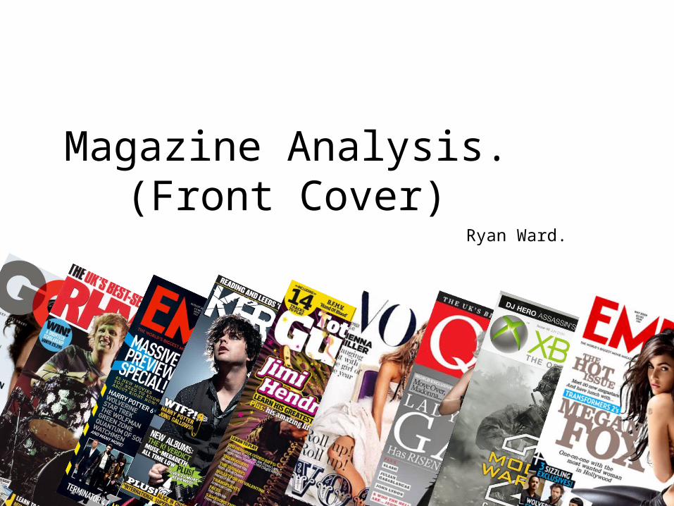
Magazine Analysis. (Front Cover)Ryan Ward.
Elements of a front cover.
• Mast head – The ‘big’ title/logo that is more often that not positioned at the top of the front cover of a magazine.
• Price, Issue ‘number’/date, Bar code – Straight forward.• Main cover line – The main article that a magazine contains/focuses on. It is
usually advertised through use of big, attractive text, and is usually accompanied by a ‘Feature article photo’, which is also more often that not rather large, and aims to attract the ‘audience’.
• Cover line/’s – Other ‘less important’ articles that the magazine contains. These are advertised through smaller text and also accompanied by a smaller photo to go with it most of the time.
• Plugs – Selling points of a magazine, that are made less obvious than Main cover lines/Cover lines etc. They may be in a list at the side of the magazine cover, or at the bottom along the width of the cover perhaps.
• Puffs – Short ‘phrases’ that rapidly attract the audience’s attention. E.g. ‘FREE!’
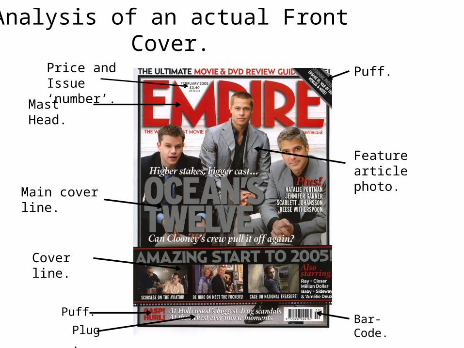
Analysis of an actual Front Cover.
Mast Head.
Bar-Code.
Price and Issue ‘number’.
Main cover line.
Feature article photo.
Puff.
Cover line.
Puff.
Plug.
Analysis of a Front Cover continued...• The Mast Head of this particular front cover spans the whole width of the magazine, and is in big,
red text. The colour red is ‘apparently’ very attractive to the male eye, so by making the Mast Head big and red the editors of ‘Empire’ are potentially increasing the attraction that the audience will feel from the magazine. The Mast Head is also slightly cut off by the ‘Feature article photograph’, this is purposely done to draw attention straight from the Mast Head to the ‘Feature article photograph’ and then obviously onto the ‘Main cover line’, a smart tactic indeed.
• The Main Cover Line is in very large text, and is placed right in front of the ‘Feature article photograph’. The large text catches the audiences eye almost instantly, and is also quite fitting to the general colour theme of the ‘Feature article photograph’ just behind it, to look smart and professional. This could also be done so that when people are looking at the photograph, they’ll look at the ‘Main cover line’ almost subconsciously without realising, and obviously start to read it.
• The Cover Line is placed just below where the ‘Main cover line’ is, and is in smaller text, and is accompanied by smaller pictures, as obviously these articles aren’t what the magazine is mainly focused on deeming them ‘less important’. The text is the exact same colour as what the ‘Main cover line’ is, which is purposely done to make the audience almost subconsciously move onto and start reading the ‘Cover line’ just after reading the ‘Main cover line’ without realising, similar to the ‘smart tactic’ I stated above, and also to substitute a general colour theme the magazine has got going on.
• The plug featured on this particular front cover is placed right at the bottom of the page. The plug has no pictures to accompany it, and is in small, non-’striking’ text. There are puffs right next to the plug (Left hand side) that do the job of catching the audiences attention, as they are in more of a ‘striking’ type of font and fashion, and are coloured red.


