Embed Size (px)
Citation preview
Ecommerce Usability Guidelines!8 F R E E A C T I O N A B L E I N S I G H T S
8 Actionable Guidelines!
This actionable guide will provide you with 8 insights that will convert online shoppers to purchase your products.!!To discover the guidelines we conducted qualitative research which highlighted insight into the decision making process of online shoppers as well as usability issues that stop shoppers from completing a purchase. This research has then been translated into actionable guidelines that will not only improve the users experience but also the conversion rate of an ecommerce website. !!The full guide contains 100 actionable insights for further details please visit http://uxapplication.com/ecommerce-guide.!!
Checkout Pages!The revenue generating driving force of an online store is the checkout page. Your customers experience during this process can lead to a sale or abandonment.!Customers who arrive at the checkout page have already selected products they wish to buy. Once a strong desire is displayed in one or several products, you must pave the way for the sale.!
Capture the customers email address at an early stage of the checkout process, if a customer abandons their cart you can trigger a recovery of their email address and cart items. Cart abandonment can be detected when the browser is closed or based on a session timeout.!
Action #1 Cart Abandonment!
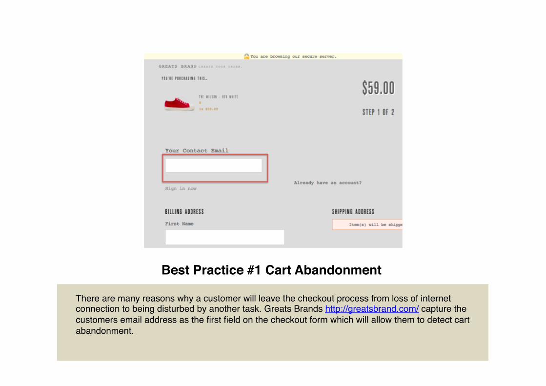
Best Practice #1 Cart Abandonment!
There are many reasons why a customer will leave the checkout process from loss of internet connection to being disturbed by another task. Greats Brands http://greatsbrand.com/ capture the customers email address as the first field on the checkout form which will allow them to detect cart abandonment.!
!
Shopping Cart!The Shopping cart plays a key journey in transitioning your customers' interest in a product to a desire to purchase. Improving the presentation and features of the cart page will instigate the customers' actions to click the checkout button.!
When the checkout button is clicked don't show any intermediate pages, take the user straight to the checkout page.!
Action #2 Intermediate Pages!
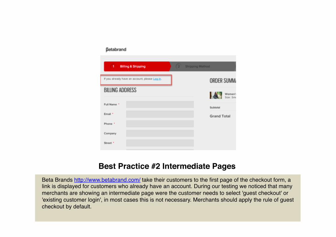
Best Practice #2 Intermediate Pages!Beta Brands http://www.betabrand.com/ take their customers to the first page of the checkout form, a link is displayed for customers who already have an account. During our testing we noticed that many merchants are showing an intermediate page were the customer needs to select 'guest checkout' or 'existing customer login', in most cases this is not necessary. Merchants should apply the rule of guest checkout by default.!
!
Site Search!Search in fundamental to an ecommerce store especially if you have a wide range of products, allowing customers to search is an effective method to increase site usage and in-turn improves online sales. If your customers can find what they are looking for quickly they are more likely to make a purchase.!
There are scenarios where a search term does not return positive results. A customer should never see a page that displays "No Results" in such instances recommend products that will allow them to go forward. Displaying a list of product categories or your best selling products will offer an opportunity for the consumer to find an alternative method to navigating the site.!
Action #3 Negative Search Results!
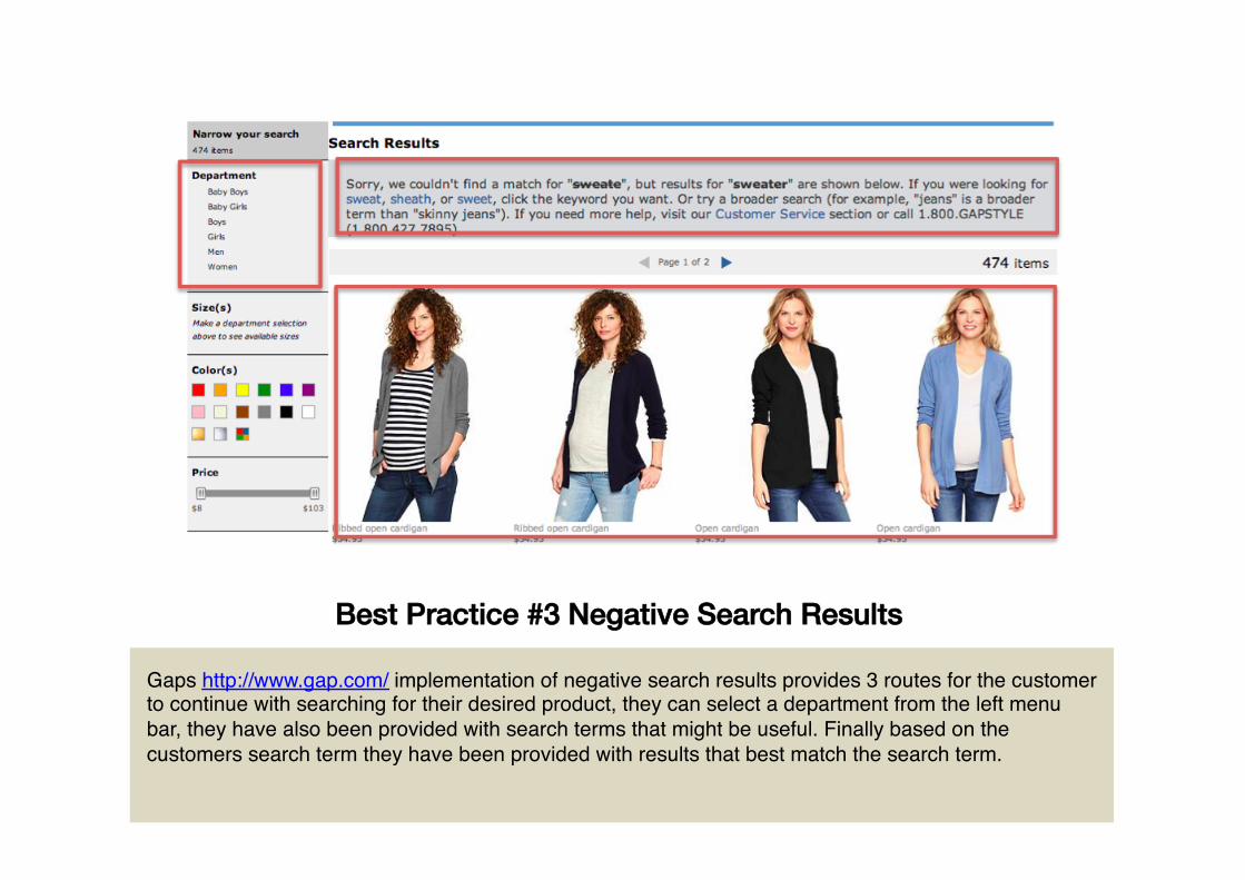
Best Practice #3 Negative Search Results!
Gaps http://www.gap.com/ implementation of negative search results provides 3 routes for the customer to continue with searching for their desired product, they can select a department from the left menu bar, they have also been provided with search terms that might be useful. Finally based on the customers search term they have been provided with results that best match the search term.!
!
Product Pages!The product page showcases valuable details for customers to make an informed decision to make a purchase. The design and layout of these pages need to be optimized to include all the information a customer requires to make a decision to purchase.!
Offer alternative items if the specific product has been discontinued, this could be the same product but a newer model or a different brand.!
Action #4 Discontinued Products!
Action #4 Discontinued Products!
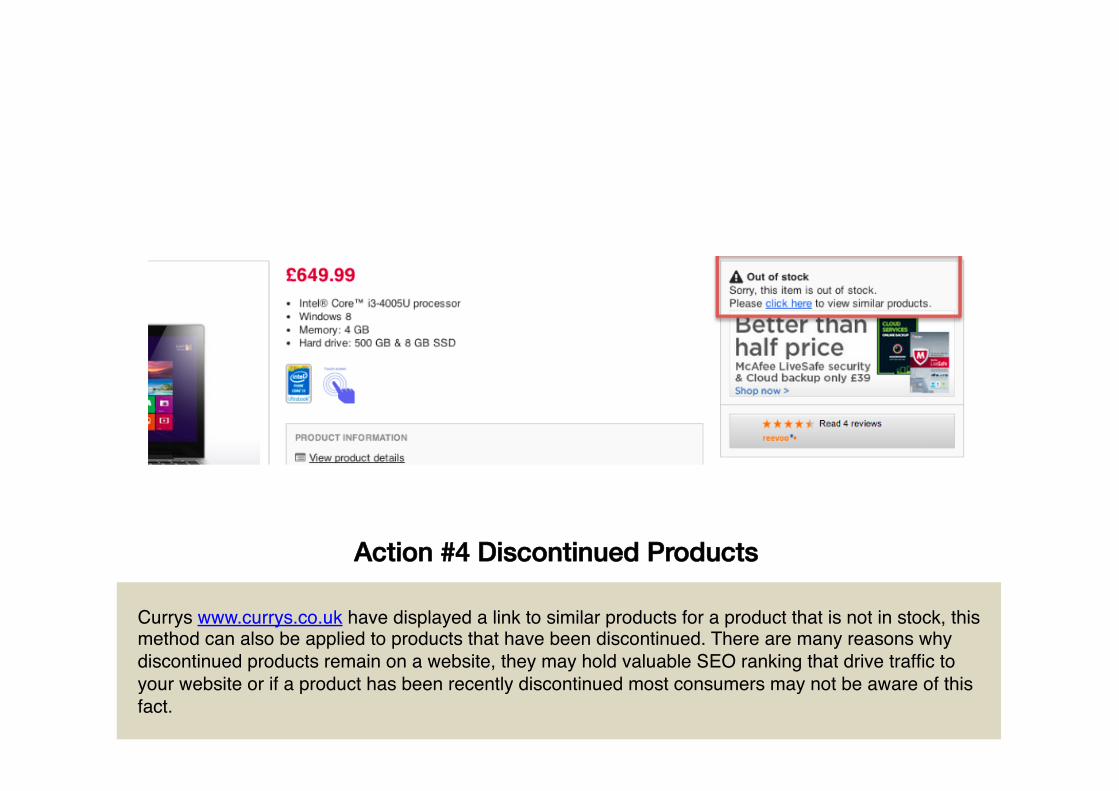
Currys www.currys.co.uk have displayed a link to similar products for a product that is not in stock, this method can also be applied to products that have been discontinued. There are many reasons why discontinued products remain on a website, they may hold valuable SEO ranking that drive traffic to your website or if a product has been recently discontinued most consumers may not be aware of this fact.!
Product Category!The key objective of the product category page is to get customers who land on it to click through to the product page or to add the product directly to their basket.!
The product category page should provide clarity of the product that the customer is interested in without having to click through to the product page.!Filtering allows users to narrow down their product search based on a specific criteria. If the product is clothes then filters should be based on color, size and style. Filters are generally position in the left hand column of the page.!
Action #5 Product Filtering!
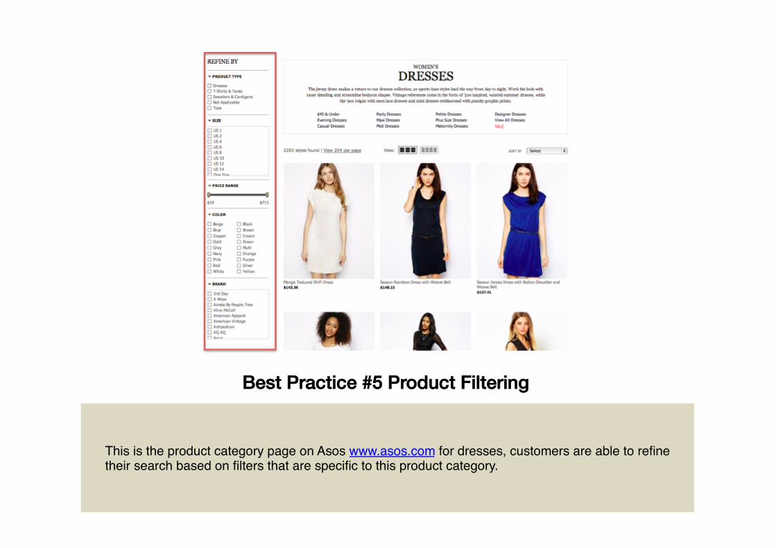
Best Practice #5 Product Filtering!
This is the product category page on Asos www.asos.com for dresses, customers are able to refine their search based on filters that are specific to this product category.!
Header & Footer!The header and footer of the website should link to valuable information that will aid the visitors positive shopping experience.!
Recent studies have shown that 20% of shopping carts are abandoned where customers wanted to ask a question before they completed a purchase. Create an extensive help page that will answer the most obvious questions like "what is the return policy" or "do you ship internationally".!
Action #6 Help Section!
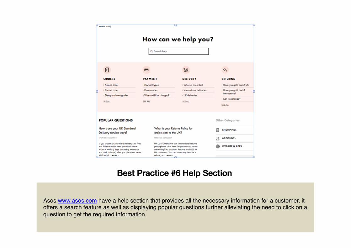
Best Practice #6 Help Section!
Asos www.asos.com have a help section that provides all the necessary information for a customer, it offers a search feature as well as displaying popular questions further alleviating the need to click on a question to get the required information.!
Mobile Optimization!Customize your ecommerce website to support mobile devices, this can be achieved by using a responsive framework that will resize the layout and positions of elements to match the customers device.!
For email fields automatically switch the customer to the Email keyboard <input type="email"> which will display the @ symbol.!
Action #7 Email Keyboard!
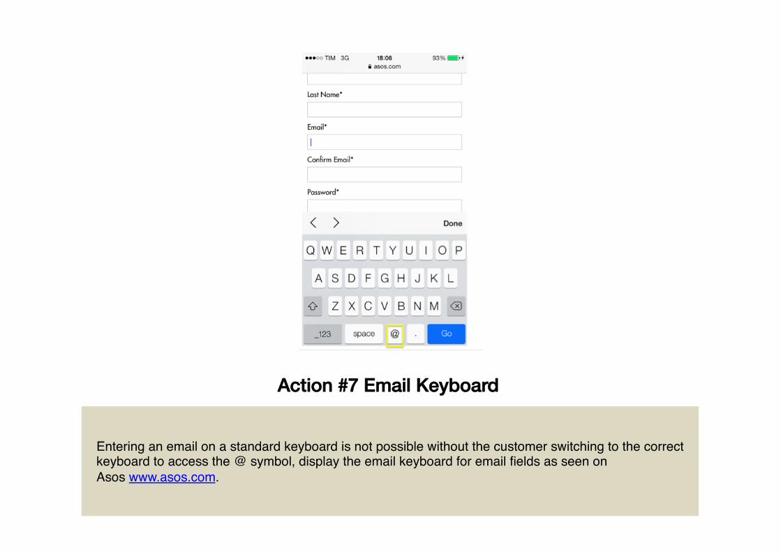
Action #7 Email Keyboard!
Entering an email on a standard keyboard is not possible without the customer switching to the correct keyboard to access the @ symbol, display the email keyboard for email fields as seen on Asos www.asos.com.!
My Account Pages!Customers who login to purchase are your loyal customers who will return if they have a great shopping experience.!
Get product feedback from your customers, next to each order display a link to allow the user to review the product they have purchased.!
Action #8 Review Purchase!
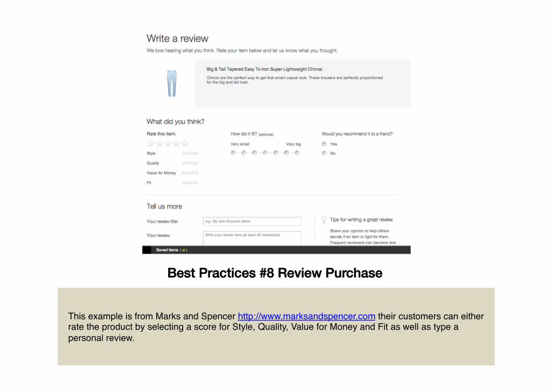
Best Practices #8 Review Purchase!
This example is from Marks and Spencer http://www.marksandspencer.com their customers can either rate the product by selecting a score for Style, Quality, Value for Money and Fit as well as type a personal review.!
How can we help?!If you have any question regarding this guide please contact
!!
Download the full guide!For further details please visit!
http://uxapplication.com/ecommerce-guide!
!!