Embed Size (px)
Citation preview
Francis Evdokimov
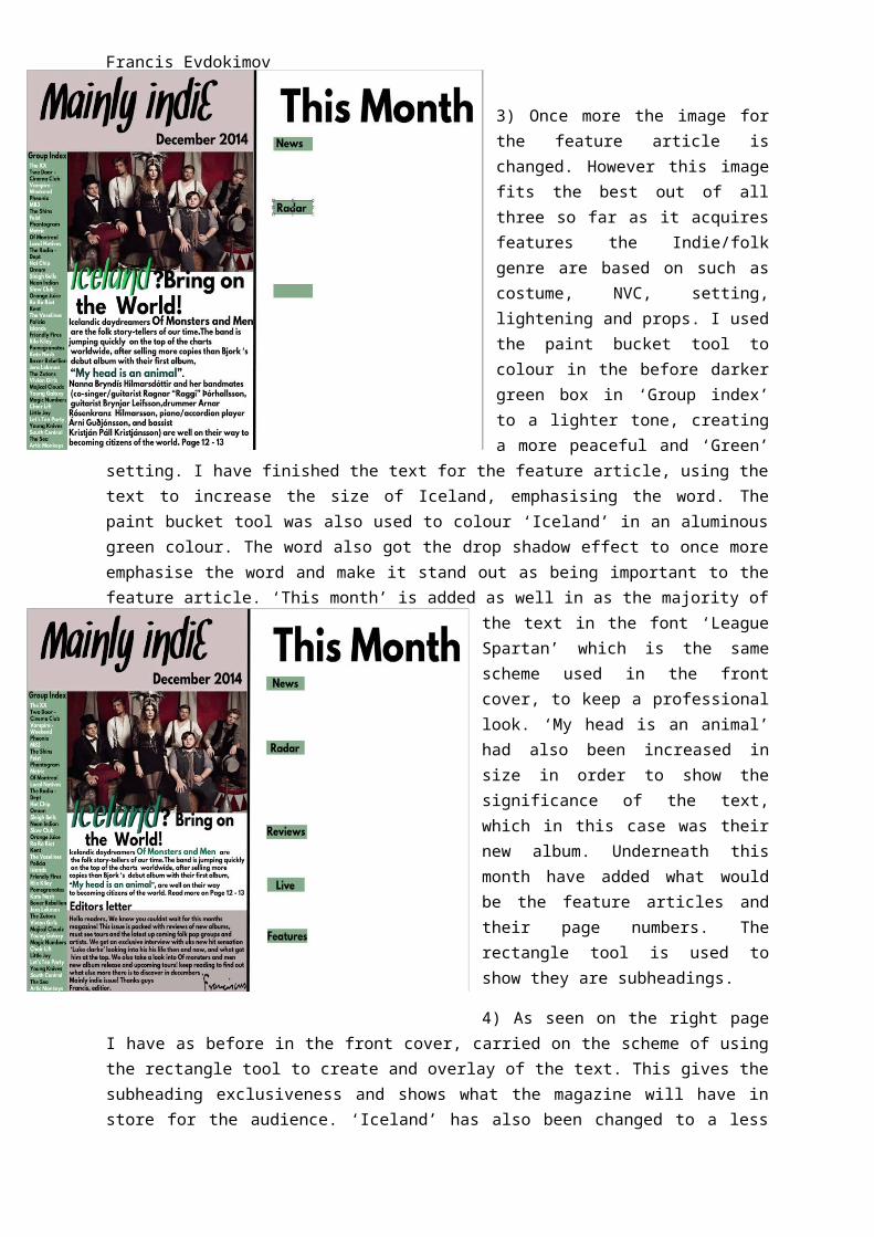
3) Once more the image for the feature article is changed. However this image fits the best out of all three so far as it acquires features the Indie/folk genre are based on such as costume, NVC, setting, lightening and props. I used the paint bucket tool to colour in the before darker green box in ‘Group index’ to a lighter tone, creating a more peaceful and ‘Green’ setting. I have finished the text for the feature article, using the text to increase the size of Iceland, emphasising the word. The paint bucket tool was also used to colour ‘Iceland’ in an aluminous green colour. The word also got the drop shadow effect to once more emphasise
the word and make it stand out as being important to the feature article. ‘This month’ is added as well in as the majority of the text in the font ‘League Spartan’ which is the same scheme used in the front cover, to keep a professional look. ‘My head is an animal’ had also been increased in size in order to show the significance of the text, which in this case was their new album. Underneath this month have added what would be the feature articles and their page numbers. The rectangle tool is used to show they are subheadings.
4) As seen on the right page I have as before in the front cover, carried on the scheme of using the rectangle tool to create and overlay of the text. This gives the subheading exclusiveness and shows what the magazine will have in store for the audience. ‘Iceland’ has also been changed to a less aluminous green but to one which blends in better with the house colours and less intimidating. This was done using the paint bucket tool which allowed me to pick the exact colour that suited the text. As seen as well the feature article has also been shortened and an editor’s text has been input. This follows media magazine conventions as magazines do tend to have an introduction to the
magazine and give an insight to what they should look forward to. The editor’s text has also been covered by the rectangle tool as well as the paint bucket tool to carry on the house theme of the contents page. It also portrays it has different relevance to the text above. The signature had been taken and imported from the internet, which just marks the editor’s letter, again a convention of a magazine.