Embed Size (px)
Citation preview
5- How did you attract/address your audience?
My Masterhead
I researched Hip hop magazines and looked at what features they used and the effect they had on consumers. The first thing I wanted to design for my magazine was my masterhead. This was because it would give me guidance to how the rest of my magazine would look. For example once I knew how I was going to design my masterhead, I could come up with ideas about designing the rest of my magazine, as my masterhead would have set the colour theme and the font type.
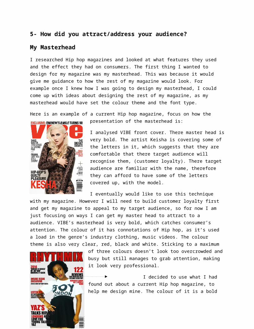
Here is an example of a current Hip hop magazine, focus on how the presentation of the masterhead is:
I analysed VIBE front cover. There master head is very bold. The artist Keisha is covering some of the letters in it, which suggests that they are comfortable that there target audience will recognise them, (customer loyalty). There target audience are familiar with the name, therefore they can afford to have some of the letters covered up, with the model.
I eventually would like to use this technique with my magazine. However I will need to build customer loyalty first and get my magazine to appeal to my target audience, so for now I am just focusing on ways I can get my master head to attract to a audience. VIBE’s masterhead is very bold, which catches consumer’s attention. The colour of it has connotations of Hip hop, as it’s used a load in the genre’s industry
clothing, music videos. The colour theme is also very clear, red, black and white. Sticking to a maximum of three colours doesn’t look too overcrowded and busy but still manages to grab attention, making it look very professional.
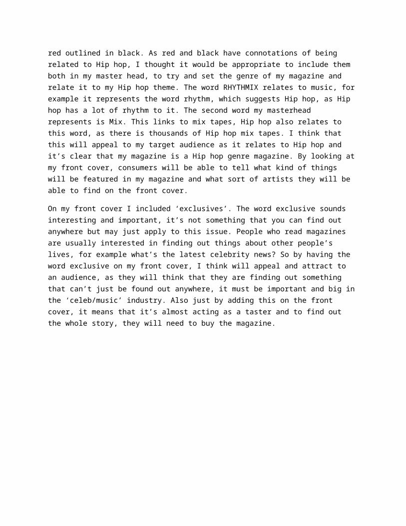
I decided to use what I had found out about a current Hip hop magazine, to help me design mine. The colour of it is a bold red outlined in black. As red and black have connotations of being related to Hip hop, I thought it would be appropriate to include them both in my master head, to try and set the genre of my magazine and relate it to my Hip hop theme. The word RHYTHMIX relates to music, for example it represents the word rhythm, which suggests Hip hop, as Hip hop has a lot of rhythm to it. The second word my masterhead represents is Mix. This links to mix tapes, Hip hop also relates to this word, as there is thousands of Hip hop mix tapes. I think that this will appeal to my target audience as it relates to Hip hop and it’s clear that my magazine is a Hip hop genre magazine. By looking at my front cover, consumers will be
able to tell what kind of things will be featured in my magazine and what sort of artists they will be able to find on the front cover.
On my front cover I included ‘exclusives’. The word exclusive sounds interesting and important, it’s not something that you can find out anywhere but may just apply to this issue. People who read magazines are usually interested in finding out things about other people’s lives, for example what’s the latest celebrity news? So by having the word exclusive on my front cover, I think will appeal and attract to an audience, as they will think that they are finding out something that can’t just be found out anywhere, it must be important and big in the ‘celeb/music’ industry. Also just by adding this on the front cover, it means that it’s almost acting as a taster and to find out the whole story, they will need to buy the magazine.
I have also put big Hip hop artists name in bold, red writing on the front cover. For example I included Kendrick Lamar on my front cover, along with Jay Z and Kanye West. These are massive names in the Hip hop industry. My target audience will be familiar with these artists because they are some of the top current Hip hop artists, with singles going straight to number one in the chart list and some of the most popular downloads on ITunes. This will appeal to my target audience because they have been made aware of that these artists will be featuring in my magazine, therefore they will be finding out the latest gossip and news on them.
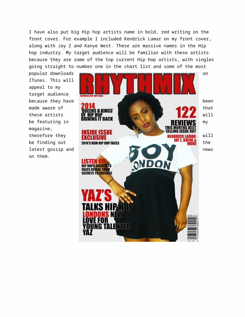
Above is the final version of my magazines front cover
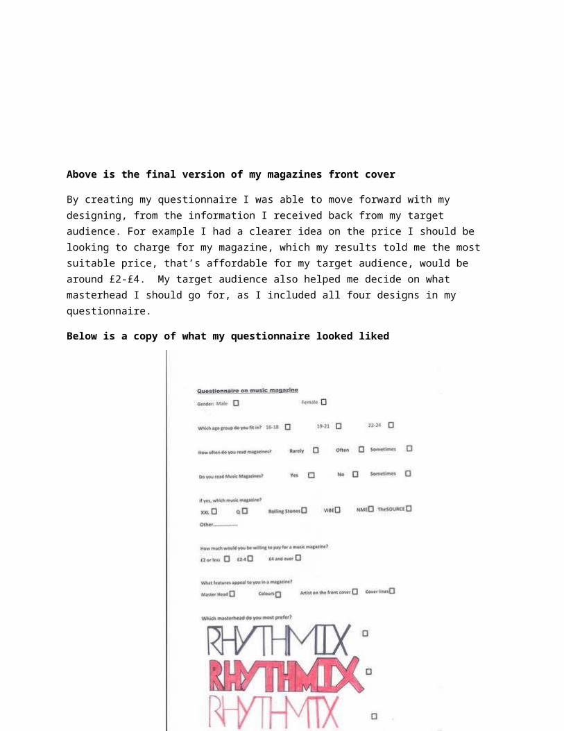
By creating my questionnaire I was able to move forward with my designing, from the information I received back from my target audience. For example I had a clearer idea on the price I should be looking to charge for my magazine, which my results told me the most suitable price, that’s affordable for my target audience, would be around £2-£4. My target audience also helped me decide on what masterhead I should go for, as I included all four designs in my questionnaire.
Below is a copy of what my questionnaire looked liked
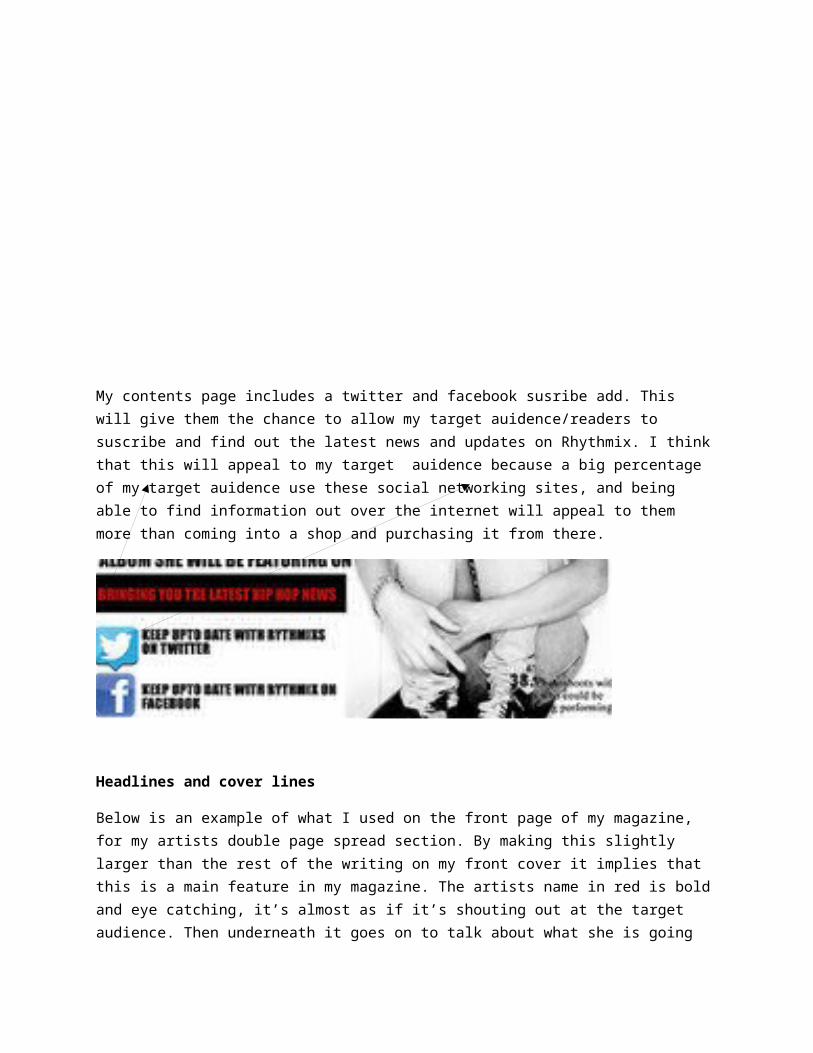
My contents page includes a twitter and facebook susribe add. This will give them the chance to allow my target auidence/readers to suscribe and find out the latest news and updates on Rhythmix. I think that this will appeal to my target auidence because a big percentage of my target auidence use these social networking sites, and being able to find information out over the internet will appeal to them more than coming into a shop and purchasing it from there.
Headlines and cover lines
Below is an example of what I used on the front page of my magazine, for my artists double page spread section. By making this slightly larger than the rest of the writing on my front cover it implies that this is a main feature in my magazine. The artists name in red is bold and eye catching, it’s almost as if it’s shouting out at the target audience. Then underneath it goes on to talk about what she is going to talk about in her interview. I put the word London in red, as I wanted it to stand out because most of the current Hip hop artists that are making music today are originally from somewhere in the US or their background is American based. So by the word London being in red it stands out more against the black. This will attract readers to go on and want to read because it’s something new, a young female, hip hop artist from London is something new on the market, it will also appeal to them because my magazine is UK produced, they may be able to relate to my artist more as she has a background that they can relate with and are familiar with, being raised in London, it seems familiar.
Photos used in my magazine
The Hip hop industry is a busy one and full of colour and unique designing. I wanted the picture quality to be at a high standard, for the photos I was going to include in my magazine. To manage this I used a DSLR Cannon camera, to assure that my pictures would be at a good quality. I think by having pictures at a high standard of quality, will give off a more professional look for my magazine, which will appeal to consumers more because they know that the standard of my magazine will be high/quality. I also went to different landmarks to get the kind of look and setting I wanted in my photos. For example the photo that I used as one of my contents ones was taking down Brick Lane. I think that brick lane explores a lot of culture, diversity and art, which I can relate to hip hop, as I feel it does the same.
The photos all include really bright colours, as I am targeting my magazine at more of a younger generation, I think that this will appeal to them more. A lot of Hip hop music videos are filmed in places that have a lot of graffiti, it’s seen as ‘cool’. I took this in mind to try and find somewhere which had graffiti, which I was successful in doing. I think this will appeal to my target audience because they will relate this to the hip hop industry overall.
All but one image is in colour. I included one photo, which I photo shopped to get a black and white effect. The colours black and white play a massive role in the Hip hop industry, the Hip hop fashion trend look is made up of a majority of black and white make up. I think that this will appeal to my target audience because it makes my magazine look more professional, showing that I have done my research as a producer and have included this by the way I have chosen to lay out and present features/photos in my magazine.