Embed Size (px)
Citation preview

webdev@rguCSS Frameworks
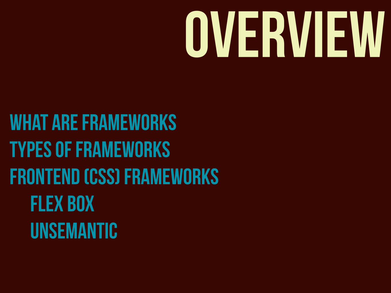
overviewwhat are frameworks types of frameworks frontend (CSS) Frameworks
flex box unsemantic

what are frameworks?

a standardised set of concepts, practices and criteria for dealing
with a common type of problem
a package made up files and folders of standardised code to aid in the development of websites
In general
In web design
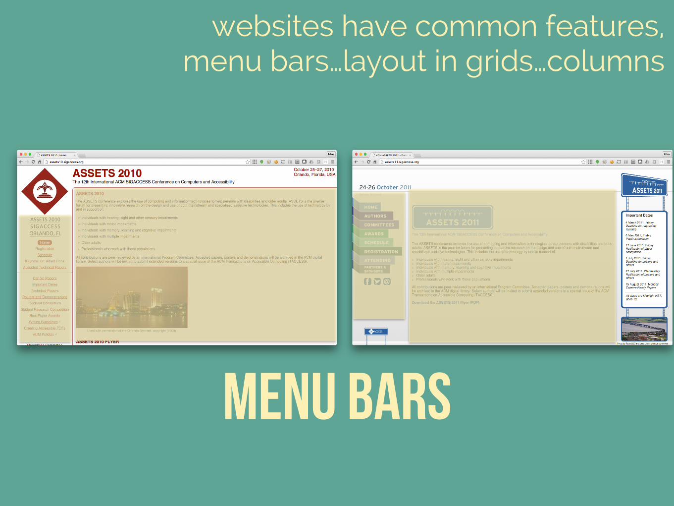
websites have common features, menu bars…layout in grids…columns
Menu Bars
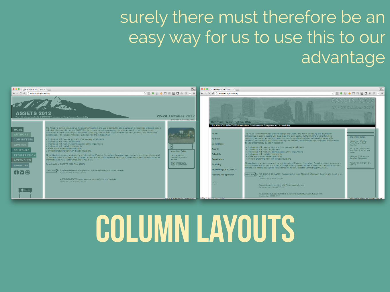
column layouts
surely there must therefore be an easy way for us to use this to our
advantage
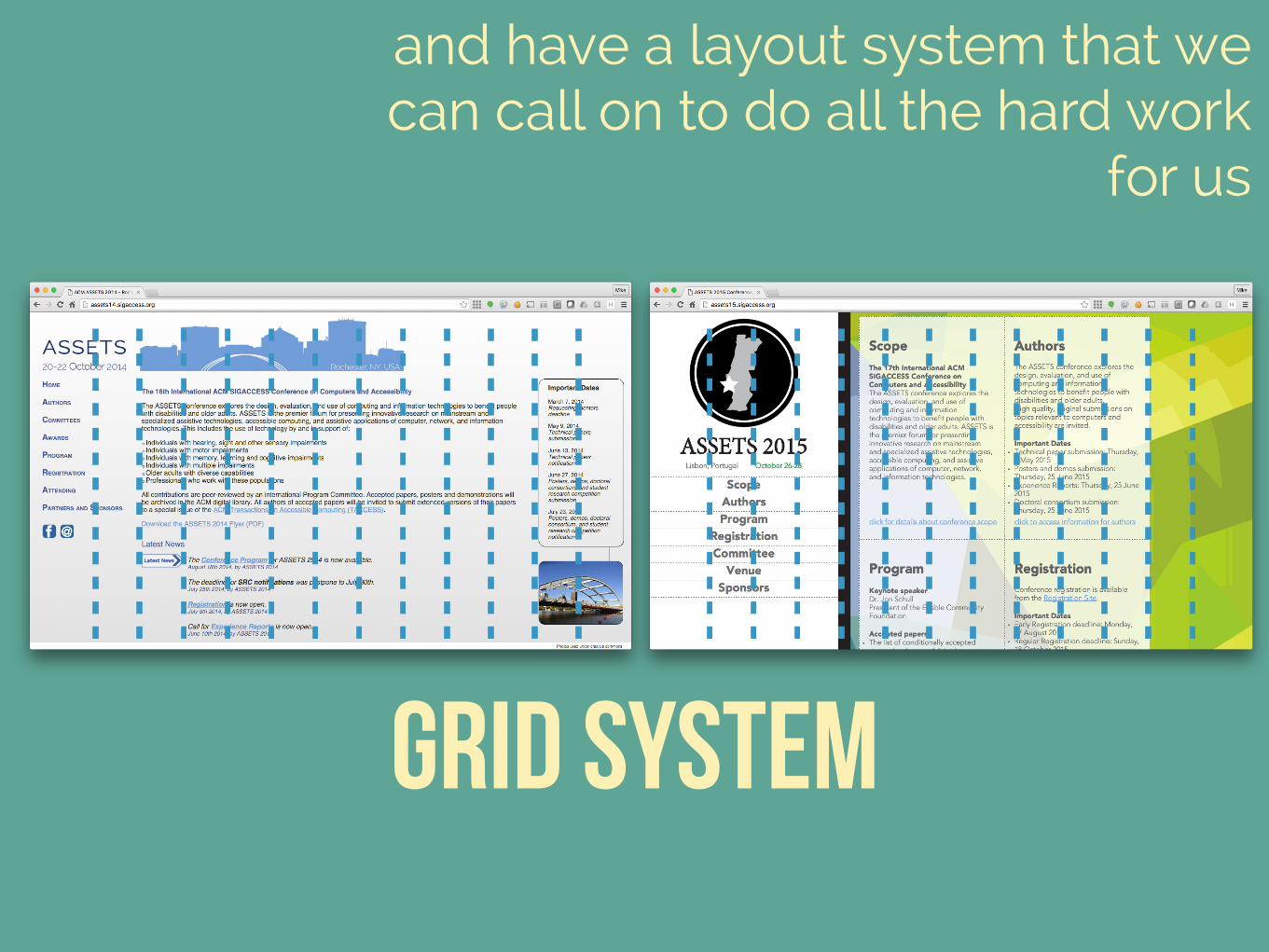
Grid SYstem
and have a layout system that we can call on to do all the hard work
for us
“the aim of frameworks is to give developers a common structure so
that we don't have to make everything from scratch every time
that we want to make a new websites”
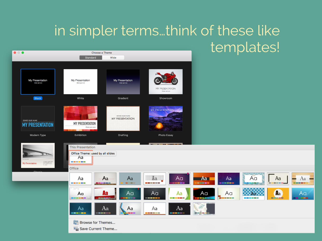
in simpler terms…think of these like templates!

types of frameworks
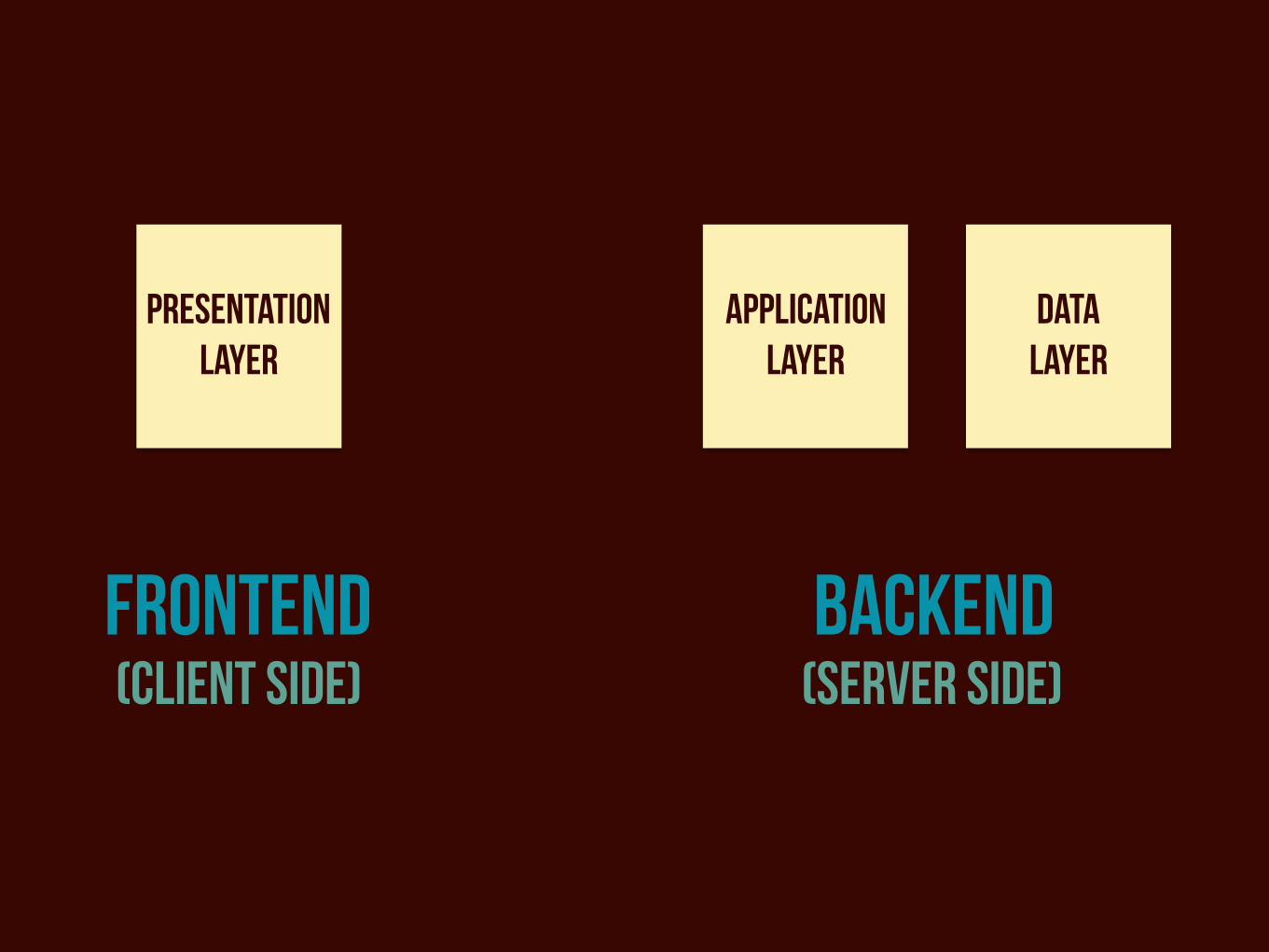
frontend backend(client Side) (server Side)
Presentation Layer
Application Layer
Data Layer
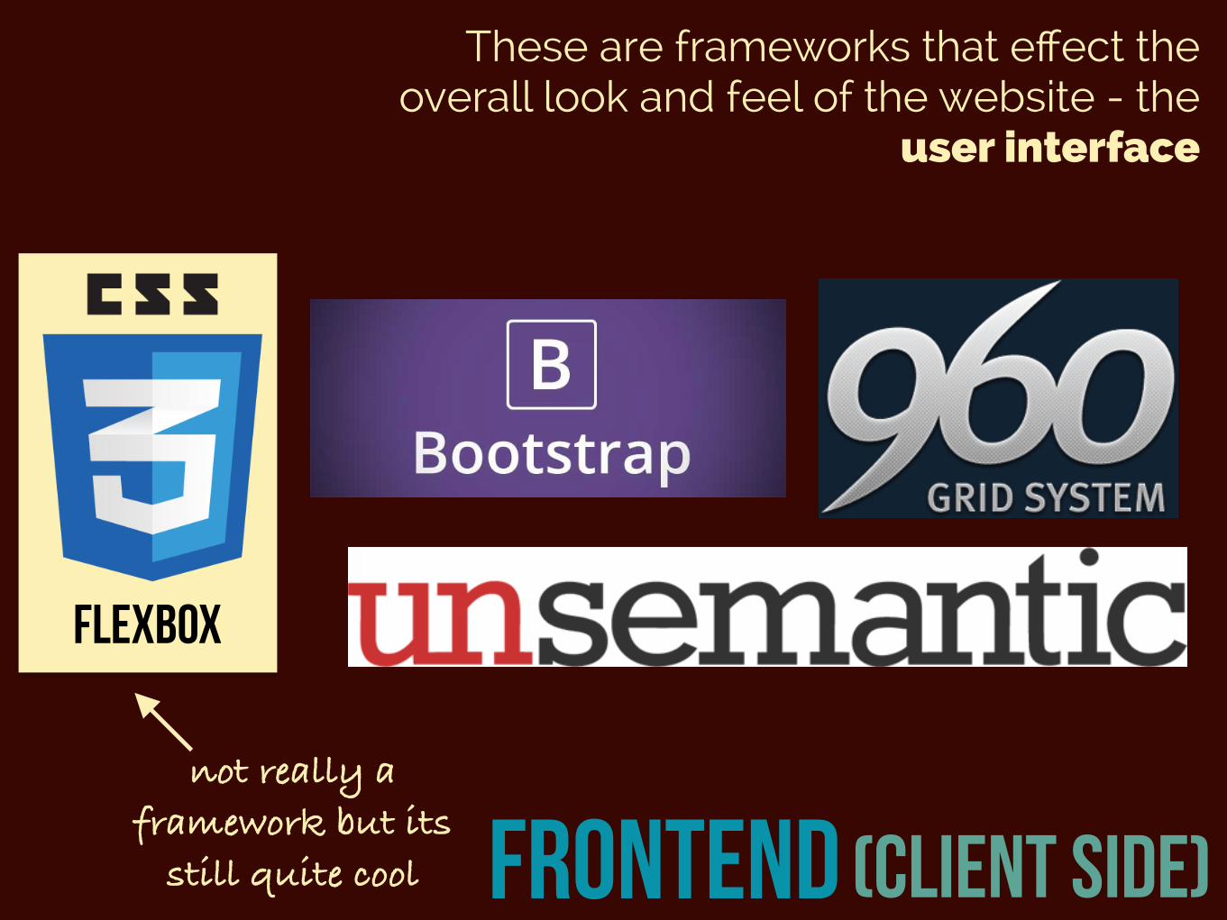
frontend (client Side)
These are frameworks that effect the overall look and feel of the website - the
user interface
flexbox
not really a framework but its
still quite cool
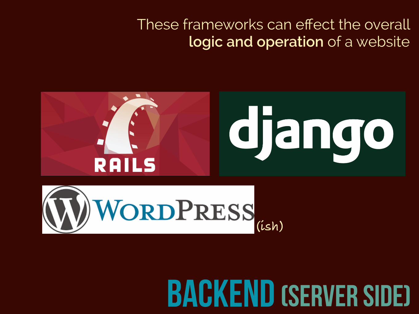
backend (server Side)
These frameworks can effect the overall logic and operation of a website
(ish)

frontend (CSS) frameworks
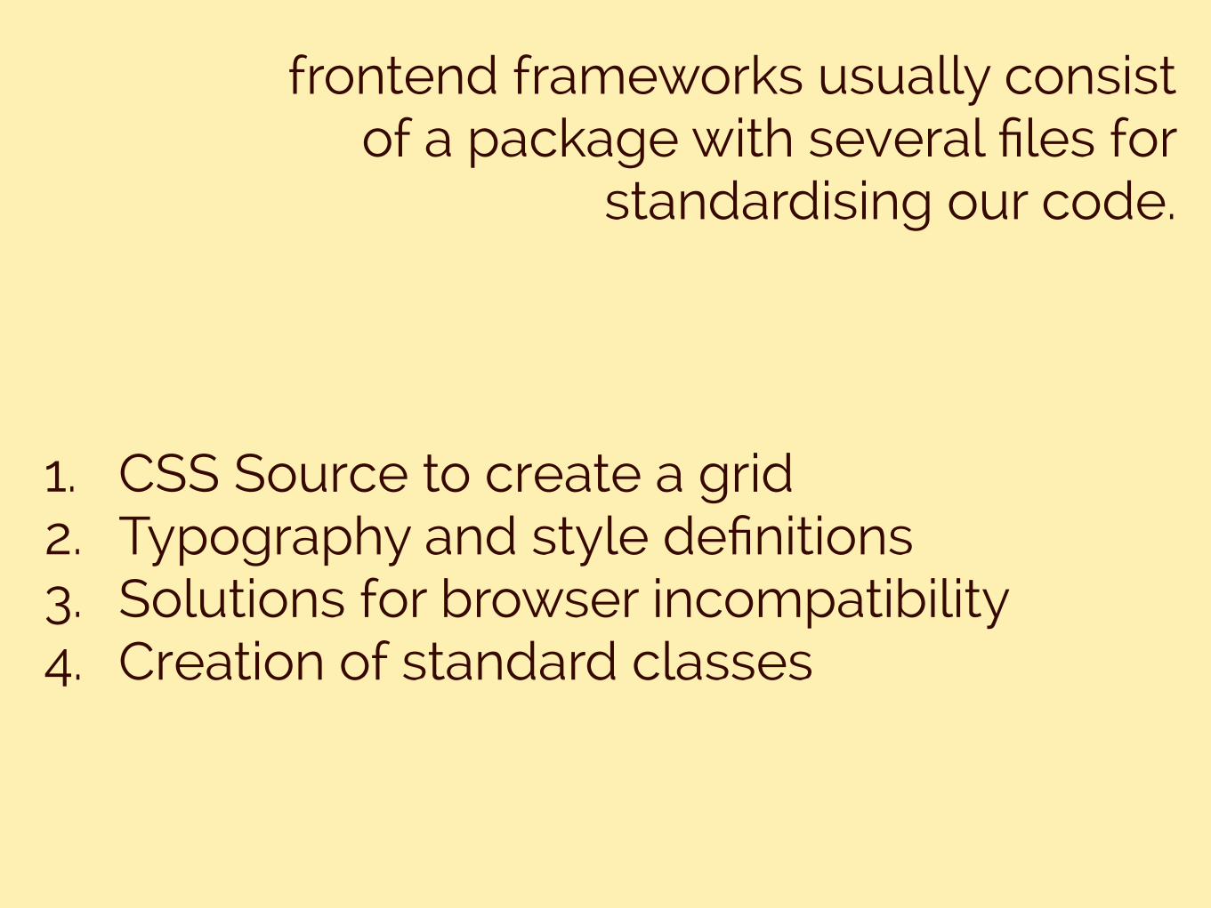
frontend frameworks usually consist of a package with several files for
standardising our code.
1. CSS Source to create a grid 2. Typography and style definitions 3. Solutions for browser incompatibility 4. Creation of standard classes
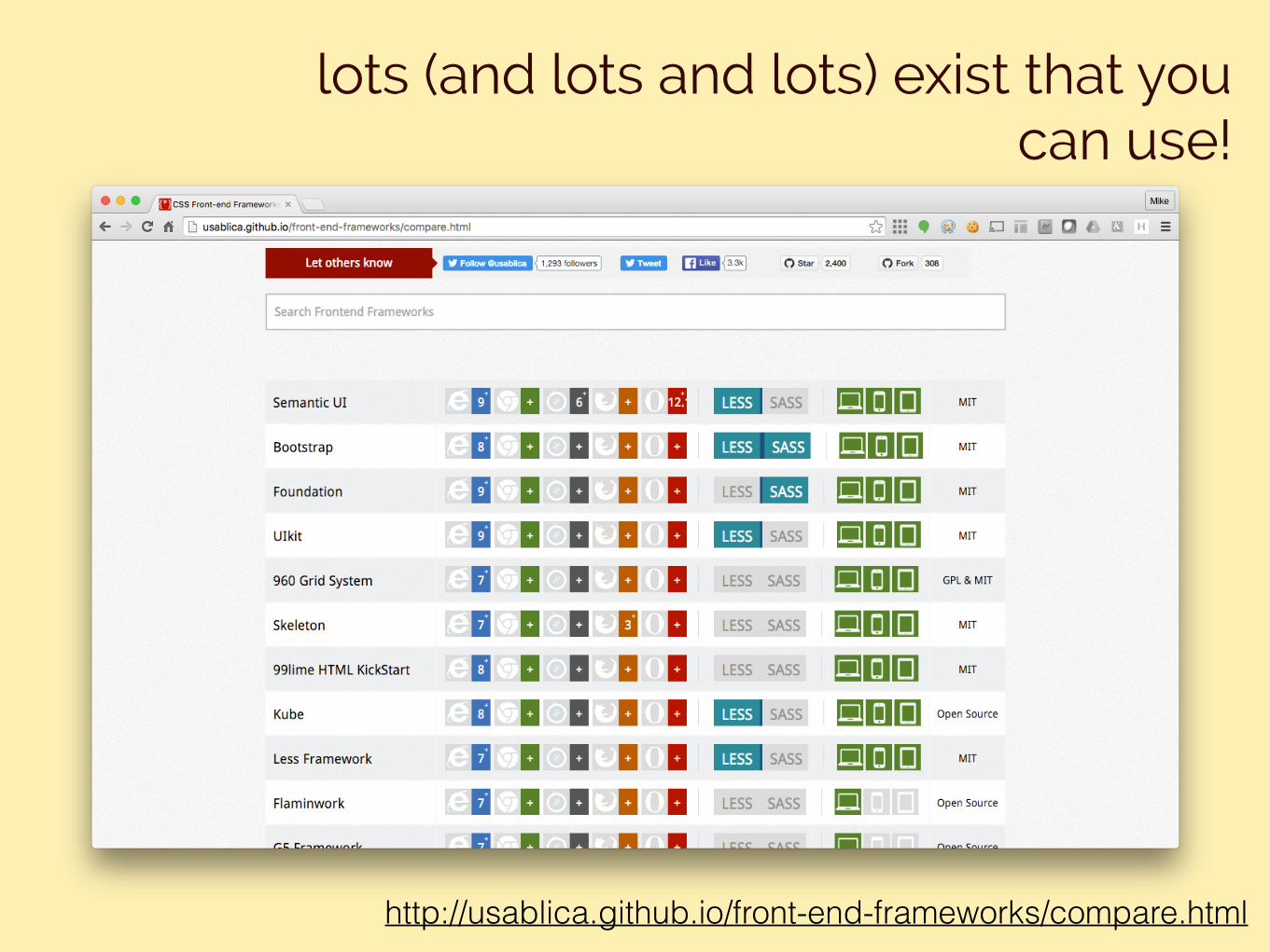
lots (and lots and lots) exist that you can use!
http://usablica.github.io/front-end-frameworks/compare.html
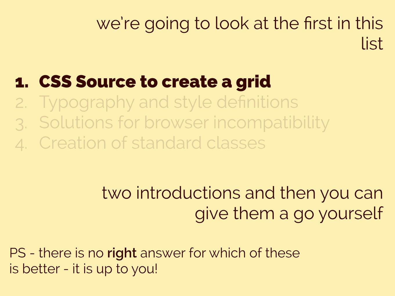
we’re going to look at the first in this list
1. CSS Source to create a grid 2. Typography and style definitions 3. Solutions for browser incompatibility 4. Creation of standard classes
two introductions and then you can give them a go yourself
PS - there is no right answer for which of these is better - it is up to you!

frontend (CSS) frameworks
FLEXBOX
• this isn’t really a framework, but its a really good new addition to CSS3 that makes our life easier
• We can use this to aid in laying out our webpages
• A flex container is used to contain all of our flex items
flex box
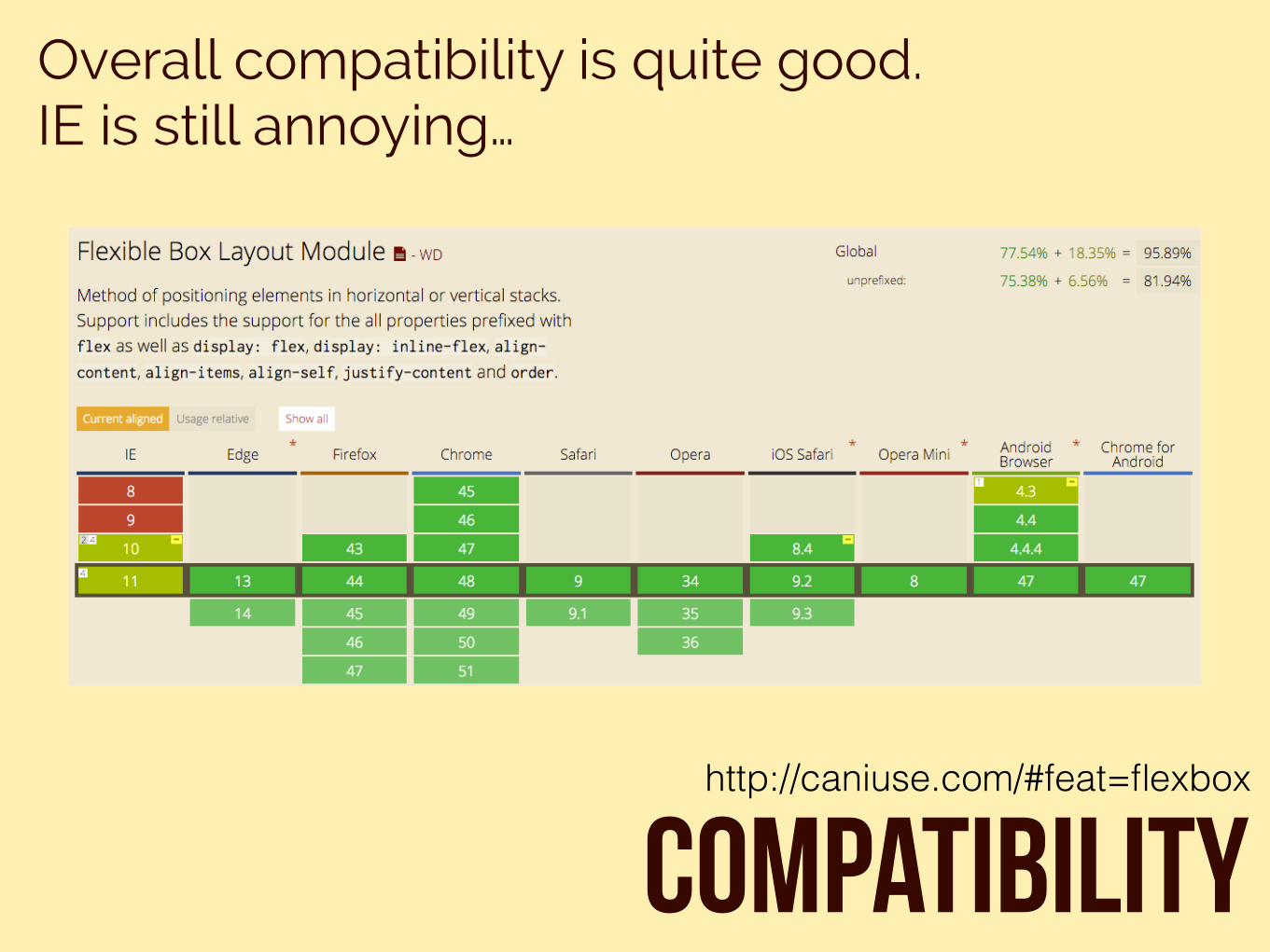
Overall compatibility is quite good. IE is still annoying…
Compatibilityhttp://caniuse.com/#feat=flexbox
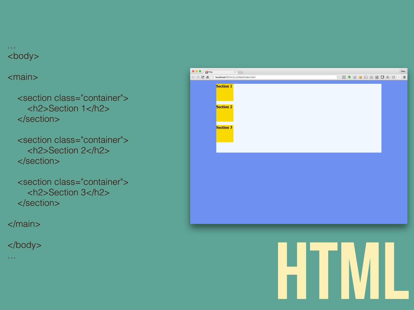
… <body>
<main>
<section class="container"> <h2>Section 1</h2> </section>
<section class="container"> <h2>Section 2</h2> </section>
<section class="container"> <h2>Section 3</h2> </section>
</main>
</body> … html
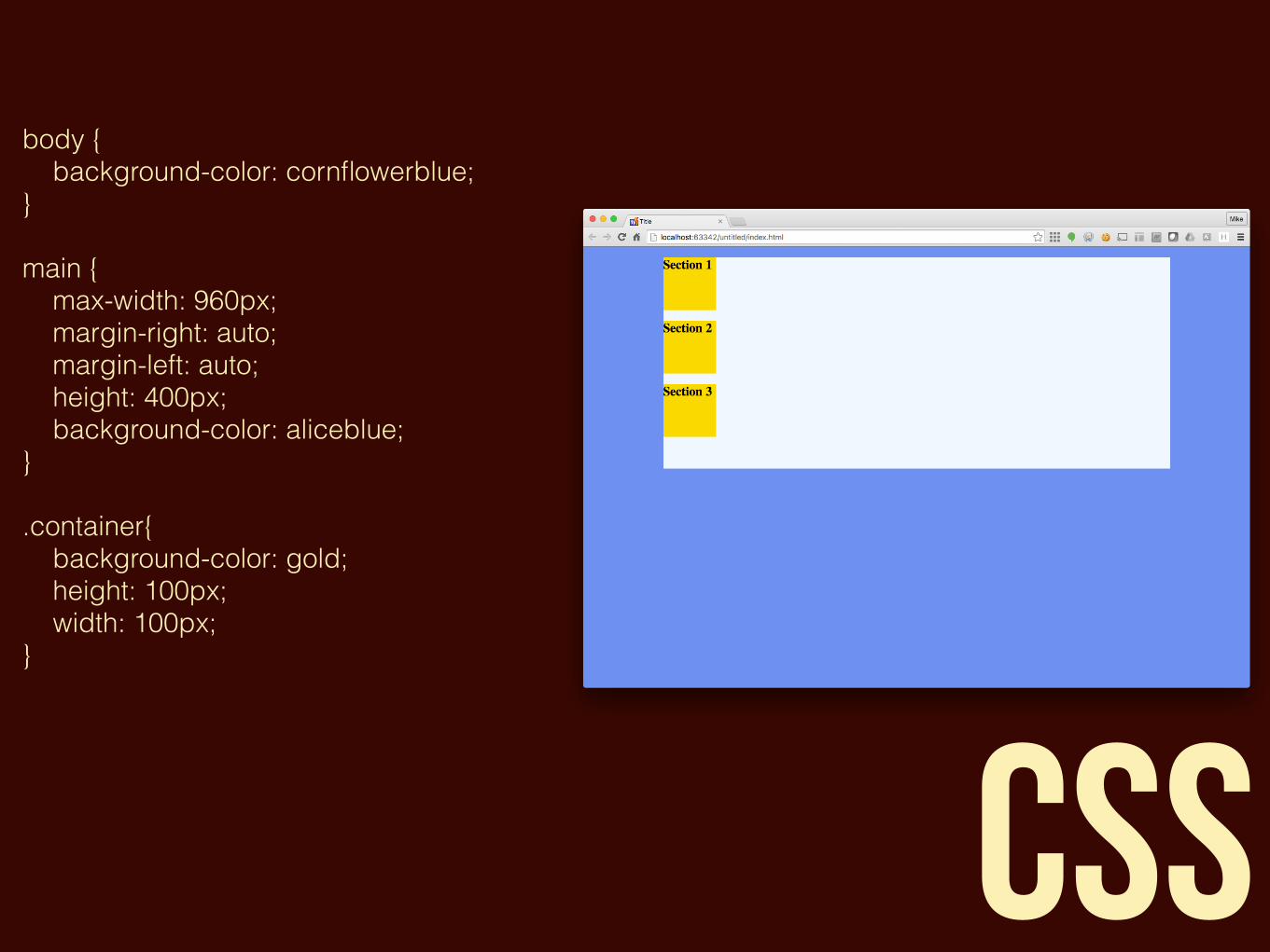
body { background-color: cornflowerblue; }main { max-width: 960px; margin-right: auto; margin-left: auto; height: 400px; background-color: aliceblue; }.container{ background-color: gold; height: 100px; width: 100px;}
css
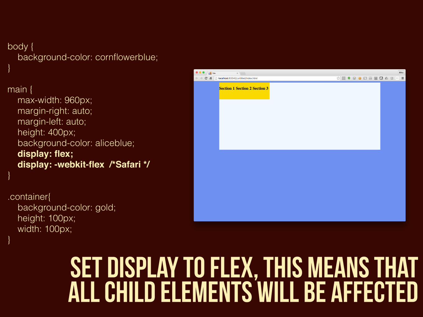
body { background-color: cornflowerblue; }main { max-width: 960px; margin-right: auto; margin-left: auto; height: 400px; background-color: aliceblue; display: flex; display: -webkit-flex /*Safari */}.container{ background-color: gold; height: 100px; width: 100px;}
set display to flex, this means that all child elements will be affected
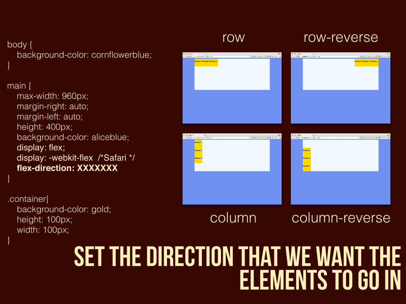
body { background-color: cornflowerblue; }main { max-width: 960px; margin-right: auto; margin-left: auto; height: 400px; background-color: aliceblue; display: flex; display: -webkit-flex /*Safari */ flex-direction: XXXXXXX }.container{ background-color: gold; height: 100px; width: 100px;}
set the direction that we want the elements to go in
row row-reverse
column column-reverse
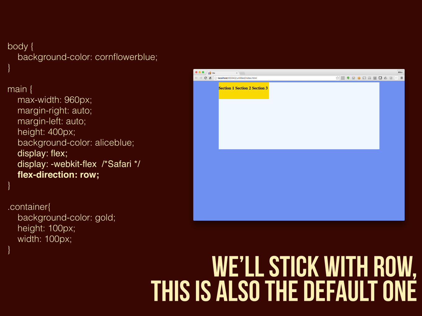
body { background-color: cornflowerblue; }main { max-width: 960px; margin-right: auto; margin-left: auto; height: 400px; background-color: aliceblue; display: flex; display: -webkit-flex /*Safari */ flex-direction: row; }.container{ background-color: gold; height: 100px; width: 100px;}
we’ll stick with row, this is also the default one
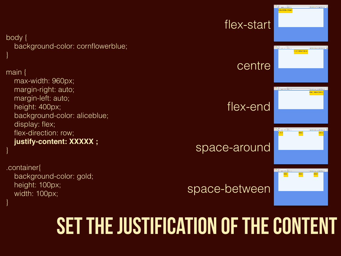
body { background-color: cornflowerblue; }main { max-width: 960px; margin-right: auto; margin-left: auto; height: 400px; background-color: aliceblue; display: flex; flex-direction: row; justify-content: XXXXX ; }.container{ background-color: gold; height: 100px; width: 100px;}
Set the justification of the content
flex-start
centre
flex-end
space-around
space-between
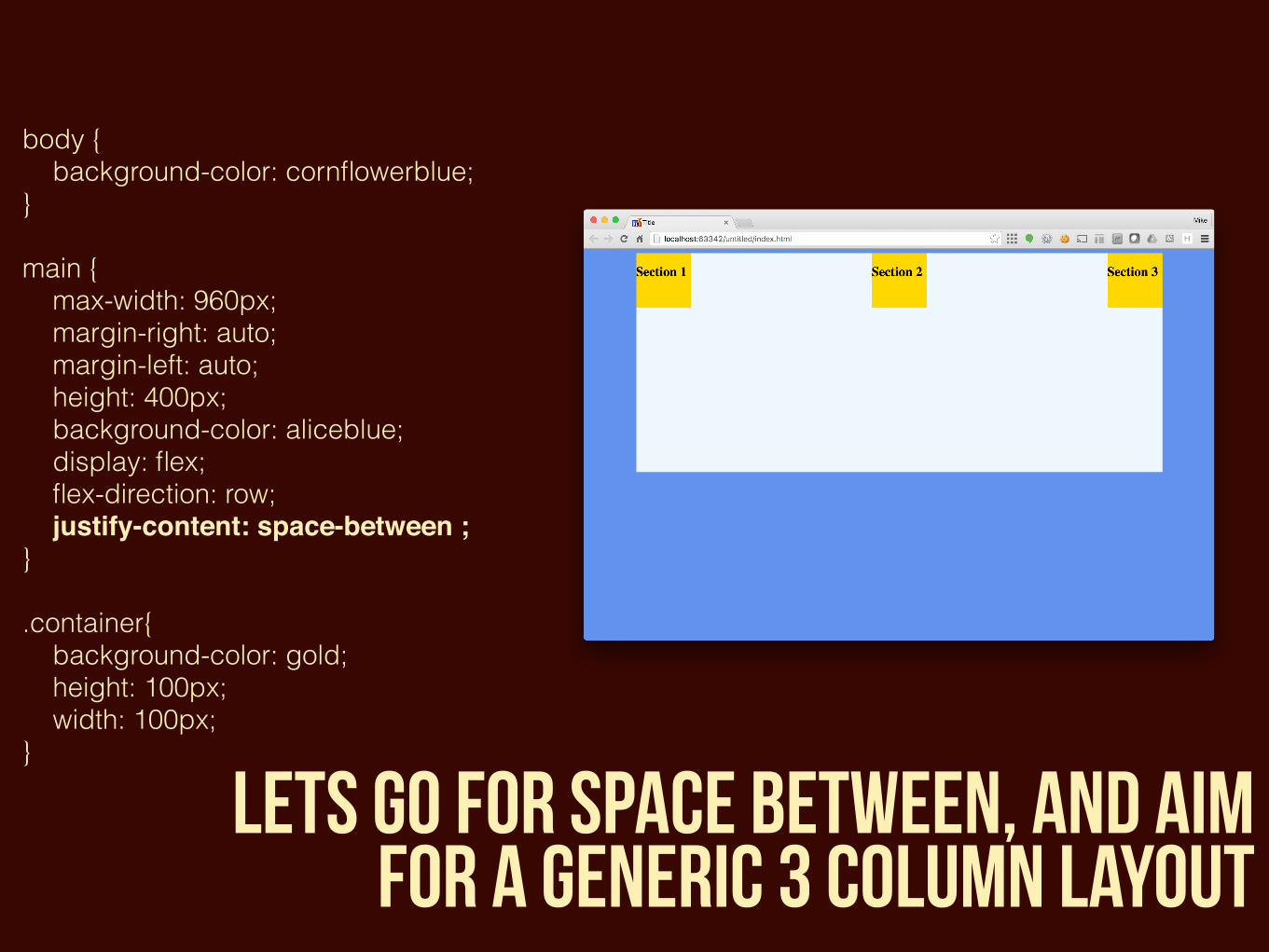
body { background-color: cornflowerblue; }main { max-width: 960px; margin-right: auto; margin-left: auto; height: 400px; background-color: aliceblue; display: flex; flex-direction: row; justify-content: space-between ; }.container{ background-color: gold; height: 100px; width: 100px;}
lets go for space between, and aim for a generic 3 column layout
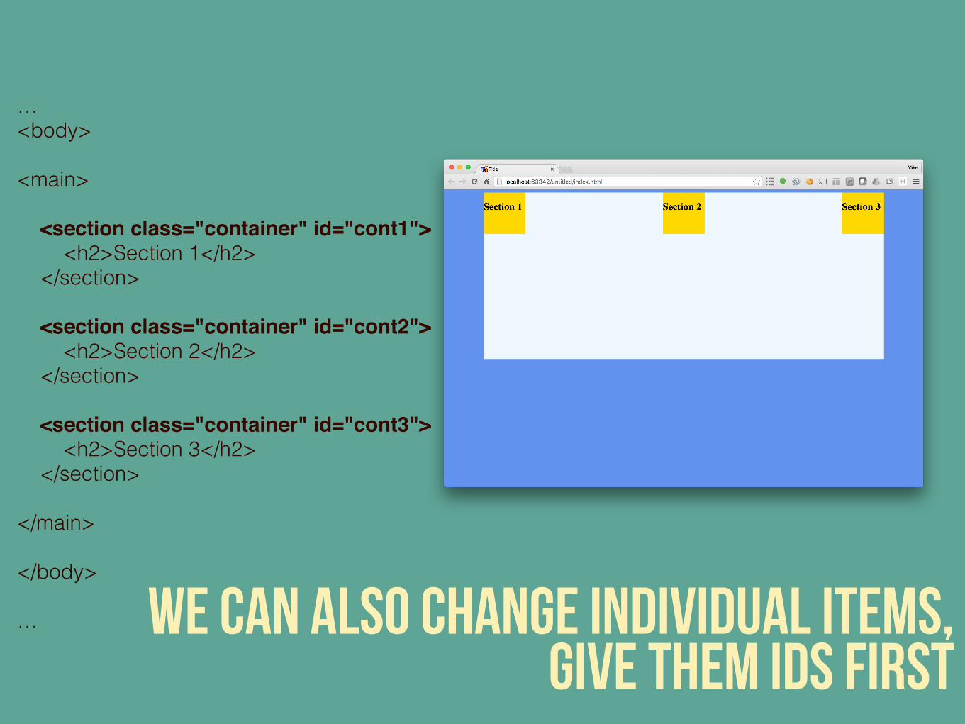
… <body><main> <section class="container" id="cont1"> <h2>Section 1</h2> </section> <section class="container" id="cont2"> <h2>Section 2</h2> </section> <section class="container" id="cont3"> <h2>Section 3</h2> </section></main></body>
… we can also change individual items, give them ids first
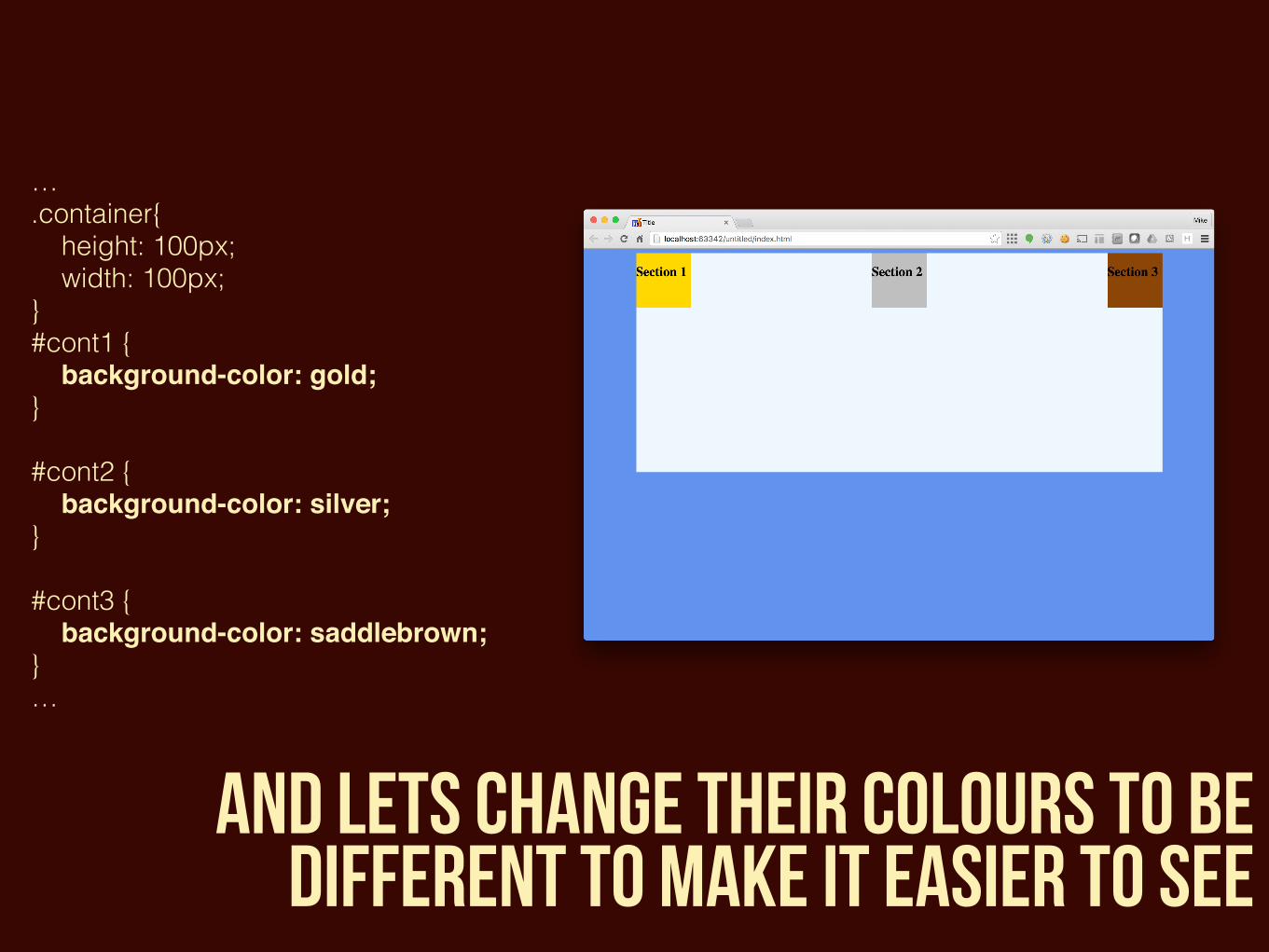
….container{ height: 100px; width: 100px;} #cont1 { background-color: gold; }#cont2 { background-color: silver; }#cont3 { background-color: saddlebrown; } …
and lets change their colours to be different to make it easier to see
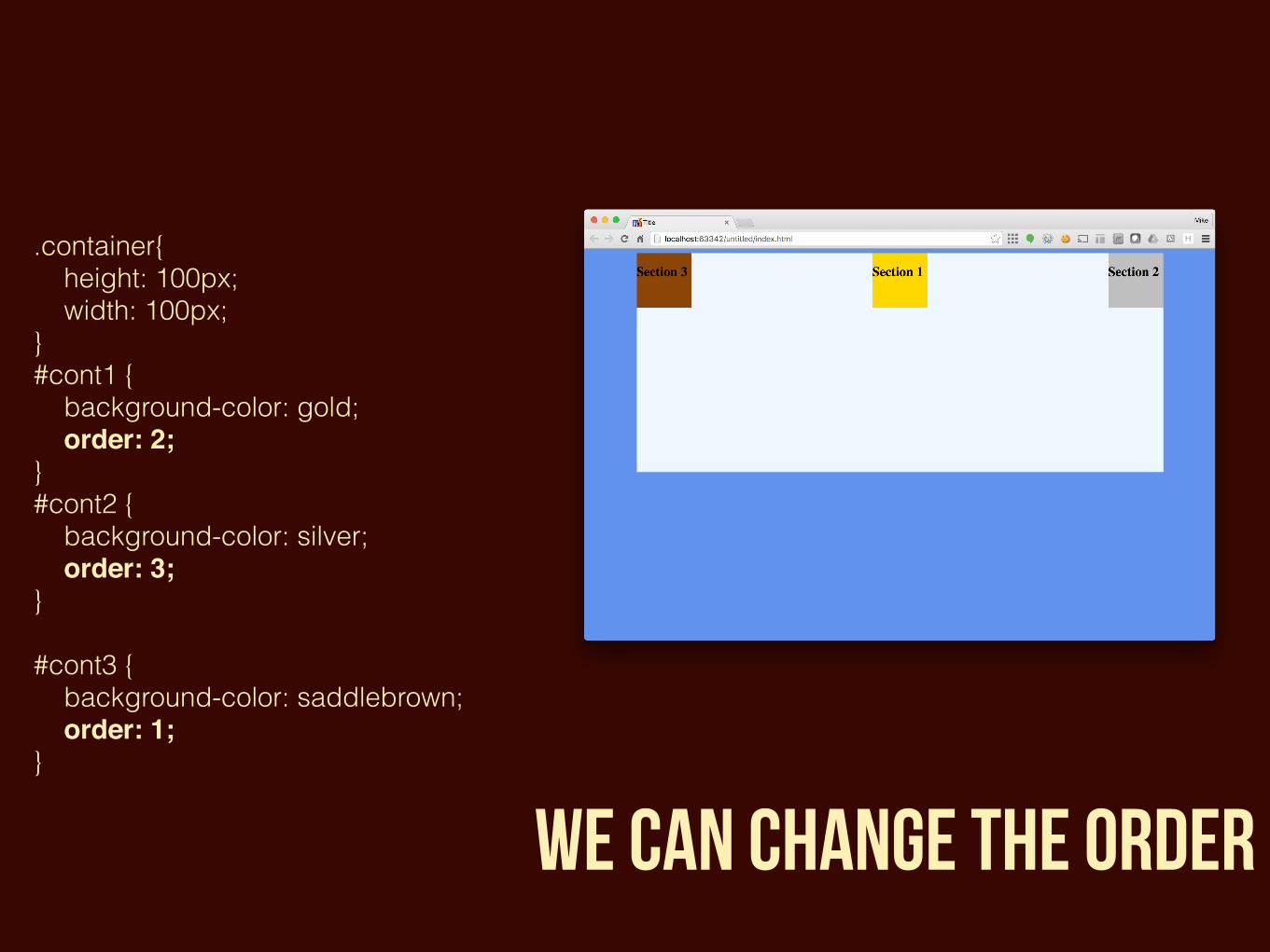
.container{ height: 100px; width: 100px;} #cont1 { background-color: gold; order: 2;}#cont2 { background-color: silver; order: 3; }#cont3 { background-color: saddlebrown; order: 1; }
we can change the order
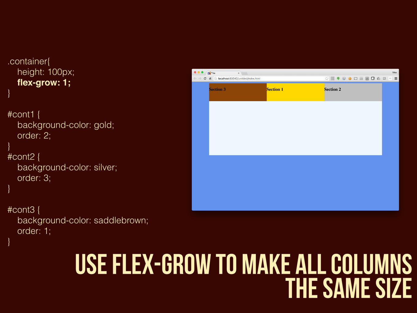
.container{ height: 100px; flex-grow: 1; }#cont1 { background-color: gold; order: 2;}#cont2 { background-color: silver; order: 3;}#cont3 { background-color: saddlebrown; order: 1;}
use flex-grow to make all columns the same size
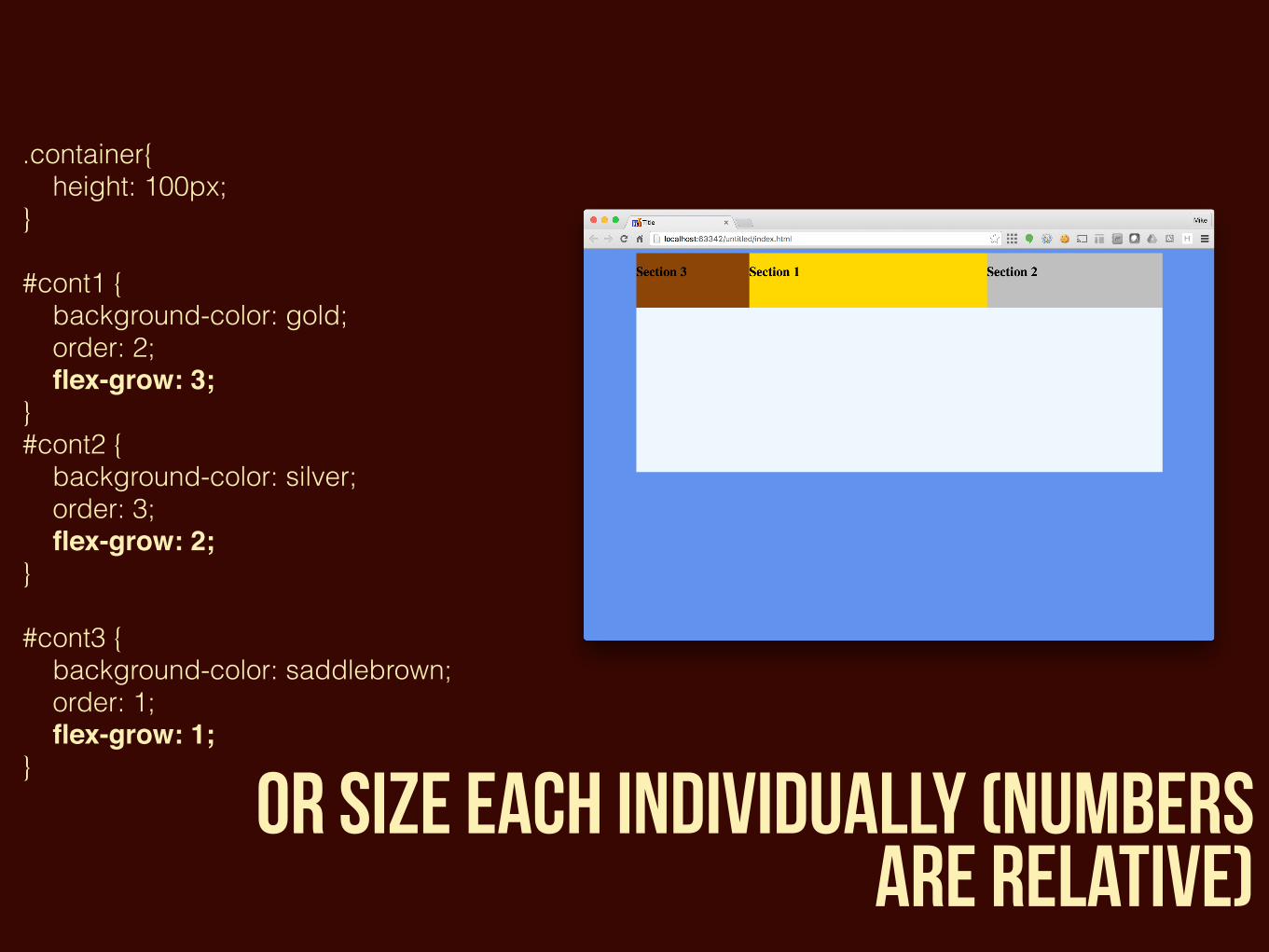
.container{ height: 100px;}#cont1 { background-color: gold; order: 2; flex-grow: 3; }#cont2 { background-color: silver; order: 3; flex-grow: 2; }#cont3 { background-color: saddlebrown; order: 1; flex-grow: 1; }
or size each individually (numbers are relative)
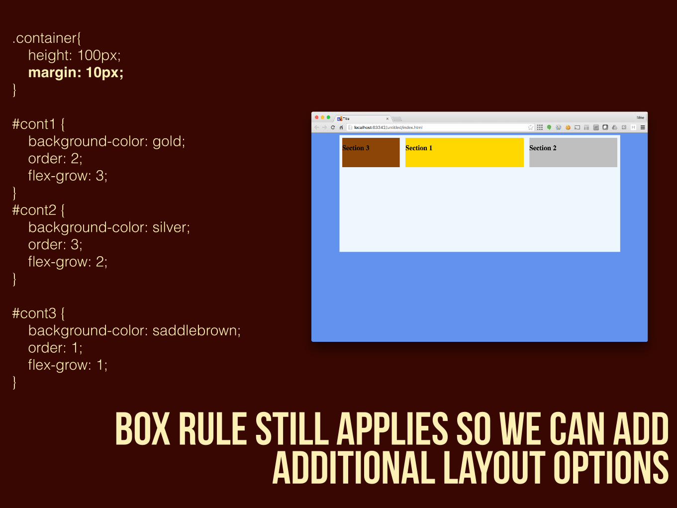
.container{ height: 100px; margin: 10px; }#cont1 { background-color: gold; order: 2; flex-grow: 3;}#cont2 { background-color: silver; order: 3; flex-grow: 2;}#cont3 { background-color: saddlebrown; order: 1; flex-grow: 1;}
box rule still applies so we can add additional layout options
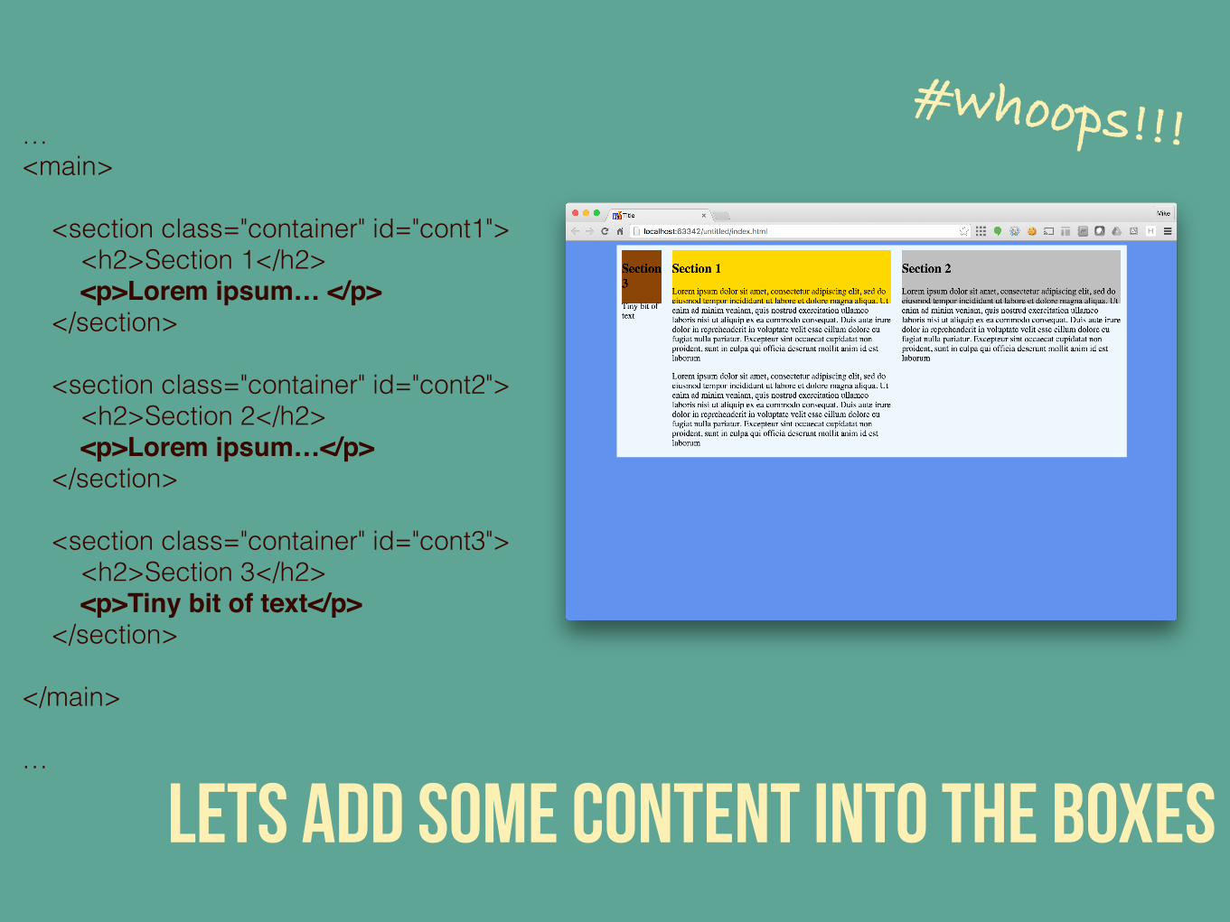
… <main> <section class="container" id="cont1"> <h2>Section 1</h2> <p>Lorem ipsum… </p> </section> <section class="container" id="cont2"> <h2>Section 2</h2> <p>Lorem ipsum…</p> </section> <section class="container" id="cont3"> <h2>Section 3</h2> <p>Tiny bit of text</p> </section></main>
…
lets add some content into the boxes
#whoops!!!
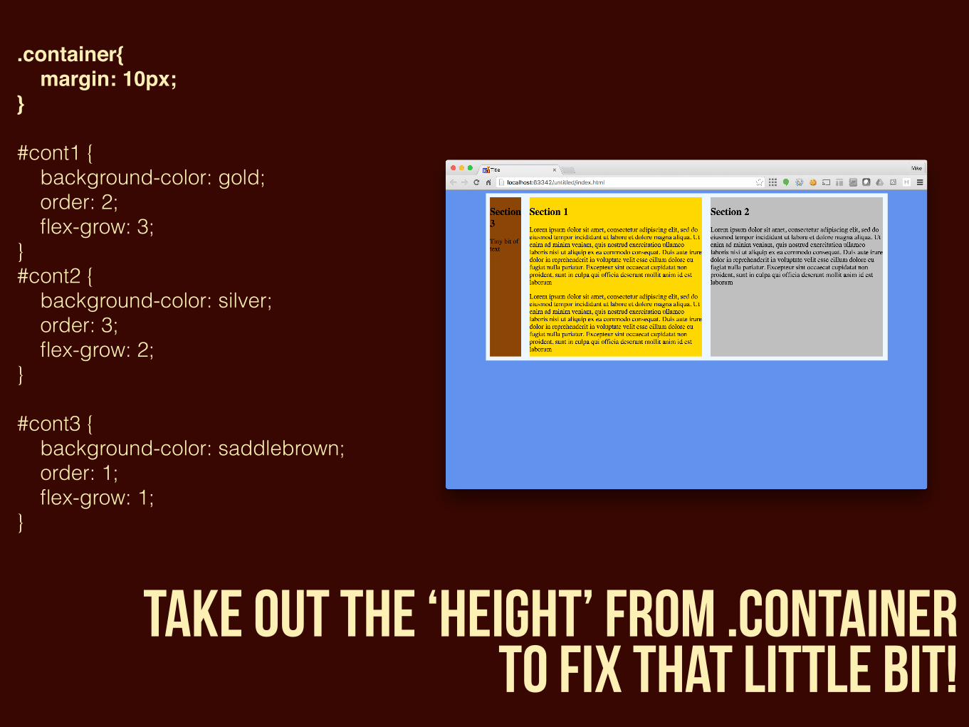
.container{ margin: 10px;} #cont1 { background-color: gold; order: 2; flex-grow: 3;}#cont2 { background-color: silver; order: 3; flex-grow: 2;}#cont3 { background-color: saddlebrown; order: 1; flex-grow: 1;}
take out the ‘height’ from .container to fix that little bit!

And that’s just the start of it!
the lovely people over at
have a really good tutorial on how you can do lots lots more

frontend (CSS) frameworks
unsemantic
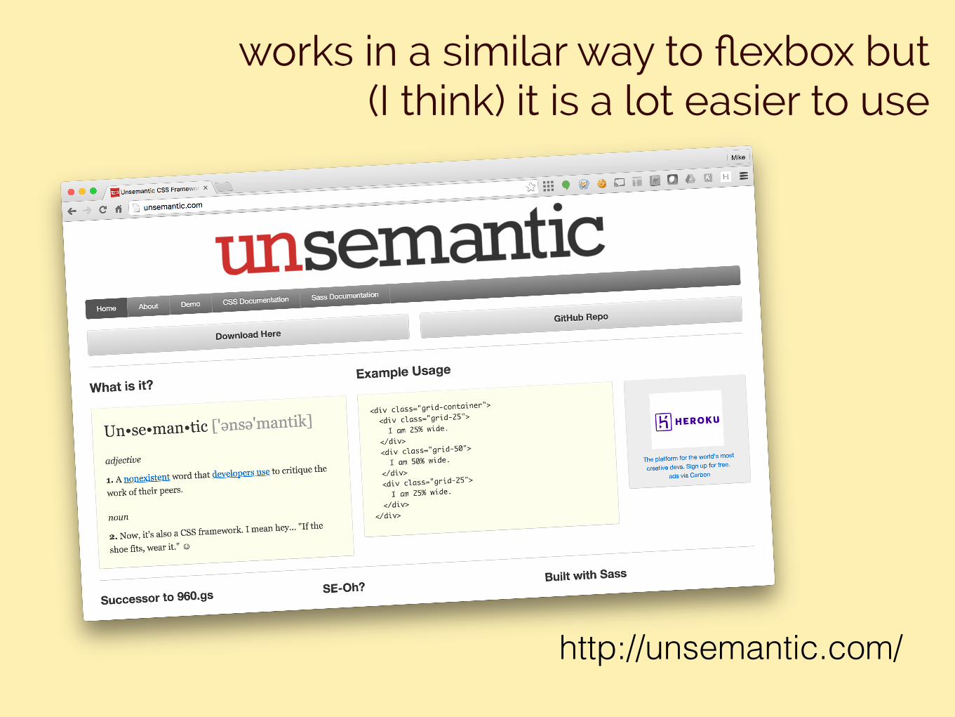
works in a similar way to flexbox but (I think) it is a lot easier to use
http://unsemantic.com/
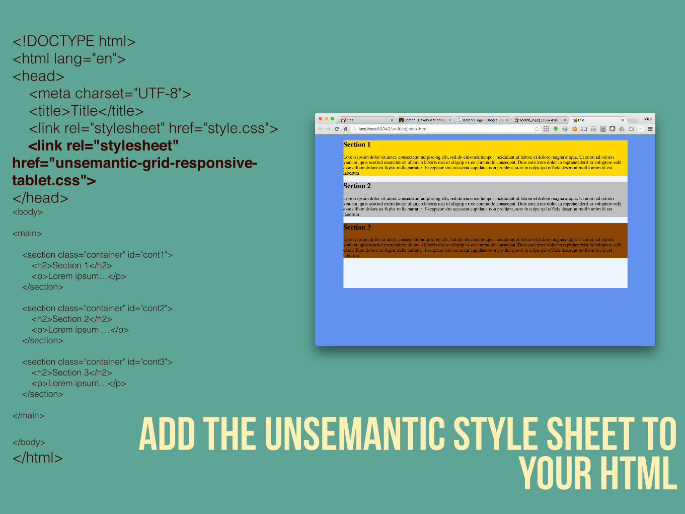
<!DOCTYPE html><html lang="en"><head> <meta charset="UTF-8"> <title>Title</title> <link rel="stylesheet" href="style.css"> <link rel="stylesheet" href="unsemantic-grid-responsive-tablet.css"></head><body><main> <section class="container" id="cont1"> <h2>Section 1</h2> <p>Lorem ipsum…</p> </section> <section class="container" id="cont2"> <h2>Section 2</h2> <p>Lorem ipsum …</p> </section> <section class="container" id="cont3"> <h2>Section 3</h2> <p>Lorem ipsum…</p> </section></main>
</body></html>
add the unsemantic style sheet to your html
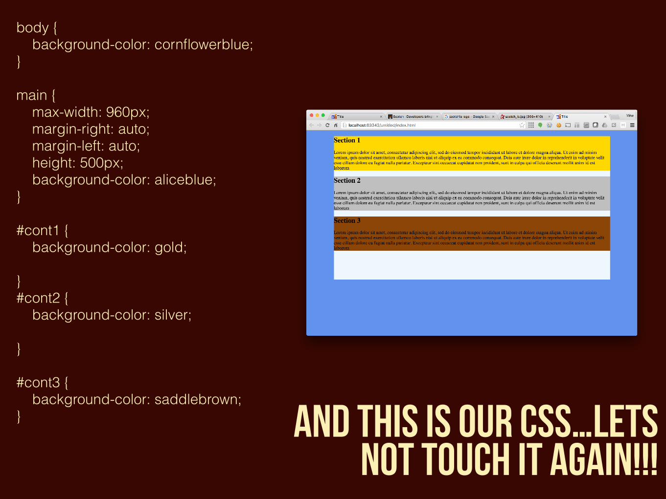
body { background-color: cornflowerblue; }main { max-width: 960px; margin-right: auto; margin-left: auto; height: 500px; background-color: aliceblue; }#cont1 { background-color: gold;}#cont2 { background-color: silver; }#cont3 { background-color: saddlebrown; } and this is our css…lets
not touch it again!!!
we’re going to use the CSS that is already made for us by
unsemantic from this point
quick game 1. open up the unsemantic css file 2. cry 3. close it and never open it again
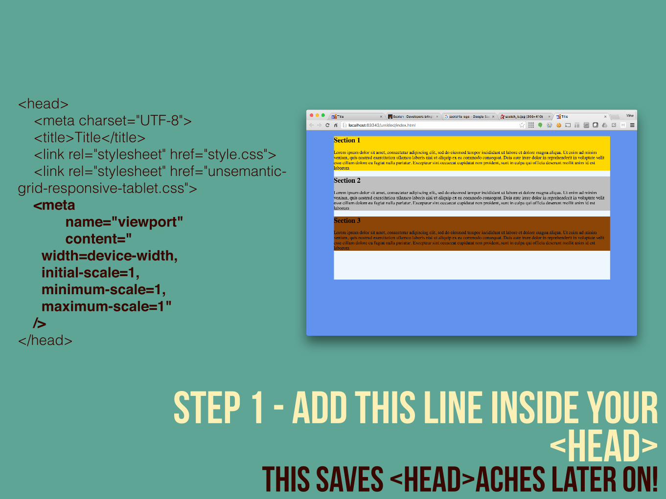
<head> <meta charset="UTF-8"> <title>Title</title> <link rel="stylesheet" href="style.css"> <link rel="stylesheet" href="unsemantic-grid-responsive-tablet.css"> <meta name="viewport" content=" width=device-width, initial-scale=1, minimum-scale=1, maximum-scale=1" /> </head>
step 1 - add this line inside your <head>
This saves <head>aches later on!
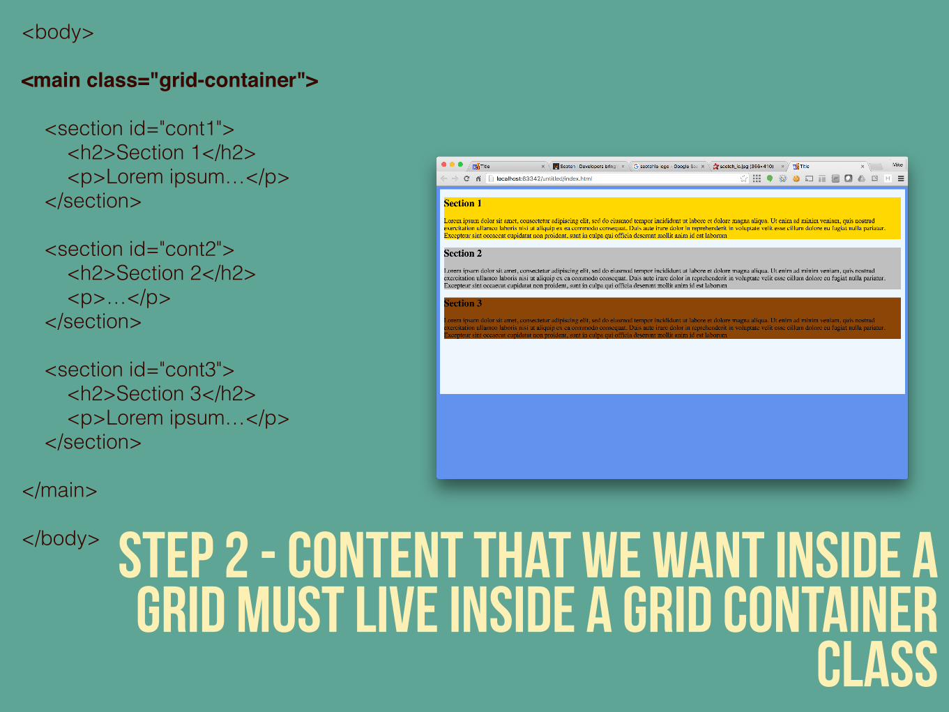
<body><main class="grid-container"> <section id="cont1"> <h2>Section 1</h2> <p>Lorem ipsum…</p> </section> <section id="cont2"> <h2>Section 2</h2> <p>…</p> </section> <section id="cont3"> <h2>Section 3</h2> <p>Lorem ipsum…</p> </section></main></body> step 2 - content that we want inside a
grid must live inside a grid container class
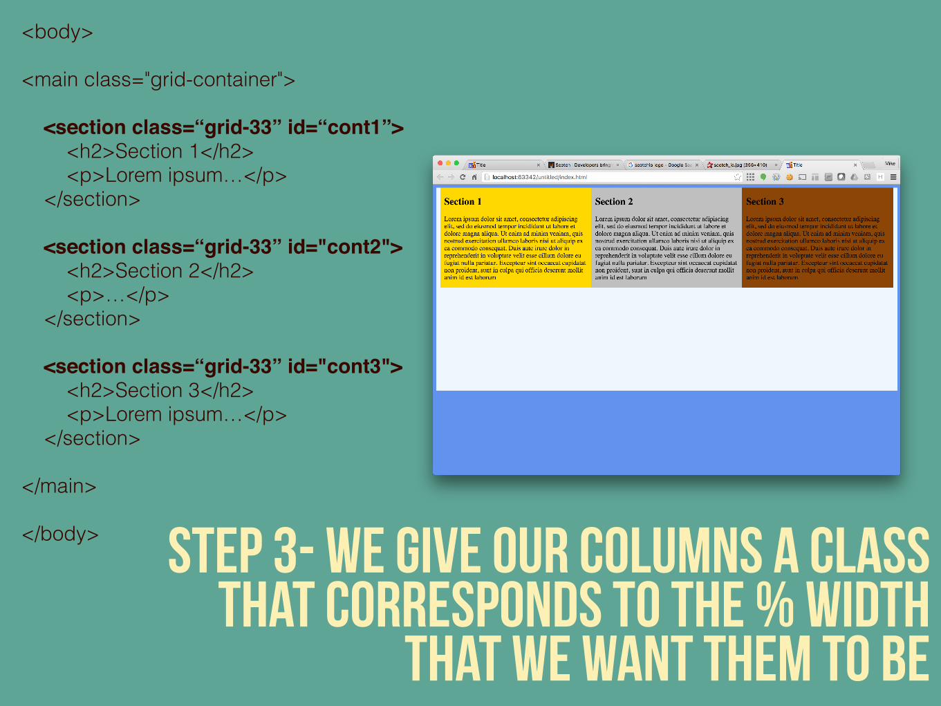
<body><main class="grid-container"> <section class=“grid-33” id=“cont1”> <h2>Section 1</h2> <p>Lorem ipsum…</p> </section> <section class=“grid-33” id="cont2"> <h2>Section 2</h2> <p>…</p> </section> <section class=“grid-33” id="cont3"> <h2>Section 3</h2> <p>Lorem ipsum…</p> </section></main></body> step 3- we give our columns a class
that corresponds to the % width that we want them to be
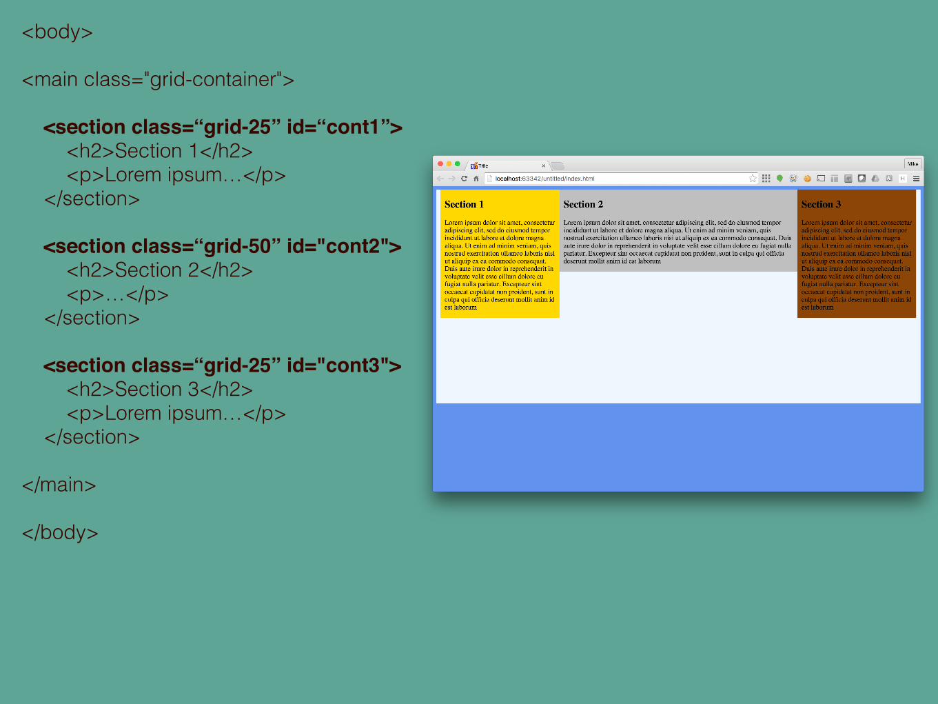
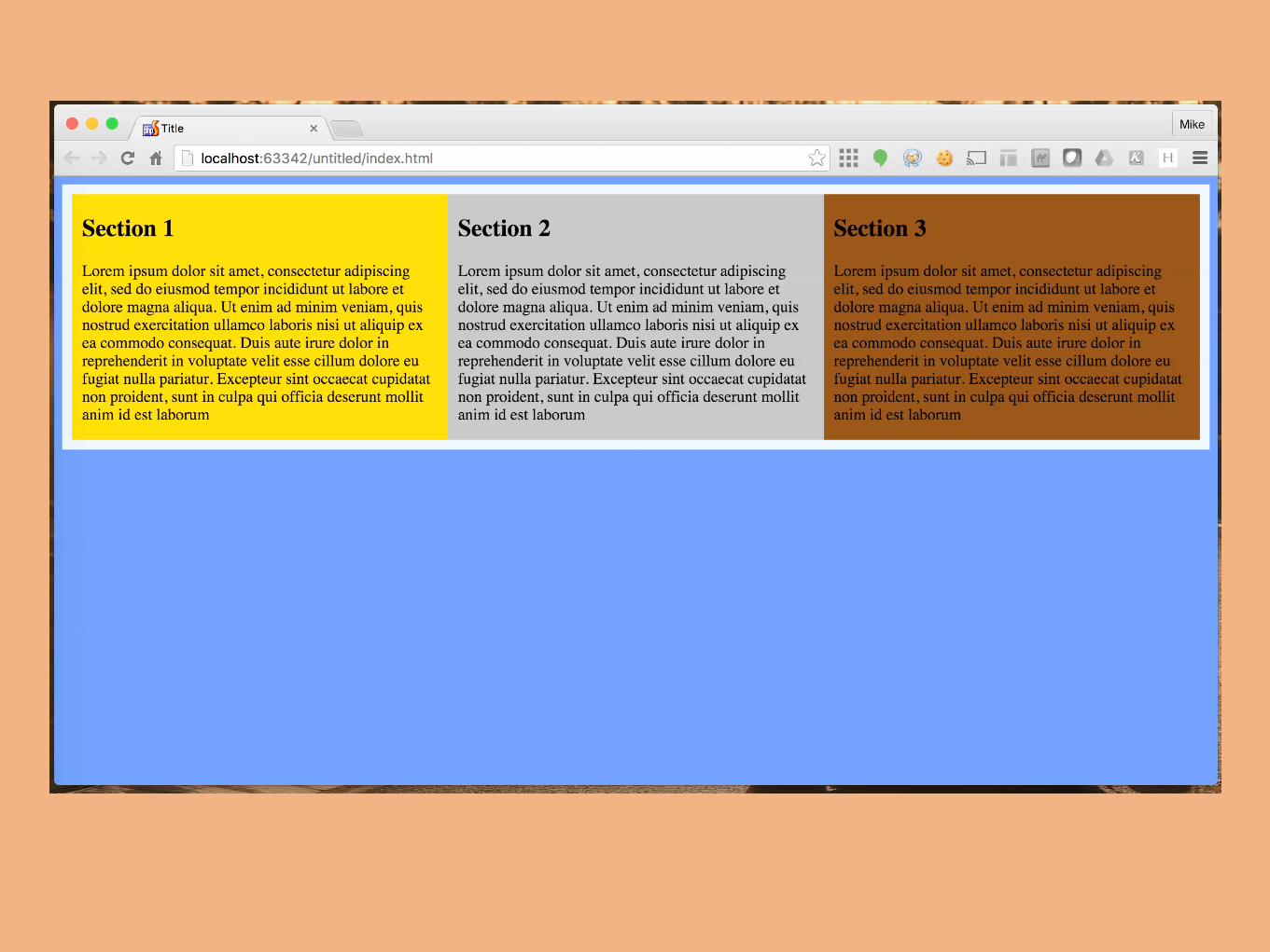
<body><main class="grid-container"> <section class=“grid-25” id=“cont1”> <h2>Section 1</h2> <p>Lorem ipsum…</p> </section> <section class=“grid-50” id="cont2"> <h2>Section 2</h2> <p>…</p> </section> <section class=“grid-25” id="cont3"> <h2>Section 3</h2> <p>Lorem ipsum…</p> </section></main></body>
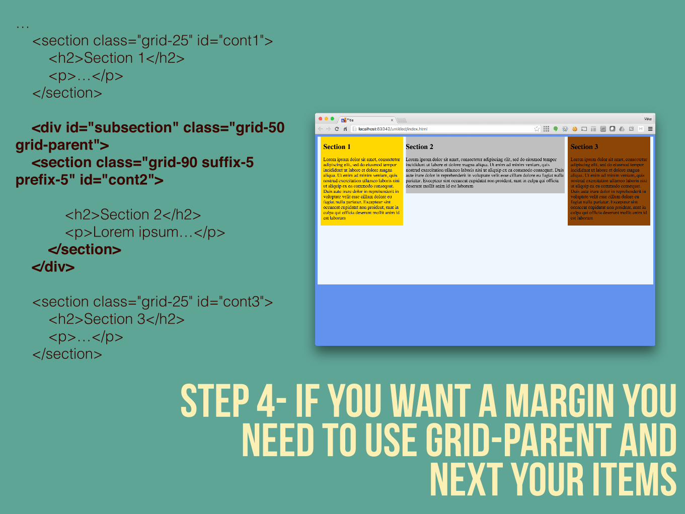
step 4- if you want a margin you need to use grid-parent and
next your items
… <section class="grid-25" id="cont1"> <h2>Section 1</h2> <p>…</p> </section> <div id="subsection" class="grid-50 grid-parent"> <section class="grid-90 suffix-5 prefix-5" id="cont2"> <h2>Section 2</h2> <p>Lorem ipsum…</p> </section> </div> <section class="grid-25" id="cont3"> <h2>Section 3</h2> <p>…</p> </section>
#responsive?
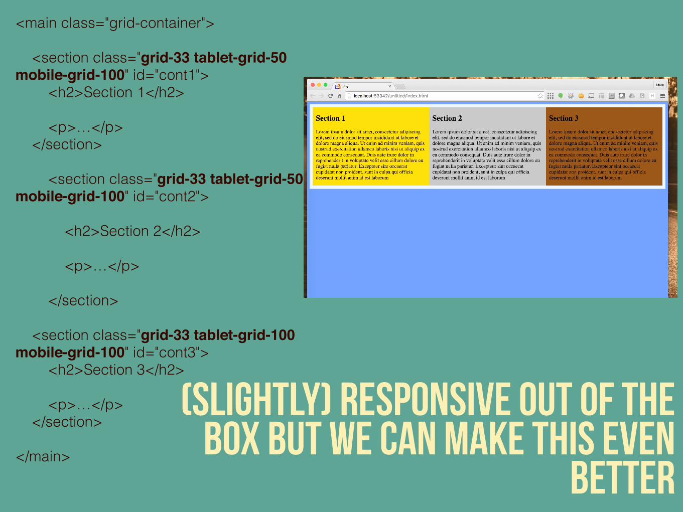
(slightly) responsive out of the box but we can make this even
better
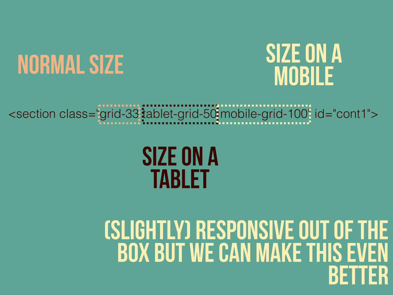
<main class="grid-container"> <section class="grid-33 tablet-grid-50 mobile-grid-100" id="cont1"> <h2>Section 1</h2> <p>…</p> </section> <section class="grid-33 tablet-grid-50 mobile-grid-100" id="cont2"> <h2>Section 2</h2> <p>…</p> </section> <section class="grid-33 tablet-grid-100 mobile-grid-100" id="cont3"> <h2>Section 3</h2> <p>…</p> </section></main>
(slightly) responsive out of the box but we can make this even
better
<section class="grid-33 tablet-grid-50 mobile-grid-100" id="cont1">
normal size
size on a tablet
size on a mobile
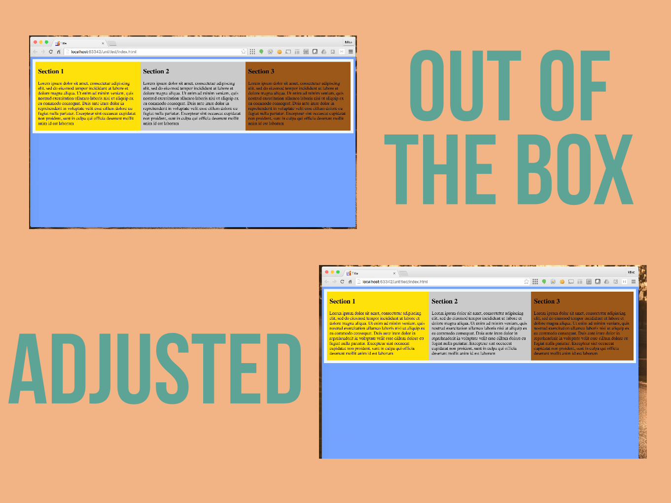
out of the box
adjusted
same as before…there are lots of other things that you can do with
this framework as well!
Have a look at the unsemantic website for more

recapwhat are frameworks types of frameworks frontend (CSS) Frameworks
flex box unsemantic