Embed Size (px)
Citation preview
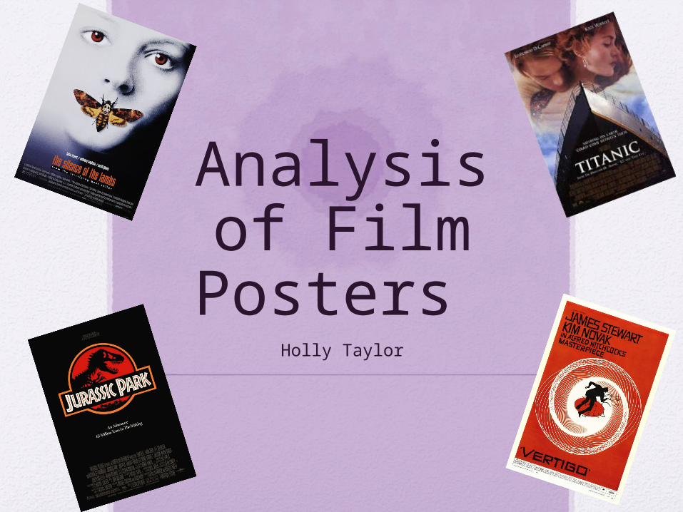
Analysis of Film Posters
Holly Taylor
Film Posters• In order to best develop and create our own movie poster,
by referencing conventions and styles used in other posters, we can make ours relatable and effective. Therefore I have decided to analyse two different film posters;
• One being a poster from a teen drama film; so we can see how to clearly establish our genre of teen drama by analysing a real poster of one, and learning from their techniques.
• I’ve also decided to analyse a film poster which is very iconic and recognizable, from this I can see what features in posters we can use to make our poster successful in gaining a massive audience for the film all from the poster.
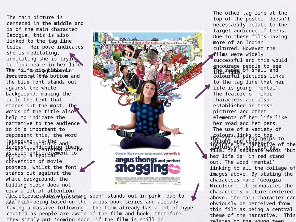
The tag line too helps to indicate the narrative of the film, the separate words ‘but her life is’ in red stand out. The word ‘mental’ linking to all the collage of images above. By stating the characters name ‘Georgia Nicolson’, it emphasizes the character’s picture centered above, the main character can obviously be perceived from this film as being a central theme of the narrative. This relates to the young teen audience as they can feel they can relate to her.
The films big title is located at the bottom and the blue font stands out against the white background, making the title the text that stands out the most. The words of the title also help to indicate the narrative to the audience so it’s important to represent this, the word ‘snogging’ is the largest, indicating there is a romantic element to the film.The billing block and rating are centered at the bottom, a typical convention of movie posters, whilst the font stands out against the white background, the billing block does not draw a lot of attention away from the main picture and title.
The main picture is centered in the middle and is of the main character Georgia, this is also linked to the tag line below. Her pose indicates she is meditating, indicating she is trying to find peace in her life, she is looking above at her crazy life.
The range of small and colourful pictures links to the tag line that her life is going ‘mental’. The feature of minor characters are also established in these pictures and other elements of her life like her road and her pets. The use of a variety of colours links to the bright and colourful nature of teen dramas.
The other tag line at the top of the poster, doesn’t necessarily relate to the target audience of teens. Due to these films having more of an Indian cultured. However the films were widely successful and this would encourage people to see this film.
The release date of ‘coming soon’ stands out in pink, due to the film being based on the famous book series and already having a massive following, the film already has a lot of hype created as people are aware of the film and book, therefore they simply put 'coming soon' if the film is still in production, as this will build anticipation for fans.
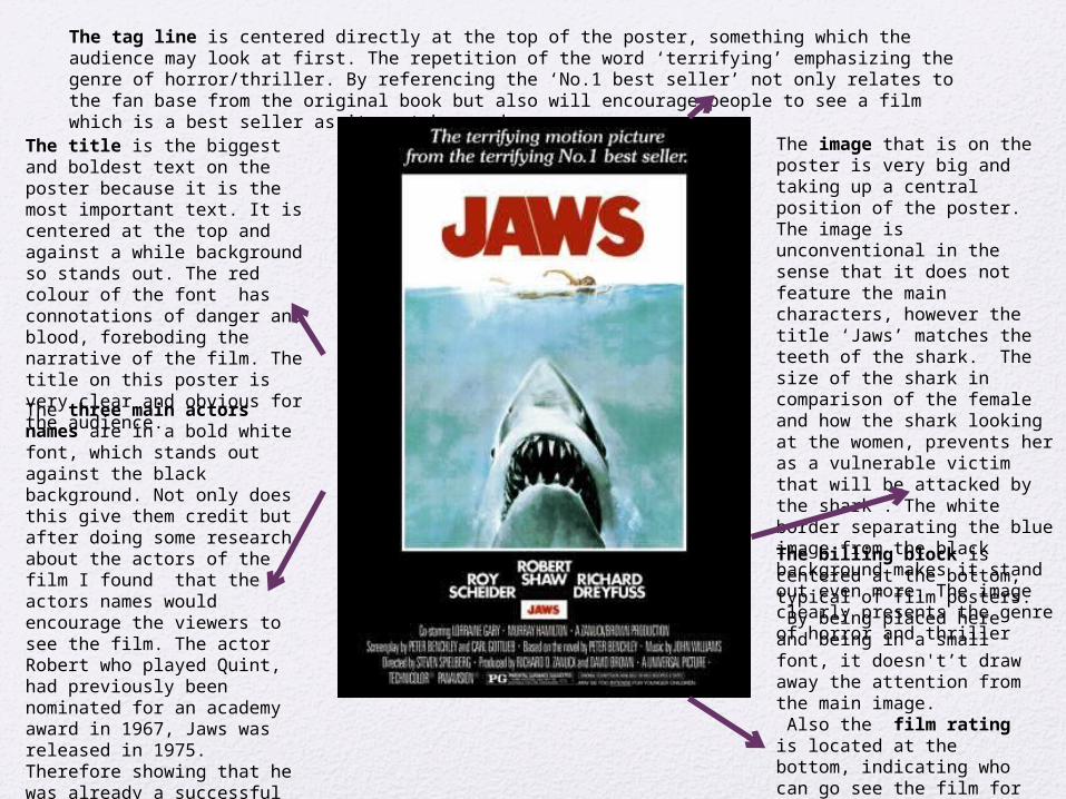
The title is the biggest and boldest text on the poster because it is the most important text. It is centered at the top and against a while background so stands out. The red colour of the font has connotations of danger and blood, foreboding the narrative of the film. The title on this poster is very clear and obvious for the audience.
The image that is on the poster is very big and taking up a central position of the poster. The image is unconventional in the sense that it does not feature the main characters, however the title ‘Jaws’ matches the teeth of the shark. The size of the shark in comparison of the female and how the shark looking at the women, prevents her as a vulnerable victim that will be attacked by the shark . The white border separating the blue image from the black background makes it stand out even more. The image clearly presents the genre of horror and thriller
The tag line is centered directly at the top of the poster, something which the audience may look at first. The repetition of the word ‘terrifying’ emphasizing the genre of horror/thriller. By referencing the ‘No.1 best seller’ not only relates to the fan base from the original book but also will encourage people to see a film which is a best seller as it must be good.
The three main actors names are in a bold white font, which stands out against the black background. Not only does this give them credit but after doing some research about the actors of the film I found that the actors names would encourage the viewers to see the film. The actor Robert who played Quint, had previously been nominated for an academy award in 1967, Jaws was released in 1975. Therefore showing that he was already a successful and well known actor, encouraging fans or people aware of this to see the film.
The billing block is centered at the bottom, typical of film posters. By being placed here and being in a small font, it doesn't’t draw away the attention from the main image. Also the film rating is located at the bottom, indicating who can go see the film for the audience to see.
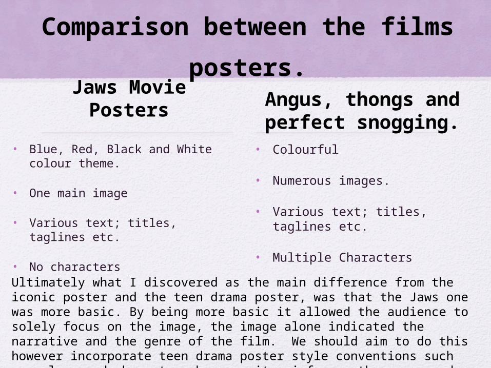
Comparison between the films posters.
Jaws Movie Posters
• Blue, Red, Black and White colour theme.
• One main image
• Various text; titles, taglines etc.
• No characters
Angus, thongs and perfect snogging.
• Colourful
• Numerous images.
• Various text; titles, taglines etc.
• Multiple Characters
Ultimately what I discovered as the main difference from the iconic poster and the teen drama poster, was that the Jaws one was more basic. By being more basic it allowed the audience to solely focus on the image, the image alone indicated the narrative and the genre of the film. We should aim to do this however incorporate teen drama poster style conventions such as colour and characters because it reinforces the genre and therefore will best target our audience.