Embed Size (px)
Citation preview
Ridiculously
E A S Y
Layouts
with
Flexbox https://github.com/ecarlisle/Easy-Layouts-with-Flexbox
@eric_carlisleEric Carlisle
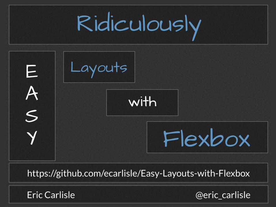
me, myself, and i
Eric Carlisle
UI / UX Geek
Baltimore, MD
who?
what?
where?
how?
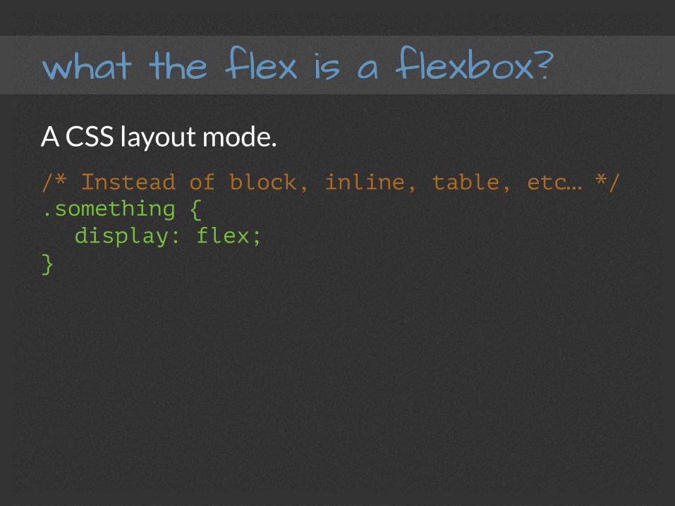
what the flex is a flexbox?
A CSS layout mode.
what the flex is a flexbox?
A CSS layout mode.
/* Instead of block, inline, table, etc… */ .something { display: flex;
}
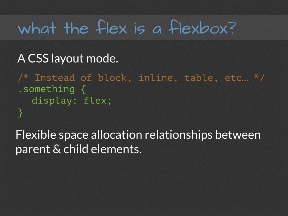
what the flex is a flexbox?
A CSS layout mode.
/* Instead of block, inline, table, etc… */ .something { display: flex;
}
Flexible space allocation relationships between parent & child elements.
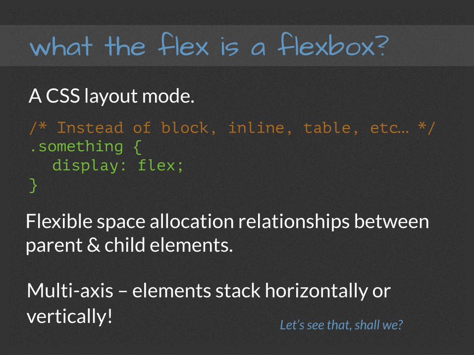
what the flex is a flexbox?
A CSS layout mode.
/* Instead of block, inline, table, etc… */ .something { display: flex;
}
Flexible space allocation relationships between parent & child elements.
Multi-axis – elements stack horizontally or vertically! Let’s see that, shall we?
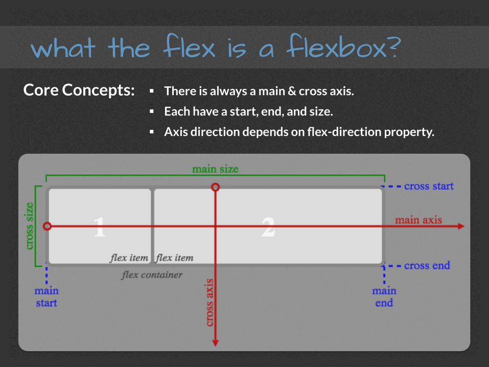
what the flex is a flexbox? Core Concepts: § There is always a main & cross axis.
§ Each have a start, end, and size.
§ Axis direction depends on flex-direction property.
general benefits?
§ W3C Standard! No libraries needed!
§ Once you grok it, it’s amazingly easy.
§ Opportunity for tremendous creativity.
layout benefits?
§ Gets us away from countless floats and clears!
§ Override source order with CSS!
§ Vertical positioning without hacks!
§ Equal heights (e.g. columns)
layout-benefits?
§ Elements “flex” to fit available space.
§ Custom responsive layouts can be a cakewalk!
§ More opportunity for the semantic.
final results?
PURE AWESOMENESS!
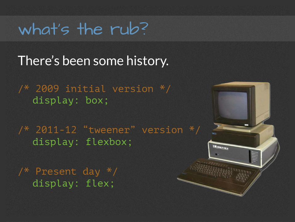
what’s the rub?
There’s been some history.
/* 2009 initial version */ display: box;
/* 2011-12 “tweener” version */ display: flexbox;
/* Present day */ display: flex;
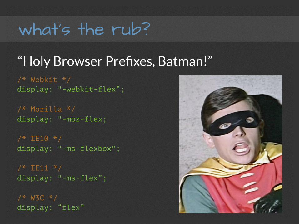
what’s the rub?
/* Webkit */ display: "-webkit-flex”; /* Mozilla */ display: "-moz-flex; /* IE10 */ display: "-ms-flexbox"; /* IE11 */ display: "-ms-flex”; /* W3C */ display: “flex”
“Holy Browser Prefixes, Batman!”
what’s the rub?
/* Webkit */ display: "-webkit-flex”; /* Mozilla */ display: "-moz-flex; /* IE10 */ display: "-ms-flexbox"; /* IE11 */ display: "-ms-flex”; /* W3C */ display: “flex”
“Holy Browser Prefixes, Batman!”Recommended Approach:
Use Preprocessor Mixins!
(For this presentation, I’ll use FireFox Developer Edition)
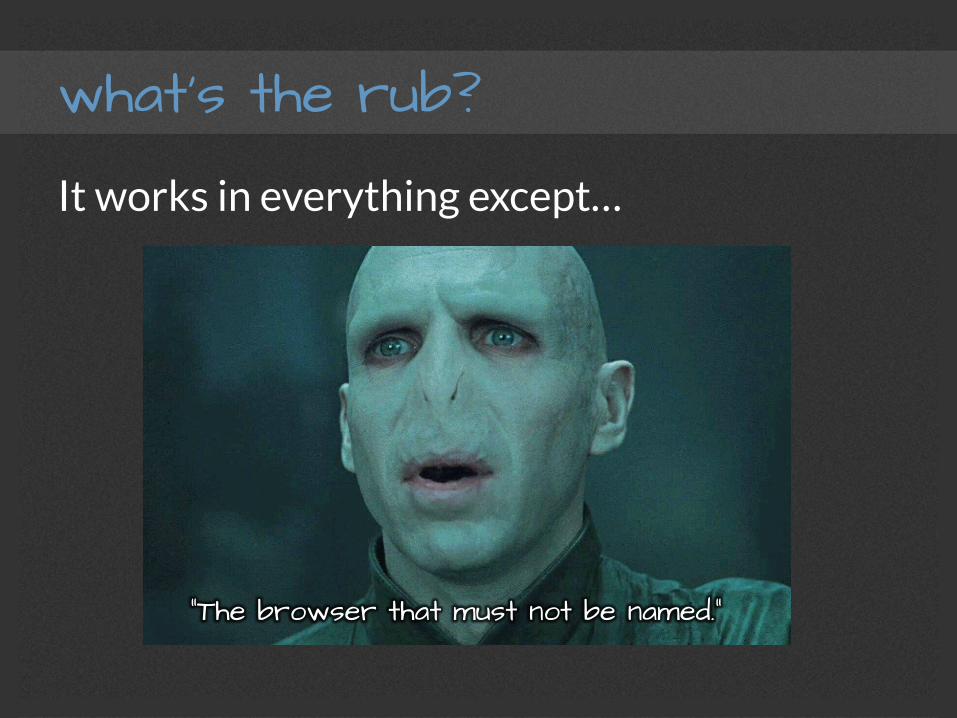
what’s the rub?
It works in everything except…
Guess!
what’s the rub?
It works in everything except…
“The browser that must not be named.”

what’s the rub?
h"p://caniuse.com/#feat=flexbox § Clear-ish support across the board
§ IE10 supports the 2012 version (as per current spec)
§ Most current browsers still have flexbox “personality”
But in All Fairness…
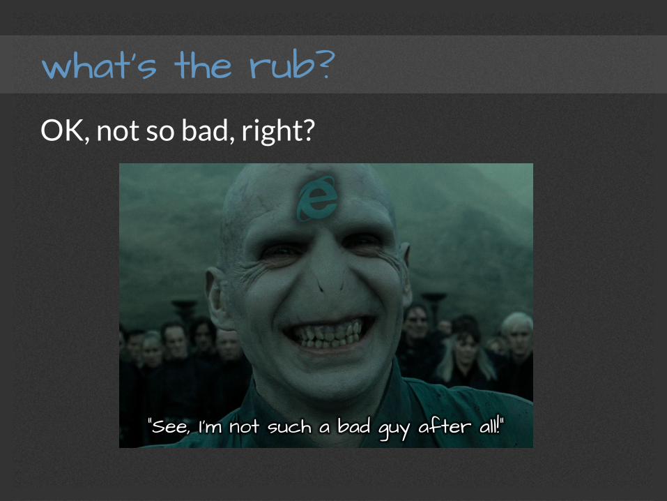
what’s the rub? OK, not so bad, right?
“See, I’m not such a bad guy after all!”
what’s the rub?
It’s not exactly done done done yet.
h"p://dev.w3.org/csswg/css-‐flexbox/
Editor’s DraB – March 2nd, 2015
h"p://www.w3.org/TR/css3-‐flexbox/
Last Call Working DraB – September 25th 2014

what’s the rub?
It’s not exactly done done done yet.
h"p://dev.w3.org/csswg/css-‐flexbox/
Editor’s DraB – March 2nd, 2015
h"p://www.w3.org/TR/css3-‐flexbox/
Last Call Working DraB – September 25th 2014
“Standards are Paper.” -‐-‐ Linus Torvalds

Parents & Children
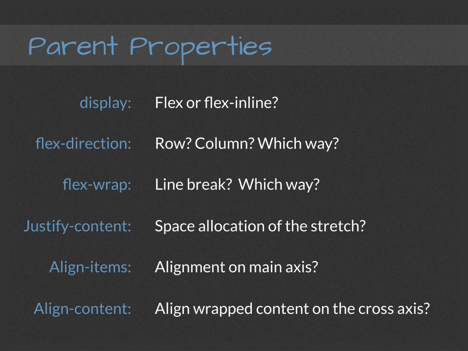
Parent Properties
display:
flex-direction:
flex-wrap:
Justify-content:
Align-items:
Align-content:
Flex or flex-inline?
Row? Column? Which way?
Line break? Which way?
Space allocation of the stretch?
Alignment on main axis?
Align wrapped content on the cross axis?
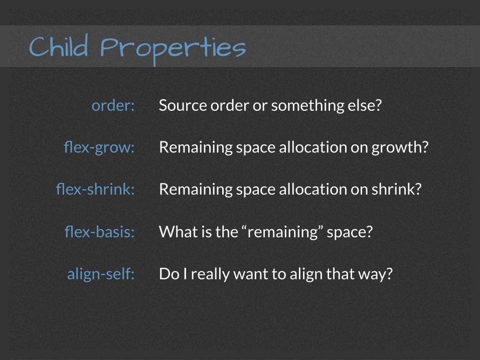
Child Properties
order:
flex-grow:
flex-shrink:
flex-basis:
align-self:
Source order or something else?
Remaining space allocation on growth?
Remaining space allocation on shrink?
What is the “remaining” space?
Do I really want to align that way?