Embed Size (px)
Citation preview
Color Theory
Every decision from clothes selection tohome/work environment is a color choice.
The study of color is complex.Everyone can profit from the knowing some
basic color principles.
!
!
!

2
The ElectromagneticSpectrum
3
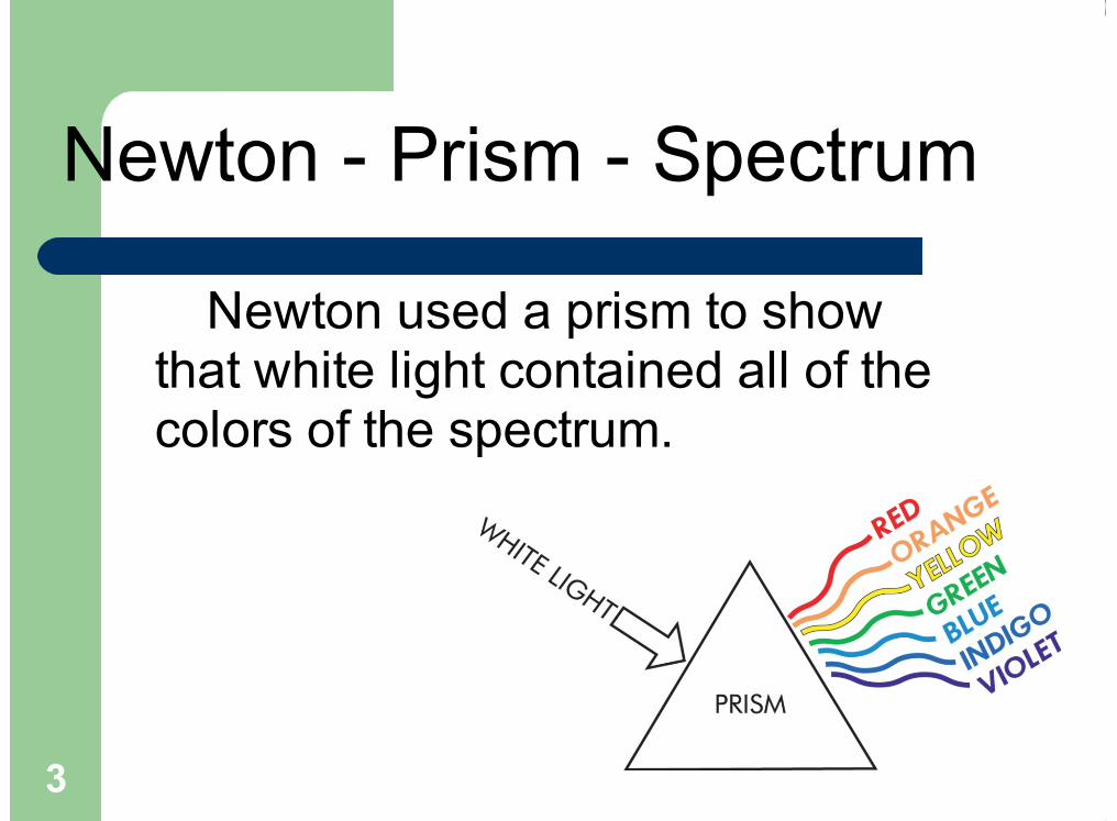
Newton used a prism to showthat white light contained all of thecolors of the spectrum.
Newton - Prism - Spectrum
4
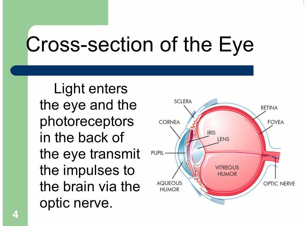
Cross-section of the Eye
Light entersthe eye and thephotoreceptorsin the back ofthe eye transmitthe impulses tothe brain via theoptic nerve.
5
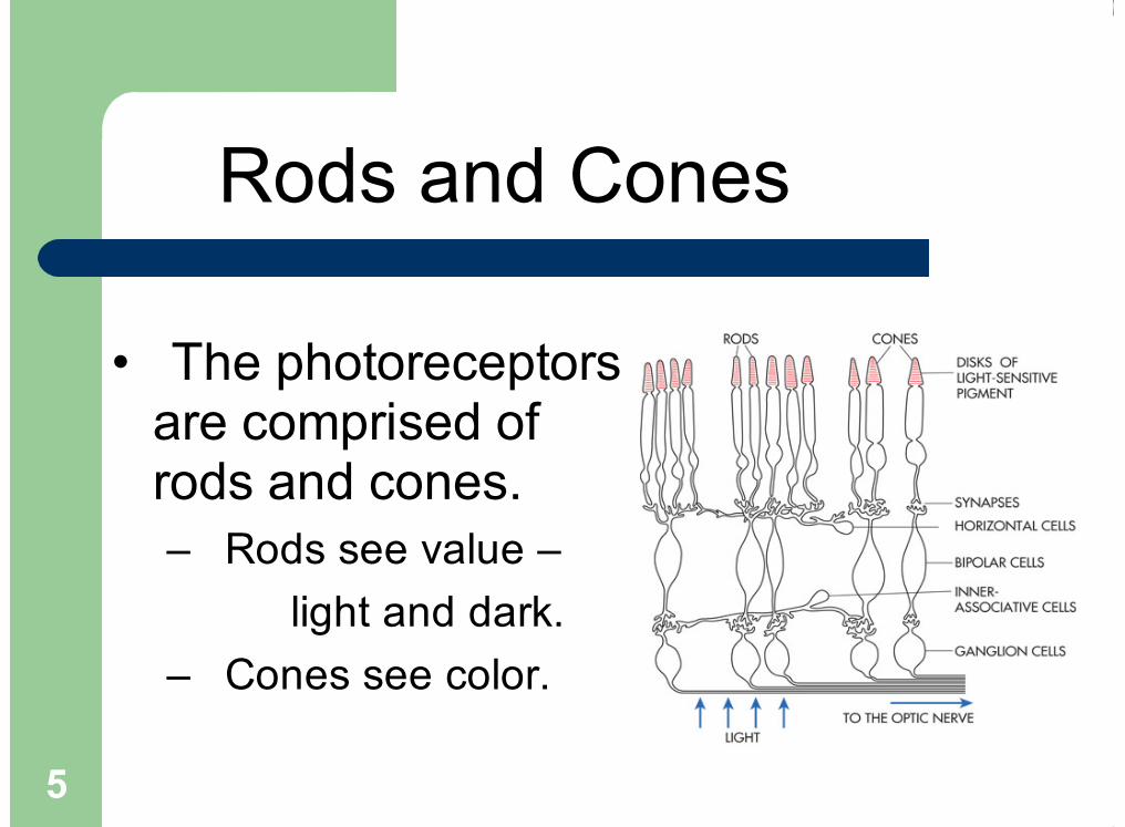
The photoreceptorsare comprised ofrods and cones.
Rods see value – light and dark.
Cones see color.
•
–
–
Rods and Cones

6
Reflection and Absorption
The reason we see a particular color – Orange– is that all of the other light rays are absorbedand only orange is reflected.

The Essentials
Light is made of all colors (Sir Isaac Newton putwhite light through a prism = colors)Color is a property of light. Objects have no color of their own, they just reflect
a particular wavelength from the color spectrum. (For example a blue object absorbs all of the
wavelengths, EXCEPT the blue ones, thus the blueones are reflected back to our eyes.Black absorbs all the wave lengths of the color
spectrum. White reflects all the wave lengths of the color
spectrum.
!
!
!
!
!

Color Mixing
Additive System – Color is created from projected light.(Example: theater lighting, photography, interior design,etc.) (The primary colors mix to create white in anadditive system.)
Subtractive System – Color is created from pigments,(Painting, drawing, etc…) The primary colors mix tocreate neutral gray or black. Seen in dyes, paints, and ink
Color Wheel – most common organization for color Primary Colors – Subtractive Color:
Red Blue Yellow
–
–
–

9
Additive andSubtractive Color
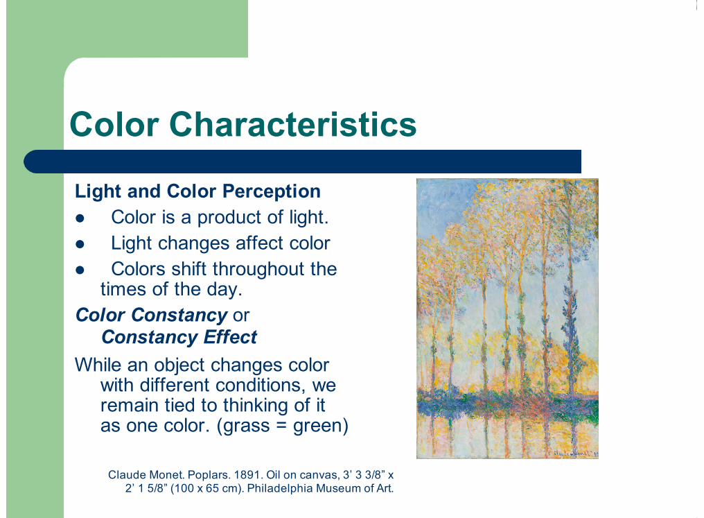
Color Characteristics
Light and Color PerceptionColor is a product of light. Light changes affect color Colors shift throughout the
times of the day.Color Constancy or
Constancy Effect While an object changes color
with different conditions, weremain tied to thinking of itas one color. (grass = green)
!
!
!
Claude Monet. Poplars. 1891. Oil on canvas, 3’ 3 3/8” x2’ 1 5/8” (100 x 65 cm). Philadelphia Museum of Art.
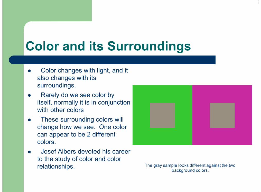
Color and its Surroundings
Color changes with light, and italso changes with itssurroundings.Rarely do we see color by
itself, normally it is in conjunctionwith other colorsThese surrounding colors will
change how we see. One colorcan appear to be 2 differentcolors.Josef Albers devoted his career
to the study of color and colorrelationships.
!
!
!
!
The gray sample looks different against the twobackground colors.

The 3 Properties of Color
HueValueIntensity/ComplementaryColors
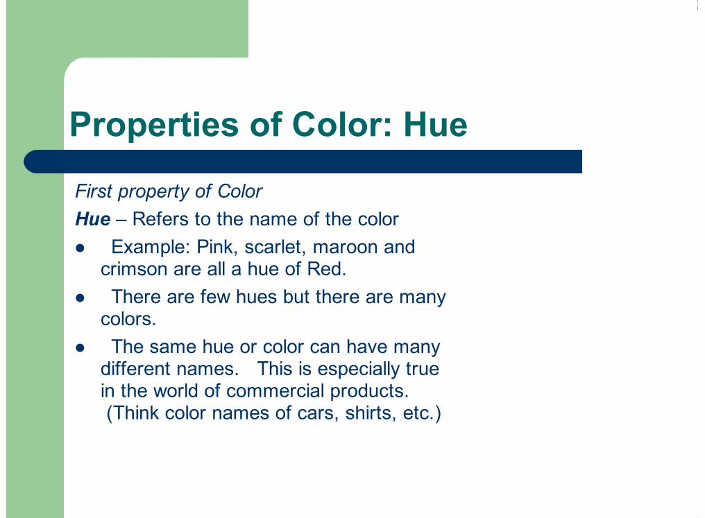
Properties of Color: Hue
First property of ColorHue – Refers to the name of the color
Example: Pink, scarlet, maroon andcrimson are all a hue of Red. There are few hues but there are many
colors.The same hue or color can have many
different names. This is especially truein the world of commercial products. (Think color names of cars, shirts, etc.)
!
!
!
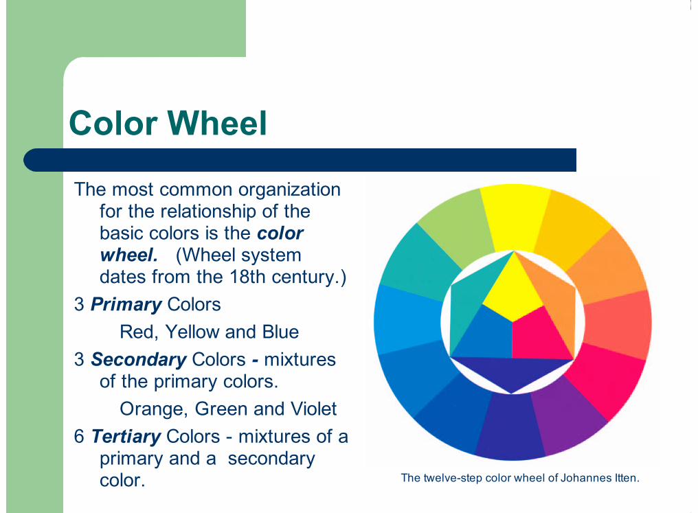
Color Wheel
The most common organizationfor the relationship of thebasic colors is the colorwheel. (Wheel systemdates from the 18th century.)
3 Primary Colors Red, Yellow and Blue3 Secondary Colors - mixtures
of the primary colors. Orange, Green and Violet6 Tertiary Colors - mixtures of a
primary and a secondarycolor. The twelve-step color wheel of Johannes Itten.

Properties of Color: Value
Value - Lightness or darkness of the hueTint - adding white to a hue = high value colorShade - adding black to a hue = low value color
“Most people can distinguish at least 40 tints and shades of any color.”“Normal” Color Values Differ
“Not all the colors on the color wheel are shown at the same value.”Yellow = light value color Blue = darker value color
!
!
Value scales for blue, gray, and yellow with equal visual steps.

Properties of Color: Value
Changing Color ValueWhen working with paint you can thin
a color by adding medium.The more transparent a color is, the
lighter it’s value placed over white. You can also alter the value by mixing
hues together. Value, just like color, is changed by its
surroundings.
!
!
!
!
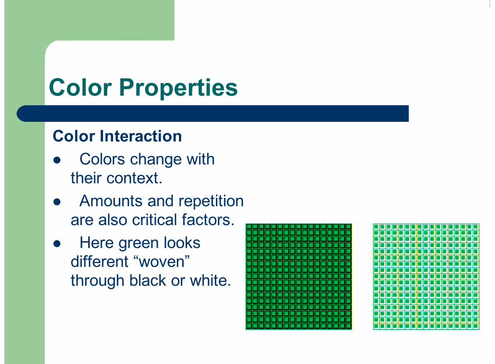
Color Properties
Color Interaction Colors change with
their context. Amounts and repetition
are also critical factors. Here green looks
different “woven”through black or white.
!
!
!

Properties of Color:Intensity/Complementary Colors
Intensity = brightness of a color.At full intensity only when pure
or unmixed.Also called chroma or
saturation.
2 ways to lower intensity:(or make a color duller)
Mix with GrayMix with Complement
!
!
!
!
Complementary colors neutralize each other in mixture.

Intensity/Complementary Colors
To Make Brighter use:Simultaneous contrast – when 2
compliments are placed next to each other,they increase in visual brilliance, usually with avibrating edge.
A visual phenomenon:Afterimage effect – when you stare at an
intense color for a minute or so and then lookaway, you will see the complementary color
!
!
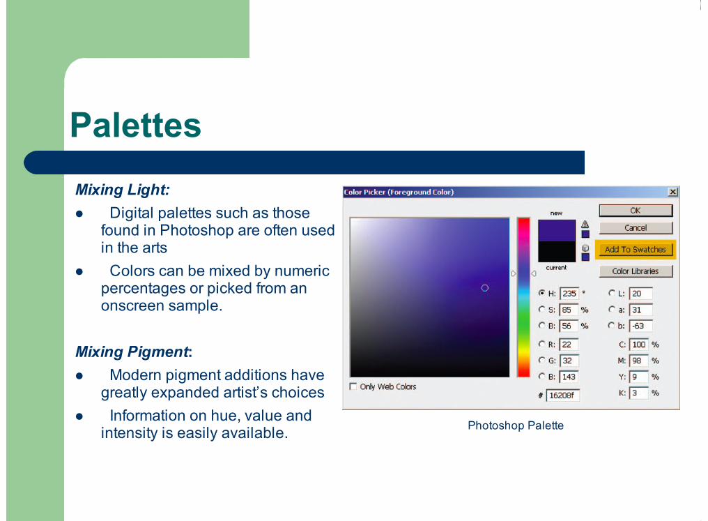
Mixing Light:Digital palettes such as those
found in Photoshop are often usedin the arts
Colors can be mixed by numericpercentages or picked from anonscreen sample.
Mixing Pigment:Modern pigment additions have
greatly expanded artist’s choicesInformation on hue, value and
intensity is easily available.
!
!
!
!
Palettes
Photoshop Palette

Visual Color Mixing
Techniques that suggest light
Visual Color Mixing Techniques:Visual Mixing = Optical Mixing
Pigment can not reproduce theluminous and brilliant quality of light
We create a color by placing 2pure colors next to each other ratherthen mixing them on a palette.
At a certain distance the viewer’seye mixes them together
!
!
!
Chuck Close. April. 1990-1991.Oil on canvas, 8’ 4” x7’. Courtesy Pace Wildenstein, New York.
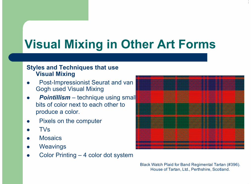
Visual Mixing in Other Art Forms
Styles and Techniques that useVisual MixingPost-Impressionist Seurat and van
Gogh used Visual MixingPointillism – technique using small
bits of color next to each other toproduce a color. Pixels on the computerTVsMosaicsWeavingsColor Printing – 4 color dot system
!
!
!
!
!
!
!
Black Watch Plaid for Band Regimental Tartan (#396).House of Tartan, Ltd., Perthshire, Scotland.

Cool/Warm Colors
Color as physical sensation:Cool Colors –Blue, Green, Violet
Cool colors recedesRepresents – Sky, Water,
Grass, PlantsWarm Colors – Red, Orange,
YellowWarm colors come forwardRepresent – Fire, sun and heat
!
!
!
!
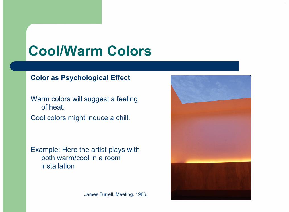
Cool/Warm Colors
Color as Psychological Effect
Warm colors will suggest a feelingof heat.
Cool colors might induce a chill.
Example: Here the artist plays withboth warm/cool in a roominstallation
James Turrell. Meeting. 1986.
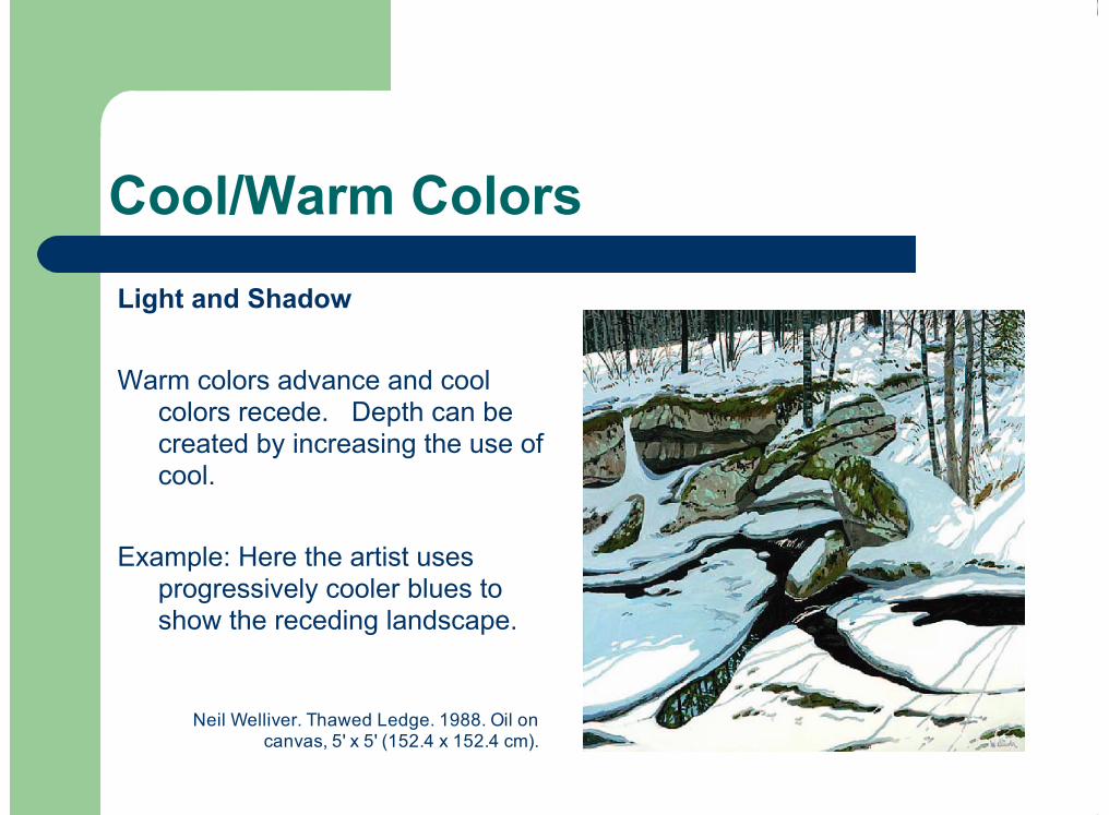
Cool/Warm Colors
Light and Shadow
Warm colors advance and coolcolors recede. Depth can becreated by increasing the use ofcool.
Example: Here the artist usesprogressively cooler blues toshow the receding landscape.
Neil Welliver. Thawed Ledge. 1988. Oil oncanvas, 5' x 5' (152.4 x 152.4 cm).
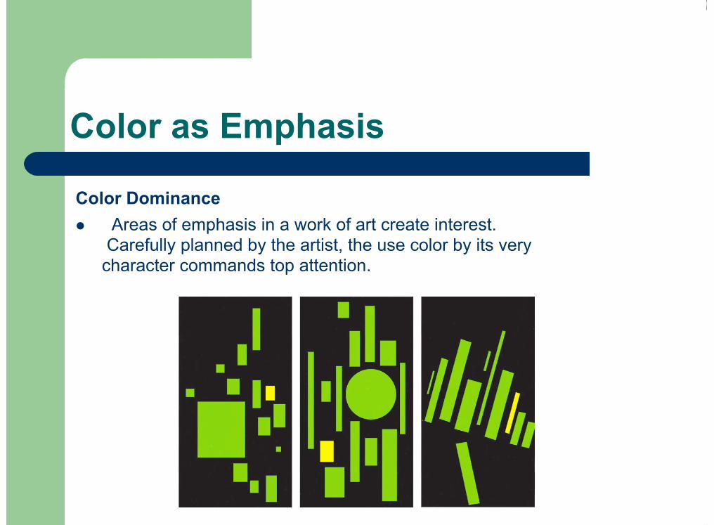
Color as Emphasis
Color DominanceAreas of emphasis in a work of art create interest.
Carefully planned by the artist, the use color by its verycharacter commands top attention.
!
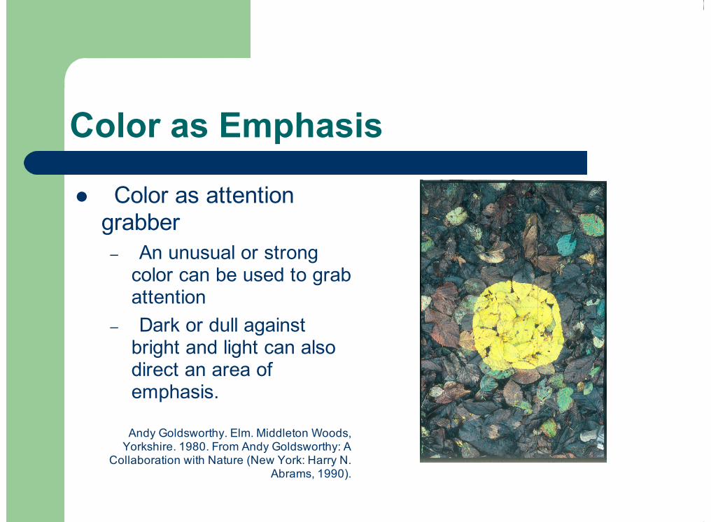
Color as Emphasis
Color as attentiongrabber
An unusual or strongcolor can be used to grabattentionDark or dull against
bright and light can alsodirect an area ofemphasis.
!
–
–
Andy Goldsworthy. Elm. Middleton Woods,Yorkshire. 1980. From Andy Goldsworthy: A
Collaboration with Nature (New York: Harry N.Abrams, 1990).
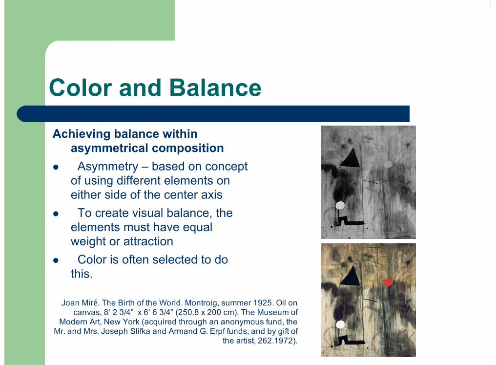
Color and Balance
Achieving balance withinasymmetrical compositionAsymmetry – based on concept
of using different elements oneither side of the center axisTo create visual balance, the
elements must have equalweight or attractionColor is often selected to do
this.
!
!
!
Joan Miré. The Birth of the World. Montroig, summer 1925. Oil oncanvas, 8’ 2 3/4” x 6’ 6 3/4” (250.8 x 200 cm). The Museum of
Modern Art, New York (acquired through an anonymous fund, theMr. and Mrs. Joseph Slifka and Armand G. Erpf funds, and by gift of
the artist, 262.1972).
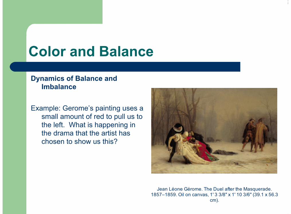
Color and Balance
Dynamics of Balance andImbalance
Example: Gerome’s painting uses asmall amount of red to pull us tothe left. What is happening inthe drama that the artist haschosen to show us this?
Jean Léone Gérome. The Duel after the Masquerade.1857–1859. Oil on canvas, 1' 3 3/8" x 1' 10 3/6" (39.1 x 56.3
cm).

Color and Space
Color’s Spatial PropertiesColor creates depthIntense, warm colors come
forward, cool colors go back.
Atmospheric PerspectiveAs things go back into the
distance they fade to blue-gray.
!
!
Asher B. Durand. Kindred Spirits. 1849. Oil oncanvas, 3’ 8” x 3’. Courtesy Crystal Bridges
Museum of American Art, Bentonville, Arkansas.
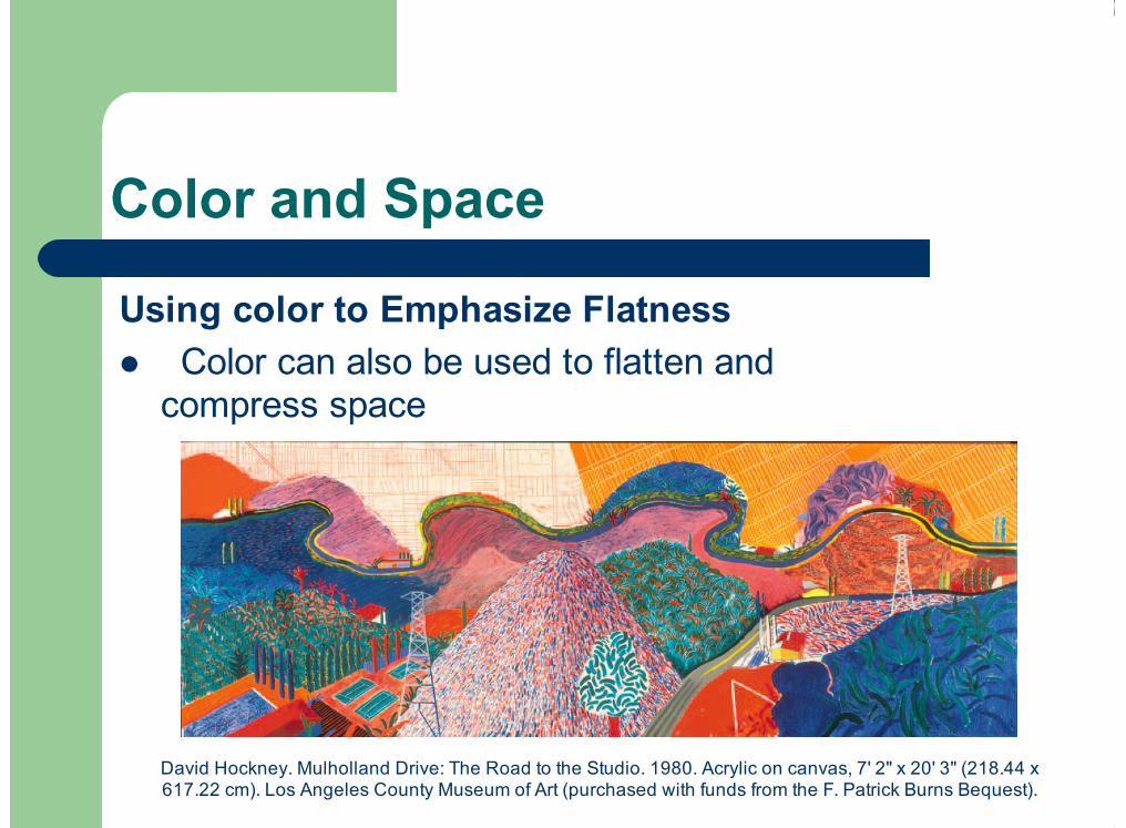
Color and Space
Using color to Emphasize FlatnessColor can also be used to flatten and
compress space!
David Hockney. Mulholland Drive: The Road to the Studio. 1980. Acrylic on canvas, 7' 2" x 20' 3" (218.44 x617.22 cm). Los Angeles County Museum of Art (purchased with funds from the F. Patrick Burns Bequest).

Color Schemes
Color harmonies - a simple combination ofparticular colors based on the colorwheel. Also known as color schemes.
EXAMPLES:Monochromatic - The use of just one hue in
an image. Value can be varied or usedwith black and white.
Analogous – Use of 2-3 colors that are rightnext to each other on the color wheel.
Mark Tansey. The Bricoleur's Daughter. 1987. Oil oncanvas, 5' 8" × 5' 7". Collection Emily FisherLandau,New York..
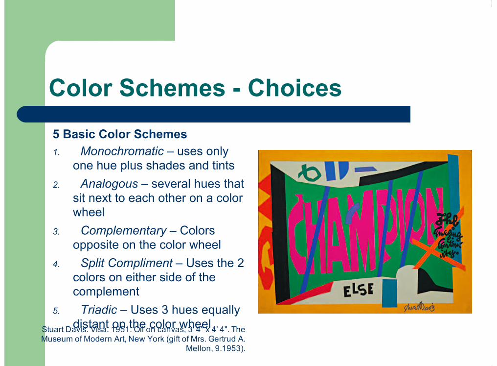
Color Schemes - Choices
5 Basic Color Schemes Monochromatic – uses only
one hue plus shades and tintsAnalogous – several hues that
sit next to each other on a colorwheel
Complementary – Colorsopposite on the color wheel
Split Compliment – Uses the 2colors on either side of thecomplement
Triadic – Uses 3 hues equallydistant on the color wheel
1.
2.
3.
4.
5.
Stuart Davis. Visa. 1951. Oil on canvas, 3' 4" x 4' 4". TheMuseum of Modern Art, New York (gift of Mrs. Gertrud A.
Mellon, 9.1953).

Planning Color Schemes
Interiors, posters, andpackaging are the mostcommon deliberate use ofcolor schemes….other areasmay be more intuitive.Knowing these harmonies
can help all artists anddesigners consciously planthe visual effects they want afinished work to have.
!
!
Jan Vermeer. Girl with a Pearl Earring. c. 1665-1666. Oil on canvas, 1’ 5 1/2” x 1’ 3 3/8” (44.5 x 39cm). Royal Cabinet of Paintings, Mauritshuis, The
Hague.

Color Discord and Vibrating Colors
Unexpected CombinationsColor Discord – the
opposite of color harmony. Can be visually disturbing. They do not balance each
other nor do they haveaffinity for each other. Mild discord can be exciting
or stimulating.
!
!
!
!
Wolf Kahn. Color/Tree Symphony. 1994. Oil oncanvas, 4’ 3 1/2” x 4’x 8 1/2”. Grace Borgenicht
Gallery, New York

Color Discord and Vibrating Colors
Using Discord to add InterestMild discord results in exciting, eye-catching
combinationsThe fashion world exploits this concept so discordant is
commonplace and acceptableDiscordant color = visual surpriseRules about what “goes together” seem outdated and
silly.We approach color more freely today, seeking
unexpected and unusual color combinations
!
!
!
!
!

Color Discord and Vibrating Colors
Colors in ConflictCertain color paring are almost
difficult to look at.Our eyes experience conflict
trying to look at themThey look as though they are
vibratingVibrating Colors – Colors that
create a flickering effect at theirborder. This effect is usuallydependant on an equal valuerelationship and strong huecontrast
!
!
!
!
Annie Mae Young. Quilt. c. 1965. Cotton stiff material:corduroy sheeting, polyester dress and pants material,
wool, 7’ 7” x 6’ 9”. Tinwood Media Atlanta.

Color Uses
Three basic ways in which to use colorin painting and other areas of art.
Local Color (or Objective)- Thecolor an object seems underordinary daylight.
Optical Color - Depicting anobjects color as it might be seenunder various or different light.
Subjective Color - Is the arbitraryus of color. Here the artist pickscolors based on design, aesthetics,or emotional response.
(Heightened color is the use of color thatis intensified or exaggerated.)
1.
2.
3.
Scene from Candide by Leonard Bernstein andRichard Wilbur. The Ohio State University
Department of Theatre.

Emotional Color
Emotional Color – Creates a strongemotional response in the viewer
Yellow, red and orange colors = Warm,happy and cheerful reactions
Blue and green colors = Cool,Melancholy and depressingreactions
Value and intensity also influenceus
Subject matter plays a part
!
!
Pablo Picasso. Crouching Woman. 1902. Oil on canvas,2’ 11” x 2’ 4” (90 x 71 cm). Staatsgalerie, Stuttgart.

Emotional Color
Themes and Context Artist often use a color to add
emotional impact to alreadyvolatile or emotive work. Color is often selected by the
artist specific to this experience.
!
!
Leon Golub. Mercenaries IV. 1980. Acrylic onlinen, 10’ x 19’ 2 1/2” (3 x 6 m). Private
collection, courtesy of the artist

Color Symbolism
Conceptual Qualities of Color
He is true-blue.Caught him red-handed.She told a white lie.
Color Can represent a concept or idea like sin,greed, cowardice, etc. This is a mental orconceptual idea.
!

Color Symbolism
Color meaning varies betweencountries and historical times.
MourningUS-blackIndia-whiteTurkey-VioletEthiopia-BrownBurma-YellowBrides US-WhiteHindu India-YellowChina-RedRoyaltyEuropean & Egyptians-purpleChina-YellowRome-Red
!
!
!
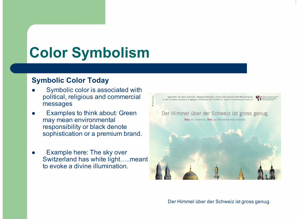
Color Symbolism
Symbolic Color TodaySymbolic color is associated with
political, religious and commercialmessages
Examples to think about: Greenmay mean environmentalresponsibility or black denotesophistication or a premium brand.
Example here: The sky overSwitzerland has white light…..meantto evoke a divine illumination.
!
!
!
Der Himmel über der Schweiz ist gross genug.

![Intro CSM 2017 Handouts.pptx [Read-Only]...5 Color Doppler Velocity information is presented as a colored overlay on a B-mode image Detects direction ... Microsoft PowerPoint - Intro](https://img.pdfslide.net/doc/110x75/5fd9e4b003717e0f0c31cabc/intro-csm-2017-read-only-5-color-doppler-velocity-information-is-presented.jpg)