Embed Size (px)
Citation preview

Development of Contents Page

As the majority of magazines are in an A4 format, A4
needed to be selected here.
I chose to have 3 columns on my Front
Cover in order to plan where the
individual features would be placed.
For the Contents page I only required
one page, opposed to the
DPS which requires two facing pages.
In order for the image to be to the edges of the page when printed I have selected a 4mm bleed all the way around my magazine, ensuring no image is lost.
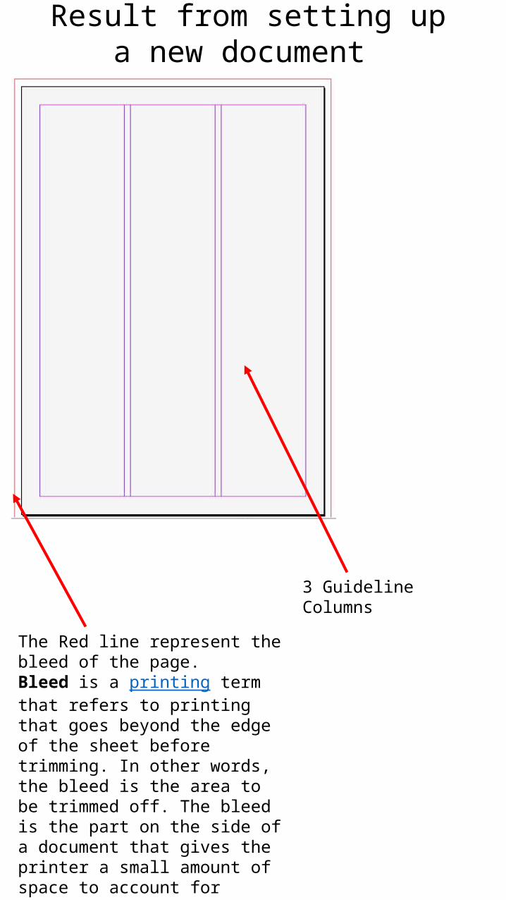
Result from setting up a new document
The Red line represent the bleed of the page.Bleed is a printing term that refers to printing that goes beyond the edge of the sheet before trimming. In other words, the bleed is the area to be trimmed off. The bleed is the part on the side of a document that gives the printer a small amount of space to account for movement of the paper, and design inconsistencies. (Wikipedia)
3 Guideline Columns

• Stage 1 of the construction process was to write “contents” in my chosen font, Bleeding Cowboys, front Dafont.com. This I took and inverted in Photoshop so the writing was in white and the background black, two of the desired colours from my target audience research.

• I then Inserted the photo of my chosen band into Indesign. I then found that right clicking on the photo allows you to open it directly in Photo shop, and any changes made were updated directly in Indesign also. Here I feathered the edges of the image.

• Again using my chosen font, I repeated the same inverting process for each of my contents titles. These were inserted and spaced equally apart at first. I kept these white as I thought it would stand out.


• I inserted the numbers 2 to 20, depending on how many pages each article would cover. These numbers were also put in white because I believed it would contrast with the black, suiting the Rock genre.


• I began by writing in the contents of my magazine…

………Until I had enough articles to cover 20 pages.This didn’t stand out enough however, and after showing this stage to 3 13-17 year olds I concluded it wouldn’t follow the theme of the magazine or appeal to my target audience if the writing was only in white.

• Because of this I changed every other Number and line of text to purple, the same as I had already used on my Front Cover. This, when shown next to the text in white to a different group of 5 13-17 year olds, got great responses therefor I would decide to keep with this design.

• I had a range of ideas for the other images to be used on my contents page, but all I knew is that I wanted them to represent the subjects ‘Paramore’ on page 17, and ‘Spotify’ on page 19…• (I placed the purple boxes as a guide, but decided they
looked good as backgrounds for the images.)

• …to do this I took a photograph of the CD from a Paramore Album, ‘Riot!’. I also went online to find the Spotify logo, which I opened in Photo Shop and made purple to match the theme of my magazine.

• To these background boxes I added a feather effect by right clicking and choosing effects. I didn’t understand the terminology used in these options so I viewed a YouTube video to ensure I achieved what I intended to do.

• I also added this to the two images on top of the purple boxes.

I thought the background of my contents page was too plain and wanted to incorporate something else onto it. I reviewed the responses from my questionnaire and a few people said they’d like to see art/drawings in a music magazine.
I drew a fallen angel in chains, as I though it would suit the Rock theme, and also the theme of my chosen band, Wicked Faith, who often base their music on faith and religion/beliefs. This was then scanned in digitally.
I made a few adjustments, using Photo Shop, to the quality a pencil marks, paper texture and rubbings out could be seen from the scanned image.
I then Inverted this In Photo Shop in order for the drawing to be in white and the background black. This was then added to the background layer of my contents page.

• This is what the page looked like after adding my drawing. I thought this worked well and hoped I would have another opportunity to use one a drawing of my own.


• To keep the audience Interested in my music magazine I added a box which gives details on how to keep up to date through Facebook and Twitter. This wasn’t very appealing or noticeable, therefor I decided to do more to it.

• I found the Facebook and Twitter Logos online and added them to my page without making any adjustments to them.• Here I felt as though my contents page was done.