Embed Size (px)
Citation preview

Evaluation: Question 1
In what ways does your media product use, develop or challenge forms and conventions of real media products?

In the construction of my magazine, I tried to use as many conventional magazine features as possible in order for my
magazine to look realistic. On my front cover I included:My masthead is in the top left hand corner. The logo of my magazine would grow to be a trademark symbol and would work to draw attention to the magazine.
I used a tagline/unique selling point. I put it under my masthead. Because of the masthead creating attention, readers would then read the tagline, so this would encourage them to buy the magazine.
I decided to include a left hand third on my magazine because this is part of the codes and conventions of magazines, It is also very informative about what the magazine includes. I also made sure to include artists of my music genre, this made the magazine seem more real.
The barcode, issue number, date and price are all situated in the bottom left hand corner. These all help to make the magazine look more realistic, as if it was on sale in a shop.
I added a few puffs across the front cover. These were to supply extra information about the content of the magazine, but also to grab the readers attention by advertising relevant information to their interests.In the centre of the page, I placed the image of my artist. I made it as large as I could, within reason, to make it stand out off the page. I also added the lead article/cover story on top of the image, this was to tell the reader who the artist is and what he’s been talking about.Before I started constructing this page, I decided that the colour scheme was going to be red, black and white. This was because I had already created my masthead and taken the photo of my artist and they matched well.
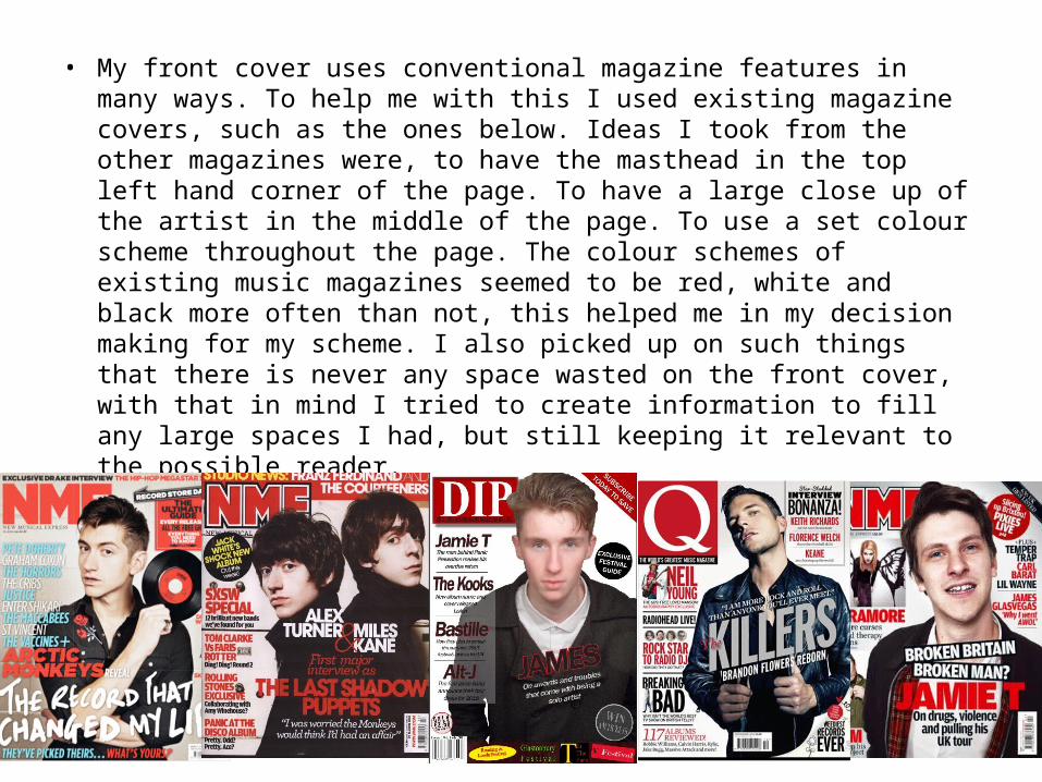
• My front cover uses conventional magazine features in many ways. To help me with this I used existing magazine covers, such as the ones below. Ideas I took from the other magazines were, to have the masthead in the top left hand corner of the page. To have a large close up of the artist in the middle of the page. To use a set colour scheme throughout the page. The colour schemes of existing music magazines seemed to be red, white and black more often than not, this helped me in my decision making for my scheme. I also picked up on such things that there is never any space wasted on the front cover, with that in mind I tried to create information to fill any large spaces I had, but still keeping it relevant to the possible reader.
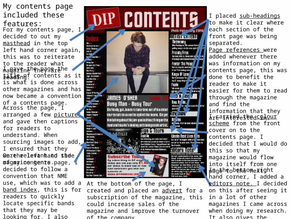
My contents page included these features:For my contents page, I decided to out my masthead in the top left hand corner again, this was to reiterate to the reader what magazine they are reading.I gave the page the title of contents as it is what is done across other magazines and has now became a convention of a contents page.Across the page, I arranged a few pictures and gave then captions for readers to understand. When sourcing images to add, I ensured that they were relevant to the magazine genre.On the left hand side of my contents page, I decided to follow a convention that NME use, which was to add a band index, this is for readers to quickly locate specific bands that they may be looking for. I also think that it makes it look more professional and more like a read magazine.
At the bottom of the page, I created and placed an advert for a subscription of the magazine, this could increase sales of the magazine and improve the turnover of the company.
I placed sub-headings to make it clear where each section of the front page was being separated.
Page references were added whenever there was information on my contents page, this was done to benefit the reader to make it easier for them to read through the magazine and find the information that they are interested in.
I carried the colour scheme from the front cover on to the contents page. I decided that I would do this so that my magazine would flow into itself from one page to the next.
In the bottom right hand corner, I added a editors note. I decided on this after seeing it in a lot of other magazines I came across when doing my research. It also gives the magazine a personal feel to it.

• My contents page layout follows conventional magazine features such as using several images, bold letters and heading. My contents followed a very similar method of layout to that of NME magazine. I followed a convention of grouping text together to make it easier for reader to view and read. I have given all of my sub-headings an outline for the benefit of anyone that reads it, this makes the heading much easier to read and stands out from the black background.
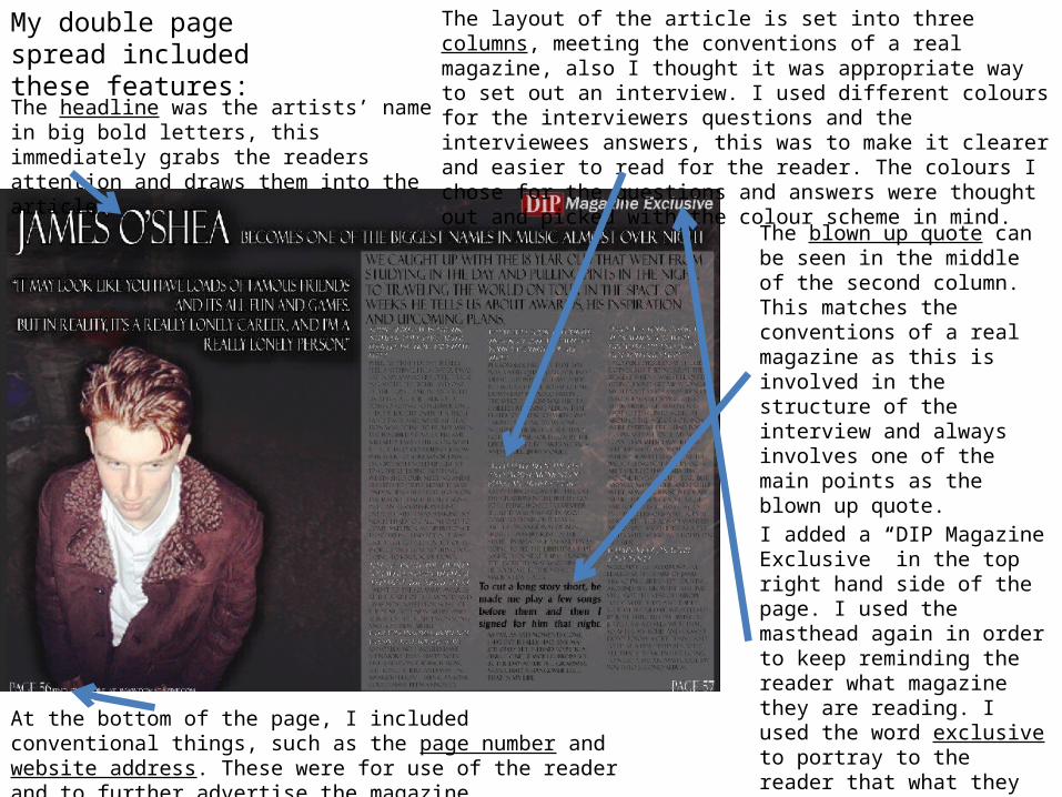
My double page spread included these features:
At the bottom of the page, I included conventional things, such as the page number and website address. These were for use of the reader and to further advertise the magazine.
The headline was the artists’ name in big bold letters, this immediately grabs the readers attention and draws them into the article.
The layout of the article is set into three columns, meeting the conventions of a real magazine, also I thought it was appropriate way to set out an interview. I used different colours for the interviewers questions and the interviewees answers, this was to make it clearer and easier to read for the reader. The colours I chose for the questions and answers were thought out and picked with the colour scheme in mind.
The blown up quote can be seen in the middle of the second column. This matches the conventions of a real magazine as this is involved in the structure of the interview and always involves one of the main points as the blown up quote.
I added a “DIP Magazine Exclusive” in the top right hand side of the page. I used the masthead again in order to keep reminding the reader what magazine they are reading. I used the word exclusive to portray to the reader that what they are reading is special to this magazine.
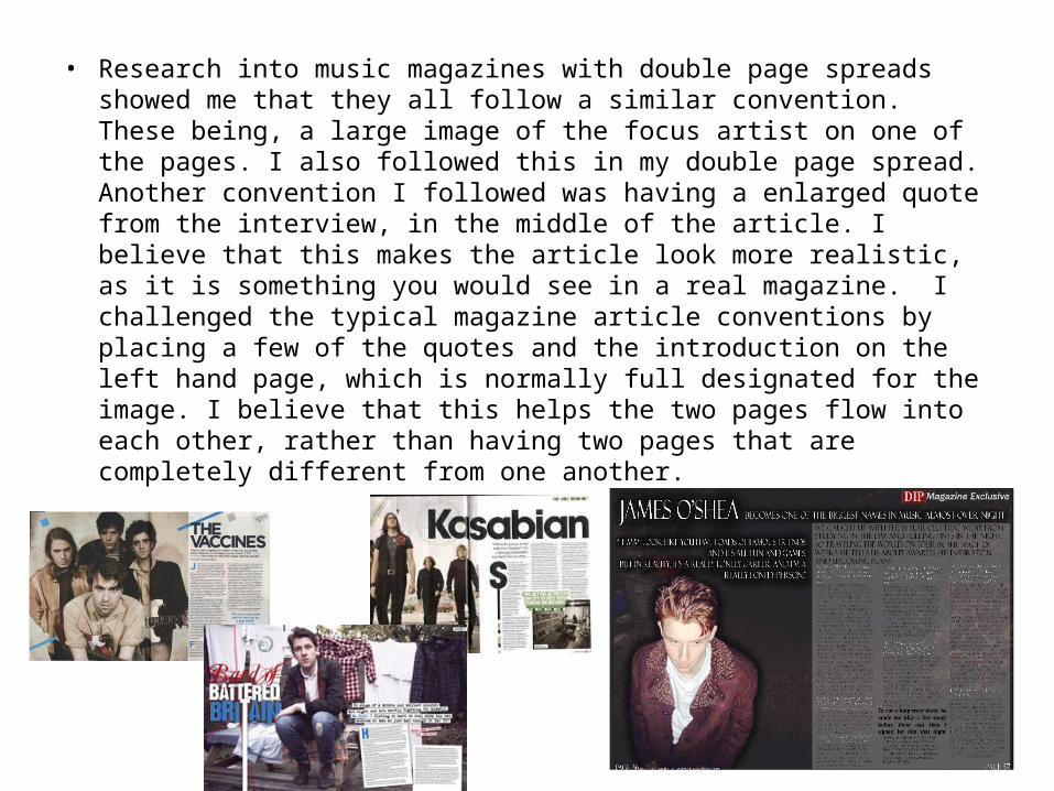
• Research into music magazines with double page spreads showed me that they all follow a similar convention. These being, a large image of the focus artist on one of the pages. I also followed this in my double page spread. Another convention I followed was having a enlarged quote from the interview, in the middle of the article. I believe that this makes the article look more realistic, as it is something you would see in a real magazine. I challenged the typical magazine article conventions by placing a few of the quotes and the introduction on the left hand page, which is normally full designated for the image. I believe that this helps the two pages flow into each other, rather than having two pages that are completely different from one another.