Embed Size (px)
Citation preview
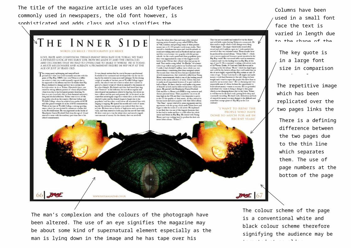
The repetitive image which has been replicated over the two pages links the contents of the two pages.
Columns have been used in a small font face the text is varied in length due to the shape of the man’s body.
There is a defining difference between the two pages due to the thin line which separates them. The use of page numbers at the bottom of the page signifies the article is from a magazine.
The man’s complexion and the colours of the photograph have been altered. The use of an eye signifies the magazine may be about some kind of supernatural element especially as the man is lying down in the image and he has tape over his mouth.
The colour scheme of the page is a conventional white and black colour scheme therefore signifying the audience may be targeted at an older sophisticated audience or an audience of high status.
The title of the magazine article uses an old typefaces commonly used in newspapers, the old font however, is sophisticated and adds class and also signifies the magazine is targeting a specific demographic audience.
The key quote is in a large font size in comparison to the columns contents
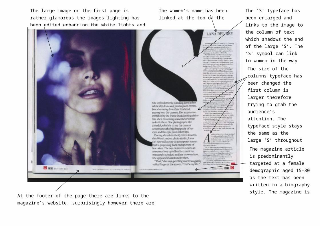
The large image on the first page is rather glamorous the images lighting has been edited enhancing the white lights and making the woman look angelic
The ‘S’ typeface has been enlarged and links to the image to the column of text which shadows the end of the large ‘S’. The ‘S’ symbol can link to women in the way that they use to wear corset and achieve an ‘S’ shape figure.
The women’s name has been linked at the top of the page
The size of the columns typeface has been changed the first column is larger therefore trying to grab the audience’s attention. The typeface style stays the same as the large ‘S’ throughout the magazine. There is also a large ‘A’ at the bottom of the page signifying a summary of the article or an important quote.
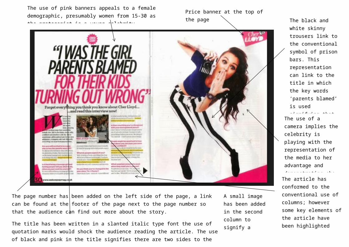
The magazine article is predominantly targeted at a female demographic aged 15-30 as the text has been written in a biography style. The magazine is well known and the page layout is very elegant.
At the footer of the page there are links to the magazine’s website, surprisingly however there are no page numbers.
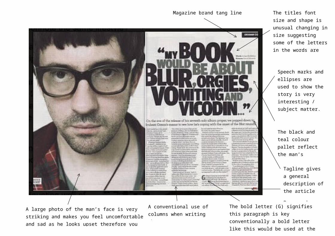
A large photo of the man’s face is very striking and makes you feel uncomfortable and sad as he looks upset therefore you want to read about the article.
A conventional use of columns when writing the text
The titles font size and shape is unusual changing in size suggesting some of the letters in the words are jumping out at you to attract your attention.
Speech marks and ellipses are used to show the story is very interesting / subject matter.
The black and teal colour pallet reflect the man’s clothing therefore signifying there is a link between the two pages
Magazine brand tang line
Tagline gives a general description of the article
Page number
The bold letter (G) signifies this paragraph is key conventionally a bold letter like this would be used at the beginning or an article to signify the beginning of the text