Embed Size (px)
Citation preview
Indie album covers
By Lois Baker
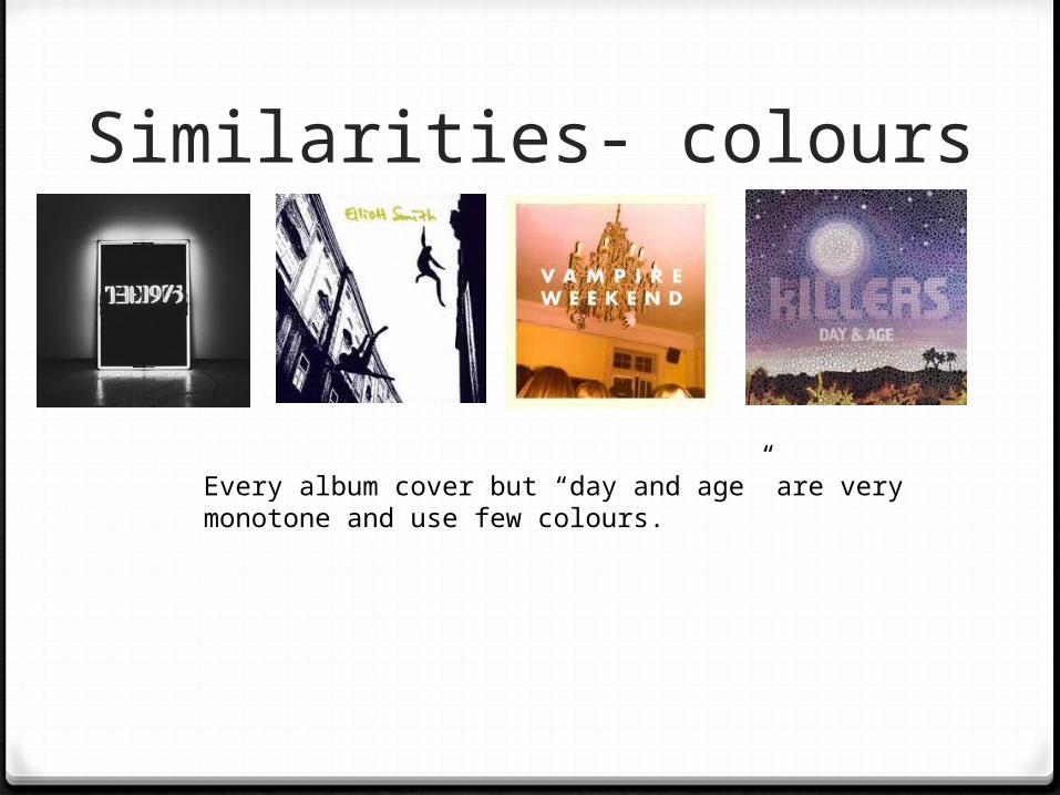
Similarities- colours
Every album cover but “day and age” are very monotone and use few colours.
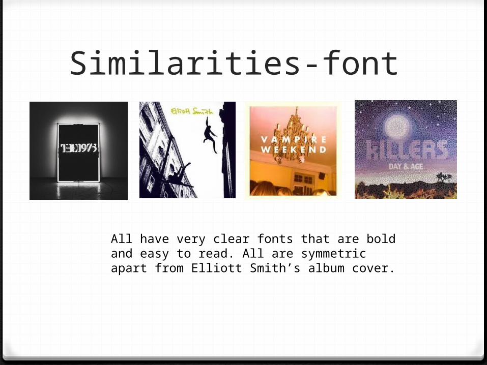
Similarities-font
All have very clear fonts that are bold and easy to read. All are symmetric apart from Elliott Smith’s album cover.
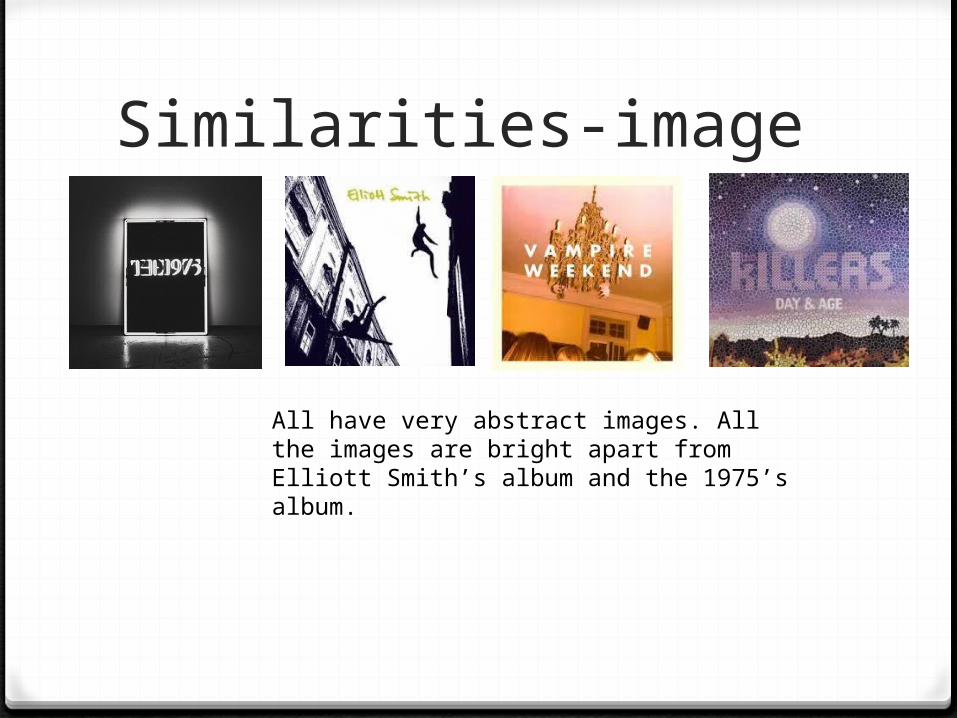
Similarities-image
All have very abstract images. All the images are bright apart from Elliott Smith’s album and the 1975’s album.
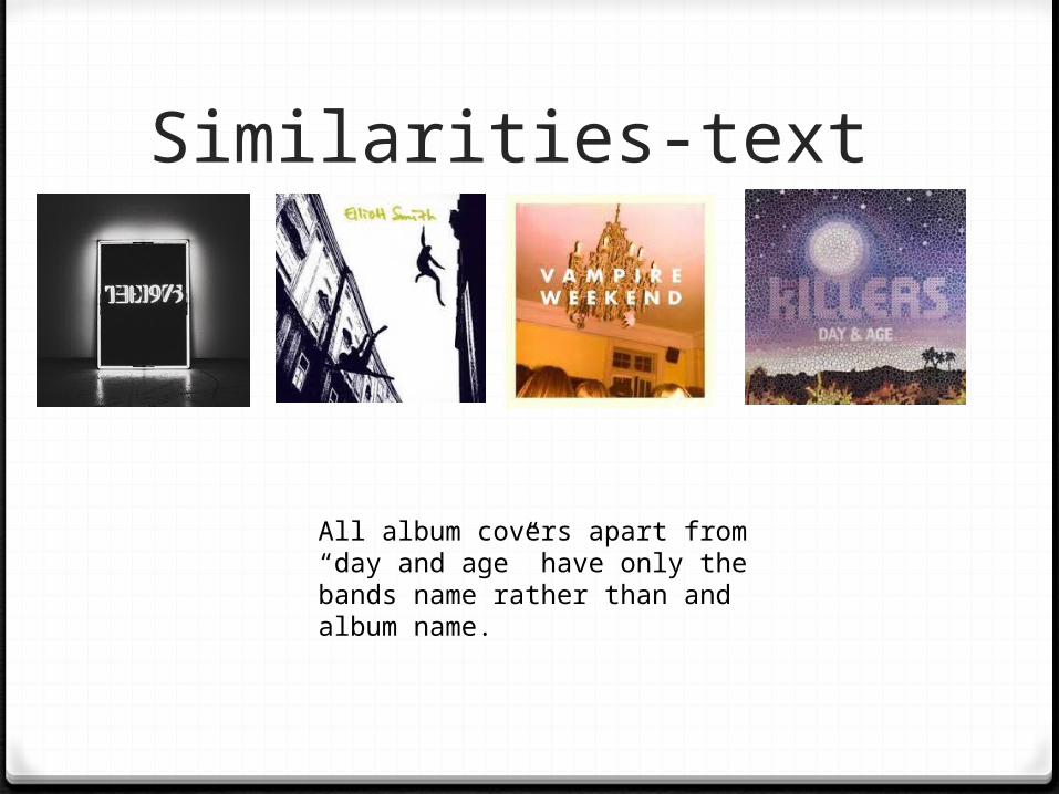
Similarities-text
All album covers apart from “day and age” have only the bands name rather than and album name.
What I’m going to include in my own album cover based
other indie album art
I’m going to make my album cover simple as all the other album covers weren't particularly showy. I’m not going to include a album name on the front to keep it minimalistic. Minimalism seems to be a common theme in the indie scene, so I think to appeal to an indie audience my album cover should be as minimalistic as possible.