Embed Size (px)
Citation preview
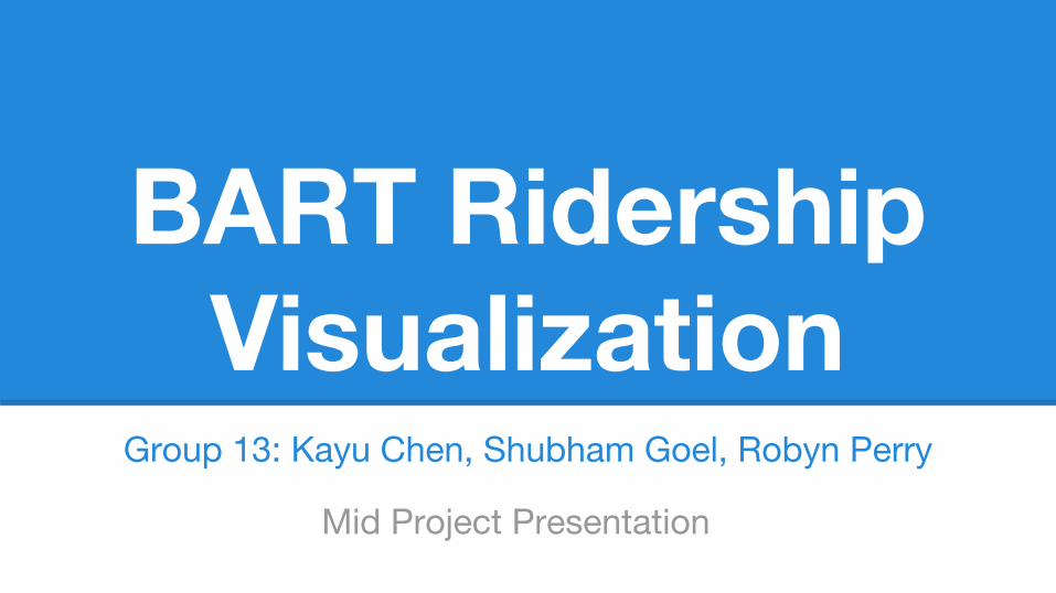
BART Ridership Visualization
Group 13: Kayu Chen, Shubham Goel, Robyn Perry
Mid Project Presentation

Motivation: Why Are We Doing This?
● visualization suited to complex urban systems & data
● we’re curious about BART traffic flows & use over time

Goals
answer our own curiosities ○ has ridership changed over the time period (2006-present) for particular routes (ie
increase from West Oakland due to more commuters to SF)?○ just how frequented is BART?
allow exploration○ compare passenger flows from each station AND over time
use the other super interesting data we have○ BART trivia!

Available DataMonthly ridership data from 2006-2014 Data from 2008 Station Profile Survey about
each station (income, gender, reason for travel, traveling with children, etc.)

Design Strategy
● EDA in Tableau● design aesthetic based on BART colors● simple/minimalistic design● route map abstracted, geometric shapes● web-based, should fit most of the
content onto a single screen to avoid scrolling
● exploratory actions should be intuitive (minimal instruction)

Mockups (default map)
● selector changes dataset being used
● time change function (slider or brushing)
● emphasizes transbay travel (showing water)

Mockups (station selected)
● station names appear on hover
● on click, map generates ridership flows from source station in red lines of varying thickness for specific time period
● inspired (partly) by Minard’s Napoleon’s March viz

Mockups (small multiples)
● small multiples show top 12-15 most interesting stations
● graphs dynamically change depending on selected year
● presents a view over time of specific stations

Mockups (potential layouts)
Larger small multiples, map fully fills space. This view makes the multiples smaller, and allows more open space. Center will have options/legend.

Overall Layout (default)
Current layout:
● map on left● small multiples,
trivia, summary on right.
● center for switching datasets and key
● Trivia/small multiples dynamically change

Overall Layout (station selected)Example:
Click Balboa Park & weekday.
You see passengers travel towards and exit in downtown SF.
The trivia box populated with in-depth info about Balboa Park passengers (income, gender, mode of accessing BART, etc).

Current Layout (overlay)
Long view: total ridership data from 1973 to present.
Possibility: click on 'total ridership' for an overlay showing change in total ridership since inception.
Could instead do static graph below the route map.

Demo time!
http://cl.ly/VFzv

Evaluation Strategy
● audience ○ transit planners analyzing current use○ general public/BART riders
● revisions after discussing with Raymon○ instead of using discrete bins for scaling ridership, scaled using range of pixel thickness
for lines○ trivia into one box, instead of extraneous charts/graphs at the bottom
● asking friends/family who use BART to test it, and reaching out to contacts in BART organization to assess usefulness

Work So Far
● extensive mockups that showcase layout, color theme, aesthetic elements, overall mood/theme
● interactive/dynamic features we want to implementa. selecting stations and seeing ridership from itb. dynamically changing small multiples based on timec. dynamically changing trivia based on stationd. change dataset from weekday to weekend
● map prototype using D3● small multiples using sample data in D3● basic layout in HTML/CSS● mappings in order to implement graph traversal● EDA in Tableau with station trivia to find insights

Issues to Consider
● layout/design aesthetics: cluttered? intuitive?● overall ridership overlay: useful or arbitrary?● small multiples - 15 too many? 3 x 5 grid or 5 x 3 grid?● West Dublin/Pleasanton station ignored (opened in 2011)● SFO station is tricky to implement, b/c riders at San Bruno can either go
San Bruno -> SFO -> Millbrae OR San Bruno -> Millbrae, which would create a loop in our direction flow○ Pretending you can’t get to MB from SFO (only runs weekday evenings/weekends, so not
missing much)
● time selection: slider or brushing feature using small multiples?