Embed Size (px)
Citation preview
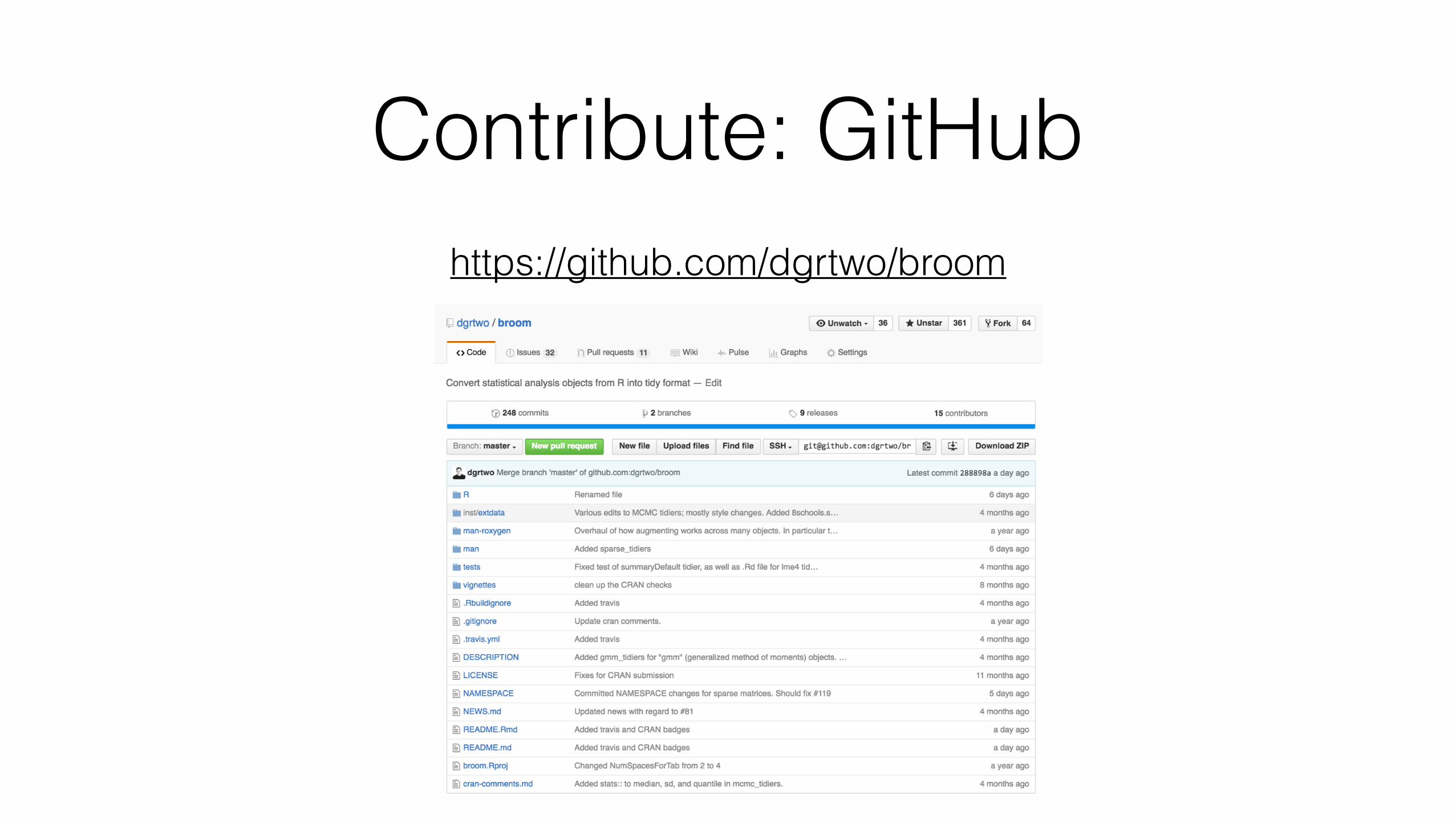
Broom: Converting Statistical Models to Tidy Data Frames
David Robinson 4/8/2016

What is tidy data?
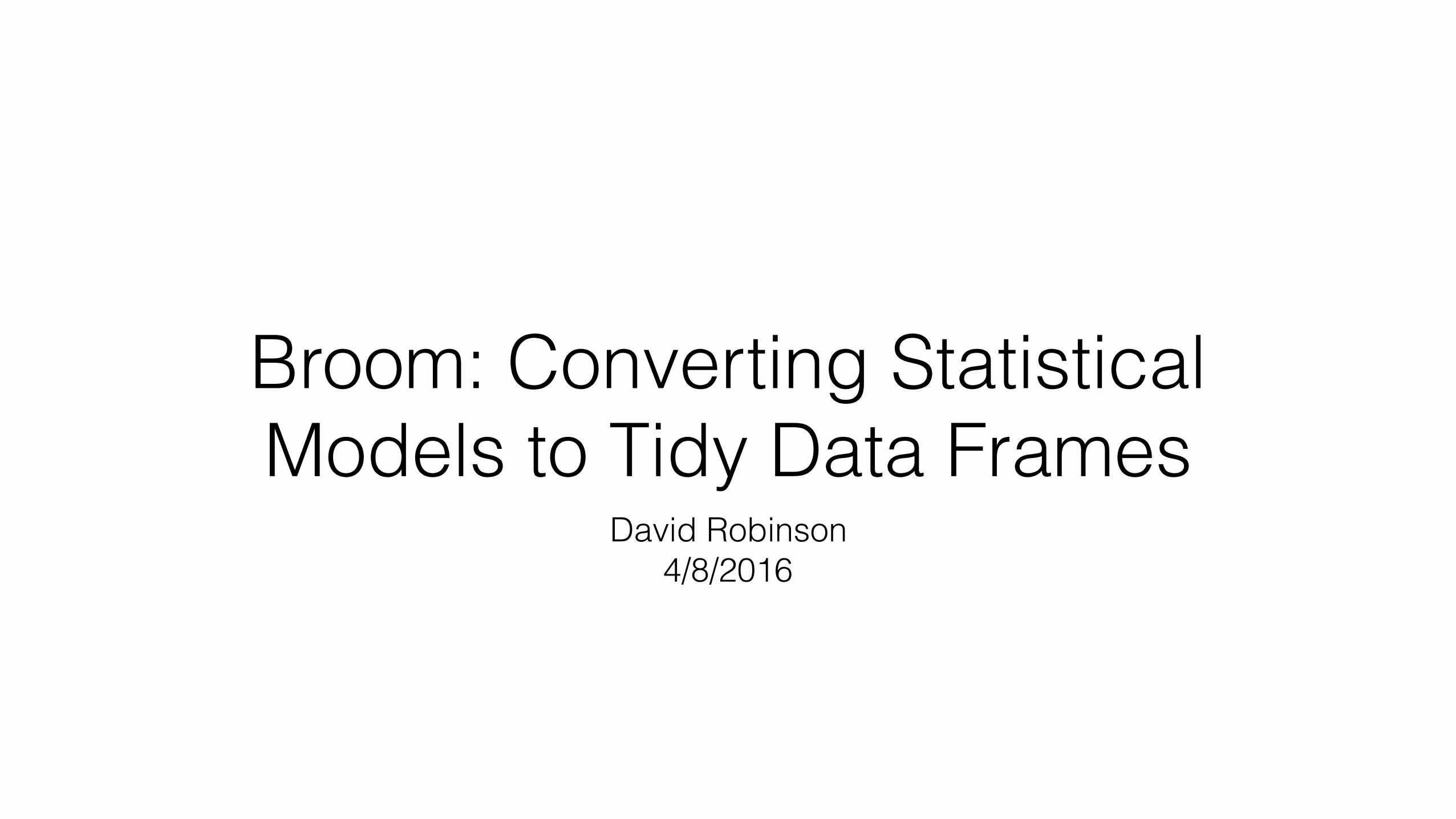
Data frames arranged as:
• One row for each observation
• One column for each variable
• One table for each type of observational unit
For details, see Tidy Data (Wickham 2014)
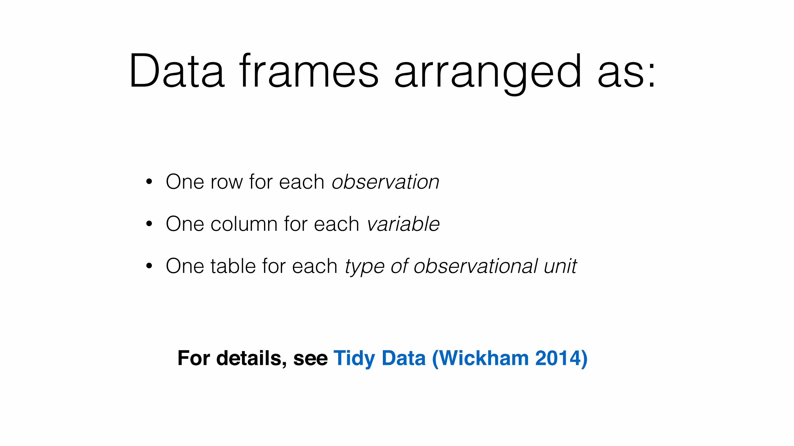
“Tidy tools” work with tidy data frames
Data Wrangling with dplyr and tidyr
Cheat Sheet
RStudio® is a trademark of RStudio, Inc. • CC BY RStudio • [email protected] • 844-448-1212 • rstudio.com
Syntax - Helpful conventions for wrangling
dplyr::tbl_df(iris) Converts data to tbl class. tbl’s are easier to examine than data frames. R displays only the data that fits onscreen:
dplyr::glimpse(iris) Information dense summary of tbl data.
utils::View(iris) View data set in spreadsheet-like display (note capital V).
Source: local data frame [150 x 5]
Sepal.Length Sepal.Width Petal.Length 1 5.1 3.5 1.4 2 4.9 3.0 1.4 3 4.7 3.2 1.3 4 4.6 3.1 1.5 5 5.0 3.6 1.4 .. ... ... ... Variables not shown: Petal.Width (dbl), Species (fctr)
dplyr::%>% Passes object on left hand side as first argument (or . argument) of function on righthand side.
"Piping" with %>% makes code more readable, e.g. iris %>% group_by(Species) %>% summarise(avg = mean(Sepal.Width)) %>% arrange(avg)
x %>% f(y) is the same as f(x, y) y %>% f(x, ., z) is the same as f(x, y, z )
Reshaping Data - Change the layout of a data set
Subset Observations (Rows) Subset Variables (Columns)
F M A
Each variable is saved in its own column
F M A
Each observation is saved in its own row
In a tidy data set: &
Tidy Data - A foundation for wrangling in R
Tidy data complements R’s vectorized operations. R will automatically preserve observations as you manipulate variables. No other format works as intuitively with R.
FAM
M * A
*
tidyr::gather(cases, "year", "n", 2:4) Gather columns into rows.
tidyr::unite(data, col, ..., sep) Unite several columns into one.
dplyr::data_frame(a = 1:3, b = 4:6) Combine vectors into data frame (optimized).
dplyr::arrange(mtcars, mpg) Order rows by values of a column (low to high).
dplyr::arrange(mtcars, desc(mpg)) Order rows by values of a column (high to low).
dplyr::rename(tb, y = year) Rename the columns of a data frame.
tidyr::spread(pollution, size, amount) Spread rows into columns.
tidyr::separate(storms, date, c("y", "m", "d")) Separate one column into several.
wwwwwwA1005A1013A1010A1010
wwp110110100745451009wwp110110100745451009 wwp110110100745451009wwp110110100745451009
wppw11010071007110451009100945wwwww110110110110110 wwwwdplyr::filter(iris, Sepal.Length > 7)
Extract rows that meet logical criteria. dplyr::distinct(iris)
Remove duplicate rows. dplyr::sample_frac(iris, 0.5, replace = TRUE)
Randomly select fraction of rows. dplyr::sample_n(iris, 10, replace = TRUE)
Randomly select n rows. dplyr::slice(iris, 10:15)
Select rows by position. dplyr::top_n(storms, 2, date)
Select and order top n entries (by group if grouped data).
< Less than != Not equal to> Greater than %in% Group membership== Equal to is.na Is NA<= Less than or equal to !is.na Is not NA>= Greater than or equal to &,|,!,xor,any,all Boolean operators
Logic in R - ?Comparison, ?base::Logic
dplyr::select(iris, Sepal.Width, Petal.Length, Species) Select columns by name or helper function.
Helper functions for select - ?selectselect(iris, contains("."))
Select columns whose name contains a character string. select(iris, ends_with("Length"))
Select columns whose name ends with a character string. select(iris, everything())
Select every column. select(iris, matches(".t."))
Select columns whose name matches a regular expression. select(iris, num_range("x", 1:5))
Select columns named x1, x2, x3, x4, x5. select(iris, one_of(c("Species", "Genus")))
Select columns whose names are in a group of names. select(iris, starts_with("Sepal"))
Select columns whose name starts with a character string. select(iris, Sepal.Length:Petal.Width)
Select all columns between Sepal.Length and Petal.Width (inclusive). select(iris, -Species)
Select all columns except Species. Learn more with browseVignettes(package = c("dplyr", "tidyr")) • dplyr 0.4.0• tidyr 0.2.0 • Updated: 1/15
wwwwwwA1005A1013A1010A1010
devtools::install_github("rstudio/EDAWR") for data sets
tidyr dplyrdplyr::group_by(iris, Species) Group data into rows with the same value of Species.
dplyr::ungroup(iris) Remove grouping information from data frame.
iris %>% group_by(Species) %>% summarise(…) Compute separate summary row for each group.
Combine Data Sets
Group Data
Summarise Data Make New Variables
ir irC
dplyr::summarise(iris, avg = mean(Sepal.Length)) Summarise data into single row of values.
dplyr::summarise_each(iris, funs(mean)) Apply summary function to each column.
dplyr::count(iris, Species, wt = Sepal.Length) Count number of rows with each unique value of variable (with or without weights).
dplyr::mutate(iris, sepal = Sepal.Length + Sepal. Width) Compute and append one or more new columns.
dplyr::mutate_each(iris, funs(min_rank)) Apply window function to each column.
dplyr::transmute(iris, sepal = Sepal.Length + Sepal. Width) Compute one or more new columns. Drop original columns.
Summarise uses summary functions, functions that take a vector of values and return a single value, such as:
Mutate uses window functions, functions that take a vector of values and return another vector of values, such as:
window function
summary function
dplyr::first First value of a vector.
dplyr::last Last value of a vector.
dplyr::nth Nth value of a vector.
dplyr::n # of values in a vector.
dplyr::n_distinct # of distinct values in a vector.
IQR IQR of a vector.
min Minimum value in a vector.
max Maximum value in a vector.
mean Mean value of a vector.
median Median value of a vector.
var Variance of a vector.
sd Standard deviation of a vector.
dplyr::lead Copy with values shifted by 1.
dplyr::lag Copy with values lagged by 1.
dplyr::dense_rank Ranks with no gaps.
dplyr::min_rank Ranks. Ties get min rank.
dplyr::percent_rank Ranks rescaled to [0, 1].
dplyr::row_number Ranks. Ties got to first value.
dplyr::ntile Bin vector into n buckets.
dplyr::between Are values between a and b?
dplyr::cume_dist Cumulative distribution.
dplyr::cumall Cumulative all
dplyr::cumany Cumulative any
dplyr::cummean Cumulative mean
cumsum Cumulative sum
cummax Cumulative max
cummin Cumulative min
cumprod Cumulative prod
pmax Element-wise max
pmin Element-wise min
iris %>% group_by(Species) %>% mutate(…) Compute new variables by group.
x1 x2A 1B 2C 3
x1 x3A TB FD T+ =
x1 x2 x3A 1 TB 2 FC 3 NA
x1 x3 x2A T 1B F 2D T NA
x1 x2 x3A 1 TB 2 F
x1 x2 x3A 1 TB 2 FC 3 NAD NA T
x1 x2A 1B 2C 3
x1 x2B 2C 3D 4+ =
x1 x2B 2C 3
x1 x2A 1B 2C 3D 4
x1 x2A 1
x1 x2A 1B 2C 3B 2C 3D 4
x1 x2 x1 x2A 1 B 2B 2 C 3C 3 D 4
Mutating Joins
Filtering Joins
Binding
Set Operations
dplyr::left_join(a, b, by = "x1") Join matching rows from b to a.
a b
dplyr::right_join(a, b, by = "x1") Join matching rows from a to b.
dplyr::inner_join(a, b, by = "x1") Join data. Retain only rows in both sets.
dplyr::full_join(a, b, by = "x1") Join data. Retain all values, all rows.
x1 x2A 1B 2
x1 x2C 3
y z
dplyr::semi_join(a, b, by = "x1") All rows in a that have a match in b.
dplyr::anti_join(a, b, by = "x1") All rows in a that do not have a match in b.
dplyr::intersect(y, z) Rows that appear in both y and z.
dplyr::union(y, z) Rows that appear in either or both y and z.
dplyr::setdiff(y, z) Rows that appear in y but not z.
dplyr::bind_rows(y, z) Append z to y as new rows.
dplyr::bind_cols(y, z) Append z to y as new columns. Caution: matches rows by position.
RStudio® is a trademark of RStudio, Inc. • CC BY RStudio • [email protected] • 844-448-1212 • rstudio.com Learn more with browseVignettes(package = c("dplyr", "tidyr")) • dplyr 0.4.0• tidyr 0.2.0 • Updated: 1/15devtools::install_github("rstudio/EDAWR") for data sets
ggplot2
Graphical Primitives
Data Visualization with ggplot2
Cheat Sheet
RStudio® is a trademark of RStudio, Inc. • CC BY RStudio • [email protected] • 844-448-1212 • rstudio.com
Geoms - Use a geom to represent data points, use the geom’s aesthetic properties to represent variables. Each function returns a layer.
One Variable
a + geom_area(stat = "bin") x, y, alpha, color, fill, linetype, size b + geom_area(aes(y = ..density..), stat = "bin")
a + geom_density(kernel = "gaussian") x, y, alpha, color, fill, linetype, size, weight b + geom_density(aes(y = ..county..))
a + geom_dotplot() x, y, alpha, color, fill
a + geom_freqpoly() x, y, alpha, color, linetype, size b + geom_freqpoly(aes(y = ..density..))
a + geom_histogram(binwidth = 5) x, y, alpha, color, fill, linetype, size, weight b + geom_histogram(aes(y = ..density..))
Discreteb <- ggplot(mpg, aes(fl))
b + geom_bar() x, alpha, color, fill, linetype, size, weight
Continuousa <- ggplot(mpg, aes(hwy))
Two Variables
Continuous Function
Discrete X, Discrete Yh <- ggplot(diamonds, aes(cut, color))
h + geom_jitter() x, y, alpha, color, fill, shape, size
Discrete X, Continuous Yg <- ggplot(mpg, aes(class, hwy))
g + geom_bar(stat = "identity") x, y, alpha, color, fill, linetype, size, weight
g + geom_boxplot() lower, middle, upper, x, ymax, ymin, alpha, color, fill, linetype, shape, size, weight
g + geom_dotplot(binaxis = "y", stackdir = "center") x, y, alpha, color, fill
g + geom_violin(scale = "area") x, y, alpha, color, fill, linetype, size, weight
Continuous X, Continuous Yf <- ggplot(mpg, aes(cty, hwy))
f + geom_blank() (Useful for expanding limits)
f + geom_jitter() x, y, alpha, color, fill, shape, size
f + geom_point() x, y, alpha, color, fill, shape, size
f + geom_quantile() x, y, alpha, color, linetype, size, weight
f + geom_rug(sides = "bl") alpha, color, linetype, size
f + geom_smooth(model = lm) x, y, alpha, color, fill, linetype, size, weight
f + geom_text(aes(label = cty)) x, y, label, alpha, angle, color, family, fontface, hjust, lineheight, size, vjust
Three Variables
m + geom_contour(aes(z = z)) x, y, z, alpha, colour, linetype, size, weight
seals$z <- with(seals, sqrt(delta_long^2 + delta_lat^2)) m <- ggplot(seals, aes(long, lat))
j <- ggplot(economics, aes(date, unemploy))j + geom_area()
x, y, alpha, color, fill, linetype, size
j + geom_line() x, y, alpha, color, linetype, size
j + geom_step(direction = "hv") x, y, alpha, color, linetype, size
Continuous Bivariate Distributioni <- ggplot(movies, aes(year, rating))i + geom_bin2d(binwidth = c(5, 0.5))
xmax, xmin, ymax, ymin, alpha, color, fill, linetype, size, weight
i + geom_density2d() x, y, alpha, colour, linetype, size
i + geom_hex() x, y, alpha, colour, fill size
e + geom_segment(aes( xend = long + delta_long, yend = lat + delta_lat)) x, xend, y, yend, alpha, color, linetype, size
e + geom_rect(aes(xmin = long, ymin = lat, xmax= long + delta_long, ymax = lat + delta_lat)) xmax, xmin, ymax, ymin, alpha, color, fill, linetype, size
c + geom_polygon(aes(group = group)) x, y, alpha, color, fill, linetype, size
e <- ggplot(seals, aes(x = long, y = lat))
m + geom_raster(aes(fill = z), hjust=0.5, vjust=0.5, interpolate=FALSE) x, y, alpha, fill (fast)
m + geom_tile(aes(fill = z)) x, y, alpha, color, fill, linetype, size (slow)
k + geom_crossbar(fatten = 2) x, y, ymax, ymin, alpha, color, fill, linetype, size
k + geom_errorbar() x, ymax, ymin, alpha, color, linetype, size, width (also geom_errorbarh())
k + geom_linerange() x, ymin, ymax, alpha, color, linetype, size
k + geom_pointrange() x, y, ymin, ymax, alpha, color, fill, linetype, shape, size
Visualizing errordf <- data.frame(grp = c("A", "B"), fit = 4:5, se = 1:2)
k <- ggplot(df, aes(grp, fit, ymin = fit-se, ymax = fit+se))
d + geom_path(lineend="butt", linejoin="round’, linemitre=1) x, y, alpha, color, linetype, size
d + geom_ribbon(aes(ymin=unemploy - 900, ymax=unemploy + 900)) x, ymax, ymin, alpha, color, fill, linetype, size
d <- ggplot(economics, aes(date, unemploy))
c <- ggplot(map, aes(long, lat))
data <- data.frame(murder = USArrests$Murder, state = tolower(rownames(USArrests)))
map <- map_data("state") l <- ggplot(data, aes(fill = murder))
l + geom_map(aes(map_id = state), map = map) + expand_limits(x = map$long, y = map$lat) map_id, alpha, color, fill, linetype, size
Maps
ABC
Basics
Build a graph with ggplot() or qplot()
ggplot2 is based on the grammar of graphics, the idea that you can build every graph from the same few components: a data set, a set of geoms—visual marks that represent data points, and a coordinate system.
To display data values, map variables in the data set to aesthetic properties of the geom like size, color, and x and y locations.
Graphical Primitives
Data Visualization with ggplot2
Cheat Sheet
RStudio® is a trademark of RStudio, Inc. • CC BY RStudio • [email protected] • 844-448-1212 • rstudio.com Learn more at docs.ggplot2.org • ggplot2 0.9.3.1 • Updated: 3/15
Geoms - Use a geom to represent data points, use the geom’s aesthetic properties to represent variables
Basics
One Variable
a + geom_area(stat = "bin") x, y, alpha, color, fill, linetype, size b + geom_area(aes(y = ..density..), stat = "bin")
a + geom_density(kernal = "gaussian") x, y, alpha, color, fill, linetype, size, weight b + geom_density(aes(y = ..county..))
a+ geom_dotplot() x, y, alpha, color, fill
a + geom_freqpoly() x, y, alpha, color, linetype, size b + geom_freqpoly(aes(y = ..density..))
a + geom_histogram(binwidth = 5) x, y, alpha, color, fill, linetype, size, weight b + geom_histogram(aes(y = ..density..))
Discretea <- ggplot(mpg, aes(fl))
b + geom_bar() x, alpha, color, fill, linetype, size, weight
Continuousa <- ggplot(mpg, aes(hwy))
Two Variables
Discrete X, Discrete Yh <- ggplot(diamonds, aes(cut, color))
h + geom_jitter() x, y, alpha, color, fill, shape, size
Discrete X, Continuous Yg <- ggplot(mpg, aes(class, hwy))
g + geom_bar(stat = "identity") x, y, alpha, color, fill, linetype, size, weight
g + geom_boxplot() lower, middle, upper, x, ymax, ymin, alpha, color, fill, linetype, shape, size, weight
g + geom_dotplot(binaxis = "y", stackdir = "center") x, y, alpha, color, fill
g + geom_violin(scale = "area") x, y, alpha, color, fill, linetype, size, weight
Continuous X, Continuous Yf <- ggplot(mpg, aes(cty, hwy))
f + geom_blank()
f + geom_jitter() x, y, alpha, color, fill, shape, size
f + geom_point() x, y, alpha, color, fill, shape, size
f + geom_quantile() x, y, alpha, color, linetype, size, weight
f + geom_rug(sides = "bl") alpha, color, linetype, size
f + geom_smooth(model = lm) x, y, alpha, color, fill, linetype, size, weight
f + geom_text(aes(label = cty)) x, y, label, alpha, angle, color, family, fontface, hjust, lineheight, size, vjust
Three Variables
i + geom_contour(aes(z = z)) x, y, z, alpha, colour, linetype, size, weight
seals$z <- with(seals, sqrt(delta_long^2 + delta_lat^2)) i <- ggplot(seals, aes(long, lat))
g <- ggplot(economics, aes(date, unemploy))Continuous Function
g + geom_area() x, y, alpha, color, fill, linetype, size
g + geom_line() x, y, alpha, color, linetype, size
g + geom_step(direction = "hv") x, y, alpha, color, linetype, size
Continuous Bivariate Distributionh <- ggplot(movies, aes(year, rating))h + geom_bin2d(binwidth = c(5, 0.5))
xmax, xmin, ymax, ymin, alpha, color, fill, linetype, size, weight
h + geom_density2d() x, y, alpha, colour, linetype, size
h + geom_hex() x, y, alpha, colour, fill size
d + geom_segment(aes( xend = long + delta_long, yend = lat + delta_lat)) x, xend, y, yend, alpha, color, linetype, size
d + geom_rect(aes(xmin = long, ymin = lat, xmax= long + delta_long, ymax = lat + delta_lat)) xmax, xmin, ymax, ymin, alpha, color, fill, linetype, size
c + geom_polygon(aes(group = group)) x, y, alpha, color, fill, linetype, size
d<- ggplot(seals, aes(x = long, y = lat))
i + geom_raster(aes(fill = z), hjust=0.5, vjust=0.5, interpolate=FALSE) x, y, alpha, fill
i + geom_tile(aes(fill = z)) x, y, alpha, color, fill, linetype, size
e + geom_crossbar(fatten = 2) x, y, ymax, ymin, alpha, color, fill, linetype, size
e + geom_errorbar() x, ymax, ymin, alpha, color, linetype, size, width (also geom_errorbarh())
e + geom_linerange() x, ymin, ymax, alpha, color, linetype, size
e + geom_pointrange() x, y, ymin, ymax, alpha, color, fill, linetype, shape, size
Visualizing errordf <- data.frame(grp = c("A", "B"), fit = 4:5, se = 1:2)
e <- ggplot(df, aes(grp, fit, ymin = fit-se, ymax = fit+se))
g + geom_path(lineend="butt", linejoin="round’, linemitre=1) x, y, alpha, color, linetype, size
g + geom_ribbon(aes(ymin=unemploy - 900, ymax=unemploy + 900)) x, ymax, ymin, alpha, color, fill, linetype, size
g <- ggplot(economics, aes(date, unemploy))
c <- ggplot(map, aes(long, lat))
data <- data.frame(murder = USArrests$Murder, state = tolower(rownames(USArrests)))
map <- map_data("state") e <- ggplot(data, aes(fill = murder))
e + geom_map(aes(map_id = state), map = map) + expand_limits(x = map$long, y = map$lat) map_id, alpha, color, fill, linetype, size
Maps
F M A
=1
2
3
00 1 2 3 4
4
1
2
3
00 1 2 3 4
4
+
data geom coordinate system
plot
+
F M A
=1
2
3
00 1 2 3 4
4
1
2
3
00 1 2 3 4
4
data geom coordinate system
plotx = F y = A color = F size = A
1
2
3
00 1 2 3 4
4
plot
+
F M A
=1
2
3
00 1 2 3 4
4
data geom coordinate systemx = F
y = A
x = F y = A
ggsave("plot.png", width = 5, height = 5) Saves last plot as 5’ x 5’ file named "plot.png" in working directory. Matches file type to file extension.
qplot(x = cty, y = hwy, color = cyl, data = mpg, geom = "point") Creates a complete plot with given data, geom, and mappings. Supplies many useful defaults.
aesthetic mappings data geom
ggplot(data = mpg, aes(x = cty, y = hwy)) Begins a plot that you finish by adding layers to. No defaults, but provides more control than qplot().
ggplot(mpg, aes(hwy, cty)) + geom_point(aes(color = cyl)) + geom_smooth(method ="lm") + coord_cartesian() + scale_color_gradient() + theme_bw()
dataadd layers,
elements with +
layer = geom + default stat + layer specific
mappings
additional elements
Add a new layer to a plot with a geom_*() or stat_*() function. Each provides a geom, a set of aesthetic mappings, and a default stat
and position adjustment.
last_plot() Returns the last plot
Learn more at docs.ggplot2.org • ggplot2 1.0.0 • Updated: 4/15
Source: RStudio: Data Wrangling Cheatsheet RStudio: Data Visualization Cheatsheet
Data Wrangling with dplyr and tidyr
Cheat Sheet
RStudio® is a trademark of RStudio, Inc. • CC BY RStudio • [email protected] • 844-448-1212 • rstudio.com
Syntax - Helpful conventions for wrangling
dplyr::tbl_df(iris) Converts data to tbl class. tbl’s are easier to examine than data frames. R displays only the data that fits onscreen:
dplyr::glimpse(iris) Information dense summary of tbl data.
utils::View(iris) View data set in spreadsheet-like display (note capital V).
Source: local data frame [150 x 5]
Sepal.Length Sepal.Width Petal.Length 1 5.1 3.5 1.4 2 4.9 3.0 1.4 3 4.7 3.2 1.3 4 4.6 3.1 1.5 5 5.0 3.6 1.4 .. ... ... ... Variables not shown: Petal.Width (dbl), Species (fctr)
dplyr::%>% Passes object on left hand side as first argument (or . argument) of function on righthand side.
"Piping" with %>% makes code more readable, e.g. iris %>% group_by(Species) %>% summarise(avg = mean(Sepal.Width)) %>% arrange(avg)
x %>% f(y) is the same as f(x, y) y %>% f(x, ., z) is the same as f(x, y, z )
Reshaping Data - Change the layout of a data set
Subset Observations (Rows) Subset Variables (Columns)
F M A
Each variable is saved in its own column
F M A
Each observation is saved in its own row
In a tidy data set: &
Tidy Data - A foundation for wrangling in R
Tidy data complements R’s vectorized operations. R will automatically preserve observations as you manipulate variables. No other format works as intuitively with R.
FAM
M * A
*
tidyr::gather(cases, "year", "n", 2:4) Gather columns into rows.
tidyr::unite(data, col, ..., sep) Unite several columns into one.
dplyr::data_frame(a = 1:3, b = 4:6) Combine vectors into data frame (optimized).
dplyr::arrange(mtcars, mpg) Order rows by values of a column (low to high).
dplyr::arrange(mtcars, desc(mpg)) Order rows by values of a column (high to low).
dplyr::rename(tb, y = year) Rename the columns of a data frame.
tidyr::spread(pollution, size, amount) Spread rows into columns.
tidyr::separate(storms, date, c("y", "m", "d")) Separate one column into several.
wwwwwwA1005A1013A1010A1010
wwp110110100745451009wwp110110100745451009 wwp110110100745451009wwp110110100745451009
wppw11010071007110451009100945wwwww110110110110110 wwwwdplyr::filter(iris, Sepal.Length > 7)
Extract rows that meet logical criteria. dplyr::distinct(iris)
Remove duplicate rows. dplyr::sample_frac(iris, 0.5, replace = TRUE)
Randomly select fraction of rows. dplyr::sample_n(iris, 10, replace = TRUE)
Randomly select n rows. dplyr::slice(iris, 10:15)
Select rows by position. dplyr::top_n(storms, 2, date)
Select and order top n entries (by group if grouped data).
< Less than != Not equal to> Greater than %in% Group membership== Equal to is.na Is NA<= Less than or equal to !is.na Is not NA>= Greater than or equal to &,|,!,xor,any,all Boolean operators
Logic in R - ?Comparison, ?base::Logic
dplyr::select(iris, Sepal.Width, Petal.Length, Species) Select columns by name or helper function.
Helper functions for select - ?selectselect(iris, contains("."))
Select columns whose name contains a character string. select(iris, ends_with("Length"))
Select columns whose name ends with a character string. select(iris, everything())
Select every column. select(iris, matches(".t."))
Select columns whose name matches a regular expression. select(iris, num_range("x", 1:5))
Select columns named x1, x2, x3, x4, x5. select(iris, one_of(c("Species", "Genus")))
Select columns whose names are in a group of names. select(iris, starts_with("Sepal"))
Select columns whose name starts with a character string. select(iris, Sepal.Length:Petal.Width)
Select all columns between Sepal.Length and Petal.Width (inclusive). select(iris, -Species)
Select all columns except Species. Learn more with browseVignettes(package = c("dplyr", "tidyr")) • dplyr 0.4.0• tidyr 0.2.0 • Updated: 1/15
wwwwwwA1005A1013A1010A1010
devtools::install_github("rstudio/EDAWR") for data sets
The official Cheat Sheet for the DataCamp course
DATA ANALYSIS THE DATA.TABLE WAY
General form: DT[i, j, by] “Take DT, subset rows using i, then calculate j grouped by by”
CREATE A DATA TABLE
Create a data.table and call it DT.
library(data.table) set.seed(45L)
DT <- data.table(V1=c(1L,2L), V2=LETTERS[1:3], V3=round(rnorm(4),4), V4=1:12)
> DT V1 V2 V3 V4
1: 1 A -1.1727 1 2: 2 B -0.3825 2 3: 1 C -1.0604 3 4: 2 A 0.6651 4 5: 1 B -1.1727 5 6: 2 C -0.3825 6 7: 1 A -1.0604 7 8: 2 B 0.6651 8 9: 1 C -1.1727 9 10: 2 A -0.3825 10 11: 1 B -1.0604 11 12: 2 C 0.6651 12
SUBSETTING ROWS USING What? Example Notes Output
Subsetting rows by numbers. DT[3:5,] #or DT[3:5] Selects third to fifth row. V1 V2 V3 V4
1: 1 C -1.0604 3 2: 2 A 0.6651 4 3: 1 B -1.1727 5
Use column names to select rows in i based on a condition using fast automatic indexing. Or for selecting on multiple values: DT[column %in% c("value1","value2")], which selects all rows that have value1 or value2 in column.
DT[ V2 == "A"] Selects all rows that have value A in column V2.
V1 V2 V3 V4
1: 1 A -1.1727 1 2: 2 A 0.6651 4 3: 1 A -1.0604 7 4: 2 A -0.3825 10 V1 V2 V3 V4
1: 1 A -1.1727 1 2: 1 C -1.0604 3
...
7: 2 A -0.3825 10 8: 2 C 0.6651 12
DT[ V2 %in% c("A","C")] Select all rows that have the value A or C in column V2.
MANIPULATING ON COLUMNS IN
What? Example Notes Output
Select 1 column in j. DT[,V2] Column V2 is returned as a vector. [1] "A" "B" "C" "A" "B" "C" ...
Select several columns in j. DT[,.(V2,V3)] Columns V2 and V3 are returned as a data.table.
V2 V3
1: A -1.1727 2: B -0.3825 3: C -1.0604
…
.() is an alias to list(). If .() is used, the returned value is a data.table. If .() is not used, the result is a vector.
Call functions in j. DT[,sum(V1)] Returns the sum of all elements of column V1 in a vector.
[1] 18
Computing on several columns. DT[,.(sum(V1),sd(V3))] Returns the sum of all elements of column V1 and the standard deviation of V3 in a data.table.
V1 V2
1: 18 0.7634655
Assigning column names to computed columns.
DT[,.(Aggregate = sum(V1), Sd.V3 = sd(V3))]
The same as above, but with new names. Aggregate Sd.V3
1: 18 0.7634655
Columns get recycled if different length.
DT[,.(V1, Sd.V3 = sd(V3))] Selects column V1, and compute std. dev. of V3, which returns a single value and gets recycled.
V1 Sd.V3
1: 1 0.7634655 2: 2 0.7634655
...
11: 1 0.7634655 12: 2 0.7634655
Multiple expressions can be wrapped in curly braces.
DT[,{print(V2) plot(V3) NULL}]
Print column V2 and plot V3. [1] "A" "B" "C" "A" "B" "C" ...
#And a plot
DOING GROUP What? Example Notes Output
Doing j by group. DT[,.(V4.Sum = sum(V4)),by=V1] Calculates the sum of V4, for every group in V1.
V1 V4.Sum
1: 1 36
Doing j by several groups using .().
DT[,.(V4.Sum = sum(V4)),by=.(V1,V2)] The same as above, but for every group in V1 and V2.
V1 V2 V4.Sum
1: 1 A 8 2: 2 B 10 3: 1 C 12 4: 2 A 14 5: 1 B 16 6: 2 C 18
Call functions in by. DT[,.(V4.Sum = sum(V4)),by=sign(V1-1)] Calculates the sum of V4, for every group in sign(V1-1).
sign V4.Sum
1: 0 36 2: 1 42
Assigning new column names in by.
DT[,.(V4.Sum = sum(V4)), by=.(V1.01 = sign(V1-1))]
Same as above, but with a new name for the variable we are grouping by.
V1.01 V4.Sum
1: 0 36 2: 1 42
Grouping only on a subset by specifying i.
DT[1:5,.(V4.Sum = sum(V4)),by=V1] Calculates the sum of V4, for every group in V1, after subsetting on the first five rows.
V1 V4.Sum
1: 1 9 2: 2 6
Using .N to get the total number of observations of each group.
DT[,.N,by=V1] Count the number of rows for every group in V1.
V1 N
1: 1 6 2: 2 6
BY J
ADDING/UPDATING COLUMNS BY REFERENCE IN USING := What? Example Notes Output
Adding/updating a column by reference using := in one line. Watch out: extra assignment (DT <- DT[...]) is redundant.
DT[, V1 := round(exp(V1),2)] Column V1 is updated by what is after :=. Returns the result invisibly. Column V1 went from: [1] 1 2 1 2 … to [1] 2.72 7.39 2.72 7.39 …
Adding/updating several columns by reference using :=.
DT[, c("V1","V2") := list(round(exp(V1),2), LETTERS[4:6])]
Column V1 and V2 are updated by what is after :=.
Returns the result invisibly. Column V1 changed as above. Column V2 went from: [1] "A" "B" "C" "A" "B" "C" … to: [1] "D" "E" "F" "D" "E" "F" …
Using functional :=. DT[, ':=' (V1 = round(exp(V1),2), V2 = LETTERS[4:6])][]
Another way to write the same line as above this one, but easier to write comments side-by-side. Also, when [] is added the result is printed to the screen.
Same changes as line above this one, but the result is printed to the screen because of the [] at the end of the statement.
Remove a column instantly using :=.
DT[, V1 := NULL] Removes column V1. Returns the result invisibly. Column V1 became NULL.
Remove several columns instantly using :=.
DT[, c("V1","V2") := NULL] Removes columns V1 and V2. Returns the result invisibly. Col-umn V1 and V2 became NULL.
Wrap the name of a variable which contains column names in parenthesis to pass the contents of that variable to be deleted.
Cols.chosen = c("A","B") DT[, Cols.chosen := NULL] Watch out: this deletes the column with
column name Cols.chosen. Returns the result invisibly. Column with name Cols.chosen became NULL.
DT[, (Cols.chosen) := NULL] Deletes the columns specified in the variable Cols.chosen (V1 and V2).
Returns the result invisibly. Columns V1 and V2 became NULL.
INDEXING AND KEYS What? Example Notes Output
Use setkey() to set a key on a DT. The data is sorted on the column we specified by reference.
setkey(DT,V2) A key is set on column V2. Returns results invisibly.
Use keys like supercharged rownames to select rows.
DT["A"] Returns all the rows where the key column (set to column V2 in the line above) has the value A.
V1 V2 V3 V4
1: 1 A -1.1727 1 2: 2 A 0.6651 4 3: 1 A -1.0604 7 4: 2 A -0.3825 10
DT[c("A","C")] Returns all the rows where the key column (V2) has the value A or C.
V1 V2 V3 V4
1: 1 A -1.1727 1 2: 2 A 0.6651 4
...
7: 1 C -1.1727 9 8: 2 C 0.6651 12
The mult argument is used to control which row that i matches to is returned, default is all.
DT["A", mult ="first"] Returns first row of all rows that match the value A in the key column (V2).
V1 V2 V3 V4
1: 1 A -1.1727 1
DT["A", mult = "last"] Returns last row of all rows that match the value A in the key column (V2).
V1 V2 V3 V4
1: 2 A -0.3825 10
The nomatch argument is used to control what happens when a value specified in i has no match in the rows of the DT. Default is NA, but can be changed to 0. 0 means no rows will be returned for that non-matched row of i.
DT[c("A","D")] Returns all the rows where the key column (V2) has the value A or D. A is found, D is not so NA is returned for D.
V1 V2 V3 V4
1: 1 A -1.1727 1 2: 2 A 0.6651 4 3: 1 A -1.0604 7 4: 2 A -0.3825 10 5: NA D NA NA
DT[c("A","D"), nomatch = 0]
Returns all the rows where the key column (V2) has the value A or D. Value D is not found and not returned because of the nomatch argument.
V1 V2 V3 V4
1: 1 A -1.1727 1 2: 2 A 0.6651 4 3: 1 A -1.0604 7 4: 2 A -0.3825 10
by=.EACHI allows to group by each subset of known groups in i. A key needs to be set to use by=.EACHI.
DT[c("A","C"), sum(V4)]
Returns one total sum of column V4, for the rows of the key column (V2) that have values A or C.
[1] 52
DT[c("A","C"), sum(V4), by=.EACHI]
Returns one sum of column V4 for the rows of column V2 that have value A, and another sum for the rows of column V2 that have value C.
V2 V1
1: A 22 2: C 30
Any number of columns can be set as key using setkey(). This way rows can be selected on 2 keys which is an equijoin.
setkey(DT,V1,V2) Sorts by column V1 and then by column V2 within each group of column V1.
Returns results invisibly.
DT[.(2,"C")] Selects the rows that have the value 2 for the first key (column V1) and the value C for the second key (column V2).
V1 V2 V3 V4
1: 2 C -0.3825 6 2: 2 C 0.6651 12
DT[.(2, c("A","C"))]
Selects the rows that have the value 2 for the first key (column V1) and within those rows the value A or C for the second key (column V2).
V1 V2 V3 V4
1: 2 A 0.6651 4 2: 2 A -0.3825 10 3: 2 C -0.3825 6 4: 2 C 0.6651 12
ADVANCED DATA TABLE OPERATIONS What? Example Notes Output
.N contains the number of rows or the last row.
Usable in i: DT[.N-1] Returns the penultimate row of the data.table.
V1 V2 V3 V4
1: 1 B -1.0604 11
Usable in j: DT[,.N] Returns the number of rows. [1] 12
.() is an alias to list() and means the same. The .() notation is not needed when there is only one item in by or j.
Usable in j: DT[,.(V2,V3)] #or DT[,list(V2,V3)]
Columns V2 and V3 are returned as a data.table.
V2 V3
1: A -1.1727 2: B -0.3825 3: C -1.0604
...
Usable in by: DT[, mean(V3), by=.(V1,V2)]
Returns the result of j, grouped by all possible combinations of groups specified in by.
V1 V2 V1
1: 1 A -1.11655 2: 2 B 0.14130 3: 1 C -1.11655 4: 2 A 0.14130 5: 1 B -1.11655 6: 2 C 0.14130
.SD is a data.table and holds all the values of all columns, except the one specified in by. It reduces programming time but keeps readability. .SD is only accessible in j.
DT[, print(.SD), by=V2] To look at what .SD contains.
#All of .SD (output
too long to display
here)
DT[,.SD[c(1,.N)], by=V2] Selects the first and last row grouped by column V2.
V2 V1 V3 V4
1: A 1 -1.1727 1 2: A 2 -0.3825 10 3: B 2 -0.3825 2 4: B 1 -1.0604 11 5: C 1 -1.0604 3 6: C 2 0.6651 12
DT[, lapply(.SD, sum), by=V2] Calculates the sum of all columns in .SD grouped by V2.
V2 V1 V3 V4
1: A 6 -1.9505 22 2: B 6 -1.9505 26 3: C 6 -1.9505 30
.SDcols is used together with .SD, to specify a subset of the columns of .SD to be used in j.
DT[, lapply(.SD,sum), by=V2, .SDcols = c("V3","V4")]
Same as above, but only for columns V3 and V4 of .SD. V2 V3 V4
1: A -1.9505 22 2: B -1.9505 26 3: C -1.9505 30 .SDcols can be the result of a
function call. DT[, lapply(.SD,sum), by=V2, .SDcols = paste0("V",3:4)]
Same result as the line above.
CHAINING HELPS TACK EXPRESSIONS TOGETHER AND AVOID (UNNECESSARY) INTERMEDIATE ASSIGNMENTS
What? Example Notes Output
Do 2 (or more) sets of statements at once by chaining them in one statement. This corresponds to having in SQL.
DT<-DT[, .(V4.Sum = sum(V4)),by=V1] DT[V4.Sum > 40] #no chaining
First calculates sum of V4, grouped by V1. Then selects that group of which the sum is > 40 without chaining.
V1 V4.Sum
1: 1 36 2: 2 42
DT[, .(V4.Sum = sum(V4)), by=V1][V4.Sum > 40 ]
Same as above, but with chaining. V1 V4.Sum
1: 2 42
Order the results by chaining. DT[, .(V4.Sum = sum(V4)), by=V1][order(-V1)]
Calculates sum of V4, grouped by V1, and then orders the result on V1.
V1 V4.Sum
1: 2 42 2: 1 36
USING THE set()-FAMILY What? Example Notes Output
set() is used to repeatedly update rows and columns by reference. Set() is a loopable low overhead version of :=. Watch out: It can not handle grouping operations.
Syntax of set(): for (i in from:to) set(DT, row, column, new value).
rows = list(3:4,5:6) cols = 1:2 for (i in seq_along(rows)) { set(DT,
i=rows[[i]], j = cols[i], value = NA) }
Sequence along the values of rows, and for the values of cols, set the values of those elements equal to NA.
Returns the result invisibly. > DT
V1 V2 V3 V4
1: 1 A -1.1727 1 2: 2 B -0.3825 2 3: NA C -1.0604 3 4: NA A 0.6651 4 5: 1 NA -1.1727 5 6: 2 NA -0.3825 6 7: 1 A -1.0604 7 8: 2 B 0.6651 8
setnames() is used to create or update column names by reference.
Syntax of setnames(): setnames(DT,"old","new")[]
Changes (set) the name of column old to new. Also, when [] is added at the end of any set() function the result is printed to the screen.
setnames(DT,"V2","Rating") Sets the name of column V2 to Rating. Returns the result invisibly.
setnames(DT,c("V2","V3"), c("V2.rating","V3.DataCamp"))
Changes two column names. Returns the result invisibly.
setcolorder() is used to reorder columns by reference.
setcolorder(DT, "neworder") neworder is a character vector of the new column name ordering.
setcolorder(DT, c("V2","V1","V4","V3"))
Changes the column ordering to the contents of the vector.
Returns the result invisibly. The new column order is now [1] "V2" "V1" "V4" "V3"
i
J
J
data.table
DataCamp: Data Analysis The data.table Way (DataCamp)
http://pandas.pydata.org/
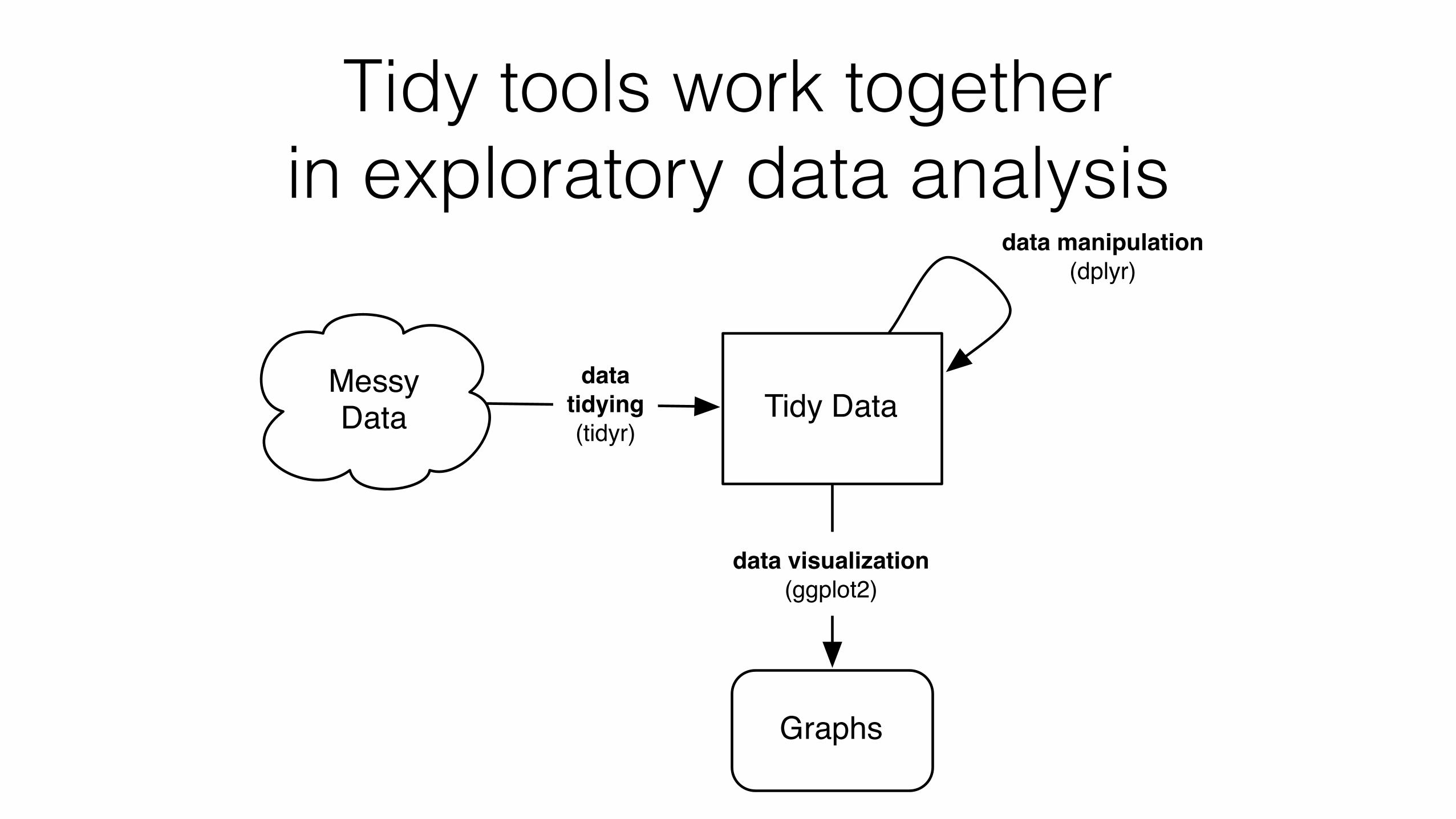
Tidy tools work together in exploratory data analysis
Messy Data Tidy Data
Graphs
data visualization(ggplot2)
datatidying(tidyr)
data manipulation(dplyr)
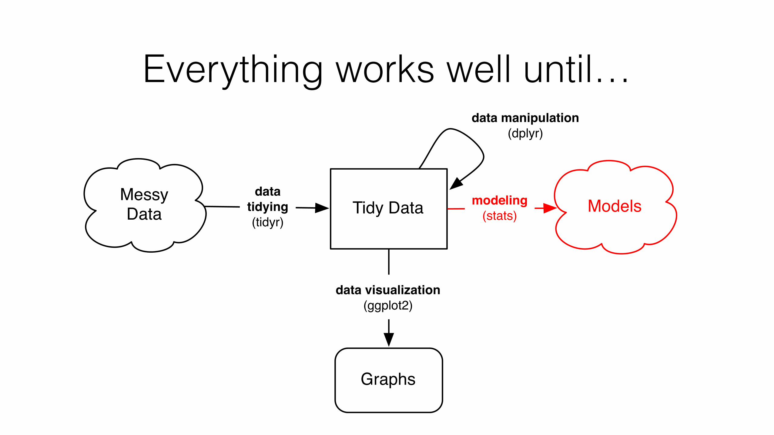
Everything works well until…
Messy Data Tidy Data
Graphs
data visualization(ggplot2)
datatidying(tidyr)
data manipulation(dplyr)
Modelsmodeling(stats)
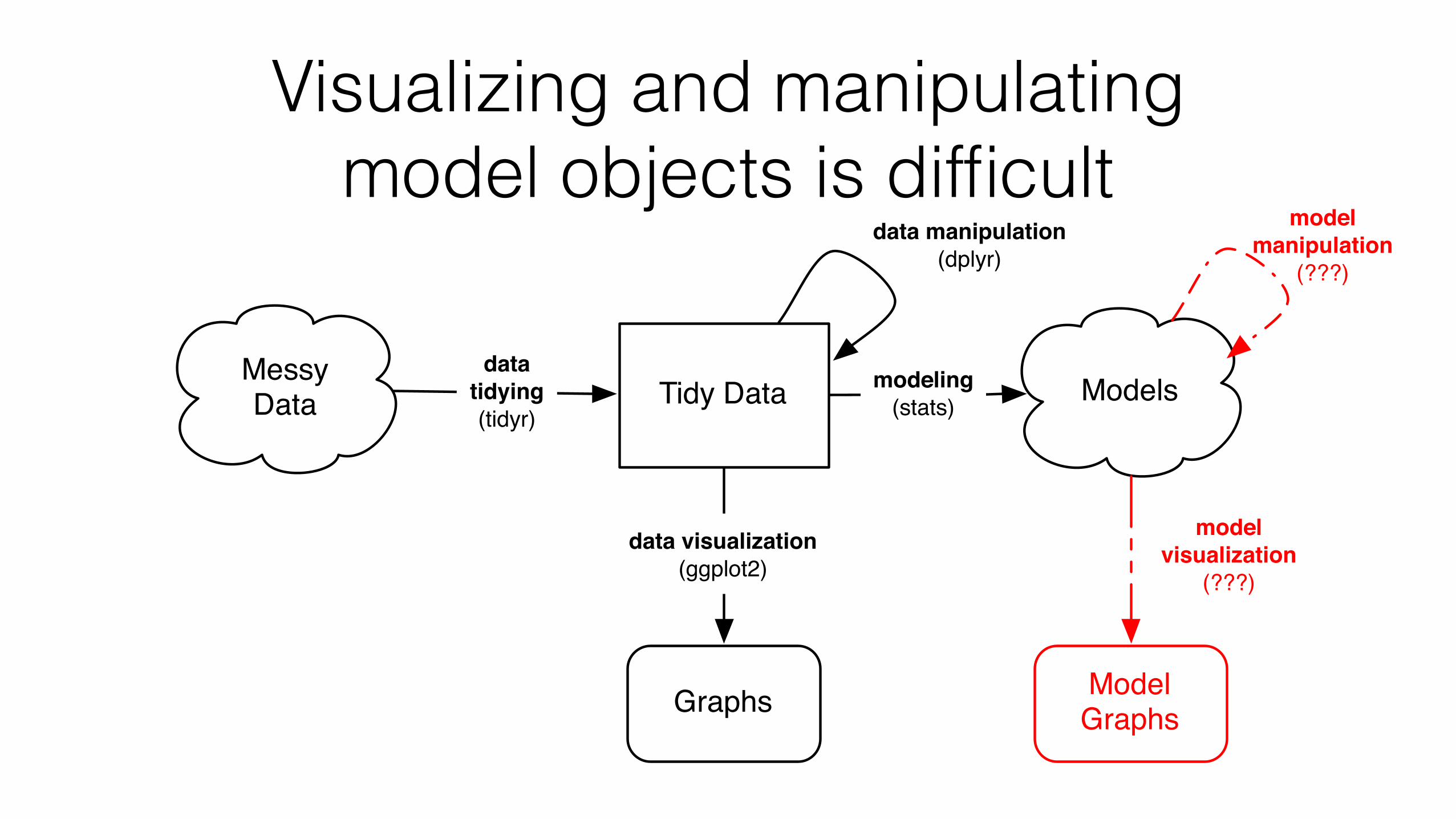
Visualizing and manipulating model objects is difficult
modelvisualization
(???)
modelmanipulation
(???)
Messy Data Tidy Data
Graphs
data visualization(ggplot2)
datatidying(tidyr)
data manipulation(dplyr)
Modelsmodeling(stats)
Model Graphs
Model objects are messy
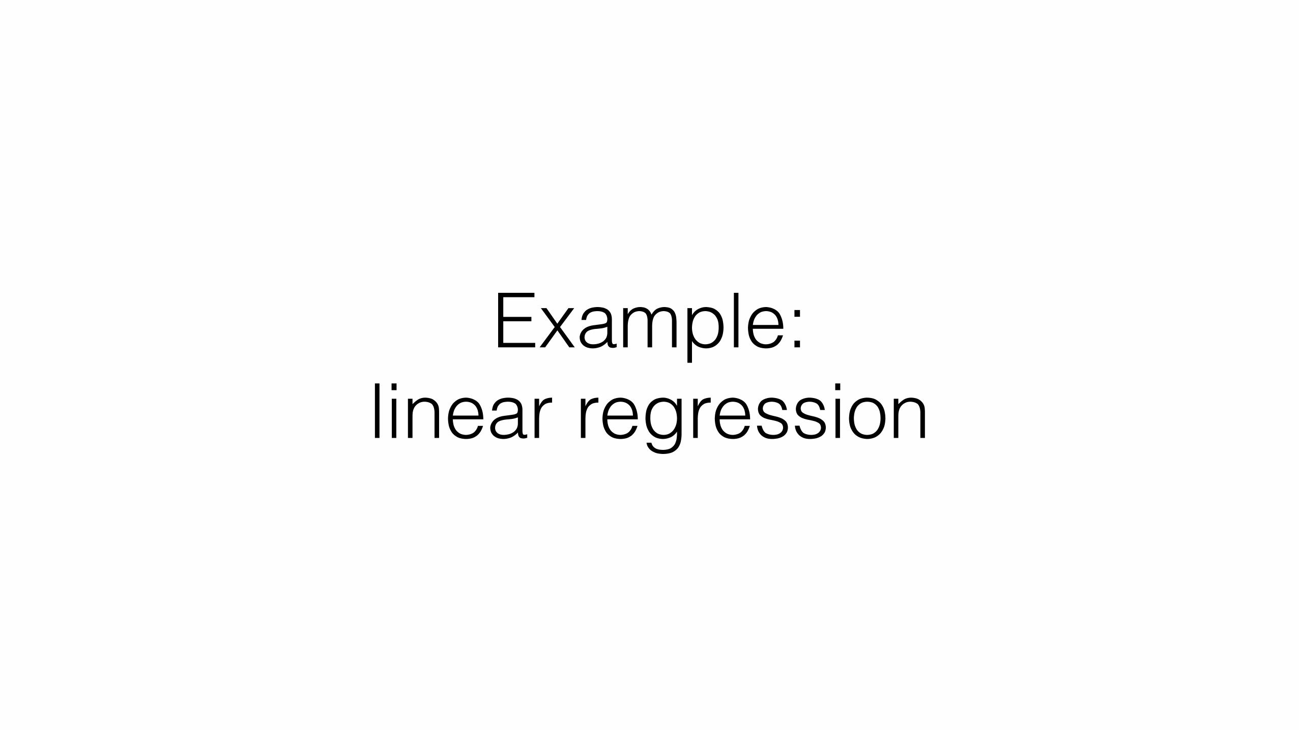
Example: linear regression
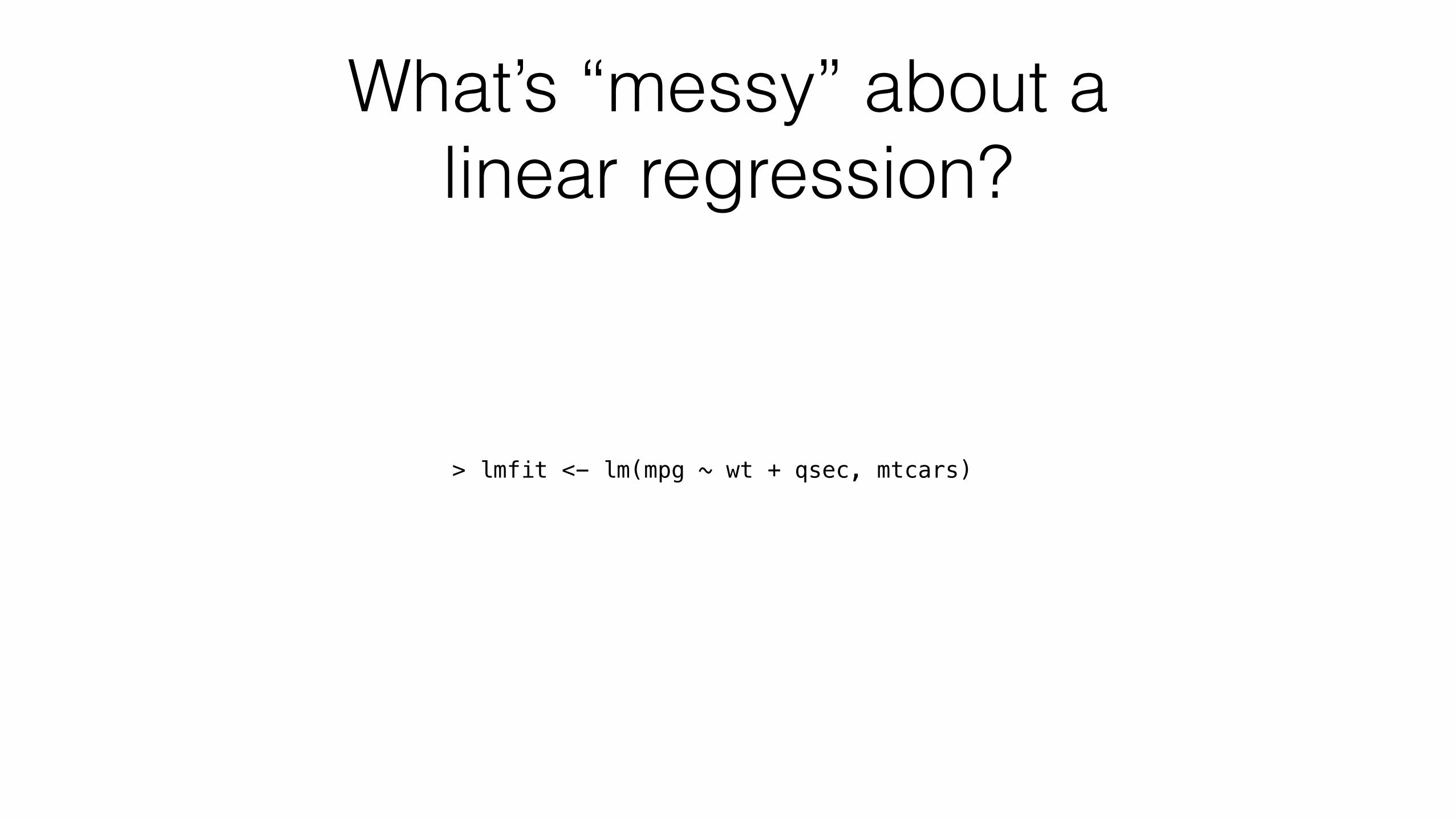
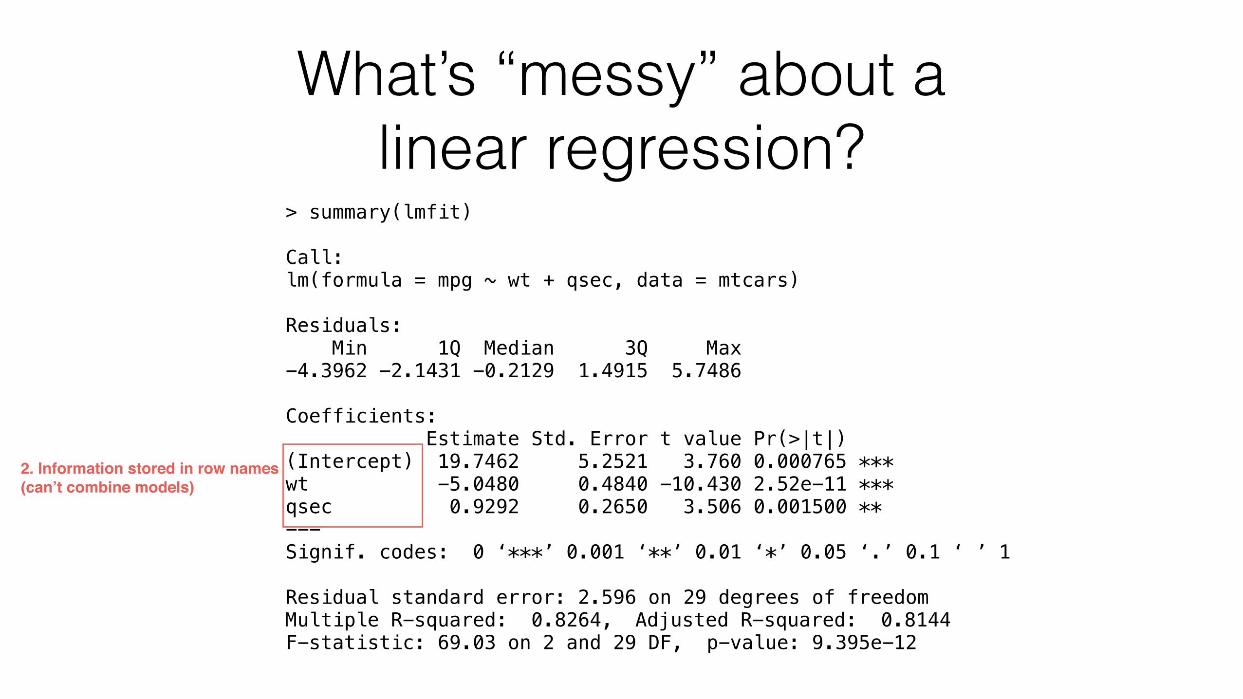
What’s “messy” about a linear regression?
> lmfit <- lm(mpg ~ wt + qsec, mtcars)
What’s “messy” about a linear regression?
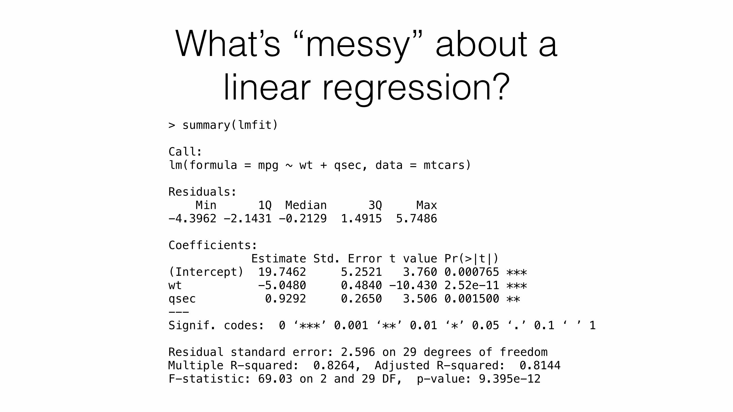
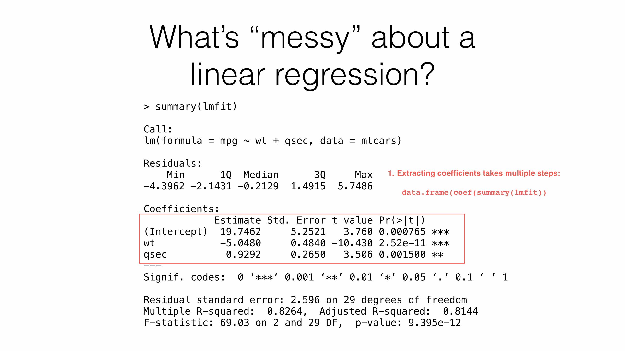
> summary(lmfit)
Call: lm(formula = mpg ~ wt + qsec, data = mtcars)
Residuals: Min 1Q Median 3Q Max -4.3962 -2.1431 -0.2129 1.4915 5.7486
Coefficients: Estimate Std. Error t value Pr(>|t|) (Intercept) 19.7462 5.2521 3.760 0.000765 *** wt -5.0480 0.4840 -10.430 2.52e-11 *** qsec 0.9292 0.2650 3.506 0.001500 ** --- Signif. codes: 0 ‘***’ 0.001 ‘**’ 0.01 ‘*’ 0.05 ‘.’ 0.1 ‘ ’ 1
Residual standard error: 2.596 on 29 degrees of freedom Multiple R-squared: 0.8264, Adjusted R-squared: 0.8144 F-statistic: 69.03 on 2 and 29 DF, p-value: 9.395e-12
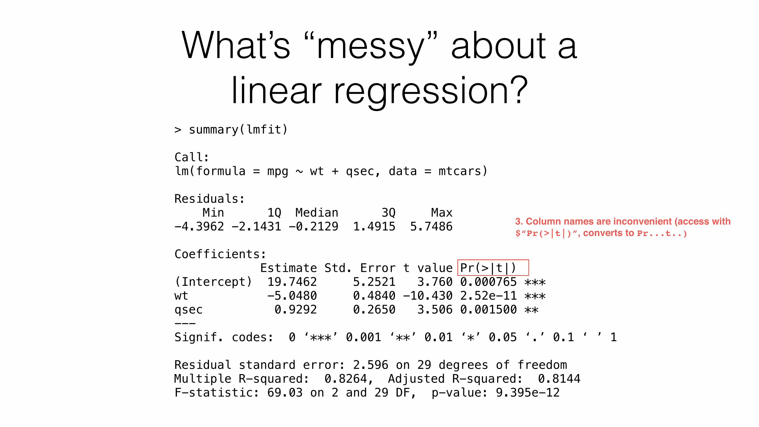
What’s “messy” about a linear regression?
> summary(lmfit)
Call: lm(formula = mpg ~ wt + qsec, data = mtcars)
Residuals: Min 1Q Median 3Q Max -4.3962 -2.1431 -0.2129 1.4915 5.7486
Coefficients: Estimate Std. Error t value Pr(>|t|) (Intercept) 19.7462 5.2521 3.760 0.000765 *** wt -5.0480 0.4840 -10.430 2.52e-11 *** qsec 0.9292 0.2650 3.506 0.001500 ** --- Signif. codes: 0 ‘***’ 0.001 ‘**’ 0.01 ‘*’ 0.05 ‘.’ 0.1 ‘ ’ 1
Residual standard error: 2.596 on 29 degrees of freedom Multiple R-squared: 0.8264, Adjusted R-squared: 0.8144 F-statistic: 69.03 on 2 and 29 DF, p-value: 9.395e-12
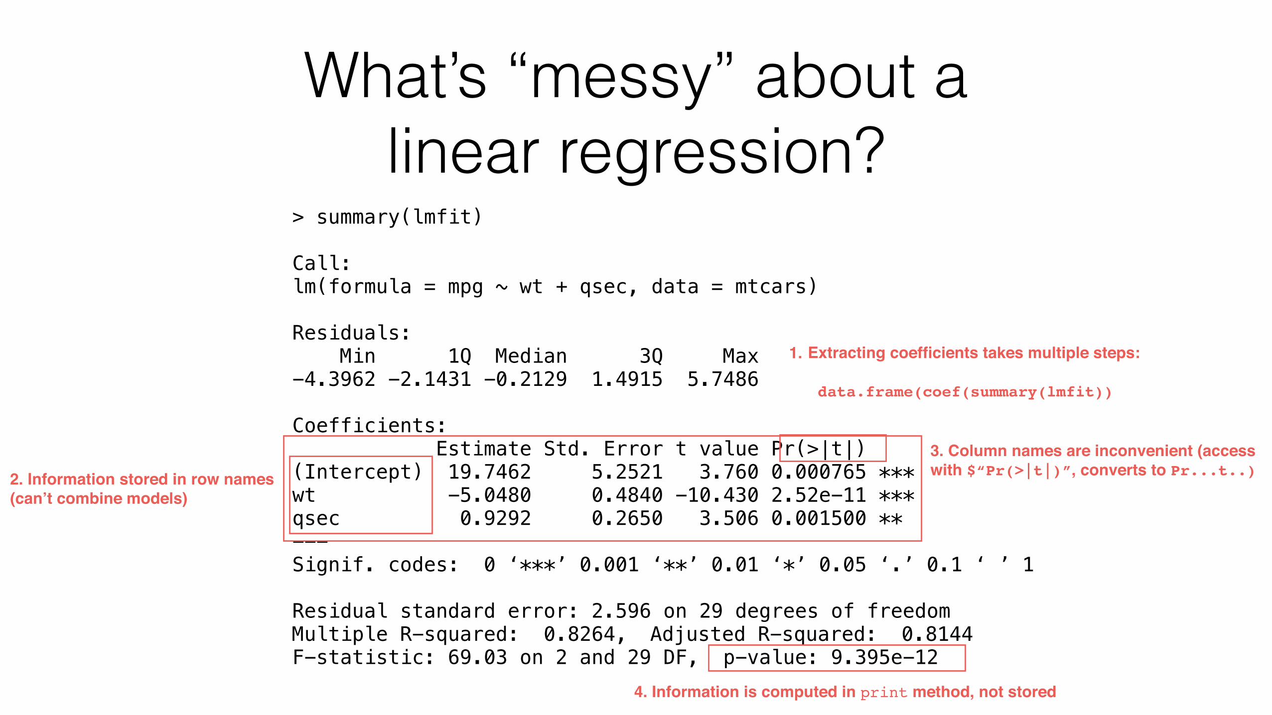
1. Extracting coefficients takes multiple steps:
data.frame(coef(summary(lmfit))
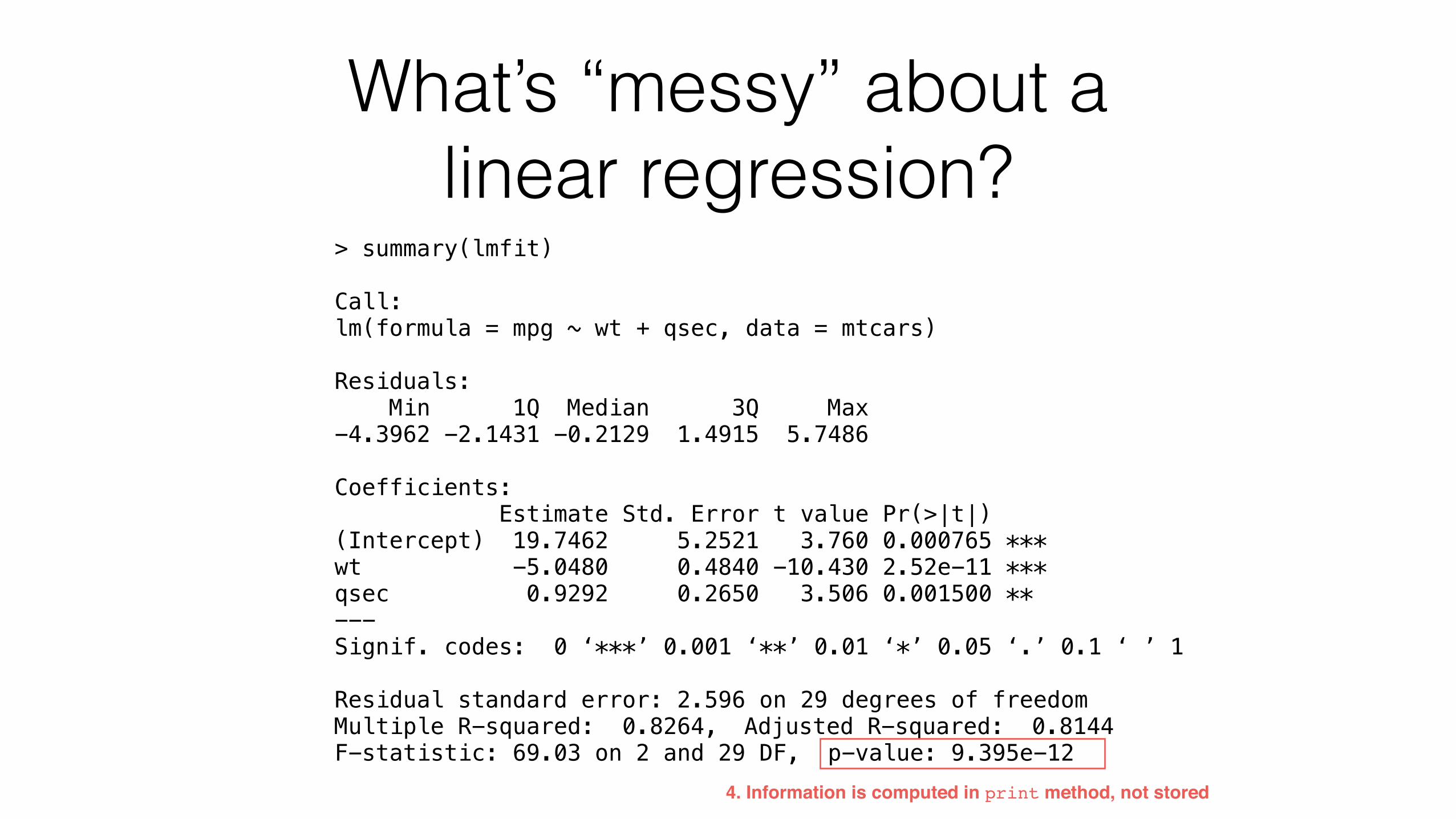
What’s “messy” about a linear regression?
> summary(lmfit)
Call: lm(formula = mpg ~ wt + qsec, data = mtcars)
Residuals: Min 1Q Median 3Q Max -4.3962 -2.1431 -0.2129 1.4915 5.7486
Coefficients: Estimate Std. Error t value Pr(>|t|) (Intercept) 19.7462 5.2521 3.760 0.000765 *** wt -5.0480 0.4840 -10.430 2.52e-11 *** qsec 0.9292 0.2650 3.506 0.001500 ** --- Signif. codes: 0 ‘***’ 0.001 ‘**’ 0.01 ‘*’ 0.05 ‘.’ 0.1 ‘ ’ 1
Residual standard error: 2.596 on 29 degrees of freedom Multiple R-squared: 0.8264, Adjusted R-squared: 0.8144 F-statistic: 69.03 on 2 and 29 DF, p-value: 9.395e-12
2. Information stored in row names(can’t combine models)
What’s “messy” about a linear regression?
> summary(lmfit)
Call: lm(formula = mpg ~ wt + qsec, data = mtcars)
Residuals: Min 1Q Median 3Q Max -4.3962 -2.1431 -0.2129 1.4915 5.7486
Coefficients: Estimate Std. Error t value Pr(>|t|) (Intercept) 19.7462 5.2521 3.760 0.000765 *** wt -5.0480 0.4840 -10.430 2.52e-11 *** qsec 0.9292 0.2650 3.506 0.001500 ** --- Signif. codes: 0 ‘***’ 0.001 ‘**’ 0.01 ‘*’ 0.05 ‘.’ 0.1 ‘ ’ 1
Residual standard error: 2.596 on 29 degrees of freedom Multiple R-squared: 0.8264, Adjusted R-squared: 0.8144 F-statistic: 69.03 on 2 and 29 DF, p-value: 9.395e-12
3. Column names are inconvenient (access with $“Pr(>|t|)”, converts to Pr...t..)
What’s “messy” about a linear regression?
> summary(lmfit)
Call: lm(formula = mpg ~ wt + qsec, data = mtcars)
Residuals: Min 1Q Median 3Q Max -4.3962 -2.1431 -0.2129 1.4915 5.7486
Coefficients: Estimate Std. Error t value Pr(>|t|) (Intercept) 19.7462 5.2521 3.760 0.000765 *** wt -5.0480 0.4840 -10.430 2.52e-11 *** qsec 0.9292 0.2650 3.506 0.001500 ** --- Signif. codes: 0 ‘***’ 0.001 ‘**’ 0.01 ‘*’ 0.05 ‘.’ 0.1 ‘ ’ 1
Residual standard error: 2.596 on 29 degrees of freedom Multiple R-squared: 0.8264, Adjusted R-squared: 0.8144 F-statistic: 69.03 on 2 and 29 DF, p-value: 9.395e-12
4. Information is computed in print method, not stored
1. Extracting coefficients takes multiple steps:
data.frame(coef(summary(lmfit))
2. Information stored in row names(can’t combine models)
3. Column names are inconvenient (access with $“Pr(>|t|)”, converts to Pr...t..)

These inconveniences aren’t an exception, they’re the rule
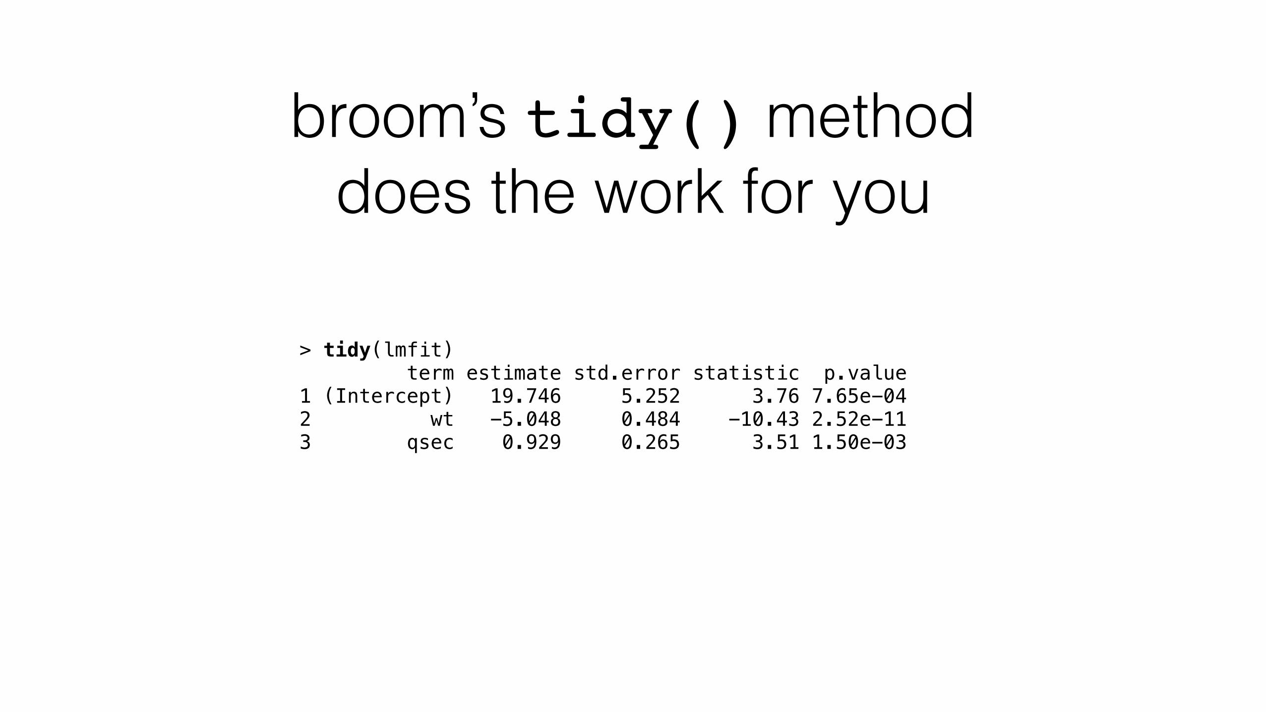
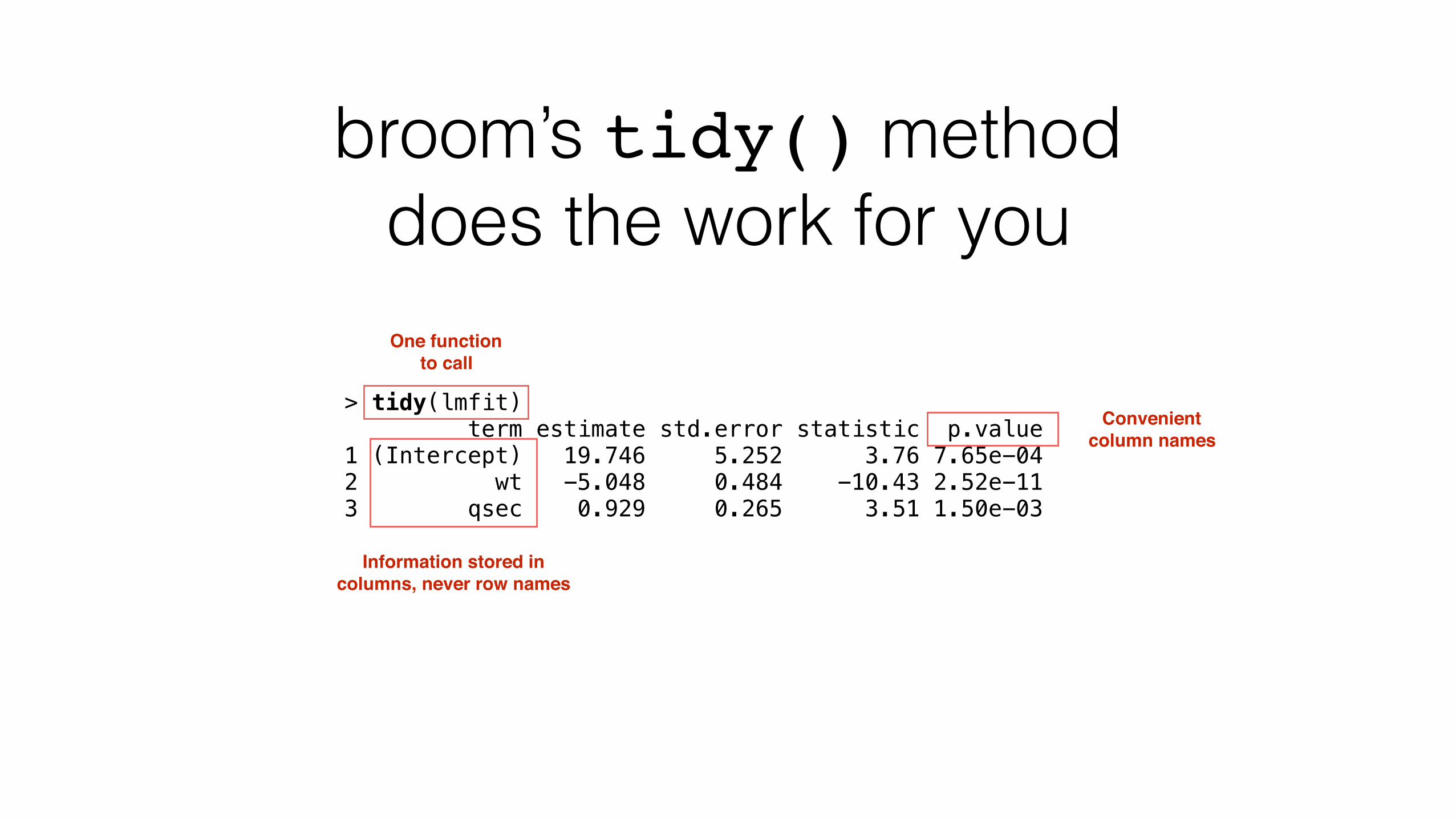
broom’s tidy() method does the work for you
> tidy(lmfit) term estimate std.error statistic p.value 1 (Intercept) 19.746 5.252 3.76 7.65e-04 2 wt -5.048 0.484 -10.43 2.52e-11 3 qsec 0.929 0.265 3.51 1.50e-03
broom’s tidy() method does the work for you
> tidy(lmfit) term estimate std.error statistic p.value 1 (Intercept) 19.746 5.252 3.76 7.65e-04 2 wt -5.048 0.484 -10.43 2.52e-11 3 qsec 0.929 0.265 3.51 1.50e-03
Information stored in columns, never row names
Convenient column names
One function to call
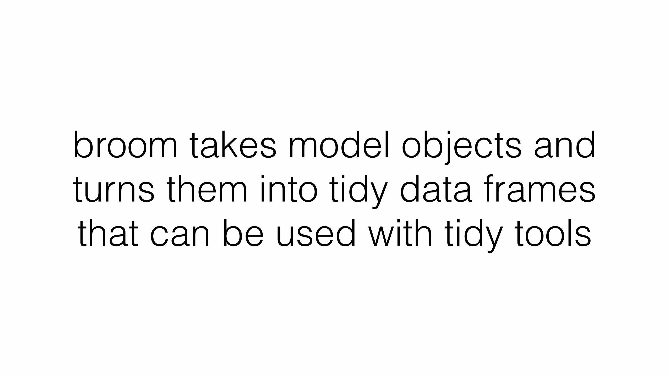
broom takes model objects and turns them into tidy data frames that can be used with tidy tools
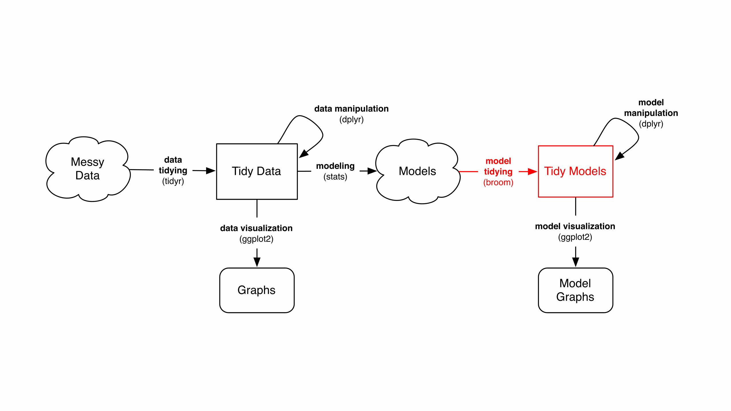
Messy Data Tidy Data
Graphs
data visualization(ggplot2)
datatidying(tidyr)
data manipulation(dplyr)
Modelsmodeling(stats)
ModelGraphs
Tidy Modelsmodeltidying(broom)
model visualization(ggplot2)
model manipulation
(dplyr)
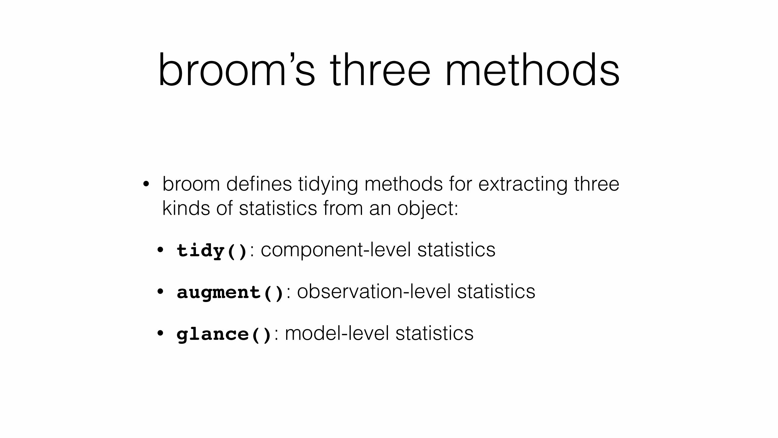
broom’s three methods
• broom defines tidying methods for extracting three kinds of statistics from an object:
• tidy(): component-level statistics
• augment(): observation-level statistics
• glance(): model-level statistics
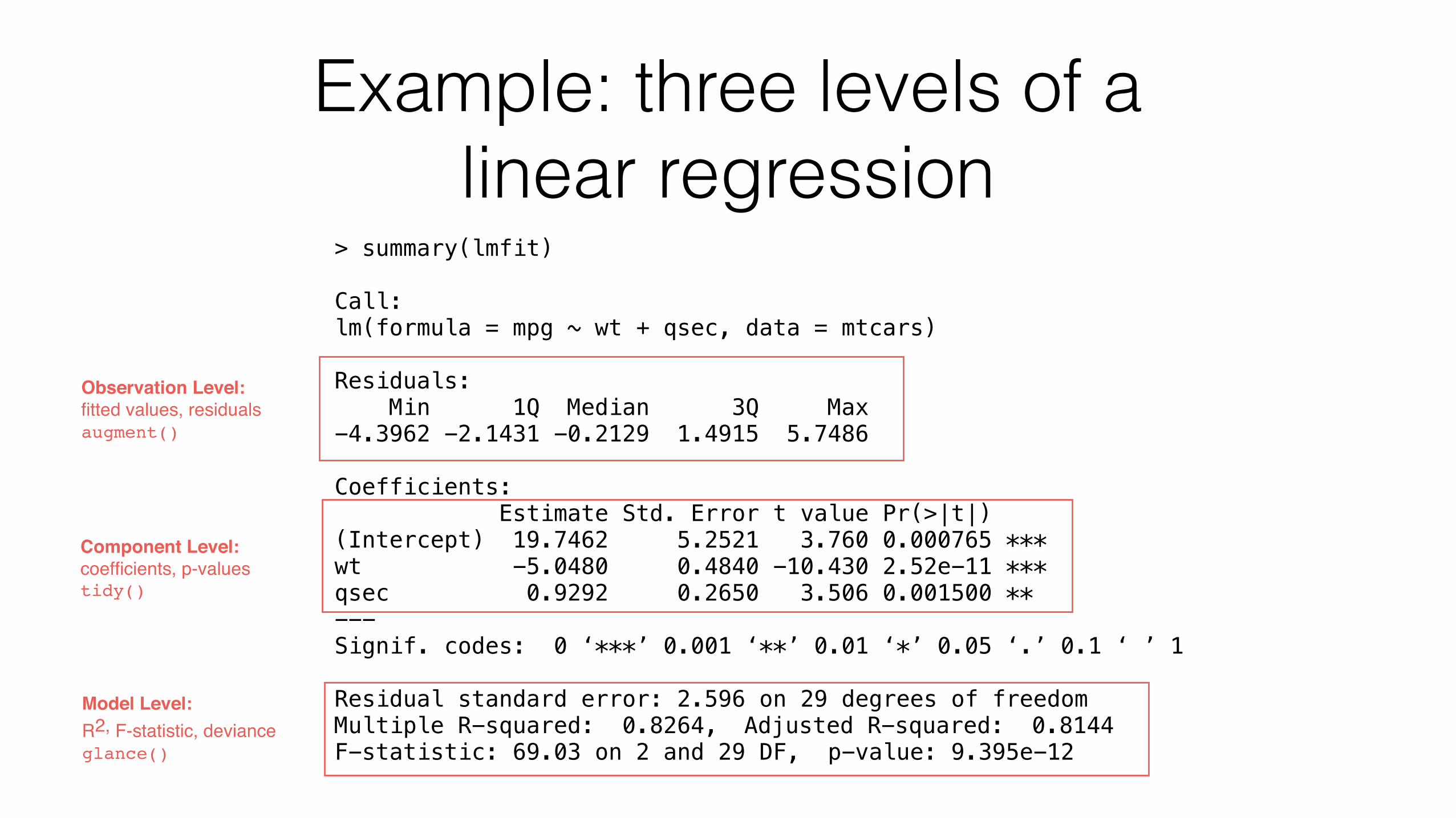
Example: three levels of a linear regression
> summary(lmfit)
Call: lm(formula = mpg ~ wt + qsec, data = mtcars)
Residuals: Min 1Q Median 3Q Max -4.3962 -2.1431 -0.2129 1.4915 5.7486
Coefficients: Estimate Std. Error t value Pr(>|t|) (Intercept) 19.7462 5.2521 3.760 0.000765 *** wt -5.0480 0.4840 -10.430 2.52e-11 *** qsec 0.9292 0.2650 3.506 0.001500 ** --- Signif. codes: 0 ‘***’ 0.001 ‘**’ 0.01 ‘*’ 0.05 ‘.’ 0.1 ‘ ’ 1
Residual standard error: 2.596 on 29 degrees of freedom Multiple R-squared: 0.8264, Adjusted R-squared: 0.8144 F-statistic: 69.03 on 2 and 29 DF, p-value: 9.395e-12
Component Level: coefficients, p-valuestidy()
Observation Level: fitted values, residualsaugment()
Model Level: R2, F-statistic, devianceglance()
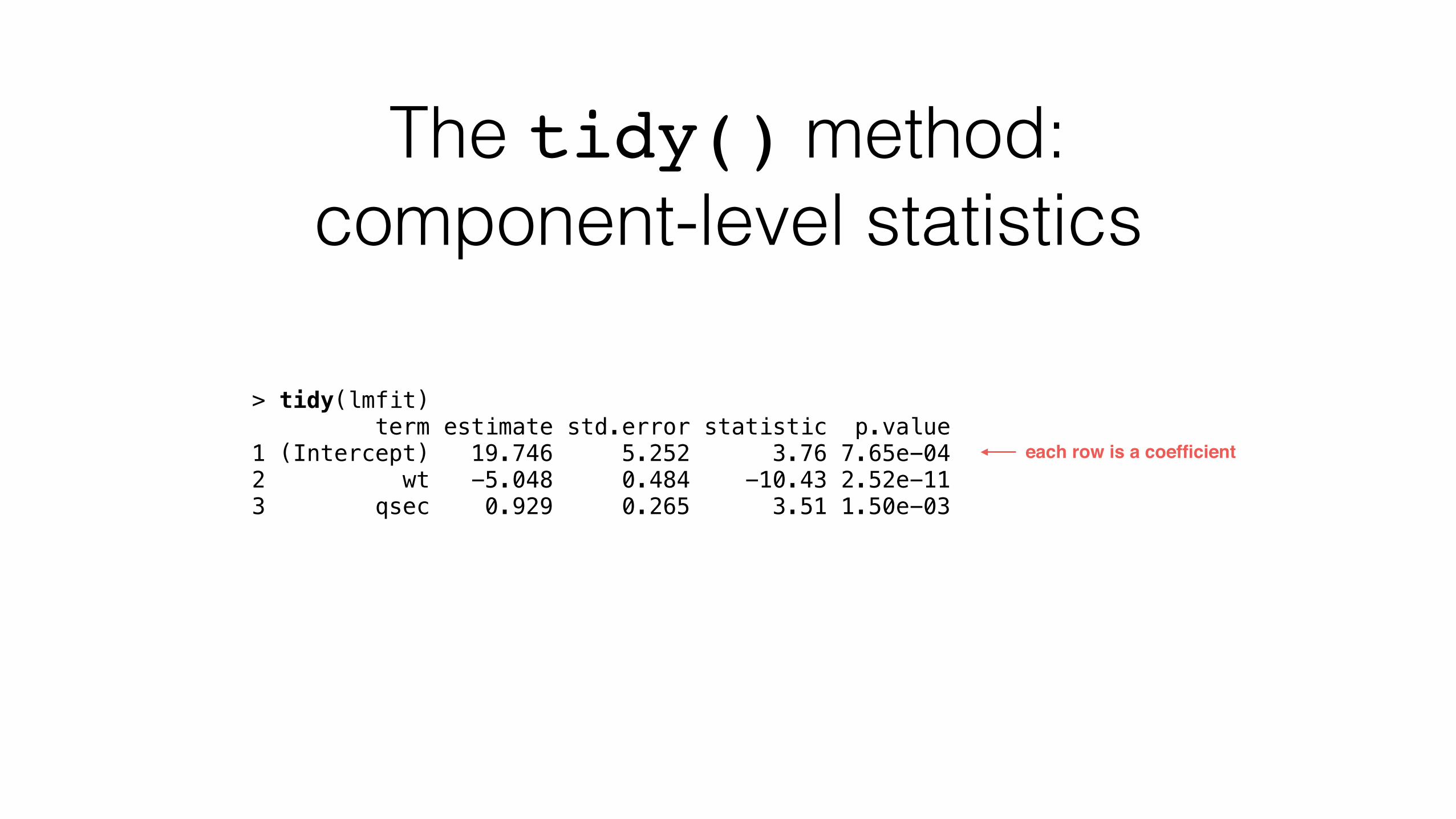
The tidy() method: component-level statistics
> tidy(lmfit) term estimate std.error statistic p.value 1 (Intercept) 19.746 5.252 3.76 7.65e-04 2 wt -5.048 0.484 -10.43 2.52e-11 3 qsec 0.929 0.265 3.51 1.50e-03
each row is a coefficient
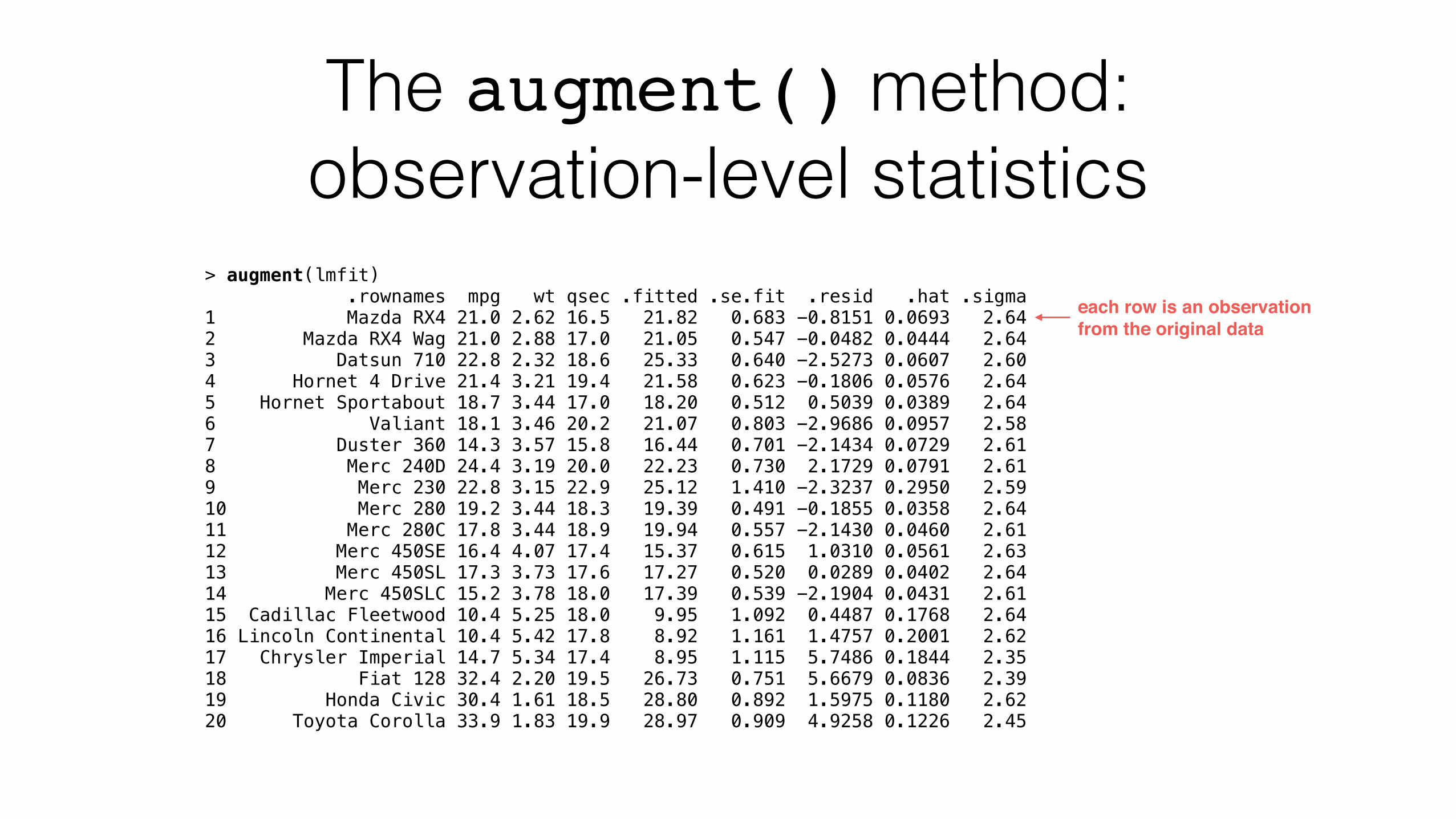
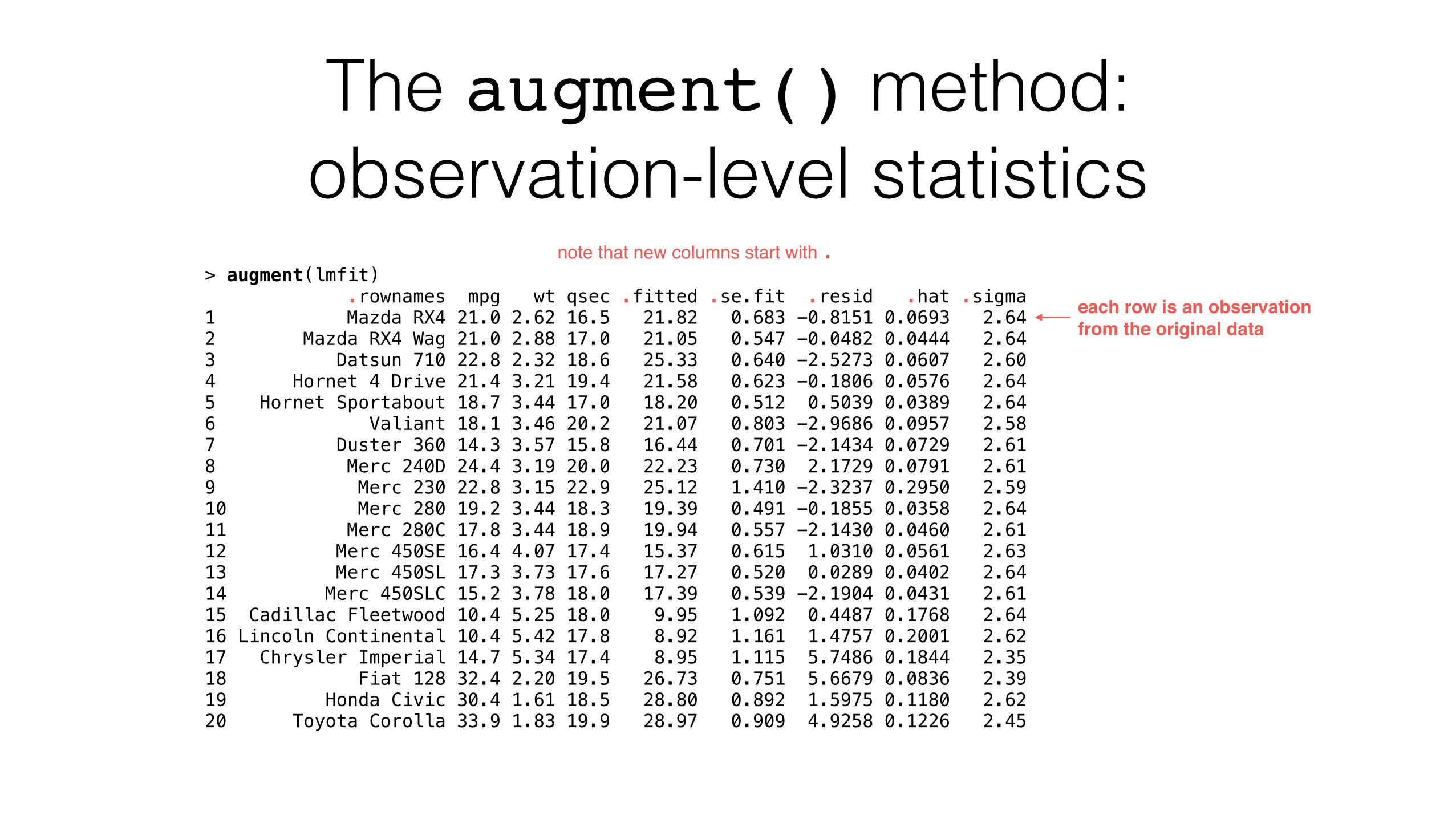
The augment() method: observation-level statistics
> augment(lmfit) .rownames mpg wt qsec .fitted .se.fit .resid .hat .sigma 1 Mazda RX4 21.0 2.62 16.5 21.82 0.683 -0.8151 0.0693 2.64 2 Mazda RX4 Wag 21.0 2.88 17.0 21.05 0.547 -0.0482 0.0444 2.64 3 Datsun 710 22.8 2.32 18.6 25.33 0.640 -2.5273 0.0607 2.60 4 Hornet 4 Drive 21.4 3.21 19.4 21.58 0.623 -0.1806 0.0576 2.64 5 Hornet Sportabout 18.7 3.44 17.0 18.20 0.512 0.5039 0.0389 2.64 6 Valiant 18.1 3.46 20.2 21.07 0.803 -2.9686 0.0957 2.58 7 Duster 360 14.3 3.57 15.8 16.44 0.701 -2.1434 0.0729 2.61 8 Merc 240D 24.4 3.19 20.0 22.23 0.730 2.1729 0.0791 2.61 9 Merc 230 22.8 3.15 22.9 25.12 1.410 -2.3237 0.2950 2.59 10 Merc 280 19.2 3.44 18.3 19.39 0.491 -0.1855 0.0358 2.64 11 Merc 280C 17.8 3.44 18.9 19.94 0.557 -2.1430 0.0460 2.61 12 Merc 450SE 16.4 4.07 17.4 15.37 0.615 1.0310 0.0561 2.63 13 Merc 450SL 17.3 3.73 17.6 17.27 0.520 0.0289 0.0402 2.64 14 Merc 450SLC 15.2 3.78 18.0 17.39 0.539 -2.1904 0.0431 2.61 15 Cadillac Fleetwood 10.4 5.25 18.0 9.95 1.092 0.4487 0.1768 2.64 16 Lincoln Continental 10.4 5.42 17.8 8.92 1.161 1.4757 0.2001 2.62 17 Chrysler Imperial 14.7 5.34 17.4 8.95 1.115 5.7486 0.1844 2.35 18 Fiat 128 32.4 2.20 19.5 26.73 0.751 5.6679 0.0836 2.39 19 Honda Civic 30.4 1.61 18.5 28.80 0.892 1.5975 0.1180 2.62 20 Toyota Corolla 33.9 1.83 19.9 28.97 0.909 4.9258 0.1226 2.45
each row is an observation from the original data
The augment() method: observation-level statistics
> augment(lmfit) .rownames mpg wt qsec .fitted .se.fit .resid .hat .sigma 1 Mazda RX4 21.0 2.62 16.5 21.82 0.683 -0.8151 0.0693 2.64 2 Mazda RX4 Wag 21.0 2.88 17.0 21.05 0.547 -0.0482 0.0444 2.64 3 Datsun 710 22.8 2.32 18.6 25.33 0.640 -2.5273 0.0607 2.60 4 Hornet 4 Drive 21.4 3.21 19.4 21.58 0.623 -0.1806 0.0576 2.64 5 Hornet Sportabout 18.7 3.44 17.0 18.20 0.512 0.5039 0.0389 2.64 6 Valiant 18.1 3.46 20.2 21.07 0.803 -2.9686 0.0957 2.58 7 Duster 360 14.3 3.57 15.8 16.44 0.701 -2.1434 0.0729 2.61 8 Merc 240D 24.4 3.19 20.0 22.23 0.730 2.1729 0.0791 2.61 9 Merc 230 22.8 3.15 22.9 25.12 1.410 -2.3237 0.2950 2.59 10 Merc 280 19.2 3.44 18.3 19.39 0.491 -0.1855 0.0358 2.64 11 Merc 280C 17.8 3.44 18.9 19.94 0.557 -2.1430 0.0460 2.61 12 Merc 450SE 16.4 4.07 17.4 15.37 0.615 1.0310 0.0561 2.63 13 Merc 450SL 17.3 3.73 17.6 17.27 0.520 0.0289 0.0402 2.64 14 Merc 450SLC 15.2 3.78 18.0 17.39 0.539 -2.1904 0.0431 2.61 15 Cadillac Fleetwood 10.4 5.25 18.0 9.95 1.092 0.4487 0.1768 2.64 16 Lincoln Continental 10.4 5.42 17.8 8.92 1.161 1.4757 0.2001 2.62 17 Chrysler Imperial 14.7 5.34 17.4 8.95 1.115 5.7486 0.1844 2.35 18 Fiat 128 32.4 2.20 19.5 26.73 0.751 5.6679 0.0836 2.39 19 Honda Civic 30.4 1.61 18.5 28.80 0.892 1.5975 0.1180 2.62 20 Toyota Corolla 33.9 1.83 19.9 28.97 0.909 4.9258 0.1226 2.45
note that new columns start with .
each row is an observation from the original data
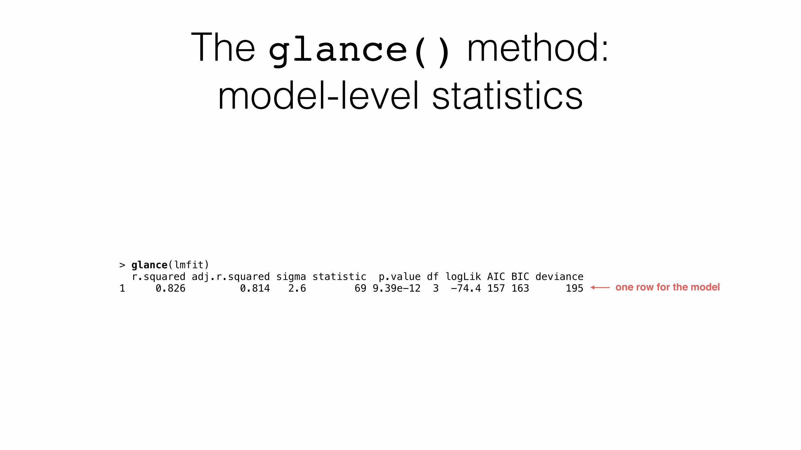
The glance() method: model-level statistics
> glance(lmfit) r.squared adj.r.squared sigma statistic p.value df logLik AIC BIC deviance 1 0.826 0.814 2.6 69 9.39e-12 3 -74.4 157 163 195 one row for the model
broom works across many kinds of model objects
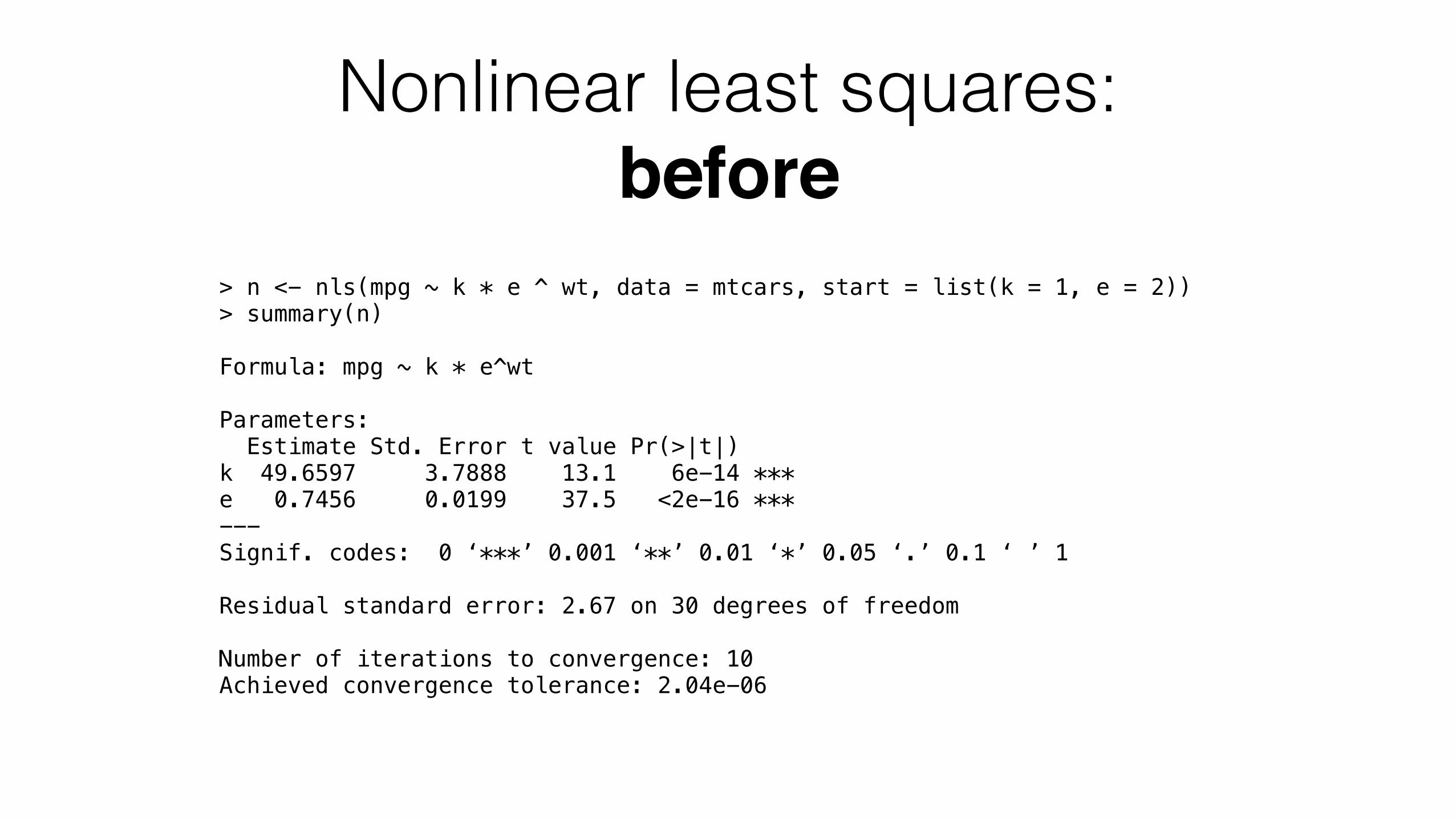
Nonlinear least squares: before
> n <- nls(mpg ~ k * e ^ wt, data = mtcars, start = list(k = 1, e = 2)) > summary(n)
Formula: mpg ~ k * e^wt
Parameters: Estimate Std. Error t value Pr(>|t|) k 49.6597 3.7888 13.1 6e-14 *** e 0.7456 0.0199 37.5 <2e-16 *** --- Signif. codes: 0 ‘***’ 0.001 ‘**’ 0.01 ‘*’ 0.05 ‘.’ 0.1 ‘ ’ 1
Residual standard error: 2.67 on 30 degrees of freedom
Number of iterations to convergence: 10 Achieved convergence tolerance: 2.04e-06
Nonlinear least squares: after
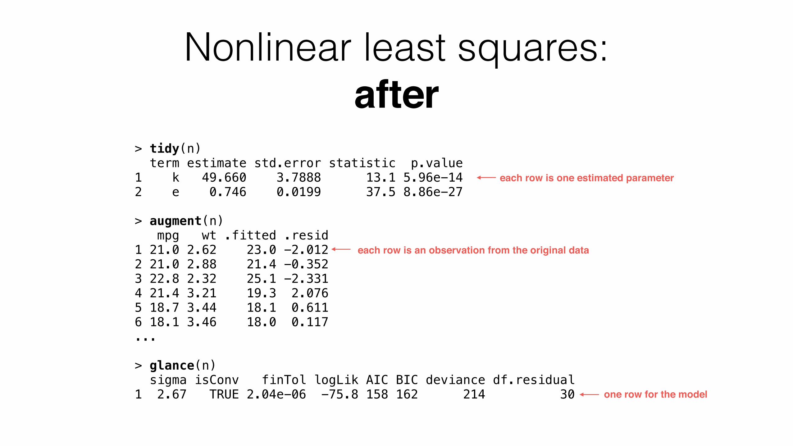
> tidy(n) term estimate std.error statistic p.value 1 k 49.660 3.7888 13.1 5.96e-14 2 e 0.746 0.0199 37.5 8.86e-27
> augment(n) mpg wt .fitted .resid 1 21.0 2.62 23.0 -2.012 2 21.0 2.88 21.4 -0.352 3 22.8 2.32 25.1 -2.331 4 21.4 3.21 19.3 2.076 5 18.7 3.44 18.1 0.611 6 18.1 3.46 18.0 0.117 ...
> glance(n) sigma isConv finTol logLik AIC BIC deviance df.residual 1 2.67 TRUE 2.04e-06 -75.8 158 162 214 30
each row is one estimated parameter
each row is an observation from the original data
one row for the model
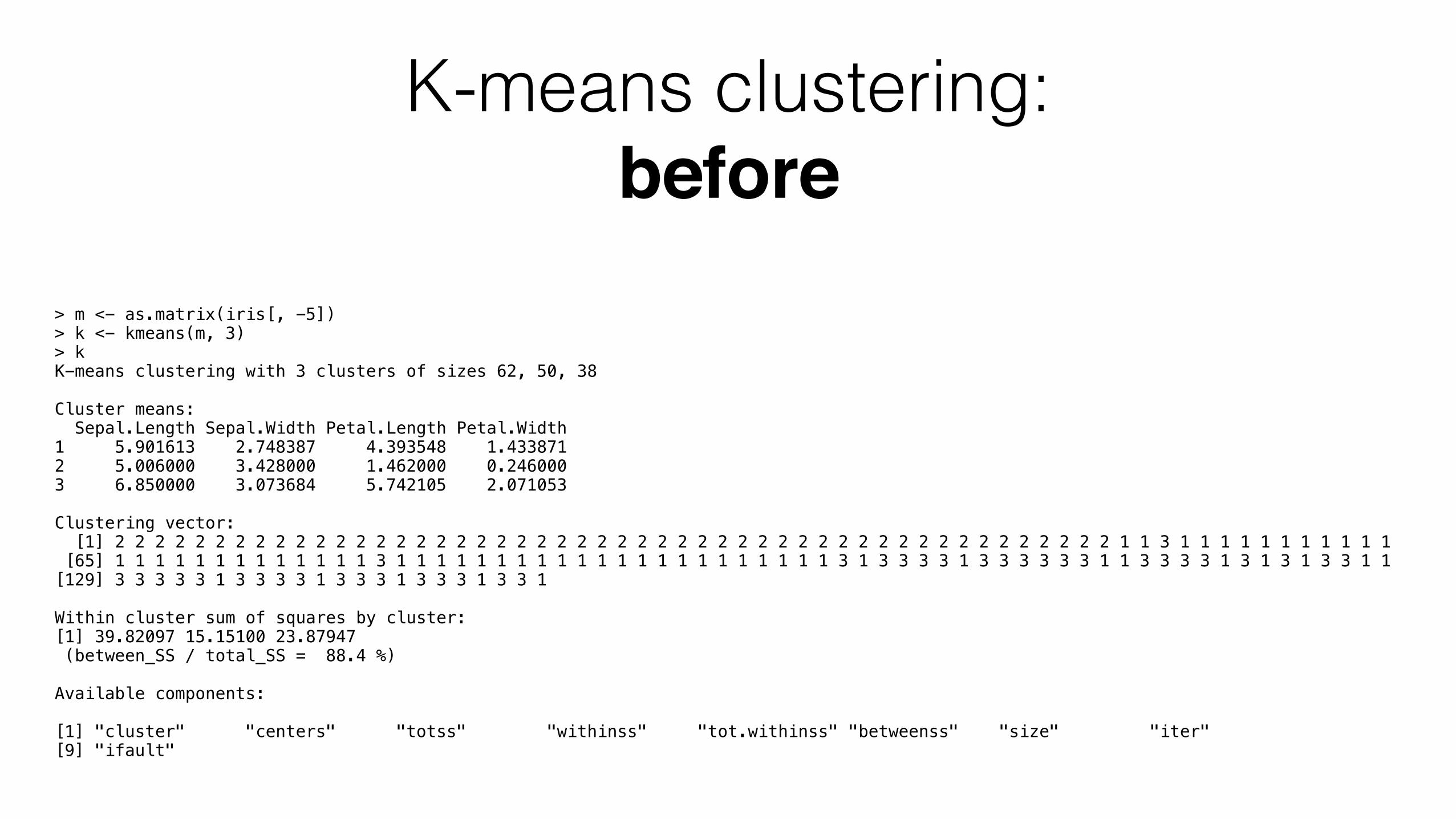
K-means clustering: before
> m <- as.matrix(iris[, -5]) > k <- kmeans(m, 3) > k K-means clustering with 3 clusters of sizes 62, 50, 38
Cluster means: Sepal.Length Sepal.Width Petal.Length Petal.Width 1 5.901613 2.748387 4.393548 1.433871 2 5.006000 3.428000 1.462000 0.246000 3 6.850000 3.073684 5.742105 2.071053
Clustering vector: [1] 2 2 2 2 2 2 2 2 2 2 2 2 2 2 2 2 2 2 2 2 2 2 2 2 2 2 2 2 2 2 2 2 2 2 2 2 2 2 2 2 2 2 2 2 2 2 2 2 2 2 1 1 3 1 1 1 1 1 1 1 1 1 1 1 [65] 1 1 1 1 1 1 1 1 1 1 1 1 1 3 1 1 1 1 1 1 1 1 1 1 1 1 1 1 1 1 1 1 1 1 1 1 3 1 3 3 3 3 1 3 3 3 3 3 3 1 1 3 3 3 3 1 3 1 3 1 3 3 1 1 [129] 3 3 3 3 3 1 3 3 3 3 1 3 3 3 1 3 3 3 1 3 3 1
Within cluster sum of squares by cluster: [1] 39.82097 15.15100 23.87947 (between_SS / total_SS = 88.4 %)
Available components:
[1] "cluster" "centers" "totss" "withinss" "tot.withinss" "betweenss" "size" "iter" [9] "ifault"
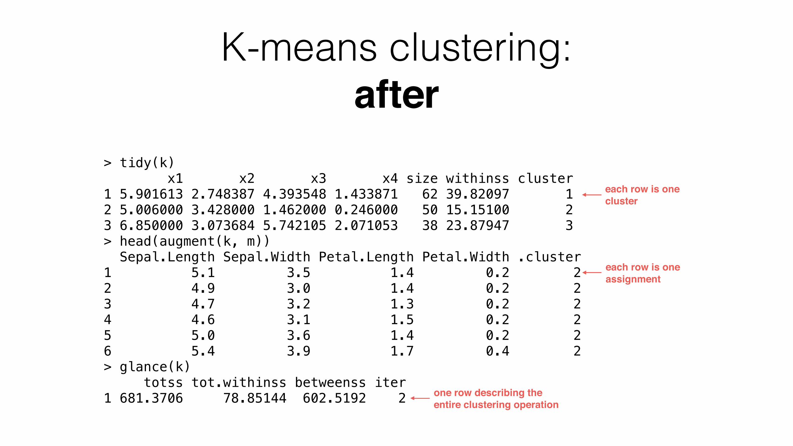
K-means clustering: after
> tidy(k) x1 x2 x3 x4 size withinss cluster 1 5.901613 2.748387 4.393548 1.433871 62 39.82097 1 2 5.006000 3.428000 1.462000 0.246000 50 15.15100 2 3 6.850000 3.073684 5.742105 2.071053 38 23.87947 3 > head(augment(k, m)) Sepal.Length Sepal.Width Petal.Length Petal.Width .cluster 1 5.1 3.5 1.4 0.2 2 2 4.9 3.0 1.4 0.2 2 3 4.7 3.2 1.3 0.2 2 4 4.6 3.1 1.5 0.2 2 5 5.0 3.6 1.4 0.2 2 6 5.4 3.9 1.7 0.4 2 > glance(k) totss tot.withinss betweenss iter 1 681.3706 78.85144 602.5192 2
each row is one cluster
each row is one assignment
one row describing the entire clustering operation
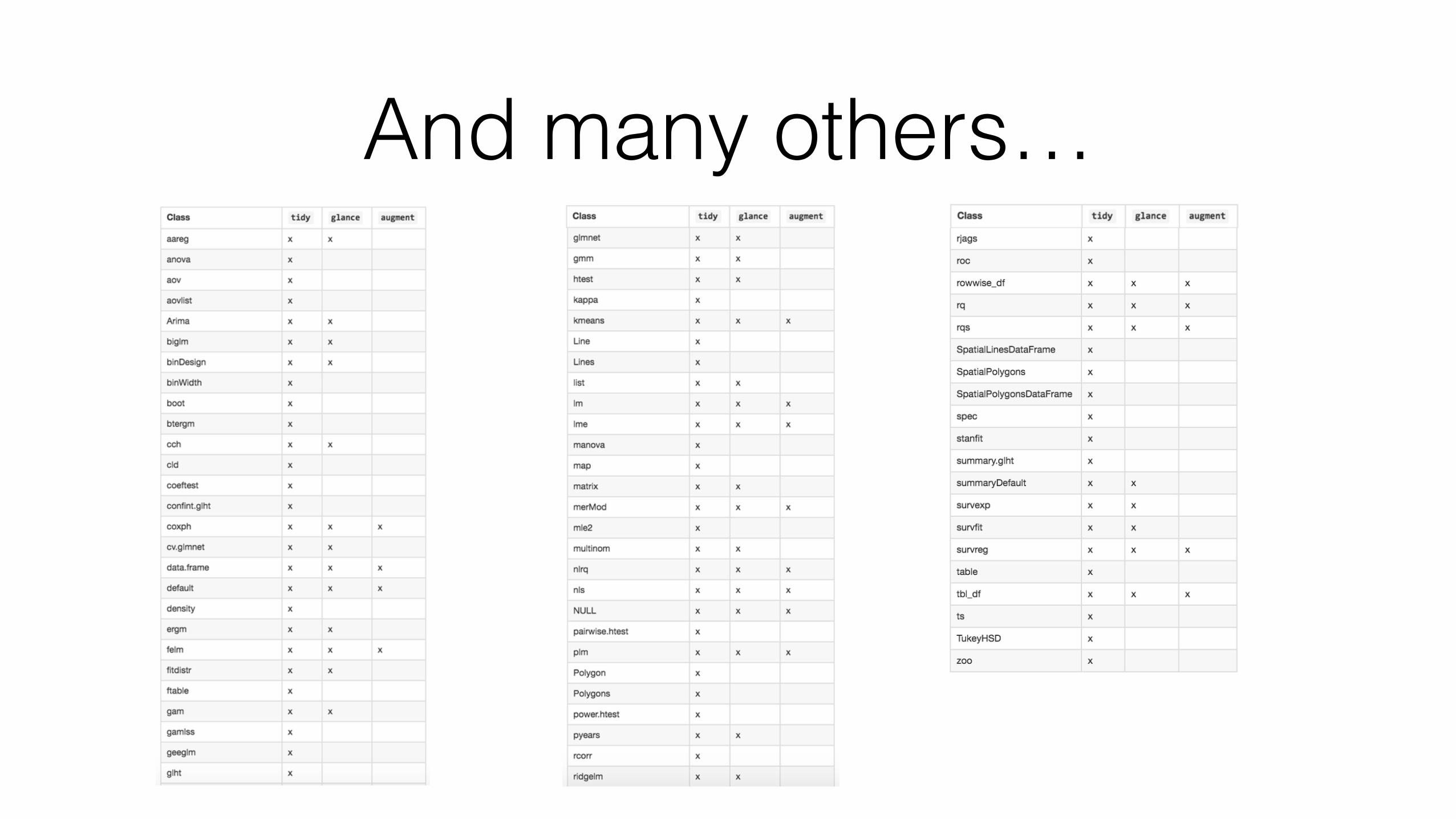
And many others…

Why are tidy models useful?
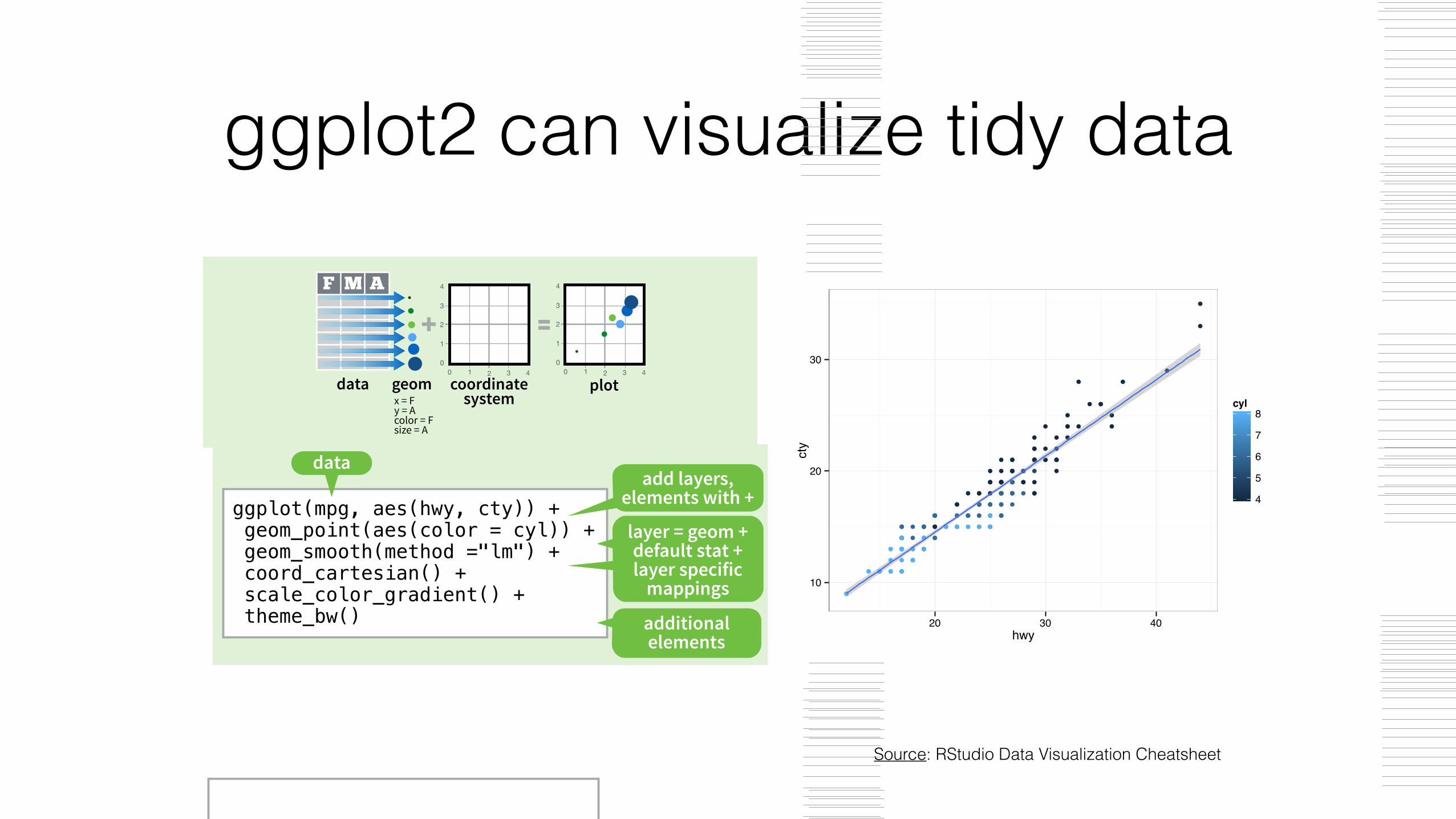
ggplot2 can visualize tidy data
Source: RStudio Data Visualization Cheatsheet
Graphical Primitives
Data Visualization with ggplot2
Cheat Sheet
RStudio® is a trademark of RStudio, Inc. • CC BY RStudio • [email protected] • 844-448-1212 • rstudio.com Learn more at docs.ggplot2.org • ggplot2 0.9.3.1 • Updated: 3/15
Geoms - Use a geom to represent data points, use the geom’s aesthetic properties to represent variables. Each function returns a layer.
One Variable
a + geom_area(stat = "bin") x, y, alpha, color, fill, linetype, size b + geom_area(aes(y = ..density..), stat = "bin")
a + geom_density(kernel = "gaussian") x, y, alpha, color, fill, linetype, size, weight b + geom_density(aes(y = ..county..))
a + geom_dotplot() x, y, alpha, color, fill
a + geom_freqpoly() x, y, alpha, color, linetype, size b + geom_freqpoly(aes(y = ..density..))
a + geom_histogram(binwidth = 5) x, y, alpha, color, fill, linetype, size, weight b + geom_histogram(aes(y = ..density..))
Discreteb <- ggplot(mpg, aes(fl))
b + geom_bar() x, alpha, color, fill, linetype, size, weight
Continuousa <- ggplot(mpg, aes(hwy))
Two Variables
Continuous Function
Discrete X, Discrete Yh <- ggplot(diamonds, aes(cut, color))
h + geom_jitter() x, y, alpha, color, fill, shape, size
Discrete X, Continuous Yg <- ggplot(mpg, aes(class, hwy))
g + geom_bar(stat = "identity") x, y, alpha, color, fill, linetype, size, weight
g + geom_boxplot() lower, middle, upper, x, ymax, ymin, alpha, color, fill, linetype, shape, size, weight
g + geom_dotplot(binaxis = "y", stackdir = "center") x, y, alpha, color, fill
g + geom_violin(scale = "area") x, y, alpha, color, fill, linetype, size, weight
Continuous X, Continuous Yf <- ggplot(mpg, aes(cty, hwy))
f + geom_blank()
f + geom_jitter() x, y, alpha, color, fill, shape, size
f + geom_point() x, y, alpha, color, fill, shape, size
f + geom_quantile() x, y, alpha, color, linetype, size, weight
f + geom_rug(sides = "bl") alpha, color, linetype, size
f + geom_smooth(model = lm) x, y, alpha, color, fill, linetype, size, weight
f + geom_text(aes(label = cty)) x, y, label, alpha, angle, color, family, fontface, hjust, lineheight, size, vjust
Three Variables
m + geom_contour(aes(z = z)) x, y, z, alpha, colour, linetype, size, weight
seals$z <- with(seals, sqrt(delta_long^2 + delta_lat^2)) m <- ggplot(seals, aes(long, lat))
j <- ggplot(economics, aes(date, unemploy))j + geom_area()
x, y, alpha, color, fill, linetype, size
j + geom_line() x, y, alpha, color, linetype, size
j + geom_step(direction = "hv") x, y, alpha, color, linetype, size
Continuous Bivariate Distributioni <- ggplot(movies, aes(year, rating))i + geom_bin2d(binwidth = c(5, 0.5))
xmax, xmin, ymax, ymin, alpha, color, fill, linetype, size, weight
i + geom_density2d() x, y, alpha, colour, linetype, size
i + geom_hex() x, y, alpha, colour, fill size
e + geom_segment(aes( xend = long + delta_long, yend = lat + delta_lat)) x, xend, y, yend, alpha, color, linetype, size
e + geom_rect(aes(xmin = long, ymin = lat, xmax= long + delta_long, ymax = lat + delta_lat)) xmax, xmin, ymax, ymin, alpha, color, fill, linetype, size
c + geom_polygon(aes(group = group)) x, y, alpha, color, fill, linetype, size
e <- ggplot(seals, aes(x = long, y = lat))
m + geom_raster(aes(fill = z), hjust=0.5, vjust=0.5, interpolate=FALSE) x, y, alpha, fill
m + geom_tile(aes(fill = z)) x, y, alpha, color, fill, linetype, size
k + geom_crossbar(fatten = 2) x, y, ymax, ymin, alpha, color, fill, linetype, size
k + geom_errorbar() x, ymax, ymin, alpha, color, linetype, size, width (also geom_errorbarh())
k + geom_linerange() x, ymin, ymax, alpha, color, linetype, size
k + geom_pointrange() x, y, ymin, ymax, alpha, color, fill, linetype, shape, size
Visualizing errordf <- data.frame(grp = c("A", "B"), fit = 4:5, se = 1:2)
k <- ggplot(df, aes(grp, fit, ymin = fit-se, ymax = fit+se))
d + geom_path(lineend="butt", linejoin="round’, linemitre=1) x, y, alpha, color, linetype, size
d + geom_ribbon(aes(ymin=unemploy - 900, ymax=unemploy + 900)) x, ymax, ymin, alpha, color, fill, linetype, size
d <- ggplot(economics, aes(date, unemploy))
c <- ggplot(map, aes(long, lat))
data <- data.frame(murder = USArrests$Murder, state = tolower(rownames(USArrests)))
map <- map_data("state") l <- ggplot(data, aes(fill = murder))
l + geom_map(aes(map_id = state), map = map) + expand_limits(x = map$long, y = map$lat) map_id, alpha, color, fill, linetype, size
Maps
ABC
Basics
Build a graph with qplot() or ggplot()
ggplot2 is based on the grammar of graphics, the idea that you can build every graph from the same few components: a data set, a set of geoms—visual marks that represent data points, and a coordinate system.
To display data values, map variables in the data set to aesthetic properties of the geom like size, color, and x and y locations.
Graphical Primitives
Data Visualization with ggplot2
Cheat Sheet
RStudio® is a trademark of RStudio, Inc. • CC BY RStudio • [email protected] • 844-448-1212 • rstudio.com Learn more at docs.ggplot2.org • ggplot2 0.9.3.1 • Updated: 3/15
Geoms - Use a geom to represent data points, use the geom’s aesthetic properties to represent variables
Basics
One Variable
a + geom_area(stat = "bin") x, y, alpha, color, fill, linetype, size b + geom_area(aes(y = ..density..), stat = "bin")
a + geom_density(kernal = "gaussian") x, y, alpha, color, fill, linetype, size, weight b + geom_density(aes(y = ..county..))
a+ geom_dotplot() x, y, alpha, color, fill
a + geom_freqpoly() x, y, alpha, color, linetype, size b + geom_freqpoly(aes(y = ..density..))
a + geom_histogram(binwidth = 5) x, y, alpha, color, fill, linetype, size, weight b + geom_histogram(aes(y = ..density..))
Discretea <- ggplot(mpg, aes(fl))
b + geom_bar() x, alpha, color, fill, linetype, size, weight
Continuousa <- ggplot(mpg, aes(hwy))
Two Variables
Discrete X, Discrete Yh <- ggplot(diamonds, aes(cut, color))
h + geom_jitter() x, y, alpha, color, fill, shape, size
Discrete X, Continuous Yg <- ggplot(mpg, aes(class, hwy))
g + geom_bar(stat = "identity") x, y, alpha, color, fill, linetype, size, weight
g + geom_boxplot() lower, middle, upper, x, ymax, ymin, alpha, color, fill, linetype, shape, size, weight
g + geom_dotplot(binaxis = "y", stackdir = "center") x, y, alpha, color, fill
g + geom_violin(scale = "area") x, y, alpha, color, fill, linetype, size, weight
Continuous X, Continuous Yf <- ggplot(mpg, aes(cty, hwy))
f + geom_blank()
f + geom_jitter() x, y, alpha, color, fill, shape, size
f + geom_point() x, y, alpha, color, fill, shape, size
f + geom_quantile() x, y, alpha, color, linetype, size, weight
f + geom_rug(sides = "bl") alpha, color, linetype, size
f + geom_smooth(model = lm) x, y, alpha, color, fill, linetype, size, weight
f + geom_text(aes(label = cty)) x, y, label, alpha, angle, color, family, fontface, hjust, lineheight, size, vjust
Three Variables
i + geom_contour(aes(z = z)) x, y, z, alpha, colour, linetype, size, weight
seals$z <- with(seals, sqrt(delta_long^2 + delta_lat^2)) i <- ggplot(seals, aes(long, lat))
g <- ggplot(economics, aes(date, unemploy))Continuous Function
g + geom_area() x, y, alpha, color, fill, linetype, size
g + geom_line() x, y, alpha, color, linetype, size
g + geom_step(direction = "hv") x, y, alpha, color, linetype, size
Continuous Bivariate Distributionh <- ggplot(movies, aes(year, rating))h + geom_bin2d(binwidth = c(5, 0.5))
xmax, xmin, ymax, ymin, alpha, color, fill, linetype, size, weight
h + geom_density2d() x, y, alpha, colour, linetype, size
h + geom_hex() x, y, alpha, colour, fill size
d + geom_segment(aes( xend = long + delta_long, yend = lat + delta_lat)) x, xend, y, yend, alpha, color, linetype, size
d + geom_rect(aes(xmin = long, ymin = lat, xmax= long + delta_long, ymax = lat + delta_lat)) xmax, xmin, ymax, ymin, alpha, color, fill, linetype, size
c + geom_polygon(aes(group = group)) x, y, alpha, color, fill, linetype, size
d<- ggplot(seals, aes(x = long, y = lat))
i + geom_raster(aes(fill = z), hjust=0.5, vjust=0.5, interpolate=FALSE) x, y, alpha, fill
i + geom_tile(aes(fill = z)) x, y, alpha, color, fill, linetype, size
e + geom_crossbar(fatten = 2) x, y, ymax, ymin, alpha, color, fill, linetype, size
e + geom_errorbar() x, ymax, ymin, alpha, color, linetype, size, width (also geom_errorbarh())
e + geom_linerange() x, ymin, ymax, alpha, color, linetype, size
e + geom_pointrange() x, y, ymin, ymax, alpha, color, fill, linetype, shape, size
Visualizing errordf <- data.frame(grp = c("A", "B"), fit = 4:5, se = 1:2)
e <- ggplot(df, aes(grp, fit, ymin = fit-se, ymax = fit+se))
g + geom_path(lineend="butt", linejoin="round’, linemitre=1) x, y, alpha, color, linetype, size
g + geom_ribbon(aes(ymin=unemploy - 900, ymax=unemploy + 900)) x, ymax, ymin, alpha, color, fill, linetype, size
g <- ggplot(economics, aes(date, unemploy))
c <- ggplot(map, aes(long, lat))
data <- data.frame(murder = USArrests$Murder, state = tolower(rownames(USArrests)))
map <- map_data("state") e <- ggplot(data, aes(fill = murder))
e + geom_map(aes(map_id = state), map = map) + expand_limits(x = map$long, y = map$lat) map_id, alpha, color, fill, linetype, size
Maps
F M A
=1
2
3
00 1 2 3 4
4
1
2
3
00 1 2 3 4
4
+
data geom coordinate system
plot
+
F M A
=1
2
3
00 1 2 3 4
4
1
2
3
00 1 2 3 4
4
data geom coordinate system
plotx = F y = A color = F size = A
1
2
3
00 1 2 3 4
4
plot
+
F M A
=1
2
3
00 1 2 3 4
4
data geom coordinate systemx = F
y = A
x = F y = A
Graphical Primitives
Data Visualization with ggplot2
Cheat Sheet
RStudio® is a trademark of RStudio, Inc. • CC BY RStudio • [email protected] • 844-448-1212 • rstudio.com Learn more at docs.ggplot2.org • ggplot2 0.9.3.1 • Updated: 3/15
Geoms - Use a geom to represent data points, use the geom’s aesthetic properties to represent variables
Basics
One Variable
a + geom_area(stat = "bin") x, y, alpha, color, fill, linetype, size b + geom_area(aes(y = ..density..), stat = "bin")
a + geom_density(kernal = "gaussian") x, y, alpha, color, fill, linetype, size, weight b + geom_density(aes(y = ..county..))
a+ geom_dotplot() x, y, alpha, color, fill
a + geom_freqpoly() x, y, alpha, color, linetype, size b + geom_freqpoly(aes(y = ..density..))
a + geom_histogram(binwidth = 5) x, y, alpha, color, fill, linetype, size, weight b + geom_histogram(aes(y = ..density..))
Discretea <- ggplot(mpg, aes(fl))
b + geom_bar() x, alpha, color, fill, linetype, size, weight
Continuousa <- ggplot(mpg, aes(hwy))
Two Variables
Discrete X, Discrete Yh <- ggplot(diamonds, aes(cut, color))
h + geom_jitter() x, y, alpha, color, fill, shape, size
Discrete X, Continuous Yg <- ggplot(mpg, aes(class, hwy))
g + geom_bar(stat = "identity") x, y, alpha, color, fill, linetype, size, weight
g + geom_boxplot() lower, middle, upper, x, ymax, ymin, alpha, color, fill, linetype, shape, size, weight
g + geom_dotplot(binaxis = "y", stackdir = "center") x, y, alpha, color, fill
g + geom_violin(scale = "area") x, y, alpha, color, fill, linetype, size, weight
Continuous X, Continuous Yf <- ggplot(mpg, aes(cty, hwy))
f + geom_blank()
f + geom_jitter() x, y, alpha, color, fill, shape, size
f + geom_point() x, y, alpha, color, fill, shape, size
f + geom_quantile() x, y, alpha, color, linetype, size, weight
f + geom_rug(sides = "bl") alpha, color, linetype, size
f + geom_smooth(model = lm) x, y, alpha, color, fill, linetype, size, weight
f + geom_text(aes(label = cty)) x, y, label, alpha, angle, color, family, fontface, hjust, lineheight, size, vjust
Three Variables
i + geom_contour(aes(z = z)) x, y, z, alpha, colour, linetype, size, weight
seals$z <- with(seals, sqrt(delta_long^2 + delta_lat^2)) i <- ggplot(seals, aes(long, lat))
g <- ggplot(economics, aes(date, unemploy))Continuous Function
g + geom_area() x, y, alpha, color, fill, linetype, size
g + geom_line() x, y, alpha, color, linetype, size
g + geom_step(direction = "hv") x, y, alpha, color, linetype, size
Continuous Bivariate Distributionh <- ggplot(movies, aes(year, rating))h + geom_bin2d(binwidth = c(5, 0.5))
xmax, xmin, ymax, ymin, alpha, color, fill, linetype, size, weight
h + geom_density2d() x, y, alpha, colour, linetype, size
h + geom_hex() x, y, alpha, colour, fill size
d + geom_segment(aes( xend = long + delta_long, yend = lat + delta_lat)) x, xend, y, yend, alpha, color, linetype, size
d + geom_rect(aes(xmin = long, ymin = lat, xmax= long + delta_long, ymax = lat + delta_lat)) xmax, xmin, ymax, ymin, alpha, color, fill, linetype, size
c + geom_polygon(aes(group = group)) x, y, alpha, color, fill, linetype, size
d<- ggplot(seals, aes(x = long, y = lat))
i + geom_raster(aes(fill = z), hjust=0.5, vjust=0.5, interpolate=FALSE) x, y, alpha, fill
i + geom_tile(aes(fill = z)) x, y, alpha, color, fill, linetype, size
e + geom_crossbar(fatten = 2) x, y, ymax, ymin, alpha, color, fill, linetype, size
e + geom_errorbar() x, ymax, ymin, alpha, color, linetype, size, width (also geom_errorbarh())
e + geom_linerange() x, ymin, ymax, alpha, color, linetype, size
e + geom_pointrange() x, y, ymin, ymax, alpha, color, fill, linetype, shape, size
Visualizing errordf <- data.frame(grp = c("A", "B"), fit = 4:5, se = 1:2)
e <- ggplot(df, aes(grp, fit, ymin = fit-se, ymax = fit+se))
g + geom_path(lineend="butt", linejoin="round’, linemitre=1) x, y, alpha, color, linetype, size
g + geom_ribbon(aes(ymin=unemploy - 900, ymax=unemploy + 900)) x, ymax, ymin, alpha, color, fill, linetype, size
g <- ggplot(economics, aes(date, unemploy))
c <- ggplot(map, aes(long, lat))
data <- data.frame(murder = USArrests$Murder, state = tolower(rownames(USArrests)))
map <- map_data("state") e <- ggplot(data, aes(fill = murder))
e + geom_map(aes(map_id = state), map = map) + expand_limits(x = map$long, y = map$lat) map_id, alpha, color, fill, linetype, size
Maps
F M A
=1
2
3
00 1 2 3 4
4
1
2
3
00 1 2 3 4
4
+
data geom coordinate system
plot
+
F M A
=1
2
3
00 1 2 3 4
4
1
2
3
00 1 2 3 4
4
data geom coordinate system
plotx = F y = A color = F size = A
1
2
3
00 1 2 3 4
4
plot
+
F M A
=1
2
3
00 1 2 3 4
4
data geom coordinate systemx = F
y = A
x = F y = A
ggsave("plot.png", width = 5, height = 5) Saves last plot as 5’ x 5’ file named "plot.png" in working directory. Matches file type to file extension.
qplot(x = cty, y = hwy, color = cyl, data = mpg, geom = "point") Creates a complete plot with given data, geom, and mappings. Supplies many useful defaults.
ggplot(data = mpg, aes(x = cty, y = hwy)) Begins a plot that you finish by adding layers to. No defaults, but provides more control than qplot().
ggplot(mpg, aes(hwy, cty)) + geom_point(aes(color = cyl)) + geom_smooth(method ="lm") + coord_cartesian() + scale_color_gradient() + theme_bw()
data
aesthetic mappings
add layers, elements with +
layer = geom + default stat + layer specific
mappings
additional elements
data geom
Add a new layer to a plot with a geom_*() or stat_*() function. Each provides a geom, a set of aesthetic mappings, and a default stat
and position adjustment.
last_plot() Returns the last plot
Graphical Primitives
Data Visualization with ggplot2
Cheat Sheet
RStudio® is a trademark of RStudio, Inc. • CC BY RStudio • [email protected] • 844-448-1212 • rstudio.com Learn more at docs.ggplot2.org • ggplot2 0.9.3.1 • Updated: 3/15
Geoms - Use a geom to represent data points, use the geom’s aesthetic properties to represent variables. Each function returns a layer.
One Variable
a + geom_area(stat = "bin") x, y, alpha, color, fill, linetype, size b + geom_area(aes(y = ..density..), stat = "bin")
a + geom_density(kernel = "gaussian") x, y, alpha, color, fill, linetype, size, weight b + geom_density(aes(y = ..county..))
a + geom_dotplot() x, y, alpha, color, fill
a + geom_freqpoly() x, y, alpha, color, linetype, size b + geom_freqpoly(aes(y = ..density..))
a + geom_histogram(binwidth = 5) x, y, alpha, color, fill, linetype, size, weight b + geom_histogram(aes(y = ..density..))
Discreteb <- ggplot(mpg, aes(fl))
b + geom_bar() x, alpha, color, fill, linetype, size, weight
Continuousa <- ggplot(mpg, aes(hwy))
Two Variables
Continuous Function
Discrete X, Discrete Yh <- ggplot(diamonds, aes(cut, color))
h + geom_jitter() x, y, alpha, color, fill, shape, size
Discrete X, Continuous Yg <- ggplot(mpg, aes(class, hwy))
g + geom_bar(stat = "identity") x, y, alpha, color, fill, linetype, size, weight
g + geom_boxplot() lower, middle, upper, x, ymax, ymin, alpha, color, fill, linetype, shape, size, weight
g + geom_dotplot(binaxis = "y", stackdir = "center") x, y, alpha, color, fill
g + geom_violin(scale = "area") x, y, alpha, color, fill, linetype, size, weight
Continuous X, Continuous Yf <- ggplot(mpg, aes(cty, hwy))
f + geom_blank()
f + geom_jitter() x, y, alpha, color, fill, shape, size
f + geom_point() x, y, alpha, color, fill, shape, size
f + geom_quantile() x, y, alpha, color, linetype, size, weight
f + geom_rug(sides = "bl") alpha, color, linetype, size
f + geom_smooth(model = lm) x, y, alpha, color, fill, linetype, size, weight
f + geom_text(aes(label = cty)) x, y, label, alpha, angle, color, family, fontface, hjust, lineheight, size, vjust
Three Variables
m + geom_contour(aes(z = z)) x, y, z, alpha, colour, linetype, size, weight
seals$z <- with(seals, sqrt(delta_long^2 + delta_lat^2)) m <- ggplot(seals, aes(long, lat))
j <- ggplot(economics, aes(date, unemploy))j + geom_area()
x, y, alpha, color, fill, linetype, size
j + geom_line() x, y, alpha, color, linetype, size
j + geom_step(direction = "hv") x, y, alpha, color, linetype, size
Continuous Bivariate Distributioni <- ggplot(movies, aes(year, rating))i + geom_bin2d(binwidth = c(5, 0.5))
xmax, xmin, ymax, ymin, alpha, color, fill, linetype, size, weight
i + geom_density2d() x, y, alpha, colour, linetype, size
i + geom_hex() x, y, alpha, colour, fill size
e + geom_segment(aes( xend = long + delta_long, yend = lat + delta_lat)) x, xend, y, yend, alpha, color, linetype, size
e + geom_rect(aes(xmin = long, ymin = lat, xmax= long + delta_long, ymax = lat + delta_lat)) xmax, xmin, ymax, ymin, alpha, color, fill, linetype, size
c + geom_polygon(aes(group = group)) x, y, alpha, color, fill, linetype, size
e <- ggplot(seals, aes(x = long, y = lat))
m + geom_raster(aes(fill = z), hjust=0.5, vjust=0.5, interpolate=FALSE) x, y, alpha, fill
m + geom_tile(aes(fill = z)) x, y, alpha, color, fill, linetype, size
k + geom_crossbar(fatten = 2) x, y, ymax, ymin, alpha, color, fill, linetype, size
k + geom_errorbar() x, ymax, ymin, alpha, color, linetype, size, width (also geom_errorbarh())
k + geom_linerange() x, ymin, ymax, alpha, color, linetype, size
k + geom_pointrange() x, y, ymin, ymax, alpha, color, fill, linetype, shape, size
Visualizing errordf <- data.frame(grp = c("A", "B"), fit = 4:5, se = 1:2)
k <- ggplot(df, aes(grp, fit, ymin = fit-se, ymax = fit+se))
d + geom_path(lineend="butt", linejoin="round’, linemitre=1) x, y, alpha, color, linetype, size
d + geom_ribbon(aes(ymin=unemploy - 900, ymax=unemploy + 900)) x, ymax, ymin, alpha, color, fill, linetype, size
d <- ggplot(economics, aes(date, unemploy))
c <- ggplot(map, aes(long, lat))
data <- data.frame(murder = USArrests$Murder, state = tolower(rownames(USArrests)))
map <- map_data("state") l <- ggplot(data, aes(fill = murder))
l + geom_map(aes(map_id = state), map = map) + expand_limits(x = map$long, y = map$lat) map_id, alpha, color, fill, linetype, size
Maps
ABC
Basics
Build a graph with qplot() or ggplot()
ggplot2 is based on the grammar of graphics, the idea that you can build every graph from the same few components: a data set, a set of geoms—visual marks that represent data points, and a coordinate system.
To display data values, map variables in the data set to aesthetic properties of the geom like size, color, and x and y locations.
Graphical Primitives
Data Visualization with ggplot2
Cheat Sheet
RStudio® is a trademark of RStudio, Inc. • CC BY RStudio • [email protected] • 844-448-1212 • rstudio.com Learn more at docs.ggplot2.org • ggplot2 0.9.3.1 • Updated: 3/15
Geoms - Use a geom to represent data points, use the geom’s aesthetic properties to represent variables
Basics
One Variable
a + geom_area(stat = "bin") x, y, alpha, color, fill, linetype, size b + geom_area(aes(y = ..density..), stat = "bin")
a + geom_density(kernal = "gaussian") x, y, alpha, color, fill, linetype, size, weight b + geom_density(aes(y = ..county..))
a+ geom_dotplot() x, y, alpha, color, fill
a + geom_freqpoly() x, y, alpha, color, linetype, size b + geom_freqpoly(aes(y = ..density..))
a + geom_histogram(binwidth = 5) x, y, alpha, color, fill, linetype, size, weight b + geom_histogram(aes(y = ..density..))
Discretea <- ggplot(mpg, aes(fl))
b + geom_bar() x, alpha, color, fill, linetype, size, weight
Continuousa <- ggplot(mpg, aes(hwy))
Two Variables
Discrete X, Discrete Yh <- ggplot(diamonds, aes(cut, color))
h + geom_jitter() x, y, alpha, color, fill, shape, size
Discrete X, Continuous Yg <- ggplot(mpg, aes(class, hwy))
g + geom_bar(stat = "identity") x, y, alpha, color, fill, linetype, size, weight
g + geom_boxplot() lower, middle, upper, x, ymax, ymin, alpha, color, fill, linetype, shape, size, weight
g + geom_dotplot(binaxis = "y", stackdir = "center") x, y, alpha, color, fill
g + geom_violin(scale = "area") x, y, alpha, color, fill, linetype, size, weight
Continuous X, Continuous Yf <- ggplot(mpg, aes(cty, hwy))
f + geom_blank()
f + geom_jitter() x, y, alpha, color, fill, shape, size
f + geom_point() x, y, alpha, color, fill, shape, size
f + geom_quantile() x, y, alpha, color, linetype, size, weight
f + geom_rug(sides = "bl") alpha, color, linetype, size
f + geom_smooth(model = lm) x, y, alpha, color, fill, linetype, size, weight
f + geom_text(aes(label = cty)) x, y, label, alpha, angle, color, family, fontface, hjust, lineheight, size, vjust
Three Variables
i + geom_contour(aes(z = z)) x, y, z, alpha, colour, linetype, size, weight
seals$z <- with(seals, sqrt(delta_long^2 + delta_lat^2)) i <- ggplot(seals, aes(long, lat))
g <- ggplot(economics, aes(date, unemploy))Continuous Function
g + geom_area() x, y, alpha, color, fill, linetype, size
g + geom_line() x, y, alpha, color, linetype, size
g + geom_step(direction = "hv") x, y, alpha, color, linetype, size
Continuous Bivariate Distributionh <- ggplot(movies, aes(year, rating))h + geom_bin2d(binwidth = c(5, 0.5))
xmax, xmin, ymax, ymin, alpha, color, fill, linetype, size, weight
h + geom_density2d() x, y, alpha, colour, linetype, size
h + geom_hex() x, y, alpha, colour, fill size
d + geom_segment(aes( xend = long + delta_long, yend = lat + delta_lat)) x, xend, y, yend, alpha, color, linetype, size
d + geom_rect(aes(xmin = long, ymin = lat, xmax= long + delta_long, ymax = lat + delta_lat)) xmax, xmin, ymax, ymin, alpha, color, fill, linetype, size
c + geom_polygon(aes(group = group)) x, y, alpha, color, fill, linetype, size
d<- ggplot(seals, aes(x = long, y = lat))
i + geom_raster(aes(fill = z), hjust=0.5, vjust=0.5, interpolate=FALSE) x, y, alpha, fill
i + geom_tile(aes(fill = z)) x, y, alpha, color, fill, linetype, size
e + geom_crossbar(fatten = 2) x, y, ymax, ymin, alpha, color, fill, linetype, size
e + geom_errorbar() x, ymax, ymin, alpha, color, linetype, size, width (also geom_errorbarh())
e + geom_linerange() x, ymin, ymax, alpha, color, linetype, size
e + geom_pointrange() x, y, ymin, ymax, alpha, color, fill, linetype, shape, size
Visualizing errordf <- data.frame(grp = c("A", "B"), fit = 4:5, se = 1:2)
e <- ggplot(df, aes(grp, fit, ymin = fit-se, ymax = fit+se))
g + geom_path(lineend="butt", linejoin="round’, linemitre=1) x, y, alpha, color, linetype, size
g + geom_ribbon(aes(ymin=unemploy - 900, ymax=unemploy + 900)) x, ymax, ymin, alpha, color, fill, linetype, size
g <- ggplot(economics, aes(date, unemploy))
c <- ggplot(map, aes(long, lat))
data <- data.frame(murder = USArrests$Murder, state = tolower(rownames(USArrests)))
map <- map_data("state") e <- ggplot(data, aes(fill = murder))
e + geom_map(aes(map_id = state), map = map) + expand_limits(x = map$long, y = map$lat) map_id, alpha, color, fill, linetype, size
Maps
F M A
=1
2
3
00 1 2 3 4
4
1
2
3
00 1 2 3 4
4
+
data geom coordinate system
plot
+
F M A
=1
2
3
00 1 2 3 4
4
1
2
3
00 1 2 3 4
4
data geom coordinate system
plotx = F y = A color = F size = A
1
2
3
00 1 2 3 4
4
plot
+
F M A
=1
2
3
00 1 2 3 4
4
data geom coordinate systemx = F
y = A
x = F y = A
Graphical Primitives
Data Visualization with ggplot2
Cheat Sheet
RStudio® is a trademark of RStudio, Inc. • CC BY RStudio • [email protected] • 844-448-1212 • rstudio.com Learn more at docs.ggplot2.org • ggplot2 0.9.3.1 • Updated: 3/15
Geoms - Use a geom to represent data points, use the geom’s aesthetic properties to represent variables
Basics
One Variable
a + geom_area(stat = "bin") x, y, alpha, color, fill, linetype, size b + geom_area(aes(y = ..density..), stat = "bin")
a + geom_density(kernal = "gaussian") x, y, alpha, color, fill, linetype, size, weight b + geom_density(aes(y = ..county..))
a+ geom_dotplot() x, y, alpha, color, fill
a + geom_freqpoly() x, y, alpha, color, linetype, size b + geom_freqpoly(aes(y = ..density..))
a + geom_histogram(binwidth = 5) x, y, alpha, color, fill, linetype, size, weight b + geom_histogram(aes(y = ..density..))
Discretea <- ggplot(mpg, aes(fl))
b + geom_bar() x, alpha, color, fill, linetype, size, weight
Continuousa <- ggplot(mpg, aes(hwy))
Two Variables
Discrete X, Discrete Yh <- ggplot(diamonds, aes(cut, color))
h + geom_jitter() x, y, alpha, color, fill, shape, size
Discrete X, Continuous Yg <- ggplot(mpg, aes(class, hwy))
g + geom_bar(stat = "identity") x, y, alpha, color, fill, linetype, size, weight
g + geom_boxplot() lower, middle, upper, x, ymax, ymin, alpha, color, fill, linetype, shape, size, weight
g + geom_dotplot(binaxis = "y", stackdir = "center") x, y, alpha, color, fill
g + geom_violin(scale = "area") x, y, alpha, color, fill, linetype, size, weight
Continuous X, Continuous Yf <- ggplot(mpg, aes(cty, hwy))
f + geom_blank()
f + geom_jitter() x, y, alpha, color, fill, shape, size
f + geom_point() x, y, alpha, color, fill, shape, size
f + geom_quantile() x, y, alpha, color, linetype, size, weight
f + geom_rug(sides = "bl") alpha, color, linetype, size
f + geom_smooth(model = lm) x, y, alpha, color, fill, linetype, size, weight
f + geom_text(aes(label = cty)) x, y, label, alpha, angle, color, family, fontface, hjust, lineheight, size, vjust
Three Variables
i + geom_contour(aes(z = z)) x, y, z, alpha, colour, linetype, size, weight
seals$z <- with(seals, sqrt(delta_long^2 + delta_lat^2)) i <- ggplot(seals, aes(long, lat))
g <- ggplot(economics, aes(date, unemploy))Continuous Function
g + geom_area() x, y, alpha, color, fill, linetype, size
g + geom_line() x, y, alpha, color, linetype, size
g + geom_step(direction = "hv") x, y, alpha, color, linetype, size
Continuous Bivariate Distributionh <- ggplot(movies, aes(year, rating))h + geom_bin2d(binwidth = c(5, 0.5))
xmax, xmin, ymax, ymin, alpha, color, fill, linetype, size, weight
h + geom_density2d() x, y, alpha, colour, linetype, size
h + geom_hex() x, y, alpha, colour, fill size
d + geom_segment(aes( xend = long + delta_long, yend = lat + delta_lat)) x, xend, y, yend, alpha, color, linetype, size
d + geom_rect(aes(xmin = long, ymin = lat, xmax= long + delta_long, ymax = lat + delta_lat)) xmax, xmin, ymax, ymin, alpha, color, fill, linetype, size
c + geom_polygon(aes(group = group)) x, y, alpha, color, fill, linetype, size
d<- ggplot(seals, aes(x = long, y = lat))
i + geom_raster(aes(fill = z), hjust=0.5, vjust=0.5, interpolate=FALSE) x, y, alpha, fill
i + geom_tile(aes(fill = z)) x, y, alpha, color, fill, linetype, size
e + geom_crossbar(fatten = 2) x, y, ymax, ymin, alpha, color, fill, linetype, size
e + geom_errorbar() x, ymax, ymin, alpha, color, linetype, size, width (also geom_errorbarh())
e + geom_linerange() x, ymin, ymax, alpha, color, linetype, size
e + geom_pointrange() x, y, ymin, ymax, alpha, color, fill, linetype, shape, size
Visualizing errordf <- data.frame(grp = c("A", "B"), fit = 4:5, se = 1:2)
e <- ggplot(df, aes(grp, fit, ymin = fit-se, ymax = fit+se))
g + geom_path(lineend="butt", linejoin="round’, linemitre=1) x, y, alpha, color, linetype, size
g + geom_ribbon(aes(ymin=unemploy - 900, ymax=unemploy + 900)) x, ymax, ymin, alpha, color, fill, linetype, size
g <- ggplot(economics, aes(date, unemploy))
c <- ggplot(map, aes(long, lat))
data <- data.frame(murder = USArrests$Murder, state = tolower(rownames(USArrests)))
map <- map_data("state") e <- ggplot(data, aes(fill = murder))
e + geom_map(aes(map_id = state), map = map) + expand_limits(x = map$long, y = map$lat) map_id, alpha, color, fill, linetype, size
Maps
F M A
=1
2
3
00 1 2 3 4
4
1
2
3
00 1 2 3 4
4
+
data geom coordinate system
plot
+
F M A
=1
2
3
00 1 2 3 4
4
1
2
3
00 1 2 3 4
4
data geom coordinate system
plotx = F y = A color = F size = A
1
2
3
00 1 2 3 4
4
plot
+
F M A
=1
2
3
00 1 2 3 4
4
data geom coordinate systemx = F
y = A
x = F y = A
ggsave("plot.png", width = 5, height = 5) Saves last plot as 5’ x 5’ file named "plot.png" in working directory. Matches file type to file extension.
qplot(x = cty, y = hwy, color = cyl, data = mpg, geom = "point") Creates a complete plot with given data, geom, and mappings. Supplies many useful defaults.
ggplot(data = mpg, aes(x = cty, y = hwy)) Begins a plot that you finish by adding layers to. No defaults, but provides more control than qplot().
ggplot(mpg, aes(hwy, cty)) + geom_point(aes(color = cyl)) + geom_smooth(method ="lm") + coord_cartesian() + scale_color_gradient() + theme_bw()
data
aesthetic mappings
add layers, elements with +
layer = geom + default stat + layer specific
mappings
additional elements
data geom
Add a new layer to a plot with a geom_*() or stat_*() function. Each provides a geom, a set of aesthetic mappings, and a default stat
and position adjustment.
last_plot() Returns the last plot
●
●
●
●
●
● ●●
●
●
●
●
●●
●●
●
●
●
●
●
●
●
●
●
●
●●
●
● ●
●
●
●
● ●
●
●
●
●●
●●
●
●●
●●
●
●
●
● ●●
●
●●
●●
●
●
●
●
●
●
●
●●
●
●
● ●
●
● ●●
●
●
●
●
●●●
●●
●● ●
●
●
●●
●
●
● ● ●●
●
●
●
●
●
●
●
●
●
●
● ●
● ●
●●
●● ●
●●
●
●
●●
● ●
●
●
●
●
● ●
●●
● ●●
●
●
●●●
●
●
● ●
●●
●
●●
●
●
●
●
●
●
●
●
●
●●
●
●
●
●
●
●●●
● ●
●
●
●
●
●●
●
●
●● ●●
●●
●
● ● ●
●
●● ●
● ●
●
●
●
●
●
●
●
●
● ●●
●
●
●
●
●
●
●
●
●
●
●●●
●
●
●
●
●
●
● ●
●
●
●
●
●
●
●
10
20
30
20 30 40hwy
cty
4
5
6
7
8cyl
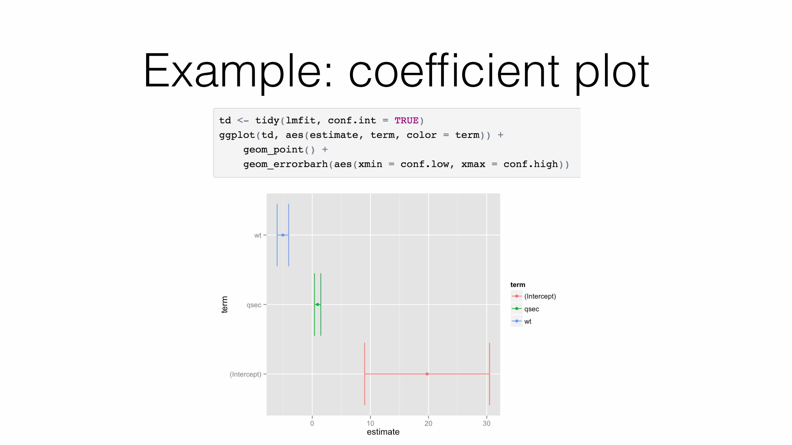
Example: coefficient plot
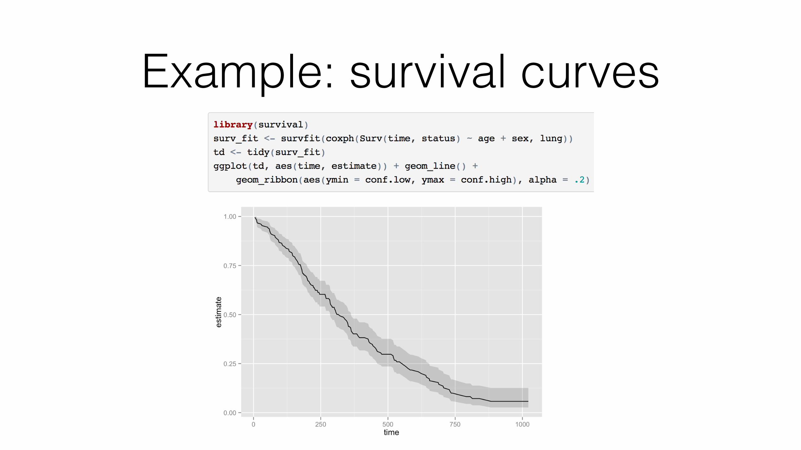
Example: survival curves
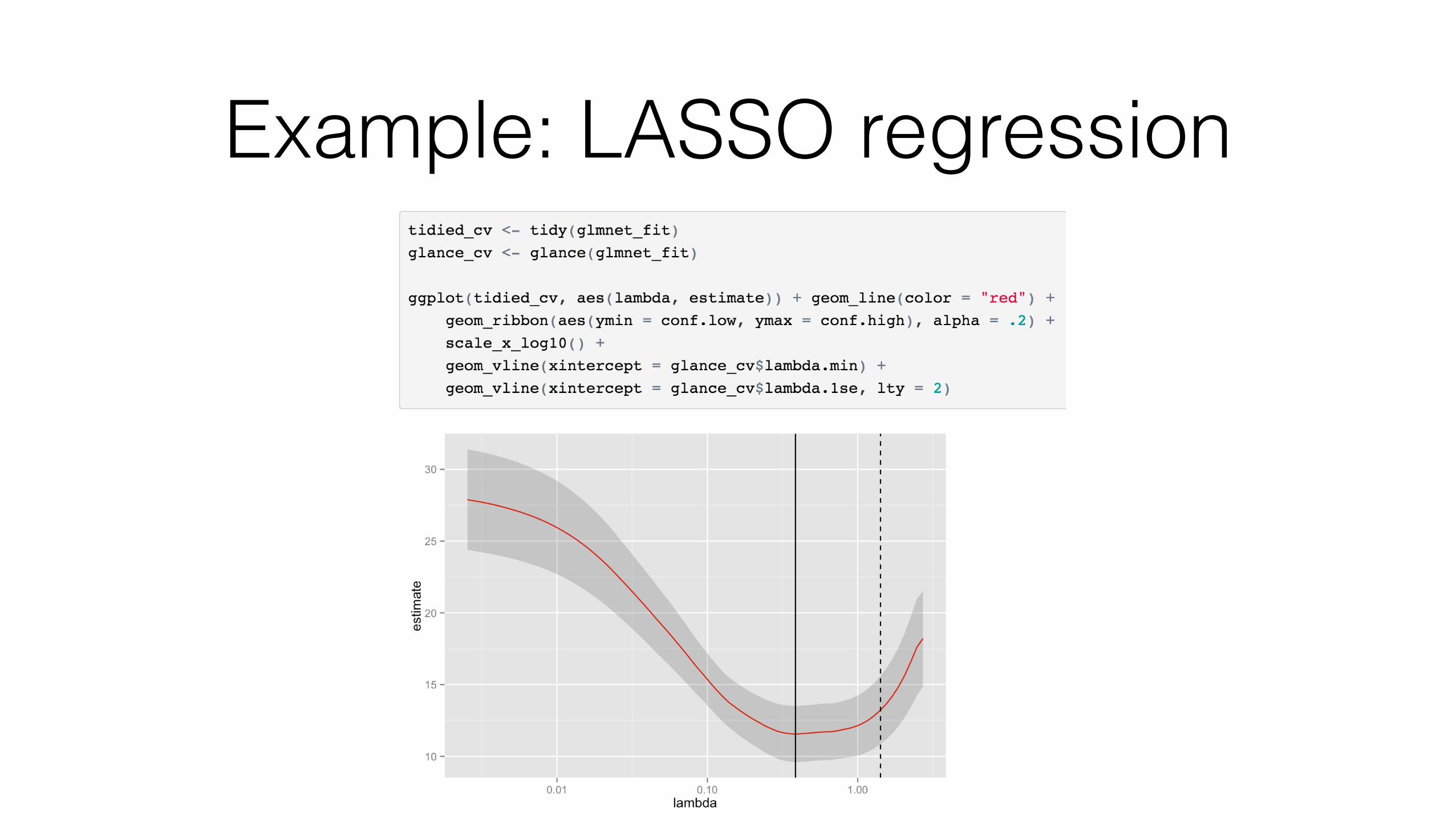
Example: LASSO regression

Tidy models can be combined and compared
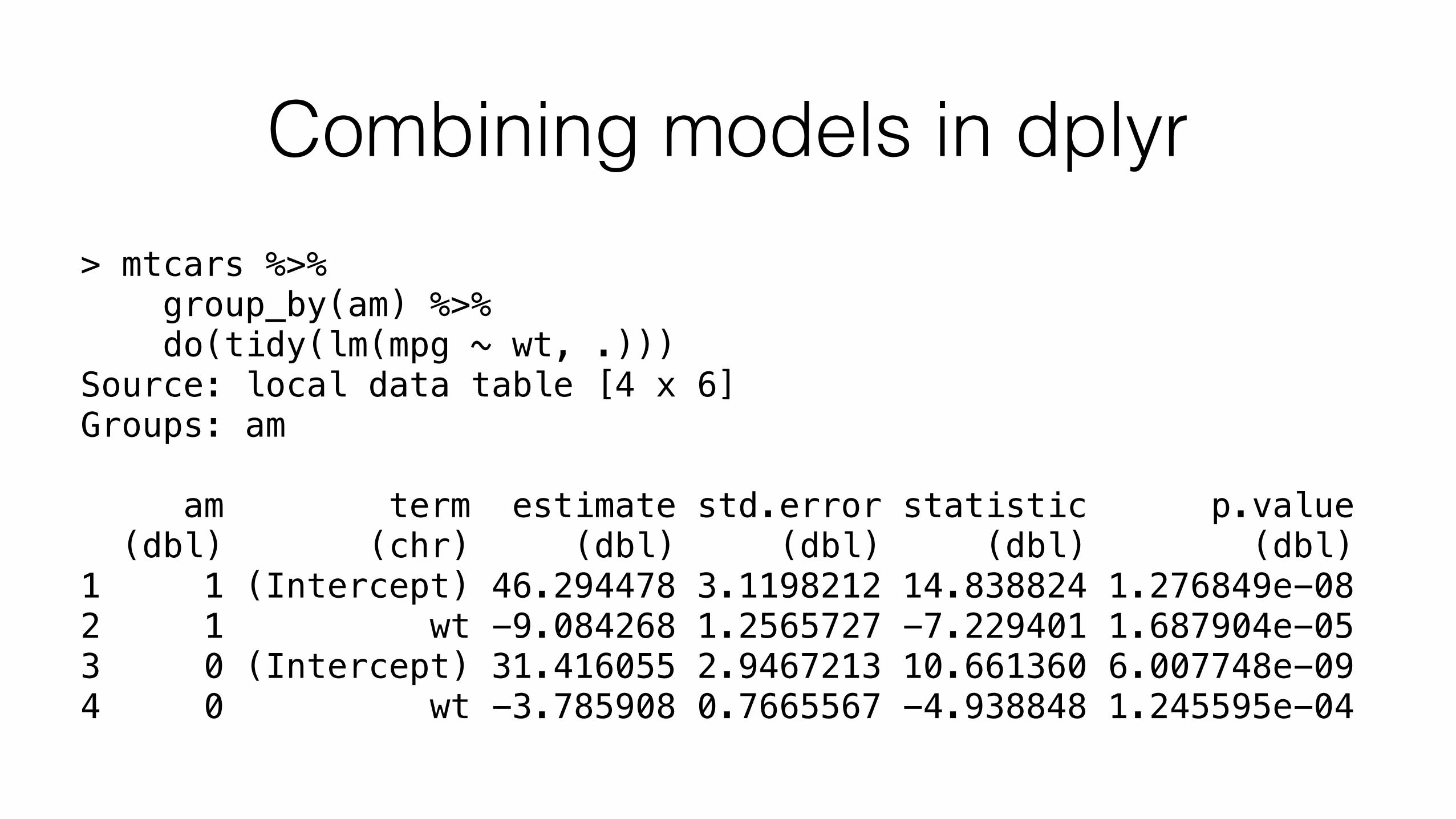
Combining models in dplyr> mtcars %>% group_by(am) %>% do(tidy(lm(mpg ~ wt, .))) Source: local data table [4 x 6] Groups: am
am term estimate std.error statistic p.value (dbl) (chr) (dbl) (dbl) (dbl) (dbl) 1 1 (Intercept) 46.294478 3.1198212 14.838824 1.276849e-08 2 1 wt -9.084268 1.2565727 -7.229401 1.687904e-05 3 0 (Intercept) 31.416055 2.9467213 10.661360 6.007748e-09 4 0 wt -3.785908 0.7665567 -4.938848 1.245595e-04
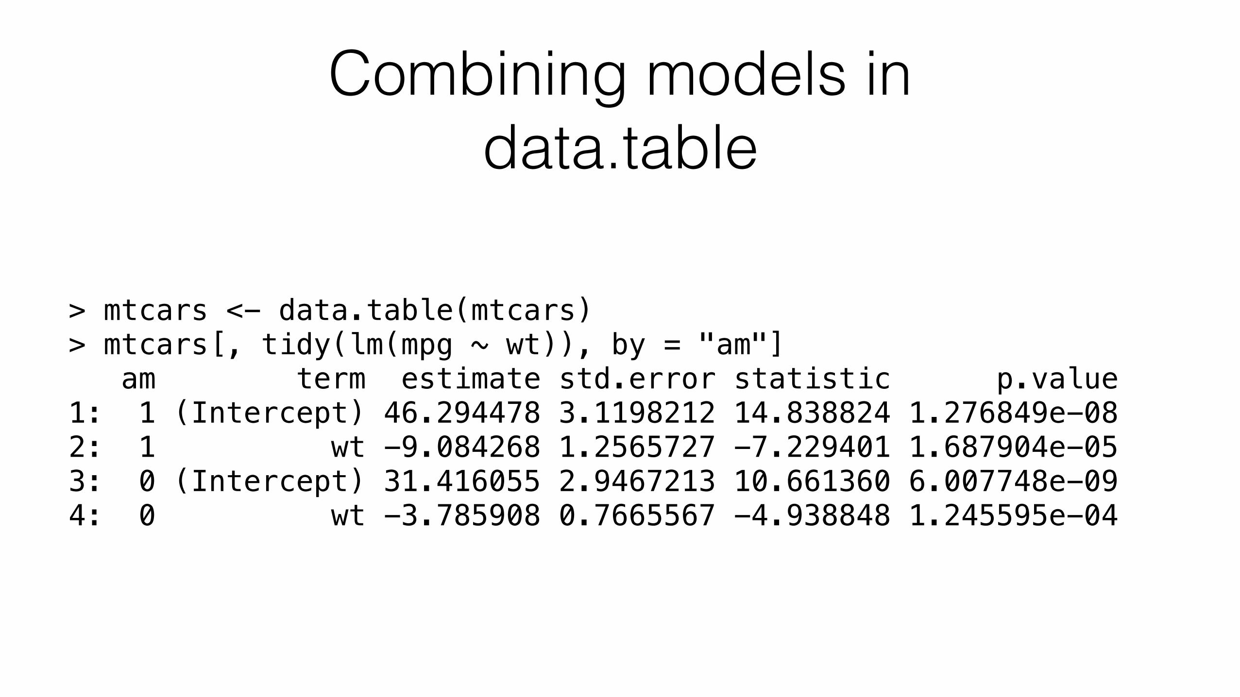
Combining models in data.table
> mtcars <- data.table(mtcars) > mtcars[, tidy(lm(mpg ~ wt)), by = "am"] am term estimate std.error statistic p.value 1: 1 (Intercept) 46.294478 3.1198212 14.838824 1.276849e-08 2: 1 wt -9.084268 1.2565727 -7.229401 1.687904e-05 3: 0 (Intercept) 31.416055 2.9467213 10.661360 6.007748e-09 4: 0 wt -3.785908 0.7665567 -4.938848 1.245595e-04
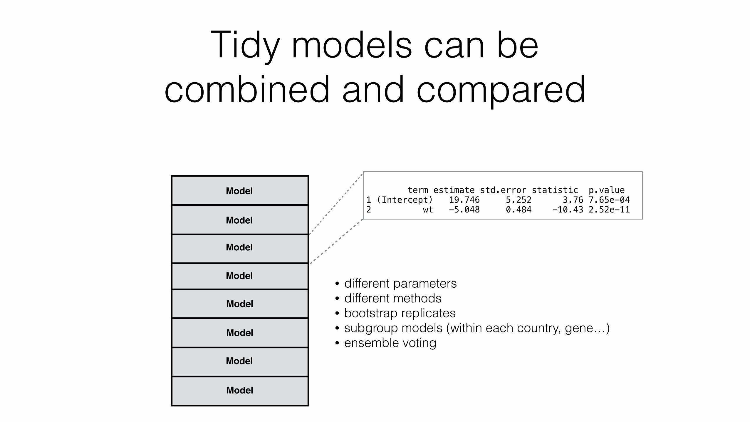
Tidy models can be combined and compared
term estimate std.error statistic p.value 1 (Intercept) 19.746 5.252 3.76 7.65e-04 2 wt -5.048 0.484 -10.43 2.52e-11
• different parameters • different methods • bootstrap replicates • subgroup models (within each country, gene…) • ensemble voting
Model
Model
Model
Model
Model
Model
Model
Model
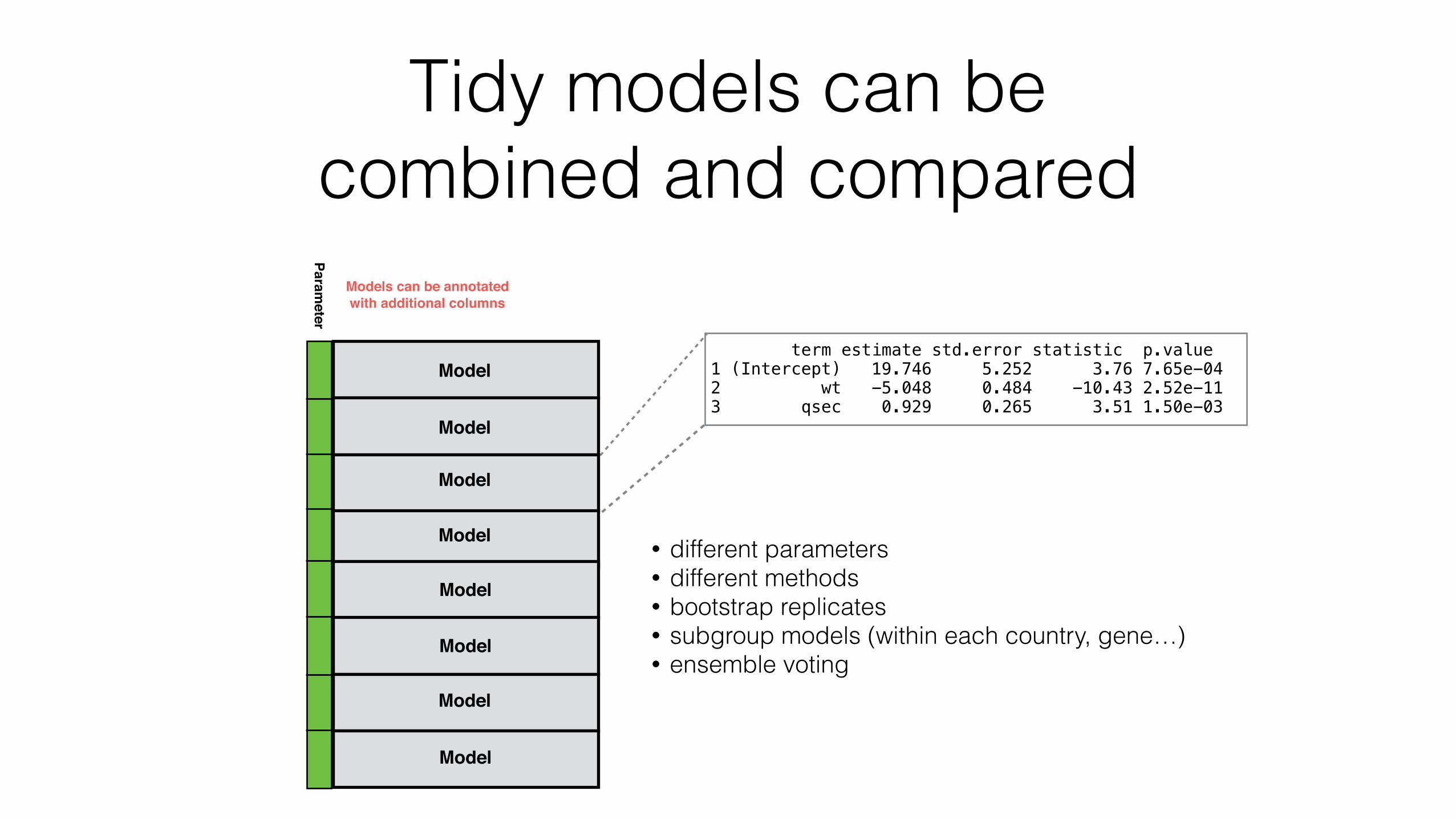
Tidy models can be combined and compared
term estimate std.error statistic p.value 1 (Intercept) 19.746 5.252 3.76 7.65e-04 2 wt -5.048 0.484 -10.43 2.52e-11 3 qsec 0.929 0.265 3.51 1.50e-03
• different parameters • different methods • bootstrap replicates • subgroup models (within each country, gene…) • ensemble voting
Model
Model
Model
Model
Model
Model
Model
Model
Parameter
Models can be annotated with additional columns
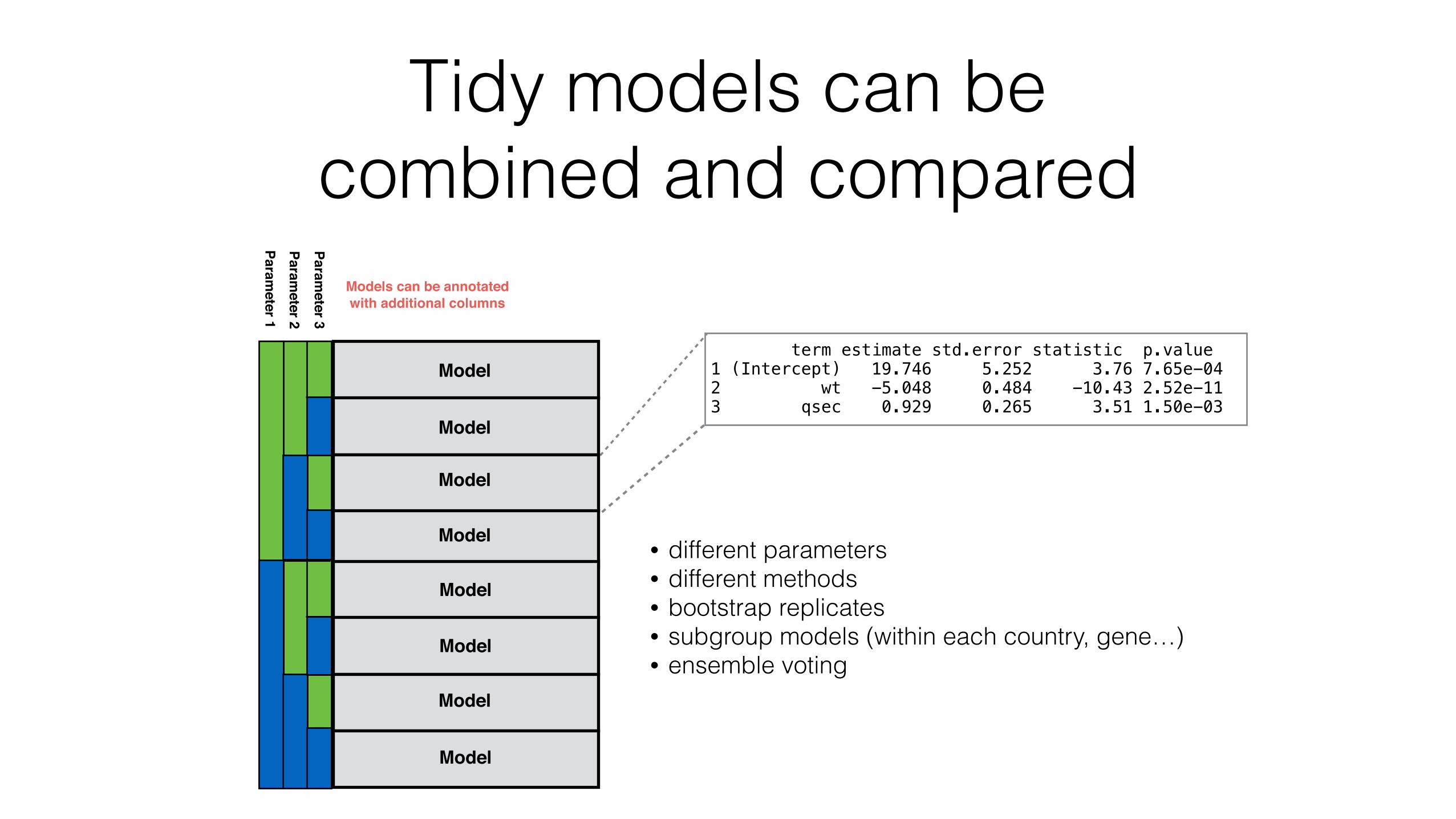
Tidy models can be combined and compared
term estimate std.error statistic p.value 1 (Intercept) 19.746 5.252 3.76 7.65e-04 2 wt -5.048 0.484 -10.43 2.52e-11 3 qsec 0.929 0.265 3.51 1.50e-03
• different parameters • different methods • bootstrap replicates • subgroup models (within each country, gene…) • ensemble voting
Model
Model
Model
Model
Model
Model
Model
Model
Parameter 1
Parameter 2
Parameter 3
Models can be annotated with additional columns
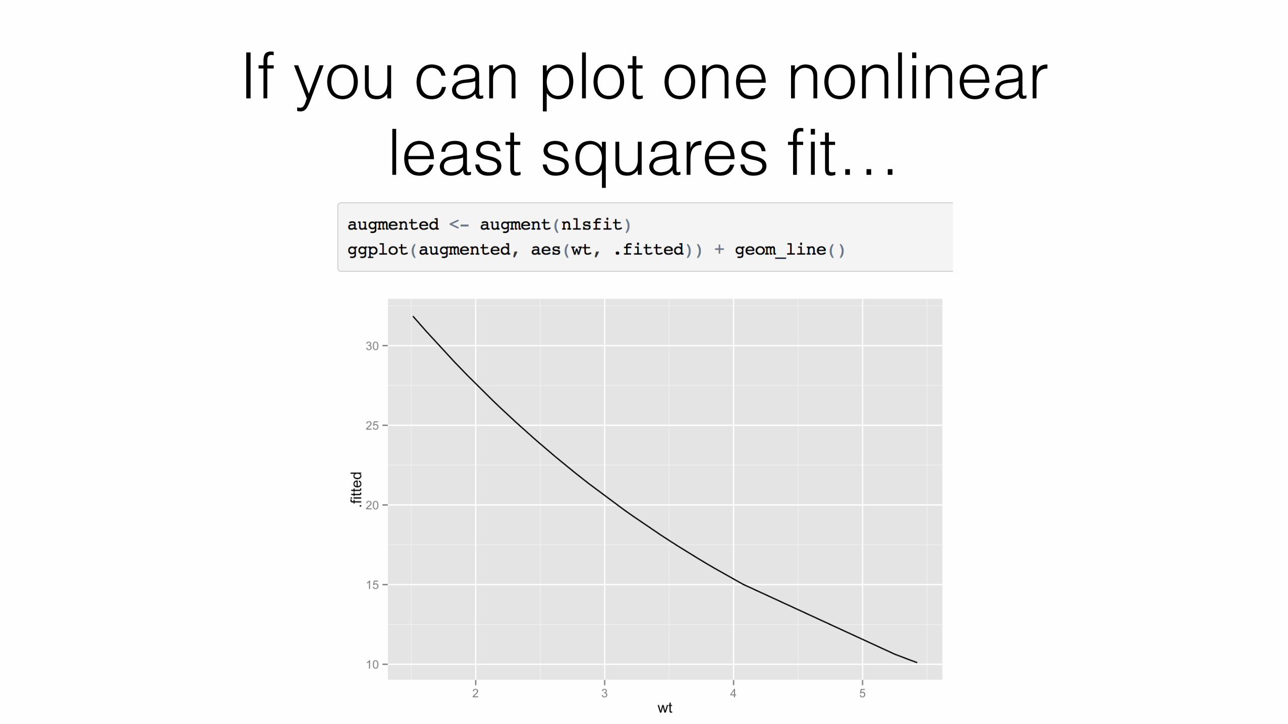
If you can plot one nonlinear least squares fit…
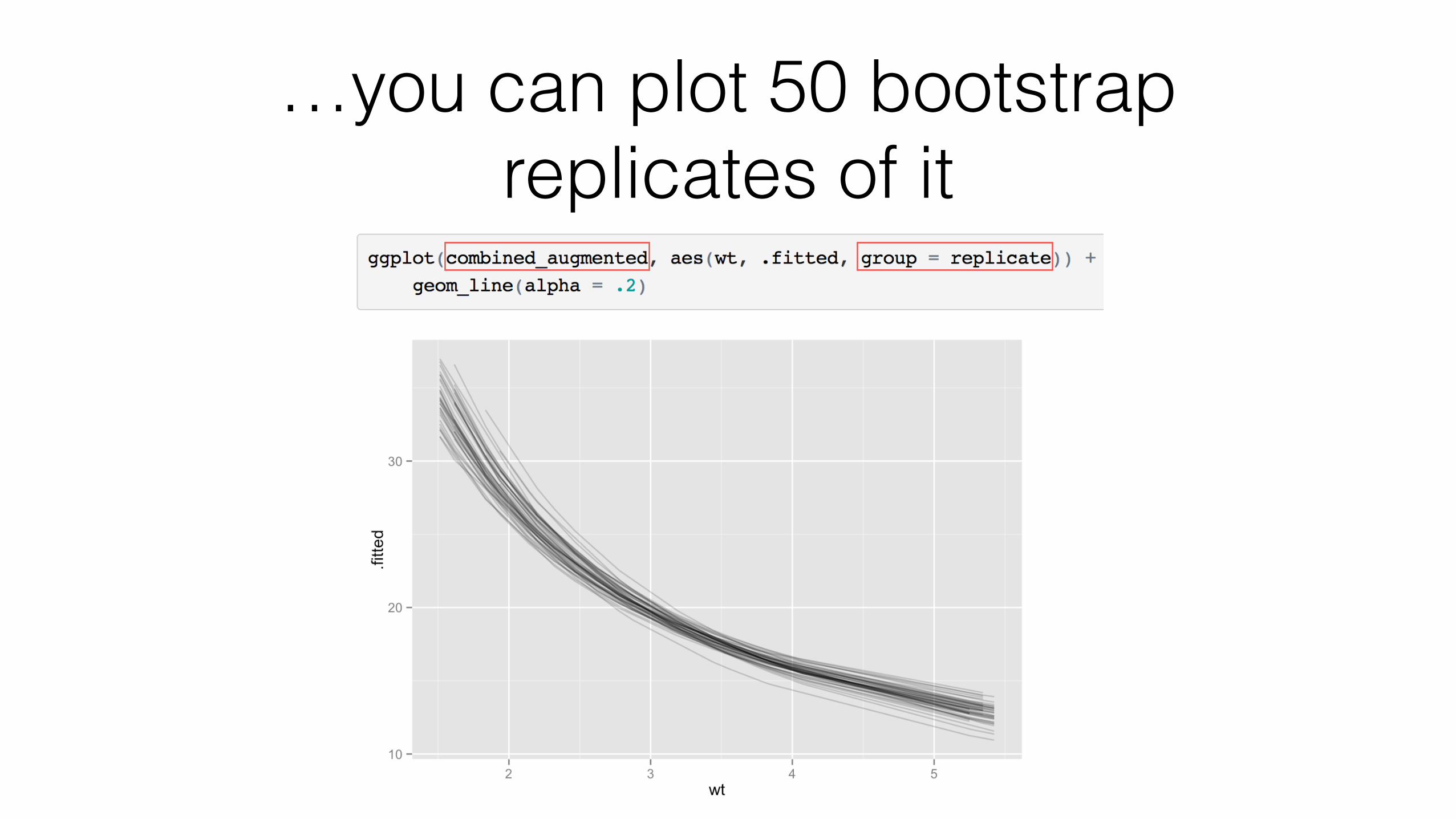
…you can plot 50 bootstrap replicates of it
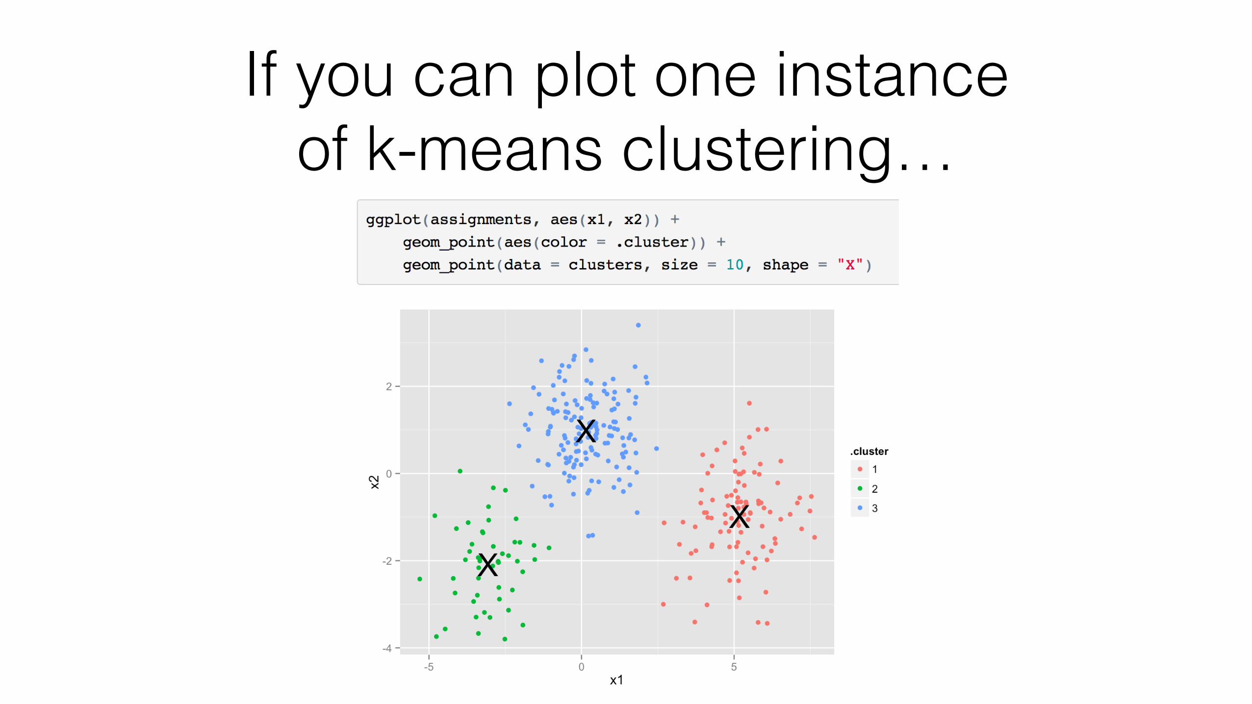
If you can plot one instance of k-means clustering…
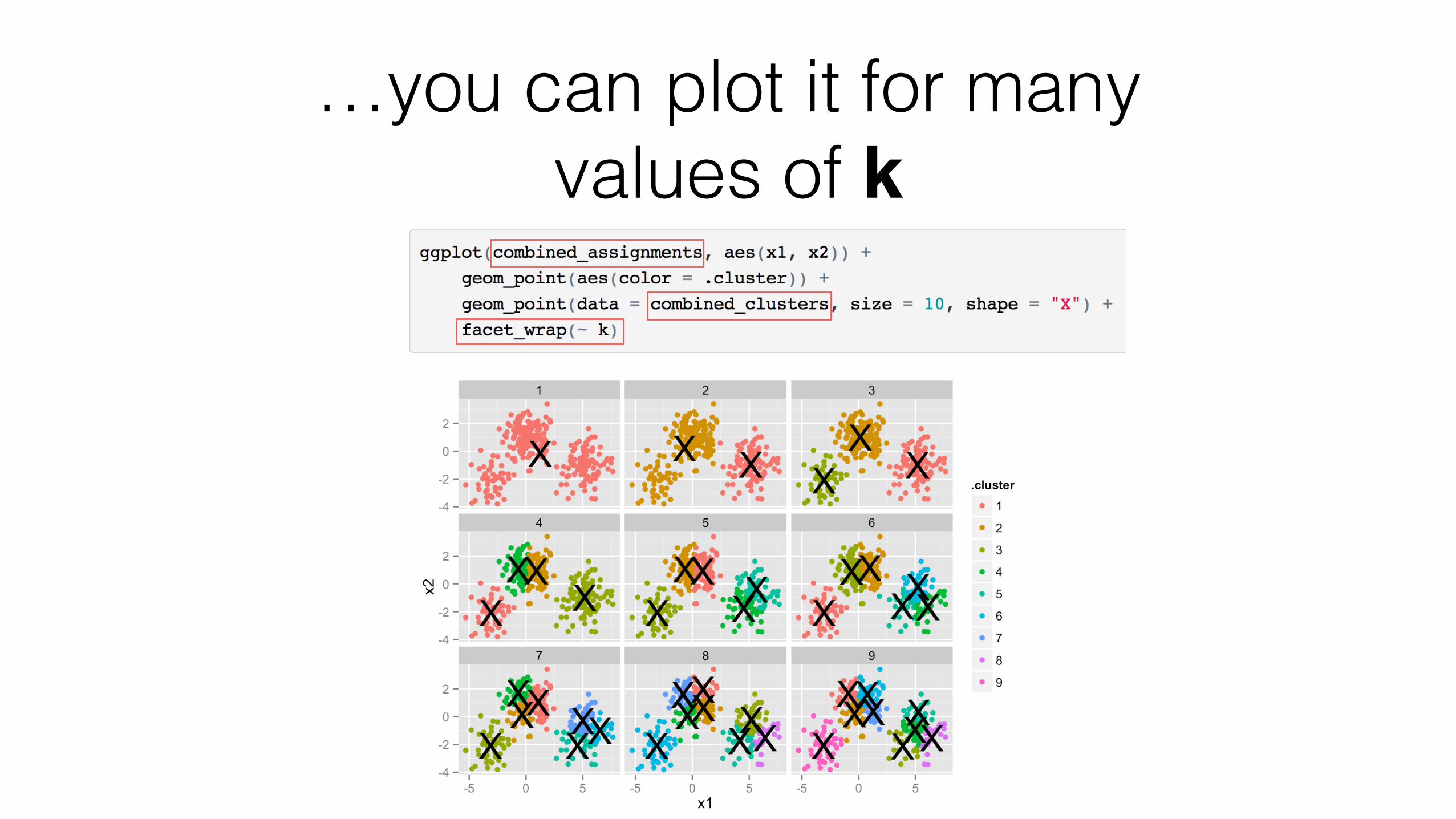
…you can plot it for many values of k

Learn more: vignettes
Introduction to broom broom and dplyr kmeans with dplyr+broom Tidy bootstrapping with dplyr+broom
Learn more: manuscript
arX
iv:1
412.
3565
v2 [
stat.C
O]
19 D
ec 2
014
broom: An R Package for Converting Statistical
Analysis Objects Into Tidy Data Frames
David Robinson
Abstract
The concept of "tidy data" offers a powerful framework for structuring data to ease
manipulation, modeling and visualization. However, most R functions, both those built-in and those found in third-party packages, produce output that is not tidy, and that istherefore difficult to reshape, recombine, and otherwise manipulate. Here I introduce the
broom package, which turns the output of model objects into tidy data frames that aresuited to further analysis, manipulation, and visualization with input-tidy tools. broom
defines the tidy, augment, and glance generics, which arrange a model into three levels
of tidy output respectively: the component level, the observation level, and the modellevel. I provide examples to demonstrate how these generics work with tidy tools to allowanalysis and modeling of data that is divided into subsets, to recombine results frombootstrap replicates, and to perform simulations that investigate the effect of varying
input parameters.
1 Introduction
A common observation is that more of the data scientist’s time is occupied with data cleaning,manipulation, and "munging" than it is with actual statistical modeling (Rahm and Do, 2000;Dasu and Johnson, 2003). Thus, the development of tools for manipulating and transformingdata is necessary for efficient and effective data analysis. One important choice for a datascientist working in R is how data should be structured, particularly the choice of dividingobservations across rows, columns, and multiple tables.
The concept of "tidy data," introduced by Wickham (2014a), offers a set of guidelines fororganizing data in order to facilitate statistical analysis and visualization. In short, data canbe described as "tidy" if it is represented in a table following three rules:
• Each variable forms one column
• Each observation forms one row
• Each type of observational unit forms one table
This framework makes it easy for analysts to reshape, combine, group and otherwise manip-ulate data. Packages such as ggplot2, dplyr, and many built-in R modeling and plotting func-tions require the input to be in a tidy form, so keeping the data in this form allows multiple toolsto be used in sequence in a seamless analysis pipeline (Wickham, 2009; Wickham and Francois,2014).
Tools are classified as "messy-output" if their output does not fit into this framework.Unfortunately, the majority of R modeling tools, both from the built-in stats package andthose in common third party packages, are messy-output. This means the data analyst musttidy not only the original data, but the results at each intermediate stage of an analysis.Wickham (2014a) describes this problem succinctly:
While model inputs usually require tidy inputs, such attention to detail doesn’tcarry over to model outputs. Outputs such as predictions and estimated coeffi-cients aren’t always tidy. For example, in R, the default representation of model
1
http://arxiv.org/pdf/1412.3565v2.pdf
Thank you!• broom package/paper
• Matthieu Gomez
• Boris Demeshev
• Dieter Meine
• Benjamin Nutter
• Luke Johnston
• Ben Bolker
• Francois Briatte
• Bob Muenchen
• Hadley WickhamCC BY David Robinson 2015