Embed Size (px)
Citation preview

Plotting systems in RIlya Zhbannikov
Graphics Devices in R
• Screen device
• File device (pdf, png, jpeg, etc.)
Graphics device: a place to make plot appear
How does a plot get created?• Call a plotting function, i.e. plot(), xyplot(),
qplot()
• The plot appears on a screen device
• Annotate plot, if necessary
• Save it to file, for example.
Screen and file devices
• How the plot will be used?
• Use screen device for quick visualisation or exploratory studies.
• Plotting functions (plot(), qplot(), xyplot()) send output to the screen device by default.
• If the plot will be printed, use file device instead.
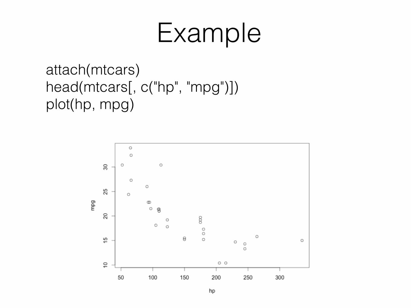
Exampleattach(mtcars) head(mtcars[, c("hp", "mpg")]) plot(hp, mpg)
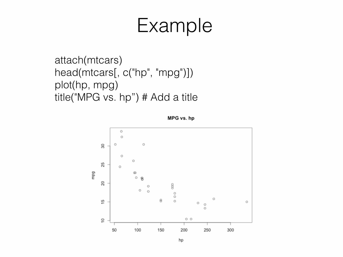
Exampleattach(mtcars) head(mtcars[, c("hp", "mpg")]) plot(hp, mpg) title("MPG vs. hp”) # Add a title
Available plotting systems
• Base
• lattice
• ggplot2
Base plotting system
• Installed by default
• Quickest way to visualise your data
• Plot can be further updated using additional options
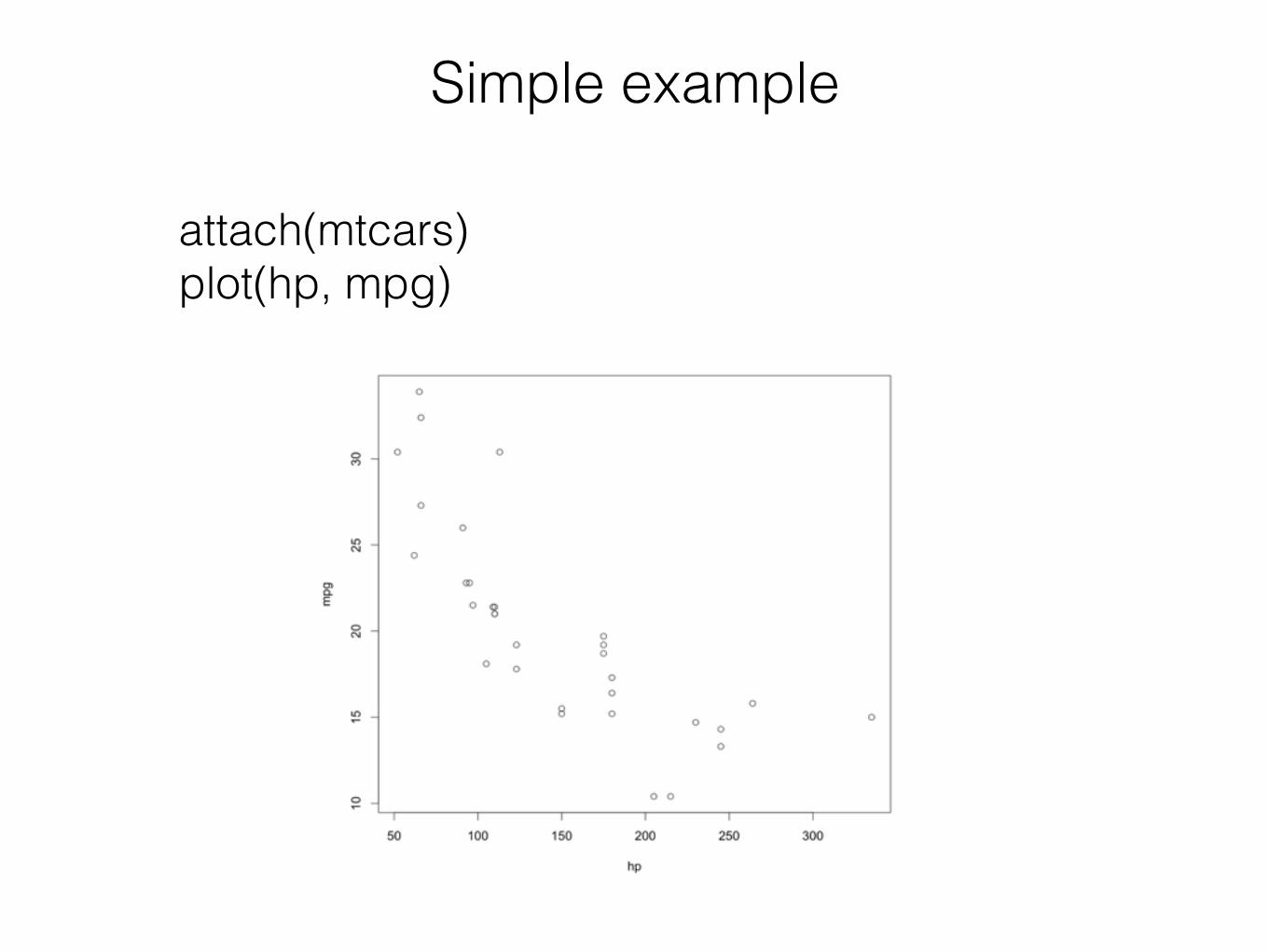
Simple example
attach(mtcars) plot(hp, mpg)
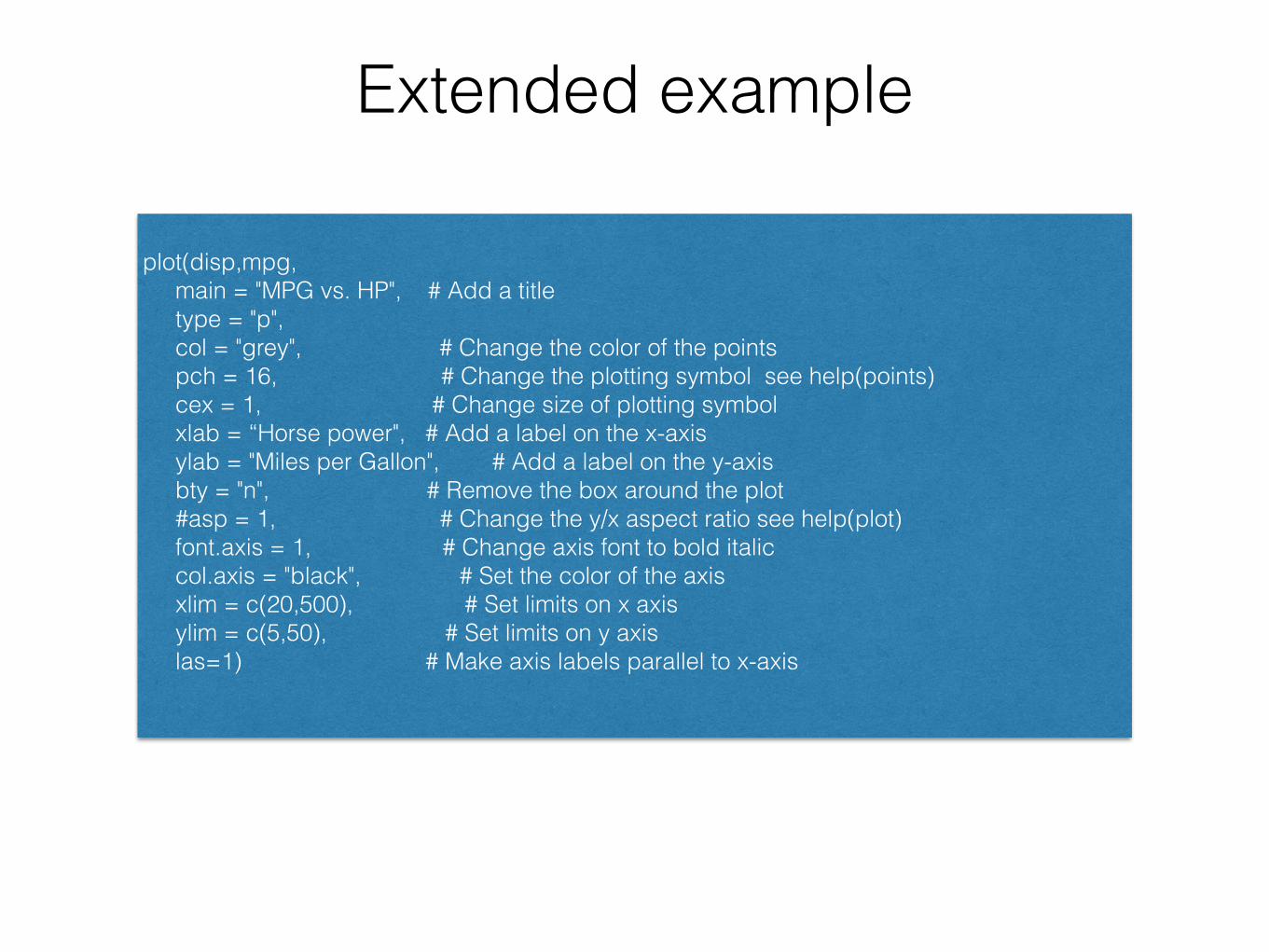
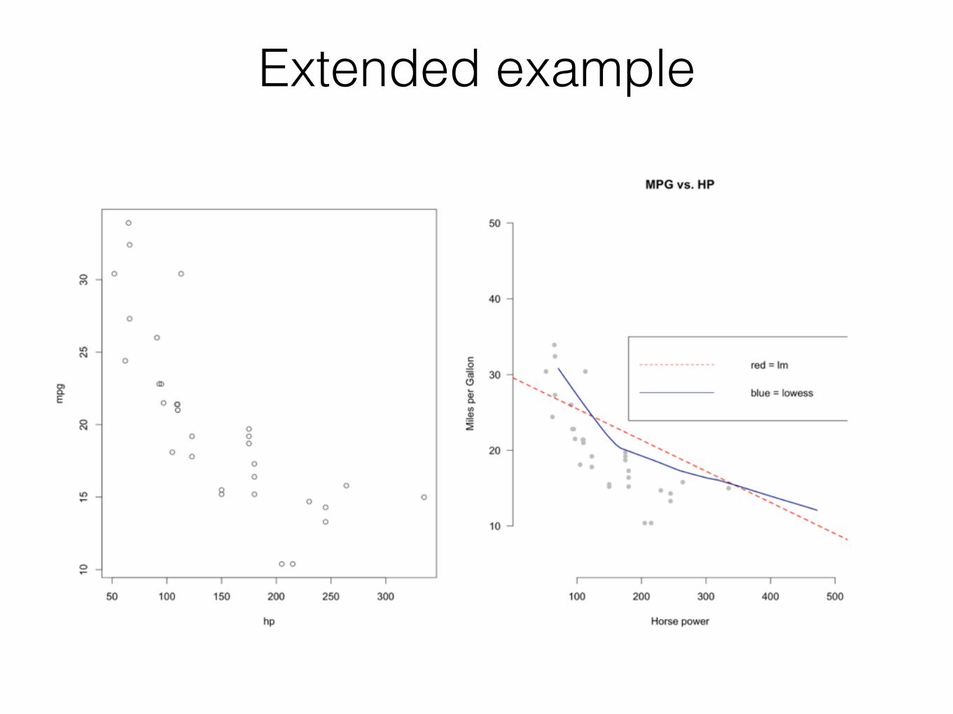
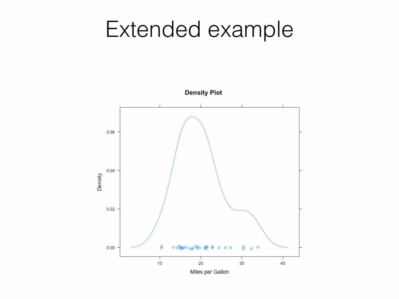
Extended example
plot(disp,mpg, main = "MPG vs. HP", # Add a title type = "p", col = "grey", # Change the color of the points pch = 16, # Change the plotting symbol see help(points) cex = 1, # Change size of plotting symbol xlab = “Horse power", # Add a label on the x-axis ylab = "Miles per Gallon", # Add a label on the y-axis bty = "n", # Remove the box around the plot #asp = 1, # Change the y/x aspect ratio see help(plot) font.axis = 1, # Change axis font to bold italic col.axis = "black", # Set the color of the axis xlim = c(20,500), # Set limits on x axis ylim = c(5,50), # Set limits on y axis las=1) # Make axis labels parallel to x-axis
Extended example
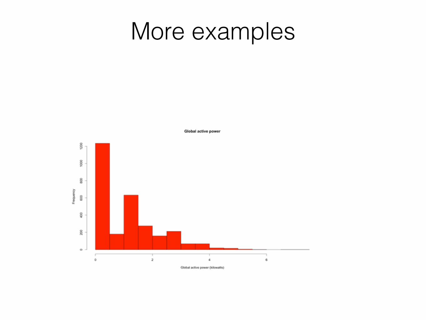
More examples
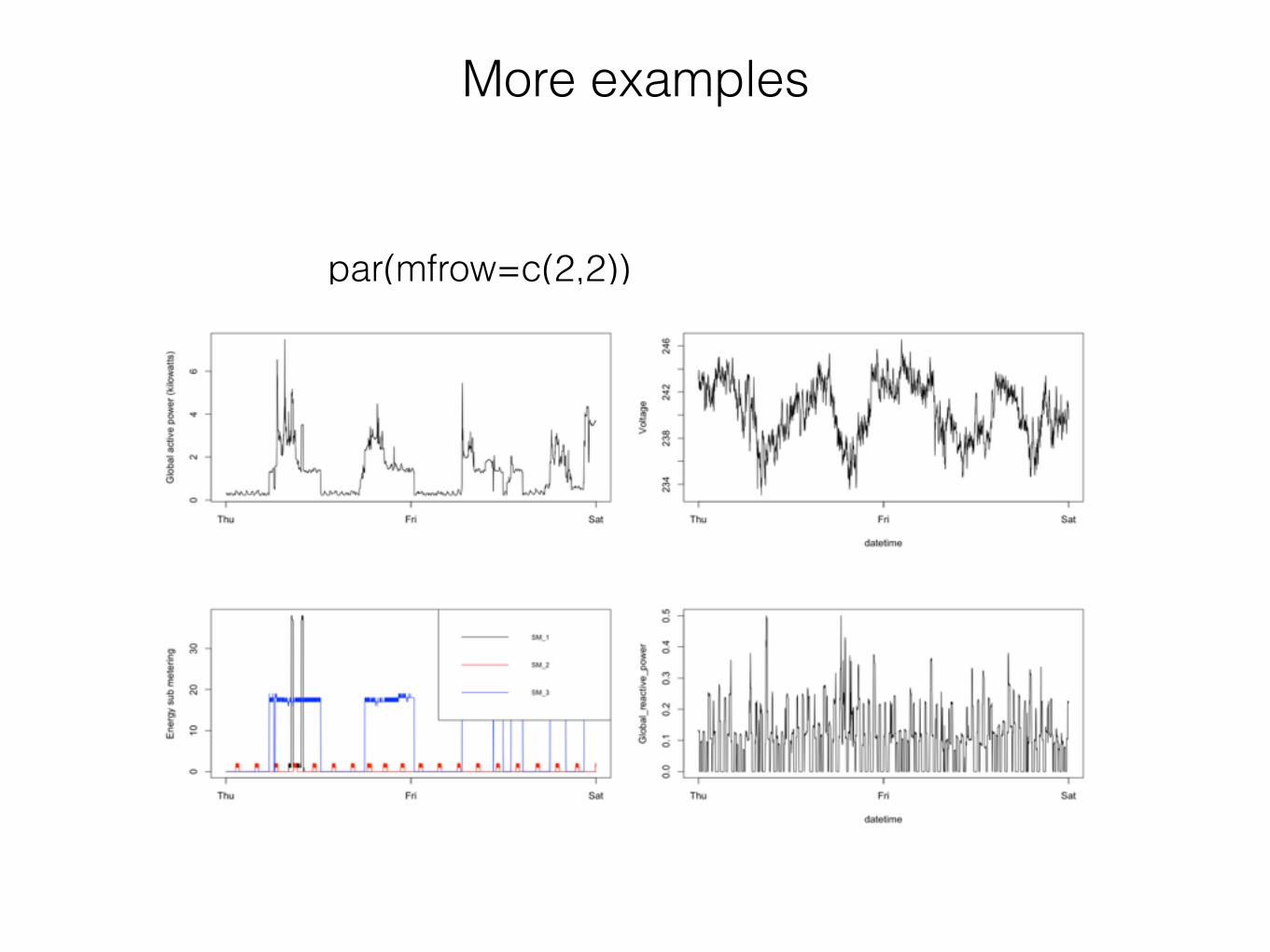
More examples
par(mfrow=c(2,2))
• Multivariate data
• Uses formulas
• Single function call
The Lattice Plotting System

The Lattice Plotting System
• lattice: code for producing Trellis graphics, includes functions like xyplot(), bwplot(), levelplot()
• Grid: implements a different graphics system and the lattice package are on top of it
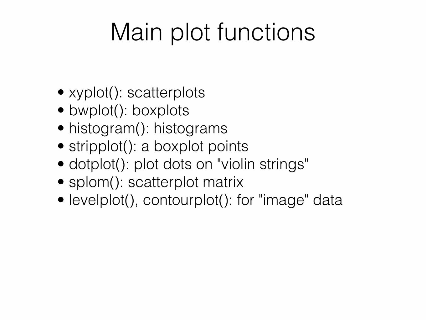
Main plot functions
• xyplot(): scatterplots • bwplot(): boxplots • histogram(): histograms • stripplot(): a boxplot points • dotplot(): plot dots on "violin strings" • splom(): scatterplot matrix • levelplot(), contourplot(): for "image" data

Examplelibrary(lattice) attach(mtcars) xyplot(mpg ~ hp, data = mtcars)
Extended example
More examples
• See lattice_example_1.R
ggplot2 Plotting System
• “Grammar of Graphics” by Leland Wilkinson, written by Hadley Wickham
• Data must be a data frame
• Uses grammar
• Web site: http://ggplot2.org
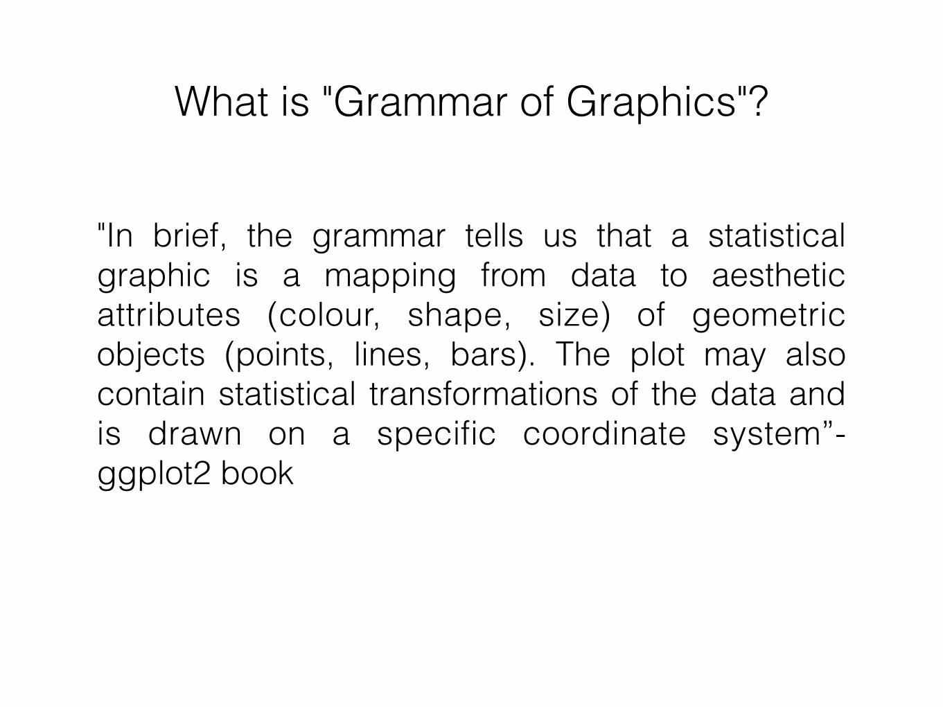
What is "Grammar of Graphics"?
"In brief, the grammar tells us that a statistical graphic is a mapping from data to aesthetic attributes (colour, shape, size) of geometric objects (points, lines, bars). The plot may also contain statistical transformations of the data and is drawn on a specific coordinate system”- ggplot2 book
qplot() and ggplot()
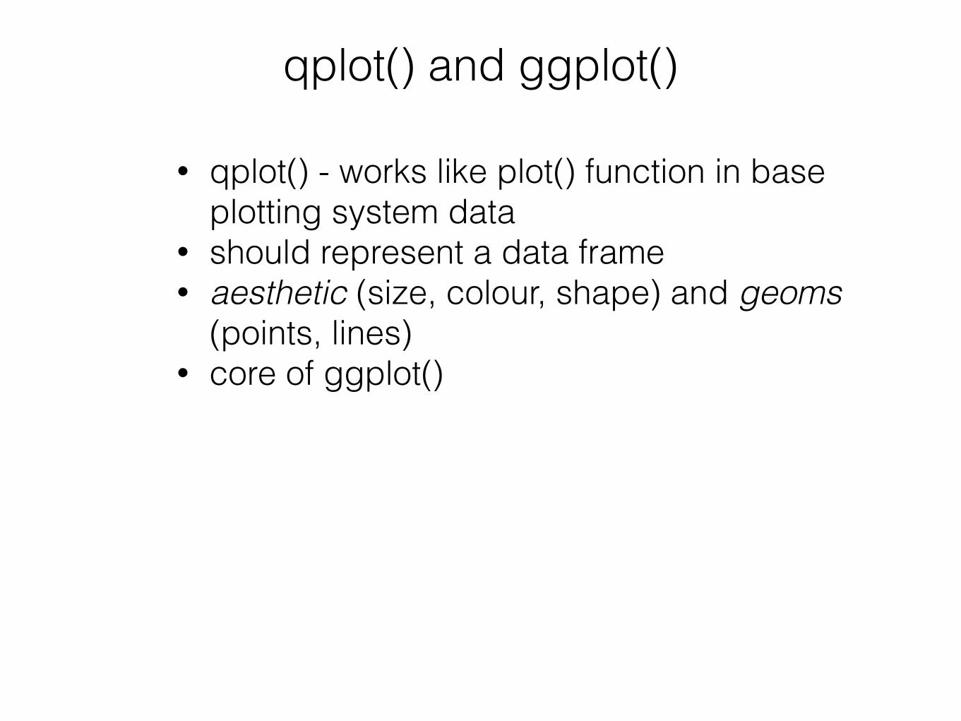
• qplot() - works like plot() function in base plotting system data
• should represent a data frame • aesthetic (size, colour, shape) and geoms
(points, lines) • core of ggplot()

qplot
• qplot() - works like plot() function in base plotting system data
• Should represent a data frame • aesthetic (size, colour) and geoms (points,
lines) • Core of ggplot()
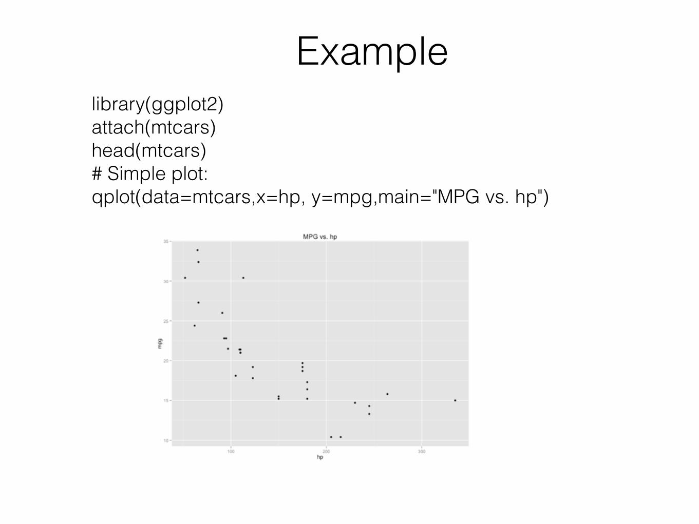
Examplelibrary(ggplot2) attach(mtcars) head(mtcars) # Simple plot: qplot(data=mtcars,x=hp, y=mpg,main="MPG vs. hp")
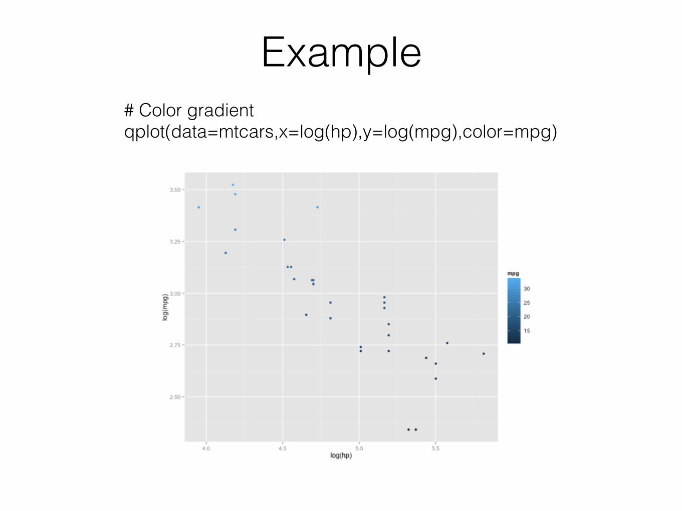
Example# Color gradient qplot(data=mtcars,x=log(hp),y=log(mpg),color=mpg)

Example# Boxplots: qplot(data=mtcars,x=factor(cyl), y=mpg,geom="boxplot", main="MPG vs. # of Cylinders")
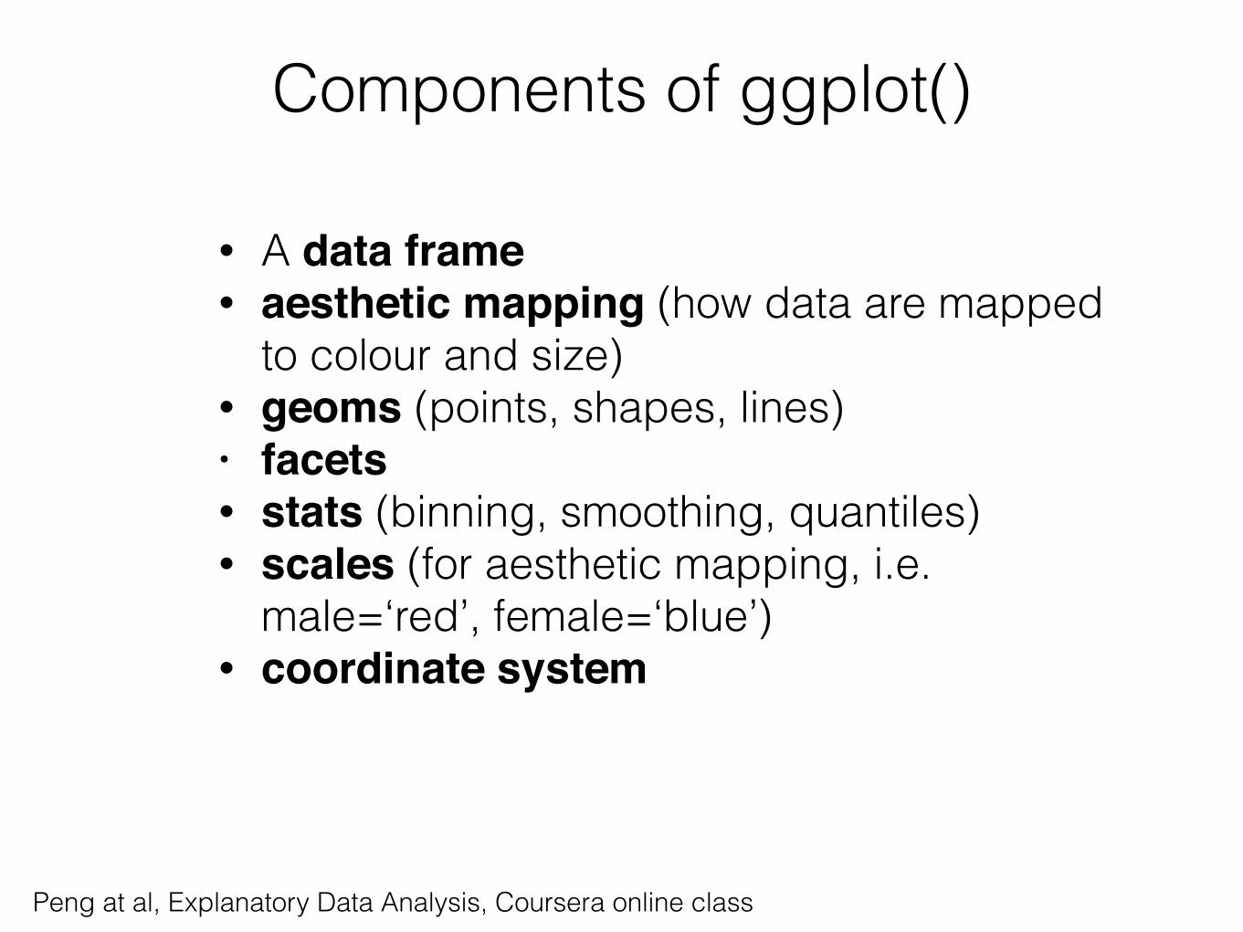
Components of ggplot()
• A data frame • aesthetic mapping (how data are mapped
to colour and size) • geoms (points, shapes, lines) • facets• stats (binning, smoothing, quantiles) • scales (for aesthetic mapping, i.e.
male=‘red’, female=‘blue’) • coordinate system
Peng at al, Explanatory Data Analysis, Coursera online class
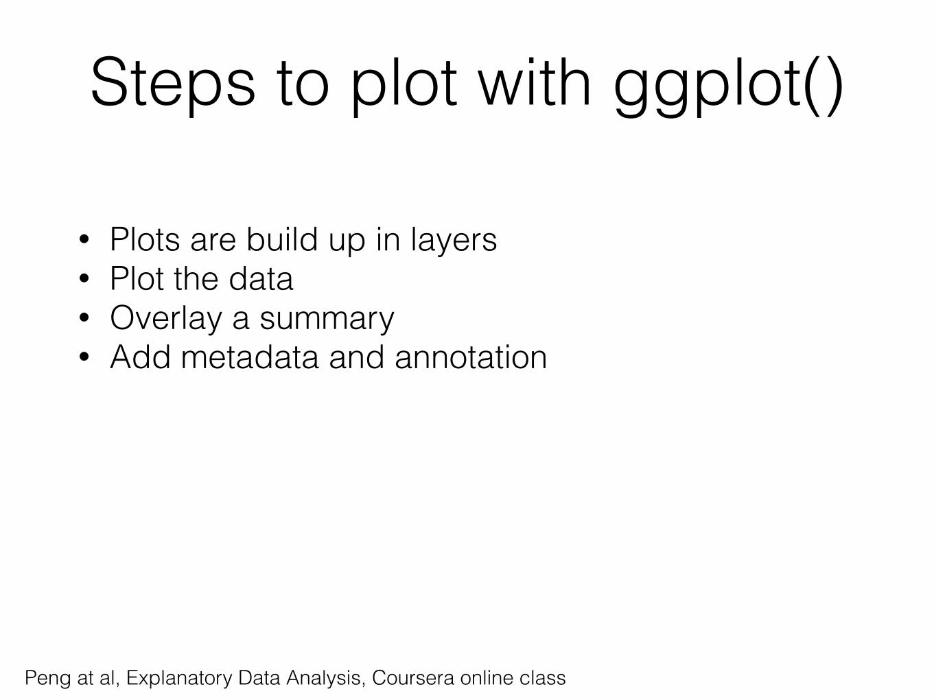
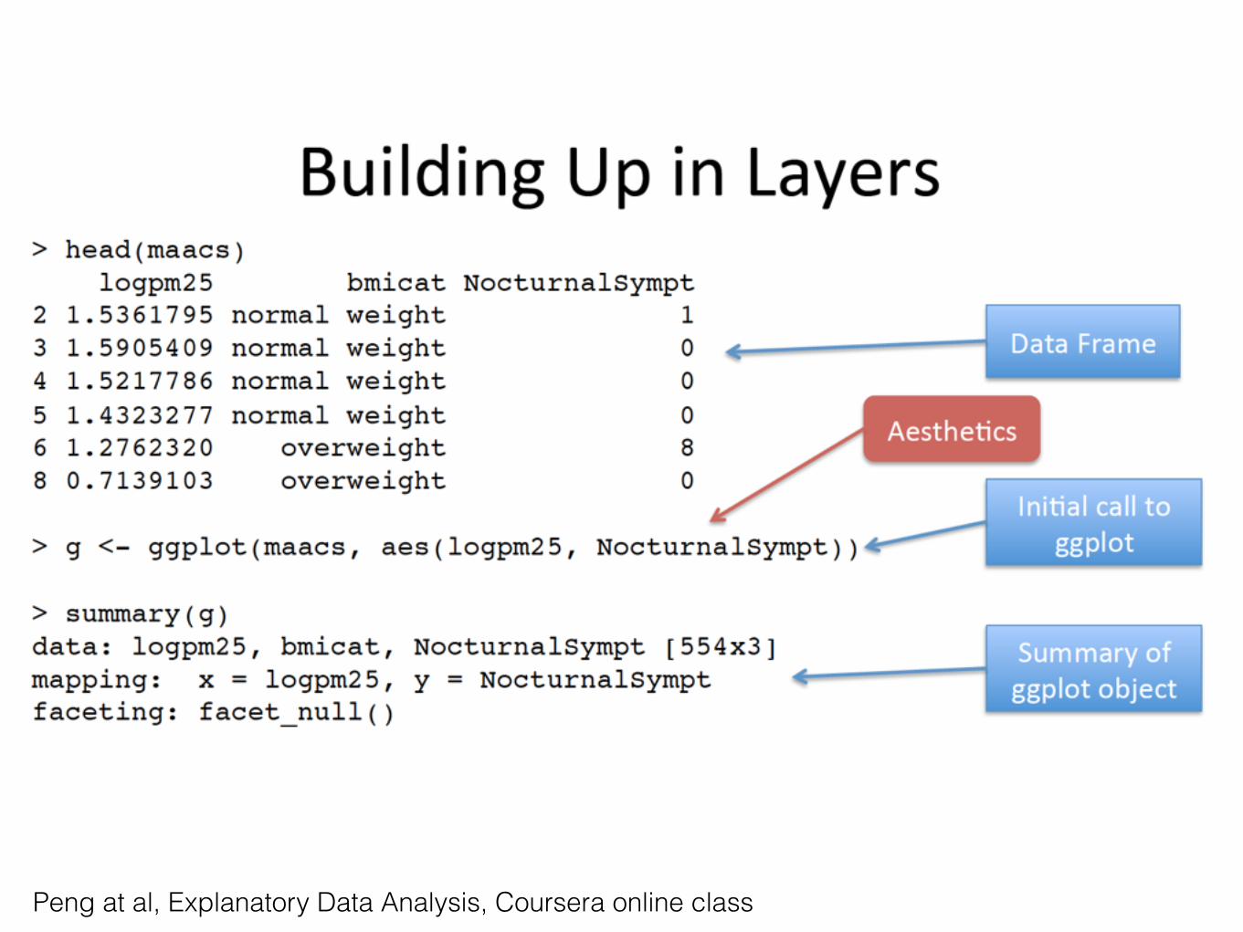
Steps to plot with ggplot()
• Plots are build up in layers • Plot the data • Overlay a summary • Add metadata and annotation
Peng at al, Explanatory Data Analysis, Coursera online class
Peng at al, Explanatory Data Analysis, Coursera online class
Peng at al, Explanatory Data Analysis, Coursera online class
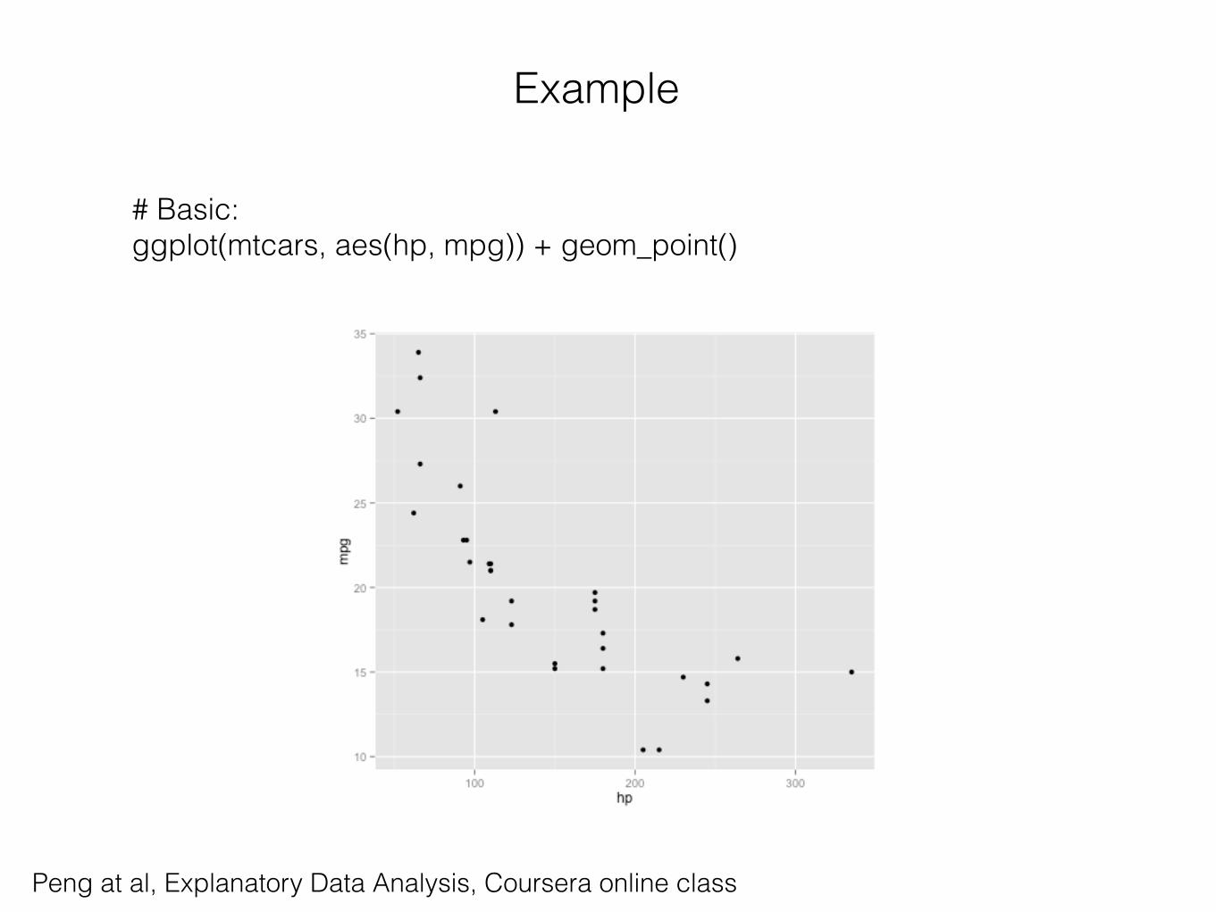
Example
# Basic: ggplot(mtcars, aes(hp, mpg)) + geom_point()
Peng at al, Explanatory Data Analysis, Coursera online class
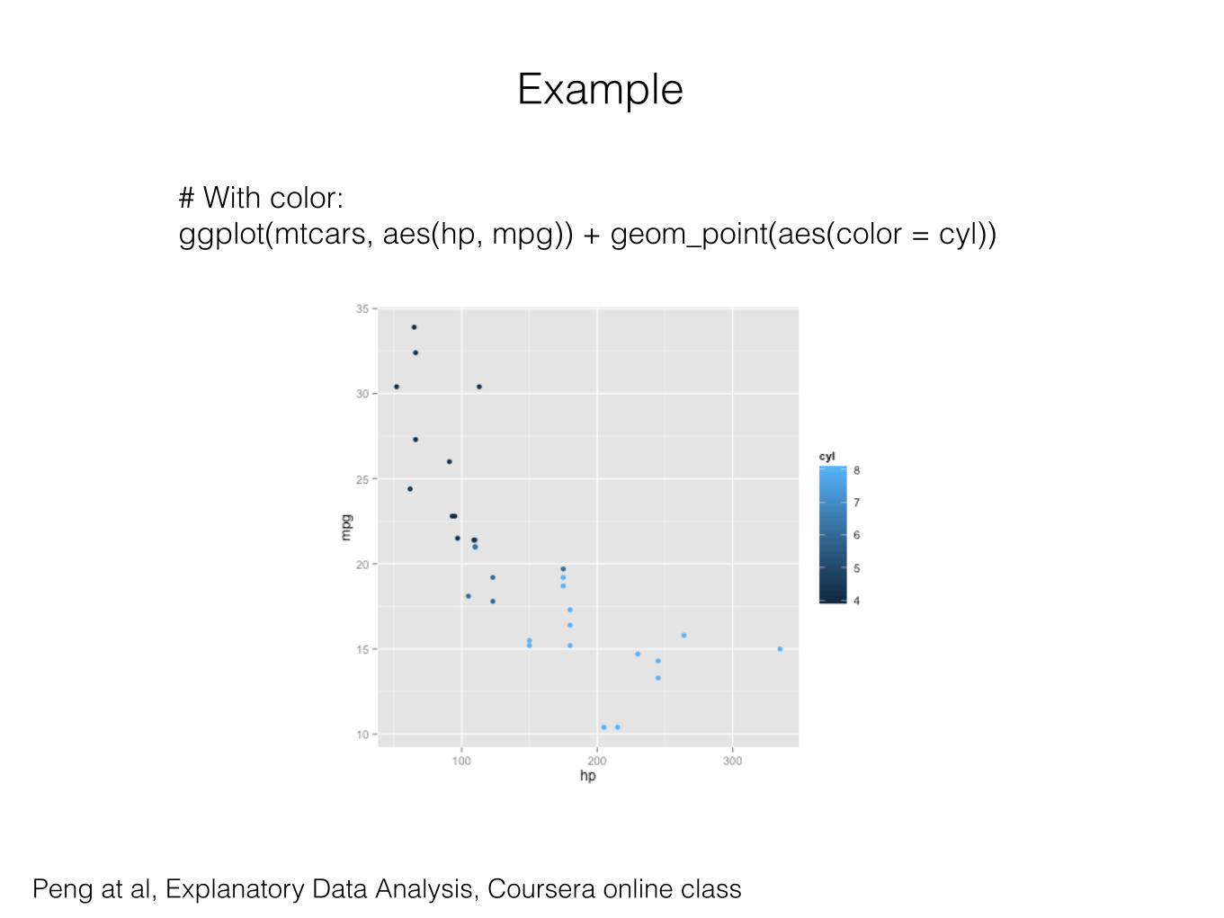
Example
# With color: ggplot(mtcars, aes(hp, mpg)) + geom_point(aes(color = cyl))
Peng at al, Explanatory Data Analysis, Coursera online class
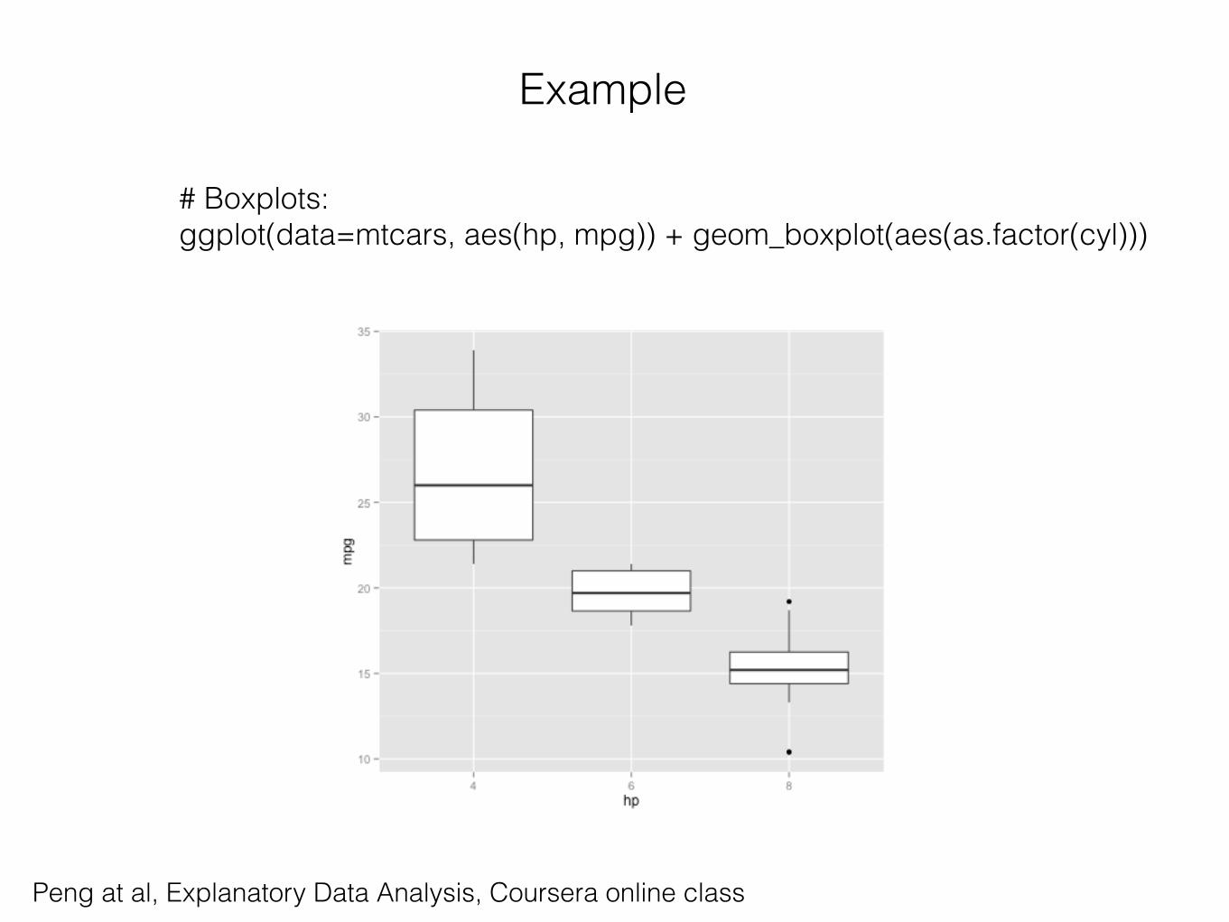
Example
# Boxplots: ggplot(data=mtcars, aes(hp, mpg)) + geom_boxplot(aes(as.factor(cyl)))
Peng at al, Explanatory Data Analysis, Coursera online class
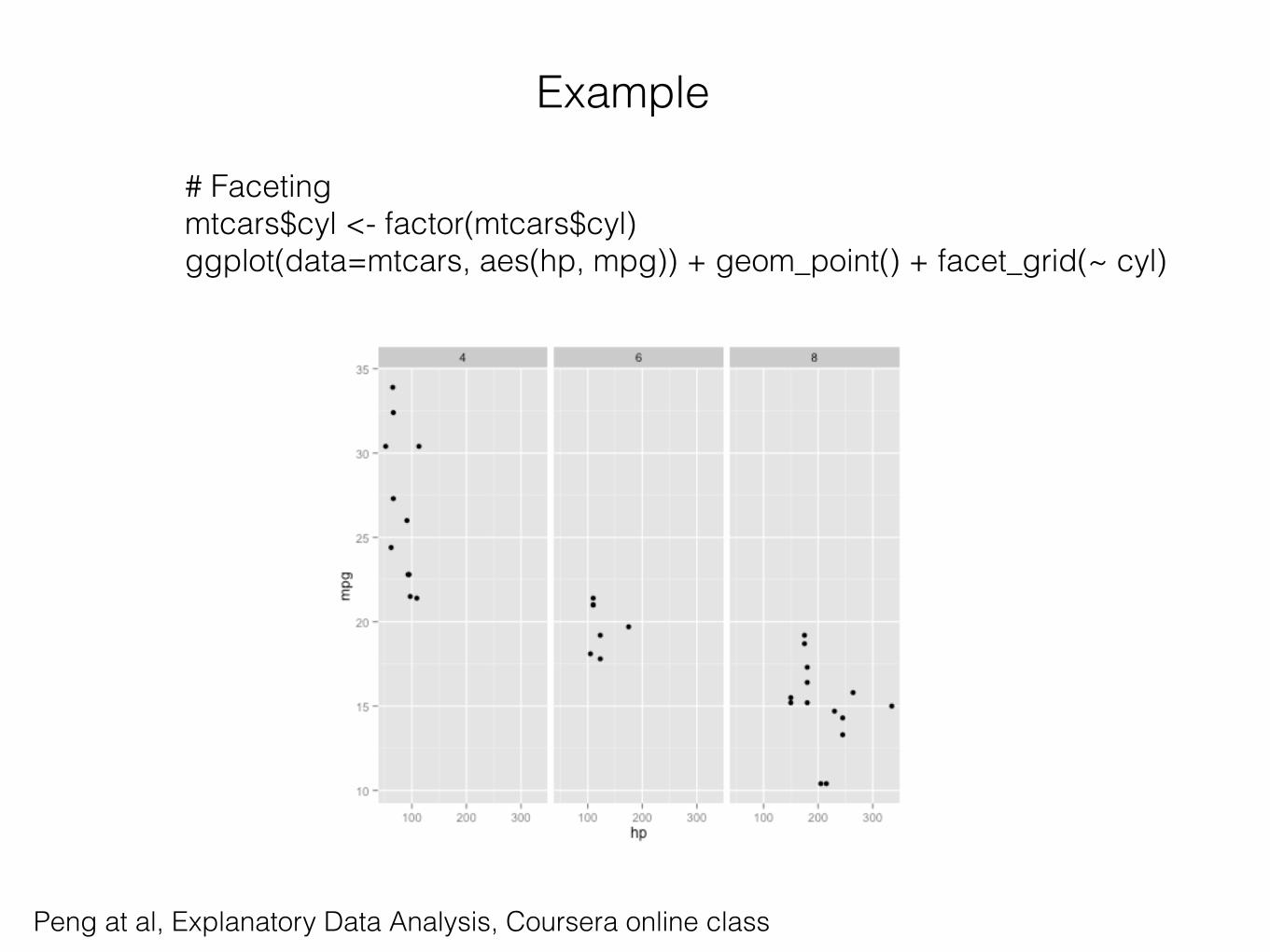
Example
# Faceting mtcars$cyl <- factor(mtcars$cyl) ggplot(data=mtcars, aes(hp, mpg)) + geom_point() + facet_grid(~ cyl)

Peng at al, Explanatory Data Analysis, Coursera online class
Example
# Faceting mtcars$cyl <- factor(mtcars$cyl) ggplot(data=mtcars, aes(hp, mpg)) + geom_point() + facet_grid(~ cyl)
Peng at al, Explanatory Data Analysis, Coursera online class
Example
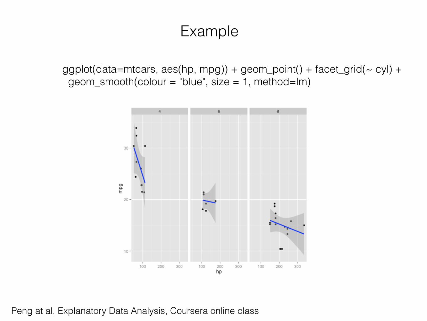
ggplot(data=mtcars, aes(hp, mpg)) + geom_point() + facet_grid(~ cyl) + geom_smooth(colour = "blue", size = 1, method=lm)
Resources
• http://www.r-bloggers.com
• http://revolutionanalytics.com
• http://www.statmethods.net (Quick-R)
• Coursera (Data Science Specialisation)