Embed Size (px)
Citation preview
Production process of my double page
spread
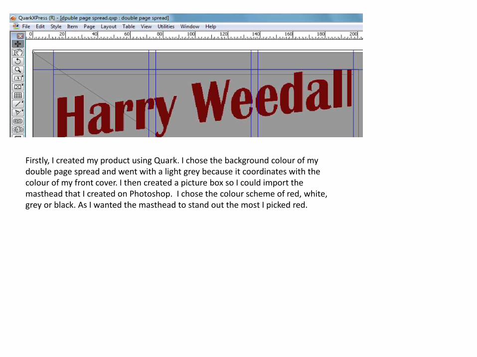
Firstly, I created my product using Quark. I chose the background colour of my double page spread and went with a light grey because it coordinates with the colour of my front cover. I then created a picture box so I could import the masthead that I created on Photoshop. I chose the colour scheme of red, white, grey or black. As I wanted the masthead to stand out the most I picked red.

I then added a sub heading using the text tool underneath the masthead. I chose black Arial font because I didn’t want it to stand out.
I then again creating another text box so I could write by stand first, I chose a bold black font as I wanted it to stand out. The stand first it what gives the reader an insight to the article.
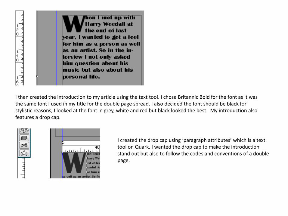
I then created the introduction to my article using the text tool. I chose Britannic Bold for the font as it was the same font I used in my title for the double page spread. I also decided the font should be black for stylistic reasons, I looked at the font in grey, white and red but black looked the best. My introduction also features a drop cap.
I created the drop cap using ‘paragraph attributes’ which is a text tool on Quark. I wanted the drop cap to make the introduction stand out but also to follow the codes and conventions of a double page.
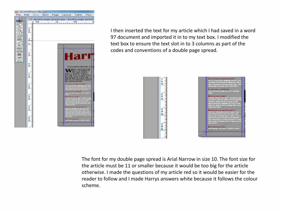
I then inserted the text for my article which I had saved in a word 97 document and imported it in to my text box. I modified the text box to ensure the text slot in to 3 columns as part of the codes and conventions of a double page spread.
The font for my double page spread is Arial Narrow in size 10. The font size for the article must be 11 or smaller because it would be too big for the article otherwise. I made the questions of my article red so it would be easier for the reader to follow and I made Harrys answers white because it follows the colour scheme.

I then created a image box in the middle of my article so I could insert a quote which I created on Photoshop. I added a quote box in my article to follow the codes and conventions of a double page spread as the two articles I analysed both had quote boxes. However, I also added the quote box because it is one of the first things the reader will see therefore its an insight to the article. The quotation I used is very cheeky and will intrigue the reader making them want to read on.
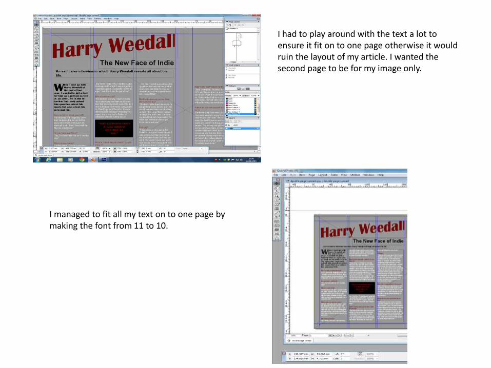
I had to play around with the text a lot to ensure it fit on to one page otherwise it would ruin the layout of my article. I wanted the second page to be for my image only.
I managed to fit all my text on to one page by making the font from 11 to 10.
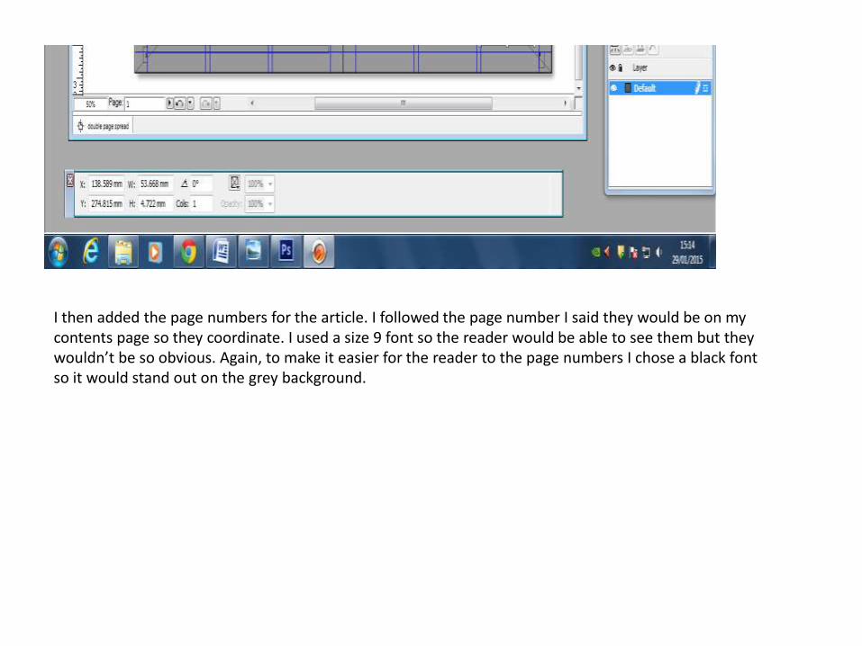
I then added the page numbers for the article. I followed the page number I said they would be on my contents page so they coordinate. I used a size 9 font so the reader would be able to see them but they wouldn’t be so obvious. Again, to make it easier for the reader to the page numbers I chose a black font so it would stand out on the grey background.
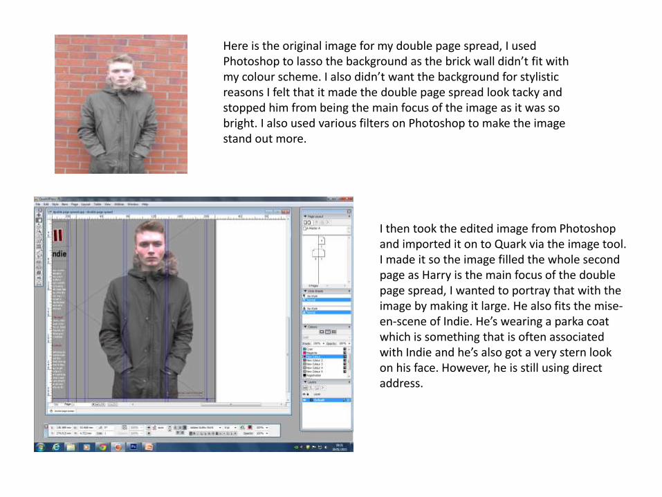
Here is the original image for my double page spread, I used Photoshop to lasso the background as the brick wall didn’t fit with my colour scheme. I also didn’t want the background for stylistic reasons I felt that it made the double page spread look tacky and stopped him from being the main focus of the image as it was so bright. I also used various filters on Photoshop to make the image stand out more.
I then took the edited image from Photoshop and imported it on to Quark via the image tool. I made it so the image filled the whole second page as Harry is the main focus of the double page spread, I wanted to portray that with the image by making it large. He also fits the mise-en-scene of Indie. He’s wearing a parka coat which is something that is often associated with Indie and he’s also got a very stern look on his face. However, he is still using direct address.
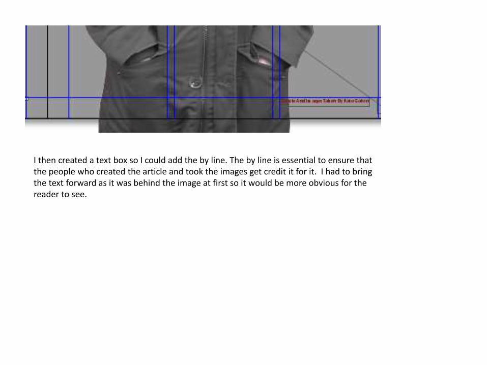
I then created a text box so I could add the by line. The by line is essential to ensure that the people who created the article and took the images get credit it for it. I had to bring the text forward as it was behind the image at first so it would be more obvious for the reader to see.
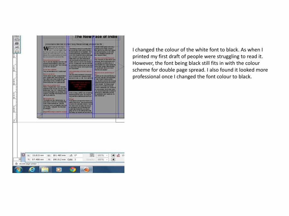
I changed the colour of the white font to black. As when I printed my first draft of people were struggling to read it. However, the font being black still fits in with the colour scheme for double page spread. I also found it looked more professional once I changed the font colour to black.


I also changed my mind on the style of my masthead. I then recreated it on Photoshop so I created an image box to import it on to Quark. Instead of the masthead being slanted I made it straight with a white outline, I did this because it made the title masthead out more but also made it look more sophisticated. I also let the masthead bleed over on to the next page so it was closer to the image, this was for stylistic reason. I felt the second masthead looks better than the original.
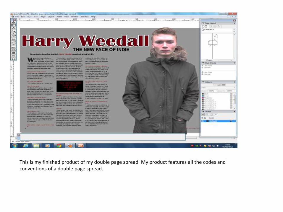
This is my finished product of my double page spread. My product features all the codes and conventions of a double page spread.