Embed Size (px)
Citation preview

3
A n e s s e n t i a l g u i d e f o r t i m e a n d c a s h c r u n c h e d e n t r e p r e n e u r s .
b y N I S H C H A L P A R

This is eguide can downloaded and shared for FREE.

This guide is a result of countless interactions I have had with entrepre-neurs who design their company logo themselves. Since you are reading this, I’m guessing you are one of them.
The problem that I always find with most of the logos is not with the ‘art’
part of it (that’s another story) rather the thought behind it
and the practical implications of the logo.
Now I do understand that the last thing on your mind is how practical your logo should be. Your logo may look great on a computer but on other
dear Entrepreneur, please read this any further.
mediums it may not work. Think about it this way, your logo, is an identification mark of your company, and your identification mark should be recognizable across different medi-ums, right? Most logos can’t be recog-nized if we were to fit them in a one inch square. Why? Too many ideas, colors, fonts being force fitted in to one innocent logo. Time to change your approach.
The purpose of this guide is to help you create a versatile logo for your company giving you simple instruc-tions with an investment of a little time and little or no money.
There are a lot of details that need to be covered, but I won’t be getting into each and every little thing.
I can sense you are getting impatient already, so next page please.

Design is what works.Steve Jobs

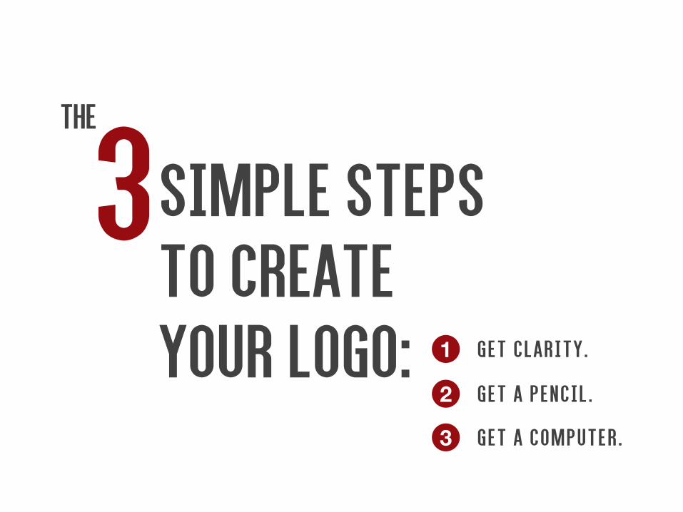
3 G e t a p e n c i l .
G e t a c o m p u t e r .
G e t c l a r i t y .1
2
3
simple stepsto createyour logo:
THe

Practice safe design, use a concept.Petrula Vrontikis

Get clarity.
1Spend the most time here, if you get this right, everything else will just flow.
People have this misconception that the ‘creative types’ just put their feet on the table and dream all day long.
Although, it’s partially true, but the fact is, the best ones love solving problems with creative solutions and that’s where they spend the most time,
pretty much like you.
Now designing your logo is also a problem of ‘identification of your business’ and that‘s what we are trying to solve. The best
way to solve a problem is to clearly define it, let’s start by doing exactly that.
get your Feet on the table.

You or your partners should come together(you could keep
your feet on the table if you want) and list down all the things that you guys feel you
stand for. Don’t be logical here, what-ever comes from the heart, write it.
What we are trying to do here is to verbalize the values of your business. Express each of your business values in only one word. Example: speed, luxury, experience, innovative, crea-tive, professional, etc etc.
Look inside.
Here are some questions to get you started:
What’s our vision? What’s our mis-sion? What do we sell? What do we believe in? What differentiates us? What’s our world view? What got us started?
Now narrow the list of words down to two or at the most three values, values that express the core of your business. You could call these values ‘the soul of your business’.
Now that you have defined your core values, get an agreement with all your stakeholders on the same before moving on to the next step.

Now that we’ve gone inwards and found out our core values, it’s time to take our thinking outwards.
In order to visually express your values, you need to think about all
the possible things that come to mind from that one word. Remember, if you can’t spell out your idea, you don’t have
one. We’ve all suffered with the ‘I have
this idea, but I don’t know how to put it into words’, but don’t worry
look outside
let’s try to express our values using words.
I have found mind-mapping as a fantastic tool for exploration. I’m suggesting mind-map purely because I use it myself(you’ll see an example in the next page), if you want you could try something else. The basic idea here is to give a form, a metaphor to your values. So whatever comes to mind, however silly, write it down, don’t filter anything right now.

Here’s an example of a mind map. As the picture shows, let one thing branch out into another and another. Write whatever leads to the next possible thought. Let your imagination go wild.
After you finish mindmapping, take a break. I usually sleep over a mindmap and come back to it the next day, detachment gives you a fresh perspective. Since you may be in a bit of a hurry, just step out of your work space and get some fresh air. Let your mind free.
When you come back, go through all of the connections again, you might have something new to add.
Once you feel you are done, go to the next step.

Everyone is born creative; everyone is given a box of crayons in kindergarten.
Hugh MacLeod

Get a pencil
2Time to give some life to words. Time to do some drawing.

Don’t worry, it doesn’t really matter. You don’t have to be a Picasso, but I’m sure you can express a thought visu-ally. Just forget the aesthetics, it’s the thought that counts.
Now, go through all the expressions/metaphors of your values in your mindmap and do two things. One, see what clearly excites you as a thought. And two, decide if it is a good representation of your business.
Let’s look at two examples.
If you look at the TATA motors logo, it looks a road running towards the hori-
but..but I can’t draw?zon forming a ‘T’. I’m guessing the thought was the journey towards the neverending horizon, quite in alignment with the the business. Or look at café coffee day, a logo(speech blurb + open inverted comma in reverse) inspired from the conversa-tions we have over a cup of coffee.
Something interesting to observe, where’s coffee or coffee cup in the logo?
It just goes to tell you that your logo doesn’t have to be a literal represen-tation of your business.

paper, you force yourself to focus on your idea and bring that idea to life. A computer will overwhelm and distract
you with its options and confuse you, and you may end up with something else. So if you are tempted to use the computernow, hang in there, use your pencil first, we will use the computer next.
Now let’s say, ‘speed’ is one of the expres-sions of your business, and the image you get is of a shark or a cheetah. Draw it. Try varia-tions if possible. There is no limit, so what-ever expresses a thought best, deserves a chance.
When you are satisfied with the visual idea of your logo, move to the final step.
Now that you’ve agreed on a representation of your company, it’s time to do some drawing. Here’s what you do: Get a fresh blank paper and a pen or pencil. Now all you need to do is draw the expression. Do some drawing, take a short break and repeat the exercise.
Why work on paper you ask? Well, the best of modern designers in the age of computers express their ideas on paper first, before even touching the computer. And there is a powerful reasoning behind it.
When you use simple tools like pencil and
Time to become an artist.

Before we named the company deepfriedcolors, we were toying with the name f3 designs as the name of our company. here are some of the scribbles we made for it.

Computers are useless. They can only give you answers.Pablo Picasso

Get a computer
3You may be thinking that this should have been the first and only step. Trust me it’s better this way. In fact you now even have a story to tell your clients about your logo.

You have a couple of options now, get your hands on either CorelDraw, or Adobe Illustrator(which I highly recom-mend). If you can’t get the software and/or you don’t know how to use it. Find someone who can and tell them to recre-ate what you have conceptually designed on a computer.
Don’t be stupid.
DO NOT use Photoshop to create your logo, it’s a bad idea. Use Photoshop for images and so don’t use an actual image in your logo either, imagine if you have to stretch your logo on a large canvas, your logo will pixellate. Bad idea.
Using Adobe Illustrator helps in creating the graphic in vector which is great as it can be stretched to any size. If you don’t know what a vector is, it’s ok, what you need to know now is that creating a logo on Photoshop, no matter how tempting it may seem is a really bad idea.
Work on Illustrator or worse case Corel-Draw.

Now, before you get all too excited to see your logo being created on a computer (feels good doesn’t it?), create your logo in black and white first.
Why? Because your logo has to stand it’s ground across mediums – website, walls, stationary, stickers etc., and creat-ing it in black and white will auto-matically make your logo versatile.
All the well known logos work well in both black and white and color, and so should yours.
If you have multiple visual options, create them all in black and white first.
Now select the ones you really like in agreement with the stakeholders, only then proceed to colors.
Black and white first.

b&w color

What we made of the scribble.
The visual idea was that ‘F’ is seen in the negative space,
IN FRONT OF ‘3’.

with a concept is that if after a few days or weeks you realize that the color you selected sucks then you can simply change it. Imagine the entire idea of the logo dependent on a color ‘purple’, and now you feel it’s a bad idea!
FONT: Again by themselves a typeface(font) suggests nothing. But use fonts that look the part. Using a casual looking font for a serious business just for kicks I think is a bad idea,
unless that’s the imagery you want. Imag-ine an auditing company using a font that a kid’s brand uses. Looks totally unprofes-sional. You can use sites like dafont.com to explore a variety of different fonts.
Show your true colors (and fonts).
COLORS: Don’t get too emotional or intellec-tual about the color trying to represent some-thing, trust me colors at best, are vague and they have a lot of cultural implications as well. So use color/s that you feel works for your com-pany, you are the designer. However, restrict your logo colors to two or three maximum, otherwise it will be distracting.
See the good thing about creating something


If you have followed all the steps given, I believe you have created a professional and versatile logo for your company.
Congratulations!

And one more thing...

If you are really excited about your design, I’m guessing you are, then try playing with the design element of your logo.
Use the design element across your stationary, website, office walls etc.
Louis Vuitton’s identity.You just know it’s them.
Create your identity.

form patterns
VISITING CARD BACK OF AN ENVELOPE PATTERN
NISHCHAL PARCHIEF CREATIVE OFFICER

REMEMBER:Get clarity - think on paper first and only then use the computer.
Black and white first, color second.
Vector graphics only. Use Adobe Illustrator.
Think small, your logo should be identifiable even on a one inch square.
Keep it simple, focus on only one aspect of the visual. Don’t try to add too many ideas. One idea is enough, otherwise your logo will be cluttered and unappealing.
Don’t have to follow a trend, just follow your heart - it’s your identity.

Nishchal ParFo, deepfriedcolors designs
I believe in the power of marketing and passionately use my expertise in this field to help small and medium sized enterprises take their brand to the next level.
My experience in sales and advertising help me in approaching each project by strategically understanding the business problems of the client, something most of my contemporaries are very uncomfortable with, thus creating design solutions that address those very challenges.
If you want us to work together write to me at [email protected]
Thanks for reading!
About ME

www.deepfriedcolors.com
Your second chance to make a first impression.
dfcD E S I G N
C O .
Image Credits:Morning Chai www.flickr.com/photos/lecercle/1812960596
No Barkingwww.flickr.com/photos/heretakis/5001296127
Steve Jobs Keynotewww.flickr.com/photos/acaben/541420967
Louis Vuitton Outlet 2012www.flickr.com/photos/foeock/7898493596