Embed Size (px)
Citation preview

Designing for Mobile
Ana Risteska
User centering. How-tos. Trends.

Source: Venturebeat, Business Insider
Since 2013 there are more than
actively used worldwide and the number
is constantly growing.
Android runs on 80% of them
1.4 bilion smartphones

Small screen sizes
Using it on the move
Limited bandwidth and connectivity
The Challenges
iPhone 4640 x 960
iPad 2768 x 1024
Galaxy S51080 x 1920

Focus on the most important stuff
Design based on functionalities
Well known UI elements from the platforms
Positive outtakesSmall screen sizes
Using it on the move
Limited bandwidth and connectivity
The Challenges
iPhone 4640 x 960
iPad 2768 x 1024
Galaxy S51080 x 1920

Native elements that users know how to use
Frameworks like jQuery (Mobile) or Bootstrap
Icon fonts, Web fonts, SVG images
Convenient resources
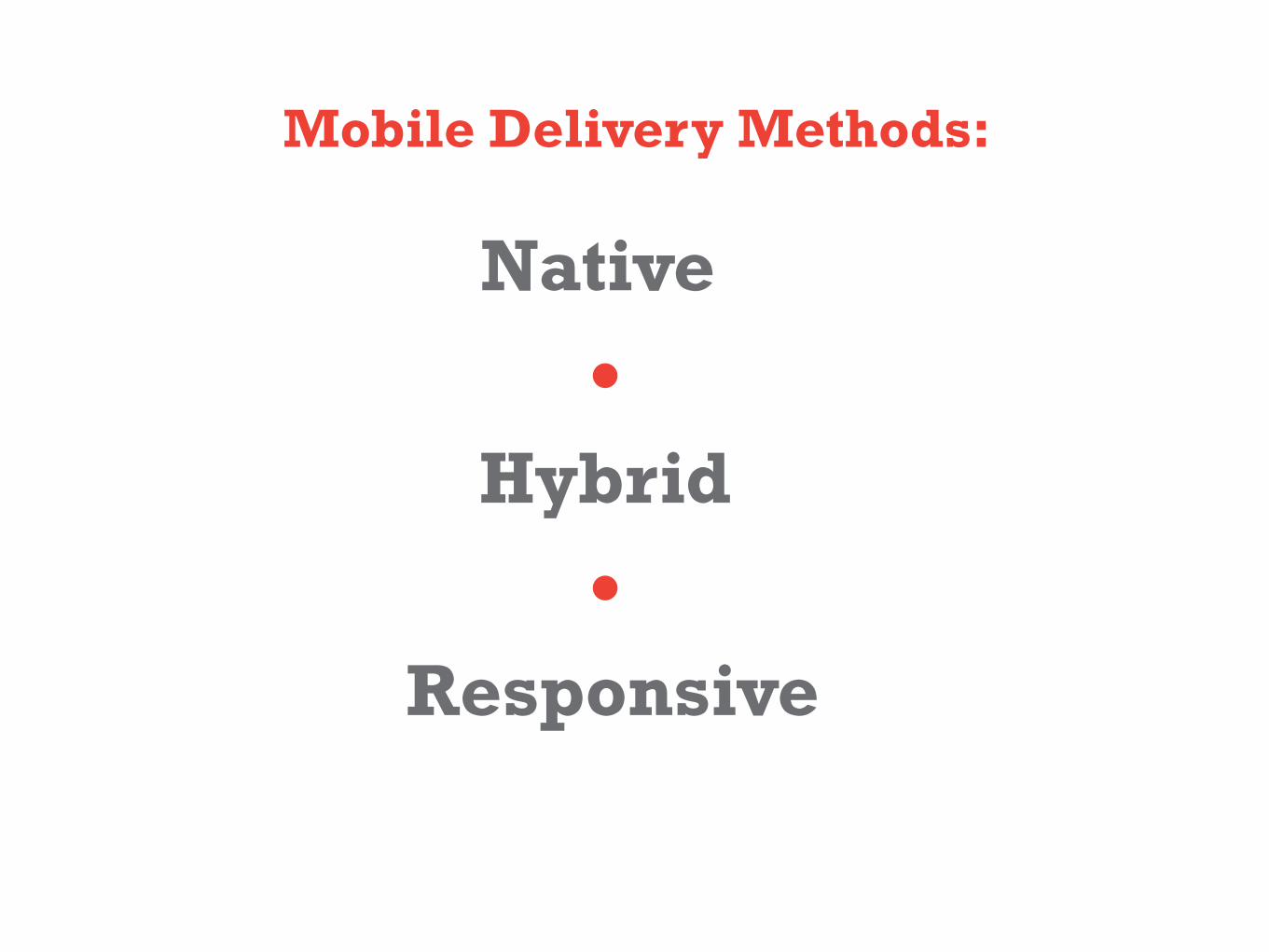
Mobile Delivery Methods:
Native
Hybrid
Responsive

Having in mind...
Way of interaction (mouse, touch, movement, voice,…)
Screen sizes & resolutions
Platform (font, navigation, input type)
Hardware capabilities (camera, GPS, audio, …)

Organize informationPlan the content
Ask ourselves: What is the goal? Why willthe users use our app?
Goal You could use...
I wanna get tickets for Arcade Fire Visible search field.Prominent “Buy tickets” button.
I wanna find the Van Gogh Museum. “Locate me” buttonLink to the Amsterdam map.
I wanna see when is the next bus. Menu with all the lines.Search input to find my line.

Hit areas are areas of the screen the user touches to activate something
Average fingertip: 1 to 2cm wide=
from 44px to 57px (88px to 114px on Retina)
Holding devices. Hit areas.
lukew.com

Placing content? Essentials, options, extras...
GO SEE
Name or logo
List with options
Option 1
GO
SEE
Ова е параграфче со објаснување на опцијата 2. Ова е параграфче со објаснување на опцијата 2.
Опција 1
Option 1
Option 2
This is introductory paragraph for my app. This is introductory para-graph for my app. This is introducto-ry paragraph for my app. This is introductory paragraph for my app.
This is paragraph that contains info for the option 1. This is paragraph that contains info for the option 1.
This is paragraph that contains info for the option 1. This is paragraph that contains info for the option 1.
This is introductory paragraph for my app. This is introductory para-graph for my app. This is introducto-ry paragraph for my app. This is introductory paragraph for my app.
Name or logo
Option 2
This is paragraph that contains info for the option 2. This is paragraph that contains info for the option 2.
Option 3
List with options

Size matters

Size mattershwdesignco.com
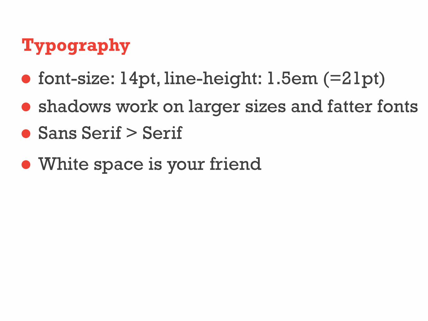
Typography
font-size: 14pt, line-height: 1.5em (=21pt)
shadows work on larger sizes and fatter fontsSans Serif > Serif
White space is your friend

This is Serif font And this is Sans Serif font
Fonts, line heights and whitespaces
yogurtlabs.com tweaked yogurtlabs.com
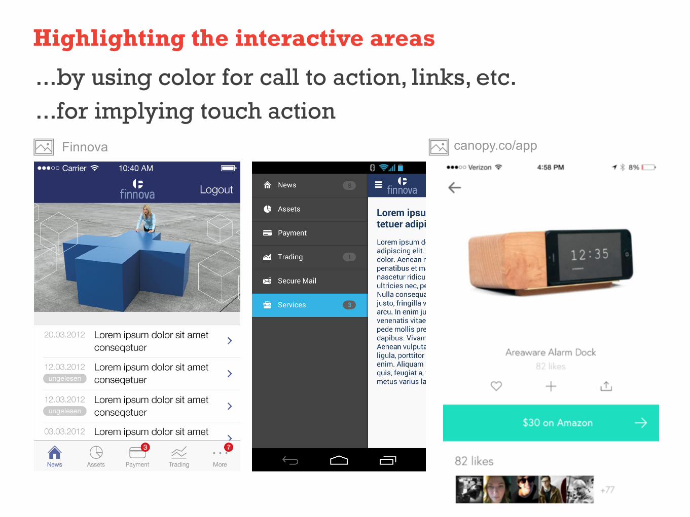
Highlighting the interactive areas
...by using color for call to action, links, etc.
...for implying touch actionFinnova canopy.co/app

Highlighting (the interactive areas) ...by using color for call to action, links, etc....for implying touch action
Hipmunk App Sunrise CalendarBetpicker App concept by Gökhan Kurt

Reuse elements
colors for the button could be link colors too.
get inspired by the branding. Use those elements.

Designing navigation
Expanding menu Side menuFor apps with a high number of menu options. For responsive web sites
Starbucks Homepage Hipmunk App

Designing navigation
Tab menuFor apps with fewer menu options.
Hub and spoke menuFor quickly exposing the app’s features
Tab Bar iOS icons of Wemlin App
Tumblr App

Platform style

Platform style
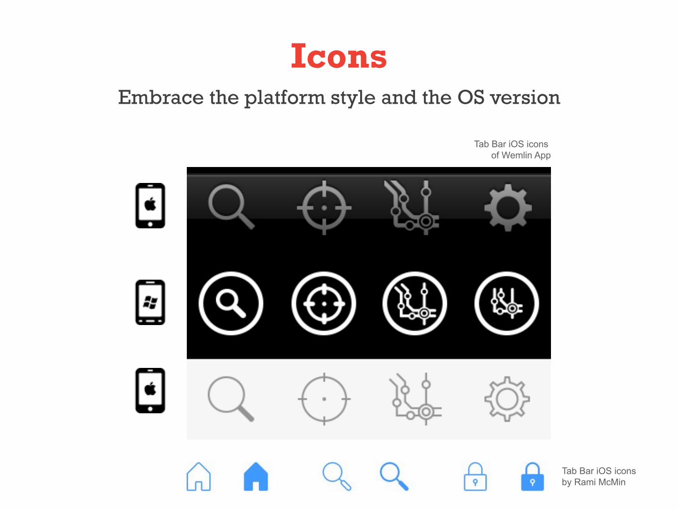
IconsEmbrace the platform style and the OS version
Tab Bar iOS icons by Rami McMin
Tab Bar iOS icons of Wemlin App

Android
XXXHDPI(~640dpi)
oops....
iOSnon-retina @1xretina @2x
http://blog.mready.net - Designer’s Guide: Photoshop Action – Multiple DPI Resizing for Android
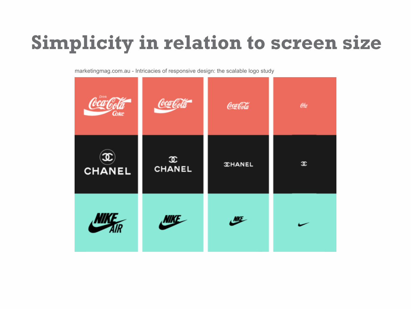
Simplicity in relation to screen sizemarketingmag.com.au - Intricacies of responsive design: the scalable logo study

Flat design and sleek typographyTrends
Weather App by Sergey Valiukh for Tubik Studio Windows Phone UI FM Radio UI by Aurélien Salomon
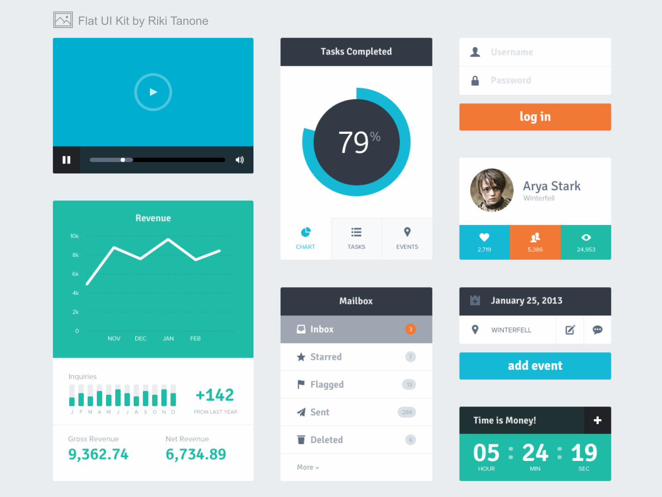
Flat UI Kit by Riki Tanone

Android: Material designTrends
google.com/design/

iOS: outlined icons, blurry backgrounds,circular shapes
Trends
WhatsApp iOS 7 Redesign by Saffad Khan Class Register by Charles Patterson

Ideas to take home
think of the usage - where, when, what?
first prio: readability and hit areas
reuse and keep the consistency
be up-to-date