Embed Size (px)
Citation preview
Digital Graphic Narrative
Development
Emma Wells
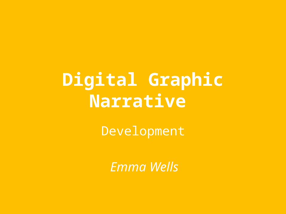
Shape Task
EvaluationWhat did you like about your image?I like how you can easily tell what animal it is, even if you don’t think of the exact animal. This is due to small shapes being used to distinguish the animals features and make it easy to tell what animal it is. To make this image I took an image of my chosen animal, which was a Lioness, and pasted it into Photoshop. I then used small shapes to make the outer shape of the lioness so I could add features later. I changed the opacity of each shape and warped them into the shape of a feature of the lion and then coloured it close to the animals colour range. I like how the shapes came together with the colours as they look as close to the original as possible. I chose the colours I did because they were close to the colours of the lioness which helped make the image more realistic and for people to spot the animal better.
What would you improve if you did it again?If I could do this image again I would add more shapes to the image to make out more features of the animal. This can help children identify the animal. I would also change the background of the image so it would look more realistic for the animal which will make it even easier to distinguish the animal.
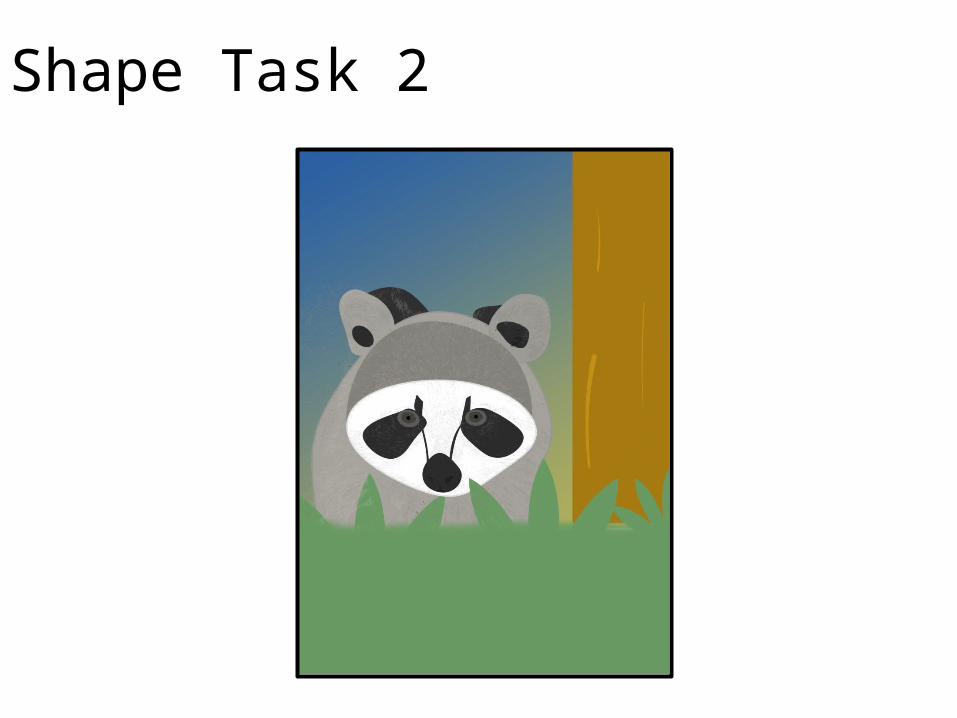
Shape Task 2
Evaluation
What did you like about your image?For this image, I liked how the shapes have been used to create the animal and it’s background as they look as
realistic as they can be and makes it obvious what animal it is and what his whereabouts are. To make this image I used small shapes to make the out line of the animal which was made by warping the shapes I put in to make it as close to the animal shape as possible.. Once I did that I colour overlayed the shapes to a similar colour to that part of that animal. I did that for every part of the animal I could see and colour overlayed them to a similar colour to the part I was overlaying. This completed the animal.
Once that was done I used shapes to create the background for the animal and make it look more realistic to my target audience. I like the background because it gives the image more colour and catches the eye of my audience.
What would you improve if you did it again?If I could do this again I would add more texture to the animal which will make it look like it had
fur which it does it real life.
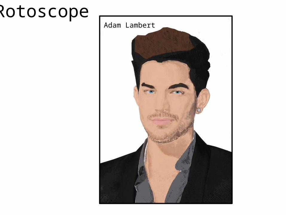
RotoscopeAdam Lambert
EvaluationWhat did you like about your image?The first thing I like about this is the shading. I used colour to get these dark colours and faded them a bit to make it look
more realistic. I think the shading on the face makes it more realistic as it gives his face depth like his real face does. I also like his hair because although it looks blocky, the small slashes in his hair makes it look like real hair and makes the whole image look better. I also like the look of the lips because they look real and, with added shading, they are given more depth and shadows. To do this to my image I took an image from the internet of a celebrity and used the lasso tool to layer different parts of the person to colour overlay them. Some parts like the facial hair were hard to do with the lasso tool so I used Colour Range to layer different shades of the same colour to get little bits of the facial hair that I couldn’t get with the lasso tool. This really did help because it made the facial hair look more real and made it look like it would feel rough like facial hair does.
What would you improve if you did it again?For this image, I would make the black part of his hair lighter so you can see the lighter parts of the hair that make it
look more real. I would also add some more shade the the forehead and left side of his face to add more depth.
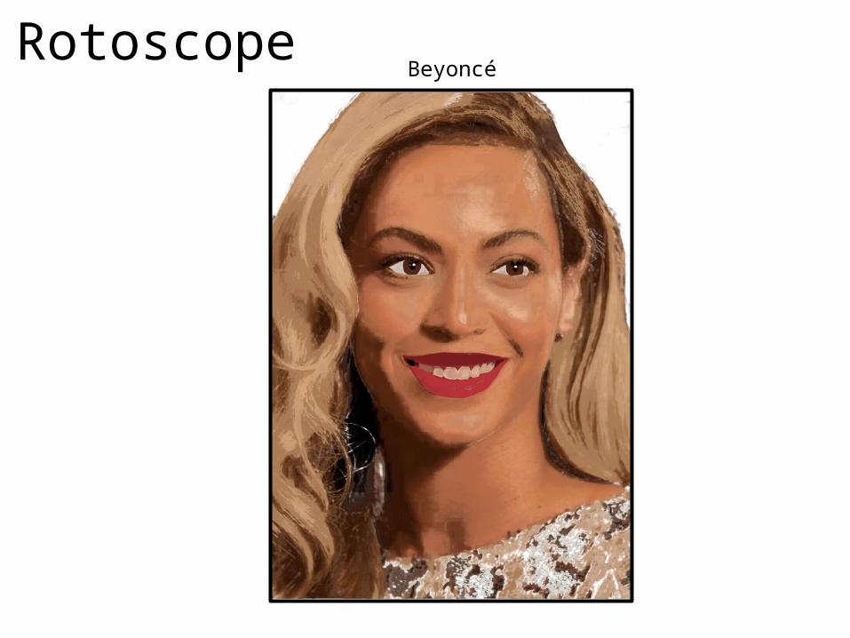
RotoscopeBeyoncé
EvaluationWhat did you like about your image?This is my favourite image out of the two rotoscopes as I really like the colours and shades and really like how it looks really realistic. I also really like the shading on the face and the hair as they make the image look real and gives the celebrity I’ve done some depth. I also like the different shades on the lips as it makes the lips more realistic. The teeth I liked because they got shading from the colour range which made them look real and not to plain and obvious. To get this on my image I did the same as I did for the first image but just used different colours depending on what part of the original photo was like.
What would you improve if you did it again?If I could do this image again I wouldn’t do any much shading as I think there’s a lot of shading going on in the image that it almost looks to much like the real image. I would also change the shades of the colours of her lips because I think they are too different and they need to be more alike to get the lips to look real.
Text Based
Text Based
Evaluation
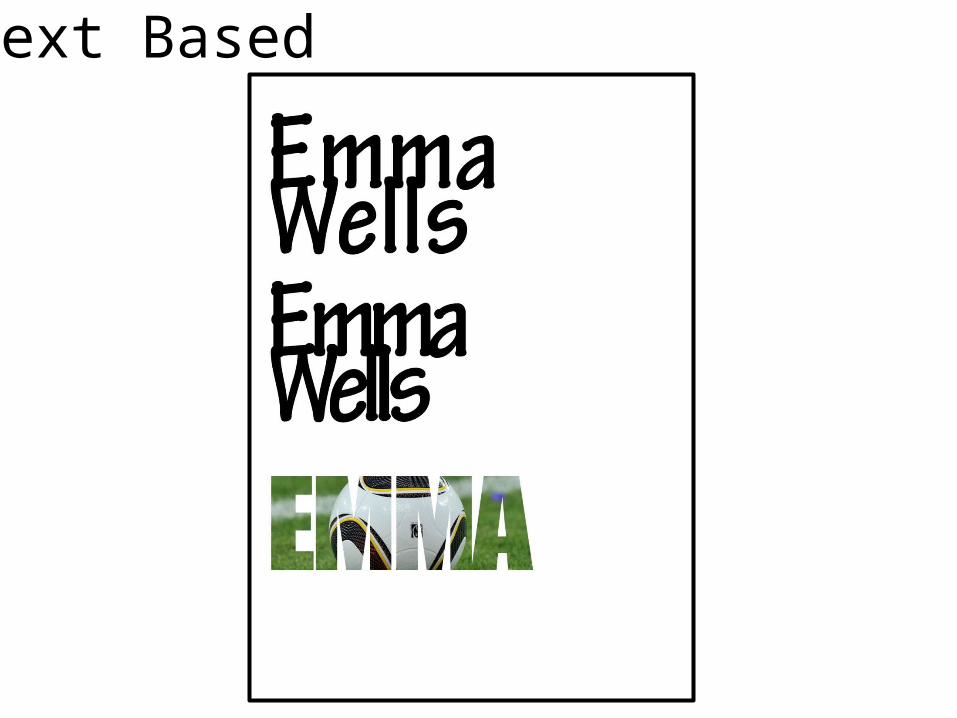
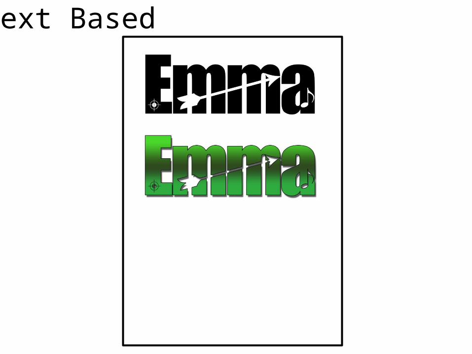
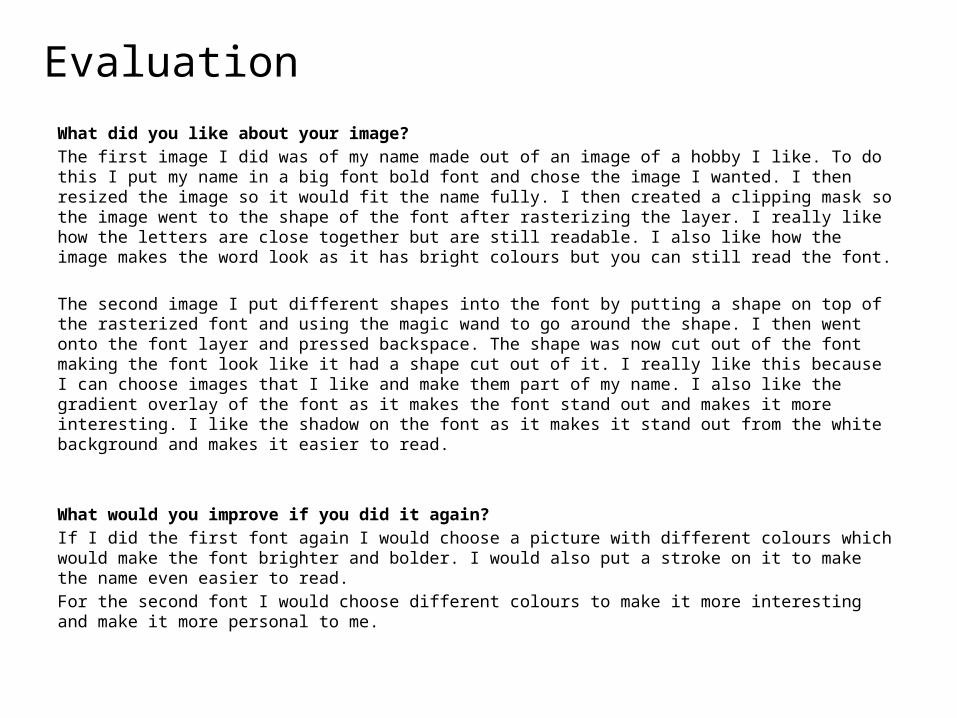
What did you like about your image?The first image I did was of my name made out of an image of a hobby I like. To do this I put my name in a big font bold font and chose the image I wanted. I then resized the image so it would fit the name fully. I then created a clipping mask so the image went to the shape of the font after rasterizing the layer. I really like how the letters are close together but are still readable. I also like how the image makes the word look as it has bright colours but you can still read the font.
The second image I put different shapes into the font by putting a shape on top of the rasterized font and using the magic wand to go around the shape. I then went onto the font layer and pressed backspace. The shape was now cut out of the font making the font look like it had a shape cut out of it. I really like this because I can choose images that I like and make them part of my name. I also like the gradient overlay of the font as it makes the font stand out and makes it more interesting. I like the shadow on the font as it makes it stand out from the white background and makes it easier to read.
What would you improve if you did it again?If I did the first font again I would choose a picture with different colours which would make the font brighter and bolder. I would also put a stroke on it to make the name even easier to read.For the second font I would choose different colours to make it more interesting and make it more personal to me.
Comic Book 1
Comic Book 2
Comic Book 3
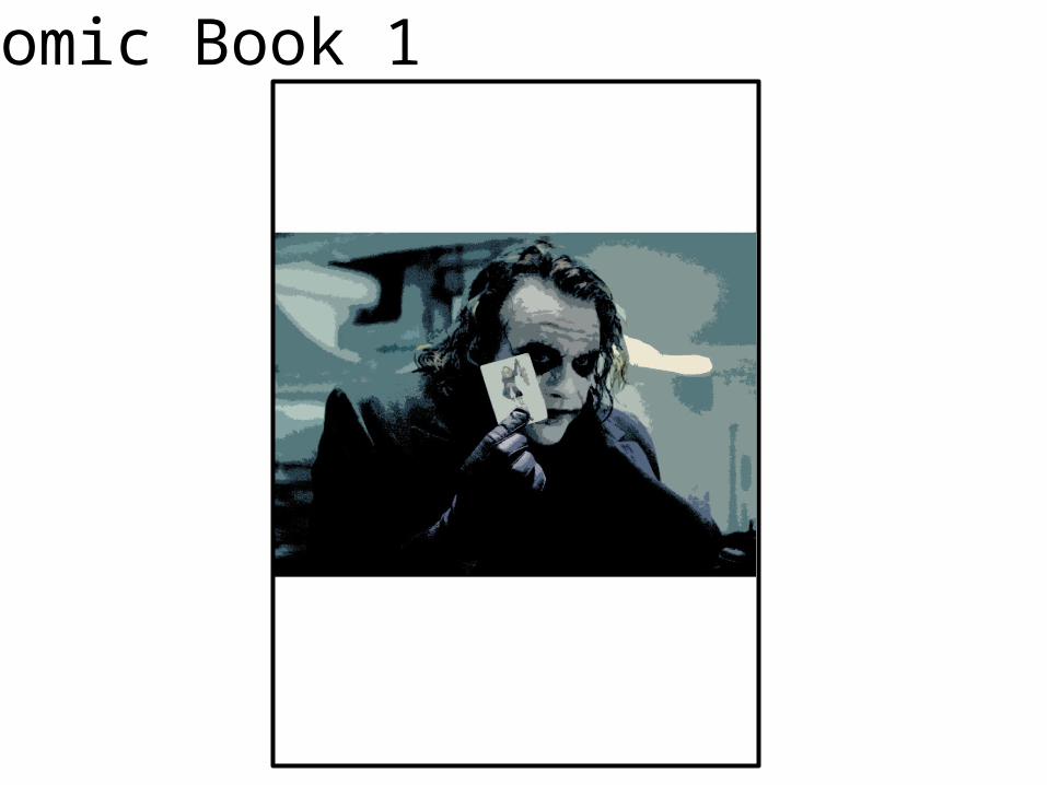
EvaluationWhat did you like about your image?The first image I did was of the joker from The Dark Knight movie. For this image I like how the colours look together as I think they look good together and are interesting to look at. I also like how the shadows work in this image as they give the joker depth and makes him look more real. To get this image as it is, I duplicated the image to make two layers of the image above the background. I then went to layer 1 and went into filter gallery and chose the cutout filter. I changed the settings in cutout until I was happy with my image. I then clicked okay and went onto the copied image. When on the copied image I went to adjustments-threshold to get the darker shadows of the original image. Once done I went to blending mode and chose a blending option I liked.
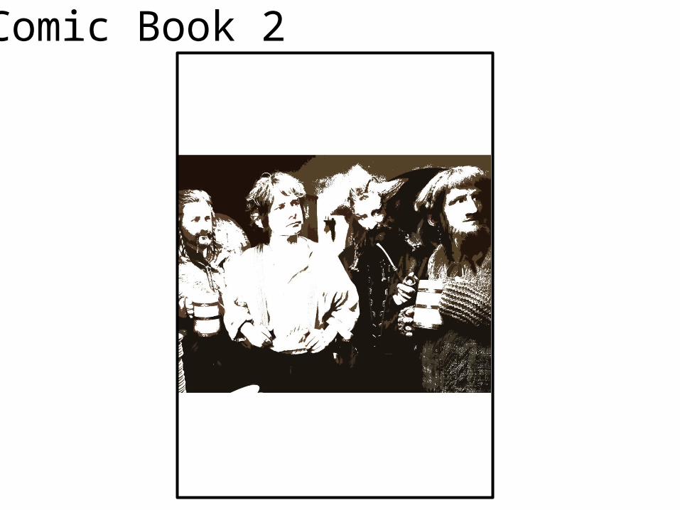
The second image I did was of Bilbo Baggins and a few dwarfs from the first Hobbit film. I did the same movies as I did on the first image but just changed the filter settings, threshold and the blending so I got a different kind of image from the first. I like how the people are brighter than their darker background as it makes them stand out and gives the image more depth making It more real. I also like how there’s bits of darker colour on the people as it gives them depth and makes them more 3D.
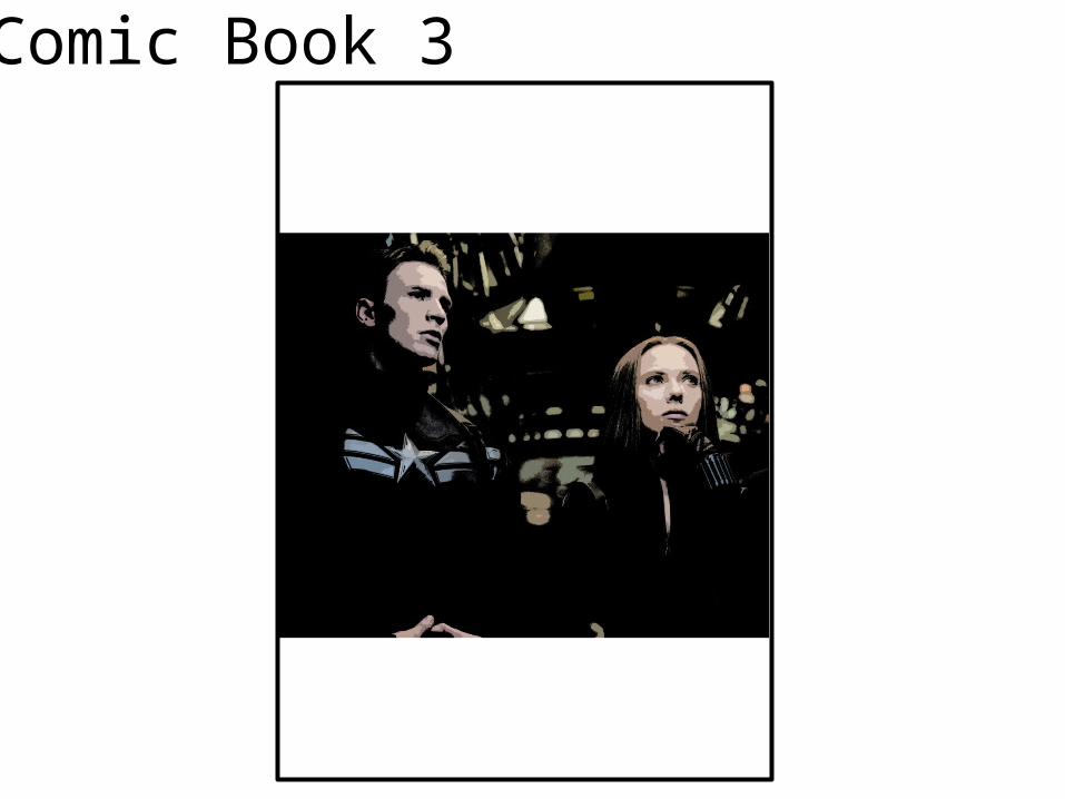
For my third and last image, I chose to do two main characters from the second Captain America movie. I did the same as I did for the second image but again changed the bits I wanted to. I really like third image because the main image is mainly black and white which helped the final image look darker and more comic book like. I also like the people’s faces as you can see different shades to their face which gives them depth and makes it more realistic.
What would you improve if you did it again?If I could do these images again, I would make the first one less clearer to make the image look interesting and different. I would change the second image by toning down the white on the image a bit and make it darker to look more realistic. For my third and final image, I would make the image black and white to make it look more like a comic book and to make it different from the other images.
Photography
Evaluation
What did you like about your image?
What would you improve if you did it again?
Illustration
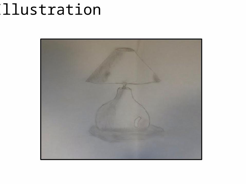
EvaluationWhat did you like about your image?I like the shading on the drawing because it gives it depth and gives a sense of where the light is coming through. This makes it look more natural and seem more realistic, bringing it to life. I also like the shadow because that also gives a sense of where the light is and a rough idea of how big the thing the drawing is of is.
What would you improve if you did it again?If I could dot his again I would draw a more complicated image that uses more shading and more difficult shaping to test my ability and see how well I can cope with harder drawings.
Initial Ideas
Mood board of inspiration
Idea Generation
Mood board of chosen idea
ProposalDimensions
(number of pages and page size)
Story Overview
(Provide an outline of your story)
Export Format
Advantages:
Disadvantages:
Deadline
Audience
(Think about who you are targeting as your audience. Consider age, gender, class, location and other characteristics which could define your audience.)
Production Methods
(Explain the methods you are going to use to produce your pages. Show us the thinking behind your decisions for a more detail response)

What are the strengths of the proposal? What areas of the proposal need further work?
What are the strengths of the idea generation? What areas of idea generation could have been further developed?
What are the strengths of the proposal? What areas of the proposal need further work?
What are the strengths of the idea generation? What areas of idea generation could have been further developed?

What are the strengths of the proposal? What areas of the proposal need further work?
What are the strengths of the idea generation? What areas of idea generation could have been further developed?
Feedback Summary
Sum up your feedback.
Which parts of your feedback do you agree with and why?
Which parts of your feedback do you disagree with and why?
Storyboards

Storyboards

Storyboards

Original Script
Original Script goes here with link to where it came from
Original Script
Original Script goes here with link to where it came from
Final Script
Final script goes here.
Digital Flat Plans