Embed Size (px)
Citation preview
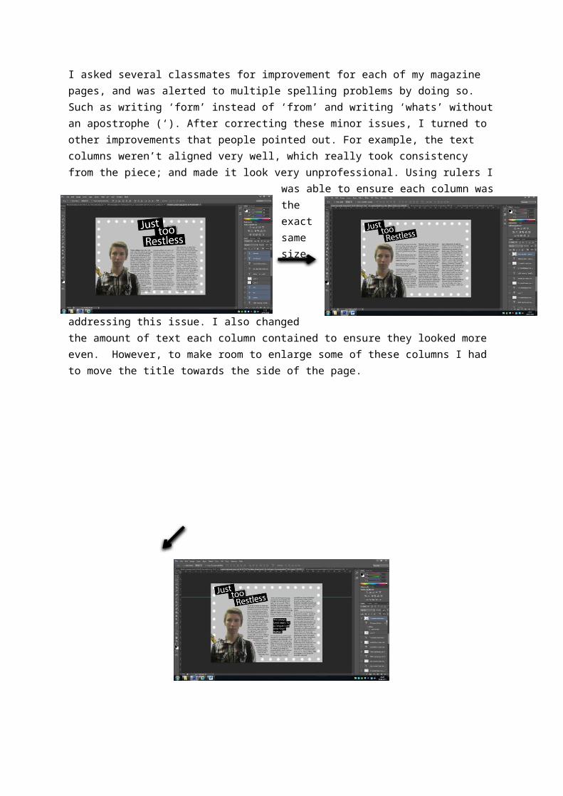
I asked several classmates for improvement for each of my magazine pages, and was alerted to multiple spelling problems by doing so. Such as writing ‘form’ instead of ‘from’ and writing ‘whats’ without an apostrophe (‘). After correcting these minor issues, I turned to other improvements that people pointed out. For example, the text columns weren’t aligned very well, which really took consistency from the piece; and made it look very unprofessional. Using rulers I was able to ensure each column was the exact same size, addressing this issue. I also changed the amount of text each column contained to ensure they looked more even. However, to make room to enlarge some of these columns I had to move the title towards the side of the page.
After making these improvements, I asked another group of classmates if there’s anything they would improve. They commented on how there is a little too much plain space in the top right corner. Also, that the text looked to boring overall, as there were 3 full columns of plain black text. To address this issue, I changed the text slightly, and planned on implementing a quote to grab attention and prevent this bland overview. This is another technique used in many large magazines.
Once I had rewritten part of the article, I placed in into the page, with a similar column layout as before. I then changed the location of the image slightly, and resized the columns. A feature widely used by other music magazines is to have a large, outstanding quote somewhere near the centre of the page. This then means that attention is drawn towards it, but also it stops the text from looking as bland and lengthy.
Of the people 6 people I asked to give feedback on the contents page, there were few improvements suggested as they all thought the page was effective, and worked well. All that I had to do to improve this page then was to correct the small spelling mistakes.
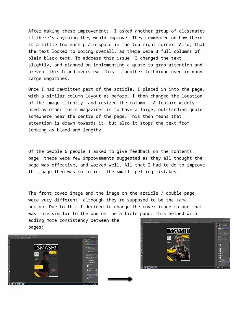
The front cover image and the image on the article / double page were very different, although they’re supposed to be the same person. Due to this I decided to change the cover image to one that was more similar to the one on the article page. This helped with adding more consistency between the pages:
Although when I initially placed this image on the page it didn’t fit the design very well. After adding several effects it looked considerably better, suiting the ‘rock’ style, with darker grungier look to it.