Embed Size (px)
Citation preview

Hi.George Oates @ukglo Good, Form & Spectacle Ltd. @goodformand [email protected]
Libraries & Tech For Good, London, 11 July March 2016

gfns.uk
My name is George Oates, and I’m a software designer. I’ve made web things for about 20 years now. I run a company called Good, Form & Spectacle, a design firm that’s focussed on cultural heritage work.

R&D Tools, Products
Clients
gfns.uk
I’m working hard to construct the company along three lines: R&D, Tools and Products, and Client projects.
So far, we’ve mostly built new, exploratory web interfaces for catalogues containing millions of things, like the British Museum, or the Wellcome Library. You can have a look at those if you’re curious, at the URL there.
Today I’d like to show you one of our major research projects, and how it’s evolved in the year or so we’ve been working on it. It’s about 3D printing, internet of things, museum objects, and interaction design.

whatsinthelibrary.com
I’m here today to talk to you about a project we did with the Wellcome Trust, and specifically the web team of the Wellcome Library. We were installed onsite at Euston Road with the team, and we just built as much as we could, as fast as we could.

1 Scope
2 Show the Thing
3 Context
4 Scalabilitywhatsinthelibrary.com
Our initial brief comprised these four simple categories, so we decided to structure the project around them directly, allocating one week for each category of thinking and work.

whatsinthelibrary.com
We explicitly set up the project as a series of loose sketches. It was exciting that Jenn and her team at the Wellcome was open to, and excited about, working in public too. We just all sort of looked at each other early on and agreed it was a great thing to try.
So, you can have a poke around all of this at your leisure, including the 60 or so blog posts we wrote on the project blog as we worked.

1 Week 1: Scope
2
3
4
In the first week, it was our job to show the scope of the catalogue. We got a dump of MARC XML, and tried to figure out its size and shape, somewhat naively. It was apparent that people weren’t really sure of these sorts of totals for things, or at least, they were figures that aren’t normally reported on.

1
2
3
4
1
This was one of the first visualisations we drew. It’s a map of all the MARC fields we found in the data – 184 of them. We’ve shaded them based on how many records have a value in each field, where black is most used. It was a very quick indication for us of “data coverage” – we were looking for some kind of blunt measure of data quality, thinking that “presence of data” is a good one.

1
2
3
4
1
Here’s the second visualisation, which shows in more detail which MARC fields are populated.

1
2
3
4
1
And the third, which shows, for any one MARC field, the distribution of values within it.

1
2
3
4
1
The bottom one there, “The Long Tail”, is Organization and Arrangement of Materials, field 351.

1
2
3
4
1

1
2
3
4
1

1
2
3
4

We call this type of interface a “Spelunker”.

1
2 Week 2: Show The Thing
3
4
A thread through the project was always about challenging the dominance of search as primary entry point to a library collection.
We looked at the search logs, and were pleased to find a bunch of general things.

1
2
3
4
There was the odd specific thing, but overall, people were searching for general terms.

1
2
3
4
2
Then, we just started drawing everything so we could see the shape of the metadata. This is a graph of dates across the data, what was published when. The white tips show digitised things.

1
2
3
4
2
Spotting holes in metadata… Year “----”

1
2
3
4
2
Spotting holes in metadata… Year “----”

By # of records in category
1
2
3
4
2
This is a fairly conventional visualisation type called a treemap. We used it to show distribution across types of things, like Portrait prints or Stipple engravings.

By # of digitised things in category
1
2
3
4
2
We made it so you could rearrange the visualisation by % digitised. In this case, the Aids Posters collection is most digitised.

1
2
3
4
2
Another simple visualisation that shows how much of a category has things to look at

1
2
3
4
live site ours
2
Big pictures. It’s that simple.

Show everything. No search box.
Big images.
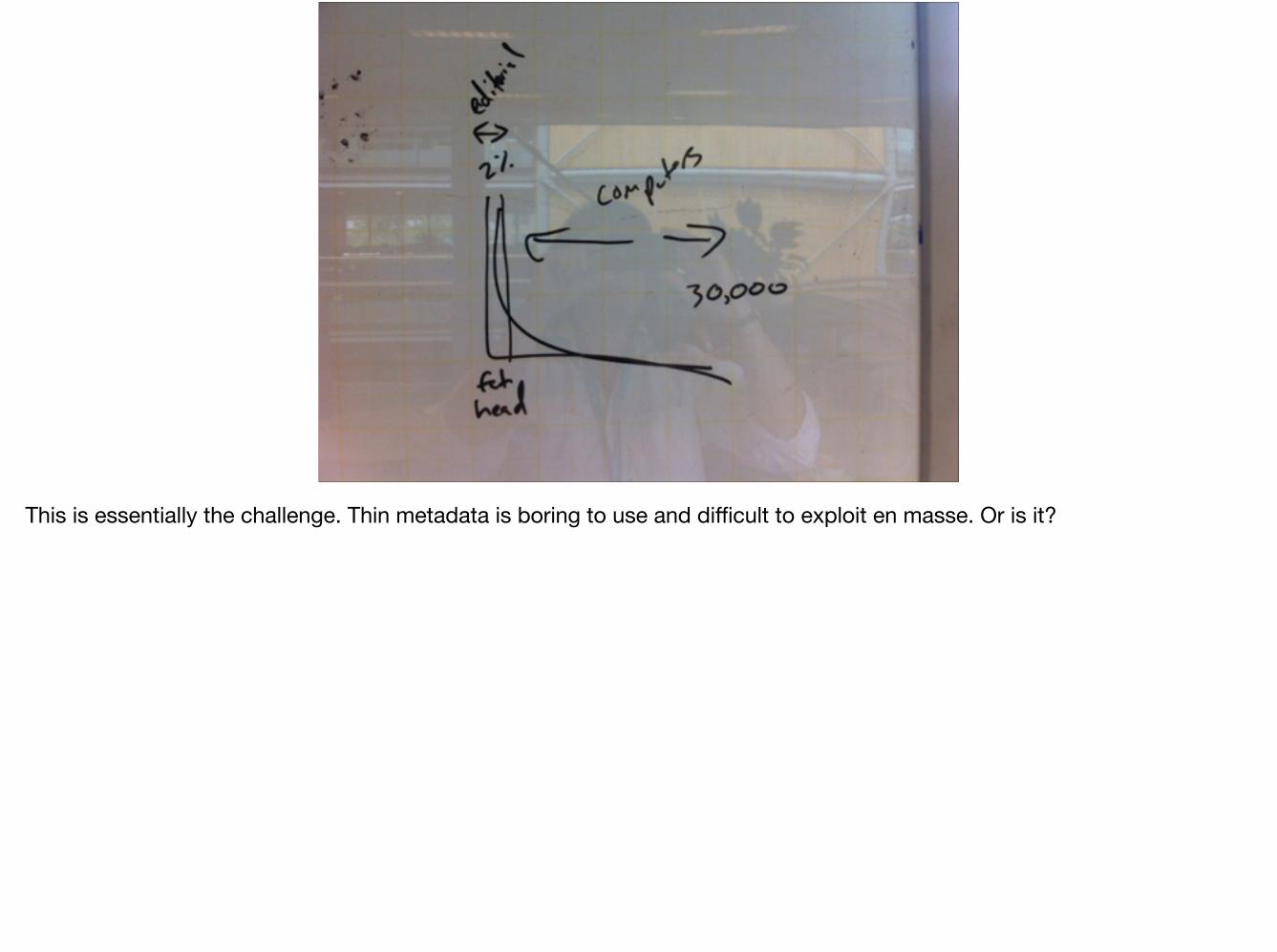
This is essentially the challenge. Thin metadata is boring to use and difficult to exploit en masse. Or is it?

1
2
3 Week 3: Context
4
So Week 3 was all about context… how much time does it take to make a fantastic, contextually rich content set for an interesting topic or person?
We gave ourselves a week to describe this chap, satirist and printmaker, James Gillray, who was working in London at the birth of the medical profession.

1
2
3
4
This is day one. We printed out a bunch of his works, and figured out some scaffolding and useful themes. That’s Lalita Kaplish on the left, our main collaborator for this bit.
1
2
3
4
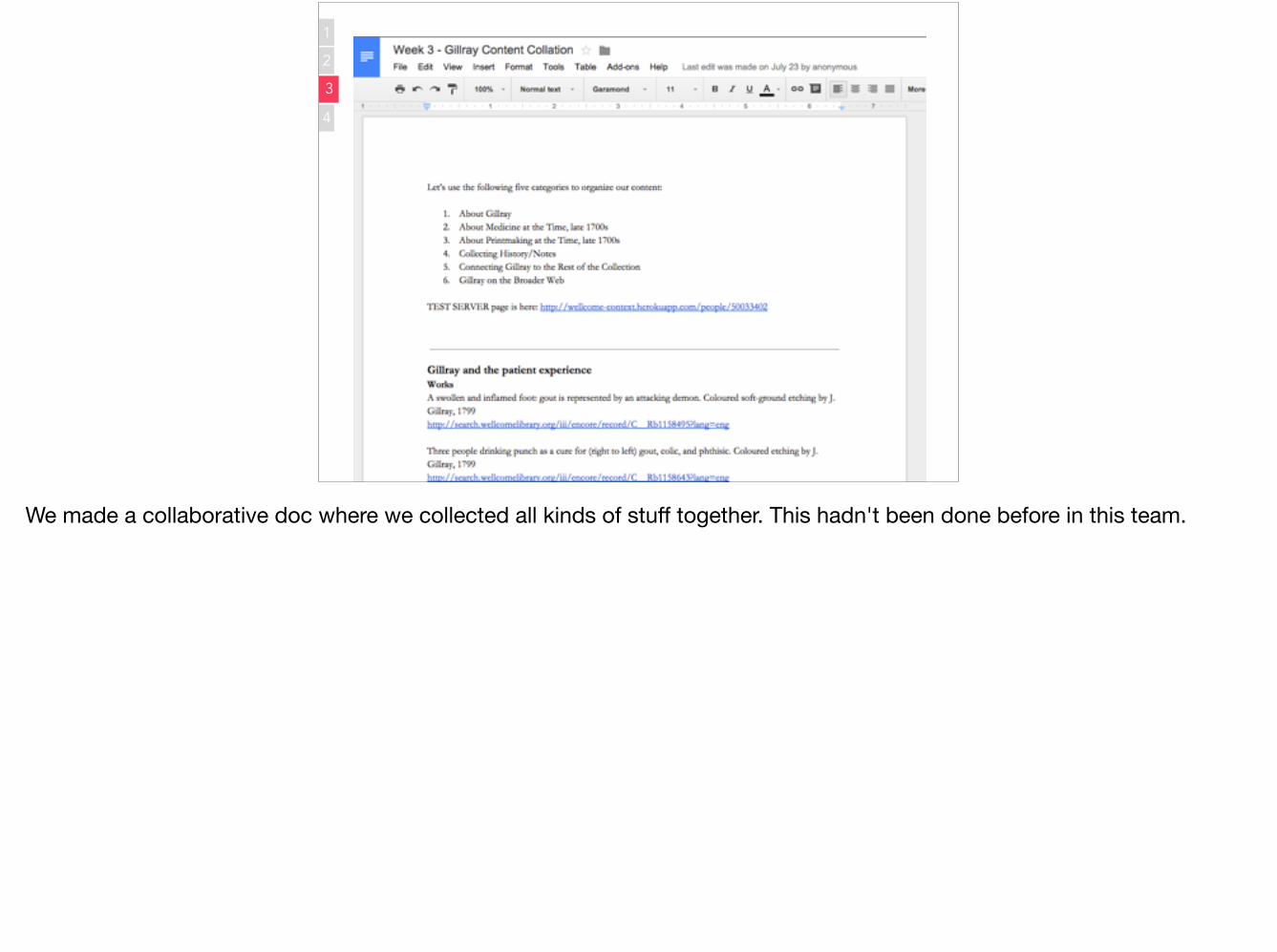
We made a collaborative doc where we collected all kinds of stuff together. This hadn't been done before in this team.

Content Scaffolding 1. About the thing
2. Themes around the thing
3. Connect to the rest of the collection
4. Connect to the rest of the web
1
2
3
4
1
2
3
4
Theses were our content planning elements, working from the objects themselves out to the web.
1
2
3
4
1
2
3
4
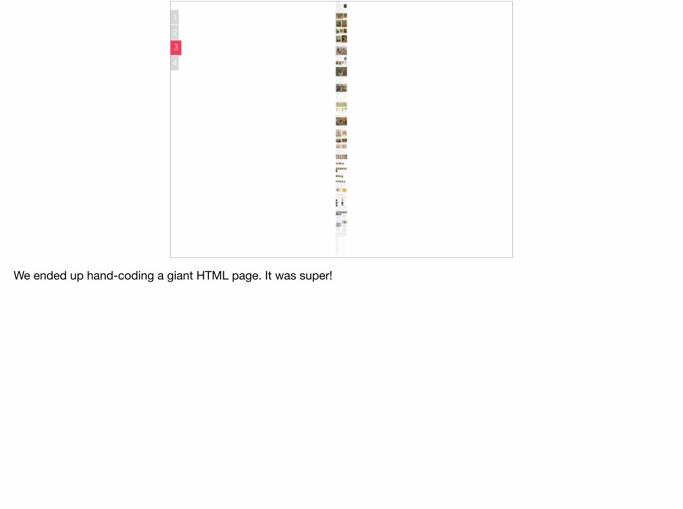
We ended up hand-coding a giant HTML page. It was super!

1
2
3
4
1
2
3
4
Here it is a bit bigger.

Great content takes a while.
Or, a week, actually.

1
2
3
4 Week 4: Scalability
So, back to our challenge. Now that we’d taken a week to do an amazing job with James Gillray, what could we possibly do across the larger dataset of ~1 million records?

1
2
3
4
We made a home page, and curated some fun links. We also kept a live daily work log, which we used to show daily progress, and also include some fun things we came across, like haemorrhoids.

1
2
3
4
We added a “lookup” which we deliberately didn’t call a “search” because it was the most basic search you could possibly imagine.

1
2
3
4
We connected to Wikipedia, using VIAF identifiers which we could find because some of the Wellcome records had Library of Congress IDs for the people. Then we could show their portraits.

1
2
3
4
We found lots of data duplicates, so fixed them where we could. (In a week. To do this thoroughly is quite hard and time-consuming.)

1
2
3
4
We found a boy named Sue. (Why do people think it’s OK to just use people’s surnames??)
• String match subjects Medicine + Medicine.
• Displaying related subjects
• Places and Orgs are online
• Matched people to Wikipedia intro + pic
• New Person IDs collected through VIAF
• Only 50 Authors in 700 field, now matched
• Integrated MeSH subjects
• Integrated Archive tree/metadata
• Available as .JSON
1
2
3
4
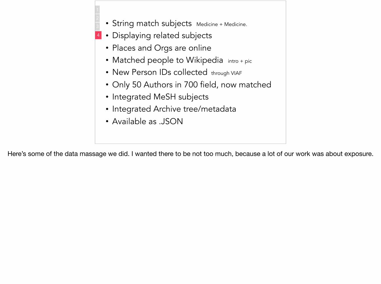
Here’s some of the data massage we did. I wanted there to be not too much, because a lot of our work was about exposure.

1
2
3
4
We continued to find nice surprises as we moved around the data spelunker. I like that the Church of England publishing graph looks a little bit like a church.

1
2
3
4
That was the overall thing about this, that there’s still so much to be digitised… Once you can explore everything freely, it’s quite disappointing quite often.
When will we realise that digitisation is just like the need for building roads (or cycle superhighways)?

MOAR DIGITISATION!!!!
1
2
3
4
Enough said.

b11589723
1
2
3
4
So, highlights?We built three different views on the same record.
A lot of what my company is trying to do is demonstrate what happens when you deploy good software people on the inside.
Now Wellcome is hiring like mad!

6 websites 10 visualisations 63 68 blog posts 7 code repositories 4 review meetings 2 surprise public toys MeSH browser + MaRC to PostGRES slurper
56 58 flat whites 1 on-site breakfast
1
2
3
4
We produced all this stuff…

1
2
3
4
We marketed the work to the staff at Wellcome using this fun “ad” in the lift. And we also did some user research with the general public, tempting them with FREE CHOCOLATE, which works remarkably well as bait.
Thanks.George Oates @ukglo Good, Form & Spectacle Ltd. @goodformand [email protected]
Libraries & Tech For Good, London, 11 July March 2016
So there you have it. Thanks!