Embed Size (px)
Citation preview
Make it Responsive!the logic, the code & tricks of trade
A talk on Responsive Web Design (RWD)
for WordPress Themes
by King Sidharthfor WordCamp Pune 2013

#WCPune2013@kingsidharth
Tweet Away!
What is Responsive Design?
An approach aimed at crafting sites to
provide an optimal viewing
experience across a wide range of
devices.

That’s @mashable’s btw
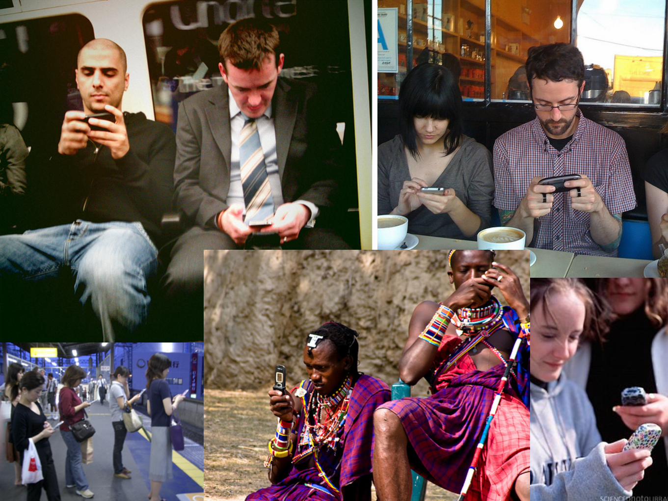
Why Responsive Design?
Make it Responsivethe Logic
K.I.S.S.Keep It Simple, Stupid!
Keep only bare minimum and leave out all the rest.

Desktop: 2-3 Columns
Tablets: 1-2 Columns
Mobile: 1 Columns
Break Points & Layoutsthink columns
Rethink Order of the Elements
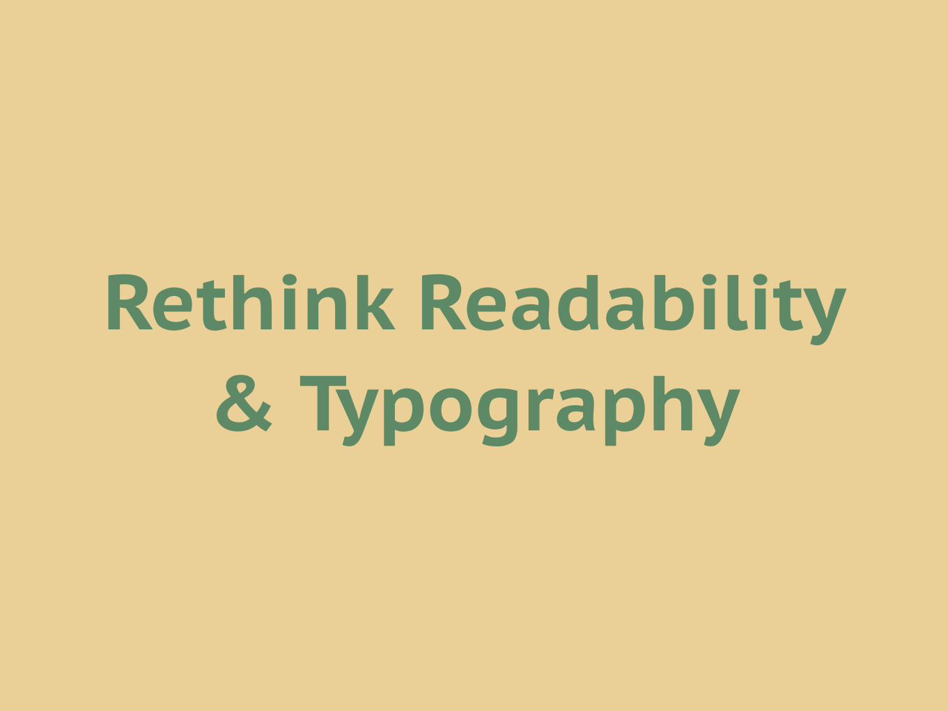
Rethink Readability & Typography

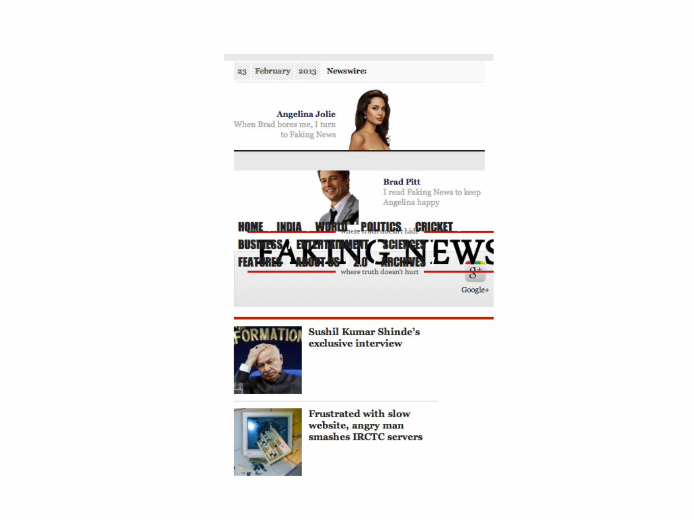
Rethink Images

http://www.fuelyourcreativity.com

Make it Responsivethe Code

CSS Crash Course<div class=”boy” id=”kingsidharth”></div><div class=”boy” id=”aniket pant”></div><div class=”boy” ></div><div class=”girl” id=”nisthadixit”></div>
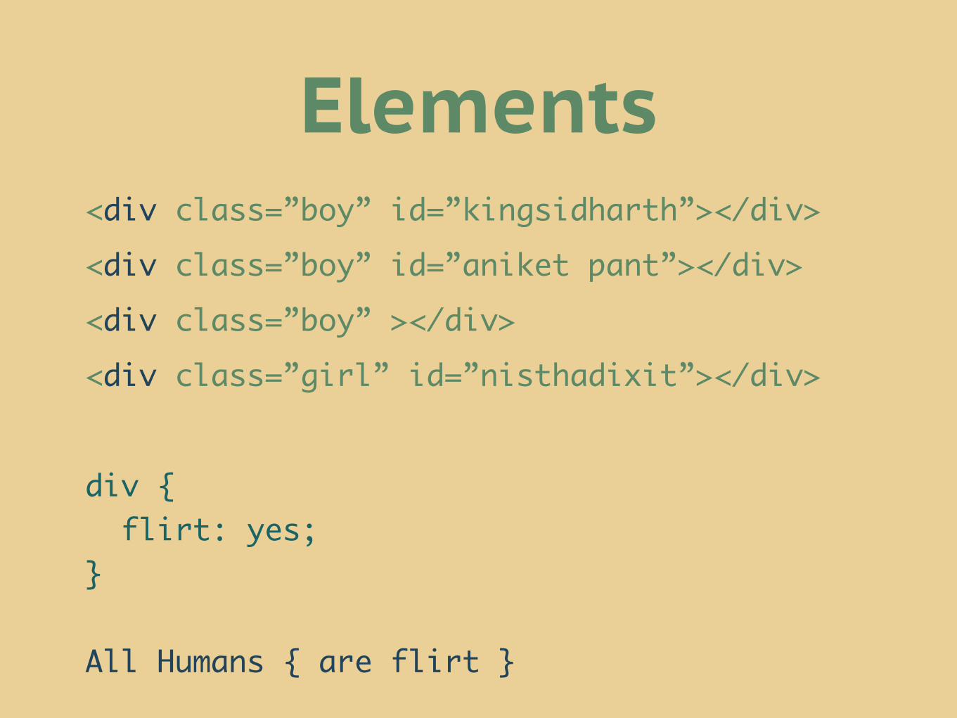
<div class=”boy” id=”kingsidharth”></div><div class=”boy” id=”aniket pant”></div><div class=”boy” ></div><div class=”girl” id=”nisthadixit”></div>
div { flirt: yes;}
All Humans { are flirt }
Elements
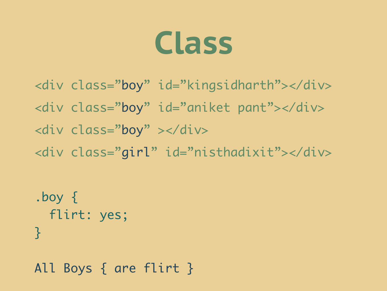
<div class=”boy” id=”kingsidharth”></div><div class=”boy” id=”aniket pant”></div><div class=”boy” ></div><div class=”girl” id=”nisthadixit”></div>
.boy { flirt: yes;}
All Boys { are flirt }
Class
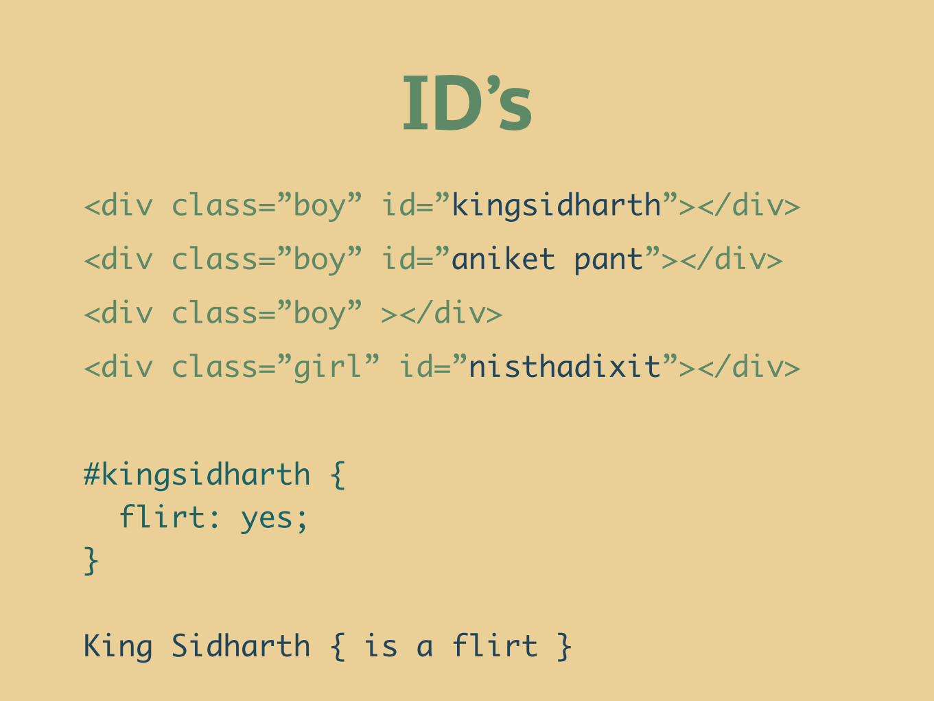
<div class=”boy” id=”kingsidharth”></div><div class=”boy” id=”aniket pant”></div><div class=”boy” ></div><div class=”girl” id=”nisthadixit”></div>
#kingsidharth { flirt: yes;}
King Sidharth { is a flirt }
ID’s
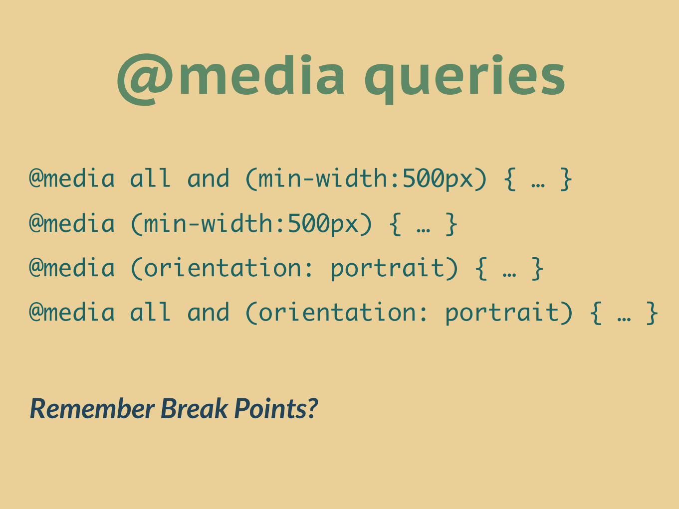
@media queries
@media all and (min-width:500px) { … }@media (min-width:500px) { … }@media (orientation: portrait) { … }@media all and (orientation: portrait) { … }
Remember Break Points?
View Port Setting


<meta name="viewport" content="width=device-width">
@-o-viewport { width: device-width;
}
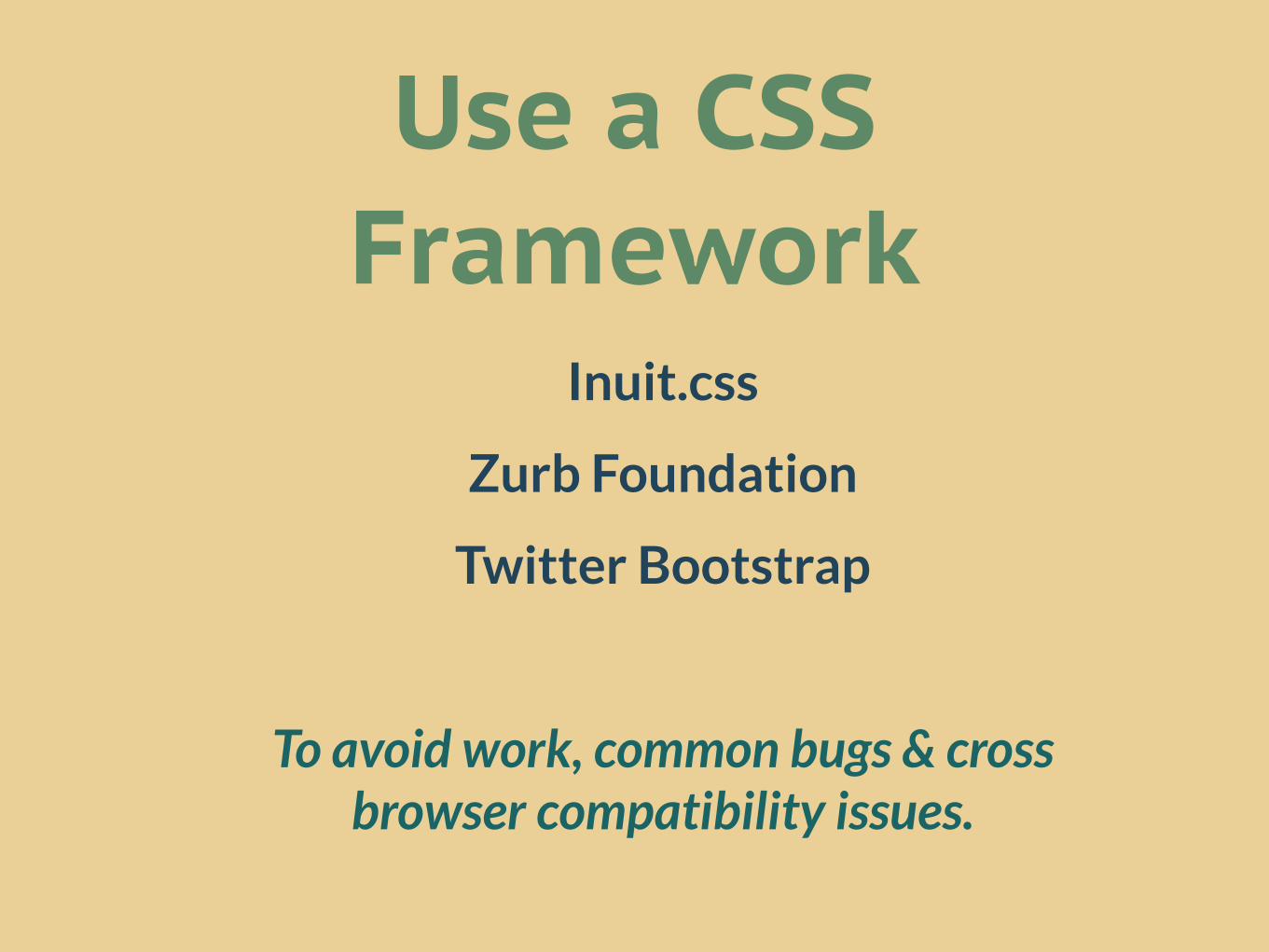
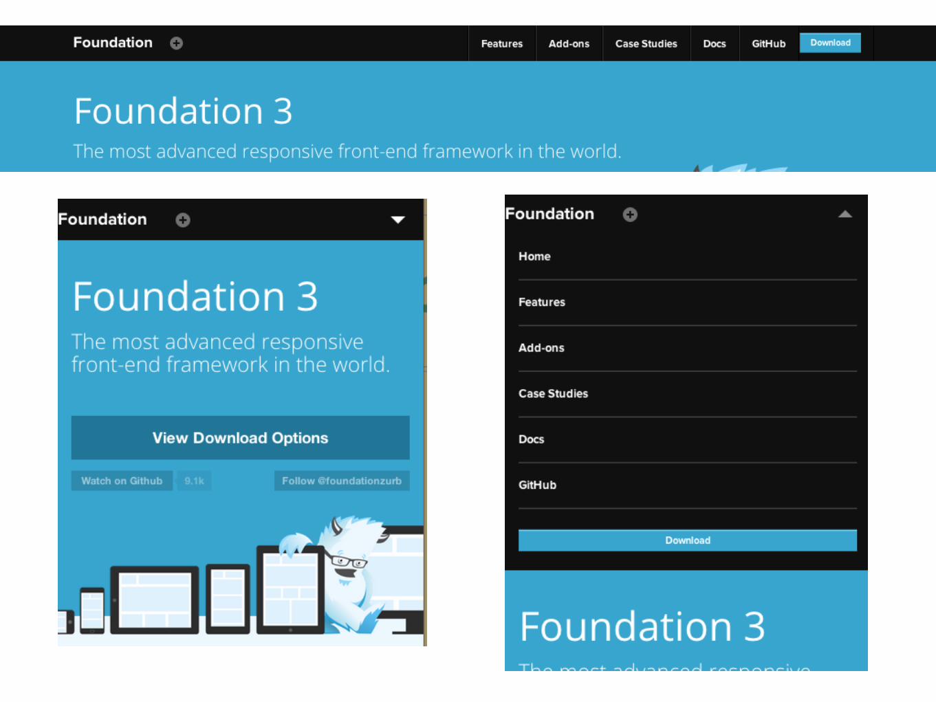
Use a CSS Framework
Inuit.css
Zurb Foundation
Twitter Bootstrap
To avoid work, common bugs & cross browser compatibility issues.

Make it ResponsiveTricks of the Trade

NavigationTo Play Hide n’ Seek or Not
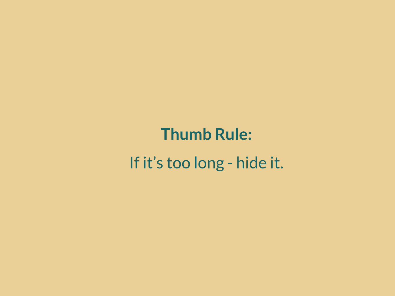
Thumb Rule:
If it’s too long - hide it.
Kill Images on MobileCoz it’s loading...

Thumb Rule:
If they are not important - kill them.
Don’t ResizeTest it for Real on Real Devices

Pornographyfor DevelopersSome ideas & problems to think about

Social Media Buttons
They don’t work on mobiles and some tablets
Responsive Design Options for
Theme BackendWarning: Still in Experimental Phase
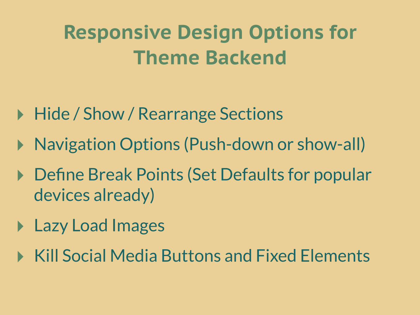
‣ Hide / Show / Rearrange Sections
‣ Navigation Options (Push-down or show-all)
‣ Define Break Points (Set Defaults for popular devices already)
‣ Lazy Load Images
‣ Kill Social Media Buttons and Fixed Elements
Responsive Design Options forTheme Backend
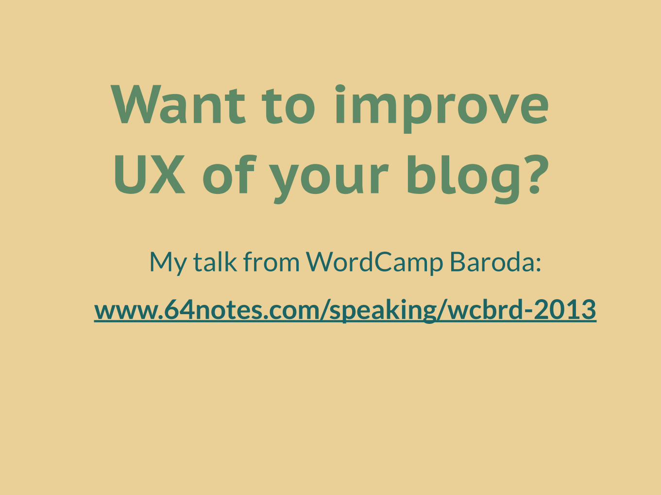
Want to improve UX of your blog?
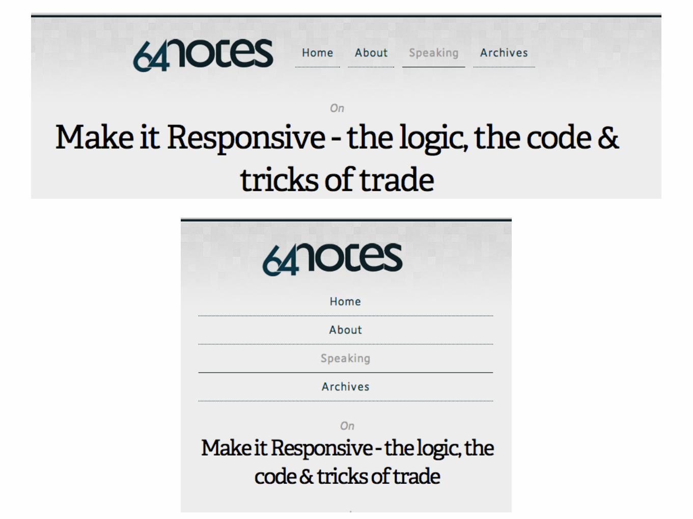
My talk from WordCamp Baroda:
www.64notes.com/speaking/wcbrd-2013
King SidharthCo-Founder Web Mutiny
19+2 Years Old Entrepreneur
DesignerArtist
Public Speaker
www.64notes.com/speaking/wcpune-2013
@kingsidharth
Questions or Threats?
Thank You!