Embed Size (px)
Citation preview
Here a close up is used as it presents a woman, thus would catch the attention of most men. Plus the women portrayed in this image has a very devious expression, and seems to be less concerned with appearance than that of the other women.
This may be due to the lifestyle of a rock star whom are usually more concerned with a mental state that their appearance. However this often results in people making the assumption that they are of a lower class in society as they’re not willing to spend masses of money to look more appealing aesthetically.
The text within this image seems to be very rough and doesn’t seem to be particularly easy to read. Likewise the use of the colours black and white are very basic, this paired with the grunge effect gives a very unappealing finish. Therefore in many ways the text is much like the woman who is portrayed.
The layout here is very cluttered and untidy. Making it hard to read. This can be done to portray the messy and unpredictable lifestyle of a person such as that shown in the image.
The colour scheme used is very basic, with mainly dull colours. This includes a considerable amount of black, commonly associated with rock stars.
The colours of red and yellow were used as they contrast one another, thus stand out; catching the attention of a (potential) reader.
The black clothing also represents a rockstar as stereotypically they tend to wear a lot of black and other dull colours.
Despite the name here been overlapped by women. Most people still recognise the name/brand as ‘Kerrang’ have built up an audience whom are aware of the logo and header.

The text here is written very informally as its hand written, which could suggest that the personality of the person shown is also informal.
The background here is a solid black, which isn’t very appealing to look at. Stereotypically, rockstars use this colour often, but also they’re not bothered about their looks- thus aren’t bothered about looking appealing.
The expression upon the face of the women is extremely menacing which could imply an overall view of the stereotype of ‘rockstars’. Rockstars are often quite rebellious to, stereotypically.
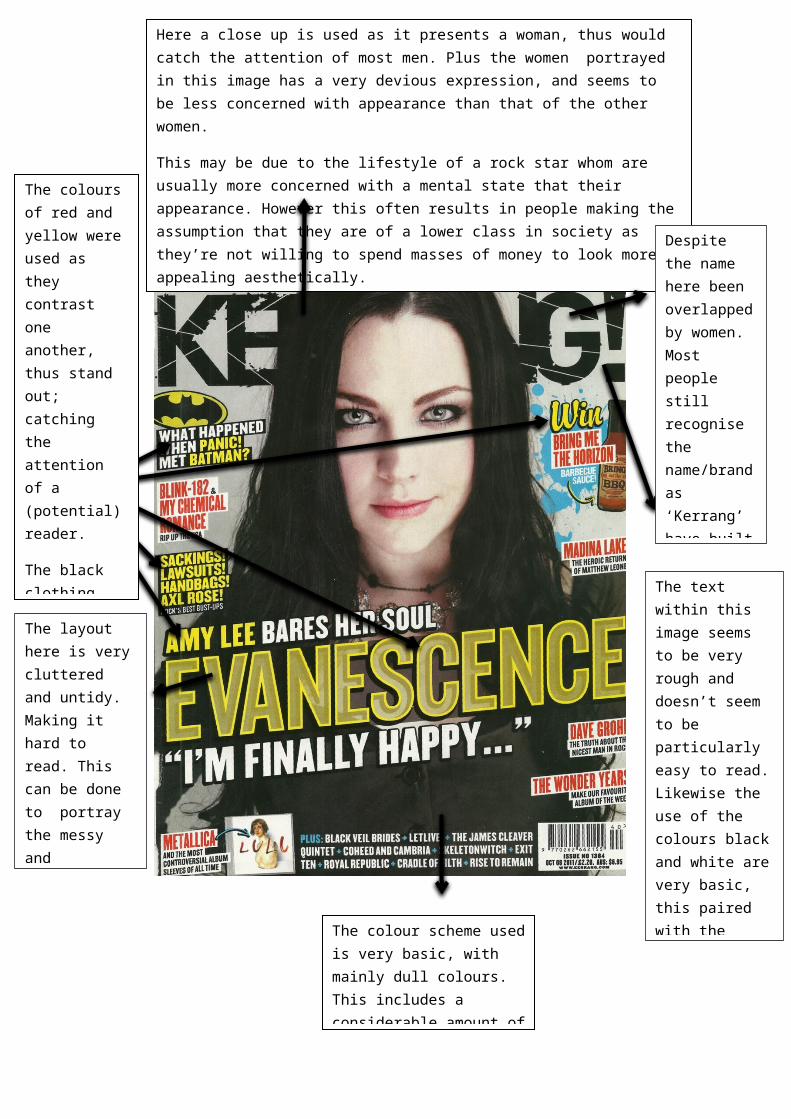
The woman here is very pale and wearing dark, heavy makeup. Plus she’s wearing a black, leather jacket which implies she has a deep attitude.
The women is looking directly at the reader here, which may cause the reader to feel more inclined to read the article; due to eye contact been made.
Here the background is a dark colour, whereas the text is of light colours of pink and white. This
This quote stands out, not only due to the colour choice, but also as it’s isolated from the rest of the text. The text also causes the reader to become intrigued as they become curious of the mistakes she made. Also, the words which indicate the subject of the sentence have been isolated from the rest of the quote by been of a different colour.
The woman is equally as large as the text as an image (especially of a woman) would be more likely to catch the attention of people/ readers.
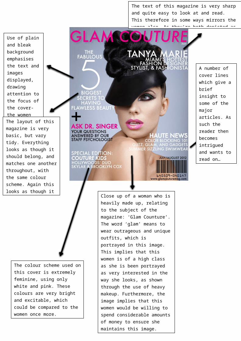
Close up of a woman who is heavily made up, relating to the subject of the magazine: ‘Glam Counture’. The word ‘glam’ means to wear outrageous and unique outfits, which is portrayed in this image. This implies that this women is of a high class as she is been portrayed as very interested in the way she looks, as shown through the use of heavy makeup. Furthermore, the image implies that this women would be willing to spend considerable amounts of money to ensure she maintains this image.
A number of cover lines which give a brief insight to some of the major articles. As such the reader then becomes intrigued and wants to read on…
Use of plain and bleak background emphasises the text and images displayed, drawing attention to the focus of the cover- the women and the text.
The text of this magazine is very sharp and quite easy to look at and read. This therefore in some ways mirrors the women also. As they’re both depicted as very flashy and also quite feminine: due to the use of the colour pink.
The layout of this magazine is very basic, but vary tidy. Everything looks as though it should belong, and matches one another throughout, with the same colour scheme. Again this looks as though it was designed like this too look appealing to the reader; once more much like the woman.
The colour scheme used on this cover is extremely feminine, using only white and pink. These colours are very bright and excitable, which could be compared to the women once more.