Embed Size (px)
Citation preview
Music Magazine Deconstructions:
Nicole McGrath-Wood
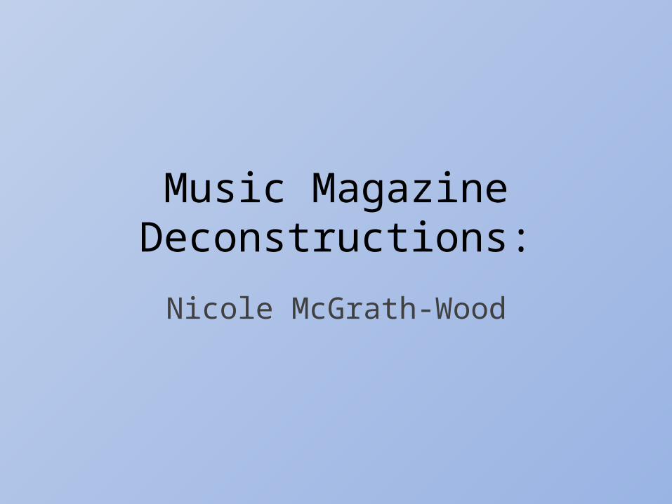
Masthead:The masthead on most ‘Q’ music magazines are unusual. This one included as it dominates the whole front cover whereas the main image normally does that. This has intentionally been done because the main selling point here is the magazine not the person whom is on the cover. The contrasting colours, red and white, are caught by the readers eyes immediately.
Main cover line:The main cover line relates straight to the main image and gives the reader an insight of what they’re going to be reading/what the story will be like. Here “I feel so alone” may relate to isolated readers.
Essential information:The price/issue date/barcode are all together – this is useful as the reader can look at everything straight away and not have to scan the whole front cover to find what they’re looking for.
Cover lines:Again, using well known artists in your cover lines adds further excitement and attracts even more readers – readers that may not even be fond of whom is within the dominating image.
Bubble:Mainly in a circular shape. This sells or advertises something – because here, it is isolated from the cover lines etc. It makes the reader feel this is an important piece of information and so adds to their urge of wanting to but the magazine.
Main image: Using an image like this on a music magazine, of a well known singer (Florence Welch), instantly grabs the readers attention. The use of white font against the singers hair makes the front cover bold and exciting which connotes to the whole of the magazine/what is within. The colour blue on the cover links in with the singers makeup and so is not out of place and adds a bit of enthusiasm.
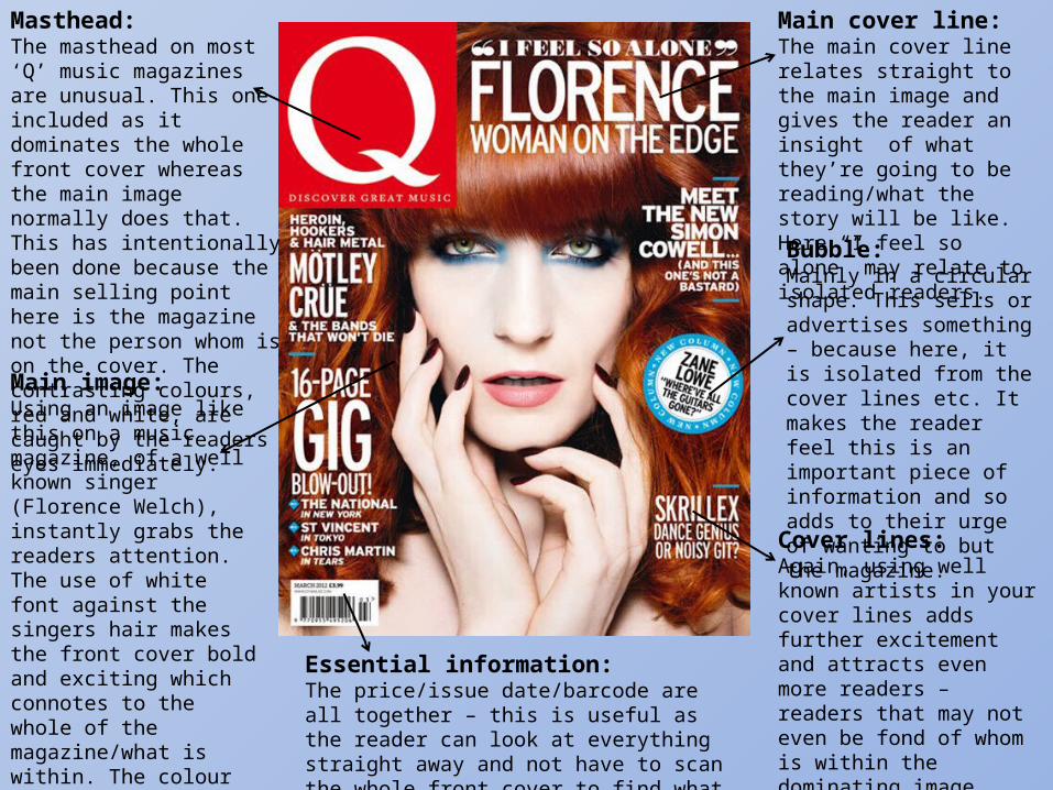
Masthead :Because the masthead is placed behind the main image, the magazine is saying to the reader that everyone knows about it and so it doesn’t need to have a masthead on full display – it is simply better than all of the others. This also draws readers in and progresses sale.
Main image :This main image completely dominates the whole front cover and so makes the magazine seem more powerful and in control over who buys it – It is specified for the target audience. Having Paramore as this dominating image creates a sense of liveliness about the magazine and further intrigues the reader to buy it. Sub images:
The sub images used here relate instantly to the theme of the magazine and further promote the product as being bold and full of energy. They are best suited to music magazines to show off bands/artists etc.
Colour:Black and white in contrast to the background stands out massively and really sets a voice/image about the magazine. However, using the light orange text against the dark orange top/background clashes and puts the reader off slightly as it just isn’t attractive to look at.
Essential information:Again having all of the information the reader needs stuck together makes the front cover neat and so the reader further assumes the rest of the magazine is going to be neat.
Cover lines:Using a few cover lines and adding sub images to relate to them is more effective than just plain cover lines on their own. “Dirty little secrets” makes the reader instantly interested because they realise famous people have secrets that are perhaps just like theirs.
Compared to the Q magazine cover this one is targeted at a younger audience because of the poster give away and the use of more sub images.
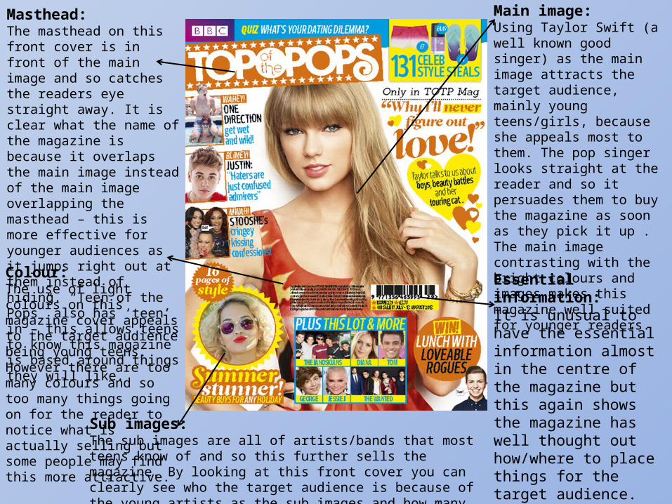
Colour:The use of light colours on this magazine cover appeals to the target audience being young teens. However there are too many colours and so too many things going on for the reader to notice what is actually selling but some people may find this more attractive.
Main image: Using Taylor Swift (a well known good singer) as the main image attracts the target audience, mainly young teens/girls, because she appeals most to them. The pop singer looks straight at the reader and so it persuades them to buy the magazine as soon as they pick it up . The main image contrasting with the bright colours and images makes this magazine well suited for younger readers.
Sub images:The sub images are all of artists/bands that most teens know of and so this further sells the magazine. By looking at this front cover you can clearly see who the target audience is because of the young artists as the sub images and how many there actually is.
Essential information:It is unusual to have the essential information almost in the centre of the magazine but this again shows the magazine has well thought out how/where to place things for the target audience. The layout of this magazine is quite messy – just like teens.
Masthead:The masthead on this front cover is in front of the main image and so catches the readers eye straight away. It is clear what the name of the magazine is because it overlaps the main image instead of the main image overlapping the masthead – this is more effective for younger audiences as it jumps right out at them instead of hiding. “Teen of the Pops” also has ‘teen’ in – this allows teens to know this magazine is based around things they will like.
Summary: Out of all three of the magazine covers I feel that “Teen of the Pops” best relates to it’s target audience and will therefore get a better sale – I will position everything on my magazine specifically to appeal more to my target audience being old teens to late 20’s. The magazine cover “Kerrang” has bad colour choices but I find the use of more, but not too many, sub images – I will add a few sub images to my magazine to give the reader an insight on what they will be buying. Like “Q” magazine I will use well known artists, to both late teens and adults, in my cover lines to draw the readers in and also 2/3 colours so things aren’t too confusing and messy, I am going to try and use black and then two vibrant colours that will stand out but not clash with my main image or my masthead. I will also try and include a bubble to sell/advertise something to promote my product further. All three of the magazines have helped me decided I will place my masthead behind my main image but not to the point where you can’t even make out the name (like the Kerrang cover).