Embed Size (px)
Citation preview
RESPONSIVE DESIGN
IDAN BEN ARI


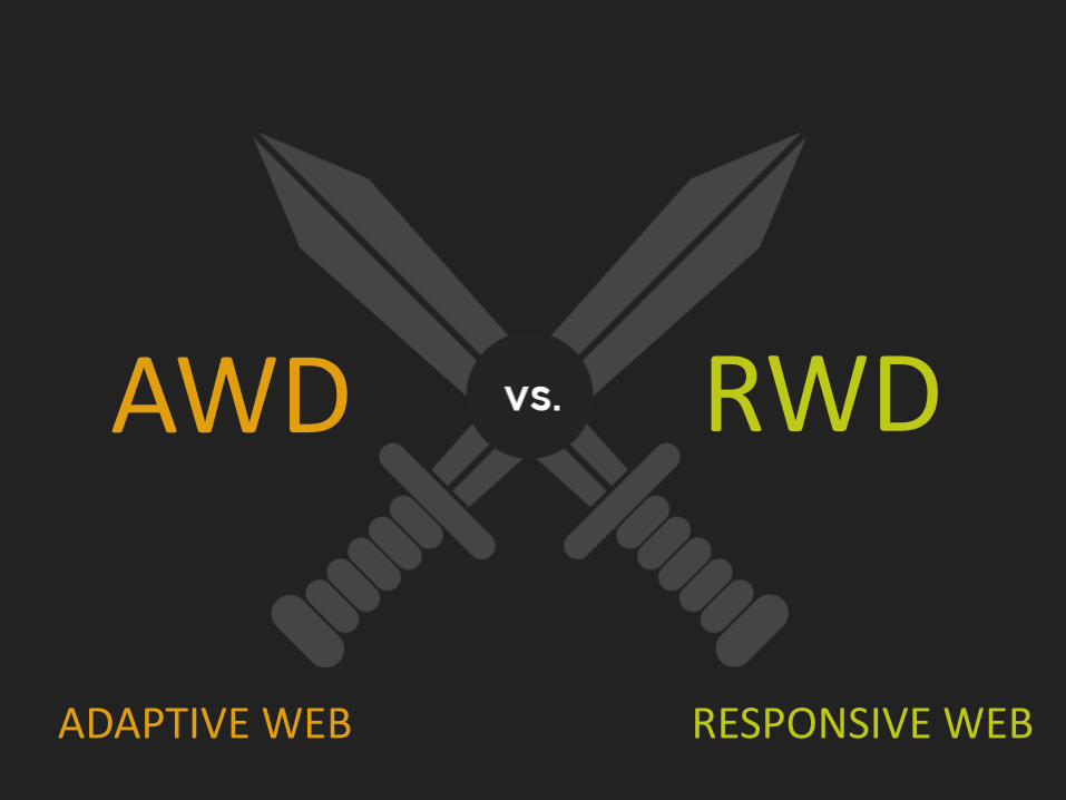
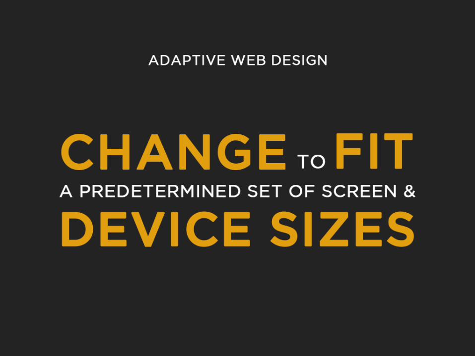
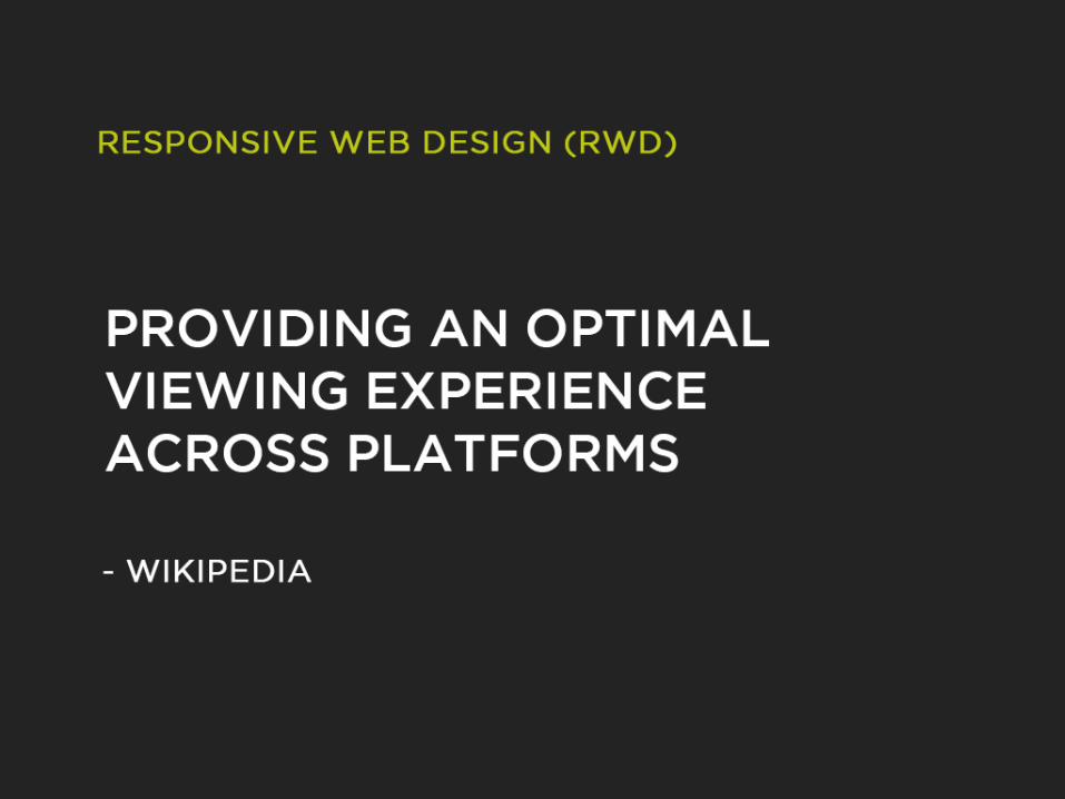
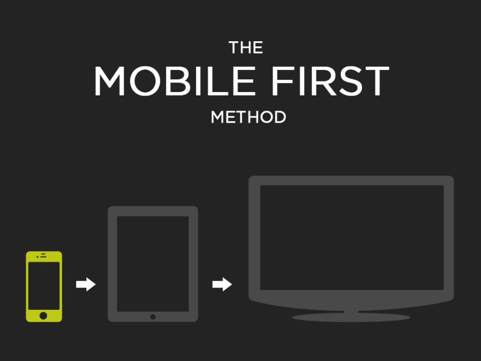
RWD AWD
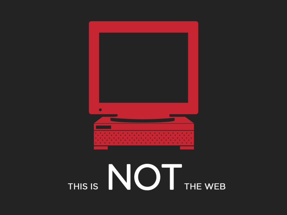
ADAPTIVE WEB RESPONSIVE WEB
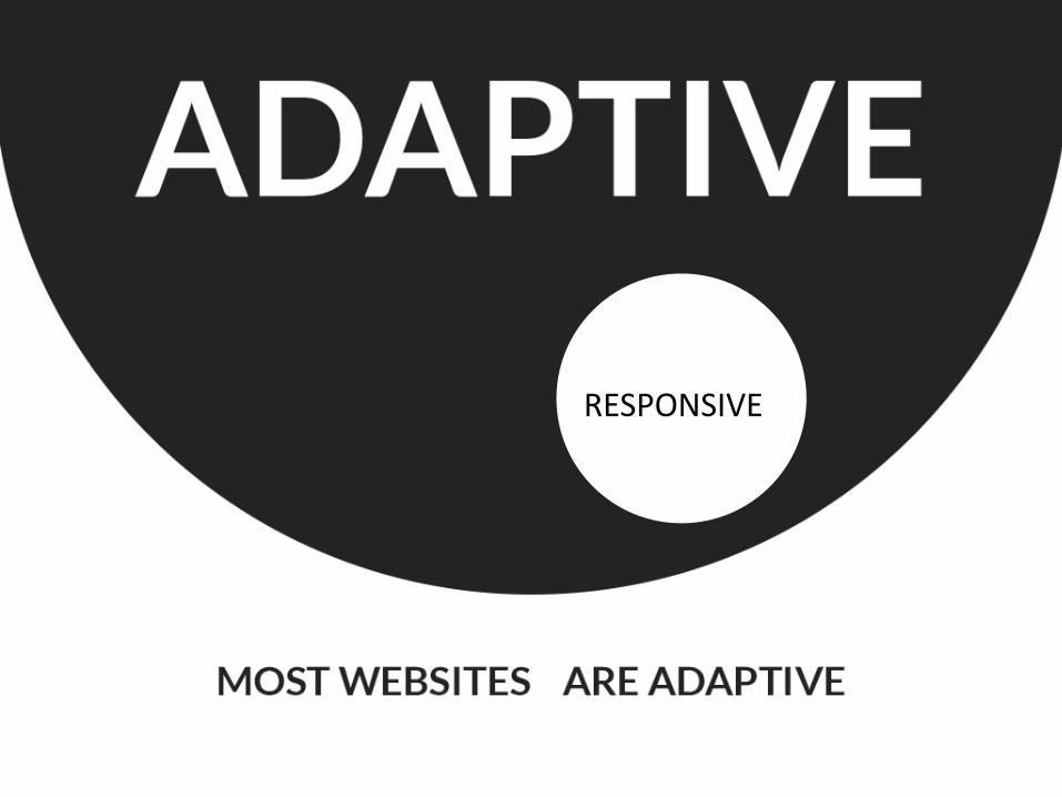
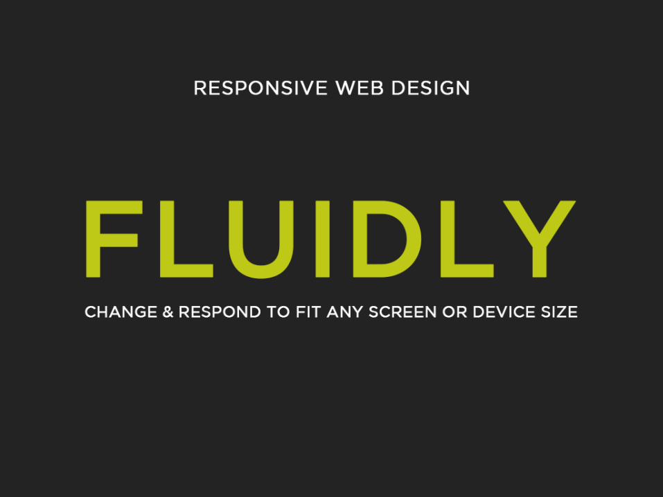
RESPONSIVE
דוגמא לאתר אדפטיבי#
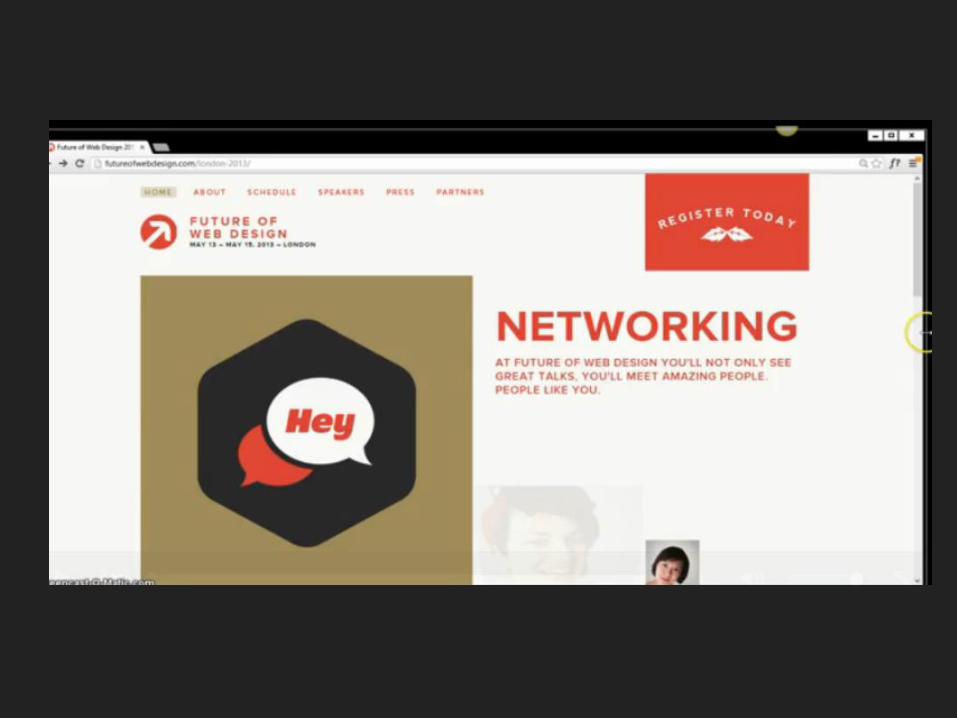
רספונסיבידוגמא לאתר #
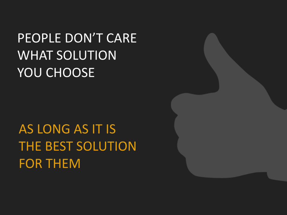
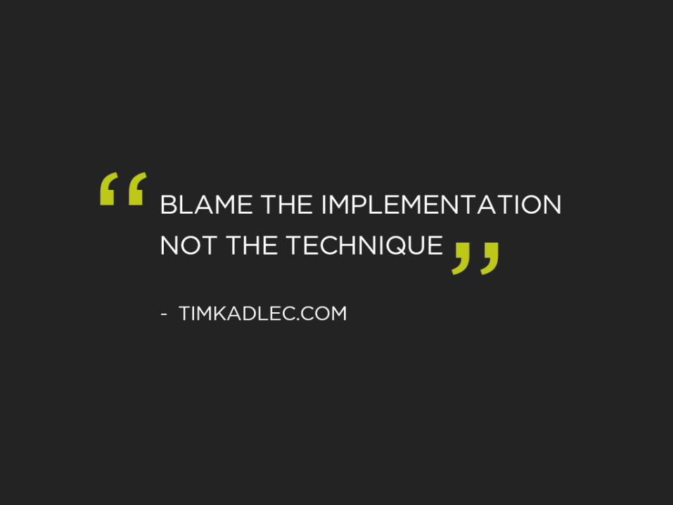
AS LONG AS IT IS THE BEST SOLUTION FOR THEM
PEOPLE DON’T CARE WHAT SOLUTION YOU CHOOSE
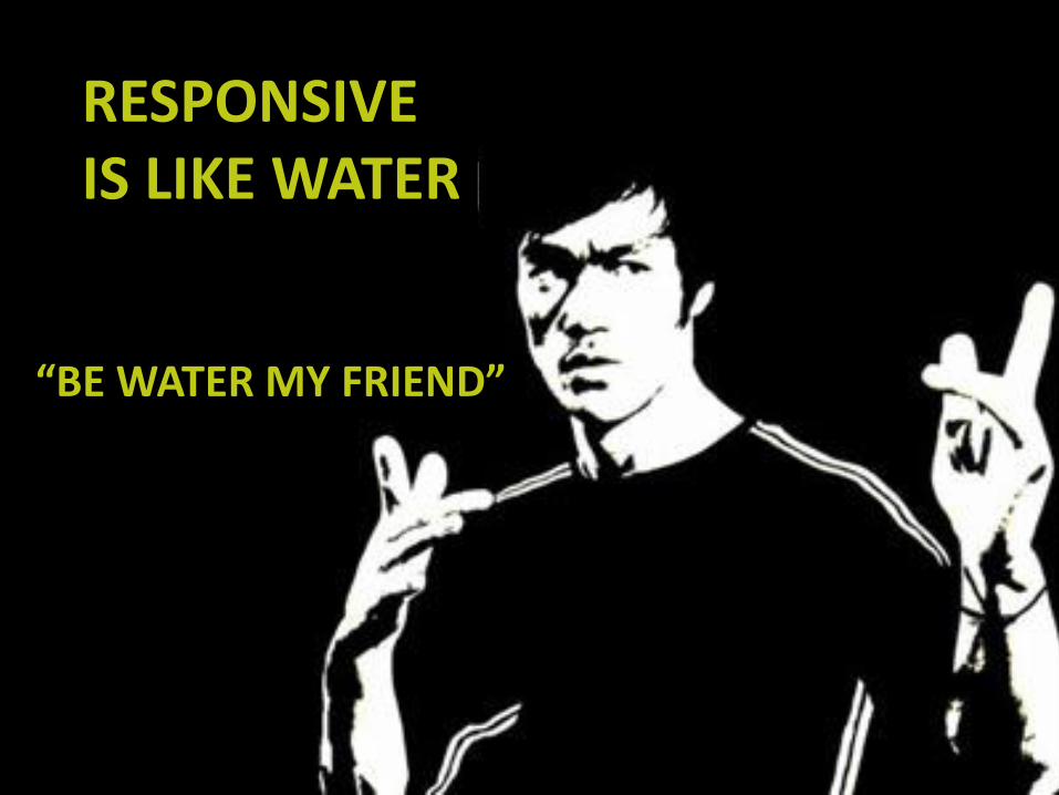
RESPONSIVE
IS LIKE WATER
“BE WATER MY FRIEND”
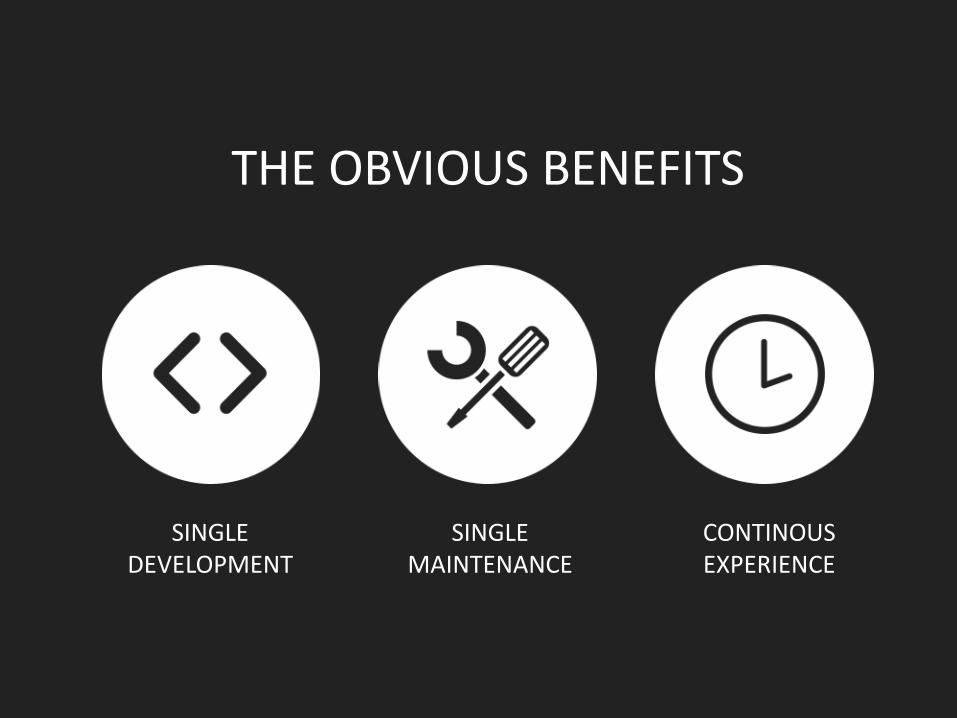
SINGLE DEVELOPMENT
SINGLE MAINTENANCE
CONTINOUS EXPERIENCE
THE OBVIOUS BENEFITS
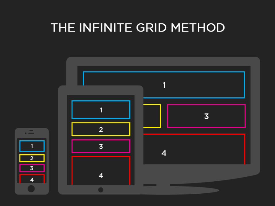
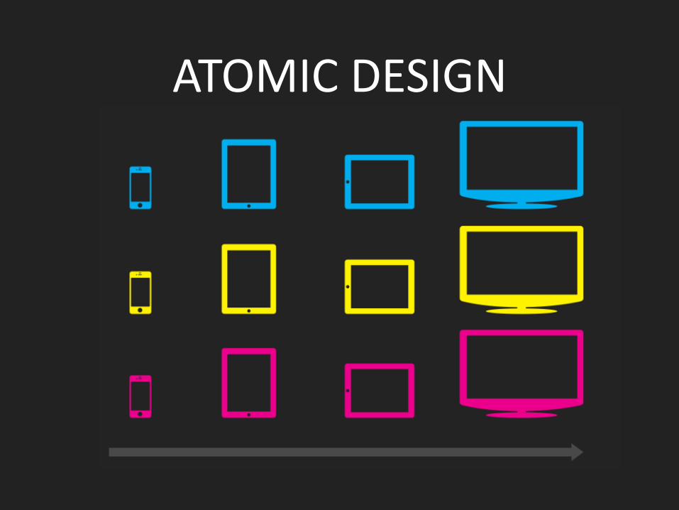
ATOMIC DESIGN
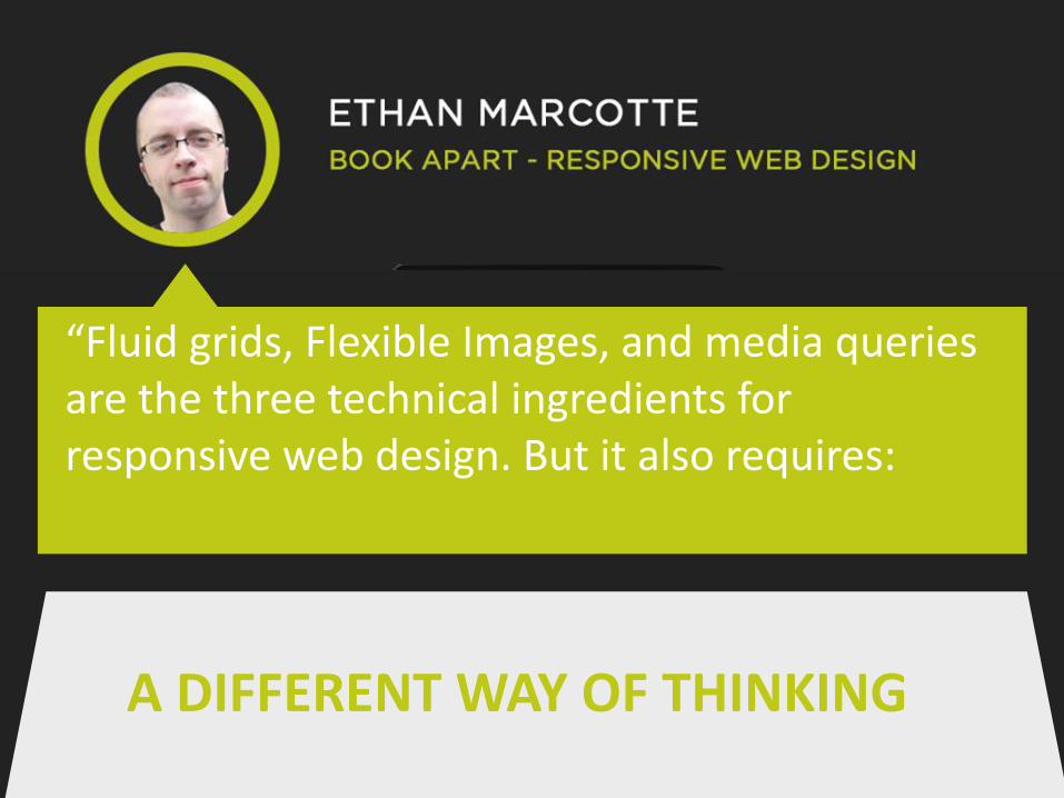
“Fluid grids, Flexible Images, and media queries are the three technical ingredients for responsive web design. But it also requires:
A DIFFERENT WAY OF THINKING
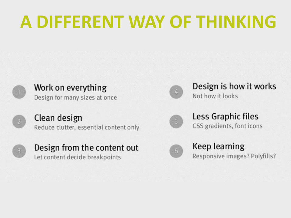
A DIFFERENT WAY OF THINKING
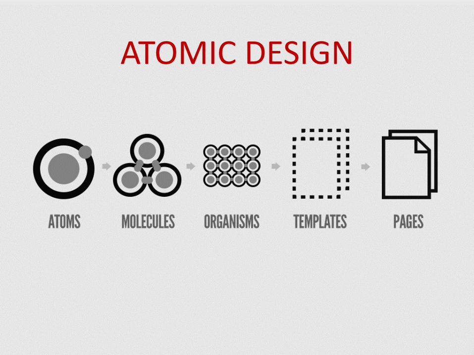
ATOMIC DESIGN
ATOMIC
DESIGN
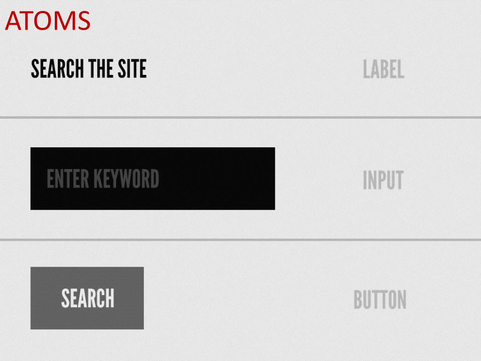
ATOMS
ATOMIC
DESIGN
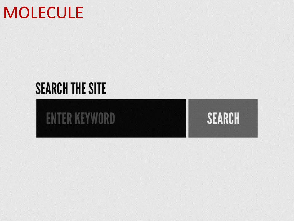
MOLECULE
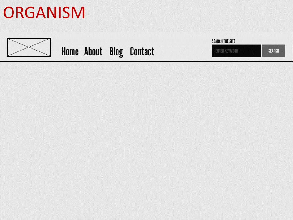
ORGANISM
ATOMIC
DESIGN
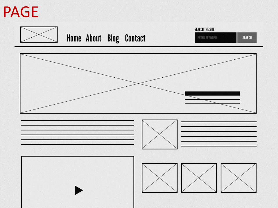
PAGE
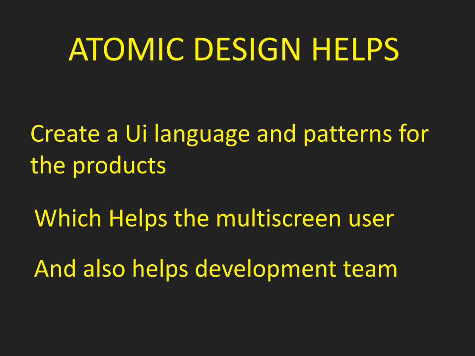
ATOMIC DESIGN HELPS
Create a Ui language and patterns for the products
Which Helps the multiscreen user
And also helps development team
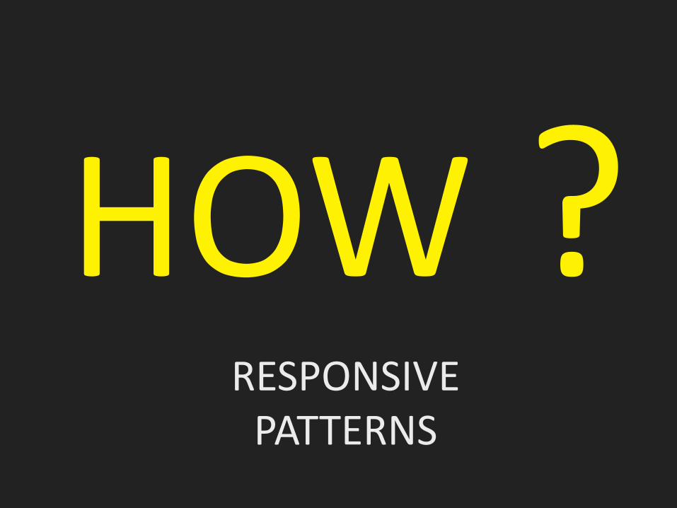
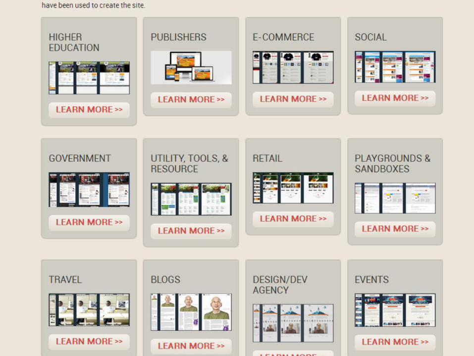
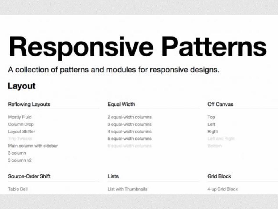
RESPONSIVE PATTERNS
HOW
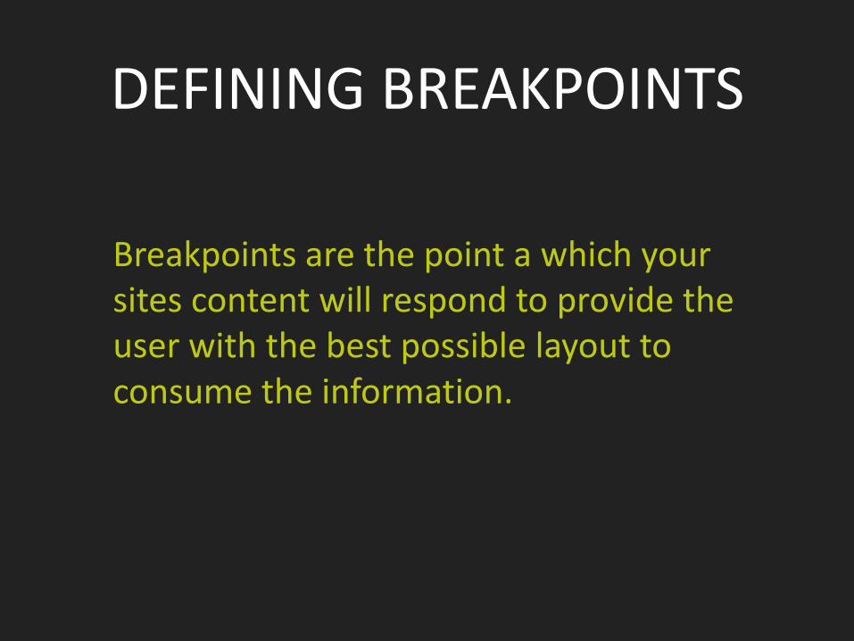
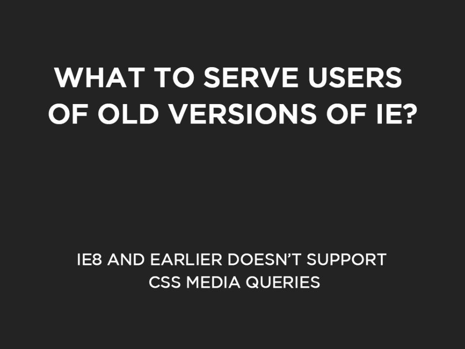
DEFINING BREAKPOINTS
Breakpoints are the point a which your sites content will respond to provide the user with the best possible layout to consume the information.
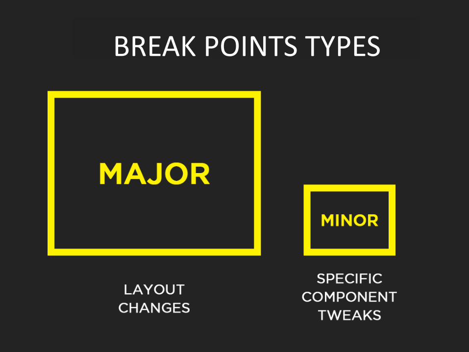
BREAK POINTS TYPES
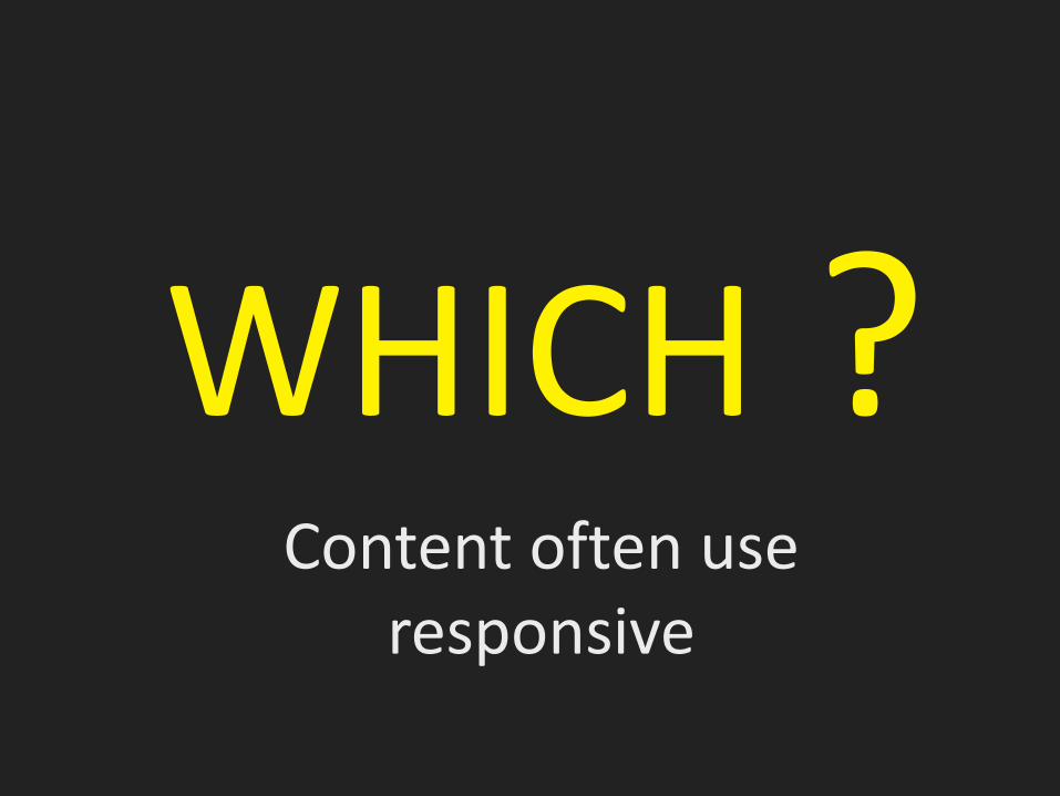
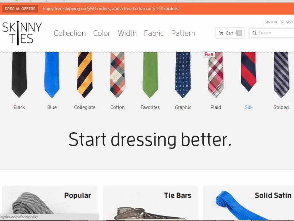
Content often use responsive
WHICH ?

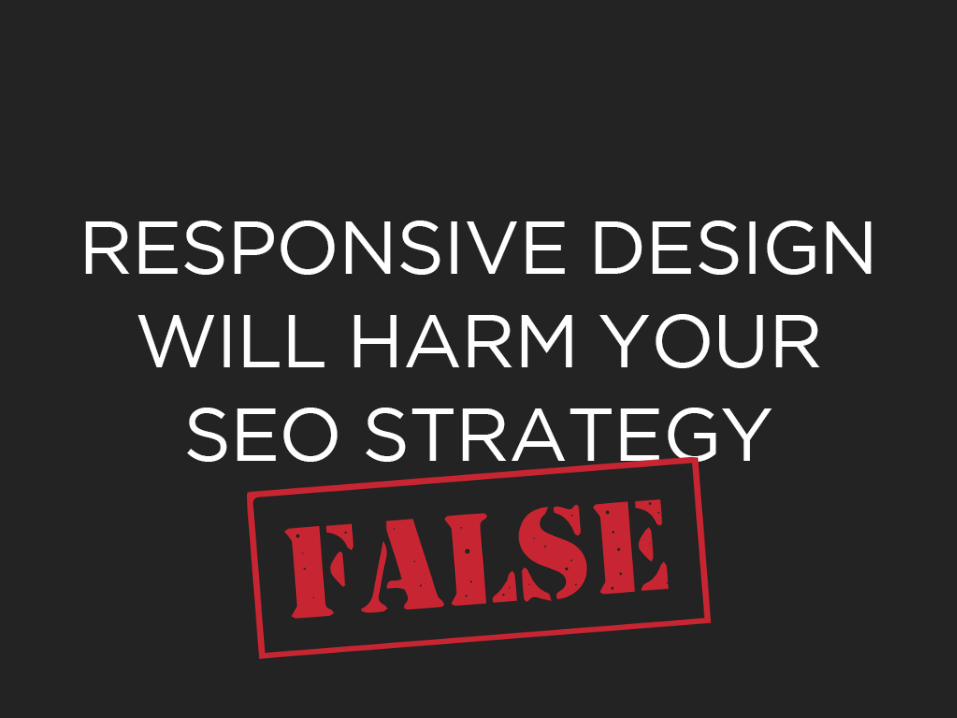
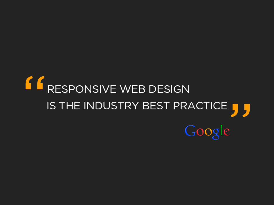
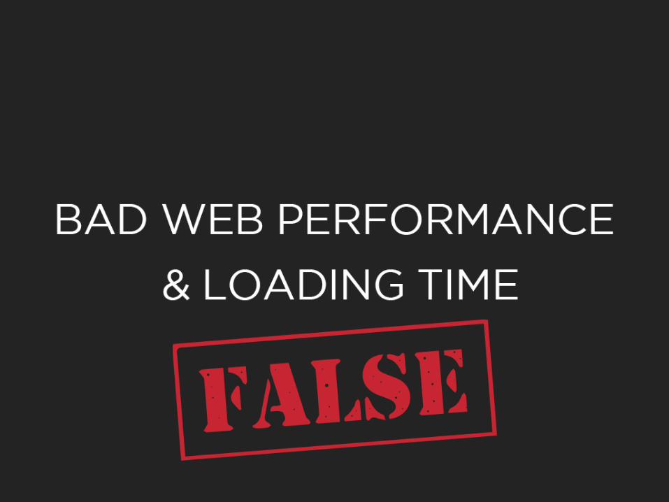
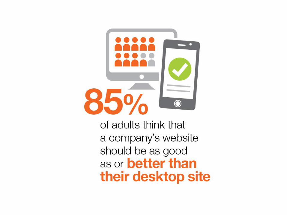
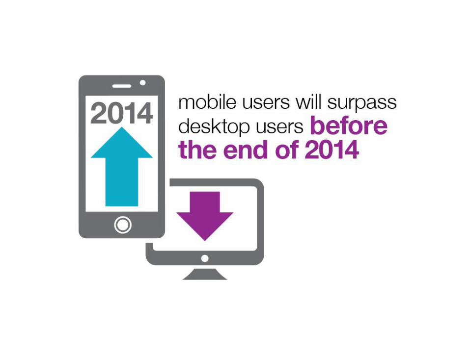
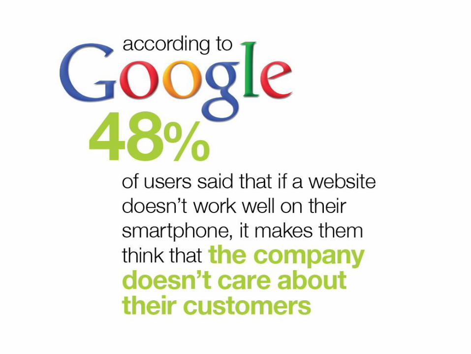
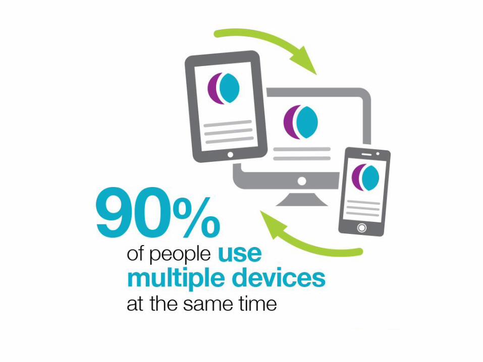
Some Good Reasons
STILL NOT CONVINCED?
THANK YOU :)

![Responsive Design Fundamentals [Read-Only] - … Design Fundame… · Responsive Design Fundamentals Carolyn Yon, PMI-ACP Development Manager ... Responsive Design • web design](https://img.pdfslide.net/doc/110x75/5b7c060b7f8b9adb4c8df8c4/responsive-design-fundamentals-read-only-design-fundame-responsive-design.jpg)