Embed Size (px)
Citation preview
Designing with Accessibility
(#a11y) in Mind: How IA and
Visual Design Decisions
Impact Persons with
Disabilities
November M. Samnee
@novie
What we’re doing today
• Review of how people with disabilities access the web
• Learn by example: – Presented with two options of design
treatments
– You make a choice
– We discuss which is the most accessible, and why
• Review of tools you can use to help make your designs more accessible
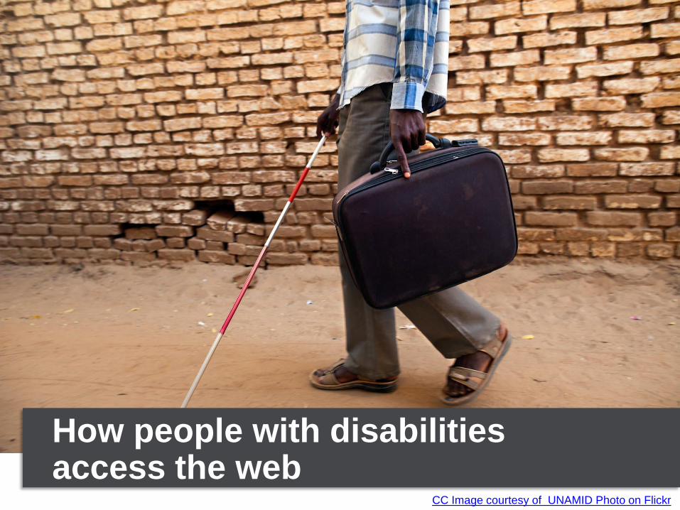
How people with disabilities access the web
CC Image courtesy of UNAMID Photo on Flickr
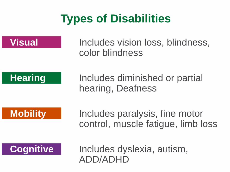
Types of Disabilities
Visual Includes vision loss, blindness, color blindness
Hearing Includes diminished or partial hearing, Deafness
Mobility Includes paralysis, fine motor control, muscle fatigue, limb loss
Cognitive Includes dyslexia, autism, ADD/ADHD
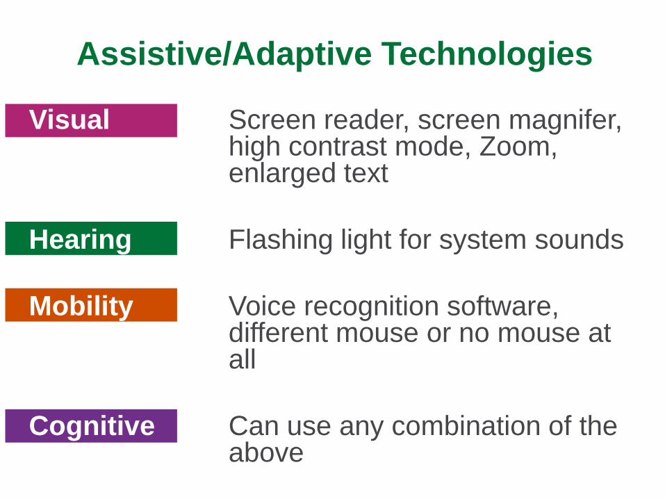
Assistive/Adaptive Technologies
Visual Screen reader, screen magnifer, high contrast mode, Zoom, enlarged text
Hearing Flashing light for system sounds
Mobility Voice recognition software, different mouse or no mouse at all
Cognitive Can use any combination of the above
Learn by example
CC Image courtesy of saechang on Flickr

Practice Round
CC Image courtesy of .m for matthijs on Flickr
A B
A B
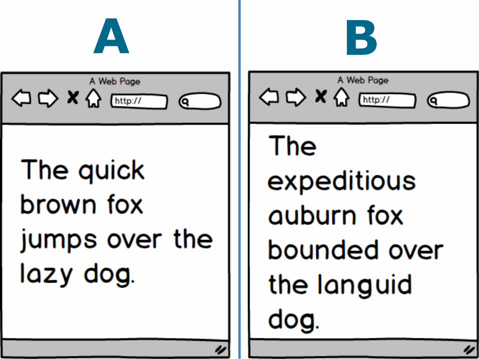
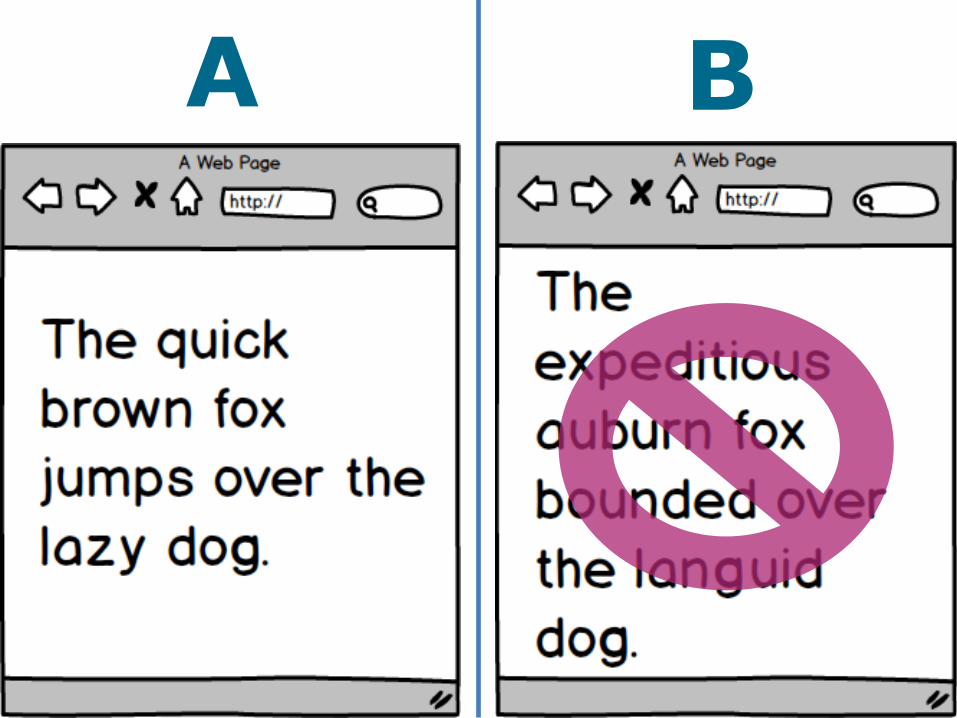
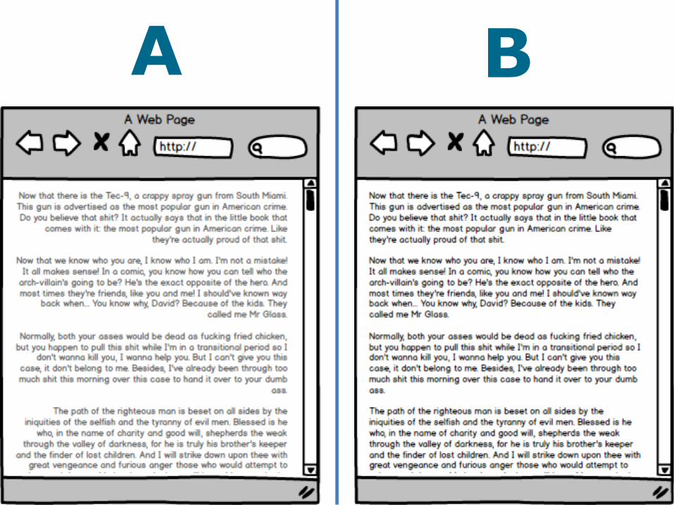
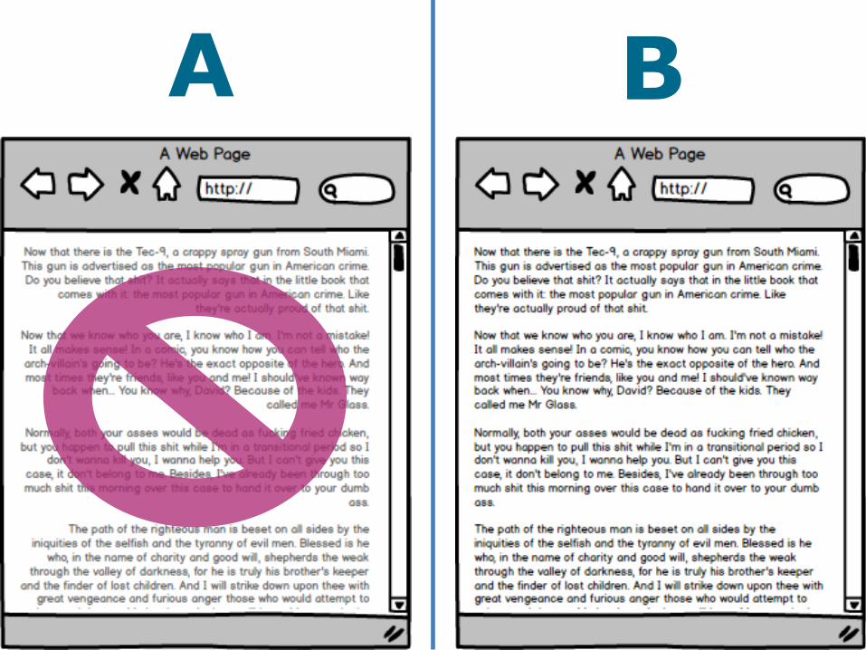
Q: Why is this more accessible?
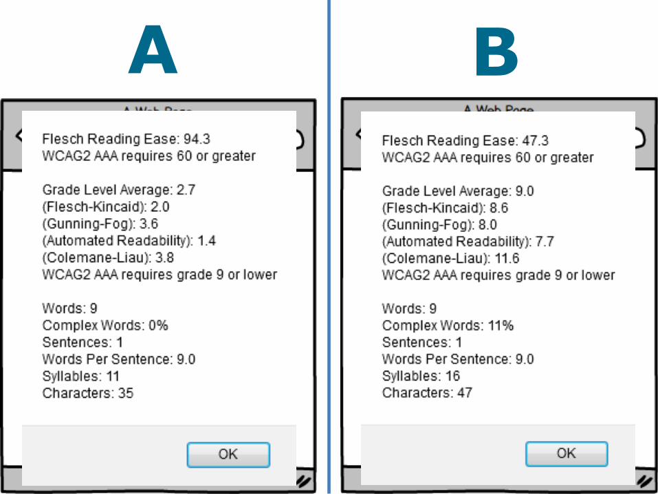
A: The more advanced the language, the more
difficult it is for some people with cognitive
disabilities to understand the intent of your
web content.
Your content should be clear and concise.
Cognitive
CC Image courtesy of Rolling F-Stop on Flickr
Lap One
A B
A B
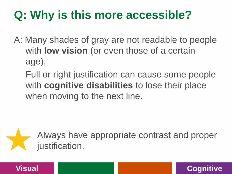
Q: Why is this more accessible?
A: Many shades of gray are not readable to people
with low vision (or even those of a certain
age).
Full or right justification can cause some people
with cognitive disabilities to lose their place
when moving to the next line.
Always have appropriate contrast and proper
justification.
Visual Cognitive
A B
A B
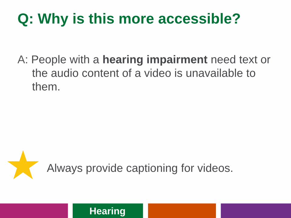
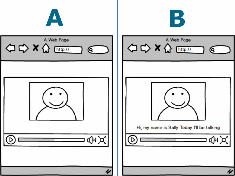
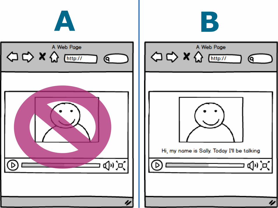
Q: Why is this more accessible?
A: People with a hearing impairment need text or
the audio content of a video is unavailable to
them.
Always provide captioning for videos.
Hearing
A B
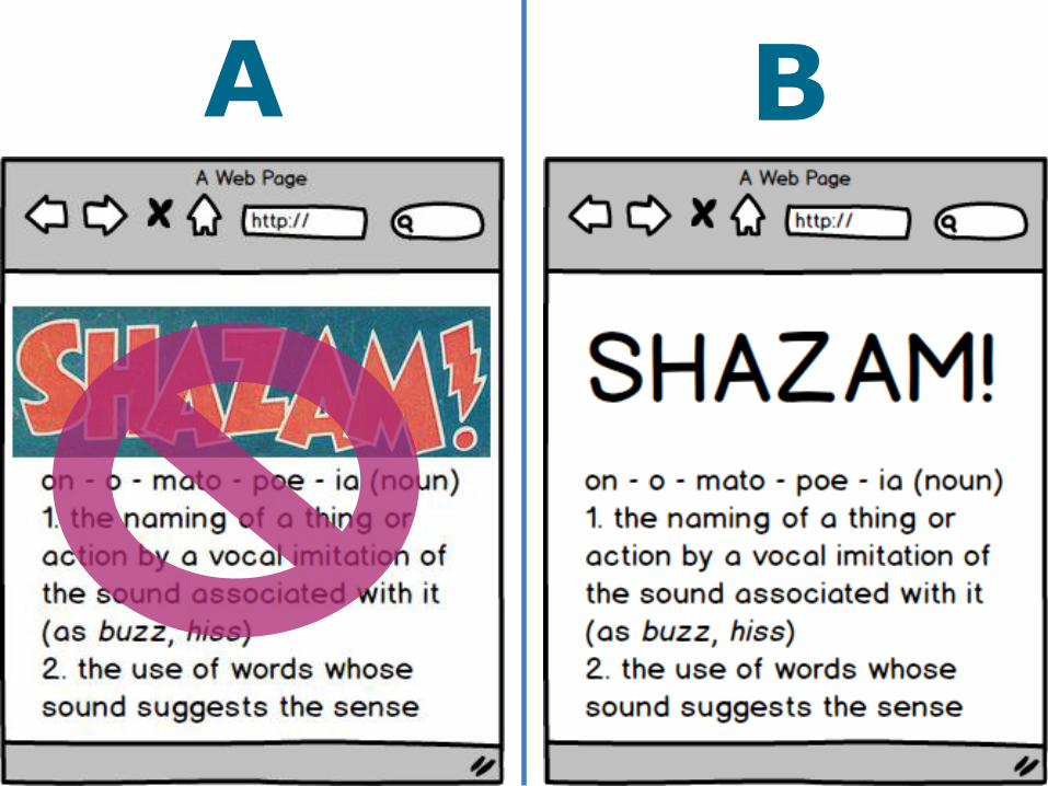
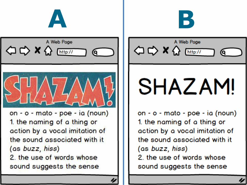
A B
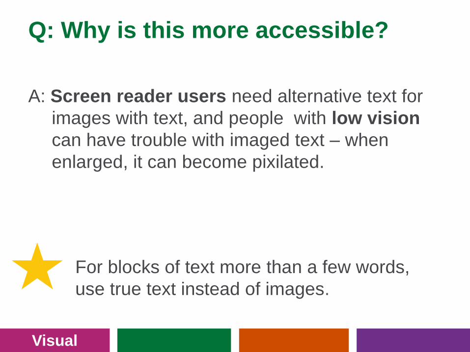
Q: Why is this more accessible?
A: Screen reader users need alternative text for
images with text, and people with low vision
can have trouble with imaged text – when
enlarged, it can become pixilated.
For blocks of text more than a few words,
use true text instead of images.
Visual
A B
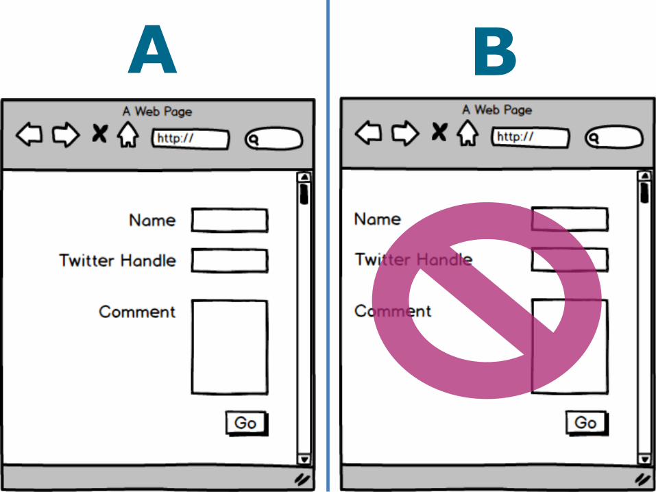
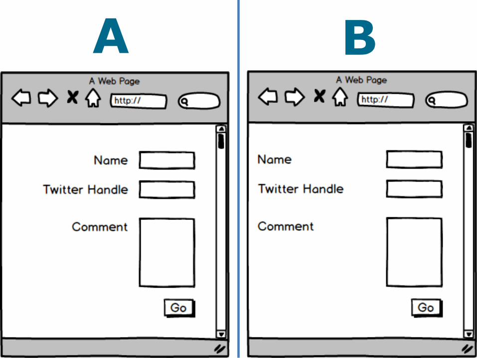
A B
Q: Why is this more accessible?
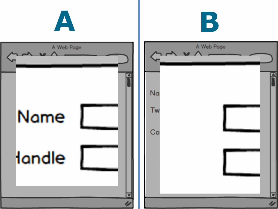
A: For screen magnifier users, labels can be
hard to match up. When they are far from the
corresponding field they may not show up on
their screen.
Be mindful of proximity when designing the
layout of forms.
Visual
A B
A B
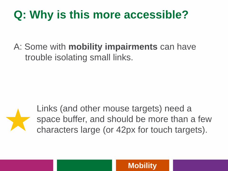
Q: Why is this more accessible?
A: Some with mobility impairments can have
trouble isolating small links.
Links (and other mouse targets) need a
space buffer, and should be more than a few
characters large (or 42px for touch targets).
Mobility
A B
A B
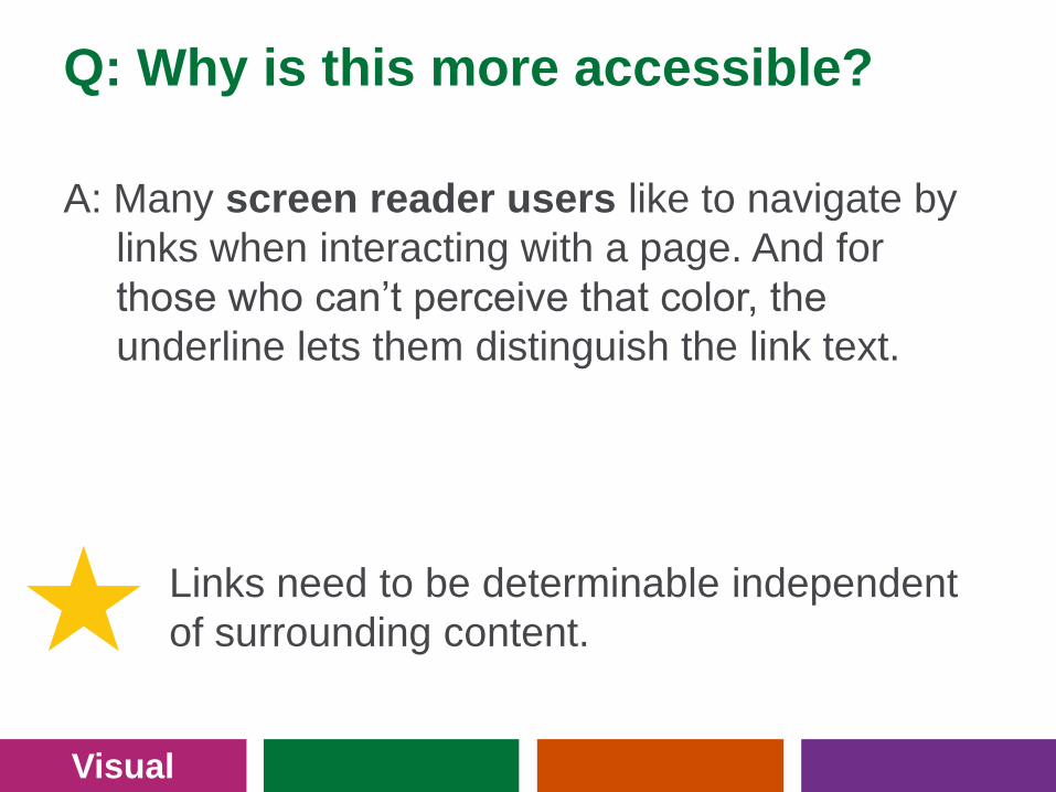
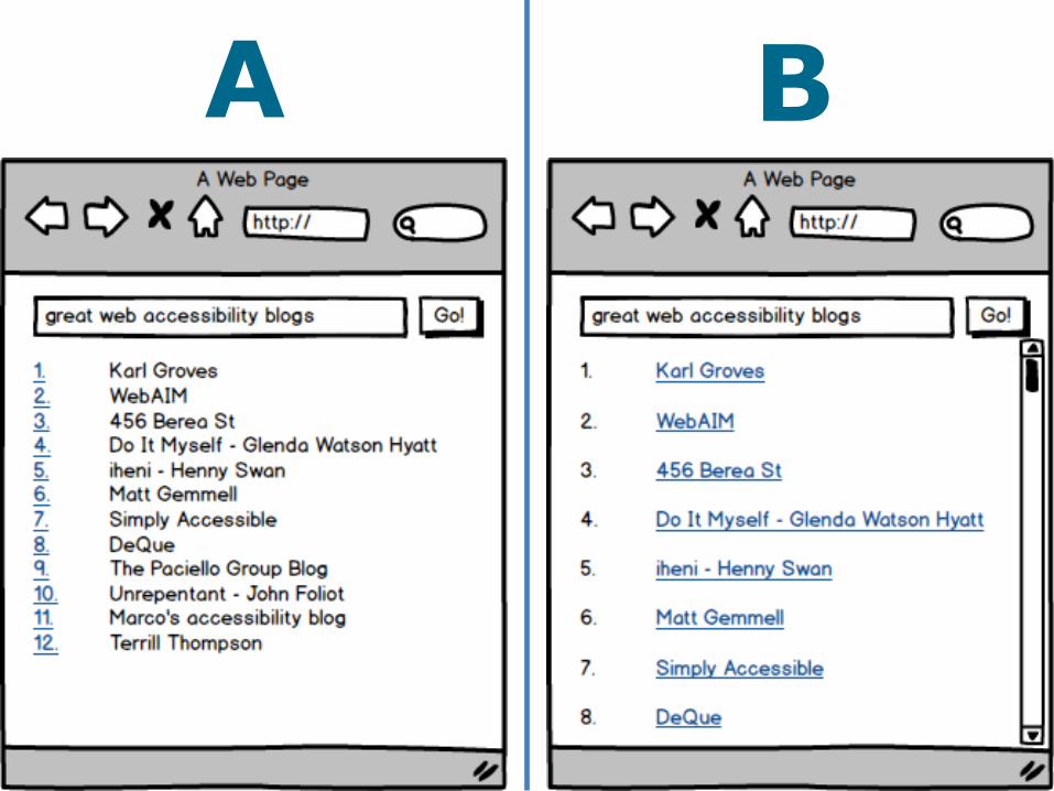
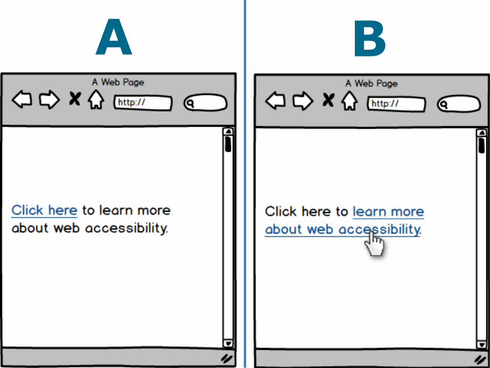
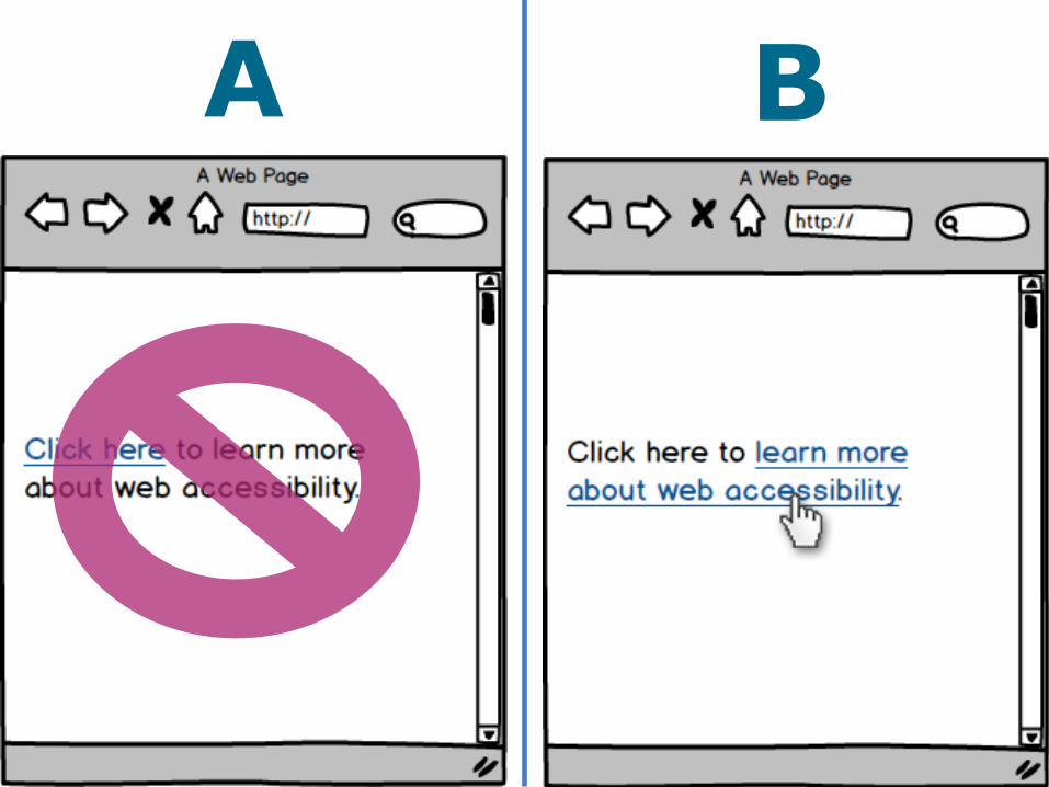
Q: Why is this more accessible?
A: Many screen reader users like to navigate by
links when interacting with a page. And for
those who can’t perceive that color, the
underline lets them distinguish the link text.
Links need to be determinable independent
of surrounding content.
Visual
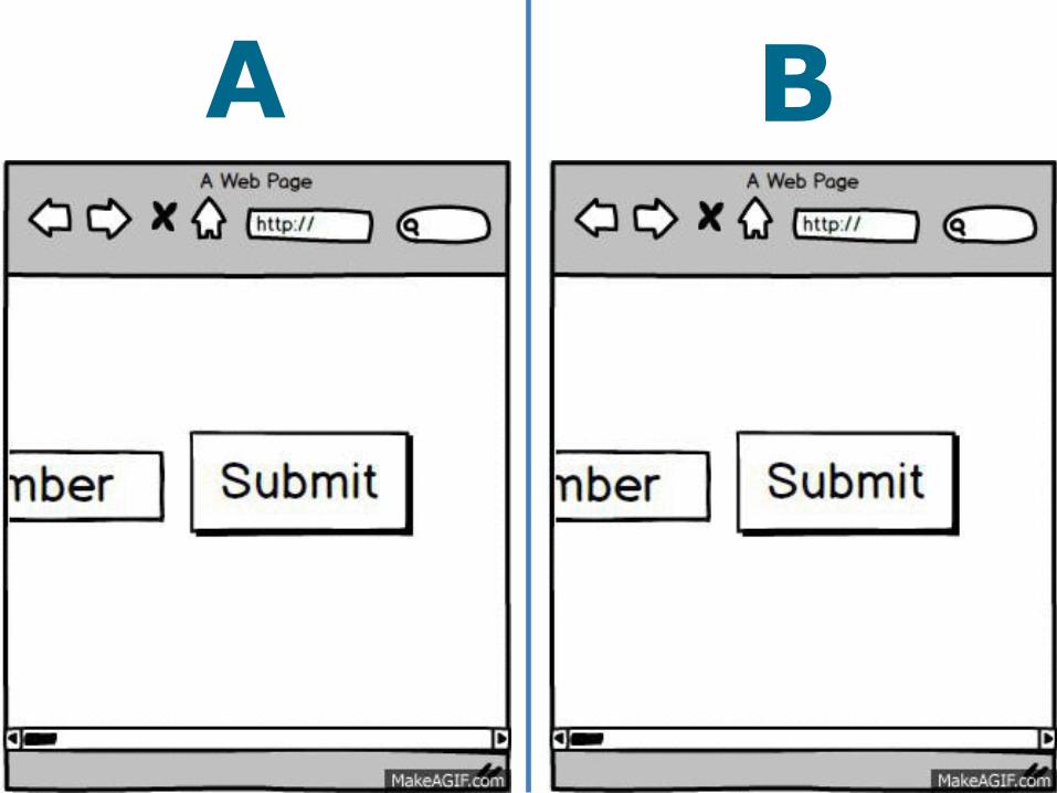
A B
A B
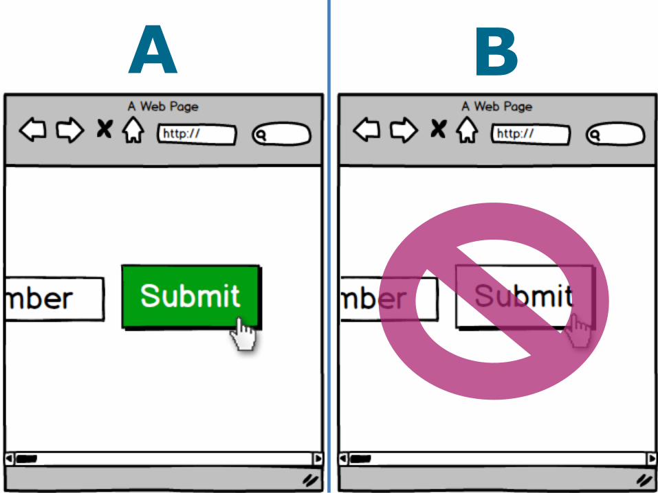
Q: Why is this more accessible?
A: When targeting a mouse pointer with voice
recognition software, or with an enlarged
cursor sometimes used by people with low
vision, or those using keyboard only, an
indication that focus is on a button can be really
helpful and save time.
Use some visual indication of focus.
Visual Mobility
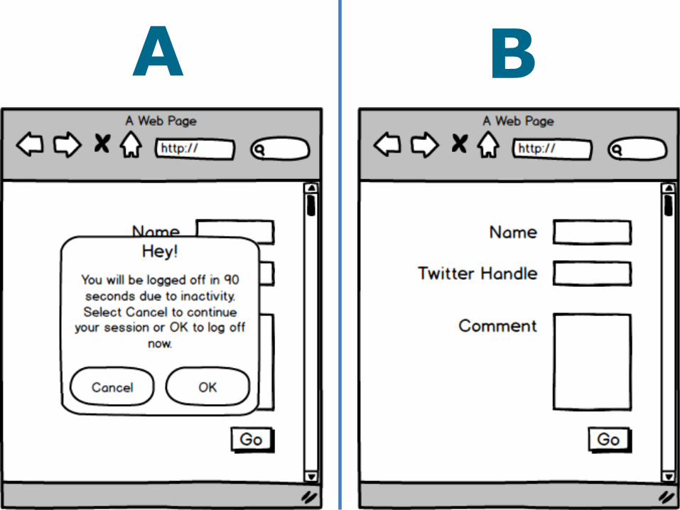
A B
A B
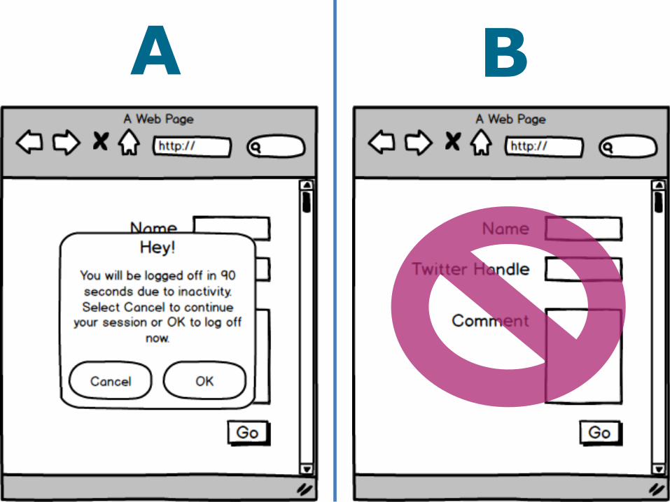
Q: Why is this more accessible?
A: All users of assistive technology may take
longer to interact with pages than designers and
developers would anticipate.
Provide a warning before automatically
timing out a user (if time out is needed at all).
Visual Cognitive Mobility Hearing
A B
A B
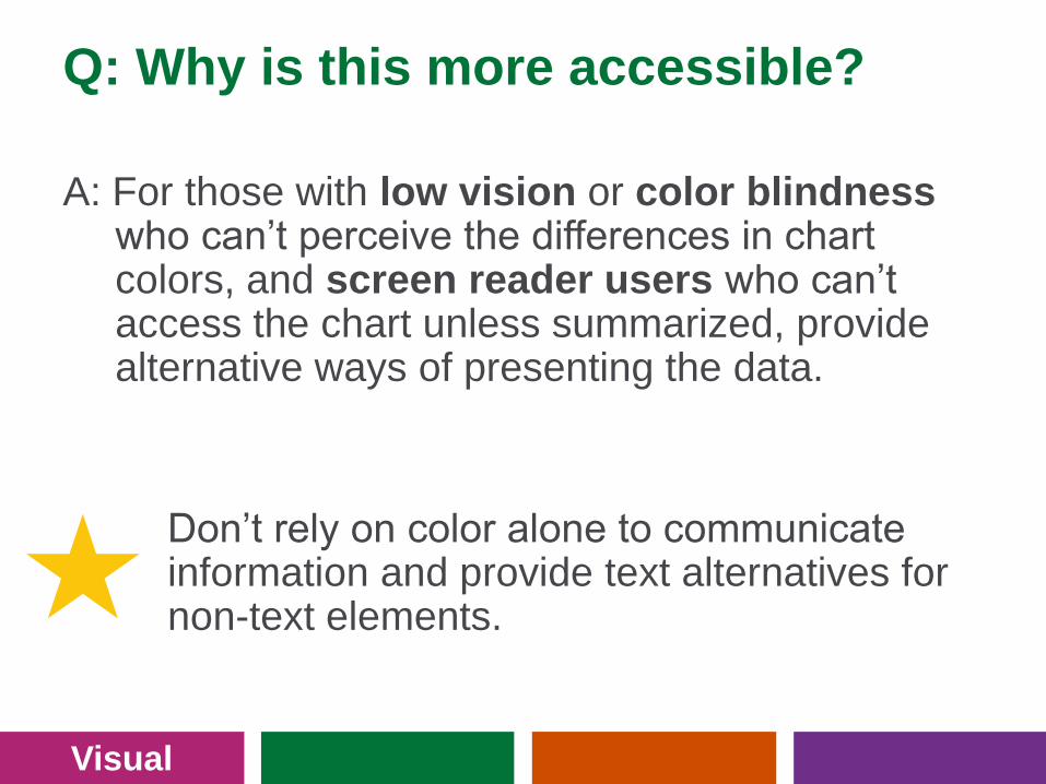
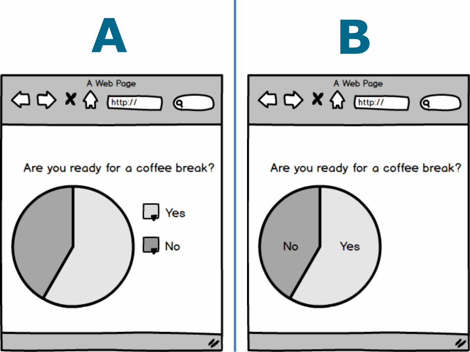
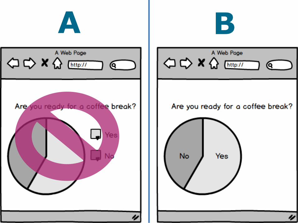
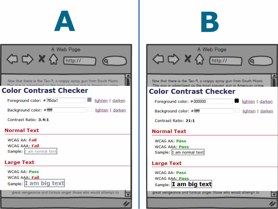
Q: Why is this more accessible?
A: For those with low vision or color blindness who can’t perceive the differences in chart colors, and screen reader users who can’t access the chart unless summarized, provide alternative ways of presenting the data.
Don’t rely on color alone to communicate information and provide text alternatives for non-text elements.
Visual
A B
A B
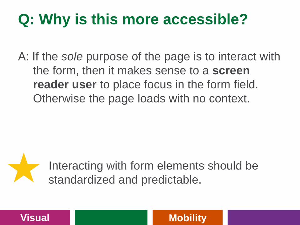
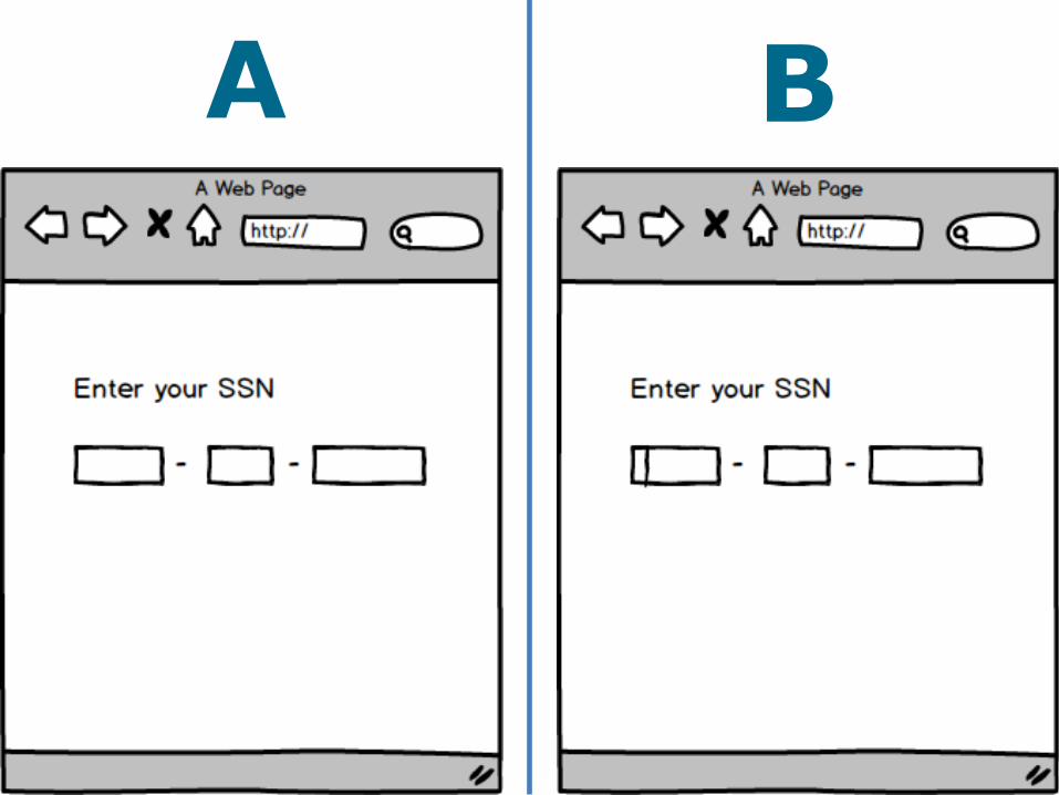
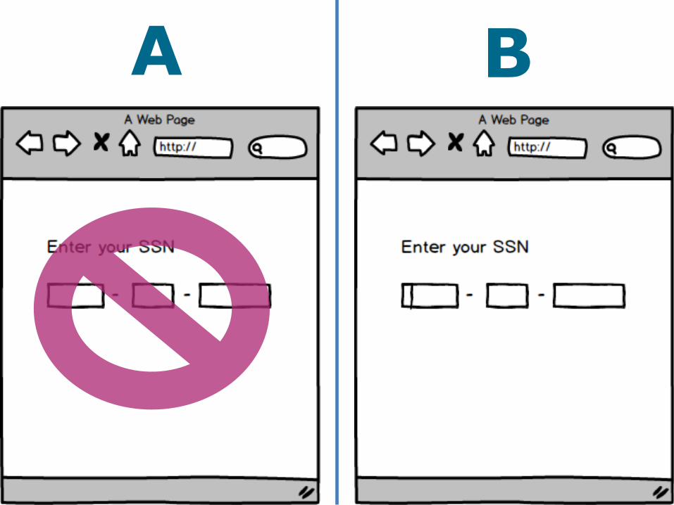
Q: Why is this more accessible?
A: If the sole purpose of the page is to interact with
the form, then it makes sense to a screen
reader user to place focus in the form field.
Otherwise the page loads with no context.
Interacting with form elements should be
standardized and predictable.
Mobility Visual
CC Image courtesy of eszter on Flickr
Extra Credit
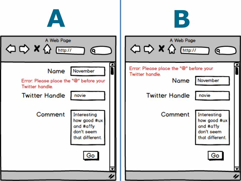
A B
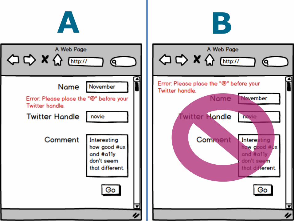
A B
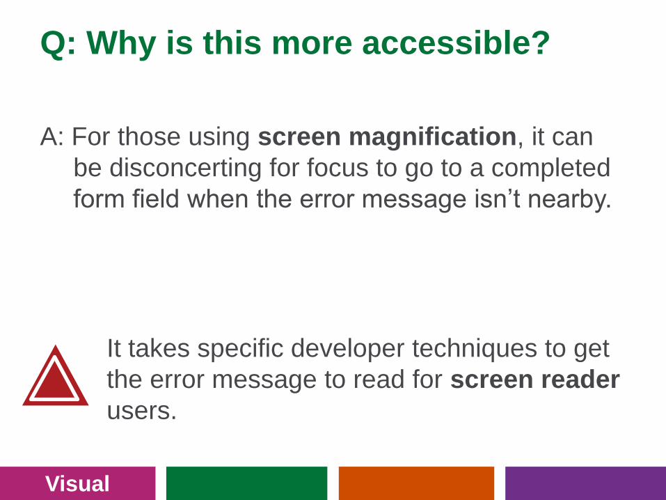
Q: Why is this more accessible?
A: For those using screen magnification, it can
be disconcerting for focus to go to a completed
form field when the error message isn’t nearby.
It takes specific developer techniques to get
the error message to read for screen reader
users.
Visual
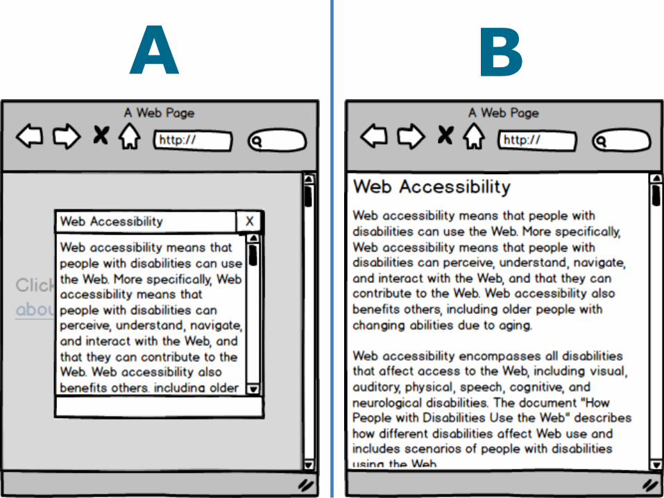
A B
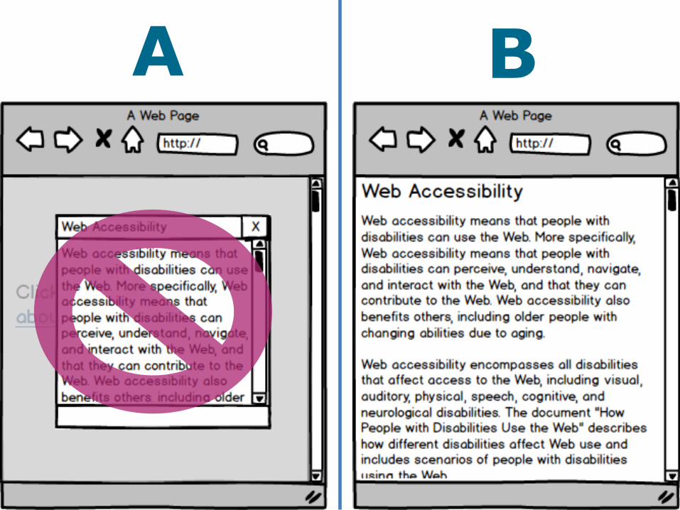
A B
Q: Why is this more accessible?
A: It is really difficult for a voice recognition user
to scroll when there are two vertical scroll bars
on a page.
It takes specific developer effort to make
modals/lightboxes accessible for screen
reader users.
Mobility Visual
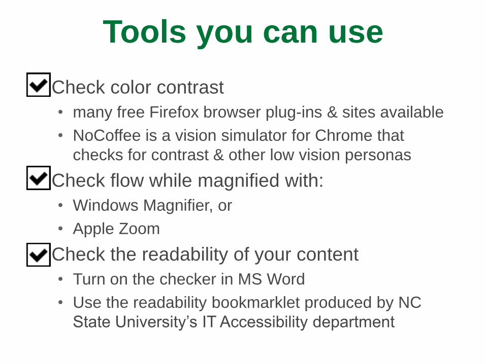
Tools you can use
Check color contrast
• many free Firefox browser plug-ins & sites available
• NoCoffee is a vision simulator for Chrome that
checks for contrast & other low vision personas
Check flow while magnified with:
• Windows Magnifier, or
• Apple Zoom
Check the readability of your content
• Turn on the checker in MS Word
• Use the readability bookmarklet produced by NC
State University’s IT Accessibility department
A B
A B
A B
Tools you can use
Check color contrast
• many free Firefox browser plug-ins & sites available
• NoCoffee is a vision simulator for Chrome that
checks for contrast & other low vision personas
Check flow while magnified with:
• Windows Magnifier, or
• Apple Zoom
Check the readability of your content
• Turn on the checker in MS Word
• Use the readability bookmarklet produced by NC
State University’s IT Accessibility department
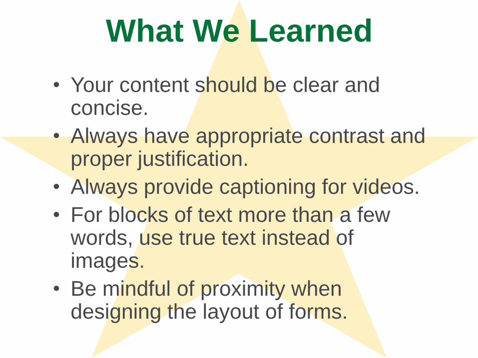
What We Learned
• Your content should be clear and concise.
• Always have appropriate contrast and proper justification.
• Always provide captioning for videos.
• For blocks of text more than a few words, use true text instead of images.
• Be mindful of proximity when designing the layout of forms.
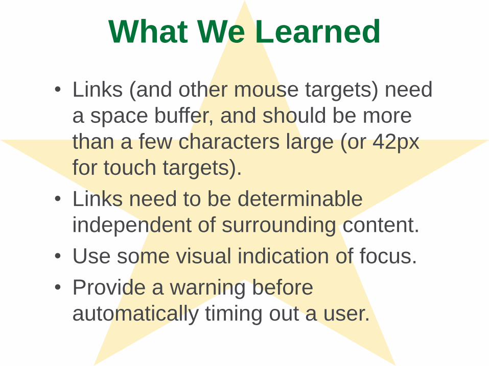
What We Learned
• Links (and other mouse targets) need
a space buffer, and should be more
than a few characters large (or 42px
for touch targets).
• Links need to be determinable
independent of surrounding content.
• Use some visual indication of focus.
• Provide a warning before
automatically timing out a user.
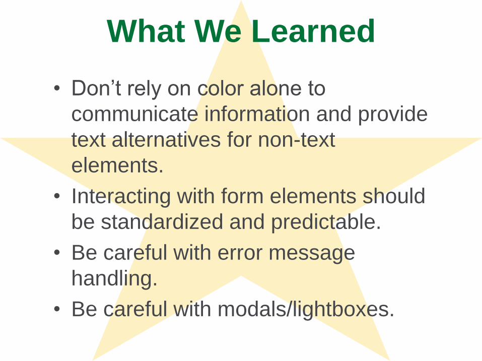
What We Learned
• Don’t rely on color alone to
communicate information and provide
text alternatives for non-text
elements.
• Interacting with form elements should
be standardized and predictable.
• Be careful with error message
handling.
• Be careful with modals/lightboxes.