Embed Size (px)
Citation preview
VanhackBrandEvolutionYour connection with the Canadian Digital Market.
Overview
Allow people with information, knowledge and contacts in IT, Design and Digital Marketing find a job in Canada.
Mission
How?
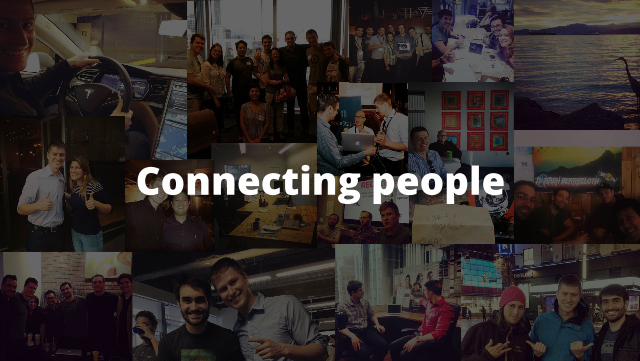
Connecting people

and places.
Brand
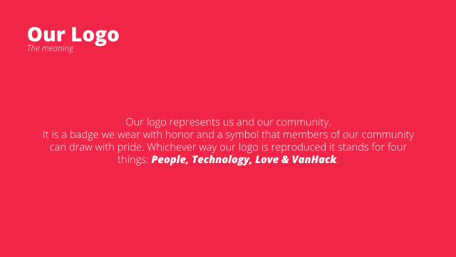
Our Logo
Our logo represents us and our community.It is a badge we wear with honor and a symbol that members of our community
can draw with pride. Whichever way our logo is reproduced it stands for four things: People, Technology, Love & VanHack.
The meaning
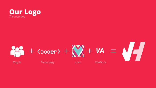
Our LogoThe meaning
People Technology Love VanHack
The symbol
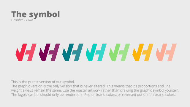
This is the purest version of our symbol. The graphic version is the only version that is never altered. This means that it’s proportions and line weight always remain the same. Use the master artwork rather than drawing the graphic symbol yourself.The logo’s symbol should only be rendered in Red or brand colors, or reversed out of non-brand colors.
Graphic - Pure
The symbol
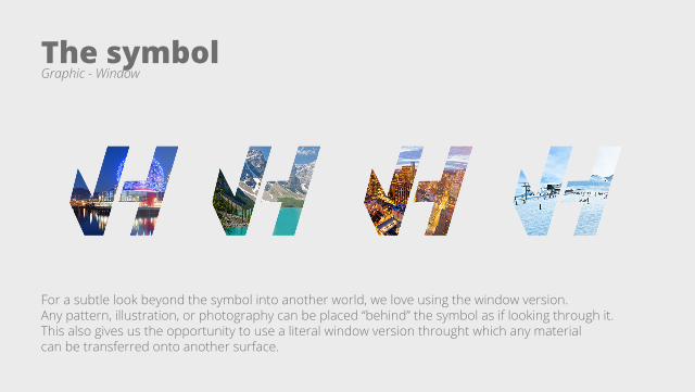
For a subtle look beyond the symbol into another world, we love using the window version. Any pattern, illustration, or photography can be placed “behind” the symbol as if looking through it.This also gives us the opportunity to use a literal window version throught which any material can be transferred onto another surface.
Graphic - Window
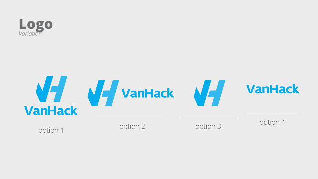
LogoVariation

Thank You.