Embed Size (px)
Citation preview
TODAY
1) Moving into generating web content2) Web unit assignment one: the
personal logo3) Things to consider about on-screen
logos4) Coming soon!
After our print work…
…we’re now going to talk about designing for the web. We will be working toward a major project of revising/updating the Miami Professional Writing website, but before we get there, we’re going to again do some work with logos.
Today, you read…
… some information about how to make a personal logo or identity mark. It can be quite difficult to determine what works well as a personal logo. I have, myself, gone through a bunch. To be fair, this time I’m going to work with you.
First…
…let’s talk about the examples you read over. What did you notice from the readings? What is intriguing? What questions do you have?
Pointers from the print logos
1) Colors matter– some of you copped out on the color choices. You need to be super-careful with them here.
2) Less is more.
3) Think about balance and size and how things are skewed– be dynamic!
And some stuff we need to focus on
1) Scalability
2) Loss of DPI on screen
3) New audiences: new expectations
4) Different purposes, multiple purposes
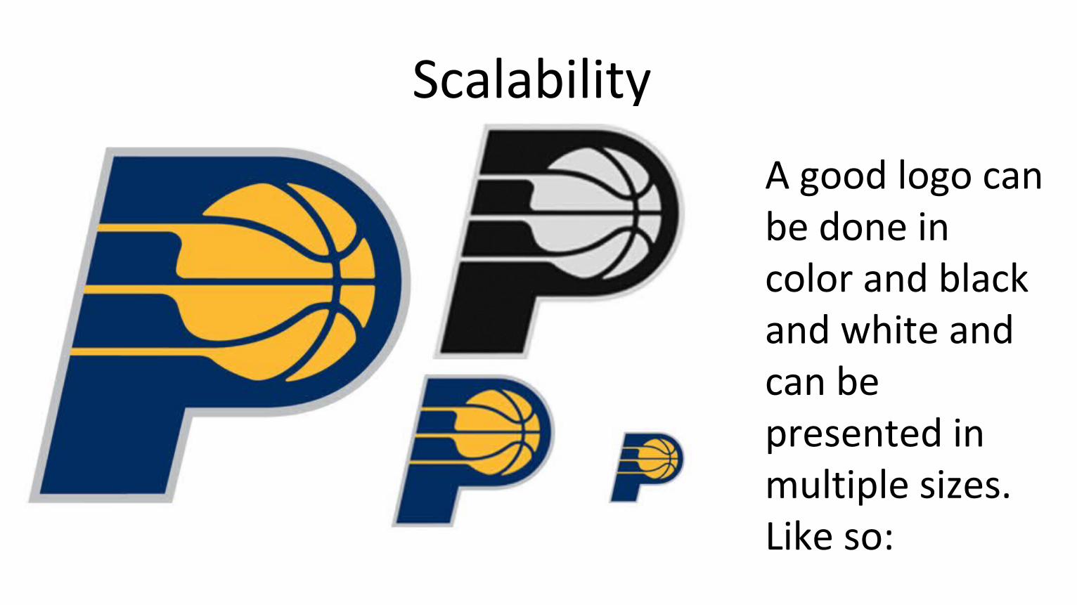
Scalability
A good logo can be done in color and black and white and can be presented in multiple sizes. Like so:
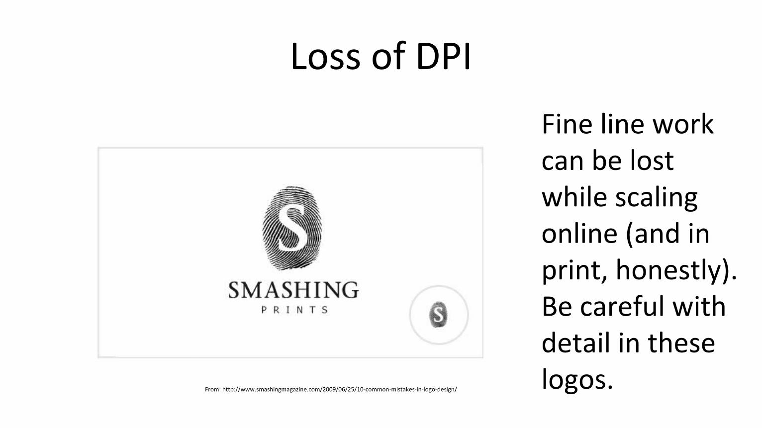
Loss of DPI
Fine line work can be lost while scaling online (and in print, honestly). Be careful with detail in these logos. From: http://www.smashingmagazine.com/2009/06/25/10-common-mistakes-in-logo-design/
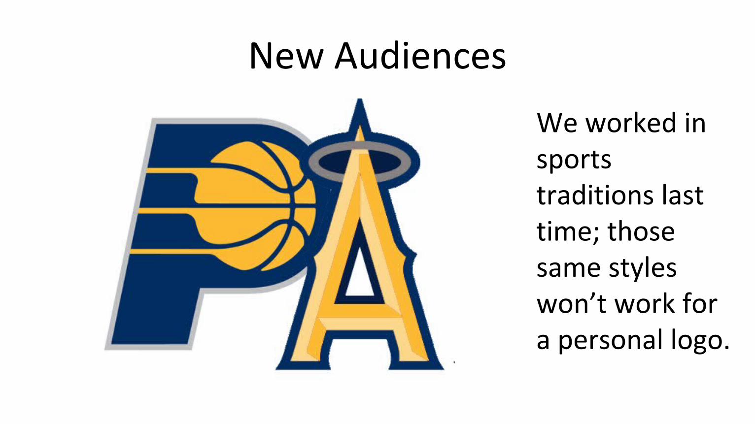
New Audiences
We worked in sports traditions last time; those same styles won’t work for a personal logo.
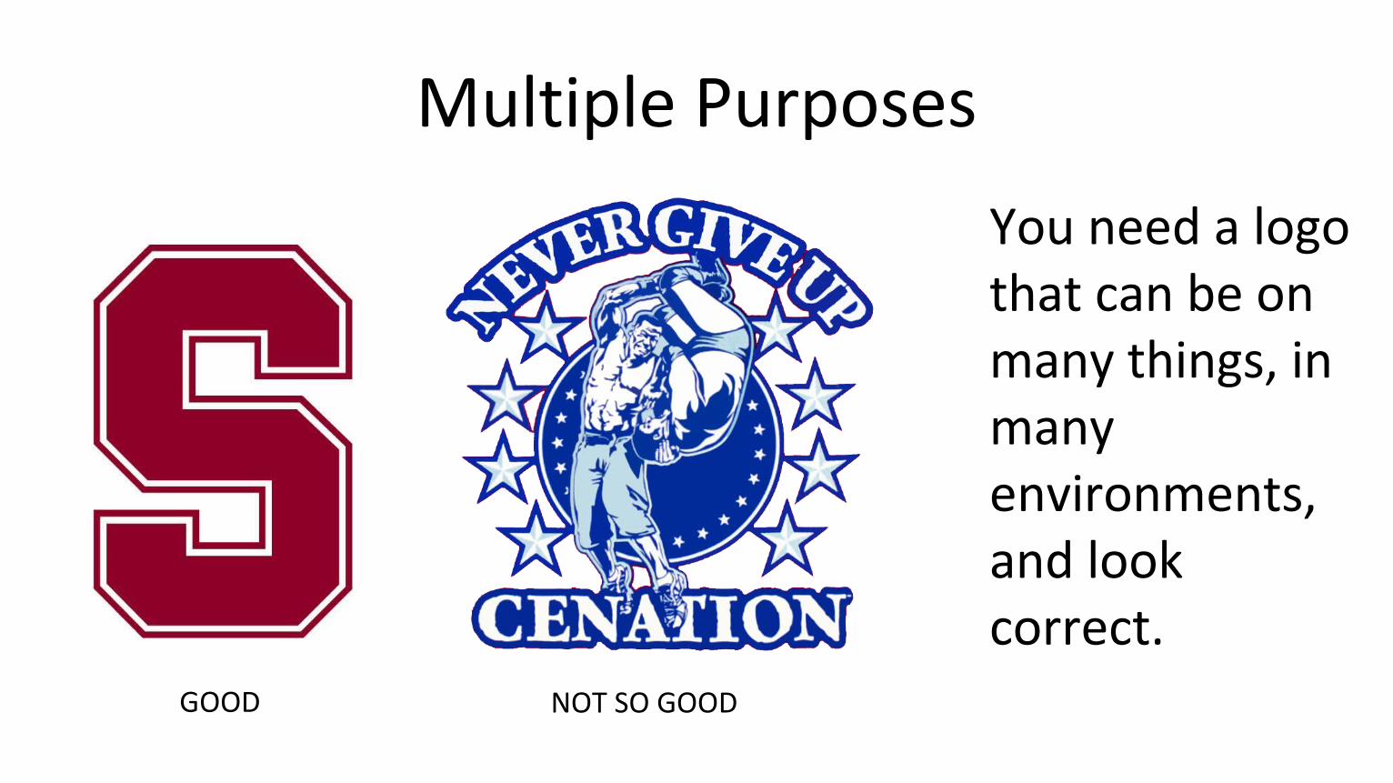
Multiple Purposes
You need a logo that can be on many things, in many environments, and look correct.
GOOD NOT SO GOOD
Knowing all that…
Your logos will be a solo project.
I’d like for us to spend some time brainstorming, then the rest of this class digging for inspiration and starting (and talking memo for the print project).
On the next five slides are five burning questions for you to consider. Write your thoughts– freewriting style– about each one until I tell you stop and go to the next prompt.
Question 1:
What visuals come to mind when you think of yourself and your work? Remember, we’re brainstorming. There are no wrong answers.
Question 2:
What colors represent you? Think about what we studied earlier. Google meanings if you need to. Know your colors and know why.
Question 3:
Think about the balance of “professional” and “individual.” What risks do the visuals you thought of represent? What visuals does your hopeful profession add?
Question 4:
What visuals you have in mind right now can be simplified and or stylized? Remember that you can’t have really fine-line work. What of what you’re thinking about can you pull off?
Question 5:
Stepping back, think about the people who know you and, as a totally separate audience, the people you hope will come to know you for your online identity.
Is what you’re thinking of now consistent with who you are and who you want to project?
Homework
For next Monday:
Design tasks are back. See the schedule for the task.
Also re-read the “About Face” article from earlier; we’ll be using it again in discussion Monday.