Embed Size (px)
Citation preview
DEPARTAMENTO DE ARQUITECTURA YTECNOLOGÍA DE SISTEMAS INFORMÁTICOS
Escuela Técnica Superior de Ingenieros InformáticosUniversidad Politécnica de Madrid
PhD THESIS
A visual framework to accelerate knowledge discoverybased on Dimensionality Reduction minimizing
degradation of quality.
AuthorAntonio Gracia Berná
MS Advanced ComputingMS Computer Graphics
PhD DirectorsSantiago González Tortosa - PhD Computer Science
Víctor Robles Forcada - PhD Computer Science
2014


Thesis Committee
Chairman: Luis Pastor Pérez
Member: Ernestina Menasalvas Ruiz
Member: Cristóbal Belda Iniesta
Member: Fazel Famili
Secretary: Manuel Abellanas Oar
Substitute: Fernando Maestú Unturbe
Substitute: Miguel Ángel Otaduy Tristán


Croyez ceux qui cherchent la véritéDoutez de ceux qui la trouvent
Believe those who are seeking the truthDoubt those who find it
Cree a aquellos que buscan la verdadDuda de los que la encuentran
André Gide
Scio me nihil scire
I only know that I know nothing
Sólo sé que no sé nada
Sócrates de Atenas


A mis padres Antonio y Silvia.
Os quiero

AcknowledgmentsMe gustaría escribir una breve sección de agradecimientos, con la que pretendo mostrar mi gratitud hacia las
personas que me han ayudado a finalizar esta tesis doctoral.
Han sido 3 años y medio complicados, motivados en su totalidad por la situación económica actual. Tras
haber pasado por periodos en los cuáles lo más sencillo era abandonar y buscar trabajo fuera de la investigación,
siempre me ha mantenido vivo el deseo de poder dedicarme a lo que realmente me proporciona tan buenos
momentos, y sé que no será de otra forma en el futuro. He pasado también momentos magníficos e irrepetibles.
En primer lugar, mi familia y amigos, sin los cuales gracias a su incondicional apoyo hubiera sido realmente
complicado escribir las palabras que aquí hoy me ocupan. A mis padres y hermana: Silvia, Antonio y Julia, que
siempre me han alentado durante este dedicado proceso, además de proporcionarme todo tipo de facilidades
y comodidades con el objetivo de hacerme más llevadero el viaje. A mis amigos de verdad, que siempre han
tenido palabras buenas hacia mí valorando el esfuerzo que estaba haciendo al terminar la tesis, sin beca y
estando muy lejos físicamente del ambiente de investigación que tanto ayuda a avanzar de forma más efectiva.
Cristina, tú te mereces una mención especial, ya que tu infinita paciencia, apoyo y comprensión han creado
una férrea autovía que me han hecho avanzar sin detenerme ni un sólo segundo, y a una velocidad nada despre-
ciable. Parecía como si supieras y aceptaras, incluso a veces mejor que yo, que mi meta era ésta y has hecho
todo lo que podía esperar de ti (y mucho más) para conseguirla. Sólo puedo darte las gracias por este regalo
emocional, y créeme cuando te digo que es grande...
A mis directores de tesis, Santiago y Víctor. Realmente creo que os costaría llegar a entender la enorme
cantidad de cosas que he aprendido con vosotros durante este periodo, desde que llegué al laboratorio de SSOO
y confiasteis en mí para la tesis, hasta el final de la misma. Me habéis facilitado muchísimo el acceso a proyectos
muy importantes a nivel mundial e increíbles, liderados por gente con conocimientos grandísimos en el mundo
de la investigación. Siempre que acaba una etapa comienza otra diferente, y creo que me habéis proporcionado
más de lo necesario para volar de forma más autónoma de lo que hasta ahora venía haciendo. Gracias a ambos
por hacerme madurar. Santi, muchísimas gracias por tu gran esfuerzo conmigo. Y citando a Víctor: ’¿Ves todo
esto hijo mío?. Algún día será tuyo...’.
Por último quiero agradecer a mis fantásticos compañeros de laboratorio que me han hecho más divertida
la tesis: Elena, Laura, Jorge, Alex, Jacobo, así como profesores de la UPM como Ernestina Menasalvas por su
efectiva forma de trabajar, o de la URJC como Luis Pastor. A este último me gustaría agradecerle personalmente
su humildad, profesionalidad, amabilidad y amplia experiencia en el mundo de la investigación, rasgos que
rápidamente percibí cuando lo conocí, allá en el año 2008. Gracias por su trato exquisito, apoyo y visión
poniéndome en contacto con gente de la UPM para realizar esta tesis.
A todos vosotros, realmente habéis sido de gran ayuda, mucho más de lo que podréis llegar a pensar. Sois
increíbles.

Antonio Gracia Berná
May 13, 2014
AbstractTraditionally, the use of data analysis techniques has been one of the main ways of discovering knowledge
hidden in large amounts of data, collected by experts in different domains. Moreover, visualization techniques
have also been used to enhance and facilitate this process. However, there are serious limitations in the process
of knowledge acquisition, as it is often a slow, tedious and many times fruitless process, due to the difficulty
for human beings to understand large datasets.
Another major drawback, rarely considered by experts that analyze large datasets, is the involuntary degra-
dation to which they subject the data during analysis tasks, prior to obtaining the final conclusions. Degradation
means that data can lose part of their original properties, and it is usually caused by improper data reduction,
thereby altering their original nature and often leading to erroneous interpretations and conclusions that could
have serious implications. Furthermore, this fact gains a trascendental importance when the data belong to med-
ical or biological domain, and the lives of people depends on the final decision-making, which is sometimes
conducted improperly.
This is the motivation of this thesis, which proposes a new visual framework, called MedVir, which com-
bines the power of advanced visualization techniques and data mining to try to solve these major problems
existing in the process of discovery of valid information. Thus, the main objective is to facilitate and to make
more understandable, intuitive and fast the process of knowledge acquisition that experts face when working
with large datasets in different domains. To achieve this, first, a strong reduction in the size of the data is
carried out in order to make the management of the data easier to the expert, while preserving intact, as far
as possible, the original properties of the data. Then, effective visualization techniques are used to represent
the obtained data, allowing the expert to interact easily and intuitively with the data, to carry out different data
analysis tasks, and so visually stimulating their comprehension capacity. Therefore, the underlying objective
is based on abstracting the expert, as far as possible, from the complexity of the original data to present him a
more understandable version, thus facilitating and accelerating the task of knowledge discovery.
MedVir has been succesfully applied to, among others, the field of magnetoencephalography (MEG), which
consists in predicting the rehabilitation of Traumatic Brain Injury (TBI). The results obtained successfully
demonstrate the effectiveness of the framework to accelerate and facilitate the process of knowledge discovery
on real world datasets.
Keywords: Knowledge Discovery, Dimensionality Reduction, Visualization Techniques, Data Mining,
Quality assessment.

AbstractTradicionalmente, el uso de técnicas de análisis de datos ha sido una de las principales vías para el descubrim-
iento de conocimiento oculto en grandes cantidades de datos, recopilados por expertos en diferentes dominios.
Por otra parte, las técnicas de visualización también se han usado para mejorar y facilitar este proceso. Sin em-
bargo, existen limitaciones serias en la obtención de conocimiento, ya que suele ser un proceso lento, tedioso
y en muchas ocasiones infructífero, debido a la dificultad de las personas para comprender conjuntos de datos
de grandes dimensiones.
Otro gran inconveniente, pocas veces tenido en cuenta por los expertos que analizan grandes conjuntos de
datos, es la degradación involuntaria a la que someten a los datos durante las tareas de análisis, previas a la
obtención final de conclusiones. Por degradación quiere decirse que los datos pueden perder sus propiedades
originales, y suele producirse por una reducción inapropiada de los datos, alterando así su naturaleza original
y llevando en muchos casos a interpretaciones y conclusiones erróneas que podrían tener serias implicaciones.
Además, este hecho adquiere una importancia trascendental cuando los datos pertenecen al dominio médico
o biológico, y la vida de diferentes personas depende de esta toma final de decisiones, en algunas ocasiones
llevada a cabo de forma inapropiada.
Ésta es la motivación de la presente tesis, la cual propone un nuevo framework visual, llamado MedVir,
que combina la potencia de técnicas avanzadas de visualización y minería de datos para tratar de dar solución
a estos grandes inconvenientes existentes en el proceso de descubrimiento de información válida. El objetivo
principal es hacer más fácil, comprensible, intuitivo y rápido el proceso de adquisición de conocimiento al que
se enfrentan los expertos cuando trabajan con grandes conjuntos de datos en diferentes dominios. Para ello,
en primer lugar, se lleva a cabo una fuerte disminución en el tamaño de los datos con el objetivo de facilitar
al experto su manejo, y a la vez preservando intactas, en la medida de lo posible, sus propiedades originales.
Después, se hace uso de efectivas técnicas de visualización para representar los datos obtenidos, permitiendo
al experto interactuar de forma sencilla e intuitiva con los datos, llevar a cabo diferentes tareas de análisis de
datos y así estimular visualmente su capacidad de comprensión. De este modo, el objetivo subyacente se basa
en abstraer al experto, en la medida de lo posible, de la complejidad de sus datos originales para presentarle
una versión más comprensible, que facilite y acelere la tarea final de descubrimiento de conocimiento.
MedVir se ha aplicado satisfactoriamente, entre otros, al campo de la magnetoencefalografía (MEG), que
consiste en la predicción en la rehabilitación de lesiones cerebrales traumáticas (Traumatic Brain Injury (TBI)
rehabilitation prediction). Los resultados obtenidos demuestran la efectividad del framework a la hora de
acelerar y facilitar el proceso de descubrimiento de conocimiento sobre conjuntos de datos reales.
Palabras clave: Descubrimiento de conocimiento, reducción de dimensionalidad, técnicas de visual-
ización, minería de datos, evaluación de calidad.


DeclarationI declare that this PhD Thesis was composed by myself and that the work contained therein is my own, except
where explicitly stated otherwise in the text.
(Antonio Gracia Berná)


Contents
Contents i
List of Figures vii
Tables index xiii
Acronyms 1
I INTRODUCTION 3
Chapter 1 Introduction 5
1.1 Motivation . . . . . . . . . . . . . . . . . . . . . . . . . . . . . . . . . . . . . . . . . . . . . 5
1.2 Hypothesis and objectives . . . . . . . . . . . . . . . . . . . . . . . . . . . . . . . . . . . . 6
1.3 Document organization . . . . . . . . . . . . . . . . . . . . . . . . . . . . . . . . . . . . . . 8
II BACKGROUND 9
Chapter 2 Data mining 11
2.1 Origins . . . . . . . . . . . . . . . . . . . . . . . . . . . . . . . . . . . . . . . . . . . . . . 11
2.2 Multivariate and Multidimensional data problems . . . . . . . . . . . . . . . . . . . . . . . . 12
2.2.1 Feature subset selection . . . . . . . . . . . . . . . . . . . . . . . . . . . . . . . . . 15
2.2.2 Feature subset extraction . . . . . . . . . . . . . . . . . . . . . . . . . . . . . . . . . 16
2.3 Classification . . . . . . . . . . . . . . . . . . . . . . . . . . . . . . . . . . . . . . . . . . . 16
2.3.1 Supervised classification . . . . . . . . . . . . . . . . . . . . . . . . . . . . . . . . . 17
2.3.1.1 Methods . . . . . . . . . . . . . . . . . . . . . . . . . . . . . . . . . . . . 18
2.3.1.2 Validation . . . . . . . . . . . . . . . . . . . . . . . . . . . . . . . . . . . 23
2.3.2 Unsupervised classification . . . . . . . . . . . . . . . . . . . . . . . . . . . . . . . . 25
2.3.2.1 Methods . . . . . . . . . . . . . . . . . . . . . . . . . . . . . . . . . . . . 25
2.3.2.2 Validation . . . . . . . . . . . . . . . . . . . . . . . . . . . . . . . . . . . 27
i
Chapter 3 Dimensionality reduction 29
3.1 Definition . . . . . . . . . . . . . . . . . . . . . . . . . . . . . . . . . . . . . . . . . . . . . 31
3.2 Classification in DR-FSE . . . . . . . . . . . . . . . . . . . . . . . . . . . . . . . . . . . . . 32
3.2.1 Convex/Non-convex and Full/Sparse spectral . . . . . . . . . . . . . . . . . . . . . . 32
3.2.2 Distance/Topology preservation . . . . . . . . . . . . . . . . . . . . . . . . . . . . . 32
3.2.3 Linear/Nonlinear dimensionality reduction . . . . . . . . . . . . . . . . . . . . . . . 35
3.3 DR-FSE methods . . . . . . . . . . . . . . . . . . . . . . . . . . . . . . . . . . . . . . . . . 35
3.3.1 Principal Components Analysis . . . . . . . . . . . . . . . . . . . . . . . . . . . . . 35
3.3.2 Linear Discriminant Analysis . . . . . . . . . . . . . . . . . . . . . . . . . . . . . . 36
3.3.3 Isomap . . . . . . . . . . . . . . . . . . . . . . . . . . . . . . . . . . . . . . . . . . 37
3.3.4 Kernel PCA . . . . . . . . . . . . . . . . . . . . . . . . . . . . . . . . . . . . . . . . 37
3.3.5 Locally Linear Embedding . . . . . . . . . . . . . . . . . . . . . . . . . . . . . . . . 38
3.3.6 Laplacian Eigenmaps . . . . . . . . . . . . . . . . . . . . . . . . . . . . . . . . . . . 38
3.3.7 Difussion Maps . . . . . . . . . . . . . . . . . . . . . . . . . . . . . . . . . . . . . . 39
3.3.8 t-Distributed Stochastic Neighbor Embedding . . . . . . . . . . . . . . . . . . . . . . 39
3.3.9 Sammon Mapping . . . . . . . . . . . . . . . . . . . . . . . . . . . . . . . . . . . . 40
3.3.10 Maximum Variance Unfolding . . . . . . . . . . . . . . . . . . . . . . . . . . . . . . 41
3.3.11 Curvilinear Component Analysis . . . . . . . . . . . . . . . . . . . . . . . . . . . . . 41
3.4 Quality assessment criteria . . . . . . . . . . . . . . . . . . . . . . . . . . . . . . . . . . . . 42
3.4.1 Local-neighborhood-preservation approaches . . . . . . . . . . . . . . . . . . . . . . 43
3.4.1.1 Spearman’s Rho . . . . . . . . . . . . . . . . . . . . . . . . . . . . . . . . 43
3.4.1.2 Topological Product . . . . . . . . . . . . . . . . . . . . . . . . . . . . . . 43
3.4.1.3 Topological Function . . . . . . . . . . . . . . . . . . . . . . . . . . . . . 44
3.4.1.4 König’s Measure . . . . . . . . . . . . . . . . . . . . . . . . . . . . . . . . 44
3.4.1.5 Trustworthiness & Continuity . . . . . . . . . . . . . . . . . . . . . . . . . 44
3.4.1.6 Local Continuity Meta-Criterion . . . . . . . . . . . . . . . . . . . . . . . 45
3.4.1.7 Agreement Rate/Corrected Agreement Rate . . . . . . . . . . . . . . . . . 46
3.4.1.8 Mean Relative Rank Errors . . . . . . . . . . . . . . . . . . . . . . . . . . 46
3.4.1.9 Procrustes Measure/Modified Procrustes Measure . . . . . . . . . . . . . . 47
3.4.1.10 Co-ranking Matrix . . . . . . . . . . . . . . . . . . . . . . . . . . . . . . . 47
3.4.2 Global-structure-holding approaches . . . . . . . . . . . . . . . . . . . . . . . . . . . 49
3.4.2.1 Shepard Diagram and Kruskal Stress Measure . . . . . . . . . . . . . . . . 49
3.4.2.2 Sammon Stress . . . . . . . . . . . . . . . . . . . . . . . . . . . . . . . . 50
3.4.2.3 Residual Variance . . . . . . . . . . . . . . . . . . . . . . . . . . . . . . . 51
3.4.2.4 The Relative Error . . . . . . . . . . . . . . . . . . . . . . . . . . . . . . . 51
3.4.3 Others . . . . . . . . . . . . . . . . . . . . . . . . . . . . . . . . . . . . . . . . . . . 51
3.4.3.1 Classification Error Rate . . . . . . . . . . . . . . . . . . . . . . . . . . . . 51
3.4.3.2 Global Measure . . . . . . . . . . . . . . . . . . . . . . . . . . . . . . . . 51
3.4.3.3 Normalization independent embedding quality assessment . . . . . . . . . . 52
3.5 Comparison of DR-FSE methods . . . . . . . . . . . . . . . . . . . . . . . . . . . . . . . . . 52
Chapter 4 Multivariate and multidimensional data visualization 57
4.1 Definition . . . . . . . . . . . . . . . . . . . . . . . . . . . . . . . . . . . . . . . . . . . . . 58
4.1.1 Multivariate and Multidimensional data . . . . . . . . . . . . . . . . . . . . . . . . . 59
4.1.2 Visualization pipeline . . . . . . . . . . . . . . . . . . . . . . . . . . . . . . . . . . . 60
4.1.2.1 The underlying mapping process . . . . . . . . . . . . . . . . . . . . . . . 60
4.2 Classification in MMDV . . . . . . . . . . . . . . . . . . . . . . . . . . . . . . . . . . . . . 61
4.2.1 E-notation . . . . . . . . . . . . . . . . . . . . . . . . . . . . . . . . . . . . . . . . 62
4.2.2 Classification Scheme by Wong and Bergeron . . . . . . . . . . . . . . . . . . . . . . 63
4.2.3 Task by Data Type Taxonomy . . . . . . . . . . . . . . . . . . . . . . . . . . . . . . 64
4.2.4 Data Visualization Taxonomy . . . . . . . . . . . . . . . . . . . . . . . . . . . . . . 64
4.2.5 Classification by Keim . . . . . . . . . . . . . . . . . . . . . . . . . . . . . . . . . . 66
4.3 MMDV techniques . . . . . . . . . . . . . . . . . . . . . . . . . . . . . . . . . . . . . . . . 67
4.3.1 Geometric projection . . . . . . . . . . . . . . . . . . . . . . . . . . . . . . . . . . . 67
4.3.1.1 Scatterplot matrix . . . . . . . . . . . . . . . . . . . . . . . . . . . . . . . 67
4.3.1.2 Andrews’ curves . . . . . . . . . . . . . . . . . . . . . . . . . . . . . . . . 68
4.3.1.3 Radical coordinates visualization (RadViz) . . . . . . . . . . . . . . . . . . 69
4.3.1.4 Star coordinates . . . . . . . . . . . . . . . . . . . . . . . . . . . . . . . . 69
4.3.2 Pixel-Oriented techniques . . . . . . . . . . . . . . . . . . . . . . . . . . . . . . . . 70
4.3.2.1 Space-filling curves . . . . . . . . . . . . . . . . . . . . . . . . . . . . . . 71
4.3.2.2 Circle-segments . . . . . . . . . . . . . . . . . . . . . . . . . . . . . . . . 72
4.3.2.3 Pixel bar Chart . . . . . . . . . . . . . . . . . . . . . . . . . . . . . . . . . 72
4.3.3 Hierarchical display . . . . . . . . . . . . . . . . . . . . . . . . . . . . . . . . . . . 73
4.3.3.1 Dimensional stacking . . . . . . . . . . . . . . . . . . . . . . . . . . . . . 73
4.3.3.2 Worlds within worlds . . . . . . . . . . . . . . . . . . . . . . . . . . . . . 74
4.3.3.3 Treemap . . . . . . . . . . . . . . . . . . . . . . . . . . . . . . . . . . . . 74
4.3.4 Icon-based techniques . . . . . . . . . . . . . . . . . . . . . . . . . . . . . . . . . . 75
4.3.4.1 Chernoff faces . . . . . . . . . . . . . . . . . . . . . . . . . . . . . . . . . 75
4.3.4.2 Star glyph . . . . . . . . . . . . . . . . . . . . . . . . . . . . . . . . . . . 76
4.3.4.3 Color icons . . . . . . . . . . . . . . . . . . . . . . . . . . . . . . . . . . . 76
4.4 Two versus three dimensions in MMDV . . . . . . . . . . . . . . . . . . . . . . . . . . . . . 77
III PROPOSALS 79
Chapter 5 Quality degradation quantification in Dimensionality Reduction 81
5.1 Quality Loss Quantifier Curves (QLQC) Methodology . . . . . . . . . . . . . . . . . . . . . 82
5.1.1 Dimensional thresholding computation . . . . . . . . . . . . . . . . . . . . . . . . . 82
5.1.2 Quality Loss Quantifier Curves (QLQC) obtaining . . . . . . . . . . . . . . . . . . . 83
5.1.3 Increasing/Decreasing Stability function . . . . . . . . . . . . . . . . . . . . . . . . . 84
5.1.4 Quantification analysis of loss of quality . . . . . . . . . . . . . . . . . . . . . . . . . 87
5.2 Application to real world domains . . . . . . . . . . . . . . . . . . . . . . . . . . . . . . . . 88
5.2.1 Applying the methodology . . . . . . . . . . . . . . . . . . . . . . . . . . . . . . . . 90
5.2.1.1 The relationship between different preservation of geometry measures . . . 91
5.2.1.2 Comparative study and clustering of DR methods . . . . . . . . . . . . . . 95
5.2.1.3 Loss of quality trend analysis from 3 into 2 dimensions . . . . . . . . . . . 98
5.2.2 Computation times . . . . . . . . . . . . . . . . . . . . . . . . . . . . . . . . . . . . 98
5.3 Discussion . . . . . . . . . . . . . . . . . . . . . . . . . . . . . . . . . . . . . . . . . . . . . 100
Chapter 6 On the suitability of the third dimension to visualize data 103
6.1 Benefits and limitations of 3D in MMDV . . . . . . . . . . . . . . . . . . . . . . . . . . . . 104
6.2 Visual statistical approach . . . . . . . . . . . . . . . . . . . . . . . . . . . . . . . . . . . . 106
6.2.1 Definition of the visual tests . . . . . . . . . . . . . . . . . . . . . . . . . . . . . . . 106
6.2.1.1 Point classification . . . . . . . . . . . . . . . . . . . . . . . . . . . . . . . 111
6.2.1.2 Distance perception . . . . . . . . . . . . . . . . . . . . . . . . . . . . . . 112
6.2.1.3 Outliers identification . . . . . . . . . . . . . . . . . . . . . . . . . . . . . 114
6.2.2 Definition of the questions . . . . . . . . . . . . . . . . . . . . . . . . . . . . . . . . 115
6.2.3 Results obtained . . . . . . . . . . . . . . . . . . . . . . . . . . . . . . . . . . . . . 115
6.2.3.1 Visual tests . . . . . . . . . . . . . . . . . . . . . . . . . . . . . . . . . . . 115
6.2.3.2 Questions . . . . . . . . . . . . . . . . . . . . . . . . . . . . . . . . . . . 117
6.3 Analytical approach . . . . . . . . . . . . . . . . . . . . . . . . . . . . . . . . . . . . . . . . 120
6.3.1 Results . . . . . . . . . . . . . . . . . . . . . . . . . . . . . . . . . . . . . . . . . . 120
6.3.1.1 Quality criteria . . . . . . . . . . . . . . . . . . . . . . . . . . . . . . . . . 121
6.3.1.2 DR algorithms . . . . . . . . . . . . . . . . . . . . . . . . . . . . . . . . . 124
6.4 Discussion . . . . . . . . . . . . . . . . . . . . . . . . . . . . . . . . . . . . . . . . . . . . . 125
Chapter 7 MedVir. A visual framework to accelerate knowledge discovery 127
7.1 MedVir . . . . . . . . . . . . . . . . . . . . . . . . . . . . . . . . . . . . . . . . . . . . . . 128
7.1.1 Data pre-processing . . . . . . . . . . . . . . . . . . . . . . . . . . . . . . . . . . . 129
7.1.2 Feature subset selection . . . . . . . . . . . . . . . . . . . . . . . . . . . . . . . . . 130
7.1.3 Dimensionality reduction . . . . . . . . . . . . . . . . . . . . . . . . . . . . . . . . . 132
7.1.4 Data visualization . . . . . . . . . . . . . . . . . . . . . . . . . . . . . . . . . . . . . 133
7.1.4.1 Interaction for knowledge acquisition . . . . . . . . . . . . . . . . . . . . . 135
7.2 MedVir applied to TBI . . . . . . . . . . . . . . . . . . . . . . . . . . . . . . . . . . . . . . 136
7.2.1 Data description . . . . . . . . . . . . . . . . . . . . . . . . . . . . . . . . . . . . . 137
7.2.2 Running of MedVir . . . . . . . . . . . . . . . . . . . . . . . . . . . . . . . . . . . . 137
7.2.2.1 Data pre-processing . . . . . . . . . . . . . . . . . . . . . . . . . . . . . . 138
7.2.2.2 Feature subset selection . . . . . . . . . . . . . . . . . . . . . . . . . . . . 138
7.2.2.3 Dimensionality reduction . . . . . . . . . . . . . . . . . . . . . . . . . . . 140
7.2.2.4 Data visualization . . . . . . . . . . . . . . . . . . . . . . . . . . . . . . . 140
7.3 Discussion . . . . . . . . . . . . . . . . . . . . . . . . . . . . . . . . . . . . . . . . . . . . . 141
IV CONCLUSIONS AND FUTURE LINES 143
Chapter 8 Conclusions 145
8.1 Contributions . . . . . . . . . . . . . . . . . . . . . . . . . . . . . . . . . . . . . . . . . . . 145
8.1.1 Development of a methodology for the quantification of the loss of quality in Dimen-
sionality Reduction tasks . . . . . . . . . . . . . . . . . . . . . . . . . . . . . . . . . 146
8.1.2 Demonstration of the superiority of 3D over 2D to visualize multidimensional and mul-
tivariate data . . . . . . . . . . . . . . . . . . . . . . . . . . . . . . . . . . . . . . . 147
8.1.3 Establishment and development of a visual framework to accelerate knowledge discov-
ery in large datasets . . . . . . . . . . . . . . . . . . . . . . . . . . . . . . . . . . . . 147
8.2 Future lines . . . . . . . . . . . . . . . . . . . . . . . . . . . . . . . . . . . . . . . . . . . . 148
8.2.1 New research lines on the quantification of degradation of quality and its applications . 149
8.2.2 Functionalities to improve the performance of MedVir . . . . . . . . . . . . . . . . . 149
8.2.3 Application to other fields . . . . . . . . . . . . . . . . . . . . . . . . . . . . . . . . 151
8.3 Publications . . . . . . . . . . . . . . . . . . . . . . . . . . . . . . . . . . . . . . . . . . . . 152
8.3.1 Journals . . . . . . . . . . . . . . . . . . . . . . . . . . . . . . . . . . . . . . . . . . 152
8.3.2 Conferences . . . . . . . . . . . . . . . . . . . . . . . . . . . . . . . . . . . . . . . . 152
V APPENDICES 153
Appendix A Definition of the questions 155
Bibliography 157

List of Figures
2.1 Graphical representation of the CRISP-DM process (adapted from [50]). . . . . . . . . . . . . 12
2.2 Feature subset selection and Feature subset extraction. In FSS, the final subset of features
(xi1 ,xi2 ,..,xiM ) are selected without modifying their nature. In FSE, a transformation function (f)
is applied to obtain the final subset of features (y1,y2,..,yM). . . . . . . . . . . . . . . . . . . . 14
2.3 Naïve Bayes algorithm for the weather data (taken from [336]). . . . . . . . . . . . . . . . . . 19
2.4 Example of a real C4.5 output representation classifying weather data. . . . . . . . . . . . . . 20
2.5 Example of a K-NN classification. The instance to be classified ( the star symbol) is compared
to its neighborhood. . . . . . . . . . . . . . . . . . . . . . . . . . . . . . . . . . . . . . . . . 21
2.6 SVM algorithm. A: several instances and possible separating hyperplanes. B: linear MMH (red
line); hyperplanes H1 and H2 (blue discontinuous lines) ; and support vectors (black circles).
C: a nonlinear decision boundary (black discontinuous line). . . . . . . . . . . . . . . . . . . 23
2.7 Unsupervised classification. A: Original data. B: Different clusters (A and B) are identified,
thus separating the instances according to their attribute values. Cohesion between instances
in the same cluster is shown in discontinuous red lines, whilst separation is represented by the
discontinuous blue lines. . . . . . . . . . . . . . . . . . . . . . . . . . . . . . . . . . . . . . 25
3.1 Process of unfolding. The high-dimensional data are unfolded and the real structure of the data
is revealed in a lower dimensional space (taken from [304]). . . . . . . . . . . . . . . . . . . 31
3.2 Laurens van der Maaten’s Taxonomy (taken from [304]). . . . . . . . . . . . . . . . . . . . . 33
3.3 This dataset consists of a list of 3-dimensional points. It is, a two-dimensional manifold em-
bedded into a three-dimensional space (taken from [187]). . . . . . . . . . . . . . . . . . . . 34
3.4 Left: when performing an unfolding process, the appearance of short circuit induced by the
Euclidean distance is likely. Right: the benefits of the geodesic distance. The two points are
not neighbors as they are far away in accordance with the geodesic distance. . . . . . . . . . . 34
3.5 Basic idea of kernel PCA. By means of a nonlinear kernel function κ instead of the standard dot
product, we implicitly perform PCA in a possibly high-dimensional space F which is nonlin-
early related to input space. The dotted lines are contour lines of constant feature value (taken
from [187]). . . . . . . . . . . . . . . . . . . . . . . . . . . . . . . . . . . . . . . . . . . . . 38
3.6 Co-ranking matrix (reproduced with permission from [188]). . . . . . . . . . . . . . . . . . . 48
vii

3.7 Shepard Diagram example. A and B: different types of diagrams (the ideal case is when all the
points lie in the diagonal line. It means that all the distances in the reduced space match the
original distances, so the representation in B is better than in A). C: intuitive explanation of the
SD diagrams; Original distances on a vertical axis, embedded distances on a horizontal axis.
The green color represents projection in a reduced space accounting for a high fraction of vari-
ance (relative positions of points are similar). The red color represents projection accounting
for a small fraction of variance (relative projections of objects are similar). The yellow color
represents projection accounting for a small fraction of variance (but the relative projection of
objects differ in the two spaces). . . . . . . . . . . . . . . . . . . . . . . . . . . . . . . . . . 50
4.1 Graphical representation of the Houses dataset. Top left: 1-dimensional (price) data are rep-
resented by an histogram. Top right: 2-dimensional (price and area) data are represented by
the 2D-Scatterplot method. Bottom left: 3-dimensional (price, area and bedrooms) data are
represented by the 3D-Scatterplot method. Bottom right: MMDV is used if the data have more
than 3 variables. . . . . . . . . . . . . . . . . . . . . . . . . . . . . . . . . . . . . . . . . . . 58
4.2 Circos is a visualization tool to facilitate the analysis of genomic data. A: Different colors,
shapes and transparencies are used to define the final aspect of the data visualization. B: The
data can be arranged according to different sizes and colors (taken from [180]). . . . . . . . . 59
4.3 The visualization pipeline (adapted from [45]). F represents the visual mapping function, and
F’ its inverse. . . . . . . . . . . . . . . . . . . . . . . . . . . . . . . . . . . . . . . . . . . . 61
4.4 A set of different glyphs and some of their visual properties (adapted from [45]). . . . . . . . 62
4.5 Left: Example of traditional scatterplot technique for bivariate data. Right: A scatterplot matrix
for 4-dimensional data of 400 automobiles (taken from [222]). . . . . . . . . . . . . . . . . . 68
4.6 A: Andrews’ curves. An andrews’ plot of the iris data set. The plot evidences that Virginica is
different from the other two (especially from t=2 to t=3), but differentiating between the other
two is less easy (adapted from [97]). B: RadViz data visualization for the lung cancer data set
that uses gene expression information on seven genes. Points represent tissue samples and are
colored with respect to diagnostic class (AD, NL, SMCL, SQ and COID) (taken from [222]). . 69
4.7 Star coordinates. A: Process of obtaining the final position of a data-point for a 8-dimensional
dataset. B: Interacting with the car specs dataset (400 cars manufactured world-wide con-
taining the following attributes: mpg, cylinders, weight, acceleration, displacement, origin,
horsepower, year) by means of the SC algorithm (taken from [152]). . . . . . . . . . . . . . . 70
4.8 Pixel-Oriented visualization of 6-dimensional data (taken from [165]). . . . . . . . . . . . . . 71
4.9 Data arrangements (adapted from [161]). . . . . . . . . . . . . . . . . . . . . . . . . . . . . . 71
4.10 Circle-segments. A: Circle-segments with 7 input attributes and 1 class (adapted from [12]). B:
Circle-segments method displaying different data values (taken from [160]). . . . . . . . . . . 72
4.11 Pixel bar chart. A: Ordering. B: Equal-height pixel bar chart. C: Equal-width pixel bar chart
(taken from [164]). . . . . . . . . . . . . . . . . . . . . . . . . . . . . . . . . . . . . . . . . 73
4.12 Dimensional stacking. A: Partition of dimensional stacking. B: An example (taken from [159]). 73
4.13 A: Worlds within worlds. Variate x, y, and z are plotted initially. Variate u, v, and w are plotted
after all previous variates are defined (taken from [339]). B: A real example of treemap (taken
from [1]). . . . . . . . . . . . . . . . . . . . . . . . . . . . . . . . . . . . . . . . . . . . . . 74
4.14 A: A Chernoff face with 11 facial characteristic parameters. B: Chernoff faces in various 2D
positions (taken from [54]). . . . . . . . . . . . . . . . . . . . . . . . . . . . . . . . . . . . . 75
4.15 A: Construction of a star glyph. The blue line connects the different data value points on each
axis to define the glyph. B: Star glyph representation of an auto dataset with 12 attributes (taken
from [197]). . . . . . . . . . . . . . . . . . . . . . . . . . . . . . . . . . . . . . . . . . . . . 76
4.16 A: Square shaped color icon which maps up to six variates. Each variate is mapped to one of
the six thick lines. B: Mapping MMD with one to six variates to color icons. The value is
mapped to the thick line only (taken from [339]). . . . . . . . . . . . . . . . . . . . . . . . . 77
5.1 Proposed methodology . . . . . . . . . . . . . . . . . . . . . . . . . . . . . . . . . . . . . . 83
5.2 Example of QLQC plot for a particular dataset, by using a DR algorithm (MVU). . . . . . . . 84
5.3 QLQC containing curves that violate the Increasing/Decreasing Stability criterion. The red and
green dashed lines (that is, the quality curves generated by the QY and SS measures) and black
line (PM) violate the Increasing/Decreasing Stability criterion. These curves do not reach the
minimum threshold to be considered suitable to analyze. The blue and light blue lines (Qk and
RNX measures) present low values of Increasing/Decreasing Stability, and the rest present high
values of Increasing/Decreasing Stability since they are smooth and have a decreasing behavior. 86
5.4 Increasing/Decreasing Stability function. . . . . . . . . . . . . . . . . . . . . . . . . . . . . . 86
5.5 Selected experiments (top) versus discarded experiments (bottom). . . . . . . . . . . . . . . . 92
5.6 (A) Correlations between pairs of quality measures in all datasets greater than 0.612. (B)
Statistical values of correlation for each pair of measures. . . . . . . . . . . . . . . . . . . . . 93
5.7 Mean values of loss of quality from N′D to 2D, for each DR algorithm. A set of key dimensions,
as 2D, 3D, ID and N′D have been selected for the study. . . . . . . . . . . . . . . . . . . . . . 96
5.8 Farthest First clustering algorithm. Green, blue and red represent the three clusters, while the
orange indicates the outlier. . . . . . . . . . . . . . . . . . . . . . . . . . . . . . . . . . . . . 97
5.9 Number of features versus CPU Time. . . . . . . . . . . . . . . . . . . . . . . . . . . . . . . 100
6.1 Simulation of the loss of quality throughout the entire DR process. Can the degradation of
quality be quantified accurately from 3D to 2D?. . . . . . . . . . . . . . . . . . . . . . . . . . 104
6.2 Basic Information on the users. . . . . . . . . . . . . . . . . . . . . . . . . . . . . . . . . . . 107
6.3 Methodology used in the visual tests. The order for carrying out the tests is shown by the arrow.
For each user n, the following stages have been implemented. Test 1: Before carrying out the
test, a set of random points (those about to be classified) are selected. The user n carries out the
2D test 1 (using a 2D scatterplot) and obtains two different results, T nPC_2D (time) and In
PC_2D
(error value). After this, the user n carries out the same test in 3D (using a 3D scatterplot) and
obtains another two results, T nPC_3D (time) and In
PC_3D (error value). Note that the points selected
at the beginning of each test will be used both the 2D and 3D test. The explained process is
identical for tests 2 and 3. Thus, by repeating this process for each user, a cross-validation of
the results is achieved. . . . . . . . . . . . . . . . . . . . . . . . . . . . . . . . . . . . . . . 109
6.4 2D and 3D scenarios. Each scenario provides the user different views and camera modes, as
well as several sliders for adjusting the DV. . . . . . . . . . . . . . . . . . . . . . . . . . . . 110
6.5 Point Classification test. Left-hand image: the 2D version. Right-hand image: the 3D version.
The point to be classified is colored white. . . . . . . . . . . . . . . . . . . . . . . . . . . . . 111
6.6 Distance Perception test. Left-hand image: 2D version, here the yellow line could be perceived
as roughly twice the length of the magenta line, thus the value to be introduced should be
approximately 2.0. Right-hand image: 3D version. Here, the inclusion of an extra dimension
could provide new information about the relation, in terms of distances, between both lines. To
make the performance of the test easier, only the selected points are visualized, as well as the
lines joining those points. The other elements are hidden for clarity. . . . . . . . . . . . . . . 113
6.7 Outlier Identification test. The points identified as possible outliers are colored green. . . . . . 114
6.8 Boxplots of the tests results. A) Distribution of the time values obtained for each of the three
tests in both dimensionalities. This boxplot shows clear differences in relation to the time taken
by each of the tests using the 2D and 3D scatterplot. The following points must be highlighted:
less time in the realization of the 2D version of the test Point Classification, with respect to
the 3D version; the time values are considerably smaller in the realization of the 3D version of
the test Distance Perception than the 2D version; the time values are also considerably smaller
in the realization of the 3D version of the test Outlier Identification than the 2D version. B)
Distribution of the error values obtained for the test 2, Distances Perception. It can be clearly
seen that the error values produced in the 3D version are much lower than those in the 2D version.117
6.9 Users’ preferences after carrying out the tests. . . . . . . . . . . . . . . . . . . . . . . . . . . 118
6.10 Mean loss of quality values in the transition from 3D to 2D (results from Table 6.2). X axis
represents how the different quality criteria quantify the loss of quality, when reducing the data
dimensionality from 3D to 2D using the different DR algorithms on all the datasets. Y axis
shows the mean loss of quality values. The data are presented in a scale 0%-50%. . . . . . . . 122
6.11 Boxplot that shows the distribution of the mean loss of quality values at quality criteria level
(boxplots correspond to columns in Table 6.2). The data are presented in a scale 0%-50%. This
represents to what extent each quality criterion quantifies the loss of quality, for all the DR
algorithms. . . . . . . . . . . . . . . . . . . . . . . . . . . . . . . . . . . . . . . . . . . . . 122
6.12 Mean quality values reported by the quality criteria for all the DR algorithms. It is quite clear
that, for almost all the quality criteria, the mean values of loss of quality in the transition from
3D to 2D are high enough to be taken into account. The data are presented in a scale 0%-35%.
The highest loss of quality value is highlighted in bold. . . . . . . . . . . . . . . . . . . . . . 123
6.13 Boxplot that shows the distribution of the mean loss of quality values at DR algorithm level
(each boxplot corresponds to a row in Table 6.2). The data are presented in a scale 0%-50%. . 124
7.1 MedVir’s concept. . . . . . . . . . . . . . . . . . . . . . . . . . . . . . . . . . . . . . . . . 128
7.2 The MedVir framework. . . . . . . . . . . . . . . . . . . . . . . . . . . . . . . . . . . . . . 129
7.3 Data pre-processing stage. . . . . . . . . . . . . . . . . . . . . . . . . . . . . . . . . . . . . 130
7.4 FSS stage, supervised version. For each dataset, 80xP (5FilterMethods x 4SearchMethods x 4Classi f icationAlgorithms
x PNumberO f AttributesToBeFiltered) different models are obtained. Note that P can be set according
to the number of attributes contained in the original data. . . . . . . . . . . . . . . . . . . . . 130
7.5 The expert can select the model in the ranking that best fits his interests or criterion. . . . . . . 131
7.6 DR stage. Depending on the selected criterion, the expert can select among different algorithms
to carry out the DR process. At the end of this stage, as many vectors as attributes has the dataset
are obtained. To implement the DR algorithms, the Matlab Toolbox for DR has been used [305]. 132
7.7 Data visualization stage. Unity 3D engine has been used to implement the visual representation. 133
7.8 MedVir’s GUI. . . . . . . . . . . . . . . . . . . . . . . . . . . . . . . . . . . . . . . . . . . 134
7.9 An example of classification and data visualization in MedVir using PCA. A: Model 1. 2D view.
Blue represents the dummy class A, red means the dummy class B and new classified patients
are represented in magenta. The dotted black line indicates the linear decision boundary in
classification tasks. B: Model 2. 3D view. Attributes can be selected (in green) to interact with
them. . . . . . . . . . . . . . . . . . . . . . . . . . . . . . . . . . . . . . . . . . . . . . . . 135
7.10 MEG data obtaining process. . . . . . . . . . . . . . . . . . . . . . . . . . . . . . . . . . . . 137
7.11 A: Comparison of computation times, in sequential and using the Magerit supercomputer. B:
Power7 architecture in Magerit. . . . . . . . . . . . . . . . . . . . . . . . . . . . . . . . . . 138
7.12 An example of the ranking of models obtained after the FSS stage. . . . . . . . . . . . . . . . 139
7.13 Two models to classify the new patients. A: First model. B: Second model. The discrepancies
between the models when classifying the new patients are indicated in red. . . . . . . . . . . . 140
7.14 Visualization in MedVir using LDA. A: 3D. B: 2D. Blue represents control subjects, red means
TBI patients, new classified patients are represented in magenta, whilst the dotted green line
and green plane depict the linear decision boundary in classification tasks. . . . . . . . . . . . 141

8.1 Adaptation of MedVir to a web platform using the functionalities of CesViMa. . . . . . . . . . 151

Tables index
2.1 Examples of Multivariate Data. . . . . . . . . . . . . . . . . . . . . . . . . . . . . . . . . . . 13
2.2 Fisher’s Iris Data. . . . . . . . . . . . . . . . . . . . . . . . . . . . . . . . . . . . . . . . . . 18
3.1 Main nomenclature. . . . . . . . . . . . . . . . . . . . . . . . . . . . . . . . . . . . . . . . . 32
3.2 Most used DR Algorithms in the literature, listed chronologically. . . . . . . . . . . . . . . . 36
3.3 Summary of methods for evaluating the quality of DR algorithms, listed chronologically. . . . 42
4.1 List of entities, E-notation and visualization methods associated for each category (adapted
from [71]). . . . . . . . . . . . . . . . . . . . . . . . . . . . . . . . . . . . . . . . . . . . . . 63
4.2 Distribution of several visualization techniques according to Keim’s taxonomy. . . . . . . . . 66
5.1 Real-world datasets used in the experiments. . . . . . . . . . . . . . . . . . . . . . . . . . . . 89
5.2 DR algorithms and parameter settings for the experiments. . . . . . . . . . . . . . . . . . . . 89
5.3 High correlated pairs of measures for all datasets . . . . . . . . . . . . . . . . . . . . . . . . . 94
5.4 Results of the Wilcox statistical test, comparing each pair of DR algorithms. The p-values are
shown. The values printed in bold mean that, a particular DR algorithm produces a lower loss
of quality than another algorithm. . . . . . . . . . . . . . . . . . . . . . . . . . . . . . . . . 96
5.5 Computation times (in hours) per dataset. Columns PM , PMC, NIEQALOCAL, QY , Rest of mea-
sures and DR methods show the % of the CPU time used, as regards the Total CPU time (hours).
The largest values are printed in bold. . . . . . . . . . . . . . . . . . . . . . . . . . . . . . . 99
5.6 Computation times (in seconds) per dataset and DR method. The largest values are printed in
bold. . . . . . . . . . . . . . . . . . . . . . . . . . . . . . . . . . . . . . . . . . . . . . . . . 99
6.1 Mean values of the results obtained in the tests: TPC, IPC, TDP, IDP, TOI and IOI , both for 2 and
3 dimensions. The best values are highlighted in bold. . . . . . . . . . . . . . . . . . . . . . . 116
xiii

6.2 Mean values (in %, each value is the mean of the Q.L.R3D→2D values obtained on each of the
12 datasets) of loss of quality in the transition from 3D to 2D (e.g., SS obtains a value of 28%
when reducing the dimensionality using CCA. This means that the SS measure quantifies a
mean loss of quality value of 28.92% only in the transition from 3D to 2D regarding the total
loss of quality from N′D to 2D). X values represent when there are no computed values on any
of the datasets, due to technical restrictions on the algorithms used in the methodology. . . . . 120

Acronyms and Definitions
DM Data Mining
KDD Knowledge Discovery from Databases
CRISP-DM Cross-industry standard process for data mining
ETL Extract, Transform and Load
FSS Feature Subset Selection
FSE Feature Subset Extraction
LOOCV Leave-one-out Cross Validation
DR Dimensionality Reduction
LDR Linear Dimensionality Reduction
NLDR Non Linear Dimensionality Reduction
DP Distance Preservation
TP Topology Preservation
MRW Markov Random Walk
MMDV Multivariate and Multidimensional Data Visualization
MMD Multivariate and Multidimensional Data
SciVis Scientific Visualization
InfoVis Information Visualization
EDA Exploratory Data Analysis
SC Star Coordinates
QLQC Quality Loss Quantifier Curves
CesVima Supercomputing and Visualization Center of Madrid
TBI Traumatic Brain Injury
1


Part I
INTRODUCTION


Chapter 1
Introduction
1.1 Motivation
There are several drawbacks of the traditional methods of data analysis, as the large amount of time that
takes from the initial analysis to the final making decision. This long process is usually tedious, complicated
and in many cases fruitless. Furthermore, the fact of handling huge amounts of data and the access to these
also involves a further difficulty. It may even be the case that if the data have few instances and these have
multidimensional nature, a direct analysis is further complicated due to the human inability to understand data
with these features.
Most of the data collected from the real world are multidimensional [187], which means that many different
properties (sometimes hundreds, thousands or tens of thousands) are needed to unambiguously define an unique
datum. Thus, the human inability to handle large amounts of data, coupled with the time it takes to reach
acceptable solutions, require the use of useful techniques to overcome this difficulty. These are the advanced
visualization and data analysis techniques (as well as the importance of an adequate use of good dimensionality
reduction and feature selection techniques), and the synergistic effect they cause when combined and used
intelligently.
This problem is common in many domains, such as might be in medicine, biology, business and finance,
astronomy, engineering, physics or even internet. In all these fields, the amount of data produced on a daily
basis either in experiments or collected directly from nature seems endless. Not only that, but they have an
exponential reproducibility [336], which makes complicated their storage, processing and direct analysis to
reach comprehensible conclusions.
In this sense, computer technology has made very great progress, automating and speeding up the process-
ing of information to facilitate data access to experts in different fields [336, 220]. In addition, this growing
field has also enabled to make use of a great computational power to design effective and efficient algorithms in
Antonio Gracia Berná A visual framework to accelerate knowledge discovery based on Dimensionality Reduction minimizing degradation of quality.
6 CHAPTER 1. INTRODUCTION
the field of Machine Learning and Data Mining, which allow to obtain solutions in increasingly shorter times.
However, sometimes these times are still too high, due to the enormous size of some data to be analyzed, as well
as the reduced power offered by current desktop computers when they work with these sizes. One possible so-
lution to this is the development of approaches which make use of parallel implementations or supercomputers,
but in practise this is rarely feasible for experts from some domains, such as biomedical.
For example, if we focus on an important field of application as cancer genomics in medicine, there are
currently many different approaches that attempt to use visualization and data analysis techniques on large
datasets in order to solve the above problems exposed [261, 234, 48, 115, 308, 291, 255, 90, 267, 56]. These
techniques offer great posibilities, but at the same time they have major shortcomings because: i) they are too
focused on a particular domain, ii) in most cases, the interaction with the visualization is reduced to simple
consultations, iii) they do not usually have into account the importance of an effective process to reduce the
dimensionality of the data, thus preventing the information in them can be largely degraded, and iv) they almost
always use traditional two dimensional representations, rarely allowing the visual stimulus which involves the
use of three dimensional interactive visualizations. Furthermore, the computational power of their data analysis
techniques is very limited by not using parallel processing offered by supercomputers.
It is at this point where the main motivation of this thesis arises, which poses to take into account and to
give the deserved importance to the aforementioned steps to solve them. To achieve this, a complete frame-
work, from the point of view of computer technology, is proposed, which is emerged from a problem in DNA
microarray analysis in order to improve this process, as those kind of analyses are characterized to be very
long in time and subjective. Thus, this approach makes use of different techniques to address the problem of
rapid acquisition of knowledge in large datasets, being able to apply it to many different domains, including the
previously stated. Hence, it is intended that the combined use of visualization techniques, data mining, dimen-
sionality reduction and supercomputing ultimately could enable experts from different fields the knowledge
discovery in a fast, simple, intuitive and reliable way.
Pudiendose aplicar a muchos dominios, incluyendo el enunciado previamente.
1.2 Hypothesis and objectives
Based on the motivation presented above, this research has a main and decomposable hypothesis:
• There is a visual mechanism of multidimensional data analysis that allows the acquisition of new knowl-
edge from large datasets in a fast, easy, and reliable way.
Once the main hypothesis of the research has been defined, each of the objectives to be achieved to demon-
strate the hypothesis are described:
1. Study of the state of the art. An extensive study on the state of the art in multivariate and multidimen-
sional data visualization and data mining techniques is required, focusing on dimensionality reduction. It
A visual framework to accelerate knowledge discovery based on Dimensionality Reduction minimizing degradation of quality. Antonio Gracia Berná
1.2. HYPOTHESIS AND OBJECTIVES 7
is very important to know thoroughly the current status in these three fields, paying particular attention to
the different dimensionality reduction algorithms, indices for evaluating the quality of data and different
visualization techniques. These will form the basis for research and development to be carried out at
later stages.
2. To ensure minimal degradation of data quality in the visualization. It is vital to guarantee the expert
that analyzes a large dataset that those data, when visualized on the display, will maintain their original
properties the less degraded as possible. That is, relationships, patterns and trends in the original data
must be preserved in the best way possible after the process of data analysis and dimensionality reduction
to which they will be subjected, before finally being visualized. To achieve this objective, the following
sub-objectives are proposed:
(a) Quantification of the quality degradation in dimensionality reduction processes. Nowadays,
there are some quality indices to measure the degradation suffered by the data, however they do not
cover the whole process of dimensionality reduction, thus making complicated a more complete
study of the degradation of quality. Therefore, it is proposed the development of a methodology that
encompasses the most commonly used quality assessment indices thus allowing the quantification
of the quality degradation suffered by real world data when their dimensionality is reduced, as well
as the comparison of different dimensionality reduction algorithms to select those that produce
less degradation of data quality. To achieve this sub-objective, the demonstration of the following
hypotheses is proposed: i) it is possible to quantify accurately the real loss of quality produced in
the entire DR process, and ii) it is possible to group the different DR methods as regards the loss of
quality they produce when reducing the data dimensionality.
(b) Study of superiority of 3D over 2D. Currently, there are only two ways to visualize data, using 2D
or 3D techniques. Therefore, to ensure the highest quality in the final visualization, there is a need to
demonstrate that the use of 3D spaces for displaying data outperforms the use of 2D spaces. Hence,
a demonstration based on the concept of quality degradation suffered by data when represented in
both spaces is proposed. Finally, the use of the space which best preserves the original properties of
data will be suggested. To achieve this sub-objective, the demonstration of the following hypothesis
is proposed: the transition from three to two dimensions generally involves a considerable loss of
quality.
3. Development of a visual framework for knowledge discovery quickly. Once the aforementioned
quality requirements are met, the development of a framework that allows obtaining knowledge from
large datasets is proposed. Unlike many existing methods, this process must be done in a fast and reliable
way.
Antonio Gracia Berná A visual framework to accelerate knowledge discovery based on Dimensionality Reduction minimizing degradation of quality.
8 CHAPTER 1. INTRODUCTION
1.3 Document organization
The rest of this document is divided into the following chapters:
• Chapter 2 analyzes the state of the art in Data Mining: origins, different fields where high-dimensional
data is encountered, types of classification, most used algorithms, validation, etc.
• Chapter 3 presents the state of the art in Dimensionality reduction, covering: formal definition, types of
taxonomies, most used algorithms, quality assessment indices and several comparative studies.
• Chapter 4 analyzes the state of the art in Multivariate and multidimensional data visualization, includ-
ing: origins, formal definition, classification schemes for visualization, most used algorithms and a final
section presenting comparative studies of 2D data visualization techniques versus 3D techniques.
• Chapter 5 presents a new methodology to compare dimensionality reduction algorithms, depending on
the amount of degradation in the quality at which data undergo. This chapter presents the stages of the
methodology, its application to real world data, results and discussion of them.
• Chapter 6 proposes an analytical demonstration that the use of three-dimensional spaces significantly
outperforms the two dimensions when visualizing multivariate and multidimensional data, in terms of
degradation of data quality. This chapter presents the advantages and disadvantages of using 3D to
visualize data, a first stage of the demonstration based on a visual approach, its application to a sample of
users and the results obtained. Next, the chapter presents the second phase of the demonstration based on
a purely analytical approach, its application to real data and the results. Finally all results are discussed.
• Chapter 7 presents a new visual framework, whose base is a strong process of dimensionality reduction,
enabling a fast and intuitive discovering of underlying knowledge in the data. In this chapter, the stages of
the framework, the application to real world data and the results and a discussion of them are presented.
• Chapter 8 extracts the most important conclusions obtained from the achievements of this work and
describes the possible research lines that arise at the end of the thesis development.
A visual framework to accelerate knowledge discovery based on Dimensionality Reduction minimizing degradation of quality. Antonio Gracia Berná

Part II
BACKGROUND

Chapter 2
Data mining
2.1 Origins
Data Mining (DM) is about identification of patterns, trends and relationships contained in the huge, and
ever-growing, amounts of data that companies, organizations, financial markets, scientific research centers,
hospitals and other institutions store daily. Hence, a deep understanding of the history of those data can help to
predict trends and behaviors in future situations, which should be exploited intelligently to decision making.
Nowadays, we are overwhelmed with data. The amount of data in our lives seems to go on and on increasing
- and there is no end in sight. As a consequence, Ian Witten and Eibe Frank [336, 220] indicated that the amount
of stored data in the world is duplicated every 20 months.
As the volume of data increases, the proportion of it that people understand decreases, alarmingly. There-
fore, to tackle the problem of working with such data to extract valuable conclusions about this high magnitude
of information, the term KDD (Knowledge Discovery from Databases) makes sense. This term was first coined
in the 1990s to reference the nontrivial process to discover valid, novel, potentially useful and interesting infor-
mation hidden in large data sets [86].
One of the most important stages in the KDD process is DM. In fact, this name is currently used to refer the
entire KDD process. This is, therefore, a multidisciplinary field at which different areas come together, such as
artificial intelligence, pattern recognition, machine learning, statistics, data visualization, etc. KDD processes
have been successfully applied to different fields, and they have taken particular importance in business, as
they are used to improve the performance as basis of business inteligence. The result obtained are models
of decision support, allowing decision-making according to data collected by users and their activities in any
field. CRISP-DM (cross-industry standard process for data mining) [335] process is often mixed up with KDD
and DM. The discussion about differences between several data analysis process is out of scope of this thesis,
but based on [13], CRISP-DM can be seen as a mainly-used-in-industry implementation of KDD. DM can be
Antonio Gracia Berná A visual framework to accelerate knowledge discovery based on Dimensionality Reduction minimizing degradation of quality.
12 CHAPTER 2. DATA MINING
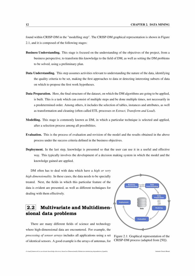
found within CRISP-DM in the "modelling step". The CRISP-DM graphical representation is shown in Figure
2.1, and it is composed of the following stages:
Business Understanding. This stage is focused on the understanding of the objectives of the project, from a
business perspective, to transform this knowledge to the field of DM, as well as setting the DM problems
to be solved, using a preliminary plan.
Data Understanding. This step assumes activities relevant to understanding the nature of the data, identifying
the quality criteria to be set, making the first approaches to data or detecting interesting subsets of data
on which to propose the first work hypotheses.
Data Preparation. Here, the final structure of the dataset, on which the DM algorithms are going to be applied,
is built. This is a task which can consist of multiple steps and be done multiple times, not necessarily in
a predetermined order. Among others, it includes the selection of tables, instances and attributes, as well
as transformation and cleaning (often called ETL processes or Extract, Transform and Load).
Modelling. This stage is commonly known as DM, in which a particular technique is selected and applied,
after a selection process among all possibilities.
Evaluation. This is the process of evaluation and revision of the model and the results obtained in the above
process under the success criteria defined in the business objectives.
Deployment. In the last step, knowledge is presented so that the user can use it in a useful and effective
way. This typically involves the development of a decision making system in which the model and the
knowledge gained are applied.
Figure 2.1: Graphical representation of theCRISP-DM process (adapted from [50]).
DM often has to deal with data which have a high or very
high dimensionality. In these cases, the data needs to be specially
treated. Next, the fields in which this particular feature of the
data is evident are presented, as well as different techniques for
dealing with them effectively.
2.2 Multivariate and Multidimen-sional data problems
There are many different fields of science and technology
where high-dimensional data are encountered. For example, the
processing of sensor arrays includes all applications using a set
of identical sensors. A good example is the arrays of antennas, for
A visual framework to accelerate knowledge discovery based on Dimensionality Reduction minimizing degradation of quality. Antonio Gracia Berná
2.2. MULTIVARIATE AND MULTIDIMENSIONAL DATA PROBLEMS 13
example in radiotelescopes. Besides that, several biomedical ap-
plications also belong to this class, such as magnetoencephalog-
raphy or electrocardiogram acquisition. In these devices, several
electrodes record time signals localed at different places on the scalp or the chest. This same configuration
can be also found in seismography or weather forecasting, for which several channels or satellites deliver high-
dimensional data. The geographic positioning using satellites (as in the GPS) may be included within the same
framework. DR has been successfully applied to this field in [314, 7].
Another example is image processing. If a picture is considered as the output of a digital camera, it consist
of hundreds or even thousands of pixels which can be considered as high-dimensional data. In other words,
the data sample is represented by the picture itself, and each of the pixels contained in the image represent its
features. In this field, DR techniques transform the original high-dimensional features into a reduced represen-
tation set of features [228] (also named features vector). Therefore, the features vector will contain the relevant
information from the input data in order to perform the desired task using this reduced representation instead of
the full size input. Image processing is sufficiently important to be considered as a standalone domain, mainly
because vision is a very specific task that holds a privileged place in information sciences.
Multivariate data analysis (MDA) comprises a set of techniques that can be used when several measure-
ments are made on each individual or object in one or more samples. Often, such measures are related to each
other but come from different types of sensors or sources. The measurements are called variables and the
individuals or objects are called units or observations. A good example of MDA can be found in a car, since
the gearbox connecting the engine to the wheels takes into account information from rotation sensors, force
sensors, position sensors, temperature sensors, and so forth. Historically, the core of applications of MDA
have been in the behavioral and biological sciences. Nevertheless, the interest in multivariate methods has now
spread to numerous other fields of investigation [173]. For example, there are multivariate problems in educa-
tion, chemistry, physics, geology, engineering, law, business, literature, religion, public broadcasting, nursing,
mining, linguistics, biology, psychology, and many other fields. Some examples of multivariate observations
are shown in Table 2.1.
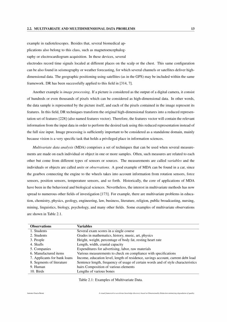
Observations Variables1. Students Several exam scores in a single course2. Students Grades in mathematics, history, music, art, physics3. People Height, weight, percentage of body fat, resting heart rate4. Skulls Length, width, cranial capacity5. Companies Expenditures for advertising, labor, raw materials6. Manufactured items Various measurements to check on compliance with specifications7. Applicants for bank loans Income, education level, length of residence, savings account, current debt load8. Segments of literature Sentence length, frequency of usage of certain words and of style characteristics9. Human hairs Composition of various elements10. Birds Lengths of various bones
Table 2.1: Examples of Multivariate Data.
Antonio Gracia Berná A visual framework to accelerate knowledge discovery based on Dimensionality Reduction minimizing degradation of quality.
14 CHAPTER 2. DATA MINING
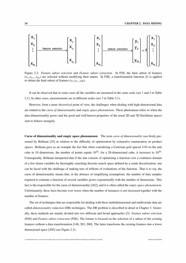
Figure 2.2: Feature subset selection and Feature subset extraction. In FSS, the final subset of features(xi1 ,xi2 ,..,xiM ) are selected without modifying their nature. In FSE, a transformation function (f) is appliedto obtain the final subset of features (y1,y2,..,yM).
It can be observed that in some cases all the variables are measured in the same scale (see 1 and 2 in Table
2.1). In other cases, measurements are in different scales (see 3 in Table 2.1).
However, from a more theoretical point of view, the challenges when dealing with high-dimensional data
are related to the curse of dimensionality and empty space phenomenon. These phenomena refers to when the
data dimensionality grows and the good and well-known properties of the usual 2D and 3D Euclidean spaces
start to behave strangely.
Curse of dimensionality and empty space phenomenon The term curse of dimensionality was firstly pre-
sented by Bellman [25] in relation to the difficulty of optimization by exhaustive enumeration on product
spaces. Bellman gave as an example the fact that when considering a Cartesian grid spaced 1/10 on the unit
cube in 10 dimensions, the number of points equals 1010; for a 20-dimensional cube, it increases to 1020.
Consequently, Bellman interpreted that if the aim consists of optimizing a function over a continuos domain
of a few dozen variables by thoroughly searching discrete search space defined by a crude discretization, one
can be faced with the challenge of making tens of trillions of evaluations of the function. That is to say, the
curse of dimensionality means that, in the absence of simplifying assumptions, the number of data samples
required to estimate a function of several variables grows exponentially with the number of dimensions. This
fact is the responsible for the curse of dimensionality [262], and it is often called the empty space phenomenon.
Unfortunately, these facts become ever worse when the number of instances is not increased together with the
number of features.
The set of techniques that are responsible for dealing with these multidimensional and multivariate data are
called dimensionality reduction (DR) techniques. The DR problem is described in detail in Chapter 3. Gener-
ally, these methods are mainly divided into two different and broad approaches [3]: Feature subset selection
(FSS) and Feature subset extraction (FSE). The former is focused on the selection of a subset of the existing
features without a data transformation [148, 283, 200]. The latter transforms the existing features into a lower
dimensional space [205] (see Figure 2.2).
A visual framework to accelerate knowledge discovery based on Dimensionality Reduction minimizing degradation of quality. Antonio Gracia Berná
2.2. MULTIVARIATE AND MULTIDIMENSIONAL DATA PROBLEMS 15
2.2.1 Feature subset selection
It is often desirable to select a reduced subset of features before or during the process of DM. This process
of selection is called Feature subset selection (FSS) and it has been widely studied in DM [33, 203]. In FSS,
several subsets are searched and the best of them is selected according to some criterion. To achieve this, two
steps are carried out: search and evaluation.
As regards the search, if F is the number of available features, the space search needed to find a solution
consists of 2F different possibilities. There are typical search algorithms in graph theory, such as breadth-first
and depth-first, based on exhaustively search for all possible combinations in order to find the best possible
subset of features. However, these methods should not be applied when F is relatively high since the space
search would increase exponentially. This fact can be addressed by the use of Heuristic techniques, that are
often applied to find solutions close to the optimal, and, in some situations, even the optimal itself. Therefore,
Heuristic techniques are divided into:
Stochastic. The ouput of these algorithms varies for each different run, even when the same configuration is
considered. A clear example of this kind of algorithms is Genetic algorithms (GAs) [342, 286]. These
methods are characterized by a search process that evolves a set of good features by using random
perturbations or modifications of a list of candidate subsets.
Deterministic. These methods always obtains the same solution for each run and configuration. Thus, these
algorithms are based on a "greedy" nature, that is, the search is always started from the same point and it
continues until the optimization cannot be further improved. Feature forward selection (FFS) and Feature
backward elimination (BFE) are two of the most common deterministics methods in the literature [170].
FFS starts with no features and one feature is added in each step, until the fitness function no longer
improves. BFE works in reverse order, it starts with all the features and one of them is removed in each
step until the fitness function does not improves when any feature is removed.
The second stage is related to how the evaluation of the subset of features is carried out in each step.
Therefore, an objective, evaluation or fitness function is defined. FSS is tackled from two different approaches
[203]:
Filter. These methods carry out the feature selection process as a pre-processing step with no induction
algorithm. This model is faster than the wrapper approach and results in a better generalization since it
acts independently of the learning algorithm. The main drawback is that the selected subset of features
often has a high number of features (or even all the features), thus a threshold is required to select an
specific subset of features. Filter methods rank features according to a measure, e.g., RELIEFF [168],
correlation between features [119] or mutual information between features and classes [34].
Wrapper. This approach evaluates the performance of a learning algorithm to identify feature relevance
[171]. Thus, the search evaluation function is the same than evaluating the applied learning algorithm.
Antonio Gracia Berná A visual framework to accelerate knowledge discovery based on Dimensionality Reduction minimizing degradation of quality.
16 CHAPTER 2. DATA MINING
Wrapper methods generally outperform filter methods in terms of prediction accuracy, but are generally
computationally more intensive.
In addition to these methods, two different approaches, embedded and hybrid, can also be found in the
literature [204, 341]. The former selects some features as relevant during the classification process, e.g., the
classification tree algorithm C4.5. The latter combines filter and wrapper approaches.
2.2.2 Feature subset extraction
Feature subset extraction (FSE) transforms the original features into a reduced representation set of features,
called features vector. FSE differs from FSS in that the latter does not modify the original nature of the features,
whilst the former creates new features from the original ones. To obtain the final subset of features, FSE
applies a transformation function to the original features that maps them to a lower dimensional space. This
transformation function is specifically designed for each problem, taking into account the criterion to be met
by the created features. For example, PCA [151, 140] is one of the most widely used FSE algorithms, and it is
characterised by obtaining new uncorrelated variables named principal components (PCs), which preserve as
much of the original information as possible. In this case, the optimization criterion is to maximize the data
variance captured. Another example is Isomap [290, 64], which captures the original distances between the
data samples and creates a set of new variables that allow to approximate those distances.
Other applications in FSE include Audio data classification tasks [301, 216], wavelet transforms [61] and
partial least squares [338].
It is worth mentioning that this thesis extends FSE rather than FSS methods, specifically manifold learning
that is an approach to Non-Linear DR algorithms (described in Chapter 3). Though supervised variants exist
[347], the typical manifold learning problem is unsupervised: it learns the high-dimensional structure of the
data from the data itself, without the use of predetermined classifications.
2.3 Classification
At this point, it should be noted that in several stages of the CRISP-DM methodology, as well as in FSE
and FSS, classification methods are often used. These methods are divided into two broad categories [287]:
• Predictive problems. Here, the aim is to predict the value of a particular attribute based on the val-
ues of other attributes. The predicted attribute is commonly referred as target attribute (or dependent
variable), while the attributes used for prediction are known as explanatory attributes (or independent
variables). Methods in this category are called supervised, since they have a training step for obtaining
the knowledge model. In [336], several methods to detect anomalies in predictive tasks are discussed.
• Descriptive problems. The objective is to derive patterns (correlations, trends, groups or clusters, tra-
jectories and anomalies) summarizing the inherent characteristics in the data. Such techniques are ex-
A visual framework to accelerate knowledge discovery based on Dimensionality Reduction minimizing degradation of quality. Antonio Gracia Berná
2.3. CLASSIFICATION 17
ploratory in nature and they require post-processing of the data to validate and explain the results. These
methods are also called clustering, or unsupervised, as they have no training step and they aim to discover
groups and to identify interesting distributions and patterns in the data [309].
Fayyad et al. [87] summarized those methods which are the most used by each of the two types of prob-
lems: classification methods, regression, association, clustering, etc. Below is a summary of both kinds of
classifications, together with a set of algorithms each one.
However, in addition to the aforementioned classification algorithms, there are other algorithms known as
ensembles of classifiers [69]. These systems classify new instances by combining the individual decisions of
the classifiers of which they are composed of. Examples of these algorithms are Boosting [20] and Bagging
[241, 40].
2.3.1 Supervised classification
A supervised classification algorithm is responsible for generating a classifier model which is able to learn,
from a set of pre-labeled samples (also called training data). Once the classifier has gained the knowledge,
it can be used to identify and estimate the correct label for new unlabeled samples (test data). The training
data must be characterized using descriptive features and a class label variable (also called class or label). The
test data, instead, are only composed of descriptive features, without a class, which must be predicted by the
classifier. The way of evaluating a particular classifier can be based on different criteria, such as accuracy,
understandability, or other desirable properties that determine how good it is to carry out a task.
Before continuing, several concepts must be clarified. An instance or sample is a fixed list of attribute
values, which represents the basic entities it works with, like a plant, a patient, a DNA sequence or a company.
By contrast, an attribute or variable describes a specific property of an instance. Attributes are often discrete
or continuous. The former ones are further classified in nominal (e.g., marital status ∈unmarried, married,
divorcee, widower) and ordinal (e.g., time involvement ∈low, medium, great). The latter ones could be, for
example, height ∈ℜ+.
The Iris flower dataset is a well known example of supervised data. Also known as Fisher’s Iris dataset, this
is a multivariate dataset presented by Ronald Fisher [89] as an example of discriminant analysis. The dataset
contains 3 different classes of 50 instances each (where each class refers to a type of iris plant: Iris Setosa, Iris
Versicolour, and Iris Virginica). Each iris plant is characterized using four different attributes: sepal length,
sepal width, petal length and petal width. As regards the last column in Table 2.2, Species, it is the class, that
is, the one which has to be estimated from the remaining attributes.
Formally, let the training set χ = (x(1)),c(1)),. . .,(x(n),c(n)) be a set of instances characterized by a vec-
tor of descriptive attributes in a space of dimension D, that is, x(i) ∈ ℜD, and a label from a class attribute,
c(i) ∈1,. . . ,C, with i ∈1,. . . ,n. The different attributes are represented by X1,X2,. . . ,XD. Then, a super-
vised classification algorithm builds a classification model, learned from χ , which will be used to assign class
Antonio Gracia Berná A visual framework to accelerate knowledge discovery based on Dimensionality Reduction minimizing degradation of quality.
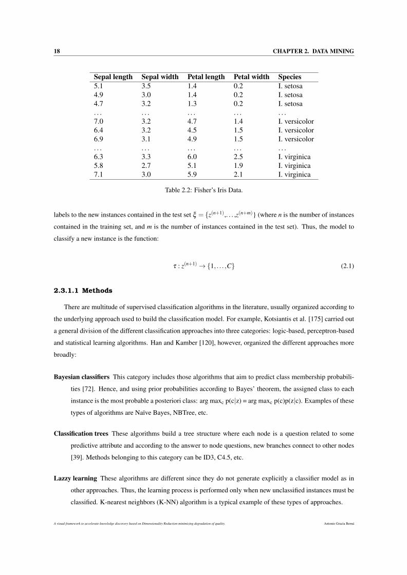
18 CHAPTER 2. DATA MINING
Sepal length Sepal width Petal length Petal width Species5.1 3.5 1.4 0.2 I. setosa4.9 3.0 1.4 0.2 I. setosa4.7 3.2 1.3 0.2 I. setosa. . . . . . . . . . . . . . .7.0 3.2 4.7 1.4 I. versicolor6.4 3.2 4.5 1.5 I. versicolor6.9 3.1 4.9 1.5 I. versicolor. . . . . . . . . . . . . . .6.3 3.3 6.0 2.5 I. virginica5.8 2.7 5.1 1.9 I. virginica7.1 3.0 5.9 2.1 I. virginica
Table 2.2: Fisher’s Iris Data.
labels to the new instances contained in the test set ξ = z(n+1),. . . ,z(n+m) (where n is the number of instances
contained in the training set, and m is the number of instances contained in the test set). Thus, the model to
classify a new instance is the function:
τ : z(n+1)→1, . . . ,C (2.1)
2.3.1.1 Methods
There are multitude of supervised classification algorithms in the literature, usually organized according to
the underlying approach used to build the classification model. For example, Kotsiantis et al. [175] carried out
a general division of the different classification approaches into three categories: logic-based, perceptron-based
and statistical learning algorithms. Han and Kamber [120], however, organized the different approaches more
broadly:
Bayesian classifiers This category includes those algorithms that aim to predict class membership probabili-
ties [72]. Hence, and using prior probabilities according to Bayes’ theorem, the assigned class to each
instance is the most probable a posteriori class: arg maxc p(c|z) = arg maxc p(c)p(z|c). Examples of these
types of algorithms are Naïve Bayes, NBTree, etc.
Classification trees These algorithms build a tree structure where each node is a question related to some
predictive attribute and according to the answer to node questions, new branches connect to other nodes
[39]. Methods belonging to this category can be ID3, C4.5, etc.
Lazzy learning These algorithms are different since they do not generate explicitly a classifier model as in
other approaches. Thus, the learning process is performed only when new unclassified instances must be
classified. K-nearest neighbors (K-NN) algorithm is a typical example of these types of approaches.
A visual framework to accelerate knowledge discovery based on Dimensionality Reduction minimizing degradation of quality. Antonio Gracia Berná
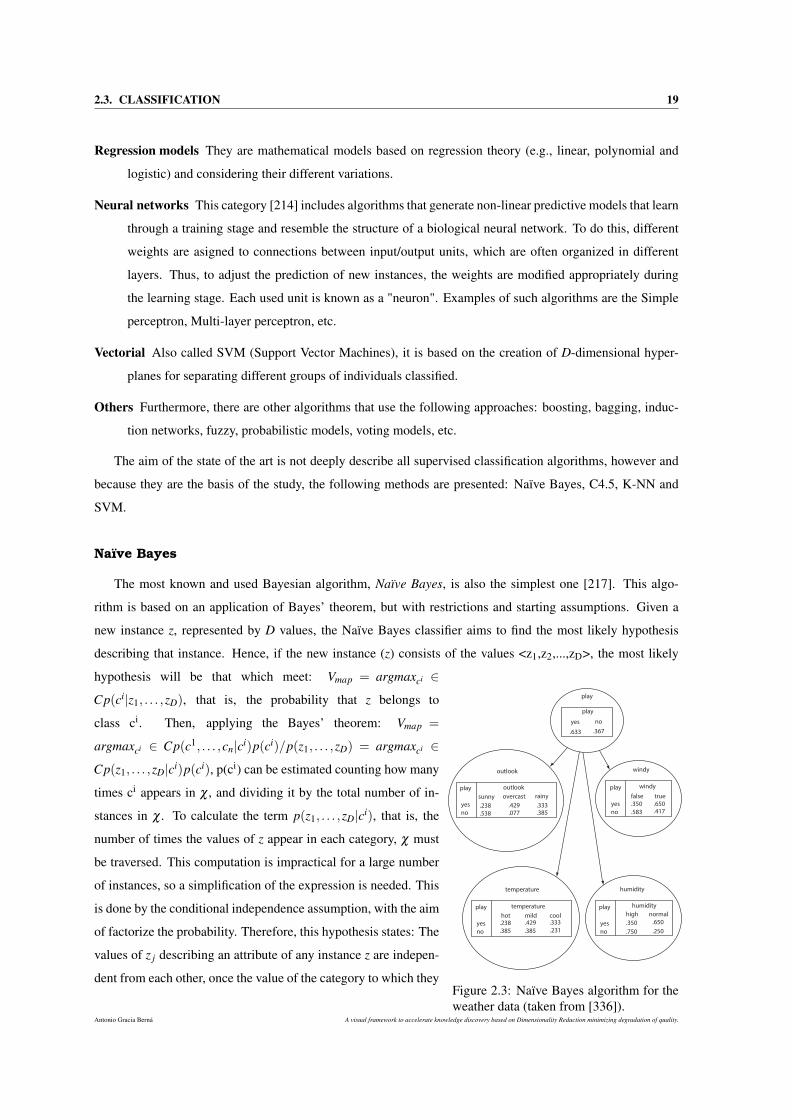
2.3. CLASSIFICATION 19
Regression models They are mathematical models based on regression theory (e.g., linear, polynomial and
logistic) and considering their different variations.
Neural networks This category [214] includes algorithms that generate non-linear predictive models that learn
through a training stage and resemble the structure of a biological neural network. To do this, different
weights are asigned to connections between input/output units, which are often organized in different
layers. Thus, to adjust the prediction of new instances, the weights are modified appropriately during
the learning stage. Each used unit is known as a "neuron". Examples of such algorithms are the Simple
perceptron, Multi-layer perceptron, etc.
Vectorial Also called SVM (Support Vector Machines), it is based on the creation of D-dimensional hyper-
planes for separating different groups of individuals classified.
Others Furthermore, there are other algorithms that use the following approaches: boosting, bagging, induc-
tion networks, fuzzy, probabilistic models, voting models, etc.
The aim of the state of the art is not deeply describe all supervised classification algorithms, however and
because they are the basis of the study, the following methods are presented: Naïve Bayes, C4.5, K-NN and
SVM.
Naïve Bayes
The most known and used Bayesian algorithm, Naïve Bayes, is also the simplest one [217]. This algo-
rithm is based on an application of Bayes’ theorem, but with restrictions and starting assumptions. Given a
new instance z, represented by D values, the Naïve Bayes classifier aims to find the most likely hypothesis
describing that instance. Hence, if the new instance (z) consists of the values <z1,z2,...,zD>, the most likely
play
outlook
temperature
windy
humidity
outlook
sunny overcast rainy
play
yes
no.238
.538
.429
.077.333.385
play
yes
no
play
yes
no
play
yes
no
windy
temperature humidity
false true
.350
.583
.650
.417
hot mild cool.238
.385
.429 .333
.385 .231
high normal
.350
.250
.650
.750
play
.367.633
noyes
Figure 2.3: Naïve Bayes algorithm for theweather data (taken from [336]).
hypothesis will be that which meet: Vmap = argmaxci ∈
Cp(ci|z1, . . . ,zD), that is, the probability that z belongs to
class ci. Then, applying the Bayes’ theorem: Vmap =
argmaxci ∈ Cp(c1, . . . ,cn|ci)p(ci)/p(z1, . . . ,zD) = argmaxci ∈
Cp(z1, . . . ,zD|ci)p(ci), p(ci) can be estimated counting how many
times ci appears in χ , and dividing it by the total number of in-
stances in χ . To calculate the term p(z1, . . . ,zD|ci), that is, the
number of times the values of z appear in each category, χ must
be traversed. This computation is impractical for a large number
of instances, so a simplification of the expression is needed. This
is done by the conditional independence assumption, with the aim
of factorize the probability. Therefore, this hypothesis states: The
values of z j describing an attribute of any instance z are indepen-
dent from each other, once the value of the category to which they
Antonio Gracia Berná A visual framework to accelerate knowledge discovery based on Dimensionality Reduction minimizing degradation of quality.
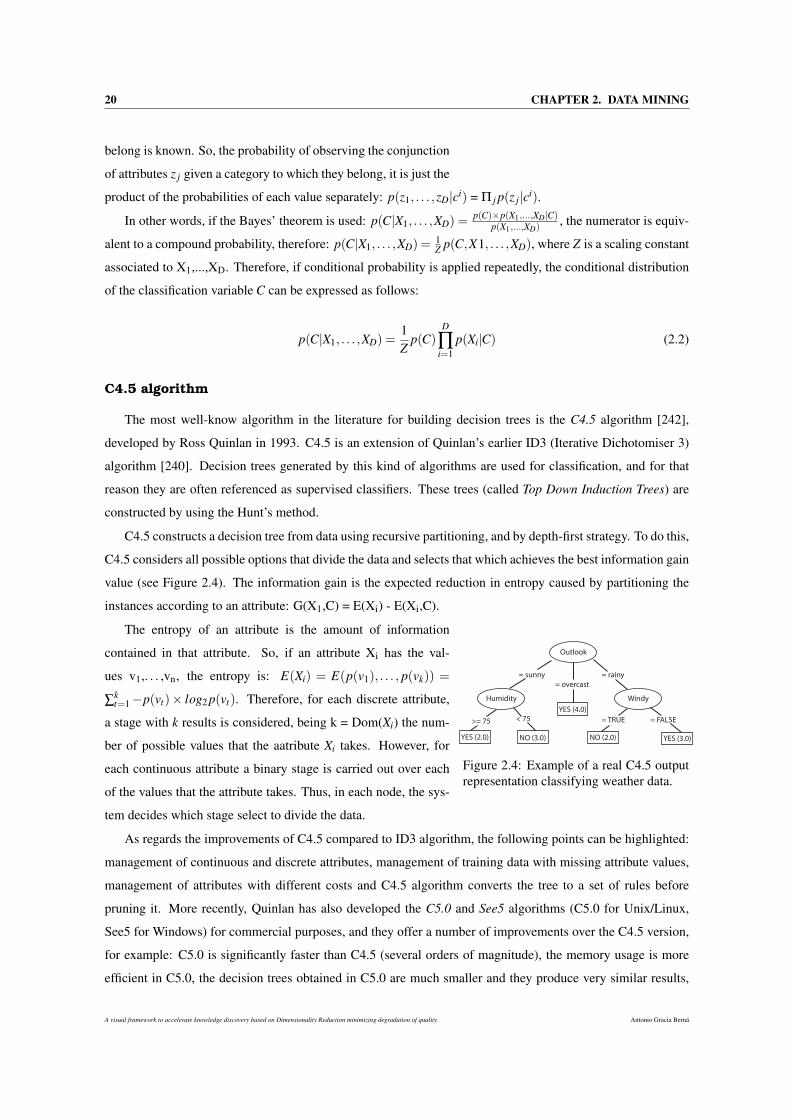
20 CHAPTER 2. DATA MINING
belong is known. So, the probability of observing the conjunction
of attributes z j given a category to which they belong, it is just the
product of the probabilities of each value separately: p(z1, . . . ,zD|ci) = Π j p(z j|ci).
In other words, if the Bayes’ theorem is used: p(C|X1, . . . ,XD) =p(C)×p(X1,...,XD|C)
p(X1,...,XD), the numerator is equiv-
alent to a compound probability, therefore: p(C|X1, . . . ,XD) =1Z p(C,X1, . . . ,XD), where Z is a scaling constant
associated to X1,...,XD. Therefore, if conditional probability is applied repeatedly, the conditional distribution
of the classification variable C can be expressed as follows:
p(C|X1, . . . ,XD) =1Z
p(C)D
∏i=1
p(Xi|C) (2.2)
C4.5 algorithm
The most well-know algorithm in the literature for building decision trees is the C4.5 algorithm [242],
developed by Ross Quinlan in 1993. C4.5 is an extension of Quinlan’s earlier ID3 (Iterative Dichotomiser 3)
algorithm [240]. Decision trees generated by this kind of algorithms are used for classification, and for that
reason they are often referenced as supervised classifiers. These trees (called Top Down Induction Trees) are
constructed by using the Hunt’s method.
C4.5 constructs a decision tree from data using recursive partitioning, and by depth-first strategy. To do this,
C4.5 considers all possible options that divide the data and selects that which achieves the best information gain
value (see Figure 2.4). The information gain is the expected reduction in entropy caused by partitioning the
instances according to an attribute: G(X1,C) = E(Xi) - E(Xi,C).
Outlook
Humidity Windy
= sunny
= overcast
= rainy
>= 75 < 75 = TRUE = FALSE
YES (4.0)
NO (2.0) YES (3.0)YES (2.0) NO (3.0)
Figure 2.4: Example of a real C4.5 outputrepresentation classifying weather data.
The entropy of an attribute is the amount of information
contained in that attribute. So, if an attribute Xi has the val-
ues v1,. . . ,vn, the entropy is: E(Xi) = E(p(v1), . . . , p(vk)) =
∑kt=1−p(vt)× log2 p(vt). Therefore, for each discrete attribute,
a stage with k results is considered, being k = Dom(Xi) the num-
ber of possible values that the aatribute Xi takes. However, for
each continuous attribute a binary stage is carried out over each
of the values that the attribute takes. Thus, in each node, the sys-
tem decides which stage select to divide the data.
As regards the improvements of C4.5 compared to ID3 algorithm, the following points can be highlighted:
management of continuous and discrete attributes, management of training data with missing attribute values,
management of attributes with different costs and C4.5 algorithm converts the tree to a set of rules before
pruning it. More recently, Quinlan has also developed the C5.0 and See5 algorithms (C5.0 for Unix/Linux,
See5 for Windows) for commercial purposes, and they offer a number of improvements over the C4.5 version,
for example: C5.0 is significantly faster than C4.5 (several orders of magnitude), the memory usage is more
efficient in C5.0, the decision trees obtained in C5.0 are much smaller and they produce very similar results,
A visual framework to accelerate knowledge discovery based on Dimensionality Reduction minimizing degradation of quality. Antonio Gracia Berná
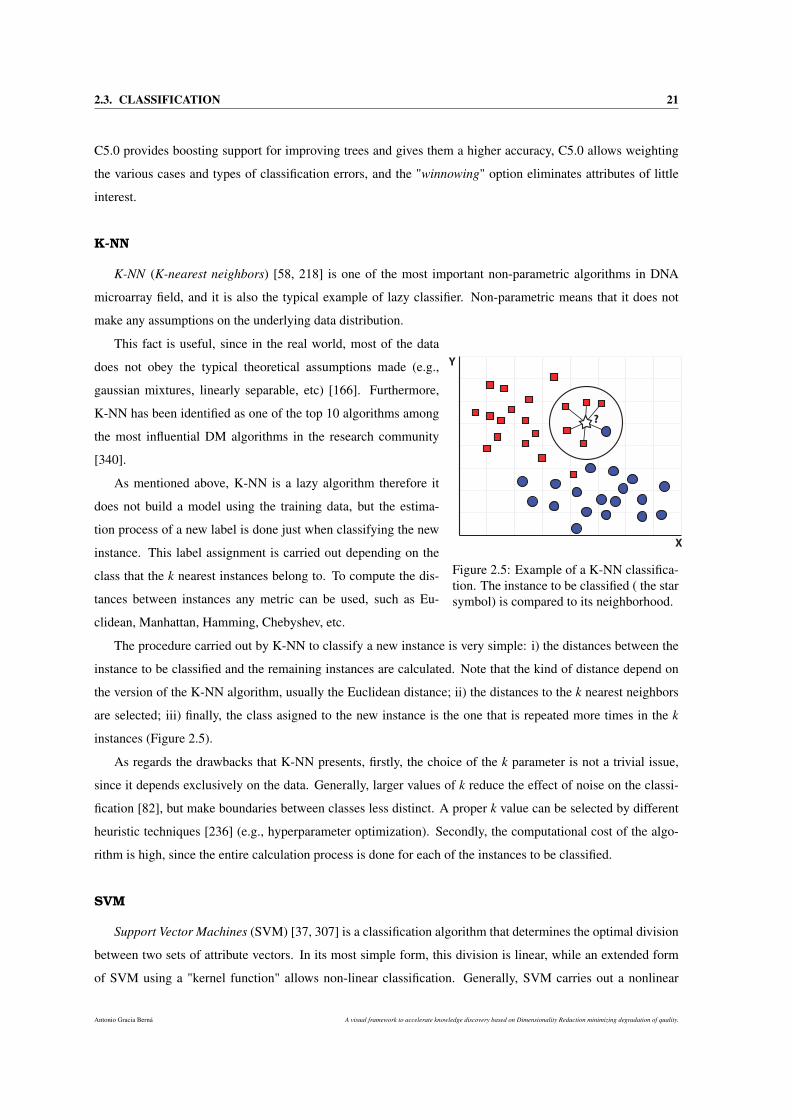
2.3. CLASSIFICATION 21
C5.0 provides boosting support for improving trees and gives them a higher accuracy, C5.0 allows weighting
the various cases and types of classification errors, and the "winnowing" option eliminates attributes of little
interest.
K-NN
K-NN (K-nearest neighbors) [58, 218] is one of the most important non-parametric algorithms in DNA
microarray field, and it is also the typical example of lazy classifier. Non-parametric means that it does not
make any assumptions on the underlying data distribution.
?
X
Y
Figure 2.5: Example of a K-NN classifica-tion. The instance to be classified ( the starsymbol) is compared to its neighborhood.
This fact is useful, since in the real world, most of the data
does not obey the typical theoretical assumptions made (e.g.,
gaussian mixtures, linearly separable, etc) [166]. Furthermore,
K-NN has been identified as one of the top 10 algorithms among
the most influential DM algorithms in the research community
[340].
As mentioned above, K-NN is a lazy algorithm therefore it
does not build a model using the training data, but the estima-
tion process of a new label is done just when classifying the new
instance. This label assignment is carried out depending on the
class that the k nearest instances belong to. To compute the dis-
tances between instances any metric can be used, such as Eu-
clidean, Manhattan, Hamming, Chebyshev, etc.
The procedure carried out by K-NN to classify a new instance is very simple: i) the distances between the
instance to be classified and the remaining instances are calculated. Note that the kind of distance depend on
the version of the K-NN algorithm, usually the Euclidean distance; ii) the distances to the k nearest neighbors
are selected; iii) finally, the class asigned to the new instance is the one that is repeated more times in the k
instances (Figure 2.5).
As regards the drawbacks that K-NN presents, firstly, the choice of the k parameter is not a trivial issue,
since it depends exclusively on the data. Generally, larger values of k reduce the effect of noise on the classi-
fication [82], but make boundaries between classes less distinct. A proper k value can be selected by different
heuristic techniques [236] (e.g., hyperparameter optimization). Secondly, the computational cost of the algo-
rithm is high, since the entire calculation process is done for each of the instances to be classified.
SVM
Support Vector Machines (SVM) [37, 307] is a classification algorithm that determines the optimal division
between two sets of attribute vectors. In its most simple form, this division is linear, while an extended form
of SVM using a "kernel function" allows non-linear classification. Generally, SVM carries out a nonlinear
Antonio Gracia Berná A visual framework to accelerate knowledge discovery based on Dimensionality Reduction minimizing degradation of quality.
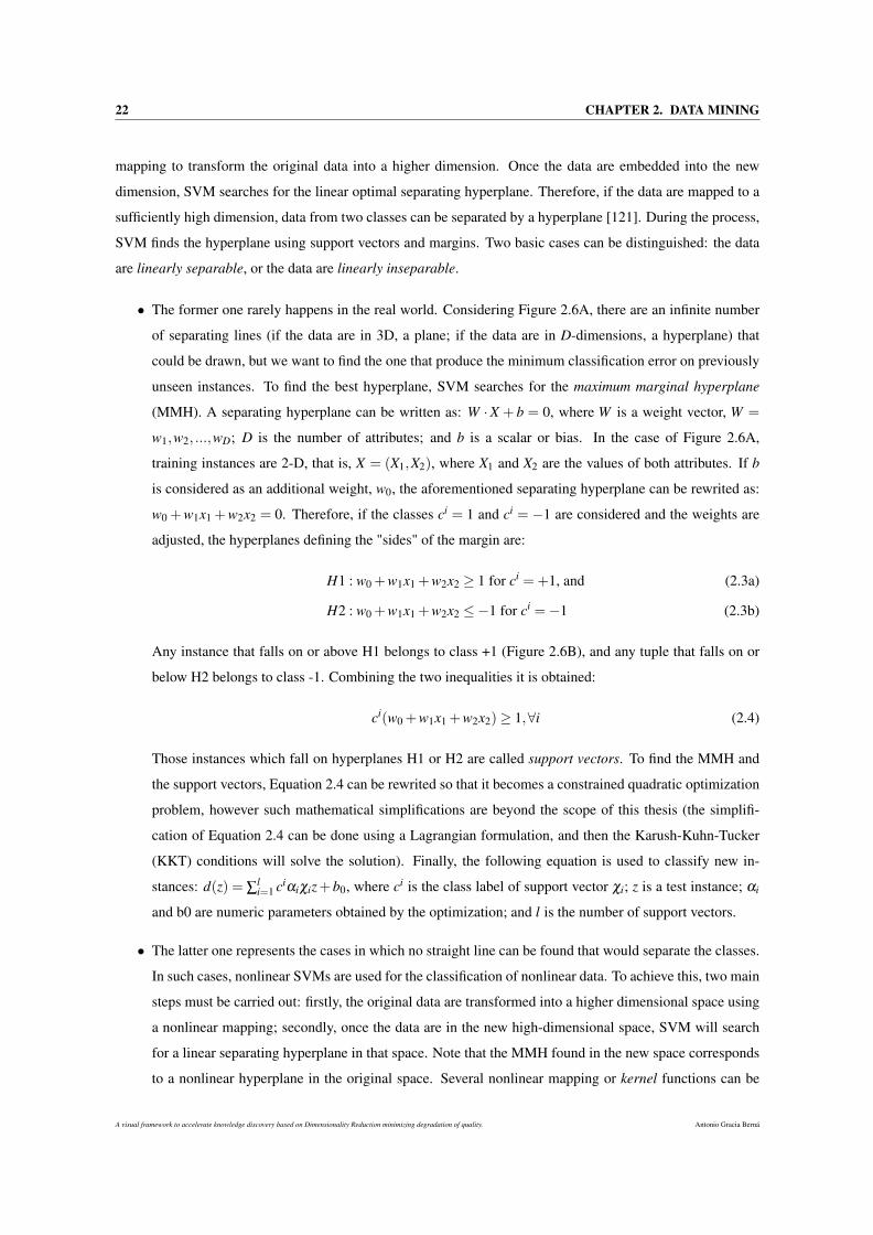
22 CHAPTER 2. DATA MINING
mapping to transform the original data into a higher dimension. Once the data are embedded into the new
dimension, SVM searches for the linear optimal separating hyperplane. Therefore, if the data are mapped to a
sufficiently high dimension, data from two classes can be separated by a hyperplane [121]. During the process,
SVM finds the hyperplane using support vectors and margins. Two basic cases can be distinguished: the data
are linearly separable, or the data are linearly inseparable.
• The former one rarely happens in the real world. Considering Figure 2.6A, there are an infinite number
of separating lines (if the data are in 3D, a plane; if the data are in D-dimensions, a hyperplane) that
could be drawn, but we want to find the one that produce the minimum classification error on previously
unseen instances. To find the best hyperplane, SVM searches for the maximum marginal hyperplane
(MMH). A separating hyperplane can be written as: W ·X + b = 0, where W is a weight vector, W =
w1,w2, ...,wD; D is the number of attributes; and b is a scalar or bias. In the case of Figure 2.6A,
training instances are 2-D, that is, X = (X1,X2), where X1 and X2 are the values of both attributes. If b
is considered as an additional weight, w0, the aforementioned separating hyperplane can be rewrited as:
w0 +w1x1 +w2x2 = 0. Therefore, if the classes ci = 1 and ci = −1 are considered and the weights are
adjusted, the hyperplanes defining the "sides" of the margin are:
H1 : w0 +w1x1 +w2x2 ≥ 1 for ci =+1, and (2.3a)
H2 : w0 +w1x1 +w2x2 ≤−1 for ci =−1 (2.3b)
Any instance that falls on or above H1 belongs to class +1 (Figure 2.6B), and any tuple that falls on or
below H2 belongs to class -1. Combining the two inequalities it is obtained:
ci(w0 +w1x1 +w2x2)≥ 1,∀i (2.4)
Those instances which fall on hyperplanes H1 or H2 are called support vectors. To find the MMH and
the support vectors, Equation 2.4 can be rewrited so that it becomes a constrained quadratic optimization
problem, however such mathematical simplifications are beyond the scope of this thesis (the simplifi-
cation of Equation 2.4 can be done using a Lagrangian formulation, and then the Karush-Kuhn-Tucker
(KKT) conditions will solve the solution). Finally, the following equation is used to classify new in-
stances: d(z) = ∑li=1 ciαiχiz+b0, where ci is the class label of support vector χi; z is a test instance; αi
and b0 are numeric parameters obtained by the optimization; and l is the number of support vectors.
• The latter one represents the cases in which no straight line can be found that would separate the classes.
In such cases, nonlinear SVMs are used for the classification of nonlinear data. To achieve this, two main
steps must be carried out: firstly, the original data are transformed into a higher dimensional space using
a nonlinear mapping; secondly, once the data are in the new high-dimensional space, SVM will search
for a linear separating hyperplane in that space. Note that the MMH found in the new space corresponds
to a nonlinear hyperplane in the original space. Several nonlinear mapping or kernel functions can be
A visual framework to accelerate knowledge discovery based on Dimensionality Reduction minimizing degradation of quality. Antonio Gracia Berná
2.3. CLASSIFICATION 23
Different
separating
hyperplanes
1
1
−=
=
i
i
c
c
H2
wr
H1
7−= xy
Support vectors
A) B)x1
x2
x1
x2
A nonlinear
decision
boundary
1
1
−=
=
i
i
c
c
C)x1
x2
Figure 2.6: SVM algorithm. A: several instances and possible separating hyperplanes. B: linear MMH (redline); hyperplanes H1 and H2 (blue discontinuous lines) ; and support vectors (black circles). C: a nonlineardecision boundary (black discontinuous line).
used to transform the input data to a higher dimension (Figure 2.6B), as:
Polynomial kernel of degree h :K(χi,χ j) = (χi ·χ j +1)h (2.5a)
Gaussian radial basis function kernel :e−‖χi−χ j‖2/2σ2
(2.5b)
Sigmoid kernel :K(χi,χ j) = tanh(κχi ·χ j−δ ) (2.5c)
Although the computational time of SVM can be very slow, they are highly accurate, since they have a
great ability to produce complex nonlinear decision boundaries. Furthermore, they are much less susceptible
to overfitting than other classification algorithms.
2.3.1.2 Validation
A very important step after the supervised classification process is the validation of the results. This is
responsible for checking and assessing the quality of the model built by a classification algorithm with the
objective of being able to compare it to the efficacy obtained with other different models. This kind of validation
is relatively straightforward and trivial, since the class labels are available, which are considered as the ground
truth.
Currently, there are several indicators that are responsible to measure different features of the classifier,
such as discrimination and calibration [211, 250, 17]. An example of these indicators are the accuracy (or hit
ratio), Maximum Log Likehood, area under the curve (AUC), Hosmer-Lemershow, etc. Of these, one of the
most is interpretable is the accuracy, that indicates the percentage of instances that are correctly classified by a
model.
There are different approaches to estimate the aforementioned measures, and most of them differ each other
in how available labeled data are handled. These methods are:
Antonio Gracia Berná A visual framework to accelerate knowledge discovery based on Dimensionality Reduction minimizing degradation of quality.
24 CHAPTER 2. DATA MINING
• Resubstitution. This validation method is one of the simplest. Here, the same original dataset is used
both for learning and validation steps. Obviously, the results will be too optimistic, since the classifier
error is tipically underestimated, severely so in many cases. These facts make it a not reliable method
when a robust validation of a classifier is needed.
• Hold-out. This method is used when there are a limited amount of data. Here, the data are randomly
partitioned into two datasets, a training set and a test set [336]. Generally, two-thirds of the data are
reserved for training, and one-third for testing. Therefore, the training set is used to build the model,
and the accuracy is obtained using the test set. This method is pessimistic, since not all the data are
used to train the model. Special care should be taken to ensure that each class is represented correctly
in both training set and test set, otherwise the classifier built will be incorrect. This procedure is known
as stratification, specifically stratified holdhout. Furthermore, Random subsampling is a variation of
Hold-out, in which the holdout method is repeated k times.
• K-fold cross-validation. This well known method of validation splits randomly the data into K mutually
exclusive ’folds’, all of them with similar size [281]. Therefore, the training and test steps are carried out
K times, always reserving one different fold for testing, and (K-1) folds for training. The final accuracy
of the model is calculated by dividing the K accuracy values, by the number of instances of the input
data. If stratification is applied to cross-validation (stratified cross-validation), the resulting folds are
stratified so that the class distribution of the instances in each fold is approximately the same as that in
the input data. Furthermore, it has been demonstrated that the use of stratification improves the results
of the cross-validation [336]. Generally, it is recommended the use of stratified 10-fold cross-validation
for estimating accuracy. The particular case where K equals the number of instances of the input data is
called leave-one-out cross validation (LOOCV), that is, one single instance is used for testing, and (K-1)
instances are used for training.
• Bootstrap. The last validation method takes especial importance when the size of the input data is
particularly small, or when they have the curse of dimensionality (that is, the number of instances is very
small relative to the number of attributes [25]), since in these cases it works especially well. There are
many diferent bootstrap methods [76], being 0.632 Bootstrap [77, 78] one of the most used. Thus, the
main idea is to obtain samples of the input data with replacement to build a training set. To do so, a dataset
of N instances is sampled N times, with replacement, to obtain another dataset of N instances. As some
instances of the second dataset will be repeated, there will be several instances of the original dataset that
will not be selected, which will be used to create the test set. The particular name of this method is due
to the probability of an instance of being selected. This probability is 1/N, so that there will be 1-(1/N)
probability of not being selected. So, if this value is multiplied by the N opportunities to be selected,
the probability of eventually not being selected is: (1− 1N )
N ≈ e−1 = 0.368. Therefore, if a data set is
large enough, it will contain 36.8% of test instances and 63.2% of training instances. The estimated error
A visual framework to accelerate knowledge discovery based on Dimensionality Reduction minimizing degradation of quality. Antonio Gracia Berná
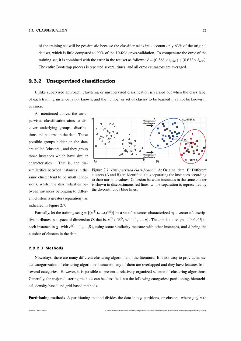
2.3. CLASSIFICATION 25
of the training set will be pessimistic because the classifier takes into account only 63% of the original
dataset, which is little compared to 90% of the 10-fold cross-validation. To compensate the error of the
training set, it is combined with the error in the test set as follows: e = (0.368× etrain)+(0.632× etest).
The entire Bootstrap process is repeated several times, and all error estimators are averaged.
2.3.2 Unsupervised classification
Unlike supervised approach, clustering or unsupervised classification is carried out when the class label
of each training instance is not known, and the number or set of classes to be learned may not be known in
advance.
X
Y
X
Y CLUSTER A
CLUSTER B
Unsupervised
classi!cation
Unsupervised
classi!cation
A) B)
Figure 2.7: Unsupervised classification. A: Original data. B: Differentclusters (A and B) are identified, thus separating the instances accordingto their attribute values. Cohesion between instances in the same clusteris shown in discontinuous red lines, whilst separation is represented bythe discontinuous blue lines.
As mentioned above, the unsu-
pervised classification aims to dis-
cover underlying groups, distribu-
tions and patterns in the data. These
possible groups hidden in the data
are called ’clusters’, and they group
those instances which have similar
characteristics. That is, the dis-
similarities between instances in the
same cluster tend to be small (cohe-
sion), whilst the dissimilarities be-
tween instances belonging to differ-
ent clusters is greater (separation), as
indicated in Figure 2.7.
Formally, let the training set χ = (x(1)),. . .,(x(n)) be a set of instances characterized by a vector of descrip-
tive attributes in a space of dimension D, that is, x(i) ∈ℜD, ∀i ∈ 1, . . . ,n. The aim is to assign a label c(i) to
each instance in χ , with c(i) ∈1,. . . ,S, using some similarity measure with other instances, and S being the
number of clusters in the data.
2.3.2.1 Methods
Nowadays, there are many different clustering algorithms in the literature. It is not easy to provide an ex-
act categorization of clustering algorithms because many of them are overlapped and they have features from
several categories. However, it is possible to present a relatively organized scheme of clustering algorithms.
Generally, the major clustering methods can be classified into the following categories: partitioning, hierarchi-
cal, density-based and grid-based methods.
Partitioning methods A partitioning method divides the data into p partitions, or clusters, where p ≤ n (n
Antonio Gracia Berná A visual framework to accelerate knowledge discovery based on Dimensionality Reduction minimizing degradation of quality.
26 CHAPTER 2. DATA MINING
is the number of instances of the data). These methods carry out one-level partitioning on datasets.
Most partitioning methods typically conduct a cluster separation in which each instance must belong to
exactly one group, besides being distance-based. That is, given p, the number of partitions to construct,
a partitioning method creates an initial partitioning. Then, by using an iterative relocation algorithm, the
partitioning is improved by moving instances from one partition to another. In general, the main criterion
of a good partitioning is that instances in the same partition are "close" to each other, whereas instances in
different partitions or clusters are "far apart" or very different to each other. Note that, If there are many
attributes and the data are sparse, partitioning methods can be further extended to carry out subspace
clustering, instead of searching the full data space. The k-means [153], the PAM [158], the CLARA
[158], and the CLARANS [227] algorithms are the typical examples of partitioning methods, and they
work considerably well for finding spherical-shaped clusters in small or medium size data. Nevertheless,
when dealing with very large datasets or clusters with complex shapes must be found, these methods
need to be extended.
Hierarchical methods The main feature of these methods is that they create a hierarchical decomposition of
the data. Depending on the kind of decomposition carried out, a hierarchical method can be agglomer-
ative or divisive. The former, the bottom-up approach, starts by grouping each instance into a separate
cluster. Then, it successively merges the instances or clusters close to one another, until all the clusters
are merged into one, or a termination condition holds. Typical agglomerative methods include AGNES
[158], BIRCH [346], CHAMELEON [157] and CURE [114]. The latter, the top-down approach, does
exactly the opposite. Thus, it starts by grouping all the instances into the same cluster. In each successive
iteration, a cluster is split into smaller clusters, until each instance is in one cluster. The DIANA [158],
DISMEA [280] algorithms are typical divisive methods. The data structure used to represent this clusters
hierarchy is a tree called dendrogram [287]. Hierarchical clustering methods can be distance-based or
density- and continuity based. However, a serious limitation is that these methods suffer from the fact
that once a step is done, it can never be undone.
Density-based methods Methods based on the notion of density have been devised to overcome the limitations
introduced by those methods which present difficulties to discover clusters of arbitrary shapes (since they
are only capable of detecting spherical clusters). Their main idea is to grow a particular cluster as long as
the density of points in the "neighborhood" exceeds a defined threshold. Hence, for each instance within
a given cluster, the neighborhood of a given radius will contain at least a minimum number of instances.
This approach is often used to discover clusters of arbitrary shape, or even to filter out outliers contained
in the data. Typical examples of these methods are the EM [57], the DBSCAN [79], the DENCLUE [131]
and the OPTICS [11] algorithms.
Grid-based methods This approach comprises those methods which attempt to reduce the computational load
using partition, division or reduction methods in which the data space consists of a grid. Each of the
A visual framework to accelerate knowledge discovery based on Dimensionality Reduction minimizing degradation of quality. Antonio Gracia Berná
2.3. CLASSIFICATION 27
individual elements forming the grid are called units. Thus, the use of a grid for spatial division provides
several benefits, such as the study of the effects of clusters locally, which makes it very useful to use
along with partition or density based approaches. Furthermore, the main advantage of these methods
is its fast processing time, which is dependent only on the number of cells in each dimension in the
quantized space, rather than the number of data objects. This approach is often used as an intermediate
step in many algorithms (e.g., CLIQUE or DESCRY). In this category, the most widely known algorithms
are STING [320], WAVECLUSTER [268] and OptiGrid [132].
In addition to these main categories, there are other methods based on combinations of the above, as
CLIQUE [4] and DESCRY [10]. Another approach is graph partitioning [27], where the graphs show a ten-
dency to express similarity that can be used for partitioning a dataset. Finally, coclustering techniques [27] (also
called bli-clustering, block clustering or distributional clustering) carry out a double clustering (individuals and
attributes simultaneously), that is, the attributes are clustered based on the instances.
The detailed description of each of the previously mentioned methods is beyond the scope of this thesis.
However, it is important to briefly describe the most used validation techniques in unsupervised classification.
2.3.2.2 Validation
After the unsupervised classification process, questions as how good is the clustering generated by a
method, and how the clusterings generated by different methods can be compared often arise. However, the
validation process for clustering tasks is much more difficult than for supervised classification, because there
are no class labels and the result of clustering is a completely subjective fact from the point of view of the
expert. To tackle this, there are multitude of clustering quality indices (CQIs) which attempt to assess, from
different approaches, the quality of clustering solutions.
In general, these indices can be categorized into two groups according to whether ground truth is available
[344]: internal and external. Nevertheless, other authors discussed the existence of a third group, called relative
[117, 146]. The first category, internal indices, comprises those methods which measure how well the clusters
fit the dataset. The second category, external indices, include those methods which measure how well the
clusters match the ground truth. Finally, relative indices are based on the score of clusterings allowing the
comparison of two sets of clustering results on the same dataset.
Internal indices When the ground truth of a dataset is not available, internal CQIs are used to evaluate the
clustering quality. These indices assess a clustering by examining how well the clusters are separated
and how compact the clusters are. Many internal CQIs have the advantage of a similarity metric between
objects in the dataset. However, the limitation of this approach is that the results may be biased depending
on how the partition has been built. This is because the final quality may be measured using different
criteria than those used to build the partition, which can cause incorrect validations. The most known
internal CQIs in the literature are Silhouette [251], Calinski [44], C-index [15], Davies-Bouldin (DB)
Antonio Gracia Berná A visual framework to accelerate knowledge discovery based on Dimensionality Reduction minimizing degradation of quality.

28 CHAPTER 2. DATA MINING
index [62] and Gamma index (a.k.a. Baker and Huberts index) [15].
External indices They are based on the comparison of the results of a clustering process with a reference
data classification. Hence, the ground truth is known and the assessment is conducted based on this
knowledge. However, external validation is not applicable in real world situations since reference classi-
fications are not normally available. In other words, external validation is more accurate but not realistic.
However, this approach becomes more realistic and useful when the comparison of different clustering
partitions, even during the clustering process, is needed. In general, an external index on clustering
quality is effective if it satisfies the following four essential criteria: i) cluster homogeneity, that is, the
more pure the clusters in a clustering are, the better the clustering; ii) cluster completeness, this is the
counterpart of cluster homogeneity; iii) rag bag, there is often a "rag bag" category containing objects
that cannot be merged with other objects; and iv) small cluster preservation, if a small group is split
into small pieces in a clustering, those small pieces may become noise. The most used external CQIs in
the literature are Rand index [244], Adjusted Rand index (ARI) [141], Gamma index [146], Gower [109]
and Russel index [253]. Furthermore, the BCubed precision [14] and the BCubed recall [14] indices also
satisfy all four aforementioned criteria.
Relative indices These indices are based on the comparison of different clustering schemes. In this case, the
same algorithm is run on the dataset while the input parameters are being changed. These comparative
measures are based on features inherent to the clustering achieved (e.g., separation or homogeneity of the
clusters). However, these indices are very computationally complex, sensitive to the presence of noise
[309]. Examples of this kind of indices are the Dunn [75] and the SDbw [116] indices.
A visual framework to accelerate knowledge discovery based on Dimensionality Reduction minimizing degradation of quality. Antonio Gracia Berná
Chapter 3
Dimensionality reduction
Methods of dimensionality reduction (DR) are important and innovative tools in the field of machine learning.
Researchers working in different domains such as engineering, medicine, astronomy, biology, economics and
finances daily face a massive increase in size (number of data samples and attributes) and complexity of the
data every day. To effectively tackle these challenges, DR methods provide a way to understand and interpret
the underlying structure of such complex data. Historically, the main applications of DR have been, amongst
others, the elimination of data redundancy and noise, the reduction in the number of features for minimizing
the computational cost in data pre-processing, the identification of the most discriminative features and the
reduction of features for visualization tasks.
By essence, the world could be considered as multidimensional. A dimension refers to a measurement of a
certain property of an object. DR is the study of methods for reducing the number of dimensions describing the
object. We have only to take a look at human beings, cells, genes, or, in the field of technology, sensor arrays,
digital images, etc [187]. In many cases, if a large number of simple units are combined, a great variety of
complex tasks can be performed. This fact provides a cheaper solution than designing or developing a specific
device and it is also more robust, since the malfunction of a few individual units does not affect the whole
system. This particular property is explained by the fact that units are often partially redundant. Consequently,
erroneous units can be replaced with others that achieve the same task. Redundancy (a more detailed description
of redundancy in information theory is presented in [247]) can be explained by the fact that the features that
characterize the set of various units are not independent from each others. Therefore, this redundancy must be
taken into account in order to an efficient management of all units. The goal of DR is to summarize the large
set of features into a smaller set, with no or less redundancy, in order to produce the same (or almost the same)
analytical results.
Traditionally, the main applications of DR have focused on different tasks in order to make easier the pro-
cess of data analysis. One of this applications is the elimination of data redundancy and noise [60]. This
Antonio Gracia Berná A visual framework to accelerate knowledge discovery based on Dimensionality Reduction minimizing degradation of quality.
30 CHAPTER 3. DIMENSIONALITY REDUCTION
process is very important since in many cases the high-dimensional data contain repeated information that does
not add new properties to the data. Furthermore, there may also be the existence of noise (in the form of
missing or inconsistent values) mainly due to errors in the instruments that perform the measurements for each
observation. A good example in which this cleaning process is needed, is given in obtaining data from DNA
Microarray and Proteomics [245, 143]. Here, the data have a very high-dimensionality (the order of tens or
hundreds of thousands) and the information contained in the variables (represented by genes) is often repeated,
the variables are highly correlated each other and there are inconsistent values that need to be removed. There-
fore, it is crucial to treat properly these elements, since the original nature of the data may be degraded leading
the data analyst to erroneous or biased interpretations.
DR is also widely used to identify those variables that contain more information to better discriminate
between the data samples. This process is known as Feature subset selection (presented in Section 2.2.1), and
consists in selecting a reduced subset of features that best optimizes a cost function, previously defined. This
function could consist, for example, in selecting those variables that best explain the separation of the classes
using supervised data. Consequently, this reduction in the number of features also results in the minimization
of the computational cost in data pre-processing [226]. Thus, working with a set of simplified data reduces
significantly the complexity of the data, as well as the time required for data processing and obtaining results.
A very important application of DR is the visualization of multidimensional data. High-dimensional data,
meaning data that requires more than 3 dimensions to represent, can be difficult to understand and interpret.
This is an inherent characteristic of human nature, as we often move, relate each other and interact in a world
of, at most, 3 spatial dimensions. Therefore, the human ability to understand the features of that object or
unit that does not have this particularity, greatly diminishes. One possible solution to interpret those high-
dimensional data, is try to capture their underlying structure and to extrapolate it to a much more familiar
environment to us, such as 2 or 3 dimensions (see Figure 3.1). In other words, imagine that high-dimensional
data have a set of particular characteristics, then the aim would be to find a way to map those properties to
a more understandable representation, preserving the features as maximum as possible in order to produce a
minimal loss of information. This reduction in the dimensionality of the data to visualize them is often closely
related to a FSE (presented in Section 2.2.2) process.
Once the dimensionality of the data is reduced, there are many different techniques to visualize the resulting
data. These techniques range from geometric projections and transformations of multidimensional data, pixel-
oriented representations (by coloring the pixels according to the multidimensional values), subdivision of the
data space in a hierarchical fashion, to icon-based representations that map each multidimensional data item to
an icon or glyph. An extensive review of these techniques is presented in Chapter 4. Next, a formal definition
of DR is presented.
A visual framework to accelerate knowledge discovery based on Dimensionality Reduction minimizing degradation of quality. Antonio Gracia Berná
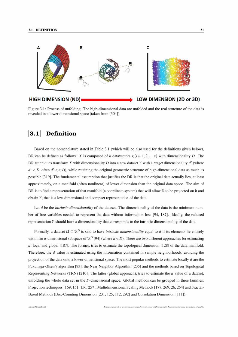
3.1. DEFINITION 31
Figure 3.1: Process of unfolding. The high-dimensional data are unfolded and the real structure of the data isrevealed in a lower dimensional space (taken from [304]).
3.1 Definition
Based on the nomenclature stated in Table 3.1 (which will be also used for the definitions given below),
DR can be defined as follows: X is composed of n datavectors xi(i ∈ 1,2, ...,n) with dimensionality D. The
DR techniques transform X with dimensionality D into a new dataset Y with a target dimensionality d′ (where
d′ < D, often d′ << D), while retaining the original geometric structure of high-dimensional data as much as
possible [319]. The fundamental assumption that justifies the DR is that the original data actually lies, at least
approximately, on a manifold (often nonlinear) of lower dimension than the original data space. The aim of
DR is to find a representation of that manifold (a coordinate system) that will allow X to be projected on it and
obtain Y , that is a low-dimensional and compact representation of the data.
Let d be the intrinsic dimensionality of the dataset. The dimensionality of the data is the minimum num-
ber of free variables needed to represent the data without information loss [94, 187]. Ideally, the reduced
representation Y should have a dimensionality that corresponds to the intrinsic dimensionality of the data.
Formally, a dataset Ω ⊂ ℜD is said to have intrinsic dimensionality equal to d if its elements lie entirely
within an d-dimensional subspace of ℜD [94] (where d < D). There are two different approaches for estimating
d, local and global [187]. The former, tries to estimate the topological dimension [128] of the data manifold.
Therefore, the d value is estimated using the information contained in sample neighborhoods, avoiding the
projection of the data onto a lower-dimensional space. The most popular methods to estimate locally d are the
Fukunaga-Olsen’s algorithm [93], the Near Neighbor Algorithm [235] and the methods based on Topological
Representing Networks (TRN) [210]. The latter (global approach), tries to estimate the d value of a dataset,
unfolding the whole data set in the D-dimensional space. Global methods can be grouped in three families:
Projection techniques [169, 151, 156, 257], Multidimensional Scaling Methods [177, 269, 26, 254] and Fractal-
Based Methods (Box-Counting Dimension [231, 125, 112, 292] and Correlation Dimension [111]).
Antonio Gracia Berná A visual framework to accelerate knowledge discovery based on Dimensionality Reduction minimizing degradation of quality.
32 CHAPTER 3. DIMENSIONALITY REDUCTION
Notation DescriptionD Dimensionality of the high-dimensional datad Intrinsic dimensionality of the high-dimensional datan Total number of datapointsM Topological manifold
ℜD D-Dimensional Euclidean space where high-dimensional datapoints lieℜd d-Dimensional Euclidean space (low-dimensional space using d dimensionality)xi the i-th datapoint in ℜD
yi the i-th datapoint in ℜd
X Original dataset in ℜD (X = x1,x2, ...,xn).Y Reduced dataset in ℜd (Y = y1,y2, ...,yn).Dg Pairwise geodesic distance matrix in ℜD
δ Pairwise euclidean distance matrix in ℜD
ζ Pairwise euclidean distance matrix in ℜd
Dgi j Pairwise geodesic distance between xi and x jδi j Pairwise euclidean distance between xi and x jζi j Pairwise euclidean distance between yi and y jk Number of neighbors of a datapoint
Xik Set of k nearest neighbors of xiYik Set of k nearest neighbors of yi
Table 3.1: Main nomenclature.
3.2 Classification in DR-FSE
Different taxonomies or classification of DR techniques, in terms of feature subset extraction (FSE), have
been proposed.
3.2.1 Convex/Non-convex and Full/Sparse spectral
Laurens van der Maaten et al. [304] carried out a thorough comparative review of the front-ranked linear
(LDR) and non-linear (NLDR) DR techniques. They divided the DR techniques into two criteria (Figure 3.2).
The first criterion is the convex and non-convex intrinsic nature of the techniques. Convex techniques
optimize an objective function that does not contain any local optima (i.e., the solution space is convex [38]),
whereas non-convex techniques optimize objective functions that do contain local optima. The second division
criterion is related to full or sparse spectral techniques. The first one carries out an eigendecomposition of a
full matrix that captures the covariance between dimensions or the pairwise similarities between datapoints.
The other case solves a sparse eigenproblem.
3.2.2 Distance/Topology preservation
John A. Lee et al. proposed a different taxonomy of DR-FE techniques [187] in accordance with procedures
that reduce the features or dimensionality of the data by preserving the overall shape of the geometry, or
by preserving the local properties and neighborhood information of the data. Thus, there is a possibility of
A visual framework to accelerate knowledge discovery based on Dimensionality Reduction minimizing degradation of quality. Antonio Gracia Berná
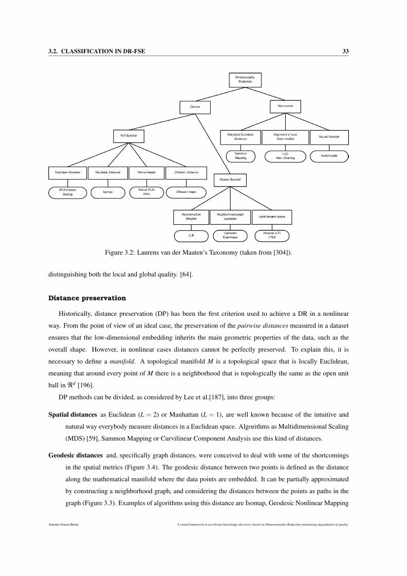
3.2. CLASSIFICATION IN DR-FSE 33
Figure 3.2: Laurens van der Maaten’s Taxonomy (taken from [304]).
distinguishing both the local and global quality. [64].
Distance preservation
Historically, distance preservation (DP) has been the first criterion used to achieve a DR in a nonlinear
way. From the point of view of an ideal case, the preservation of the pairwise distances measured in a dataset
ensures that the low-dimensional embedding inherits the main geometric properties of the data, such as the
overall shape. However, in nonlinear cases distances cannot be perfectly preserved. To explain this, it is
necessary to define a manifold. A topological manifold M is a topological space that is locally Euclidean,
meaning that around every point of M there is a neighborhood that is topologically the same as the open unit
ball in ℜd [196].
DP methods can be divided, as considered by Lee et al.[187], into three groups:
Spatial distances as Euclidean (L = 2) or Manhattan (L = 1), are well known because of the intuitive and
natural way everybody measure distances in a Euclidean space. Algorithms as Multidimensional Scaling
(MDS) [59], Sammon Mapping or Curvilinear Component Analysis use this kind of distances.
Geodesic distances and, specifically graph distances, were conceived to deal with some of the shortcomings
in the spatial metrics (Figure 3.4). The geodesic distance between two points is defined as the distance
along the mathematical manifold where the data points are embedded. It can be partially approximated
by constructing a neighborhood graph, and considering the distances between the points as paths in the
graph (Figure 3.3). Examples of algorithms using this distance are Isomap, Geodesic Nonlinear Mapping
Antonio Gracia Berná A visual framework to accelerate knowledge discovery based on Dimensionality Reduction minimizing degradation of quality.
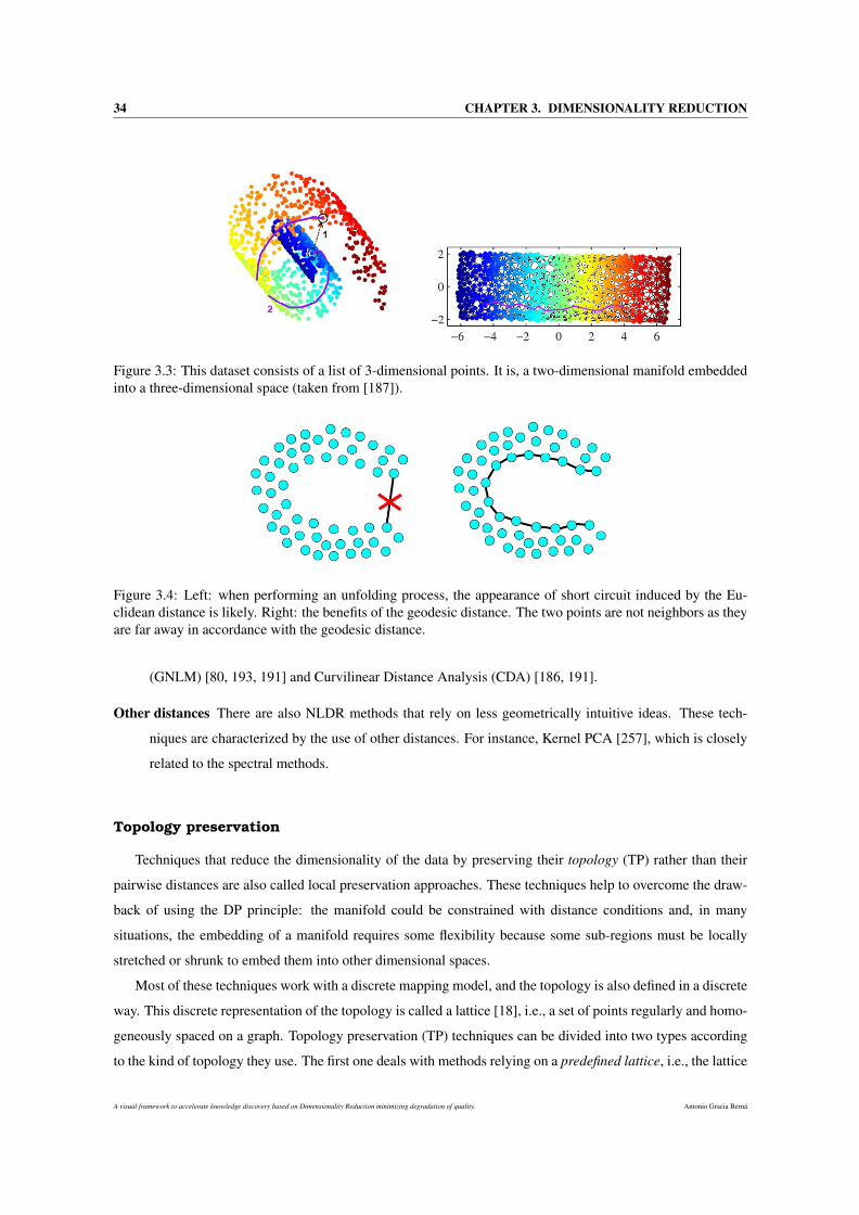
34 CHAPTER 3. DIMENSIONALITY REDUCTION
Figure 3.3: This dataset consists of a list of 3-dimensional points. It is, a two-dimensional manifold embeddedinto a three-dimensional space (taken from [187]).
Figure 3.4: Left: when performing an unfolding process, the appearance of short circuit induced by the Eu-clidean distance is likely. Right: the benefits of the geodesic distance. The two points are not neighbors as theyare far away in accordance with the geodesic distance.
(GNLM) [80, 193, 191] and Curvilinear Distance Analysis (CDA) [186, 191].
Other distances There are also NLDR methods that rely on less geometrically intuitive ideas. These tech-
niques are characterized by the use of other distances. For instance, Kernel PCA [257], which is closely
related to the spectral methods.
Topology preservation
Techniques that reduce the dimensionality of the data by preserving their topology (TP) rather than their
pairwise distances are also called local preservation approaches. These techniques help to overcome the draw-
back of using the DP principle: the manifold could be constrained with distance conditions and, in many
situations, the embedding of a manifold requires some flexibility because some sub-regions must be locally
stretched or shrunk to embed them into other dimensional spaces.
Most of these techniques work with a discrete mapping model, and the topology is also defined in a discrete
way. This discrete representation of the topology is called a lattice [18], i.e., a set of points regularly and homo-
geneously spaced on a graph. Topology preservation (TP) techniques can be divided into two types according
to the kind of topology they use. The first one deals with methods relying on a predefined lattice, i.e., the lattice
A visual framework to accelerate knowledge discovery based on Dimensionality Reduction minimizing degradation of quality. Antonio Gracia Berná
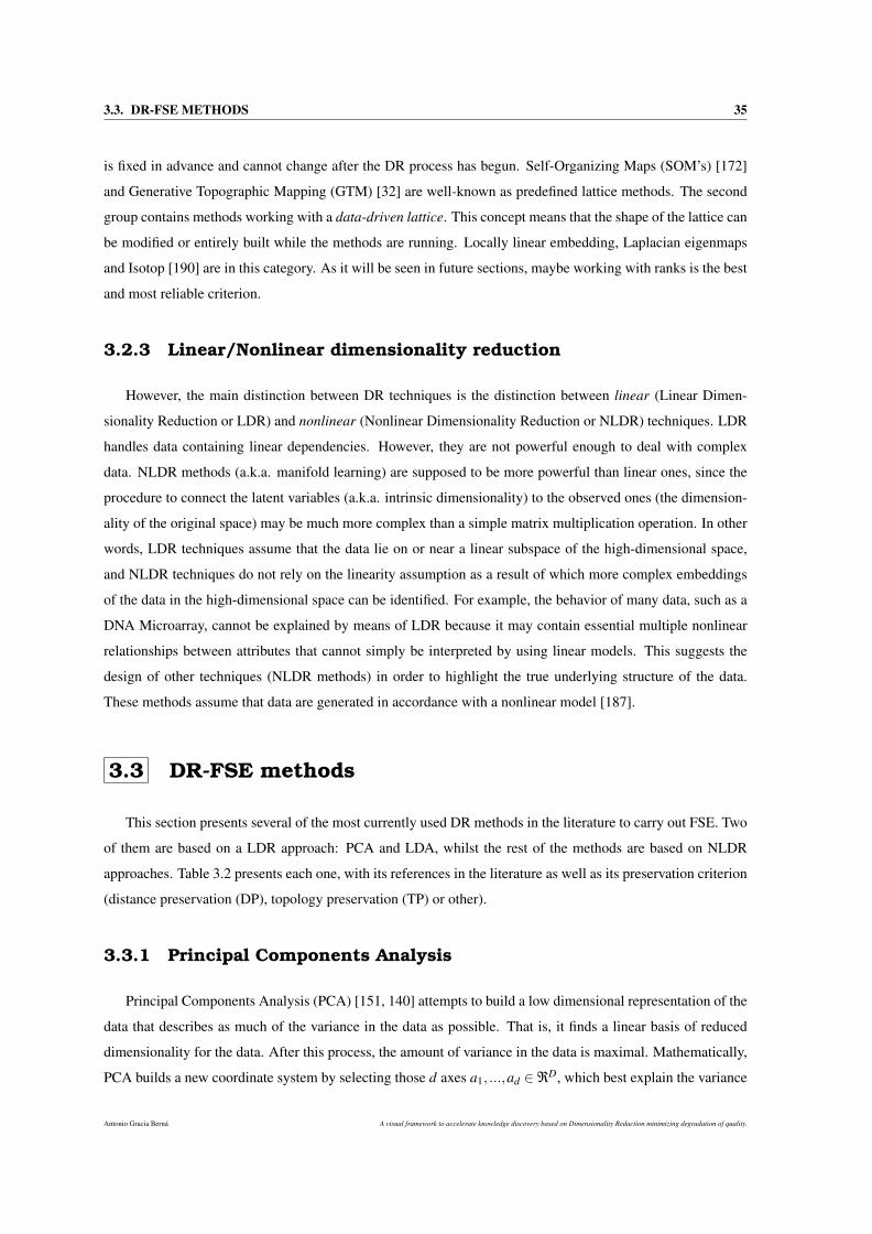
3.3. DR-FSE METHODS 35
is fixed in advance and cannot change after the DR process has begun. Self-Organizing Maps (SOM’s) [172]
and Generative Topographic Mapping (GTM) [32] are well-known as predefined lattice methods. The second
group contains methods working with a data-driven lattice. This concept means that the shape of the lattice can
be modified or entirely built while the methods are running. Locally linear embedding, Laplacian eigenmaps
and Isotop [190] are in this category. As it will be seen in future sections, maybe working with ranks is the best
and most reliable criterion.
3.2.3 Linear/Nonlinear dimensionality reduction
However, the main distinction between DR techniques is the distinction between linear (Linear Dimen-
sionality Reduction or LDR) and nonlinear (Nonlinear Dimensionality Reduction or NLDR) techniques. LDR
handles data containing linear dependencies. However, they are not powerful enough to deal with complex
data. NLDR methods (a.k.a. manifold learning) are supposed to be more powerful than linear ones, since the
procedure to connect the latent variables (a.k.a. intrinsic dimensionality) to the observed ones (the dimension-
ality of the original space) may be much more complex than a simple matrix multiplication operation. In other
words, LDR techniques assume that the data lie on or near a linear subspace of the high-dimensional space,
and NLDR techniques do not rely on the linearity assumption as a result of which more complex embeddings
of the data in the high-dimensional space can be identified. For example, the behavior of many data, such as a
DNA Microarray, cannot be explained by means of LDR because it may contain essential multiple nonlinear
relationships between attributes that cannot simply be interpreted by using linear models. This suggests the
design of other techniques (NLDR methods) in order to highlight the true underlying structure of the data.
These methods assume that data are generated in accordance with a nonlinear model [187].
3.3 DR-FSE methods
This section presents several of the most currently used DR methods in the literature to carry out FSE. Two
of them are based on a LDR approach: PCA and LDA, whilst the rest of the methods are based on NLDR
approaches. Table 3.2 presents each one, with its references in the literature as well as its preservation criterion
(distance preservation (DP), topology preservation (TP) or other).
3.3.1 Principal Components Analysis
Principal Components Analysis (PCA) [151, 140] attempts to build a low dimensional representation of the
data that describes as much of the variance in the data as possible. That is, it finds a linear basis of reduced
dimensionality for the data. After this process, the amount of variance in the data is maximal. Mathematically,
PCA builds a new coordinate system by selecting those d axes a1, ...,ad ∈ℜD, which best explain the variance
Antonio Gracia Berná A visual framework to accelerate knowledge discovery based on Dimensionality Reduction minimizing degradation of quality.
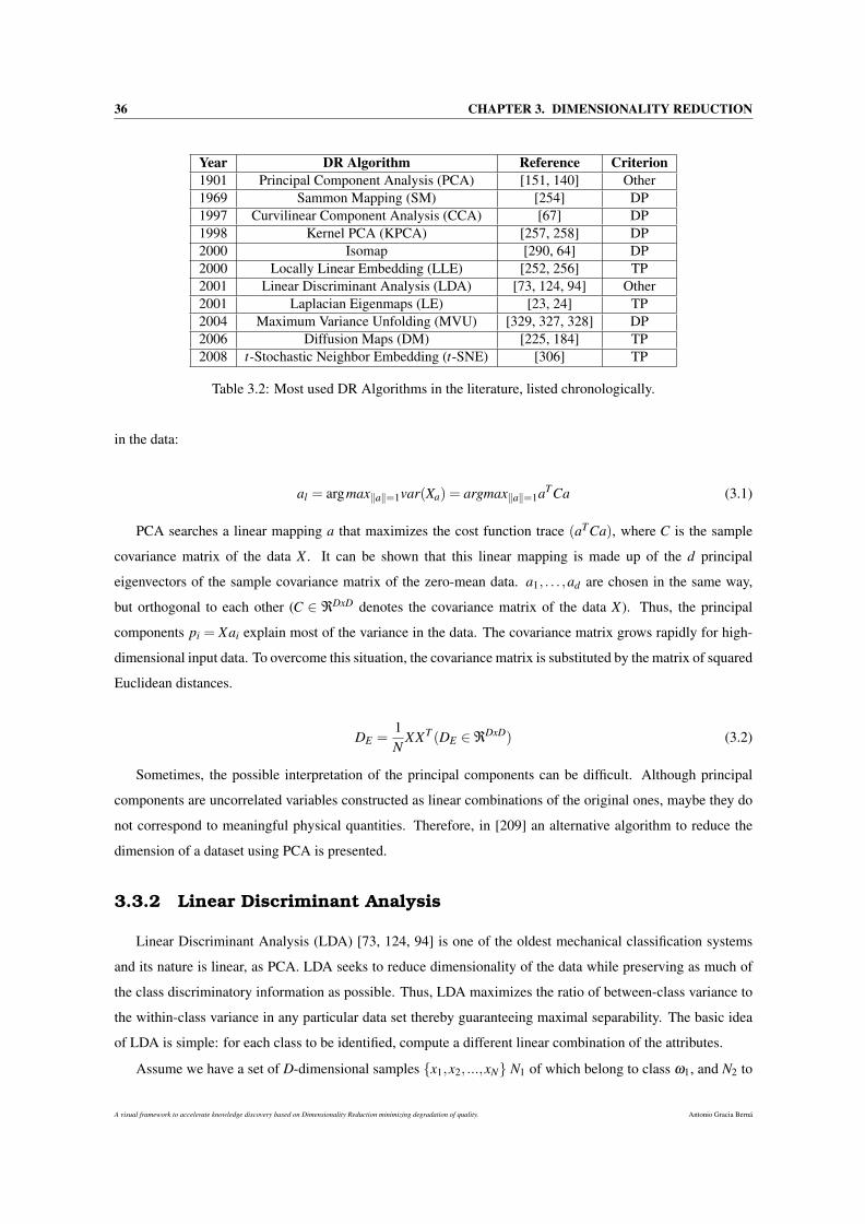
36 CHAPTER 3. DIMENSIONALITY REDUCTION
Year DR Algorithm Reference Criterion1901 Principal Component Analysis (PCA) [151, 140] Other1969 Sammon Mapping (SM) [254] DP1997 Curvilinear Component Analysis (CCA) [67] DP1998 Kernel PCA (KPCA) [257, 258] DP2000 Isomap [290, 64] DP2000 Locally Linear Embedding (LLE) [252, 256] TP2001 Linear Discriminant Analysis (LDA) [73, 124, 94] Other2001 Laplacian Eigenmaps (LE) [23, 24] TP2004 Maximum Variance Unfolding (MVU) [329, 327, 328] DP2006 Diffusion Maps (DM) [225, 184] TP2008 t-Stochastic Neighbor Embedding (t-SNE) [306] TP
Table 3.2: Most used DR Algorithms in the literature, listed chronologically.
in the data:
al = argmax‖a‖=1var(Xa) = argmax‖a‖=1aTCa (3.1)
PCA searches a linear mapping a that maximizes the cost function trace (aTCa), where C is the sample
covariance matrix of the data X . It can be shown that this linear mapping is made up of the d principal
eigenvectors of the sample covariance matrix of the zero-mean data. a1, . . . ,ad are chosen in the same way,
but orthogonal to each other (C ∈ ℜDxD denotes the covariance matrix of the data X). Thus, the principal
components pi = Xai explain most of the variance in the data. The covariance matrix grows rapidly for high-
dimensional input data. To overcome this situation, the covariance matrix is substituted by the matrix of squared
Euclidean distances.
DE =1N
XXT (DE ∈ℜDxD) (3.2)
Sometimes, the possible interpretation of the principal components can be difficult. Although principal
components are uncorrelated variables constructed as linear combinations of the original ones, maybe they do
not correspond to meaningful physical quantities. Therefore, in [209] an alternative algorithm to reduce the
dimension of a dataset using PCA is presented.
3.3.2 Linear Discriminant Analysis
Linear Discriminant Analysis (LDA) [73, 124, 94] is one of the oldest mechanical classification systems
and its nature is linear, as PCA. LDA seeks to reduce dimensionality of the data while preserving as much of
the class discriminatory information as possible. Thus, LDA maximizes the ratio of between-class variance to
the within-class variance in any particular data set thereby guaranteeing maximal separability. The basic idea
of LDA is simple: for each class to be identified, compute a different linear combination of the attributes.
Assume we have a set of D-dimensional samples x1,x2, ...,xN N1 of which belong to class ω1, and N2 to
A visual framework to accelerate knowledge discovery based on Dimensionality Reduction minimizing degradation of quality. Antonio Gracia Berná
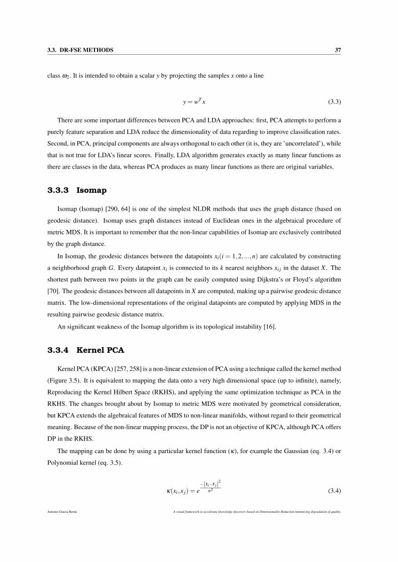
3.3. DR-FSE METHODS 37
class ω2. It is intended to obtain a scalar y by projecting the samples x onto a line
y = wT x (3.3)
There are some important differences between PCA and LDA approaches: first, PCA attempts to perform a
purely feature separation and LDA reduce the dimensionality of data regarding to improve classification rates.
Second, in PCA, principal components are always orthogonal to each other (it is, they are ’uncorrelated’), while
that is not true for LDA’s linear scores. Finally, LDA algorithm generates exactly as many linear functions as
there are classes in the data, whereas PCA produces as many linear functions as there are original variables.
3.3.3 Isomap
Isomap (Isomap) [290, 64] is one of the simplest NLDR methods that uses the graph distance (based on
geodesic distance). Isomap uses graph distances instead of Euclidean ones in the algebraical procedure of
metric MDS. It is important to remember that the non-linear capabilities of Isomap are exclusively contributed
by the graph distance.
In Isomap, the geodesic distances between the datapoints xi(i = 1,2, ...,n) are calculated by constructing
a neighborhood graph G. Every datapoint xi is connected to its k nearest neighbors xi j in the dataset X . The
shortest path between two points in the graph can be easily computed using Dijkstra’s or Floyd’s algorithm
[70]. The geodesic distances between all datapoints in X are computed, making up a pairwise geodesic distance
matrix. The low-dimensional representations of the original datapoints are computed by applying MDS in the
resulting pairwise geodesic distance matrix.
An significant weakness of the Isomap algorithm is its topological instability [16].
3.3.4 Kernel PCA
Kernel PCA (KPCA) [257, 258] is a non-linear extension of PCA using a technique called the kernel method
(Figure 3.5). It is equivalent to mapping the data onto a very high dimensional space (up to infinite), namely,
Reproducing the Kernel Hilbert Space (RKHS), and applying the same optimization technique as PCA in the
RKHS. The changes brought about by Isomap to metric MDS were motivated by geometrical consideration,
but KPCA extends the algebraical features of MDS to non-linear manifolds, without regard to their geometrical
meaning. Because of the non-linear mapping process, the DP is not an objective of KPCA, although PCA offers
DP in the RKHS.
The mapping can be done by using a particular kernel function (κ), for example the Gaussian (eq. 3.4) or
Polynomial kernel (eq. 3.5).
κ(xi,x j) = e−|Xi−Xj|2
σ2 (3.4)
Antonio Gracia Berná A visual framework to accelerate knowledge discovery based on Dimensionality Reduction minimizing degradation of quality.
38 CHAPTER 3. DIMENSIONALITY REDUCTION
Figure 3.5: Basic idea of kernel PCA. By means of a nonlinear kernel function κ instead of the standard dotproduct, we implicitly perform PCA in a possibly high-dimensional space F which is nonlinearly related toinput space. The dotted lines are contour lines of constant feature value (taken from [187]).
κ(xi,x j) = (xi · x j)2 (3.5)
3.3.5 Locally Linear Embedding
Locally Linear Embedding (LLE) [252, 256] tries to preserve the local properties of the data from a dif-
ferent point of view. In LLE, the local properties of the data manifold (represented as Xi) are constructed by
mapping the datapoints as a linear combination of their k-nearest neighbors (eq. 3.6). In the low-dimensional
representation of the data, LLE attempts to retain the reconstruction weights in the linear combinations as best
as possible.
~Xi =k
∑j=1
Wi j~X j (3.6)
Weights Wi j are computed by minimizing the constrained least-squares problem. The embedding vectors ~Yi
are reconstructed by Wi j, minimizing Eq. 3.8.
E(W ) =N
∑i=1
∣∣∣∣∣~Xi−k
∑j=1
Wi j~X j
∣∣∣∣∣2
(3.7)
Φ(Y ) =N
∑i=1
∣∣∣∣∣~Yi−k
∑j=1
Wi j~Yj
∣∣∣∣∣2
(3.8)
Although Wi j and ~Yi are computed by methods in linear algebra, the constraint that points are only recon-
structed from neighbors can result in highly nonlinear embeddings.
3.3.6 Laplacian Eigenmaps
The Laplacian Eigenmaps algorithm (LE) is similar to LLE in the sense that it finds a low-dimensional data
representation by preserving the local properties of the manifold [23, 24]. LE can be included in sparse spectral
A visual framework to accelerate knowledge discovery based on Dimensionality Reduction minimizing degradation of quality. Antonio Gracia Berná
3.3. DR-FSE METHODS 39
techniques. This algorithm attempts to compute a low-dimensional representation of the data in which the
distances between a datapoint and its k nearest neighbors are minimized. The distance in the low-dimensional
data representation between a datapoint and its first nearest neighbor contributes more to the cost function
than the distance between the datapoint and its second nearest neighbor. Using spectral graph theory, the
minimization of the cost function is defined (eq. 3.9) as an eigenproblem, where Wi j values are from the
Gaussian kernel function,
E(Y ) = ∑i j
∣∣∣~Yi−~Yj
∣∣∣2 Wi j (3.9)
and for neighboring yi, y j (W (i, j) = 0 otherwise), the distances between the low space representations are
minimized and the nearby samples xi,x j are highly weighted, and thus brought closed together.
3.3.7 Difussion Maps
The Diffusion Maps (DM) algorithm [225, 184] is based on diffusion processes for finding meaningful
geometric descriptions of data sets. In this technique, a graph is built from the samples on the manifold where
the diffusion distance describes the connectivity on the graph between every two points. This distance is
characterized by the probability of transition between them. DM captures the intrinsic natural parameters that
generate the data, which usually lie on a lower dimension.
The assumption is that the data lie on a non-linear manifold. The data are transformed using a Gaussian
kernel function (eq. 3.10). This kernel is used for the construction of Markov Random Walk (MRW) matrix.
The diffusion distances in the original space are mapped into Euclidean distances in the new diffusion space.
Because of the diffusion distance between two points is obtained from all of the possible paths in the graph,
DM is robust to noise.
K(xi,x j) = e−|Xi−X j|2
σ2 (3.10)
3.3.8 t-Distributed Stochastic Neighbor Embedding
t-Distributed Stochastic Neighbor Embedding (t-SNE) algorithm [306] faces the DR problem from a stochas-
tic and probabilistic-based approach. t-SNE algorithm is considered as an improved version in the original SNE,
of Hinton and Rowies [133]. The main idea of SNE is to minimize the difference between conditional prob-
ability distributions that represent similarities in both dimensional spaces. Thus, the conditional probabilities
are computed by SNE as
p j|i =exp(−
∥∥xi− x j∥∥/2σ2
i )
∑k 6=i exp(−‖xi− xk‖/2σ2i )
(3.11)
Antonio Gracia Berná A visual framework to accelerate knowledge discovery based on Dimensionality Reduction minimizing degradation of quality.
40 CHAPTER 3. DIMENSIONALITY REDUCTION
q j|i =exp(−
∥∥yi− y j∥∥2)
∑k 6=i exp(−‖yi− yk‖2)(3.12)
in high and low dimensional space, respectively, with pi|i and qi|i set to zero. 3.11 and 3.12 represent the
probability that xi (yi) would select x j (y j) as its neighbor. This results in high values for nearby points and
lower values for distantly separated ones. The main assumption in SNE is the following: if the low dimensional
points in Y correctly model the structure of the points in X , then the conditional probabilities will be the
same. In order to evaluate how well qi|i models pi|i, the summed Kullbac-Leibler (KL) divergence is used.
Using gradient descent techniques, SNE minimizes a KL fitness function. To initialize the gradient descent,
an isotropic Gaussian distribution is used. σi represent the variance in the Gaussian distribution centered on
the point xi. Thus, an important step is to properly select the parameter σi, process that can be facilitated by
a property called perplexity. SNE searches the value of σi that produces a Pi (probability) with the specified
perplexity.
t-SNE improves SNE in two aspects: first, symmetrized conditional probabilities are used to simplify the
gradient as well as the fitness function for defining the joint probabilities on P and Q (e.g., pi j = (p j|i +
pi| j)/2n). Second, the Gaussian distribution is changed to a heavier tailed Student’s t distribution with one
degree of freedom. So, q j|i is modified to be
q j|i =(1+
∥∥yi− y j∥∥2)−1
∑k 6=l(1+‖yk− yl‖2)−1(3.13)
and the fitness function for t-SNE is defined by
δCδyi
= 4∑i(pi j−qi j)(yi− y j)(1+
∥∥yi− y j∥∥2)−1 (3.14)
3.3.9 Sammon Mapping
Sammon Mapping (SM) [254] is considered a variant of MDS. SM appeared in order to address several
weakness in MDS, since MDS mainly focuses on retaining large pairwise distances, but not on retaining the
small ones. The small pairwise distances are supposed to be much more important for preserving the geometry
of the data.
SM weights the contribution of each pair of points (i, j) to the cost function by the inverse of their pairwise
distance in the high-dimensional space δi j. Thus, instead of MDS, the fitness function in SM assigns equal
weight to preserving each of the pairwise distances, and therefore preserves the local structure of the data much
better than classical scaling.
SM states a fitness function which is labelled as Sammon’s stress in the literature (as it will be seen below):
ESM =1
∑i< j δi j
∑i< j(δi j−ζi j)2
δi j(3.15)
A visual framework to accelerate knowledge discovery based on Dimensionality Reduction minimizing degradation of quality. Antonio Gracia Berná
3.3. DR-FSE METHODS 41
The projection aims to minimize this function and the projection problem can be seen as a function minimiz-
ing problem which can’t be solved in a closed form. It can only be made approximately. The minimization of
the Sammon cost function can be performed using several methods: pseudo-Newton method, gradient descent,
genetic algorithms, simulated annealing, particle swarm optimization and many other heuristic approaches.
3.3.10 Maximum Variance Unfolding
Maximum Variance Unfolding (MVU, formerly known as Semidefinite Embedding) [329, 327, 328] presents
a similar approach to Isomap. MVU attemps to preserve the distances among k-nearest neighbors by means
of a neighborhood graph G. Instead of using geodesic distances, MVU considers squared Euclidean distances
between two neighbored samples. It also maximizes the Euclidean distance between all points yi , y j in the
target space (in order to ’unfold’ the data manifold) while it also preserves the distances in the neighborhood
graph.
The optimization problem is the following:
max∑i j
∥∥yi− y j∥∥2 sub ject→
∥∥yi− y j∥∥2
=∥∥xi− x j
∥∥2 f or∀(i, j) ∈ G (3.16)
MVU is based on the same concept than Isomap, so MVU shares some weaknesses with it, such as suffering
from erroneous connections in the main graph.
3.3.11 Curvilinear Component Analysis
The Curvilinear component analysis (CCA) [67] algorithm works as follows: it searches for a properly
configuration of the datapoints in a lower space that preserves original pairwise distance matrix as much as
possible. In contrast to SM, CCA focuses on small distances in the output space instead of focusing on small
distances in the original space. CCA can be considered as an iterative learning algorithm. At the beginning
of the process, it starts focusing on large distances (as the SM algorithm). Then it gradually changes focus to
small distances. At the end of the algorithm, the small distance information will overwrite the large distance
information.
Formally, the quadratic cost function is defined as
ECCA =12
N
∑i
N
∑j 6=i
(δi j−ζi j)2F(ζi j,λy) (3.17)
The aim is to force to match for each possible pair in δi j and ζi j. A perfect matching is not possible at all
scales when manifold ’unfolding’ is needed to reduce the dimension from D to d. So, a weighting function is
introduced, F(ζi j,λy).
CCA is based on a self-organized neural network carrying out two main tasks: i) vector quantization (VQ)
of the submanifold in the data set (input space), and ii) nonlinear projection of these quantizing vectors toward
Antonio Gracia Berná A visual framework to accelerate knowledge discovery based on Dimensionality Reduction minimizing degradation of quality.
42 CHAPTER 3. DIMENSIONALITY REDUCTION
Year Name of the measure Criterion Reference1962 Sheppard Diagram (SD) global [269, 270]1964 Kruskal Stress Measure (S) global [177, 178]1969 Sammon Stress (SS) global [254]1988 Spearman’s Rho (SR) local [276]1992 Topological Product (TPr) local [21]1997 Topological Function (TF ) local [316]2000 Residual Variance (RV ) global [290]2000 König’s Measure (KM) local [174]2001 Trustworthiness & Continuity (T&C) local [311]2003 Classification error rate classification error [256, 329, 310]2006 Local Continuity Meta-Criterion (Qk) local [51, 52]2006 Agreement Rate (AR)/Corrected Agreement Rate (CAR) local [6]2007 Mean Relative Rank Errors (MRRE) local [187, 188, 195]2009 Procrustes Measure (PM)/Modified Procrustes Measure (PMC) local [102]2009 Co-ranking Matrix (Q) local [188, 194]2011 Global Measure (QY ) local & global [215]2011 The Relative Error (RE ) global [122]2012 Normalization independent embedding quality assessment (NIEQA) local &/OR global [345]
Table 3.3: Summary of methods for evaluating the quality of DR algorithms, listed chronologically.
an output space, providing a revealing unfolding of the submanifold.
3.4 Quality assessment criteria
There are many different quality assessment measures for evaluating the performance of the DR algo-
rithms. In other words, these methods measure the inevitable degradation of the quality after a DR process.
Historically, most of the approaches have focused on evaluating the local-neighborhood-preservation and the
overall-structure-holding performance of the DR methods. In this section the most used measures in the litera-
ture are classified (using global or local preservation criteria) and described (see Table 3.3). Firstly, local-based
approaches are presented in 3.4.1. Secondly, global-based approaches are explained in 3.4.2 and finally, several
approaches based on different criteria are described in 3.4.3. All these criteria have been used in this thesis.
Before explaining the different approaches for quality assessment, it is very important to highlight a basic
concept to better understand the following measures.
Multidimensional scaling Multidimensional scaling (MDS) is a statistical method for fitting a set of points
in a space so that the distances between points correspond as closely as possible to a given set of dissimilarities
between a set of objects. Developed primarily by psychometricians and statisticians, MDS is widely used in a
variety of disciplines for visualization and DR. The literature on MDS includes books [35, 59, 83] and book
chapters ([81], chapter 5; [179], chapter 5; [209], chapter 14; and [263], Section 5.5). The method devised by
Torgerson [293] and Gower [108], called classical MDS and principal coordinate analysis, could be formulated
as an optimization problem with an objective function whose minimum value is called the stress criterion.
Later, Kruskal [177, 178] defined MDS in terms of the minimization of this stress criterion, which is simply
A visual framework to accelerate knowledge discovery based on Dimensionality Reduction minimizing degradation of quality. Antonio Gracia Berná
3.4. QUALITY ASSESSMENT CRITERIA 43
a measure of the lack of fit between dissimilarities δ and fitted distances ζ . In the simplest case, stress is a
residual sum of the squares:
StressD(y1, ...,yn) =
(∑
i6= j=1..n(δi j−
∥∥ζi j∥∥)2
) 12
(3.18)
where the outer square root provides greater spread to small values. For a given δ , MDS minimizes Stress over
all different configurations (y1, ...,yn)T , thought of as n×D-dimensional hypervectors of unknown parameters.
The minimization is carried out by gradient descent applied to StressD, viewed as a function on ℜnD.
3.4.1 Local-neighborhood-preservation approaches
This subsection present the methods that evaluate the effectiveness when preserving the local information,
after a DR process.
3.4.1.1 Spearman’s Rho
Siegel and Castellan presented one of the first measures to estimate the topology preservation (TP) after
a DR process, Spearman’s rho (SR) [276]. This measure estimates the correlation of rank order data. That
is, it tries to assess how well the corresponding projection preserves the order of pairwise distances between
data-points in high-dimensional space. In order to compute the SR, the following equation is used
SR = 1− 6∑Ti=1(z(i)− z(i))2
T 3−T(3.19)
where z(i), i = 1,T is the different rank (order numbers) of pairwise distances in the original space, sorted
in ascending order. z(i), i = 1,T is the same for the output space. T is the total number of distances to be
compared (T = n(n− 1)/2). The interval is SR ∈ [−1,1], where 1 means a perfect preservation. SR is often
used for estimating the TP with a view to reducing dimensionality [31, 106, 176, 28]. Karbauskaitÿe et al.
[154] successfully demonstrated that SR can be used to analize the TP when visualizing the data through the
embeddings generated by the LLE algorithm.
In contrast to MDS, that only focuses on fitting the distances from δ to ζ (the order of these distances do
not matter), the SR measure also takes into account the rank of pairwise distances in δ and ζ for the quality
assessment.
3.4.1.2 Topological Product
The following attempts are found in the particular case of SOM. In this sense, Bauer and Pawelzik proposed
the topographic product (TPr) [21]. TPr is one of the oldest measures that quantifies the TP features of the SOM,
and it is a measure for the preservation of distances within the local neighborhoods. Let Q1(i, j) be the distance
between point i in ℜD and its jth nearest neighbour as measured by distance orderings of their images in ℜd ,
divided by the distance between point i in ℜD and its jth nearest neighbour as measured by distance orderings
Antonio Gracia Berná A visual framework to accelerate knowledge discovery based on Dimensionality Reduction minimizing degradation of quality.
44 CHAPTER 3. DIMENSIONALITY REDUCTION
in ℜD. Q2(i, j) gives analogous information where i and j are points in ℜd . The Q′s are then combined to yield
a single number TPr, the topological product, which defines the quality of the mapping:
TPr =1
n(n−1)
n
∑g=1
n−1
∑f=1
log(Π fp=1Q1(g, p)Q2(g, p))
12 f (3.20)
The result of the TPr indicates whether the size of the map is appropriate to fit into the dataset. TPr = 0 means a
perfectly order-preserving map.
3.4.1.3 Topological Function
Five years later Villmann et al. presented the topological function (TF , 1997) [315]. The TF was one of the
simplest TP measures in SOM. TF is based in the Delaunay triangulation graph D of the weight vectors. These
vectors wi and w j were defined as being adjacent on the manifold V , if their receptive fields are adjacent. Thus,
the adjacency of these receptive fields can be approximated by computing C (the connectivity matrix) of the
induced Delaunay triangulation graph D:
1. Given a data sample, find its first best matching unit i and second best matching unit j.
2. Create a synaptic link between neurons i and j, i.e. set Ci j=1.
3. Go back to step 1 and repeat for all datasamples.
If the number of weight vectors is "dense" enough on the manifold V , then D represents a perfect TP
mapping of V that also preserves the paths on V . Villmann et al. demonstrated that the TF presents reliable
results only for almost linear datasets [316].
3.4.1.4 König’s Measure
König. A developed a TP measure, the König’s measure (KM) [174]. KM was used to estimate the local
preservation of the maps, obtained when using self-organizing neural networks. It is also based on the analysis
of rank order in the input and output spaces. The KM is calculated as follows:
KM =1
3k1n
n
∑i=1
k1
∑j=1
KMi j (3.21)
KM ∈ [0,1], where 1 means a perfect preservation. KMi j represents the TP between point i and j, and k1 is the
neighborhood value.
3.4.1.5 Trustworthiness & Continuity
Venna and Kaski proposed a method which assesses two different concepts, trustworthiness and continuity
(T&C) [311]. It is based on the exchange of indices of neighboring samples in D and d (by using the pairwise
A visual framework to accelerate knowledge discovery based on Dimensionality Reduction minimizing degradation of quality. Antonio Gracia Berná
3.4. QUALITY ASSESSMENT CRITERIA 45
Euclidean distances), respectively. The T&C criterion involves two evaluations, the trustworthiness and the
continuity measure, defined, respectively, as:
MT = 1− 2nk(2n−3k−1)
n
∑i=1
∑j∈Uk(i)/∈Vk(i)
(r(i, j)− k) (3.22)
MC = 1− 2nk(2n−3k−1)
n
∑i=1
∑j∈Vk(i)/∈Uk(i)
(r(i, j)− k) (3.23)
where k is the size of the neighborhood, r(i, j) and r(i, j) are the rank of x j and y j in the ordering according
to the distance from xi(yi) in the original (representational) space. Uk(i) and Vk(i) are the set of those data
samples that are in k of xi(yi) in the representational (original) space. As regards the meaning of MT and MC,
the first one measures the degree of trustworthiness that data points which were originally farther away enter
the neighborhood of a sample in the embeddings. The latter evaluates the degree of continuity that data points
that are originally in the neighborhood are pushed farther away in data representations. Therefore, the T&C
measure is defined as:
QT = αMT +(1−α)MC (3.24)
where α ∈ [0,1] is the compromise parameter. The trade-off between the two terms, tunable by a parameter
α , governs the trade-off between trustworthiness and continuity. A properly selected α value, can reflect the
consistency between the local neighborhoods of the original data and the corresponding ones in the embed-
dings calculated by the NLDR method. The interval of QT ∈ [0,1] which are the higher values means a good
preservation of trustworthiness and continuity.
3.4.1.6 Local Continuity Meta-Criterion
There are also several methods that assess the performance of the DR algorithms by checking the degree of
overlap between the neighboring sets of a data sample and of their corresponding embedding. This is the case
of the Local Continuity Meta-Criterion (Qk) [51, 52], presented by Chen and Buja. The Qk can be defined as:
Qk = 1− 1nk
n
∑i=1
∣∣∣Ψxk(i)
⋂Ψ
yk(i)∣∣∣− k2
n−1(3.25)
where k is the pre-specified size of the neighborhood, Ψxk(i) is the index set of x′is k points and Ψ
yk(i) is the
index set of y′is k points. If the overlap between two k neighboring sets of the original and representational sets
is computing, the Qk gives a general measurement for the local faithfulness of the computed embeddings. The
interval of Qk ∈ [0,1], whose values next to 1 mean a high neighborhood overlap between the two dimensional
spaces, and next to 0 values the opposite.
In contrast to TPr, which attempts to measure the DP between the local neighbors, the Qk measure focuses
on comparing the identities of these local neighbors.
Antonio Gracia Berná A visual framework to accelerate knowledge discovery based on Dimensionality Reduction minimizing degradation of quality.
46 CHAPTER 3. DIMENSIONALITY REDUCTION
3.4.1.7 Agreement Rate/Corrected Agreement Rate
The agreement rate (AR, originally called ’rate of agreement in local structure’) technique was presented by
Akkucuk and Carroll [6]. This measure is very similar to Qk, and RAND or corrected RAND index [243, 142].
AR was originally developed for comparing embeddings of sets of objects in [5]. It works as follows: it takes
two configuration of points X and Y . For each embedding, AR calculates the distances between each pair of
datapoints, this give us δ and ζ . For each datapoint, it calculates its neighborhood in both configurations,
producing Xik and Yik. Finally, it attempts to compute the percentage of overlapping datapoints in the neigh-
borhood of each point, for X and Y . Here, the order is not important. Let’s consider ui as the number of
overlapping points in both Xik and Yik, for datapoint i. Therefore, the AR is
AR =1kn
n
∑i=1
ui (3.26)
where an AR value equal to 1 means a perfect preservation. The authors also suggested another quality criterion
called the corrected agreement rate (CAR). This method computes an AR, by randomly rearranging the indices
of datapoints in Y . France et al. also proposed a method in [91], where they combined the use of the AR and
RAND index in order to assess DR methods.
3.4.1.8 Mean Relative Rank Errors
Lee and Verleysen developed a quality assessment measure, the mean relative rank errors (MRRE) [187,
188, 195]. It is based on ranks of pairwise Euclidean distances within local neighborhoods. In 2009, Kar-
bauskaite et al. analyzed the efficiency of MRRE when reducing the dimensionality using LLE [155]. The
MRRE criterion is based on a very similar principle to that of the T&C, but it includes two elements defined as
WT = 1− 1Hk
n
∑i=1
∑j∈Uk(i)
|r(i, j)− r(i, j)|r(i, j)
(3.27)
WC = 1− 1Hk
n
∑i=1
∑j∈Vk(i)
|r(i, j)− r(i, j)|r(i, j)
(3.28)
where k is the size of the neighborhood and eq. 3.29 is the normalizing factor. The MRRE criterion is eq. 3.30
where β ∈ [0,1] is the compromise parameter. The main difference between the MRRE and the T&C is that the
first one considers all of the k samples in the representational (original) space, and the latter focuses on the k of
the samples in the representational (original) space but not in the original (representational) space. Although
we are talking about subtle differences between them, they are significant enough to be considered. Hk is a
normalizing factor. The interval of QM ∈ [0,1], whose values near to 0 will indicate a small rank error in the
final embedding, are result of the error-based nature of MRRE.
Hk = nk
∑i=1
|n−2i+1|i
(3.29)
A visual framework to accelerate knowledge discovery based on Dimensionality Reduction minimizing degradation of quality. Antonio Gracia Berná
3.4. QUALITY ASSESSMENT CRITERIA 47
QM = βWT +(1−β )WC (3.30)
In contrast to SR, which focuses on assesing how well the corresponding low-dimensional projection pre-
serves the order of pairwise distances between the high-dimensional data points converted to ranks, the QM
measure evaluates (using an error value) that the order of Xik and Yik is the same.
3.4.1.9 Procrustes Measure/Modified Procrustes Measure
The Procrustes analysis [274, 275, 264] has been widely used for the study of the distribution of a set of
shapes. Based on this concept, Goldberg and Ritov [102] developed the Procrustes measure (PM). PM allows
the isometric embeddings to be compared. The method can be described as follows: using the procrustes
analysis, the aim is to find a rigid motion (a translation and a rotation), after which Xik best when it coincides
with Yik (for i = 1 to n). Once the transformation has been computed, the local similarity for the i-th element
is calculated as
Lsimilarity(Xik,Yik) =k
∑j=1
∥∥Xi j−∂Yi j−ℑ∥∥2
2 (3.31)
∂ is the selected rotation matrix and ℑ the translation vector (‖..‖2 indicates the L2 norm for a vector). To
finish, the PM value is obtained by
PM = 1/nn
∑i=1
Lsimilarity(Xik,Yik)/‖XikBk‖2F (3.32)
Bk = Ik−1k
qkqTk (3.33)
where Ik represents the identity matrix of size kxk, qk a k dimensional column vector of ones, and ‖..‖F indi-
cates the Frobenius norm for a matrix. A PM close to zero means a perfect preservation. At this point, it is
important to highlight that PM was originally devised for assessing the quality of isometric embeddings, such
as Isomap or MDS. Nevertheless, PM will fail when assessing normalized embeddings (such as LLE, [103]),
as they are known to distort the local neighborhood. To overcome this, in [102] the authors also suggested a
modified version (PMC) that addresses this drawback. This version eliminates the global scaling factor in each
neighborhood, so it is appropriate for conformal embeddings. To summarize, the main difference between the
two versions of the measure is that PM takes into account the stretch/shrink factor, and PMC does not. In the
particular case of different scaling of coordinates in low dimensional embeddings, neither PM nor PMC solves
the problem.
3.4.1.10 Co-ranking Matrix
Many different concepts and quality criteria for DR can be summarized using the Co-ranking framework
(Q), presented by Lee and Verleysen [188, 194]. Several of the aforementioned methods (based on distance
Antonio Gracia Berná A visual framework to accelerate knowledge discovery based on Dimensionality Reduction minimizing degradation of quality.
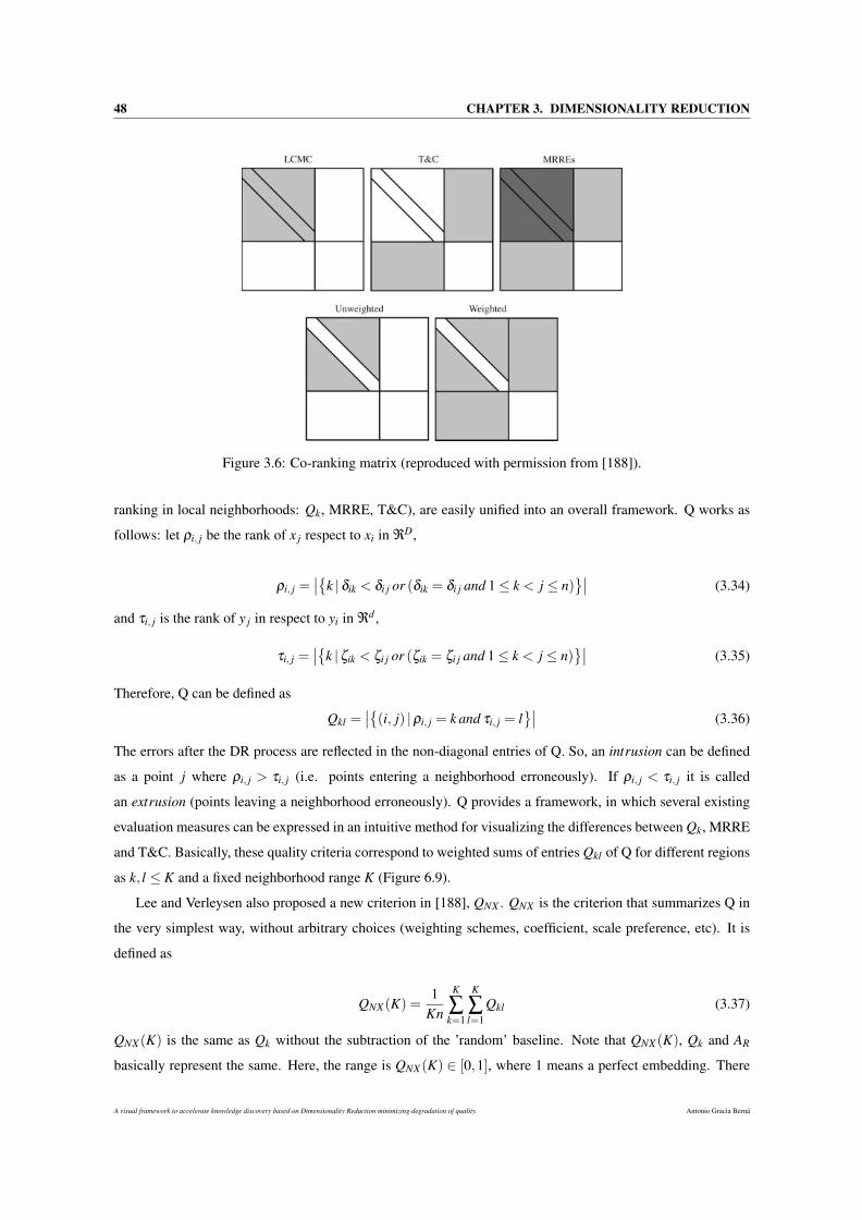
48 CHAPTER 3. DIMENSIONALITY REDUCTION
Figure 3.6: Co-ranking matrix (reproduced with permission from [188]).
ranking in local neighborhoods: Qk, MRRE, T&C), are easily unified into an overall framework. Q works as
follows: let ρi, j be the rank of x j respect to xi in ℜD,
ρi, j =∣∣k |δik < δi j or (δik = δi j and 1≤ k < j ≤ n)
∣∣ (3.34)
and τi, j is the rank of y j in respect to yi in ℜd ,
τi, j =∣∣k |ζik < ζi j or (ζik = ζi j and 1≤ k < j ≤ n)
∣∣ (3.35)
Therefore, Q can be defined as
Qkl =∣∣(i, j) |ρi, j = k and τi, j = l
∣∣ (3.36)
The errors after the DR process are reflected in the non-diagonal entries of Q. So, an intrusion can be defined
as a point j where ρi, j > τi, j (i.e. points entering a neighborhood erroneously). If ρi, j < τi, j it is called
an extrusion (points leaving a neighborhood erroneously). Q provides a framework, in which several existing
evaluation measures can be expressed in an intuitive method for visualizing the differences between Qk, MRRE
and T&C. Basically, these quality criteria correspond to weighted sums of entries Qkl of Q for different regions
as k, l ≤ K and a fixed neighborhood range K (Figure 6.9).
Lee and Verleysen also proposed a new criterion in [188], QNX . QNX is the criterion that summarizes Q in
the very simplest way, without arbitrary choices (weighting schemes, coefficient, scale preference, etc). It is
defined as
QNX (K) =1
Kn
K
∑k=1
K
∑l=1
Qkl (3.37)
QNX (K) is the same as Qk without the subtraction of the ’random’ baseline. Note that QNX (K), Qk and AR
basically represent the same. Here, the range is QNX (K) ∈ [0,1], where 1 means a perfect embedding. There
A visual framework to accelerate knowledge discovery based on Dimensionality Reduction minimizing degradation of quality. Antonio Gracia Berná

3.4. QUALITY ASSESSMENT CRITERIA 49
are two other quality criteria, BNX (K) and RNX (K). The first one subtracts elements of Q that are above or below
the main diagonal: it indicates whether a given embedding tends to favor intrusions or extrusions. The range is
BNX (K) ∈ [−1,1]. The sign depends on the dominating type of errors (BNX (K)> 0 represents intrusions, and
BNX (K)< 0 are extrusions). Zero means an equal number of intrusions and extrusions.
The last one, RNX (K) [192], can be considered a renormalized Qk, allowing us to compare values at dif-
ferent scales. RNX (K) is based on Qk with a baseline subtraction and a normalization: it indicates the relative
improvement in a random embedding. Thus, the main advantage of RNX (K) is straightforward, as two different
embeddings can be compared on different values of K. This is very difficult to achieve and less interpretable
with other criteria. The range is RNX (K) ∈ [0,1], where 1 represents a perfect embedding.
In [189], Lee and Verleysen studied and proposed several solutions to solve the issue of overall scale
dependency.
3.4.2 Global-structure-holding approaches
This subsection is focused on the methods that assess the effectiveness when preserving the overall shape
of the data, after a DR process.
3.4.2.1 Shepard Diagram and Kruskal Stress Measure
Shepard presented in [269, 270] the Shepard Diagram (SD). The SD is known to be one of the oldest DP
methods. The SD can be formally considered as the diagram obtained by plotting the n(n−1)/2 distances of the
original configuration δ against the approximated distances ζ (Figure 3.7). The SD visualizes the goodness-of-
fit of all sets of distances. It can be useful to detect anisotropic distortions in the representation. Thus, Kruskal
[177, 178] proposed a measure for the deviation from monotonicity between δ and ζ , called the stress function
(S):
S =
√∑i j(ζi j−d∗i j)
2
∑i j ζ 2i j
(3.38)
Note that δ does not appear in this equation. Instead, the discrepancy between ζi j and the target distances
d∗i j are measured. d∗i j can be computed by finding the monotonic regression [177, 178]. In the SD, instead of
showing individual points for d∗i j , they are connected by a solid line. The target distances d∗i j represent the
distances that lead to a perfect monotonic relationship to δ that minimizes S for the given ζi j. S is a ’lack of
fit’ measure: if S equals 0, there is a perfect monotonic relationship between ζi j and δi j.
Note that, the Shepard Diagram and the Kruskal Stress Measure are based on a concept very similar to
MDS, since in fact they originate from it.
Antonio Gracia Berná A visual framework to accelerate knowledge discovery based on Dimensionality Reduction minimizing degradation of quality.
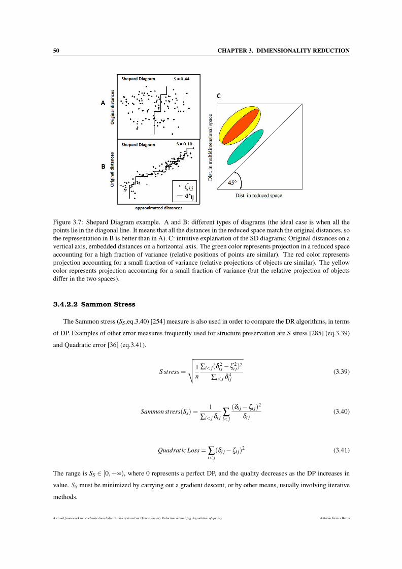
50 CHAPTER 3. DIMENSIONALITY REDUCTION
Figure 3.7: Shepard Diagram example. A and B: different types of diagrams (the ideal case is when all thepoints lie in the diagonal line. It means that all the distances in the reduced space match the original distances, sothe representation in B is better than in A). C: intuitive explanation of the SD diagrams; Original distances on avertical axis, embedded distances on a horizontal axis. The green color represents projection in a reduced spaceaccounting for a high fraction of variance (relative positions of points are similar). The red color representsprojection accounting for a small fraction of variance (relative projections of objects are similar). The yellowcolor represents projection accounting for a small fraction of variance (but the relative projection of objectsdiffer in the two spaces).
3.4.2.2 Sammon Stress
The Sammon stress (SS,eq.3.40) [254] measure is also used in order to compare the DR algorithms, in terms
of DP. Examples of other error measures frequently used for structure preservation are S stress [285] (eq.3.39)
and Quadratic error [36] (eq.3.41).
S stress =
√√√√1n
∑i< j(δ2i j−ζ 2
i j)2
∑i< j δ 4i j
(3.39)
Sammon stress(Ss) =1
∑i< j δi j∑i< j
(δi j−ζi j)2
δi j(3.40)
Quadratic Loss = ∑i< j
(δi j−ζi j)2 (3.41)
The range is SS ∈ [0,+∞), where 0 represents a perfect DP, and the quality decreases as the DP increases in
value. SS must be minimized by carrying out a gradient descent, or by other means, usually involving iterative
methods.
A visual framework to accelerate knowledge discovery based on Dimensionality Reduction minimizing degradation of quality. Antonio Gracia Berná

3.4. QUALITY ASSESSMENT CRITERIA 51
3.4.2.3 Residual Variance
Tenenbaum and Silva. [290] used the residual variance (RV) for assessing the global quality of an em-
bedding. RV is computed by RV = 1−R2(GX ,ζ ), where R(GX ,ζ ) represents the standard linear correlation
coefficients over all entries of GX and ζ . The term GX is the graph distance matrix [290]. The range is
RV ∈ [0,1], where 0 value represents a perfect quality of the embedding. An RV quality criterion has been also
successfully applied to choose the embedding dimensionality for Isomap [290].
3.4.2.4 The Relative Error
Handa [122] introduced the Relative error (RE ) to be used with another quality criteria, such as MRRE and
Qk, for evaluating the quality of DR methods. The RE is calculated as
RE =n
∑i
n
∑j=i+1
∣∣Dgi j−ζi j∣∣
Dgi jn(n+1)/2(3.42)
3.4.3 Others
There are different quality criteria approaches that do not merely focus on evaluating the TP or DP, for
example: Classification error rate, Global Measure and NIEQA.
3.4.3.1 Classification Error Rate
Another approach mentioned in the literature consists of using an indirect accuracy index, such as a classi-
fication error. See [256, 329] and other references in [310]. It can be defined as:
Ce = AccℜD −Accℜd (3.43)
where AccℜD is the classification accuracy in ℜD, and Accℜd represents the same in ℜd . Logically, the classi-
fication error can be used only with labeled data.
The last two quality measures have recently appeared, and they share a particular feature: they combine
both local and global quality measure approaches. Here, the main aim is to provide a global or ’mixture’ value
that assesses the TP and DP capabilities of a DR algorithm.
3.4.3.2 Global Measure
Meng et. al [215] proposed a new quality criteria (QY ) that evaluates the neighborhood-preserving and
global-structure performances when performing manifold learning tasks. To compute QY , the shortest path tree
(SPT) is generated from the k neighborhood graph. After this, the global-structure assessment is calculated
using the Spearman rank order correlation, defined in the rankings of branch lengths (QGB). So, the overall
assessment (QY ) can be defined as a linear combination of the global assessment, QGB, and a local assessment,
Antonio Gracia Berná A visual framework to accelerate knowledge discovery based on Dimensionality Reduction minimizing degradation of quality.
52 CHAPTER 3. DIMENSIONALITY REDUCTION
such as Qk (QM or QT could also be used). Then, QY = µQGB +(1−µ)Qk, where µ ∈ [0,1] and represents a
parameter to balance QGB and Qk in quality assessment. QY is valued between 0 and 1, where 1 represents a
perfect global-structure-preserving.
In contrast to measures, such as SR and QM , QY provides a more sophisticate and complete approach, since
it assesses both local and global quality. However, there is a certain similarity to SR measure, as it uses the
Spearman rank order correlation on the main branches of the SPT in order to evaluate the DP.
3.4.3.3 Normalization independent embedding quality assessment
Zhang et. al [345] presented a normalization independent embedding quality criterion, for manifold learn-
ing purposes (NIEQA). In the paper, they first developed a measure called the anisotropic scaling independent
measure (ASIM), which compares the similarity between two configurations under rigid motion and anisotropic
coordinate scaling. NIEQA is based on ASIM, and consists of three assessments, a local one, a global one and
a linear combination of the two. This thesis is merely focused on the local one. The local measure evaluates
how well local neighborhood information is preserved under anisotropic coordinate scaling and rigid motion.
That is, the local assessment is defined as:
NIEQALOCAL(X ,Y ) =1n
n
∑i=1
Masim(Xi,Yi) (3.44)
where Masim(Xik,Yik) is the ASIM value for index i. NIEQA is valued between 0 and 1, where 0 represents a
perfect preservation. NIEQA has three characteristics to be highlighted: it can be applied to both normalized
and isometric embeddings, it can provide both local and global assessments, and it can serve as a natural tool
for model selection and evaluation tasks.
3.5 Comparison of DR-FSE methods
Different comparative studies amongst the different DR algorithms and also using several quality assess-
ment criteria are currently being carried out as reported in the literature. In this section the most complete
studies will be described, in chronological order.
Pölzlbauer [237] presented a comparative study in which he described some of the major SOM quality
measuring methods. The aim was to test empirically how well the measures are suited for different map
sizes. Finally, the author highlighted several advantages and disadvantages for each method. In the same year,
Fukumizu et al. [92] proposed a novel DR kernel-based approach, KDR, for supervised learning problems.
KDR provides data visualization capabilities, it can also identify and select important explanatory variables
in regression and it can yield a better classification performance than the performance achieved with the full-
dimensional covariate space.
Vinay et al. worked [317] on a comparison of the DR-FSE techniques for text retrieval. Basically, they
compared four different DR-FSE techniques and assessed their performance in the context of text retrieval.
A visual framework to accelerate knowledge discovery based on Dimensionality Reduction minimizing degradation of quality. Antonio Gracia Berná
3.5. COMPARISON OF DR-FSE METHODS 53
They concluded that ICA (Independent component analysis) and PCA offered the best improvements. In the
field of text clustering, Tang et al. presented in [288] a study of the comparison and the combination of DR-
FSE techniques for efficient text clustering. Thus, they compared the performance of six DR algorithms when
applied to text clustering. DR algorithms consisted of three DR-FSE algorithms: ICA, Latent Semantic Index-
ing (LSI), Random Projection (RP); and three DR-FSS algorithms based on Document Frequency (DF), mean
TF-IDF (TI) and Term Frequency Variance (TfV). They observed that for DR-FSE, the ranking (considering
classification accuracy and stability) was: ICA > LSI > RP. However, in the case of DR-FSS methods, DF was
inferior compared to TI and TfV.
Chikhi et al. [55] carried out a comparative review of DR techniques for web structure mining. They used
several DR algorithms (PCA, Non-negative Matrix Factorization - NMF, ICA and RP) in order to extract the
implicit structures hidden in the web hyperlink connectivity. The conclusions were that NMF outperforms
PCA and ICA in terms of stability and interpretability of the discovered structures. In the same year [229],
Ohbuchi et al. experimentally compared six DR algorithms for their efficacy in the context of shape-based
3D model retrieval. They discovered that nonlinear manifold learning algorithms (KPCA, Locality Preserving
Projections - LLP, LLE, LE, Isomap) performed better than the linear one (PCA). Specifically, LE and LLE
algorithms produced significant gains in retrieval performance for different shape features. France and Carroll
introduced in [91] a new metric (AR) for evaluating the performance of DR techniques. Furthermore, they
proposed three potential uses for the measure: comparing DR techniques, tuning parameters, and selecting
solutions in techniques with local optima.
Lacoste-Julien et al. [183] presented a new method, DiscLDA, based on a variation of the LDA algo-
rithm for DR and classification tasks. DiscLDA retains the ability of the LDA approach to find useful low-
dimensional representations of documents, and also to make use of discriminative side information (labels) in
forming these representations. Tsang et al. [299] focused on the attributes reduction with fuzzy rough sets.
They developed an algorithm using a discernibility matrix to compute all the attribute reductions.
Laurens van der Maaten et al. [304] carried out one of the most extensive and complete comparative studies
in the field of DR. They investigated the performances of the NLDR techniques in artificial and natural tasks. To
do so, the authors carried out a comparison between several DR algorithms, by using the T&C quality criteria
on artificial and natural datasets. They concluded that NLDR methods performed well in artificial tasks, but that
this does not necessarily extend to real-world tasks. They also suggested how the performance of the NLDR
techniques may be improved. Karbauskaite and Dzemyda tested the efficacy of several TP measures in [155].
Specifically, they used the KM , MRRE and SR criteria for estimating the TP of a manifold after unfolding it in
a low-dimensional space. The authors pointed out that KM and MRRE produced better results than SR in all
the cases. In the same year, Shuiwang and Jieping [147] studied the role of DR in multi-label classification.
They proposed a new iterative algorithm and showed that when the least squares loss is used in classification,
the joint learning decouples into two separate components.
Venna et al. [312] presented a new DR algorithm, Neighborhood Retrieval Visualizer (NeRV), as well as
Antonio Gracia Berná A visual framework to accelerate knowledge discovery based on Dimensionality Reduction minimizing degradation of quality.
54 CHAPTER 3. DIMENSIONALITY REDUCTION
new measures of visualization quality (mean smoothed precision and mean smoothed recall methods). The per-
formance of NeRV was compared with 11 unsupervised DR-FSE algorithms: PCA, MDS, LLE, LE, Hessian-
based locally linear embedding (HLLE), Isomap, CCA, CDA, MVU, Landmark MVU (LMVU), and local
MDS (LMDS). Two NeRV approaches were developed: one supervised and another unsupervised. To com-
pare the methods, the authors used five pairs of quality measures: mean smoothed precision-mean smoothed
recall, mean precision-mean recall curves, mean rank-based smoothed precision-mean rank-based smoothed
recall, T&C criteria, and the classification error. The tests showed that NeRV outperformed existing DR-FSE
methods. Lee and Verleysen [189] suggested a way of summarizing the quality criteria that are based on ranks
and neighborhoods into a single scalar value. This allows the user to compare DR methods in a straightforward
way. Qian and Davidson [239] studied a novel joint learning framework which carries out optimization for DR
and multi-label inference in semi-supervised setting. The experimental results validated the performance of
their approach, and demonstrated the effectiveness of connecting DR and learning tasks.
With the aim of validating their new quality assessment criterion, Meng et al. [215] compared it to four
quality criteria: T&C, MRRE, SR and Qk, when reducing the dimensionality through different DR algorithms.
In particular, the authors used PCA, MDS, ICA, Isomap, LLE, LE, HLLE, Local Tangent Space Alignment
(LTSA), MVU, Locally Linear Coordination (LLC), Neighborhood Preserving Embedding (NPE), and Lin-
earity Preserving Projection (LPP) for the experiments. Handa [122] also analyzed the effect of DR through
manifold learning for evolutionary learning. He proposed a method for reducing the difficulty in designing the
allocation of sensors. To achieve this, he used Isomap and LLE for DR tasks and compared them by using
RE , MRRE and Qk measures. In the same year, Lespinats and Aupetit [198] proposed the CheckViz method
to evaluate the mapping quality at one single glance. Particularly, they defined a two-dimensional perceptu-
ally uniform colour coding which allows tears and false neighbourhoods to be visualised, the two elementary
and complementary types of geometrical mapping distortions, straight onto the map at the location where they
occur.
Recently, Zhang et al. developed a new quality assessment method for manifold learning tasks [345]. In
the paper, they conducted an exhaustive comparison with other quality criteria (PM , PMC, RV and Qk) in order
to test the efficacy of the new method. Empirical tests on synthetic and real data demonstrated the effectiveness
of the proposed method. Chen and Lin [53] presented a novel approach, to Label Space DR (LSDR, is a
paradigm for multi-label classification with many classes) that considers both the label and the feature parts.
The approach is based on minimizing an upper bound of the popular Hamming loss. They demonstrated that
their approach is more effective than existing ones to LSDR across many real-world datasets. Gan et al. [96]
proposed a filter-dominating hybrid SFFS method, aiming at high efficiency and insignificant accuracy sacrifice
for high-dimensional FSS.
Very recently, Mokbel et al. [219] proposed a way of linking the evaluation to point-wise quality measures
which can be used directly to augment the evaluated visualization and highlight erroneous regions. Further-
more, they improved the parameterization of the quality measure to offer more direct control over the evalu-
A visual framework to accelerate knowledge discovery based on Dimensionality Reduction minimizing degradation of quality. Antonio Gracia Berná

3.5. COMPARISON OF DR-FSE METHODS 55
ation’s focus, and thus help the user to investigate more specific characteristics of the visualization. Finally,
Bashir [224] carried out a comparison of `1-regularized logistic regression, PCA, KPCA and ICA for feature
selection in classification tasks. To do so, he assessed the performance of these methods using different statis-
tical measures, e.g: accuracy, sensitivity, specificity, precision, the area under receiver operating characteristic
curve and the receiver operating characteristic analysis.
Antonio Gracia Berná A visual framework to accelerate knowledge discovery based on Dimensionality Reduction minimizing degradation of quality.

56 CHAPTER 3. DIMENSIONALITY REDUCTION
A visual framework to accelerate knowledge discovery based on Dimensionality Reduction minimizing degradation of quality. Antonio Gracia Berná
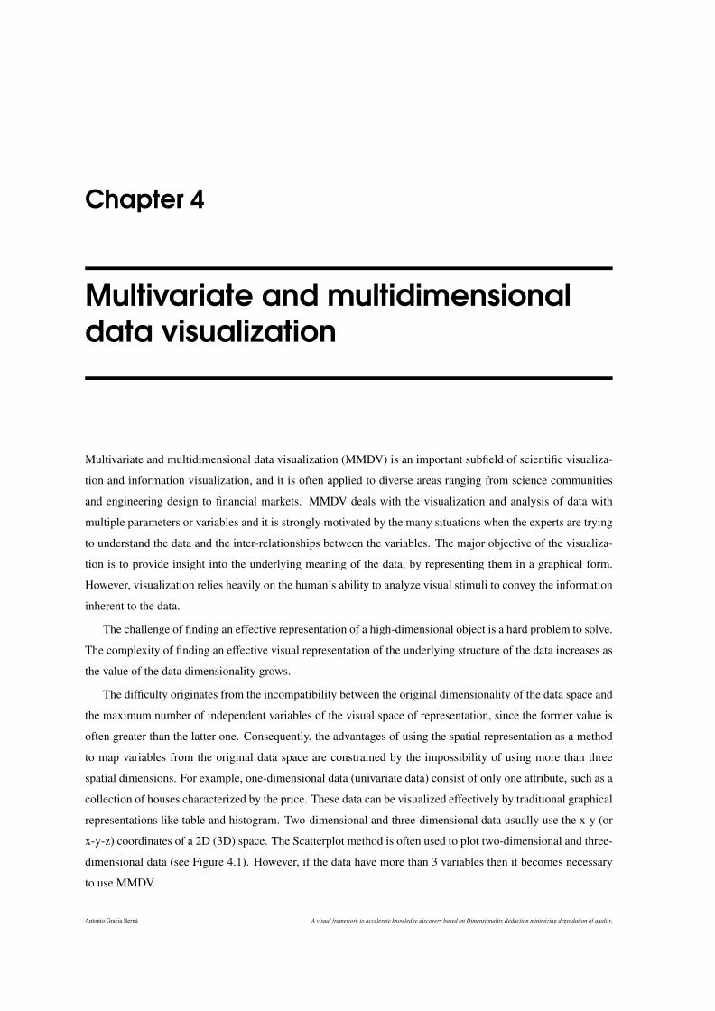
Chapter 4
Multivariate and multidimensionaldata visualization
Multivariate and multidimensional data visualization (MMDV) is an important subfield of scientific visualiza-
tion and information visualization, and it is often applied to diverse areas ranging from science communities
and engineering design to financial markets. MMDV deals with the visualization and analysis of data with
multiple parameters or variables and it is strongly motivated by the many situations when the experts are trying
to understand the data and the inter-relationships between the variables. The major objective of the visualiza-
tion is to provide insight into the underlying meaning of the data, by representing them in a graphical form.
However, visualization relies heavily on the human’s ability to analyze visual stimuli to convey the information
inherent to the data.
The challenge of finding an effective representation of a high-dimensional object is a hard problem to solve.
The complexity of finding an effective visual representation of the underlying structure of the data increases as
the value of the data dimensionality grows.
The difficulty originates from the incompatibility between the original dimensionality of the data space and
the maximum number of independent variables of the visual space of representation, since the former value is
often greater than the latter one. Consequently, the advantages of using the spatial representation as a method
to map variables from the original data space are constrained by the impossibility of using more than three
spatial dimensions. For example, one-dimensional data (univariate data) consist of only one attribute, such as a
collection of houses characterized by the price. These data can be visualized effectively by traditional graphical
representations like table and histogram. Two-dimensional and three-dimensional data usually use the x-y (or
x-y-z) coordinates of a 2D (3D) space. The Scatterplot method is often used to plot two-dimensional and three-
dimensional data (see Figure 4.1). However, if the data have more than 3 variables then it becomes necessary
to use MMDV.
Antonio Gracia Berná A visual framework to accelerate knowledge discovery based on Dimensionality Reduction minimizing degradation of quality.
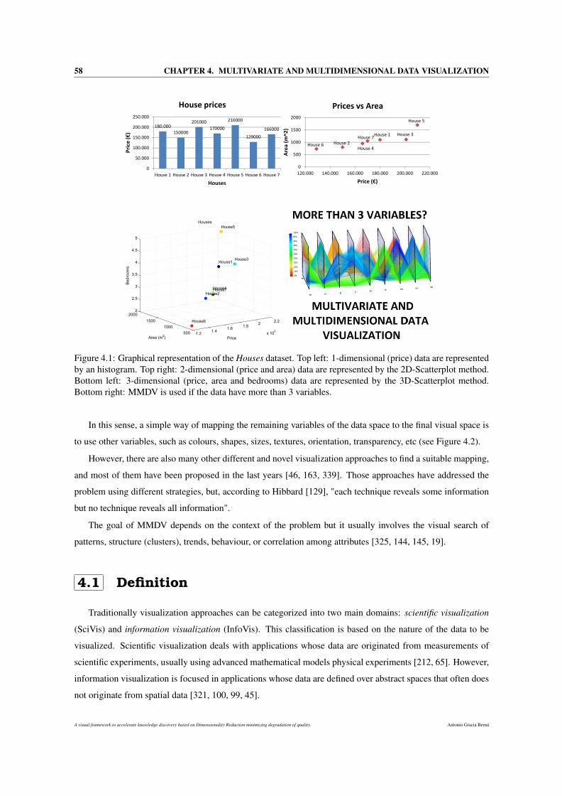
58 CHAPTER 4. MULTIVARIATE AND MULTIDIMENSIONAL DATA VISUALIZATION
1.2 1.4 1.6 1.8 2 2.2
x 1055001000
15002000
2
2.5
3
3.5
4
4.5
5
House3
Price
House5
House1
House7House4House2
Houses
House6
Area (m2)
Bedr
oom
s
Figure 4.1: Graphical representation of the Houses dataset. Top left: 1-dimensional (price) data are representedby an histogram. Top right: 2-dimensional (price and area) data are represented by the 2D-Scatterplot method.Bottom left: 3-dimensional (price, area and bedrooms) data are represented by the 3D-Scatterplot method.Bottom right: MMDV is used if the data have more than 3 variables.
In this sense, a simple way of mapping the remaining variables of the data space to the final visual space is
to use other variables, such as colours, shapes, sizes, textures, orientation, transparency, etc (see Figure 4.2).
However, there are also many other different and novel visualization approaches to find a suitable mapping,
and most of them have been proposed in the last years [46, 163, 339]. Those approaches have addressed the
problem using different strategies, but, according to Hibbard [129], "each technique reveals some information
but no technique reveals all information".
The goal of MMDV depends on the context of the problem but it usually involves the visual search of
patterns, structure (clusters), trends, behaviour, or correlation among attributes [325, 144, 145, 19].
4.1 Definition
Traditionally visualization approaches can be categorized into two main domains: scientific visualization
(SciVis) and information visualization (InfoVis). This classification is based on the nature of the data to be
visualized. Scientific visualization deals with applications whose data are originated from measurements of
scientific experiments, usually using advanced mathematical models physical experiments [212, 65]. However,
information visualization is focused in applications whose data are defined over abstract spaces that often does
not originate from spatial data [321, 100, 99, 45].
A visual framework to accelerate knowledge discovery based on Dimensionality Reduction minimizing degradation of quality. Antonio Gracia Berná
4.1. DEFINITION 59
Figure 4.2: Circos is a visualization tool to facilitate the analysis of genomic data. A: Different colors, shapesand transparencies are used to define the final aspect of the data visualization. B: The data can be arrangedaccording to different sizes and colors (taken from [180]).
The precise definition for both fields and the implications of treating them separately were debated in [248].
Furthermore, Tory and Möller attempted to reduce the ambiguity that the traditional definitions of SciVis and
InfoVis may induce [296]. To do so, the authors suggested the following terminology: continuous model
visualization and discrete model visualization. The former comprises visualizations that deal with continuous
data model (SciVis). The latter includes visualizations that deal with a discrete data model (InfoVis).
4.1.1 Multivariate and Multidimensional data
Words such as ’dimensionality’, ’multidimensional’, and ’multivariate’ are often overused and even mis-
used in the visualization literature. The background of all those definitions is, in fact, the term variable.
An item of data is composed of one or more variables. If that data item is defined by more than one variable
it is called a multivariable data item. Variables can be classified into two different categories: dependent or
independent. Although the definition for both terms varies among engineers, scientists, physicists, etc., two
major definitions are distinguished.
For example, for physicists and statisticians a variable is a physical property of an object, such as mass,
volume, time, etc., whose magnitude can be measured. Here, if a dataset is made up of variables that follow
this definition, the aim is to understand the relationships among the variables. In this dataset, the independent
variables are those manipulated by the experimenter and the dependent variables are directly measured from
the subjects. However, these terms often take a different interpretation in the sense that they are applied in
studies where there is no direct manipulation of independent variables. For example, a statistical experiment
may require one to confirm if males are more inclined to car accidents than females. Here, the independent
variable is the gender and the dependent variables are the statistical data regarding accidents.
Nevertheless, for mathematicians a variable is usually associated with the idea of physical space (a D-
Antonio Gracia Berná A visual framework to accelerate knowledge discovery based on Dimensionality Reduction minimizing degradation of quality.
60 CHAPTER 4. MULTIVARIATE AND MULTIDIMENSIONAL DATA VISUALIZATION
dimensional Euclidean space ℜD) in which an ’unit’ or ’entity’ (e.g. a function) of continuous nature is defined.
A range of coordinate system (for example, polar or cartesian) is used to locate the data within this space. Here,
the dependent variables are used to describe the ’entity’ (or function value) while the independent variables
represent the coordinate system that describes the space in which the ’entity’ is defined. If a dataset is made
up of those kind of variables the aim is to understand how the ’entity’ is defined within the D-dimensional
Euclidean space ℜD.
Therefore, those variables meaning measurement of property are called variate, whilst those variables mean-
ing a coordinate system are referred as dimension.
Multivariate dataset. This kind of dataset has many dependent variables and they might be correlated to
each other. This type of dataset is often associated with discrete data models [8].
Multidimensional dataset. This dataset has many independent variables clearly identified, and one or more
dependent variables associated to them. This type of dataset is often associated with continuous data
models [187].
As multivariate and multidimensional data visualization have been referred as MMDV, From here on out
the acronym MMD is going to be used to refer multivariate and multidimensional data. These terms can
be adopted [138], since a set of multivariate data is in high dimensionality and can possibly be regarded as
multidimensional because the key relationships between the attributes are generally unknown in advance [296,
339].
4.1.2 Visualization pipeline
The visualization pipeline is the process of transforming raw information into a visual form so that users
can interact with [45] (see Figure 4.3). Firstly, the raw information is transformed into an organized canonical
data format. The typical format consists of a dataset in which the rows contain the data samples and the
columns represent the different data attribute values. In this step, the use of DM and clustering techniques can
be useful to gain valuable insight into the data. Secondly, the core of the visualization process is the mapping
of the dataset into a visual representation. Thirdly, the visual form is embedded into views, which display the
visual representation on screen, thus allowing the users to interpret the visualization to recover partially the
information contained in the original data. Finally, users can modify any of the previous steps to adjust the
final visualization, and to draw further conclusions.
4.1.2.1 The underlying mapping process
The second step in the visualization pipeline, visual mapping, is the core of the visualization, that must be
designed carefully. They main goal is to convey the information from the computer to a human. Therefore,
the data are mapped into visual form by a function F, which takes the data as input and produces the visual
A visual framework to accelerate knowledge discovery based on Dimensionality Reduction minimizing degradation of quality. Antonio Gracia Berná
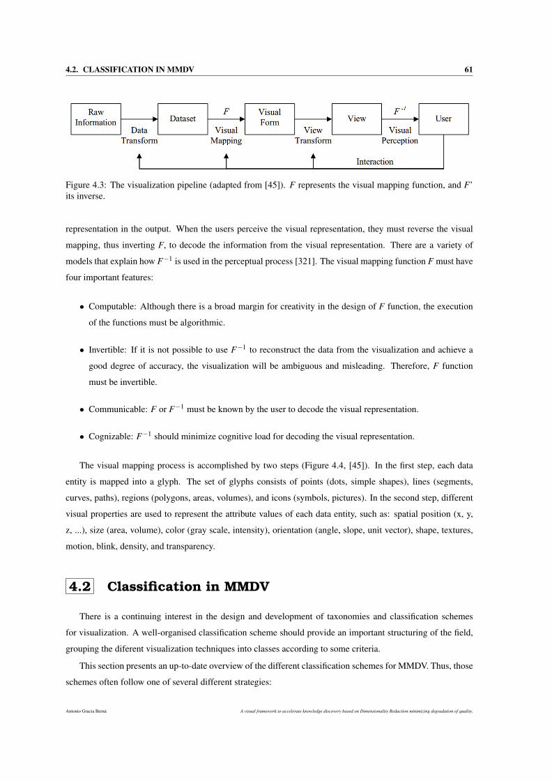
4.2. CLASSIFICATION IN MMDV 61
Figure 4.3: The visualization pipeline (adapted from [45]). F represents the visual mapping function, and F’its inverse.
representation in the output. When the users perceive the visual representation, they must reverse the visual
mapping, thus inverting F, to decode the information from the visual representation. There are a variety of
models that explain how F−1 is used in the perceptual process [321]. The visual mapping function F must have
four important features:
• Computable: Although there is a broad margin for creativity in the design of F function, the execution
of the functions must be algorithmic.
• Invertible: If it is not possible to use F−1 to reconstruct the data from the visualization and achieve a
good degree of accuracy, the visualization will be ambiguous and misleading. Therefore, F function
must be invertible.
• Communicable: F or F−1 must be known by the user to decode the visual representation.
• Cognizable: F−1 should minimize cognitive load for decoding the visual representation.
The visual mapping process is accomplished by two steps (Figure 4.4, [45]). In the first step, each data
entity is mapped into a glyph. The set of glyphs consists of points (dots, simple shapes), lines (segments,
curves, paths), regions (polygons, areas, volumes), and icons (symbols, pictures). In the second step, different
visual properties are used to represent the attribute values of each data entity, such as: spatial position (x, y,
z, ...), size (area, volume), color (gray scale, intensity), orientation (angle, slope, unit vector), shape, textures,
motion, blink, density, and transparency.
4.2 Classification in MMDV
There is a continuing interest in the design and development of taxonomies and classification schemes
for visualization. A well-organised classification scheme should provide an important structuring of the field,
grouping the diferent visualization techniques into classes according to some criteria.
This section presents an up-to-date overview of the different classification schemes for MMDV. Thus, those
schemes often follow one of several different strategies:
Antonio Gracia Berná A visual framework to accelerate knowledge discovery based on Dimensionality Reduction minimizing degradation of quality.
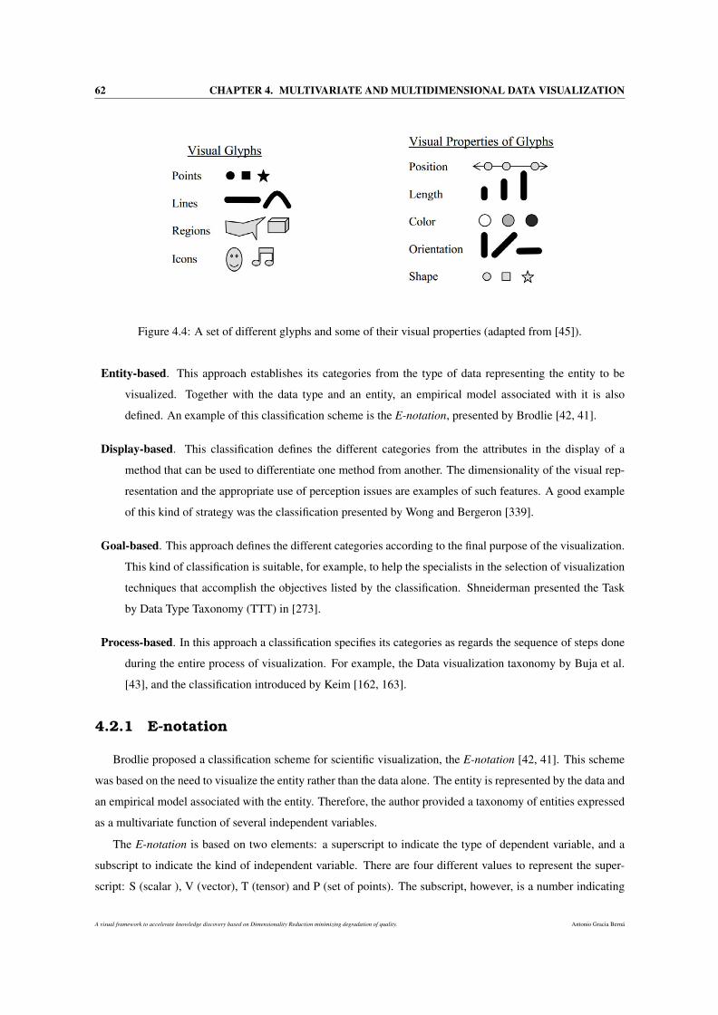
62 CHAPTER 4. MULTIVARIATE AND MULTIDIMENSIONAL DATA VISUALIZATION
Figure 4.4: A set of different glyphs and some of their visual properties (adapted from [45]).
Entity-based. This approach establishes its categories from the type of data representing the entity to be
visualized. Together with the data type and an entity, an empirical model associated with it is also
defined. An example of this classification scheme is the E-notation, presented by Brodlie [42, 41].
Display-based. This classification defines the different categories from the attributes in the display of a
method that can be used to differentiate one method from another. The dimensionality of the visual rep-
resentation and the appropriate use of perception issues are examples of such features. A good example
of this kind of strategy was the classification presented by Wong and Bergeron [339].
Goal-based. This approach defines the different categories according to the final purpose of the visualization.
This kind of classification is suitable, for example, to help the specialists in the selection of visualization
techniques that accomplish the objectives listed by the classification. Shneiderman presented the Task
by Data Type Taxonomy (TTT) in [273].
Process-based. In this approach a classification specifies its categories as regards the sequence of steps done
during the entire process of visualization. For example, the Data visualization taxonomy by Buja et al.
[43], and the classification introduced by Keim [162, 163].
4.2.1 E-notation
Brodlie proposed a classification scheme for scientific visualization, the E-notation [42, 41]. This scheme
was based on the need to visualize the entity rather than the data alone. The entity is represented by the data and
an empirical model associated with the entity. Therefore, the author provided a taxonomy of entities expressed
as a multivariate function of several independent variables.
The E-notation is based on two elements: a superscript to indicate the type of dependent variable, and a
subscript to indicate the kind of independent variable. There are four different values to represent the super-
script: S (scalar ), V (vector), T (tensor) and P (set of points). The subscript, however, is a number indicating
A visual framework to accelerate knowledge discovery based on Dimensionality Reduction minimizing degradation of quality. Antonio Gracia Berná
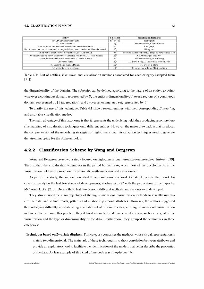
4.2. CLASSIFICATION IN MMDV 63
Entity E-notation Visualization technique1D, 2D, 3D multivariate data EP
1 , EP2 , EP
3 ScatterplotsDD multivariate data EP
D Andrews curves, Chernoff facesA set of points sampled over a continuous 1D scalar domain ES
1 Line graphList of values that can be associated to ranges defined over a continuous 1D scalar domain ES
|1| HistogramSet of values sampled over a continuous 2D scalar domain ES
2 Discrete shaded contouring, image display, surface viewTwo separate sets of values sampled over the same continuous 2D scalar domain E2S
2 Coloured height-field plotScalar field sampled over a continuous 3D scalar domain ES
3 Volume rendering, isosurfacing2D vector fields EV2
2 2D arrow plots; 2D vector field topology plot3D vector fields over a 2D plane EV3
2 3D arrows in plane3D vector fields in a volume EV3
3 3D arrow in a volume, 3D streamlines
Table 4.1: List of entities, E-notation and visualization methods associated for each category (adapted from[71]).
the dimensionality of the domain. The subscript can be defined according to the nature of an entity: a) point-
wise over a continuous domain, represented by D, the entity’s dimensionality; b) over a regions of a continuous
domain, represented by [ ] (aggregation); and c) over an enumerated set, represented by .
To clarify the use of this technique, Table 4.1 shows several entities with their corresponding E-notation,
and a suitable visualization method.
The main advantage of this taxonomy is that it represents the underlying field, thus producing a comprehen-
sive mapping of visualization techniques onto different entities. However, the major drawback is that it reduces
the comprehension of the underlying strategies of high-dimensional visualization techniques used to generate
the visual mapping for the different fields.
4.2.2 Classification Scheme by Wong and Bergeron
Wong and Bergeron presented a study focused on high-dimensional visualization throughout history [339].
They studied the visualization techniques in the period before 1976, when most of the developments in the
visualization field were carried out by physicists, mathematicians and astronomers.
As part of the study, the authors described three main periods of work to date. However, their work fo-
cuses primarily on the last two stages of developments, starting in 1987 with the publication of the paper by
McCormick et al [213]. During those last two periods, different methods and systems were developed.
They also reduced the main objectives of the high-dimensional visualization methods to visually summa-
rize the data, and to find trends, patterns and relationship among attributes. However, the authors suggested
the underlying difficulty in establishing a suitable set of criteria to categorize high-dimensional visualization
methods. To overcome this problem, they defined attempted to define several criteria, such as the goal of the
visualization and the type or dimensionality of the data. Furthermore, they grouped the techniques in three
categories:
Techniques based on 2-variate displays. This category comprises the methods whose visual representation is
mainly two-dimensional. The main task of these techniques is to show correlation between attributes and
provide an exploratory tool to facilitate the identification of the models that better describe the properties
of the data. A clear example of this kind of methods is scatterplot matrix.
Antonio Gracia Berná A visual framework to accelerate knowledge discovery based on Dimensionality Reduction minimizing degradation of quality.
64 CHAPTER 4. MULTIVARIATE AND MULTIDIMENSIONAL DATA VISUALIZATION
Multivariate displays techniques. The majority of the visualization methods belong to this category, and
their main features are: the generation of coloured and complex images, a high-speed in the output
displays to support effective interaction and the ability to deal with datasets more complex than the ones
tackled by methods in the first category. Furthermore, this category is divided into five sub-categories:
brushing, panel matrix, iconography, hierarchical displays, and non-Cartesian displays.
Animation based techniques. The last category comprises the methods that use animation to enhance the
presentation of the data.
Three major contributions were made by the authors. Firstly, they introduced a classification scheme for
MMDV techniques. Secondly, they compiled a useful description of several techniques, concepts, and software
systems related to the MMDV field. Finally, they conducted a historic overview, showing the evolution of the
field over a 30 year period (1977-1997).
However, three fundamental deficiencies are also highlighted: the first drawback is that the authors do not
distinguish interaction techniques, concepts, tools, visual techniques or software systems. Furthermore, the
brushing sub-category describes only one method. The third shortcoming is that there is a possible overlap
between a category and a sub-category (techniques based on 2-variate displays and non-Cartesian displays,
respectively), since the parallel coordinates technique fits into both definitions.
4.2.3 Task by Data Type Taxonomy
The Task by (Data) Type Taxonomy (TTT) was presented by Shneiderman [273] and motivated by a basic
principle called the Visual Information Seeking Mantra: overview first, zoom and filter, then details-on-demand.
The main feature of this taxonomy is that it considers the different visualization methods under two aspects:
the data type and the task-domain information objects. In this taxonomy, the data is a collection of items with
different types of attributes: 1D, 2D, 3D, temporal, multidimensional, tree, and network data. As regards the
second aspect, although only seven basic tasks are described: overview, zoom, filter, details-on-demand, relate,
history, and extract; Shneiderman suggested that the list should be extended.
This taxonomy presents several advantages and drawbacks. For example, the sub-categories of TTT cover
most of the InfoVis field, making easier the understanding of the area. However, many times this coverage is
not broad enough to include several high-dimensional subfields.
Another drawback of the taxonomy is that it does not distinguish between methods and software systems,
e.g. 3D scatterplot is often classified together with Spotfire.
4.2.4 Data Visualization Taxonomy
Buja en al. presented a process-based taxonomy for data visualization [43]. It is divided into two different
categories: rendering and manipulation. It is worth mentioning that this taxonomy is focused on classifying
A visual framework to accelerate knowledge discovery based on Dimensionality Reduction minimizing degradation of quality. Antonio Gracia Berná
4.2. CLASSIFICATION IN MMDV 65
aspects of a visualization method, instead of classifying the method as a whole. This could lead a technique to
be fitted into several and different subtypes in each category of the taxonomy.
The first category, rendering, provides information and describes the features of a static image. It is divided
into three subtypes:
Traces. The data samples are mapped to functions of a real parameter (e.g. Andrews curves and parallel
coordinates).
Scatterplots. The data samples are mapped to location of data-points in two or three-dimensional spaces (e.g.
2D and 3D Scatterplot).
Glyphs. The data samples are mapped to abstract symbols whose features represent the attributes of the data
samples. (e.g. stars, trees and castles, Chernoff faces and shape coding).
However, the authors gave much consideration to the interaction with the visualization in order to accom-
plish a meaningful data exploration. The use of the visualization enhanced with interaction options to analyze
the data and acquire knowledge comes from a methodology, Exploratory Data Analysis (EDA), presented by
Tukey [300]. EDA has had a great influence on subsequent methods for visualization and statistical analysis.
The taxonomy introduced by Buja et al. is focused on the manipulation category, that represents the process of
interaction mentioned above. This category is organized in terms of three basic search tasks:
Finding Gestalt. This task usually involves the search for structures in the data and any kind of relation-
ship between attributes. For example, to find local or global linearities and nonlinearities; to identify
discontinuities; or to locate clusters, outliers, and unusual groups.
Posing queries. This second task attempts to make sense out the results (e.g. views) obtained in the first
task (finding Gestalt), using a graphical query posed on these views. For example, the use of brushing in
linked views.
Making comparisons. This stage performs comparisons of several views of the data (e.g. similar plots of
data) produced in the finding Gestalt task. The aim is to make easier meaningful comparisons. This
process is called arranging views. An example of this task is carried out by Scatterplot matrix technique.
One of the advantages of this taxonomy is its innovative character, since it contains three subcategories for
the manipulation category. This allows a high degree of abstraction, as well as the comparison of the different
techniques according to their capabilities when dealing with the three manipulation processes. Furthermore,
The Buja et al. taxonomy uses of the Gestalt theory as the basis to describe the steps of the manipulation
(interaction) part of a visualization.
However, this taxonomy also presents some drawbacks. The rendering category does not have sub-categories
enough to describe precisely several visualization techniques, for instance dimension stacking method or pixel-
oriented methods. Specifically, the scatterplots sub-category has a great limitation, since it merely groups and
describes one method, the scatterplot.
Antonio Gracia Berná A visual framework to accelerate knowledge discovery based on Dimensionality Reduction minimizing degradation of quality.
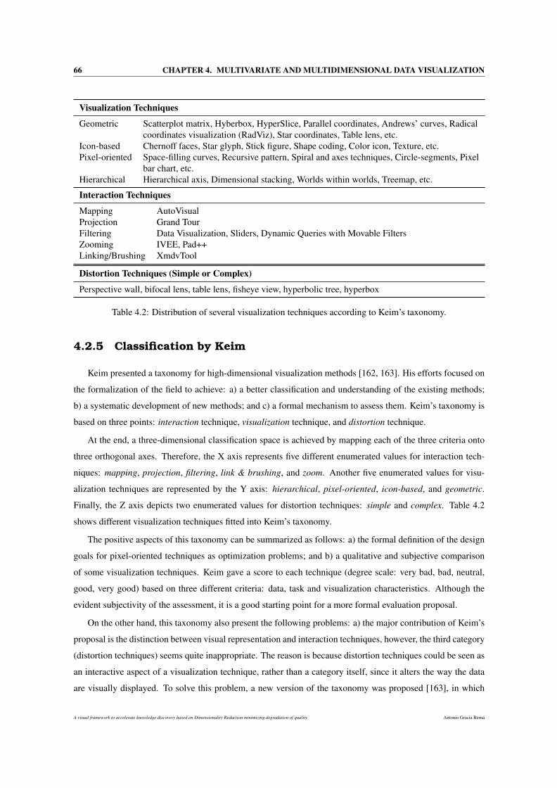
66 CHAPTER 4. MULTIVARIATE AND MULTIDIMENSIONAL DATA VISUALIZATION
Visualization Techniques
Geometric Scatterplot matrix, Hyberbox, HyperSlice, Parallel coordinates, Andrews’ curves, Radicalcoordinates visualization (RadViz), Star coordinates, Table lens, etc.
Icon-based Chernoff faces, Star glyph, Stick figure, Shape coding, Color icon, Texture, etc.Pixel-oriented Space-filling curves, Recursive pattern, Spiral and axes techniques, Circle-segments, Pixel
bar chart, etc.Hierarchical Hierarchical axis, Dimensional stacking, Worlds within worlds, Treemap, etc.
Interaction Techniques
Mapping AutoVisualProjection Grand TourFiltering Data Visualization, Sliders, Dynamic Queries with Movable FiltersZooming IVEE, Pad++Linking/Brushing XmdvTool
Distortion Techniques (Simple or Complex)
Perspective wall, bifocal lens, table lens, fisheye view, hyperbolic tree, hyperbox
Table 4.2: Distribution of several visualization techniques according to Keim’s taxonomy.
4.2.5 Classification by Keim
Keim presented a taxonomy for high-dimensional visualization methods [162, 163]. His efforts focused on
the formalization of the field to achieve: a) a better classification and understanding of the existing methods;
b) a systematic development of new methods; and c) a formal mechanism to assess them. Keim’s taxonomy is
based on three points: interaction technique, visualization technique, and distortion technique.
At the end, a three-dimensional classification space is achieved by mapping each of the three criteria onto
three orthogonal axes. Therefore, the X axis represents five different enumerated values for interaction tech-
niques: mapping, projection, filtering, link & brushing, and zoom. Another five enumerated values for visu-
alization techniques are represented by the Y axis: hierarchical, pixel-oriented, icon-based, and geometric.
Finally, the Z axis depicts two enumerated values for distortion techniques: simple and complex. Table 4.2
shows different visualization techniques fitted into Keim’s taxonomy.
The positive aspects of this taxonomy can be summarized as follows: a) the formal definition of the design
goals for pixel-oriented techniques as optimization problems; and b) a qualitative and subjective comparison
of some visualization techniques. Keim gave a score to each technique (degree scale: very bad, bad, neutral,
good, very good) based on three different criteria: data, task and visualization characteristics. Although the
evident subjectivity of the assessment, it is a good starting point for a more formal evaluation proposal.
On the other hand, this taxonomy also present the following problems: a) the major contribution of Keim’s
proposal is the distinction between visual representation and interaction techniques, however, the third category
(distortion techniques) seems quite inappropriate. The reason is because distortion techniques could be seen as
an interactive aspect of a visualization technique, rather than a category itself, since it alters the way the data
are visually displayed. To solve this problem, a new version of the taxonomy was proposed [163], in which
A visual framework to accelerate knowledge discovery based on Dimensionality Reduction minimizing degradation of quality. Antonio Gracia Berná
4.3. MMDV TECHNIQUES 67
the interaction category and the distortion category were unified into one single category and a new category
was also introduced (data type to be visualized); b) the absence of a formal definition that describes the main
features of each category. Instead, the author provided several examples of different techniques that could be
classified into a specific category.
4.3 MMDV techniques
This section presents some of the most applied and reviewed MMDV techniques in the literature. To
facilitate the reading and to make more understandable the nature and kind of the techniques, they are presented
by following one of the previous taxonomies.
Specifically, the taxonomy introduced by Keim is used (Section 4.2.5). The main reason is the simplicity
and intuition in which Keim organizes the different visualization techniques, according to the overal approaches
taken to generate resulting visualizations. Thus, in one of his three different ways of classification, Keim
grouped MMDV techniques into five broad categories: geometric, pixel-oriented, hierarchical and icon-based.
4.3.1 Geometric projection
These techniques carry out informative projections and transformations of MMD [165]. Geometric projec-
tion techniques often map the attributes to a Cartesian plane, such as scatterplot or star coordinates, or more
innovatively to an arbitrary space, as parallel coordinates.
This category comprises techniques that are good for detecting outliers and correlation amongst different
attributes. Furthermore, those techniques are also able to handle huge datasets when appropriate interaction
techniques are included [159]. Internally, all attributes are treated equally but, in fact, they may not be perceived
equally [278]. A point to take into account is that the order in which the axes are visualized could affect
our perception [165], therefore an optimum rearrangement must be done or the visual representation will be
biased. Another problem is related to the visual cluttering and the record overlapping [165] produced by the
high dimensionality or the large size of the data. This could, indeed, limit the user’s perception capabilities.
4.3.1.1 Scatterplot matrix
Traditionally, the scatterplot technique has been used for bivariate data in which two attributes are projected
along the x-y axes of the Cartesian coordinates. Scatterplot matrix [123] is an extension for MMD where a
collection of scatterplots is arranged in a matrix simultaneously to provide correlation information among the
different attributes (see Figure 4.5). Formally, given a set of variables L1, L2, ..., LD, the scatterplot matrix
contains all the pairwise scatterplots of the variables on a single page in a matrix format. In other words, if a
dataset have D variables, the scatterplot matrix will have D rows, D columns, and the ith row and jth column
of the matrix is a plot of Li versus L j.
Antonio Gracia Berná A visual framework to accelerate knowledge discovery based on Dimensionality Reduction minimizing degradation of quality.
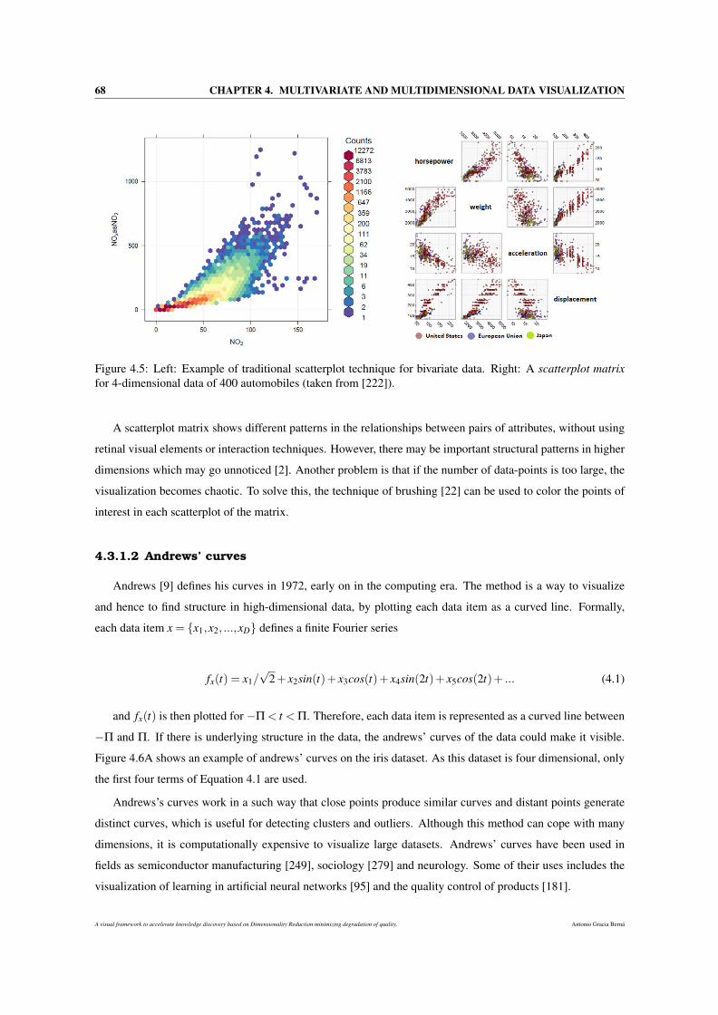
68 CHAPTER 4. MULTIVARIATE AND MULTIDIMENSIONAL DATA VISUALIZATION
Figure 4.5: Left: Example of traditional scatterplot technique for bivariate data. Right: A scatterplot matrixfor 4-dimensional data of 400 automobiles (taken from [222]).
A scatterplot matrix shows different patterns in the relationships between pairs of attributes, without using
retinal visual elements or interaction techniques. However, there may be important structural patterns in higher
dimensions which may go unnoticed [2]. Another problem is that if the number of data-points is too large, the
visualization becomes chaotic. To solve this, the technique of brushing [22] can be used to color the points of
interest in each scatterplot of the matrix.
4.3.1.2 Andrews’ curves
Andrews [9] defines his curves in 1972, early on in the computing era. The method is a way to visualize
and hence to find structure in high-dimensional data, by plotting each data item as a curved line. Formally,
each data item x = x1,x2, ...,xD defines a finite Fourier series
fx(t) = x1/√
2+ x2sin(t)+ x3cos(t)+ x4sin(2t)+ x5cos(2t)+ ... (4.1)
and fx(t) is then plotted for −Π < t < Π. Therefore, each data item is represented as a curved line between
−Π and Π. If there is underlying structure in the data, the andrews’ curves of the data could make it visible.
Figure 4.6A shows an example of andrews’ curves on the iris dataset. As this dataset is four dimensional, only
the first four terms of Equation 4.1 are used.
Andrews’s curves work in a such way that close points produce similar curves and distant points generate
distinct curves, which is useful for detecting clusters and outliers. Although this method can cope with many
dimensions, it is computationally expensive to visualize large datasets. Andrews’ curves have been used in
fields as semiconductor manufacturing [249], sociology [279] and neurology. Some of their uses includes the
visualization of learning in artificial neural networks [95] and the quality control of products [181].
A visual framework to accelerate knowledge discovery based on Dimensionality Reduction minimizing degradation of quality. Antonio Gracia Berná
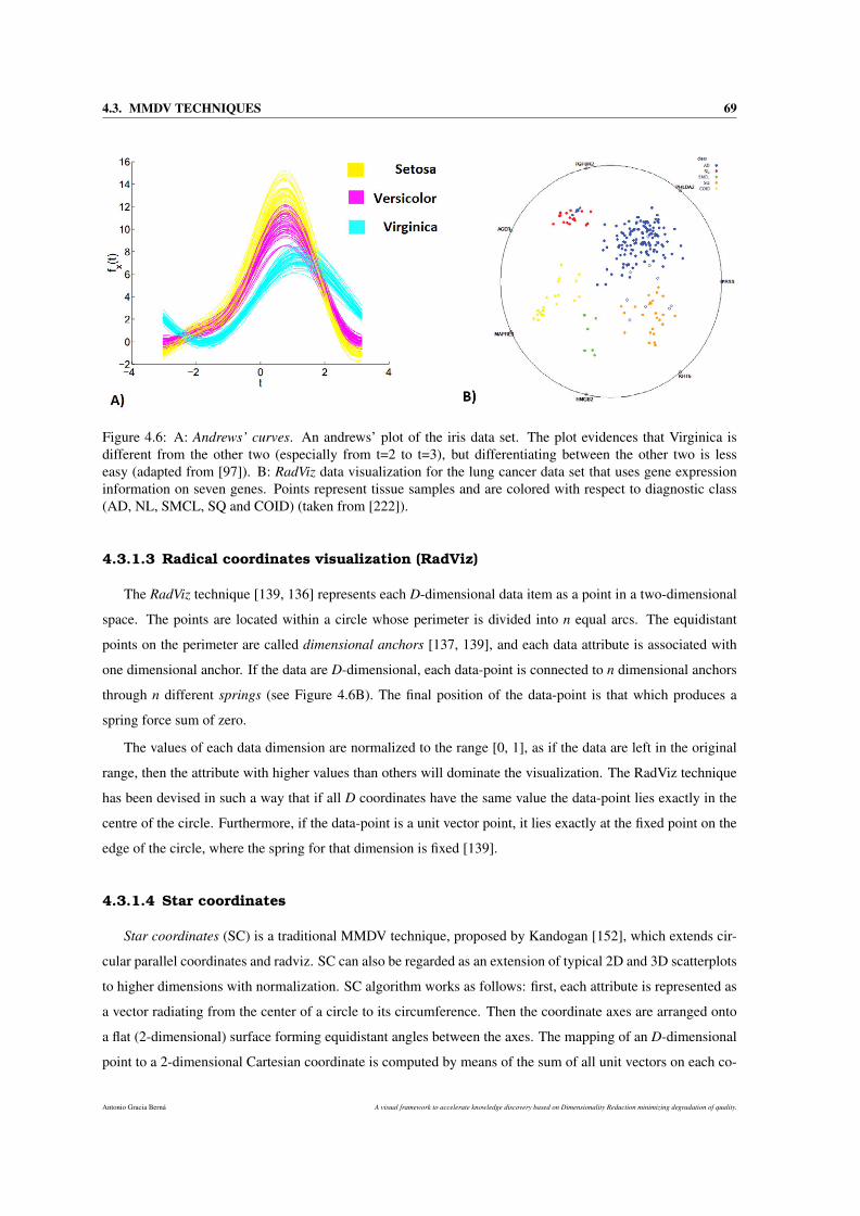
4.3. MMDV TECHNIQUES 69
Figure 4.6: A: Andrews’ curves. An andrews’ plot of the iris data set. The plot evidences that Virginica isdifferent from the other two (especially from t=2 to t=3), but differentiating between the other two is lesseasy (adapted from [97]). B: RadViz data visualization for the lung cancer data set that uses gene expressioninformation on seven genes. Points represent tissue samples and are colored with respect to diagnostic class(AD, NL, SMCL, SQ and COID) (taken from [222]).
4.3.1.3 Radical coordinates visualization (RadViz)
The RadViz technique [139, 136] represents each D-dimensional data item as a point in a two-dimensional
space. The points are located within a circle whose perimeter is divided into n equal arcs. The equidistant
points on the perimeter are called dimensional anchors [137, 139], and each data attribute is associated with
one dimensional anchor. If the data are D-dimensional, each data-point is connected to n dimensional anchors
through n different springs (see Figure 4.6B). The final position of the data-point is that which produces a
spring force sum of zero.
The values of each data dimension are normalized to the range [0, 1], as if the data are left in the original
range, then the attribute with higher values than others will dominate the visualization. The RadViz technique
has been devised in such a way that if all D coordinates have the same value the data-point lies exactly in the
centre of the circle. Furthermore, if the data-point is a unit vector point, it lies exactly at the fixed point on the
edge of the circle, where the spring for that dimension is fixed [139].
4.3.1.4 Star coordinates
Star coordinates (SC) is a traditional MMDV technique, proposed by Kandogan [152], which extends cir-
cular parallel coordinates and radviz. SC can also be regarded as an extension of typical 2D and 3D scatterplots
to higher dimensions with normalization. SC algorithm works as follows: first, each attribute is represented as
a vector radiating from the center of a circle to its circumference. Then the coordinate axes are arranged onto
a flat (2-dimensional) surface forming equidistant angles between the axes. The mapping of an D-dimensional
point to a 2-dimensional Cartesian coordinate is computed by means of the sum of all unit vectors on each co-
Antonio Gracia Berná A visual framework to accelerate knowledge discovery based on Dimensionality Reduction minimizing degradation of quality.
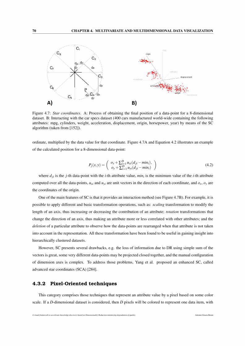
70 CHAPTER 4. MULTIVARIATE AND MULTIDIMENSIONAL DATA VISUALIZATION
Figure 4.7: Star coordinates. A: Process of obtaining the final position of a data-point for a 8-dimensionaldataset. B: Interacting with the car specs dataset (400 cars manufactured world-wide containing the followingattributes: mpg, cylinders, weight, acceleration, displacement, origin, horsepower, year) by means of the SCalgorithm (taken from [152]).
ordinate, multiplied by the data value for that coordinate. Figure 4.7A and Equation 4.2 illustrates an example
of the calculated position for a 8-dimensional data-point:
Pj(x,y) =(
ox +∑Di=1 uxi(d ji −mini),
oy +∑Di=1 uyi(d ji −mini)
)(4.2)
where d ji is the j-th data-point with the i-th attribute value, mini is the minimum value of the i-th attribute
computed over all the data-points, uxi and uyi are unit vectors in the direction of each coordinate, and ox, oy are
the coordinates of the origin.
One of the main features of SC is that it provides an interaction method (see Figure 4.7B). For example, it is
possible to apply different and basic transformation operations, such as: scaling transformation to modify the
length of an axis, thus increasing or decreasing the contribution of an attribute; rotation transformations that
change the direction of an axis, thus making an attribute more or less correlated with other attributes; and the
deletion of a particular attribute to observe how the data-points are rearranged when that attribute is not taken
into account in the representation. All these transformation have been found to be useful in gaining insight into
hierarchically clustered datasets.
However, SC presents several drawbacks, e.g. the loss of information due to DR using simple sum of the
vectors is great, some very different data-points may be projected closed together, and the manual configuration
of dimension axes is complex. To address those problems, Yang et al. proposed an enhanced SC, called
advanced star coordinates (SCA) [284].
4.3.2 Pixel-Oriented techniques
This category comprises those techniques that represent an attribute value by a pixel based on some color
scale. If a D-dimensional dataset is considered, then D pixels will be colored to represent one data item, with
A visual framework to accelerate knowledge discovery based on Dimensionality Reduction minimizing degradation of quality. Antonio Gracia Berná
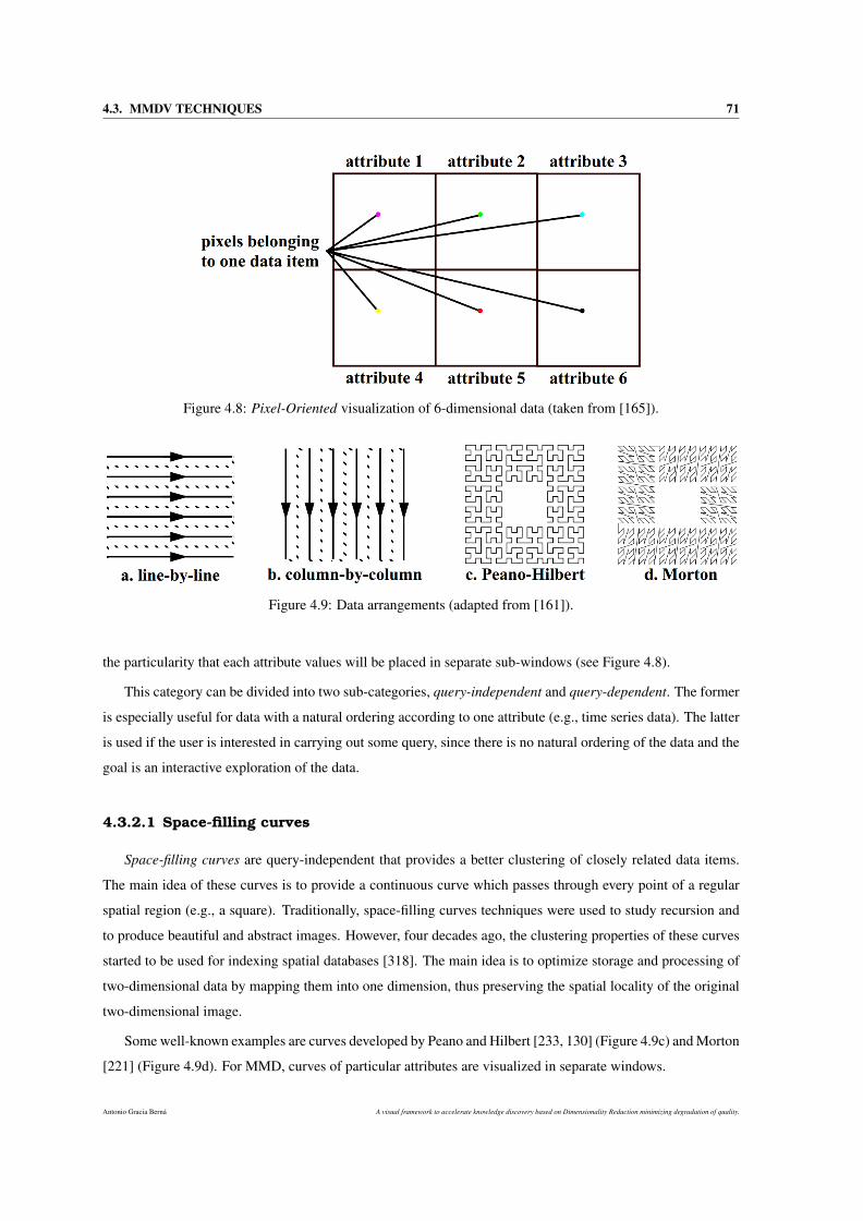
4.3. MMDV TECHNIQUES 71
Figure 4.8: Pixel-Oriented visualization of 6-dimensional data (taken from [165]).
Figure 4.9: Data arrangements (adapted from [161]).
the particularity that each attribute values will be placed in separate sub-windows (see Figure 4.8).
This category can be divided into two sub-categories, query-independent and query-dependent. The former
is especially useful for data with a natural ordering according to one attribute (e.g., time series data). The latter
is used if the user is interested in carrying out some query, since there is no natural ordering of the data and the
goal is an interactive exploration of the data.
4.3.2.1 Space-filling curves
Space-filling curves are query-independent that provides a better clustering of closely related data items.
The main idea of these curves is to provide a continuous curve which passes through every point of a regular
spatial region (e.g., a square). Traditionally, space-filling curves techniques were used to study recursion and
to produce beautiful and abstract images. However, four decades ago, the clustering properties of these curves
started to be used for indexing spatial databases [318]. The main idea is to optimize storage and processing of
two-dimensional data by mapping them into one dimension, thus preserving the spatial locality of the original
two-dimensional image.
Some well-known examples are curves developed by Peano and Hilbert [233, 130] (Figure 4.9c) and Morton
[221] (Figure 4.9d). For MMD, curves of particular attributes are visualized in separate windows.
Antonio Gracia Berná A visual framework to accelerate knowledge discovery based on Dimensionality Reduction minimizing degradation of quality.
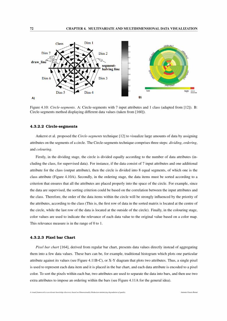
72 CHAPTER 4. MULTIVARIATE AND MULTIDIMENSIONAL DATA VISUALIZATION
Figure 4.10: Circle-segments. A: Circle-segments with 7 input attributes and 1 class (adapted from [12]). B:Circle-segments method displaying different data values (taken from [160]).
4.3.2.2 Circle-segments
Ankerst et al. proposed the Circle-segments technique [12] to visualize large amounts of data by assigning
attributes on the segments of a circle. The Circle-segments technique comprises three steps: dividing, ordering,
and colouring.
Firstly, in the dividing stage, the circle is divided equally according to the number of data attributes (in-
cluding the class, for supervised data). For instance, if the data consist of 7 input attributes and one additional
attribute for the class (output attribute), then the circle is divided into 8 equal segments, of which one is the
class attribute (Figure 4.10A). Secondly, in the ordering stage, the data items must be sorted according to a
criterion that ensures that all the attributes are placed properly into the space of the circle. For example, since
the data are supervised, the sorting criterion could be based on the correlation between the input attributes and
the class. Therefore, the order of the data items within the circle will be strongly influenced by the priority of
the attributes, according to the class (This is, the first row of data in the sorted matrix is located at the centre of
the circle, while the last row of the data is located at the outside of the circle). Finally, in the colouring stage,
color values are used to indicate the relevance of each data value to the original value based on a color map.
This relevance measure is in the range of 0 to 1.
4.3.2.3 Pixel bar Chart
Pixel bar chart [164], derived from regular bar chart, presents data values directly instead of aggregating
them into a few data values. These bars can be, for example, traditional histogram which plots one particular
attribute against its values (see Figure 4.11B-C), or X-Y diagram that plots two attributes. Thus, a single pixel
is used to represent each data item and it is placed in the bar chart, and each data attribute is encoded to a pixel
color. To sort the pixels within each bar, two attributes are used to separate the data into bars, and then use two
extra attributes to impose an ordering within the bars (see Figure 4.11A for the general idea).
A visual framework to accelerate knowledge discovery based on Dimensionality Reduction minimizing degradation of quality. Antonio Gracia Berná
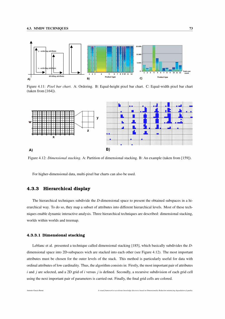
4.3. MMDV TECHNIQUES 73
Figure 4.11: Pixel bar chart. A: Ordering. B: Equal-height pixel bar chart. C: Equal-width pixel bar chart(taken from [164]).
Figure 4.12: Dimensional stacking. A: Partition of dimensional stacking. B: An example (taken from [159]).
For higher-dimensional data, multi-pixel bar charts can also be used.
4.3.3 Hierarchical display
The hierarchical techniques subdivide the D-dimensional space to present the obtained subspaces in a hi-
erarchical way. To do so, they map a subset of attributes into different hierarchical levels. Most of these tech-
niques enable dynamic interactive analysis. Three hierarchical techniques are described: dimensional stacking,
worlds within worlds and treemap.
4.3.3.1 Dimensional stacking
Leblanc et al. presented a technique called dimensional stacking [185], which basically subdivides the D-
dimensional space into 2D-subspaces wich are stacked into each other (see Figure 4.12). The most important
attributes must be chosen for the outer levels of the stack. This method is particularly useful for data with
ordinal attributes of low cardinality. Thus, the algorithm consists in: Firstly, the most important pair of attributes
i and j are selected, and a 2D grid of i versus j is defined. Secondly, a recursive subdivision of each grid cell
using the next important pair of parameters is carried out. Finally, the final grid cells are colored.
Antonio Gracia Berná A visual framework to accelerate knowledge discovery based on Dimensionality Reduction minimizing degradation of quality.
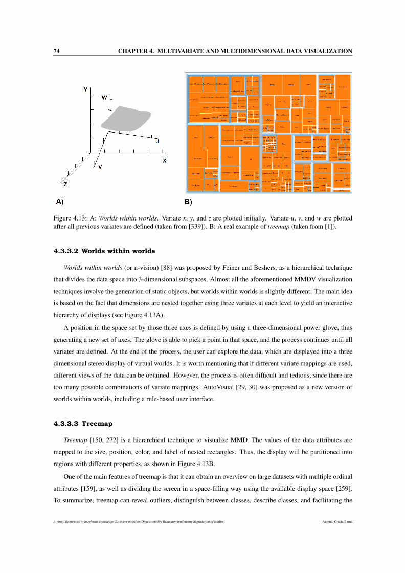
74 CHAPTER 4. MULTIVARIATE AND MULTIDIMENSIONAL DATA VISUALIZATION
Figure 4.13: A: Worlds within worlds. Variate x, y, and z are plotted initially. Variate u, v, and w are plottedafter all previous variates are defined (taken from [339]). B: A real example of treemap (taken from [1]).
4.3.3.2 Worlds within worlds
Worlds within worlds (or n-vision) [88] was proposed by Feiner and Beshers, as a hierarchical technique
that divides the data space into 3-dimensional subspaces. Almost all the aforementioned MMDV visualization
techniques involve the generation of static objects, but worlds within worlds is slightly different. The main idea
is based on the fact that dimensions are nested together using three variates at each level to yield an interactive
hierarchy of displays (see Figure 4.13A).
A position in the space set by those three axes is defined by using a three-dimensional power glove, thus
generating a new set of axes. The glove is able to pick a point in that space, and the process continues until all
variates are defined. At the end of the process, the user can explore the data, which are displayed into a three
dimensional stereo display of virtual worlds. It is worth mentioning that if different variate mappings are used,
different views of the data can be obtained. However, the process is often difficult and tedious, since there are
too many possible combinations of variate mappings. AutoVisual [29, 30] was proposed as a new version of
worlds within worlds, including a rule-based user interface.
4.3.3.3 Treemap
Treemap [150, 272] is a hierarchical technique to visualize MMD. The values of the data attributes are
mapped to the size, position, color, and label of nested rectangles. Thus, the display will be partitioned into
regions with different properties, as shown in Figure 4.13B.
One of the main features of treemap is that it can obtain an overview on large datasets with multiple ordinal
attributes [159], as well as dividing the screen in a space-filling way using the available display space [259].
To summarize, treemap can reveal outliers, distinguish between classes, describe classes, and facilitating the
A visual framework to accelerate knowledge discovery based on Dimensionality Reduction minimizing degradation of quality. Antonio Gracia Berná
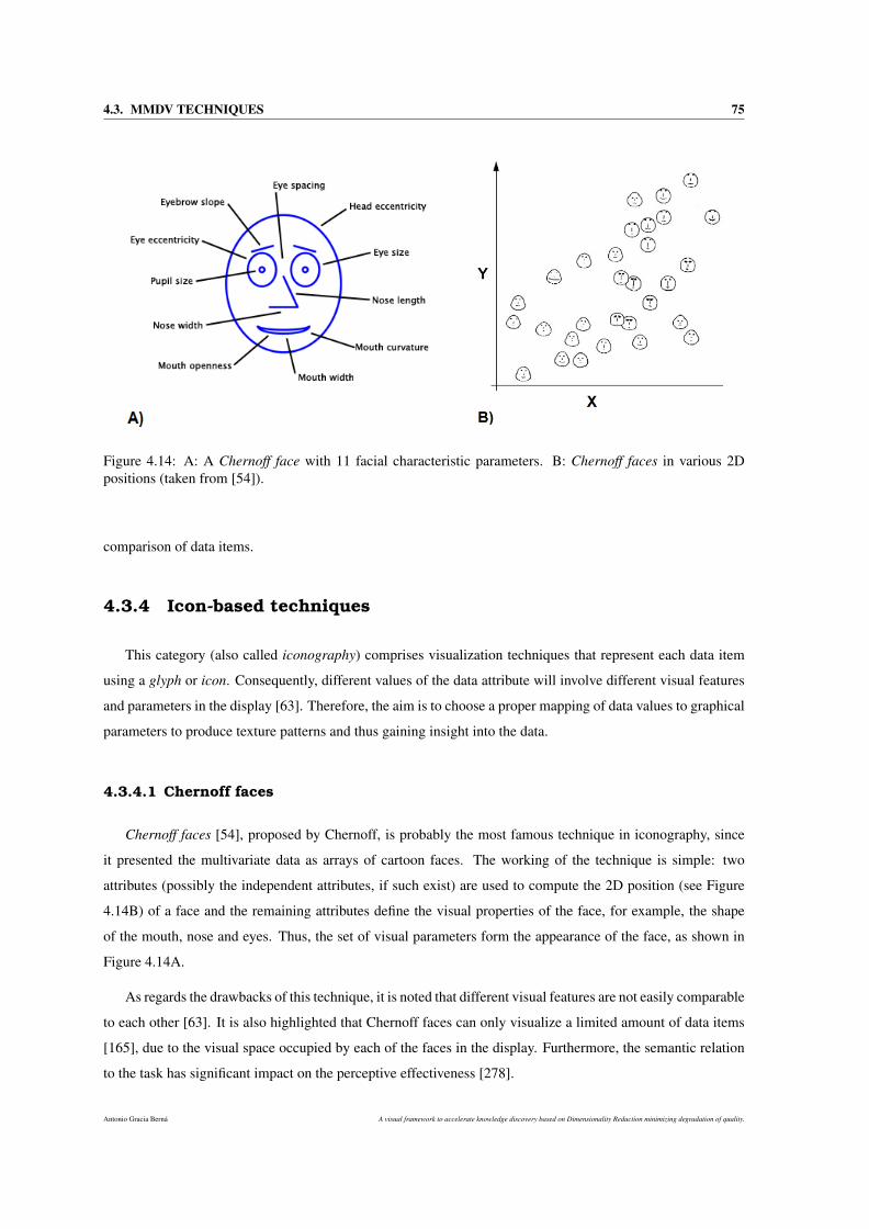
4.3. MMDV TECHNIQUES 75
Figure 4.14: A: A Chernoff face with 11 facial characteristic parameters. B: Chernoff faces in various 2Dpositions (taken from [54]).
comparison of data items.
4.3.4 Icon-based techniques
This category (also called iconography) comprises visualization techniques that represent each data item
using a glyph or icon. Consequently, different values of the data attribute will involve different visual features
and parameters in the display [63]. Therefore, the aim is to choose a proper mapping of data values to graphical
parameters to produce texture patterns and thus gaining insight into the data.
4.3.4.1 Chernoff faces
Chernoff faces [54], proposed by Chernoff, is probably the most famous technique in iconography, since
it presented the multivariate data as arrays of cartoon faces. The working of the technique is simple: two
attributes (possibly the independent attributes, if such exist) are used to compute the 2D position (see Figure
4.14B) of a face and the remaining attributes define the visual properties of the face, for example, the shape
of the mouth, nose and eyes. Thus, the set of visual parameters form the appearance of the face, as shown in
Figure 4.14A.
As regards the drawbacks of this technique, it is noted that different visual features are not easily comparable
to each other [63]. It is also highlighted that Chernoff faces can only visualize a limited amount of data items
[165], due to the visual space occupied by each of the faces in the display. Furthermore, the semantic relation
to the task has significant impact on the perceptive effectiveness [278].
Antonio Gracia Berná A visual framework to accelerate knowledge discovery based on Dimensionality Reduction minimizing degradation of quality.
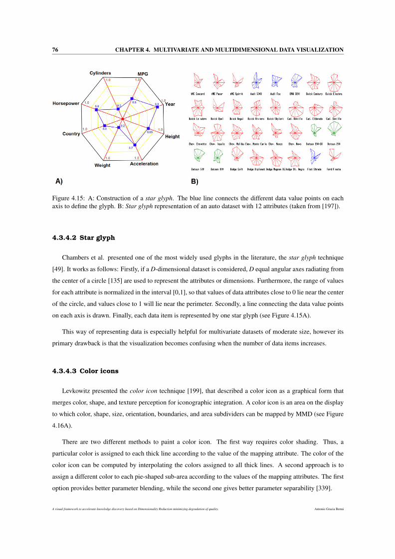
76 CHAPTER 4. MULTIVARIATE AND MULTIDIMENSIONAL DATA VISUALIZATION
Figure 4.15: A: Construction of a star glyph. The blue line connects the different data value points on eachaxis to define the glyph. B: Star glyph representation of an auto dataset with 12 attributes (taken from [197]).
4.3.4.2 Star glyph
Chambers et al. presented one of the most widely used glyphs in the literature, the star glyph technique
[49]. It works as follows: Firstly, if a D-dimensional dataset is considered, D equal angular axes radiating from
the center of a circle [135] are used to represent the attributes or dimensions. Furthermore, the range of values
for each attribute is normalized in the interval [0,1], so that values of data attributes close to 0 lie near the center
of the circle, and values close to 1 will lie near the perimeter. Secondly, a line connecting the data value points
on each axis is drawn. Finally, each data item is represented by one star glyph (see Figure 4.15A).
This way of representing data is especially helpful for multivariate datasets of moderate size, however its
primary drawback is that the visualization becomes confusing when the number of data items increases.
4.3.4.3 Color icons
Levkowitz presented the color icon technique [199], that described a color icon as a graphical form that
merges color, shape, and texture perception for iconographic integration. A color icon is an area on the display
to which color, shape, size, orientation, boundaries, and area subdividers can be mapped by MMD (see Figure
4.16A).
There are two different methods to paint a color icon. The first way requires color shading. Thus, a
particular color is assigned to each thick line according to the value of the mapping attribute. The color of the
color icon can be computed by interpolating the colors assigned to all thick lines. A second approach is to
assign a different color to each pie-shaped sub-area according to the values of the mapping attributes. The first
option provides better parameter blending, while the second one gives better parameter separability [339].
A visual framework to accelerate knowledge discovery based on Dimensionality Reduction minimizing degradation of quality. Antonio Gracia Berná
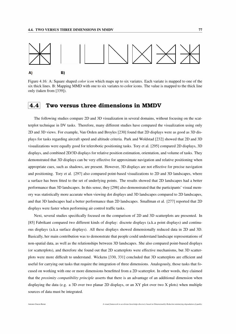
4.4. TWO VERSUS THREE DIMENSIONS IN MMDV 77
Figure 4.16: A: Square shaped color icon which maps up to six variates. Each variate is mapped to one of thesix thick lines. B: Mapping MMD with one to six variates to color icons. The value is mapped to the thick lineonly (taken from [339]).
4.4 Two versus three dimensions in MMDV
The following studies compare 2D and 3D visualization in several domains, without focusing on the scat-
terplot technique in DV tasks. Therefore, many different studies have compared the visualization using only
2D and 3D views. For example, Van Orden and Broyles [230] found that 2D displays were as good as 3D dis-
plays for tasks regarding aircraft speed and altitude criteria. Park and Woldstad [232] showed that 2D and 3D
visualizations were equally good for telerobotic positioning tasks. Tory et al. [295] compared 2D displays, 3D
displays, and combined 2D/3D displays for relative position estimation, orientation, and volume of tasks. They
demonstrated that 3D displays can be very effective for approximate navigation and relative positioning when
appropriate cues, such as shadows, are present. However, 3D displays are not effective for precise navigation
and positioning. Tory et al. [297] also compared point-based visualizations to 2D and 3D landscapes, where
a surface has been fitted to the set of underlying points. The results showed that 2D landscapes had a better
performance than 3D landscapes. In this sense, they [298] also demonstrated that the participants’ visual mem-
ory was statistically more accurate when viewing dot displays and 3D landscapes compared to 2D landscapes,
and that 3D landscapes had a better performance than 2D landscapes. Smallman et al. [277] reported that 2D
displays were faster when performing air control traffic tasks.
Next, several studies specifically focused on the comparison of 2D and 3D scatterplots are presented. In
[85] Fabrikant compared two different kinds of display: discrete displays (a.k.a point displays) and continu-
ous displays (a.k.a surface displays). All these displays showed dimensionally reduced data in 2D and 3D.
Basically, her main contribution was to demonstrate that people could understand landscape representations of
non-spatial data, as well as the relationships between 3D landscapes. She also compared point-based displays
(or scatterplots), and therefore she found out that 2D scatterplots were effective mechanisms, but 3D scatter-
plots were more difficult to understand. Wickens [330, 331] concluded that 3D scatterplots are efficient and
useful for carrying out tasks that require the integration of three dimensions. Analogously, those tasks that fo-
cused on working with one or more dimensions benefitted from a 2D scatterplot. In other words, they claimed
that the proximity compatibility principle asserts that there is an advantage of an additional dimension when
displaying the data (e.g. a 3D over two planar 2D displays, or an XY plot over two X plots) when multiple
sources of data must be integrated.
Antonio Gracia Berná A visual framework to accelerate knowledge discovery based on Dimensionality Reduction minimizing degradation of quality.

78 CHAPTER 4. MULTIVARIATE AND MULTIDIMENSIONAL DATA VISUALIZATION
These conclusions indeed provide a good feedback on the advantages of 3D and 2D scatterplots. However, it
is also important to note that the scatterplots that were used by Wickens et al. [332] in the experiments, showed
just six or eight different points, and thus this number of points is not realistic for high-dimensional datasets,
since they often contain thousands of points. Very recently, Sedlmair et al. [265] conducted an extensive
empirical data study and developed a workflow model to demonstrate whether cluster separation could better
performed using 2D Scatterplots, interactive 3D Scatterplots, or Scatterplot Matrices (SPLOMs). To do so,
the authors analyzed a set of 816 scatterplots (derived from 75 datasets x 4 DR techniques x 3 scatterplot
techniques) to assess the cluster results by using a heatmap approach. They found out that 2D scatterplots are
often ’good enough’, that is, neither SPLOM nor interactive 3D adds notably more cluster separability with a
particular DR technique.
A visual framework to accelerate knowledge discovery based on Dimensionality Reduction minimizing degradation of quality. Antonio Gracia Berná

Part III
PROPOSALS

Chapter 5
Quality degradation quantificationin Dimensionality Reduction
Despite the advantages and disadvantages outlined in Chapter 3, the use of DR often entails an inherent and
inevitable degradation of the data quality that is likely to affect the understanding of the data. This phenomenon
is considered to be of great importance in the analysis of medical and biological data, among other fields. That
is, patterns discovered and extracted from the reduced data will probably be a small part of the patterns extracted
from the original data. Furthermore, the meaning of these patterns may be partially or completely altered by
this reduction. This degradation in the data quality is also known as loss of quality and it is a concept strongly
linked to the preservation of original data geometry.
This distortion in the original nature of the data can lead to biased interpretations and wrong conclusions
about the data that could cause serious implications. Therefore, it is vitally important to quantify to what extent
the data are being degraded to make an appropriate decision about the data analysis tools to be used.
Each DR algorithm has been created to achieve a specific aim, which defines its specific nature. It is also
true that, depending on its specification, a DR algorithm can give rise to more or less loss of quality at the time
of reducing the data. Therefore, this loss of quality could be determinant when selecting a DR method, because
of the nature of each method.
The first approach in this thesis has been proposed to demonstrate the following hypotheses: it is possible to
quantify accurately the real loss of quality produced in the entire DR process, as well as it is possible to group
the different DR methods as regards the loss of quality they produce when reducing the data dimensionality. To
do so, a methodology [110] that allows different DR methods to be analyzed and compared as regards the loss
of quality produced by them is presented. This approach is called Quality Loss Quantifier Curves Methodology
(QLQC) and the main idea is to identify and to model different patterns in the behaviour of the loss of quality
in order to group the DR methods, as well as drawing conclusions about the magnitude of that loss of quality.
Antonio Gracia Berná A visual framework to accelerate knowledge discovery based on Dimensionality Reduction minimizing degradation of quality.
82 CHAPTER 5. QUALITY DEGRADATION QUANTIFICATION IN DIMENSIONALITY REDUCTION
The chapter continues in the next section with the definition and notation used throughout this chapter,
as well as the details about QLQC. Section 5.2 presents the application of QLQC methodology to real world
domains, which is composed of the description of the environment for carrying out the experiments and the
presentation of the experimental results. Finally, a summary of the proposal and some discussion can be found
in Section 5.3.
5.1 Quality Loss Quantifier Curves (QLQC) Methodology
The goal of QLQC is to compare different DR methods in terms of loss of quality. To achieve this, the loss
of quality is quantified when reducing the dimensionality of the data over a pre-specified dimensional range.
The loss of quality concept is defined as:
Quality Loss = (1−quality value) (5.1)
where 1 represents a perfect preservation of geometry, and the quality value is the value obtained by a particular
quality measure. The domain for quality value is [0,1], where 0 means the worst preservation of geometry and
1 is the best possible result (this is explained better in Section 5.1.2). The loss of quality is the achieved quality
value subtracted from 1. Therefore, the smaller loss of quality value, the better preservation of geometry.
The loss of quality concept could be seen as a simple way of referring to the process of losing the original
data geometry associated with a reduction in the data dimensionality, when using a DR algorithm. The rationale
for using this concept is that the methodology presented here should emphasise the loss of quality that occurs
in a DR process, rather than the value itself obtained by a quality measure.
The methodology is based on the following steps (Figure 5.1): dimensional thresholding computation,
quality loss quantifier curves (a.k.a. QLQC, explained below in Section 5.1.2) obtaining, increasing/decreasing
stability function and quantification analysis of loss of quality.
In the first step, a dimensionality interval (by using the minor and major thresholds) is defined in order to
quantify the loss of quality over the DR process. After this, the quality curves asociated to each assessment
measure are obtained. The increasing/decreasing stability function deals with the selection of those curves that
meet a set of constraints. Finally, an analysis of the loss of quality on the selected curves is carried out.
5.1.1 Dimensional thresholding computation
In order to quantify the loss of quality in a DR process, it is necessary to define a major (N′) and minor (n′)
dimensionality threshold. The minor threshold n′ is considered a fixed value independent of the data and the
DR algorithms. This value is usually the lowest possible dimensionality to be reduced (2 dimensions).
The major threshold N′ is limited by the selected DR algorithms. Theoretically, the methodology presented
here proposes that N′ could correspond to the dimensionality value of the original dataset in order to carry
out a more extensive study of the loss of quality, but in fact there are some cases in which this is not always
A visual framework to accelerate knowledge discovery based on Dimensionality Reduction minimizing degradation of quality. Antonio Gracia Berná
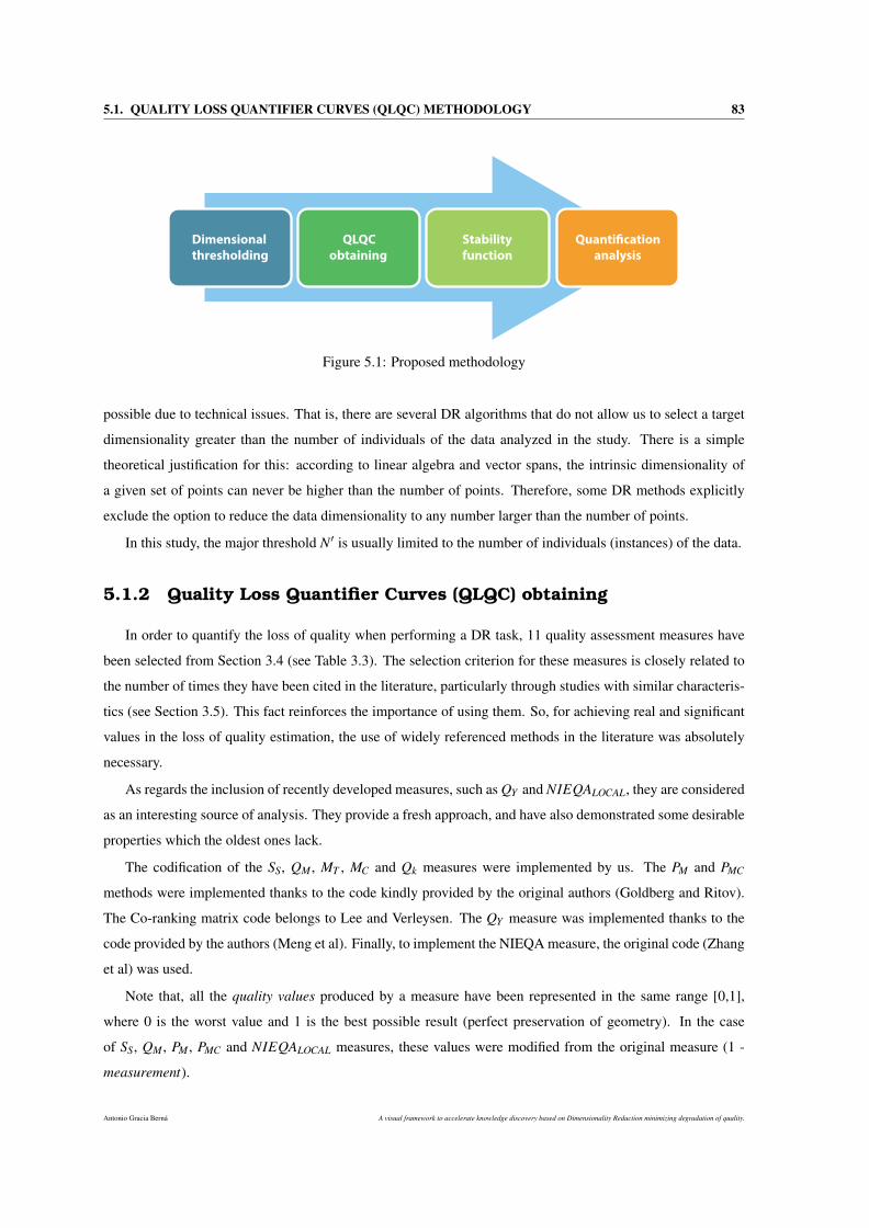
5.1. QUALITY LOSS QUANTIFIER CURVES (QLQC) METHODOLOGY 83
Dimensional
thresholding
QLQC
obtaining
Stability
function
Quanti!cation
analysis
Figure 5.1: Proposed methodology
possible due to technical issues. That is, there are several DR algorithms that do not allow us to select a target
dimensionality greater than the number of individuals of the data analyzed in the study. There is a simple
theoretical justification for this: according to linear algebra and vector spans, the intrinsic dimensionality of
a given set of points can never be higher than the number of points. Therefore, some DR methods explicitly
exclude the option to reduce the data dimensionality to any number larger than the number of points.
In this study, the major threshold N′ is usually limited to the number of individuals (instances) of the data.
5.1.2 Quality Loss Quantifier Curves (QLQC) obtaining
In order to quantify the loss of quality when performing a DR task, 11 quality assessment measures have
been selected from Section 3.4 (see Table 3.3). The selection criterion for these measures is closely related to
the number of times they have been cited in the literature, particularly through studies with similar characteris-
tics (see Section 3.5). This fact reinforces the importance of using them. So, for achieving real and significant
values in the loss of quality estimation, the use of widely referenced methods in the literature was absolutely
necessary.
As regards the inclusion of recently developed measures, such as QY and NIEQALOCAL, they are considered
as an interesting source of analysis. They provide a fresh approach, and have also demonstrated some desirable
properties which the oldest ones lack.
The codification of the SS, QM , MT , MC and Qk measures were implemented by us. The PM and PMC
methods were implemented thanks to the code kindly provided by the original authors (Goldberg and Ritov).
The Co-ranking matrix code belongs to Lee and Verleysen. The QY measure was implemented thanks to the
code provided by the authors (Meng et al). Finally, to implement the NIEQA measure, the original code (Zhang
et al) was used.
Note that, all the quality values produced by a measure have been represented in the same range [0,1],
where 0 is the worst value and 1 is the best possible result (perfect preservation of geometry). In the case
of SS, QM , PM , PMC and NIEQALOCAL measures, these values were modified from the original measure (1 -
measurement).
Antonio Gracia Berná A visual framework to accelerate knowledge discovery based on Dimensionality Reduction minimizing degradation of quality.
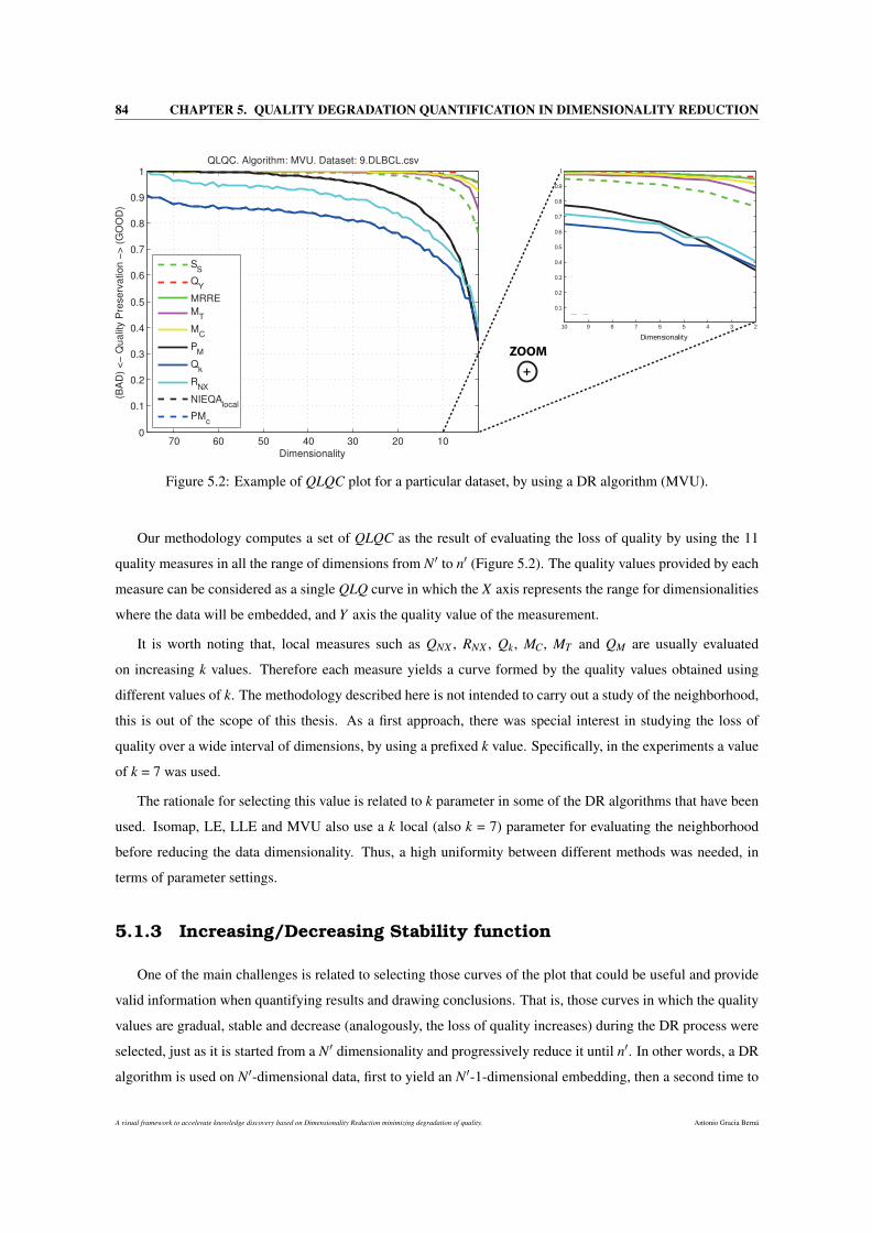
84 CHAPTER 5. QUALITY DEGRADATION QUANTIFICATION IN DIMENSIONALITY REDUCTION
Dimensionality
+
ZOOM
2345678910
0.1
0.2
0.3
0.4
0.5
0.6
0.7
0.8
0.9
1
Figure 5.2: Example of QLQC plot for a particular dataset, by using a DR algorithm (MVU).
Our methodology computes a set of QLQC as the result of evaluating the loss of quality by using the 11
quality measures in all the range of dimensions from N′ to n′ (Figure 5.2). The quality values provided by each
measure can be considered as a single QLQ curve in which the X axis represents the range for dimensionalities
where the data will be embedded, and Y axis the quality value of the measurement.
It is worth noting that, local measures such as QNX , RNX , Qk, MC, MT and QM are usually evaluated
on increasing k values. Therefore each measure yields a curve formed by the quality values obtained using
different values of k. The methodology described here is not intended to carry out a study of the neighborhood,
this is out of the scope of this thesis. As a first approach, there was special interest in studying the loss of
quality over a wide interval of dimensions, by using a prefixed k value. Specifically, in the experiments a value
of k = 7 was used.
The rationale for selecting this value is related to k parameter in some of the DR algorithms that have been
used. Isomap, LE, LLE and MVU also use a k local (also k = 7) parameter for evaluating the neighborhood
before reducing the data dimensionality. Thus, a high uniformity between different methods was needed, in
terms of parameter settings.
5.1.3 Increasing/Decreasing Stability function
One of the main challenges is related to selecting those curves of the plot that could be useful and provide
valid information when quantifying results and drawing conclusions. That is, those curves in which the quality
values are gradual, stable and decrease (analogously, the loss of quality increases) during the DR process were
selected, just as it is started from a N′ dimensionality and progressively reduce it until n′. In other words, a DR
algorithm is used on N′-dimensional data, first to yield an N′-1-dimensional embedding, then a second time to
A visual framework to accelerate knowledge discovery based on Dimensionality Reduction minimizing degradation of quality. Antonio Gracia Berná
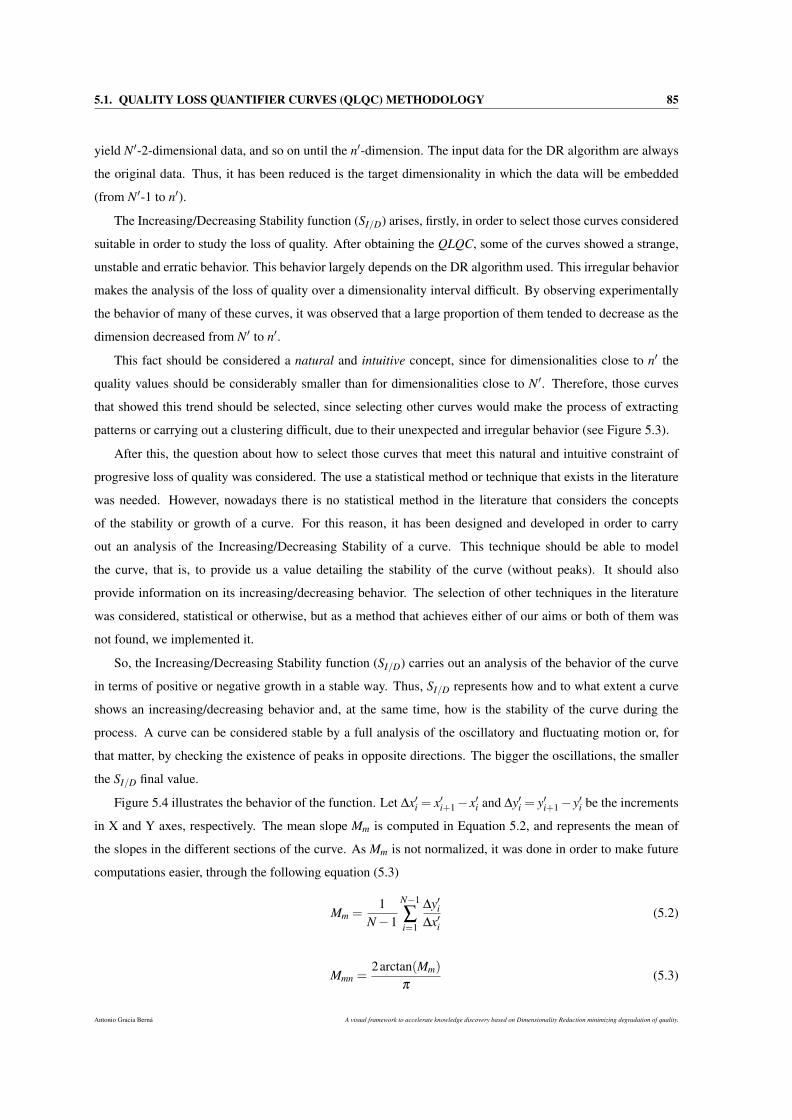
5.1. QUALITY LOSS QUANTIFIER CURVES (QLQC) METHODOLOGY 85
yield N′-2-dimensional data, and so on until the n′-dimension. The input data for the DR algorithm are always
the original data. Thus, it has been reduced is the target dimensionality in which the data will be embedded
(from N′-1 to n′).
The Increasing/Decreasing Stability function (SI/D) arises, firstly, in order to select those curves considered
suitable in order to study the loss of quality. After obtaining the QLQC, some of the curves showed a strange,
unstable and erratic behavior. This behavior largely depends on the DR algorithm used. This irregular behavior
makes the analysis of the loss of quality over a dimensionality interval difficult. By observing experimentally
the behavior of many of these curves, it was observed that a large proportion of them tended to decrease as the
dimension decreased from N′ to n′.
This fact should be considered a natural and intuitive concept, since for dimensionalities close to n′ the
quality values should be considerably smaller than for dimensionalities close to N′. Therefore, those curves
that showed this trend should be selected, since selecting other curves would make the process of extracting
patterns or carrying out a clustering difficult, due to their unexpected and irregular behavior (see Figure 5.3).
After this, the question about how to select those curves that meet this natural and intuitive constraint of
progresive loss of quality was considered. The use a statistical method or technique that exists in the literature
was needed. However, nowadays there is no statistical method in the literature that considers the concepts
of the stability or growth of a curve. For this reason, it has been designed and developed in order to carry
out an analysis of the Increasing/Decreasing Stability of a curve. This technique should be able to model
the curve, that is, to provide us a value detailing the stability of the curve (without peaks). It should also
provide information on its increasing/decreasing behavior. The selection of other techniques in the literature
was considered, statistical or otherwise, but as a method that achieves either of our aims or both of them was
not found, we implemented it.
So, the Increasing/Decreasing Stability function (SI/D) carries out an analysis of the behavior of the curve
in terms of positive or negative growth in a stable way. Thus, SI/D represents how and to what extent a curve
shows an increasing/decreasing behavior and, at the same time, how is the stability of the curve during the
process. A curve can be considered stable by a full analysis of the oscillatory and fluctuating motion or, for
that matter, by checking the existence of peaks in opposite directions. The bigger the oscillations, the smaller
the SI/D final value.
Figure 5.4 illustrates the behavior of the function. Let ∆x′i = x′i+1−x′i and ∆y′i = y′i+1−y′i be the increments
in X and Y axes, respectively. The mean slope Mm is computed in Equation 5.2, and represents the mean of
the slopes in the different sections of the curve. As Mm is not normalized, it was done in order to make future
computations easier, through the following equation (5.3)
Mm =1
N−1
N−1
∑i=1
∆y′i∆x′i
(5.2)
Mmn =2arctan(Mm)
π(5.3)
Antonio Gracia Berná A visual framework to accelerate knowledge discovery based on Dimensionality Reduction minimizing degradation of quality.
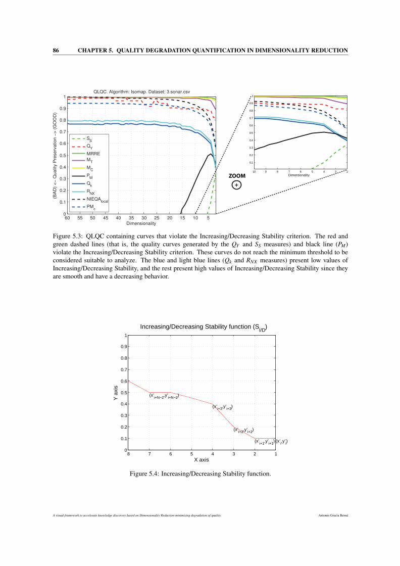
86 CHAPTER 5. QUALITY DEGRADATION QUANTIFICATION IN DIMENSIONALITY REDUCTION
2345678910
0.1
0.2
0.3
0.4
0.5
0.6
0.7
0.8
0.9
1
Dimensionality
+
ZOOM
Figure 5.3: QLQC containing curves that violate the Increasing/Decreasing Stability criterion. The red andgreen dashed lines (that is, the quality curves generated by the QY and SS measures) and black line (PM)violate the Increasing/Decreasing Stability criterion. These curves do not reach the minimum threshold to beconsidered suitable to analyze. The blue and light blue lines (Qk and RNX measures) present low values ofIncreasing/Decreasing Stability, and the rest present high values of Increasing/Decreasing Stability since theyare smooth and have a decreasing behavior.
123456780
0.1
0.2
0.3
0.4
0.5
0.6
0.7
0.8
0.9
1
X axis
Y a
xis
Increasing/Decreasing Stability function (SI/D
)
(x’i,y’i)(x’i+1,y’i+1)
(x’i+2,y’i+2)
(x’i+3,y’i+3)
(x’i+N−2,y’i+N−2)
Figure 5.4: Increasing/Decreasing Stability function.
A visual framework to accelerate knowledge discovery based on Dimensionality Reduction minimizing degradation of quality. Antonio Gracia Berná
5.1. QUALITY LOSS QUANTIFIER CURVES (QLQC) METHODOLOGY 87
where the interval of Mmn ∈ [−1,1], 1 represents a positive mean slope of 90, 0 is a 0 mean slope, and -1
represents a negative mean slope of −90 in respect to the X axis line. As seen above, this value penalizes the
0 value slope sections of the curve. Finally, SI/D is computed as
SI/D =∑
N−1i=1 Cp
∑N−1i=1
√∆y′2i +∆x′2i
(5.4)
where the denominator calculates the total length of the curve, and the numerator calculates the partial contri-
butions (Cp) in each section of the curve. Thus, Cp is computed by the following conditions
Cp =
√∆y′2i +∆x′2i , if ∆y′i > 0,
−√
∆y′2i +∆x′2i , if ∆y′i < 0,
0, if ∆y′i = 0 and Mmn = 0,
Mmn
√∆y′2i +∆x′2i , if ∆y′i = 0 and Mmn 6= 0,
(5.5)
SI/D ∈ [−1,1], where 1 represents a perfect increasing stability, 0 absence of increasing/decreasing stability,
and -1 perfect decreasing stability. Basically, SI/D computes the total length of the curve and carries out an
analysis of the contribution of each section of the curve to the total length, according to its positive, null or
negative growth. In the case of 0 slope sections, the total mean slope is analyzed to penalize the value of SI/D
in a way proportional to the curve, that is, according to the general trend of the curve.
It is important to discard those curves from the plot that show a high instability (SI/D values close to 0),
or excessively low quality values. For selecting a proper threshold for SI/D values, the approach analyzes the
boxplot of the absolute values of SI/D obtained for all the curves, and selects a particular minimum threshold.
Thus, those curves in which the SI/D value is less than this threshold will be automatically discarded (see
Section 5.2.1 to see the rationale for the selection of these values).
5.1.4 Quantification analysis of loss of quality
Once the stabilized curves have been selected, the methodology proposes a quantification analysis of them.
These analyses could be from a simple analysis of the loss of quality in a certain interesting dimensionality to
a more complex data analysis. In this way, three different kinds of analysis are proposed as a starting point:
Clustering of methods according to the loss of quality throughout the entire DR process. In order to detect
similar behaviors when reducing the dimensionality of the data, in terms of loss of quality, a clustering
process of the DR algorithms has been carried out.
Relationship between different preservation of geometry measures. The Pearson correlation indicates whether
two different curves are linearly correlated or not. Nevertheless, it cannot detect differences in correlation
when curves having the same proportion but different magnitudes. In this sense, for analyzing the simi-
larity we should take into account both proportions and magnitudes (loss of quality values). Therefore, a
Antonio Gracia Berná A visual framework to accelerate knowledge discovery based on Dimensionality Reduction minimizing degradation of quality.

88 CHAPTER 5. QUALITY DEGRADATION QUANTIFICATION IN DIMENSIONALITY REDUCTION
new modified version of the Pearson correlation of two different curves i and j is proposed.
Corri j =∣∣Pi j∣∣− (1− cvi
cv j) (5.6)
where Pi j is the Pearson correlation between the curves i and j, and cvi and cv j are the variation co-
efficients (cv = standard deviation/mean) of curves i and j, respectively. Taking into account that the
variation coefficient determines the possible variability in relation to the mean of the population [127],
in this case this determines the possible stability of a curve in relation to the mean of its values.
Note that cv j > cvi for all cases, so the denominator must always be the greatest of the two values. The
equation part (cvi/cv j) ∈ [0,1] represents how similar both curves are in terms of variability, 0 being the
representation of different curves and 1 when the variability of both curves is the same. Thus, in this way,
(1− cvi/cv j) penalizes the Pearson correlation when the proportions and magnitudes of the variabilities
of both curves are different, even if these are correlated.
The interval of Corri j ∈ [−1,1], where 1 represents a perfect correlation and -1 indicates the absence of
it. This equation evaluates the correlation between two distributions of data, considering the coefficient
of variance of both distributions.
Loss of quality trend analysis from M into B dimension. Here the methodology represents the differences in
loss of quality trend when the data is reduced from N′ into M and from N′ into B dimensions, B being
lower than M. With this analysis we can conclude that any DR algorithm is stable or not (its trend is
always the same) in the different dimensionality reductions in terms of loss of quality.
5.2 Application to real world domains
In this thesis, the proposed methodology has been applied to several real-world datasets, collected from
different domains.
12 real-world datasets , where eight of them have been selected from the UCI Machine Learning Repository
(Table 5.1). As regards their nature, 3 of the selected datasets are exclusively of DNA microarray origin
(Leukemia, DLBCL and SRBCT’s), 5 of them belong to other medical nature (Breast Cancer Wiscon-
sin, SPECTF Heart, Prostate, Parkinsons and neurons), and other fields (Connectionist Bench, Glass
Identification and Libras Movement).
Note that, in order to obtain the intrinsic dimensionality for each dataset, Maximum likelihood (MLE) and
Eigenvalue-based estimators [303] were used, by calculating the integer mean value of both estimators.
Once the data domains have been defined, several experiments have been proposed and carried out on each
of the aforementioned datasets. The implementation has been completely carried out in Matlab software, and
the environmental setting is made up of:
A visual framework to accelerate knowledge discovery based on Dimensionality Reduction minimizing degradation of quality. Antonio Gracia Berná
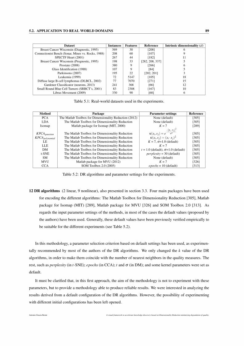
5.2. APPLICATION TO REAL WORLD DOMAINS 89
Dataset Instances Features Reference Intrinsic dimensionality (d)Breast Cancer Wisconsin (Diagnostic, 1995) 569 30 [208] 6
Connectionist Bench (Sonar, Mines vs. Rocks, 1988) 208 60 [107] 9SPECTF Heart (2001) 267 44 [182] 11
Breast Cancer Wisconsin (Prognostic, 1995) 198 33 [282, 208, 337] 5Prostate (2008) 380 9 [266] 6
Glass Identification (1988) 107 9 [84] 5Parkinsons (2007) 195 22 [202, 201] 3Leukemia (1999) 72 5147 [105] 18
Diffuse large B-cell lymphomas (DLBCL, 2002) 77 7070 [271] 15Gardener Classificator (neurons, 2013) 241 368 [66] 12
Small Round Blue Cell Tumors (SRBCT’s, 2001) 83 2308 [167] 10Libras Movement (2009) 330 90 [68] 6
Table 5.1: Real-world datasets used in the experiments.
Method Package Parameter settings ReferencePCA The Matlab Toolbox for Dimensionality Reduction (2012) None (default) [305]LDA The Matlab Toolbox for Dimensionality Reduction None (default) [305]
Isomap Matlab package for Isomap (MIT, 2000) K = 7 [289]
KPCAgaussian The Matlab Toolbox for Dimensionality Reduction κ(xi,x j) = e−|Xi−Xj|2
σ2 [305]KPCApolynomial The Matlab Toolbox for Dimensionality Reduction κ(xi,x j) = (xi · x j)
2 [305]LE The Matlab Toolbox for Dimensionality Reduction K = 7, σ=1.0 (default) [305]
LLE The Matlab Toolbox for Dimensionality Reduction K = 7 [305]DM The Matlab Toolbox for Dimensionality Reduction t = 1.0 (default), σ=1.0 (default) [305]
t-SNE The Matlab Toolbox for Dimensionality Reduction perplexity = 30 (default) [305]SM The Matlab Toolbox for Dimensionality Reduction None (default) [305]
MVU Matlab package for MVU (2012) K = 7 [326]CCA SOM Toolbox 2.0 (2005) epochs = 10 (default) [313]
Table 5.2: DR algorithms and parameter settings for the experiments.
12 DR algorithms (2 linear, 9 nonlinear), also presented in section 3.3. Four main packages have been used
for encoding the different algorithms: The Matlab Toolbox for Dimensionality Reduction [305], Matlab
package for Isomap (MIT) [289], Matlab package for MVU [326] and SOM Toolbox 2.0 [313]. As
regards the input parameter settings of the methods, in most of the cases the default values (proposed by
the authors) have been used. Generally, these default values have been previously verified empirically to
be suitable for the different experiments (see Table 5.2).
In this methodology, a parameter selection criterion based on default settings has been used, as experimen-
tally recommended by most of the authors of the DR algorithms. We only changed the k value of the DR
algorithms, in order to make them coincide with the number of nearest neighbors in the quality measures. The
rest, such as perplexity (in t-SNE); epochs (in CCA); t and σ (in DM); and some kernel parameters were set as
default.
It must be clarified that, in this first approach, the aim of the methodology is not to experiment with these
parameters, but to provide a methodology able to produce reliable results. We were interested in analyzing the
results derived from a default configuration of the DR algorithms. However, the possibility of experimenting
with different initial configurations has been left opened.
Antonio Gracia Berná A visual framework to accelerate knowledge discovery based on Dimensionality Reduction minimizing degradation of quality.
90 CHAPTER 5. QUALITY DEGRADATION QUANTIFICATION IN DIMENSIONALITY REDUCTION
5.2.1 Applying the methodology
The first step in the methodology is the dimensional thresholding calculation. The minor threshold n′ of all
the experiments has been fixed at 2, that is the lowest dimensionality possible. On the other hand, the major
thresholds N′ have been calculated depending on the original number of dimensions and instances of the data
considered (as stated in Section 5.1.1). So, the major thresholds N′ are: 30 in the Breast Cancer Wisconsin
Diagnostic, 60 in the Connectionist Bench, 44 in SPECTF Heart, 33 in the Breast Cancer Wisconsin Prognostic,
9 in Prostate, 9 in Glass Identification, 22 in Parkinsons, 72 in Leukemia, 77 in DLBCL, 100 in neurons, 83
in SRBCTs and 90 in Libras. Note that, for DNA microarray data (Leukemia, DLBCL and SRBCTs), N′ is
constrained to the number of individuals of each dataset due to the technical limitations of the DR algorithms.
In the neurons dataset, N′ is set to 100 since it has been observed that greater values do not give rise to loss of
qualities, thus these cases are of no interest to the study. For the rest of the datasets, the N′ value is the original
dimensionality of the data.
In order to obtain the QLQC plots, all the curves must be calculated. Based on the 12 DR algorithms and
the 12 datasets, the method calculates 11measures×12algorithms×12datasets = 1,584 curves for studying the loss
of quality resulting from a DR process.
For each curve, the SI/D value is calculated. In order to select the sufficiently stable curves, a minimum
threshold is necessary. To select this threshold, a boxplot of the absolute values of SI/D obtained throughout the
1,584 curves was carried out. When analyzing the distribution of the boxplot, it could make sense to discard
those curves whose stability value is less than the second quartil of the boxplot, that is 0.3005.
Rationale for the SI/D minimum threshold The main values obtained when representing by using the box-
plot technique were: quartile 1 (0.08, Q1), quartile 2 (0.3005, median or Q2) and quartile 3 (0.8, Q3). At first
glance, selecting a threshold value from which a curve meets the decreasing stability constraints was not easy,
thus an empirical study of the behaviour of the curves using Q1, Q2 and Q3 was carried out. To this end, the
curves with SI/D values equal to or greater than the selected quartile have been selected, and they were plotted
using the 2D scatterplot technique. When using Q1 (0.08) as the threshold, it is observed that almost all the
selected curves behaved in a highly unstable and erratic manner and they did not meet the decreasing stability
constraint. Therefore, Q1 was discounted and Q2 was studied. When Q2 (0.3005) was used as a candidate
threshold, almost the 100% of the curves exceeding this threshold showed a strong decreasing stability behav-
ior. Finally, Q2 was selected as the threshold for SI/D values, and roughly one third (474) of the total curves
(1,584) were selected for further analysis. It is important to note that: firstly, when testing Q3 as the threshold
value, many fewer curves were selected, so it was decided to work with Q2. Secondly, for the SI/D threshold,
the first value (and it should be statistically justified) that allowed us to achieve curves that meet the decreasing
stability constraints was selected, and that is why an intermediate value between quartiles was not selected.
Moreover, the curves whose quality values obtained in 2, 3 and intrinsic dimensions were outside a specific
interval were also discounted.
A visual framework to accelerate knowledge discovery based on Dimensionality Reduction minimizing degradation of quality. Antonio Gracia Berná
5.2. APPLICATION TO REAL WORLD DOMAINS 91
Rationale for the selection of the quality value interval Solely based on normalization criteria, we were
interested in selecting those curves whose quality values in 2, 3 and intrinsic dimensions were in the interval
[0,1], and discarding the rest. By definition, all the quality measures, except SS sometimes, provide quality
values within that range. In its original definition [254], SS ∈ [0,∞). However, as we normalized all the
measures so that 1 is the best quality value (see Section 5.1.2), the new range for this measure was SS ∈ [1,−∞)
(where −∞ is the worst value) and therefore there were still a few curves with quality values of less than 0
(even after filtering by the SI/D threshold). As has already been said, we wanted to study quality values in the
interval [0,1], therefore this constraint discounted the rest of the curves that did not meet this condition. After
discounting the curves outside the [0,1] interval, we also realized that all the curves, in fact, curiously presented
quality values greater than 0.198.
Thus, using two ways of filtering the curves, we ensured that we were selecting decreasing and stable curves
(as the target dimensionality is reduced from N′ to n′), as well as quality values in the [0,1] interval (see Figure
5.5). The aim is to be able to quantify the loss of quality in a DR process.
It is worth mentioning that, after applying the two constraints (quality and stability) imposed on the selected
curves, no DR algorithm fails uniformly. That is, to a greater or lesser degree, all the DR algorithms yield
QT QC enough to accurately quantify the loss of quality through these curves. Specifically, the distribution of
the selected curves for each of the DR algorithms is as follows: PCA (67 curves), MVU (66), KPCApoly (57),
Isomap (57), LE (47), KPCAgauss (42), SM (37), LDA (26), DM (21), t-SNE (21), CCA (18) and LLE (15).
From this distribution we conclude that, from a point of view based on stability and quality criteria, the DR
algorithms that produce more suitable curves for studying the loss of quality are PCA, MVU, KPCApoly and
Isomap, whilst LLE and CCA performed the worst.
5.2.1.1 The relationship between different preservation of geometry measures
One of the quantification analyses made using this methodology is the relationship between the quality
criteria during the DR process, when using the different DR algorithms.
So, firstly the proposed correlation (Section 5.1.4, Equation 5.6) for each pair of measures in the different
datasets was calculated. After analyzing all the values through a boxplot, it was decided to analyze only those
pairs of measures whose correlation was greater than the third quartile (0.612), in order to see the possible real
relationships between the measures.
Antonio Gracia Berná A visual framework to accelerate knowledge discovery based on Dimensionality Reduction minimizing degradation of quality.
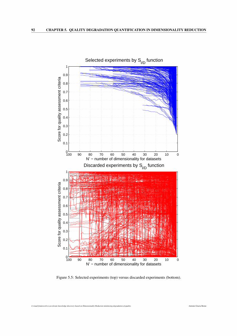
92 CHAPTER 5. QUALITY DEGRADATION QUANTIFICATION IN DIMENSIONALITY REDUCTION
01020304050607080901000
0.1
0.2
0.3
0.4
0.5
0.6
0.7
0.8
0.9
1
N’ − number of dimensionality for datasets
Sco
re fo
r qu
ality
ass
essm
ent c
riter
iaSelected experiments by S
I/D function
01020304050607080901000
0.1
0.2
0.3
0.4
0.5
0.6
0.7
0.8
0.9
1
N’ − number of dimensionality for datasets
Sco
re fo
r qu
ality
ass
essm
ent c
riter
ia
Discarded experiments by SI/D
function
Figure 5.5: Selected experiments (top) versus discarded experiments (bottom).
A visual framework to accelerate knowledge discovery based on Dimensionality Reduction minimizing degradation of quality. Antonio Gracia Berná
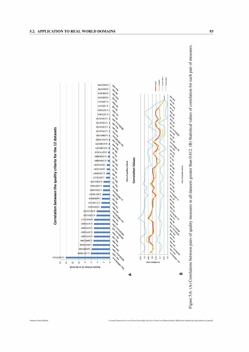
5.2. APPLICATION TO REAL WORLD DOMAINS 93
Figu
re5.
6:(A
)Cor
rela
tions
betw
een
pair
sof
qual
itym
easu
res
inal
ldat
aset
sgr
eate
rtha
n0.
612.
(B)S
tatis
tical
valu
esof
corr
elat
ion
fore
ach
pair
ofm
easu
res.
Antonio Gracia Berná A visual framework to accelerate knowledge discovery based on Dimensionality Reduction minimizing degradation of quality.
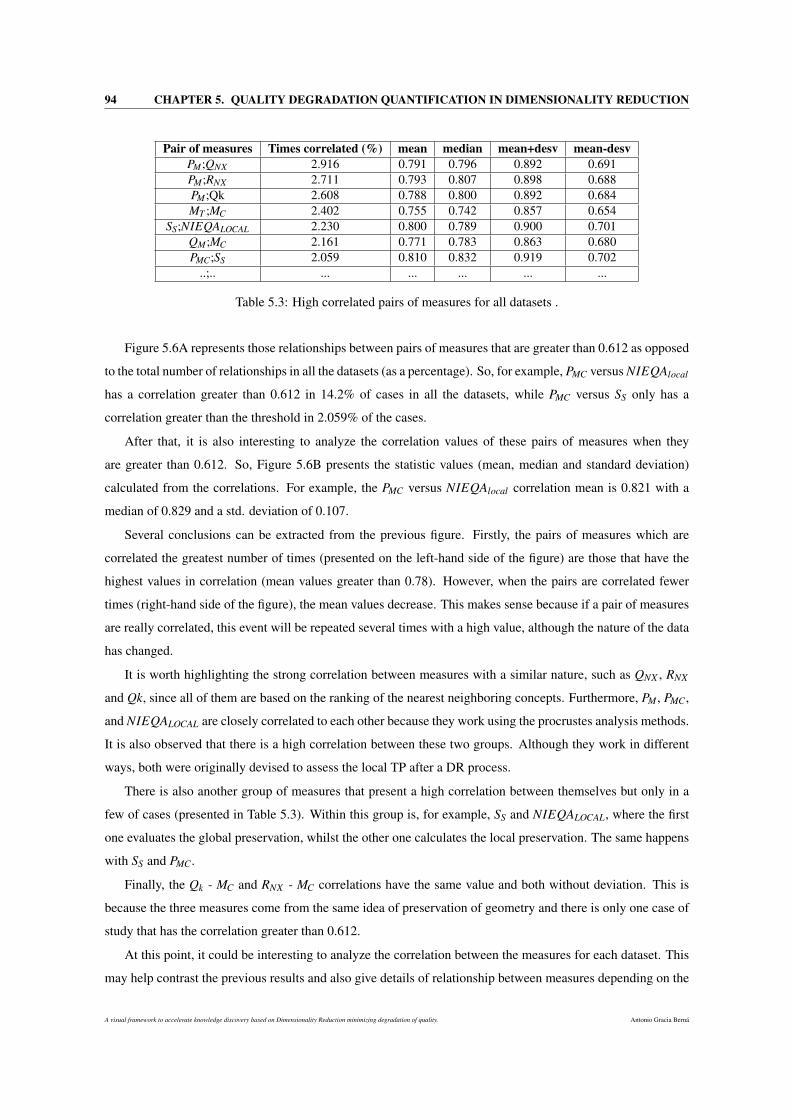
94 CHAPTER 5. QUALITY DEGRADATION QUANTIFICATION IN DIMENSIONALITY REDUCTION
Pair of measures Times correlated (%) mean median mean+desv mean-desvPM;QNX 2.916 0.791 0.796 0.892 0.691PM;RNX 2.711 0.793 0.807 0.898 0.688PM;Qk 2.608 0.788 0.800 0.892 0.684MT ;MC 2.402 0.755 0.742 0.857 0.654
SS;NIEQALOCAL 2.230 0.800 0.789 0.900 0.701QM;MC 2.161 0.771 0.783 0.863 0.680PMC;SS 2.059 0.810 0.832 0.919 0.702
..;.. ... ... ... ... ...
Table 5.3: High correlated pairs of measures for all datasets .
Figure 5.6A represents those relationships between pairs of measures that are greater than 0.612 as opposed
to the total number of relationships in all the datasets (as a percentage). So, for example, PMC versus NIEQAlocal
has a correlation greater than 0.612 in 14.2% of cases in all the datasets, while PMC versus SS only has a
correlation greater than the threshold in 2.059% of the cases.
After that, it is also interesting to analyze the correlation values of these pairs of measures when they
are greater than 0.612. So, Figure 5.6B presents the statistic values (mean, median and standard deviation)
calculated from the correlations. For example, the PMC versus NIEQAlocal correlation mean is 0.821 with a
median of 0.829 and a std. deviation of 0.107.
Several conclusions can be extracted from the previous figure. Firstly, the pairs of measures which are
correlated the greatest number of times (presented on the left-hand side of the figure) are those that have the
highest values in correlation (mean values greater than 0.78). However, when the pairs are correlated fewer
times (right-hand side of the figure), the mean values decrease. This makes sense because if a pair of measures
are really correlated, this event will be repeated several times with a high value, although the nature of the data
has changed.
It is worth highlighting the strong correlation between measures with a similar nature, such as QNX , RNX
and Qk, since all of them are based on the ranking of the nearest neighboring concepts. Furthermore, PM , PMC,
and NIEQALOCAL are closely correlated to each other because they work using the procrustes analysis methods.
It is also observed that there is a high correlation between these two groups. Although they work in different
ways, both were originally devised to assess the local TP after a DR process.
There is also another group of measures that present a high correlation between themselves but only in a
few of cases (presented in Table 5.3). Within this group is, for example, SS and NIEQALOCAL, where the first
one evaluates the global preservation, whilst the other one calculates the local preservation. The same happens
with SS and PMC.
Finally, the Qk - MC and RNX - MC correlations have the same value and both without deviation. This is
because the three measures come from the same idea of preservation of geometry and there is only one case of
study that has the correlation greater than 0.612.
At this point, it could be interesting to analyze the correlation between the measures for each dataset. This
may help contrast the previous results and also give details of relationship between measures depending on the
A visual framework to accelerate knowledge discovery based on Dimensionality Reduction minimizing degradation of quality. Antonio Gracia Berná
5.2. APPLICATION TO REAL WORLD DOMAINS 95
nature of the data.
To do this, two figures per dataset were obtained. Only in one of the dataset were there no figures, as there
were no stable curves with correlations outperforming the threshold. Like the previous results (the averaged
way with all the datasets), there is a very strong correlation between the following groups of measures: the
first group consists of 3 measures, QNX , RNX , and Qk. It is noted that, for absolutely all the datasets, the same
pattern is repeated and these 3 measures are highly correlated. Furthermore, the second group showing a very
high degree of correlation is made up of PM , PMC and NIEQALOCAL. This is, by far, the most correlated group
of all datasets, and it is also strongly correlated with the first group. For each one of the datasets, there is always
a large number of correlation cases between the members of the first group, the members of the second group,
and between these two groups. This coincides entirely with the conclusions drawn in the previous section for
all the datasets.
High correlations are often reported between SS and PMC and NIEQALOCAL measures. Furthermore, MT ,
MC and QM also present a large number of correlation cases between themselves. However, the QY criterion
lacks any direct correlation with other criteria (it does not appear in the figures, or with a low degree) because,
as pointed out earlier, of its peculiar nature.
The strong correlation between these measures is confirmed when their mean correlation values are ob-
served. Note that, correlation values in the [0.75,1.0] range can be considered as very high, since the original
Pearson correlation function was modified in order to be stricter.
To sum up, the conclusions presented by separating per dataset confirm the high degree of correlation
between the different groups of quality measures.
5.2.1.2 Comparative study and clustering of DR methods
The analysis of the loss of quality during the DR process from N′D to 2D obtained by each DR algorithm
are presented here. The aim is to compare these results, in order to highlight the ’quality preservation’ skills of
the DR algorithms. Then, we show which type of DR algorithms usually carry out DR tasks while producing
minimum losses of quality. To achieve this, the quality values obtained by the different DR algorithms are
compared in a set of key dimensions, as 2D, 3D, ID (intrinsic dimensionality, d) and N′D.
The Mann-Whitney Wilcoxon signed-rank test [333] is a non-parametric statistical hypothesis test used
when comparing two samples. This can matematically demonstrate whether two samples came from the same
population, or if the distribution of one sample is stochastically greater than the other.
In this study, the Wilcox test was used to compare each pair of DR algorithms (if one algorithm is better
than other, in terms of loss of quality), based on its mean loss of quality values for each DR algorithm. A p-
value (probability) less than or equal than 0.05 affirms the asumption of improvement from one over the other
algorithm. Figure 5.7 shows the mean loss of quality values achieved by the different algorithms.
First of all, note that, in fact, the real input data for the statistical test consist of all the values that produce
these mean values. It can be clearly seen that, for dimensionalities close to N′, the loss of quality produced by
Antonio Gracia Berná A visual framework to accelerate knowledge discovery based on Dimensionality Reduction minimizing degradation of quality.
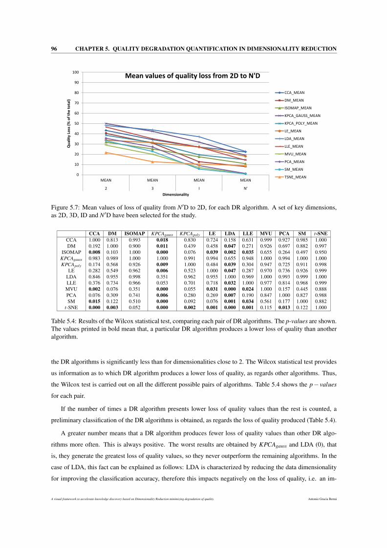
96 CHAPTER 5. QUALITY DEGRADATION QUANTIFICATION IN DIMENSIONALITY REDUCTION
0
10
20
30
40
50
60
70
80
90
100
MEAN MEAN MEAN MEAN
2 3 I N'
Qu
alit
y Lo
ss (
% o
f th
e t
ota
l)
Dimensionality
Mean values of quality loss from 2D to N'D
CCA_MEAN
DM_MEAN
ISOMAP_MEAN
KPCA_GAUSS_MEAN
KPCA_POLY_MEAN
LE_MEAN
LDA_MEAN
LLE_MEAN
MVU_MEAN
PCA_MEAN
SM_MEAN
TSNE_MEAN
Figure 5.7: Mean values of loss of quality from N′D to 2D, for each DR algorithm. A set of key dimensions,as 2D, 3D, ID and N′D have been selected for the study.
CCA DM ISOMAP KPCAgauss KPCApoly LE LDA LLE MVU PCA SM t-SNECCA 1.000 0.813 0.993 0.018 0.830 0.724 0.158 0.631 0.999 0.927 0.985 1.000DM 0.192 1.000 0.900 0.011 0.439 0.458 0.047 0.271 0.926 0.697 0.882 0.997
ISOMAP 0.008 0.103 1.000 0.000 0.076 0.039 0.002 0.035 0.655 0.264 0.497 0.950KPCAgauss 0.983 0.989 1.000 1.000 0.991 0.994 0.655 0.948 1.000 0.994 1.000 1.000KPCApoly 0.174 0.568 0.926 0.009 1.000 0.484 0.039 0.304 0.947 0.725 0.911 0.998
LE 0.282 0.549 0.962 0.006 0.523 1.000 0.047 0.287 0.970 0.736 0.926 0.999LDA 0.846 0.955 0.998 0.351 0.962 0.955 1.000 0.969 1.000 0.993 0.999 1.000LLE 0.376 0.734 0.966 0.053 0.701 0.718 0.032 1.000 0.977 0.814 0.968 0.999
MVU 0.002 0.076 0.351 0.000 0.055 0.031 0.000 0.024 1.000 0.157 0.445 0.888PCA 0.076 0.309 0.741 0.006 0.280 0.269 0.007 0.190 0.847 1.000 0.827 0.988SM 0.015 0.122 0.510 0.000 0.092 0.076 0.001 0.034 0.561 0.177 1.000 0.882
t-SNE 0.000 0.003 0.052 0.000 0.002 0.001 0.000 0.001 0.115 0.013 0.122 1.000
Table 5.4: Results of the Wilcox statistical test, comparing each pair of DR algorithms. The p-values are shown.The values printed in bold mean that, a particular DR algorithm produces a lower loss of quality than anotheralgorithm.
the DR algorithms is significantly less than for dimensionalities close to 2. The Wilcox statistical test provides
us information as to which DR algorithm produces a lower loss of quality, as regards other algorithms. Thus,
the Wilcox test is carried out on all the different possible pairs of algorithms. Table 5.4 shows the p− values
for each pair.
If the number of times a DR algorithm presents lower loss of quality values than the rest is counted, a
preliminary classification of the DR algorithms is obtained, as regards the loss of quality produced (Table 5.4).
A greater number means that a DR algorithm produces fewer loss of quality values than other DR algo-
rithms more often. This is always positive. The worst results are obtained by KPCAgauss and LDA (0), that
is, they generate the greatest loss of quality values, so they never outperform the remaining algorithms. In the
case of LDA, this fact can be explained as follows: LDA is characterized by reducing the data dimensionality
for improving the classification accuracy, therefore this impacts negatively on the loss of quality, i.e. an im-
A visual framework to accelerate knowledge discovery based on Dimensionality Reduction minimizing degradation of quality. Antonio Gracia Berná
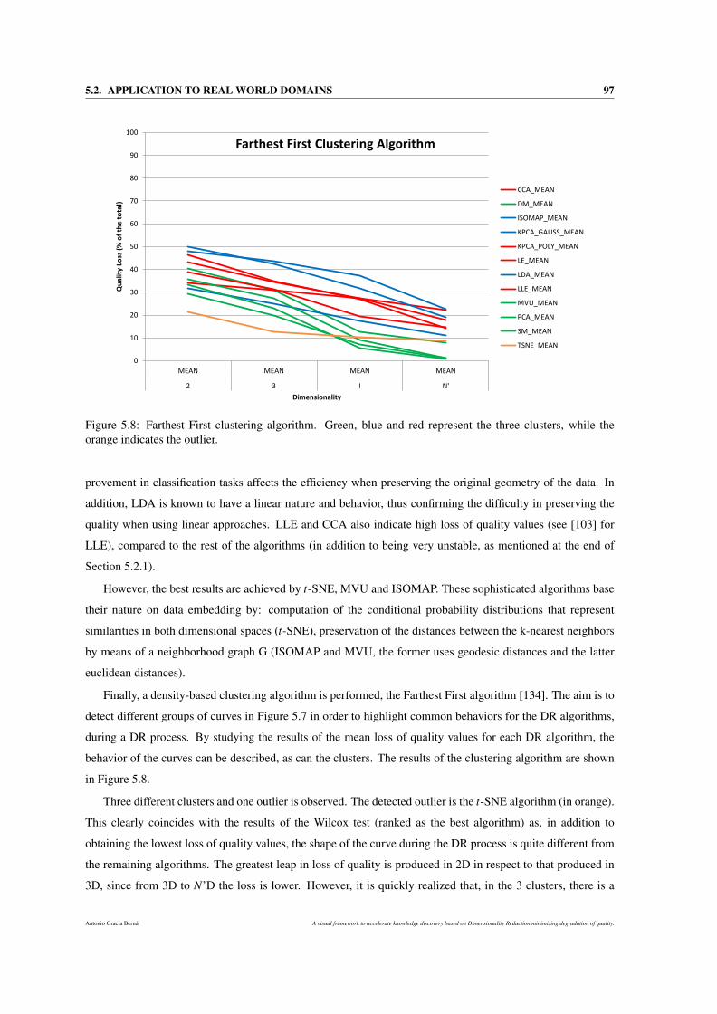
5.2. APPLICATION TO REAL WORLD DOMAINS 97
0
10
20
30
40
50
60
70
80
90
100
MEAN MEAN MEAN MEAN
2 3 I N'
Qu
alit
y Lo
ss (
% o
f th
e t
ota
l)
Dimensionality
Farthest First Clustering Algorithm
CCA_MEAN
DM_MEAN
ISOMAP_MEAN
KPCA_GAUSS_MEAN
KPCA_POLY_MEAN
LE_MEAN
LDA_MEAN
LLE_MEAN
MVU_MEAN
PCA_MEAN
SM_MEAN
TSNE_MEAN
Figure 5.8: Farthest First clustering algorithm. Green, blue and red represent the three clusters, while theorange indicates the outlier.
provement in classification tasks affects the efficiency when preserving the original geometry of the data. In
addition, LDA is known to have a linear nature and behavior, thus confirming the difficulty in preserving the
quality when using linear approaches. LLE and CCA also indicate high loss of quality values (see [103] for
LLE), compared to the rest of the algorithms (in addition to being very unstable, as mentioned at the end of
Section 5.2.1).
However, the best results are achieved by t-SNE, MVU and ISOMAP. These sophisticated algorithms base
their nature on data embedding by: computation of the conditional probability distributions that represent
similarities in both dimensional spaces (t-SNE), preservation of the distances between the k-nearest neighbors
by means of a neighborhood graph G (ISOMAP and MVU, the former uses geodesic distances and the latter
euclidean distances).
Finally, a density-based clustering algorithm is performed, the Farthest First algorithm [134]. The aim is to
detect different groups of curves in Figure 5.7 in order to highlight common behaviors for the DR algorithms,
during a DR process. By studying the results of the mean loss of quality values for each DR algorithm, the
behavior of the curves can be described, as can the clusters. The results of the clustering algorithm are shown
in Figure 5.8.
Three different clusters and one outlier is observed. The detected outlier is the t-SNE algorithm (in orange).
This clearly coincides with the results of the Wilcox test (ranked as the best algorithm) as, in addition to
obtaining the lowest loss of quality values, the shape of the curve during the DR process is quite different from
the remaining algorithms. The greatest leap in loss of quality is produced in 2D in respect to that produced in
3D, since from 3D to N’D the loss is lower. However, it is quickly realized that, in the 3 clusters, there is a
Antonio Gracia Berná A visual framework to accelerate knowledge discovery based on Dimensionality Reduction minimizing degradation of quality.
98 CHAPTER 5. QUALITY DEGRADATION QUANTIFICATION IN DIMENSIONALITY REDUCTION
strong similarity between the curves inside a particular cluster. Curves grouped in the same cluster show very
similar transitions during the loss of quality process (from N’D to 2D).
The first cluster, which groups DR algorithms that give rise to the lowest loss of quality, is made up of
by PCA, SM and MVU algorithms. All of them show moderate loss of qualities from N′D to ID. However,
from there to 2D there is a huge leap in loss of quality. The results obtained by SM and MVU coincide with
the Wilcox test, since both algorithms give rise to mild loss of qualities with respect to the rest and occupy a
front-ranked position.
The second cluster groups most of the algorithms together, it is made up of LLE, LE, CCA and KPCApoly.
The behavior of this group is slightly different as, unlike other clusters, there is a clear linearity in the loss of
quality.
The last cluster groups the LDA, KPCAgauss and ISOMAP algorithms together. This is the group that
presents higher loss of qualities. The following observations can be made: the first is that the results of LDA
and KPCAgauss coincide with the Wilcox test, since they appear in the lowest positions in the ranking. The
second one is that the bad results of Isomap in the clustering algorithm, does not coincide at all with the Wilcox
test. This can be explained by the fact that the input data for the Wilcox test and the clustering algorithm
are different, in value and quantity. Thereby, the results are different because of variability in the data. The
clusters have been defined according to the average of the data. Thus, any curve varying in [-3*standard.dev,
3*standard.dev] range could be grouped into different clusters.
5.2.1.3 Loss of quality trend analysis from 3 into 2 dimensions
Like the first analysis made using this methodology, a comparative study based on the loss of quality
produced when reducing MMD to two and three dimensions was proposed. This particular case is presented
individually in Chapter 6, since a more detailed study was necessary.
This study demonstrates that, only when switching from 3D to 2D, does it reach maximum values of 48.62%
and mean values of 30.48% of the total loss of quality for many case studies with the presented datasets. These
values can be considered noticeably high and suggest the suitability of the third dimension for reducing and
visualizing MMD.
5.2.2 Computation times
Table 5.5 describes the computation times per dataset (in hours), as well as the % of the CPU time used by
each quality measure, as regards the total CPU time (in hours).
A single column has been used for each of the most computationally high measures, while the rest of the
measures have been grouped together in the Rest of measures column due to their insignificant computation
time as regards the total time.
The quality measures that have required the longest computing times have been NIEQALOCAL, and QY .
A visual framework to accelerate knowledge discovery based on Dimensionality Reduction minimizing degradation of quality. Antonio Gracia Berná
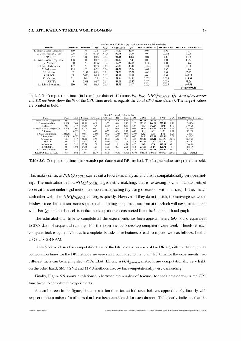
5.2. APPLICATION TO REAL WORLD DOMAINS 99
% of the total CPU time (by quality measures and DR methods)Dataset Instances Features PM PMC NIEQALOCAL QY Rest of measures DR methods Total CPU time (hours)
1. Breast Cancer (Diagnostic) 569 30 0.1 0.09 55.82 43.94 0.03 0.02 41.32. Connectionist Bench 208 60 0.124 0.124 96.96 2.78 0.01 0.002 79.79
3. SPECTF 267 44 0.15 0.14 91.48 8.13 0.08 0.02 43.064. Breast Cancer (Prognostic) 198 33 0.17 0.18 91.23 8.4 0.01 0.01 10.52
5. Prostate 380 9 0.36 0.36 16.39 82.75 0.13 0.01 1.666. Glass Identification 107 9 0.83 0.83 65.21 33.11 0.002 0.018 0.10
7. Parkinsons 195 22 0.32 0.34 84.22 15.04 0.05 0.03 3.848. Leukemia 72 5147 0.19 0.21 74.25 25.32 0.02 0.01 85.039. DLBCL 77 7070 0.15 0.17 82.98 16.68 0.01 0.01 102.22
10. Neurons 241 368 0.2 0.19 75.44 24.14 0.025 0.005 123.0111. SRBCT’s 83 2308 0.17 0.17 89.08 10.57 0.007 0.003 95.26
12. Libras Movement 330 90 0.15 0.15 84.98 14.7 0.015 0.005 107.61Total = 693.41
Table 5.5: Computation times (in hours) per dataset. Columns PM , PMC, NIEQALOCAL, QY , Rest of measuresand DR methods show the % of the CPU time used, as regards the Total CPU time (hours). The largest valuesare printed in bold.
Total CPU time (by DR methods)Dataset PCA LDA Isomap KPCAgauss KPCApoly LE LLE DM t-SNE SM MVU CCA Total CPU time (seconds)
1. Breast Cancer (Diagnostic) 0.02 0.16 71.36 3.74 19.44 2.78 6.42 6.27 681.95 903.97 1225.12 49.55 2970.782. Connectionist Bench 0.004 0.03 11.96 0.58 3.53 0.46 1.16 1.03 123.66 164.06 222.48 9.18 538.134
3. SPECTF 0.03 0.17 74.59 4.9 20.27 2.3 6.69 6.54 719.8 942.27 1271 54.7 3103.264. Breast Cancer (Prognostic) 0.004 0.02 10.07 0.47 2.37 0.34 0.81 0.89 86.56 114.91 165.63 6.42 388.494
5. Prostate 0 0.003 1.35 0.07 0.37 0.04 0.12 0.12 13.19 16.51 23.73 0.77 56.2736. Glass Identification 3.85E-05 0 0.08 0.003 0.02 0.003 0.006 0.007 0.82 1.19 1.48 0.26 3.869
7. Parkinsons 0.004 0.023 9.93 0.52 2.7 0.37 0.89 0.87 94.8 125.85 170.56 7.03 413.5478. Leukemia 0.03 0.17 72.44 3.75 20.01 2.76 6.3 6.45 701.74 933.24 1260.72 51.02 3058.639. DLBCL 0.03 0.2 87.3 4.63 24.06 3.32 7.94 7.76 842.53 1118.47 1515.83 62.54 3674.61
10. Neurons 0.02 0.12 53.23 2.78 14.67 2 4.78 4.67 502 673 912.11 37.61 2206.9911. SRBCT’s 0.01 0.02 24.32 1.29 6.71 0.97 2.21 2.06 234.95 312.9 422.71 17.24 1025.39
12. Libras Movement 0.02 0.11 46.41 2.44 12.36 1.75 4.08 4.08 444.52 584.78 797.96 32.72 1931.23Total CPU time (seconds) 0.17 1.02 463.04 25.17 126.51 17.093 41.406 40.74 4446.52 5891.15 7989.33 329.04 Total = 19371.2
Table 5.6: Computation times (in seconds) per dataset and DR method. The largest values are printed in bold.
This makes sense, as NIEQALOCAL carries out a Procrustes analysis, and this is computationally very demand-
ing. The motivation behind NIEQALOCAL is geometric matching, that is, assessing how similar two sets of
observations are under rigid motion and coordinate scaling (by using operations with matrices). If they match
each other well, then NIEQALOCAL converges quickly. However, if they do not match, the convergence would
be slow, since the iteration process gets stuck in finding an optimal transformation which will never match them
well. For QY , the bottlecneck is in the shortest path tree constructed from the k neighborhood graph.
The estimated total time to complete all the experiments has been approximately 693 hours, equivalent
to 28.8 days of sequential running. For the experiments, 5 desktop computers were used. Therefore, each
computer took roughly 5.76 days to complete its tasks. The features of each computer were as follows: Intel i5
2.8Ghz, 8 GB RAM.
Table 5.6 also shows the computation time of the DR process for each of the DR algorithms. Although the
computation times for the DR methods are very small compared to the total CPU time for the experiments, two
different facts can be highlighted: PCA, LDA, LE and KPCAgaussian methods are computationally very light;
on the other hand, SM, t-SNE and MVU methods are, by far, computationally very demanding.
Finally, Figure 5.9 shows a relationship between the number of features for each dataset versus the CPU
time taken to complete the experiments.
As can be seen in the figure, the computation time for each dataset behaves approximately linearly with
respect to the number of attributes that have been considered for each dataset. This clearly indicates that the
Antonio Gracia Berná A visual framework to accelerate knowledge discovery based on Dimensionality Reduction minimizing degradation of quality.
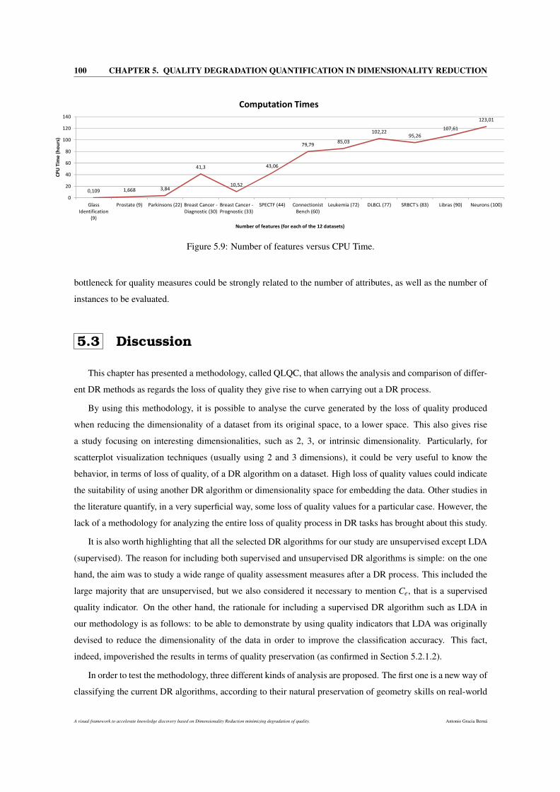
100 CHAPTER 5. QUALITY DEGRADATION QUANTIFICATION IN DIMENSIONALITY REDUCTION
0,109 1,668 3,84
41,3
10,52
43,06
79,7985,03
102,2295,26
107,61
123,01
0
20
40
60
80
100
120
140
Glass
Identification
(9)
Prostate (9) Parkinsons (22) Breast Cancer -
Diagnostic (30)
Breast Cancer -
Prognostic (33)
SPECTF (44) Connectionist
Bench (60)
Leukemia (72) DLBCL (77) SRBCT's (83) Libras (90) Neurons (100)
CP
U T
ime
(h
ou
rs)
Number of features (for each of the 12 datasets)
Computation Times
Please purchase 'docPrint PDF Driver' on http://www.verypdf.com/artprint/index.html to remove this message.
Figure 5.9: Number of features versus CPU Time.
bottleneck for quality measures could be strongly related to the number of attributes, as well as the number of
instances to be evaluated.
5.3 Discussion
This chapter has presented a methodology, called QLQC, that allows the analysis and comparison of differ-
ent DR methods as regards the loss of quality they give rise to when carrying out a DR process.
By using this methodology, it is possible to analyse the curve generated by the loss of quality produced
when reducing the dimensionality of a dataset from its original space, to a lower space. This also gives rise
a study focusing on interesting dimensionalities, such as 2, 3, or intrinsic dimensionality. Particularly, for
scatterplot visualization techniques (usually using 2 and 3 dimensions), it could be very useful to know the
behavior, in terms of loss of quality, of a DR algorithm on a dataset. High loss of quality values could indicate
the suitability of using another DR algorithm or dimensionality space for embedding the data. Other studies in
the literature quantify, in a very superficial way, some loss of quality values for a particular case. However, the
lack of a methodology for analyzing the entire loss of quality process in DR tasks has brought about this study.
It is also worth highlighting that all the selected DR algorithms for our study are unsupervised except LDA
(supervised). The reason for including both supervised and unsupervised DR algorithms is simple: on the one
hand, the aim was to study a wide range of quality assessment measures after a DR process. This included the
large majority that are unsupervised, but we also considered it necessary to mention Ce, that is a supervised
quality indicator. On the other hand, the rationale for including a supervised DR algorithm such as LDA in
our methodology is as follows: to be able to demonstrate by using quality indicators that LDA was originally
devised to reduce the dimensionality of the data in order to improve the classification accuracy. This fact,
indeed, impoverished the results in terms of quality preservation (as confirmed in Section 5.2.1.2).
In order to test the methodology, three different kinds of analysis are proposed. The first one is a new way of
classifying the current DR algorithms, according to their natural preservation of geometry skills on real-world
A visual framework to accelerate knowledge discovery based on Dimensionality Reduction minimizing degradation of quality. Antonio Gracia Berná
5.3. DISCUSSION 101
datasets. t-SNE, MVU and Isomap algorithms have been demonstrated in these cases to preserve the original
quality contained in the data, in a more effective way than the remaining algorithms. However, KPCAgauss and
LDA performed worst in the experiments. To select the experiments for studying properly the loss of quality,
the Increasing/Decreasing Stability function (SI/D) is also proposed.
For detecting similar behaviors when reducing the dimensionality of the data, in terms of loss of quality, a
clustering process of the DR algorithms has been carried out. This second analysis reports results that indicate
4 different groups of algorithms. t-SNE indicated a differentiated behavior of the remaining algorithms when
performing DR tasks, and thus achieved the best results. PCA, SM and MVU algorithms reduced the dimen-
sionality of the data in a very similar way. Conversely, LDA, KPCAgauss and ISOMAP algorithms also showed
common features when reducing the dimensionality of the data.
A final analysis is also presented, as regards the correlation between the different quality criteria when
assessing the DR process. There is a very strong correlation between several criteria. For a more accurate
measurement of the correlations, a modification of the original Pearson correlation coefficient is presented.
Therefore, PM , PMC and NIEQALOCAL proved to be strongly correlated. QNX , RNX , and Qk showed high
correlation values. All these criteria and many other have shown strong correlations, independently of the
nature of the dataset. However, the QY criterion lacks direct correlation with other criteria because of its
peculiar nature.
Antonio Gracia Berná A visual framework to accelerate knowledge discovery based on Dimensionality Reduction minimizing degradation of quality.

102 CHAPTER 5. QUALITY DEGRADATION QUANTIFICATION IN DIMENSIONALITY REDUCTION
A visual framework to accelerate knowledge discovery based on Dimensionality Reduction minimizing degradation of quality. Antonio Gracia Berná
Chapter 6
On the suitability of the thirddimension to visualize data
A possible solution when a medical expert needs to obtain knowledge from a very large dataset, is through
the use of visualization techniques. Hence, the expert can quickly visualize, in 2 or 3 dimensions, the data to
identify patterns, relationships and trends to obtain the largest possible amount of knowledge. The problem
arises when the expert should select 2 or 3 dimensions to visualize these data, since the conclusions may
vary according to the choice. This chapter seeks to address this problem from the perspective of computer
technology.
Traditionally, most visualization techniques used in the large-scale analysis of biological or medical data,
among other fields, have used two, instead of three dimensions, to represent data. The simplicity and intuition
provided by MMDV (Multivariate and multidimensional data visualization) techniques in two-dimensional
(2D) spaces are certainly their keys to success. However, there are other important factors that are not often
taken into account when selecting two or three dimensions (3D) to display data, like the degradation of the
quality of the data produced in both dimensionalities. This degradation is supposed to be greater in two, than
in three dimensions, and consequently simply by using two (instead of three) dimensions to visualize data
could cause significant degradation of the quality that would result in misleading interpretations and wrong
conclusions.
Therefore, it would be very useful to demonstrate whether the transition from three to two dimensions
generally involves a considerable loss of quality, and thus the final choice of three dimensions for MMDV
tasks could, indeed, be better justified (see Figure 6.1).
The chapter continues in the next section with a presentation of the benefits and limitations introduced
by the use of 3 dimensions to visualize MMD. Section 6.2 describes of the environment for carrying out the
visual statistical tests, together with a discussion of the results. Section 6.3 introduces an analytical approach
Antonio Gracia Berná A visual framework to accelerate knowledge discovery based on Dimensionality Reduction minimizing degradation of quality.
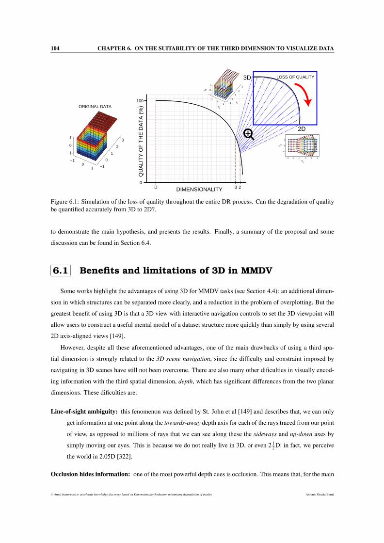
104 CHAPTER 6. ON THE SUITABILITY OF THE THIRD DIMENSION TO VISUALIZE DATA
QU
ALI
TY
OF
TH
E D
AT
A (
%)
DIMENSIONALITYD 3 2
100
0
LOSS OF QUALITY
2D
3D
x 2
−3 −2 −1 0 1 2
−1
0
1
x1
x 2
−10
1 −1
0
1
2
3
−1
0
1
ORIGINAL DATA
−10
1 −1
0
1
2
3
−1
0
1
y2
y1
y3
Figure 6.1: Simulation of the loss of quality throughout the entire DR process. Can the degradation of qualitybe quantified accurately from 3D to 2D?.
to demonstrate the main hypothesis, and presents the results. Finally, a summary of the proposal and some
discussion can be found in Section 6.4.
6.1 Benefits and limitations of 3D in MMDV
Some works highlight the advantages of using 3D for MMDV tasks (see Section 4.4): an additional dimen-
sion in which structures can be separated more clearly, and a reduction in the problem of overplotting. But the
greatest benefit of using 3D is that a 3D view with interactive navigation controls to set the 3D viewpoint will
allow users to construct a useful mental model of a dataset structure more quickly than simply by using several
2D axis-aligned views [149].
However, despite all these aforementioned advantages, one of the main drawbacks of using a third spa-
tial dimension is strongly related to the 3D scene navigation, since the difficulty and constraint imposed by
navigating in 3D scenes have still not been overcome. There are also many other dificulties in visually encod-
ing information with the third spatial dimension, depth, which has significant differences from the two planar
dimensions. These dificulties are:
Line-of-sight ambiguity: this fenomenon was defined by St. John et al [149] and describes that, we can only
get information at one point along the towards-away depth axis for each of the rays traced from our point
of view, as opposed to millions of rays that we can see along these the sideways and up-down axes by
simply moving our eyes. This is because we do not really live in 3D, or even 2 12 D: in fact, we perceive
the world in 2.05D [322].
Occlusion hides information: one of the most powerful depth cues is occlusion. This means that, for the main
A visual framework to accelerate knowledge discovery based on Dimensionality Reduction minimizing degradation of quality. Antonio Gracia Berná
6.1. BENEFITS AND LIMITATIONS OF 3D IN MMDV 105
observer of the scene, a particular object may remain partially or completely hidden due to other objects
located in front of it. It is possible to solve the 3D structure of the occluded elements of the scene by
using an interactive navigation, but it takes time and implies a cognitive load.
Perspective distortion: this is the phenomenon in which distant objects appear smaller and change their planar
position on the image plane. This distorsion is one of the main dangers of depth, since the power of the
plane is completely lost. For instance, if charts are used, it is more difficult to evaluate bar heights in a
3D bar than in multiple horizontally aligned 2D bars.
Text legibility: Another drawback derived from the use of 3D is the quality reduction in text legibility with
most standard graphics packages that use current display technology [113]. Specifically, when a text
label is tilted in the image plane, it often becomes blocky and jaggy.
Inappropriate view scale: If the user is placed at viewpoints too close to or too distant from the 3D scene
representation, important information (e.g. 3D objects) may lie outside the viewing frustum or be so
small that they go unnoticed by the user.
Limited perception of movement: Depending on the user’s viewpoint and the nature of the 3D objects, it may
be difficult to see objects moving toward or away from the user. For example, objects whose position or
attribute change is parallel to the eye vector for the scene.
Nevertheless, these advantages and drawbacks do not univocally specify that the use of 3D is the most
appropriate for MMDV. Going further, the following questions remain unanswered:
• i) When visualizing data, is the 3D representation less degraded and therefore more faithful to the reality
of the data? Would it be possible to quantify this degradation in the final representation? Is it too big?
• ii) When the users interact with the visualization, do they make fewer errors in 3D? Would it be possible
to assess the effectiveness and efficiency when working on both representations (2D and 3D)?
• iii) Therefore, is 3D the most suitable representation to visualize data?
These open questions motivate the research presented in this proposal, in which we face the challenges
behind the selection of a space with the appropriate dimensionality to visualize MMD. To answer these ques-
tions, an approach focusing on loss of quality is proposed. This concept is the key point, since the inevitable
degradation of the data quality when the dimensionality is reduced, as well as a bad choice of the data dimen-
sionality for MMDV could drastically affect to the final interpretation of the data in the process of knowledge
acquisition.
The main hypothesis of the proposal presented here is based on the assertion that the use of the three
dimensions in visualization counteracts the benefits of dealing with traditional 2D visualization. In other
words, the intention is to demonstrate the superiority of 3D over 2D visualization for MMDV tasks.
Antonio Gracia Berná A visual framework to accelerate knowledge discovery based on Dimensionality Reduction minimizing degradation of quality.
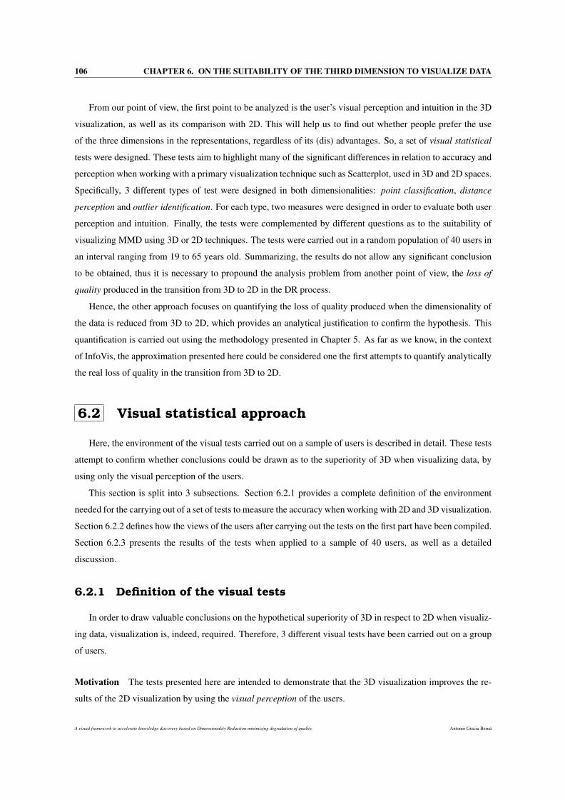
106 CHAPTER 6. ON THE SUITABILITY OF THE THIRD DIMENSION TO VISUALIZE DATA
From our point of view, the first point to be analyzed is the user’s visual perception and intuition in the 3D
visualization, as well as its comparison with 2D. This will help us to find out whether people prefer the use
of the three dimensions in the representations, regardless of its (dis) advantages. So, a set of visual statistical
tests were designed. These tests aim to highlight many of the significant differences in relation to accuracy and
perception when working with a primary visualization technique such as Scatterplot, used in 3D and 2D spaces.
Specifically, 3 different types of test were designed in both dimensionalities: point classification, distance
perception and outlier identification. For each type, two measures were designed in order to evaluate both user
perception and intuition. Finally, the tests were complemented by different questions as to the suitability of
visualizing MMD using 3D or 2D techniques. The tests were carried out in a random population of 40 users in
an interval ranging from 19 to 65 years old. Summarizing, the results do not allow any significant conclusion
to be obtained, thus it is necessary to propound the analysis problem from another point of view, the loss of
quality produced in the transition from 3D to 2D in the DR process.
Hence, the other approach focuses on quantifying the loss of quality produced when the dimensionality of
the data is reduced from 3D to 2D, which provides an analytical justification to confirm the hypothesis. This
quantification is carried out using the methodology presented in Chapter 5. As far as we know, in the context
of InfoVis, the approximation presented here could be considered one the first attempts to quantify analytically
the real loss of quality in the transition from 3D to 2D.
6.2 Visual statistical approach
Here, the environment of the visual tests carried out on a sample of users is described in detail. These tests
attempt to confirm whether conclusions could be drawn as to the superiority of 3D when visualizing data, by
using only the visual perception of the users.
This section is split into 3 subsections. Section 6.2.1 provides a complete definition of the environment
needed for the carrying out of a set of tests to measure the accuracy when working with 2D and 3D visualization.
Section 6.2.2 defines how the views of the users after carrying out the tests on the first part have been compiled.
Section 6.2.3 presents the results of the tests when applied to a sample of 40 users, as well as a detailed
discussion.
6.2.1 Definition of the visual tests
In order to draw valuable conclusions on the hypothetical superiority of 3D in respect to 2D when visualiz-
ing data, visualization is, indeed, required. Therefore, 3 different visual tests have been carried out on a group
of users.
Motivation The tests presented here are intended to demonstrate that the 3D visualization improves the re-
sults of the 2D visualization by using the visual perception of the users.
A visual framework to accelerate knowledge discovery based on Dimensionality Reduction minimizing degradation of quality. Antonio Gracia Berná
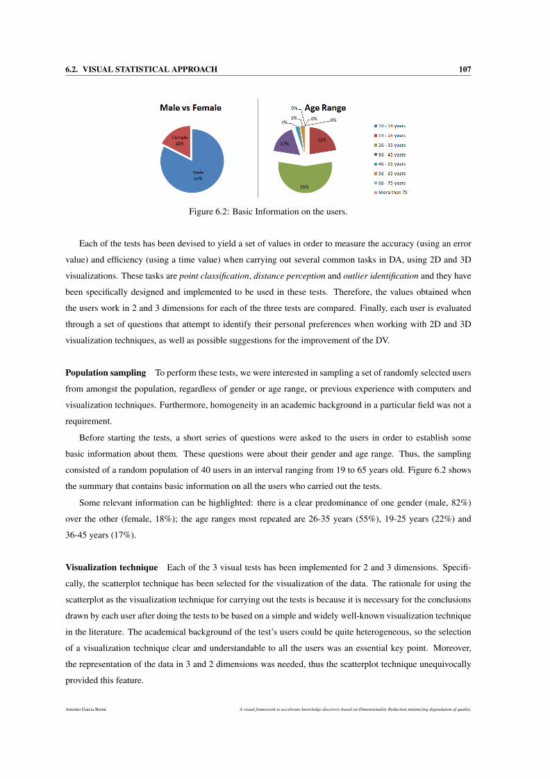
6.2. VISUAL STATISTICAL APPROACH 107
Figure 6.2: Basic Information on the users.
Each of the tests has been devised to yield a set of values in order to measure the accuracy (using an error
value) and efficiency (using a time value) when carrying out several common tasks in DA, using 2D and 3D
visualizations. These tasks are point classification, distance perception and outlier identification and they have
been specifically designed and implemented to be used in these tests. Therefore, the values obtained when
the users work in 2 and 3 dimensions for each of the three tests are compared. Finally, each user is evaluated
through a set of questions that attempt to identify their personal preferences when working with 2D and 3D
visualization techniques, as well as possible suggestions for the improvement of the DV.
Population sampling To perform these tests, we were interested in sampling a set of randomly selected users
from amongst the population, regardless of gender or age range, or previous experience with computers and
visualization techniques. Furthermore, homogeneity in an academic background in a particular field was not a
requirement.
Before starting the tests, a short series of questions were asked to the users in order to establish some
basic information about them. These questions were about their gender and age range. Thus, the sampling
consisted of a random population of 40 users in an interval ranging from 19 to 65 years old. Figure 6.2 shows
the summary that contains basic information on all the users who carried out the tests.
Some relevant information can be highlighted: there is a clear predominance of one gender (male, 82%)
over the other (female, 18%); the age ranges most repeated are 26-35 years (55%), 19-25 years (22%) and
36-45 years (17%).
Visualization technique Each of the 3 visual tests has been implemented for 2 and 3 dimensions. Specifi-
cally, the scatterplot technique has been selected for the visualization of the data. The rationale for using the
scatterplot as the visualization technique for carrying out the tests is because it is necessary for the conclusions
drawn by each user after doing the tests to be based on a simple and widely well-known visualization technique
in the literature. The academical background of the test’s users could be quite heterogeneous, so the selection
of a visualization technique clear and understandable to all the users was an essential key point. Moreover,
the representation of the data in 3 and 2 dimensions was needed, thus the scatterplot technique unequivocally
provided this feature.
Antonio Gracia Berná A visual framework to accelerate knowledge discovery based on Dimensionality Reduction minimizing degradation of quality.
108 CHAPTER 6. ON THE SUITABILITY OF THE THIRD DIMENSION TO VISUALIZE DATA
Data As regards the data, one of the most well-known DNA microarray datasets in the literature has been
used, Leukemia data [105], by Golub et al. (1999). This dataset was used for three main reasons. First of all,
the data would have had a supervised nature, since one of the tests (point classification) requires labeled data.
Secondly, the tests should be based on a highly tested and referenced datasets from other studies [74, 343, 223].
Lastly, the data should be one of the datasets used by the methodology in Section 5.2 to quantify the loss of
quality values.
DR algorithm To represent the data selected by the scatterplot visualization technique, first it is necessary to
carry out a DR process, since the data was originally of a multidimensional nature. So, in order to successfully
complete the tests, the data dimensionality is firstly reduced to 3 and 2 dimensions. Later, the 3D and 2D
scatterplot technique respectively, deals with the visualization of the MMD.
The PCA algorithm has been selected for carrying out the DR. The rationale is similar to the points men-
tioned above, as: i) it is important to use a broadly referenced and used DR algorithm in the literature, and the
PCA satisfies this requirement; ii) moreover, according the results obtained in [110], the PCA provides a high
accuracy in the preservation of the intrinsic geometric structure of the data [319], which ensures a good quality
in the final data visualization. Note that the PCA is of an unsupervised nature [151, 140] and the leukemia data
are supervised, thus to reduce the data the original classes have not been taken into account. Subsequently, the
data are coloured in accordance with their labels once they are visualized.
It is also worth highlighting that the selection of the DR algorithm could be a decisive issue for achieving
different results. However, the aim of the tests is to show the perception skills, experience and criteria of the
users when working with 3D and 2D data, obtained by the same method (PCA). Therefore, in this case, the user
is abstracted from this particularity and is presented by a visualization of the data from the previous dataset.
Time measurement Before explaining the details of the tests, it is important to highlight that the time (in
seconds) that each user takes to complete each test is measured. However, the users were not notified that the
time is going to be taken into account, so that nobody modifies their rhythm of work, and thus taking the needed
time to properly complete each test. This will provide a better appreciation of the real time that each user takes
to complete a test, by using either a 2D or 3D scatterplot. Note that the time the users had to perform the tests
was open. As they finished the tests, the time taken was recorded.
Validation of the results Cross-validation is used in order to properly validate the results. For each user, we
followed a specific methodology (see Figure 6.3).
Firstly, a set of random points that are going to be classified are selected. Thus, the user n carries out the
point classification test (2D) and obtains two different results, T nPC_2D (time) and In
PC_2D (error value). After
this, the user n carries out the same test in 3D and obtains another two results, T nPC_3D (time) and In
PC_3D (error
value).
A visual framework to accelerate knowledge discovery based on Dimensionality Reduction minimizing degradation of quality. Antonio Gracia Berná
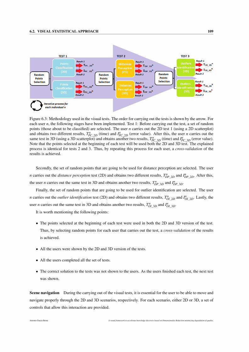
6.2. VISUAL STATISTICAL APPROACH 109
Figure 6.3: Methodology used in the visual tests. The order for carrying out the tests is shown by the arrow. Foreach user n, the following stages have been implemented. Test 1: Before carrying out the test, a set of randompoints (those about to be classified) are selected. The user n carries out the 2D test 1 (using a 2D scatterplot)and obtains two different results, T n
PC_2D (time) and InPC_2D (error value). After this, the user n carries out the
same test in 3D (using a 3D scatterplot) and obtains another two results, T nPC_3D (time) and In
PC_3D (error value).Note that the points selected at the beginning of each test will be used both the 2D and 3D test. The explainedprocess is identical for tests 2 and 3. Thus, by repeating this process for each user, a cross-validation of theresults is achieved.
Secondly, the set of random points that are going to be used for distance perception are selected. The user
n carries out the distance perception test (2D) and obtains two different results, T nDP_2D and In
DP_2D. After this,
the user n carries out the same test in 3D and obtains another two results, T nDP_3D and In
DP_3D.
Finally, the set of random points that are going to be used for outlier identification are selected. The user
n carries out the outlier identification test (2D) and obtains two different results, T nOI_2D and In
OI_2D. Lastly, the
user n carries out the same test in 3D and obtains another two results, T nOI_3D and In
OI_3D.
It is worth mentioning the following points:
• The points selected at the beginning of each test were used in both the 2D and 3D version of the test.
Thus, by selecting random points for each user that carries out the test, a cross-validation of the results
is achieved.
• All the users were shown by the 2D and 3D version of the tests.
• All the users completed all the set of tests.
• The correct solution to the tests was not shown to the users. As the users finished each test, the next test
was shown.
Scene navigation During the carrying out of the visual tests, it is essential for the user to be able to move and
navigate properly through the 2D and 3D scenarios, respectively. For each scenario, either 2D or 3D, a set of
controls that allow this interaction are provided.
Antonio Gracia Berná A visual framework to accelerate knowledge discovery based on Dimensionality Reduction minimizing degradation of quality.
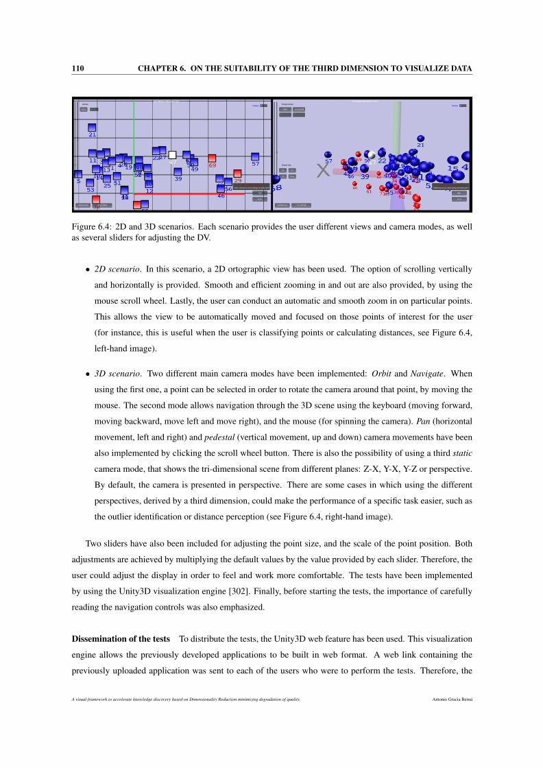
110 CHAPTER 6. ON THE SUITABILITY OF THE THIRD DIMENSION TO VISUALIZE DATA
Figure 6.4: 2D and 3D scenarios. Each scenario provides the user different views and camera modes, as wellas several sliders for adjusting the DV.
• 2D scenario. In this scenario, a 2D ortographic view has been used. The option of scrolling vertically
and horizontally is provided. Smooth and efficient zooming in and out are also provided, by using the
mouse scroll wheel. Lastly, the user can conduct an automatic and smooth zoom in on particular points.
This allows the view to be automatically moved and focused on those points of interest for the user
(for instance, this is useful when the user is classifying points or calculating distances, see Figure 6.4,
left-hand image).
• 3D scenario. Two different main camera modes have been implemented: Orbit and Navigate. When
using the first one, a point can be selected in order to rotate the camera around that point, by moving the
mouse. The second mode allows navigation through the 3D scene using the keyboard (moving forward,
moving backward, move left and move right), and the mouse (for spinning the camera). Pan (horizontal
movement, left and right) and pedestal (vertical movement, up and down) camera movements have been
also implemented by clicking the scroll wheel button. There is also the possibility of using a third static
camera mode, that shows the tri-dimensional scene from different planes: Z-X, Y-X, Y-Z or perspective.
By default, the camera is presented in perspective. There are some cases in which using the different
perspectives, derived by a third dimension, could make the performance of a specific task easier, such as
the outlier identification or distance perception (see Figure 6.4, right-hand image).
Two sliders have also been included for adjusting the point size, and the scale of the point position. Both
adjustments are achieved by multiplying the default values by the value provided by each slider. Therefore, the
user could adjust the display in order to feel and work more comfortable. The tests have been implemented
by using the Unity3D visualization engine [302]. Finally, before starting the tests, the importance of carefully
reading the navigation controls was also emphasized.
Dissemination of the tests To distribute the tests, the Unity3D web feature has been used. This visualization
engine allows the previously developed applications to be built in web format. A web link containing the
previously uploaded application was sent to each of the users who were to perform the tests. Therefore, the
A visual framework to accelerate knowledge discovery based on Dimensionality Reduction minimizing degradation of quality. Antonio Gracia Berná
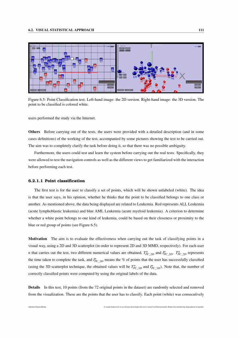
6.2. VISUAL STATISTICAL APPROACH 111
Figure 6.5: Point Classification test. Left-hand image: the 2D version. Right-hand image: the 3D version. Thepoint to be classified is colored white.
users performed the study via the Internet.
Others Before carrying out of the tests, the users were provided with a detailed description (and in some
cases definitions) of the working of the test, accompanied by some pictures showing the test to be carried out.
The aim was to completely clarify the task before doing it, so that there was no possible ambiguity.
Furthermore, the users could test and learn the system before carrying out the real tests. Specifically, they
were allowed to test the navigation controls as well as the different views to get familiarized with the interaction
before performing each test.
6.2.1.1 Point classification
The first test is for the user to classify a set of points, which will be shown unlabeled (white). The idea
is that the user says, in his opinion, whether he thinks that the point to be classified belongs to one class or
another. As mentioned above, the data being displayed are related to Leukemia. Red represents ALL Leukemia
(acute lymphoblastic leukemia) and blue AML Leukemia (acute myeloid leukemia). A criterion to determine
whether a white point belongs to one kind of leukemia, could be based on their closeness or proximity to the
blue or red group of points (see Figure 6.5).
Motivation The aim is to evaluate the effectiveness when carrying out the task of classifying points in a
visual way, using a 2D and 3D scatterplot (in order to represent 2D and 3D MMD, respectively). For each user
n that carries out the test, two different numerical values are obtained, T nPC_2D and In
PC_2D. T nPC_2D represents
the time taken to complete the task, and InPC_2D means the % of points that the user has successfully classified
(using the 3D scatterplot technique, the obtained values will be T nPC_3D and In
PC_3D). Note that, the number of
correctly classified points were computed by using the original labels of the data.
Details In this test, 10 points (from the 72 original points in the dataset) are randomly selected and removed
from the visualization. These are the points that the user has to classify. Each point (white) was consecutively
Antonio Gracia Berná A visual framework to accelerate knowledge discovery based on Dimensionality Reduction minimizing degradation of quality.
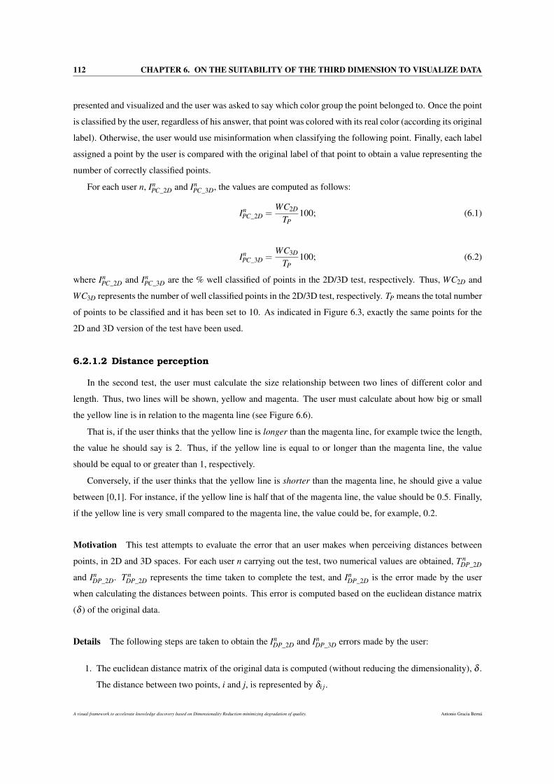
112 CHAPTER 6. ON THE SUITABILITY OF THE THIRD DIMENSION TO VISUALIZE DATA
presented and visualized and the user was asked to say which color group the point belonged to. Once the point
is classified by the user, regardless of his answer, that point was colored with its real color (according its original
label). Otherwise, the user would use misinformation when classifying the following point. Finally, each label
assigned a point by the user is compared with the original label of that point to obtain a value representing the
number of correctly classified points.
For each user n, InPC_2D and In
PC_3D, the values are computed as follows:
InPC_2D =
WC2D
TP100; (6.1)
InPC_3D =
WC3D
TP100; (6.2)
where InPC_2D and In
PC_3D are the % well classified of points in the 2D/3D test, respectively. Thus, WC2D and
WC3D represents the number of well classified points in the 2D/3D test, respectively. TP means the total number
of points to be classified and it has been set to 10. As indicated in Figure 6.3, exactly the same points for the
2D and 3D version of the test have been used.
6.2.1.2 Distance perception
In the second test, the user must calculate the size relationship between two lines of different color and
length. Thus, two lines will be shown, yellow and magenta. The user must calculate about how big or small
the yellow line is in relation to the magenta line (see Figure 6.6).
That is, if the user thinks that the yellow line is longer than the magenta line, for example twice the length,
the value he should say is 2. Thus, if the yellow line is equal to or longer than the magenta line, the value
should be equal to or greater than 1, respectively.
Conversely, if the user thinks that the yellow line is shorter than the magenta line, he should give a value
between [0,1]. For instance, if the yellow line is half that of the magenta line, the value should be 0.5. Finally,
if the yellow line is very small compared to the magenta line, the value could be, for example, 0.2.
Motivation This test attempts to evaluate the error that an user makes when perceiving distances between
points, in 2D and 3D spaces. For each user n carrying out the test, two numerical values are obtained, T nDP_2D
and InDP_2D. T n
DP_2D represents the time taken to complete the test, and InDP_2D is the error made by the user
when calculating the distances between points. This error is computed based on the euclidean distance matrix
(δ ) of the original data.
Details The following steps are taken to obtain the InDP_2D and In
DP_3D errors made by the user:
1. The euclidean distance matrix of the original data is computed (without reducing the dimensionality), δ .
The distance between two points, i and j, is represented by δi j.
A visual framework to accelerate knowledge discovery based on Dimensionality Reduction minimizing degradation of quality. Antonio Gracia Berná
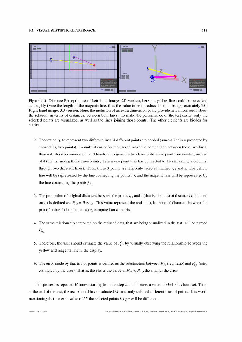
6.2. VISUAL STATISTICAL APPROACH 113
Figure 6.6: Distance Perception test. Left-hand image: 2D version, here the yellow line could be perceivedas roughly twice the length of the magenta line, thus the value to be introduced should be approximately 2.0.Right-hand image: 3D version. Here, the inclusion of an extra dimension could provide new information aboutthe relation, in terms of distances, between both lines. To make the performance of the test easier, only theselected points are visualized, as well as the lines joining those points. The other elements are hidden forclarity.
2. Theoretically, to represent two different lines, 4 different points are needed (since a line is represented by
connecting two points). To make it easier for the user to make the comparison between these two lines,
they will share a common point. Therefore, to generate two lines 3 different points are needed, instead
of 4 (that is, among those three points, there is one point which is connected to the remaining two points,
through two different lines). Thus, those 3 points are randomly selected, named i, j and z. The yellow
line will be represented by the line connecting the points i-j, and the magenta line will be represented by
the line connecting the points j-z.
3. The proportion of original distances between the points i, j and z (that is, the ratio of distances calculated
on δ ) is defined as: Pi jz = δi j/δ jz. This value represent the real ratio, in terms of distance, between the
pair of points i-j in relation to j-z, computed on δ matrix.
4. The same relationship computed on the reduced data, that are being visualized in the test, will be named
P′i jz.
5. Therefore, the user should estimate the value of P′i jz by visually observing the relationship between the
yellow and magenta line in the display.
6. The error made by that trio of points is defined as the substraction between Pi jz (real ratio) and P′i jz (ratio
estimated by the user). That is, the closer the value of P′i jz to Pi jz, the smaller the error.
This process is repeated M times, starting from the step 2. In this case, a value of M=10 has been set. Thus,
at the end of the test, the user should have evaluated M randomly selected different trios of points. It is worth
mentioning that for each value of M, the selected points i, j y z will be different.
Antonio Gracia Berná A visual framework to accelerate knowledge discovery based on Dimensionality Reduction minimizing degradation of quality.
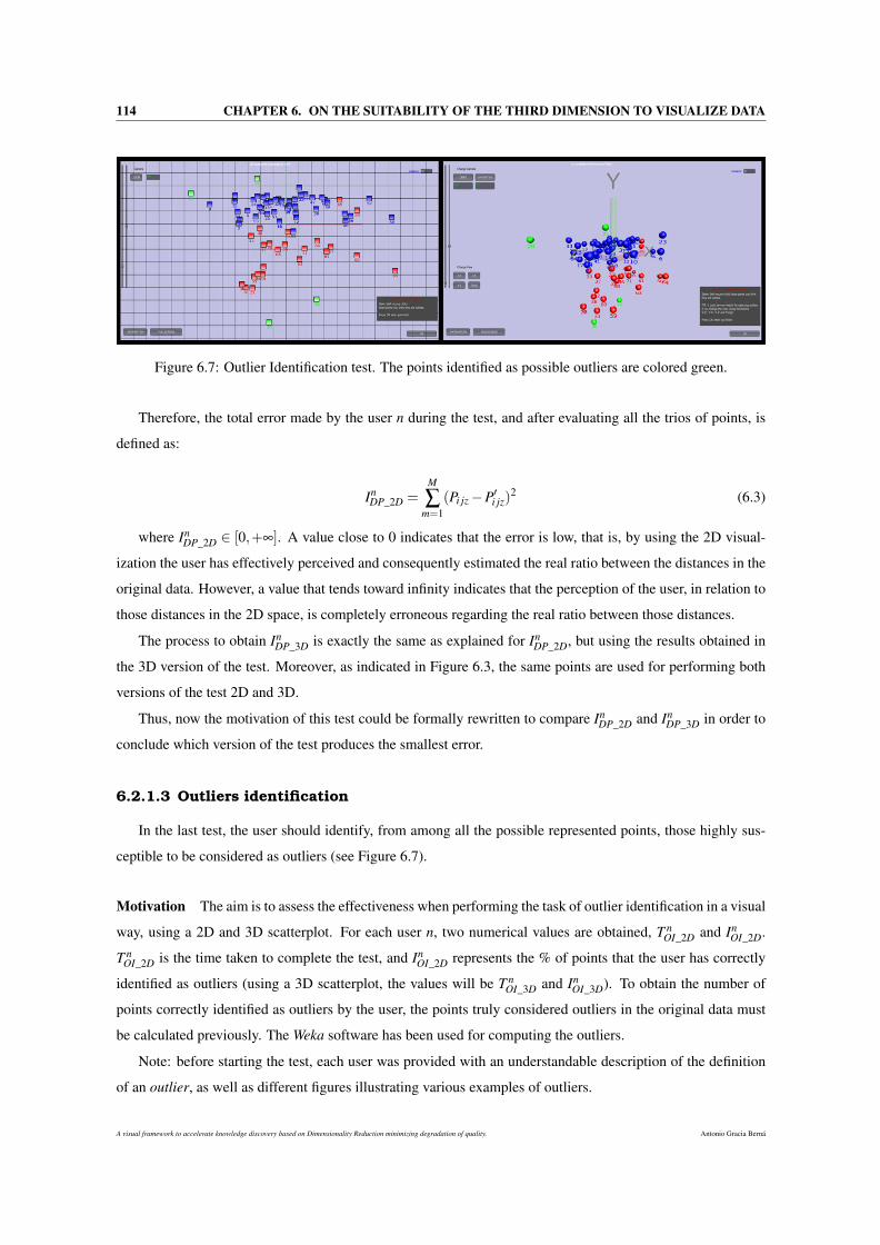
114 CHAPTER 6. ON THE SUITABILITY OF THE THIRD DIMENSION TO VISUALIZE DATA
Figure 6.7: Outlier Identification test. The points identified as possible outliers are colored green.
Therefore, the total error made by the user n during the test, and after evaluating all the trios of points, is
defined as:
InDP_2D =
M
∑m=1
(Pi jz−P′i jz)2 (6.3)
where InDP_2D ∈ [0,+∞]. A value close to 0 indicates that the error is low, that is, by using the 2D visual-
ization the user has effectively perceived and consequently estimated the real ratio between the distances in the
original data. However, a value that tends toward infinity indicates that the perception of the user, in relation to
those distances in the 2D space, is completely erroneous regarding the real ratio between those distances.
The process to obtain InDP_3D is exactly the same as explained for In
DP_2D, but using the results obtained in
the 3D version of the test. Moreover, as indicated in Figure 6.3, the same points are used for performing both
versions of the test 2D and 3D.
Thus, now the motivation of this test could be formally rewritten to compare InDP_2D and In
DP_3D in order to
conclude which version of the test produces the smallest error.
6.2.1.3 Outliers identification
In the last test, the user should identify, from among all the possible represented points, those highly sus-
ceptible to be considered as outliers (see Figure 6.7).
Motivation The aim is to assess the effectiveness when performing the task of outlier identification in a visual
way, using a 2D and 3D scatterplot. For each user n, two numerical values are obtained, T nOI_2D and In
OI_2D.
T nOI_2D is the time taken to complete the test, and In
OI_2D represents the % of points that the user has correctly
identified as outliers (using a 3D scatterplot, the values will be T nOI_3D and In
OI_3D). To obtain the number of
points correctly identified as outliers by the user, the points truly considered outliers in the original data must
be calculated previously. The Weka software has been used for computing the outliers.
Note: before starting the test, each user was provided with an understandable description of the definition
of an outlier, as well as different figures illustrating various examples of outliers.
A visual framework to accelerate knowledge discovery based on Dimensionality Reduction minimizing degradation of quality. Antonio Gracia Berná
6.2. VISUAL STATISTICAL APPROACH 115
Details As a preliminary step to the carrying out of the test, the filter ’InterquartileRange’ was used, avalaible
in Weka, for computing the possible outliers in the original data. A total of 13 points have been detected as
potential outliers (points: 9, 10, 11, 14, 17, 20, 30, 31, 38, 39, 66, 70 and 72). Therefore, our calculations are
based on these points.
Next, in the test, the user is asked about which point or points could be considered as outliers, from his
point of view. As the user selected those candidate points as outliers, these points were colored green in order
to distinguish them from the rest. Finally, the set of points that the user has identified as outliers are compared
to those that, in fact, are outliers.
The equations for computing InOI_2D and In
OI_3D are defined as:
InOI_2D =
CO2D
TO100; (6.4)
InOI_3D =
CO3D
TO100; (6.5)
where InOI_2D and In
OI_3D are the % of points correctly identified as outliers in the 2D/3D test, respectively.
Therefore, CO2D and CO3D represents the number of points correctly identified as outliers in the 2D/3D test,
respectively. TO is the total number of points identified as outliers in the original data and its value is 13.
6.2.2 Definition of the questions
To complement the results of the visual tests, a set of questions have been also included. The users were
asked these questions once they finished the tests. These questions attempt to assess the visual experience of
each user with each previously performed test. The aim is to reinforce, as far as possible, the results according
to the criteria and preferences of each user.
The definition and description of these questions are shown in detail in Appendix A.
6.2.3 Results obtained
In this subsection, the results obtained after applying the aforementioned experiments to a group of 40 users
are presented.
6.2.3.1 Visual tests
Table 6.1 presents the mean values of the results obtained during the tests, for both dimensions (2 and 3).
Before analyzing these results, several aspects must be considered. Firstly, the results for each test in both
dimensions will be compared. For the tests Point Classification and Outlier Identification, the mean value of
% success rate, computed on all the users, is shown (Mean IPC_2D, IPC_3D, IOI_2D and IOI_3D). However, for the
test Distance Perception, the total error value, computed over all the users, is shown (Total IDP_2D and IDP_3D).
Antonio Gracia Berná A visual framework to accelerate knowledge discovery based on Dimensionality Reduction minimizing degradation of quality.
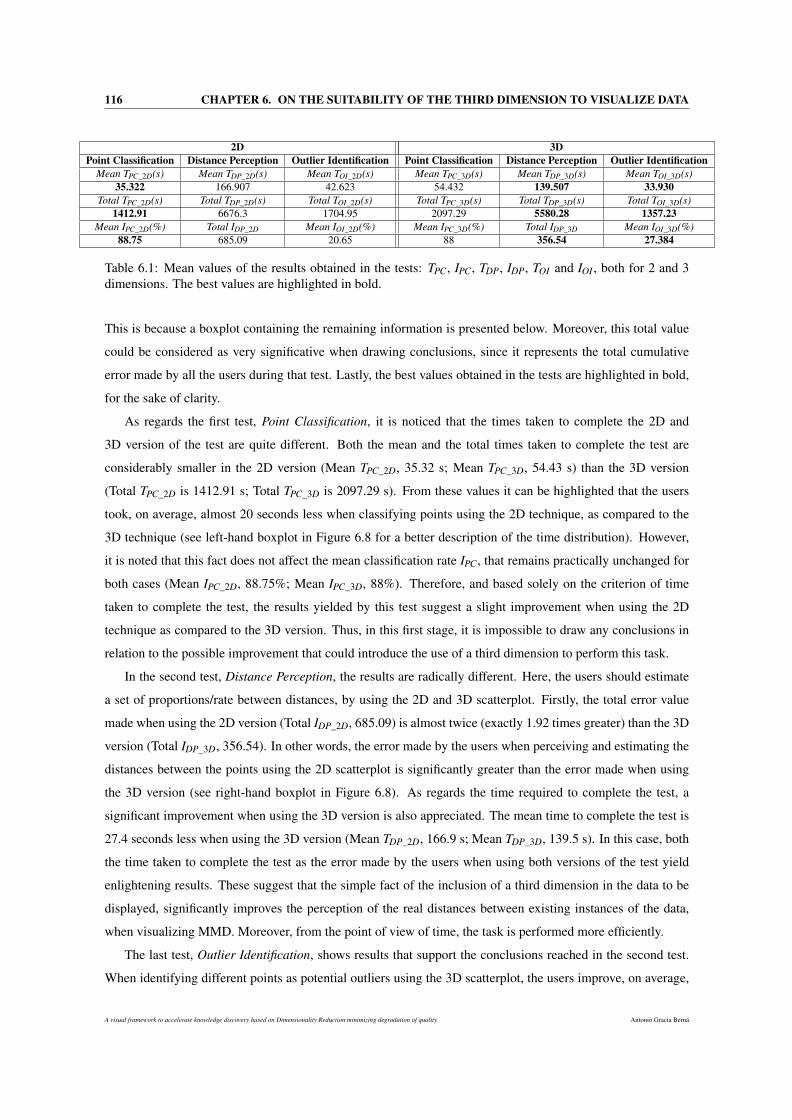
116 CHAPTER 6. ON THE SUITABILITY OF THE THIRD DIMENSION TO VISUALIZE DATA
2D 3DPoint Classification Distance Perception Outlier Identification Point Classification Distance Perception Outlier Identification
Mean TPC_2D(s) Mean TDP_2D(s) Mean TOI_2D(s) Mean TPC_3D(s) Mean TDP_3D(s) Mean TOI_3D(s)35.322 166.907 42.623 54.432 139.507 33.930
Total TPC_2D(s) Total TDP_2D(s) Total TOI_2D(s) Total TPC_3D(s) Total TDP_3D(s) Total TOI_3D(s)1412.91 6676.3 1704.95 2097.29 5580.28 1357.23
Mean IPC_2D(%) Total IDP_2D Mean IOI_2D(%) Mean IPC_3D(%) Total IDP_3D Mean IOI_3D(%)88.75 685.09 20.65 88 356.54 27.384
Table 6.1: Mean values of the results obtained in the tests: TPC, IPC, TDP, IDP, TOI and IOI , both for 2 and 3dimensions. The best values are highlighted in bold.
This is because a boxplot containing the remaining information is presented below. Moreover, this total value
could be considered as very significative when drawing conclusions, since it represents the total cumulative
error made by all the users during that test. Lastly, the best values obtained in the tests are highlighted in bold,
for the sake of clarity.
As regards the first test, Point Classification, it is noticed that the times taken to complete the 2D and
3D version of the test are quite different. Both the mean and the total times taken to complete the test are
considerably smaller in the 2D version (Mean TPC_2D, 35.32 s; Mean TPC_3D, 54.43 s) than the 3D version
(Total TPC_2D is 1412.91 s; Total TPC_3D is 2097.29 s). From these values it can be highlighted that the users
took, on average, almost 20 seconds less when classifying points using the 2D technique, as compared to the
3D technique (see left-hand boxplot in Figure 6.8 for a better description of the time distribution). However,
it is noted that this fact does not affect the mean classification rate IPC, that remains practically unchanged for
both cases (Mean IPC_2D, 88.75%; Mean IPC_3D, 88%). Therefore, and based solely on the criterion of time
taken to complete the test, the results yielded by this test suggest a slight improvement when using the 2D
technique as compared to the 3D version. Thus, in this first stage, it is impossible to draw any conclusions in
relation to the possible improvement that could introduce the use of a third dimension to perform this task.
In the second test, Distance Perception, the results are radically different. Here, the users should estimate
a set of proportions/rate between distances, by using the 2D and 3D scatterplot. Firstly, the total error value
made when using the 2D version (Total IDP_2D, 685.09) is almost twice (exactly 1.92 times greater) than the 3D
version (Total IDP_3D, 356.54). In other words, the error made by the users when perceiving and estimating the
distances between the points using the 2D scatterplot is significantly greater than the error made when using
the 3D version (see right-hand boxplot in Figure 6.8). As regards the time required to complete the test, a
significant improvement when using the 3D version is also appreciated. The mean time to complete the test is
27.4 seconds less when using the 3D version (Mean TDP_2D, 166.9 s; Mean TDP_3D, 139.5 s). In this case, both
the time taken to complete the test as the error made by the users when using both versions of the test yield
enlightening results. These suggest that the simple fact of the inclusion of a third dimension in the data to be
displayed, significantly improves the perception of the real distances between existing instances of the data,
when visualizing MMD. Moreover, from the point of view of time, the task is performed more efficiently.
The last test, Outlier Identification, shows results that support the conclusions reached in the second test.
When identifying different points as potential outliers using the 3D scatterplot, the users improve, on average,
A visual framework to accelerate knowledge discovery based on Dimensionality Reduction minimizing degradation of quality. Antonio Gracia Berná
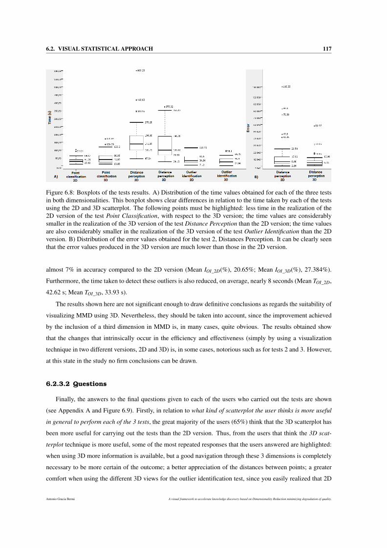
6.2. VISUAL STATISTICAL APPROACH 117
Figure 6.8: Boxplots of the tests results. A) Distribution of the time values obtained for each of the three testsin both dimensionalities. This boxplot shows clear differences in relation to the time taken by each of the testsusing the 2D and 3D scatterplot. The following points must be highlighted: less time in the realization of the2D version of the test Point Classification, with respect to the 3D version; the time values are considerablysmaller in the realization of the 3D version of the test Distance Perception than the 2D version; the time valuesare also considerably smaller in the realization of the 3D version of the test Outlier Identification than the 2Dversion. B) Distribution of the error values obtained for the test 2, Distances Perception. It can be clearly seenthat the error values produced in the 3D version are much lower than those in the 2D version.
almost 7% in accuracy compared to the 2D version (Mean IOI_2D(%), 20.65%; Mean IOI_3D(%), 27.384%).
Furthermore, the time taken to detect these outliers is also reduced, on average, nearly 8 seconds (Mean TOI_2D,
42.62 s; Mean TOI_3D, 33.93 s).
The results shown here are not significant enough to draw definitive conclusions as regards the suitability of
visualizing MMD using 3D. Nevertheless, they should be taken into account, since the improvement achieved
by the inclusion of a third dimension in MMD is, in many cases, quite obvious. The results obtained show
that the changes that intrinsically occur in the efficiency and effectiveness (simply by using a visualization
technique in two different versions, 2D and 3D) is, in some cases, notorious such as for tests 2 and 3. However,
at this state in the study no firm conclusions can be drawn.
6.2.3.2 Questions
Finally, the answers to the final questions given to each of the users who carried out the tests are shown
(see Appendix A and Figure 6.9). Firstly, in relation to what kind of scatterplot the user thinks is more useful
in general to perform each of the 3 tests, the great majority of the users (65%) think that the 3D scatterplot has
been more useful for carrying out the tests than the 2D version. Thus, from the users that think the 3D scat-
terplot technique is more useful, some of the most repeated responses that the users answered are highlighted:
when using 3D more information is available, but a good navigation through these 3 dimensions is completely
necessary to be more certain of the outcome; a better appreciation of the distances between points; a greater
comfort when using the different 3D views for the outlier identification test, since you easily realized that 2D
Antonio Gracia Berná A visual framework to accelerate knowledge discovery based on Dimensionality Reduction minimizing degradation of quality.
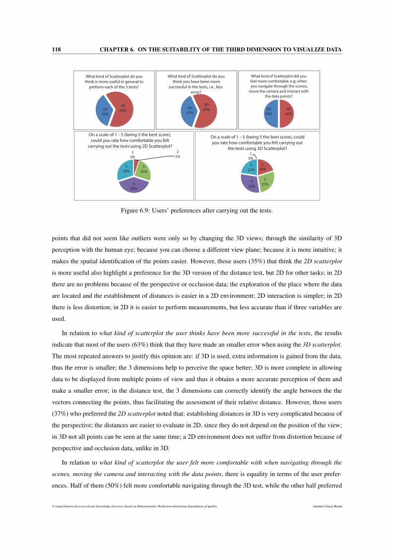
118 CHAPTER 6. ON THE SUITABILITY OF THE THIRD DIMENSION TO VISUALIZE DATA
2D
35%
3D
65%
What kind of Scatterplot do you
think is more useful in general to
perform each of the 3 tests?
2D
37%
3D
63%
What kind of Scatterplot do you
think you have been more
successful in the tests, i.e., less
error?
2D
50%
3D
50%
What kind of Scatterplot did you
feel more comfortable, e.g: when
you navigate through the scenes,
move the camera and interact with
the data points?
1
0%
2
5%
3
25%
4
40%
5
30%
On a scale of 1 - 5 (being 5 the best score),
could you rate how comfortable you felt
carrying out the tests using 2D Scatterplot?
1
0%
2
20%
3
27% 4
30%
5
23%
On a scale of 1 - 5 (being 5 the best score), could
you rate how comfortable you felt carrying out
the tests using 3D Scatterplot?
Figure 6.9: Users’ preferences after carrying out the tests.
points that did not seem like outliers were only so by changing the 3D views; through the similarity of 3D
perception with the human eye; because you can choose a different view plane; because it is more intuitive; it
makes the spatial identification of the points easier. However, those users (35%) that think the 2D scatterplot
is more useful also highlight a preference for the 3D version of the distance test, but 2D for other tasks; in 2D
there are no problems because of the perspective or occlusion data; the exploration of the place where the data
are located and the establishment of distances is easier in a 2D environment; 2D interaction is simpler; in 2D
there is less distortion; in 2D it is easier to perform measurements, but less accurate than if three variables are
used.
In relation to what kind of scatterplot the user thinks have been more successful in the tests, the results
indicate that most of the users (63%) think that they have made an smaller error when using the 3D scatterplot.
The most repeated answers to justify this opinion are: if 3D is used, extra information is gained from the data,
thus the error is smaller; the 3 dimensions help to perceive the space better; 3D is more complete in allowing
data to be displayed from multiple points of view and thus it obtains a more accurate perception of them and
make a smaller error; in the distance test, the 3 dimensions can correctly identify the angle between the the
vectors connecting the points, thus facilitating the assessment of their relative distance. However, those users
(37%) who preferred the 2D scatterplot noted that: establishing distances in 3D is very complicated because of
the perspective; the distances are easier to evaluate in 2D, since they do not depend on the position of the view;
in 3D not all points can be seen at the same time; a 2D environment does not suffer from distortion because of
perspective and occlusion data, unlike in 3D.
In relation to what kind of scatterplot the user felt more comfortable with when navigating through the
scenes, moving the camera and interacting with the data points, there is equality in terms of the user prefer-
ences. Half of them (50%) felt more comfortable navigating through the 3D test, while the other half preferred
A visual framework to accelerate knowledge discovery based on Dimensionality Reduction minimizing degradation of quality. Antonio Gracia Berná
6.2. VISUAL STATISTICAL APPROACH 119
moving through the 2D version. The justification for some of the answers that supported the 3D version are that
it is more helpful in 3D since the navigation is more realistic than in 2D; it gave the impression that in 3D, the
resolution was better and when zooming in and out there was a really noticeable shift in perspective, while the
2D scatterplot did not provide that feeling; a better appreciation of the real distances when navigating through
the 3D scene. While some responses that support the 2D version were: the range of movements in 3D is much
more useful, but it is hard to get used to it and what offers the 2D is desirable; the 3D interaction did not work
as expected. It was hard to interact and it was faster changing the view to Y-Z, X-Y and X-Z to discover the
results; in 2D, the controls were simpler, easier, more comfortable and faster.
It was appropriate to complement the previous answers with several questions related to: rate, on a scale of
1 - 5 (5 being the best score), how comfortable the user felt carrying out the test using the 2D scatterplot and
rate, on a scale of 1 - 5, how comfortable the user felt carrying out the test using the 3D scatterplot (Bottom
figures in Figure 6.9). It appears that the users slightly opted for the carrying out of the tests using the 2D
scatterplot, since the scores are a slightly greater. 70% of the users gave scores of 5 or 4 (30% gave scores of
5, 40% gave scores of 4) the comfort they felt when carrying out the 2D tests, whilst the 53% of the users gave
scores of 5 or 4 (23% gave scores of 5, 30% gave scores of 4) when they used the 3D version.
Finally, some interesting concepts in relation to whether the user had any clue about how to improve the
visualization in 3D or 2D scatterplots are highlighted. Some of the responses were: the inclusion of some kind
of additional display, with shapes, sizes, colors and transparencies; to improve the interface for navigation in
3D; do not use red and green as colors in the same plot, since people with difficulties cannot see these colors.
Maybe, there are much better color schemes available; to add a grid in order to quantify the coordinates of each
point more easily; in 3D, to facilitate the operation of zooming in and out when using the perspective mode.
The results presented here refer to the second part of the users’ preferences of the visual tests. On the one
hand, generally most of the users think that using the 3D version of the scatterplot technique is more useful in
carrying out the tasks assigned, moreover in many cases they think that the error made in the tests is smaller, a
fact that actually happens.
On the other hand, the results also suggest that there is a clear and consensual trend indicating that, the
users felt more comfortable carrying out the tasks when using the 2D scatterplot, mainly due to its direct and
traditional use, as well as the simplicity of the 2D technique. Therefore, the conclusions outlined here highlight
the fact that, there is still a lot of hard work to be done in the conception and design of appropriate, powerful
and intuitive interfaces that allow the interaction in three dimensional environments when visualizing MMD
using 3D visualization techniques.
There are still some clear discrepancies in the opinions of users in this second stage of the visual tests.
Therefore, and similarly to the first part of the visual tests, firm conclusions still cannot be drawn that support
the possible benefits of the inclusion of the third dimension to display MMD.
To summarize, the results of the visual tests carried out on 40 users, do not highlight definitive information
on the superiority of 3D compared to 2D when visualizing MMD. However, certain advantages of using 3D
Antonio Gracia Berná A visual framework to accelerate knowledge discovery based on Dimensionality Reduction minimizing degradation of quality.
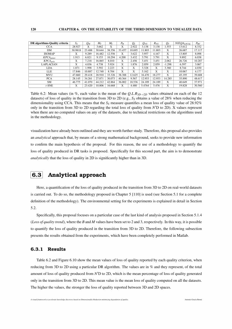
120 CHAPTER 6. ON THE SUITABILITY OF THE THIRD DIMENSION TO VISUALIZE DATA
DR algorithms-Quality criteria SS QM MT MC PM Qk QNX RNX QY NIEQALOCAL PMCCCA 28.927 X 3.662 X X 2.922 3.138 3.138 1.553 13.612 8.332DM 30.9818 23.488 30.644 38.356 33.457 10.695 11.803 11.803 X 26.687 17.117
ISOMAP X 9.289 16.482 12.556 X 3.622 3.957 4.167 X 13.805 8.098KPCAgauss 1.913 6.821 9.153 10.294 4.200 3.432 3.791 3.791 X 9.892 6.038KPCApoly X 7.218 16.065 8.010 X 2.456 3.451 3.451 2.062 26.726 10.287
LAPLACIAN X 4.036 4.738 5.924 X 1.876 2.059 2.059 -1.298 6.597 3.067LDA 1.871 1.998 3.592 2.223 X X 3.328 X 3.360 8.744 4.030LLE 17.846 10.887 12.740 8.704 X X 5.162 X X 10.067 4.177
MVU 47.660 29.418 28.910 33.326 38.388 12.625 16.470 18.277 X 45.195 39.688PCA 28.145 34.261 27.871 30.073 40.364 9.567 12.953 12.953 14.285 35.890 48.617SM 46.775 41.070 44.212 42.864 36.002 18.536 24.189 24.189 X 40.649 37.971
t-SNE X 23.420 10.806 16.668 X 4.480 5.4764 5.476 X 19.828 30.560
Table 6.2: Mean values (in %, each value is the mean of the Q.L.R3D→2D values obtained on each of the 12datasets) of loss of quality in the transition from 3D to 2D (e.g., SS obtains a value of 28% when reducing thedimensionality using CCA. This means that the SS measure quantifies a mean loss of quality value of 28.92%only in the transition from 3D to 2D regarding the total loss of quality from N′D to 2D). X values representwhen there are no computed values on any of the datasets, due to technical restrictions on the algorithms usedin the methodology.
visualization have already been outlined and they are worth further study. Therefore, this proposal also provides
an analytical approach that, by means of a strong mathematical background, seeks to provide new information
to confirm the main hypothesis of the proposal. For this reason, the use of a methodology to quantify the
loss of quality produced in DR tasks is proposed. Specifically for this second part, the aim is to demonstrate
analytically that the loss of quality in 2D is significantly higher than in 3D.
6.3 Analytical approach
Here, a quantification of the loss of quality produced in the transition from 3D to 2D on real-world datasets
is carried out. To do so, the methodology proposed in Chapter 5 [110] is used (see Section 5.1 for a complete
definition of the methodology). The environmental setting for the experiments is explained in detail in Section
5.2.
Specifically, this proposal focuses on a particular case of the last kind of analysis proposed in Section 5.1.4
(Loss of quality trend), where the B and M values have been set to 2 and 3, respectively. In this way, it is possible
to quantify the loss of quality produced in the transition from 3D to 2D. Therefore, the following subsection
presents the results obtained from the experiments, which have been completely performed in Matlab.
6.3.1 Results
Table 6.2 and Figure 6.10 show the mean values of loss of quality reported by each quality criterion, when
reducing from 3D to 2D using a particular DR algorithm. The values are in % and they represent, of the total
amount of loss of quality produced from N′D to 2D, which is the mean percentage of loss of quality generated
only in the transition from 3D to 2D. This mean value is the mean loss of quality computed on all the datasets.
The higher the values, the stronger the loss of quality reported between 3D and 2D spaces.
A visual framework to accelerate knowledge discovery based on Dimensionality Reduction minimizing degradation of quality. Antonio Gracia Berná
6.3. ANALYTICAL APPROACH 121
Particularly, the method for calculating each value in the table is summarized as follows: the mean loss of
qualities from N′D to 2D are computed, that is, loss of quality value in N′D, in (N′−1)D, and so on up to 2D.
After that, the mean of these values is obtained and called total loss of quality. It is an indicator of how is the
transition in the loss of quality throughout the whole DR process. The second step is exactly the same as the
previous one but, instead of 2D, the loss of qualities up to 3D are computed (it is called 3D quality loss). The
final value (in %) is the ratio between both values:
Quality LossRatio (Q.L.R)3D→2D = (1.0− 3D quality losstotal quality loss
)∗100; (6.6)
Rewriting formally what was said above, each value in Table 6.2 represents the mean of the Q.L.R3D→2D
values on all the datasets, when reducing the data using a particular DR method and measuring the loss of
quality through a quality criterion.
As regards the X values in Table 6.2, it means that it has not been possible to obtain results on any of
the datasets, due to the technical issues of the DR algorithms and quality criteria used in the methodology.
However, it is considered that the rest of the results presented here involve enough experimentation on several
datasets to provide firm results in the quantification process.
It is worth mentioning that before analyzing the results of the quantification, Table 6.2 provides interesting
information about the stability (in terms of technical restrictions of the algorithm used) of the quality criteria, as
well as the DR algorithms. If the table is observed at a column level the best quality criteria, in terms of stability
on all the datasets, are MT , QNX , NIEQALOCAL and PMC (No X values in columns, thus they always obtained
results). QM and MC criteria also present good values for stability, since they rarely failed when producing
results. However, PM , SS and QY measures were quite unstable in all the datasets, as they often failed. If the
table at a row level is analyzed, the best DR algorithms are PCA, DM, MVU, SM and KPCAgauss. However,
the worst results are obtained by Isomap, LLE, t-SNE, LDA and CCA.
The following subsections analyze the loss of quality from two different approaches: the first one is a point
of view from the quality criteria, and the other is from the DR algorithms. In both cases, boxplots are used for
making easier the interpretation of the results.
6.3.1.1 Quality criteria
Firstly, according to Figure 6.11, it is worth noting the disparity between distributions of some quality
criteria. According to the different distribution of the quality values reported by each criterion, several groups
could be observed: 1) QY ; 2) Qk, QNX and RNX ; 3) QM , MT , MC, NIEQALOCAL and PMC; 4) SS; 5) PM .
Firstly, the QY criterion reports low and a very different distribution of loss of qualities as regards the rest
of the criteria (around a median value of 1.55% and 3.36% of maximum value). This is due to its unique way
of evaluating the loss of quality, since it is not based on comparable concepts to the rest of the measures and it
involves both local and global concepts. Furthermore, the boxplot indicates outliers (14.29% and -1.3% values)
for the QY criterion, that provide further information about its previously cited unstability.
Antonio Gracia Berná A visual framework to accelerate knowledge discovery based on Dimensionality Reduction minimizing degradation of quality.
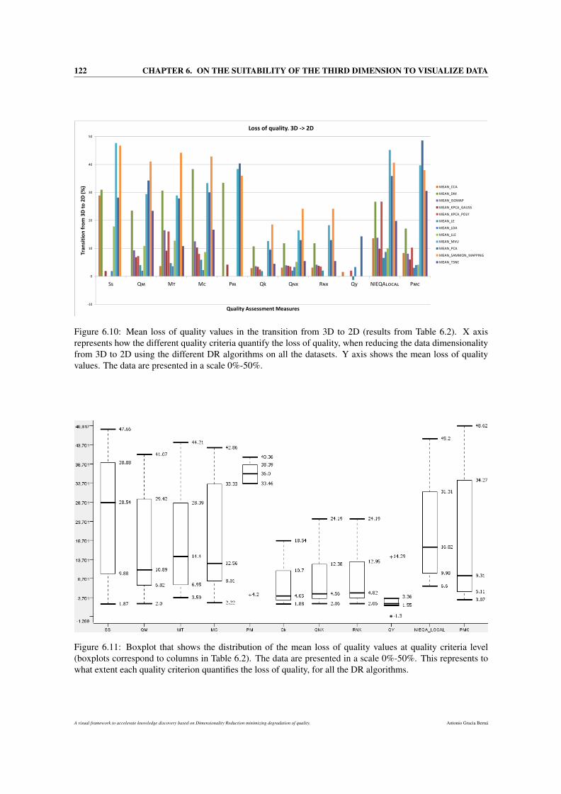
122 CHAPTER 6. ON THE SUITABILITY OF THE THIRD DIMENSION TO VISUALIZE DATA
Figure 6.10: Mean loss of quality values in the transition from 3D to 2D (results from Table 6.2). X axisrepresents how the different quality criteria quantify the loss of quality, when reducing the data dimensionalityfrom 3D to 2D using the different DR algorithms on all the datasets. Y axis shows the mean loss of qualityvalues. The data are presented in a scale 0%-50%.
Figure 6.11: Boxplot that shows the distribution of the mean loss of quality values at quality criteria level(boxplots correspond to columns in Table 6.2). The data are presented in a scale 0%-50%. This represents towhat extent each quality criterion quantifies the loss of quality, for all the DR algorithms.
A visual framework to accelerate knowledge discovery based on Dimensionality Reduction minimizing degradation of quality. Antonio Gracia Berná
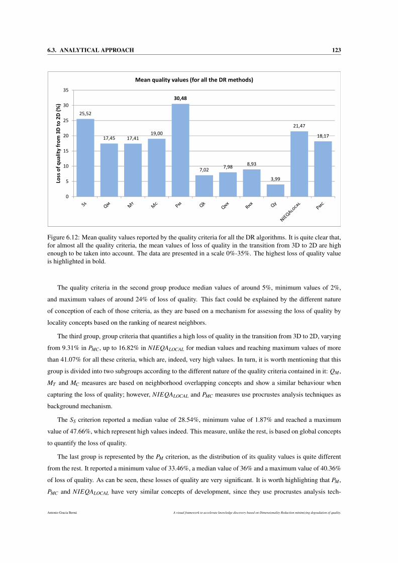
6.3. ANALYTICAL APPROACH 123
Figure 6.12: Mean quality values reported by the quality criteria for all the DR algorithms. It is quite clear that,for almost all the quality criteria, the mean values of loss of quality in the transition from 3D to 2D are highenough to be taken into account. The data are presented in a scale 0%-35%. The highest loss of quality valueis highlighted in bold.
The quality criteria in the second group produce median values of around 5%, minimum values of 2%,
and maximum values of around 24% of loss of quality. This fact could be explained by the different nature
of conception of each of those criteria, as they are based on a mechanism for assessing the loss of quality by
locality concepts based on the ranking of nearest neighbors.
The third group, group criteria that quantifies a high loss of quality in the transition from 3D to 2D, varying
from 9.31% in PMC, up to 16.82% in NIEQALOCAL for median values and reaching maximum values of more
than 41.07% for all these criteria, which are, indeed, very high values. In turn, it is worth mentioning that this
group is divided into two subgroups according to the different nature of the quality criteria contained in it: QM ,
MT and MC measures are based on neighborhood overlapping concepts and show a similar behaviour when
capturing the loss of quality; however, NIEQALOCAL and PMC measures use procrustes analysis techniques as
background mechanism.
The SS criterion reported a median value of 28.54%, minimum value of 1.87% and reached a maximum
value of 47.66%, which represent high values indeed. This measure, unlike the rest, is based on global concepts
to quantify the loss of quality.
The last group is represented by the PM criterion, as the distribution of its quality values is quite different
from the rest. It reported a minimum value of 33.46%, a median value of 36% and a maximum value of 40.36%
of loss of quality. As can be seen, these losses of quality are very significant. It is worth highlighting that PM ,
PMC and NIEQALOCAL have very similar concepts of development, since they use procrustes analysis tech-
Antonio Gracia Berná A visual framework to accelerate knowledge discovery based on Dimensionality Reduction minimizing degradation of quality.
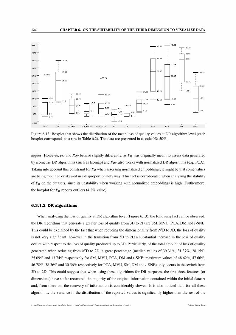
124 CHAPTER 6. ON THE SUITABILITY OF THE THIRD DIMENSION TO VISUALIZE DATA
Figure 6.13: Boxplot that shows the distribution of the mean loss of quality values at DR algorithm level (eachboxplot corresponds to a row in Table 6.2). The data are presented in a scale 0%-50%.
niques. However, PM and PMC behave slightly differently, as PM was originally meant to assess data generated
by isometric DR algorithms (such as Isomap) and PMC also works with normalized DR algorithms (e.g. PCA).
Taking into account this constraint for PM when assessing normalized embeddings, it might be that some values
are being modified or skewed in a disproportionately way. This fact is corroborated when analyzing the stability
of PM on the datasets, since its unstability when working with normalized embeddings is high. Furthermore,
the boxplot for PM reports outliers (4.2% value).
6.3.1.2 DR algorithms
When analyzing the loss of quality at DR algorithm level (Figure 6.13), the following fact can be observed:
the DR algorithms that generate a greater loss of quality from 3D to 2D are SM, MVU, PCA, DM and t-SNE.
This could be explained by the fact that when reducing the dimensionality from N′D to 3D, the loss of quality
is not very significant, however in the transition from 3D to 2D a substantial increase in the loss of quality
occurs with respect to the loss of quality produced up to 3D. Particularly, of the total amount of loss of quality
generated when reducing from N′D to 2D, a great percentage (median values of 39.31%, 31.37%, 28.15%,
25.09% and 13.74% respectively for SM, MVU, PCA, DM and t-SNE; maximum values of 48.62%, 47.66%,
46.78%, 38.36% and 30.56% respectively for PCA, MVU, SM, DM and t-SNE) only occurs in the switch from
3D to 2D. This could suggest that when using these algorithms for DR purposes, the first three features (or
dimensions) have so far recovered the majority of the original information contained within the initial dataset
and, from there on, the recovery of information is considerably slower. It is also noticed that, for all these
algorithms, the variance in the distribution of the reported values is significantly higher than the rest of the
A visual framework to accelerate knowledge discovery based on Dimensionality Reduction minimizing degradation of quality. Antonio Gracia Berná
6.4. DISCUSSION 125
algorithms.
LDA, LE, CCA and KPCAgauss algorithms score low median values of loss of quality in the transition from
3D to 2D, as well as distributions with low variance. In addition, according to Figure 6.13, CCA and LDA
algorithms show distributions with outliers. This coincides with the unstable behaviours for these aforemen-
tioned algorithms. However, the maximum values of loss of quality achieved by two of these algorithms, CCA
and KPCAgauss, are high (13.61% and 10.29%, respectively).
The rest of the algorithms (Isomap, KPCApoly and LLE) also report high values. Specifically, median values
from 7.22% to 10.07%, and maximum values around 17%.
To sum up, both approaches (Sections 6.3.1.1 and 6.3.1.2) show that the loss of quality in 2D spaces far
exceed that which occurs in 3D spaces. To be more precise, the theoretical results indicate that the loss of
quality, when switching from 3D to 2D, reaches maximum values of 48.62% (see Figures 6.11 and 6.13) and
mean values of 30.483% (see Figure 6.12) of the total loss of quality for many cases, which can be considered
noticeably high.
6.4 Discussion
How to visualize data is an important question, especially for MMD with more than two attributes this seems
to be an open issue in VA, human computer interaction, and computer graphics in general. The simplicity and
intuition provided by DV techniques in 2D spaces is certainly one key to their success. However, the aim of
this proposal is to demonstrate scientifically that the use of three dimensions on the visualization counteracts
the benefits of dealing with traditional 2D. From a point of view based on the loss of quality the results are
conclusive, 3D showed a solid and significant superiority over 2D visualization. In this sense, few times before
this concept had been analized and quantified in this particular way.
To prove the superiority of 3D over 2D when visualizing MMD, first, a battery of tests on a sample of 40
users attempts to demonstrate statistically, by means of visualization, whether conclusions on the improvement
in the accuracy and efficiency produced by the inclusion of a third dimension can be drawn. Secondly, an
analytical quantification of the loss of quality produced when reducing the dimensionality of the data from
3D to 2D is proposed in order to yield new insights into the possible superiority of the third dimension. This
quantification is done by using a recently proposed methodology.
The tests in the visual statistical approach showed that the error made by the users and the time spent
carrying out a set of tasks (such as outlier identification or distance perception) in DV is considerably smaller
when visualizing MMD in 3D. This suggests a greater accuracy and efficiency when working with the data
using 3D visualization. However, at this point no firm conclusions about the superiority of 3D visualization
could be drawn. As regards the suggestions and preferences of the users the results indicated that, and taking
into account the clear improvement and work still needed in the development of 3D displays, working with 3
dimensions may be equally or even more helpful that than traditionally done using 2D DV. But there were some
Antonio Gracia Berná A visual framework to accelerate knowledge discovery based on Dimensionality Reduction minimizing degradation of quality.

126 CHAPTER 6. ON THE SUITABILITY OF THE THIRD DIMENSION TO VISUALIZE DATA
clear discrepancies in the opinions of users and thus firm conclusions still cannot be drawn about the benefits
of 3D to display MMD.
Nevertheless, the results obtained through the analytical approach showed that the average and maximum
loss of qualities obtained only when reducing the data dimensionality from 3 to 2, are 30.483% and 48.62%
(respectively) of the total loss of quality produced throughout the whole DR process (from the original dimen-
sionality of the data to 2D). This means that a high degree of loss of quality occurs just passing from 3D to 2D,
which can make us reconsider whether that 2D reduction is really necessary or not.
These results provide definitive conclusions, as well as a demonstration of the superiority of using a 3D
environment when MMD are visualized. The concept of quality degradation could be crucial when visualizing
data, and it is demonstrated that the loss of quality produced with the inclusion of a third dimension is noticeably
smaller than just using 2 dimensions. This fact strongly suggests the suitability of the third dimension for
embedding and visualizing MMD, as well as for manifold learning tasks where the intrinsic dimensionality of
the dataset is unknown or greater than 2. Therefore, this fact allow the original hypothesis to be confirmed and
it should be taken into account for future developments.
A visual framework to accelerate knowledge discovery based on Dimensionality Reduction minimizing degradation of quality. Antonio Gracia Berná
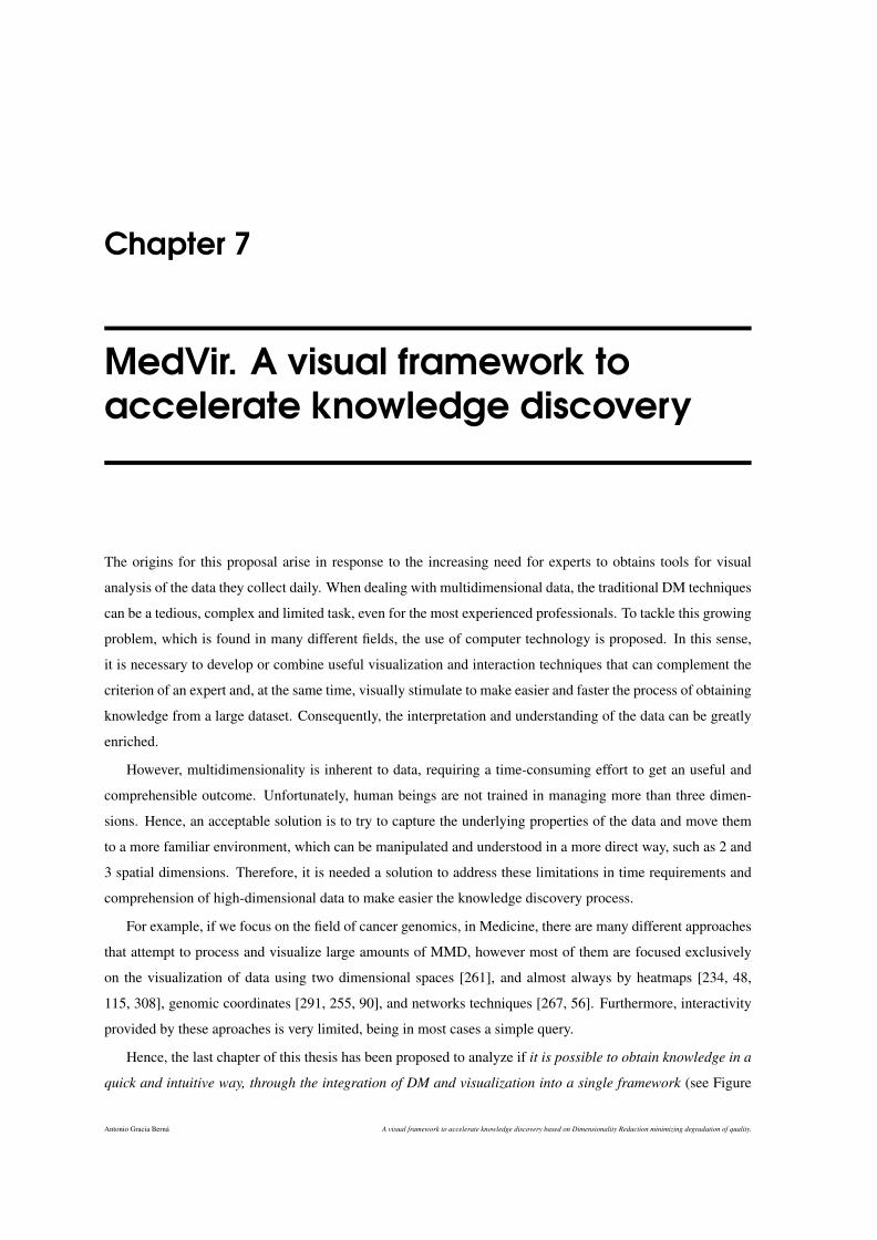
Chapter 7
MedVir. A visual framework toaccelerate knowledge discovery
The origins for this proposal arise in response to the increasing need for experts to obtains tools for visual
analysis of the data they collect daily. When dealing with multidimensional data, the traditional DM techniques
can be a tedious, complex and limited task, even for the most experienced professionals. To tackle this growing
problem, which is found in many different fields, the use of computer technology is proposed. In this sense,
it is necessary to develop or combine useful visualization and interaction techniques that can complement the
criterion of an expert and, at the same time, visually stimulate to make easier and faster the process of obtaining
knowledge from a large dataset. Consequently, the interpretation and understanding of the data can be greatly
enriched.
However, multidimensionality is inherent to data, requiring a time-consuming effort to get an useful and
comprehensible outcome. Unfortunately, human beings are not trained in managing more than three dimen-
sions. Hence, an acceptable solution is to try to capture the underlying properties of the data and move them
to a more familiar environment, which can be manipulated and understood in a more direct way, such as 2 and
3 spatial dimensions. Therefore, it is needed a solution to address these limitations in time requirements and
comprehension of high-dimensional data to make easier the knowledge discovery process.
For example, if we focus on the field of cancer genomics, in Medicine, there are many different approaches
that attempt to process and visualize large amounts of MMD, however most of them are focused exclusively
on the visualization of data using two dimensional spaces [261], and almost always by heatmaps [234, 48,
115, 308], genomic coordinates [291, 255, 90], and networks techniques [267, 56]. Furthermore, interactivity
provided by these aproaches is very limited, being in most cases a simple query.
Hence, the last chapter of this thesis has been proposed to analyze if it is possible to obtain knowledge in a
quick and intuitive way, through the integration of DM and visualization into a single framework (see Figure
Antonio Gracia Berná A visual framework to accelerate knowledge discovery based on Dimensionality Reduction minimizing degradation of quality.
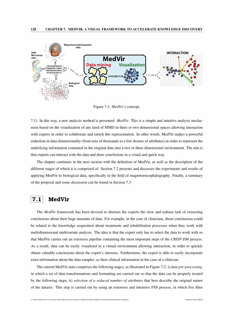
128 CHAPTER 7. MEDVIR. A VISUAL FRAMEWORK TO ACCELERATE KNOWLEDGE DISCOVERY
Figure 7.1: MedVir’s concept.
7.1). In this way, a new analysis method is presented: MedVir. This is a simple and intuitive analysis mecha-
nism based on the visualization of any kind of MMD in three or two-dimensional spaces allowing interaction
with experts in order to collaborate and enrich this representation. In other words, MedVir makes a powerful
reduction in data dimensionality (from tens of thousands to a few dozens of attributes) in order to represent the
underlying information contained in the original data into a two or three dimensional environment. The aim is
that experts can interact with the data and draw conclusions in a visual and quick way.
The chapter continues in the next section with the definition of MedVir, as well as the description of the
different stages of which it is comprised of. Section 7.2 presents and discusses the experiments and results of
applying MedVir to biological data, specifically in the field of magnetoencephalography. Finally, a summary
of the proposal and some discussion can be found in Section 7.3.
7.1 MedVir
The MedVir framework has been devised to abstract the experts the slow and tedious task of extracting
conclusions about their huge amounts of data. For example, in the case of clinicians, those conclusions could
be related to the knowledge acquisition about treatments and rehabilitation processes when they work with
multidimensional multivariate analysis. The idea is that the expert only has to select the data to work with so
that MedVir carries out an extensive pipeline containing the most important steps of the CRISP-DM process.
As a result, data can be easily visualized in a virtual environment allowing interaction, in order to quickly
obtain valuable conclusions about the expert’s interests. Furthermore, the expert is able to easily incorporate
extra information about the data samples, as their clinical information in the case of a clinician.
The current MedVir state comprises the following stages, as illustrated in Figure 7.2: i) data pre-processing,
in which a set of data transformations and formatting are carried out so that the data can be properly treated
by the following steps; ii) selection of a reduced number of attributes that best describe the original nature
of the dataset. This step is carried out by using an extensive and intensive FSS process, in which five filter
A visual framework to accelerate knowledge discovery based on Dimensionality Reduction minimizing degradation of quality. Antonio Gracia Berná
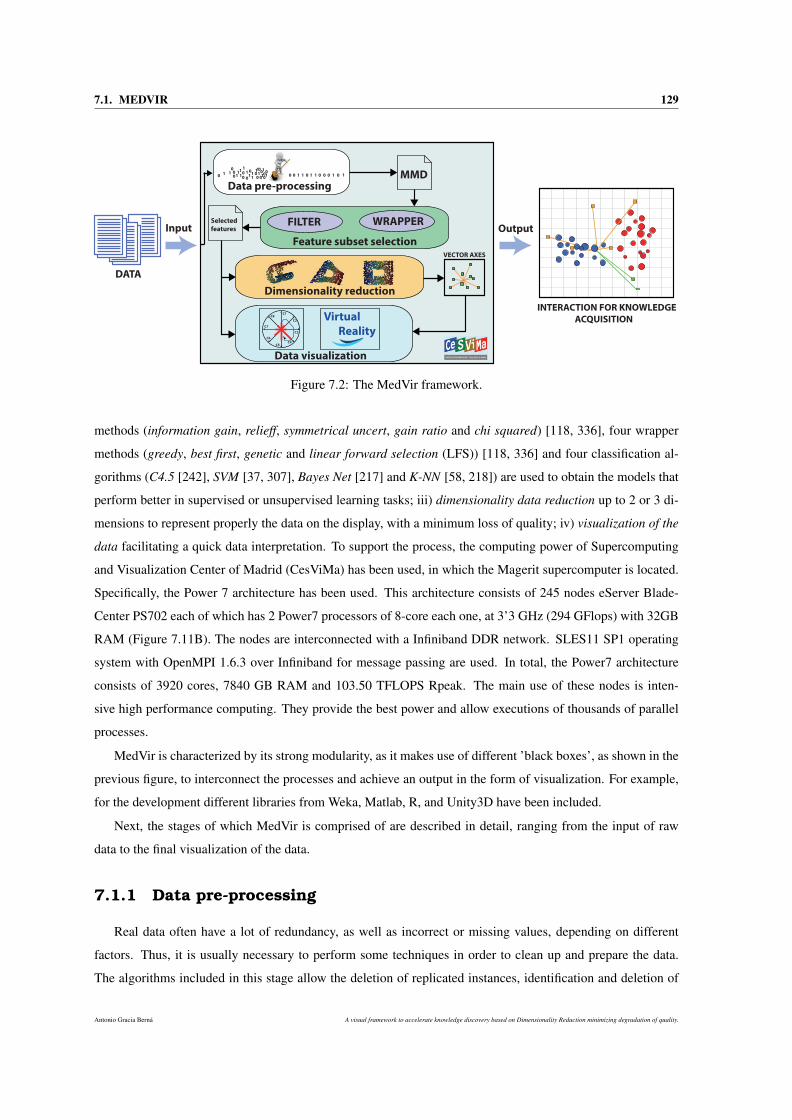
7.1. MEDVIR 129
Data pre-processing
Feature subset selection
FILTER WRAPPER
MMD
Dimensionality reduction
Data visualization
C8
C7
C6
C5C4
C3
C2
C1
P
Virtual
Reality
Selected
features
VECTOR AXES
INTERACTION FOR KNOWLEDGE
ACQUISITION
DATA
Input Output
11
1 11 1
11 1 00
00 00
0
00 000
1111110
0
101
00 0 01 1 1 1 0 0 0 1 0 1
Figure 7.2: The MedVir framework.
methods (information gain, relieff, symmetrical uncert, gain ratio and chi squared) [118, 336], four wrapper
methods (greedy, best first, genetic and linear forward selection (LFS)) [118, 336] and four classification al-
gorithms (C4.5 [242], SVM [37, 307], Bayes Net [217] and K-NN [58, 218]) are used to obtain the models that
perform better in supervised or unsupervised learning tasks; iii) dimensionality data reduction up to 2 or 3 di-
mensions to represent properly the data on the display, with a minimum loss of quality; iv) visualization of the
data facilitating a quick data interpretation. To support the process, the computing power of Supercomputing
and Visualization Center of Madrid (CesViMa) has been used, in which the Magerit supercomputer is located.
Specifically, the Power 7 architecture has been used. This architecture consists of 245 nodes eServer Blade-
Center PS702 each of which has 2 Power7 processors of 8-core each one, at 3’3 GHz (294 GFlops) with 32GB
RAM (Figure 7.11B). The nodes are interconnected with a Infiniband DDR network. SLES11 SP1 operating
system with OpenMPI 1.6.3 over Infiniband for message passing are used. In total, the Power7 architecture
consists of 3920 cores, 7840 GB RAM and 103.50 TFLOPS Rpeak. The main use of these nodes is inten-
sive high performance computing. They provide the best power and allow executions of thousands of parallel
processes.
MedVir is characterized by its strong modularity, as it makes use of different ’black boxes’, as shown in the
previous figure, to interconnect the processes and achieve an output in the form of visualization. For example,
for the development different libraries from Weka, Matlab, R, and Unity3D have been included.
Next, the stages of which MedVir is comprised of are described in detail, ranging from the input of raw
data to the final visualization of the data.
7.1.1 Data pre-processing
Real data often have a lot of redundancy, as well as incorrect or missing values, depending on different
factors. Thus, it is usually necessary to perform some techniques in order to clean up and prepare the data.
The algorithms included in this stage allow the deletion of replicated instances, identification and deletion of
Antonio Gracia Berná A visual framework to accelerate knowledge discovery based on Dimensionality Reduction minimizing degradation of quality.
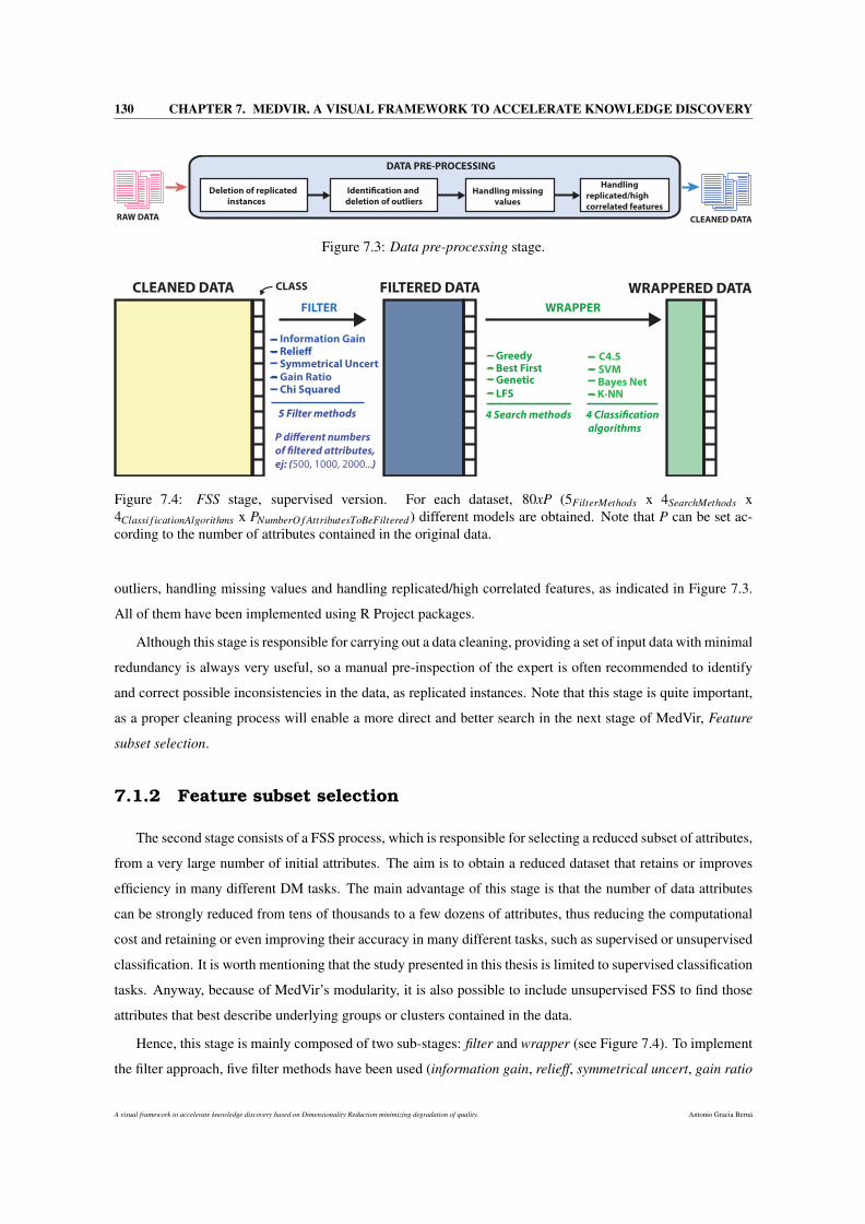
130 CHAPTER 7. MEDVIR. A VISUAL FRAMEWORK TO ACCELERATE KNOWLEDGE DISCOVERY
Handling
replicated/high
correlated features
Handling missing
values
Deletion of replicated
instances
Identi!cation and
deletion of outliers
DATA PRE-PROCESSING
RAW DATA CLEANED DATA
Figure 7.3: Data pre-processing stage.
CLEANED DATA FILTERED DATA WRAPPERED DATA
FILTER WRAPPER
Information Gain
Symmetrical UncertRelie!
Gain RatioChi Squared
5 Filter methods
GreedyBest FirstGenetic
LFS
4 Search methods
C4.5SVMBayes NetK-NN
4 Classi!cation
algorithms
CLASS
P di"erent numbers
of !ltered attributes,
ej: (500, 1000, 2000...)
Figure 7.4: FSS stage, supervised version. For each dataset, 80xP (5FilterMethods x 4SearchMethods x4Classi f icationAlgorithms x PNumberO f AttributesToBeFiltered) different models are obtained. Note that P can be set ac-cording to the number of attributes contained in the original data.
outliers, handling missing values and handling replicated/high correlated features, as indicated in Figure 7.3.
All of them have been implemented using R Project packages.
Although this stage is responsible for carrying out a data cleaning, providing a set of input data with minimal
redundancy is always very useful, so a manual pre-inspection of the expert is often recommended to identify
and correct possible inconsistencies in the data, as replicated instances. Note that this stage is quite important,
as a proper cleaning process will enable a more direct and better search in the next stage of MedVir, Feature
subset selection.
7.1.2 Feature subset selection
The second stage consists of a FSS process, which is responsible for selecting a reduced subset of attributes,
from a very large number of initial attributes. The aim is to obtain a reduced dataset that retains or improves
efficiency in many different DM tasks. The main advantage of this stage is that the number of data attributes
can be strongly reduced from tens of thousands to a few dozens of attributes, thus reducing the computational
cost and retaining or even improving their accuracy in many different tasks, such as supervised or unsupervised
classification. It is worth mentioning that the study presented in this thesis is limited to supervised classification
tasks. Anyway, because of MedVir’s modularity, it is also possible to include unsupervised FSS to find those
attributes that best describe underlying groups or clusters contained in the data.
Hence, this stage is mainly composed of two sub-stages: filter and wrapper (see Figure 7.4). To implement
the filter approach, five filter methods have been used (information gain, relieff, symmetrical uncert, gain ratio
A visual framework to accelerate knowledge discovery based on Dimensionality Reduction minimizing degradation of quality. Antonio Gracia Berná
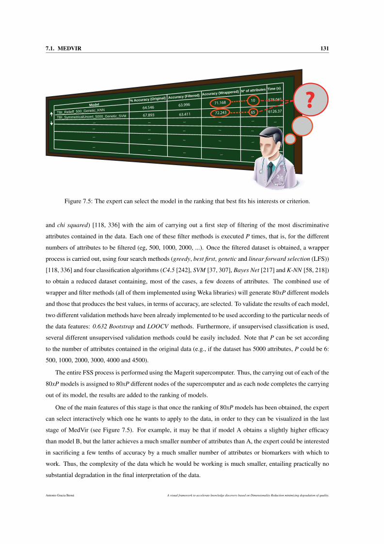
7.1. MEDVIR 131
Model% Accuracy (Original) Accuracy (Filtered) Accuracy (Wrappered) Nº of attributes Time (s)
TBI_Relieff_500_Genetic_KNN
TBI_SymmetricalUncert_5000_Genetic_SVM
64.546
67.893
63.996
63.411
71.168
72.243
10
65
578.041
6126.37
...
...
...
... ...
...
...
......
...
...
...
...
...
...
...
...
...
...
...
...
...
...
...
?
Figure 7.5: The expert can select the model in the ranking that best fits his interests or criterion.
and chi squared) [118, 336] with the aim of carrying out a first step of filtering of the most discriminative
attributes contained in the data. Each one of these filter methods is executed P times, that is, for the different
numbers of attributes to be filtered (eg, 500, 1000, 2000, ...). Once the filtered dataset is obtained, a wrapper
process is carried out, using four search methods (greedy, best first, genetic and linear forward selection (LFS))
[118, 336] and four classification algorithms (C4.5 [242], SVM [37, 307], Bayes Net [217] and K-NN [58, 218])
to obtain a reduced dataset containing, most of the cases, a few dozens of attributes. The combined use of
wrapper and filter methods (all of them implemented using Weka libraries) will generate 80xP different models
and those that produces the best values, in terms of accuracy, are selected. To validate the results of each model,
two different validation methods have been already implemented to be used according to the particular needs of
the data features: 0.632 Bootstrap and LOOCV methods. Furthermore, if unsupervised classification is used,
several different unsupervised validation methods could be easily included. Note that P can be set according
to the number of attributes contained in the original data (e.g., if the dataset has 5000 attributes, P could be 6:
500, 1000, 2000, 3000, 4000 and 4500).
The entire FSS process is performed using the Magerit supercomputer. Thus, the carrying out of each of the
80xP models is assigned to 80xP different nodes of the supercomputer and as each node completes the carrying
out of its model, the results are added to the ranking of models.
One of the main features of this stage is that once the ranking of 80xP models has been obtained, the expert
can select interactively which one he wants to apply to the data, in order to they can be visualized in the last
stage of MedVir (see Figure 7.5). For example, it may be that if model A obtains a slightly higher efficacy
than model B, but the latter achieves a much smaller number of attributes than A, the expert could be interested
in sacrificing a few tenths of accuracy by a much smaller number of attributes or biomarkers with which to
work. Thus, the complexity of the data which he would be working is much smaller, entailing practically no
substantial degradation in the final interpretation of the data.
Antonio Gracia Berná A visual framework to accelerate knowledge discovery based on Dimensionality Reduction minimizing degradation of quality.
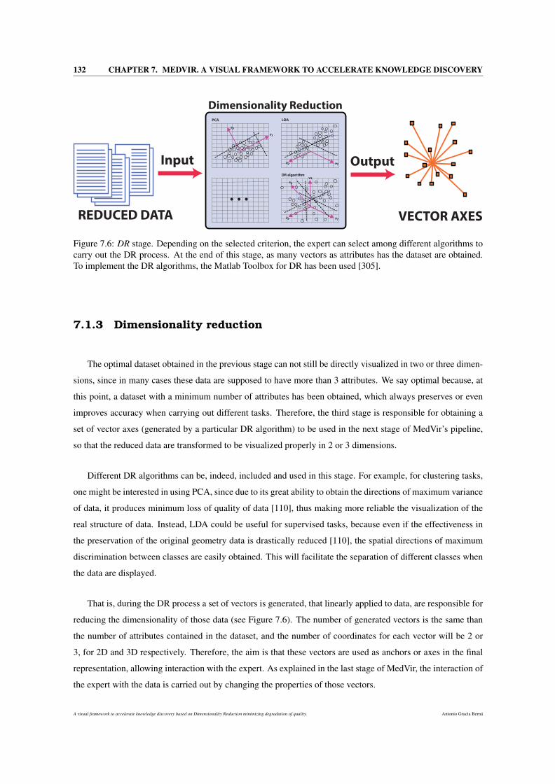
132 CHAPTER 7. MEDVIR. A VISUAL FRAMEWORK TO ACCELERATE KNOWLEDGE DISCOVERY
REDUCED DATA
Input
V1
V2
PCA
V1V2
LDA
V1V2
DR algorithm
. . .
Output
Dimensionality Reduction
VECTOR AXES
V3
V4
Figure 7.6: DR stage. Depending on the selected criterion, the expert can select among different algorithms tocarry out the DR process. At the end of this stage, as many vectors as attributes has the dataset are obtained.To implement the DR algorithms, the Matlab Toolbox for DR has been used [305].
7.1.3 Dimensionality reduction
The optimal dataset obtained in the previous stage can not still be directly visualized in two or three dimen-
sions, since in many cases these data are supposed to have more than 3 attributes. We say optimal because, at
this point, a dataset with a minimum number of attributes has been obtained, which always preserves or even
improves accuracy when carrying out different tasks. Therefore, the third stage is responsible for obtaining a
set of vector axes (generated by a particular DR algorithm) to be used in the next stage of MedVir’s pipeline,
so that the reduced data are transformed to be visualized properly in 2 or 3 dimensions.
Different DR algorithms can be, indeed, included and used in this stage. For example, for clustering tasks,
one might be interested in using PCA, since due to its great ability to obtain the directions of maximum variance
of data, it produces minimum loss of quality of data [110], thus making more reliable the visualization of the
real structure of data. Instead, LDA could be useful for supervised tasks, because even if the effectiveness in
the preservation of the original geometry data is drastically reduced [110], the spatial directions of maximum
discrimination between classes are easily obtained. This will facilitate the separation of different classes when
the data are displayed.
That is, during the DR process a set of vectors is generated, that linearly applied to data, are responsible for
reducing the dimensionality of those data (see Figure 7.6). The number of generated vectors is the same than
the number of attributes contained in the dataset, and the number of coordinates for each vector will be 2 or
3, for 2D and 3D respectively. Therefore, the aim is that these vectors are used as anchors or axes in the final
representation, allowing interaction with the expert. As explained in the last stage of MedVir, the interaction of
the expert with the data is carried out by changing the properties of those vectors.
A visual framework to accelerate knowledge discovery based on Dimensionality Reduction minimizing degradation of quality. Antonio Gracia Berná
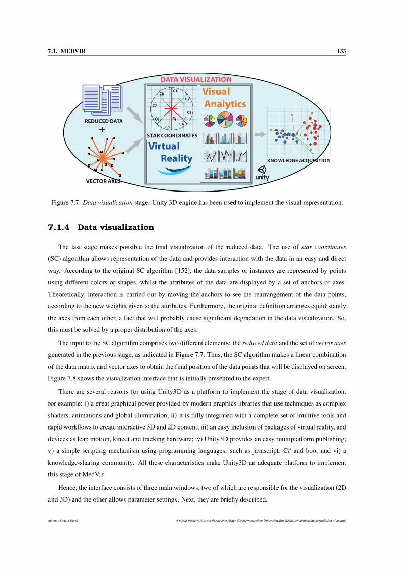
7.1. MEDVIR 133
DATA VISUALIZATION
C8
C7
C6
C5C4
C3
C2
C1
P
REDUCED DATA
VECTOR AXES
+STAR COORDINATES
Virtual
Reality
Visual
Analytics
KNOWLEDGE ACQUISITION0,1 0,2 0,3 0,4 0,5 0,60,2
0,4
0,6
0,8
1,0
0,1 0,2 0,3 0,4 0,5 0,60,0
0,1
0,2
0,3
0,4
0,5
0,6
0,7
0,8
0,1 0,2 0,3 0,4 0,5 0,60,0
0,2
0,4
0,6
0,8
1,0
0
10
20
30
40
50
60
70
80
0
10
20
30
40
50
60
70
80
0
10
20
30
40
50
60
70
80
0
2
4
6
8
10
12
0
5
10
15
20
0
100
200
300
400
500
Figure 7.7: Data visualization stage. Unity 3D engine has been used to implement the visual representation.
7.1.4 Data visualization
The last stage makes possible the final visualization of the reduced data. The use of star coordinates
(SC) algorithm allows representation of the data and provides interaction with the data in an easy and direct
way. According to the original SC algorithm [152], the data samples or instances are represented by points
using different colors or shapes, whilst the attributes of the data are displayed by a set of anchors or axes.
Theoretically, interaction is carried out by moving the anchors to see the rearrangement of the data points,
according to the new weights given to the attributes. Furthermore, the original definition arranges equidistantly
the axes from each other, a fact that will probably cause significant degradation in the data visualization. So,
this must be solved by a proper distribution of the axes.
The input to the SC algorithm comprises two different elements: the reduced data and the set of vector axes
generated in the previous stage, as indicated in Figure 7.7. Thus, the SC algorithm makes a linear combination
of the data matrix and vector axes to obtain the final position of the data points that will be displayed on screen.
Figure 7.8 shows the visualization interface that is initially presented to the expert.
There are several reasons for using Unity3D as a platform to implement the stage of data visualization,
for example: i) a great graphical power provided by modern graphics libraries that use techniques as complex
shaders, animations and global illumination; ii) it is fully integrated with a complete set of intuitive tools and
rapid workflows to create interactive 3D and 2D content; iii) an easy inclusion of packages of virtual reality, and
devices as leap motion, kinect and tracking hardware; iv) Unity3D provides an easy multiplatform publishing;
v) a simple scripting mechanism using programming languages, such as javascript, C# and boo; and vi) a
knowledge-sharing community. All these characteristics make Unity3D an adequate platform to implement
this stage of MedVir.
Hence, the interface consists of three main windows, two of which are responsible for the visualization (2D
and 3D) and the other allows parameter settings. Next, they are briefly described.
Antonio Gracia Berná A visual framework to accelerate knowledge discovery based on Dimensionality Reduction minimizing degradation of quality.
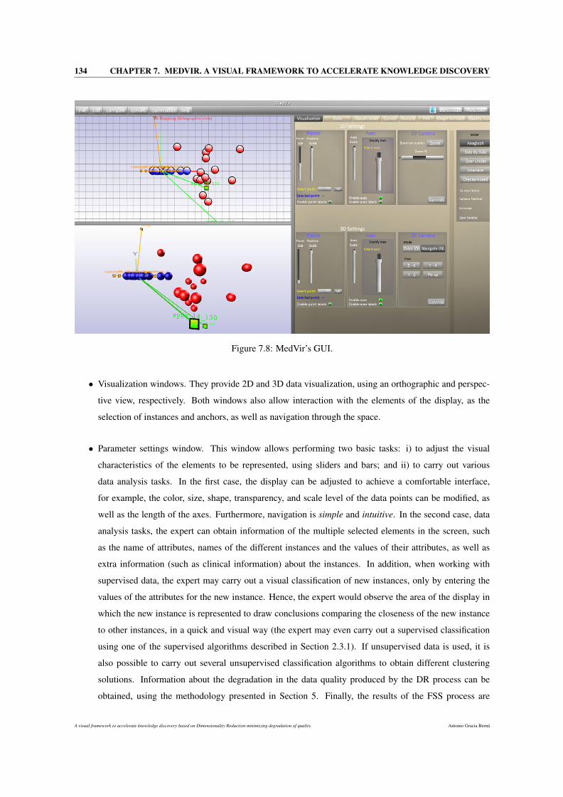
134 CHAPTER 7. MEDVIR. A VISUAL FRAMEWORK TO ACCELERATE KNOWLEDGE DISCOVERY
Figure 7.8: MedVir’s GUI.
• Visualization windows. They provide 2D and 3D data visualization, using an orthographic and perspec-
tive view, respectively. Both windows also allow interaction with the elements of the display, as the
selection of instances and anchors, as well as navigation through the space.
• Parameter settings window. This window allows performing two basic tasks: i) to adjust the visual
characteristics of the elements to be represented, using sliders and bars; and ii) to carry out various
data analysis tasks. In the first case, the display can be adjusted to achieve a comfortable interface,
for example, the color, size, shape, transparency, and scale level of the data points can be modified, as
well as the length of the axes. Furthermore, navigation is simple and intuitive. In the second case, data
analysis tasks, the expert can obtain information of the multiple selected elements in the screen, such
as the name of attributes, names of the different instances and the values of their attributes, as well as
extra information (such as clinical information) about the instances. In addition, when working with
supervised data, the expert may carry out a visual classification of new instances, only by entering the
values of the attributes for the new instance. Hence, the expert would observe the area of the display in
which the new instance is represented to draw conclusions comparing the closeness of the new instance
to other instances, in a quick and visual way (the expert may even carry out a supervised classification
using one of the supervised algorithms described in Section 2.3.1). If unsupervised data is used, it is
also possible to carry out several unsupervised classification algorithms to obtain different clustering
solutions. Information about the degradation in the data quality produced by the DR process can be
obtained, using the methodology presented in Section 5. Finally, the results of the FSS process are
A visual framework to accelerate knowledge discovery based on Dimensionality Reduction minimizing degradation of quality. Antonio Gracia Berná
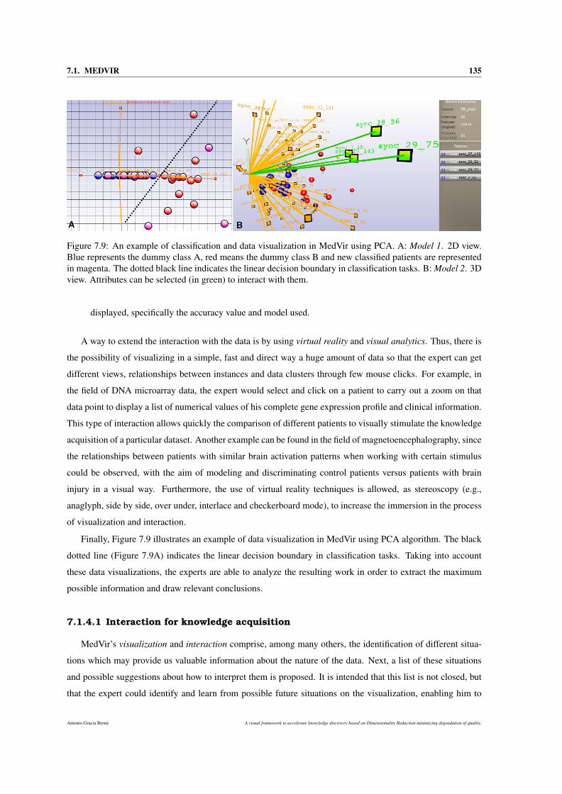
7.1. MEDVIR 135
Figure 7.9: An example of classification and data visualization in MedVir using PCA. A: Model 1. 2D view.Blue represents the dummy class A, red means the dummy class B and new classified patients are representedin magenta. The dotted black line indicates the linear decision boundary in classification tasks. B: Model 2. 3Dview. Attributes can be selected (in green) to interact with them.
displayed, specifically the accuracy value and model used.
A way to extend the interaction with the data is by using virtual reality and visual analytics. Thus, there is
the possibility of visualizing in a simple, fast and direct way a huge amount of data so that the expert can get
different views, relationships between instances and data clusters through few mouse clicks. For example, in
the field of DNA microarray data, the expert would select and click on a patient to carry out a zoom on that
data point to display a list of numerical values of his complete gene expression profile and clinical information.
This type of interaction allows quickly the comparison of different patients to visually stimulate the knowledge
acquisition of a particular dataset. Another example can be found in the field of magnetoencephalography, since
the relationships between patients with similar brain activation patterns when working with certain stimulus
could be observed, with the aim of modeling and discriminating control patients versus patients with brain
injury in a visual way. Furthermore, the use of virtual reality techniques is allowed, as stereoscopy (e.g.,
anaglyph, side by side, over under, interlace and checkerboard mode), to increase the immersion in the process
of visualization and interaction.
Finally, Figure 7.9 illustrates an example of data visualization in MedVir using PCA algorithm. The black
dotted line (Figure 7.9A) indicates the linear decision boundary in classification tasks. Taking into account
these data visualizations, the experts are able to analyze the resulting work in order to extract the maximum
possible information and draw relevant conclusions.
7.1.4.1 Interaction for knowledge acquisition
MedVir’s visualization and interaction comprise, among many others, the identification of different situa-
tions which may provide us valuable information about the nature of the data. Next, a list of these situations
and possible suggestions about how to interpret them is proposed. It is intended that this list is not closed, but
that the expert could identify and learn from possible future situations on the visualization, enabling him to
Antonio Gracia Berná A visual framework to accelerate knowledge discovery based on Dimensionality Reduction minimizing degradation of quality.
136 CHAPTER 7. MEDVIR. A VISUAL FRAMEWORK TO ACCELERATE KNOWLEDGE DISCOVERY
quickly transform those experiences into valid and useful knowledge about the data.
• Two points of different class (color) are very close or even overlapped in the visualization. This could
strongly suggest that the expert might have made a mistake when originally labelling those instances.
Therefore, it is strongly recommended the revision of the class membership of those instances appearing
overlapped in the visualization, and even a re-labeling process if necessary.
• If an attribute is selected, all the points will be resized based on that attribute’s value. This could represent
the importance or influence of that attribute on a particular class. For example, if an attribute is selected
and the points that belong to class A acquire substantially larger sizes to those points of class B, this
might suggest that this attribute has a great influence to effectively discriminate between the two classes.
• If one or more attributes are selected and their lengths are modified, we would be giving them more or
less weight on the representation, so all the instances will be reorganized based on those new weights.
For example, if we give a greater weight to an attribute and a point with class A approaches another point
with class B, this could suggest that a higher value of that attribute will mean a change in instance status
from class A to B.
• Different attributes can be removed or added from the visualization to decrease, or increase their influ-
ence on the data representation, respectively. The idea is that, after these changes of adding or removing
attributes on the data previously obtained by the FSS process, the DR algorithm is rerun with the new
information and the results are presented in a new visualization.
• Data points and axes can be selected and be relocated to different locations of the visual space. It
is important to highlight that these changes could alter and degrade the original nature of the data.
Although this option is provided to the expert, the possible consequences of these changes should always
be taken into account.
• Extra information about the data samples can be included in the representation. For example, if the
instances represent patients, their clinical information can be visualized quickly and easily for a better
understanding of the visual properties that are being displayed.
• Different visual dispersion among members of the same class and other classes may suggest different
levels of cohesion between different instances.
7.2 MedVir applied to TBI
In this section, MedVir has been applied to a real world case, that is a Traumatic Brain Injury (TBI) re-
habilitation prediction [47]. The aim is to discriminate patients with brain injuries of those who do not have,
through MEG information.
A visual framework to accelerate knowledge discovery based on Dimensionality Reduction minimizing degradation of quality. Antonio Gracia Berná
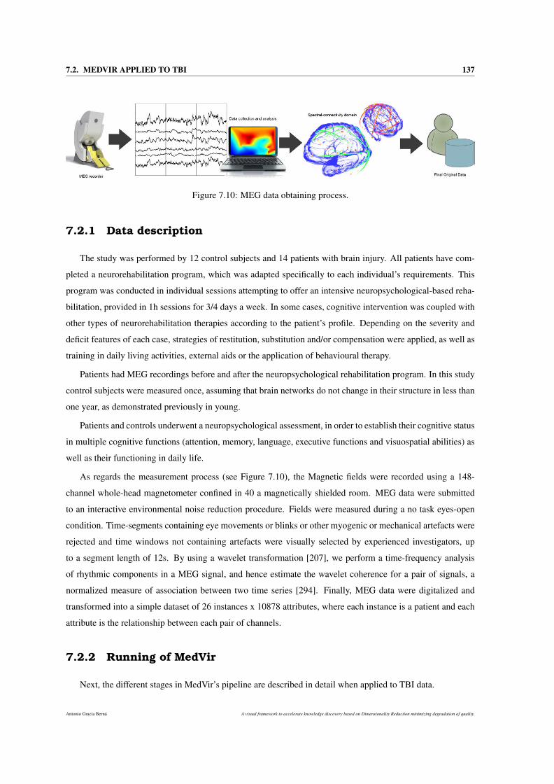
7.2. MEDVIR APPLIED TO TBI 137
Figure 7.10: MEG data obtaining process.
7.2.1 Data description
The study was performed by 12 control subjects and 14 patients with brain injury. All patients have com-
pleted a neurorehabilitation program, which was adapted specifically to each individual’s requirements. This
program was conducted in individual sessions attempting to offer an intensive neuropsychological-based reha-
bilitation, provided in 1h sessions for 3/4 days a week. In some cases, cognitive intervention was coupled with
other types of neurorehabilitation therapies according to the patient’s profile. Depending on the severity and
deficit features of each case, strategies of restitution, substitution and/or compensation were applied, as well as
training in daily living activities, external aids or the application of behavioural therapy.
Patients had MEG recordings before and after the neuropsychological rehabilitation program. In this study
control subjects were measured once, assuming that brain networks do not change in their structure in less than
one year, as demonstrated previously in young.
Patients and controls underwent a neuropsychological assessment, in order to establish their cognitive status
in multiple cognitive functions (attention, memory, language, executive functions and visuospatial abilities) as
well as their functioning in daily life.
As regards the measurement process (see Figure 7.10), the Magnetic fields were recorded using a 148-
channel whole-head magnetometer confined in 40 a magnetically shielded room. MEG data were submitted
to an interactive environmental noise reduction procedure. Fields were measured during a no task eyes-open
condition. Time-segments containing eye movements or blinks or other myogenic or mechanical artefacts were
rejected and time windows not containing artefacts were visually selected by experienced investigators, up
to a segment length of 12s. By using a wavelet transformation [207], we perform a time-frequency analysis
of rhythmic components in a MEG signal, and hence estimate the wavelet coherence for a pair of signals, a
normalized measure of association between two time series [294]. Finally, MEG data were digitalized and
transformed into a simple dataset of 26 instances x 10878 attributes, where each instance is a patient and each
attribute is the relationship between each pair of channels.
7.2.2 Running of MedVir
Next, the different stages in MedVir’s pipeline are described in detail when applied to TBI data.
Antonio Gracia Berná A visual framework to accelerate knowledge discovery based on Dimensionality Reduction minimizing degradation of quality.
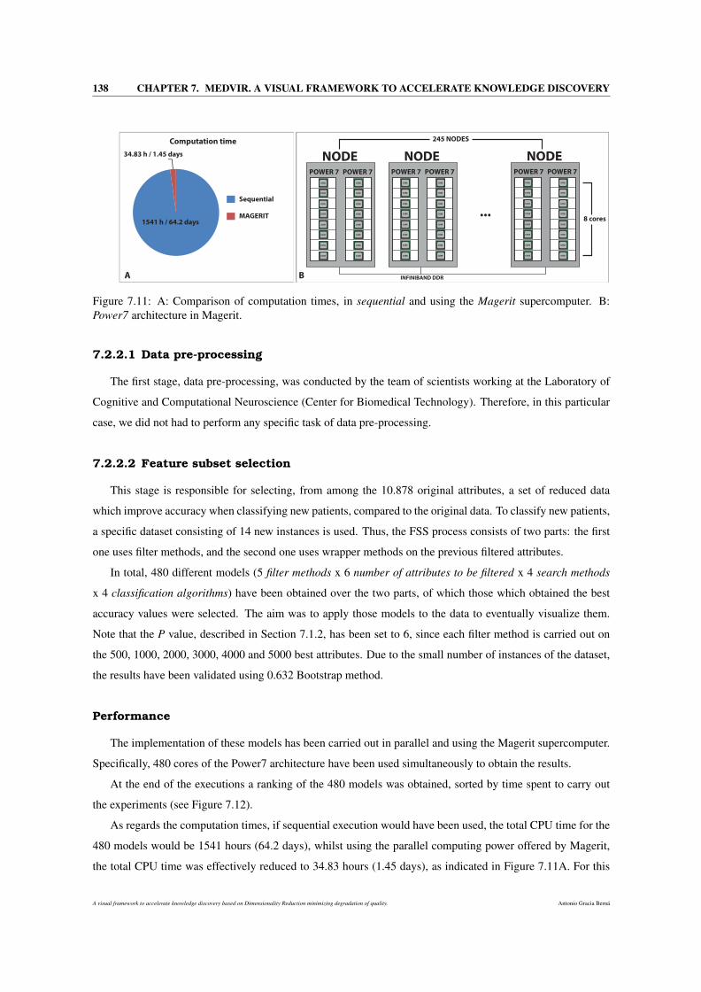
138 CHAPTER 7. MEDVIR. A VISUAL FRAMEWORK TO ACCELERATE KNOWLEDGE DISCOVERY
POWER 7 POWER 7
NODE
CORE
CORE
CORE
CORE
CORE
CORE
CORE
CORE
CORE
CORE
CORE
CORE
CORE
CORE
CORE
CORE
POWER 7 POWER 7
NODE
CORE
CORE
CORE
CORE
CORE
CORE
CORE
CORE
CORE
CORE
CORE
CORE
CORE
CORE
CORE
CORE
POWER 7 POWER 7
NODE
CORE
CORE
CORE
CORE
CORE
CORE
CORE
CORE
CORE
CORE
CORE
CORE
CORE
CORE
CORE
CORE
INFINIBAND DDR
...8 cores
245 NODESComputation time
34.83 h / 1.45 days
1541 h / 64.2 days
Sequential
MAGERIT
A B
Figure 7.11: A: Comparison of computation times, in sequential and using the Magerit supercomputer. B:Power7 architecture in Magerit.
7.2.2.1 Data pre-processing
The first stage, data pre-processing, was conducted by the team of scientists working at the Laboratory of
Cognitive and Computational Neuroscience (Center for Biomedical Technology). Therefore, in this particular
case, we did not had to perform any specific task of data pre-processing.
7.2.2.2 Feature subset selection
This stage is responsible for selecting, from among the 10.878 original attributes, a set of reduced data
which improve accuracy when classifying new patients, compared to the original data. To classify new patients,
a specific dataset consisting of 14 new instances is used. Thus, the FSS process consists of two parts: the first
one uses filter methods, and the second one uses wrapper methods on the previous filtered attributes.
In total, 480 different models (5 filter methods x 6 number of attributes to be filtered x 4 search methods
x 4 classification algorithms) have been obtained over the two parts, of which those which obtained the best
accuracy values were selected. The aim was to apply those models to the data to eventually visualize them.
Note that the P value, described in Section 7.1.2, has been set to 6, since each filter method is carried out on
the 500, 1000, 2000, 3000, 4000 and 5000 best attributes. Due to the small number of instances of the dataset,
the results have been validated using 0.632 Bootstrap method.
Performance
The implementation of these models has been carried out in parallel and using the Magerit supercomputer.
Specifically, 480 cores of the Power7 architecture have been used simultaneously to obtain the results.
At the end of the executions a ranking of the 480 models was obtained, sorted by time spent to carry out
the experiments (see Figure 7.12).
As regards the computation times, if sequential execution would have been used, the total CPU time for the
480 models would be 1541 hours (64.2 days), whilst using the parallel computing power offered by Magerit,
the total CPU time was effectively reduced to 34.83 hours (1.45 days), as indicated in Figure 7.11A. For this
A visual framework to accelerate knowledge discovery based on Dimensionality Reduction minimizing degradation of quality. Antonio Gracia Berná
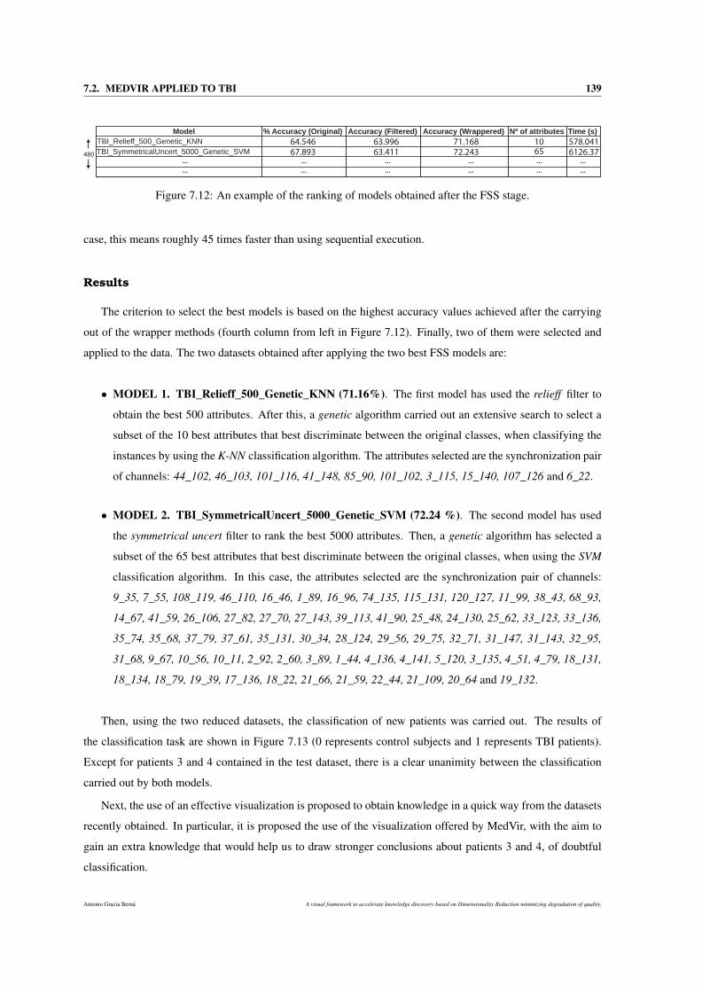
7.2. MEDVIR APPLIED TO TBI 139
Model % Accuracy (Original) Accuracy (Filtered) Accuracy (Wrappered) Nº of attributes Time (s)
TBI_Relieff_500_Genetic_KNN
TBI_SymmetricalUncert_5000_Genetic_SVM
64.546
67.893
63.996
63.411
71.168
72.243
10
65
578.041
6126.37
...
...
...
...
...
...
...
...
...
...
...
...
480
Figure 7.12: An example of the ranking of models obtained after the FSS stage.
case, this means roughly 45 times faster than using sequential execution.
Results
The criterion to select the best models is based on the highest accuracy values achieved after the carrying
out of the wrapper methods (fourth column from left in Figure 7.12). Finally, two of them were selected and
applied to the data. The two datasets obtained after applying the two best FSS models are:
• MODEL 1. TBI_Relieff_500_Genetic_KNN (71.16%). The first model has used the relieff filter to
obtain the best 500 attributes. After this, a genetic algorithm carried out an extensive search to select a
subset of the 10 best attributes that best discriminate between the original classes, when classifying the
instances by using the K-NN classification algorithm. The attributes selected are the synchronization pair
of channels: 44_102, 46_103, 101_116, 41_148, 85_90, 101_102, 3_115, 15_140, 107_126 and 6_22.
• MODEL 2. TBI_SymmetricalUncert_5000_Genetic_SVM (72.24 %). The second model has used
the symmetrical uncert filter to rank the best 5000 attributes. Then, a genetic algorithm has selected a
subset of the 65 best attributes that best discriminate between the original classes, when using the SVM
classification algorithm. In this case, the attributes selected are the synchronization pair of channels:
9_35, 7_55, 108_119, 46_110, 16_46, 1_89, 16_96, 74_135, 115_131, 120_127, 11_99, 38_43, 68_93,
14_67, 41_59, 26_106, 27_82, 27_70, 27_143, 39_113, 41_90, 25_48, 24_130, 25_62, 33_123, 33_136,
35_74, 35_68, 37_79, 37_61, 35_131, 30_34, 28_124, 29_56, 29_75, 32_71, 31_147, 31_143, 32_95,
31_68, 9_67, 10_56, 10_11, 2_92, 2_60, 3_89, 1_44, 4_136, 4_141, 5_120, 3_135, 4_51, 4_79, 18_131,
18_134, 18_79, 19_39, 17_136, 18_22, 21_66, 21_59, 22_44, 21_109, 20_64 and 19_132.
Then, using the two reduced datasets, the classification of new patients was carried out. The results of
the classification task are shown in Figure 7.13 (0 represents control subjects and 1 represents TBI patients).
Except for patients 3 and 4 contained in the test dataset, there is a clear unanimity between the classification
carried out by both models.
Next, the use of an effective visualization is proposed to obtain knowledge in a quick way from the datasets
recently obtained. In particular, it is proposed the use of the visualization offered by MedVir, with the aim to
gain an extra knowledge that would help us to draw stronger conclusions about patients 3 and 4, of doubtful
classification.
Antonio Gracia Berná A visual framework to accelerate knowledge discovery based on Dimensionality Reduction minimizing degradation of quality.
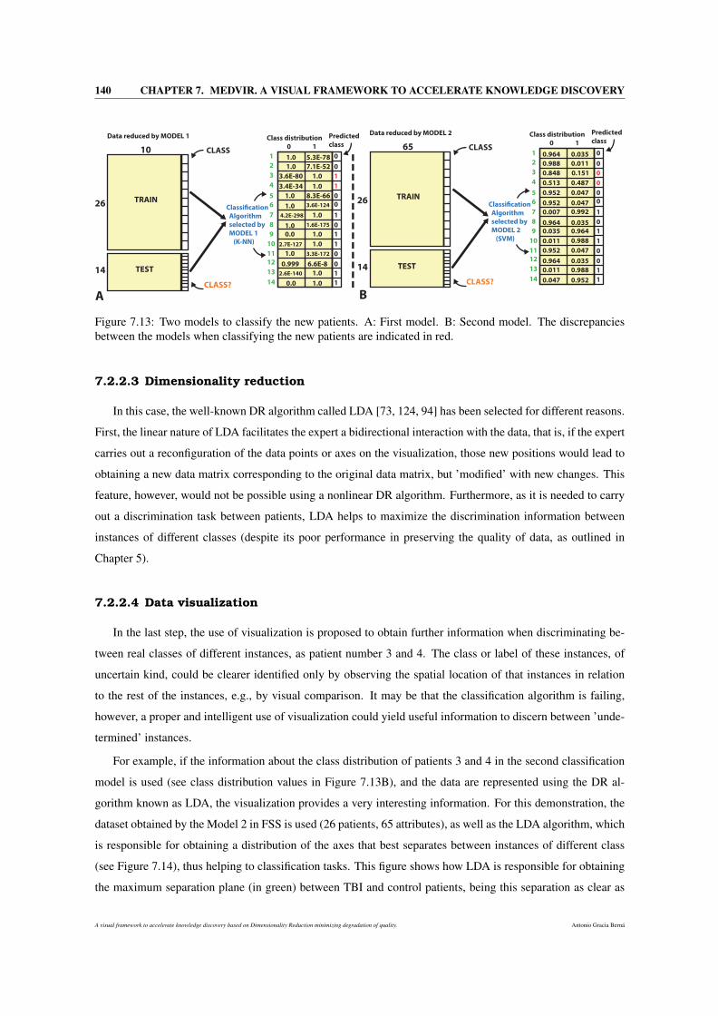
140 CHAPTER 7. MEDVIR. A VISUAL FRAMEWORK TO ACCELERATE KNOWLEDGE DISCOVERY
Data reduced by MODEL 1
CLASS
26
14
CLASS?
TRAIN
TEST
Classi!cation
Algorithm
selected by
MODEL 1
(K-NN)
Class distribution
0 1
0
1
0
0
1
1
0
1
1
0
1
0
1
0
101
2
3
4
5
6
7
8
9
10
11
12
13
14
1.0 5.3E-78
1.0 7.1E-52
3.6E-80 1.0
3.4E-34 1.0
1.0 8.3E-66
1.0 3.6E-124
4.2E-298 1.0
1.0 1.6E-175
0.0 1.0
2.7E-127 1.0
1.0 3.3E-172
0.999 6.6E-8
2.6E-140 1.0
0.0 1.0
Data reduced by MODEL 2
CLASS
26
14
CLASS?
TRAIN
TEST
Classi!cation
Algorithm
selected by
MODEL 2
(SVM)
0
0
0
0
1
1
0
1
0
0
1
0
1
0
651
2
3
4
5
6
7
8
9
10
11
12
13
14
0.0350.964
0.0110.988
0.513
0.1510.848
0.952 0.047
0.0470.952
0.007
0.964 0.035
0.035 0.964
0.9880.011
0.952 0.047
0.0350.964
0.011 0.988
0.047 0.952
Predicted
class
Class distribution
0 1
Predicted
class
0.992
A B
0.487
Figure 7.13: Two models to classify the new patients. A: First model. B: Second model. The discrepanciesbetween the models when classifying the new patients are indicated in red.
7.2.2.3 Dimensionality reduction
In this case, the well-known DR algorithm called LDA [73, 124, 94] has been selected for different reasons.
First, the linear nature of LDA facilitates the expert a bidirectional interaction with the data, that is, if the expert
carries out a reconfiguration of the data points or axes on the visualization, those new positions would lead to
obtaining a new data matrix corresponding to the original data matrix, but ’modified’ with new changes. This
feature, however, would not be possible using a nonlinear DR algorithm. Furthermore, as it is needed to carry
out a discrimination task between patients, LDA helps to maximize the discrimination information between
instances of different classes (despite its poor performance in preserving the quality of data, as outlined in
Chapter 5).
7.2.2.4 Data visualization
In the last step, the use of visualization is proposed to obtain further information when discriminating be-
tween real classes of different instances, as patient number 3 and 4. The class or label of these instances, of
uncertain kind, could be clearer identified only by observing the spatial location of that instances in relation
to the rest of the instances, e.g., by visual comparison. It may be that the classification algorithm is failing,
however, a proper and intelligent use of visualization could yield useful information to discern between ’unde-
termined’ instances.
For example, if the information about the class distribution of patients 3 and 4 in the second classification
model is used (see class distribution values in Figure 7.13B), and the data are represented using the DR al-
gorithm known as LDA, the visualization provides a very interesting information. For this demonstration, the
dataset obtained by the Model 2 in FSS is used (26 patients, 65 attributes), as well as the LDA algorithm, which
is responsible for obtaining a distribution of the axes that best separates between instances of different class
(see Figure 7.14), thus helping to classification tasks. This figure shows how LDA is responsible for obtaining
the maximum separation plane (in green) between TBI and control patients, being this separation as clear as
A visual framework to accelerate knowledge discovery based on Dimensionality Reduction minimizing degradation of quality. Antonio Gracia Berná
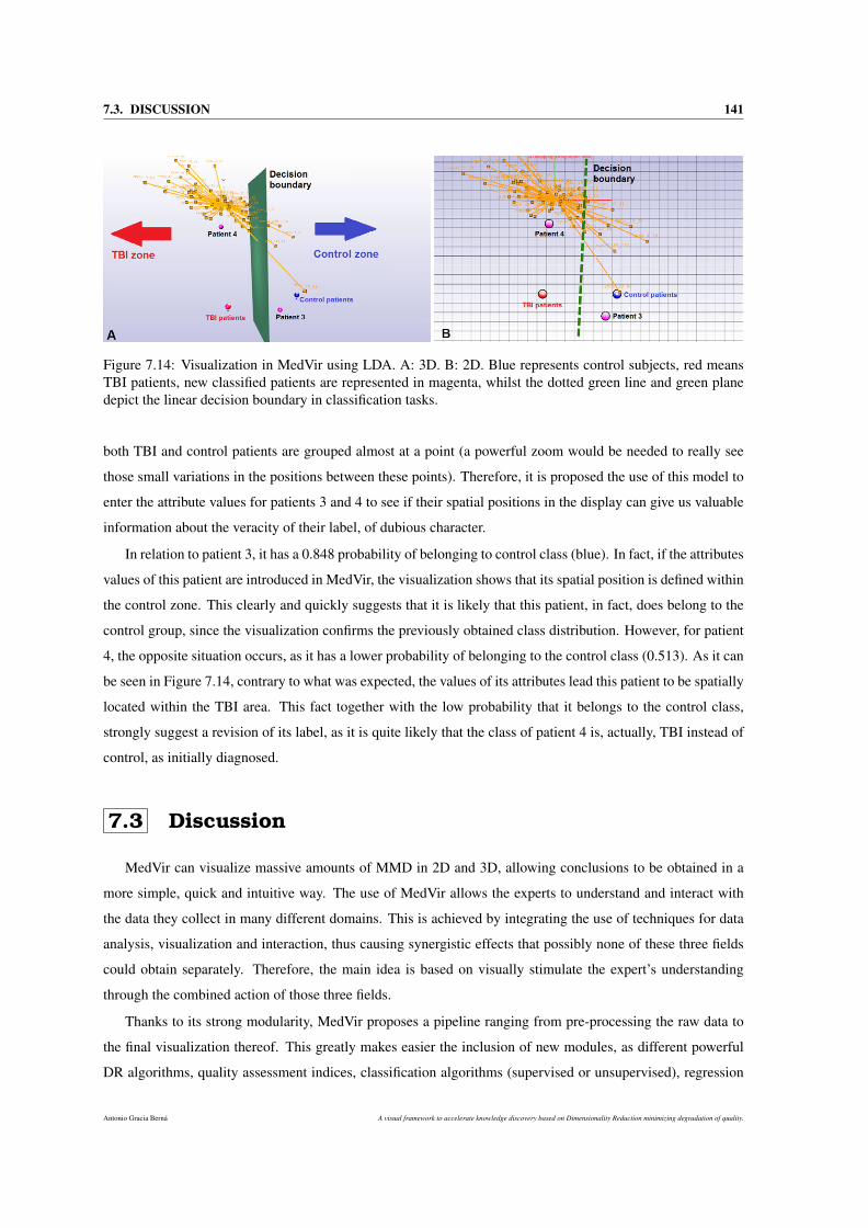
7.3. DISCUSSION 141
Figure 7.14: Visualization in MedVir using LDA. A: 3D. B: 2D. Blue represents control subjects, red meansTBI patients, new classified patients are represented in magenta, whilst the dotted green line and green planedepict the linear decision boundary in classification tasks.
both TBI and control patients are grouped almost at a point (a powerful zoom would be needed to really see
those small variations in the positions between these points). Therefore, it is proposed the use of this model to
enter the attribute values for patients 3 and 4 to see if their spatial positions in the display can give us valuable
information about the veracity of their label, of dubious character.
In relation to patient 3, it has a 0.848 probability of belonging to control class (blue). In fact, if the attributes
values of this patient are introduced in MedVir, the visualization shows that its spatial position is defined within
the control zone. This clearly and quickly suggests that it is likely that this patient, in fact, does belong to the
control group, since the visualization confirms the previously obtained class distribution. However, for patient
4, the opposite situation occurs, as it has a lower probability of belonging to the control class (0.513). As it can
be seen in Figure 7.14, contrary to what was expected, the values of its attributes lead this patient to be spatially
located within the TBI area. This fact together with the low probability that it belongs to the control class,
strongly suggest a revision of its label, as it is quite likely that the class of patient 4 is, actually, TBI instead of
control, as initially diagnosed.
7.3 Discussion
MedVir can visualize massive amounts of MMD in 2D and 3D, allowing conclusions to be obtained in a
more simple, quick and intuitive way. The use of MedVir allows the experts to understand and interact with
the data they collect in many different domains. This is achieved by integrating the use of techniques for data
analysis, visualization and interaction, thus causing synergistic effects that possibly none of these three fields
could obtain separately. Therefore, the main idea is based on visually stimulate the expert’s understanding
through the combined action of those three fields.
Thanks to its strong modularity, MedVir proposes a pipeline ranging from pre-processing the raw data to
the final visualization thereof. This greatly makes easier the inclusion of new modules, as different powerful
DR algorithms, quality assessment indices, classification algorithms (supervised or unsupervised), regression
Antonio Gracia Berná A visual framework to accelerate knowledge discovery based on Dimensionality Reduction minimizing degradation of quality.
142 CHAPTER 7. MEDVIR. A VISUAL FRAMEWORK TO ACCELERATE KNOWLEDGE DISCOVERY
methods, or filters to complete the FSS process. Hence, MedVir could be easily adapted to the needs of the
expert’s application field.
Furthermore, the use of the powerful parallelism offered by the Supercomputing and Visualization Centre
of Madrid (CeSViMa) has allowed the results to be obtained and analyzed in a very reduced time, around 45
times faster than using sequential execution.
As regards the application of MedVir to real-world data, it has been successfully applied to a biological
dataset in the field of magnetoencephalography. MedVir has allowed to discriminate effectively, easily and
quickly between control subjects and TBI patients with a 72% of accuracy. To analize this value it should be,
indeed, beared in mind that Bootstrap validation has been used due to the very low number of instances of the
dataset, so a model that does not overfit the data was needed. In this study, MedVir has been presented as a
quick and easy tool to classify and visualize new subjects included in the TBI study, however other analysis
could be proposed. Thus, visualization and interaction with the data can provide extra useful information to
discern between uncertain class patients, after obtaining the results of a classification process. In addition,
MedVir could even be used to estimate if a TBI patient is in process of rehabilitation or not, so clinicians could
be able to change the treatment or definitely stop it.
However, there will be further research behind this deep work. In terms of TBI data analysis, regression
models and neuropsychological tests are going to be included to estimate the exact situation of a TBI patient
in the recovery process, and how much treatment time he will need to be fully rehabilitated. That is, instead
of discriminating between TBI and control patients, the use of regression techniques applied to different neu-
ropsychological tests could help detect if a patient improves and the amount of this improvement. Some of
these neuropsychological tests could be the Wechsler Adult Intelligence Scale III (WAIS-III; [324]), the Wech-
sler Memory Scale Revised [323], the Brief Test of Attention [260], the Trail Making Test [246], the Stroop
Colour Word Test [104], the Wisconsin Card Sorting Test [126], the Verbal Fluency Test [101], the Tower of
Hanoi [206], the Zoo Map Test (from the Behavioral Assessment of the Dysexecutive Syndrome; [334]) and the
Patient Competency Rating Scale (PCRS; [238]). This last scale is formed from items related to different daily
living activities (basic and instrumental activities as well as social skills and cognitive and emotional issues)
and the patient’s level of competency on a five-point Likert scale. Another interesting future research point is
the DR of data based on clustering of MEG sensors (e.g., creation of brain regions based on sensors locations
and their relationships).
Concluding, MedVir, as an analysis tool, has successfully served for its purpose, which is to provide the
expert a reliable method to accelerate the discovery of underlying knowledge in large amounts of data. This
has been achieved thanks to a strong reduction in the size of the data while preserving most of their properties,
a complete process of experimentation using DM models, and an effective data visualization that aims to
estimulate and make easier the data interpretation and decision making.
A visual framework to accelerate knowledge discovery based on Dimensionality Reduction minimizing degradation of quality. Antonio Gracia Berná

Part IV
CONCLUSIONS AND FUTURE LINES


Chapter 8
Conclusions
Each chapter has presented a brief discussion about the achievements in each proposal. However, this chapter
summarizes the most relevant conclusions, emphasizing the most important reached achievements.
The chapter index is as follows, Section 8.1 describes the main contributions made by this thesis. Section
8.2 presents and enumerates some of the most relevant future lines and open issues. Finally, Section 8.3
describes the publications derived from this research.
8.1 Contributions
This research has made a major and very successful commitment, which is the demonstration of the main
hypothesis of this thesis: There is a visual mechanism of multidimensional data analysis that allows the
acquisition of new knowledge from large datasets in a fast, easy, and reliable way.
In this case, satisfactory results have been obtained when applying this research to different real world
domains in the following chapters:
• Chapter 5 and Chapter 6: i) Diseases, such as breast, leukemia, DLBCL cancer and parkinsons; ii)
Biological domains, as neuronal data; and iii) Other data.
• Chapter 7: Magnetoencephalography (MEG) data.
Next, the breakdown of contributions obtained during the demonstration of the main hypothesis is pre-
sented.
Antonio Gracia Berná A visual framework to accelerate knowledge discovery based on Dimensionality Reduction minimizing degradation of quality.

146 CHAPTER 8. CONCLUSIONS
8.1.1 Development of a methodology for the quantification of the lossof quality in Dimensionality Reduction tasks
When DR techniques are used, it is extremely important to be aware and be able to quantify to what extent
the data quality is being degraded, as this degradation in the original nature of the data can lead to wrong
conclusions about the data causing serious implications.
Nowadays, many different indices have been developed to measure effectively the degradation of data qual-
ity suffered when their dimensionality is reduced for data analysis tasks using a particular DR method. Most
of those indices are based on the study of spatial concepts as distances and nearest neighbors, depending on
the proposed approach. However, these measures are limited to the isolated analysis of the quality degradation
suffered in the data for a fixed dimension value (e.g., dimension 10 or 11), thus omitting the great influence
that might have the quality degradation suffered in other dimensions during the DR process.
In the literature, there is no any procedure to analyze and quantify in a comprehensive manner the loss of
quality suffered throughout the DR process, using different DR algorithms. To address this and to demonstrate
the main hypotheses of this study: i) it is possible to quantify accurately the real loss of quality produced in
the entire DR process and ii) it is possible to group the different DR methods as regards the loss of quality
they produce when reducing the data dimensionality, this thesis proposes a complete methodology (presented
in Chapter 5) that groups several quality assessment indices, and some of the most important DR algorithms
in the literature. The aim is to effectively quantify the loss of quality suffered by a given dataset when a DR
algorithm is applied, to make appropriate decisions about the data analysis tools to be used.
This methodology allows:
• The analysis, comparison and clustering of different DR methods as regards the loss of quality they give
rise to when carrying out a DR process. To quantifying properly the loss of quality, a new statistical
function has been also proposed.
• The study of the correlation between the different quality criteria when quantifying the degradation of
the data in DR processes.
• The analysis of the trend in loss of quality between dimensions. Furthermore, the concept of stability of
a DR algorithm has been also proposed.
This contribution represents an important advance in the field of DR and quality assessment because it
defines a new way of linking simultaneously very important and extensive concepts never combined before in
a methodology. Therefore, the objective "Quantification of the quality degradation in DR processes" has been
fulfilled in Chapter 5.
A visual framework to accelerate knowledge discovery based on Dimensionality Reduction minimizing degradation of quality. Antonio Gracia Berná
8.1. CONTRIBUTIONS 147
8.1.2 Demonstration of the superiority of 3D over 2D to visualize mul-tidimensional and multivariate data
Chapter 6 proposes an innovative solution to solve the controversial discussion of the choice of a suitable
dimensional space to visualize MMD (2D or 3D). This is based on the concept of quality degradation suffered
by the data, and it scientifically demonstrates that the loss of quality produced in 3D spaces is considerably less
than in 2D.
To demonstrate the main hypothesis of this study, which is based on claim that the transition from three to
two dimensions generally involves a considerable loss of quality, this thesis proposes two different approaches:
visual and analytical.
• The first approach presents a set of visual statistical tests using 40 users to demonstrate that the 3D
visualization improves the results of the 2D visualization by using the visual perception of the users.
The results indicated that, although there are certain advantages of using 3D visualization, there is also a
great need to improve the current 3D interfaces. Therefore, a much more deep study is proposed.
• However, the second approach provides the definitive analytical demonstration that the transition from
3D to 2D involves a considerable loss of quality. This quantification of loss of quality has been carried
out using the methodology proposed in Chapter 5.
Finally, the high values of loss of quality produced in 2D strongly suggest the suitability of the third di-
mension to visualize MMD. This is a very important contribution, since this could be considered one the first
attempts to quantify analytically the real loss of quality produced in the transition from 3D to 2D. Thus, the
objective "Study of superiority of 3D over 2D" has been successfully fulfilled in Chapter 6.
8.1.3 Establishment and development of a visual framework to accel-erate knowledge discovery in large datasets
Unlike traditional methods of multidimensional data visualization of genomics nature, this thesis has pro-
posed a novel framework that integrates advanced DM, visualization and interaction techniques. The point of
view of computer technology has been effectively used to accelerate and facilitate the process of knowledge
acquisition from very large datasets in any real world domain, not only in genomics.
To summarize, the expert has been successfully provided with a framework enabling him to introduce his
own dataset (often composed of several thousands of attributes), significantly reduce the size of the data (to a
few tens of attributes) while maintaining their original properties (as far as possible), to finally visualize them in
a simple and quick way. This allows the expert to visually stimulate the knowledge acquisition, while the speed
of interpretation and understanding of the data is greatly enriched. This framework brings together several
major stages of the CRISP-DM process and allows different modular tasks:
• Data pre-processing. Here, different processing tasks are carried out, as: deletion of replicated instances,
Antonio Gracia Berná A visual framework to accelerate knowledge discovery based on Dimensionality Reduction minimizing degradation of quality.
148 CHAPTER 8. CONCLUSIONS
identification and deletion of outliers, handling missing values and handling replicated/high correlated
features.
• Feature subset selection (FSS). This step makes use of an intensive FSS process, which is responsible for
selecting a few tens of attributes containing most of the important properties of the original data.
• Dimensionality reduction (DR). To visualize the data, it is needed a reduction in the dimensionality of
the data obtained in the previous step to 2 or 3 dimensions. For this, the use of different DR algorithms
is allowed.
• Data visualization. Finally, the reduced data are presented to the expert, allowing interaction.
This infrastructure has been implemented efficiently by using the Magerit supercomputer, thus significantly
reducing the time for obtaining results. Furthermore, in order to demonstrate the effectiveness and usefulness of
the proposed framework, it has been applied to a dataset from the field of magnetoencephalography, providing
useful results that experts are analyzing. Hence, with this last contribution, the objective "Development of a
visual framework for knowledge discovery quickly" has been successfully fulfilled in Chapter 7, leading the
main hypothesis of the research to be demonstrated.
Besides the chapters related to the aforementioned objectives, Chapters 2, 3 and 4 present an extensive
overview of all the visualization, DM and DR topics used throughout this thesis, presenting different ap-
proaches, algorithms and references.
8.2 Future lines
Despite reaching the goals that have been proposed in this research, the deepening into the different areas
involved allows clearly identify a number of open research lines from the solutions provided in this thesis.
These are presented in the following sections:
New research lines on quantification of degradation of quality and applications. Here, new possible lines
of research that arise as a consequence of the contributions made by Chapters 5 and 6 are presented.
Functionalities to improve the performance of MedVir. This section present future new functionalities that
will enhance and optimize the abilities of the current implementation of MedVir.
Application to other fields. Finally, it is presented a brief review about the possible fields of application of
MedVir.
A visual framework to accelerate knowledge discovery based on Dimensionality Reduction minimizing degradation of quality. Antonio Gracia Berná
8.2. FUTURE LINES 149
8.2.1 New research lines on the quantification of degradation of qual-ity and its applications
The study presented in this research opens up a wide range of possibilities for carrying out a deeper compar-
ative study of the DR algorithms according their geometry preservation skills, as well as the inclusion of other
metrics or quality criteria for enriching the loss of quality evaluation. Furthermore, the results obtained through
QLQC (Quality Loss Quantifier Curves) Methodology [110] could be extended through the implementation of
a more complex kind of data analysis for studying the behavior of the loss of quality in DR tasks.
Aditionally, we are very interested in studying those quality curves discarded during the quality quantifi-
cation process for not meeting the required stability criteria, as well as to know what the ’unstability’ concept
really means and what could be causing this unstability. In this sense, is also proposed to answer why some
DR algorithms behave more unstable than others during the DR process. Furthermore, it would be helpful to
carry out several statistical and mathematical studies about the quality curves obtained to know whether there
are certain ’key dimensions’, from which a greater and faster degradation in the quality of the data is going to
be produced. This could make the expert reconsider the need to reduce the dimensionality of the data beyond
that threshold. Finally, at this point, there may be a need to respond to an obvious question, as if reducing the
dimensionality of the data to a value beyond the intrinsic dimensionality thereof, may be significantly degrad-
ing the quality of the data. Besides this, another possible future line is to analyze the effects of different values
for the k parameter used in some of the DR algorithms when evaluating the neighborhood before reducing the
data dimensionality.
An useful future application is the use of the QLQC methodology to quantify and to model to what extent
the quality degradation of the data would be influencing the accuracy achieved in supervised learning tasks.
That is, experts often make use of techniques to reduce dimensionality of their data, prior to classification
tasks. It would therefore be of vital importance to be aware of to what extent this first step will degrade the
nature of the data, probably influencing the accuracy obtained in classification tasks.
8.2.2 Functionalities to improve the performance of MedVir
As mentioned above, MedVir is an open framework and it is in continuous development. By open we
mean that it is possible to include future modules that allow the tool to be provided with more functionalities
for data analysis and visualization processes. Thus, the aim is to provide the expert a convenient, easy to
use, and powerful framework that encourages rapid knowledge discovery by integrating DM, visualization and
interaction techniques.
• Improvement of the mechanisms for knowledge acquisition. With the aim to provide the experts
greater possibilities for gaining knowledge about data they work with, the use of different techniques
or even the combination of them is needed. Therefore, a greater experimentation with visualization and
interaction techniques is proposed. Regarding these features, it is worth mentioning that in this research
Antonio Gracia Berná A visual framework to accelerate knowledge discovery based on Dimensionality Reduction minimizing degradation of quality.
150 CHAPTER 8. CONCLUSIONS
all the possibilities that provides the interaction with the data visualization have not been completely
tapped.
However, some interesting conclusions about the meaning of certain interactive actions on display have
been already outlined, which must be completed and extended in the future. Thus, the use of the method-
ology oriented to user [98] is proposed, which would improve the reliability of MedVir. This would
certainly validate the conclusions drawn from visualization and interaction with the data. We also want
to considerably enhance the user’s interaction, using IO devices such as Leap Motion (MedVir con-
trolled by gestual movements) and voice recognition (by means of expert orders), as well as studying the
possible improvement effects in the expert’s understanding about the data introduced by the use of stereo-
scopic techniques. Besides all this, a more complete experimentation with visual analytics techniques
will enhance the chances of quick interaction and knowledge acquisition.
• To expand capabilities of MedVir. An improvement in the functionalities that MedVir provides is pro-
posed, in relation to the data analysis tasks that can be performed. To tackle this, new data analysis
modules could be included. For example, if data segmentation tasks (in which the instances do not have
labels) are required, several different algorithms can be incorporated and used. The inclusion of unsu-
pervised filter and wrapper approaches during the FSS process will provide the expert a segmentation
of his data, whilst obtaining a minimal number of attributes. Then, using the visualization provided by
MedVir, the expert would obtain a quick look of the data to identify those possible groups or clusters
to carry out a process of labeling instances. The combination of his experience and criterion about the
data, along with the visual stimulus that provides an effective visualization, will greatly facilitate this
tedious process. Furthermore, just as in supervised learning, the expert would select the most interesting
clustering solution among the final ranking of models obtained, to visualize it. Moreover, the use of
regression techniques will allow to show, using different colors and transparencies, the final predicted
value for a given instance. Such regression techniques could also allow to detect whether a particular
patient is improving or not, for a given treatment. This could mean huge cost savings, because it would
mean that a particular patient is not given further treatment than necessary. Another possible application
is the management of time series data, that could show the evolution (through spatial movement) of a
given instance in a visual way to spatially locate it where appropriate, according to the final value of
its attributes. The results of all these techniques proposed here could be effectively complemented by
the inclusion of extra information about the instances, as could be complete clinical information about
patients when working with medical or biological data.
• To facilitate the dissemination and execution of MedVir. Medvir is intended to be a quick and com-
fortable platform for experts from different domains that allows them, as far as possible, to be abstracted
of costly computational processes underlying in the requested data analysis tasks. This could be achieved
easily by adaptating MedVir to a web platform where experts could upload their datasets and seek en-
A visual framework to accelerate knowledge discovery based on Dimensionality Reduction minimizing degradation of quality. Antonio Gracia Berná
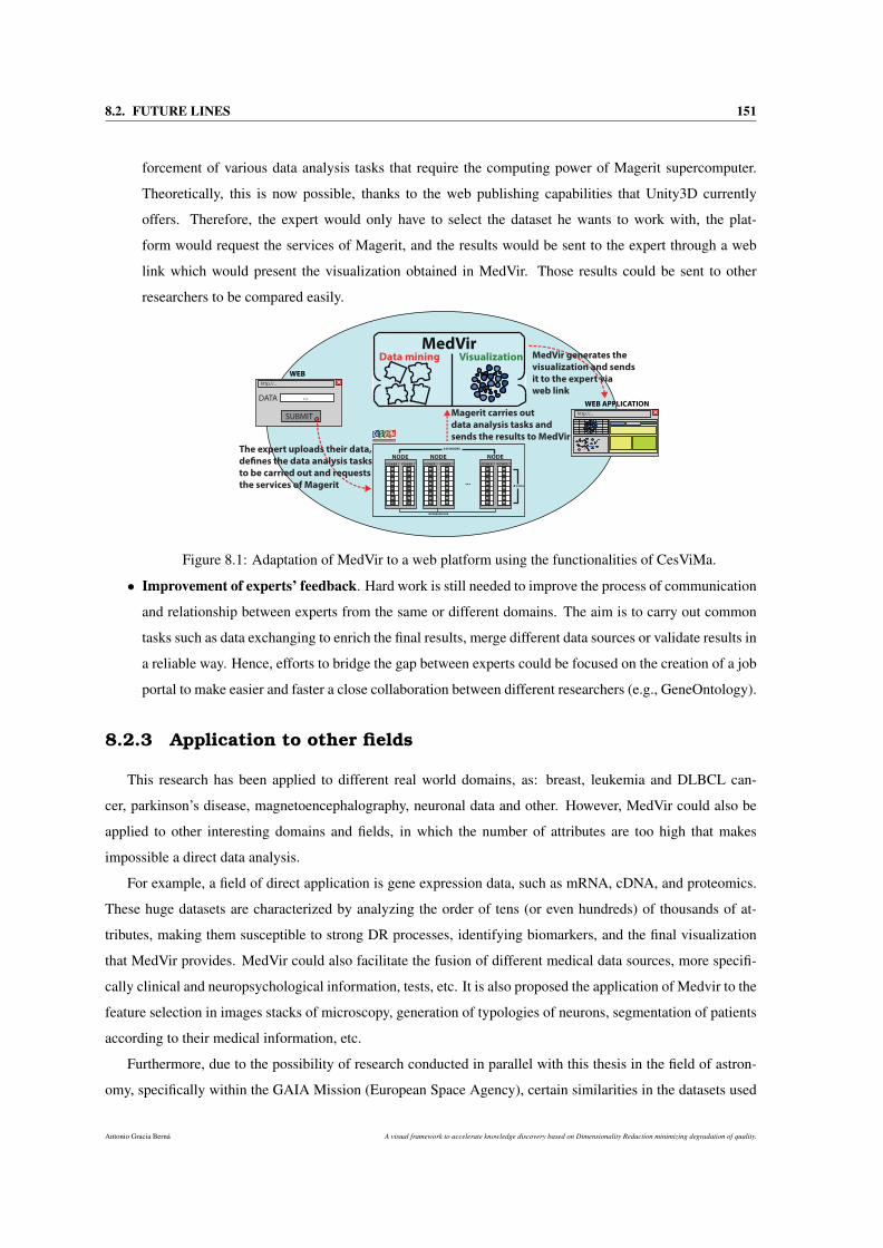
8.2. FUTURE LINES 151
forcement of various data analysis tasks that require the computing power of Magerit supercomputer.
Theoretically, this is now possible, thanks to the web publishing capabilities that Unity3D currently
offers. Therefore, the expert would only have to select the dataset he wants to work with, the plat-
form would request the services of Magerit, and the results would be sent to the expert through a web
link which would present the visualization obtained in MedVir. Those results could be sent to other
researchers to be compared easily.
POWER 7 POWER 7
NODE
CORE
CORE
CORE
CORE
CORE
CORE
CORE
CORE
CORE
CORE
CORE
CORE
CORE
CORE
CORE
CORE
POWER 7 POWER 7
NODE
CORE
CORE
CORE
CORE
CORE
CORE
CORE
CORE
CORE
CORE
CORE
CORE
CORE
CORE
CORE
CORE
POWER 7 POWER 7
NODE
CORE
CORE
CORE
CORE
CORE
CORE
CORE
CORE
CORE
CORE
CORE
CORE
CORE
CORE
CORE
CORE
INFINIBAND DDR
...8 cores
245 NODES
DATA
SUBMIT
...
http://...
WEB
MedVirData mining Visualization
http://...
WEB APPLICATION
The expert uploads their data,
de!nes the data analysis tasks
to be carried out and requests
the services of Magerit
Magerit carries out
data analysis tasks and
sends the results to MedVir
MedVir generates the
visualization and sends
it to the expert via
web link
Figure 8.1: Adaptation of MedVir to a web platform using the functionalities of CesViMa.
• Improvement of experts’ feedback. Hard work is still needed to improve the process of communication
and relationship between experts from the same or different domains. The aim is to carry out common
tasks such as data exchanging to enrich the final results, merge different data sources or validate results in
a reliable way. Hence, efforts to bridge the gap between experts could be focused on the creation of a job
portal to make easier and faster a close collaboration between different researchers (e.g., GeneOntology).
8.2.3 Application to other fields
This research has been applied to different real world domains, as: breast, leukemia and DLBCL can-
cer, parkinson’s disease, magnetoencephalography, neuronal data and other. However, MedVir could also be
applied to other interesting domains and fields, in which the number of attributes are too high that makes
impossible a direct data analysis.
For example, a field of direct application is gene expression data, such as mRNA, cDNA, and proteomics.
These huge datasets are characterized by analyzing the order of tens (or even hundreds) of thousands of at-
tributes, making them susceptible to strong DR processes, identifying biomarkers, and the final visualization
that MedVir provides. MedVir could also facilitate the fusion of different medical data sources, more specifi-
cally clinical and neuropsychological information, tests, etc. It is also proposed the application of Medvir to the
feature selection in images stacks of microscopy, generation of typologies of neurons, segmentation of patients
according to their medical information, etc.
Furthermore, due to the possibility of research conducted in parallel with this thesis in the field of astron-
omy, specifically within the GAIA Mission (European Space Agency), certain similarities in the datasets used
Antonio Gracia Berná A visual framework to accelerate knowledge discovery based on Dimensionality Reduction minimizing degradation of quality.
152 CHAPTER 8. CONCLUSIONS
within this domain have been clearly identified. Thus, MedVir could be applied to these astronomical datasets,
often composed of thousands of attributes, to visualize and interact with multidimensional properties of stars,
planets and other celestial bodies.
Finally, it is also proposed the application in the growing fields of neuroscience and magnetoencephalogra-
phy, in which many experts from different domains are working intensely at the Center for Biomedical Tech-
nology (Technical University of Madrid, Madrid).
8.3 Publications
The publications derived from this research are listed below.
8.3.1 Journals
• A. Gracia, S. González, V. Robles and E. Menasalvas Ruiz. A methodology to compare Dimensionality
Reduction algorithms in terms of loss of quality. Information Sciences, 270(0):1-27, 2014. Current JCR
(2014): 3.643.
• A. Gracia, S. González, V. Robles, E. Menasalvas and T. von Landesberger. New insights into the
suitability of the third dimension for visualizing multivariate/multidimensional data: a study based on
loss of quality quantification. Information Visualization, Accepted with major changes. Current JCR
(2014): 1.0.
8.3.2 Conferences
• S. González, A. Gracia, P. Herrero, N. Castellanos, N. Paul. MedVir: an interactive representation system
of multidimensional medical data applied to Traumatic Brain Injury’s rehabilitation prediction. Madrid,
Spain. Joint Rough Set Symposium, 2014.
• A. Gracia, S. González and V. Robles. MedVir: 3D visual interface applied to gene profile analysis.
Madrid, Spain. HPCS 2012: 693-695.
• A. Gracia, S. González, J. Veiga and V. Robles: VR BioViewer - A new interactive-visual model to repre-
sent medical information. In MSV ’11: Proceedings of the 2011 International Conference on Modeling,
Simulation and Visualization Methods. Las Vegas, NV, USA 2011:40-46.
A visual framework to accelerate knowledge discovery based on Dimensionality Reduction minimizing degradation of quality. Antonio Gracia Berná

Part V
APPENDICES


Appendix A
Definition of the questions
This appendix provides a list of questions asked to users once they finished the carrying out of the visual tests.
The list of questions is as follows:
• Question: From your point of view, what kind of scatterplot (2D or 3D) do you think is more useful in
general to perform each of the 3 tests?. Answer: two options were available: 2 or 3. The user should
select only one option. Answering this question was obligatory.
• Question: Could you tell us why?. Answer: free text answer. Answering this question was obligatory.
• Question: On a scale of 1 - 5 (5 being the best score), could you rate how comfortable you felt carrying
out the test using a 2D scatterplot?. Answer: five options were available: 1, 2, 3, 4 and 5. The user
should select only one option. Answering this question was obligatory.
• Question: On a scale of 1 - 5 (5 being the best score), could you rate how comfortable you felt carrying
out the test using a 3D scatterplot?. Answer: five options were available: 1, 2, 3, 4 and 5. The user
should select only one option. Answering this question was obligatory.
• What kind of scatterplot (2D or 3D) do you think you have been more successful in the tests, i.e., less
error?. Answer: two options were available: 2 or 3. The user should select only one option. Answering
this questions was obligatory.
• Could you tell us why you think so?. Answer: free text answer. This question was not mandatory to
answer.
• What kind of scatterplot (2D or 3D) did you feel more comfortable with, e.g: when you navigate through
the scenes, move the camera and interact with the data points?. Answer: two options were available: 2
or 3. The user should select only one option. Answering this question was obligatory.
Antonio Gracia Berná A visual framework to accelerate knowledge discovery based on Dimensionality Reduction minimizing degradation of quality.

156 APPENDIX A. DEFINITION OF THE QUESTIONS
• Could you tell us why you think so?. Answer: free text answer. Answering this question was optional.
• Do you have any clue on how to improve the visualization in 3D or 2D scatterplots?. Answer: free text
answer. Answering this question was optional.
• Finally, would you like to make any comments or suggestions about the tests for future improvement?.
Answer: free text answer. Answering this question was optional.
A visual framework to accelerate knowledge discovery based on Dimensionality Reduction minimizing degradation of quality. Antonio Gracia Berná

Bibliography
[1] Treemap. http://hci.stanford.edu/jheer/files/zoo/ex/hierarchies/
treemap.html. Accessed March 6, 2014.
[2] Visualizing Higher Dimensional Data. from the MathWorks, available at: http://www.
mathworks.com/products/demos/statistics/mvplotdemo.html, 2006.
[3] Dale Addison. Intelligent Computing Techniques: A Review. Telos Pr, 2004.
[4] Rakesh Agrawal, Johannes Gehrke, Dimitrios Gunopulos, and Prabhakar Raghavan. Automatic subspace
clustering of high dimensional data for data mining applications. SIGMOD Rec., 27(2):94–105, June
1998.
[5] U. Akkucuk. Nonlinear Mapping: Approaches Based on Optimizing an Index of Continuity and Applying
Classical Metric MDS on Revised Distances. Rutgers University, 2004.
[6] Ulas Akkucuk and J. Douglas Carroll. PARAMAP vs. Isomap: A Comparison of Two Nonlinear Map-
ping Algorithms. Journal of Classification, 23:221–254, 2006.
[7] Sören Anderson. On optimal dimension reduction for sensor array signal processing. Signal Processing,
30(2):245 – 256, 1993.
[8] T.W. Anderson. An introduction to multivariate statistical analysis. Wiley series in probability and
mathematical statistics. Probability and mathematical statistics. Wiley, 1958.
[9] D. F. Andrews. Plots of High-Dimensional Data. Biometrics, 28(1), 1972.
[10] Fabrizio Angiulli, Clara Pizzuti, and Massimo Ruffolo. Descry: A density based clustering algorithm
for very large data sets. In IDEAL, pages 203–210, 2004.
[11] Mihael Ankerst, Markus M. Breunig, Hans-Peter Kriegel, and Jörg Sander. Optics: ordering points to
identify the clustering structure. SIGMOD Rec., 28(2):49–60, June 1999.
[12] Mihael Ankerst, Daniel A. Keim, and Hans-Peter Kriegel. Circle Segments: A Technique for Visually
Exploring Large Multidimensional Data Sets. In Visualization ’96, Hot Topic Session, 1996, 1996.
Antonio Gracia Berná A visual framework to accelerate knowledge discovery based on Dimensionality Reduction minimizing degradation of quality.
158 BIBLIOGRAPHY
[13] Ana Azevedo and Manuel Filipe Santos. Kdd, semma and crisp-dm: a parallel overview. In Ajith
Abraham, editor, IADIS European Conf. Data Mining, pages 182–185. IADIS, 2008.
[14] Amit Bagga and Breck Baldwin. Entity-based cross-document coreferencing using the vector space
model. In Proceedings of the 17th International Conference on Computational Linguistics - Volume 1,
COLING ’98, pages 79–85, Stroudsburg, PA, USA, 1998. Association for Computational Linguistics.
[15] F. B. Baker and L. J. Hubert. Measuring the power of hierarchical cluster analysis. Journal of the
American Statistical Association, 70:31–38, 1975.
[16] M. Balasubramanian and E. L. Schwartz. The Isomap Algorithm and Topological Stability. Science,
295(5552):7, January 2002.
[17] P. Baldi, S. Brunak, Y. Chauvin, C. A. Andersen, and H. Nielsen. Assessing the accuracy of prediction
algorithms for classification: an overview. Bioinformatics, 16(5):412–24, 2000.
[18] W. W. R. Ball and H. S. M. Coxeter. Mathematical Recreations and Essays, 13th ed. Dover, New York,
1987.
[19] Wojciech Basalaj. Proximity Visualization of Abstract Data. PhD thesis, Trinity College (Cambridge,
UK), 2001.
[20] Eric Bauer and Ron Kohavi. An empirical comparison of voting classification algorithms: Bagging,
boosting, and variants. Mach. Learn., 36(1-2):105–139, 1999.
[21] H.-U. Bauer and K. Pawelzik. Quantifying the Neighborhood Preservation of Self-Organizing Feature
Maps. IEEE Transactions on Neural Networks, 3(4):570–579, 1992.
[22] Richard A. Becker and William S. Cleveland. Brushing Scatterplots. Technometrics, 29(2):127–142,
May 1987.
[23] Mikhail Belkin and Partha Niyogi. Laplacian Eigenmaps and Spectral Techniques for Embedding and
Clustering. In Advances in Neural Information Processing Systems, 2001, volume 14, pages 585–591,
2001.
[24] Mikhail Belkin and Partha Niyogi. Laplacian Eigenmaps for Dimensionality Reduction and Data Rep-
resentation. Neural Computation, 15(6):1373–1396, June 2003.
[25] Richard E. Bellman. Adaptive control processes - A guided tour. Princeton University Press, Princeton,
New Jersey, U.S.A., 1961.
[26] R. Bennett. The intrinsic dimensionality of signal collections. IEEE Trans. Inf. Theor., 15(5):517–525,
September 2006.
A visual framework to accelerate knowledge discovery based on Dimensionality Reduction minimizing degradation of quality. Antonio Gracia Berná
BIBLIOGRAPHY 159
[27] Pavel Berkhin. Survey of clustering data mining techniques. Technical report, Accrue Software, San
Jose, CA, 2002.
[28] Jolita Bernataviciene, Gintautas Dzemyda, Olga Kurasova, and Virginijus Marcinkevicius. Optimal
decisions in combining the SOM with nonlinear projection methods. European Journal of Operational
Research, 173(3):729–745, 2006.
[29] Clifford Beshers and Steven Feiner. Automated design of virtual worlds for visualizing multivariate
relations. In Proceedings of the 3rd Conference on Visualization ’92, VIS ’92, pages 283–290, Los
Alamitos, CA, USA, 1992. IEEE Computer Society Press.
[30] Clifford Beshers and Steven Feiner. Auto visual: Rule-based design of interactive multivariate visual-
izations. IEEE Comput. Graph. Appl., 13(4):41–49, July 1993.
[31] James C. Bezdek and Nikhil R. Pal. An index of topological preservation for feature extraction. Pattern
Recognition, 28(3):381–391, 1995.
[32] Christopher M. Bishop and Christopher K. I. Williams. GTM: The generative topographic mapping.
Neural Computation, 10:215–234, 1998.
[33] Avrim L. Blum and Pat Langley. Selection of relevant features and examples in machine learning. Artif.
Intell., 97(1-2):245–271, December 1997.
[34] B. Bonev, F. Escolano, and M. Cazorla. A novel information theory method for filter feature selection.
In MICAI 2007, Aguascalientes, Mexico, LNAI, November 2007.
[35] I. Borg and P.J.F. Groenen. Modern Multidimensional Scaling: Theory and Applications. Springer, New
York, 1997.
[36] I. Borg and J. Lingoes. Multidimensional similarity structure analysis. Springer Verlag, New York,
1987.
[37] Bernhard E. Boser, Isabelle M. Guyon, and Vladimir N. Vapnik. A training algorithm for optimal margin
classifiers. In Proceedings of the 5th Annual ACM Workshop on Computational Learning Theory, pages
144–152. ACM Press, 1992.
[38] Stephen Boyd and Lieven Vandenberghe. Convex Optimization. Cambridge University Press, mar 2004.
[39] L. Breiman, J. Friedman, R. Olshen, and C. Stone. Classification and Regression Trees. Wadsworth and
Brooks, Monterey, CA, 1984.
[40] Leo Breiman. Bagging predictors. Mach. Learn., 24(2):123–140, 1996.
[41] K. W. Brodlie. Scientific visualization : techniques and applications. Springer-Verlag, Berlin New York,
1992.
Antonio Gracia Berná A visual framework to accelerate knowledge discovery based on Dimensionality Reduction minimizing degradation of quality.
160 BIBLIOGRAPHY
[42] Ken Brodlie. A Classification Scheme for Scientific Visualization, 1993. In R. E. Earnshaw and D.
Watson, editors, Animation and scientific visualization - tools and applications, chapter 8, pages 125 -
140. Academic Press Ltd.
[43] Andreas Buja, Dianne Cook, and Deborah F. Swayne. Interactive high-dimensional data visualization.
Journal of Computational and Graphical Statistics, 5(1):78–99, 1996.
[44] T. Calinski and J. Harabasz. A dendrite method for cluster analysis. Communications in Statistics-
Simulation and Computation, 3(1):1–27, 1974.
[45] Stuart K. Card, Jock D. Mackinlay, and Ben Shneiderman, editors. Readings in Information Visualiza-
tion: Using Vision to Think. Morgan Kaufmann Publishers Inc., San Francisco, CA, USA, 1999.
[46] Miguel Á. Carreira-Perpiñán. A Review of Dimension Reduction Techniques. Technical Report CS-96-
09, Department of Computer Science, University of Sheffield, UK, 1996.
[47] N. P. Castellanos, N. Paul, V. E. Ordonez, O. Demuynck, R. Bajo, P. Campo, A. Bilbao, T. Ortiz, F. del
Pozo, and F. Maestu. Reorganization of functional connectivity as a correlate of cognitive recovery in
acquired brain injury. Brain Journal, 133:2365–2381, 2010.
[48] E. Cerami, J. Gao, U. Dogrusoz, B. E. Gross, S. O. Sumer, B. A. Aksoy, A. Jacobsen, C. J. Byrne,
M. L. Heuer, E. Larsson, Y. Antipin, B. Reva, A. P. Goldberg, C. Sander, and N. Schultz. The cBio
cancer genomics portal: an open platform for exploring multidimensional cancer genomics data. Cancer
Discov, 2(5):401–404, May 2012.
[49] J.M. Chambers, W.S. Cleveland, B. Kleiner, and P.A. Tukey. Graphical Methods for Data Analysis. The
Wadsworth Statistics/Probability Series. Boston, MA: Duxury, 1983.
[50] Pete Chapman, Julian Clinton, Randy Kerber, Thomas Khabaza, Thomas Reinartz, Colin Shearer, and
Rudiger Wirth. Crisp-dm 1.0 step-by-step data mining guide. Technical report, The CRISP-DM consor-
tium, August 2000.
[51] L Chen. Local Multidimensional Scaling for Nonlinear Dimension Reduction, Graph Layout and Prox-
imity Analysis, Ph.D. Thesis. University of Pennsylvania, 2006.
[52] Lisha Chen and Andreas Buja. Local Multidimensional Scaling for Nonlinear Dimension Reduction,
Graph Drawing, and Proximity Analysis. Journal of the American Statistical Association, 104(485):209–
219, 2009.
[53] Yao-Nan Chen and Hsuan-Tien Lin. Feature-aware Label Space Dimension Reduction for Multi-label
Classification. In Advances in Neural Information Processing Systems 25, pages 1538–1546. 2012.
[54] Herman Chernoff. The Use of Faces to Represent Points in K-Dimensional Space Graphically. Journal
of the American Statistical Association, 68(342):361–368, 1973.
A visual framework to accelerate knowledge discovery based on Dimensionality Reduction minimizing degradation of quality. Antonio Gracia Berná

BIBLIOGRAPHY 161
[55] N.F. Chikhi, B. Rothenburger, and N. Aussenac-Gilles. A Comparison of Dimensionality Reduction
Techniques for Web Structure Mining. In IEEE/WIC/ACM International Conference on Web Intelli-
gence, 2007, pages 116–119, 2007.
[56] M. S. Cline, M. Smoot, E. Cerami, A. Kuchinsky, N. Landys, C. Workman, R. Christmas, I. Avila-
Campilo, M. Creech, B. Gross, K. Hanspers, R. Isserlin, R. Kelley, S. Killcoyne, S. Lotia, S. Maere,
J. Morris, K. Ono, V. Pavlovic, A. R. Pico, A. Vailaya, P. L. Wang, A. Adler, B. R. Conklin, L. Hood,
M. Kuiper, C. Sander, I. Schmulevich, B. Schwikowski, G. J. Warner, T. Ideker, and G. D. Bader.
Integration of biological networks and gene expression data using Cytoscape. Nat Protoc, 2(10):2366–
2382, 2007.
[57] Frank Dellaert College and Frank Dellaert. The expectation maximization algorithm. Technical report,
2002.
[58] T. Cover and P. Hart. Nearest neighbor pattern classification. Information Theory, IEEE Transactions
on, 13(1):21–27, 1967.
[59] Trevor F. Cox and Michael A. A. Cox. Multidimensional Scaling. Chapman & Hall, London, 1994.
[60] T. Dasu and T. Johnson. Exploratory Data Mining and Data Cleaning. Wiley Series in Probability and
Statistics. Wiley, 2003.
[61] I. Daubechies. The wavelet transform, time-frequency localization and signal analysis. IEEE Trans. Inf.
Theor., 36(5):961–1005, September 2006.
[62] David L. Davies and Donald W. Bouldin. A cluster separation measure. IEEE Trans. Pattern Anal.
Mach. Intell., 1(2):224–227, February 1979.
[63] Maria Cristina Ferreira de Oliveira and Haim Levkowitz. From Visual Data Exploration to Visual Data
Mining: A Survey. IEEE Trans. Vis. Comput. Graph., 9(3):378–394, 2003.
[64] Vin De Silva and Joshua B. Tenenbaum. Global Versus Local Methods in Nonlinear Dimensionality
Reduction. In Advances in Neural Information Processing Systems 15, 2003, volume 15, pages 705–
712, 2003.
[65] T.A. DeFanti, M.D. Brown, and B.H. McCormick. Visualization: expanding scientific and engineering
research opportunities. Computer, 22(8):12–16, Aug 1989.
[66] J. DeFelipe, P.L. Lopez-Cruz, R. Benavides-Piccione, C. Bielza, P. Larrañaga, and et al. New insights
into the classification and nomenclature of cortical GABAergic interneurons. Nature Reviews Neuro-
science, 14(3):202–216, 2013.
[67] P. Demartines and J. Herault. Curvilinear component analysis: A self-organizing neural network for
nonlinear mapping of data sets. IEEE Trans. Neural Netw., 8(1):148–154, 1997.
Antonio Gracia Berná A visual framework to accelerate knowledge discovery based on Dimensionality Reduction minimizing degradation of quality.

162 BIBLIOGRAPHY
[68] Daniel B. Dias, Renata C. B. Madeo, Thiago Rocha, Helton H. Bíscaro, and Sarajane M. Peres. Hand
movement recognition for brazilian sign language: a study using distance-based neural networks. In
Proceedings of the 2009 international joint conference on Neural Networks, IJCNN’09, pages 2355–
2362. IEEE Press, 2009.
[69] Thomas G. Dietterich. Machine-learning research – four current directions. AI MAGAZINE, 18:97–136,
1997.
[70] E. W. Dijkstra. A note on two problems in connexion with graphs. Numerische Mathematik, 1(1):269–
271, 1959.
[71] Selan Rodrigues. Dos Santos. A Framework for the Visualization of Multidimensional and Multivariate
Data. PhD thesis, The University of Leeds, School of Computing (Leeds, UK), 2004.
[72] R.O. Duda and P.E. Hart. Pattern Classification and Scene Analysis. A Wiley-Interscience publication.
Wiley, 1973.
[73] R.O. Duda, P.E. Hart, and D.G. Stork. Pattern classification. Pattern Classification and Scene Analysis:
Pattern Classification. Wiley, 2001.
[74] Sandrine Dudoit, Jane Fridlyand, and Terence P. Speed. Comparison of discrimination methods for the
classification of tumors using gene expression data. Journal of the American Statistical Association,
97(457):77–87, 2002.
[75] J. C. Dunn. A Fuzzy Relative of the ISODATA Process and Its Use in Detecting Compact Well-Separated
Clusters. Journal of Cybernetics, 3(3):32–57, 1973.
[76] B. Efron. Bootstrap methods: another look at the jackknife. Ann. Statistics, 7:1–26, 1979.
[77] B. Efron. Estimating the Error Rate of a Prediction Rule: Improvement on Cross-Validation. Journal of
the American Statistical Association, 78(382):316–331, 1983.
[78] Bradley Efron and Robert Tibshirani. Improvements on cross-validation: The .632+ bootstrap method.
Journal of the American Statistical Association, 92(438):548–560, 1997.
[79] Martin Ester, Hans-peter Kriegel, S. Jörg, and Xiaowei Xu. A density-based algorithm for discovering
clusters in large spatial databases with noise, 1996.
[80] Pablo A. Estévez and Andrés M. Chong. Geodesic Nonlinear Mapping Using the Neural Gas Network.
In IJCNN, 2006, pages 3287–3294, 2006.
[81] Brian Everitt, G. Graham Dunn, and Brian Everitt. Applied multivariate data analysis. Edward Arnold,
London, 1991.
A visual framework to accelerate knowledge discovery based on Dimensionality Reduction minimizing degradation of quality. Antonio Gracia Berná

BIBLIOGRAPHY 163
[82] Brian S. Everitt, Sabine Landau, and Morven Leese. Cluster Analysis. Wiley Publishing, 4th edition,
2009.
[83] B.S. Everitt and S. Rabe-Hesketh. The Analysis of Proximity Data. Kendall’s Library of Statistics, No
4. Edward Arnold, London, 1997.
[84] I. W. Evett and E. J. Spiehler. Knowledge Based Systems. chapter Rule induction in forensic science,
pages 152–160. Halsted Press, New York, NY, USA, 1988.
[85] S.I. Fabrikant. Spatial Metaphors for Browsing Large Data Archives. University of Colorado, 2000.
[86] Usama M. Fayyad, Gregory Piatetsky-Shapiro, Padhraic Smyth, and Ramasamy Uthurusamy, editors.
Advances in Knowledge Discovery and Data Mining. American Association for Artificial Intelligence,
Menlo Park, CA, USA, 1996.
[87] Usama M. Fayyad, Gregory Piatetsky-Shapiro, Padhraic Smyth, and Ramasamy Uthurusamy, editors.
Advances in Knowledge Discovery and Data Mining. AAAI/MIT Press, 1996.
[88] S. K. Feiner and Clifford Beshers. Visualizing N-dimensional Virtual Worlds with N-vision. SIGGRAPH
Comput. Graph., 24(2):37–38, 1990.
[89] R. A. Fisher. The use of multiple measurements in taxonomic problems. Annals of Eugenics, 7(7):179–
188, 1936.
[90] Marc Fiume, Eric J. M. Smith, Andrew Brook, Dario Strbenac, Brian Turner, Aziz M. Mezlini, Mark D.
Robinson, Shoshana J. Wodak, and Michael Brudno. Savant genome browser 2: visualization and
analysis for population-scale genomics. Nucleic Acids Research, 40(Web-Server-Issue):615–621, 2012.
[91] Stephen France and Douglas Carroll. Development of an Agreement Metric Based Upon the RAND
Index for the Evaluation of Dimensionality Reduction Techniques, with Applications to Mapping Cus-
tomer Data. In Petra Perner, editor, Machine Learning and Data Mining in Pattern Recognition, volume
4571 of Lecture Notes in Computer Science, pages 499–517. Springer Berlin Heidelberg, 2007.
[92] Kenji Fukumizu, Francis R. Bach, and Michael I. Jordan. Dimensionality Reduction for Supervised
Learning with Reproducing Kernel Hilbert Spaces. J. Mach. Learn. Res., 5:73–99, 2004.
[93] K. Fukunaga and D. R. Olsen. An Algorithm for Finding Intrinsic Dimensionality of Data. IEEE Trans.
Comput., 20(2):176–183, February 1971.
[94] Keinosuke Fukunaga. Introduction to statistical pattern recognition (2nd ed.). Academic Press Profes-
sional, Inc., San Diego, CA, USA, 1990.
[95] Marcus R. Gallagher. Multi-Layer Perceptron Error Surfaces: Visualization, Structure and Modelling.
PhD thesis, Dept. Computer Science and Electrical Engineering, University of Queensland, 2000.
Antonio Gracia Berná A visual framework to accelerate knowledge discovery based on Dimensionality Reduction minimizing degradation of quality.
164 BIBLIOGRAPHY
[96] JohnQ. Gan, Bashar Awwad Shiekh Hasan, and ChunSingLouis Tsui. A filter-dominating hybrid sequen-
tial forward floating search method for feature subset selection in high-dimensional space. International
Journal of Machine Learning and Cybernetics, pages 1–11, 2012.
[97] Cesar García-Osorio and Colin Fyfe. Visualization of High-dimensional Data via Orthogonal Curves.
Journal of Universal Computer Science, 11(11):1806–1819, 2005.
[98] J.J. Garrett. Elements of User Experience,The: User-Centered Design for the Web and Beyond. Voices
That Matter. Pearson Education, 2010.
[99] Gary Geisler. Making Information More Accessible: A Survey of Information Visualization Applica-
tions and Techniques, 1998.
[100] Nahum Gershon and Stephen G. Eick. Information visualization. IEEE Comput. Graph. Appl., 17(4):29–
31, July 1997.
[101] J.A. Gladsjo, S.W. Miller, and R.K. Heaton. Norms for Letter and Category Fluency: Demographic
Corrections for Age, Education, and Ethnicity. Psychological Assessment Resources, 1999.
[102] Yair Goldberg and Ya’Acov Ritov. Local procrustes for manifold embedding: a measure of embedding
quality and embedding algorithms. Machine Learning, 77(1):1–25, oct 2009.
[103] Yair Goldberg, Alon Zakai, Dan Kushnir, and Ya’acov Ritov. Manifold Learning: The Price of Normal-
ization. J. Mach. Learn. Res., 9:1909–1939, June 2008.
[104] C.J. Golden. Stroop Color and Word Test: Cat. No. 30150M; a Manual for Clinical and Experimental
Uses. Stoelting, 1978.
[105] T. R. Golub, D. K. Slonim, P. Tamayo, C. Huard, M. Gaasenbeek, J. P. Mesirov, H. Coller, M. L. Loh,
J. R. Downing, M. A. Caligiuri, C. D. Bloomfield, and E. S. Lander. Molecular classification of cancer:
class discovery and class prediction by gene expression monitoring. Science, 286(5439):531–537, 1999.
[106] G. Goodhill, S. Finch, and T. Sejnowski. Quantifying neighbourhood preservation in topographic map-
pings. In Proceedings of the 3rd Joint Symposium on Neural Computation, 1996, 1996.
[107] Paul R. Gorman and Terrence J. Sejnowski. Analysis of hidden units in a layered network trained to
classify sonar targets. Neural Networks, 1(1):75–89, 1988.
[108] J. C. Gower. Some Distance Properties of Latent Root and Vector Methods Used in Multivariate Analy-
sis. Biometrika, 53(3/4):325–338, 1966.
[109] J. C. Gower and P. Legendre. Metric and euclidean properties of dissimilarity coefficients. Journal of
Classification, 3(1):5–48, March 1986.
A visual framework to accelerate knowledge discovery based on Dimensionality Reduction minimizing degradation of quality. Antonio Gracia Berná

BIBLIOGRAPHY 165
[110] Antonio Gracia, Santiago González, Victor Robles, and Ernestina Menasalvas. A methodology to com-
pare dimensionality reduction algorithms in terms of loss of quality. Information Sciences, 270(0):1 –
27, 2014.
[111] P. Grassberger and I. Procaccia. Measuring the strangeness of strange attractors. Physica D, 9:189, 1983.
[112] Peter Grassberger. An optimized box-assisted algorithm for fractal dimensions. Physics Letters A,
148(1):63–68, 1990.
[113] Tovi Grossman, Daniel Wigdor, and Ravin Balakrishnan. Exploring and reducing the effects of orien-
tation on text readability in volumetric displays. In Mary Beth Rosson and David J. Gilmore, editors,
CHI, pages 483–492. ACM, 2007.
[114] Sudipto Guha, Rajeev Rastogi, and Kyuseok Shim. Cure: An efficient clustering algorithm for large
databases. SIGMOD Rec., 27(2):73–84, June 1998.
[115] Gunes Gundem, Christian Perez-Llamas, Alba Jene-Sanz, Anna Kedzierska, Abul Islam, Jordi Deu-
Pons, Simon J. Furney, and Nuria Lopez-Bigas. IntOGen: integration and data mining of multidimen-
sional oncogenomic data. Nat Meth, 7(2):92–93, February 2010.
[116] Maria Halkidi and Michalis Vazirgiannis. Clustering validity assessment: Finding the optimal partition-
ing of a data set. In Proceedings of the 2001 IEEE International Conference on Data Mining, ICDM
’01, pages 187–194, Washington, DC, USA, 2001. IEEE Computer Society.
[117] Maria Halkidi, Michalis Vazirgiannis, and Yannis Batistakis. On clustering validation techniques. Jour-
nal of Intelligent Information Systems, 17(2-3):107–145, 2001.
[118] Mark Hall, Eibe Frank, Geoffrey Holmes, Bernhard Pfahringer, Peter Reutemann, and Ian H. Witten.
The weka data mining software: An update. SIGKDD Explor. Newsl., 11(1):10–18, November 2009.
[119] Mark A. Hall and Lloyd A. Smith. Feature subset selection: a correlation based filter approach. In 1997
International Conference on Neural Information Processing and Intelligent Information Systems, pages
855–858. Springer, 1997.
[120] Jiawei Han and Micheline Kamber. Data Mining: Concepts and Techniques (The Morgan Kaufmann
Series in Data Management Systems). Morgan Kaufmann, 1st edition, September 2000.
[121] Jiawei Han and Micheline Kamber. Data Mining: Concepts and Techniques. Morgan Kaufmann, 2
edition, January 2006.
[122] Hisashi Handa. On the effect of dimensionality reduction by Manifold Learning for Evolutionary Learn-
ing. Evolving Systems, 2:235–247, 2011.
Antonio Gracia Berná A visual framework to accelerate knowledge discovery based on Dimensionality Reduction minimizing degradation of quality.
166 BIBLIOGRAPHY
[123] J.A. Hartigan. Printer graphics for clustering. Journal of Statistical Computation and Simulation,
4(3):187–213, 1975.
[124] T.J. Hastie, R.J. Tibshirani, and J.J.H. Friedman. The Elements of Statistical Learning: Data Mining,
Inference, and Prediction. Springer Series in Statistics Series. Darinka Springer & Janez, 2001.
[125] F. Hausdorff. Dimension und äußeres maß. Mathematische Annalen, 79:157–179, 1919.
[126] R.K. Heaton, I. Grant, and C.G. Matthews. Comprehensive Norms for an Expanded Halstead-Reitan
Battery: Demographic Corrections, Research Findings, and Clinical Applications. Psychological As-
sessment Resources, 1991.
[127] Walter A. Hendricks and Kate W. Robey. The sampling distribution of the coefficient of variation. The
Annals of Mathematical Statistics, 7(3):129–132, 1936.
[128] A. Heyting and H. Freudenthal. L.E.J. Brouwer Collected Works. 1975.
[129] Bill Hibbard. Top Ten Visualization Problems. SIGGRAPH Comput. Graph., 33(2):21–22, May 1999.
[130] David Hilbert. Ueber die stetige Abbildung einer Line auf ein Flächenstück. Mathematische Annalen,
38(3):459–460, 1891.
[131] Alexander Hinneburg, Er Hinneburg, and Daniel A. Keim. An efficient approach to clustering in large
multimedia databases with noise. pages 58–65. AAAI Press, 1998.
[132] Alexander Hinneburg and Daniel A. Keim. Optimal grid-clustering: Towards breaking the curse of
dimensionality in high-dimensional clustering. pages 506–517. Morgan Kaufmann, 1999.
[133] Geoffrey E. Hinton and Sam T. Roweis. Stochastic Neighbor Embedding. In NIPS, pages 833–840,
2002.
[134] Dorit S. Hochbaum and David B. Shmoys. A Best Possible Heuristic for the k-Center Problem. Mathe-
matics of Operations Research, 10(2):180–184, 1985.
[135] P. E. Hoffman. Table Visualizations: A Formal Model and Its Applications. PhD thesis, Computer
Science Department, University of Massachusetts at Lowell, 1999.
[136] Patrick Hoffman, Georges Grinstein, Kenneth Marx, Ivo Grosse, and Eugene Stanley. DNA Visual
and Analytic Data Mining. In Proceedings of the 8th Conference on Visualization ’97, VIS ’97, pages
437–ff., Los Alamitos, CA, USA, 1997. IEEE Computer Society Press.
[137] Patrick Hoffman, Georges Grinstein, and David Pinkney. Dimensional Anchors: A Graphic Primitive
for Multidimensional Multivariate Information Visualizations. In Proceedings of the 1999 Workshop
on New Paradigms in Information Visualization and Manipulation in Conjunction with the Eighth ACM
A visual framework to accelerate knowledge discovery based on Dimensionality Reduction minimizing degradation of quality. Antonio Gracia Berná
BIBLIOGRAPHY 167
Internation Conference on Information and Knowledge Management, NPIVM ’99, pages 9–16, New
York, NY, USA, 1999. ACM.
[138] Patrick E. Hoffman and Georges G. Grinstein. Information visualization in data mining and knowledge
discovery. chapter A Survey of Visualizations for High-dimensional Data Mining, pages 47–82. Morgan
Kaufmann Publishers Inc., San Francisco, CA, USA, 2002.
[139] Patrick Edward Hoffman. Table Visualizations: A Formal Model and Its Applications. PhD thesis, 2000.
AAI9950455.
[140] H. Hotelling. Analysis of a complex of statistical variables into principal components. J. Educ. Psych.,
24, 1933.
[141] L. Hubert and P. Arabie. Comparing partitions. Journal of classification, 2(1):193–218, 1985.
[142] Lawrence Hubert and Phipps Arabie. Comparing partitions. Journal of Classification, 2:193–218, 1985.
[143] Edmundo Bonilla Huerta, Béatrice Duval, and Jin-Kao Hao. Fuzzy logic for elimination of redundant
information of microarray data. Genomics, Proteomics & Bioinformatics, 6(2):61–73, 2008.
[144] Alfred Inselberg and Bernard Dimsdale. Parallel coordinates: A tool for visualizing multi-dimensional
geometry. In Proceedings of the 1st Conference on Visualization ’90, VIS ’90, pages 361–378, Los
Alamitos, CA, USA, 1990. IEEE Computer Society Press.
[145] Victoria Interrante. Harnessing natural textures for multivariate visualization. IEEE Comput. Graph.
Appl., 20(6):6–11, November 2000.
[146] Anil K. Jain and Richard C. Dubes. Algorithms for clustering data. Prentice-Hall, Inc., Upper Saddle
River, NJ, USA, 1988.
[147] Shuiwang Ji and Jieping Ye. Linear dimensionality reduction for multi-label classification. In Proceed-
ings of the 21st international jont conference on Artificial intelligence, IJCAI’09, pages 1077–1082, San
Francisco, CA, USA, 2009. Morgan Kaufmann Publishers Inc.
[148] Thanyaluk Jirapech-Umpai and Stuart Aitken. Feature selection and classification for microarray data
analysis: Evolutionary methods for identifying predictive genes. BMC Bioinformatics, 6(1):148, 2005.
[149] Mark F. St. John, Michael B. Cowen, Harvey S. Smallman, and Heather M. Oonk. The Use of 2D and
3D Displays for Shape-Understanding versus Relative-Position Tasks. Human Factors, 43(1):79–98,
2001.
[150] Brian Johnson and Ben Shneiderman. Tree-maps: A space-filling approach to the visualization of hi-
erarchical information structures. In Proceedings of the 2Nd Conference on Visualization ’91, VIS ’91,
pages 284–291, Los Alamitos, CA, USA, 1991. IEEE Computer Society Press.
Antonio Gracia Berná A visual framework to accelerate knowledge discovery based on Dimensionality Reduction minimizing degradation of quality.
168 BIBLIOGRAPHY
[151] I. T. Jolliffe. Principal Component Analysis. Springer-Verlag, 1986.
[152] Eser Kandogan. Visualizing multi-dimensional clusters, trends, and outliers using star coordinates. In
KDD ’01: Proceedings of the seventh ACM SIGKDD international conference on Knowledge discovery
and data mining, pages 107–116, New York, NY, USA, 2001. ACM.
[153] Tapas Kanungo, David M. Mount, Nathan S. Netanyahu, Christine D. Piatko, Ruth Silverman, and
Angela Y. Wu. An efficient k-means clustering algorithm: Analysis and implementation. IEEE Trans.
Pattern Anal. Mach. Intell., 24(7):881–892, July 2002.
[154] O. Kurasova Karbauskaitÿe, R. and G. Dzemyda. Selection of the number of neighbours of each data
point for the locally linear embedding algorithm. Information Technology and Control., 36(4):359–364,
2007.
[155] Rasa Karbauskaite and Gintautas Dzemyda. Topology Preservation Measures in the Visualization of
Manifold-Type Multidimensional Data. Informatica, Lith. Acad. Sci., 20(2):235–254, 2009.
[156] Juha Karhunen and Jyrki Joutsensalo. Representation and separation of signals using nonlinear pca type
learning. Neural Networks, 7(1):113–127, 1994.
[157] G. Karypis, Eui-Hong Han, and V. Kumar. Chameleon: hierarchical clustering using dynamic modeling.
Computer, 32(8):68–75, August 1999.
[158] L. Kaufman and P. J. Rousseeuw. Finding groups in data: an introduction to cluster analysis. John
Wiley and Sons, New York, 1990.
[159] D. A. Keim. Visual techniques for exploring databases. In Proceedings of the International Conference
on Knowledge Discovery in Databases (KDD’97), 1997.
[160] Daniel A Keim. Circleview. http://www.infovis-wiki.net/index.php?title=
CircleView. Accessed March 5, 2014.
[161] Daniel A. Keim. Pixel-oriented Visualization Techniques for Exploring Very Large Databases. Journal
of Computational and Graphical Statistics, 5:58–77, 1996.
[162] Daniel A. Keim. Designing Pixel-Oriented Visualization Techniques: Theory and Applications. IEEE
Transactions on Visualization and Computer Graphics, 6(1):59–78, January 2000.
[163] Daniel A. Keim. Information Visualization and Visual Data Mining. IEEE Transactions on Visualization
and Computer Graphics, 8(1):1–8, January 2002.
[164] Daniel A. Keim, Ming C Hao, Umesh Dayal, and Meichun Hsu. Pixel bar charts: A visualization
technique for very large multi-attribute data sets. Information Visualization, 1(1):20–34, March 2002.
A visual framework to accelerate knowledge discovery based on Dimensionality Reduction minimizing degradation of quality. Antonio Gracia Berná

BIBLIOGRAPHY 169
[165] Daniel A. Keim and Hans-Peter Kriegel. Visualization techniques for mining large databases: A compar-
ison. Transactions on Knowledge and Data Engineering, Special Issue on Data Mining, 8(6):923–938,
December 1996.
[166] G. Kesavaraj and S. Sukumaran. A comparison study on performance analysis of data mining algo-
rithms in classification of local area news dataset using weka tool. International Journal Of Engineering
Sciences & Research Technology, pages 2748–2755, 2013.
[167] Javed Khan, Jun S. Wei, Markus Ringner, Lao H. Saal, Marc Ladanyi, Frank Westermann, Frank
Berthold, Manfred Schwab, Cristina R. Antonescu, Carsten Peterson, and Paul S. Meltzer. Classifica-
tion and diagnostic prediction of cancers using gene expression profiling and artificial neural networks.
Nature Medicine, 7(6):673–679, 2001.
[168] Kenji Kira and Larry A. Rendell. The feature selection problem: Traditional methods and a new al-
gorithm. In Proceedings of the Tenth National Conference on Artificial Intelligence, AAAI’92, pages
129–134. AAAI Press, 1992.
[169] M. Kirby. Geometric Data Analysis: An Empirical Approach to Dimensionality Reduction and the Study
of Patterns. Wiley-Interscience publication. Wiley, 2001.
[170] J. Kittler. Feature Set Search Algorithms. Pattern Recognition and Signal Processing, pages 41–60,
1978.
[171] Ron Kohavi and George H. John. Wrappers for feature subset selection. Artif. Intell., 97(1-2):273–324,
December 1997.
[172] T. Kohonen, M. R. Schroeder, and T. S. Huang. Self-Organizing Maps. Springer-Verlag New York, Inc.,
Secaucus, NJ, USA, 3rd edition, 2001.
[173] A. König. Dimensionality reduction techniques for multivariate data classification, interactive visu-
alization, and analysis - systematic feature selection vs. extraction. In Knowledge-Based Intelligent
Engineering Systems and Allied Technologies, 2000. Proceedings. Fourth International Conference on,
volume 1, pages 44–55 vol.1, 2000.
[174] Andreas König. Interactive visualization and analysis of hierarchical neural projections for data mining.
IEEE Trans. Neural Netw. Learning Syst., 11(3):615–624, 2000.
[175] S. B. Kotsiantis, I. D. Zaharakis, and P. E. Pintelas. Machine learning: A review of classification and
combining techniques. Artif. Intell. Rev., 26(3):159–190, November 2006.
[176] Olga Kouropteva, Oleg Okun, and Matti Pietikäinen. Incremental Locally Linear Embedding Algorithm.
In SCIA, volume 3540 of Lecture Notes in Computer Science, pages 521–530. Springer, 2005.
Antonio Gracia Berná A visual framework to accelerate knowledge discovery based on Dimensionality Reduction minimizing degradation of quality.
170 BIBLIOGRAPHY
[177] J Kruskal. Multidimensional scaling by optimizing goodness of fit to a nonmetric hypothesis. Psychome-
trika, 29(1):1–27, 1964.
[178] J.B. Kruskal. Nonmetric multidimensional scaling: A numerical method. Psychometrika, 29:115–129,
1964.
[179] W. J. Krzanowski and F. H. C. Marriott. Multivariate Analysis, Part 1: Distributions, Ordination and
Inference. Edward Arnold, London, 1994.
[180] Martin I Krzywinski, Jacqueline E Schein, Inanc Birol, Joseph Connors, Randy Gascoyne, Doug Hors-
man, Steven J Jones, and Marco A Marra. Circos: An information aesthetic for comparative genomics.
Genome Research, 2009.
[181] S.R Kulkarni and S.R Paranjape. Use of andrews’ function plot technique to construct control curves for
multivariate process. Communications in Statistics - Theory and Methods, 13(20):2511–2533, 1984.
[182] Lukasz A Kurgan, Krzysztof J Cios, Ryszard Tadeusiewicz, Marek R Ogiela, and Lucy S Gooden-
day. Knowledge discovery approach to automated cardiac SPECT diagnosis. Artificial Intelligence in
Medicine, 23:149, 2001.
[183] Simon Lacoste-Julien, Fei Sha, and Michael I. Jordan. DiscLDA: Discriminative Learning for Dimen-
sionality Reduction and Classification. In NIPS, pages 897–904. Curran Associates, Inc., 2008.
[184] Stephane Lafon and Ann B. Lee. Diffusion Maps and Coarse-Graining: A Unified Framework for
Dimensionality Reduction, Graph Partitioning, and Data Set Parameterization. IEEE Transactions on
Pattern Analysis and Machine Intelligence, 28(9):1393–1403, 2006.
[185] Jeffrey LeBlanc, Matthew O. Ward, and Norman Wittels. Exploring N-dimensional Databases. In
Proceedings of the 1st Conference on Visualization ’90, VIS ’90, pages 230–237, Los Alamitos, CA,
USA, 1990. IEEE Computer Society Press.
[186] John A. Lee, Amaury Lendasse, Nicolas Donckers, and Michel Verleysen. A robust non-linear projection
method. In ESANN, 2000, pages 13–20, 2000.
[187] John A. Lee and Michel. Verleysen. Nonlinear dimensionality reduction. Springer, New York; London,
2007.
[188] John A. Lee and Michel Verleysen. Quality assessment of dimensionality reduction: Rank-based criteria.
Neurocomput., 72(7-9):1431–1443, 2009.
[189] John A. Lee and Michel Verleysen. Scale-independent quality criteria for dimensionality reduction.
Pattern Recogn. Lett., 31(14):2248–2257, 2010.
A visual framework to accelerate knowledge discovery based on Dimensionality Reduction minimizing degradation of quality. Antonio Gracia Berná

BIBLIOGRAPHY 171
[190] John Aldo Lee, Cédric Archambeau, and Michel Verleysen. Locally linear embedding versus isotop. In
ESANN, 2003, pages 527–534, 2003.
[191] John Aldo Lee, Amaury Lendasse, and Michel Verleysen. Curvilinear Distance Analysis versus Isomap.
In ESANN, 2002, pages 185–192, 2002.
[192] John Aldo Lee, Emilie Renard, Guillaume Bernard, Pierre Dupont, and Michel Verleysen. Type 1
and 2 mixtures of Kullback-Leibler divergences as cost functions in dimensionality reduction based on
similarity preservation. Neurocomputing, 112:92–108, 2013.
[193] John Aldo Lee and Michel Verleysen. Nonlinear dimensionality reduction of data manifolds with essen-
tial loops. Neurocomputing, 67:29–53, 2005.
[194] John Aldo Lee and Michel Verleysen. Quality assessment of nonlinear dimensionality reduction based
on K-ary neighborhoods. Journal of Machine Learning Research - Proceedings Track, 4:21–35, 2008.
[195] John Aldo Lee and Michel Verleysen. Rank-based quality assessment of nonlinear dimensionality re-
duction. In ESANN, 2008, pages 49–54, 2008.
[196] John M. Lee. Introduction to Topological Manifolds (Graduate Texts in Mathematics). Springer, 2000.
[197] Michael D. Lee, Marcus A. Butavicius, and Rachel E. Reilly. Visualizations of binary data: A compar-
ative evaluation. Int. J. Hum.-Comput. Stud., 59(5):569–602, November 2003.
[198] Sylvain Lespinats and Michaël Aupetit. CheckViz: Sanity Check and Topological Clues for Linear and
Non-Linear Mappings. Comput. Graph. Forum, 30(1):113–125, 2011.
[199] Haim Levkowitz. Color Icons: Merging Color and Texture Perception for Integrated Visualization of
Multiple Parameters. In IEEE Visualization, pages 164–170, 1991.
[200] Tao Li, Chengliang Zhang, and Mitsunori Ogihara. A comparative study of feature selection and multi-
class classification methods for tissue classification based on gene expression. Bioinformatics (Oxford,
England), 20(15):2429–2437, October 2004.
[201] Max A. Little, Patrick E. McSharry, Eric J. Hunter, Jennifer L. Spielman, and Lorraine O. Ramig. Suit-
ability of Dysphonia Measurements for Telemonitoring of Parkinson’s Disease. IEEE Trans. Biomed.
Engineering, 56(4):1015–1022, 2009.
[202] Max A. Little, Patrick E. Mcsharry, Stephen J. Roberts, Declan A. E. Costello, and Irene M. Moroz. Ex-
ploiting Nonlinear Recurrence and Fractal Scaling Properties for Voice Disorder Detection. BioMedical
Engineering OnLine, 6:23+, 2007.
[203] Huan Liu and Hiroshi Motoda. Feature Selection for Knowledge Discovery and Data Mining. Kluwer
Academic Publishers, Norwell, MA, USA, 1998.
Antonio Gracia Berná A visual framework to accelerate knowledge discovery based on Dimensionality Reduction minimizing degradation of quality.

172 BIBLIOGRAPHY
[204] Huan Liu and Lei Yu. Toward integrating feature selection algorithms for classification and clustering.
IEEE Trans. on Knowl. and Data Eng., 17(4):491–502, April 2005.
[205] L.H. Liu and H. Motoda. Feature Extraction, Construction and Selection: A Data Mining Perspective.
The Springer International Series in Engineering and Computer Science Series. Kluwer Acad. Publ.,
1998.
[206] E. Lucas. Récréations mathématiques. Number v. 4 in Récréations mathématiques. Gauthier-Villars,
1894.
[207] Stphane Mallat. A Wavelet Tour of Signal Processing, Third Edition: The Sparse Way. Academic Press,
3rd edition, 2008.
[208] Olvi L. Mangasarian, W. Nick Street, and William H. Wolberg. Breast cancer diagnosis and prognosis
via linear programming. Operations Research, 43:570–577, 1995.
[209] K. V. Mardia, J. T. Kent, and J. M. Bibby. Multivariate Analysis. Probability and Mathematical Statistics.
Academic Press, 1995.
[210] Thomas Martinetz and Klaus Schulten. Topology representing networks. Neural Netw., 7(3):507–522,
March 1994.
[211] Michael E. Matheny, Lucila Ohno-Machado, and Frederic S. Resnic. Discrimination and calibration
of mortality risk prediction models in interventional cardiology. Journal of Biomedical Informatics,
38(5):367–375, 2005.
[212] B. H. McCormick. Visualization in scientific computing. SIGBIO Newsl., 10(1):15–21, March 1988.
[213] B. H. McCormick, T. A. DeFanti, and M. D. Brown. Visualization in Scientific Computing. ACM
Computer Graphics, 21(6):1–14, November 1987.
[214] Warren S. McCulloch and Walter Pitts. A logical calculus of the ideas immanent in nervous activity.
Bulletin of Mathematical Biology, 5(4):115–133, December 1943.
[215] Deyu Meng, Yee Leung, and Zongben Xu. A new quality assessment criterion for nonlinear dimension-
ality reduction. Neurocomputing, 74(6):941–948, 2011.
[216] Ingo Mierswa and Katharina Morik. Automatic feature extraction for classifying audio data. Machine
Learning, 58(2-3):127–149, 2005.
[217] Marvin Minsky. Steps toward artificial intelligence. In Edward A. Feigenbaum and Jerome A. Feldman,
editors, Computers and Thought, pages 406–450. McGraw-Hill, New York, 1963.
[218] T. Mitchell. Machine Learning (Mcgraw-Hill International Edit). McGraw-Hill Education (ISE Edi-
tions), 1st edition, October 1997.
A visual framework to accelerate knowledge discovery based on Dimensionality Reduction minimizing degradation of quality. Antonio Gracia Berná

BIBLIOGRAPHY 173
[219] Bassam Mokbel, Wouter Lueks, Andrej Gisbrecht, and Barbara Hammer. Visualizing the quality of
dimensionality reduction. Neurocomputing, 112(0):109 – 123, 2013.
[220] Gordon E. Moore. Cramming more components onto integrated circuits. Electronics Magazine, 38(8),
April 1965.
[221] Morton. A computer oriented geodetic data base and a new technique in file sequencing. Technical
Report Ottawa, Ontario, Canada, 1966.
[222] Minca Mramor, Gregor Leban, Janez Demsar, and Blaz Zupan. Visualization-based cancer microarray
data classification analysis. Bioinformatics, 23(16):2147–2154, 2007.
[223] Sayan Mukherjee, Pablo Tamayo, Simon Rogers, Ryan M. Rifkin, Anna Engle, Colin Campbell, Todd R.
Golub, and Jill P. Mesirov. Estimating Dataset Size Requirements for Classifying DNA Microarray Data.
Journal of Computational Biology, 10(2):119–142, 2003.
[224] AbdallahBashir Musa. A comparison of `1-regularizion, PCA, KPCA and ICA for dimensionality re-
duction in logistic regression. International Journal of Machine Learning and Cybernetics, pages 1–13,
2013.
[225] Boaz Nadler, Stephane Lafon, Ronald R. Coifman, and Ioannis G. Kevrekidis. Diffusion maps, spec-
tral clustering and reaction coordinates of dynamical systems. Applied and Computational Harmonic
Analysis, 21(1):113–127, 2006.
[226] Andrew Y. Ng. Preventing "overfitting" of cross-validation data. In In Proceedings of the Fourteenth
International Conference on Machine Learning, pages 245–253. Morgan Kaufmann, 1997.
[227] Raymond T. Ng and Jiawei Han. Efficient and effective clustering methods for spatial data mining. In
Proceedings of the 20th International Conference on Very Large Data Bases, VLDB ’94, pages 144–155,
San Francisco, CA, USA, 1994. Morgan Kaufmann Publishers Inc.
[228] Mark Nixon and Alberto S. Aguado. Feature Extraction & Image Processing, Second Edition. Academic
Press, 2nd edition, 2008.
[229] Ryutarou Ohbuchi, Jun Kobayashi, Akihiro Yamamoto, and Toshiya Shimizu. Comparison of Dimension
Reduction Methods for Database-Adaptive 3D Model Retrieval. In Adaptive Multimedial Retrieval:
Retrieval, User, and Semantics, volume 4918 of Lecture Notes in Computer Science, pages 196–210.
Springer Berlin Heidelberg, 2008.
[230] K.F Van Orden and J.W Broyles. Visuospatial Task Performance as a Function of Two and Three-
Dimensional Display Presentation Techniques. Displays, 21(1):17–24, 2000.
[231] E. Ott. Chaos in Dynamical Systems. Cambridge University Press, 2002.
Antonio Gracia Berná A visual framework to accelerate knowledge discovery based on Dimensionality Reduction minimizing degradation of quality.
174 BIBLIOGRAPHY
[232] Sung Ha Park and Jeffrey C. Woldstad. Multiple Two-Dimensional Displays as an Alternative to Three-
Dimensional Displays in Telerobotic Tasks. Human Factors, 42(4):592–603, 2000.
[233] G. Peano. Sur une courbe, qui remplit toute une aire plane. Mathematische Annalen, 36:157–160, 1890.
[234] Christian Perez-Llamas and Nuria Lopez-Bigas. Gitools: Analysis and Visualisation of Genomic Data
Using Interactive Heat-Maps. PLoS ONE, 6(5):e19541+, May 2011.
[235] Karl W. Pettis, Thomas A. Bailey, Anil K. Jain, and Richard C. Dubes. An intrinsic dimensionality
estimator from near-neighbor information. IEEE Transactions on Pattern Analysis and Machine Intelli-
gence, 1(1):25–37, 1979.
[236] D. Pham, S. Dimov, and C. Nguyen. Selection of k in k-means clustering. In Proc. Institution of
Mechanical Engineers, Part C: J. Mechanical Engineering Sci, volume 219, pages 103–119, 2005.
[237] Georg Pölzlbauer. Survey and Comparison of Quality Measures for Self-Organizing Maps. In Pro-
ceedings of the Fifth Workshop on Data Analysis (WDA’04), pages 67–82, Sliezsky dom, Vysoké Tatry,
Slovakia, June 24–27 2004. Elfa Academic Press.
[238] George Prigatano. Awareness of deficit after brain injury : clinical and theoretical issues. Oxford
University Press, New York, 1991.
[239] Buyue Qian and Ian Davidson. Semi-Supervised Dimension Reduction for Multi-Label Classification.
In AAAI. AAAI Press, 2010.
[240] J. R. Quinlan. Induction of decision trees. Mach. Learn, pages 81–106, 1986.
[241] J. R. Quinlan. Bagging, boosting, and c4.5. In In Proceedings of the Thirteenth National Conference on
Artificial Intelligence, pages 725–730. AAAI Press, 1996.
[242] J. Ross Quinlan. C4.5: Programs for Machine Learning (Morgan Kaufmann Series in Machine Learn-
ing). Morgan Kaufmann, 1 edition, January 1993.
[243] William M. Rand. Objective Criteria for the Evaluation of Clustering Methods. Journal of the American
Statistical Association, 66(336):846–850, 1971.
[244] W.M. Rand. Objective criteria for the evaluation of clustering methods. Journal of the American Statis-
tical Association, 66(336):846–850, 1971.
[245] M. Babu Reddy and L. S. S. Reddy. Dimensionality reduction: An empirical study on the usability of ife-
cf (independent feature elimination- by c-correlation and f-correlation) measures. CoRR, abs/1002.1156,
2010.
[246] R.M. Reitan. Trail Making Test: Manual for Administration and Scoring. Reitan Neuropsychology
Laboratory, 1992.
A visual framework to accelerate knowledge discovery based on Dimensionality Reduction minimizing degradation of quality. Antonio Gracia Berná
BIBLIOGRAPHY 175
[247] F.M. Reza. An Introduction to Information Theory. Dover Books on Mathematics Series. Dover, 1994.
[248] Theresa M. Rhyne, Melanie Tory, Tamara Munzner, Matt Ward, Chris Johnson, and David H. Laidlaw.
Panel Session: Information and Scientific Visualization: Separate but Equal or Happy Together at Last.
In Proceedings of IEEE Visualization’03, 2003.
[249] E.A. Rietman, John Tseng-Chung Lee, and Nace Layadi. Dynamic images of plasma processes: Use
of Fourier blobs for endpoint detection during plasma etching of patterned wafers. Journal of Vacuum
Science Technology A: Vacuum, Surfaces, and Films, 16(3):1449–1453, May 1998.
[250] V. Robles, C. Bielza, P. Larrañaga, S. González, and L. Ohno-Machado. Optimizing logistic regression
coefficients for discrimination and calibration using estimation of distribution algorithms. TOP: An
Official Journal of the Spanish Society of Statistics and Operations Research, 16(2):345–366, December
2008.
[251] Peter Rousseeuw. Silhouettes: A graphical aid to the interpretation and validation of cluster analysis. J.
Comput. Appl. Math., 20(1):53–65, November 1987.
[252] Sam T. Roweis and Lawrence K. Saul. Nonlinear Dimensionality Reduction by Locally Linear Embed-
ding. Science, 290(5500):2323–2326, 2000.
[253] Paul Russel and T. Ramachandra Rao. On habitat and association of species of anopheline larvae in
south-eastern madras. Journal of the Malaria Institute of India, 3(1):153–178, 1940.
[254] J. W. Sammon. A Nonlinear Mapping for Data Structure Analysis. IEEE Transactions on Computers,
C-18(5), 1969.
[255] J. Zachary Sanborn, Stephen C. Benz, Brian Craft, Christopher Szeto, Kord M. Kober, Laurence R.
Meyer, Charles J. Vaske, Mary Goldman, Kayla E. Smith, Robert M. Kuhn, Donna Karolchik, W. James
Kent, Joshua M. Stuart, David Haussler, and Jingchun Zhu. The ucsc cancer genomics browser: update
2011. Nucleic Acids Research, 39(Database-Issue):951–959, 2011.
[256] Lawrence K. Saul and Sam T. Roweis. Think Globally, Fit Locally: Unsupervised Learning of Low
Dimensional Manifolds. Journal of Machine Learning Research, 4:119–155, June 2003.
[257] Bernhard Schölkopf, Alexander Smola, and Klaus-Robert Müller. Nonlinear component analysis as a
kernel eigenvalue problem. Neural Comput., 10(5):1299–1319, July 1998.
[258] Bernhard Schölkopf, Alexander J. Smola, and Klaus R. Müller. Kernel principal component analysis,
pages 327–352. MIT Press, Cambridge, MA, USA, 1999.
[259] Tobias Schreck, Daniel Keim, and Florian Mansmann. Regular treemap layouts for visual analysis of
hierarchical data. In In Spring Conference on Computer Graphics (SCCG’2006), April 20-22, Casta
Papiernicka, Slovak Republic. ACM Siggraph, pages 184–191, 2006.
Antonio Gracia Berná A visual framework to accelerate knowledge discovery based on Dimensionality Reduction minimizing degradation of quality.
176 BIBLIOGRAPHY
[260] D. Schretlen. Brief Test of Attention: BTA. Psychological Assessment Resources, 2002.
[261] Michael P. Schroeder, Abel Gonzalez-Perez, and Nuria Lopez-Bigas. Visualizing multidimensional
cancer genomics data. Genome medicine, 5(1):9+, January 2013.
[262] D.W. Scott and J.R. Thompson. Probability density estimation in higher dimensions. In Computer
Science and Statistics: Proceedings of the Fifteenth Symposium on the Interface, volume 528, pages
173–179, 1983.
[263] G.A.F. Seber. Multivariate Observations. Wiley, New York, 1984.
[264] G.A.F. Seber. Multivariate Observations. Wiley Series in Probability and Statistics. Wiley, 2004.
[265] Michael Sedlmair, Tamara Munzner, and Melanie Tory. Empirical Guidance on Scatterplot and Dimen-
sion Reduction Technique Choices. IEEE Trans. Vis. Comput. Graph., 19(12):2634–2643, 2013.
[266] Sunita R. Setlur, Kirsten D. Mertz, Yujin Hoshida, Francesca Demichelis, Mathieu Lupien, Sven Perner,
Andrea Sboner, Yudi Pawitan, Ove Andrén, Laura A. Johnson, Jeff Tang, Hans-Olov Adami, Stefano
Calza, Arul M. Chinnaiyan, Daniel Rhodes, Scott Tomlins, Katja Fall, Lorelei A. Mucci, Philip W.
Kantoff, Meir J. Stampfer, Swen-Olof Andersson, Eberhard Varenhorst, Jan-Erik Johansson, Myles
Brown, Todd R. Golub, and Mark A. Rubin. Estrogen-dependent signaling in a molecularly distinct
subclass of aggressive prostate cancer. Journal of the National Cancer Institute, 100(11):815–825, June
2008.
[267] P. Shannon, A. Markiel, O. Ozier, N. S. Baliga, J. T. Wang, D. Ramage, N. Amin, B. Schwikowski,
and T. Ideker. Osgi alliance cytoscape: a software environment for integrated models of biomolecular
interaction networks. Genome Res, 13(11):2498–2504, 2003.
[268] Gholamhosein Sheikholeslami, Surojit Chatterjee, and Aidong Zhang. Wavecluster: A multi-resolution
clustering approach for very large spatial databases. pages 428–439, 1998.
[269] Roger Shepard. The analysis of proximities: Multidimensional scaling with an unknown distance func-
tion. I. Psychometrika, 27(2):125–140, June 1962.
[270] Roger Shepard. The analysis of proximities: Multidimensional scaling with an unknown distance func-
tion. II. Psychometrika, 27(3):219–246, September 1962.
[271] M. A. Shipp, K. N. Ross, P. Tamayo, A. P. Weng, J. L. Kutok, R. C. Aguiar, M. Gaasenbeek, M. Angelo,
M. Reich, G. S. Pinkus, T. S. Ray, M. A. Koval, K. W. Last, A. Norton, T. A. Lister, J. Mesirov, D. S.
Neuberg, E. S. Lander, J. C. Aster, and T. R. Golub. Diffuse large B-cell lymphoma outcome prediction
by gene-expression profiling and supervised machine learning. Nat Med, 8(1):68–74, January 2002.
[272] Ben Shneiderman. Tree visualization with tree-maps: 2-d space-filling approach. ACM Trans. Graph.,
11(1):92–99, January 1992.
A visual framework to accelerate knowledge discovery based on Dimensionality Reduction minimizing degradation of quality. Antonio Gracia Berná
BIBLIOGRAPHY 177
[273] Ben Shneiderman. The eyes have it: A task by data type taxonomy for information visualizations. In
Proceedings of the 1996 IEEE Symposium on Visual Languages, VL ’96, pages 336–343, Washington,
DC, USA, 1996. IEEE Computer Society.
[274] R Sibson. Studies in the robustness of multidimensional-scaling: procrustes statistics. J. R. Stat. Soc.
Ser. B Methodol, 40(2):234–238, 1978.
[275] R Sibson. Perturbational analysis of classical scaling. J. R. Stat. Soc. Ser. B Methodol, 41(2):217–229,
1979.
[276] S. Siegel and N.J. Castellan. Nonparametric statistics for the behavioral sciences. McGraw–Hill, Inc.,
second edition, 1988.
[277] Harvey S. Smallman, Mark F. St. John, Heather M. Oonk, and Michael B. Cowen. Information Avail-
ability in 2D and 3D Displays. IEEE Computer Graphics and Applications, 21(5):51–57, 2001.
[278] Robert Spence. Information visualization: design for interaction. Addison Wesley, Harlow, England
New York, 2007.
[279] Neil H. Spencer. Investigating Data with Andrews Plots. Soc. Sci. Comput. Rev., 21(2):244–249, June
2003.
[280] Helmuth Späth and V Bull. Cluster analysis algorithms for data reduction and classification of objects /
Helmuth Spa¨th ; translated by Ursula Bull. Chichester, Eng. : E. Horwood ; New York : Halsted Press,
1980. Translation of Cluster-Analyse-Algorithmen zur Objektklassifizierung und Datenreduktion.
[281] M. Stone. Cross-validatory choice and assessment of statistical predictions. Roy. Stat. Soc., 36:111–147,
1974.
[282] W. Nick Street, Olvi L. Mangasarian, and W. H. Wolberg. An inductive learning approach to prognostic
prediction. In ICML, 1995, pages 522–530, 1995.
[283] Yang Su, T. M. Murali, Vladimir Pavlovic, Michael Schaffer, and Simon Kasif. RankGene: identification
of diagnostic genes based on expression data. Bioinformatics, 19(12):1578–1579, August 2003.
[284] Yang Sun, Jiuyang Tang, Daquan Tang, and Weidong Xiao. Advanced Star Coordinates. Web-Age
Information Management, International Conference on, 0:165–170, 2008.
[285] Y. Takane, F. W. Young, and J. De Leeuw. Nonmetric individual differences multidimensional scaling:
An alternating least squares method with optimal scaling features. Psychometrika, 42:7–67, 1977.
[286] Feng Tan, Xuezheng Fu, Yanqing Zhang, and Anu G. Bourgeois. A genetic algorithm-based method for
feature subset selection. Soft Comput., 12(2):111–120, September 2007.
Antonio Gracia Berná A visual framework to accelerate knowledge discovery based on Dimensionality Reduction minimizing degradation of quality.
178 BIBLIOGRAPHY
[287] Pang-Ning Tan, Michael Steinbach, and Vipin Kumar. Introduction to Data Mining. Addison Wesley,
us ed edition, May 2005.
[288] Bin Tang, Michael Shepherd, Evangelos Milios, and Malcolm I. Heywood. Comparing and Combining
Dimension Reduction Techniques for Efficient Text Clustering. In Proceedings of the Workshop on
Feature Selection for Data Mining, SIAM Data Mining, 2005, 2005.
[289] J.B Tenenbaum. Matlab package for Isomap (MIT), 2000.
[290] J.B. Tenenbaum, V. Silva, and J.C. Langford. A global geometric framework for nonlinear dimension-
ality reduction. Science, 290(5500):2319–2323, 2000.
[291] Helga Thorvaldsdóttir, James T. Robinson, and Jill P. Mesirov. Integrative genomics viewer (igv): high-
performance genomics data visualization and exploration. Briefings in Bioinformatics, 14(2):178–192,
2013.
[292] Charles R. Tolle, Timothy R. McJunkin, and David J. Gorisch. Suboptimal minimum cluster volume
cover-based method for measuring fractal dimension. IEEE Trans. Pattern Anal. Mach. Intell., 25(1):32–
41, 2003.
[293] WarrenS Torgerson. Multidimensional scaling: I. Theory and method. Psychometrika, 17(4):401–419,
December 1952.
[294] C. Torrence and G. P. Compo. A practical guide to wavelet analysis. Bull. Am. Meteorol. Soc., 79(1):61–
78, 1998.
[295] Melanie Tory, Arthur E. Kirkpatrick, M. Stella Atkins, and Torsten Möller. Visualization Task Perfor-
mance with 2D, 3D, and Combination Displays. IEEE Transactions on Visualization and Computer
Graphics, 12(1):2–13, 2006.
[296] Melanie Tory and Torsten Möller. A Model-Based Visualization Taxonomy, 2002. Technical Report
CMPT-TR2002-06, Computing Science Department, Simon Fraser University.
[297] Melanie Tory, David W. Sprague, Fuqu Wu, Wing Yan So, and Tamara Munzner. Spatialization Design:
Comparing Points and Landscapes. IEEE Trans. Vis. Comput. Graph., 13(6):1262–1269, 2007.
[298] Melanie Tory, Colin Swindells, and Rebecca Dreezer. Comparing Dot and Landscape Spatializations for
Visual Memory Differences. IEEE Trans. Vis. Comput. Graph., 15(6):1033–1040, 2009.
[299] E. C C Tsang, Degang Chen, D.S. Yeung, Xi-Zhao Wang, and J.W.T. Lee. Attributes Reduction Using
Fuzzy Rough Sets. Fuzzy Systems, IEEE Transactions on, 16(5):1130–1141, 2008.
[300] John W. Tukey. Exploratory Data Analysis. Addison-Wesley, 1977.
A visual framework to accelerate knowledge discovery based on Dimensionality Reduction minimizing degradation of quality. Antonio Gracia Berná

BIBLIOGRAPHY 179
[301] K. Umapathy, S. Krishnan, and R.K. Rao. Audio signal feature extraction and classification using local
discriminant bases. Audio, Speech, and Language Processing, IEEE Transactions on, 15(4):1236–1246,
May 2007.
[302] Unity_Technologies. Unity3d, 2009.
[303] L. J. P. van der Maaten and U. Maastricht. An Introduction to Dimensionality Reduction Using Matlab,
2007.
[304] L. J. P. Van der Maaten, E. O. Postma, and H. J. van den Herik. Dimensionality Reduction: A Compar-
ative Review, 2007.
[305] Laurens van der Maaten. The Matlab Toolbox for Dimensionality Reduction, 2012.
[306] Laurens van der Maaten and Geoffrey Hinton. Visualizing High-Dimensional Data Using t-SNE. Journal
of Machine Learning Research, 9:2579–2605, 2008.
[307] Vladimir Vapnik. Statistical learning theory. Wiley, New York, 1998.
[308] Charles J. Vaske, Stephen C. Benz, J. Zachary Sanborn, Dent Earl, Christopher Szeto, Jingchun Zhu,
David Haussler, and Joshua M. Stuart. Inference of patient-specific pathway activities from multi-
dimensional cancer genomics data using paradigm. Bioinformatics [ISMB], 26(12):237–245, 2010.
[309] Michalis Vazirgiannis, Maria Halkidi, and Dimitrios Gunopulos. Uncertainty Handling and Quality
Assesment in Data Mining. Springer-Verlag New York, Inc., Secaucus, NJ, USA, 2003.
[310] J. Venna. Dimensionality Reduction for Visual Exploration of Similarity Structures. Dissertations in
computer and information science. Helsinki University of Technology, 2007.
[311] Jarkko Venna and Samuel Kaski. Local multidimensional scaling. Neural Networks, 19(6-7):889–899,
2006.
[312] Jarkko Venna, Jaakko Peltonen, Kristian Nybo, Helena Aidos, and Samuel Kaski. Information Retrieval
Perspective to Nonlinear Dimensionality Reduction for Data Visualization. Journal of Machine Learning
Research, 11:451–490, 2010.
[313] Juha Vesanto, Johan Himberg, Esa Alhoniemi, and Juha Parhankangas. SOM Toolbox 2.0, 2005.
[314] Mats Viberg and Björn E. Ottersten. Sensor array processing based on subspace fitting. IEEE Transac-
tions on Signal Processing, 39(5):1110–1121, 1991.
[315] T. Villmann, R. Der, M. Herrmann, and T.M. Martinetz. Topology preservation in self-organizing feature
maps: exact definition and measurement. IEEE Transactions on Neural Networks, 8(2):256–266, mar
1997.
Antonio Gracia Berná A visual framework to accelerate knowledge discovery based on Dimensionality Reduction minimizing degradation of quality.

180 BIBLIOGRAPHY
[316] T. Villmann, R. Der, and T. Martinetz. A new quantitative measure of topology preservation in Kohonen’s
feature maps. In Neural Networks, 1994. IEEE World Congress on Computational Intelligence., 1994
IEEE International Conference on, volume 2, pages 645–648, jun-2 jul 1994.
[317] Vishwa Vinay, Ingemar J. Cox, Kenneth R. Wood, and Natasa Milic-Frayling. A comparison of dimen-
sionality reduction techniques for text retrieval. In ICMLA. IEEE Computer Society, 2005.
[318] Alexandrov V.V. and Grosky N.D. Recursive Approach to Associative Storage and Search of Information
in Data Bases. In Proc. Finnish-Soviet Symposium on Design and Applications of Data Base Systems,
pages 271–284, Finland, 1980.
[319] J. Wang. Geometric Structure of High-dimensional Data and Dimensionality Reduction. Higher Educa-
tion Press, 2012.
[320] Wei Wang, Jiong Yang, and Richard Muntz. Sting: A statistical information grid approach to spatial
data mining, 1997.
[321] Colin Ware. Information Visualization: Perception for Design. Morgan Kaufmann Publishers Inc., San
Francisco, CA, USA, 2004.
[322] Colin Ware. Visual Thinking: for Design. 2008.
[323] D. Wechsler. Wechsler Memory Scale - Revised manual. The Psychological Corporation, San Antonio,
1987.
[324] D. Wechsler. Wechsler Adult Intelligence Scale - Third Edition. The Psychological Corporation, San
Antonio, 1997.
[325] Edward J. Wegman and Qiang Luo. High Dimensional Clustering Using Parallel Coordinates and the
Grand Tour. Computing Science and Statistics, 28:361–368, 1997.
[326] K. Q. Weinberger. Matlab package for MVU, 2012.
[327] Kilian Q. Weinberger and Lawrence K. Saul. Unsupervised Learning of Image Manifolds by Semidefi-
nite Programming. Int. J. Comput. Vision, 70(1):77–90, October 2006.
[328] Killan Q. Weinberger and Lawrence K. Saul. An introduction to nonlinear dimensionality reduction by
maximum variance unfolding. In proceedings of the 21st national conference on Artificial intelligence -
Volume 2, AAAI 2006, pages 1683–1686, 2006.
[329] K.Q. Weinberger, F. Sha, and L. K. Saul. Learning a kernel matrix for nonlinear dimensionality reduc-
tion. In Proceedings of the Twenty First International Conference on Machine Learning (ICML-04),
pages 839–846, Banff, Canada, 2004.
A visual framework to accelerate knowledge discovery based on Dimensionality Reduction minimizing degradation of quality. Antonio Gracia Berná

BIBLIOGRAPHY 181
[330] C.D Wickens. The proximity compatibility principle: Its psychological foundation and relevance to
display design. Technical report, ARL-92-5/NASA-92-3. Savoy, IL: University of Illinois Institute of
Aviation, Aviation Research Lab, 1992.
[331] C.D Wickens. Virtual reality and education. In Proceedings of the IEEE International Conference on
Systems, Man, and Cybernetics, 1992, pages 842–847, 1992.
[332] C.D Wickens, D.H Merwin, and E.L Lin. Implications of graphics enhancements for the visualization
of scientific data: dimensional integrality, stereopsis, motion, and mesh. Human Factors, 36(1):44–61,
1994.
[333] Frank Wilcoxon. Individual Comparisons by Ranking Methods. Biometrics Bulletin, 1(6):80–83, De-
cember 1945.
[334] B.A. Wilson. Case Studies in Neuropsychological Rehabilitation. Oxford University Press, 1999.
[335] Rüdiger Wirth. Crisp-dm: Towards a standard process model for data mining. In Proceedings of the
Fourth International Conference on the Practical Application of Knowledge Discovery and Data Mining,
pages 29–39, 2000.
[336] Ian H. Witten and Eibe Frank. Data Mining: Practical Machine Learning Tools and Techniques. Morgan
Kaufmann Series in Data Management Systems. Morgan Kaufmann, second edition, June 2005.
[337] William H. Wolberg, W. Nick Street, DM Heisey, and Olvi L. Mangasarian. Computerized breast cancer
diagnosis and prognosis from fine-needle aspirates. Archives of Surgery, 130(5):511–516, 1995.
[338] H. Wold. Partial Least Squares, volume 6, pages 581–591. John Wiley & Sons, Inc., 1985.
[339] Pak Chung Wong and R. Daniel Bergeron. 30 Years of Multidimensional Multivariate Visualization,
1997. Chapter 1 (pp. 3–33) of Gregory M. Nielson, Hans Hagen, and Heinrich Müller, editors, Scientific
Visualization: Overviews, Methodologies, and Techniques, IEEE Computer Society.
[340] Xindong Wu, Vipin Kumar, J. Ross Quinlan, Joydeep Ghosh, Qiang Yang, Hiroshi Motoda, Geoffrey
McLachlan, Angus Ng, Bing Liu, Philip Yu, Zhi-Hua Zhou, Michael Steinbach, David Hand, and Dan
Steinberg. Top 10 algorithms in data mining. Knowledge and Information Systems, 14(1):1–37, January
2008.
[341] Eric P. Xing, Michael I. Jordan, and Richard M. Karp. Feature selection for high-dimensional genomic
microarray data. In In Proceedings of the Eighteenth International Conference on Machine Learning,
pages 601–608. Morgan Kaufmann, 2001.
[342] Jihoon Yang and Vasant G. Honavar. Feature subset selection using a genetic algorithm. IEEE Intelligent
Systems, 13(2):44–49, March 1998.
Antonio Gracia Berná A visual framework to accelerate knowledge discovery based on Dimensionality Reduction minimizing degradation of quality.

182 BIBLIOGRAPHY
[343] Chen-Hsiang Yeang, Sridhar Ramaswamy, Pablo Tamayo, Sayan Mukherjee, Ryan M. Rifkin, Michael
Angelo, Michael Reich, Eric S. Lander, Jill P. Mesirov, and Todd R. Golub. Molecular classification of
multiple tumor types. In ISMB (Supplement of Bioinformatics), 2001, pages 316–322, 2001.
[344] Yeung, Haynor, and Ruzzo. Validating Clustering for Gene Expression Data. BIOINF: Bioinformatics,
17, 2001.
[345] Peng Zhang, Yuanyuan Ren, and Bo Zhang. A new embedding quality assessment method for manifold
learning. Neurocomputing, 97:251–266, 2012.
[346] Tian Zhang, Raghu Ramakrishnan, and Miron Livny. Birch: An efficient data clustering method for very
large databases. SIGMOD Rec., 25(2):103–114, June 1996.
[347] Zeng-Shun Zhao, Li Zhang, Meng Zhao, Zeng-Guang Hou, and Changshui Zhang. Gabor face recogni-
tion by multi-channel classifier fusion of supervised kernel manifold learning. Neurocomputing, 97:398–
404, 2012.
A visual framework to accelerate knowledge discovery based on Dimensionality Reduction minimizing degradation of quality. Antonio Gracia Berná


