Embed Size (px)
Citation preview
ORIGINAL ARCHIVAL COPY
DEVELOPING INFORMATION PRODUCTS USING QUALITY
MANAGEMENT
BY
LAURA SHEEHAN BATSON
DEPARTMENT OF HUMANITIES
Submitted in partial fulfillment of the requirements for the degree of
Doctor of Philosophy in Technical Communication in the Graduate College of the Illinois Institute of Technology
Approved Adviser
Chicago, Illinois December 2010
UMI Number: 3455012
All rights reserved
INFORMATION TO ALL USERS The quality of this reproduction is dependent upon the quality of the copy submitted.
In the unlikely event that the author did not send a complete manuscript and there are missing pages, these will be noted. Also, if material had to be removed,
a note will indicate the deletion.
UMI Dissertation Publishing
UMI 3455012 Copyright 2011 by ProQuest LLC.
All rights reserved. This edition of the work is protected against unauthorized copying under Title 17, United States Code.
A ® uest ProQuest LLC
789 East Eisenhower Parkway P.O. Box 1346
Ann Arbor, Ml 48106-1346

ACKNOWLEDGEMENT
Through the journey of producing this dissertation, I have experienced everything
from confusion to clarity, deprivation to joy. In the end, it all worked out!!
I would like to profoundly thank all my committee members, Dr. Glenn
Broadhead, Dr. Michael Davis, Dr. Zia Hassan, and Dr. Greg Pulliam, for sharing their
insightful knowledge. To my graduate advisor and friend, Susan Feinberg, I give special
thanks for her inspiration and patience throughout my graduate work. Also, I want to
acknowledge John Duda, who gave me the initial idea for my research and many hours of
discussion on the topic, along with Susan Mallgrave for her support and friendship.
In regards to my family and friends, I thank them all for their continuing support.
My Mom and Dad were always encouraging me and I wish my Dad could be here to
know I finished. Also, a special thanks to my two sons, Gehrig and Nick, for their
understanding throughout this process. Lastly, I would like to dedicate this work to my
husband, Alan Batson, for his patience and perseverance through my graduate studies.
Without his support, I would have never made it!!
in
TABLE OF CONTENTS
Page
ACKNOWLEDGEMENT iii
LIST OF TABLES vi
LIST OF FIGURES vii
GLOSSARY viii
ABSTRACT x
CHAPTER
1. INTRODUCTION 1
2. LITERATURE REVIEW 7
2.1 Evolution of Information Design 7 2.2 Information Design Process Management 12
2.3 Information Design Customer Requirements 15
3. A CHANGE TO QUALITY MANAGEMENT 17
3.1 Quality Management Processes 17 3.2 Quality Management Tools 22 3.3 Customer Requirement Elicitation and Quality Tools 24
3.3.1 Solution-Based Versus Outcome-Based Requirements.... 26 3.3.2 Constructivism Elicitation Technique 30
3.4 Data Analysis Quality Tool 34 3.4.1 Quality Dimensions of Information Design 38
4. METHOD AND PROCEDURES 48 4.1 Overview and Research Questions 48 4.2 Statement of Problem 50 4.3 Research Methodology 50
4.3.1 Traditional Group Methodology 51 4.3.2 Quality Management Group Methodology 55 4.3.3 Comparison Study Methodology 62
IV
5. RESULTS 64
5.1 Traditional Group Results 64 5.1.1 Heuristic Evaluation 64 5.1.2 Target Audience 66 5.1.3 Test Results 67 5.1.4 Summary of Recommendation 72 5.1.5 Recommendations for Redesign 74 5.1.6 Traditional Group Analysis 75
5.2 Quality Management Group Results 80 5.2.1 Innovation Stage 81 5.2.2 Customer Elicitation Stage 84 5.2.3 Design Stage 86 5.2.4 Development Stage 97 5.2.5 Quality Management Group Analysis 98
5.3 Comparison Study Results 103 5.3.1 Traditional Group Usability Results 103 5.3.2 Quality Management Group Usability Results 106 5.3.3 Comparison Study Analysis 109
6. CONCLUSION 121
6.1 Implications for Future Studies 123
APPENDIX
A. HEURISTIC EVALUTION 125
B. USABILITY STUDY FORMS 131
C. FOCUS GROUP CONSENT FORM 144
D. CUSTOMER ELICIATION DOCUMENTS 147
E. QUALITY FUNCTION DEPLOYMENT TEMPLATE 152
F. TRADITIONAL GROUP HEURISITC EVALUATION AND USABILITY
RESULTS 154
G. COMPARISON STUDY USABILITY DEBRIEFING RESULTS 166
BIBLIOGRAPHY 171
v
LIST OF TABLES
Table Page
3.1 Data Quality Dimensions 40
3.2 Quality Dimensions and Heuristic Evaluation 43
5.1 Traditional Group Demographics 67
5.2 Summary of Recommendations 74
5.3 Traditional Group Development Tasks and Time 80
5.4 Focus Group's Outcomes and Measurements 82
5.5 Results of Customer Card Sort Survey 84
5.6 Quality Management Group Development Tasks and Time 102
5.7 Comparison Study: Traditional Group Demographics 104
5.8 Comparison Study: Traditional Group Usability Test Results 105
5.9 Comparison Study: Quality Management Group Demographics 107
5.10 Comparison Study: Quality Management Group Usability Test Results 108
5.11 Perceived Quality 112
5.12 Ease of Use 113
5.13 Measurement of "Maximizing the Understanding of the Benefit Coverage". 114
5.14 Percentage of Benefits Information Completed 115
vi
LIST OF FIGURES
Figure Page
1.1 Quality Management Tool Functionality 3
1.2 Quality Management Group Process 5
2.1 Hacko's Documentation Process 14
3.1 Methodology of the Juran Trilogy 18
3.2 Overview of the Nexgen Stage-Gate® System 20
3.3 Quality Management Tool Functionality 23
3.4 Syntax for Desired Outcomes 29
3.5 Kano's Model of Customer Satisfaction 33
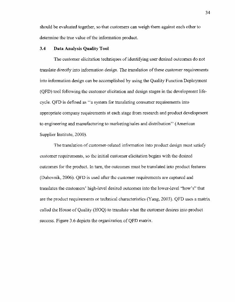
3.6 Quality Function Deployment Matrix 35
4.1 Quality Management Group Development Methodology 56
4.2 Quality Function Deployment Workflow Diagram 60
5.1 Quality Management Group Development Methodology 81
5.2 House of Quality: Translating Outcomes to Actions 87
5.3 House of Quality: Translating Actions to Heuristic Dimensions 91
VII
GLOSSARY
Definition
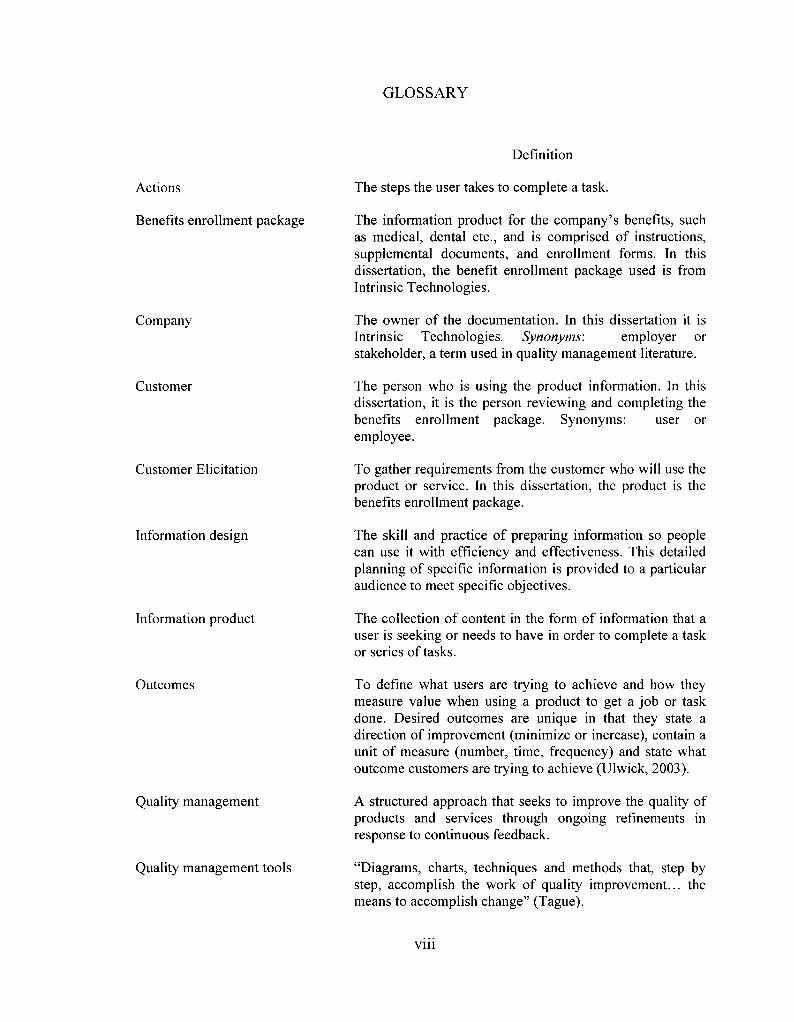
Actions
Benefits enrollment package
Company
Customer
Customer Elicitation
Information design
Information product
Outcomes
Quality management
Quality management tools
The steps the user takes to complete a task.
The information product for the company's benefits, such as medical, dental etc., and is comprised of instructions, supplemental documents, and enrollment forms. In this dissertation, the benefit enrollment package used is from Intrinsic Technologies.
The owner of the documentation. In this dissertation it is Intrinsic Technologies. Synonyms: employer or stakeholder, a term used in quality management literature.
The person who is using the product information. In this dissertation, it is the person reviewing and completing the benefits enrollment package. Synonyms: user or employee.
To gather requirements from the customer who will use the product or service. In this dissertation, the product is the benefits enrollment package.
The skill and practice of preparing information so people can use it with efficiency and effectiveness. This detailed planning of specific information is provided to a particular audience to meet specific objectives.
The collection of content in the form of information that a user is seeking or needs to have in order to complete a task or series of tasks.
To define what users are trying to achieve and how they measure value when using a product to get a job or task done. Desired outcomes are unique in that they state a direction of improvement (minimize or increase), contain a unit of measure (number, time, frequency) and state what outcome customers are trying to achieve (Ulwick, 2003).
A structured approach that seeks to improve the quality of products and services through ongoing refinements in response to continuous feedback.
"Diagrams, charts, techniques and methods that, step by step, accomplish the work of quality improvement... the means to accomplish change" (Tague).
Vll l
Stakeholder The owner of the documentation. In this dissertation it is Intrinsic Technologies. Synonyms: company or employer.
Tasks A series of actions to complete a job.
User The person who is using the product information. In this dissertation, it is the person reviewing and completing the benefits enrollment package. Synonyms: employee or customer, a term used in quality management literature.
IX
ABSTRACT
In regards to information design, research provides high-level suggestions on how
to learn and interact with customers to obtain their desired requirements; but specifics on
an approach to eliciting and controlling measurable requirements throughout the
development process are not explored. In other areas of design, such an approach already
exists: Quality Management, which has successfully improved processes and provided
measurements for improvement in order to decrease errors and increase productivity.
This dissertation analyzes the applicability of quality management tools to the process of
developing information products.
The methodology involved two phases. In the initial phase, the researcher had the
task of improving a company's benefits enrollment package for two groups. A
Traditional Group used the currently accepted best practices in technical communication,
performing a heuristic evaluation and a usability test to determine what changes to make
in the existing package. This group focuses on the existing benefits enrollment package.
In contrast, a Quality Management Group developed a benefits enrollment package using
quality management tools, gathering quantifiable functional requirements early in the
design and continuing throughout the process. The researcher prepared a revised benefits
enrollment package for both groups, and the results of the studies were compared.
According to the usability analysis, the Traditional Group showed considerable
improvement from the original package to the redesigned package. However, the Quality
Management Group showed even greater improvements in several areas, suggesting the
potential viability of this method in information design.
x
Future studies should focus on testing the effectiveness of this process on other
types of information products. For the products that are successful, information designers
could greatly benefit in learning how to use quality management tools to provide more
precise and measurable information products.
xi
1
CHAPTER 1
INTRODUCTION
Consumers demand product information to aid them in using the product to
perform specific tasks. Too frequently, consumers find the product information
unsatisfactory because it is not constructed properly or it lacks essential elements to
understand how the product functions; thus it does not help them with their tasks. How
and why do these inadequacies develop?
The purpose of this dissertation is to determine 1.) if the quality management
tools used to collect and analyze user requirements for products can be adapted to
information design and 2.) if they are better than the current, generally accepted, best
practices of utilizing a heuristic evaluation and a usability study. Many studies have
shown the importance of usability testing while consumers are in the process of using the
information product. These traditional tests determine what is valuable to the consumer
and what is not; however, they are after-the-fact results. Specific research has not been
done on gathering quantifiable functional requirements early in the design process. This
change to gathering requirements early in the process rather than after-the-fact may
eliminate some of the core conflicts. Rather than determining the requirements after-the-
fact with usability testing or contextual inquiry, the use of effective customer requirement
elicitation upfront may result in a process that provides more control and measure for
developing information products.
The information product selected for this research is a benefits enrollment
package used by Intrinsic Technologies (the company), an information technology
consulting firm. My reason for selecting this benefits enrollment package is that it seems
2
difficult for new employees to understand and complete. The required tasks and desired
outcomes associated with completing the benefits enrollment forms are difficult to
understand and do not meet the users' requirements.
The proposed methodology uses two groups: one that uses traditional best
practices and one that uses quality management tools in the development of a benefits
enrollment package for new employees. The Traditional Group focuses on the existing
benefits enrollment package solution, which is a combination of hardcopy materials
including both benefit forms and supplemental documentation explaining the benefits.
This group performs a heuristic evaluation and usability test to determine the changes to
make in the benefits package. The researcher incorporates the recommendations into the
redesign of a new benefits enrollment package. This method is widely used to improve
the design of information products; a current, generally accepted, best practice.
The Quality Management Group uses quality management tools to control and
measure the steps in the process of developing a new benefits enrollment package for
new employees. A literature review explains these tools, along with investigating their
relevancy for use in information design. These quality management tools have been used
by various companies to develop products over the last century. Each tool performs a
specific job for improvement in the quality of the process and ultimately the product
(Tague, 2005). Some familiar examples of these tools are brainstorming, cause and effect
diagrams, risk analysis, and usability testing to name just a few of over a hundred
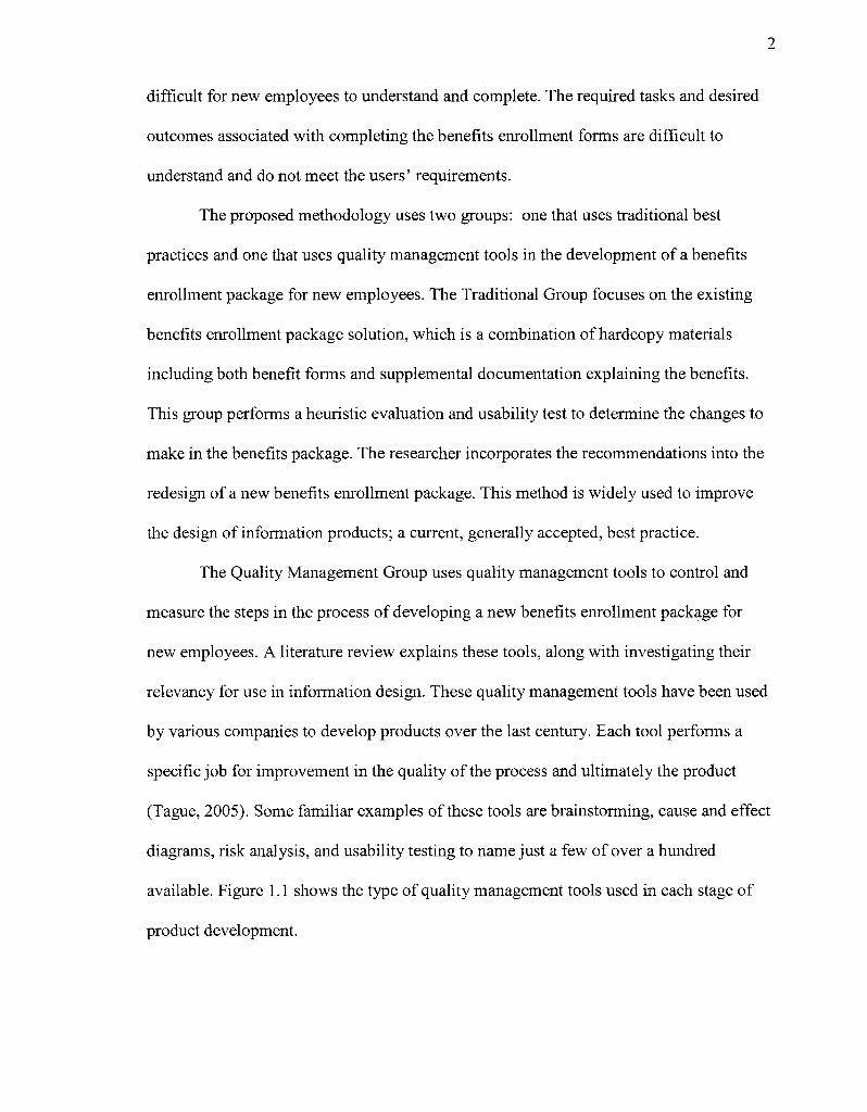
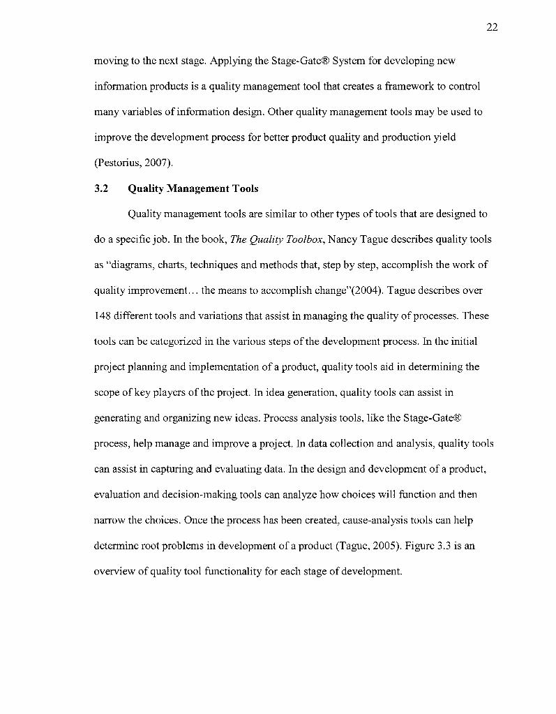
available. Figure 1.1 shows the type of quality management tools used in each stage of
product development.
Innovation Stage
• Quality tools generate and organize project ideas
" Customer i Elicitation Stage 1
A •Qualitvtools I capture
measurable customer
: reauirements
Design Stage Gats 2 I
Development
Quality tools i evaluate and \ translate t I customer > I requirements into * •t desian t
• Gate 3
• The design dimensions are i used to develop , an information j product f
Testing Stage
• Quality tools analyze for root problems and their causes
i 'Quality tools analyze the results 1*1*!, I and determine fixes for | constraints in the process
Figure 1.1 Quality Management Tool Functionality
Each stage utilizes several types of quality management tools for specific
circumstances. In this dissertation, the focus is on using these innovative tools in the early
stages of the information design process in order to determine if the results can be
incorporated into the development process rather than applied "after-the-fact" when it is
often too late to incorporate results. The significance of this research is that it
demonstrates that a development process using quality management tools produces a
product that meets customer requirements and satisfaction.
The overall development of a new benefits enrollment package will supply the
New Product Development (NPD) process model and the Stage-Gate® System, which
incorporates stringent quality criteria at each stage of the process (Cooper, 2008). In the
Innovation Stage, the quality tool is an organized focus group that is used to brainstorm
the desired outcomes that the company wants for the benefits enrollment package along
with the actions and metrics associated with them.
4
In the Customer Elicitation Stage, outcome-based customer elicitation is used to
determine the new employees' desired outcomes from the benefits enrollment package.
The reason for the outcome-based approach is that eliciting new requirements should not
focus on a specific solution or heuristic too soon, or creativity of development may be
stifled (Ulwick, 2005). For example, a user should be asked how a monitor should
display the image (the outcome), rather than asking users what monitor they want (the
solution or design heuristic) (Griffin, 1993). Once all the outcomes are determined, then
it is possible to ask for solutions in the context of the outcomes. By limiting a product to
a solution too soon, possibilities could be missed.
In addition, an outcome-based approach is derived from constructivism, a belief
that as people interact with the world and begin learning, they constantly reorganize and
create new meaning (Hein, 1995). This customer elicitation attempts to gather customer
mental constructs of how they would use the benefits enrollment package before it is
developed by using the Personal Construct Theory (PCT) introduced by psychologist
George Kelly in 1955. Originally, Kelly applied the PCT to individuals, families, and
social groups, but recently it has been applied to business and marketing in eliciting
customer requirements for products using a card sort technique. This technique consists
of a series of sorting criteria in order to determine classifications or hierarchies.
In the Design Stage, the researcher evaluates and translates customer
requirements or outcomes into information design heuristics using the Quality Function
Deployment (QFD) tool. This tool tracks the quantifiable results of the outcomes in order
to translate them into design heuristics or dimensions for the benefits enrollment package.
In addition, the QFD tool compares the results gathered from competitors. Benefits
enrollment packages from two other companies will be reviewed and added to the QFD
table for analysis.
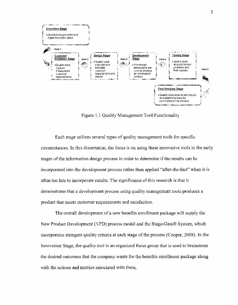
In the Development Stage, the researcher creates the new benefits enrollment
package using the design dimensions produced from the QFD tool. Figure 1.2 gives on
overview of this Quality Management Group using quality management tools.
Innovation Stage
• Focus Group determines outcomes outcome measures and related actions
Customer Elicrtation Stage
• Card Sort gathers priorities of outcomes ?nd 'elated actons
Design Stage
• QFD-translates outcomes to actions and actions to design dimensions
Development Gate 3 Stage
• The design dimensions are used to de"eloo an tn'ormation product
Testing Stage
• Usability Study -Test new procedures and old procedures
Final Analysis Stage
•Analvze the results and measure outcomes of the usability studies for each procedures
Figure 1.2 Quality Management Group Process
In order to test this new process and determine if it is better than, equal to, or less
than the Traditional Group, final usability studies are performed on the results of both the
Traditional Group and the Quality Management Group. This approach is a current, and
generally accepted, best practice used widely in information design and assists in
answering the research question: "How does the Quality Management Group compare to
the Traditional Group in developing the benefits enrollment package for new employees
in the following categories?" The final usability studies answer this question using the
6
quality components of learnability, efficiency, errors and satisfaction, along with
measuring the initial desired outcomes developed in the Quality Management Focus
Group. This research is important for two reasons: first, it shows how quality
management tools used to collect and analyze customer requirements for products can be
adapted to information design; second, it shows how the desired outcomes can provide a
helpful measurement of customer satisfaction.
7
CHAPTER 2
LITERATURE REVIEW
2.1 Evolution of Information Design
Information design has evolved over the last century from both a sociological and
a technological perspective. As Americans shift to a more industrialized and market-
oriented society, individual buying patterns also shift. With an increase toward the
consumption of products and services, companies begin spending more time and money
on branding and documenting their products (Schriver, 1997). Over the years, consumers
have come to expect quality products and product information. Most consumers now
realize that poor quality leads to poor results. As consumer demand rises for quality
products and product information, technology has expanded the possibilities of
information design and the integration of writing and visualizing (Schriver, 1997). Today,
computers and software offer endless text and graphic opportunities.
Through the last century, the distinction between writer and designer has eroded
and information designers are expected to produce both words and pictures. "Today's
professional must be flexible enough to cross the disciplinary divide between writing and
design, as well as sophisticated enough to make rhetorical choices that are sensitive to the
reader's situation" (Schriver, 1997). Although the roles of writing and design have been
separated in the past, today the integration of the two is essential for quality information.
Often, design comes after-the-fact of writing instead of being considered at the same time
(Schriver, 1997). The after-the-fact integration then becomes awkward and limited.
Expanding on Schriver's idea that writing and design must be developed
simultaneously, Robert Horn introduced Visual Language. His ideas of integrating text
8
and pictures to create documentation came in 1998 at a pivotal time when information
was needed quickly and concisely. Expansion into global markets also made it important
to use text and pictures to attract and not offend global consumers (Horn, 1998).
Individuals view information both visually and through language, and Visual Language
developed a visual approach for conveying information.
Understanding the situation or context of the consumer is essential to the
development of documentation. In a two-year study, Karl Smart used a contextual design
to capture "users' wants, needs, and work habits" in order to assist in designing computer
documentation. The study showed the importance of documentation as an integral part of
the product for an entire user-experience and not just a "printed manual or an online help
system" (Smart, 2002). The observation showed the importance of building a product to
"reflect the workflow of users, support various users' learning styles, and remain
compatible with users' working environment and language" (Smart, 2002). Product
information follows the same flow, style, and compatibility as the product and becomes a
bridge between the product and the consumer.
Tailoring documentation to bridge the gaps between the product and the consumer
with the least amount of effort requires a user-centric approach. This approach is the
premise behind minimalist documentation. This type of documentation was originally
developed by John Carroll and introduced in his book, The Nurnberg Funnel (1990).
Adult learners are curious, eager, and often times impatient to learn. In order to
accommodate adult learners, minimalist documentation presents the fewest number of
obstacles to the learner's effort. The goal of minimalist documentation is to allow users to
perform real-work tasks that are self-contained and meaningful as soon as possible. The
9
documentation should provide error-recovery information and encourage exploratory
learning by trial and error (Carroll, 1990). Minimalist documentation contains only the
information the user needs. In minimalist design, extensive user analysis is required with
many iterations occurring to determine what the user needs to know and how the user
will use the information (Carroll, 1990). The four principals in designing minimalist
documentation are to:
1. choose an action-oriented approach;
2. anchor the tool in the task domain;
3. support error recognition and recovery; and
4. support reading to do, study, and locate (Carroll, 1998).
Carroll based his studies of minimal documentation on a diverse range of
computer applications including word processing, databases, and programming. He
provides a framework for practice and theory through a variety of applications. Other
information designers have expanded upon Carroll's work. For example, Hackos (1998)
applied the minimalist approach to a software manual for visual analysis. Originally the
software was typically used by scientists in a college setting, but the goal was to appeal to
a larger audience, primarily business engineers. Hackos' goal was to revamp the current
"menu-oriented, screen oriented" voluminous reference manual in order to attract this
larger audience. Through a suggestion from the marketing department to make a task-
driven manual, Hackos decided to use the minimalist principals as a logical approach.
User feedback determined that business engineers were not concerned with the
development of the software, but instead they wanted to know how to use the
characteristics of the software that were important to their work. All four minimalist
10
principles were incorporated into the documentation. When the manual was produced, the
customer feedback was positive. The manual attracted the engineers and allowed them to
interact with the software quickly and easily. The manual allowed users to confidently
experiment with the product without pouring through a voluminous reference manual
(Hackos, 1998).
Understanding the users of documentation through user testing has shown to be
successful. For example, the SABRE Travel Information Network developed a
documentation group to revise their 100 page manual. The manual was originally created
by the developers of the SABRE software to explain the application in terms of its
development. Through usability testing, the documentation group was able to break the
manual down by task and eliminate 80 pages (Blackwell, 1995).
As documentation evolved, documentation designers realized the importance of
providing user-centered documentation for products and services, and as a result, the
media for documentation expanded from hardcopy to online or even integration into the
product. This evolution occurred at the same time as the advent of the Internet when
document designers were transforming into information designers. This transition
required the integration of document design best practices with user-interface best
practices.
At a conference that was jointly sponsored by Eindhoven University of
Technology and the Netherlands STIC, Interface Design and Documentation Design is a
collection of the proceedings that focused on how user interface design can apply to
document design principles to create more user-centered design (Westendorp, 2000). One
of the papers from the conference, "Parallels and Dichotomies in Interface Design and
11
Document Design," directly addresses the integration and coordination of document and
interface design. The authors emphasize the importance of understanding documentation
design and using the principles to create their interfaces to make them more usable. In
addition, the authors stress an integration of the user-interface heuristics and the
document design heuristics for a more cohesive product (Westendorp, 2000).
The integration of these two heuristics led to information design. Information
design, like document design, began with diverse techniques from technical writing,
graphic design, user interface design, instructional design, usability studies, and many
more. The anthology Information Design (Jacobson, 1999) provides a collection of 14
essays written by authors from various backgrounds that define the theoretical
foundations in conjunction with practical experiences and technologies for designing
information. The essays do not conclude with a single definition of information design;
however, they do provide a greater understanding of this new discipline. As information
design has evolved, guidelines and best practices begin to emerge. For example, Rune
Pettersson wrote Information Design; An Introduction as a basic textbook for information
designers and defines information design as a combination of research principles for
"analysis, planning, presentation and understanding of messages - their contents,
language and form. Regardless of the selected medium, a well designed information set
will satisfy aesthetic, economic, ergonomic, as well as subject matter requirements"
(2002).
The user-centered approach that is in Rune's book is prevalent in subsequent
articles and books. In the anthology of 13 articles, Content & Complexity: Information
Design in Technical Communication, Karen Schriver begins by saying that "well
12
designed content can help people ferret out fact from fiction, main points from details,
and 'must read' from 'optional read' information" (2003). One of the editors, Michael
Albers, points out that information design is an "intersection" between technical
communication, visual design, and human factors (2003). Some of the articles point out
that the definition of information design varies widely depending on the user situations
and needs. For example, Whitney Quesenbery's "The Five Dimensions of Usability"
explains the give-and-take relationship of presentation and content and the importance of
usability to determine the right balance (Albers, 2003). The power of user-centered
design is the ability to manage the right balance of quality heuristics used in information
design. Even though the design can look high-quality and is easy to read, if it does not
meet the user's expectations, it is unusable. Managing this process is very important to
ensure the right balance for the customer.
2.2 Information Design Process Management
Managing and measuring the process of information design shows its worth to
both the stakeholder and their customers. In 1995, a survey conducted by the Society of
Technical Communication (STC) found that the majority of technical communicators,
who took the survey, felt that measuring the value they added would be very useful
(89%). Managers of technical communicators taking the survey felt even stronger about
measuring value (90%). Both groups also felt it would be difficult to measure (54%)
(Ramey, 1995). The survey results suggest the reluctance for using measurements in
developing information products due to lack of knowledge about how to measure.
Managers who had experiences with metrics seemed more comfortable with the
13
appropriateness, feasibility, and cost of implementation. These managers ranked the use
of metrics almost 28% higher than those who did not (Ramey, 1995).
In the development of information products, multiple studies have shown that
only about "10% of the activities are actual writing" (Breuleux, 1995). Therefore, the
success of product information goes beyond writing and editing, and includes skills
associated with managing and measuring the process, integrating design and writing, and
adapting a user-centric approach. The role includes "knowledge engineering," which
consists of "knowing the customer, understanding how people communicate, and
understanding how people remember and learn" (Millar, 1998).
Many of the writing techniques and heuristics already exist. With these techniques
and heuristics in place, Edmond Weiss suggests in the article, "Egoless writing," that
writing can be shipped overseas just as programming has, which diminishes the role of
the writer (2002). Weiss suggests that the writer's role should expand from a writer to a
"knowledge worker" who manages the project by finding, using, and adapting
information to meet the customer's goals (2002). In other words, creating an information
product is not a difficult task, but to provide an information product that provides value to
the customer requires management of the process.
One of the first formal books on this subject was Managing Your Documentation
Projects, by Joann Hackos (1994), who describes the documentation process as similar to
the development of any other product. By using the product development life-cycle in
creating documentation, Hackos is able to pin-point key elements that must be included
in each stage. For example, her book has five stages providing experienced advice on
managing document projects. Figure 2.1 shows the high level stages of her process.
14
Stage 1 - Stage 2 Stage 3 Stage 4 Stage 5
Start.ng the Project—
The Information Planning Stage
Establishing the Specifics—
The Content-Speofication Phase
Keeping the Project
" , Running—
The Implementation Stage
Managing the Production Stage
? ^
Ending the Project—
The Evaluation Stage
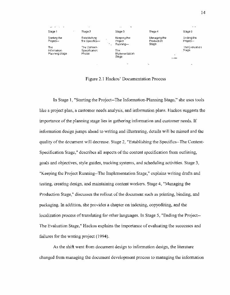
Figure 2.1 Hackos' Documentation Process
In Stage 1, "Starting the Project—The Information-Planning Stage," she uses tools
like a project plan, a customer needs analysis, and information plans. Hackos suggests the
importance of the planning stage lies in gathering information and customer needs. If
information design jumps ahead to writing and illustrating, details will be missed and the
quality of the document will decrease. Stage 2, "Establishing the Specifics—The Content-
Specification Stage," describes all aspects of the content specification from outlining,
goals and objectives, style guides, tracking systems, and scheduling activities. Stage 3,
"Keeping the Project Running—The Implementation Stage," explains writing drafts and
testing, creating design, and maintaining content workers. Stage 4, "Managing the
Production Stage," discusses the rollout of the document such as printing, binding, and
packaging. In addition, she provides a chapter on indexing, copyediting, and the
localization process of translating for other languages. In Stage 5, "Ending the Project-
Trie Evaluation Stage," Hackos explains the importance of evaluating the successes and
failures for the writing project (1994).
As the shift went from document design to information design, the literature
changed from managing the document development process to managing the information
15
development process within an organization. Management of the process expanded from
just company documentation to company websites, intranet and database management to
name a few. In Hackos' book, Information Development: Managing Your
Documentation Projects, Portfolio, and People (2007), she approaches the development
of information in a project management approach and addresses it as a company-wide
initiative. The book describes a very methodical and best practice approach to organizing
information projects within an organization and ways to manage quality and cost
effectiveness. Hackos addresses controlling the development processes of information in
an organization to improve performance and reduce costs (2007). The basic idea is to
mature a company's information processes to eliminate constraints. Rather than looking
at process management at an organizational level, this dissertation focuses on an
individual project level, primarily concentrating on managing and measuring customer
requirements.
2.3 Information Design Customer Requirements
In the book, The Practical Guide to Information Design, Ronnie Lipton (2007)
and others, such as Hackos (2007) and Schriver (1997), provide high-level suggestions on
how to learn and interact with the customer, but specifics on a model approach to
eliciting and controlling measurable requirements throughout the development process
are not explored. Lipton points out that most humans universally perceive and
comprehend information in many standard ways. For example, text with emphasis is
typically most important. Text that is aligned allows for easier navigation. Many of these
ideas apply to cognitive psychology and Gestalt Principles that relate to similarity of
equal items, proximity of related items, and figures that stand out from the background
16
(Lipton, 2007 & Schriver, 1997). Lipton states that by implementing these items into
information design, designers create clarity for the readers, although for complete
usability, it is necessary to know the audience at a "deeper-level" (2007).
Understanding what the customer requires is often obtained through usability
testing during information design development (Lipton, 2007). Usability testing captures
empirical data from typical users of a product while performing representative tasks. The
results give clear ideas where users have trouble performing the necessary tasks to do a
job (Rubin, 2008). Usability can be used throughout the development life-cycle and as
early as when task analysis is complete. During this design stage, paper prototypes are
often utilized to determine ease of use (Nielsen, 2009). A problem with usability tests is
that some sort of design needs to occur before customer elicitation is gathered.
Instead of focusing on usability studies or contextual inquiries to determine how
users use information products, the research focuses on eliciting initial customer
requirements that are measurable and controlled throughout the process. The first step to
quality process management is gathering quantifiable customer requirements. These
quantitative approaches have been applied to the quality process management in product
development in order to measure the success or failure of the product. In this dissertation,
the same quantitative approach that is used in quality process management of products is
used to gather, create, and measure information design and development. This is the
change that makes this dissertation unique.
17
CHAPTER 3
A CHANGE TO QUALITY MANAGEMENT
3.1 Quality Management Processes
Quality management of processes evolved in the early 20* century. The premise
of quality management is to control the processes of a business in order to decrease error
rate and increase profitability. The management of the product development life-cycle
encompasses a succession of stages from product conception, to design and development,
to product delivery and disposal. The tasks of each stage vary from company to company,
depending on their product methodology, but they all have the basic steps of the classic
Plan, Do, Check, Act (PDCA) iterative cycle that was introduced by Walter A. Shewhart
(Gee, 2005). This quality control process should be used repeatedly until the necessary
degree of quality is achieved. The Plan stage determines the objectives, desirable
changes, and data needed. The Do stage implements the process changes preferably at a
small scale. The Check stage monitors and evaluates the process changes against the
objectives. The Act stage reviews the changes and determines how to modify the process
for implementation. This final stage determines if changes should be made at a specific
stage or at all stages that include some activity to better satisfy the customer (Gee, 2005).
The PDCA was made popular by Edward R. Deming, another well-known quality
expert, who in 1951 presented it, combined with the use of control sheets, to the
Japanese. At this time, Japan was experiencing a crisis in product quality. Deming
worked closely with the Japanese for 30 years and many credit him with "leading the
Japanese quality revolution." Using Shewhart's insights, he created a systematic process
that focused on a shift to quality management philosophy (Cutler, 2001). Deming's ideas
18
stressed the consistency and quality of products throughout a company. He felt that
companies must stop focusing on numerical targets and quotas for the short-term and
"concentrate on improving processes, giving workers clear standards for acceptable work,
as well as the tools needed to achieve it" (March, 1990).
Deming used this process in developing products and fine tuning them to
decrease variation in the process over time. A's a result, the costs associated with the
process are reduced (March, 1990). Most product development is based on this cycle,
although the complexities depend on the product's needs.
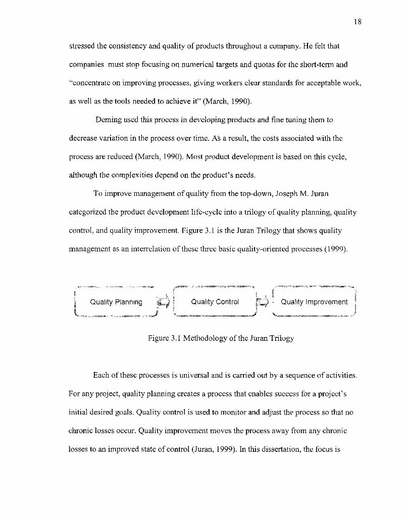
To improve management of quality from the top-down, Joseph M. Juran
categorized the product development life-cycle into a trilogy of quality planning, quality
control, and quality improvement. Figure 3.1 is the Juran Trilogy that shows quality
management as an interrelation of these three basic quality-oriented processes (1999).
Quality Planning i l l ) I Quality Control |{,*^ - Quality Improvement |
Figure 3.1 Methodology of the Juran Trilogy
Each of these processes is universal and is carried out by a sequence of activities.
For any project, quality planning creates a process that enables success for a project's
initial desired goals. Quality control is used to monitor and adjust the process so that no
chronic losses occur. Quality improvement moves the process away from any chronic
losses to an improved state of control (Juran, 1999). In this dissertation, the focus is
19
solely on quality planning. Juran's Quality Planning Road Map consists of the following
steps:
1. evaluate quality goals
2. identify the customers both internal and external to the company
3. determine the needs of those customers
4. develop product features that respond to the customers' needs - translating what
the customer wants into information design
5. develop processes capable of enhancing the product features
6. establish process controls
7. transfer the plans to the operating forces, meaning create the first iteration of the
product
8. test to determine success
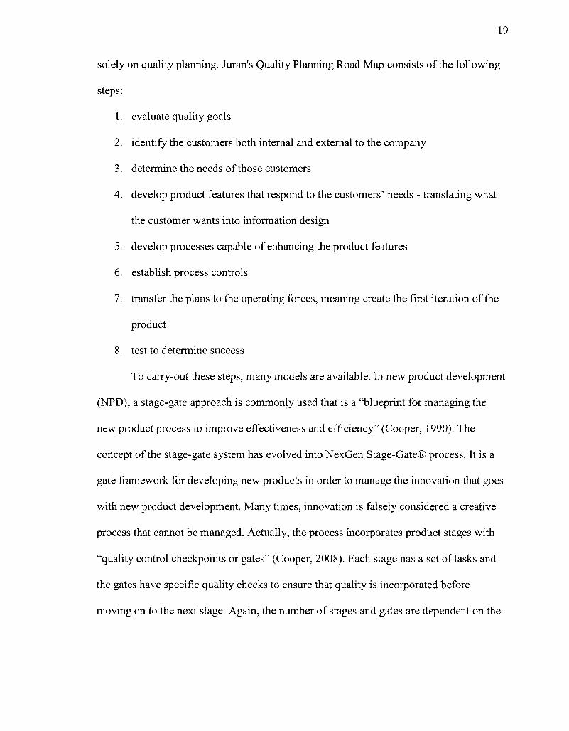
To carry-out these steps, many models are available. In new product development
(NPD), a stage-gate approach is commonly used that is a "blueprint for managing the
new product process to improve effectiveness and efficiency" (Cooper, 1990). The
concept of the stage-gate system has evolved into NexGen Stage-Gate® process. It is a
gate framework for developing new products in order to manage the innovation that goes
with new product development. Many times, innovation is falsely considered a creative
process that cannot be managed. Actually, the process incorporates product stages with
"quality control checkpoints or gates" (Cooper, 2008). Each stage has a set of tasks and
the gates have specific quality checks to ensure that quality is incorporated before
moving on to the next stage. Again, the number of stages and gates are dependent on the
20
product and company methodology, but they typically vary from four to seven stages
(Cooper, 1990). Figure 3.2 is an overview of theNexGen Stage-Gate® System.
Discovery Build Tpstmgand ^ g e Scoring tysincssCasc Development Validation Launch
Figure 3.2 Overview of the NexGen Stage-Gate® System (Source: Cooper, 2008, http://www.prod-dev.com/stage-gate.php)
The Stage-Gate® moaei has been applied in many different industries to provide
an innovative process from idea to market. Many times, the actual strategic focus of an
organization is to initiate new concepts from start io finish, so a planning framework,
such as the Stage-Gate® model, is necessary for the implementation of end-to-end
innovation. For example, in the renewable energy sector, a state-owned research
organization implemented stage-gate methodology in order to plan and control short-term
and long-term collaboration with different partners throughout the entire process. The
high-level tasks for each partner area, which included R&D Development, Production
Management, Marketing, Finance, and Regulatory, were mapped in a stage-gate process
to understand the collaborative needs between the groups at each stage (Marxt, 2004). In
addition, the process contained descriptions of what procedures and functions need to
occur at each stage and the roles of each area as checks and balances throughout the
process. This model became a basis for the planning of collaborative practices in
developing new product innovations (Marxt, 2004).
21
Other companies have used the stage-gate process successfully for years. One
company that develops new semiconductor technologies has used this methodology for
over six years. The company experienced many positive outcomes as different
departments adopted the methodology, such that it created discipline within their
organization (Shaikh). The methodology creates a control to ensure the probability of
delivery of new "revenue-generating technology." The stage-gate methodology provides
stability between the creative ideas and translating those ideas into practical applications
that are distinctive among their competitors (Shaikh, 2008).
The Department of Energy (DOE) Office of Solar Energy Technologies uses the
stage-gate methodology for program management to ensure that their development is
competitive with current energy solutions. Their applied research program uses
continuing modeling and evaluation throughout each stage of the project. Formal gate
reviews are completed after every stage through benchmarking and analysis toward
overall program goals, which are to achieve "full and competitive commercial status and
no longer require federal research support" (Cameron, 2007). After each gate review,
four decisions are possible: pass and move on to the next stage, recycle and complete
additional work at the same stage, hold and suspend work until further information is
given to restart, or stop the project. By using the stage-gate process, they are able to focus
on research that supports their goals of providing new competitive energy solutions and
scale-back or terminate those less promising (Cameron, 2007).
Although the steps seem simple on the surface, many tasks are required with each
step. The success or failure of the new product depends on how well the tasks are
performed. The gates will ensure that key quality dimensions will be checked before
22
moving to the next stage. Applying the Stage-Gate® System for developing new
information products is a quality management tool that creates a framework to control
many variables of information design. Other quality management tools may be used to
improve the development process for better product quality and production yield
(Pestorius, 2007).
3.2 Quality Management Tools
Quality management tools are similar to other types of tools that are designed to
do a specific job. In the book, The Quality Toolbox, Nancy Tague describes quality tools
as "diagrams, charts, techniques and methods that, step by step, accomplish the work of
quality improvement... the means to accomplish change"(2004). Tague describes over
148 different tools and variations that assist in managing the quality of processes. These
tools can be categorized in the various steps of the development process. In the initial
project planning and implementation of a product, quality tools aid in determining the
scope of key players of the project. In idea generation, quality tools can assist in
generating and organizing new ideas. Process analysis tools, like the Stage-Gate®
process, help manage and improve a project. In data collection and analysis, quality tools
can assist in capturing and evaluating data. In the design and development of a product,
evaluation and decision-making tools can analyze how choices will function and then
narrow the choices. Once the process has been created, cause-analysis tools can help
determine root problems in development of a product (Tague, 2005). Figure 3.3 is an
overview of quality tool functionality for each stage of development.
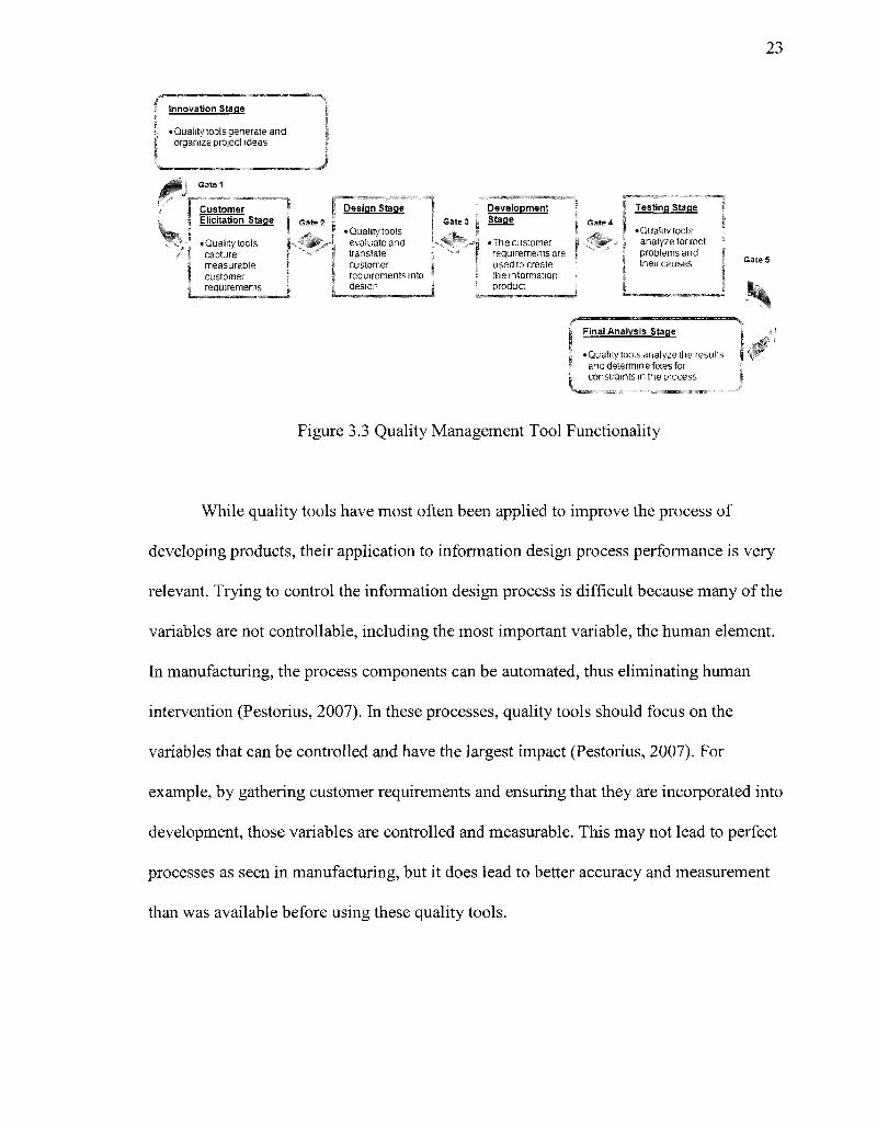
23
i Innovation Stage % | • Qualitytoolsgenerate and
organize project ideas
Customer { Elicitation Stage G3te 2
Design Stage
Quality tools capture measurable i customer J requirements ;
• Quality tools evaluate and translate
; customer I requirements into J design
Gate 3 Development Stage
• The customer requirements are used to create the information product
I Testing Stage
• Quality tools analyze for root problems and
r their causes i Gate 5
Final Analysis Stage
• Quality tools analyze the results and determine fixes for constraints in the process
Figure 3.3 Quality Management Tool Functionality
While quality tools have most often been applied to improve the process of
developing products, their application to information design process performance is very
relevant. Trying to control the information design process is difficult because many of the
variables are not controllable, including the most important variable, the human element.
In manufacturing, the process components can be automated, thus eliminating human
intervention (Pestorius, 2007). In these processes, quality tools should focus on the
variables that can be controlled and have the largest impact (Pestorius, 2007). For
example, by gathering customer requirements and ensuring that they are incorporated into
development, those variables are controlled and measurable. This may not lead to perfect
processes as seen in manufacturing, but it does lead to better accuracy and measurement
than was available before using these quality tools.
24
3.3 Customer Requirement Elicitation and Quality Tools
In development of products, the proper customer input is essential, although as
Robert Cooper observes:
Studies reveal that the art of product development has not improved all that
much—that the voice of the customer is still missing, that solid up-front
homework is not done, that many products enter the development phase lacking
clear definition, and so on (1999).
Cooper (2000) estimated that 46% of the project resources that companies devote
to design, development, and launch of new products involve products that do not succeed
or never make it to market. The design process and initial development is only part of the
development life-cycle, although the initial decisions have the greatest impact on the
success of the product.
All of these deficiencies are due to lack of proper customer research. In addition,
many companies do not integrate all their departments, especially marketing and sales,
with product development. When this occurs, traditional product development focuses on
the engineer who develops the product and customer research is often missing (Miller &
Swaddling, 2002).
The same is true in information design when developers typically write from
personal experience, knowledge, and intuition. The missing component is the value of
knowing their audience and how they interact with the document. Even though the words
and pictures work well together, there is no substitute for determining the context of how
the audience will use the document (Schriver, 1997). In her book, Dynamics in Document
Design, Schriver characterizes "people who use the documents and the people who
25
design them" (1997). In order to inform or persuade the audience, it is critical to capture
the readers' thoughts and feelings. For example, Schriver conducted a study to gather the
opinions of high school students on drug prevention brochures. From the student
feedback, Schriver found a difference between the efficiency and effectiveness of the
brochures. The impact that the brochure had on the students varied because of student
comprehension of the content. When gathering information from customers, it is
important to take time to determine what type of information is truly necessary to make a
difference in the acceptance of a product. In this case, if data was collected on only the
efficiency of the brochures, the results would show the impact the brochures had on the
high school students. However, it would not be an indication of whether they actually
comprehended the information (Schriver, 1997). Determining the user's ultimate
outcome for the information product is the key to customer satisfaction.
Through exploratory research, secondary research, and confirmatory research, the
consumer can be given a voice in the design process. Exploratory research is usually
done initially to understand the issues and formulate concrete ideas. Typically, it is
qualitative research through open-ended questions to collect data (Miller & Swaddling,
2002). Secondary research is obtained through existing sources and does not directly
gather data from the customer. It is a low-cost way to gather important background
information especially at the business case development stage (Lipton, 2007). These two
types of research "lay the groundwork" for confirmatory research that provides accurate
and concrete information about customer values. It is the most reliable research that is
collected directly from the customer and can provide quantitative information showing
causal relationships in the data (Miller & Swaddling, 2002). Information from your
26
customer can be gained from direct interviews or testing of your customers (Lipton,
2007). As Schriver has shown from obtaining user requirements for brochures, no matter
what the approach is to customer elicitation, the right information needs to be determined
and captured or the end product will not meet the expectation of the customer (1997).
3.3.1 Solution-Based Versus Outcome-Based Requirements. In the 1980's,
technology-driven products became very popular among consumers and many companies
realized the difficulty of creating and marketing these tech-products without customer
input. Because many products failed, companies began to manage their innovations
through customer requirements (Ulwick, 2003). By understanding what the customer
wants before investing in a product, companies improve their innovation process. In
eliciting customer requirements, drawbacks arise when customers state their needs in the
form of a product solution or specification. The problem with this approach is that many
times the solutions or specifications between customers clash during product design,
which leads to customer disappointment with the final product (Ulwick, 2003). When too
much emphasis is placed on the product and not on the desired effects the product needs
to achieve, usability problems occur (Rubin, 2008).
Most customers are not scientists or engineers; so, when customers provide
possible solutions for a product, especially during the initial customer elicitation,
creativity of development may be stifled (Griffin, 1993). For example, when a user who
is asked how a new car's dash board should look (the solution) instead of being asked
what type of tasks must be performed (the outcome), innovative possibilities may be
missed. In addition, by focusing on outcomes rather than solutions, measurement of
customer satisfaction is more accurate because you are measuring if the user can perform
27
the job or task. For example, if a person uses a razor, the desired outcome is a close shave
and no nicks, which is easy to measure. If solutions are only captured for customer
requirements, like a rubber handle on a shaver, it is difficult to measure whether the
overall product worked successfully for the customer (Ulwick, 2003). Once all the
outcomes are determined, then solutions should be established in the context of the
outcomes.
The outcome-based approach is being used by service-oriented companies,
education and in product innovation. In service-oriented companies, outcome-based
evaluation moves away from measuring the bottom-line profitability and measures how
the service or program makes a difference and how the participants are better served as a
result (Schalock, 2001). In the academic sector, outcome-based education develops
curriculum around "what is essential for all students to be able to do successfully at the
end of their learning experiences" (Spady, 1994). In product development, outcome-
driven innovation focuses on the job or task, desired outcomes, and constraints that the
customer desires from the product, rather than focusing on the proposed solutions and
specifications given by the customer for the product. The theory is that value creation
should revolve around the task, which is the stable, long-term focal point (Ulwick, 2005).
The outcome-based approach is derived from constructivism, supports the belief
that as people interact with the world and begin learning, they constantly reorganize and
create new meaning (Hein, 1995). Constructivism focuses on the learner and their
outcomes, not the subject to be learned. For example, a nonprofit organization such as a
museum would focus on visitors learning and not on the museum content (Hein, 1995).
28
The evolution of outcome-based evaluation used by nonprofit organizations began
when these service-oriented companies started to calculate a bottom line that was not
dependent on numbers. In the article "Good Performance is Not Measured by Financial
Data Alone," Peter Frumkin (2002) addresses the issue of only focusing on financial data
in nonprofit organizations. He states that these organizations are "understandably led to
focus on financial measures of performance because they are so much more concrete and
robust than programmatic ones... and what outsiders can observe easily." Even if
tracking finances is an important managerial task, it lacks the ability to probe into the
consequences of what can be accomplished by the organization (Frumkin, 2002).
In nonprofit organizations, the initial questions are: "How has my program made
a difference?" and "How are the lives of the program participants better as a result of my
program?" (Voelker-Morris, 2004). To ensure that government grant money was able to
answer these questions, the United States Office of Management and Budget enacted the
Government Performance Results Act of 1993. The purpose of this act was to empower
government officials to measure and effectively improve their programs using outcome-
based evaluation (Government Performance, 1993). Following the act in 1995, the United
Way changed their evaluation to focus on the recipients of their services instead of the
service providers themselves. They began measuring their programs by focusing on the
"benefits and/or changes to the targeted population of a program" (Voelker-Morris,
2004).
The evolution of outcome-driven innovation in product development arose from
the need to successfully manage innovation. When developing a product, managers must
focus on the job or task the customer wants to do with the product, instead of focusing
29
primarily on quantifying the attributes for product development (Christensen, 2003).
Anthony Ulwick's book, What Customers Want (2005), illustrates how to gather and
measure customer requirements using an outcome-based approach. He distinguishes
between the solution-based versus outcome-based requirements and clearly shows that
outcome-based requirements provide a more accountable model for innovation. These
requirements are more valuable because they measure the customer's success in
performing the anticipated job or task. This elicitation approach controls the variability of
developing products by always focusing on the outcome (Ulwick, 2005).
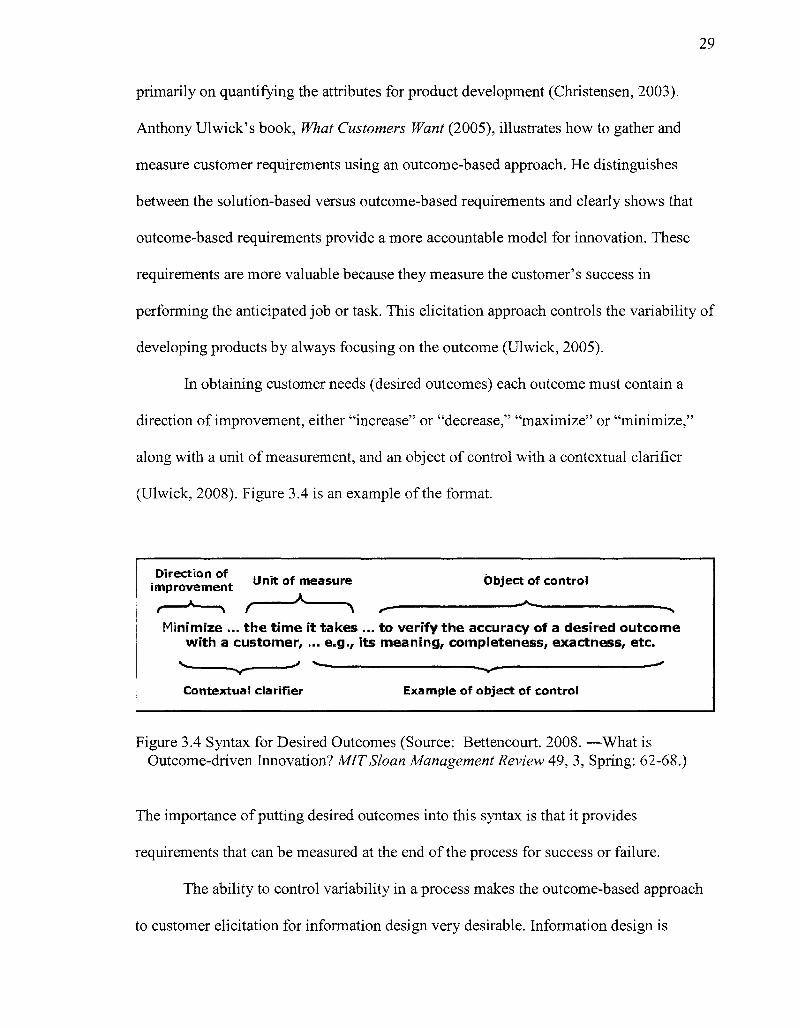
In obtaining customer needs (desired outcomes) each outcome must contain a
direction of improvement, either "increase" or "decrease," "maximize" or "minimize,"
along with a unit of measurement, and an object of control with a contextual clarifier
(Ulwick, 2008). Figure 3.4 is an example of the format.
Direction of . . . . . ~.. _. . . . improvement Unit of measure Object of control ,—*—s / K ^ , - -*•
Minimize ... the t ime i t takes ... t o ver i fy the accuracy of a desired outcome w i t h a customer, ... e.g., i ts meaning, completeness, exactness, etc.
—' > -
Contextual clarifier Example of object of control
Figure 3.4 Syntax for Desired Outcomes (Source: Bettencourt. 2008. —What is Outcome-driven Innovation? MIT Sloan Management Review 49, 3, Spring: 62-68.)
The importance of putting desired outcomes into this syntax is that it provides
requirements that can be measured at the end of the process for success or failure.
The ability to control variability in a process makes the outcome-based approach
to customer elicitation for information design very desirable. Information design is
30
typically difficult to control and measure. The outcome-based approach provides control
and measurement of these variables, which is important for a successful information
product.
3.3.2 Constructivism Elicitation Technique. The elicitation technique that is
associated with the constructivist approach in psychology is George Kelly's Personal
Construct Theory (PCT) (1955). Originally, Kelly applied the PCT to individuals,
families, and social groups. Recently, it has been applied to business and marketing in
eliciting customer requirements for products and services. The basic premise is that
people are constructing and building upon what they know in order to understand their
current situation so that it makes sense to them. Kelly felt that people are scientists and
continually build constructs about their situations in an attempt to make them
understandable and familiar (1955). The term construct has a dual meaning to Kelly in
that a person has a view of the world in the way they construct it. On the other hand, a
person construes the world in a certain manner because of the experiences they
encounter. In other words, a person's construct is their past experience and their
inclination to perceive new experiences (Kelly, 1955).
An example of this point occurs when two women discuss buying long-term care
insurance. The first woman purchased this type of insurance right after college. Her
experience was based on many family members having long extended illnesses, so her
decision was easy. The second woman had only experienced the quick deaths of older
family members and was unfamiliar with this type of insurance. The women had very
different constructs based on their experience with deaths of family members. The second
31
woman's construct for this type of insurance changed after the discussion and gave her
the background to change her mental construct for this topic.
In determining an individual's construct systems, the original elicitation technique
that Kelly used was the repertory grid technique. Being a psychologist, Kelly focused on
his patient's experiences and relationships, and used repertory grids to capture an
individual's perspective without questioning them directly about their experiences. This
technique uses "triadic elicitation" by taking three concepts from one topic and asking for
two of them to be paired in contrast with the third (Kelly, 1955). By giving the
participants alternative constructions, the repertory grid technique encourages these
participants to clarify how they distinguish one experience from another. By considering
all possible combinations of three elements, constructs are elicited until no more
constructs seem to emerge. The repertory grid method helps to minimize bias, while
developing an understanding of a particular topic from the participant's perspective
(Kelly, 1955).
Derived from the repertory grid technique, the laddering technique is a structured
questioning methodology for customer elicitation. The ladder technique is based on the
work by Rugg and McGeorge (1995), and begins with selecting a "seed" item, which is
part of the problem domain. The interviewer probes either by asking "why" based
questions or "how" based questions until questions can go no further (Rugg, 1995).
Card sorting is another technique using the personal construct theory. It consists
of a series of sorting criteria to determine classifications or hierarchies. This technique is
very popular in determining information architecture in computer applications. The
overall importance of all these elicitation techniques is to capture the tacit knowledge of
32
the customers, which basic interviews and surveys fail to obtain (Upchurch, 2001).
Applying card sort to outcomes that the customer wants allows the customer to prioritize
features that appear in the development of information design. The customers can be
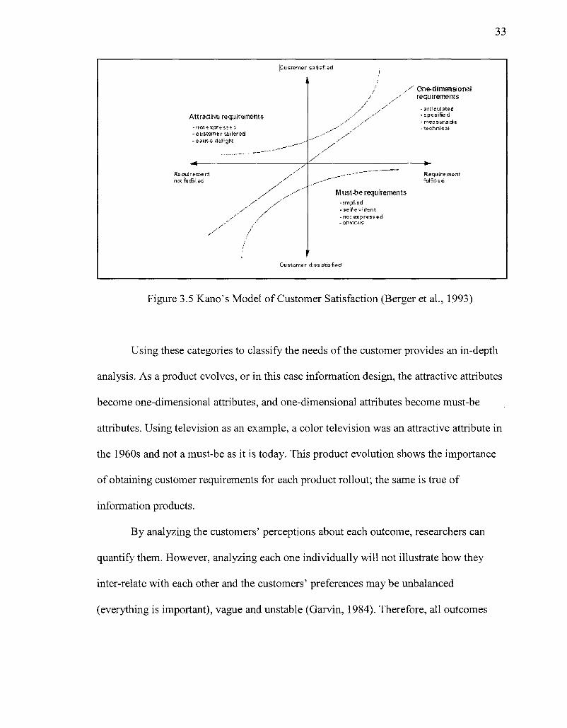
asked to sort the outcomes, for example by using priority or using the Kano Model
developed by Noriaki Kano, which classifies customer preferences.
The Kano Model can help in classifying customer requirements into must-be, one-
dimensional and attractive outcomes.
• Must-be attributes: These are attributes that customers take for granted and when
they are not present, customers are dissatisfied. For example, a new television
must be color and not black & white.
• One-dimensional (should-be) attributes: These are attributes that, when fulfilled,
satisfy the customer; when they are not, the customer is dissatisfied. For example,
a television should always come with a remote.
• Attractive attributes: These are attributes that are not expected by the customer,
but, when fulfilled, delight the customer. For example, a new television comes
with free setup and maintenance for a year (Tan, 2000).
The Kano model depicts the relationship between the product and customer
satisfaction as shown in the figure below.
33
Attractive requirements -not expressed - custom e r taHcred -cause delight
__——~—~ 4 ^ _ _ _ ^ ^ ^ ^ ^ ^ ^ ^ _ — ^
Re csui -eme r t not *fu sfi II frd
y y*
y y y /
/ / >•-*** /
y /
<
f^ussomer satisfied
k /
---' _-—
/ y y
y y'
y'
/ / / / / /
y"' *" y* S
.-•* s
• " ' " /
y y
„ - - - - —~ " ~
,---**~~~ Must-be requirements
- J mi l l ed -self-evident -not expressed -obvious
1 Customer dissatisfied
One-dimensional requirements
-articylate-d - specified - measurable -technical
Require meiit fulS!^=d
Figure 3.5 Kano's Model of Customer Satisfaction (Berger et al., 1993)
Using these categories to classify the needs of the customer provides an in-depth
analysis. As a product evolves, or in this case information design, the attractive attributes
become one-dimensional attributes, and one-dimensional attributes become must-be
attributes. Using television as an example, a color television was an attractive attribute in
the 1960s and not a must-be as it is today. This product evolution shows the importance
of obtaining customer requirements for each product rollout; the same is true of
information products.
By analyzing the customers' perceptions about each outcome, researchers can
quantify them. However, analyzing each one individually will not illustrate how they
inter-relate with each other and the customers' preferences may be unbalanced
(everything is important), vague and unstable (Garvin, 1984). Therefore, all outcomes
34
should be evaluated together, so that customers can weigh them against each other to
determine the true value of the information product.
3.4 Data Analysis Quality Tool
The customer elicitation techniques of identifying user desired outcomes do not
translate directly into information design. The translation of these customer requirements
into information design can be accomplished by using the Quality Function Deployment
(QFD) tool following the customer elicitation and design stages in the development life-
cycle. QFD is defined as "a system for translating consumer requirements into
appropriate company requirements at each stage from research and product development
to engineering and manufacturing to marketing/sales and distribution" (American
Supplier Institute, 2000).
The translation of customer-related information into product design must satisfy
customer requirements, so the initial customer elicitation begins with the desired
outcomes for the product. In turn, the outcomes must be translated into product features
(Duhovnik, 2006). QFD is used after the customer requirements are captured and
translates the customers' high-level desired outcomes into the lower-level "how's" that
are the product requirements or technical characteristics (Yang, 2003). QFD uses a matrix
called the House of Quality (HOQ) to translate what the customer desires into product
success. Figure 3.6 depicts the organization of QFD matrix.
35
Qh D Mairix = House of Quality
o o O 4»
=3 & o o:
© 8 r*~ CO
-g « pz 03 £ >
©
o
o
Hows
Relationship Matrix
Ranking the Hows
© o
j i i
Or c O SS5 o c:
©
ctio
n ot
es
< 2:
Figure 3.6 Quality Function Deployment Matrix (Source: Villanova Six Sigma Green Belt Training)
1. Customer Requirements are the "what's" that will satisfy the customer wants.
They are obtained when gathering customer requirements through interviews,
focus groups, market research, surveys, customer observations, and complaints.
Customer requirements may be subcategorized in the QFD.
2. Importance Value is the rank order of the customer needs from highest value as
most important and lowest value as least important.
3. "How's" are the actions or tasks in the process to satisfy the customers' "what's."
These critical-to-quality requirements or CTQs are captured through the CTQ
Tree, which branches out on the specific needs to capture the requirements as a
measurable form.
4. Relationship Matrix shows the interaction and correlation between the "what's"
and the "how's." A correlation key is used to show the correlation between the
"what's" and "how's" by using High, Medium, Low, or no correlation. In
addition, a measure for each correlation level can be added depending on the
36
weight you decide. The correlations are typically defined as "9" for high, " 3 " for
medium, and " 1 " for low, giving the strongest correlations more weight so they
standout more through the translation.
5. Competitor Ratings come from the voice of the customer and ranks the product's
success against their competition. This also flushes out what is truly important to
the customer.
6. Action Notes can be added to the far right of the matrix for specific notes and
issues.
7. Ranking the "how's" can be done either through absolute weight or relative
weight. Absolute weight is adding the highs, mediums, and lows in each "how's"
column. Relative weight is each correlation factor times customer importance
ranking. This reveals that what ranks the highest will have the highest impact. In
analysis, the product team needs to determine if the ranking is absolute or relative
weight.
8. Correlation Matrix allows the product team to see the interactions of the
requirements or the "how's" by showing the impact between them either
favorably or unfavorably. Positive correlation occurs when, if one increases, the
other also increases. Negative correlation occurs when, if one increases, the other
decreases. After determining the correlation, it is necessary to indicate which way
the impact is most favorable: increase, decrease or nominal (Yang, 2003).
Quality Function Deployment (QFD) was developed by Shigeru Mizuno and Yoji
Akao, and first used in Japan in the 1960s. As the success of the tool was revealed,
various United States organizations adopted the technique in the 1980s. Some of the first
37
to use the QFD in the United States were Xerox, Massachusetts Institute of Technology,
and Ford Motor (Cohen, 1995). Since that time, many companies have used it and in
1993, a non-profit organization was formed called QFD Institute that provides for
education and research on QFD in conjunction with a yearly symposium (Chan, 2002).
Initially, QFD was used in "product development, quality management and customer
needs analysis," but as the success of the tool grew, the use expanded into areas of
"design, planning, decision making, engineering, management, teamwork, timing and
costing" (Chan, 2002).
With QFD used in such a variety of industries and applications, thousands of
articles have been published on the use of the tool. For example, Chan et al. (2002)
cataloged almost one thousand articles regarding QFD in an article called "Quality
Function Deployment: A Literature Review." The article did not summarize any of the
literature, but rather categorized them by type and industry. Subsequent to Chan's article,
Carnevalli and Miguel (2008) cataloged the literature on QFD produced between 2002
and 2006. The articles during that time were reviewed and most primarily described using
QFD for a specific application. In addition, many articles focused on quality matrix
problem solving because most problems of QFD use the HOQ matrix (Carnevalli, 2008).
Even with issues regarding the use of the QFD tool, Duhovnik et al. (2006)
discuss the importance of it because all associated activities begin with the "voice of the
customer." Using the QFD tool begins with abstract ideas of customer expectations or the
outcomes of the product instead of focusing on product solutions or specifications
(Duhovnik, 2006) (Ulwick, 2005). The application of QFD is used in conjunction with
other quality tools to provide successful product development (Chan, 2002). This
38
dissertation focuses on development of an information product and quality management
of the process in development. Both product development and quality management are
accomplished through two facets of customer needs analysis: collecting/translating
customer needs and satisfying customer needs (Chan, 2002). QFD helps to incorporate
only those quality dimensions that please the customer into the information design (Juran,
1999).
3.4.1 Quality Dimensions of Information Design. In order to quantify information
design, it is necessary to categorize it into type of heuristics or quality dimensions. The
value-based definition of quality is:
"the degree of excellence at an acceptable price and the control of variability at an
acceptable cost." (Broh, 1982)
This definition merges excellence and worth, which the customer balances in
order to determine value. David A. Garvin created a framework for the eight dimensions
of quality for manufacturing. This framework for strategic analysis includes eight
dimensions: performance, features, reliability, conformance, durability, serviceability,
aesthetics, and perceived quality (1984).
Performance refers to a product's primary operating characteristics.
Features are usually the secondary aspects of performance, the "bells and
whistles" of products and services, those characteristics that supplement their
basic functioning.
Reliability reflects the probability of a product malfunctioning or failing within a
specified time period.
39
Conformance is the degree to which a product's design and operating
characteristics meet established standards.
Serviceability is the speed, courtesy, competence, and ease of repair. Consumers
are concerned not only with a product breaking down, but also with the time
before service is restored, the timeliness with which service appointments are
kept, the nature of dealings with service personnel, and the frequency with which
service calls or repairs fail to correct outstanding problems.
Aesthetics is a subjective dimension of quality. How a product looks, feels,
sounds, tastes, or smells is a matter of personal judgment and a reflection of
individual preference.
Perceived Quality is the customer's first impression. Consumers do not always
have complete information about a product's or service's attributes. (Garvin,
1984).
Garvin's quality dimensions for manufacturing clarify the need to categorize
quality into dimensions, although these dimensions are not directly applicable to
information products (1984). Quality dimensions for information have been used
extensively to measure data quality in Information Systems for database management. A
few discrepancies in defining quality dimensions in information systems are due to the
contextual nature of quality (Cappiello, 2002). However, these quality dimensions are
summarized in common categories of accuracy, accessibility, completeness, consistency,
interpretability, relevancy and timeliness (Fox, 1994) (Miller, 1996) (Redman, 1996)
(Strong, 1997) (Pipino, 2002). Pipino expands further on the quality dimensions used in
Information Systems and defines them in Table 3.1.
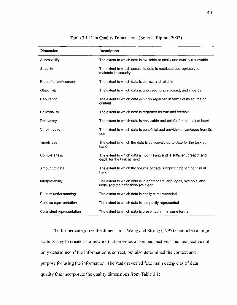
40
Table 3.1 Data Quality Dimensions (Source: Pipino, 2002)
Dimension Description
Accessibility
Security
Free of error/Accuracy
Objectivity
Reputation
Believability
Relevancy
Value-added
Timeliness
Completeness
Amount of data
Interpretability
Ease of understanding
Concise representation
Consistent representation
The extent to which data is available or easily and quickly retrievable
The extent to which access to data is restricted appropriately to maintain its security
The extent to which data is correct and reliable
The extent to which data is unbiased, unprejudiced, and impartial
The extent to which data is highly regarded in terms of its source or content
The extent to which data is regarded as true and credible
The extent to which data is applicable and helpful for the task at hand
The extent to which data is beneficial and provides advantages from its use
The extent to which the data is sufficiently up-to-date for the task at hand
The extent to which data is not missing and is sufficient breadth and depth for the task at hand
The extent to which the volume of data is appropriate for the task at hand
The extent to which data is in appropriate languages, symbols, and units, and the definitions are clear
The extent to which data is easily comprehended
The extent to which data is compactly represented
The extent to which data is presented in the same format
To further categorize the dimensions, Wang and Strong (1997) conducted a large-
scale survey to create a framework that provides a user perspective. This perspective not
only determined if the information is correct, but also determined the context and
purpose for using the information. The study revealed four main categories of data
quality that incorporate the quality dimensions from Table 3.1:
41
Accessibility quality involves the user's access to the information. The
dimensions include accessibility and security.
Contextual quality focuses on quality dimensions as they relate to the user's
specific task. The dimensions include relevancy, value-added, timeliness,
completeness and amount of data.
Intrinsic quality relates to the quality of the data in its current state. The
dimensions include accuracy, believability, objectivity and relevancy.
Representational quality relates to the format and meaning of the data. The
dimensions include interpretability, ease of understanding, concise representation
and consistent representation.
In addition, Pipino et al. (2002) noted that quality dimensions should be measured
depending on whether they are subjective due to user perception or objective. Subjective
dimensions, in both accessibility quality and contextual quality dimensions, cannot use
objective measures, but rather input from the users. Objective dimensions, in both
intrinsic quality and representational quality dimensions, can be measured through three
different functional forms: simple ratio, min or max, and weighted average (Pipino).
Simple Ratio measures the ratio of desired outcomes to total outcomes with the
calculation of undesirable outcomes divided by total outcomes and subtracted by
one. One represents the most desirable and zero the least desirable (Pipino).
Min or Max Operation handles dimensions that need to aggregate multiple data
quality indicators. In addition, it provides the aggregate value of data quality for a
single dimension for specific information. The max and min are selected for each
dimension and any quality indicators associated with it (Pipino).
42
Weighted Average is used when there is a good understanding of the importance
of each variable in the overall evaluation of a dimension. The weights summarize
to one with each ranging between zero and one (Pipino).
The quality dimensions, categorizations, and measures from Information Systems
have evolved over the course of several years and they have become industry standard.
These dimensions are more relevant to information design than Garvin's list for
manufacturing, but before adopting it to the new process, it is necessary to evaluate the
definitions and contexts of each dimension.
Many studies have used these dimensions to categorize information in a different
context than Information Systems. For example, the use of quality dimensions have been
used in related fields such as knowledge management. The dimensions are similar but the
definitions are catered toward the management of knowledge; such as, accuracy is
defined as the accuracy of the knowledge retainer (Rao, 2007). In addition, these
dimensions have been used in measuring the quality of information on the Internet. One
study measured the perception on undergraduate versus graduate students of Internet data
quality using the dimensions proposed through the studies in Information Systems
(Klein, 2002). Using these quality dimensions, they were able to categorize and measure
that the graduate students with more education felt that the information on the Internet
was "less accurate, less secure, and more poorly presented and formatted" than the
undergraduates (Klein, 2002).
Another study evaluated the quality dimension derived from Information Systems
and determined a new set of dimensions in the context of e-business systems (Kim,
2005). The study mapped the quality dimensions from Information Systems and
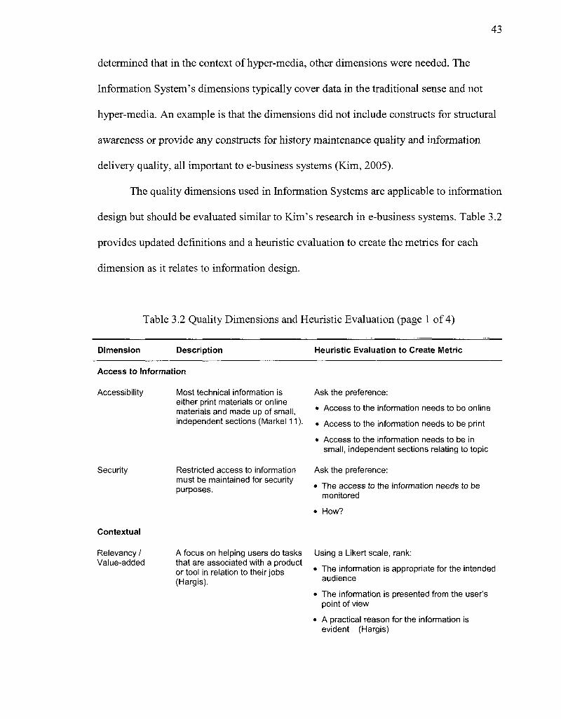
43
determined that in the context of hyper-media, other dimensions were needed. The
Information System's dimensions typically cover data in the traditional sense and not
hyper-media. An example is that the dimensions did not include constructs for structural
awareness or provide any constructs for history maintenance quality and information
delivery quality, all important to e-business systems (Kim, 2005).
The quality dimensions used in Information Systems are applicable to information
design but should be evaluated similar to Kim's research in e-business systems. Table 3.2
provides updated definitions and a heuristic evaluation to create the metrics for each
dimension as it relates to information design.
Table 3.2 Quality Dimensions and Heuristic Evaluation (page 1 of 4)
Dimension Description Heuristic Evaluation to Create Metric
Access to Information
Accessibility
Security
Most technical information is either print materials or online materials and made up of small, independent sections (Markel 11)
Restricted access to information must be maintained for security purposes.
Ask the preference:
• Access to the information needs to be online
• Access to the information needs to be print
• Access to the information needs to be in small, independent sections relating to topic
Ask the preference:
• The access to the information needs to be monitored
• How?
Contextual
Relevancy / A focus on helping users do tasks Using a Likert scale, rank: Value-added that are associated with a product
or tool in relation to their jobs (Hargis).
The information is appropriate for the intended audience
• The information is presented from the user's point of view
• A practical reason for the information is evident (Hargis)
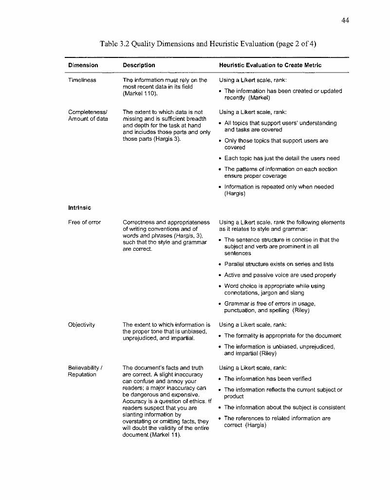
44
Table 3.2 Quality Dimensions and Heuristic Evaluation (page 2 of 4)
Dimension Description Heuristic Evaluation to Create Metric
Timeliness
Completeness/ Amount of data
The information must rely on the most recent data in its field (Markel 110).
The extent to which data is not missing and is sufficient breadth and depth for the task at hand and inciudes those parts and only those parts (Hargis 3).
Using a Likert scale, rank:
• The information has been created or updated recently (Markel)
Using a Likert scale, rank:
• All topics that support users' understanding and tasks are covered
• Only those topics that support users are covered
• Each topic has just the detail the users need
• The patterns of information on each section ensure proper coverage
• Information is repeated only when needed (Hargis)
Intrinsic
Free of error Correctness and appropriateness Using a Likert scale, rank the following elements of writing conventions and of as it relates to style and grammar: words and phrases (Hargis, 3), ,., such that the style and grammar * T h e sentence structure is concise in that the are correct subject and verb are prominent in all
sentences • Parallel structure exists on series and lists
• Active and passive voice are used properly
• Word choice is appropriate while using connotations, jargon and slang
• Grammar is free of errors in usage, punctuation, and spelling (Riley)
Objectivity
Believability / Reputation
The extent to which information is the proper tone that is unbiased, unprejudiced, and impartial.
The document's facts and truth are correct. A slight inaccuracy can confuse and annoy your readers; a major inaccuracy can be dangerous and expensive. Accuracy is a question of ethics. If readers suspect that you are slanting information by overstating or omitting facts, they will doubt the validity of the entire document (Markel 11).
Using a Likert scale, rank:
• The formality is appropriate for the document
• The information is unbiased, unprejudiced, and impartial (Riley)
Using a Likert scale, rank:
• The information has been verified
• The information reflects the current subject or product
• The information about the subject is consistent
• The references to related information are correct (Hargis)
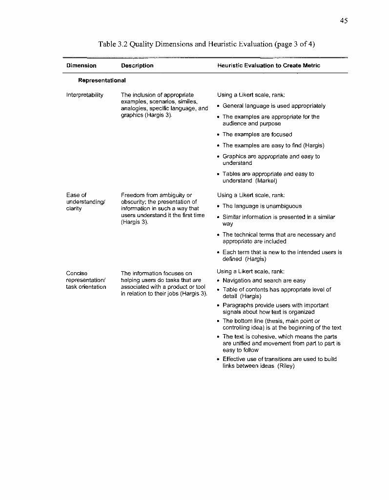
45
Table 3.2 Quality Dimensions and Heuristic Evaluation (page 3 of 4)
Dimension Description Heuristic Evaluation to Create Metric
Representational
Interpretability
Ease of understanding/ clarity
Concise representation/ task orientation
The inclusion of appropriate examples, scenarios, similes, analogies, specific language, and graphics (Hargis 3).
Freedom from ambiguity or obscurity; the presentation of information in such a way that users understand it the first time (Hargis 3).
The information focuses on helping users do tasks that are associated with a product or tool in relation to their jobs (Hargis 3).
Using a Likert scale, rank:
• General language is used appropriately
• The examples are appropriate for the audience and purpose
• The examples are focused
• The examples are easy to find (Hargis)
• Graphics are appropriate and easy to understand
• Tables are appropriate and easy to understand (Markel)
Using a Likert scale, rank:
• The language is unambiguous
• Similar information is presented in a similar way
• The technical terms that are necessary and appropriate are included
• Each term that is new to the intended users is defined (Hargis)
Using a Likert scale, rank: • Navigation and search are easy • Table of contents has appropriate level of
detail (Hargis) • Paragraphs provide users with important
signals about how text is organized • The bottom line (thesis, main point or
controlling idea) is at the beginning of the text • The text is cohesive, which means the parts
are unified and movement from part to part is easy to follow
• Effective use of transitions are used to build links between ideas (Riley)
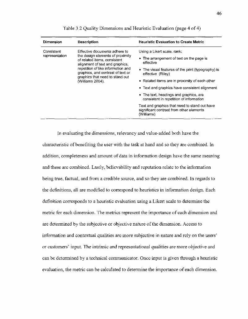
46
Table 3.2 Quality Dimensions and Heuristic Evaluation (page 4 of 4)
Dimension Description Heuristic Evaluation to Create Metric
Consistent Effective documents adhere to representation the design elements of proximity
of related items, consistent alignment of text and graphics, repetition of like information and graphics, and contrast of text or graphics that need to stand out (Williams 2004).
Using a Likert scale, rank:
• The arrangement of text on the page is effective
• The visual features of the print (typography) is effective (Riley)
• Related items are in proximity of each other
• Text and graphics have consistent alignment
• The text, headings and graphics, are consistent in repetition of information
Text and graphics that need to stand out have significant contrast from other elements (Williams)
In evaluating the dimensions, relevancy and value-added both have the
characteristic of benefiting the user with the task at hand and so they are combined. In
addition, completeness and amount of data in information design have the same meaning
and these are combined. Lastly, believability and reputation relate to the information
being true, factual, and from a credible source, and so they are combined. In regards to
the definitions, all are modified to correspond to heuristics in information design. Each
definition corresponds to a heuristic evaluation using a Likert scale to determine the
metric for each dimension. The metrics represent the importance of each dimension and
are determined by the subjective or objective nature of the dimension. Access to
information and contextual qualities are more subjective in nature and rely on the users'
or customers' input. The intrinsic and representational qualities are more objective and
can be determined by a technical communicator. Once input is given through a heuristic
evaluation, the metric can be calculated to determine the importance of each dimension.
47
In developing an information product, it is difficult to have all quality dimensions
perfect and it is rarely necessary. In fact improving one dimension of quality many times
decreases the quality in another dimension (Garvin, 1984). The customers' value of the
quality dimensions and weighing them against each other is a key element. Therefore, all
quality dimensions should be evaluated together so that customers can determine the true
value of the end product (Garvin, 1984), which is what the QFD tool does.
The idea of balancing quality dimensions of a product is analyzed by quality
expert Joseph M. Juran who stressed "fitness of use" of a product to its customers.
"Fitness of use" weighs the cost/benefit and diminishing returns (March, 1990). For
example, if customers trade in their cars after five years, then the quality of the parts
should last five years, not less or more. Juran believed that a product does not need every
quality feature, only those that satisfy the customer. He focused on maintaining and
minimizing the cost of quality by selecting those quality dimensions that satisfied
customers to create breakthrough results for the product (1999). Evaluation of quality
dimensions together ensures to balance each one against the others.
48
CHAPTER 4
METHODS AND PROCEDURES
4.1 Overview and Research Questions
This dissertation focuses on developing information products using quality
management. To illustrate the procedure I use the information design of a benefits
enrollment package for new employees at Intrinsic Technologies, a small information
technology company. Currently, this design contains text and graphical materials, but the
process for reading and accurately completing the benefits enrollment forms is difficult
for new employees.
The change in the process and procedure to develop a new benefits enrollment
package for new employees is similar to product development because both create an end
product. Information design is "most properly seen as a product, with its own costs and
benefits like any other product, and research should focus on supporting this new view of
the profession" (Mead, 1998).
This research uses a Traditional Group and a Quality Management Group. The
Traditional Group uses the current benefits enrollment package solution, which is a
collection of hardcopy materials containing benefit enrollment forms, instructions and
supplemental documentation explaining the benefits. The Quality Management Group
uses quality management tools to control and measure the steps in the process of
developing a new benefits enrollment package.
To determine if the information design of the Quality Management Group is
better than, equal to, or less than the Traditional Group's current best practices, a

49
usability study is administered. The usability study assists in answering the following
research questions:
Research Question 1: How does the Quality Management Group compare to the
Traditional Group in developing the benefits enrollment package for new
employees in the following categories?
1.1 Learnability: Will the testing results from the Quality Management Group
have the same, better, or worse success rate as the Traditional Group in
comprehending and completing the benefit forms, the first time they encounter the
design?
1.2 Efficiency: Will the time it took users to complete the benefit enrollment
forms be the same, better, or worse for the Quality Management Group and the
Traditional Group?
1.3 Errors: Will the severity and recovery of the errors made in the Quality
Management Group be the same, better, or worse as the Traditional Group?
1.4 Satisfaction: Will the satisfaction in completing the benefits enrollment forms
be the same, better, or worse for the Quality Management Group and the
Traditional Group?
Research Question 2: Do the users' desired outcomes (determined in the Quality
Management Group) hold true for both the Traditional Group and Quality
Management Group?
2.1: Will all the desired outcomes be met in the Quality Management Group?
2.2: Will all the desired outcomes be met in the Traditional Group?
50
4.2 Statement of Problem
Many researchers in the field of information design (Lipton 2007, Hackos 2007,
and Schriver 1997) provide high-level suggestions on how to learn and interact with the
customer, but specifics on a model approach to eliciting and controlling measurable
requirements throughout the development process are not explored. The research in this
dissertation tests a Quality Management Group using a formal model for customer
elicitation and the utilization of quality management tools in the development of
information design. The importance of this research is that it uses quality management in
order to create a proactive, user-centric, measurable approach to create a benefits
enrollment package for new employees and potentially other types of information
products. It also develops a managed process to capture user requirements for
information design that are measurable. If this is successful, it can assist in eliminating
most of the after-the-fact usability studies and rework that are typically found in
traditional information design processes. Information design will be more effective much
earlier in the lifecycle.
4.3 Research Methodology
The proposed methodology uses a Traditional Group and a Quality Management
Group in the development of the benefits enrollment package for new employees. The
Traditional Group focuses on the current solution, the existing benefits enrollment
package, and performs a heuristic evaluation and usability test to determine the changes
to make in the current benefits enrollment package. In the Quality Management Group,
the researcher develops a new benefits enrollment package using quality management
tools and gathering quantifiable functional requirements early in the design process. Once
51
both of the benefits enrollment packages are redesigned, the method to test the validity of
the Quality Management Group is a final usability test. The results are then evaluated for
both groups.
4.3.1 Traditional Group Methodology. In the Traditional Group, the researcher takes
the current solution, the current benefits enrollment package for new employees, provides
a heuristic evaluation, and a usability test with the target population.
For the heuristic evaluation, previous studies suggest that two to five participants
from management and human resources from the company should conduct the evaluation
alone to ensure a "higher degree of certainty" along with an unbiased perspective from
each other (Kantner, Jakob 2005). The heuristic evaluation was created using Table 3.2
Quality Dimensions and Heuristic Evaluation. The evaluation form is in Appendix A.
For the usability testing, six participants are selected because Jakob Nielsen
established that six users uncovered over 90 % of the issues (Nielsen, 2000). The users
are individuals who have or are likely to complete a college education and join the
workforce. Each one is given the current benefits enrollment package and asked to
perform the job or task that is determined in the Quality Management Focus Group.
Jakob Nielsen (2008) gives five quality components to measure usability testing.
1. Learnability: What is the success rate for the users to complete the benefits
enrollment package the first time they encounter the design?
2. Efficiency: How quickly can the users complete the benefits enrollment
package?
3. Errors: How many errors do the users make, how severe are the errors, and can
they recover from them?
52
4. Satisfaction: What was the level of user satisfaction completing the benefits
package?
Note: One of Nielsen's components, Memorability, is not measured because it
requires a longevity study, which is not applicable to this research. It asks: when
users return to the design after a period of not using it, how easily can they
reestablish proficiency?
These components are addressed through note taking during the usability test and
the debriefing session afterwards. The usability forms are found in Appendix B. The
results from the usability tests will be evaluated by the researcher, who will redesign a
benefits enrollment package prototype based on the results of the usability test.
Methodology and Process. This usability study includes the collection of
systematic, recorded, quantifiable data and observation of behaviors. The facilitation of
this usability study begins with planning the test, developing participant profiles,
identifying participants from a user pool, creating test materials, writing task scenarios,
determining usability criteria and setting metrics for the criteria. In addition, the test
location is identified and a beta test is administered with the materials and procedures.
Minor adjustments are made and then formal testing begins.
At the beginning of each test, the participants are greeted by the facilitator of the
test and made to feel comfortable and relaxed. The participants are provided with a brief
explanation of the benefits enrollment package to be tested and the equipment to be used.
The facilitator reviews an audio release consent form (see Appendix B) and has the
participants sign it. The purpose of the consent form is to protect the users from any
undue stress or harm. Due to the human subject aspect of this research, the methodology
53
and consent form was reviewed and approved by the Institutional Review Board at
Illinois Institute of Technology.
Then, the participants receive a short verbal introduction and orientation to the
usability study. This introduction and orientation explains the purpose and objective of
the evaluation and provide additional information about what is expected of them. The
participants are assured that the benefits enrollment package is the center of the
evaluation and not themselves, and that they should perform in whatever manner is
typical and comfortable for them.
The participants review the task to be performed:
As a new employee of ABC Corporation, you are eligible for Medical, Dental,
Long-term Disability, Short-term Disability, and Life. For Medical, there is a
supplemental fee associated with the coverage. The others are covered 100% by
ABC Corporation, unless you add dependent coverage for voluntary life, which is
an additional fee.
Please fill out the forms with the coverage you want and return them to us as soon
as possible.
Then, the participants complete the task while being observed. After the
participants begin working through the task, they are encouraged to work without
guidance except for the provided materials. The test facilitator asks the participants to use
the "Talk-Aloud Protocol" to verbalize his or her thoughts, particularly if the participants
become stuck or confused. These occurrences are noted by the facilitator and are used to
pinpoint the cause of the problem. The participants are given 45 minutes to complete the
task. All subtasks are recorded as successful or failed attempts. After the task is
54
completed or the time has expired, the participants are briefly interviewed by the test
facilitator and asked to share his or her opinions. These forms are found in Appendix B.
The debriefing session allows the participants to say whatever they like or dislike about
the benefits enrollment package, particularly when the task is frustrating. Most
importantly, participants often provide insights to possible solutions that had been
previously overlooked. After the debriefing session, the participants are thanked for their
efforts and released.
After each test, the researcher enters the data into Excel spreadsheets for further
analysis. One spreadsheet contains the user profile information in detail. Another
spreadsheet holds all the users actions and comments. This sheet is grouped by
instructions and supplemental documentation, the two forms of documentation provided
during testing, explaining the benefits, along with each section in the benefit enrollment
forms. The results are entered by user and each user is numbered to remain anonymous.
For the instructions and supplemental documents, the users' actions and comments are
entered while they interact with them. For each section of the forms, the fields completed
correctly for each user are entered, along with their actions and comments. Then, the data
for the completed fields is averaged per user and overall for the section. For example, the
medical information in the Blue Cross Blue Shield form has two possible fields to
complete. If a user completes one out of the two fields correctly, the average is 50%. By
converting the success rate into percentages, it is possible to determine an average overall
ranking, although the individual results are shown to reveal any extreme variance
between the users.
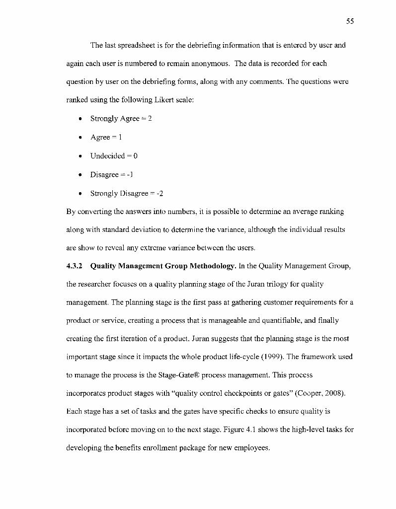
55
The last spreadsheet is for the debriefing information that is entered by user and
again each user is numbered to remain anonymous. The data is recorded for each
question by user on the debriefing forms, along with any comments. The questions were
ranked using the following Likert scale:
• Strongly Agree = 2
• Agree = 1
• Undecided = 0
• Disagree = -1
• Strongly Disagree = -2
By converting the answers into numbers, it is possible to determine an average ranking
along with standard deviation to determine the variance, although the individual results
are show to reveal any extreme variance between the users.
4.3.2 Quality Management Group Methodology. In the Quality Management Group,
the researcher focuses on a quality planning stage of the Juran trilogy for quality
management. The planning stage is the first pass at gathering customer requirements for a
product or service, creating a process that is manageable and quantifiable, and finally
creating the first iteration of a product. Juran suggests that the planning stage is the most
important stage since it impacts the whole product life-cycle (1999). The framework used
to manage the process is the Stage-Gate® process management. This process
incorporates product stages with "quality control checkpoints or gates" (Cooper, 2008).
Each stage has a set of tasks and the gates have specific checks to ensure quality is
incorporated before moving on to the next stage. Figure 4.1 shows the high-level tasks for
developing the benefits enrollment package for new employees.
56
J Innovation Stage
• Focus Group determines outcomes outcome measures
Customer Elicrtation Stage
• Card Son gathers priorities of outcomes and related actions
i Design Stage
i »QFD-translates * outcomes to . actions and | actions to design I dimensions
Development Stage
• Create nev, procedures using design dimensions
r-*~ Testing Stage
• Usability Studv- ' Test new ! procedures and j old procedures J
Final Analysis Stage
• Analyze the results and measure outcomes of the usability studies for each procedure
Figure 4.1 Quality Management Group Development Methodology
Innovation Stage. A focus group of management and human resources staff from
the company is used to determine the job or task required by new employees to complete
the benefits enrollment package. The focus group then determines the preferred outcomes
that they expect after new employees read and complete the benefits enrollment package.
In addition, this group determines how to measure the success of each outcome. In the
article "Development Process with Regard to Customer Requirements," Duhovnik (2006)
states that the size of a focus group is typically six to twelve participants including a
moderator. Duhovnik believes that all members should be of similar interest. The
website www.usability.gov, states eight to twelve users are ideal. The book Focus
Groups by Krueger and Casey, suggests that when dealing with knowledgeable groups, a
mini-focus group may be more productive (2008). In this study, the focus group consists
of employees from human resources and management who know the purpose of the
57
benefits enrollment package, therefore a mini-focus group of four to six participants are
used.
The goal of the focus group is to determine the following:
• What job needs to be performed by the new employee?
• What desired outcomes for the job should result from the new employee
(customers) completing the benefit package forms?
• How should the outcomes be measured - quantitatively?
• What constraints, if any, are associated with any of the outcomes?
• What actions are related to the outcomes?
Each participant of the focus group is given the list of questions before the
meeting in order to generate more meaningful discussion of these questions. During the
focus group the researcher presents each question sequentially. The researcher uses a
white board to take notes and an additional note taker records the information on paper.
Before the focus group begins, the researcher reviews a consent form (see Appendix C).
The purpose of the consent form is to protect the users from any undue stress or harm.
Due to the human subject aspect this research, the methodology and consent form was
reviewed and approved by the Institutional Review Board at Illinois Institute of
Technology.
The focus group discussion typically lasts between 60 and 90 minutes or until all
outcomes are exhausted. Once completed, the information is collected, analyzed, and
placed in a card sort survey for analysis by users, potential employees.
Gate 1 - Innovation Stage has two questions to determine any problems before
passing to the next stage in the process.
58
Ql. 1: Was the focus group able to create outcomes from the job with related
measures and constraints?
Q1.2: Do any constraints prevent the user from a successful outcome?
Customer Elicitation Stage. The second step is to provide an individual card sort
in the form of a survey for potential employees using the benefits enrollment package.
The number of customers for the card sort is determined through research conducted by
Jakob Nielsen wherein 15 users give correlations of 90%, 20 users gives 93% and 30
users gives 95% (Nielsen, 2004). For this test, at least 20 student members will perform
the card sort. The target population is individuals who have or soon will likely complete a
college education and join the workforce.
The card sorting approach provides benefits to customer elicitation of outcomes.
By analyzing the customers' different rankings of the proposed outcomes, it is possible to
quantify them. All outcomes should be evaluated together so that customers can weigh
them against each other and determine the true value of each one (Garvin, 1984).
Before the participants begin the card sort survey, the researcher reviews a
consent form (see Appendix D). This consent form is similar to the one used in the focus
group and approved by the Institutional Review Board at Illinois Institute of Technology.
Next, the customers are asked to perform the card sort survey and rank the
outcomes as they relate to their job or task, which is to review and complete the benefits
enrollment package. The card sort survey is monitored in case a user is unclear about this
procedure, but no assistance is given with the sort decisions.
The first sort asks the customer to eliminate or add to the outcomes generated
from the focus group. The second sort applies the Kano Model and asks the users to
59
classify the outcomes into must-be, one-dimensional (should-be), and attractive. The
Kano Model is used to aid in the accuracy of quantifying the data in the evaluation stage.
The third sort is to rank the outcomes from highest to lowest.
The results of the card sorts are analyzed and quantified by the researcher with the
help of Websort software and an Excel spreadsheet and the results presented in Chapter
5: Results. This analysis shows the correlations of the Kano Model classifications to the
outcomes in association to the rankings of outcomes. The results are analyzed and
present:
• Outcomes to Kano attributes by user
• Summary of outcomes to Kano attributes
• Percentage of attributes to Kano attributes
• Ranking of outcomes by user
• Cumulative ranking of outcomes
• Comparative analysis of Kano attribute percentages and cumulative ranking
Gate 2 - Customer Elicitation Stage has two questions to determine any
problems before passing to the next stage in the process.
Q2.1: Do the outcomes generated by the focus group match the customers'
outcomes during the card sort survey?
Q2.2: Were the customers able to sort outcomes, by Kano Model attributes and
by priority?
Design Stage. In the design stage, the researcher translates what the customer
wants into information design. Using the Quality Function Design (QFD) tool is
beneficial because it translates the customers' desires or requirements into the
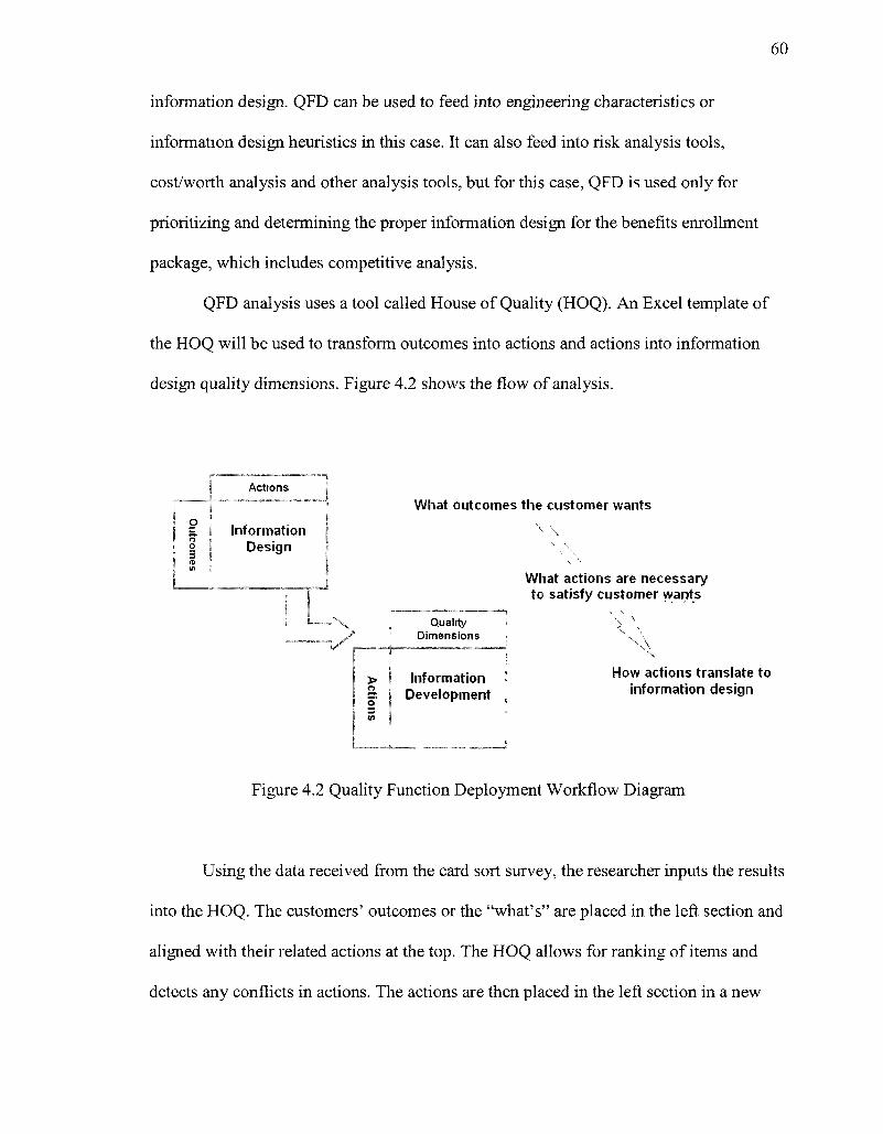
60
information design. QFD can be used to feed into engineering characteristics or
information design heuristics in this case. It can also feed into risk analysis tools,
cost/worth analysis and other analysis tools, but for this case, QFD is used only for
prioritizing and determining the proper information design for the benefits enrollment
package, which includes competitive analysis.
QFD analysis uses a tool called House of Quality (HOQ). An Excel template of
the HOQ will be used to transform outcomes into actions and actions into information
design quality dimensions. Figure 4.2 shows the flow of analysis.
the customer wants
% \
What actions are necessary to satisfy customer wants
How actions translate to information design
Figure 4.2 Quality Function Deployment Workflow Diagram
Using the data received from the card sort survey, the researcher inputs the results
into the HOQ. The customers' outcomes or the "what's" are placed in the left section and
aligned with their related actions at the top. The HOQ allows for ranking of items and
detects any conflicts in actions. The actions are then placed in the left section in a new
Actions
1 Information I Design
What outcomes t
Quality 1 Dimensions
> ' Information Development
3 at
61
HOQ and aligned with related quality dimensions of information design. The rankings of
each action are carried over from the first HOQ to prioritize the quality dimensions. In
addition, the HOQ detects any conflicts between the quality dimensions.
Lastly in the HOQ, the customer competitive assessment is found to the right of
the relationship matrix. The heuristic dimensions from the competitive analysis of two
benefits enrollment packages are entered to rank whether the "what's" of the various
designs are appealing. A sample of the HOQ template that will be used is found in
Appendix E.
Gate 3 - Design Stage has three questions to determine any problems before
passing to the next stage in the process.
Q3.1: Given the results of the card sort survey, do the outcomes translate
successfully to actions and what are the conflicts?
Q3.2: Do the actions translate successfully to information design dimensions and
what are the conflicts?
Q3.3: How do the competitor's benefit enrollment packages rank heuristically
with the design features of the new Quality Management Group's package?
Development Stage. After analyzing the quality dimensions to use in the
information design, the researcher develops a benefits package prototype using those
dimensions.
Gate 4 - Development Stage has one question to determine any problems with
the final design of the benefits enrollment package.
Q4.1: Did the development of the benefits package incorporate all the required
information design quality dimensions?
62
4.3.3 Comparison Study Methodology. Both the Traditional Group and Quality
Management Group benefit package prototypes are usability tested. Each group is tested
with six users, which will capture over 90% of the errors in the documentation (Nielsen,
2008).
After the studies, four of Nielsen's quality components are used to measure the
usability differences between Traditional Group and the Quality Management Group
results using the following metrics:
1. Learnability: What is the success rate for the users to complete the benefits
enrollment package the first time they encounter the design?
2. Efficiency: How quickly can the users complete the benefits enrollment
package?
3. Errors: How many errors do the users make, how severe are the errors, and can
they recover from them?
4. Satisfaction: What was the level of user satisfaction completing the benefits
package?
Note: One of Nielsen's components, Memorability, is not measured because it
requires a longevity study, which is not applicable to this research. It asks: when
users return to the design after a period of not using it, how easily can they
reestablish proficiency?
One through three of the quality components are answered through the test itself.
The fourth component, satisfaction, is determined through a debriefing survey. The forms
for the usability study are found in Appendix B. In addition, the researcher analyzes the
63
results using the outcomes and their measures determined in the Quality Management
Focus Group. The results of all stages are analyzed and documented.
64
CHAPTER 5
RESULTS
This dissertation attempts to establish that using quality management tools for
information design provides a more measurable and improved information product than
the traditional process of creating an information product and then validating it through
usability testing. In a Traditional Group, the researcher applied the traditional process to
create a benefits enrollment package. In a Quality Management Group, the researcher
applied quality management tools to create a benefits enrollment package.
5.1 Traditional Group Results
In the Traditional Group, the researcher applied a traditional approach in creating
the benefits enrollment package. A heuristics evaluation was conducted by the company
followed by a usability study on the Traditional Group. The results were then used to
redesign the benefits enrollment package.
5.1.1 Heuristic Evaluation. Heuristics are best-practice guidelines used for evaluating
information. A heuristics evaluation was conducted to determine the effectiveness of the
design of the current benefits enrollment package. When combined with a formal
usability study, a heuristics evaluation provides additional feedback on how the
documentation can be improved. The heuristics dimensions, or categories, were
determined in the literature review (see Table 3.2) and are as follows:
• Access to information and security
• Relevancy / value-added
• Timeliness
• Completeness / amount of data
65
• Free of error
• Objectivity
• Believability / Reputation
• Interpretability
• Ease of understanding / clarity
• Concise representation / task orientation
• Concise representation
The usability issues identified are presented with recommendations for
remediation, where possible and appropriate. This report assigns a severity rating to each
issue based on the evaluation done by two employees of the company, who are familiar
with the benefits enrollment package. The main issues that evolved from the heuristic
evaluation are listed below.
• Access to information: The hardcopy forms need a signature and the form needs
to be kept locked and secure for HIPPA Compliance, Beneficiary Information and
EEOA.
• Relevancy of the information: The information in the cover letter is not presented
in the users' point of view.
• Completeness of the data: The information in the cover letter and instructions
does not explain and define the coverage. In addition, all the information design
patterns vary.
• Ease of understanding: The benefits jargon used is not well defined and the
language is ambiguous across many of the documents.
66
• Concise representation: Navigation and search are difficult with the supplemental
documents and no guide or table of contents are available.
• Consistent representation: The fonts are not visually effective and vary widely
among the forms and supplemental documents.
From the main issues, five overall recommendations are given:
1. Ensure that the user signs the hardcopy form and that the form is kept on file by
the company for easy access.
2. Revise the cover letter to include more definitions and descriptions for better
comprehension.
3. Revise the cover letter and instructions to support the users' understanding and
tasks.
4. Create instructions that clearly point out and define the benefits covered.
5. Provide guidance to navigate through the documents through a table of contents
or instructions.
The recommendations above are incorporated into the revised benefits enrollment
package by the researcher. More details of the heuristic evaluation can be found in
Appendix F.
5.1.2 Target Audience. To evaluate the benefits enrollment package, the target
population is users who are in or will soon likely be in a professional career. Six users
with the following demographics (see Table 5.1) were selected to participate in the
evaluation.
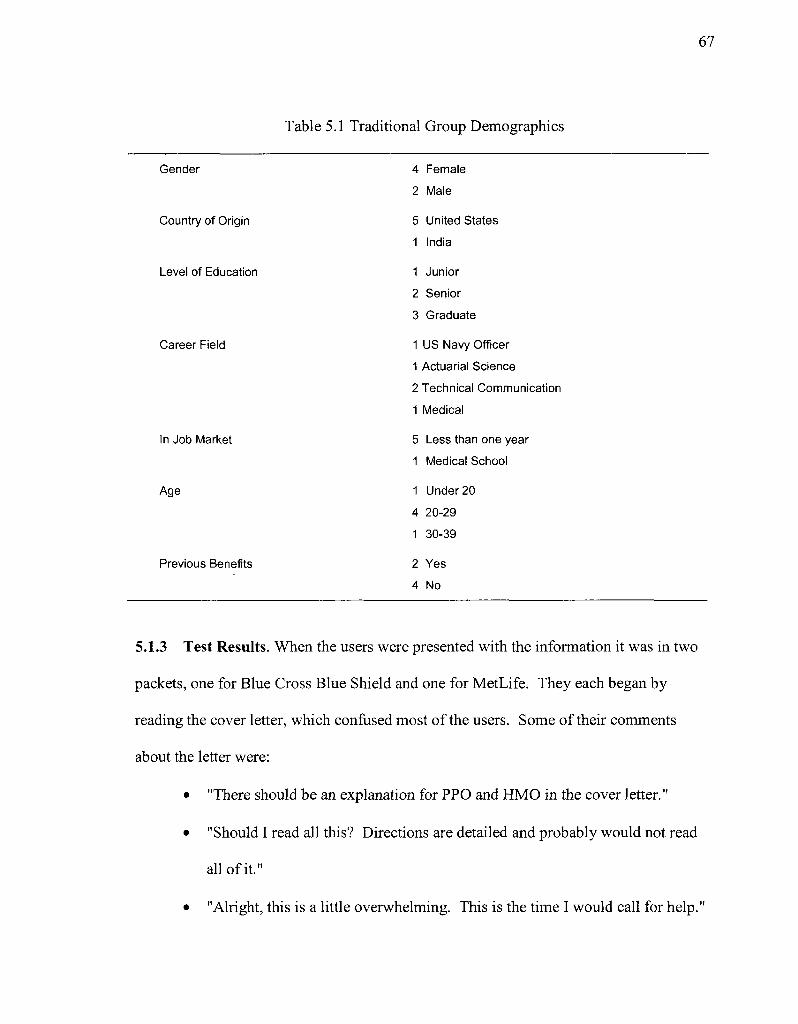
67
Table 5.1 Traditional Group Demographics
Gender
Country of Origin
Level of Education
Career Field
In Job Market
Age
Previous Benefits
4 Female
2 Male
5 United States
1 India
1 Junior
2 Senior
3 Graduate
1 US Navy Officer
1 Actuarial Science 2 Technical Communication
1 Medical
5 Less than one year 1 Medical School
1 Under 20
4 20-29
1 30-39
2 Yes
4 No
5.1.3 Test Results. When the users were presented with the information it was in two
packets, one for Blue Cross Blue Shield and one for MetLife. They each began by
reading the cover letter, which confused most of the users. Some of their comments
about the letter were:
• "There should be an explanation for PPO and HMO in the cover letter."
• "Should I read all this? Directions are detailed and probably would not read
all of it."
• "Alright, this is a little overwhelming. This is the time I would call for help."
68
In fact, all six users suggested that a definition of HMO and PPO should be provided
because they were unfamiliar with the terms.
All the users started with the Blue Cross Blue Shield packet, which included the
form and supplemental documents. Also, Blue Cross Blue Shield provided generic
instructions that seemed helpful but confused some of the users because many of the
fields did not apply. Only medical insurance is covered through Blue Cross Blue Shield,
although the generic form did have options for dental and life. For analysis of the users'
input into the Blue Cross Blue Shield form, the form was sub-divided into various
sections. The first part of the form was the personal information. Most users were
successful completing this section, 87%. The most fields anyone missed were three out of
nine, so no one user skewed this percentage. Some fields were confusing like COBRA
insurance, which is insurance that the company has to provide after you leave your job.
This obviously does not apply to new users, but no clear definition was given to help the
users.
The next sections of the form were the benefits selections and only two users
referenced the supplemental documents to determine what to select at the time they
completed them. In the medical coverage, all users successfully selected their option,
even though most were unsure of the difference between HMO and PPO. The other
coverage, dental and life insurance, are options on the generic form but not provided by
Blue Cross Blue Shield, instead they are provided by MetLife. Four out of the six users
mistakenly selected dental, unaware that this was not an option. Two of six users
selected the life insurance. One user saw the MetLife packet, abandoned the remainder of
the Blue Cross Blue Shield form, and never came back to it for completion.
69
The remainder of the form dealt with family coverage and other insurance
information like a medical questionnaire. Except for the one that abandoned the form and
never returned to complete it, the users were successful in completing the remainder of
the form. One area of confusion was the waiver of coverage sections. For example, one
user states, "This is confusing. If I didn't enroll for Dearborn Life, would I have to fill it
out here?" Another area of confusion was that once the users did reference the
supplement documents regarding medical benefits, it did not seem to help them. As one
user states, "Nothing seems to help. This doesn't give you what the differences are in
HMO and PPO." From the comments throughout the usability tests, it was evident that
more definitions and guidance was needed in completing the form for Blue Cross Blue
Shield. More details regarding data collected during the tests can be found in Appendix F.
MetLife covers dental, life, long-term disability, and short-term disability and is
free to employees, although the users have the option to buy additional supplemental life.
When the users began to complete the MetLife form, all of them felt it was easier to
complete. The reason is that the form was easier to read and contained fewer options. The
results were similar to the Blue Cross Blue Shield form with the personal information.
Of the seven fields, only one user completed all of them correctly with an overall success
rate of 81%. Again, certain items like COBRA insurance were not clear to them.
The available benefits selections were aggregated together and did have more
options than necessary due to the use of the generic form, but there were not as many as
the Blue Cross Blue Shield form. Initially, none of users cross-referenced the
supplemental documents when completing this section. Some referenced them after
completing the form, but no major changes were made to the form. When selecting the
70
benefits, the users that chose dental on the Blue Cross Blue Shield form were confused to
see it on the MetLife form. One actually corrected his mistake on the Blue Cross Blue
Shield form and selected it on the MetLife form. Of the fields completed incorrectly, the
dental along with long-term and short-term disability, were missed by two users. Most
selected life insurance correctly, but were unclear about the supplemental life benefits.
The next section was for dependent coverage and was found to be confusing for
most users. This coverage was for supplemental life for their spouse only, but some felt it
was for dental too. The percentage of fields completed correctly was 56%, which was
skewed by one user only completing three of the six fields correctly and one user unable
to complete the remainder of the form due to time.
The last section that was difficult for some users to successfully complete was the
beneficiary designation section. This section only had a success rate of 71 % due to the
confusion on stating accurate percentages or proceeds distribution. This was again
skewed by one person only completing two of the four fields correctly and one user
unable to complete the remainder of the form due to time.
The final results show that the users needed more direction and definitions when
completing both forms. Aggregating the total percentages of fields completed correctly
for both the Blue Cross Blue Shield enrollment form and the MetLife enrollment form
resulted in an accuracy of 75%. For more details of the test results, see Appendix F.
After the each usability test, the attitudes of the users on the test were taken using
the debriefing form found in Appendix B. In the debriefing, the users were overall neutral
on most questions. One user strongly disagreed that the information was easy to use and
sufficient to complete the forms. Otherwise, the answers ranged from "agree,"
71
"undecided" or "disagree." The users commented on what they felt was particularly easy
to use, such as:
• The life insurance was easy to understand and use.
• Instructions for Blue Cross Blue Shield were good.
• HMO supplementary documentation was easy to use.
• In the PPO supplementary documentation, the user liked the charts but
information was too close together for easy reading.
• MetLife is easier to use than Blue Cross Blue Shield because not as much
information, along with the font size was easier to read.
• The cover letter for the medical coverage cost was done well.
• The numbered directions corresponding to sections numbers in the form was
helpful for Blue Cross Blue Shield.
The users also commented on what was difficult to use, such as:
• For Blue Cross Blue Shield information, it was hard find correct information and
the instructions were not exactly clear.
• The medical form was difficult.
• In the instructions for Blue Cross Blue Shield, the topics and titles could be
highlighted more. Needs better document design.
• Coverage request data was difficult to understand.
• MetLife supplementary documents were difficult to get the information needed.
• On the Blue Cross Blue Shield form, the boxes were too small and had too much
data.
• The life insurance coverage beneficiary percentage was difficult to understand.
72
• Checking boxes for coverage had no specification on how many to check.
Finally, some of the users suggested areas of content and functionality that were
noticeably missing:
• Add missing definitions of all coverage and technical terms.
• Need to have a comparison of PPO and HMO.
• Condense information and offer suggestion to what package would be the best fit
for me.
• Have an overall "how to" that explains the coverage and fields relevant to me.
• Need clear directions on which boxes to check for coverage.
• Have complete instructions.
• Arrange packets so I read what I am signing up for before I sign up.
For more details on the debriefing, the full results are in Appendix F.
5.1.4 Summary of Recommendations. The recommendations for redesign are
gathered from the patterns and trends as they were discovered in the usability testing. The
summary of recommendations reports user issues and possible solutions, severity of
issue, and the type of change.
Severity is determined by the number of users who had issues with the feature:
• High Severity - the information is critical and at least one user had a problem
with it
• Medium Severity - the information was moderate and at least one user had a
problem with it
• Low Severity - the information was minor and at least one user had a problem
with it
73
Type reflects the different categories of the issues and is referred to as the following:
• Accessibility quality involves the user's access to the information. The
dimensions include accessibility and security.
• Contextual quality focuses on quality dimensions as they relate to the user's
specific task. The dimensions include relevancy, value-added, timeliness,
completeness and amount of data. This includes functionality recommendations
that involve application response that doesn't meet user's expectations (mental
model).
• Intrinsic quality relates to the quality of the data in its current state. The
dimensions include accuracy, believability, objectivity, and relevancy.
• Representational quality relates to the format and meaning of the data. The
dimensions include interpretability, ease of understanding, concise representation,
and consistent representation. This includes navigation recommendations that
involve information flow, organization, and layout of the information. In addition,
terminology recommendations involve terms and definitions.
Table 5.2 summarizes the issues and recommendations by the general sections of
the cover letter, the forms and the supplemental documents. Note that Intrinsic Quality
was considered but not relevant to any redesign. This quality relates to accuracy,
believability, objectivity, and relevancy. Every user in the debriefing believed that the
information had those qualities or was undecided.
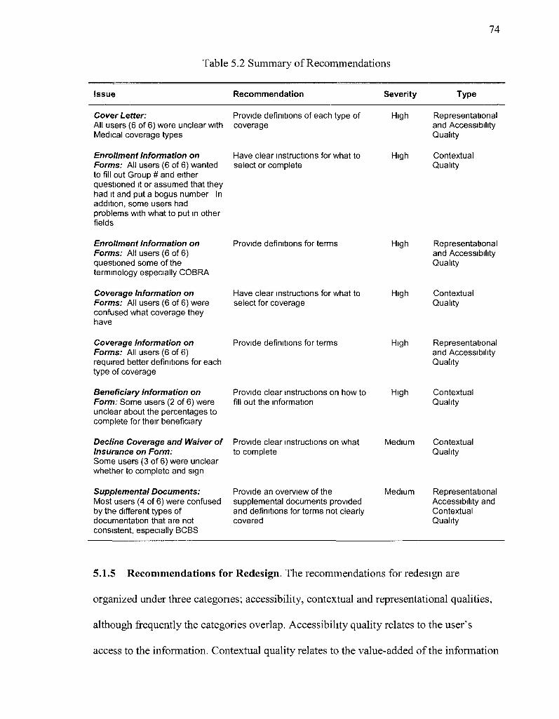
74
Table 5.2 Summary of Recommendations
Issue Recommendation Severity Type
Cover Letter: All users (6 of 6) were unclear with Medical coverage types
Enrollment Information on Forms: All users (6 of 6) wanted to fill out Group # and either questioned it or assumed that they had it and put a bogus number In addition, some users had problems with what to put in other fields
Enrollment Information on Forms: All users (6 of 6) questioned some of the terminology especially COBRA
Coverage Information on Forms: All users (6 of 6) were confused what coverage they have
Coverage Information on Forms: All users (6 of 6) required better definitions for each type of coverage
Beneficiary Information on Form: Some users (2 of 6) were unclear about the percentages to complete for their beneficiary
Decline Coverage and Waiver of Insurance on Form: Some users (3 of 6) were unclear whether to complete and sign
Supplemental Documents: Most users (4 of 6) were confused by the different types of documentation that are not consistent, especially BCBS
Provide definitions of each type of coverage
Have clear instructions for what to select or complete
High Representational and Accessibility Quality
High Contextual Quality
Provide definitions for terms
Have clear instructions for what to select for coverage
Provide definitions for terms
Provide clear instructions on how to fill out the information
Provide clear instructions on what to complete
Provide an overview of the supplemental documents provided and definitions for terms not clearly covered
High
High
High
High
Medium
Medium
Representational and Accessibility Quality
Contextual Quality
Representational and Accessibility Quality
Contextual Quality
Contextual Quality
Representational Accessibility and Contextual Quality
5.1.5 Recommendations for Redesign. The recommendations for redesign are
organized under three categones; accessibility, contextual and representational qualities,
although frequently the categories overlap. Accessibility quality relates to the user's
access to the information. Contextual quality relates to the value-added of the information
75
along with the completeness and amount of data so that it meets the expectations or
mental model of the user. Representational quality relates to ease of understanding of the
information and terminology along with the layout of the information.
The results of the study show that the following improvements to the benefits
enrollment package should be made:
1. One cover letter should accompany both packets (Blue Cross Blue Shield and
MetLife), explaining the contents and coverage of each insurance company to
improve accessibility and contextual quality.
2. Definitions of each type of coverage need to be created as supplemental
information to the cover letter to improve representational quality.
3. A check list, explaining each field on the forms to be completed and how to
complete them, needs to be created to improve accessibility and contextual
quality.
4. For the supplemental documentation, create an overview of the documentation
and define the terms for each type of coverage, if not present, to improve
accessibility and contextual and representational quality.
These results were incorporated by the researcher into a redesigned benefits enrollment
package by the researcher.
5.1.6 Traditional Group Analysis. The Traditional Group used the existing benefits
enrollment package and ran a heuristic evaluation followed by a usability study. The
packet included a cover letter, supplemental documents of the benefits, limited
instructions to complete the forms, and two enrollment forms. The heuristic evaluation
was designed using quality design dimensions from database management research and
76
then applied to information design for documentation as explained in Chapter
3.4.1 Quality Dimensions of Information Design. The usability study determined where
users were having problems with the information. Usability testing allows the developer
of the information to see the users' mental model and evaluate their expectations and
needs.
In the heuristic evaluation, two employees from the company evaluated the
original enrollment package using the heuristic form found in Appendix A. In evaluating
the results, it was found that the enrollment package does not meet the users' mental
model. Overall, the language is ambiguous and technical terms are not defined clearly. In
addition, movement from section to section and transitions between all documents is
difficult and cumbersome to navigate. In evaluating each part of the benefits enrollment
package, the results show that it is not presented from the users' point of view; the user is
a new employee to the workforce who may not be familiar with benefits.
Regarding the supplemental documents, the design patterns of all the information
varies and the information about the benefits is inconsistent. All supplemental documents
give examples in different formats, which can be confusing for the users. In addition, the
examples given tend to be unclear, difficult to find, and hard to understand. Navigation
and search of information is difficult and no table of contents is available. Lastly, the
fonts used in the documents are not visually effective and the text, headings, and graphics
are not consistent in alignment and repetition.
Completing the benefits enrollment forms, the limited instructions do not support
the users' understanding of the benefits and how to complete the forms. The information
does not support the users' understanding of the tasks to be completed and it does not
77
explain or define the specific coverage for the employees. In regard to completing the
enrollment forms, it is very important for the employee to sign the hardcopy enrollment
forms because the enrollment forms need to be kept locked and secure for HIPPA
Compliance, Beneficiary Information, and EEOA. Unfortunately, this is not stressed in
the forms or any of the other documentation provided. Lastly, the text, headings and
graphics are inconsistent in alignment and repetition, and the arrangement of text on the
forms is ineffective.
The next step is to run a usability study that tested six users who are in or will
soon likely be in a professional career. In evaluating the results, four of Nielsen's quality
components are used to measure the usability: learnability, errors, efficiency, and
satisfaction. Learnability shows the success rate for the users to complete the benefits
enrollment form. From the six users, 75% of all fields were completed successfully,
which shows that the employer would have substantial follow-up with the employees to
correct these errors. When processing the benefits selected on the form, there is a
considerable chance that the employee could have errors in their benefits coverage. This
means that the error rate in processing the forms without follow-up from the employer
would be 27%. The only solution to recover from these errors is if the employer goes
over the form with the employee, which is what they are trying to avoid.
In the usability tests, the users were given 45 minutes to review the benefits
enrollment package and complete the forms. The efficiency, or how quickly the users
completed the benefits package, averaged 43 minutes, with one individual not being able
to complete the last form. Even though most of the users finished in the time allotted,
they all seemed confused from their comments about the enrollment forms and
78
supplemental information, and felt they needed more clarity. These results were reflected
in the users' level of satisfaction that was captured in the debriefing after each test. The
debriefing form can be found in Appendix B. The questions were ranked using the
following Likert scale:
• Strongly Agree = 2
• Agree = 1
• Undecided = 0
• Disagree = -1
• Strongly Disagree = -2
Overall, the average ranking for the debriefing questions was .3, which is roughly
to a satisfaction of "undecided." The users did have a few positive comments about some
of the documents, but mostly they were critical of the overall benefits enrollment
package. The criticism of the current package was primarily that the information about
the benefits was hard to find and unclear. It was unclear on the enrollment forms, as to
which benefits applied and which did not. The items that the users felt were missing from
the package were primarily that they needed better definitions of the coverage because
the benefits jargon was hard to understand. In addition, most felt they needed clearer
instructions on how to evaluate the information and complete the forms. These results are
consistent with the ones in the heuristic evaluation, which determined that the benefits
enrollment package did not meet the users' mental model in both design and content.
Using the feedback from the heuristic evaluation and usability study, the
researcher redesigned the benefits enrollment package. In the redesign, the documents
that could not be modified were the supplemental documents from the insurance
79
companies and the forms that needed to be signed by the employees. To assist in
improving both the design and content, recommendations were made to easily guide the
users through the supplemental documents and the enrollment forms. First, a cover letter
was developed to show the logical steps to review the information and complete the
enrollment forms. General definitions about each type of coverage were given to clarify
their meanings. Along with the definitions, a list of supplemental documents and their
general contents were provided. Lastly, a step-by-step guide was created for each form to
guide the user in what to complete and what to leave blank. These improvements resulted
in 93% of the fields in the enrollment form being completed correctly as compared to
75% before the revision of the benefits enrollment package. The increase in fields
completed correctly decreased the error rate by 18%, a considerable improvement to the
number of critical fields completed on the forms.
Another important analysis is the overall time it took to create the original
documentation, complete the heuristic evaluations, conduct the usability test, analyze the
results and create a new benefits enrollment package. Table 5.3 details specific tasks and
the time it took to execute them. The only item not included in the time was the research
and development of the information design heuristics and evaluation form. The research
and design took the researcher about 40 hours and was completed before the development
of the benefits enrollment package. Also, the heuristics are something that can be used
extensively when developing any type of information and also used in the Quality
Management Group's design.
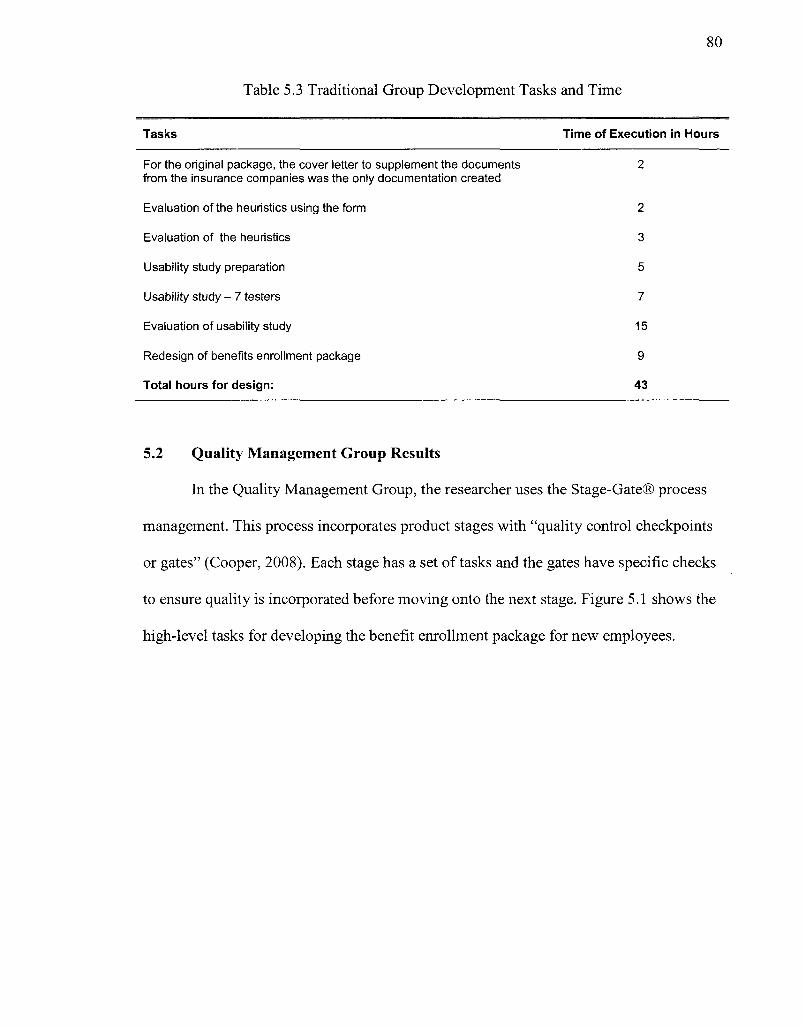
80
Table 5.3 Traditional Group Development Tasks and Time
Tasks Time of Execution in Hours
For the original package, the cover letter to supplement the documents 2
from the insurance companies was the only documentation created
Evaluation of the heuristics using the form 2
Evaluation of the heuristics 3
Usability study preparation 5
Usability study - 7 testers 7
Evaluation of usability study 15
Redesign of benefits enrollment package 9
Total hours for design: 43
5.2 Quality Management Group Results
In the Quality Management Group, the researcher uses the Stage-Gate® process
management. This process incorporates product stages with "quality control checkpoints
or gates" (Cooper, 2008). Each stage has a set of tasks and the gates have specific checks
to ensure quality is incorporated before moving onto the next stage. Figure 5.1 shows the
high-level tasks for developing the benefit enrollment package for new employees.
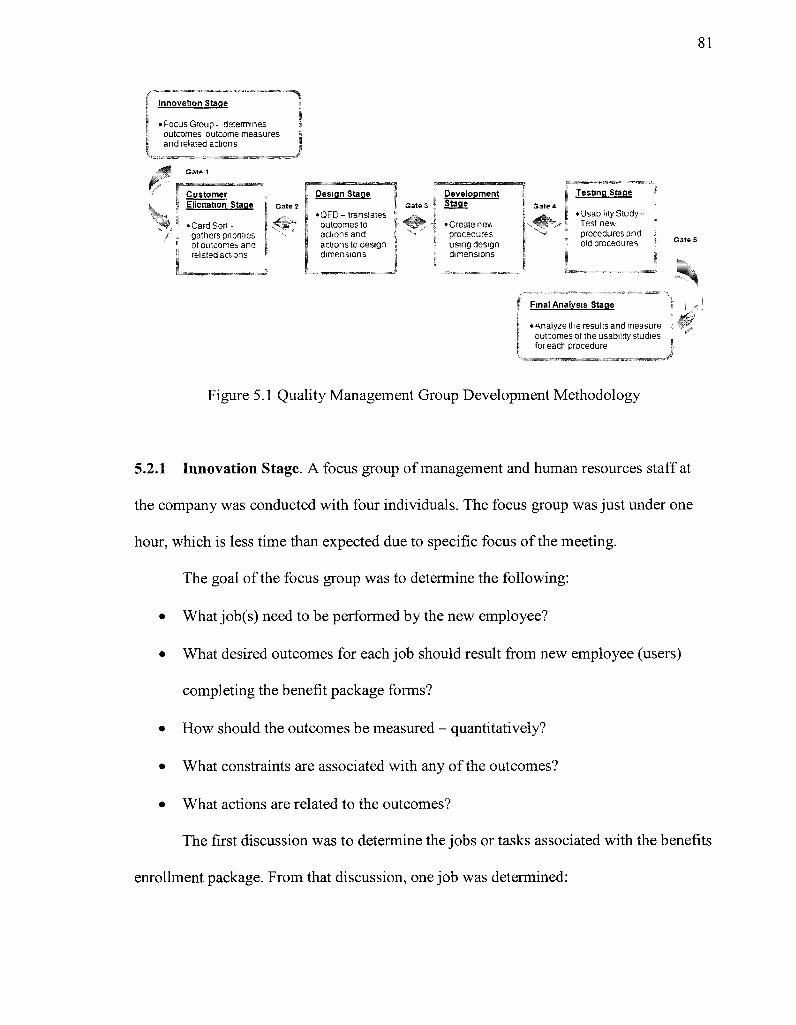
81
f~~ Innovation Stage
Ej 'FocusGroup- determines I outcomes outcome measures j and related actions l _ - ^ _ ^ ,
¥/• Customer „ Elicitation Stage Gate 2
Jf, • Card Sort-" / . gathers pnonties
* of outcomes and I related actions
Design Stage
• QFD- translates outcomes to actions and actions to design dimensions
Development { i
* • Create new, ". procedures " using design ; dimensions
Testing Stage
• Usability Study-t Test new
procedures and old procedures
Final Analysis Stage
• analyze the results and measure outcomes of the usability studies for each procedure
Figure 5.1 Quality Management Group Development Methodology
5.2.1 Innovation Stage. A focus group of management and human resources staff at
the company was conducted with four individuals. The focus group was just under one
hour, which is less time than expected due to specific focus of the meeting.
The goal of the focus group was to determine the following:
• What job(s) need to be performed by the new employee?
• What desired outcomes for each job should result from new employee (users)
completing the benefit package forms?
• How should the outcomes be measured - quantitatively?
• What constraints are associated with any of the outcomes?
• What actions are related to the outcomes?
The first discussion was to determine the jobs or tasks associated with the benefits
enrollment package. From that discussion, one job was determined:
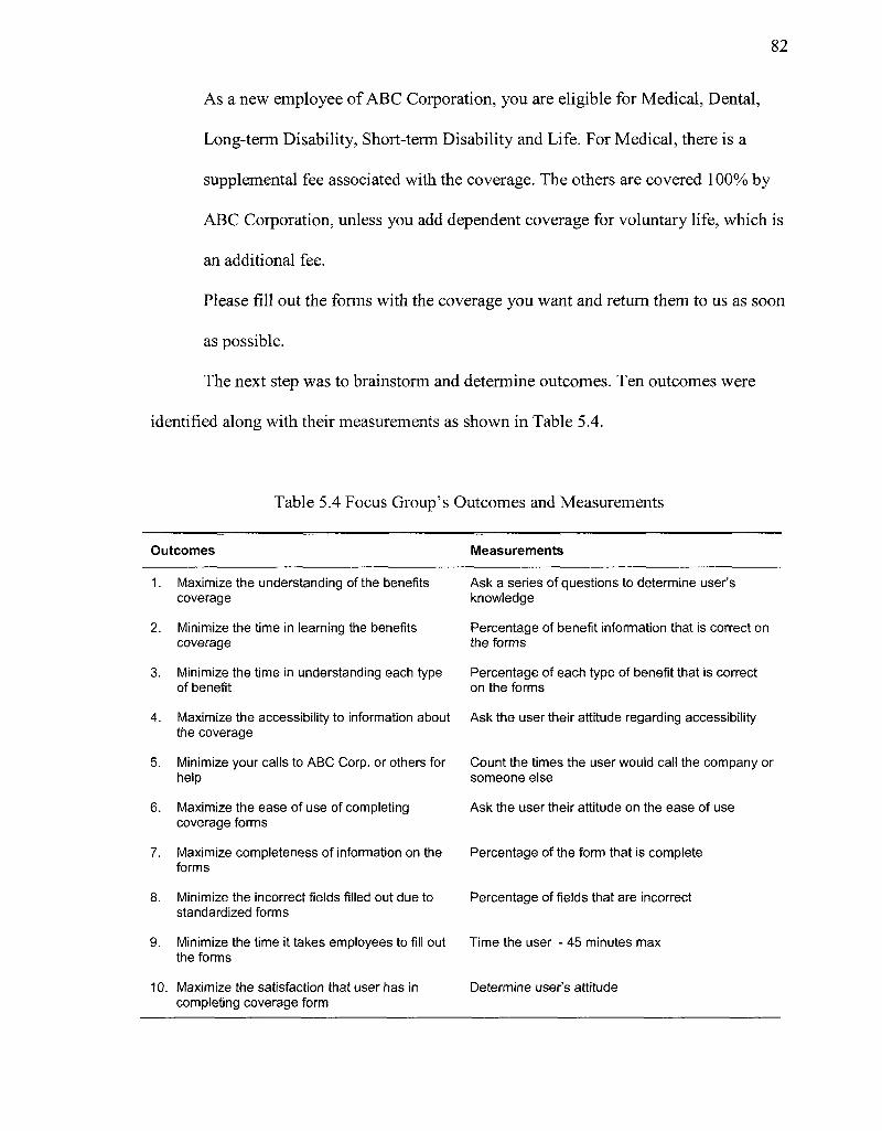
82
As a new employee of ABC Corporation, you are eligible for Medical, Dental,
Long-term Disability, Short-term Disability and Life. For Medical, there is a
supplemental fee associated with the coverage. The others are covered 100% by
ABC Corporation, unless you add dependent coverage for voluntary life, which is
an additional fee.
Please fill out the forms with the coverage you want and return them to us as soon
as possible.
The next step was to brainstorm and determine outcomes. Ten outcomes were
identified along with their measurements as shown in Table 5.4.
Table 5.4 Focus Group's Outcomes and Measurements
Outcomes Measurements
1. Maximize the understanding of the benefits Ask a series of questions to determine user's coverage knowledge
2. Minimize the time in learning the benefits Percentage of benefit information that is correct on coverage the forms
3. Minimize the time in understanding each type Percentage of each type of benefit that is correct of benefit on the forms
4. Maximize the accessibility to information about Ask the user their attitude regarding accessibility the coverage
5. Minimize your calls to ABC Corp. or others for Count the times the user would call the company or help someone else
6. Maximize the ease of use of completing Ask the user their attitude on the ease of use coverage forms
7. Maximize completeness of information on the Percentage of the form that is complete forms
8. Minimize the incorrect fields filled out due to Percentage of fields that are incorrect standardized forms
9. Minimize the time it takes employees to fill out Time the user - 45 minutes max the forms
10. Maximize the satisfaction that user has in Determine user's attitude completing coverage form
83
The specific questions to determine the user's understanding and attitude (for
outcomes 1, 4, 6, & 10) are found in Appendix B and can be used for the final usability
study.
In addition, the focus group identified any constraints that would constrict the use
of the benefits enrollment package. During the brainstorming, the primary constraint
identified was related to the steps that the user follows to complete the benefits
enrollment package. If the user goes directly to the forms without reading the directions
first, there is a high probability that the forms will be completed incorrectly. The reason
for this is that the forms are standardized and contain benefits that are not offered by the
company. If the user does not understand which benefits are applicable to which
insurance company, the fields will be completed incorrectly.
Before moving to the Elicitation Stage, it is important to determine if the
information collected is sufficient to move on to the next stage.
Gate 1 - Innovation Stage has two questions to determine any problems before
passing to the next stage in the process.
Ql. 1: Was the focus group able to create outcomes from the job with related
measures and constraints?
Al .1: The outcomes generated by the focus group are sufficient.
Ql.2: Do any constraints prevent the user from a successful outcome?
Al .2: If the user completes the standardized forms before reviewing the coverage
provided by the company, errors will probably be made. This constraint can be
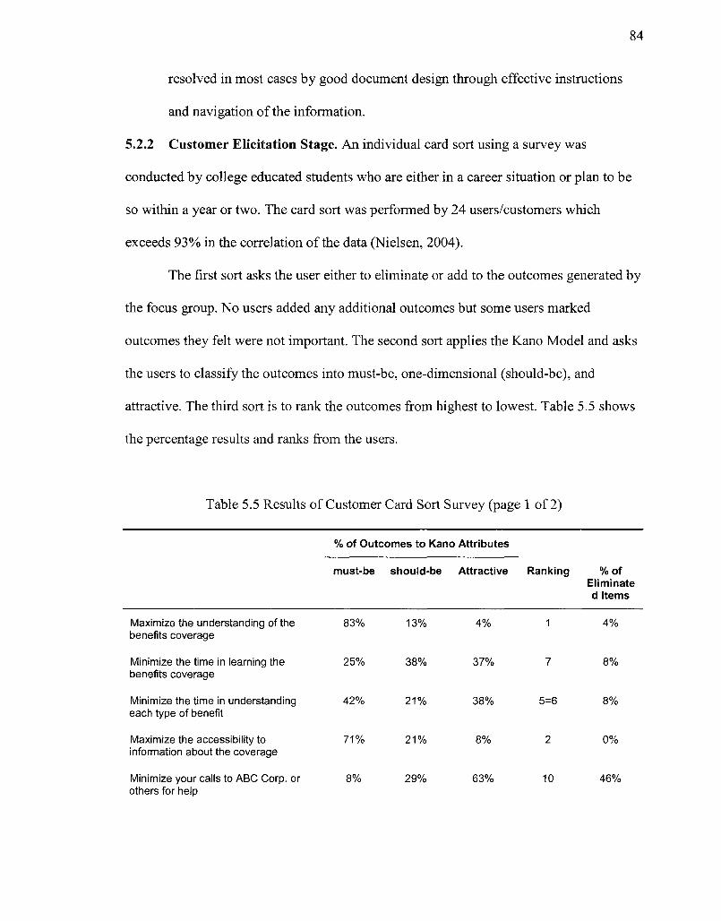
84
resolved in most cases by good document design through effective instructions
and navigation of the information.
5.2.2 Customer Elicitation Stage. An individual card sort using a survey was
conducted by college educated students who are either in a career situation or plan to be
so within a year or two. The card sort was performed by 24 users/customers which
exceeds 93% in the correlation of the data (Nielsen, 2004).
The first sort asks the user either to eliminate or add to the outcomes generated by
the focus group. No users added any additional outcomes but some users marked
outcomes they felt were not important. The second sort applies the Kano Model and asks
the users to classify the outcomes into must-be, one-dimensional (should-be), and
attractive. The third sort is to rank the outcomes from highest to lowest. Table 5.5 shows
the percentage results and ranks from the users.
Table 5.5 Results of Customer Card Sort Survey (page 1 of 2)
% of Outcomes to Kano Attributes
must-be should-be Attractive Ranking % of Eliminate d Items
Maximize the understanding of the 83% 13% 4% 1 4% benefits coverage
Minimize the time in learning the 25% 38% 37% 7 8% benefits coverage
Minimize the time in understanding 42% 21% 38% 5=6 8% each type of benefit
Maximize the accessibility to 71% 2 1 % 8% 2 0% information about the coverage
Minimize your calls to ABC Corp. or 8% 29% 63% 10 46% others for help
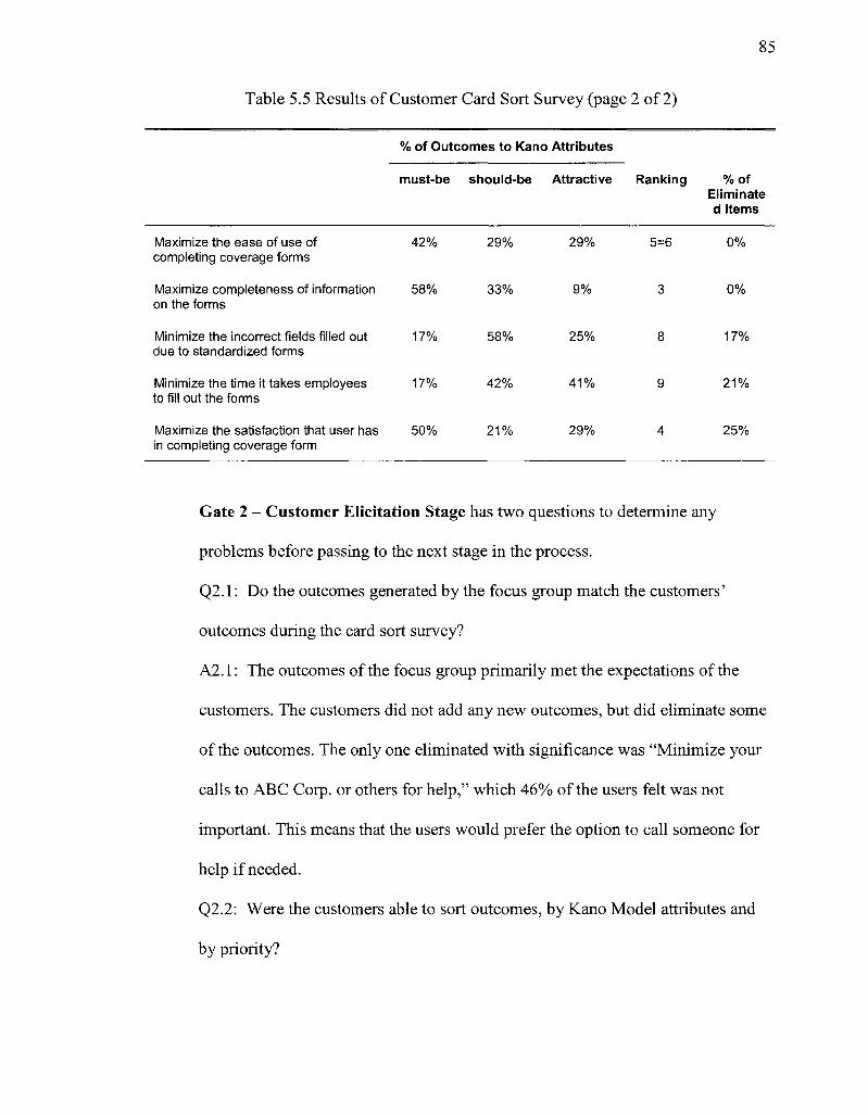
85
Table 5.5 Results of Customer Card Sort Survey (page 2 of 2)
% of Outcomes to Kano Attributes
must-be should-be Attractive Ranking % of Eliminate d Items
Maximize the ease of use of 42% 29% 29% 5=6 0% completing coverage forms
Maximize completeness of information 58% 33% 9% 3 0% on the forms
Minimize the incorrect fields filled out 17% 58% 25% 8 17% due to standardized forms
Minimize the time it takes employees 17% 42% 4 1 % 9 21% to fill out the forms
Maximize the satisfaction that user has 50% 21% 29% 4 25% in completing coverage form
Gate 2 - Customer Elicitation Stage has two questions to determine any
problems before passing to the next stage in the process.
Q2.1: Do the outcomes generated by the focus group match the customers'
outcomes during the card sort survey?
A2.1: The outcomes of the focus group primarily met the expectations of the
customers. The customers did not add any new outcomes, but did eliminate some
of the outcomes. The only one eliminated with significance was "Minimize your
calls to ABC Corp. or others for help," which 46% of the users felt was not
important. This means that the users would prefer the option to call someone for
help if needed.
Q2.2: Were the customers able to sort outcomes, by Kano Model attributes and
by priority?
86
A2.2: The rankings of importance fall in-line with the percentages of must-be
selections, which mean there is a correlation between the must-be and most
desired outcomes. In addition, the primary outcome eliminated by the customers,
"Minimize your calls to ABC Corp. or others for help," at 46% was ranked last by
the users, and 63% said it was an "attractive" outcome, which means it was not
expected.
5.2.3 Design Stage. This stage, the researcher translated customer wants into
information design. The Quality Function Deployment tool is used to translate the
outcomes into design dimensions. Quality Function Deployment analysis uses a tool
called House of Quality (HOQ). An Excel template of the HOQ was used to transform
outcomes into actions and actions into heuristic dimensions for the information design.
Figure 5.2 shows the results and analysis of the data when translating user outcomes to
actions.
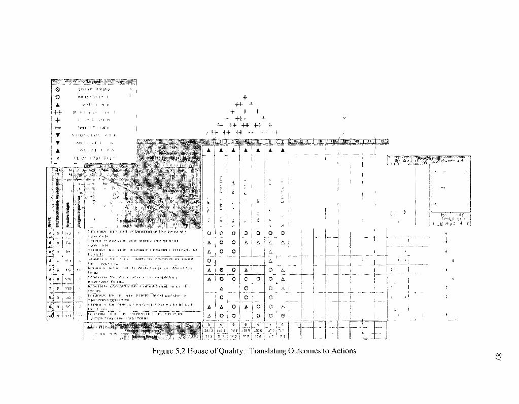
+
F* T™f ? T
•++ -H- ++ - — +
B|nieiim**rfftl4»«(tJ»Srt! M*p*s t* J swift- i *.! « WflH rt
-.j.iilf> «.^ 4(ji%|ls ' i f l s ' ' # ifc 5 «^a%.W%sfc^rf^ i (i „ I if^ !
i J ^ e ~ ^ ^-1
f-* H J
7 t •» 1 —
•HI **
P l~\ ien\?i in~r u n r t r^t^ir^rasrtrii o*1 t?i*- hiorsf fit"™ r c t v i n e t * * " t n i i n r- Ei ic E "ine l«ti tc i rr&i i ic! 1fis- *jc r i f if 3
"> 5 f l l l f l i / ' f f l H E HI!" Jfi UrtCti r t HtH3 r*CJ ( IE tS r (. p i CM t a us U
i f f* *r ii-V n 1I111 / t voesi
cJ^J!lJLac<', i ^ J l ^ „ ™ i i . ' ^ f u i " to-mp^Sc n ^ * u* ! i t !o mat "••n c i 1h
? 1 mm * fJif titiu H ̂ T(I *. «i T l plov^ *"• 3. to f*H out m t tn\ ^ ^ m ™ «, „™ «™«™ ?/ i* n i i^ it * it f t rMon Hi if u r h T in
A A I A
i
O j
A i
0 O 0 0 0 o
e 0 o o A
0 l_ _
A O
SriMtlnCfiitgtit
11 J * 5 5
0 o o !
1 i t
, r? J 10 9
1 »
' \
o o o
A >
is
A
A
h
B
1J
Figure 5.2 House of Quality: Translating Outcomes to Actions 00 - 0
88
Task 1: In the left section of the Figure 5.2, the customers' outcomes or the
"what's" were entered.
Task 2: Across the top, the "how's" are the actions that the customer would take
to achieve the outcomes. These actions were determined through a brainstorming session
with the company. The direction for improvement, above the actions, shows that the
action needs to increase, decrease or stay the same (nominal) for improvement. In this
case, the direction is to improve all the actions.
Task 3: Next to the outcomes on the left, the Weight/Importance is the ranking by
the customers of the outcomes during the card sorting of outcomes with the highest
number being most important. In addition, the Relative Weight is calculated by
translating the ranking to a 100-point scale. The relative weight for each outcome is
obtained by dividing the Weight/Importance by the sum of all Weights/Importance and
then multiplying by 100. The sum of the relative weights is always 100.
Task 4: In the body of Figure 5.2, the correlation between the actions and the
outcomes were determined through another brainstorming session with employees of the
company. The correlations between the outcomes and actions are shown as follows:
• solid circle — strong relationship between requirements,
• open circle ~ moderate relationship between requirements,
• triangle ~ weak relationship between requirements,
• blank — no relationship between requirements.
Each type of correlation is also assigned a numeric value (e.g., 9, 3, and 1, for strong,
moderate, and weak relationships respectively) for further analysis that occurs while
prioritizing the actions.
89
Task 5: At the bottom, the relative value is calculated for each action by
multiplying each correlation factor with the relative weights of each outcome and then
adding those values for each column. For example, the relative value for "access
information" is calculated as (3x18.2) + (1x7.3) + (1x9.1) + (9x16.4) + (lxl.8) +
(1x10.9) + (0x14.5) + (0x5.5) + (1x3.6) + (1x12.7) = 247.3. From the Relative Value,
the Relative Weight is calculated. In this case, the Relative Values and Relative Weights
are used to rank the actions so that the customer importance is carried over from the
outcomes. This prioritizes the actions for the next step of turning the actions into heuristic
dimensions for the information design.
Task 6: The triangle at the top is the correlation matrix that shows how the
actions correlate with each other. So, one action may favorably or unfavorably impact
another action. Positive correlation shows that as one action increases, so does the other
but it may not be a favorable condition. Negative correlation shows that as one action
increases, another action decreases but again, it may or may not be favorable. In this case,
one conflict is a negative correlation with "quickly finish forms" to both "complete
correct fields in form" and "easily verify information in forms." When developing the
benefits enrollment package, this correlation should be addressed to try to design it so it
is "quick to use" and "easy to verify" that the information is correct. This is the only
conflict between all the actions.
Task 7: On the right hand side, the competitor information compares the
company's benefits package with two other benefits packages. The competitor
information can be gathered from the customer or evaluated technically through a
heuristic evaluation done by the company. In this case, the packages are evaluated by the
90
company focusing on the content and heuristic design. The first benefits enrollment
package was similar to Intrinsic Technologies' although it had better definitions
regarding the benefits. The main problem was that it still lacked explanation of certain
fields due to standardized forms. The other enrollment package was online. Each
employee receives an ID and password, and registers online. The instructions provided a
step-by-step guide to reviewing the benefits, enrolling in them, and then printing them off
for their records. The ideal situation is removing any standardized forms. Since Intrinsic
Technologies is not a large company, the insurance companies do not personalize the
forms, so they have to use the standardized forms. One way to solve this problem is to
create an online form that feeds into the standardized PDF forms. After completing the
forms, the employee can print it for signature and return it to the employer.
The next step is to use the HOQ to translate the actions into heuristic dimensions
for information design as categorized in Figure 5.3.
"L" _" " o 0 4
~H""
+ T V
A
i r i-*?*?"*™ r < 1
n < i"
* ? 1 1! "
" ' ! | t
( 1 r<ii
i 3 1*
*r
T
1 2 ! c-
+ + • +
+ + •-• + 4- -H- ++
4- 4- • + ++ , • 4-
+ >
0 "PC" J i l l ' * J o/*»p-eu •
Qua n> 'na-'T'-t 4 iss
sity
Tl *
21 2
IS 2
1 ,f
13 •>
1 , /
ii J
, ' 4 ' !
OTJ) .
1 - ; T
xm a
^ ' 3
rJLh^.iiii!: *!aifUm"*jgf>
tons^li'itf « v * x i r tffos sit Trtn^
•d* "4eiA*'oiis*ip Val-^ ir Colurr '.'.Ollf* : ' '1103 \\ M.0
rr A
•s
""*"*'~
A
V
1
A
% c ! ' ? • > ] - . A
j [- * i-
© •
0 , 0 , A
A j 0
0 ! o f A
1 i 1
17 1 • ) - -' > i>>
0 |
A 1 s t 1
A [
i
~?iAt
A
t.
f-
-: r •
0 0 0
0
i i -i
« T |
j " [
< 4 ' . h:
( V f
| A
i j
! r
1 ,' ,
1
0 I
0 i 0 ;
o } A i
"-<-"jr~"
__._
A
',
A" 0 0
0 Mk
> I >» Ml?
" i t f I
?M * ji «
rrn'ir
1 1 1 i
i « s i ai
_ ,_ __
A
^
«. '
I
A
A
0 0
i
USS in
0 G o 0 m.
t ^ , ,
i'
A
<
[ f
:•
•
0 0 0
0 A
" "
A
^
u
i
^ -> ' ' 0 0 0 0 0 0 A
J J
in i | avr i- H I
i ' i m ? ? *™™ M " " M *
5
| A
s %
I 1
1 i-
I J c:
J
0 0 0 0 0 0
1
r*6 J
'"I
« • < < " " " • ipl W j i 1# II 1 VWl111
[
-
"" '
1
I
•
Figure 5.3 House of Quality: Translating Actions into Heuristic Dimensions
92
Task 1: On the left side, the actions along with the relative weight and
weight/importance are carried over from Figure 5.2 that translated the outcomes into
actions.
Task 2: Across the top, the "how's" are entered, which are the heuristic
dimensions for information design that were determined in Table 3.2 Quality Dimensions
and Heuristic Evaluation. The direction for improvement, above the heuristic dimensions,
shows that the action needs to increase, decrease, or stay the same (nominal) for
improvement. In this case, the direction is to improve all the heuristic dimensions.
Task 3: In the body of Figure 5.3, the correlation between the actions and the
heuristic dimensions were determined by another brainstorming session with employees
of the company. The correlations between the outcomes and actions are shown as
follows:
• solid circle ~ strong relationship between requirements,
• open circle ~ moderate relationship between requirements,
• triangle — weak relationship between requirements,
• blank ~ no relationship between requirements.
Each type of correlation is also assigned a numeric value (e.g., 9, 3, and 1, for strong,
moderate, and weak relationships respectively) for further analysis that occurs while
prioritizing the actions.
Task 4: At the bottom, the relative value is calculated for each action by
multiplying each correlation factor with the relative weights of each outcome and then
adding those values for each column. For example, the relative value for "access to
information" is calculated as (9x11.3) + (3x21.2) + (0x15.2) + (1x15.7) + (0x10.5) +
93
(3x16.7) + (0x9.4) = 230.7. From the Relative Value, the Relative Weight is calculated.
This prioritizes the heuristic dimensions for the information design, using the importance
carried over from the previous house of quality translating outcomes to actions.
Task 5: The triangle at the top is the correlation matrix that shows how the
heuristic dimensions correlate with each other. Any one dimension may favorably or
unfavorably impact another dimension. Positive correlation shows that as one dimension
increases, so does the other, but it may not be a favorable condition. Negative correlation
shows that as one dimension increases, another dimension decreases, but again, it may or
may not be favorable. In this case, all the heuristics have a positive or no correlation.
None of the correlations provide a conflict with each other.
The final step is the evaluation of the relative weights of the heuristic dimensions.
The following lists the dimensions, from highest to lowest priority, along with an analysis
of what is needed in the designing of the benefits enrollment package.
1. "Consistent. Representation" designs on effective documents that adhere to the
design elements of the proximity of related items, consistent alignment of text and
graphics, repetition of like information and graphics, and contrast of text or
graphics that need to stand out (Williams). The challenge with "consistent
representation" is managing the use of standardized forms and documents that are
in different formats. "Consistent representation" can be incorporated by:
a. developing the cover page and directions to be consistent in representations;
and,
94
b. highlighting items in standardized forms and documents to point out
consistency. For example, fees for each type of coverage, items included in
each type of coverage, limitations of each type of coverage, etc...
2. "Interpretability" includes appropriate examples, scenarios, similes, analogies,
specific language, and graphics. The users may not be familiar with the
terminology, so interpretability should be developed by:
a. using appropriate language with definitions;
b. creating examples when needed; and,
c. creating figures and graphics when appropriate.
3. "Concise Representation / Task Orientation" focuses on helping users do tasks
that are associated with a product or tool in relation to their jobs. The main idea
for this dimension is to make navigation easy by:
a. creating a table of contents for the information;
b. including important signals of how information is organized which can be
completed by breaking out directions amongst the major sections of
standardized forms;
c. making text cohesive in the directions to complete forms and unifying with
standard documents; and,
d. placing the main idea for each specific section at the beginning of the text.
4. "Ease of Understanding / Clarity" eliminates ambiguity or obscurity; the
presentation of information is in such a way that users understand it the first time.
The information developed from the first, second and third dimensions should be
evaluated to:
95
a. ensure information is easy to understand;
b. confirm that information is consistent in representation; and,
c. verify that terms are defined and ideas are easy to understand.
5. "Completeness and Amount of Data" ensures the extent to which data is not
missing and is sufficient in breadth and depth for the task at hand and includes
those parts and only those parts. This dimension can be developed by:
a. ensuring all important information is included; and,
b. eliminating redundant or unnecessary data.
6. "Free of Error" evaluates the correctness and appropriateness of writing
conventions and of words and phrases, such that the style and grammar are
correct. This is a quality check to ensure that the style of writing and grammar are
correct.
7. "Relevancy / Value Add" focuses on helping users execute tasks that are
associated with a product or tool in relation to their jobs. This is a quality check
that ensures the information is appropriate for the audience.
a. "Access to Information" is provided by either print material or online
materials and made up of small, independent sections. In addition, restricted
access to information must be maintained for security reasons. At this time,
this information is required to be print media (hard- copy) because the
employee is required to sign the forms and the forms need to be on file to
ensure legal compliance.
96
8. "Timeliness" ensures that the information must rely on the most recent data. The
user probably assumes that the data is up-to-date. A quality check needs to ensure
that the information is current.
9. "Believability / Reputation" ensures that the document's facts and truths are
authoritative. A slight inaccuracy can confuse and annoy a user. A major
inaccuracy can be dangerous and expensive. Accuracy can be a question of ethics.
If readers suspect that the information is slanted by overstating or omitting facts,
they will doubt the validity of the entire document. This quality check can be
completed by the company to determine that the information is authoritative.
The highest ranking heuristic dimensions are those that really create a base for
information design for this type of documentation. The middle ranking heuristic
dimensions verify that the design has appropriate content and format. The lower ranking
heuristic dimensions verify the credibility of the information. These heuristic dimensions
are used to create the design of the new benefits enrollment package.
Gate 3 - Design Stage has three questions to determine any problems before
passing to the next stage in the process.
Q3.1: Given the results of the card sort survey, do the outcomes translate
successfully to actions and what are the conflicts?
A3.1: The outcomes translated successfully to the actions. The only conflict was
between the action to "quickly finish forms" in relation to the actions to
"complete correct fields in form" and "easily verify information." The conflict is
that quickly finishing the forms may not result in having all the fields correct and
97
the ability to verify the information. This is considered in the design of the
benefits enrollment package.
Q3.2: Do the actions translate successfully to heuristics dimensions for
information design and what are the conflicts?
A3.2: The actions translate successfully into the heuristic dimensions without any
conflicts. It was possible to outline the heuristics in order of importance and
include them in the new benefits enrollment package.
Q3.3: How do the competitors' benefit enrollment packages rank heuristically
with the design features of the new Quality Management Group's package?
A3.3: Reviewing the competitor's packages resulted in finding design ideas for
the new package. Finding a solution to use a customized form that feeds into the
standardized forms when complete, results in eliminating form items that are
confusing or do not apply.
5.2.4 Development Stage. After analyzing the quality dimensions to use in the
information design, the researcher begins the development of the benefits enrollment
package prototype.
Gate 4 - Development Stage has one question to determine any problems with
the final design of the benefits enrollment package.
Q4.1: Did the development of the benefits package incorporate all the required
information design quality dimensions?
A4.1: No conflicts between design dimensions occurred when developing the
new enrollment package.
98
5.2.5 Quality Management Group Analysis. The Quality Management Group did not
consider the original benefits enrollment package, but instead created a new one from the
ground up. Using an established process, Stage-Gate® process management, and other
quality management tools, the researcher designed and developed a new benefits
enrollment package . The stages in the process were innovation, customer elicitation,
design, and development.
In the innovation stage, a focus group was conducted using four employees from
the company. The purpose of the focus group was to determine the job or task to be
performed with the benefits enrollment package, the desired outcomes, and the
measurements for those outcomes. The measurements for the outcomes are very
important because they provide a way to quantify the results of the final benefits
enrollment packages after they have been used by the customer. The measurements are
either a percentage of items completed correctly or an attitudinal survey in Appendix B.
After determining all the possible outcomes and their metrics, the group brainstormed
various actions associated with the outcomes. It was important to determine all the
outcomes before discussing actions because by finding solutions (actions) too soon, some
ideas may be overlooked (Ulwick, 2005). The time allotted was an hour to an hour and a
half, although the group finished in just under an hour.
After the focus group, a survey that appears in Appendix D was created for
customer elicitation. The purpose of the survey was to have the user evaluate the
outcomes through three types of sorts. The first was to add or eliminate any outcome. The
next was to rank the outcomes from highest to lowest. The last sort uses the Kano model
in order to sort the outcomes by must-be, should-be or attractive. Typically for a card
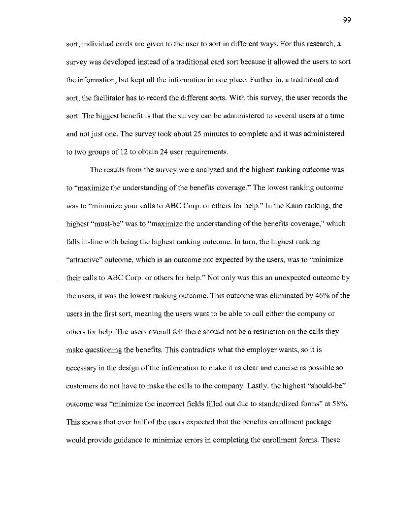
99
sort, individual cards are given to the user to sort in different ways. For this research, a
survey was developed instead of a traditional card sort because it allowed the users to sort
the information, but kept all the information in one place. Further in, a traditional card
sort, the facilitator has to record the different sorts. With this survey, the user records the
sort. The biggest benefit is that the survey can be administered to several users at a time
and not just one. The survey took about 25 minutes to complete and it was administered
to two groups of 12 to obtain 24 user requirements.
The results from the survey were analyzed and the highest ranking outcome was
to "maximize the understanding of the benefits coverage." The lowest ranking outcome
was to "minimize your calls to ABC Corp. or others for help." In the Kano ranking, the
highest "must-be" was to "maximize the understanding of the benefits coverage," which
falls in-line with being the highest ranking outcome. In turn, the highest ranking
"attractive" outcome, which is an outcome not expected by the users, was to "minimize
their calls to ABC Corp. or others for help." Not only was this an unexpected outcome by
the users, it was the lowest ranking outcome. This outcome was eliminated by 46% of the
users in the first sort, meaning the users want to be able to call either the company or
others for help. The users overall felt there should not be a restriction on the calls they
make questioning the benefits. This contradicts what the employer wants, so it is
necessary in the design of the information to make it as clear and concise as possible so
customers do not have to make the calls to the company. Lastly, the highest "should-be"
outcome was "minimize the incorrect fields filled out due to standardized forms" at 58%.
This shows that over half of the users expected that the benefits enrollment package
would provide guidance to minimize errors in completing the enrollment forms. These
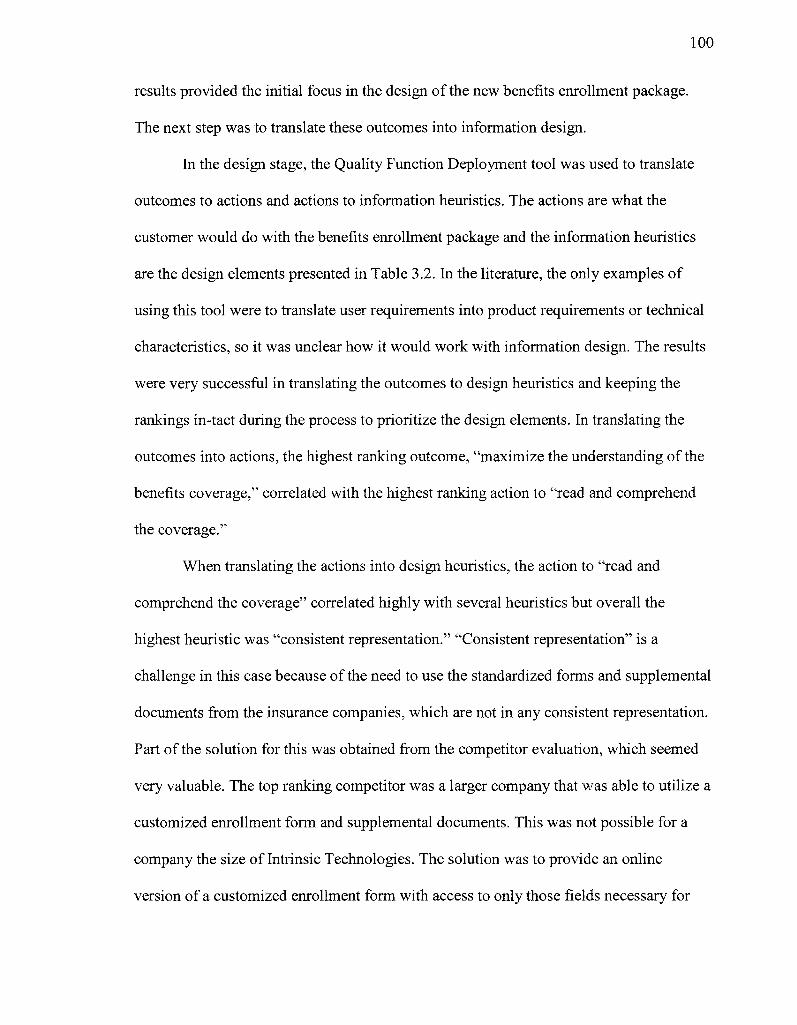
100
results provided the initial focus in the design of the new benefits enrollment package.
The next step was to translate these outcomes into information design.
In the design stage, the Quality Function Deployment tool was used to translate
outcomes to actions and actions to information heuristics. The actions are what the
customer would do with the benefits enrollment package and the information heuristics
are the design elements presented in Table 3.2. In the literature, the only examples of
using this tool were to translate user requirements into product requirements or technical
characteristics, so it was unclear how it would work with information design. The results
were very successful in translating the outcomes to design heuristics and keeping the
rankings in-tact during the process to prioritize the design elements. In translating the
outcomes into actions, the highest ranking outcome, "maximize the understanding of the
benefits coverage," correlated with the highest ranking action to "read and comprehend
the coverage."
When translating the actions into design heuristics, the action to "read and
comprehend the coverage" correlated highly with several heuristics but overall the
highest heuristic was "consistent representation." "Consistent representation" is a
challenge in this case because of the need to use the standardized forms and supplemental
documents from the insurance companies, which are not in any consistent representation.
Part of the solution for this was obtained from the competitor evaluation, which seemed
very valuable. The top ranking competitor was a larger company that v/as able to utilize a
customized enrollment form and supplemental documents. This was not possible for a
company the size of Intrinsic Technologies. The solution was to provide an online
version of a customized enrollment form with access to only those fields necessary for
101
the customer to complete. Those fields would then populate the standardized forms which
the user prints out and signs. In addition, the cover letter, definitions, and information
about the coverage were all consistent in representation.
The next top heuristics were "interpretability" and "concise representation / task
orientation" that incorporated the design of clear definitions on the coverage along with
guiding the user step-by-step on how to navigate and complete the enrollment form. The
remainder of the heuristics assisted in a quality check of the information. For example,
"ease of understanding / clarity," "completeness and amount of data," "free of error,"
and "relevancy / value add" were incorporated through a quality check by the company to
verify that the information is easy to understand, complete, relevant, and consistent in
representation. "Access to Information" was addressed by allowing the user to print off
the documents and sign them. Lastly, "timeliness" and "believability / reputation"
ensures that the information is up-to-date and ensures that the document's facts and truth
are correct. This quality check was also completed by the company to verify these
heuristics.
Another important analysis is the overall time it took to create the new benefits
enrollment package, which included the focus group, the survey, the QFD analysis, and
development. Table 5.6 details specific tasks and the time it took to execute them.
In the test, the programming to have the custom form feed into the standardized
forms was not completed because these were only prototypes. The estimated time for a
programmer to complete this task is 10 hours. The Quality Management Group took four
hours longer than the Traditional Group to develop a benefits enrollment package;
however, the Quality Management Group had a more complex solution using a
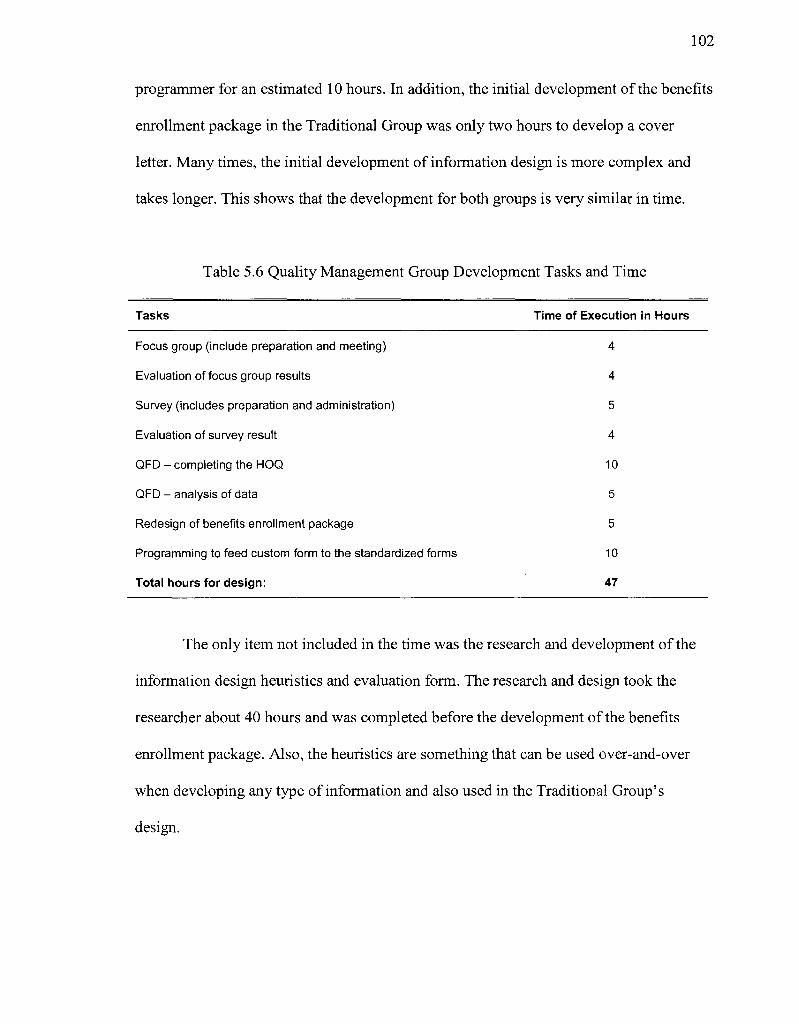
102
programmer for an estimated 10 hours. In addition, the initial development of the benefits
enrollment package in the Traditional Group was only two hours to develop a cover
letter. Many times, the initial development of information design is more complex and
takes longer. This shows that the development for both groups is very similar in time.
Table 5.6 Quality Management Group Development Tasks and Time
Tasks Time of Execution in Hours
Focus group (include preparation and meeting)
Evaluation of focus group results
Survey (includes preparation and administration)
Evaluation of survey result
QFD - completing the HOQ
QFD - analysis of data
Redesign of benefits enrollment package
Programming to feed custom form to the standardized forms
Total hours for design:
4
4
5
4
10
5
5
10
47
The only item not included in the time was the research and development of the
information design heuristics and evaluation form. The research and design took the
researcher about 40 hours and was completed before the development of the benefits
enrollment package. Also, the heuristics are something that can be used over-and-over
when developing any type of information and also used in the Traditional Group's
design.
103
To compare other differences in the Traditional Group and the Quality
Management Group, both newly developed benefits enrollment packages were usability
tested.
5.3 Comparison Study Results
The comparison study consists of two separate usability studies, one for the
Traditional Group and one for the Quality Management Group. Each study consisted of
six individual users and applied the same methodology used in the first Traditional Group
usability study in section 4.3.1. All users are given the same task to be performed:
As a new employee of ABC Corporation, you are eligible for Medical, Dental,
Long-term Disability, Short-term Disability, and Life. For Medical, there is a
supplemental fee associated with the coverage. The others are covered 100% by
ABC Corporation, unless you add dependent coverage for voluntary life, which is
an additional fee.
Please fill out the forms with the coverage you want and return them to us as soon
as possible.
The results focus on metrics to determine learnability, efficiency, errors, and
satisfaction. In addition, the metrics for the outcomes determined in the Quality
Management Group are calculated to determine how many were successful and to
compare the differences between the Traditional Group and Quality Management Group.
5.3.1 Traditional Group Usability Results. To evaluate the benefits enrollment
package, the target population is users who are in or will soon likely be in a professional
career. Six users with the following demographics were selected to participate in the
evaluation.
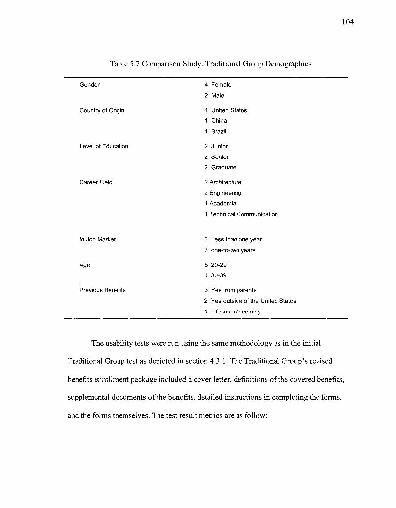
104
Table 5.7 Comparison Study: Traditional Group Demographics
Gender
Country of Origin
Level of Education
Career Field
4 Female
2 Male
4 United States
1 China
1 Brazil
2 Junior
2 Senior
2 Graduate
2 Architecture
2 Engineering
1 Academia
1 Technical Communication
In Job Market
Age
Previous Benefits
3 Less than one year
3 one-to-two years
5 20-29 1 30-39
3 Yes from parents
2 Yes outside of the United States
1 Life insurance only
The usability tests were run using the same methodology as in the initial
Traditional Group test as depicted in section 4.3.1. The Traditional Group's revised
benefits enrollment package included a cover letter, definitions of the covered benefits,
supplemental documents of the benefits, detailed instructions in completing the forms,
and the forms themselves. The test result metrics are as follow:
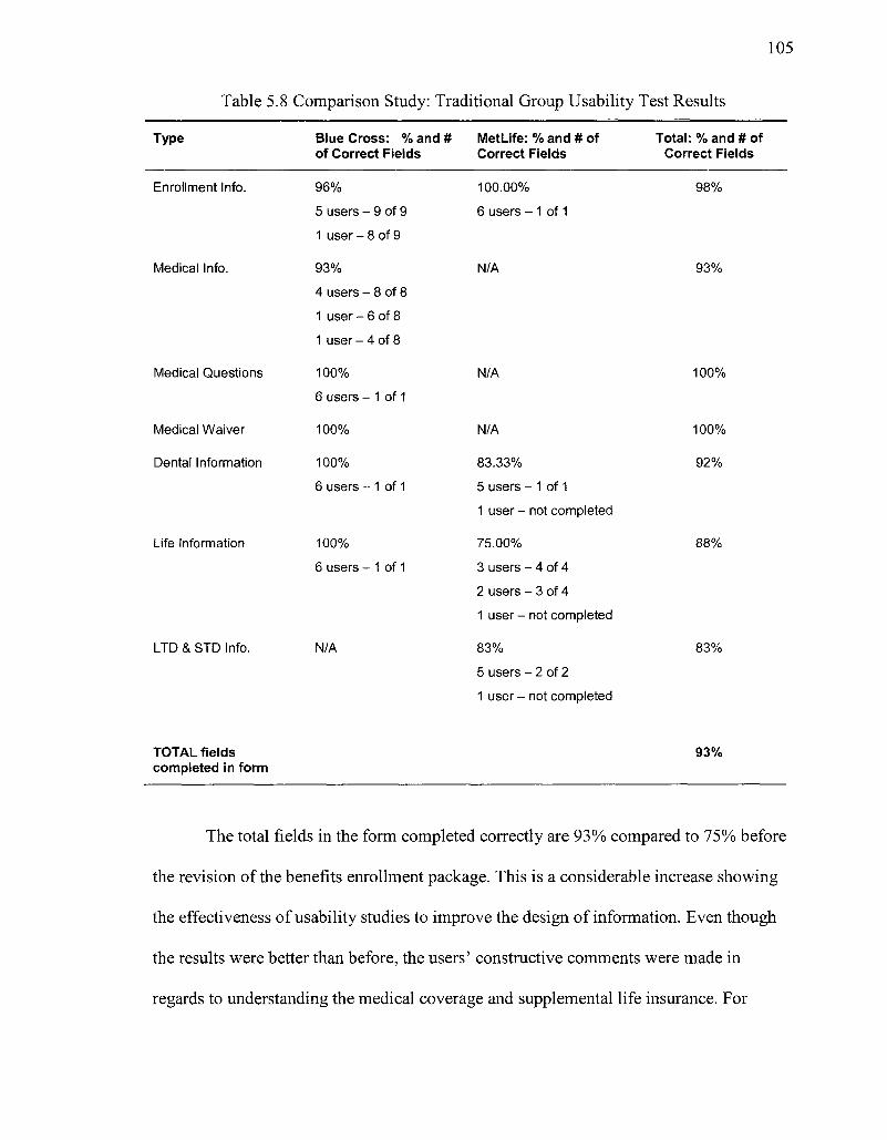
105
Table 5.8 Comparison Study: Traditional Group Usability Test Results
Type
Enrollment Info.
Medical Info.
Medical Questions
Medical Waiver
Dental Information
Life Information
LTD & STD Info.
Blue Cross: % and # of Correct Fields
96%
5 users - 9 of 9
1 user - 8 of 9
93%
4 users - 8 of 8
1 user - 6 of 8
1 user - 4 of 8
100% 6 users - 1 of 1
100%
100%
6 users - 1 of 1
100% 6 users - 1 of 1
N/A
Met Life: % and # of Correct Fields
100.00%
6 users - 1 of 1
N/A
N/A
N/A
83.33%
5 users - 1 of 1 1 user - not completed
75.00%
3 users - 4 of 4 2 users - 3 of 4 1 user - not completed
83%
5 users - 2 of 2 1 user - not completed
Total: % and # of Correct Fields
98%
93%
100%
100%
92%
88%
83%
TOTAL fields completed in form
93%
The total fields in the form completed correctly are 93% compared to 75% before
the revision of the benefits enrollment package. This is a considerable increase showing
the effectiveness of usability studies to improve the design of information. Even though
the results were better than before, the users' constructive comments were made in
regards to understanding the medical coverage and supplemental life insurance. For
106
example, one user stated, "the supplemental life document stating how to request
coverage is confusing, I need more clarification."
The user's attitudes towards the revised benefits enrollment packet were captured
in a debriefing using the forms in Appendix B. The questions were ranked using the
following Likert scale:
• Strongly Agree = 2
• Agree = 1
• Undecided = 0
• Disagree = -1
• Strongly Disagree = -2
The result from the debriefing resulted primarily in positive feedback. The
majority of answers were "agree" with some "strongly agree" and "undecided." No one
"strongly disagreed" with any of the questions, but two "disagreed" that the wording and
terms were clear. In contrast, two other users "strongly agreed" that the wording and
terms were clear. Another "strongly agree" was by two users who felt the information
was easy to navigate. Some items that the users felt were difficult to use were the
supplemental documents for both the medical and supplemental life insurance, which was
discussed earlier in the test results. Overall, the results from the debriefing showed that
most users generally "agree" that the information is easy to use and understand. The
detailed results from the debriefing questions are in Appendix G.
5.3.2 Quality Management Group Usability Results. To evaluate the benefits
enrollment package, the target population is the same as the Traditional Group is users
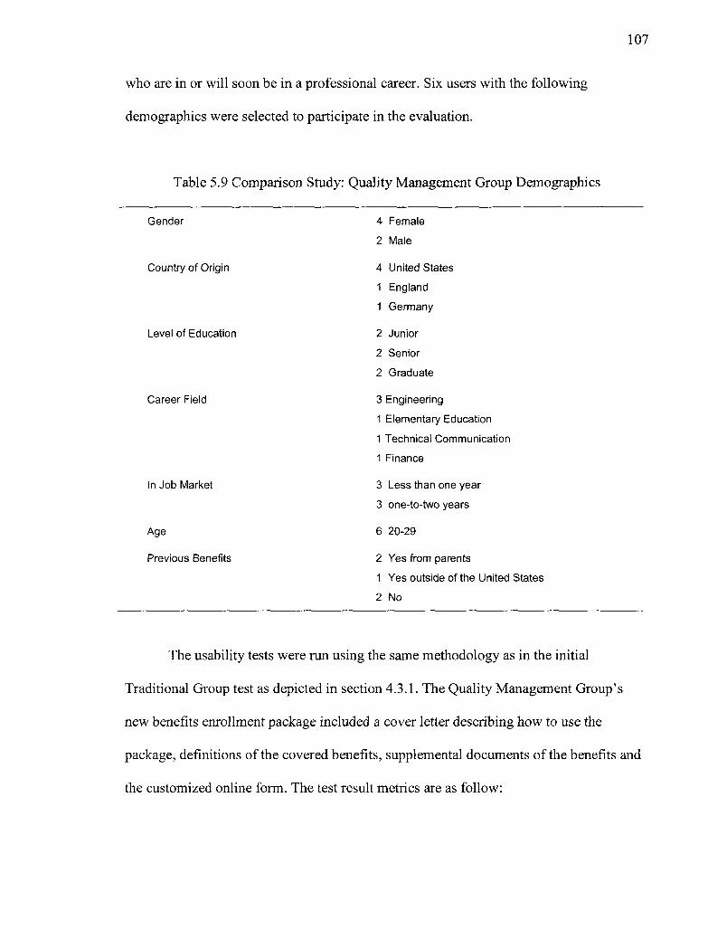
who are in or will soon be in a professional career. Six users with the following
demographics were selected to participate in the evaluation.
Table 5.9 Comparison Study: Quality Management Group Demographics
Gender
Country of Origin
Level of Education
Career Field
In Job Market
Age
Previous Benefits
4 Female
2 Male
4 United States 1 England 1 Germany
2 Junior
2 Senior
2 Graduate
3 Engineering
1 Elementary Education
1 Technical Communication
1 Finance
3 Less than one year
3 one-to-two years
6 20-29
2 Yes from parents
1 Yes outside of the United States
2 No
The usability tests were run using the same methodology as in the initial
Traditional Group test as depicted in section 4.3.1. The Quality Management Group's
new benefits enrollment package included a cover letter describing how to use the
package, definitions of the covered benefits, supplemental documents of the benefits and
the customized online form. The test result metrics are as follow:
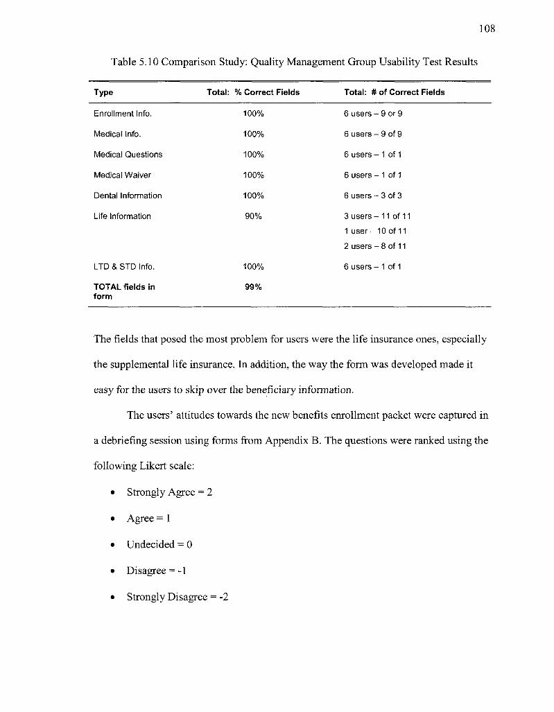
108
Table 5.10 Comparison Study: Quality Management Group Usability Test Results
Type Total: % Correct Fields Total: # of Correct Fields
Enrollment Info.
Medical Info.
Medical Questions
Medical Waiver
Dental Information
Life Information
LTD & STD Info.
TOTAL fields in form
100%
100%
100%
100%
100%
90%
100%
99%
6 users - 9 or 9
6 users - 9 of 9
6 users - 1 of 1
6 users - 1 of 1
6 users - 3 of 3
3 users - 11 of 11 1 user-10 of 11
2 users - 8 of 11
6 users - 1 of 1
The fields that posed the most problem for users were the life insurance ones, especially
the supplemental life insurance. In addition, the way the form was developed made it
easy for the users to skip over the beneficiary information.
The users' attitudes towards the new benefits enrollment packet were captured in
a debriefing session using forms from Appendix B. The questions were ranked using the
following Likert scale:
• Strongly Agree = 2
• Agree = 1
• Undecided = 0
• Disagree = -1
• Strongly Disagree = -2
109
The results from the debriefing showed that most users "agreed" that the
information was easy to use. Two users "strongly agreed" that the information was easy
to navigate and find information. On the contrary, one user "strongly disagreed" that the
information was easy to find. Regarding if the information was sufficient in helping
determine how to complete the forms, three users "strongly agreed" and no user
"disagreed" with this. Most users found the definitions of the benefits coverage very
helpful, but found the supplemental documents insufficient especially with medical and
supplement life insurance. Detailed results of the debriefing are found in Appendix G.
Overall, the result from the debriefing showed the most users "agree" that the
information is easy to use and understand. The results from both the Traditional Group
and the Quality Management Group tested considerably higher than the original benefits
enrollment package.
5.3.3 Comparison Study Analysis. The analysis consists of Jacob Nielson's four
quality components to measure usability: learnability, errors, efficiency and satisfaction.
For more discrete measures, each outcome's measurement determined in the Quality
Management Focus Group was calculated for both the Traditional Group and the Quality
Management Group.
In regard to Nielsen's first quality component, learnability was determined by
how successful the users were in completing the benefits enrollment package. In the
Traditional Group, the users successfully read the instructions and supplemental
documents, although there was confusion with the medical and supplemental life benefits
coverage for some of the users. The results were the same for the Quality Management
Group. In these cases, the users would probably need additional assistance from other
110
individuals. The overall completion of the forms was 93% for the Traditional Group and
99% for the Quality Management Group. The rankings were very successful for both,
although the company wanted to eliminate any calls, so to accomplish this goal a
redesign is necessary to better explain medical and supplemental life coverage.
The next quality measure was efficiency. All users were given 45 minutes to
complete the benefits enrollment package. In real life, most users would have taken more
time to read the supplemental documents and discuss them with their family and friends.
In completing the necessary enrollment forms, the Traditional Group's average time was
45 minutes to complete. This means everyone on average took the total allotted time to
complete the enrollment forms, except one user who ran out of time and did not complete
half of the final enrollment form. For the Quality Management Group, the average time
was 39 minutes with everyone completing the enrollment form. The reason the Quality
Management Group was faster than the Traditional Group is the design of the
documentation had less fields to complete and only those fields necessary. From the
competitor's review in the Quality Management Group, it was clear that the enrollment
forms needed to be online, condensed into one, and included only those fields that were
necessary to complete. This was originally thought to be a problem because the insurance
companies and the company needed to use the standardized insurance forms for signature
and retention compliance. To address this issue, once the fields are complete, a program
can feed those fields into the standardized forms for printing. The Traditional Group used
the standardized forms from the insurance companies and was given instructions on what
fields to complete. In the end, they both resulted in the same effect and the company had
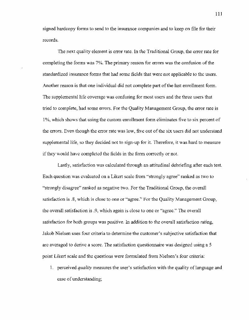
I l l
signed hardcopy forms to send to the insurance companies and to keep on file for their
records.
The next quality element is error rate. In the Traditional Group, the error rate for
completing the forms was 7%. The primary reason for errors was the confusion of the
standardized insurance forms that had some fields that were not applicable to the users.
Another reason is that one individual did not complete part of the last enrollment form.
The supplemental life coverage was confusing for most users and the three users that
tried to complete, had some errors. For the Quality Management Group, the error rate is
1 %, which shows that using the custom enrollment form eliminates five to six percent of
the errors. Even though the error rate was low, five out of the six users did not understand
supplemental life, so they decided not to sign-up for it. Therefore, it was hard to measure
if they would have completed the fields in the form correctly or not.
Lastly, satisfaction was calculated through an attitudinal debriefing after each test.
Each question was evaluated on a Likert scale from "strongly agree" ranked as two to
"strongly disagree" ranked as negative two. For the Traditional Group, the overall
satisfaction is .8, which is close to one or "agree." For the Quality Management Group,
the overall satisfaction is .9, which again is close to one or "agree." The overall
satisfaction for both groups was positive. In addition to the overall satisfaction rating,
Jakob Nielsen uses four criteria to determine the customer's subjective satisfaction that
are averaged to derive a score. The satisfaction questionnaire was designed using a 5
point Likert scale and the questions were formulated from Nielsen's four criteria:
1. perceived quality measures the user's satisfaction with the quality of language and
ease of understanding;
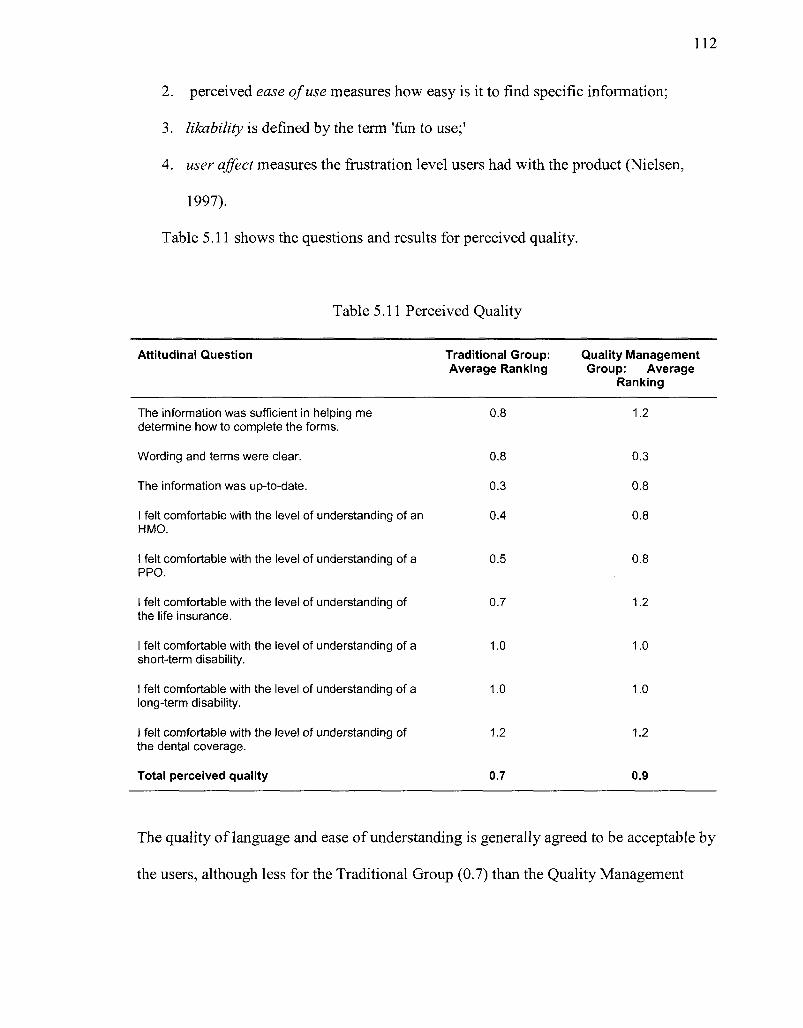
112
2. perceived ease of use measures how easy is it to find specific information;
3. likability is defined by the term 'fun to use;'
4. user affect measures the frustration level users had with the product (Nielsen,
1997).
Table 5.11 shows the questions and results for perceived quality.
Table 5.11 Perceived Quality
Attitudinal Question Traditional Group: Average Ranking
Quality Management Group: Average
Ranking
The information was sufficient in helping me determine how to complete the forms.
Wording and terms were clear.
The information was up-to-date.
I felt comfortable with the level of understanding of an HMO.
I felt comfortable with the level of understanding of a PPO.
I felt comfortable with the level of understanding of the life insurance.
I felt comfortable with the level of understanding of a short-term disability.
I felt comfortable with the level of understanding of a long-term disability.
I felt comfortable with the level of understanding of the dental coverage.
Total perceived quality
0.8
0.8
0.3
0.4
0.5
0.7
1.0
1.0
1.2
0.7
1.2
0.3
0.8
0.8
0.8
1.2
1.0
1.0
1.2
0.9
The quality of language and ease of understanding is generally agreed to be acceptable by
the users, although less for the Traditional Group (0.7) than the Quality Management
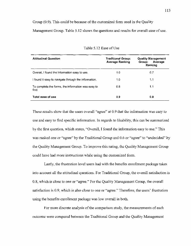
113
Group (0.9). This could be because of the customized form used in the Quality
Management Group. Table 5.12 shows the questions and results for overall ease of use.
Table 5.12 Ease of Use
Attitudinal Question Traditional Group: Quality Management Average Ranking Group: Average
Ranking
Overall, I found the information easy to use. 1.0 0.7
I found it easy to navigate through the information. 1.0 1.1
To complete the forms, the information was easy to 0.8 1.1 find.
Total ease of use 0.9 0.9
These results show that the users overall "agree" at 0.9 that the information was easy to
use and easy to find specific information. In regards to likability, this can be summarized
by the first question, which states, "Overall, I found the information easy to use." This
was ranked one or "agree" by the Traditional Group and 0.6 or "agree" to "undecided" by
the Quality Management Group. To improve this rating, the Quality Management Group
could have had more instructions while using the customized form.
Lastly, the frustration level users had with the benefits enrollment package takes
into account all the attitudinal questions. For Traditional Group, the overall satisfaction is
0.8, which is close to one or "agree." For the Quality Management Group, the overall
satisfaction is 0.9, which is also close to one or "agree." Therefore, the users' frustration
using the benefits enrollment package was low overall in both.
For more discrete analysis of the comparison study, the measurements of each
outcome were compared between the Traditional Group and the Quality Management
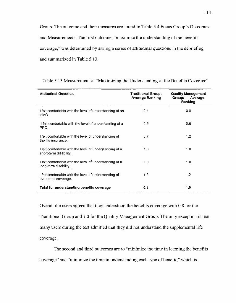
114
Group. The outcome and their measures are found in Table 5.4 Focus Group's Outcomes
and Measurements. The first outcome, "maximize the understanding of the benefits
coverage," was determined by asking a series of attitudinal questions in the debriefing
and summarized in Table 5.13.
Table 5.13 Measurement of "Maximizing the Understanding of the Benefits Coverage"
Attitudinal Question Traditional Group: Quality Management Average Ranking Group: Average
Ranking
I felt comfortable with the level of understanding of an 0.4 0.8 HMO.
I felt comfortable with the level of understanding of a 0.5 0.8 PPO.
I felt comfortable with the level of understanding of 0.7 1.2 the life insurance.
I felt comfortable with the level of understanding of a 1.0 1.0 short-term disability.
I felt comfortable with the level of understanding of a 1.0 1.0 long-term disability.
I felt comfortable with the level of understanding of 1.2 1.2 the dental coverage.
Total for understanding benefits coverage 0.8 1.0
Overall the users agreed that they understood the benefits coverage with 0.8 for the
Traditional Group and 1.0 for the Quality Management Group. The only exception is that
many users during the test admitted that they did not understand the supplemental life
coverage.
The second and third outcomes are to "minimize the time in learning the benefits
coverage" and "minimize the time in understanding each type of benefit," which is
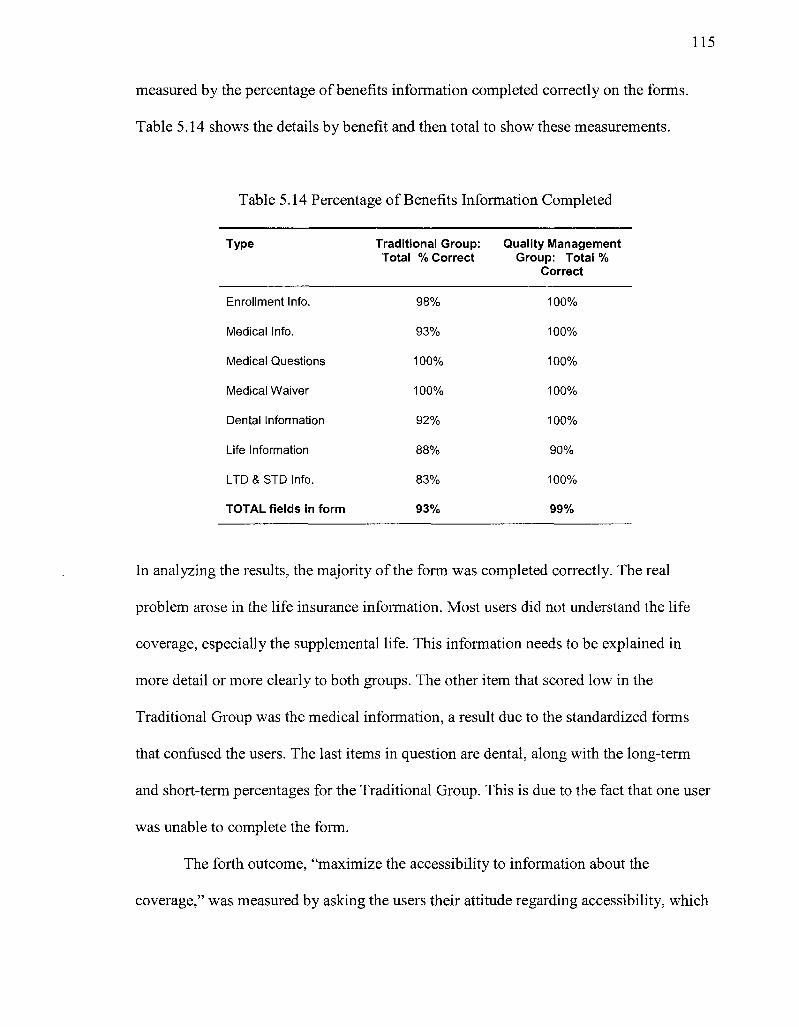
115
measured by the percentage of benefits information completed correctly on the forms.
Table 5.14 shows the details by benefit and then total to show these measurements.
Table 5.14 Percentage of Benefits Information Completed
Type
Enrollment Info.
Medical Info.
Medical Questions
Medical Waiver
Dental Information
Life Information
LTD & STD Info.
TOTAL fields in form
Traditional Group: Total % Correct
98%
93%
100%
100%
92%
88%
83%
93%
Quality Management Group: Total %
Correct
100%
100%
100%
100%
100%
90%
100%
99%
In analyzing the results, the majority of the form was completed correctly. The real
problem arose in the life insurance information. Most users did not understand the life
coverage, especially the supplemental life. This information needs to be explained in
more detail or more clearly to both groups. The other item that scored low in the
Traditional Group was the medical information, a result due to the standardized forms
that confused the users. The last items in question are dental, along with the long-term
and short-term percentages for the Traditional Group. This is due to the fact that one user
was unable to complete the form.
The forth outcome, "maximize the accessibility to information about the
coverage," was measured by asking the users their attitude regarding accessibility, which
116
was done in the debriefing. The debriefing question was "To complete the forms, the
information was easy to find," and the Traditional Group ranked it 0.8 and the Quality
Management Group ranked it 1.1. Therefore, the users "agree" that overall the
accessibility to information about the coverage was adequate to complete the forms.
The fifth outcome, "minimize your calls to ABC Corp. or others for help," was
determined by counting the times during the test when the user said they would call
someone for help. At the beginning of each test, the users were told that if they needed
help, to state whether they would call someone and who they would call. In the
Traditional Group, only two users stated they would call someone for help. The first
would call a family member and the other would call the insurance company. In the
Quality Management Group, four users stated that they would call someone for help.
Two would call a friend, one would call a family member, and one would call the
insurance company. None of the users stated they would call the company, which aligned
with a goal of the company, but the fact that they would call anyone still needs to be
addressed.
The sixth outcome, "maximize the ease of use of completing coverage forms," is
measured by asking the users their attitude on the ease of use, which was done in the
debriefing. The results are the same as the "ease of use" determined for Nielsen's quality
measures shown in Table 5.12. Both the Traditional Group and the Quality Management
Group results were 0.9 or "agree" that the information was easy to use, navigate and find.
The seventh outcome, "maximize completeness of information on the forms," was
measured by the percentage of the form that is complete. For the Traditional Group, the
completeness was 93% and the Quality Management Group 99%.
117
The eighth outcome, "minimize the incorrect fields filled out due to standardized
forms," is measured by percentage of fields that are incorrect. For the Traditional Group,
the error rate is 7% and 1 % for the Quality Management Group. As discussed before in
evaluating Nielsen's quality measures of learnability and error rate, the 6% difference in
the groups is probably due to the customized form for the Quality Management Group.
The ninth outcome, "minimize the time it takes employees to fill out the forms,"
was determined by timing the user with a maximum of 45 minutes. This is the same
analysis as Nielsen's quality measure of efficiency. In completing the necessary forms,
the Traditional Group's average time was 45 minutes, which means everyone took the
total allotted time to complete the forms. One of the users ran out of time and did not
complete half of the final form. For the Quality Management Group, the average time
was 39 minutes with everyone completing the forms. The reason the Quality
Management Group was faster than the Traditional Group was again because of the
customized form.
The tenth outcome, "maximize the satisfaction that user has in completing
coverage form" determined the user's attitude and was captured through the overall result
of the debriefing forms. For the Traditional Group, the overall satisfaction is 0.8, which is
close to one or "agree." For the Quality Management Group, the overall satisfaction is
0.9, which is also close to one or "agree." These results show that users from the Quality
Management Group were more satisfied than the Traditional Group, although the results
are close.
The results from Nielsen's quality measures and the outcomes are very similar in
results, although the outcomes are more focused for this specific test. By using the
118
outcomes, it is possible to focus in on specific issues related to this project. Overall, the
results from the Traditional Group and the Quality Management Group are very close,
with the Quality Management Group a little higher in most of the ratings. In addition, the
Quality Management Group provided the outcomes and their measures for better
measurements of the results. The answers to the research questions show the same
results.
Research Question 1: How does the Quality Management Group compare to the
Traditional Group in developing the benefits enrollment package for new
employees in the following categories?
Research Question 1 established that the Quality Management Group results
showed a higher ranking in most items compared to the Traditional Group.
1.1 Learnability: Will the testing results from the Quality Management Group
have the same, better, or worse success rate as the Traditional Group in
comprehending and completing the benefit forms, the first time they
encounter the design?
The Quality Management Group had higher comprehension and success in
completing the benefits enrollment package than the Traditional Group.
1.2 Efficiency: Will the time it took users to complete the benefit enrollment
forms be the same, better, or worse for the Quality Management Group and
the Traditional Group?
The users of the Quality Management Group were faster in completing the
benefits enrollment package than the ones in the Traditional Group.
119
1.3 Errors: Will the severity and recovery of the errors made in the Quality
Management Group be the same, better, or worse as the Traditional?
The Quality Management Group had 6% fewer errors than the Traditional
Group.
1.4 Satisfaction: Will the satisfaction in completing the benefits enrollment forms
be the same, better, or worse for the Quality Management Group and the
Traditional Group?
The Quality Management Group ranked higher at 0.9 to the Traditional
Groups overall satisfaction of 0.8. Both were very close to a one, which means
the users "agree" they were satisfied overall.
Research Question 2: Do the users' desired outcomes (determined in the Quality
Management Group) hold true for both the Traditional Group and Quality
Management Group?
Research Question 2 showed that the outcomes in both groups provided good
measures for the final results. The information was able to be quantified either
through percentages or attitudinal results.
2.1: Will all the desired outcomes be met in the Quality Management Group?
All desired outcomes for the Quality Management Group were ranked high
but not perfect. Adjustments will need to be made so that the form is more
consistently completed correctly. In addition, clearer definitions of benefits
would help with clarity and accuracy in completing the form.
2.2: Will all the desired outcomes be met in the Traditional Group?
Not all desired outcomes for the Traditional Group were met and were lower
than the Quality Management Group. Again, improvements for redesign are
the same as in question 2.1.
The final analysis is the time it took from the initial planning to deployment of
each benefits enrollment packages. For the Traditional Group, the overall time was 43
hours. For the Quality Management Group, the overall time was 47 hours, although 10
hours was the estimated programming time to have the customized form populate the
insurance companies' standardized forms. In addition, the initial development of the
benefits enrollment package in the Traditional Group was only two hours, to develop a
cover letter. Typically, the initial development of information design is more complex
and takes longer. The results of the two groups showed that the final benefits enrollment
package was more complex. This analysis is important because it shows that using
quality management tools does not take longer than some of the best practices in
information design. In addition, the end-product is slightly better than the best practices.
Lastly, using quality management tools, it is possible to measure the outcomes of the
results using outcomes that directly correlate with the information product.
CHAPTER 7
CONCLUSION
This study tested the theoretical and practical implications of using quality
management tools in information design. Quality management tools in product
development have successfully improved processes and provided measurements for
improvement in order to decrease errors and increase productivity. In theory, these tools
should work for any process. In this study, the results established that using quality
management tools in information design increased the success of producing effective
documentation. On the practical side, by reviewing the level of success of each tool used
shows the implications of future use and evaluates the adjustments to be made.
To begin the process, the focus group determined the desired outcomes and their
measurements in completing the benefits enrollment package. Focusing on desired
outcomes gives a good foundation for information design that is measurable, rather than
focusing on solutions, which are hard to change and measure once developed.
The tool used to capture user requirements was a survey with desired outcomes
for the tasks to be completed. By allowing users to sort the outcomes, it was possible to
track the users' priorities using the next tool, Quality Function Deployment (QFD). The
QFD tool was easy to use and successful in translating outcomes to actions and then
actions to information design heuristics. The reason for the success was collaboration
with the company to determine how to translate the items. This task would be very
difficult (and possibly slanted) if left to one person's decision.
In addition, for the QFD tool to be successful, information design heuristics
needed to be categorized into different types of dimensions. Through extensive research,
122
quality dimensions used in database management were transformed into dimensions
relating specifically to information design. Some of these quality dimensions can be used
repeatedly with the development of other information products using the QFD tool. These
heuristic dimensions were successfully used as an evaluation questionnaire in the
Traditional Group's heuristic evaluation.
In regard to the methodology, using a Traditional Group and Quality Management
Group provided a good comparison to determine if the quality management approach was
successful or not. Using the Traditional Group, usability studies as a best practice have
been verified extensively and repetitively to improve information design in many
mediums. Seeing the considerable improvement from the original benefits enrollment
package to the revised version after the usability study in the Traditional Group provided
a measurable benchmark for the Quality Management Group to meet. By ranking higher
in most of the areas of design compared to the Traditional Group, the Quality
Management Group's approach is something that should be considered as a successful
design process. In addition, the hours to complete the benefits enrollment packages for
both groups were very similar. By doing future studies using the Quality Management
Group process, the efficiency of the process will be improved, which leads to greater
effectiveness.
In discussing the results of this study with the same members of the Quality
Management Focus Group at Intrinsic Technology, the group found it very interesting
going through both the Traditional Group and the Quality Management Group processes.
The company was very happy with the results of the Quality Management Group in that
it cut down considerably on the errors filling out in the form. They are very open to
123
using the quality management process for future work because it was not intrusive and
did not demand too much effort or time. The group felt comfortable with the quality
management tools used in the process, if they used it again and the same results were
received.
By using this process on other information products will show if it can be
successful on more than one type of information product. This process can become more
refined and streamlined for information products that succeed in using it. For the products
that are successful, information designers could greatly benefit in learning how to use
quality management tools to provide more precise and measurable information products.
7.1 Implications for Future Studies
Future researchers in information design can use this process to determine the
types of information products that can successfully use it. By doing this, research could
work on ways to streamline the approach to using quality management tools by
improving the process in the way the tools are used and documenting how to use it. The
development process moves on from quality planning, Juran's first step in product
development life-cycle, and to the second and third steps, quality control and quality
improvement. Quality control is used to monitor and adjust the process so that no chronic
losses occur. Quality improvement moves the process away from any chronic losses to an
improved state of control (Juran, 1999). The best way to move into these quality steps is
by providing detailed instructional guides to assist individuals on how to use these tools
for any information product. By standardizing the process, more information designers
will have access to these tools without supervision from experienced users. Transforming
124
this research to instructional guides, many information designers will have the
opportunity to apply the process to information products.
125
APPENDIX A
HEURISTIC EVALUATION
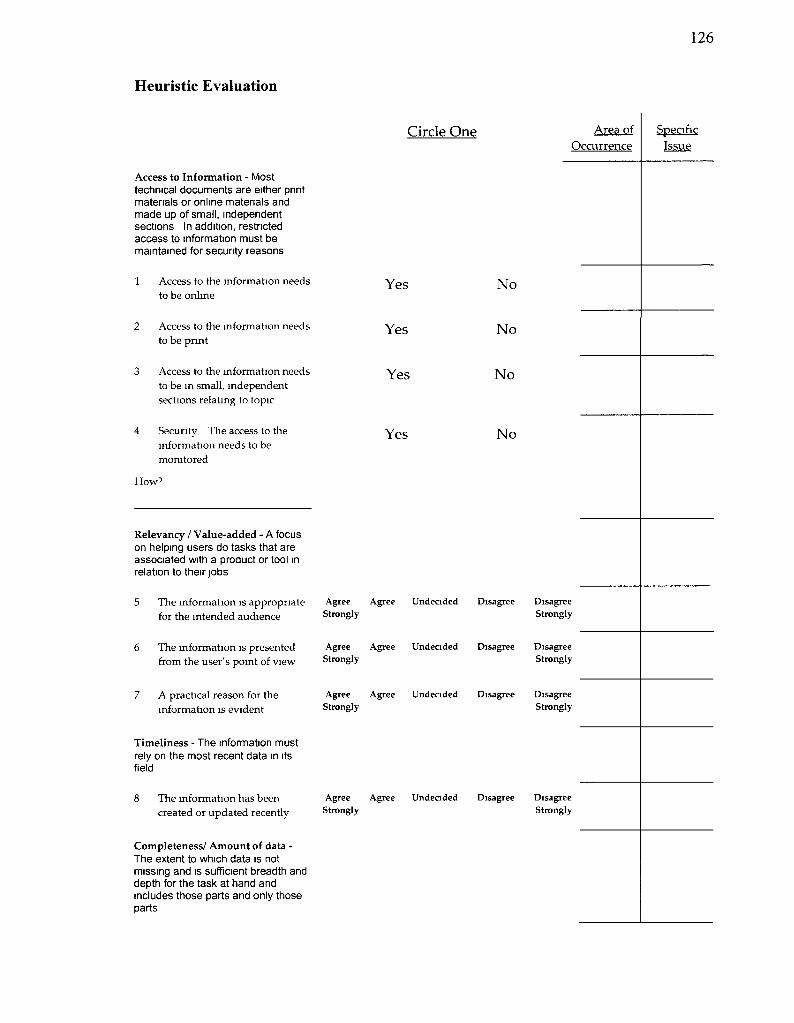
126
Heuristic Evaluation
Circle One Area of Occurrence
Specific Issue
Access to Information - Most technical documents are either print materials or online materials and made up of small, independent sections In addition, restricted access to information must be maintained for security reasons
1 Access to the information needs to be online
2 Access to the information needs to be print
3 Access to the mformation needs to be in small, independent sections relating to topic
4 Security The access to the information needs to be monitored
How7
Yes
Yes
Yes
Yes
No
No
No
No
Relevancy / Value-added - A focus on helping users do tasks that are associated with a product or tool in relation to their jobs
5 The information is appropriate for the intended audience
6 The mformation is presented from the user's point of view
7 A practical reason for the information is evident
Timeliness - The information must rely on the most recent data in its field
8 The information has been created or updated recently
Agree Strongly
Agree Strongly
Agree Strongly
Agree Strongly
Agree
Agree
Agree
Agree
Undecided
Undecided
Undecided
Undecided
Disagree
Disagree
Disagree
Disagree
Disagree Strongly
Disagree Strongly
Disagree Strongly
Disagree Strongly
Completeness/ Amount of data -The extent to which data is not missing and is sufficient breadth and depth for the task at hand and includes those parts and only those parts
127
9. All topics that support users' understanding and tasks are covered
Circle One
Agree Agree Undecided Disagree Strongly
Area of Occurrence
Specific Issue
Disagree Strongly
10. Only those topics that support Agree Agree Undecided Disagree Disagree users are covered Strongly Strongly
11. Each topic has just the detail the Agree Agree Undecided Disagree Disagree users need Strongly Strongly
12 The patterns of information on Agree Agree Undecided Disagree Disagree each section ensure proper Strongly Strongly coverage
13. Information is repeated only Agree Agree Undecided Disagree Disagree when needed Strongly Strongly
Free of error - Correctness and appropriateness of writing conventions and of words and phrases, such that the style and grammar are correct.
14. The sentence structure is concise Agree Agree Undecided Disagree Disagree in that the subject and verb are Strongly Strongly prominent in all sentences
15. Parallel structure exists on series Agree Agree Undecided Disagree Disagree and lists Strongly Strongly
16. Active and passive voice are Agree Agree Undecided Disagree Disagree used properly Strongly Strongly
17. Word choice is appropriate Agree Agree Undecided Disagree Disagree while using connotations, jargon Strongly Strongly and slang.
18. Grammar is free of errors in Agree Agree Undecided Disagree Disagree usage, punctuation, and Strongly Strongly spelling.
Objectivity - The extent to which information is the proper tone that is unbiased, unprejudiced, and impartial.
19. The formality is appropriate for Agree Agree Undecided Disagree Disagree the document Strongly Strongly
20. The information is unbiased, Agree Agree Undecided Disagree Disagree unprejudiced, and impartial Strongly Strongly
128
Circle One Area of
Occurrence
Believability / Reputation - The document's facts and truth are correct A slight inaccuracy can confuse and annoy your readers, a major inaccuracy can be dangerous and expensive Accuracy is a question of ethics, if readers suspect that you are slanting information by overstating or omitting facts, they will doubt the validity of the entire document
21
22
23
24
The informat ion h a s been verified
The in format ion reflects the cu r ren t subject or p r o d u c t
The informat ion a b o u t the subject is consis tent
The references to re la ted informat ion a re correct
Agree Strongly
Agree Strongly
Agree Strongly
Agree Strongly
Agree
Agree
Agree
Agree
Undecided
Undecided
Undecided
Undecided
Disagree
Disagree
Disagree
Disagree
Disagree Strongly
Disagree Strongly
Disagree Strongly
Disagree Strongly
Interpretability - The inclusion of appropriate examples, scenarios, similes, analogies, specific language, and graphics
25 Genera l l a n g u a g e is u s e d app rop r i a t e ly
Agree Agree Strongly
26 The example s are a p p r o p r i a t e Agree Agree for the aud i enc e a n d p u r p o s e Strongly
Undecided Disagree
Undecided Disagree
27 The example s are focused
28 The example s are easy to find
29 Graph ics a re a p p r o p r i a t e a n d easy to u n d e r s t a n d
Agree Agree Strongly
Undecided Disagree
Agree Strongly
Agree Strongly
Agree Undecided Disagree
Agree Undecided Disagree
30 Tables a re a p p r o p r i a t e a n d easy Agree Agree to u n d e r s t a n d Strongly
Ease of understanding/ clarity -Freedom from ambiguity or obscunty, the presentation of information in such a way that users understand it the first time
Undecided Disagree
Disagree Strongly
Disagree Strongly
Disagree Strongly
Disagree Strongly
Disagree Strongly
Disagree Strongly
S p e c i f i c
I s s u e
129
Circle One
31 The language is unambiguous Agree Agree Undecided Disagree Strongly
32 Similar mformation is presented Agree Agree Undecided Disagree in a similar way Strongly
33 The technical terms that are Agree necessary and appropriate are Strongly included
34 Each term that is new to the Agree Agree intended users is defined Strongly
Concise representation/ task orientation - A focus on helping users do tasks that are associated with a product or tool in relation to their jobs
35 Navigation and search are easy
Agree Undecided Disagree
Undecided Disagree
Agree Strongly
Agree Undecided Disagree
36 Table of contents has Agree Agree appropriate level of detail Strongly
37 Paragraphs provide users with Agree important signals about how Strongly text is organized
38 The bottom line (thesis, main Agree point or controlling idea) is at Strongly the beginning of the text
39 The text is cohesive, which Agree means the parts are unified and Strongly movement from part to part is easy to follow
40 Effective use of transitions are Agree used to build links between Strongly ideas
Consistent representation - Effective documents adhere to the design elements of proximity of related items, consistent alignment of text and graphics, repetition of like information and graphics, and contrast of text or graphics that need to stand out
Undecided Disagree
Agree Undecided Disagree
Agree Undecided Disagree
Agree Undecided Disagree
Agree Undecided Disagree
Area of Occurrence
Disagree Strongly
Disagree Strongly
Disagree Strongly
Disagree Strongly
Disagree Strongly
Disagree Strongly
Disagree Strongly
Disagree Strongly
Disagree Strongly
Disagree Strongly
Specific Issue
130
Circle One Area of Occurrence
Specific Issue
41. The arrangement of text on the Agree Agree Undecided Disagree Disagree page is effective Strongly Strongly
42. The visual features of the print Agree Agree Undecided Disagree Disagree (typography) is effective Strongly Strongly
43. Related items are in proximity Agree Agree Undecided Disagree Disagree of each other Strongly Strongly
44. Text and graphics have consistent alignment
Agree Agree Undecided Disagree Disagree Strongly Strongly
45 The text, headings and graphics Agree Agree Undecided Disagree Disagree are consistent in repetition of Strongly Strongly information
46. Text and graphics that need to Agree Agree Undecided Disagree Disagree stand out have significant Strongly Strongly contrast from other elements

131
APPENDIX B
USABILITY STUDY FORMS
132
These forms are used for the Traditional Group first usability test and then for both the
Traditional Group and Quality Management Group usability test. Usability Study Debriefing:
Additional Questions is only used for the final usability testing on the Traditional Group
and Quality Management Group to measure some of the outcomes determined in the
Quality Management Group.
133
Facilitator's Script
Thank you for giving up some of your time to help us test the benefits forms for ABC Corporation.
Usability evaluations seek to determine if the people who use this documentation can do so quickly and easily to accomplish the tasks. Evaluations are designed to solicit feedback from participants focusing on the areas of concern or confusion identified by you, the user. An evaluation typically involves several users like yourself who represents a person expecting new employment.
The task is:
As a new employee of ABC Corporation, you are eligible for Medical, Dental, Long-term Disability, Short-term Disability and Life. For Medical, there is a supplemental fee associated with the coverage. The others are covered 100% by ABC Corporation, unless you add dependent coverage for voluntary life, which is an additional fee.
Please fill out the forms with the coverage you want and return them to us as soon as possible.
While you are doing the task, we would like you to tell us what you are thinking as you do things on the site, this is called "Talk-Aloud Protocol". For example, if you are looking for something, explain to us what you are thinking as you look. If you think you might have looked in the wrong place for something, let us know, and tell us why you looked where you did. While you are doing the tasks, we might prompt you to tell us what you are thinking quite often.
Lastly, even though we may be sitting next to you, we cannot help you out with the tasks. If we help you, we cannot find out what it is that we are doing wrong. As mentioned, if you do not feel like you can complete a task then, let us know and we can move on to the next task.
Do you have any questions at all before we get started?
Usability Study Consent Form
APPROVED IfT/SRB
CONSENT DOCUMENT E X P I R E S ^ * l < L # l f Benefits Enrollment Package Usability Study E A f i n t a f f i ^ n I «^»
You are invited to be a part of a research study involving the improvement for the design of an employee benefits enrollment package This study is being conducted by a researcher m IIT's Technical Communication piogram Laura Batson You were selected as a possible participant because you are an undergraduate or graduate student planning on entering the workforce within one to two years
Please read this form and ask any questions you may have before agreeing to be in the study
BACKGROUND INFORMATION This research project is to contribute to improving the design of a employee benefits enrollment package The goal of this study is to gather information about the usability and design of the documents
PROCEDURES If I agree to be a participant in the study, I will agree to the following
e Participants will be asked to review and complete benefits forms and "talk aloud" while doing so • Participants will be audio taped • Performance data, such as the number of errors or time to complete a task will be collected « Participants will be asked to spend a short time at the end talking to us and giving us their opinions The entire
procedure will take approximately 45 minutes to one hour
RISKS AND BENEFITS OF THE STUDY I understand that this research presents no risks other than what might be experienced in daily use of a desktop computer working in their workplace, or taking a test I understand that the IIT Counseling Center is available to me, fiee of charge, to discuss my situation or my feelings IIT Counseling Center can be contacted at 312-567-5900 Please note the IIT Counseling Center is available to IIT students only Participants who are not IIT students may consult the Investigator for appropriate referrals
CONFIDENTIALITY Once the results of these studies have been tabulated and reported the names of individual participants will be destroyed in order to ensure confidentiality No one other than the investigator named above and the members of her test administration team will be informed of or have access to data on the performance of individuals Data and audio tapes w ill be retained b> the principal investigator for no more than one > ear following the date on which the study is administered You are free to refuse to participate in the study and may withdraw at any time without penalty
CONTACTS AND QUESTIONS Experimental procedures have been explained to me and I have a satisfactory understanding of them Any further questions about the research and my rights as a participant will be answered if you contact Laura Batson, batson@nt edu
1 understand that the Illinois Institute of Technology is not responsible for any injuries or medical conditions I may suffer during the time I am a research subject unless those injuries or medical conditions are due to IIT's negligence I may address questions and complaints to Glenn Krell MP A, CRA, Executive Officer of IIT Institutional Review Board at 312-567-7141
I understand that my participation in this research project is voluntary and that 1 may withdraw from the study at any time without penalty 1 also understand that the data will be coded to ensure confidentiality
I of 2
135
STA TEMENT OF CONSENT 1 have read the above information. I have asked questions and have received answers. I consent to participate in the study. I have received a copy of this consent form.
Signature Date_
Signature of Investigator Date_
You will be given a copy of this form to keep for your records.
This consent form is valid only if stamped by the executive officer of the IIT IRB.
APPROVED tnvsRB
1 M 2 of 2
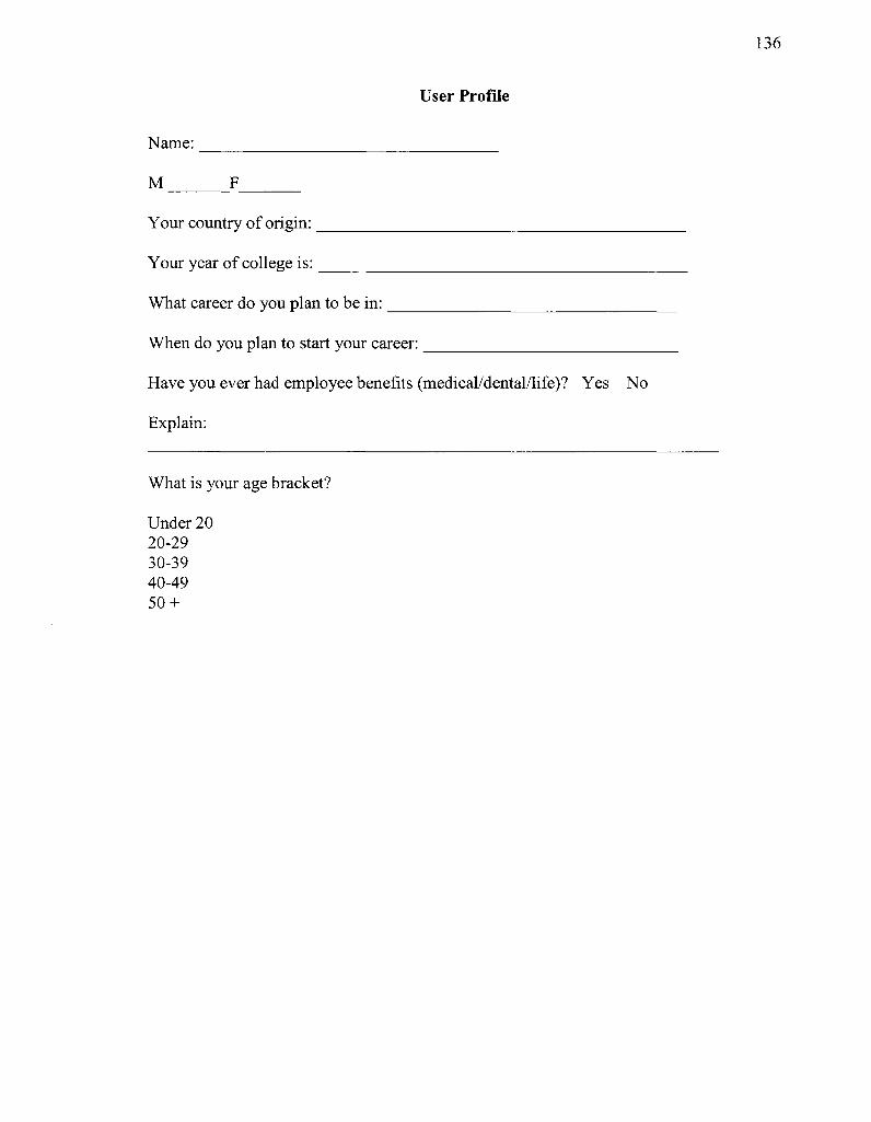
User Profile
Name:
M F
Your country of origin:
Your year of college is:
What career do you plan to be in:
When do you plan to start your career:
Have you ever had employee benefits (medical/dental/life)? Yes No
Explain:
What is your age bracket?
Under 20 20-29 30-39 40-49 50 +
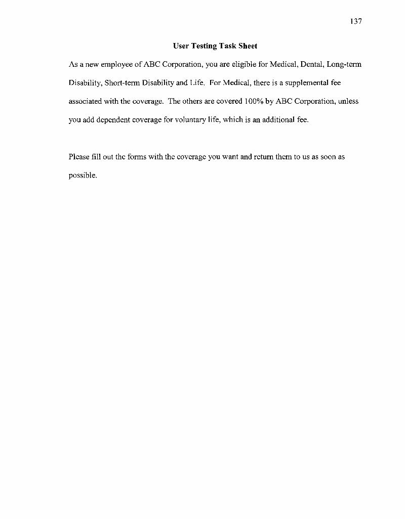
137
User Testing Task Sheet
As a new employee of ABC Corporation, you are eligible for Medical, Dental, Long-term
Disability, Short-term Disability and Life. For Medical, there is a supplemental fee
associated with the coverage. The others are covered 100% by ABC Corporation, unless
you add dependent coverage for voluntary life, which is an additional fee.
Please fill out the forms with the coverage you want and return them to us as soon as
possible.
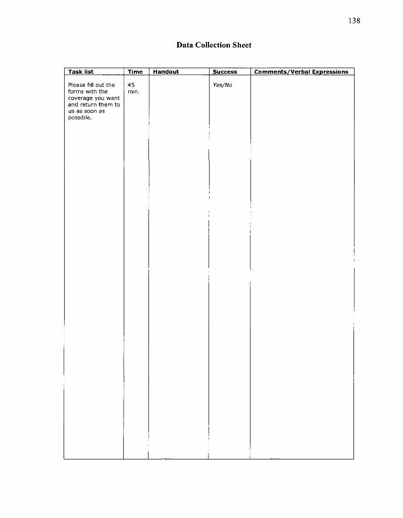
138
Data Collection Sheet
Task list Time Handout Success Comments /Verbal Expressions
Please fill out the forms with the coverage you want and return them to us as soon as possible.
45 mm.
Yes/No
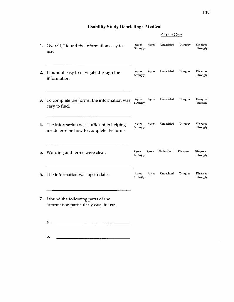
139
Usability Study Debriefing: Medical
Circle One
1. Overall, I found the information easy to use.
Agree Agree Undecided Disagree Disagree Strongly Strongly
2. I found it easy to navigate through the information.
Agree Agree Undecided Disagree Disagree Strongly Strongly
3 . TO Complete the forms, the information Was cA^ee Agree Undecided Disagree Disagree
* Strongly Strongly easy to find.
4. The information Was Sufficient in helping A&ree ASree Undecided Disagree Disagree * " Strongly Strongly
me determine how to complete the forms.
5. Wording and terms were clear. Agree Agree Undecided Disagree Disagree Strongly Strongly
6. The information was up-to-date. Agree Agree Undecided Disagree Disagree Strongly Strongly
7. I found the following parts of the information particularly easy to use.
b.
140
I found the following parts of the information particularly difficult to use.
9. What areas of content and functionality were noticeably missing that would be helpful?
141
Usability Study Debriefing: Dental/Life/LTD & STD
Circle One
1. Overall, I found the information easy to use.
Agree Agree Undecided Disagree Disagree Strongly Strongly
2. I found it easy to navigate through the information.
Agree Agree Undecided Disagree Disagree Strongly Strongly
3. To complete the forms, the information was Agree Agree Undecided D i s a s r e e D i s a s r e e
* Strongly Strongly easy to find.
4. The information was sufficient in helping Agree Agree Undecided D i s a s r e e D i s a s r f 1 " Strongly Strongly
me determine how to complete the forms.
5. Wording and terms were clear. Agree Agree Undecided Disagree Disagree Strongly Strongly
6. The information was up-to-date. Agree Agree Undecided Disagree Disagree Strongly Strongly
7. I found the following parts of the information particularly easy to use.
b.
142
8. I found the following parts of the information particularly difficult to use.
a.
b.
9. What areas of content and functionality were noticeably missing that would be helpful?
b.
143
Usability Study Debriefing: Additional Questions
Circle One
1. I felt comfortable with the level of Agree Agree Undecided Disasree Disasree
understanding of an HMO. strongly strongly
2. I felt comfortable with the level of Agree Agree Undeclded Dis^ee Disasree
understanding of a PPO. strongly strongly
3. I felt comfortable with the level of Agree Agree Undecided Disasree Disasree
understanding of the life insurance. strongly strongly
4. I felt comfortable with the level of understanding of a short-term disability.
6. I felt comfortable with the level of understanding of the dental coverage.
7. Blue Cross Blue Shield provided what type of coverage (circle all applicable).
8. MetLife provided what type of coverage (circle all applicable).
Agree Agree Undecided Disagree Disagree
Strongly Strongly
Agree Agree Undecided Disagree Disagree
Strongly Strongly
Medical Dental Life
Long-term Disability Short-term Disability
Medical Dental Life
Long-term Disability Short-term Disability
5. I felt comfortable with the level of Agree Agree Undeaded Dlsasree Dlsasree
understanding of a long-term disability. strongly strongly

144
APPENDIX C
FOCUS GROUP CONSENT FORM
CONSENT DOCUMENT Benefits Enrollment Package Focus Group
You are invited to be a part of a research study involving the improvement for the design of an employee benefits enrollment package This study is being conducted by a researcher in IIT's Technical Communication program Laura Batson You were selected as a possible participant because you are an employee who either created or are familiar with your employee benefits enrollment package
Please read this form and ask any questions you may have before agreeing to be in the study
BACKGROUND INFORMATION
This research project is to contribute to improving the design of a employee benefits enrollment package The goal of this focus group is to gather information about the usability and design of the documents
PROCEDURES If I agree to be a participant m the study, I will agree to brainstorm the following questions
• What job needs to be performed by the new employee' • What desired outcomes for the job should lesult from new employee (customers) completing the benefit
enrollment package forms'' • How should the outcomes be measured - quantitatively'' • What constraints are associated with any of the outcomes''
In addition 1 agree to examine and compare the designs of two similar employer's benefit enrollment packages and complete a heuristic evaluation of them
RISKS AND BENEFITS OF THE STUDY I understand that this research presents no risks other than what might be experienced in working in the work-place or taking a test I understand that the IIT Counseling Center is available to me, free of charge, to discuss my situation or my feelings IIT Counseling Center can be contacted at 312-567 5900 Please note the IIT Counseling Center is available to IIT students only Participants who are not IIT students may consult the Investigator for appropriate referrals
CONFIDENTIALITY The identities of the participants are anonymous
CONTACTS AND QUESTIONS Experimental procedures have been explained to me and I have a satisfactory understanding of them Any further questions about the research and my rights as a participant will be answered if you contact Laura Batson, batson@nt edu
1 understand that the Illinois Institute of Technology is not responsible for any injuries or medical conditions I may suffer dunng the time I am a research subject unless those injunes or medical conditions are due to IIT's negligence I may address questions and complaints to Glenn Krell MPA, CRA, Executive Officer of IIT Institutional Review Board at 312-567-7141
I understand that my participation in this research project is voluntary and that I may withdraw fiom the study ai any time without penalty I also understand that the data is anonymous
APPROVED IIT/IRB
EXPIREStJiiOu W, 3011 'of2
~ M 9
146
ST A TEMENT OF CONSENT I have read the above information I have asked questions and have received answers 1 verbally consent to participate in the study I have received a cop> of this consent form
You will be given a copy of this form to keep for your records
This consent form is valid only if stamped by the executive officer of the IIT IRB.
APPROVED IIT/IRB
EXPIRES ̂ 1 1 3611 2 of 2
147
APPENDIX D
CUSTOMER ELICIT ATION DOCUMENTS
Survey Consent Form
CONSENT DOCUMENT Benefits Enrollment Package Survey
You are invited to be a part of a research study involving the improvement for the design of an employee benefits enrollment package This study is being conducted by a researcher in IIT's Technical Communication program Laura Batson You were selected as a possible participant because you are an undergraduate or graduate student planning on entering the workforce within one to two years
Phase read this form and ask any questions you ma)' have before agreeing to be in the study
BACKGROUND INFORMATION This research project is to contribute to improving the design of a employee benefits enrollment package The goal of this survey is to gather information about the usability and design of the documents
PROCEDURES If I agree to be a participant in the survey, I will agree to complete a survey that allows me to sort my desired outcomes of the employee benefits enrollment package in different ways as they relate to completing the enrollment forms The survey is monitored m case I am unclear about this procedure, but no assistance is given with my sort decisions The entire procedure will take approximately 20 to 30 minutes
RISKS AND BENEFITS OF THE STUDY I understand that this reseaich presents no risks other than what might be experienced in working in their workplace, or taking a test I understand that the IIT Counseling Center is available to me, free of charge, to discuss my situation or my feelings IIT Counseling Center can be contacted at 312-567-5900 Please note the IIT Counseling Center is available to IIT students only Participants who are not IIT students maj consult the Investigator for appropriate referrals
CONFIDENTIALITY The identities of the participants are anonymous
CONTACTS AND QUESTIONS Experimental procedures have been explained to me and I have a satisfactory understanding of them Any further questions about the i esearch and my rights as a participant will be answered if vou contact Laura Batson, batson@nt edu
I understand that the Illinois Institute of Technology is not responsible for any injuries or medical conditions I may suffer during the time I am a research subject unless those injuries or medical conditions are due to IIT's negligence I may address questions and complaints to Glenn Krell MP A, CRA, Executive Officer of IIT Institutional Review Board at 312 567-7141
I understand that my participation in this research project is voluntary and that I may withdraw from the study at any time without penalty I also understand that the data is anonymous
STATEMENT OF CONSENT I have read the above information I have asked questions and have received answers I verbally consent to participate in the stud) I have leceived a copy of this consent form
You will be given a copy of this form to keep for your records. This consent form is valid only if stamped by the executive officer of the IIT IRB
1
APPROVED IST/iRB
EXPIRES M M Pl.aoU
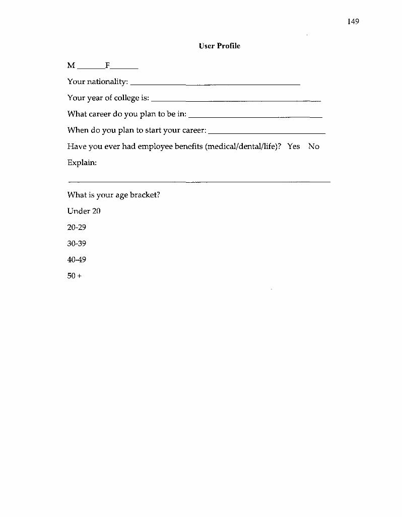
User Profile
M F
Your nationality:
Your year of college is:
What career do you plan to be in:
When do you plan to start your career:
Have you ever had employee benefits (medical/dental/life)? Yes No
Explain:
What is your age bracket?
Under 20
20-29
30-39
40-49
50 +
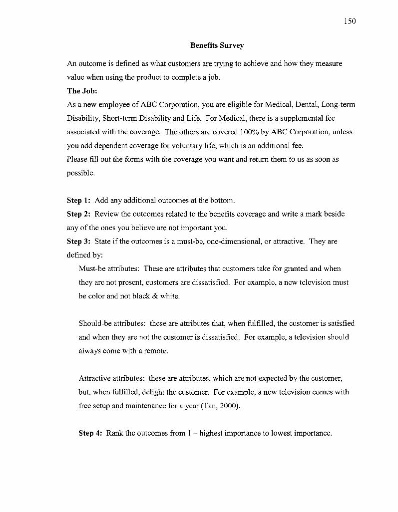
150
Benefits Survey
An outcome is defined as what customers are trying to achieve and how they measure
value when using the product to complete a job.
The Job: As a new employee of ABC Corporation, you are eligible for Medical, Dental, Long-term
Disability, Short-term Disability and Life. For Medical, there is a supplemental fee
associated with the coverage. The others are covered 100% by ABC Corporation, unless
you add dependent coverage for voluntary life, which is an additional fee.
Please fill out the forms with the coverage you want and return them to us as soon as
possible.
Step 1: Add any additional outcomes at the bottom.
Step 2: Review the outcomes related to the benefits coverage and write a mark beside
any of the ones you believe are not important you.
Step 3: State if the outcomes is a must-be, one-dimensional, or attractive. They are
defined by:
Must-be attributes: These are attributes that customers take for granted and when
they are not present, customers are dissatisfied. For example, a new television must
be color and not black & white.
Should-be attributes: these are attributes that, when fulfilled, the customer is satisfied
and when they are not the customer is dissatisfied. For example, a television should
always come with a remote.
Attractive attributes: these are attributes, which are not expected by the customer,
but, when fulfilled, delight the customer. For example, a new television comes with
free setup and maintenance for a year (Tan, 2000).
Step 4: Rank the outcomes from 1 - highest importance to lowest importance.
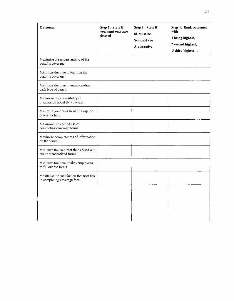
151
Outcomes
Maximize the understanding of the benefits coverage
Minimize the time in learning the benefits coverage
Minimize the time in understanding each type of benefit
Maximize the accessibility to information about the coverage
Minimize your calls to ABC Corp. or others for help
Maximize the ease of use of completing coverage forms
Maximize completeness of information on the forms
Minimize the incorrect fields filled out due to standardized forms
Minimize the time it takes employees to fill out the forms
Maximize the satisfaction that user has in completing coverage form
Step 2: State if you want outcome deleted
Step 3: State if
M-must-be
S-should -be
A-attractive
Step 4: Rank outcomes with
1 being highest,
2 second highest,
3 third highest...

152
APPENDIX E
QUALITY FUNCTION DEPLOYMENT TEMPLATE
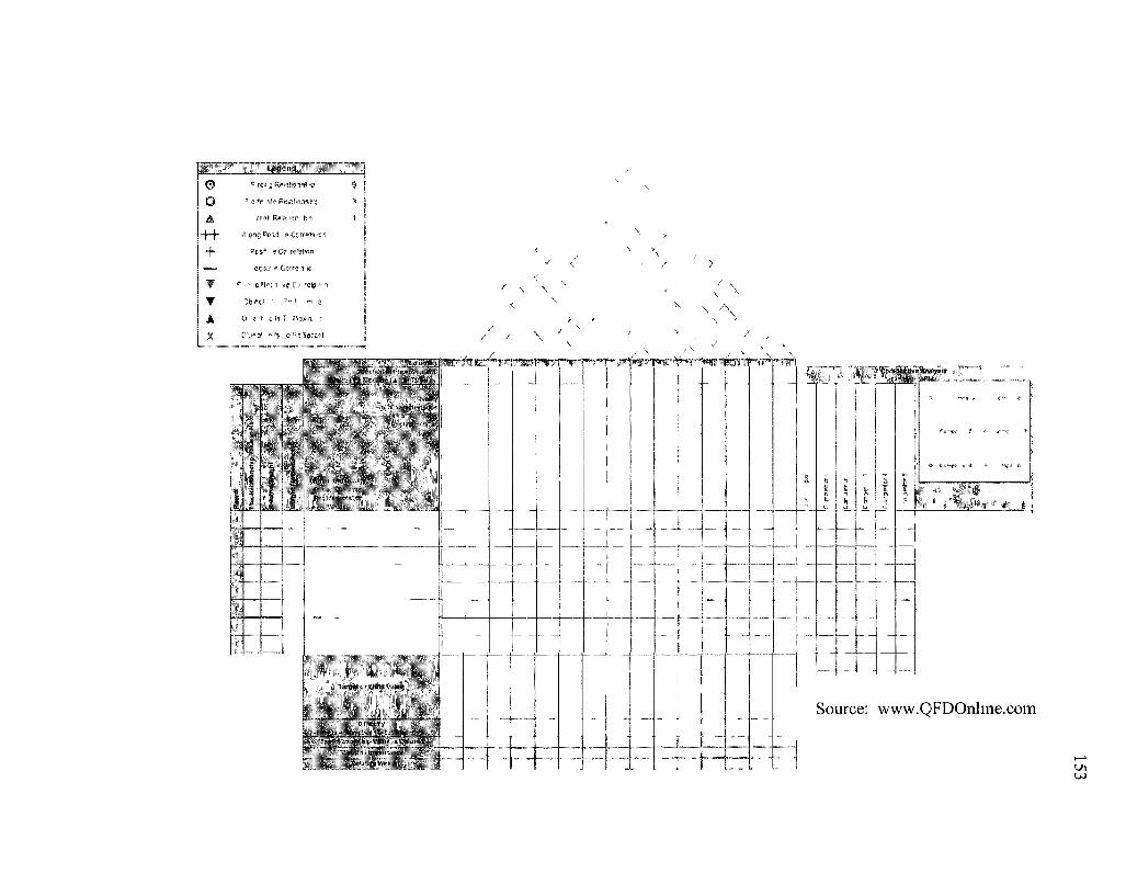
sp?» © 0 &
4_h + —« T T 4 X
*\, w OT#C™f™ ^ r«si g^ iE^m* ?
1 o ^ ^ e P e ^ f a a 1 ^
*•£&!• R t̂a icr |53
j t ong Po3(! e 0>rr*,li « ^
Pes* eCr f e ^ h ^
e f̂SJ" * Corre 1 t€
^ r- $ 'j«cji V ? C J rets v^
DbPti " 7 c i 1*1 &
0 <? * e l i T ? lMa f
Ct10-^ ° ^ o H1 tssr^f-t
- 1 * ; ' i i |
3
3 I
J
1 5
5 i
3
#
1 I " I
• 4- . l - l . l . V l I
1 • . | i . H - i i
"•• " j * - Ji- I t
' / <
F'hmt'v'trmP ^P^^y^^^,!^^!^^^
Source: www.QFDOnline.com
154
APPENDIX F
TRADITIONAL GROUP HEURISITIC EVALUATION AND USABILITY STUDY
RESULTS
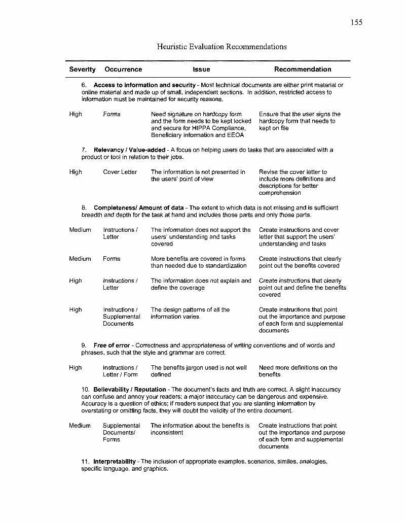
Heuristic Evaluation Recommendations
Severity Occurrence Issue Recommendation
6. Access to information and security - Most technical documents are either print material or online material and made up of small, independent sections. In addition, restricted access to information must be maintained for security reasons.
High Forms Need signature on hardcopy form and the form needs to be kept locked and secure for HIPPA Compliance, Beneficiary Information and EEOA
Ensure that the user signs the hardcopy form that needs to kept on file
7. Relevancy / Value-added - A focus on helping users do tasks that are associated with a product or tool in relation to their jobs.
High Cover Letter The information is not presented in the users' point of view
Revise the cover letter to include more definitions and descriptions for better comprehension
8. Completeness/ Amount of data - The extent to which data is not missing and is sufficient breadth and depth for the task at hand and includes those parts and only those parts.
Medium Instructions / Letter
The information does not support the users' understanding and tasks covered
Create instructions and cover letter that support the users' understanding and tasks
Medium Forms More benefits are covered in forms than needed due to standardization
Create instructions that clearly point out the benefits covered
High Instructions / The information does not explain and Letter define the coverage
Create instructions that clearly point out and define the benefits covered
High Instructions / Supplemental Documents
The design patterns of all the information varies
Create instructions that point out the importance and purpose of each form and supplemental documents
9. Free of error - Correctness and appropriateness of writing conventions and of words and phrases, such that the style and grammar are correct.
High Instructions / The benefits jargon used is not well Letter/Form defined
Need more definitions on the benefits
10. Believability / Reputation - The document's facts and truth are correct. A slight inaccuracy can confuse and annoy your readers; a major inaccuracy can be dangerous and expensive. Accuracy is a question of ethics; if readers suspect that you are slanting information by overstating or omitting facts, they will doubt the validity of the entire document.
Medium Supplemental Documents/ Forms
The information about the benefits is inconsistent
Create instructions that point out the importance and purpose of each form and supplemental documents
11. Interpretability - The inclusion of appropriate examples, scenarios, similes, analogies, specific language, and graphics.
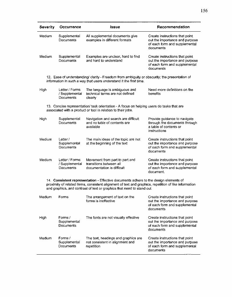
Seventy Occurrence Issue Recommendation
Medium Supplemental All supplemental documents give Documents examples in different formats
Create instructions that point out the importance and purpose of each form and supplemental documents
Medium Supplemental Examples are unclear, hard to find Documents and hard to understand
Create instructions that point out the importance and purpose of each form and supplemental documents
12. Ease of understanding/ clarity - Freedom from ambiguity or obscurity; the presentation of information in such a way that users understand it the first time.
High Letter/Forms The language is ambiguous and / Supplemental technical terms are not defined Documents clearly
Need more definitions on the benefits
13. Concise representation/ task orientation - A focus on helping users do tasks that are associated with a product or tool in relation to their jobs.
High Supplemental Navigation and search are difficult Documents and no table of contents are
available
Provide guidance to navigate through the documents through a table of contents or instructions
Medium Letter / Supplemental Documents
The main ideas of the topic are not at the beginning of the text
Create instructions that point out the importance and purpose of each form and supplemental documents
Medium Letter / Forms / Supplemental Documents
Movement from part to part and transitions between all documentation is difficult
Create instructions that point out the importance and purpose of each form and supplemental document.
14. Consistent representation - Effective documents adhere to the design elements of proximity of related items, consistent alignment of text and graphics, repetition of like information and graphics, and contrast of text or graphics that need to stand out
Medium Forms The arrangement of text on the forms is ineffective
Create instructions that point out the importance and purpose of each form and supplemental documents
High Forms / Supplemental Documents
The fonts are not visually effective Create instructions that point out the importance and purpose of each form and supplemental documents
Medium Forms / The text, headings and graphics are Supplemental not consistent in alignment and Documents repetition
Create instructions that point out the importance and purpose of each form and supplemental documents
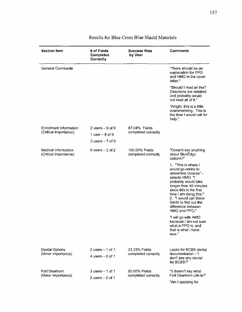
Results for Blue Cross Blue Shield Materials
Section Item # of Fields Completed Correctly
Success Rate by User
Comments
General Comments "There should be an explanation for PPO and HMO in the cover letter."
"Should I read all this? Directions are detailed and probably would not read all of it."
"Alright, this is a little overwhelming. This is the time I would call for help."
Enrollment Information (Critical Importance)
2 users - 9 of 9
1 user - 8 of 9
3 users - 7 of 9
87.04% Fields completed correctly
Medical Information (Critical Importance)
6 users - 2 of 2 100.00% Fields completed correctly
"Doesn't say anything about BlueEdge options?"
1. "This is where I would go online to determine choices" -selects HMO. "I probably would take longer than 40 minutes since this is the first time I am doing this." 2. "I would call Steve Smith to find out the difference between HMO and PPO."
"I will go with HMO because I am not sure what a PPO is, and that is what I have now."
Dental Options (Minor Importance)
2 users - 1 of 1
4 users - 0 of 1
33.33% Fields completed correctly
Looks for BCBS dental documentation - "I don't see any dental for BCBS?"
Fort Dearborn (Minor Importance)
3 users - 1 of 1
2 users - 0 of 1
50.00% Fields completed correctly
"It doesn't say what Fort Dearborn Life is?"
"Am I applying for
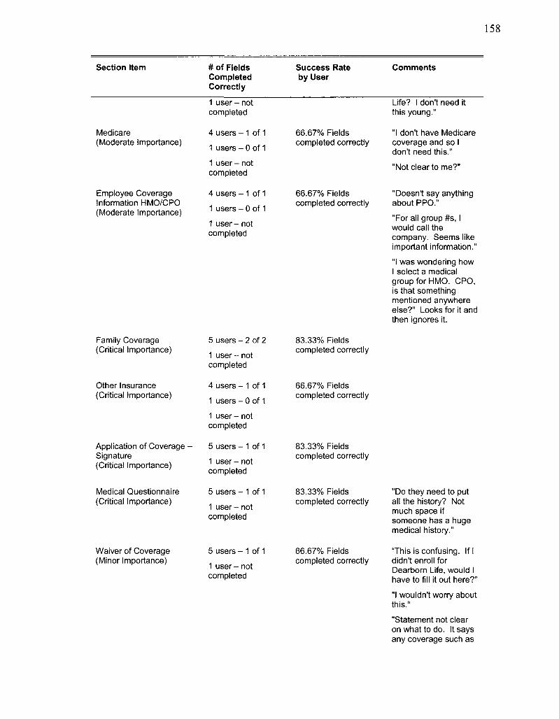
Section Item # of Fields Completed Correctly
Success Rate by User
Comments
Medicare (Moderate Importance)
1 user - not completed
4 users - 1 of 1 1 users - 0 of 1 1 user - not completed
66.67% Fields completed correctly
Life? I don't need it this young."
"I don't have Medicare coverage and so I don't need this."
"Not clear to me?"
Employee Coverage Information HMO/CPO (Moderate Importance)
4 users - 1 of 1
1 users - 0 of 1 1 user - not completed
66.67% Fields completed correctly
"Doesn't say anything about PPO."
"For all group #s, I would call the company. Seems like important information."
"I was wondering how I select a medical group for HMO. CPO, is that something mentioned anywhere else?" Looks for it and then ignores it.
Family Coverage (Critical Importance)
Other Insurance (Critical Importance)
Application of Coverage • Signature (Critical Importance)
5 users - 2 of 2 1 user - not completed
4 users - 1 of 1
1 users - 0 of 1 1 user - not completed
5 users - 1 of 1 1 user - not completed
83.33% Fields completed correctly
66.67% Fields completed correctly
83.33% Fields completed correctly
Medical Questionnaire (Critical Importance)
5 users - 1 of 1
1 user - not completed
83.33% Fields completed correctly
"Do they need to put all the history? Not much space if someone has a huge medical history."
Waiver of Coverage (Minor Importance)
5 users - 1 of 1 1 user - not completed
66.67% Fields completed correctly
"This is confusing. If I didn't enroll for Dearborn Life, would I have to fill it out here?"
"I wouldn't worry about this."
"Statement not clear on what to do. It says any coverage such as
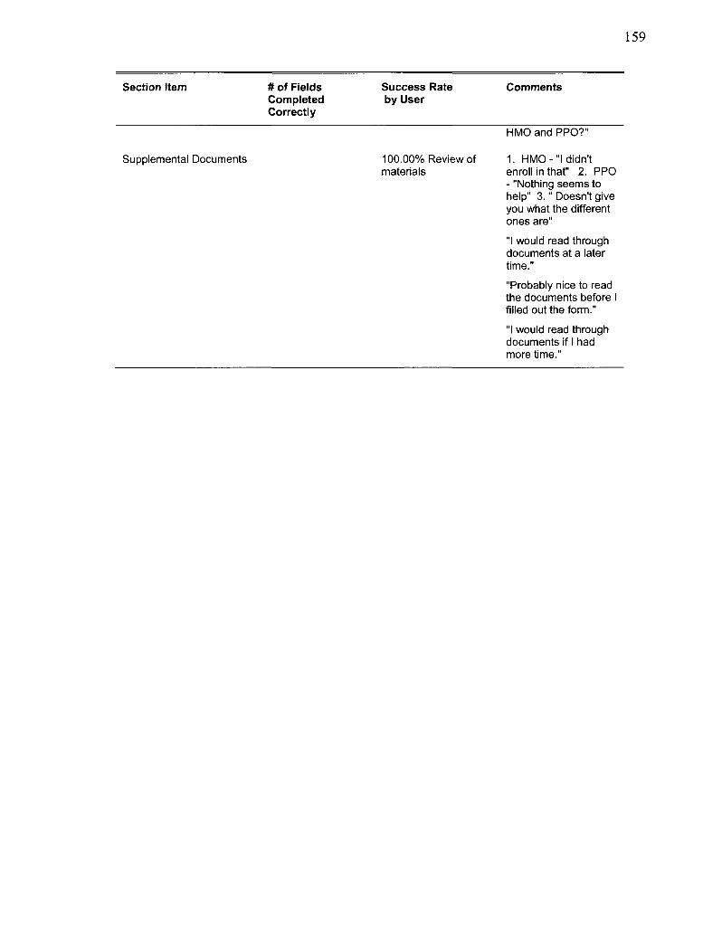
159
Section Item # of Fields Completed Correctly
Success Rate by User
Comments
HMO and PPO?"
Supplemental Documents 100.00% Review of materials
1. HMO-"I didn't enroll in that" 2. PPO - "Nothing seems to help" 3." Doesn't give you what the different ones are" "I would read through documents at a later time."
"Probably nice to read the documents before I filled out the form."
"I would read through documents if I had more time."
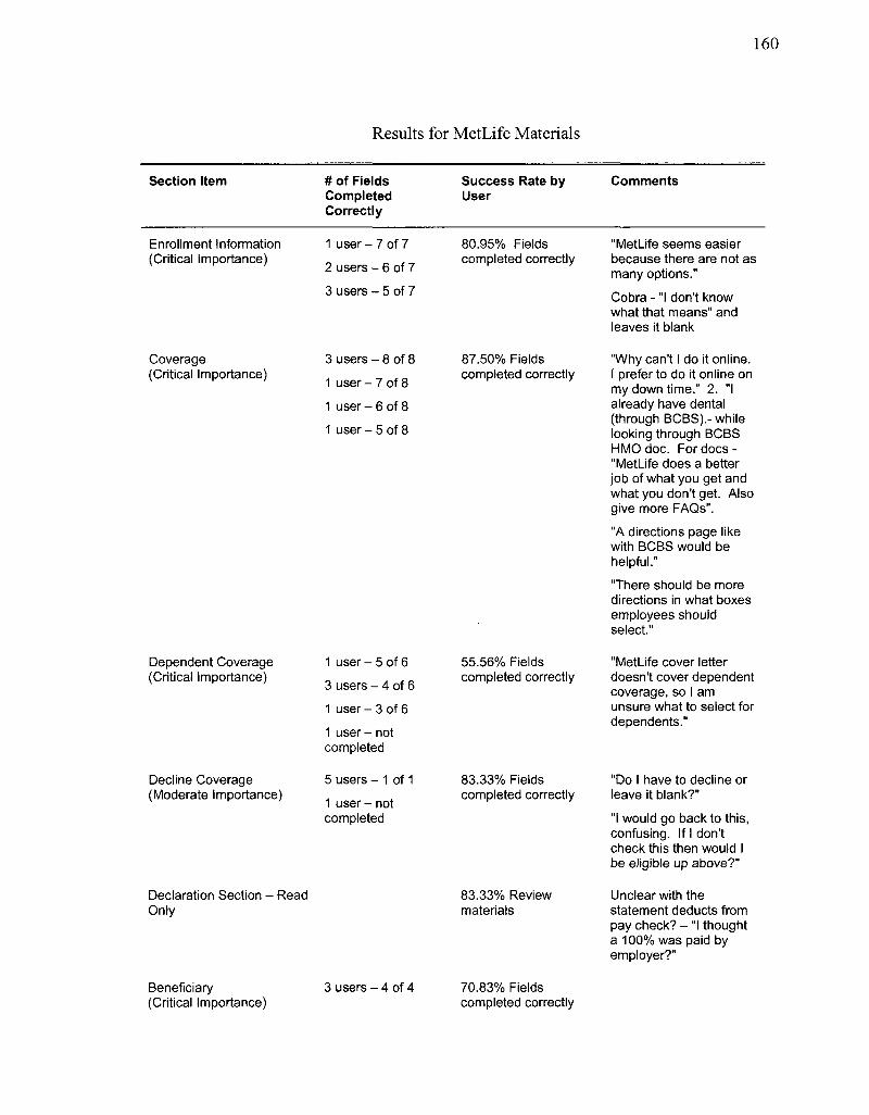
160
Results for MetLife Materials
Section Item # of Fields Completed Correctly
Success Rate by User
Comments
Enrollment Information (Critical Importance)
1 user - 7 of 7
2 users - 6 of 7
3 users - 5 of 7
80.95% Fields completed correctly
"MetLife seems easier because there are not as many options." Cobra - "I don't know what that means" and leaves it blank
Coverage (Critical Importance)
3 users - 8 of 8
1 user - 7 of 8
1 user - 6 of 8
1 user - 5 of 8
87.50% Fields completed correctly
"Why can't I do it online. I prefer to do it online on my down time." 2. "I already have dental (through BCBS).- while looking through BCBS HMO doc. For docs -"MetLife does a better job of what you get and what you don't get. Also give more FAQs".
"A directions page like with BCBS would be helpful."
"There should be more directions in what boxes employees should select."
Dependent Coverage (Critical Importance)
Decline Coverage (Moderate Importance)
Declaration Section - Read Only
Beneficiary (Critical Importance)
1 user - 5 of 6
3 users - 4 of 6 1 user - 3 of 6
1 user - not completed
5 users - 1 of 1
1 user - not completed
3 users - 4 of 4
55.56% Fields completed correctly
83.33% Fields completed correctly
83.33% Review materials
70.83% Fields completed correctly
"MetLife cover letter doesn't cover dependent coverage, so I am unsure what to select for dependents."
"Do I have to decline or leave it blank?"
"I would go back to this, confusing. If I don't check this then would I be eligible up above?"
Unclear with the statement deducts from pay check? - "I thought a 100% was paid by employer?"
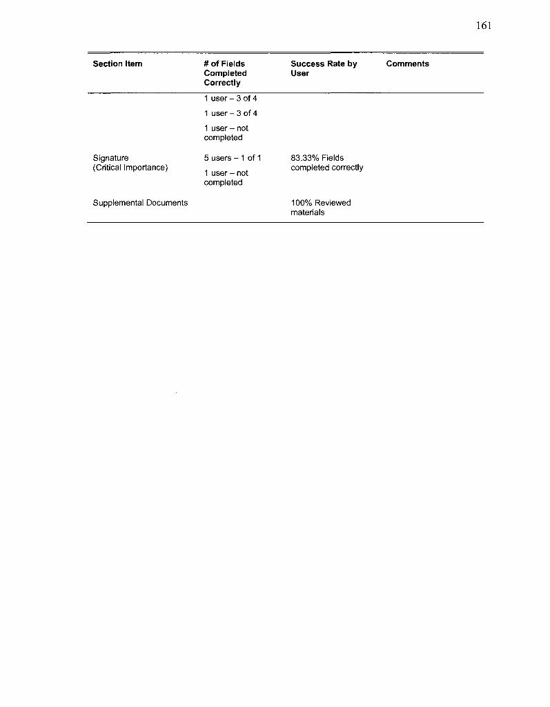
161
Section Item # of Fields Completed Correctly
Success Rate by User
Comments
1 user - 3 of 4 1 user - 3 of 4 1 user - not completed
Signature (Critical Importance)
5 users - 1 of 1 1 user - not completed
83.33% Fields completed correctly
Supplemental Documents 100% Reviewed materials
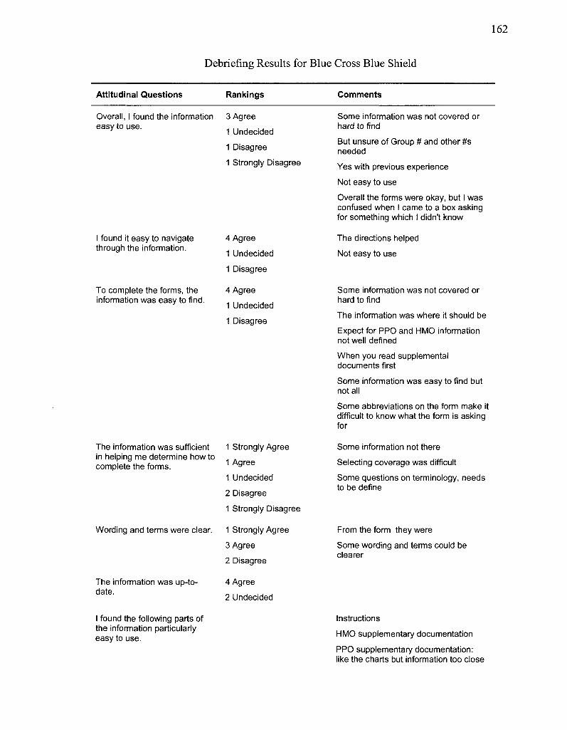
162
Debriefing Results for Blue Cross Blue Shield
Attitudinal Questions Rankings Comments
Overall, I found the information easy to use.
I found it easy to navigate through the information.
To complete the forms, the information was easy to find.
3 Agree
1 Undecided 1 Disagree
1 Strongly Disagree
4 Agree
1 Undecided
1 Disagree
4 Agree
1 Undecided
1 Disagree
Some information was not covered or hard to find
But unsure of Group # and other #s needed
Yes with previous experience Not easy to use
Overall the forms were okay, but I was confused when I came to a box asking for something which I didn't know
The directions helped Not easy to use
Some information was not covered or hard to find
The information was where it should be
Expect for PPO and HMO information not well defined When you read supplemental documents first
Some information was easy to find but not all
Some abbreviations on the form make it difficult to know what the form is asking for
The information was sufficient in helping me determine how to complete the forms.
Wording and terms were clear.
1 Strongly Agree
1 Agree
1 Undecided
2 Disagree
1 Strongly Disagree
1 Strongly Agree
3 Agree
2 Disagree
Some information not there Selecting coverage was difficult
Some questions on terminology, needs to be define
From the form they were
Some wording and terms could be clearer
The information was up-to-date.
4 Agree
2 Undecided
I found the following parts of the information particularly easy to use.
Instructions
HMO supplementary documentation
PPO supplementary documentation: like the charts but information too close
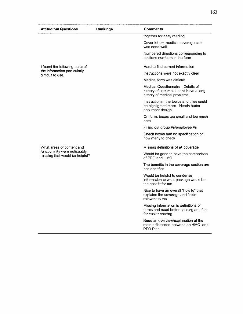
Attitudinal Questions Rankings Comments
together for easy reading
Cover letter: medical coverage cost was done well
Numbered directions corresponding to sections numbers in the form
I found the following parts of the information particularly difficult to use.
Hard to find correct information
Instructions were not exactly clear
Medical form was difficult
Medical Questionnaire: Details of history of assumes I don't have a long history of medical problems.
Instructions: the topics and titles could be highlighted more. Needs better document design.
On form, boxes too small and too much data Filling out group #s/employee #s
Check boxes had no specification on how many to check
What areas of content and functionality were noticeably missing that would be helpful?
Missing definitions of all coverage Would be good to have the comparison of PPO and HMO
The benefits in the coverage section are not identified.
Would be helpful to condense information to what package would be the best fit for me
Nice to have an overall "how to" that explains the coverage and fields relevant to me
Missing information is definitions of terms and need better spacing and font for easier reading
Need an overview/explanation of the main differences between an HMO and PPO Plan
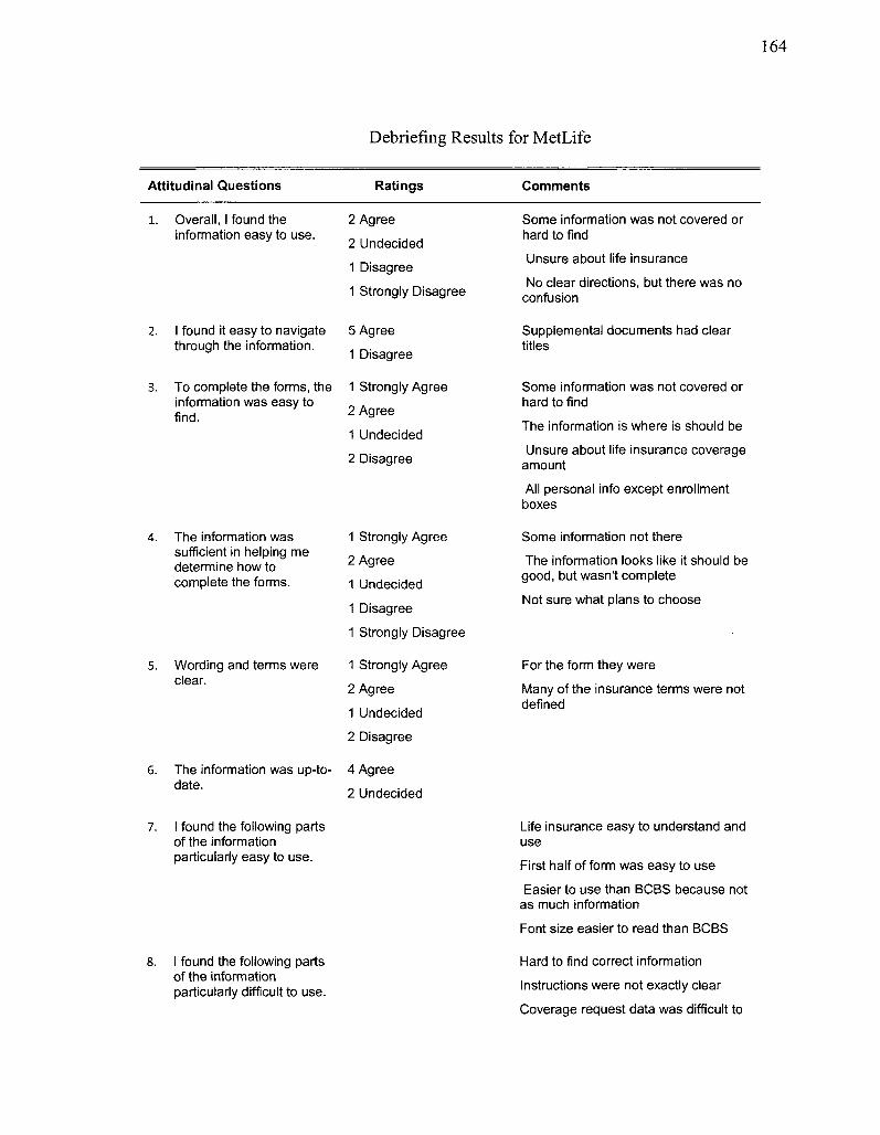
164
Debriefing Results for MetLife
Attitudinal Questions Ratings Comments
l . Overall, I found the information easy to use.
2 Agree
2 Undecided
1 Disagree
1 Strongly Disagree
Some information was not covered or hard to find Unsure about life insurance
No clear directions, but there was no confusion
I found it easy to navigate through the information.
To complete the forms, the information was easy to find.
5 Agree
1 Disagree
1 Strongly Agree
2 Agree
1 Undecided
2 Disagree
Supplemental documents had clear titles
Some information was not covered or hard to find The information is where is should be
Unsure about life insurance coverage amount All personal info except enrollment boxes
The information was sufficient in helping me determine how to complete the forms.
5. Wording and terms were clear.
6. The information was up-to-date.
1 Strongly Agree
2 Agree
1 Undecided
1 Disagree
1 Strongly Disagree
1 Strongly Agree
2 Agree
1 Undecided
2 Disagree
4 Agree
2 Undecided
Some information not there The information looks like it should be
good, but wasn't complete
Not sure what plans to choose
For the form they were
Many of the insurance terms were not defined
7. I found the following parts of the information particularly easy to use.
Life insurance easy to understand and use First half of form was easy to use
Easier to use than BCBS because not as much information
Font size easier to read than BCBS
I found the following parts of the information particularly difficult to use.
Hard to find correct information
Instructions were not exactly clear
Coverage request data was difficult to
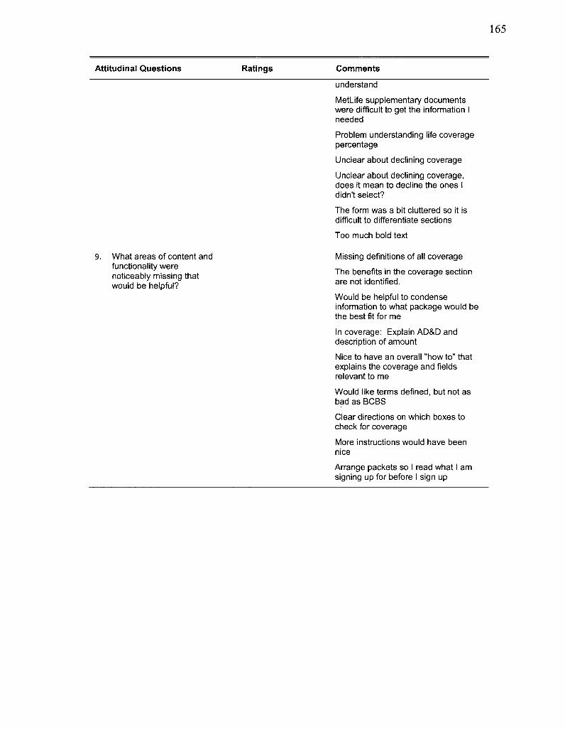
Attitudinal Questions Ratings Comments
understand
MetLife supplementary documents were difficult to get the information I needed
Problem understanding life coverage percentage Unclear about declining coverage
Unclear about declining coverage, does it mean to decline the ones I didn't select?
The form was a bit cluttered so it is difficult to differentiate sections Too much bold text
What areas of content and functionality were noticeably missing that would be helpful?
Missing definitions of all coverage The benefits in the coverage section are not identified.
Would be helpful to condense information to what package would be the best fit for me
In coverage: Explain AD&D and description of amount
Nice to have an overall "how to" that explains the coverage and fields relevant to me
Would like terms defined, but not as bad as BCBS Clear directions on which boxes to check for coverage
More instructions would have been nice Arrange packets so I read what I am signing up for before I sign up
166
APPENDIX G
COMPARISON STUDY DEBRIEFING RESULTS
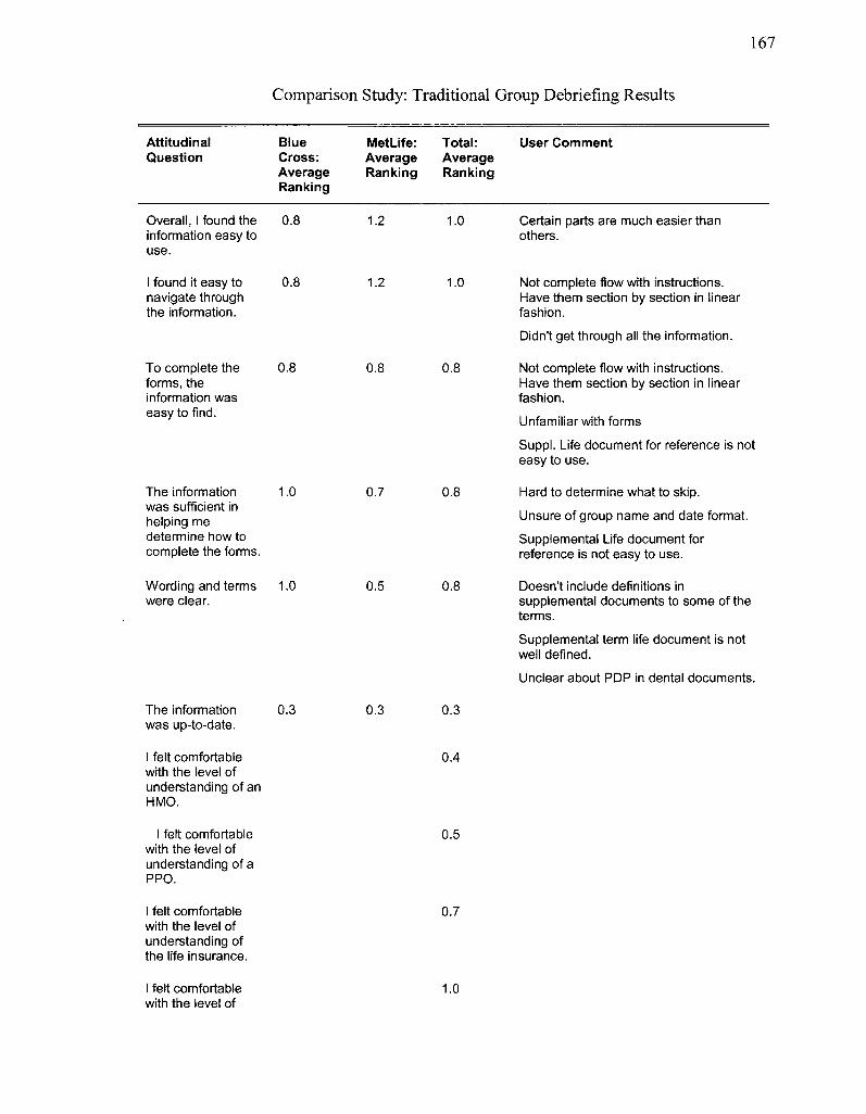
167
Comparison Study: Traditional Group Debriefing Results
Attitudinal Question
Overall, 1 found the information easy to use.
1 found it easy to navigate through the information.
To complete the forms, the information was easy to find.
Blue Cross: Average Ranking
0.8
0.8
0.8
MetLife: Average Ranking
1.2
1.2
0.8
Total: Average Ranking
1.0
1.0
0.8
User Comment
The information was sufficient in helping me determine how to complete the forms.
1.0 0.7 0.8
Certain parts are much easier than others.
Not complete flow with instructions. Have them section by section in linear fashion.
Didn't get through all the information.
Not complete flow with instructions. Have them section by section in linear fashion.
Unfamiliar with forms
Suppl. Life document for reference is not easy to use.
Hard to determine what to skip.
Unsure of group name and date format. Supplemental Life document for reference is not easy to use.
Wording and terms were clear.
1.0 0.5 0.8 Doesn't include definitions in supplemental documents to some of the terms.
Supplemental term life document is not well defined.
Unclear about PDP in dental documents.
The information was up-to-date.
0.3 0.3 0.3
I felt comfortable with the level of understanding of an HMO.
0.4
I felt comfortable with the level of understanding of a PPO.
0.5
I felt comfortable with the level of understanding of the life insurance.
0.7
I felt comfortable with the level of
1.0
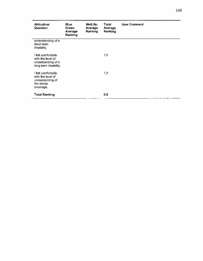
168
Attitudinal Blue Met Life: Total: User Comment Question Cross: Average Average
Average Ranking Ranking Ranking
understanding of a short-term disability.
I felt comfortable 1.0 with the level of understanding of a long-term disability.
I felt comfortable 1.2 with the level of understanding of the dental coverage.
Total Ranking 0.8
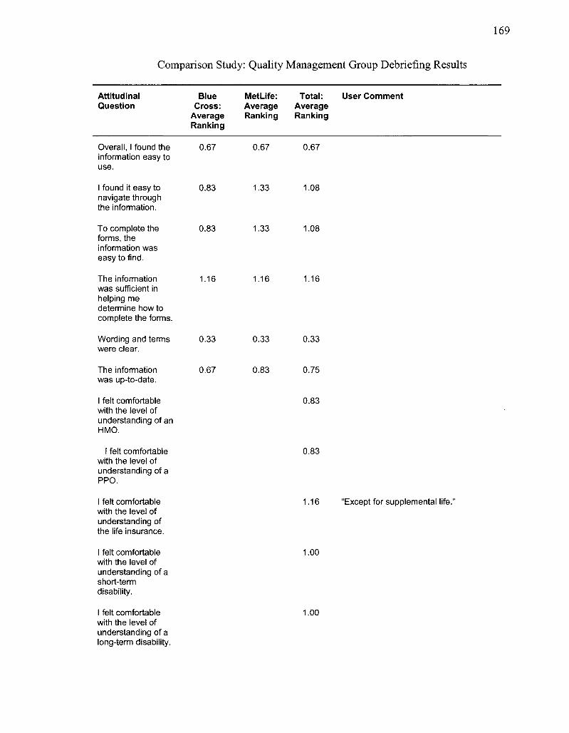
169
Comparison Study: Quality Management Group Debriefing Results
Attitudinal Question
Blue Cross:
Average Ranking
Met Life: Total: User Comment Average Average Ranking Ranking
Overall, I found the information easy to use.
0.67 0.67 0.67
I found it easy to navigate through the information.
0.83 1.33 1.08
To complete the forms, the information was easy to find.
0.83 1.33 1.08
The information was sufficient in helping me determine how to complete the forms.
1.16 1.16 1.16
Wording and terms were clear.
0.33 0.33 0.33
The information was up-to-date.
0.67 0.83 0.75
I felt comfortable with the level of understanding of an HMO.
0.83
I felt comfortable with the level of understanding of a PPO.
0.83
I felt comfortable with the level of understanding of the life insurance.
1.16 "Except for supplemental life.'
I felt comfortable with the level of understanding of a short-term disability.
1.00
I felt comfortable with the level of understanding of a long-term disability.
1.00
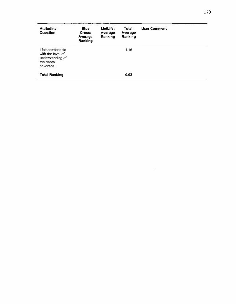
170
Attitudinal Blue MetLife: Total: User Comment Question Cross: Average Average
Average Ranking Ranking Ranking
I felt comfortable 1.16 with the level of understanding of the dental coverage.
Total Ranking 0.92
171
BIBLIOGRAPHY
Albers, M. J. & Mazur, M.B. (2003). Content & complexity: Information design in technical communication. Philadelphia: Lawrence Erlbaum.
American Supplier Institute. (2000). What is QFD. Retrieved 06-Sep-2008 from http: //www. amsup. com/qfd/index.htm
Batson, Laura & Feinberg, Susan. (2008). "Managing Collaboration: Adding Communication & Documentation Environment (CDE) to a Product Development Cycle." Connecting People with Technology: Issues in Professional Communication. Amityville, NY: Baywood Publishing Company, Inc.
Berger, C , et al. (1993). Kano's methods for understanding customer-defined quality. Center for Quality Management Journal, 4, 3-36.
Blackwell, C. L. (1995). A good installation guide increases user satisfaction and reduces support costs. Technical Communication 42(1), 56-60.
Borden, K. S. & Abbott, B. B. (2002). Research design and methods, 5l Edition. New York: McGraw-Hill.
Breuleux, A., Bracewell, R. J. & Reanud, P. (1995). Cooperation, Sharing, and Support among Specialists in Producing Technical Documentation. Technical Communication, 42(1), 155-160.
Broh, R. A. (1982). Quality for higher profits. NewYork: McGraw-Hill.
Cameron, C. & Cornelius, C. (2007). "A Systems-Driven Approach to Solar Energy R&D." Proceedings from the IEEE International System of Systems Engineering 2007, Tucson, Arizona.
Cappiello, C , Francalanci, C, & Pernici, B. (2002). Data quality from the user's perspective. IQIS 2004, Maison de la Chimie, Paris, France, 68-73. ACM.
Carroll, J. M. ( 1990 ). The nurnberg funnel: Designing minimalism instruction for practical computer skills. Cambridge, MA: The MIT Press.
Carroll, J.M. (Ed.). (1998). Minimalism beyond the nurnberg funnel. Cambridge, MA: The MIT Press.
Carnevalli, J. A. & Miguel P. C. (2008). Review, analysis and classification of the literature on QFD - Types of research, difficulties and benefits. International Journal of Production Economics, 114, 737-754.
172
Chan, L.K. & Wu, M.L. (2002). Quality function deployment: A literature review. European Journal of Operational Research, 143,. 463-497.
Christensen, CM. (2003). The innovator's solution: Creating and sustaining successful growth. Boston, MA: Harvard Business School Publishing Corporation.
Cooper, R. G. (1990). Stage-Gate® System: A new tool for managing new products. Business Horizons, May/June, 44-53.
Cooper, R. G. (1999). The invisible success factors in product innovation. Journal of Product Innovation Management, March, 115-133.
Cooper, R.G. (2000). Doing it right winning with new products. Ivey Business Journal, July/August.
Cooper, R.G. (2008). Stage-Gate - Your roadmap for new product development. Product Development Institute, Inc. Retrieved October 7, 2008, from http://www.prod-dev.com/stage-gate.php.
Cutler, A.N. (2001). Biography of Walter A. Shewhart. Sigma Engineering Partnership. Retrieved October 15, 2007, from http://www.sigma-engineering.co.uk/light/shewhartbiog.htm.
Duhovnik, J., Kusar, J., Tomazevic, R. & Starbek, M. (2006). Development process with regard to customer requirements. Concurrent Engineering, 14, 67-82.
Fox, C, Levitin, A., & Redman, T. (1994). The notion of data and its quality dimensions. Information Processing & Management, 30(1), 9-19.
Frumkin, P. (2002, May 29). Good performance is not measured by financial data alone. The Chronicle of Philanthropy. Retrieved September 25, 2008, from http://www.newamerica.net/publications/articles/2002/good_performance_is_not_ measured_by_financial_data_alone.
Garvin, D. A. (1984). Competing on the eight dimensions of quality. Harvard Business Review, Nov-Dec, 101-109.
Gee, G., Richardson, W.R. & Wormian, B.L. (2005). CMQprimer. Terre Haute, IN: Quality Council of Indiana.
Government Performance Results Act of 1993. (1993). Office of management and budget: The executive office of the president. Retrieved October 20, 2008, from http://www.whitehouse.gOv/omb/mgmt-gpra/gplaw2m.html#h2.
Griffin, A. & Hauser, J. R. (1993). The voice of the customer. Marketing Science, Vol. 12, no. 1, Winter 1993.
173
Hackos, J. T. (1994). Managing your documentation projects. New York: John Wiley & Sons, Inc., Wiley Technical Communication Library.
Hackos, J. T. (1998). Choosing a minimalist approach for expert users. In J. M. Carroll (Ed.), Minimalism beyond the nurnberg funnel (pp. 149-178). Cambridge, MA: The MIT Press.
Hackos, J. T. (2007). Information development: Managing your documentation projects, portfolio, and people. Indianapolis, IN: Wiley Publishing, Inc.
Hargis, G. et al. (2004). Developing quality technical information: A handbook for writers and editors. Upper Saddle River, NJ: Pearson Education, Inc.
Hein, G.E. (1995). The constructivist museum. Journal for Education in Museums Nov. 16, 1995, 21-23. Retrieved October 2, 2008, from http://www.gem.org.uk/pubs/news/heinl995.html
Horn, R. E. (1998). Visual language: Global communication for the 21st century. Bainbridge Island, Washington: MarcoVU, Inc.
Jacobson, R. (Ed.). (1999). Information design. Cambridge, MA: MIT Press.
Juran, J. M. (1999). Juran 's quality handbook, 5th ed. New York: McGraw-Hill.
Kantner, L. Shroyer, R. & Rosenbaum, S. (2002). Structured Heuristic Evaluation of Online Documentation. Proceedings from IPCC 2002, the annual conference of the IEEE Professional Communication Society.
Kelly, G.A. (1955). The psychology of personal constructs. New York: W.W. Norton.
Kim, Y.J., Kishore, R. & Sanders, G.L. (2005). From DQ to EQ: Understanding data quality in the context of e-business systems. Communications of the ACM, 48(10), 75-81.
Klein, B. (2002). Internet data quality: Perceptions of graduate and undergraduate business students. Journal of Business and Management, Fall 2002.
Krueger, R. A. & Casey, M. A. (2008). Focus groups: A practical guide for applied research, 4th edition. Thousands Oaks, CA: Sage Publications, Inc.
Lipton, R. (2007). The practical guide to information design. Hoboken, NJ: John Wiley & Sons, Inc.
March, A. & Garvin, D. A. (1990). A note on quality: The views of Deming, Juran, and Crosby. Harvard Business School, 9-687-011.
174
Markel, M. (2007). Technical Communication, 8 ed. Boston: Bedford/St. Martin's.
Marxt, C. Hacklin, F., Rothlisberger, C , & Schaffner T. (2004). "End-to-End Innovation: Extending the Stage-Gate® Model into a Sustainable Collaboration Framework." Proceedings from the IEEE International Engineering Management Conference 2004.
Mead, J. (1998). Measuring the value added by technical documentation: A review of research and practice. Technical Communication, 45(3), 353-379.
Millar, C. (1998). Making manuals obsolete: Getting information out of the manual and into the product. Technical Communication, 45(2), 161-167.
Miller, C. & Swaddling, D. C. (2002). Focusing NPD research on customer-perceived value. In P. Belliveau, A. Griffin, & S. Somermeyer (Ed.), The PDMA toolbook for new product development. New York: John Wiley & Sons, Inc.
Miller, H. (1996).The multiple dimensions of information quality. Information Systems Management, 13(2), 79-82.
Nielsen, J. (1997). Measuring the usability of reading on the Web. Nielsen's Alertbox, November, 1997. Retrieved December 19, 2008, from http://www.useit.com/alertbox/readingmetrics.html.
Nielsen, J. (2000). Why you only need to test with 5 users. Jakob Nielsen's Alertbox, March 19, 2000. Retrieved November 12, 2008, from http://www.useit.com/alertbox/20000319.html.
Nielsen, J. (2004). Card sorting: How many users to test. Jakob Nielsen's Alertbox, July 19, 2004. Retrieved November 12, 2008, from http://www.useit.com/alertbox/20040719.html.
Nielsen, J. (2005). How to conduct a heuristic evaluation. Jakob Nielsen's Papers and Essays, 2005. Retrieved June 5, 2009, from http://www.useit.com/papers/heuristic/heuristic_evaluation.html
Nielsen, J. (2008). Usability 101: Introduction to usability. Jakob Nielsen's Alertbox, 2008. Retrieved November 12, 2008, from http://www.useit.com/alertbox/20030825.html.
Pestorius, M. J. (2007). Applying the science of Six Sigma to the art of sales and marketing. Milwaukee, WI: ASQ Quality Press.
Pettersson, R. (2002). Information design: An introduction. Amsterdam/Philadelphia: John Benjamins Publishing Company.
175
Pipino, L.L., Lee, Y.W., & Wang, R.Y. (2002). Data quality assessment. Communication of the ACM, 45(4), 211-218.
Ramey, J. (1995). What technical communicators think about measuring value added: Report on a questionnaire. Technical Communication, 42(1), 40-51.
Rao, L. & Osei-Bryson, K. (2007). Towards defining dimensions of knowledge systems quality. Expert Systems with Applications, 33, 368-378.
Redman, T.C. (1996). Dimensions of data quality. In Data Quality for the Information Age. Boston: Artech House, 245-269.
Riley, K. et al. (2007). Revising professional writing in science and technology, business, and the social sciences. Chicago: Parlay Press.
Rubin, J., Chisnell, D., & Spool J. (2008). Handbook of Usability Testing: How to Plan, Design, and Conduct Effective Tests. Indianapolis, IN: Wiley Publishing, Inc.
Rugg, G. and McGeorge, P. (1995). Laddering. Expert Systems, 12(4), 279-291.
Schalock, R. L. (2001). Outcome-based evaluation, 2n edition. New York: Kluwer Academic / Plenum Publishers.
Schriver, K. A. (1997). Dynamics in document design. John Wiley & Sons, Inc., New York.
Schriver, K. A. (2003). Foreward. In M.J. Albers & M. B. Mazur (Eds.), Content & complexity: Information design in technical communication ( p. ix). Philadelphia: Lawrence Erlbaum.
Shaikh, A. R. (2008). A Stage-Gate Methodology for New Semiconductor Technology Development. Proceedings from the IEEE International Engineering Management Conference 2008, Estoril, Portugal.
Smart, K. L., (2002). Assessing quality documents. ACM Journal of Computer Documentation, 26(3), 130-140.
Spady. W. G. (1994). Outcome-based education: Critical issues and answers. Arlington, VA: American Association of School Administrators.
Strong, D.M., Lee, Y. W., & Wang, R.Y. (1997). 10 potholes in the road to information quality. Computer,30(8), 38-46.
Tan, K. C. & Shen, X. (2000). Integrating Kano's model in the planning matrix of quality function deployment. Total Quality Management, 11 (8), 1141-1151.
176
Tague, N.R. (2005). The quality toolbox, 2" edition. Milwaukee, Wisconsin: American Society of Quality, Quality Press.
Ulwick, A. W. (2003). The strategic role of the customer requirements in innovation. Strategyn, Inc. Retrieved September 12, 2008, from http://www.strategyn.com/pdf/TheStrategicRoleofRequirementinlnnovation.pdf.
Ulwick, A. W. (2005). What customers want. New York: McGraw-Hill.
Ulwick, Anthony W, and Lance A. Bettencourt. 2008. —What is Outcome-driven Innovation? MIT Sloan Management Review 49, 3, Spring: 62-68.
Outcome-based evaluation: Practical and theoretical applications. A Periodic Broadside for Arts and Culture Workers. June 2004. Vol. 8, No. 4. Retrieved September 24, 2008, from http://aad.uoregon.edu/culturework/culturework28.htm
Wang, R.Y. & Strong, D.M. (1996). Beyond accuracy: What data quality means to data consumers. Journal of Management Information Systems 12(4), 5-34.
Weiss, E. H. (2002). The metaphysics of information quality: comments on producing quality technical information. ACM Journal of Computer Documentation, 26,141-147.
Westendorp, P., Jansen, C. & Punselie, R. (Eds.) (2000). Interface design & document design. Amsterdam, The Netherlands/Atlanta, GA: Rodopi.
Williams, R. (2008). The non-designer's design booh, 3rd edition. Berkeley, CA: Peachpit Press.
Yang, K. & El-Haik, B. (2003). Design for Six Sigma: A roadmap for product development. McGraw-Hill, New York.


