Embed Size (px)
Citation preview

Transit Accessibility and Residential Segregation
by
Prottoy Aman Akbar
B.A. in Economics and Mathematics, Middlebury College, 2013
M.A. in Economics, University of Pittsburgh, 2017
Submitted to the Graduate Faculty of
the Dietrich School of Arts and Sciences in partial fulfillment
of the requirements for the degree of
Doctor of Philosophy
University of Pittsburgh
2021

UNIVERSITY OF PITTSBURGH
DIETRICH SCHOOL OF ARTS AND SCIENCES
This dissertation was presented
by
Prottoy Aman Akbar
It was defended on
March 26, 2021
and approved by
Randall P. Walsh, Department of Economics, University of Pittsurgh
Gilles Duranton, Real Estate Department, Wharton School of Business, University of
Pennsylvania
Allison Shertzer, Department of Economics, University of Pittsburgh
Richard van Weelden, Department of Economics, University of Pittsburgh
ii

Copyright c© by Prottoy Aman Akbar
2021
iii

Transit Accessibility and Residential Segregation
Prottoy Aman Akbar, PhD
University of Pittsburgh, 2021
Residential segregation by income and race is a salient feature of most US cities. An
important determinant of residential location choice is access to desirable urban amenities via
affordable travel modes. The first chapter of the dissertation studies residential and travel
mode choices of commuters in US cities to estimate the heteregenous demand for access
to neighborhoods offering faster commutes and to characterize what that means for how
the gains from mass transit improvements are distributed among rich and poor commuters.
I show that cities where transit improvements would be most effective at generating new
transit ridership and overall welfare gains are ones where the gains accrue more to higher
income commuters.
Within cities, who gentrify transit-accessible neighborhoods and ride mass transit
depends on the type (e.g. bus versus rail) and location of the transit improvements. The
second chapter of this dissertation models household choices of where to live and how to
travel in a stylized city with a competitive housing market. I characterize when and where
marginal improvements in transit access reduce residential segregation by income instead of
exacerbating it, and I show that an urban planners trying to maximize transit ridership is
often incentivized to expand the transit network where it increases income segregation.
Residential segregation has important implications for inequality. The third chapter of
the dissertation studies how racially segregated housing markets have historically exacerbated
racial inequality in US cities. The Great Migration of black families from the rural South
to northern cities in the 1930s saw a growing number of segregated city blocks transition
racially. Over a single decade, while rental prices soared on city blocks that transitioned from
all white to majority black and pioneering black families paid large premiums to buy homes
on majority white blocks, such homes quickly lost value on blocks that transitioned from
majority white to majority black. These findings suggest that segregated housing markets
eroded much of the gains for black families moving out of ghettos.
iv

Table of Contents
Preface . . . . . . . . . . . . . . . . . . . . . . . . . . . . . . . . . . . . . . . . . . . xiii
1.0 Introduction . . . . . . . . . . . . . . . . . . . . . . . . . . . . . . . . . . . . . 1
2.0 Who Benefits from Faster Public Transit? . . . . . . . . . . . . . . . . . . 3
2.1 Introduction . . . . . . . . . . . . . . . . . . . . . . . . . . . . . . . . . . . 3
2.2 Data . . . . . . . . . . . . . . . . . . . . . . . . . . . . . . . . . . . . . . . 8
2.2.1 Commuting Flows . . . . . . . . . . . . . . . . . . . . . . . . . . . 8
2.2.2 Travel Times . . . . . . . . . . . . . . . . . . . . . . . . . . . . . . 9
2.3 Travel Speeds, Mode Choices and Incomes . . . . . . . . . . . . . . . . . . 12
2.4 A Model of Travel Mode and Residential Location Choice . . . . . . . . . . 17
2.4.1 Specification . . . . . . . . . . . . . . . . . . . . . . . . . . . . . . . 19
2.4.2 Identification . . . . . . . . . . . . . . . . . . . . . . . . . . . . . . 21
2.4.3 Estimation . . . . . . . . . . . . . . . . . . . . . . . . . . . . . . . 23
2.5 Estimated Preferences for Faster Transit . . . . . . . . . . . . . . . . . . . 25
2.5.1 Willingness to Pay for Faster Commutes . . . . . . . . . . . . . . . 25
2.5.2 Willingness to Ride Transit . . . . . . . . . . . . . . . . . . . . . . 30
2.5.2.1 Within Cities . . . . . . . . . . . . . . . . . . . . . . . . . 33
2.5.3 Distribution of Welfare Gains . . . . . . . . . . . . . . . . . . . . . 36
2.6 Conclusion . . . . . . . . . . . . . . . . . . . . . . . . . . . . . . . . . . . . 41
3.0 Public Transit Access and Income Segregation . . . . . . . . . . . . . . . 44
3.1 Introduction . . . . . . . . . . . . . . . . . . . . . . . . . . . . . . . . . . . 44
3.1.1 Related Literature . . . . . . . . . . . . . . . . . . . . . . . . . . . 46
3.2 Empirical Observations . . . . . . . . . . . . . . . . . . . . . . . . . . . . . 49
3.2.1 Transit Ridership by Household Income . . . . . . . . . . . . . . . 49
3.2.2 Changes in Public Transit and Neighborhood Incomes . . . . . . . 52
3.3 Model . . . . . . . . . . . . . . . . . . . . . . . . . . . . . . . . . . . . . . 54
3.3.1 Living in the City . . . . . . . . . . . . . . . . . . . . . . . . . . . . 56
v

3.3.2 Travel in the City . . . . . . . . . . . . . . . . . . . . . . . . . . . . 56
3.3.3 Household Preferences . . . . . . . . . . . . . . . . . . . . . . . . . 58
3.3.4 Travel Mode and Residential Location Choices . . . . . . . . . . . . 59
3.4 Income Segregation . . . . . . . . . . . . . . . . . . . . . . . . . . . . . . . 61
3.4.1 Transit Improvements and Income Segregation . . . . . . . . . . . . 63
3.4.2 Visualizing Income Segregation . . . . . . . . . . . . . . . . . . . . 66
3.5 Transit Ridership . . . . . . . . . . . . . . . . . . . . . . . . . . . . . . . . 69
3.5.1 Maximizing Short-Term Transit Ridership . . . . . . . . . . . . . . 70
3.5.2 Maximizing Long-Term Transit Ridership . . . . . . . . . . . . . . 71
3.5.3 Transit Ridership vs. Income Segregation . . . . . . . . . . . . . . 72
3.5.4 Targeting Existing Transit Ridership . . . . . . . . . . . . . . . . . 74
3.5.5 Empirical Evidence from US Cities . . . . . . . . . . . . . . . . . . 75
3.6 Model Generalizations . . . . . . . . . . . . . . . . . . . . . . . . . . . . . 77
3.6.1 Travel Times by car and Preferences over Amenities . . . . . . . . 77
3.6.2 Housing Demand . . . . . . . . . . . . . . . . . . . . . . . . . . . . 78
3.6.3 Travel Destinations . . . . . . . . . . . . . . . . . . . . . . . . . . . 79
3.7 Conclusion . . . . . . . . . . . . . . . . . . . . . . . . . . . . . . . . . . . . 80
4.0 Racial Segregation in Housing Markets and the Erosion of Black Wealth 82
4.1 Introduction . . . . . . . . . . . . . . . . . . . . . . . . . . . . . . . . . . . 82
4.2 Historical Background . . . . . . . . . . . . . . . . . . . . . . . . . . . . . 86
4.3 Data . . . . . . . . . . . . . . . . . . . . . . . . . . . . . . . . . . . . . . . 88
4.4 Semi-Parametric Analysis . . . . . . . . . . . . . . . . . . . . . . . . . . . 92
4.5 Capitalization Framework and Parametric Analysis . . . . . . . . . . . . . 98
4.5.1 Baseline Results . . . . . . . . . . . . . . . . . . . . . . . . . . . . 101
4.5.2 Discriminatory Premiums in the Housing Market . . . . . . . . . . 107
4.5.3 Selection . . . . . . . . . . . . . . . . . . . . . . . . . . . . . . . . . 109
4.5.4 Further Robustness and Concordance with Non-Parametric Analysis 112
4.6 Discussion . . . . . . . . . . . . . . . . . . . . . . . . . . . . . . . . . . . . 114
4.7 Conclusion . . . . . . . . . . . . . . . . . . . . . . . . . . . . . . . . . . . . 116
Appendix A. Who Benefits from Faster Public Transit? . . . . . . . . . . . . 118
vi

A.1 Defining and Simulating Trips on Google Maps . . . . . . . . . . . . . . . 118
A.2 Estimating Tract Speeds and Commuting Times . . . . . . . . . . . . . . . 120
A.3 Housing Demand Estimation . . . . . . . . . . . . . . . . . . . . . . . . . . 122
A.4 Mode and Neighborhood Choice Estimation . . . . . . . . . . . . . . . . . 123
A.5 Additional Tables and Figures . . . . . . . . . . . . . . . . . . . . . . . . . 125
A.5.1 Travel Distances vs. Speeds . . . . . . . . . . . . . . . . . . . . . . 125
Appendix B. Public Transit Access and Income Segregation . . . . . . . . . 133
B.1 Additional Results and Details . . . . . . . . . . . . . . . . . . . . . . . . . 133
B.1.1 Income Differences in Transit Ridership Across Cities . . . . . . . . 133
B.1.2 Income DISSimilarity . . . . . . . . . . . . . . . . . . . . . . . . . 134
B.1.3 Transit Ridership . . . . . . . . . . . . . . . . . . . . . . . . . . . . 137
B.1.3.1 Maximizing Short-Term Transit Ridership (Proof of
Proposition 3.2) . . . . . . . . . . . . . . . . . . . . . . . . 138
B.1.3.2 Maximizing Long-Term Transit Ridership . . . . . . . . . 139
B.1.4 Model Generalizations . . . . . . . . . . . . . . . . . . . . . . . . . 140
B.1.4.1 Price-Elastic Housing Demand . . . . . . . . . . . . . . . 140
B.1.4.2 Destination-Specific Travel Times . . . . . . . . . . . . . . 142
B.1.4.3 Travel Network Externalities . . . . . . . . . . . . . . . . 143
B.2 Mathematical Derivations and Proofs . . . . . . . . . . . . . . . . . . . . . 146
B.2.1 Marginal Effect of Transit Times on Income Segregation . . . . . . 146
B.2.1.1 Proof of Lemma 3.1 . . . . . . . . . . . . . . . . . . . . . 146
B.2.1.2 Proof of Proposition 3.1 . . . . . . . . . . . . . . . . . . . 147
B.2.1.3 Proof of Corollary 3.1 . . . . . . . . . . . . . . . . . . . . 148
B.2.2 Income DISSimilarity as a Function of Travel Times . . . . . . . . 149
B.2.2.1 Aggregate Travel Cost . . . . . . . . . . . . . . . . . . . . 149
B.2.2.2 Income Sorting (Proof of Proposition B.1) . . . . . . . . . 150
B.2.3 Marginal Effect of Transit Times on Long-Term Transit Ridership . 152
B.2.3.1 Change in Transit Ridership Among Stayers . . . . . . . . 152
B.2.3.2 Change in Transit Ridership Among Movers (Proof of
Lemma B.1.3.2) . . . . . . . . . . . . . . . . . . . . . . . 153
vii

B.2.3.3 Maximizing Long-Term Transit Ridership (Proof of
Proposition B.2) . . . . . . . . . . . . . . . . . . . . . . . 154
B.2.4 Generalization: Travel Times to Income-Specific Destinations . . . 155
B.2.4.1 Zero Network Spillovers (Proof of Proposition B.3) . . . . 155
B.2.4.2 Positive Network Spillovers (Proof of Proposition B.4) . . 156
B.2.4.3 Positive Network Spillovers (Proof of Corollary B.1.4.3) . 157
B.2.5 Perfect Income Segregation . . . . . . . . . . . . . . . . . . . . . . 158
Appendix C. Racial Segregation in Housing Markets and the Erosion of
Black Wealth . . . . . . . . . . . . . . . . . . . . . . . . . . . . . . . . . . . . 160
C.1 Constructing the Matched Address Sample . . . . . . . . . . . . . . . . . . 160
C.2 Details on Matching Methodology . . . . . . . . . . . . . . . . . . . . . . . 161
C.3 Geocoding Addresses . . . . . . . . . . . . . . . . . . . . . . . . . . . . . . 164
C.4 Additional Tables and Figures . . . . . . . . . . . . . . . . . . . . . . . . . 165
Bibliography . . . . . . . . . . . . . . . . . . . . . . . . . . . . . . . . . . . . . . . 178
viii

List of Tables
1 Mean distances, times and speeds on observed commutes . . . . . . . . . . . . . 13
2 Ranking of cities by mean commuting speeds on transit . . . . . . . . . . . . . 14
3 Cities ranked by mean MWTP for faster transit commutes . . . . . . . . . . . . 27
4 Mean MWTP for 1% increase in commuting speed . . . . . . . . . . . . . . . . 27
5 Mean relative MWTP across all cities . . . . . . . . . . . . . . . . . . . . . . . 28
6 Cities ranked by MWTT from 1% increase in transit speeds . . . . . . . . . . . 31
7 Mean MWTT from 1% increase in commuting speed . . . . . . . . . . . . . . . 32
8 Mean relative MWTT across cities . . . . . . . . . . . . . . . . . . . . . . . . . 32
9 Mean u(nconditional)MWTP for 1% increase in travel speeds . . . . . . . . . . 38
10 Mean relative uMWTP across all cities . . . . . . . . . . . . . . . . . . . . . . . 38
11 Cities ranked by uMWTP for faster transit . . . . . . . . . . . . . . . . . . . . 40
12 Summary statistics for single-family home addresses . . . . . . . . . . . . . . . 93
13 Main results: price and occupancy . . . . . . . . . . . . . . . . . . . . . . . . . 102
14 Price shifts and capitalization rates by occupancy change . . . . . . . . . . . . . 105
15 Coefficient on rental indicator for addresses on blocks that remained white . . . 106
16 Discrimination in owned and rented housing . . . . . . . . . . . . . . . . . . . . 108
17 Predicting racial transition in baseline sample . . . . . . . . . . . . . . . . . . . 110
18 Results for racial transition and proximity to nearest black neighborhood . . . . 113
19 Full ranking of cities by commuting speeds on transit . . . . . . . . . . . . . . . 126
20 Estimated coefficients αDy and αSmy on commuting distance and speed . . . . . . 127
21 Cities ranked by mean MWTP for faster transit commutes . . . . . . . . . . . . 129
22 Cities ranked by MWTT from 1% increase in commuting speed . . . . . . . . . 130
23 Cities ranked by unconditional MWTP for faster transit . . . . . . . . . . . . . 131
24 Address statistics for block sample . . . . . . . . . . . . . . . . . . . . . . . . . 172
25 Address sample statistics . . . . . . . . . . . . . . . . . . . . . . . . . . . . . . 173
26 Selection into sample . . . . . . . . . . . . . . . . . . . . . . . . . . . . . . . . . 174
ix

27 Decomposing transition . . . . . . . . . . . . . . . . . . . . . . . . . . . . . . . 175
28 Main results excluding longstanding white residents . . . . . . . . . . . . . . . . 176
29 Housing market discrimination excluding longstanding white residents . . . . . 177
x

List of Figures
1 Share of commuters riding transit as a function of travel speeds . . . . . . . . . 15
2 Share of commuters who are high-income by (standardized) speed of travel . . . 16
3 Mean incomes of commuters as a function of driving and transit speeds . . . . . 18
4 Mean MWTP for 1% increase in transit speed (relative to lowest income group) 29
5 Mean MWTT from 1% increase in transit speed (relative to lowest income group) 34
6 Mean MWTT by location of transit improvement . . . . . . . . . . . . . . . . . 35
7 Mean unconditional MWTP for a 1% increase in transit speed . . . . . . . . . . 41
8 Incomes and housing prices by distance to mass transit stops in NYC . . . . . . 50
9 Residential segregation by income against share of commuters who ride mass
public transit . . . . . . . . . . . . . . . . . . . . . . . . . . . . . . . . . . . . . 51
10 Share of commuters using mass transit by household income . . . . . . . . . . . 53
11 Change in neighborhood incomes and transit ridership between 2000 and 2010 . . . . 55
12 Fraction of trips taken by transit as a function of income . . . . . . . . . . . . . . 60
13 Income sorting under one mode of travel . . . . . . . . . . . . . . . . . . . . . . . 61
14 ξ(w; ∆p) when we reduce travel times τ t2 from the poorer neighborhood 2 . . . . . . 63
15 Income dissimilarity as a function of travel times . . . . . . . . . . . . . . . . . . . 68
16 Optimal directions of marginal transit improvements to minimize DISS (solid, black
arrows) or to maximize Ridership (red, dashed arrows) . . . . . . . . . . . . . . . . 73
17 Change in transit ridership by median neighborhood income . . . . . . . . . . . 76
18 Average city-block-level percent black exprienced by black families . . . . . . . 91
19 Semiparametric relationship between percent black and rents . . . . . . . . . . 94
20 Semiparametric relationship between percent black and home values . . . . . . 95
21 The relationship between percent black and ownership rates . . . . . . . . . . . 97
22 Predicted vs observed housing expenditures in the microdata . . . . . . . . . . 124
23 Average commuting distances by speed . . . . . . . . . . . . . . . . . . . . . . . 125
24 Mean MWTT from 1% increase in transit speed (relative to lowest income group)128
xi

25 Mean MWTT by location of transit improvement . . . . . . . . . . . . . . . . . 132
26 Share of commuting trips using mass transit by household income in the 3 largest US
cities . . . . . . . . . . . . . . . . . . . . . . . . . . . . . . . . . . . . . . . . . . 133
27 Income dissimilarity as a function of travel times, when K > 0 . . . . . . . . . . . . 135
28 Transit travel time combinations with DISS = 0 for K < 0 . . . . . . . . . . . . . 137
29 Self-reported value vs. deed value from county records . . . . . . . . . . . . . . 165
30 Geocoded Detroit addresses . . . . . . . . . . . . . . . . . . . . . . . . . . . . . 166
31 Racial transition in geocoded blocks in Detroit . . . . . . . . . . . . . . . . . . 167
32 Robustness to definition of a white block in 1930 . . . . . . . . . . . . . . . . . 168
33 Robustness to definition of racial transition . . . . . . . . . . . . . . . . . . . . 169
34 Semiparametric relationship between percent black and rents, excluding
longstanding white residents . . . . . . . . . . . . . . . . . . . . . . . . . . . . . 170
35 Semiparametric relationship between percent black and home values, excluding
longstanding white residents . . . . . . . . . . . . . . . . . . . . . . . . . . . . . 171
xii

Preface
The most important ingredient was not my own faith in my ability to pull off this
dissertation, but the unshakeable faith of my advisors. I spent years testing it, and here is
something to show for it.
xiii
1.0 Introduction
Residential segregation by income and race is a salient feature of most US cities. An
important determinant of residential location choice is access to desirable urban amenities via
affordable travel modes. And access to such desirable residential neighborhoods are dictated
by competitive housing markets. This dissertation explores the relationships between public
transit accessibility, housing markets, and residential segregation in US cities over three
chapters.
The first chapter studies residential sorting by income among commuters in US cities to
learn about the heterogeneous gains from access to faster public transit commutes. Lower
income commuters are more likely to ride and reside near public transit within cities, but
do they also benefit more from faster transit travel? Combining survey data on travel
behavior with web-scraped data on counterfactual travel times for millions of trips across
49 large US cities, I estimate a structural model of travel mode and residential location
choice. I characterize the heterogeneity across income and groups and cities in commuters’
willingness to pay for access to faster transit and the expected increase in transit ridership
in response to marginal transit improvements. I find that richer transit riders sort more
aggressively into the fastest transit routes and are, on average, willing to pay more for faster
commutes. Improvements in transit speed are most effective at generating transit ridership
and welfare gains where transit is already fast (relative to driving), in cities with a greater
share of rail-based transit and where the gains are larger for high-income commuters. Transit
improvements benefit low-income commuters more where transit is relatively slow, in cities
with more bus transit, and where the overall marginal gains are small. So, the most effective
transit improvements are unlikely to be equitable.
While the first chapter of the dissertation looks at segregation to learn about preferences
for access to faster transit, the second chapter turns the question around: what are the
implications of mass transit improvements for residential income segregation within cities? I
model a stylized city where heterogeneous households choose where to live and how to travel
given a spatial distribution of travel times and a competitive housing market. I characterize
1

when and where marginal improvements in transit access reduce income segregation isntead
of exacerbating it. I show that a planner trying to maximize the city’s transit ridership
is incentivized to improve low-speed transit (e.g. buses on shared lanes) where it reduces
income segregation but improve high-speed transit (e.g. subways) where it increases income
segregation. These results are consistent with recent changes in transit ridership and
neighborhood incomes in US cities.
Residential segregation has important implications for inequality. The third chapter of
the dissertation is a joint work that studies how racially segregated housing markets have
historically exacerbated racial inequality in US cities. Housing is the most important asset
for the vast majority of American households and a key driver of racial disparities in wealth.
This chapter studies how residential segregation by race eroded black wealth in prewar urban
areas. Using a novel sample of temporally matched addresses from prewar American cities,
we find that over a single decade rental prices soared by roughly 50 percent on city blocks
that transitioned from all white to majority black. Meanwhile, pioneering black families paid
a 28 percent premium to buy a home on a majority white block. Yet, such homes sold at a
-10 percent discount on blocks that had transitioned from majority white to majority black.
These findings strongly suggest that segregated housing markets cost black families much of
the gains associated with migrating to the North.
2

2.0 Who Benefits from Faster Public Transit?
2.1 Introduction
In a rapidly urbanizing world, governments and financial institutions are investing large
sums on high-speed inner-city mass transit infrastructure in order to tackle growing road
congestion and to reduce carbon emissions.1 Faster public transit networks are expected
to increase transit ridership and reduce the number of vehicles on the road. They are also
widely believed to reduce inequality by disproportionately improving mobility and labor
market access for the urban poor (Kalachek, 1968). How effective are improvements in
travel speed at increasing transit ridership? How are the ridership and welfare gains from
faster transit travel distributed across rich and poor commuters? And are the more effective
transit improvements also more equitable?
To answer these questions, I develop a discrete choice model of residential location and
travel mode choices within cities that reflect heterogenous preferences over travel times
by high and low income commuters. To estimate the model, I combine census data on
commuting flows and mode choices within US cities with rich web-scraped travel time and
route data for millions of counterfactual commuting choices in order to derive the demand
for access to faster transit and driving commutes. To the best of my knowledge, this paper is
the first to investigate how the demand for faster travel by transit (relative to driving) varies
across cities, across commuting routes within cities, and by commuter income. In doing so,
I show that improvements in transit speed are most effective at generating overall welfare
and transit ridership gains where they benefit higher income commuters relatively more. So,
the most effective transit improvements (and the ones likely to be realized) are unlikely to
be equitable!
1For instance, China spent USD 100 billion on rail transit infrastructure in 2017 (OECD, 2019) andopened over 45 subway lines across 25 cities just between August 2016 and December 2017. Hannon et al.[2020] estimates cities and transit providers to undertake at least USD 1.4 trillion in new mass transitinfrastructure investments by 2025. Over USD 100 billion of it will be committed to mass transit in NorthAmerica.
3

My main findings are as follows. First, I find large differences across cities in commuters’
demand for faster public transit commutes. In particular, the marginal willingness to pay
(MWTP) for faster transit is significantly higher in cities where transit is already fast (relative
to driving) or where a large share of transit usage is via rail transit. For example, the mean
MWTP for a one percent increase in commuting speeds among transit riders ranges from
$374 per year in San Francisco CA (and a value of travel time saving of around $19 per
hour) to just $9 per year in Las Vegas NV.2 These differences have important implications
for the effectiveness of transit improvements at attracting new transit riders. For instance,
a one percent increase in transit speeds throughout San Francisco increases transit ridership
by roughly 3.5 percentage points (over 20 percent of baseline transit ridership). In contrast,
a one percent increase in transit speeds in Las Vegas increases transit ridership by only 0.2
percentage points (or 6 percent). These city-level patterns mask even larger variation by the
location of transit improvements within cities. Most notably, the demand for faster transit is
significantly higher along commuting routes where transit is already fast relative to driving
(such as along rail routes or congested driving routes).
Second, I find that higher income commuters tend to have a higher willingness to pay
for faster travel conditional on travel mode choice. Transit improvements attract and
benefit lower income commuters more where transit is already slow (relative to driving),
as it typically is in most US cities. But transit improvements attract and benefit higher
income commuters more where transit is relatively fast. For instance, in New York (the city
with the fastest transit speeds in my sample), commuters with annual incomes greater than
$75,000 are 67% more likely to switch to riding transit than commuters with incomes less
than $35,000. In contrast, in Los Angeles (where the transit network is relatively sparse and
primarily bus-based), commuters with incomes greater than $75,000 are only half as likely to
switch to transit than commuters with incomes less than $35,000. Within cities, the income
elasticity of demand for faster transit is positive and higher along commuting routes where
transit is relatively fast. Together with my first set of results, they imply that the transit
improvements most effective at increasing overall welfare and transit ridership are those that
2Differences across cities in incomes and housing costs play an important role. However, for comparison,the MWTP for a one percent increase in commuting speeds for drivers is $302 in San Francisco CA (lowerthan the MWTP of transit riders) and $17 in Las Vegas NV (much higher than the MWTP of transit riders).
4

benefit and attract higher income commuters relatively more (such as in cities and along
popular commuting routes where transit is already fast and driving is slow). This result
calls into question the extent to which public transit improvements can be both efficient and
equitable.
Additionally, this paper makes two distinct methodological innovations. The first is a
data innovation. While we know anecdotally that travel on public transit is typically slower
than on privately-owned vehicles, we have limited understanding of how much faster public
transit trips would be on private vehicles (and vice versa) and how they compare across
cities and across different parts of the same city. Much of our formal knowledge of travel
times to date originates from household travel surveys. But surveys only impart partial
information on selected trips which are not directly comparable across mode choices.3 This
paper innovates by leveraging a newly emerging source of big data, Google Maps, to predict
travel times on both observed and counterfactual trips by each travel mode between the same
sets of origin-destination pairs at the same time of day.4 The rich variation in travel times
across millions of simulated trips allows me to systematically compare transit and driving
travel speeds both across and within US cities (and across high- and low-income commutes
within cities).
The paper’s second methodological innovation is developing an empirical framework
to evaluate the demand for counterfactual transit improvements based off of aggregate
cross-sectional data on commuting behavior. To do so, I build on the discrete choice
framework developed by McFadden [1978] and extended by Bayer et al. [2004] and Bayer
et al. [2007] to recover household preferences for location attributes in the presence of sorting
on unobservables. Income sorting into travel modes and neighborhoods necessarily induces
correlations between location attributes endogenous to incomes and other unobservable (and
observable) location attributes.5 My empirical framework gets around such endogeneity
concerns by allowing choices to condition on unobservable attributes of travel modes and
3Self-reported travel times are also subject to recall bias, anchoring and related measurement concerns.4Google Maps exploits historical and real-time data from tracking the movement of smartphones combined
with information on transit schedules to predict travel times that have been shown to credibly capturevariation in travel times from real driving trips (Akbar et al., 2018).
5For instance, higher-income neighborhoods may be higher-quality or have higher travel speeds becauseof better-funded local amenities and infrastructure.
5

residential neighborhoods. In addition, my paper extends on this class of residential sorting
models by conditioning out mean preferences across income groups over the unobservable
attributes of travel modes (thus essentially controlling for the income sorting). Then,
preferences over commuting speeds are identified from the residual variation in individual
workers’ commutes to their given work locations within the city.
Identifying preferences off of net variation in commuting speeds instead of proximity to
transit (as is common among studies of inner-city transit) makes a big difference to the
estimated distributional gains from faster transit: because while poorer commuters tend
to reside closer to transit stops in typically high-density neighborhoods, I show that richer
commuters are the ones who enjoy the fastest transit commutes within cities. Who benefits
more from improvements in transit speed (and how much) depends on how fast transit is
(already) relative to driving.
My investigation has important implications for three broad groups of literature.
First, the paper’s findings help us better understand public transit’s role in neighborhood
gentrification and inequality. Because poorer commuters have been shown to be more likely
to ride transit and reside near new transit stops (Baum-Snow and Kahn, 2000, 2005, Pathak
et al., 2017), public transportation in the US is frequently portrayed as an inferior good and
a poverty magnet (Glaeser et al., 2008). This paper shows that transit is indeed more likely
to attract poorer commuters where it is slow relative to driving (as it is on most commutes).
But as we make transit faster, it becomes relatively more attractive to the rich (and a
normal good). This result is consistent with recent individual case studies of high-speed
transit expansions, which often find incomes to have gone up in newly transit accessible
neighborhoods (Heilmann, 2018) and richer commuters to have benefited just as much or
more (Tsivanidis, 2019). It may be that realized high-speed transit expansions often attract
the rich more because planners are focusing on efficiency rather than equity (as suggested
by my results), and transit expansions that are more attractive to the poor would also be
less effective overall (as in Gaduh et al., 2020).
Second, this paper informs us of the value of travel time savings on public transit. Papers
comparing the effect of different public transit expansions have overwhelmingly focused on
proximity to transit stations or distance along transit routes assuming anecdotal or constant
6

speeds (Kahn, 2007, Glaeser et al., 2008, Gu et al., 2019, Pathak et al., 2017 to name a
few). In contrast, my data allows me to directly estimate preferences for faster transit
commute (instead of proximity to transit). There is a large literature on measuring people’s
opportunity cost of time spent traveling and using it to inform transportation policies at the
intensive margin, such as for congestion pricing (Small, 2012, Bucholz et al., 2020, Goldszmidt
et al., 2020). While the value of travel time savings (VTTS) has been extensively studied
based on driving trips, this paper tells us about the VTTS on public transit and how it
compares to driving across income brackets and across cities with different transit networks.
The distinction proves important because I estimate VTTS among mass transit riders that
are, on average, half the VTTS among drivers.6
Third, this paper contributes to the literature quantifying the gains from investing in
inner-city mass transit infrastructure. A growing number of case studies of individual mass
transit expansions investigate transit’s general equilibrium effects on the spatial distribution
of economic activity within cities (Heblich et al., 2018, Severen, 2019, Tsivanidis, 2019,
Warnes, 2020). In order to precisely estimate the heterogeneity in preferences for faster
transit commutes, I deviate from these quantitative spatial models by foregoing much of
the restrictions on preferences imposed by their model structure. Instead, I use a more
flexible utility specification that allows me to more precisely identify the heterogeneity in
preferences across income groups and across space.7 Understanding this heterogeneity is key
to be able to generalize case studies to inform policy making. For instance, how informative
are model predictions for one city about potential transit improvements in another? I show
that the demand for faster commutes varies widely but systematically across cities and across
locations within cities.
This paper focuses only on the direct travel time gains from mass transit improvements,
which Tsivanidis [2019] found to have accounted for 60-80% of the total welfare gains in
general equilibrium from expanding Bus Rapid Transit in Bogota. There are also studies
that explore mass transit’s implications for population decentralization (Gonzalez-Navarro
6Craig [2019] also uses residential location and travel mode choices to estimate the value of commutingtime in Vancouver, but their model does not distinguish the value of time by each mode of travel. Also,their variation in travel time is based on reported transit schedules and survey-reported driving times.
7In doing so, I also forego the ability (of these models) to simulate mass transit’s longer term implicationsfor urban residents beyond the immediate gains from faster travel.
7

and Turner, 2018, Lin, 2017), income segregation (Akbar, 2020), congestion (Anderson, 2014,
Gu et al., 2019), car ownership (Mulalic et al., 2020), air pollution (Gendron-Carrier et al.,
2020), property values (Bowes and Ihlanfeldt, 2001, Cervero and Kang, 2011, Gupta et al.,
2020), labor market informality (Zarate, 2020), gender inequality (Kwon, 2020, Kondylis
et al., 2020) and long-term growth of cities (Heblich et al., 2018) among other things.
The rest of this paper is organized as follows. Section 2.2 describes the available data on
observed commutes and the data estimation process for counterfactual commutes. Section
2.3 documents differences in transit ridership and transit travel times relative to driving both
across cities and within cities. It also documents differences across income groups in their
access to high-speed transit and driving commuting routes. Section 2.4 presents a model
of travel mode and residential location choices within cities and an estimation strategy
to identify the demand for faster transit commutes. Section 2.5 presents the estimated
preferences in terms of commuters’ willingness to pay for faster travel and characterizes the
heterogeneous gains in transit ridership and welfare from marginal improvements in transit
speeds across cities. Section 2.6 concludes.
2.2 Data
This paper studies the residential neighborhood and travel mode choices of commuters
in the 2006-10 American Community Survey (ACS). A ‘city’ in this paper is a metropolitan
area (CBSA) and I focus on the 49 metropolitan areas with population over 300,000 where
at least 2% of the commutes are by public transportation.
2.2.1 Commuting Flows
Data on the flow of commuters between each pair of residence and work census tracts
comes from the 2006-10 Census Transportation Planning Package (CTPP), which are
aggregations of the ACS microdata for the corresponding years. I use the breakdown
of the population of commuters by their household income bracket and their means of
8
transportation to work.8 Household income brackets are fixed for all metropolitan areas
at (1) under $35,000, (2) $35,000-50,000, (3) $50,000-75,000 and (4) over $75,000. I restrict
my analysis to workers over 16 years old who commute to work within the extent of my
CBSAs and who either drive, ride public transportation or walk to work.9 For the rest of
the paper, I use the term ‘transit’ to refer exclusively to public transportation.
Across all cities, my sample covers roughly 61 million commutes across 2 million observed
residence-work tract pairs. The vast majority of commuters in each city choose to drive. The
fraction of commutes by transit is 4% in the median CBSA in my sample and is as high as
31% (in New York, NY). The fraction of commutes by ’walking’ is around 3% in the median
CBSA and as high as 11% (in Boulder, CO).
In addition to the aggregate counts of commuting flows, my analysis relies on housing
expenditure data on individual workers from the 5% sample of microdata from IPUMS
(Ruggles et al., 2019) and aggregate demographic data on residential census tracts and
block groups (with more detailed breakdown on household incomes and choices than the
CTPP data) from the National Historic Geographic Information System (NHGIS). I use
population-weighted centroids and crosswalks between geographies from the Missouri Census
Data Center. To measure housing prices, I use standardized property prices on single-family
parcels at the census tract level from Davis et al. [2020].
2.2.2 Travel Times
The analysis in this paper relies on knowing the travel times faced by each worker
from their observed residential locations and travel modes as well as from (the unchosen)
alternative locations and modes. To construct these counterfactual travel times, I simulate
a series of trips on Google Maps by driving, transit, and walking. These include trips from
every block group in the CBSA to nearby popular shopping malls, restaurants, schools,
pharmacies and 15 other destination types from Google’s directory of “place types”. The
8CTPP data for more recent years do not include these tabulations for the interaction of household incomeand means of transportation. Thus, my analysis is limited to ACS years 2006-10.
9Driving pools together both those who ride their own vehicle and those who carpool with others onprivately owned vehicles. Unfortunately, walking includes bicycling as the ACS lumped together counts ofcommuters who walk to work with those who bike.
9

exact trip destinations depend both on the destination’s popularity as a Google search result
as well as on its proximity to the trip origin. In addition, I define trips from every block
group to the 5 most popular work destinations in the corresponding county as well as trips
to the 5 most popular work destinations of commuters residing in the corresponding census
tract (based on commuting flows observed in the CTPP data).
Google’s travel time predictions on trips by driving or walking are based on their historical
data on smartphone movements.10 In contrast, travel time predictions on trips by transit
are based on schedules shared by local transit authorities (sometimes in real-time) and the
open-source General Transit Feed Specification (GTFS). These transit travel times include
waits between transfers as well as time spent walking to transit stops. For trips with no
viable transit routes nearby, Google returns the predicted walking times. Since transit travel
times are sensitive to the timing of the Google Maps query and the departure time (which
are not planned relative to the transit schedules unlike most real transit trips), I search each
trip at five different times of the day and consider a weighted average of the travel times
in subsequent analyses.11 I only do so for transit trips as the driving and walking travel
times returned by Google are already historical weighted averages across time of day and
days. Appendix Section A.1 includes additional details on identifying trip destinations and
querying trips on Google Maps.
Importantly, I also predict the counterfactual commuting times faced by individual
workers from their observed work tracts to each residential tract within the CBSA by each
travel mode. There are 38 million residence-work location combinations faced by commuters
across my 49 cities. Since the full matrix of possible trips between these location pairs by
each travel mode is too large (and expensive) to query individually on Google Maps, I rely
on an alternative approach that proceeds in three steps. First, I identify the shortest routes
between all trip origin-destination pairs (including for the non-commuting trips queried on
Google Maps) along major road networks downloaded from OpenStreetMap (OSM) and
compute the overlap between these routes and the city’s tract boundaries. Second, using
the trips for which I have travel times from Google Maps, I estimate the average speed of
10Google also makes real-time travel time predictions but they are more susceptible to idiosyncratic shocksand the timing of the data collection.
11The weights are proportional to the hourly frequency of trips (by trip purpose) in the 2017 NHTS.
10

travel through each tract.12 Third, I use the estimated tract speeds and the overlaps between
tracts and routes to predict travel times on the remaining (commuting) trips. I repeat the
second and third steps of the process separately for each of the three modes of travel and
for each CBSA.
Let τcqm denote the travel time on trip q in CBSA c using travel mode m. I can decompose
it into a sum of travel times through each overlapping tract on its route:
τcqm =∑k∈Kc
lckq/sckm (2.2.1)
where lckq is the trip length overlapping tract k, sckm is the mode-specific travel speed
through tract k, and Kc is the set of census tracts within a convex hull of the CBSA’s
geographic extent. To determine the overlap lckq between trips and tracts, I compute each
trip’s shortest route along the network of non-residential streets and intersect it with all
tract boundaries. Then, using the set of trips for which I also have total trip travel times
τcqm from Google Maps, I estimate travel speeds sckm from (2.2.1) using an OLS regression of
the trip travel times on the trip lengths overlapping each tract (with coefficients 1/sckm). I
run these regressions separately for each CBSA and travel mode. Then I plug the estimated
speeds into (2.2.1) to predict travel times on the commuting trips that did not get queried
on Google Maps. See Appendix Section A.2 for further details on estimating tract speeds
and commuting times.
Note that the trip lengths lckq are not necessarily the traveled road distances and do not
vary with travel modes. Accordingly, the estimated speeds sckm measure both the speed
of travel on the road as well as the directness of the travel route (relative to the shortest
street route). For example, higher transit speeds on a trip may correspond to either a more
direct transit connection (such as one with fewer detours or less time spent walking and
waiting along the way) or a faster transit route (such as one with fewer stops in between or
12In this version of the paper, the Google Maps travel times to non-residential amenities (such asrestaurants, shopping malls and parks) only serve to help me predict travel times on commutes since thisstudy focuses only on commuting trips. An extension (in progress) investigates worker preferences on bothcommuting trips and trips to amenities.
11

by subway instead of bus).13 Similarly, driving speeds reflect both the directness of chosen
driving routes (relative to the shortest route along major arteries) and how fast traffic flows
along these routes.
An advantage of the commuting travel times predicted from these tract-level speeds (as
opposed to travel times directly from a Google Maps trip between the centroids of tracts) is
that they are less sensitive to the precise locations of the trip origins and destinations within
tracts. It pertains even more to transit travel times because transit routes can be sparse and
walking times to and from transit stops can vary significantly depending on where the trip
starts and ends. The tract level speeds smooth out this variation within tracts. So, while the
predicted commuting times may not be the best predictor of actual travel times between the
tract centroids, they may be more representative of average travel times between the tracts.
As a quality check, I use the estimated speeds to also predict travel times for a randomly
selected test sample of trips for which I already have Google travel times but which I do
not use in the speed estimation. The predicted travel times are strongly correlated with
the Google travel times: for the median city, the correlation for driving and walking travel
times are 95% and 97% respectively. The median correlation between transit travel times is
slightly lower (but still reasonably high) at 84%.
2.3 Travel Speeds, Mode Choices and Incomes
Henceforth in the paper, trip ‘distance’ refers to the length of the shortest OSM route
and the (average) trip ‘speed’ is this shortest route distance divided by the predicted travel
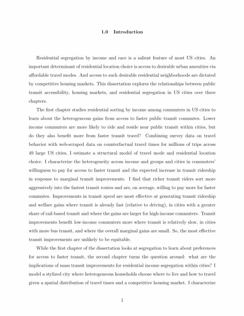
time. Table 1 shows mean travel times, distances and speeds across all commuting trips in
my sample conditional on each commuter choosing their observed residence, work location
and travel mode. On average, driving commutes are longer than transit commutes (both in
13The transit speeds do not include scheduling costs related to when to start the trip. For instance, GoogleMaps may ask the traveler to start their trip at a particular departure time to have them coincide with thearrival of a bus or train at the designated stop. The difference between the scheduled departure time and thetime the trip is queried is not included in the travel times. In subsequent analyses in Section 2.4 onwards,this schedule cost is covered by travel mode-origin fixed effects. Note, however, that wait times betweentransit transfers are included in the travel times.
12
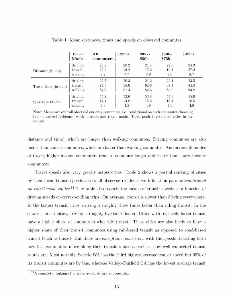
Table 1: Mean distances, times and speeds on observed commutes
TravelMode
Allcommuters
<$35k $35k-$50k
$50k-$75k
>$75k
Distance (in km)
driving 23.2 20.2 21.4 22.6 24.3transit 22.6 15.2 17.2 19.4 27.2walking 8.2 7.7 7.9 8.0 8.7
Travel time (in min)
driving 22.7 20.3 21.2 22.1 23.5transit 74.5 58.0 62.6 67.4 84.8walking 87.6 81.4 84.6 85.0 93.8
Speed (in km/h)
driving 55.2 52.6 53.8 54.9 55.9transit 17.1 14.8 15.6 16.4 18.5walking 4.9 4.8 4.9 4.9 4.9
Note: Means are over all observed one-way commutes, i.e. conditional on each commuter choosingtheir observed residence, work location and travel mode. Table pools together all cities in mysample.
distance and time), which are longer than walking commutes. Driving commutes are also
faster than transit commutes, which are faster than walking commutes. And across all modes
of travel, higher income commuters tend to commute longer and faster than lower income
commuters.
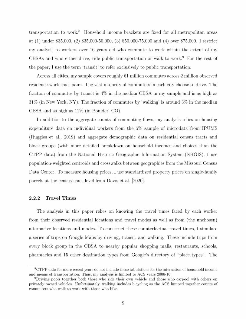
Travel speeds also vary greatly across cities. Table 2 shows a partial ranking of cities
by their mean transit speeds across all observed residence-work location pairs unconditional
on travel mode choice.14 The table also reports the means of transit speeds as a function of
driving speeds on corresponding trips. On average, transit is slower than driving everywhere.
In the fastest transit cities, driving is roughly three times faster than riding transit. In the
slowest transit cities, driving is roughly five times faster. Cities with relatively faster transit
have a higher share of commuters who ride transit. These cities are also likely to have a
higher share of their transit commutes using rail-based transit as opposed to road-based
transit (such as buses). But there are exceptions, consistent with the speeds reflecting both
how fast commuters move along their transit routes as well as how well-connected transit
routes are. Most notably, Seattle WA has the third highest average transit speed but 95% of
its transit commutes are by bus, whereas Vallejo-Fairfield CA has the lowest average transit
14A complete ranking of cities is available in the appendix.
13

Table 2: Ranking of cities by mean commuting speeds on transit
Rank City Transit speed(in km/h)
Ratio of transitto driving speed
% commutersriding transit
Rail share oftransit riders
1 New York, NY 20.2 0.35 30.7% 86.7%2 San Francisco, CA 18.9 0.31 15.5% 51.6%3 Seattle, WA 17.8 0.30 8.6% 5.2%4 Chicago, IL 17.7 0.28 11.9% 69.8%5 Philadelphia, PA 17.1 0.30 9.7% 46.0%
-10 Atlanta, GA 15.7 0.21 3.5% 30.8%
-15 Minneapolis, MN 15.1 0.20 4.8% 5.8%
-26 San Diego, CA 13.9 0.24 3.5% 11.0%
-37 Austin, TX 12.8 0.21 2.8% 1.1%
-49 Vallejo-Fairfield, CA 8.8 0.18 2.7% 33.3%
Note: Speeds are relative to shortest road distance (not necessarily the travel distance). Speedsand ratios of travel times are means across all trips between observed work-residence locationpairs (unconditional on travel mode choice) ignoring the top and bottom 5% of outliers. Railshare is the fraction of transit commutes via rail transit in the city.
14
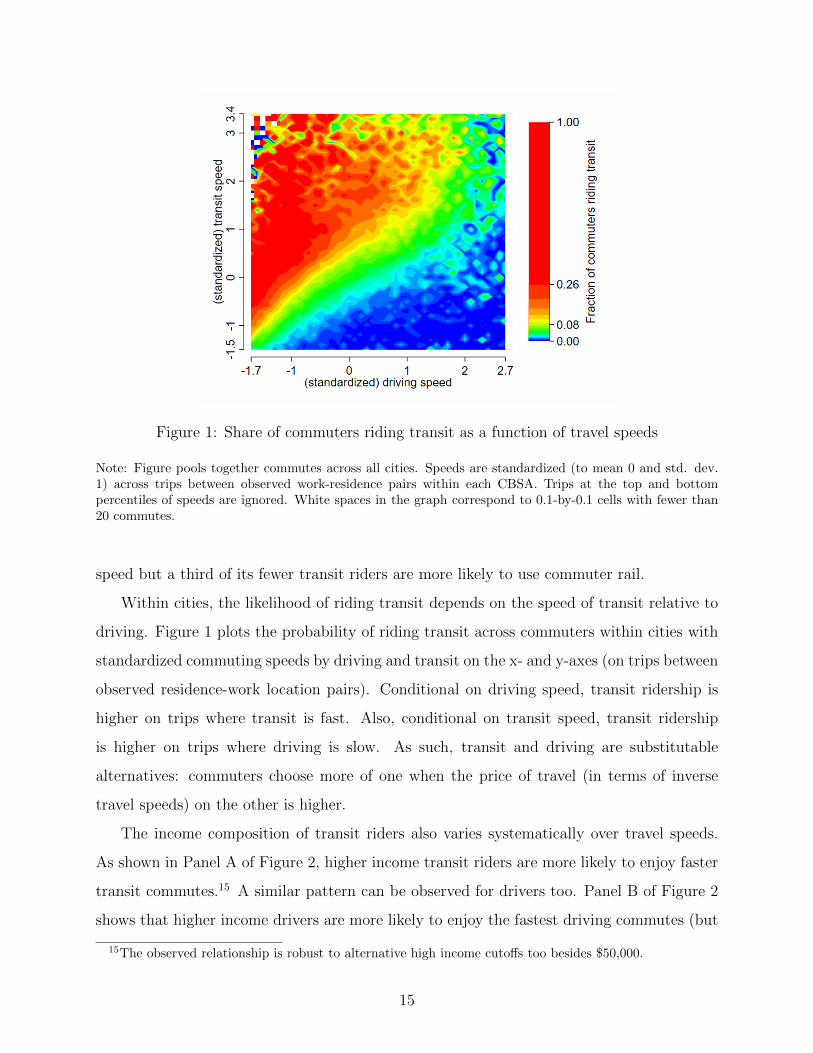
Figure 1: Share of commuters riding transit as a function of travel speeds
Note: Figure pools together commutes across all cities. Speeds are standardized (to mean 0 and std. dev.1) across trips between observed work-residence pairs within each CBSA. Trips at the top and bottompercentiles of speeds are ignored. White spaces in the graph correspond to 0.1-by-0.1 cells with fewer than20 commutes.
speed but a third of its fewer transit riders are more likely to use commuter rail.
Within cities, the likelihood of riding transit depends on the speed of transit relative to
driving. Figure 1 plots the probability of riding transit across commuters within cities with
standardized commuting speeds by driving and transit on the x- and y-axes (on trips between
observed residence-work location pairs). Conditional on driving speed, transit ridership is
higher on trips where transit is fast. Also, conditional on transit speed, transit ridership
is higher on trips where driving is slow. As such, transit and driving are substitutable
alternatives: commuters choose more of one when the price of travel (in terms of inverse
travel speeds) on the other is higher.
The income composition of transit riders also varies systematically over travel speeds.
As shown in Panel A of Figure 2, higher income transit riders are more likely to enjoy faster
transit commutes.15 A similar pattern can be observed for drivers too. Panel B of Figure 2
shows that higher income drivers are more likely to enjoy the fastest driving commutes (but
15The observed relationship is robust to alternative high income cutoffs too besides $50,000.
15

(A) High-income share of transit riders (B) High-income share of drivers
Figure 2: Share of commuters who are high-income by (standardized) speed of travel
Note: The figures pool together commutes across all CBSAs. Horizontal axis depicts travel speeds on chosenmode standardized (to mean 0 and std. dev. 1) across all observed commutes on the same made within eachCBSA. Trips at the top and bottom percentiles of speeds are ignored. Speed, in this context, is the shortestroad distance divided by travel time. Confidence intervals are in grey.
16

the mean differences are smaller than among transit riders). These patterns could be due
to an income-elastic preference for faster commutes that is missed if we focus only on travel
times instead of speeds. As explored further in Apprendix Section A.5.1, when commuters
travel faster, they also commute longer. And, as seen in Table 1, higher income commuters
have higher average travel times (and distances) on their chosen travel mode despite higher
travel speeds.
Having said that, unconditional on mode choice, higher income commuters are more likely
to sort into commutes where driving is fast. Figure 3 shows average commuter incomes
by driving and transit speeds between their work and residence. Given both driving and
transit commutes appear to be normal goods and driving is typically faster (cheaper in time)
than transit, it is unsurprising that average commuter incomes are higher where driving is
faster. In a few cases, incomes are also high where transit is fast and driving is not. The
model developed in the following section formalizes the intuitions presented so far. More
importantly, it allows me to isolate the extent to which the observed income sorting into
work-residence location pairs and travel modes informs us about heterogenous preferences
for faster travel as opposed to other spatially correlated features.
2.4 A Model of Travel Mode and Residential Location Choice
Suppose each city is composed of a fixed population of heterogeneous workers, a set of
residential neighborhoods n and work locations j, and three modes of travel m ∈ M =
{driving, transit,walking}. Workers classify under one of four income groups y, each with
a fixed population in the city and a different distribution of jobs across work locations.
Each worker i is exogenously assigned a work location and an income wi, and choose their
residential neighborhood and mode of travel to maximize their gains from shorter commutes
given heterogenous preferences over mode and neighborhood characteristics. The rest of
this section characterizes (and parameterizes) the worker’s decision problem and outlines a
strategy to estimate the preference parameters from available data.
17

Figure 3: Mean incomes of commuters as a function of driving and transit speeds
Note: Figure pools together commutes across all cities. Household incomes are means across commutesof medians of income brackets (based on micro-data). Speeds are standardized (to mean 0 and std. dev.1) across trips between observed work-residence pairs within each CBSA. Trips at the top and bottompercentiles of speeds are ignored. White spaces in the graph correspond to 0.1-by-0.1 cells with fewer than20 commutes.
18

2.4.1 Specification
Work locations determine the set of commuting times workers face to each residential
neighborhood by each travel mode, and workers from different income groups may have
different preferences over these commuting times. For instance, if higher income commuters
have a higher opportunity cost of time, they are likely to have a stronger prefernce for shorter
commutes. Commuting times (in log) can be decomposed into the (log) distance Djn from
work to residential neighborhoods minus the (log) average speed Sjmn along the route on
the chosen travel mode. The utility gain from commuting distance Djn at speed Sjmn is
denoted:
αSmySjmn − αDy Djn
where parameters αSmy and αDy dictate the income group-specific preferences over speeds and
distances (respectively). Note that when αCmy = αDy , they are just the coefficient on (log)
commuting time. But I allow preferences over speed αSmy to also vary with the choice of
travel mode m. The value of travel time spent riding the transit may differ from the time
spent driving (or walking), and consequently, so may preferences for travel times savings on
each travel mode (and differentially across income groups).
On the other hand, parameters αDy reflect the net gains from shorter commutes
unconditional on mode choice. Since workers have different work locations within the city,
they differ in their distances to high quality residential neighborhoods and, consequently,
in their accessibility gains from a longer commuting distance. So, αDy also encapsulate
differences in the geography of high- and low-income jobs within the city. Workers from
an income group with more jobs farther away from desirable neighborhoods are likely to be
more willing to commute longer and have a smaller αDy .16
Neighborhoods differ in their supply of developable land and a competitive housing
market determines the equilibrium housing prices pn (per unit of space) faced by the
neighborhood’s residents. While prices depend on the aggregate demand for housing
space in each neighborhood, each worker takes these prices as given when making housing
16Alternatively, if jobs are more substitutable across space (e.g. in terms of wages) for one income group,they may have a stronger preference for more centrally located jobs and a higher αDy . Modeling the geographyof jobs (and work location choices) explicitly is beyond the scope of this paper.
19

consumption and location choices. Housing is a normal good and individual demand for
housing space is increasing with income and decreasing with the price of housing. More
specifically, conditional on residing in neighborhood n, the housing consumption of worker i
is:
h(pn, wi) = (pn)αh(wi)αw (2.4.1)
where αh < 0 is the price elasticity and αw > 0 is the income elasticity of housing demand.
Net of preferences over housing costs and commuting times, each worker’s preferences
over neighborhoods and travel modes can be decomposed into two components: a common
preference across all workers in an income group and an idiosyncratic preference. Let δmny
denote the income group-specific utility from choosing neighborhood n and travel mode m.
This utility shifter captures differences across modes in the monetary cost of travel (such as
of vehicle ownership or transit fare) that affects each income group differently. They also
capture differences in the quality of residential amenities (such as schooling and crime) as
well as in location-specific attributes of travel (such as convenience of parking or waiting at
the nearest transit stop). The latter may include differences in how well (on average) the
commuting mode connects the residential neighborhood to non-commuting destinations and
non-residential amenities such as restaurants and shopping malls. While the (unobserved)
mode choices on non-commuting trips may be different from the observed mode choice on
commutes, the gains from owning a vehicle or a bus pass are greater when they improve
access to more than just the immediate work location.
Workers also have idiosyncratic preferences over neighborhood-mode alternatives and I
let εimny denote their idiosyncratic utility gains from choosing neighborhood n and mode m.
Assume εimny are random draws from a type 1 extreme value (T1EV or Gumbel) distribution
that is identical across workers and independent of their commuting and housing preferences.
Together with the aforementioned deterministic components of utility, workers’ choices in
equilibrium maximize the following (indirect) utility function:
Umn|ijy ≡ αSmySjmn − αDy Djn +(wi)
1−αw
1− αw− (pn)1+αh
1 + αh+ δmny + εimny (2.4.2)
20

The parameters αw and αh determine the diminishing marginal utility from higher incomes
and the marginal disutility from higher prices (respectively). The housing demand function
in (2.4.1) follows from Roy’s Identity.17
Preference parameters αSmy, αDy , αw and αh may vary across cities, but I drop the city
subscripts to simplify notation. That means preferences over commuting and housing depend
on city-level attributes such as (but not limited to) the spatial distribution of high- and low-
income jobs with respect to the travel network and city-level housing constraints. These
city-level attributes are exogenous with respect to each worker’s decision problem.
Finally, given the distribution of the logit error term εimny, the probability of a worker
from income group y and work location j choosing mode m and neighborhood n is
πmn|jy =exp
(Vmn|jy
)∑m′∈M
∑n′ exp
(Vm′n′|jy
) (2.4.3)
where Vmn|jy ≡ αSmySjmn − αDmyDjn + δmny −(pn)1+αh
1 + αh
2.4.2 Identification
In applying this utility specification to data, I address three important empirical
challenges to identifying preferences for faster commutes. First, travel times on
commutes depend on both the spatial distribution of transportation infrastructure (such
as transit routes and highways) and the spatial distribution of jobs relative to residential
neighborhoods. If work locations for higher income groups are farther away from desirable
residential neighborhoods, they may appear to have a smaller disutility from longer commutes
despite having a higher opportunity cost of travel time. Decomposing commuting times into
shortest-route road distances Djn and mode-specific speeds Sjmn allows me to isolate the
two effects and identify preferences over access to faster commutes conditional on proximity
to jobs. Furthermore, conditional on the income group-specific fixed effects, I am identifying
the coefficient on speed using variation across individuals in the same income group.
17By Roy’s Identity:
h(p, w) = − dU/dpdU/dw
21

Second, commuting speeds may be correlated with other (unobservable) attributes of
residential neighborhoods and travel modes. For example, if transit planners are more likely
to expand high-speed transit routes into neighborhoods with attributes more desirable to
the rich, then unless I control for these correlated neighborhood attributes in my regression,
higher income commuters would appear to have a higher coefficient on transit speed than they
actually do. My inclusion of alternative-specific constants for each income group δmny (fixed
effects) essentially controls for preferences over unobservable neighborhood-mode attributes.
Third, commuting speeds may be systematically correlated with the locations of high-
and low-income jobs. For example, if work locations of some income groups are better
connected by high-speed transit than driving relative to the work locations of others, then
these income groups would appear to have a higher coefficient on transit speed than they
actually do. To address this concern, I standardize the commuting speeds and distances
faced by each worker to mean 0 (and standard deviation 1) conditional on travel mode. In
doing so, any mean preference for one travel mode over another within an income group y
is absorbed by the group’s corresponding alternative-specific constant δmny. So, conditional
on commuting distance and income group-alternative-specific constants, the coefficients on
speed αSmy are the gains from shorter commuting time identified off of mode-specific variation
in speeds to different work locations in the city.18
In addition to the coefficients on commuting speed, I need to estimate housing demand
parameters αw and αh to be able to compare preferences for access to faster commutes
in terms of workers’ willingness to pay for housing. This exercise poses two additional
econometric challenges. First, the price elasticity of housing demand αh is not identifiable
from the utility specification because housing prices pn are necessarily correlated with
neighborhood characteristics captured by the fixed effects δmny. Second, the choice
probabilities in (2.4.3) do not inform us at all about the income elasticity of housing demand
αw. So, I need to identify these parameters separately. To do so, I exploit the housing
expenditure patterns of a representative micro-sample of each city’s working population.
Consider the log of the housing demand function in (2.4.1), which I can rewrite as a linear
18Later on, I transform the speeds and distances back to their unstandardized levels for evaluatingwillingness to pay and transit ridership responses to a percent change in travel speeds.
22

relationship between the log of total housing expenditure as a share of income (on the left)
and the logs of housing prices and incomes (on the right):
ln
(hinpnwi
)= (1 + αh) ln(pn) + (αw − 1) ln(wi) (2.4.4)
Then the price and income elasticities of housing demand follow directly from the coefficients
of (log) price and (log) income above.
2.4.3 Estimation
Estimation of the model parameters proceeds separately for each city and in two stages.
The first stage estimates the housing demand parameters αw and αh using micro-data on
individual housing expenditures in an OLS estimation based on (2.4.4). For each worker in
the census micro-sample, I observe both precise household incomes and the share of that
income spent on housing expenditures. I can combine them with tract-level standardized
housing prices from Davis et al. [2020].19 Then I regress the log of housing expenditure share
on log housing price and log household income as below.
ln
(HousingExpShare
)= αh ln
(Price
)+ αw ln
(Income
)(2.4.5)
where the coefficients are αh = 1 + αh and αw = αw − 1. See Appendix Section A.3 for
estimation details and results. Having estimated αh, the housing price component of each
worker’s choice probabilities −(p1+αhn )/(1+αh) is just a neighborhood-specific constant from
here on.
The second stage estimates parameters αSmy and αDy together with fixed effects δmny
using the data on observed commuting flows and counterfactual travel times in a maximum
likelihood estimation based on (2.4.2). The estimation maximizes the probability that the
model correctly matches each worker in the city to their observed nieghborhood and mode
19I do not observe the workers’ tracts of residence in the microdata. The smallest known geography ofresidence is the PUMA, which are slightly larger. So, instead, I assign each worker the expected housingprice experienced by workers in the same income bin and PUMA. See Appendix Section A.3 for details.
23

in the CTPP data. In particular, estimated parameters maximize the following sum across
all workers of the log-likelihood of their observed choices:
L =∑y
∑j
∑n
∑m∈M
Pjmny ln(πmn|jy
)(2.4.6)
where Pjmny is the observed population of commuters in income group y and work location j
who choose mode m and residence n. The estimation procedure then consists of numerically
searching over the twelve αSmy parameters and the four αDy parameters as well as the full
matrix of fixed effects δmny in order to maximize L.
The set of work locations are the census tracts in the city that receive non-zero commutes.
The choice set of residential neighborhoods in each city is the set of census tracts with non-
zero observed population of workers.20 The number of residential tracts ranges from 58 in
my smallest city (Trenton, NJ) to 3050 in my largest (New York, NY). So, given the large
number of fixed effects to be estimated for every mode, neighborhood and income group
combination, I exploit a contraction mapping approach popularized by Berry et al. [1995] to
speed up convergence to the optimal parameter estimates. See Appendix Section A.4 for
details.
Across all cities, income groups and travel modes, I estimate 588 different coefficients on
commuting speed. To make them comparable across cities and income groups, I combine
the estimated coefficients with my parameter estimates from the first stage to characterize
preferences in terms of the implied marginal willingness to pay (MWTP) in annual housing
costs for faster commutes.21 Appendix Table 20 reports the distribution of the (raw)
estimated coefficients on commuting distance and speed (αDy and αSmy) across the 49 cities.
The following section explores how the implied MWTP varies across cities and income groups.
20Commuters with either residence or work location outside of the extent of the city are dropped from thesample.
21The marginal willingness to pay (MWTP) for higher commuting speed is −dU/dSjmn
dU/dpn.
24

2.5 Estimated Preferences for Faster Transit
This section presents the estimated preferences for faster transit commutes in three
stages. First, I characterize the value of travel time conditional on travel mode choice.
In other words, how much are transit riders willing to pay for faster commutes (compared
to drivers)? Second, I characterize the marginal propensity of consumers to ride transit in
response to shorter transit travel times. In other words, how do increases in transit speed
affect transit ridership? Third, I combine the two results to characterize the overall expected
welfare gains from increases in transit speed (unconditional on mode choices) and how these
gains compare for rich and poor commuters.
2.5.1 Willingness to Pay for Faster Commutes
Conditional on travel mode choices, the mean estimated MWTP (per year) for a one
percent increase in travel speed on commutes (across all cities) is $98 among transit riders
and $142 among drivers. Assuming workers commute 5 days a week and commutes make
up 35% of their total time spent traveling (based on reported travel times in the 2017
NHTS)22, the mean MWTP estimates for speed imply a mean value of travel time savings
(VTTS) among transit riders of $7.4 per hour (and roughly 40% of the median transit rider’s
wage). In comparison, the mean VTTS among drivers is $15.5 per hour (which is 86% of
the median driver’s wage).23 My mean driving estimates are similar to contemporary value-
of-time estimates from other papers using alternative methodologies (Small, 2012), such as
means of $13-$14 per hour in Prague (Bucholz et al., 2020) and Vancouver (Craig, 2019).
There are no comparable estimates in the literature of the value of travel time on transit.
As shown in Table 3, the mean estimates mask large variation across cities. The table
reports the mean MWTP for faster travel by mode choice and city ranked by the MWTP
22The share of total travel time spent on commutes to work is calculated from the share of reported traveltimes spent on trips to work in the 2017 US National Household Travel Survey (NHTS). I assume increasesin travel speed on commutes also increases travel speeds on all other trips at the same rate.
23One reason for the VTTS among transit riders being a smaller share of wages than the VTTS amongdrivers is that transit riders are primarily concentrated in higher-income cities. So, across all cities, theaverage transit rider has a higher income than the average driver.
25
among transit riders.24 Because of the large number of commutes informing these preference
estimations, asymptotic standard errors are tiny (typically around one cent or less in MWTP)
and omitted from the tables.25 Focusing first on transit users, in San Francisco (the top
ranked city on the list), the MWTP for faster transit is $374 per year, almost four times the
average across all commuters. To benchmark these magnitudes, consider MWTP estimates
for other locational attributes. For example, Bayer and McMillan [2012] estimate MWTP
(per year) in the San Francisco Bay area of: $236 for access to schools with (1 standard
deviation) higher average test scores, $126 for 10% more college-educated neighborhoods
and $436 for neighborhoods with $10,000 higher average incomes.
While city-level MWTP for faster commutes for drivers are similar in magnitude to those
for transit riders, the rank ordering is different. When interpreting these preference estimates,
bear in mind that they reflect how aggressively transit riders and drivers bid for access to
(and sort into) locations with faster commutes. So, some of these cross-city differences in
mean MWTP also stem from differences in housing market constraints and urban amenities
that make housing in some cities more expensive than in others.
Incomes are another important determinant of a commuter’s MWTP estimate. Table
4 decomposes the mean MWTP by commuter’s income bracket and reports it for the two
largest cities in my sample. Unsurprisingly, richer transit riders have higher MWTP for
faster transit commutes than poorer transit riders. Also, richer drivers have higher MWTP
for faster driving commutes than poorer drivers. The estimates are consistent with the rich
having a higher overall value of travel time savings than do lower income commuters. When
I aggregate my estimates across all commuters, the magnitude of the income differences
are comparable to extant reduced form estimates in the literature.26 Some of the income
elasticity of MWTP are undoubtedly due to differences in the mean ability to pay (and richer
commuters generally spending more on housing). More notably, based on the differences
across income brackets, the income elasticity of the demand for faster travel appears to be
higher among transit riders than drivers. Table 5 pools together commuters across all 49
24A table of results for the full list of cities is in the Appendix.25In work in progress, I bootstrap the standard errors with Monte Carlo simulations to derive more credible
estimates.26Small [2012] reviews contemporary empirical estimates of value of time savings (VTTS) on commutes
and cites income elasticities of VTTS typically between 0.5 and 0.7.
26

Table 3: Cities ranked by mean MWTP for faster transit commutes
Rank City MWTP forfaster transit
MWTP forfaster driving
1 San Francisco, CA $ 374 $ 3022 Seattle, WA $ 188 $ 1793 New York, NY $ 178 $ 3454 San Jose, CA $ 169 $ 1395 Boston, MA $ 148 $ 1896 Washington, DC $ 129 $ 1567 Vallejo-Fairfield, CA $ 119 $ 698 Chicago, IL $ 116 $ 1799 Los Angeles, CA $ 114 $ 102
-20 Miami, FL $ 64 $ 75
-29 Phoenix, AZ $ 44 $ 47
-36 Urban Honolulu, HI $ 32 $ 19
-49 Las Vegas, NV $ 9 $ 17
Note: Cities are ranked by the mean MWTP for faster transit.MWTP values are means across all commuters for 1% changein travel speed on their observed commutes (i.e. conditional oncommuters choosing their observed modes and neighborhoods).See mean MWTP estimates for full list of cities in the Appendix.
Table 4: Mean MWTP for 1% increase in commuting speed
City Mode < $35k $35k-$50k $50k-$75k >$75k
New Yorktransit $43 $69 $125 $219driving $134 $211 $273 $401
Los Angelestransit $42 $62 $80 $146driving $51 $81 $81 $123
Note: MWTP values are means across all commuters for 1% increase intravel speed on their observed commutes (i.e. conditional on commuterschoosing their observed modes and neighborhoods). Asymptotic standarderrors are less than a cent.
27

Table 5: Mean relative MWTP across all cities
Mode < $35k $35k-$50k $50k-$75k >$75k
transit 1.00 1.40 2.00 3.24driving 1.00 1.47 1.86 2.57
Note: Reported values are the MWTP estimates for1% increase in commuting speed divided by the lowestincome group’s MWTP and averaged over commutesacross all cities.
cities and, for comparability across cities, presents the MWTP estimates as multiples of the
lowest income group’s MWTP. The average transit commuter with income over $75,000 is
willing to pay over three times more for a one percent increase in commuting speed than the
average transit commuter with income below $35,000. This is not just driven by differences
in the ability to pay. The table also shows the relative MWTP across income groups among
drivers, and the income elasticity of the willingness to pay for faster commutes is much
smaller among drivers than among transit riders (like in New York and Los Angeles).
Panel A of Figure 4 plots these relative MWTP estimates by city against mean transit
speeds relative to driving (from column 4 of Table 2). The rich have higher MWTP for
increase in transit speed relative to the poor in cities with faster transit. This figure highlights
a key finding of my work: transit improvements are relatively more attractive to the rich
when transit is fast. Another dimension of transit which is often associated with use by
the wealthy is rail transit versus bus transit. Rail transit typically has higher velocity than
buses, so the rail composition of a city’s transit network can proxy for average travel velocity
on transit (and an alternative to my measure of travel speeds). Panel B of Figure 4 plots
the relative MWTP estimates against each city’s rail share of transit usage (from column 6
of Table 2). Unsurprisingly, transit improvements are relatively more attractive to the rich
when transit is more rail-based.
28

(A) by mean (relative) transit speeds (B) by rail share of transit commutes
Figure 4: Mean MWTP for 1% increase in transit speed (relative to lowest income group)
Note: Each observation corresponds to a city. Vertical axis depicts the MWTP for faster transit as a fractionof the MWTP of commuters with incomes less than $35,000 (indicated by solid black line at 1). Horizontalaxis depicts either (a) the ratio of driving to transit travel times (across all observed commutes) in the city or(b) the share of transit riders in the city who commute by rail transit. Confidence intervals for each linear fitare shaded in corresponding color. For commuters with incomes $35k-$75k, figures plot population-weightedmeans of the MWTP estimates for the two middle-income groups in my data.
29

2.5.2 Willingness to Ride Transit
So far, I have focused on heterogeneity in MWTP for transit speed (or, if you will,
the demand for faster travel) among commuters who ride transit. MWTP is central to
evaluating welfare from the perspective of transit users, but transit policy is often predicated
on a broader set of concerns including reducing congestion and climate change concerns.
Evaluating policy along these dimensions requires assessing how policies impact the decision
to use transit instead of driving. To this end, I use my model to estimate the probability of
non-transit commuters switching to riding transit if transit is made faster. Let Rjny denote
the transit ridership among income group y on commutes between neighborhood n and work
location j. I can solve for a commuter’s marginal willingness to ride transit (or, in aggregate
terms, the marginal change in transit ridership), denoted MWTT, in response to a percent
increase in transit speed on their commuting route.27 The MWTT measures the predicted
change in the probability of transit use along a given work-residence commuting route in
response to a percent increase in speed along the route.
Table 6 reports the mean MWTT across all commuters in a city conditional on observed
residential location choices. The cities at the top of the list, where marginal improvements in
transit speed would be most effective at generating new transit ridership, are likely to be cities
with high pre-existing transit ridership (but not always). The top of the list includes both
cities with high rail transit usage among transit riders (such as Chicago, Washington and
Boston) and ones with very low rail transit usage (such as Seattle, Portland and Pittsburgh).
These cities also attract transit riders at different rates across income groups. Table
7 compares the MWTT across income groups for New York and for Los Angeles. In New
York, a one percent increase in transit speeds everywhere increases transit ridership more
among higher income commuters than lower income commuters. However, the opposite is
true in Los Angeles, where lower income commuters are twice as likely to increase transit
ridership. The case of Los Angeles is more common among other cities, but there is also a
27Formally, the marginal willingness to ride transit (MWTT) is defined:
MWTTjny =dRjny
dSjtransitn≡ d
dSjtransitn
(πtransitn|jy∑m∈M πmn|jy
)= αStransityRjny(1−Rjny)
30

Table 6: Cities ranked by MWTT from 1% increase in transit speeds
Rank City %age pt change intransit ridership
Baseline transitridership (in %)
1 San Francisco, CA 3.52 15.52 Chicago, IL 2.97 11.93 Washington, DC 2.97 14.54 Seattle, WA 2.88 8.65 Boston, MA 2.76 12.46 Portland, OR 2.22 6.67 New York, NY 2.22 30.78 Philadelphia, PA 1.81 9.79 Pittsburgh, PA 1.77 6.0
-18 Miami, FL 0.80 3.8
-25 Urban Honolulu, HI 0.71 8.2
-34 Phoenix, AZ 0.55 2.3
-49 Rochester, NY 0.13 2.1
Note: Cities are ranked by the MWTT in response to a 1% increasein transit speed along all observed commutes (i.e. conditionalon commuters choosing their observed neighborhoods). See meanMWTT for full list of cities in the Appendix.
31

generalizable pattern here. Cities with high (baseline) transit ridership among commuters
are more likely to have high MWTT among richer commuters (relative to the MWTT among
poorer commuters). Table 8 groups together cities by each city’s (baseline) transit ridership.
For comparability across cities, I present the MWTT estimates as fractions of the lowest
income group’s MWTT. In most cities, baseline transit ridership is low and poorer commuters
have much larger MWTT. However, in the five cities where more than 10% of the commutes
are by transit, the MWTT is similar if not larger for richer commuters.
These five cities (New York, San Francisco, Chicago, Boston and Washington DC) also
happen to be (among the seven) cities with more rail transit riders than road transit riders.
Since higher income transit riders benefit more from improvements in rail-heavy transit
networks (as I showed in Section 2.5.1), it is unsurprising that these improvements also
increase transit usage relatively more among higher income commuters.
Table 7: Mean MWTT from 1% increase in commuting speed
City < $35k $35k-$50k $50k-$75k >$75k
New York 1.5% 1.3% 1.9% 2.5%Los Angeles 1.8% 1.4% 1.2% 0.9%
Note: Table reports percentage point change in total transitridership across all commuters in response to 1% increase intransit speeds.
Table 8: Mean relative MWTT across cities
Cities with . . . < $35k $35k-$50k $50k-$75k >$75k
less than 10% commuters riding transit 1.00 0.61 0.52 0.40more than 10% commuters riding transit 1.00 0.86 1.15 1.53
Note: Reported values are means across all commuters of their MWTT estimate divided bythe lowest income group’s MWTT over the same commuting route.
More generally, cities with higher overall (baseline) transit ridership and higher overall
marginal transit ridership (namely higher overall MWTT) have larger relative MWTT among
higher income commuters. Figure 5 illustrates this point by plotting the relative MWTT
across income groups as a function of both the city’s overall baseline transit ridership
32

and overall MWTT.28 In cities with higher baseline transit ridership and where transit
improvements are most effective at generating new ridership, transit improvements also
increase ridership relatively more among higher income commuters.
2.5.2.1 Within Cities
The data show similar patterns in marginal transit ridership across locations within cities.
So far, the analysis has focused on city-wide improvements in transit speeds. For evaluating
MWTT within cities, I now consider increasing speeds only along particular commuting
routes. To illustrate general patterns, I plot means for the route-specific results aggregated
along two dimensions: (standardized) driving speed and (standardized) transit speed.29 I
plot these results for commuters in each of three income brackets. Figure 6 shows contour
plots for New York and Los Angeles of the MWTT from an increase in transit speed at
different points along the city’s observed commuting network.30 The x- and y-axes depict
existing driving and transit speeds on the route. The axes scales are fixed so that the colors
representing the MWTT are comparable across income groups and cities.
28Income differences in mean MWTT across cities are also correlated with mean transit speeds relativeto driving and the city’s rail share of transit usage. Appendix Figures 24 plot the relative MWTT acrossincome groups as a function of both the city’s rail share of transit commutes and its mean transit speedrelative to driving.
29As before, for comparability across cities, speeds are normalized across all commutes within each city.30Note that the MWTT does not capture commuters moving across residential neighborhoods, and hence
the graphs depict the change in transit ridership among commuters given their (observed) work and residence.Section 2.5.3 relaxes this assumption.
33

by (baseline) share of commuters riding transit by overall MWTT (across all commuters)
Figure 5: Mean MWTT from 1% increase in transit speed (relative to lowest income group)
Note: Each observation corresponds to a city. Vertical axis depicts the MWTT for faster transit as afraction of the MWTT of commuters with incomes less than $35,000 (indicated by solid black line at 1).Horizontal axis depicts in log scale either (a) the baseline transit ridership (across all observed commutes)in the city or (b) the mean MWTT across all commuters. Confidence intervals for each linear fit are shadedin corresponding color. For commuters with incomes $35k-$75k, figures plot population-weighted means ofthe MWTT estimates for the two middle-income groups in my data.
34

New York, Incomes<$35k New York, Incomes $35k-$75k New York, Incomes>$75k
Los Angeles, Incomes<$35k Los Angeles, Incomes $35k-$75k Los Angeles, Incomes>$75k
Figure 6: Mean MWTT by location of transit improvement
Note: The x- and y-axes depict standardized driving and transit speeds (resp.) on the commuting route. The z-axis depicts the percantage pointchange in transit ridership in response to a 1% increase in transit speed along the commuting route. The z-axis colours are fixed across all graphs.Speeds are standardized (to mean 0 and std. dev. 1) across trips between observed work-residence pairs within each CBSA.. Trips at the top andbottom percentiles of speeds are ignored. White spaces in the graphs correspond to 0.1-by-0.1 cells with fewer than 20 commutes.
35

I highlight two regularities that are clear from these graphs. First, as seen from the
increasingly reddish shades at the top-left of each graph, the maginal gains in transit ridership
are higher along routes where transit is already relatively fast (or driving is relatively slow).
The figures suggest that the relationship between transit ridership and transit speed is
convex. Marginal transit improvements may seem ineffective at the beginning when transit
is slow, but would yield increasingly larger ridership returns.
Second, in New York, the ridership gains among higher income commuters are much
larger (compared to lower income commuters) where driving is relatively slow. Whereas
in Los Angeles, it is the opposite: lower income commuters are the ones more likely to
increase transit ridership along the (relatively) slow driving routes. The graphs for other
rail-transit cities like Chicago, Washington DC and San Francisco with high overall transit
ridership resemble that of New York in that high-income commuters have a larger MWTT
where driving is relatively slow. Whereas, graphs for most other cities look like those of
Los Angeles where low-income commuters have a larger MWTT when driving is relatively
slow.31 There are, however, exceptions like Seattle (where transit is fast and only 5% of
transit commutes are by rail transit) where the distribution of the ridership gains for high
and low income commuters look similar (see Appendix Figure 25).
More generally, the routes where marginal transit improvements are most effective at
generating new transit ridership across all income groups (such as where driving is relatively
slow to begin with) are ones: (a) where the ridership gains are larger among the rich in
high-speed rail-transit cities like New York or (b) where the gains are larger among the poor
in low-speed road-transit cities like Los Angeles.
2.5.3 Distribution of Welfare Gains
Finally, what are the welfare gains across income groups from faster transit commutes? In
Section 2.5.1, I presented the gains from faster travel for transit riders and drivers conditional
on their observed mode and location choices. Now, having characterized how higher transit
31While the increase in transit ridership (in terms of percentage point change) is larger among lower-incomecommuters, the percentage change from baseline transit ridership is larger among higher income commuters,who have very low transit usage in cities like Los Angeles.
36

speeds affect the probability of riding transit (conditional on neighborhood choices), this
section quantifies the average commuter’s expected marginal gains (in terms of their marginal
willingness to pay) from increase in travel speeds unconditional on their mode and location
choice, denoted unconditional MWTP or ’uMWTP’ for short. In other words, I compute
the marginal gains from increases in transit speed for all commuters (not just transit riders)
accounting for re-sorting across both travel modes and residential locations.32
Table 9 compares estimates of uMWTP for a one percent increase in travel speeds by
driving and transit in New York and Los Angeles. The uMWTP for an increase in transit
speeds are an order (or two) of magnitude smaller than the uMWTP for an increase in
driving speeds, which is unsurprising given generally low baseline transit ridership. Higher
income commuters have a higher willingness to pay than lower income commuters for faster
driving commutes, but the income elasticity of the gains from faster transit commutes varies
by city. In New York, the uMWTP for faster transit is higher among richer commuters.
Whereas in Los Angeles, the uMWTP for faster transit is higher among poorer commuters.
Table 10 generalizes this result across all cities and presents the uMWTP estimates relative
to that of the lowest income group’s. As in Los Angeles and New York, higher income
commuters consistently benefit more from increases in driving speeds. However, the lowest
income commuters benefit most on average from increases in transit speeds. And as with
transit ridership in the previous section, the gains from increases in transit speeds are (over
four times) larger for poorer commuters in cities with low baseline transit ridership but (over
two times) larger for richer commuters in cities with high baseline transit ridership.
32Note that welfare gains in this context only refer to the direct utility gains from shorter commuting timesas formalized in Section 2.4. They do not account for general equilibrium effects, such as through changesin congestion or the locations of jobs and residential amenities.
37

Table 9: Mean u(nconditional)MWTP for 1% increase in travel speeds
City Mode < $35k $35k-$50k $50k-$75k >$75k
New Yorktransit $18 $24 $33 $44driving $131 $231 $316 $478
Los Angelestransit $2.9 $2.9 $2.2 $0.9driving $62 $101 $101 $154
Note: uMWTP values are means across all commuters in the income group for1% change in travel speeds everywhere. Asymptotic standard errors are less thana cent.
Table 10: Mean relative uMWTP across all cities
Mode < $35k $35k-$50k $50k-$75k >$75k
All citiesdriving 1.00 1.56 2.00 2.83transit 1.00 0.84 0.83 0.92
with less than 10% transit ridership transit 1.00 0.70 0.48 0.24
with more than 10% transit ridership transit 1.00 1.13 1.54 2.33
Note: uMWTP estimates are divided by the lowest income group’s and averaged over commutesacross all cities.
How do these distributional effects compare to the overall welfare gains from faster
transit? Table 11 ranks cities by their overall mean uMWTP for faster transit (across
all income groups).33 Cities with higher overall uMWTP (across all commuters) for faster
transit are ones where both overall (baseline) transit ridership and the rail share of transit
ridership are high. Most remarkably, the five cities with the highest uMWTP are also the only
cities in my sample where commuters with incomes above $75,000 have a larger uMWTP for
faster transit than commuters with incomes below $35,000. These cities are able to attract
disproportionately more high income transit riders (as seen in Section 2.5.2), and higher
income transit riders have a higher willingness to pay for faster commutes especially when
33While some of the cross-city differences in the magnitudes of uMWTP may be attributable to city-specifichousing markets, cities with higher uMWTP for faster transit also have higher uMWTP for transit relativeto driving. Column 6 of the table presents the ratio of the uMWTP for faster transit to the uMWTP forfaster driving, and a ranking of cities based on this ratio is strongly correlated to the ranking presented. SeeAppendix for a complete ranking of cities by uMWTP for faster transit.
38

transit is already relatively fast and rail transit is more prevalent (as seen earlier in Section
2.5.1).
More generally, this result reflects the fact that as I move up the ranking of cities,
richer commuters stand to benefit increasingly more (relative to poorer commuters) from
marginal improvements in transit speed. Panel A of Figure 7 illustrates this point by
plotting each city’s mean uMWTP for faster transit of higher income commuters relative
to commuters with incomes below $35,000. The horizonal axis depicts the mean uMWTP
across all commuters (in log scale). Cities with the highest per capita gains from marginal
transit improvements are also ones where the welfare gains are more likely to accrue to
the rich. And these are also the cities where transit improvements are most effective at
generating new transit ridership, as shown in Panel B of Figure 7. After all, overall gains
in transit ridership are higher when, as shown earlier in Section 2.5.2, the gains are also
disproportionately higher for the rich than the poor.
39

Table 11: Cities ranked by uMWTP for faster transit
uMWTP for faster transit Relative todriving
Rank City allcommuters
incomes<$35k
incomes>$75k
allcommuters
1 San Francisco, CA $ 39.82 $ 17.24 $ 46.26 0.1182 New York, NY $ 38.75 $ 18.22 $ 44.21 0.0953 Boston, MA $ 16.19 $ 12.90 $ 16.04 0.0754 Washington, DC $ 14.81 $ 13.86 $ 14.31 0.0875 Chicago, IL $ 11.44 $ 4.81 $ 16.29 0.0536 Seattle, WA $ 7.87 $ 9.33 $ 6.96 0.0387 Philadelphia, PA $ 5.69 $ 8.20 $ 4.49 0.0388 Portland, OR $ 2.49 $ 4.26 $ 1.67 0.0239 Pittsburgh, PA $ 2.01 $ 3.51 $ 1.52 0.018
-21 San Diego, CA $ 0.51 $ 1.37 $ 0.18 0.005
-35 Phoenix, AZ $ 0.24 $ 0.65 $ 0.10 0.004
-49 Provo-Orem, UT $ 0.02 $ 0.06 $ 0.00 0.001
Note: Cities are ranked by their mean uMWTP (across all commuters) for 1%increase in transit speeds. Reported uMWTP values are estimates of mean MWTPacross all commuters unconditional on their choices of mode and neighborhood.Ratio in column 6 divides uMWTP estimates in column 3 by estimates of the city’smean uMWTP for 1% increase in driving speeds. See rankings for full list of citiesin the Appendix.
40

(A) by mean uMWTP across all commuters (B) by mean MWTT across all commuters
Figure 7: Mean unconditional MWTP for a 1% increase in transit speed
Note: Vertical axis depicts the income group’s mean (relative to commuters with income below $35,000) andhorizontal axis depicts (in log scale) the mean across all commuters of either (a) uMWTP or (b) MWTT.Each observation corresponds to a city. Confidence intervals for each linear fit are shaded in correspondingcolor. For incomes $35k-$75k, I plot population-weighted averages of the uMWTP of the two middle-incomegroups in my data.
2.6 Conclusion
In this paper, I introduce a methodology for evaluating the demand for faster commutes
by public transit and driving based on observed residential location and travel mode choices
within cities. In doing so, I address two important empirical challenges that has limited past
work on this topic. The first one is a (sparse) data challenge: I need to compare chosen (and
observed) commutes to unchosen (and unobserved) ones. To measure the latter, I combine
millions of scraped trip queries on Google Maps with data on street networks to predict
travel times on all possible alternative commutes between census tracts in US cities. The
second challenge is to disentangle the extent to which observed choices and the gains from
41

them (as reflected in housing prices) are due to differences in commuting speeds as opposed
to other spatially correlated features of travel modes and neighborhoods. To that end, I
propose a discrete choice model that complements my rich data environment with detailed
fixed effects in order to identify heterogeneous preferences over commuting speeds. Applying
this model to 49 US cities with different transit networks reveals many new insights on the
expected ridership and welfare gains from transit improvements across income groups and
cities.
Among other things, I show that the demand for faster transit commutes is small relative
to the demand for faster driving commutes and depends importantly on the speed of transit
relative to driving along commutes as well as on the prevalence of rail transit in the city.
Ridership and welfare gains from transit improvements are larger for high income commuters
in cities with already high transit ridership, relatively fast transit and high rail transit usage.
The opposite is true (that is, larger gains for lower income commuters) in cities with low
baseline transit ridership, relatively slow transit and low rail transit usage. And because
higher income transit riders have a higher willingness to pay for faster transit commutes,
cities where transit improvements are more attractive to the rich are also the ones where
they generate more overall transit ridership and welfare. While transit improvements are
often believed to reduce inequality in cities, this result suggests that transit improvements
most in demand (and, consequently, more likely to be cost-effective and to be realized) are
likely to trade off equity for efficiency.
While the paper’s findings shed light on several important policy questions, it also opens
up new ones that the paper leaves unanswered. For instance, why are transit improvements
in rail-transit-heavy cities more likely to benefit the rich? One hypothesis is that because
rail transit expansions can be much costlier than road transit expansions, transit planners
may be under greater pressure to target efficiency (and high income commuters) over equity
(and low income commuters) when choosing where to improve rail transit. Whereas, with
buses, planners may focus more on equity. They may also be wary of transit-induced
neighborhood gentrification and income segregation in the city. In ongoing work in progress,
I am simulating the effect of counterfactual transit improvements in my 49 US cities on
residential location choices in order to study who are likely to gentrify newly transit-accessible
42
neighborhoods. In a companion theoretical paper (Akbar, 2020), I explore the decision
problem of a transit planner trying to generate new transit ridership or reduce income
segregation given heterogeneous preferences over commuting speed. Akbar [2020] shows
that urban planners trying to maximize transit ridership have an incentive to target high-
speed (such as rail) transit improvements where they are also likely to exacerbate income
segregation but low-speed transit (such as shared-lane bus) improvements where they are
likely to reduce segregation.
43

3.0 Public Transit Access and Income Segregation
3.1 Introduction
Public transportation is typically considered a means of more targeted welfare
improvements for the urban poor, but is also often held responsible for concentrating poverty
in cities (Kalachek, 1968, Glaeser et al., 2008). Public transit is typically cheaper and
slower than private vehicles and can, thus, disproportionately benefit relatively low-income
households. However, transit networks tend to also be sparsely connected relative to the
urban road network. Residential neighborhoods that are close to desirable destinations by
driving may be relatively poorly connected by transit (and vice versa). So when high and
low income households differ in their travel mode choices, they may also differ in preferences
over transit- and driving-accessible neighborhoods. Carefully planned transit expansions can
improve low-income households’ access to otherwise high-income residential neighborhoods.
But transit expansions also have the potential to segregate the poor further in low-income
(and potentially low-quality) neighborhoods.
A burgeoning literature shows that socio-economic mobility varies substantially based on
where children grow up (Chetty and Hendren, 2018), and low-income families in U.S. cities
tend to be segregated in lower-opportunity neighborhoods (Bergman et al., 2019). So the
spatial concentration of the urban poor can contribute to the persistence of income inequality
(Fogli and Guerrieri, 2019) and intergenerational poverty (Chetty et al., 2014). As a result, it
can also lead to inefficient labor market equilibria (Benabou, 1993), segregation along other
dimensions like race (Sethi and Somanathan, 2004), and disproportionately worse access
to good schools and desirable urban amenities for the urban poor (Couture et al., 2020,
Fernandez and Rogerson, 1996).
To relieve increasing levels of urban congestion and environmental pollution, local
governments and international financial institutions are slated to spend large sums on mass
transit systems.1 Given the persistence of such travel infrastructure and their role in shaping
1For instance, China spent over USD 100 billion on rail transit infrastructure in 2017 alone (OECD, 2019)
44

the long-run structure of cities (Heblich et al., 2018), it is important to understand how
the type and distribution of new mass transit infrastructure within cities affect residential
segregation and how the accessibility gains are distributed between the rich and the poor.
In particular, when might new mass transit infrastructure exacerbate residential segregation
by income? As cities rush to switch more commuters to riding mass transit, how would
transit improvements need to be distributed across space to minimize income segregation?
And to what extent would such a transit network be consistent with policies that focus on
increasing mass transit ridership and battling negative externalities of driving?
To tackle these questions, this paper models the relationship between transit expansions
and residential income segregation in a stylized city. Given a network of travel times from
each residential neighborhood and by each mode of travel in the city, heterogenous households
in the model choose where to live and how to travel. Differences in the willingness to pay
for faster travel lead high income households to ride the faster travel mode more often and
low income households to ride the cheaper mode more often. As a result, conditional on
other neighborhood differences, high-income households are willing to pay more to reside
in the neighborhood that is more accessible by the faster mode of travel, while low-income
households are willing to pay more to reside in the neighborhood that is more accessible by
the cheaper mode of travel. Housing prices capitalize the demand for each neighborhood
through a competitive housing market and dictate the subsequent sorting by income. I show
that the effect of new transit improvements on residential income segregation is minimized
either when high and low income households use both modes of travel equally often or when
both neighborhoods are equally accessible by transit relative to driving. When public transit
is slow relative to driving (such as buses on shared lanes) and attracts more low-income riders,
income segregation is minimized by improving transit access from the richer neighborhood.
Whereas, when public transit is relatively fast (such as subways) and attracts more high-
income riders, income segregation is minimized by improving transit access from the poorer
neighborhood.
I then endogenize the location of public transit improvements as the choice of a planner
trying to maximize new transit ridership. I show that this planner’s optimal policy is to
and opened over 45 subway lines across 25 cities just between Aug 2016 and Dec 2017.
45

improve transit access from the neighborhood with higher aggregate incomes, where there
are more drivers likely to benefit from switching to riding transit. These transit improvements
inadvertently exacerbate income segregation when transit has more high-income ridership
(and is relatively fast) but reduce income segregation when transit has more low-income
ridership (and is relatively slow). My results serve to highlight the tension between efficient
and equitable policy outcomes. As fast growing cities implement new high-speed transit
infrastructure to efficiently move drivers off the streets, there is an incentive to focus on
areas with a high density of high-income commuters and risk further income segregation. I
show that changes in public transit ridership in US cities over the last 3 decades are consistent
with my model’s predictions given these policy incentives. I also document a shift in recent
years towards transit developments that minimize income segregation.
3.1.1 Related Literature
The literature has long recognized that the availability, speed, and price of public
transportation facilities may disproportionately affect employment opportunities for black
and low-income households (Kalachek, 1968). More recently, Glaeser et al. [2008] compares
metropolitan areas in the U.S. and finds that the urbanization of poverty comes mainly from
better access to public transportation in central cities. The intuition behind this claim is
that the opportunity for poor and rich households to sort into different travel mode choices
allows them to avoid competing for the same housing stock and instead segregate across
more and less transit accessible neighborhoods. As such, urban public transportation acts
as a poverty magnet. In constrast, I show that access to public transportation need not lead
to greater income segregation for a host of possible travel configurations. In fact, the income
sorting on public transit access can reduce income segregation arising from other spatial
features of the city such as the distribution of amenities and driving times, making urban
public transportation a potential tool for income desegregation. However, I also show that
transit authorities trying to increase the city’s overall transit ridership are incentivized to
expand the transit network in ways that further segregate the rich and poor, consistent with
the empirical observations of Glaeser et al. [2008]. To my knowledge, my paper is the first
46

systematic attempt to generalize how the distribution of the city’s public transit network
translates into differential access to opportunities for low and high income households.
This paper also helps reconcile a growing body of empirical evidence from evaluations of
new urban transportation infrastructure. The vast majority of these studies focus on high-
speed mass transit expansions and often find evidence of more income segregation (Heilmann,
2018, Glaeser et al., 2008), but not always (Kahn, 2007, Craig, 2019, Pathak et al., 2017).2
And even when not explicitly studying segregation, researchers have found large disparities
in welfare implications for the rich and the poor that are correlated with gains in overall
transit ridership in ways consistent with this paper’s findings. For instance, bus rapid transit
(BRT) expansions in Bogota (Tsivanidis, 2019), led to large accessibility gains for the high-
skilled and the rich as well as large gains in overall ridership. Whereas with a similarly
large-scale BRT expansion in Jakarta (Gaduh et al., 2020), the gains in ridership were
modest and mostly concentrated among middle and low income households, and did little
to reduce road congestion. Contemporary studies of mass transit expansions also study
effects on population growth and decentralization (Gonzalez-Navarro and Turner, 2018),
road congestion (Gu et al., 2019) and gender inequality (Kondylis et al., 2020) among other
things that are beyond the scope of this paper but also relevant to the discussion on optimal
transit policy reform.
Methodologically, this paper contributes to the literature modeling and documenting the
distribution of transportation infrastructure and populations within cities. A large class of
spatial equilibrium models study income sorting within cities (Wheaton, 1977 and variants)
and its interaction with travel mode choice (LeRoy and Sonstelie, 1983 and variants). These
models tend to offer households a continuum of residential location choices over a very
specific cityscape that mechanically causes a discrete number of household types (such as
rich and poor) to segregate perfectly across space. Empirical studies have traditionally
built on this framework to document changes in population and property prices primarily
as a function of proximity to the city center (Gonzalez-Navarro and Turner, 2018, Baum-
Snow, 2007). Instead, I let the cityscape be defined flexibly using only a set of travel times
2There are also cross-sectional studies that have linked transit availability to greater income mixing(Blumenberg and Ong, 2001, Sanchez, 2002).
47

with no underlying topographic constraints. Among other things, doing so allows me to
consider scenarios where mass transit networks are sparse and travel times by transit are
uncorrelated (or even negatiively correlated) with driving times. I also deviate from these
spatial equilibrium models by having a continuum of household types sorting into a discrete
number of choices, similar to Epple and Platt [1998], Sethi and Somanathan [2004] and
related equilibrium sorting models where segregation can be an outcome of interest at the
intensive margin. In doing so, this work connects to a number of theoretical and empirical
papers outside of the transportation literature that have modeled residential location choices
similarly over a discrete set of neighborhoods to study, for instance, the effect of residential
segregation on labor market efficiency (Benabou, 1993) and inequality (Fogli and Guerrieri,
2019) or the effect on segregation of local amenities such as public school financing (Fernandez
and Rogerson, 1996) and air pollution (Banzhaf and Walsh, 2013). Finally, while I focus on
the impact of public transit on income segregation, the framework developed in this paper
could be adapted to model transit-induced segregation along other demographic dimensions
of interest. For instance, Baum-Snow and Kahn [2000] document disproportionately higher
mass transit usage among black, female, college-educated and unmarried urban residents.
The rest of this paper is organized as follows. Section 3.2 documents income differences
in urban mass transit ridership and residential location choices in data from U.S. cities.
Section 3.3 introduces a model of travel mode and residential location choices by heterogenous
households in a stylized city. Section 3.4 studies the effect of improving transit access on
household choices in equilibrium and income segregation, and characterizes how the effect
varies with the location of transit on the existing travel network. Section 3.5 characterizes
optimal transit improvements from the perspective of a planner trying to maximize overall
transit ridership, documents changes in observed transit ridership in US cities, and discusses
their implications for income segregation. Section 3.6 shows the results’ robustness to several
generalizations of the baseline model. Section 3.7 concludes.
48

3.2 Empirical Observations
Poorer households tend to reside closer to public transportation in cities. Panel A of
Figure 8 shows that median household incomes in New York city (NYC) census tracts
are significantly lower closer to transit stops.3 Housing prices near transit stops are also
higher, suggesting a higher willingness to pay for better transit access (and correlated urban
amenities) among poorer households. Panel B of Figure 8 plots average housing price indices
from the US Federal Housing Finance Agency for each of our NYC tracts against their
distance to mass transit conditional on median household incomes.4 Census tracts within
half a kilometer of mass transit are likely to have higher housing prices (by roughly half a
standard deviation) than tracts beyond with the same median incomes. Similar patterns
have been observed for other large US cities, leading Glaeser et al. [2008] to deem public
transportation a poverty magnet. Figure 9 plots the inequality in median incomes across
neighborhoods in US metropolitan areas as a function of the share of total commuters who
ride mass public transportation. Cities that have high transit ridership also tend to have
more income segregation. However, this observed relationship between transit and income
segregation masks important heterogeneity in preferences for transit access.
3.2.1 Transit Ridership by Household Income
Panel A of Figure 10 plots as a function of annual household income the fraction of
workers in U.S. cities for whom the primary means of commute is public transportation.5
3To make sure we are not just comparing downtowns to suburbs, I restrict the graph to only tracts within1 km (on average) of transit stops. But even beyond 1 km, median household income continues to be higherthan $100,000.
4The US Federal Housing Finance Agency (FHFA) publishes monthly census tract-level housing priceindices based on repeat mortgage transactions on single-family properties. I use their 2017 price indices toestimate the following semi-parametric regression:
HousingPriceIndex = f(DistanceToTransit
)+MedianHouseholdIncome
5Data is based on the American Community Survey 2013-17. The ACS surveys 5% of US households overa 5-year period. My sample (courtesy of Ruggles et al., 2019) includes all survey respondents who lived ina Census-designated city, was above 16 years of age and was working at the time of the survey. I discretizehousehold income into 10 bins, starting at $1, $15,000, $25,000, $35,000, $50,000, $75,000, $100,000, $125,000,$150,000, and $200,000.
49

(A) Median household income in NYC census tracts from ACS 2013-17
(B) FHFA housing price index (2017) conditional on median houshold income
Figure 8: Incomes and housing prices by distance to mass transit stops in NYC
Note: Values on vertical axes are kernel-smoothed functions of distance to nearest bus, rail or subway stopfor the average household in the census tract. Gray area depicts 95% confidence interval.
50

Figure 9: Residential segregation by income against share of commuters who ride mass
public transit
Note: Figure covers U.S. metropolitan areas with population over 300,000. Vertical axis depicts the Ginicoefficient of median household incomes across Census block groups, based on data from the 2006-10American Community Survey.
51

Ridership on public transportation that share the road with car traffic, as in buses (and
streetcars and trolley cars), is decreasing with household income. In contrast, ridership on
subway, elevated and rail transit is increasing with income. Panel B restricts the sample
to only cities with both high road and rail transit ridership to show that this income
difference in transit ridership is not just due to higher incomes in cities with more rail
transit. Richer households happen to have better access to rail transit within cities (despite
transit-accessible neighborhoods being relative poorer). Panel C plots transit ridership across
different neighborhoods of NYC.6 Conditional on residing in a census tract that is well
connected by both subway/railway and bus, the rich and poor are equally likely to ride
public transit. When we look at tracts close to bus stops but far from subway/railway stops,
transit ridership starts to decrease with income. The relationship slopes down even further
when we look at tracts that are sparsely connected by either type of transit. So, cities with
denser transit networks and more rail transit tend to have higher overall transit ridership as
well as a larger share of transit riders who are high-income.7
3.2.2 Changes in Public Transit and Neighborhood Incomes
Finally, I document how changes in transit correlate with income sorting across transit
neighborhoods between the 2000 and 2010 censuses. Given higher public transit ridership
also reflects better transit access, Figure 11 plots the relationship between changes in
a neighborhood’s transit ridership (as a proxy for transit access) and changes in the
neighborhood’s median income (conditional on city fixed effects). I restrict my sample to the
54 metropolitan areas (CBSAs) where at least 2% of the commutes use public transit and to
neighborhoods within these CBSAs where at least 5% of the commutes used public transit in
2000.8 The graph distinguishes cities where a larger share of transit commutes are rail-based
(such as New York and Chicago) from cities where a larger share of transit commutes are
6To compare mass transit across neighborhoods within a city, I use the following crude measure of transitaccess at the level of census tracts. From each residential block in New York city, I compute the straight-linedistance to the nearest mass transit stop, and take its mean within each census tract weighted by blockpopulation. This is the proximity to mass transit for the average household living in the tract.
7See Appendix B.1.1 for a cross-city comparison of transit ridership.8I also exclude neighborhoods with over 95% public transit ridership in 2000 (to avoid mechanical
boundary effects) and the top and bottom 1% of transit ridership changes.
52

(A) All U.S. cities (B) Cities with both high (>5%) bus and rail
transit ridership
(C) Census tracts in New York
Figure 10: Share of commuters using mass transit by household income
Note: Data is from the 2013-17 American Community Survey. Household income is censored at $300,000per year and discretized into 10 bins. Lines connect points at the median of each bin. Panel C shows transitridership in tracts where the average household lives within 400 meters of a subway/railway stop (solidline), has a bus stop but no subway/railway stop within 400 meters (dashed line), or has a bus stop but nosubway/railway stop within 1 km (dotted line).
53
by bus (such as Los Angeles and Philadelphia). In cities with more bus ridership, changes
in public transit ridership are negatively correlated with changes in neighborhood income,
potentially due to poorer households relocating to more transit-accessible neighborhoods.
However, in cities with more rail transit ridership, the relationship is U-shaped: large
decreases in transit ridership coincide with larger increases in neighborhood incomes, but
so do increases in transit ridership. The latter is consistent with recent empirical case
studies of rail transit expansions finding higher income households gentrifying new rail transit
neighborhoods (Heilmann, 2018, Kahn, 2007).
The following section presents a model of travel mode and residential location choices that
formalizes the relationships observed in this section. Later on in the paper, I document strong
correlations between transit ridership changes and initial neighborhood incomes across bus
and rail transit-heavy US cities. I use the model’s predictions to interpret these correlations
as the choices of urban planners trying to maximize transit ridership or minimize income
segregation.
3.3 Model
Consider a city with two generic residential neighborhoods, n ∈ {1, 2}. The
neighborhoods may be East and West, downtown and suburb, or some other spatially
separated areas of the city. The city has a continuum of measure 1 of heterogeneous
households. All households are exogenously assigned to one of two income groups g ∈ {L,H}.
There are Λ households with low income wL and 1−Λ households with high income wH . Each
household experiences an idiosyncratic benefit ξ from choosing to living in neighborhood 1
over neighborhood 2, where ξ is independent of income and distributed uniformly between−Ξ
and Ξ. Households in the city are characterized completely by their income wg and preference
ξ for neighborhood 1. The city is ’closed’ in that there is no possibility of migration in or out
of the city and the distribution of household characteristics (wg, ξ) are fixed. But households
may relocate costlessly across residential neighborhoods within the city.
54

Figure 11: Change in neighborhood incomes and transit ridership between 2000 and 2010
Note: Figures covers all U.S. metropolitan areas (CBSAs) where at least 2% of commuters ride transit.Neighborhoods correspond to census tracts within 30 km of the primary city center. Vertical axis depicts thepercentage change in median household incomes net of average change in the CBSA. Horizontal axis depictspercentage point change in the share of commutes by public transit.
55

3.3.1 Living in the City
Conditional on residing in neighborhood n, households consume a single unit of identical
housing space at (endogenously determined) market price pn. Each neighborhood n has the
same fixed supply of housing and accommodates exactly half of the city’s households.9 So,
the housing prices ensure that aggregate demand for housing in each neighborhood matches
the fixed supply of 12. Since all housing within a neighborhood are identical and the housing
stock is fixed, the difference in housing prices ∆p ≡ p1 − p2 captures the attractiveness of
residential neighborhood 1 relative to 2.10
Each residential neighborhood also offers local amenities An for household consumption.
The provision of this good is exogenously fixed and independent of other characteristics of
the neighborhood (such as housing prices or average incomes of residents) and its location
within the city’s travel network.
3.3.2 Travel in the City
All households in the city are faced with a continuum of measure 1 trips of different types
(such as to work, to grocery stores, to school, etc) indexed by q. These trip destinations
need not coincide with the city’s residential neighborhoods and could be located anywhere
in the continuous space surrounding the neighborhoods. For each trip, a household may
use one of two modes of travel m ∈ {transit, car}. Think of transit as a generic label
for a publicly provided mass transit, such as a subway or a city bus, that runs on a fixed
network of routes. Similarly, car could be any alternative mode of travel with a wider
network of routes such as a taxi or a private vehicle. The trip travel time τmn depends only
on the household’s neighborhood (trip origin) n and mode of travel m.11 The residential
neighborhoods are equally accessible by car so that τ c1 = τ c2 , but may vary in access along
9In section 3.6, I generalize the model to allow housing consumption and neighborhood populations tovary by letting housing demand be price elastic (instead of fixed). Doing so does not change the paper’smain results.
10Prices pn could be interpreted as housing rent to absentee landlords or recurring costs of home ownership(e.g. mortgage payments, maintenance, etc). But, more importantly, pn is the price of residing inneighborhood n.
11Section 3.6.3 extends the model to let travel destinations (and travel times) vary with household income.
56

the transit network.12 Households also incur a monetary cost of κm on each trip that is
larger by car than by transit (κc > κt). The total travel cost of a trip is the sum of this
monetary cost and the household’s opportunity cost of the time spent traveling:
Cmgn = β · wg · τmn + κm (3.3.1)
where β > 0 is the value of a unit of time on the road as a fraction of income.13 There
are also trip-specific benefits/costs γq to using car over transit (such as from having a car
to carry back large groceries, or from taking the transit where parking spots are scarce)
that are drawn from independent and identical uniform distributions over a broad support
[−Γ,Γ].14 Let Ψ and ψ denote the c.d.f. and p.d.f. of the distribution. So, for each trip
q from neighborhood n, a household from income group g chooses travel mode m?gn(γq) to
minimize Cmgn− γq · Im=c. The household chooses to ride transit on trips where it is cheaper
to do so:
Ctgn < Cc
gn − γq
⇔ γq < Ccgn − Ct
gn ≡ γ(wg; ∆τn, κ) ≡ γgn (3.3.2)
where, henceforth, ∆τn ≡ τ tn− τ cn denotes travel time by transit relative to car, κ ≡ κc− κt
denotes the difference in monetary cost of travel and γ(wg; τtn− τ cn), or γgn for short, is the γ
needed to make households indifferent between choosing car or transit. The fraction of trips
that is taken by transit from neighborhood n is Ψ(γgn).15 Note from (3.3.2) that transit
ridership is decreasing with income wg when transit is slower than car (∆τn > 0), and vice
versa. And the slower transit is, the faster transit ridership declines with income. This is
consistent with our observations from U.S. cities in Section 3.2.
12Section 3.6.1 extends the model to allow travel times by car to vary across neighborhoods.13The analysis is robust to alternative functional forms of this travel cost as long as the opportunity cost
and the monetary cost are additively separable. For instance, we can include a monetary cost that varieswith travel time (e.g. for gas). Doing so might make the function more realistic but would not change themodel’s qualitative predictions in any meaningful way.
14Note that γq may be negative e.g. when transit is more suitable than car for trip q.15We can interpret γgn as the trip-specific benefits from riding car that would make a group g resident of
neighborhood n indifferent between the two travel modes.
57

3.3.3 Household Preferences
Besides travel and housing costs, households spend the rest of their incomes on consuming
x of some composite good at a normalized price of 1. Conditional on living in neighborhood n,
each household chooses their consumption x and distribution of travel modes m? to maximize
the following linear utility function:
Ugn(x,m?; ξ) ≡ x+ An + ξ · In=1 +
∫γ:m?
gn(γ)=c
γ · dΨ(γ) (3.3.3)
subject to budget constraint
x = wg − pn −∫γ
Cm?
gn(γ)gn · dΨ(γ) (3.3.4)
In words, households derive utility from consumption x, idiosyncratic taste ξ for
neighborhood 1, and net benefits from choosing to ride the car (aggregated across all their
trips). The household’s consumption is constrained by their income w net of expenditure on
housing and travel (resulting from optimal choices of travel mode across trips).
Given optimal consumption x and mode choices m?, households can compare their
utilities from each neighborhood choice. For ease of notation from here on, let us subtract
the utility benefits γ of riding the car from the travel costs (in 3.3.4) and aggregate across
trips to define Cgn as the net (monetary and psychological) travel cost from neighborhood
n:
Cgn ≡∫γ
Cm?
gn(γ)gn · ∂Ψ(γ)−
∫γ:m?
gn(γ)=c
γ · dΨ(γ)
=[1−Ψ
(γgn)]· Cc
gn + Ψ(γgn)· Ct
gn −∫ +∞
γgn
γ · dΨ(γ) (3.3.5)
Note that Cgn is the minimized total travel cost resulting from optimal travel mode choices.
Substituting the budget constraint (3.3.4) into the utility function (3.3.3) and plugging in the
newly defined Cgn yields the following indirect utility from choosing to live in neighborhood
n:
Vgn ≡ wg − pn − Cgn + An + ξIn=1 (3.3.6)
58

Households that reside in neighborhood 1 in equilibrium have (wg, ξ) such that Vg1 ≥ Vg2 at
equilibrium prices p1 and p2. So, a household lives in neighborhood 1 if
ξ > Cg1 − Cg2 − A1 + A2 + p1 − p2 ≡ ξ(wg; ∆p) ≡ ξg (3.3.7)
that is, if the household has a high enough relative taste for living in neighborhood 1 given its
travel and housing costs and gains from local amenities. ξ(wg; ∆p), or ξg for short, denotes
the taste difference ξ needed to make a household with income wg indifferent between the
two neighborhoods. ξg also characterizes the mapping of household characteristics to their
choice of residential neighborhood for any given pair of housing prices. Let F denote the
c.d.f. of the uniformly distributed ξ. Then the measure (and fraction) of households with
income wg living in neighborhoods 1 and 2 are 1− F(ξg)
and F(ξg)
respectively.
Finally, the housing price difference ∆p across neighborhoods must be such that the
aggregate demand for housing in each neighborhood equals the fixed housing supply:
Λ · F(ξL)
+ (1− Λ) · F(ξH)
=1
2(3.3.8)
Intuitively, we are looking at a competitive equilibrium where each household best responds
to the housing prices taking everyone else’s best response as given. Having defined the
household’s decision problem, I now characterize the optimal choices of travel mode m and
neighborhood n.
3.3.4 Travel Mode and Residential Location Choices
We know from (3.3.2) that γgn and, hence, the fraction Ψ(γgn)
of a household’s trips by
transit is decreasing in income when transit is slower than car (∆τn > 0) and increasing
in income when transit is faster (∆τn < 0). So, from either neighborhood, the higher the
household’s income the more they ride the faster mode of travel (as illustrated in Figure
12). As we decrease travel times by transit, all households increase their transit ridership.
But because higher-income households have a higher opportunity cost of time, γHn increases
more than γLn and high-income households switch to riding transit more than low-income
households. Note the resemblance in transit ridership from Figure 12 to that within U.S.
59

Figure 12: Fraction of trips taken by transit as a function of income
Note: Separate lines for when transit is: slow (∆τn � 0), fast (∆τn > 0) and faster than car (∆τn < 0).
cities in Panel C of Figure 10 (and, in the case of transit faster than car, to rail transit
ridership in Panel A of Figure 10).
As for residential neighborhood choice, recall that at any given income wg, households
with high ξ > ξg live in neighborhood 1, while those with low ξ < ξg live in neighborhood
2. First, consider the more straightforward case where car is infinitely slow and everyone
always rides transit. Then ξg = β ·wg · (τ t1 − τ t2) +A2−A1 + ∆p is linear in income and the
difference in travel times (see Figure 13). Suppose neighborhood 1 offers shorter travel times:
τ t1 < τ t2. Because higher-income households have a higher opportunity cost of travel time,
they require a smaller ξ to make them choose the closer neighborhood 1 over the distant one
2. Thus, ξ(w) is decreasing in income, and the closer neighborhood 1 has more high-income
households, while the distant neighborhood 2 has more low-income households.16 The larger
the difference in travel times between the two neighborhoods, the steeper is the slope of
ξ(w), and the worse is the sorting by income (with a constant ξ indicating perfect income
mixing).
Note that the differences in housing prices ∆p and neighborhood amenities A2 − A1 do
not affect the degree of income sorting. They determine the intercept of ξ(w; ∆p), but not its
gradient. The intercept is such that the number of households above and below the line equal
exactly half (the housing stock in each neighborhood). With two modes of travel, ξ is not
16If neighborhood 2 were more accessible (τ t1 > τ t2), the reverse would be true (and the graph would beupward sloping).
60

Figure 13: Income sorting under one mode of travel
Note: Graph depicts ξ(w; ∆p) when τ cn ≫ τ tn in both n, τ t1 < τ t2 and A1 − p1 < A2 − p2. Households withξ > ξ(w) live in neighborhood 1, while those with ξ < ξ(w) live in neighborhood 2. Dashed line depicts zeroincome segregation.
a linear function of income but its gradient is still proportional to the difference in average
travel times (weighted by travel mode share) between the neighborhoods and independent
of equilibrium housing prices.
Having characterized the city in equilibrium, the following section explores how changes
in transit access shift household choices and income segregation. Recall that car travel
times are fixed, so a level change in relative transit times ∆τn is equivalent to a level change
in transit times τ tn. From here on, changes in transit access or transit improvements are
presented in terms of a change in ∆τn.
3.4 Income Segregation
As a formal measure of income segregation, I rely on the commonly used dissimilarity
index, which is the minimum fraction of the city’s population that needs to relocate to
achieve perfect income mixing (i.e., the same distribution of incomes in each neighborhood).
In the context of my city, income dissimilarity, denoted DISS henceforth, is computed as
61

follows:
DISS ≡ Λ ·∣∣∣∣F(ξL)− 1
2
∣∣∣∣+ (1− Λ) ·∣∣∣∣F(ξH)− 1
2
∣∣∣∣ (3.4.1)
When we substitute into it the housing market clearing constraint (3.3.8), the dissimilarity
measure boils down to:
DISS = 2Λ · (1− Λ) ·∣∣F(ξL)− F(ξH)∣∣ (3.4.2)
DISSimilarity is minimized when ξL = ξH , which is when low and high income households
face similar differences in travel costs and amenity benefits across neighborhoods.
Assume from now on that tastes ξ have broad enough distributional support so that
F(ξg)∈ (0, 1) for both g and neither income group is perfectly segregated in one of the
residential neighborhoods.17 Given constant probability density f = 12Ξ> 0 over tastes, the
dissimilarity index simplifies to
DISS = 2Λ · (1− Λ) · f ·∣∣ξL − ξH∣∣ (3.4.3)
For narrative convenience, a neighborhood n is deemed ‘richer’ or ‘high-income’ if the share
of the city’s high-income households residing in n is larger than the share of low-income
households in n. Conversely, the ‘poorer’ or ‘low-income’ neighborhood’s share of low-income
households is larger than its share of high-income households. For example, ξL > ξH is
equivalent to a richer neighborhood 1 and a poorer neighborhood 2, and vice versa. Given
the population in each neighborhood is exactly half, the richer neighborhood also has higher
aggregate residential income than the poorer household.
17This assumption is simply for narrative convenience. As I shown in Appendix B.2.5, when either ξLor ξH is outside the distribution’s support [−Ξ,Ξ], travel time changes have no effect on income segregation(dDISSd∆τn
= 0 ∀n). Intuitively, when ξg is outside of the support, all households of income wg choose to reside
in the same neighborhood (F(ξg)
is either 0 or 1) and marginal changes in neighborhood characteristics (andξg) do not alter their choice.
62

Travel cost effect: lower Cg2 increases demand
for neighborhood 2
Housing price effect: Lower ∆p reduces
demand for neighborhood 2
Figure 14: ξ(w; ∆p) when we reduce travel times τ t2 from the poorer neighborhood 2
3.4.1 Transit Improvements and Income Segregation
How do changes in travel times by transit affect income sorting? First, suppose we lower
(relative) transit travel times ∆τ2 from neighborhood 2. Lower travel costs Cg2 shifts ξg up
for all households with positive transit ridership. The magnitude of the shift will differ by
income. For example, higher income households gain more from shorter travel times on each
trip (as they have a larger opportunity cost), but lower income households may make more
trips by transit.18 Then, as long there is non-zero transit ridership from neighborhood 2,
aggregate housing demand goes up, forcing housing prices to also go up (and prices to go
down in neighborhood 1). Higher housing prices in neighborhood 2 forces some marginal
households across all income groups to move out to neighborhood 1, shifting ξg down by the
same amount for all households. Figure 14 demonstrates this graphically for a reduction in
transit travel times when it benefits the rich more.
In general, the income group with the larger reduction in travel costs sees a net increase
in neighborhood population whereas the income group with the smaller reduction in travel
costs sees a net decline in neighborhood population. This sorting dynamics leads us to the
18For m = car, the shift in ξ is always greater for higher income households.
63

following result on transit.
Lemma 3.1. Suppose there is non-zero transit ridership in neighborhood n so that Ψ(γgn)>
0 for some g.
• When n is the richer neighborhood, a marginal reduction in transit travel times ∆τn
– increases income segregation (dDISSd∆τn
< 0) if there is large enough high-income
transit ridership (wH ·Ψ(γHn
)> wL ·Ψ
(γLn)), and
– decreases income segregation (dDISSd∆τn
> 0) if there is large enough low-income
transit ridership (wH ·Ψ(γHn
)< wL ·Ψ
(γLn))
• When n is the poorer neighborhood, a marginal reduction in transit travel times ∆τn
– increases income segregation (dDISSd∆τn
< 0) if there is large enough low-income
transit ridership (wH ·Ψ(γHn
)< wL ·Ψ
(γLn)), and
– decreases income segregation (dDISSd∆τn
> 0) if there is large enough high-income
transit ridership (wH ·Ψ(γHn
)> wL ·Ψ
(γLn)).
The formal proof is in the Appendix (as with all formal results from here on) but the
intuition behind the result is straightforward. When we reduce transit travel times from
some neighborhood n (keeping car travel times the same), we make n more attractive to
potential transit riders. Greater demand for residing in n (along with fixed housing supply)
would drive up housing prices and drive out the households with relatively low transit
usage (and, hence, low marginal willingness to pay for faster transit travel). A marginal
reduction in transit travel times benefits more the income group that spends more on transit
travel. So, improving transit travel times from a neighborhood where transit ridership is
sufficiently high-income would attract disproportionately more high-income households to
the neighborhood. There is increased income segregation if the neighborhood is already the
richer of the two neighborhoods but reduced income segregation if the neighborhood is the
poorer one to begin with. Similarly, improving transit travel times from a neighborhood
where transit ridership is sufficiently low-income would attract disproporionately more low-
income households, increasing income segregation if the neighborhood was relatively poor to
begin with but reducing income segregation if the neighborhood was relatively rich to begin
with.
64

Since transit ridership itself is a function of travel time differences across modes and
neighborhoods, we can polish the result even further. We know that transit riders are more
likely to be high-income the faster transit is (as in Figure 12). Then, as long as there
is non-zero transit ridership in the neighborhood, small improvements in transit travel
times from a neighborhood with fast (slow) transit must attract disproportionately more
high (low) income households to the neighborhood. This means, improving fast (slow)
transit in the richer neighborhood or slow (fast) transit in the poorer neighborhood would
increase (decrease) income segregation. Proposition 3.1 defines “fast” and “slow” transit
in this context and rephrases the intuition above more formally. Recall that γ is uniformly
distributed. To simplify the narrative, assume henceforth that the support of the distribution
[−Γ,Γ] is broad enough to include γgn for all g and n. In other words, there is positive car
and transit ridership among both income groups from both neighborhoods.
Proposition 3.1. There exists a constant τ such that:
• when n is the richer neighborhood, a marginal reduction in transit travel times ∆τn
– increases income segregation (dDISSd∆τn
< 0) if transit is sufficiently fast (∆τn < τ),
and
– decreases income segregation (dDISSd∆τn
> 0) if transit is sufficiently slow (∆τn > τ).
• when n is the poorer neighborhood, a marginal reduction in transit travel times τ tn
– decreases income segregation (dDISSd∆τn
> 0) if transit is sufficiently fast (∆τn < τ),
and
– increases income segregation (dDISSd∆τn
< 0) if transit is sufficiently slow (∆τn > τ).
Extending Lemma 3.1 to Proposition 3.1 is straightforward. Whenever transit is fast
enough relative to car, it attracts more high-income riders to the neighborhood. Whenever
transit is relatively slow (but not slow enough to have no riders), it attracts more low-income
riders.
The results so far imply that to minimize any resulting income segregation, a transit
planner may want to improve high-speed public transit (like subways) in the poorer
neighborhood and improve low-speed transit (like buses on shared lanes) in the richer
neighborhood. Note that such a policy does not necessarily reduce overall income segregation
65

because it may be that transit is already sufficiently fast in the richer neighborhood and
slow in the poorer neighborhood, in which cases any marginal improvement in transit times
will only induce more income segregation. Of course, the transit planner typically cares not
only about income segregation but may want to improve transit times in the city anyways.
They minimize income segregation more by improving transit times (at the margin) in the
richer neighborhood when transit is slow and in the poorer neighborhood when transit is
fast. Corollary 3.1 states this more formally.
Corollary 3.1. A marginal reduction in transit travel time from neighborhood 2 minimizes
DISSimilarity more than a marginal reduction in transit travel time from neighborhood 1
(dDISSd∆τ1
> dDISSd∆τ2
) if and only if:
• neighborhood 2 is poorer (ξL > ξH) and transit is fast enough to attract more high income
ridership (∆τ1 + ∆τ2 < 2τ), OR
• neighborhood 2 is richer (ξL < ξH) and transit is slow enough to attract more low income
ridership (∆τ1 + ∆τ2 > 2τ).
3.4.2 Visualizing Income Segregation
Note that Corollary 3.1 focuses only on marginal changes in travel times and, in real
cities, may apply more to changes at the intensive margin such as adding extra vehicles to
reduce wait times between buses or adding more stops to reduce walking times. A large
enough reduction in travel times (such as the opening of the city’s first subway line) might
turn a slow transit (∆τn > τ) into a fast transit (∆τn < τ) or tip the composition of
transit riders from predominantly poor to rich. A large enough change could also flip a
neighborhood from being the richer (poorer) one to the poorer (richer) one. Arguably, such
events are rare and most transit development happens incrementally. In Appendix B.1.2, I
solve more generally for a closed-form relationship between DISSimilarity and travel times.
To illustrate this relationship, Panel A of Figure 15 shows a contour plot of DISS as a
function of ∆τ1 and ∆τ2 with darker shades indicating greater income segregation. Panel B
of Figure 15 graphs the travel times that minimize income segregation (ξL = ξH), depicted by
two straight lines. As we move further away from these lines, income segregation increases.
66
The upward sloping line is ∆τ1 = ∆τ2, when transit is equally fast/slow (relative to car)
in both residential neighborhoods. There is perfect income mixing along this line. The
downward sloping line is ∆τ1 + ∆τ2 = 2τ . Recall that τ is the cutoff for whether transit is
fast enough (relative to car) to attract more high-income than low-income ridership. When
∆τ1 +∆τ2 = 2τ , the marginal benefit from shorter transit times (as well as transit ridership
in the city) is the same for high and low income households in the city.19 More generally, along
∆τ1 + ∆τ2 = 2τ , high- and low-income households experience the same difference in travel
costs between the two neighborhoods so that differences between transit and car travel times
do not induce any income sorting. Consequently, income segregation is minimized either by
equalizing travel times by transit (relative to car) between the residential neighborhoods,
or by equalizing the difference in the relative travel costs across rich and poor households.
When transit is generally slow (∆τ1 + ∆τ2 > 2τ , as in the top or right quadrants of
Figure 15 Panel B) but relatively faster from neighborhood n (∆τn < ∆τj for j 6= n), low-
income households are willing to pay more for the faster transit access from neighborhood
n. As a result, n is the poorer neighborhood. Similarly, when transit is generally fast
(∆τ1 +∆τ2 < 2τ , as in the bottom or left quadrants) and relatively faster from neighborhood
n (∆τn < ∆τj for j 6= n), high-income households are willing to pay more for the faster
transit access from neighborhood n, making n the richer neighborhood. Given this income
sorting on transit access, an immediate implication of Corollary 3.1 is as follows.
Remark. Segregation is minimized more by improving transit access from the neighborhood
with relatively slower transit.
As depicted by the arrows in Panel B of Figure 15, the planner will improve transit access
from neighborhood 1 when ∆τ1 > ∆τ2 and improve transit access from 2 when ∆τ1 < ∆τ2.
Thus, they will move the city’s network of travel times towards ∆τ2 = ∆τ1, where transit is
equally fast across residential neighborhoods.
19Along this line, it may be that transit is much faster in 1 than in 2 so that high-income householdschoose to ride transit more (than the low-income households) from neighborhood 1 and ride the car morefrom 2, whereas low-income households ride the car more (than high-income households) from 1 and thetransit more from 2. But the travel cost savings to the high-income households from riding the transit from1 (as opposed to riding the car from 2) are the same as the savings to the low-income households from ridingthe car from 1 (as opposed to the transit from 2).
67

(A) Contour plot of DISS (B) How to minimize DISS?
Figure 15: Income dissimilarity as a function of travel times
Note: Darker shades in Panel A correspond to larger DISSimilarity. Panel B shows travel time combinationswith zero dissimilarity (where ξL = ξH), which corresponds to either ∆τ1 = ∆τ2 or ∆τ1 + ∆τ2 = 2τ . Arrowsindicate where to reduce transit travel times to minimize DISS.
68

3.5 Transit Ridership
While the transit location policies we have considered so far have only focused on mass
transit’s effect on income segregation, public transit planners usually also have to account for
transit’s effect on outcomes like road congestion and air pollution that depend on transit’s
ability to get drivers to switch. The motives of transit planners are usually closely aligned
with those of local governments.20 So they may also be politically inclined to favor policies
that lead to immediate gains in transit ridership and appear more effective in the short run.
In this section, I endogenize the location of transit improvements as the choice of a transit
planner trying to maximize transit ridership in the city, and analyze its implications for
income segregation. I consider both policies that maximize ‘short-term’ transit ridership at
households’ initial residential location choices as well as policies that maximize ‘long-term’
transit ridership at the updated equilibrium housing prices and residential location choices.
Then I analyze how the optimal choices for maximizing transit ridership compare to the
optimal choices for minimizing income segregation. Finally, I document changes in transit
ridership across US cities between 1990 and 2010 and discuss what that implies about the
goals of transit planners and transit’s role in income segregation in the future.
To constrain the set of changeable parameters, assume (i) the transit planner is restricted
to only improving travel times by transit, and (ii) the marginal cost of improving travel times
is constant.21 Let R denote the fraction of trips by transit in the city across all households
and neighborhoods:
R ≡ Λ · rL + (1− Λ) · rH (3.5.1)
where rg ≡ Ψ(γg2)· F(ξg)
+ Ψ(γg1)·[1− F
(ξg)]
(3.5.2)
20The US Federal Transit Administration (FTA) in 2017 reported that 54% of the transit authorties inits database are departments of local (city or county) governments. Another 28% are independent publicagencies and 2% are operated by state departments of transportation.
21In reality, marginal costs vary a lot across travel times and space. For instance, extending a subway linemay be a lot more expensive than extending a bus route. This paper abstracts away from these context-specific marginal cost differences.
69

3.5.1 Maximizing Short-Term Transit Ridership
First, consider a “short-term” transit planner who only cares about immediate gains in
transit ridership, and optimizes ridership taking the income distribution in each residential
neighborhood as fixed (and exogenous to travel time changes).22 Formally, the short-term
planner assumesdF(ξg)
d∆τn= 0 ∀g ∈ {L,H} and n ∈ {1, 2}
and chooses to improve transit travel times from the neighborhood n where the marginal
effect (of transit time) on R is larger.
Proposition 3.2. The short-term transit planner trying to maximize transit ridership R
will choose to reduce transit travel times from the residential neighborhood with higher
aggregate income.
The intuition behind this result is straightforward. Households with higher opportunity
cost of travel time benefit more from shorter travel times. Given constant marginal transit
ridership (due to uniformly distributed γ), the households who switch more from car to
transit are the high-income households. In contrast, low-income households generally have
large transit ridership and are less responsive to changes in transit travel times. We saw
this in Figure 12 (right). So it is optimal for the transit planner to target ridership gains
among high-income households. Since the planner ignores the fact that these households
might instead relocate to a different neighborhood in response, they would reduce transit
times from the neighborhood that already has higher residential incomes.
Recall from Proposition 3.1 that when transit is relatively slow (∆τn > τ) from
the high-income neighborhood, such a policy will attract more low-income riders to the
richer neighborhood and reduce income segregation. Whereas when transit is relatively
fast (∆τn < τ) from the high-income neighborhood, the policy will exacerbate income
segregation. Continued transit improvements (or a large enough improvement) in the richer
neighborhood can make a slow transit fast enough to attract more high-income riders to the
22Alternatively, we may assume the transit planner is myopic or believes household relocation acrossneighborhoods to be a much slower process (e.g. due to moving costs, lease contracts, etc.) relative tohouseholds switching modes of travel across trips. In the latter case, when convergence to the new residentialsorting equilibrium is slow, transit planners may be able to maximize ridership better even in the very longrun by implementing the “short-term” policy.
70

already rich neighborhood. Once transit is fast enough everywhere, income segregation will
only continue to increase with subsequent travel time reductions.23
There is one important caveat to this policy implication for income segregation. Because
the two residential neighborhoods equally split the population of the city in the baseline
model, the neighborhood with the higher share of high income households is also the one with
higher aggregate incomes and higher marginal transit ridership. In reality, a neighborhood
with a significantly larger share of the city’s overall population (and trips) could be relatively
poor (with a lower mean income) and yet have higher aggregate residential income (and
marginal transit ridership), so that the short-term planner would choose to improve high-
speed transit from this neighborhood and do so without increasing income segregation.24
In real cities, neighborhoods that have seen more transit development (such as downtowns)
do tend to be more densely populated, consistent with Proposition 3.2. My results on
income segregation suggests that when these neighborhoods are relatively poor, improving
low-speed transit would exacerbate income segregation while improving high-speed transit
would reduce income segregation.
3.5.2 Maximizing Long-Term Transit Ridership
Where do transit travel time improvements maximize long-term transit ridership? It
is still optimal for the planner to target ridership gains among high-income households.
But since households relocate costlessly and compete for fixed housing stock in each
neighborhood, the planner would have to improve transit in the neighborhood where the
households that would switch more to transit (the high-income group) would have higher
willingness to pay for housing and the reduction in transit ridership among households that
get priced out would be low. There are two possible scenarios:
23This result holds only as long as γgn are in the support of γ, as we assumed earlier in the paper. Forshort enough travel times by transit, the high-income households in the richer neighborhood n may alreadybe riding transit on every trip (since γHn > Γ) and there would be no more new ridership to attractin n (Ψ
(γHn
)= 1). At this point. the short-term planner switches to improving transit in the poorer
neighborhood. This boundary case is not yet relevant for most real cities where transit is far from thestrictly dominant mode of choice for high income households.
24The assumption of equally-sized neighborhoods serves purely to simplify exposition. All of the paper’sresults continue to hold for, say, arbitrary housing supplies Hn such that H1 +H2 = 1.
71

(a) transit is faster from the richer neighborhood and more attractive to high-income
households. In this case, the transit planner maximizes ridership by improving transit
access from the richer neighborhood as it attracts more high-income transit ridership to
the neighborhood and prices out (primarily) low income households who would retain
high transit ridership even in the poorer neighborhood.
(b) transit is faster from the poorer neighborhood and more attractive to low-income
households. The transit planner still maximizes ridership by improving transit access
from the richer neighborhood as both the (primarily) high-income households that move
out in response as well as the households that stay would increase their transit ridership.
Given the income sorting across neighborhoods is determined by differences in transit
access, these are the only two possible scenarios.25 So, long-term transit ridership is also
maximized by targeting neighborhoods with higher residential incomes. Appendix B.1.3
characterizes the planner’s long-term ridership-maximizing policy more formally. Like the
short-term planner, the long-term planner is incentivized to improve fast transit where
it would exacerbate income segregation and improve slow transit where it would reduce
segregation. In reality, planners who are also trying to minimize their footprint on income
segregation (if not income segregation itself), most likely implement policies that trade
off some high-income transit ridership to make transit more accessible also to low-income
commuters.
3.5.3 Transit Ridership vs. Income Segregation
For different combinations of ∆τ1 and ∆τ2, Figure 16 shows the choice of a transit
planner if they had to choose one neighborhood to marginally improve transit times in
while minimizing DISS as in Corollary 3.1 (solid black arrows) or while maximizing transit
ridership R as in Proposition 3.2 (dashed red arrows).
Suppose transit is fast enough to attract more high-income riders (∆τ1 + ∆τ2 < 2τ).
25When transit is more attractive to the poor, the neighborhood with faster transit must be poorer.Whreas, when transit is more attractive to the rich, the neighborhood with faster transit must be richer.This need not hold if income sorting across neighborhoods were to also depend on factors other thantransit access (as I explore in Section 3.6). Appendix B.1.3 characterizes the planner’s long-term ridership-maximizing policy more exhaustively.
72

Figure 16: Optimal directions of marginal transit improvements to minimize DISS (solid, black
arrows) or to maximize Ridership (red, dashed arrows)
Note: Arrows depict where to reduce transit travel times based on Corollary 3.1 and Proposition 3.2. Solidlines correspond to DISS = 0 and ξL = ξH .
73

Then the DISS-minimizer would improve transit access from neighborhood 1 (move down)
when 2 is the richer neighborhood (far left of graph) and improve transit access from 2
(move left) when 1 is the richer neighborhood (bottom of graph). In other words, the DISS-
minimizer would improve (fast) transit from the poorer neighborhood. In contrast, a planner
trying to maximize transit ridership R would do the opposite and improve (fast) transit
from the neighborhood with higher aggregate incomes. This is true for non-marginal/large
reductions in travel times too. Now, suppose transit is slow and attracts primarily low-
income riders (∆τ1 + ∆τ2 > 2τ). It is optimal for the planner to improve transit from the
richer neighborhood at the margin, regardless of whether the planner is minimizing DISS
or maximizing R. However, a large enough improvement in even the poorer neighborhood
might make transit fast and attractive enough for high-income households to gentrify the
neighboorhood (that is, flip the income sorting across neighborhoods) and achieve the
intended effect. Once transit is fast relative to car everywhere and attractive to both high
and low income households (∆τ1 + ∆τ2 < 2τ), maximizing transit ridership will inevitably
induce more income segregation.
3.5.4 Targeting Existing Transit Ridership
In the U.S., there is a long history of routine opposition to new transit infrastructure
(both ‘slow’ and ‘fast’) by local residents who fear increased traffic, crime and/or changes in
the demographic composition of their neighbors (Altshuler and Luberoff, 2003). On the other
hand, the most ardent proponents of new transit infrastructure tend to be communities that
already rely heavily on public transit access. Understandably, transit planners might have
an incentive to expand transit in neighborhoods with already high transit ridership instead
of trying to maximize new ridership. In the context of my baseline model, it corresponds
to developing ’slow’ transit from the low-income neighborhood and ‘fast’ transit from the
high-income neighborhood. The latter is consistent with maximizing transit ridership while
the former is not. Accordingly, Turner [2019] documents that rail transit ridership in US
cities has almost doubled between 1992 and 2017 while bus ridership has remained about
the same (despite similar growth in the size of the bus and rail fleet in operation by public
74

transit authorities).
More importantly, a transit location policy that prioritizes existing ridership always
exacerbates segregation when the income sorting is driven primarily by differences in transit
access (as in the baseline model). Improving ’slow’ transit from the low-income neighborhood
attracts more low-income households to the neighborhood and improving ‘fast’ transit from
the high-income neighborhood attracts more high-income households.
3.5.5 Empirical Evidence from US Cities
To confirm the different policy incentives and implications for ‘fast’ versus ‘slow’ transit, I
compare the locations of public transit development over 3 decades across US cities with and
without a large rail transit presence. As in Section 3.2 before, I restrict my sample to CBSAs
with large enough transit ridership (at least 2%) and neighborhoods with some existing
transit ridership (at least 5%).26 Lacking sufficient information on transit travel times, I
proxy for transit access with transit ridership. Figure 17 plots changes in a neighborhood’s
share of transit commuters between 1990, 2000 and 2010 against the neighborhood’s median
residential income.27 28 Consistent with transit policies trying to maximize ridership,
between 1990 and 2000, cities with more rail transit riders experienced larger net increases
in ridership among higher income neighborhoods. In contrast, cities with more bus transit
riders experienced relatively modest differences in ridership change between high and low
income neighborhoods.
Between 2000 and 2010, however, cities with more rail transit riders saw larger net
ridership gains in low income neighborhoods whereas cities with more bus riders saw larger
net ridership gains in high income neighborhoods. These changes are consistent with transit
improvements that minimize income segregation. Indeed, as shown earlier in Figure 11,
neighborhoods with higher ridership gains experienced higher incomes in rail transit cities
and lower incomes in bus transit cities. Note that if the changes in transit ridership between
26As such, I am focusing primarily on transit improvements at the intensive margin (as in most of thetheoretical results).
27Census tracts with median incomes less than $5,000 or greater than $100,000 are ignored. So are tractswhere transit ridership is less than 5% or greater than 95% in the base year (to avoid boundary effects).
28I pool together cities with different levels of transit ridership, but the figures are robust to conditioningout the city fixed effects on the change in transit ridership.
75

1990-2000: cities with higher rail transit
ridership
1990-2000: cities with higher bus transit
ridership
2000-2010: cities with higher rail transit
ridership
2000-2010: cities with higher bus transit
ridership
Figure 17: Change in transit ridership by median neighborhood income
Note: Data points are census tracts within 30 km of primary city centers within each CBSA. Vertical axisshows percentage points change in the share of commutes by public transit. Horizontal axis shows mediandollar incomes in the census tract. Grey areas depict 95% confidence intervals.
76

1990-2000 and 2000-2010 were driven by increased demand for buses among high-income
households or for rail transit among low-income households, the corresponding changes in
neighborhood incomes would be in the opposite direction. So, the differences between 1990-
2000 and 2000-2010, especially for cities with higher rail transit ridership, suggest transit
planners may be starting to prioritize lower income segregation (over higher ridership), even
if historically transit development may have left cities more income segregated.
It is important to note that this average trend conceals significant heterogeneity across
cities. For instance, some cities like Trenton (NJ) with more rail commuters have seen even
more transit ridership growth in high income neighborhoods between 2000 and 2010. At
the same time, some cities like Baltimore (MD) with more bus commuters have seen more
ridership growth in low income neighborhoods.
3.6 Model Generalizations
This section extends the baseline model to show that my paper’s results are robust to
incorporating additional features of real cities that dictate public transit’s role in income
segregation.
3.6.1 Travel Times by car and Preferences over Amenities
So far, I have modeled two equidistant neighborhoods with different transit access.
Suppose (without loss of generality) that neighborhood 1 is closer so that it is more accessible
by car: τ c1 < τ c2 (and car travel times are small enough that there is non-zero car ridership).
Now the income sorting is assymetric around transit access. In particular, when transit
travel times are the same across neighborhoods, higher income households are more likely
to reside in neighborhood 1 to capitalize on faster travel (see Appendix Figure 27). We can
also incorporate income sorting on local amenities. Suppose the utility gains from amenities,
denoted Agn, varied across income groups even within the same neighborhood. For example,
higher income households may have a higher willingness to pay for better quality local
77

schools. So, all else equal, they may be more likely to reside in the neighborhood with better
schools.29 There is now an additional dimension of income sorting where (all else equal) the
rich are more likely to reside in the neighborhood n that offers them higher additional utility
gains from amenities (relative to the poor): AHn − ALn > AHj − ALjfor j 6= n.30
Suppose the amenities and car access in neighborhood 1 are more attractive to the rich
than those in neighborhood 2. Then for the rich and the poor to sort evenly across the
two neighborhoods (zero income DISSimilarity), transit needs to be more attractive to
the rich from neighborhood 2 or more attractive to the poor from neighborhood 1. So,
unlike in the baseline model where income segregation is at its lowest when transit access is
identical across neighborhoods, some spatial disparities in transit access is now desirable for
a transit planner trying to minimize income segregation. However, even though the levels
of income segregation are different than in the baseline model, the results so far on the
marginal effect of transit (stated in terms of relative travel times ∆τn ≡ τ tn − τ cn and the
high- versus low-income status of neighborhoods) remain completely unchanged. Appendix
B.1.2 characterizes DISSimilarity as a function of transit travel times accounting for both
heterogenous preferences over amenities and different travel times by car.31
3.6.2 Housing Demand
I assumed housing consumption per household and neighborhood populations are
fixed. But, in reality, households may choose smaller apartments/dwellings to continue
to reside in more easily accessible neighborhoods. City centers and more transit-accessible
neighborhoods do indeed tend to be more densely populated. So, when travel times by
29Households with higher incomes have also been observed to spend more on housing and have differentpreferences over neighborhood housing prices than households with lower incomes. A large urban literaturetries to understand its implications for income sorting across residential locations. While the amount ofhousing space being consumed is fixed in my model, Agn can incorporate heterogeneous preferences forhousing type or other residential amenity that could induce income sorting independent of the city’s travelnetwork.
30Neighborhood 1 is richer when
ξL > ξH ⇔ CL1 − CL2 −AL1 +AL2 > CH1 − CH2 −AH1 +AH2
31All proofs of formal results so far also already account for these additional dimensions of income sorting.
78

transit are reduced and capitalized into higher housing prices, we may wonder whether
the opportunity to trade off housing space (instead of moving out of the neighborhood)
dampens the effect on income segregation. Appendix B.1.4.1 presents a generalization of the
model where a price-elastic housing demand implies population (and density) varies across
neighborhoods. Changes in housing prices do lead to smaller population shifts (crowded out
by changes in housing consumption) but continue to have no effect on income segregation,
as in the baseline model. This is because the marginal utility gain from additional housing
space is still the same for both low- and high-income households. So price changes shift ξg
(where household type g is indifferent between neighborhoods) by the same amount for all
households and does not affect its gradient, which determines income segregation.32
3.6.3 Travel Destinations
The baseline model simplfied the city’s geography by assuming all households in a
neighborhood have the same travel destinations, allowing me to characterize each mode’s
travel network with a pair of travel times. In reality, rich and poor households may commute
to very different work or consumption locations as parts of a city specialize in different
economic sectors. As a result, mass transit services may differ significantly in how well they
connect a residence to high- versus low-income destinations.33
Suppose high- and low-income households in my model city have different trip
destinations, and let τmng denote the travel time to destinations of type g (corresponding
to income group g) from neighborhood n using mode m. Planners can improve travel
times to particular destination types, but with some positive spillovers for everyone else
32Traditional urban spatial equilibrium models often suppose the demand for residential land is incomeelastic so that the rich have a relatively lower willingness to trade off housing space than the poor. However,empirical estimates of the income elasticity of housing demand are typically too low to explain the observedsorting of rich and poor households within cities (see Glaeser et al., 2008). Regardless, an income-elastichousing demand would change the cutoffs for when improvements in high-speed transit access minimizesincome segregation more than improvements in low-speed transit access. But, qualitatively, the relationshipbetween transit changes and income segregation would remain the same.
33For instance, Tsivanidis [2019] finds that Bogota’s new bus rapid transit service, the Transmilenio,manages to better connect residences to high-skilled job sectors as opposed to low-skilled job sectors, whichare more dispersed throughout the city. Because low-skilled commuters could access low-skilled jobs relativelyeasily from neighborhoods further away from the Transmilenio, higher income commuters benefited morefrom the transit expansion and gentrified neighborhoods closer to Transmilenio stops.
79

in the neighborhood. Appendix B.1.4.2- B.1.4.3 presents such a model generalization
where households benefit differently from travel time improvements depending on their
destination. The baseline model from Section 3.3 is an extreme case of perfect network
spillover where all travel destinations benefit equally from improved transit access to a
residential neighborhood. More generally, whether the rich or the poor benefit more from
transit improvements depends both on the income composition of transit ridership (and,
hence, on transit travel times relative to driving) as in the baseline model as well as on
the destinations being connected. All else equal, better access to low-income destinations
attracts more low-income households to the neighborhoods, whereas better access to high-
income destinations attracts more high-income households. I show that, qualitatively, the
effect of lower transit travel times on income segregation is the same as for the baseline
model and as depicted in Section 3.4. Quantitatively, the conditions for when transit
improvements increase or decrease segregation additionally depend on the magnitude of
the network spillover effects.
3.7 Conclusion
In this paper, I document income differences in urban households’ willingness to pay
for ‘fast’ and ‘slow’ transit and, subsequently, for residential neighborhoods with varying
access to public transit. Consistent with these observations, I propose a novel theoretical
framework for characterizing travel mode choices and income segregation within cities. My
model predicts that, while transit is slower than driving (e.g. buses on shared lanes),
improving transit access to a residential neighborhood attracts more low-income residents to
the neighborhood. Whereas, improving high-speed transit access attracts more high-income
residents. Consequently, from any static equilibrium of the model, improving access by either
high-speed transit to the high-income neighborhood or low-speed transit to the low-income
neighborhood ends up exacerbating income segregation in the city. Whereas, improving
access by either low-speed transit to the high-income neighborhood or high-speed transit to
the low-income neighborhood reduces income segregation.
80

An important implication of this relationship between transit access and income
segregation is that policies that minimize income segregation are often, but not always,
at odds with policies that maximize new transit ridership. In particular, improving high
speed transit in low-income neighborhoods would displace low-income transit riders with
high-income transit riders (thereby reducing segregation), but fail to generate as much
new transit ridership as if high-speed transit was improved in high-income neighborhoods,
which has more drivers who would switch to high-speed transit. On the other hand,
improving low-speed transit in high-income neighborhoods is likely to increase overall transit
ridership (as well as reduce segregation) more than improving low-speed transit in low-income
neighborhoods, where low-speed transit ridership is already high. So, while both high- and
low-speed transit access can be improved in a way that minimizes income segregation in
the city, high-speed transit planners have an incentive to trade off lower income segregation
for higher ridership. Such behavior is consistent with observed changes in public transit
ridership in US cities between 1990 and 2000. But more recent trends in transit ridership
suggest planners, on average, may be starting to recognize transit development as a tool
for desegregating cities. What these shifting priorities ultimately mean for social welfare is
a multi-dimensional question beyond the scope of this paper. However, they tell us that
transit’s role in income segregation relies importantly on the past and ongoing choices of
transit planners (and not just on incomes differences in demand for transit).
The distinction between fast and slow transit developed in this paper is particularly
relevant given powerful political incentives to overspend on salient mass transportation
infrastructure such as rail or bus rapid transit when the negative externalities for voters are
less salient (Glaeser and Ponzetto, 2018), such as the long term costs of income segregation.
There are similarly strong incentives for these politicized investments to appear efficient
at generating new transit ridership, and not just equitable. Consequently, faster travel by
mass transit could leave poorer households with worse access to endogenously arising local
amenities (often funded through taxation on local income) and greater income inequality.
Unless urban planners and transit authorities already internalize these externalities in their
policymaking, they may need to more actively address income segregation as a concern while
expanding public transportation services in a rapidly urbanizing world.
81

4.0 Racial Segregation in Housing Markets and the Erosion of Black Wealth
(Joint work with Sijie Li, Allison Shertzer, and Randall P. Walsh)
“Daisy and Bill Myers, the first black family to move into Levittown, Pennsylvania, weregreeted with protests and a burning cross. A neighbor who opposed the family said that BillMyers was ‘probably a nice guy, but every time I look at him I see $2,000 drop off the valueof my house.’”
- Ta-Nehisi Coates, We Were Eight Years in Power: An American Tragedy (2017)
“During the early nineteen twenties it is estimated that more than 200,000 Negroesmigrated to Harlem. . . It was a typical slum and tenement area little different from manyothers in New York except for the fact that in Harlem rents were higher. . . Before Negroesinhabited them, they could be let for virtually a song. Afterwards, however, they broughthandsome incomes.”
- Frank Boyd, American Life Histories Manuscripts (WPA Federal Writers’ Project, 1938)
4.1 Introduction
The Great Migration – which saw millions of African Americans depart the Jim Crow
South for northern cities – is a key channel through which black families sought to improve
their economic standing in the middle decades of the twentieth century. Moving to the North
was associated with increased wages and improved occupational status (Myrdal, 1944, Collins
and Wanamaker, 2014, Boustan, 2016). Yet these earnings gains failed to close the racial
wealth gap, which persisted and, in some cases, worsened over the ensuing decades (Blau and
Graham, 1990, Bound and Freeman, 1992). To explain the persistence of these disparities,
economists have long highlighted the role of pervasive discrimination in the labor market and
in the educational system in preventing black families from accumulating wealth at the same
rate as whites (Smith and Welch, 1989, Collins and Wanamaker, 2017, Bayer and Charles,
2018).
Recent scholarship has also highlighted the role of discriminatory government policies
in supporting residential segregation by race and disadvantaging black wealth accumulation
82

through reduced home ownership rates (Rothstein, 2017). Residential segregation by income
has been shown to exacerbate inequality in contemporary US cities (Fogli and Guerrieri,
2019), yet we know surprisingly little about the channels through which racially segregated
housing markets served to perpetuate racial inequality. Closing this gap is particularly
relevant to our understanding of how residential segregation worsened and solidified the
racial wealth disparities in American cities during the Great Migration.
The extant lack of empirical work stems largely from the fact that urban segregation
during this time period was a city-block-level phenomenon and researchers have historically
lacked data linking housing prices and demographic characteristics at the fine level of
spatial detail needed to explore these dynamics. In this paper we introduce two major
data innovations to overcome these limitations. First, using the full-count censuses of 1930
and 1940, we create detailed demographic data, including housing values and rents, at the
city-block level for ten major northern cities. These two censuses were the first to ask about
home values and rents, and they are also free of confidentiality restrictions, enabling us to
observe the address for the universe of individual census records in each of our ten cities.1
As a result, we can geocode the vast majority of these blocks. Our second data innovation is
to match addresses across these two censuses. This matching allows us to track the 10-year
change in an individual home’s price and its exposure to city-block-level transition in racial
composition during the Great Depression, a decade when black neighborhoods saw major
expansions.
Our analysis begins by providing the first description of residential segregation by race
at the city-block level in prewar American cities. We find high degrees of concentration, with
the percent of black families living on blocks that were virtually all black (> 90 percent)
increasing from 52 percent in 1930 to 63 percent at the end of the decade. Racial transition
was also central to the black experience in this decade. While only 4 percent of black
families lived on blocks that were predominantly white (> 75 percent) in 1930, fully 13
percent lived on blocks that had been predominantly white in 1930. The price dynamics
on these transitioning blocks represent an essential component of black housing during the
1There is no systematic, address-level housing price data available for 1920 or earlier years. The 1950census is not yet digitized and publicly available.
83
decade. Importantly, these blocks can be used in conjunction with our new linked sample to
recover estimates of the causal impact of racial segregation and white flight on the housing
prices and rents faced by black households more broadly.
Using repeated observations of addresses that were occupied by white homeowners at
the start of the decade, we show that black families that were renters paid a premium
of roughly 50 percent relative to white families renting equivalent housing on blocks that
did not transition. Occupancy soared on these blocks as well, increasing by roughly 47
percent. While price impacts differed, home ownership provided black families no escape.
To this point, we find that the first black arrivals on a majority white block were much
more likely to buy their home than to rent. To induce incumbent white owners to sell to
a black family, these pioneers paid a premium of roughly 28 percent relative to the prices
that white homeowners were paying on the same block. The situation was much different for
black homeowners on transitioned blocks which experienced a roughly 10 percent discount
on their value relative to un-transitioned blocks.
Moreover, once these early pioneers had locked in their ownership at an inflated price, we
find that home values declined significantly throughout the transition process. By the time
a block had transitioned to majority black, homes had on average lost nearly 10 percent of
their original (no premium) value.
To better understand the divergence between prices and rents, we propose a simple
no-arbitrage condition to fix the relationship between rents and home prices (Kearl, 1979,
Poterba, 1992). Through this lens, investors demanded higher rents to compensate for
declines over time in the price of their rental properties that were anticipated as a result of
racial transition. While one potential driver of the observed rent increases is the increase
in occupancy rates that occurred during the racial transition process, we demonstrate that
crowding cannot explain most of the key price changes. We also find that landlords provided
steep discounts to white renters who stayed on blocks during the process of transition.
We argue that the presence of these rental discounts for remaining white families is direct
evidence of landlord discrimination. These rental markets are particularly important given
that 86 percent of blacks on fully transitioned blocks were renters in our sample.
While ours is the first work of which we are aware to document that segregated housing
84

markets led to both elevated rents and declining home values for black households, these
findings are consistent with the historical record of the period.2 Real estate historians
have argued that the urban color line moved because black families who demanded better
quality housing outbid whites for the purchase of homes in neighborhoods just outside of
the established ghetto (Mehlhorn, 1998, Troesken and Walsh, 2019). In response to these
new black arrivals, and at least in part compelled by concerns about falling home values and
the quality of public services, white households subsequently fled these transitioning areas
(Boustan, 2010, Derenoncourt, 2018, Shertzer and Walsh, 2019). These transitions were then
associated with an increase in absentee landlords, as many former residents either rented out
their home or sold it to a (white) investor.3
In total, our investigation documents that segregation and the process of black
neighborhood expansion left African Americans both living in declining neighborhoods and
doubly poorer. Applying our estimates to the modal black renter in our sample of northern
cities, we find that the price shifts associated with racial transition erased roughly forty
percent of the annual income gain associated with moving from the South to the North.
This calculation suggests that a significant share of cumulative gains in occupational standing
and earnings achieved by black families who migrated to the North were canceled out by the
market dynamics associated with segregated housing markets. Segregation thus limited the
degree to which black Americans could move to opportunity over the course of the Great
Migration.
2The consensus in the literature is that segregation that arises from constraints on black housing supplywill result in black families paying higher prices for similar housing relative to whites. Indeed, most papersthat examine racial housing price disparities between 1940 and 1970 have argued that blacks paid such apremium (King and Mieszkowski, 1973, Yinger, 1978, Schafer, 1979). The passage of the Fair Housing Actin 1968 reduced the tools available to white families to maintain the color line, and most papers workingwith data from after 1970 argue that segregation was maintained by whites paying a premium to avoid blackneighbors (Follain-Jr. and Malpezzi, 1981, Chambers, 1992). Using the interaction between black householdand measured racial segregation in a particular city, Cutler et al. [1999] conclude that blacks paid a premiumin the 1940s and whites a premium by the 1990s.
3See for instance United States Congress House Committee on the District of Columbia, 1935, RentCommission: Hearings before the subcommittee on Fiscal Affairs on H.R. 3809, p. 7. The investors aredescribed as follows: “It is a certain class of individuals in a great many cases that buys up these propertiesand gets as much out of them as they possibly can until the properties are condemned or fall down or areconverted to some other use. . . In a great many other cases [the houses] have been in the family for years,and the family does not know how to get rid of it, so they just keep renting the house.”
85

4.2 Historical Background
The Great Migration saw millions of African Americans leave the poverty and oppression
of the Jim Crow South for better lives in northern cities. However, they soon discovered that
the North maintained its own system of racial segregation, particularly in housing markets.
Black families found themselves largely restricted to homes in existing black neighborhoods
through a mixture of threats, actual violence, and discriminatory real estate practices. The
narrative history emphasizes collective action taken by whites to maintain the color line,
which shifted over time from angry mobs in the early days of the Great Migration to the later
establishment of genteel neighborhood “improvement” associations (Massey and Denton,
1993). Such associations were created in part to lower the costs of adopting restrictive
covenants, which were deed provisions prohibiting the sale of a house to a black family. Such
covenants had effect until 1948 when the Supreme Court struck down their enforcement in
Shelley v. Kraemer.
Still, the color line was not inviolate. The 1920s and 1930s saw significant expansions
of existing black neighborhoods in most northern cities. Urban historians underscore the
desperation of black families for better housing and their tendency to outbid whites for
homes near the ghetto. At the same time, real estate professionals and academics were
united in their belief that black entry would harm home values.4 Such expectations
made banks reluctant to underwrite a mortgage for a “pioneer” black family entering a
white neighborhood where the lending institution already held loans. One urban historian
summarized the dichotomy thusly: “One of the most interesting points made in the [real
estate] broker comments is the recurring theme that while sellers may not get their price from
whites (who are reluctant to consider an area undergoing racial transition), they probably can
from nonwhites. This is quite different from the unqualified prediction that all prices in an
‘invaded’ area fall” (Laurenti, 1960).
The fact that black neighborhoods expanded even though black families on average had
fewer assets to use for a down payment suggests that some banks did in fact underwrite
4Some social scientists had a more nuanced view of the process. For instance, Gunnar Myrdal argued inAn American Dilemma that white racism was the primary cause of drops in home values as a block begantransitioning and that prices should recover once the neighborhood was majority black (p. 623).
86
mortgages for them. While banks were typically reluctant to initiate racial transition on
a block, they appear willing to have made loans in neighborhoods likely to transition.
Surveys of real estate brokers from the period suggest that the first family to enter a white
neighborhood often sought a mortgage from a distant bank that did not have exposure to the
area in question (Schietinger, 1953, p. 172). The narrative history on the issue of mortgage
terms is mixed, with some surveys finding blacks and whites received similar terms (Rapkin
and Grigsby, 1960, p. 77) and other scholars arguing that African American borrowers were
steered towards installment contracts where they could lose possession of their home if they
were late on a single payment (Satter, 2009, p. 4).
Government policies also influenced black families’ ability to finance home purchases.
Beginning in 1934, at the height of the Depression, the Federal Housing Authority initiated
underwriting mortgages and imposed policies that would disadvantage the low income and
transitioning central-city neighborhoods where black families were likely to buy. However,
FHA underwriting was still a nascent process during our sample period, particularly so in the
neighborhoods that we study. As of the end of 1940, the FHA had underwritten only 60,339
mortgages on existing homes across the entire metropolitan areas of the cities we study
in this paper (our analysis is limited to existing homes).5 Further, federal urban renewal
policies did not begin until the 1949 Housing Act (Collins and Shester, 2013, LaVoice, 2019).
It is thus unlikely that federal housing or lending policies can explain our findings.
Of course, not all black families bought their home; in fact, the majority were renters. As
we discuss below, we find that the proportion of renters increased throughout the transition
process. The question of who owned properties rented to black families is thus important
for interpreting our results. The census does not allow us to observe the identity of property
owners in the case where the occupants are renters. We thus turn to the narrative history,
which suggests white investors purchased properties in the black ghetto with the perhaps
self-fulfilling expectation that their investment would sharply depreciate over time. Real
5This figure comes from the FHA’s Annual report for 1940 (FHA, 1941). We have been unable to identifyexactly how large the metropolitan areas were for this reported data. However, as an example, the FHAreported more homes insured in the New York City Metropolitan area than it reported for the entire state ofNew York, suggesting that they used broad metropolitan area definitions. Thus, this number should likelybe viewed as a very conservative upper bound and FHA penetration into our city neighborhoods would stillhave been quite limited as of 1940 (likely representing well fewer than 2 percent of the homes in our sample).
87

estate brokers believed that houses that were converted to multi-family rentals would lose
value over time and were generally unwilling to make loans for the purchase of such properties
(McEntire, 1960, ch. xiii). It would thus be necessary to buy these properties with cash. It
is also likely the case that some landlords were former homeowners who decided to convert
the house into a rental property instead of selling. Both considerations underscore the fact
that in our setting the owners of rental properties were most likely white.
4.3 Data
It is clear from the 1930 and 1940 census that black families lived in homes that,
on average, both sold and rented at prices below those occupied by white families. For
example, in 1930 (1940) our sample average black rent was only 77 percent (83 percent)
of the average white rent and for home values the figure was 68 percent (79 percent). It
is difficult to ascertain the role of quantity and quality in determining these cross-sectional
differences. Specifically, we cannot directly measure the relative prices paid by black and
white households when they consumed the same quantity and quality of housing.
Our data work and analytical framework are tailored to addressing this empirical
challenge. In terms of the former, we construct a novel dataset composed of the universe
of addresses in ten major cities matched across the 1930 and 1940 censuses. The sample
cities are Baltimore, Boston, the Brooklyn and Manhattan boroughs of New York, Chicago,
Cincinnati, Cleveland, Detroit, Philadelphia, Pittsburgh, and St. Louis. To create the set
of addresses matched over time, we developed an algorithm designed to ensure that only
true address matches are included in our sample and to prevent the inclusion of buildings
for which we can’t be certain about their occupants. Our basic approach is as follows:
(a) We first assign every individual living in one of our sample cities in either 1930 or 1940 to
an address that is consistent across all household members. If an address is missing, we
impute it using another member of the household (households with inconsistent addresses
are dropped).
(b) We standardize street names to deal with variations of directional prefixes and typical
88
suffixes (“First” vs. “1st”, “st” vs. “Street”). We cross-reference street names using
a digitized street file for each city: if there is no corresponding street name in the
neighborhood in the digitized data, we drop everyone with an address on that street
from the census data.
(c) We conduct a series of consistency checks to identify the types of errors and omissions
that are common in the address field, including making sure neighbors on the same street
have street numbers that change monotonically as we move down a manuscript page.
(d) We retain only observations on streets that pass our quality checks and have no address
inconsistencies.
(e) We merge across the 1930 and 1940 census using standardized street names and house
numbers, yielding a sample of both single-family homes and apartment buildings.
Our algorithm is conservative in that we discard everyone associated with a particular
address and everyone associated with an adjacent address on the manuscript when there is
a potential problem with the census data, minimizing the risk of missing true occupants of
a particular address in our final dataset. Because we wish to examine both occupancy rates
and prices in our matched sample, developing an accurate count of household members is
essential. Further details of the address data construction can be found in the Appendices
C.1 and C.2. Our final sample contains 591,780 unique addresses that could be located in
both 1930 and 1940 from about 100,000 city-blocks across the sample cities (see Appendix
Tables I and II).6 We have on average 10 to 15 addresses per city-block in the unmatched
data, depending on the city. We compare addresses that could be cleaned and matched to
the universe of addresses in Appendix Table III. There is some evidence that addresses with
fewer occupants were more likely to be matched although the differences are economically
small.7
We aggregate households in addresses with multiple units to obtain aggregate rents and
6To obtain the final address-level dataset, we trim outliers that are likely transcription errors or recordsassociated with institutionalized individuals. In particular, we drop any households with more than 10members, any household with more than three heads, any addresses with monthly rent greater than $100,and any addresses with a value greater than $20,000.
7For instance, there were 7.51 individuals per address in the universe of addresses compared with 6.81individuals on average in our matched addresses. Because of the large sample size, nearly every differencein Appendix Table III is statistically significant.
89

occupancy. Addresses that report both an owner and a renter are dropped from the sample.
One potential concern with using self-reported valuations as a measure of home prices is
accuracy. To verify the accuracy of our price data, for a sample of homes in Pittsburgh
that sold in 1930 or 1940, we identified the corresponding address in the county Recorder of
Deeds office and obtained the actual sales price. We plot the differential between the census
valuation and the actual sales price in Appendix Figure 29. The figure suggests that there
is no systematic bias.
In previous work, we constructed fine-grained, spatially-identified demographic data for
neighborhoods in ten of the largest northern cities for 1900, 1910, 1920, and 1930 (Shertzer
et al., 2016). We are thus able to measure a relatively broad set of baseline neighborhood
characteristics at a small unit of geography, specifically at the level of the 1930 census
enumeration district (typically around four city blocks in urban areas). Using our address
data, we are further able to measure racial composition and other key variables at the
city-block level. Blocks are delineated using postal service convention with street number
intervals in the hundreds.
Figure 18 summarizes the block-level racial patterns in this newly constructed data.
Panel A illustrates the distribution of percent black on the blocks where black families lived
in 1930. Panel B presents the same data for 1940. These distributions document extremely
high, and increasing, levels of segregation at the city-block level.8 By 1940, 63 percent of all
black families lived on a block that was more than 90 percent black and more than four out
of every five black families lived on a block that was at least 75 percent black. Conversely,
only 4 percent of black families lived on blocks that were greater than 75 percent white.
Concurrent with the increase in segregation, the number of black households in our sample
increased by 16 percent. Much of this growth in households was facilitated by the racial
transition of previously all white blocks. As is illustrated in Panel C, nearly 8 percent of
black households in 1940 lived on a city block that was less than 10 percent white in 1930.
These newly transitioned blocks are at the core of our broader identification strategy
which focuses on a sample of single-family owner-occupied homes located on blocks that were
8Between 1930 and 1940 city-block level isolation (dissimilarity) indices increased from 80% (95%) to 85%(96%), calculated at the household level based on the matched address data set.
90

(A) 1930 (B) 1940
(C) 1940 (level in 1930)
Figure 18: Average city-block-level percent black exprienced by black families
Note: These figures show the distribution of percent black experienced by black households in our matchedsample. Panels A and B report contemporaneous distributions (i.e. 1930 percent black on blocks whereblack families live in 1930). Panel C reports the distribution of percent black in 1930 for the blocks wereblack families were living in 1940. The basic unit of observation underlying these distributions is a blackhousehold head as identified in the 1930 or 1940 census. Note the change in scale between Panel C andPanels A and B.
91

all white in 1930. We present summary statistics for this sample in Table 12, subdividing the
sample by whether the block had begun undergoing racial transition or not in 1940 (defined
as having any black population in 1940). We first note the enormous drop in nominal
home prices that accompanied the Great Depression, with homes on all blocks losing about
40 percent of their value between 1930 and 1940. Blocks that transitioned were located
in neighborhoods closer to existing black neighborhoods in 1930, but other differences in
neighborhood characteristics are relatively small.
Homes on blocks that transitioned were actually slightly more expensive on average in
1930, a finding we explore in more detail below. Average rents on these blocks for homes
that switched to rentals in 1940 were higher relative to homes on blocks that remained white
($39.30 versus $35.10, respectively). Finally, homes on blocks that transitioned gained more
occupants relative to homes on blocks that remained white (1.18 versus 1.06, respectively).
4.4 Semi-Parametric Analysis
We begin with a discussion of the overall patterns in our data, Figures 19 and 20
present the semiparametric relationship between racial transition and rents and home prices
estimated using the Robinson’s double residual method (Robinson, 1988). The figures are
based on our baseline matched sample of homes that were single family, owner occupied and
located on a block that was all white in 1930. They visualize the non-parametric relationship
between the level of racial transition as of 1940 (horizontal axis) and rent or price in 1940
(vertical axis), controlling parametrically for a full set of controls including the home’s value
in 1930. We begin in Panel A by showing the relationship between 1940 black share and the
log rent for all houses that had switched to being rentals by 1940.9
Rental prices are relatively flat at low levels of racial transition process. However, prices
increase rapidly after a block attains majority black status. In total, Figure 19 suggests that
9That is, we estimate lnPricei40 = X ′iβ + f
(Blacksharei40
)+ εi where Xi includes controls for the log
of 1930 price, occupancy at the address level, share renters and total number of addresses at the block level,and share black, share immigrant, share laborer, mean age, median home value, median rent, and medianoccupational score at the neighborhood level.
92

Table 12: Summary statistics for single-family home addresses
Blocks stayed white in 1940 Blocks > 0% black in 19401930 1940 1930 1940
Address Level:Nominal home value 6280.37 3897.07 6654.52 4095.07
(3466.17) (2322.96) (4312.74) (2739.39)Aggregate monthly rent - 35.10 - 39.30
- (23.64) - (29.02)Aggregate occupancy 4.31 4.15 4.59 4.72
(1.84) (2.01) (2.03) (2.62)Aggregate households 1.00 1.06 1.00 1.18
(0.05) (0.36) (0.07) (0.70)Block Level:Black Share - - - 0.17
- - - (0.24)Enumeration District Level:Laborer Share 0.03 0.03 0.04 0.05
(0.03) (0.03) (0.04) (0.04)Foreign-Born Share 0.18 0.15 0.21 0.16
(0.10) (0.08) (0.12) (0.10)Mean Age of Head 29.45 32.80 30.11 32.64
(3.22) (2.60) (3.51) 2.91Share of Homes Owned 1 0.76 1 0.66
- (0.43) - (0.47)Miles to nearest black ED in 1930 1.29 - 0.64 -
(1.46) - (1.11) -
Number of owner-occupied houses 247191 187962 5590 3687Number of rented houses - 59229 - 1903
Note: This table reports statistics on our baseline sample of homes that were single family, owneroccupied, located on a block with no black residents in 1930, and could be matched across the1930 and 1940 censuses.
93

(A) Baseline sample
(B) Black and white households separately
Figure 19: Semiparametric relationship between percent black and rents
Note: These figures show the semiparametric relationship between percent black on the block in 1940(independent variable) and log rent in 1940 (dependent variable) on our baseline sample of homes that weresingle family, owner occupied, and located on a block that had no blacks in 1930. Controls are included for1930 price and occupancy at the address level, share renters and total number of addresses at the block level,and share black, share immigrant, share laborer, mean age, median home value, median rent, and medianoccupational score at the neighborhood level. The estimation method is Robinson’s double residual method(1988). We also include binned residuals from the regression on each chart.
94
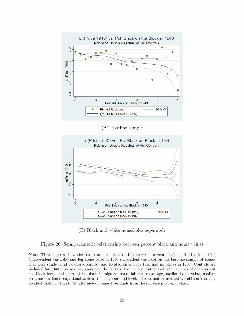
(A) Baseline sample
(B) Black and white households separately
Figure 20: Semiparametric relationship between percent black and home values
Note: These figures show the semiparametric relationship between percent black on the block in 1940(independent variable) and log home price in 1940 (dependent variable) on our baseline sample of homesthat were single family, owner occupied, and located on a block that had no blacks in 1930. Controls areincluded for 1930 price and occupancy at the address level, share renters and total number of addresses atthe block level, and share black, share immigrant, share laborer, mean age, median home value, medianrent, and median occupational score at the neighborhood level. The estimation method is Robinson’s doubleresidual method (1988). We also include binned residuals from the regression on each chart.
95

rents increased by 25 percent over the course of racial transition. In Panel B, we decompose
rents based on the race of the occupant. The figure shows that while blacks in general always
paid a premium relative to whites to rent on the same block, this premium grew significantly
along with the level of transition, accelerating its growth rate at approximately 40 percent
black. Thus, above this point white renters demanded, and landlords were willing to provide,
a significant discount to remain on transitioned blocks. The most direct explanation for these
differentials is racial discrimination.
We now turn from rents to valuations of home prices. If racial market dynamics were
driven solely by supply restrictions in the market for black housing related to the enforcement
of segregated neighborhoods, we would expect the value of owner-occupied homes in black
neighborhoods to experience similar increases in valuations upon racial transition. Yet, as is
shown in Panel A of Figure 20, overall home values in fully transitioned neighborhoods
declined by about 35 log points (about 40 percent). In Panel B, we decompose this
relationship by the race of the owner. This figure suggests that the overall drop in home
values was, in part, driven by the “pioneer” premium paid by black families buying a
home on a mostly white block. We estimate that this premium is about 30 log points
(35 percent). Further, homes purchased on transitioning blocks lost value throughout the
transition process. By the time the block was mostly black, such homes had lost about 11
percent of their original value.
To better understand the impact of these price and rent dynamics, Figure 21 documents
black homeownership rates over the range of transition. Panel A documents high home
ownership rates (low rental rates) among the pioneering black families. Black ownership
rates then decrease with transition level, plateauing when blocks become majority black.
This pattern indicates that black families were most likely to buy homes when the purchase
premium required from them was highest and most likely to rent when the rent premium
was highest. Taken together, these results suggest that there was no escape from the
disadvantageous housing market faced by black families. In contrast, there is no trend
in ownership for white families (Panel B).
We now turn to a more parametrized analysis. Here, we have two primary goals. First, we
wish to better understand the divergence between rents and owner-occupied housing values.
96

(A) Black ownership rate
(B) White ownership rate
Figure 21: The relationship between percent black and ownership rates
Note: These figures show the semiparametric relationship between percent black on the block in 1940(independent variable) and log rent in 1940 (dependent variable) on our baseline sample of homes that weresingle family, owner occupied, and located on a block that had no blacks in 1930. Controls are included for1930 price and occupancy at the address level, share renters and total number of addresses at the block level,and share black, share immigrant, share laborer, mean age, median home value, median rent, and medianoccupational score at the neighborhood level. The estimation method is Robinson’s double residual method(1988). We also include binned residuals from the regression on each chart.
97

Second, we seek to better identify the relationships we document in the semi-parametric
analysis and demonstrate that they are causal.
4.5 Capitalization Framework and Parametric Analysis
Our parametric framework models the relationship between rents, property values, and
the racial composition of neighborhoods from the perspective of an arbitraging real estate
investor. To fix ideas, we denote the price (rent or own) of an individual building as follows:
Pi =
annual renti if tenure = r
sales valuei if tenure = o
For a given owner occupied house, its price in year t is given by:
Pit = ct ∗ ρt ∗Q(Zi) (4.5.1)
where ρt is the city-specific price level at time t, Zi is a vector fo housing and neighborhood
characteristics that are particular to the given house, Q(.) is a quantity function that maps
these characteristics into a unidimensional measure of service flow, and ct is a capitalization
rate that captures the equilibrium relationship between sales price and annual rent.
Thus, we follow Poterba [1992] in conceptualizing the capitalization rate as follows:
rentit = ct ∗ saleit (4.5.2)
The capitalization rate, ct can be decomposed as follows:
ct = i+ τp + risk +maintenance+ depreciation− appreciation
where i is the risk-free interest. Intuitively, the real estate investor must receive a return
on her investment equal to the risk-free interest rate available in the broader market place.
This risk-free rate of return is adjusted for additional costs and benefits associated with
owning the property. In particular: tax benefits or costs associated with owning a home
(τp), a risk premium associated with housing price uncertainty (risk), costs for maintaining
98

the property (maintenance), physical depreciation (depreciation), and appreciation of the
home’s value net of the overall inflation rate (appreciation) - with all of these terms expressed
as percentages of the property’s values. We also note that the results presented in Panel B
of Figure 19 suggest augmenting the basic model to include an additional term to account
for landlord preferences over the race of potential tenants (taste-based discrimination).
This no-arbitrage relationship is central to understanding Figures 19 and 20 that
show racial transition being associated with lower sales values and higher rents. While
perhaps surprising at first, this dichotomy can be rationalized by investors having
exceedingly pessimistic expectations regarding the impact of racial transition on housing
price appreciation (expectations of rapidly declining values), physical depreciation or
maintenance costs.
To operationalize this relationship, we begin by combining equations (4.5.1) and (4.5.2)
to derive a unified expression for Pit:
Pit = ρt ∗ cIrentt ∗Q(Zi) (4.5.3)
where Irent is an indicator variable which equals 1 if the house is rented. Taking the log of
both sides yields the following:
lnPit = ln ρt + ln ct ∗ Irent + q(Zi) (4.5.4)
where q(Zi) = lnQ(Zi). In our application, we don’t directly observe characteristics Zi, but
we do observe prices in both 1940 and 1930. As we detail below, we can use this information
to effectively control for these unobserved characteristics.
Solving the 1930 iteration of equation (4.5.4) for q(Zi) gives: q(Zi) = lnPit− ln ρt− ln ct∗
Irent. Assuming that Zi is time invariant, limiting our sample to houses that were owner
occupied in 1930 (we relax both of these restrictions later), and substituting this expression
into the 1940 version of equation (4.5.4) yields the following expression for 1940 prices:
lnPi40 = ln ρ40 − ln ρ30 + lnPi30 + ln ct40 ∗ Irent40 (4.5.5)
99

Thus, ignoring for the moment neighborhood racial transition, we have the following model:
lnPi40 = α + β ∗ Irent40 + γ lnPi30 + εi (4.5.6)
We can interpret the key coefficients in equation (4.5.6) as follows: α is the difference in the
(logged) price levels between 1940 and 1930 and β is the logged capitalization rate in 1940.
Further, inclusion of the 1930 house price effectively controls for all time-invariant house and
neighborhood characteristics.10
To build on this basic empirical specification, we begin by limiting our sample to houses
located on city blocks that were all white 1930. We then generate an indicator variable for
racial transition (Itransi). Finally, we add the transition variable and its interaction with the
rent indicator to equation (4.5.6) yielding our basic specification:
lnPi40 = α + βtrans ∗ Itransi + βrent ∗ Irenti + βtransXrent ∗ ItransXrenti + γ lnPi30 + εi (4.5.7)
In this specification, exp(βtrans
)provides an estimate of the percent difference in sales prices
between blocks that transitioned and those that did not. Further, exp(βtrans + βtransXrent
)provides an estimate of the percent difference in rental prices across transitioning and non-
transitioning blocks.11
One potential concern is that certain characteristics of houses (or their neighborhoods)
might change in systematic ways between 1930 and 1940. We control for this possibility in
two separate ways. First, we directly include controls for a number of 1930 characteristics
at the address, block, and neighborhood level that may be predictive of these systematic
changes. Specifically, we control for the occupancy at the address level, share renters and
total number of addresses at the city-block level, and at the neighborhood level we control
for share black, share immigrant, share laborer, mean age, median home value, median rent,
and median occupational score. Second, we drop the neighborhood-level controls (keeping
the house and city-block-level controls) and instead include ED-level fixed effects. These
fixed effects will absorb any time changing characteristics that are shared at the ED-level
(recall that EDs in our sample are typically approximately four city blocks).
10One could restrict the coefficient γ to be equal to 1. However, not doing so allows for the possibilitythat price deflation between 1930 and 1940 varied across the distribution of housing quantities.
11We also note that βrent and βtransXrent allow for the recovery of effective capitalization rates intransitioned and un-transitioned neighborhoods.
100
4.5.1 Baseline Results
We begin our parametric analysis by relating changes in block-level racial composition
to changes in housing prices over the 1930s. For our baseline specification, we consider
the impact of city block-level racial change as measured by a variable that equals 1 if a
formerly white block became majority black by 1940 and 0 otherwise. Column (1) of Panel
A in Table 13 reports the empirical estimate of equation (4.5.7), restricting the sample
to single-family, owner-occupied homes and controlling only for price and occupancy in
1930. The second column adds neighborhood-level controls and the third incorporates both
neighborhood fixed effects as well as block-level controls for share renters and number of
households in 1930. While results are qualitatively consistent across specifications, the model
presented in column (3) is the most robust in terms of controls. We therefore view it as our
preferred specification.12
The coefficient on the rent indicator (-2.214) reflects the log of the capitalization rate
for blocks that did not experience racial transition. It implies a baseline capitalization rate
of 10.9 percent. Thus, in white neighborhoods the annual rent that a real estate investor
should have expected to receive on a given property was roughly 11 percent of its sales
value.13 The coefficient on the racial transition variable (-.096) implies that houses on blocks
that saw an influx of blacks lost 9.1 percent of their value relative to blocks that remained
white. Meanwhile, in conjunction with the coefficient on the interaction between rented
and transition (.503), this estimate implies that rents on these blocks increased by 50.2
percent relative to non-transitioning blocks. Finally, the estimated capitalization rate for
transitioned neighborhoods is 18.1 percent (computed as the exponent of the sum of the
rented coefficient and the interaction of transition and rented).
Although we prefer to restrict our attention to single-family, owner-occupied homes for
the purpose of identification of the transition effect, we also present results for a larger sample
12Appendix Figures 32 and 33 demonstrate the general robustness of our analysis to different choices ofbaseline blocks (i.e. choosing as a baseline all city-blocks that were less than x% black in 1930) and differentthresholds for racial transition (i.e. defining as transitioned all city-blocks that were more than x% black in1940).
13The Great Depression was associated with substantial housing price deflation which outpaced theconcomitant declines in rents, and thus we should expect capitalization rates that are in general largerthan those from the current day, which tend to center around 6 percent (see for instance Davis et al., 2008).
101
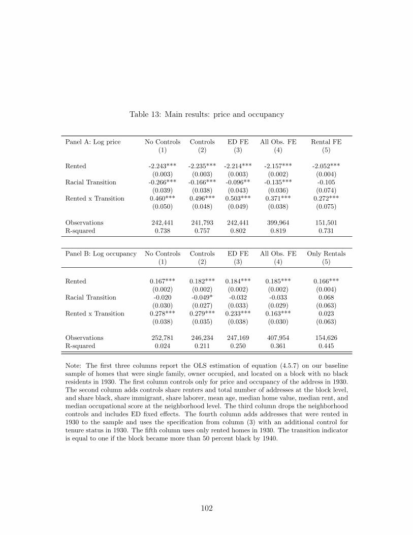
Table 13: Main results: price and occupancy
Panel A: Log price No Controls Controls ED FE All Obs. FE Rental FE(1) (2) (3) (4) (5)
Rented -2.243*** -2.235*** -2.214*** -2.157*** -2.052***(0.003) (0.003) (0.003) (0.002) (0.004)
Racial Transition -0.266*** -0.166*** -0.096** -0.135*** -0.105(0.039) (0.038) (0.043) (0.036) (0.074)
Rented x Transition 0.460*** 0.496*** 0.503*** 0.371*** 0.272***(0.050) (0.048) (0.049) (0.038) (0.075)
Observations 242,441 241,793 242,441 399,964 151,501R-squared 0.738 0.757 0.802 0.819 0.731
Panel B: Log occupancy No Controls Controls ED FE All Obs. FE Only Rentals(1) (2) (3) (4) (5)
Rented 0.167*** 0.182*** 0.184*** 0.185*** 0.166***(0.002) (0.002) (0.002) (0.002) (0.004)
Racial Transition -0.020 -0.049* -0.032 -0.033 0.068(0.030) (0.027) (0.033) (0.029) (0.063)
Rented x Transition 0.278*** 0.279*** 0.233*** 0.163*** 0.023(0.038) (0.035) (0.038) (0.030) (0.063)
Observations 252,781 246,234 247,169 407,954 154,626R-squared 0.024 0.211 0.250 0.361 0.445
Note: The first three columns report the OLS estimation of equation (4.5.7) on our baselinesample of homes that were single family, owner occupied, and located on a block with no blackresidents in 1930. The first column controls only for price and occupancy of the address in 1930.The second column adds controls share renters and total number of addresses at the block level,and share black, share immigrant, share laborer, mean age, median home value, median rent, andmedian occupational score at the neighborhood level. The third column drops the neighborhoodcontrols and includes ED fixed effects. The fourth column adds addresses that were rented in1930 to the sample and uses the specification from column (3) with an additional control fortenure status in 1930. The fifth column uses only rented homes in 1930. The transition indicatoris equal to one if the block became more than 50 percent black by 1940.
102

of addresses in column 4. Specifically, we also include buildings that were rented in 1930.14
Our estimates are quantitatively similar. In column (5) we report results focusing solely on
the sample of addresses that were rented in 1930, again finding similar results but with a
smaller rental premium for homes on blocks that underwent racial transition and remained
rented in 1940 as well. As we show below in Section 4.5.4, and in Appendix Figure 33, these
results are robust to alternative definitions of racial transition.
In all specifications we find that racial transition was accompanied by falling home values,
sharply increasing rents, and a substantially higher capitalization rate. As discussed above,
the finding that rents and valuations diverged on transitioned blocks, can be rationalized
by investors having exceedingly pessimistic expectations regarding housing prices, physical
depreciation, or maintenance costs. We note that the channel through which racial
preferences impact prices and rents is less direct here, where we are comparing average prices
and rents across blocks at different stages of racial transition, than it was in Figure 19 Panel
B where we compared differences in rent paid by black and white households on blocks at
identical stages of transition. In the earlier comparison across the race of individual renters,
differentials are likely driven by white landlords preferring to rent to white tenants and thus
charging blacks higher rents than whites for identical properties. Here we are instead focused
on how rents change with block-level transitions, independent of the race of a home’s renter
or owner. The primary channel through which racial preferences drive cross-block market
dynamics on this dimension are more likely white flight and related expectations about future
declines in price.
Independent of racial preferences or price expectations, contemporaneous narratives
suggest that one channel through which capitalization rates (and thus rents) could have been
higher for buildings on blocks undergoing racial transition is through higher occupancy rates,
either due to subdividing single-family housing into multiple rental units or as a result of black
families taking on boarders to help cover the steep rents that they faced. Managing contracts
with multiple households could have imposed direct costs, while increased occupancy itself
could have led to more rapid physical depreciation.
14This specification requires additional controls for tenure status in 1930. We do not include mixed-tenureor multiple owner addresses in this analysis because it is unclear how to aggregate a mix of valuations orvaluations and rents into an address-level price.
103

We explore the impact of transition on occupancy rates in panel B of Table 13, which
replicates panel A using log of aggregate occupancy as the outcome variable. Occupancy
results are generally similar across all models. Houses on un-transitioned blocks that
switched from being owned to rented saw increases in their average aggregate occupancy
rate of approximately 20 percent. These occupancy rate increases were even larger when
the move to rental status was associated with racial transition. The estimates from column
(3) indicate that rental occupancy soared by 47 percent in such homes relative to homes
that remained owned on blocks that did not transition.15 For owner occupied housing, the
main effect of racial transition is very small or negative in all specifications (-0.032 and
statistically insignificant in our preferred specification). This finding is consistent with the
narrative evidence that higher-socioeconomic-status black families, who would not need to
bring on boarders or live in subdivided units to afford housing, were the first to arrive on
a transitioning block and bought their homes rather than renting them (e.g. Massey and
Denton, 1993).
Our occupancy results raise the possibility that the observed increase in capitalization
rates on transitioned blocks, and the associated rent spikes, could simply be the direct
result of increases in maintenance or physical depreciation costs arising from higher-density
habitation. To examine this issue directly, in Table 14 we consider how capitalization
rates varied with both occupancy and racial transition, augmenting our baseline log-price
specification to consider multiple levels of racial transition and splitting the sample between
houses that experienced increased occupancy rates and those that experienced decreased or
unchanged occupancy rates. The results suggest that while occupancy rates had a small
impact on capitalization rates on blocks that remained white, the magnitudes are too small
to explain the bulk of the rent hikes experienced in transitioning blocks. In Table 15, we
go further and focus on subsamples comprised only of addresses that gained between one
and four members located on blocks that remained white between 1930 and 1940. Even for
addresses that gained at least four members, a very large occupancy increase, the coefficient
estimates imply capitalization rates that never exceed 11.5 percent. We thus reject the notion
that our results are driven solely by occupation rates.
15That is, exp(.184-.032+.233)=1.47.
104

Table 14: Price shifts and capitalization rates by occupancy change
All AddressesPercent black on block in 1940 Sales Rent Cap. Rate0 100.00% 100.00% 10.90%0-10% 98.22% 107.36% 11.92%10-50% 98.51% 110.08% 12.18%50-100% 91.48% 151.74% 18.09%Observations 242,441
Occupancy IncreasedPercent black on block in 1940 Sales Rent Cap. Rate0 100.00% 100.00% 11.24%0-10% 93.43% 111.18% 13.37%10-50% 97.92% 116.53% 12.68%50-100% 76.64% 129.30% 18.96%Observations 71,943
Occupancy Decreased or SamePercent black on block in 1940 Sales Rent Cap. Rate0 100.00% 100.00% 10.32%0-10% 101.01% 101.82% 10.40%10-50% 100.40% 100.20% 10.30%50-100% 99.80% 151.29% 15.65%Observations 170,498
Note: The table reports the implied capitalization rates from an OLSestimation of equation (4.5.7) on our baseline sample of homes that weresingle family, owner occupied, and located on a block with no blackresidents in 1930. Regressions include controls for price and occupancy ofthe address in 1930, share renters and total number of addresses at theblock level, and ED fixed effects. See text for details on how to computethe capitalization rate from regression coefficients.
105

Table 15: Coefficient on rental indicator for addresses on blocks that remained white
No Controls Controls ED FE All Obs FE(1) (2) (3) (4)
All addresses -2.244*** -2.237*** -2.216*** -2.160***(0.003) (0.003) (0.003) (0.002)
Addresses that gained at least 2 members -2.186*** -2.171*** -2.177*** -2.114***(0.009) (0.009) (0.010) (0.008)
Addresses that gained at least 3 members -2.164*** -2.153*** -2.179*** -2.106***(0.013) (0.013) (0.016) (0.011)
Addresses that gained at least 4 members -2.139*** -2.118*** -2.161*** -2.080***(0.019) (0.018) (0.025) (0.017)
Note: The table reports the rental indicator from OLS estimation of equation (4.5.7) on ourbaseline sample of homes that were single family, owner occupied, and located on a block thathad no blacks in both 1930 and 1940. The first column controls only for price and occupancyof the address in 1930. The second column adds controls share renters and total number ofaddresses at the block level, and share black, share immigrant, share laborer, mean age, medianhome value, median rent, and median occupational score at the neighborhood level. The thirdcolumn drops the neighborhood controls and includes ED fixed effects. The last column addsaddresses that were rented in 1930 to the sample and uses the specification from column (3) withan additional control for tenure status in 1930. The table reports the coefficient on the “rented”variable, which is an indicator for whether the house switched to being a rental in 1940.
106

4.5.2 Discriminatory Premiums in the Housing Market
We next seek to estimate the premiums required of black families in owned and rented
housing markets suggested by the semiparametric results from Section 4.4. Recall that
black families appeared to pay a premium to buy a house on a white block at the earliest
stages of transition (Figure 20 Panel B). To estimate this premium, we modify our baseline
specification (4.5.7) by adding an indicator for a black household and interacting this
indicator with rental status. We also drop the indicator for racial transition and instead
restrict analysis to blocks that experienced low levels of racial transition (black share in
1940). Column 1 (column 2) of Table 16 presents results for the sample of blocks that
were all white in 1930 and less than five percent (ten percent) black in 1940. The highly
significant point estimate on black household of 0.32 (0.25) translates to pioneering black
families paying a 38 percent (28 percent) discriminatory premium. It is unlikely that these
premiums reflect simple differences in perceptions since the black homebuyers would have
just recently purchased their homes in white neighborhoods.
Turning to the rental market, Figure 19 Panel B suggests that white families received
a large discount if they remained in their rental units during the racial transition process,
particularly once the block experienced marked racial mixing. To estimate these premia,
we again rerun our modified specification but for blocks where racial transition was well
underway. Column 3 (column 4) shows the results for blocks that were at least 40 percent
(60 percent) black in 1940. The coefficient estimates suggest that on such blocks black renters
paid 34 percent (44 percent) more than white renters for identical housing. Again, the most
direct explanation for these premiums is racial discrimination on the part of landlords. One
potential concern is that, by construction, black households on newly transitioned blocks
would have had a shorter tenure than white residents and that rental and sales premia are
being driven by these differences. As we discuss below in section 4.5.4, we can rule out
this concern by limiting our sample of white households to only include those whose 1940
tenure was less than five years. We discuss the implications of the rental and homeownership
premiums faced by black households in Section 4.6.
107

Table 16: Discrimination in owned and rented housing
Black < 5% Black < 10% Black > 40% Black > 60%(1) (2) (3) (4)
Rented -2.216*** -2.215*** -2.093*** -2.033***(0.003) (0.003) (0.080) (0.104)
Black Household 0.322*** 0.250*** 0.097 -0.023(0.106) (0.074) (0.079) (0.095)
Rented x Black Household 0.213 0.133 0.295*** 0.368***(0.182) (0.128) (0.111) (0.133)
Black Pioneer Premium 0.38 0.28Black Rental Premium 0.34 0.44
Observations 239,397 240,450 837 533R-squared 0.858 0.846 0.822 0.840
Note: The table reports the OLS estimation of the modified version of equation (4.5.7)that includes an indicator for black household interacted with the rental indicator. Theracial transition indicator is dropped and the modified specification run on differentparts of the black share distribution. All specifications include enumeration districtfixed effects and are run on our baseline sample of homes that were single family, owneroccupied, and located on a block with no black residents in 1930.
108

4.5.3 Selection
One potential concern with our empirical results is the possibility that neighborhoods
that were already destined to experience declining values (or higher rents) were differentially
targeted for racial expansion, even after controlling for price in 1930. Perhaps most
concerning is the role played by proximity to existing black neighborhoods. Our data
clearly document that proximity to an existing black neighborhood was a strong predictor
of racial transition. If these proximate neighborhoods were also destined to see systematic
departures from price trends, for instance because of reduced city services or other forms of
disinvestment, our results could be biased. The inclusion of enumeration district (ED) fixed
effects in our preferred specification is largely a response to this concern as they will control
for all factors affecting prices that are constant over very small neighborhood definitions.
However, it is still possible that even differences in black neighborhood proximity across a
few city blocks could lead to selection problems.
As a first test of our fixed effects strategy we evaluate the effectiveness of using
enumeration district fixed effects to absorb control for the correlation between 1930
demographic measures and racial transition over the following decade. Table 17 presents
the results of a block-level estimation of the determinants of racial transition for blocks that
had at least one owner-occupied single-family home and were all white in 1930. Columns (1)
and (4) present regressions on the entire sample that include ED fixed effects in addition to
controls for household head age, share laborer, foreign-born share, average rent per person
and homeownership share. For ease of interpretation, all explanatory variables are expressed
in terms of their standard deviations. Thus, the coefficient estimate of -.001 on average age
of household head implies that, once one controls for enumeration district fixed effects, a one
standard deviation decrease in average household head age in 1930 is on average associated
with a one-tenth of a one percentage point increase in percent black on the block in 1940.
While a number of demographic variables are statistically significant in columns 1 and 4, the
coefficient estimates are all quite small, and from an economic perspective, they are precisely
estimated zeros.
Omitted from these first two regressions are controls for proximity to existing black
109

Table 17: Predicting racial transition in baseline sample
Percent Black in 1940 Percent Black in 1940 > 50%Block characteristics in 1930: (1) (2) (3) (4) (5) (6)
Average age of heads of HH -0.001*** -0.001** -0.001** -0.001*** -0.001* -0.001*(0.000) (0.000) (0.000) (0.000) (0.000) (0.000)
Share laborer heads of HH 0.001*** 0.000 0.000 0.001*** 0.001** 0.001**(0.000) (0.000) (0.000) (0.000) (0.000) (0.000)
Share foreign born heads of HH 0.001*** 0.000 0.000 0.001* -0.000 -0.000(0.000) (0.000) (0.000) (0.000) (0.000) (0.000)
Average rent per person -0.001** -0.000 -0.000 -0.001 -0.000 -0.000(0.000) (0.000) (0.000) (0.000) (0.000) (0.000)
Ownership share -0.000 0.000 0.000 -0.000 -0.000 -0.000(0.000) (0.000) (0.000) (0.000) (0.000) (0.000)
Distance to nearest ghetto -0.005* -0.002(0.003) (0.003)
Sample All Geo. Geo. All Geo. Geo.Observations 51,859 43,819 43,819 53,478 43,819 43,819R-squared 0.585 0.654 0.654 0.563 0.609 0.609
Note: This table reports OLS estimations of selection into racial transition using our baselinesample of blocks that had at least one owner-occupied, single-family home and no black residentsin 1930.
110
neighborhoods, perhaps the most important potential confound (see Table 12). To address
the possibility that distance to an existing black neighborhood is biasing our baseline results,
we geocoded our sample of city blocks.16 This geocoded subsample allows us to directly test
the efficacy of our ED fixed effects in controlling for existing black neighborhood proximity.
Appendix Figure 30 presents a visualization of our geocoded blocks for Detroit, which is
typical of all of our sample cities. A limitation of our geocoding is that we were only able
to geocode approximately 87 percent of our sample. One concern is that this subsample
will vary systematically from our main sample as addresses that were targeted for urban
renewal and demolition in the 1960s and 1970s may be overwhelmingly represented in the
set of addresses that could not be geocoded.
Columns (2) and (5) of Table 17 replicate the regressions of columns 1 and 4 on
the geocoded subsample; while columns (3) and (6) add distance to the nearest black
neighborhood (ED > 15 percent black in 1930) to the regressions (normalized by standard
deviation). Consistent with expectations, such proximity is a stronger predictor of transition
than were our demographic variables. Nonetheless, ED fixed effects are still effective in
absorbing proximity’s impact. Controlling for ED, on average, a one standard deviation
decrease in proximity in 1930 is associated with only a one-half of a one percentage point
increase in percent black on a block in 1940. These results suggest that our price and
occupancy results are driven by racial transition and not by other factors.
As a final test on this dimension, we evaluate the impact of incorporating distance to
existing black neighborhoods directly into our main specification. Columns (2) and (5)
of Table 18 replicate our baseline results for the geocoded sample; for comparison, baseline
results for the entire sample are repeated in Columns (1) and (4). While qualitatively similar
to the full-sample estimates, the interaction between rented and majority black is smaller
in the geocoded sample versus the full sample (.345 versus .503, respectively). Thus, it is
important to focus within the geocoded subsample when assessing the impact of controls
for distance to the nearest black neighborhood on our coefficients of interest. Columns (3)
and (6) add a control for distance to the nearest black neighborhood (defined as miles to
an enumeration district that was at least 15 percent black) to the model. Comparing these
16See the Appendix C.3 for a description of this process.
111
results to those in columns (2) and (5) demonstrates that while distance to the nearest black
neighborhood is negatively associated with price, all other coefficient estimates are virtually
unchanged by its inclusion in the regression, suggesting that enumeration district fixed effects
provide sufficient controls for this source of selection bias. Additionally, distance to a black
neighborhood is not associated with occupancy (column 6).
4.5.4 Further Robustness and Concordance with Non-Parametric Analysis
Our parametric results are based on a relatively granular characterization of the racial
transition of city blocks: moving from all white in 1930 to majority black in 1940. To
develop a richer understanding of the underlying process, we explore the impact of racial
transition on prices and occupancy over the range of 1940 black share. This approach echoes
our semiparametric analysis and provides insight into price dynamics on blocks that were at
different stages of racial transition. Specifically, we partition our sample of blocks that were
white in 1930 into four groups: those that remained white, those that had strictly between
0 and 10 percent black population in 1940, those that had between 10 and 50 percent black
population in 1940, and those that had over 50 percent black population in 1940. The
coefficient estimates from this analysis are presented in Appendix Table 27. For ease of
interpretation, we also summarize the effects on prices, rents and capitalization rates for this
specification in the top panel of Table 14.
Recall that our preferred specification includes neighborhood (ED) fixed effects along
with block-level controls. Thus, identification comes from variation in block-level racial
composition from within a very small neighborhood and beyond that which can be predicted
by residential density and rental share. In terms of average prices and rents, our findings
are robust to this disaggregation. The finding that transition impacts are muted below 50
percent black in our most robust specification (with ED fixed effects) is consistent with
the non-parametric analysis of Figures 19 and 20 and the sensitivity analysis presented in
Appendix Figure 33. Appendix Figure 33 also demonstrates our results’ robustness to the
choice of transition threshold. Additionally, we note here that our results are robust to
alternate definitions of a white block in 1930 (see Appendix Figure 32).
112

Table 18: Results for racial transition and proximity to nearest black neighborhood
Dependent variable = log price Dependent variable = log occupancyAll blocks Geocoded Geocoded All blocks Geocoded Geocoded
(1) (2) (3) (4) (5) (6)
Rented -2.214*** -2.222*** -2.222*** 0.186*** 0.184*** 0.184***(0.003) (0.003) (0.003) (0.002) (0.002) (0.002)
Transition -0.096** -0.202*** -0.201*** -0.039 -0.042 -0.042(0.043) (0.058) (0.058) (0.033) (0.044) (0.044)
Rented x Transition 0.503*** 0.345*** 0.345*** 0.240*** 0.120** 0.120**(0.049) (0.066) (0.066) (0.037) (0.050) (0.050)
Distance to Ghetto 0.102*** -0.001(0.012) (0.009)
Observations 242,441 211,964 211,964 252,781 221,054 221,054R-squared 0.802 0.805 0.805 0.250 0.252 0.252
Note: The table reports the OLS estimation of equation (4.5.7) on our baseline sample of homesthat were single family, owner occupied, and located on a block with no black residents in 1930.Regressions include controls for price and occupancy of the address in 1930, share renters andtotal number of addresses at the block level, and ED fixed effects. The second and third columnsinclude only addresses that could be geocoded. Black neighborhoods are defined as EDs with atleast 15 percent black population.
113

A final concern is that the differential prices faced by black and white households are
driven by tenure bias, in particular the possibility that white households bought houses or
signed rental contracts long before the Great Depression began. To address this concern, we
replicate all of our main findings restricting our sample to white households that had resided
in a different address in 1935 using the migration question first asked in the 1940 census.
The semiparametric regressions from Figures 19 and 20 are reproduced for this sample of
recent arrivers of both races in Appendix Figures 34 and 35, respectively. The main results
from Tables 13 and 16 are similarly produced in Appendix Tables 28 and 29. There are no
substantive differences, strong suggesting that our results are driven by race and not tenure.
4.6 Discussion
The housing market dynamics underlying our analysis arose under, and were shaped by,
the Great Migration. During this period, black migrants were both pushed and pulled to the
North by a myriad of factors; the opportunity for economic advancement playing a central
role. In 1940, black men between the age of 18 and 60 working for wages in the states of
the former Confederacy earned $475 per year. In contrast, their counterparts living in one
of our ten sample cities earned on average $994 per year. Upon migrating North, these
individuals fared slightly less well than longer-term black residents of the North, earning on
average approximately 15 percent less than the extant work force ($839 per year), but they
still experienced a greater than 75 percent increase in average wages.17
In contrast, our analysis demonstrates that this promise of higher wages was offset, at
least partially, by forces at work in the North’s segregated housing markets. At this time,
the large majority of blacks living in our sample cities were renters, paying an average rent of
$36.88 per month. At this level of rent, our estimated 50.2 percent rent premium translated
to an annual cost of $147.97, or just over 40 percent of the income gain associated with
northern migration. One way that black renters attempted to ameliorate these costs was
17Averages computed from the 100 percent sample of the 1940 US census accessed through IPUMS-USA(Ruggles et al., 2019). We restrict the sample to wage workers who reported working at least 50 weeks inthe prior year.
114

to live more densely relative to white renters (on the order of 22 percent according to the
estimates presented in Table 13 column 3). But of course this increase in density was not
without costs, and our estimates assume that the transition from white block to black block
was associated with no other changes in neighborhood quality, such as those that might be
expected if the racial transition was associated with a reduction in the quality of city services
provided to its residents (Derenoncourt, 2018).
Some migrants would have avoided these steep rent premiums by instead purchasing
their home. As is shown in Panel A of Figure 21, by far the highest black ownership rates
occurred on predominantly white blocks where black ownership rates were on the order of
70 percent (as opposed to black ownership rates of closer to 20 percent on predominantly
black blocks). Blacks purchasing on these blocks were also disadvantaged by the segregated
housing markets (see Figure 20 Panel B and Table 16). Black families who purchased homes
on city blocks that were less than 10 percent white paid on average $4,166.74 for their home
and bought at a premium of almost 28 percent relative to what white families would have
paid on the same block. Further, the arrival of a few pioneering black families led to a
significant racial transition, switching the block from white to black. Then, this transition
would have on average eroded the home’s value to roughly 10 percent its initial value (See
Figure 20 Panel A and Table 13). The net effect of the initial race premium and ensuing
price erosion on such a house represents a loss of $1,218.72, or nearly 3.5 years’ worth of the
migration-driven gain in wages for a typical black migrant.
Largely unanswered in this discussion is an identification of the specific role that racism
played in underpinning the price dynamics of this period’s segregated housing markets and
the costs that these markets extracted from black families. The potential channels are
numerous and interwoven. Clearly white flight from the arrival of pioneering black families
is an important channel.18 While such flight was likely at least partially driven by white
attitudes about black families, flight could also be partially explained by expectations about
how a block’s racial transition could lead to a reduction in the quality of city services,
with such reductions themselves being the result of racist city policies. Similarly, the price
premium demanded of pioneering black families can be viewed as evidence of preference-based
18Shertzer and Walsh [2019], Boustan and Margo [2013].
115
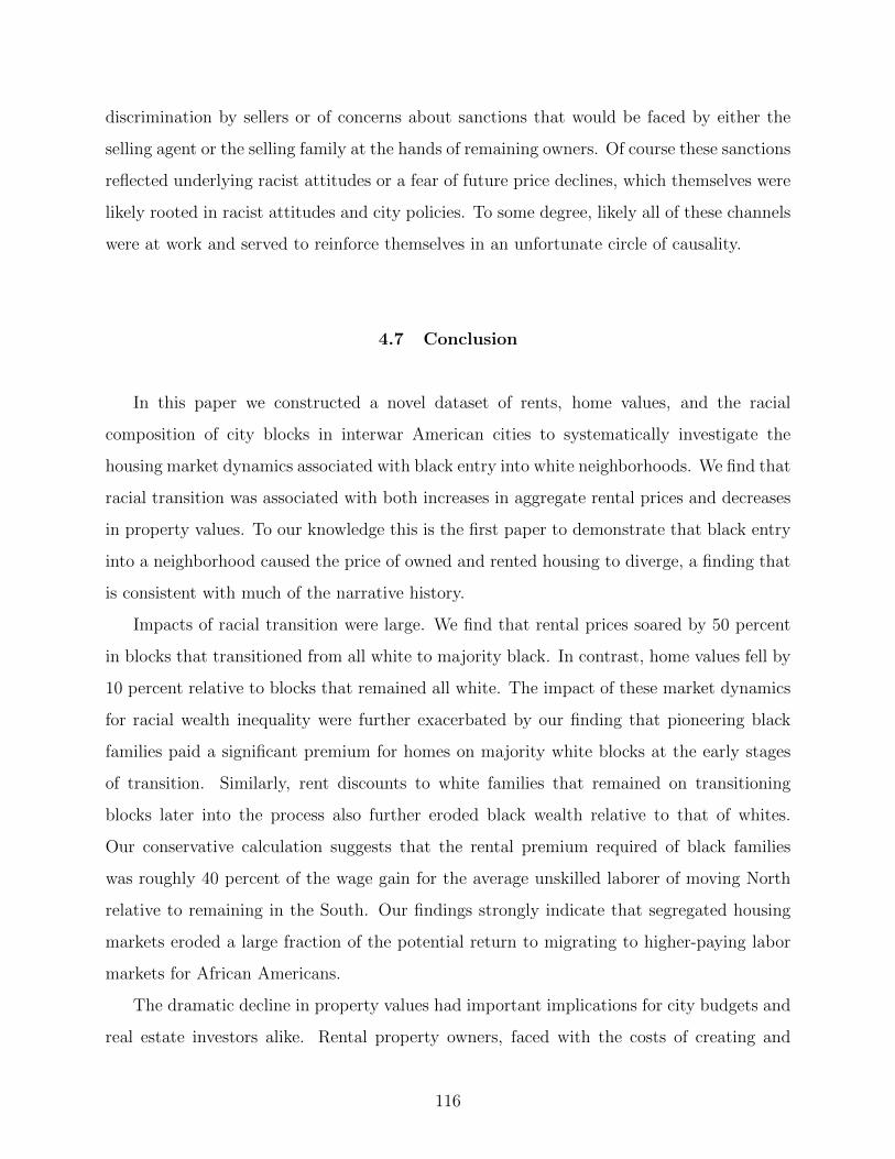
discrimination by sellers or of concerns about sanctions that would be faced by either the
selling agent or the selling family at the hands of remaining owners. Of course these sanctions
reflected underlying racist attitudes or a fear of future price declines, which themselves were
likely rooted in racist attitudes and city policies. To some degree, likely all of these channels
were at work and served to reinforce themselves in an unfortunate circle of causality.
4.7 Conclusion
In this paper we constructed a novel dataset of rents, home values, and the racial
composition of city blocks in interwar American cities to systematically investigate the
housing market dynamics associated with black entry into white neighborhoods. We find that
racial transition was associated with both increases in aggregate rental prices and decreases
in property values. To our knowledge this is the first paper to demonstrate that black entry
into a neighborhood caused the price of owned and rented housing to diverge, a finding that
is consistent with much of the narrative history.
Impacts of racial transition were large. We find that rental prices soared by 50 percent
in blocks that transitioned from all white to majority black. In contrast, home values fell by
10 percent relative to blocks that remained all white. The impact of these market dynamics
for racial wealth inequality were further exacerbated by our finding that pioneering black
families paid a significant premium for homes on majority white blocks at the early stages
of transition. Similarly, rent discounts to white families that remained on transitioning
blocks later into the process also further eroded black wealth relative to that of whites.
Our conservative calculation suggests that the rental premium required of black families
was roughly 40 percent of the wage gain for the average unskilled laborer of moving North
relative to remaining in the South. Our findings strongly indicate that segregated housing
markets eroded a large fraction of the potential return to migrating to higher-paying labor
markets for African Americans.
The dramatic decline in property values had important implications for city budgets and
real estate investors alike. Rental property owners, faced with the costs of creating and
116

maintaining rental units that were going to depreciate in value and with a ready supply of
black households desperate for housing outside of the already underserved ghetto, were able
to charge high enough rental prices to make their investment worthwhile. These processes
overlapped and reinforced each other, during which entire sections of cities transitioned from
being all white to majority black over a relatively short period, with devastating results for
black household wealth. Our results highlight the importance of private market dynamics
that occurred at the block level prior to the heyday of the FHA and suggest that racial
disparities in wealth accumulation would likely have emerged absent discriminatory federal
policies. Government at all levels missed the opportunity to change the trajectory of private
housing markets.
117

Appendix A Who Benefits from Faster Public Transit?
A.1 Defining and Simulating Trips on Google Maps
This section describes how I sample trip origin-destination pairs and query them on
Google Maps for travel times. These travel times are then used to estimate census tract-
specific travel speeds by each mode as described in Section A.2. To do so credibly, there needs
to be enough trips going through each census tract and the speeds on these trips need to be
representative of trips actually taken (and not just speeds on infrequently travelled routes).
In addition, because transit networks can be sparse, the trips need to be geographically
spread out so that I am not just looking at areas within a tract far away from (or close to)
transit routes.
To that end, a subset of trips are defined to be between the origins and destinations
on trips reported in the 2017 National Household Travel Survey (NHTS). The confidential
version of the NHTS (U.S. Department of Transportation) identifies locations at the block
group level, and I define my trips to be between the population-weighted centroids of these
block groups. I ignore round trips and unrepresentative trips (such as trips by air). NHTS
trips span only a few thousand in total across all cities and they are missing for a sizeable
share of my urban block groups. So, I generate additional origin-destination pairs myself.
For the remainder of my trips, I set the trip origins to be the population-weighted
centroids of each block group with a non-zero residential population within the extent of my
CBSAs. Since block groups are geographically smaller than tracts, I always guarantee a few
trips originating in every tract. Trip destinations are of two types: (1) centroids of tracts
that are popular commuting destinations as observed in the CTPP and (2) popular non-
residential amenities nearby (such as restaurants and shopping malls). Popular commuting
tract destinations include the 5 most popular destinations from the trip’s tract of origin and
the 5 most popular destinations from the trip’s county of origin.
For trips to amenities, I first gather a dataset of popular amenities (also from Google). I
categorize non-residential amenities into 19 types, each corresponding to a different Google
118

“place type” on Google’s Places API. These amenity types include banks, cafes, churches,
city hall, convenience stores, doctors, gyms, hospitals, libraries, mosques, movie theaters,
parks, pharmacies, post offices, restaurants, schools, shopping malls, stadiums, and train
stations. I use each of these as search terms to query Google’s Places API for the most
popular destinations of each type within a fixed radius of (the centroid of) each block group.
On any search Google returns upto 20 places in order of “prominence”, as determined “by a
place’s ranking in Google’s index, global popularity, and other factors.” The search radius
determines the average proximity to the returned destinations. I let the radius vary with the
place type being searched since some types may be sparser across space than others (such
as restaurants are typically more common than stadiums). In setting the search radii, I
also try to mimic the distribution of trip distances observed in the NHTS. For each place,
Google returns geographical coordinates (as well as other data not used in this paper), which
I then use to define trips between each block group centroid and the closest of the (twenty)
returned destinations around it. Sometimes, Google may find no destination of a particular
type around a block group, in which case I choose the closest destination from the pool of
places of that type returned on queries from other block groups in the city. In total, I defined
roughly 2 million origin-destination (O-D) pairs across all cities to query on Google Maps for
travel times. I defined more trips in cities with more block groups (as per the trip sampling
strategy outlined above), which also translates to more trips in more populated cities.
All trips were queried on weekdays in the middle of June 2018. Google’s travel time
predictions for driving and walking trips are based on its own historical and real-time data.
I only scrape the travel times that are based on historical averages (as opposed to real-time
predictions by Google). These averages do not vary much over time and should be less
susceptible to idiosyncratic shocks at the time of the data collection. On the other hand,
Google’s travel time predictions for transit are based on transit schedules shared by transit
authorities and the GTFS. While the transit schedule variation is also small across weekdays,
they are still sensitive to the trip’s departure time. So, I repeat each transit trip at roughly
5 different hours of the day and take a weighted average where the weights are constructed
from the distribution of trip departure times observed in the NHTS.
Not all queries to Google Maps return route results. A small share of driving queries
119

(less than 1%) and walking queries (less than 2%) return null results, but roughly a fifth of
transit queries return null results. Transit networks are sparse, so this is unsurprising. In
fact, the share of null results would be higher if not for Google returning the walking routes
in most (but not all) of the cases where the trip does not overlap with any transit route. The
rate of queries with non-zero returns varies across and within cities, with more null results
farther away from city centers. I impute travel times on missing trips by assuming people
walk the entire trip (straight-line) distance at a speed that is the 90th percentile of ‘effective’
walking speeds across successful trips in the surrounding tracts. The ‘effective’ speed is the
straight-line distance covered per minute and by penalizing the missing trips with a slow
walking speed, I implicitly assume there are obstructions and long detours along the way
(that are also leading Google to not return these as viable travel routes).
A.2 Estimating Tract Speeds and Commuting Times
The goal of this exercise is to estimate travel times by driving, transit and walking
between all possible pairings of residential and work tracts within a city. I compute this
matrix of travel times in three steps. First, I identify the shortest routes between all O-D
pairs (including for the non-commuting trips queried on Google Maps) along major road
networks and their overlap with the city’s tracts. Second, using the trips for which I also
have travel times from Google Maps, I estimate tract-level speeds on each travel mode using
a series of OLS regressions. Third, I use the estimated speeds together with route overlaps
with tracts to predict travel times on the remaining (commuting) trips.
I download the network of major streets in each city from OpenStreetMap (OSM),
a crowd-sourced mapping platform. The street networks cover a 1% buffer zone around
the geographic bounds of trips and includes the following OSM street types: motorways,
trunks, primary, secondary, tertiary and unclassified. To improve the speed of (and memory
constraints from) the millions of shortest route searches, I exclude smaller residential streets
and driveways. As such, my ’shortest routes’ are only along major streets and may not be
the actual shortest route along the entire road network. This is not a major concern because
120

residential streets tend to be slower and even when they make up a large portion of the
shortest route, they are less likely to be part of the fastest route (or to be traveled). As such,
my routes may even be more representative of actual traveled routes.
Then I map each trip origin and destination to their nearest point on the street network
and project the entire network as a directional graph of edges along streets and nodes at
street intersections and trip endpoints. Shortest paths between trip endpoints are computed
using NetworkX, a python package. Having identified the shortest routes, I intersect them at
tract boundaries and compute the lengths of the intersections with each tract that is within
a 1% buffer around the convex hull of the set of tracts in the CBSA. I ignore a small share
of trips with less than 50% overlap with these tracts. Note that commuting trips are defined
to be between the centroids of tracts within the CBSA and are, hence, always within the
convex hull of these tracts. The total distance along the shortest path on commuting trips
is the trip distance measure used in subsequent analysis from Section 2.3 onwards.
For estimating tract speeds, I specify a trip’s total travel time as the sum of travel times
through each tract that its route overlaps. As shown in (2.2.1), I further decompose each
travel time segment into a route distance divided by travel speed. When I know both the
total travel time and the distances traveled through each tract, I can use an OLS regression
to uncover the coefficients on distances which are also the travel speeds in the corresponding
tracts. So, using my set of non-commuting trips for which I have the Google Maps travel
times, I run separate regressions for each city and travel mode to estimate the tract-specific
speeds.
With the large number of tracts to estimate speeds for, the OLS regression faces a
multi-colinearity problem that is more prominent among tracts with limited variation in trip
routes. For example, if two tracts share a large fraction of the trips passing through them,
then it is difficult to isolate the effect that going through each tract has on the trips’ travel
times. In the worst case, some tracts have to be dropped from the estimation due to perfect
colinearity. I assign each dropped tract the median of estimated speeds of their surrounding
tracts. The OLS regression may also estimate extremely high or low speeds for some less
central tracts in the city. So, I truncate the top and bottom 5% of estimated speeds in each
city.
121

Finally, to predict total travel times on commuting trips, I plug in the estimated tract
speeds along with each trip’s route (length) overlaps with tracts into (2.2.1).
A.3 Housing Demand Estimation
I observe annual household incomes and annual housing expenditures in the publicly
available census microdata from IPUMS but not their census tract of residence. The smallest
identifiable geography of residence in the microdata are PUMAs, which are usually larger
than tracts. In order to combine the housing expenditure data with tract-level standardized
housing prices from Davis et al. [2020] to the microdata, I rely on aggregate tract-level data
from NHGIS. In the aggregate data, I observe household counts by census tract across 16
income brackets, so I can determine the median housing prices experienced by households in
each bracket. To aggregate the tract level prices for each income group to the PUMA level, I
use a crosswalk from the website of Missouri Census Data Center that returns the population-
weighted overlaps between PUMAs and tracts. I use these as weights to compute the median
housing prices experienced by households in each income bracket within a PUMA. I merge
these PUMA-income-level average prices to the micro-data to use in the housing demand
estimation. As such, these are not the actual housing prices corresponding to the housing
expenditures but the housing prices likely to be experienced by the median household in the
same income bracket and PUMA.
Once I have incomes, housing expenditures and housing prices for my sample of individual
housesholds, I run the OLS regression in (2.4.5) separately for each CBSA: I regress the log
share of income spent on housing expenditures (on the left) on log income and log housing
price (on the right). Observations are weighted by survey weights for households and excludes
households with zero housing expenditure and households at the top and bottome percentiles
of the sample’s income distribution. Sample sizes for the regressions range from around
15,000 households in the smallest cities to over 700,000 in the largest ones.
Estimated price elasticities of housing demand (αh) range from -0.66 (in Syracuse, NY)
to -0.82 (in San Francisco, CA). Estimated income elasticities of housing demand (αw)
122

range from 0.4 (in Provo-Orem, UT) to 0.6 (in San Francisco, CA). Figure 22 compares
the predicted (“fitted”) and the observed housing expenditures as a function of household
income, pooling together all cities. My predicted housing expenditures are too high for
household incomes below $15,000 (an artifact of the log-log functional form) and slightly
smaller than those observed for incomes above.
A.4 Mode and Neighborhood Choice Estimation
Estimation requires numerically searching over parameters αSmy and αDy and fixed effects
δmny to maximize the sum of log likelihoods L from (2.4.6). To aid the search process, I
exploit a contraction mapping approach popularized by Berry et al. [1995]. More specifically,
given any realization of the vector of parameters αS and αD, a contraction mapping is used
to calculate the matrix of fixed effects δ that solves the first order conditions ∂L∂δ
= 0.
Consider the following first-order Taylor approximation of L as a function of the fixed
effects:
L(αS, αD, δt+1) = L(αS, αD, δt) + (δt+1 − δt)′∂L(αS, αD, δt)
∂δ
The first order condition to solve for the δt+1 that maximizes this approximation is
∂L(δt+1)
∂δt+1= 0
which, following some algebraic manipulation, evaluates to
δt+1mny = δtmny − ln
[∑j
(∑m
∑n
∑y
Pjmny
)πmn|jy
/(∑j
Pjmny
)]Updating the values of δ as above until convergence maximizes L conditional on parameters
αS and αD. I update parameters αS and αD by the (weighted) gradient of the log likelihood
with respect to each:
∂L
∂αDy=∑j
∑n
∑m∈M
[Pjmny − πmn|jy
(∑m
∑n
Pjmny
)]·Djn
∂L
∂αSmy=∑j
∑n
[Pjmny − πmn|jy
(∑m
∑n
Pjmny
)]· Sjmn
123

Figure 22: Predicted vs observed housing expenditures in the microdata
Note: The fitted regression line is based on the OLS estimation of (2.4.5). The figure pools togetherhouseholds across all cities.
124

A.5 Additional Tables and Figures
A.5.1 Travel Distances vs. Speeds
Figure 23 shows that average travel distance is increasing with travel speed, suggesting
commuters (on average) travel farther when they can travel faster. Alternatively, longer
trips tend to be faster. This is true for both drivers and transit riders and across all income
groups. However, even conditional on speed, higher income groups appear to commute
slightly longer.
Drivers
Transit riders
Figure 23: Average commuting distances by speed
Note: Distances and speeds are in logs and standardized across commutes within each CBSA and travelmode. The figures pool together commutes across all cities in my sample.
125

Table 19: Full ranking of cities by commuting speeds on transit
Rank City Transitspeed (inkm/h)
Ratio oftransit todriving speed
% commutersriding transit
Rail shareof transitriders
1 New York-Newark-Jersey City, NY-NJ-PA 20.2 0.35 30.7% 86.7%2 San Francisco-Oakland-Hayward, CA 18.9 0.31 15.5% 51.6%3 Seattle-Tacoma-Bellevue, WA 17.8 0.30 8.6% 5.2%4 Chicago-Naperville-Elgin, IL-IN-WI 17.7 0.28 11.9% 69.8%5 Philadelphia-Camden-Wilmington, PA-NJ-DE-MD 17.1 0.30 9.7% 46.0%6 Washington-Arlington-Alexandria, DC-VA-MD-WV 17.0 0.30 14.5% 82.3%7 Houston-The Woodlands-Sugar Land, TX 16.5 0.21 2.7% 2.5%8 Denver-Aurora-Lakewood, CO 15.9 0.28 4.9% 16.2%9 Urban Honolulu, HI 15.8 0.33 8.2% 0.3%10 Atlanta-Sandy Springs-Roswell, GA 15.7 0.21 3.5% 30.8%11 Santa Maria-Santa Barbara, CA 15.7 0.28 4.0% 1.3%12 Los Angeles-Long Beach-Anaheim, CA 15.5 0.27 6.4% 10.9%13 Boston-Cambridge-Newton, MA-NH 15.5 0.28 12.4% 78.4%14 St. Louis, MO-IL 15.4 0.23 2.7% 19.5%15 Minneapolis-St. Paul-Bloomington, MN-WI 15.1 0.20 4.8% 5.8%16 Portland-Vancouver-Hillsboro, OR-WA 14.9 0.29 6.6% 12.2%17 Sacramento–Roseville–Arden-Arcade, CA 14.8 0.23 2.8% 18.4%18 Miami-Fort Lauderdale-West Palm Beach, FL 14.7 0.26 3.8% 14.2%19 Cleveland-Elyria, OH 14.6 0.21 4.0% 8.3%20 San Antonio-New Braunfels, TX 14.5 0.23 2.3% 0.3%21 Milwaukee-Waukesha-West Allis, WI 14.4 0.23 3.8% 1.5%22 Phoenix-Mesa-Scottsdale, AZ 14.4 0.23 2.3% 2.8%23 Pittsburgh, PA 14.3 0.25 6.0% 3.0%24 Boulder, CO 14.2 0.32 5.9% 0.2%25 Hartford-West Hartford-East Hartford, CT 14.0 0.23 2.9% 6.6%26 San Diego-Carlsbad, CA 13.9 0.24 3.5% 11.0%27 Salt Lake City, UT 13.9 0.26 3.5% 16.3%28 Providence-Warwick, RI-MA 13.8 0.24 2.7% 45.6%29 Baltimore-Columbia-Towson, MD 13.7 0.25 6.5% 36.0%30 Eugene, OR 13.7 0.28 4.1% 0.3%31 Albany-Schenectady-Troy, NY 13.4 0.25 3.2% 6.2%32 Las Vegas-Henderson-Paradise, NV 13.3 0.27 3.8% 0.2%33 Buffalo-Cheektowaga-Niagara Falls, NY 13.1 0.23 3.8% 7.2%34 Bridgeport-Stamford-Norwalk, CT 13.1 0.23 9.7% 83.6%35 Rochester, NY 13.1 0.19 2.1% 3.5%36 Madison, WI 13.0 0.23 4.0% 1.1%37 Austin-Round Rock, TX 12.8 0.21 2.8% 1.1%38 Tucson, AZ 12.8 0.28 2.6% 0.4%39 Durham-Chapel Hill, NC 12.6 0.24 4.0% 1.4%40 Lansing-East Lansing, MI 12.5 0.21 2.4% 0.8%41 Provo-Orem, UT 12.5 0.26 2.2% 2.0%42 Syracuse, NY 11.8 0.21 2.2% 1.0%43 San Jose-Sunnyvale-Santa Clara, CA 11.7 0.24 3.4% 36.9%44 Trenton, NJ 11.1 0.24 7.6% 73.9%45 New Haven-Milford, CT 11.1 0.24 3.8% 35.8%46 Ann Arbor, MI 10.8 0.23 4.1% 1.7%47 Springfield, MA 10.7 0.21 2.1% 3.2%48 Savannah, GA 9.9 0.21 2.1% 0.9%49 Vallejo-Fairfield, CA 8.8 0.18 2.7% 33.3%
Note: Speeds are relative to shortest road distance. Speeds and ratios of travel times are meansacross all trips between observed work-residence location pairs (unconditional on travel mode choice)ignoring the top and bottom 5% of outliers. Rail share is the fraction of transit commutes via railtransit in the city.
126

Table 20: Estimated coefficients αDy and αSmy on commuting distance and speed
Variable Mode Income Mean p5 p25 Median p75 p95
Distance all
< $35k 1.518 0.971 1.260 1.601 1.686 2.006$35k-$$50k 1.501 0.911 1.260 1.555 1.700 1.991$50k-$75k 1.453 0.864 1.142 1.514 1.649 1.947> $75k 1.421 0.851 1.155 1.465 1.624 1.891
Speed
driving
< $35k 0.301 0.156 0.218 0.293 0.370 0.471$35k-$$50k 0.310 0.131 0.247 0.303 0.376 0.494$50k-$75k 0.293 0.083 0.211 0.297 0.380 0.487> $75k 0.272 0.091 0.201 0.273 0.337 0.484
transit
< $35k 0.271 0.140 0.210 0.271 0.313 0.387$35k-$$50k 0.241 0.119 0.197 0.220 0.257 0.374$50k-$75k 0.243 0.087 0.200 0.248 0.282 0.377> $75k 0.276 0.097 0.225 0.274 0.319 0.478
walking
< $35k -0.155 -0.303 -0.212 -0.153 -0.103 0.010$35k-$$50k -0.146 -0.364 -0.189 -0.146 -0.086 0.054$50k-$75k -0.177 -0.408 -0.219 -0.148 -0.115 -0.039> $75k -0.265 -0.435 -0.321 -0.265 -0.208 -0.137
Note: Table reports the mean, 5th percentile, 25th percentile, median, 75th percentile and95th percentile (in that order) of coefficient estimates across all 49 cities. Standard errorson all estimated coefficients are less than 0.00001.
127

by mean (relative) transit speeds by rail share of transit commutes
Figure 24: Mean MWTT from 1% increase in transit speed (relative to lowest income
group)
Note: Each observation corresponds to a city. Vertical axis depicts the MWTT for faster transit as a fractionof the MWTT of commuters with incomes less than $35,000 (indicated by solid black line at 1). Horizontalaxis depicts either (a) the ratio of driving to transit travel times (across all observed commutes) in the city or(b) the share of transit riders in the city who commute by rail transit. Confidence intervals for each linear fitare shaded in corresponding color. For commuters with incomes $35k-$75k, figures plot population-weightedmeans of the MWTT estimates for the two middle-income groups in my data.
128

Table 21: Cities ranked by mean MWTP for faster transit commutes
Rank City MWTP forfaster transit
MWTP forfaster driving
1 San Francisco-Oakland-Hayward, CA $ 374 $ 3022 Seattle-Tacoma-Bellevue, WA $ 188 $ 1793 New York-Newark-Jersey City, NY-NJ-PA $ 178 $ 3454 San Jose-Sunnyvale-Santa Clara, CA $ 169 $ 1395 Boston-Cambridge-Newton, MA-NH $ 148 $ 1896 Washington-Arlington-Alexandria, DC-VA-MD-WV $ 129 $ 1567 Vallejo-Fairfield, CA $ 119 $ 698 Chicago-Naperville-Elgin, IL-IN-WI $ 116 $ 1799 Los Angeles-Long Beach-Anaheim, CA $ 114 $ 102
10 Sacramento–Roseville–Arden-Arcade, CA $ 101 $ 9511 Portland-Vancouver-Hillsboro, OR-WA $ 97 $ 9412 Denver-Aurora-Lakewood, CO $ 94 $ 6713 San Diego-Carlsbad, CA $ 87 $ 9214 Boulder, CO $ 85 $ 4815 Minneapolis-St. Paul-Bloomington, MN-WI $ 78 $ 12916 Providence-Warwick, RI-MA $ 78 $ 13417 Philadelphia-Camden-Wilmington, PA-NJ-DE-MD $ 77 $ 12318 Pittsburgh, PA $ 73 $ 9019 Houston-The Woodlands-Sugar Land, TX $ 70 $ 7020 Miami-Fort Lauderdale-West Palm Beach, FL $ 64 $ 7521 Bridgeport-Stamford-Norwalk, CT $ 64 $ 8022 Hartford-West Hartford-East Hartford, CT $ 61 $ 7423 Santa Maria-Santa Barbara, CA $ 61 $ 7824 Atlanta-Sandy Springs-Roswell, GA $ 59 $ 7825 Baltimore-Columbia-Towson, MD $ 59 $ 7626 Savannah, GA $ 52 $ 1927 New Haven-Milford, CT $ 47 $ 5428 San Antonio-New Braunfels, TX $ 47 $ 3429 Phoenix-Mesa-Scottsdale, AZ $ 44 $ 4730 St. Louis, MO-IL $ 43 $ 4731 Ann Arbor, MI $ 42 $ 2732 Albany-Schenectady-Troy, NY $ 41 $ 5533 Austin-Round Rock, TX $ 39 $ 6534 Eugene, OR $ 38 $ 2635 Milwaukee-Waukesha-West Allis, WI $ 35 $ 3936 Urban Honolulu, HI $ 32 $ 1937 Durham-Chapel Hill, NC $ 32 $ 5638 Springfield, MA $ 32 $ 4339 Madison, WI $ 31 $ 4240 Trenton, NJ $ 31 $ 4541 Lansing-East Lansing, MI $ 30 $ 3042 Cleveland-Elyria, OH $ 30 $ 5743 Tucson, AZ $ 29 $ 3544 Salt Lake City, UT $ 28 $ 1945 Syracuse, NY $ 26 $ 3846 Provo-Orem, UT $ 22 $ 1747 Rochester, NY $ 21 $ 5048 Buffalo-Cheektowaga-Niagara Falls, NY $ 17 $ 3649 Las Vegas-Henderson-Paradise, NV $ 9 $ 17
Note: Cities are ranked by the mean MWTP for faster transit. MWTP valuesare means across all commuters for 1% change in travel speed on their observedcommutes (i.e. conditional on commuters choosing their observed modes andneighborhoods).
129

Table 22: Cities ranked by MWTT from 1% increase in commuting speed
Rank City %age pt change intransit ridership
Baseline transitridership (in %)
1 San Francisco-Oakland-Hayward, CA 3.52 15.452 Chicago-Naperville-Elgin, IL-IN-WI 2.97 11.873 Washington-Arlington-Alexandria, DC-VA-MD-WV 2.97 14.464 Seattle-Tacoma-Bellevue, WA 2.88 8.635 Boston-Cambridge-Newton, MA-NH 2.76 12.436 Portland-Vancouver-Hillsboro, OR-WA 2.22 6.577 New York-Newark-Jersey City, NY-NJ-PA 2.22 30.748 Philadelphia-Camden-Wilmington, PA-NJ-DE-MD 1.81 9.669 Pittsburgh, PA 1.77 5.9710 Boulder, CO 1.73 5.9311 Denver-Aurora-Lakewood, CO 1.57 4.9212 Baltimore-Columbia-Towson, MD 1.16 6.5113 Los Angeles-Long Beach-Anaheim, CA 1.11 6.3814 Minneapolis-St. Paul-Bloomington, MN-WI 1.07 4.7615 Eugene, OR 1.05 4.1116 Atlanta-Sandy Springs-Roswell, GA 0.97 3.5417 Houston-The Woodlands-Sugar Land, TX 0.85 2.6618 Miami-Fort Lauderdale-West Palm Beach, FL 0.80 3.8419 Durham-Chapel Hill, NC 0.79 4.0220 Savannah, GA 0.79 2.1421 Madison, WI 0.78 4.0122 Bridgeport-Stamford-Norwalk, CT 0.76 9.7323 San Antonio-New Braunfels, TX 0.76 2.3224 Salt Lake City, UT 0.75 3.4625 Urban Honolulu, HI 0.71 8.1826 Ann Arbor, MI 0.70 4.0627 New Haven-Milford, CT 0.69 3.7828 Sacramento–Roseville–Arden-Arcade, CA 0.69 2.8329 San Jose-Sunnyvale-Santa Clara, CA 0.66 3.4430 Tucson, AZ 0.65 2.6331 Santa Maria-Santa Barbara, CA 0.56 4.0132 Austin-Round Rock, TX 0.55 2.7833 St. Louis, MO-IL 0.55 2.6934 Phoenix-Mesa-Scottsdale, AZ 0.55 2.3335 San Diego-Carlsbad, CA 0.54 3.5236 Albany-Schenectady-Troy, NY 0.51 3.2437 Hartford-West Hartford-East Hartford, CT 0.45 2.8638 Lansing-East Lansing, MI 0.45 2.4039 Trenton, NJ 0.39 7.5740 Vallejo-Fairfield, CA 0.38 2.7141 Buffalo-Cheektowaga-Niagara Falls, NY 0.38 3.7742 Provo-Orem, UT 0.36 2.2243 Milwaukee-Waukesha-West Allis, WI 0.35 3.7744 Cleveland-Elyria, OH 0.34 4.0345 Providence-Warwick, RI-MA 0.33 2.7246 Springfield, MA 0.33 2.0847 Syracuse, NY 0.26 2.1648 Las Vegas-Henderson-Paradise, NV 0.21 3.7549 Rochester, NY 0.13 2.08
Note: Cities are ranked by the MWTT in response to a 1% increase in transit speedalong all observed commutes (i.e. conditional on commuters choosing their observedneighborhoods).
130

Table 23: Cities ranked by unconditional MWTP for faster transit
Rank CityuMWTP for faster transit Relative to
driving
allcommuters
incomes¡$35k
incomes¿$75k
allcommuters
1 San Francisco-Oakland-Hayward, CA $ 39.82 $ 17.24 $ 46.26 0.11792 New York-Newark-Jersey City, NY-NJ-PA $ 38.75 $ 18.22 $ 44.21 0.09543 Boston-Cambridge-Newton, MA-NH $ 16.19 $ 12.90 $ 16.04 0.07504 Washington-Arlington-Alexandria, DC-VA-MD-WV $ 14.81 $ 13.86 $ 14.31 0.08685 Chicago-Naperville-Elgin, IL-IN-WI $ 11.44 $ 4.81 $ 16.29 0.05346 Seattle-Tacoma-Bellevue, WA $ 7.87 $ 9.33 $ 6.96 0.03797 Philadelphia-Camden-Wilmington, PA-NJ-DE-MD $ 5.69 $ 8.20 $ 4.49 0.03798 Portland-Vancouver-Hillsboro, OR-WA $ 2.49 $ 4.26 $ 1.67 0.02309 Pittsburgh, PA $ 2.01 $ 3.51 $ 1.52 0.018110 Minneapolis-St. Paul-Bloomington, MN-WI $ 1.59 $ 3.38 $ 0.92 0.010311 Los Angeles-Long Beach-Anaheim, CA $ 1.56 $ 2.91 $ 0.89 0.012112 Baltimore-Columbia-Towson, MD $ 1.37 $ 4.11 $ 0.55 0.015813 Atlanta-Sandy Springs-Roswell, GA $ 0.97 $ 2.37 $ 0.51 0.010114 Denver-Aurora-Lakewood, CO $ 0.79 $ 1.75 $ 0.37 0.010415 Miami-Fort Lauderdale-West Palm Beach, FL $ 0.72 $ 1.51 $ 0.37 0.007816 Boulder, CO $ 0.60 $ 2.75 $ 0.05 0.012017 San Jose-Sunnyvale-Santa Clara, CA $ 0.60 $ 2.10 $ 0.15 0.003918 Santa Maria-Santa Barbara, CA $ 0.56 $ 1.19 $ 0.26 0.006419 Urban Honolulu, HI $ 0.54 $ 3.13 $ 0.24 0.025320 Durham-Chapel Hill, NC $ 0.52 $ 1.41 $ 0.11 0.008421 San Diego-Carlsbad, CA $ 0.51 $ 1.37 $ 0.18 0.004922 Ann Arbor, MI $ 0.50 $ 1.42 $ 0.02 0.017923 Bridgeport-Stamford-Norwalk, CT $ 0.50 $ 1.52 $ 0.18 0.005424 Sacramento–Roseville–Arden-Arcade, CA $ 0.46 $ 0.90 $ 0.27 0.004225 Albany-Schenectady-Troy, NY $ 0.39 $ 2.38 $ 0.04 0.006326 Austin-Round Rock, TX $ 0.38 $ 1.24 $ 0.05 0.005227 Providence-Warwick, RI-MA $ 0.35 $ 0.87 $ 0.18 0.002228 Madison, WI $ 0.35 $ 1.32 $ 0.05 0.007329 Houston-The Woodlands-Sugar Land, TX $ 0.35 $ 0.74 $ 0.22 0.004130 New Haven-Milford, CT $ 0.34 $ 1.54 $ 0.06 0.005631 Hartford-West Hartford-East Hartford, CT $ 0.28 $ 0.86 $ 0.17 0.003232 Springfield, MA $ 0.27 $ 1.41 $ 0.02 0.005633 Trenton, NJ $ 0.26 $ 1.93 $ 0.00 0.005434 Eugene, OR $ 0.25 $ 1.05 $ 0.02 0.009035 Phoenix-Mesa-Scottsdale, AZ $ 0.24 $ 0.65 $ 0.10 0.004436 Cleveland-Elyria, OH $ 0.22 $ 0.79 $ 0.07 0.003237 St. Louis, MO-IL $ 0.21 $ 0.76 $ 0.07 0.003838 Buffalo-Cheektowaga-Niagara Falls, NY $ 0.21 $ 0.97 $ 0.02 0.005139 San Antonio-New Braunfels, TX $ 0.17 $ 0.51 $ 0.01 0.004440 Lansing-East Lansing, MI $ 0.14 $ 0.26 $ 0.14 0.004441 Salt Lake City, UT $ 0.09 $ 0.35 $ 0.03 0.004642 Savannah, GA $ 0.09 $ 0.23 $ 0.00 0.004543 Rochester, NY $ 0.09 $ 0.59 $ 0.01 0.001544 Tucson, AZ $ 0.08 $ 0.24 $ 0.01 0.002245 Vallejo-Fairfield, CA $ 0.06 $ 0.14 $ 0.01 0.000846 Syracuse, NY $ 0.04 $ 0.20 $ 0.00 0.000947 Milwaukee-Waukesha-West Allis, WI $ 0.03 $ 0.13 $ 0.01 0.000848 Las Vegas-Henderson-Paradise, NV $ 0.03 $ 0.12 $ 0.00 0.001949 Provo-Orem, UT $ 0.02 $ 0.06 $ 0.00 0.0012
Note: Cities are ranked by their mean uMWTP (across all commuters) for 1% increase in transit speeds. Reported uMWTPvalues are estimates of mean MWTP across all commuters unconditional on their choices of mode and neighborhood. Ratioin column 6 divides uMWTP estimates in column 3 by estimates of the city’s mean uMWTP for 1% increase in drivingspeeds.
131

Seattle, Incomes<$35k Seattle, Incomes $35k-$75k Seattle, Incomes>$75k
Boston, Incomes<$35k Boston, Incomes $35k-$75k Boston, Incomes>$75k
Figure 25: Mean MWTT by location of transit improvement
Note: The x- and y-axes depict standardized driving and transit speeds (resp.) on the commuting route. The z-axis depicts the percantage pointchange in transit ridership in response to a 1% increase in transit speed along the commuting route. The z-axis colours are fixed across all graphs.Speeds are standardized (to mean 0 and std. dev. 1) across trips between observed work-residence pairs within each CBSA.. Trips at the top andbottom percentiles of speeds are ignored. White spaces in the graphs correspond to 0.1-by-0.1 cells with fewer than 20 commutes.
132

Appendix B Public Transit Access and Income Segregation
B.1 Additional Results and Details
B.1.1 Income Differences in Transit Ridership Across Cities
Figure 26: Share of commuting trips using mass transit by household income in the 3 largest US
cities
Note: Figure uses data from the 2013-17 American Community Survey. Household income is discretized into 10 bins and and the graph connects points at the median income of each bin.
Figure 26 shows overall transit ridership separately for the three largest U.S. cities. The
city of New York, ranked the most transit friendly large city in the US by walkscore.com
(with a Transit Score of 84 out of 100), has a dense enough subway network that it is the
most popular means of transportation for both high and low income commuters.1 Public
transportation in Los Angeles (with a Transit Score of 53), on the other hand, is mostly
made up of a sparse network of buses. Ridership is a lot lower in general, but is also mostly
made up of low-income commuters. Chicago (with a Transit Score of 65) is somewhere in1The methodology behind Transit Scores is described in more details at this link:
https://www.walkscore.com/transit-score-methodology.shtml.
133

between with a dense bus network and a sparse rail transit network. Transit ridership is
again decreasing with income more steeply than in New York but less steeply than in Los
Angeles.
B.1.2 Income DISSimilarity
This section characterizes a closed form solution for income DISSimilarity as a
function of transit ridership, travel times and exogenous parameters of the model. The
results incorporate the generalization of the model from Section 3.6.1 with income specific
preferences over amenities Agn and different travel times by car across neighborhoods.
I continue to assume that there is non-zero high and low transit ridership in both
neighborhoods (γgn ∈ [−Γ,Γ] ∀g ∈ {L,H} and ∀n ∈ {1, 2}).
Proposition B.1. DISS is proportional to |ξL − ξH | where
ξL − ξH =1
2ψ·(
Ψ(γL2
)2 −Ψ(γH2
)2 −Ψ(γL1
)2+ Ψ
(γH1
)2)
+K (B.1.1)
= Q ·(∆τ1 −∆τ2
)·(∆τ1 + ∆τ2 − 2τ
)+K (B.1.2)
where K ≡ AH1 −AH2 −AL1 +AL2 + β · (wH − wL) · (τ c2 − τ c1) and Q ≡ 12β · ψ · (w2
H − w2L)
are constants.
The proof follows in Appendix B.2.2.2.
That DISS is proportional to |ξL − ξH | follows trivially from its definition in (3.4.3).
The first equality, ( B.1.1), characterizes income sorting across neighborhoods as a
function of differences in high and low income transit ridership (squared) between the
two neighborhoods. Greater differences across neighborhoods in the income sorting into
travel mode choices translates to greater income sorting across the residential neighborhoods
themselves. In other words, DISS is higher when the difference in transit ridership between
high and low income households is much larger in one neighborhood than the other. The
second equality, ( B.1.2), of Proposition B.1 substitutes in households’ optimal mode choices
to rewrite DISS purely as a function of travel time differences (between transit and car)
and other exogenous parameters of the model.
134

(A) Contour plot of DISS (B) How to minimize DISS?
Figure 27: Income dissimilarity as a function of travel times, when K > 0
Note: Darker shades in Panel A correspond to larger DISSimilarity. Solid lines in Panel B show traveltime combinations with zero dissimilarity (where ξL = ξH), which corresponds to either ∆τ1 = ∆τ2 or∆τ1 + ∆τ2 = 2τ . Dashed lines are asymptotes, which correspond to either ∆τ1 = ∆τ2 or ∆τ1 + ∆τ2 = 2τ .Arrows indicate where to reduce transit travel times to minimize DISS.
135

In section 3.4, I illustrated a special case of K = 0 where the income sorting is driven
solely by differences in travel times by transit. When K 6= 0, there is a baseline level
of income segregation that arises even when transit is the same in both neighborhoods
(τ t1 = τ t2): high-income households find neighborhood 1 more attractive when K > 0 and
neighborhood 2 more attractive when K < 0. Assume, without loss of generality, that K > 0.
In other words, neighborhood 1 offers better high-income amenities and shorter travel times
by car.2 As shown in Figure 27, equalizing travel costs across neighborhoods (as in along
the lines ∆τ1 = ∆τ2 and ∆τ1 + ∆τ2 = 2τ and nearby) is no longer the optimal solution
for minimizing income segregation. Minimizing DISS now involves attracting some more
high-income households to 2 or some more low-income households to 1 in order to offset the
baseline level of income segregation. The former requires transit to be faster in 2 (i.e. a
lower ∆τ2) than before when transit is generally fast (∆τ1 +∆τ2 < 2τ and transit riders are
relatively high-income) while the latter requires transit to be slower in 2 (i.e. a higher ∆τ2)
than before when transit is generally slow (∆τ1 + ∆τ2 > 2τ and transit riders are relatively
low-income). The opposite would be true for K < 0.
When K < 0, neighborhood 2 offers better high-income amenities and shorter travel
times by car. As shown in Figure 28, even when car and transit cost differences are the
same across neighborhoods (as in along the dashed lines ∆τ1 = ∆τ2 and ∆τ1 + ∆τ2 = 2τ
and nearby), minimizing DISS involves attracting some more high-income households to 1
or some more low-income households to 2 (rellative to when K = 0) in order to offset the
baseline level of income segregation. The former requires transit to be faster in 1 (i.e. a
lower ∆τ1) than before when transit is generally fast (∆τ1 + ∆τ2 < 2τ) and transit riders
are relatively high-income while the latter requires transit to be slower in 1 (i.e. a higher
∆τ1) than before when transit is generally slow (∆τ1 + ∆τ2 > 2τ) and transit riders are
relatively low-income.
2In a monocentric city, neighborhood 1 might correspond to the central business district.
136

Figure 28: Transit travel time combinations with DISS = 0 for K < 0
Note: Solid lines correspond to ξL = ξH . Dashed lines are asymptotes of ξL = ξH , which corresponds toeither ∆τ1 = ∆τ2 or ∆τ1 + ∆τ2 = 2τ .
B.1.3 Transit Ridership
Recall that rg is the total transit ridership among households of type g, as in (3.5.2),
and R denotes the total transit ridership across all households, as in (3.5.1). The marginal
effect on this total transit ridership of a transit time change in neighborhood n is given by:
dR
d∆τn= E
[drgd∆τn
]= E
[dΨ(γgn)
d∆τn·(
In=2 · F(ξg)
+ In=1 ·[1− F
(ξg)])]
︸ ︷︷ ︸change in transit ridership among stayers, Sn
+ E
[dF(ξg)
d∆τn·(
Ψ(γg2)−Ψ
(γg1))]
︸ ︷︷ ︸change in transit ridership among movers, Mn
(B.1.3)
where E[ · ] denotes the expectation over the distribution of w. The first additive component
of dRd∆τn
in ( B.1.3) is the marginal change in transit ridership in neighborhood n among
households that continue to stay in the same neighborhood or the change in overall transit
ridership assuming no households move (∂F(ξg
)∂∆τn
= 0). Let Sn denote this “short-run” change
in transit ridership. The second additive component, denoted Mn, is the net change in
137

transit ridership among households moving neighborhoods in response to changing travel
costs and housing prices. Together, they sum up to the total “long-run” change in transit
ridership in the city. In this section, I identify when the marginal effect on transit ridership
is larger from transit time reductions in neighborhood 1 rather than in neighborhood 2. In
other words, when is dRd∆τ2
> dRd∆τ1
? Alternatively, when is the following expression positive?
dR
d∆τ2
− dR
d∆τ1
= E
[dΨ(γg2)
d∆τ2
· F(ξg)−dΨ(γg1)
d∆τ1
·[1− F
(ξg)]]
︸ ︷︷ ︸S2−S1
+ E
[(dF(ξg)
d∆τ2
−dF(ξg)
d∆τ1
)·(
Ψ(γg2)−Ψ
(γg1))]
︸ ︷︷ ︸M2−M1
(B.1.4)
B.1.3.1 Maximizing Short-Term Transit Ridership (Proof of Proposition 3.2)
Proposition 3.2 claims S2 > S1 (i.e. transit ridership among non-movers is maximized
from a transit time reduction in neighborhood 1) if and only if neighborhood 1 has higher
residential incomes than neighborhood 2.
Proof. Since γgn lie in the support [−Γ,Γ] of the distribution of γ for both g and both n,
the marginal effect of transit times on transit ridership of households of a given type is the
same across neighborhoods:
dΨ(γg1)
d∆τ1
=dΨ(γg2)
d∆τ2
= −ψ · β · wg (B.1.5)
Plug this into S2 − S1 from ( B.1.4) to get
S2 − S1 = ψ · β · E[wg ·
(1− 2F
(ξg))]
(B.1.6)
We can expand the expectation over the two possible household types to get S2 > S1 if and
only if
Λ · wL ·(
1− 2F(ξL))
+ (1− Λ) · wH ·(
1− 2F(ξH))
> 0
⇔ F(ξL)· wL · Λ + F
(ξH)· wH · (1− Λ) <
1
2·(wH · (1− Λ) + wL · Λ
)
138

In the inequality above, on the left is the total income of households in neighborhood 2,
and on the right is half the total income of households in the city. In other words, when
the aggregate income of residents of neighborhood 2 is smaller than that of the residents
of neighborhood 1, it is optimal for the transit provider to to reduce transit times in
neighborhood 1 (and vice versa).
B.1.3.2 Maximizing Long-Term Transit Ridership
Let us now identify the optimal location of marginal transit time reductions in order
to maximize overall ‘long-term’ transit ridership R. Households that stay in the same
neighborhood in response to marginal changes in transit face the same changes in long-term
transit ridership as in the short-term. I evaluate this change in Appendix B.2.3.1. What
about the change in ridership among households that move?
Lemma. A marginal reduction in transit travel times τ tn maximizes transit ridership among
households that move (between neighborhoods) if n is the neighborhood with smaller relative
transit travel time ∆τn.
This is because high-income households are more likely to switch to transit and move
in to the neighborhood when transit is fast. Low-income households are more likely to
move out but retain high transit ridership even when transit is slow. The formal proof
follows in Appendix B.2.3.2. Finally, comparing the sum of the change in ridership among
households that stay Sn and the change in ridership among households that move Mn lets
me solve for the values of ∆τ1 and ∆τ2 for which dRd∆τ2− dR
d∆τ1is positive. In other words, I can
characterize when lower transit times from neighborhood 1 increases the city’s ‘long-term’
transit ridership more than lower transit times from neighborhood 2.
Proposition B.2. A marginal reduction in transit travel times from neighborhood 1
increases transit ridership more than a marginal reduction in transit travel times from
neighborhood 2 ( dRd∆τ1
< dRd∆τ2
) if and only if
ξL − ξH >K
2
139

where K ≡ AH1 −AH2 −AL1 +AL2 + β · (wH −wL) · (τ2c − τ1
c) is as defined in Proposition
B.1. The proof follows in Appendix B.2.3.3. Note that K = 0 in the baseline model
(and differences in amenities and car travel times do not affect income sorting), where long-
term transit ridership is always maximized by improving transit access from the richer
neighborhood, just as in the short-term and as discussed in Section 3.5.2.
Besides what is covered in the main text of the paper, it is worth briefly considering what
happens when K 6= 0 and income sorting also depends on preferences over amenities and
differences in car travel times (the generalization described in Section 3.6.1). There are now
two additional possible income sorting scenarios to the ones listed in Section 3.5.2. Either:
(a) transit is faster from the richer neighborhood and more attractive to low-income
households, so improving transit access from the richer neighborhood would decrease
transit ridership among the (primarily) high-inccome households that move out, OR
(d) transit is faster from the poorer neighborhood and more attractive to high-income
households, so improving transit access from the richer neighborhood would decrease
transit ridership for the high-income households that move in.
In both cases, the policy that maximizes long-term transit ridership depends on how
the change in ridership among households that move compare to that of households that
stay in their original neighborhood. Whether or not a household moves depends not just on
differences in transit access (as in the baseline model) but also on differences in car access
and preferences over residential amenities.
B.1.4 Model Generalizations
B.1.4.1 Price-Elastic Housing Demand
Let us relax the assumption of fixed housing consumption and fixed neighborhood
populations in the baseline model. Suppose households now gain utility from consuming
more housing and choose their housing consumption h to maximize the following utility
function
Ugn(x, h,m?; ξ) ≡ x+ hσ/(1+σ) + Ang + ξ · In=1 +
∫γ
γI[m?gn(γ)=c] · ∂Ψ(γ) (B.1.7)
140

subject to budget constraint
x = wg − hpn −∫γ
Cm?
gn(γ)gn · ∂Ψ(γ) (B.1.8)
In this specification, σ > 0 determines the constant price elasticity of housing demand.3 First
order condition w.r.t. h lets us solve for the optimal housing consumption as a function of
housing price:
0 =σ
1 + σh−1/(1+σ) − pn
=⇒ h? =
((1 + σ)pn
σ
)−(1+σ)
After substituting in optimal numerarire consumption and mode chocies, the indirect utility
from choosing to reside in neighborhood n is
Vgn ≡ wg + σσ(1 + σ)−(1+σ)p−σn − Cgn + Agn + ξIn=1 (B.1.9)
Households are indifferent between the two neighborhoods when their taste ξ for
neighborhood 1 is equal to
ξg ≡ Vg2 − Vg1 = ∆σp+ Cg1 − Cg2 + Ag2 − Ag1
where ∆σp ≡ σσ(1 + σ)−(1+σ)(p−σ2 − p−σ1 ) is the difference in the utility from housing prices
in each neighborhood. The baseline scenario corresponds to ∆σp = ∆p.
We will also drop the assumption of equally sized neighborhoods, and assume the housing
stock in neighborhood n is fixed at Hn. For the housing market to clear in each neighborhood,
aggregate housing demand needs to equal equal the fixed housing supply:
h?(p1) ·(
Λ ·(1− F (ξL)
)+ (1− Λ) ·
(1− F (ξH)
))= H1
h?(p2) ·(
Λ · F (ξL) + (1− Λ) · F (ξH)
)= H2
The clearing conditions for the two housing markets are equivalent since the total population
of the city is still fixed at 1, so that
H2
h?(p2)+
H1
h?(p1)= 1
3The price elasticity of housing demand is −(1 + σ).
141

The population in each neighborhood is now a function of the housing price. Our dissimilarity
measure (the fraction of population that needs to move to achieve perfect income mixing)
is:
DISS ≡ Λ ·∣∣∣∣F(ξL)− H2
h?(p2)
∣∣∣∣+ (1− Λ) ·∣∣∣∣F(ξH)− H2
h?(p2)
∣∣∣∣We can substitute in H2
h?(p2)from the housing market clearing condition and solve for the
same dissimilarity measure as before:
DISS = Λ ·∣∣∣∣F(ξL)−Λ ·F (ξL)−(1−Λ) ·F (ξH)
∣∣∣∣+(1−Λ) ·∣∣∣∣F(ξH)−Λ ·F (ξL)−(1−Λ) ·F (ξH)
∣∣∣∣= 2Λ · (1− Λ) ·
∣∣F(ξL)− F(ξH)∣∣Given ξg are always in the support of ξ, income dissimilarity
DISS = 2Λ · (1− Λ) · f ·∣∣ξL − ξH∣∣
is, as before, no longer a function of housing prices. We can substitute ∆p with ∆σp in
the proofs and results on transit’s effect on income segregation and they still hold. Income
segregation does not depend on neighborhood population (density) or housing prices in this
model.
B.1.4.2 Destination-Specific Travel Times
In this section, I extend the model proposed in Section 3.6.3. High and low income
households have different trip destinations, and τmng denotes the travel time to destinations of
type g from neighborhood n using mode m. There are now four possible transit travel times
that can be changed and, for now, assume each travel time can be changed independent of the
other three. Planners choose to improve travel times not just from particular neighborhoods
but also for particular income groups. Improving travel times to low-income destinations
attracts more low-income households to the neighborhood, whereas improving travel times to
high-income destinations attracts more high-income households. It is then straightforward
to extend Proposition 3.1 to this transit network with four travel times.
Proposition B.3. A marginal reduction in travel time τmng
142

• increases income segregation (dDISSdτ tng
< 0) if and only if income group g is more
likely to reside in neighborhood n
• decreases income segregation (dDISSdτ tng
> 0) if and only if income group k 6= g is more
likely to reside in neighborhood n
In other words, improving travel times from either the poorer neighborhood to low-
income destinations or the richer neighborhood to high-income destinations increases income
segregation by attracting more low-income households to the poorer neighborhood or
more high-income households to the richer neighborhood. On the other hand, improving
travel times from either the poorer neighborhood to high-income destinations or the richer
neighborhood to low-income destinations decreases income segregation. Note that, unlike
the results in section 3.4, the outcome for income segregation does not depend on the level of
transit ridership (as long as it is positive) or the transit travel time. In the baseline model,
the speed of transit travel relative to car determined who benefited more from reductions
in transit travel times and who were more likely to move in response. Now that travel time
improvements can be targeted directly at a particular income group, the effect on income
segregation depends only on who are being targeted.
Of course, this is a highly stylized scenario. In reality, extending a transit route to a
neighborhood usually improves connection to the rest of the transit network for everyone
in the neighborhood. The following section accounts for these positive spillover effects from
network connectivity.
B.1.4.3 Travel Network Externalities
Building off of the scenario with income-specific trip destinations, suppose travel times
were not independent and expanding the transit network from neighborhood n to destination
type g has positive spillovers for all transit riders residing in n. More precisely, suppose
transit travel times from any residential neighborhood n are related such that
dτ tnkdτ tng
= θk ≥ 0 for k 6= g ∀g ∀n (B.1.10)
where θk measures how additionally accessible group k destinations are following a marginal
reduction in transit travel times to other destinations from the same neighborhood.
143
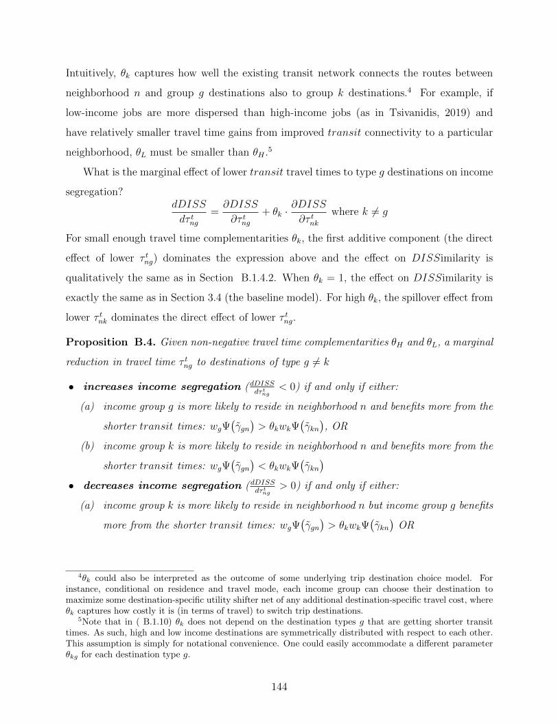
Intuitively, θk captures how well the existing transit network connects the routes between
neighborhood n and group g destinations also to group k destinations.4 For example, if
low-income jobs are more dispersed than high-income jobs (as in Tsivanidis, 2019) and
have relatively smaller travel time gains from improved transit connectivity to a particular
neighborhood, θL must be smaller than θH .5
What is the marginal effect of lower transit travel times to type g destinations on income
segregation?dDISS
dτ tng=∂DISS
∂τ tng+ θk ·
∂DISS
∂τ tnkwhere k 6= g
For small enough travel time complementarities θk, the first additive component (the direct
effect of lower τ tng) dominates the expression above and the effect on DISSimilarity is
qualitatively the same as in Section B.1.4.2. When θk = 1, the effect on DISSimilarity is
exactly the same as in Section 3.4 (the baseline model). For high θk, the spillover effect from
lower τ tnk dominates the direct effect of lower τ tng.
Proposition B.4. Given non-negative travel time complementarities θH and θL, a marginal
reduction in travel time τ tng to destinations of type g 6= k
• increases income segregation (dDISSdτ tng
< 0) if and only if either:
(a) income group g is more likely to reside in neighborhood n and benefits more from the
shorter transit times: wgΨ(γgn)> θkwkΨ
(γkn), OR
(b) income group k is more likely to reside in neighborhood n and benefits more from the
shorter transit times: wgΨ(γgn)< θkwkΨ
(γkn)
• decreases income segregation (dDISSdτ tng
> 0) if and only if either:
(a) income group k is more likely to reside in neighborhood n but income group g benefits
more from the shorter transit times: wgΨ(γgn)> θkwkΨ
(γkn)
OR
4θk could also be interpreted as the outcome of some underlying trip destination choice model. Forinstance, conditional on residence and travel mode, each income group can choose their destination tomaximize some destination-specific utility shifter net of any additional destination-specific travel cost, whereθk captures how costly it is (in terms of travel) to switch trip destinations.
5Note that in ( B.1.10) θk does not depend on the destination types g that are getting shorter transittimes. As such, high and low income destinations are symmetrically distributed with respect to each other.This assumption is simply for notational convenience. One could easily accommodate a different parameterθkg for each destination type g.
144

(b) income group g is more likely to reside in neighborhood n but income group k benefits
more from the shorter transit times: wgΨ(γgn)< θkwkΨ
(γkn)
In other words, suppose high (low) income households have higher transit ridership,
transit connectivity and/or value of travel time so that they benefit more from shorter
transit times. Then, improving transit access from the high (low) income neighborhood
increases income segregation by disproportionately attracting more high (low) income
households to the neighborhood. In contrast, improving transit from the low (high)
income neighborhood decreases income segregation by disproportionately attracting more
high (low) income households. Note that, qualitatively, this effect of lower transit travel
times on income segregation is the same as in the baseline model, as depicted in Lemma 3.1.
Quantitatively, the outcome depends on the destinations being connected and the magnitude
of the network spillover effects.
Corollary. Given non-negative travel time complementarities θH and θL, a marginal
reduction in travel time τ tng to destinations of type g 6= k minimizes DISSimilarity more
from the residential neighborhood
• with a larger share of income group k when wg[Ψ(γ1g)+Ψ(γ2g)
]> θkwk
[Ψ(γ1k)+Ψ(γ2k)
]• with a larger share of income group g when wg
[Ψ(γ1g)+Ψ(γ2g)
]< θkwk
[Ψ(γ1k)+Ψ(γ2k)
]In other words, to minimize income segregation, a transit planner would reduce travel
times from the high (low) income neighborhood when overall transit ridership in the city
is sufficiently large among low (high) income households. Once again, this result reinforces
that of Corollary 3.1.
145

B.2 Mathematical Derivations and Proofs
B.2.1 Marginal Effect of Transit Times on Income Segregation
B.2.1.1 Proof of Lemma 3.1
Proof. First, let us determine the marginal effect of transit times on overall travel costs
Cgn from (3.3.5):
dCgnd∆τn
= β · wg ·[ψ(γgn)· Cc
gn − ψ(γgn)· Ct
gn + Ψ(γgn)− γgn · ψ
(γgn)]
where the last component follows from the Fundamental Theorem of Calculus.
=⇒ dCgnd∆τn
= β · wg ·[ψ(γgn)·(Ccgn − Ct
gn − γgn)
+ Ψ(γgn)]
Then, plugging in γgn from (3.3.2) yields
dCgnd∆τn
= β · wg ·Ψ(γgn)
(B.2.1)
Now, we can take the derivative of DISS from (3.4.3) with respect to ∆τn:
dDISS
d∆τn= 2Λ · (1− Λ) · (1− 2I[ξL < ξH ])
·[(1− 2In=2) ·
(f · dCLn
d∆τn− f · dCHn
∆dτn
)+
(f − f
)· d∆p
dτ tn
](B.2.2)
= 2Λ · (1− Λ) · f · (1− 2In=2) · (1− 2I[ξL < ξH ]) ·(dCLnd∆τn
− dCHnd∆τn
)(B.2.3)
wheredCLnd∆τn
− dCHnd∆τn
= β ·(
Ψ(γLn)· wL −Ψ
(γHn
)· wH
)(B.2.4)
In ( B.2.3), dDISSdτ tn
< 0 if and only if one of the following holds true:
(a) n = 2, ξL < ξH and Ψ(γLn)· wL < Ψ
(γHn
)· wH
(b) n = 1, ξL > ξH and Ψ(γLn)· wL < Ψ
(γHn
)· wH
(c) n = 2, ξL > ξH and Ψ(γLn)· wL > Ψ
(γHn
)· wH
(d) n = 1, ξL < ξH and Ψ(γLn)· wL > Ψ
(γHn
)· wH
146

Recall that F(ξg)
is the fraction of type g households that live in neighborhood 2. Since
there are only two residential neighborhoods, a larger fraction of high-income households in
neighborhood 2 (i.e., F(ξH)> F
(ξL)
or ξH > ξL) automatically implies a larger fraction
of low-income households in neighborhood 1 (i.e., 1 − F(ξL)> 1 − F
(ξH)). So, the first
two conditions correspond to n being the richer neighborhood and the last two conditions
correspond to n being the poorer neighborhood. Lumping them together, dDISSd∆τn
< 0 if and
only if either:
• n is the richer neighborhood and Ψ(γLn)· wL < Ψ
(γHn
)· wH OR
• n is the poorer neighborhood and Ψ(γLn)· wL > Ψ
(γHn
)· wH
Similarly, dDISSdτ tn
> 0 if and only if either:
• n is the richer neighborhood and Ψ(γLn)· wL > Ψ
(γHn
)· wH OR
• n is the poorer neighborhood and Ψ(γLn)· wL < Ψ
(γHn
)· wH
B.2.1.2 Proof of Proposition 3.1
Proof. Note that Ψ(γLn)· wL < Ψ
(γHn
)· wH is equivalent to
ψ ·(κ− β · wL ·∆τn + Γ
)· wL < ψ ·
(κ− β · wH ·∆τn + Γ
)· wH
⇔ β ·∆τn ·(wH − wL
)·(wH + wL
)< (wH − wL) ·
(κ+ Γ
)⇔ ∆τn <
κ+ Γ
β · (wH + wL)
Conversely, Ψ(γLn)· wL > Ψ
(γHn
)· wH is equivalent to
∆τn >κ+ Γ
β · (wH + wL)
Letting τ ≡ κ+Γβ·(wH+wL)
, Lemma 3.1 can be re-stated as follows.
Improved transit access increases income segregation (dDISSd∆τn
< 0) if and only if either:
• n is the richer neighborhood and ∆τn < τ OR
• n is the poorer neighborhood and ∆τn > τ
147

Whereas, improved transit access decreases income segregation (dDISSd∆τn
> 0) if and only if
either:
• n is the richer neighborhood and ∆τn > τ OR
• n is the poorer neighborhood and ∆τn < τ
B.2.1.3 Proof of Corollary 3.1
Proof. Take the derivative of DISS w.r.t. ∆τn and compare it for the two neighborhoods:
dDISS
d∆τ1
− dDISS
d∆τ2
= 2Λ · (1− Λ) · f · (1− 2I[ξL < ξH ]) ·G (B.2.5)
where G ≡ dCL1
d∆τ1
− dCH1
d∆τ1
+dCL2
d∆τ2
− dCH2
d∆τ2
Improving transit times in neighborhood 1 would induce more income mixing (or less income
segregation) than doing so in neighborhood 2 if and only if dDISSd∆τ1
− dDISSd∆τ2
is positive. The
sign depends on G. If we plug in dCgn
d∆τnfrom ( B.2.1),
G = β · wL ·(
Ψ(γL1
)+ Ψ
(γL2
))− β · wH ·
(Ψ(γH1
)+ Ψ
(γH2
))Since γgn ∈ [−Γ,Γ] ∀n, g, we can plug in Ψ
(γgn)
= ψ ·(γgn + Γ
)into G:
G = β · ψ ·[wL ·
(γL1 + γL2 + 2Γ
)− wH ·
(γH1 + γH2 + 2Γ
)]Plug in γgn ≡ κ− β · wg ·∆τn:
=⇒ G = β · ψ ·[β · (∆τ1 + ∆τ2) · (w2
H − w2L)− 2(κ+ Γ) · (wH − wL)
]
= β · ψ · (wH − wL) ·[β · (∆τ1 + ∆τ2) · (wH + wL)− 2(κ+ Γ)
]Finally, on plugging this expression for G back into ( B.2.5), we get that dDISS
d∆τ1− dDISS
d∆τ2is
positive if and only if either:
• neighborhood 2 is poorer (ξL > ξH) and transit is sufficiently slow
∆τ1 + ∆τ2 >2(κ+ Γ)
β · (wH + wL)= 2τ
148

• OR neighborhood 2 is richer (ξL < ξH) and transit is sufficiently fast
∆τ1 + ∆τ2 <2(κ+ Γ)
β · (wH + wL)= 2τ
B.2.2 Income DISSimilarity as a Function of Travel Times
In this section, I derive a closed-form solution of income DISSimilarity in the city purely
in terms of travel times and exogenous parameters of the model. Income segregation is driven
by the difference in travel costs between the neighborhoods, and how it differs between high
and low income households. First, I characterize how this difference in travel costs varies
with transit ridership and travel times (section B.2.2.1). Then, I show how neighborhood
differences in travel costs and independent amenities affect endogenously determined housing
prices and ultimately the level of income DISSimilarity in a competitive equilibrium (section
B.2.2.2). Throughout this section, assume that γgn lies within the support of the distribution
of γ for all n, g.
B.2.2.1 Aggregate Travel Cost
Based on the travel cost function specified in (3.3.5), we have
Cg1 − Cg2 =∑n
(1− 2In=2) ·[Ccgn + Ψ
(γgn)·(Ctgn − Cc
gn
)]+
∫ γg1
γg2
γ · dΨ(γ)
Substitute Ccgn ≡ κ+β ·wg · τ cn from (3.3.1) and γgn ≡ Cc
gn− Ctgn from (3.3.2) into Cg1−Cg2
=∑n
(1− 2In=2) ·[β · wg · τ cn −Ψ
(γgn)· γgn
]+
∫ γg1
γg2
γ · dΨ(γ) (B.2.6)
Because γ is uniformly distributed with constant density ψ and γgn lie within the support
[−Γ,Γ], we know Ψ(γgn)
= ψ ·[γgn + Γ
]and we can substitute dΨ(γ) = ψ · dγ into the
integral to get ∫ γg1
γg2
γ · dΨ(γ) =ψ
2·[(γg1)2 −
(γg2)2]
149

Now plug them into ( B.2.6) to get
Cg1 − Cg2 =∑n
(1− 2In=2) ·[β · wg · τ cn − ψ ·
(γgn + Γ
)· γgn +
ψ
2·(γgn)2]
(B.2.7)
Add 0 = ψ2·(
3Γ2− 3Γ2 +∑
n(1− 2In=2) · 2γgn ·(Γ−Γ
))=∑
n(1− 2In=2) ·[−ψ ·Γ ·
(γgn +
Γ)
+ ψ2·(
Γ2 + 2γgn · Γ)]
:
Cg1 − Cg2 =∑n
(1− 2In=2) ·[β · wg · τ cn − ψ ·
(γgn + Γ
)·(γgn + Γ
)+ψ
2·(γg1 + Γ
)2]
=∑n
(1− 2In=2) ·[β · wg · τ cn −
1
2ψ·Ψ(γgn)2]
(B.2.8)
B.2.2.2 Income Sorting (Proof of Proposition B.1)
Proof. Recall that A ≡ AH1 − AH2 − AL1 + AL2. Then
ξL − ξH = CL1 − CL2 − CH1 + CH2 + A
Plug in Cg1 − Cg2 from ( B.2.8) to get
ξL − ξH =∑g
∑n
(1− 2Ig=H) · (1− 2In=2) ·[β · wg · τ cn −
1
2ψ·Ψ(γgn)2]
+ A
and substitute in K ≡ β · (wH − wL) · (τ c2 − τ c1) + A:
= K − 1
2ψ·∑g
∑n
(1− 2Ig=H) · (1− 2In=2) ·Ψ(γgn)2
(B.2.9)
which can be rewritten as
ξL − ξH =1
2ψ·(
Ψ(γL2
)2 −Ψ(γH2
)2 −Ψ(γL1
)2+ Ψ
(γH1
)2)
+K
Thus, we have ( B.1.1), the first equality of Proposition B.1. Now plug in γgn from (3.3.2)
into ( B.2.9) to get ξL − ξH
= K −∑g
(1− 2Ig=H) ·∑n
(1− 2In=2) ·[ψ
2·(κ− β · wg ·∆τn + Γ
)2]
150

and expand the square:
= K −∑g
(1− 2Ig=H) ·∑n
(1− 2In=2) · ψ2·[2(κ+ Γ) · (β · wg ·∆τn)−
(β · wg ·∆τn
)2]
where∑
g(1− 2Ig=H) ·∑
n(1− 2In=2) · (κ+ Γ)2 = 0.
= β · ψ2·[β · (w2
H − w2L) ·
[(∆τ1)2 − (∆τ2)2
]− 2(κ+ Γ) · (wH − wL) · (∆τ1 −∆τ2)
]+K
= β · ψ2· (wH − wL) · (∆τ1 −∆τ2) ·
(β · (wH + wL) · (∆τ1 + ∆τ2)− 2(κ+ Γ)
)+K
Substitute in τ ≡ κ+Γβ·(wH+wL)
to get
= β · ψ2· (wH − wL) · (∆τ1 −∆τ2) · β · (wH + wL) ·
(∆τ1 + ∆τ2 − 2τ
)+K
Substitute in Q ≡ 12β · ψ · (w2
H − w2L) = 1
2β · ψ · (wH − wL) · (wH + wL) to derive our second
equality, ( B.1.2), from Proposition B.1:
ξL − ξH = Q ·(∆τ1 −∆τ2
)·(∆τ1 + ∆τ2 − 2τ
)+K
Then, based on our definition of income DISSimilarity from (3.4.1),
DISS = 2Λ · (1− Λ) · f ·∣∣∣∣Q · (∆τ1 −∆τ2
)·(∆τ1 + ∆τ2 − 2τ
)+K
∣∣∣∣
151

B.2.3 Marginal Effect of Transit Times on Long-Term Transit Ridership
B.2.3.1 Change in Transit Ridership Among Stayers
Since the distribution of incomes across neighborhoods are an endogenous function of
the distribution of travel times, we can continue to develop the expression in ( B.1.6) to
re-write it as a function of exogenous parameters of the model. This will be useful when
characterizing changes in transit ridership in the long-run. So, plug in ξg from (3.3.7):
S2 − S1 = ψ · β · E[w ·(
1− 2f ·(Cg1 − Cg2 − Ag1 + Ag2 + ∆p+ Ξ
))]
= ψ · β · E[w ·(
1− 2f ·(Cg1 − Cg2 − Ag1 + Ag2 + ∆p+ Ξ
))](B.2.10)
From the housing market clearing condition in (3.3.8), we have
∆p =1
2f− Ξ− E
[Cg1 − Cg2 − Ag1 + Ag2
](B.2.11)
Plug in this ∆p into ( B.2.10) to get
S2−S1 = ψ ·β ·E[wg ·
(1− 2f ·
(Cg1−Cg2−Ag1 +Ag2 +
1
2f−E
[Cg1−Cg2−Ag1 +Ag2
]))]
= 2f · ψ · β ·[E[wg ·
(Cg1 − Cg2 − Ag1 + Ag2
)]− E[wg] · E
[Cg1 − Cg2 − Ag1 + Ag2
]]We can simplify the expectation over incomes to get
S2 − S1 = 2f · ψ · β · Λ · (1− Λ) · (wH − wL) ·[CH1 − CH2 − CL1 + CL2 + A
](B.2.12)
where A ≡ AH1 − AH2 − AL1 + AL2
To be concise, I use A to denote the effect of exogenously distributed amenities in the city.
Note that S2 − S1 is proportional to income DISSimilarity as defined in (3.4.1):
S2 − S1 = 2f · ψ · β · Λ · (1− Λ) · (wH + wL) ·(ξL − ξH
)(B.2.13)
In words, the greater the difference in incomes across residential neighborhoods, the larger
are the gains in (’short-term’) transit ridership from improving transit in the richer
neighborhood.
152

B.2.3.2 Change in Transit Ridership Among Movers (Proof of Lemma B.1.3.2)
What is the change in transit ridership Mn among households that move?
Proof. Plug in ξg from (3.3.7) into M2 −M1 from ( B.1.4) and take its derivative w.r.t τ t1
and τ t2 to get
M2 −M1 = f · E[(
d∆p
d∆τ2
− dCg2d∆τ2
− d∆p
d∆τ1
− dCg1d∆τ1
)·(
Ψ(γg2)−Ψ
(γg1))]
The derivative of ∆p from ( B.2.11) w.r.t. ∆τn is
d∆p
d∆τn= −E
[ dCgnd∆τn
· (1− 2In=2)]
which we can plug into M2 −M1
= f · E[(
E[ dCg2d∆τ2
+dCg1d∆τ1
]− dCg2d∆τ2
− dCg1d∆τ1
)·(
Ψ(γg2)−Ψ
(γg1))]
Substitute in dCgn
d∆τn= β ·wg ·Ψ
(γgn)
from ( B.2.1) and plug in Ψ(γgn)
= ψ ·(κ−β ·wg ·∆τn+Γ
)to get
M2 −M1 = f · β · E[ψ · β · w2
g · (∆τ1 + ∆τ2)
]· E[ψ · β · wg · (∆τ1 −∆τ2)
]− f · β · E
[wg ·
[ψ · β · wg · (∆τ1 + ∆τ2)
]·[ψ · β · wg · (∆τ1 −∆τ2)
]]
= f · ψ2 · β3 ·(
E[w3g]− E[w2
g] · E[wg]
)·[(∆τ2)2 − (∆τ1)2
]Finally, simplify the expectation over the two possible incomes:
M2 −M1 = f · β3 · ψ2 · Λ · (1− Λ) · (w2H − w2
L) · (wH − wL) ·[(∆τ2)2 − (∆τ1)2
](B.2.14)
M2 > M1 if and only if ∆τ1 < ∆τ2. In other words, ridership among households that
move increases more from transit improvements in neighborhood 1 (as opposed to 2) if
and only if transit is relatively faster from neighborhood 1 than from 2. This is because
movers increase their transit usage when they move in to a neighborhood with relatively
shorter transit times, but decrease their transit usage when they move to a neighborhood
with longer transit times. Similarly, households that move out of the neighborhood with
faster transit had relatively lower transit usage (and lower willingness to pay the higher
153

housing prices for it) to begin with. So, overall transit ridership among the city’s movers
is maximized by marginal improvements in transit from the neighborhood that has the
relatively shorter transit travel time.
B.2.3.3 Maximizing Long-Term Transit Ridership (Proof of Proposition B.2)
Let me finally compare the change in transit ridership among all households in the city.
Proof. Recall from ( B.1.4) that dRd∆τ2− dR
d∆τ1equals the sum of S2 − S1 and M2 −M1. So,
plug in ξL − ξH from ( B.1.2) into S2 − S1from ( B.2.13) and add them to M2 −M1 from (
B.2.14) to get dRd∆τ2− dR
d∆τ1
= 2f · ψ · β · Λ · (1− Λ) · (wH − wL) ·[β · (wH − wL) ·
[ψ · (κ+ Γ) · (∆τ1 −∆τ2)
]− ψ · β2 · (w2
H − w2L) ·
[(∆τ1)2 − (∆τ2)2
]+K
]which is positive if and only if
β · (wH − wL) · ψ · (∆τ1 −∆τ2) ·(κ+ Γ− β · (wH + wL) · (∆τ1 + ∆τ2)
)+K > 0
⇔ 2Q · (∆τ1 −∆τ2) ·(τ − (∆τ1 + ∆τ2)
)+K > 0
2(ξL − ξH −K) +K > 0
where I substituted in Q, K and ξL− ξH from Proposition B.1. So, improving transit travel
times from neighborhood 1 increases transit ridership more than improving transit times
from neighborhood 2 if and only if
ξL − ξH >K
2
154

B.2.4 Generalization: Travel Times to Income-Specific Destinations
Suppose the travel network is characterized by travel times τmng to destinations of type
g (for income group g). What is the marginal effect of transit travel times on income
segregation? When is dDISSdτ tng
< 0? There are four marginal transit travel time changes to
evaluate. Let ∆τng ≡ τ cng− τ tng denote the travel time difference between car and transit for
each commute ng. Households are indifferent between car and transit on trips with γ equal
to
γng = κ− βwg∆τng
B.2.4.1 Zero Network Spillovers (Proof of Proposition B.3)
Proof. To compute dDISSdτ tng
, first, derive the marginal effect of travel times on travel costs:
dCngdτ tng
= β · wg ·[ψ(γng)· Cc
ng − ψ(γng)· Ct
ng + Ψ(γng)− γng · ψ
(γng)]
where the last component follows from the Fundamental Theorem of Calculus.
=⇒ dCngdτ tng
= β · wg ·[ψ(γng)·(Ccng − Ct
ng − γng)
+ Ψ(γng)]
Then, plugging in γng from (3.3.2) yields
dCngdτ tng
= β · wg ·Ψ(γng)
(B.2.15)
Now, we can take the derivative of DISS from (3.4.3) with respect to τ tng:
dDISS
dτ tng= 2Λ · (1− Λ) · (1− 2I[ξL < ξH ])·[
(1− 2In=2) · (1− 2Ig=H) · f · dCngdτ tng
+
(f − f
)· d∆p
dτ tng
](B.2.16)
=⇒ dDISS
dτ tng= 2Λ · (1−Λ) · f · (1− 2In=2) · (1− 2Ig=H) · (1− 2I[ξL < ξH ]) · dCng
dτ tng(B.2.17)
In ( B.2.17), dDISSdτ tng
< 0 if and only if there is non-zero transit ridership among the target
group (Ψ(γng) > 0) and one of the following holds true:
155

• n = 2, ξL < ξH and g = H
• n = 1, ξL > ξH and g = H
• n = 2, ξL > ξH and g = L
• n = 1, ξL < ξH and g = L
Recall that F(ξg)
is the fraction of group g households that live in neighborhood 2. Since
there are only two residential neighborhoods, a larger fraction of high-income households in
neighborhood 2 (i.e., F(ξH)> F
(ξL)
or ξH > ξL) automatically implies a larger fraction
of low-income households in neighborhood 1 (i.e., 1 − F(ξL)> 1 − F
(ξH)). So, the first
two conditions correspond to n being the richer neighborhood and the last two conditions
correspond to n being the poorer neighborhood. Lumping them together, dDISSdτ tng
< 0 if and
only if either:
• n is the richer neighborhood and g = H OR
• n is the poorer neighborhood and g = L
Similarly, dDISSdτ tng
> 0 if and only if either:
• n is the richer neighborhood and g = L OR
• n is the poorer neighborhood and g = H
B.2.4.2 Positive Network Spillovers (Proof of Proposition B.4)
Proof. When is dDISSdτ tng
< 0?
dDISS
dτ tng=∂DISS
∂τ tng+ θk ·
∂DISS
∂τ tnkwhere k 6= g
where we can plug in the derivative from ( B.2.17) to get
dDISS
dτ tng= 2Λ · (1− Λ) · f · (1− 2In=2) · (1− 2I[ξL < ξH ]) · (1− 2Ig=H) ·
(dCngdτ tng
− θkdCnkdτ tnk
)
= 2Λ · (1−Λ) · f · (1− 2In=2) · (1− 2I[ξL < ξH ]) · (1− 2Ig=H)β ·(wgΨ
(γng)− θkwkΨ
(γnk))
Then dDISSdτ tng
< 0 if and only if one of the following holds true:
156

(a) n is the richer neighborhood and g = H and wgΨ(γgn)> θkwkΨ
(γkn)
(b) n is the poorer neighborhood and g = L and wgΨ(γgn)> θkwkΨ
(γkn)
(c) n is the richer neighborhood and g = L and wgΨ(γgn)< θkwkΨ
(γkn)
(d) n is the poorer neighborhood and g = H and wgΨ(γgn)< θkwkΨ
(γkn)
The first two conditions are consistent with the results of Lemma 3.1. They state that
improving travel times from the high (low) income neighborhood to high (low) income
destinations increases income segregation when there is large enough high (low) income
transit ridership in the neighborhood and sufficiently small θk. The last two conditions state
that improving travel times from the high (low) income neighborhood even to low (high)
income destinations increase income segregation when there is large enough high (low) income
transit ridership and sufficiently large θk.
Similarly, dDISSdτ tng
> 0 if and only if one of the following holds true:
(a) n is the richer neighborhood and g = L and wLΨ(γLn)> θHwHΨ
(γHn
)(b) n is the poorer neighborhood and g = H and wHΨ
(γHn
)> θLwLΨ
(γLn)
(c) n is the richer neighborhood and g = H and wHΨ(γHn
)< θLwLΨ
(γLn)
(d) n is the poorer neighborhood and g = L and wLΨ(γLn)< θHwHΨ
(γHn
)
B.2.4.3 Positive Network Spillovers (Proof of Corollary B.1.4.3)
Proof. Take the derivative of DISS w.r.t. τ tgn and compare n = 1 to n = 2:
dDISS
dτ tg1− dDISS
dτ tg2= 2Λ · (1− Λ) · f · (1− 2I[ξL < ξH ]) · (1− 2Ig=H) ·G1 (B.2.18)
where G1 ≡dCg1dτ tg1
− θkdCk1
dτ tk1
+dCg2dτ tg2
− θkdCk2
dτ tk2
where k 6= g
Improving transit times in neighborhood 1 would induce more income mixing (or less income
segregation) than doing so in neighborhood 2 if and only if dDISSdτ tg1
− dDISSdτ tg2
is positive. The
sign depends on G1. Based on ( B.2.1),
G1 = wgΨ(γ1g
)− θkwkΨ
(γ1k
)+ wgΨ
(γ2g
)− θkwkΨ
(γ2k
)
157

= wg
(Ψ(γ1g
)+ Ψ
(γ2g
))− θkwk
(Ψ(γ1k
)+ Ψ
(γ2k
))G1 < 0 implies that the non-targeted benefits from expanding the transit network outweighs
the direct benefits from shorter travel times to targeted destinations. So, dDISSdτ t1g
> dDISSdτ t2g
if
and only if either
(a) neighborhood 1 is richer, g = L and sufficiently large low-income transit ridership such
that G1 > 0, OR
(b) neighborhood 1 is poorer, g = H and sufficiently large high-income transit ridership
such that G1 > 0, OR
(c) neighborhood 1 is richer, g = H and sufficiently large low-income transit ridership such
that G1 < 0, OR
(d) neighborhood 1 is poorer, g = L and sufficiently large high-income transit ridership such
that G1 < 0
The cases for improving transit times in neighborhood 2 follow the same reasoning.
Qualitatively, we get lower income segregation on improving transit access between the
high (low) income neighborhood and
• low (high) income destinations when transit ridership is sufficiently large among low
(high) income households
• high (low) income destinations when transit ridership is sufficiently large among low
(high) income households
More concisely, we get lower income segregation on improving transit access from the
high (low) income neighborhood when transit ridership is sufficiently large among low (high)
income households, just like in the baseline model.
B.2.5 Perfect Income Segregation
The paper’s main results focus on cases where both ξL and ξH lie in the support [−Ξ,Ξ]
of the distribution of ξ. In this section, I consider the alternative where ξg /∈ [−Ξ,Ξ] for
some g ∈ {L,H}. In other words, all households in one of the income groups sort perfectly
158

into one neighborhood. Let f(ξ) denote the probability density of ξ such that f(ξ) = 0 for
ξ /∈ [−Ξ,Ξ] and f(ξ) = 12Ξ
for ξ ∈ [−Ξ,Ξ].
Proposition B.5. Suppose ξg /∈ [−Ξ,Ξ] for some g ∈ {L,H}. Then
dDISS
dτmn= 0 ∀m ∈ {t, c}, ∀n ∈ {1, 2}
Proof. Take the derivative of our measure of DISS in (3.4.2) with respect to travel time
τmn to get
dDISS
dτmn= 2Λ · (1− Λ) · (1− 2I[ξL < ξH ])
·[(1− 2In=2) ·
(f(ξL)· dCLndτmn
− f(ξH)· dCHndτmn
)+
(f(ξL)− f
(ξH))· d∆p
dτmn
]When ξg /∈ [−Ξ,Ξ] for both g ∈ {L,H}, f
(ξg)
= 0 ∀g. So none of the households move in
response to marginal changes (in ξ) and dDISSdτmn
= 0.
Let us then consider the case where at least one of ξL or ξH lie in the support. Suppose
ξg ∈ [−Ξ,Ξ] and ξk /∈ [−Ξ,Ξ] for g 6= k. The housing market clearing condition in (3.3.8)
boils down to1
2= Λ · I[ξk > Ξ] + (1− Λ) · ξg + Ξ
2Ξ
and we can decompose ξg to solve for the equilibrium housing price difference across
neighborhoods:
⇔ ∆p = −Ξ +(1− 2Λ · I[ξk > Ξ]
)· 2Ξ
2(1− Λ)−[Cg1 − Cg2 − Ag1 + Ag2
]Take the derivative with respect to τmn to get
d∆p
dτmn= −(1− 2In=2) · dCgn
dτmn
=⇒ dDISS
dτmn= −2Λ · (1− Λ)
2Ξ·[(1− 2In=2) · dCgn
dτmn+d∆p
dτmn
]= 0
Since only households in income group g relocate in response to travel time changes and
since the number of group g households that move out is the same as the number of group
g households that move in (given fixed housing supply), the income compositions of the
neighborhoods remain the same in equilibrium.
Thus, marginal changes in travel times do not affect DISS when either ξL or ξH (or
both) does not lie in the support [−Ξ,Ξ] of the distribution of ξ.
159

Appendix C Racial Segregation in Housing Markets and the Erosion of Black
Wealth
C.1 Constructing the Matched Address Sample
Each record in the census data represents an individual in a household. Each household
has a head and related members who share the same address. An address is the combination
of a house number and a street name. In an ideal world, we would know the number of
individuals and households residing at a given address. However, either the house number
or the street name entry for an individual could have been mis-recorded by the census
enumerators or mis-digitized by the contemporary census digitization workers. Therefore,
some households have incorrect or incomplete addresses, possibly leading to inaccurate counts
of households in any building. This appendix describes the algorithm we used to construct a
representative set of households for our sample cities in 1930 and 1940, focusing in particular
on the challenge of assigning all individuals to the correct address.
We first need to make sure that no household is either missing an address or assigned
more than one. We assume that the enumeration districts (EDs) and tracts reported in the
census data were transcribed correctly. A tiny fraction of EDs and tracts from the census
do not coincide with the list of EDs that we use to define our cities. We drop those EDs or
tracts, as they are likely to be institutions that were given a separate ED number.
We have digitized 1930 enumeration district boundaries (Shertzer et al., 2016) and
obtained census tract boundary files from the National Historical Geographic Information
System (NHGIS). We cross-check census address data by “fuzzy” matching each census street
name to a list of street names from the corresponding ED/tract obtained from the spatial
datasets. We exclude addresses on streets that have either no reasonable match or too many
potential matches among the digitized streets.
Census enumerators were instructed to survey households as they moved along a street,
and thus we do not expect to see house numbers within a street jump around. Thus, the
order in which households appear on the manuscripts should generally reflect their location
160

within the ED relative to neighboring households.1 To ensure that we have all the households
living in each address in our sample, we also drop any address that shares a street-block (or
the entire street-ED when the block cannot be identified) with an address that is potentially
out of order on the manuscript. We provide further details of the process below.
C.2 Details on Matching Methodology
We make sure that every household has exactly one address composed of a street name
and house number. To begin, we assign the address information from the household head to
everyone in his/her household. When the household head has partial (e.g. only a street
name or only the house number) or no information on address, we fill in information
from the household’s non-head member. We perform a series of quality checks on these
imputed addresses that are described below. If the household head is missing an address
and household members disagree on either street name or house number, we impute the
missing address information from those of households listed just before this one in the census
manuscripts and flag these households.
In the case of multiple households sharing the same dwelling unit, we will have more
than one household head. When these household heads disagree on the address, we compare
each component of the addresses (the street names and house numbers) to those of adjacent
households and keep the one(s) that matches that of the most number of neighbors. We
flag all addresses imputed from adjacent households. A very small number of dwellings from
the 1940 Census seem to have members belonging to different EDs/tracts. As with street
names and house numbers, we assume the household head’s ED/tract is the correct one.
In the case of multi-family households, we compare each candidate ED/tract with those
of households appearing immediately before and after on the census manuscripts, and only
retain the EDs/tracts with the highest number of matches. We have a few households located
at the intersection of EDs/tracts, and we flag these as well.
1Our indicators of manuscript page and line numbers are not very reliable, so we use the household IDsassigned by IPUMS as proxy for the order in which households appear in the original census manuscripts.
161

Then we standardize street names in the census, which are noisy and frequently riddled
with typos. We first standardize all the directional prefix and street suffix, convert ordinal
street numbers to their cardinal text forms, and remove any redundant information from
street name (such as “Block A”). We then match these formatted street names to our
digitized 1930 city streets to standardize further the names. We create a crosswalk of digitized
street names, 1930 EDs, and 1940 tracts and fuzzy match them with the set of unique
census street names by ED/tract (allowing some margin of error in the string match). We
use STATA’s reclink2 command for this task. If a census street matches to more than one
digitized street (a “one-to-many” match) within an ED/tract, then we flag all the digitized
streets that were a match. Eventually we drop all Census records where the street does not
match a digitized street or matches one that is flagged as part of a one-to-many match. Note
that the process is sensitive to the margin of error that we allow in our string match. A
wide error margin means we will have more one-to-many matches and fewer non-matches,
whereas with a narrow error margin, we will have more non-matches and fewer one-to-
many matches. The former introduces false one-to-one matches that might otherwise stay
unmatched, whereas the latter introduces false one-to-one matches that might otherwise be
matched to many. Thus, a conservative approach is to allow a wide margin of error, but
narrow enough that we are still left with a reasonably sized sample after dropping one-to-
many and non-matches.
House numbers, like street names, are also prone to errors and typos. The next step is
to standardize house numbers as best as we can across ED/tracts and census years. When
the house number variable is just one clear number, we leave it as it is. When it is not (e.g.,
“945/6”, “4531 667” or “1??2”), we try to identify a minimum and a maximum possible
house number. For instance, when the reported house number is “4531 667”, we treat it as
ranging from 667 to 4531 and flag all addresses on the same street block and ED with house
numbers in that range.2 We assume a “?” can range from 0 to 9, so that house number
“1??2” ranges from 1002 to 1992. We treat separators like “/”, “-“, “&”, “+”, “ ” and
2There are alternative ways of interpreting a reported house number of “4531 467”. The second numbermight be an apartment number within the building, or the building might span house numbers 4531 to 4667.However, given that we eventually drop all street blocks intersecting this range of numbers, we believe ourrange assignment is the most conservative in dealing with such ambiguity. The street block is defined by thestreet name and the hundreds of the house number.
162

“,” as spaces when identifying the range, while we ignore alphabets (treating “5a” as “5”)
and other non-alphanumeric characters (e.g. parentheses and brackets). All problematic
addresses are flagged.
We do not have digitized historical house numbers as with street names to validate our
cleaning process. Instead, we perform a number of quality checks based on the ordering of
households in the census manuscripts and flag households that fail to satisfy these checks.
Failing one or more of these reality checks implies that the re-formatted and standardized
addresses are unlikely to be correct. These flagged households include cases where:
(a) the address differs from that of adjacent households on the manuscript when adjacent
households share an address,
(b) only the house number matches that of one adjacent household, and only the street name
matches that of the other adjacent household,
(c) the house number differs from adjacent house numbers by more than 10 along the same
street,
(d) the house number changes non-monotonically (and differs from adjacent house numbers
by at least 4) along the same street, and
(e) the address is (either partially or completely) imputed from that of the preceding
household when adjacent street names differ.
We drop households in all addresses that were flagged in any of the previous steps.
If a household’s address is flagged, the correct address is likely to be that of adjacent
households on the manuscript, given our assumption on the path of the enumerators. To
avoid undercounting the individuals in these adjacent addresses, we also drop all addresses
adjacent to flagged addresses on the manuscript. Thus, we generate a sample of addresses
that are correct with a reasonable degree of accuracy that is our baseline.3
Finally, from each sample, we retain only the addresses that appear in both the 1930 and
the 1940 Census. Since we have digitized 1930 ED boundaries and 1940 tract boundaries,
3If the street block of a flagged address cannot be identified credibly (e.g. when the house number iscompletely non-numeric or the range of house numbers is unrealistically large), we drop all addresses on thesame street and ED.
163

we further make sure that the reported EDs (in 1930) and tracts (in 1940) corresponding to
each address overlap spatially.
C.3 Geocoding Addresses
We geocode all formatted address strings on Google Maps’ Directions API. We include
all 1930 and 1940 addresses with non-missing street names and house numbers, including
those we have flagged as potentially erroneous. The Directions API does a fuzzy name match
of our input strings with addresses on Google’s database and returns none, one or multiple
location matches. For each location match, the API returns the geographic coordinates, the
level of precision of the geocoding (e.g. “street address”, “route”, “intersection”, “ward”,
etc.), and any administrative/political areas that the geocoded location falls within (e.g. the
county, city, state, postal code or other well-defined “neighborhoods”). We drop any matches
where the precision of the geocoding is an administrative area (e.g. a ward, a neighborhood,
a city, etc.) or if the state differs from that of our city.
We then map each geocoded location to our 1930 ED and 1940 tract boundaries, and drop
any location matches that do not coincide with either the ED or the tract associated with the
input address. From each remaining geocoded location matches, we compute straight-line
distances to the nearest black neighborhood. If there are still multiple location matches for
an address, we keep the location match whose distance to the nearest black neighborhood
is closest to the average distance from all location matches of addresses in the same block.
Finally, in a small number of cases, when location matches for an address are tied in their
deviation from the average distance to the nearest black neighborhood in the block, we pick
the location match that appears first in the Directions API’s sorting of results.4
To compute block-level distances to the nearest black neighborhood, we take the average
of distances from each address in the block. As long as a block includes at least one address
that is not flagged as problematic, we exclude distances from flagged addresses.
4The sorting reflects the “prominence” of the location, which is Google’s measure of how likely the locationis to be the result of a search.
164

C.4 Additional Tables and Figures
Figure 29: Self-reported value vs. deed value from county records
Note: The figure presents a Kernel Density Estimate of the PDF of differences between self-reported homevaluations as recorded in the decennial census and sales amounts as recorded by the Allegheny CountyRecorder of Deeds for a sample of 404 owner-occupied homes in the city of Pittsburgh. The data wereconstructed by identifying homes in the recorder of deed’s records that were sold in either 1930 or 1940 andthen hand matching them to the appropriate individual census record based on the home’s address.
165

Figure 30: Geocoded Detroit addresses
Note: The figure shows the addresses in our sample for the city of Detroit that could be geocoded against amap of 1940 enumeration districts produced by Logan and Zhang (2017).
166

Figure 31: Racial transition in geocoded blocks in Detroit
Note: The figure shows the addresses in our sample for the city of Detroit that could be geocoded against amap of 1940 enumeration districts produced by Logan and Zhang (2017). Blocks are color-coded as follows:blue blocks were less than 5 percent black in both 1930 and 1940, pink blocks were less than 5 percent blackin 1930 and more than 5 percent black in 1940, and black blocks were over 5 percent black in both 1930 and1940.
167

Racial Transition Coefficient
Racial Transition Rent Interaction Coefficient
Figure 32: Robustness to definition of a white block in 1930
Note: These figures present parameter estimates consistent with those presented in Column 3 of Table 13,Panel A under different definitions of a baseline block (in Table 13, only blocks with pct. black = 0 in 1930were included in the analsyis).
168

Racial Transition Coefficient
Racial Transition Rent Interaction Coefficient
Figure 33: Robustness to definition of racial transition
Note: These figures present parameter estimates consistent with those presented in Column 3 of Table 13,Panel A under different definitions of a racial transition (in Table 13, transition was defined as all city-blocksthat were > 50% black in 1940).
169
Baseline Sample
Black and White Households Separately
Figure 34: Semiparametric relationship between percent black and rents, excluding
longstanding white residents
Note: This figure replicates Figure 19 except for dropping white households that had lived in the sameaddress in 1935 from the sample.
170

Baseline Sample
Black and White Households Separately
Figure 35: Semiparametric relationship between percent black and home values, excluding
longstanding white residents
Note: This figure replicates Figure 20 except for dropping white households that had lived in the sameaddress in 1935 from the sample.
171
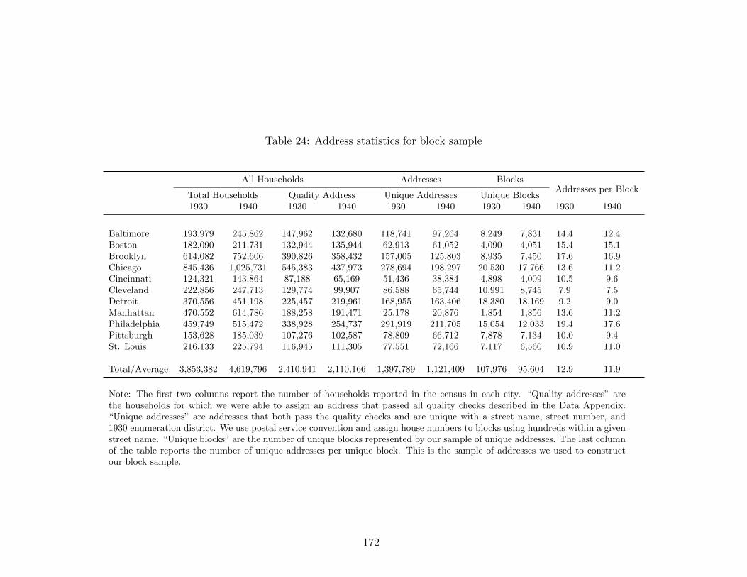
Table 24: Address statistics for block sample
All Households Addresses BlocksAddresses per Block
Total Households Quality Address Unique Addresses Unique Blocks1930 1940 1930 1940 1930 1940 1930 1940 1930 1940
Baltimore 193,979 245,862 147,962 132,680 118,741 97,264 8,249 7,831 14.4 12.4Boston 182,090 211,731 132,944 135,944 62,913 61,052 4,090 4,051 15.4 15.1Brooklyn 614,082 752,606 390,826 358,432 157,005 125,803 8,935 7,450 17.6 16.9Chicago 845,436 1,025,731 545,383 437,973 278,694 198,297 20,530 17,766 13.6 11.2Cincinnati 124,321 143,864 87,188 65,169 51,436 38,384 4,898 4,009 10.5 9.6Cleveland 222,856 247,713 129,774 99,907 86,588 65,744 10,991 8,745 7.9 7.5Detroit 370,556 451,198 225,457 219,961 168,955 163,406 18,380 18,169 9.2 9.0Manhattan 470,552 614,786 188,258 191,471 25,178 20,876 1,854 1,856 13.6 11.2Philadelphia 459,749 515,472 338,928 254,737 291,919 211,705 15,054 12,033 19.4 17.6Pittsburgh 153,628 185,039 107,276 102,587 78,809 66,712 7,878 7,134 10.0 9.4St. Louis 216,133 225,794 116,945 111,305 77,551 72,166 7,117 6,560 10.9 11.0
Total/Average 3,853,382 4,619,796 2,410,941 2,110,166 1,397,789 1,121,409 107,976 95,604 12.9 11.9
Note: The first two columns report the number of households reported in the census in each city. “Quality addresses” arethe households for which we were able to assign an address that passed all quality checks described in the Data Appendix.“Unique addresses” are addresses that both pass the quality checks and are unique with a street name, street number, and1930 enumeration district. We use postal service convention and assign house numbers to blocks using hundreds within a givenstreet name. “Unique blocks” are the number of unique blocks represented by our sample of unique addresses. The last columnof the table reports the number of unique addresses per unique block. This is the sample of addresses we used to constructour block sample.
172

Table 25: Address sample statistics
Households with address found in both census years AddressesHouseholds per Address
Total Restricted Sample Quality Address Unique Addresses1930 1940 1930 1940 1930 1940 1930 1940 1930 1940
Baltimore 110,312 125,598 98,780 111,757 67,925 75,888 57,287 57,287 1.2 1.3Boston 122,353 136,230 100,785 109,334 67,008 71,343 33,267 33,267 2.0 2.1Brooklyn 365,589 413,796 254,723 286,483 144,116 159,787 62,108 62,108 2.3 2.6Chicago 443,948 497,700 355,109 389,081 190,802 207,627 104,553 104,553 1.8 2.0Cincinnati 78,245 85,719 67,293 72,601 33,132 35,112 20,967 20,967 1.6 1.7Cleveland 124,151 135,182 111,170 118,948 48,676 51,126 34,843 34,843 1.4 1.5Detroit 212,211 228,290 184,660 194,112 95,309 98,560 76,845 76,845 1.2 1.3Manhattan 235,841 299,774 95,304 119,594 29,369 36,001 3,913 3,913 7.5 9.2Philadelphia 227,479 244,202 206,716 218,856 145,313 152,650 131,469 131,469 1.1 1.2Pittsburgh 84,028 94,428 73,731 81,806 43,172 47,767 32,289 32,289 1.3 1.5St. Louis 141,183 148,756 124,771 130,522 48,185 50,361 34,239 34,239 1.4 1.5
Total/Average 2,145,340 2,409,675 1,673,042 1,833,094 913,007 986,222 591,780 591,780 2.1 2.3
Note: The “Total” columns report the number of households with addresses we were able to locate in both the 1930 and1940 censuses. We trimmed this sample to eliminate transcription errors and institutions (we drop any households with morethan 10 members, any household with more than three heads, any addresses with monthly rent greater than $100, and finallyany addresses with a value greater than $20,000). The “Trimmed Sample” columns report the number of households withoutproblematic census values in both 1930 and 1940. The “Quality Address” columns report the number of households withoutproblematic census values that passed the address quality checks described in the Data Appendix. The “Unique Addresses”columns report the number of addresses represented by this sample of households. This is the sample of addresses we used inour address-level analysis.
173
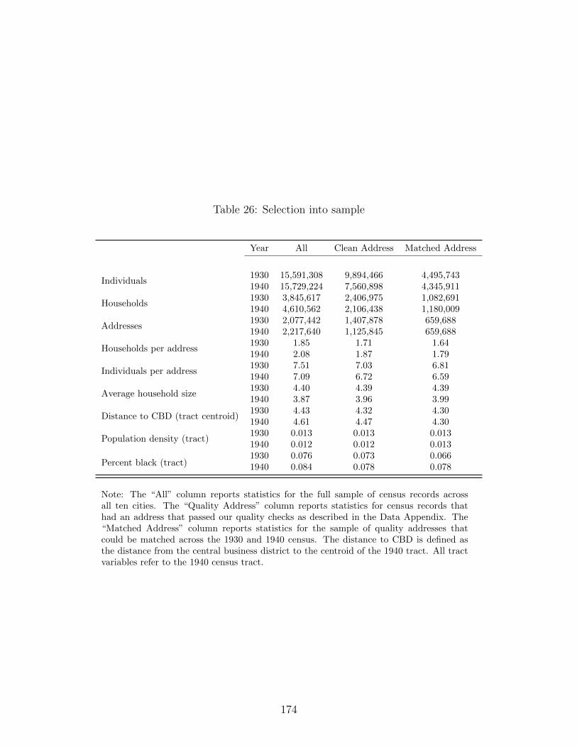
Table 26: Selection into sample
Year All Clean Address Matched Address
Individuals1930 15,591,308 9,894,466 4,495,7431940 15,729,224 7,560,898 4,345,911
Households1930 3,845,617 2,406,975 1,082,6911940 4,610,562 2,106,438 1,180,009
Addresses1930 2,077,442 1,407,878 659,6881940 2,217,640 1,125,845 659,688
Households per address1930 1.85 1.71 1.641940 2.08 1.87 1.79
Individuals per address1930 7.51 7.03 6.811940 7.09 6.72 6.59
Average household size1930 4.40 4.39 4.391940 3.87 3.96 3.99
Distance to CBD (tract centroid)1930 4.43 4.32 4.301940 4.61 4.47 4.30
Population density (tract)1930 0.013 0.013 0.0131940 0.012 0.012 0.013
Percent black (tract)1930 0.076 0.073 0.0661940 0.084 0.078 0.078
Note: The “All” column reports statistics for the full sample of census records acrossall ten cities. The “Quality Address” column reports statistics for census records thathad an address that passed our quality checks as described in the Data Appendix. The“Matched Address” column reports statistics for the sample of quality addresses thatcould be matched across the 1930 and 1940 census. The distance to CBD is defined asthe distance from the central business district to the centroid of the 1940 tract. All tractvariables refer to the 1940 census tract.
174

Table 27: Decomposing transition
Log Price Log Occupancy
No Controls Controls ED FE No Controls Controls ED FE(1) (2) (3) (4) (5) (6)
Rented -2.244*** -2.238*** -2.216*** 0.184*** 0.181*** 0.183***(0.003) (0.003) (0.003) (0.002) (0.002) (0.002)
Transition < 10% 0.005 -0.007 -0.018 0.022*** 0.017* -0.008(0.012) (0.012) (0.013) (0.009) (0.009) (0.010)
Rented < 10% 0.071*** 0.087*** 0.089*** 0.066*** 0.065*** 0.053***(0.023) (0.022) (0.021) (0.016) (0.016) (0.017)
Transition 10-50% -0.142*** -0.080*** -0.015 -0.000 -0.012 -0.025(0.020) (0.020) (0.022) (0.014) (0.014) (0.017)
Rented x 10-50% 0.105*** 0.141*** 0.111*** 0.152*** 0.153*** 0.137***(0.034) (0.033) (0.032) (0.024) (0.024) (0.025)
Transition 50-100% -0.266*** -0.166*** -0.089** -0.042 -0.046* -0.028(0.039) (0.038) (0.043) (0.027) (0.027) (0.033)
Rented x 50-100% 0.461*** 0.499*** 0.506*** 0.290*** 0.286*** 0.238***(0.050) (0.048) (0.049) (0.035) (0.035) (0.038)
Observations 242,441 241,793 242,441 247,169 246,234 247,169R-squared 0.738 0.757 0.802 0.202 0.212 0.251
Note: The first three columns report the OLS estimation of equation (4.5.7) on our baselinesample of homes that were single family, owner occupied, and located on a block with no blackresidents in 1930 with racial transition disaggregated to black share strictly between zero andten percent, black share between ten and fifty percent, and black share strictly above 50 percent.The first and fourth columns controls only for price and occupancy of the address in 1930. Thesecond and fifth columns add controls share renters and total number of addresses at the blocklevel, and share black, share immigrant, share laborer, mean age, median home value, medianrent, and median occupational score at the neighborhood level. The third and sixth columnsdrop the neighborhood controls and includes ED fixed effects.
175

Table 28: Main results excluding longstanding white residents
Panel A: Log price No Controls Controls ED FE All Obs. FE Rental FE(1) (2) (3) (4) (5)
Rented -2.217*** -2.214*** -2.191*** -2.136*** -2.049***(0.003) (0.003) (0.003) (0.002) (0.005)
Racial Transition -0.264*** -0.150*** -0.090** -0.124*** -0.084(0.039) (0.038) (0.043) (0.036) (0.078)
Rented x Transition 0.460*** 0.496*** 0.503*** 0.371*** 0.272***(0.050) (0.048) (0.049) (0.038) (0.075)
Observations 242,441 241,793 242,441 399,964 151,501R-squared 0.738 0.757 0.802 0.819 0.731
Panel B: Log occupancy No Controls Controls ED FE All Obs. FE Only Rentals(1) (2) (3) (4) (5)
Rented 0.167*** 0.187*** 0.188*** 0.181*** 0.150***(0.003) (0.002) (0.002) (0.002) (0.004)
Racial Transition -0.020 -0.046* -0.012 -0.043 0.044(0.030) (0.027) (0.033) (0.029) (0.063)
Rented x Transition 0.298*** 0.293*** 0.240*** 0.185*** 0.046(0.038) (0.035) (0.038) (0.030) (0.063)
Observations 233,053 227,347 228,221 335,343 101,671R-squared 0.020 0.221 0.261 0.296 0.373
Note: This table replicates Table 13 except for dropping white households that had lived in thesame address in 1935 from the sample.
176

Table 29: Housing market discrimination excluding longstanding white residents
Black < 5% Black < 10% Black > 40% Black > 60%(1) (2) (3) (4)
Rented -2.193*** -2.192*** -2.114*** -1.991***(0.003) (0.003) (0.091) (0.116)
Black Household 0.322*** 0.250*** 0.085 -0.030(0.104) (0.072) (0.079) (0.096)
Rented x Black Household 0.199 0.054 0.328*** 0.325**(0.183) (0.132) (0.120) (0.144)
Black Pioneer Premium 0.38 0.28Black Rental Premium 0.39 0.38
Observations 220,674 221,629 808 520R-squared 0.775 0.775 0.822 0.838
Note: This table replicates Table 16 except for dropping white households that hadlived in the same address in 1935 from the sample.
177

Bibliography
Prottoy A. Akbar. Public transit access and income segregation. Working Paper, Universityof Pittsburgh, 2020.
Prottoy A. Akbar, Victor Couture, Gilles Duranton, and Adam Storeygard. Mobility andcongestion in urban india. October 2018.
Alan A. Altshuler and David E. Luberoff. Mega-Projects: The Changing Politics of UrbanPublic Investment. Brookings Institution Press, 2003.
Michael L. Anderson. Subways, strikes, and slowdowns: The impact of public transit ontraffic congestion. American Economic Review, 104(9):2763–96, September 2014.
Spencer Banzhaf and Randall Walsh. Segregation and tiebout sorting: The link betweenplace-based investments and neighborhood tipping. Journal of Urban Economics, 74:83–98,2013.
Nathaniel Baum-Snow. Did highways cause suburbanization? Quarterly Journal ofEconomics, 122(2):775–805, 2007.
Nathaniel Baum-Snow and Matthew E. Kahn. The effects of new public projects to expandurban rail transit. Journal of Public Economics, 77:241–263, 2000.
Nathaniel Baum-Snow and Matthew E. Kahn. Effects of urban rail transit expansions:Evidence from sixteen cities, 1970-2000. Technical report, Brookings-Wharton Papers onUrban Affairs, 2005.
Patrick Bayer and Kerwin Kofi Charles. Divergent paths: A new perspective on earningsdifferences between black and white men since 1940. The Quarterly Journal of Economics,133(3):1459–1501, 2018.
Patrick Bayer and Robert McMillan. Tiebout sorting and neighborhood stratification.Journal of Public Economics, 96:1129–1143, 2012.
Patrick Bayer, Robert McMillan, and Kim Reuben. What drives racial segregation? newevidence using census microdata. Journal of Urban Economics, 56(3):514–35, 2004.
Patrick Bayer, Fernando Ferreira, and Robert McMillan. A unified framework for measuringpreferences for schools and neighborhoods. Journal of Political Economy, 115(4):588–638,August 2007.
Roland Benabou. Workings of a city: Location, education, and production. The QuarterlyJournal of Economics, 108(3):619–652, August 1993.
178

Peter Bergman, Raj Chetty, Stefanie DeLuca, Nathaniel Hendren, Lawrence Katz, andChristopher Palmer. Creating moves to opportunity: Experimental evidence on barriersto neighborhood choice. NBER Working Paper No. 26164, August 2019.
Steven Berry, James Levinsohn, and Ariel Pakes. Automobile prices in market equilibrium.Econometrica, 63(4):841–890, July 1995.
Francine D. Blau and John W. Graham. Black-white differences in wealth and assetcomposition. The Quarterly Journal of Economics, 105(2):321–339, 1990.
Evelyn Blumenberg and Paul Ong. Cars, buses, and jobs: welfare participants andemployment access in los angeles. Transportation Research Board, 1756:22–31, 2001.
John Bound and Richard B. Freeman. What went wrong? the erosion of relative earnings andemployment among young black men in the 1980s. The Quarterly Journal of Economics,107(1):201–232, 1992.
Leah P. Boustan and Robert A. Margo. A silver lining to white flight? white suburbanizationand african–american homeownership, 1940–1980. Journal of Urban Economics, 78:71–80,2013.
Leah Platt Boustan. Was postwar suburbanization “white flight”? evidence from the blackmigration. The Quarterly Journal of Economics, 125(1):417–443, 2010.
Leah Platt Boustan. Competition in the promised land: Black migrants in northern citiesand labor markets. Princeton University Press, 2016.
David R. Bowes and Keith R. Ihlanfeldt. Identifying the impacts of rail transit stations onresidential property values. Journal or Urban Economics, 2001.
Nicholas Bucholz, Laura Doval, Jakub Kastl, Filip Matejka, and Tobias Salz. The valule oftime: Evidence from auctioned cab rides. August 2020.
Robert Cervero and Chang Deok Kang. Bus rapid transit impacts on land uses and landvalues in seoul, korea. Transport Policy, 18(1):102–116, 2011.
Daniel N. Chambers. The racial housing price differential and racially transitionalneighborhoods. Journal of Urban Economics, 32(2):214–232, 1992.
Raj Chetty and Nathaniel Hendren. The impacts of neighborhoods on intergenerationalmobility ii: County-level estimates. Quarterly Journal of Economics, 133(3):1163–1228,2018.
Raj Chetty, Nathaniel Hendren, Patrick Kline, and Emmanuel Saez. Where is the land ofopportunity? the geography of intergenerational mobility in the united states. QuarterlyJournal of Economics, 129(4):1553–1623, 2014.
179

William J. Collins and Katharine L. Shester. Slum clearance and urban renewal in the unitedstates. American Economic Journal: Applied Economics, 5(1):239–73, 2013.
William J. Collins and Marianne H. Wanamaker. Selection and economic gains in the greatmigration of african americans: new evidence from linked census data. American EconomicJournal: Applied Economics, 6(1):220–52, 2014.
William J. Collins and Marianne H. Wanamaker. Up from slavery? african americanintergenerational economic mobility since 1880. NBER working paper no. w23395, 2017.
Victor Couture, Cecile Gaubert, Jessie Handbury, and Erik Hurst. Income growth and thedistributional effects of urban spatial sorting. January 2020.
Andrea Craig. Commute mode and location choice. Working Paper, University of Windsor,2019.
David M. Cutler, Edward L. Glaeser, and Jacob L. Vigdor. The rise and decline of theamerican ghetto. Journal of Political Economy, 107(3):455–506, 06 1999.
Morris A. Davis, Andreas Lehnert, and Robert F. Martin. The rent-price ratio for theaggregate stock of owner-occupied housing. Review of Income and Wealth, 54(2):279–284,2008.
Morris A. Davis, William D. Larson, Stephen D. Oliner, and Jessica Shui. The price ofresidential land for counties, zip codes, and census tracts in the united states. FederalHousing Finance Agency Staff Working Paper 19-01, February 2020.
Ellora Derenoncourt. Can you move to opportunity? evidence from the great migration.Harvard University, mimeo, 2018.
Dennis Epple and Glenn J. Platt. Equilibrium and local redistribution in an urban economywhen households differ in both preferences and incomes. Journal of Urban Economics, 43:23–51, 1998.
2017 National Transit Summary and Trends. Federal Transit Administration, Departmentof Transportation, October 2018.
Raquel Fernandez and Richard Rogerson. Income distribution, communities, and the qualityof public education. The Quarterly Journal of Economics, 111(1):135–164, 1996.
Alessandra Fogli and Veronica Guerrieri. The end of the american dream? inequality andsegregation in us cities. NBER Working Paper 26143, July 2019.
James R. Follain-Jr. and Stephen Malpezzi. Another look at racial differences in housingprices. Urban Studies, 18(2):195–203, 1981.
180

Arya Gaduh, Tadeja Gracner, and Alex Rothenberg. Improving mobility in developingcountry cities: Evaluating bus rapid transit and other policies in jakarta. Working Paper,2020.
Nicolas Gendron-Carrier, Marco Gonzalez-Navarro, Stefano Polloni, and Matthew A. Turner.Subways and urban air pollution. October 2020.
Edward L. Glaeser and Giacomo A. M. Ponzetto. The political economy of transportationinvestment. Economics of Transportation, 13:4–26, 2018.
Edward L. Glaeser, Matthew E. Kahn, and Jordan Rappaport. Why do the poor live incities? the role of public transportation. Journal of Urban Economics, 63(1):1–24, 2008.
Ariel Goldszmidt, John A. List, Robert D. Metcalfe, Ian Muir, V. Kerry Smith, and JennyWang. The value of time in the united states: Estimates from nationwide natural fieldexperiments. 2020.
Marco Gonzalez-Navarro and Matthew A. Turner. Subways and urban growth: Evidencefrom earth. Journal of Urban Economics, 108:85–106, 2018.
Yizhen Gu, Chang Jiang, Junfu Zhang, and Ben Zou. Subways and road congestion.American Economic Journal: Applied Economics (forthcoming), 2019.
Arpit Gupta, Sijn Van Nieuwerburgh, and Constantine Kontokosta. Take the q train: Valuecapture of public infrastructure projects. Working paper, 2020.
Eric Hannon, Jan Tijs Nijssen, Sebastian Stern, and Ben Sumers. Transit investments in anage of uncertainty. Technical report, McKinsey & Company, March 2020.
Stephan Heblich, Stephen J. Redding, and Daniel M. Sturm. The making of the modernmetropolis: Evidence from london. NBER Working Paper 25047, September 2018.
Kilian Heilmann. Transit access and neighborhood segregation: Evidence from the dallaslight rail system. Regional Science and Urban Economics, 73:237–250, 2018.
Matthew E. Kahn. Gentrification trends in new transit-oriented communities: Evidencefrom 14 cities that expanded and built rail transit systems. Real Estate Economics, 2007.
Ed Kalachek. Ghetto dwellers transportation and employment. In Conference onTransportation and Poverty, Brookline, MA, 1968.
James R. Kearl. Inflation, mortgage, and housing. Journal of Political Economy, 87(5):1115–1138, 1979.
Thomas A. King and Peter Mieszkowski. Racial discrimination, segregation, and the priceof housing. Journal of Political Economy, 81(3):590–606, 1973.
181

Florence Kondylis, Arianna Legovini, Kate Vyborny, Astrid Zwager, and Luiza Andrade.Demand for safe spaces: Avoiding harassment and stigma. World Bank working paper(WPS 9269), 2020.
Eunjee Kwon. Why do improvements in transportation infrastructure reduce the gender gapin south korea? Working paper, 2020.
Luigi Laurenti. Property Values and Race, page 20. University of Berkeley Press, 1960.
Jessica LaVoice. The long-run implications of slum clearance: A neighborhood analysis.Manuscript, 2019.
Stephen F. LeRoy and Jon Sonstelie. Paradise lost and regained: Transportation, innovation,income and residential location. Journal of Urban Economics, 13(1):67–89, 1983.
Yatang Lin. Travel costs and urban specialization patterns: Evidence from china’s highspeed railway system. Journal of Urban Economics, 98(C):98–123, 2017.
Douglas S. Massey and Nancy A. Denton. American apartheid: Segregation and the makingof the underclass. Harvard University Press, 1993.
Davis McEntire. Residence and Race. University of California Press, 1960.
Daniel McFadden. Spatial Interaction Theory and Planning Models, chapter Modelling theChoice of Residential Location, pages 75–96. North Holland, 1978.
Dmitri Mehlhorn. A requiem for blockbusting: Law, economics, and race-based real estatespeculation. Fordham L. Rev., 67:1145, 1998.
Ismir Mulalic, Ninette Pilegaard, and Jan Rouwendal. Does improving public transportdecrease car ownership? evidence from the copenhagen metropolitan area. Regional Scienceand Urban Economics, 83:1–19, July 2020.
Gunnar Myrdal. An American dilemma; the Negro problem and modern democracy. Harperand Bros., 1944.
OECD. Infrastructure investment (indicator), 2019.
Rahul Pathak, Christopher K. Wyczalkowski, and Xi Huang. Public transit access andthe changing spatial distribution of poverty. Regional Science and Urban Economics, 66:198–212, 2017.
James M. Poterba. Taxation and housing: Old questions, new answers. The AmericanEconomic Review, 82(2):237–242, 1992.
Chester Rapkin and William G. Grigsby. The Demand for Housing in Racially Mixed Areas:A Study of the Nature of Neighborhood Change. University of California Press, 1960.
182

Peter M. Robinson. Root-n-consistent semiparametric regression. Econometrica: Journal ofthe Econometric Society, pages 931–954, 1988.
Richard Rothstein. The color of law: A forgotten history of how our government segregatedAmerica. Liveright Publishing, 2017.
Steven Ruggles, Sarah Flood, Ronald Goeken, Josiah Grover, Erin Meyer, Jose Pacas, andMatthew Sobek. Ipums usa: Version 9.0 [dataset]. Minneapolis, MN: IPUMS, 2019.
Thomas Sanchez. The impact of public transportation on us metropolitan wage inequality.Urban Studies, 39(3):423–36, 2002.
Beryl Satter. Family properties: Race, real estate, and the exploitation of black urbanAmerica. Macmillan, 2009.
Robert Schafer. Racial discrimination in the boston housing market. Journal of UrbanEconomics, 6(2):176–196, 1979.
Egbert Frederick Schietinger. Racial succession and changing property values in residentialChicago. PhD thesis, Department of Sociology, University of Chicago, 1953.
Rajiv Sethi and Rohini Somanathan. Inequality and segregation. Journal of PoliticalEconomy, 112(6), 2004.
Chris Severen. Commuting, labor, and housing market effects of mass transportation:Welfare and identification. Federal Reserve Bank of Philadelphia Working Paper, 2019.
Allison Shertzer and Randall P. Walsh. Racial sorting and the emergence of segregation inamerican cities. Review of Economics and Statistics, 101(3):415–427, 2019.
Allison Shertzer, Randall P. Walsh, and John R. Logan. Segregation and neighborhoodchange in northern cities: New historical gis data from 1900–1930. Historical Methods: AJournal of Quantitative and Interdisciplinary History, 49(4):187–197, 2016.
Kenneth A. Small. Valuation of travel time. Economics of Transportation, 1(1):2–14, 2012.
James P. Smith and Finis R. Welch. Black economic progress after myrdal. Journal ofeconomic literature, 27(2):519–564, 1989.
Werner Troesken and Randall Walsh. Collective action, white flight, and the origins of racialzoning laws. The Journal of Law, Economics, and Organization, 35(2):289–318, 2019.
Nick Tsivanidis. Evaluating the impact of urban transit infrastructure: Evidence frombogota’s transmilenio. Working Paper, 2019.
Matthew A. Turner. Local transportation policy and economic opportunity. Technical report,The Brookings Institution, Hamilton Project, January 2019.
183

Federal Highway Administration U.S. Department of Transportation. 2017 nationalhousehold travel survey. URL: http://nhts.ornl.gov.
Pablo Ernesto Warnes. Transport infrastructure improvements and spatial sorting: Evidencefrom buenos aires. Working paper, 2020.
William C. Wheaton. Income and urban residence: An analysis of consumer demand forlocation. The American Economic Review, 1977.
John Yinger. The black-white price differential in housing: some further evidence. LandEconomics, 54(2):187–206, 1978.
Roman David Zarate. Spatial misallocation, informality and transit improvements: Evidencefrom mexico city. Working Paper, 2020.
184


