Embed Size (px)
Citation preview
Improving Fire Rescue Performance
Animated Data, Inc.
634 39th Avenue NE
St. Petersburg, FL 33703
A Practical Guide for Decision Makers
Improving Fire Rescue PerformanceA Practical Guide for Decision Makers
by Michael Fay
Fire officers seldom have an affinity for statistics. Stats seemdry, overly complex and too time consuming to be used forday-to-day decision making. That's a shame.
Today's technology automates statistical analysis usingmobile devices to deliver just the stats needed to just thedecision makers who need them. All that's necessary is anunderstanding of the operational meaning behind today'sbest practices graphs, charts and maps.
This manual removes the complexity from performancestatistics by explaining how basic stats relate to firedepartment operations. With this information you will beequipped to use performance stats to improve your firerescue operation.
This document may be freely distributed as long as it isdistributed in its entirety.
IContents
I
Copyright © 2014 Animated Data, Inc. All Rights Reserved
Table of Contents
Part I 1. Demand for Service 1
................................................................................................................................... 21 Demand by Incident Type
................................................................................................................................... 52 Demand Over Time
................................................................................................................................... 83 Geographic Demand
................................................................................................................................... 114 Resource Demand
................................................................................................................................... 135 Simultaneous Demand
................................................................................................................................... 166 Agency & Station Aid
Part II 2. Performance Basics 19
................................................................................................................................... 201 Defining Emergencies
................................................................................................................................... 212 Outlier Settings
................................................................................................................................... 223 Timestamps
................................................................................................................................... 254 Incident Types
................................................................................................................................... 265 Operational Divisions
................................................................................................................................... 286 Data Splits
................................................................................................................................... 307 Distribution & Concentration
Part III 3. 90% Performance Measures 33
................................................................................................................................... 341 90% Spreadsheet Summary
................................................................................................................................... 362 90% Worksheets
................................................................................................................................... 383 90% Geographic Models
Part IV 4. Fractiles & Compliance 41
................................................................................................................................... 421 Fractile Waterfall
................................................................................................................................... 432 Setting Fractile Goals
................................................................................................................................... 443 Fractile Tables
................................................................................................................................... 454 Fractile Graphs
................................................................................................................................... 475 Fractile Matrices
................................................................................................................................... 506 Fractile Maps
Part V 5. Effective Response Force 53
................................................................................................................................... 531 ERF Definitions
................................................................................................................................... 552 ERF Record Sets
................................................................................................................................... 563 ERF Reports
................................................................................................................................... 564 ERF Maps
Improving Fire Rescue PerformanceII
Copyright © 2014 Animated Data, Inc. All Rights Reserved
Part VI 6. Benchmarks & Baselines 59
................................................................................................................................... 601 B & B Populations
................................................................................................................................... 632 B & B Outlier Settings
................................................................................................................................... 643 B& B Goals
................................................................................................................................... 654 B & B Distribution
................................................................................................................................... 665 B & B Concentration
Part VII 7. Response Reliability 69
................................................................................................................................... 691 Reliability Performance
................................................................................................................................... 702 Reliability Graph
................................................................................................................................... 723 Out of Area Responses
Part VIII 8. Automatic Reporting 75
................................................................................................................................... 761 RMS Interface Options
................................................................................................................................... 772 Performance Trends
................................................................................................................................... 803 Performance Dashboard
................................................................................................................................... 824 Targeted Emails / Texts
................................................................................................................................... 825 StatsFD
Index 85
1. Demand for Service 1
Copyright © 2014 Animated Data, Inc. All Rights Reserved
1 1. Demand for Service
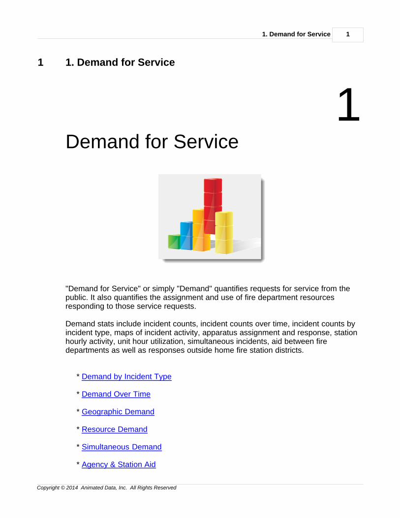
1Demand for Service
"Demand for Service" or simply "Demand" quantifies requests for service from thepublic. It also quantifies the assignment and use of fire department resourcesresponding to those service requests.
Demand stats include incident counts, incident counts over time, incident counts byincident type, maps of incident activity, apparatus assignment and response, stationhourly activity, unit hour utilization, simultaneous incidents, aid between firedepartments as well as responses outside home fire station districts.
* Demand by Incident Type
* Demand Over Time
* Geographic Demand
* Resource Demand
* Simultaneous Demand
* Agency & Station Aid
Improving Fire Rescue Performance2
Copyright © 2014 Animated Data, Inc. All Rights Reserved
------------------------------------------------------------------------
1.1 Demand by Incident Type
Demand for Service
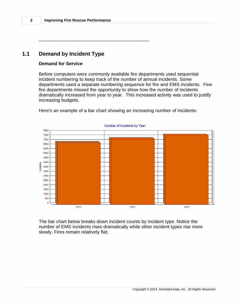
Before computers were commonly available fire departments used sequentialincident numbering to keep track of the number of annual incidents. Somedepartments used a separate numbering sequence for fire and EMS incidents. Fewfire departments missed the opportunity to show how the number of incidentsdramatically increased from year to year. This increased activity was used to justifyincreasing budgets.
Here's an example of a bar chart showing an increasing number of incidents:
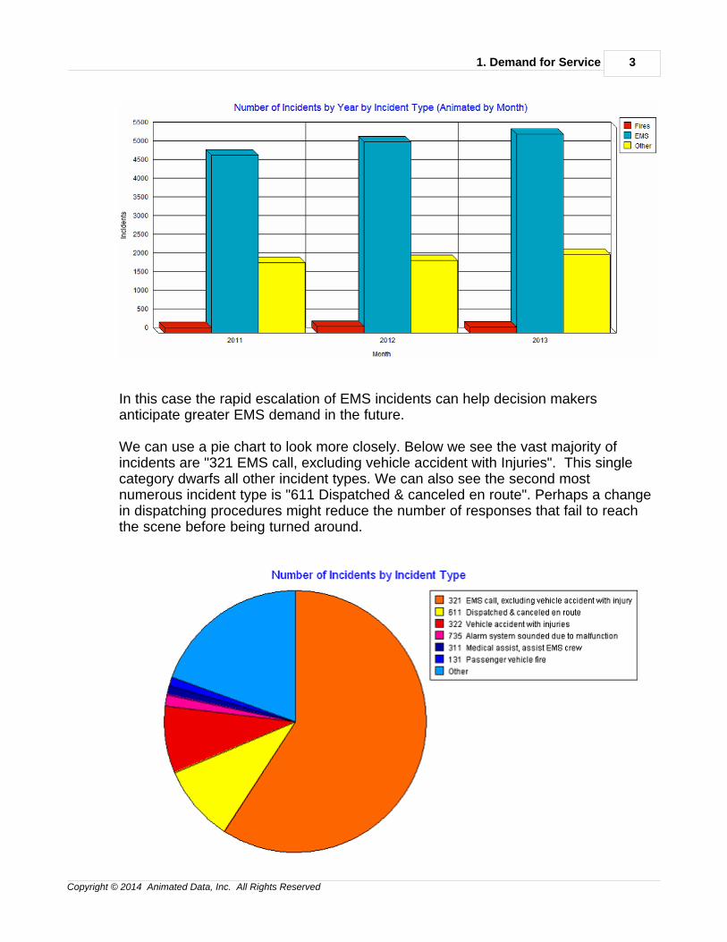
The bar chart below breaks down incident counts by incident type. Notice thenumber of EMS incidents rises dramatically while other incident types rise moreslowly. Fires remain relatively flat:
1. Demand for Service 3
Copyright © 2014 Animated Data, Inc. All Rights Reserved
In this case the rapid escalation of EMS incidents can help decision makersanticipate greater EMS demand in the future.
We can use a pie chart to look more closely. Below we see the vast majority ofincidents are "321 EMS call, excluding vehicle accident with Injuries". This singlecategory dwarfs all other incident types. We can also see the second mostnumerous incident type is "611 Dispatched & canceled en route". Perhaps a changein dispatching procedures might reduce the number of responses that fail to reachthe scene before being turned around.
Improving Fire Rescue Performance4
Copyright © 2014 Animated Data, Inc. All Rights Reserved
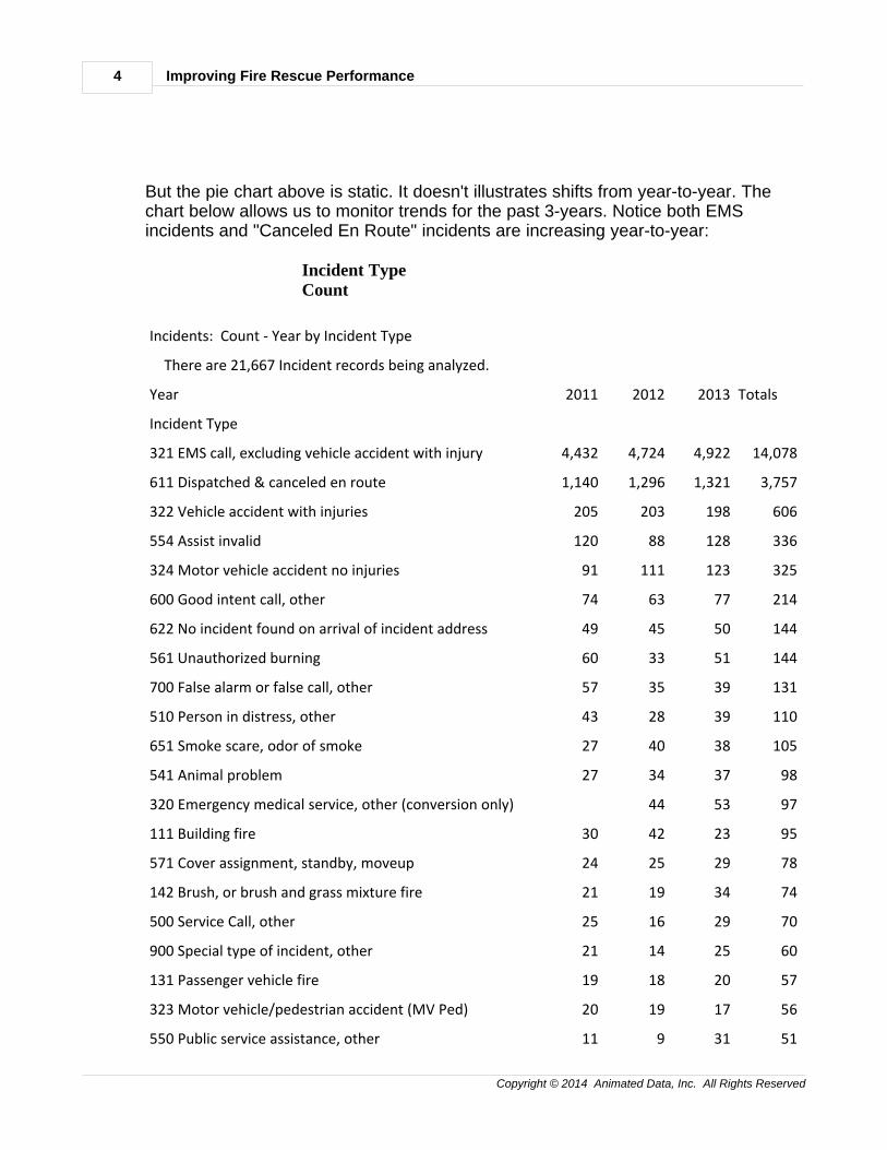
But the pie chart above is static. It doesn't illustrates shifts from year-to-year. Thechart below allows us to monitor trends for the past 3-years. Notice both EMSincidents and "Canceled En Route" incidents are increasing year-to-year:
Incident Type Count
Incidents: Count - Year by Incident Type
There are 21,667 Incident records being analyzed.
Year 2011 2012 2013 Totals
Incident Type
321 EMS call, excluding vehicle accident with injury 4,432 4,724 4,922 14,078
611 Dispatched & canceled en route 1,140 1,296 1,321 3,757
322 Vehicle accident with injuries 205 203 198 606
554 Assist invalid 120 88 128 336
324 Motor vehicle accident no injuries 91 111 123 325
600 Good intent call, other 74 63 77 214
622 No incident found on arrival of incident address 49 45 50 144
561 Unauthorized burning 60 33 51 144
700 False alarm or false call, other 57 35 39 131
510 Person in distress, other 43 28 39 110
651 Smoke scare, odor of smoke 27 40 38 105
541 Animal problem 27 34 37 98
320 Emergency medical service, other (conversion only) 44 53 97
111 Building fire 30 42 23 95
571 Cover assignment, standby, moveup 24 25 29 78
142 Brush, or brush and grass mixture fire 21 19 34 74
500 Service Call, other 25 16 29 70
900 Special type of incident, other 21 14 25 60
131 Passenger vehicle fire 19 18 20 57
323 Motor vehicle/pedestrian accident (MV Ped) 20 19 17 56
550 Public service assistance, other 11 9 31 51
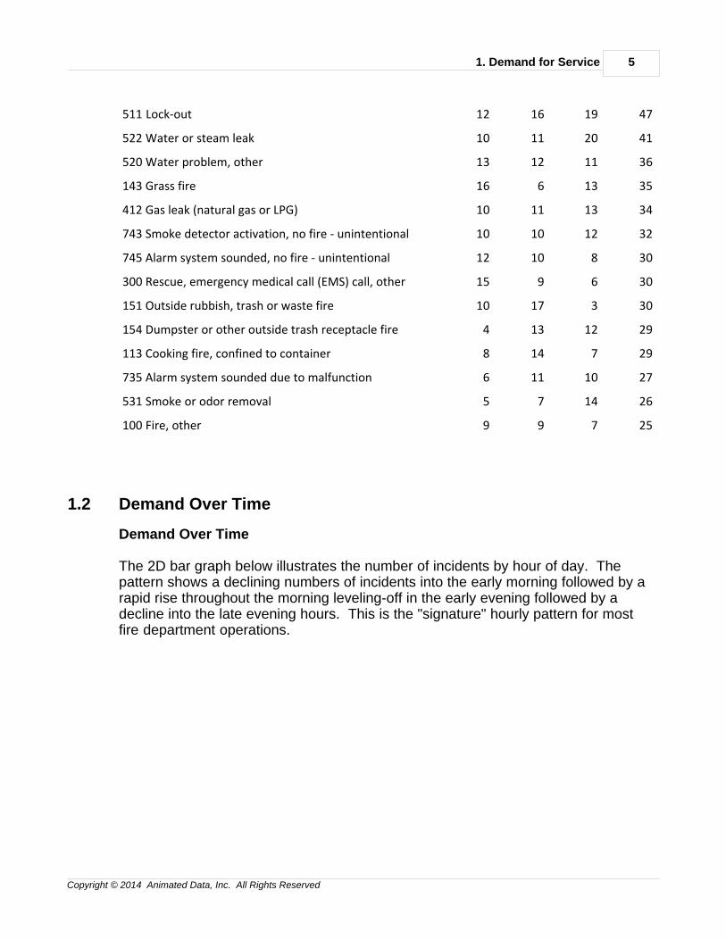
1. Demand for Service 5
Copyright © 2014 Animated Data, Inc. All Rights Reserved
511 Lock-out 12 16 19 47
522 Water or steam leak 10 11 20 41
520 Water problem, other 13 12 11 36
143 Grass fire 16 6 13 35
412 Gas leak (natural gas or LPG) 10 11 13 34
743 Smoke detector activation, no fire - unintentional 10 10 12 32
745 Alarm system sounded, no fire - unintentional 12 10 8 30
300 Rescue, emergency medical call (EMS) call, other 15 9 6 30
151 Outside rubbish, trash or waste fire 10 17 3 30
154 Dumpster or other outside trash receptacle fire 4 13 12 29
113 Cooking fire, confined to container 8 14 7 29
735 Alarm system sounded due to malfunction 6 11 10 27
531 Smoke or odor removal 5 7 14 26
100 Fire, other 9 9 7 25
1.2 Demand Over Time
Demand Over Time
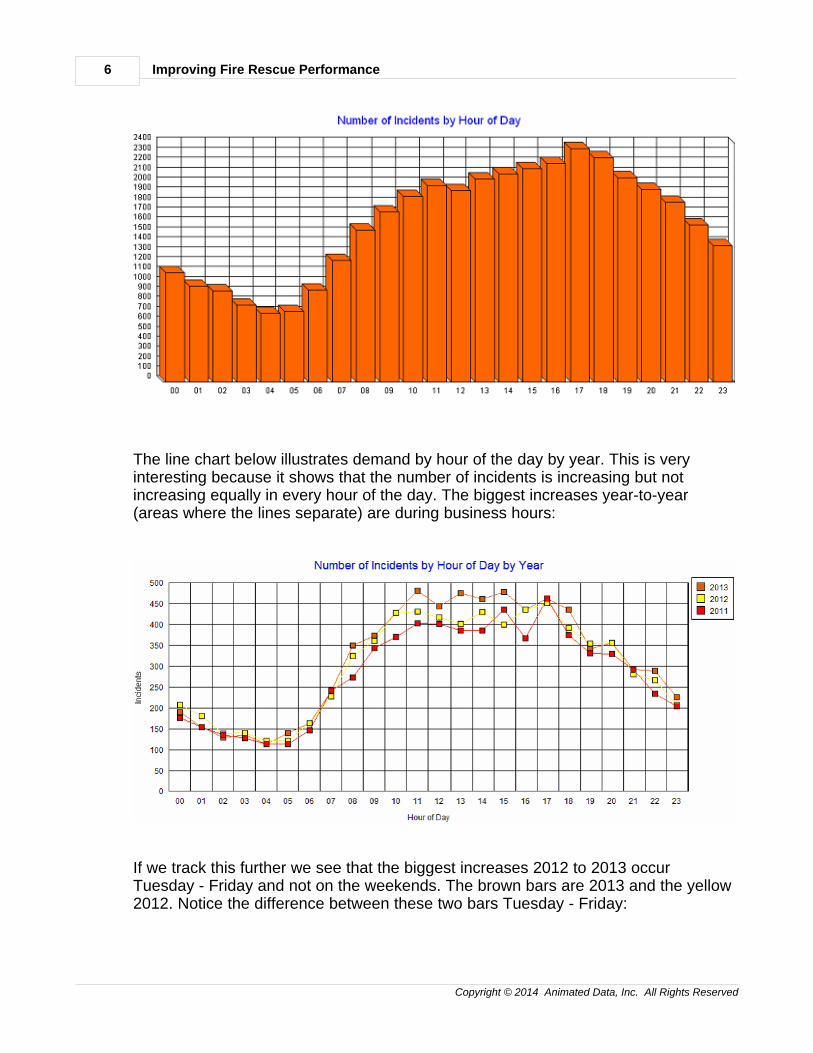
The 2D bar graph below illustrates the number of incidents by hour of day. Thepattern shows a declining numbers of incidents into the early morning followed by arapid rise throughout the morning leveling-off in the early evening followed by adecline into the late evening hours. This is the "signature" hourly pattern for mostfire department operations.
Improving Fire Rescue Performance6
Copyright © 2014 Animated Data, Inc. All Rights Reserved
The line chart below illustrates demand by hour of the day by year. This is veryinteresting because it shows that the number of incidents is increasing but notincreasing equally in every hour of the day. The biggest increases year-to-year(areas where the lines separate) are during business hours:
If we track this further we see that the biggest increases 2012 to 2013 occurTuesday - Friday and not on the weekends. The brown bars are 2013 and the yellow2012. Notice the difference between these two bars Tuesday - Friday:
1. Demand for Service 7
Copyright © 2014 Animated Data, Inc. All Rights Reserved
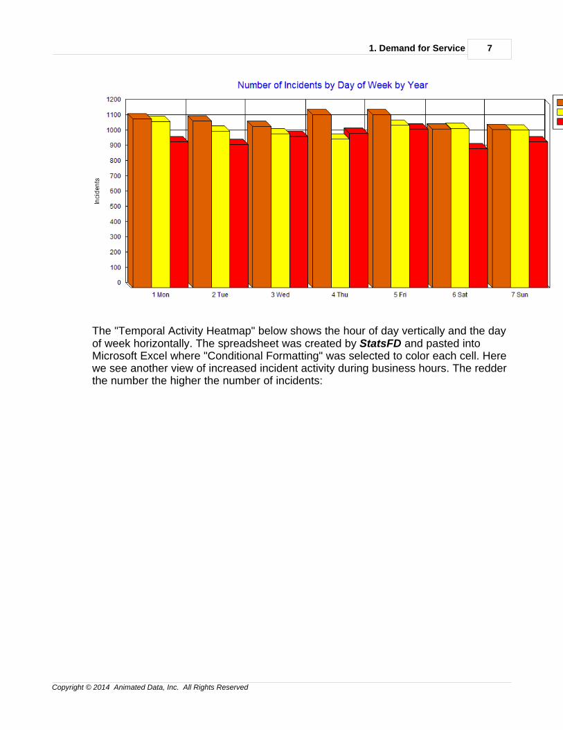
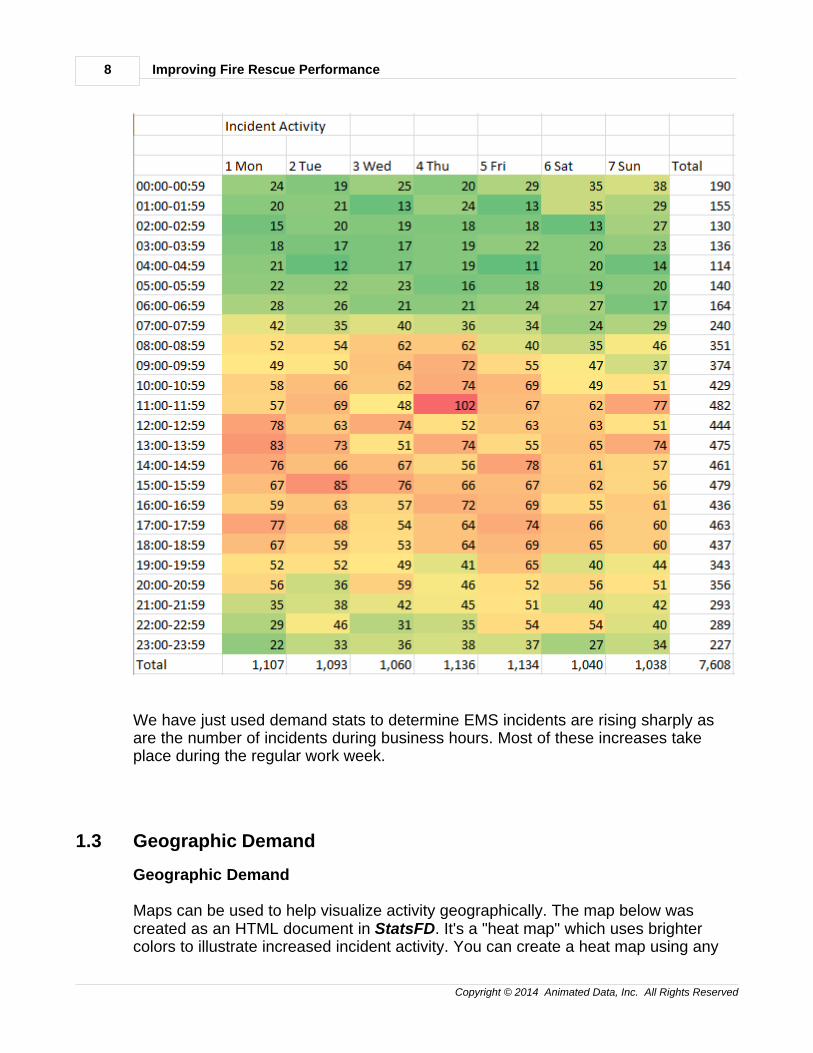
The "Temporal Activity Heatmap" below shows the hour of day vertically and the dayof week horizontally. The spreadsheet was created by StatsFD and pasted intoMicrosoft Excel where "Conditional Formatting" was selected to color each cell. Herewe see another view of increased incident activity during business hours. The redderthe number the higher the number of incidents:
Improving Fire Rescue Performance8
Copyright © 2014 Animated Data, Inc. All Rights Reserved
We have just used demand stats to determine EMS incidents are rising sharply asare the number of incidents during business hours. Most of these increases takeplace during the regular work week.
1.3 Geographic Demand
Geographic Demand
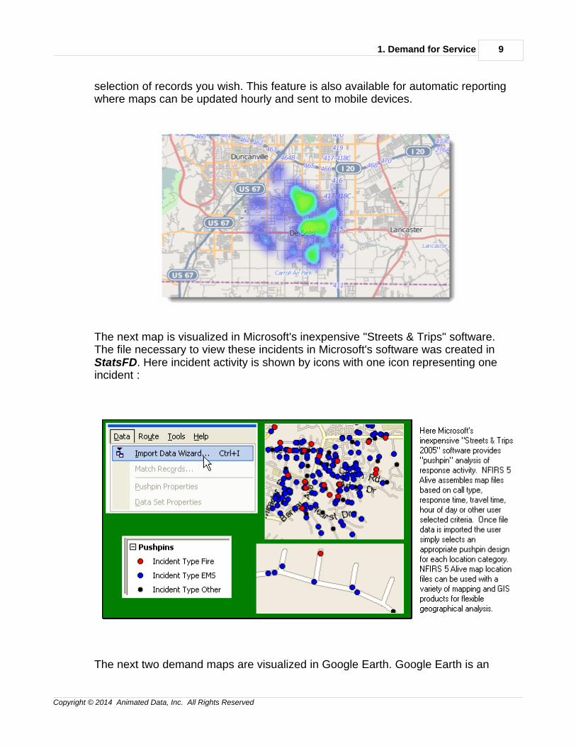
Maps can be used to help visualize activity geographically. The map below wascreated as an HTML document in StatsFD. It's a "heat map" which uses brightercolors to illustrate increased incident activity. You can create a heat map using any
1. Demand for Service 9
Copyright © 2014 Animated Data, Inc. All Rights Reserved
selection of records you wish. This feature is also available for automatic reportingwhere maps can be updated hourly and sent to mobile devices.
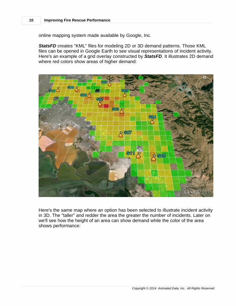
The next map is visualized in Microsoft's inexpensive "Streets & Trips" software. The file necessary to view these incidents in Microsoft's software was created in StatsFD. Here incident activity is shown by icons with one icon representing oneincident :
The next two demand maps are visualized in Google Earth. Google Earth is an
Improving Fire Rescue Performance10
Copyright © 2014 Animated Data, Inc. All Rights Reserved
online mapping system made available by Google, Inc.
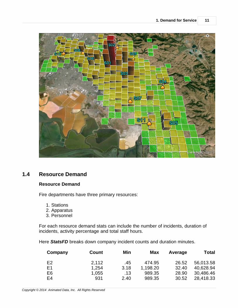
StatsFD creates "KML" files for modeling 2D or 3D demand patterns. Those KMLfiles can be opened in Google Earth to see visual representations of incident activity.Here's an example of a grid overlay constructed by StatsFD. It illustrates 2D demandwhere red colors show areas of higher demand:
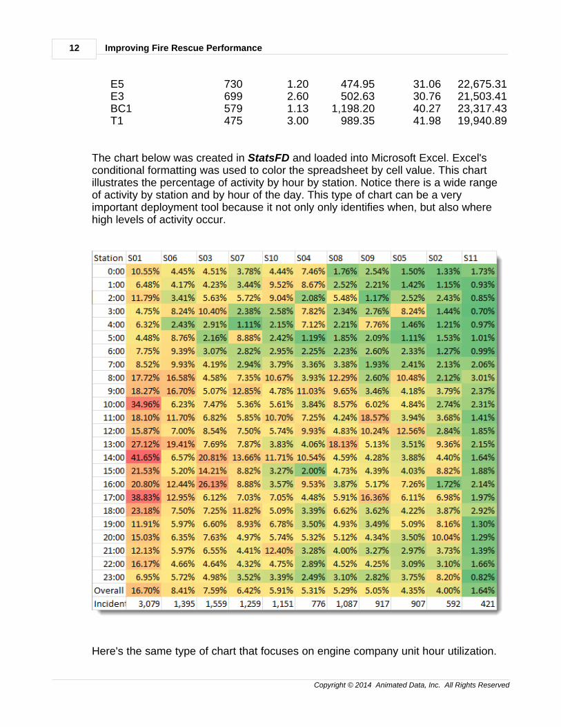
Here's the same map where an option has been selected to illustrate incident activityin 3D. The "taller" and redder the area the greater the number of incidents. Later onwe'll see how the height of an area can show demand while the color of the areashows performance:
1. Demand for Service 11
Copyright © 2014 Animated Data, Inc. All Rights Reserved
1.4 Resource Demand
Resource Demand
Fire departments have three primary resources:
1. Stations2. Apparatus3. Personnel
For each resource demand stats can include the number of incidents, duration ofincidents, activity percentage and total staff hours.
Here StatsFD breaks down company incident counts and duration minutes.
Company Count Min Max Average Total
E2 2,112 .45 474.95 26.52 56,013.58E1 1,254 3.18 1,198.20 32.40 40,628.94E6 1,055 .13 989.35 28.90 30,486.46E4 931 2.40 989.35 30.52 28,418.33
Improving Fire Rescue Performance12
Copyright © 2014 Animated Data, Inc. All Rights Reserved
E5 730 1.20 474.95 31.06 22,675.31E3 699 2.60 502.63 30.76 21,503.41BC1 579 1.13 1,198.20 40.27 23,317.43T1 475 3.00 989.35 41.98 19,940.89
The chart below was created in StatsFD and loaded into Microsoft Excel. Excel'sconditional formatting was used to color the spreadsheet by cell value. This chartillustrates the percentage of activity by hour by station. Notice there is a wide rangeof activity by station and by hour of the day. This type of chart can be a veryimportant deployment tool because it not only only identifies when, but also wherehigh levels of activity occur.
Here's the same type of chart that focuses on engine company unit hour utilization.
1. Demand for Service 13
Copyright © 2014 Animated Data, Inc. All Rights Reserved
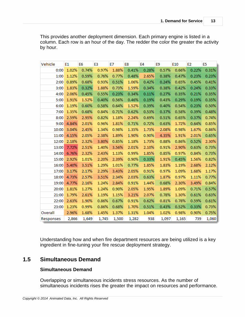
This provides another deployment dimension. Each primary engine is listed in acolumn. Each row is an hour of the day. The redder the color the greater the activityby hour.
Understanding how and when fire department resources are being utilized is a keyingredient in fine-tuning your fire rescue deployment strategy.
1.5 Simultaneous Demand
Simultaneous Demand
Overlapping or simultaneous incidents stress resources. As the number ofsimultaneous incidents rises the greater the impact on resources and performance.
Improving Fire Rescue Performance14
Copyright © 2014 Animated Data, Inc. All Rights Reserved
Consider this simultaneous demand alarm pattern:
1 or more simultaneous incidents 70.37%2 or more simultaneous incidents 39.69%3 or more simultaneous incidents 17.71%4 or more simultaneous incidents 06.68%5 or more simultaneous incidents 02.14%6 or more simultaneous incidents 00.60%
Notice as the number of simultaneous incidents increases the percentage of timedrops. The correct way to the finding on row 4 would be:
"A new incident occurs 6.68% of the time when 4 or more incidents wereunderway."
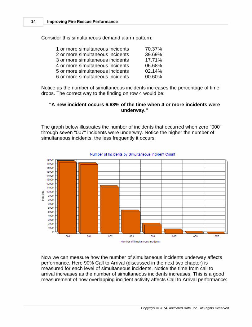
The graph below illustrates the number of incidents that occurred when zero "000"through seven "007" incidents were underway. Notice the higher the number ofsimultaneous incidents, the less frequently it occurs:
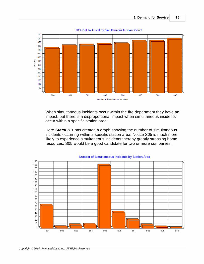
Now we can measure how the number of simultaneous incidents underway affectsperformance. Here 90% Call to Arrival (discussed in the next two chapter) ismeasured for each level of simultaneous incidents. Notice the time from call toarrival increases as the number of simultaneous incidents increases. This is a goodmeasurement of how overlapping incident activity affects Call to Arrival performance:
1. Demand for Service 15
Copyright © 2014 Animated Data, Inc. All Rights Reserved
When simultaneous incidents occur within the fire department they have animpact, but there is a disproportional impact when simultaneous incidentsoccur within a specific station area.
Here StatsFD's has created a graph showing the number of simultaneousincidents occurring within a specific station area. Notice S05 is much morelikely to experience simultaneous incidents thereby greatly stressing homeresources. S05 would be a good candidate for two or more companies:
Improving Fire Rescue Performance16
Copyright © 2014 Animated Data, Inc. All Rights Reserved
1.6 Agency & Station Aid
Agency & Station Aid
While aid (historically called mutual aid) measures resources moving between firedepartments, it can also measure resource movements between fire stations. Let'slook at aid at the fire department level first.
Here StatsFD has broken down department aid by aid type by year. Since multipleyears of data are available aid trends can be identified. This fire department has agood balance between aid given and received. Notice the big jump in Aid Receivedin 2013:
Incidents: Count - Year by Aid Type
There are 21,667 Incident records being analyzed.
Year 2011 2012 2013 Totals
Aid Type
1 Received 48 28 73 149
2 Automatic Aid Received 1,201 1,184 1,148 3,533
3 Given 196 244 269 709
4 Automatic Aid Given 1,435 1,564 1,630 4,629
5 Other Aid Given 11 5 4 20
N None 3,921 4,222 4,484 12,627
Totals 6,812 7,247 7,608 21,667
Station-to-Station Aid
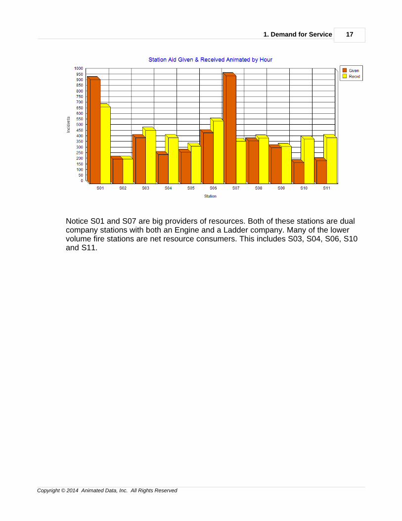
It's important to monitor resource movement between fire stations. In the graphbelow apparatus resources leaving the station area are tracked in red; apparatusresources entering a station from other station areas are tracked in yellow.Responses by home apparatus are not tracked, only aid out and in is being tracked.
1. Demand for Service 17
Copyright © 2014 Animated Data, Inc. All Rights Reserved
Notice S01 and S07 are big providers of resources. Both of these stations are dualcompany stations with both an Engine and a Ladder company. Many of the lowervolume fire stations are net resource consumers. This includes S03, S04, S06, S10and S11.

2. Performance Basics 19
Copyright © 2014 Animated Data, Inc. All Rights Reserved
2 2. Performance Basics
2Performance Basics
When calculating demand it's appropriate to look at all types of activity. However,when calculating performance you do not want to include every incident in yourperformance calculations. Before running performance measurements you mustexclude out of jurisdiction and non-emergency responses. You should also setoutlier limits and exclude atypical incidents that fall outside of those outlier limits.This chapter examines the basics of performance analysis.
* Defining Emergencies
* Outlier Settings
* Timestamps
* Incident Types
* Operational Divisions
* Data Splits
Improving Fire Rescue Performance20
Copyright © 2014 Animated Data, Inc. All Rights Reserved
* Distribution & Concentration
------------------------------------------------------------------------
2.1 Defining Emergencies
Defining Local Emergencies
To accurately understand performance capabilities you must restrict performancemeasurements to local emergency incidents only. If you include non-emergenciesand incident originating in other jurisdictions you will skew your performancecalculations.
Ideally your agency tracks response priority by responding apparatus. For example,a structure fire may have a high response priority for all responding apparatus whilea reported fire alarm problem may have a high priority for the first arriving apparatusand a lower priority for other responding apparatus.
If you track response priority by apparatus you should only measure performance forhigh priority (emergency) incidents. If an apparatus is downgraded during it'sresponse it should not be used for performance calculations.
If response priority is not available you can restrict performance measurements tofire and EMS incidents only. Simply select any NFIRS 5 incident type beginning witha "1" (fire) or a "3" (EMS) when selecting records for analysis.
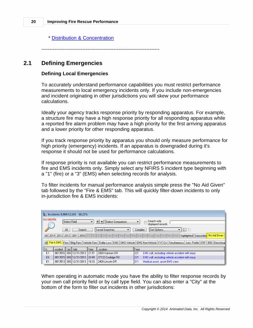
To filter incidents for manual performance analysis simple press the "No Aid Given"tab followed by the "Fire & EMS" tab. This will quickly filter-down incidents to onlyin-jurisdiction fire & EMS incidents:
When operating in automatic mode you have the ability to filter response records byyour own call priority field or by call type field. You can also enter a "City" at thebottom of the form to filter out incidents in other jurisdictions:
2. Performance Basics 21
Copyright © 2014 Animated Data, Inc. All Rights Reserved
2.2 Outlier Settings
Outlier Settings
There are 86,400 seconds in a day (24 X 60 X 60). If you see an incident with a callprocessing time of 86,283 seconds you most likely have a situation where the time ofthe call and the time of dispatch were transposed.
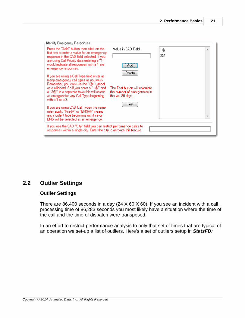
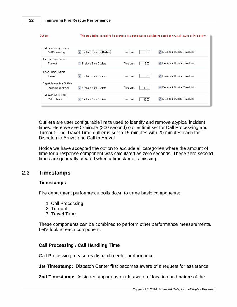
In an effort to restrict performance analysis to only that set of times that are typical ofan operation we set-up a list of outliers. Here's a set of outliers setup in StatsFD:
Improving Fire Rescue Performance22
Copyright © 2014 Animated Data, Inc. All Rights Reserved
Outliers are user configurable limits used to identify and remove atypical incidenttimes. Here we see 5-minute (300 second) outlier limit set for Call Processing andTurnout. The Travel Time outlier is set to 15-minutes with 20-minutes each forDispatch to Arrival and Call to Arrival.
Notice we have accepted the option to exclude all categories where the amount oftime for a response component was calculated as zero seconds. These zero secondtimes are generally created when a timestamp is missing.
2.3 Timestamps
Timestamps
Fire department performance boils down to three basic components:
1. Call Processing2. Turnout3. Travel Time
These components can be combined to perform other performance measurements.Let's look at each component.
Call Processing / Call Handling Time
Call Processing measures dispatch center performance.
1st Timestamp: Dispatch Center first becomes aware of a request for assistance.
2nd Timestamp: Assigned apparatus made aware of location and nature of the
2. Performance Basics 23
Copyright © 2014 Animated Data, Inc. All Rights Reserved
emergency.
Discussion: If initial requests for assistance are received by a PSAP (Public SafetyAccess Point) the typical number of seconds for routing to the dispatch center shouldbe calculated and reported along with any call processing report. Since dispatchcenters receive request via 911, radio, direct-line, alarm systems, etc. the 1sttimestamp should be the earliest time every request type is time stamped.Frequently the earliest timestamp is the "Create Time" for the CAD record.
In order to respond assigned companies must know the location and nature of theirresponse. The closest time stamp to the companies receiving this information willterminate the performance measurement for call processing and start the timestampfor turnout.
Turnout Time
Turnout measures the time it takes for a company to assemble for response.
1st Timestamp: Assigned apparatus is made aware of location and nature ofemergency.
2nd Timestamp: Apparatus begins response - wheels turning.
Discussion: Turnout time is a critical measurement and should be accurately timestamped. Crew notified times should be fairly easy to capture, but every effort shouldbe made to make sure the 2nd timestamp is "wheels turning" and not simply a radioor MDT acknowledgement made before travel to the scene actually begins.
Travel Time
Travel measures the time it takes for a company to cover the distance from theirlocation at dispatch to the location of the incident.
1st Timestamp: Apparatus begins response - wheels turning.
2nd Timestamp: Apparatus arrives on the scene.
3rd Timestamp (Optional): Responding personnel make patient contact.
Discussion: Travel time is a key measurement for the location of station facilities.Accurate travel times can help assure accurate location of facilities.
In some neighborhoods patient contact occurs immediately after arrival on thescene. In urban areas, however, when the apparatus stops on the scene the traveltime to the patient may still be seconds or minutes away. This is especially true in
Improving Fire Rescue Performance24
Copyright © 2014 Animated Data, Inc. All Rights Reserved
high-rise housing situations.
Where a variety of housing types exist it's a good idea to have a patient contacttimestamp that accurately identifies the start of patient care.
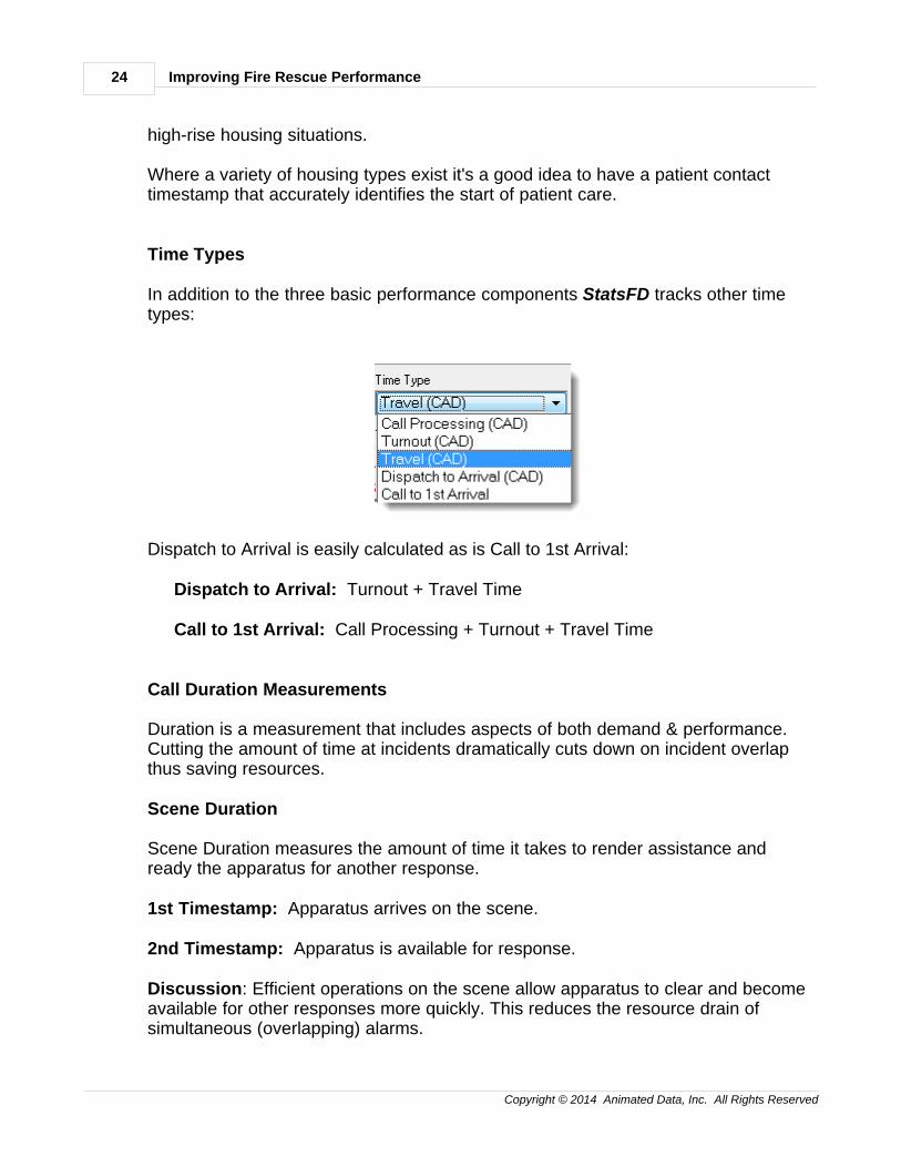
Time Types
In addition to the three basic performance components StatsFD tracks other timetypes:
Dispatch to Arrival is easily calculated as is Call to 1st Arrival:
Dispatch to Arrival: Turnout + Travel Time
Call to 1st Arrival: Call Processing + Turnout + Travel Time
Call Duration Measurements
Duration is a measurement that includes aspects of both demand & performance.Cutting the amount of time at incidents dramatically cuts down on incident overlapthus saving resources.
Scene Duration
Scene Duration measures the amount of time it takes to render assistance andready the apparatus for another response.
1st Timestamp: Apparatus arrives on the scene.
2nd Timestamp: Apparatus is available for response.
Discussion: Efficient operations on the scene allow apparatus to clear and becomeavailable for other responses more quickly. This reduces the resource drain ofsimultaneous (overlapping) alarms.
2. Performance Basics 25
Copyright © 2014 Animated Data, Inc. All Rights Reserved
Total Duration
Total Duration measures the amount of time it takes to handle an incident from thetime of call until the apparatus is available for response.
1st Timestamp: The Dispatch Center first becomes aware of a request forassistance.
2nd Timestamp: Apparatus is available for response.
Discussion: Total Duration monitors the entire incident handling process fromnotification through unit available. This measurement can be broken down byincident type and location to help determine the resources required for differenttypes of incidents in different areas of the community.
2.4 Incident Types
Incident Types
Different types of incidents require different types of resources for response. It is vitalto measure performance for each major incident type.
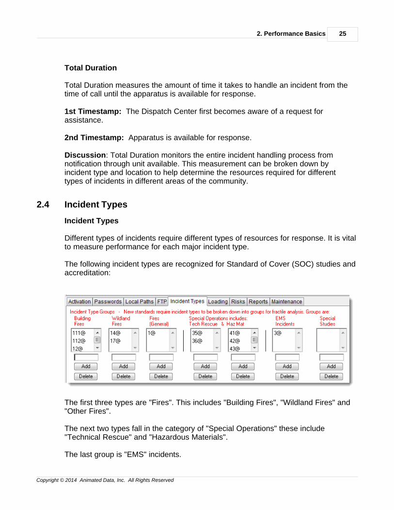
The following incident types are recognized for Standard of Cover (SOC) studies andaccreditation:
The first three types are "Fires". This includes "Building Fires", "Wildland Fires" and"Other Fires".
The next two types fall in the category of "Special Operations" these include"Technical Rescue" and "Hazardous Materials".
The last group is "EMS" incidents.
Improving Fire Rescue Performance26
Copyright © 2014 Animated Data, Inc. All Rights Reserved
There's also a "Special Studies" group that allows users to study any additional setof incident types.
Notice each type is defined by multiple NFIRS 5 Incident Type codes. The "@"symbol is used as a wild card in the code. Since Incident Types can have an extralocally defined district and code beginning with "111" is classified as a building fire.Any code beginning with a "1" is a fire.
By identifying "Incident Types" you have the ability to quickly break downperformance by major incident type to meet SOC and accreditation requirements.
2.5 Operational Divisions
Operational Divisions
It is valuable to split analysis so comparisons can be made between variousoperational divisions. Here are some common divisions:
Department (Data split by Fire Department Identification Number, FDID)
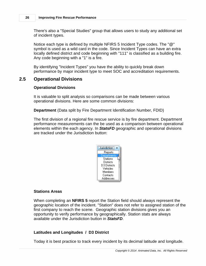
The first division of a regional fire rescue service is by fire department. Departmentperformance measurements can the be used as a comparison between operationalelements within the each agency. In StatsFD geographic and operational divisionsare tracked under the Jurisdiction button:
Stations Areas
When completing an NFIRS 5 report the Station field should always represent thegeographic location of the incident. "Station" does not refer to assigned station of thefirst company to reach the scene. Geographic station divisions gives you anopportunity to verify performance by geographically. Station stats are alwaysavailable under the Jurisdiction button in StatsFD.
Latitudes and Longitudes / D3 District
Today it is best practice to track every incident by its decimal latitude and longitude.
2. Performance Basics 27
Copyright © 2014 Animated Data, Inc. All Rights Reserved
Decimal lats and longs give you a variety of analysis tools not available to users of X/ Y state plane data. One thing StatsFD can do with lats and longs is to create a gridof geographic "cells" that can be overlayed on a map of your jurisdiction. Each cellwithin the grid can by processed for response performance. Since the grid can beresized dynamically, its a great way to model demand and performance. In StatsFDthese geographic cells are called "D3 Districts" or Dynamically Defined Districts.
See more about Geographic models in Chapter 3.
Protection Levels
Protection Levels are geographic divisions calculated by population density. It ispossible in StatsFD to move every D3 District into the following population densitygroupings:
MetropolitanUrbanSuburbanRuralWildland
When every incident is associated with a Protection Level it is possible to runBenchmark & Baseline performance reports as outlined later in Chapter 6.
FDZ
FDZ stands for "Fire Demand Zone" and can be any geographic division you wish touse. So if you track a geographic division in your CAD or RMS data you should mapit to import into the FDZ or other geographic field..
Map Page
A Map Page may refer to a real map page system used in your fire rescue agency.Or, it may simply be used for any division you track in your CAD or RMS data.
Zip
Performance by zip code can easily be tracked in StatsFD.
Improving Fire Rescue Performance28
Copyright © 2014 Animated Data, Inc. All Rights Reserved
2.6 Data Splits
Data Splits
Data splits include the incident types and operational divisions discussed earlier.They also include other pre-defined and user defined data elements. Data Splitsallow performance to be compared in many different ways. For example, if you datasplit by station you will be able to compare performance by station. Here arecommon data splits used in StatsFD:
by Aid Typeby Aid Type_Yrby Aid Type_Shiftby Cityby City_Yrby City_Shiftby D3 Districtby D3 District_Yrby D3 District_Shiftby Day of Weekby Day of Week_Yrby Day of Week_Shiftby Districtby District_Yrby District_Shiftby FDIDby FDID_Yrby FDID_Shiftby FDZby FDZ_Yrby FDZ_Shiftby First Companyby First Company_Yrby First Company_Shiftby Hour of Dayby Hour of Day_Yrby Hour of Day_Shiftby Map Pageby Map Page_Yrby Map Page_Shiftby Monthby Month_Yrby Month_Shiftby Property Useby Property Use_Yrby Property Use_Shiftby Protection Level
2. Performance Basics 29
Copyright © 2014 Animated Data, Inc. All Rights Reserved
by Protection Level_Yrby Protection Level_Shiftby Shiftby Shift_Yrby Stationby Station_Yrby Station_Shiftby Station / Activityby Station / Activity Yrby Station / Activity_Shiftby Station / Levelby Station / Level_Yrby Station / Level_Shiftby User Alpha 1by User Alpha 1_Yrby User Alpha 1_Shiftby User Alpha 2by User Alpha 2_Yrby User Alpha 2_Shiftby User Alpha 3by User Alpha 3_Yrby User Alpha 3_Shiftby User Alpha 4by User Alpha 4_Yrby User Alpha 4_Shiftby User Alpha 5by User Alpha 5_Yrby User Alpha 5_Shiftby Yearby Year_Monthby Year_Shiftby Zipby Zip_Yrby Zip_Shiftby Activity Levelby Activity Level_Yrby Activity Level_Shift
by Incident Type...
If by Incident Type is selected you may select one or more of the followingincident types:
by Building Firesby Wildland Firesby All Firesby Tech Rescue
Improving Fire Rescue Performance30
Copyright © 2014 Animated Data, Inc. All Rights Reserved
by Hazardous Materials Responseby Special Operationsby EMS
with additional options by Year and by Shift
Data Splits allow the types of comparisons necessary to identify opportunities forperformance improvement.
2.7 Distribution & Concentration
Distribution & Concentration
Distribution measures the performance of the first arriving apparatus. Since mostincidents have at least one first arriving apparatus the timestamps for that apparatusare stored with the incident for distribution performance.
Concentration focuses on the arrival of fire department teams. So, for example, thetime it takes for a second apparatus to arrive on the scene is considered aconcentration measurement. Here's another example. If the 1st alarm assignment toa building fire is established as 3-Engines, 1-Ladder and 1-EMS apparatus thetimestamp for the arrival of the final component of that 1st alarm assignment is usedfor this 1st alarm concentration measurement.
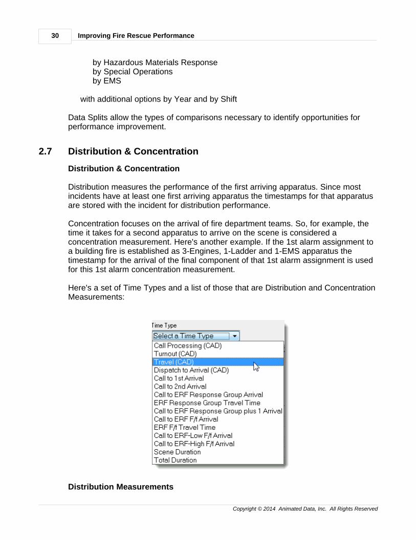
Here's a set of Time Types and a list of those that are Distribution and ConcentrationMeasurements:
Distribution Measurements
2. Performance Basics 31
Copyright © 2014 Animated Data, Inc. All Rights Reserved
Call ProcessingTurnoutTravelDispatch to ArrivalCall to 1st ArrivalTotal Duration (last unit clear)
Concentration Measurements
Call to 2nd ArrivalCall to ERF Response Group ArrivalERF Response Group Travel TimeCall to ERF Response Group plus 1 ArrivalCall to ERF F/f ArrivalERF F/f Travel TimeCall to ERF-Low F/f ArrivalCall to ERF-High F/f Arrival
ERF stands for Effective Response Force and covered in-depth in Chapter 5.

3. 90% Performance Measures 33
Copyright © 2014 Animated Data, Inc. All Rights Reserved
3 3. 90% Performance Measures
390% Performance Measures
"90% Performance" refers to the amount of time necessary to perform a specificresponse component for 90% of incidents being calculated. Let's use an example:
Let's say the performance being measured is travel time for 1,000 records. The mostaccurate way to calculate 90% performance is to list all 1,000 travel times from thequickest to the slowest. Once ordered on the list you move 90% of the way down thelist toward the longest time. For 1,000 records 90% down the list would be record900. The Travel Time in record 900 is your 90% travel time performance.
* 90% Spreadsheet Summaries
* 90% Worksheeets
* 90% Geographic Models
------------------------------------------------------------------------
Improving Fire Rescue Performance34
Copyright © 2014 Animated Data, Inc. All Rights Reserved
3.1 90% Spreadsheet Summary
90% Spreadsheet Summaries
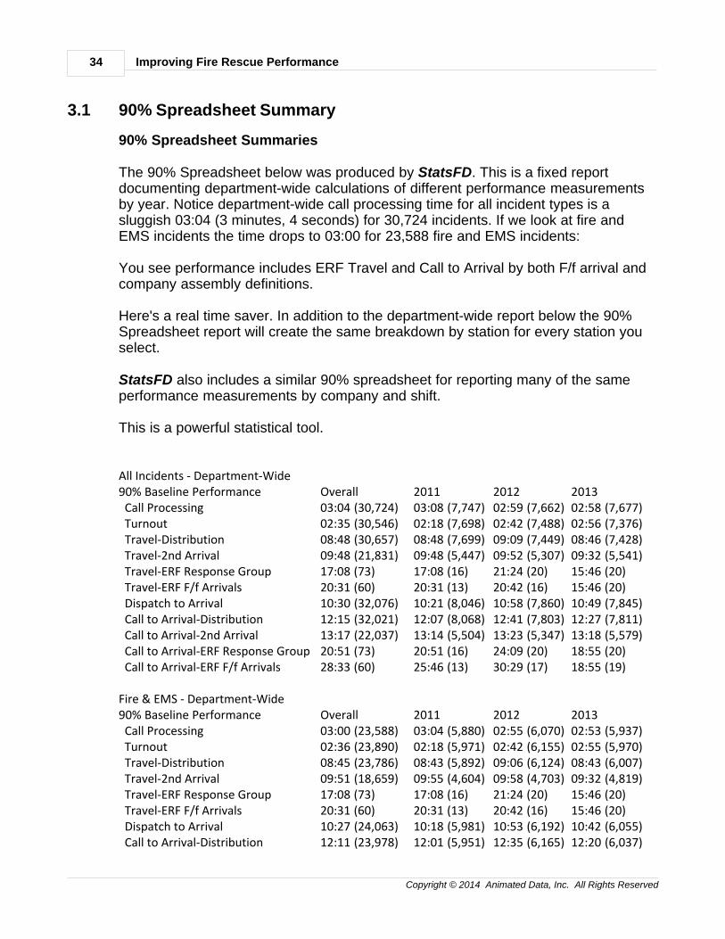
The 90% Spreadsheet below was produced by StatsFD. This is a fixed reportdocumenting department-wide calculations of different performance measurementsby year. Notice department-wide call processing time for all incident types is asluggish 03:04 (3 minutes, 4 seconds) for 30,724 incidents. If we look at fire andEMS incidents the time drops to 03:00 for 23,588 fire and EMS incidents:
You see performance includes ERF Travel and Call to Arrival by both F/f arrival andcompany assembly definitions.
Here's a real time saver. In addition to the department-wide report below the 90%Spreadsheet report will create the same breakdown by station for every station youselect.
StatsFD also includes a similar 90% spreadsheet for reporting many of the sameperformance measurements by company and shift.
This is a powerful statistical tool.
All Incidents - Department-Wide90% Baseline Performance Overall 2011 2012 2013 Call Processing 03:04 (30,724) 03:08 (7,747) 02:59 (7,662) 02:58 (7,677) Turnout 02:35 (30,546) 02:18 (7,698) 02:42 (7,488) 02:56 (7,376) Travel-Distribution 08:48 (30,657) 08:48 (7,699) 09:09 (7,449) 08:46 (7,428) Travel-2nd Arrival 09:48 (21,831) 09:48 (5,447) 09:52 (5,307) 09:32 (5,541) Travel-ERF Response Group 17:08 (73) 17:08 (16) 21:24 (20) 15:46 (20) Travel-ERF F/f Arrivals 20:31 (60) 20:31 (13) 20:42 (16) 15:46 (20) Dispatch to Arrival 10:30 (32,076) 10:21 (8,046) 10:58 (7,860) 10:49 (7,845) Call to Arrival-Distribution 12:15 (32,021) 12:07 (8,068) 12:41 (7,803) 12:27 (7,811) Call to Arrival-2nd Arrival 13:17 (22,037) 13:14 (5,504) 13:23 (5,347) 13:18 (5,579) Call to Arrival-ERF Response Group 20:51 (73) 20:51 (16) 24:09 (20) 18:55 (20) Call to Arrival-ERF F/f Arrivals 28:33 (60) 25:46 (13) 30:29 (17) 18:55 (19)
Fire & EMS - Department-Wide90% Baseline Performance Overall 2011 2012 2013 Call Processing 03:00 (23,588) 03:04 (5,880) 02:55 (6,070) 02:53 (5,937) Turnout 02:36 (23,890) 02:18 (5,971) 02:42 (6,155) 02:55 (5,970) Travel-Distribution 08:45 (23,786) 08:43 (5,892) 09:06 (6,124) 08:43 (6,007) Travel-2nd Arrival 09:51 (18,659) 09:55 (4,604) 09:58 (4,703) 09:32 (4,819) Travel-ERF Response Group 17:08 (73) 17:08 (16) 21:24 (20) 15:46 (20) Travel-ERF F/f Arrivals 20:31 (60) 20:31 (13) 20:42 (16) 15:46 (20) Dispatch to Arrival 10:27 (24,063) 10:18 (5,981) 10:53 (6,192) 10:42 (6,055) Call to Arrival-Distribution 12:11 (23,978) 12:01 (5,951) 12:35 (6,165) 12:20 (6,037)
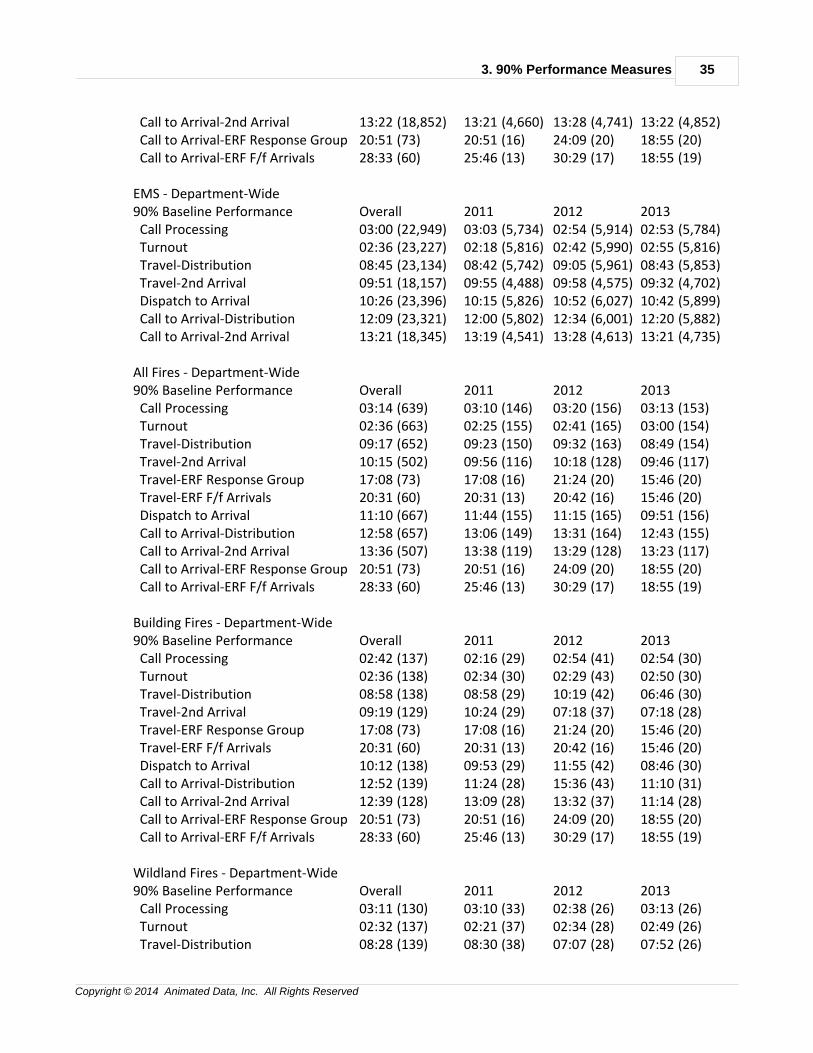
3. 90% Performance Measures 35
Copyright © 2014 Animated Data, Inc. All Rights Reserved
Call to Arrival-2nd Arrival 13:22 (18,852) 13:21 (4,660) 13:28 (4,741) 13:22 (4,852) Call to Arrival-ERF Response Group 20:51 (73) 20:51 (16) 24:09 (20) 18:55 (20) Call to Arrival-ERF F/f Arrivals 28:33 (60) 25:46 (13) 30:29 (17) 18:55 (19)
EMS - Department-Wide90% Baseline Performance Overall 2011 2012 2013 Call Processing 03:00 (22,949) 03:03 (5,734) 02:54 (5,914) 02:53 (5,784) Turnout 02:36 (23,227) 02:18 (5,816) 02:42 (5,990) 02:55 (5,816) Travel-Distribution 08:45 (23,134) 08:42 (5,742) 09:05 (5,961) 08:43 (5,853) Travel-2nd Arrival 09:51 (18,157) 09:55 (4,488) 09:58 (4,575) 09:32 (4,702) Dispatch to Arrival 10:26 (23,396) 10:15 (5,826) 10:52 (6,027) 10:42 (5,899) Call to Arrival-Distribution 12:09 (23,321) 12:00 (5,802) 12:34 (6,001) 12:20 (5,882) Call to Arrival-2nd Arrival 13:21 (18,345) 13:19 (4,541) 13:28 (4,613) 13:21 (4,735)
All Fires - Department-Wide90% Baseline Performance Overall 2011 2012 2013 Call Processing 03:14 (639) 03:10 (146) 03:20 (156) 03:13 (153) Turnout 02:36 (663) 02:25 (155) 02:41 (165) 03:00 (154) Travel-Distribution 09:17 (652) 09:23 (150) 09:32 (163) 08:49 (154) Travel-2nd Arrival 10:15 (502) 09:56 (116) 10:18 (128) 09:46 (117) Travel-ERF Response Group 17:08 (73) 17:08 (16) 21:24 (20) 15:46 (20) Travel-ERF F/f Arrivals 20:31 (60) 20:31 (13) 20:42 (16) 15:46 (20) Dispatch to Arrival 11:10 (667) 11:44 (155) 11:15 (165) 09:51 (156) Call to Arrival-Distribution 12:58 (657) 13:06 (149) 13:31 (164) 12:43 (155) Call to Arrival-2nd Arrival 13:36 (507) 13:38 (119) 13:29 (128) 13:23 (117) Call to Arrival-ERF Response Group 20:51 (73) 20:51 (16) 24:09 (20) 18:55 (20) Call to Arrival-ERF F/f Arrivals 28:33 (60) 25:46 (13) 30:29 (17) 18:55 (19)
Building Fires - Department-Wide90% Baseline Performance Overall 2011 2012 2013 Call Processing 02:42 (137) 02:16 (29) 02:54 (41) 02:54 (30) Turnout 02:36 (138) 02:34 (30) 02:29 (43) 02:50 (30) Travel-Distribution 08:58 (138) 08:58 (29) 10:19 (42) 06:46 (30) Travel-2nd Arrival 09:19 (129) 10:24 (29) 07:18 (37) 07:18 (28) Travel-ERF Response Group 17:08 (73) 17:08 (16) 21:24 (20) 15:46 (20) Travel-ERF F/f Arrivals 20:31 (60) 20:31 (13) 20:42 (16) 15:46 (20) Dispatch to Arrival 10:12 (138) 09:53 (29) 11:55 (42) 08:46 (30) Call to Arrival-Distribution 12:52 (139) 11:24 (28) 15:36 (43) 11:10 (31) Call to Arrival-2nd Arrival 12:39 (128) 13:09 (28) 13:32 (37) 11:14 (28) Call to Arrival-ERF Response Group 20:51 (73) 20:51 (16) 24:09 (20) 18:55 (20) Call to Arrival-ERF F/f Arrivals 28:33 (60) 25:46 (13) 30:29 (17) 18:55 (19)
Wildland Fires - Department-Wide90% Baseline Performance Overall 2011 2012 2013 Call Processing 03:11 (130) 03:10 (33) 02:38 (26) 03:13 (26) Turnout 02:32 (137) 02:21 (37) 02:34 (28) 02:49 (26) Travel-Distribution 08:28 (139) 08:30 (38) 07:07 (28) 07:52 (26)
Improving Fire Rescue Performance36
Copyright © 2014 Animated Data, Inc. All Rights Reserved
Travel-2nd Arrival 10:35 (96) 10:15 (25) 10:27 (22) 09:46 (17) Dispatch to Arrival 09:54 (140) 09:47 (38) 09:54 (29) 09:30 (26) Call to Arrival-Distribution 12:43 (140) 13:33 (38) 09:37 (28) 11:14 (26) Call to Arrival-2nd Arrival 13:23 (96) 13:22 (25) 11:55 (22) 13:23 (17)
Technical Rescue - Department-Wide90% Baseline Performance Overall 2011 2012 2013 Call Processing 03:23 (31) 03:19 (4) 01:53 (7) 03:23 (3) Turnout 02:27 (38) 02:56 (5) 03:06 (7) 01:34 (6) Travel-Distribution 07:56 (33) 07:56 (3) 05:31 (7) 07:46 (6) Travel-2nd Arrival 09:16 (24) 07:56 (3) 06:54 (3) 09:53 (5) Dispatch to Arrival 10:40 (34) 08:00 (3) 07:04 (7) 07:50 (6) Call to Arrival-Distribution 14:08 (32) 11:19 (3) 08:22 (7) 14:30 (5) Call to Arrival-2nd Arrival 14:08 (24) 11:19 (3) 08:33 (3) 14:37 (4)
Haz Mat - Department-Wide90% Baseline Performance Overall 2011 2012 2013 Call Processing 03:05 (869) 03:05 (198) 03:08 (141) 03:22 (181) Turnout 02:25 (892) 02:04 (204) 02:50 (148) 02:47 (184) Travel-Distribution 08:22 (914) 08:35 (209) 09:00 (153) 09:11 (184) Travel-2nd Arrival 09:40 (675) 09:04 (152) 09:56 (105) 09:40 (132) Dispatch to Arrival 09:46 (919) 09:57 (210) 10:05 (153) 10:48 (186) Call to Arrival-Distribution 11:51 (913) 12:14 (210) 12:21 (150) 12:40 (186) Call to Arrival-2nd Arrival 13:10 (678) 13:03 (153) 13:24 (104) 14:00 (133)
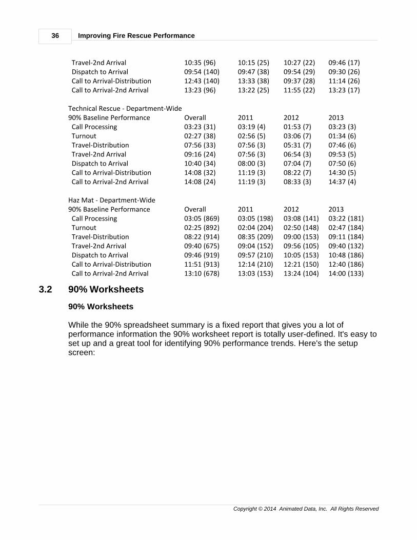
3.2 90% Worksheets
90% Worksheets
While the 90% spreadsheet summary is a fixed report that gives you a lot ofperformance information the 90% worksheet report is totally user-defined. It's easy toset up and a great tool for identifying 90% performance trends. Here's the setupscreen:
3. 90% Performance Measures 37
Copyright © 2014 Animated Data, Inc. All Rights Reserved
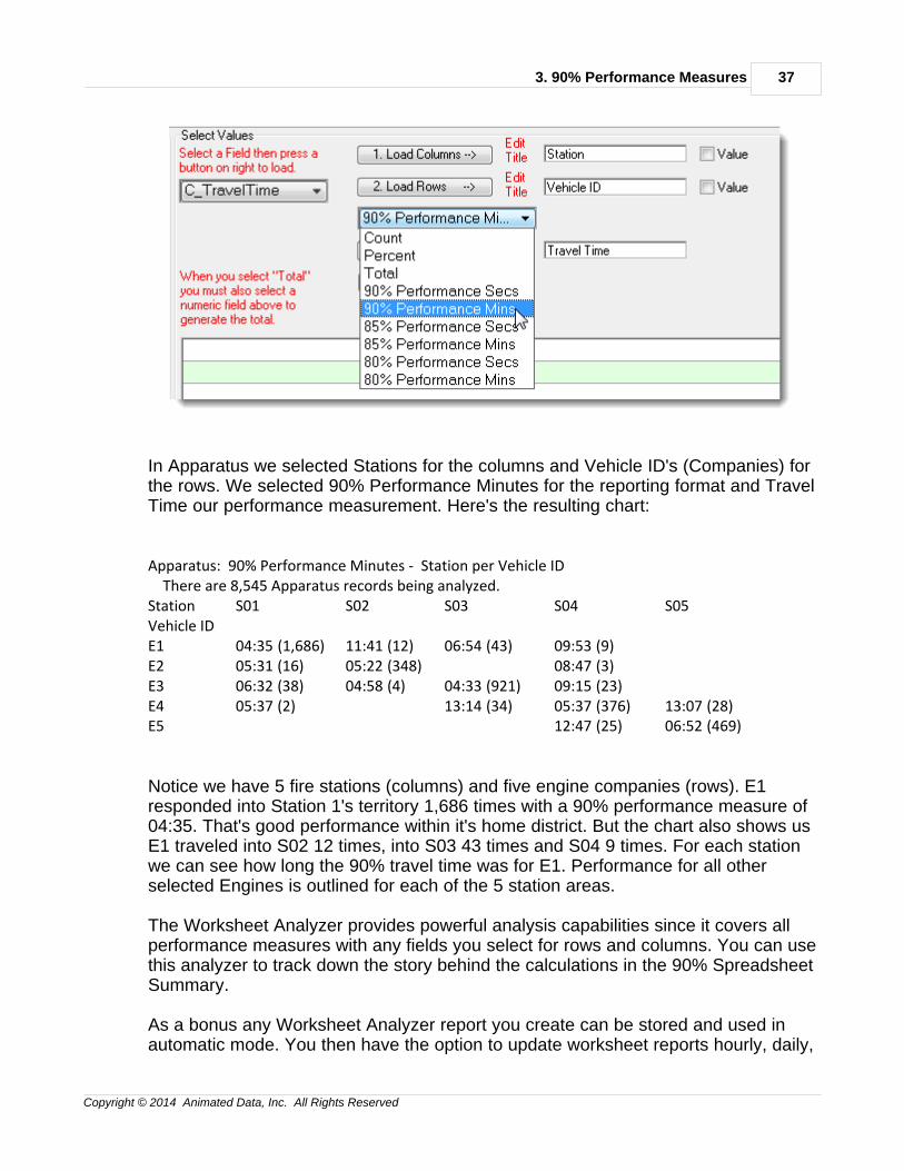
In Apparatus we selected Stations for the columns and Vehicle ID's (Companies) forthe rows. We selected 90% Performance Minutes for the reporting format and TravelTime our performance measurement. Here's the resulting chart:
Apparatus: 90% Performance Minutes - Station per Vehicle ID There are 8,545 Apparatus records being analyzed.Station S01 S02 S03 S04 S05Vehicle ID E1 04:35 (1,686) 11:41 (12) 06:54 (43) 09:53 (9)E2 05:31 (16) 05:22 (348) 08:47 (3)E3 06:32 (38) 04:58 (4) 04:33 (921) 09:15 (23)E4 05:37 (2) 13:14 (34) 05:37 (376) 13:07 (28)E5 12:47 (25) 06:52 (469)
Notice we have 5 fire stations (columns) and five engine companies (rows). E1responded into Station 1's territory 1,686 times with a 90% performance measure of04:35. That's good performance within it's home district. But the chart also shows usE1 traveled into S02 12 times, into S03 43 times and S04 9 times. For each stationwe can see how long the 90% travel time was for E1. Performance for all otherselected Engines is outlined for each of the 5 station areas.
The Worksheet Analyzer provides powerful analysis capabilities since it covers allperformance measures with any fields you select for rows and columns. You can usethis analyzer to track down the story behind the calculations in the 90% SpreadsheetSummary.
As a bonus any Worksheet Analyzer report you create can be stored and used inautomatic mode. You then have the option to update worksheet reports hourly, daily,
Improving Fire Rescue Performance38
Copyright © 2014 Animated Data, Inc. All Rights Reserved
weekly or monthly - automatically.
3.3 90% Geographic Models
90% Geographic Models
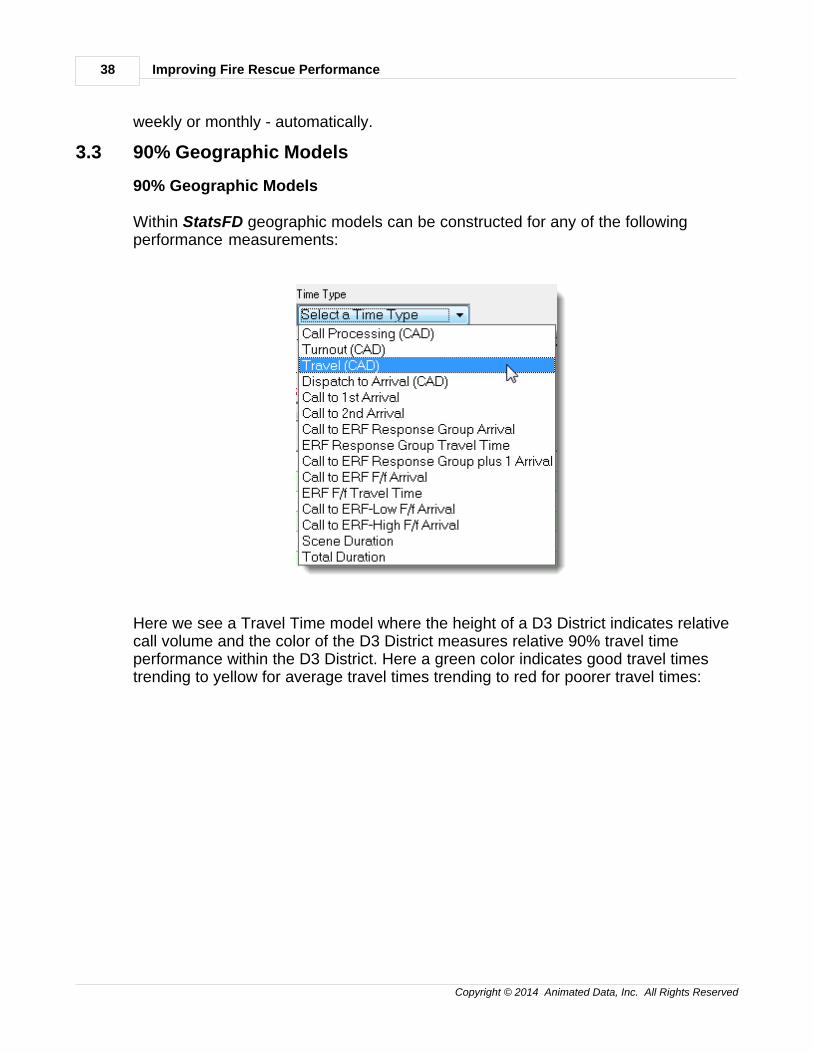
Within StatsFD geographic models can be constructed for any of the followingperformance measurements:
Here we see a Travel Time model where the height of a D3 District indicates relativecall volume and the color of the D3 District measures relative 90% travel timeperformance within the D3 District. Here a green color indicates good travel timestrending to yellow for average travel times trending to red for poorer travel times:
3. 90% Performance Measures 39
Copyright © 2014 Animated Data, Inc. All Rights Reserved
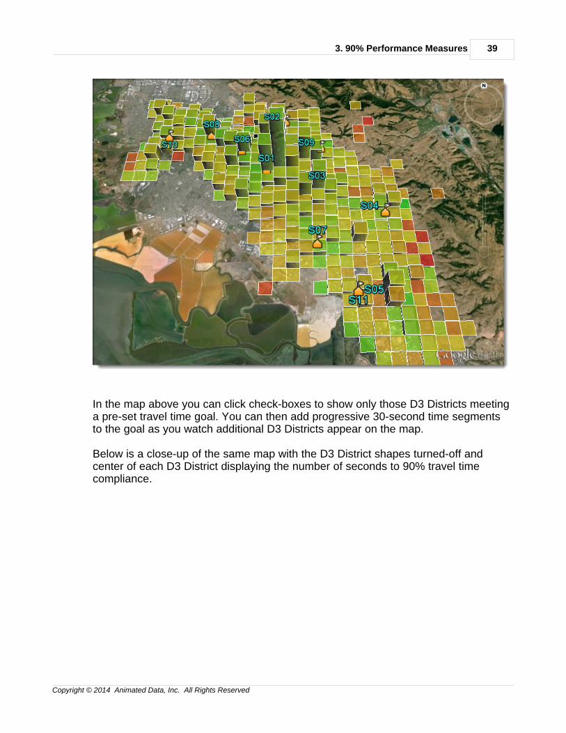
In the map above you can click check-boxes to show only those D3 Districts meetinga pre-set travel time goal. You can then add progressive 30-second time segmentsto the goal as you watch additional D3 Districts appear on the map.
Below is a close-up of the same map with the D3 District shapes turned-off andcenter of each D3 District displaying the number of seconds to 90% travel timecompliance.
Improving Fire Rescue Performance40
Copyright © 2014 Animated Data, Inc. All Rights Reserved
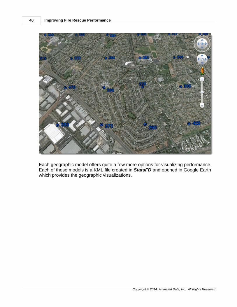
Each geographic model offers quite a few more options for visualizing performance.Each of these models is a KML file created in StatsFD and opened in Google Earthwhich provides the geographic visualizations.
4. Fractiles & Compliance 41
Copyright © 2014 Animated Data, Inc. All Rights Reserved
4 4. Fractiles & Compliance
4Fractiles & Compliance
Fractiles refers to performance calculations in which the number of incidents meetingprogressive time increments is converted into a percentage of all incidents beingtested. Each time increment has a calculated "compliance percentage" or"compliance".
Here's an example. We have 1,000 incidents. Each incident has a valid travel time.Each incident is ordered so the fastest travel duration is listed first.
In this example, we may see that 100 incidents have a Travel Time of 60-seconds orless. So at 1-minute we can say there is a 10% travel time compliance. If number ofincidents with travel times less than or equal to 120 seconds is 300 then we can saythere is a 30% travel time compliance at 2-minutes. And so on...
* Fractile Waterfall
* Setting Fractile Goals
* Fractile Graphs
Improving Fire Rescue Performance42
Copyright © 2014 Animated Data, Inc. All Rights Reserved
* Fractile Matricies
* Fractile Maps
------------------------------------------------------------------------
4.1 Fractile Waterfall
Fractiles Waterfall
Example: Click Here
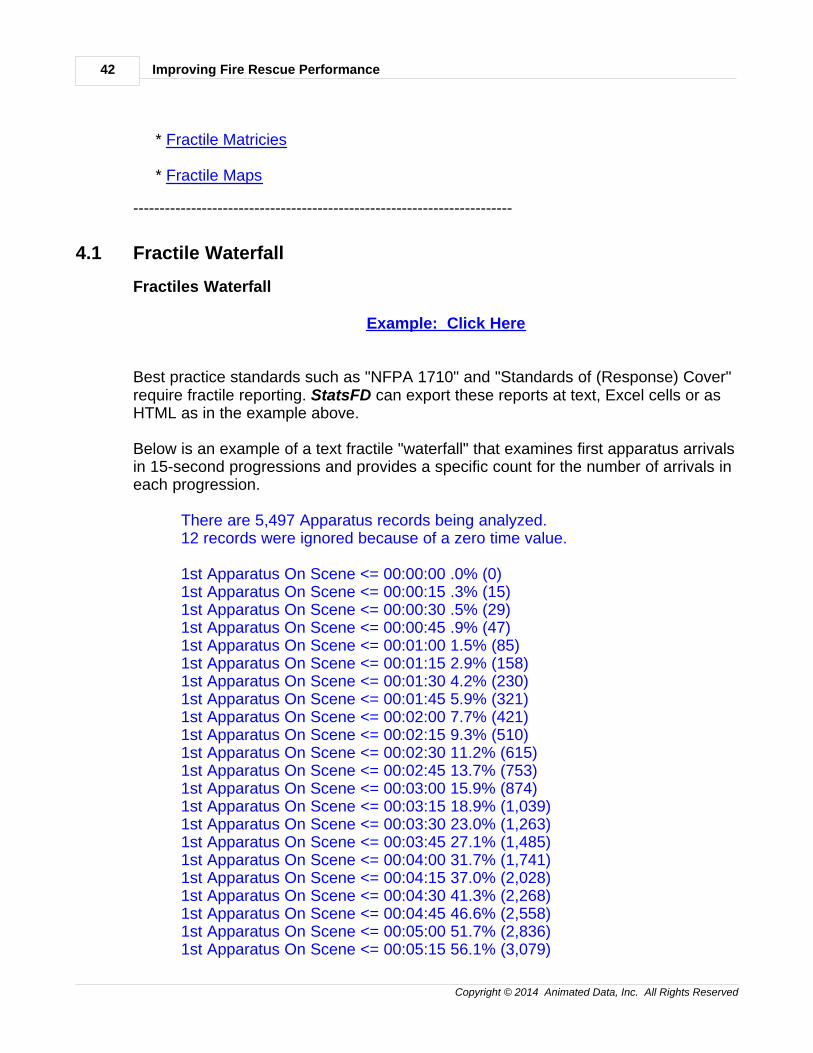
Best practice standards such as "NFPA 1710" and "Standards of (Response) Cover"require fractile reporting. StatsFD can export these reports at text, Excel cells or asHTML as in the example above.
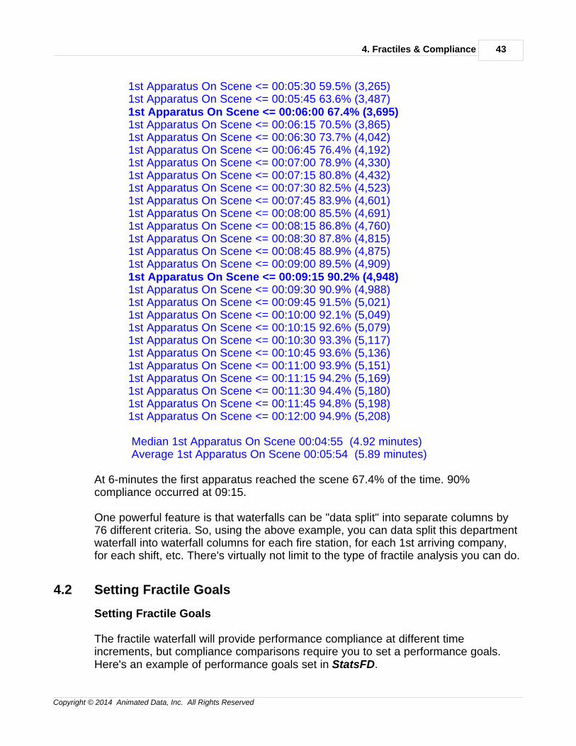
Below is an example of a text fractile "waterfall" that examines first apparatus arrivalsin 15-second progressions and provides a specific count for the number of arrivals ineach progression.
There are 5,497 Apparatus records being analyzed.12 records were ignored because of a zero time value.
1st Apparatus On Scene <= 00:00:00 .0% (0)1st Apparatus On Scene <= 00:00:15 .3% (15)1st Apparatus On Scene <= 00:00:30 .5% (29)1st Apparatus On Scene <= 00:00:45 .9% (47)1st Apparatus On Scene <= 00:01:00 1.5% (85)1st Apparatus On Scene <= 00:01:15 2.9% (158)1st Apparatus On Scene <= 00:01:30 4.2% (230)1st Apparatus On Scene <= 00:01:45 5.9% (321)1st Apparatus On Scene <= 00:02:00 7.7% (421)1st Apparatus On Scene <= 00:02:15 9.3% (510)1st Apparatus On Scene <= 00:02:30 11.2% (615)1st Apparatus On Scene <= 00:02:45 13.7% (753)1st Apparatus On Scene <= 00:03:00 15.9% (874)1st Apparatus On Scene <= 00:03:15 18.9% (1,039)1st Apparatus On Scene <= 00:03:30 23.0% (1,263)1st Apparatus On Scene <= 00:03:45 27.1% (1,485)1st Apparatus On Scene <= 00:04:00 31.7% (1,741)1st Apparatus On Scene <= 00:04:15 37.0% (2,028)1st Apparatus On Scene <= 00:04:30 41.3% (2,268)1st Apparatus On Scene <= 00:04:45 46.6% (2,558)1st Apparatus On Scene <= 00:05:00 51.7% (2,836)1st Apparatus On Scene <= 00:05:15 56.1% (3,079)
4. Fractiles & Compliance 43
Copyright © 2014 Animated Data, Inc. All Rights Reserved
1st Apparatus On Scene <= 00:05:30 59.5% (3,265)1st Apparatus On Scene <= 00:05:45 63.6% (3,487)1st Apparatus On Scene <= 00:06:00 67.4% (3,695)1st Apparatus On Scene <= 00:06:15 70.5% (3,865)1st Apparatus On Scene <= 00:06:30 73.7% (4,042)1st Apparatus On Scene <= 00:06:45 76.4% (4,192)1st Apparatus On Scene <= 00:07:00 78.9% (4,330)1st Apparatus On Scene <= 00:07:15 80.8% (4,432)1st Apparatus On Scene <= 00:07:30 82.5% (4,523)1st Apparatus On Scene <= 00:07:45 83.9% (4,601)1st Apparatus On Scene <= 00:08:00 85.5% (4,691)1st Apparatus On Scene <= 00:08:15 86.8% (4,760)1st Apparatus On Scene <= 00:08:30 87.8% (4,815)1st Apparatus On Scene <= 00:08:45 88.9% (4,875)1st Apparatus On Scene <= 00:09:00 89.5% (4,909)1st Apparatus On Scene <= 00:09:15 90.2% (4,948)1st Apparatus On Scene <= 00:09:30 90.9% (4,988)1st Apparatus On Scene <= 00:09:45 91.5% (5,021)1st Apparatus On Scene <= 00:10:00 92.1% (5,049)1st Apparatus On Scene <= 00:10:15 92.6% (5,079)1st Apparatus On Scene <= 00:10:30 93.3% (5,117)1st Apparatus On Scene <= 00:10:45 93.6% (5,136)1st Apparatus On Scene <= 00:11:00 93.9% (5,151)1st Apparatus On Scene <= 00:11:15 94.2% (5,169)1st Apparatus On Scene <= 00:11:30 94.4% (5,180)1st Apparatus On Scene <= 00:11:45 94.8% (5,198)1st Apparatus On Scene <= 00:12:00 94.9% (5,208)
Median 1st Apparatus On Scene 00:04:55 (4.92 minutes) Average 1st Apparatus On Scene 00:05:54 (5.89 minutes)
At 6-minutes the first apparatus reached the scene 67.4% of the time. 90%compliance occurred at 09:15.
One powerful feature is that waterfalls can be "data split" into separate columns by76 different criteria. So, using the above example, you can data split this departmentwaterfall into waterfall columns for each fire station, for each 1st arriving company,for each shift, etc. There's virtually not limit to the type of fractile analysis you can do.
4.2 Setting Fractile Goals
Setting Fractile Goals
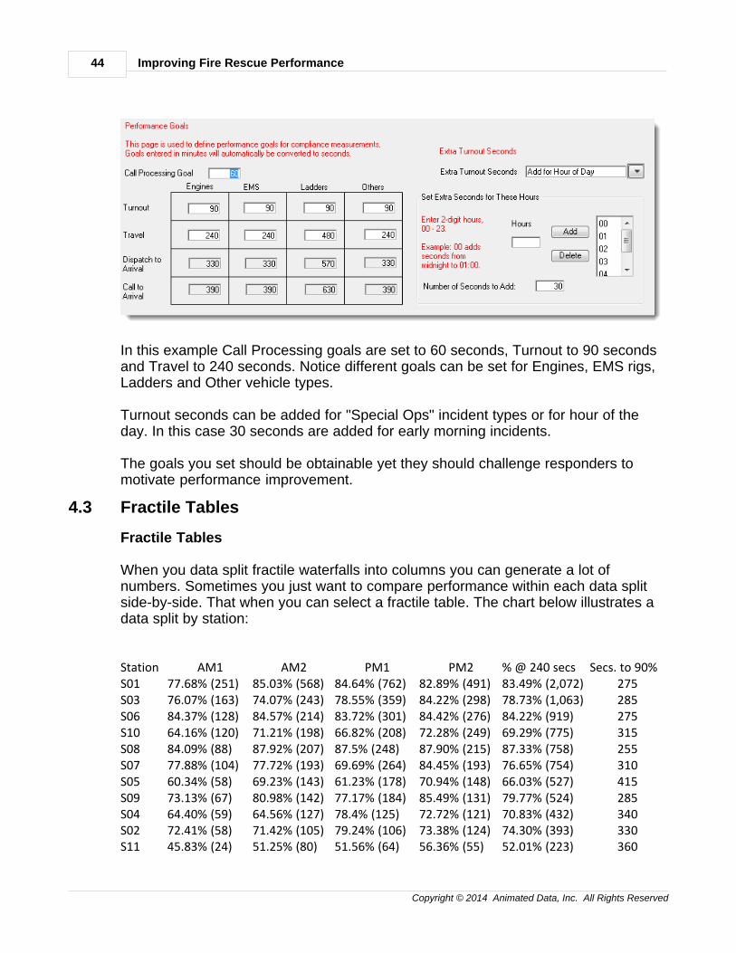
The fractile waterfall will provide performance compliance at different timeincrements, but compliance comparisons require you to set a performance goals.Here's an example of performance goals set in StatsFD.
Improving Fire Rescue Performance44
Copyright © 2014 Animated Data, Inc. All Rights Reserved
In this example Call Processing goals are set to 60 seconds, Turnout to 90 secondsand Travel to 240 seconds. Notice different goals can be set for Engines, EMS rigs,Ladders and Other vehicle types.
Turnout seconds can be added for "Special Ops" incident types or for hour of theday. In this case 30 seconds are added for early morning incidents.
The goals you set should be obtainable yet they should challenge responders tomotivate performance improvement.
4.3 Fractile Tables
Fractile Tables
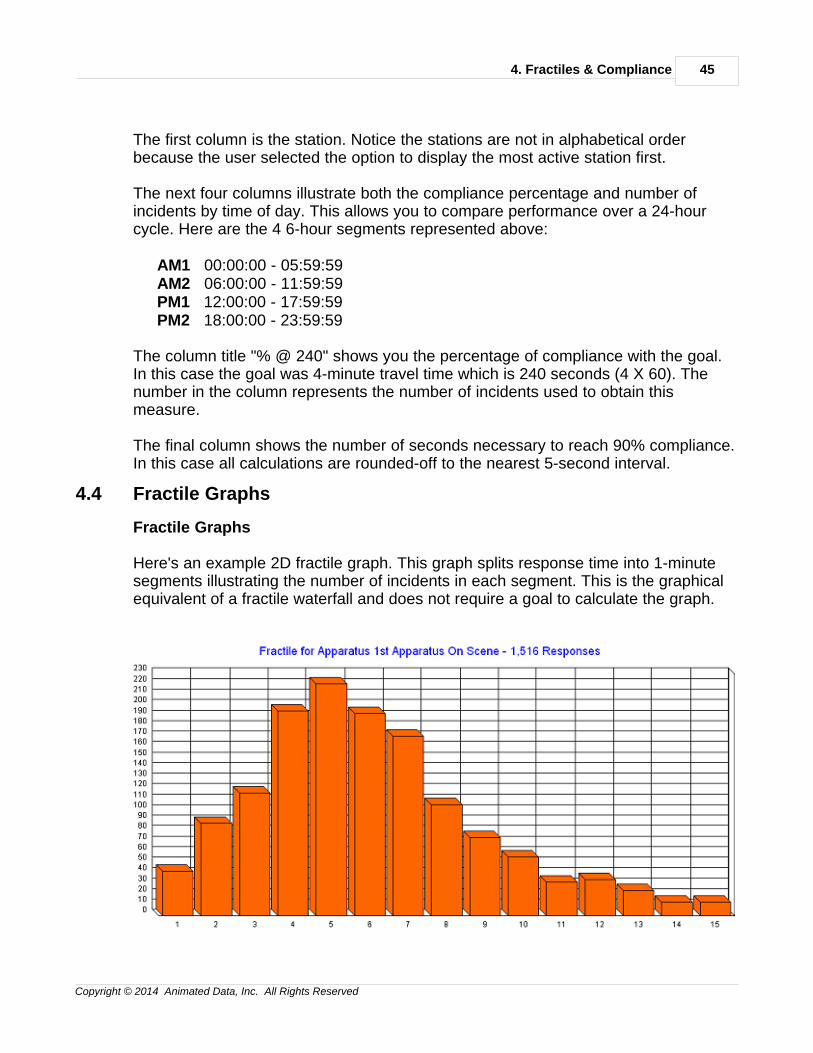
When you data split fractile waterfalls into columns you can generate a lot ofnumbers. Sometimes you just want to compare performance within each data splitside-by-side. That when you can select a fractile table. The chart below illustrates adata split by station:
Station AM1 AM2 PM1 PM2 % @ 240 secs Secs. to 90%S01 77.68% (251) 85.03% (568) 84.64% (762) 82.89% (491) 83.49% (2,072) 275S03 76.07% (163) 74.07% (243) 78.55% (359) 84.22% (298) 78.73% (1,063) 285S06 84.37% (128) 84.57% (214) 83.72% (301) 84.42% (276) 84.22% (919) 275S10 64.16% (120) 71.21% (198) 66.82% (208) 72.28% (249) 69.29% (775) 315S08 84.09% (88) 87.92% (207) 87.5% (248) 87.90% (215) 87.33% (758) 255S07 77.88% (104) 77.72% (193) 69.69% (264) 84.45% (193) 76.65% (754) 310S05 60.34% (58) 69.23% (143) 61.23% (178) 70.94% (148) 66.03% (527) 415S09 73.13% (67) 80.98% (142) 77.17% (184) 85.49% (131) 79.77% (524) 285S04 64.40% (59) 64.56% (127) 78.4% (125) 72.72% (121) 70.83% (432) 340S02 72.41% (58) 71.42% (105) 79.24% (106) 73.38% (124) 74.30% (393) 330S11 45.83% (24) 51.25% (80) 51.56% (64) 56.36% (55) 52.01% (223) 360
4. Fractiles & Compliance 45
Copyright © 2014 Animated Data, Inc. All Rights Reserved
The first column is the station. Notice the stations are not in alphabetical orderbecause the user selected the option to display the most active station first.
The next four columns illustrate both the compliance percentage and number ofincidents by time of day. This allows you to compare performance over a 24-hourcycle. Here are the 4 6-hour segments represented above:
AM1 00:00:00 - 05:59:59AM2 06:00:00 - 11:59:59PM1 12:00:00 - 17:59:59PM2 18:00:00 - 23:59:59
The column title "% @ 240" shows you the percentage of compliance with the goal.In this case the goal was 4-minute travel time which is 240 seconds (4 X 60). Thenumber in the column represents the number of incidents used to obtain thismeasure.
The final column shows the number of seconds necessary to reach 90% compliance.In this case all calculations are rounded-off to the nearest 5-second interval.
4.4 Fractile Graphs
Fractile Graphs
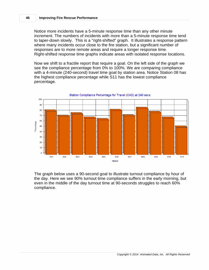
Here's an example 2D fractile graph. This graph splits response time into 1-minutesegments illustrating the number of incidents in each segment. This is the graphicalequivalent of a fractile waterfall and does not require a goal to calculate the graph.
Improving Fire Rescue Performance46
Copyright © 2014 Animated Data, Inc. All Rights Reserved
Notice more incidents have a 5-minute response time than any other minuteincrement. The numbers of incidents with more than a 5-minute response time tendto taper-down slowly. This is a "right-shifted" graph. It illustrates a response patternwhere many incidents occur close to the fire station, but a significant number ofresponses are to more remote areas and require a longer response time.Right-shifted response time graphs indicate areas with isolated response locations.
Now we shift to a fractile report that require a goal. On the left side of the graph wesee the compliance percentage from 0% to 100%. We are comparing compliancewith a 4-minute (240-second) travel time goal by station area. Notice Station 08 hasthe highest compliance percentage while S11 has the lowest compliancepercentage.
The graph below uses a 90-second goal to illustrate turnout compliance by hour ofthe day. Here we see 90% turnout time compliance suffers in the early morning, buteven in the middle of the day turnout time at 90-seconds struggles to reach 60%compliance.
4. Fractiles & Compliance 47
Copyright © 2014 Animated Data, Inc. All Rights Reserved
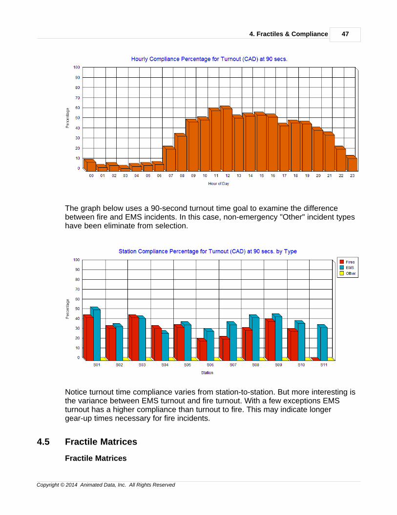
The graph below uses a 90-second turnout time goal to examine the differencebetween fire and EMS incidents. In this case, non-emergency "Other" incident typeshave been eliminate from selection.
Notice turnout time compliance varies from station-to-station. But more interesting isthe variance between EMS turnout and fire turnout. With a few exceptions EMSturnout has a higher compliance than turnout to fire. This may indicate longergear-up times necessary for fire incidents.
4.5 Fractile Matrices
Fractile Matrices
Improving Fire Rescue Performance48
Copyright © 2014 Animated Data, Inc. All Rights Reserved
Example: Click Here
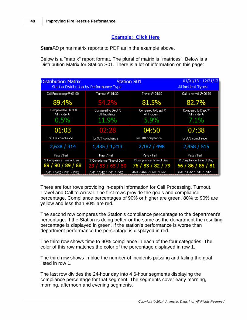
StatsFD prints matrix reports to PDF as in the example above.
Below is a "matrix" report format. The plural of matrix is "matrices". Below is aDistribution Matrix for Station S01. There is a lot of information on this page:
There are four rows providing in-depth information for Call Processing, Turnout,Travel and Call to Arrival. The first rows provide the goals and compliancepercentage. Compliance percentages of 90% or higher are green, 80% to 90% areyellow and less than 80% are red.
The second row compares the Station's compliance percentage to the department'spercentage. If the Station is doing better or the same as the department the resultingpercentage is displayed in green. If the station's performance is worse thandepartment performance the percentage is displayed in red.
The third row shows time to 90% compliance in each of the four categories. Thecolor of this row matches the color of the percentage displayed in row 1.
The third row shows in blue the number of incidents passing and failing the goallisted in row 1.
The last row divides the 24-hour day into 4 6-hour segments displaying thecompliance percentage for that segment. The segments cover early morning,morning, afternoon and evening segments.
4. Fractiles & Compliance 49
Copyright © 2014 Animated Data, Inc. All Rights Reserved
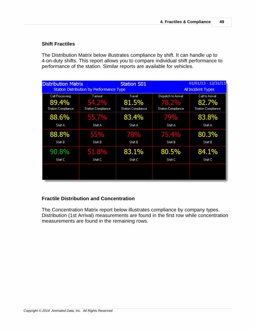
Shift Fractiles
The Distribution Matrix below illustrates compliance by shift. It can handle up to4-on-duty shifts. This report allows you to compare individual shift performance toperformance of the station. Similar reports are available for vehicles.
Fractile Distribution and Concentration
The Concentration Matrix report below illustrates compliance by company types.Distribution (1st Arrival) measurements are found in the first row while concentrationmeasurements are found in the remaining rows.
Improving Fire Rescue Performance50
Copyright © 2014 Animated Data, Inc. All Rights Reserved
Each cell in the matrix shows the minutes to 90% compliance followed in blue by thenumber of apparatus responses used to calculate performance. The higher thenumber in blue the less volatile the 90% performance measurement.
4.6 Fractile Maps
Fractile Maps
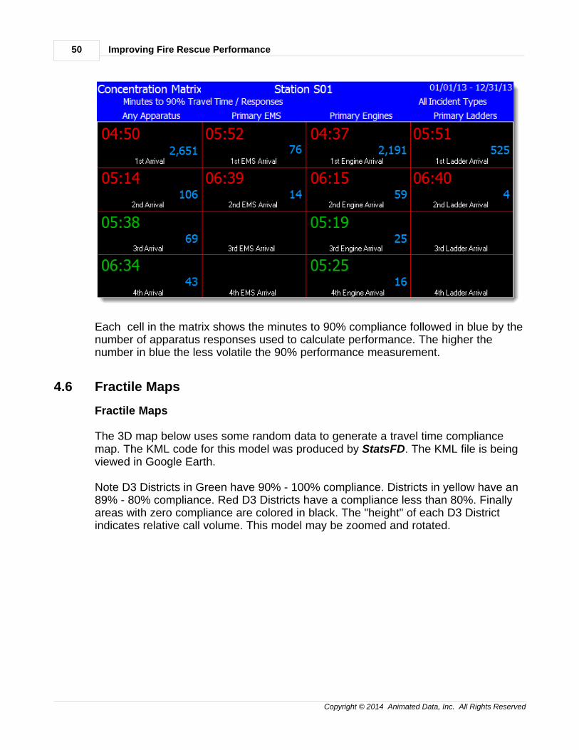
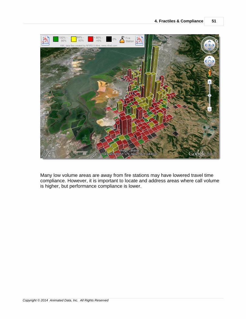
The 3D map below uses some random data to generate a travel time compliancemap. The KML code for this model was produced by StatsFD. The KML file is beingviewed in Google Earth.
Note D3 Districts in Green have 90% - 100% compliance. Districts in yellow have an89% - 80% compliance. Red D3 Districts have a compliance less than 80%. Finallyareas with zero compliance are colored in black. The "height" of each D3 Districtindicates relative call volume. This model may be zoomed and rotated.
4. Fractiles & Compliance 51
Copyright © 2014 Animated Data, Inc. All Rights Reserved
Many low volume areas are away from fire stations may have lowered travel timecompliance. However, it is important to locate and address areas where call volumeis higher, but performance compliance is lower.

5. Effective Response Force 53
Copyright © 2014 Animated Data, Inc. All Rights Reserved
5 5. Effective Response Force
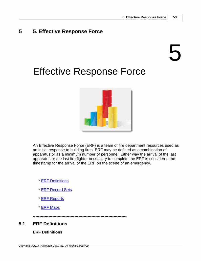
5Effective Response Force
An Effective Response Force (ERF) is a team of fire department resources used asan initial response to building fires. ERF may be defined as a combination ofapparatus or as a minimum number of personnel. Either way the arrival of the lastapparatus or the last fire fighter necessary to complete the ERF is considered thetimestamp for the arrival of the ERF on the scene of an emergency.
* ERF Definitions
* ERF Record Sets
* ERF Reports
* ERF Maps
------------------------------------------------------------------------
5.1 ERF Definitions
ERF Definitions
Improving Fire Rescue Performance54
Copyright © 2014 Animated Data, Inc. All Rights Reserved
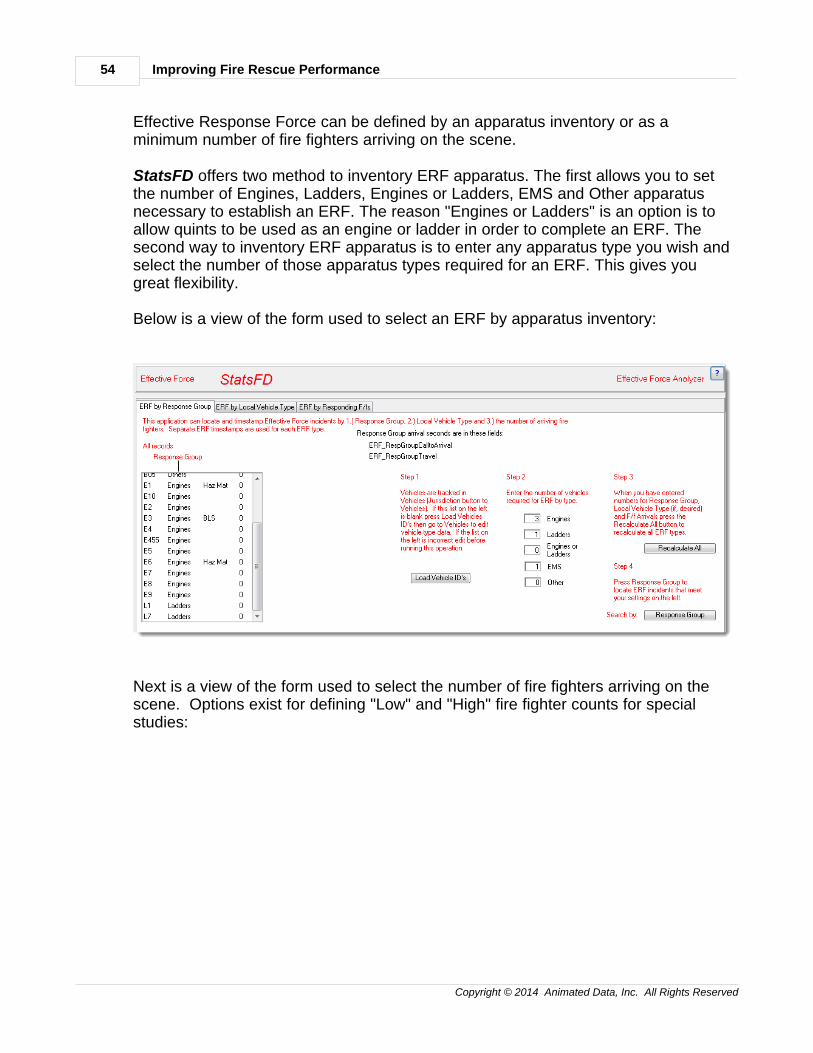
Effective Response Force can be defined by an apparatus inventory or as aminimum number of fire fighters arriving on the scene.
StatsFD offers two method to inventory ERF apparatus. The first allows you to setthe number of Engines, Ladders, Engines or Ladders, EMS and Other apparatusnecessary to establish an ERF. The reason "Engines or Ladders" is an option is toallow quints to be used as an engine or ladder in order to complete an ERF. Thesecond way to inventory ERF apparatus is to enter any apparatus type you wish andselect the number of those apparatus types required for an ERF. This gives yougreat flexibility.
Below is a view of the form used to select an ERF by apparatus inventory:
Next is a view of the form used to select the number of fire fighters arriving on thescene. Options exist for defining "Low" and "High" fire fighter counts for specialstudies:
5. Effective Response Force 55
Copyright © 2014 Animated Data, Inc. All Rights Reserved
5.2 ERF Record Sets
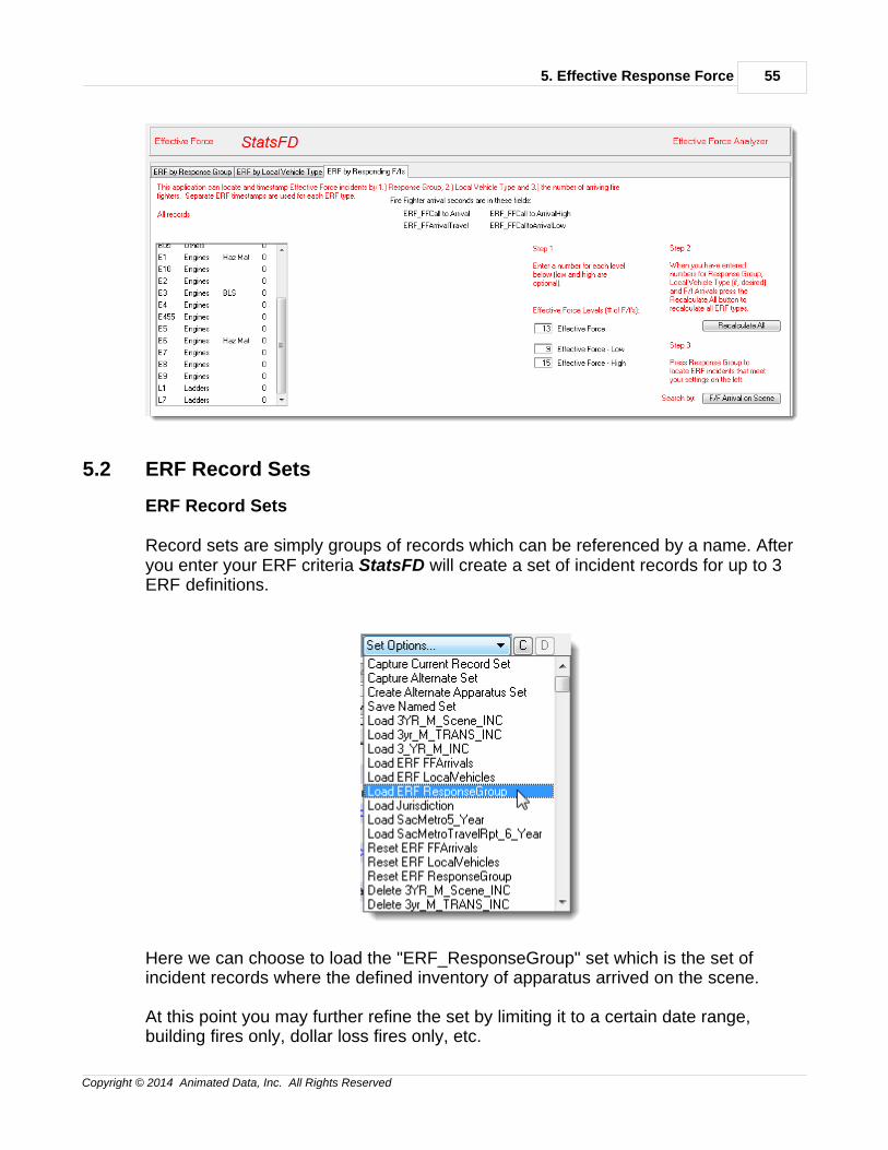
ERF Record Sets
Record sets are simply groups of records which can be referenced by a name. Afteryou enter your ERF criteria StatsFD will create a set of incident records for up to 3ERF definitions.
Here we can choose to load the "ERF_ResponseGroup" set which is the set ofincident records where the defined inventory of apparatus arrived on the scene.
At this point you may further refine the set by limiting it to a certain date range,building fires only, dollar loss fires only, etc.
Improving Fire Rescue Performance56
Copyright © 2014 Animated Data, Inc. All Rights Reserved
When you have refined the ERF record set simply select "Reset ERFResponseGroup" to reset the ERF record set to only the incidents you want toinclude.
The same process can be followed for the other two ERF sets:
ERF FFArrivalsERF LocalVehicles
The ERF record sets you defined remain in the system and can be recalled at anytime.
5.3 ERF Reports
ERF Reports
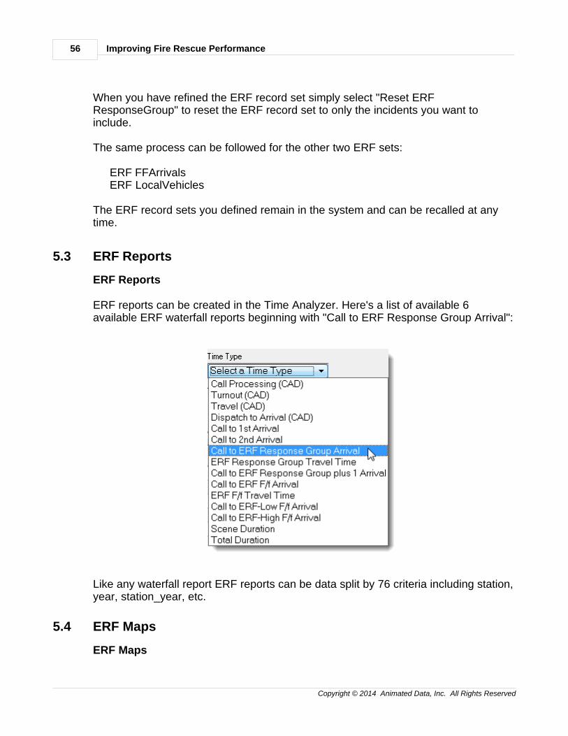
ERF reports can be created in the Time Analyzer. Here's a list of available 6available ERF waterfall reports beginning with "Call to ERF Response Group Arrival":
Like any waterfall report ERF reports can be data split by 76 criteria including station,year, station_year, etc.
5.4 ERF Maps
ERF Maps
5. Effective Response Force 57
Copyright © 2014 Animated Data, Inc. All Rights Reserved
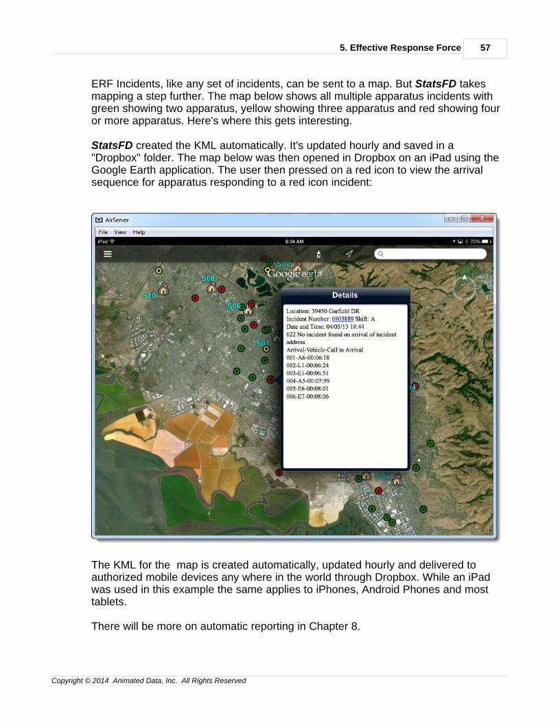
ERF Incidents, like any set of incidents, can be sent to a map. But StatsFD takesmapping a step further. The map below shows all multiple apparatus incidents withgreen showing two apparatus, yellow showing three apparatus and red showing fouror more apparatus. Here's where this gets interesting.
StatsFD created the KML automatically. It's updated hourly and saved in a"Dropbox" folder. The map below was then opened in Dropbox on an iPad using theGoogle Earth application. The user then pressed on a red icon to view the arrivalsequence for apparatus responding to a red icon incident:
The KML for the map is created automatically, updated hourly and delivered toauthorized mobile devices any where in the world through Dropbox. While an iPadwas used in this example the same applies to iPhones, Android Phones and mosttablets.
There will be more on automatic reporting in Chapter 8.

6. Benchmarks & Baselines 59
Copyright © 2014 Animated Data, Inc. All Rights Reserved
6 6. Benchmarks & Baselines
6Benchmarks & Baselines
Benchmarks & Baselines measures performance against operational goals(Benchmarks) and minimum performance expectations (Baselines) over variouspopulation densities. The measurements include "Overall" performance plusbreakdowns for "Metropolitan", "Urban", "Suburban" and "Rural" populationdensities. Distribution performance is measured for "Call Processing", "Turnout","Travel", "Dispatch to Arrival" and "Call to Arrival". Concentration measurements areestablished for "2nd Apparatus Arrival", "ERF Travel" and "ERF Call to Arrival".
By evaluating both operational goals and minimum performance expectations overdifferent population densities you get a more complete performance picture of youroperation's capabilities and vulnerabilities.
* B & B Populations
* B & B Outlier Settings
* B & B Goals
* B & B Distribution
Improving Fire Rescue Performance60
Copyright © 2014 Animated Data, Inc. All Rights Reserved
* B & B Concentration
------------------------------------------------------------------------
6.1 B & B Populations
B & B Populations
Example: Click Here
The example is a PDF document created by StatsFD. It contains random data whichmay result in zeros when parsed into very small segments. But it gives you an ideaof the capabilities of the Benchmarks & Baselines report.
The first task in any Benchmarks & Baselines calculation is to determine thepopulation density at the location of each incident being analyzed. This sounds like ahuge task, but it may be easier than it sounds. There are four population densities:
1. Metropolitan2. Urban3. Suburban4. Rural
If your fire department is suburban your entire district may have a suburbanpopulation density so nothing needs to be done. However, most larger cities willhave two, three or sometimes even four population density types. You need someway to associate the appropriate population density with each incident.
Some fire departments use census tract information which provides a populationdensity by census tract. If you track census tracts in your NFIRS 5 data this canmake associating a population density an easy task.
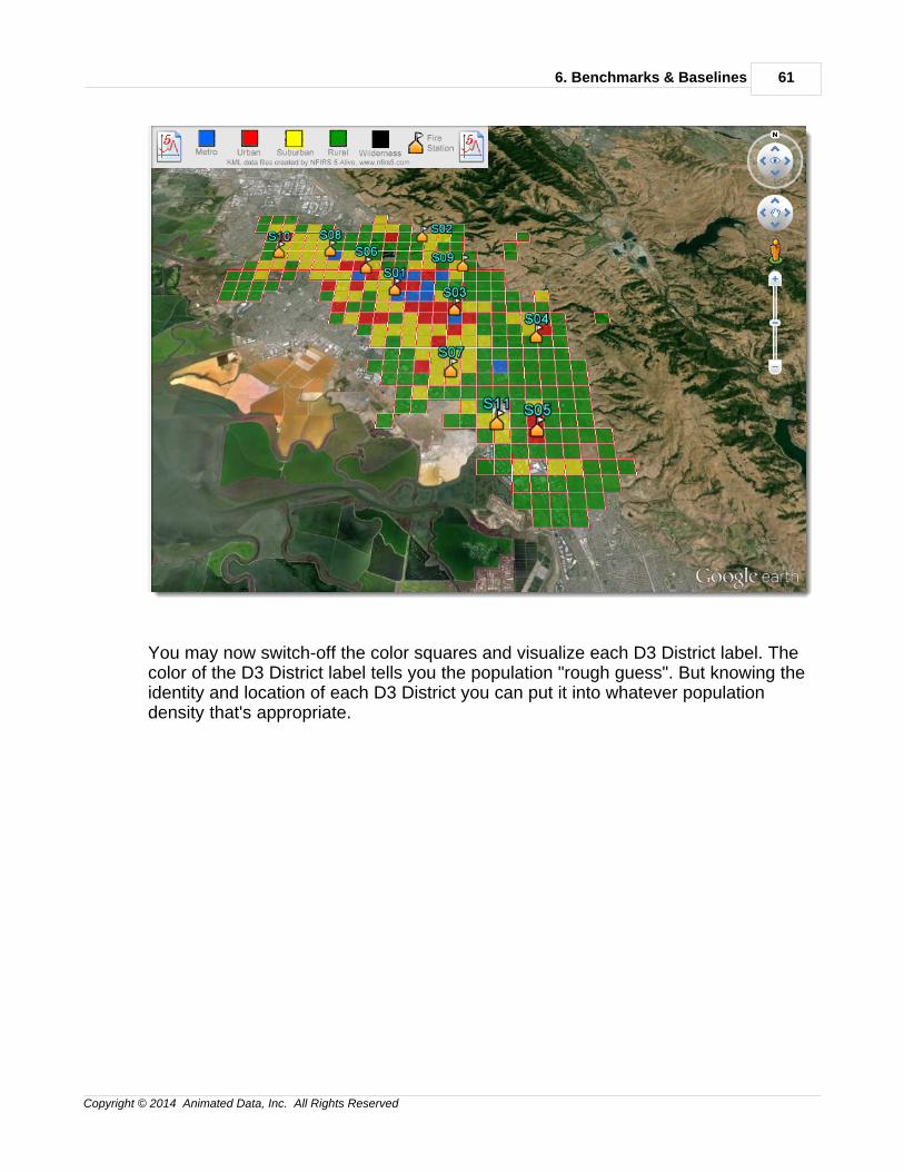
StatsFD allows you to select one or more of the population levels found it your firedepartment's response area. You can then use D3 Districts to create populationmaps. The map below "roughs-in" population densities by using incident volume.The broad assumption is made that very heavy incident loads will be experienced inmore dense population levels. So incident counts by D3 district are used to make apreliminary "rough guess" at the population levels.
6. Benchmarks & Baselines 61
Copyright © 2014 Animated Data, Inc. All Rights Reserved
You may now switch-off the color squares and visualize each D3 District label. Thecolor of the D3 District label tells you the population "rough guess". But knowing theidentity and location of each D3 District you can put it into whatever populationdensity that's appropriate.
Improving Fire Rescue Performance62
Copyright © 2014 Animated Data, Inc. All Rights Reserved
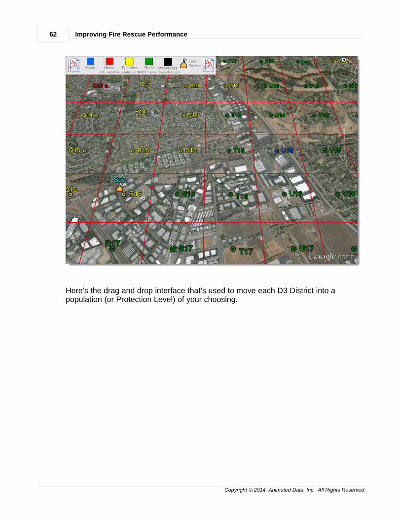
Here's the drag and drop interface that's used to move each D3 District into apopulation (or Protection Level) of your choosing.
6. Benchmarks & Baselines 63
Copyright © 2014 Animated Data, Inc. All Rights Reserved
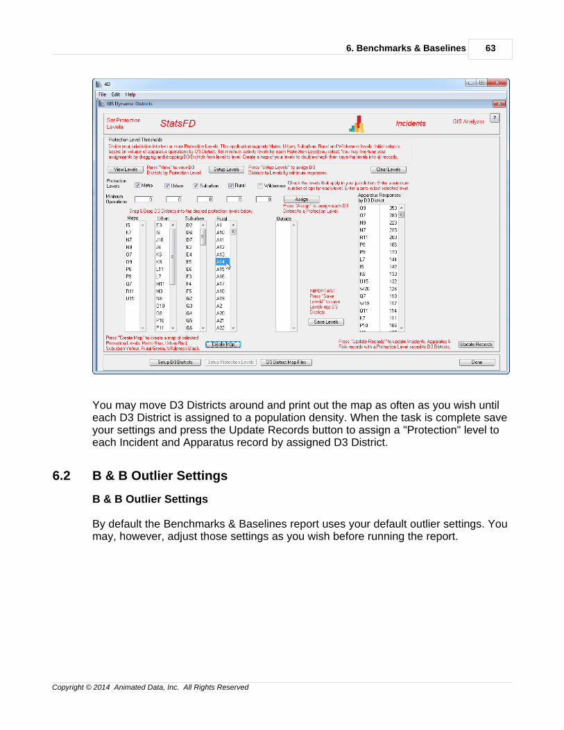
You may move D3 Districts around and print out the map as often as you wish untileach D3 District is assigned to a population density. When the task is complete saveyour settings and press the Update Records button to assign a "Protection" level toeach Incident and Apparatus record by assigned D3 District.
6.2 B & B Outlier Settings
B & B Outlier Settings
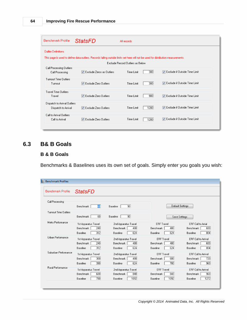
By default the Benchmarks & Baselines report uses your default outlier settings. Youmay, however, adjust those settings as you wish before running the report.
Improving Fire Rescue Performance64
Copyright © 2014 Animated Data, Inc. All Rights Reserved
6.3 B& B Goals
B & B Goals
Benchmarks & Baselines uses its own set of goals. Simply enter you goals you wish:
6. Benchmarks & Baselines 65
Copyright © 2014 Animated Data, Inc. All Rights Reserved
6.4 B & B Distribution
B & B Distribution
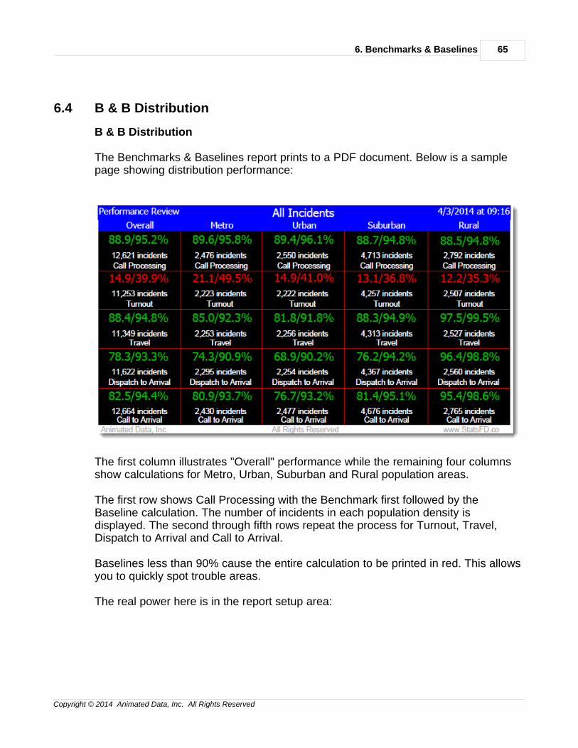
The Benchmarks & Baselines report prints to a PDF document. Below is a samplepage showing distribution performance:
The first column illustrates "Overall" performance while the remaining four columnsshow calculations for Metro, Urban, Suburban and Rural population areas.
The first row shows Call Processing with the Benchmark first followed by theBaseline calculation. The number of incidents in each population density isdisplayed. The second through fifth rows repeat the process for Turnout, Travel,Dispatch to Arrival and Call to Arrival.
Baselines less than 90% cause the entire calculation to be printed in red. This allowsyou to quickly spot trouble areas.
The real power here is in the report setup area:
Improving Fire Rescue Performance66
Copyright © 2014 Animated Data, Inc. All Rights Reserved
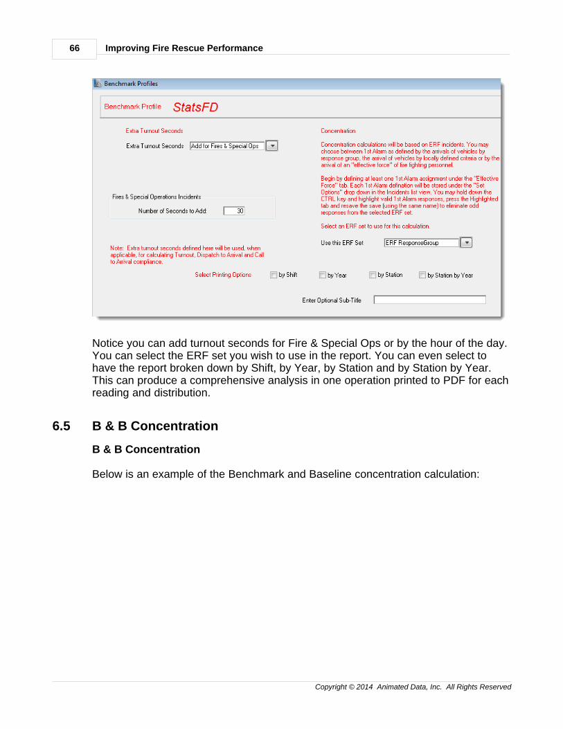
Notice you can add turnout seconds for Fire & Special Ops or by the hour of the day.You can select the ERF set you wish to use in the report. You can even select tohave the report broken down by Shift, by Year, by Station and by Station by Year.This can produce a comprehensive analysis in one operation printed to PDF for eachreading and distribution.
6.5 B & B Concentration
B & B Concentration
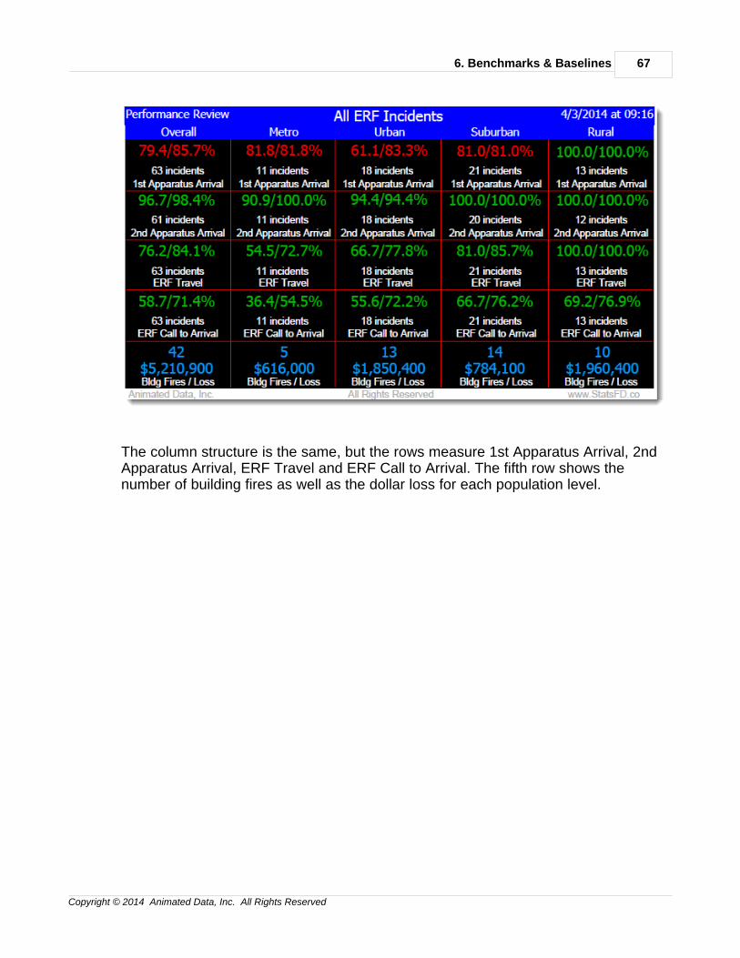
Below is an example of the Benchmark and Baseline concentration calculation:
6. Benchmarks & Baselines 67
Copyright © 2014 Animated Data, Inc. All Rights Reserved
The column structure is the same, but the rows measure 1st Apparatus Arrival, 2ndApparatus Arrival, ERF Travel and ERF Call to Arrival. The fifth row shows thenumber of building fires as well as the dollar loss for each population level.

7. Response Reliability 69
Copyright © 2014 Animated Data, Inc. All Rights Reserved
7 7. Response Reliability
7Response Reliability
"Response Reliability" refers to the percentage of time a home engine company isthe first engine company to reach the scene of an emergency. For example, themore frequently Engine 5 is the first engine to arrive on the scene in Station 5's areathe higher the response reliability percentage for E5.
Response Reliability as a percentage does not tell you much about the operation ofthe engine. To gain practical information about first arriving engine companies in astation you must mix response reliability with performance.
* Reliability Performance
* Reliability Graph
* Out of Area Responses
7.1 Reliability Performance
Reliability Performance
Improving Fire Rescue Performance70
Copyright © 2014 Animated Data, Inc. All Rights Reserved
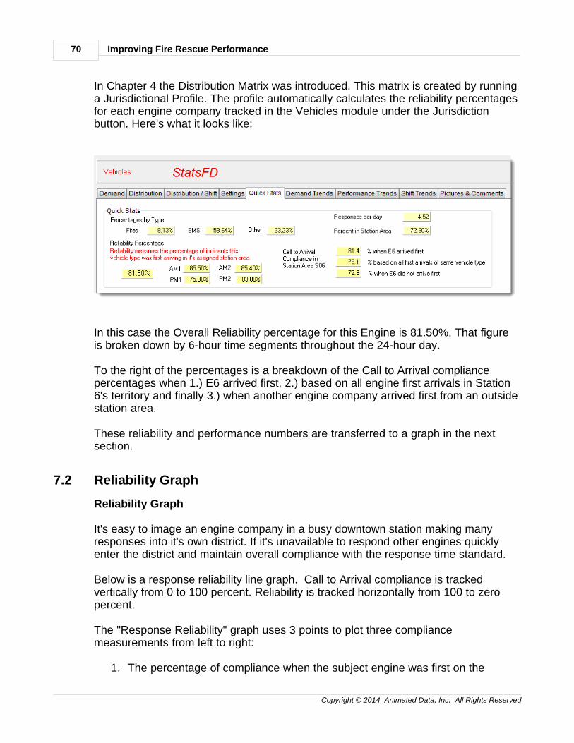
In Chapter 4 the Distribution Matrix was introduced. This matrix is created by runninga Jurisdictional Profile. The profile automatically calculates the reliability percentagesfor each engine company tracked in the Vehicles module under the Jurisdictionbutton. Here's what it looks like:
In this case the Overall Reliability percentage for this Engine is 81.50%. That figureis broken down by 6-hour time segments throughout the 24-hour day.
To the right of the percentages is a breakdown of the Call to Arrival compliancepercentages when 1.) E6 arrived first, 2.) based on all engine first arrivals in Station6's territory and finally 3.) when another engine company arrived first from an outsidestation area.
These reliability and performance numbers are transferred to a graph in the nextsection.
7.2 Reliability Graph
Reliability Graph
It's easy to image an engine company in a busy downtown station making manyresponses into it's own district. If it's unavailable to respond other engines quicklyenter the district and maintain overall compliance with the response time standard.
Below is a response reliability line graph. Call to Arrival compliance is trackedvertically from 0 to 100 percent. Reliability is tracked horizontally from 100 to zeropercent.
The "Response Reliability" graph uses 3 points to plot three compliancemeasurements from left to right:
1. The percentage of compliance when the subject engine was first on the
7. Response Reliability 71
Copyright © 2014 Animated Data, Inc. All Rights Reserved
scene. 2. The percentage of compliance for all engine responses within the station
area. 3. The percentage of compliance when the subject engine was not able to
respond.
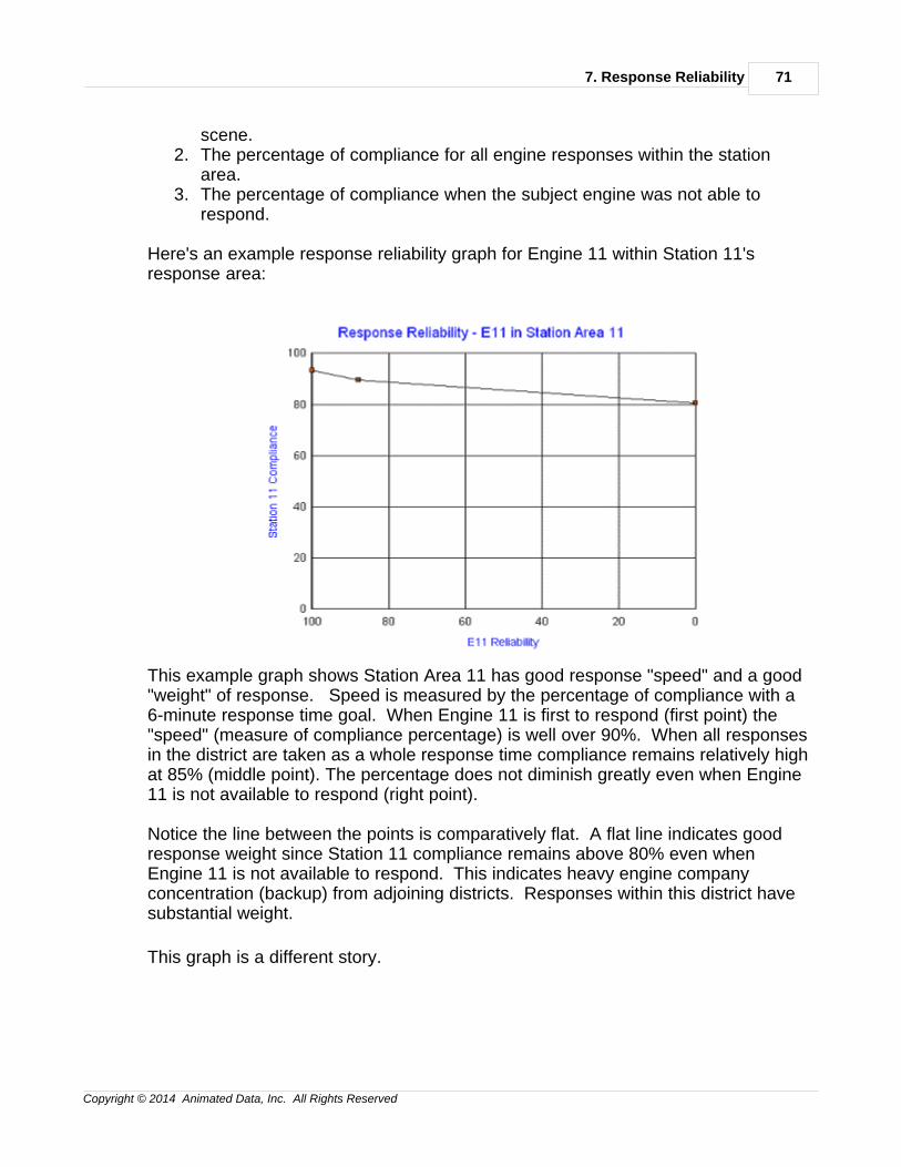
Here's an example response reliability graph for Engine 11 within Station 11'sresponse area:
This example graph shows Station Area 11 has good response "speed" and a good"weight" of response. Speed is measured by the percentage of compliance with a6-minute response time goal. When Engine 11 is first to respond (first point) the"speed" (measure of compliance percentage) is well over 90%. When all responsesin the district are taken as a whole response time compliance remains relatively highat 85% (middle point). The percentage does not diminish greatly even when Engine11 is not available to respond (right point).
Notice the line between the points is comparatively flat. A flat line indicates goodresponse weight since Station 11 compliance remains above 80% even whenEngine 11 is not available to respond. This indicates heavy engine companyconcentration (backup) from adjoining districts. Responses within this district havesubstantial weight.
This graph is a different story.
Improving Fire Rescue Performance72
Copyright © 2014 Animated Data, Inc. All Rights Reserved
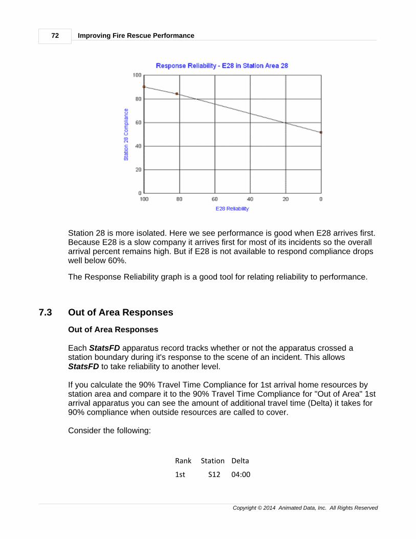
Station 28 is more isolated. Here we see performance is good when E28 arrives first.Because E28 is a slow company it arrives first for most of its incidents so the overallarrival percent remains high. But if E28 is not available to respond compliance dropswell below 60%.
The Response Reliability graph is a good tool for relating reliability to performance.
7.3 Out of Area Responses
Out of Area Responses
Each StatsFD apparatus record tracks whether or not the apparatus crossed astation boundary during it's response to the scene of an incident. This allows StatsFD to take reliability to another level.
If you calculate the 90% Travel Time Compliance for 1st arrival home resources bystation area and compare it to the 90% Travel Time Compliance for "Out of Area" 1starrival apparatus you can see the amount of additional travel time (Delta) it takes for90% compliance when outside resources are called to cover.
Consider the following:
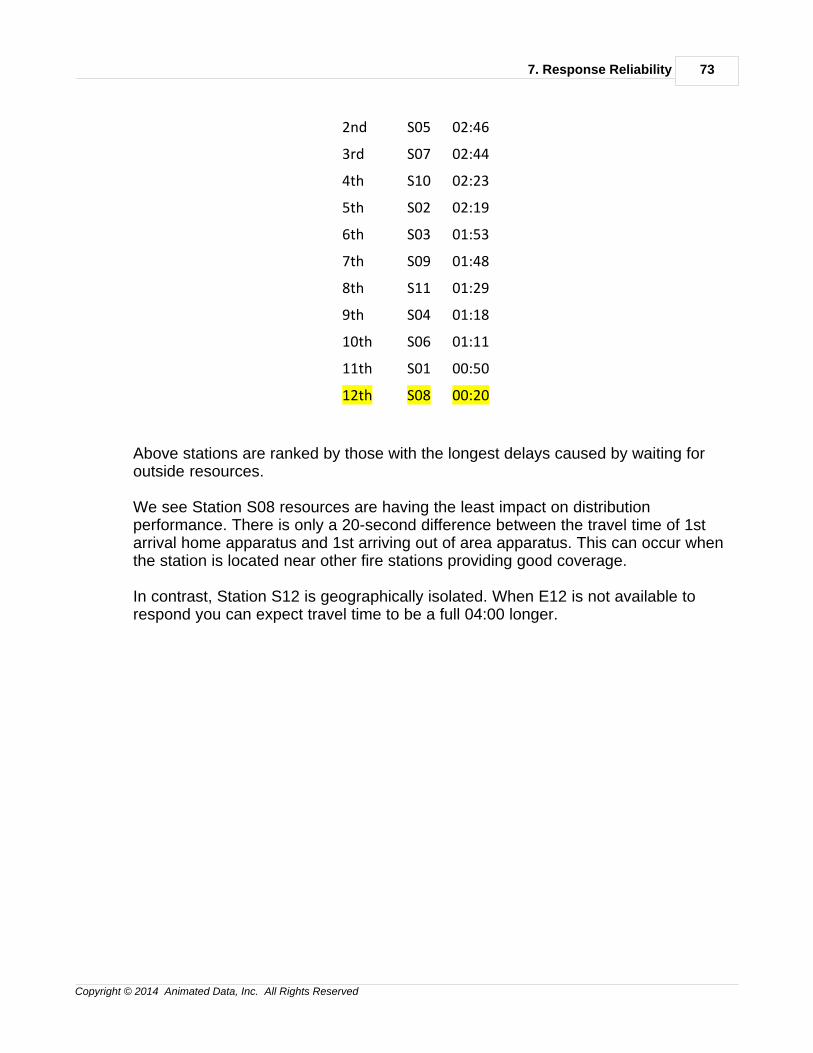
Rank Station Delta
1st S12 04:00
7. Response Reliability 73
Copyright © 2014 Animated Data, Inc. All Rights Reserved
2nd S05 02:46
3rd S07 02:44
4th S10 02:23
5th S02 02:19
6th S03 01:53
7th S09 01:48
8th S11 01:29
9th S04 01:18
10th S06 01:11
11th S01 00:50
12th S08 00:20
Above stations are ranked by those with the longest delays caused by waiting foroutside resources.
We see Station S08 resources are having the least impact on distributionperformance. There is only a 20-second difference between the travel time of 1starrival home apparatus and 1st arriving out of area apparatus. This can occur whenthe station is located near other fire stations providing good coverage.
In contrast, Station S12 is geographically isolated. When E12 is not available torespond you can expect travel time to be a full 04:00 longer.

8. Automatic Reporting 75
Copyright © 2014 Animated Data, Inc. All Rights Reserved
8 8. Automatic Reporting
8Automatic Reporting
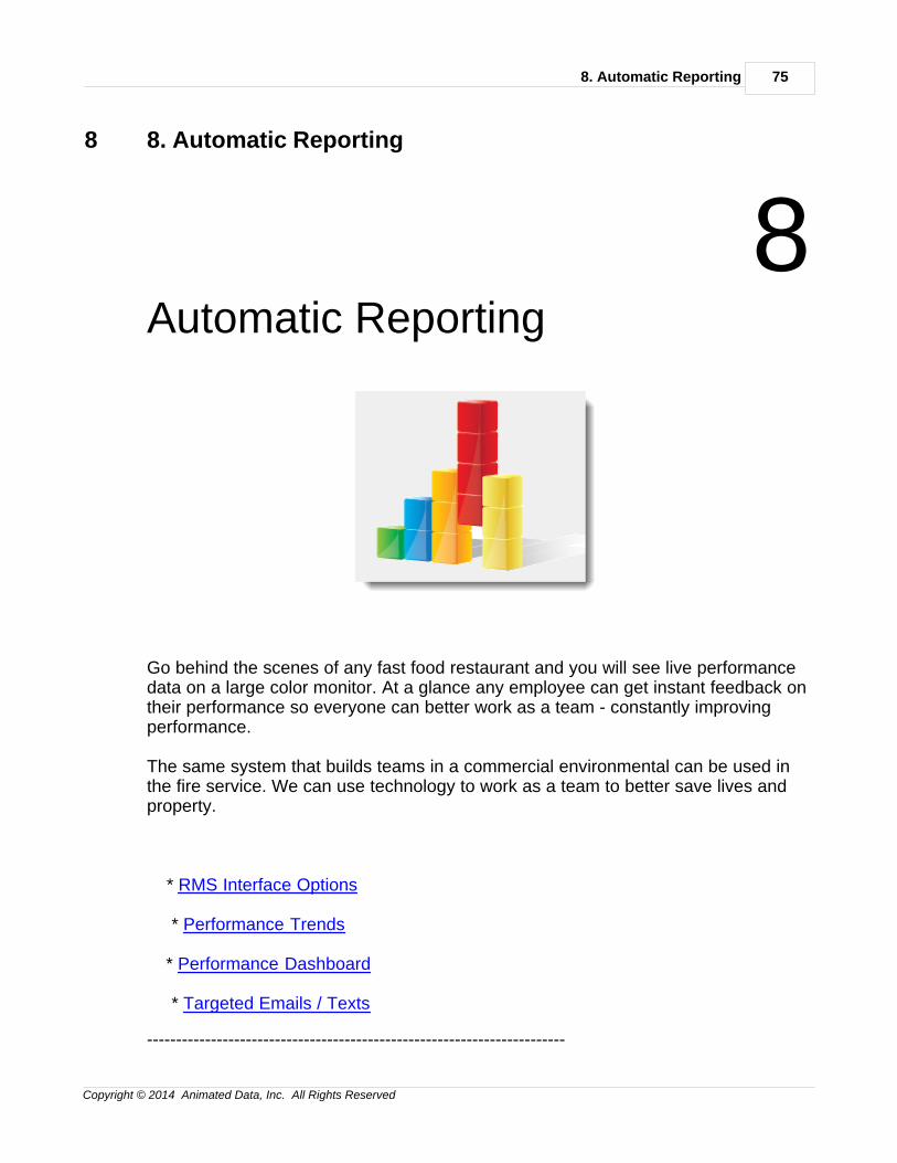
Go behind the scenes of any fast food restaurant and you will see live performancedata on a large color monitor. At a glance any employee can get instant feedback ontheir performance so everyone can better work as a team - constantly improvingperformance.
The same system that builds teams in a commercial environmental can be used inthe fire service. We can use technology to work as a team to better save lives andproperty.
* RMS Interface Options
* Performance Trends
* Performance Dashboard
* Targeted Emails / Texts
------------------------------------------------------------------------
Improving Fire Rescue Performance76
Copyright © 2014 Animated Data, Inc. All Rights Reserved
8.1 RMS Interface Options
RMS Interface Options
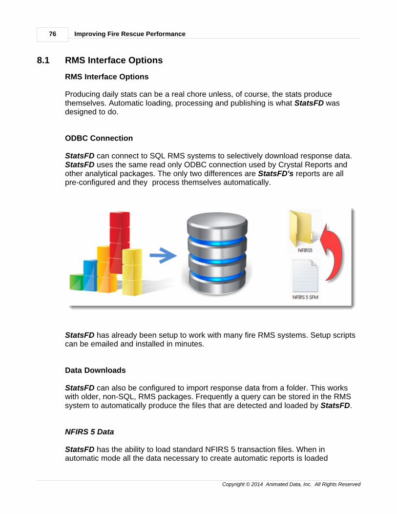
Producing daily stats can be a real chore unless, of course, the stats producethemselves. Automatic loading, processing and publishing is what StatsFD wasdesigned to do.
ODBC Connection
StatsFD can connect to SQL RMS systems to selectively download response data.StatsFD uses the same read only ODBC connection used by Crystal Reports andother analytical packages. The only two differences are StatsFD's reports are allpre-configured and they process themselves automatically.
StatsFD has already been setup to work with many fire RMS systems. Setup scriptscan be emailed and installed in minutes.
Data Downloads
StatsFD can also be configured to import response data from a folder. This workswith older, non-SQL, RMS packages. Frequently a query can be stored in the RMSsystem to automatically produce the files that are detected and loaded by StatsFD.
NFIRS 5 Data
StatsFD has the ability to load standard NFIRS 5 transaction files. When inautomatic mode all the data necessary to create automatic reports is loaded
8. Automatic Reporting 77
Copyright © 2014 Animated Data, Inc. All Rights Reserved
automatically. But if you want to dig deeper using NFIRS 5 data elements simplyplace the NFIRS 5 transaction in the NFIRS5 folder and it will be loaded and mergedautomatically.
8.2 Performance Trends
Performance Trends
Example: Click Here
When in automatic reporting mode the example PDF is create and updated daily.
Up to this point we have been examining past performance sometimes calledretrospective analysis. Now, with automatic downloading of data, we are shiftingperspective from the past to the present. Performance trends seeks to measurewhether performance, up to this present day, is trending better, poorer or about thesame.
In StatsFD performance trend lines are established by looking at differentperformance measurements over the past 90-days and comparing that longer-rangeperformance with performance over the past 7-days. If 90-day performance is betterperformance is on the decline. If 7-day performance is better then performance isimproving.
The goal is to detect performance trends to the present day so problem areas areidentified and addressed immediately. In StatsFD performance trends are generateddaily and automatically.
Demand Trends
The first trend measurement is demand. This measurement establishes whether thenumber of incidents and apparatus responses is rising, falling or remaining about thesame.
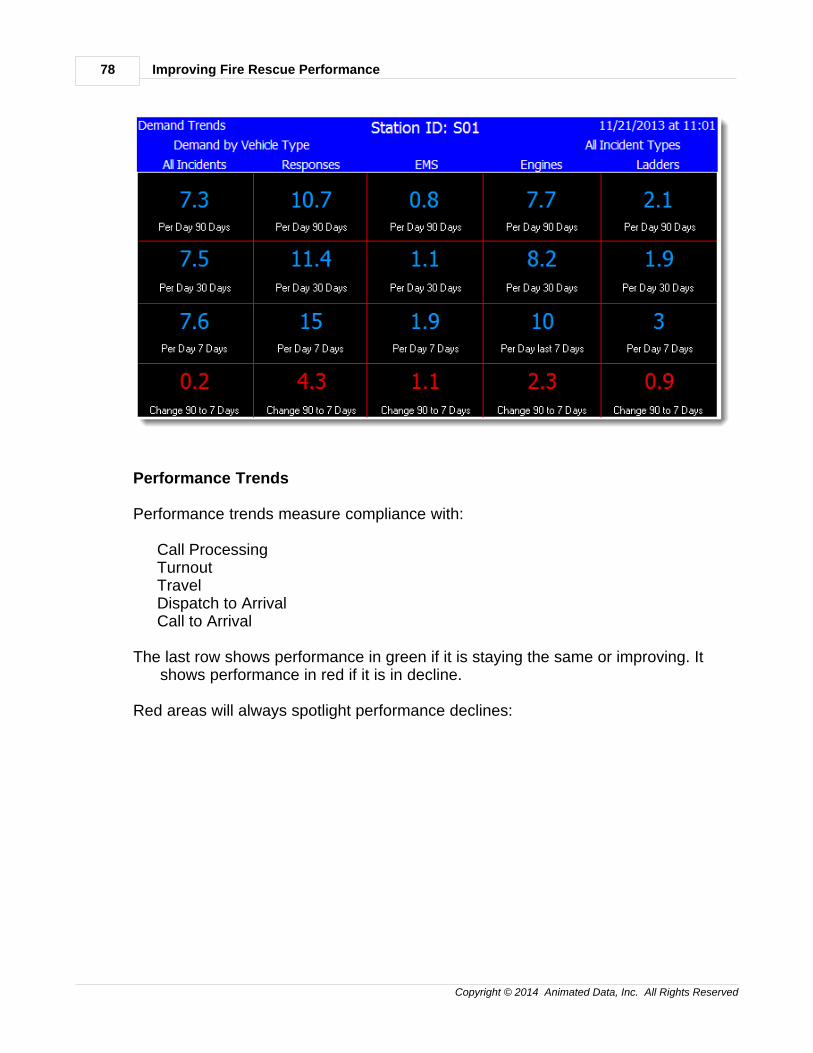
Improving Fire Rescue Performance78
Copyright © 2014 Animated Data, Inc. All Rights Reserved
Performance Trends
Performance trends measure compliance with:
Call ProcessingTurnoutTravelDispatch to ArrivalCall to Arrival
The last row shows performance in green if it is staying the same or improving. Itshows performance in red if it is in decline.
Red areas will always spotlight performance declines:
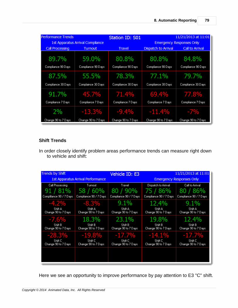
8. Automatic Reporting 79
Copyright © 2014 Animated Data, Inc. All Rights Reserved
Shift Trends
In order closely identify problem areas performance trends can measure right downto vehicle and shift:
Here we see an opportunity to improve performance by pay attention to E3 "C" shift.
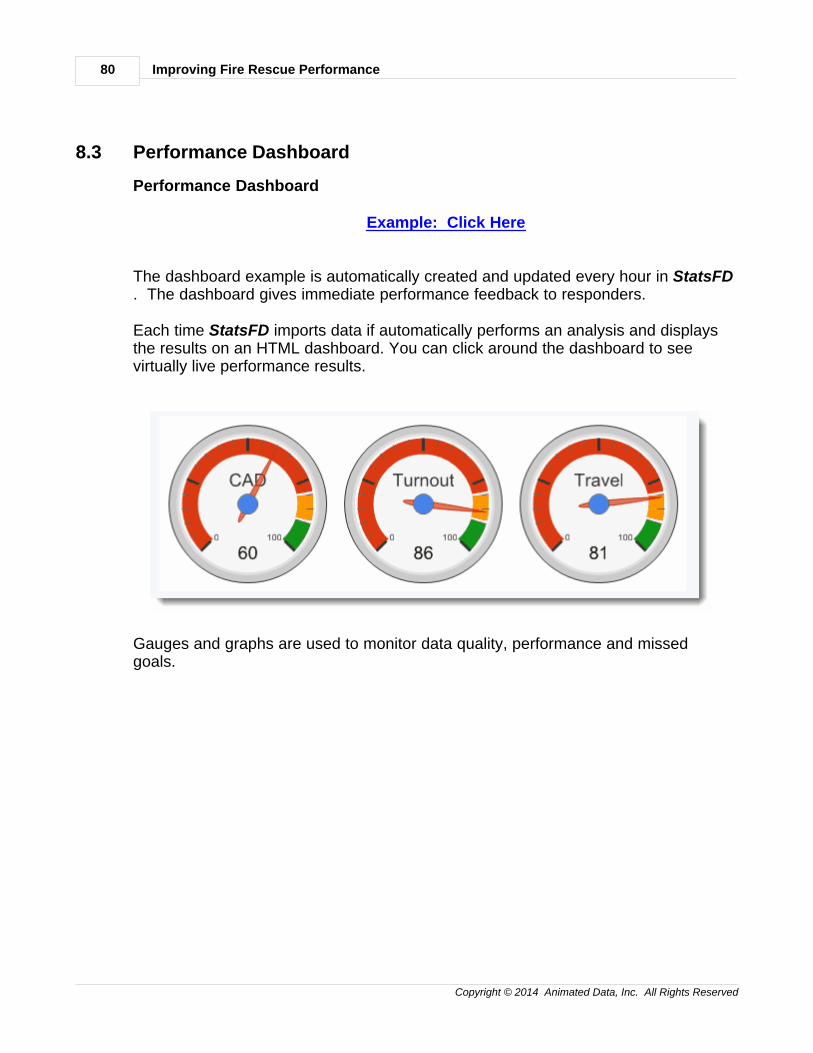
Improving Fire Rescue Performance80
Copyright © 2014 Animated Data, Inc. All Rights Reserved
8.3 Performance Dashboard
Performance Dashboard
Example: Click Here
The dashboard example is automatically created and updated every hour in StatsFD. The dashboard gives immediate performance feedback to responders.
Each time StatsFD imports data if automatically performs an analysis and displaysthe results on an HTML dashboard. You can click around the dashboard to seevirtually live performance results.
Gauges and graphs are used to monitor data quality, performance and missedgoals.
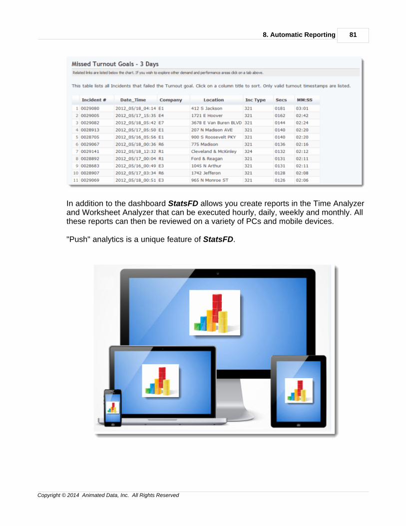
8. Automatic Reporting 81
Copyright © 2014 Animated Data, Inc. All Rights Reserved
In addition to the dashboard StatsFD allows you create reports in the Time Analyzerand Worksheet Analyzer that can be executed hourly, daily, weekly and monthly. Allthese reports can then be reviewed on a variety of PCs and mobile devices.
"Push" analytics is a unique feature of StatsFD.
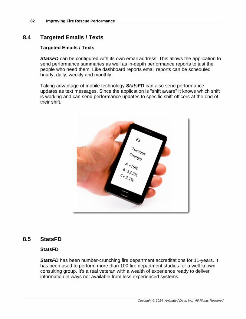
Improving Fire Rescue Performance82
Copyright © 2014 Animated Data, Inc. All Rights Reserved
8.4 Targeted Emails / Texts
Targeted Emails / Texts
StatsFD can be configured with its own email address. This allows the application tosend performance summaries as well as in-depth performance reports to just thepeople who need them. Like dashboard reports email reports can be scheduledhourly, daily, weekly and monthly.
Taking advantage of mobile technology StatsFD can also send performanceupdates as text messages. Since the application is "shift aware" it knows which shiftis working and can send performance updates to specific shift officers at the end oftheir shift.
8.5 StatsFD
StatsFD
StatsFD has been number-crunching fire department accreditations for 11-years. Ithas been used to perform more than 100 fire department studies for a well-knownconsulting group. It's a real veteran with a wealth of experience ready to deliverinformation in ways not available from less experienced systems.
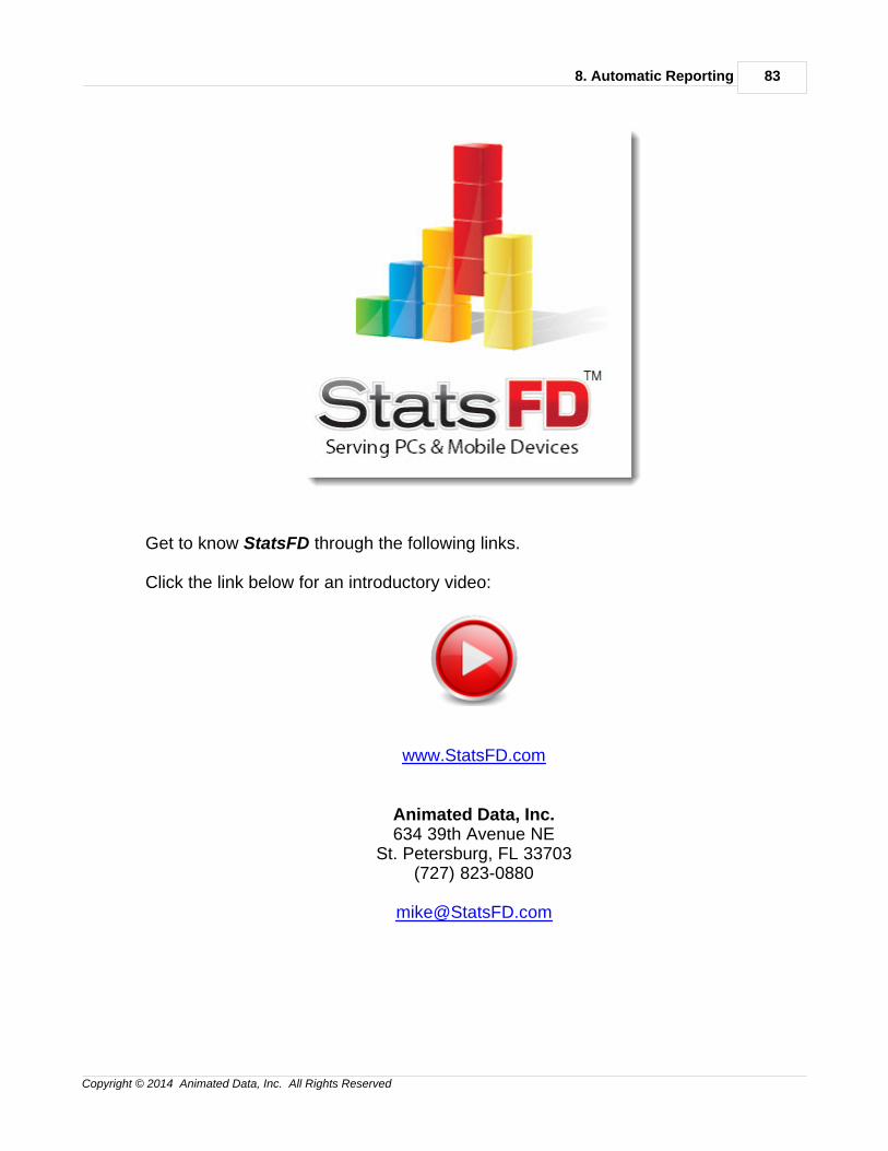
8. Automatic Reporting 83
Copyright © 2014 Animated Data, Inc. All Rights Reserved
Get to know StatsFD through the following links.
Click the link below for an introductory video:
www.StatsFD.com
Animated Data, Inc.634 39th Avenue NE
St. Petersburg, FL 33703(727) 823-0880

Index 85
Copyright © 2014 Animated Data, Inc. All Rights Reserved
Index- 9 -90% Geographic Models 38
90% Maps 38
90% Performance 33, 34, 38
90% Performance Spreadsheet 34
90% Spreadsheet Summary 34
90% Worksheets 36
- A -Aid 16
Automatic Reporting 75
- B -Baselines 59, 60, 63, 65, 66
Benchmark & Baselines Outlier Settings 63
Benchmarks 59, 60, 63, 65, 66
Benchmarks & Baselines 59, 60, 63, 64, 65, 66
Benchmarks & Baselines Concentration 66
Benchmarks & Baselines Distribution 65
- C -Concentration 30
- D -D3 Districts 60
Data Splits 28
Defining Emergencies 20
Demand 1, 2, 5, 8, 11, 13, 16
Demand by Incident Type 2
Demand for Service 1, 2
Demand Over Time 5
Demand Trends 77
Distribution 30
- E -Effective Response Force 53, 55, 56
ERF 53, 55, 56
ERF Definitions 53
ERF Maps 56
ERF Record Sets 55
ERF Reports 56
- F -Fractile Goals 43
Fractile Graphs 45
Fractile Maps 50
Fractile Matricies 47
Fractile Matrix 47
Fractile Tables 44
Fractile Waterfall 42
Fractiles 41, 42, 47, 50
- G -Geographic Demand 8
Geographic Divisions 26
Goals 43, 64
Goals, B & B 64
- I -Incident Type Comparisons 47
Introductory Video 82
- M -Metropolitian 60
Mutual Aid 16
- N -NFPA 1710 42
- O -Operational Divisions 26
Out of Area Responses 72
Outlier Settings 63
Outliers 21
Improving Fire Rescue Performance86
Copyright © 2014 Animated Data, Inc. All Rights Reserved
- P -Peformance 19
Performance 20, 25, 26, 30, 34, 36, 38
Performance Dashboard 80
Performance Incident Types 25
Performance Outliers 21
Performance Trends 77
Performance Types 22
Population Levles 60
Populations 60
Protection Levels 60
- R -Reliability 72
Reliability Performance 69
Resource Demand 11
Response Group 53
Response Reliabiliity 70
Response Reliability 69
Response Reliability Graph 70
Response Time 45
Right-shifted 45
RMS Interface 76
Rural 60
- S -Shift Trends 77
Simultaneous Demand 13
SOC 42
Standard of Cover 42
Station Aid 16
StatsFD 82
Suburban 60
- T -Targeted Emails 82
Targeted Text Messages 82
Timestamps 22
Trends 77
- U -Urban 60
- W -Worksheets 36