Embed Size (px)
Citation preview
iTunes Heuristic Evaluation Report
Emily Tennant Dino Anastasia Cara D’Amato
Assignment 6 SI 622 Judy Olson Mailbox #261 February 23, 2005

1
EXECUTIVE SUMMARY
This report provides a detailed analysis of the heuristic evaluation process used to evaluate
iTunes, Apple’s digital music application. The evaluation itself was performed using the
heuristic evaluation usability method, based on heuristics provided by Jakob Nielsen. This
method consists of evaluators comparing a pre-defined set of usability principles to an
application or website while attempting to complete a system task.
For this project, nine heuristics were used, focusing on the core functionalities of iTunes:
importing, organizing and playing digital music and burning CDs. The goal of this evaluation
was to identify major usability flaws within the iTunes interface through the application of these
nine heuristics:
1. Use Aesthetic and Minimalist Design
2. Effective Menu/Command Structure
3. Use Simple and Natural Language
4. Minimize User’s Memory Load
5. Be Consistent
6. Provide Feedback
7. Provide Clearly Marked Exits
8. Deal with Errors in a Positive Manner
9. Provide Help
The usability problems found from this evaluation are clustered into eleven areas and are ranked
according to their severity and ease with which the problem can be solved. The seven most
severe and easiest to fix problems are:
1. Inconsistencies between menus and buttons
2. Some language does not correspond with user terminology
3. There are buttons that the user may not realize are buttons
4. Not all buttons have tooltips
5. Some inconsistencies with Windows operating standards
6. Undo commands basically unsupported
7. Modal interface causes inconsistency in available features
The last four usability problems that are not discussed in detail in this report are: “Help content
uses different terminology than application,” “Default text in interface is difficult to read,”
“Similar buttons in different areas do different things,” and “System does not always provide
user with enough information about the task being performed.” These problems are not discussed
in detail because evaluators have classified them as superficial usability problems that should be
fixed only if extra time is available.
2
INTRODUCTION
This report describes the heuristic evaluation process and findings for Apple’s iTunes digital
music application. It begins with summary information describing the product and its target
population, and then continues with an overview of the heuristic evaluation technique in general,
the specific goals of this project, and the heuristics used in our walk-through of the application.
Following is a summary of the major problems identified by the heuristic evaluation and a more
detailed exploration of the findings related to these specific problems prioritized according to
their severity and impact on the user experience. The report concludes with a list of resources
related to heuristic evaluation and a detailed list of the actual heuristics used in the evaluation.
PRODUCT INFORMATION
Product Description
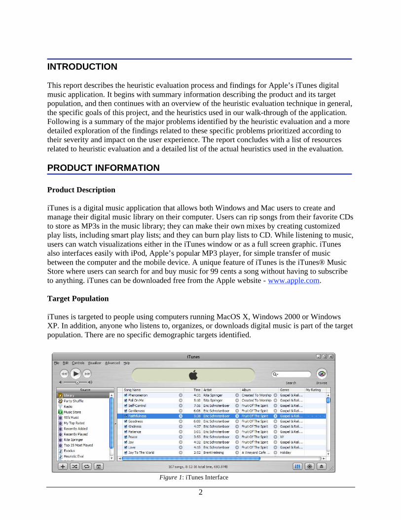
iTunes is a digital music application that allows both Windows and Mac users to create and
manage their digital music library on their computer. Users can rip songs from their favorite CDs
to store as MP3s in the music library; they can make their own mixes by creating customized
play lists, including smart play lists; and they can burn play lists to CD. While listening to music,
users can watch visualizations either in the iTunes window or as a full screen graphic. iTunes
also interfaces easily with iPod, Apple’s popular MP3 player, for simple transfer of music
between the computer and the mobile device. A unique feature of iTunes is the iTunes® Music
Store where users can search for and buy music for 99 cents a song without having to subscribe
to anything. iTunes can be downloaded free from the Apple website - www.apple.com.
Target Population
iTunes is targeted to people using computers running MacOS X, Windows 2000 or Windows
XP. In addition, anyone who listens to, organizes, or downloads digital music is part of the target
population. There are no specific demographic targets identified.
Figure 1: iTunes Interface
3
HEURISTIC EVALUATION TECHNIQUE
Methodology
The heuristic evaluation usability method was used to produce the findings summarized in this
report. According to renowned usability expert Jakob Nielsen, a “heuristic evaluation involves
having a small set of evaluators examine the interface and judge its compliance with recognized
usability principles (the ‘heuristics’)” (How to conduct a heuristic evaluation). Commonly
referred to as a “discount” usability technique (Nielsen, 1993, p. 160), this method allows
evaluators to discover possible usability problems in a product or application in a single
afternoon. Later, more expensive and extensive user testing can investigate the usability
problems identified through heuristic evaluation. When conducting a heuristic evaluation,
evaluators compare a pre-defined set of specific usability principles with a product or web site
interface while attempting to accomplish actual system tasks. Evaluators may either work
individually, combining findings later, or they may perform the evaluation at the same time with
each individual focusing on several different heuristics.
Specific Project Goals
For this project, three evaluators developed and used a set of nine heuristics to discover usability
problems in the iTunes digital music application interface. This evaluation focused on the core
functionality of the iTunes interface: importing, organizing, and playing digital music and
burning CDs. The interaction with Apple’s iPod MP3 player and the iTunes online Music Store
were not investigated. The evaluators each prepared results for two heuristics individually, and
then all three evaluated the remaining heuristics together in a joint product walk-through. Larger
problem areas and severities were reached through group consensus. The CUE heuristic
evaluation tool was not used in the preparation of this report.
The goal of this project was to identify major usability flaws in the iTunes digital music
application using established heuristic evaluation techniques. In addition, the heuristic evaluation
revealed controversial situations where the application may violate traditional heuristics while
remaining usable for the actual user. Once these usability problems were identified, they were
prioritized. Selected areas will be investigated further through user testing.
Heuristics Used
Many of the most commonly available lists of heuristics are specifically oriented toward the
evaluation of web sites. As a computer application, iTunes has a different interface and
navigation style than a traditional web site. To best accommodate these needs, we combined a set
of ten heuristics suggested by Jakob Nielsen (1993) and a set of nine design principles suggested
by Saul Greenberg, a professor of Human-Computer Interaction at the University of Calgary
(Design Principles and Usability Heuristics). To aid in the evaluation process, the broad
heuristics were supplemented with more descriptive notes and examples borrowed from Olson
(lecture notes, February 10, 2005). The nine heuristics used to evaluate the iTunes application
are summarized below and listed in full detail in Appendix A.
4
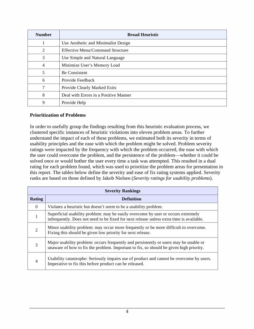
Number Broad Heuristic
1 Use Aesthetic and Minimalist Design
2 Effective Menu/Command Structure
3 Use Simple and Natural Language
4 Minimize User’s Memory Load
5 Be Consistent
6 Provide Feedback
7 Provide Clearly Marked Exits
8 Deal with Errors in a Positive Manner
9 Provide Help
Prioritization of Problems
In order to usefully group the findings resulting from this heuristic evaluation process, we
clustered specific instances of heuristic violations into eleven problem areas. To further
understand the impact of each of these problems, we estimated both its severity in terms of
usability principles and the ease with which the problem might be solved. Problem severity
ratings were impacted by the frequency with which the problem occurred, the ease with which
the user could overcome the problem, and the persistence of the problem—whether it could be
solved once or would bother the user every time a task was attempted. This resulted in a dual
rating for each problem found, which was used to prioritize the problem areas for presentation in
this report. The tables below define the severity and ease of fix rating systems applied. Severity
ranks are based on those defined by Jakob Nielsen (Severity ratings for usability problems).
Severity Rankings
Rating Definition
0 Violates a heuristic but doesn’t seem to be a usability problem.
1 Superficial usability problem: may be easily overcome by user or occurs extremely
infrequently. Does not need to be fixed for next release unless extra time is available.
2 Minor usability problem: may occur more frequently or be more difficult to overcome.
Fixing this should be given low priority for next release.
3 Major usability problem: occurs frequently and persistently or users may be unable or
unaware of how to fix the problem. Important to fix, so should be given high priority.
4 Usability catastrophe: Seriously impairs use of product and cannot be overcome by users.
Imperative to fix this before product can be released.
5
Ease of Fixing Rankings
Rating Definition
0 Problem would be extremely easy to fix. Could be completed by one team member before
next release.
1 Problem would be easy to fix. Involves specific interface elements and solution is clear.
2
Problem would require some effort to fix. Involves multiple aspects of the interface or
would require team of developers to implement changes before next release or solution is
not clear.
3
Usability problem would be difficult to fix. Requires concentrated development effort to
finish before next release, involves multiple aspects of interface. Solution may not be
immediately obvious or may be disputed.
6
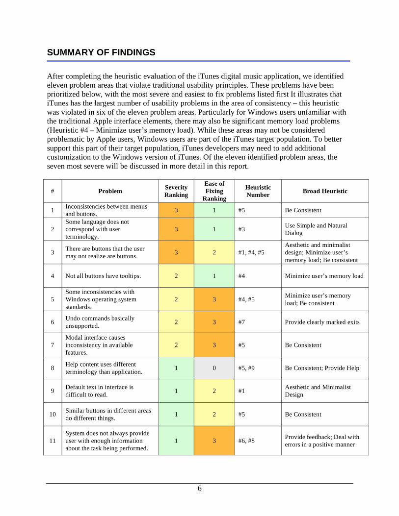
SUMMARY OF FINDINGS
After completing the heuristic evaluation of the iTunes digital music application, we identified
eleven problem areas that violate traditional usability principles. These problems have been
prioritized below, with the most severe and easiest to fix problems listed first It illustrates that
iTunes has the largest number of usability problems in the area of consistency – this heuristic
was violated in six of the eleven problem areas. Particularly for Windows users unfamiliar with
the traditional Apple interface elements, there may also be significant memory load problems
(Heuristic #4 – Minimize user’s memory load). While these areas may not be considered
problematic by Apple users, Windows users are part of the iTunes target population. To better
support this part of their target population, iTunes developers may need to add additional
customization to the Windows version of iTunes. Of the eleven identified problem areas, the
seven most severe will be discussed in more detail in this report.
# Problem Severity
Ranking
Ease of
Fixing
Ranking
Heuristic
Number Broad Heuristic
1 Inconsistencies between menus
and buttons. 3 1 #5 Be Consistent
2
Some language does not
correspond with user
terminology.
3 1 #3 Use Simple and Natural
Dialog
3 There are buttons that the user
may not realize are buttons. 3 2 #1, #4, #5
Aesthetic and minimalist
design; Minimize user’s
memory load; Be consistent
4 Not all buttons have tooltips. 2 1 #4 Minimize user’s memory load
5
Some inconsistencies with
Windows operating system
standards.
2 3 #4, #5 Minimize user’s memory
load; Be consistent
6 Undo commands basically
unsupported. 2 3 #7 Provide clearly marked exits
7
Modal interface causes
inconsistency in available
features.
2 3 #5 Be Consistent
8 Help content uses different
terminology than application. 1 0 #5, #9 Be Consistent; Provide Help
9 Default text in interface is
difficult to read. 1 2 #1
Aesthetic and Minimalist
Design
10 Similar buttons in different areas
do different things. 1 2 #5 Be Consistent
11
System does not always provide
user with enough information
about the task being performed.
1 3 #6, #8 Provide feedback; Deal with
errors in a positive manner
7
SPECIFIC PROBLEM AREAS
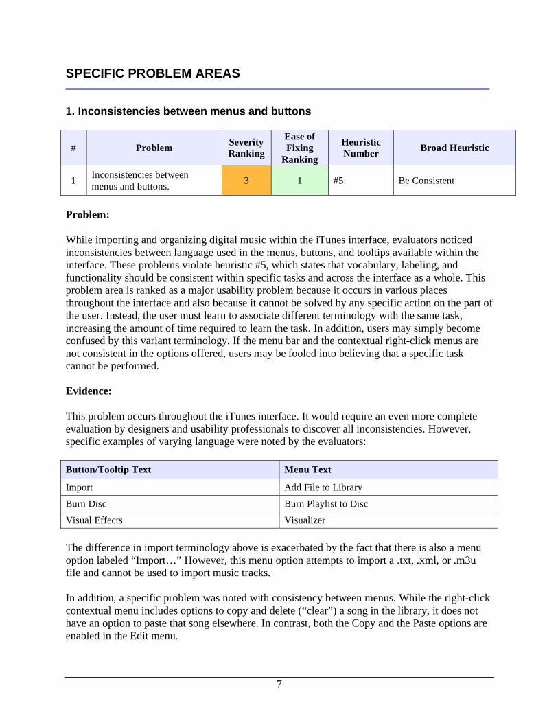
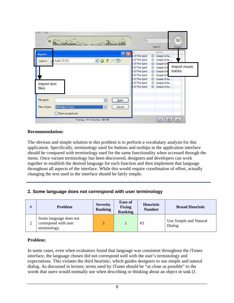
1. Inconsistencies between menus and buttons
# Problem Severity
Ranking
Ease of
Fixing
Ranking
Heuristic
Number Broad Heuristic
1 Inconsistencies between
menus and buttons. 3 1 #5 Be Consistent
Problem:
While importing and organizing digital music within the iTunes interface, evaluators noticed
inconsistencies between language used in the menus, buttons, and tooltips available within the
interface. These problems violate heuristic #5, which states that vocabulary, labeling, and
functionality should be consistent within specific tasks and across the interface as a whole. This
problem area is ranked as a major usability problem because it occurs in various places
throughout the interface and also because it cannot be solved by any specific action on the part of
the user. Instead, the user must learn to associate different terminology with the same task,
increasing the amount of time required to learn the task. In addition, users may simply become
confused by this variant terminology. If the menu bar and the contextual right-click menus are
not consistent in the options offered, users may be fooled into believing that a specific task
cannot be performed.
Evidence:
This problem occurs throughout the iTunes interface. It would require an even more complete
evaluation by designers and usability professionals to discover all inconsistencies. However,
specific examples of varying language were noted by the evaluators:
Button/Tooltip Text Menu Text
Import Add File to Library
Burn Disc Burn Playlist to Disc
Visual Effects Visualizer
The difference in import terminology above is exacerbated by the fact that there is also a menu
option labeled “Import…” However, this menu option attempts to import a .txt, .xml, or .m3u
file and cannot be used to import music tracks.
In addition, a specific problem was noted with consistency between menus. While the right-click
contextual menu includes options to copy and delete (“clear”) a song in the library, it does not
have an option to paste that song elsewhere. In contrast, both the Copy and the Paste options are
enabled in the Edit menu.
8
Recommendation:
The obvious and simple solution to this problem is to perform a vocabulary analysis for this
application. Specifically, terminology used for buttons and tooltips in the application interface
should be compared with terminology used for the same functionality when accessed through the
menu. Once variant terminology has been discovered, designers and developers can work
together to establish the desired language for each function and then implement that language
throughout all aspects of the interface. While this would require coordination of effort, actually
changing the text used in the interface should be fairly simple.
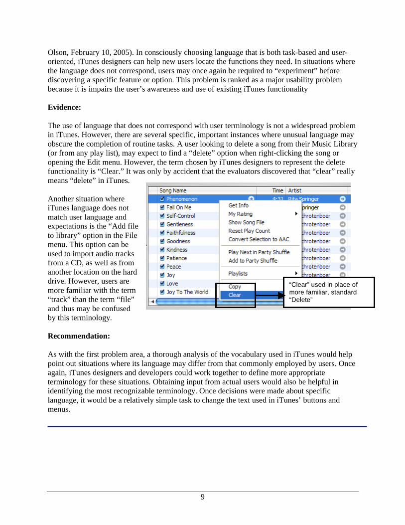
2. Some language does not correspond with user terminology
# Problem Severity
Ranking
Ease of
Fixing
Ranking
Heuristic
Number Broad Heuristic
2
Some language does not
correspond with user
terminology.
3 1 #3 Use Simple and Natural
Dialog
Problem:
In some cases, even when evaluators found that language was consistent throughout the iTunes
interface, the language chosen did not correspond well with the user’s terminology and
expectations. This violates the third heuristic, which guides designers to use simple and natural
dialog. As discussed in lecture, terms used by iTunes should be “as close as possible” to the
words that users would normally use when describing or thinking about an object or task (J.
Import music tracks
Import text files
9
“Clear” used in place of more familiar, standard “Delete”
Olson, February 10, 2005). In consciously choosing language that is both task-based and user-
oriented, iTunes designers can help new users locate the functions they need. In situations where
the language does not correspond, users may once again be required to “experiment” before
discovering a specific feature or option. This problem is ranked as a major usability problem
because it is impairs the user’s awareness and use of existing iTunes functionality
Evidence:
The use of language that does not correspond with user terminology is not a widespread problem
in iTunes. However, there are several specific, important instances where unusual language may
obscure the completion of routine tasks. A user looking to delete a song from their Music Library
(or from any play list), may expect to find a “delete” option when right-clicking the song or
opening the Edit menu. However, the term chosen by iTunes designers to represent the delete
functionality is “Clear.” It was only by accident that the evaluators discovered that “clear” really
means “delete” in iTunes.
Another situation where
iTunes language does not
match user language and
expectations is the “Add file
to library” option in the File
menu. This option can be
used to import audio tracks
from a CD, as well as from
another location on the hard
drive. However, users are
more familiar with the term
“track” than the term “file”
and thus may be confused
by this terminology.
Recommendation:
As with the first problem area, a thorough analysis of the vocabulary used in iTunes would help
point out situations where its language may differ from that commonly employed by users. Once
again, iTunes designers and developers could work together to define more appropriate
terminology for these situations. Obtaining input from actual users would also be helpful in
identifying the most recognizable terminology. Once decisions were made about specific
language, it would be a relatively simple task to change the text used in iTunes’ buttons and
menus.
10
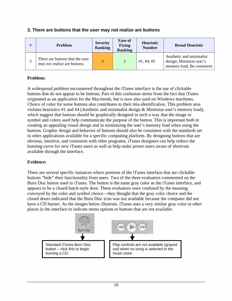
3. There are buttons that the user may not realize are buttons
# Problem Severity
Ranking
Ease of
Fixing
Ranking
Heuristic
Number Broad Heuristic
3 There are buttons that the user
may not realize are buttons. 3 2 #1, #4, #5
Aesthetic and minimalist
design; Minimize user’s
memory load; Be consistent
Problem:
A widespread problem encountered throughout the iTunes interface is the use of clickable
buttons that do not appear to be buttons. Part of this confusion stems from the fact that iTunes
originated as an application for the Macintosh, but is now also used on Windows machines.
Choice of color for some buttons also contributes to their mis-identification. This problem area
violates heuristics #1 and #4 (Aesthetic and minimalist design & Minimize user’s memory load),
which suggest that buttons should be graphically designed in such a way that the image or
symbol and colors used help communicate the purpose of the button. This is important both in
creating an appealing visual design and in minimizing the user’s memory load when using the
buttons. Graphic design and behavior of buttons should also be consistent with the standards set
in other applications available for a specific computing platform. By designing buttons that are
obvious, intuitive, and consistent with other programs, iTunes designers can help reduce the
learning curve for new iTunes users as well as help make power users aware of shortcuts
available through the interface.
Evidence:
There are several specific instances where portions of the iTunes interface that are clickable
buttons “hide” their functionality from users. Two of the three evaluators commented on the
Burn Disc button used in iTunes. The button is the same gray color as the iTunes interface, and
appears to be a closed hatch-style door. These evaluators were confused by the meaning
conveyed by the color and symbol choice—they thought that the gray color choice and the
closed doors indicated that the Burn Disc icon was not available because the computer did not
have a CD burner. As the images below illustrate, iTunes uses a very similar gray color in other
places in the interface to indicate menu options or buttons that are not available.
Standard iTunes Burn Disc button – click this to begin burning a CD.
Play controls are not available (grayed out) when no song is selected in the music store.
11
iTunes also makes use of a number of small, round, clickable buttons in the interface. Many of
these buttons are gray, which once again suggests to users that they may not be enabled. In
addition, unlike other Windows applications, these buttons do not change upon mouse-over.
Therefore, the user has no hint that they are actually buttons unless he or she actually clicks on
one to see what will happen.
Recommendation:
Solving this problem poses a more difficult design challenge in part because it would likely be
difficult to find a solution acceptable to all interested parties. The conscious choice to make the
iTunes interface as simple as possible meshes well with the use of small, simple buttons.
However, a change in button color might help the clickable areas of the iTunes interface stand
out from its gray background. In addition, it would also be helpful to highlight or change the
color of the button when the user moves the mouse over it. This technique is used in many
Windows applications to indicate to the user that a specific image or symbol is actually a
clickable button.
4. Not all buttons have tooltips
# Problem Severity
Ranking
Ease of
Fixing
Ranking
Heuristic
Number Broad Heuristic
4 Not all buttons have tooltips. 2 1 #4 Minimize user’s memory
load
Problem:
The use of tooltips that appear when a user moves the mouse over a button has become a
common practice in many graphical applications. These tooltips generally provide very succinct
descriptions of that button’s functionality in order to assist users in identifying the correct button
for the task at hand. Tooltips for small graphical buttons can also play the role of reducing the
user’s memory load, as do permanent labels on other buttons. With tooltips, a user does not have
to remember exactly what each button does—they are can look it up almost instantaneously.
More examples of buttons that do not look like traditional buttons and do not change on mouse-over.
12
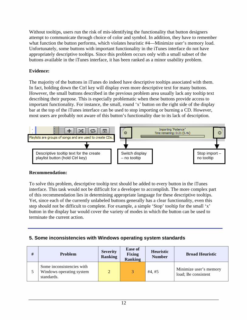
Without tooltips, users run the risk of mis-identifying the functionality that button designers
attempt to communicate through choice of color and symbol. In addition, they have to remember
what function the button performs, which violates heuristic #4—Minimize user’s memory load.
Unfortunately, some buttons with important functionality in the iTunes interface do not have
appropriately descriptive tooltips. Since this problem occurs only with a small subset of the
buttons available in the iTunes interface, it has been ranked as a minor usability problem.
Evidence:
The majority of the buttons in iTunes do indeed have descriptive tooltips associated with them.
In fact, holding down the Ctrl key will display even more descriptive text for many buttons.
However, the small buttons described in the previous problem area usually lack any tooltip text
describing their purpose. This is especially problematic when these buttons provide access to
important functionality. For instance, the small, round ‘x’ button on the right side of the display
bar at the top of the iTunes interface can be used to stop importing or burning a CD. However,
most users are probably not aware of this button’s functionality due to its lack of description.
Recommendation:
To solve this problem, descriptive tooltip text should be added to every button in the iTunes
interface. This task would not be difficult for a developer to accomplish. The more complex part
of this recommendation lies in determining appropriate language for these descriptive tooltips.
Yet, since each of the currently unlabeled buttons generally has a clear functionality, even this
step should not be difficult to complete. For example, a simple ‘Stop’ tooltip for the small ‘x’
button in the display bar would cover the variety of modes in which the button can be used to
terminate the current action.
5. Some inconsistencies with Windows operating system standards
# Problem Severity
Ranking
Ease of
Fixing
Ranking
Heuristic
Number Broad Heuristic
5
Some inconsistencies with
Windows operating system
standards.
2 3 #4, #5 Minimize user’s memory
load; Be consistent
Descriptive tooltip text for the create playlist button (hold Ctrl key)
Switch display – no tooltip
Stop import – no tooltip
13
Problem:
Another issue observed by the evaluators was the challenges presented by maintaining an
application for two computing platforms (Windows and Macintosh) that have different design
standards. The Microsoft Windows version of iTunes was used in this heuristic evaluation. Two
of the evaluators use Windows as their primary computing platform while the third prefers to use
a Macintosh. Thus, we were suited to evaluate aspects of the iTunes interface that were standard
for Macintosh users but unfamiliar to Windows users. By maintaining consistency with standards
used throughout an operating system, iTunes designers can minimize the user’s need to
remember application-specific methods to perform common tasks (Heuristic #4—Minimize
user’s memory load & Heuristic #5—Be consistent) . This usability problem was ranked as
minor because it occurred infrequently during the heuristic evaluation and did not seriously
impair overall use of the iTunes interface.
Evidence:
In general, the iTunes interface has the look and feel of a Macintosh application, rather than a
Windows application. In most situations, this look and feel does not prevent Windows users from
accomplishing desired tasks. However, there are a few (at least) specific instances where more
thorough integration of Windows standards would be helpful to Windows users and would not
require a significant change in the overall look and feel of the application.
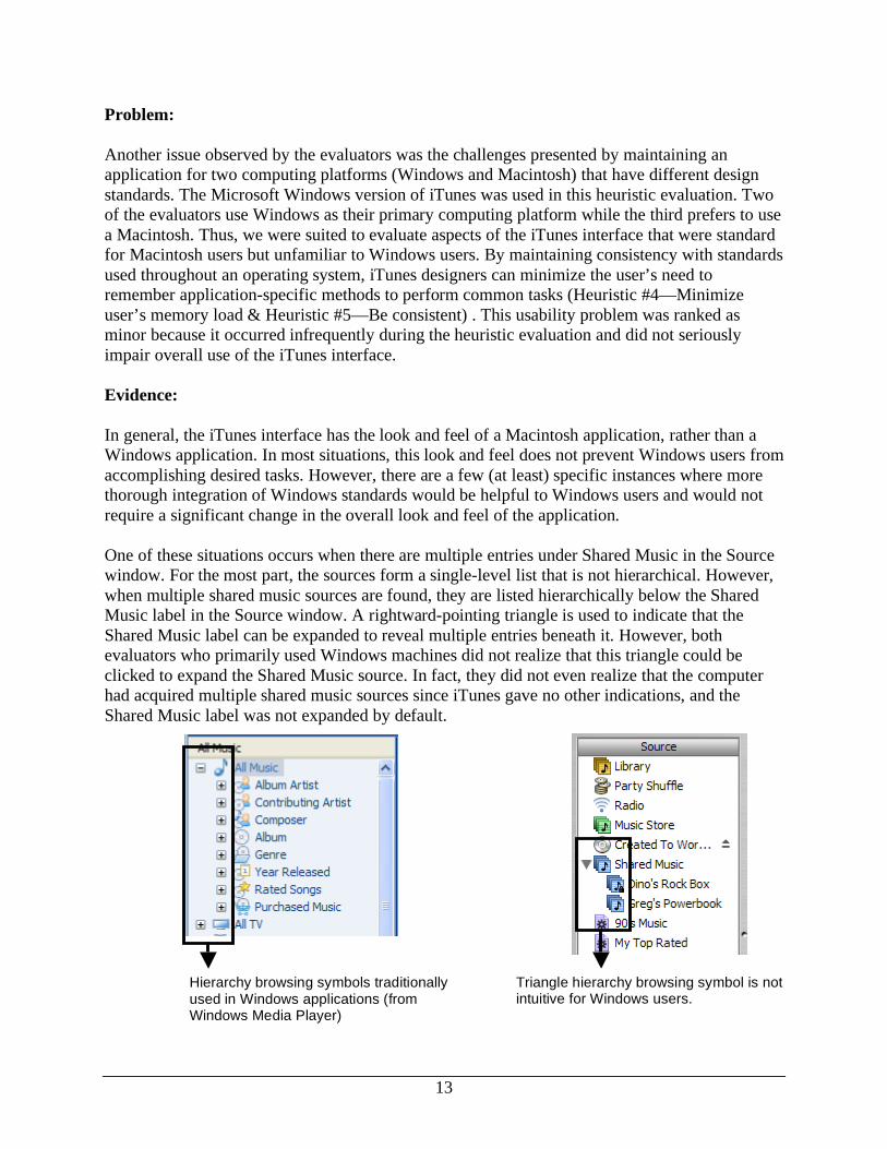
One of these situations occurs when there are multiple entries under Shared Music in the Source
window. For the most part, the sources form a single-level list that is not hierarchical. However,
when multiple shared music sources are found, they are listed hierarchically below the Shared
Music label in the Source window. A rightward-pointing triangle is used to indicate that the
Shared Music label can be expanded to reveal multiple entries beneath it. However, both
evaluators who primarily used Windows machines did not realize that this triangle could be
clicked to expand the Shared Music source. In fact, they did not even realize that the computer
had acquired multiple shared music sources since iTunes gave no other indications, and the
Shared Music label was not expanded by default.
Hierarchy browsing symbols traditionally used in Windows applications (from Windows Media Player)
Triangle hierarchy browsing symbol is not intuitive for Windows users.
14
Recommendation:
For the Windows version of iTunes, the more standardized ‘+’ and ‘-‘ hierarchy browsing
symbols could be used to indicate sub-levels within the Source list. However, we also
recommend that a deeper solution would be for iTunes designers to complete a full inventory of
the iTunes interface to discover other elements that prove extremely unintuitive for the Windows
users in their target population and could easily be adjusted for the Windows version of iTunes.
It would be simple for iTunes developers to replace the Macintosh-oriented symbol for browsing
hierarchies with the Windows-oriented symbols. However, this problem is rated as requiring
some effort to fix because the implementation of this recommendation throughout the entire
interface would require much negotiation as to which aspects should be and could be changed
without altering the overall look and feel of the application.
6. Undo commands basically unsupported
# Problem Severity
Ranking
Ease of
Fixing
Ranking
Heuristic
Number Broad Heuristic
6 Undo commands basically
unsupported. 2 3 #7
Provide clearly marked
exits
Problem:
As a rule, general computer users are accustomed to being able to back out of a change or
mistake they make by selecting UNDO. This command can be found in almost every computer
application. Unfortunately the UNDO command has limited support for undoing user actions in
iTunes. Furthermore, where it is supported it exhibits quirky behavior. This violates the seventh
heuristic, Provide clearly marked exits, which emphasizes that users should be able to undo or
back out of unwanted system states easily. The problem is ranked as minor since the changes and
mistakes are easy enough to overcome, but could be simplified more.
Evidence:
Supported and Quirky: While UNDO is supported during the editing of the ID3 tag information
either directly in the interface or via the song info window, it has some apparent issues. When
editing tag information in-line in the interface, UNDO is only available while you have a tag
highlighted and are actively editing it. Once a change is made the UNDO command is grayed out
and it is impossible to back out of the change made without re-editing the tag, which requires
that the user remember its initial state. In the song info dialog box, the same basic behavior
exists, though with a quirky twist. A user can UNDO a change made while in the field just
edited. Moving to another field and attempting to UNDO the change results in the first letter of
the field in which the cursor resides being replaced with a space while the change made in the
15
previous field remains. If UNDO is again selected, the cursor moves to the start of the field.
Another attempt to UNDO will not work because it is grayed out at that point. Moving back to
the changed field the user again has the opportunity to UNDO, and doing so will indeed undo the
change made. At this point UNDO remains active and will result in replacing the first character
of the field with a space.
Unsupported: When a song is deleted from a playlist the action cannot be undone since UNDO
remains grayed out. The only way to recover from the song deletion is to re-import the song into
the library. In addition when the song order is rearranged in a playlist it cannot be undone via the
UNDO command.
Recommendation:
One obvious and simple solution to the tag editing problem would be to only enable the UNDO
command when changes to a tag are made and not allow UNDO to change a field that hadn’t
already been changed by the user. In addition, undo support for backing out of modifications
made to a play list, either through deletion or reordering, should be enabled. The ability for a
user to recover from accidentally deleting a song without having to re-import it would greatly
enhance the user experience.
7. Modal interface causes inconsistency in available features
# Problem Severity
Ranking
Ease of
Fixing
Ranking
Heuristic
Number Broad Heuristic
7
Modal interface causes
inconsistency in available
features.
2 3 #5 Be Consistent
Problem:
To maintain complete consistency throughout an interface, “the same information should be
presented in the same location on all screens and dialog boxes and it should be formatted in the
same way” (Nielsen, 1993, p. 132). In addition, usability principles recommend avoiding
“modes” in application interfaces which permit access to different functionality according to the
current mode. An example of this problem given in class is the Print Preview mode of Microsoft
Windows which does not allow the user to actually edit the document he or she is previewing.
In some ways, iTunes also presents a modal interface to users. The functionality available in the
interface changes based on the currently selected music source. This violates the fifth heuristic,
which counsels designers to maintain complete consistency throughout the interface. In many
instances, a change in Source hides available functionality by making it available only from the
menu. In other instances, interface tools are available on an inconsistent basis between different
source modes. In general, buttons seem to change based on the currently selected Source. This
usability problem is ranked as minor primarily because it is unclear whether its manifestation in
16
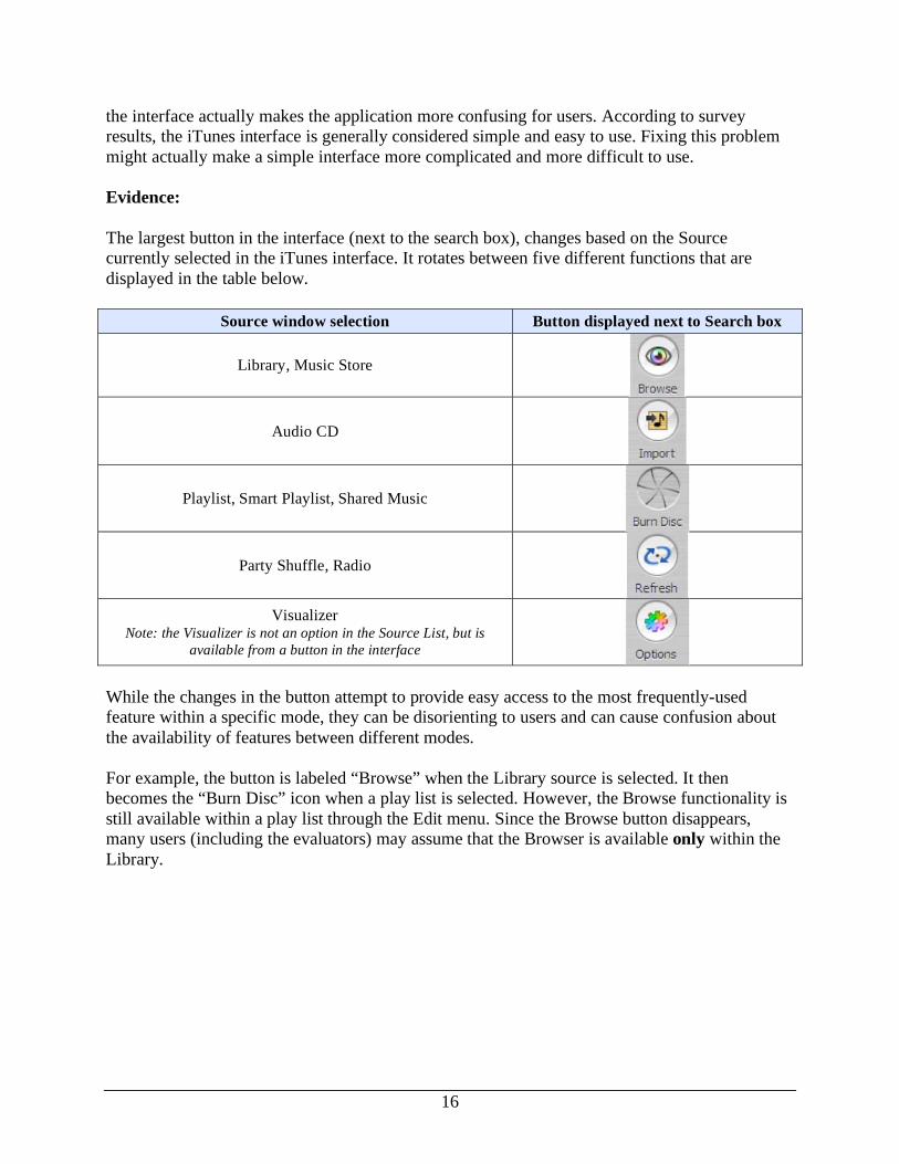
the interface actually makes the application more confusing for users. According to survey
results, the iTunes interface is generally considered simple and easy to use. Fixing this problem
might actually make a simple interface more complicated and more difficult to use.
Evidence:
The largest button in the interface (next to the search box), changes based on the Source
currently selected in the iTunes interface. It rotates between five different functions that are
displayed in the table below.
Source window selection Button displayed next to Search box
Library, Music Store
Audio CD
Playlist, Smart Playlist, Shared Music
Party Shuffle, Radio
Visualizer Note: the Visualizer is not an option in the Source List, but is
available from a button in the interface
While the changes in the button attempt to provide easy access to the most frequently-used
feature within a specific mode, they can be disorienting to users and can cause confusion about
the availability of features between different modes.
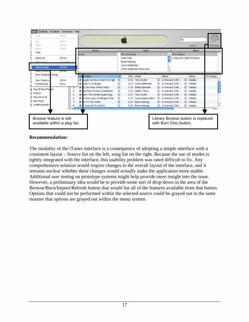
For example, the button is labeled “Browse” when the Library source is selected. It then
becomes the “Burn Disc” icon when a play list is selected. However, the Browse functionality is
still available within a play list through the Edit menu. Since the Browse button disappears,
many users (including the evaluators) may assume that the Browser is available only within the
Library.
17
Recommendation:
The modality of the iTunes interface is a consequence of adopting a simple interface with a
consistent layout – Source list on the left, song list on the right. Because the use of modes is
tightly integrated with the interface, this usability problem was rated difficult to fix. Any
comprehensive solution would require changes to the overall layout of the interface, and it
remains unclear whether these changes would actually make the application more usable.
Additional user testing on prototype systems might help provide more insight into the issue.
However, a preliminary idea would be to provide some sort of drop-down in the area of the
Browse/Burn/Import/Refresh button that would list all of the features available from that button.
Options that could not be performed within the selected source could be grayed out in the same
manner that options are grayed out within the menu system.
Browse feature is still available within a play list.
Library Browse button is replaced with Burn Disc button.
18
SUMMARY
While Apple’s iTunes digital music application is generally considered easy to use, a detailed
heuristic evaluation based on nine general usability principles revealed a number of specific
usability problems. These specific usability problems were clustered into eleven general problem
areas and ranked according to severity and the ease with which they could be fixed. The seven
most severe problem areas were addressed in more detail in this report, providing information
about the general problem, some specific examples, and a high-level recommendation for solving
the problem.
The seven most severe and easiest to fix problems are:
1. Inconsistencies between menus and buttons
2. Some language does not correspond with user terminology
3. There are buttons that the user may not realize are buttons
4. Not all buttons have tooltips
5. Some inconsistencies with Windows operating standards
6. Undo commands basically unsupported
7. Modal interface causes inconsistency in available features
By investigating these problem areas in more depth and implementing user-centered solutions,
iTunes designers will be able to make an already well-designed product even easier to use.
RESOURCES
Greenberg, S. (n.d.). Design Principles and Usability Heuristics. Accessed February 23, 2005, at
http://pages.cpsc.ucalgary.ca/~saul/hci_topics/pdf_files/heuristics.pdf
Nielsen, J. (1993). “Usability Heuristics.” In Usability Engineering. San Diego, CA: Academic
Press.
Nielsen, J. (n.d.). How to Conduct a Heuristic Evaluation. Accessed February 9, 2005, at
http://www.useit.com/papers/heuristic/heuristic_evaluation.html
Nielsen, J. (n.d.) Severity Rankings for Usability Problems. Access February 22, 2005, from
http://www.useit.com/papers/heuristic/severityrating.html
Nielsen, J. (n.d.). Ten Usability Heuristics. Accessed February 9, 2005, at
http://www.useit.com/papers/heuristic/heuristic_list.html
Olson, J. (2005, February 10). Quick Methods: Checklists, Heuristic Evaluation, Cognitive
Walkthrough. Slides presented in a lecture at University of Michigan School of
Information, Ann Arbor, MI.
19
APPENDIX A: DETAILED HEURISTIC LIST
1. Use Aesthetic and Minimalist Design
• Less is more – less information/less complex structure is easier to understand.
• Extraneous information risks confusing the novice user and slows down the expert
user.
• Text size, font, and spacing allow the user to read the font.
• Color is used to highlight current area of work or group functionally related items.
• Screen layout uses gestalt rules for human perception to increase users’ understanding
of relationships between the dialogue elements.
2. Effective Menu/Command Structure
• Frequently used commands are easily accessible.
• Related commands are grouped together.
• Experienced users have shortcuts to perform frequent operations quickly.
3. Use Simple and Natural Language
• Simplify and shorten text as much as possible.
• Use words, phrases, and concepts that are familiar to the user, rather than system-
oriented terms.
• Use words based on the task that the user is trying to accomplish.
4. Minimize User’s Memory Load
• Utilize recognition rather than recall.
• Make available tools/options visible to user (no scrolling required).
• Include appropriate labels so that users can easily locate desired buttons/menu options.
• Provide hover text over labeled/unlabelled buttons.
• Use a small number of pervasive rules or generic commands that apply throughout the
user interface.
5. Be Consistent
• Vocabulary/labeling should be consistent within tasks.
• The same function/label should do the same thing everywhere throughout the
application.
• Same information should be presented in the same location and formatted in the same
way on all screens and dialog boxes.
6. Provide Feedback
• Inform the user about what the system is doing.
• Show progress achieved toward goal, particularly if operation takes more than 10
seconds to complete.
• Notify user when a task is completed.
7. Provide Clearly Marked Exits
• Allow user to cancel a system function or leave and unwanted state easily.
20
• Include cancel buttons in dialog boxes.
• Support generic undo and redo commands throughout the system.
8. Deal with Errors in a Positive Manner
• Error messages indicate specific problem in plain language.
• Error messages suggest a solution to help user solve the problem.
9. Provide Help
• Easy to search for solutions to specific problems.
• Help content is written in a task-oriented fashion.
• Each help section is as self-contained as possible.


