Embed Size (px)
Citation preview
53
Looking at Chinese Calligraphy: The Anxiety of Anonymity and Calligraphy from the Periphery
Amy McNair
The appreciation of calligraphy goes back at least two thousand years in China and, quite likely, much farther than that. Although critical texts discussing
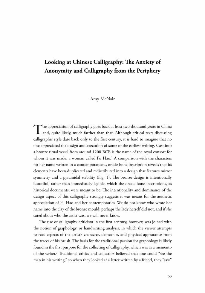
calligraphic style date back only to the first century, it is hard to imagine that no one appreciated the design and execution of some of the earliest writing. Cast into a bronze ritual vessel from around 1200 BCE is the name of the royal consort for whom it was made, a woman called Fu Hao.1 A comparison with the characters for her name written in a contemporaneous oracle bone inscription reveals that its elements have been duplicated and redistributed into a design that features mirror symmetry and a pyramidal stability (Fig. 1). The bronze design is intentionally beautiful, rather than immediately legible, which the oracle bone inscriptions, as historical documents, were meant to be. The intentionality and dominance of the design aspect of this calligraphy strongly suggests it was meant for the aesthetic appreciation of Fu Hao and her contemporaries. We do not know who wrote her name into the clay of the bronze mould; perhaps the lady herself did not, and if she cared about who the artist was, we will never know.
The rise of calligraphy criticism in the first century, however, was joined with the notion of graphology, or handwriting analysis, in which the viewer attempts to read aspects of the artist’s character, demeanor, and physical appearance from the traces of his brush. The basis for the traditional passion for graphology is likely found in the first purpose for the collecting of calligraphy, which was as a memento of the writer.2 Traditional critics and collectors believed that one could “see the man in his writing,” so when they looked at a letter written by a friend, they “saw”
L O O K I N G A T A S I A N A R T
54
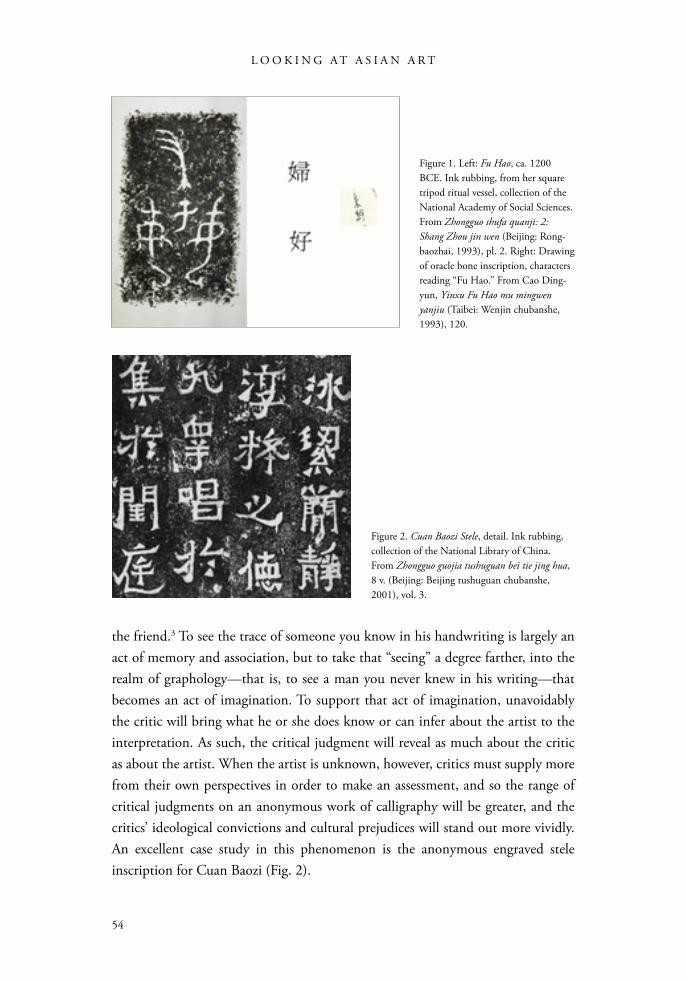
the friend.3 To see the trace of someone you know in his handwriting is largely an act of memory and association, but to take that “seeing” a degree farther, into the realm of graphology—that is, to see a man you never knew in his writing—that becomes an act of imagination. To support that act of imagination, unavoidably the critic will bring what he or she does know or can infer about the artist to the interpretation. As such, the critical judgment will reveal as much about the critic as about the artist. When the artist is unknown, however, critics must supply more from their own perspectives in order to make an assessment, and so the range of critical judgments on an anonymous work of calligraphy will be greater, and the critics’ ideological convictions and cultural prejudices will stand out more vividly. An excellent case study in this phenomenon is the anonymous engraved stele inscription for Cuan Baozi (Fig. 2).
Figure 1. Left: Fu Hao, ca. 1200 BCE. Ink rubbing, from her square tripod ritual vessel, collection of the National Academy of Social Sciences. From Zhongguo shufa quanji: 2: Shang Zhou jin wen (Beijing: Rong-baozhai, 1993), pl. 2. Right: Drawing of oracle bone inscription, characters reading “Fu Hao.” From Cao Ding-yun, Yinxu Fu Hao mu mingwen yanjiu (Taibei: Wenjin chubanshe, 1993), 120.
Figure 2. Cuan Baozi Stele, detail. Ink rubbing, collection of the National Library of China. From Zhongguo guojia tushuguan bei tie jing hua, 8 v. (Beijing: Beijing tushuguan chubanshe, 2001), vol. 3.
55
LO O K I N G AT C H I N E S E C A L L I G R A PH Y
After introducing the Cuan Baozi Stele, I will look closely at the formal qualities of the calligraphy. These should be examined as objectively as possible so that we can understand the various subjective interpretive strategies that have been brought to bear upon this work by twentieth-century scholars. Next, I will introduce some of the factors, having to do with the time and place in which this calligraphy was believed to have been written, that have made it open to various interpretations. Finally, having given the reader the range of information known to the scholars who have written about the Stele for Cuan Baozi, I will review some of their critical assessments. Hopefully this will allow us to understand how those scholars were informed by their convictions and motivations.
Figure 3. Map of China: Linguistic and ethnic diversity in China today.
L O O K I N G A T A S I A N A R T
56
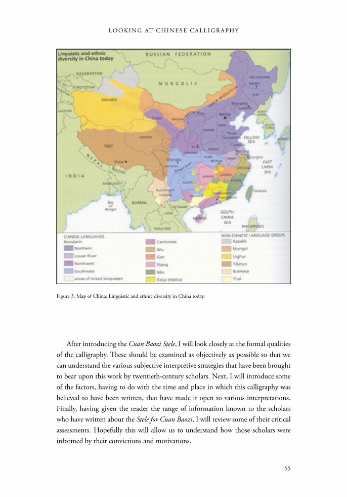
The inscription on the stele for Cuan Baozi is dated to the year 405, but the stone was lost to history until the year 1778, when it was excavated in the village of Yangqitian, 35 kilometers south of the modern city of Qujing, in Yunnan Province (Fig. 3). Yunnan Province is in far southwest China, bordering Myanmar, Laos, and Vietnam to the south and the Chinese provinces of Sichuan to the north and Guizhou to the east. Qujing is located northeast of Kunming, the modern capital of Yunnan. By 1852, when Deng Erheng arrived as governor of this area, the epigraphy studies movement had been under way among elite scholars throughout China for a few decades, so interest in early engraved inscriptions was considerable. Scholars of paleography and epigraphy were eager to collect and study any newly rediscovered work of calligraphy from antiquity, so travelers to Yunnan took ink rubbings from the stele to give as rare and elegant gifts to educated friends.4 They were soon followed by professional sellers of ink rubbings. One of their unscrupulous practices was to take several ink rubbings from a stone engraving and then to damage it, in order to drive up the value and price of their ink rubbings. Perhaps to ward off such an event, Deng Erheng had the stele moved into the city of Qujing and set up in the Temple to Zhuge Liang.5 He did this, he said, in order “to treasure this work for the people of this county.”6 In the twentieth century, the Temple to Zhuge Liang was converted into the No. 1 Middle School, and in 1961, the stele and the pavilion it stands in were designated an Important National Cultural Relic Protection unit.
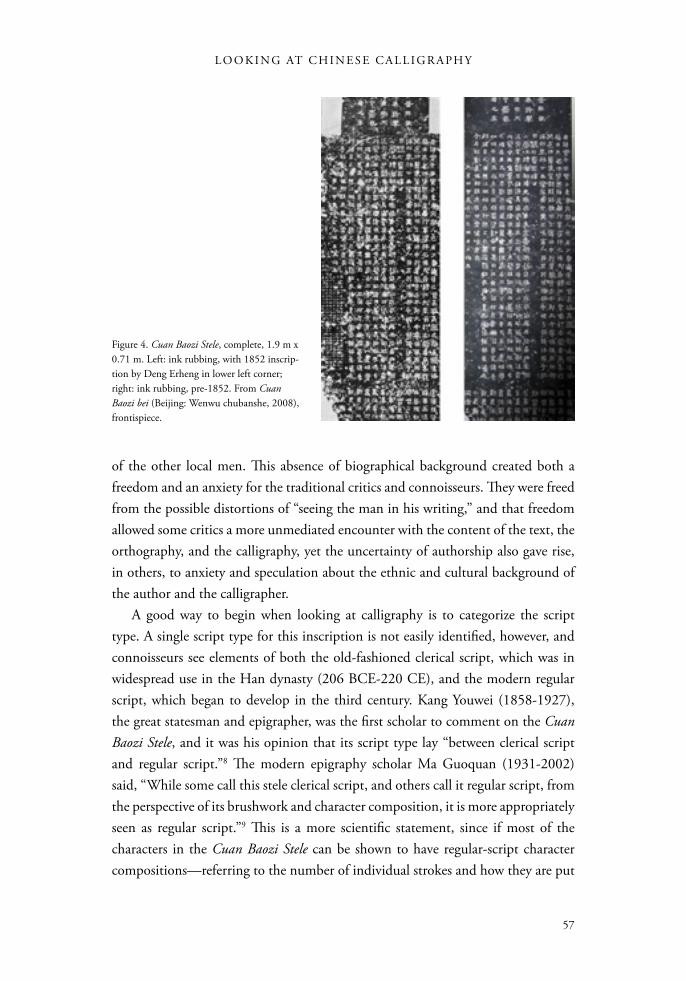
The inscription has several parts, so we will look at them in the order in which they were intended to be read (Fig. 4). At the top is the heading, in larger characters, which reads: “Tomb of Commandery Governor Cuan, the late Awe-inspiring General and Governor of Jianning of the Jin Dynasty.” Below this is the body of the text, which is a eulogy for the deceased, Cuan Baozi, who died at the age of twenty-three. The first section on the right is a biographical statement, written in the highly stylized “parallel prose,” which contains the scant facts about the brief life of Cuan Baozi. This is followed to the left by a much longer eulogy in four-character lines of poetry, which extols his personality and character. On the extreme left edge, the line at the end gives the date as the fourth year of the Daheng era, which may be interpreted as the year 405.7 Lastly, at the bottom of the stele are the names of thirteen local men, who have official titles and who may have been responsible for the setting up of this stele.
What is absent that would typically appear on such a monument is the name of the author and of the calligrapher. In other words, this is an anonymous work of art. Further, there is no other historical record concerning Cuan Baozi or any
57
LO O K I N G AT C H I N E S E C A L L I G R A PH Y
of the other local men. This absence of biographical background created both a freedom and an anxiety for the traditional critics and connoisseurs. They were freed from the possible distortions of “seeing the man in his writing,” and that freedom allowed some critics a more unmediated encounter with the content of the text, the orthography, and the calligraphy, yet the uncertainty of authorship also gave rise, in others, to anxiety and speculation about the ethnic and cultural background of the author and the calligrapher.
A good way to begin when looking at calligraphy is to categorize the script type. A single script type for this inscription is not easily identified, however, and connoisseurs see elements of both the old-fashioned clerical script, which was in widespread use in the Han dynasty (206 BCE-220 CE), and the modern regular script, which began to develop in the third century. Kang Youwei (1858-1927), the great statesman and epigrapher, was the first scholar to comment on the Cuan Baozi Stele, and it was his opinion that its script type lay “between clerical script and regular script.”8 The modern epigraphy scholar Ma Guoquan (1931-2002) said, “While some call this stele clerical script, and others call it regular script, from the perspective of its brushwork and character composition, it is more appropriately seen as regular script.”9 This is a more scientific statement, since if most of the characters in the Cuan Baozi Stele can be shown to have regular-script character compositions—referring to the number of individual strokes and how they are put
Figure 4. Cuan Baozi Stele, complete, 1.9 m x 0.71 m. Left: ink rubbing, with 1852 inscrip-tion by Deng Erheng in lower left corner; right: ink rubbing, pre-1852. From Cuan Baozi bei (Beijing: Wenwu chubanshe, 2008), frontispiece.
L O O K I N G A T A S I A N A R T
58
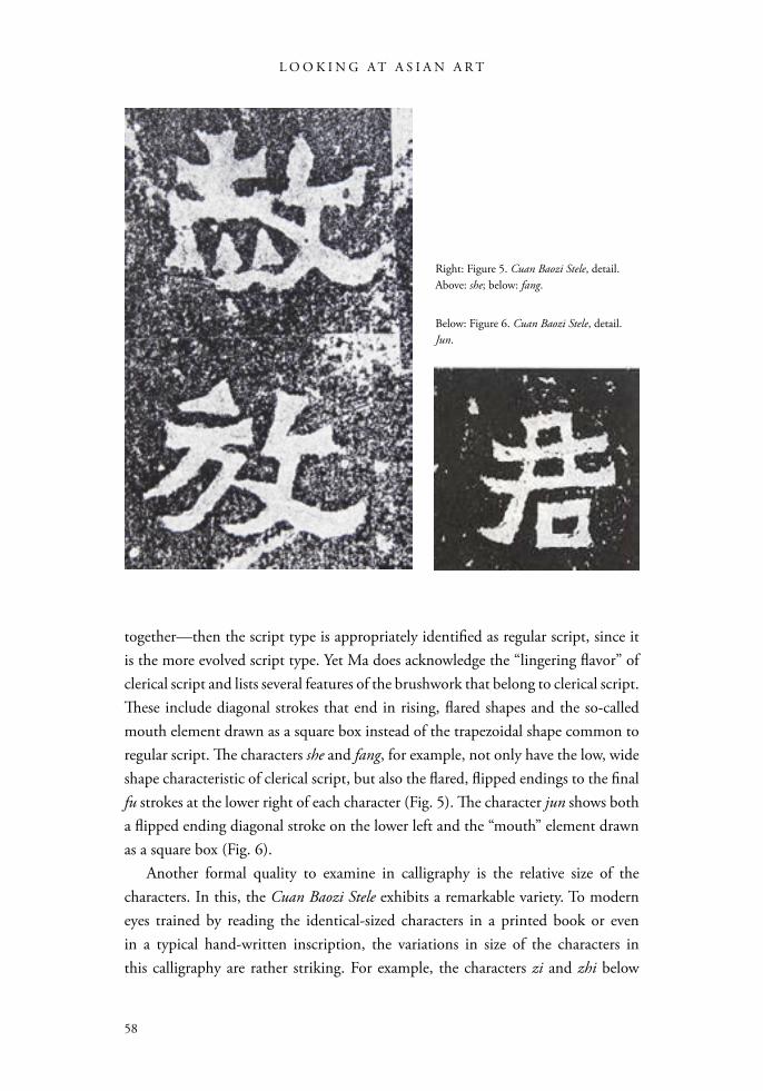
together—then the script type is appropriately identified as regular script, since it is the more evolved script type. Yet Ma does acknowledge the “lingering flavor” of clerical script and lists several features of the brushwork that belong to clerical script. These include diagonal strokes that end in rising, flared shapes and the so-called mouth element drawn as a square box instead of the trapezoidal shape common to regular script. The characters she and fang, for example, not only have the low, wide shape characteristic of clerical script, but also the flared, flipped endings to the final fu strokes at the lower right of each character (Fig. 5). The character jun shows both a flipped ending diagonal stroke on the lower left and the “mouth” element drawn as a square box (Fig. 6).
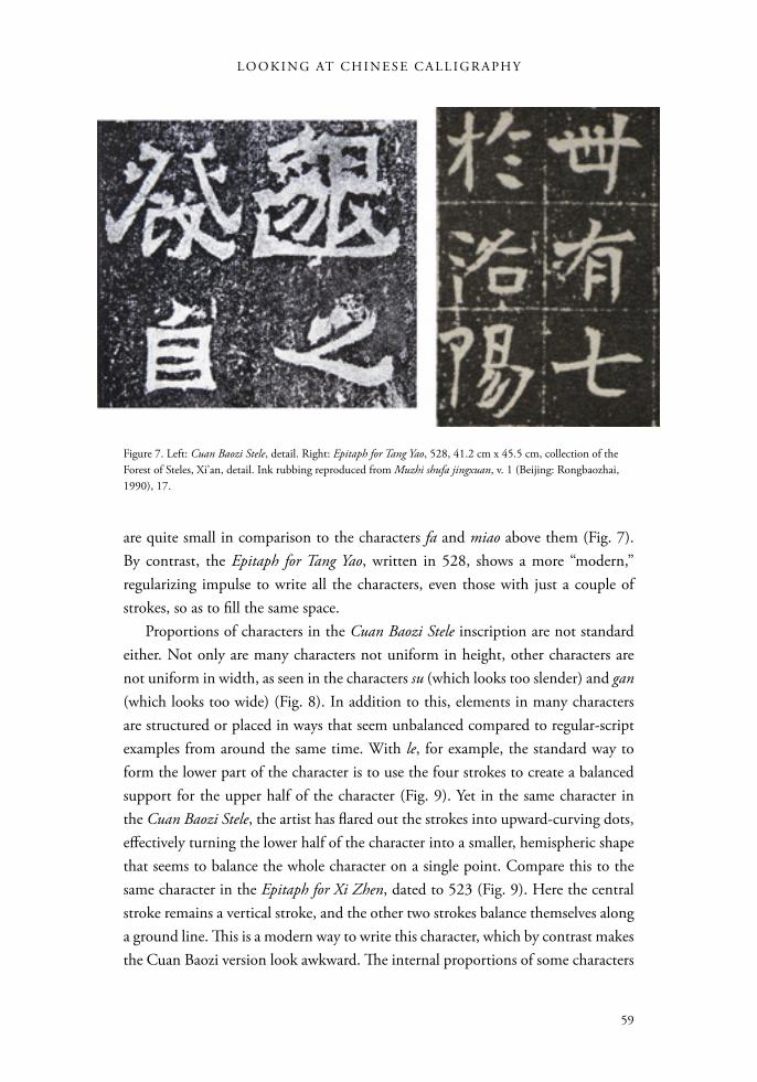
Another formal quality to examine in calligraphy is the relative size of the characters. In this, the Cuan Baozi Stele exhibits a remarkable variety. To modern eyes trained by reading the identical-sized characters in a printed book or even in a typical hand-written inscription, the variations in size of the characters in this calligraphy are rather striking. For example, the characters zi and zhi below
Right: Figure 5. Cuan Baozi Stele, detail. Above: she; below: fang.
Below: Figure 6. Cuan Baozi Stele, detail. Jun.
59
LO O K I N G AT C H I N E S E C A L L I G R A PH Y
are quite small in comparison to the characters fa and miao above them (Fig. 7). By contrast, the Epitaph for Tang Yao, written in 528, shows a more “modern,” regularizing impulse to write all the characters, even those with just a couple of strokes, so as to fill the same space.
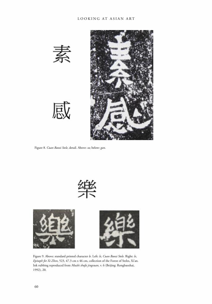
Proportions of characters in the Cuan Baozi Stele inscription are not standard either. Not only are many characters not uniform in height, other characters are not uniform in width, as seen in the characters su (which looks too slender) and gan (which looks too wide) (Fig. 8). In addition to this, elements in many characters are structured or placed in ways that seem unbalanced compared to regular-script examples from around the same time. With le, for example, the standard way to form the lower part of the character is to use the four strokes to create a balanced support for the upper half of the character (Fig. 9). Yet in the same character in the Cuan Baozi Stele, the artist has flared out the strokes into upward-curving dots, effectively turning the lower half of the character into a smaller, hemispheric shape that seems to balance the whole character on a single point. Compare this to the same character in the Epitaph for Xi Zhen, dated to 523 (Fig. 9). Here the central stroke remains a vertical stroke, and the other two strokes balance themselves along a ground line. This is a modern way to write this character, which by contrast makes the Cuan Baozi version look awkward. The internal proportions of some characters
Figure 7. Left: Cuan Baozi Stele, detail. Right: Epitaph for Tang Yao, 528, 41.2 cm x 45.5 cm, collection of the Forest of Steles, Xi’an, detail. Ink rubbing reproduced from Muzhi shufa jingxuan, v. 1 (Beijing: Rongbaozhai, 1990), 17.
L O O K I N G A T A S I A N A R T
60
Figure 8. Cuan Baozi Stele, detail. Above: su; below: gan.
Figure 9. Above: standard printed character le. Left: le, Cuan Baozi Stele. Right: le, Epitaph for Xi Zhen, 523, 47.3 cm x 46 cm, collection of the Forest of Steles, Xi’an. Ink rubbing reproduced from Muzhi shufa jingxuan, v. 6 (Beijing: Rongbaozhai, 1992), 20.
61
LO O K I N G AT C H I N E S E C A L L I G R A PH Y
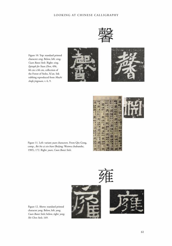
Figure 10. Top: standard printed character xing. Below, left: xing, Cuan Baozi Stele. Right: xing, Epitaph for Yuan Zhen, 496, 66 cm x 66 cm, collection of the Forest of Steles, Xi’an. Ink rubbing reproduced from Muzhi shufa jingxuan, v. 6, 9.
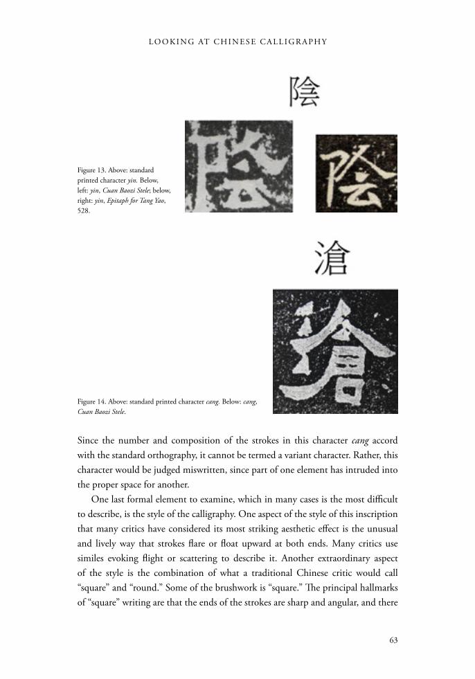
Figure 12. Above: standard printed character yong. Below, left: yong, Cuan Baozi Stele; below, right: yong, Shi Chen Stele, 169.
Figure 11. Left: variant yuan characters. From Qin Gong, comp., Bei bie zi xin bian (Beijing: Wenwu chubanshe, 1985), 172. Right: yuan, Cuan Baozi Stele.
L O O K I N G A T A S I A N A R T
62
are also nonstandard and unbalanced. In the character xing, for example, the artist has shifted the lower xiang element over to the left side of the character (Fig. 10). Compare this to how it is centered in the same character from the Epitaph for Yuan Zhen, done in 496. These kinds of structural imbalances have been interpreted by some critics as evidence of archaism, normally an attractive quality, while others find it rustic or provincial, which is less so.
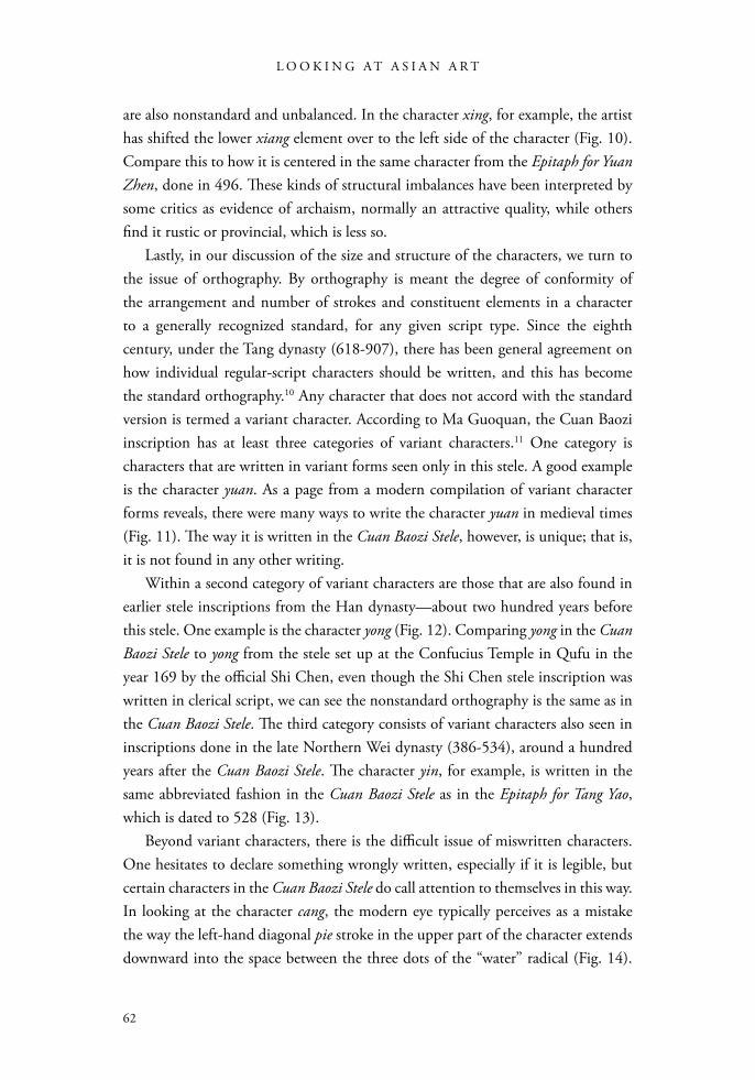
Lastly, in our discussion of the size and structure of the characters, we turn to the issue of orthography. By orthography is meant the degree of conformity of the arrangement and number of strokes and constituent elements in a character to a generally recognized standard, for any given script type. Since the eighth century, under the Tang dynasty (618-907), there has been general agreement on how individual regular-script characters should be written, and this has become the standard orthography.10 Any character that does not accord with the standard version is termed a variant character. According to Ma Guoquan, the Cuan Baozi inscription has at least three categories of variant characters.11 One category is characters that are written in variant forms seen only in this stele. A good example is the character yuan. As a page from a modern compilation of variant character forms reveals, there were many ways to write the character yuan in medieval times (Fig. 11). The way it is written in the Cuan Baozi Stele, however, is unique; that is, it is not found in any other writing.
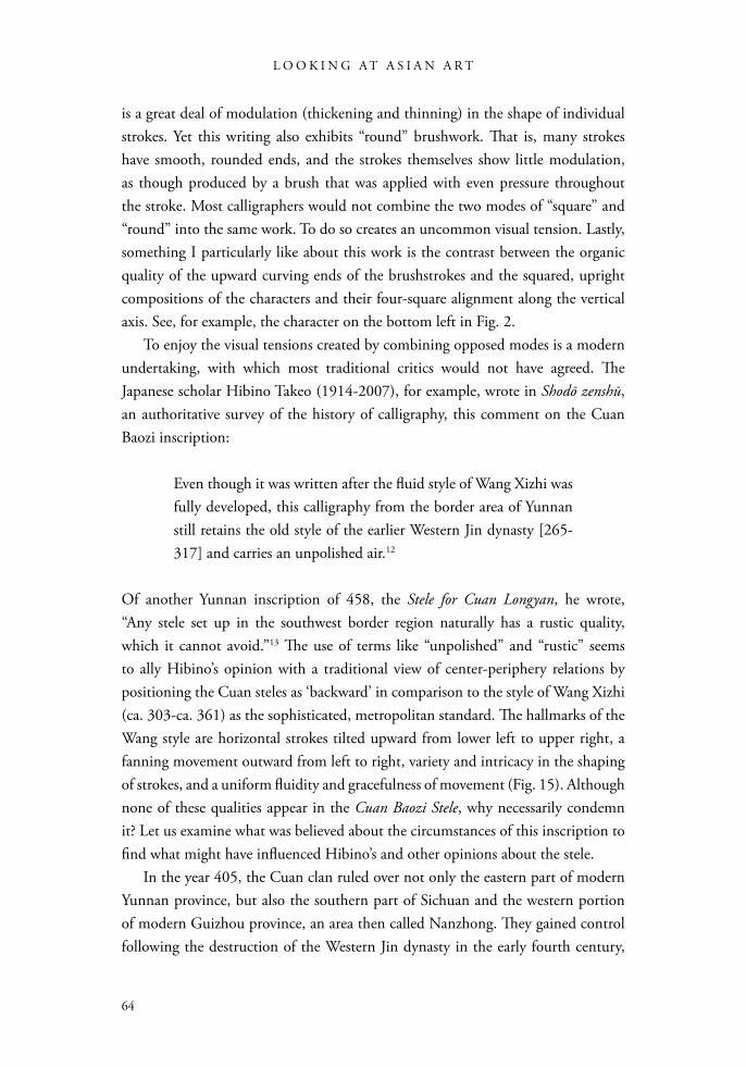
Within a second category of variant characters are those that are also found in earlier stele inscriptions from the Han dynasty—about two hundred years before this stele. One example is the character yong (Fig. 12). Comparing yong in the Cuan Baozi Stele to yong from the stele set up at the Confucius Temple in Qufu in the year 169 by the official Shi Chen, even though the Shi Chen stele inscription was written in clerical script, we can see the nonstandard orthography is the same as in the Cuan Baozi Stele. The third category consists of variant characters also seen in inscriptions done in the late Northern Wei dynasty (386-534), around a hundred years after the Cuan Baozi Stele. The character yin, for example, is written in the same abbreviated fashion in the Cuan Baozi Stele as in the Epitaph for Tang Yao, which is dated to 528 (Fig. 13).
Beyond variant characters, there is the difficult issue of miswritten characters. One hesitates to declare something wrongly written, especially if it is legible, but certain characters in the Cuan Baozi Stele do call attention to themselves in this way. In looking at the character cang, the modern eye typically perceives as a mistake the way the left-hand diagonal pie stroke in the upper part of the character extends downward into the space between the three dots of the “water” radical (Fig. 14).
63
LO O K I N G AT C H I N E S E C A L L I G R A PH Y
Since the number and composition of the strokes in this character cang accord with the standard orthography, it cannot be termed a variant character. Rather, this character would be judged miswritten, since part of one element has intruded into the proper space for another.
One last formal element to examine, which in many cases is the most difficult to describe, is the style of the calligraphy. One aspect of the style of this inscription that many critics have considered its most striking aesthetic effect is the unusual and lively way that strokes flare or float upward at both ends. Many critics use similes evoking flight or scattering to describe it. Another extraordinary aspect of the style is the combination of what a traditional Chinese critic would call “square” and “round.” Some of the brushwork is “square.” The principal hallmarks of “square” writing are that the ends of the strokes are sharp and angular, and there
Figure 14. Above: standard printed character cang. Below: cang, Cuan Baozi Stele.
Figure 13. Above: standard printed character yin. Below, left: yin, Cuan Baozi Stele; below, right: yin, Epitaph for Tang Yao, 528.
L O O K I N G A T A S I A N A R T
64
is a great deal of modulation (thickening and thinning) in the shape of individual strokes. Yet this writing also exhibits “round” brushwork. That is, many strokes have smooth, rounded ends, and the strokes themselves show little modulation, as though produced by a brush that was applied with even pressure throughout the stroke. Most calligraphers would not combine the two modes of “square” and “round” into the same work. To do so creates an uncommon visual tension. Lastly, something I particularly like about this work is the contrast between the organic quality of the upward curving ends of the brushstrokes and the squared, upright compositions of the characters and their four-square alignment along the vertical axis. See, for example, the character on the bottom left in Fig. 2.
To enjoy the visual tensions created by combining opposed modes is a modern undertaking, with which most traditional critics would not have agreed. The Japanese scholar Hibino Takeo (1914-2007), for example, wrote in Shodō zenshū, an authoritative survey of the history of calligraphy, this comment on the Cuan Baozi inscription:
Even though it was written after the fluid style of Wang Xizhi was fully developed, this calligraphy from the border area of Yunnan still retains the old style of the earlier Western Jin dynasty [265-317] and carries an unpolished air.12
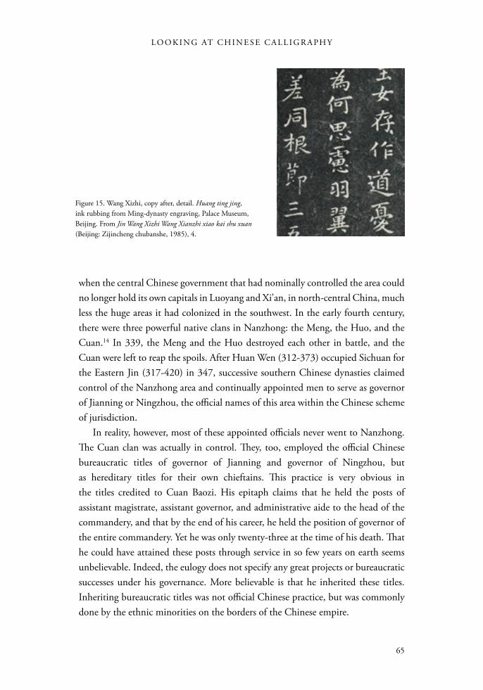
Of another Yunnan inscription of 458, the Stele for Cuan Longyan, he wrote, “Any stele set up in the southwest border region naturally has a rustic quality, which it cannot avoid.”13 The use of terms like “unpolished” and “rustic” seems to ally Hibino’s opinion with a traditional view of center-periphery relations by positioning the Cuan steles as ‘backward’ in comparison to the style of Wang Xizhi (ca. 303-ca. 361) as the sophisticated, metropolitan standard. The hallmarks of the Wang style are horizontal strokes tilted upward from lower left to upper right, a fanning movement outward from left to right, variety and intricacy in the shaping of strokes, and a uniform fluidity and gracefulness of movement (Fig. 15). Although none of these qualities appear in the Cuan Baozi Stele, why necessarily condemn it? Let us examine what was believed about the circumstances of this inscription to find what might have influenced Hibino’s and other opinions about the stele.
In the year 405, the Cuan clan ruled over not only the eastern part of modern Yunnan province, but also the southern part of Sichuan and the western portion of modern Guizhou province, an area then called Nanzhong. They gained control following the destruction of the Western Jin dynasty in the early fourth century,
65
LO O K I N G AT C H I N E S E C A L L I G R A PH Y
when the central Chinese government that had nominally controlled the area could no longer hold its own capitals in Luoyang and Xi’an, in north-central China, much less the huge areas it had colonized in the southwest. In the early fourth century, there were three powerful native clans in Nanzhong: the Meng, the Huo, and the Cuan.14 In 339, the Meng and the Huo destroyed each other in battle, and the Cuan were left to reap the spoils. After Huan Wen (312-373) occupied Sichuan for the Eastern Jin (317-420) in 347, successive southern Chinese dynasties claimed control of the Nanzhong area and continually appointed men to serve as governor of Jianning or Ningzhou, the official names of this area within the Chinese scheme of jurisdiction.
In reality, however, most of these appointed officials never went to Nanzhong. The Cuan clan was actually in control. They, too, employed the official Chinese bureaucratic titles of governor of Jianning and governor of Ningzhou, but as hereditary titles for their own chieftains. This practice is very obvious in the titles credited to Cuan Baozi. His epitaph claims that he held the posts of assistant magistrate, assistant governor, and administrative aide to the head of the commandery, and that by the end of his career, he held the position of governor of the entire commandery. Yet he was only twenty-three at the time of his death. That he could have attained these posts through service in so few years on earth seems unbelievable. Indeed, the eulogy does not specify any great projects or bureaucratic successes under his governance. More believable is that he inherited these titles. Inheriting bureaucratic titles was not official Chinese practice, but was commonly done by the ethnic minorities on the borders of the Chinese empire.
Figure 15. Wang Xizhi, copy after, detail. Huang ting jing, ink rubbing from Ming-dynasty engraving, Palace Museum, Beijing. From Jin Wang Xizhi Wang Xianzhi xiao kai shu xuan (Beijing: Zijincheng chubanshe, 1985), 4.
L O O K I N G A T A S I A N A R T
66
Were the Cuan Han Chinese or an ethnic minority? Information about them is found in a half-dozen epitaphs that have survived from the fifth century.15 According to the Stele for Cuan Longyan, the Cuan were descendants of Ziwen, the prime minister of the state of Chu during the Spring and Autumn Period (722-481 BCE), who received the surname Ban. At the end of the Eastern Han dynasty, in the first or second century, they were granted land at some place called Cuan, which was perhaps in Shanxi Province, in northern China, from which they took a new surname.16 If this story is true, then the Cuan may have been ethnic Han Chinese who migrated to Nanzhong after the native Dian Kingdom came under the control of the Chinese in 109 BCE. They then established themselves as a powerful local “Great Clan” and became “barbarized”; that is, they adapted to local ways. Conversely, however, even though we might be tempted to see a stone-carved epitaph as an accurate record written from the perspective of the Cuan, not Han Chinese historians, this genealogy could be fiction. The ethnicity of the Cuan is a matter of dispute. Some modern scholars say they belonged to the ethnic group who in ancient times were called the “Cuan Man” (man meaning “southern barbarians”) and were the ancestors of the present-day Yi minority nationality.17
Though the ethnicity of the Cuan is open to discussion today, it would appear to have been a settled issue to the calligraphy critics of the twentieth century. As we will see, they believed the stele was produced in a border area of the Chinese empire, one that was only nominally under the control of any central Chinese government, and that the Cuan clan, which the inscription honors, was either originally Man, or “barbarian,” or were Han Chinese people who had lived in Yunnan so long as to become “barbarized.” In other words, the stele was produced by people who were, either ethnically or culturally, not fully Chinese in a place that was never fully a part of China. The anxiety provoked by its anonymity and its location in a peripheral cultural area seems to have encouraged a range of partisan interpretations. We have already heard the essentialist point of view, from Hibino, who called the Cuan steles “unavoidably” “unpolished” and “rustic.”
Taking the style of Wang Xizhi as the gold standard in calligraphy is an old-fashioned practice that predates the fashion for studying and imitating epigraphic writing that began in the mid-1700s in China. Newer attitudes have formed with the rise of the epigraphy movement, which continues in force today, and with the advent of the People’s Republic of China in 1949, which has promoted popularization of the “elite” art of calligraphy, created policies that intentionally embrace “minority” cultures within a “unified China,” and advocated critical support for previously ignored or denigrated types of writing as “calligraphy of the people.”
67
LO O K I N G AT C H I N E S E C A L L I G R A PH Y
Taking four twentieth-century Chinese critics as examples, we can sketch a range of attitudes toward the Cuan Baozi Stele. Kang Youwei was the first of the epigraphy enthusiasts to comment on the aesthetic qualities of the Cuan Baozi Stele, and it is obvious he believed it was written by a non-Chinese person. He wrote:
Among the extant steles from the south, the two Cuan (inscriptions) emerged from the Man of Dian and some dedicatory inscription(s) came from Sichuan. Like the engraved writings of the ancient cities of Goguryeo (37 BCE-668 CE) and the stele about the hunting expedition from Silla (57 BCE-935 CE), though they were created by distant barbarians, and they came from foreign countries, still their lofty beauty crowns ancient and modern.18
This is fairly strong praise, even though it is couched within the segregated category of calligraphy by “distant barbarians”: artists from the southwest borders of China and the early kingdoms of Korea.
In other comments, Kang said the Cuan Baozi inscription’s calligraphy was “simple, weighty, antique and beautiful; its marvelous gestures make it stand out from the crowd.”19 This suggests he liked the extraordinary sense of movement in the strokes, as well as its unaffected freedom from the self-conscious aesthetic effects of the Wang style. In another short essay, in which he characterized a number of early works in anthropomorphic terms, he said of the Cuan Baozi Stele that “its grave simplicity is like the face of an ancient Buddha image,” meaning, perhaps, that it was worthy of veneration for its seeming lack of artifice, in contrast to the Wang style, which was typically criticized by epigraphy enthusiasts as “mannered” or “artificial.”20 It may be fair to say that Kang was a great enthusiast for anything surviving from antiquity, and for that alone, the Cuan Baozi Stele was quite exciting. Since the Jin dynasty proscribed the setting up of engraved steles, there was little other original epigraphy surviving from that time (more works are known today thanks to a number of recent archeological finds), so the mere fact that this stele boasted an Eastern Jin date would be enough to excite any historian’s interest. In addition, Kang considered the script type to sit somewhere between clerical script and regular script, which meant it was pre-modern in script type, while the high percentage of variant characters also reinforced its feeling of antiquity and remoteness from the present day in terms of its orthography.
As a university educator, the famous calligrapher Sha Menghai (1900-1992) was focused on guiding young people in the study of calligraphy. Since the evidence
L O O K I N G A T A S I A N A R T
68
of the use of the brush is not obvious in engraved works of calligraphy, it is difficult for beginners to copy them using brush and ink, and as a result, Sha was critical of the current fashion for using ink rubbings of epigraphical works as models for calligraphy students. He also subscribed to the belief that the calligraphy on many engraved works had been altered or distorted by the engravers when it was carved. Sha had a particularly low regard for the Cuan Baozi Stele. He wrote:
There are some works that have good calligraphy and are well engraved . . . others have good calligraphy and the engraving was not done well . . . but some have poor calligraphy and were poorly engraved, such as the Guangwu General Stele, the Governor of Zhiyang Stele, the Cuan Baozi Stele, and the Zheng Changyou Inscription.21
Sha Menghai’s dislike of the Cuan Baozi Stele was so pronounced that he looked for a reason why so eminent a connoisseur as Kang Youwei would value it. In the end, he attributed it to Kang’s love of the unusual and his urgent desire to break away from the stereotyped, flaccid “Academy Style” of the late Qing dynasty (1644-1911). Concerning Kang’s praise for other fifth- and sixth-century engraved works of calligraphy, Sha wrote:
When Kang Youwei praised the calligraphy of the Inscription for the Stone Gate, the Essay Mourning Bigan, the Stele for Zhang Menglong, the Stele for Zheng Wengong, and the Eulogy for the Burial of a Crane, no one challenged that.22 Yet, at the same time he was so fond of the novel and the strange that he also praised the Cuan Baozi Stele, the Cuan Longyan Stele, the Reverse of the Lingmiao Stele, the Stele for the Governor of Zhiyang, and the Dedicatory Inscription of Zheng Changyou . . . he even put the Cuan Longyan Stele into the ‘Divine Work No. 1 class,’ which was really going too far and has misled later students of calligraphy.23
Another critic with a different point of view was Ma Guoquan, the eminent epigraphy scholar quoted above. As a student of ancient scripts, he considered every form of variation to be positive and interesting. In addition to extolling the variations in character forms and sizes within the Cuan Baozi inscription, Ma Guoquan also felt that the rising and slanting in the brushwork created a tremendous feeling of
69
LO O K I N G AT C H I N E S E C A L L I G R A PH Y
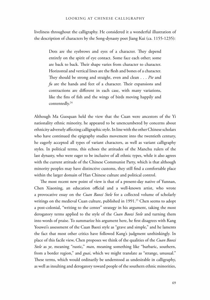
liveliness throughout the calligraphy. He considered it a wonderful illustration of the description of characters by the Song-dynasty poet Jiang Kui (ca. 1155-1235):
Dots are the eyebrows and eyes of a character. They depend entirely on the spirit of eye contact. Some face each other; some are back to back. Their shape varies from character to character. Horizontal and vertical lines are the flesh and bones of a character. They should be strong and straight, even and clean . . . Pie and fu are the hands and feet of a character. Their expansions and contractions are different in each case, with many variations, like the fins of fish and the wings of birds moving happily and contentedly.24
Although Ma Guoquan held the view that the Cuan were ancestors of the Yi nationality ethnic minority, he appeared to be unencumbered by concerns about ethnicity adversely affecting calligraphic style. In line with the other Chinese scholars who have continued the epigraphy studies movement into the twentieth century, he eagerly accepted all types of variant characters, as well as variant calligraphy styles. In political terms, this echoes the attitudes of the Manchu rulers of the last dynasty, who were eager to be inclusive of all ethnic types, while it also agrees with the current attitude of the Chinese Communist Party, which is that although minority peoples may have distinctive customs, they still find a comfortable place within the larger domain of Han Chinese culture and political control.
The most recent new point of view is that of a present-day native of Yunnan, Chen Xiaoning, an education official and a well-known artist, who wrote a provocative essay on the Cuan Baozi Stele for a collected volume of scholarly writings on the medieval Cuan culture, published in 1991.25 Chen seems to adopt a post-colonial, “writing to the center” strategy in his argument, taking the most derogatory terms applied to the style of the Cuan Baozi Stele and turning them into words of praise. To summarize his argument here, he first disagrees with Kang Youwei’s assessment of the Cuan Baozi style as “grave and simple,” and he laments the fact that most other critics have followed Kang’s judgment unthinkingly. In place of this facile view, Chen proposes we think of the qualities of the Cuan Baozi Stele as ye, meaning “rustic,” man, meaning something like “barbaric, southern, from a border region,” and guai, which we might translate as “strange, unusual.” These terms, which would ordinarily be understood as undesirable in calligraphy, as well as insulting and derogatory toward people of the southern ethnic minorities,
L O O K I N G A T A S I A N A R T
70
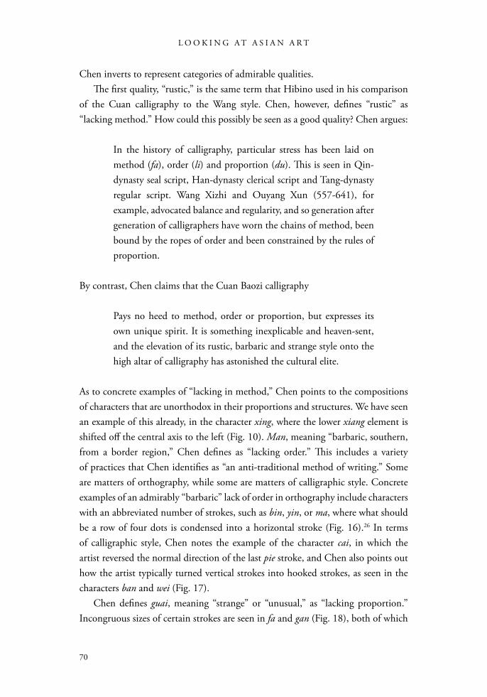
Chen inverts to represent categories of admirable qualities. The first quality, “rustic,” is the same term that Hibino used in his comparison
of the Cuan calligraphy to the Wang style. Chen, however, defines “rustic” as “lacking method.” How could this possibly be seen as a good quality? Chen argues:
In the history of calligraphy, particular stress has been laid on method (fa), order (li) and proportion (du). This is seen in Qin-dynasty seal script, Han-dynasty clerical script and Tang-dynasty regular script. Wang Xizhi and Ouyang Xun (557-641), for example, advocated balance and regularity, and so generation after generation of calligraphers have worn the chains of method, been bound by the ropes of order and been constrained by the rules of proportion.
By contrast, Chen claims that the Cuan Baozi calligraphy
Pays no heed to method, order or proportion, but expresses its own unique spirit. It is something inexplicable and heaven-sent, and the elevation of its rustic, barbaric and strange style onto the high altar of calligraphy has astonished the cultural elite.
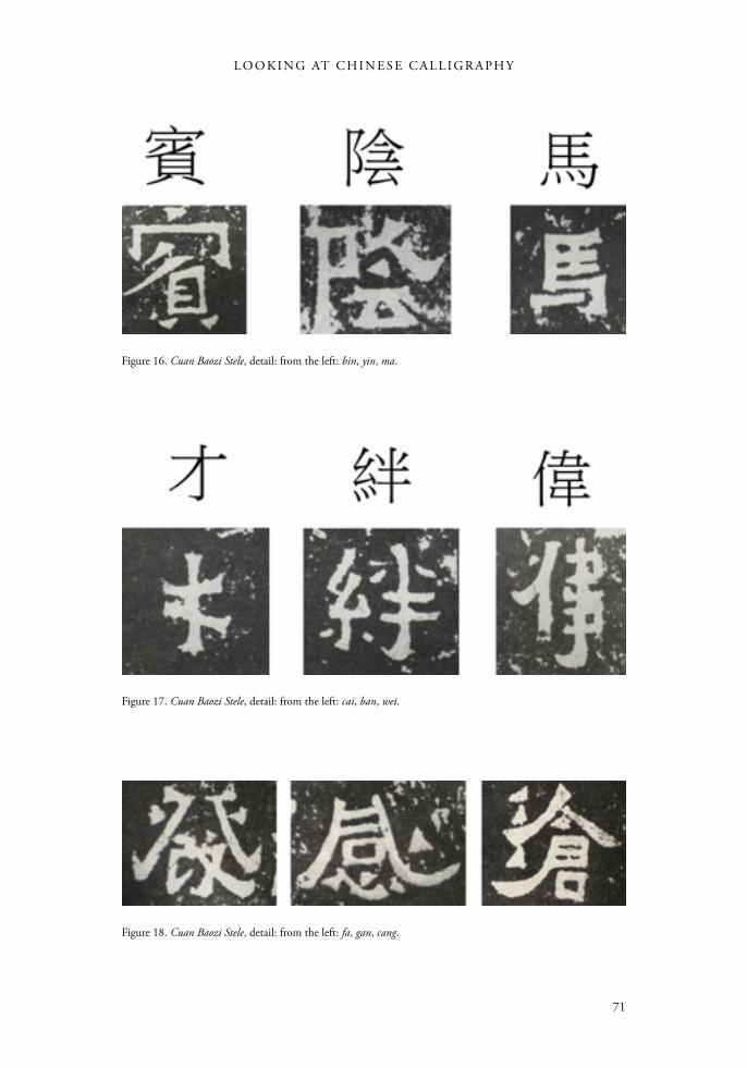
As to concrete examples of “lacking in method,” Chen points to the compositions of characters that are unorthodox in their proportions and structures. We have seen an example of this already, in the character xing, where the lower xiang element is shifted off the central axis to the left (Fig. 10). Man, meaning “barbaric, southern, from a border region,” Chen defines as “lacking order.” This includes a variety of practices that Chen identifies as “an anti-traditional method of writing.” Some are matters of orthography, while some are matters of calligraphic style. Concrete examples of an admirably “barbaric” lack of order in orthography include characters with an abbreviated number of strokes, such as bin, yin, or ma, where what should be a row of four dots is condensed into a horizontal stroke (Fig. 16).26 In terms of calligraphic style, Chen notes the example of the character cai, in which the artist reversed the normal direction of the last pie stroke, and Chen also points out how the artist typically turned vertical strokes into hooked strokes, as seen in the characters ban and wei (Fig. 17).
Chen defines guai, meaning “strange” or “unusual,” as “lacking proportion.” Incongruous sizes of certain strokes are seen in fa and gan (Fig. 18), both of which
71
LO O K I N G AT C H I N E S E C A L L I G R A PH Y
Figure 16. Cuan Baozi Stele, detail: from the left: bin, yin, ma.
Figure 17. Cuan Baozi Stele, detail: from the left: cai, ban, wei.
Figure 18. Cuan Baozi Stele, detail: from the left: fa, gan, cang.
L O O K I N G A T A S I A N A R T
72
show disproportionately large diagonal strokes with swooping hooks at the ends. He borrows Jiang Kui’s phrase to describe the extension of these pie and fu strokes as “spreading out like the fins of a fish or tail of a bird.” In addition, he points out the most commonly cited example of the strangeness of this inscription: the upper pie stroke in cang that breaks through the three dots of the “water” radical on the left (Fig. 18).
In the end, Chen makes a grand claim for the style of the Cuan Baozi Stele that makes his postcolonial emphasis on ethnicity explicit and his assumption that the inscription’s calligrapher was not Han Chinese clear: he praises hybridity as a virtue. He does this by personifying calligraphic styles in gendered terms, calling the calligraphic style of the Wangs “a dancing girl with flowers stuck in her hair.” This in itself is nothing new in the history of calligraphy criticism, and several critics have characterized the Wang style as feminine.27 But Chen goes further to personify the Cuan style as masculine, calling it “a young lad of the plains, who though slow and crude of speech, has a great vitality beneath a silent exterior. His is not the beauty of powder and perfume.”28 Chen claims that the mixture of the robust customs of native ways with Chinese culture worked like fresh blood in the anemic body of Han Chinese civilization and made the calligraphic art of Yunnan different aesthetically from the style of the Wangs used in the Chinese capital. It is this hybridity that allows the Cuan Baozi Stele calligraphy to manifest an aesthetic that is admirably “primitive, unruly, and fierce.” Such a style could never have been produced in the realm of the Eastern Jin dynasty, so deeply mired in Chinese tradi-tion, but only in a land under Cuan control.29
Endnotes1. Though her name is conventionally read “Fu Hao,” Fu is likely an official title meaning “royal consort,” while the name Hao has been interpreted variously. Li Xueqin holds that Hao was her personal name, while Ding Shan and Tang Lan contend that the two elements in the character “hao” should be read separately, as “daughter” of the “Zi” family. Qiu Xigui believes Hao was a clan name. See Cao Dingyun, Yinxu Fu Hao mu mingwen yanjiu (Taibei: Wenjin chubanshe, 1993), 79-80.2. See Lothar Ledderose, Mi Fu and the Classical Tradition of Chinese Calligraphy (Princeton: Princeton University Press, 1979), 30.3. The earliest expression of this notion is the famous phrase of Yang Xiong (53 BCE-18 CE), “Writing is the delineation of the mind.” Yang Xiong, Fayan, Sibu beiyao edition (Shanghai: Zhonghua shuju, 1936), ch. 5, 3b. A well-known later statement specific to calligraphy is the comment by Su Shi (1037-1101) about the calligraphy of Yan Zhenqing (709-785): “When I look at his calligraphy, I know what kind of person he was.” Su Shi, “Colophon to a Letter by Yan Lugong,” in Dongpo tiba (Taibei: Shijie shuju, 1962), 76.
73
LO O K I N G AT C H I N E S E C A L L I G R A PH Y
4. See Ma Guoquan, “Cuan Baozi bei yanjiu,” in Xiandai shufa lunwenxuan (Shanghai: Shanghai shuhua chubanshe, 1980), 241.5. The stele is 1.9 meters tall, 0.71 meters wide and 21 cm thick. Each character is about 3 cm across. 6. Deng Erheng’s inscription, engraved on the lower left corner of the stele, is transcribed in Xu Facang, ed., Qujing shike (Kunming: Yunnan minzu chubanshe, 1999), 8. 7. There was no fourth year of the Daheng reign period. It lasted only a few months in the year of 402, when Huan Xuan (369-404) elevated himself to prime minister. He quickly discarded this title when he usurped the throne and declared a new dynasty. This date is an interesting mystery, which I will explore in an article in the journal Early Medieval China.8. Kang Youwei, Guang Yizhou shuangji zhu, ed. by Cui Erping (Shanghai: Shanghai shuhua chubanshe, 1981), 82.9. Ma, “Cuan Baozi bei yanjiu,” 237.10. See Amy McNair, “Public Values in Calligraphy and Orthography in the Tang Dynasty,” Monumenta Serica 43 (1995): 263-278.11. Ma, “Cuan Baozi bei yanjiu,” 235-236.12. Hibino Takeo, Shodō zenshū, Vol. 4 (Tokyo: Heibonsha, 1954-1968), 199.13. Hibino Takeo, Shodō zenshū, Vol. 5, 138. 14. See Lin Quan, “Cuan wenhua de lishi tedian,” in Cuan wenhua lun, ed. Fan Jianhua (Kunming: Yunnan daxue chubanshe, 1991), 72.15. These are the steles for Cuan Longyan, Cuan Shen, Cuan Longxiang, Cuan Baozi, and Cuan Yun. See Fang Guoyu, ed., Yunnan shiliao congkan, Vol. 1 (Kunming: Yunnan daxue chubanshe, 1999), 232-24616. Xu, ed., Qujing shike, 12 and n. 36-38.17. Ma, “Cuan Baozi bei yanjiu,” 235.18. Kang, Guang Yizhou shuangji zhu, 133. 19. Ibid., 131.20. Ibid., 181.21. Sha Menghai, “Shufa shi shang de ruogan wenti,” in Sha Menghai lun shu cong gao (Shanghai: Shanghai shuhua chubanshe, 1987), 183. The Guangwu General Stele, dateable to 368, was excavated in the Qianlong period (1736-1795) and is now in the collection of the Forest of Steles, Xi’an. The Governor of Zhiyang Stele refers to the Spirit Road Inscription for the Governor of Zhiyang, dated 399, excavated in Baxian, Sichuan. The Zheng Changyou Inscription, dated to 501, is one of the “Twenty Works of Longmen” and is located adjacent to the Buddhist shrines donated by this aristocrat and his family on the south wall of Guyang Grotto, Longmen Grottoes, Henan.22. On the Stone Gate inscriptions and the Zheng Wengong inscriptions, see Robert E. Harrist, Jr., The Landscape of Words : Stone Inscriptions from Early and Medieval China (Seattle: University of Washington, 2008), ch. 1-2. On the Eulogy for the Burial of a Crane (Yiheming), see Lei Xue, “The Elusive Crane: Memory, Metaphor, and a Stone Monument from Sixth Century China,” PhD dissertation, Columbia University, 2009.23. Sha, “Shufa shi shang de ruogan wenti,” 183, ellipsis in the original. The Reverse of the Lingmiao Stele refers to the inscription on the back of the 456 Highest Spirit of the Central Marchmount Song Temple Stele, in the Central Marchmount Temple, Dengfeng County, Henan.24. Ma, “Cuan Baozi bei yanjiu,” 240. The translation is taken from Chang Ch’ung-ho and Hans H. Frankel, trans., Two Chinese Treatises on Calligraphy (New Haven and London: Yale University Press, 1995), 18-19.25. Chen Xiaoning, “Shilun Cuan Baozi bei de meixue tezheng,” in Cuan wenhua lun, 302-308.
L O O K I N G A T A S I A N A R T
74
26. To alert the reader to the highly polemical nature of Chen’s view, however, I will add that other scholars have different explanations for some of these phenomena. Lu Mingjun states that the abbreviation in bin is simply a stroke missed by the engraver, while the abbreviation of the four dots in ma is a borrowing of that practice from cursive script. Lu Mingjun, Wei Jin Nanbeichao bei bie zi yanjiu (Beijing: Wenhua yishu chubanshe, 2009), 240, 59.27. See Eugene Y. Wang, “The Taming of the Shrew: Wang Hsi-chih (303-361) and Calligraphic Gentrification in the Seventh Century,” in Character and Context in Chinese Calligraphy (Princeton: Princeton University Press, 1999), 132-173, esp. 146.28. Chen, “Shilun Cuan Baozi bei,” 304.29. Ibid., 306.


