Embed Size (px)
Citation preview
Measuring Collective Attentionin Online Content: Sampling,
Engagement, and Network Effects
Siqi Wu
A thesis submitted for the degree of
Doctor of Philosophy at
The Australian National University
March 2021c© 2021 by Siqi Wu
All Rights Reserved

Except where otherwise indicated, this thesis is my own original work.
Siqi Wu9 March 2021
Acknowledgments
I would like to express my sincere gratitude to the people who have supported mein this Ph.D grind:
• Prof. Lexing Xie. I am extremely honored to have Lexing to be my advisor. Herextensive knowledge in various fields and strong dedication to research motivateme to become a good researcher.
• Dr. Marian-Andrei Rizoiu. Andrei is one of the smartest people that I know. Heprovided many insightful ideas when I was stuck. His research also sparked myinterests in modeling online popularity.
• Dr. Cheng Soon Ong. Cheng is my “think tank”. He never turned me down whenI felt discouraged or desperately looked for advices, both in research and in life.
• Members of the ANU Computational Media Lab – Swapnil Mishra, Quyu Kong,Alexander Mathews, Dawei Chen, Minjeong Shin, Dongwoo Kim, Jooyoung Lee,Rui Zhang, Alasdair Tran, Umanga Bista, Yuli Liu, Qiongkai Xu, and many others.I am grateful that I can work with a group of supportive talents. Much of my workis benefited from the discussions with them.
• External collaborators – Yu-Ru Lin, Ali Mert Ertugrul, and Xian Teng from Univer-sity of Pittsburgh, Paul Resnick and James Park from Univeristy of Michigan, andLu Cheng from Arizona State University. It has been a great pleasure to work withthem. Our collaborations also lead to fruitful research outcomes.
• Data61, CSIRO. I would like to thank Data61 for providing my scholarship. It hasalso provided me a strong network in both academia and industry.
• ANU Research School of Computer Science. I would like to thank the admin andHDR team in CECS for creating a friendly working environment for us.
• National eResearch Collaboration Tools and Resources (Nectar). I would like tothank Nectar for providing computational resources that facilitate my research.
This research is supported in part by Asian Office of Aerospace Research and De-velopment Grant 19IOA078, Air Force Research Laboratory Grant FA2386-15-1-4018,Australian Research Council Project DP180101985, and a Google PhD Fellowship.
2

Finally, and most importantly, I would like to express deep thanks to my wifeRongqin Tan, my parents Suying Deng and Sanji Wu, and my extended family, whohave all given their unreserved supports to me in so many years. May my grandpar-ents rest in peace. I love you and always will.
Abstract
The production and consumption of online content have been increasing rapidly,whereas human attention is a scarce resource. Understanding how the content cap-tures collective attention has become a challenge of growing importance. In thisthesis, we tackle this challenge from three fronts – quantifying sampling effects ofsocial media data; measuring engagement behaviors towards online content; andestimating network effects induced by the recommender systems.
Data sampling is a fundamental problem. To obtain a list of items, one commonmethod is sampling based on the item prevalence in social media streams. However,social data is often noisy and incomplete, which may affect the subsequent observa-tions. For each item, user behaviors can be conceptualized as two steps – the first stepis relevant to the content appeal, measured by the number of clicks; the second stepis relevant to the content quality, measured by the post-clicking metrics, e.g., dwelltime, likes, or comments. We categorize online attention (behaviors) into two classes:popularity (clicking) and engagement (watching, liking, or commenting). Moreover,modern platforms use recommender systems to present the users with a tailoringcontent display for maximizing satisfaction. The recommendation alters the appealof an item by changing its ranking, and consequently impacts its popularity.
Our research is enabled by the data available from the largest video hosting siteYouTube. We use YouTube URLs shared on Twitter as a sampling protocol to obtaina collection of videos, and we track their prevalence from 2015 to 2019. This methodcreates a longitudinal dataset consisting of more than 5 billion tweets. Albeit thevolume is substantial, we find Twitter still subsamples the data. Our dataset coversabout 80% of all tweets with YouTube URLs. We present a comprehensive measure-ment study of the Twitter sampling effects across different timescales and differentsubjects. We find that the volume of missing tweets can be estimated by Twitter ratelimit messages, true entity ranking can be inferred based on sampled observations,and sampling compromises the quality of network and diffusion models.
Next, we present the first large-scale measurement study of how users collec-tively engage with YouTube videos. We study the time and percentage of each videobeing watched. We propose a duration-calibrated metric, called relative engagement,which is correlated with recognized notion of content quality, stable over time, andpredictable even before a video’s upload.
4
5
Lastly, we examine the network effects induced by the YouTube recommendersystem. We construct the recommendation network for 60,740 music videos from4,435 professional artists. An edge indicates that the target video is recommendedon the webpage of source video. We discover the popularity bias – videos are dis-proportionately recommended towards more popular videos. We use the bow-tiestructure to characterize the network and find that the largest strongly connectedcomponent consists of 23.1% of videos while occupying 82.6% of attention. We alsobuild models to estimate the latent influence between videos and artists. By takinginto account the network structure, we can predict video popularity 9.7% better thanother baselines.
Altogether, we explore the collective consuming patterns of human attention to-wards online content. Methods and findings from this thesis can be used by contentproducers, hosting sites, and online users alike to improve content production, adver-tising strategies, and recommender systems. We expect our new metrics, methods,and observations can generalize to other multimedia platforms such as the musicstreaming service Spotify.
Publications, Software, and Data
The majority of the thesis has been published in peer-reviewed conference proceed-ings. Software and data developed as a part of this thesis are provided for reproduc-ing experiment results and facilitating future work.
Publications
• Minjeong Shin*, Alasdair Tran*, Siqi Wu*, Alexander Mathews, Rong Wang, Geor-giana Lyall, and Lexing Xie. “AttentionFlow: Visualising Dynamic Influence in EgoNetworks.” ACM International Conference on Web Search and Data Mining (WSDM),2021. (Demo | Chapter 5)
• Lu Cheng, Kai Shu, Siqi Wu, Yasin N. Silva, Deborah L. Hall, and Huan Liu. “Un-supervised Cyberbullying Detection via Time-Informed Gaussian Mixture Model.”ACM International Conference on Information and Knowledge Management (CIKM),2020. (Full paper, acceptance rate: 21%)
• Siqi Wu, Marian-Andrei Rizoiu, and Lexing Xie. “Variation across Scales: Mea-surement Fidelity under Twitter Data Sampling.” AAAI International Conferenceon Weblogs and Social Media (ICWSM), 2020. (Full paper, acceptance rate: 17% |Chapter 3)
• Siqi Wu, Marian-Andrei Rizoiu, and Lexing Xie. “Estimating Attention Flow inOnline Video Networks.” ACM International Conference on Computer-Supported Co-operative Work and Social Computing (CSCW), 2019. (Best paper honorable mentionaward, acceptance rate: 31% | Chapter 5)
• Siqi Wu. “How is Attention Allocated? Data-driven Studies of Popularity andEngagement in Online Videos.” ACM International Conference on Web Search andData Mining (WSDM), 2019. (Doctoral consortium)
• Siqi Wu, Marian-Andrei Rizoiu, and Lexing Xie. “Beyond Views: Measuring andPredicting Engagement in Online Videos.” AAAI International Conference on Weblogsand Social Media (ICWSM), 2018. (Full paper, acceptance rate: 16% | Chapter 4)
6
7
• Quyu Kong, Marian-Andrei Rizoiu, Siqi Wu, and Lexing Xie. “Will This Video GoViral? Explaining and Predicting the Popularity of YouTube Videos.” InternationalConference on World Wide Web Companion (WWW), 2018. (Demo | Chapter 4)
Preprints
• Ali Mert Ertugrul*, Siqi Wu*, Jooyoung Lee*, Lexing Xie, and Yu-Ru Lin. “LinkingCollective Attention Across Platforms: Do More Tweets Beget More Video Views?”Under revision.
• Siqi Wu and Paul Resnick. “Cross-Partisan Discussions on YouTube: Conserva-tives Talk to Liberals but Liberals Don’t Talk to Conservatives.” Under review.
Software
• Twitter-intact-stream (Chapter 3): a Python package to reconstruct the completeTwitter filtered stream.
https://github.com/avalanchesiqi/twitter-intact-stream
• YouTube-insight (Chapter 4): a Python package to collect metadata and historicaldata for YouTube videos.
https://github.com/avalanchesiqi/youtube-insight
• HIPie (Chapter 4): a web interface to explain and predict the popularity of YouTubevideos.
http://www.hipie.ml/
• AttentionFlow (Chapter 5): a web interface to visualize a collection of time seriesand the dynamic network influence among them.
http://www.attentionflow.ml/
Data
• Complete/Sampled Retweet Cascades Datasets (Chapter 3) include 2 sets ofcomplete/sampled retweet cascades on the topics of cyberbullying (sampling rate:52.72%, 3M complete cascades, 1.17M sampled cascades) and YouTube video shar-ing (sampling rate: 91.53%, 2.02M complete cascades, 1.8M sampled cascades).
https://tinyurl.com/rguqamr
8
• YouTube Engagement ’16 Datasets (Chapter 4) include (1) a tweeted videos dataset,which contains 5M YouTube videos that are uploaded and tweeted from 2016-07-01 to 2016-08-31, and are watched at least 100 times within 30 days of their onsets;(2) three quality videos datasets, which contain 96K videos deemed of high qualityby domain experts. To our knowledge, they are the only publicly available datasetscontaining information of video watch time.
https://tinyurl.com/wswvtbj
• Vevo Music Graph Dataset (Chapter 5) contains the metadata and historical dataof 60,740 YouTube videos from 4,435 Vevo artists who are active in English-speakingcountries, and 63 daily snapshots of the video recommendation network.
https://tinyurl.com/tqzeaps
Contents
Acknowledgments 2
Abstract 4
Publications, Software, and Data 6
1 Introduction 11.1 Thesis overview . . . . . . . . . . . . . . . . . . . . . . . . . . . . . . . . . 31.2 Key contributions and impact . . . . . . . . . . . . . . . . . . . . . . . . . 5
2 Related work 82.1 The anatomy of online attention . . . . . . . . . . . . . . . . . . . . . . . 82.2 Social data sampling . . . . . . . . . . . . . . . . . . . . . . . . . . . . . . 112.3 User engagement . . . . . . . . . . . . . . . . . . . . . . . . . . . . . . . . 132.4 Item popularity . . . . . . . . . . . . . . . . . . . . . . . . . . . . . . . . . 142.5 Content recommendation networks . . . . . . . . . . . . . . . . . . . . . 17
3 Quantifying sampling effects of online social data 193.1 Introduction . . . . . . . . . . . . . . . . . . . . . . . . . . . . . . . . . . . 203.2 Datasets and Twitter rate limit messages . . . . . . . . . . . . . . . . . . 223.3 Are tweets missing at random? . . . . . . . . . . . . . . . . . . . . . . . . 293.4 Impacts on Twitter entities . . . . . . . . . . . . . . . . . . . . . . . . . . . 31
3.4.1 Twitter sampling as a Bernoulli process . . . . . . . . . . . . . . . 313.4.2 Entity frequency . . . . . . . . . . . . . . . . . . . . . . . . . . . . 323.4.3 Entity ranking . . . . . . . . . . . . . . . . . . . . . . . . . . . . . . 35
3.5 Impacts on networks . . . . . . . . . . . . . . . . . . . . . . . . . . . . . . 373.5.1 User-hashtag bipartite graph . . . . . . . . . . . . . . . . . . . . . 373.5.2 User-user retweet network . . . . . . . . . . . . . . . . . . . . . . 40
3.6 Impacts on retweet cascades . . . . . . . . . . . . . . . . . . . . . . . . . . 413.7 Conclusion . . . . . . . . . . . . . . . . . . . . . . . . . . . . . . . . . . . . 43
3.7.1 Limitations . . . . . . . . . . . . . . . . . . . . . . . . . . . . . . . 443.7.2 Practical implications and future work . . . . . . . . . . . . . . . 44
9
Contents 10
4 Measuring and predicting engagement in online videos 454.1 Introduction . . . . . . . . . . . . . . . . . . . . . . . . . . . . . . . . . . . 464.2 Data . . . . . . . . . . . . . . . . . . . . . . . . . . . . . . . . . . . . . . . . 48
4.2.1 YouTube Engagement ’16 datasets . . . . . . . . . . . . . . . . . . 484.2.2 Twitter sampling effects . . . . . . . . . . . . . . . . . . . . . . . . 504.2.3 Video metadata and attention dynamics . . . . . . . . . . . . . . 51
4.3 Measures of video engagement . . . . . . . . . . . . . . . . . . . . . . . . 514.3.1 Discrepancy between views and watch time . . . . . . . . . . . . 514.3.2 New tool – engagement map . . . . . . . . . . . . . . . . . . . . . 524.3.3 New metric – relative engagement . . . . . . . . . . . . . . . . . . 544.3.4 Linking relative engagement and video quality . . . . . . . . . . 554.3.5 Temporal dynamics of relative engagement . . . . . . . . . . . . 57
4.4 Predicting aggregate engagement . . . . . . . . . . . . . . . . . . . . . . . 594.4.1 Experimental setup . . . . . . . . . . . . . . . . . . . . . . . . . . . 594.4.2 Features . . . . . . . . . . . . . . . . . . . . . . . . . . . . . . . . . 604.4.3 Methods . . . . . . . . . . . . . . . . . . . . . . . . . . . . . . . . . 614.4.4 Results and analysis . . . . . . . . . . . . . . . . . . . . . . . . . . 624.4.5 Are Freebase topics informative? . . . . . . . . . . . . . . . . . . . 64
4.5 Forecasting temporal engagement . . . . . . . . . . . . . . . . . . . . . . 654.5.1 Experimental setup . . . . . . . . . . . . . . . . . . . . . . . . . . . 654.5.2 Methods - Hawkes Intensity Process (HIP) . . . . . . . . . . . . . 664.5.3 Results and analysis . . . . . . . . . . . . . . . . . . . . . . . . . . 68
4.6 Conclusion . . . . . . . . . . . . . . . . . . . . . . . . . . . . . . . . . . . . 704.6.1 Limitations . . . . . . . . . . . . . . . . . . . . . . . . . . . . . . . 714.6.2 Practical implications and future work . . . . . . . . . . . . . . . 71
5 Measuring and modeling online recommendation networks 725.1 Introduction . . . . . . . . . . . . . . . . . . . . . . . . . . . . . . . . . . . 735.2 Data . . . . . . . . . . . . . . . . . . . . . . . . . . . . . . . . . . . . . . . . 76
5.2.1 Vevo Music Graph dataset . . . . . . . . . . . . . . . . . . . . . . . 765.2.2 Data collection strategy . . . . . . . . . . . . . . . . . . . . . . . . 775.2.3 The network of YouTube videos . . . . . . . . . . . . . . . . . . . 78
5.3 Macroscopic measures . . . . . . . . . . . . . . . . . . . . . . . . . . . . . 815.3.1 Basic statistics . . . . . . . . . . . . . . . . . . . . . . . . . . . . . . 815.3.2 Linking network structure and popularity . . . . . . . . . . . . . 825.3.3 The bow-tie structure . . . . . . . . . . . . . . . . . . . . . . . . . 83
5.4 Microscopic measures . . . . . . . . . . . . . . . . . . . . . . . . . . . . . 855.4.1 The disconnect between network indegree and video view count 86
Contents 11
5.4.2 A closer look at the top videos . . . . . . . . . . . . . . . . . . . . 865.5 Temporal patterns . . . . . . . . . . . . . . . . . . . . . . . . . . . . . . . . 895.6 Estimating attention flow in recommendation network . . . . . . . . . . 91
5.6.1 Constructing a network with persistent links . . . . . . . . . . . . 915.6.2 Problem statement . . . . . . . . . . . . . . . . . . . . . . . . . . . 935.6.3 Experimental setup . . . . . . . . . . . . . . . . . . . . . . . . . . . 945.6.4 Methods . . . . . . . . . . . . . . . . . . . . . . . . . . . . . . . . . 945.6.5 Results and analysis . . . . . . . . . . . . . . . . . . . . . . . . . . 96
5.7 Visualizing attention flow in recommendation network . . . . . . . . . . 995.8 Conclusion . . . . . . . . . . . . . . . . . . . . . . . . . . . . . . . . . . . . 101
5.8.1 Discussion . . . . . . . . . . . . . . . . . . . . . . . . . . . . . . . . 1025.8.2 Limitations and future work . . . . . . . . . . . . . . . . . . . . . 102
6 Conclusion 1036.1 Summary . . . . . . . . . . . . . . . . . . . . . . . . . . . . . . . . . . . . . 1036.2 Future work . . . . . . . . . . . . . . . . . . . . . . . . . . . . . . . . . . . 105
A Appendix 107A.1 Twitter data in ICWSM papers (2015-2019) . . . . . . . . . . . . . . . . . 107
List of Figures
1.1 Screenshots of two YouTube videos, their metadata, insight data, andrecommended videos. (a) “Trump Inauguration Speech (FULL) | ABCNews” (source: https://www.youtube.com/watch?v=sRBsJNdK1t0);(b) “Disney Stars Past & Present ALS Ice Bucket Challenge” (source:https://www.youtube.com/watch?v=TCY0 tP cbk). The screenshotswere taken in May, 2018. The insight dashboard (highlighted in redbox) is deprecated in current YouTube interface. . . . . . . . . . . . . . . 3
2.1 A YouTube video webpage and user interactions on it. The notionsof popularity and engagement respectively describe the decision toclick on a video (right box) and the decision to interact after clicking(left box). (Screenshot source: https://www.youtube.com/watch?v=TCY0 tP cbk) . . . . . . . . . . . . . . . . . . . . . . . . . . . . . . . . . . 10
3.1 Collected and missing tweets in an 11-second interval. blue circle:collected tweet; black cross: missing tweet; black vertical line: ratelimit message. green number: estimated missing volume from ratelimit messages; black number: count of missing tweets compared tothe complete set. . . . . . . . . . . . . . . . . . . . . . . . . . . . . . . . . 25
3.2 MAPE of estimating the missing volumes in the rate limit segments. . . 253.3 (a) The density distribution of milliseconds in the received 55,420 rate
limit messages. (b) The histogram of the number of rate limit messagesreceived in each second. (c) Scatter plot of rate limit messages. x-axis:timestamp; y-axis: values in the rate limit messages. (d) Coloringrate limit messages into 4 monotonically increasing threads by usingAlgorithm 1. All figures are produced based on the Sampled ’15 dataset. 26
3.4 Comparing Twitter public filtered stream to the Firehose stream. MAPEis 0.68% with estimated missing tweet volume from rate limit messages. 28
3.5 Sampling rates are uneven (a) in different hours or (b) in differentmilliseconds. black line: temporal mean sampling rates; color shades:95% confidence interval. (c) Minutely sampling rates. (d) Secondlysampling rates. . . . . . . . . . . . . . . . . . . . . . . . . . . . . . . . . . 29
12
LIST OF FIGURES 13
3.6 Hourly tweet volumes in YouTube dataset. (a) Japanese+Korean; (b)other languages. black line: temporal mean tweet volumes; colorshades: 95% confidence interval. . . . . . . . . . . . . . . . . . . . . . . . 30
3.7 The frequency distributions of (a) user posting and (b) hashtag. Thex-axis starts at 0 rather than 1, as the sample set and uniform randomsample both have missing entities. . . . . . . . . . . . . . . . . . . . . . . 32
3.8 (a) D-statistic between empirical distribution and binomial distribu-tion. (b) The probability distribution of observing ns tweets in thesample set when a user posts 20 tweets in the complete set (meanvalue: 10.54). (c) The probability distribution of ns when nc=100. . . . . 33
3.9 (a) D-statistic between empirical distribution and negative binomialdistribution. (b) The probability distribution of posting nc tweets inthe complete set when observing a user posts 13 tweets in the sampleset (mean value: 23.60). (c) The probability distribution of nc whenns=100. . . . . . . . . . . . . . . . . . . . . . . . . . . . . . . . . . . . . . . 34
3.10 (a) Observed ranks in the sample set (x-axis) vs. true ranks in thecomplete set (y-axis). (b) Estimated ranks improve the agreement withthe ground-truth ranks. (c) user WeltRadio, observed/true/estimatedranks: 15/50/50. (d) user bensonbersk, observed/true/estimated ranks:66/42/52. blue/red shades: sample tweet volume; grey shades: com-plete tweet volume; black line: estimated tweet volume. . . . . . . . . . 36
3.11 The change of clusters from complete set to sample set. Each celldenotes the volume (top number) and the ratio (bottom percentage) ofentities (users and hashtags) that traverse from a complete cluster to asample cluster. Clusters are ordered to achieve maximal ratios alongthe diagonal. . . . . . . . . . . . . . . . . . . . . . . . . . . . . . . . . . . . 38
3.12 Visualization of bow-tie structure in complete set. The black numberindicates the relative size of component in the complete set, blue num-ber indicates the relative size in the sample set. . . . . . . . . . . . . . . 40
3.13 The change of bow-tie components from complete set to sample set.Each cell denotes the volume (top) and the ratio (bottom) of users thattraverse from a component in complete set to a component in sampleset. . . . . . . . . . . . . . . . . . . . . . . . . . . . . . . . . . . . . . . . . 41
3.14 CCDFs of (a) inter-arrival time and (b) relative potential reach. . . . . . 42
LIST OF FIGURES 14
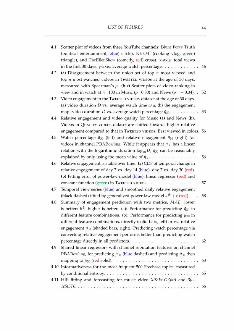
4.1 Scatter plot of videos from three YouTube channels: Blunt Force Truth
(political entertainment, blue) circle), KEEMI (cooking vlog, green)triangle), and TheEllenShow (comedy, red) cross). x-axis: total viewsin the first 30 days; y-axis: average watch percentage. . . . . . . . . . . . 46
4.2 (a) Disagreement between the union set of top n most viewed andtop n most watched videos in Tweeted videos at the age of 30 days,measured with Spearman’s ρ. (b-c) Scatter plots of video ranking inview and in watch at n=100 in Music (ρ=0.80) and News (ρ=− 0.34). . 52
4.3 Video engagement in the Tweeted videos dataset at the age of 30 days.(a) video duration D vs. average watch time ω30; (b) the engagementmap: video duration D vs. average watch percentage η30. . . . . . . . . 53
4.4 Relative engagement and video quality for Music (a) and News (b).Videos in Quality videos dataset are shifted towards higher relativeengagement compared to that in Tweeted videos. Best viewed in colors. 56
4.5 Watch percentage µ30 (left) and relative engagement η30 (right) forvideos in channel PBABowling. While it appears that µ30 has a linearrelation with the logarithmic duration log10 D, η30 can be reasonablyexplained by only using the mean value of η30. . . . . . . . . . . . . . . . 56
4.6 Relative engagement is stable over time. (a) CDF of temporal change inrelative engagement of day 7 vs. day 14 (blue), day 7 vs. day 30 (red).(b) Fitting error of power-law model (blue), linear regressor (red) andconstant function (green) in Tweeted videos. . . . . . . . . . . . . . . . . 57
4.7 Temporal view series (blue) and smoothed daily relative engagement(black dashed) fitted by generalized power-law model atb + c (red). . . . 58
4.8 Summary of engagement prediction with two metrics, MAE: loweris better; R2: higher is better. (a): Performance for predicting η30 indifferent feature combinations. (b): Performance for predicting µ30 indifferent feature combinations, directly (solid bars, left) or via relativeengagement η30 (shaded bars, right). Predicting watch percentage viaconverting relative engagement performs better than predicting watchpercentage directly in all predictors. . . . . . . . . . . . . . . . . . . . . . 62
4.9 Shared linear regressors with channel reputation features on channelPBABowling, for predicting µ30 (blue dashed) and predicting η30 thenmapping to µ30 (red solid). . . . . . . . . . . . . . . . . . . . . . . . . . . 63
4.10 Informativeness for the most frequent 500 Freebase topics, measuredby conditional entropy. . . . . . . . . . . . . . . . . . . . . . . . . . . . . . 65
4.11 HIP fitting and forecasting for music video X0ZEt GZfkA and 3jL-1c5t5T0. . . . . . . . . . . . . . . . . . . . . . . . . . . . . . . . . . . . . . . 66
LIST OF FIGURES 15
4.12 Forecasting errors of HIP and MLR on daily views (hollow) and watchtime (solid) using historical attention and sharing dynamics. . . . . . . . 68
4.13 Correlation plots of viral rank (0–100 percentile) of HIP-view (x-axis)versus HIP-watch (y-axis). (a)-(d): number of videos, average videoduration, average watch percentage and average watch time. . . . . . . 69
5.1 Observing the effects of recommendation network on video popularity.(a) A directed network consists of six videos by the artist Adele. Thenode size is proportional to the video’s cumulative view counts tillNov 02, 2018. The red arrow highlights one possible route that usersvisit “Skyfall” from “Hello” in 2 hops. (b) View series for the sixvideos shown in (a). x-axis is calendar year. Visually we observe asimultaneous spike across all videos when “Hello” was uploaded onOct 22, 2015, denoted by red dashed vertical line. . . . . . . . . . . . . . 74
5.2 YouTube webpage layout for the video “Adele - Hello”, together withits recommended and relevant lists. Vevo videos are colored in blueand included in our dataset. (Screenshot source: https://www.youtube.com/watch?v=YQHsXMglC9A) . . . . . . . . . . . . . . . . . . . . . . . 78
5.3 (a) Display probabilities of videos from the position x of the relevantlist appear at different positions of the recommended list. (b) Proba-bilities of videos from the position x of the recommended list originatefrom different positions of the relevant list. (a) and (b) are similar butwith the relevant and recommended lists along the x-axis and y-axisswapped. . . . . . . . . . . . . . . . . . . . . . . . . . . . . . . . . . . . . 80
5.4 (a) The indegree distribution of the Vevo network for four snapshots.The x-axis is the (log) indegree, and the y-axis is the (log) CCDF. On av-erage, 33% of all videos have no incoming links at the cutoff of 15. Bestfitted power-law model is x−1.02. (b) The average daily view countsdistribution of Vevo network for the same four snapshots. The x-axisshows average daily view count percentiles, and the y-axis shows theraw number of view counts in log scale. Both (a) and (b) show thatthe macroscopic structure is temporally consistent. (c) The number ofVevo videos uploaded each year, broken down by genre. . . . . . . . . 81
5.5 The four video groups are constructed based on view count percentilesand the connections between them. The arrow from group “(25%, 50%]”to group “top 25%” indicates the number of recommendation linksfrom all videos in the second quartile to all videos in the top quartile.All groups disproportionately point to more popular groups. . . . . . . 83
LIST OF FIGURES 16
5.6 (a) The bow-tie structure of the Vevo network, using a snapshot on Oct,1, 2018 and a cutoff of 15 on the relevant list. (b) The bow-tie structure,with each component resized by its corresponding view counts. TheLSCC consumes the majority of attention in the Vevo network. . . . . . 84
5.7 The relative size of the components in bow-tie structure, as a functionof the cutoff on the relevant list. Red dots denote the statistics at thecutoff of 15. . . . . . . . . . . . . . . . . . . . . . . . . . . . . . . . . . . . 85
5.8 Spearman’s ρ between video indegree and views, across all videos ordisaggregated by uploaded year. . . . . . . . . . . . . . . . . . . . . . . . 86
5.9 Temporal evolution of the bow-tie structure over 63 days. . . . . . . . . 895.10 (a) Daily indegree change rate for videos that have at least 20 in-links.
(b) Link frequency of video-to-video pairs. 434K (25.2%) links appearonly once while 54K (3.1%) links appear every day of our 9-week ob-servation windows. . . . . . . . . . . . . . . . . . . . . . . . . . . . . . . . 90
5.11 (a) The probability of forming a persistent link (y-axis) as a functionof the probability of forming a link (x-axis). (b) Fraction of statisticallycorrelated links in four groups at significance level of 0.05. The num-bers in the brackets indicate the number of links in each group. (c) Thenumbers above the shaded bar indicate the fraction of links betweenvideos from the same artist (top) or with the same genre (bottom). Thenumbers above the solid bar indicate the fraction of links connectingvideos with the same artist/genre and whose popularity dynamics arestatistically correlated at significance level of 0.05. . . . . . . . . . . . . 92
5.12 Summary of prediction results, SMAPE: lower is better. (a) Boxplotsaggregate the prediction performances over the 13,710 videos in thetest set. The dotted green line and the values show the mean SMAPE.(b) SMAPE for different forecast horizons (in days). (c) The distribu-tion of estimated link strength βu,v (y-axis) against the ratio of viewsof source video to that of target video (x-axis, in log scale). It has abi-modal shape. . . . . . . . . . . . . . . . . . . . . . . . . . . . . . . . . 97
LIST OF FIGURES 17
5.13 (a) SMAPE as a function of the network contribution ηv from videoswith the same artist (top) or the same genre (bottom). We use the ηv
percentile as x-axis. The numbers within the brackets indicate splitvalues for each percentile, e.g., the right-most dots indicate top 10%videos with the highest percent of views from similar content, havingηv larger than 0.607 for the same artist (top) or 0.615 for the same genre(bottom). (b) Boxplot of artists’ popularity percentile changes whenadding the recommendation network. x-axis: popularity percentileif removing the network; y-axis: popularity percentile change withnetwork. The outliers (red circles) denote the artists who gain themost popularity through the network among their cohort. (c) A closerlook of artists identified in (b). A group of Hip hop artists and Indieartists rely more on the recommendation network to become popular. . 98
5.14 AttentionFlow visualizes the temporal attention trend of a video andthe dynamic attention flowing over its ego network. Focusing on anego video (g), the metadata view (a) shows its descriptive information.The trend view (b) presents two attention series of the ego and thehovered alter node, while the network view (c) highlights the incomingand outgoing attention between them. Users can filter the alter nodesby choosing influence threshold (d) and select a sorting criterion forthe vertical axis (e). The time slider (f) defines an observation window,in which the ego video (g) is always placed at the rightmost position.In this snapshot, we observe two spikes in the attention dynamics ofthe music video “Rolling in the Deep” by Adele. The first spike (P)is related to the Grammy Awards of that year, while the second (Q) isdue to the release of Adele’s new song “Hello”. . . . . . . . . . . . . . . 100
List of Tables
3.1 Summary of Cyberbullying and YouTube datasets. . . . . . . . . . . . . 223.2 Subcrawler configurations for Cyberbullying dataset. “all” indicates
all 66 language codes on Twitter, and “all\en” is all languages exclud-ing “en”. . . . . . . . . . . . . . . . . . . . . . . . . . . . . . . . . . . . . . 23
3.3 Subcrawler configurations for YouTube dataset. . . . . . . . . . . . . . . 243.4 The sampling ratios of the 4 tweet types (root tweet, retweet, quote,
and reply). . . . . . . . . . . . . . . . . . . . . . . . . . . . . . . . . . . . . 313.5 Empirical and estimated missing rates for entities in Cyberbullying
dataset, average tweet missing rate 1−ρ=47.28%. . . . . . . . . . . . . . 343.6 Statistics of user-hashtag bipartite graph in Cyberbullying dataset.
The sampling ratios (rightmost column) compare the values of thesample set against that of the complete set. The reason that ratiosare higher than mean sampling rate (ρ=52.72%) is due to entities thatoccur multiple times are more likely to be sampled. . . . . . . . . . . . 37
3.7 Statistics and the most used 5 hashtags in the 6 clusters of the user-hashtag bipartite graph. Three complete clusters maintain their struc-ture in the sample set (boldfaced). The language code within bracketsis the original language for the hashtag. ja: Japanese; ko: Korean; th:Thai; hi: Hindi; ar: Arabic. . . . . . . . . . . . . . . . . . . . . . . . . . . . 39
3.8 Statistics of cascades in Cyberbullying dataset, mean sampling rateρ=52.72%. The numbers of sampled cascades (top 2 rows) are below52.72% (see text for explanation). . . . . . . . . . . . . . . . . . . . . . . . 42
4.1 Overview of 4 new video datasets. The estimated number of the com-plete videos and channels are provided due to Twitter data sampling,see computing methods described in Section 3.4.2. Video samplingrate is 89.2% for the Tweeted Videos dataset. . . . . . . . . . . . . . . . 49
4.2 Breakdown of Tweeted Videos by category. . . . . . . . . . . . . . . . . 494.3 Overview of features for predicting engagement. . . . . . . . . . . . . . 60
5.1 Comparison of bow-tie structure in prior studies and Vevo network. . . 84
18
LIST OF TABLES 19
5.2 Top 20 most-linked (top panel) and top 20 most-viewed videos (bottompanel). Both the indegree and the view counts are the average of dailyvalues across 9 weeks. The age (in days) is calculated till Nov 2, 2018.Only 5 videos appear in both charts (boldfaced). Most high indegreevideos are songs with sustained interests, whereas most highly viewedvideos are recently uploaded. . . . . . . . . . . . . . . . . . . . . . . . . 88
A.1 Year 2015. 20 out of 64 papers used Twitter data. search API: 4; sam-pled stream: 5; filtered stream: 3; firehose: 1; unspecified: 4; multipleAPIs: 3. . . . . . . . . . . . . . . . . . . . . . . . . . . . . . . . . . . . . . . 108
A.2 Year 2016. 23 out of 52 papers used Twitter data. search API: 10; sam-pled stream: 2; filtered stream: 5; firehose: 3; unspecified: 1; multipleAPIs: 2. . . . . . . . . . . . . . . . . . . . . . . . . . . . . . . . . . . . . . . 109
A.3 Year 2017. 9 out of 50 papers used Twitter data. search API: 3; filteredstream: 3; multiple APIs: 3. . . . . . . . . . . . . . . . . . . . . . . . . . . 110
A.4 Year 2018. 13 out of 48 papers used Twitter data. search API: 2; sam-pled stream: 3; filtered stream: 4; firehose: 2; multiple APIs: 2. . . . . . 111
A.5 Year 2019. 17 out of 51 papers used Twitter data. search API: 6; sam-pled stream: 2; filtered stream: 3; firehose: 2; unspecified: 2; multipleAPIs: 2. . . . . . . . . . . . . . . . . . . . . . . . . . . . . . . . . . . . . . . 112
Chapter 1
Introduction
Online content has shown a tremendous increase in both content production andattention consumption. In the era of information overload, while users have an un-precedented volume of products to choose from, the products in turn compete fortheir limited attention [Weng et al., 2012; Zarezade et al., 2017]. It has become in-creasingly difficult for the users to differentiate a set of valuable information sources,which also hinders them from allocating attention efficiently.
The inefficient attention allocation can be attributed to two reasons. Firstly, onlinecontent is overwhelmingly presented. For example, more than 500 million tweets aresent on Twitter every day [twitter.com, 2013] and more than 500 hours of videos areuploaded on YouTube every minute [tubefilter.com, 2019]. Secondly, the negativeeffects of platforms’ proprietary algorithms remain an active matter of debate. Forexample, the recommender systems have been criticized for exposing users to a nar-rower spectrum of content over time, creating a filter bubble phenomenon [Resnicket al., 2013; Nguyen et al., 2014]. Therefore, understanding how the content captureshuman attention is a fundamental step towards building responsible platforms.
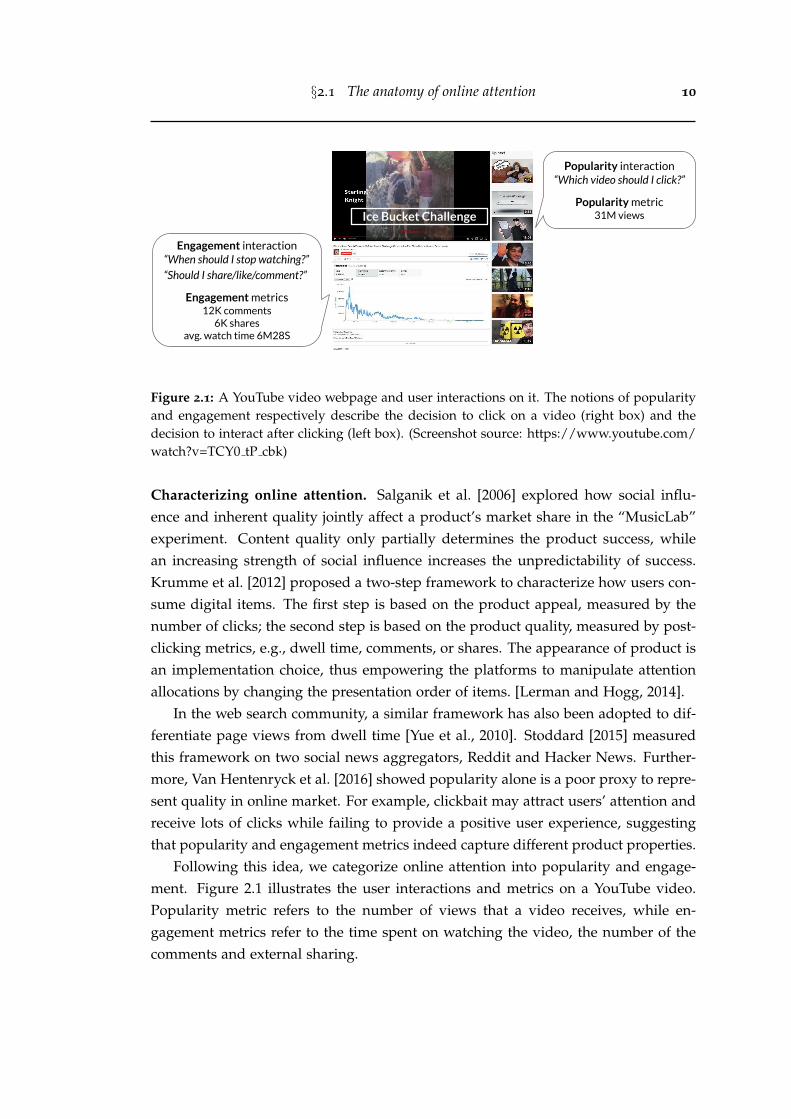
Instead of focusing on each individual user, we take an item-centric approach. Weconceptualize the behaviors of consuming a digital product as two steps – the firststep is relevant to the content appeal, measured by the number of clicks or views; thesecond step is relevant to the content quality, measured by the post-clicking metrics,e.g., dwell time, likes, or comments. The two steps characterization was also adoptedin the MIT MusicLab experiment [Salganik et al., 2006; Krumme et al., 2012]. Basedon it, online attention (behaviors) can be categorized into two classes: popularity(clicking) and engagement (watching, liking, or commenting). Intuitively, the notionsof popularity and engagement respectively describe the decision to click on an itemand the decision to interact after clicking.
In this thesis, we use the largest video hosting platform YouTube as a lens tostudy the collective user behaviors. YouTube currently ranks the second in the most-visited websites [alexa.com, 2020] and attracts over a billion hours watch time every
1
2
day [youbube.com, 2017]. Broadly, online videos account for 73% of internet trafficin 2016, and they are projected to have 82% of all traffic by 2021 [cisco.com, 2017]. Wetackle three research questions related to attention consumption on YouTube videosfrom the perspectives of sampling, engagement, and network effects.
Our first question quantifies the effects of social data sampling on widely-usedattention measures. Data sampling is a common yet fundamental problem in socialmedia studies [Morstatter et al., 2013; Olteanu et al., 2019]. Most platforms deploya request quotation system to avoid malicious attacks. For example, the prevailingdata source Twitter allows 15 to 900 requests every 15 minutes [twitter.com, 2020f],which is often inadequate to construct a complete, unsampled dataset. The datasampling introduces noises and biases [Boyd and Crawford, 2012; Tufekci, 2014].Hence, researchers must be aware and take account of hidden noises in their curateddatasets for drawing rigorous scientific conclusions.
Our second question measures and predicts the collective engagement patternstowards online content. While there has been a rich body of literature studyingonline content, current research extensively focuses on measuring and modeling thepopularity metrics [Pinto et al., 2013; Rizoiu et al., 2017b]. On the other hand, en-gagement measures, sometimes referred to as “active participation” [Khan, 2017] or“post-clicking behaviors” [Yi et al., 2014], remain understudied in academia despitebecoming core metrics in practice [youtube.com, 2012; facebook.com, 2017]. Consid-ering video watch time or webpage dwell time, the audience may immerse in thecontent once they click on the item, or quickly abandon it.
Our third question measures and models the network effects induced by therecommender systems. Many modern platforms provide algorithmic suggestionsto help users explore the enormous content space. Users may first react to exoge-nous stimuli such as breaking news events and social media promotions [Lehmannet al., 2012; De Choudhury et al., 2016]. Their attention is then amplified and steeredthrough the platforms’ recommender systems, creating an endogenous effect [Rizoiuand Xie, 2017]. On YouTube, despite that the recommender system accounts for70% watch time [cnet.com, 2018], little is known about how the system drives userattention and how the induced network affects video popularity.
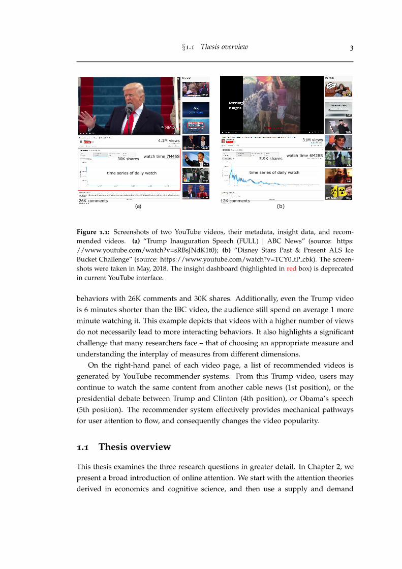
We show one example for illustrating this discrepancy between popularity andengagement metrics. Figure 1.1 (a) is the Trump1 inauguration speech video andFigure 1.1 (b) is one of the most viewed Ice Bucket Challenge2 (IBC) videos. In termsof the popularity metric, the Trump video has 4.1M views while the IBC video is farmore popular with 31M views. However, the Trump video attracts more engaging
1https://en.wikipedia.org/wiki/Donald Trump2https://en.wikipedia.org/wiki/Ice Bucket Challenge
§1.1 Thesis overview 3
(a)
4.1M views
watch time 7M45S30K shares
time series of daily watch
26K comments(b)
31M views
watch time 6M28S5.9K shares
12K comments
time series of daily watch
Figure 1.1: Screenshots of two YouTube videos, their metadata, insight data, and recom-mended videos. (a) “Trump Inauguration Speech (FULL) | ABC News” (source: https://www.youtube.com/watch?v=sRBsJNdK1t0); (b) “Disney Stars Past & Present ALS IceBucket Challenge” (source: https://www.youtube.com/watch?v=TCY0 tP cbk). The screen-shots were taken in May, 2018. The insight dashboard (highlighted in red box) is deprecatedin current YouTube interface.
behaviors with 26K comments and 30K shares. Additionally, even the Trump videois 6 minutes shorter than the IBC video, the audience still spend on average 1 moreminute watching it. This example depicts that videos with a higher number of viewsdo not necessarily lead to more interacting behaviors. It also highlights a significantchallenge that many researchers face – that of choosing an appropriate measure andunderstanding the interplay of measures from different dimensions.
On the right-hand panel of each video page, a list of recommended videos isgenerated by YouTube recommender systems. From this Trump video, users maycontinue to watch the same content from another cable news (1st position), or thepresidential debate between Trump and Clinton (4th position), or Obama’s speech(5th position). The recommender system effectively provides mechanical pathwaysfor user attention to flow, and consequently changes the video popularity.
1.1 Thesis overview
This thesis examines the three research questions in greater detail. In Chapter 2, wepresent a broad introduction of online attention. We start with the attention theoriesderived in economics and cognitive science, and then use a supply and demand
§1.1 Thesis overview 4
framework to demonstrate the competition of attention. Next, we review recentadvances in measuring collective behaviors in complex social systems from the frontsof social data sampling, popularity and engagement measures, and recommendersystems. We are interested in understanding how users reach the content, what theyconsume, and how they interact in the information-overloaded world.
In Chapter 3, we address the first research question by presenting a compre-hensive study of the Twitter sampling effects on common measurements [Wu et al.,2020]. Because we use Twitter prevalence as a proxy to obtain YouTube videos, it iscrucial to first understand the potential sampling effects on attention measures. Byconstructing two sets of complete and sampled tweet datasets on cyberbullying andYouTube sharing, we show that Twitter rate limit message is an accurate indicator forthe volume of missing tweets, and sampling rates vary across different timescales. Wefind the Bernoulli process with a uniform rate can approximate the empirical entitydistribution well. More importantly, the true entity distribution and ranking can beinferred based on sampled observations. In network measures, we observe that thestructures are altered with denser components more likely to be preserved. Lastly,sampling compromises the quality of diffusion models since tweet inter-arrival timeis significantly longer in the sampled stream, while user influence is lower.
We curate a longitudinal dataset that tracks tweets containing YouTube URLsfrom 2015 to 2019. On average, more than 3M tweets are collected every day. Weextract the associated URLs to acquire YouTube video ids. We develop a new Pythonpackage to crawl YouTube data, and use it to construct two large video datasets,which are our basis to study the collective user behaviors in online videos.
In Chapter 4, we address the second research question by presenting the firstlarge-scale measurement study of video engagement on YouTube [Wu et al., 2018]. Incontrast to prior work that requires auxiliary toolkits to record user actions [Buscheret al., 2009; Arantes et al., 2016], our collection (5.3M videos) raises the data volumeby several orders of magnitude. We study a set of metrics including time and per-centage of videos being watched. We observe that video duration is an importantcovariate on watching patterns. Longer videos generally make the users stay fora longer time but are less likely to keep them watching till the end. To calibratewatching metrics against video duration, we construct a 2-dimensional tool, calledengagement map. Based on it, we propose a new metric, called relative engagement,as the watch percentage rank percentile among videos of similar lengths. This met-ric is closely correlated with recognized notions of content quality. Moreover, wefind that engagement measures are stable over time and predictable even before avideo’s upload. They have most of the variance explained by video context, topicsand channel information at coefficient of determination R2 of 0.77. Using a Hawkes
§1.2 Key contributions and impact 5
process model to forecast the video attention dynamics, we find the time series ofthe engagement metric (daily watch time) is more predictable than that of the popu-larity metric (daily view count). The result is significant as it separates the concernsfor modeling engagement and popularity – the latter is known to be unpredictableaprior and driven by external promotions [Kong et al., 2018].
In Chapter 5, we address the third research question by presenting the first large-scale measurement study on the network effects induced by YouTube recommendersystems [Wu et al., 2019]. We construct the content recommendation network for60,740 music videos from 4,435 professional artists. An edge indicates that the targetvideo is recommended on the webpage of source video. Our work is motivated by afew key observations that the recommender systems drive user attention, especiallywhen a blockbuster video is uploaded or when a breaking news event arises. By sys-tematically measuring the entire network, we find that videos are disproportionatelyrecommended towards more popular videos. This means the recommender systemis likely to take a random viewer to more popular videos and keep them there,thus reinforcing the “rich get richer” phenomenon. Furthermore, we use the bow-tiestructure [Broder et al., 2000] to characterize the recommendation network. We findthat its core component (23.1% of the videos) occupies most of the attention (82.6%of the views). This is indicative of the connection between video recommendationand the inequality of user attention allocation. Finally, we estimate the attentionflow in the video recommendation network. We propose a new model, called AR-Net, which accounts for the network structure and can predict video popularity 9.7%better than other baselines. The ARNet model also allows us to identify a group ofartists who gain significant attention from the recommender systems. Furthermore,we develop a new demo called AttentionFlow [Shin et al., 2021] to visualize theeffects of recommendation for videos and artists in the YouTube network.
Finally, we summarize our work and present a number of interesting future di-rections in Chapter 6.
1.2 Key contributions and impact
The key contributions of this thesis include new observations, methods, metrics,datasets, software, and web demonstrations.
• New observations and methods on social data sampling. (1) The volume of miss-ing tweets can be estimated by rate limit messages. (2) Tweet sampling rates varyacross different timescales. (3) The Bernoulli process approximates the empiricalentity distribution well. (4) Sampling compromises the quality of network and
§1.2 Key contributions and impact 6
diffusion models. (5) A new method to infer true entity statistics (e.g., missingvolume, entity distribution, and ranking) based on sampled observations.
• New metrics and observations on collective engagement patterns. (1) A newtool called engagement map to capture the nonlinear relationship between videolength and watch patterns. (2) A new metric – relative engagement – that calibratesagainst video length, correlates with video quality, and appears stable over time.(3) Engagement metrics can be predicted in a cold-start setup, achieving R2=0.77.
• New observations and methods on recommendation network effects. (1) Thefirst large-scale characterization of the video recommendation network intersectingwith video attention consumption. (2) Popularity bias – videos are disproportion-ately recommended towards more popular videos. (3) A new model called ARNetthat accounts for the network structure to predict video popularity and to estimatethe network contribution between videos and artists.
• Large-scale datasets. We curate and release two YouTube datasets. (1) YouTube
Engagement ’16 dataset contains 5.3M videos published and tweeted between Julyand August, 2016. (2) Vevo Music Graph dataset contains 60K music videos with63 daily snapshots of the video recommendation network. We also release two setsof Complete/Sampled Retweet Cascades datasets on the topics of cyberbullyingand YouTube sharing.
• Open software. We release two new data collection tools. (1) Twitter-intact-stream, for reconstructing the complete filtered stream on Twitter; (2) YouTube-insight, for collecting metadata and historical data for videos on YouTube.
• Web demonstrations. We build two new web demonstrations. (1) HIPie, for ex-plaining and predicting the popularity of YouTube videos; (2) AttentionFlow,for visualizing a collection of time series and the dynamic network influence.
Overall, a better understanding of how online content attracts human attentionprovides us with a set of useful tools to improve user experience in online platforms.The observations of the sampling study can help researchers be aware of and mitigatehidden noises in social media datasets. The observations of the engagement studycan help content producers choose engaging topics to create better products, and helphosting sites prioritize quality products in recommender systems. The observationsof the network effects study can help content owners understand how traffic is drivenfor better promotion strategies, help hosting sites combat social optimization, andhelp online users be conscious of the relevance, novelty and diversity trade-offs inthe content they are recommended to.
§1.2 Key contributions and impact 7
Looking forward, the popularity bias in the recommendation network sheds lighton building a responsible online platforms. But we still lack knowledge of howthe recommender systems change a user’s cognition, stance and behavior. Futureresearch should include a user-centric qualitative study that surveys user cognitionon the effects of recommender systems, and a quantitative study that uses auditingmethods to examine the biases in the recommendation network.
Chapter 2
Related work
The collective user behaviors that we investigate in this thesis have been studied inmultiple disciplines including computer science, sociology, and economics. Firstly,we provide a brief introduction to online attention in Section 2.1. Next, Section 2.2details the usage of social media APIs and their sampling effects. Guiding by the twosteps framework, we review work studying the engagement and popularity patternsin Section 2.3 and Section 2.4, respectively. Lastly, we discuss recommender systemsand their effects on driving user attention in Section 2.5.
2.1 The anatomy of online attention
In psychology, attention is a cognitive process of selectively concentrating on a spe-cific piece of information [James, 2007]. American economist, Nobel Prize and TuringAward winner Herbert Simon articulated the concept of attention economy, in whichhe pointed out that attention is the limiting factor for information consumption sincehuman beings cannot digest all the information [Simon, 1971]. In modern society, at-tention becomes a scarce commodity. Users need to allocate their attention efficientlyto avoid getting lost in a wealth of information.Competition for finite attention. The attention competition is exacerbated with theexplosive growths of online products and social media content. Whenever a novelitem occurs, it often captures immediate attention. This effectively reduces the at-tention to other items, leading to inattentional blindness [Chabris and Simons, 2010].Wu and Huberman [2007] studied the dynamics of collective attention in Digg sto-ries. They observed a natural time scale over which the attention fades. The dynam-ics can be described by an exponentially decaying model characterized by a singlenovelty factor. Weng et al. [2012] investigated how the competition shapes the spreadof information, especially on content popularity, diversity, and lifetime. Valera andGomez-Rodriguez [2015] modeled and illustrated the impact of social influence onthe adoption of competing products.
8
§2.1 The anatomy of online attention 9
The attention competition also exists in social networks. First proposed by Britishanthropologist Robin Dunbar, the Dunbar’s number suggests the cognitive limit of thenumber of people with whom one can maintain stable relationships [Dunbar, 1992].He found a correlation between primate brain size and average social group size.The Dunbar’s number for human beings is often perceived around 150. However,the prevailing usage of social media really boosts the number of relationships onecan possible make. Although initially obtained in an offline experimental setting,can the Dunbar’s number generalize to online relationships?
Goncalves et al. [2011] validated the Dunbar’s number on a large Twitter net-works. They found that the empirical data is in agreement with Dunbar’s result:users can only maintain a close relationship circle of 100-200 people. On another so-cial media platform Facebook, Backstrom et al. [2011] analyzed how the users balancetheir attention among social contacts. They found that communication-based activ-ities (e.g, messages and comments) are much more focused with a higher fractionof attention going towards top contacts, while viewing-based activities (e.g, profileviews and photo views) are significantly more dispersed across contacts.
The above research altogether gives an example of saturated attention economy:the ability of information consumption is greatly limited by the finite human atten-tion. This can partly explain many social and economic phenomena, such as “richget richer” [Piketty, 2015] and “winner takes all” [Giridharadas, 2019].Strategies to gain attention. Nowadays, most user-generated content (UGC) siteshave three stakeholders: content consumers, content producers, and hosting plat-forms. We can use a supply and demand framework to explain their goals. Con-sumers have the demand of consuming information and the resources (e.g., time,money) to spend. On the supply end, producers aim at maximizing exposure andmonetization by attracting as many consumers as possible; hosting platforms wantto keep the consumers satisfied by aligning them with the needed products [Konstanand Riedl, 2012]. Therefore, a surrogate metric of attention is useful and desirable,since it can serve as a quantifiable signal for the producers to improve their produc-tions, and for the platforms to improve their services.
For the above three stakeholders, their strategies for gaining attention vary eventhough it is intuitive that higher quality products will probably beget more attention.In this thesis, we focus on the perspectives of content producers and hosting sites.Shen et al. [2015] investigated product rating on Amazon and found strategic behav-iors among online reviewers. Their results suggest that reviewers are more likely topost reviews for popular but less crowded products, and tend to be more conserva-tive when posting controversial opinions. In terms of the platforms, recommendersystems are widely used to attract users’ long term attention [Chen et al., 2019].
§2.1 The anatomy of online attention 10
Popularity interaction“Which video should I click?”
Popularity metric31M views
Engagement interaction“When should I stop watching?”“Should I share/like/comment?”
Engagement metrics12K comments
6K sharesavg. watch time 6M28S
Ice Bucket Challenge
Figure 2.1: A YouTube video webpage and user interactions on it. The notions of popularityand engagement respectively describe the decision to click on a video (right box) and thedecision to interact after clicking (left box). (Screenshot source: https://www.youtube.com/watch?v=TCY0 tP cbk)
Characterizing online attention. Salganik et al. [2006] explored how social influ-ence and inherent quality jointly affect a product’s market share in the “MusicLab”experiment. Content quality only partially determines the product success, whilean increasing strength of social influence increases the unpredictability of success.Krumme et al. [2012] proposed a two-step framework to characterize how users con-sume digital items. The first step is based on the product appeal, measured by thenumber of clicks; the second step is based on the product quality, measured by post-clicking metrics, e.g., dwell time, comments, or shares. The appearance of product isan implementation choice, thus empowering the platforms to manipulate attentionallocations by changing the presentation order of items. [Lerman and Hogg, 2014].
In the web search community, a similar framework has also been adopted to dif-ferentiate page views from dwell time [Yue et al., 2010]. Stoddard [2015] measuredthis framework on two social news aggregators, Reddit and Hacker News. Further-more, Van Hentenryck et al. [2016] showed popularity alone is a poor proxy to repre-sent quality in online market. For example, clickbait may attract users’ attention andreceive lots of clicks while failing to provide a positive user experience, suggestingthat popularity and engagement metrics indeed capture different product properties.
Following this idea, we categorize online attention into popularity and engage-ment. Figure 2.1 illustrates the user interactions and metrics on a YouTube video.Popularity metric refers to the number of views that a video receives, while en-gagement metrics refer to the time spent on watching the video, the number of thecomments and external sharing.
§2.2 Social data sampling 11
2.2 Social data sampling
We rely on social media APIs to collect data used in this thesis, specifically, Twitterand YouTube APIs. YouTube API does not subsample the data, yet it requires aninput field of video id. Because we use collected tweets as a proxy to obtain YouTubevideo ids, it is crucial to first understand Twitter data sampling.Twitter APIs. Twitter has different levels of access (Firehose, Gardenhose, Spritzer)and different ways to access (search API, sampled stream, filtered stream). As thecomplete data service (Firehose) incurs excessive costs and requires severe storageloads, here we only discuss the free APIs.
• Twitter search API returns relevant tweets for a given query, but it only fetchesresults published in the past 7 days [twitter.com, 2020d]. The search API alsobears the issue of data attrition. Research using this API to construct a “complete”dataset would inevitably miss parts of desired tweets [Wang et al., 2015] since tweetcreation and deletion are highly dynamic [Almuhimedi et al., 2013]. To overcomethis limitation, researchers can pivot to the streaming APIs, which return publictweets at the time of their creation.
• Twitter sampled streaming API returns roughly 1% of all public tweets in real-time [twitter.com, 2020c]. Pfeffer et al. [2018] detailed its sampling mechanism andidentified potential tampering behaviors. Ghosh et al. [2013] compared the 1%sampling with expert sampling. They observed that elite users share more trust-worthy content and react faster to breaking events. Gonzalez-Bailon et al. [2014]examined the biases in the retweet network from the 1% sample and the searchAPI. Some researchers found that the 1% sample can be treated as a representa-tive sample of all Twitter activities since the hashtag frequencies from 1% samplelargely overlay (within 3 standard deviations) with the bootstrapped random sam-ples from the complete Firehose stream [Morstatter et al., 2014]. However, it isworth noting that data filtering can only be conducted after the data is collected.Therefore, the sampled streaming API is not suitable to create ad hoc datasets, e.g.,tracking all tweets that contain the hashtag #coronavirus.
• Twitter filtered streaming API collects tweets matching a set of prescribed pred-icates in realtime [twitter.com, 2020a]. Suppose that the streaming rate is belowTwitter limit, the pre-filtering makes the filtered stream possible to construct thecomplete datasets without using the costly Firehose stream, e.g., on social move-ments [De Choudhury et al., 2016], on news outlets [Mishra et al., 2016], and oncontroversial topics [Bista et al., 2019]. We focus on the scenes where the datastreams are sampled. The most relevant work is done by Morstatter et al. [2013],
§2.2 Social data sampling 12
in which they compared the filtered stream with the Firehose, and measured thediscrepancies in various metrics.
Another important observation is that Twitter sampling is deterministic. Josephet al. [2014] found no practical differences in tweets seen in different streamingclients, as long as the filtered configurations are the same. Therefore, simply stack-ing crawlers with the same predicates will not yield more data. However, userscan improve the sample coverage by splitting the keyword set into multiple disjointpredicate sets, and monitoring each set with a distinct subcrawler. Sampson et al.[2015] successfully inflated the volume of collected tweets by 10 times through 20subcrawlers.Effects of missing social data. The data quality problem has received growing atten-tion in academic studies. Social data, which records ubiquitous human activities indigital form, plays a fundamental role in social media research. Boyd and Crawford[2012] pointed out the necessity to interrogate the assumptions and biases in data.Ruths and Pfeffer [2014] discussed the biases and flaws in social media data. Tufekci[2014] outlined five issues on data representativeness and validity. The hidden databiases may alter some research conclusions and even impact human decision mak-ing [Olteanu et al., 2019].Sampling from graphs and cascades. Leskovec and Faloutsos [2006] studied dif-ferent graph sampling strategies for drawing representative samples. Wagner et al.[2017] considered how sampling impacts the relative ranking of groups in the at-tributed graphs. The effects of graph sampling have been extensively discussed byKossinets [2006]. In a retweet graph, the missing tweets can cause edge weights todecrease, and some edges to even disappear. On sampling a cascade, De Choud-hury et al. [2010] found that combining network topology and contextual attributesdistorts less the observed metrics. Sadikov et al. [2011] proposed a k-tree model touncover some properties from the sampled data. They both sampled the cascadesvia different techniques (e.g., random, activity-based, forest fire) and varying ratios.
In this thesis, we do not design new sampling mechanism, instead, we study thesampling effects of Twitter’s proprietary algorithm. Based on a widely-used Redditcorpus, Gaffney and Matias [2018] identified and suggested strong risks in researchthat concerns user history or network information, and moderate risks in researchthat uses aggregate counts. We use these qualitative observations as starting pointsand conduct a set of in-depth quantitative measurements in Chapter 3. We corrob-orate the risks in user history study and network analysis and further extend thescope of measured subjects. Moreover, we use the sampled observations to estimatethe unobserved, complete entity statistics. Our observations are of great importance
§2.3 User engagement 13
to researchers who use Twitter data for empirical measurement and user modeling.
2.3 User engagement
Many researchers have analyzed user engagement behaviors towards web content.For example, the line of work that measures webpage reading patterns often exploitsauxiliary toolkits such as mouse-tracking [Arapakis et al., 2014; Lagun and Lalmas,2016] or eye-tracking [Buscher et al., 2009] instrumented browser. Dwell time, whichis conceptually close to video watch time, has been widely used in the domainsof web search and recommendation to improve retrieval performance [Dupret andLalmas, 2013; Lalmas et al., 2015].
In recommender systems, Yi et al. [2014] compared two systems that optimize forclicks and dwell time, and found the one using dwell time achieves better perfor-mance on ranking relevant products. On YouTube, both explicit (e.g., rating) and im-plicit (e.g., watch time) feedback signals are vital for recommending satisfied items tousers [Davidson et al., 2010; Covington et al., 2016]. More recently, YouTube switchedto promote videos that can keep the audience watching for longer time rather thanthese optimizing for clicks [youtube.com, 2012]. The same adjustment was also seenin Facebook videos [facebook.com, 2017].Individual versus collective measurement. Most of the above research is user-centricas they study engagement for each individual user. User activity trajectories (e.g.,search history, watch history) are often assumed available in this approach. Thisinformation is obtained either from internal logs or from crowdsourcing platformssuch as Amazon Mechanical Turk (MTurk).
Figueiredo et al. [2014] asked 72 MTurk users to rate pairs of YouTube videos, andfound that in most evaluations users could not reach consensus on which video is ofbetter quality. Arantes et al. [2016] monitored a campus network and analyzed howusers interact with video-ad on YouTube. Sun et al. [2017] interviewed a small groupof recruited participants on how they watch a video together. Swart et al. [2020]surveyed 300 MTurk users to evaluate if advertising banner on YouTube is noticeable.Survey, interview, field deployment, and diary study are important means of user-centric studies in human-computer interaction (HCI). However, they are unlikely toprovide quantitative conclusions due to limited data size, typically ranging from adozen to several hundred.
Unfortunately, user-level data is generally inaccessible on YouTube, even the con-tent owners only observe an aggregate analytic report. To this end, researchers cantake an item-centric approach as the aggregate statistics for each item is public andcan be crawled by automated scripts [Yu et al., 2015].
§2.4 Item popularity 14
Dobrian et al. [2011] correlated user engagement on video watching with networkquality, e.g., join time, buffering ratio, rendering quality. Guo et al. [2014] presented acase study of 4 pre-selected edX courses, where mixed methods were applied – min-ing edX server logs and interviewing course designer. This approach is infeasible atthe scale of system level and its implications are limited within the area of educa-tional videos. The most relevant work to this thesis is from Park et al. [2016], whomeasured watch time of a small set of YouTube videos, and showed the predictivepower of collective reactions.Modeling user engagement. Guo and Agichtein [2012] monitored cursor movingand scrolling to estimate document relevance on webpage. Drutsa et al. [2015] usedgradient boosting decision tree model to predict user browsing behaviors in searchengine. Barbieri et al. [2016] used survival analysis techniques to estimate the distri-bution of time that users will spend on online advertisements. Dupret and Lalmas[2013] argued that solely relying dwell time is not enough, the time between twoconsecutive user visits, or the absence time, should also be taken into considerationfor modeling engagement.
On online videos, Chen et al. [2013] correlated watch time to video length, type,and popularity measures. Their model is a simple concatenation of multiple linearcomponents. Park et al. [2016] showed that watch percentage is positively associatedwith the view count, the number of likes per view, and perhaps most surprisingly,the negative sentiment in the comments. One drawback of these features is that theyrequire observing videos for some period of time. Yet, a large fraction of videos donot have comments [Cheng et al., 2008], making this prediction setup inapplicable toany random YouTube video. Tong et al. [2020] studied video engagement from a neu-roscience viewpoint. They found that brain activities are informative for predictingwhen users stop watching.
Complementary to the studies on engagement behaviors for individual user, ourwork in Chapter 4 focuses on measuring and modeling content engagement at theaggregate level and at large scale. We propose a new metric, called relative engage-ment, and we find it closely correlates with recognized notion of quality. We alsoshow that the aggregate engagement is stable throughout a video’s lifetime, and itcan be predicted before the video gathers any view or comment.
2.4 Item popularity
Individual user actions on social media platforms give rise to complex phenomenaat the aggregate level (e.g., spiky, irregular, seasonal popularity). Cha et al. [2007]are among the first to observe the long-tail distribution of popularity on YouTube, in
§2.4 Item popularity 15
which they explain by the preferential attachment effect. Gill et al. [2007] analyzedthe YouTube network traffic inside the campus of the University of Calgary. Theyfound that the viewing patterns for videos vary significantly by the time of day andday of week. Zhou et al. [2010] revealed that internal search and video recommen-dation are the two most important traffic sources for video popularity. Figueiredoet al. [2011] characterized the growth patterns of video popularity. In particular, topvideos often get most of the views much earlier in their lifetimes.Modeling item popularity. Popularity dynamic is the most studied attribute of on-line products. One line of work aims at predicting the volume of final popularity [Sz-abo and Huberman, 2010]. On the other hand, many researchers focus on predictingthe shape (e.g., time series) of future popularity [Figueiredo et al., 2016].
A number of models have been proposed to describe it, such as a series of en-dogenous relaxations [Crane and Sornette, 2008] or multiple power-law phases [Yuet al., 2015]. Other studies link popularity dynamics to epidemic contagion [Bauck-hage et al., 2015; Kong et al., 2020b], external stimulation [Yu et al., 2014] or geo-graphic locality [Brodersen et al., 2012]. We broadly categorize the approaches intofour directions: time series analysis, feature-driven model, point process, and deeplearning.
• Time series analysis is based on the autocorrelation between past observations andfuture trend. Szabo and Huberman [2010] showed that early viewing pattern is astrong predictor for future views and the relation appears to be log-linear. Later,Pinto et al. [2013] extended the log-linear model to multivariate linear regression(MLR) to account for the different weights of past observations and a Radial Ba-sis Functions (RBF) kernel MLR to account for the similarity of popularity growthpatterns with a set of pre-selected video clusters. Instead of predicting numericalvalue, Ahmed et al. [2013] discretized popularity into several states and used tran-sition graph to infer hidden popularity states. Autoregressive Integrated MovingAverage (ARIMA) is one of the most used methods for modeling time series data.It decouples the trend part and the seasonality part. Gursun et al. [2011] appliedseasonal ARIMA to predict future view counts on YouTube videos.
• Feature-driven approach falls into the regime of traditional machine learning thatrelies on feature engineering. It achieves the trade-off between predictability andinterpretability [Hofman et al., 2017] and often provides instrumental insights.Studying the sharing behaviors of Facebook posts, Cheng et al. [2014] observedthat temporal and structural features are key predictors of final popularity size. Incontrast, Martin et al. [2016] found that even with unlimited data, the predictiveability in complex social systems would be bounded below a theoretic, determin-
§2.4 Item popularity 16
istic threshold. Nevertheless, both works point out that past success is the mostpredictive feature. On YouTube, Ma et al. [2017] utilized metadata features fromvideo and its uploader in a regression model to predict lifetime popularity. Abi-sheva et al. [2014] conducted a cross-platform prediction task that uses the sharingsignals on Twitter to predict the video popularity on YouTube.
• Point processes contain a family of generative models that account for the impactsfrom past events, for example, poisson point process, determinantal point pro-cess, Hawkes process, to name a few. They are often associated with a decayingkernel (e.g., power-law or exponential) since the interest towards a new event nat-urally fades away [Wu and Huberman, 2007]. Zhao et al. [2015] proposed a doublystochastic poisson process called SEISMIC to model the information diffusion onTwitter. Mishra et al. [2016] integrated content features into a marked Hawkes self-exciting point process to estimate content virality, memory decay, and user influ-ence. Kong et al. [2020a] extended self-exciting processes to dual-mixture processesfor characterizing the resharing cascades of online items. Rizoiu et al. [2017b] usedHawkes process to explain the complex popularity dynamics of YouTube videosas two components: exogenous stimuli and endogenous response. For a detailedintroduction of Hawkes process on social media, we refer to the tutorials by Rizoiuet al. [2017a].
• Deep learning is an active research field. In particular, recurrent neural network(RNN) with long short-term memory (LSTM) units has achieved state-of-the-artperformances in many time series modeling tasks [Kuznetsov and Mariet, 2019].Li et al. [2017] proposed an end-to-end deep learning framework to predict cascadesize on Twitter. They found it is critical to learn how the information is diffused(graph embedding) but not merely who shares the information (node embedding).Zhu and Laptev [2017] used a Bayesian neural network model for both point anduncertainty estimation in Uber trip data. Although deep learning techniques mayobtain superior modeling results, the fact that they often fall short of interpretabil-ity is undesirable in providing practical instructions to the stakeholders.
Our model in Chapter 5 takes a mixed approach – we extract features from bothtime series and network. To our knowledge, no prior work has attempted to pre-dict video popularity with fine-grained content recommendation network due to thedifficulty in constructing such network. Although the regression-based model is rel-atively simple, we show that once integrating the network structure, it is possible tobeat more sophisticated time series and deep learning models.
§2.5 Content recommendation networks 17
2.5 Content recommendation networks
The goals of recommender systems can be summarized as two related yet distincttasks. The first task is user-centric, i.e., given users’ profiles and past activities,finding a collection of items that might interest them [Konstan and Riedl, 2012]. Theresulting recommendations, often shown in user homepage feed, can be regardedas the entry point for the user action sequence (also known as a user session). Thesecond task is item-centric, i.e., given the currently visited item, finding a rankedlist of relevant items [Zhang et al., 2012; Gomez-Uribe and Hunt, 2016]. This can beregarded as recommending the next item in a sequence of actions.
In the same vein, we conceptualize and explain the behaviors on online platforms– users start the action sequences by latent interests, and their subsequent actionsare driven by network effects. The items that are connected by the recommendersystems, form a backbone content network of user navigation pathways.Recommender systems on YouTube. Recommender systems, along with YouTubesearch, have been shown as the two dominant factors driving user attention onYouTube [Zhou et al., 2010]. In 2010, Davidson et al. [2010] reported the usage ofa collaborative filtering method in the YouTube recommender systems, i.e., videosare recommended by counting the number of co-watches. This approach works wellfor videos with many views, however, it is less applicable for newly uploaded videosor least watched videos. Bendersky et al. [2014] proposed two methods to enhancethe collaborative filtering approach by embedding the video topic representation intothe recommender. Covington et al. [2016] applied deep neural networks and indi-cated that the final recommendation is a top-K sample from a large candidate setgenerated by taking into the account content relevance, past watch and search activ-ities, etc. Other enhancements include incorporating contextual data [Beutel et al.,2018]. Chen et al. [2019] and Ie et al. [2019] showed success in applying reinforce-ment learning techniques in YouTube recommender systems. Most recently, fairnessand responsibility in recommender systems have received significant amount of at-tention [Wilhelm et al., 2018; Beutel et al., 2019; Yi et al., 2019].
Our work does not deal with designing a recommender system, nor does it at-tempt to reverse engineer the YouTube recommender. Instead, we concentrate ouranalysis on the impacts of the recommender systems by presenting large-scale mea-surements of the content recommendation network.Measuring the effects of recommender systems. Contrasting the extensive literatureon evaluating the accuracy of recommendation [Zhang et al., 2012; Lalmas et al., 2015;Li et al., 2018], we focus on prior work that connects network structure with contentconsumption. Gal Oestreicher-Singer and her collaborators have presented a series
§2.5 Content recommendation networks 18
of work on Amazon book recommendation network. Firstly, Oestreicher-Singer andSundararajan [2012] demonstrated the demand effects of recommendation networks.Dhar et al. [2014] further showed the effectiveness of using the recommendationnetwork in predicting item demands. Lastly, Carmi et al. [2017] reported how thebook sales react to exogenous demand shocks – not only does the sales increase forthe featured item, but the increase also propagates a few hops away by following thelinks created by the recommender systems.
Su et al. [2016] linked the aggregate effects of recommendations and networkstructure, and found that popular items profit substantially more than the averageones. However, Sharma et al. [2015] stressed the difficulty of inferring causal relationsbased on observational data in recommender systems. Zannettou et al. [2018] inves-tigated a set of clickbait videos on YouTube. Surprisingly, their analysis suggestedthat YouTube recommender fails to take into account the factors of clickbait.
Cheng et al. [2008] are among the first to study the popularity statistics of YouTuberecommender systems. They scraped video webpages to construct the video networkat a weekly interval. Airoldi et al. [2016] followed the video suggestions on YouTubeto construct one static network snapshot for a random collection of music videos.
Note that both studies adopt a snowball sampling technique to construct thenetwork, whereas in Chapter 5 of this thesis, we have the complete trace of an easilyidentifiable group of Vevo artists. The data collection method allows us to find theless connected group in the network. We capture the dynamics of network snapshotsat a much finer daily granularity. Since presenting an item does not guarantee theconsumption of item, our work is significant as we link the content network withthe attention dynamics. We discover the popularity bias in YouTube recommendersystems – videos are disproportionately recommended to more popular videos. Wealso quantify the unequal attention allocation that the largest strongly connectedcomponent (23% of videos) attract 82% of all attention.
Chapter 3
Quantifying sampling effects ofonline social data
A comprehensive understanding of data quality is the cornerstone of measurementstudies in social media research. Many researchers rely on public and free applica-tion programming interfaces provided by the hosting platforms to curate datasets.However, the process should be taken with caution, since defective data collectionpipelines may introduce noises and potential biases in social data, effectively alteringthe observations and conclusions.
In this chapter, we present in-depth measurements on the effects of Twitter datasampling across different timescales and different subjects (entities, networks, andcascades). By constructing complete tweet streams, we show that Twitter rate limitmessage is an accurate indicator for the volume of missing tweets in Section 3.2.Sampling also differs significantly across timescales. While the hourly sampling rateis influenced by the diurnal rhythm in different time zones, the millisecond levelsampling is heavily affected by the implementation choices (Section 3.3). For Twitterentities such as users, we find the Bernoulli process with a uniform rate approxi-mates the empirical distributions well. It also allows us to estimate the true rankingwith the observed sample data (Section 3.4). For networks on Twitter, their struc-tures are altered significantly and some components are more likely to be preserved(Section 3.5). For retweet cascades, we observe changes in distributions of tweetinter-arrival time and user influence, which will consequently affect models that relyon these features (Section 3.6). Altogether, the work in this chapter provides a fewpractical tools to measure Twitter sampling effects.
19
§3.1 Introduction 20
3.1 Introduction
“Polls are just a collection of statistics that reflect what people are thinking in‘reality’. And reality has a well-known liberal bias.” – Stephen Colbert1
Data quality is a timely topic that receives broad attention. The data noises andbiases particularly affect data-driven studies in social media [Tufekci, 2014; Olteanuet al., 2019]. Overrepresented or underrepresented data may mislead researchersto spurious claims [Ruths and Pfeffer, 2014]. For example, opinion polls wronglypredicted the U.S. presidential election results in 1936 and 1948 because of unrepre-sentative samples [Mosteller, 1949]. In the era of machine learning, the data biasescan be amplified by the subsequent models. For example, models overly classifyagents doing cooking activity as female due to overrepresented correlations [Zhaoet al., 2017], or lack the capacity to identify dark-skinned women due to underrepre-sented data [Buolamwini and Gebru, 2018]. Hence, researchers must be aware andtake account of the hidden noises in their datasets for drawing rigorous scientificconclusions.
Twitter is the most prominent data source in ICWSM – 82 (31%) out of 265 fullpapers in the past 5 years (2015-2019) used Twitter data2, in part because Twitterhas relatively open data policies, and in part because Twitter offers a range of pub-lic application programming interfaces (APIs). Researchers have used Twitter dataas a lens to understand political elections [Bovet and Makse, 2019], social move-ments [De Choudhury et al., 2016], information diffusion [Zhao et al., 2015], andmany other social phenomena. Twitter offers two streaming APIs for free, namelysampled stream and filtered stream. The filtered stream tracks a set of keywords,users, languages, and locations. When the matched tweet volume is above a thresh-old, Twitter subsamples the stream, which compromises the completeness of thecollected data. In this chapter, we focus on empirically quantifying the data noisesresulted from the sampling in the filtered stream and its impacts on common mea-surements.
Our work addresses two open questions related to Twitter data sampling. Firstly,how are the tweets missing in the filtered stream? The sampling mechanism of thesampled stream has been extensively investigated [Kergl et al., 2014; Pfeffer et al.,2018], but relatively little is said about the filtered stream. Since the two streamingAPIs are designed to be used in different scenarios, it is pivotal for researchers whouse the filtered stream to understand what, when, and how much data is missing.Secondly, what are the sampling effects on common measurements? Our work
1At the 2006 White House Correspondents’ Dinner.2We list the papers and their used Twitter APIs in Section A.1.
§3.1 Introduction 21
is inspired by Morstatter et al. [2013], who measured the discrepancies of topical,network, and geographic metrics. We extend the measurements to entity frequency,entity ranking, bipartite graph, retweet network, and retweet cascades. The answersto these questions not only help researchers shape appropriate questions, but alsohelp platforms improve their data services.
We address the first question by curating two datasets that track suggested key-words in previous studies. Without leveraging the costly Twitter Firehose service, weconstruct the complete tweet streams by splitting the keywords and languages intomultiple subcrawlers. We study the Twitter rate limit messages. Contradicting obser-vations made by Sampson et al. [2015], our results show that the rate limit messagesclosely approximate the volume of missing data. We also find that sampling rateshave distinct temporal variations across different timescales, especially at the level ofhour and millisecond.
Addressing the second question, we measure the effects of Twitter data samplingacross different subjects, e.g., the entity frequency, entity ranking, user-hashtag bi-partite graph, retweet network, and retweet cascades. We find that (1) the Bernoulliprocess with a uniform rate can approximate the empirical entity distribution well;(2) the ranks of top entities are distorted; (3) the true entity frequency and rankingcan be inferred based on sampled observations; (4) the network structures changesignificantly with some components more likely to be preserved; (5) sampling com-promises the quality of diffusion models as the distributions of tweet inter-arrivaltime and user influence are substantially skewed. We remark that this work onlystudies the effects of Twitter sampling mechanism, but does not intend to reverseengineer it.
The main contributions of this chapter include:
• We show that Twitter rate limit message is an accurate indicator for the volume ofmissing tweets.
• A set of measurements on the Twitter sampling effects across different timescalesand different subjects.
• We show how to estimate the entity frequency and ranking of the complete datausing only the sample data.
• We release a software package “Twitter-intact-stream” for constructing the com-plete data streams on Twitter3.3The data collection package is available at https://github.com/avalanchesiqi/twitter-intact-stream.
Analysis code and collected data are available at https://github.com/avalanchesiqi/twitter-sampling.
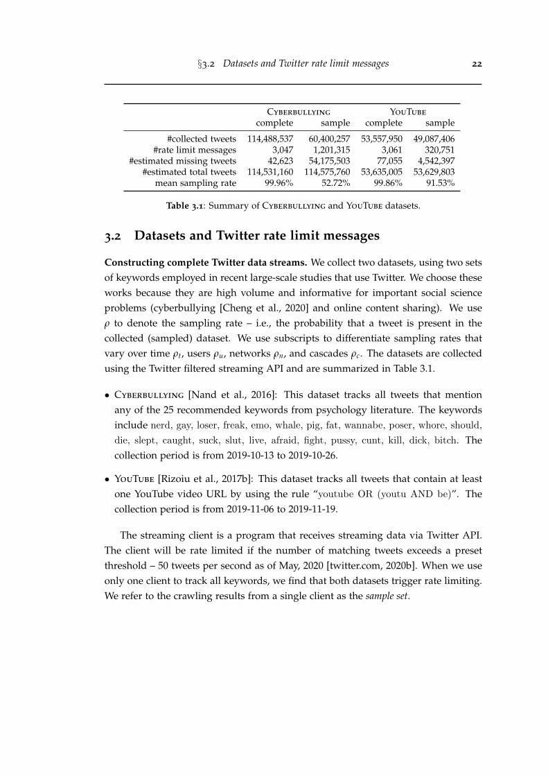
§3.2 Datasets and Twitter rate limit messages 22
Cyberbullying YouTube
complete sample complete sample
#collected tweets 114,488,537 60,400,257 53,557,950 49,087,406#rate limit messages 3,047 1,201,315 3,061 320,751
#estimated missing tweets 42,623 54,175,503 77,055 4,542,397#estimated total tweets 114,531,160 114,575,760 53,635,005 53,629,803
mean sampling rate 99.96% 52.72% 99.86% 91.53%
Table 3.1: Summary of Cyberbullying and YouTube datasets.
3.2 Datasets and Twitter rate limit messages
Constructing complete Twitter data streams. We collect two datasets, using two setsof keywords employed in recent large-scale studies that use Twitter. We choose theseworks because they are high volume and informative for important social scienceproblems (cyberbullying [Cheng et al., 2020] and online content sharing). We useρ to denote the sampling rate – i.e., the probability that a tweet is present in thecollected (sampled) dataset. We use subscripts to differentiate sampling rates thatvary over time ρt, users ρu, networks ρn, and cascades ρc. The datasets are collectedusing the Twitter filtered streaming API and are summarized in Table 3.1.
• Cyberbullying [Nand et al., 2016]: This dataset tracks all tweets that mentionany of the 25 recommended keywords from psychology literature. The keywordsinclude nerd, gay, loser, freak, emo, whale, pig, fat, wannabe, poser, whore, should,
die, slept, caught, suck, slut, live, afraid, fight, pussy, cunt, kill, dick, bitch. Thecollection period is from 2019-10-13 to 2019-10-26.
• YouTube [Rizoiu et al., 2017b]: This dataset tracks all tweets that contain at leastone YouTube video URL by using the rule “youtube OR (youtu AND be)”. Thecollection period is from 2019-11-06 to 2019-11-19.
The streaming client is a program that receives streaming data via Twitter API.The client will be rate limited if the number of matching tweets exceeds a presetthreshold – 50 tweets per second as of May, 2020 [twitter.com, 2020b]. When we useonly one client to track all keywords, we find that both datasets trigger rate limiting.We refer to the crawling results from a single client as the sample set.
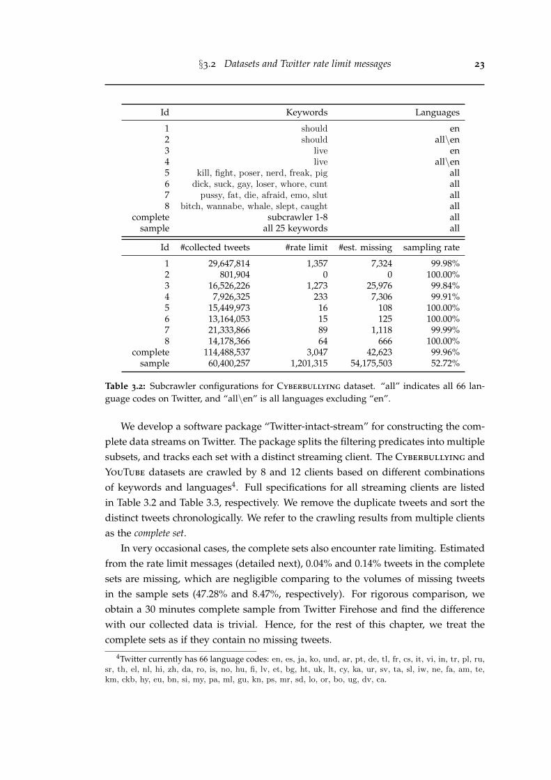
§3.2 Datasets and Twitter rate limit messages 23
Id Keywords Languages
1 should en2 should all\en3 live en4 live all\en5 kill, fight, poser, nerd, freak, pig all6 dick, suck, gay, loser, whore, cunt all7 pussy, fat, die, afraid, emo, slut all8 bitch, wannabe, whale, slept, caught all
complete subcrawler 1-8 allsample all 25 keywords all
Id #collected tweets #rate limit #est. missing sampling rate
1 29,647,814 1,357 7,324 99.98%2 801,904 0 0 100.00%3 16,526,226 1,273 25,976 99.84%4 7,926,325 233 7,306 99.91%5 15,449,973 16 108 100.00%6 13,164,053 15 125 100.00%7 21,333,866 89 1,118 99.99%8 14,178,366 64 666 100.00%
complete 114,488,537 3,047 42,623 99.96%sample 60,400,257 1,201,315 54,175,503 52.72%
Table 3.2: Subcrawler configurations for Cyberbullying dataset. “all” indicates all 66 lan-guage codes on Twitter, and “all\en” is all languages excluding “en”.
We develop a software package “Twitter-intact-stream” for constructing the com-plete data streams on Twitter. The package splits the filtering predicates into multiplesubsets, and tracks each set with a distinct streaming client. The Cyberbullying andYouTube datasets are crawled by 8 and 12 clients based on different combinationsof keywords and languages4. Full specifications for all streaming clients are listedin Table 3.2 and Table 3.3, respectively. We remove the duplicate tweets and sort thedistinct tweets chronologically. We refer to the crawling results from multiple clientsas the complete set.
In very occasional cases, the complete sets also encounter rate limiting. Estimatedfrom the rate limit messages (detailed next), 0.04% and 0.14% tweets in the completesets are missing, which are negligible comparing to the volumes of missing tweetsin the sample sets (47.28% and 8.47%, respectively). For rigorous comparison, weobtain a 30 minutes complete sample from Twitter Firehose and find the differencewith our collected data is trivial. Hence, for the rest of this chapter, we treat thecomplete sets as if they contain no missing tweets.
4Twitter currently has 66 language codes: en, es, ja, ko, und, ar, pt, de, tl, fr, cs, it, vi, in, tr, pl, ru,sr, th, el, nl, hi, zh, da, ro, is, no, hu, fi, lv, et, bg, ht, uk, lt, cy, ka, ur, sv, ta, sl, iw, ne, fa, am, te,km, ckb, hy, eu, bn, si, my, pa, ml, gu, kn, ps, mr, sd, lo, or, bo, ug, dv, ca.
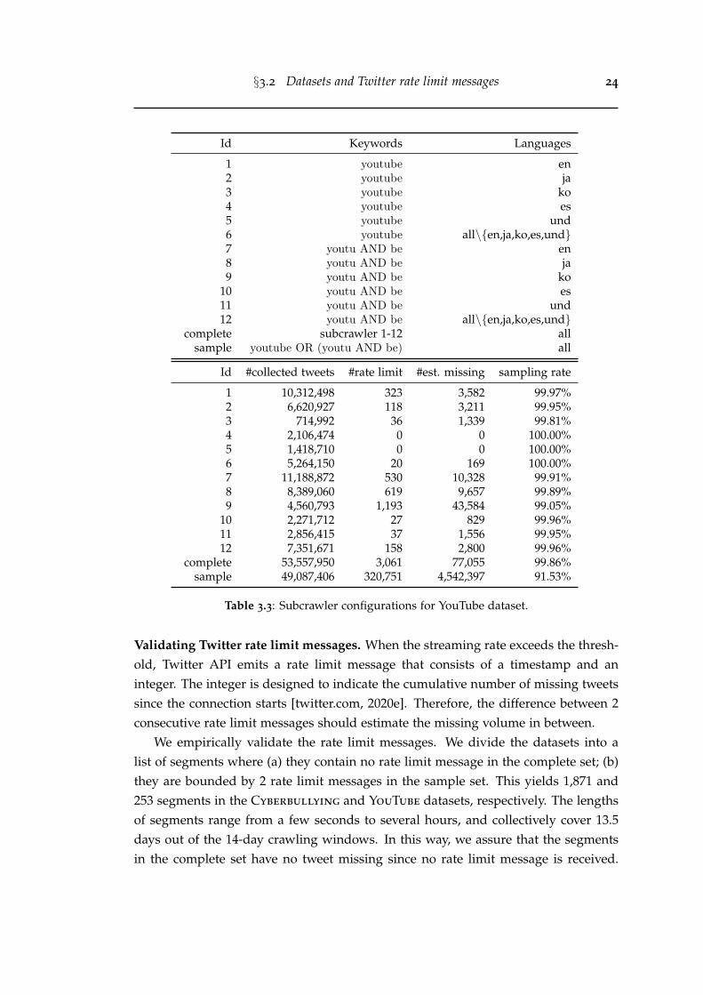
§3.2 Datasets and Twitter rate limit messages 24
Id Keywords Languages
1 youtube en2 youtube ja3 youtube ko4 youtube es5 youtube und6 youtube all\{en,ja,ko,es,und}7 youtu AND be en8 youtu AND be ja9 youtu AND be ko
10 youtu AND be es11 youtu AND be und12 youtu AND be all\{en,ja,ko,es,und}
complete subcrawler 1-12 allsample youtube OR (youtu AND be) all
Id #collected tweets #rate limit #est. missing sampling rate
1 10,312,498 323 3,582 99.97%2 6,620,927 118 3,211 99.95%3 714,992 36 1,339 99.81%4 2,106,474 0 0 100.00%5 1,418,710 0 0 100.00%6 5,264,150 20 169 100.00%7 11,188,872 530 10,328 99.91%8 8,389,060 619 9,657 99.89%9 4,560,793 1,193 43,584 99.05%
10 2,271,712 27 829 99.96%11 2,856,415 37 1,556 99.95%12 7,351,671 158 2,800 99.96%
complete 53,557,950 3,061 77,055 99.86%sample 49,087,406 320,751 4,542,397 91.53%
Table 3.3: Subcrawler configurations for YouTube dataset.
Validating Twitter rate limit messages. When the streaming rate exceeds the thresh-old, Twitter API emits a rate limit message that consists of a timestamp and aninteger. The integer is designed to indicate the cumulative number of missing tweetssince the connection starts [twitter.com, 2020e]. Therefore, the difference between 2consecutive rate limit messages should estimate the missing volume in between.
We empirically validate the rate limit messages. We divide the datasets into alist of segments where (a) they contain no rate limit message in the complete set; (b)they are bounded by 2 rate limit messages in the sample set. This yields 1,871 and253 segments in the Cyberbullying and YouTube datasets, respectively. The lengthsof segments range from a few seconds to several hours, and collectively cover 13.5days out of the 14-day crawling windows. In this way, we assure that the segmentsin the complete set have no tweet missing since no rate limit message is received.
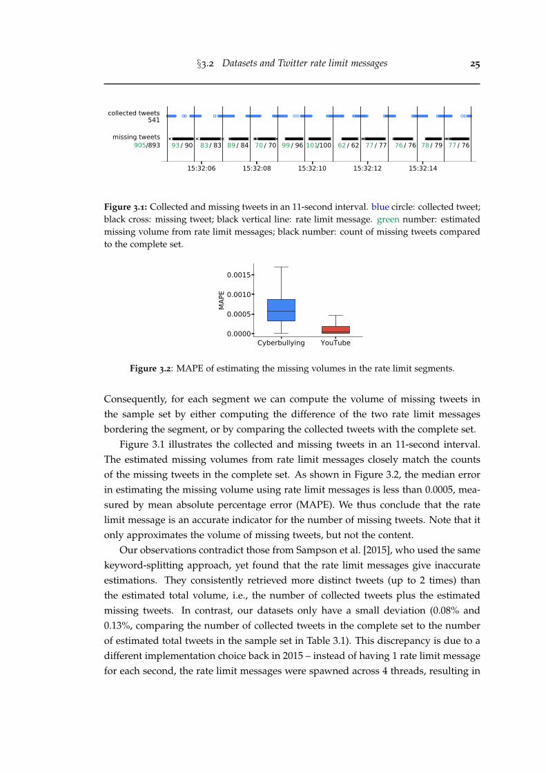
§3.2 Datasets and Twitter rate limit messages 25
15:32:06 15:32:08 15:32:10 15:32:12 15:32:14
541collected tweets
/ 9093 / 8383 / 8489 / 7070 / 9699 /100101 / 6262 / 7777 / 7676 / 7978 / 7677missing tweets
905/893
Figure 3.1: Collected and missing tweets in an 11-second interval. blue circle: collected tweet;black cross: missing tweet; black vertical line: rate limit message. green number: estimatedmissing volume from rate limit messages; black number: count of missing tweets comparedto the complete set.
Cyberbullying YouTube0.0000
0.0005
0.0010
0.0015
MAP
E
Figure 3.2: MAPE of estimating the missing volumes in the rate limit segments.
Consequently, for each segment we can compute the volume of missing tweets inthe sample set by either computing the difference of the two rate limit messagesbordering the segment, or by comparing the collected tweets with the complete set.
Figure 3.1 illustrates the collected and missing tweets in an 11-second interval.The estimated missing volumes from rate limit messages closely match the countsof the missing tweets in the complete set. As shown in Figure 3.2, the median errorin estimating the missing volume using rate limit messages is less than 0.0005, mea-sured by mean absolute percentage error (MAPE). We thus conclude that the ratelimit message is an accurate indicator for the number of missing tweets. Note that itonly approximates the volume of missing tweets, but not the content.
Our observations contradict those from Sampson et al. [2015], who used the samekeyword-splitting approach, yet found that the rate limit messages give inaccurateestimations. They consistently retrieved more distinct tweets (up to 2 times) thanthe estimated total volume, i.e., the number of collected tweets plus the estimatedmissing tweets. In contrast, our datasets only have a small deviation (0.08% and0.13%, comparing the number of collected tweets in the complete set to the numberof estimated total tweets in the sample set in Table 3.1). This discrepancy is due to adifferent implementation choice back in 2015 – instead of having 1 rate limit messagefor each second, the rate limit messages were spawned across 4 threads, resulting in
§3.2 Datasets and Twitter rate limit messages 26
0 250 500 750 1000millisecond
0.000
0.002
0.004
dens
ity
(a)0 1 2 3 4
#rate limit messages per second0
5K
10K
15K
frequ
ency
(b)
07:00:00 08:00:00 09:00:00Sep 08, 2015
16K
18K
20K
valu
e
(c)
07:00:00 08:00:00 09:00:00Sep 08, 2015
16K
18K
20K
(d)
Figure 3.3: (a) The density distribution of milliseconds in the received 55,420 rate limit mes-sages. (b) The histogram of the number of rate limit messages received in each second. (c)Scatter plot of rate limit messages. x-axis: timestamp; y-axis: values in the rate limit mes-sages. (d) Coloring rate limit messages into 4 monotonically increasing threads by usingAlgorithm 1. All figures are produced based on the Sampled ’15 dataset.
up to 4 messages per second (detailed next).A detailed comparison with Sampson et al. [2015] on the rate limit messages. Tounderstand the contradiction, we investigate a sampled dataset crawled within a30 minutes interval on Sep 08, 2015 (dubbed Sampled ’15). This dataset contains66K tweets mentioning YouTube video URLs, and it is also publicly available in ourGithub repository. We believe that the design of rate limit messages in Sampled
’15 is the same with that measured in [Sampson et al., 2015]. Differing from theobservations we make in the 2019 Cyberbullying and YouTube datasets, we notice2 major differences in Sampled ’15 dataset, which imply that the rate limit messageswere implemented differently back in 2015.
Firstly, Sampled ’15 receives up to 4 rate limit messages for each second. Fig-ure 3.3(a) shows the milliseconds in the rate limit messages are not uniformly dis-tributed – 89% rate limit messages are emitted between millisecond 700 to 1,000.With a total of 55,420 rate limit messages, Figure 3.3(b) shows that 0 to 4 rate limitmessages can be received every second. On the contrary, we obtain at most 1 ratelimit message per second in the datasets crawled in 2019. Based on a 5-year tweettracking dataset we collect, the change was made on Nov 30, 2018.
Secondly, the integers in the rate limit messages are not increasing monoton-ically. This contradicts Twitter’s official documentation that “Limit notices contain
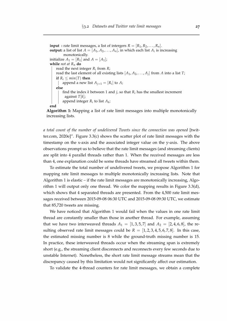
§3.2 Datasets and Twitter rate limit messages 27
input : rate limit messages, a list of intergers R = [R1, R2, . . . , Rn].output: a list of list A = [A1, A2, . . . , An], in which each list Ai is increasing
monotonically.initialize A1 = [R1] and A = [A1];while not at Rn do
read the next integer Ri from R;read the last element of all existing lists [A1, A2, . . . , Aj] from A into a list T;if Ri ≤ min(T) then
append a new list Aj+1 = [Ri] to A;else
find the index k between 1 and j, so that Ri has the smallest incrementagainst T[k];
append integer Ri to list Ak;end
Algorithm 1: Mapping a list of rate limit messages into multiple monotonicallyincreasing lists.
a total count of the number of undelivered Tweets since the connection was opened [twit-ter.com, 2020e]”. Figure 3.3(c) shows the scatter plot of rate limit messages with thetimestamp on the x-axis and the associated integer value on the y-axis. The aboveobservations prompt us to believe that the rate limit messages (and streaming clients)are split into 4 parallel threads rather than 1. When the received messages are lessthan 4, one explanation could be some threads have streamed all tweets within them.
To estimate the total number of undelivered tweets, we propose Algorithm 1 formapping rate limit messages to multiple monotonically increasing lists. Note thatAlgorithm 1 is elastic – if the rate limit messages are monotonically increasing, Algo-rithm 1 will output only one thread. We color the mapping results in Figure 3.3(d),which shows that 4 separated threads are presented. From the 4,500 rate limit mes-sages received between 2015-09-08 06:30 UTC and 2015-09-08 09:30 UTC, we estimatethat 85,720 tweets are missing.
We have noticed that Algorithm 1 would fail when the values in one rate limitthread are constantly smaller than those in another thread. For example, assumingthat we have two interweaved threads A1 = [1, 3, 5, 7] and A2 = [2, 4, 6, 8], the re-sulting observed rate limit messages could be R = [1, 2, 3, 4, 5, 6, 7, 8]. In this case,the estimated missing number is 8 while the ground-truth missing number is 15.In practice, these interweaved threads occur when the streaming span is extremelyshort (e.g., the streaming client disconnects and reconnects every few seconds due tounstable Internet). Nonetheless, the short rate limit message streams mean that thediscrepancy caused by this limitation would not significantly affect our estimation.
To validate the 4-thread counters for rate limit messages, we obtain a complete
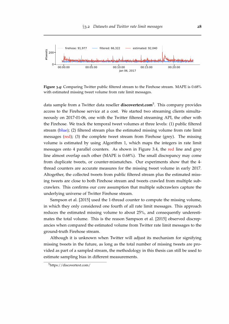
§3.2 Datasets and Twitter rate limit messages 28
00:00:00 00:05:00 00:10:00 00:15:00 00:20:00Jan 06, 2017
0
200
#twe
ets firehose: 91,977 filtered: 66,322 estimated: 92,040
Figure 3.4: Comparing Twitter public filtered stream to the Firehose stream. MAPE is 0.68%with estimated missing tweet volume from rate limit messages.
data sample from a Twitter data reseller discovertext.com5. This company providesaccess to the Firehose service at a cost. We started two streaming clients simulta-neously on 2017-01-06, one with the Twitter filtered streaming API, the other withthe Firehose. We track the temporal tweet volumes at three levels: (1) public filteredstream (blue); (2) filtered stream plus the estimated missing volume from rate limitmessages (red); (3) the complete tweet stream from Firehose (grey). The missingvolume is estimated by using Algorithm 1, which maps the integers in rate limitmessages onto 4 parallel counters. As shown in Figure 3.4, the red line and greyline almost overlap each other (MAPE is 0.68%). The small discrepancy may comefrom duplicate tweets, or counter-mismatches. Our experiments show that the 4-thread counters are accurate measures for the missing tweet volume in early 2017.Altogether, the collected tweets from public filtered stream plus the estimated miss-ing tweets are close to both Firehose stream and tweets crawled from multiple sub-crawlers. This confirms our core assumption that multiple subcrawlers capture theunderlying universe of Twitter Firehose stream.
Sampson et al. [2015] used the 1-thread counter to compute the missing volume,in which they only considered one fourth of all rate limit messages. This approachreduces the estimated missing volume to about 25%, and consequently underesti-mates the total volume. This is the reason Sampson et al. [2015] observed discrep-ancies when compared the estimated volume from Twitter rate limit messages to theground-truth Firehose stream.
Although it is unknown when Twitter will adjust its mechanism for signifyingmissing tweets in the future, as long as the total number of missing tweets are pro-vided as part of a sampled stream, the methodology in this thesis can still be used toestimate sampling bias in different measurements.
5https://discovertext.com/
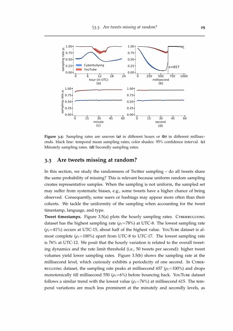
§3.3 Are tweets missing at random? 29
0 6 12 18 24hour (in UTC)
0.00
0.25
0.50
0.75
1.00
sam
plin
g ra
te
t
(a)
CyberbullyingYouTube
0 250 500 750 1000millisecond
0.00
0.25
0.50
0.75
1.00
x=657
(b)
0 15 30 45 60minute
0.00
0.25
0.50
0.75
1.00
sam
plin
g ra
te
t
(c)
0 15 30 45 60second
0.00
0.25
0.50
0.75
1.00
(d)
Figure 3.5: Sampling rates are uneven (a) in different hours or (b) in different millisec-onds. black line: temporal mean sampling rates; color shades: 95% confidence interval. (c)Minutely sampling rates. (d) Secondly sampling rates.
3.3 Are tweets missing at random?
In this section, we study the randomness of Twitter sampling – do all tweets sharethe same probability of missing? This is relevant because uniform random samplingcreates representative samples. When the sampling is not uniform, the sampled setmay suffer from systematic biases, e.g., some tweets have a higher chance of beingobserved. Consequently, some users or hashtags may appear more often than theircohorts. We tackle the uniformity of the sampling when accounting for the tweettimestamp, language, and type.Tweet timestamps. Figure 3.5(a) plots the hourly sampling rates. Cyberbullying
dataset has the highest sampling rate (ρt=78%) at UTC-8. The lowest sampling rate(ρt=41%) occurs at UTC-15, about half of the highest value. YouTube dataset is al-most complete (ρt=100%) apart from UTC-8 to UTC-17. The lowest sampling rateis 76% at UTC-12. We posit that the hourly variation is related to the overall tweet-ing dynamics and the rate limit threshold (i.e., 50 tweets per second): higher tweetvolumes yield lower sampling rates. Figure 3.5(b) shows the sampling rate at themillisecond level, which curiously exhibits a periodicity of one second. In Cyber-bullying dataset, the sampling rate peaks at millisecond 657 (ρt=100%) and dropsmonotonically till millisecond 550 (ρt=6%) before bouncing back. YouTube datasetfollows a similar trend with the lowest value (ρt=76%) at millisecond 615. The tem-poral variations are much less prominent at the minutely and secondly levels, as
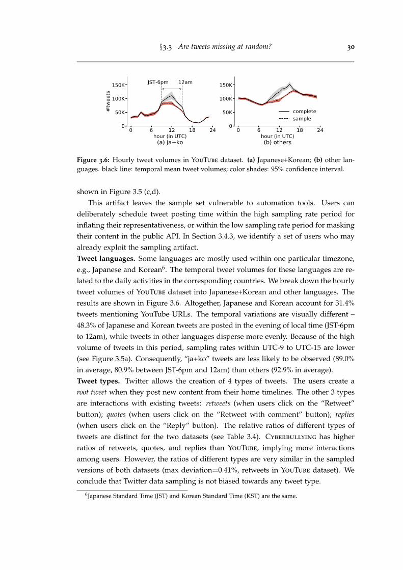
§3.3 Are tweets missing at random? 30
0 6 12 18 24hour (in UTC)
0
50K
100K
150K
#twe
ets
JST-6pm 12am
(a) ja+ko
0 6 12 18 24hour (in UTC)
0
50K
100K
150K
(b) others
completesample
Figure 3.6: Hourly tweet volumes in YouTube dataset. (a) Japanese+Korean; (b) other lan-guages. black line: temporal mean tweet volumes; color shades: 95% confidence interval.
shown in Figure 3.5 (c,d).This artifact leaves the sample set vulnerable to automation tools. Users can
deliberately schedule tweet posting time within the high sampling rate period forinflating their representativeness, or within the low sampling rate period for maskingtheir content in the public API. In Section 3.4.3, we identify a set of users who mayalready exploit the sampling artifact.Tweet languages. Some languages are mostly used within one particular timezone,e.g., Japanese and Korean6. The temporal tweet volumes for these languages are re-lated to the daily activities in the corresponding countries. We break down the hourlytweet volumes of YouTube dataset into Japanese+Korean and other languages. Theresults are shown in Figure 3.6. Altogether, Japanese and Korean account for 31.4%tweets mentioning YouTube URLs. The temporal variations are visually different –48.3% of Japanese and Korean tweets are posted in the evening of local time (JST-6pmto 12am), while tweets in other languages disperse more evenly. Because of the highvolume of tweets in this period, sampling rates within UTC-9 to UTC-15 are lower(see Figure 3.5a). Consequently, “ja+ko” tweets are less likely to be observed (89.0%in average, 80.9% between JST-6pm and 12am) than others (92.9% in average).Tweet types. Twitter allows the creation of 4 types of tweets. The users create aroot tweet when they post new content from their home timelines. The other 3 typesare interactions with existing tweets: retweets (when users click on the “Retweet”button); quotes (when users click on the “Retweet with comment” button); replies(when users click on the “Reply” button). The relative ratios of different types oftweets are distinct for the two datasets (see Table 3.4). Cyberbullying has higherratios of retweets, quotes, and replies than YouTube, implying more interactionsamong users. However, the ratios of different types are very similar in the sampledversions of both datasets (max deviation=0.41%, retweets in YouTube dataset). Weconclude that Twitter data sampling is not biased towards any tweet type.
6Japanese Standard Time (JST) and Korean Standard Time (KST) are the same.
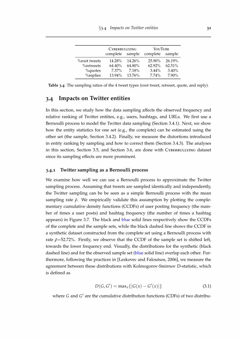
§3.4 Impacts on Twitter entities 31
Cyberbullying YouTube
complete sample complete sample
%root tweets 14.28% 14.26% 25.90% 26.19%%retweets 64.40% 64.80% 62.92% 62.51%
%quotes 7.37% 7.18% 3.44% 3.40%%replies 13.94% 13.76% 7.74% 7.90%
Table 3.4: The sampling ratios of the 4 tweet types (root tweet, retweet, quote, and reply).
3.4 Impacts on Twitter entities
In this section, we study how the data sampling affects the observed frequency andrelative ranking of Twitter entities, e.g., users, hashtags, and URLs. We first use aBernoulli process to model the Twitter data sampling (Section 3.4.1). Next, we showhow the entity statistics for one set (e.g., the complete) can be estimated using theother set (the sample, Section 3.4.2). Finally, we measure the distortions introducedin entity ranking by sampling and how to correct them (Section 3.4.3). The analysesin this section, Section 3.5, and Section 3.6, are done with Cyberbullying datasetsince its sampling effects are more prominent.
3.4.1 Twitter sampling as a Bernoulli process
We examine how well we can use a Bernoulli process to approximate the Twittersampling process. Assuming that tweets are sampled identically and independently,the Twitter sampling can be be seen as a simple Bernoulli process with the meansampling rate ρ. We empirically validate this assumption by plotting the comple-mentary cumulative density functions (CCDFs) of user posting frequency (the num-ber of times a user posts) and hashtag frequency (the number of times a hashtagappears) in Figure 3.7. The black and blue solid lines respectively show the CCDFsof the complete and the sample sets, while the black dashed line shows the CCDF ina synthetic dataset constructed from the complete set using a Bernoulli process withrate ρ=52.72%. Firstly, we observe that the CCDF of the sample set is shifted left,towards the lower frequency end. Visually, the distributions for the synthetic (blackdashed line) and for the observed sample set (blue solid line) overlap each other. Fur-thermore, following the practices in [Leskovec and Faloutsos, 2006], we measure theagreement between these distributions with Kolmogorov-Smirnov D-statistic, whichis defined as
D(G, G′) = maxx{|G(x)− G′(x)|} (3.1)
where G and G′ are the cumulative distribution functions (CDFs) of two distribu-
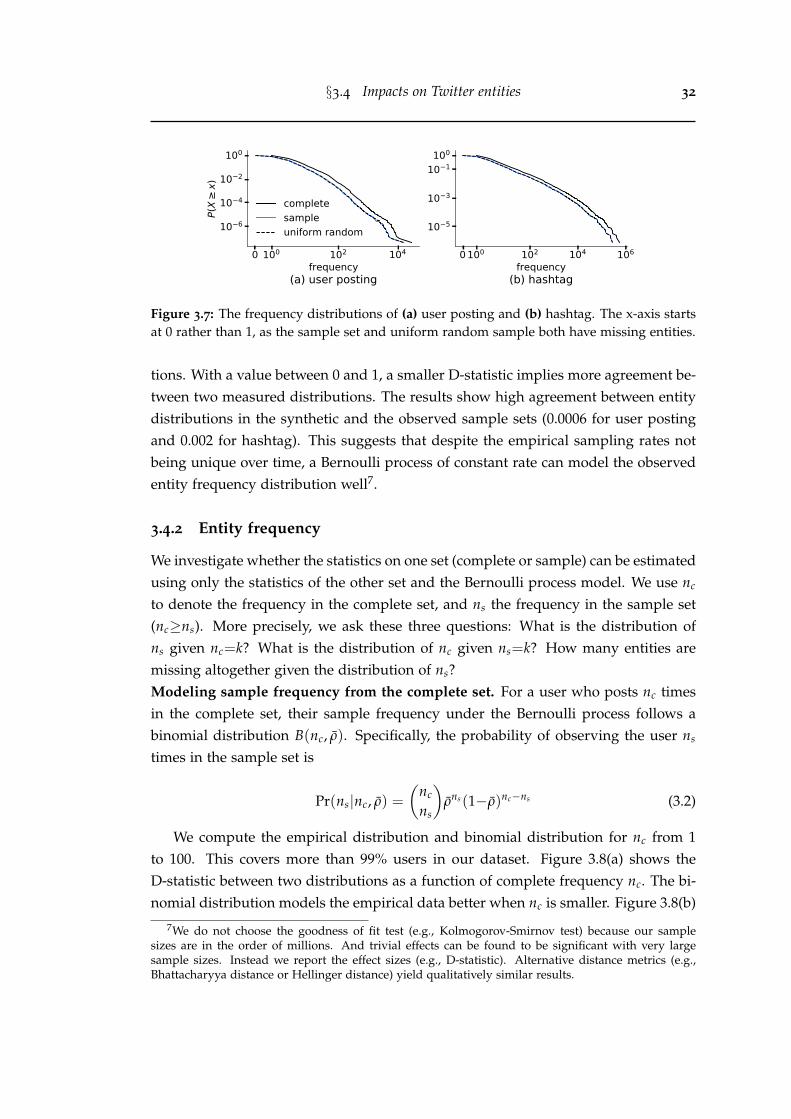
§3.4 Impacts on Twitter entities 32
0 100 102 104
frequency
100
10 2
10 4
10 6P(
Xx)
(a) user posting
completesampleuniform random
0 100 102 104 106
frequency
100
10 1
10 3
10 5
(b) hashtag
Figure 3.7: The frequency distributions of (a) user posting and (b) hashtag. The x-axis startsat 0 rather than 1, as the sample set and uniform random sample both have missing entities.
tions. With a value between 0 and 1, a smaller D-statistic implies more agreement be-tween two measured distributions. The results show high agreement between entitydistributions in the synthetic and the observed sample sets (0.0006 for user postingand 0.002 for hashtag). This suggests that despite the empirical sampling rates notbeing unique over time, a Bernoulli process of constant rate can model the observedentity frequency distribution well7.
3.4.2 Entity frequency
We investigate whether the statistics on one set (complete or sample) can be estimatedusing only the statistics of the other set and the Bernoulli process model. We use nc
to denote the frequency in the complete set, and ns the frequency in the sample set(nc≥ns). More precisely, we ask these three questions: What is the distribution ofns given nc=k? What is the distribution of nc given ns=k? How many entities aremissing altogether given the distribution of ns?Modeling sample frequency from the complete set. For a user who posts nc timesin the complete set, their sample frequency under the Bernoulli process follows abinomial distribution B(nc, ρ). Specifically, the probability of observing the user ns
times in the sample set is
Pr(ns|nc, ρ) =
(nc
ns
)ρns (1−ρ)nc−ns (3.2)
We compute the empirical distribution and binomial distribution for nc from 1to 100. This covers more than 99% users in our dataset. Figure 3.8(a) shows theD-statistic between two distributions as a function of complete frequency nc. The bi-nomial distribution models the empirical data better when nc is smaller. Figure 3.8(b)
7We do not choose the goodness of fit test (e.g., Kolmogorov-Smirnov test) because our samplesizes are in the order of millions. And trivial effects can be found to be significant with very largesample sizes. Instead we report the effect sizes (e.g., D-statistic). Alternative distance metrics (e.g.,Bhattacharyya distance or Hellinger distance) yield qualitatively similar results.
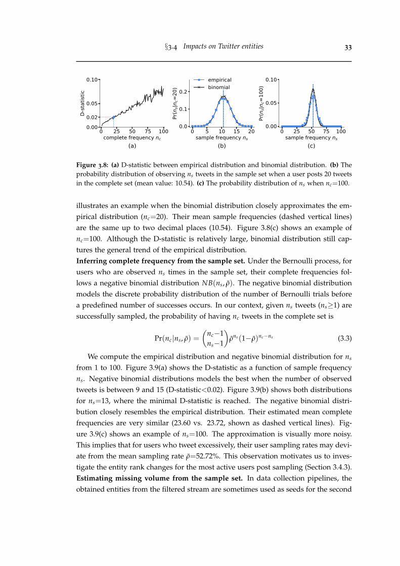
§3.4 Impacts on Twitter entities 33
0 25 50 75 100complete frequency nc
0.000.02
0.05
0.10D-
stat
istic
(a)
0 5 10 15 20sample frequency ns
0.0
0.1
0.2
Pr(n
s|nc=
20)
(b)
empiricalbinomial
0 25 50 75 100sample frequency ns
0.00
0.05
0.10
Pr(n
s|nc=
100)
(c)
Figure 3.8: (a) D-statistic between empirical distribution and binomial distribution. (b) Theprobability distribution of observing ns tweets in the sample set when a user posts 20 tweetsin the complete set (mean value: 10.54). (c) The probability distribution of ns when nc=100.
illustrates an example when the binomial distribution closely approximates the em-pirical distribution (nc=20). Their mean sample frequencies (dashed vertical lines)are the same up to two decimal places (10.54). Figure 3.8(c) shows an example ofnc=100. Although the D-statistic is relatively large, binomial distribution still cap-tures the general trend of the empirical distribution.Inferring complete frequency from the sample set. Under the Bernoulli process, forusers who are observed ns times in the sample set, their complete frequencies fol-lows a negative binomial distribution NB(ns, ρ). The negative binomial distributionmodels the discrete probability distribution of the number of Bernoulli trials beforea predefined number of successes occurs. In our context, given ns tweets (ns≥1) aresuccessfully sampled, the probability of having nc tweets in the complete set is
Pr(nc|ns, ρ) =
(nc−1ns−1
)ρns (1−ρ)nc−ns (3.3)
We compute the empirical distribution and negative binomial distribution for ns
from 1 to 100. Figure 3.9(a) shows the D-statistic as a function of sample frequencyns. Negative binomial distributions models the best when the number of observedtweets is between 9 and 15 (D-statistic<0.02). Figure 3.9(b) shows both distributionsfor ns=13, where the minimal D-statistic is reached. The negative binomial distri-bution closely resembles the empirical distribution. Their estimated mean completefrequencies are very similar (23.60 vs. 23.72, shown as dashed vertical lines). Fig-ure 3.9(c) shows an example of ns=100. The approximation is visually more noisy.This implies that for users who tweet excessively, their user sampling rates may devi-ate from the mean sampling rate ρ=52.72%. This observation motivates us to inves-tigate the entity rank changes for the most active users post sampling (Section 3.4.3).Estimating missing volume from the sample set. In data collection pipelines, theobtained entities from the filtered stream are sometimes used as seeds for the second
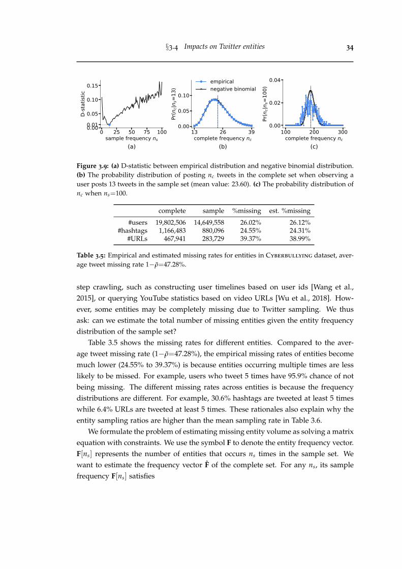
§3.4 Impacts on Twitter entities 34
0 25 50 75 100sample frequency ns
0.000.01
0.05
0.10
0.15D-
stat
istic
(a)
13 26 39complete frequency nc
0.00
0.05
0.10
Pr(n
c|ns=
13)
(b)
empiricalnegative binomial
100 200 300complete frequency nc
0.00
0.02
0.04
Pr(n
c|ns=
100)
(c)
Figure 3.9: (a) D-statistic between empirical distribution and negative binomial distribution.(b) The probability distribution of posting nc tweets in the complete set when observing auser posts 13 tweets in the sample set (mean value: 23.60). (c) The probability distribution ofnc when ns=100.
complete sample %missing est. %missing
#users 19,802,506 14,649,558 26.02% 26.12%#hashtags 1,166,483 880,096 24.55% 24.31%
#URLs 467,941 283,729 39.37% 38.99%
Table 3.5: Empirical and estimated missing rates for entities in Cyberbullying dataset, aver-age tweet missing rate 1−ρ=47.28%.
step crawling, such as constructing user timelines based on user ids [Wang et al.,2015], or querying YouTube statistics based on video URLs [Wu et al., 2018]. How-ever, some entities may be completely missing due to Twitter sampling. We thusask: can we estimate the total number of missing entities given the entity frequencydistribution of the sample set?
Table 3.5 shows the missing rates for different entities. Compared to the aver-age tweet missing rate (1−ρ=47.28%), the empirical missing rates of entities becomemuch lower (24.55% to 39.37%) is because entities occurring multiple times are lesslikely to be missed. For example, users who tweet 5 times have 95.9% chance of notbeing missing. The different missing rates across entities is because the frequencydistributions are different. For example, 30.6% hashtags are tweeted at least 5 timeswhile 6.4% URLs are tweeted at least 5 times. These rationales also explain why theentity sampling ratios are higher than the mean sampling rate in Table 3.6.
We formulate the problem of estimating missing entity volume as solving a matrixequation with constraints. We use the symbol F to denote the entity frequency vector.F[ns] represents the number of entities that occurs ns times in the sample set. Wewant to estimate the frequency vector F of the complete set. For any ns, its samplefrequency F[ns] satisfies
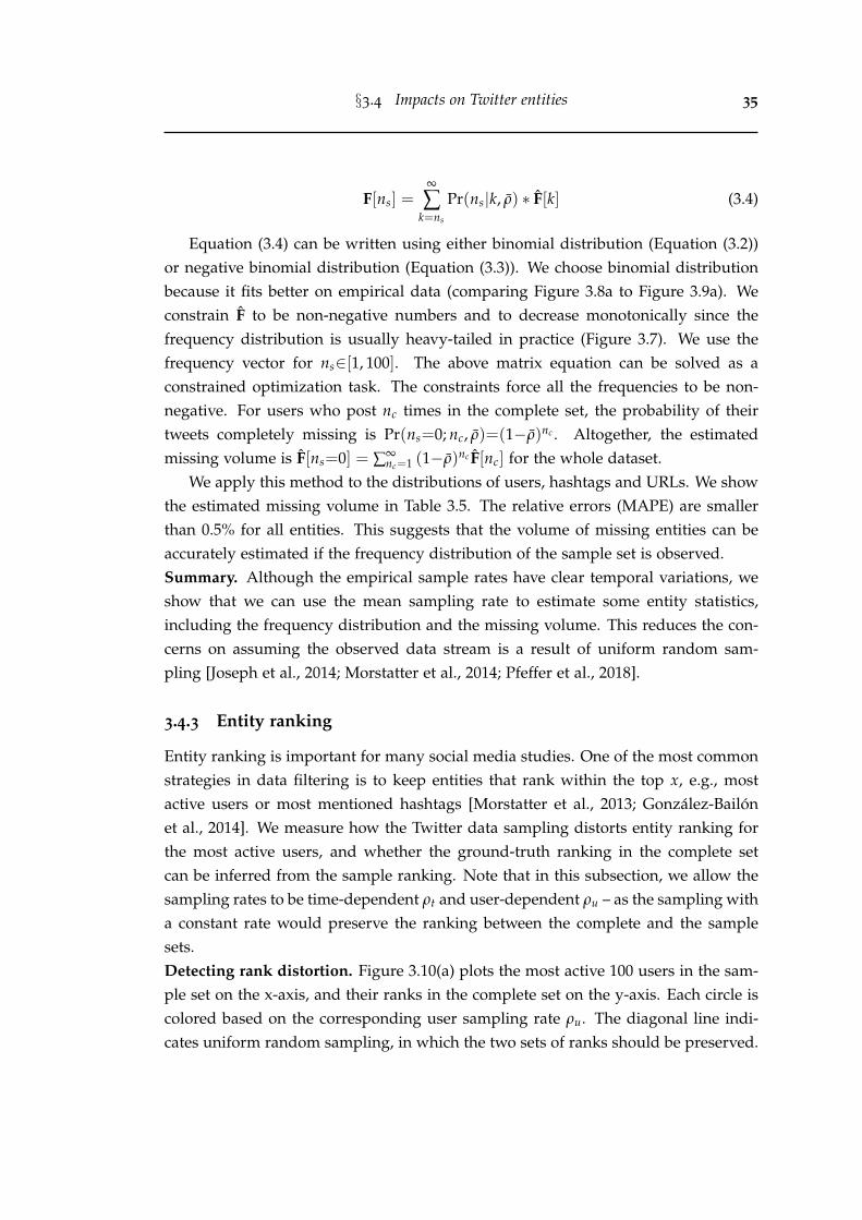
§3.4 Impacts on Twitter entities 35
F[ns] =∞
∑k=ns
Pr(ns|k, ρ) ∗ F[k] (3.4)
Equation (3.4) can be written using either binomial distribution (Equation (3.2))or negative binomial distribution (Equation (3.3)). We choose binomial distributionbecause it fits better on empirical data (comparing Figure 3.8a to Figure 3.9a). Weconstrain F to be non-negative numbers and to decrease monotonically since thefrequency distribution is usually heavy-tailed in practice (Figure 3.7). We use thefrequency vector for ns∈[1, 100]. The above matrix equation can be solved as aconstrained optimization task. The constraints force all the frequencies to be non-negative. For users who post nc times in the complete set, the probability of theirtweets completely missing is Pr(ns=0; nc, ρ)=(1−ρ)nc . Altogether, the estimatedmissing volume is F[ns=0] = ∑∞
nc=1 (1−ρ)nc F[nc] for the whole dataset.We apply this method to the distributions of users, hashtags and URLs. We show
the estimated missing volume in Table 3.5. The relative errors (MAPE) are smallerthan 0.5% for all entities. This suggests that the volume of missing entities can beaccurately estimated if the frequency distribution of the sample set is observed.Summary. Although the empirical sample rates have clear temporal variations, weshow that we can use the mean sampling rate to estimate some entity statistics,including the frequency distribution and the missing volume. This reduces the con-cerns on assuming the observed data stream is a result of uniform random sam-pling [Joseph et al., 2014; Morstatter et al., 2014; Pfeffer et al., 2018].
3.4.3 Entity ranking
Entity ranking is important for many social media studies. One of the most commonstrategies in data filtering is to keep entities that rank within the top x, e.g., mostactive users or most mentioned hashtags [Morstatter et al., 2013; Gonzalez-Bailonet al., 2014]. We measure how the Twitter data sampling distorts entity ranking forthe most active users, and whether the ground-truth ranking in the complete setcan be inferred from the sample ranking. Note that in this subsection, we allow thesampling rates to be time-dependent ρt and user-dependent ρu – as the sampling witha constant rate would preserve the ranking between the complete and the samplesets.Detecting rank distortion. Figure 3.10(a) plots the most active 100 users in the sam-ple set on the x-axis, and their ranks in the complete set on the y-axis. Each circle iscolored based on the corresponding user sampling rate ρu. The diagonal line indi-cates uniform random sampling, in which the two sets of ranks should be preserved.
§3.4 Impacts on Twitter entities 36
0 50 100
observed rank in sample set
0
50
100ra
nk
in c
om
ple
te s
et
kendall's : 0.7349
(a)
0 50 100
estimated rank in sample set
0
50
100
kendall's : 0.8485
(b)
0.2
0.3
0.4
0.5
0.6
0.7
0.8
0.9
use
r sa
mplin
g r
ate
0 250 500 750 1000millisecond
0
100
200
volu
me
(c) WeltRadio
(c) (c)
(cd) (cd)
0 6 12 18 24hour
0
200
400
600
(d) bensonbersk
Figure 3.10: (a) Observed ranks in the sample set (x-axis) vs. true ranks in the com-plete set (y-axis). (b) Estimated ranks improve the agreement with the ground-truth ranks.(c) user WeltRadio, observed/true/estimated ranks: 15/50/50. (d) user bensonbersk, ob-served/true/estimated ranks: 66/42/52. blue/red shades: sample tweet volume; greyshades: complete tweet volume; black line: estimated tweet volume.
The users above the diagonal line improve their ranks in the sample set, while theones below lose their positions.
Figure 3.10(c) highlights a user WeltRadio, who benefits the most from the sam-pling: it ranks 50th in the complete set, but it is boosted to 15th place in the sampleset. Comparing the complete tweet volume, its volume (4,529) is only 67% relativeto the user who actually ranks 15th in the complete set (6,728, user thirdbrainfx). Wealso find that WeltRadio tweets mostly in the very high sampling rate secondly pe-riod (millisecond 657 to 1,000), resulting in a high user sampling rate (ρu=79.1%).On the contrary, Figure 3.10(d) shows a user bensonbersk with decreased rank in thesample set and low sampling rate (ρu=36.5%). Examining his posting pattern, thisuser mainly tweets in the low sampling rate hours (UTC-12 to 19).Estimating true ranking from the sample set. Apart from measuring the rank dis-tortion between the complete and the sample sets, we investigate the possibility of es-timating the ground-truth ranks by using the observations from the sample set. From
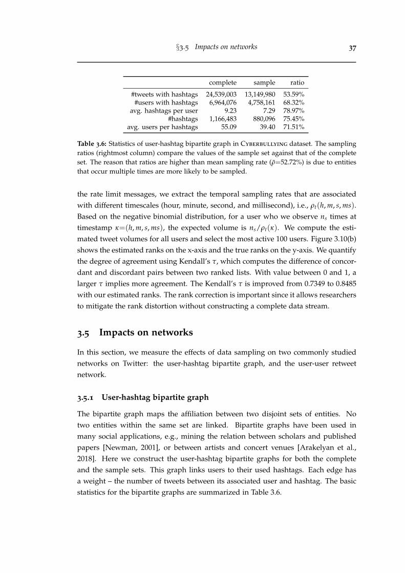
§3.5 Impacts on networks 37
complete sample ratio
#tweets with hashtags 24,539,003 13,149,980 53.59%#users with hashtags 6,964,076 4,758,161 68.32%
avg. hashtags per user 9.23 7.29 78.97%#hashtags 1,166,483 880,096 75.45%
avg. users per hashtags 55.09 39.40 71.51%
Table 3.6: Statistics of user-hashtag bipartite graph in Cyberbullying dataset. The samplingratios (rightmost column) compare the values of the sample set against that of the completeset. The reason that ratios are higher than mean sampling rate (ρ=52.72%) is due to entitiesthat occur multiple times are more likely to be sampled.
the rate limit messages, we extract the temporal sampling rates that are associatedwith different timescales (hour, minute, second, and millisecond), i.e., ρt(h, m, s, ms).Based on the negative binomial distribution, for a user who we observe ns times attimestamp κ=(h, m, s, ms), the expected volume is ns/ρt(κ). We compute the esti-mated tweet volumes for all users and select the most active 100 users. Figure 3.10(b)shows the estimated ranks on the x-axis and the true ranks on the y-axis. We quantifythe degree of agreement using Kendall’s τ, which computes the difference of concor-dant and discordant pairs between two ranked lists. With value between 0 and 1, alarger τ implies more agreement. The Kendall’s τ is improved from 0.7349 to 0.8485with our estimated ranks. The rank correction is important since it allows researchersto mitigate the rank distortion without constructing a complete data stream.
3.5 Impacts on networks
In this section, we measure the effects of data sampling on two commonly studiednetworks on Twitter: the user-hashtag bipartite graph, and the user-user retweetnetwork.
3.5.1 User-hashtag bipartite graph
The bipartite graph maps the affiliation between two disjoint sets of entities. Notwo entities within the same set are linked. Bipartite graphs have been used inmany social applications, e.g., mining the relation between scholars and publishedpapers [Newman, 2001], or between artists and concert venues [Arakelyan et al.,2018]. Here we construct the user-hashtag bipartite graphs for both the completeand the sample sets. This graph links users to their used hashtags. Each edge hasa weight – the number of tweets between its associated user and hashtag. The basicstatistics for the bipartite graphs are summarized in Table 3.6.
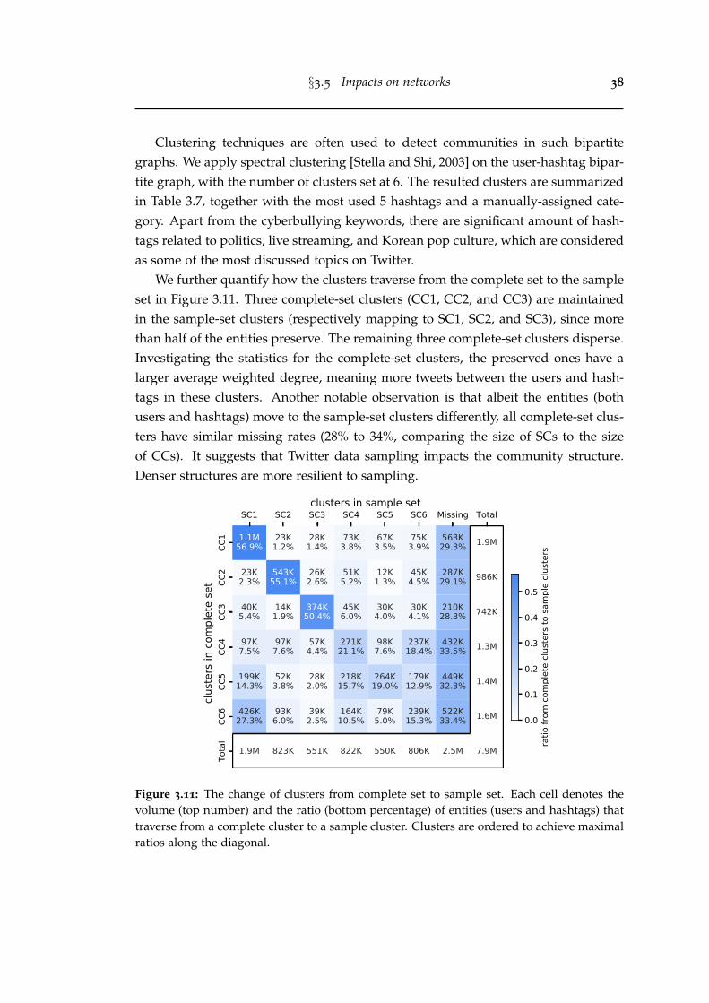
§3.5 Impacts on networks 38
Clustering techniques are often used to detect communities in such bipartitegraphs. We apply spectral clustering [Stella and Shi, 2003] on the user-hashtag bipar-tite graph, with the number of clusters set at 6. The resulted clusters are summarizedin Table 3.7, together with the most used 5 hashtags and a manually-assigned cate-gory. Apart from the cyberbullying keywords, there are significant amount of hash-tags related to politics, live streaming, and Korean pop culture, which are consideredas some of the most discussed topics on Twitter.
We further quantify how the clusters traverse from the complete set to the sampleset in Figure 3.11. Three complete-set clusters (CC1, CC2, and CC3) are maintainedin the sample-set clusters (respectively mapping to SC1, SC2, and SC3), since morethan half of the entities preserve. The remaining three complete-set clusters disperse.Investigating the statistics for the complete-set clusters, the preserved ones have alarger average weighted degree, meaning more tweets between the users and hash-tags in these clusters. Another notable observation is that albeit the entities (bothusers and hashtags) move to the sample-set clusters differently, all complete-set clus-ters have similar missing rates (28% to 34%, comparing the size of SCs to the sizeof CCs). It suggests that Twitter data sampling impacts the community structure.Denser structures are more resilient to sampling.
SC1 SC2 SC3 SC4 SC5 SC6 Missing Total
CC1
CC2
CC3
CC4
CC5
CC6
Tota
l
1.1M56.9%
23K1.2%
28K1.4%
73K3.8%
67K3.5%
75K3.9%
563K29.3% 1.9M
23K2.3%
543K55.1%
26K2.6%
51K5.2%
12K1.3%
45K4.5%
287K29.1% 986K
40K5.4%
14K1.9%
374K50.4%
45K6.0%
30K4.0%
30K4.1%
210K28.3% 742K
97K7.5%
97K7.6%
57K4.4%
271K21.1%
98K7.6%
237K18.4%
432K33.5% 1.3M
199K14.3%
52K3.8%
28K2.0%
218K15.7%
264K19.0%
179K12.9%
449K32.3% 1.4M
426K27.3%
93K6.0%
39K2.5%
164K10.5%
79K5.0%
239K15.3%
522K33.4% 1.6M
1.9M 823K 551K 822K 550K 806K 2.5M 7.9M
clust
ers i
n co
mpl
ete
set
clusters in sample set
0.0
0.1
0.2
0.3
0.4
0.5
ratio
from
com
plet
e clu
ster
s to
sam
ple
clust
ers
Figure 3.11: The change of clusters from complete set to sample set. Each cell denotes thevolume (top number) and the ratio (bottom percentage) of entities (users and hashtags) thattraverse from a complete cluster to a sample cluster. Clusters are ordered to achieve maximalratios along the diagonal.
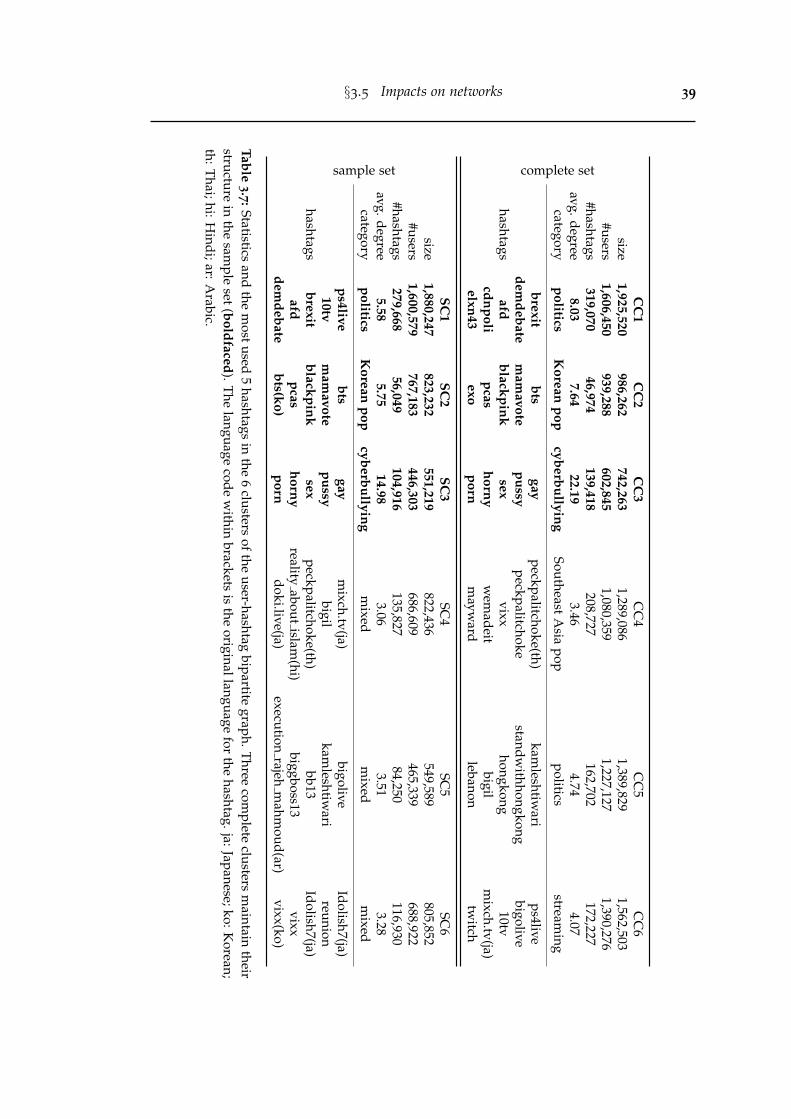
§3.5 Impacts on networks 39
complete setC
C1
CC
2C
C3
CC
4C
C5
CC
6size
1,925,520986,262
742,2631,289,086
1,389,8291,562,503
#users1,606,450
939,288602,845
1,080,3591,227,127
1,390,276#hashtags
319,07046,974
139,418208,727
162,702172,227
avg.degree8.03
7.6422.19
3.464.74
4.07category
politicsK
oreanpop
cyberbullyingSoutheast
Asia
poppolitics
streaming
hashtags
brexitbts
gaypeckpalitchoke(th)
kamleshtiw
arips4live
demdebate
mam
avotepussy
peckpalitchokestandw
ithhongkongbigolive
afdblackpink
sexvixx
hongkong10tv
cdnpolipcas
hornyw
emadeit
bigilm
ixch.tv(ja)elxn43
exoporn
mayw
ardlebanon
twitch
sample set
SC1
SC2
SC3
SC4
SC5
SC6
size1,880,247
823,232551,219
822,436549,589
805,852#users
1,600,579767,183
446,303686,609
465,339688,922
#hashtags279,668
56,049104,916
135,82784,250
116,930avg.degree
5.585.75
14.983.06
3.513.28
categorypolitics
Korean
popcyberbullying
mixed
mixed
mixed
hashtags
ps4livebts
gaym
ixch.tv(ja)bigolive
Idolish7(ja)10tv
mam
avotepussy
bigilkam
leshtiwari
reunionbrexit
blackpinksex
peckpalitchoke(th)bb13
Idolish7(ja)afd
pcashorny
realityabout
islam(hi)
biggboss13vixx
demdebate
bts(ko)porn
doki.live(ja)execution
rajehm
ahmoud(ar)
vixx(ko)
Table3.7:Statistics
andthe
mostused
5hashtags
inthe
6clusters
oftheuser-hashtag
bipartitegraph.Three
complete
clustersm
aintaintheir
structurein
thesam
pleset(boldfaced).T
helanguage
codew
ithinbrackets
isthe
originallanguagefor
thehashtag.ja:Japanese;ko:K
orean;th:T
hai;hi:Hindi;ar:A
rabic.
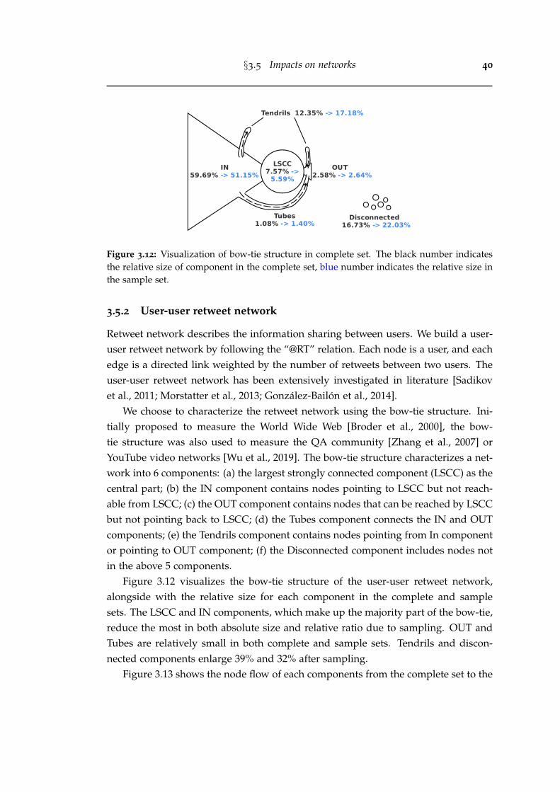
§3.5 Impacts on networks 40
LSCC7.57% ->
5.59%IN
59.69% -> 51.15%OUT
2.58% -> 2.64%
Disconnected 16.73% -> 22.03%
Tendrils 12.35% -> 17.18%
Tubes1.08% -> 1.40%
Figure 3.12: Visualization of bow-tie structure in complete set. The black number indicatesthe relative size of component in the complete set, blue number indicates the relative size inthe sample set.
3.5.2 User-user retweet network
Retweet network describes the information sharing between users. We build a user-user retweet network by following the “@RT” relation. Each node is a user, and eachedge is a directed link weighted by the number of retweets between two users. Theuser-user retweet network has been extensively investigated in literature [Sadikovet al., 2011; Morstatter et al., 2013; Gonzalez-Bailon et al., 2014].
We choose to characterize the retweet network using the bow-tie structure. Ini-tially proposed to measure the World Wide Web [Broder et al., 2000], the bow-tie structure was also used to measure the QA community [Zhang et al., 2007] orYouTube video networks [Wu et al., 2019]. The bow-tie structure characterizes a net-work into 6 components: (a) the largest strongly connected component (LSCC) as thecentral part; (b) the IN component contains nodes pointing to LSCC but not reach-able from LSCC; (c) the OUT component contains nodes that can be reached by LSCCbut not pointing back to LSCC; (d) the Tubes component connects the IN and OUTcomponents; (e) the Tendrils component contains nodes pointing from In componentor pointing to OUT component; (f) the Disconnected component includes nodes notin the above 5 components.
Figure 3.12 visualizes the bow-tie structure of the user-user retweet network,alongside with the relative size for each component in the complete and samplesets. The LSCC and IN components, which make up the majority part of the bow-tie,reduce the most in both absolute size and relative ratio due to sampling. OUT andTubes are relatively small in both complete and sample sets. Tendrils and discon-nected components enlarge 39% and 32% after sampling.
Figure 3.13 shows the node flow of each components from the complete set to the
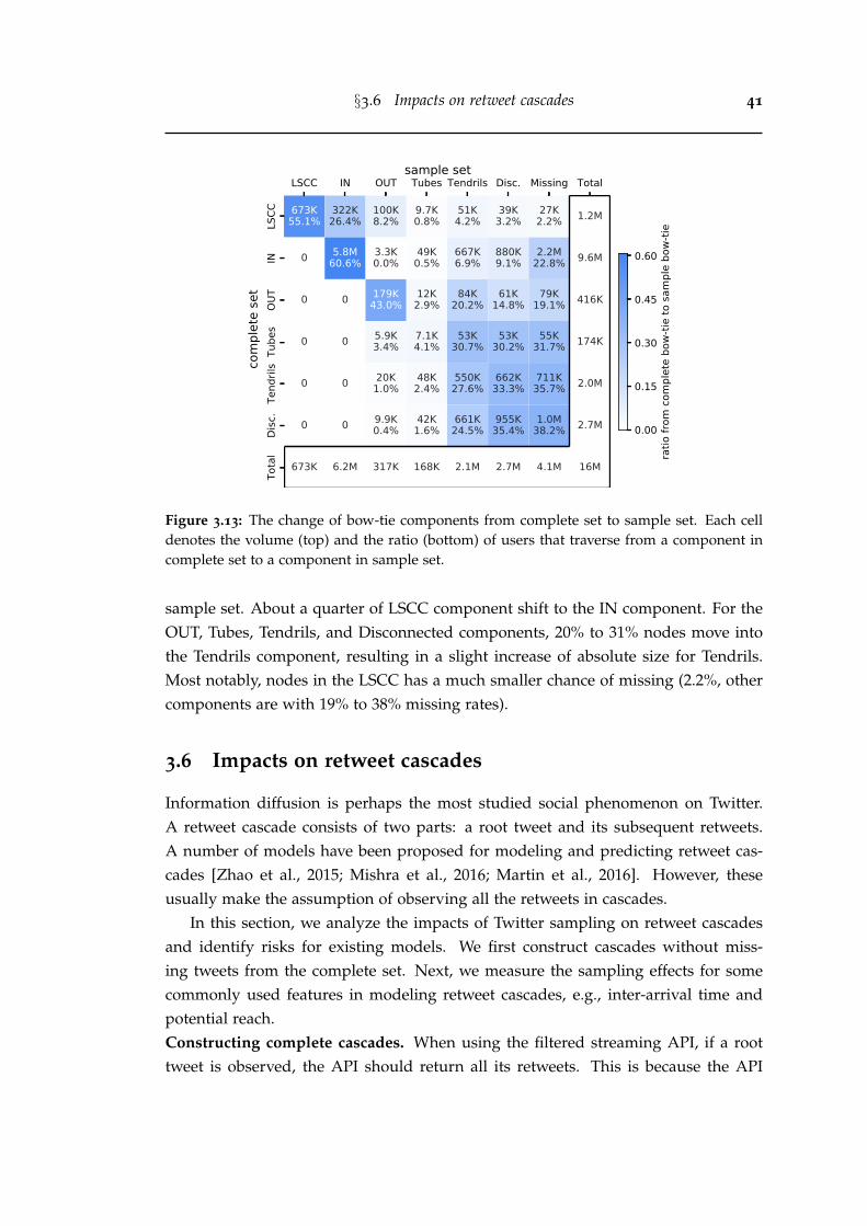
§3.6 Impacts on retweet cascades 41
LSCC IN OUT Tubes Tendrils Disc. Missing Total
LSCC
INOU
TTu
bes
Tend
rils
Disc
.To
tal
673K55.1%
322K26.4%
100K8.2%
9.7K0.8%
51K4.2%
39K3.2%
27K2.2% 1.2M
0 5.8M60.6%
3.3K0.0%
49K0.5%
667K6.9%
880K9.1%
2.2M22.8% 9.6M
0 0 179K43.0%
12K2.9%
84K20.2%
61K14.8%
79K19.1% 416K
0 0 5.9K3.4%
7.1K4.1%
53K30.7%
53K30.2%
55K31.7% 174K
0 0 20K1.0%
48K2.4%
550K27.6%
662K33.3%
711K35.7% 2.0M
0 0 9.9K0.4%
42K1.6%
661K24.5%
955K35.4%
1.0M38.2% 2.7M
673K 6.2M 317K 168K 2.1M 2.7M 4.1M 16M
com
plet
e se
t
0.00
0.15
0.30
0.45
0.60
ratio
from
com
plet
e bo
w-tie
to sa
mpl
e bo
w-tie
sample set
Figure 3.13: The change of bow-tie components from complete set to sample set. Each celldenotes the volume (top) and the ratio (bottom) of users that traverse from a component incomplete set to a component in sample set.
sample set. About a quarter of LSCC component shift to the IN component. For theOUT, Tubes, Tendrils, and Disconnected components, 20% to 31% nodes move intothe Tendrils component, resulting in a slight increase of absolute size for Tendrils.Most notably, nodes in the LSCC has a much smaller chance of missing (2.2%, othercomponents are with 19% to 38% missing rates).
3.6 Impacts on retweet cascades
Information diffusion is perhaps the most studied social phenomenon on Twitter.A retweet cascade consists of two parts: a root tweet and its subsequent retweets.A number of models have been proposed for modeling and predicting retweet cas-cades [Zhao et al., 2015; Mishra et al., 2016; Martin et al., 2016]. However, theseusually make the assumption of observing all the retweets in cascades.
In this section, we analyze the impacts of Twitter sampling on retweet cascadesand identify risks for existing models. We first construct cascades without miss-ing tweets from the complete set. Next, we measure the sampling effects for somecommonly used features in modeling retweet cascades, e.g., inter-arrival time andpotential reach.Constructing complete cascades. When using the filtered streaming API, if a roottweet is observed, the API should return all its retweets. This is because the API
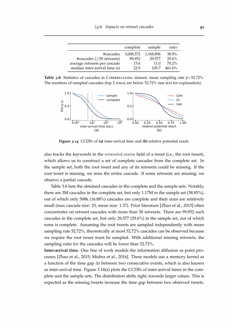
§3.6 Impacts on retweet cascades 42
complete sample ratio
#cascades 3,008,572 1,168,896 38.9%#cascades (≥50 retweets) 99,952 29,577 29.6%
average retweets per cascade 15.6 11.0 70.2%median inter-arrival time (s) 22.9 105.7 461.6%
Table 3.8: Statistics of cascades in Cyberbullying dataset, mean sampling rate ρ=52.72%.The numbers of sampled cascades (top 2 rows) are below 52.72% (see text for explanation).
0100 102 104 106
inter-arrival time (sec)
0.0
0.5
1.0
P(X
x)
(a)
samplecomplete
0.00 0.25 0.50 0.75 1.00relative potential reach
0.0
0.5
1.0
(b)
10m1h14d
Figure 3.14: CCDFs of (a) inter-arrival time and (b) relative potential reach.
also tracks the keywords in the retweeted status field of a tweet (i.e., the root tweet),which allows us to construct a set of complete cascades from the complete set. Inthe sample set, both the root tweet and any of its retweets could be missing. If theroot tweet is missing, we miss the entire cascade. If some retweets are missing, weobserve a partial cascade.
Table 3.8 lists the obtained cascades in the complete and the sample sets. Notably,there are 3M cascades in the complete set, but only 1.17M in the sample set (38.85%),out of which only 508k (16.88%) cascades are complete and their sizes are relativelysmall (max cascade size: 23, mean size: 1.37). Prior literature [Zhao et al., 2015] oftenconcentrates on retweet cascades with more than 50 retweets. There are 99,952 suchcascades in the complete set, but only 29,577 (29.6%) in the sample set, out of whichnone is complete. Assuming the root tweets are sampled independently with meansampling rate 52.72%, theoretically at most 52.72% cascades can be observed becausewe require the root tweet must be sampled. With additional missing retweets, thesampling ratio for the cascades will be lower than 52.72%.Inter-arrival time. One line of work models the information diffusion as point pro-cesses [Zhao et al., 2015; Mishra et al., 2016]. These models use a memory kernel asa function of the time gap ∆t between two consecutive events, which is also knownas inter-arrival time. Figure 3.14(a) plots the CCDFs of inter-arrival times in the com-plete and the sample sets. The distribution shifts right, towards larger values. This isexpected as the missing tweets increase the time gap between two observed tweets.
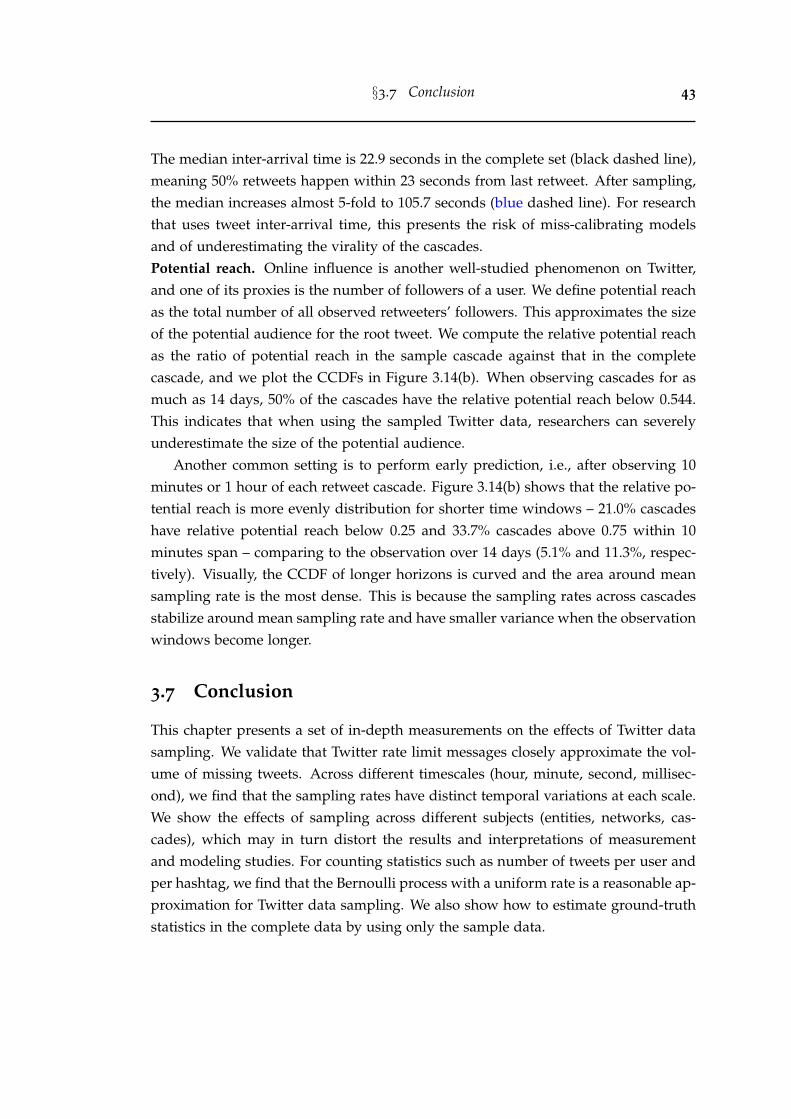
§3.7 Conclusion 43
The median inter-arrival time is 22.9 seconds in the complete set (black dashed line),meaning 50% retweets happen within 23 seconds from last retweet. After sampling,the median increases almost 5-fold to 105.7 seconds (blue dashed line). For researchthat uses tweet inter-arrival time, this presents the risk of miss-calibrating modelsand of underestimating the virality of the cascades.Potential reach. Online influence is another well-studied phenomenon on Twitter,and one of its proxies is the number of followers of a user. We define potential reachas the total number of all observed retweeters’ followers. This approximates the sizeof the potential audience for the root tweet. We compute the relative potential reachas the ratio of potential reach in the sample cascade against that in the completecascade, and we plot the CCDFs in Figure 3.14(b). When observing cascades for asmuch as 14 days, 50% of the cascades have the relative potential reach below 0.544.This indicates that when using the sampled Twitter data, researchers can severelyunderestimate the size of the potential audience.
Another common setting is to perform early prediction, i.e., after observing 10minutes or 1 hour of each retweet cascade. Figure 3.14(b) shows that the relative po-tential reach is more evenly distribution for shorter time windows – 21.0% cascadeshave relative potential reach below 0.25 and 33.7% cascades above 0.75 within 10minutes span – comparing to the observation over 14 days (5.1% and 11.3%, respec-tively). Visually, the CCDF of longer horizons is curved and the area around meansampling rate is the most dense. This is because the sampling rates across cascadesstabilize around mean sampling rate and have smaller variance when the observationwindows become longer.
3.7 Conclusion
This chapter presents a set of in-depth measurements on the effects of Twitter datasampling. We validate that Twitter rate limit messages closely approximate the vol-ume of missing tweets. Across different timescales (hour, minute, second, millisec-ond), we find that the sampling rates have distinct temporal variations at each scale.We show the effects of sampling across different subjects (entities, networks, cas-cades), which may in turn distort the results and interpretations of measurementand modeling studies. For counting statistics such as number of tweets per user andper hashtag, we find that the Bernoulli process with a uniform rate is a reasonable ap-proximation for Twitter data sampling. We also show how to estimate ground-truthstatistics in the complete data by using only the sample data.
§3.7 Conclusion 44
3.7.1 Limitations
These observations in this chapter apply to current Twitter APIs (as of May, 2020)and are subject to the changes of Twitter’s proprietary sampling mechanisms. Weare aware of that Twitter plans to release a new set of APIs in near future. Consistentwith the current streaming APIs, the rate limit threshold for the new APIs is also setto 50 tweets per second [twitter.com, 2020b]. Therefore, we believe the observationsof this work will hold.
3.7.2 Practical implications and future work
This work calls attention to the hidden noises and biases in social media data. Wehave shown effective methods for estimating ground-truth statistics, which allowsresearchers to mitigate the risks in their datasets without collecting the completedata. Our research provides methods and toolkits for collecting sampled and com-plete data streams on Twitter. Our findings also provide foundations to many otherresearch topics using sampled data, such as community detection and informationdiffusion algorithms that are robust to data subsampling.
Future works include measuring a larger set of activity and network measure-ments under data sampling, generalizing the results of this work to other social me-dia platforms and data formats, and quantifying the robustness of existing networkand diffusion models against data sampling. To establish a benchmark, we releaseour collected complete and sampled retweet cascades that contain all required fea-tures (timestamp and user follower count) of existing diffusion models [Zhao et al.,2015; Mishra et al., 2016].
Chapter 4
Measuring and predictingengagement in online videos
In the previous chapter, we extensively discussed the impacts of Twitter data sam-pling. Since we use Twitter data as a proxy to curate YouTube video datasets, we cannow use the methods in Chapter 3 to measure the sampling effects in our datasets.
In this chapter, we discuss engagement of online videos in detail. Most currentresearch focuses on modeling video viewership, but we argue that video engage-ment, or time spent watching is a more appropriate measure for resource allocationproblems in attention, network, and promotion activities.
We present the first large-scale measurement of video-level aggregate engage-ment on a collection of 5.3 million YouTube videos published over two months in2016. We study a set of metrics including time and percentage of a video beingwatched. In Section 4.3, we propose a new metric, relative engagement, which is cal-ibrated against video properties and strongly correlated with recognized notions ofquality. Moreover, we find engagement measures of videos stable over time. In Sec-tion 4.4, we find that aggregate engagement metrics are predictable from a cold-startsetup, having most of their variance explained by video context, topics and channelinformation. Channel past success is the most predictive feature while video topicsseem to have a non-trivial effect. In Section 4.5, we link daily watch time to externalsharing of a video using a self-exciting Hawkes Intensity Process, and find that wecan forecast daily watch time more accurately than daily views.
This chapter provides a set of new yardsticks for measuring online content in-cluding video and other length-constrained media such as songs and podcasts. Theobservations here imply several prospective usages of engagement metrics – choos-ing engaging topics for video production, or promoting engaging videos in recom-mender systems.
45
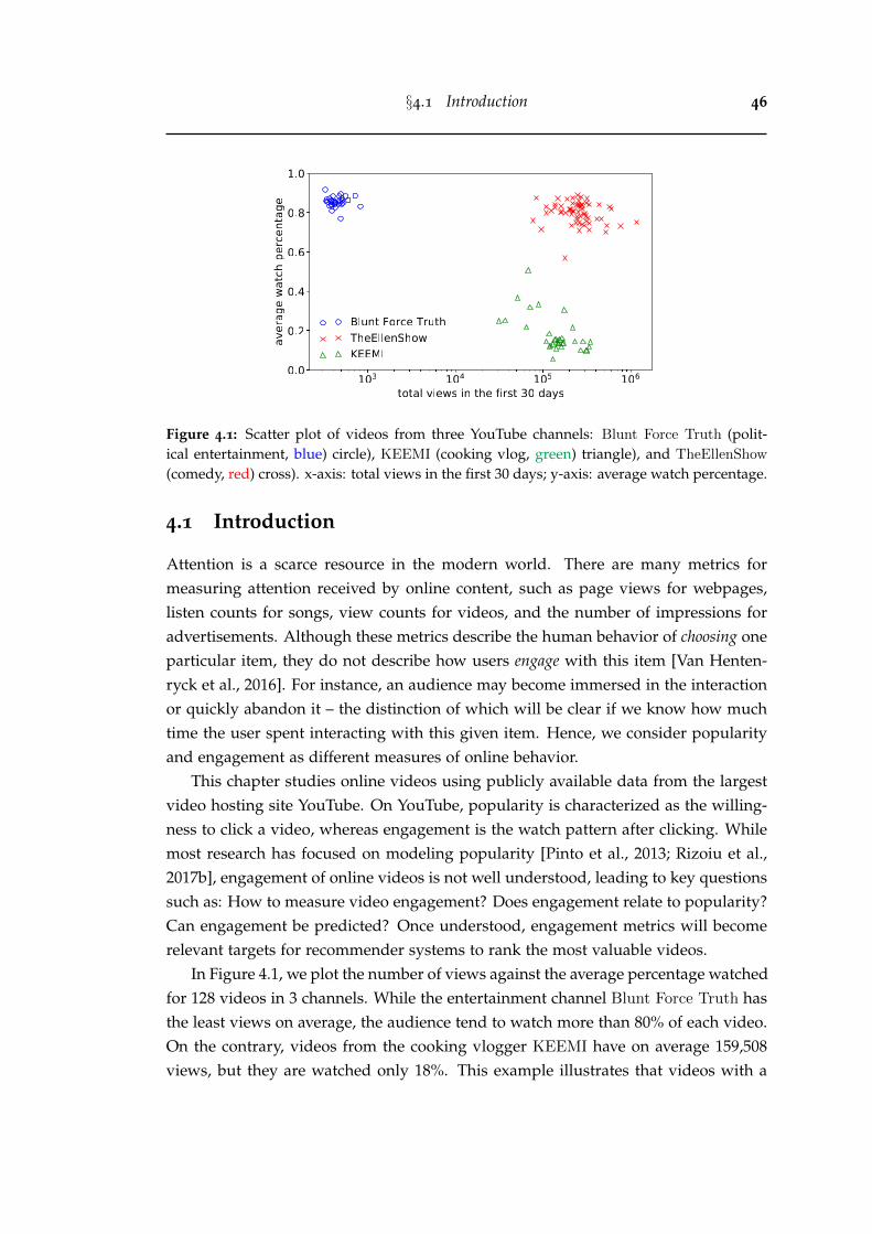
§4.1 Introduction 46
Figure 4.1: Scatter plot of videos from three YouTube channels: Blunt Force Truth (polit-ical entertainment, blue) circle), KEEMI (cooking vlog, green) triangle), and TheEllenShow
(comedy, red) cross). x-axis: total views in the first 30 days; y-axis: average watch percentage.
4.1 Introduction
Attention is a scarce resource in the modern world. There are many metrics formeasuring attention received by online content, such as page views for webpages,listen counts for songs, view counts for videos, and the number of impressions foradvertisements. Although these metrics describe the human behavior of choosing oneparticular item, they do not describe how users engage with this item [Van Henten-ryck et al., 2016]. For instance, an audience may become immersed in the interactionor quickly abandon it – the distinction of which will be clear if we know how muchtime the user spent interacting with this given item. Hence, we consider popularityand engagement as different measures of online behavior.
This chapter studies online videos using publicly available data from the largestvideo hosting site YouTube. On YouTube, popularity is characterized as the willing-ness to click a video, whereas engagement is the watch pattern after clicking. Whilemost research has focused on modeling popularity [Pinto et al., 2013; Rizoiu et al.,2017b], engagement of online videos is not well understood, leading to key questionssuch as: How to measure video engagement? Does engagement relate to popularity?Can engagement be predicted? Once understood, engagement metrics will becomerelevant targets for recommender systems to rank the most valuable videos.
In Figure 4.1, we plot the number of views against the average percentage watchedfor 128 videos in 3 channels. While the entertainment channel Blunt Force Truth hasthe least views on average, the audience tend to watch more than 80% of each video.On the contrary, videos from the cooking vlogger KEEMI have on average 159,508views, but they are watched only 18%. This example illustrates that videos with a
§4.1 Introduction 47
high number of views do not necessarily have high watch percentages, and promptsus to investigate other metrics for describing engagement.
Recent progress in understanding video popularity and the availability of newdatasets allow us to address four open questions about video engagement. Firstly,on an aggregate level, how to measure engagement? Most engagement literaturefocuses on the viewpoint of an individual user, such as recommending relevant prod-ucts [Covington et al., 2016], tracking mouse gestures [Arapakis et al., 2014] or op-timizing search results [Drutsa et al., 2015]. Since user-level data is often unavail-able, defining and measuring average engagement is useful for content producers onYouTube. Secondly, within the scope of online video, can engagement help mea-sure content quality? As shown in Figure 4.1, video popularity metric is inadequateto estimate quality. One early attempt to measure online content quality was takenby Salganik et al. [2006], who studied music listening behavior in an experimental en-vironment. For a large number of online contents, measuring quality from empiricaldata still remains unexplored. Thirdly, in a cold-start setup, can engagement be pre-dicted? For engagement, Park et al. [2016] showed the predictive power of collectiveuser reactions. However, these features require monitoring the system for a periodof time. In contrast, if engagement can be predicted before content is uploaded, itwill provide actionable insights to content producers. Lastly, on forecasting futureperformance, how predictable is engagement comparing to popularity? Onlinepopularity is known to be difficult to forecast [Martin et al., 2016; Hofman et al.,2017]. Yet, no one has tried to forecast the future trend of watch time, nor comparedthe difference of predictability between engagement and popularity.
We address the first question by constructing a new dataset that contains morethan 5 million tweeted YouTube videos and 3 datasets that contain quality videos. Webuild two 2-dimensional maps that visualize the internal bias of existing engagementmetrics – average watch time and average watch percentage – against video length.Building upon that, we derive a novel metric relative engagement, as the duration-calibrated rank of average watch percentage.
Addressing the second question, we demonstrate that relative engagement is sta-ble over time, and strongly correlates with established quality measures in Music andNews categories, such as Billboard songs, Vevo artists, and top news channels. It im-plies that relative engagement can be a target for recommender systems to prioritizequality videos, and for content producers to create engaging videos.
Addressing the third question, we predict engagement metrics in a cold-startsetting, using only video topical content and channel features. With off-the-shelfmachine learning algorithms, we achieve R2=0.77 for predicting average watch per-centage. We consider this as a significant result that shows the predictability of
§4.2 Data 48
engagement metrics. Furthermore, we explore the predictive power of video topicsand find some topics are strong indicators for engagement.
Addressing the last question, we adopt a variant of stochastic point processes,namely Hawkes Intensity Process (HIP) [Rizoiu et al., 2017b]. We model and forecastboth daily watch time and daily views. The forecast error on engagement metric is4.93 percentile points, better than that of popularity metric (5.43 percentile points).
The main contributions of this chapter include:
• We conduct a large-scale measurement study of engagement on 5.3 million videosover two-month period, and publicly release 4 new datasets and the engagementbenchmarks1.
• We measure a set of engagement metrics for online videos, including averagewatch time, average watch percentage, and a novel metric – relative engagement,which is calibrated with respect to video length, stable over time, and correlatedwith video quality.
• We predict relative engagement and watch percentage from video context, topics,and channel reputation in a cold-start setting (i.e., before the video gathers anyview or comment), achieving R2=0.45 and 0.77 respectively.
• We explain and forecast daily watch time. The self-exciting HIP model achieves anaverage error of 4.93 percentile points.
• We release a software package “YouTube-insight” for collecting metadata and his-torical data for videos on YouTube.2.
4.2 Data
We curate the YouTube Engagement ’16 datasets that consist of 4 new publicly avail-able video datasets, as summarized in Table 4.1 and Table 4.2. We also discuss theTwitter sampling effects on our datasets. We conclude with an introduction of threedaily series available for all videos: shares, views and watch time.
4.2.1 YouTube Engagement ’16 datasets
Tweeted videos dataset contains 5,331,204 videos published between July 1st andAugust 31st, 2016 from 1,257,412 channels. The notion of channel on YouTube is
1The code and datasets are available at https://github.com/avalanchesiqi/youtube-engagement.2The package is available at https://github.com/avalanchesiqi/youtube-insight. However, it is no
longer working as designed since YouTube deprecated the insight endpoint around Nov, 2018.
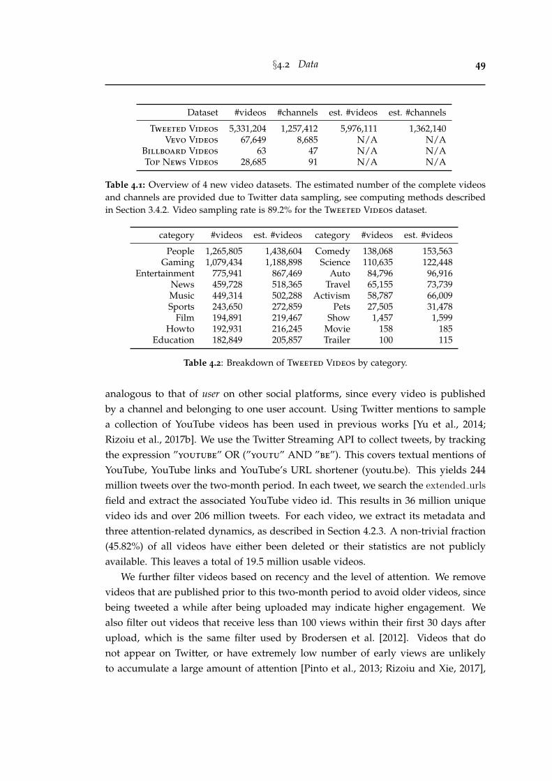
§4.2 Data 49
Dataset #videos #channels est. #videos est. #channels
Tweeted Videos 5,331,204 1,257,412 5,976,111 1,362,140Vevo Videos 67,649 8,685 N/A N/A
Billboard Videos 63 47 N/A N/ATop News Videos 28,685 91 N/A N/A
Table 4.1: Overview of 4 new video datasets. The estimated number of the complete videosand channels are provided due to Twitter data sampling, see computing methods describedin Section 3.4.2. Video sampling rate is 89.2% for the Tweeted Videos dataset.
category #videos est. #videos category #videos est. #videos
People 1,265,805 1,438,604 Comedy 138,068 153,563Gaming 1,079,434 1,188,898 Science 110,635 122,448
Entertainment 775,941 867,469 Auto 84,796 96,916News 459,728 518,365 Travel 65,155 73,739Music 449,314 502,288 Activism 58,787 66,009Sports 243,650 272,859 Pets 27,505 31,478
Film 194,891 219,467 Show 1,457 1,599Howto 192,931 216,245 Movie 158 185
Education 182,849 205,857 Trailer 100 115
Table 4.2: Breakdown of Tweeted Videos by category.
analogous to that of user on other social platforms, since every video is publishedby a channel and belonging to one user account. Using Twitter mentions to samplea collection of YouTube videos has been used in previous works [Yu et al., 2014;Rizoiu et al., 2017b]. We use the Twitter Streaming API to collect tweets, by trackingthe expression ”youtube” OR (”youtu” AND ”be”). This covers textual mentions ofYouTube, YouTube links and YouTube’s URL shortener (youtu.be). This yields 244million tweets over the two-month period. In each tweet, we search the extended urls
field and extract the associated YouTube video id. This results in 36 million uniquevideo ids and over 206 million tweets. For each video, we extract its metadata andthree attention-related dynamics, as described in Section 4.2.3. A non-trivial fraction(45.82%) of all videos have either been deleted or their statistics are not publiclyavailable. This leaves a total of 19.5 million usable videos.
We further filter videos based on recency and the level of attention. We removevideos that are published prior to this two-month period to avoid older videos, sincebeing tweeted a while after being uploaded may indicate higher engagement. Wealso filter out videos that receive less than 100 views within their first 30 days afterupload, which is the same filter used by Brodersen et al. [2012]. Videos that donot appear on Twitter, or have extremely low number of early views are unlikelyto accumulate a large amount of attention [Pinto et al., 2013; Rizoiu and Xie, 2017],
§4.2 Data 50
therefore, they do not provide enough data to reflect collective watch patterns. Ourproposed measures can still be computed on these removed videos, however theresults might have limited relevance given the low level of user interaction withthem. Table 4.2 shows a detailed category breakdown of Tweeted videos.Quality videos datasets. We collect three datasets containing videos deemed of highquality by domain experts, two of which are on Music category and one is on News.These datasets are used to link engagement and video quality (Section 4.3.4).• Vevo Videos. Vevo is a multinational video hosting service which syndicates
licensed music clips from three major record companies on YouTube [wikipedia.com,2020b]. Vevo artists usually come from professional music background, and theirvideos are professionally produced. We consider Vevo Videos to be of higher qualitythan the average Music videos in the Tweeted Videos dataset. We collect all theYouTube channels that contain the keyword “Vevo” in the title and a “verified” statusbadge on the profile webpage. In total, this dataset contains 8,685 Vevo channels with67,649 music clips, as of August 31st, 2016.• Billboard Videos. Billboard acts as a canonical ranking source in the music
industry, aggregating music sales, radio airtime and other popularity metrics into ayearly Hot 100 music chart. The songs that appear in this chart are usually perceivedas having vast success and being of high quality. We collect 63 videos from 47 artistsbased on the 2016 Billboard Hot 100 chart3.• Top News Videos features a list of top 100 most viewed News channels, as
reported by an external ranking source4. This list includes traditional news broad-casting companies (e.g., CNN), as well as popular politic talk shows (e.g., The Young
Turks). For each channel, we retrieve its last 500 videos published before Aug 31st,2016. This dataset contains 91 publicly available News channels and 28,685 videos.
4.2.2 Twitter sampling effects
We apply methods described in Chapter 3 to measure the sampling effects on theYouTube Engagement ’16 datasets. The overall tweet sampling rate between 2016-07-01 and 2016-08-31 is 76.67% (230,290,042 collected tweets out of 300,347,371 es-timated total tweets). Next, we infer the complete number of videos (channels) byfeeding the sampled tweetcount distribution per video (channel) into Equation (3.4).The estimated volumes are shown in Table 4.1. Additionally, Table 4.2 lists the es-timated volume for each category. The video sampling rates for different categoriesvary between 85.4% and 90.8%.
3https://en.wikipedia.org/wiki/Billboard Year-End Hot 100 singles of 20164https://vidstatsx.com/youtube-top-100-most-viewed-news-politics
§4.3 Measures of video engagement 51
For the three Quality videos datasets, there is no need to estimate the completevolume because they are not constructed from collected tweets. Hence, the Twittersampling effects do not apply on them.
4.2.3 Video metadata and attention dynamics
For each video, we use the YouTube Data API to retrieve video metadata information– video id, title, description, upload time, category, duration, definition, channel id,channel title, and associated Freebase topic ids, which we resolve to entity namesusing the latest Freebase data dump5.
We develop a software package “YouTube-insight” to extract three daily seriesof video attention dynamics: daily volume of shares, view counts and watch time.Throughout this chapter, we denote the number of shares and views that a videoreceives on the tth day after upload as s[t] and xv[t], respectively. Similarly, xw[t]is the total amount of time of video being watched on the tth day. Each attentionseries is observed for at least 30 days, i.e., t=1, 2, . . . 30. Most prior research onmodeling video popularity dynamics [Szabo and Huberman, 2010; Figueiredo et al.,2016] studies only view counts. To the best of our knowledge, our work is the first toperform large-scale measurements on video watch time. The YouTube Engagement
’16 datasets are also one of the two publicly available datasets including informationof video watch time. The other is our Vevo Music Graph dataset (see Section 5.2.1).
4.3 Measures of video engagement
In this section, we measure the interplay between view count, watch time, watch per-centage and video duration. We first examine their relation in a new visual presenta-tion – engagement map, then we propose relative engagement, a novel metric to estimatevideo engagement (Section 4.3.3). We show that relative engagement calibrates watchpatterns for videos of different lengths, demonstrates correlation to external notionsof video quality (Section 4.3.4), and remains stable over time (Section 4.3.5).
4.3.1 Discrepancy between views and watch time
Figure 4.1 illustrates that watch patterns (e.g., average percentage of video watched)can be very different for videos with similar views. We examine the union set oftop n videos in Tweeted Videos dataset, respectively ranked by total views and totalwatch time at the age of 30 days. For n varying from 100 to 1000, we measure their
5https://developers.google.com/freebase. The Freebase corpus is not updated any more but datadump is still available.
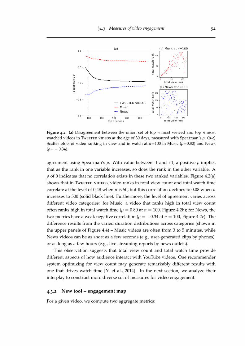
§4.3 Measures of video engagement 52
Figure 4.2: (a) Disagreement between the union set of top n most viewed and top n mostwatched videos in Tweeted videos at the age of 30 days, measured with Spearman’s ρ. (b-c)Scatter plots of video ranking in view and in watch at n=100 in Music (ρ=0.80) and News(ρ=− 0.34).
agreement using Spearman’s ρ. With value between -1 and +1, a positive ρ impliesthat as the rank in one variable increases, so does the rank in the other variable. Aρ of 0 indicates that no correlation exists in these two ranked variables. Figure 4.2(a)shows that in Tweeted videos, video ranks in total view count and total watch timecorrelate at the level of 0.48 when n is 50, but this correlation declines to 0.08 when nincreases to 500 (solid black line). Furthermore, the level of agreement varies acrossdifferent video categories: for Music, a video that ranks high in total view countoften ranks high in total watch time (ρ = 0.80 at n = 100, Figure 4.2b); for News, thetwo metrics have a weak negative correlation (ρ = −0.34 at n = 100, Figure 4.2c). Thedifference results from the varied duration distributions across categories (shown inthe upper panels of Figure 4.4) – Music videos are often from 3 to 5 minutes, whileNews videos can be as short as a few seconds (e.g., user-generated clips by phones),or as long as a few hours (e.g., live streaming reports by news outlets).
This observation suggests that total view count and total watch time providedifferent aspects of how audience interact with YouTube videos. One recommendersystem optimizing for view count may generate remarkably different results withone that drives watch time [Yi et al., 2014]. In the next section, we analyze theirinterplay to construct more diverse set of measures for video engagement.
4.3.2 New tool – engagement map
For a given video, we compute two aggregate metrics:
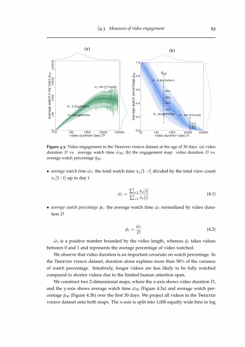
§4.3 Measures of video engagement 53
Figure 4.3: Video engagement in the Tweeted videos dataset at the age of 30 days. (a) videoduration D vs. average watch time ω30; (b) the engagement map: video duration D vs.average watch percentage η30.
• average watch time ωt: the total watch time xw[1 : t] divided by the total view countxv[1 : t] up to day t
ωt =∑t
i=1 xw[i]∑t
i=1 xv[i](4.1)
• average watch percentage µt: the average watch time ωt normalized by video dura-tion D
µt =ωt
D(4.2)
ωt is a positive number bounded by the video length, whereas µt takes valuesbetween 0 and 1 and represents the average percentage of video watched.
We observe that video duration is an important covariate on watch percentage. Inthe Tweeted videos dataset, duration alone explains more than 58% of the varianceof watch percentage. Intuitively, longer videos are less likely to be fully watchedcompared to shorter videos due to the limited human attention span.
We construct two 2-dimensional maps, where the x-axis shows video duration D,and the y-axis shows average watch time ω30 (Figure 4.3a) and average watch per-centage µ30 (Figure 4.3b) over the first 30 days. We project all videos in the Tweeted
videos dataset onto both maps. The x-axis is split into 1,000 equally wide bins in log
§4.3 Measures of video engagement 54
scale. We choose 1,000 bins to trade-off enough data in each bin and having enoughbins. We have also tried discretizing to smaller or larger number of bins, but theresults are visually similar. We merge bins containing a very low number of videos(<50) to nearby bins. Overall, each bin contains between 50 and 38,508 videos. Thecolor shades correspond to data percentiles inside each bin: the darkest color cor-responds to the median value and the lightest correspond to the extremes (0% and100%). Both maps calibrate watch time and watch percentage against video duration:highly-watched videos are positioned towards the top of allocated bin, while barely-watched videos are at the bottom compared to other videos with similar length.
Those two maps are logically identical because the position of each video in Fig-ure 4.3(b) can be obtained by normalizing with its duration in Figure 4.3(a). It isworth noticing that a linear trend exists between average watch time and video du-ration in the log-log space, with an increasing variance as duration grows. In thiswork, we predominantly use the map of watch percentage (Figure 4.3b) given itsy-axis is bounded between [0,1], making it easier to interpret. We denote this map asthe engagement map.
Note that our method of constructing the engagement map resembles the idea ofnon-parametric quantile regression, which essentially computes a quantile regressionfit in an equally spaced span [Koenker and Hallock, 2001]. For smaller datasets, usingquantile regression may result in a smoother mapping. We tried quantile regressionon Tweeted videos dataset, and we found that the values on both tails are inaccurateas the polynomial fits do not accurately reflect nonlinear trends. In contrast, ourbinning method works better in this case. Finally, we remarks that the engagementmap can be constructed at different ages, which allows us to study the temporalevolution of engagement (Section 4.3.1).
4.3.3 New metric – relative engagement
Based on the engagement map, we propose the relative engagement ηt ∈ [0, 1], de-fined as the rank percentile of video in its duration bin. This is an average engage-ment measure in the first t days. Figure 4.3(b) illustrates the relation between videoduration D, watch percentage µ30, and relative engagement η30 for three examplevideos. Video v1 (d 8ao3o5ohU) shows kids doing karate and v2 (akuyBBIbOso) isabout teaching toddlers colors. They are both about 5 minutes, but have differentwatch percentages, µ30(v1)= 0.70 and µ30(v2)=0.21. These amount to very differ-ent values of the relative engagement: η30(v1)=0.96, while η30(v2)=0.07. Video v3
(WH7llf2vaKQ) is a much longer video (D=3 hours 49 minutes) showing a live fight-ing show. It has a relatively low watch percentage (µ30(v3)=0.19), similar to v2. How-
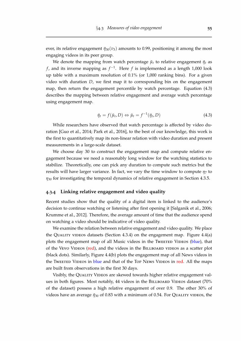
§4.3 Measures of video engagement 55
ever, its relative engagement η30(v3) amounts to 0.99, positioning it among the mostengaging videos in its peer group.
We denote the mapping from watch percentage µt to relative engagement ηt asf , and its inverse mapping as f−1. Here f is implemented as a length 1,000 lookup table with a maximum resolution of 0.1% (or 1,000 ranking bins). For a givenvideo with duration D, we first map it to corresponding bin on the engagementmap, then return the engagement percentile by watch percentage. Equation (4.3)describes the mapping between relative engagement and average watch percentageusing engagement map.
ηt = f (µt, D)⇔ µt = f−1(ηt, D) (4.3)
While researchers have observed that watch percentage is affected by video du-ration [Guo et al., 2014; Park et al., 2016], to the best of our knowledge, this work isthe first to quantitatively map its non-linear relation with video duration and presentmeasurements in a large-scale dataset.
We choose day 30 to construct the engagement map and compute relative en-gagement because we need a reasonably long window for the watching statistics tostabilize. Theoretically, one can pick any duration to compute such metrics but theresults will have larger variance. In fact, we vary the time window to compute η7 toη30 for investigating the temporal dynamics of relative engagement in Section 4.3.5.
4.3.4 Linking relative engagement and video quality
Recent studies show that the quality of a digital item is linked to the audience’sdecision to continue watching or listening after first opening it [Salganik et al., 2006;Krumme et al., 2012]. Therefore, the average amount of time that the audience spendon watching a video should be indicative of video quality.
We examine the relation between relative engagement and video quality. We placethe Quality videos datasets (Section 4.3.4) on the engagement map. Figure 4.4(a)plots the engagement map of all Music videos in the Tweeted Videos (blue), thatof the Vevo Videos (red), and the videos in the Billboard videos as a scatter plot(black dots). Similarly, Figure 4.4(b) plots the engagement map of all News videos inthe Tweeted Videos in blue and that of the Top News Videos in red. All the mapsare built from observations in the first 30 days.
Visibly, the Quality Videos are skewed towards higher relative engagement val-ues in both figures. Most notably, 44 videos in the Billboard Videos dataset (70%of the dataset) possess a high relative engagement of over 0.9. The other 30% ofvideos have an average η30 of 0.83 with a minimum of 0.54. For Quality videos, the
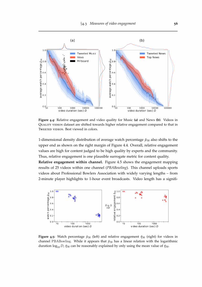
§4.3 Measures of video engagement 56
Figure 4.4: Relative engagement and video quality for Music (a) and News (b). Videos inQuality videos dataset are shifted towards higher relative engagement compared to that inTweeted videos. Best viewed in colors.
1-dimensional density distribution of average watch percentage µ30 also shifts to theupper end as shown on the right margin of Figure 4.4. Overall, relative engagementvalues are high for content judged to be high quality by experts and the community.Thus, relative engagement is one plausible surrogate metric for content quality.Relative engagement within channel. Figure 4.5 shows the engagement mappingresults of 25 videos within one channel (PBABowling). This channel uploads sportsvideos about Professional Bowlers Association with widely varying lengths – from2-minute player highlights to 1-hour event broadcasts. Video length has a signifi-
Figure 4.5: Watch percentage µ30 (left) and relative engagement η30 (right) for videos inchannel PBABowling. While it appears that µ30 has a linear relation with the logarithmicduration log10 D, η30 can be reasonably explained by only using the mean value of η30.
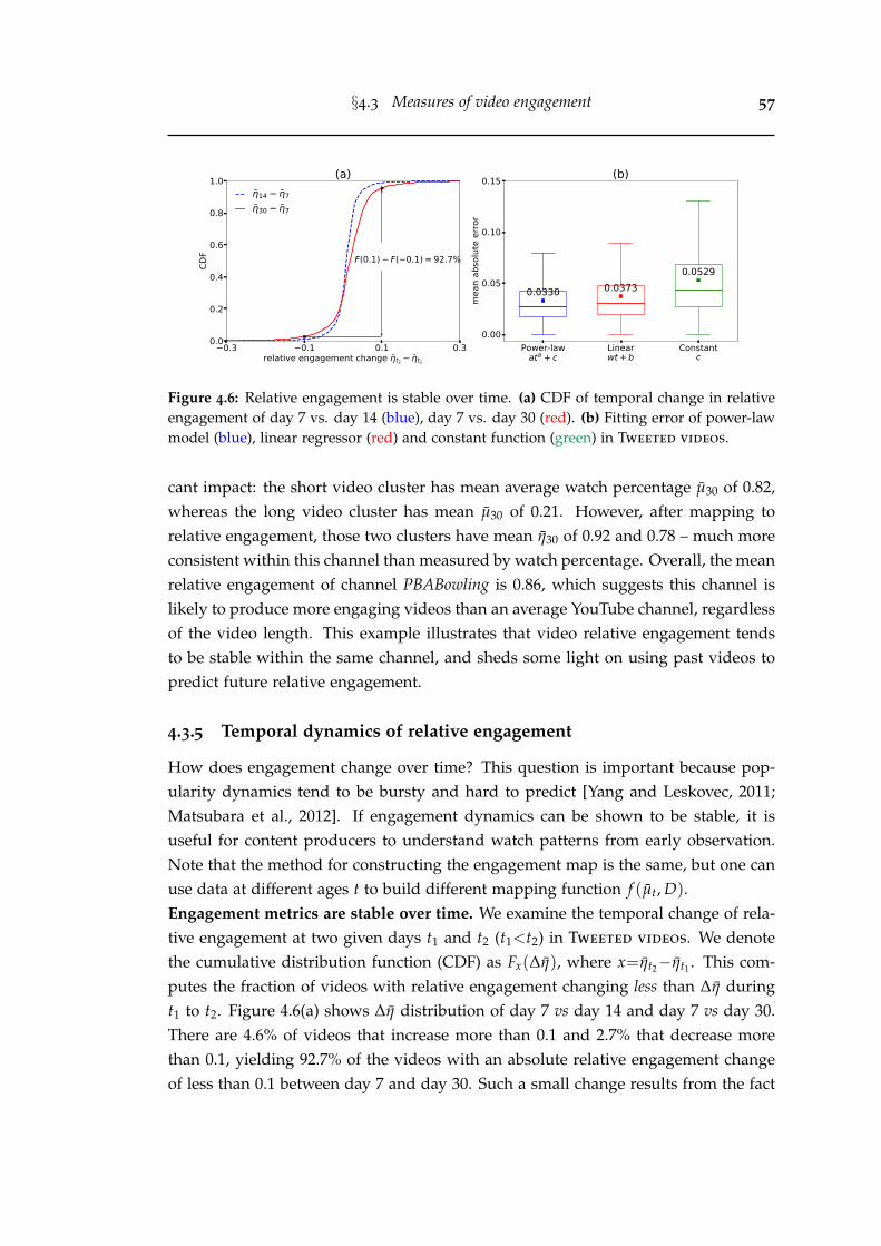
§4.3 Measures of video engagement 57
0.3 0.1 0.1 0.3relative engagement change t2 t1
0.0
0.2
0.4
0.6
0.8
1.0
CDF F(0.1) F( 0.1) = 92.7%
(a)14 7
30 7
Power-lawatb + c
Linearwt + b
Constantc
0.00
0.05
0.10
0.15
mea
n ab
solu
te e
rror
0.0330 0.03730.0529
(b)
Figure 4.6: Relative engagement is stable over time. (a) CDF of temporal change in relativeengagement of day 7 vs. day 14 (blue), day 7 vs. day 30 (red). (b) Fitting error of power-lawmodel (blue), linear regressor (red) and constant function (green) in Tweeted videos.
cant impact: the short video cluster has mean average watch percentage µ30 of 0.82,whereas the long video cluster has mean µ30 of 0.21. However, after mapping torelative engagement, those two clusters have mean η30 of 0.92 and 0.78 – much moreconsistent within this channel than measured by watch percentage. Overall, the meanrelative engagement of channel PBABowling is 0.86, which suggests this channel islikely to produce more engaging videos than an average YouTube channel, regardlessof the video length. This example illustrates that video relative engagement tendsto be stable within the same channel, and sheds some light on using past videos topredict future relative engagement.
4.3.5 Temporal dynamics of relative engagement
How does engagement change over time? This question is important because pop-ularity dynamics tend to be bursty and hard to predict [Yang and Leskovec, 2011;Matsubara et al., 2012]. If engagement dynamics can be shown to be stable, it isuseful for content producers to understand watch patterns from early observation.Note that the method for constructing the engagement map is the same, but one canuse data at different ages t to build different mapping function f (µt, D).Engagement metrics are stable over time. We examine the temporal change of rela-tive engagement at two given days t1 and t2 (t1<t2) in Tweeted videos. We denotethe cumulative distribution function (CDF) as Fx(∆η), where x=ηt2−ηt1 . This com-putes the fraction of videos with relative engagement changing less than ∆η duringt1 to t2. Figure 4.6(a) shows ∆η distribution of day 7 vs day 14 and day 7 vs day 30.There are 4.6% of videos that increase more than 0.1 and 2.7% that decrease morethan 0.1, yielding 92.7% of the videos with an absolute relative engagement changeof less than 0.1 between day 7 and day 30. Such a small change results from the fact
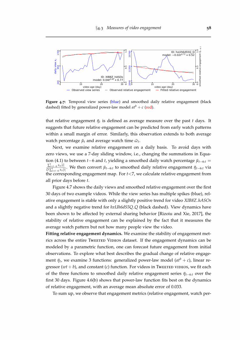
§4.3 Measures of video engagement 58
0 10 20 30video age (day)
200
950
1700
daily
vie
w x v
0.0
0.5
1.0
ID: XIB8Z_hASOsmodel: 0.04t0.41 + 0.77
0 10 20 30video age (day)
2000
1135
020
700
0.0
0.5
1.0
smoo
thed
rela
tive
enga
gem
ent
t6:
t
ID: hxUh6dS5Q_Qmodel: 0.02t0.72 + 0.52
Observed view series Observed relative engagement Fitted relative engagement
Figure 4.7: Temporal view series (blue) and smoothed daily relative engagement (blackdashed) fitted by generalized power-law model atb + c (red).
that relative engagement ηt is defined as average measure over the past t days. Itsuggests that future relative engagement can be predicted from early watch patternswithin a small margin of error. Similarly, this observation extends to both averagewatch percentage µt and average watch time ωt.
Next, we examine relative engagement on a daily basis. To avoid days withzero views, we use a 7-day sliding window, i.e., changing the summations in Equa-tion (4.1) to between t−6 and t, yielding a smoothed daily watch percentage µt−6:t =
∑ti=t−6 xw[i]
D ∑ti=t−6 xv[i]
. We then convert µt−6:t to smoothed daily relative engagement ηt−6:t viathe corresponding engagement map. For t<7, we calculate relative engagement fromall prior days before t.
Figure 4.7 shows the daily views and smoothed relative engagement over the first30 days of two example videos. While the view series has multiple spikes (blue), rel-ative engagement is stable with only a slightly positive trend for video XIB8Z hASOsand a slightly negative trend for hxUh6dS5Q Q (black dashed). View dynamics havebeen shown to be affected by external sharing behavior [Rizoiu and Xie, 2017], thestability of relative engagement can be explained by the fact that it measures theaverage watch pattern but not how many people view the video.Fitting relative engagement dynamics. We examine the stability of engagement met-rics across the entire Tweeted Videos dataset. If the engagement dynamics can bemodeled by a parametric function, one can forecast future engagement from initialobservations. To explore what best describes the gradual change of relative engage-ment ηt, we examine 3 functions: generalized power-law model (atb + c), linear re-gressor (wt + b), and constant (c) function. For videos in Tweeted videos, we fit eachof the three functions to smoothed daily relative engagement series ηt−6:t over thefirst 30 days. Figure 4.6(b) shows that power-law function fits best on the dynamicsof relative engagement, with an average mean absolute error of 0.033.
To sum up, we observe that engagement metrics (relative engagement, watch per-
§4.4 Predicting aggregate engagement 59
centage, and watch time) are stable throughout a video’s lifetime, which implies thatearly watching patterns are strong predictors for future engagement and makes themattractive prediction targets. It is desirable to predict them in a cold-start setting, i.e.,before videos get uploaded or any viewing behavior is observed.
4.4 Predicting aggregate engagement
In this section, we predict relative engagement and average watch percentage of avideo in a cold-start setting. We further analyze the importance of each video featureon predicting engagement metrics.
4.4.1 Experimental setup
Prediction targets. We setup two regression tasks to predict average watch per-centage µ30 and relative engagement η30. Watch percentage is intuitively useful forcontent producers, while relative engagement is designed to calibrate watch percent-age against duration as detailed in Section 4.3.3. It is interesting to see whether suchcalibration changes prediction performance. We report three evaluation results: pre-dicting relative engagement and watch percentage directly, and predicting relativeengagement then mapping to watch percentage via engagement map by using Equa-tion (4.3). We do not predict average watch time because it can be deterministicallycomputed by multiplying watch percentage and video duration.Training and test data. We split Tweeted videos at 5:1 ratio over publish time.We use the first 51 days (2016-07-01 to 2016-08-20) for training, containing 4,455,339videos from 1,132,933 channels; and the last 11 days for testing (2016-08-21 to 2016-08-31), containing 875,865 videos from 366,311 channels. 242,017 (66%) channels inthe test set have appeared in training set, however, none of the videos in the test setis in the training set. The engagement map between watch percentage and relativeengagement is built on the training set over the first 30 days. We split the dataset intime to ensure that learning is on past videos and prediction is on future videos.Evaluation metrics. Performance is measured with two metrics:
• Mean Absolute Error MAE = 1N ∑N
i=1 |yi − yi|
• Coefficient of Determination R2 = 1− ∑Ni=1(yi−yi)
2
∑Ni=1(yi−y)2
Here y is the true value, y the predicted value, y the average; i indexes samples in thetest set. MAE is a standard metric for average error. R2 quantifies the proportion of
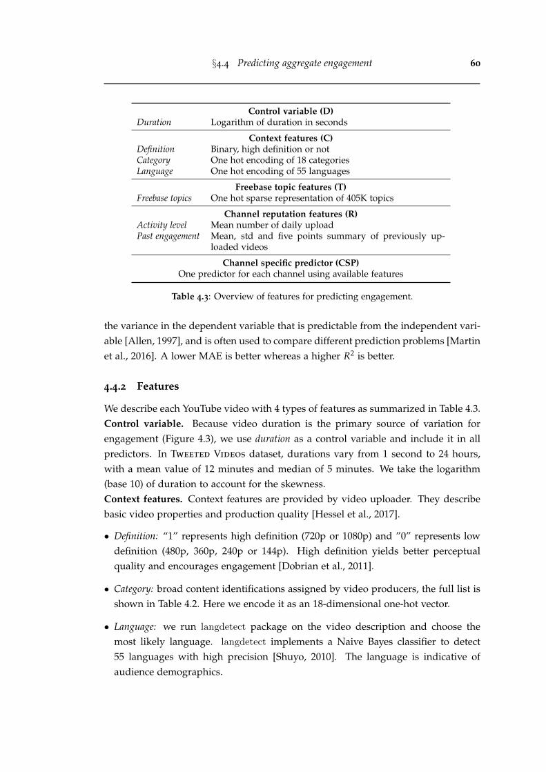
§4.4 Predicting aggregate engagement 60
Control variable (D)Duration Logarithm of duration in seconds
Context features (C)Definition Binary, high definition or notCategory One hot encoding of 18 categoriesLanguage One hot encoding of 55 languages
Freebase topic features (T)Freebase topics One hot sparse representation of 405K topics
Channel reputation features (R)Activity level Mean number of daily uploadPast engagement Mean, std and five points summary of previously up-
loaded videos
Channel specific predictor (CSP)One predictor for each channel using available features
Table 4.3: Overview of features for predicting engagement.
the variance in the dependent variable that is predictable from the independent vari-able [Allen, 1997], and is often used to compare different prediction problems [Martinet al., 2016]. A lower MAE is better whereas a higher R2 is better.
4.4.2 Features
We describe each YouTube video with 4 types of features as summarized in Table 4.3.Control variable. Because video duration is the primary source of variation forengagement (Figure 4.3), we use duration as a control variable and include it in allpredictors. In Tweeted Videos dataset, durations vary from 1 second to 24 hours,with a mean value of 12 minutes and median of 5 minutes. We take the logarithm(base 10) of duration to account for the skewness.Context features. Context features are provided by video uploader. They describebasic video properties and production quality [Hessel et al., 2017].
• Definition: “1” represents high definition (720p or 1080p) and ”0” represents lowdefinition (480p, 360p, 240p or 144p). High definition yields better perceptualquality and encourages engagement [Dobrian et al., 2011].
• Category: broad content identifications assigned by video producers, the full list isshown in Table 4.2. Here we encode it as an 18-dimensional one-hot vector.
• Language: we run langdetect package on the video description and choose themost likely language. langdetect implements a Naive Bayes classifier to detect55 languages with high precision [Shuyo, 2010]. The language is indicative ofaudience demographics.
§4.4 Predicting aggregate engagement 61
Freebase topics features. YouTube labels videos with Freebase entities [Bollackeret al., 2008]. These labels incorporate user engagement signals, video metadata andcontent analysis, and are built upon a large amount of data and computational re-sources. With the recent advances in computer vision and natural language process-ing, there may exist more accurate methods for annotating videos. However, one cannot easily build such an annotator at scale, and finding the best video annotationtechnique is beyond the scope of this work. On average, each video in the Tweeted
Videos dataset has 6.16 topics. Overall, there are 405K topics and 98K of them appearmore than 6 times. These topics vary from broad categories (Song), to specific object(Game of Thrones), celebrities (Adele), real-world events (2012 Seattle International FilmFestival) and many more. Such fine-grained topics are descriptive of video content.While learning embedding vectors can help predict engagement [Covington et al.,2016], using raw Freebase topics enables us to interpret the effect of individual topic(Section 4.4.4).Channel reputation features. Prior research shows that user features are predictivefor product popularity [Martin et al., 2016; Mishra et al., 2016]. Here we computefeature from a channel’s history to represent its reputation. We could not use socialstatus indicators such as the number of subscribers, because it is a time-varyingquantity and the value when a video is uploaded can not be retrospectively obtained.Thus, we compute two proxies for describing channel features.
• Activity level: mean number of daily published videos by channels in the trainingdata. Intuitively, channels with higher upload rates reflect better productivity.
• Past engagement: relative engagement of previously uploaded videos from the samechannel in the training set. Here we compute mean, standard deviation and fivepoints summary: median, 25th and 75th percentile, min and max.
Several features used in prior works are interesting, but they do not apply in oursetting. Network traffic measurement [Dobrian et al., 2011] requires access to thehosting backend. Audience reactions such as likes and comments [Park et al., 2016]can not be obtained before a video’s upload.
4.4.3 Methods
We use linear regression with L2-regularization to predict engagement metrics, η30
and µ30, both lie between 0 and 1. Since the dimensionality of Freebase topics featuresis high (4M x 405K), we convert the feature matrix to a sparse representation, allow-ing the predictor to be trained on one workstation. We adopt a fall-back strategy todeal with missing features. For instance, we use the context predictor for videos for
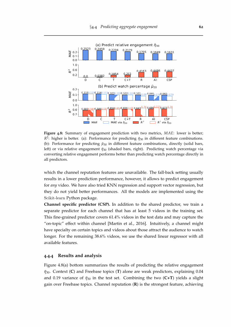
§4.4 Predicting aggregate engagement 62
Figure 4.8: Summary of engagement prediction with two metrics, MAE: lower is better;R2: higher is better. (a): Performance for predicting η30 in different feature combinations.(b): Performance for predicting µ30 in different feature combinations, directly (solid bars,left) or via relative engagement η30 (shaded bars, right). Predicting watch percentage viaconverting relative engagement performs better than predicting watch percentage directly inall predictors.
which the channel reputation features are unavailable. The fall-back setting usuallyresults in a lower prediction performance, however, it allows to predict engagementfor any video. We have also tried KNN regression and support vector regression, butthey do not yield better performances. All the models are implemented using theScikit-learn Python package.Channel specific predictor (CSP). In addition to the shared predictor, we train aseparate predictor for each channel that has at least 5 videos in the training set.This fine-grained predictor covers 61.4% videos in the test data and may capture the“on-topic” effect within channel [Martin et al., 2016]. Intuitively, a channel mighthave specialty on certain topics and videos about those attract the audience to watchlonger. For the remaining 38.6% videos, we use the shared linear regressor with allavailable features.
4.4.4 Results and analysis
Figure 4.8(a) bottom summarizes the results of predicting the relative engagementη30. Context (C) and Freebase topics (T) alone are weak predictors, explaining 0.04and 0.19 variance of η30 in the test set. Combining the two (C+T) yields a slightgain over Freebase topics. Channel reputation (R) is the strongest feature, achieving
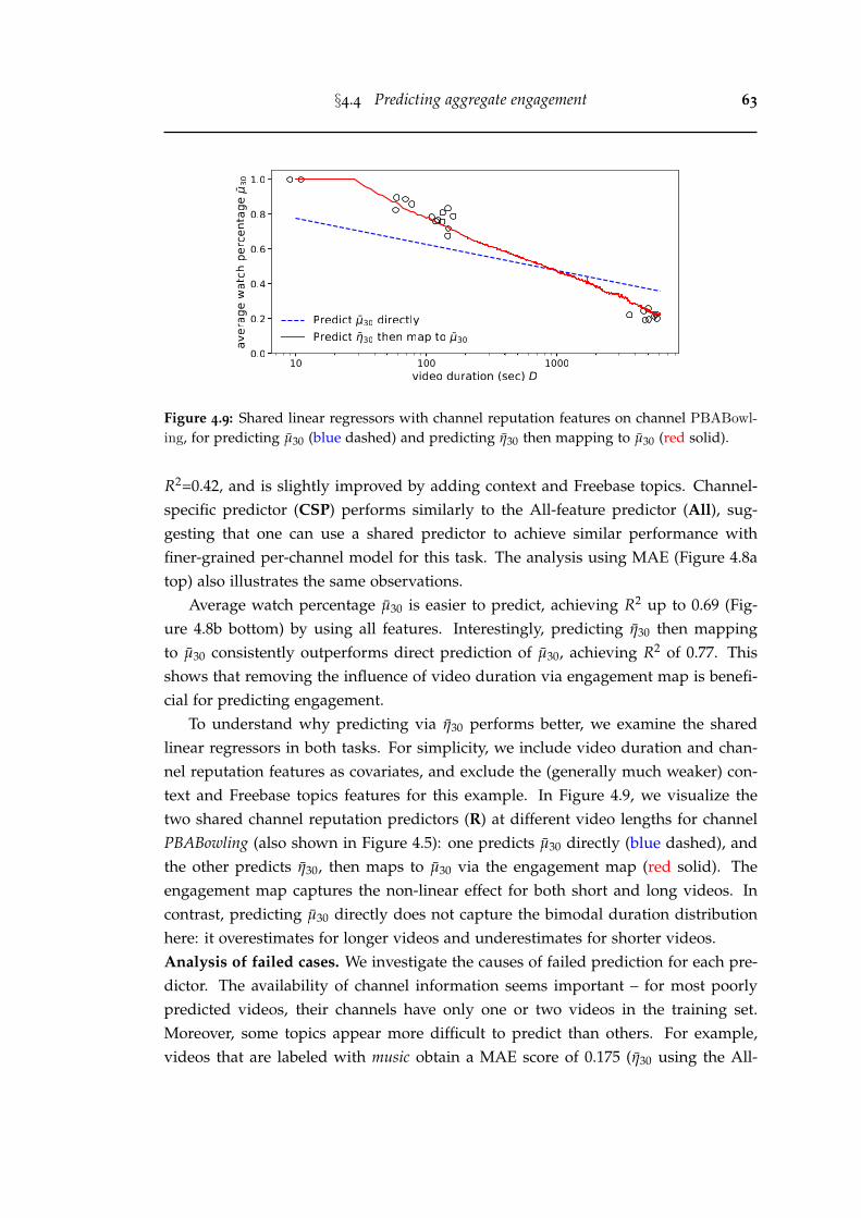
§4.4 Predicting aggregate engagement 63
Figure 4.9: Shared linear regressors with channel reputation features on channel PBABowl-
ing, for predicting µ30 (blue dashed) and predicting η30 then mapping to µ30 (red solid).
R2=0.42, and is slightly improved by adding context and Freebase topics. Channel-specific predictor (CSP) performs similarly to the All-feature predictor (All), sug-gesting that one can use a shared predictor to achieve similar performance withfiner-grained per-channel model for this task. The analysis using MAE (Figure 4.8atop) also illustrates the same observations.
Average watch percentage µ30 is easier to predict, achieving R2 up to 0.69 (Fig-ure 4.8b bottom) by using all features. Interestingly, predicting η30 then mappingto µ30 consistently outperforms direct prediction of µ30, achieving R2 of 0.77. Thisshows that removing the influence of video duration via engagement map is benefi-cial for predicting engagement.
To understand why predicting via η30 performs better, we examine the sharedlinear regressors in both tasks. For simplicity, we include video duration and chan-nel reputation features as covariates, and exclude the (generally much weaker) con-text and Freebase topics features for this example. In Figure 4.9, we visualize thetwo shared channel reputation predictors (R) at different video lengths for channelPBABowling (also shown in Figure 4.5): one predicts µ30 directly (blue dashed), andthe other predicts η30, then maps to µ30 via the engagement map (red solid). Theengagement map captures the non-linear effect for both short and long videos. Incontrast, predicting µ30 directly does not capture the bimodal duration distributionhere: it overestimates for longer videos and underestimates for shorter videos.Analysis of failed cases. We investigate the causes of failed prediction for each pre-dictor. The availability of channel information seems important – for most poorlypredicted videos, their channels have only one or two videos in the training set.Moreover, some topics appear more difficult to predict than others. For example,videos that are labeled with music obtain a MAE score of 0.175 (η30 using the All-
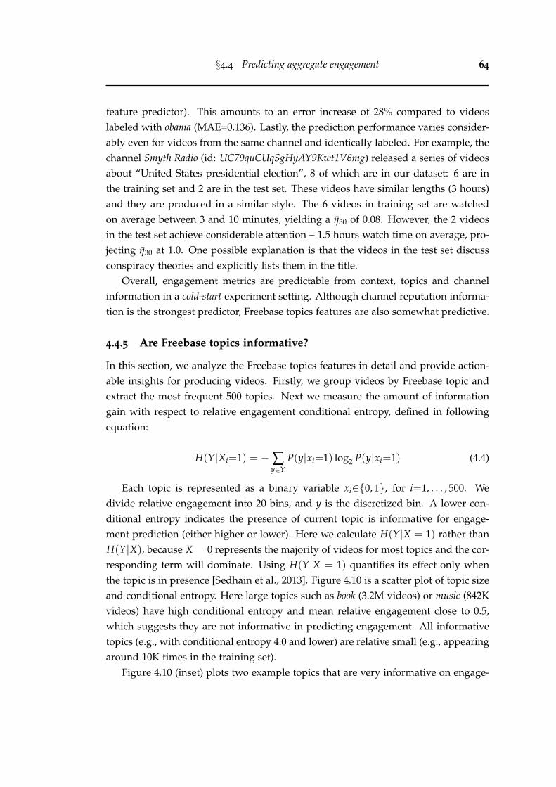
§4.4 Predicting aggregate engagement 64
feature predictor). This amounts to an error increase of 28% compared to videoslabeled with obama (MAE=0.136). Lastly, the prediction performance varies consider-ably even for videos from the same channel and identically labeled. For example, thechannel Smyth Radio (id: UC79quCUqSgHyAY9Kwt1V6mg) released a series of videosabout “United States presidential election”, 8 of which are in our dataset: 6 are inthe training set and 2 are in the test set. These videos have similar lengths (3 hours)and they are produced in a similar style. The 6 videos in training set are watchedon average between 3 and 10 minutes, yielding a η30 of 0.08. However, the 2 videosin the test set achieve considerable attention – 1.5 hours watch time on average, pro-jecting η30 at 1.0. One possible explanation is that the videos in the test set discussconspiracy theories and explicitly lists them in the title.
Overall, engagement metrics are predictable from context, topics and channelinformation in a cold-start experiment setting. Although channel reputation informa-tion is the strongest predictor, Freebase topics features are also somewhat predictive.
4.4.5 Are Freebase topics informative?
In this section, we analyze the Freebase topics features in detail and provide action-able insights for producing videos. Firstly, we group videos by Freebase topic andextract the most frequent 500 topics. Next we measure the amount of informationgain with respect to relative engagement conditional entropy, defined in followingequation:
H(Y|Xi=1) = − ∑y∈Y
P(y|xi=1) log2 P(y|xi=1) (4.4)
Each topic is represented as a binary variable xi∈{0, 1}, for i=1, . . . , 500. Wedivide relative engagement into 20 bins, and y is the discretized bin. A lower con-ditional entropy indicates the presence of current topic is informative for engage-ment prediction (either higher or lower). Here we calculate H(Y|X = 1) rather thanH(Y|X), because X = 0 represents the majority of videos for most topics and the cor-responding term will dominate. Using H(Y|X = 1) quantifies its effect only whenthe topic is in presence [Sedhain et al., 2013]. Figure 4.10 is a scatter plot of topic sizeand conditional entropy. Here large topics such as book (3.2M videos) or music (842Kvideos) have high conditional entropy and mean relative engagement close to 0.5,which suggests they are not informative in predicting engagement. All informativetopics (e.g., with conditional entropy 4.0 and lower) are relative small (e.g., appearingaround 10K times in the training set).
Figure 4.10 (inset) plots two example topics that are very informative on engage-
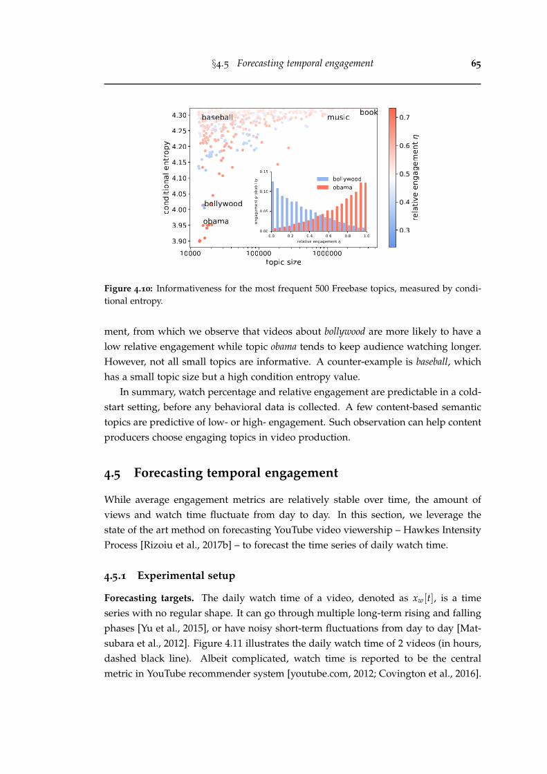
§4.5 Forecasting temporal engagement 65
Figure 4.10: Informativeness for the most frequent 500 Freebase topics, measured by condi-tional entropy.
ment, from which we observe that videos about bollywood are more likely to have alow relative engagement while topic obama tends to keep audience watching longer.However, not all small topics are informative. A counter-example is baseball, whichhas a small topic size but a high condition entropy value.
In summary, watch percentage and relative engagement are predictable in a cold-start setting, before any behavioral data is collected. A few content-based semantictopics are predictive of low- or high- engagement. Such observation can help contentproducers choose engaging topics in video production.
4.5 Forecasting temporal engagement
While average engagement metrics are relatively stable over time, the amount ofviews and watch time fluctuate from day to day. In this section, we leverage thestate of the art method on forecasting YouTube video viewership – Hawkes IntensityProcess [Rizoiu et al., 2017b] – to forecast the time series of daily watch time.
4.5.1 Experimental setup
Forecasting targets. The daily watch time of a video, denoted as xw[t], is a timeseries with no regular shape. It can go through multiple long-term rising and fallingphases [Yu et al., 2015], or have noisy short-term fluctuations from day to day [Mat-subara et al., 2012]. Figure 4.11 illustrates the daily watch time of 2 videos (in hours,dashed black line). Albeit complicated, watch time is reported to be the centralmetric in YouTube recommender system [youtube.com, 2012; Covington et al., 2016].
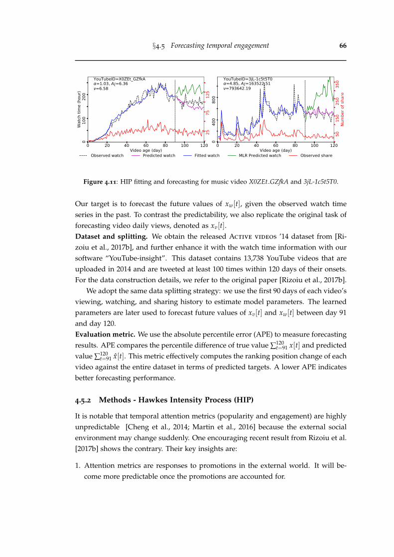
§4.5 Forecasting temporal engagement 66
0 20 40 60 80 100 120Video age (day)
010
020
0W
atch
tim
e (h
our)
2575
125
YouTubeID=X0ZEt_GZfkA=1.03, A =6.36=6.58
0 20 40 60 80 100 120Video age (day)
040
080
0
5015
025
035
0Nu
mbe
r of s
hare
YouTubeID=3jL-1c5t5T0=4.85, A =163522.51=793642.19
Observed watch Predicted watch Fitted watch MLR Predicted watch Observed share
Figure 4.11: HIP fitting and forecasting for music video X0ZEt GZfkA and 3jL-1c5t5T0.
Our target is to forecast the future values of xw[t], given the observed watch timeseries in the past. To contrast the predictability, we also replicate the original task offorecasting video daily views, denoted as xv[t].Dataset and splitting. We obtain the released Active videos ’14 dataset from [Ri-zoiu et al., 2017b], and further enhance it with the watch time information with oursoftware “YouTube-insight”. This dataset contains 13,738 YouTube videos that areuploaded in 2014 and are tweeted at least 100 times within 120 days of their onsets.For the data construction details, we refer to the original paper [Rizoiu et al., 2017b].
We adopt the same data splitting strategy: we use the first 90 days of each video’sviewing, watching, and sharing history to estimate model parameters. The learnedparameters are later used to forecast future values of xv[t] and xw[t] between day 91and day 120.Evaluation metric. We use the absolute percentile error (APE) to measure forecastingresults. APE compares the percentile difference of true value ∑120
t=91 x[t] and predictedvalue ∑120
t=91 x[t]. This metric effectively computes the ranking position change of eachvideo against the entire dataset in terms of predicted targets. A lower APE indicatesbetter forecasting performance.
4.5.2 Methods - Hawkes Intensity Process (HIP)
It is notable that temporal attention metrics (popularity and engagement) are highlyunpredictable [Cheng et al., 2014; Martin et al., 2016] because the external socialenvironment may change suddenly. One encouraging recent result from Rizoiu et al.[2017b] shows the contrary. Their key insights are:
1. Attention metrics are responses to promotions in the external world. It will be-come more predictable once the promotions are accounted for.
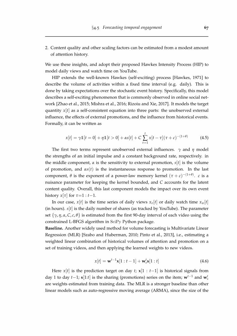
§4.5 Forecasting temporal engagement 67
2. Content quality and other scaling factors can be estimated from a modest amountof attention history.
We use these insights, and adopt their proposed Hawkes Intensity Process (HIP) tomodel daily views and watch time on YouTube.
HIP extends the well-known Hawkes (self-exciting) process [Hawkes, 1971] todescribe the volume of activities within a fixed time interval (e.g. daily). This isdone by taking expectations over the stochastic event history. Specifically, this modeldescribes a self-exciting phenomenon that is commonly observed in online social net-work [Zhao et al., 2015; Mishra et al., 2016; Rizoiu and Xie, 2017]. It models the targetquantity x[t] as a self-consistent equation into three parts: the unobserved externalinfluence, the effects of external promotions, and the influence from historical events.Formally, it can be written as
x[t] = γ1[t = 0] + η1[t > 0] + αs[t] + Ct
∑τ=1
x[t− τ](τ + c)−(1+θ) (4.5)
The first two terms represent unobserved external influences. γ and η modelthe strengths of an initial impulse and a constant background rate, respectively. inthe middle component, α is the sensitivity to external promotion, s[t] is the volumeof promotion, and αs(t) is the instantaneous response to promotion. In the lastcomponent, θ is the exponent of a power-law memory kernel (τ + c)−(1+θ). c is anuisance parameter for keeping the kernel bounded, and C accounts for the latentcontent quality. Overall, this last component models the impact over its own eventhistory x[τ] for τ=1 : t−1.
In our case, x[t] is the time series of daily views xv[t] or daily watch time xw[t](in hours). s[t] is the daily number of shares (as tracked by YouTube). The parameterset {γ, η, α, C, c, θ} is estimated from the first 90-day interval of each video using theconstrained L-BFGS algorithm in SciPy Python package.Baseline. Another widely used method for volume forecasting is Multivariate LinearRegression (MLR) [Szabo and Huberman, 2010; Pinto et al., 2013], i.e., estimating aweighted linear combination of historical volumes of attention and promotion on aset of training videos, and then applying the learned weights to new videos.
x[t] = wt−1x[1 : t− 1] + wtss[1 : t] (4.6)
Here x[t] is the prediction target on day t; x[1 : t−1] is historical signals fromday 1 to day t−1; s[1:t] is the sharing (promotions) series on the item; wt−1 and wt
s
are weights estimated from training data. The MLR is a stronger baseline than otherlinear models such as auto-regressive moving average (ARMA), since the size of the
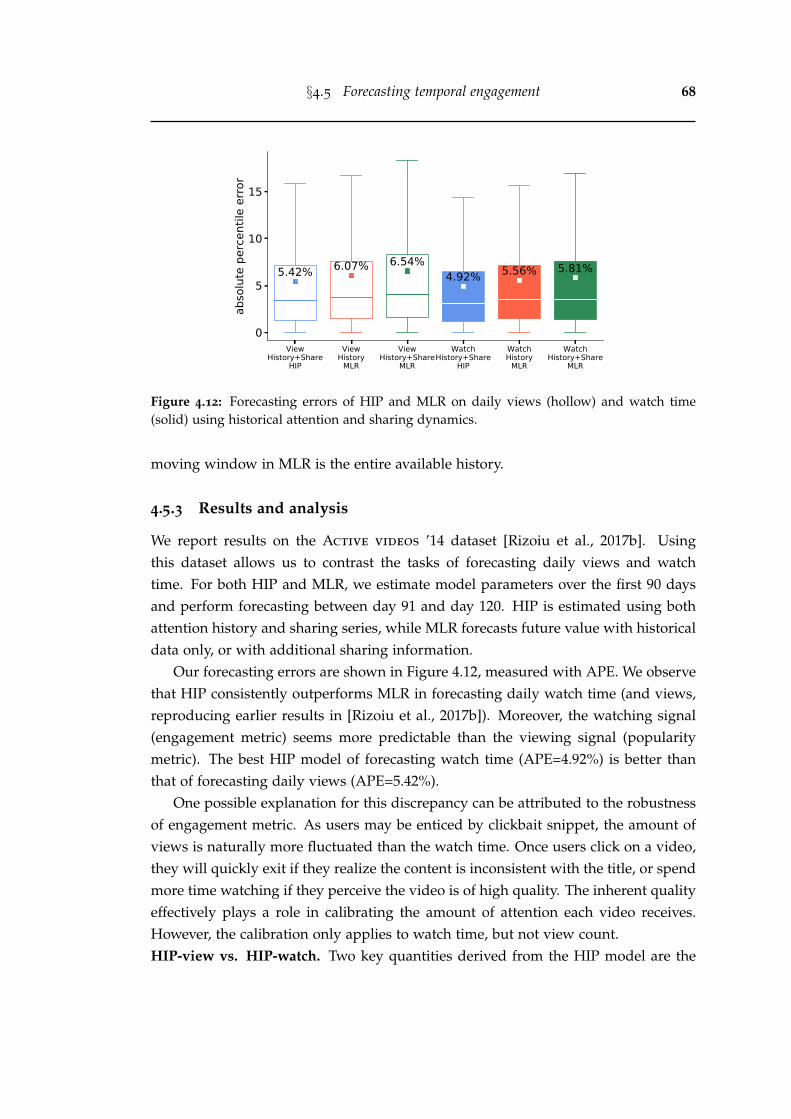
§4.5 Forecasting temporal engagement 68
ViewHistory+Share
HIP
ViewHistory
MLR
ViewHistory+Share
MLR
WatchHistory+Share
HIP
WatchHistory
MLR
WatchHistory+Share
MLR
0
5
10
15
abso
lute
per
cent
ile e
rror
5.42% 6.07% 6.54%4.92% 5.56% 5.81%
Figure 4.12: Forecasting errors of HIP and MLR on daily views (hollow) and watch time(solid) using historical attention and sharing dynamics.
moving window in MLR is the entire available history.
4.5.3 Results and analysis
We report results on the Active videos ’14 dataset [Rizoiu et al., 2017b]. Usingthis dataset allows us to contrast the tasks of forecasting daily views and watchtime. For both HIP and MLR, we estimate model parameters over the first 90 daysand perform forecasting between day 91 and day 120. HIP is estimated using bothattention history and sharing series, while MLR forecasts future value with historicaldata only, or with additional sharing information.
Our forecasting errors are shown in Figure 4.12, measured with APE. We observethat HIP consistently outperforms MLR in forecasting daily watch time (and views,reproducing earlier results in [Rizoiu et al., 2017b]). Moreover, the watching signal(engagement metric) seems more predictable than the viewing signal (popularitymetric). The best HIP model of forecasting watch time (APE=4.92%) is better thanthat of forecasting daily views (APE=5.42%).
One possible explanation for this discrepancy can be attributed to the robustnessof engagement metric. As users may be enticed by clickbait snippet, the amount ofviews is naturally more fluctuated than the watch time. Once users click on a video,they will quickly exit if they realize the content is inconsistent with the title, or spendmore time watching if they perceive the video is of high quality. The inherent qualityeffectively plays a role in calibrating the amount of attention each video receives.However, the calibration only applies to watch time, but not view count.HIP-view vs. HIP-watch. Two key quantities derived from the HIP model are the
§4.5 Forecasting temporal engagement 69
viral score α and the viral potential ν. The viral score α quantifies the degree of in-stantaneous response to external promotions. Figure 4.11 contains two videos withresults of fitting and forecasting from both HIP (magenta) and MLR (green). Thelatino music video (X0ZEt GZfkA) has a lower viral score than a Vevo video by RickyMartin (3jL-1c5t5T0). This suggests that the latino music video needs more promo-tions to attract a similar amount of attention when compared to the Vevo video.
0 20 40 60 80 100View Viral Rank
0
20
40
60
80
100
Wat
ch V
iral R
ank
1376 507 197 64 41
451 955 540 198 42
153 452 866 551 163
120 199 457 892 518
85 73 125 481 1422
(a) Number of videos
200
400
600
800
1000
1200
1400
0 20 40 60 80 100View Viral Rank
0
20
40
60
80
100
Wat
ch V
iral R
ank
310 107 64 87 189
443 232 128 74 99
1148 530 250 138 104
1700 1302 563 361 153
980 1384 1631 899 583
(b) Video duration (sec)
200
400
600
800
1000
1200
1400
1600
0 20 40 60 80 100View Viral Rank
0
20
40
60
80
100
Wat
ch V
iral R
ank
0.682 0.798 0.913 0.930 0.706
0.627 0.675 0.738 0.861 0.923
0.552 0.620 0.656 0.740 0.875
0.549 0.518 0.600 0.662 0.745
0.588 0.580 0.498 0.575 0.633
(c) Watch percentage
0.50
0.55
0.60
0.65
0.70
0.75
0.80
0.85
0.90
0 20 40 60 80 100View Viral Rank
0
20
40
60
80
100
Wat
ch V
iral R
ank
145 72 46 55 102
235 147 86 49 60
389 248 149 88 78
461 461 275 169 104
345 475 512 382 269
(d) Average watch time (sec)
100
200
300
400
500
Figure 4.13: Correlation plots of viral rank (0–100 percentile) of HIP-view (x-axis) versus HIP-watch (y-axis). (a)-(d): number of videos, average video duration, average watch percentageand average watch time.
The viral potential ν quantifies how much attention will be gained for each im-pulse received. Here we introduce a nuanced concept impulse, denoted as ξ[t]. Foreach share, it will generate α impulses. The viral potential ν is computed as a nu-meric integration of response to a unit of impulse from 0 to 10,000 time steps. At
§4.6 Conclusion 70
each time step, ξ[t] accounts for all past impulses ξ[t− τ] over the power-law kernel.
ξ[0] = 1; ξ[t] = CT
∑τ=1
ξ[t− τ](τ + c)−(1+θ) for t ≥ 1;
ν =10000
∑t=0
ξ[t]
(4.7)
We compare viral potential ν from the HIP models on views and on watch time,by looking at correlation matrices after rank-normalizing their respective values ofν, dubbed viral rank. Figure 4.13(a) shows that the viral ranks of HIP-view andHIP-watch highly correlate with each other – 50.4% of videos are in the same 20-percentile bucket in both models (summing over the secondary diagonal), and theranks of another 36.2% differ by one.
For each cell in Figure 4.13(a), we examine some video-level properties – duration,watch percentage, and average watch time. We visualize the results in Figure 4.13(b-d). The number within each cell denotes the mean value of the property for videosin corresponding cell. Videos with a high viral rank in watch but low rank in views(top left buckets) tend to have longer length (Figure 4.13b) and longer watch time(Figure 4.13c), whereas those with a low viral rank in watch but high rank in views(bottom right buckets) tend to have a very high watch percentage (generally >0.90,see Figure 4.13d).
In summary, self-exciting model can describe the attention dynamics of YouTubevideos well. The task of forecasting future watch time is relatively easy comparedwith forecasting future view counts. The HIP model is a useful tool to quantity thegained attention given a known volume of social promotion, or identify videos thathave the potential to become viral.
4.6 Conclusion
In this chapter, we measure a set of aggregate engagement metrics for online videos,including average watch time, average watch percentage, and a new metric, relativeengagement. We study the proposed metrics on a public dataset of 5.3 million videos.We show that relative engagement is stable over the video lifetime, and is stronglycorrelated with established notions of video quality. We further predict the averagewatch percentage, and forecast the volume of future watch time. We find that averageengagement metrics are quite predictable, even in a cold-start setting. Althoughforecasting future attention dynamics is difficult, we find the series of watch time ismore predictable than view count.
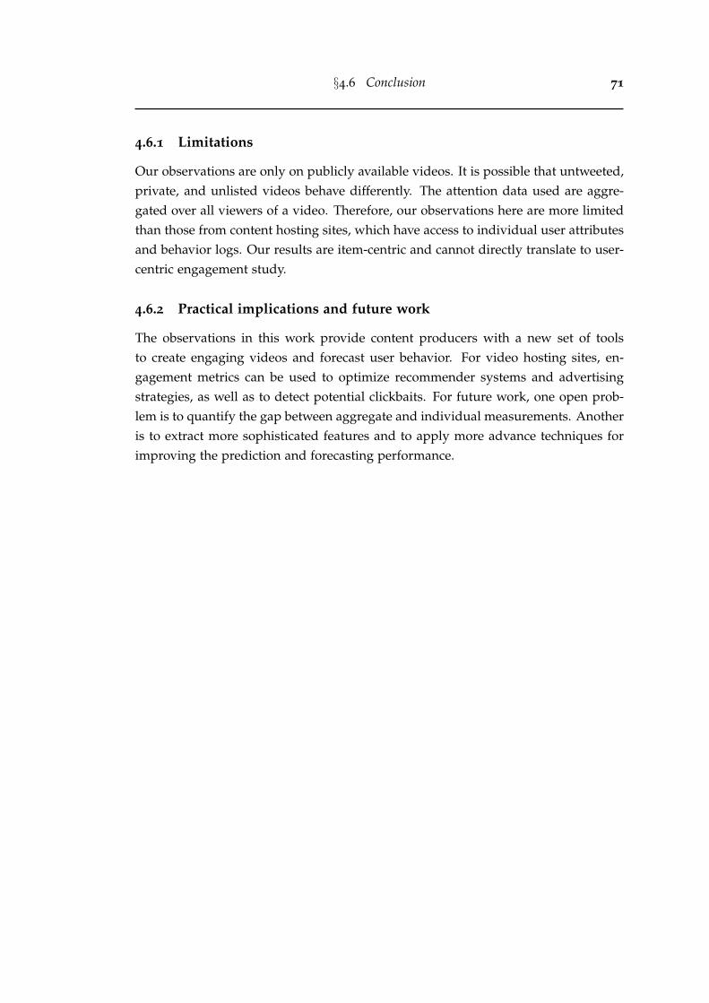
§4.6 Conclusion 71
4.6.1 Limitations
Our observations are only on publicly available videos. It is possible that untweeted,private, and unlisted videos behave differently. The attention data used are aggre-gated over all viewers of a video. Therefore, our observations here are more limitedthan those from content hosting sites, which have access to individual user attributesand behavior logs. Our results are item-centric and cannot directly translate to user-centric engagement study.
4.6.2 Practical implications and future work
The observations in this work provide content producers with a new set of toolsto create engaging videos and forecast user behavior. For video hosting sites, en-gagement metrics can be used to optimize recommender systems and advertisingstrategies, as well as to detect potential clickbaits. For future work, one open prob-lem is to quantify the gap between aggregate and individual measurements. Anotheris to extract more sophisticated features and to apply more advance techniques forimproving the prediction and forecasting performance.
Chapter 5
Measuring and modeling onlinerecommendation networks
Chapter 4 examined the engagement patterns of online videos at the aggregate level.In this chapter, we shift our focus to the popularity measure and its interplay withthe recommender systems. At present, most video hosting sites implement recom-mender systems, which connect the videos into a directed network and build path-ways for users to navigate from one video to another. However, little is known abouthow the collective human attention is allocated over such large-scale networks, andabout the impacts of the recommender systems on driving overall traffic.
In Section 5.2, we construct the Vevo network – a YouTube video network with60,740 music videos interconnected by the recommendation links, and we collecttheir associated viewing dynamics. This results in a total of 310 million views everyday over a period of 9 weeks. From Section 5.3 to Section 5.5, we present a set ofmeasurements from the macroscopic, microscopic, and temporal perspectives. Thesemeasurements connect the structure of the recommendation network and the videoattention dynamics. We use the bow-tie structure to characterize the Vevo networkand we find that its core component (23.1% of the videos), which occupies most of theattention (82.6% of the views), is made out of videos that are mainly recommendedamong themselves. This is indicative of the links between video recommendationand the inequality of attention allocation. In Section 5.6, we address the task ofestimating the attention flow in the video recommendation network. We propose amodel that accounts for the network effects for predicting video popularity, and weshow it consistently outperforms the baselines. This model also identifies a group ofartists gaining attention because of the recommendation network.
Altogether, the observations and models in this chapter provide a new set oftools to better understand the impacts of recommender systems on collective socialattention.
72
§5.1 Introduction 73
5.1 Introduction
Many online platforms present algorithmic suggestions to help users explore theenormous content space. The recommender systems, which produce such sugges-tions, are central to modern online platforms. They have been employed in manyapplications, such as finding new friends on Twitter [Su et al., 2016], discoveringinteresting communities on LinkedIn [Sharma and Yan, 2013], and recommendingsimilar goods on Amazon [Oestreicher-Singer and Sundararajan, 2012; Dhar et al.,2014]. In the domain of multimedia, service providers (e.g., YouTube, Netflix, andSpotify) use recommender systems to suggest related videos or songs [Davidsonet al., 2010; Covington et al., 2016; Gomez-Uribe and Hunt, 2016; Zhang et al., 2012;Celma and Cano, 2008], and to generate non-stop media playlist [Bendersky et al.,2014; Chen et al., 2019]. Much effort has been on generating more accurate recom-mendations, but relatively little is said about the effects of recommender systemson overall attention, such as their effects on item popularity ranking, the estimatedstrength of item-to-item links, and global patterns on the attention gained due tobeing recommended. This chapter aims to answer such questions for online videos,using publicly available recommendation networks and attention time series.
Consistent with Chapter 4, we use the term attention to refer to a broad range ofuser activities with respect to an online item, such as clicking, commenting, sharing,or watching. In contrast, the term popularity is used to denote observed attentionstatistics that are often used to rank online items against each other. Our measure-ment and estimation are carried out on the largest online video platform YouTube,and we specifically quantify popularity using the number of daily views for eachvideo. Note that though the validation in this chapter is limited to popularity, ouroutlined methods may well apply to other deeper forms of user engagement such aswatch time.
We illustrate the goals of this chapter through an example. Figure 5.1(a) showsthe recommendation network for six videos from the artist Adele1. It is a directednetwork and the directions imply how users can navigate between videos by follow-ing the recommendation links. Some videos are not directly connected but reachablewithin a few hops. For example, “Skyfall” is not on the recommended list of “Hello”,but a user can visit “Skyfall” from “Hello” by first visiting “Rolling in the deep”. Fig-ure 5.1(b) plots the daily view series since the upload of each of the six videos. When“Hello” was released, it broke the YouTube debut records by attracting 28M viewsin the first 24 hours2. Simultaneously, we observe a traffic spike in all of her other
1https://en.wikipedia.org/wiki/Adele2https://www.billboard.com/articles/news/6745062/adele-hello-biggest-youtube-debut-this-year
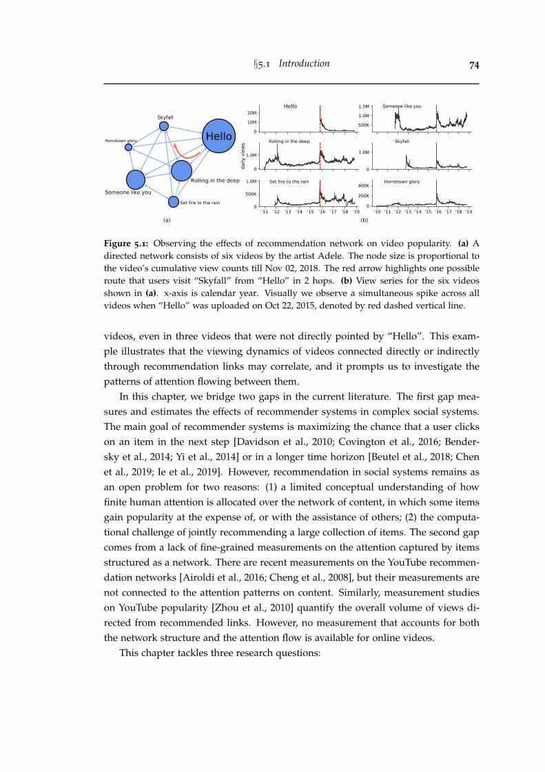
§5.1 Introduction 74
Figure 5.1: Observing the effects of recommendation network on video popularity. (a) Adirected network consists of six videos by the artist Adele. The node size is proportional tothe video’s cumulative view counts till Nov 02, 2018. The red arrow highlights one possibleroute that users visit “Skyfall” from “Hello” in 2 hops. (b) View series for the six videosshown in (a). x-axis is calendar year. Visually we observe a simultaneous spike across allvideos when “Hello” was uploaded on Oct 22, 2015, denoted by red dashed vertical line.
videos, even in three videos that were not directly pointed by “Hello”. This exam-ple illustrates that the viewing dynamics of videos connected directly or indirectlythrough recommendation links may correlate, and it prompts us to investigate thepatterns of attention flowing between them.
In this chapter, we bridge two gaps in the current literature. The first gap mea-sures and estimates the effects of recommender systems in complex social systems.The main goal of recommender systems is maximizing the chance that a user clickson an item in the next step [Davidson et al., 2010; Covington et al., 2016; Bender-sky et al., 2014; Yi et al., 2014] or in a longer time horizon [Beutel et al., 2018; Chenet al., 2019; Ie et al., 2019]. However, recommendation in social systems remains asan open problem for two reasons: (1) a limited conceptual understanding of howfinite human attention is allocated over the network of content, in which some itemsgain popularity at the expense of, or with the assistance of others; (2) the computa-tional challenge of jointly recommending a large collection of items. The second gapcomes from a lack of fine-grained measurements on the attention captured by itemsstructured as a network. There are recent measurements on the YouTube recommen-dation networks [Airoldi et al., 2016; Cheng et al., 2008], but their measurements arenot connected to the attention patterns on content. Similarly, measurement studieson YouTube popularity [Zhou et al., 2010] quantify the overall volume of views di-rected from recommended links. However, no measurement that accounts for boththe network structure and the attention flow is available for online videos.
This chapter tackles three research questions:
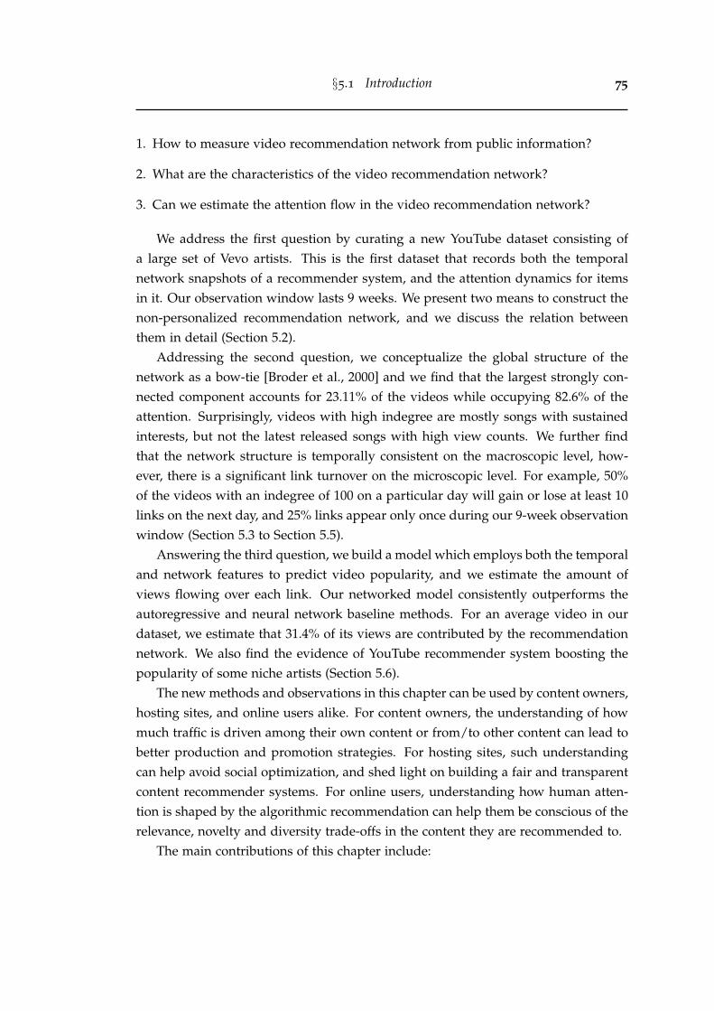
§5.1 Introduction 75
1. How to measure video recommendation network from public information?
2. What are the characteristics of the video recommendation network?
3. Can we estimate the attention flow in the video recommendation network?
We address the first question by curating a new YouTube dataset consisting ofa large set of Vevo artists. This is the first dataset that records both the temporalnetwork snapshots of a recommender system, and the attention dynamics for itemsin it. Our observation window lasts 9 weeks. We present two means to construct thenon-personalized recommendation network, and we discuss the relation betweenthem in detail (Section 5.2).
Addressing the second question, we conceptualize the global structure of thenetwork as a bow-tie [Broder et al., 2000] and we find that the largest strongly con-nected component accounts for 23.11% of the videos while occupying 82.6% of theattention. Surprisingly, videos with high indegree are mostly songs with sustainedinterests, but not the latest released songs with high view counts. We further findthat the network structure is temporally consistent on the macroscopic level, how-ever, there is a significant link turnover on the microscopic level. For example, 50%of the videos with an indegree of 100 on a particular day will gain or lose at least 10links on the next day, and 25% links appear only once during our 9-week observationwindow (Section 5.3 to Section 5.5).
Answering the third question, we build a model which employs both the temporaland network features to predict video popularity, and we estimate the amount ofviews flowing over each link. Our networked model consistently outperforms theautoregressive and neural network baseline methods. For an average video in ourdataset, we estimate that 31.4% of its views are contributed by the recommendationnetwork. We also find the evidence of YouTube recommender system boosting thepopularity of some niche artists (Section 5.6).
The new methods and observations in this chapter can be used by content owners,hosting sites, and online users alike. For content owners, the understanding of howmuch traffic is driven among their own content or from/to other content can lead tobetter production and promotion strategies. For hosting sites, such understandingcan help avoid social optimization, and shed light on building a fair and transparentcontent recommender systems. For online users, understanding how human atten-tion is shaped by the algorithmic recommendation can help them be conscious of therelevance, novelty and diversity trade-offs in the content they are recommended to.
The main contributions of this chapter include:
§5.2 Data 76
• We curate a new YouTube dataset, called Vevo Music Graph dataset3, which con-tains the daily snapshots of the video recommendation network over a span of 9weeks, and the associated daily view series for each video since upload.
• We perform, to our knowledge, the first large-scale measurement study that con-nects the structure of the recommendation network with video attention dynamics.
• We propose an effective model that accounts for the network structure to predictvideo popularity and to estimate the attention flow over each recommendationlink.
5.2 Data
In this section, we first introduce our newly curated Vevo Music Graph dataset(Section 5.2.1). Next, we detail the data collection strategy (Section 5.2.2) and ana-lyze the relation between two types of non-personalized video recommendation lists(Section 5.2.3).
5.2.1 Vevo Music Graph dataset
The Vevo Music Graph dataset consists of the verified Vevo artists who are active insix English-speaking countries (United States, United Kingdom, Canada, Australia,New Zealand, and Ireland), together with their complete record of videos uploadedon YouTube from the launch of Vevo (Dec 8, 2009) until Aug 31, 2018. Our datasetcontains 4,435 Vevo artists and 60,740 music videos. For each video, we collect itsmetadata (e.g., title, description, uploader), its view count time series, and its rec-ommendation relations with other videos. The videos and their recommendationrelations form a dynamic directed network, which we capture daily between Sep 1,2018 and Nov 2, 2018 (63 days, 9 weeks).Why Vevo? Vevo4 is the largest syndication hub that provides licensed music videosfrom major record companies to YouTube [Wikipedia.com, 2020b]. We choose tostudy the networked attention flow on Vevo for several reasons. First, Vevo is anecosystem of its own that attracts tremendous attention — 94 of all-time top 100most viewed videos on YouTube are music, and 64 of which are distributed viaVevo [wikipedia.com, 2020a]. On average, our dataset accounts for 310 millions viewsand 9.1 millions watch hours every day. Second, many users utilize YouTube as their
3The code and datasets are available at https://github.com/avalanchesiqi/networked-popularity4The Vevo website was shut down on May 24, 2018. However, videos syndicated on YouTube before
are still embedded with a “VEVO” watermark on their thumbnails. See screenshot in Figure 5.2 forillustration.
§5.2 Data 77
music streaming player, listening to non-stop playlists generated by the recommendersystems. After the completion of the current video, YouTube automatically plays the“Up next” video – the video in the first position of the recommended list, as illus-trated in Figure 5.2. This usage pattern for music videos makes the network effectsof YouTube recommender systems more significant for directing user attention fromone video to another. Third, Vevo artists and their videos form a tightly connectednetwork. The average degree in the Vevo video network is 10, compared to 3.2 inthe YouTube video network collected by Airoldi et al. [2016] via snowball sampling(see Section 5.2.3). The nodes are homogeneous in terms of content – they are all mu-sic videos from artists based in English-speaking countries. Lastly, the Vevo artistsare easily identifiable – they include the keyword “VEVO” in the channel title, theypossess a verification badge on the channel page, and they publish licensed videoswith a “VEVO” watermark.
5.2.2 Data collection strategy
We identify Vevo artists starting from Twitter. We capture every tweet that men-tions YouTube videos by feeding the rule “youtube” OR (“youtu” AND “be”) intothe Twitter Streaming API [twitter.com, 2020a]. Our Twitter crawler has been run-ning continuously since Jun 2014. From the “extended urls” field of each tweet, weextract the associated YouTube video ID, and we use our open-source tool “YouTube-insight” [Wu et al., 2018] to retrieve the video’s metadata, daily view count series andthe ranked list of relevant videos. Next, we select the Vevo artists by keeping onlythe channels that have the keyword “VEVO” in the channel title and a “verified”status badge on the channel homepage. Note that a channel refers to a user who up-loads videos on YouTube. We query an open music database MusicBrainz5 to retrievemore features about each artist, such as the music genres and the geographical areaof activities. We retain the artists who are active in the six aforementioned English-speaking countries, and the videos that are classified into the “Music” category. Forcompleteness, we also implement a snowball-like procedure to retrieve further artistsand their videos by following the recommendation relations from the tweeted videos.However, this procedure only adds 2 more artists (out of the 4,435 Vevo artists in ourdataset) and 5 more videos (out of the 60,740 music videos). This is not surprising,considering most artists would promote their works on social media platforms. Onedata limitation is that artists who are not affiliated with Vevo will not appear in ourcollection, such as Ed Sheeran and Christina Perry.
5https://musicbrainz.org
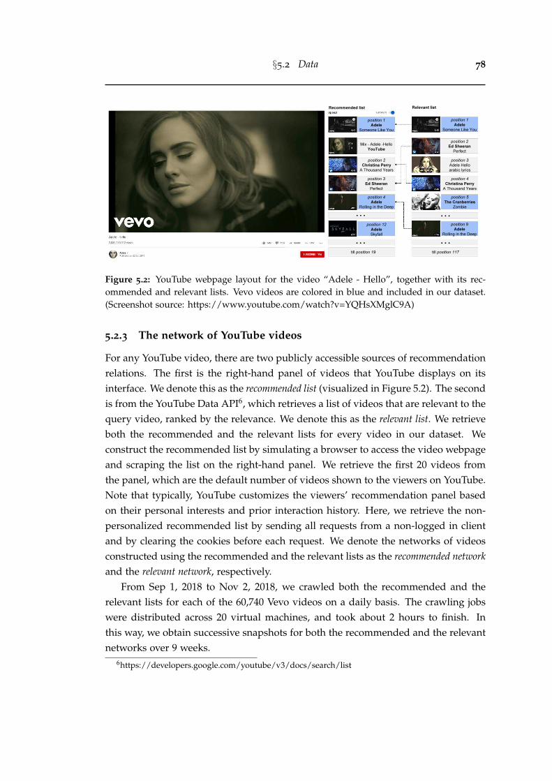
§5.2 Data 78
Figure 5.2: YouTube webpage layout for the video “Adele - Hello”, together with its rec-ommended and relevant lists. Vevo videos are colored in blue and included in our dataset.(Screenshot source: https://www.youtube.com/watch?v=YQHsXMglC9A)
5.2.3 The network of YouTube videos
For any YouTube video, there are two publicly accessible sources of recommendationrelations. The first is the right-hand panel of videos that YouTube displays on itsinterface. We denote this as the recommended list (visualized in Figure 5.2). The secondis from the YouTube Data API6, which retrieves a list of videos that are relevant to thequery video, ranked by the relevance. We denote this as the relevant list. We retrieveboth the recommended and the relevant lists for every video in our dataset. Weconstruct the recommended list by simulating a browser to access the video webpageand scraping the list on the right-hand panel. We retrieve the first 20 videos fromthe panel, which are the default number of videos shown to the viewers on YouTube.Note that typically, YouTube customizes the viewers’ recommendation panel basedon their personal interests and prior interaction history. Here, we retrieve the non-personalized recommended list by sending all requests from a non-logged in clientand by clearing the cookies before each request. We denote the networks of videosconstructed using the recommended and the relevant lists as the recommended networkand the relevant network, respectively.
From Sep 1, 2018 to Nov 2, 2018, we crawled both the recommended and therelevant lists for each of the 60,740 Vevo videos on a daily basis. The crawling jobswere distributed across 20 virtual machines, and took about 2 hours to finish. Inthis way, we obtain successive snapshots for both the recommended and the relevantnetworks over 9 weeks.
6https://developers.google.com/youtube/v3/docs/search/list
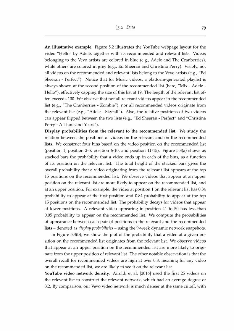
§5.2 Data 79
An illustrative example. Figure 5.2 illustrates the YouTube webpage layout for thevideo “Hello” by Adele, together with its recommended and relevant lists. Videosbelonging to the Vevo artists are colored in blue (e.g., Adele and The Cranberries),while others are colored in grey (e.g., Ed Sheeran and Christina Perry). Visibly, notall videos on the recommended and relevant lists belong to the Vevo artists (e.g., “EdSheeran - Perfect”). Notice that for Music videos, a platform-generated playlist isalways shown at the second position of the recommended list (here, “Mix - Adele -Hello”), effectively capping the size of this list at 19. The length of the relevant list of-ten exceeds 100. We observe that not all relevant videos appear in the recommendedlist (e.g., “The Cranberries - Zombie”), nor all recommended videos originate fromthe relevant list (e.g., “Adele - Skyfall”). Also, the relative positions of two videoscan appear flipped between the two lists (e.g., “Ed Sheeran - Perfect” and “ChristinaPerry - A Thousand Years”).Display probabilities from the relevant to the recommended list. We study therelation between the positions of videos on the relevant and on the recommendedlists. We construct four bins based on the video position on the recommended list(position 1, position 2-5, position 6-10, and position 11-15). Figure 5.3(a) shows asstacked bars the probability that a video ends up in each of the bins, as a functionof its position on the relevant list. The total height of the stacked bars gives theoverall probability that a video originating from the relevant list appears at the top15 positions on the recommended list. We observe videos that appear at an upperposition on the relevant list are more likely to appear on the recommended list, andat an upper position. For example, the video at position 1 on the relevant list has 0.34probability to appear at the first position and 0.84 probability to appear at the top15 positions on the recommended list. The probability decays for videos that appearat lower positions. A relevant video appearing in position 41 to 50 has less than0.05 probability to appear on the recommended list. We compute the probabilitiesof appearance between each pair of positions in the relevant and the recommendedlists – denoted as display probabilities – using the 9-week dynamic network snapshots.
In Figure 5.3(b), we show the plot of the probability that a video at a given po-sition on the recommended list originates from the relevant list. We observe videosthat appear at an upper position on the recommended list are more likely to origi-nate from the upper position of relevant list. The other notable observation is that theoverall recall for recommended videos are high at over 0.8, meaning for any videoon the recommended list, we are likely to see it on the relevant list.YouTube video network density. Airoldi et al. [2016] used the first 25 videos onthe relevant list to construct the relevant network, which had an average degree of3.2. By comparison, our Vevo video network is much denser at the same cutoff, with
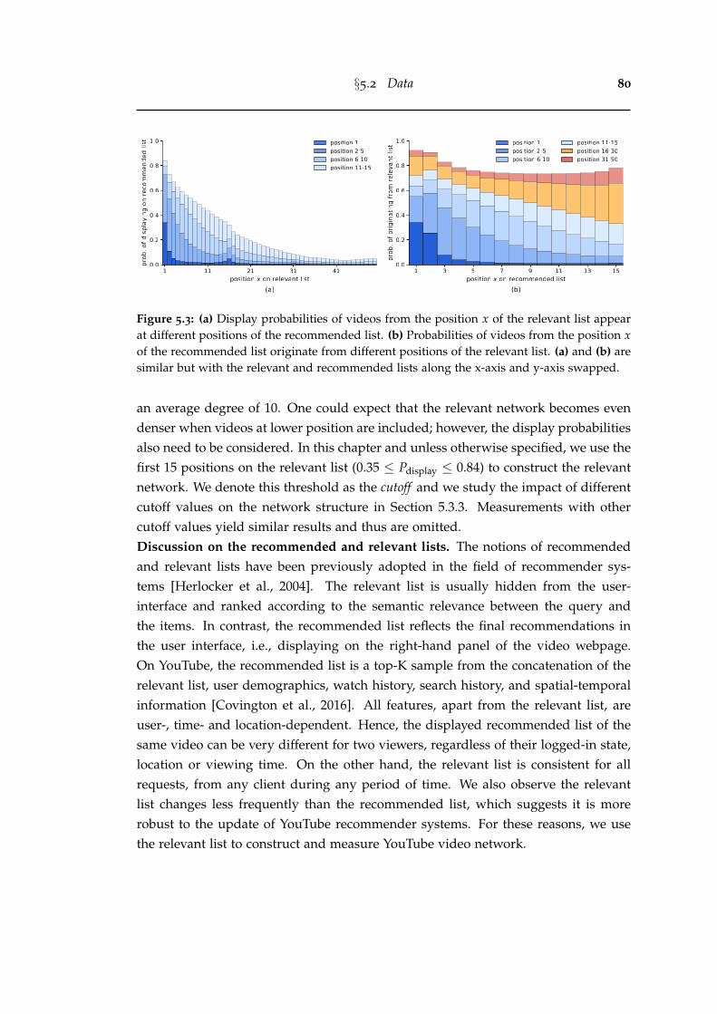
§5.2 Data 80
Figure 5.3: (a) Display probabilities of videos from the position x of the relevant list appearat different positions of the recommended list. (b) Probabilities of videos from the position xof the recommended list originate from different positions of the relevant list. (a) and (b) aresimilar but with the relevant and recommended lists along the x-axis and y-axis swapped.
an average degree of 10. One could expect that the relevant network becomes evendenser when videos at lower position are included; however, the display probabilitiesalso need to be considered. In this chapter and unless otherwise specified, we use thefirst 15 positions on the relevant list (0.35 ≤ Pdisplay ≤ 0.84) to construct the relevantnetwork. We denote this threshold as the cutoff and we study the impact of differentcutoff values on the network structure in Section 5.3.3. Measurements with othercutoff values yield similar results and thus are omitted.Discussion on the recommended and relevant lists. The notions of recommendedand relevant lists have been previously adopted in the field of recommender sys-tems [Herlocker et al., 2004]. The relevant list is usually hidden from the user-interface and ranked according to the semantic relevance between the query andthe items. In contrast, the recommended list reflects the final recommendations inthe user interface, i.e., displaying on the right-hand panel of the video webpage.On YouTube, the recommended list is a top-K sample from the concatenation of therelevant list, user demographics, watch history, search history, and spatial-temporalinformation [Covington et al., 2016]. All features, apart from the relevant list, areuser-, time- and location-dependent. Hence, the displayed recommended list of thesame video can be very different for two viewers, regardless of their logged-in state,location or viewing time. On the other hand, the relevant list is consistent for allrequests, from any client during any period of time. We also observe the relevantlist changes less frequently than the recommended list, which suggests it is morerobust to the update of YouTube recommender systems. For these reasons, we usethe relevant list to construct and measure YouTube video network.
§5.3 Macroscopic measures 81
100 101 10310 5
10 4
10 3
10 2
10 1
100
x 1.02
33% with 0 indegree
(a) indegree distribution
0 20 40 60 80 100views percentile
100
101
102
103
104
105
num
of v
iew
s
median views 81
90th views 4,575
99th views 94,975
(b) daily views vs. its percentile
'09 '10 '11 '12 '13 '14 '15 '16 '17uploaded year
0
2K
4K
6K
8K
num
of v
ideo
s
(c) VEVO videos uploading trend
PopRock
Hip hopIndependent
CountryElectronic
SoulOthers
indegreeSep 01, 2018 Sep 16, 2018 Oct 01, 2018 Oct 16, 2018
P(X
x)
Figure 5.4: (a) The indegree distribution of the Vevo network for four snapshots. The x-axisis the (log) indegree, and the y-axis is the (log) CCDF. On average, 33% of all videos haveno incoming links at the cutoff of 15. Best fitted power-law model is x−1.02. (b) The averagedaily view counts distribution of Vevo network for the same four snapshots. The x-axis showsaverage daily view count percentiles, and the y-axis shows the raw number of view countsin log scale. Both (a) and (b) show that the macroscopic structure is temporally consistent.(c) The number of Vevo videos uploaded each year, broken down by genre.
5.3 Macroscopic measures
We first compute several basic statistics such as indegree distribution, view count dis-tribution, and Vevo videos uploading trend (Section 5.3.1). Next, we study the con-nection between the network structure and video popularity (Section 5.3.2). Lastly,we use the bow-tie structure to characterize the Vevo network and we discuss theimpact of different cutoff values (Section 5.3.3).
5.3.1 Basic statistics
Over-represented medium-size indegree videos. Here we study the indegree dis-tribution of the Vevo network. Note that the outdegree of all nodes is bounded bythe cutoff value on the relevant list and therefore not presented. We remove all linkspointing to non-Vevo videos, resulting in an average of 363,965 edges each day, andan average degree of 6. Note that the average degree of 10 mentioned in Section 5.2is obtained with a cutoff of 25, whereas here we study the relevant network con-structed with a cutoff of 15, since the display probability of videos below position15 appearing on recommended list is less than 0.32. Figure 5.4(a) shows the com-plementary cumulative density function (CCDF) of the indegree distribution for fourdifferent snapshots of the network, taken 15 days apart. We notice that the indegreedistribution does not resemble a straight line in the log-log plot, meaning it is notpower-law, unlike for other online networks, e.g., the World Wide Web [Broder et al.,
§5.3 Macroscopic measures 82
2000; Meusel et al., 2014], the network of interaction in online communities [Zhanget al., 2007], and the follower/following network on social media [Kwak et al., 2010].The medium-sized indegree videos are over represented than that in the best fittedpower-law model (α = 2.02, fitted by powerlaw package [Alstott et al., 2014], result-ing in x−1.02 in CCDF [Clauset et al., 2009]). This result holds for all four snapshots.Attention is unequally allocated. Figure 5.4(b) plots the average daily views againstthe view count percentile. The daily view count at median is 81, but it is 4,575at the 90th percentile. These observations, together with a Gini coefficient of 0.946,indicate that the attention allocation in the Vevo network is highly unequal — the top10% most viewed videos occupy 93.1% views. We also find a moderate correlationbetween view count and indegree value (details in Section 5.4).Uploading trend by music genres. To date, our dataset is the largest digital traceof Vevo artists on YouTube, allowing us to study the production dynamics of theVevo platform. Figure 5.4(c) shows the number of Vevo videos that are uploadedeach year from 2009 to 2017, broken down by their genres. We omit year 2018 aswe only observed 8 months for it (until August). There is a significantly highernumber of uploads (9,277) in 2009 as it is the year when Vevo was launched, andwhen many all-time favorite songs were syndicated to the YouTube platform. Pop,Rock, and Hip hop music are the top 3 genres, accounting for 62.85% of all uploads.The Vevo videos upload rate is more or less constant around 7,000 since 2013. Theflattening production dynamics is somewhat surprising given the overall growth ofYouTube [youbube.com, 2017].
5.3.2 Linking network structure and popularity
Here, we investigate the connection between the relevant network structure andvideo view counts. Specifically, we divide the videos in the Vevo Music Graph
dataset into four equal groups by computing the view count quartiles. Each groupcontains 15,185 videos. Next, we count the number of edges that originate and endin each pair of groups. Figure 5.5 represents the four groups together with the num-ber of links between them. The “top 25%” group contains the top 25% most viewedvideos, while the “bottom 25%” contains the 25% least viewed videos. The width ofthe arrows is scaled by the number of the edges between the videos placed in the twogroups. One can conceptualize that the edges act as conduits for the attention to flowbetween different groups and their thickness indicate the probability that a randomuser jumps from one group to the other. We observe that all four groups have themost links pointing to the “top 25%” group. In fact, every group disproportionatelypoints towards more popular groups than towards the less popular ones. This means
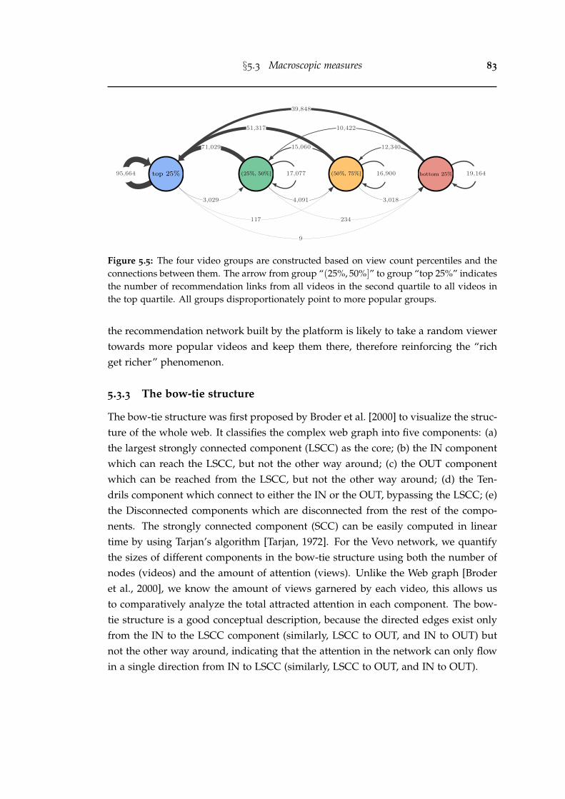
§5.3 Macroscopic measures 83
Figure 5.5: The four video groups are constructed based on view count percentiles and theconnections between them. The arrow from group “(25%, 50%]” to group “top 25%” indicatesthe number of recommendation links from all videos in the second quartile to all videos inthe top quartile. All groups disproportionately point to more popular groups.
the recommendation network built by the platform is likely to take a random viewertowards more popular videos and keep them there, therefore reinforcing the “richget richer” phenomenon.
5.3.3 The bow-tie structure
The bow-tie structure was first proposed by Broder et al. [2000] to visualize the struc-ture of the whole web. It classifies the complex web graph into five components: (a)the largest strongly connected component (LSCC) as the core; (b) the IN componentwhich can reach the LSCC, but not the other way around; (c) the OUT componentwhich can be reached from the LSCC, but not the other way around; (d) the Ten-drils component which connect to either the IN or the OUT, bypassing the LSCC; (e)the Disconnected components which are disconnected from the rest of the compo-nents. The strongly connected component (SCC) can be easily computed in lineartime by using Tarjan’s algorithm [Tarjan, 1972]. For the Vevo network, we quantifythe sizes of different components in the bow-tie structure using both the number ofnodes (videos) and the amount of attention (views). Unlike the Web graph [Broderet al., 2000], we know the amount of views garnered by each video, this allows usto comparatively analyze the total attracted attention in each component. The bow-tie structure is a good conceptual description, because the directed edges exist onlyfrom the IN to the LSCC component (similarly, LSCC to OUT, and IN to OUT) butnot the other way around, indicating that the attention in the network can only flowin a single direction from IN to LSCC (similarly, LSCC to OUT, and IN to OUT).
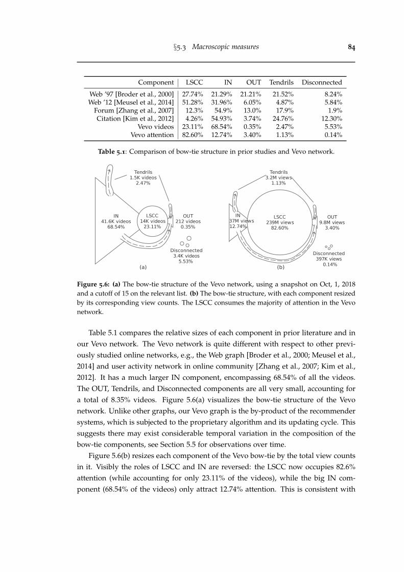
§5.3 Macroscopic measures 84
Component LSCC IN OUT Tendrils Disconnected
Web ’97 [Broder et al., 2000] 27.74% 21.29% 21.21% 21.52% 8.24%Web ’12 [Meusel et al., 2014] 51.28% 31.96% 6.05% 4.87% 5.84%
Forum [Zhang et al., 2007] 12.3% 54.9% 13.0% 17.9% 1.9%Citation [Kim et al., 2012] 4.26% 54.93% 3.74% 24.76% 12.30%
Vevo videos 23.11% 68.54% 0.35% 2.47% 5.53%Vevo attention 82.60% 12.74% 3.40% 1.13% 0.14%
Table 5.1: Comparison of bow-tie structure in prior studies and Vevo network.
Figure 5.6: (a) The bow-tie structure of the Vevo network, using a snapshot on Oct, 1, 2018and a cutoff of 15 on the relevant list. (b) The bow-tie structure, with each component resizedby its corresponding view counts. The LSCC consumes the majority of attention in the Vevonetwork.
Table 5.1 compares the relative sizes of each component in prior literature and inour Vevo network. The Vevo network is quite different with respect to other previ-ously studied online networks, e.g., the Web graph [Broder et al., 2000; Meusel et al.,2014] and user activity network in online community [Zhang et al., 2007; Kim et al.,2012]. It has a much larger IN component, encompassing 68.54% of all the videos.The OUT, Tendrils, and Disconnected components are all very small, accounting fora total of 8.35% videos. Figure 5.6(a) visualizes the bow-tie structure of the Vevonetwork. Unlike other graphs, our Vevo graph is the by-product of the recommendersystems, which is subjected to the proprietary algorithm and its updating cycle. Thissuggests there may exist considerable temporal variation in the composition of thebow-tie components, see Section 5.5 for observations over time.
Figure 5.6(b) resizes each component of the Vevo bow-tie by the total view countsin it. Visibly the roles of LSCC and IN are reversed: the LSCC now occupies 82.6%attention (while accounting for only 23.11% of the videos), while the big IN com-ponent (68.54% of the videos) only attract 12.74% attention. This is consistent with
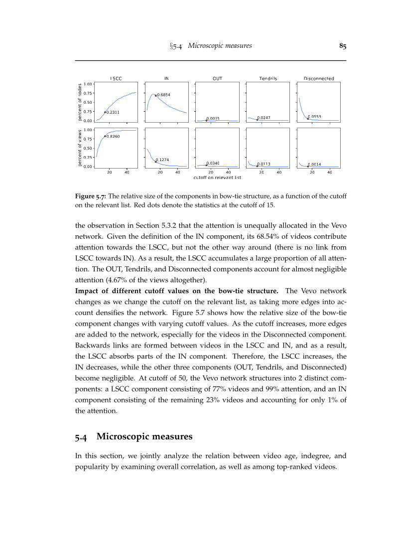
§5.4 Microscopic measures 85
Figure 5.7: The relative size of the components in bow-tie structure, as a function of the cutoffon the relevant list. Red dots denote the statistics at the cutoff of 15.
the observation in Section 5.3.2 that the attention is unequally allocated in the Vevonetwork. Given the definition of the IN component, its 68.54% of videos contributeattention towards the LSCC, but not the other way around (there is no link fromLSCC towards IN). As a result, the LSCC accumulates a large proportion of all atten-tion. The OUT, Tendrils, and Disconnected components account for almost negligibleattention (4.67% of the views altogether).Impact of different cutoff values on the bow-tie structure. The Vevo networkchanges as we change the cutoff on the relevant list, as taking more edges into ac-count densifies the network. Figure 5.7 shows how the relative size of the bow-tiecomponent changes with varying cutoff values. As the cutoff increases, more edgesare added to the network, especially for the videos in the Disconnected component.Backwards links are formed between videos in the LSCC and IN, and as a result,the LSCC absorbs parts of the IN component. Therefore, the LSCC increases, theIN decreases, while the other three components (OUT, Tendrils, and Disconnected)become negligible. At cutoff of 50, the Vevo network structures into 2 distinct com-ponents: a LSCC component consisting of 77% videos and 99% attention, and an INcomponent consisting of the remaining 23% videos and accounting for only 1% ofthe attention.
5.4 Microscopic measures
In this section, we jointly analyze the relation between video age, indegree, andpopularity by examining overall correlation, as well as among top-ranked videos.
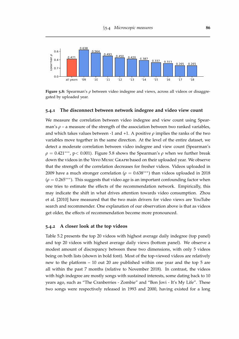
§5.4 Microscopic measures 86
Figure 5.8: Spearman’s ρ between video indegree and views, across all videos or disaggre-gated by uploaded year.
5.4.1 The disconnect between network indegree and video view count
We measure the correlation between video indegree and view count using Spear-man’s ρ – a measure of the strength of the association between two ranked variables,and which takes values between -1 and +1. A positive ρ implies the ranks of the twovariables move together in the same direction. At the level of the entire dataset, wedetect a moderate correlation between video indegree and view count (Spearman’sρ = 0.421∗∗∗, p< 0.001). Figure 5.8 shows the Spearman’s ρ when we further breakdown the videos in the Vevo Music Graph based on their uploaded year. We observethat the strength of the correlation decreases for fresher videos. Videos uploaded in2009 have a much stronger correlation (ρ = 0.638∗∗∗) than videos uploaded in 2018(ρ = 0.265∗∗∗). This suggests that video age is an important confounding factor whenone tries to estimate the effects of the recommendation network. Empirically, thismay indicate the shift in what drives attention towards video consumption. Zhouet al. [2010] have measured that the two main drivers for video views are YouTubesearch and recommender. One explanation of our observation above is that as videosget older, the effects of recommendation become more pronounced.
5.4.2 A closer look at the top videos
Table 5.2 presents the top 20 videos with highest average daily indegree (top panel)and top 20 videos with highest average daily views (bottom panel). We observe amodest amount of discrepancy between these two dimensions, with only 5 videosbeing on both lists (shown in bold font). Most of the top-viewed videos are relativelynew to the platform – 10 out 20 are published within one year and the top 5 areall within the past 7 months (relative to November 2018). In contrast, the videoswith high indegree are mostly songs with sustained interests, some dating back to 10years ago, such as “The Cranberries - Zombie” and “Bon Jovi - It’s My Life”. Thesetwo songs were respectively released in 1993 and 2000, having existed for a long
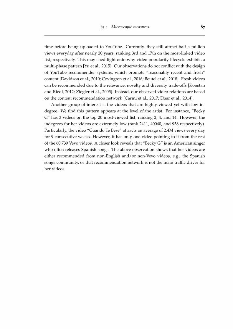
§5.4 Microscopic measures 87
time before being uploaded to YouTube. Currently, they still attract half a millionviews everyday after nearly 20 years, ranking 3rd and 17th on the most-linked videolist, respectively. This may shed light onto why video popularity lifecycle exhibits amulti-phase pattern [Yu et al., 2015]. Our observations do not conflict with the designof YouTube recommender systems, which promote “reasonably recent and fresh”content [Davidson et al., 2010; Covington et al., 2016; Beutel et al., 2018]. Fresh videoscan be recommended due to the relevance, novelty and diversity trade-offs [Konstanand Riedl, 2012; Ziegler et al., 2005]. Instead, our observed video relations are basedon the content recommendation network [Carmi et al., 2017; Dhar et al., 2014].
Another group of interest is the videos that are highly viewed yet with low in-degree. We find this pattern appears at the level of the artist. For instance, “BeckyG” has 3 videos on the top 20 most-viewed list, ranking 2, 4, and 14. However, theindegrees for her videos are extremely low (rank 2411, 40040, and 958 respectively).Particularly, the video “Cuando Te Bese” attracts an average of 2.4M views every dayfor 9 consecutive weeks. However, it has only one video pointing to it from the restof the 60,739 Vevo videos. A closer look reveals that “Becky G” is an American singerwho often releases Spanish songs. The above observation shows that her videos areeither recommended from non-English and/or non-Vevo videos, e.g., the Spanishsongs community, or that recommendation network is not the main traffic driver forher videos.
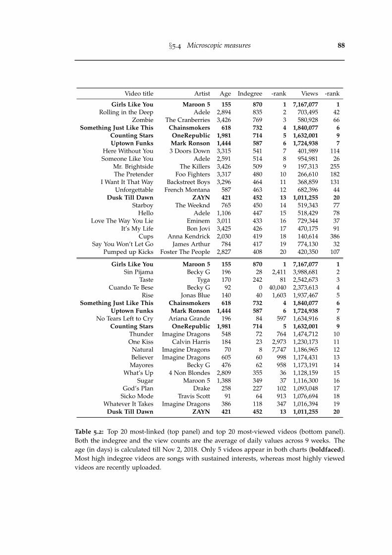
§5.4 Microscopic measures 88
Video title Artist Age Indegree -rank Views -rank
Girls Like You Maroon 5 155 870 1 7,167,077 1Rolling in the Deep Adele 2,894 835 2 703,495 42
Zombie The Cranberries 3,426 769 3 580,928 66Something Just Like This Chainsmokers 618 732 4 1,840,077 6
Counting Stars OneRepublic 1,981 714 5 1,632,001 9Uptown Funks Mark Ronson 1,444 587 6 1,724,938 7
Here Without You 3 Doors Down 3,315 541 7 401,989 114Someone Like You Adele 2,591 514 8 954,981 26
Mr. Brightside The Killers 3,426 509 9 197,313 255The Pretender Foo Fighters 3,317 480 10 266,610 182
I Want It That Way Backstreet Boys 3,296 464 11 368,859 131Unforgettable French Montana 587 463 12 682,396 44
Dusk Till Dawn ZAYN 421 452 13 1,011,255 20Starboy The Weeknd 765 450 14 519,343 77
Hello Adele 1,106 447 15 518,429 78Love The Way You Lie Eminem 3,011 433 16 729,344 37
It’s My Life Bon Jovi 3,425 426 17 470,175 91Cups Anna Kendrick 2,030 419 18 140,614 386
Say You Won’t Let Go James Arthur 784 417 19 774,130 32Pumped up Kicks Foster The People 2,827 408 20 420,350 107
Girls Like You Maroon 5 155 870 1 7,167,077 1Sin Pijama Becky G 196 28 2,411 3,988,681 2
Taste Tyga 170 242 81 2,542,673 3Cuando Te Bese Becky G 92 0 40,040 2,373,613 4
Rise Jonas Blue 140 40 1,603 1,937,467 5Something Just Like This Chainsmokers 618 732 4 1,840,077 6
Uptown Funks Mark Ronson 1,444 587 6 1,724,938 7No Tears Left to Cry Ariana Grande 196 84 597 1,634,916 8
Counting Stars OneRepublic 1,981 714 5 1,632,001 9Thunder Imagine Dragons 548 72 764 1,474,712 10One Kiss Calvin Harris 184 23 2,973 1,230,173 11
Natural Imagine Dragons 70 8 7,747 1,186,965 12Believer Imagine Dragons 605 60 998 1,174,431 13Mayores Becky G 476 62 958 1,173,191 14
What’s Up 4 Non Blondes 2,809 355 36 1,128,159 15Sugar Maroon 5 1,388 349 37 1,116,300 16
God’s Plan Drake 258 227 102 1,093,048 17Sicko Mode Travis Scott 91 64 913 1,076,694 18
Whatever It Takes Imagine Dragons 386 118 347 1,016,394 19Dusk Till Dawn ZAYN 421 452 13 1,011,255 20
Table 5.2: Top 20 most-linked (top panel) and top 20 most-viewed videos (bottom panel).Both the indegree and the view counts are the average of daily values across 9 weeks. Theage (in days) is calculated till Nov 2, 2018. Only 5 videos appear in both charts (boldfaced).Most high indegree videos are songs with sustained interests, whereas most highly viewedvideos are recently uploaded.
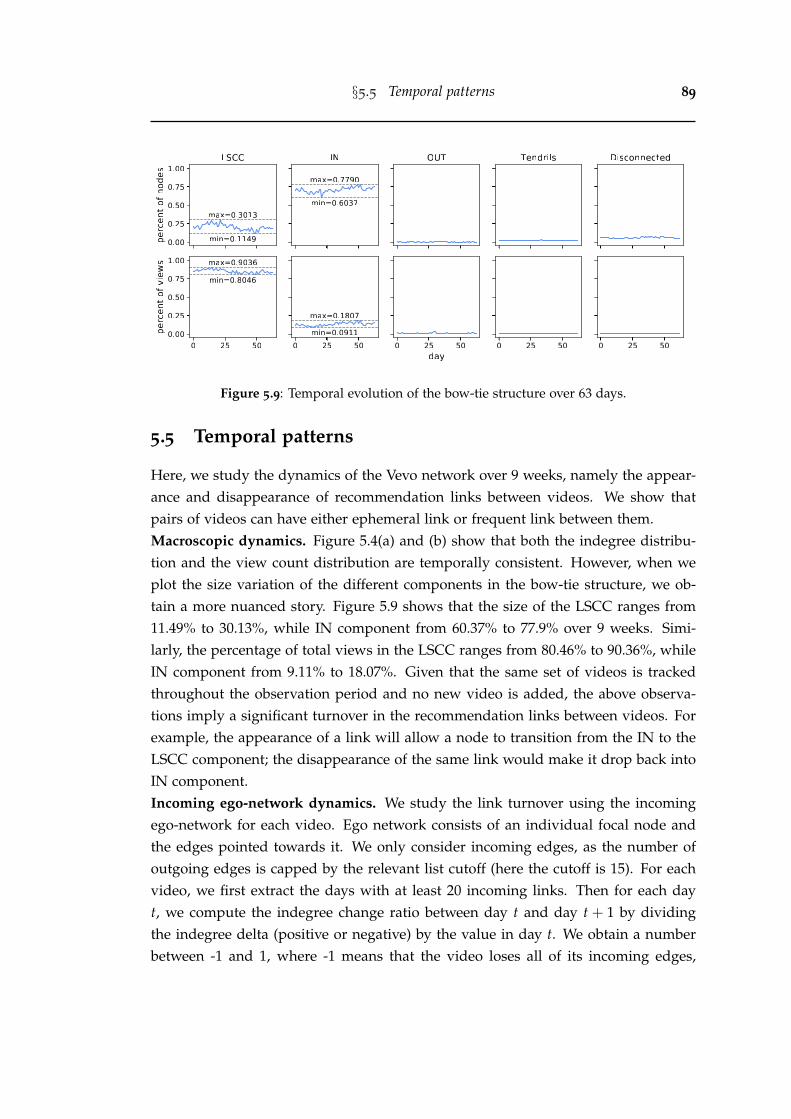
§5.5 Temporal patterns 89
Figure 5.9: Temporal evolution of the bow-tie structure over 63 days.
5.5 Temporal patterns
Here, we study the dynamics of the Vevo network over 9 weeks, namely the appear-ance and disappearance of recommendation links between videos. We show thatpairs of videos can have either ephemeral link or frequent link between them.Macroscopic dynamics. Figure 5.4(a) and (b) show that both the indegree distribu-tion and the view count distribution are temporally consistent. However, when weplot the size variation of the different components in the bow-tie structure, we ob-tain a more nuanced story. Figure 5.9 shows that the size of the LSCC ranges from11.49% to 30.13%, while IN component from 60.37% to 77.9% over 9 weeks. Simi-larly, the percentage of total views in the LSCC ranges from 80.46% to 90.36%, whileIN component from 9.11% to 18.07%. Given that the same set of videos is trackedthroughout the observation period and no new video is added, the above observa-tions imply a significant turnover in the recommendation links between videos. Forexample, the appearance of a link will allow a node to transition from the IN to theLSCC component; the disappearance of the same link would make it drop back intoIN component.Incoming ego-network dynamics. We study the link turnover using the incomingego-network for each video. Ego network consists of an individual focal node andthe edges pointed towards it. We only consider incoming edges, as the number ofoutgoing edges is capped by the relevant list cutoff (here the cutoff is 15). For eachvideo, we first extract the days with at least 20 incoming links. Then for each dayt, we compute the indegree change ratio between day t and day t + 1 by dividingthe indegree delta (positive or negative) by the value in day t. We obtain a numberbetween -1 and 1, where -1 means that the video loses all of its incoming edges,
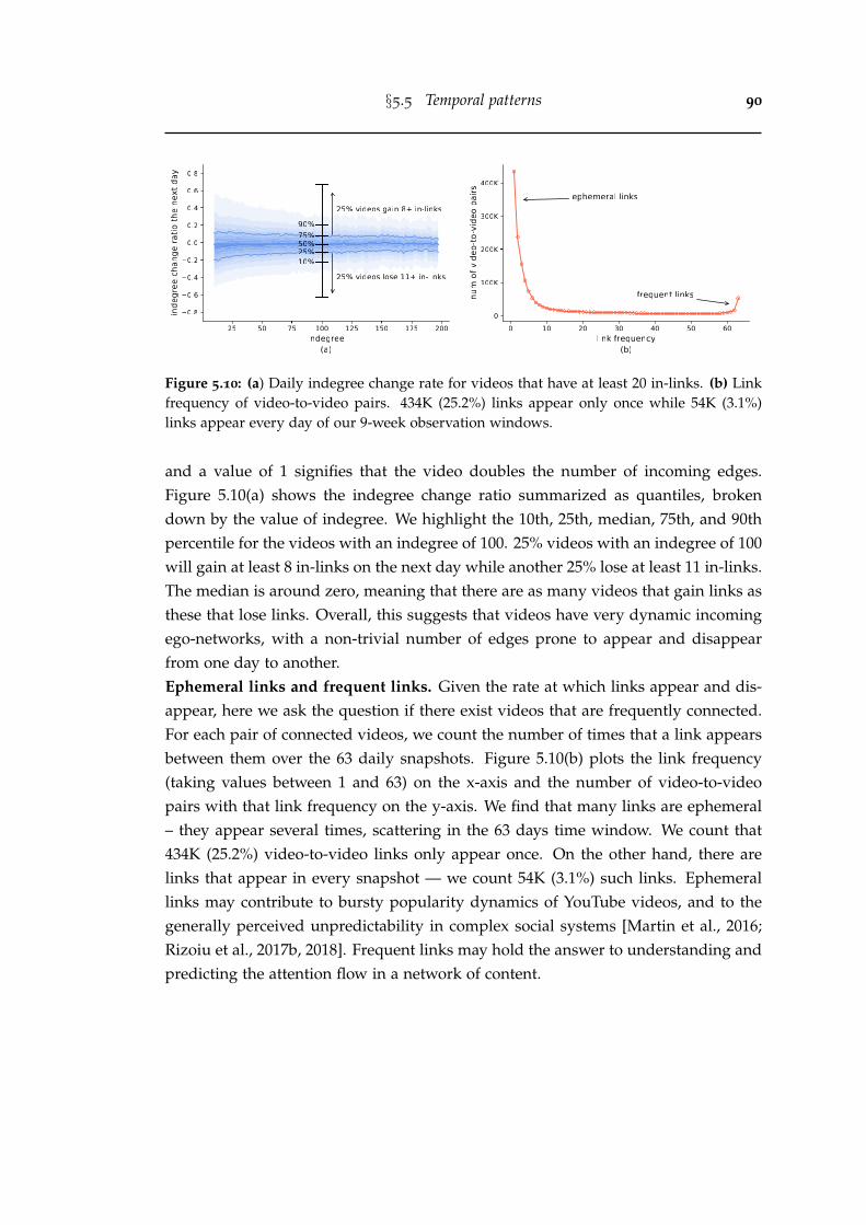
§5.5 Temporal patterns 90
Figure 5.10: (a) Daily indegree change rate for videos that have at least 20 in-links. (b) Linkfrequency of video-to-video pairs. 434K (25.2%) links appear only once while 54K (3.1%)links appear every day of our 9-week observation windows.
and a value of 1 signifies that the video doubles the number of incoming edges.Figure 5.10(a) shows the indegree change ratio summarized as quantiles, brokendown by the value of indegree. We highlight the 10th, 25th, median, 75th, and 90thpercentile for the videos with an indegree of 100. 25% videos with an indegree of 100will gain at least 8 in-links on the next day while another 25% lose at least 11 in-links.The median is around zero, meaning that there are as many videos that gain links asthese that lose links. Overall, this suggests that videos have very dynamic incomingego-networks, with a non-trivial number of edges prone to appear and disappearfrom one day to another.Ephemeral links and frequent links. Given the rate at which links appear and dis-appear, here we ask the question if there exist videos that are frequently connected.For each pair of connected videos, we count the number of times that a link appearsbetween them over the 63 daily snapshots. Figure 5.10(b) plots the link frequency(taking values between 1 and 63) on the x-axis and the number of video-to-videopairs with that link frequency on the y-axis. We find that many links are ephemeral– they appear several times, scattering in the 63 days time window. We count that434K (25.2%) video-to-video links only appear once. On the other hand, there arelinks that appear in every snapshot — we count 54K (3.1%) such links. Ephemerallinks may contribute to bursty popularity dynamics of YouTube videos, and to thegenerally perceived unpredictability in complex social systems [Martin et al., 2016;Rizoiu et al., 2017b, 2018]. Frequent links may hold the answer to understanding andpredicting the attention flow in a network of content.
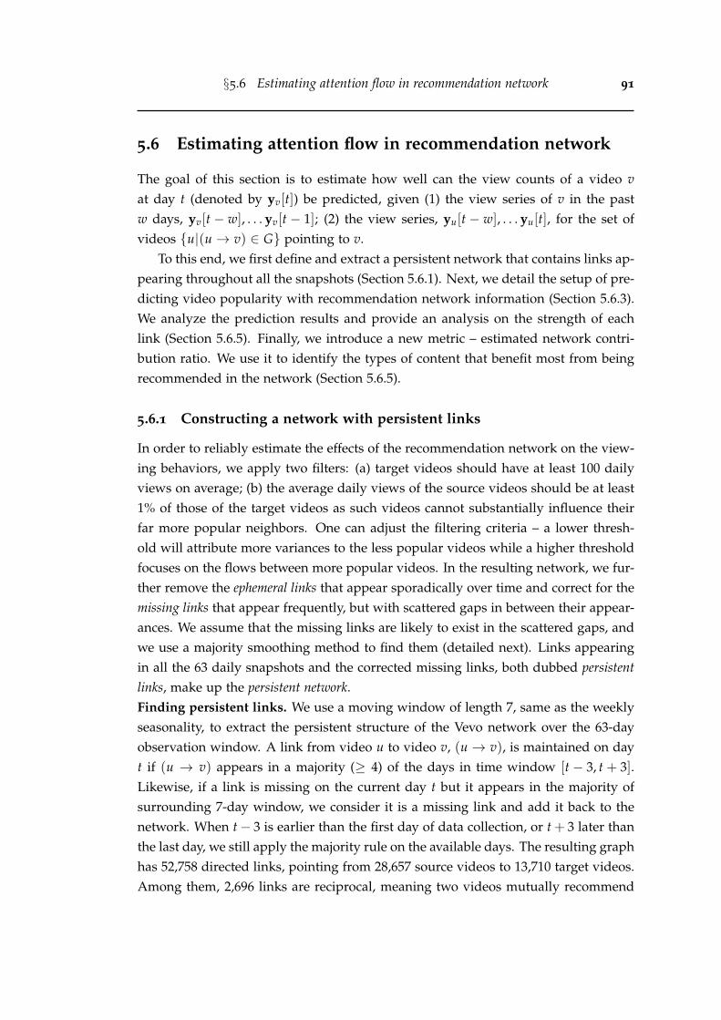
§5.6 Estimating attention flow in recommendation network 91
5.6 Estimating attention flow in recommendation network
The goal of this section is to estimate how well can the view counts of a video vat day t (denoted by yv[t]) be predicted, given (1) the view series of v in the pastw days, yv[t − w], . . . yv[t − 1]; (2) the view series, yu[t − w], . . . yu[t], for the set ofvideos {u|(u→ v) ∈ G} pointing to v.
To this end, we first define and extract a persistent network that contains links ap-pearing throughout all the snapshots (Section 5.6.1). Next, we detail the setup of pre-dicting video popularity with recommendation network information (Section 5.6.3).We analyze the prediction results and provide an analysis on the strength of eachlink (Section 5.6.5). Finally, we introduce a new metric – estimated network contri-bution ratio. We use it to identify the types of content that benefit most from beingrecommended in the network (Section 5.6.5).
5.6.1 Constructing a network with persistent links
In order to reliably estimate the effects of the recommendation network on the view-ing behaviors, we apply two filters: (a) target videos should have at least 100 dailyviews on average; (b) the average daily views of the source videos should be at least1% of those of the target videos as such videos cannot substantially influence theirfar more popular neighbors. One can adjust the filtering criteria – a lower thresh-old will attribute more variances to the less popular videos while a higher thresholdfocuses on the flows between more popular videos. In the resulting network, we fur-ther remove the ephemeral links that appear sporadically over time and correct for themissing links that appear frequently, but with scattered gaps in between their appear-ances. We assume that the missing links are likely to exist in the scattered gaps, andwe use a majority smoothing method to find them (detailed next). Links appearingin all the 63 daily snapshots and the corrected missing links, both dubbed persistentlinks, make up the persistent network.Finding persistent links. We use a moving window of length 7, same as the weeklyseasonality, to extract the persistent structure of the Vevo network over the 63-dayobservation window. A link from video u to video v, (u → v), is maintained on dayt if (u → v) appears in a majority (≥ 4) of the days in time window [t − 3, t + 3].Likewise, if a link is missing on the current day t but it appears in the majority ofsurrounding 7-day window, we consider it is a missing link and add it back to thenetwork. When t− 3 is earlier than the first day of data collection, or t + 3 later thanthe last day, we still apply the majority rule on the available days. The resulting graphhas 52,758 directed links, pointing from 28,657 source videos to 13,710 target videos.Among them, 2,696 links are reciprocal, meaning two videos mutually recommend
§5.6 Estimating attention flow in recommendation network 92
Figure 5.11: (a) The probability of forming a persistent link (y-axis) as a function of theprobability of forming a link (x-axis). (b) Fraction of statistically correlated links in fourgroups at significance level of 0.05. The numbers in the brackets indicate the number of linksin each group. (c) The numbers above the shaded bar indicate the fraction of links betweenvideos from the same artist (top) or with the same genre (bottom). The numbers above thesolid bar indicate the fraction of links connecting videos with the same artist/genre andwhose popularity dynamics are statistically correlated at significance level of 0.05.
each other. We find significant homophily in the persistent network: 33,908 (64.3%)links have both the source and the target videos belonging to the same Vevo artist,and 44,154 (83.7%) links are between videos of the same music genre.Validating persistent links via simulation. We illustrate the probability of persistentlinks by simulating a simple link presence/absence model. We assume a link isindependently presented on each day with probability pl ∈ [0, 1], and absent withprobability 1− pl . We first simulate the link formulation for 63 times, then apply our7-day majority smoothing to determine if it is persistent. We repeat the simulationfor 100,000 times, and compute the probability of a link being persistent, denoted byξ. In Figure 5.11(a), we plot the obtained ξ against varying pl . For pl = 0.5 the edgeis never persistent (ξ = 0), whereas for pl = 0.9 the edge is very likely to be persistent(ξ = 0.92). From the simulation results, we can see that our 7-day majority smoothingrule favors links that appear much more frequent than chance, and suppresses linksthat appear lower or closer to chance.Videos connected by persistent links have correlated popularity dynamics. Weuse Pearson’s r to measure the correlation between the popularity dynamics of twovideos connected by a persistent link. It is known that the cross-correlation of timeseries data is affected by the within-series dependence. Therefore, we deseasonalize,detrend, and normalize the view count series by following the benchmark steps in theM4 forecasting competition [Competition, 2018]. This is to ensure that the residualtime series data is stationary and to avoid spurious correlations. We compute thePearson’s r on the obtained residual data, and we perform a paired correlation test
§5.6 Estimating attention flow in recommendation network 93
which we consider statistically significant for p < 0.05.Figure 5.11(b) shows the fraction of links for which the correlation test is statis-
tically significant over four groups of links. The persistent− group contains all the52,758 persistent links we identified but excluding the 2,696 pairs of reciprocal links— resulting in 47,366 persistent yet non-reciprocal links. The ephemeral group con-sists of all links which have been deemed as non-persistent after applying the 7-daymajority smoothing. The random group is constructed by randomly selecting pairsof unconnected videos and pretending that they have a link. All groups are filteredbased on the same two criteria mentioned before. There are a total of 694,617 linksin the ephemeral group and we sample 700,000 links in the random group. We findthat 75.4% of the reciprocal links connect videos with statistically correlated popu-larity series. We include both positive and negative correlations as two user attentionseries may cooperate or compete with each other [Zarezade et al., 2017]. Combiningthe reciprocal and persistent− groups, 26,460 (50.2%) links in our persistent networkhave correlated dynamics. This is much higher than the percentage for ephemerallinks (40.9%) and that for unconnected random video pairs (22.1%).
We further examine the content similarity in the persistent links by groupinglinks that connect videos from the same artist or with the same music genre (de-scribed in Figure 5.4(c)). Figure 5.11(c) top shows that most reciprocal links (93.1%)connect videos from the same artist, while 71.1% of them have statistically correlatedpopularity dynamics. The percentages are slightly lower for the persistent− group(61% from the same artist, and 32.6% with correlated popularity) and it drops evenlower for ephemeral group (28.2% and 12.2%, respectively). The situation is slightlydifferent when we study the links that connect videos of the same genre, as shownin Figure 5.11(c) bottom. We find that more than 80% of the links connect videosof the same genre, irrespective of whether they are sporadically or persistently con-nected. The percentages of statistically correlated links with the same genre followthe same trend as those from the same artist, i.e., highest for reciprocal (65%), fol-lowed by persistent− (39.8%), ephemeral (33.6%) and lowest for random (6.6%). Theabove observations indicate that not all persistent links have the same effect on videopopularity, and motivate us to build a prediction model for each of the links.
5.6.2 Problem statement
One important observation is that viewing dynamics exhibit a 7-day seasonality [Huanget al., 2018; Cheng et al., 2008]. In our temporal hold-out setting, we use the first 8weeks (2018-09-01 to 2018-10-26) to train the model and we predict the daily viewcounts in the last week (2018-10-27 to 2018-11-02). This chronological split ensures
§5.6 Estimating attention flow in recommendation network 94
that the training data temporally precedes the testing data. If at any point we arerequired to use the day t + 1 to predict the day t + 2 (when both t + 1 and t + 2 arein the testing period), we use the predicted value y[t + 1] instead of observed valuey[t + 1].
5.6.3 Experimental setup
Evaluation metric. The predicting performance is quantified using the symmetricmean absolute percentage error (SMAPE). SMAPE is an alternative to the mean ab-solute percentage error (MAPE) that can handle the case when the true value or thepredicted value is zero. It is a scale-independent metric and suitable for our task inwhich the volume of views for different videos vary considerably. Formally, SMAPEcan be defined as
SMAPE(v) =200T
T
∑t=1
|yv[t]− yv[t]||yv[t]|+ |yv[t]| or SMAPE(t) =
200|G| ∑
v∈G
|yv[t]− yv[t]||yv[t]|+ |yv[t]|
(5.1)where yv[t] is the true value for video v on day t, yv[t] is the predicted value, T ismaximal forecast horizon, and G is the persistent network. SMAPE(v) averages theforecast errors over different horizons for an individual video v, while SMAPE(t)averages over different videos for a certain forecast horizon t. The overall SMAPEfor each model is computed by taking the arithmetic mean of SMAPEs over differenthorizons and over all videos. SMAPE ranges from 0 to 200, while 0 indicates perfectprediction and 200 the largest error, when one of the true or the predicted values is0. When the true and the predicted are both 0, we define SMAPE to be 0.
5.6.4 Methods
Baseline models. We use a few off-the-shelf time series forecasting methods fromnaive forecast to recurrent neural network. The baseline models are estimated on aper-video basis.
• Naive: The forecast at all future times is the last known observation.
yv[t] = yv[T∗] (5.2)
where T∗ is the last day in the training phase.
• Seasonal naive (SN): The forecast is the corresponding observation in the last sea-sonal cycle. This method often works well for seasonal data. We observe that many
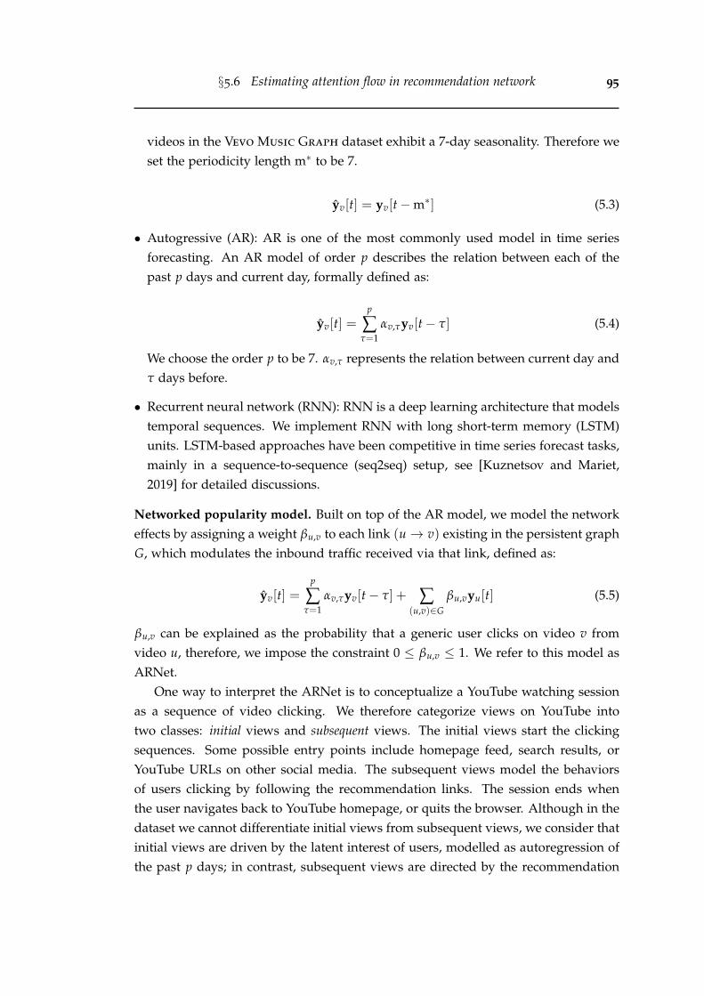
§5.6 Estimating attention flow in recommendation network 95
videos in the Vevo Music Graph dataset exhibit a 7-day seasonality. Therefore weset the periodicity length m∗ to be 7.
yv[t] = yv[t−m∗] (5.3)
• Autogressive (AR): AR is one of the most commonly used model in time seriesforecasting. An AR model of order p describes the relation between each of thepast p days and current day, formally defined as:
yv[t] =p
∑τ=1
αv,τyv[t− τ] (5.4)
We choose the order p to be 7. αv,τ represents the relation between current day andτ days before.
• Recurrent neural network (RNN): RNN is a deep learning architecture that modelstemporal sequences. We implement RNN with long short-term memory (LSTM)units. LSTM-based approaches have been competitive in time series forecast tasks,mainly in a sequence-to-sequence (seq2seq) setup, see [Kuznetsov and Mariet,2019] for detailed discussions.
Networked popularity model. Built on top of the AR model, we model the networkeffects by assigning a weight βu,v to each link (u→ v) existing in the persistent graphG, which modulates the inbound traffic received via that link, defined as:
yv[t] =p
∑τ=1
αv,τyv[t− τ] + ∑(u,v)∈G
βu,vyu[t] (5.5)
βu,v can be explained as the probability that a generic user clicks on video v fromvideo u, therefore, we impose the constraint 0 ≤ βu,v ≤ 1. We refer to this model asARNet.
One way to interpret the ARNet is to conceptualize a YouTube watching sessionas a sequence of video clicking. We therefore categorize views on YouTube intotwo classes: initial views and subsequent views. The initial views start the clickingsequences. Some possible entry points include homepage feed, search results, orYouTube URLs on other social media. The subsequent views model the behaviorsof users clicking by following the recommendation links. The session ends whenthe user navigates back to YouTube homepage, or quits the browser. Although in thedataset we cannot differentiate initial views from subsequent views, we consider thatinitial views are driven by the latent interest of users, modelled as autoregression ofthe past p days; in contrast, subsequent views are directed by the recommendation
§5.6 Estimating attention flow in recommendation network 96
network, modelled as contribution from its incoming neighbours {u|(u → v) ∈ G}and mediated by estimated link strength βu,v.
We use the statsmodels.tsa package for the AR model, keras package for theRNN, and build a customized optimization task with constrained L-BFGS for theARNet. We use the SMAPE as objective function in both RNN and ARNet.
5.6.5 Results and analysis
Figure 5.12(a) summarizes the prediction errors achieved by the five methods definedin Section 5.6.3. The Naive model alone is a weak predictor, however accounting forthe seasonal effects (SN model) yields a significant error decrease. It is worth notic-ing that the AR model yields similar performance as the advanced RNN model —due to the known result that future popularity of online videos correlates with theirpast popularity [Pinto et al., 2013]. We observe that using recommendation networkinformation further improves the prediction performance: the ARNet model achievesa 9.66% relative error reduction compared to the RNN model7. This prediction taskshows that one can better predict the view series for a video if the list of videospointing to it is known. Next we study the prediction performance with respect tothe forecast horizon, i.e., how many days in advance do we predict. We average theSMAPEs over all videos against predictions for a given forecast horizon t, computedas SMAPE(t) in Equation (5.1). Figure 5.12(b) shows a nuanced story: the predictionperformances decrease for all models as the forecast horizon extends. Nevertheless,the ARNet model consistently outperforms other baselines across all forecast hori-zons, especially for larger horizons.
We posit two factors in preventing the models from obtaining even better results.Firstly, it is well known that the attention dynamics tend to be bursty when itemsare first uploaded [Rizoiu and Xie, 2017; Cheng et al., 2016; Martin et al., 2016],and the interest dissipates with time [Figueiredo et al., 2016]. Given that 56,845(93.6%) videos in our dataset have been uploaded for more than one year and 9,277(15.3%) videos for almost ten years, most of the videos have passed the phases ofthe initial attention burst. As a result, a large part of popularity variation comesfrom the weekly seasonality, rendering the simple seasonal naive model particularlycompetitive when compared to the more advanced RNN method. The second is datasparsity when we build the models on a per-video basis. RNN works best when ithas ample volumes of data to train. However, we use a sliding 7-day windows topredict the views in the next 7 days as suggested in [Kuznetsov and Mariet, 2019],
7In a follow-up study from our lab, Tran et al. [2021] have showed a further performance improve-ment by using a multi-head attention model.
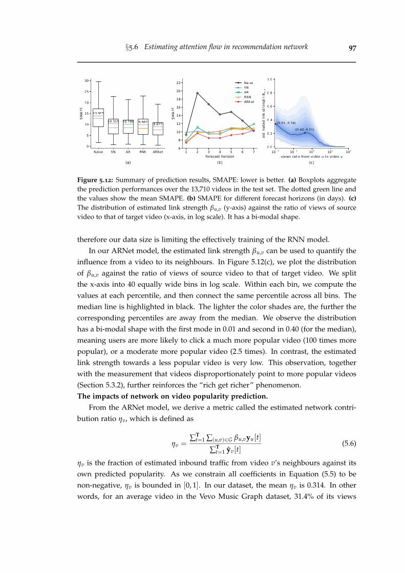
§5.6 Estimating attention flow in recommendation network 97
Figure 5.12: Summary of prediction results, SMAPE: lower is better. (a) Boxplots aggregatethe prediction performances over the 13,710 videos in the test set. The dotted green line andthe values show the mean SMAPE. (b) SMAPE for different forecast horizons (in days). (c)The distribution of estimated link strength βu,v (y-axis) against the ratio of views of sourcevideo to that of target video (x-axis, in log scale). It has a bi-modal shape.
therefore our data size is limiting the effectively training of the RNN model.In our ARNet model, the estimated link strength βu,v can be used to quantify the
influence from a video to its neighbours. In Figure 5.12(c), we plot the distributionof βu,v against the ratio of views of source video to that of target video. We splitthe x-axis into 40 equally wide bins in log scale. Within each bin, we compute thevalues at each percentile, and then connect the same percentile across all bins. Themedian line is highlighted in black. The lighter the color shades are, the further thecorresponding percentiles are away from the median. We observe the distributionhas a bi-modal shape with the first mode in 0.01 and second in 0.40 (for the median),meaning users are more likely to click a much more popular video (100 times morepopular), or a moderate more popular video (2.5 times). In contrast, the estimatedlink strength towards a less popular video is very low. This observation, togetherwith the measurement that videos disproportionately point to more popular videos(Section 5.3.2), further reinforces the “rich get richer” phenomenon.The impacts of network on video popularity prediction.
From the ARNet model, we derive a metric called the estimated network contri-bution ratio ηv, which is defined as
ηv =∑T
t=1 ∑(u,v)∈G βu,vyu[t]
∑Tt=1 yv[t]
(5.6)
ηv is the fraction of estimated inbound traffic from video v’s neighbours against itsown predicted popularity. As we constrain all coefficients in Equation (5.5) to benon-negative, ηv is bounded in [0, 1]. In our dataset, the mean ηv is 0.314. In otherwords, for an average video in the Vevo Music Graph dataset, 31.4% of its views
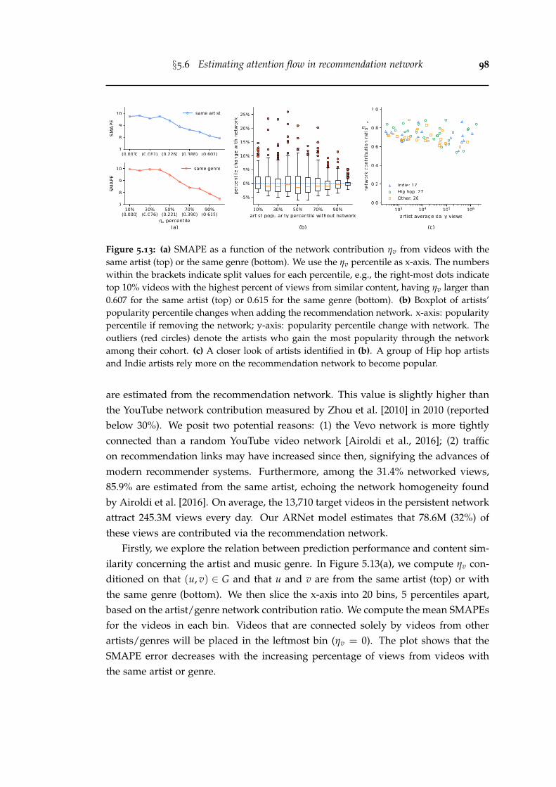
§5.6 Estimating attention flow in recommendation network 98
Figure 5.13: (a) SMAPE as a function of the network contribution ηv from videos with thesame artist (top) or the same genre (bottom). We use the ηv percentile as x-axis. The numberswithin the brackets indicate split values for each percentile, e.g., the right-most dots indicatetop 10% videos with the highest percent of views from similar content, having ηv larger than0.607 for the same artist (top) or 0.615 for the same genre (bottom). (b) Boxplot of artists’popularity percentile changes when adding the recommendation network. x-axis: popularitypercentile if removing the network; y-axis: popularity percentile change with network. Theoutliers (red circles) denote the artists who gain the most popularity through the networkamong their cohort. (c) A closer look of artists identified in (b). A group of Hip hop artistsand Indie artists rely more on the recommendation network to become popular.
are estimated from the recommendation network. This value is slightly higher thanthe YouTube network contribution measured by Zhou et al. [2010] in 2010 (reportedbelow 30%). We posit two potential reasons: (1) the Vevo network is more tightlyconnected than a random YouTube video network [Airoldi et al., 2016]; (2) trafficon recommendation links may have increased since then, signifying the advances ofmodern recommender systems. Furthermore, among the 31.4% networked views,85.9% are estimated from the same artist, echoing the network homogeneity foundby Airoldi et al. [2016]. On average, the 13,710 target videos in the persistent networkattract 245.3M views every day. Our ARNet model estimates that 78.6M (32%) ofthese views are contributed via the recommendation network.
Firstly, we explore the relation between prediction performance and content sim-ilarity concerning the artist and music genre. In Figure 5.13(a), we compute ηv con-ditioned on that (u, v) ∈ G and that u and v are from the same artist (top) or withthe same genre (bottom). We then slice the x-axis into 20 bins, 5 percentiles apart,based on the artist/genre network contribution ratio. We compute the mean SMAPEsfor the videos in each bin. Videos that are connected solely by videos from otherartists/genres will be placed in the leftmost bin (ηv = 0). The plot shows that theSMAPE error decreases with the increasing percentage of views from videos withthe same artist or genre.

§5.7 Visualizing attention flow in recommendation network 99
Secondly, we study the question that which artists are affected most if the rec-ommender systems were to be turned off? Figure 5.13(b) shows the popularity per-centile change at the level of artist. We first compute the network-subtracted views,i.e., subtracting the network contribution ∑T
t=1 ∑(u,v)∈G βu,vyu[t] from the observedviews ∑T
t=1 yv[t]. We then aggregate and compute the popularity percentiles for bothobserved views and network-subtracted views at the level of artist. The x-axis plotsthe artists’ popularity percentiles without recommendation network, and y-axis plotsthe percentile changes when turning on the network. The range of percentiles staysconstant between [0, 100%], reflecting the concept of finite attention — one videogains popularity at the expense of others. The top outliers identify artists who gainmuch more popularity than their peers with similar popularity due to the recommen-dation network; whereas the bottom outliers represent artists who lose popularity.There are 2,340 artists having target videos in the persistent network. We observethat 1,378 (58.89%) artists losing a small amount of popularity (less than 5%) while948 (40.51%) gaining. We notice there is no bottom outlier. On the contrary, the topoutliers show that the network can help some artists massively increase their relativepopularity (as high as 26%, J-Kwon (American rapper) in 4th bin).
We take a closer look at the outliers by scattering them in Figure 5.13(c). 70 artistsgain significant popularity from the recommendation network, implying a betterutilization of network effects. We retrieve the artist genres from the music databaseMusicBrainz, and we notice two notable groups. One is the Indie group by matchinggenre keywords “indie”, “alternative”, or “new wave”. The top 3 most popular Indieartists are 4 Non Blondes, Hoobastank, and The Police. The other is the Hip hopgroup by matching genre keywords “hip hop”, “rap”, “reggae”, or “r&b”. The top3 most popular Hip hop artists are Mark Ronson, French Montana, and PharrellWilliams. This finding reveals that the recommender systems can lead users to findniche artists.
5.7 Visualizing attention flow in recommendation network
In this section, we present AttentionFlow, a new system to visualize the attentiontime series of videos in the YouTube recommendation network and the dynamicinfluence they have among each other. We choose the ego network as the maininterface. An ego network consists of a focal node (the ego) and its direct neighbors(the alters). It emphasizes the changing relations and evolving influence between theego and alters. More broadly, AttentionFlow can be generalized to visualize webtraffic patterns, search trends, or movement of people and goods among urban hubs.
Centred around an ego video, our system progressively reveals its neighbors at
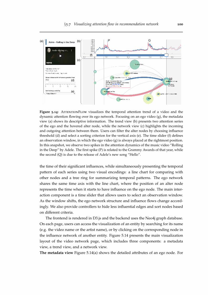
§5.7 Visualizing attention flow in recommendation network 100
(a) (b)
(c)(f)
(d)
(e)
P Q
(g)
Figure 5.14: AttentionFlow visualizes the temporal attention trend of a video and thedynamic attention flowing over its ego network. Focusing on an ego video (g), the metadataview (a) shows its descriptive information. The trend view (b) presents two attention seriesof the ego and the hovered alter node, while the network view (c) highlights the incomingand outgoing attention between them. Users can filter the alter nodes by choosing influencethreshold (d) and select a sorting criterion for the vertical axis (e). The time slider (f) definesan observation window, in which the ego video (g) is always placed at the rightmost position.In this snapshot, we observe two spikes in the attention dynamics of the music video “Rollingin the Deep” by Adele. The first spike (P) is related to the Grammy Awards of that year, whilethe second (Q) is due to the release of Adele’s new song “Hello”.
the time of their significant influences, while simultaneously presenting the temporalpattern of each series using two visual encodings: a line chart for comparing withother nodes and a tree ring for summarizing temporal patterns. The ego networkshares the same time axis with the line chart, where the position of an alter noderepresents the time when it starts to have influence on the ego node. The main inter-action component is a time slider that allows users to select an observation window.As the window shifts, the ego network structure and influence flows change accord-ingly. We also provide controllers to hide less influential edges and sort nodes basedon different criteria.
The frontend is rendered in D3.js and the backend uses the Neo4j graph database.On each page, users can access the visualization of an entity by searching for its name(e.g. the video name or the artist name), or by clicking on the corresponding node inthe influence network of another entity. Figure 5.14 presents the main visualizationlayout of the video network page, which includes three components: a metadataview, a trend view, and a network view.The metadata view Figure 5.14(a) shows the detailed attributes of an ego node. For
§5.8 Conclusion 101
example, video title, embedded snippet, creation time and genres are presented for agiven music video. Below the description panel, two controllers can be used to alterthe network layout. The influence slider (Figure 5.14d) is used to filter out alter nodeswith influence less than a chosen threshold, defaulted at 1%. This threshold alsodetermines the influencing time of the alters, which in turn decides the horizontalpositions of the alter nodes in the network view. The drop-down box (Figure 5.14e)provides five criteria for sorting nodes along the vertical axis: force-directed (default),total views, incoming views, outgoing views, or artist names.The trend view Figure 5.14(b) provides a line chart to visualize the time series ofattention. A time slider (Figure 5.14f) is located on the horizontal axis to select anobservation window. The left handle changes the start time of the observation, whilethe right handle changes the position of the ego. The periods outside the selectedtime range are greyed out.The network view Figure 5.14(c) visualizes the ego network structure and influenceflows. They change dynamically when users interact with the time slider and theinfluence slider. Alter nodes that have influence with the ego by more than thechosen threshold will appear in the network view. When hovering over an alternode, the edges between the alter and the ego are highlighted, the alter’s line chartis revealed in the trend view, and a card containing influence information pops up.For each alter node, the horizontal position is related to the influence threshold andthe vertical position is related to the sorting criteria.
5.8 Conclusion
This work presents a large-scale study for online videos on YouTube. We collecta new dataset that consists of 60,740 Vevo music videos, representing some of themost popular music clips and artists. We construct the YouTube recommendationnetwork. We present measurements on the global component structure and temporalpersistence of links. A model that leverages the network information for predictingvideo popularity is proposed, which achieves superior results over other baselines.It also allows us to estimate the amount of attention flow over each recommendationlink. We derive a metric — estimated network contribution ratio, and we quantifythis ratio at both the entire Vevo network level and individual artist level. We alsodevelop a new system AttentionFlow to visualize a collection of video attentionseries and the dynamic network influence. To the best of our knowledge, this is thefirst work that links the video recommendation network structure to the attentionconsumption for the videos in it.
§5.8 Conclusion 102
5.8.1 Discussion
Much progress has been made to algorithmically optimize or increase the attentionfor individual digital item (from videos to products to connections in social net-works), whereas the theory about attention flow among different items is still fairlynascent. Our data includes a series of network snapshots that are constructed bythe platform’s recommender systems, and visible to both content producers and con-sumers. We believe that the area of understanding the implications of content recom-mendation networks has many worthy problems and fruitful applications. However,definitions and properties of a recommendation network that is fair and transparentto the content hosting site, producers and consumers remain as open issues.
5.8.2 Limitations and future work
Our limitations include: interpretations of importance are directly based on regres-sion weights; some observations may not generalize to other digital items other thanthe most popular music videos; the prediction does not explore all the potential deeplearning architecture and parameter tuning. Future work includes modeling atten-tion flow that takes into account item rank on the relevant list; connecting aggregateattention with individual click streams; and improving deep neural network mod-els, specifically, three directions for us to exploit. Firstly, extract additional features,such as audio-visual, artist, and network features. Secondly, measure the relationsbetween estimated link strength and link properties, such as the diversity and/ornovelty of the target video relative to the source video [Ziegler et al., 2005]. Lastly,train a shared RNN model on videos with similar dynamics for increasing the vol-ume of training data [Figueiredo et al., 2016].
Chapter 6
Conclusion
In this chapter, we first summarize the main contributions of this thesis. Next, wediscuss several possible future research directions.
6.1 Summary
The work in this thesis aims to understand the collective human behaviors in onlineplatforms from the perspectives of social data sampling, user engagement patterns,and network effects of recommender systems. In particular, we focus on item-centric,quantitative analysis instead of user-centric, qualitative approach. Broadly, this thesismakes the following contributions:
• Quantify sampling effects of online social data. We present a comprehensivestudy of the Twitter sampling effects on common measurements in Chapter 3. Weshow that Twitter rate limit messages can estimate the volume of missing tweetsaccurately. Tweets sampling rates also vary across different timescales. While thehourly sampling rate is affected by the diurnal rhythm in different time zones, themillisecond level sampling is heavily influenced by the Twitter’s implementationchoices. We find the Bernoulli process with a uniform rate approximates the em-pirical entity distribution well. We also propose a new method to infer the true en-tity distribution and ranking based on sampled observations. In the user-hashtagbipartite graph and user-user retweet network, we observe that the network struc-tures are altered with denser components more likely to be preserved. For thediffusion models, sampling compromises their quality because tweet inter-arrivaltime is significantly longer in the sampled stream, while user influence is lower.
• Measuring and predicting engagement in online content. We present the firstlarge-scale measurement study on how users collectively engage with online con-tent in Chapter 4. We study a set of metrics including time and percentage ofvideos being watched, and we observe that video duration is an important covari-
103
§6.1 Summary 104
ate on watching patterns. To calibrate engagement measures against video length,we construct a new tool called engagement map to convert the watch percentageinto a new metric – relative engagement. The relative engagement metric capturesthe watch percentage rank percentile among videos of similar lengths. We showrelative engagement is closely correlated with recognized notions of content qual-ity, stable over time and predictable before videos’ upload. We extract featuressuch as video content, topics, and channel reputation to predict watch percentageand relative engagement in a cold-start setup. And we can achieve coefficient ofdetermination R2 of 0.45 and 0.77, respectively. Lastly, we use a Hawkes processmodel to forecast the video viewing and watching dynamics. The result suggeststhe engagement metric (daily watch time) is more predictable than the popularitymetric (daily view count).
• Measuring and modeling content recommendation networks. We present thefirst large-scale measurement study on the network effects induced by YouTuberecommender systems in Chapter 5. The study is done on a new Vevo Music
Graph dataset, which contains the content recommendation network for 60,740music videos. We discover the popularity bias that videos are disproportionatelyrecommended towards more popular videos. This means the recommender systemis likely to take a random viewer to more popular videos and keep them there.Furthermore, we use the bow-tie structure to characterize the recommendationnetwork. We find that its core component (23.1% of the videos) occupies most ofthe attention (82.6% of the views). We also propose a new model, called ARNet,which accounts for the network structure and can predict video popularity 9.7%better than other baselines. More importantly, the ARNet model allows us toquantify the latent influence between videos and artists. To our knowledge, this isthe first work that measures YouTube recommendation as a network and links tothe attention consumption for the videos in it.
• Large-scale datasets, open tools, and web demonstrations. The contributions ofour work go beyond quantitative observations. Altogether, we have released 3 newdatasets, 2 data collection tools, and 2 new web demos. They include: (1) YouTube
Engagement ’16 dataset: 5.3M videos published and tweeted between July andAugust, 2016, and 3 quality video datasets. (2) Vevo Music Graph dataset: 60Kmusic videos with 63 daily snapshots of the video recommendation network. (3)Complete/Sampled Retweet Cascades datasets: 2 sets of complete/sampledretweet cascades on the topics of cyberbullying and YouTube video sharing. (4)Twitter-intact-stream: a Python package for reconstructing the complete fil-tered stream on Twitter. (5) YouTube-insight: a Python package for collecting
§6.2 Future work 105
metadata and historical data for videos on YouTube. (6) HIPie: an interactiveweb interface for explaining and predicting the popularity of YouTube videos. (7)AttentionFlow: an interactive web interface for visualizing a collection of timeseries and the dynamic network influence.
6.2 Future work
We envision our long-term goal as developing principles for responsible platformsby measuring and modeling the collective user behaviors.
• Measuring conversation quality in online platform. In Chapter 4, we use videowatching metrics as a surrogate of collective user engagement. Another impor-tant engagement behavior is commenting. Although YouTube becomes a prevail-ing platform, the conversation (i.e., comments) on YouTube videos is surprisinglyunderstudied. Recently, scholars have used YouTube comments to study hatespeech [Mathew et al., 2019], content moderation [Jiang et al., 2019], and politi-cal polarization [Ribeiro et al., 2020]. However, we still lack the knowledge of howusers comment on YouTube videos in general.
We can narrow down the scope to the conversation around political videos, sothat both the users and videos carry clear ideologies. It is of great importance tounderstand how users engage with videos and users with the same or oppositeideologies. Specifically, one can ask questions such as how many comments onYouTube are cross-partisan? are the cross-partisan comments more toxic? do cross-partisan comments get more attention? which topics or media are more likely toincur cross-partisan conversation?1
Moving beyond YouTube, we can intersect the videos with the sharing behaviorson other social media, e.g., tweets on Twitter. Hence, an important question is tomeasure the difference between the comments on YouTube and tweets on Twitterfor the same video. Overall, this question can help us understand the engagementpatterns across platforms and shed light on advertising online products.
• Auditing biases in the recommender systems. In Chapter 5, we discover thepopularity bias in the YouTube recommender systems. We can extend the study toother biases, e.g., in politics, education, medical information, or culture trends.
For the political bias in recommender systems, there have been many anecdo-tal reports on how YouTube radicalizes the users by recommending more extreme
1A preliminary attempt to answer these questions is available in [Wu and Resnick, 2021].
§6.2 Future work 106
videos [Tufekci, 2018; Lewis, 2018]. Recently, Ribeiro et al. [2020] presented a quan-titative analysis and used YouTube comments as a proxy of video consumption. Wecan bridge the gaps with prior work from two fronts: Firstly, all existing researchheavily focus on the right-wing party, but we argue that it is important to under-stand the radicalization problem from the whole political spectrum. Secondly, toperform a systematic study, we propose to build a simulator for mimicking realusers and auditing the recommendations given by the platform. The simulatorneeds to account for different demographic features (e.g., gender, location, polit-ical leaning) and different user behaviors (e.g., random click or always click thefirst recommendation).
Appendix A
Appendix
A.1 Twitter data in ICWSM papers (2015-2019)
82 (31%) out of 265 ICWSM full papers used Twitter data from 2015 to 2019. Twittersearch API has been used 25 times, sampled stream 12 times, filtered stream 18 times,firehose 8 times. 12 papers used multiple Twitter APIs for data collection. 7 papersdid not clearly specify their Twitter API choices.
107
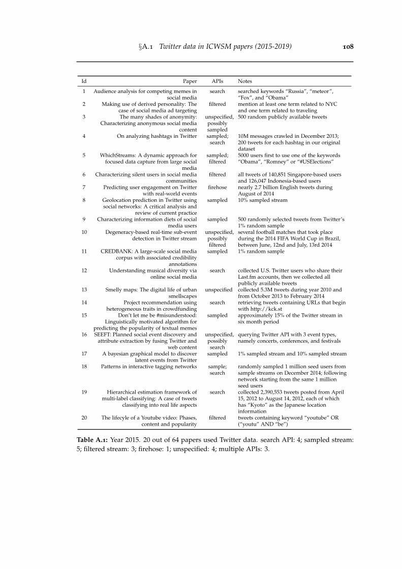
§A.1 Twitter data in ICWSM papers (2015-2019) 108
Id Paper APIs Notes
1 Audience analysis for competing memes insocial media
search searched keywords “Russia”, “meteor”,“Fox”, and “Obama”
2 Making use of derived personality: Thecase of social media ad targeting
filtered mention at least one term related to NYCand one term related to traveling
3 The many shades of anonymity:Characterizing anonymous social media
content
unspecified,possiblysampled
500 random publicly available tweets
4 On analyzing hashtags in Twitter sampled;search
10M messages crawled in December 2013;200 tweets for each hashtag in our originaldataset
5 WhichStreams: A dynamic approach forfocused data capture from large social
media
sampled;filtered
5000 users first to use one of the keywords“Obama”, “Romney” or “#USElections”
6 Characterizing silent users in social mediacommunities
filtered all tweets of 140,851 Singapore-based usersand 126,047 Indonesia-based users
7 Predicting user engagement on Twitterwith real-world events
firehose nearly 2.7 billion English tweets duringAugust of 2014
8 Geolocation prediction in Twitter usingsocial networks: A critical analysis and
review of current practice
sampled 10% sampled stream
9 Characterizing information diets of socialmedia users
sampled 500 randomly selected tweets from Twitter’s1% random sample
10 Degeneracy-based real-time sub-eventdetection in Twitter stream
unspecified,possiblyfiltered
several football matches that took placeduring the 2014 FIFA World Cup in Brazil,between June, 12nd and July, 13rd 2014
11 CREDBANK: A large-scale social mediacorpus with associated credibility
annotations
sampled 1% random sample
12 Understanding musical diversity viaonline social media
search collected U.S. Twitter users who share theirLast.fm accounts, then we collected allpublicly available tweets
13 Smelly maps: The digital life of urbansmellscapes
unspecified collected 5.3M tweets during year 2010 andfrom October 2013 to February 2014
14 Project recommendation usingheterogeneous traits in crowdfunding
search retrieving tweets containing URLs that beginwith http://kck.st
15 Don’t let me be #misunderstood:Linguistically motivated algorithm for
predicting the popularity of textual memes
sampled approximately 15% of the Twitter stream insix month period
16 SEEFT: Planned social event discovery andattribute extraction by fusing Twitter and
web content
unspecified,possiblysearch
querying Twitter API with 3 event types,namely concerts, conferences, and festivals
17 A bayesian graphical model to discoverlatent events from Twitter
sampled 1% sampled stream and 10% sampled stream
18 Patterns in interactive tagging networks sample;search
randomly sampled 1 million seed users fromsample streams on December 2014; followingnetwork starting from the same 1 millionseed users
19 Hierarchical estimation framework ofmulti-label classifying: A case of tweets
classifying into real life aspects
search collected 2,390,553 tweets posted from April15, 2012 to August 14, 2012, each of whichhas “Kyoto” as the Japanese locationinformation
20 The lifecyle of a Youtube video: Phases,content and popularity
filtered tweets containing keyword “youtube” OR(“youtu” AND “be”)
Table A.1: Year 2015. 20 out of 64 papers used Twitter data. search API: 4; sampled stream:5; filtered stream: 3; firehose: 1; unspecified: 4; multiple APIs: 3.
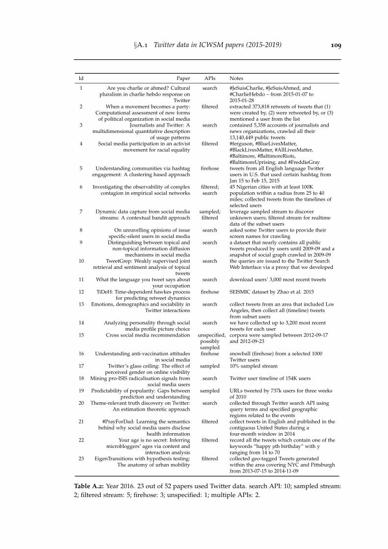
§A.1 Twitter data in ICWSM papers (2015-2019) 109
Id Paper APIs Notes
1 Are you charlie or ahmed? Culturalpluralism in charlie hebdo response on
search #JeSuisCharlie, #JeSuisAhmed, and#CharlieHebdo – from 2015-01-07 to2015-01-28
2 When a movement becomes a party:Computational assessment of new forms
of political organization in social media
filtered extracted 373,818 retweets of tweets that (1)were created by, (2) were retweeted by, or (3)mentioned a user from the list
3 Journalists and Twitter: Amultidimensional quantitative description
of usage patterns
search contained 5,358 accounts of journalists andnews organizations, crawled all their13,140,449 public tweets
4 Social media participation in an activistmovement for racial equality
filtered #ferguson, #BlueLivesMatter,#BlackLivesMatter, #AllLivesMatter,#Baltimore, #BaltimoreRiots,#BaltimoreUprising, and #FreddieGray
5 Understanding communities via hashtagengagement: A clustering based approach
firehose tweets from all English language Twitterusers in U.S. that used certain hashtag fromJan 15 to Feb 15, 2015
6 Investigating the observability of complexcontagion in empirical social networks
filtered;search
45 Nigerian cities with at least 100Kpopulation within a radius from 25 to 40miles; collected tweets from the timelines ofselected users
7 Dynamic data capture from social mediastreams: A contextual bandit approach
sampled;filtered
leverage sampled stream to discoverunknown users; filtered stream for realtimedata of the subset users
8 On unravelling opinions of issuespecific-silent users in social media
search asked some Twitter users to provide theirscreen names for crawling
9 Distinguishing between topical andnon-topical information diffusion
mechanisms in social media
search a dataset that nearly contains all publictweets produced by users until 2009-09 and asnapshot of social graph crawled in 2009-09
10 TweetGrep: Weakly supervised jointretrieval and sentiment analysis of topical
tweets
search the queries are issued to the Twitter SearchWeb Interface via a proxy that we developed
11 What the language you tweet says aboutyour occupation
search download users’ 3,000 most recent tweets
12 TiDeH: Time-dependent hawkes processfor predicting retweet dynamics
firehose SEISMIC dataset by Zhao et al. 2015
13 Emotions, demographics and sociability inTwitter interactions
search collect tweets from an area that included LosAngeles, then collect all (timeline) tweetsfrom subset users
14 Analyzing personality through socialmedia profile picture choice
search we have collected up to 3,200 most recenttweets for each user
15 Cross social media recommendation unspecified,possiblysampled
corpora were sampled between 2012-09-17and 2012-09-23
16 Understanding anti-vaccination attitudesin social media
firehose snowball (firehose) from a selected 1000Twitter users
17 Twitter’s glass ceiling: The effect ofperceived gender on online visibility
sampled 10% sampled stream
18 Mining pro-ISIS radicalisation signals fromsocial media users
search Twitter user timeline of 154K users
19 Predictability of popularity: Gaps betweenprediction and understanding
sampled URLs tweeted by 737k users for three weeksof 2010
20 Theme-relevant truth discovery on Twitter:An estimation theoretic approach
search collected through Twitter search API usingquery terms and specified geographicregions related to the events
21 #PrayForDad: Learning the semanticsbehind why social media users disclose
health information
filtered collect tweets in English and published in thecontiguous United States during afour-month window in 2014
22 Your age is no secret: Inferringmicrobloggers’ ages via content and
interaction analysis
filtered record all the tweets which contain one of thekeywords “happy yth birthday” with yranging from 14 to 70
23 EigenTransitions with hypothesis testing:The anatomy of urban mobility
filtered collected geo-tagged Tweets generatedwithin the area covering NYC and Pittsburghfrom 2013-07-15 to 2014-11-09
Table A.2: Year 2016. 23 out of 52 papers used Twitter data. search API: 10; sampled stream:2; filtered stream: 5; firehose: 3; unspecified: 1; multiple APIs: 2.
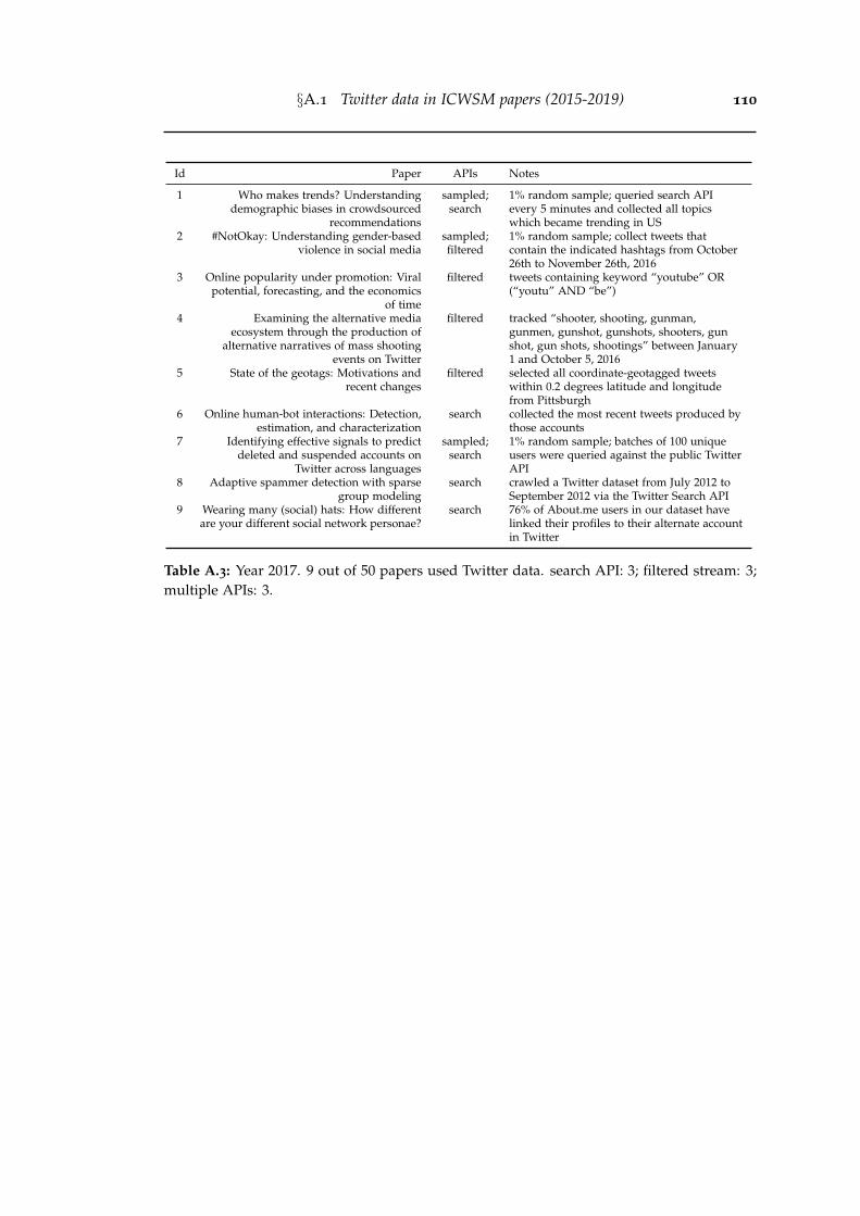
§A.1 Twitter data in ICWSM papers (2015-2019) 110
Id Paper APIs Notes
1 Who makes trends? Understandingdemographic biases in crowdsourced
recommendations
sampled;search
1% random sample; queried search APIevery 5 minutes and collected all topicswhich became trending in US
2 #NotOkay: Understanding gender-basedviolence in social media
sampled;filtered
1% random sample; collect tweets thatcontain the indicated hashtags from October26th to November 26th, 2016
3 Online popularity under promotion: Viralpotential, forecasting, and the economics
of time
filtered tweets containing keyword “youtube” OR(“youtu” AND “be”)
4 Examining the alternative mediaecosystem through the production of
alternative narratives of mass shootingevents on Twitter
filtered tracked “shooter, shooting, gunman,gunmen, gunshot, gunshots, shooters, gunshot, gun shots, shootings” between January1 and October 5, 2016
5 State of the geotags: Motivations andrecent changes
filtered selected all coordinate-geotagged tweetswithin 0.2 degrees latitude and longitudefrom Pittsburgh
6 Online human-bot interactions: Detection,estimation, and characterization
search collected the most recent tweets produced bythose accounts
7 Identifying effective signals to predictdeleted and suspended accounts on
Twitter across languages
sampled;search
1% random sample; batches of 100 uniqueusers were queried against the public TwitterAPI
8 Adaptive spammer detection with sparsegroup modeling
search crawled a Twitter dataset from July 2012 toSeptember 2012 via the Twitter Search API
9 Wearing many (social) hats: How differentare your different social network personae?
search 76% of About.me users in our dataset havelinked their profiles to their alternate accountin Twitter
Table A.3: Year 2017. 9 out of 50 papers used Twitter data. search API: 3; filtered stream: 3;multiple APIs: 3.
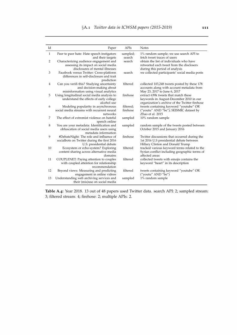
§A.1 Twitter data in ICWSM papers (2015-2019) 111
Id Paper APIs Notes
1 Peer to peer hate: Hate speech instigatorsand their targets
sampled;search
1% random sample; we use search API tofetch tweet traces of users
2 Characterizing audience engagement andassessing its impact on social media
disclosures of mental illnesses
search obtain the list of individuals who haveretweeted each tweet from the disclosersduring this period of analysis
3 Facebook versus Twitter: Cross-platformdifferences in self-disclosure and trait
prediction
search we collected participants’ social media posts
4 Can you verifi this? Studying uncertaintyand decision-making about
misinformation using visual analytics
filtered collected 103,248 tweets posted by these 178accounts along with account metadata fromMay 23, 2017 to June 6, 2017
5 Using longitudinal social media analysis tounderstand the effects of early college
alcohol use
firehose extract 639k tweets that match thesekeywords in August-December 2010 in ourorganization’s archive of the Twitter firehose
6 Modeling popularity in asynchronoussocial media streams with recurrent neural
networks
filtered;firehose
tweets containing keyword “youtube” OR(“youtu” AND “be”); SEISMIC dataset byZhao et al. 2015
7 The effect of extremist violence on hatefulspeech online
sampled 10% random sample
8 You are your metadata: Identification andobfuscation of social media users using
metadata information
sampled random sample of the tweets posted betweenOctober 2015 and January 2016
9 #DebateNight: The role and influence ofsocialbots on Twitter during the first 2016
U.S. presidential debate
firehose Twitter discussions that occurred during the1st 2016 U.S presidential debate betweenHillary Clinton and Donald Trump
10 Ecosystem or echo-system? Exploringcontent sharing across alternative media
domains
filtered tracked various keyword terms related to theSyrian conflict including geographic terms ofaffected areas
11 COUPLENET: Paying attention to coupleswith coupled attention for relationship
recommendation
filtered collected tweets with emojis contains thekeyword “heart” in its description
12 Beyond views: Measuring and predictingengagement in online videos
filtered tweets containing keyword “youtube” OR(“youtu” AND “be”)
13 Understanding web archiving services andtheir (mis)use on social media
sampled 1% random sample
Table A.4: Year 2018. 13 out of 48 papers used Twitter data. search API: 2; sampled stream:3; filtered stream: 4; firehose: 2; multiple APIs: 2.
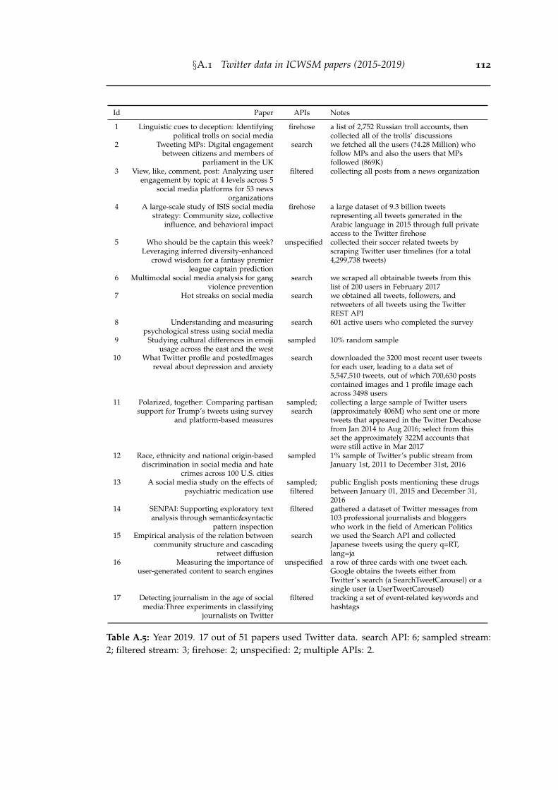
§A.1 Twitter data in ICWSM papers (2015-2019) 112
Id Paper APIs Notes
1 Linguistic cues to deception: Identifyingpolitical trolls on social media
firehose a list of 2,752 Russian troll accounts, thencollected all of the trolls’ discussions
2 Tweeting MPs: Digital engagementbetween citizens and members of
parliament in the UK
search we fetched all the users (?4.28 Million) whofollow MPs and also the users that MPsfollowed (869K)
3 View, like, comment, post: Analyzing userengagement by topic at 4 levels across 5
social media platforms for 53 newsorganizations
filtered collecting all posts from a news organization
4 A large-scale study of ISIS social mediastrategy: Community size, collective
influence, and behavioral impact
firehose a large dataset of 9.3 billion tweetsrepresenting all tweets generated in theArabic language in 2015 through full privateaccess to the Twitter firehose
5 Who should be the captain this week?Leveraging inferred diversity-enhanced
crowd wisdom for a fantasy premierleague captain prediction
unspecified collected their soccer related tweets byscraping Twitter user timelines (for a total4,299,738 tweets)
6 Multimodal social media analysis for gangviolence prevention
search we scraped all obtainable tweets from thislist of 200 users in February 2017
7 Hot streaks on social media search we obtained all tweets, followers, andretweeters of all tweets using the TwitterREST API
8 Understanding and measuringpsychological stress using social media
search 601 active users who completed the survey
9 Studying cultural differences in emojiusage across the east and the west
sampled 10% random sample
10 What Twitter profile and postedImagesreveal about depression and anxiety
search downloaded the 3200 most recent user tweetsfor each user, leading to a data set of5,547,510 tweets, out of which 700,630 postscontained images and 1 profile image eachacross 3498 users
11 Polarized, together: Comparing partisansupport for Trump’s tweets using survey
and platform-based measures
sampled;search
collecting a large sample of Twitter users(approximately 406M) who sent one or moretweets that appeared in the Twitter Decahosefrom Jan 2014 to Aug 2016; select from thisset the approximately 322M accounts thatwere still active in Mar 2017
12 Race, ethnicity and national origin-baseddiscrimination in social media and hate
crimes across 100 U.S. cities
sampled 1% sample of Twitter’s public stream fromJanuary 1st, 2011 to December 31st, 2016
13 A social media study on the effects ofpsychiatric medication use
sampled;filtered
public English posts mentioning these drugsbetween January 01, 2015 and December 31,2016
14 SENPAI: Supporting exploratory textanalysis through semantic&syntactic
pattern inspection
filtered gathered a dataset of Twitter messages from103 professional journalists and bloggerswho work in the field of American Politics
15 Empirical analysis of the relation betweencommunity structure and cascading
retweet diffusion
search we used the Search API and collectedJapanese tweets using the query q=RT,lang=ja
16 Measuring the importance ofuser-generated content to search engines
unspecified a row of three cards with one tweet each.Google obtains the tweets either fromTwitter’s search (a SearchTweetCarousel) or asingle user (a UserTweetCarousel)
17 Detecting journalism in the age of socialmedia:Three experiments in classifying
journalists on Twitter
filtered tracking a set of event-related keywords andhashtags
Table A.5: Year 2019. 17 out of 51 papers used Twitter data. search API: 6; sampled stream:2; filtered stream: 3; firehose: 2; unspecified: 2; multiple APIs: 2.
Bibliography
Abisheva, A.; Garimella, V. R. K.; Garcia, D.; and Weber, I., 2014. Who watches(and shares) what on YouTube? and when?: Using Twitter to understand YouTubeviewership. In Proceedings of the ACM International Conference on Web Search andData Mining. (cited on page 16)
Ahmed, M.; Spagna, S.; Huici, F.; and Niccolini, S., 2013. A peek into the future:Predicting the evolution of popularity in user generated content. In Proceedings ofthe ACM International Conference on Web Search and Data Mining. (cited on page 15)
Airoldi, M.; Beraldo, D.; and Gandini, A., 2016. Follow the algorithm: An ex-ploratory investigation of music on YouTube. Poetics, (2016). (cited on pages 18,74, 77, 79, and 98)
alexa.com, 2020. Alexa top 500 global sites. https://www.alexa.com/topsites. [On-line; accessed 2020/06/01]. (cited on page 1)
Allen, M. P., 1997. The coefficient of determination in multiple regression. Under-standing Regression Analysis, (1997). (cited on page 60)
Almuhimedi, H.; Wilson, S.; Liu, B.; Sadeh, N.; and Acquisti, A., 2013. Tweetsare forever: A large-scale quantitative analysis of deleted tweets. In Proceedings ofthe ACM Conference on Computer-Supported Cooperative Work and Social Computing.(cited on page 11)
Alstott, J.; Bullmore, E.; and Plenz, D., 2014. powerlaw: A python package foranalysis of heavy-tailed distributions. PloS one, (2014). (cited on page 82)
Arakelyan, S.; Morstatter, F.; Martin, M.; Ferrara, E.; and Galstyan, A., 2018.Mining and forecasting career trajectories of music artists. In Proceedings of theACM Conference on Hypertext and Social Media. (cited on page 37)
Arantes, M.; Figueiredo, F.; and Almeida, J. M., 2016. Understanding video-adconsumption on YouTube: A measurement study on user behavior, popularity,and content properties. In Proceedings of the ACM Conference on Web Science. (citedon pages 4 and 13)
113
BIBLIOGRAPHY 114
Arapakis, I.; Lalmas, M.; and Valkanas, G., 2014. Understanding within-contentengagement through pattern analysis of mouse gestures. In Proceedings of the ACMInternational Conference on Information and Knowledge Management. (cited on pages13 and 47)
Backstrom, L.; Bakshy, E.; Kleinberg, J. M.; Lento, T. M.; and Rosenn, I., 2011.Center of attention: How facebook users allocate attention across friends. In Pro-ceedings of the International AAAI Conference on Web and Social Media. (cited on page9)
Barbieri, N.; Silvestri, F.; and Lalmas, M., 2016. Improving post-click user en-gagement on native ads via survival analysis. In Proceedings of the InternationalConference on World Wide Web. (cited on page 14)
Bauckhage, C.; Hadiji, F.; and Kersting, K., 2015. How viral are viral videos? InProceedings of the International AAAI Conference on Web and Social Media. (cited onpage 15)
Bendersky, M.; Garcia-Pueyo, L.; Harmsen, J.; Josifovski, V.; and Lepikhin, D.,2014. Up next: Retrieval methods for large scale related video suggestion. InProceedings of the ACM SIGKDD International Conference on Knowledge Discovery andData Mining. (cited on pages 17, 73, and 74)
Beutel, A.; Chen, J.; Doshi, T.; Qian, H.; Wei, L.; Wu, Y.; Heldt, L.; Zhao, Z.;Hong, L.; Chi, E. H.; et al., 2019. Fairness in recommendation ranking throughpairwise comparisons. In Proceedings of the ACM SIGKDD International Conferenceon Knowledge Discovery and Data Mining Workshop. (cited on page 17)
Beutel, A.; Covington, P.; Jain, S.; Xu, C.; Li, J.; Gatto, V.; and Chi, E. H., 2018.Latent cross: Making use of context in recurrent recommender systems. In Proceed-ings of the ACM International Conference on Web Search and Data Mining. (cited onpages 17, 74, and 87)
Bista, U.; Mathews, A.; Shin, M.; Menon, A. K.; and Xie, L., 2019. Comparativedocument summarisation via classification. In Proceedings of the International AAAIConference. (cited on page 11)
Bollacker, K.; Evans, C.; Paritosh, P.; Sturge, T.; and Taylor, J., 2008. Freebase:A collaboratively created graph database for structuring human knowledge. InProceedings of the ACM SIGMOD International Conference on Management of Data.(cited on page 61)
BIBLIOGRAPHY 115
Bovet, A. and Makse, H. A., 2019. Influence of fake news in Twitter during the 2016US presidential election. Nature Communications, (2019). (cited on page 20)
Boyd, D. and Crawford, K., 2012. Critical questions for big data: Provocations for acultural, technological, and scholarly phenomenon. Information, Communication &Society, (2012). (cited on pages 2 and 12)
Broder, A.; Kumar, R.; Maghoul, F.; Raghavan, P.; Rajagopalan, S.; Stata, R.;Tomkins, A.; and Wiener, J., 2000. Graph structure in the web. Computer networks,(2000). (cited on pages 5, 40, 75, 81, 83, and 84)
Brodersen, A.; Scellato, S.; and Wattenhofer, M., 2012. YouTube around theworld. In Proceedings of the International Conference on World Wide Web. (cited onpages 15 and 49)
Buolamwini, J. and Gebru, T., 2018. Gender shades: Intersectional accuracy dispar-ities in commercial gender classification. In Proceedings of the ACM Conference onFairness, Accountability, and Transparency. (cited on page 20)
Buscher, G.; Cutrell, E.; and Morris, M. R., 2009. What do you see when you’resurfing?: Using eye tracking to predict salient regions of web pages. In Proceedingsof the SIGCHI Conference on Human Factors in Computing Systems. (cited on pages 4and 13)
Carmi, E.; Oestreicher-Singer, G.; Stettner, U.; and Sundararajan, A., 2017. IsOprah contagious? the depth of diffusion of demand shocks in a product network.MIS Quarterly, (2017). (cited on pages 18 and 87)
Celma, O. and Cano, P., 2008. From hits to niches?: or how popular artists canbias music recommendation and discovery. In Proceedings of the ACM SIGKDDInternational Conference on Knowledge Discovery and Data Mining Workshop. (citedon page 73)
Cha, M.; Kwak, H.; Rodriguez, P.; Ahn, Y.-Y.; and Moon, S., 2007. I tube, youtube, everybody tubes: Analyzing the world’s largest user generated content videosystem. In Proceedings of the ACM SIGCOMM conference on Internet Measurement.(cited on page 14)
Chabris, C. F. and Simons, D. J., 2010. The invisible gorilla: And other ways ourintuitions deceive us. Harmony. (cited on page 8)
Chen, M.; Beutel, A.; Covington, P.; Jain, S.; Belletti, F.; and Chi, E. H., 2019.Top-k off-policy correction for a REINFORCE recommender system. In Proceedings
BIBLIOGRAPHY 116
of the ACM International Conference on Web Search and Data Mining. (cited on pages9, 17, 73, and 74)
Chen, Y.; Zhang, B.; Liu, Y.; and Zhu, W., 2013. Measurement and modeling of videowatching time in a large-scale internet video-on-demand system. IEEE Transactionson Multimedia, (2013). (cited on page 14)
Cheng, J.; Adamic, L.; Dow, P. A.; Kleinberg, J. M.; and Leskovec, J., 2014. Cancascades be predicted? In Proceedings of the International Conference on World WideWeb. (cited on pages 15 and 66)
Cheng, J.; Adamic, L. A.; Kleinberg, J. M.; and Leskovec, J., 2016. Do cascadesrecur? In Proceedings of the International Conference on World Wide Web. (cited onpage 96)
Cheng, L.; Shu, K.; Wu, S.; Silva, Y. N.; Hall, D. L.; and Liu, H., 2020. Unsupervisedcyberbullying detection via time-informed gaussian mixture model. In Proceedingsof the ACM International Conference on Information and Knowledge Management. (citedon page 22)
Cheng, X.; Dale, C.; and Liu, J., 2008. Statistics and social network of YouTubevideos. In Proceedings of International Workshop on Quality of Service. (cited onpages 14, 18, 74, and 93)
cisco.com, 2017. Cisco visual networking index: Forecast and method-ology, 2016–2021. https://www.reinvention.be/webhdfs/v1/docs/complete-white-paper-c11-481360.pdf. [Online; accessed 2020/08/22]. (cited onpage 2)
Clauset, A.; Shalizi, C. R.; and Newman, M. E., 2009. Power-law distributions inempirical data. SIAM review, (2009). (cited on page 82)
cnet.com, 2018. Youtube’s ai is the puppet master over most of what youwatch. https://www.cnet.com/news/youtube-ces-2018-neal-mohan//. [Online;accessed 2020/06/01]. (cited on page 2)
Competition, M., 2018. M4-methods. https://github.com/M4Competition/M4-methods/blob/master/ML benchmarks.py. (cited on page 92)
Covington, P.; Adams, J.; and Sargin, E., 2016. Deep neural networks for YouTuberecommendations. In Proceedings of the ACM Conference on Recommender Systems.(cited on pages 13, 17, 47, 61, 65, 73, 74, 80, and 87)
BIBLIOGRAPHY 117
Crane, R. and Sornette, D., 2008. Robust dynamic classes revealed by measuringthe response function of a social system. Proceedings of the National Academy ofSciences, (2008). (cited on page 15)
Davidson, J.; Liebald, B.; Liu, J.; Nandy, P.; Van Vleet, T.; Gargi, U.; Gupta, S.; He,Y.; Lambert, M.; Livingston, B.; et al., 2010. The YouTube video recommendationsystem. In Proceedings of the ACM conference on Recommender Systems. (cited onpages 13, 17, 73, 74, and 87)
De Choudhury, M.; Jhaver, S.; Sugar, B.; and Weber, I., 2016. Social media partici-pation in an activist movement for racial equality. In Proceedings of the InternationalAAAI Conference on Web and Social Media. (cited on pages 2, 11, and 20)
De Choudhury, M.; Lin, Y.-R.; Sundaram, H.; Candan, K. S.; Xie, L.; and Kelliher,A., 2010. How does the data sampling strategy impact the discovery of informationdiffusion in social media? In Proceedings of the International AAAI Conference on Weband Social Media. (cited on page 12)
Dhar, V.; Geva, T.; Oestreicher-Singer, G.; and Sundararajan, A., 2014. Predic-tion in economic networks. Information Systems Research, (2014). (cited on pages18, 73, and 87)
Dobrian, F.; Sekar, V.; Awan, A.; Stoica, I.; Joseph, D.; Ganjam, A.; Zhan, J.; and
Zhang, H., 2011. Understanding the impact of video quality on user engagement.ACM SIGCOMM Computer Communication Review, (2011). (cited on pages 13, 60,and 61)
Drutsa, A.; Gusev, G.; and Serdyukov, P., 2015. Future user engagement predictionand its application to improve the sensitivity of online experiments. In Proceedingsof the International Conference on World Wide Web. (cited on pages 14 and 47)
Dunbar, R. I., 1992. Neocortex size as a constraint on group size in primates. Journalof human evolution, (1992). (cited on page 9)
Dupret, G. and Lalmas, M., 2013. Absence time and user engagement: evaluatingranking functions. In Proceedings of the ACM International Conference on Web Searchand Data Mining. (cited on pages 13 and 14)
facebook.com, 2017. Updating how we account for videocompletion rates. https://about.fb.com/news/2017/01/news-feed-fyi-updating-how-we-account-for-video-completion-rates/. [On-line; accessed 2020/06/01]. (cited on pages 2 and 13)
BIBLIOGRAPHY 118
Figueiredo, F.; Almeida, J. M.; Benevenuto, F.; and Gummadi, K. P., 2014. Doescontent determine information popularity in social media?: A case study ofYouTube videos’ content and their popularity. In Proceedings of the SIGCHI Con-ference on Human Factors in Computing Systems. (cited on page 13)
Figueiredo, F.; Almeida, J. M.; Goncalves, M. A.; and Benevenuto, F., 2016.Trendlearner: Early prediction of popularity trends of user generated content. In-formation Sciences, (2016). (cited on pages 15, 51, 96, and 102)
Figueiredo, F.; Benevenuto, F.; and Almeida, J. M., 2011. The tube over time:Characterizing popularity growth of YouTube videos. In Proceedings of the ACMInternational Conference on Web Search and Data Mining. (cited on page 15)
Gaffney, D. and Matias, J. N., 2018. Caveat emptor, computational social science:Large-scale missing data in a widely-published Reddit corpus. PloS one, (2018).(cited on page 12)
Ghosh, S.; Zafar, M. B.; Bhattacharya, P.; Sharma, N.; Ganguly, N.; and Gum-madi, K., 2013. On sampling the wisdom of crowds: Random vs. expert samplingof the Twitter stream. In Proceedings of the ACM International Conference on Informa-tion and Knowledge Management. (cited on page 11)
Gill, P.; Arlitt, M.; Li, Z.; and Mahanti, A., 2007. YouTube traffic characterization:A view from the edge. In Proceedings of the ACM SIGCOMM Conference on InternetMeasurement. (cited on page 15)
Giridharadas, A., 2019. Winners take all: The elite charade of changing the world. Vin-tage. (cited on page 9)
Gomez-Uribe, C. A. and Hunt, N., 2016. The Netflix recommender system: Algo-rithms, business value, and innovation. ACM Transactions on Management Informa-tion Systems, (2016). (cited on pages 17 and 73)
Goncalves, B.; Perra, N.; and Vespignani, A., 2011. Modeling users’ activity onTwitter networks: Validation of Dunbar’s number. PloS one, (2011). (cited on page9)
Gonzalez-Bailon, S.; Wang, N.; Rivero, A.; Borge-Holthoefer, J.; and Moreno,Y., 2014. Assessing the bias in samples of large online networks. Social Networks,(2014). (cited on pages 11, 35, and 40)
Guo, P. J.; Kim, J.; and Rubin, R., 2014. How video production affects studentengagement: An empirical study of MOOC videos. In Proceedings of the ACMConference on Learning@ Scale. (cited on pages 14 and 55)
BIBLIOGRAPHY 119
Guo, Q. and Agichtein, E., 2012. Beyond dwell time: Estimating document rele-vance from cursor movements and other post-click searcher behavior. In Proceed-ings of the International Conference on World Wide Web. (cited on page 14)
Gursun, G.; Crovella, M.; and Matta, I., 2011. Describing and forecasting videoaccess patterns. In Proceedings of the IEEE International Conference on Computer Com-munications. (cited on page 15)
Hawkes, A. G., 1971. Spectra of some self-exciting and mutually exciting point pro-cesses. Biometrika, (1971). (cited on page 67)
Herlocker, J. L.; Konstan, J. A.; Terveen, L. G.; and Riedl, J. T., 2004. Evaluat-ing collaborative filtering recommender systems. ACM Transactions on InformationSystems, (2004). (cited on page 80)
Hessel, J.; Lee, L.; and Mimno, D., 2017. Cats and captions vs. creators and theclock: Comparing multimodal content to context in predicting relative popularity.In Proceedings of the International Conference on World Wide Web. (cited on page 60)
Hofman, J. M.; Sharma, A.; and Watts, D. J., 2017. Prediction and explanation insocial systems. Science, (2017). (cited on pages 15 and 47)
Huang, L.; Ding, B.; Wang, A.; Xu, Y.; Zhou, Y.; and Li, X., 2018. User behavioranalysis and video popularity prediction on a large-scale VoD system. ACM Trans-actions on Multimedia Computing, Communications, and Applications, (2018). (citedon page 93)
Ie, E.; Jain, V.; Wang, J.; Narvekar, S.; Agarwal, R.; Wu, R.; Cheng, H.-T.; Chan-dra, T.; and Boutilier, C., 2019. SlateQ: A tractable decomposition for reinforce-ment learning with recommendation sets. In Proceedings of the International JointConferences on Artificial Intelligence. (cited on pages 17 and 74)
James, W., 2007. The principles of psychology. Cosimo, Inc. (cited on page 8)
Jiang, S.; Robertson, R. E.; and Wilson, C., 2019. Bias misperceived: The role ofpartisanship and misinformation in youtube comment moderation. In Proceedingsof the International AAAI Conference on Web and Social Media. (cited on page 105)
Joseph, K.; Landwehr, P. M.; and Carley, K. M., 2014. Two 1%s don’t make awhole: Comparing simultaneous samples from Twitter’s streaming API. In Inter-national Conference on Social Computing, Behavioral-Cultural Modeling and Predictionand Behavior Representation in Modeling and Simulation. (cited on pages 12 and 35)
BIBLIOGRAPHY 120
Kergl, D.; Roedler, R.; and Seeber, S., 2014. On the endogenesis of Twitter’sSpritzer and Gardenhose sample streams. In Proceedings of the IEEE/ACM Interna-tional Conference on Advances in Social Networks Analysis and Mining. (cited on page20)
Khan, M. L., 2017. Social media engagement: What motivates user participation andconsumption on YouTube? Computers in Human Behavior, (2017). (cited on page 2)
Kim, M.; Xie, L.; and Christen, P., 2012. Event diffusion patterns in social media. InProceedings of the International AAAI Conference on Web and Social Media. (cited onpage 84)
Koenker, R. and Hallock, K. F., 2001. Quantile regression. Journal of economicperspectives, (2001). (cited on page 54)
Kong, Q.; Rizoiu, M.-A.; Wu, S.; and Xie, L., 2018. Will this video go viral: Explain-ing and predicting the popularity of YouTube videos. In Companion Proceedings ofthe International Conference on World Wide Web. (cited on page 5)
Kong, Q.; Rizoiu, M.-A.; and Xie, L., 2020a. Describing and predicting online itemswith reshare cascades via dual mixture self-exciting processes. In Proceedings of theACM International Conference on Information and Knowledge Management. (cited onpage 16)
Kong, Q.; Rizoiu, M.-A.; and Xie, L., 2020b. Modeling information cascades withself-exciting processes via generalized epidemic models. In Proceedings of the ACMInternational Conference on Web Search and Data Mining. (cited on page 15)
Konstan, J. A. and Riedl, J., 2012. Recommender systems: From algorithms to userexperience. User modeling and user-adapted interaction, (2012). (cited on pages 9, 17,and 87)
Kossinets, G., 2006. Effects of missing data in social networks. Social Networks,(2006). (cited on page 12)
Krumme, C.; Cebrian, M.; Pickard, G.; and Pentland, S., 2012. Quantifying socialinfluence in an online cultural market. PloS one, (2012). (cited on pages 1, 10,and 55)
Kuznetsov, V. and Mariet, Z., 2019. Foundations of sequence-to-sequence modelingfor time series. In Proceedings of International Conference on Artificial Intelligence andStatistics. (cited on pages 16, 95, and 96)
BIBLIOGRAPHY 121
Kwak, H.; Lee, C.; Park, H.; and Moon, S., 2010. What is Twitter, a social networkor a news media? In Proceedings of the International Conference on World Wide Web.(cited on page 82)
Lagun, D. and Lalmas, M., 2016. Understanding user attention and engagementin online news reading. In Proceedings of the ACM International Conference on WebSearch and Data Mining. (cited on page 13)
Lalmas, M.; Lehmann, J.; Shaked, G.; Silvestri, F.; and Tolomei, G., 2015. Promot-ing positive post-click experience for in-stream Yahoo gemini users. In Proceedingsof the ACM SIGKDD International Conference on Knowledge Discovery and Data Min-ing. (cited on pages 13 and 17)
Lehmann, J.; Goncalves, B.; Ramasco, J. J.; and Cattuto, C., 2012. Dynamicalclasses of collective attention in Twitter. In Proceedings of the International Conferenceon World Wide Web, 251–260. (cited on page 2)
Lerman, K. and Hogg, T., 2014. Leveraging position bias to improve peer recom-mendation. PloS one, (2014). (cited on page 10)
Leskovec, J. and Faloutsos, C., 2006. Sampling from large graphs. In Proceedings ofthe ACM SIGKDD International Conference on Knowledge Discovery and Data Mining.(cited on pages 12 and 31)
Lewis, R., 2018. Alternative influence: Broadcasting the reactionary right on youtube.Data & Society, (2018). (cited on page 106)
Li, C.; Ma, J.; Guo, X.; and Mei, Q., 2017. Deepcas: An end-to-end predictor ofinformation cascades. In Proceedings of the International Conference on World WideWeb. (cited on page 16)
Li, S.; Abbasi-Yadkori, Y.; Kveton, B.; Muthukrishnan, S.; Vinay, V.; and Wen,Z., 2018. Offline evaluation of ranking policies with click models. In Proceedings ofthe ACM SIGKDD International Conference on Knowledge Discovery and Data Mining.(cited on page 17)
Ma, C.; Yan, Z.; and Chen, C. W., 2017. LARM: A lifetime aware regression modelfor predicting YouTube video popularity. In Proceedings of the ACM InternationalConference on Information and Knowledge Management. (cited on page 16)
Martin, T.; Hofman, J. M.; Sharma, A.; Anderson, A.; and Watts, D. J., 2016.Exploring limits to prediction in complex social systems. In Proceedings of the Inter-national Conference on World Wide Web. (cited on pages 15, 41, 47, 60, 61, 62, 66, 90,and 96)
BIBLIOGRAPHY 122
Mathew, B.; Saha, P.; Tharad, H.; Rajgaria, S.; Singhania, P.; Maity, S. K.; Goyal,P.; and Mukherjee, A., 2019. Thou shalt not hate: Countering online hate speech.In Proceedings of the International AAAI Conference on Web and Social Media. (citedon page 105)
Matsubara, Y.; Sakurai, Y.; Prakash, B. A.; Li, L.; and Faloutsos, C., 2012. Riseand fall patterns of information diffusion: model and implications. In Proceedings ofthe ACM SIGKDD International Conference on Knowledge Discovery and Data Mining.(cited on pages 57 and 65)
Meusel, R.; Vigna, S.; Lehmberg, O.; and Bizer, C., 2014. Graph structure in theweb—revisited: A trick of the heavy tail. In Proceedings of the International Conferenceon World Wide Web. (cited on pages 82 and 84)
Mishra, S.; Rizoiu, M.-A.; and Xie, L., 2016. Feature driven and point processapproaches for popularity prediction. In Proceedings of the ACM International Con-ference on Information and Knowledge Management. (cited on pages 11, 16, 41, 42, 44,61, and 67)
Morstatter, F.; Pfeffer, J.; and Liu, H., 2014. When is it biased?: Assessing therepresentativeness of Twitter’s streaming API. In Proceedings of the InternationalConference on World Wide Web. (cited on pages 11 and 35)
Morstatter, F.; Pfeffer, J.; Liu, H.; and Carley, K. M., 2013. Is the sample goodenough? Comparing data from Twitter’s streaming API with Twitter’s firehose. InProceedings of the International AAAI Conference on Web and Social Media. (cited onpages 2, 11, 21, 35, and 40)
Mosteller, F., 1949. The pre-election polls of 1948. Social Science Research Council,(1949). (cited on page 20)
Nand, P.; Perera, R.; and Kasture, A., 2016. How bullying is this message?: Apsychometric thermometer for bullying. In Proceedings of the International Conferenceon Computational Linguistics. (cited on page 22)
Newman, M. E., 2001. The structure of scientific collaboration networks. Proceedingsof the National Academy of Sciences, (2001). (cited on page 37)
Nguyen, T. T.; Hui, P.-M.; Harper, F. M.; Terveen, L.; and Konstan, J. A., 2014.Exploring the filter bubble: The effect of using recommender systems on contentdiversity. In Proceedings of the International Conference on World Wide Web. (cited onpage 1)
BIBLIOGRAPHY 123
Oestreicher-Singer, G. and Sundararajan, A., 2012. Recommendation networksand the long tail of electronic commerce. MIS Quarterly, (2012). (cited on pages 18and 73)
Olteanu, A.; Castillo, C.; Diaz, F.; and Kiciman, E., 2019. Social data: Biases,methodological pitfalls, and ethical boundaries. Frontiers in Big Data, (2019). (citedon pages 2, 12, and 20)
Park, M.; Naaman, M.; and Berger, J., 2016. A data-driven study of view durationon YouTube. In Proceedings of the International AAAI Conference on Web and SocialMedia. (cited on pages 14, 47, 55, and 61)
Pfeffer, J.; Mayer, K.; and Morstatter, F., 2018. Tampering with Twitter’s sampleAPI. EPJ Data Science, (2018). (cited on pages 11, 20, and 35)
Piketty, T., 2015. About capital in the twenty-first century. American Economic Review,(2015). (cited on page 9)
Pinto, H.; Almeida, J. M.; and Goncalves, M. A., 2013. Using early view patternsto predict the popularity of YouTube videos. In Proceedings of the ACM InternationalConference on Web Search and Data Mining. (cited on pages 2, 15, 46, 49, 67, and 96)
Resnick, P.; Garrett, R. K.; Kriplean, T.; Munson, S. A.; and Stroud, N. J., 2013.Bursting your (filter) bubble: Strategies for promoting diverse exposure. In Pro-ceedings of the ACM Conference on Computer-Supported Cooperative Work and SocialComputing Companion. (cited on page 1)
Ribeiro, M. H.; Ottoni, R.; West, R.; Almeida, V. A.; and Meira Jr, W., 2020.Auditing radicalization pathways on youtube. In Proceedings of the 2020 Conferenceon Fairness, Accountability, and Transparency. (cited on pages 105 and 106)
Rizoiu, M.-A.; Lee, Y.; Mishra, S.; and Xie, L., 2017a. A tutorial on Hawkes pro-cesses for events in social media. Frontiers of Multimedia Research, (2017). (cited onpage 16)
Rizoiu, M.-A.; Mishra, S.; Kong, Q.; Carman, M.; and Xie, L., 2018. SIR-Hawkes:Linking epidemic models and Hawkes processes to model diffusions in finite pop-ulations. In Proceedings of the International Conference on World Wide Web. (cited onpage 90)
Rizoiu, M.-A. and Xie, L., 2017. Online popularity under promotion: Viral potential,forecasting, and the economics of time. In Proceedings of the International AAAIConference on Web and Social Media. (cited on pages 2, 49, 58, 67, and 96)
BIBLIOGRAPHY 124
Rizoiu, M.-A.; Xie, L.; Sanner, S.; Cebrian, M.; Yu, H.; and Van Hentenryck, P.,2017b. Expecting to be HIP: Hawkes intensity processes for social media popular-ity. In Proceedings of the International Conference on World Wide Web. (cited on pages2, 16, 22, 46, 48, 49, 65, 66, 68, and 90)
Ruths, D. and Pfeffer, J., 2014. Social media for large studies of behavior. Science,(2014). (cited on pages 12 and 20)
Sadikov, E.; Medina, M.; Leskovec, J.; and Garcia-Molina, H., 2011. Correctingfor missing data in information cascades. In Proceedings of the ACM InternationalConference on Web Search and Data Mining. (cited on pages 12 and 40)
Salganik, M. J.; Dodds, P. S.; and Watts, D. J., 2006. Experimental study of inequal-ity and unpredictability in an artificial cultural market. Science, (2006). (cited onpages 1, 10, 47, and 55)
Sampson, J.; Morstatter, F.; Maciejewski, R.; and Liu, H., 2015. Surpassing thelimit: Keyword clustering to improve Twitter sample coverage. In Proceedings ofthe ACM Conference on Hypertext and Social Media. (cited on pages 12, 21, 25, 26,and 28)
Sedhain, S.; Sanner, S.; Xie, L.; Kidd, R.; Tran, K.-N.; and Christen, P., 2013.Social affinity filtering: Recommendation through fine-grained analysis of userinteractions and activities. In Proceedings of the ACM conference on Online SocialNetworks. (cited on page 64)
Sharma, A.; Hofman, J. M.; and Watts, D. J., 2015. Estimating the causal impactof recommendation systems from observational data. In Proceedings of the ACMConference on Economics and Computation. (cited on page 18)
Sharma, A. and Yan, B., 2013. Pairwise learning in recommendation: Experimentswith community recommendation on Linkedin. In Proceedings of the ACM Confer-ence on Recommender Systems. (cited on page 73)
Shen, W.; Hu, Y. J.; and Ulmer, J. R., 2015. Competing for attention: An empiricalstudy of online reviewers’ strategic behavior. Mis Quarterly, (2015). (cited on page9)
Shin, M.; Tran, A.; Wu, S.; Mathews, A.; Wang, R.; Lyall, G.; and Xie, L., 2021.Attentionflow: Visualising influence in networks of time series. In Proceedings ofthe ACM International Conference on Web Search and Data Mining. (cited on page 5)
BIBLIOGRAPHY 125
Shuyo, N., 2010. Language detection library for Java. http://code.google.com/p/language-detection/. (cited on page 60)
Simon, H. A., 1971. Designing organizations for an information-rich world. In Com-puters, communications, and the public interest. (cited on page 8)
Stella, X. Y. and Shi, J., 2003. Multiclass spectral clustering. In Proceedings of theInternational Conference on Computer Vision. (cited on page 38)
Stoddard, G., 2015. Popularity dynamics and intrinsic quality in Reddit and HackerNews. In Proceedings of the International AAAI Conference on Web and Social Media.(cited on page 10)
Su, J.; Sharma, A.; and Goel, S., 2016. The effect of recommendations on networkstructure. In Proceedings of the International Conference on World Wide Web. (cited onpages 18 and 73)
Sun, E.; de Oliveira, R.; and Lewandowski, J., 2017. Challenges on the journey toco-watching YouTube. In Proceedings of the ACM Conference on Computer-SupportedCooperative Work and Social Computing. (cited on page 13)
Swart, M.; Lopez, Y.; Mathur, A.; and Chetty, M., 2020. Is this an ad?: Automat-ically disclosing online endorsements on youtube with adintuition. In Proceedingsof the SIGCHI Conference on Human Factors in Computing Systems. (cited on page 13)
Szabo, G. and Huberman, B. A., 2010. Predicting the popularity of online content.Communications of the ACM, (2010). (cited on pages 15, 51, and 67)
Tarjan, R., 1972. Depth-first search and linear graph algorithms. SIAM journal oncomputing, (1972). (cited on page 83)
Tong, L. C.; Acikalin, M. Y.; Genevsky, A.; Shiv, B.; and Knutson, B., 2020. Brainactivity forecasts video engagement in an internet attention market. Proceedings ofthe National Academy of Sciences, (2020). (cited on page 14)
Tran, A.; Mathews, A.; Ong, C. S.; and Xie, L., 2021. Radflow: A recurrent, aggre-gated, and decomposable model for networks of time series. In Proceedings of theInternational Conference on World Wide Web. (cited on page 96)
tubefilter.com, 2019. More than 500 hours of content are now beinguploaded to youtube every minute. https://www.tubefilter.com/2019/05/07/number-hours-video-uploaded-to-youtube-per-minute/. [Online; accessed2020/06/01]. (cited on page 1)
BIBLIOGRAPHY 126
Tufekci, Z., 2014. Big questions for social media big data: Representativeness, va-lidity and other methodological pitfalls. In Proceedings of the International AAAIConference on Web and Social Media. (cited on pages 2, 12, and 20)
Tufekci, Z., 2018. Youtube, the great radicalizer. The New York Times, (2018). (citedon page 106)
twitter.com, 2013. New tweets per second record, and how! https://blog.twitter.com/engineering/en us/a/2013/new-tweets-per-second-record-and-how.html.[Online; accessed 2020/08/22]. (cited on page 1)
twitter.com, 2020a. Filter realtime tweets. https://developer.twitter.com/en/docs/tweets/filter-realtime/overview/statuses-filter. [Online; accessed 2020/06/01].(cited on pages 11 and 77)
twitter.com, 2020b. Rate limit in Labs streaming endpoint. https://developer.twitter.com/en/docs/labs/filtered-stream/troubleshooting. [Online; accessed2020/06/01]. (cited on pages 22 and 44)
twitter.com, 2020c. Sample realtime tweets. https://developer.twitter.com/en/docs/tweets/sample-realtime/overview/GET statuse sample. [Online; accessed2020/06/01]. (cited on page 11)
twitter.com, 2020d. Search tweets. https://developer.twitter.com/en/docs/tweets/search/overview. [Online; accessed 2020/06/01]. (cited on page 11)
twitter.com, 2020e. Twitter rate limit notices. https://developer.twitter.com/en/docs/tweets/filter-realtime/guides/streaming-message-types. [Online; accessed2020/06/01]. (cited on pages 24 and 27)
twitter.com, 2020f. Twitter rate limits. https://developer.twitter.com/en/docs/twitter-api/v1/rate-limits. [Online; accessed 2020/08/22]. (cited on page 2)
Valera, I. and Gomez-Rodriguez, M., 2015. Modeling adoption and usage of com-peting products. In Proceedings of IEEE International Conference on Data Mining.(cited on page 8)
Van Hentenryck, P.; Abeliuk, A.; Berbeglia, F.; Maldonado, F.; and Berbeglia,G., 2016. Aligning popularity and quality in online cultural markets. In Proceedingsof the International AAAI Conference on Web and Social Media. (cited on pages 10and 46)
BIBLIOGRAPHY 127
Wagner, C.; Singer, P.; Karimi, F.; Pfeffer, J.; and Strohmaier, M., 2017. Samplingfrom social networks with attributes. In Proceedings of the International Conferenceon World Wide Web. (cited on page 12)
Wang, Y.; Callan, J.; and Zheng, B., 2015. Should we use the sample? Analyzingdatasets sampled from Twitter’s stream API. ACM Transactions on Web, (2015).(cited on pages 11 and 34)
Weng, L.; Flammini, A.; Vespignani, A.; and Menczer, F., 2012. Competitionamong memes in a world with limited attention. Scientific Reports, (2012). (citedon pages 1 and 8)
wikipedia.com, 2020a. List of most-viewed YouTube videos. https://en.wikipedia.org/wiki/List of most-viewed YouTube videos. [Online; accessed 2020/06/01].(cited on page 76)
wikipedia.com, 2020b. Vevo. https://en.wikipedia.org/wiki/Vevo. [Online; ac-cessed 2020/06/01]. (cited on pages 50 and 76)
Wilhelm, M.; Ramanathan, A.; Bonomo, A.; Jain, S.; Chi, E. H.; and Gillenwater,J., 2018. Practical diversified recommendations on youtube with determinantalpoint processes. In Proceedings of the ACM International Conference on Informationand Knowledge Management. (cited on page 17)
Wu, F. and Huberman, B. A., 2007. Novelty and collective attention. Proceedings ofthe National Academy of Sciences, (2007). (cited on pages 8 and 16)
Wu, S. and Resnick, P., 2021. Cross-partisan discussions on YouTube: Conservativestalk to liberals but liberals don’t talk to conservatives. Under review, (2021). (citedon page 105)
Wu, S.; Rizoiu, M.-A.; and Xie, L., 2018. Beyond views: Measuring and predictingengagement in online videos. In Proceedings of the International AAAI Conference onWeb and Social Media. (cited on pages 4, 34, and 77)
Wu, S.; Rizoiu, M.-A.; and Xie, L., 2019. Estimating attention flow in online videonetworks. In Proceedings of the ACM Conference on Computer-Supported CooperativeWork and Social Computing. (cited on pages 5 and 40)
Wu, S.; Rizoiu, M.-A.; and Xie, L., 2020. Variation across scales: Measurementfidelity under Twitter data sampling. In Proceedings of the International AAAI Con-ference on Web and Social Media. (cited on page 4)
BIBLIOGRAPHY 128
Yang, J. and Leskovec, J., 2011. Patterns of temporal variation in online media.In Proceedings of the ACM International Conference on Web Search and Data Mining.(cited on page 57)
Yi, X.; Hong, L.; Zhong, E.; Liu, N. N.; and Rajan, S., 2014. Beyond clicks: Dwelltime for personalization. In Proceedings of the ACM Conference on Recommender Sys-tems. (cited on pages 2, 13, 52, and 74)
Yi, X.; Yang, J.; Hong, L.; Cheng, D. Z.; Heldt, L.; Kumthekar, A.; Zhao, Z.; Wei, L.;and Chi, E., 2019. Sampling-bias-corrected neural modeling for large corpus itemrecommendations. In Proceedings of the ACM Conference on Recommender Systems.(cited on page 17)
youbube.com, 2017. Official YouTube blog: You know what’s cool? a billion hours.https://youtube.googleblog.com/2017/02/you-know-whats-cool-billion-hours.html. [Online; accessed 2020/06/01]. (cited on pages 2 and 82)
youtube.com, 2012. YouTube now: why we focus onwatch time. https://youtube-creators.googleblog.com/2012/08/youtube-now-why-we-focus-on-watch-time.html. [Online; accessed 2020/06/01].(cited on pages 2, 13, and 65)
Yu, H.; Xie, L.; and Sanner, S., 2014. Twitter-driven YouTube views: Beyond indi-vidual influencers. In Proceedings of the ACM International Conference on Multimedia.(cited on pages 15 and 49)
Yu, H.; Xie, L.; and Sanner, S., 2015. The lifecyle of a YouTube video: Phases,content and popularity. In Proceedings of the International AAAI Conference on Weband Social Media. (cited on pages 13, 15, 65, and 87)
Yue, Y.; Patel, R.; and Roehrig, H., 2010. Beyond position bias: Examining resultattractiveness as a source of presentation bias in clickthrough data. In Proceedingsof the International Conference on World Wide Web. (cited on page 10)
Zannettou, S.; Chatzis, S.; Papadamou, K.; and Sirivianos, M., 2018. The good,the bad and the bait: Detecting and characterizing clickbait on YouTube. In Pro-ceedings of the IEEE International Conference on Security and Privacy Workshops. (citedon page 18)
Zarezade, A.; Khodadadi, A.; Farajtabar, M.; Rabiee, H. R.; and Zha, H., 2017.Correlated cascades: Compete or cooperate. In Proceedings of the International AAAIConference. (cited on pages 1 and 93)
BIBLIOGRAPHY 129
Zhang, J.; Ackerman, M. S.; and Adamic, L., 2007. Expertise networks in onlinecommunities: Structure and algorithms. In Proceedings of the International Conferenceon World Wide Web. (cited on pages 40, 82, and 84)
Zhang, Y. C.; Seaghdha, D. O.; Quercia, D.; and Jambor, T., 2012. Auralist: Intro-ducing serendipity into music recommendation. In Proceedings of the ACM Interna-tional Conference on Web Search and Data Mining. (cited on pages 17 and 73)
Zhao, J.; Wang, T.; Yatskar, M.; Ordonez, V.; and Chang, K.-W., 2017. Men alsolike shopping: Reducing gender bias amplification using corpus-level constraints.In Proceedings of the International Conference on Empirical Methods in Natural LanguageProcessing. (cited on page 20)
Zhao, Q.; Erdogdu, M. A.; He, H. Y.; Rajaraman, A.; and Leskovec, J., 2015.SEISMIC: A self-exciting point process model for predicting tweet popularity. InProceedings of the ACM SIGKDD International Conference on Knowledge Discovery andData Mining. (cited on pages 16, 20, 41, 42, 44, and 67)
Zhou, R.; Khemmarat, S.; and Gao, L., 2010. The impact of YouTube recommen-dation system on video views. In Proceedings of the ACM SIGCOMM Conference onInternet Measurement. (cited on pages 15, 17, 74, 86, and 98)
Zhu, L. and Laptev, N., 2017. Deep and confident prediction for time series at uber.In Proceedings of the IEEE International Conference on Data Mining Workshops. (citedon page 16)
Ziegler, C.-N.; McNee, S. M.; Konstan, J. A.; and Lausen, G., 2005. Improving rec-ommendation lists through topic diversification. In Proceedings of the InternationalConference on World Wide Web. (cited on pages 87 and 102)


