Embed Size (px)
Citation preview
Microsoft
Excel
Visualising Data with
Charts
IT Training
St. George’s, University of London
Page 1
Contents
Understanding The Charting Process ..................................................................................... 2
Choosing The Right Chart .................................................................................................. 3 Using A Recommended Chart ............................................................................................ 4 Creating A New Chart From Scratch .................................................................................. 5 Working With An Embedded Chart ..................................................................................... 6 Resizing A Chart .................................................................................................. 7 Repositioning A Chart .......................................................................................... 8 Printing An Embedded Chart ............................................................................... 9 Creating A Chart Sheet ...................................................................................... 10 Changing The Chart Type.................................................................................. 11 Changing The Chart Layout .............................................................................................. 12 Changing The Chart Style ................................................................................................ 13 Printing A Chart Sheet ...................................................................................................... 14 Embedding A Chart Into A Worksheet .............................................................................. 15 Deleting A Chart ................................................................................................................ 16
Understanding Chart Elements ............................................................................... 17
Adding A Chart Title .......................................................................................................... 18
Adding Axes Titles ............................................................................................................ 19
Repositioning The Legend ................................................................................................ 20
Showing Data Labels ........................................................................................................ 21
Showing Gridlines ............................................................................................................. 22
Formatting The Chart Area ............................................................................................... 23
Adding A Trendline ........................................................................................................... 24
Adding Error Bars ............................................................................................................. 25
Adding A Data Table ......................................................................................................... 26
Understanding Chart Formatting ............................................................................ 27
Selecting Chart Objects .................................................................................................... 28
Using Shape Styles ........................................................................................................... 29
Changing Column Colour Schemes ................................................................................. 30
Changing The Colour Of A Series .................................................................................... 31
Changing Line Chart Colours ........................................................................................... 32
Using Shape Effects ......................................................................................................... 33
Colouring The Chart Background ..................................................................................... 34
Understanding The Format Pane ..................................................................................... 35
Using The Format Pane .................................................................................................... 36
Exploding Pie Slices ......................................................................................................... 37
Changing Individual Bar Colours ...................................................................................... 38
Formatting Text ................................................................................................................. 39
Formatting With WordArt .................................................................................................. 40
Changing WordArt Fill ....................................................................................................... 41
Changing WordArt Effects ................................................................................................ 42
If you have a St. George’s username and password you can access all the files that goes
with this manual.
Files can be found in a folder on the N drive in the IT Training folder named:
Microsoft Excel Visualising Data with Charts
N:\IT Training\ Microsoft Excel Visualising Data with Charts
Page 2
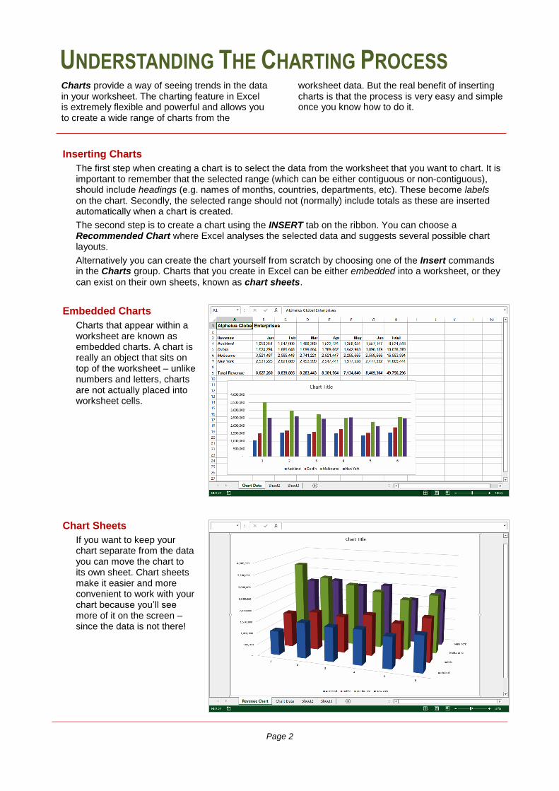
UNDERSTANDING THE CHARTING PROCESS
Charts provide a way of seeing trends in the data in your worksheet. The charting feature in Excel is extremely flexible and powerful and allows you to create a wide range of charts from the
worksheet data. But the real benefit of inserting charts is that the process is very easy and simple once you know how to do it.
Inserting Charts
The first step when creating a chart is to select the data from the worksheet that you want to chart. It is important to remember that the selected range (which can be either contiguous or non-contiguous), should include headings (e.g. names of months, countries, departments, etc). These become labels on the chart. Secondly, the selected range should not (normally) include totals as these are inserted automatically when a chart is created.
The second step is to create a chart using the INSERT tab on the ribbon. You can choose a Recommended Chart where Excel analyses the selected data and suggests several possible chart layouts.
Alternatively you can create the chart yourself from scratch by choosing one of the Insert commands in the Charts group. Charts that you create in Excel can be either embedded into a worksheet, or they
can exist on their own sheets, known as chart sheets.
Chart Sheets
If you want to keep your chart separate from the data you can move the chart to its own sheet. Chart sheets make it easier and more convenient to work with your chart because you’ll see more of it on the screen – since the data is not there!
Embedded Charts
Charts that appear within a worksheet are known as embedded charts. A chart is really an object that sits on top of the worksheet – unlike numbers and letters, charts are not actually placed into worksheet cells.
Microsoft Excel 2013
Information Services Page 3 Creating Charts
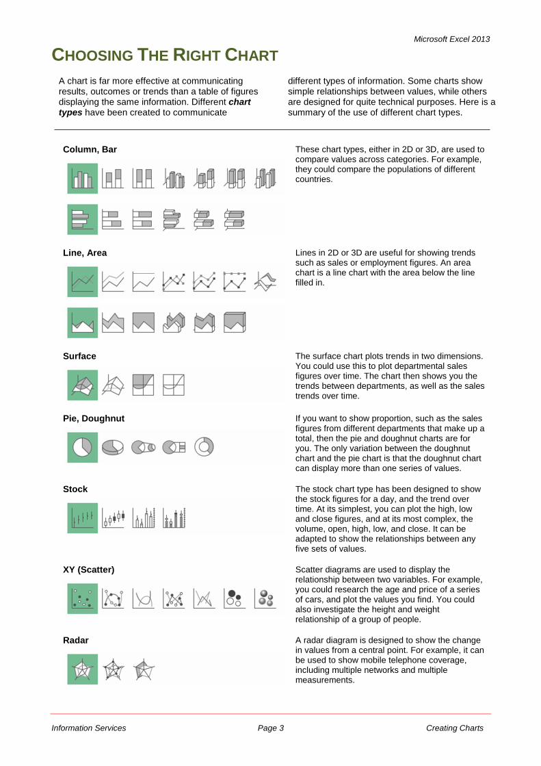
CHOOSING THE RIGHT CHART
Column, Bar
These chart types, either in 2D or 3D, are used to compare values across categories. For example, they could compare the populations of different countries.
Line, Area
Lines in 2D or 3D are useful for showing trends such as sales or employment figures. An area chart is a line chart with the area below the line filled in.
Surface
The surface chart plots trends in two dimensions. You could use this to plot departmental sales figures over time. The chart then shows you the trends between departments, as well as the sales trends over time.
Pie, Doughnut
If you want to show proportion, such as the sales figures from different departments that make up a total, then the pie and doughnut charts are for you. The only variation between the doughnut chart and the pie chart is that the doughnut chart can display more than one series of values.
Stock
The stock chart type has been designed to show the stock figures for a day, and the trend over time. At its simplest, you can plot the high, low and close figures, and at its most complex, the volume, open, high, low, and close. It can be adapted to show the relationships between any five sets of values.
XY (Scatter)
Scatter diagrams are used to display the relationship between two variables. For example, you could research the age and price of a series of cars, and plot the values you find. You could also investigate the height and weight relationship of a group of people.
Radar
A radar diagram is designed to show the change in values from a central point. For example, it can be used to show mobile telephone coverage, including multiple networks and multiple measurements.
A chart is far more effective at communicating results, outcomes or trends than a table of figures displaying the same information. Different chart types have been created to communicate
different types of information. Some charts show simple relationships between values, while others are designed for quite technical purposes. Here is a summary of the use of different chart types.
Microsoft Excel 2013
Information Services Page 4 Creating Charts
USING A RECOMMENDED CHART
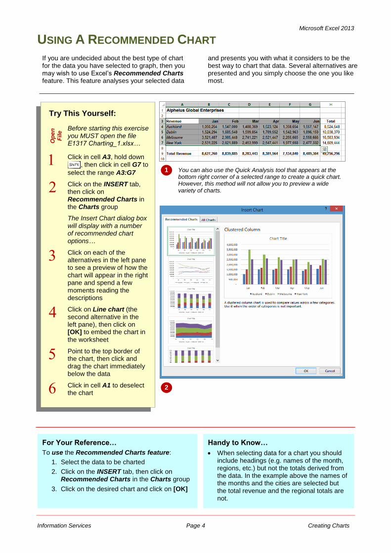
If you are undecided about the best type of chart for the data you have selected to graph, then you may wish to use Excel’s Recommended Charts feature. This feature analyses your selected data
and presents you with what it considers to be the best way to chart that data. Several alternatives are presented and you simply choose the one you like most.
Try This Yourself:
Op
en
Fil
e Before starting this exercise
you MUST open the file E1317 Charting_1.xlsx…
Click in cell A3, hold down , then click in cell G7 to
select the range A3:G7
Click on the INSERT tab, then click on Recommended Charts in the Charts group
The Insert Chart dialog box will display with a number of recommended chart options…
Click on each of the alternatives in the left pane to see a preview of how the chart will appear in the right pane and spend a few moments reading the descriptions
Click on Line chart (the second alternative in the left pane), then click on [OK] to embed the chart in the worksheet
Point to the top border of the chart, then click and drag the chart immediately below the data
Click in cell A1 to deselect the chart
1 You can also use the Quick Analysis tool that appears at the bottom right corner of a selected range to create a quick chart. However, this method will not allow you to preview a wide variety of charts.
2
For Your Reference…
To use the Recommended Charts feature:
1. Select the data to be charted
2. Click on the INSERT tab, then click on Recommended Charts in the Charts group
3. Click on the desired chart and click on [OK]
Handy to Know…
When selecting data for a chart you should include headings (e.g. names of the month, regions, etc.) but not the totals derived from the data. In the example above the names of the months and the cities are selected but the total revenue and the regional totals are not.
Microsoft Excel 2013
Information Services Page 5 Creating Charts
CREATING A NEW CHART FROM SCRATCH
Try This Yourself:
Op
en
Fil
e
Before starting this exercise you MUST open the file E1317 Charting_1.xlsx…
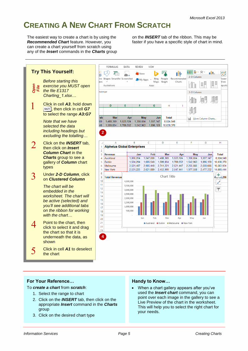
Click in cell A3, hold down , then click in cell G7
to select the range A3:G7
Note that we have selected the data including headings but excluding the totalling…
Click on the INSERT tab, then click on Insert Column Chart in the Charts group to see a gallery of Column chart types
Under 2-D Column, click on Clustered Column
The chart will be embedded in the worksheet. The chart will be active (selected) and you’ll see additional tabs on the ribbon for working with the chart…
Point to the chart, then click to select it and drag the chart so that it is underneath the data, as shown
Click in cell A1 to deselect the chart
2
For Your Reference…
To create a chart from scratch:
1. Select the range to chart
2. Click on the INSERT tab, then click on the appropriate Insert command in the Charts group
3. Click on the desired chart type
The easiest way to create a chart is by using the Recommended Chart feature. However, you can create a chart yourself from scratch using any of the Insert commands in the Charts group
on the INSERT tab of the ribbon. This may be faster if you have a specific style of chart in mind.
Handy to Know…
When a chart gallery appears after you’ve used the Insert chart command, you can point over each image in the gallery to see a Live Preview of the chart in the worksheet. This will help you to select the right chart for your needs.
4
Microsoft Excel 2013
Information Services Page 6 Creating Charts
WORKING WITH AN EMBEDDED CHART
2
Try This Yourself:
Sa
me
Fil
e
Continue using the previous file with this exercise, or open the file E1317 Charting_2.xlsx...
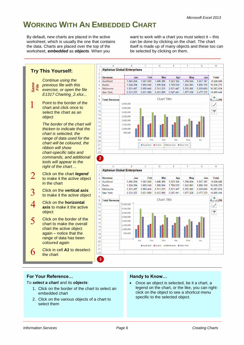
Point to the border of the chart and click once to select the chart as an object
The border of the chart will thicken to indicate that the chart is selected, the range of data used for the chart will be coloured, the ribbon will show chart-specific tabs and commands, and additional tools will appear to the right of the chart…
Click on the chart legend to make it the active object in the chart
Click on the vertical axis to make it the active object
Click on the horizontal axis to make it the active object
Click on the border of the chart to make the overall chart the active object again – notice that the range of data has been coloured again
Click in cell A1 to deselect the chart
By default, new charts are placed in the active worksheet, which is usually the one that contains the data. Charts are placed over the top of the worksheet, embedded as objects. When you
want to work with a chart you must select it – this can be done by clicking on the chart. The chart itself is made up of many objects and these too can be selected by clicking on them.
For Your Reference…
To select a chart and its objects:
1. Click on the border of the chart to select an embedded chart
2. Click on the various objects of a chart to select them
Handy to Know…
Once an object is selected, be it a chart, a legend on the chart, or the like, you can right-click on the object to see a shortcut menu specific to the selected object.
3
Microsoft Excel 2013
Information Services Page 7 Creating Charts
RESIZING A CHART
Try This Yourself:
Sa
me
File Continue using the
previous file with this exercise, or open the file E1317 Charting_3.xlsx...
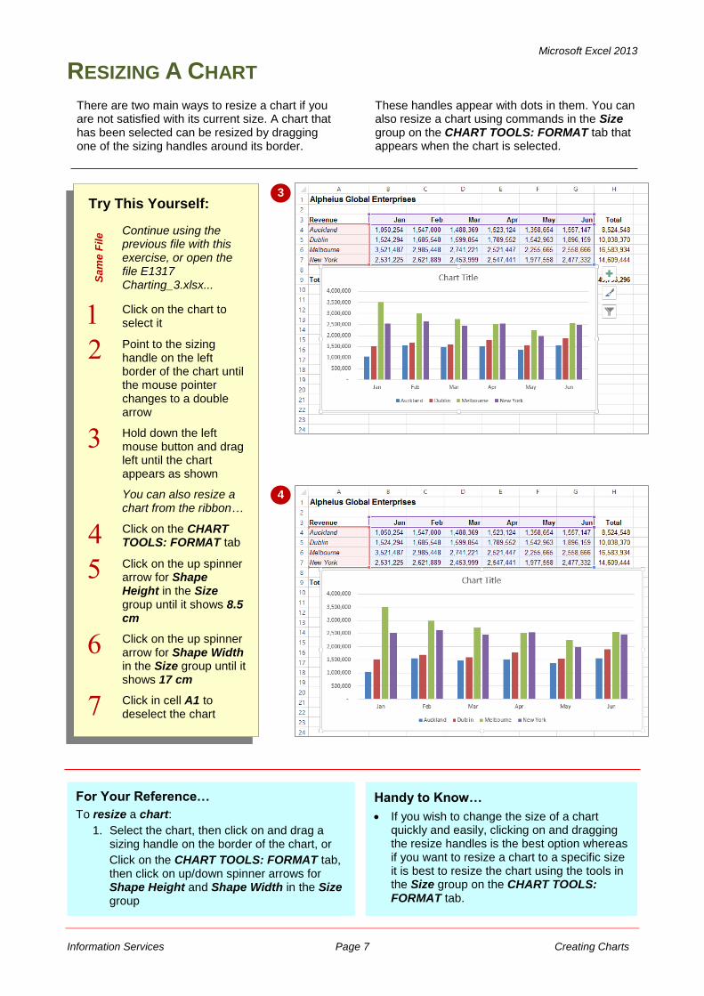
Click on the chart to select it
Point to the sizing handle on the left border of the chart until the mouse pointer changes to a double arrow
Hold down the left mouse button and drag left until the chart appears as shown
You can also resize a chart from the ribbon…
Click on the CHART TOOLS: FORMAT tab
Click on the up spinner arrow for Shape Height in the Size group until it shows 8.5 cm
Click on the up spinner arrow for Shape Width in the Size group until it shows 17 cm
Click in cell A1 to deselect the chart
3
For Your Reference…
To resize a chart:
1. Select the chart, then click on and drag a sizing handle on the border of the chart, or
Click on the CHART TOOLS: FORMAT tab, then click on up/down spinner arrows for Shape Height and Shape Width in the Size group
There are two main ways to resize a chart if you are not satisfied with its current size. A chart that has been selected can be resized by dragging one of the sizing handles around its border.
These handles appear with dots in them. You can also resize a chart using commands in the Size group on the CHART TOOLS: FORMAT tab that appears when the chart is selected.
4
Handy to Know…
If you wish to change the size of a chart quickly and easily, clicking on and dragging the resize handles is the best option whereas if you want to resize a chart to a specific size it is best to resize the chart using the tools in the Size group on the CHART TOOLS: FORMAT tab.
Microsoft Excel 2013
Information Services Page 8 Creating Charts
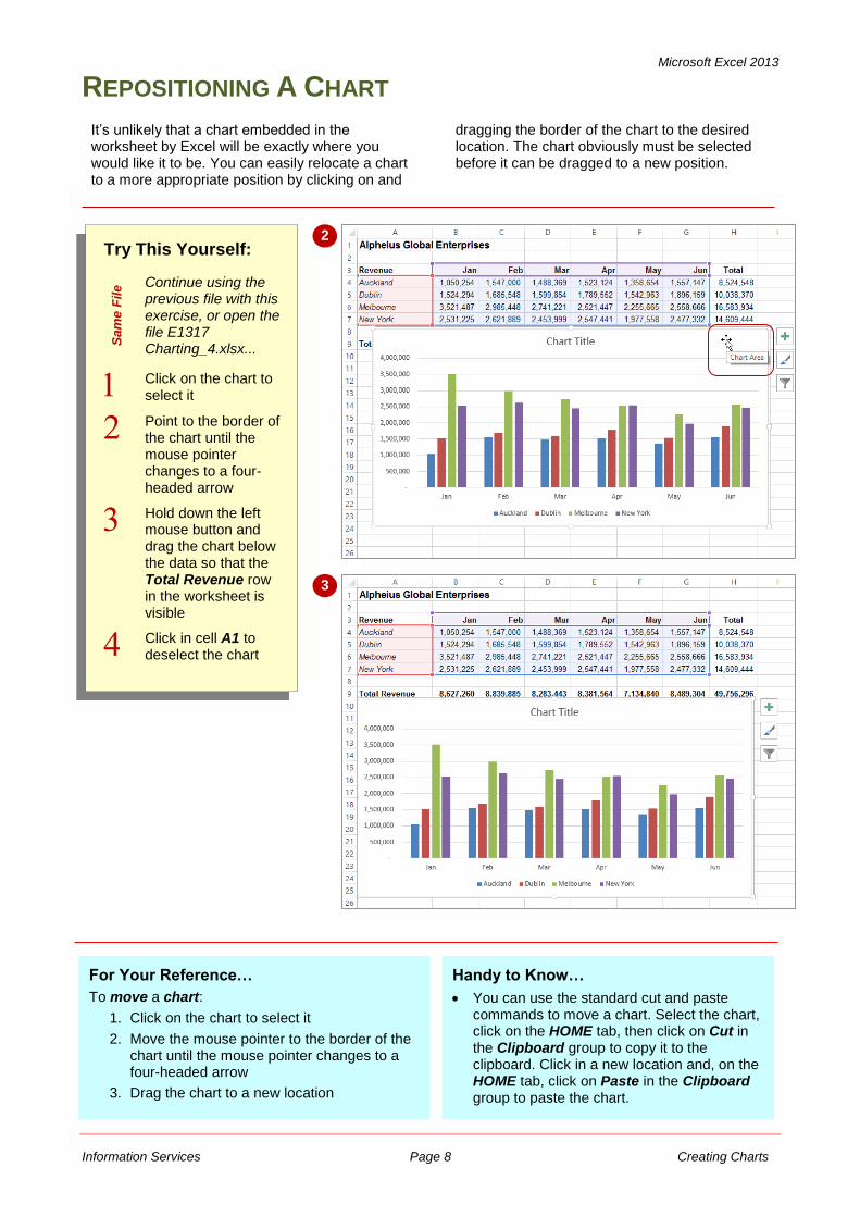
REPOSITIONING A CHART
Try This Yourself:
Sa
me
File Continue using the
previous file with this exercise, or open the file E1317 Charting_4.xlsx...
Click on the chart to select it
Point to the border of the chart until the mouse pointer changes to a four-headed arrow
Hold down the left mouse button and drag the chart below the data so that the Total Revenue row in the worksheet is visible
Click in cell A1 to deselect the chart
2
It’s unlikely that a chart embedded in the worksheet by Excel will be exactly where you would like it to be. You can easily relocate a chart to a more appropriate position by clicking on and
dragging the border of the chart to the desired location. The chart obviously must be selected before it can be dragged to a new position.
For Your Reference…
To move a chart:
1. Click on the chart to select it
2. Move the mouse pointer to the border of the chart until the mouse pointer changes to a four-headed arrow
3. Drag the chart to a new location
Handy to Know…
You can use the standard cut and paste commands to move a chart. Select the chart, click on the HOME tab, then click on Cut in the Clipboard group to copy it to the clipboard. Click in a new location and, on the HOME tab, click on Paste in the Clipboard group to paste the chart.
3
Microsoft Excel 2013
Information Services Page 9 Creating Charts
PRINTING AN EMBEDDED CHART
Try This Yourself:
Op
en
Fil
e
Before starting this exercise you MUST open the file E1317 Charting_5.xlsx…
Click on the FILE tab, then click on Print to see a preview of the data and the chart
Not all of the chart or data may be visible so we’ll change the orientation to landscape…
Click on Portrait Orientation in Settings then select Landscape Orientation
Click on [Print] to print the chart
If you don’t have a printer connected or you don’t wish to print, click on the Back arrow to display the workbook again
1
When you print a worksheet, Excel will print whatever is in or embedded in that worksheet (including charts). This makes it easy and convenient to print both the chart and its
underlying data. All you need to do is to position the chart in the appropriate location then access the print commands in the usual way.
2
For Your Reference…
To print an embedded chart:
1. Click on the FILE tab, then click on Print
2. Click on [Print]
Handy to Know…
If you only want to print the chart and not the data, click on the chart to select it, click on the FILE tab, then click on Print. You will notice that only the chart will appear in the preview.
Microsoft Excel 2013
Information Services Page 10 Creating Charts
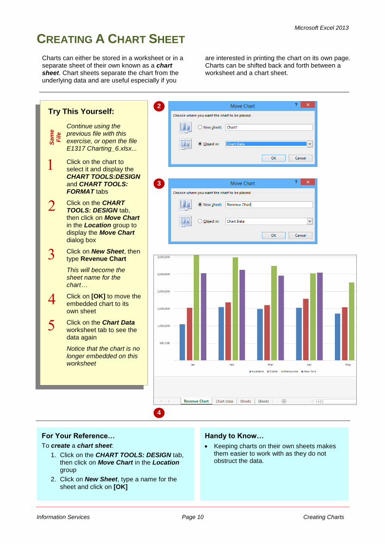
CREATING A CHART SHEET
Charts can either be stored in a worksheet or in a separate sheet of their own known as a chart sheet. Chart sheets separate the chart from the underlying data and are useful especially if you
are interested in printing the chart on its own page. Charts can be shifted back and forth between a worksheet and a chart sheet.
Try This Yourself:
Sa
me
Fil
e
Continue using the previous file with this exercise, or open the file E1317 Charting_6.xlsx...
Click on the chart to select it and display the CHART TOOLS:DESIGN and CHART TOOLS: FORMAT tabs
Click on the CHART TOOLS: DESIGN tab, then click on Move Chart in the Location group to display the Move Chart dialog box
Click on New Sheet, then type Revenue Chart
This will become the sheet name for the chart…
Click on [OK] to move the embedded chart to its own sheet
Click on the Chart Data worksheet tab to see the data again
Notice that the chart is no longer embedded on this worksheet
2
3
4
For Your Reference…
To create a chart sheet:
1. Click on the CHART TOOLS: DESIGN tab, then click on Move Chart in the Location group
2. Click on New Sheet, type a name for the
sheet and click on [OK]
Handy to Know…
Keeping charts on their own sheets makes them easier to work with as they do not obstruct the data.
Microsoft Excel 2013
Information Services Page 11 Creating Charts
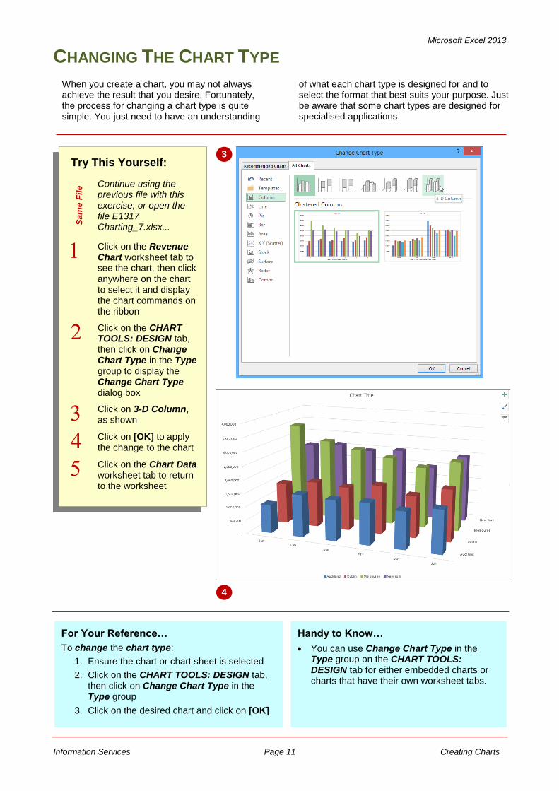
CHANGING THE CHART TYPE
Try This Yourself:
Sa
me
File Continue using the
previous file with this exercise, or open the file E1317 Charting_7.xlsx...
Click on the Revenue Chart worksheet tab to see the chart, then click anywhere on the chart to select it and display the chart commands on the ribbon
Click on the CHART TOOLS: DESIGN tab, then click on Change Chart Type in the Type group to display the Change Chart Type dialog box
Click on 3-D Column, as shown
Click on [OK] to apply the change to the chart
Click on the Chart Data worksheet tab to return to the worksheet
3
When you create a chart, you may not always achieve the result that you desire. Fortunately, the process for changing a chart type is quite simple. You just need to have an understanding
of what each chart type is designed for and to select the format that best suits your purpose. Just be aware that some chart types are designed for specialised applications.
For Your Reference…
To change the chart type:
1. Ensure the chart or chart sheet is selected
2. Click on the CHART TOOLS: DESIGN tab, then click on Change Chart Type in the Type group
3. Click on the desired chart and click on [OK]
Handy to Know…
You can use Change Chart Type in the Type group on the CHART TOOLS: DESIGN tab for either embedded charts or charts that have their own worksheet tabs.
4
Microsoft Excel 2013
Information Services Page 12 Creating Charts
CHANGING THE CHART LAYOUT
Try This Yourself:
Sa
me
Fil
e
Continue using the previous file with this exercise, or open the file E1317 Charting_8.xlsx...
Click on the Revenue Chart worksheet tab to see the chart, then click anywhere on the chart to select it and see the CHART TOOLS: DESIGN and CHART TOOLS: FORMAT tabs
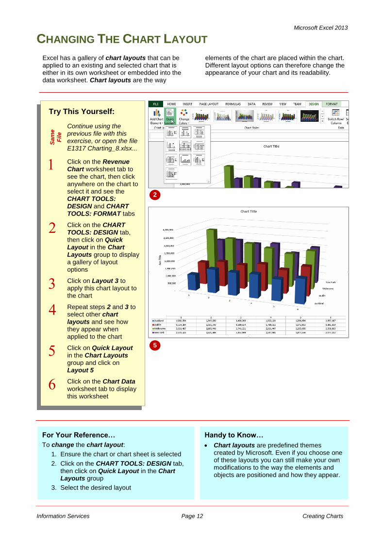
Click on the CHART TOOLS: DESIGN tab, then click on Quick Layout in the Chart Layouts group to display a gallery of layout options
Click on Layout 3 to apply this chart layout to the chart
Repeat steps 2 and 3 to select other chart layouts and see how they appear when applied to the chart
Click on Quick Layout in the Chart Layouts group and click on Layout 5
Click on the Chart Data worksheet tab to display this worksheet
2
Excel has a gallery of chart layouts that can be applied to an existing and selected chart that is either in its own worksheet or embedded into the data worksheet. Chart layouts are the way
elements of the chart are placed within the chart. Different layout options can therefore change the appearance of your chart and its readability.
For Your Reference…
To change the chart layout:
1. Ensure the chart or chart sheet is selected
2. Click on the CHART TOOLS: DESIGN tab, then click on Quick Layout in the Chart Layouts group
3. Select the desired layout
Handy to Know…
Chart layouts are predefined themes created by Microsoft. Even if you choose one of these layouts you can still make your own modifications to the way the elements and objects are positioned and how they appear.
5
Microsoft Excel 2013
Information Services Page 13 Creating Charts
CHANGING THE CHART STYLE
Try This Yourself:
Sa
me
File Continue using the
previous file with this exercise, or open the file E1317 Charting_9.xlsx...
Click on the Revenue Chart worksheet tab to see the chart, then click anywhere on the chart to select it
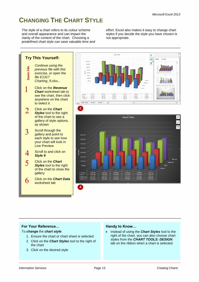
Click on the Chart Styles tool to the right of the chart to see a gallery of style options, as shown
Scroll through the gallery and point to each style to see how your chart will look in Live Preview
Scroll to and click on Style 9
Click on the Chart Styles tool to the right of the chart to close the gallery
Click on the Chart Data worksheet tab
2
The style of a chart refers to its colour scheme and overall appearance and can impact the clarity of the content of the chart. Choosing a predefined chart style can save valuable time and
effort. Excel also makes it easy to change chart styles if you decide the style you have chosen is not appropriate.
For Your Reference…
To change the chart style:
1. Ensure the chart or chart sheet is selected
2. Click on the Chart Styles tool to the right of the chart
3. Click on the desired style
Handy to Know…
Instead of using the Chart Styles tool to the right of the chart, you can also choose chart styles from the CHART TOOLS: DESIGN tab on the ribbon when a chart is selected.
4
Microsoft Excel 2013
Information Services Page 14 Creating Charts
PRINTING A CHART SHEET
Try This Yourself:
Sa
me
Fil
e
Continue using the previous file with this exercise, or open the file E1317 Charting_10.xlsx...
Click on the Revenue Chart worksheet tab
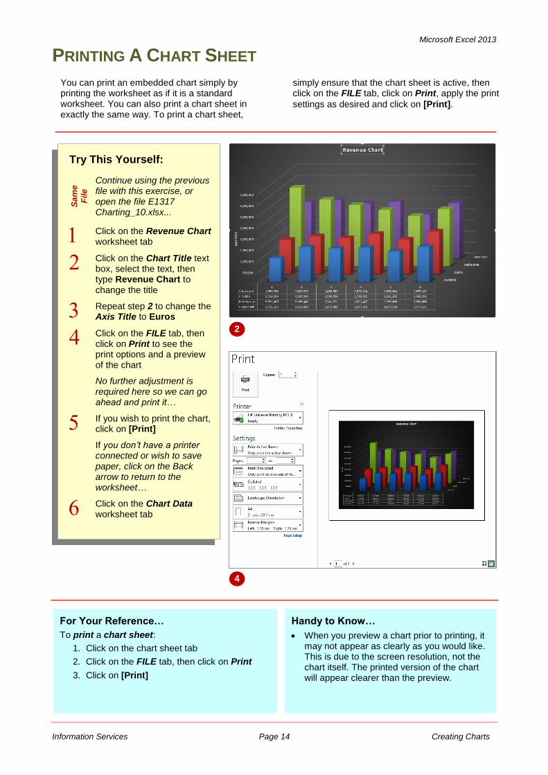
Click on the Chart Title text box, select the text, then type Revenue Chart to change the title
Repeat step 2 to change the Axis Title to Euros
Click on the FILE tab, then click on Print to see the print options and a preview of the chart
No further adjustment is required here so we can go ahead and print it…
If you wish to print the chart, click on [Print]
If you don’t have a printer connected or wish to save paper, click on the Back arrow to return to the worksheet…
Click on the Chart Data worksheet tab
2
For Your Reference…
To print a chart sheet:
1. Click on the chart sheet tab
2. Click on the FILE tab, then click on Print
3. Click on [Print]
You can print an embedded chart simply by printing the worksheet as if it is a standard worksheet. You can also print a chart sheet in exactly the same way. To print a chart sheet,
simply ensure that the chart sheet is active, then click on the FILE tab, click on Print, apply the print
settings as desired and click on [Print].
Handy to Know…
When you preview a chart prior to printing, it may not appear as clearly as you would like. This is due to the screen resolution, not the chart itself. The printed version of the chart will appear clearer than the preview.
4
Microsoft Excel 2013
Information Services Page 15 Creating Charts
EMBEDDING A CHART INTO A WORKSHEET
Try This Yourself:
Sa
me
File Continue using the
previous file with this exercise, or open the file E1317 Charting_11.xlsx...
Click on the Revenue Chart worksheet tab
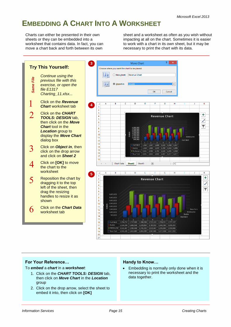
Click on the CHART TOOLS: DESIGN tab, then click on the Move Chart tool in the Location group to display the Move Chart dialog box
Click on Object in, then click on the drop arrow and click on Sheet 2
Click on [OK] to move the chart to the worksheet
Reposition the chart by dragging it to the top left of the sheet, then drag the resizing handles to resize it as shown
Click on the Chart Data worksheet tab
Charts can either be presented in their own sheets or they can be embedded into a worksheet that contains data. In fact, you can move a chart back and forth between its own
sheet and a worksheet as often as you wish without impacting at all on the chart. Sometimes it is easier to work with a chart in its own sheet, but it may be necessary to print the chart with its data.
3
4
For Your Reference…
To embed a chart in a worksheet:
1. Click on the CHART TOOLS: DESIGN tab, then click on Move Chart in the Location group
2. Click on the drop arrow, select the sheet to
embed it into, then click on [OK]
5
Handy to Know…
Embedding is normally only done when it is necessary to print the worksheet and the data together.
Microsoft Excel 2013
Information Services Page 16 Creating Charts
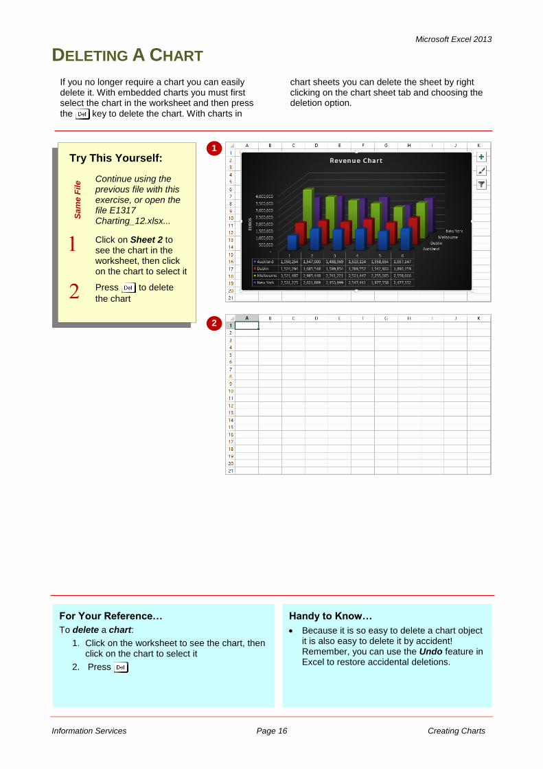
DELETING A CHART
Try This Yourself:
Sa
me
File Continue using the
previous file with this exercise, or open the file E1317 Charting_12.xlsx...
Click on Sheet 2 to see the chart in the worksheet, then click on the chart to select it
Press to delete
the chart
1
For Your Reference…
To delete a chart:
1. Click on the worksheet to see the chart, then click on the chart to select it
2. Press
If you no longer require a chart you can easily delete it. With embedded charts you must first select the chart in the worksheet and then press the key to delete the chart. With charts in
chart sheets you can delete the sheet by right clicking on the chart sheet tab and choosing the deletion option.
2
Handy to Know…
Because it is so easy to delete a chart object it is also easy to delete it by accident! Remember, you can use the Undo feature in Excel to restore accidental deletions.
Microsoft Excel 2013
Information Services Page 17 Creating Charts
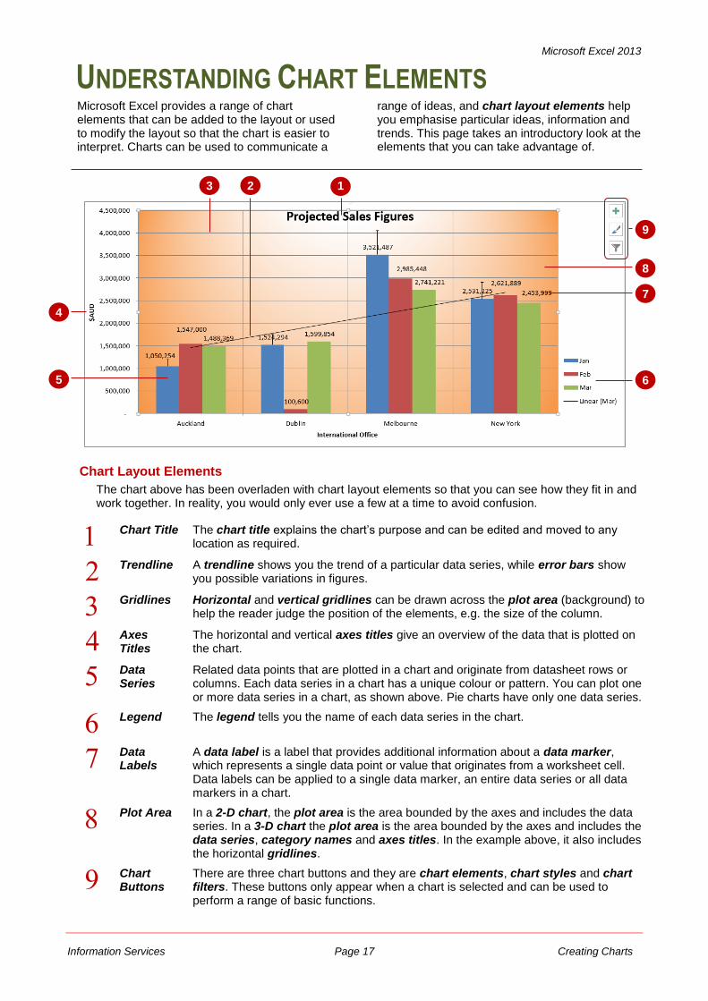
UNDERSTANDING CHART ELEMENTS
Microsoft Excel provides a range of chart elements that can be added to the layout or used to modify the layout so that the chart is easier to interpret. Charts can be used to communicate a
range of ideas, and chart layout elements help you emphasise particular ideas, information and trends. This page takes an introductory look at the elements that you can take advantage of.
1
4
9
6 5
7
8
2
Chart Layout Elements
The chart above has been overladen with chart layout elements so that you can see how they fit in and work together. In reality, you would only ever use a few at a time to avoid confusion.
Chart Title The chart title explains the chart’s purpose and can be edited and moved to any location as required.
Trendline A trendline shows you the trend of a particular data series, while error bars show you possible variations in figures.
Gridlines Horizontal and vertical gridlines can be drawn across the plot area (background) to help the reader judge the position of the elements, e.g. the size of the column.
Axes Titles
The horizontal and vertical axes titles give an overview of the data that is plotted on the chart.
Data Series
Related data points that are plotted in a chart and originate from datasheet rows or columns. Each data series in a chart has a unique colour or pattern. You can plot one or more data series in a chart, as shown above. Pie charts have only one data series.
Legend The legend tells you the name of each data series in the chart.
Data Labels
A data label is a label that provides additional information about a data marker, which represents a single data point or value that originates from a worksheet cell. Data labels can be applied to a single data marker, an entire data series or all data markers in a chart.
Plot Area In a 2-D chart, the plot area is the area bounded by the axes and includes the data series. In a 3-D chart the plot area is the area bounded by the axes and includes the data series, category names and axes titles. In the example above, it also includes the horizontal gridlines.
Chart Buttons
There are three chart buttons and they are chart elements, chart styles and chart filters. These buttons only appear when a chart is selected and can be used to perform a range of basic functions.
3
Microsoft Excel 2013
Information Services Page 18 Creating Charts
ADDING A CHART TITLE
Try This Yourself:
Op
en
Fil
e
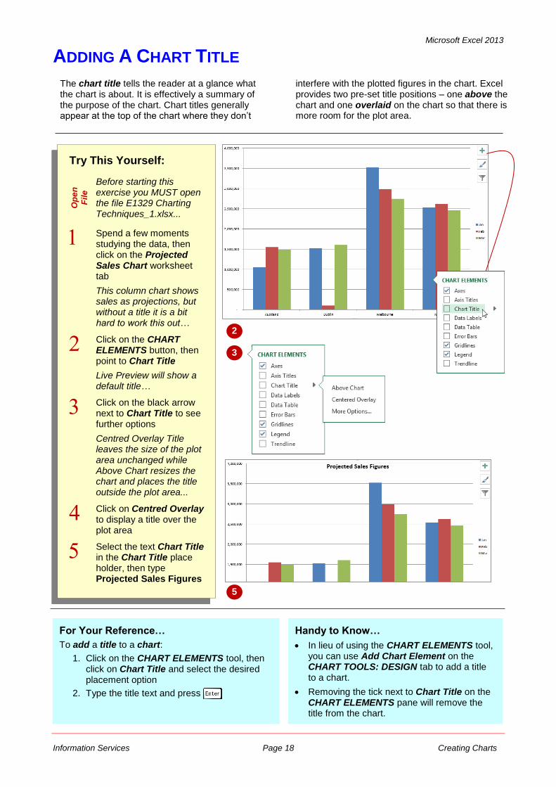
Before starting this exercise you MUST open the file E1329 Charting Techniques_1.xlsx...
Spend a few moments studying the data, then click on the Projected Sales Chart worksheet tab
This column chart shows sales as projections, but without a title it is a bit hard to work this out…
Click on the CHART ELEMENTS button, then point to Chart Title
Live Preview will show a default title…
Click on the black arrow next to Chart Title to see further options
Centred Overlay Title leaves the size of the plot area unchanged while Above Chart resizes the chart and places the title outside the plot area...
Click on Centred Overlay to display a title over the plot area
Select the text Chart Title in the Chart Title place holder, then type Projected Sales Figures
For Your Reference…
To add a title to a chart:
1. Click on the CHART ELEMENTS tool, then click on Chart Title and select the desired placement option
2. Type the title text and press
Handy to Know…
In lieu of using the CHART ELEMENTS tool, you can use Add Chart Element on the CHART TOOLS: DESIGN tab to add a title to a chart.
Removing the tick next to Chart Title on the CHART ELEMENTS pane will remove the title from the chart.
The chart title tells the reader at a glance what the chart is about. It is effectively a summary of the purpose of the chart. Chart titles generally appear at the top of the chart where they don’t
interfere with the plotted figures in the chart. Excel provides two pre-set title positions – one above the chart and one overlaid on the chart so that there is more room for the plot area.
2
3
5
Microsoft Excel 2013
Information Services Page 19 Creating Charts
ADDING AXES TITLES
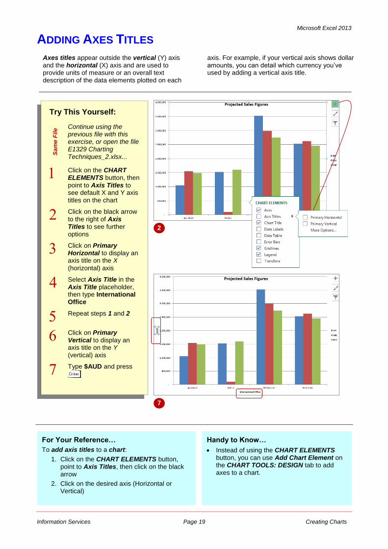
Axes titles appear outside the vertical (Y) axis and the horizontal (X) axis and are used to provide units of measure or an overall text description of the data elements plotted on each
axis. For example, if your vertical axis shows dollar amounts, you can detail which currency you’ve used by adding a vertical axis title.
Try This Yourself:
Sa
me
File Continue using the
previous file with this exercise, or open the file E1329 Charting Techniques_2.xlsx...
Click on the CHART ELEMENTS button, then point to Axis Titles to see default X and Y axis titles on the chart
Click on the black arrow to the right of Axis Titles to see further options
Click on Primary Horizontal to display an axis title on the X (horizontal) axis
Select Axis Title in the Axis Title placeholder, then type International Office
Repeat steps 1 and 2
Click on Primary Vertical to display an axis title on the Y (vertical) axis
Type $AUD and press
2
For Your Reference…
To add axis titles to a chart:
1. Click on the CHART ELEMENTS button, point to Axis Titles, then click on the black arrow
2. Click on the desired axis (Horizontal or Vertical)
Handy to Know…
Instead of using the CHART ELEMENTS button, you can use Add Chart Element on the CHART TOOLS: DESIGN tab to add axes to a chart.
7
Microsoft Excel 2013
Information Services Page 20 Creating Charts
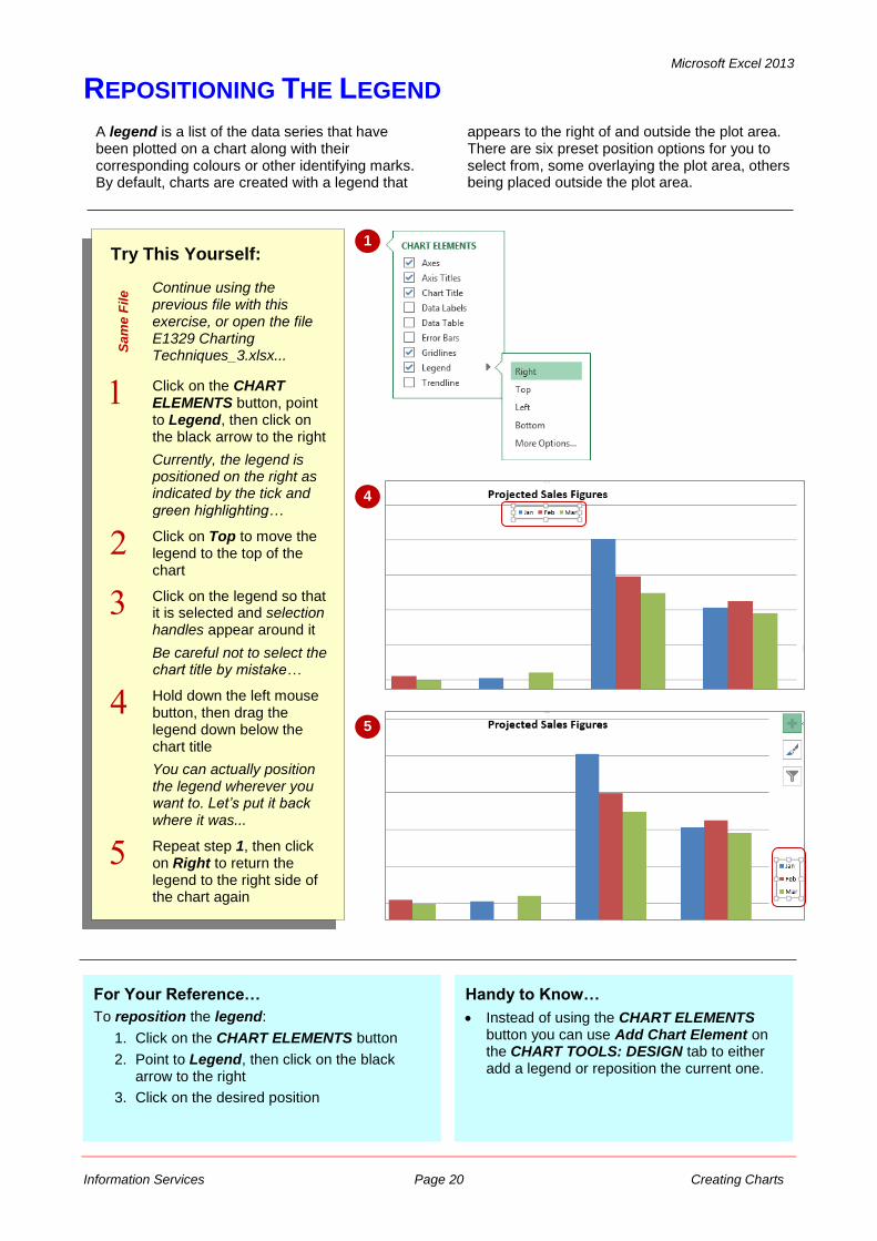
REPOSITIONING THE LEGEND
A legend is a list of the data series that have been plotted on a chart along with their corresponding colours or other identifying marks. By default, charts are created with a legend that
appears to the right of and outside the plot area. There are six preset position options for you to select from, some overlaying the plot area, others being placed outside the plot area.
Try This Yourself:
Sa
me
File Continue using the
previous file with this exercise, or open the file E1329 Charting Techniques_3.xlsx...
Click on the CHART ELEMENTS button, point to Legend, then click on the black arrow to the right
Currently, the legend is positioned on the right as indicated by the tick and green highlighting…
Click on Top to move the legend to the top of the chart
Click on the legend so that it is selected and selection handles appear around it
Be careful not to select the chart title by mistake…
Hold down the left mouse button, then drag the legend down below the chart title
You can actually position the legend wherever you want to. Let’s put it back where it was...
Repeat step 1, then click on Right to return the legend to the right side of the chart again
1
4
For Your Reference…
To reposition the legend:
1. Click on the CHART ELEMENTS button
2. Point to Legend, then click on the black arrow to the right
3. Click on the desired position
Handy to Know…
Instead of using the CHART ELEMENTS button you can use Add Chart Element on the CHART TOOLS: DESIGN tab to either add a legend or reposition the current one.
5
Microsoft Excel 2013
Information Services Page 21 Creating Charts
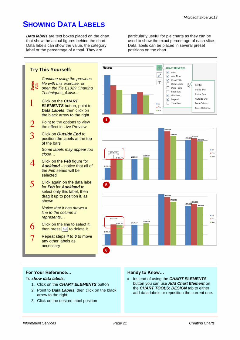
SHOWING DATA LABELS
Data labels are text boxes placed on the chart that show the actual figures behind the chart. Data labels can show the value, the category label or the percentage of a total. They are
particularly useful for pie charts as they can be used to show the exact percentage of each slice. Data labels can be placed in several preset positions on the chart.
Try This Yourself:
Sa
me
Fil
e
Continue using the previous file with this exercise, or open the file E1329 Charting Techniques_4.xlsx...
Click on the CHART ELEMENTS button, point to Data Labels, then click on the black arrow to the right
Point to the options to view the effect in Live Preview
Click on Outside End to position the labels at the top of the bars
Some labels may appear too close…
Click on the Feb figure for Auckland – notice that all of the Feb series will be selected
Click again on the data label for Feb for Auckland to select only this label, then drag it up to position it, as shown
Notice that it has drawn a line to the column it represents…
Click on the line to select it, then press to delete it
Repeat steps 4 to 6 to move any other labels as necessary
1
For Your Reference…
To show data labels:
1. Click on the CHART ELEMENTS button
2. Point to Data Labels, then click on the black arrow to the right
3. Click on the desired label position
Handy to Know…
Instead of using the CHART ELEMENTS button you can use Add Chart Element on the CHART TOOLS: DESIGN tab to either add data labels or reposition the current one.
6
5
Microsoft Excel 2013
Information Services Page 22 Creating Charts
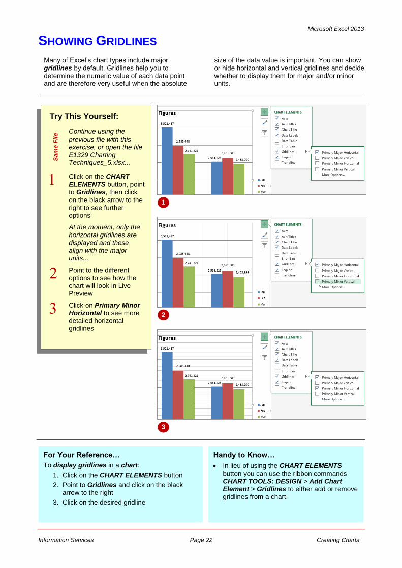
SHOWING GRIDLINES
Try This Yourself:
Sa
me
File Continue using the
previous file with this exercise, or open the file E1329 Charting Techniques_5.xlsx...
Click on the CHART ELEMENTS button, point to Gridlines, then click on the black arrow to the right to see further options
At the moment, only the horizontal gridlines are displayed and these align with the major units...
Point to the different options to see how the chart will look in Live Preview
Click on Primary Minor Horizontal to see more detailed horizontal gridlines
Many of Excel’s chart types include major gridlines by default. Gridlines help you to determine the numeric value of each data point and are therefore very useful when the absolute
size of the data value is important. You can show or hide horizontal and vertical gridlines and decide whether to display them for major and/or minor units.
1
For Your Reference…
To display gridlines in a chart:
1. Click on the CHART ELEMENTS button
2. Point to Gridlines and click on the black arrow to the right
3. Click on the desired gridline
Handy to Know…
In lieu of using the CHART ELEMENTS button you can use the ribbon commands CHART TOOLS: DESIGN > Add Chart Element > Gridlines to either add or remove gridlines from a chart.
2
3
Microsoft Excel 2013
Information Services Page 23 Creating Charts
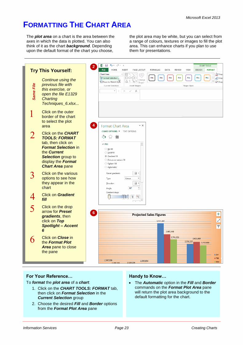
FORMATTING THE CHART AREA
The plot area on a chart is the area between the axes in which the data is plotted. You can also think of it as the chart background. Depending upon the default format of the chart you choose,
the plot area may be white, but you can select from a range of colours, textures or images to fill the plot area. This can enhance charts if you plan to use them for presentations.
Try This Yourself:
Sa
me
File Continue using the
previous file with this exercise, or open the file E1329 Charting Techniques_6.xlsx...
Click on the outer border of the chart to select the plot area
Click on the CHART TOOLS: FORMAT tab, then click on Format Selection in the Current Selection group to display the Format Chart Area pane
Click on the various options to see how they appear in the chart
Click on Gradient fill
Click on the drop arrow for Preset gradients, then click on Top Spotlight – Accent 6
Click on Close in the Format Plot Area pane to close the pane
2
4
For Your Reference…
To format the plot area of a chart:
1. Click on the CHART TOOLS: FORMAT tab, then click on Format Selection in the Current Selection group
2. Choose the desired Fill and Border options from the Format Plot Area pane
Handy to Know…
The Automatic option in the Fill and Border commands on the Format Plot Area pane will return the plot area background to the default formatting for the chart.
6
Microsoft Excel 2013
Information Services Page 24 Creating Charts
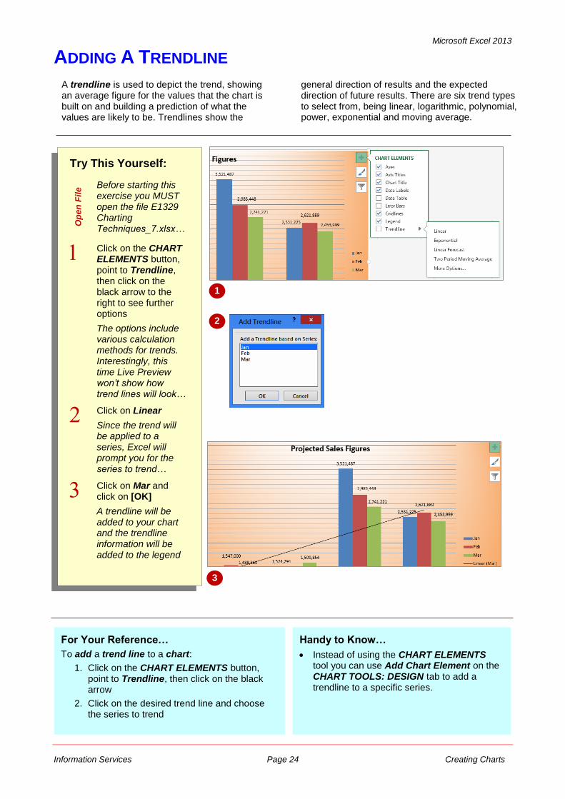
ADDING A TRENDLINE
A trendline is used to depict the trend, showing an average figure for the values that the chart is built on and building a prediction of what the values are likely to be. Trendlines show the
general direction of results and the expected direction of future results. There are six trend types to select from, being linear, logarithmic, polynomial, power, exponential and moving average.
Try This Yourself:
Op
en
Fil
e Before starting this
exercise you MUST open the file E1329 Charting Techniques_7.xlsx…
Click on the CHART ELEMENTS button, point to Trendline, then click on the black arrow to the right to see further options
The options include various calculation methods for trends. Interestingly, this time Live Preview won’t show how trend lines will look…
Click on Linear
Since the trend will be applied to a series, Excel will prompt you for the series to trend…
Click on Mar and click on [OK]
A trendline will be added to your chart and the trendline information will be added to the legend
1
2
For Your Reference…
To add a trend line to a chart:
1. Click on the CHART ELEMENTS button, point to Trendline, then click on the black arrow
2. Click on the desired trend line and choose the series to trend
Handy to Know…
Instead of using the CHART ELEMENTS tool you can use Add Chart Element on the CHART TOOLS: DESIGN tab to add a trendline to a specific series.
3
Microsoft Excel 2013
Information Services Page 25 Creating Charts
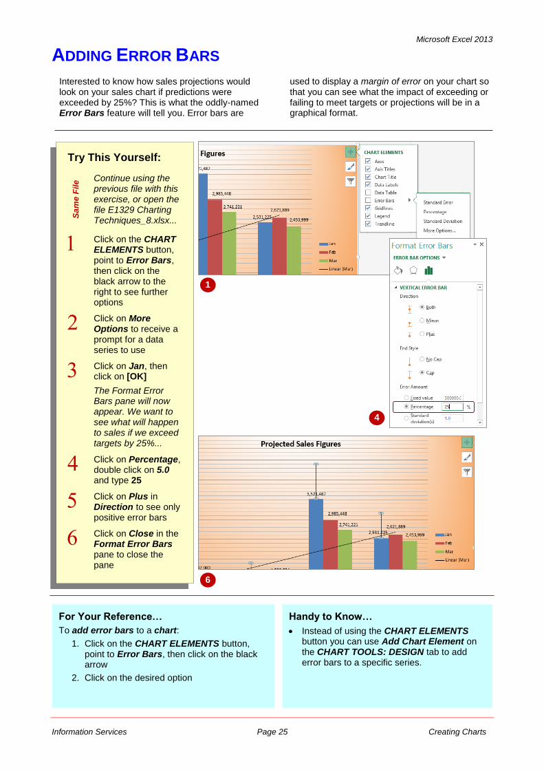
ADDING ERROR BARS
Interested to know how sales projections would look on your sales chart if predictions were exceeded by 25%? This is what the oddly-named Error Bars feature will tell you. Error bars are
used to display a margin of error on your chart so that you can see what the impact of exceeding or failing to meet targets or projections will be in a graphical format.
Try This Yourself:
Sa
me
File Continue using the
previous file with this exercise, or open the file E1329 Charting Techniques_8.xlsx...
Click on the CHART ELEMENTS button, point to Error Bars, then click on the black arrow to the right to see further options
Click on More Options to receive a prompt for a data series to use
Click on Jan, then click on [OK]
The Format Error Bars pane will now appear. We want to see what will happen to sales if we exceed targets by 25%...
Click on Percentage, double click on 5.0 and type 25
Click on Plus in Direction to see only positive error bars
Click on Close in the Format Error Bars pane to close the pane
1
For Your Reference…
To add error bars to a chart:
1. Click on the CHART ELEMENTS button, point to Error Bars, then click on the black arrow
2. Click on the desired option
4
6
Handy to Know…
Instead of using the CHART ELEMENTS button you can use Add Chart Element on the CHART TOOLS: DESIGN tab to add error bars to a specific series.
Microsoft Excel 2013
Information Services Page 26 Creating Charts
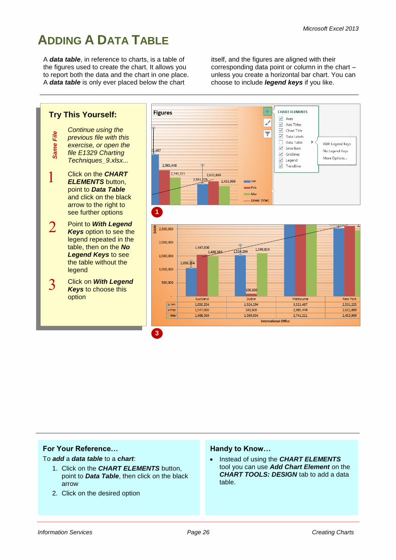
ADDING A DATA TABLE
Try This Yourself:
Sa
me
File Continue using the
previous file with this exercise, or open the file E1329 Charting Techniques_9.xlsx...
Click on the CHART ELEMENTS button, point to Data Table and click on the black arrow to the right to see further options
Point to With Legend Keys option to see the legend repeated in the table, then on the No Legend Keys to see the table without the legend
Click on With Legend Keys to choose this option
A data table, in reference to charts, is a table of the figures used to create the chart. It allows you to report both the data and the chart in one place. A data table is only ever placed below the chart
itself, and the figures are aligned with their corresponding data point or column in the chart – unless you create a horizontal bar chart. You can choose to include legend keys if you like.
1
For Your Reference…
To add a data table to a chart:
1. Click on the CHART ELEMENTS button, point to Data Table, then click on the black arrow
2. Click on the desired option
Handy to Know…
Instead of using the CHART ELEMENTS tool you can use Add Chart Element on the CHART TOOLS: DESIGN tab to add a data table.
3
Microsoft Excel 2013
Information Services Page 27 Creating Charts
UNDERSTANDING CHART FORMATTING
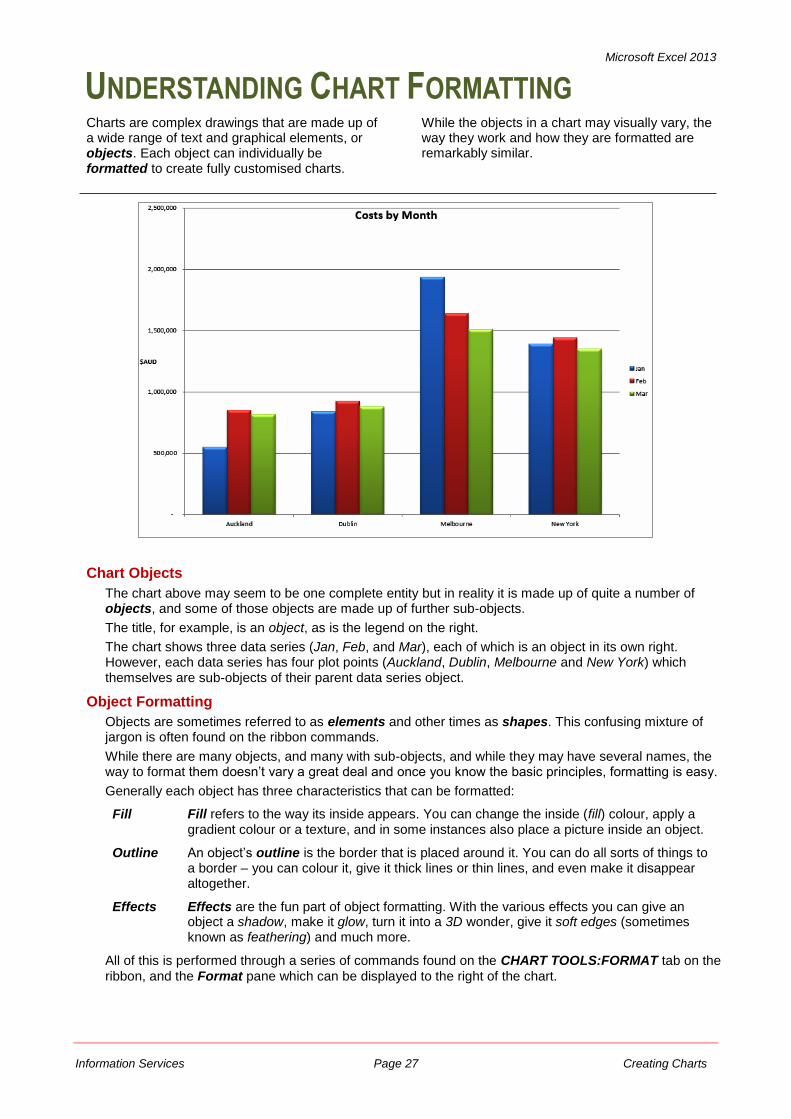
Charts are complex drawings that are made up of a wide range of text and graphical elements, or objects. Each object can individually be formatted to create fully customised charts.
While the objects in a chart may visually vary, the way they work and how they are formatted are remarkably similar.
Chart Objects
The chart above may seem to be one complete entity but in reality it is made up of quite a number of objects, and some of those objects are made up of further sub-objects.
The title, for example, is an object, as is the legend on the right.
The chart shows three data series (Jan, Feb, and Mar), each of which is an object in its own right. However, each data series has four plot points (Auckland, Dublin, Melbourne and New York) which themselves are sub-objects of their parent data series object.
Object Formatting
Objects are sometimes referred to as elements and other times as shapes. This confusing mixture of jargon is often found on the ribbon commands.
While there are many objects, and many with sub-objects, and while they may have several names, the way to format them doesn’t vary a great deal and once you know the basic principles, formatting is easy.
Generally each object has three characteristics that can be formatted:
Fill Fill refers to the way its inside appears. You can change the inside (fill) colour, apply a gradient colour or a texture, and in some instances also place a picture inside an object.
Outline An object’s outline is the border that is placed around it. You can do all sorts of things to a border – you can colour it, give it thick lines or thin lines, and even make it disappear altogether.
Effects Effects are the fun part of object formatting. With the various effects you can give an object a shadow, make it glow, turn it into a 3D wonder, give it soft edges (sometimes known as feathering) and much more.
All of this is performed through a series of commands found on the CHART TOOLS:FORMAT tab on the
ribbon, and the Format pane which can be displayed to the right of the chart.
Microsoft Excel 2013
Information Services Page 28 Creating Charts
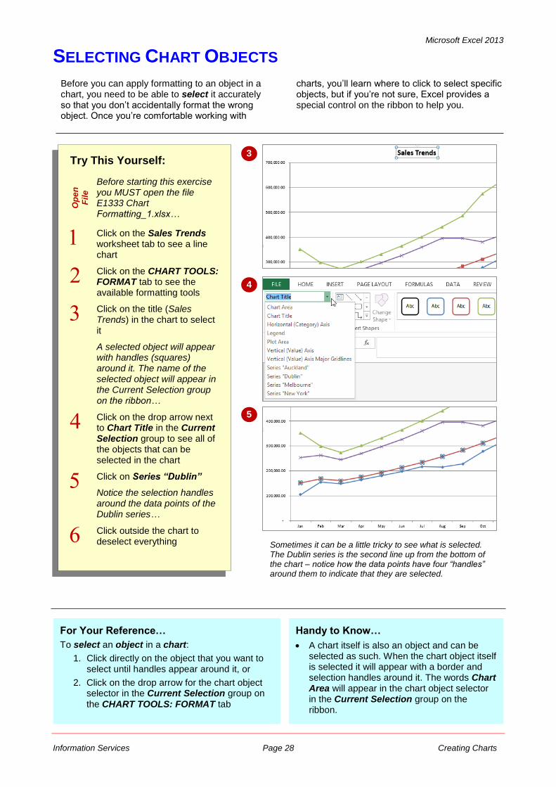
SELECTING CHART OBJECTS
Try This Yourself:
Op
en
Fil
e
Before starting this exercise you MUST open the file E1333 Chart Formatting_1.xlsx…
Click on the Sales Trends worksheet tab to see a line chart
Click on the CHART TOOLS: FORMAT tab to see the available formatting tools
Click on the title (Sales Trends) in the chart to select it
A selected object will appear with handles (squares) around it. The name of the selected object will appear in the Current Selection group on the ribbon…
Click on the drop arrow next to Chart Title in the Current Selection group to see all of the objects that can be selected in the chart
Click on Series “Dublin”
Notice the selection handles around the data points of the Dublin series…
Click outside the chart to deselect everything
For Your Reference…
To select an object in a chart:
1. Click directly on the object that you want to select until handles appear around it, or
2. Click on the drop arrow for the chart object selector in the Current Selection group on the CHART TOOLS: FORMAT tab
Before you can apply formatting to an object in a chart, you need to be able to select it accurately so that you don’t accidentally format the wrong object. Once you’re comfortable working with
charts, you’ll learn where to click to select specific objects, but if you’re not sure, Excel provides a special control on the ribbon to help you.
3
4
Handy to Know…
A chart itself is also an object and can be selected as such. When the chart object itself is selected it will appear with a border and selection handles around it. The words Chart Area will appear in the chart object selector in the Current Selection group on the ribbon.
5
Sometimes it can be a little tricky to see what is selected. The Dublin series is the second line up from the bottom of the chart – notice how the data points have four “handles” around them to indicate that they are selected.
Microsoft Excel 2013
Information Services Page 29 Creating Charts
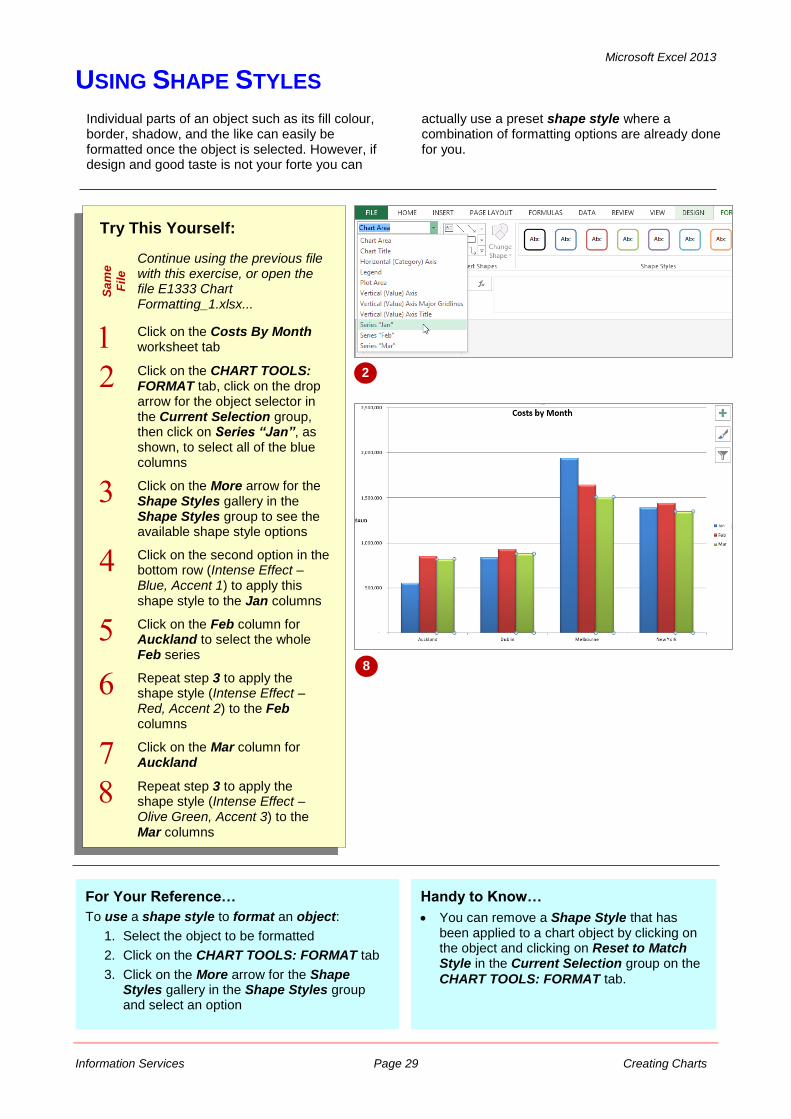
USING SHAPE STYLES
Individual parts of an object such as its fill colour, border, shadow, and the like can easily be formatted once the object is selected. However, if design and good taste is not your forte you can
actually use a preset shape style where a combination of formatting options are already done for you.
Try This Yourself:
Sa
me
Fil
e
Continue using the previous file with this exercise, or open the file E1333 Chart Formatting_1.xlsx...
Click on the Costs By Month worksheet tab
Click on the CHART TOOLS: FORMAT tab, click on the drop arrow for the object selector in the Current Selection group, then click on Series “Jan”, as shown, to select all of the blue columns
Click on the More arrow for the Shape Styles gallery in the Shape Styles group to see the available shape style options
Click on the second option in the bottom row (Intense Effect – Blue, Accent 1) to apply this shape style to the Jan columns
Click on the Feb column for Auckland to select the whole Feb series
Repeat step 3 to apply the shape style (Intense Effect – Red, Accent 2) to the Feb columns
Click on the Mar column for Auckland
Repeat step 3 to apply the shape style (Intense Effect – Olive Green, Accent 3) to the Mar columns
2
3
For Your Reference…
To use a shape style to format an object:
1. Select the object to be formatted
2. Click on the CHART TOOLS: FORMAT tab
3. Click on the More arrow for the Shape Styles gallery in the Shape Styles group and select an option
8
Handy to Know…
You can remove a Shape Style that has been applied to a chart object by clicking on the object and clicking on Reset to Match Style in the Current Selection group on the
CHART TOOLS: FORMAT tab.
Microsoft Excel 2013
Information Services Page 30 Creating Charts
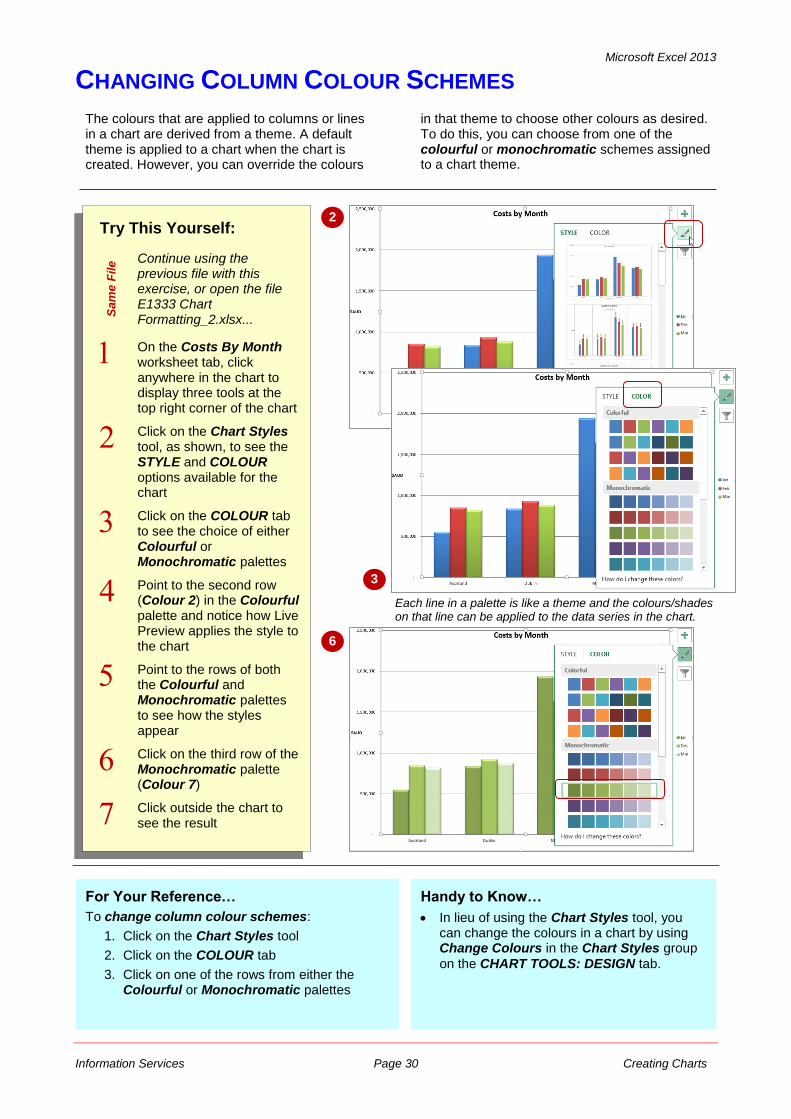
CHANGING COLUMN COLOUR SCHEMES
The colours that are applied to columns or lines in a chart are derived from a theme. A default theme is applied to a chart when the chart is created. However, you can override the colours
in that theme to choose other colours as desired. To do this, you can choose from one of the colourful or monochromatic schemes assigned to a chart theme.
Try This Yourself:
Sa
me
File Continue using the
previous file with this exercise, or open the file E1333 Chart Formatting_2.xlsx...
On the Costs By Month worksheet tab, click anywhere in the chart to display three tools at the top right corner of the chart
Click on the Chart Styles tool, as shown, to see the STYLE and COLOUR options available for the chart
Click on the COLOUR tab to see the choice of either Colourful or Monochromatic palettes
Point to the second row (Colour 2) in the Colourful palette and notice how Live Preview applies the style to the chart
Point to the rows of both the Colourful and Monochromatic palettes to see how the styles appear
Click on the third row of the Monochromatic palette (Colour 7)
Click outside the chart to see the result
2
For Your Reference…
To change column colour schemes:
1. Click on the Chart Styles tool
2. Click on the COLOUR tab
3. Click on one of the rows from either the Colourful or Monochromatic palettes
3
Handy to Know…
In lieu of using the Chart Styles tool, you can change the colours in a chart by using Change Colours in the Chart Styles group
on the CHART TOOLS: DESIGN tab.
6
Each line in a palette is like a theme and the colours/shades on that line can be applied to the data series in the chart.
Microsoft Excel 2013
Information Services Page 31 Creating Charts
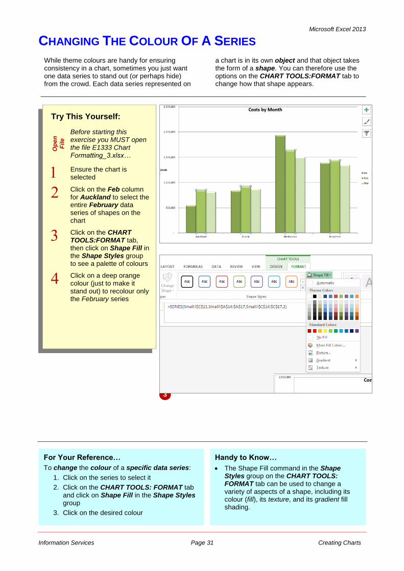
CHANGING THE COLOUR OF A SERIES
Try This Yourself:
Op
en
Fil
e
Before starting this exercise you MUST open the file E1333 Chart Formatting_3.xlsx…
Ensure the chart is selected
Click on the Feb column for Auckland to select the entire February data series of shapes on the chart
Click on the CHART TOOLS:FORMAT tab, then click on Shape Fill in the Shape Styles group to see a palette of colours
Click on a deep orange colour (just to make it stand out) to recolour only the February series
While theme colours are handy for ensuring consistency in a chart, sometimes you just want one data series to stand out (or perhaps hide) from the crowd. Each data series represented on
a chart is in its own object and that object takes the form of a shape. You can therefore use the options on the CHART TOOLS:FORMAT tab to change how that shape appears.
2
For Your Reference…
To change the colour of a specific data series:
1. Click on the series to select it
2. Click on the CHART TOOLS: FORMAT tab and click on Shape Fill in the Shape Styles group
3. Click on the desired colour
3
Handy to Know…
The Shape Fill command in the Shape Styles group on the CHART TOOLS: FORMAT tab can be used to change a variety of aspects of a shape, including its colour (fill), its texture, and its gradient fill shading.
Microsoft Excel 2013
Information Services Page 32 Creating Charts
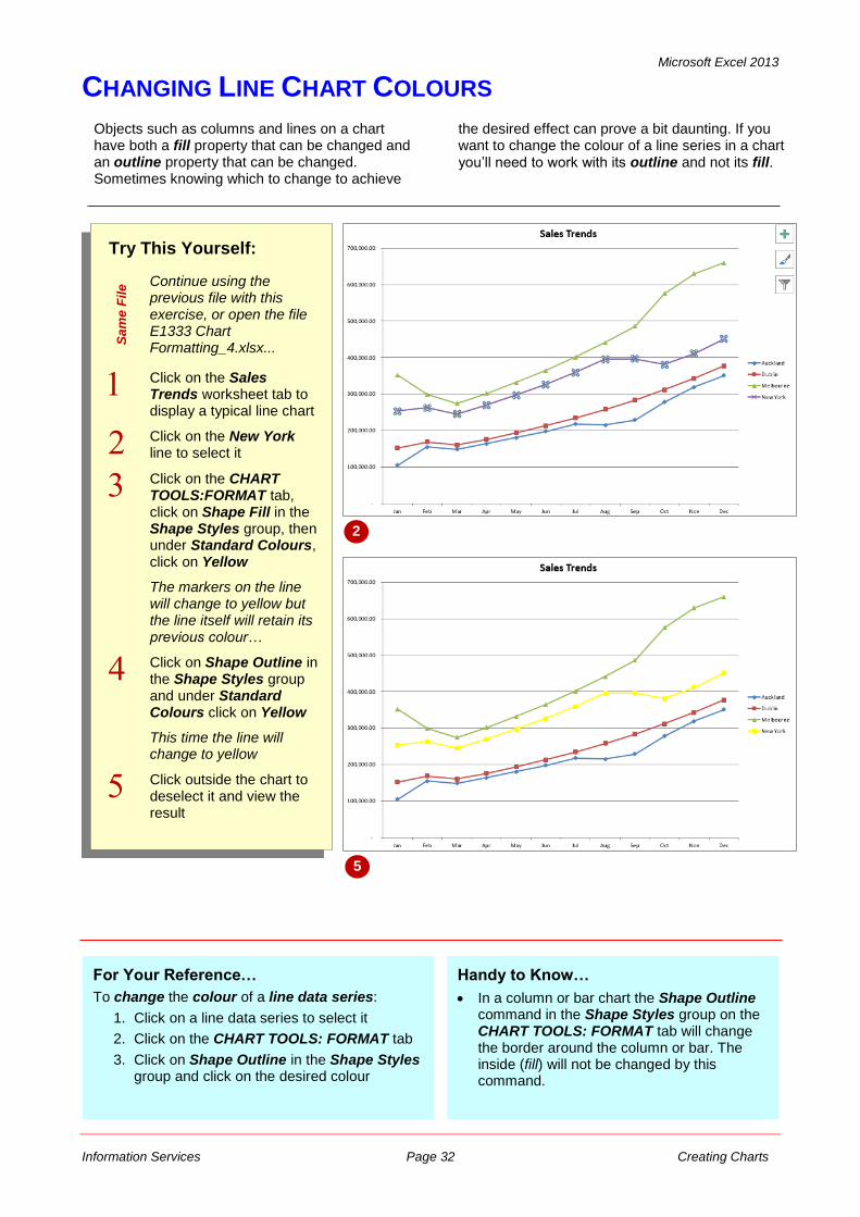
CHANGING LINE CHART COLOURS
Try This Yourself:
Sa
me
File Continue using the
previous file with this exercise, or open the file E1333 Chart Formatting_4.xlsx...
Click on the Sales Trends worksheet tab to display a typical line chart
Click on the New York line to select it
Click on the CHART TOOLS:FORMAT tab, click on Shape Fill in the Shape Styles group, then under Standard Colours, click on Yellow
The markers on the line will change to yellow but the line itself will retain its previous colour…
Click on Shape Outline in the Shape Styles group and under Standard Colours click on Yellow
This time the line will change to yellow
Click outside the chart to deselect it and view the result
For Your Reference…
To change the colour of a line data series:
1. Click on a line data series to select it
2. Click on the CHART TOOLS: FORMAT tab
3. Click on Shape Outline in the Shape Styles group and click on the desired colour
Handy to Know…
In a column or bar chart the Shape Outline command in the Shape Styles group on the CHART TOOLS: FORMAT tab will change the border around the column or bar. The inside (fill) will not be changed by this command.
Objects such as columns and lines on a chart have both a fill property that can be changed and an outline property that can be changed. Sometimes knowing which to change to achieve
the desired effect can prove a bit daunting. If you want to change the colour of a line series in a chart you’ll need to work with its outline and not its fill.
2
5
Microsoft Excel 2013
Information Services Page 33 Creating Charts
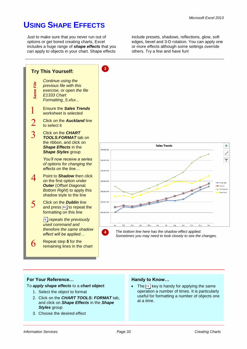
USING SHAPE EFFECTS
Try This Yourself:
Sa
me
File Continue using the
previous file with this exercise, or open the file E1333 Chart Formatting_5.xlsx...
Ensure the Sales Trends worksheet is selected
Click on the Auckland line to select it
Click on the CHART TOOLS:FORMAT tab on the ribbon, and click on Shape Effects in the Shape Styles group
You’ll now receive a series of options for changing the effects on the line…
Point to Shadow then click on the first option under Outer (Offset Diagonal, Bottom Right) to apply this shadow style to the line
Click on the Dublin line and press to repeat the
formatting on this line
repeats the previously
used command and therefore the same shadow effect will be applied…
Repeat step 5 for the remaining lines in the chart
For Your Reference…
To apply shape effects to a chart object:
1. Select the object to format
2. Click on the CHART TOOLS: FORMAT tab, and click on Shape Effects in the Shape Styles group
3. Choose the desired effect
Handy to Know…
The key is handy for applying the same
operation a number of times. It is particularly useful for formatting a number of objects one at a time.
Just to make sure that you never run out of options or get bored creating charts, Excel includes a huge range of shape effects that you can apply to objects in your chart. Shape effects
include presets, shadows, reflections, glow, soft edges, bevel and 3-D rotation. You can apply one or more effects although some settings override others. Try a few and have fun!
3
4 The bottom line here has the shadow effect applied. Sometimes you may need to look closely to see the changes.
Microsoft Excel 2013
Information Services Page 34 Creating Charts
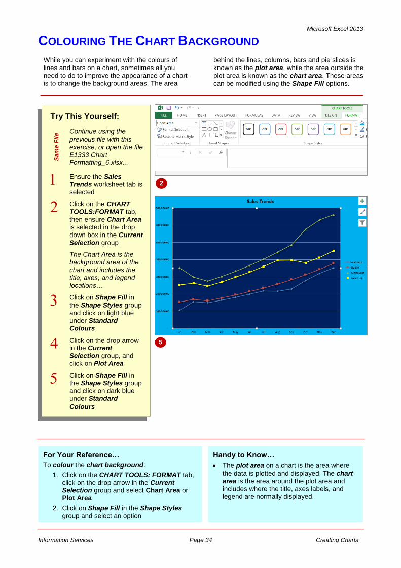
COLOURING THE CHART BACKGROUND
Try This Yourself:
Sa
me
File Continue using the
previous file with this exercise, or open the file E1333 Chart Formatting_6.xlsx...
Ensure the Sales Trends worksheet tab is selected
Click on the CHART TOOLS:FORMAT tab, then ensure Chart Area is selected in the drop down box in the Current Selection group
The Chart Area is the background area of the chart and includes the title, axes, and legend locations…
Click on Shape Fill in the Shape Styles group and click on light blue under Standard Colours
Click on the drop arrow in the Current Selection group, and click on Plot Area
Click on Shape Fill in the Shape Styles group and click on dark blue under Standard Colours
For Your Reference…
To colour the chart background:
1. Click on the CHART TOOLS: FORMAT tab, click on the drop arrow in the Current Selection group and select Chart Area or Plot Area
2. Click on Shape Fill in the Shape Styles group and select an option
While you can experiment with the colours of lines and bars on a chart, sometimes all you need to do to improve the appearance of a chart is to change the background areas. The area
behind the lines, columns, bars and pie slices is known as the plot area, while the area outside the plot area is known as the chart area. These areas
can be modified using the Shape Fill options.
2
Handy to Know…
The plot area on a chart is the area where the data is plotted and displayed. The chart area is the area around the plot area and includes where the title, axes labels, and legend are normally displayed.
5
Microsoft Excel 2013
Information Services Page 35 Creating Charts
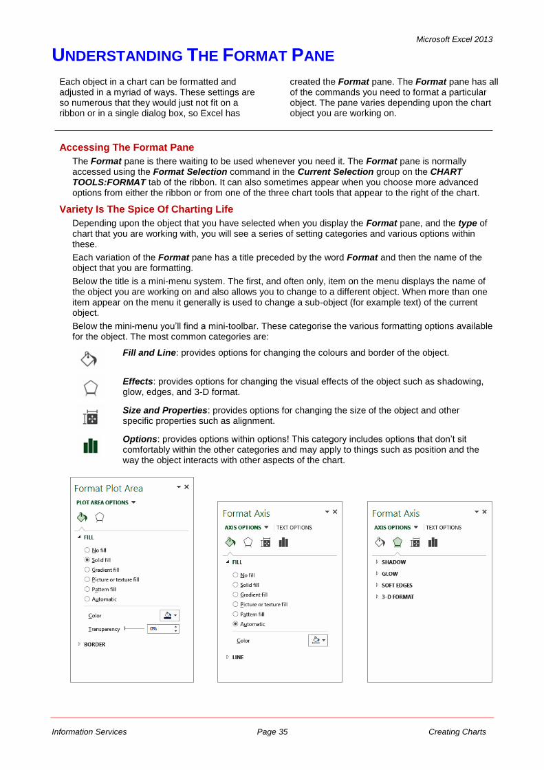
UNDERSTANDING THE FORMAT PANE
Each object in a chart can be formatted and adjusted in a myriad of ways. These settings are so numerous that they would just not fit on a ribbon or in a single dialog box, so Excel has
created the Format pane. The Format pane has all of the commands you need to format a particular object. The pane varies depending upon the chart object you are working on.
Accessing The Format Pane
The Format pane is there waiting to be used whenever you need it. The Format pane is normally accessed using the Format Selection command in the Current Selection group on the CHART TOOLS:FORMAT tab of the ribbon. It can also sometimes appear when you choose more advanced options from either the ribbon or from one of the three chart tools that appear to the right of the chart.
Variety Is The Spice Of Charting Life
Depending upon the object that you have selected when you display the Format pane, and the type of chart that you are working with, you will see a series of setting categories and various options within these.
Each variation of the Format pane has a title preceded by the word Format and then the name of the object that you are formatting.
Below the title is a mini-menu system. The first, and often only, item on the menu displays the name of the object you are working on and also allows you to change to a different object. When more than one item appear on the menu it generally is used to change a sub-object (for example text) of the current object.
Below the mini-menu you’ll find a mini-toolbar. These categorise the various formatting options available for the object. The most common categories are:
Fill and Line: provides options for changing the colours and border of the object.
Effects: provides options for changing the visual effects of the object such as shadowing, glow, edges, and 3-D format.
Size and Properties: provides options for changing the size of the object and other specific properties such as alignment.
Options: provides options within options! This category includes options that don’t sit comfortably within the other categories and may apply to things such as position and the way the object interacts with other aspects of the chart.
Microsoft Excel 2013
Information Services Page 36 Creating Charts
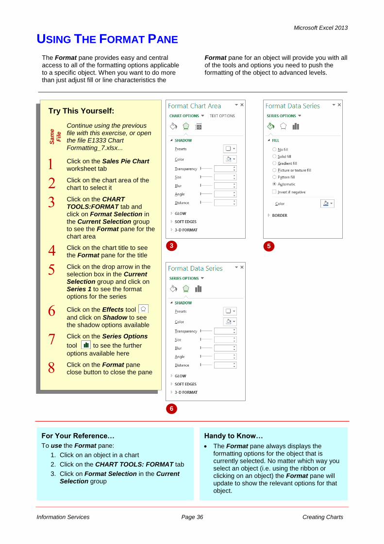
USING THE FORMAT PANE
Try This Yourself:
Sa
me
Fil
e
Continue using the previous file with this exercise, or open the file E1333 Chart Formatting_7.xlsx...
Click on the Sales Pie Chart worksheet tab
Click on the chart area of the chart to select it
Click on the CHART TOOLS:FORMAT tab and click on Format Selection in the Current Selection group to see the Format pane for the chart area
Click on the chart title to see the Format pane for the title
Click on the drop arrow in the selection box in the Current Selection group and click on Series 1 to see the format options for the series
Click on the Effects tool
and click on Shadow to see the shadow options available
Click on the Series Options
tool to see the further
options available here
Click on the Format pane close button to close the pane
For Your Reference…
To use the Format pane:
1. Click on an object in a chart
2. Click on the CHART TOOLS: FORMAT tab
3. Click on Format Selection in the Current Selection group
The Format pane provides easy and central access to all of the formatting options applicable to a specific object. When you want to do more than just adjust fill or line characteristics the
Format pane for an object will provide you with all of the tools and options you need to push the formatting of the object to advanced levels.
3 5
Handy to Know…
The Format pane always displays the formatting options for the object that is currently selected. No matter which way you select an object (i.e. using the ribbon or clicking on an object) the Format pane will update to show the relevant options for that object.
6
Microsoft Excel 2013
Information Services Page 37 Creating Charts
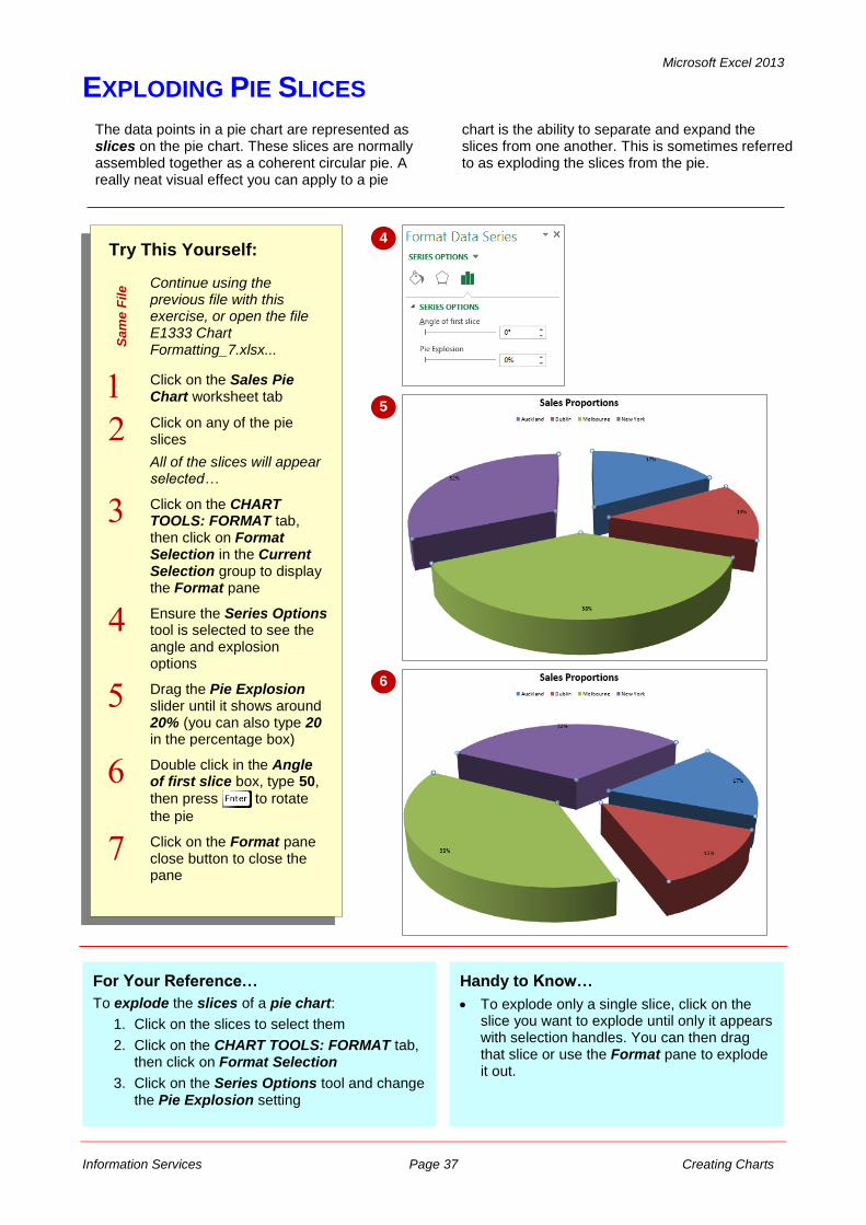
EXPLODING PIE SLICES
The data points in a pie chart are represented as slices on the pie chart. These slices are normally assembled together as a coherent circular pie. A really neat visual effect you can apply to a pie
chart is the ability to separate and expand the slices from one another. This is sometimes referred to as exploding the slices from the pie.
Try This Yourself:
Sa
me
File Continue using the
previous file with this exercise, or open the file E1333 Chart Formatting_7.xlsx...
Click on the Sales Pie Chart worksheet tab
Click on any of the pie slices
All of the slices will appear selected…
Click on the CHART TOOLS: FORMAT tab, then click on Format Selection in the Current Selection group to display the Format pane
Ensure the Series Options tool is selected to see the angle and explosion options
Drag the Pie Explosion slider until it shows around 20% (you can also type 20 in the percentage box)
Double click in the Angle of first slice box, type 50,
then press to rotate
the pie
Click on the Format pane close button to close the pane
4
5
For Your Reference…
To explode the slices of a pie chart:
1. Click on the slices to select them
2. Click on the CHART TOOLS: FORMAT tab, then click on Format Selection
3. Click on the Series Options tool and change the Pie Explosion setting
6
Handy to Know…
To explode only a single slice, click on the slice you want to explode until only it appears with selection handles. You can then drag that slice or use the Format pane to explode it out.
Microsoft Excel 2013
Information Services Page 38 Creating Charts
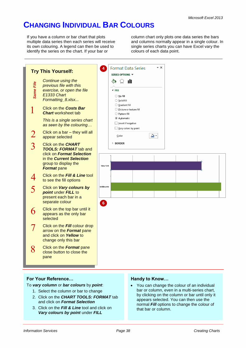
CHANGING INDIVIDUAL BAR COLOURS
Try This Yourself:
Sa
me
File Continue using the
previous file with this exercise, or open the file E1333 Chart Formatting_8.xlsx...
Click on the Costs Bar Chart worksheet tab
This is a single series chart as seen by the colouring…
Click on a bar – they will all appear selected
Click on the CHART TOOLS: FORMAT tab and click on Format Selection in the Current Selection group to display the Format pane
Click on the Fill & Line tool to see the fill options
Click on Vary colours by point under FILL to present each bar in a separate colour
Click on the top bar until it appears as the only bar selected
Click on the Fill colour drop arrow on the Format pane and click on Yellow to change only this bar
Click on the Format pane close button to close the pane
For Your Reference…
To vary column or bar colours by point:
1. Select the column or bar to change
2. Click on the CHART TOOLS: FORMAT tab and click on Format Selection
3. Click on the Fill & Line tool and click on Vary colours by point under FILL
Handy to Know…
You can change the colour of an individual bar or column, even in a multi-series chart, by clicking on the column or bar until only it appears selected. You can then use the normal Fill options to change the colour of that bar or column.
If you have a column or bar chart that plots multiple data series then each series will receive its own colouring. A legend can then be used to identify the series on the chart. If your bar or
column chart only plots one data series the bars and columns normally appear in a single colour. In single series charts you can have Excel vary the colours of each data point.
4
6
Microsoft Excel 2013
Information Services Page 39 Creating Charts
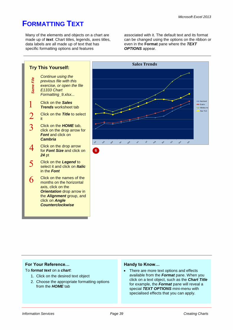
FORMATTING TEXT
Try This Yourself:
Sa
me
File Continue using the
previous file with this exercise, or open the file E1333 Chart Formatting_9.xlsx...
Click on the Sales Trends worksheet tab
Click on the Title to select it
Click on the HOME tab, click on the drop arrow for Font and click on Cambria
Click on the drop arrow for Font Size and click on 24 pt
Click on the Legend to select it and click on Italic in the Font
Click on the names of the months on the horizontal axis, click on the Orientation drop arrow in the Alignment group, and click on Angle Counterclockwise
For Your Reference…
To format text on a chart:
1. Click on the desired text object
2. Choose the appropriate formatting options
from the HOME tab
Handy to Know…
There are more text options and effects available from the Format pane. When you click on a text object, such as the Chart Title for example, the Format pane will reveal a special TEXT OPTIONS mini-menu with specialised effects that you can apply.
Many of the elements and objects on a chart are made up of text. Chart titles, legends, axes titles, data labels are all made up of text that has specific formatting options and features
associated with it. The default text and its format can be changed using the options on the ribbon or even in the Format pane where the TEXT OPTIONS appear.
6
Microsoft Excel 2013
Information Services Page 40 Creating Charts
FORMATTING WITH WORDART
Try This Yourself:
Sa
me
File Continue using the
previous file with this exercise, or open the file E1333 Chart Formatting_10.xlsx...
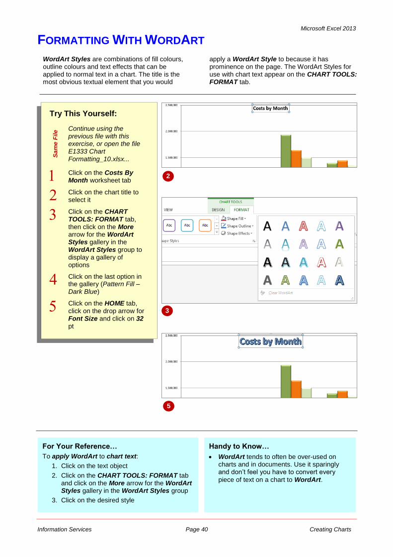
Click on the Costs By Month worksheet tab
Click on the chart title to select it
Click on the CHART TOOLS: FORMAT tab, then click on the More arrow for the WordArt Styles gallery in the WordArt Styles group to display a gallery of options
Click on the last option in the gallery (Pattern Fill – Dark Blue)
Click on the HOME tab, click on the drop arrow for Font Size and click on 32 pt
For Your Reference…
To apply WordArt to chart text:
1. Click on the text object
2. Click on the CHART TOOLS: FORMAT tab and click on the More arrow for the WordArt Styles gallery in the WordArt Styles group
3. Click on the desired style
WordArt Styles are combinations of fill colours, outline colours and text effects that can be applied to normal text in a chart. The title is the most obvious textual element that you would
apply a WordArt Style to because it has prominence on the page. The WordArt Styles for use with chart text appear on the CHART TOOLS: FORMAT tab.
2
Handy to Know…
WordArt tends to often be over-used on charts and in documents. Use it sparingly and don’t feel you have to convert every
piece of text on a chart to WordArt.
5
3
Microsoft Excel 2013
Information Services Page 41 Creating Charts
CHANGING WORDART FILL
Try This Yourself:
Sa
me
File Continue using the
previous file with this exercise, or open the file E1333 Chart Formatting_11.xlsx...
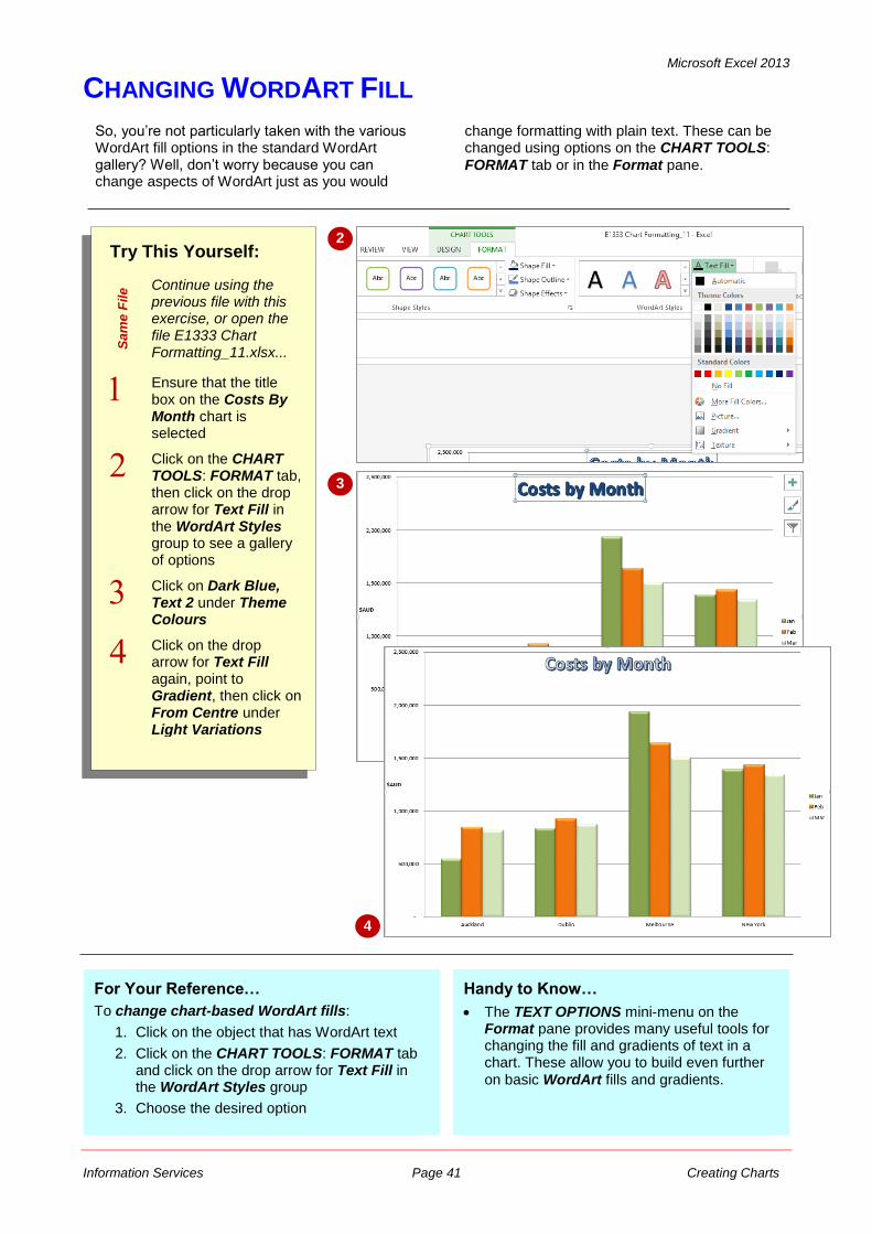
Ensure that the title box on the Costs By Month chart is selected
Click on the CHART TOOLS: FORMAT tab, then click on the drop arrow for Text Fill in the WordArt Styles group to see a gallery of options
Click on Dark Blue, Text 2 under Theme Colours
Click on the drop arrow for Text Fill again, point to Gradient, then click on From Centre under Light Variations
For Your Reference…
To change chart-based WordArt fills:
1. Click on the object that has WordArt text
2. Click on the CHART TOOLS: FORMAT tab and click on the drop arrow for Text Fill in the WordArt Styles group
3. Choose the desired option
So, you’re not particularly taken with the various WordArt fill options in the standard WordArt gallery? Well, don’t worry because you can change aspects of WordArt just as you would
change formatting with plain text. These can be changed using options on the CHART TOOLS:
FORMAT tab or in the Format pane.
2
3
Handy to Know…
The TEXT OPTIONS mini-menu on the Format pane provides many useful tools for changing the fill and gradients of text in a chart. These allow you to build even further
on basic WordArt fills and gradients.
4
Microsoft Excel 2013
Information Services Page 42 Creating Charts
CHANGING WORDART EFFECTS
Try This Yourself:
Sa
me
File Continue using the
previous file with this exercise, or open the file E1333 Chart Formatting_12.xlsx...
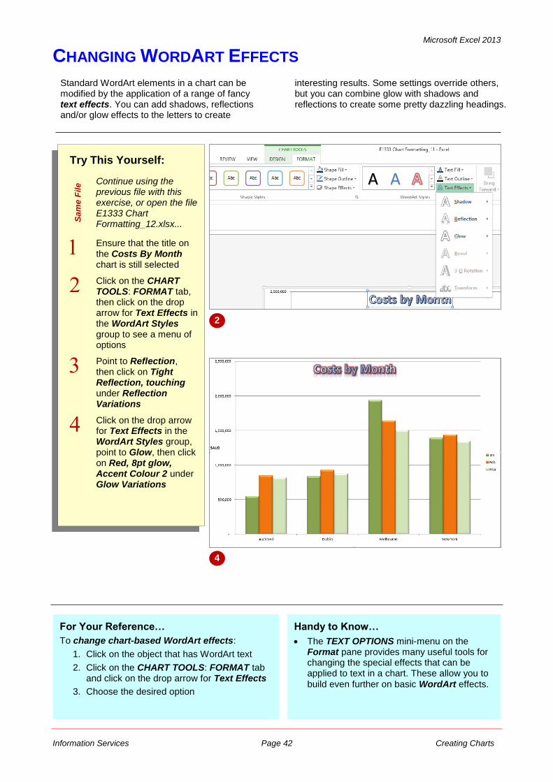
Ensure that the title on the Costs By Month chart is still selected
Click on the CHART TOOLS: FORMAT tab, then click on the drop arrow for Text Effects in the WordArt Styles group to see a menu of options
Point to Reflection, then click on Tight Reflection, touching under Reflection Variations
Click on the drop arrow for Text Effects in the WordArt Styles group, point to Glow, then click on Red, 8pt glow, Accent Colour 2 under Glow Variations
For Your Reference…
To change chart-based WordArt effects:
1. Click on the object that has WordArt text
2. Click on the CHART TOOLS: FORMAT tab and click on the drop arrow for Text Effects
3. Choose the desired option
Standard WordArt elements in a chart can be modified by the application of a range of fancy text effects. You can add shadows, reflections and/or glow effects to the letters to create
interesting results. Some settings override others, but you can combine glow with shadows and reflections to create some pretty dazzling headings.
2
Handy to Know…
The TEXT OPTIONS mini-menu on the Format pane provides many useful tools for changing the special effects that can be applied to text in a chart. These allow you to
build even further on basic WordArt effects.
4


