Embed Size (px)
Citation preview

MAKE WEB FORMS WORK ONALL SCREENS
FREE 98 MINUTESOF JS VIDEOS47
PAGES OF TIP
S
& ADVIC
E FOR 2018
ISSUE 270
he Web never stands still, technologies
are ever evolving, trends are evolving,
techniques are evolving. What does this
mean? It means that there is always
something new to learn, something to be
inspired by, and as we head into 2018 this
premise still remains the same.
This issue Web Designer has decided
that it’s time to bring together the new and
inspirational to get you ready for the year ahead. Our
HOT 101 heads out into the industry to get what you
need to be brilliant in 2018. So what’s on offer?
Creative heavyweight Tobias Van Schneider reveals
his five simple tips for design success, creative
director Tom Wittlin suggests how to power up your
portfolio and software engineer Simon Jones gives
an insight into the world of prototyping with Origami.
This is just the tip of the iceberg. You’ll also discover
16 great free font combinations to help you create
impressive typography, 10 hand-picked YouTube web
development channels, what’s new in Node 9 and
four essential eCommerce solutions. We’ll also show
you how to let your imagination run wild with six
ways to get into creative coding.
Sitting beside this bonanza of designer and
developer gold we still have a host of tutorials and
workshops. Create lush liquid effects with WebGL,
build web froms with great UX, implement glitch
effects and much more. Welcome to the latest issue
and welcome to the new year. Enjoy,
Welcome
“Skills are important,but on top of thiswe are looking forself-motivatedteam players ”Zeta are a team of artisans that wield today’sdigital tools to deliver engaging content. WebDesigner finds out more. Page 66
“ In a world where users have high expectations of their experience on the web and mobile, prototyping and user evaluation is key. ”
Follow us on Twitter for all the news & conversation @WebDesignerMagVisit our blog for opinion, freebies & more www.creativebloq.com
Highlight
TBe brilliant in 2018
Video Tuition – 98 minutes ofexpertJavaScriptvideoguidesfrom Pluralsight(pluralsight.com)
Assets –30Cheerfultrianglepatterns,andHopePosterPopArtGeneratorfromSparklestock(sparklestock.com)
39 DesignerresourcesFREE – exclusive with this issue
www.filesilo.co.uk/webdesigner
– Tutorial files andassets
THE WEB DESIGNER MISSION To be the most accessible and inspiring voice for the industry, offering cutting-edge features and techniques vital to building future-proof online content
Steven JenkinsEditor
MetaWelcome
welcome ________________________________________________3

Contributors
Followus!
Simon Jones
Matt Crouch
Tom Wittlin
Steven Roberts
Mark Shufflebottom
Tam Hanna
Luke Harrison
Tobias Van Schneider
This issue Simon coversthe basics of Origami Studio,a high-fidelity prototypingtool from Facebook, whichenables designers to createsophisticated site and appprototypes without theneed for coding.Page 60
Matt is a frontend developerbased in London. Adeveloper’s life is oftentaken up creatingrun-of-the-mill sites. In thisissue, Matt shows how thoseskills can instead help youget creative with code.Page 46
Tom is a freelance digitalcreative director and hasheaded a host of designprojects, including KellyHoppens site redesign. Thisissue he offers six rules onhow to make your portfoliostand out. He also likes towear a scarf. Page 52
Steven is a Frontenddesigner and developerfrom Middlesbrough. Hisrecent passion has beenSVG. This issue he goes alittle leftfield and selects tenYouTube dev channels thathe uses to help improve hisskills. Page 58
Mark is a Professor ofInteraction Design atSheridan College. This issuehe is making waves withWebGL. He creates ananimated liquid backgroundeffect to make a header thatreacts to mouse movement.Page 84
Tam has a wealth ofexperience in a breadth ofdifferent programminglanguages. This issue hetakes time out to take acloser look at Node. Hereveals five essentialfeatures that you need toknow in version 9. Page 56
Luke is a web developerfrom Sheffield, who is allabout scalable and efficientfrontend architecture. In thisissue, he explores how tobuild a web form with greatUX that works effectivelyacross device types.Page 90
Creative heavyweightTobias has worked for someof the biggest names in theindustry, including Spotify.This issue the co-owner ofSemplice reveals fiveessential tips to set you onthe way to design stardom.Page 32
This issue’spanelofexperts
“ Inbroad terms, it (creativecoding) refers to theproductionof something that is expressive innature
rather thanhavingapurelypracticaluse”
Welcome to that bit of the mag where we learn moreabout the featured writers and contributors…
HOT 101This issue we have a
collection of industry experts
imparting their well-formed
knowledge on a host of topics
that will make you a better
designer and developer in
2018. Discover design tips
from Tobias Van Schneider,
portfolio secrets, how to
prototype with Origami,
what’s new in Node 9 and
much more. Page 16
Facebook: www.facebook.com/WebDesignerUKTwitter: https://twitter.com/webdesignermag
Meta
4 __________________________________________________experts
Future PLC Richmond House, 33 Richmond Hill, Bournemouth, Dorset, BH2 6EZ
EditorialEditor Steven Jenkins [email protected] 01202 586233
Designer Harriet KnightEditor in Chief Amy HennesseySenior Art Editor Will Shum ContributorsTobias Van Schneider, Chester Righton, Josh Winterton, Sophie Selcoe, Jason MacKenzie, Emily Melling, Kasia Nowak,
Austwick, Mark White, Steven Roberts, Matt Crouch, Simon Jones, Tom Wittlin, David Howell, Mark Billen, Luke Harrison, Philip Morris, Rob Mead-Green, Ryan Wells, Will Shum
PhotographyJames SheppardAll copyrights and trademarks are recognised and respected
AdvertisingMedia packs are available on requestCommercial Director Clare Dove [email protected] Advertising Manager Mike Pyatt [email protected] 01225 687538Account Director George Lucas [email protected] Manager Chris Mitchell [email protected]
InternationalWeb Designer is available for licensing. Contact the International department to discuss partnership opportunitiesInternational Licensing Director Matt Ellis [email protected]
Subscriptions Email enquiries [email protected] orderline & enquiries 0344 848 2852Overseas order line and enquiries +44 (0) 344 848 2852Online orders & enquiries www.myfavouritemagazines.co.ukHead of subscriptions Sharon Todd
CirculationHead of Newstrade Tim Mathers
ProductionHead of Production Mark ConstanceProduction Project Manager Clare ScottAdvertising Production Manager Joanne CrosbyDigital Editions Controller Jason HudsonProduction Manager Nola Cokely
ManagementManaging Director Aaron AsadiCommercial Finance Director Dan JotchamEditorial Director Paul NewmanHead of Art & Design Greg Whittaker
Printed by William Gibbons, 28 Planetary Road, Willenhall, WV13, 3XT
Distributed by Marketforce, 5 Churchill Place, Canary Wharf, London, E14 5HU www.marketforce.co.uk Tel: 0203 787 9060
ISSN 1745-3534
We are committed to only using magazine paper which is derived from
The paper in this magazine was sourced and produced from sustainable managed forests, conforming to strict environmental and socioeconomic standards. The manufacturing paper mill holds full FSC (Forest Stewardship
All contents © 2018 Future Publishing Limited or published under licence. All rights reserved. No part of this magazine may be used, stored, transmitted or reproduced in any way without the prior written permission of the publisher. Future Publishing Limited (company number 2008885) is registered in
1UA. All information contained in this publication is for information only and is, as far as we are aware, correct at the time of going to press. Future cannot accept any responsibility for errors or inaccuracies in such information. You are advised to contact manufacturers and retailers directly with regard to the price of products/services referred to in this publication. Apps and websites mentioned in this publication are not under our control. We are not responsible for their contents or any other changes or updates to them.
companies mentioned herein.
If you submit material to us, you warrant that you own the material and/or have the necessary rights/permissions to supply the material and you automatically grant Future and its licensees a licence to publish your submission in whole or in part in any/all issues and/or editions of publications, in any format published worldwide and on associated websites, social media channels and associated products. Any material you submit is sent at your own risk and, although every care is taken, neither Future nor its employees, agents, subcontractors or licensees shall be liable for loss or damage. We assume all unsolicited material is for publication unless otherwise stated, and reserve the right to edit, amend, adapt all submissions.
Future plc is a public company quoted on the London Stock Exchange (symbol: FUTR)www.futureplc.com
Chief executive Zillah Byng-ThorneNon-executive chairman Peter Allen
Penny Ladkin-Brand
Tel +44 (0)1225 442 244

Cutting-edge features, techniques and inspiration for web creativesChat with the team and other readers and discuss the latest tech, trends and techniques. Here’s how to stay in touch…
[email protected] @WebDesignerMag www.creativebloq.com
C ntentsInside issue 270
Meta
6 ________________________________________________contents
Cover focus
TutorialsWeb gurus take you step-by-stepthrough professional techniques
FileSilo96 Get the latest must-have resources and videos
Web Workshop82 Implement a glitch effect
https://vintage.agencyCreate a text effect to add ambience
88 Interactive pop-up navigationwww.tentwenty.meAdd interest to menu selections with images
84 Create lush liquid WebGL effectsLearn how to use the three.js library to make a lowpolygon animated liquid wave effect
90 Build a web form with great UXDiscover the techniques and best practices to create ahighly optimised UX for all device types
96
WEB DESIGNER
myfavouritemagazines.co.uk
COMMENT - Paul Betteridge - p11
08 Learn the Generate waySign up for the latest Generate
conference to listen and learn new
essential skills
10 Webkit: The best must-try resources out there Discover the libraries and frameworks
that will make your site a better place
to visit
11 Voice search: adapt to succeed The future of search will voice. Get your
sites and apps ready to take advantage
74 Lightbox A showcase of inspirational sites and
the techniques used to create them
94 Hosting listings An extensive list of web hosting
companies.
Pick the perfect host for your needs
98 Next monthWhat’s in the next issue of
Web Designer?
contents _________________________________________________7
Subscribe Turn to page 14 now
Never miss an issue
USA readers turn to page 51 for an exclusive offer
66
10
74
Digital artisans get ready to engage
Essential libraries and frameworks
ProFile:
Resources
Fullscreen video promotes this movieLightbox:
s the web evolves there is
always something new to
learn. And what better way
to boost your skills than by
listening to the experts. Our very own
Generate conference is awash with them
and 2018 sees a host of contemporary,
must-know topics presented by an
incredible selection of industry gurus. So
where can you get to see this fine array of
talent in the coming year?
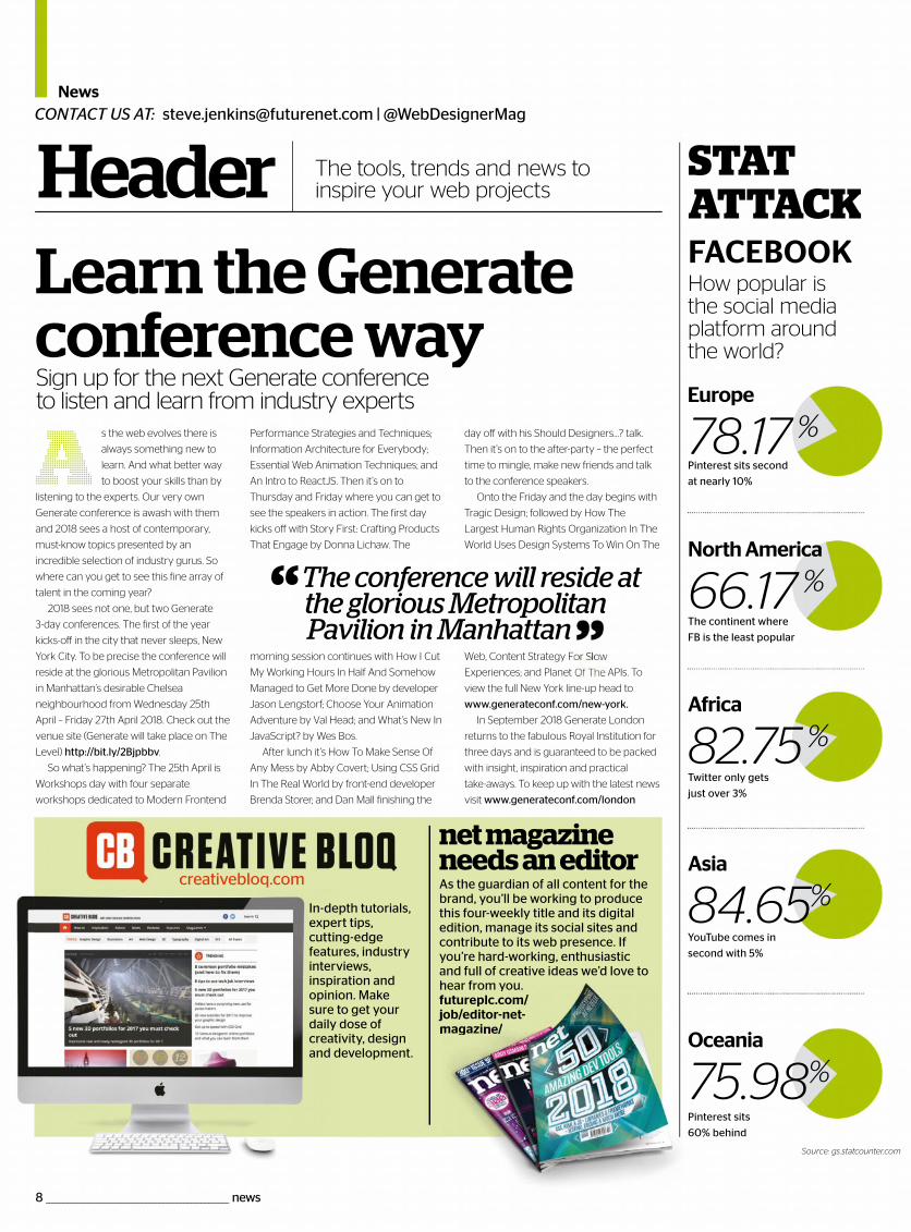
2018 sees not one, but two Generate
3-day conferences. The first of the year
kicks-off in the city that never sleeps, New
York City. To be precise the conference will
reside at the glorious Metropolitan Pavilion
in Manhattan’s desirable Chelsea
neighbourhood from Wednesday 25th
April – Friday 27th April 2018. Check out the
venue site (Generate will take place on The
Level) http://bit.ly/2Bjpbbv.
So what’s happening? The 25th April is
Workshops day with four separate
workshops dedicated to Modern Frontend
Performance Strategies and Techniques;
Information Architecture for Everybody;
Essential Web Animation Techniques; and
An Intro to ReactJS. Then it’s on to
Thursday and Friday where you can get to
see the speakers in action. The first day
kicks off with Story First: Crafting Products
That Engage by Donna Lichaw. The
morning session continues with How I Cut
My Working Hours In Half And Somehow
Managed to Get More Done by developer
Jason Lengstorf; Choose Your Animation
Adventure by Val Head; and What’s New In
JavaScript? by Wes Bos.
After lunch it’s How To Make Sense Of
Any Mess by Abby Covert; Using CSS Grid
In The Real World by front-end developer
Brenda Storer; and Dan Mall finishing the
day off with his Should Designers…? talk.
Then it’s on to the after-party – the perfect
time to mingle, make new friends and talk
to the conference speakers.
Onto the Friday and the day begins with
Tragic Design; followed by How The
Largest Human Rights Organization In The
World Uses Design Systems To Win On The
Web, Content Strategy F
Experiences; and Planet APIs. To
view the full New York line-up head to
www.generateconf.com/new-york.
In September 2018 Generate London
returns to the fabulous Royal Institution for
three days and is guaranteed to be packed
with insight, inspiration and practical
take-aways. To keep up with the latest news
visit www.generateconf.com/london
Sign up for the next Generate conferenceto listen and learn from industry experts
Learn theGenerateconferenceway
A
[email protected] | @WebDesignerMagCONTACT US AT:
Header The tools, trends and news to inspire your web projects
How popular is the social media platform around the world?
STAT ATTACKFACEBOOK
The continent where
FB is the least popular
North America
66.17 %
Twitter only gets
just over 3%
Africa
82.75%
YouTube comes in
second with 5%
Asia
84.65%
Pinterest sits
60% behind
Pinterest sits second
at nearly 10%
Europe
78.17 %
creativebloq.com
In-depth tutorials, expert tips, cutting-edge features, industry interviews, inspiration and opinion. Make sure to get your daily dose of creativity, design and development.
As the guardian of all content for the brand, you’ll be working to produce this four-weekly title and its digital edition, manage its social sites and contribute to its web presence. If you’re hard-working, enthusiastic and full of creative ideas we’d love to h ffj
net magazine needs an editor
Source: gs.statcounter.com
8 _____________________________________________________ news
Oceania
75.98%
“ The conference will reside at the glorious Metropolitan Pavilion in Manhattan
hear from you.futureplc.com/job/editor-net-magazi //
Header
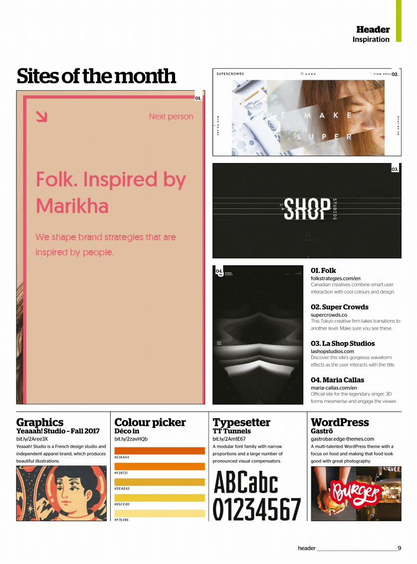
GraphicsYeaaah! Studio – Fall 2017bit.ly/2Aree3XYeaaah! Studio is a French design studio and
independent apparel brand, which produces
beautiful illustrations.
WordPressGaströgastrobar.edge-themes.comA multi-talented WordPress theme with a
focus on food and making that food look
good with great photography.
Colour picker TypesetterTT Tunnelsbit.ly/2Am1E67A modular font family with narrow
proportions and a large number of
pronounced visual compensators.
Déco inbit.ly/2zavHQb
01. Folkfolkstrategies.com/enCanadian creatives combine smart user
interaction with cool colours and design.
02. Super Crowdssupercrowds.coThis Tokyo creative firm takes transitions to
another level. Make sure you see these.
03. La Shop Studioslashopstudios.comDiscover this site's gorgeous waveform
effects as the user interacts with the title.
04. Maria Callasmaria-callas.com/enOfficial site for the legendary singer. 3D
forms mesmerise and engage the viewer.
Inspiration
Sites of the month 02.
03.
04.
#E36A03
#E6CE4D
#F28721
#F7E38E
#DEAE43
01.
header ___________________________________________________9
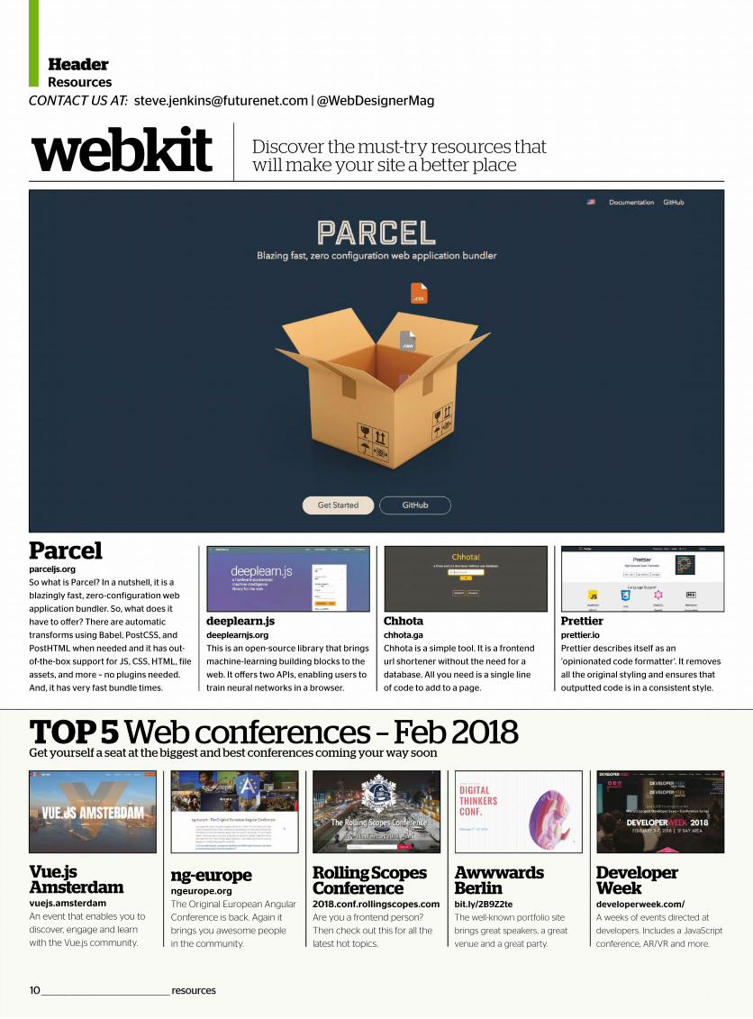
Parcelparceljs.org
So what is Parcel? In a nutshell, it is a
blazingly fast, zero-configuration web
application bundler. So, what does it
have to offer? There are automatic
transforms using Babel, PostCSS, and
PostHTML when needed and it has out-
of-the-box support for JS, CSS, HTML, file
assets, and more – no plugins needed.
And, it has very fast bundle times.
deeplearn.js
deeplearnjs.org
This is an open-source library that brings
machine-learning building blocks to the
web. It offers two APIs, enabling users to
train neural networks in a browser.
Chhota
chhota.ga
Chhota is a simple tool. It is a frontend
url shortener without the need for a
database. All you need is a single line
of code to add to a page.
Prettier
prettier.io
Prettier describes itself as an
‘opinionated code formatter’. It removes
all the original styling and ensures that
outputted code is in a consistent style.
webkit
TOP 5 Web conferences – Feb 2018Get yourself a seat at the biggest and best conferences coming your way soon
Vue.js Amsterdam
vuejs.amsterdam An event that enables you to
discover, engage and learn
with the Vue.js community.
ng-europe
ngeurope.org
The Original European Angular
Conference is back. Again it
brings you awesome people
in the community.
Rolling Scopes Conference 2018.conf.rollingscopes.com Are you a frontend person?
Then check out this for all the
latest hot topics.
Awwwards Berlin
bit.ly/2B9Z2te
The well-known portfolio site
brings great speakers, a great
venue and a great party.
Developer Week
developerweek.com/
A weeks of events directed at
developers. Includes a JavaScript
conference, AR/VR and more.
HeaderResources
[email protected] | @WebDesignerMagCONTACT US AT:
Discover the must-try resources that will make your site a better place
10 _____________________________________________ resources
HeaderOpinion
hanks to the rise of mobile and digital assistants – such as Apple’s Siri, Microsoft
Cortana, Amazon’s Alexa, and Google – voice-activated searches and commands
have become more mainstream. And since more people are using voice search,
it’s directly affecting how they search, and how businesses need to adapt their
websites and digital marketing to stay on top of these ranking opportunities.
According to comScore, 50 per cent of all searches will be voice searches by 2020 –
a major reason for this growth is convenience and ease of use. But there is far more to
voice search than convenience and the ability to multi-task, it’s changing the way search
engines handle search queries and how users search for the information they need.
Voice search is uniquely tied to real-time, in particular local searches, with longer tail
natural language searches typically reflecting immediate needs with stronger intent.
This is an exciting opportunity for businesses and marketers to increase conversion and
stay on top of this evolving niche. So how can you stay on top of the rankings?
If you want your website to be found, it needs to be mobile friendly. Your focus
should therefore be on creating mobile-friendly pages, with content that loads quickly.
Use the free Google Test My Site tool (bit.ly/2aAXzOV) to see how easily a visitor can
use your website on a mobile device. People also read mobile content differently than
they do with desktop content, bear this in mind when creating your content and design.
Amend your keyword targeting, in favour of longer tail keywords and be conscious
of ‘the why’ behind what users are searching for. This is because people talk differently
than they type, consider how you would speak naturally and search for things verbally
via voice search. Inevitably these will be longer keyword phrases, for example ‘What is
the best Italian restaurant near Bournemouth station?’
In line with longer tail keyword targeting, add an FAQ resource to your site. This will
include dedicated landing pages, filled with content that list the questions and answers
your audience has – who, what, when, where and why queries – as well as being
optimised with keywords and metadata for search engine optimisation. Ultimately, you
need to provide value to your users as well as the search engines.
Make the most of advanced SEO techniques, such as Schema data markup, since this
will enable you to comprehensively describe what the data on your site means. Add this
to your HTML and improve the way your pages are represented in SERPs. This will
ultimately boost your visibility since the search engines will find it easier to understand
who you are and what you do. For example: Structured data can be used to mark up all
kinds of items from products to events to recipes. The following URL will help you
understand the basics and how to implement it across your website: developers.
google.com/search/docs/guides/intro-structured-data.
Most people use voice search to get information about physical places they want to
visit, voice search can recognise ‘near me’ searches and turn to the Google My Business
listings to populate these results. Utilising local listings can therefore increase your
chances of appearing. Make sure your Google My Business account is up to date and
select all the relevant categories. Take advantage of other local listing directories, in
particular the free ones, to increase your search engine real estate and opportunity.
Start by visiting google.co.uk/intl/en/business/.
Also take advantage of localised paid placements, such as Google’s Ad Words. For
example, location extensions will enable your business address, phone number, and
directions to be displayed alongside your adverts. This is crucially important if you want
to show up in the strongly commercial ‘near me’ searches. Google Maps Local Search
adverts will also help you reach the right people, at the right time.
TThere is a power shift in search. Find out how to take advantage
Voice search: Adapt to succeed
Paul Betteridge
There is far moreto voice search than
mere convenience andthe ability to multi-task, it
is changing the waysearch engines handle
search queries
header __________________________________________________ 11
Digital Marekt Directorhampshireseo.co.uk
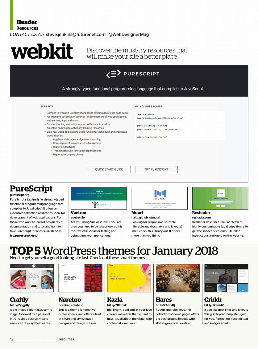
PureScriptpurescript.org
PureScript’s tagline is “A strongly-typed
functional programming language that
compiles to JavaScript”. It offers an
extensive collection of libraries, ideal for
development of web applications. For
those who want to learn it has plenty of
documentation and tutorials. Want to
take PureScript for a test run? Head to
try.purescript.org/
Vuetronvuetron.io
Are you using Vue or Vuex? If you are
then you need to be take a look at this
tool, which is ideal for testing and
debugging your applications.
Muurihaltu.github.io/muuri
Looking for responsive, sortable,
filterable and draggable grid layouts?
Then check this library out. It offers
more than you think.
Reshaderreshader.com
Reshader describes itself as “A micro,
highly-customisable JavaScript library to
get the shades of colours”. Detailed
instructions are found on the website.
webkit
TOP 5 WordPress themes for January 2018Need to get yourself a good-looking site fast. Check out these smart themes
Craftlybit.ly/2jcgpBy
A big image slider takes centre
stage, followed by a personal
intro. A shop section means
users can display their wares.
Nørebronorebro.colabr.io
This is a theme for creative
professionals, and offers a host
of smart and stylish page
designs and design options.
Kazlabit.ly/2B7lbvF
Big, bright, bold and in-your-face
colours make this theme hard to
miss. It’s all about the visual with
content at a minimum.
Haresbit.ly/2ASn4Ij
Rough and rebellious, this
collection of home pages offers
big background images with
stylish graphical overlays.
Griddrbit.ly/2Cyi240
If you like neat lines and layouts
this grid layout template is just
for you. Perfect for keeping text
and images apart.
HeaderResources
[email protected] | @WebDesignerMagCONTACT US AT:
Discover the must-try resources that will make your site a better place
12 _____________________________________________ resources

Each and every issue, we do our best to create a i e that you love to read, and we’re always
s to make it even better. Oncee your
eb Desnd all yo
is answequestion
rself – we’king forwa
from you.
FREE
After completing the survey, you’ll receive a digital copy of The JavaScript Handbook
as a thank you for
The JavaScript Handbook
T
ack.
maga i elooking for waagain, we’d likeimproving Wemagazine, anneed to do ivery quicabout yoreally lo
ear f
r help inigner
our some srerd to
SteEditor
reader survey ________________________________________13
Reader survey
fro yin
Jenkins

*
Every issue, delivered straight to your door
Subscription offer
Never miss an issue
sure to get every single one
Delivered to your homeFree delivery of every issue,
direct to your doorstep
Get the biggest savingsGet your favourite magazine for
Magazine since the early days.”
@sixrevisions via Twitter
“Love the latest magazine that
I purchased today”
@navigation_web via Twitter
“My favourite magazine!!!”
@eduardomurillo via Twitter
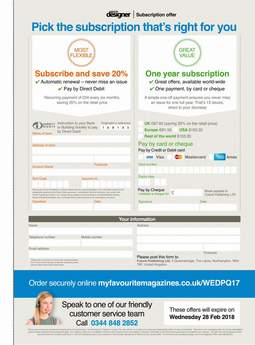
Order securely online
Postcode
AddressName
Email address
Please tick if you want to receive any communicationsfrom Future and its group companies containing news,special offers and product information.
Please post this form toFuture Publishing Ltd,7BF, United Kingdom
Your information
UK £67.60 (saving 20% on the retail price)
€81.55 USA $103.20
Rest of the world $103.20
Signature Date
I enclose a cheque for £ Future Publishing LTD
Expiry date
Visa Mastercard Amex
Signature Date
Account Name
Account no
Instruction to your Bankor Building Society to pay 516 987
Postcode
Subscribe and save 20% Automatic renewal – never miss an issue
One year subscription
saving 20% on the retail pricedirect to your doorstep
These offers will expire on
MOST GREAT
Subscription offer
Speak to one of our friendly customer service team

16 ________________________________________________ HOT 101
HOT 101 _________________________________________________17
A new year brings with it renewed
enthusiasm, new technologies and a
willingness to learn.
The world of web designers and
developers is never dull. There is always
something new to learn. You know that
something exciting is just around the
corner. You know you will be making new
discoveries that will excite and re-
energise your very soul.
This issue Web Designer decided to go a
little left-field and do something a bit
different to help you become a better
designer and developer in 2018.
We wanted to include the practical, we
wanted to include the helpful and we
wanted to provide quick snippets of
intrigue, interest and essential resources.
So, what’s on offer in this 47-page
special? We’re not sure where to start, but
we will go with creative heavyweight
Tobias van Schneider. He reveals his five
tips to help you become design royalty
(p32). Looking for visual stimulation, then
feast your eyes on some beautiful data
visualisation projects (p26). Hoping to get
more creative with your coding skills,
then we’re here to help (p46). Want to
prototype with Origami, we show you
how (p60). Need some gorgeous free
font combos? (p38). We have this and a
whole lot more. Enjoy.
“The world of web designers and developers is never dull. There is always something new to learn.
You know that something exciting is just around the corner”
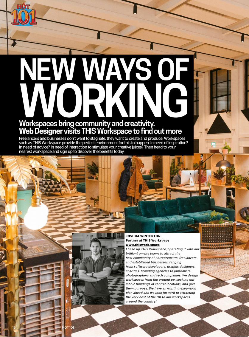
NEW WAYS OF
Workspaces bring community and creativity. Web Designer visits THIS Workspace to find out moreFreelancers and businesses don’t want to stagnate, they want to create and produce. Workspaces such as THIS Workspace provide the perfect environment for this to happen. In need of inspiration? In need of advice? In need of interaction to stimulate your creative juices? Then head to your nearest workspace and sign up to discover the benefits today.
WORKING
JOSHUA WINTERTONPartner at THIS Workspacewww.thiswork.spaceI head up THIS Workspace, operating it with our brilliant on-site teams to attract the best community of entrepreneurs, freelancers and established businesses, ranging from software developers, graphic designers, charities, branding agencies to journalists, photographers and tech companies. We design workspaces from the ground up, seeking out iconic buildings in central locations, and give them purpose. We have an exciting expansion plan ahead and we look forward to attracting the very best of the UK to our workspaces around the country!
18 ________________________________________________ HOT 101
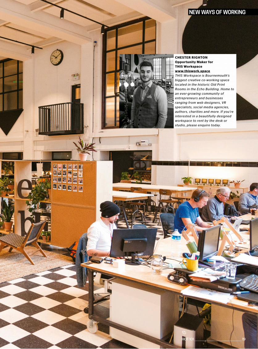
CHESTER RIGHTONOpportunity Maker forTHIS Workspacewww.thiswork.spaceTHIS Workspace is Bournemouth’sbiggest creative co-working spacelocated in the historic Old PrintRooms in the Echo Building. Home toan ever-growing community ofentrepreneurs and businessesranging from web designers, VRspecialists, social media agencies,authors, charities and more. If you’reinterested in a beautifully designedworkspace to rent by the desk orstudio, please enquire today.
NEW WAYS OF WORKING
HOT 101 ________________________________________________ 19
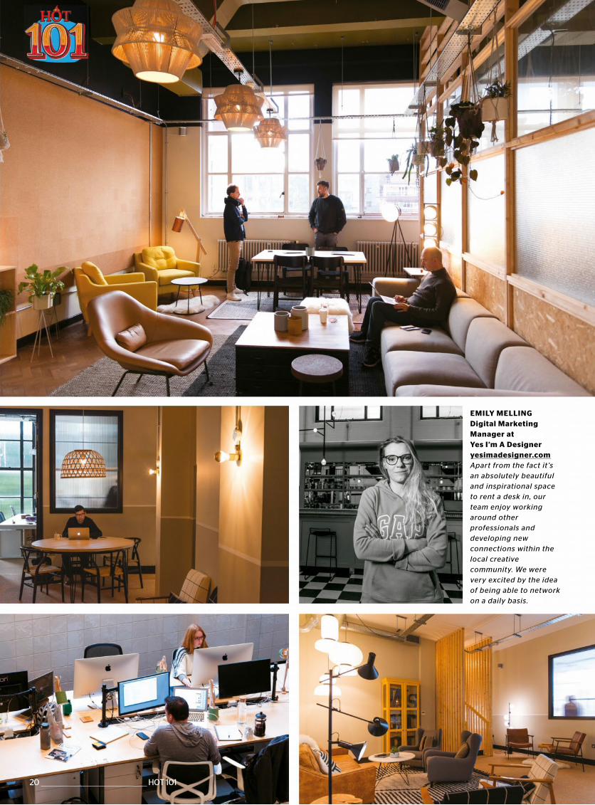
EMILY MELLINGDigital Marketing Manager at Yes I’m A Designeryesimadesigner.comApart from the fact it ’s an absolutely beautiful and inspirational space to rent a desk in, our team enjoy working around other professionals and developing new connections within the local creative community. We were very excited by the idea of being able to network on a daily basis.
20 _______________________________________________ HOT 101
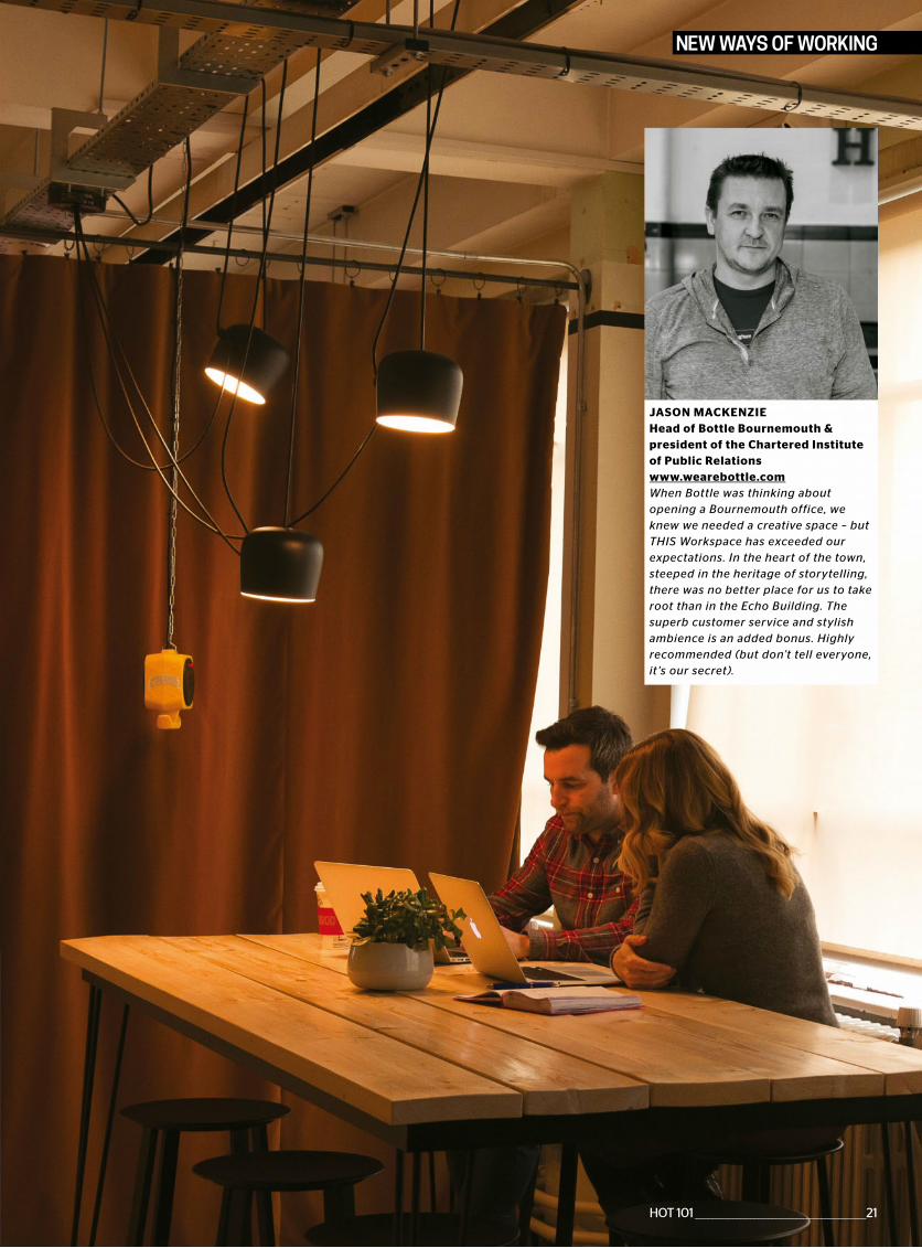
JASON MACKENZIEHead of Bottle Bournemouth &president of the Chartered Instituteof Public Relationswww.wearebottle.comWhen Bottle was thinking aboutopening a Bournemouth office, weknew we needed a creative space – butTHIS Workspace has exceeded ourexpectations. In the heart of the town,steeped in the heritage of storytelling,there was no better place for us to takeroot than in the Echo Building. Thesuperb customer service and stylishambience is an added bonus. Highlyrecommended (but don’t tell everyone,it ’s our secret).
NEW WAYS OF WORKING
HOT 101 _________________________________________________21
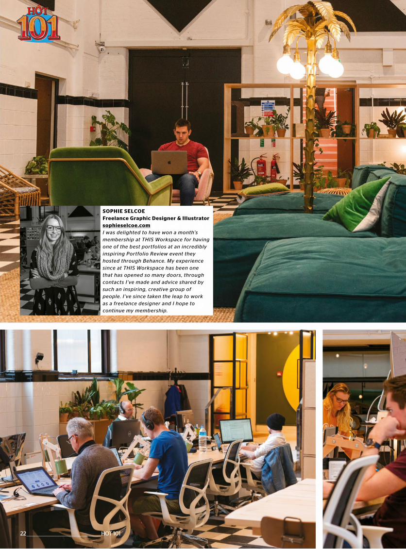
SOPHIE SELCOEFreelance Graphic Designer & Illustratorsophieselcoe.comI was delighted to have won a month’s membership at THIS Workspace for having one of the best portfolios at an incredibly inspiring Portfolio Review event they hosted through Behance. My experience since at THIS Workspace has been one that has opened so many doors, through contacts I ’ve made and advice shared by such an inspiring, creative group of people. I ’ve since taken the leap to work as a freelance designer and I hope to continue my membership.
22 ________________________________________________ HOT 101
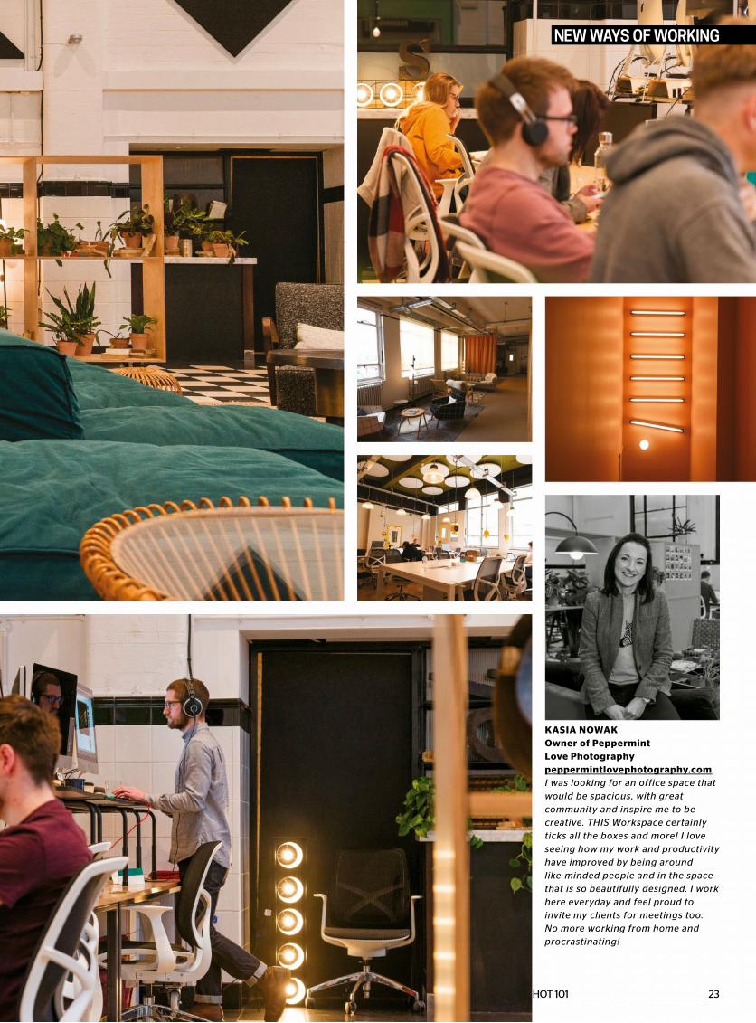
KASIA NOWAKOwner of PeppermintLove Photographypeppermintlovephotography.comI was looking for an office space thatwould be spacious, with greatcommunity and inspire me to becreative. THIS Workspace certainlyticks all the boxes and more! I loveseeing how my work and productivityhave improved by being aroundlike-minded people and in the spacethat is so beautifully designed. I workhere everyday and feel proud toinvite my clients for meetings too.No more working from home andprocrastinating!
NEW WAYS OF WORKING
HOT 101 ________________________________________________23
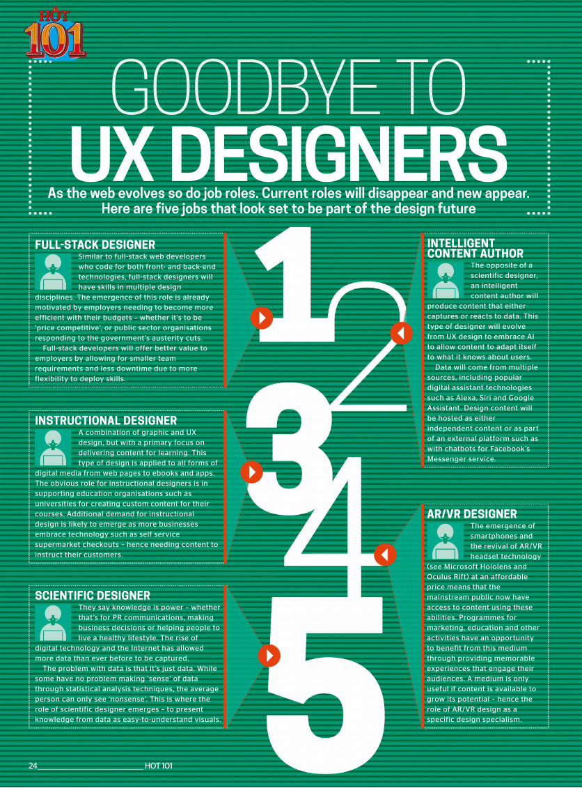
GOODBYE TO UX DESIGNERS
As the web evolves so do job roles. Current roles will disappear and new appear. Here are five jobs that look set to be part of the design future
FULL-STACK DESIGNERSimilar to full-stack web developers who code for both front- and back-end technologies, full-stack designers will have skills in multiple design
disciplines. The emergence of this role is already motivated by employers needing to become more efficient with their budgets – whether it ’s to be ‘price competitive’, or public sector organisations responding to the government’s austerity cuts.
Full-stack developers will offer better value to employers by allowing for smaller team requirements and less downtime due to more flexibility to deploy skills.
INSTRUCTIONAL DESIGNERA combination of graphic and UX design, but with a primary focus on delivering content for learning. This type of design is applied to all forms of
digital media from web pages to ebooks and apps. The obvious role for instructional designers is in supporting education organisations such as universities for creating custom content for their courses. Additional demand for instructional design is likely to emerge as more businesses embrace technology such as self service supermarket checkouts – hence needing content to instruct their customers.
SCIENTIFIC DESIGNERThey say knowledge is power – whether that’s for PR communications, making business decisions or helping people to live a healthy lifestyle. The rise of
digital technology and the Internet has allowed more data than ever before to be captured.
The problem with data is that it ’s just data. While some have no problem making ‘sense’ of data through statistical analysis techniques, the average person can only see ‘nonsense’. This is where the role of scientific designer emerges – to present knowledge from data as easy-to-understand visuals.
AR/VR DESIGNERThe emergence of smartphones and the revival of AR/VR headset technology
(see Microsoft Hololens and Oculus Rift) at an affordable price means that the mainstream public now have access to content using these abilities. Programmes for marketing, education and other activities have an opportunity to benefit from this medium through providing memorable experiences that engage their audiences. A medium is only useful if content is available to grow its potential – hence the role of AR/VR design as a specific design specialism.
INTELLIGENTCONTENT AUTHOR
The opposite of a scientific designer, an intelligent content author will
produce content that either captures or reacts to data. This type of designer will evolve from UX design to embrace AI to allow content to adapt itself to what it knows about users.
Data will come from multiple sources, including popular digital assistant technologies such as Alexa, Siri and Google Assistant. Design content will be hosted as either independent content or as part of an external platform such as with chatbots for Facebook’s Messenger service.
24 ________________________________________________ HOT 101

HOT 101 ________________________________________________25
Our interest in web-based AR is driven by our desire to create AR experiences that are a hyperlink away; no download, completely integrated into a browser. Our studio is exploring how emerging technologies can shape the future of storytelling. The camera has become one of the most important features of our toolkit; a doorway to contextual information aboutwhere I am and what I can see at that moment.
LUKE RITCHIEHEAD OF INTERACTIVE ARTS
NEXUS INTERACTIVE ARTS WEBAR EXPERIMENTS
www.nexusinteractivearts.com/webar
https://nexusinteractivearts.com/webar/weathAR/media/marker/marker.jpg
26 ________________________________________________ HOT 101
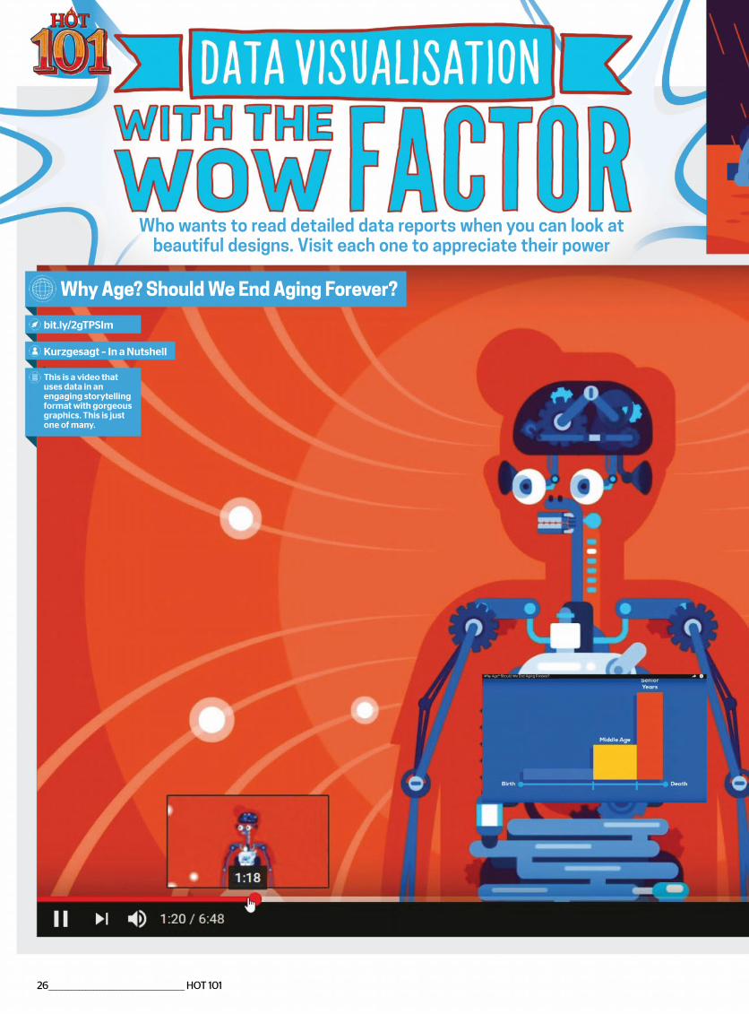
Why Age? Should We End Aging Forever?
bit.ly/2gTPSIm
Kurzgesagt – In a Nutshell
This is a video that uses data in an engaging storytelling format with gorgeous graphics. This is just one of many.
Who wants to read detailed data reports when you can look at beautiful designs. Visit each one to appreciate their power
HOT 101 ________________________________________________27
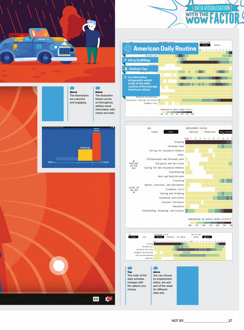
Below
The illustrative theme carries on throughout, adding visual information with charts and stats.
Above
The illustrations are colourful and engaging.
American Daily Routine
bit.ly/2yBIRag
Nathan Yau
An interactive infographic which looks at the daily routine of the average American citizen.
above
You can choose by employment status, sex and part of the week for different stats sets.
Top
The order of the daily activities changes with the options you choose.
28 ________________________________________________ HOT 101
Global Warning
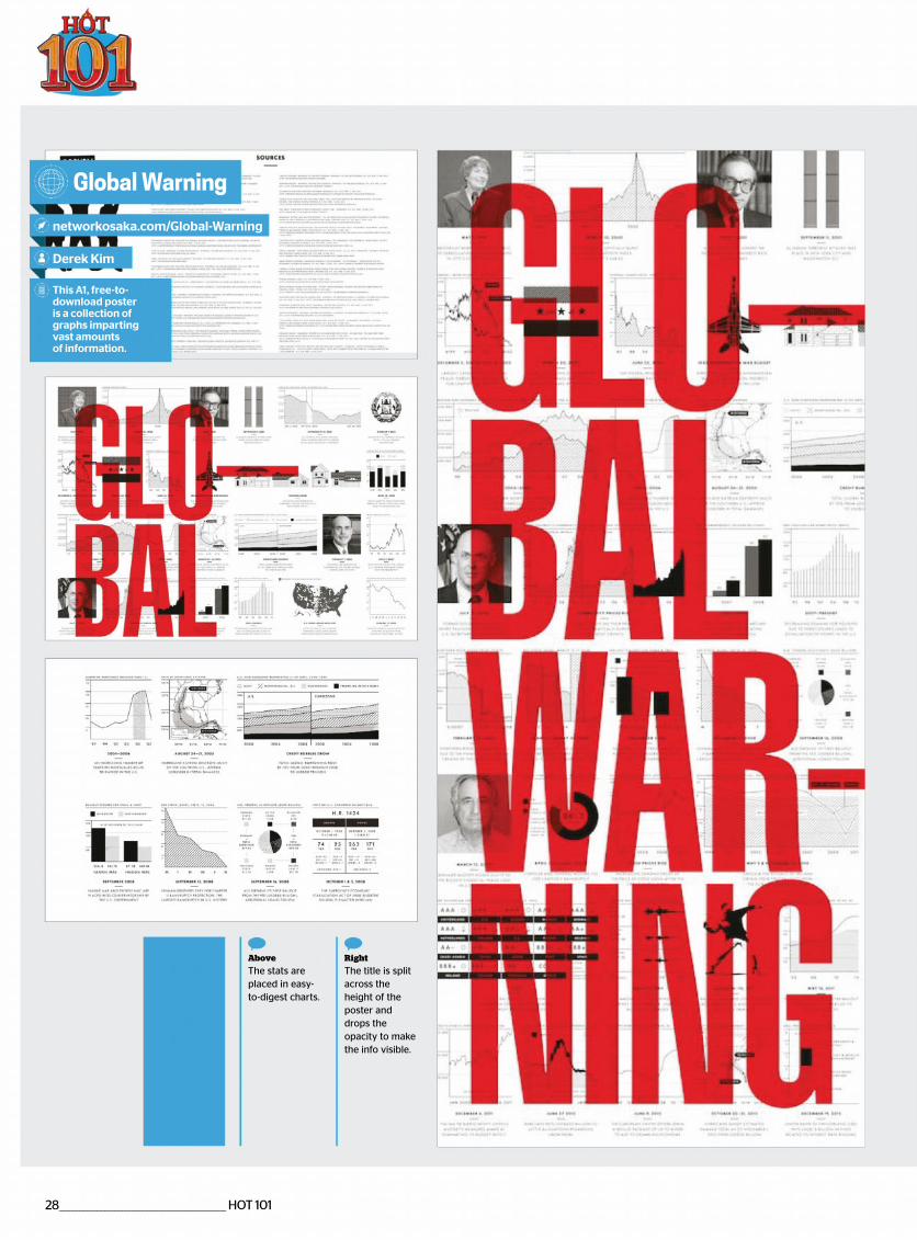
networkosaka.com/Global-Warning
Derek Kim
This A1, free-to-download poster is a collection of graphs imparting vast amounts of information.
Right
The title is split across the height of the poster and drops the opacity to make the info visible.
Above
The stats are placed in easy- to-digest charts.
HOT 101 ________________________________________________29
All the Government Barbecues
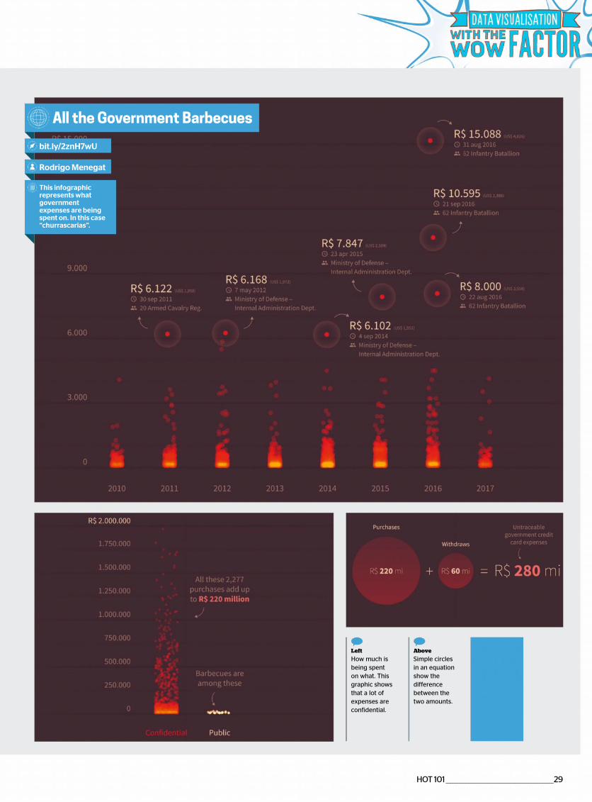
bit.ly/2znH7wU
Rodrigo Menegat
This infographic represents what government expenses are being spent on. In this case “churrascarias”.
Above
Simple circles in an equation show the difference between the two amounts.
Left
How much is being spent on what. This graphic shows that a lot of expenses are confidential.
30 _______________________________________________ HOT 101
Data Visualisation Weather Eindhoven
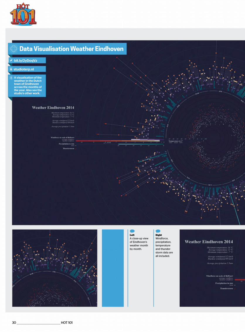
bit.ly/2yDoqVz
studioterp.nl
A visualisation of the weather in the Dutch town of Eindhoven across the months of the year. Also see the studio’s other work.
Right
Windforce, precipitation, temperature and thunder-storm data are all included.
Left
A close-up view of Eindhoven’s weather month by month.
HOT 101 _________________________________________________31
Figure it out
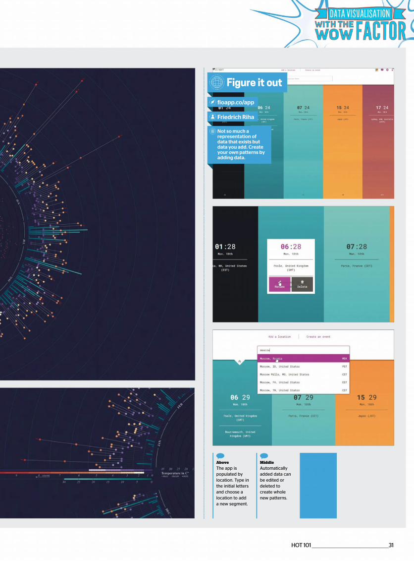
fioapp.co/app
Friedrich Riha
Not so much a representation of data that exists but data you add. Create your own patterns by adding data.
Middle
Automatically added data can be edited or deleted to create whole new patterns.
Above
The app is populated by location. Type in the initial letters and choose a location to add a new segment.
32 ________________________________________________ HOT 101
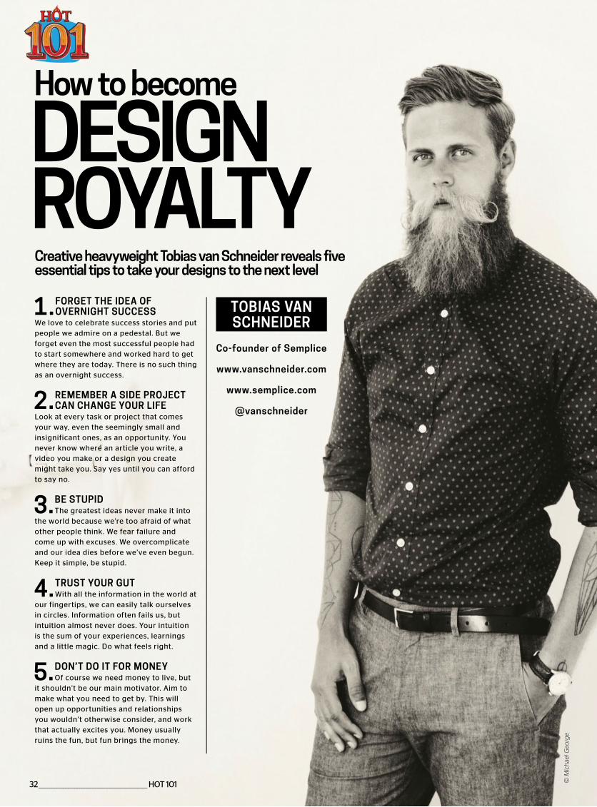
Creative heavyweight Tobias van Schneider reveals five essential tips to take your designs to the next level
How to become
DESIGN ROYALTY1. FORGET THE IDEA OF
OVERNIGHT SUCCESSWe love to celebrate success stories and put people we admire on a pedestal. But we forget even the most successful people had to start somewhere and worked hard to get where they are today. There is no such thing as an overnight success.
2. REMEMBER A SIDE PROJECT CAN CHANGE YOUR LIFE
Look at every task or project that comes your way, even the seemingly small and insignificant ones, as an opportunity. You never know where an article you write, a video you make or a design you create might take you. Say yes until you can afford to say no.
3. BE STUPIDThe greatest ideas never make it into
the world because we’re too afraid of what other people think. We fear failure and come up with excuses. We overcomplicate and our idea dies before we’ve even begun. Keep it simple, be stupid.
4. TRUST YOUR GUTWith all the information in the world at
our fingertips, we can easily talk ourselves in circles. Information often fails us, but intuition almost never does. Your intuition is the sum of your experiences, learnings and a little magic. Do what feels right.
5. DON’T DO IT FOR MONEYOf course we need money to live, but
it shouldn’t be our main motivator. Aim to make what you need to get by. This will open up opportunities and relationships you wouldn’t otherwise consider, and work that actually excites you. Money usually ruins the fun, but fun brings the money.
Co-founder of Semplice
www.vanschneider.com
www.semplice.com
@vanschneider
TOBIAS VAN SCHNEIDER
© M
ich
ael G
eorg
e

HOT 101 ________________________________________________33
XR+WEBSITE
People love Augmented Reality, but don’t like to install mobile apps. So we made a web platform to
share AR content directly on browsers using JavaScript technology. You can think of it as the
‘Vimeo for Augmented Reality’.
AUGMENTED REALITY POSTER FOR AMERICAN
FILM FESTIVALhttps://xr.plus/jt8
https://xr.plus/jt8
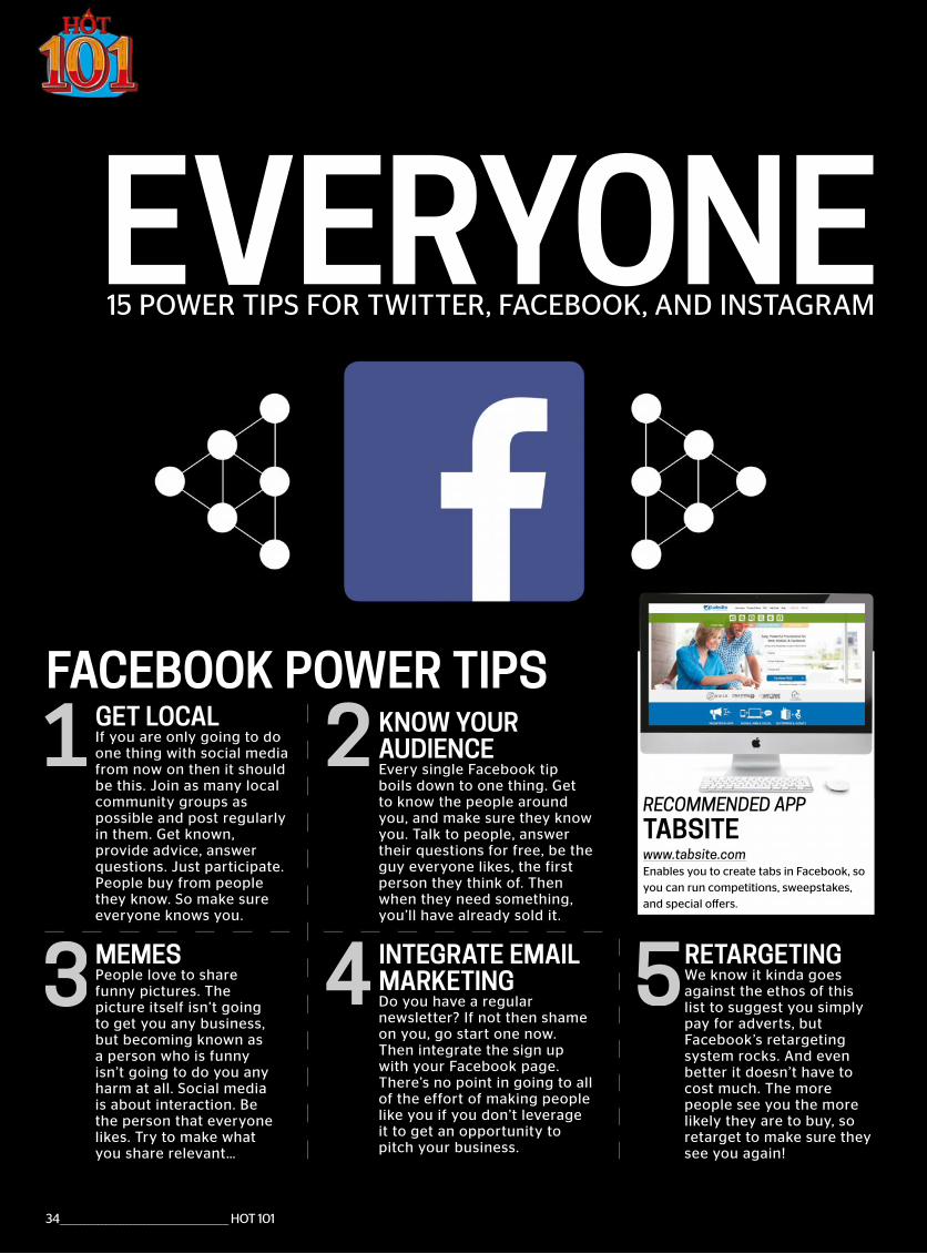
EVERYONE
FACEBOOK POWER TIPS
1
4 53
2
15 POWER TIPS FOR TWITTER, FACEBOOK, AND INSTAGRAM
GET LOCALIf you are only going to do one thing with social media from now on then it should be this. Join as many local community groups as possible and post regularly in them. Get known, provide advice, answer questions. Just participate. People buy from people they know. So make sure everyone knows you.
MEMESPeople love to share funny pictures. The picture itself isn’t going to get you any business, but becoming known as a person who is funny isn’t going to do you any harm at all. Social media is about interaction. Be the person that everyone likes. Try to make what you share relevant…
KNOW YOUR AUDIENCEEvery single Facebook tip boils down to one thing. Get to know the people around you, and make sure they know you. Talk to people, answer their questions for free, be the guy everyone likes, the first person they think of. Then when they need something, you’ll have already sold it.
INTEGRATE EMAIL MARKETINGDo you have a regular newsletter? If not then shame on you, go start one now. Then integrate the sign up with your Facebook page. There’s no point in going to all of the effort of making people like you if you don’t leverage it to get an opportunity to pitch your business.
RETARGETINGWe know it kinda goes against the ethos of this list to suggest you simply pay for adverts, but Facebook’s retargeting system rocks. And even better it doesn’t have to cost much. The more people see you the more likely they are to buy, so retarget to make sure they see you again!
34 ________________________________________________ HOT 101
www.tabsite.comEnables you to create tabs in Facebook, so you can run competitions, sweepstakes, and special offers.
TABSITERECOMMENDED APPRECOMMENDED APP
LOOK AT ME
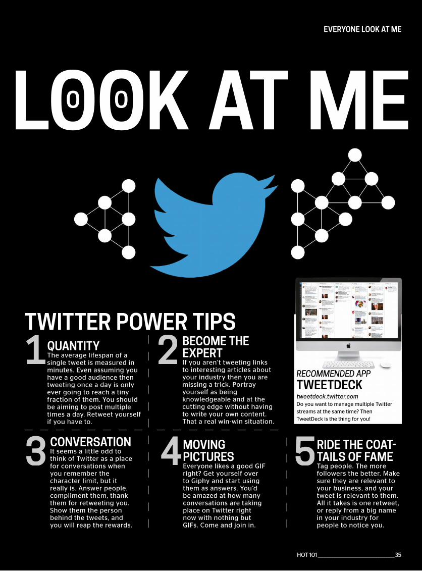
TWITTER POWER TIPS
O O
EVERYONE LOOK AT ME
1
4 53
2QUANTITYThe average lifespan of a single tweet is measured in minutes. Even assuming you have a good audience then tweeting once a day is only ever going to reach a tiny fraction of them. You should be aiming to post multiple times a day. Retweet yourself if you have to.
CONVERSATIONIt seems a little odd to think of Twitter as a place for conversations when you remember the character limit, but it really is. Answer people, compliment them, thank them for retweeting you. Show them the person behind the tweets, and you will reap the rewards.
BECOME THE EXPERTIf you aren’t tweeting links to interesting articles about your industry then you are missing a trick. Portray yourself as being knowledgeable and at the cutting edge without having to write your own content. That a real win-win situation.
MOVING PICTURESEveryone likes a good GIF right? Get yourself over to Giphy and start using them as answers. You’d be amazed at how many conversations are taking place on Twitter right now with nothing but GIFs. Come and join in.
RIDE THE COAT-TAILS OF FAMETag people. The more followers the better. Make sure they are relevant to your business, and your tweet is relevant to them. All it takes is one retweet, or reply from a big name in your industry for people to notice you.
tweetdeck.twitter.comDo you want to manage multiple Twitter streams at the same time? Then TweetDeck is the thing for you!
TWEETDECKRECOMMENDED APPRECOMMENDED APP
HOT 101 ________________________________________________35
36 ________________________________________________ HOT 101
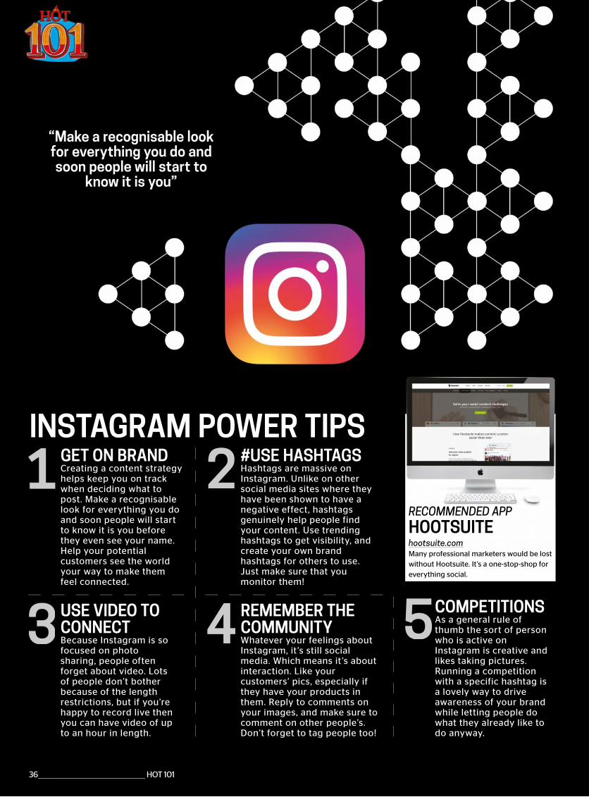
INSTAGRAM POWER TIPS
4 53
2GET ON BRANDCreating a content strategy helps keep you on track when deciding what to post. Make a recognisable look for everything you do and soon people will start to know it is you before they even see your name. Help your potential customers see the world your way to make them feel connected.
USE VIDEO TO CONNECTBecause Instagram is so focused on photo sharing, people often forget about video. Lots of people don’t bother because of the length restrictions, but if you’re happy to record live then you can have video of up to an hour in length.
#USE HASHTAGSHashtags are massive on Instagram. Unlike on other social media sites where they have been shown to have a negative effect, hashtags genuinely help people find your content. Use trending hashtags to get visibility, and create your own brand hashtags for others to use. Just make sure that you monitor them!
REMEMBER THE COMMUNITYWhatever your feelings about Instagram, it ’s still social media. Which means it’s about interaction. Like your customers’ pics, especially if they have your products in them. Reply to comments on your images, and make sure to comment on other people’s. Don’t forget to tag people too!
COMPETITIONSAs a general rule of thumb the sort of person who is active on Instagram is creative and likes taking pictures. Running a competition with a specific hashtag is a lovely way to drive awareness of your brand while letting people do what they already like to do anyway.
hootsuite.comMany professional marketers would be lost without Hootsuite. It’s a one-stop-shop for everything social.
HOOTSUITERECOMMENDED APPRECOMMENDED APP
“Make a recognisable look for everything you do and soon people will start to
know it is you”

www.generateconf.com #generateconf
TICKETS ON SALE NOW
DONNA LICHAW WES BOS ABBY COVERT DAN MALL VAL HEAD
NEW YORK | 25–27 APRIL 2018
and more!
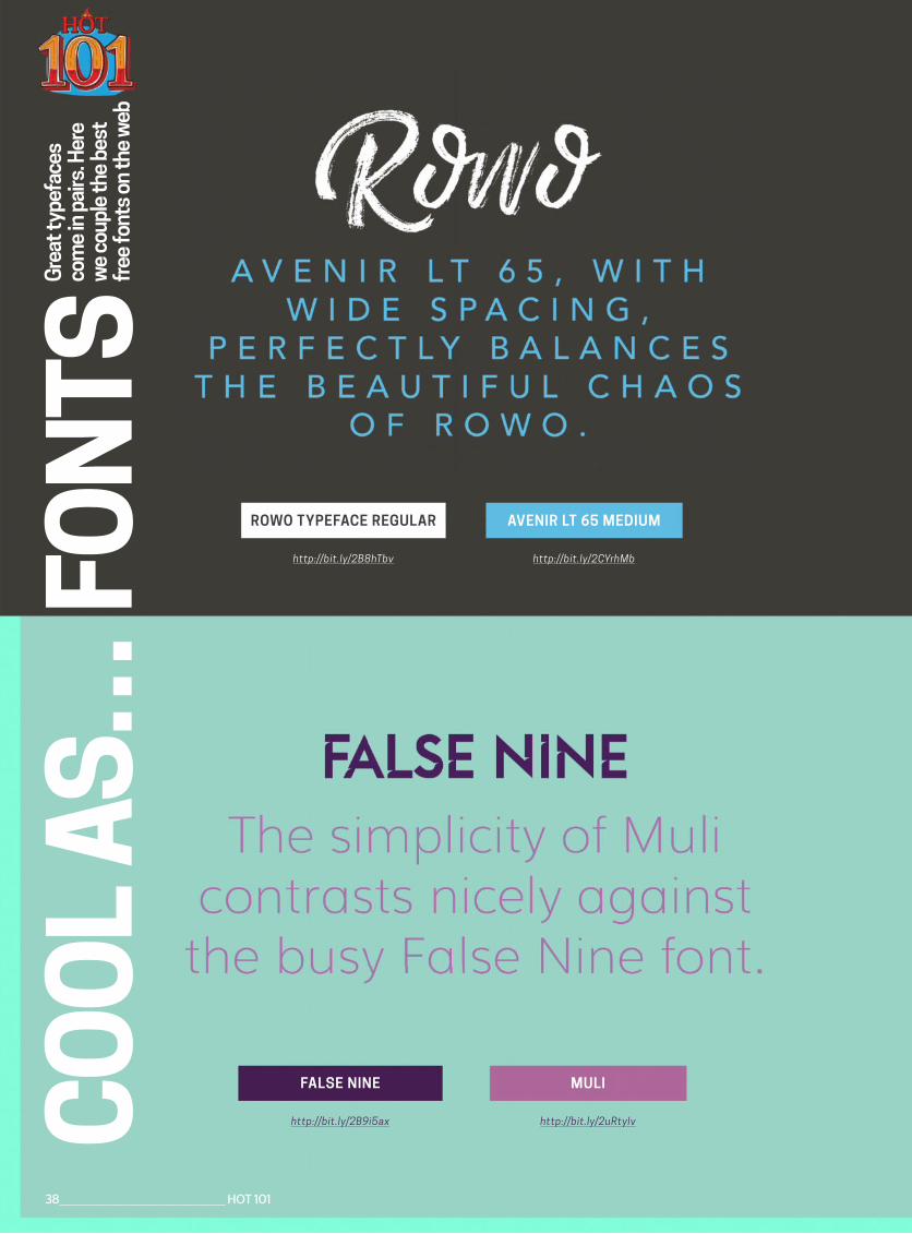
http://bit.ly/2B8hTbv
ROWO TYPEFACE REGULAR
http://bit.ly/2CYrhMb
AVENIR LT 65 MEDIUM
Gre
at ty
pefa
ces
com
e in
pai
rs. H
ere
we
coup
le th
e be
st
free
font
s on
the
web
http://bit.ly/2B9i5ax
FALSE NINE
http://bit.ly/2uRtyIv
MULICO
OL
AS…
FO
NTS
38 ________________________________________________ HOT 101
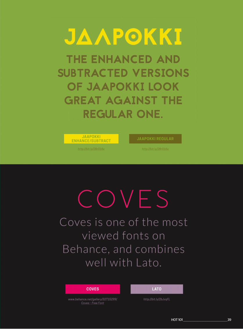
http://bit.ly/2BrO16x
JAAPOKKI ENHANCE/SUBTRACT
http://bit.ly/2BrO16x
JAAPOKKI REGULAR
www.behance.net/gallery/32715299/Coves - Free Font
COVES
http://bit.ly/2bJvqFL
LATO
HOT 101 ________________________________________________39
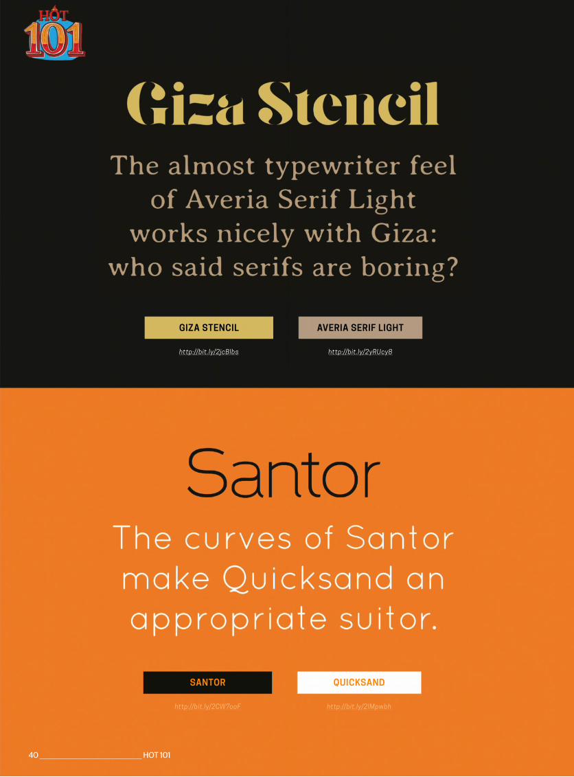
http://bit.ly/2CW7ooF
SANTOR
http://bit.ly/2lMpwbh
QUICKSAND
http://bit.ly/2jcBlbs
GIZA STENCIL
http://bit.ly/2yRUcy8
AVERIA SERIF LIGHT
40 _______________________________________________ HOT 101
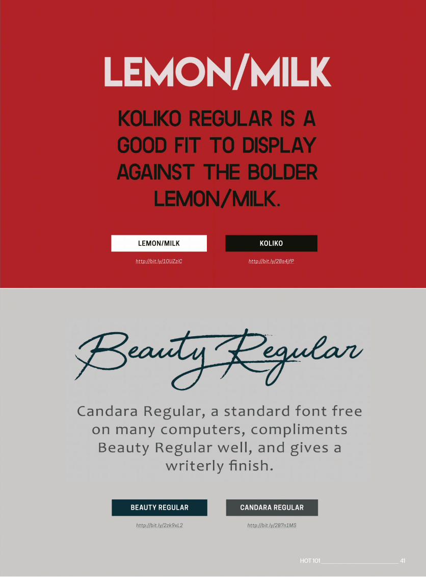
http://bit.ly/1OUZziC
LEMON/MILK
http://bit.ly/2Bs4jfP
KOLIKO
http://bit.ly/2zk9xL2
BEAUTY REGULAR
http://bit.ly/2B7n1MS
CANDARA REGULAR
HOT 101 ________________________________________________ 41
MAKE A MILLIONDISCOVER THE 4 BEST ONLINE SHOP SOLUTIONS TO HELP BUILD YOUR BUSINESS EMPIRE
42 ________________________________________________ HOT 101
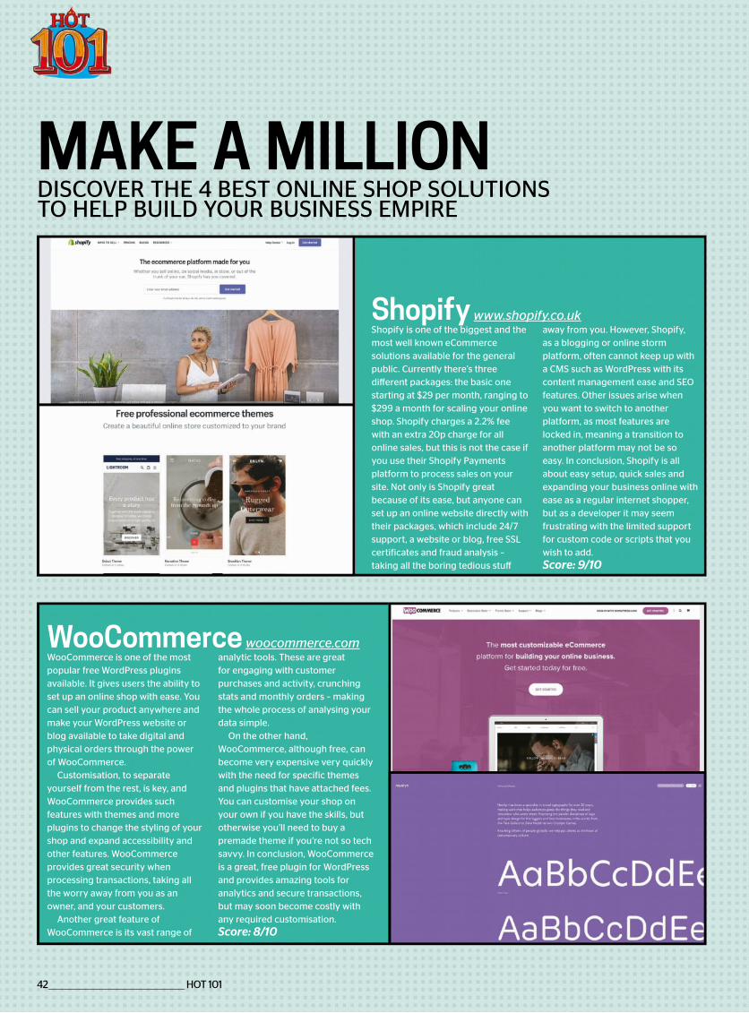
Shopify is one of the biggest and themost well known eCommercesolutions available for the generalpublic. Currently there’s threedifferent packages: the basic onestarting at $29 per month, ranging to$299 a month for scaling your onlineshop. Shopify charges a 2.2% feewith an extra 20p charge for allonline sales, but this is not the case ifyou use their Shopify Paymentsplatform to process sales on yoursite. Not only is Shopify greatbecause of its ease, but anyone canset up an online website directly withtheir packages, which include 24/7support, a website or blog, free SSLcertificates and fraud analysis –taking all the boring tedious stuff
away from you. However, Shopify, as a blogging or online storm platform, often cannot keep up with a CMS such as WordPress with its content management ease and SEO features. Other issues arise when you want to switch to another platform, as most features are locked in, meaning a transition to another platform may not be so easy. In conclusion, Shopify is all about easy setup, quick sales and expanding your business online with ease as a regular internet shopper, but as a developer it may seem frustrating with the limited support for custom code or scripts that you wish to add.Score: 9/10
Shopify www.shopify.co.uk
WooCommerce is one of the mostpopular free WordPress pluginsavailable. It gives users the ability to set up an online shop with ease. You can sell your product anywhere and make your WordPress website or blog available to take digital and physical orders through the power of WooCommerce.
Customisation, to separate yourself from the rest, is key, and WooCommerce provides such features with themes and more plugins to change the styling of your shop and expand accessibility and other features. WooCommerce provides great security when processing transactions, taking all the worry away from you as an owner, and your customers.
Another great feature of WooCommerce is its vast range of
analytic tools. These are greatfor engaging with customerpurchases and activity, crunching stats and monthly orders – making the whole process of analysing your data simple.
On the other hand, WooCommerce, although free, can become very expensive very quickly with the need for specific themes and plugins that have attached fees. You can customise your shop on your own if you have the skills, but otherwise you’ll need to buy a premade theme if you’re not so tech savvy. In conclusion, WooCommerce is a great, free plugin for WordPress and provides amazing tools for analytics and secure transactions, but may soon become costly with any required customisation.Score: 8/10
WooCommerce woocommerce.com
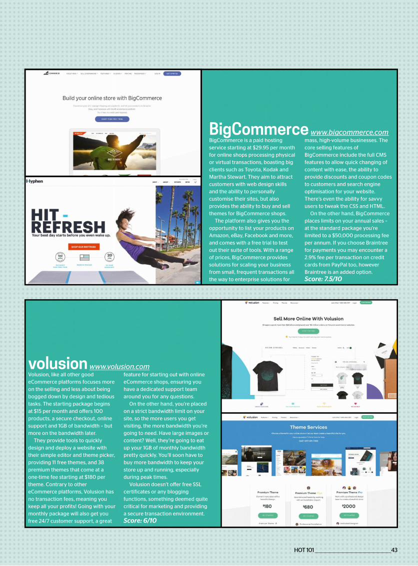
BigCommerce is a paid hostingservice starting at $29.95 per monthfor online shops processing physicalor virtual transactions, boasting bigclients such as Toyota, Kodak andMartha Stewart. They aim to attractcustomers with web design skillsand the ability to personallycustomise their sites, but alsoprovides the ability to buy and sellthemes for BigCommerce shops.
The platform also gives you theopportunity to list your products onAmazon, eBay, Facebook and more,and comes with a free trial to testout their suite of tools. With a rangeof prices, BigCommerce providessolutions for scaling your businessfrom small, frequent transactions allthe way to enterprise solutions for
mass, high-volume businesses. Thecore selling features ofBigCommerce include the full CMSfeatures to allow quick changing ofcontent with ease, the ability toprovide discounts and coupon codesto customers and search engineoptimisation for your website.There’s even the ability for savvyusers to tweak the CSS and HTML.
On the other hand, BigCommerceplaces limits on your annual sales –at the standard package you’relimited to a $50,000 processing feeper annum. If you choose Braintreefor payments you may encounter a2.9% fee per transaction on creditcards from PayPal too, howeverBraintree is an added option.Score: 7.5/10
BigCommerce www.bi commerce.com
Volusion, like all other goodeCommerce platforms focuses moreon the selling and less about being bogged down by design and tedious tasks. The starting package begins at $15 per month and offers 100 products, a secure checkout, online support and 1GB of bandwidth – but more on the bandwidth later.
They provide tools to quickly design and deploy a website with their simple editor and theme picker, providing 11 free themes, and 38 premium themes that come at a one-time fee starting at $180 per theme. Contrary to other eCommerce platforms, Volusion has no transaction fees, meaning you keep all your profits! Going with your monthly package will also get you free 24/7 customer support, a great
feature for starting out with online eCommerce shops, ensuring you have a dedicated support team around you for any questions.
On the other hand, you’re placed on a strict bandwidth limit on your site, so the more users you get visiting, the more bandwidth you’re going to need. Have large images or content? Well, they’re going to eat up your 1GB of monthly bandwidth pretty quickly. You’ll soon have to buy more bandwidth to keep your store up and running, especially during peak times.
Volusion doesn’t offer free SSL certificates or any blogging functions, something deemed quite critical for marketing and providing a secure transaction environment.Score: 6/10
volusion www.volusion.com
HOT 101 ________________________________________________43

Sourcehttp://bit.ly/2AQu4JN
According to Wikipedia these are the most expensive domain
recorded. However, other domains have cost more, but these typically
include content as well as the domain. LasVegas.com is reported
to have cost a whopping $90m, while CarInsurance.com very
nearly tops the $50m mark. Unbelievably Cars.com was valued at $872m. For a bit of fun why not
find the (approx) value of a domain you own. Take a trip to
www.siteprice.org
… HOW MUCH!!
Insurance.com|
$35.6MILLION
2010SALE DATE
1
Insure.com|
$16MILLION
2009SALE DATE
6
Internet.com|
$182009
SALE DATE
4
VacationRentals.com|
MILLION2007
SALE DATE
2
PrivateJet.com|
$30.18MILLION
2012SALE DATE
3
Fund.com|
£9.99MILLION
2008SALE DATE
7
360.com|
$17MILLION
2015SALE DATE
5
$ £
MILLION
$35
44 _______________________________________________ HOT 101
MOST NSIVE DOMAINS EVER RECORDED
WTF
Try and wrap your head around these numbers. How much is your domain worth?

HOT 101 ________________________________________________45
The best digital products are found on the intersections of different
fields. As a designer I like beautiful calligraphy, and when I found
AR.js library I decided to build a product with a mix of augmented
reality and calligraphy.
VOLODYMYR KURBATOVFREELANCE VR/AR PRODUCT DESIGNER
LEARN CALLIGRAPHY TODAYhttps://learncalligraphy.today
https://learncalligraphy.today/hiro-marker.html

6 WAYS TO GET INTO
CREATIVECODING
LET YOUR IMAGINATION RUN FREE BY PLAYING
AROUND IN CODE. SEE HOW LIBRARIES, BROWSERS AND APIS CAN COME TOGETHER
TO CREATE MESMERISING VISUAL DISPLAYS
It is difficult to define exactly what ‘creative coding’ means. In broad terms, it refers to the production of something that is expressive in nature rather than
having a purely practical use. It is a chance to learn and explore how various different technologies can come together to create impressive works of art.
What form that takes is entirely up to the creator. Anything from data visualisation to image manipulation could be considered ‘creative coding’. The web is flexible enough to open up opportunities in different areas of art and design.
Here we look at the different ways you can experiment with code and create stimulating visual results.
46 _______________________________________________ HOT 101
HOT 101 ________________________________________________47
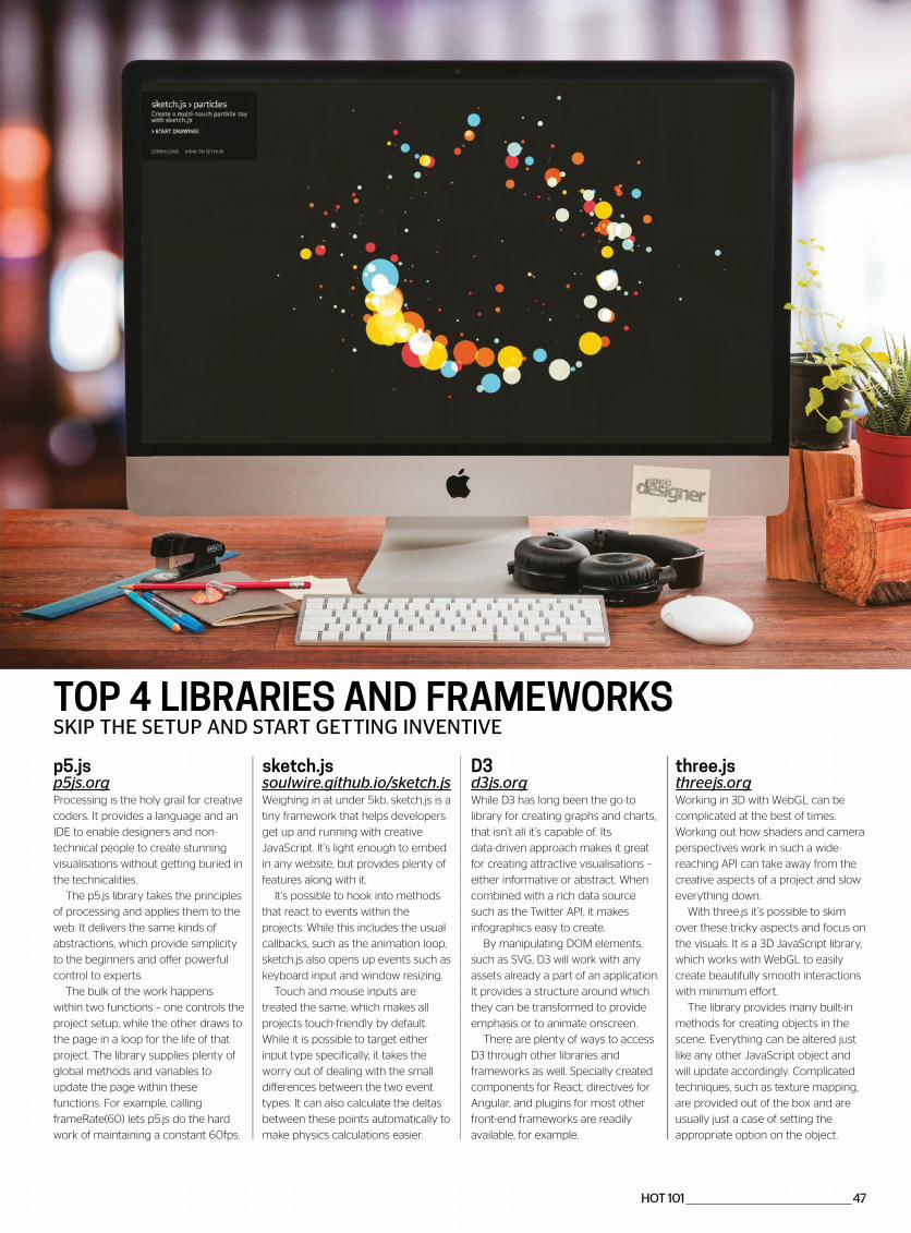
TOP 4 LIBRARIES AND FRAMEWORKSSKIP THE SETUP AND START GETTING INVENTIVE
p5.jsp5 s.orProcessing is the holy grail for creative
coders. It provides a language and an
IDE to enable designers and non-
technical people to create stunning
visualisations without getting buried in
the technicalities.
The p5.js library takes the principles
of processing and applies them to the
web. It delivers the same kinds of
abstractions, which provide simplicity
to the beginners and offer powerful
control to experts.
The bulk of the work happens
within two functions – one controls the
project setup, while the other draws to
the page in a loop for the life of that
project. The library supplies plenty of
global methods and variables to
update the page within these
functions. For example, calling
frameRate(60) lets p5.js do the hard
work of maintaining a constant 60fps.
D3d3 s.orWhile D3 has long been the go-to
library for creating graphs and charts,
that isn’t all it’s capable of. Its
data-driven approach makes it great
for creating attractive visualisations –
either informative or abstract. When
combined with a rich data source
such as the Twitter API, it makes
infographics easy to create.
By manipulating DOM elements,
such as SVG, D3 will work with any
assets already a part of an application.
It provides a structure around which
they can be transformed to provide
emphasis or to animate onscreen.
There are plenty of ways to access
D3 through other libraries and
frameworks as well. Specially created
components for React, directives for
Angular, and plugins for most other
front-end frameworks are readily
available, for example.
sketch.jssoulwire. ithub.io/sketch. sWeighing in at under 5kb, sketch.js is a
tiny framework that helps developers
get up and running with creative
JavaScript. It’s light enough to embed
in any website, but provides plenty of
features along with it.
It’s possible to hook into methods
that react to events within the
projects. While this includes the usual
callbacks, such as the animation loop,
sketch.js also opens up events such as
keyboard input and window resizing.
Touch and mouse inputs are
treated the same, which makes all
projects touch-friendly by default.
While it is possible to target either
input type specifically, it takes the
worry out of dealing with the small
differences between the two event
types. It can also calculate the deltas
between these points automatically to
make physics calculations easier.
three.jsthree s.orWorking in 3D with WebGL can be
complicated at the best of times.
Working out how shaders and camera
perspectives work in such a wide-
reaching API can take away from the
creative aspects of a project and slow
everything down.
With three.js it’s possible to skim
over these tricky aspects and focus on
the visuals. It is a 3D JavaScript library,
which works with WebGL to easily
create beautifully smooth interactions
with minimum effort.
The library provides many built-in
methods for creating objects in the
scene. Everything can be altered just
like any other JavaScript object and
will update accordingly. Complicated
techniques, such as texture mapping,
are provided out of the box and are
usually just a case of setting the
appropriate option on the object.
48 _______________________________________________ HOT 101
GET SMART WITH DATA SOURCES AND APIsGET NEW DATA FROM ELSEWHERE AND KEEP YOUR PROJECT FRESH
graphing live tweets about a topic
from around the world.
While there are plenty of
opportunities to use the output from
Twitter, the API also allows for
applications to post messages to
Twitter. These can come from any
source provided that it’s connected
to the API.
All endpoints in the API require
some kind of authentication. For most
projects that is only an application key,
but authenticating can be tricky when
done manually. Thankfully there are a
few packages that make working with
the Twitter API a little easier.
The npm module ‘twitter’ is the
catch-all client library when working
through Node. It supports regular
endpoints as well as streaming, which
may be useful for real-time projects.
The ‘flickr.photos.search’ endpoint is
the most commonly used and gives
access to most of Flickr’s content. It
can be filtered and sorted by date,
location and even license as
necessary. Other endpoints can get
more detail on the photo, such as
comments or EXIF data
Getting the API to work exactly how
the project needs it to can be difficult,
particularly if writing information back
to Flickr. Luckily, plenty of packages
exist to help use it with JavaScript,
including the company’s own
‘flickr-sdk’ on npm.
It’s important to note that all images
remain the property of their owners.
For personal projects this will not be
an issue, but if it’s being shared be
sure to either seek permission or
credit the owner.
TwitterWith over 320 million active users in
2017, Twitter is a wealth of information.
People are talking about every
conceivable topic by posting pictures
and video alongside their unfiltered
reactions in real time.
This makes it a goldmine for a
creative coding project. The official API
can bring back the tweets in the
format needed along with other
metadata that is open for analysis. This
data can then be visualised in new
and exciting ways.
The Twitter API provides four
defined ‘objects’ that can be retrieved
– tweets, users, locations and entities.
Entities include extra information
linked to those objects including
hashtags and media. Values on these
objects are fixed and will only ever be
extended upon, which means you will
never lose access.
Tweets themselves can be searched
for with a query to a single endpoint.
These searches can either be for a
string or can be more descriptive,
such as for images or tweets with a
positive sentiment.
Visualising Twitter data can make a
great connected design piece.
Combining multiple data points such
as location and sentiment can create a
project that is also informative, such as
Instagram and FlickrCreative coding projects are often
visual, which makes image and video
sharing APIs an attractive prospect for
inspiration. Thankfully, sites such as
Instagram and Flickr open up their
data and allow developers access to
that content, as well as the
surrounding metadata.
Instagram has become one of the
web’s most popular image-sharing
platforms. As a result, it is a rich source
of images to use in creative projects.
The API is no different. It provides
access to images, videos, comments
and tags, as well as ways of searching
through this information to find what is
needed for the project.
Access within the API will be initially
limited to a small pool of accounts and
images. To remove some of these
restrictions, Instagram will need to
review the project themselves, which
can be time-consuming and fruitless
for creative coding projects.
Depending on the project, the initial
sandbox mode may suffice.
Flickr has a more readily accessible
API. It is a resource of high quality
images available at multiple
resolutions. Many of the photo
endpoints only require an application
key to work, which makes set up and
fetching much easier.
The Twitter API provides four
defined ‘objects’ that can be
retrieved
Flickr has a readily accessible
API. It is a resource of high quality images
Social media APIs such as Twitter, Instagram
and Last.fm can provide a great source for data visualisations
and mashups
HOT 101 ________________________________________________49
MOBILE DEVICE SENSORSWORK WITH THEIR UNIQUE INPUTS
})
.then(function(stream) {
// Access input
})
.catch(function(error) {
// Provide fallback option
});
The code has to specify exactly what
is needed from the input devices. The
call to getUserMedia() will trigger a
permissions dialog that the user must
accept before continuing. Once
accepted, these features are available
as streams, making them more
memory efficient.
All major browsers support this API,
including mobile. If the browser
cannot meet the exact requirements,
the promise will reject and not work.
It’s important to supply an alternative
experience, such as an image upload
form, where access is not possible.
rientation”, e => {
console.log(e.gamma);
});
window.addEventListener(“devicem
otion”, e => {
console.log(e.acceleration);
});
APIs provide access to this information, but the values returned will vary by browser as they do not all use the same coordinate system. Libraries such as p5.js provide special values and hooks like ‘rotationX’ or‘deviceShaken()’ to help abstract away the differences.
Mobile devices also have the ability to determine their exact position using geolocation. Being able to get the exact location of a device can open up newpossibilities and make for a more streamlined experience.navigator.geolocation.
getCurrentPosition(pos => {
console.log(pos.coords); });
Access is provided through the navigator object. The value returned is the lat-long co-ordinates of the device, along with other data such as altitude or speed if the device supports it. Browsers will use the fastest method of detecting location, such as the IP address. However, this may not always be the most accurate.
Combining these inputs in creative ways is the key to making something special. For example, using the device’s location and orientation to create a virtual stargazing experience.
Camera and MicrophoneThe web is usually limited to pointing
and clicking with a mouse, but that is
not the only way of providing input.
Today’s browsers are equipped with
new APIs to pull in data from different
external sources, including cameras
and microphones.
Making projects that are visually
aware is a great way to get users
involved. By using vision as an input
over a traditional keyboard and
mouse, users are able to interact in
different ways, such as face tracking or
image recognition. As most devices
now come with a camera built in, it is
no longer the barrier it once was and
works out great for the web.
Listening to the user is also a great
alternative to manual input. Voice
recognition could control navigation,
or users could provide their own audio
samples to use within their experience.
It could also serve as an alternative to
a button press. By extracting pitch and
volume, these can then be mapped to
what normally would be a button
press, which could be used to control
anything from colour to movement.
Access to a camera and
microphone is possible through the
navigator object.
navigator.mediaDevices.
getUserMedia({
audio: true,
video: { width: 640, height: 480
}
The world of mobile presents a completely different set of opportunities when it comes to creative coding. The wide variety of form factors and sensors open for use within the browser can make for some distinctive experiences.
Mobile devices are almost exclusively touch interfaces. Browsers have the ability to detect and track multiple touches at once.This means that projects do nothave to be led by a single point andcan be manipulated in a much moreintuitive way.window.
addEventListener(“touchstart”, e
=> {
e.preventDefault();
const touches = e.
changedTouches;
});
All touch events use a‘changedTouches’ property on theevent. This holds a reference to allthe touch points that changeddependent on the type of event,rather than a separate event foreach touch point. By tracking these,it’s possible to map gestures orpaint with touch.
Accelerometers and gyroscopesare mostly used for changing fromportrait to landscape mode, butthese are also up for interpretation.Different methods of interactioncan be created by using the deviceitself as a control mechanism– whether that in specific co-ordinate movements or moregesture-based, such as a shake.window.addEventListener(“deviceo
By using vision as an input over a
traditional keyboard and
mouse, users are able to interact in
different ways
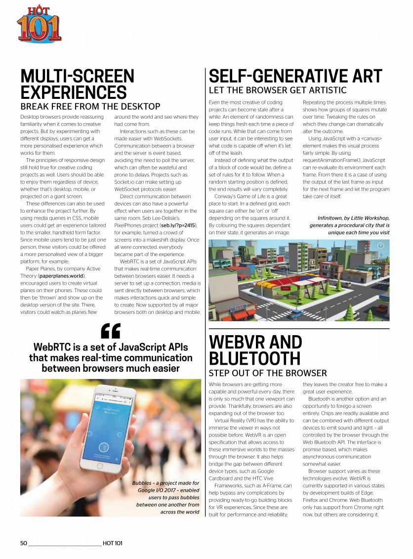
Brick Street View will show what your current surroundings would look like if they were made from LEGO
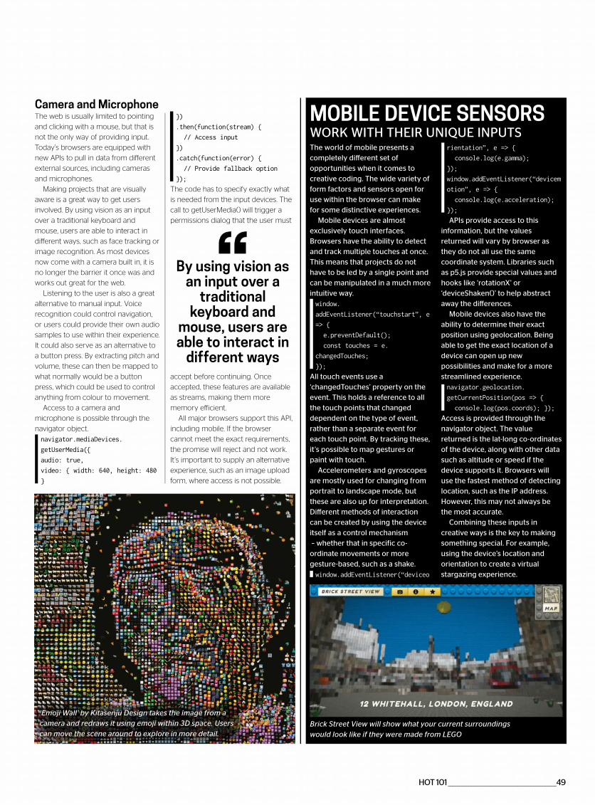
‘Emoji Wall’ by Kitasenju Design takes the image from a camera and redraws it using emoji within 3D space. Users can move the scene around to explore in more detail.
50 _______________________________________________ HOT 101
SELF-GENERATIVE ART
WEBVR ANDBLUETOOTH
MULTI-SCREEN EXPERIENCES LET THE BROWSER GET ARTISTIC
STEP OUT OF THE BROWSER
BREAK FREE FROM THE DESKTOPRepeating the process multiple times
shows how groups of squares mutate
over time. Tweaking the rules on
which they change can dramatically
alter the outcome.
Using JavaScript with a <canvas>
element makes this visual process
fairly simple. By using
requestAnimationFrame(), JavaScript
can re-evaluate its environment each
frame. From there it is a case of using
the output of the last frame as input
for the next frame and let the program
take care of itself.
they leaves the creator free to make a
great user experience.
Bluetooth is another option and an
opportunity to forego a screen
entirely. Chips are readily available and
can be combined with different output
devices to emit sound and light – all
controlled by the browser through the
Web Bluetooth API. The interface is
promise based, which makes
asynchronous communication
somewhat easier.
Browser support varies as these
technologies evolve. WebVR is
currently supported in various states
by development builds of Edge,
Firefox and Chrome. Web Bluetooth
only has support from Chrome right
now, but others are considering it.
around the world and see where they
had come from.
Interactions such as these can be
made easier with WebSockets.
Communication between a browser
and the server is event based,
avoiding the need to poll the server,
which can often be wasteful and
prone to delays. Projects such as
Socket.io can make setting up
WebSocket protocols easier.
Direct communication between
devices can also have a powerful
effect when users are together in the
same room. Seb Lee-Delisle’s
PixelPhones project (seb.ly/?p=2415),
for example, turned a crowd of
screens into a makeshift display. Once
all were connected, everybody
became part of the experience.
WebRTC is a set of JavaScript APIs
that makes real-time communication
between browsers easier. It needs a
server to set up a connection, media is
sent directly between browsers, which
makes interactions quick and simple
to create. Now supported by all major
browsers both on desktop and mobile.
Even the most creative of coding
projects can become stale after a
while. An element of randomness can
keep things fresh each time a piece of
code runs. While that can come from
user input, it can be interesting to see
what code is capable off when it’s let
off of the leash.
Instead of defining what the output
of a block of code would be, define a
set of rules for it to follow. When a
random starting position is defined,
the end results will vary completely.
Conway’s Game of Life is a great
place to start. In a defined grid, each
square can either be ‘on’ or ‘off’
depending on the squares around it.
By colouring the squares dependant
on their state, it generates an image.
While browsers are getting more
capable and powerful every day, there
is only so much that one viewport can
provide. Thankfully, browsers are also
expanding out of the browser too.
Virtual Reality (VR) has the ability to
immerse the viewer in ways not
possible before. WebVR is an open
specification that allows access to
these immersive worlds to the masses
through the browser. It also helps
bridge the gap between different
device types, such as Google
Cardboard and the HTC Vive.
Frameworks, such as A-Frame, can
help bypass any complications by
providing ready-to-go building blocks
for VR experiences. Since these are
built for performance and reliability,
Desktop browsers provide reassuring
familiarity when it comes to creative
projects. But by experimenting with
different displays, users can get a
more personalised experience which
works for them.
The principles of responsive design
still hold true for creative coding
projects as well. Users should be able
to enjoy them regardless of device,
whether that’s desktop, mobile, or
projected on a giant screen.
These differences can also be used
to enhance the project further. By
using media queries in CSS, mobile
users could get an experience tailored
to the smaller, handheld form factor.
Since mobile users tend to be just one
person, these visitors could be offered
a more personalised view of a bigger
platform, for example.
Paper Planes, by company Active
Theory (paperplanes.world),
encouraged users to create virtual
planes on their phones. These could
then be ‘thrown’ and show up on the
desktop version of the site. There,
visitors could watch as planes flew
WebRTC is a set of JavaScript APIs that makes real-time communication
between browsers much easier
Bubbles – a project made for Google I/O 2017 – enabled
users to pass bubbles between one another from
across the world
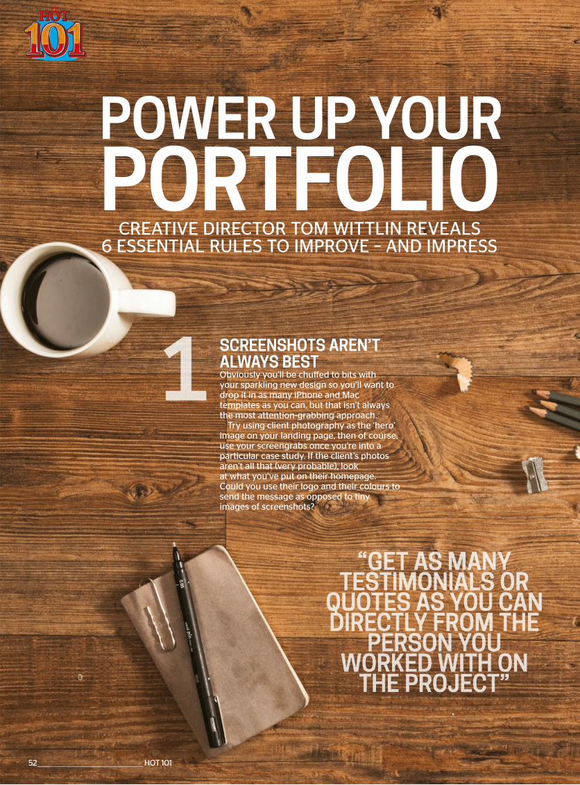
Infinitown, by Little Workshop, generates a procedural city that is
unique each time you visit

*Terms and conditions This is a US subscription offer. 6 free issues refers to the USA newsstand price of $14.99 for 13 issues being $194.87,compared with $103.20 for a subscription. You will receive 13 issues in a year. You can write to us or call us to cancel your subscription within 14 days ofpurchase. Payment is non-refundable after the 14 day cancellation period unless exceptional circumstances apply. Your statutory rights are not affected.Prices correct at point of print and subject to change. Full details of the Direct Debit guarantee are available upon request. UK calls will cost the same as
full terms and conditions please visit: bit.ly/magtandc Offer ends February 28 2018.
Expires 28 Feb 2018
ly magazine ed to design develop
ng websites
6 issuesFREET
ssststututunununnnnn
FREEresource
downloadseve y issue
Special offer for readers in North America
When you subscribe
Order hotline +44 (0) 344 848 2852Online at myfavouritemagazines.co.uk/WEDPQ17
POWER UP YOURPORTFOLIO
CREATIVE DIRECTOR TOM WITTLIN REVEALS 6 ESSENTIAL RULES TO IMPROVE – AND IMPRESS
SCREENSHOTS AREN’T ALWAYS BESTObviously you’ll be chuffed to bits with your sparkling new design so you’ll want to drop it in as many iPhone and Mac templates as you can, but that isn’t always the most attention-grabbing approach.
Try using client photography as the ‘hero’ image on your landing page, then of course, use your screengrabs once you’re into a particular case study. If the client’s photos aren’t all that (very probable), look at what you’ve put on their homepage. Could you use their logo and their colours to send the message as opposed to tiny images of screenshots?
52 ________________________________________________ HOT 101

POWER UP YOUR PORTFOLIO
LET THE CLIENT SING YOUR PRAISESGet as many testimonials or quotes as you can directly from the person you worked with on the project. This helps enormously for people to understand your capability to work with others, not just your design/coding skills.
Given how much of our work requires human interaction, it is vital for prospective clients to understand that you know how to manage yourself – and relationships.
In addition, it’s useful to ask clients to add their comments to your LinkedIn. Quite often that may be a client’s first interaction with you as opposed to coming onto your website. The old adage of word of mouth being the strongest form of advertising is still alive and well...
ATTENTION- GRABBING TITLESInstead of starting your case study off by saying “Look at the new redesign of XYZ.com”, you can make this more engaging by saying something along the lines of “Improved new customer interactions and conversions by 24%” by picking out key stats from Google Analytics.
If they don’t have any specific statistic that you can flaunt or they’re something like a barrister, no bother, just instead talk about improving the user experience through a more simplistic navigation, more effective mobile website or even just bringing their site into the 21st century.
HOT 101 ________________________________________________53
DON’T GET COCKY, KIDThere’s nothing worse than a pretentious designer’s overly ‘designed’ website, which they’ve thrown all the bells and whistles at to showcase their abilities, but neglected to provide clear routes to see the work itself.
I should know, because as a junior, I spent every waking hour redesigning my own website to chuck in more wizardry that I’d learnt, only to realise that basically all anyone needs is a nice, simple, clean looking page with a clear list of all the work completed, complete with the ability to jump into it, and an easy way of moving back to the list, or jumping to the next item. Oh – and make sure your images are big, bold and extra clear. On mobile and desktop!
ALL ABOUT THE DETAILIn your case studies, pick up on the small details you agonised over and the reasons why. For example, talk about the complexity of a JavaScript-driven menu that allows you to navigate to the lowest level in the site in just a couple of clicks to improve UX. As long as you don’t get too geeky, this will illustrate how you approach work – with clear attention to detail.
Ask how a fine furniture maker might talk about the beautiful mahogany cabinet he’s just made that took him 3,000 hours to produce. He’d likely mention joins, hinges, handles and polishing. When you consider your work is akin to a traditional craftsman, you can begin to see more than just graphics and code.
TELL A STORYIt’s easy to just explain what you did when talking about a project, but it can be far more interesting to explain why you did it. By weaving the redesign or project into a narrative you can begin to draw in the audience a little more than a simple deluge of facts and figures.
For example, as opposed to “we redesigned and built the new eCommerce store for XYZ.com”, you could begin with explaining who they are, what their current scenario was and the solution you came to help evolve them out of their current predicament.
4
5
6
54 ________________________________________________ HOT 101
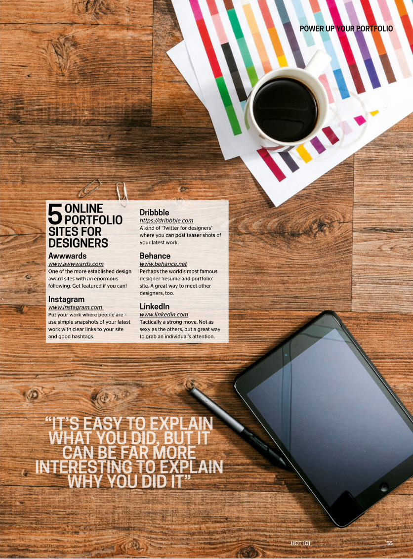
Awwwardswww.awwwards.comOne of the more established designaward sites with an enormousfollowing. Get featured if you can!
Instagramwww.instagram.comPut your work where people are –use simple snapshots of your latestwork with clear links to your siteand good hashtags.
Dribbble https://dribbble.comA kind of ‘Twitter for designers’ where you can post teaser shots of your latest work.
Behancewww.behance.netPerhaps the world’s most famous designer ‘resume and portfolio’ site. A great way to meet other designers, too.
LinkedInwww.linkedin.comTactically a strong move. Not as sexy as the others, but a great way to grab an individual’s attention.
5 ONLINE PORTFOLIO
SITES FOR DESIGNERS
POWER UP YOUR PORTFOLIO
HOT 101 ________________________________________________55
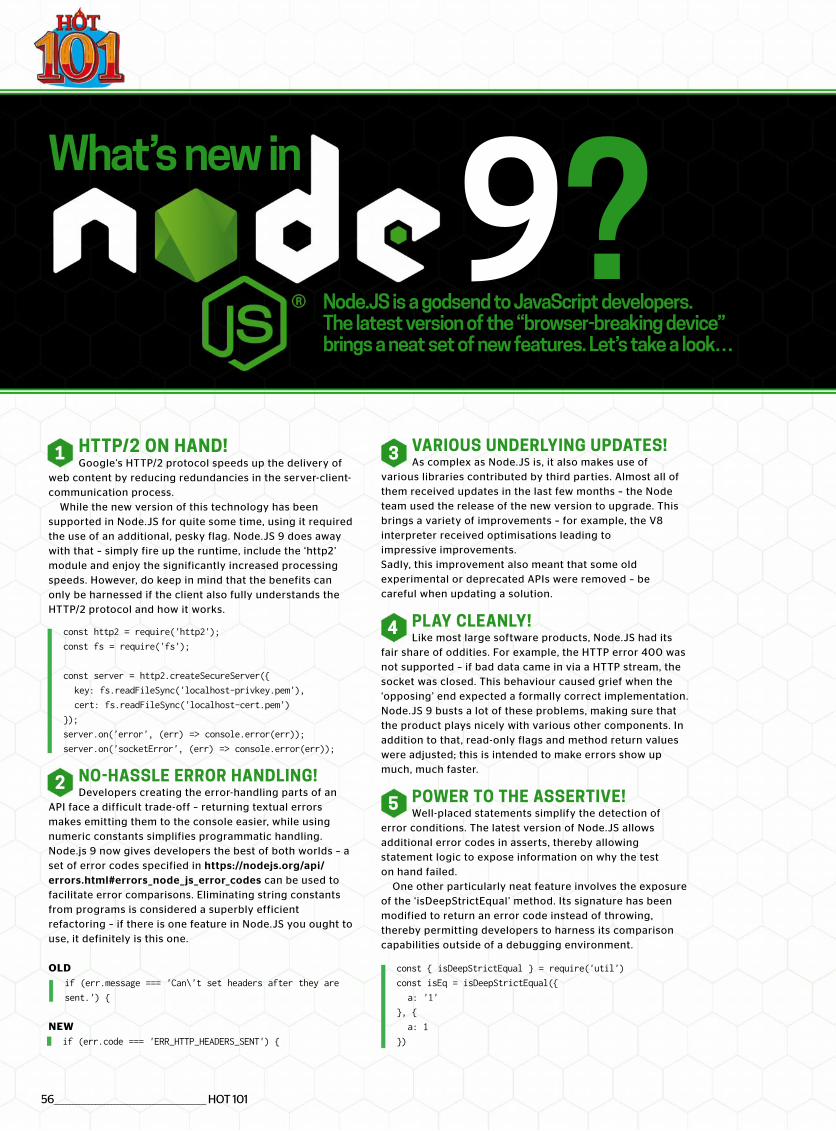
56________________________________________________ HOT 101
Node.JS is a godsend to JavaScript developers. The latest version of the “browser-breaking device” brings a neat set of new features. Let’s take a look…
9?HTTP/2 ON HAND!Google’s HTTP/2 protocol speeds up the delivery of
web content by reducing redundancies in the server-client-communication process.
While the new version of this technology has been supported in Node.JS for quite some time, using it required the use of an additional, pesky flag. Node.JS 9 does away with that – simply fire up the runtime, include the ‘http2’ module and enjoy the significantly increased processing speeds. However, do keep in mind that the benefits can only be harnessed if the client also fully understands the HTTP/2 protocol and how it works.
const http2 = require('http2');
const fs = require('fs');
const server = http2.createSecureServer({
key: fs.readFileSync('localhost-privkey.pem'),
cert: fs.readFileSync('localhost-cert.pem')
});
server.on('error', (err) => console.error(err));
server.on('socketError', (err) => console.error(err));
NO-HASSLE ERROR HANDLING!Developers creating the error-handling parts of an
API face a difficult trade-off – returning textual errors makes emitting them to the console easier, while using numeric constants simplifies programmatic handling. Node.js 9 now gives developers the best of both worlds – a set of error codes specified in https://nodejs.org/api/errors.html#errors_node_ js_error_codes can be used to facilitate error comparisons. Eliminating string constants from programs is considered a superbly efficient refactoring – if there is one feature in Node.JS you ought to use, it definitely is this one.
OLDif (err.message === 'Can\'t set headers after they are
sent.') {
NEWif (err.code === 'ERR_HTTP_HEADERS_SENT') {
What’s new in
VARIOUS UNDERLYING UPDATES!As complex as Node.JS is, it also makes use of
various libraries contributed by third parties. Almost all of them received updates in the last few months – the Node team used the release of the new version to upgrade. This brings a variety of improvements – for example, the V8 interpreter received optimisations leading to impressive improvements. Sadly, this improvement also meant that some old experimental or deprecated APIs were removed – be careful when updating a solution.
PLAY CLEANLY!Like most large software products, Node.JS had its
fair share of oddities. For example, the HTTP error 400 was not supported – if bad data came in via a HTTP stream, the socket was closed. This behaviour caused grief when the ‘opposing’ end expected a formally correct implementation. Node.JS 9 busts a lot of these problems, making sure that the product plays nicely with various other components. In addition to that, read-only flags and method return values were adjusted; this is intended to make errors show up much, much faster.
POWER TO THE ASSERTIVE!Well-placed statements simplify the detection of
error conditions. The latest version of Node.JS allows additional error codes in asserts, thereby allowing statement logic to expose information on why the test on hand failed.
One other particularly neat feature involves the exposure of the ‘isDeepStrictEqual’ method. Its signature has been modified to return an error code instead of throwing, thereby permitting developers to harness its comparison capabilities outside of a debugging environment.
const { isDeepStrictEqual } = require('util')
const isEq = isDeepStrictEqual({
a: '1'
}, {
a: 1
})
1
2
3
4
5
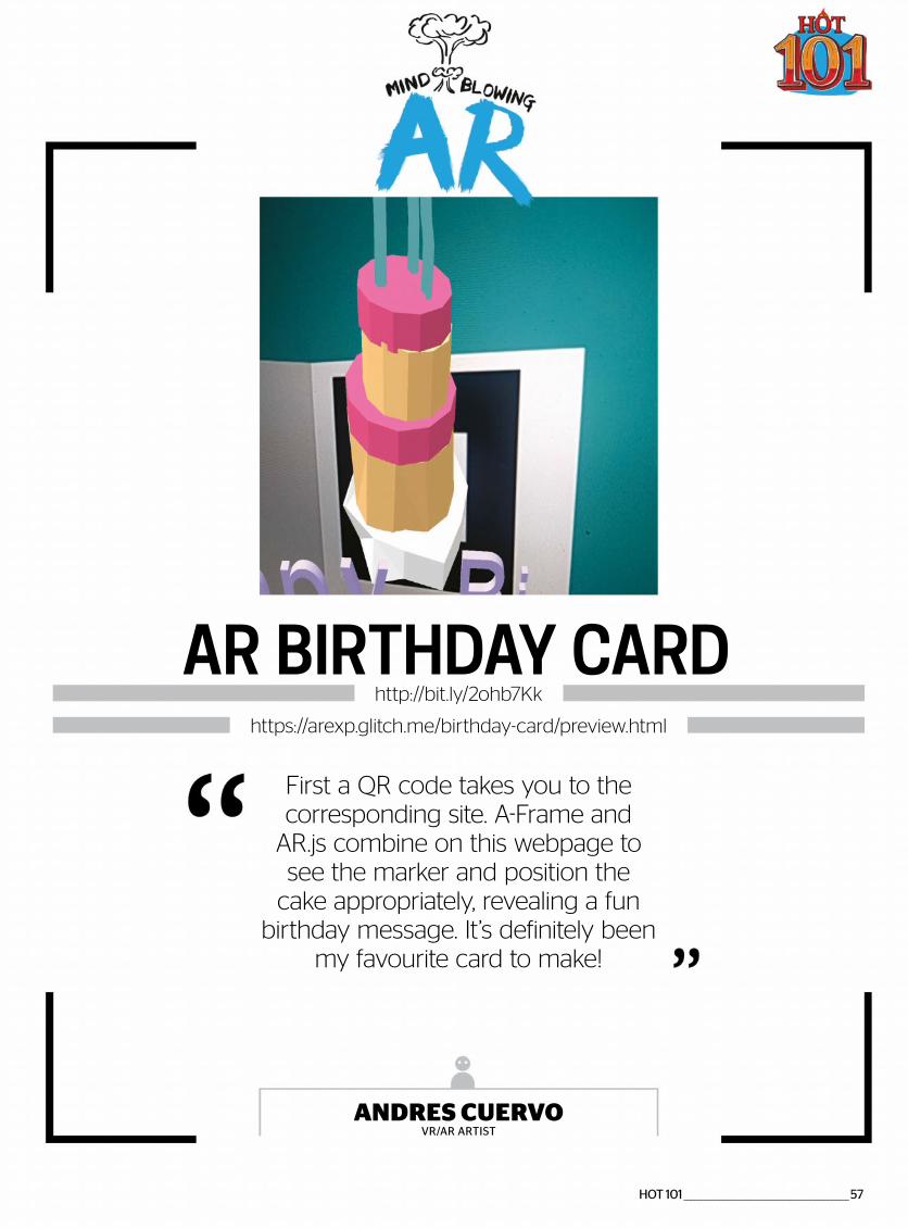
HOT 101 ________________________________________________57
First a QR code takes you to the corresponding site. A-Frame and
AR.js combine on this webpage to see the marker and position the
cake appropriately, revealing a fun birthday message. It’s definitely been
my favourite card to make!
ANDRES CUERVOVR/AR ARTIST
AR BIRTHDAY CARDhttp://bit.ly/2ohb7Kk
https://arexp.glitch.me/birthday-card/preview.html
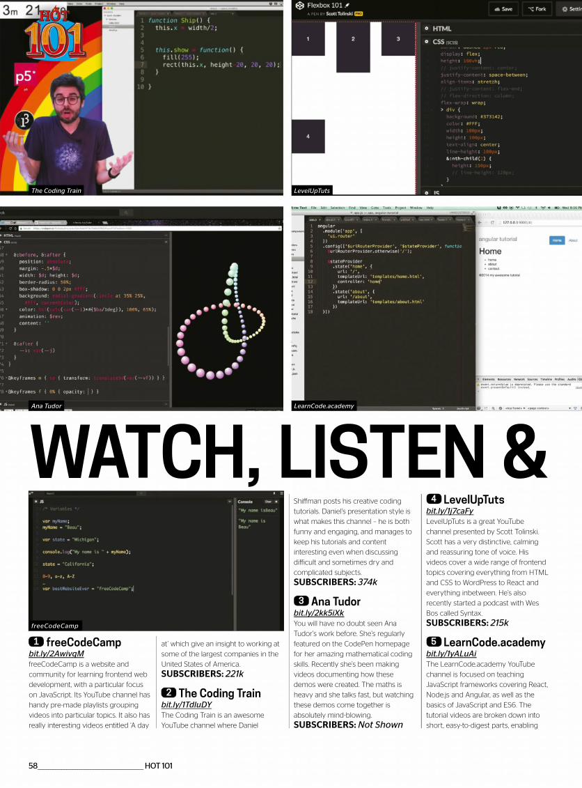
WATCH, LISTEN &
1 freeCodeCampbit.ly/2AwivqMfreeCodeCamp is a website and
community for learning frontend web
development, with a particular focus
on JavaScript. Its YouTube channel has
handy pre-made playlists grouping
videos into particular topics. It also has
really interesting videos entitled ‘A day
at’ which give an insight to working at
some of the largest companies in the
United States of America.
SUBSCRIBERS: 221k
2 The Coding Trainbit.ly/1TdluDYThe Coding Train is an awesome
YouTube channel where Daniel
Shiffman posts his creative coding
tutorials. Daniel’s presentation style is
what makes this channel – he is both
funny and engaging, and manages to
keep his tutorials and content
interesting even when discussing
difficult and sometimes dry and
complicated subjects.
SUBSCRIBERS: 374k
3 Ana Tudorbit.ly/2kk5iXkYou will have no doubt seen Ana
Tudor’s work before. She’s regularly
featured on the CodePen homepage
for her amazing mathematical coding
skills. Recently she’s been making
videos documenting how these
demos were created. The maths is
heavy and she talks fast, but watching
these demos come together is
absolutely mind-blowing.
SUBSCRIBERS: Not Shown
4 LevelUpTutsbit.ly/1j7caFyLevelUpTuts is a great YouTube
channel presented by Scott Tolinski.
Scott has a very distinctive, calming
and reassuring tone of voice. His
videos cover a wide range of frontend
topics covering everything from HTML
and CSS to WordPress to React and
everything inbetween. He’s also
recently started a podcast with Wes
Bos called Syntax.
SUBSCRIBERS: 215k
5 LearnCode.academybit.ly/1yALuAiThe LearnCode.academy YouTube
channel is focused on teaching
JavaScript frameworks covering React,
Node.js and Angular, as well as the
basics of JavaScript and ES6. The
tutorial videos are broken down into
short, easy-to-digest parts, enabling
58 ________________________________________________ HOT 101
freeCodeCamp
Ana Tudor
The Coding Train LevelUpTuts
LearnCode.academy
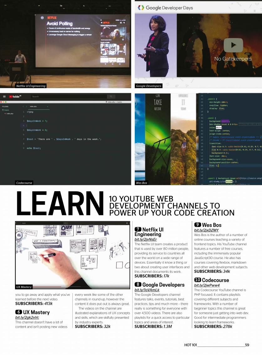
HOT 101 ________________________________________________59
LEARN 10 YOUTUBE WEB DEVELOPMENT CHANNELS TO POWER UP YOUR CODE CREATION
you to go away and apply what you’ve
learned before the next video.
SUBSCRIBERS: 413k
6 UX Mastery bit.ly/2gk2xVcThis channel doesn’t have a lot of
content and isn’t posting new videos
every week like some of the other
channels in round-up, however the
content it does put out is always great.
The videos on the channel are
illustrated explanations of UX concepts
and skills, which are skilfully presented
by industry experts.
SUBSCRIBERS: 32k
7 Netflix UI Engineering bit.ly/2jvNsErThe Netflix UI team creates a product
that is used by over 80 million people,
providing its service to countries all
over the world on a wide range of
devices. Essentially it know a thing or
two about creating user interfaces and
this channel documents its work.
SUBSCRIBERS: 17k
8 Google Developers bit.ly/1oVAmLkThe Google Developers channel
features talks, events, tutorials, best
practices, tips and much more – there
really is something for everyone with
over 4,500 videos. There are also
playlists for a quick access to particular
topics and areas of interest.
SUBSCRIBERS: 1.3M
9 Wes Bosbit.ly/2jxDZMYWes Bos is the author of a number of
online courses teaching a variety of
frontend topics. His YouTube channel
features a number of free courses,
including the immensely popular
JavaScript30 course. He also has
courses covering flexbox, markdown
and other web development subjects.
SUBSCRIBERS: 34k
10 Codecourse bit.ly/2jwPww4The Codecourse YouTube channel is
PHP focused. It contains playlists
covering different subjects and
frameworks. With a number of
beginner topics this channel is great
for someone just getting into web dev.
Good for intermediate programmers
looking to learn frameworks.
SUBSCRIBERS: 278k
UX Mastery
Wes Bos
Netflix UI Engineering Google Developers
Codecourse

60 _______________________________________________ HOT 101
BUILD WITH
USING THE LATEST AND GREATEST PROTOTYPING TOOLS CAN HELPYOU GET USER FEEDBACK EARLY ON, AND MAKE SURE THAT WHAT
YOU BUILD OFFERS THE VERY BEST USER EXPERIENCE
ORIGAMI
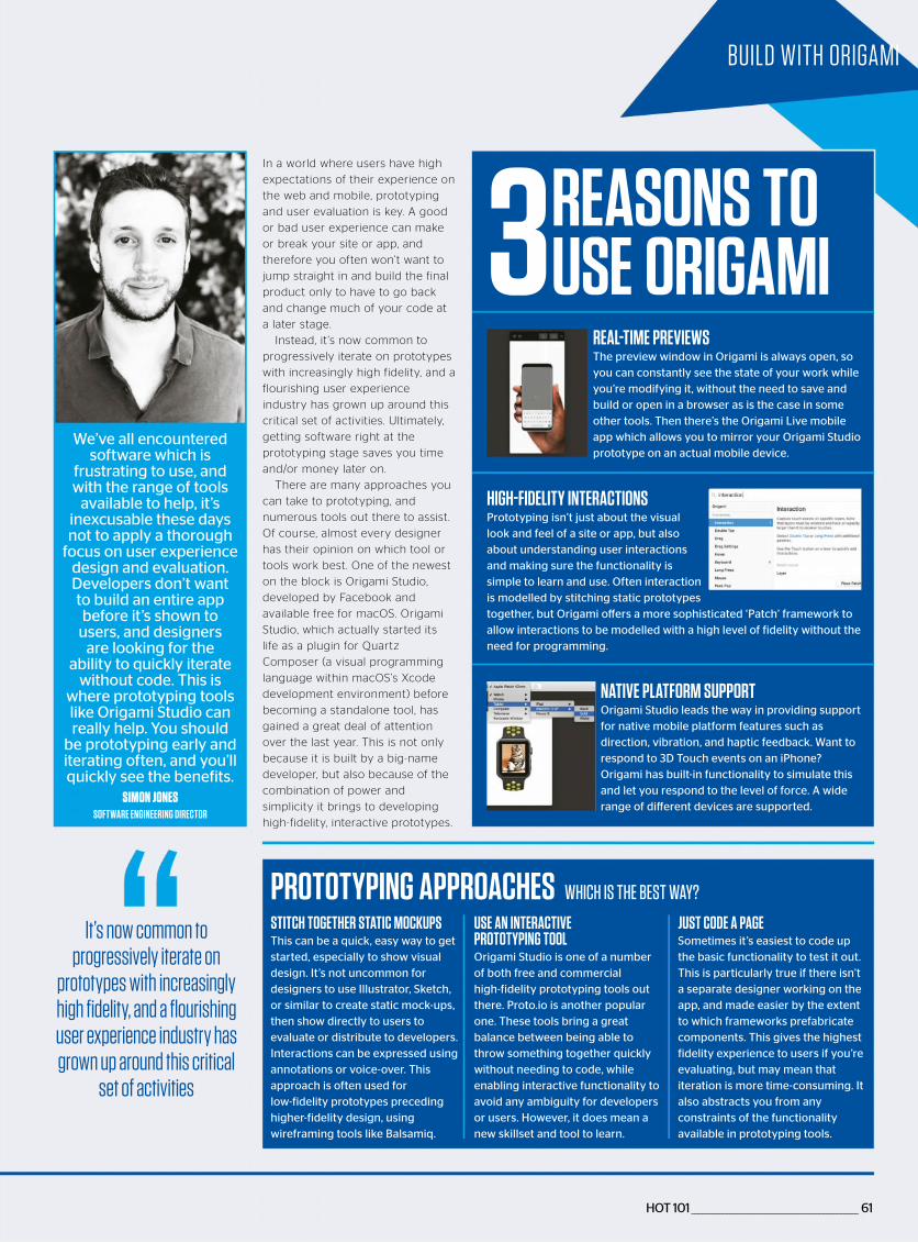
HOT 101 ________________________________________________ 61
BUILD WITH ORIGAMI
3REASONS TO USE ORIGAMI
PROTOTYPING APPROACHES WHICH IS THE BEST WAY?
In a world where users have high
expectations of their experience on
the web and mobile, prototyping
and user evaluation is key. A good
or bad user experience can make
or break your site or app, and
therefore you often won’t want to
jump straight in and build the final
product only to have to go back
and change much of your code at
a later stage.
Instead, it ’s now common to
progressively iterate on prototypes
with increasingly high fidelity, and a
flourishing user experience
industry has grown up around this
critical set of activities. Ultimately,
getting software right at the
prototyping stage saves you time
and/or money later on.
There are many approaches you
can take to prototyping, and
numerous tools out there to assist.
Of course, almost every designer
has their opinion on which tool or
tools work best. One of the newest
on the block is Origami Studio,
developed by Facebook and
available free for macOS. Origami
Studio, which actually started its
life as a plugin for Quartz
Composer (a visual programming
language within macOS’s Xcode
development environment) before
becoming a standalone tool, has
gained a great deal of attention
over the last year. This is not only
because it is built by a big-name
developer, but also because of the
combination of power and
simplicity it brings to developing
high-fidelity, interactive prototypes.
We’ve all encountered software which is
frustrating to use, and with the range of tools
available to help, it’s inexcusable these days not to apply a thorough
focus on user experience design and evaluation. Developers don’t want to build an entire app before it’s shown to
users, and designers are looking for the
ability to quickly iterate without code. This is
where prototyping tools like Origami Studio can really help. You should
be prototyping early and iterating often, and you’ll quickly see the benefits.
SIMON JONESSOFTWARE ENGINEERING DIRECTOR
REAL-TIME PREVIEWSThe preview window in Origami is always open, so you can constantly see the state of your work while you’re modifying it, without the need to save and build or open in a browser as is the case in some other tools. Then there’s the Origami Live mobile app which allows you to mirror your Origami Studio prototype on an actual mobile device.
HIGH-FIDELITY INTERACTIONSPrototyping isn’t just about the visual look and feel of a site or app, but also about understanding user interactions and making sure the functionality is simple to learn and use. Often interaction is modelled by stitching static prototypes together, but Origami offers a more sophisticated ‘Patch’ framework to allow interactions to be modelled with a high level of fidelity without the need for programming.
NATIVE PLATFORM SUPPORTOrigami Studio leads the way in providing support for native mobile platform features such as direction, vibration, and haptic feedback. Want to respond to 3D Touch events on an iPhone? Origami has built-in functionality to simulate this and let you respond to the level of force. A wide range of different devices are supported.
STITCH TOGETHER STATIC MOCKUPSThis can be a quick, easy way to get started, especially to show visual design. It’s not uncommon for designers to use Illustrator, Sketch, or similar to create static mock-ups, then show directly to users to evaluate or distribute to developers. Interactions can be expressed using annotations or voice-over. This approach is often used for low-fidelity prototypes preceding higher-fidelity design, using wireframing tools like Balsamiq.
USE AN INTERACTIVE PROTOTYPING TOOLOrigami Studio is one of a number of both free and commercial high-fidelity prototyping tools out there. Proto.io is another popular one. These tools bring a great balance between being able to throw something together quickly without needing to code, while enabling interactive functionality to avoid any ambiguity for developers or users. However, it does mean a new skillset and tool to learn.
JUST CODE A PAGESometimes it’s easiest to code up the basic functionality to test it out. This is particularly true if there isn’t a separate designer working on the app, and made easier by the extent to which frameworks prefabricate components. This gives the highest fidelity experience to users if you’re evaluating, but may mean that iteration is more time-consuming. It also abstracts you from any constraints of the functionality available in prototyping tools.
It’s now common to progressively iterate on
prototypes with increasingly high fidelity, and a flourishing user experience industry has grown up around this critical
set of activities
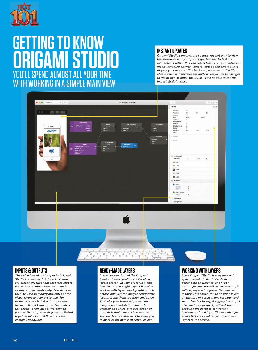
GETTING TO KNOW
YOU’LL SPEND ALMOST ALL YOUR TIMEWITH WORKING IN A SIMPLE MAIN VIEW
ORIGAMI STUDIO
READY-MADE LAYERSIn the bottom right of the OrigamiStudio window, you’ll see a list of alllayers present in your prototype. Thisbehaves as you might expect if you’veworked with layer-based graphics toolsbefore, and you can drag to reprioritiselayers, group them together, and so on.Typically your layers might includeimages, text and static colours, butOrigami also ships with a selection ofpre-fabricated ones such as mobilekeyboards and status bars to allow youto more easily mimic an actual device.
INSTANT UPDATESOrigami Studio’s preview area allows you not only to viewthe appearance of your prototype, but also to test outinteractions with it. You can select from a range of differentmedia including phones, tablets, laptops and smart TVs todisplay your work on. The best part, however, is that it ’salways open and updates instantly when you make changesto the design or functionality, so you’ll be able to see theimpact straight away.
INPUTS & OUTPUTSThe behaviour of prototypes in OrigamiStudio is controlled via ‘patches’ , whichare essentially functions that take inputs(such as user interactions or numericvalues) and generate outputs which canthen be used to modify attributes of thevisual layers in your prototype. Forexample, a patch that outputs a valuebetween 0 and 1 can be used to controlthe opacity of an image. Pre-definedpatches that ship with Origami are linkedtogether into a visual flow to createcomplex behaviour.
WORKING WITH LAYERSSince Origami Studio is a layer-basedsystem (think similar to Photoshop),depending on which layer of yourprototype you currently have selected, itwill display a set of properties you canmodify. This allows you to position layerson the screen, resize them, recolour, andso on. Most critically, dragging the outputof a patch to a property will link them,enabling the patch to control thebehaviour of that layer. The + symbol justabove this area enables you to add newlayers to the screen.
62 ________________________________________________ HOT 101
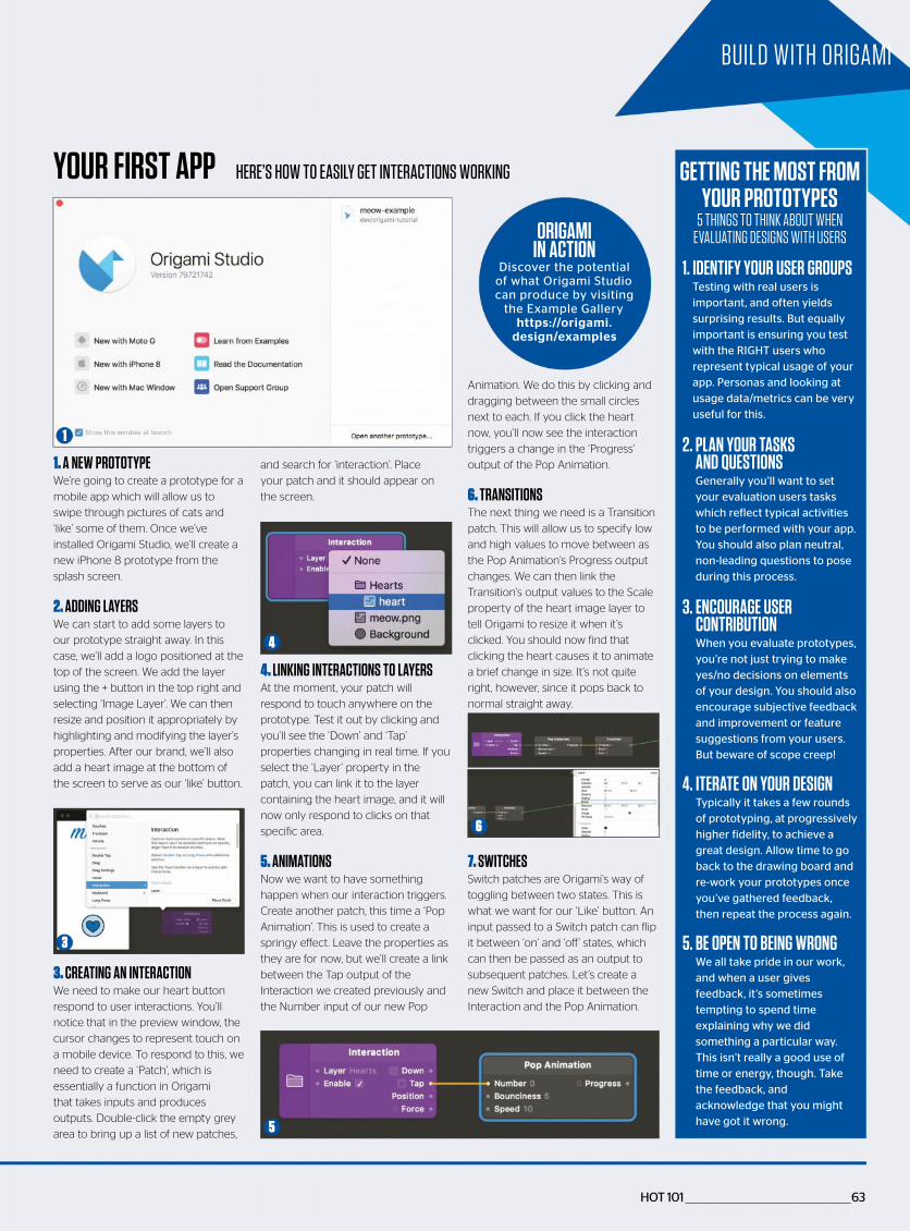
HOT 101 ________________________________________________63
BUILD WITH ORIGAMI
YOUR FIRST APP HERE’S HOW TO EASILY GET INTERACTIONS WORKING
and search for ‘interaction’. Place
your patch and it should appear on
the screen.
4. LINKING INTERACTIONS TO LAYERSAt the moment, your patch will
respond to touch anywhere on the
prototype. Test it out by clicking and
you’ll see the ‘Down’ and ‘Tap’
properties changing in real time. If you
select the ‘Layer’ property in the
patch, you can link it to the layer
containing the heart image, and it will
now only respond to clicks on that
specific area.
5. ANIMATIONSNow we want to have something
happen when our interaction triggers.
Create another patch, this time a ‘Pop
Animation’. This is used to create a
springy effect. Leave the properties as
they are for now, but we’ll create a link
between the Tap output of the
Interaction we created previously and
the Number input of our new Pop
Animation. We do this by clicking and
dragging between the small circles
next to each. If you click the heart
now, you’ll now see the interaction
triggers a change in the ‘Progress’
output of the Pop Animation.
6. TRANSITIONSThe next thing we need is a Transition
patch. This will allow us to specify low
and high values to move between as
the Pop Animation’s Progress output
changes. We can then link the
Transition’s output values to the Scale
property of the heart image layer to
tell Origami to resize it when it’s
clicked. You should now find that
clicking the heart causes it to animate
a brief change in size. It’s not quite
right, however, since it pops back to
normal straight away.
7. SWITCHESSwitch patches are Origami’s way of
toggling between two states. This is
what we want for our ‘Like’ button. An
input passed to a Switch patch can flip
it between ‘on’ and ‘off’ states, which
can then be passed as an output to
subsequent patches. Let’s create a
new Switch and place it between the
Interaction and the Pop Animation.
1. A NEW PROTOTYPEWe’re going to create a prototype for a
mobile app which will allow us to
swipe through pictures of cats and
‘like’ some of them. Once we’ve
installed Origami Studio, we’ll create a
new iPhone 8 prototype from the
splash screen.
2. ADDING LAYERSWe can start to add some layers to
our prototype straight away. In this
case, we’ll add a logo positioned at the
top of the screen. We add the layer
using the + button in the top right and
selecting ‘Image Layer’. We can then
resize and position it appropriately by
highlighting and modifying the layer’s
properties. After our brand, we’ll also
add a heart image at the bottom of
the screen to serve as our ‘like’ button.
3. CREATING AN INTERACTIONWe need to make our heart button
respond to user interactions. You’ll
notice that in the preview window, the
cursor changes to represent touch on
a mobile device. To respond to this, we
need to create a ‘Patch’, which is
essentially a function in Origami
that takes inputs and produces
outputs. Double-click the empty grey
area to bring up a list of new patches,
1. IDENTIFY YOUR USER GROUPS Testing with real users is important, and often yields surprising results. But equally important is ensuring you test with the RIGHT users who represent typical usage of your app. Personas and looking at usage data/metrics can be very useful for this.
2. PLAN YOUR TASKS AND QUESTIONS Generally you’ll want to set your evaluation users tasks which reflect typical activities to be performed with your app. You should also plan neutral, non-leading questions to pose during this process.
3. ENCOURAGE USER CONTRIBUTION When you evaluate prototypes, you’re not just trying to make yes/no decisions on elements of your design. You should also encourage subjective feedback and improvement or feature suggestions from your users. But beware of scope creep!
4. ITERATE ON YOUR DESIGN Typically it takes a few rounds of prototyping, at progressively higher fidelity, to achieve a great design. Allow time to go back to the drawing board and re-work your prototypes once you’ve gathered feedback, then repeat the process again.
5. BE OPEN TO BEING WRONG We all take pride in our work, and when a user gives feedback, it’s sometimes tempting to spend time explaining why we did something a particular way. This isn’t really a good use of time or energy, though. Take the feedback, and acknowledge that you might have got it wrong.
GETTING THE MOST FROM YOUR PROTOTYPES
5 THINGS TO THINK ABOUT WHEN EVALUATING DESIGNS WITH USERS
1
4
3
6
5
ORIGAMI IN ACTION
Discover the potential of what Origami Studio can produce by visiting
the Example Gallery https://origami.
design/examples
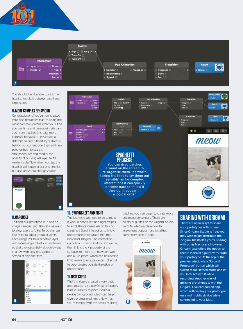
64 _______________________________________________ HOT 101
10. SWIPING LEFT AND RIGHTThe last thing we need to do to make
it work is enable left and right swipes
to scroll the carousel. We do this by
creating a Scroll interaction to link to
the carousel layer group (not the
individual images). The interaction
outputs an x co-ordinate which we can
then link to the x property of the
carousel to move it. In-between, we’ll
add a Clip patch, which can be used to
limit values to ensure we do not scroll
to co-ordinates outside the edge of
the carousel.
11. NEXT STEPSThat’s it. You’ve created a very basic
app. You can also use Origami Studio’s
built in ‘frames’ to place it onto a
device background, which can help
give a professional finish. Now that
you’re familiar with the basics of using
You should then be able to click the
heart to toggle it between small and
large states.
8. MORE COMPLEX BEHAVIOURCongratulations! You’ve now created
your first interactive feature, using the
most common patches that you’ll find
you use time and time again. We can
add more patches to create more
complex behaviour. Let’s create a
different coloured heart layer directly
behind our current one, then add new
patches both to scale it
simultaneously, and modify the
opacity of our original layer so it’s
made visible. Now, when you tap the
heart, it will toggle larger and smaller,
but also appear to change colour.
9. CAROUSELTo finish our prototype, let’s add an
image carousel with the cats we want
to allow users to ‘Like’. To do this, we
first need to add a group of layers.
Each image will be a separate layer,
with increasingly offset x co-ordinates
so that they essentially sit side-by-size
in a row with only one visible on
screen at any one item.
7
810
9 1 1
SHARING WITH ORIGAMIThere are a few ways to share your prototypes with others. Since Origami Studio is free, you may wish to just distribute the .origami file itself if you’re sharing with other Mac users. However, Origami also offers the option to record video of a journey through your prototype. At the top of the preview window is a “Record Prototype” button which will switch to full-screen mode and let you interact with it while recording. Another way of utilising prototypes is with the Origami Live companion app which will display your prototype on a real mobile device while connected to your Mac.
SPAGHETTI PROCESS
You can drag patches around on the screen to
re-organise them. It ’s worth taking the time to lay them out
sensibly, as for complex interactions it can quickly become hard to follow if
they don’t appear in a logical order.
patches, you can begin to create more
advanced behaviours. There are
plenty of guides on the Origami Studio
website, which explain how to
implement popular functionalities
commonly seen in apps.

TIME TO STEP OFF THAT TREADMILL
With so many demands from work, home and family, there never seem to be enough hours in the day for you. Why not press pause once in a while, curl up with your favourite magazine and put a little oasis of ‘you’ in your day?
To find out more about Press Pause visit:
pauseyourday.co.uk
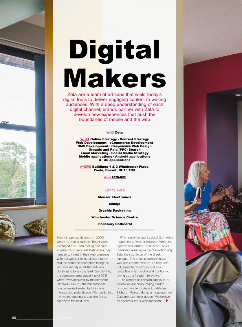
66 __________________________________________________profile
Zeta first opened its doors in 2000,
where its original founder, Roger Allen,
leveraged his IT contracting and sales
experience to persuade businesses they
needed to invest in their web presence.
With the web still in its relative infancy,
and the common perception being the
web was merely a fad, the task was
challenging to say the least. Despite this,
the company grew steadily, until 2015
when it was acquired by the Berkshire
Hathaway Group – the multinational
conglomerate headed by billionaire
investor and philanthropist Warren Buffett
– providing funding to take the Dorset
agency to the next level.
WHO Zeta
WHAT Online Strategy Content Strategy Web Development eCommerce Development CMS Development Responsive Web Design
Organic and Paid (PPC) Search Email Marketing Social Media Strategy
Mobile applications Android applications & iOS applications
WHERE Buildings 1 & 3 Winchester Place, Poole, Dorset, BH15 1NX
WEB zeta.net
KEY CLIENTS
Mouser Electronics
Mindje
Graphic Packaging
Winchester Science Centre
Salisbury Cathedral
Digital Makers
Zeta are a team of artisans that wield today’s digital tools to deliver engaging content to waiting
audiences. With a deep understanding of each digital channel, brands partner with Zeta to
develop new experiences that push the boundaries of mobile and the web
Why name the agency Zeta? Sam Allen
– Operations Director explains: “When the
agency was formed, there were just six
members, resulting in the team choosing
Zeta, the sixth letter of the Greek
alphabet. The original domain chosen
was zeta-commerce.com. It’s now Zeta.
net; easier to remember and less
restrictive in terms of brand positioning,
giving us the freedom to evolve.”
The website of a design agency is, of
course, an important calling card to
prospective clients. Anna Lundström
Silsbury – Project Manager – outlines how
Zeta approach their design: “We believe
an agency’s site is very important;
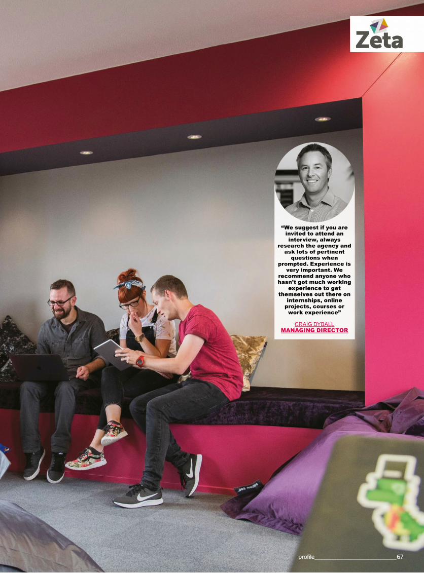
profile___________________________________________________67
“We suggest if you are invited to attend an interview, always
research the agency and ask lots of pertinent
questions when prompted. Experience is
very important. We recommend anyone who hasn’t got much working
experience to get themselves out there on
internships, online projects, courses or work experience”
CRAIG DYBALL MANAGING DIRECTOR
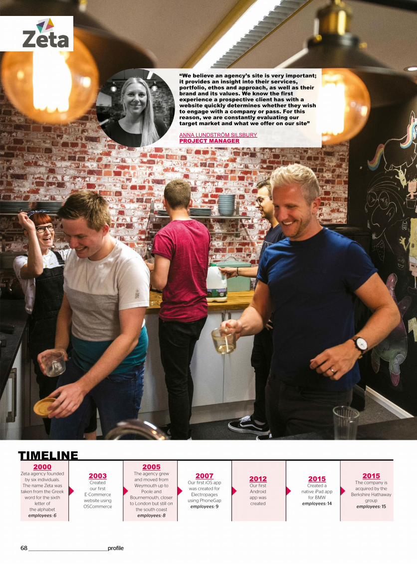
68 __________________________________________________profile
2015The company is acquired by the
Berkshire Hathaway group
employees: 15
2000Zeta agency founded
by six individuals.The name Zeta was
taken from the Greek word for the sixth
letter of the alphabet
employees: 6
2003Created our first
E-Commerce website using OSCommerce
2005The agency grew and moved from Weymouth up to
Poole and Bournemouth, closer to London but still on
the south coastemployees: 8
2007Our first iOS app was created for Electropages
using PhoneGapemployees: 9
2012Our first Android app was created
2015Created a
native iPad app for BMW
employees: 14
“We believe an agency’s site is very important; it provides an insight into their services, portfolio, ethos and approach, as well as their brand and its values. We know the first experience a prospective client has with a website quickly determines whether they wish to engage with a company or pass. For this reason, we are constantly evaluating our target market and what we offer on our site”
ANNA LUNDSTRÖM SILSBURY PROJECT MANAGER
TIME INE
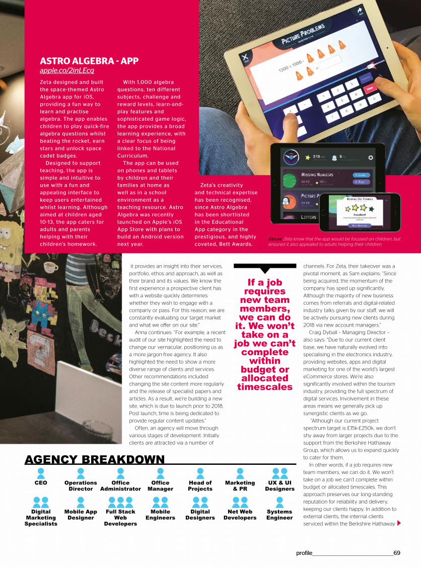
profile___________________________________________________69
it provides an insight into their services,
portfolio, ethos and approach, as well as
their brand and its values. We know the
first experience a prospective client has
with a website quickly determines
whether they wish to engage with a
company or pass. For this reason, we are
constantly evaluating our target market
and what we offer on our site.”
Anna continues: “For example, a recent
audit of our site highlighted the need to
change our vernacular, positioning us as
a more jargon-free agency. It also
highlighted the need to show a more
diverse range of clients and services.
Other recommendations included
changing the site content more regularly
and the release of specialist papers and
articles. As a result, we’re building a new
site, which is due to launch prior to 2018.
Post launch, time is being dedicated to
provide regular content updates.”
Often, an agency will move through
various stages of development. Initially
clients are attracted via a number of
channels. For Zeta, their takeover was a
pivotal moment, as Sam explains: “Since
being acquired, the momentum of the
company has sped up significantly.
Although the majority of new business
comes from referrals and digital-related
industry talks given by our staff, we will
be actively pursuing new clients during
2018 via new account managers.”
Craig Dyball – Managing Director –
also says: “Due to our current client
base, we have naturally evolved into
specialising in the electronics industry,
providing websites, apps and digital
marketing for one of the world’s largest
eCommerce stores. We’re also
significantly involved within the tourism
industry, providing the full spectrum of
digital services. Involvement in these
areas means we generally pick up
synergistic clients as we go.
“Although our current project
spectrum target is £15k-£250k, we don’t
shy away from larger projects due to the
support from the Berkshire Hathaway
Group, which allows us to expand quickly
to cater for them.
In other words, if a job requires new
team members, we can do it. We won’t
take on a job we can’t complete within
budget or allocated timescales. This
approach preserves our long-standing
reputation for reliability and delivery,
keeping our clients happy. In addition to
external clients, the internal clients
serviced within the Berkshire Hathaway
If a job requires
new team members, we can do
it. We won’t take on a
job we can’t complete
within budget or allocated
timescales
ASTRO ALGEBRA - APP apple.co/2inLEcq
Zeta designed and built the space-themed Astro Algebra app for iOS, providing a fun way to learn and practise algebra. The app enables children to play quick-fire algebra questions whilst beating the rocket, earn stars and unlock space cadet badges.
Designed to support teaching, the app is simple and intuitive to use with a fun and appealing interface to keep users entertained whilst learning. Although aimed at children aged 10-13, the app caters for adults and parents helping with their children’s homework.
With 1,000 algebra questions, ten different subjects, challenge and reward levels, learn-and-play features and sophisticated game logic, the app provides a broad learning experience, with a clear focus of being linked to the National Curriculum.
The app can be used on phones and tablets by children and their families at home as well as in a school environment as a teaching resource. Astro Algebra was recently launched on Apple’s iOS App Store with plans to build an Android version next year.
Zeta’s creativity and technical expertise has been recognised, since Astro Algebra has been shortlisted in the Educational App category in the prestigious, and highly coveted, Bett Awards.
Above Zeta knew that the app would be focused on children, but ensured it also appealed to adults helping their children.
AGENCY BREAKDOWN
CEO Operations Director
Mobile App Designer
Systems Engineer
Full Stack Web
Developers
Office Administrator
Office Manager
Head of Projects
Marketing & PR
UX & UI Designers
Digital Marketing Specialists
Mobile Engineers
Digital Designers
Net Web Developers
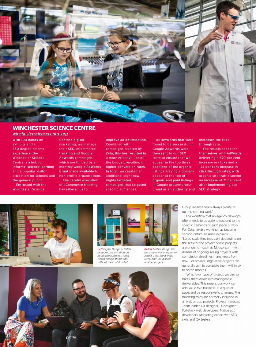
70 __________________________________________________profile
Group means there’s always plenty of
up-and-coming work.”
The workflow that an agency develops
often needs to be agile to respond to the
specific demands of each piece of work.
For Zeta, flexible working has become
second nature, as Anna explains:
“Large-scale timelines vary depending on
the scale of the project. Some projects
are ongoing – such as Mouser.com – with
dozens of ongoing, rolling projects with
completion deadlines many years from
now. For smaller, large-scale projects, we
generally aim to complete them within six
to seven months.
“Whichever type of project, we aim to
break them down into manageable
deliverables. This means our work can
add value to a business, at a quicker
pace, and be responsive to changes. The
following roles are normally included in
all web or app projects: Project manager,
Team leader, UX designer, UI designer,
Full-stack web developers, Native app
developers, Marketing expert with SEO
skills and QA testers.
WINCHESTER SCIENCE CENTRE winchestersciencecentre.orgWith 100 hands-on exhibits and a 360-degree cinema experience, the Winchester Science Centre is a hub for informal science learning and a popular visitor attraction for schools and the general public .
Entrusted with the Winchester Science
Centre’s digital marketing, we manage their SEO, eCommerce tracking and Google AdWords campaigns, which are funded by a monthly Google AdWords Grant made available to non-profits organisations.
The careful execution of eCommerce tracking has allowed us to
improve ad optimisation. Combined with campaigns created by Zeta, this has resulted in a more effective use of the budget, resulting in higher conversion rates. In total, we created an additional eight new highly targeted campaigns that targeted specific audiences.
All keywords that were found to be successful in Google AdWords were then sent to our SEO team to ensure that we appear in the top three positions of the organic listings. Having a domain appear at the top of organic and paid listings in Google presents your brand as an authority and
increases the click-through rate.
The results speak for themselves with AdWords delivering a 670 per cent increase in clicks and a 124 per cent increase in click-through rates, with organic site traffic seeing an increase of 21 per cent after implementing our SEO strategy.
Left Digital Designer Caleb deep in concentration on Zeta’s latest project. What would design studios do without the Post-it note?
Below Mobile design has become a vital component across Zeta. Zofia, Paul, Becki and Joe discuss a tablet project.
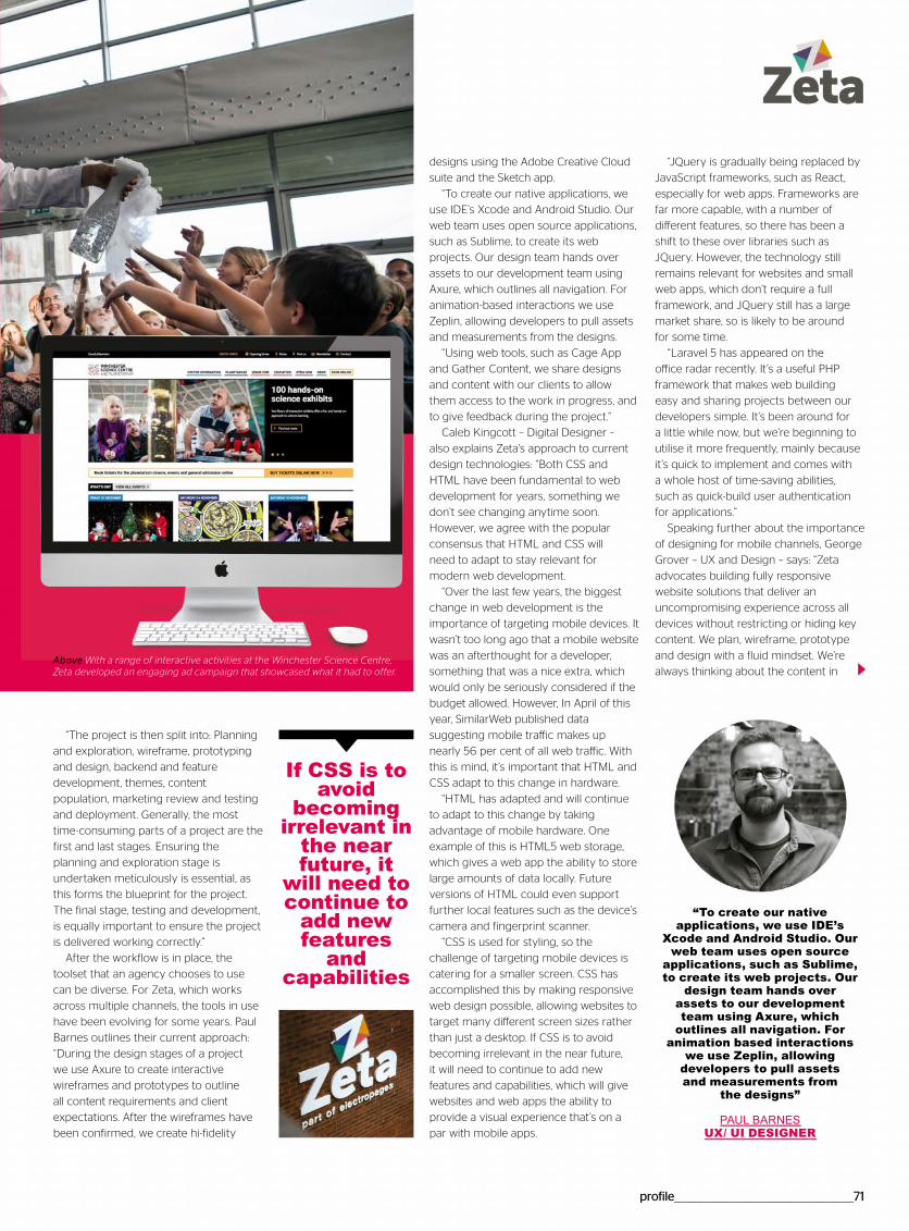
profile____________________________________________________71
“JQuery is gradually being replaced by
JavaScript frameworks, such as React,
especially for web apps. Frameworks are
far more capable, with a number of
different features, so there has been a
shift to these over libraries such as
JQuery. However, the technology still
remains relevant for websites and small
web apps, which don’t require a full
framework, and JQuery still has a large
market share, so is likely to be around
for some time.
“Laravel 5 has appeared on the
office radar recently. It’s a useful PHP
framework that makes web building
easy and sharing projects between our
developers simple. It’s been around for
a little while now, but we’re beginning to
utilise it more frequently, mainly because
it’s quick to implement and comes with
a whole host of time-saving abilities,
such as quick-build user authentication
for applications.”
Speaking further about the importance
of designing for mobile channels, George
Grover – UX and Design – says: “Zeta
advocates building fully responsive
website solutions that deliver an
uncompromising experience across all
devices without restricting or hiding key
content. We plan, wireframe, prototype
and design with a fluid mindset. We’re
always thinking about the content in
“The project is then split into: Planning
and exploration, wireframe, prototyping
and design, backend and feature
development, themes, content
population, marketing review and testing
and deployment. Generally, the most
time-consuming parts of a project are the
first and last stages. Ensuring the
planning and exploration stage is
undertaken meticulously is essential, as
this forms the blueprint for the project.
The final stage, testing and development,
is equally important to ensure the project
is delivered working correctly.”
After the workflow is in place, the
toolset that an agency chooses to use
can be diverse. For Zeta, which works
across multiple channels, the tools in use
have been evolving for some years. Paul
Barnes outlines their current approach:
“During the design stages of a project
we use Axure to create interactive
wireframes and prototypes to outline
all content requirements and client
expectations. After the wireframes have
been confirmed, we create hi-fidelity
designs using the Adobe Creative Cloud
suite and the Sketch app.
“To create our native applications, we
use IDE’s Xcode and Android Studio. Our
web team uses open source applications,
such as Sublime, to create its web
projects. Our design team hands over
assets to our development team using
Axure, which outlines all navigation. For
animation-based interactions we use
Zeplin, allowing developers to pull assets
and measurements from the designs.
“Using web tools, such as Cage App
and Gather Content, we share designs
and content with our clients to allow
them access to the work in progress, and
to give feedback during the project.”
Caleb Kingcott – Digital Designer –
also explains Zeta’s approach to current
design technologies: “Both CSS and
HTML have been fundamental to web
development for years, something we
don’t see changing anytime soon.
However, we agree with the popular
consensus that HTML and CSS will
need to adapt to stay relevant for
modern web development.
“Over the last few years, the biggest
change in web development is the
importance of targeting mobile devices. It
wasn’t too long ago that a mobile website
was an afterthought for a developer,
something that was a nice extra, which
would only be seriously considered if the
budget allowed. However, In April of this
year, SimilarWeb published data
suggesting mobile traffic makes up
nearly 56 per cent of all web traffic. With
this is mind, it’s important that HTML and
CSS adapt to this change in hardware.
“HTML has adapted and will continue
to adapt to this change by taking
advantage of mobile hardware. One
example of this is HTML5 web storage,
which gives a web app the ability to store
large amounts of data locally. Future
versions of HTML could even support
further local features such as the device’s
camera and fingerprint scanner.
“CSS is used for styling, so the
challenge of targeting mobile devices is
catering for a smaller screen. CSS has
accomplished this by making responsive
web design possible, allowing websites to
target many different screen sizes rather
than just a desktop. If CSS is to avoid
becoming irrelevant in the near future,
it will need to continue to add new
features and capabilities, which will give
websites and web apps the ability to
provide a visual experience that’s on a
par with mobile apps.
If CSS is to avoid
becoming irrelevant in
the near future, it
will need to continue to
add new features
and capabilities
Above With a range of interactive activities at the Winchester Science Centre, Zeta developed an engaging ad campaign that showcased what it had to offer.
“To create our native applications, we use IDE’s
Xcode and Android Studio. Our web team uses open source
applications, such as Sublime, to create its web projects. Our
design team hands over assets to our development team using Axure, which
outlines all navigation. For animation based interactions
we use Zeplin, allowing developers to pull assets and measurements from
the designs”
PAUL BARNES UX/ UI DESIGNER
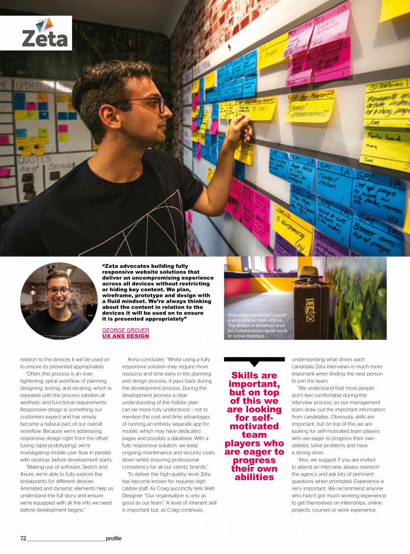
72___________________________________________________profile
relation to the devices it will be used on
to ensure its presented appropriately.
“Often, this process is an ever-
tightening, spiral workflow of planning,
designing, testing, and iterating, which is
repeated until the process satisfies all
aesthetic and functional requirements.
Responsive design is something our
customers expect and has simply
become a natural part of our overall
workflow. Because we’re addressing
responsive design right from the offset
(using rapid prototyping), we’re
investigating mobile user flow in parallel
with desktop, before development starts.
“Making use of software, Sketch and
Axure, we’re able to fully explore the
breakpoints for different devices.
Animated and dynamic elements help us
understand the full story and ensure
we’re equipped with all the info we need
before development begins.”
Anna concludes: “Whilst using a fully
responsive solution may require more
resource and time early in the planning
and design process, it pays back during
the development process. During the
development process a clear
understanding of the holistic plan
can be more fully understood – not to
mention the cost and time advantages
of running an entirely separate app for
mobile, which may have dedicated
pages and possibly a database. With a
fully responsive solution, we keep
ongoing maintenance and security costs
down whilst ensuring professional
consistency for all our clients’ brands.”
To deliver the high-quality work Zeta
has become known for requires high
calibre staff. As Craig succinctly tells Web
Designer: “Our organisation is only as
good as our team.” A level of inherent skill
is important but, as Craig continues,
understanding what drives each
candidate Zeta interviews is much more
important when finding the next person
to join the team.
“We understand that most people
don’t feel comfortable during the
interview process, so our management
team draw out the important information
from candidates. Obviously, skills are
important, but on top of this we are
looking for self-motivated team players
who are eager to progress their own
abilities, solve problems and have
a strong drive.
“Also, we suggest if you are invited
to attend an interview, always research
the agency and ask lots of pertinent
questions when prompted. Experience is
very important. We recommend anyone
who hasn’t got much working experience
to get themselves on internships, online
projects, courses or work experience.
“Zeta advocates building fully responsive website solutions that deliver an uncompromising experience across all devices without restricting or hiding key content. We plan, wireframe, prototype and design with a fluid mindset. We’re always thinking about the content in relation to the devices it will be used on to ensure it is presented appropriately”
GEORGE GROVERUX AND DESIGN
Skills are important, but on top of this we
are looking for self-
motivated team
players who are eager to
progress their own abilities
Zeta understand that a quiet area is vital in their offices. The Bridge is breakout area for collaboration, quiet work or social meetups.
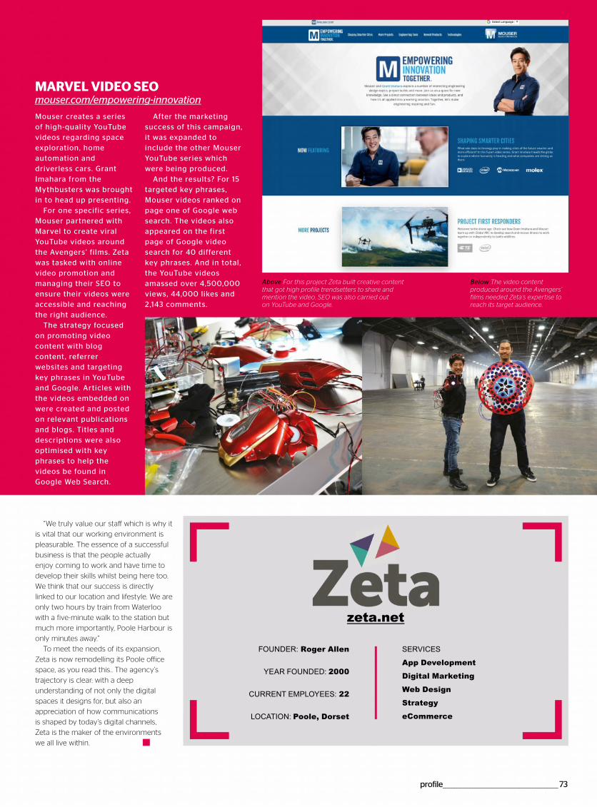
profile___________________________________________________73
MARVEL VIDEO SEO mouser.com/empowerin -innovation
Mouser creates a series of high-quality YouTube videos regarding space exploration, home automation and driverless cars. Grant Imahara from the Mythbusters was brought in to head up presenting.
For one specific series, Mouser partnered with Marvel to create viral YouTube videos around the Avengers’ films. Zeta was tasked with online video promotion and managing their SEO to ensure their videos were accessible and reaching the right audience.
The strategy focused on promoting video content with blog content, referrer websites and targeting key phrases in YouTube and Google. Articles with the videos embedded on were created and posted on relevant publications and blogs. Titles and descriptions were also optimised with key phrases to help the videos be found in Google Web Search.
After the marketing success of this campaign, it was expanded to include the other Mouser YouTube series which were being produced.
And the results? For 15 targeted key phrases, Mouser videos ranked on page one of Google web search. The videos also appeared on the first page of Google video search for 40 different key phrases. And in total, the YouTube videos amassed over 4,500,000 views, 44,000 likes and 2,143 comments.
Above For this project Zeta built creative content that got high profile trendsetters to share and mention the video. SEO was also carried out on YouTube and Google.
Below The video content produced around the Avengers’ films needed Zeta’s expertise to reach its target audience.
“We truly value our staff which is why it
is vital that our working environment is
pleasurable. The essence of a successful
business is that the people actually
enjoy coming to work and have time to
develop their skills whilst being here too.
We think that our success is directly
linked to our location and lifestyle. We are
only two hours by train from Waterloo
with a five-minute walk to the station but
much more importantly, Poole Harbour is
only minutes away.”
To meet the needs of its expansion,
Zeta is now remodelling its Poole office
space, as you read this.. The agency’s
trajectory is clear: with a deep
understanding of not only the digital
spaces it designs for, but also an
appreciation of how communications
is shaped by today’s digital channels,
Zeta is the maker of the environments
we all live within.
zeta.net
FOUNDER: Roger Allen
YEAR FOUNDED: 2000
CURRENT EMPLOYEES: 22
LOCATION: Poole, Dorset
SERVICES
App Development
Digital Marketing
Web Design
Strategy
eCommerce

“ Greta Gerwig’s coming-of-age movie Lady Bird presents a charming promo site that delivers fullscreen video clips via a drag-and-drop quiz ”Development technologies jQuery, Underscore.js, HTML5 Boilerplate, Marionette.js
Lady Birdhttp://ladybird.movieDesigner: Watsondg — http://watsondg.com
74________________________________________________lightbox
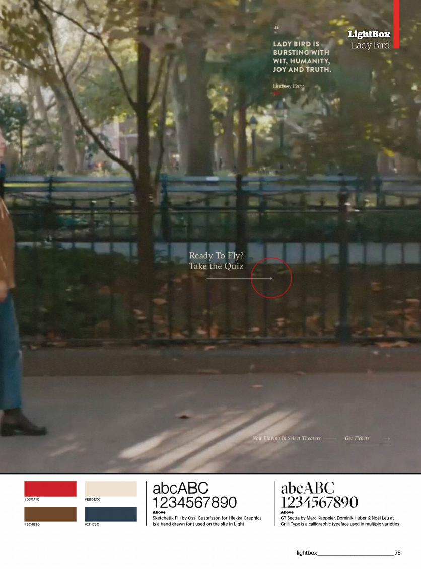
#D30A1C #EBDECC
#6C4B30 #2F475C
lightbox ________________________________________________75
LightBoxLady Bird
Above
Sketchetik Fill by Ossi Gustafsson for Hiekka Graphics is a hand drawn font used on the site in Light
Above
GT Sectra by Marc Kappeler, Dominik Huber & Noël Leu at Grilli Type is a calligraphic typeface used in multiple varieties
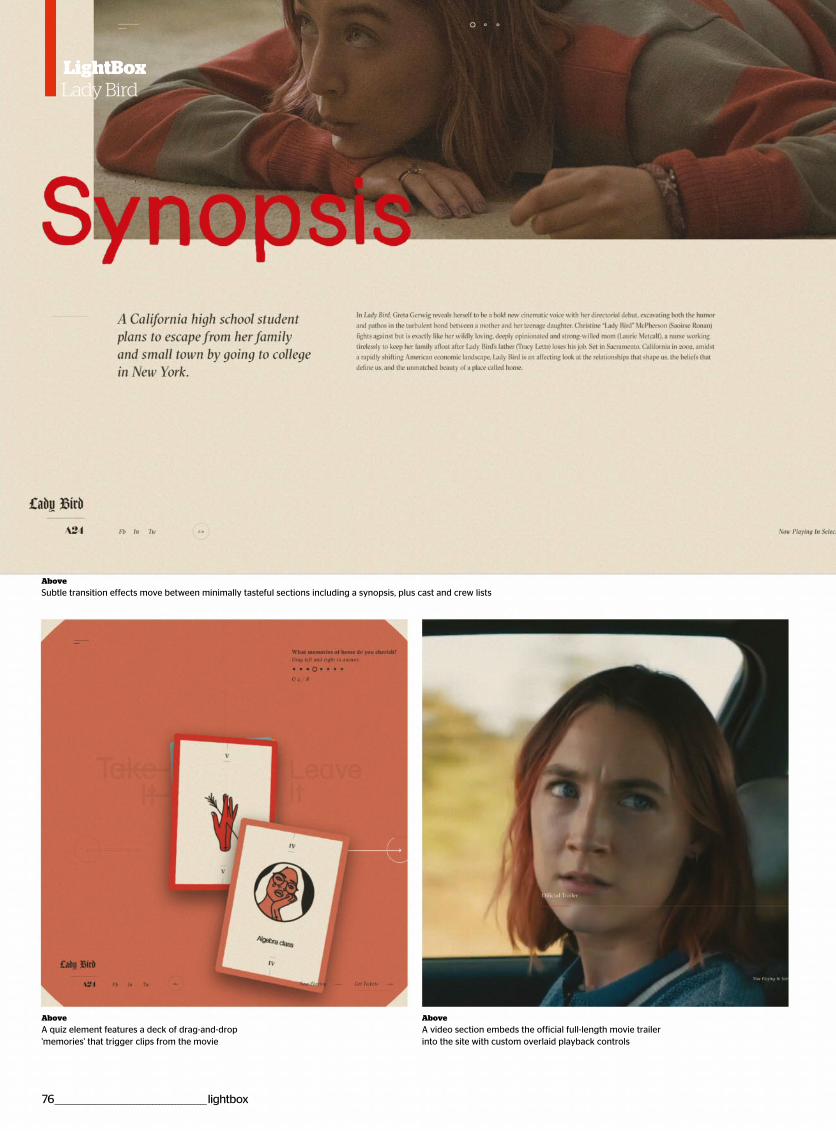
LightBoxLady Bird
Above
A quiz element features a deck of drag-and-drop 'memories' that trigger clips from the movie
Above
A video section embeds the official full-length movie trailer into the site with custom overlaid playback controls
Above
Subtle transition effects move between minimally tasteful sections including a synopsis, plus cast and crew lists
76 ________________________________________________lightbox
LightBoxgLady Bird
Use HTML, CSS and JavaScript to present an automatic sliding quotes box that can be easily updated
Create a visually dynamic sliding quotes box1. Initiate HTML documentThe first step is to initiate the document that will define
the HTML page. This consists of a HTML container that
stores the head and body sections. While the head
section stores links to external CSS and JavaScript, the
body section will store the visible content created in the
next step.
<!DOCTYPE html>
<html>
<head>
<title>Quotes List</title>
<link rel="stylesheet" type="text/css"
href="styles.css" />
<script type="text/javascript" src="code.
js"></script>
</head>
<body>
*** STEP 2 HERE
</body>
</html>
2. HTML contentThe page content consists of a container labelled with a
'data-player' attribute. This container stores the individual
quote elements – represented as span elements. Each of
these contain the content for the individual quotes; this
example uses a h3 title followed by a paragraph element.
This structure’s presentation will be controlled via the
JavaScript and CSS.
<div data-player>
<span>
<h3>Title 1</h3>
<p>Text...</p>
</span>
<span>
<h3>Title 2</h3>
<p>Text...</p>
</span>
<span>
<h3>Title 3</h3>
<p>Text...</p>
</span>
</span>
3. JavaScript initiationCreate a new file called 'code.js'. This file starts with the
initiation of two features: a 'quote' variable used to
describe the current quote to show, along with a function
to update the quote. The updateQuote function searches
for all quotes inside 'data-player' and updates their
'data-status' to be 'shown' or if their index position
matches the 'quote' variable. The quote variable is then
updated for the next time updateQuote is called.
var quote = 0;
function updateQuote(){
var nodes = document.
querySelectorAll("[data-player] > *");
for(var i=0; i<nodes.length; i++){
if(i == quote)nodes[i].
setAttribute("data-status","visible");
else nodes[i].setAttribute("data-
status","");
}
if(quote < nodes.length-1)quote++;
else quote = 0;
}
4. Load eventThe last part of the JavaScript code defines what
happens after the page has completed loading. The
page’s quote display needs to be updated immediately,
hence the call of the updateQuote function. This
updateQuote function is also called every 6,000
milliseconds (six seconds) through the use of the
setInterval instruction.
window.addEventListener("load", function()
{
updateQuote();
setInterval(updateQuote,6000);
});
5. Initiate CSSWith the JavaScript complete, create a new file called
'styles.css'. The first rule in this file sets the HTML
container and its body section to display across the full
size of the browser window. A black background with
white text is also applied, along with elimination of visible
border spacing.
html,body{
display: block;
width: 100%;
height: 100%;
margin: 0;
padding: 0;
font-family: Helvetica, sans-serif;
background: #000;
color: #fff;
}
6. Quote playerThe container for the quotes allows for consistent control
of each quote. As well as needing to have a size and
default font size, relative positioning is applied so that the
inner child items can be positioned in relation to
wherever this parent container is located. This container
is referenced via its 'data-player' attribute.
[data-player]{
position: relative;
width: 20em;
font-size: 2em;
}
7. Quote itemsEach of the quotes are child items inside the 'data-player'
container. These children are set to display with the
attributes they should animate towards when they
disappear from view. This is set at 10em from the top of
the container with opacity set to invisible. Any changes
appear animated due to the applied transition rule.
[data-player] > *{
display: block;
position: absolute;
top: 10em;
left: 0;
border: 1px solid #fff;
padding: .5em;
width: 100%;
opacity: 0;
transition: all 1s;
}
8. Visible statusThe quote item selected via JavaScript’s updateQuote
function has a 'data-status' attribute set to 'visible'. This
allows CSS to set a separate presentation rule to the
other quote items. In this case, opacity is set to full
visibility, as well as the vertical position being set to the
top of the parent container.
[data-player] > [data-status="visible"]{
opacity: 1;
top: 0;
}
lightbox ________________________________________________77
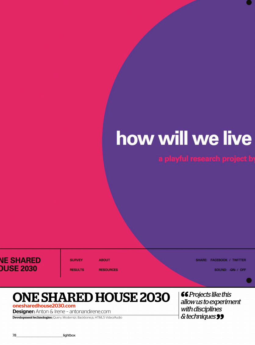
“ Projects like this allow us to experiment with disciplines & techniques ”Development technologies jQuery, Modernizr, Backbone.js, HTML5 Video/Audio
ONE SHARED HOUSE 2030onesharedhouse2030.comDesigner: Anton & Irene – antonandirene.com
78________________________________________________lightbox
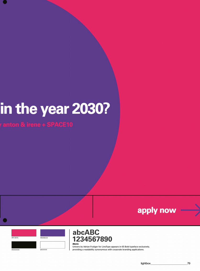
#FF3975 #640ECD
#000000 #FFFFFF
Above
Univers by Adrian Frutiger for LinoType appears in 65 Bold typeface exclusively, providing a readability synonymous with corporate branding applications.
lightbox ________________________________________________79
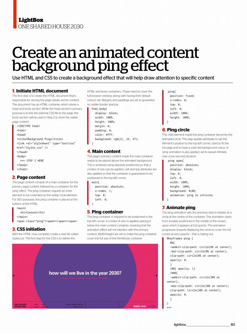
Use HTML and CSS to create a background effect that will help draw attention to specific content
Create an animated content background ping effect1. Initiate HTML documentThe first step is to create the HTML document that's
responsible for storing the page details and its content.
The document has an HTML container, which stores a
head and body section. While the head section’s primary
purpose is to link the external CSS file to the page, the
body section will be used in Step 2 to store the visible
page content.
<!DOCTYPE html>
<html>
<head>
<title>Background Ping</title>
<link rel="stylesheet" type="text/css"
href="styles.css" />
</head>
<body>
*** STEP 2 HERE
</body>
</html>
2. Page contentThe page content consists of a main container for the
primary page content, followed by a container for the
‘ping’ effect. The ping container requires an inner
element to be controlled as the visible circle element.
For SEO purposes, the ping container is placed at the
bottom of the HTML.
<main>
<h1>Content</h1>
</main>
<span class="ping"><span></span></span>
3. CSS initiationWith the HTML now complete, create a new file called
‘styles.css’. The first step for the CSS is to define the
HTML and body containers. These need to cover the
full browser window, along with having their default
colours set. Margins and paddings are set to guarantee
no visible border spacing.
html,body{
display: block;
width: 100%;
height: 100%;
margin: 0;
padding: 0;
color: #fff;
background: rgb(21, 34, 47);
}
4. Main contentThe page’s primary content inside the main container
needs to be placed above the animated background.
This is achieved using absolute positioning so that a
z-index of one can be applied. Left and top attributes are
also applied so that the container is guaranteed to be
positioned in the top-left corner.
main{
position: absolute;
z-index: 1;
top: 0;
left: 0;
}
5. Ping containerThe ping container is required to be positioned in the
top-left corner. A z-index of zero is applied, placing it
below the main content container, meaning that the
animation effect will not interfere with the primary
content. Width/height are set to make the ping container
cover the full size of the html/body container.
.ping{
position: fixed;
z-index: 0;
top: 0;
left: 0;
width: 100%;
height: 100%;
}
6. Ping circleThe child element inside the ping container becomes the
animated circle. This step applies attributes to set this
element’s position to the top-left corner, sized to fit the
full page and to have a solid red background colour. A
‘ping’ animation is also applied, set to repeat infinitely
over a two-second duration.
.ping span{
position: absolute;
display: block;
top: 0;
left: 0;
width: 100%;
height: 100%;
background: #c00;
animation: ping 2s infinite;
}
7. Animate pingThe ping animation sets the previous step to display as a
circle at the centre of the container. This animation starts
from invisibly positioned in the middle of the screen,
upon which it appears at full opacity. The animation
progresses towards displaying the circle to cover the full
screen at zero opacity – that is, fading out.
@keyframes ping {
0%{
-webkit-clip-path: circle(0% at center);
-moz-clip-path: circle(0% at center);
clip-path: circle(0% at center);
opacity: 0;
}
10%{ opacity: 1}
100%{
-webkit-clip-path: circle(30% at
center);
-moz-clip-path: circle(30% at center);
clip-path: circle(30% at center);
opacity: 0;
}
}
***
lightbox _______________________________________________ 80
LightBoxONE SHARED HOUSE 2030

Discover another of our great bookazinesFrom science and history to technology and crafts, there
are dozens of Future bookazines to suit all tastes
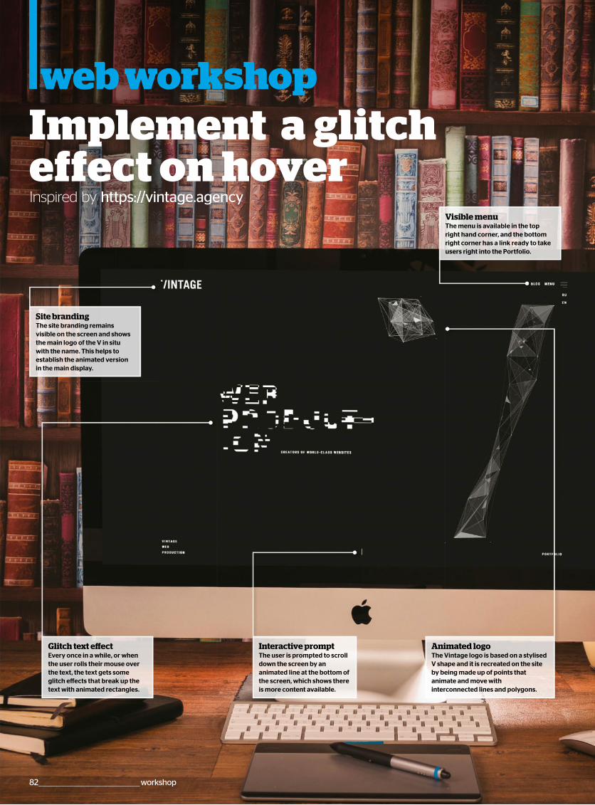
web workshopImplement a glitch effect on hover Inspired by https://vintage.agency
82 _____________________________________________workshop
Interactive promptThe user is prompted to scrolldown the screen by ananimated line at the bottom ofthe screen, which shows thereis more content available.
Visible menuThe menu is available in the topright hand corner, and the bottomright corner has a link ready to takeusers right into the Portfolio.
Animated logoThe Vintage logo is based on a stylisedV shape and it is recreated on the siteby being made up of points thatanimate and move withinterconnected lines and polygons.
Glitch text effectEvery once in a while, or whenthe user rolls their mouse overthe text, the text gets someglitch effects that break up thetext with animated rectangles.
Site brandingThe site branding remainsvisible on the screen and showsthe main logo of the V in situwith the name. This helps toestablish the animated versionin the main display.
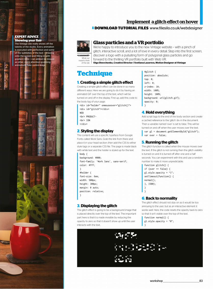
Implement aglitcheffectonhover
1. Creating a simple glitch effectCreating a simple glitch effect can be done in so many
different ways. Here we are going to do it by having an
animated GIF over the top of the text, which will be
turned on and off in the display. First up, add this code to
the body tag of your page.
<div id=”holder” onmouseover=”glitch()”>
<div id=”glitch”></div>
WEB
<br> PRODUCT-
<br> ION
</div>
2. Styling the displayThe content will use a specific typeface from Google
Fonts called Work Sans. Grab the link from there and
place it in your head section; then add the CSS to either
style tags or a separate CSS file. The page is made black
with white text and the holder is styled up for the text.
body {
background: #000;
font-family: ‘Work Sans’, sans-serif;
color: #fff;
}
#holder {
font-size: 6em;
width: 500px;
height: 300px;
margin: 0 auto;
position: relative;
}
3. Displaying the glitchThe glitch effect is going to be a background image that
is placed directly over the top of the text. The important
part here is that it is made invisible by reducing the
opacity to zero so that it doesn’t show up until the user
interacts with the text.
#glitch {
position: absolute;
top: 0;
left: 0;
z-index: 10;
width: 100%;
height: 100%;
background: url(glitch.gif);
opacity: 0;
}
4. Hold everythingAdd script tags to the end of the body section and create
a cached reference to the ‘glitch’ div in the document.
Then a variable named ‘over’ is set to false. This will be
turned on and off when the user moves over the text.
var gl = document.getElementById(“glitch”);
var over = false;
5. Running the glitchThe glitch function is called when the mouse moves over
the text. If the glitch is not running then the glitch visibility
is turned on and it is turned off after one and a half
seconds. You can experiment with this and use a random
number to make it more unpredictable.
function glitch() {
if (over == false) {
gl.style.opacity = “1”;
setTimeout(function() {
normal();
}, 1500);
}
}
6. Back to normalityThe glitch effect should not stay on as it would be too
annoying to the user, but as an interactive element it
works well. Here, the code resets the opacity back to zero
so that it isn’t visible over the top of the text.
function normal() {
gl.style.opacity = “0”;
}
Technique
Glass particles and a VR portfolioWe’re happy to introduce you to the new Vintage website – with a pinch of glitch, interactive scroll, and a lot of love in every detail. Step into the first screen, discover a logo with a pulsating form of polygonal glass particles and go forward to the thrilling VR portfolio built with Web VR.Olga Shevchenko, Creative Director / Svetlana Lazareva, Motion Designer at Vintage
<comment>What our
experts think of the site
www.filesilo.co.uk/webdesignerDOWNLOAD TUTORIAL FILES
EXPERT ADVICEShowing your flairThe Vintage site really shows off the talents of the studio. Every animation is executed with perfection and some of the subtleties of the text – drawing onto the screen and filling in with gradient lines – can almost be missed as other, more attention-grabbing animations take centre stage.
workshop _____________________________________________83
Tutorials
Use the three.js library for WebGL to make a low polygon, animated liquid wave effect for a background header
Create lush liquid effects with WebGL
www.filesilo.co.uk/webdesignerDOWNLOAD TUTORIAL FILES
84 _________________________________________________tutorial
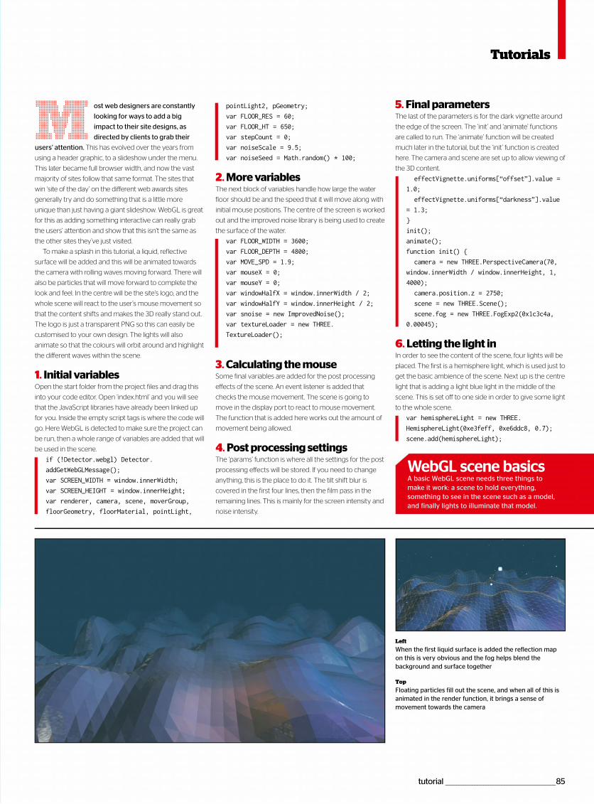
tutorial _________________________________________________85
ost web designers are constantly
looking for ways to add a big
impact to their site designs, as
directed by clients to grab their
users’ attention. This has evolved over the years from
using a header graphic, to a slideshow under the menu.
This later became full browser width, and now the vast
majority of sites follow that same format. The sites that
win ‘site of the day’ on the different web awards sites
generally try and do something that is a little more
unique than just having a giant slideshow. WebGL is great
for this as adding something interactive can really grab
the users’ attention and show that this isn’t the same as
the other sites they’ve just visited.
To make a splash in this tutorial, a liquid, reflective
surface will be added and this will be animated towards
the camera with rolling waves moving forward. There will
also be particles that will move forward to complete the
look and feel. In the centre will be the site’s logo, and the
whole scene will react to the user’s mouse movement so
that the content shifts and makes the 3D really stand out.
The logo is just a transparent PNG so this can easily be
customised to your own design. The lights will also
animate so that the colours will orbit around and highlight
the different waves within the scene.
1. Initial variablesOpen the start folder from the project files and drag this
into your code editor. Open ‘index.html’ and you will see
that the JavaScript libraries have already been linked up
for you. Inside the empty script tags is where the code will
go. Here WebGL is detected to make sure the project can
be run, then a whole range of variables are added that will
be used in the scene.
if (!Detector.webgl) Detector.
addGetWebGLMessage();
var SCREEN_WIDTH = window.innerWidth;
var SCREEN_HEIGHT = window.innerHeight;
var renderer, camera, scene, moverGroup,
floorGeometry, floorMaterial, pointLight,
pointLight2, pGeometry;
var FLOOR_RES = 60;
var FLOOR_HT = 650;
var stepCount = 0;
var noiseScale = 9.5;
var noiseSeed = Math.random() * 100;
2. More variablesThe next block of variables handle how large the water
floor should be and the speed that it will move along with
initial mouse positions. The centre of the screen is worked
out and the improved noise library is being used to create
the surface of the water.
var FLOOR_WIDTH = 3600;
var FLOOR_DEPTH = 4800;
var MOVE_SPD = 1.9;
var mouseX = 0;
var mouseY = 0;
var windowHalfX = window.innerWidth / 2;
var windowHalfY = window.innerHeight / 2;
var snoise = new ImprovedNoise();
var textureLoader = new THREE.
TextureLoader();
3. Calculating the mouseSome final variables are added for the post processing
effects of the scene. An event listener is added that
checks the mouse movement. The scene is going to
move in the display port to react to mouse movement.
The function that is added here works out the amount of
movement being allowed.
4. Post processing settingsThe ‘params’ function is where all the settings for the post
processing effects will be stored. If you need to change
anything, this is the place to do it. The tilt shift blur is
covered in the first four lines, then the film pass in the
remaining lines. This is mainly for the screen intensity and
noise intensity.
M 5. Final parametersThe last of the parameters is for the dark vignette around
the edge of the screen. The ‘init’ and ‘animate’ functions
are called to run. The ‘animate’ function will be created
much later in the tutorial, but the ‘init’ function is created
here. The camera and scene are set up to allow viewing of
the 3D content.
effectVignette.uniforms[“offset”].value =
1.0;
effectVignette.uniforms[“darkness”].value
= 1.3;
}
init();
animate();
function init() {
camera = new THREE.PerspectiveCamera(70,
window.innerWidth / window.innerHeight, 1,
4000);
camera.position.z = 2750;
scene = new THREE.Scene();
scene.fog = new THREE.FogExp2(0x1c3c4a,
0.00045);
6. Letting the light inIn order to see the content of the scene, four lights will be
placed. The first is a hemisphere light, which is used just to
get the basic ambience of the scene. Next up is the centre
light that is adding a light blue light in the middle of the
scene. This is set off to one side in order to give some light
to the whole scene.
var hemisphereLight = new THREE.
HemisphereLight(0xe3feff, 0xe6ddc8, 0.7);
scene.add(hemisphereLight);
WebGL scene basicsA basic WebGL scene needs three things to make it work: a scene to hold everything, something to see in the scene such as a model, and finally lights to illuminate that model.
Tutorials
Left
When the first liquid surface is added the reflection map on this is very obvious and the fog helps blend the background and surface together
Top
Floating particles fill out the scene, and when all of this is animated in the render function, it brings a sense of movement towards the camera
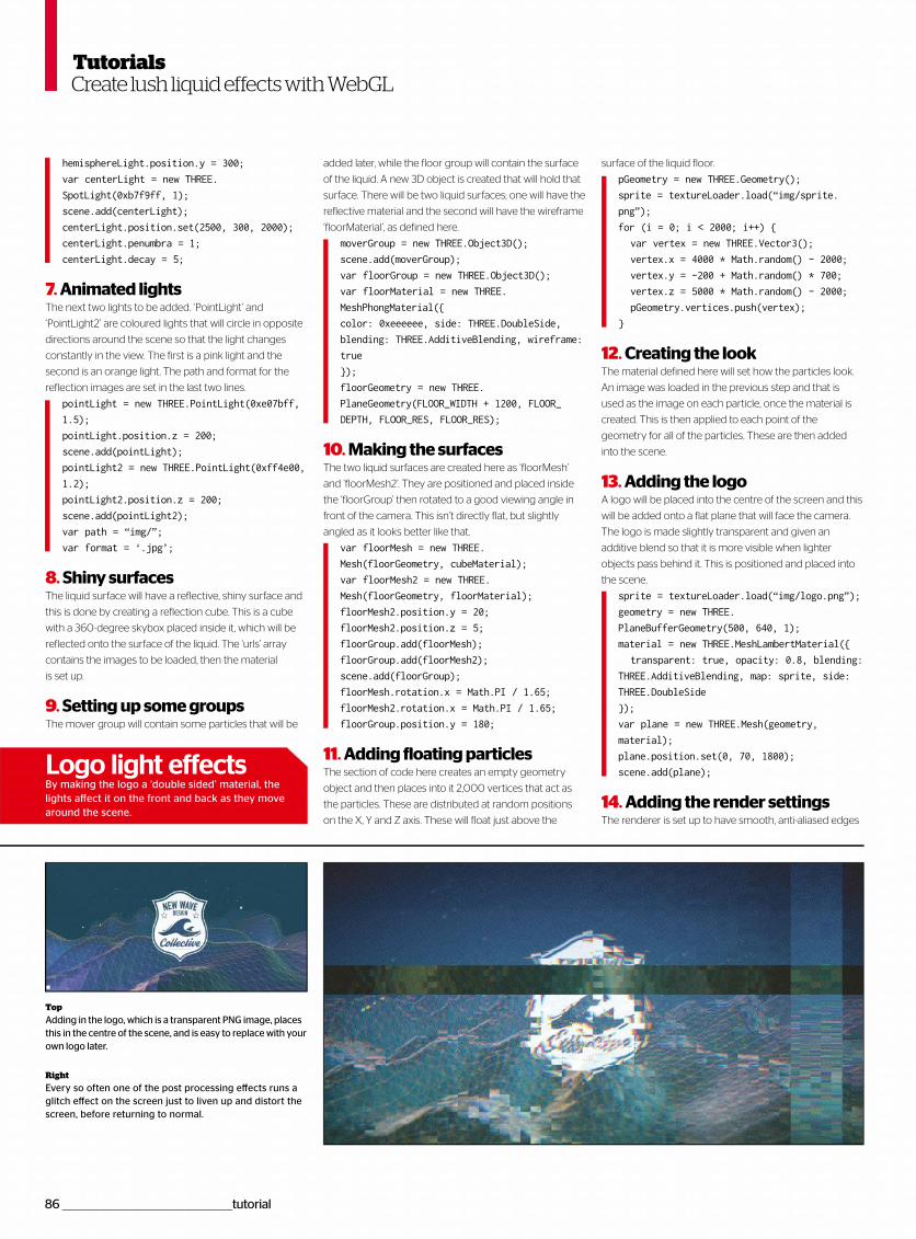
86 _________________________________________________tutorial
hemisphereLight.position.y = 300;
var centerLight = new THREE.
SpotLight(0xb7f9ff, 1);
scene.add(centerLight);
centerLight.position.set(2500, 300, 2000);
centerLight.penumbra = 1;
centerLight.decay = 5;
7. Animated lightsThe next two lights to be added. ‘PointLight’ and
‘PointLight2’ are coloured lights that will circle in opposite
directions around the scene so that the light changes
constantly in the view. The first is a pink light and the
second is an orange light. The path and format for the
reflection images are set in the last two lines.
pointLight = new THREE.PointLight(0xe07bff,
1.5);
pointLight.position.z = 200;
scene.add(pointLight);
pointLight2 = new THREE.PointLight(0xff4e00,
1.2);
pointLight2.position.z = 200;
scene.add(pointLight2);
var path = “img/”;
var format = ‘.jpg’;
8. Shiny surfacesThe liquid surface will have a reflective, shiny surface and
this is done by creating a reflection cube. This is a cube
with a 360-degree skybox placed inside it, which will be
reflected onto the surface of the liquid. The ‘urls’ array
contains the images to be loaded, then the material
is set up.
9. Setting up some groupsThe mover group will contain some particles that will be
Create lush liquid effects with WebGL
added later, while the floor group will contain the surface
of the liquid. A new 3D object is created that will hold that
surface. There will be two liquid surfaces; one will have the
reflective material and the second will have the wireframe
‘floorMaterial’, as defined here.
moverGroup = new THREE.Object3D();
scene.add(moverGroup);
var floorGroup = new THREE.Object3D();
var floorMaterial = new THREE.
MeshPhongMaterial({
color: 0xeeeeee, side: THREE.DoubleSide,
blending: THREE.AdditiveBlending, wireframe:
true
});
floorGeometry = new THREE.
PlaneGeometry(FLOOR_WIDTH + 1200, FLOOR_
DEPTH, FLOOR_RES, FLOOR_RES);
10. Making the surfacesThe two liquid surfaces are created here as ‘floorMesh’
and ‘floorMesh2’. They are positioned and placed inside
the ‘floorGroup’ then rotated to a good viewing angle in
front of the camera. This isn’t directly flat, but slightly
angled as it looks better like that.
var floorMesh = new THREE.
Mesh(floorGeometry, cubeMaterial);
var floorMesh2 = new THREE.
Mesh(floorGeometry, floorMaterial);
floorMesh2.position.y = 20;
floorMesh2.position.z = 5;
floorGroup.add(floorMesh);
floorGroup.add(floorMesh2);
scene.add(floorGroup);
floorMesh.rotation.x = Math.PI / 1.65;
floorMesh2.rotation.x = Math.PI / 1.65;
floorGroup.position.y = 180;
11. Adding floating particlesThe section of code here creates an empty geometry
object and then places into it 2,000 vertices that act as
the particles. These are distributed at random positions
on the X, Y and Z axis. These will float just above the
surface of the liquid floor.
pGeometry = new THREE.Geometry();
sprite = textureLoader.load(“img/sprite.
png”);
for (i = 0; i < 2000; i++) {
var vertex = new THREE.Vector3();
vertex.x = 4000 * Math.random() - 2000;
vertex.y = -200 + Math.random() * 700;
vertex.z = 5000 * Math.random() - 2000;
pGeometry.vertices.push(vertex);
}
12. Creating the lookThe material defined here will set how the particles look.
An image was loaded in the previous step and that is
used as the image on each particle, once the material is
created. This is then applied to each point of the
geometry for all of the particles. These are then added
into the scene.
13. Adding the logoA logo will be placed into the centre of the screen and this
will be added onto a flat plane that will face the camera.
The logo is made slightly transparent and given an
additive blend so that it is more visible when lighter
objects pass behind it. This is positioned and placed into
the scene.
sprite = textureLoader.load(“img/logo.png”);
geometry = new THREE.
PlaneBufferGeometry(500, 640, 1);
material = new THREE.MeshLambertMaterial({
transparent: true, opacity: 0.8, blending:
THREE.AdditiveBlending, map: sprite, side:
THREE.DoubleSide
});
var plane = new THREE.Mesh(geometry,
material);
plane.position.set(0, 70, 1800);
scene.add(plane);
14. Adding the render settingsThe renderer is set up to have smooth, anti-aliased edges
Top
Adding in the logo, which is a transparent PNG image, places this in the centre of the scene, and is easy to replace with your own logo later.
Right
Every so often one of the post processing effects runs a glitch effect on the screen just to liven up and distort the screen, before returning to normal.
Logo light effectsBy making the logo a ‘double sided’ material, the lights affect it on the front and back as they move around the scene.
Tutorials
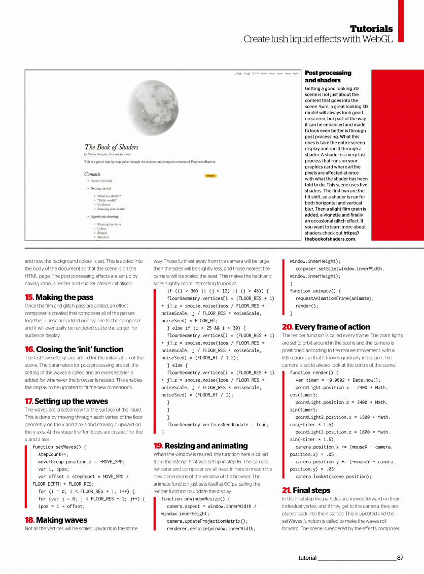
tutorial _________________________________________________87
Create lush liquid effects with WebGL
way. Those furthest away from the camera will be large,
then the sides will be slightly less, and those nearest the
camera will be scaled the least. This makes the back and
sides slightly more interesting to look at.
if ((i > 30) || (j < 12) || (j > 48)) {
floorGeometry.vertices[i * (FLOOR_RES + 1)
+ j].z = snoise.noise(ipos / FLOOR_RES *
noiseScale, j / FLOOR_RES * noiseScale,
noiseSeed) * FLOOR_HT;
} else if (i > 25 && i < 30) {
floorGeometry.vertices[i * (FLOOR_RES + 1)
+ j].z = snoise.noise(ipos / FLOOR_RES *
noiseScale, j / FLOOR_RES * noiseScale,
noiseSeed) * (FLOOR_HT / 1.2);
} else {
floorGeometry.vertices[i * (FLOOR_RES + 1)
+ j].z = snoise.noise(ipos / FLOOR_RES *
noiseScale, j / FLOOR_RES * noiseScale,
noiseSeed) * (FLOOR_HT / 2);
}
}
}
floorGeometry.verticesNeedUpdate = true;
}
19. Resizing and animatingWhen the window is resized, the function here is called
from the listener that was set up in step 16. The camera,
renderer and composer are all reset in here to match the
new dimensions of the window of the browser. The
animate function just sets itself at 60fps, calling the
render function to update the display.
function onWindowResize() {
camera.aspect = window.innerWidth /
window.innerHeight;
camera.updateProjectionMatrix();
renderer.setSize(window.innerWidth,
and now the background colour is set. This is added into
the body of the document so that the scene is on the
HTML page. The post processing effects are set up by
having various render and shader passes initialised.
15. Making the passOnce the film and glitch pass are added, an effect
composer is created that composes all of the passes
together. These are added one by one to the composer
and it will eventually be rendered out to the screen for
audience display.
16. Closing the ‘init’ functionThe last few settings are added for the initialisation of the
scene. The parameters for post processing are set, the
setting of the waves is called and an event listener is
added for whenever the browser is resized. This enables
the display to be updated to fit the new dimensions.
17. Setting up the wavesThe waves are created now for the surface of the liquid.
This is done by moving through each vertex of the floor
geometry on the x and z axis and moving it upward on
the y axis. At this stage the ‘for’ loops are created for the
x and z axis.
function setWaves() {
stepCount++;
moverGroup.position.z = -MOVE_SPD;
var i, ipos;
var offset = stepCount * MOVE_SPD /
FLOOR_DEPTH * FLOOR_RES;
for (i = 0; i < FLOOR_RES + 1; i++) {
for (var j = 0; j < FLOOR_RES + 1; j++) {
ipos = i + offset;
18. Making wavesNot all the vertices will be scaled upwards in the same
Getting a good looking 3Dscene is not just about thecontent that goes into the scene. Sure, a great looking 3D model will always look good on screen, but part of the way it can be enhanced and made to look even better is through post processing. What this does is take the entire screen display and run it through a shader. A shader is a very fast process that runs on your graphics card where all the pixels are affected at once with what the shader has been told to do. This scene uses five shaders. The first two are the tilt shift, so a shader is run for both horizontal and vertical blur. Then a slight film grain is added, a vignette and finally an occasional glitch effect. If you want to learn more about shaders check out https://thebookofshaders.com.
window.innerHeight);
composer.setSize(window.innerWidth,
window.innerHeight);
}
function animate() {
requestAnimationFrame(animate);
render();
}
20. Every frame of actionThe render function is called every frame. The point lights
are set to orbit around in the scene and the camera is
positioned according to the mouse movement, with a
little easing so that it moves gradually into place. The
camera is set to always look at the centre of the scene.
function render() {
var timer = -0.0002 * Date.now();
pointLight.position.x = 2400 * Math.
cos(timer);
pointLight.position.z = 2400 * Math.
sin(timer);
pointLight2.position.x = 1800 * Math.
cos(-timer * 1.5);
pointLight2.position.z = 1800 * Math.
sin(-timer * 1.5);
camera.position.x += (mouseX - camera.
position.x) * .05;
camera.position.y += (-mouseY - camera.
position.y) * .05;
camera.lookAt(scene.position);
21. Final stepsIn the final step the particles are moved forward on their
individual vertex, and if they get to the camera, they are
placed back into the distance. This is updated and the
setWaves function is called to make the waves roll
forward. The scene is rendered by the effects composer.
Post processing and shaders
Tutorials
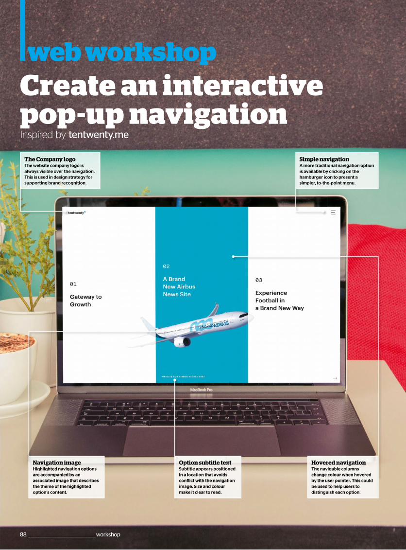
web workshopCreate an interactive pop-up navigationInspired by tentwenty.me
88 ____________________________________________workshop
Option subtitle textSubtitle appears positionedin a location that avoidsconflict with the navigationimage. Size and colourmake it clear to read.
Simple navigationA more traditional navigation optionis available by clicking on thehamburger icon to present asimpler, to-the-point menu.
Hovered navigationThe navigable columnschange colour when hoveredby the user pointer. This couldbe used to help users todistinguish each option.
Navigation imageHighlighted navigation optionsare accompanied by anassociated image that describesthe theme of the highlightedoption’s content.
The Company logoThe website company logo isalways visible over the navigation.This is used in design strategy forsupporting brand recognition.
color: #000;
}
nav a:hover::before{
opacity: 1;
bottom: 0;
}
8. Navigation imagesEach of the navigation images require an image to be
associated with their ‘before’ element. The ‘nth-child’
selector is used to apply unique images to each of the
navigation link elements to avoid the need for these to
be defined in the HTML.
nav a:nth-child(1)::before{
background-image: url(image1.jpg);
}
nav a:nth-child(2)::before{
background-image: url(image2.jpg);
}
nav a:nth-child(3)::before{
background-image: url(image3.jpg);
}
9. Content positioningSpan elements used to contain visible text are set with
absolute positioning in relation to their parent container,
which uses relative positioning. A transition is applied to
animate positioning changes with a slight delay. The
span’s position changes when the parent container is
hovered over by the user.
nav a > span{
position: absolute;
display: block;
top: 50%;
transition: top 1s;
transition-delay: .25s;
}
nav a:hover > span{
top: 10%;
}
Createan interactivepop-upnavigation
1. Initiate HTML documentThe first step is to initiate the HTML document; defining
the HTML container, which contains head and body
sections. While the head section is used to store
non-content elements, such as the reference to load the
CSS stylesheet, the body section is used to store visible
content created in Step 2.
<!DOCTYPE html>
<html>
<head>
<title>Animated Menu Navigation</title>
<link rel=”stylesheet” type=”text/css”
media=”screen” href=”styles.css”/>
</head>
<body>
*** STEP 2 HERE
</body>
</html>
2. Navigation HTMLThe navigation element is defined with HTML5’s nav
container to store the individual link items. Each of the
links has the visible text wrapped inside a span element.
This approach provides the ability for CSS to reference
while keeping the HTML clean.
<nav>
<a href=”#”><span>One</span></a>
<a href=”#”><span>Two</span></a>
<a href=”#”><span>Three</span></a>
</nav>
3. Initiate CSS stylesheetWith the HTML now complete, create a new file called
‘styles.css’. The first rules in this file set the HTML
container and its body to display across the full browser
window/screen. A black background is also applied, along
with a guarantee for no visible border spacing.
body,html {
display: block;
width: 100%;
height: 100%;
background: #000;
padding: 0;
margin: 0;
}
4. Navigation containerThe navigation should be set to cover the full size of its
parent element – that is, the previously defined body. A
display mode of table is also used so that the widths of its
first level children can be automatically calculated.
nav{
display: table;
height: 100%;
width: 100%;
}
5. Navigation linksEach of the navigation links act as a container for
addition child content – a span element in this case. We
want automatic calculation of their width, hence a
‘table-cell’ display mode. They are also set to cover the
full height of their parent.
nav a{
position: relative;
display: table-cell;
height: 100%;
color: #fff;
font-size: 3em;
overflow: hidden;
}
6. Image preparationCSS allows every element to have an associated “before”
and ‘after’ element to be created for HTML elements. This
step defines the default size and positioning images
associated with the links to be out of view. Transition is
set to animate changes to bottom and opacity.
nav a::before{
position: absolute;
display: block;
content: “”;
color: #000;
font-size: 1em;
bottom: -10em;
left: 0;
width: 100%;
height: 75%;
background: no-repeat center center;
background-size: cover;
opacity: 0;
transition: bottom 1s, opacity .5s;
}
7. Navigation link hoverChanges to hovered navigation links are defined using
the ‘hover’ selector. Navigation containers have their
colours changed, while the previously defined ‘before’
images have their opacity and vertical positioning set to
become fully visible – animated due to the transition
defined in Step 6.
nav a:hover{
background: #fff;
Technique
Layout Design: Less is moreWhile adding visual effects may look appealing, it’s important to develop a content layout strategy that supports your content’s objectives. Consider how you can avoid overcomplicating your design to a point that distracts your visitors from navigating to the content you want them to read.Leon Brown – Freelance web developer and trainer
<comment>What our
experts think of the site
www.filesilo.co.uk/webdesignerDOWNLOAD TUTORIAL FILES
workshop _____________________________________________89
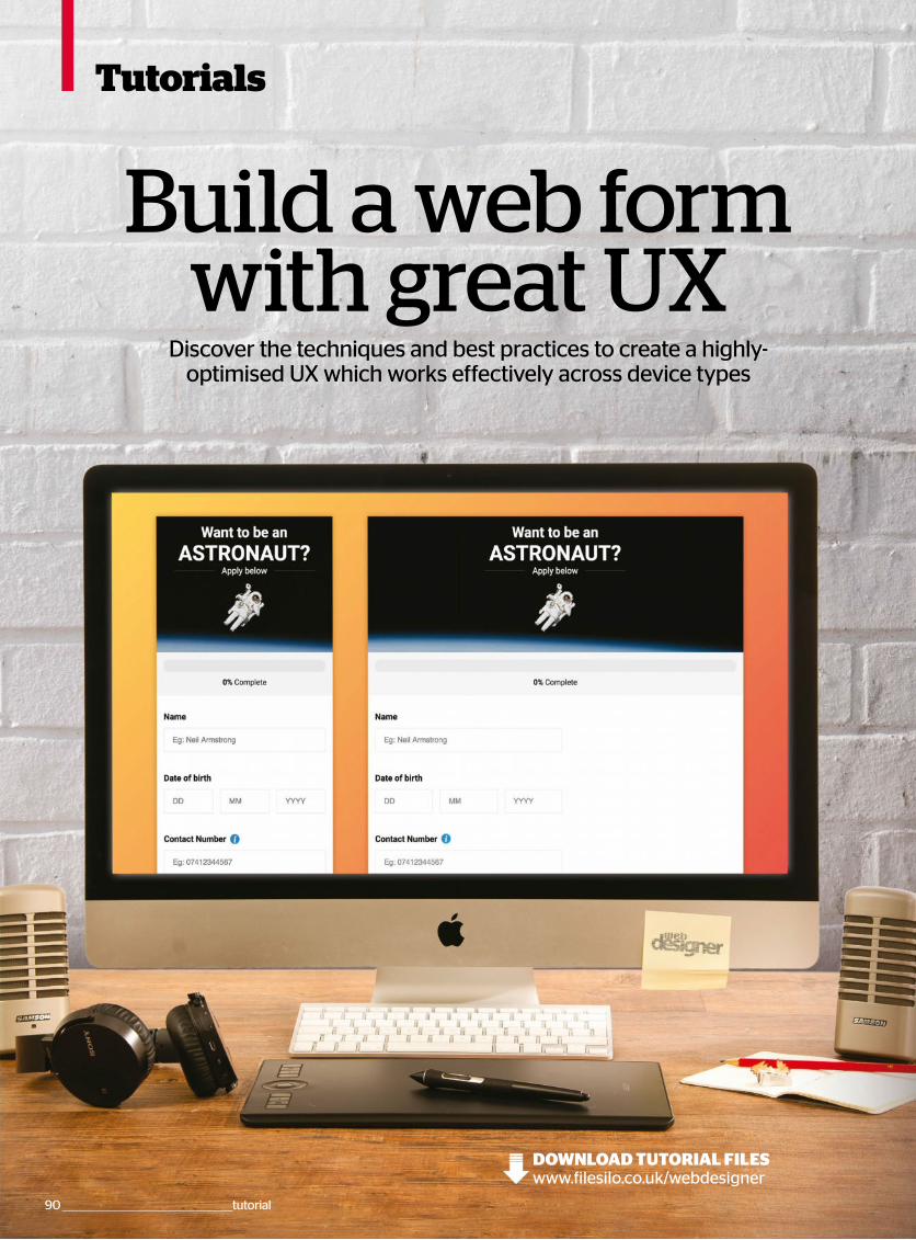
Tutorials
Build a web form with great UX
Discover the techniques and best practices to create a highly-optimised UX which works effectively across device types
90 _________________________________________________tutorial
www.filesilo.co.uk/webdesignerDOWNLOAD TUTORIAL FILES
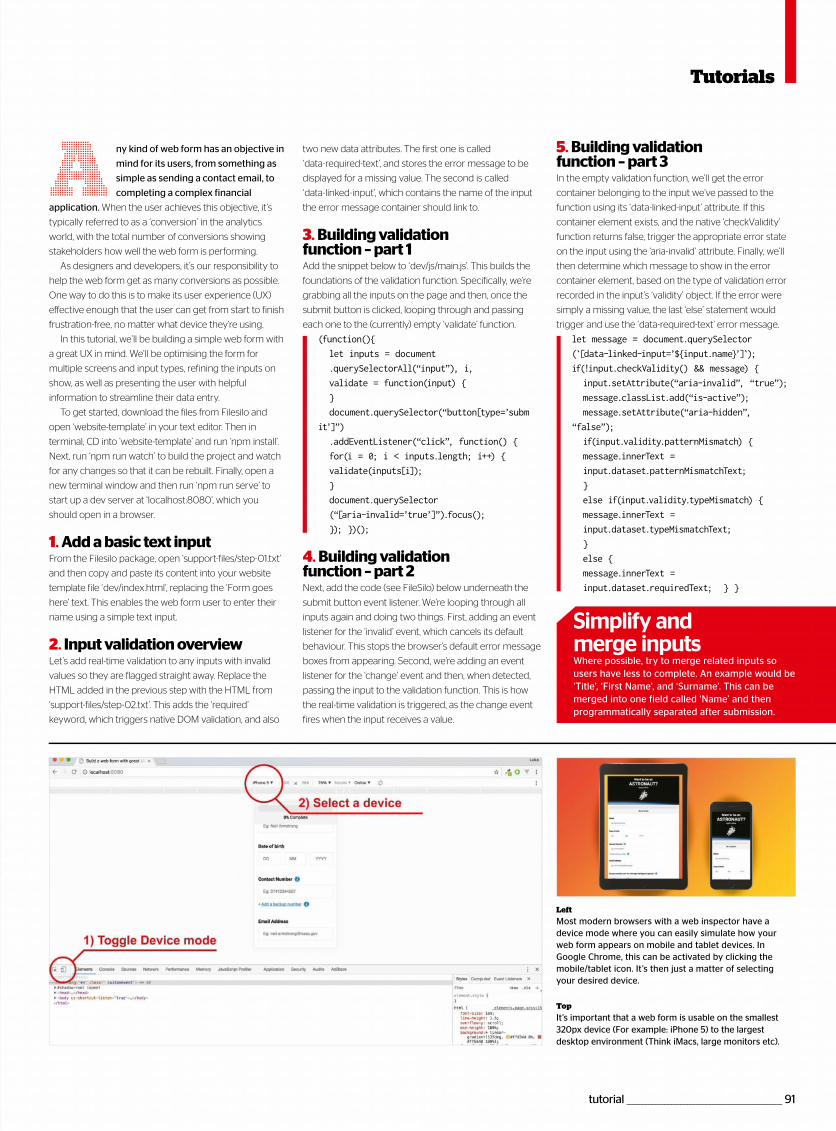
tutorial _________________________________________________ 91
ny kind of web form has an objective in
mind for its users, from something as
simple as sending a contact email, to
completing a complex financial
application. When the user achieves this objective, it’s
typically referred to as a ‘conversion’ in the analytics
world, with the total number of conversions showing
stakeholders how well the web form is performing.
As designers and developers, it’s our responsibility to
help the web form get as many conversions as possible.
One way to do this is to make its user experience (UX)
effective enough that the user can get from start to finish
frustration-free, no matter what device they’re using.
In this tutorial, we’ll be building a simple web form with
a great UX in mind. We’ll be optimising the form for
multiple screens and input types, refining the inputs on
show, as well as presenting the user with helpful
information to streamline their data entry.
To get started, download the files from Filesilo and
open ‘website-template’ in your text editor. Then in
terminal, CD into ‘website-template’ and run ‘npm install’.
Next, run ‘npm run watch’ to build the project and watch
for any changes so that it can be rebuilt. Finally, open a
new terminal window and then run ‘npm run serve’ to
start up a dev server at ‘localhost:8080’, which you
should open in a browser.
1. Add a basic text inputFrom the Filesilo package, open ‘support-files/step-01.txt’
and then copy and paste its content into your website
template file ‘dev/index.html’, replacing the ‘Form goes
here’ text. This enables the web form user to enter their
name using a simple text input.
2. Input validation overviewLet’s add real-time validation to any inputs with invalid
values so they are flagged straight away. Replace the
HTML added in the previous step with the HTML from
‘support-files/step-02.txt’. This adds the ‘required’
keyword, which triggers native DOM validation, and also
A 5. Building validationfunction – part 3In the empty validation function, we’ll get the error
container belonging to the input we’ve passed to the
function using its ‘data-linked-input’ attribute. If this
container element exists, and the native ‘checkValidity’
function returns false, trigger the appropriate error state
on the input using the ‘aria-invalid’ attribute. Finally, we’ll
then determine which message to show in the error
container element, based on the type of validation error
recorded in the input’s ‘validity’ object. If the error were
simply a missing value, the last ‘else’ statement would
trigger and use the ‘data-required-text’ error message.
let message = document.querySelector
(̀ [data-linked-input=’${input.name}’]̀ );
if(!input.checkValidity() && message) {
input.setAttribute(“aria-invalid”, “true”);
message.classList.add(“is-active”);
message.setAttribute(“aria-hidden”,
“false”);
if(input.validity.patternMismatch) {
message.innerText =
input.dataset.patternMismatchText;
}
else if(input.validity.typeMismatch) {
message.innerText =
input.dataset.typeMismatchText;
}
else {
message.innerText =
input.dataset.requiredText; } }
Simplify and merge inputsWhere possible, try to merge related inputs so users have less to complete. An example would be ‘Title’, ‘First Name’, and ‘Surname’. This can be merged into one field called ‘Name’ and then programmatically separated after submission.
Tutorials
Left
Most modern browsers with a web inspector have a device mode where you can easily simulate how your web form appears on mobile and tablet devices. In Google Chrome, this can be activated by clicking the mobile/tablet icon. It’s then just a matter of selecting your desired device.
Top
It’s important that a web form is usable on the smallest 320px device (For example: iPhone 5) to the largest desktop environment (Think iMacs, large monitors etc).
two new data attributes. The first one is called
‘data-required-text’, and stores the error message to be
displayed for a missing value. The second is called
‘data-linked-input’, which contains the name of the input
the error message container should link to.
3. Building validation function – part 1Add the snippet below to ‘dev/js/main.js’. This builds the
foundations of the validation function. Specifically, we’re
grabbing all the inputs on the page and then, once the
submit button is clicked, looping through and passing
each one to the (currently) empty ‘validate’ function.
(function(){
let inputs = document
.querySelectorAll(“input”), i,
validate = function(input) {
}
document.querySelector(“button[type=’subm
it’]”)
.addEventListener(“click”, function() {
for(i = 0; i < inputs.length; i++) {
validate(inputs[i]);
}
document.querySelector
(“[aria-invalid=’true’]”).focus();
}); })();
4. Building validation function – part 2Next, add the code (see FileSilo) below underneath the
submit button event listener. We’re looping through all
inputs again and doing two things. First, adding an event
listener for the ‘invalid’ event, which cancels its default
behaviour. This stops the browser’s default error message
boxes from appearing. Second, we’re adding an event
listener for the ‘change’ event and then, when detected,
passing the input to the validation function. This is how
the real-time validation is triggered, as the change event
fires when the input receives a value.
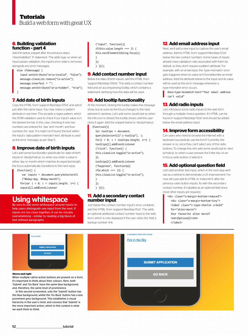
92__________________________________________________tutorial
6. Building validation function – part 4Add the below snippet after the previous step’s
‘checkValidity()’ ‘if’ statement. This adds logic so when an
input passes validation, the input’s error state is removed,
alongside any error messages.
else if(message) {
input.setAttribute(“aria-invalid”, “false”);
message.classList.remove(“is-active”);
message.innerText = “”;
message.setAttribute(“aria-hidden”, “true”);
}
7. Add date of birth inputsCopy the HTML from ‘support-files/step-07.txt’ and add it
just after the name input. You may notice a ‘pattern’
attribute in use here. This accepts a regex pattern, which
the DOM validation uses to check if our input’s value is in
the desired format. In this case, checking if only two
numbers are entered for ‘day’ and ‘month’, and four
numbers for ‘year’. If a match isn’t found, the text within
the input’s ‘data-pattern-mismatch-text’ attribute is used
as the error message, as per Step 5.
8. Improve date of birth inputsLet’s add some functionality specifically for date-of-birth
inputs to ‘dev/js/main.js’, so when you enter a value in
either day or month which matches its expected length,
the focus automatically transitions to the next input.
(function() {
var inputs = document.querySelectorAll
(“#bday-day, #bday-month”);
for(var i = 0; i < inputs.length; i++) {
inputs[i].addEventListener
Build a web form with great UX
(“input”, function(){
if(this.value.length === 2) {
this.nextElementSibling.focus();
}
});
} })();
9. Add contact number inputBelow the date-of-birth inputs, add the HTML from
‘support-files/step-09.txt’. This adds a contact number
field and an accompanying tooltip, which contains a
statement clarifying how this data will be used.
10. Add tooltip functionalityAt the moment, clicking the tooltip makes the message
show, but as soon as the focus changes to the next
element it vanishes. Let’s add some JavaScript so when
the info icon is clicked, the tooltip shows until the user
clicks it again. Add the snippet below to ‘dev/js/main.js’.
(function(){
let tooltips = document.
querySelectorAll(“.c-tooltip”), i;
for(i = 0; i < tooltips.length; i++) {
tooltips[i].addEventListener
(“click”, function() {
this.classList.toggle(“is-active”);
});
tooltips[i].addEventListener
(“keypress”, function(e){
if(e.which === 13) {
this.classList.toggle(“is-active”);
}
});
} })();
11. Add a secondary contact number inputJust below the contact number input’s error container,
add the HTML from ‘support-files/step-11.txt’. This adds
an optional additional contact number input to the web
form, which is only displayed if the user clicks the ‘Add a
backup number’ link.
12. Add email address inputNext, we’ll add a new input to capture the user’s email
address. Add its HTML from ‘support-files/step-12.txt’
below the two contact numbers. Some types of inputs
already have validation rules associated with them by
default, so they don’t require a pattern attribute. For
example, with an email input, the ‘type-mismatch’ error
gets triggered when its value isn’t formatted like an email
address. Add the attribute below to the input and its value
will be used as the error message whenever a
type-mismatch error occurs.
data-type-mismatch-text=”Your email address
isn’t valid”
13. Add radio inputsLet’s introduce some radio inputs to the web form
through a multiple choice question. It’s HTML can be
found in ‘support-files/step-13.txt’ and should be added
below the email address input.
14. Improve form accessibility Can users who need to browse the Internet with a
keyboard successfully use the form? Currently, the
answer is no, since they can’t select any of the radio
buttons. To change this, let’s add some JavaScript to ‘dev/
js/main.js’ so when a user presses the Enter key on an
in-focus radio button, it selects it.
15. Add optional question fieldLet’s add another text input, which in the next step we’ll
use as a vehicle to demonstrate a UX improvement. For
now, let’s just add its HTML to ‘index.html’ after the
previous radio button inputs. As with the secondary
contact number, it’s labelled as an optional field since
most other inputs are required.
<div class=”u-margin-bottom-reduced”>
<div class=”u-margin-bottom-tiny”>
<label class=”c-type-charlie u-bold”
for=”alien-movie”>
Your favourite alien movie?
<em>(Optional)</em>
</label>
Above and right
When multiple call-to-action buttons are present on a form, it’s important to think about their colours. Here, both ‘Submit’ and ‘Go Back’ have the same blue background, and, therefore, the same level of prominence.
In this second screenshot, only the ‘Submit’ button has the blue background, whilst the ‘Go Back’ button has a less prominent grey background. This establishes a visual hierarchy in the user’s mind, and conveys that ‘Submit’ is the more important action, which in this context is what we want them to think.
Using whitespaceBe sure to add some whitespace around inputs to help users distinguish one input from the next. If inputs are too close together, it can be visually overwhelming – similar to reading a big block of text without paragraphs.
Tutorials
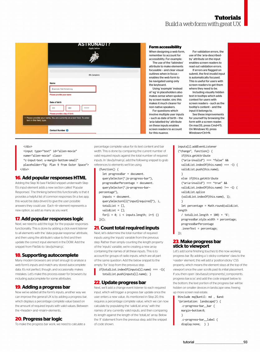
tutorial _________________________________________________93
Build a web form with great UX
percentage complete value for its text content and bar
width. This is done by comparing the current number of
valid required inputs against the total number of required
inputs. In ‘dev/js/main.js’, add the following snippet to grab
references to elements we’ll be using.
(function() {
let progressBar = document.
querySelector(“.js-progress-bar”),
progressBarPercentage = document.
querySelector(“.js-progress-bar-
percentage”),
inputs = document.
querySelectorAll(“input[required]”), i,
totalList = [],
validList = [];
for(i = 0; i < inputs.length; i++) {}
})();
21. Count total required inputsNext, let’s determine the total number of required
inputs using the ‘inputs’ variable from the previous
step. Rather than simply counting the length property
of the ‘inputs’ variable, we’re creating a new array
containing the names of all these inputs. This is to
account for groups of radio inputs, which are all part
of the same question. Add the below snippet to the
empty ‘for’ loop from the previous step.
if(totalList.indexOf(inputs[i].name) === -1){
totalList.push(inputs[i].name); }
22. Update progress barNext, we’ll add a change event listener to each required
input, which will trigger a progress bar update once the
user enters a new value. As mentioned in Step 20, this
requires a percentage complete value, which we can now
calculate by populating the ‘validList array’ with the
names of any currently valid inputs, and then comparing
its length against the length of the ‘totalList’ array. Below
the ‘if’ statement from the previous step, add the snippet
of code shown.
</div>
<input type=”text” id=”alien-movie”
name=”alien-movie” class=
“c-input-text u-margin-bottom-small”
placeholder=”Eg: Plan 9 from Outer Space”>
</div>
16. Add popular responses HTMLAdding the Step 16 (see FileSilo) snippet underneath Step
15’s input element adds a new section called ‘Popular
Responses’. The thinking behind this functionality is that it
provides a helpful list of common responses (In a live app,
this would be data driven) to give the user possible
answers they could use. Each <li> element represents a
new option, so add as many as you want.
17. Add popular responses logicNext, we need to add the logic for the popular responses
functionality. This is done by adding a click event listener
to all elements with the ‘data-popular-response’ attribute,
and then using the attribute’s value to find and then
update the correct input element in the DOM. Add the
snippet from FileSilo to ‘dev/js/main.js’.
18. Supporting autocompleteMany modern browsers are smart enough to analyse a
web form’s inputs and match any stored autocomplete
data. It’s not perfect, though, and occasionally makes
mistakes. Let’s make this process easier for browsers by
including autocomplete for some attributes.
19. Adding a progress barNow we’ve added all the form’s inputs, another way we
can improve the general UX is by adding a progress bar,
which displays a percentage complete value based on
the amount of required inputs with valid values. Between
the <header> and <main> elements.
20. Progress bar logicTo make the progress bar work, we need to calculate a
inputs[i].addEventListener
(“change”, function() {
if(this.getAttribute
(“aria-invalid”) === “false” &&
validList.indexOf(this.name) === -1) {
validList.push(this.name);
}
else if(this.getAttribute
(“aria-invalid”) === “true” &&
validList.indexOf(this.name) !== -1) {
validList.splice
(validList.indexOf(this.name), 1);
}
let percentage = Math.round(validList.
length
/ totalList.length * 100) + ‘%’;
progressBar.style.width = percentage;
progressBarPercentage
.innerText = percentage;
});
23. Make progress bar stick to viewportLet’s add some finishing touches to the now working
progress bar. By adding a ‘c-sticky-container’ class to the
‘<aside>’ element, this will add a ‘position:sticky’ CSS
property, which means the element stays at the top of the
viewport once the user scrolls past its initial placement.
If you then open ‘dev/sass/components/_components.
progress-bar.scss’ and add the code snippet below to
the bottom, the text portion of the progress bar will be
hidden on smaller devices in landscape view, freeing
up more screen real estate.
@include mq($until: md , $and:
‘(orientation: landscape)’) {
.c-progress-bar__bar {
margin-bottom:0;
}
.c-progress-bar__label {
display:none; } }
When designing a web form, remember to account for accessibility. For example:
The use of the ‘tabindex’ attribute to make elements focusable – and clear visual outlines when in focus – enables the web form to be navigated using only the keyboard.
Using ‘example’ instead of ‘eg’ in placeholders also makes sense when spoken by screen reader, sinc this makes it much clearer for non-native speakers.
For questions which involve multiple user inputs – such as date of birth – the ‘aria-labelled-by’ attribute on these inputs enables screen readers to account for this nuance.
For validation errors, the use of the ‘aria-described-by’ attribute on the input enables screen readers to read out validation errors.
If errors are flagged on submit, the first invalid input is automatically focused. This is useful for users with screen readers to get them where they need to be.
Including visually hidden text in tooltips which adds context for users with screen readers – such as the tooltip’s content – and the input it belongs to.
See these improvements for yourself by browsing the form with a screen reader. On macOS, press Cmd+F5. On Windows 10, press Windows+Ctrl+N.
Form accessibility
Tutorials
HOSTING LISTINGS
To advertise here contact [email protected]+44 (0)1225 687832
Get your listing in our directory
Featured host: tidyhostswww.tidyhosts.com / 05603 674610
Tidyhosts has become a leadingcloud hosting provider throughoutthe world. It boasts a feature-rich
selection of services including domain
registration, shared web hosting,
WordPress hosting, hosted exchange
email, cloud virtual servers and media
streaming. Its passion and drive for
About ussuccess has gained it a highly reliable
and trusted reputation from its
customers, making it the number one
for hosting services. Founded in 2004
by three developers who wanted to
build hosting infrastructure for
developers – years on, the company
has expanded to offer much more.
Domain names – Simpledomain registration with alarge choice of TLDs
Shared web hosting– Includes one-clickapplication installers and achoice of Windows or Linux
What we offer
5 Tips from the pros
Testimonials
Cloud virtual servers – Takefull control over your hosting,and install the software youneed on your server
SHOUTcast hosting – Startyour own radio station withour easy to set up and useSHOUTcast hosting service
1. Ensure that you choose theright domainWhen choosing your domain, makesure it’s easy to remember andresembles what you are offering.Customers are more likely to come
back if they can remember your URL.
2. Create clear, concisewebsite contentKeep the content on your websiteclear, informative and, moreimportantly, relative! Avoid any
duplication of content on different
pages as this can affect your rankings
on search engines.
3. Utilise SSL certificates tostay secureMore sites are moving to SSL security
to protect their customers from theever-increasing threats on the web.Search engines are now ranking sites
with an SSL higher than those without.
4. Make sure you choose theright planWhen you are ready to purchasehosting, check that you have enoughresources, especially if you expectyour website to grow quickly. Seek
advice from tidyhosts if you are unsure.
5. Use one-click installerswhen building a websiteIf you are new to building a websitethen we have a number of usefulone-click application installers. These
help you get up and running, including
the popular WordPress system.
Kelly Underwood
“ I’ve been with a number of web host providers in the past which have at
some point let me down. I now realise the importance of using a host that is
well known ”John Corey
“ We have our email hosted with tidyhosts, which serves a small number of
users in our office. We have found this solution is much more cost-effective ”Jenny Brice
“ A great host with fantastic knowledge. I have only had to use the
support channels a few times, but the replies I have had helped me instantly,
so well worth it ”
“ When you are ready to purchase hosting, check that you have enough resources ”
94 _________________________________________________listings
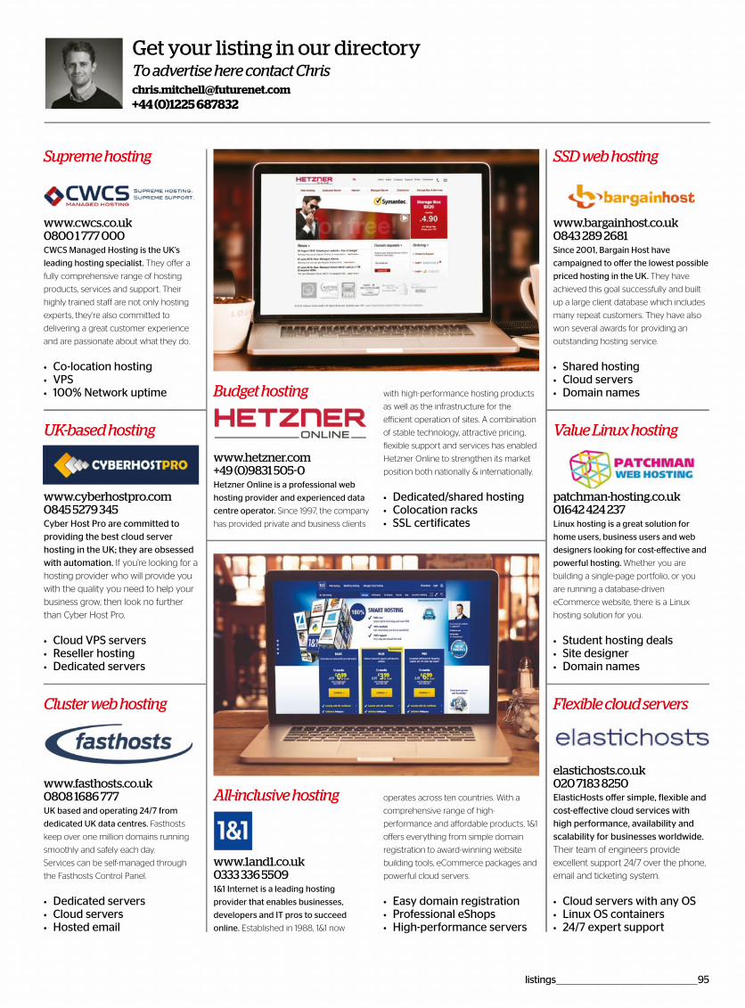
Supreme hosting SSD web hosting
UK-based hosting Value Linux hosting
Flexible cloud servers
www.cwcs.co.uk0800 1 777 000
www.bargainhost.co.uk0843 289 2681
www.cyberhostpro.com0845 5279 345
patchman-hosting.co.uk01642 424 237
elastichosts.co.uk020 7183 8250
CWCS Managed Hosting is the UK’s
leading hosting specialist. They offer a
fully comprehensive range of hosting
products, services and support. Their
highly trained staff are not only hosting
experts, they’re also committed to
delivering a great customer experience
and are passionate about what they do.
Co-location hosting VPS 100% Network uptime
Since 2001, Bargain Host have
campaigned to offer the lowest possible
priced hosting in the UK. They have
achieved this goal successfully and built
up a large client database which includes
many repeat customers. They have also
won several awards for providing an
outstanding hosting service.
Shared hostingCloud servers Domain names
Cyber Host Pro are committed to providing the best cloud server hosting in the UK; they are obsessed with automation. If you’re looking for a
hosting provider who will provide you
with the quality you need to help your
business grow, then look no further
than Cyber Host Pro.
Cloud VPS servers Reseller hosting Dedicated servers
Linux hosting is a great solution for
home users, business users and web
designers looking for cost-effective and
powerful hosting. Whether you are
building a single-page portfolio, or you
are running a database-driven
eCommerce website, there is a Linux
hosting solution for you.
Student hosting deals Site designer Domain names
ElasticHosts offer simple, flexible and cost-effective cloud services with high performance, availability and scalability for businesses worldwide. Their team of engineers provide
excellent support 24/7 over the phone,
email and ticketing system.
Cloud servers with any OS Linux OS containers 24/7 expert support
All-inclusive hosting
www.1and1.co.uk0333 336 55091&1 Internet is a leading hosting
provider that enables businesses,
developers and IT pros to succeed
online. Established in 1988, 1&1 now
operates across ten countries. With a
comprehensive range of high-
performance and affordable products, 1&1
offers everything from simple domain
registration to award-winning website
building tools, eCommerce packages and
powerful cloud servers.
Easy domain registration Professional eShops High-performance servers
To advertise here contact [email protected]+44 (0)1225 687832
Get your listing in our directory
Budget hosting
www.hetzner.com +49 (0)9831 505-0 Hetzner Online is a professional web
hosting provider and experienced data
centre operator. Since 1997, the company
has provided private and business clients
with high-performance hosting products
as well as the infrastructure for the
efficient operation of sites. A combination
of stable technology, attractive pricing,
flexible support and services has enabled
Hetzner Online to strengthen its market
position both nationally & internationally.
Dedicated/shared hosting Colocation racks SSL certificates
Cluster web hosting
www.fasthosts.co.uk0808 1686 777UK based and operating 24/7 from
dedicated UK data centres. Fasthosts
keep over one million domains running
smoothly and safely each day.
Services can be self-managed through
the Fasthosts Control Panel.
Dedicated servers Cloud servers Hosted email
listings __________________________________________________95

Free with your magazine
Register to get instant accessto this pack of must-have creative resources, how-to videos and tutorial assets
Essential assets and resourcesGet textures, fonts, backgrounds and more
Exclusive video tutorialsLearn to code/create with HTML, CSS, JS & PHP
Tutorial project files
to follow our tutorials
and JavaScript techniques
JavaScript video from Pluralsight (www.pluralsight.com)
(www.sparklestock.com)
Plus, all of this is yours too…
Log in to www.filesilo.co.uk/webdesigner Free for digital
readers, too!Read on your tablet, download on your
computer

Get startedEverything you need to know about accessing your FileSilo account
Follow the instructions on screen to create an
account with our secure FileSilo system. Log in and unlock the issue by answering a simple question about the magazine.
You can access FileSilo on any computer, tablet
or smartphone device using any popular browser. However, we recommend that you use a computer to download content, as you may not be able to download files to other devices.
If you have any problems with
accessing content on FileSilo, take a look at the FAQs online or email our team at the address below. [email protected]
Unlock the entire Web Designer FileSilo library with yourunique Web ID – the eight-digit alphanumeric code printedabove your address details on the mailing label of your subscription copies – also found on any renewal letters.
Already a print subscriber?
The home of greatdownloads – exclusive to your favourite magazines from Future!
Secure and safe online access, from anywhere
Free access for every reader, print and digital
Download only the files you want, when you want
All your gifts, from all your issues, in one place
The home of great
Over 60 hoursof video guidesLet the experts teach you
to create and code
More than400 tutorials
Get the code you need to get creative
Over 210creative assets Templates, fonts, textures
and backgrounds
gifts from more than 50 issuesAccess our entire library of resources with a money-saving
Unlock every issue
MMooorre thhaann90000 reeaasoonsstoo subbsscriibe
More added every issue
Head to page 14 to subscribe now
CONVERSION RATEOPTIMISATION
Discover how to increase site visitor numbersand turn them into customers
WIRE UP TYPESCRIPT WITH REACT
Bring together the impressive JavaScriptsuperset with React and Webpack
MAKE YOUR CSSMORE EFFICIENT
Learn how to use CSS variables tocreate smaller code bases
ALL IN YOUR NEXT
WEB DESIGNERIssue 271 on saleThursday 8th February 2018for the latest issue, back issues and specials
25 EXPERT TIPS & TECHNIQUES ON HOW TOBLEND FONTS, COLOURS, LAYOUTS AND UI
FOR THE PERFECT PAGE
myfavouritemagazines.co.uk
NEXT MONTH
98 __________________________________________next month
DESIGN LIKE A PRO
Visit the WEB DESIGNER online shop at


9000
011


