Embed Size (px)
Citation preview
Department of Chemical and Process EngineeringUniversity of Newcastle upon Tyne
PRESENTING DATAPRESENTING DATAPRESENTING DATA
School of Chemical Engineering and Advanced MaterialsUniversity of Newcastle upon Tyne
ScopeScope• Types of Data• Presenting Qualitative Information• Presenting numbers
– tables– charts
• Chart Design• Chart Design Tips
School of Chemical Engineering and Advanced MaterialsUniversity of Newcastle upon Tyne
Types of dataTypes of data
• Qualitative– descriptions– procedures– hierarchies– logic– cause-and-effect
• Numerical– nominal or categorical– ordinal– integers or countables– real and complex numbers
School of Chemical Engineering and Advanced MaterialsUniversity of Newcastle upon Tyne
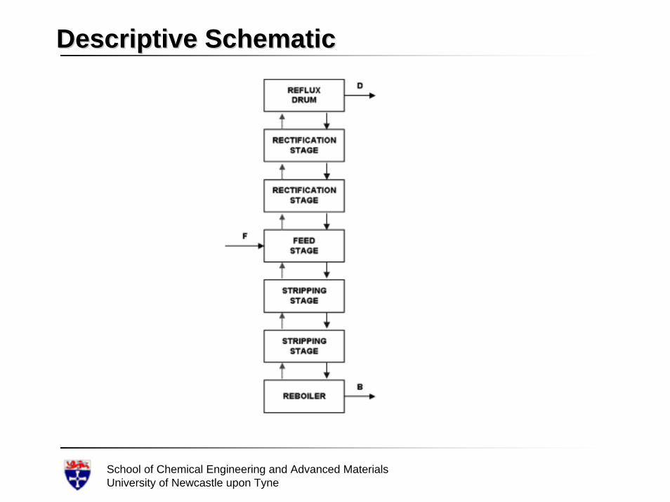
Descriptive SchematicDescriptive Schematic
School of Chemical Engineering and Advanced MaterialsUniversity of Newcastle upon Tyne
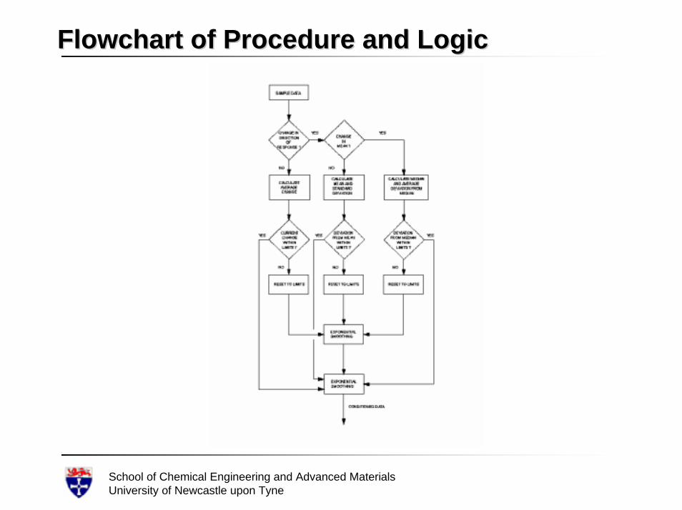
Flowchart of Procedure and LogicFlowchart of Procedure and Logic
School of Chemical Engineering and Advanced MaterialsUniversity of Newcastle upon Tyne
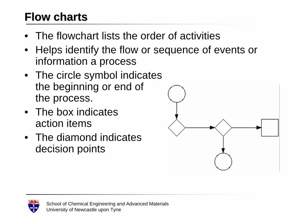
Flow chartsFlow charts• The flowchart lists the order of activities• Helps identify the flow or sequence of events or
information a process • The circle symbol indicates
the beginning or end of the process.
• The box indicatesaction items
• The diamond indicatesdecision points
School of Chemical Engineering and Advanced MaterialsUniversity of Newcastle upon Tyne
CauseCause--andand--Effect DiagramsEffect Diagrams• Also called the
– “fishbone chart” because of its appearance– “Ishikawa chart” after the man who popularised its
use in Japan. • Used to
– identify, explore, and display graphically, in increasing detail, all of the possible causes related to a problem or condition
– discover or determine root cause(s) of particular problems
School of Chemical Engineering and Advanced MaterialsUniversity of Newcastle upon Tyne
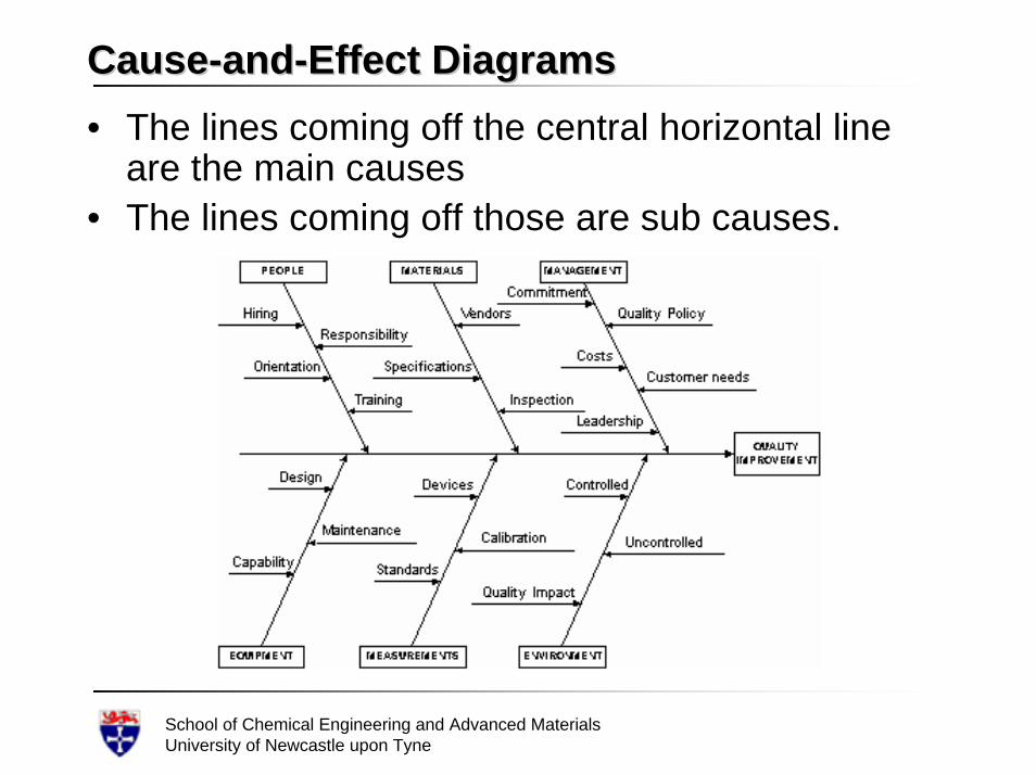
CauseCause--andand--Effect DiagramsEffect Diagrams• The lines coming off the central horizontal line
are the main causes • The lines coming off those are sub causes.
School of Chemical Engineering and Advanced MaterialsUniversity of Newcastle upon Tyne
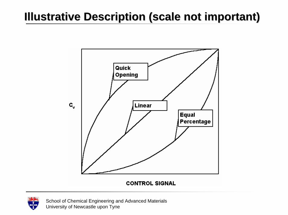
Illustrative Description (scale not important)Illustrative Description (scale not important)
School of Chemical Engineering and Advanced MaterialsUniversity of Newcastle upon Tyne
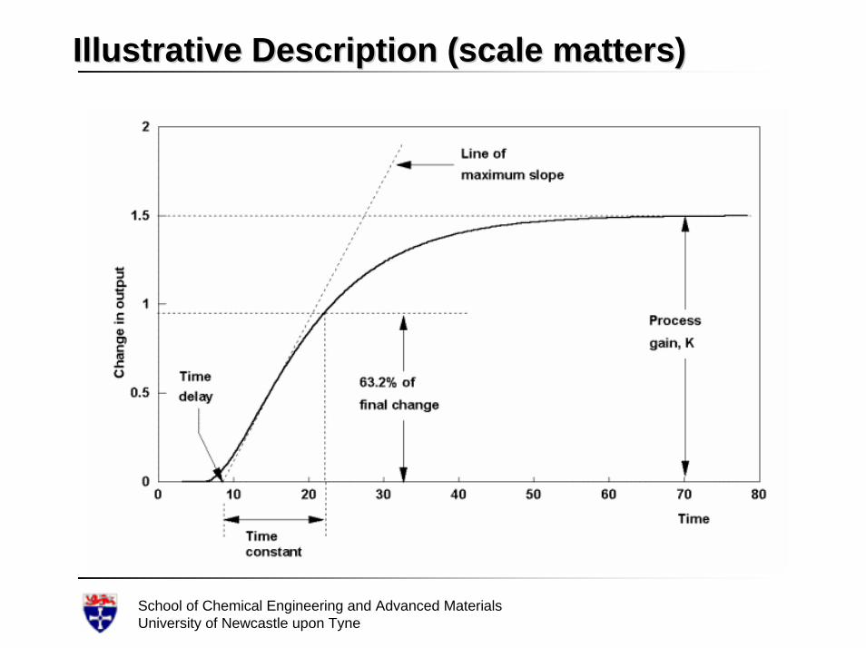
Illustrative Description (scale matters)Illustrative Description (scale matters)
School of Chemical Engineering and Advanced MaterialsUniversity of Newcastle upon Tyne
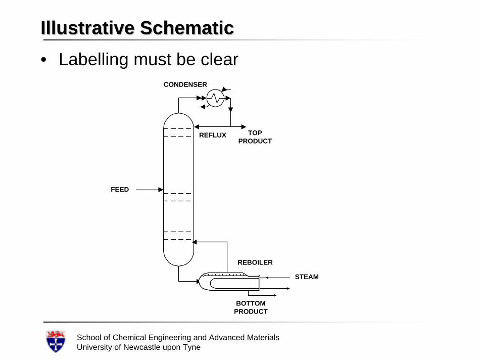
Illustrative SchematicIllustrative Schematic• Labelling must be clear
FEED
BOTTOMPRODUCT
TOPPRODUCT
CONDENSER
REBOILER
REFLUX
STEAM
School of Chemical Engineering and Advanced MaterialsUniversity of Newcastle upon Tyne
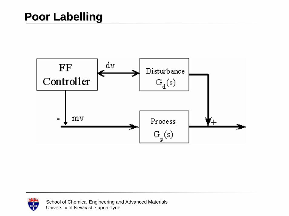
Poor LabellingPoor Labelling
School of Chemical Engineering and Advanced MaterialsUniversity of Newcastle upon Tyne
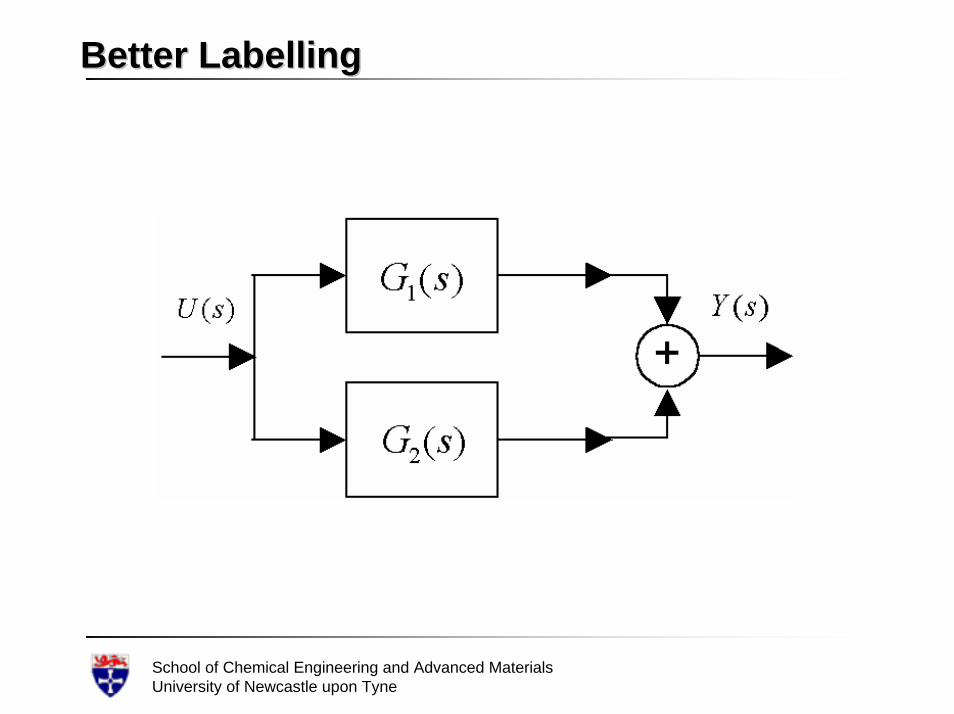
Better LabellingBetter Labelling
School of Chemical Engineering and Advanced MaterialsUniversity of Newcastle upon Tyne
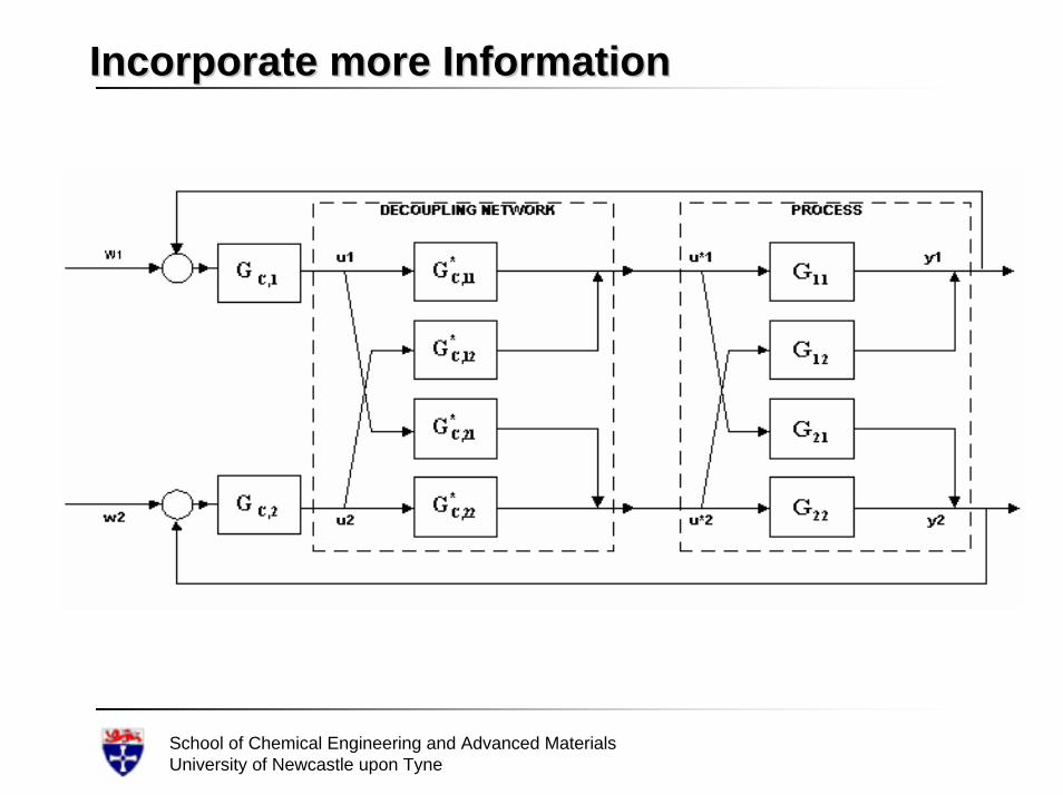
Incorporate more InformationIncorporate more Information
School of Chemical Engineering and Advanced MaterialsUniversity of Newcastle upon Tyne
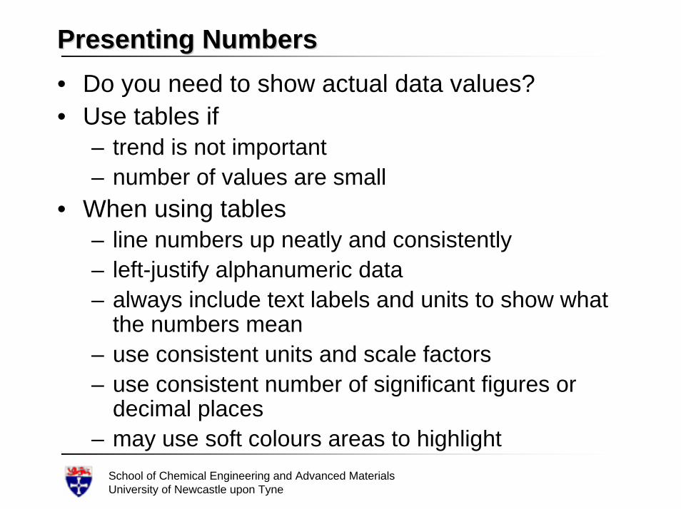
Presenting NumbersPresenting Numbers• Do you need to show actual data values?• Use tables if
– trend is not important– number of values are small
• When using tables– line numbers up neatly and consistently– left-justify alphanumeric data– always include text labels and units to show what
the numbers mean– use consistent units and scale factors– use consistent number of significant figures or
decimal places– may use soft colours areas to highlight
School of Chemical Engineering and Advanced MaterialsUniversity of Newcastle upon Tyne
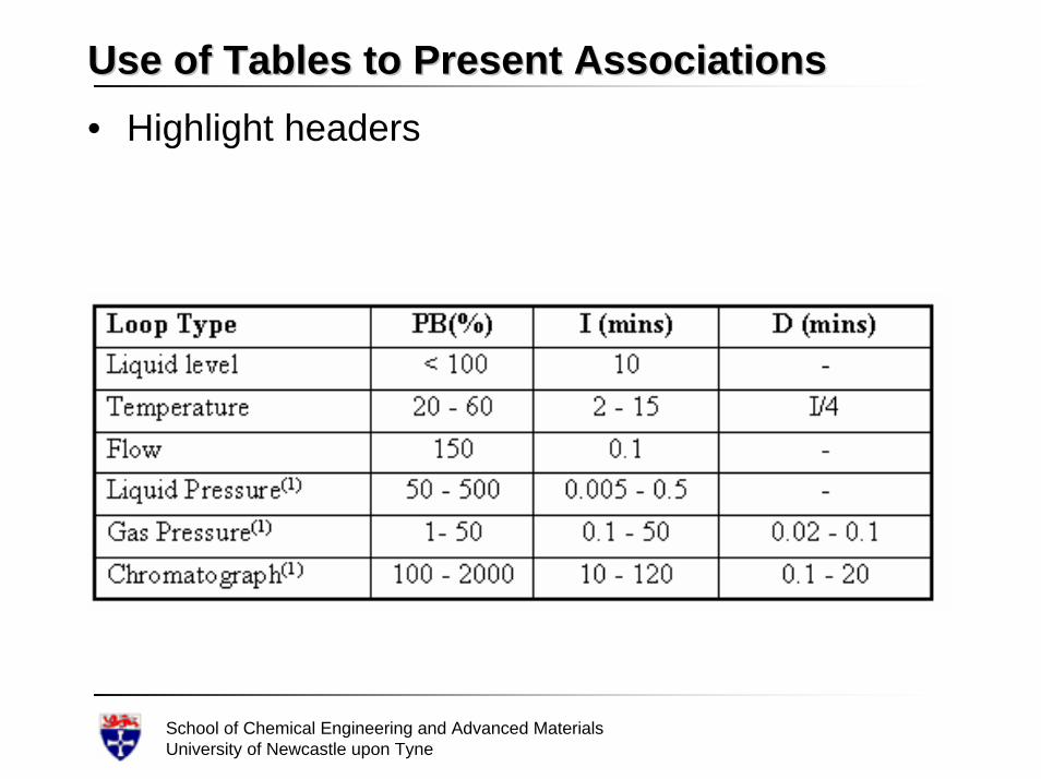
Use of Tables to Present AssociationsUse of Tables to Present Associations• Highlight headers
School of Chemical Engineering and Advanced MaterialsUniversity of Newcastle upon Tyne
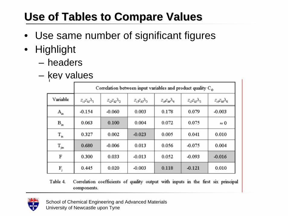
Use of Tables to Compare ValuesUse of Tables to Compare Values• Use same number of significant figures• Highlight
– headers– key values
School of Chemical Engineering and Advanced MaterialsUniversity of Newcastle upon Tyne
Using ChartsUsing Charts• A chart is often an easier and better way to
present trends or large amounts of information• A chart gives an idea of the value, and also a
visual indication of how the value is changing.• Involves more than just drawing graphs. • Effective use of charts requires an
understanding of– the type of data to be presented– the key feature that is to be portrayed– how the information will be used– who the intended audience is
School of Chemical Engineering and Advanced MaterialsUniversity of Newcastle upon Tyne
Chart DesignChart Design• The charting area is the focal point of the chart. • The chart should communicate enough
information to be a stand-alone• Try to get your point across without footnotes,
axis titles, or legends• Data displayed on figures must also be
described in the text. • For example,
– you should not just say, "the data are shown in Figure 3."
– you must tell the reader (in some detail) what Figure 3 shows
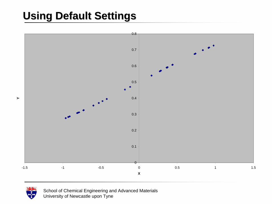
• Do not rely on “default settings”
School of Chemical Engineering and Advanced MaterialsUniversity of Newcastle upon Tyne
Using Default SettingsUsing Default Settings
0
0.1
0.2
0.3
0.4
0.5
0.6
0.7
0.8
-1.5 -1 -0.5 0 0.5 1 1.5
X
Y
School of Chemical Engineering and Advanced MaterialsUniversity of Newcastle upon Tyne
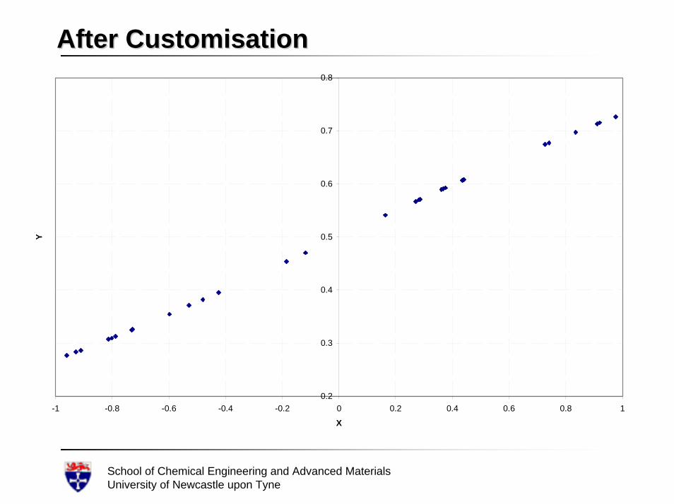
After CustomisationAfter Customisation
0.2
0.3
0.4
0.5
0.6
0.7
0.8
-1 -0.8 -0.6 -0.4 -0.2 0 0.2 0.4 0.6 0.8 1
X
Y
School of Chemical Engineering and Advanced MaterialsUniversity of Newcastle upon Tyne
Less is MoreLess is More• Do not try to put too many series in a chart. • Line charts are especially intolerant of
overcrowding. • More than three or four lines is visually
confusing, especially if the lines follow much the same direction
• The only exception to this rule is creating a line chart of several series that are not expected to be similar
School of Chemical Engineering and Advanced MaterialsUniversity of Newcastle upon Tyne
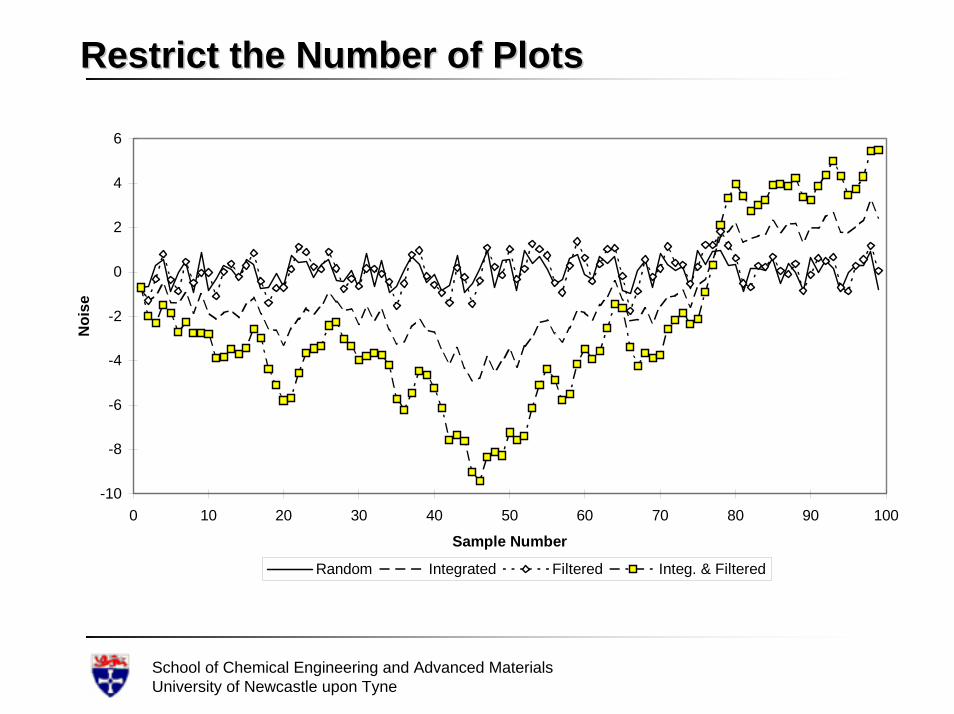
Restrict the Number of PlotsRestrict the Number of Plots
-10
-8
-6
-4
-2
0
2
4
6
0 10 20 30 40 50 60 70 80 90 100
Sample Number
Noi
se
Random Integrated Filtered Integ. & Filtered
School of Chemical Engineering and Advanced MaterialsUniversity of Newcastle upon Tyne
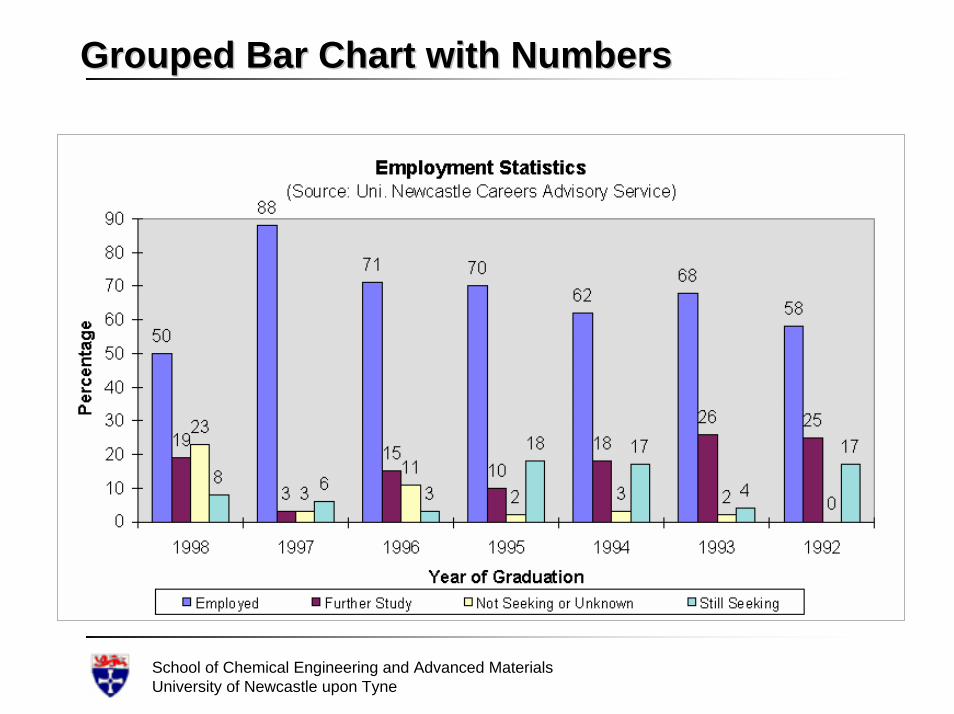
Grouping BarsGrouping Bars• Used grouped bars to show relationships
– group together tightly if they belong belong to the same class or category
• When showing a group of bars over a series of years– cluster the bars for each year– leave a little extra space between years.
• Add enough space between bars so they are easier to see
School of Chemical Engineering and Advanced MaterialsUniversity of Newcastle upon Tyne
Grouped Bar Chart with NumbersGrouped Bar Chart with Numbers
School of Chemical Engineering and Advanced MaterialsUniversity of Newcastle upon Tyne
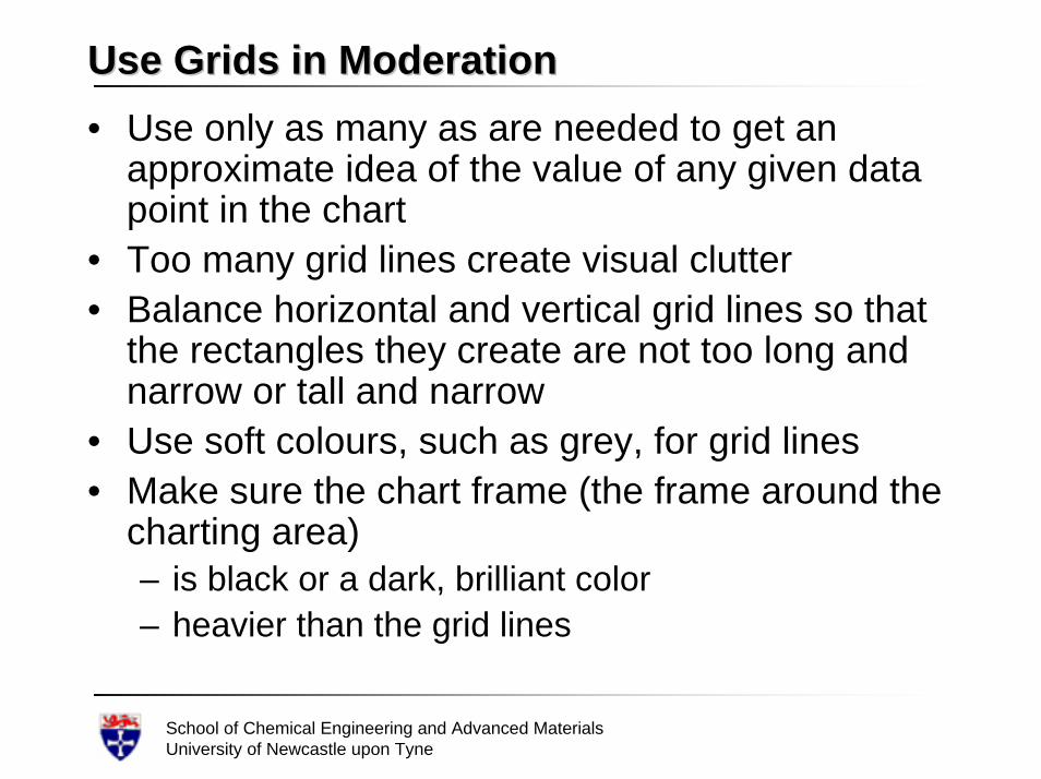
Use Grids in ModerationUse Grids in Moderation• Use only as many as are needed to get an
approximate idea of the value of any given data point in the chart
• Too many grid lines create visual clutter• Balance horizontal and vertical grid lines so that
the rectangles they create are not too long and narrow or tall and narrow
• Use soft colours, such as grey, for grid lines• Make sure the chart frame (the frame around the
charting area) – is black or a dark, brilliant color– heavier than the grid lines
School of Chemical Engineering and Advanced MaterialsUniversity of Newcastle upon Tyne
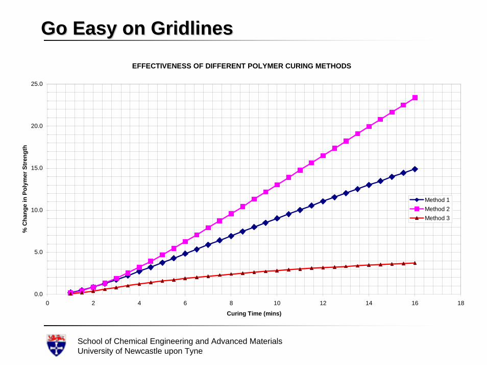
Go Easy on GridlinesGo Easy on GridlinesEFFECTIVENESS OF DIFFERENT POLYMER CURING METHODS
0.0
5.0
10.0
15.0
20.0
25.0
0 2 4 6 8 10 12 14 16 18
Curing Time (mins)
% C
hang
e in
Pol
ymer
Str
engt
h
Method 1Method 2Method 3
School of Chemical Engineering and Advanced MaterialsUniversity of Newcastle upon Tyne
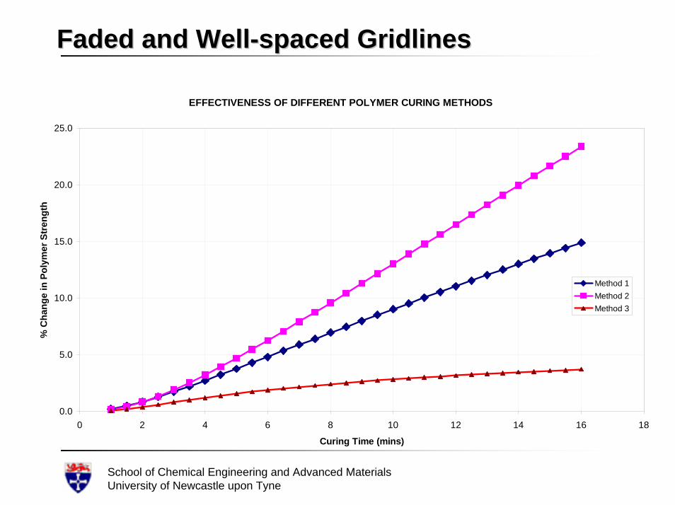
Faded and WellFaded and Well--spaced Gridlinesspaced Gridlines
EFFECTIVENESS OF DIFFERENT POLYMER CURING METHODS
0.0
5.0
10.0
15.0
20.0
25.0
0 2 4 6 8 10 12 14 16 18
Curing Time (mins)
% C
hang
e in
Pol
ymer
Str
engt
h
Method 1Method 2Method 3
School of Chemical Engineering and Advanced MaterialsUniversity of Newcastle upon Tyne
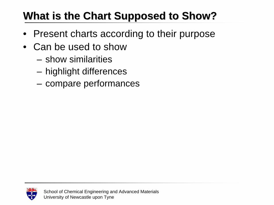
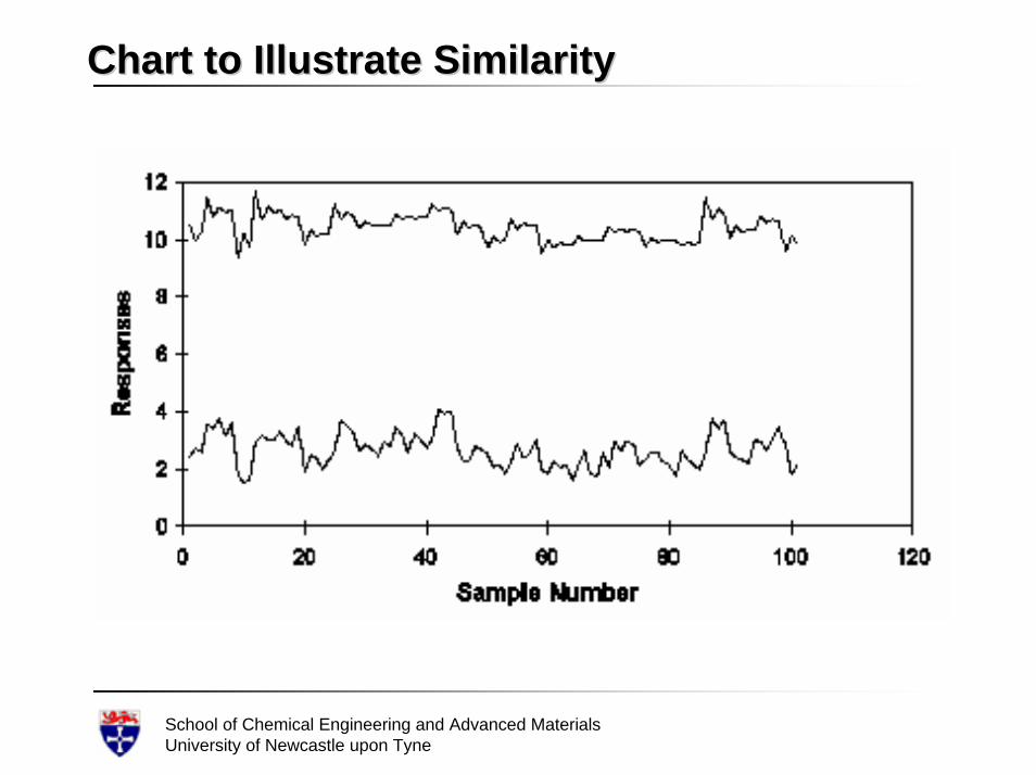
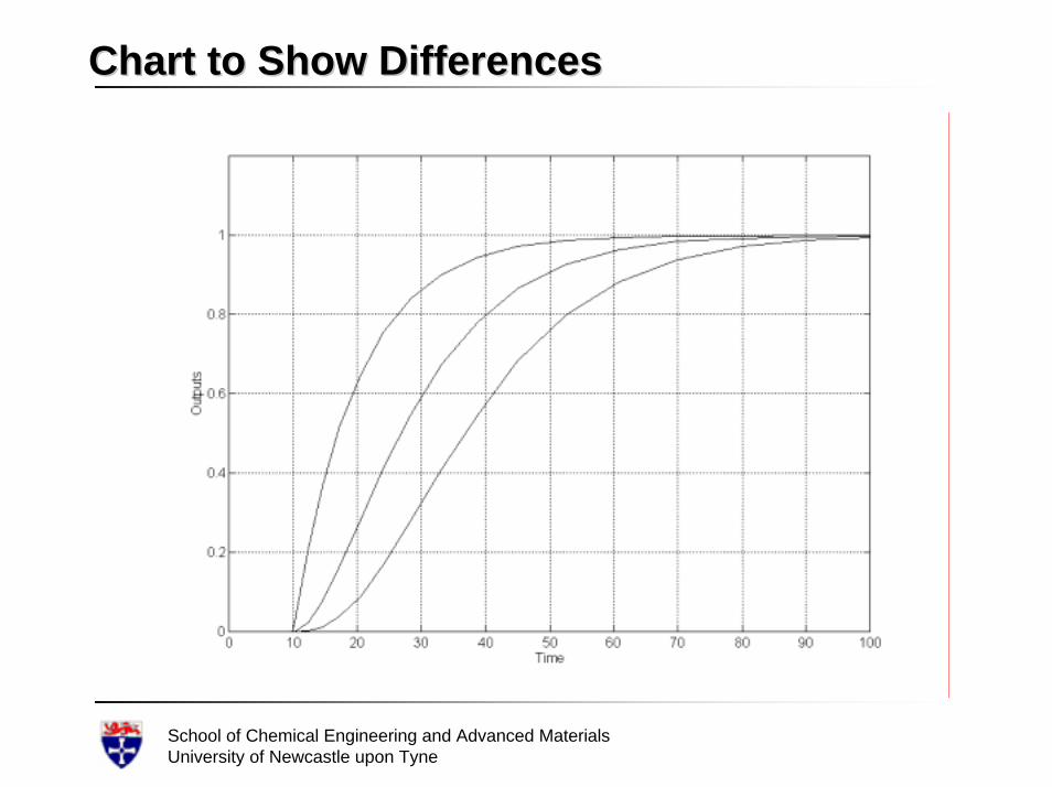
What is the Chart Supposed to Show?What is the Chart Supposed to Show?• Present charts according to their purpose• Can be used to show
– show similarities– highlight differences– compare performances
School of Chemical Engineering and Advanced MaterialsUniversity of Newcastle upon Tyne
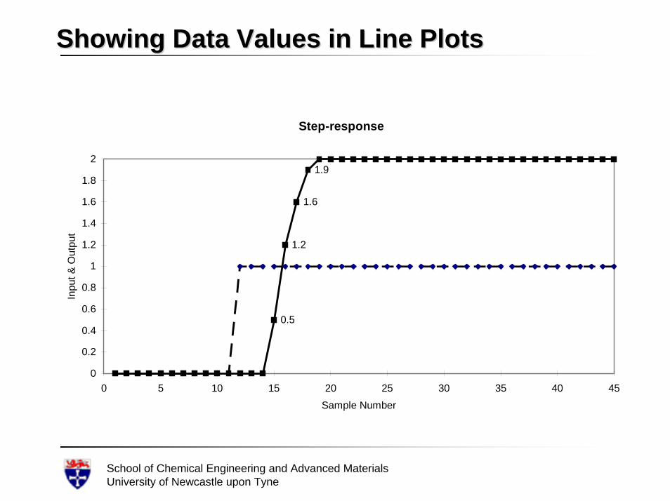
Showing Data Values in Line PlotsShowing Data Values in Line Plots
Step-response
0.5
1.2
1.6
1.9
0
0.2
0.4
0.6
0.8
1
1.2
1.4
1.6
1.8
2
0 5 10 15 20 25 30 35 40 45Sample Number
Inpu
t & O
utpu
t
School of Chemical Engineering and Advanced MaterialsUniversity of Newcastle upon Tyne
Chart to Illustrate SimilarityChart to Illustrate Similarity
School of Chemical Engineering and Advanced MaterialsUniversity of Newcastle upon Tyne
Chart to Show DifferencesChart to Show Differences
School of Chemical Engineering and Advanced MaterialsUniversity of Newcastle upon Tyne
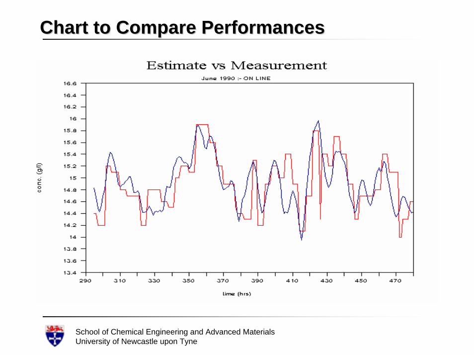
Chart to Compare PerformancesChart to Compare Performances
School of Chemical Engineering and Advanced MaterialsUniversity of Newcastle upon Tyne
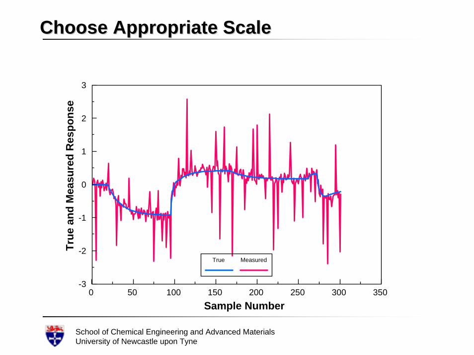
Choose Appropriate ScaleChoose Appropriate Scale
0 50 100 150 200 250 300 350-3
-2
-1
0
1
2
3
Sample Number
True
and
Mea
sure
d R
espo
nse
True Measured
School of Chemical Engineering and Advanced MaterialsUniversity of Newcastle upon Tyne
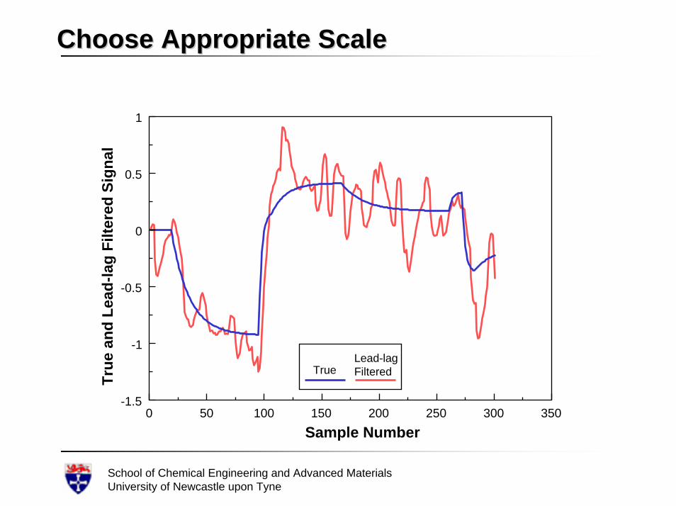
Choose Appropriate ScaleChoose Appropriate Scale
0 50 100 150 200 250 300 350-1.5
-1
-0.5
0
0.5
1
Sample Number
True
and
Lea
d-la
g Fi
ltere
d Si
gnal
TrueLead-lagFiltered
School of Chemical Engineering and Advanced MaterialsUniversity of Newcastle upon Tyne
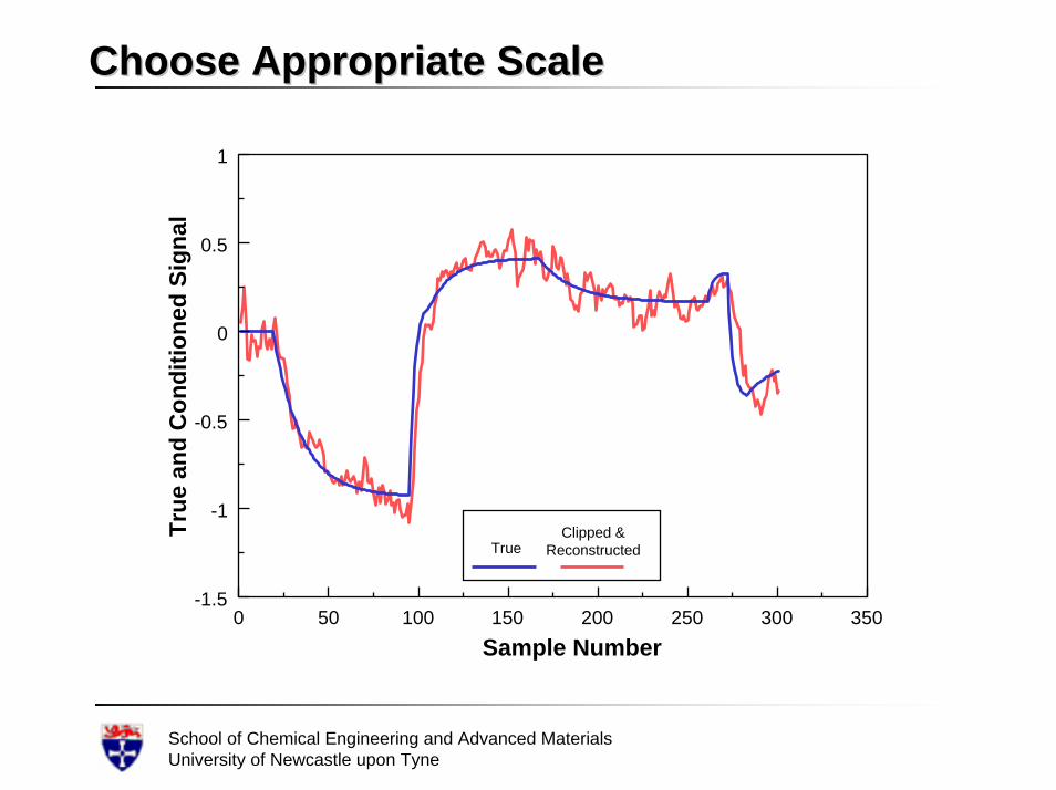
Choose Appropriate ScaleChoose Appropriate Scale
0 50 100 150 200 250 300 350-1.5
-1
-0.5
0
0.5
1
Sample Number
True
and
Con
ditio
ned
Sign
al
TrueClipped &
Reconstructed
School of Chemical Engineering and Advanced MaterialsUniversity of Newcastle upon Tyne
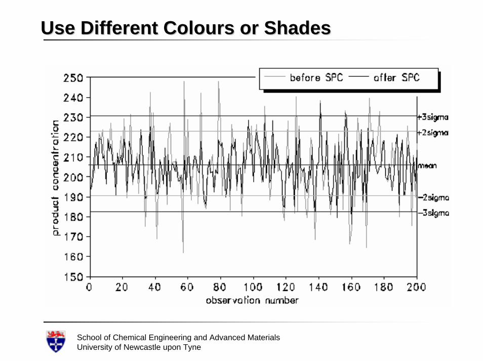
Use Different Colours or ShadesUse Different Colours or Shades
School of Chemical Engineering and Advanced MaterialsUniversity of Newcastle upon Tyne
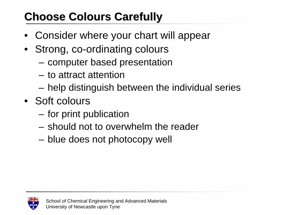
Choose Colours CarefullyChoose Colours Carefully• Consider where your chart will appear• Strong, co-ordinating colours
– computer based presentation– to attract attention – help distinguish between the individual series
• Soft colours– for print publication – should not to overwhelm the reader– blue does not photocopy well
School of Chemical Engineering and Advanced MaterialsUniversity of Newcastle upon Tyne
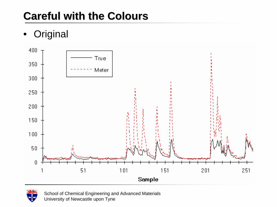
Careful with the ColoursCareful with the Colours• Original
School of Chemical Engineering and Advanced MaterialsUniversity of Newcastle upon Tyne
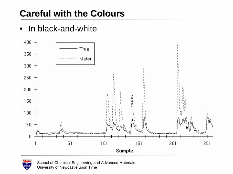
Careful with the ColoursCareful with the Colours• In black-and-white
School of Chemical Engineering and Advanced MaterialsUniversity of Newcastle upon Tyne
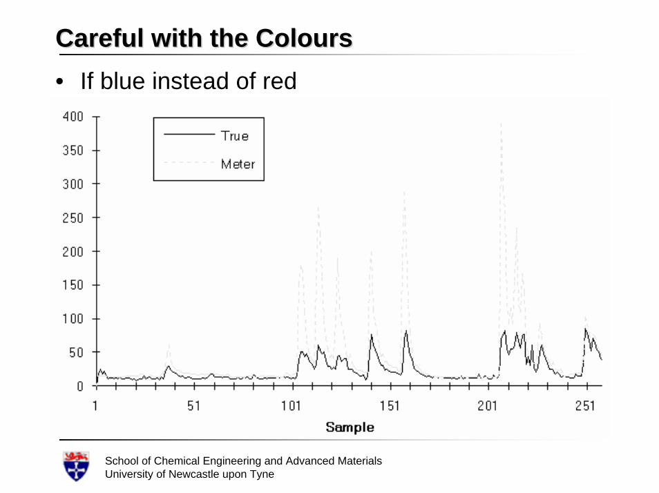
Careful with the ColoursCareful with the Colours• If blue instead of red
School of Chemical Engineering and Advanced MaterialsUniversity of Newcastle upon Tyne
Limit Use of TypefacesLimit Use of Typefaces• Use one typeface, or at most two, on each chart, • Use the same size and weight for similar
elements such as the axes and legend text• A recommended setting is 12 to 18 points and
bold• Enough typographic variety can be generated
without using another font type– using bold and italic fonts– different sizes
School of Chemical Engineering and Advanced MaterialsUniversity of Newcastle upon Tyne
Choose Legible FontsChoose Legible Fonts• Pick a typeface that looks clear in smaller sizes
and in bold– especially if your chart is to be printed in a small
size in a publication, or– if it will be viewed by a large audience in a big
room. • If your title is big enough, you can use just about
any typeface for it, and it will be legible.• For legend text, axes, footnotes and the like,
take more care. • Use faces that are neither too light nor too heavy• Arial font is good
School of Chemical Engineering and Advanced MaterialsUniversity of Newcastle upon Tyne
Select an Appropriate BackgroundSelect an Appropriate Background• Set type against an appropriate background
– be careful about the background behind your type– some colour combinations, such as pink or violet
type and a medium or dark blue background, could make your audience feel a little dizzy
– if a dark background colour is used, the type must be bright enough to be readable; it should not look as if the background is trying to "swallow it up."
– when using light type on a dark background, use a bold weight, especially with smaller type sizes.
– complex fill patterns in the background can make type hard to read, particularly smaller items like legend text and axis scales
School of Chemical Engineering and Advanced MaterialsUniversity of Newcastle upon Tyne
PatternsPatterns• Use pattern fills with moderation
– many charting software packages can create just about any kind of colour combination or fill pattern you can imagine
– do not become carried away with colour and patterns without thinking about your output device
– sophisticated fill patterns take up more disk space and take longer to print on colour printers


