Embed Size (px)
Citation preview

Essays on Innovation in Health Care Markets
by
Tamar Judith Oostrom
B.S., Washington and Lee University (2013)
Submitted to the Department of Economicsin partial fulfillment of the requirements for the degree of
Doctor of Philosophy in Economics
at the
MASSACHUSETTS INSTITUTE OF TECHNOLOGY
May 2020
c○ Tamar Judith Oostrom, MMXX. All rights reserved.
The author hereby grants to MIT permission to reproduce and to distribute publicly paperand electronic copies of this thesis document in whole or in part in any medium now
known or hereafter created.
Author. . . . . . . . . . . . . . . . . . . . . . . . . . . . . . . . . . . . . . . . . . . . . . . . . . . . . . . . . . . . . . . . . . . . . . . . . . .Department of Economics
May 15, 2020
Certified by . . . . . . . . . . . . . . . . . . . . . . . . . . . . . . . . . . . . . . . . . . . . . . . . . . . . . . . . . . . . . . . . . . . . . .Amy Finkelstein
John & Jennie S. MacDonald Professor of EconomicsThesis Supervisor
Certified by . . . . . . . . . . . . . . . . . . . . . . . . . . . . . . . . . . . . . . . . . . . . . . . . . . . . . . . . . . . . . . . . . . . . . .Heidi Williams
Charles R. Schwab Professor of Economics, Stanford UniversityThesis Supervisor
Certified by . . . . . . . . . . . . . . . . . . . . . . . . . . . . . . . . . . . . . . . . . . . . . . . . . . . . . . . . . . . . . . . . . . . . . .James Poterba
Mitsui Professor of EconomicsThesis Supervisor
Accepted by. . . . . . . . . . . . . . . . . . . . . . . . . . . . . . . . . . . . . . . . . . . . . . . . . . . . . . . . . . . . . . . . . . . . . .Amy Finkelstein
John & Jennie S. MacDonald Professor of EconomicsChairman, Department Committee on Graduate Theses

2
Essays on Innovation in Health Care Markets
by
Tamar Judith Oostrom
Submitted to the Department of Economicson May 15, 2020, in partial fulfillment of the
requirements for the degree ofDoctor of Philosophy in Economics
Abstract
This thesis consists of three chapters on innovation in health care markets. The first chapterexamines incentives in pharmaceutical innovation; the second explores selection in the responseto recommendations in health care. The third chapter presents new evidence on determinants ofrecent drug overdose mortality.
The first chapter examines the effect of financial incentives on reported drug efficacy in clinicaltrials. I leverage the insight that the exact same sets of drugs are often compared in differentrandomized control trials conducted by parties with different financial interests. I estimate that adrug appears 0.15 standard deviations more effective when the trial is sponsored by that drug’smanufacturer, compared with the same drug in the same trial without the drug manufacturer’sinvolvement. Publication bias explains a large share of this effect; observable characteristics oftrial design and patient enrollment are less important. I find the sponsorship effect decreases overtime as pre-registration requirements were implemented.
The second chapter, joint with Liran Einav, Amy Finkelstein, Abigail Ostriker, and Heidi Williams,presents evidence on the role of selection in considering whether and when to recommend screeningfor a particular disease. In the context of recommendations that breast cancer screening start at age40, we show that responders to the age 40 recommendation are less likely to have cancer and havesmaller tumors than do women who self-select into screening at earlier ages. Responders to theage 40 recommendation also have less cancer than women who never screen, suggesting that thebenefits of recommending early screening are smaller than if responders were representative of allcovered individuals.
The third chapter examines the role of declining community ties and social cohesion in the increasein drug overdose mortality in the past two decades. I assess the causal impact of declining religiosityon opioid deaths, instrumenting for religiosity with the Catholic sex-abuse scandal. I find that therecent decrease in religious employment would result in approximately one-third of the total currentopioid mortality rate. The effects are concentrated in areas with higher Catholic rates before thescandal and among young adults.
3

JEL Classifications: O31, I11, I18
Thesis Supervisor: Amy FinkelsteinTitle: John & Jennie S. MacDonald Professor of Economics
Thesis Supervisor: Heidi WilliamsTitle: Charles R. Schwab Professor of Economics, Stanford University
Thesis Supervisor: James PoterbaTitle: Mitsui Professor of Economics
4

Acknowledgments
It has been a privilege to spend the past five years at MIT, and I have benefited enormouslypersonally and professionally from this wonderful community.
I am primarily indebted to my advisors Amy Finkelstein, Heidi Williams, and Jim Poterba. I amimmensely grateful to Amy for taking me on as a research assistant with no relevant experience,encouraging me to explore this field, and applying her intense focus to my research questions andcareer choices. I have greatly enjoyed working with her and deeply admire her enthusiasm, senseof humor, and word-per-minute count, verbally and in print. If she ever learns how to run her owngoogle searches, there would be no more open questions in health insurance. I am grateful to HeidiWilliams for pushing me to be kinder and more thoughtful, in research and in life. She has putenormous care, dedication, and time into providing feedback on my research and has been a modelfor an innovative research agenda, in all senses of the word. Jim Poterba has been absolutelydelightful as an advisor. He has helped me see the forest for the trees, always remembered thedetails when we passed in the MIT or NBER hallways, and has been unfailingly kind.
In addition to my main academic advisors, I am grateful to Jonathan Gruber for his infectiousenthusiasm at key points, Frank Schilbach for always taking the time to talk, Ariel Stern forincluding me in her regulatory science group, and David Autor, Pierre Azoulay, Simon Jäeger,and Scott Stern for their time and helpful comments. I also want to thank my coauthors LiranEinav for always setting the bar high, and Abby Ostriker for her camaraderie down in the weeds ofour paper.
I am also indebted to my professors at Washington and Lee University, who were so generous withtheir time and attention. I want to thank Paul Bourdon, Art Goldsmith, Katherine Shester, andespecially Joseph Guse, who allowed me into his game theory class without the prerequisites, firstsuggested I might enjoy economics graduate school, and has been a wonderful source of supportand encouragement ever since.
My classmates were the best part of graduate school. I want to thank Ivan Badinski, Ben Deaner,Mayara Felix, Jonathan Hazell, Layne Kirshon, Claire Lazar, Anton Popov, Tim Simmons, MartinaUccioli, Sean Wang, and Michael Wong for years of practice talk attendance, Sloan lunches, andlong, meandering discussions. In particular, Layne Kirshon was a constant source of humor,Martina Uccioli embodied warmth and style, and Ivan Badinski made late nights working inthe office almost enjoyable and certainly carb-filled. I have also benefited from the advice andguidance of a number of students in older cohorts, including Sarah Abraham, Colin Gray, RyanHill, Ray Kluender, Ishan Nath, Christina Patterson, Otis Reid, Elizabeth Setren, Cory Smith,Michael Stepner, and Gabriel Unger. In particular, I want to thank Colin Gray for years of good-natured humor and life advice, Sarah Abraham, for introducing me to Tanglewood and providingninety percent of my current cultural literacy, and Christina Patterson for being a fiercely loyalmentor to me and many other women.
5

My desk at the NBER has been a source of light, both figuratively and literately. I met some of myfavorite people there as a research assistant, and I am grateful to Cirrus Foroughi, Belinda Tang,and Emilie Jackson for years of dinners and support. The attendees of the NBER Health and Aginglunch provided the most welcoming environment for early-stage ideas, and I want to particularlythank Aileen Devlin, Grace McCormack, and Angie Acquatella for creating a community, in personand virtually. Mohan Ramanujan has solved every technical problem of mine for the last sevenyears with such kindness, skill, and patience. I am also grateful to the NBER, the MIT Departmentof Economics, and the National Science Foundation for financial support.
What started out as a Saturday spin and brunch group has turned into my favorite group of friends.I want to thank Jane Choi for being the best listener. I felt like I could tell her anything (and oftendid). Maddie McKelway, along with Emma, created a lovely and peaceful home, and I am gratefulto her for our daily conversations. Pari Sastry is the funniest person I know, and I am thankful forher hysterical anecdotes and four-hour long chats about banking regulations. I believe that attentionis love, and Carolyn Stein showed me astonishing thoughtfulness, which manifested in bowls, pearlsugar, and occasionally hugs. I am so grateful for all of you.
I am lucky enough to have life-long friends from before MIT, who have helped me through graduateschool in various ways. I particularly want to thank Ann Cordray for being a source of support,visits, and phone calls even after I left our biochemistry major behind, and my best friend RoannaWang for two decades of friendship, love, and complete candor.
Lastly, I want to thank my family for their love and support. My father decided to get his PhD afteryears of working as a fruit-seller; my mother decided to get her associate’s degree while I was inhigh school. I like to think that I get my determination and curiosity from them. To Papa, Mama,Marjolein, Leonie, and Martijn – I know that you love me for everything that is not encapsulatedin this dissertation, and for that I am so grateful.
6

Contents
1 Funding of Clinical Trials and Reported Drug Efficacy 17
1.1 Introduction . . . . . . . . . . . . . . . . . . . . . . . . . . . . . . . . . . . . . . 17
1.2 Institutional Context . . . . . . . . . . . . . . . . . . . . . . . . . . . . . . . . . 24
1.2.1 Background on Clinical Trials . . . . . . . . . . . . . . . . . . . . . . . . 24
1.2.2 Setting . . . . . . . . . . . . . . . . . . . . . . . . . . . . . . . . . . . . 27
1.2.3 Antidepressant and Antipsychotic Drugs . . . . . . . . . . . . . . . . . . . 28
1.3 Empirical Framework . . . . . . . . . . . . . . . . . . . . . . . . . . . . . . . . . 29
1.3.1 Data . . . . . . . . . . . . . . . . . . . . . . . . . . . . . . . . . . . . . . 29
1.3.2 Variable Definitions . . . . . . . . . . . . . . . . . . . . . . . . . . . . . 31
1.3.3 Estimating Equations . . . . . . . . . . . . . . . . . . . . . . . . . . . . . 33
1.3.4 Summary Statistics . . . . . . . . . . . . . . . . . . . . . . . . . . . . . . 35
1.4 Results . . . . . . . . . . . . . . . . . . . . . . . . . . . . . . . . . . . . . . . . . 38
1.4.1 Difference in Difference . . . . . . . . . . . . . . . . . . . . . . . . . . . 38
1.4.2 Effect of Sponsorship on Reported Efficacy . . . . . . . . . . . . . . . . . 39
1.4.3 Heterogeneous Treatment Effects . . . . . . . . . . . . . . . . . . . . . . 42
1.4.4 External Validity . . . . . . . . . . . . . . . . . . . . . . . . . . . . . . . 44
1.5 Mechanisms . . . . . . . . . . . . . . . . . . . . . . . . . . . . . . . . . . . . . . 46
1.5.1 Differential Trial Design . . . . . . . . . . . . . . . . . . . . . . . . . . . 46
1.5.2 Publication Bias . . . . . . . . . . . . . . . . . . . . . . . . . . . . . . . 49
7

1.6 Conclusion . . . . . . . . . . . . . . . . . . . . . . . . . . . . . . . . . . . . . . 52
1.7 Figures and Tables . . . . . . . . . . . . . . . . . . . . . . . . . . . . . . . . . . 54
2 Screening and Selection: The Case of Mammograms 73
2.1 Introduction . . . . . . . . . . . . . . . . . . . . . . . . . . . . . . . . . . . . . . 73
2.2 Empirical Context . . . . . . . . . . . . . . . . . . . . . . . . . . . . . . . . . . . 79
2.2.1 Breast Cancer . . . . . . . . . . . . . . . . . . . . . . . . . . . . . . . . . 79
2.2.2 Mammography . . . . . . . . . . . . . . . . . . . . . . . . . . . . . . . . 80
2.3 Data and Descriptive Patterns . . . . . . . . . . . . . . . . . . . . . . . . . . . . . 83
2.3.1 Data and Variable Construction . . . . . . . . . . . . . . . . . . . . . . . 83
2.3.2 Mammograms and Outcomes, by Age . . . . . . . . . . . . . . . . . . . . 85
2.4 Model and Estimation . . . . . . . . . . . . . . . . . . . . . . . . . . . . . . . . . 87
2.4.1 A Descriptive Model of Mammogram Choice . . . . . . . . . . . . . . . . 88
2.4.2 Implementation . . . . . . . . . . . . . . . . . . . . . . . . . . . . . . . 91
2.5 The Impact of Alternative Screening Policies . . . . . . . . . . . . . . . . . . . . 95
2.5.1 Model Fit and Parameter Estimates . . . . . . . . . . . . . . . . . . . . . 95
2.5.2 Implications . . . . . . . . . . . . . . . . . . . . . . . . . . . . . . . . . 96
2.6 Conclusion . . . . . . . . . . . . . . . . . . . . . . . . . . . . . . . . . . . . . . 103
2.7 Tables and Figures . . . . . . . . . . . . . . . . . . . . . . . . . . . . . . . . . . 106
3 Opium for the Masses: The Effect of Declining Religiosity on Drug Poisonings, Suicides,
and Alcohol Abuse 117
3.1 Introduction . . . . . . . . . . . . . . . . . . . . . . . . . . . . . . . . . . . . . . 117
3.2 Empirical Strategy . . . . . . . . . . . . . . . . . . . . . . . . . . . . . . . . . . 120
3.2.1 Identification and Event Study . . . . . . . . . . . . . . . . . . . . . . . . 120
3.2.2 Regression Framework . . . . . . . . . . . . . . . . . . . . . . . . . . . . 123
3.3 Data . . . . . . . . . . . . . . . . . . . . . . . . . . . . . . . . . . . . . . . . . . 124
3.3.1 Data and Variable Definitions . . . . . . . . . . . . . . . . . . . . . . . . 124
8

3.3.2 Summary Statistics . . . . . . . . . . . . . . . . . . . . . . . . . . . . . . 126
3.3.3 Descriptive Analysis . . . . . . . . . . . . . . . . . . . . . . . . . . . . . 127
3.4 Results . . . . . . . . . . . . . . . . . . . . . . . . . . . . . . . . . . . . . . . . . 128
3.4.1 Event Studies . . . . . . . . . . . . . . . . . . . . . . . . . . . . . . . . . 128
3.4.2 Estimates . . . . . . . . . . . . . . . . . . . . . . . . . . . . . . . . . . . 130
3.4.3 Alternate Specifications and Outcomes . . . . . . . . . . . . . . . . . . . 132
3.4.4 Heterogeneity . . . . . . . . . . . . . . . . . . . . . . . . . . . . . . . . 133
3.5 Discussion . . . . . . . . . . . . . . . . . . . . . . . . . . . . . . . . . . . . . . . 134
3.6 Figures and Tables . . . . . . . . . . . . . . . . . . . . . . . . . . . . . . . . . . 135
A Appendix for Chapter 1 149
A.1 Statistical Significance Calculation . . . . . . . . . . . . . . . . . . . . . . . . . . 149
A.2 Appendix Figures and Tables . . . . . . . . . . . . . . . . . . . . . . . . . . . . . 150
B Appendix for Chapter 2 157
B.1 Coding Mammograms and Outcomes in Claims Data . . . . . . . . . . . . . . . . 157
B.2 Clinical Model: The Erasmus Model . . . . . . . . . . . . . . . . . . . . . . . . . 159
B.2.1 Model Details . . . . . . . . . . . . . . . . . . . . . . . . . . . . . . . . . 160
B.2.2 Parameterizing the Erasmus Model . . . . . . . . . . . . . . . . . . . . . 162
B.2.3 Visual Representation and Results from Erasmus Model: Underlying Cancer
Rate . . . . . . . . . . . . . . . . . . . . . . . . . . . . . . . . . . . . . . 164
B.3 Estimation of Mammogram Model . . . . . . . . . . . . . . . . . . . . . . . . . . 166
B.4 Counterfactual Simulations of Mammogram Model . . . . . . . . . . . . . . . . . 168
B.5 Sensitivity Analysis . . . . . . . . . . . . . . . . . . . . . . . . . . . . . . . . . 170
B.6 Appendix Figures and Tables . . . . . . . . . . . . . . . . . . . . . . . . . . . . . 172
C Appendix for Chapter 3 187
C.1 Appendix Figures and Tables . . . . . . . . . . . . . . . . . . . . . . . . . . . . . 187
9

D Bibliography 191
10
List of Figures
1.1 Types of Variation . . . . . . . . . . . . . . . . . . . . . . . . . . . . . . . . . . 54
1.2 Included Drugs . . . . . . . . . . . . . . . . . . . . . . . . . . . . . . . . . . . . 55
1.3 Distribution of Sponsorship over Time . . . . . . . . . . . . . . . . . . . . . . . . 56
1.4 Sponsorship Effect and Drug Sales . . . . . . . . . . . . . . . . . . . . . . . . . 57
1.5 Network of Trials for Antidepressants . . . . . . . . . . . . . . . . . . . . . . . . 58
1.6 Introduction of Clinical Trial Pre-registration . . . . . . . . . . . . . . . . . . . . 59
1.7 Counterfactual Sponsorship Effect under Alternate Publication Assumptions . . . . 60
2.1 Mammogram Rates by Age . . . . . . . . . . . . . . . . . . . . . . . . . . . . . . 106
2.2 Mammogram Outcomes by Age . . . . . . . . . . . . . . . . . . . . . . . . . . . 107
2.3 Tumor Stage and Size by Age . . . . . . . . . . . . . . . . . . . . . . . . . . . . 108
2.4 Spending by Age . . . . . . . . . . . . . . . . . . . . . . . . . . . . . . . . . . . 109
2.5 Mortality . . . . . . . . . . . . . . . . . . . . . . . . . . . . . . . . . . . . . . . 110
2.6 Model Fit . . . . . . . . . . . . . . . . . . . . . . . . . . . . . . . . . . . . . . . 111
2.7 Impact of Changing the Mammogram Recommendation Age from 40 to 45, by Age 112
3.1 Religion and Scandals over Time . . . . . . . . . . . . . . . . . . . . . . . . . . 135
3.2 Correlation between Opioid Deaths and Religiosity . . . . . . . . . . . . . . . . . 136
3.3 Geographic Distribution . . . . . . . . . . . . . . . . . . . . . . . . . . . . . . . 137
3.4 Event Study of the Effect of Scandals on Religious Employment Rates . . . . . . 138
3.5 Event Study of the Effect of Scandals on Death Rates . . . . . . . . . . . . . . . . 139
11

3.6 Event Study of the Effect of Scandals on Crime Rates . . . . . . . . . . . . . . . 140
A.1 Network of Trials for Antipsychotics . . . . . . . . . . . . . . . . . . . . . . . . 151
A.2 Distribution of Z-Scores Conditional on Publication . . . . . . . . . . . . . . . . . 152
B.1 Mammogram Rate in Survey and Claims Data, by Age . . . . . . . . . . . . . . . 172
B.2 Health Care Spending and Emergency Room use Prior to Mammogram, by Age . . 173
B.3 Preventive Care Prior to Mammogram by Age . . . . . . . . . . . . . . . . . . . . 174
B.4 Erasmus Model Predictions for Share with Cancer and Share In Situ (no screening) 175
B.5 Fitted Tumor Incidence by Age . . . . . . . . . . . . . . . . . . . . . . . . . . . 176
B.6 Multiplicative Incidence Adjustment . . . . . . . . . . . . . . . . . . . . . . . . . 177
B.7 Erasmus Model . . . . . . . . . . . . . . . . . . . . . . . . . . . . . . . . . . . . 178
B.8 Cancer Histories in Erasmus Model . . . . . . . . . . . . . . . . . . . . . . . . . 179
C.1 Event Study of the Effect of Scandals on Deaths of Despair . . . . . . . . . . . . 188
12
List of Tables
1.1 Sample Size . . . . . . . . . . . . . . . . . . . . . . . . . . . . . . . . . . . . . . 61
1.2 Difference in Difference: Active versus Placebo Studies . . . . . . . . . . . . . . 61
1.3 Difference in Difference: Active versus Active Antidepressant Studies . . . . . . . 62
1.4 Effect of Sponsorship on Drug Efficacy . . . . . . . . . . . . . . . . . . . . . . . 63
1.5 Robustness of Sponsorship Effect . . . . . . . . . . . . . . . . . . . . . . . . . . 64
1.6 Sponsorship Effect by Drug Type and Outcome . . . . . . . . . . . . . . . . . . . 65
1.7 Sponsorship by Study Type . . . . . . . . . . . . . . . . . . . . . . . . . . . . . 66
1.8 Sponsorship Variation by Paper Characteristics . . . . . . . . . . . . . . . . . . . 67
1.9 Characteristics of Sponsored Arms . . . . . . . . . . . . . . . . . . . . . . . . . 68
1.10 Predicted Sponsorship Effect Using Individual Characteristics . . . . . . . . . . . 69
1.11 Predicted Sponsorship Effect Using All Characteristics . . . . . . . . . . . . . . . 70
1.12 Publication by Efficacy . . . . . . . . . . . . . . . . . . . . . . . . . . . . . . . . 71
1.13 Publication by Pre-Registration . . . . . . . . . . . . . . . . . . . . . . . . . . . 72
2.1 Summary Statistics . . . . . . . . . . . . . . . . . . . . . . . . . . . . . . . . . . 113
2.2 Parameter Estimates . . . . . . . . . . . . . . . . . . . . . . . . . . . . . . . . . . 113
2.3 Impact of Changing the Mammogram Recommendation Age from 40 to 45 . . . . 114
2.4 Impact of Changing Mammogram Recommendation Age from 40 to 45, Under
Alternative Assumptions about Selection . . . . . . . . . . . . . . . . . . . . . . . 115
13

2.5 Sensitivity Checks for Impact of Changing Mammogram Recommendation age
from 40 to 45 . . . . . . . . . . . . . . . . . . . . . . . . . . . . . . . . . . . . . 116
3.1 Summary Statistics . . . . . . . . . . . . . . . . . . . . . . . . . . . . . . . . . . 141
3.2 First Stage: Effect of Scandals on Religious Employment . . . . . . . . . . . . . . 142
3.3 Effect of Religion on Opioid Death Rates . . . . . . . . . . . . . . . . . . . . . . 143
3.4 Robustness of Effect of Religion on Opioid Death Rates . . . . . . . . . . . . . . 144
3.5 Effect of Religion on Alternate Death Rates . . . . . . . . . . . . . . . . . . . . . 145
3.6 Heterogeneity by Catholic Rate . . . . . . . . . . . . . . . . . . . . . . . . . . . 146
3.7 Heterogeneity by Age . . . . . . . . . . . . . . . . . . . . . . . . . . . . . . . . 147
A.1 Fixed Effect Example . . . . . . . . . . . . . . . . . . . . . . . . . . . . . . . . 153
A.2 Non-Industry Funders . . . . . . . . . . . . . . . . . . . . . . . . . . . . . . . . 154
A.3 Full Sample Size . . . . . . . . . . . . . . . . . . . . . . . . . . . . . . . . . . . 154
A.4 Difference in Difference: Active versus Active Antipsychotic Studies . . . . . . . 155
A.5 Alternate Specifications . . . . . . . . . . . . . . . . . . . . . . . . . . . . . . . 156
B.1 Codes used to identify claims . . . . . . . . . . . . . . . . . . . . . . . . . . . . 180
B.2 Results of mammograms by diagnosis . . . . . . . . . . . . . . . . . . . . . . . . 180
B.3 Diagnosis status by true positive result . . . . . . . . . . . . . . . . . . . . . . . . 181
B.4 Tumor characteristics . . . . . . . . . . . . . . . . . . . . . . . . . . . . . . . . . 181
B.5 Model parameters . . . . . . . . . . . . . . . . . . . . . . . . . . . . . . . . . . 182
B.6 Tumor incidence by age . . . . . . . . . . . . . . . . . . . . . . . . . . . . . . . 183
B.7 Screening diameter scale parameter . . . . . . . . . . . . . . . . . . . . . . . . . 183
B.8 Tumor incidence by birth cohort: original Erasmus values . . . . . . . . . . . . . 184
B.9 Tumor type distribution . . . . . . . . . . . . . . . . . . . . . . . . . . . . . . . 184
B.10 Sensitivity checks for parameter estimates . . . . . . . . . . . . . . . . . . . . . . 185
C.1 Ordinary Least Squares of Religion on Opioid Death Rates . . . . . . . . . . . . . 189
14

C.2 Effect of Religion on Opioid Death Rate, Alternate Lag Structure . . . . . . . . . 190
15

THIS PAGE INTENTIONALLY LEFT BLANK
16
Chapter 1
Funding of Clinical Trials and Reported
Drug Efficacy*
1.1 Introduction
In 1993, Wyeth Pharmaceuticals introduced a new antidepressant drug venlafaxine (brand name
Effexor). Over the next decade and a half, Wyeth sponsored numerous randomized control trials
(RCTs) comparing the efficacy of its new drug with a main competitor—Eli Lilly’s blockbuster
drug fluoxetine (brand name Prozac). In eight out of ten papers solely sponsored by Wyeth, the
efficacy point estimate was higher for their drug compared to its competitor.1 Five out of the
*Contact: [email protected]. I am very grateful to Amy Finkelstein, Heidi Williams, and Jim Poterbafor their invaluable advice and guidance. I would like to extend a special thanks to Pierre Azoulay, JonathanGruber, Frank Schilbach, and Scott Stern for helpful comments and support. This paper also benefitedgreatly from discussions with Sarah Abraham, David Autor, Ivan Badinski, Jane Choi, Joe Doyle, ColinGray, Ryan Hill, Allan Hsiao, Simon Jaeger, Madeline Mckelway, Parinitha Sastry, Cory Smith, CarolynStein, Sean Wang, Michael Wong, and several anonymous clinical trial managers. Audrey Pettigrewprovided excellent research assistance. This material is based upon work supported by the National Instituteon Aging under Grant Number T32-AG000186 and the National Science Foundation Graduate FellowshipProgram under Grant Number 1122374. First draft April 2019.
1When computing which drug had a higher efficacy point estimate, I focus on a consistent outcomeacross papers. For antidepressant medications, this standard outcome is the share of patients who respond totreatment. See Section 1.3.2 for details.
17
seven publications concluded that venlafaxine was statistically significantly more effective than
fluoxetine.2 In contrast, neither of the two papers with alternate funding found a higher efficacy
point estimate for venlafaxine, and neither of the publications concluded that venlafaxine was
statistically significantly more effective.3 Motivated by such examples—which might be due
to idiosyncratic differences across these trials—I construct a data set of hundreds of psychiatric
clinical trials and systematically investigate the effect of an RCT’s sponsor on the reported efficacy
of its treatment arms.
Clinical trials are a key component of pharmaceutical research and development, bringing new
drugs to market, and informing subsequent prescription decisions. Estimates for the mean cost
of late stage clinical trials range from $20–35 million per trial, and tens of thousands of clinical
trials are conducted annually (Sertkaya et al., 2016; Moore et al., 2018).4 Over the past decade the
number of industry funded trials has increased by 43%, while the number of trials funded by the
National Institutes of Health has decreased by 24% (Ehrhardt et al., 2015). More than half of life
science researchers have some financial relationship with industry (Zinner et al., 2013), and one
fourth of investigators have a direct industry affiliation (Bekelman et al., 2003). The pharmaceutical
industry has strong incentives to produce scientific publications that present their drugs positively,
since these publications are the basis of regulatory, prescribing, and medical treatment decisions
(Davidoff et al., 2001).
This paper examines how financial incentives can affect the results of randomized control trials.
Specifically, I examine how much the funder of a clinical trial can change the reported efficacy of
the drugs tested. Since clinical trials cost tens of millions of dollars each, it is infeasible to randomly
assign funding to trials. In addition, privately funded trials are often very different from publicly
funded projects in terms of the diseases studied, the drugs and comparator treatment arms tested,
2The other two publications found no statistically significant difference in efficacy. Three paperssponsored by Wyeth were never published, including one of the papers that found a higher efficacy pointestimate for its competitor fluoxetine.
3One paper was funded by the Department of Health of Taiwan. The other paper was funded by Wyeth,but the authors were also consultants for Eli Lilly.
4These estimates are from 2004-2012 and 2015-2016 data, respectively, and have not been adjusted forinflation.
18
and the outcomes examined. If industry-funded trials simply test different drugs or comparators,
any efficacy differences would not reflect the causal effect of changing funding sources for a given
trial. My paper accounts for these concerns by directly comparing RCTs with identical drugs and
comparators. The key insight is that the same sets of drugs are often compared in different RCTs
conducted by parties with different financial interests. Therefore, I isolate the effect of changing
financial sponsorship in a given RCT from the fact that the pharmaceutical industry has different
objectives from non-profit sponsors and may choose to test different drugs and comparators.
I construct a data set of clinical trials where the exact same sets of drugs are studied numerous
times in trials with different sponsorship interests. I compile these data from two large meta-
analyses of the efficacy of antidepressant and antipsychotics (Cipriani et al., 2018; Leucht et al.,
2013). My analysis focuses on psychiatric disorders because of data availability and their large
economic costs: 12.7% of the U.S. adult population takes antidepressant medication monthly (Pratt
et al., 2017), and the annual economic burden of depressive disorders is estimated to be $210 billion
(Greenberg et al., 2015). Each of these trials is a double-blind RCT, enrolls adults with a primary
diagnosis of major depressive disorder or schizophrenia according to standard diagnostic criteria,
and examines standard outcomes.5 The majority of these trials are post-market and were published
after the drugs gained approval from the Food and Drug Administration (FDA). Some of these trials
are sponsored by the manufacturer of one of the drugs; others have alternate funding sources, such
as governments, alternate private firms, or unacknowledged funders.6 Therefore, I can compare the
reported efficacy of a given drug when it is sponsored to the reported efficacy of the same drug in
a trial with the same set of drugs but without the drug manufacturer’s involvement.
To illustrate a specific example, Mehtonen et al. (2000) directly compare two antidepressant
drugs, sertraline and venlafaxine. This clinical trial was sponsored by Wyeth, the manufacturer of
5As a separate point, the outcomes that clinical trial results chose to report and highlight may oftenbe endogenously selected. Among pre-registered trials, 31% showed disparities between the outcomesregistered and the outcomes published (Mathieu et al., 2009). In this analysis, I focus on a consistent set ofoutcomes to focus on differences in apparent efficacy, not reporting. The choice of which outcomes to reportis an interesting topic, but not the focus of this work.
6If no funding is acknowledged, the authors are almost always academic researchers at a university ormedical center.
19
venlafaxine. In this paper, the authors find a statistically significant higher efficacy for venlafaxine
compared to sertraline and conclude that “venlafaxine is superior in efficacy to sertraline.” On the
other hand, Sir et al. (2005) also directly compare venlafaxine and sertraline. This trial was funded
by Pfizer, the manufacturer of sertraline. The authors conclude that “sertraline and venlafaxine XR
demonstrated comparable effects. . . , although sertraline may be associated with a lower symptom
burden during treatment discontinuation.” The key feature here is that the same drug trials are
conducted with different sponsors.
Utilizing dozens of similar cases across hundreds of clinical trials, I estimate that a drug appears
36 percent more effective (0.15 standard deviations off of a base of 0.42) when the trial is sponsored
by that drug’s manufacturing or marketing firm, compared with the same drug in the same trial
without the drug manufacturer’s involvement. As in the medical literature, I measure efficacy as
either the share of patients that respond to antidepressant medications or the average decline in
schizophrenia symptoms. Sponsored drugs are also 47 percent more likely to report statistically
significant improvements over other arms (0.10 off of a base of 0.22), and 42 percent more likely
to be the most effective drug in a clinical trial (0.16 off of a base of 0.39), again, compared with the
same but unsponsored drug tested against the same set of drugs. Consistent with this result being
driven by financial incentives of sponsors, the sponsorship effect is greater for drugs with a larger
post-approval market.
There are two classes of potential mechanisms that could be driving this sponsorship effect.
Trials could either be planned or conducted differently ex-ante or presented or published differently
ex-post. I refer to the first class of mechanisms as differential trial design. Sponsored arms might
differentially select patients that are more likely to respond to a given drug, or might set trial
characteristics that are advantageous for the sponsored drug. Differential trial design also includes
changes to the sample of patients analyzed based on their responsiveness to treatment. I find limited
support for differential trial design or patient selection as a mechanism for the sponsorship effect.
I incorporate data on trial characteristics such as the length of the trial, the drug’s dosage, total
enrollment, recruitment area, and treatment setting and patient characteristics such as the mean age,
20

gender, and baseline severity. This analysis is constrained by the observable characteristics, and
trials could be differentially selected on a number of important but unobserved characteristics. For
each of the observed trial characteristics, I estimate drug-specific predicted efficacy and find that
sponsored arms, conditional on the drug and set of drugs examined, do not have higher predicted
efficacy.
In contrast, I classify any mechanisms that occur after the completion of the clinical trial
as publication bias. Publication bias might involve the decision to differentially publish results
based on their favorability to the sponsor. My analysis focuses on a consistent set of outcomes,
so I account for endogenous outcome selection as a mechanism and focus on changes to actual
reported efficacy. A variety of evidence suggests that publication bias can partially explain this
sponsorship effect. Incorporating data on unpublished clinical trials, I find sponsored papers
are less likely to publish non-positive results for their drugs. In addition, the sponsorship effect
decreases over time as scientific norms increasingly encouraged pre-registration of clinical trials
and expanded access to clinical trial results. The International Committee of Medical Journal
Editors (ICMJE) required pre-registration as a condition for publication in their journals starting
in 2005, and the effect of sponsorship on reported drug efficacy is statistically significantly lower
after and no longer statistically significantly different from zero. In addition, there is no evidence
of a sponsorship effect among the set of papers pre-registered in ClinicalTrials.gov. However,
my estimates are underpowered to distinguish between a decrease after the enforcement of pre-
registration requirements and a general decline in the sponsorship effect over time.
As a final component, I estimate how much of this sponsorship effect can be explained by
publication bias by incorporating data on both unpublished papers and all pre-registered antidepressant
trials in recent years. Under the assumptions that the unpublished papers I observe are a random
subset of all unpublished papers and that all initiated clinical trials were pre-registered, I estimate
that 40–50% of this sponsorship effect can be explained by publication bias. This 40–50% estimate
is likely a lower bound. To the extent that some recent clinical trials were neither published nor
pre-registered and the unpublished papers I observe are more favorable to the sponsors than all
21
unpublished papers, my estimate would underestimate the share explained by publication bias.
The remaining unexplained share of the sponsorship effect could be due to underestimating the
publication channels described above, or due to differential selection on trial characteristics unobserved
in my data.7
This paper builds on the large medical literature documenting the association between clinical
trial outcomes and funding sources. Clinical trials funded by industry are more likely to report
positive outcomes than those funded by the government or non-profits (Bourgeois et al., 2010;
Perlis et al., 2005), more likely to report outcomes that favor the sponsor (Lexchin et al., 2003),
and less likely to report unfavorable cost-effectiveness assessments (Friedberg et al., 1999). This
positive association has been robustly corroborated in large meta-analyses (Lundh et al., 2017;
Bekelman et al., 2003; Perlis et al., 2005). However, this association could be because pharmaceutical
companies selectively fund trials on drugs they consider to be more effective (Lexchin et al.,
2003), or due to selection of the comparative treatment (Bourgeois et al., 2010). For example,
pharmaceutical companies could fund newer drugs, which on average are more effective than
previous versions (Lathyris et al., 2010). Alternately, they could test their drugs against differentially
effective drugs in that class (Psaty et al., 2006). In these cases, a correlation might exist between
industry funded trials and more positive outcomes, but it would not measure the causal effect of
changing sponsorship for a given drug and trial. My paper is the first to examine the effect of
financial sponsorship on RCT outcomes by directly comparing a large set of trials in which the
exact same arms are tested with differing financial interests.
In addition to the medical literature, this paper contributes to the literature on sources of bias
and external validity in RCTs. While RCTs are an effective tool for evaluating the effectiveness
of interventions, recent literature in medicine and economics has found reasons to interpret their
results with caution. Trials with inadequate concealed treatment, or partial unblinding are associated
with larger estimates of treatment effects (Schulz et al., 1995), and many of the most cited RCTs
7This paper assumes that data reconciliation or manipulation decisions are resolved without referenceto the trial’s sponsors or funders. If this is not the case, data reconciliation could be an additional ex-postmechanism that might explain part of the sponsorship effect.
22
worldwide suffer from issues with blinding and randomization among trial groups (Krauss, 2018).
This paper considers only double-blind RCTs and finds that, even in this case, there are alternate
sources of bias.
In the economics literature, Allcott (2015) estimates site selection bias in RCTs in the evaluation
of an energy conservation program. Because environmentally friendly areas are more likely to both
adopt the program first and respond well to treatment, earlier RCTs of a given program produced
much larger efficacy estimates compared to subsequent trials. This effect fits with the model
outlined in Pritchett (2002), where potential RCT partners who know their program is effective
are more open to running an evaluation. In the context of pharmaceutical trials, sponsors of clinical
drug trials might be more likely to conduct trials for drugs they believe are effective ex-ante. Given
the cost of RCTs, it is unusual for the same intervention to be rigorously evaluated at more than
a small handful of sites in economics (Allcott, 2015), so the pharmaceutical industry provides a
unique setting for testing bias in evaluations. As in the literature above, I focus on RCT’s since
this is a consistent type of experiment, but my analysis applies to bias in any analysis based on
the funder’s interest. Unlike Allcott (2015), I focus on documenting and explaining bias in this
particular context, rather than highlighting a mechanism. This work is also related to a literature
on the economics of clinical trials, such as identifying placebo effects (Malani, 2006) and the
distortion of innovation away from long-term private research investment (Budish et al., 2015).
The impacts of different funding sources for clinical trials may have important welfare consequences,
which depend on several factors. This paper provides evidence that the funder of a trial affects
the reported efficacy of tested drugs, which has consequences for drug approval and prescription
decisions. However, if pharmaceutical firms were restricted from researching their own products,
the total amount of innovative research would likely decrease. In addition, if physicians, patients,
and regulators already appropriately incorporate the role of sponsorship when evaluating clinical
research, then changes to trial funding would have limited consequences for real world outcomes
such as prescriptions. The consequences of alternate clinical trial funding also depend on whether
the sponsor of a trial affects either the availability of the knowledge produced or the external
23

validity of the research. My findings suggest that sponsors affect the publication decision, and
thus the availability of knowledge produced. I find no evidence that sponsors affect the external
validity of estimates to observably different populations or settings, but the unexplained share
of the sponsorship effect may relate to the external validity of estimates based on unobservable
characteristics. In aggregate, my results suggest that the sponsor of a clinical trial has a substantial
and significant effect on the reported efficacy of the drugs tested.
Section 2 presents institutional background on clinical trials and explains the setting. I outline
my empirical strategy in Section 3, which also discusses my data and provides some initial descriptive
analysis. I present my main results on the effect of sponsorship on reported drug efficacy in Section
4. Section 5 decomposes mechanisms, focusing on differential trial design and publication bias,
and Section 6 concludes and discusses implications for the funding of clinical trials.
1.2 Institutional Context
1.2.1 Background on Clinical Trials
Drug development usually begins with pre-clinical testing of new molecules in non-human subjects.
Subsequent clinical trials in humans are organized into several phases, with increasing scale and
costs. Phase I clinical trials are conducted to assess the safety of new molecules in human subjects
and often enroll only a few dozen patients. Drugs that demonstrate safety are then assessed for
efficacy in Phase II clinical trials. Promising candidates proceed to Phase III clinical trials where
the efficacy of the new drug is tested in a larger sample of hundreds or thousands of patients.
Manufacturers then submit clinical trial reports for regulatory review. Approved new molecular
entities are then available for the general population. In the United States, the FDA is the regulatory
body that approves new drugs. After a drug is approved, post-market clinical trials, also known as
Phase IV trials, are conducted to assess the drug’s efficacy and use in the public.
This clinical trial development process involves huge financial stakes. There are substantial
direct costs of conducting clinical trials, high failure rates, and a large opportunity cost of capital
24
during the average of eight to twelve years of development Danzon and Keuffel (2014). Estimates
of research and development spending per drug approved range from $600 million to $2.6 billion
(DiMasi et al., 2016; Prasad and Mailankody, 2017).8 On the benefit side, the financial returns
from bringing a new drug to market are substantial. Among all cancer drugs approved during
1989–2017, half had cumulative sales of more than $5 billion and the upper 5% of these drugs had
sales of more than $50 billion (Tay-Teo et al., 2019). Therefore, pharmaceutical firms have large
financial risks and incentives throughout the drug development and post-approval process.
Some of the clinical trials in my data were pre-market trials, which were conducted to assess
the efficacy of a new drug. For example, the FDA recommends three to five adequate and well-
controlled clinical trials demonstrating substantial evidence of efficacy in order to support approval
for a new antidepressant drug in the United States. New antidepressants should be tested both
in trials against a placebo and in trials against the current standard of treatment; the guidelines
vary in other classes of drugs. There is substantial leeway in interpreting the FDA’s guidelines for
pharmaceutical companies—the guidelines are “not intended to be immutable, nor are they to be
used to stifle innovative approaches.” For example, separate analysis of efficacy in demographic
subsets is not required in most cases (US Food and Drug Administration, Center for Drug Evaluation
and Research, 1977).
However, many clinical trials, including the majority in my paper, are conducted after the drug
has been approved. After a new drug has been approved, clinical trials might be conducted for
marketing by the original drug manufacturer. The manufacturer may want to demonstrate efficacy
or a favorable side effect profile against a new competitor. Scientific publications are “the ultimate
basis for most treatment decisions” (Davidoff et al., 2001) and their content affects physician’s
prescription choices (Azoulay, 2004). Publications of clinical trial results also provide material for
pharmaceutical sales representatives to cite in the promotion of drugs to physicians, also known as
detailing. Drugs are also included in clinical trials as a control group in a competing company’s
8Some of these estimates been criticized due to the high assessment for capital costs and the confidentialunderlying data provided by drug makers (Avorn, 2015). However, alternate estimates are similar inmagnitude (Adams and Brantner, 2006).
25
analysis, as in the example cited in my introduction. Some clinical trials are funded by government
organizations. For example, this paper includes trials from the National Institutes of Health and
the National Institute of Mental Health, the Sao Paulo Research Foundation and the Deutsche
Forschungsgemeinschaft. Most trials in my sample were conducted to study the efficacy of a
drug for either major depressive disorder or schizophrenia. The focus of some trials ranged from
neuropsychological test performance, to saliva concentrations in patients taking antidepressants, to
genetic predictors of drug-specific responses. However, all clinical trials included in my analysis
reported a consistent set of primary efficacy outcomes, regardless of the trial’s primary purpose.
Traditionally, drug firms both financed and managed clinical trials. In the past three decades,
an increasing share of clinical trial management has been contracted out to contract research
organizations (CROs) and site management organizations (SMOs). CROs provide project management
support for all components of trials, while SMOs find investigative sites, negotiate site contracts,
train investigators, and recruit patients (Rettig, 2000). Typically, pharmaceutical firms make most
high-level decisions and determine the approach and strategy of the clinical trial, while the CROs
and SMOs help implement the day-to-day logistics.9 Once the trial is completed, the results are
often published in peer-reviewed journals. The results of some trials are available through the
FDA’s Statistical and Medical Reviews10, from individual pharmaceutical firms directly, or, in
recent years, on clinical trial registries. However, unpublished clinical trial data are often not
publicly available.
My analysis is agnostic about the source and motivation of trial funding. The focus of my
research is to investigate whether the funding source affects apparent efficacy. The pharmaceutical
industry is not the only type of funder that might have an interest in augmenting the efficacy of a
particular arm. Governmental funded trials might be conducted by investigators with strong priors
about the efficacy of a particular drug; patient organizations might want what they perceive to be
9This statement is based on interviews with clinical research scientists and managers at Boston-areapharmaceutical firms.
10The FDA Statistical and Medical Reviews are hosted on the FDA’s website for all drugs approved after1997; earlier reports can be made available through Freedom of Information Act requests.
26
the newest and best medications made available.
1.2.2 Setting
My analysis focuses on psychiatric medications for either major depressive disorder or schizophrenia.
I chose these categories because of their prevalence, large economic costs, and the robust debate
regarding their efficacy (Carroll, 2018). In addition, large meta-analyses for antidepressant and
antipsychotics medications were published recently, which provide data on the near-universe of
clinical trials in these categories.
Antidepressants and antipsychotics treat common diseases: 8.1% of American adults have
depression in a given two week period and approximately 0.5% are currently diagnosed with
schizophrenia (Wu et al., 2006; Brody et al., 2018). An even larger share of Americans take
psychiatric medications, either prophylactically or for maintenance once symptoms subside. 12.7%
of the U.S. population over age 12 takes antidepressant medication in each month, a 64% increase
from 1999–2014, and 1.6% take antipsychotics (Pratt et al., 2017; Moore and Mattison, 2017).
In 2006, five out of the 35 drugs with the largest sales in the United States were antidepressants,
and each of these drugs had annual sales of more than a billion dollars (Ioannidis, 2008).11 The
economic burden of depressive disorders in the United States is estimated to be $210 billion
annually, which includes direct health costs, suicide-related costs, and workplace costs (Greenberg
et al., 2015).
Psychiatric medications are not only prevalent, but particularly amenable for this analysis
because of the vibrant debate regarding their efficacy, both in general (Ioannidis, 2008; Carroll,
2018; Kirsch, 2010), and for specific drugs within this class (Gartlehner et al., 2011). Many
potentially substitutable drugs are used to treat major depressive disorder and, separately, schizophrenia;
my paper considers 21 antidepressants and 15 antipsychotic drugs. The active efficacy debate
among this large drug class has resulted in both numerous clinical trials and cases in which the
same sets of drugs are tested in clinical trials conducted by different sponsors. This variation is
11These blockbuster drugs include venlafaxine (brand name Effexor), escitalopram (Lexapro), sertraline(Zoloft), bupropion (Wellbutrin), and duloxetine (Cymbalta).
27
essential to identifying the effect of sponsorship on drug efficacy.
One major reason my work focuses on antidepressants and antipsychotics is the availability of
comprehensive recent meta-analyses in both of these drug classes. These meta-analyses provided
a listing of hundreds of clinical trials in these categories, and, in some cases, efficacy information
and trial characteristics. Most clinical trials in my data were published in the 1980s and 1990s
before the existence of centralized clinical trial registries. Therefore, the process of identifying all
relevant clinical trials is highly labor intensive.12 The availability of meta-analyses on all clinical
trials in these classes allo wed my analysis to build on this prior work.
1.2.3 Antidepressant and Antipsychotic Drugs
Both antidepressant and antipsychotic drugs have distinct types. Antidepressants were developed
in several waves, beginning with the monoamine oxidase inhibitors in 1958 (Hillhouse and Porter,
2015). The earliest drugs included in my analysis are two tricyclic antidepressants: amitriptyline,
which was approved by the FDA in 1961, and clomipramine, which was approved in Europe in
1970. Both are on the World Health Organization’s Model List of Essential Medications. The
antidepressants trazodone and nefazodone are also included because of their distinctive efficacy and
side effect profiles. My analysis includes all second-generation antidepressants approved either in
the United States, Europe, or Japan. Second-generation antidepressants include selective serotonin
reuptake inhibitors (SSRIs) such as citalopram, escitalopram, fluoxetine, fluvoxamine, paroxetine,
sertraline, and vilazodone. It also includes atypical antidepressants such as agomelatine, bupropion,
mirtazapine, reboxetine, and vortioxetine and serotonin-norepinphrine reuptake inhibitors (SNRIs)
such as desvenlafaxine, duloxetine, levomilnacipran, milnacipran, and venlafaxine. The list of
included antidepressants in my analysis is based on prior literature (Cipriani et al., 2018).
This analysis includes the first generation antipsychotics chlorpromazine (approved in 1957)
and haloperidol (approved in 1967). Thirteen other second generation antipsychotic drugs are
also included: amisulpride, aripiprazole, asenapine, clozapine, iloperidon, lurasidone, olanzapine,
12For example, the two meta-analyses have fifteen and eighteen authors. In one case, the paper’s protocolwas conducted over a period of five years (Cipriani et al., 2018).
28
paliperidone, quetiapine, risperidone, sertindole, zipraidone, and zotepine. Similarly, these drugs
are included based on prior literature (Leucht et al., 2013).
1.3 Empirical Framework
1.3.1 Data
My clinical trial data contain all available double-blind RCTs for either antidepressants or antipsychotics.
The antidepressant clinical trial data is based on Cipriani et al. (2018). This comprehensive
meta-analysis searched the Cochrane Central Register of Controlled Trials, Cumulative Index to
Nursing and Allied Health Literature, Embase, Latin American & Caribbean Health Sciences
Literature database, Medine, Medline In-Process, PsycINFO, the websites of regulatory agencies,
and international registers for all published and unpublished, double-blind RCTs. The earliest
published paper the authors found from these sources was from 1979, and their data continue
through January 8, 2016. This paper included placebo-controlled and head-to-head trials of 21
antidepressants used for the acute treatment of adults with major depressive disorder. This sample
excludes non-controlled clinical trials, non-double blinded analysis, trials with pediatric populations,
and trials for indications other than major depressive disorder.
Leucht et al. (2013) conducted a similar large meta-analysis of antipsychotic clinical trials.
Their analysis incorporated data from Cochrane Schizophrenia Group’s Registrar, Medline, Embase,
the Cochrane Central Register of Controlled Trails, and ClinicalTrials.gov for clinical trials published
through September 1, 2018. The earliest publication they found using these sources was from 1959.
Both meta-analyses also incorporated data from FDA reports, Freedom of Information Act requests
and data requested from pharmaceutical companies. Each meta-analysis was a multi-year project
of over a dozen authors and effectively contains the universe of all available clinical trials on these
drugs.
The original antidepressant data include 522 trials and 1,196 treatment arms. For 488 of the
522 trials, I am able to obtain the original publications or clinical trial reports. The remaining cases
29
are only available in a non-English language journal or have since been removed from company
archives. The antipsychotic data include 212 trials. For 168 of these trials, I am able to obtain the
original publications or clinical trial reports. For the antidepressant data, the full original reports
provide more detailed funding data and helpful case studies. For the antipsychotics, these primary
sources are used to obtain efficacy, funding data, and additional trial characteristics for this sample.
Occasionally, the original clinical trial reports contain additional arms that are not included in the
meta-analyses. In order to correctly define the set of drugs in a trial, I include these additional
treatment arms as well.
My final clinical trial data contain information on the efficacy and sponsorship for each arm
in hundreds of clinical trials. The meta-analysis for antidepressants, supplemented by my data
collection from the original publications for antipsychotics, also include data on the length of the
trial, the drug’s dosage, total enrollment, recruitment area, treatment setting and patient characteristics
such as the mean age, gender, dropout rate and baseline severity. In my final analysis sample, I
exclude trials and treatment arms with missing efficacy information.
Supplemental data used in my analysis include state drug utilization data from the Medicaid
Drug Rebate Program from 1991-2017. This data reports total prescriptions and dollars reimbursed
for covered outpatient drugs paid by state Medicaid agencies since the start of the Medicaid Drug
Rebate program. In the Medicaid utilization data, drugs are identified by their National Drug
Code (NDC). I use the FDA’s Approved Drug Products with Therapeutic Equivalence Evaluations
publication (commonly known as the Orange Book) to link the NDC codes to the generic drug
names in my clinical trial data.
My paper also incorporates clinical trial data from the ClinicalTrials.gov registry. This registry
contains the conditions studied, interventions, authors, and funders for over 300,000 clinical trials.
The first clinical trials were submitted in 1999; initially just over a thousand clinical trials were
added annually. The registry grew substantially with the International Committee of Medical
Journal Editors’ (ICMJE) requirement that clinical trials published in any of their affiliated journals
were pre-registered starting in 2005. In recent years, ClinicalTrials.gov contains ten to twenty
30
thousand clinical trials annually.
1.3.2 Variable Definitions
The subsequent exposition relies on defining a few key terminologies. First, a study refers a
unique combination of drugs in a clinical trial. For example, paroxetine versus placebo is one
study; paroxetine versus venlafaxine is another; paroxetine versus venlafaxine versus placebo is yet
another. A paper is a published or unpublished RCT. Each study has at least one paper comparing
a given unique combination of drugs. Each paper contains at least two treatment arms. A treatment
arms is the unit at which randomization occurs. Arms are often unique drugs but occasionally refer
to unique drug and dosage combinations.
My identification uses differences in funding sources within a study and across papers. A
particular pharmaceutical firm might be involved with some of the papers addressing a particular
study, while some papers will have alternate funding sources. I assess whether arms that test drugs
manufactured by a given pharmaceutical firm appear more effective in papers sponsored by that
firm than the same treatment arms in the papers with alternate funding sources.
Sponsorship
Cipriani et al. (2018) define a treatment arm as sponsored if any of the following cases hold: the text
indicates that the paper was sponsored or funded by the company that manufactured or marketed
the drug, one of the authors was affiliated with the company, or the data came from documents
provided on the company website. Any of a drug’s manufacturers or marketers in any country are
be considered sponsors. Cipriani et al. (2018) define a treatment arm’s sponsorship as “unclear”
if the authors only listed the names of the drug manufacturers in question in their declaration of
conflicts of interest. Since Cipriani et al. (2018) still considered these papers at high risk of bias,
I consider these conflicts of interest to be sponsored as well.13 For example, consider a paper that
compares escitalopram to venlafaxine and to a placebo. Suppose one author of that paper was
13I consider robustness to the definition of sponsorship in Table 1.5.
31
affiliated with Forest Labs, the firm that markets escitalopram in the United States. In this case,
the citalopram arm in that paper would be considered sponsored. If there were no other funding
sources listed, the venlafaxine and placebo arms in that paper would be considered unsponsored.
Sponsorship was defined for each treatment arm in the antidepressant meta-analysis; I applied
the same definition to the antipsychotic papers.14 For each antipsychotic drug, I constructed a list
of that drug’s manufacturers and marketers globally by year. As for antidepressants, a treatment
arm was considered sponsored if any of the drug’s current manufacturer or marketers was involved
or acknowledged in the paper.
Efficacy
Efficacy for psychiatric drugs is measured on an observer-rating scale. In this context, a psychiatrist
or psychologist will observe a patient and map their current or past behavior to a numeric score. The
most common scale for antidepressants is the Hamilton Score for Depression (HAMD) (Naudet et
al., 2011; Taylor et al., 2014); this is available for 85% of the antidepressant sample in my analysis.
Another 5% of papers use the Montgomery–Åsberg Depression Rating Scale (MADRS) and the
remaining 10% of papers do not specify their scale. The efficacy outcome for antidepressants is
taken from the Cipriani et al. (2018) meta-analysis. Their metric of efficacy is the share of patients
that responded to treatment. A response is defined as a reduction of greater than or equal to 50% of
the total depression score. Response is measured at eight weeks; if this length is not reported, the
authors use the closest length of time available. In robustness checks, I also consider the percent
decline in the total depression score.
Observer-rated scales for antipsychotics include the Positive and Negative Syndrome Scale
(PANSS), the Brief Psychiatric Rating Scale, and the Clinical Global Impressions–Schizophrenia
Scale. The consistent outcome used to measure efficacy for antipsychotics is taken from the Leucht
14In three cases, I revised the Cipriani et al. (2018) sponsorship definitions based on likely errors afterreviewing the initial publications. Using exclusively the original coding for antidepressants increases mostpoint estimates and makes no significant difference in my results. Specifically, Åberg-Wistedt et al. (2000)and Lydiard et al. (1997) acknowledged funding from Pfizer, so I consider the sertraline arm in both papers assponsored. Amsterdam et al. (1986) was sponsored by AstraZenca, so amitriptyline is considered sponsored.
32
et al. (2013) meta-analysis. Their efficacy measure is the mean change in the total PANSS score,
or the mean change in another available scale. If the PANSS score is not available, I use the Brief
Psychiatric Rating Scale or the Clinical Global Impressions–Schizophrenia Scale, in that order. For
both drug classes, outcomes are normalized so that higher values represent more efficacy (e.g. a
larger share of patients respond to treatment, a greater decline in the PANSS score). To combine
the antidepressant and antipsychotic outcomes in a single framework, I standardize each score to
have a mean of zero and a standard deviation of one. In robustness checks, I also consider the
percent decline in these antipsychotic scales, rather than the absolute change.
1.3.3 Estimating Equations
In my main analysis, I estimate the following specification:
yi j = α +βSponsori j +Xi jγ +Gd(i),s( j)+ εi j (1.1)
where yi j is the efficacy for arm i in paper j. The outcome yi j is computed relative to the placebo
arm in paper j, if available, or least effective arm, otherwise. For example, suppose the standardized
efficacy for an arm in a given paper is 0.4, while the standardized efficacy of the placebo arm is
0.3. Then the relative standardized efficacy for the arm yi j is 0.1. A given arm can be the least
effective arm in its own paper; in that case its relative efficacy is zero.15 Conceptually, this is
similar to adding paper fixed effects. The coefficient of interest is on Sponsori j, which is a dummy
for whether arm i was sponsored in paper j.
I control for Xi j which denotes the type of measurement scale for arm i and the year published
for paper j. As described in Section 1.3.2, some papers report efficacy using alternate depression
or schizophrenia scales; I include fixed effects for each type of measurement scale to control for
any mean differences in outcomes across these scales. I control for the paper’s publication year in
ten year bins and include a separate fixed effect for unpublished papers. Standard errors are robust
15Appendix Table A.5, panel A, includes results for non-relative outcomes as well.
33
to heteroscedasticity and clustered at the paper level, since most unobserved shocks would occur
for all arms in a clinical trial.
Most importantly, Gd(i),s( j) is a dummy for each unique drug d (i) in each separate study s( j).
Each arm i can be mapped to a unique drug d (i). In most cases, each arm in a paper is a unique
drug; in a few cases, a paper may contain multiple arms with the same drug and different dosages.
As described in Section 1.3.2, a study is a unique combination of drugs in a clinical trial; each
paper j can be mapped to a single study s( j). Therefore, paroxetine has a separate fixed effect in
a paper comparing paroxetine to citalopram, in a paper comparing paroxetine to placebo, and in a
paper comparing paroxetine to citalopram and a placebo, since these are separate studies. This is
key to my analysis, because it ensures that the sponsorship effect is estimated using differences in
funding sources among papers comparing the exact set of drug combinations. In this example, β
reflects the effect of sponsoring e.g. paroxetine, within the set of papers that directly compare e.g.
paroxetine to citalopram. In my first set of specifications, the sponsorship effect is conservatively
identified using only the studies that have variation in sponsorship. Appendix Table A.1, column
(1), provides a more detailed example of this fixed effects structure.
In an alternate empirical strategy, I include a dummy for each drug in each separate drug pair.
In this case, I estimate the following specification:
yi j = α +βSponsori j +Xi jγ +Gd(i),p( j)+ εi j (1.2)
where each term is identical to equation 1.1 above, except Gd(i),p( j) is a separate fixed effect for each
unique drug d (i) when compared in each separate drug pair p( j). Each paper j can be mapped
to potentially multiple drug pairs p( j) . For example, paroxetine has the same fixed effect in a
paper comparing paroxetine to citalopram as in a paper comparing paroxetine to citalopram and a
placebo, since both papers contain the same drug pair of paroxetine and citalopram. Conceptually,
this specification assumes that the existence of the additional arm should not affect the comparison
between a given drug pair. This assumption would not hold if the existence of an alternate drug
34
affected the efficacy between a given drug pair.16 One technical point regarding this fixed effect
structure is that a paper with three unique drugs will contain three pairs. Therefore, each arm in
that paper will be counted in two separate drug pairs.17 Therefore, I re-weight the observations so
that each treatment arm receives one weight. Appendix Table A.1, column (2), provides a more
detailed example.
My empirical results present estimates using both fixed effect specifications.
1.3.4 Summary Statistics
After dropping observations with missing efficacy or sponsorship information, my clinical trial data
contain 229 unique studies, which correspond to 586 papers and 1,412 treatment arms (see Table
1.1). Approximately three-quarters of the data are from antidepressant trials and the remaining
quarter are from antipsychotic trials (Appendix Table A.3).
As shown in Table 1.1, there are 52 studies that have variation in sponsorship. In the other
studies, each drug is either always sponsored or always unsponsored. These studies contain 230
papers and 499 treatment arms. Since my identification strategy uses differences in sponsorship
within a study, I present summary statistics for the subset of trials with variation in sponsorship
separately. The drugs and studies with consistent sponsorship are included in my main specifications
but they only identify the controls.18
Table 1.1 classifies each of the studies with variation into three main categories: “Active
vs. Placebo”, “Active vs. Active” and “Three or More Drugs.” The main types of studies are
16In some cases, the existence of an additional arm can change the interpretation of efficacy results. If atrial comparing an active drug (i.e. drug A) to a placebo fails to show efficacy for the active drug, then it isconsidered evidence of a lack of efficacy for drug A. However, if the trial included a drug that was knownto be effective (i.e. drug B) and drug B failed to show efficacy against the placebo as well, then the trialwould be considered a failed trial that does not speak to the efficacy of drug A. However, this example doesnot show why the existence of drug B would change the actual efficacy of drug A, so the assumption abovewould still hold.
17In the papers with n treatment arms, each drug will be counted in n−1 drug pairs. Thus each treatmentarm is weighted by 1
n−1 , where n is the number of treatment arms in the paper.18In the alternate drug pair fixed effect specification described in Section 1.3.3, variation in sponsorship
is defined based on drug pairs. Therefore, more drugs and studies have variation in sponsorship using thisspecification.
35
also presented graphically in Figure 1.1. The first category (“Active vs. Placebo”) compares a
given psychiatric drug (“drug A”) to a placebo directly. This category contains 10 studies and
approximately a quarter of the arms. Within these studies, some papers are sponsored by the
company that manufactures drug A (“company A”), while some have alternate funding. The studies
described as sponsored by company A could have additional funders; it is sufficient that company
A is affiliated with the study in some capacity. Any papers not affiliated with company A are
considered unsponsored.
Appendix Table A.2 tabulates the funding source for the unsponsored papers. Unsponsored
means that the manufacturer and marketers of the included drugs were not listed as providing any
support for the trial, none of the authors were affiliated with these firms, these firms were not listed
in the conflict of interest statement, and the documents were not obtained from the company’s
website. There are a total of 74 unsponsored papers. The majority of these have no funding source
listed. In all cases, the lead authors of the paper are affiliated with a United States or international
university or hospital.
The second category in Figure 1.1 (“Active vs. Active”) contains studies that compare an active
drug to another active drug. This contains 38 studies and 70% of the treatment arms. There are three
main subgroups considered; in each, a given psychiatric drug (“drug A”) varies in sponsorship.
First, the company that manufacturers the other active drug (“company B”) could never be involved
in the trial. Secondly, company B could always be involved. The third subgroup—when the
sponsorship interests of both active arms vary—is not shown in Figure 1.1.19 The last category
(“Three or More Drugs”) includes studies with more than two arms. This category contains four
studies and just under 10% of the treatment arms. In each of these studies, coincidentally, only one
drug has varying sponsorship interests.20
19An example of this latter subgroup is the study that directly compares olanzapine and risperidone,two antipsychotics. Four papers compare the same two drugs. In one paper, olanzapine is sponsored andrisperidone is not; in two papers, risperidone is sponsored and olanzapine is not; in the final papers, neitherdrug is sponsored.
20For example, in the study that includes fluoxetine, venlafaxine, and a placebo arm, only fluoxetine hasvarying sponsorship. Pfizer (the manufacturer of venlafaxine) is associated with each of the five papers inthis study.
36
In total, my analysis contains 36 unique drugs, of which 22 drugs are included in at least
one study with variation in sponsorship. Figure 1.2 shows the share of papers in which a drug is
sponsored by the drug’s FDA approval year.21 Most antidepressant and antipsychotic drugs were
approved in the 1980s, 1990s, and early 2000s. Older drugs are sponsored the least often in my
analysis sample. This is likely because these drugs no longer have patent protection during the
years covered in my sample, thus the original manufacturer has weak financial incentives to fund
clinical trials with these drugs. These older drugs might also no longer be the comparison standard
of treatment against which new drugs are tested. As shown in Figure 1.2, the very newest drugs are
always sponsored.
Figure 1.3 panel A plots the average share of treatment arms that are sponsored by the number
of years since FDA approval. Placebo arms are removed from this figure. On average, just over
60% of all active treatment arms are sponsored. Prior to FDA approval, most treatment arms are
tested in trials that are conducted by that drug’s manufacturer. After FDA approval, approximately
half of treatment are sponsored for the next two decades. Thirty or more years after FDA approval
for a given drug, almost none of the arms are still sponsored, although very few trials fall into this
category.
As shown in Figure 1.3 panel A, the share of treatment arms that are sponsored decreases over
the course of the drug’s life-cycle. Panel B restricts the sample to both the set of studies that have
variation in sponsorship (see Table 1.1) and the drugs that change sponsorship interests within those
studies. Within this set of much more comparable trials, which form the basis of my subsequent
analysis, any trend in sponsorship relative to a drug’s FDA approval year is much less apparent.
21There are six drugs in the analysis not yet approved in the United States. These are excluded from thisfigure, given that the x-axis is the United States FDA approval date. These are agomelatine, amisulpride,milnacipran, reboxetine, sertindole, and zotepine.
37
1.4 Results
1.4.1 Difference in Difference
The empirical framework in this paper can be succinctly summarized in Table 1.2. This contains all
antidepressant studies that compare one active drug to a placebo and have variation in sponsorship
(the “Active vs. Placebo” row in Table 1.1).22 Each row is a unique study and, in my initial
empirical specification, each drug in each row would receive its own fixed effect.
As mentioned in Section 1.3.2, the efficacy of antidepressants is measured as the share of
patients that respond to treatment. In the first row, I consider only papers that directly compare
paroxetine to a placebo. There are 33 such papers; 32 in which paroxetine is sponsored and
one paper in which paroxetine is not sponsored. In the papers where paroxetine is sponsored,
an average of 47% of patients receiving paroxetine respond to treatment, while an average of 32%
of patients respond to the placebo. On average, paroxetine is 15 percentage points more effective
than the placebo. Turning to the non-sponsored paper, an average of 25% of patients receiving
paroxetine respond to treatment, while an average of 23% of patients responded to the placebo.
In unsponsored studies, paroxetine is only an average of 2 percentage points more effective than
the placebo. As shown in the last column, the difference in difference estimate of the sponsorship
effect for paroxetine versus a placebo is 13 percentage points. Averaging across all antidepressant
studies that compare an active antidepressant drug to a placebo, and weighting by the number of
papers, the mean sponsorship effect is 4.8 percentage points (row 1 of Table 1.2).
Table 1.3 presents the analogous estimates for the “Active vs. Active” category in Table 1.1.
The left-hand column now lists both drugs in the study. The first drug listed varies in sponsorship
interests across papers in that study. The second drug’s sponsorship interests remain constant.23
22There are no antipsychotic studies that compare one active drug to a placebo that have variation insponsorship.
23If both drugs vary in sponsorship, they are included as two separate entries. Therefore, the totalpaper count is slightly inflated to include the variation in sponsorship for both drugs. In the regressionspecifications, these papers are not over-counted. For antidepressants, both drugs vary in sponsorship in theparoxetine vs. fluvoxamine and reboxetine vs. citalopram studies. For antipsychotics, this occurs in theolanzapine vs. aripiprazole and ziprasidone vs. olanzapine studies.
38
The first row considers the study comparing amitriptyline versus paroxetine. If amitriptyline is
sponsored and paroxetine is not, an average of 66% of patients respond to amitriptyline, while
65% of patients respond to paroxetine. Amitriptyline was an average of one percentage point more
effective than paroxetine. In the fourteen papers where neither amitriptyline nor paroxetine were
sponsored, on average of 46.5% of patients responded to amitriptyline, while 47.4% responded
to paroxetine. The mean difference in efficacy between amitriptyline and paroxetine was -0.8
percentage points. Thus the sponsorship effect, i.e. the “difference in difference,” is 1.8 percentage
points. Averaging across all antidepressant studies in this category, and weighting by the number
of papers, the average sponsorship effect is 6.4 percentage points.
Table 1.3 only contains antidepressant papers; the antipsychotic papers are shown in Appendix
Table A.4. Here, the efficacy measure is the average decline in the schizophrenia score, as described
in Section 1.3.2 and the average sponsorship effect is 0.10 points on a schizophrenia observer-rated
scale.
1.4.2 Effect of Sponsorship on Reported Efficacy
Main Outcomes
The difference-in-difference estimates from Table 1.2, Table 1.3, and Appendix Table A.4 can be
combined in a regression framework. The estimating equations are presented in Section 1.3.3. The
coefficient on sponsorship is analogous to the average difference-in-difference values in Tables 1.2
and 1.3, weighted by the number of arms in each estimate.
Table 1.4 presents the results. All columns have either drug by study controls (panel A), or
drug by drug pair controls (panel B), as described in Section 1.3.3. As shown in Table 1.4, column
(1), I find that a sponsored drug is 0.15 standard deviations more effective than the same drug in the
same study without sponsorship. Controlling for the publication year and the type of psychiatric
score in column (2) does not affect this result. The efficacy difference due to sponsorship is 36%
of the average relative efficacy difference of 0.42 standard deviations between a given arm and the
placebo or least effective arm in that paper. In other words, the funding interests of one drug can
39
explain a third of the relative efficacy of that drug.
In column (3), the outcome yi j is an indicator for whether the arm was statistically significantly
more effective than the placebo arm or least effective arm in that paper. Appendix A provides
details on the construction of this variable. On average, sponsored arms are 10 percentage points
more likely to be significant at the 5% level. This represents a 47% increase over the baseline of
22% statistical significance. As described in Section 1.2.1, the FDA suggests that pharmaceutical
companies present at least three statistically significant studies to gain FDA approval for antidepressants,
so this increase in significance could be pivotal for gaining approval. Just under 10% of my papers
were published before one of the drugs obtained FDA approval, 14% were never published, and
12% included drugs that never got FDA approval, so at most 36% of trials in my sample could also
have been conducted with the intent of gaining FDA approval.
In column (4), the outcome is an indicator for whether the arm was statistically significant at
the 10% level. While the statistical significance threshold in most clinical trial publications is 5%,
papers alternately report results at the 10% level. This coefficient is positive, but not significant. In
column (5), the outcome is an indicator for whether the given arm was the most effective arm in
that paper. Sponsored studies are 0.16 percentage points more likely to be the most effective arm,
compared with the same drug in the same trial without sponsorship. This is a 41% increase over a
baseline of 0.39.24
In panel B, I show that including drug by drug pair fixed effects, rather than drug by study
fixed effects, yields very similar estimates. As described in Section 1.3.3, these estimates are
weighted to adjust for the mechanical over-counting of larger trials. These results are all similar
in magnitude but more precisely estimated than the results in Panel A. In the drug by study fixed
effect specification in Panel A, the sponsorship effect is identified off of only papers with variation
in sponsorship within a specific study. In the drug by drug pair fixed effect specification, papers
with the same drug pairs identify the sponsorship effect. My preferred specifications are columns
(2) and (7), which use the relative standardized outcome and control for the measurement scale and
24Some trials have more than two arms, so the mean of this variable is below 0.50.
40
calendar year. The effect of sponsorship on reported drug efficacy varies from 0.12-0.15 standard
deviations, or 36% of the average relative efficacy.25
Prior literature has used either only drug fixed effects or no fixed effects to estimate the sponsorship
effect. For completeness, Appendix Table A.5 presents results for even less restrictive fixed effects,
such as only drug controls (panel C), or no controls (panel D).26 Each of the estimates of the
sponsorship effect with the relative standardized outcome is significantly positive and robust -
though this does not necessarily reflect a causal sponsorship effect. For example, in panel D, this
merely reflects that active drugs are both more effective and more likely to be sponsored than a
placebo. The estimates with just the standardized outcome yi j are less robust and, in panel C with
just drug controls, zero. This is because the absolute efficacy across trials conducted at different
times and with different patient populations can be very different and is difficult to compare across
trials. In particular, the placebo efficacy in trials run by pharmaceutical firms is often lower than
the placebo efficacy in papers with alternate funding. Drugs with lower absolute efficacy in those
funded trials might have high efficacy relative to the placebo group. Within a paper, all outcomes
are usually interpreted relative to the placebo effect or relative to the other drug arm. This is
accomplished by considering the relative standardized outcome, as in columns (3) and (4).
Robustness
Table 1.5 considers the robustness of my baseline estimates. One potential concern with my
analysis is that many of the sponsored observations occur before the drug obtained FDA approval,
while the non-sponsored observations almost always occur after FDA approval. Since FDA approval
requires evidence of efficacy, the set of approved drugs may be selected in part on the basis of
idiosyncratic positive shocks during the approval phase. Due to mean reversion, these drugs might
25In panel B, the standardized efficacy is computed relative to the other drug pair in that paper. Estimatesare highly similar to those in panel B if I use the standardized efficacy relative to all arms in that paper, as inpanel A.
26The appendix of Cipriani et al. (2018) reports whether the absolute efficacy of a drug varies dependingon its sponsorship status. The authors find that sponsorship status does not affect drug efficacy, as presentedin the first two columns of Table A.5, panel C.
41
seem less effective post-approval, when they are also less likely to be sponsored. I test for this
effect by controlling for the publication order of the paper within the study, as shown in Table 1.5,
column (2), and by restricting the analysis to only post-approval papers (Table 1.5, column (3)).
The point estimates decrease slightly but neither materially change the results. Since my estimation
uses variation within a specific drug and study, sponsored arms test drugs that are exactly as old or
new as drugs used in non-sponsored arms.
I also examine robustness to removing sponsorship definitions based on only conflict of interest
statements (column (4)). As described in Section 1.3.2, some papers are considered sponsored
because the authors listed the names of the drug manufacturers in their declaration of conflicts of
interest, rather than because the paper was directly sponsored by the company, one of the authors
was affiliated with the company, or the documents were solely provided by the company. Removing
conflict of interest sponsorship substantially decreases the sponsorship effect, suggesting that conflicts
of interest are a substantial component of the effect of sponsorship.
My main specification also considers each treatment arm be equally-weighted observations.
Conceptually, my sponsorship effect involves changing the sponsorship status of a given drug
in a particular clinical trial. In this case, this weighting is correct. However, if the conceptual
experiment were randomizing sponsorship of drugs at the patient level, my regressions should be
weighted by the total trial enrollment. These results are presented in column (5). The drug by
study fixed effect estimates are very similar to the baseline estimates, though the drug by drug pair
estimates in panel B are smaller.
1.4.3 Heterogeneous Treatment Effects
Table 1.6 decomposes the analysis by the class of drug—antidepressant or antipsychotic. The
first column reproduces the baseline estimate from Table 1.4, panel A, column (2) and panel B,
column (7). The next set of columns restrict the sample to only antidepressants. The outcome
in columns (2) and (9) is the same relative standardized efficacy as in the baseline specification.
The sponsorship effect for only antidepressants is similar in magnitude to the combined baseline
42
specification. I also present estimates using the original, non-standardized outcomes. For antidepressants,
the original outcome is the share of patients that respond to treatment, as described in Section
1.3.2. As shown in column (3), sponsored arms have a 3 percentage point higher response rate
than non-sponsored arms for the same drug and study. This is a 50% increase, compared to the
average share of patients that respond to treatment relative to the placebo or least effective arm
of 6%. Columns (2) and (3) are identical in statistical significance. Column (4) presents results
with the percent decline in the observer-rated depression score as the outcome. This is not the
standard antidepressant outcome in the medical literature, but the estimate is similarly positive and
statistically significant.
The second set of columns considers only antipsychotics. The outcome in columns (5) and
(12) is the relative standardized efficacy, as in the baseline specification. The sponsorship effect is
smaller in the antipsychotic subsample. In addition, antipsychotics are a small subsample of the
analysis sample, so none of the results are statistically significant. There are several common scales
for measuring schizophrenia. For brevity and clarity, this table only reports the mean decline in
the PANSS (see Section 1.3.2) in column (6). Approximately two-thirds of the antipsychotic trials
recorded the mean decline in the PANSS, thus the sample size falls from columns (5) to (6). The
baseline standardized outcome allows for the full antipsychotic sample to be included. Columns (7)
and (14) present results using the percent decline in the observer-rated schizophrenia score. This is
not the standard antipsychotic outcome; as with the other antipsychotic outcomes, the sponsorship
effect is positive but not significant.
Table 1.7 examines heterogeneity by study type. As described in Section 1.3.4, there are three
main types of studies: active versus placebo studies, active versus active studies, and studies with
three or more drugs. Table 1.7, columns (2)-(4) presents the sponsorship effect separately for
each of these study types. In panel A with drug by study fixed effects, I cannot rule out that the
magnitude of all of these estimates is the same; note that the mean outcome also varies across
columns. In panel B, there is no sponsorship effect among trials with three or more arms, and
this estimate is statistically significantly different than the baseline estimate. Potentially, papers
43
with three or more drugs are conducted for different reasons than papers with only two drugs. The
estimates are very similar to the baseline specification if I restrict the sample to the subset of studies
with sponsorship variation only, as in column (5). Without controls, the estimates in this subsample
are exactly the same as the baseline estimates.
The sponsorship effect could also be heterogeneous with respect to the financial incentives of
pharmaceutical firms. If the potential market for a given drug is larger due to more prescriptions or
fewer competitors within a subclass, there might be additional incentives to obtain higher reported
efficacy for a given drug. To assess this correlation, I compute the sponsorship effect separately for
each drug by estimating:
yi j = α +Sponsori j +∑d
ηdSponsori j *d (i)+Xi jγ +Gd(i),p( j)+ εi j (1.3)
where d (i) is an indicator for each drug. Recall that i indexes arms and j indexes papers. In
most cases, each arm i represents a unique drug; in a few cases multiple arms within a paper have
the same drug but different dosages. As in equation 1.2, the Gd(i),p( j) are drug by drug pair fixed
effects. Figure 1.4 plots the coefficients for each drug ηd against a proxy for market size: the
total Medicaid prescriptions in the five years after FDA approval for that drug. Of course, this
relationship could be driven either by high projected sales incentivizing a high sponsorship effect
or by a high sponsorship effect driving higher sales. However, the positive correlation between the
sponsorship effect and prescriptions does show that this sponsorship effect is related to real market
conditions.
1.4.4 External Validity
My identification is driven by the subset of trials that have variation in sponsorship. If this sample is
a highly selected, these estimates might not be applicable to the full sample of psychiatric drugs in
particular, or clinical trials in general. To assess which types of trials have variation in sponsorship,
the network of comparisons between drugs is presented graphically in Figure 1.5. Each circle
44
represents an antidepressant drug. The drugs are arranged counterclockwise in the order their first
generic entered the United States market. In my sample, generic entry occurs an average of twelve
years after FDA approval. Each line represents a clinical trial that directly compares these two
drugs, weighted by the number of trials. The solid maroon lines refer to comparisons that have
variation in sponsorship; the gray dashed lines refer to comparisons that do not have variation in
sponsorship.27
Visually, one of the best predictors of variation in sponsorship is the generic entry year.28
Among the drugs in the top section of the network plot, which have earlier generic entrants, most
have variation in sponsorship and the connections are marked by solid maroon lines. Among
the drugs in the bottom section of the plot, which do not yet have generic entrants, none of the
drug pairs have variation in sponsorship. These connections all marked by dashed gray lines.
Potentially, once a drug has generic competitors, the original manufacturer might stop funding
additional drug trials, and that drug might be included more often as a control in other papers.
Most of the trials without variation in sponsorship still have patent protection in the United States
market. This pattern also holds in Appendix Figure A.1, which plots the network for schizophrenia
drugs. In terms of external validity, most drugs have variation in sponsorship, and those without
will potentially acquire variation in future years. Therefore, my analysis sample is representative
among the established market.
Table 1.8 plots the share of papers that have variation in funding by various characteristics.
Papers have variation if they are part of a study with variation in sponsorship. Among antidepressants,
the drug classes of tricyclics and SSRIs are most likely to have variation in funding. The former
are older drugs that are often included as control arms in other papers, and the latter are the
most commonly prescribed type of antidepressant, which might be more likely to be included
in marketing papers. Papers with placebo arms are mechanically less likely to have variation in
27This analysis plots drug pairs, therefore I define variation based on drug pair combinations that havevariation in sponsorship. The plot that defines variation based on studies that have variation in sponsorshipis very similar.
28The network graph looks very similar if the drugs are plotted in the order of FDA approval year, but thesponsorship pattern is slightly less striking.
45

funding, since the placebo arm is always unsponsored. Therefore, papers with placebo arms can
only have variation in one of the remaining active drug arms. A later drug approval year also
predicts less variation in sponsorship. Drugs that were approved in earlier years have more time
to be included in papers with different funding sources. The number of papers in a given study is
also strongly predictive of variation in sponsorship for that study. This is natural, since variation in
sponsorship requires multiple papers with different funders.
1.5 Mechanisms
The sponsorship effect could be driven by two classes of mechanisms. First, I consider mechanisms
that occur before or during the clinical trial. This includes differential trial design or patient
enrollment. To test this mechanism, I first assess whether sponsored arms are differentially selected
in terms of observable trial characteristics. Secondly, I test whether sponsored arms are differentially
selected in terms of drug-specific predicted efficacy.
In the second class of mechanisms, I consider publication bias, or any action that occurs after
the trial is completed. Sponsored trials might be less likely publish trials in which their drugs appear
less effective. If publication bias is an important contributor to the sponsorship effect, required pre-
registration of clinical trial results should attenuate this effect. I assess both of these predictions.
Finally, I use the denominator of all pre-registered trials in recent years to estimate the magnitude
of publication bias.
The baseline sponsorship effect analyzed in this section is the estimate from Table 1.4, column
(7). This estimate has drug by drug pair fixed effects and controls for the measurement scale and
publication year.
1.5.1 Differential Trial Design
Anecdotally, differential trial design and patient selection can substantially affect reported efficacy
for psychiatric medications. In 1996, an unsponsored meta-analysis concluded that St. John’s wort,
46
an herbal supplement with potential anti-depressive properties, was “more effective than placebo
for the treatment of mild to moderately severe depression” (Linde et al., 1996). Subsequently, Pfizer
conducted their own clinical trial and concluded that “St. John’s wort was not effective for the
treatment of major depression” (Shelton et al., 2001). Pfizer’s antidepressant drug sertraline (brand
name Zoloft) was a large and lucrative component of the antidepressant market at the time. The
Pfizer paper criticized the earlier work for “inadequate doses of the antidepressant” and because the
“blind may have been transparent.” Shelton et al. (2001) was subsequently criticized for differential
patient selection: “patients in the Pfizer-backed study were also seriously depressed. Even the
staunchest advocates [of St. John’s wort] don’t believe it works for serious depression” (Parker-
Pope, 2001).
This section tests whether anecdotal examples such as these systematically explain the sponsorship
effect. First, I consider whether sponsored arms are differently selected on observable dimensions.
My clinical trial data contain information on the number of patients enrolled in each arm, the length
of the trial in weeks, the baseline severity, the dropout rate, the dosage, the mean patient age, and the
share of female patients. To test whether sponsored arms are differentially selected on observable
dimensions, I estimate equation 1.2 with observable trial characteristics as the dependent variable
yi j for arm i in paper j. Table 1.9 presents the results. Sponsored arms are not differentially selected
in terms of our observable characteristics. Sponsored arms enroll slightly older patients, but only
this one covariate is statistically significant.
While I find sponsored arms are not differentially selected on average, observable characteristics
could still explain the sponsorship effect if these characteristics were differentially predictive of
efficacy within specific drugs. As an example, suppose drug A is more favorable in female patients
than drug B. A sponsor of drug A might enroll more women in a clinical trial comparing these
two drugs, while a sponsor of drug B might enroll more male patients. While sponsored trials on
average do not differentially enroll patients by gender, differential selection still explains part of
the sponsorship effect.
47
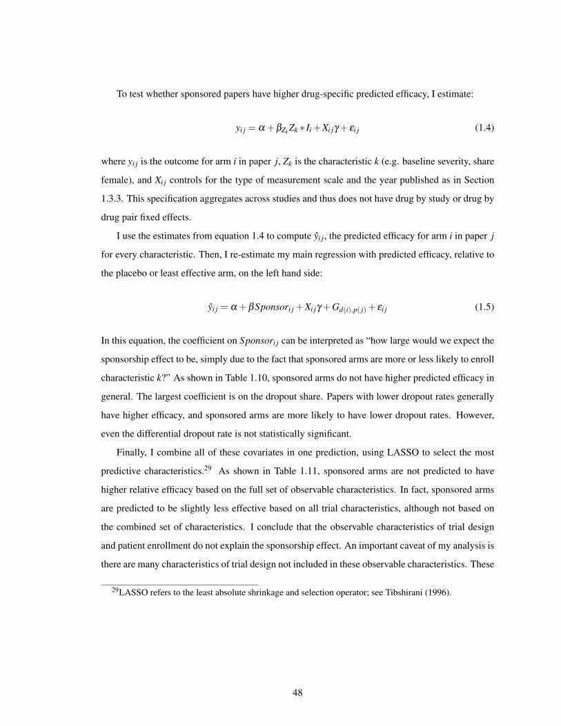
To test whether sponsored papers have higher drug-specific predicted efficacy, I estimate:
yi j = α +βZk Zk * Ii +Xi jγ + εi j (1.4)
where yi j is the outcome for arm i in paper j, Zk is the characteristic k (e.g. baseline severity, share
female), and Xi j controls for the type of measurement scale and the year published as in Section
1.3.3. This specification aggregates across studies and thus does not have drug by study or drug by
drug pair fixed effects.
I use the estimates from equation 1.4 to compute yi j, the predicted efficacy for arm i in paper j
for every characteristic. Then, I re-estimate my main regression with predicted efficacy, relative to
the placebo or least effective arm, on the left hand side:
yi j = α +βSponsori j +Xi jγ +Gd(i),p( j)+ εi j (1.5)
In this equation, the coefficient on Sponsori j can be interpreted as “how large would we expect the
sponsorship effect to be, simply due to the fact that sponsored arms are more or less likely to enroll
characteristic k?” As shown in Table 1.10, sponsored arms do not have higher predicted efficacy in
general. The largest coefficient is on the dropout share. Papers with lower dropout rates generally
have higher efficacy, and sponsored arms are more likely to have lower dropout rates. However,
even the differential dropout rate is not statistically significant.
Finally, I combine all of these covariates in one prediction, using LASSO to select the most
predictive characteristics.29 As shown in Table 1.11, sponsored arms are not predicted to have
higher relative efficacy based on the full set of observable characteristics. In fact, sponsored arms
are predicted to be slightly less effective based on all trial characteristics, although not based on
the combined set of characteristics. I conclude that the observable characteristics of trial design
and patient enrollment do not explain the sponsorship effect. An important caveat of my analysis is
there are many characteristics of trial design not included in these observable characteristics. These
29LASSO refers to the least absolute shrinkage and selection operator; see Tibshirani (1996).
48
might be notable components of the sponsorship effect.
Differential trial design might be less prevalent in this setting because determining characteristics
that are favorable for particular psychiatric medications is difficult. A meta-analysis of antidepressant
clinical trials found that, “no difference in efficacy were seen in patients with accompanying
symptoms or in subgroups based on age, sex, ethnicity, or comorbid conditions” (Gartlehner et
al., 2011). If trial funders are not able to identify characteristics that determine differences in
efficacy, then differential trial design and patient selection would be impossible to implement.
1.5.2 Publication Bias
General Tests for Publication Bias
There is an extensive literature showing that the results of drug trials affect the public dissemination
of the trials results. Clinical trials that show statistically significant effects of SSRIs were published
as stand-alone publications more often than those with non-significant results (Melander et al.,
2003). Turner et al. (2008) uses reviews for antidepressant clinical trials for the FDA and finds that
thirty-six out of thirty-seven studies viewed by the FDA as having positive results were published,
while only fifteen out of thirty-six studies that the FDA viewed as negative were published.
First, I examine whether sponsored arms are differentially likely to be published based on their
reported efficacy. My clinical trial data contain both published and unpublished papers; the latter
are available from FDA Statistical and Medical Reviews for approved drugs, from clinical trial
registries, or directly from pharmaceutical firms.30 I estimate:
1{Published j}= α +Sponsori j +Sponsori j * yi j +Xi jγ +Gd(i),p( j)+ εi j (1.6)
where the outcome is an indicator for whether paper j was published. I interact sponsorship with
yi j, the standardized efficacy of a given arm i in paper j. The rest of the terms are the same as
in equation 1.2; Gd(i),p( j) refers to drug by drug pair fixed effects. As shown in Table 1.12, while
30I thank Dr. Erick Turner for sharing FDA Statistical and Medical Reviews he obtained via the Freedomof Information Act.
49
sponsored arms are statistically significantly less likely to be published, sponsored arms with higher
efficacy are more likely to be published.31
Secondly, if this sponsorship effect is due to publication bias, then pre-registration requirements
might mitigate these effects. As of July 1, 2005, the ICMJE agreed to only publish clinical
trials in affiliated journals that had been registered before patient enrollment. To test whether
pre-registration changed the sponsorship effect, estimate the following specification:
yi j = α +Sponsori j +∑y
βySponsori j * y( j)+∑y
y( j)+Xi jγ +Gd(i),p( j)+ εi j (1.7)
where the sponsorship effect is interacted with publication year bins y( j). Here, Xi j includes only
controls for the measurement scale. Figure 1.6a plots the coefficients βy. The introduction of pre-
registration requirements is marked by the vertical dashed line. The pre-registration requirement
affected trials according to the trial enrollment date; papers that had begun enrollment before 2005
could not register their paper and publish their findings in non-ICMJE journals. Therefore, the
treatment intensity, as measured by the share of papers linked to ClinicalTrials.gov, increases
gradually over time (1.6b). Similarly, the sponsorship effect in Figure 1.6a decreases in magnitude
gradually after the 2005 pre-registration requirements. The effect of sponsorship on reported drug
efficacy is statistically significantly lower after required pre-registration than before required pre-
registration. However, this change is statistically indistinguishable from a linear decline in the
sponsorship effect over time.
I also assess whether the sponsorship effect is smaller among papers linked to ClinicalTrials.gov.
Focusing on antidepressants, I linked 76 out of the 522 papers in my analysis sample to a paper
in ClinicalTrials.gov. As shown in Figure 1.6b, these papers were disproportionately published in
31Another standard test for publication bias is to measure the level of bunching around z-score cutoffs(Brodeur et al., 2016). Appendix Figure A.2 plots the z-score distribution for published trials. There is weakevidence of bunching at the 5% and 10% cutoffs. However, this bunching occurs for both sponsored andunsponsored arms and is underpowered.
50

later years. I estimate the following specification:
yi j = α +Sponsori j +Sponsori j *Link j +Xi jγ +Gd(i),p( j)+ εi j (1.8)
where Link j is an indicator for whether paper j was pre-registered in ClinicalTrials.gov. As shown
in Table 1.13, among this linked sample, there is no sponsorship effect. The first column presents
my baseline sponsorship effect, while the second column presents the interacted coefficients on
sponsorship. I find that the differential sponsorship effect among papers linked to ClinicalTrials.gov
is -0.094 standard deviations. Adding this to the baseline sponsorship effect of 0.135, the average
sponsorship effect among linked papers is a statistically insignificant 0.041 standard deviations.
Share Explained by Publication Bias
The unpublished trials included in my sample are a subset of the universe of all unpublished
clinical trials ever conducted. This latter set of trials have never been publicly available. With
an approximation of how many clinical trials were conducted but never available, I can estimate
what total share of the sponsorship effect is explained by publication bias. I approximate these
additional unpublished papers with the full set of relevant trials in ClinicalTrials.gov during recent
years, when the pre-registration requirements were enforced.
Within the ClinicalTrials.gov data, I restrict the sample to trials for “major depressive disorder”
that tested antidepressant drugs included in my analysis sample; see Section 1.2.3. I require the
trials to be initially registered between 2005-2010, which allows six years for the results to be
available, either in published or obtainable unpublished form. Out of the 147 pre-registered trials
that fit this criteria, my clinical trial analysis sample contains results for just 22% of these trials.
Therefore, I estimate that there exist five times more unpublished papers in the universe of all
clinical trials than I observe in my analysis sample.
This estimation relies on two strong assumptions: that the observed unpublished papers are
a random sample of all potential papers and that the clinical trial registry has the full universe of
trials conducted. To the extent the observed unpublished papers are more favorable to sponsors than
51

the unobserved unpublished papers, or that the clinical trials registry undercounts trials, I would
underestimate the true share of the sponsorship effect explained by publication bias.
Figure 1.7 presents results on how the sponsorship effect would change under alternate assumptions
about the magnitude of publication bias. Moving from only published papers to my analysis sample
of both published and unpublished papers decreases the sponsorship effect from 0.155 to 0.124.
Since I estimate that I observe only 22% of all pre-registered papers in my analysis sample, the
“Add 5x” bar is my preferred estimate for the sponsorship effect with the full universe trials. With
five times more unpublished papers than in my analysis sample, the sponsorship effect falls to
0.073 and this coefficient is only significant at the 10% level. This estimate represents a decrease
of 41% from my baseline sponsorship effect of 0.124 and a decrease of 53% from the effect with
only published papers of 0.155. Therefore, I estimate that 40-50% of the sponsorship effect can
be explained by publication bias. To the extent that some clinical trials were neither published
nor pre-registered, even in recent years, this would be an underestimate of the share explained
by publication bias. As shown in the last bar of Figure 1.7, in order for the sponsorship effect
to be fully explained by publication bias, the universe of unpublished papers would need to be
approximately thirty times larger than the currently observed set of unpublished papers.
1.6 Conclusion
This paper provides empirical evidence that financial incentives affect the results of clinical trials.
I find that a sponsored drug appears substantially more effective than that same drug in the same
study but without the drug manufacturer’s involvement. Across a variety of specifications and
outcomes, this effect is large and consistently represents approximately a third of the average
difference in efficacy between trial arms. Publication bias can conservatively explain just under
half of this effect, while I find no evidence that differential trial design or patient enrollment play
a large role. The share of the sponsorship effect explained by publication bias could be larger than
I estimate due to either a lack of compliance with pre-registration requirements or selection of the
observed unpublished papers. The remaining unexplained share of the sponsorship effect may also
52

be due to characteristics of trial design that are unobservable in my clinical trial data.
While psychiatric medications are a large and economically substantial drug class, there are
various reasons why financial incentives might be more or less relevant in this setting. Sponsorship
could be less salient for psychiatric medications because of the difficulty in predicting treatment
responses to particular drugs. On the other hand, efficacy for these medications is measured on a
subjective scale, which provides more leeway than laboratory tests. Future work could examine
alternate drug classes. Classes which also have numerous substitutable drugs and variation in
sponsorship could be viable candidates.32 Another important caveat is that my paper intentionally
focuses on a consistent set of outcomes to measure drug efficacy. Thereby, I address how financial
incentives affect reported efficacy itself, rather than the choice of which efficacy measure to report.
However, outcome selection is a key component of clinical trial design and is potentially also
affected by financial incentives.
My results are agnostic about the welfare consequences of different funding sources for clinical
trials. Whether it would be socially beneficial for pharmaceutical research to be conducted by
parties with more limited financial stakes in the results depends on several factors. Policy design
should consider both whether financial sponsorship affects the results of clinical trials and the total
amount of innovative research. Alternate funding schemes should also consider additional factors
such as how sponsored clinical research is interpreted by physicians and patients, the availability
of subsequent publications, and the external validity of this research. The evidence in this paper
informs this debate by documenting that the funding source of a clinical trial affects the reported
drug efficacy and that publication bias is an important mechanism.
32Potential candidates include anti-inflammatory drugs for osteoarthritis and stimulants for attentiondeficit hyperactivity disorder.
53
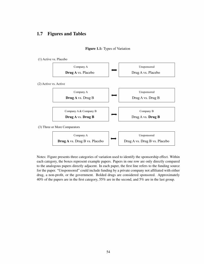
1.7 Figures and Tables
Figure 1.1: Types of Variation
Company A
Drug A vs. Placebou
(1) Active vs. Placebo
(2) Active vs. Active
(3) Three or More Comparators
Unsponsored
Drug A vs. Placebou
Company A
Drug A vs. Drug BuUnsponsored
Drug A vs. Drug Bu
Company A & Company B
Drug A vs. Drug BuCompany B
Drug A vs. Drug Bu
Company A
Drug A vs. Drug B vs. PlaceboUnsponsored
Drug A vs. Drug B vs. Placebo
Notes: Figure presents three categories of variation used to identify the sponsorship effect. Withineach category, the boxes represent example papers. Papers in one row are only directly comparedto the analogous papers directly adjacent. In each paper, the first line refers to the funding sourcefor the paper. “Unsponsored” could include funding by a private company not affiliated with eitherdrug, a non-profit, or the government. Bolded drugs are considered sponsored. Approximately40% of the papers are in the first category, 55% are in the second, and 5% are in the last group.
54
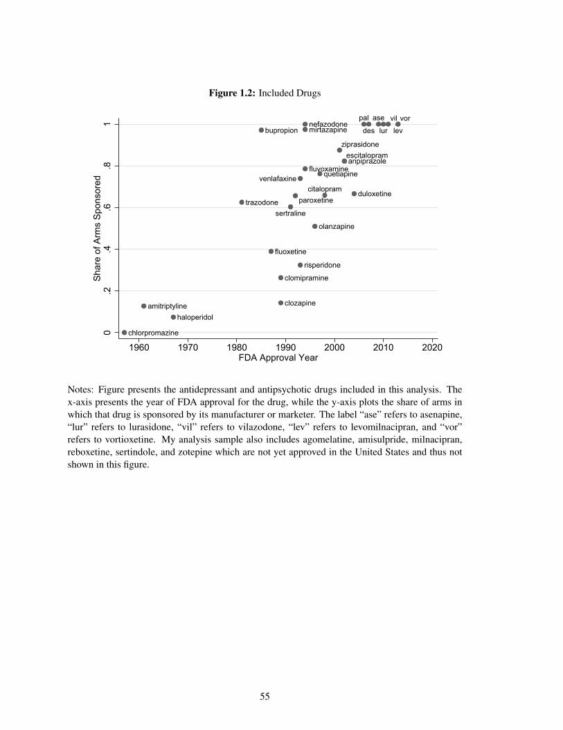
Figure 1.2: Included Drugs
amitriptyline
aripiprazole
ase
bupropion
chlorpromazine
citalopram
clomipramine
clozapine
des
duloxetine
escitalopram
fluoxetine
fluvoxamine
haloperidol
levlurmirtazapinenefazodone
olanzapine
pal
paroxetine
quetiapine
risperidone
sertraline
trazodone
venlafaxine
vil vor
ziprasidone
0.2
.4.6
.81
Share
of A
rms S
ponsore
d
1960 1970 1980 1990 2000 2010 2020FDA Approval Year
Notes: Figure presents the antidepressant and antipsychotic drugs included in this analysis. Thex-axis presents the year of FDA approval for the drug, while the y-axis plots the share of arms inwhich that drug is sponsored by its manufacturer or marketer. The label “ase” refers to asenapine,“lur” refers to lurasidone, “vil” refers to vilazodone, “lev” refers to levomilnacipran, and “vor”refers to vortioxetine. My analysis sample also includes agomelatine, amisulpride, milnacipran,reboxetine, sertindole, and zotepine which are not yet approved in the United States and thus notshown in this figure.
55
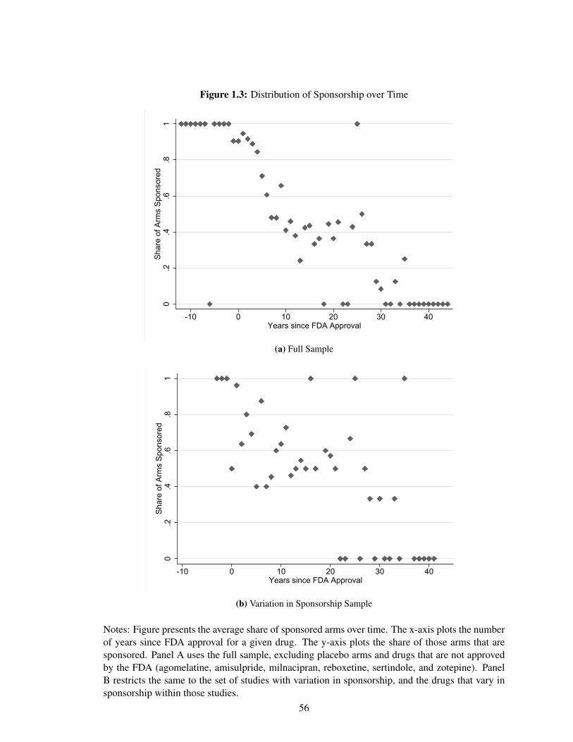
Figure 1.3: Distribution of Sponsorship over Time
0.2
.4.6
.81
Sh
are
of A
rms S
po
nso
red
-10 0 10 20 30 40Years since FDA Approval
(a) Full Sample
0.2
.4.6
.81
Sh
are
of A
rms S
po
nso
red
-10 0 10 20 30 40Years since FDA Approval
(b) Variation in Sponsorship Sample
Notes: Figure presents the average share of sponsored arms over time. The x-axis plots the numberof years since FDA approval for a given drug. The y-axis plots the share of those arms that aresponsored. Panel A uses the full sample, excluding placebo arms and drugs that are not approvedby the FDA (agomelatine, amisulpride, milnacipran, reboxetine, sertindole, and zotepine). PanelB restricts the same to the set of studies with variation in sponsorship, and the drugs that vary insponsorship within those studies.
56
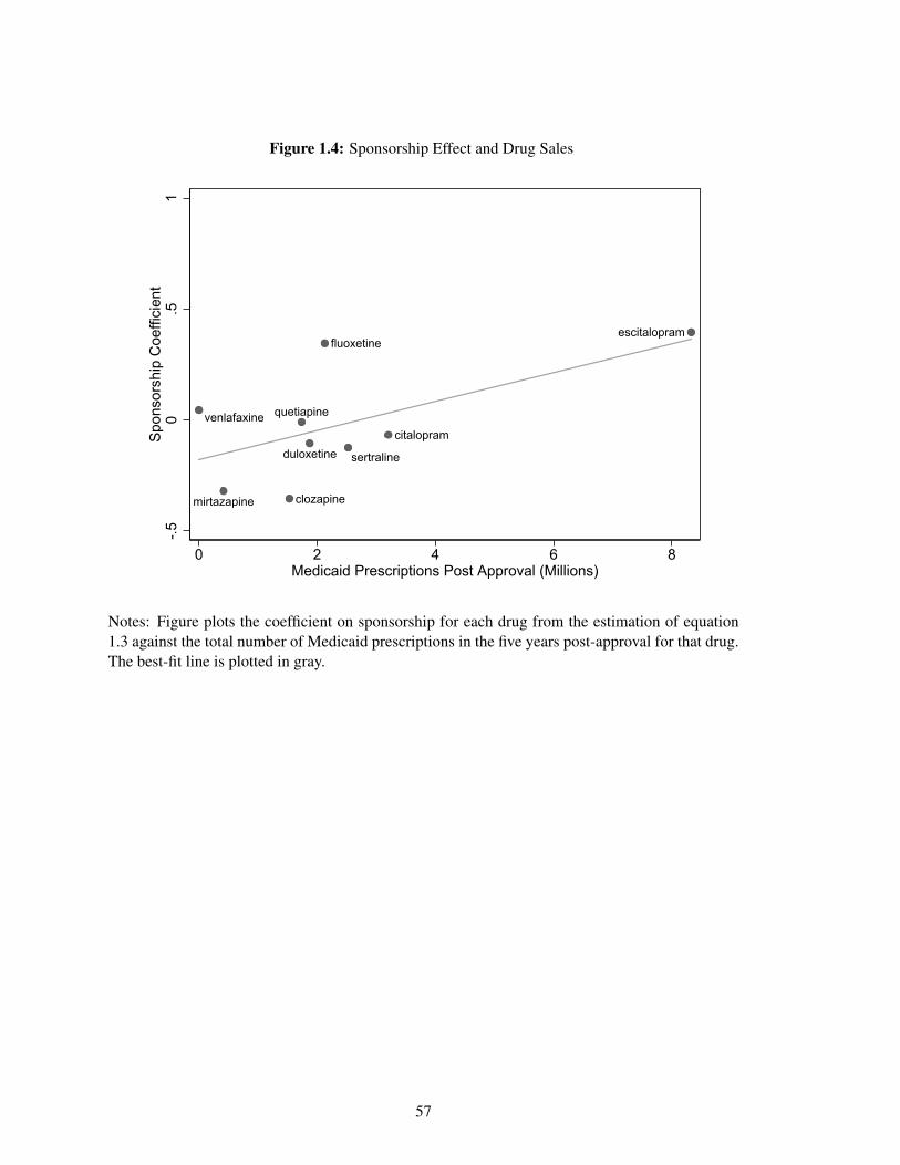
Figure 1.4: Sponsorship Effect and Drug Sales
clozapinemirtazapine
sertralineduloxetine
citalopram
quetiapinevenlafaxine
fluoxetineescitalopram
-.5
0.5
1S
ponsors
hip
Coeffic
ient
0 2 4 6 8Medicaid Prescriptions Post Approval (Millions)
Notes: Figure plots the coefficient on sponsorship for each drug from the estimation of equation1.3 against the total number of Medicaid prescriptions in the five years post-approval for that drug.The best-fit line is plotted in gray.
57
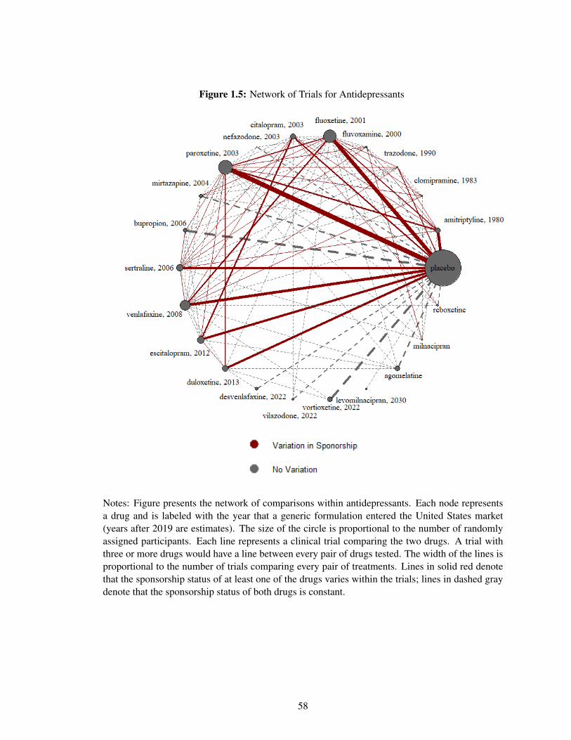
Figure 1.5: Network of Trials for Antidepressants
Notes: Figure presents the network of comparisons within antidepressants. Each node representsa drug and is labeled with the year that a generic formulation entered the United States market(years after 2019 are estimates). The size of the circle is proportional to the number of randomlyassigned participants. Each line represents a clinical trial comparing the two drugs. A trial withthree or more drugs would have a line between every pair of drugs tested. The width of the lines isproportional to the number of trials comparing every pair of treatments. Lines in solid red denotethat the sponsorship status of at least one of the drugs varies within the trials; lines in dashed graydenote that the sponsorship status of both drugs is constant.
58
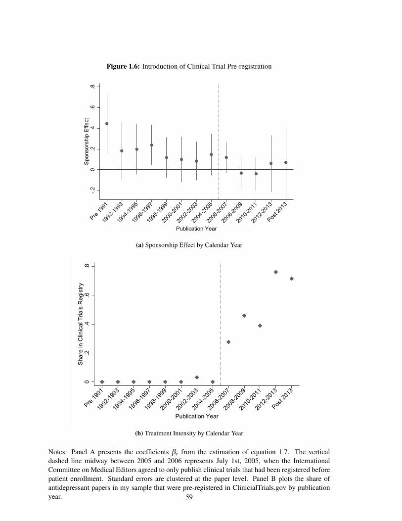
Figure 1.6: Introduction of Clinical Trial Pre-registration
-.20
.2.4
.6.8
Spon
sors
hip
Effe
ct
Pre 19
91
1992
-1993
1994
-1995
1996
-1997
1998
-1999
2000
-2001
2002
-2003
2004
-2005
2006
-2007
2008
-2009
2010
-2011
2012
-2013
Post 2
013
Publication Year
(a) Sponsorship Effect by Calendar Year
0.2
.4.6
.8Sh
are
in C
linic
al T
rials
Reg
istry
Pre 19
91
1992
-1993
1994
-1995
1996
-1997
1998
-1999
2000
-2001
2002
-2003
2004
-2005
2006
-2007
2008
-2009
2010
-2011
2012
-2013
Post 2
013
Publication Year
(b) Treatment Intensity by Calendar Year
Notes: Panel A presents the coefficients βy from the estimation of equation 1.7. The verticaldashed line midway between 2005 and 2006 represents July 1st, 2005, when the InternationalCommittee on Medical Editors agreed to only publish clinical trials that had been registered beforepatient enrollment. Standard errors are clustered at the paper level. Panel B plots the share ofantidepressant papers in my sample that were pre-registered in ClinicialTrials.gov by publicationyear. 59
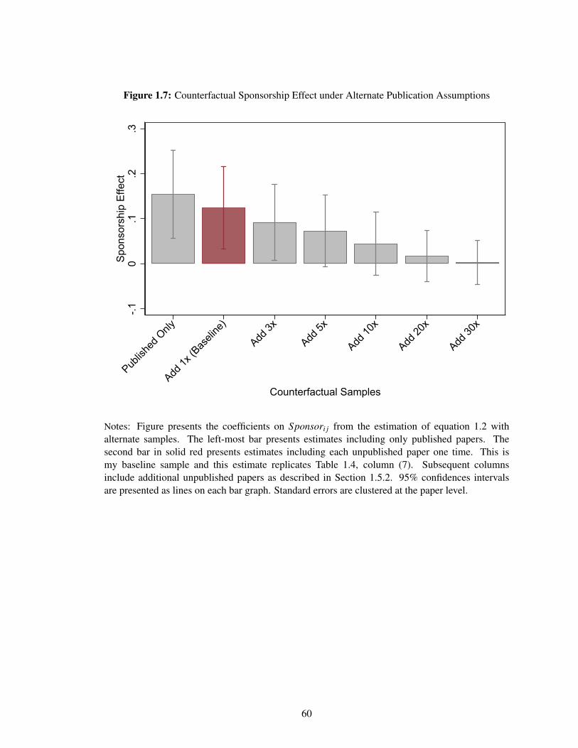
Figure 1.7: Counterfactual Sponsorship Effect under Alternate Publication Assumptions
-.10
.1.2
.3Sp
onso
rshi
p Ef
fect
Publish
ed O
nly
Add 1x
(Bas
eline
)
Add 3x
Add 5x
Add 10
x
Add 20
x
Add 30
x
Counterfactual Samples
Notes: Figure presents the coefficients on Sponsori j from the estimation of equation 1.2 withalternate samples. The left-most bar presents estimates including only published papers. Thesecond bar in solid red presents estimates including each unpublished paper one time. This ismy baseline sample and this estimate replicates Table 1.4, column (7). Subsequent columnsinclude additional unpublished papers as described in Section 1.5.2. 95% confidences intervalsare presented as lines on each bar graph. Standard errors are clustered at the paper level.
60
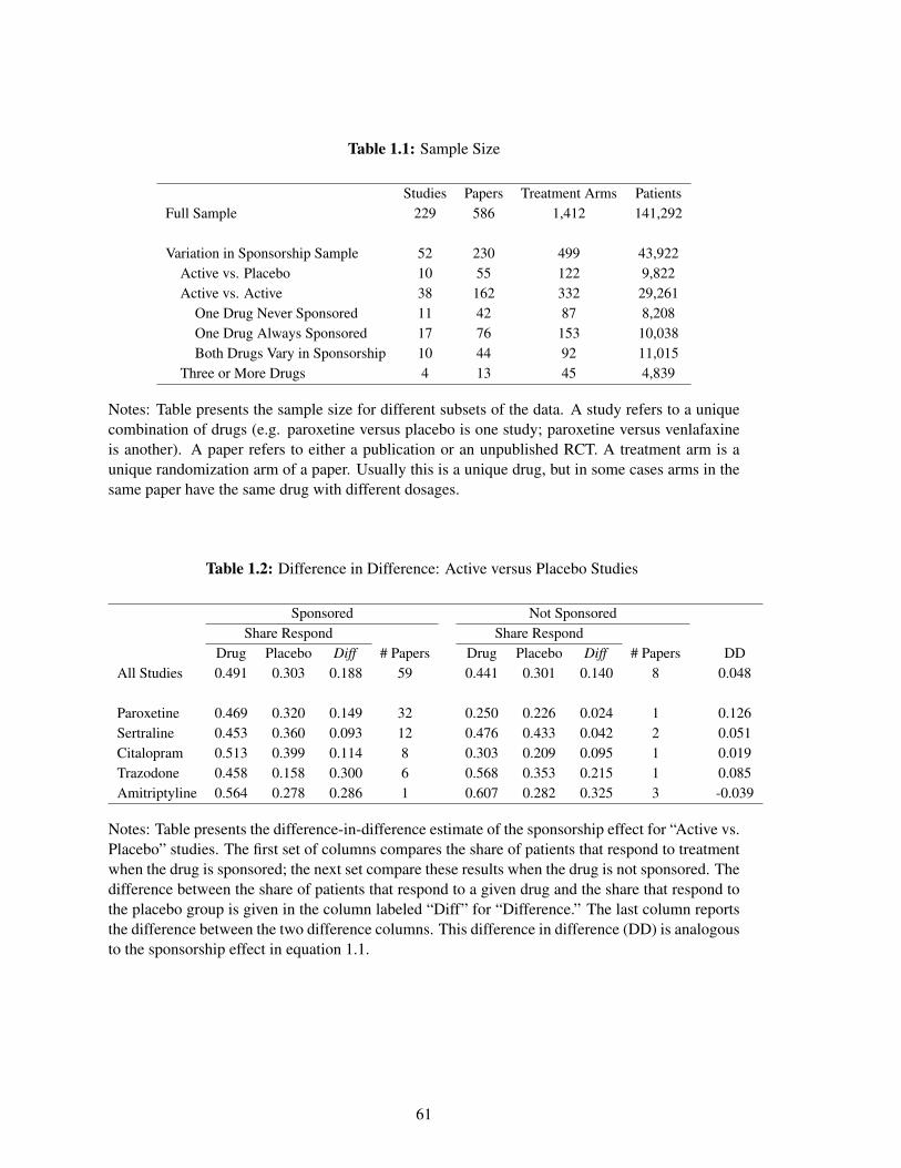
Table 1.1: Sample Size
Studies Papers Treatment Arms PatientsFull Sample 229 586 1,412 141,292
Variation in Sponsorship Sample 52 230 499 43,922Active vs. Placebo 10 55 122 9,822Active vs. Active 38 162 332 29,261
One Drug Never Sponsored 11 42 87 8,208One Drug Always Sponsored 17 76 153 10,038Both Drugs Vary in Sponsorship 10 44 92 11,015
Three or More Drugs 4 13 45 4,839
Notes: Table presents the sample size for different subsets of the data. A study refers to a uniquecombination of drugs (e.g. paroxetine versus placebo is one study; paroxetine versus venlafaxineis another). A paper refers to either a publication or an unpublished RCT. A treatment arm is aunique randomization arm of a paper. Usually this is a unique drug, but in some cases arms in thesame paper have the same drug with different dosages.
Table 1.2: Difference in Difference: Active versus Placebo Studies
Sponsored Not SponsoredShare Respond Share Respond
Drug Placebo Diff # Papers Drug Placebo Diff # Papers DDAll Studies 0.491 0.303 0.188 59 0.441 0.301 0.140 8 0.048
Paroxetine 0.469 0.320 0.149 32 0.250 0.226 0.024 1 0.126Sertraline 0.453 0.360 0.093 12 0.476 0.433 0.042 2 0.051Citalopram 0.513 0.399 0.114 8 0.303 0.209 0.095 1 0.019Trazodone 0.458 0.158 0.300 6 0.568 0.353 0.215 1 0.085Amitriptyline 0.564 0.278 0.286 1 0.607 0.282 0.325 3 -0.039
Notes: Table presents the difference-in-difference estimate of the sponsorship effect for “Active vs.Placebo” studies. The first set of columns compares the share of patients that respond to treatmentwhen the drug is sponsored; the next set compare these results when the drug is not sponsored. Thedifference between the share of patients that respond to a given drug and the share that respond tothe placebo group is given in the column labeled “Diff” for “Difference.” The last column reportsthe difference between the two difference columns. This difference in difference (DD) is analogousto the sponsorship effect in equation 1.1.
61
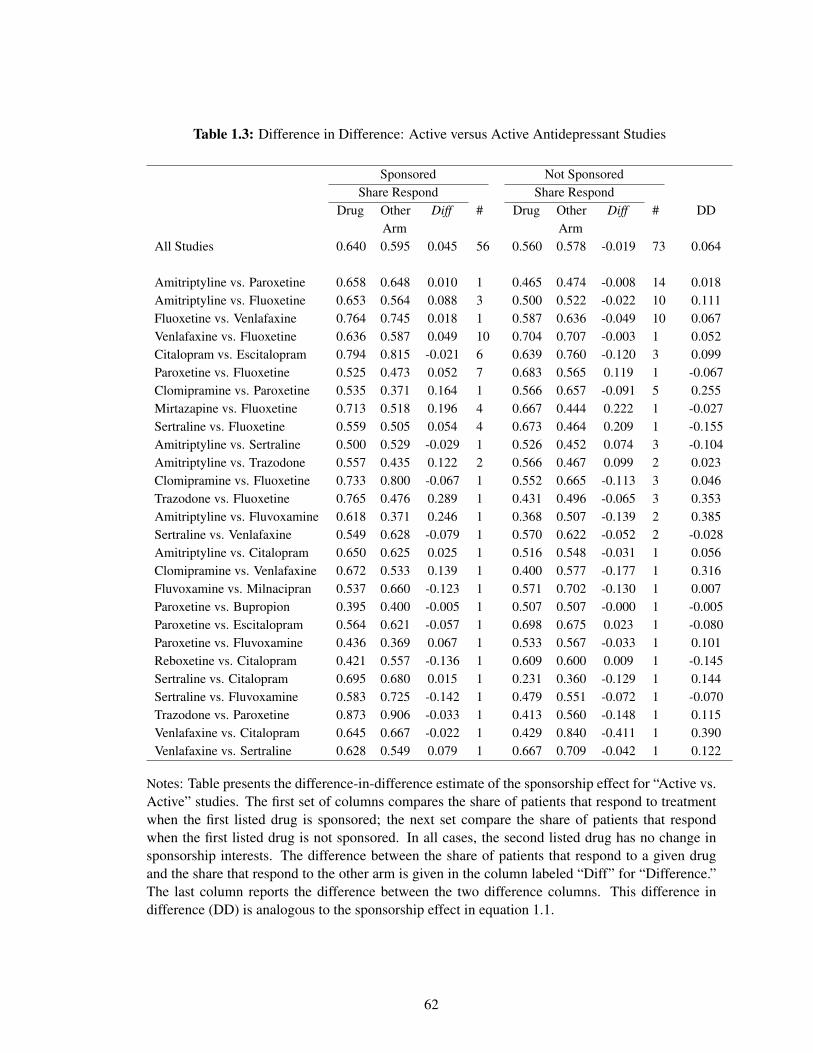
Table 1.3: Difference in Difference: Active versus Active Antidepressant Studies
Sponsored Not SponsoredShare Respond Share Respond
Drug OtherArm
Diff # Drug OtherArm
Diff # DD
All Studies 0.640 0.595 0.045 56 0.560 0.578 -0.019 73 0.064
Amitriptyline vs. Paroxetine 0.658 0.648 0.010 1 0.465 0.474 -0.008 14 0.018Amitriptyline vs. Fluoxetine 0.653 0.564 0.088 3 0.500 0.522 -0.022 10 0.111Fluoxetine vs. Venlafaxine 0.764 0.745 0.018 1 0.587 0.636 -0.049 10 0.067Venlafaxine vs. Fluoxetine 0.636 0.587 0.049 10 0.704 0.707 -0.003 1 0.052Citalopram vs. Escitalopram 0.794 0.815 -0.021 6 0.639 0.760 -0.120 3 0.099Paroxetine vs. Fluoxetine 0.525 0.473 0.052 7 0.683 0.565 0.119 1 -0.067Clomipramine vs. Paroxetine 0.535 0.371 0.164 1 0.566 0.657 -0.091 5 0.255Mirtazapine vs. Fluoxetine 0.713 0.518 0.196 4 0.667 0.444 0.222 1 -0.027Sertraline vs. Fluoxetine 0.559 0.505 0.054 4 0.673 0.464 0.209 1 -0.155Amitriptyline vs. Sertraline 0.500 0.529 -0.029 1 0.526 0.452 0.074 3 -0.104Amitriptyline vs. Trazodone 0.557 0.435 0.122 2 0.566 0.467 0.099 2 0.023Clomipramine vs. Fluoxetine 0.733 0.800 -0.067 1 0.552 0.665 -0.113 3 0.046Trazodone vs. Fluoxetine 0.765 0.476 0.289 1 0.431 0.496 -0.065 3 0.353Amitriptyline vs. Fluvoxamine 0.618 0.371 0.246 1 0.368 0.507 -0.139 2 0.385Sertraline vs. Venlafaxine 0.549 0.628 -0.079 1 0.570 0.622 -0.052 2 -0.028Amitriptyline vs. Citalopram 0.650 0.625 0.025 1 0.516 0.548 -0.031 1 0.056Clomipramine vs. Venlafaxine 0.672 0.533 0.139 1 0.400 0.577 -0.177 1 0.316Fluvoxamine vs. Milnacipran 0.537 0.660 -0.123 1 0.571 0.702 -0.130 1 0.007Paroxetine vs. Bupropion 0.395 0.400 -0.005 1 0.507 0.507 -0.000 1 -0.005Paroxetine vs. Escitalopram 0.564 0.621 -0.057 1 0.698 0.675 0.023 1 -0.080Paroxetine vs. Fluvoxamine 0.436 0.369 0.067 1 0.533 0.567 -0.033 1 0.101Reboxetine vs. Citalopram 0.421 0.557 -0.136 1 0.609 0.600 0.009 1 -0.145Sertraline vs. Citalopram 0.695 0.680 0.015 1 0.231 0.360 -0.129 1 0.144Sertraline vs. Fluvoxamine 0.583 0.725 -0.142 1 0.479 0.551 -0.072 1 -0.070Trazodone vs. Paroxetine 0.873 0.906 -0.033 1 0.413 0.560 -0.148 1 0.115Venlafaxine vs. Citalopram 0.645 0.667 -0.022 1 0.429 0.840 -0.411 1 0.390Venlafaxine vs. Sertraline 0.628 0.549 0.079 1 0.667 0.709 -0.042 1 0.122
Notes: Table presents the difference-in-difference estimate of the sponsorship effect for “Active vs.Active” studies. The first set of columns compares the share of patients that respond to treatmentwhen the first listed drug is sponsored; the next set compare the share of patients that respondwhen the first listed drug is not sponsored. In all cases, the second listed drug has no change insponsorship interests. The difference between the share of patients that respond to a given drugand the share that respond to the other arm is given in the column labeled “Diff” for “Difference.”The last column reports the difference between the two difference columns. This difference indifference (DD) is analogous to the sponsorship effect in equation 1.1.
62
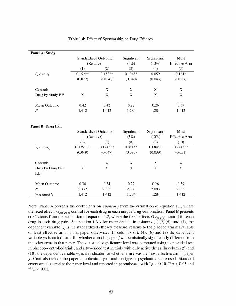
Table 1.4: Effect of Sponsorship on Drug Efficacy
Panel A: StudyStandardized Outcome Significant Significant Most
(Relative) (5%) (10%) Effective Arm(1) (2) (3) (4) (5)
Sponsori j 0.152** 0.153** 0.104** 0.059 0.164*(0.077) (0.076) (0.040) (0.043) (0.087)
Controls X X X XDrug by Study F.E. X X X X X
Mean Outcome 0.42 0.42 0.22 0.26 0.39N 1,412 1,412 1,284 1,284 1,412
Panel B: Drug PairStandardized Outcome Significant Significant Most
(Relative) (5%) (10%) Effective Arm(6) (7) (8) (9) (10)
Sponsori j 0.135*** 0.124*** 0.081** 0.084** 0.244***(0.049) (0.047) (0.037) (0.039) (0.051)
Controls X X X XDrug by Drug PairF.E.
X X X X X
Mean Outcome 0.34 0.34 0.22 0.26 0.39N 2,332 2,332 2,083 2,083 2,332Weighted N 1,412 1,412 1,284 1,284 1,412
Note: Panel A presents the coefficients on Sponsori j from the estimation of equation 1.1, wherethe fixed effects Gd(i),s( j) control for each drug in each unique drug combination. Panel B presentscoefficients from the estimation of equation 1.2, where the fixed effects Gd(i),p( j) control for eachdrug in each drug pair. See section 1.3.3 for more detail. In columns (1),(2),(6), and (7), thedependent variable yi j is the standardized efficacy measure, relative to the placebo arm if availableor least effective arm in that paper otherwise. In columns (3), (4), (8) and (9) the dependentvariable yi j is an indicator for whether arm i in paper j was statistically significantly different fromthe other arms in that paper. The statistical significance level was computed using a one-sided testin placebo-controlled trials, and a two-sided test in trials with only active drugs. In column (5) and(10), the dependent variable yi j is an indicator for whether arm i was the most effective arm in paperj. Controls include the paper’s publication year and the type of psychiatric score used. Standarderrors are clustered at the paper level and reported in parentheses, with *p < 0.10, **p < 0.05 and***p < 0.01.
63
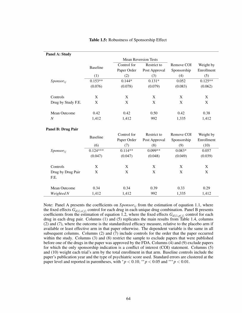
Table 1.5: Robustness of Sponsorship Effect
Panel A: StudyMean Reversion Tests
BaselineControl forPaper Order
Restrict toPost Approval
Remove COISponsorship
Weight byEnrollment
(1) (2) (3) (4) (5)Sponsori j 0.153** 0.144* 0.131* 0.052 0.125**
(0.076) (0.078) (0.079) (0.083) (0.062)
Controls X X X X XDrug by Study F.E. X X X X X
Mean Outcome 0.42 0.42 0.50 0.42 0.38N 1,412 1,412 992 1,335 1,412
Panel B: Drug Pair
BaselineControl forPaper Order
Restrict toPost Approval
Remove COISponsorship
Weight byEnrollment
(6) (7) (8) (9) (10)Sponsori j 0.124*** 0.114** 0.099** 0.083* 0.057
(0.047) (0.047) (0.048) (0.049) (0.039)
Controls X X X X XDrug by Drug PairF.E.
X X X X X
Mean Outcome 0.34 0.34 0.39 0.33 0.29Weighted N 1,412 1,412 992 1,335 1,412
Note: Panel A presents the coefficients on Sponsori j from the estimation of equation 1.1, wherethe fixed effects Gd(i),s( j) control for each drug in each unique drug combination. Panel B presentscoefficients from the estimation of equation 1.2, where the fixed effects Gd(i),p( j) control for eachdrug in each drug pair. Columns (1) and (5) replicates the main results from Table 1.4, columns(2) and (7), where the outcome is the standardized efficacy measure, relative to the placebo arm ifavailable or least effective arm in that paper otherwise. The dependent variable is the same in allsubsequent columns. Columns (2) and (7) include controls for the order that the paper occurredwithin the study. Columns (3) and (8) restrict the sample to exclude papers that were publishedbefore one of the drugs in the paper was approved by the FDA. Columns (4) and (9) exclude papersfor which the only sponsorship indication is a conflict of interest (COI) statement. Columns (5)and (10) weight each trial’s arm by the total enrollment in that arm. Baseline controls include thepaper’s publication year and the type of psychiatric score used. Standard errors are clustered at thepaper level and reported in parentheses, with *p < 0.10, **p < 0.05 and ***p < 0.01.
64
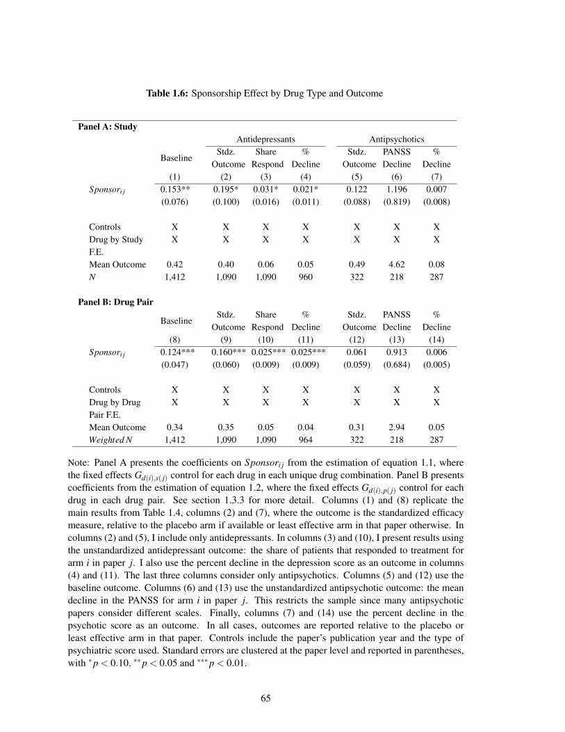
Table 1.6: Sponsorship Effect by Drug Type and Outcome
Panel A: StudyAntidepressants Antipsychotics
BaselineStdz.
OutcomeShare
Respond%
DeclineStdz.
OutcomePANSSDecline
%Decline
(1) (2) (3) (4) (5) (6) (7)Sponsori j 0.153** 0.195* 0.031* 0.021* 0.122 1.196 0.007
(0.076) (0.100) (0.016) (0.011) (0.088) (0.819) (0.008)
Controls X X X X X X XDrug by StudyF.E.
X X X X X X X
Mean Outcome 0.42 0.40 0.06 0.05 0.49 4.62 0.08N 1,412 1,090 1,090 960 322 218 287
Panel B: Drug Pair
BaselineStdz.
OutcomeShare
Respond%
DeclineStdz.
OutcomePANSSDecline
%Decline
(8) (9) (10) (11) (12) (13) (14)Sponsori j 0.124*** 0.160*** 0.025*** 0.025*** 0.061 0.913 0.006
(0.047) (0.060) (0.009) (0.009) (0.059) (0.684) (0.005)
Controls X X X X X X XDrug by DrugPair F.E.
X X X X X X X
Mean Outcome 0.34 0.35 0.05 0.04 0.31 2.94 0.05Weighted N 1,412 1,090 1,090 964 322 218 287
Note: Panel A presents the coefficients on Sponsori j from the estimation of equation 1.1, wherethe fixed effects Gd(i),s( j) control for each drug in each unique drug combination. Panel B presentscoefficients from the estimation of equation 1.2, where the fixed effects Gd(i),p( j) control for eachdrug in each drug pair. See section 1.3.3 for more detail. Columns (1) and (8) replicate themain results from Table 1.4, columns (2) and (7), where the outcome is the standardized efficacymeasure, relative to the placebo arm if available or least effective arm in that paper otherwise. Incolumns (2) and (5), I include only antidepressants. In columns (3) and (10), I present results usingthe unstandardized antidepressant outcome: the share of patients that responded to treatment forarm i in paper j. I also use the percent decline in the depression score as an outcome in columns(4) and (11). The last three columns consider only antipsychotics. Columns (5) and (12) use thebaseline outcome. Columns (6) and (13) use the unstandardized antipsychotic outcome: the meandecline in the PANSS for arm i in paper j. This restricts the sample since many antipsychoticpapers consider different scales. Finally, columns (7) and (14) use the percent decline in thepsychotic score as an outcome. In all cases, outcomes are reported relative to the placebo orleast effective arm in that paper. Controls include the paper’s publication year and the type ofpsychiatric score used. Standard errors are clustered at the paper level and reported in parentheses,with *p < 0.10, **p < 0.05 and ***p < 0.01.
65
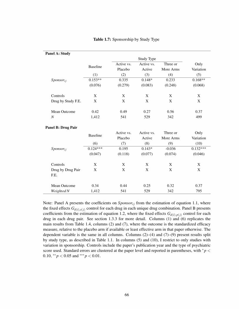
Table 1.7: Sponsorship by Study Type
Panel A: StudyStudy Type
BaselineActive vs.Placebo
Active vs.Active
Three orMore Arms
OnlyVariation
(1) (2) (3) (4) (5)Sponsori j 0.153** 0.335 0.148* 0.233 0.168**
(0.076) (0.279) (0.083) (0.248) (0.068)
Controls X X X X XDrug by Study F.E. X X X X X
Mean Outcome 0.42 0.49 0.27 0.56 0.37N 1,412 541 529 342 499
Panel B: Drug Pair
BaselineActive vs.Placebo
Active vs.Active
Three orMore Arms
OnlyVariation
(6) (7) (8) (9) (10)Sponsori j 0.124*** 0.195 0.143* -0.036 0.132***
(0.047) (0.118) (0.077) (0.074) (0.046)
Controls X X X X XDrug by Drug PairF.E.
X X X X X
Mean Outcome 0.34 0.44 0.25 0.32 0.37Weighted N 1,412 541 529 342 795
Note: Panel A presents the coefficients on Sponsori j from the estimation of equation 1.1, wherethe fixed effects Gd(i),s( j) control for each drug in each unique drug combination. Panel B presentscoefficients from the estimation of equation 1.2, where the fixed effects Gd(i),p( j) control for eachdrug in each drug pair. See section 1.3.3 for more detail. Columns (1) and (6) replicates themain results from Table 1.4, columns (2) and (7), where the outcome is the standardized efficacymeasure, relative to the placebo arm if available or least effective arm in that paper otherwise. Thedependent variable is the same in all columns. Columns (2)–(4) and (7)–(9) present results splitby study type, as described in Table 1.1. In columns (5) and (10), I restrict to only studies withvariation in sponsorship. Controls include the paper’s publication year and the type of psychiatricscore used. Standard errors are clustered at the paper level and reported in parentheses, with *p <0.10, **p < 0.05 and ***p < 0.01.
66
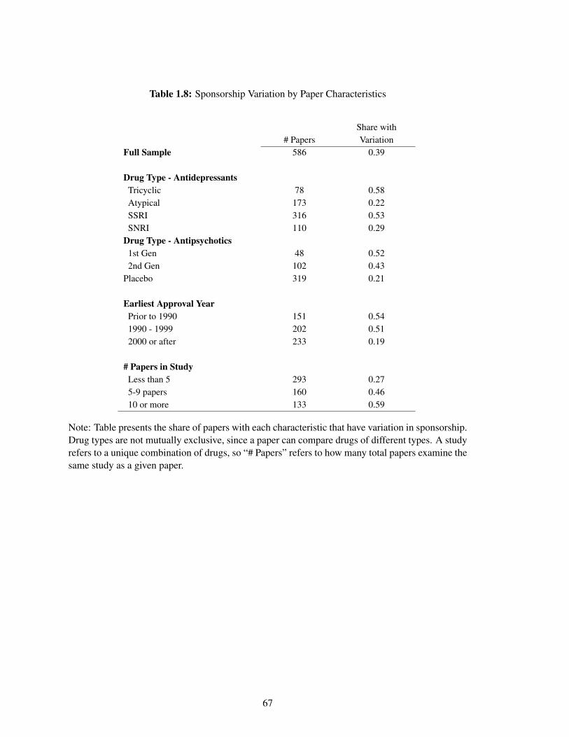
Table 1.8: Sponsorship Variation by Paper Characteristics
Share with# Papers Variation
Full Sample 586 0.39
Drug Type - AntidepressantsTricyclic 78 0.58Atypical 173 0.22SSRI 316 0.53SNRI 110 0.29
Drug Type - Antipsychotics1st Gen 48 0.522nd Gen 102 0.43
Placebo 319 0.21
Earliest Approval YearPrior to 1990 151 0.541990 - 1999 202 0.512000 or after 233 0.19
# Papers in StudyLess than 5 293 0.275-9 papers 160 0.4610 or more 133 0.59
Note: Table presents the share of papers with each characteristic that have variation in sponsorship.Drug types are not mutually exclusive, since a paper can compare drugs of different types. A studyrefers to a unique combination of drugs, so “# Papers” refers to how many total papers examine thesame study as a given paper.
67
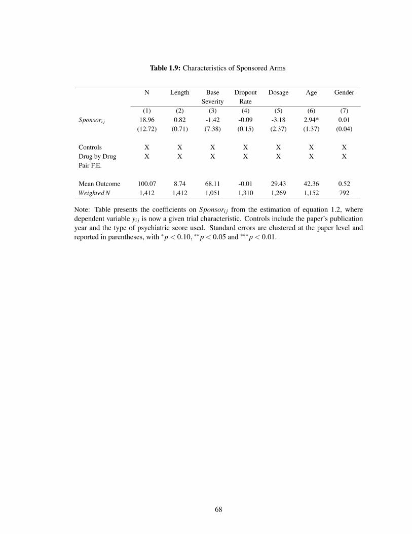
Table 1.9: Characteristics of Sponsored Arms
N Length BaseSeverity
DropoutRate
Dosage Age Gender
(1) (2) (3) (4) (5) (6) (7)Sponsori j 18.96 0.82 -1.42 -0.09 -3.18 2.94* 0.01
(12.72) (0.71) (7.38) (0.15) (2.37) (1.37) (0.04)
Controls X X X X X X XDrug by DrugPair F.E.
X X X X X X X
Mean Outcome 100.07 8.74 68.11 -0.01 29.43 42.36 0.52Weighted N 1,412 1,412 1,051 1,310 1,269 1,152 792
Note: Table presents the coefficients on Sponsori j from the estimation of equation 1.2, wheredependent variable yi j is now a given trial characteristic. Controls include the paper’s publicationyear and the type of psychiatric score used. Standard errors are clustered at the paper level andreported in parentheses, with *p < 0.10, **p < 0.05 and ***p < 0.01.
68
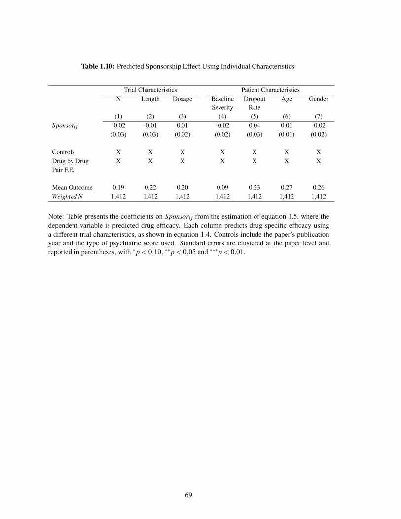
Table 1.10: Predicted Sponsorship Effect Using Individual Characteristics
Trial Characteristics Patient CharacteristicsN Length Dosage Baseline
SeverityDropout
RateAge Gender
(1) (2) (3) (4) (5) (6) (7)Sponsori j -0.02 -0.01 0.01 -0.02 0.04 0.01 -0.02
(0.03) (0.03) (0.02) (0.02) (0.03) (0.01) (0.02)
Controls X X X X X X XDrug by DrugPair F.E.
X X X X X X X
Mean Outcome 0.19 0.22 0.20 0.09 0.23 0.27 0.26Weighted N 1,412 1,412 1,412 1,412 1,412 1,412 1,412
Note: Table presents the coefficients on Sponsori j from the estimation of equation 1.5, where thedependent variable is predicted drug efficacy. Each column predicts drug-specific efficacy usinga different trial characteristics, as shown in equation 1.4. Controls include the paper’s publicationyear and the type of psychiatric score used. Standard errors are clustered at the paper level andreported in parentheses, with *p < 0.10, **p < 0.05 and ***p < 0.01.
69
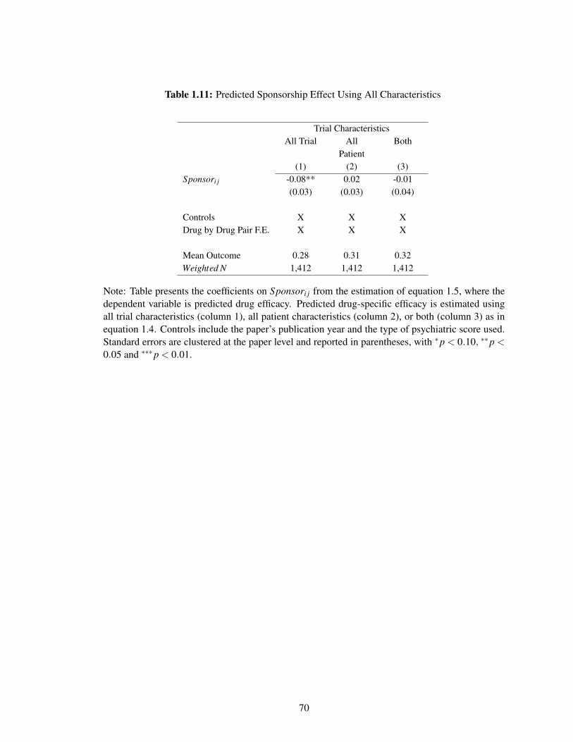
Table 1.11: Predicted Sponsorship Effect Using All Characteristics
Trial CharacteristicsAll Trial All
PatientBoth
(1) (2) (3)Sponsori j -0.08** 0.02 -0.01
(0.03) (0.03) (0.04)
Controls X X XDrug by Drug Pair F.E. X X X
Mean Outcome 0.28 0.31 0.32Weighted N 1,412 1,412 1,412
Note: Table presents the coefficients on Sponsori j from the estimation of equation 1.5, where thedependent variable is predicted drug efficacy. Predicted drug-specific efficacy is estimated usingall trial characteristics (column 1), all patient characteristics (column 2), or both (column 3) as inequation 1.4. Controls include the paper’s publication year and the type of psychiatric score used.Standard errors are clustered at the paper level and reported in parentheses, with *p < 0.10, **p <0.05 and ***p < 0.01.
70
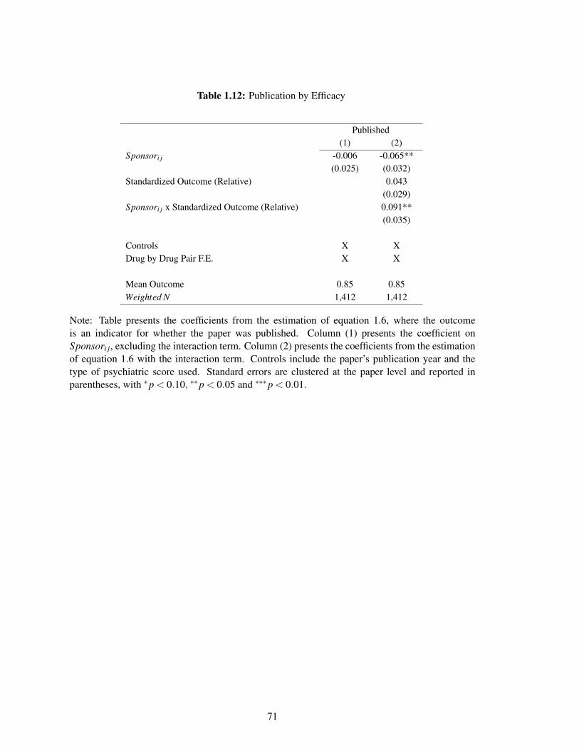
Table 1.12: Publication by Efficacy
Published(1) (2)
Sponsori j -0.006 -0.065**(0.025) (0.032)
Standardized Outcome (Relative) 0.043(0.029)
Sponsori j x Standardized Outcome (Relative) 0.091**(0.035)
Controls X XDrug by Drug Pair F.E. X X
Mean Outcome 0.85 0.85Weighted N 1,412 1,412
Note: Table presents the coefficients from the estimation of equation 1.6, where the outcomeis an indicator for whether the paper was published. Column (1) presents the coefficient onSponsori j, excluding the interaction term. Column (2) presents the coefficients from the estimationof equation 1.6 with the interaction term. Controls include the paper’s publication year and thetype of psychiatric score used. Standard errors are clustered at the paper level and reported inparentheses, with *p < 0.10, **p < 0.05 and ***p < 0.01.
71
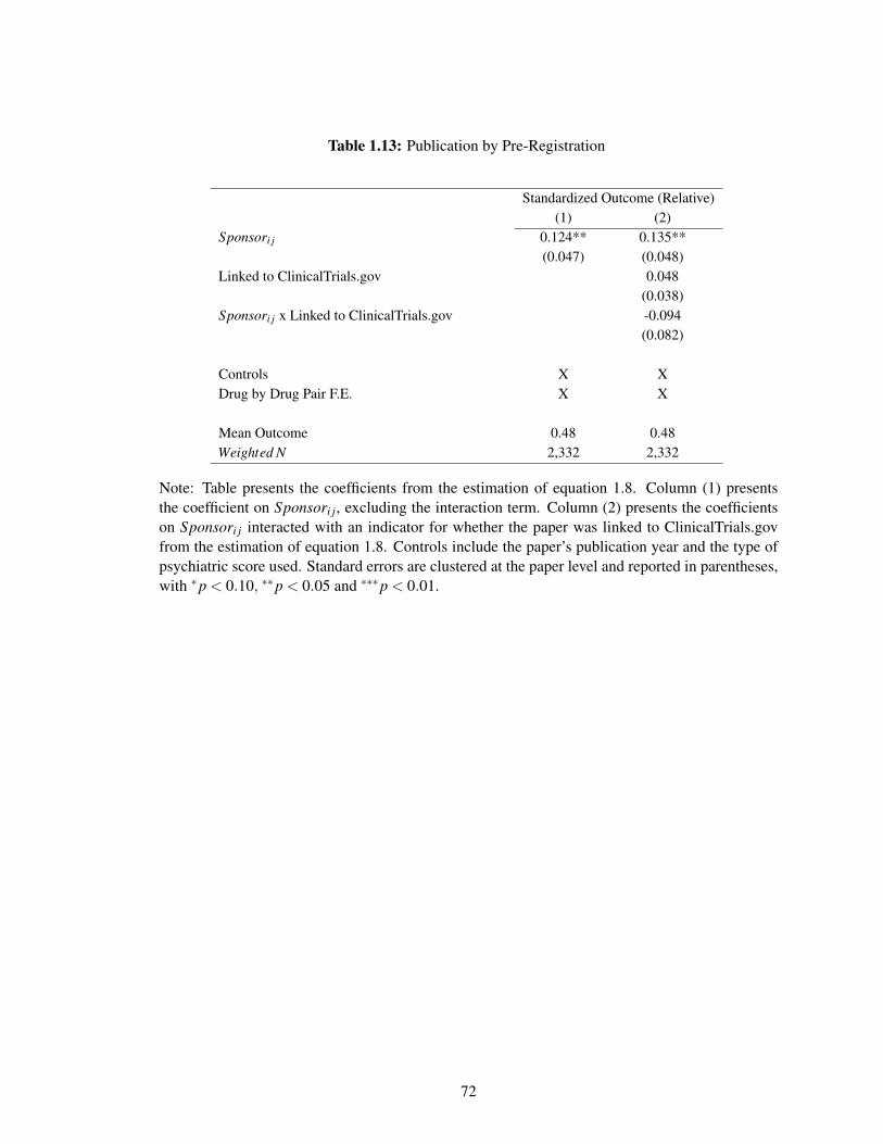
Table 1.13: Publication by Pre-Registration
Standardized Outcome (Relative)(1) (2)
Sponsori j 0.124** 0.135**(0.047) (0.048)
Linked to ClinicalTrials.gov 0.048(0.038)
Sponsori j x Linked to ClinicalTrials.gov -0.094(0.082)
Controls X XDrug by Drug Pair F.E. X X
Mean Outcome 0.48 0.48Weighted N 2,332 2,332
Note: Table presents the coefficients from the estimation of equation 1.8. Column (1) presentsthe coefficient on Sponsori j, excluding the interaction term. Column (2) presents the coefficientson Sponsori j interacted with an indicator for whether the paper was linked to ClinicalTrials.govfrom the estimation of equation 1.8. Controls include the paper’s publication year and the type ofpsychiatric score used. Standard errors are clustered at the paper level and reported in parentheses,with *p < 0.10, **p < 0.05 and ***p < 0.01.
72

Chapter 2
Screening and Selection: The Case of
Mammograms*
2.1 Introduction
Whether and when to recommend screening for potential diseases is a highly controversial and
evolving policy area, with active academic research.1 Much of the debate – both in public policy
*Contact: [email protected], [email protected], [email protected], [email protected],[email protected]. We are grateful to Leila Agha, Emily Oster and participants in the Dartmouth/NIAP01 Research Meeting and the NBER Health Care Summer Institute for helpful comments, and to the Lauraand John Arnold Foundation for financial support. This material is based upon work supported by theNational Institute on Aging through Grant Number T32-AG000186 and the National Science FoundationGraduate Fellowship Program under Grant Number 1122374 (Oostrom). The authors acknowledgethe assistance of the Health Care Cost Institute (HCCI) and its data contributors, Aetna, Humana, andUnitedHealthcare, in providing the claims data analyzed in this study. This study also used the linkedSEER-Medicare database. The interpretation and reporting of these data are the sole responsibility of theauthors. The authors acknowledge the efforts of the National Cancer Institute; the Office of Research,Development and Information, CMS; Information Management Services (IMS), Inc.; and the Surveillance,Epidemiology, and End Results (SEER) Program tumor registries in the creation of the SEER-Medicaredatabase
1For example, Welch, Schwartz and Woloshin (2011) argue that although many medical conditions– such as high blood pressure, elevated blood glucose levels, low bone density, and high cholesterol –benefit from treatment, there has been a trend over time towards widespread use of medical screening testsand increasingly low diagnostic thresholds that recommend treating patients for whom the benefits fromtreatments are quite small. By contrast, Maciosek et al. (2010) review these same screening efforts and
73
and in academia – centers on the causal impact of screening for a typical individual covered by the
recommendation. Estimating this causal impact is challenging for several well-known reasons.
First, there are the usual challenges to causal inference. Second, many of the potential costs
and benefits of screening are difficult to measure and to monetize.2 In this paper, we highlight
another important – and, we believe, overlooked – challenge in analyzing and designing screening
policies: the typical individual covered by a recommendation may be very different from the typical
individual who responds to the recommendation. As a result, the estimated impact of the screening
for a randomly selected individual may be quite different from the impact for an affected individual.
We explore this distinction in the context of the current controversy over whether to recommend
annual mammograms for women starting at age 40. Results from randomized trials have consistently
failed to show statistically significant mortality benefits of mammograms for women in their 40s,
and in 2009 this prompted the US Preventive Services Task Force (USPTF) to change its recommendation
for routine mammograms to begin at age 50 rather than at age 40. This change generated substantial
public controversy (Kolata, 2009; Saad, 2009; Berry, 2013).
This debate has focused on the costs and benefits of mammograms for typical (“average-risk”)
40 year old women, with little attention paid to what types of women respond to a screening
recommendation and whether the costs and benefits for them may differ from the average woman.
To investigate the type of women who respond, we draw on two primary data sources. The first
is insurance claims data on mammogram choices and their results (negative, false positive, or true
positive) for privately insured women aged 35-50 from the Health Care Cost Institute (HCCI). The
second is cancer registry data, from the National Cancer Institute’s Surveillance, Epidemiology and
End Results (SEER) database, on the size and stage of detected tumors for women aged 35-50 who
were diagnosed with breast cancer.
The visual evidence shows sharp and pronounced changes in behavior and outcomes at age
conclude that they save a large number of lives at relatively low cost.2The costs and benefits of screening include monetary costs, clinical outcomes, discomfort from
unnecessary procedures, and psychological effects induced by the screening process, including pre-screeningapprehension and anxiety due to false positives (e.g Ong and Mandl, 2015; Welch, 2015; Welch and Passow,2014; Nelson et al., 2009; Brett et al., 2005).
74
40. There is an over 25 percentage point jump in the annual mammogram rate at age 40, from
10 percent to 35 percent of women. Women who respond to the recommendation have a lower
incidence of cancer than do women who choose screening in the absence of the recommendation:
there is a roughly 30 percent decline (from 0.84% to 0.56%) in the share of screened women
diagnosed with cancer (i.e. true positives) at age 40. Given the high rate of false positives (about
90 percent of initial positive mammograms turn out to be false positives), the sharp increase in
the mammogram rate at age 40 translates into a substantial increase in the number of women
experiencing false positives (from about 10 per thousand women to about 40). This is consistent
with a key concern regarding false positives that motivated moving the recommended age of
mammogram from 40 to 50 (Nelson et al., 2009). Moreover, among those diagnosed with cancer,
the registry data show a sharp decline in the average tumor’s stage and size starting at age 40. For
example, the share of detected tumors that are invasive (i.e. later stage) as opposed to in situ falls
by about 6 percentage points (or 7 percent) at age 40.
These descriptive results indicate that women who respond to the recommendation for a mammogram
have lower risk of cancer than those who seek mammograms in the absence of the recommendation.
Interestingly, we find that women who respond to the recommendation also appear to be more likely
to comply with other types of recommended preventive care, such as cervical cancer screening
tests and flu shots. This is consistent with Oster (2018)’s finding that when a health behavior is
recommended, those who comply with the recommendation tend to exhibit other positive health
behaviors.
To assess the implications of these findings and to quantify costs and health outcomes under
various counterfactual selection scenarios, we specify a model of mammogram demand that is a
function of a woman’s age, her (undiagnosed) cancer type (no cancer, in situ, or invasive), and
whether or not a mammogram is recommended at her age. We estimate the model by method of
moments, using two key inputs. First, we leverage our data on the observed patterns of mammogram
decisions and mammogram outcomes (specifically, cancer type) for women by age. Second, we
bring in a clinical oncology model of the underlying rate of onset of breast cancer by age, as well
75
as cancers’ clinical progression in the absence of detection and treatment. In the absence of a
clinical model, these objects are inherently difficult (or impossible) to observe: cancer incidence is
not observed in the non-screened population, and almost all detected cancer is treated immediately
upon detection. The clinical model of breast cancer incidence and progression is drawn from a large
scale, coordinated project funded by the National Cancer Institute (NCI) involving seven different
research groups (Clarke et al., 2006); we show robustness of our findings to a range of alternative
assumptions about the onset and distribution of cancer type by age.
The estimates from our model indicate that women who would select into mammograms in
the absence of the recommendation have much higher rates of both in situ and invasive cancer
than the general population. We refer to this as “positive selection” into mammograms (positive
with respect to cancer incidence). However, our estimates indicate that the women who select
into mammograms due to the recommendation are much less likely to have invasive cancer – and
are no more likely to have in-situ cancer – than women who do not select into mammograms. The
relative degree of selection pre- and post- the age 40 recommendation is identified directly from our
data; the clinical model of underlying cancer incidence is needed to assess whether the observed
selection either pre- or post-age 40 is positive with respect to the underlying population, whose
cancer incidence is not directly observed.
We apply our model and its estimates to illustrate how the nature of selection in response to the
recommendation affects the impact of the recommendation. Specifically, we estimate that shifting
the recommendation from age 40 to age 45 results in more than three times as many deaths – at
similar cost savings – if we assume that those who respond to the recommendation are randomly
drawn from the population rather than drawn based on the estimated selection patterns. We view
this as a particularly instructive counterfactual since assuming the individuals who respond are
randomly drawn from the population is conceptually similar to using estimates of the impact of
mammography from randomized experiments (with full compliance). Because in practice those
who respond to the recommendation have a much lower rate of invasive cancer than the underlying
population, the mortality cost of moving the recommendation to age 45 is lower than under random
76
selection. Conversely, our model also illustrates that if it were feasible to target the recommendations
to those with higher rates of cancer, the mortality cost of moving the recommendation from age
40 to 45 could be substantially larger than even the random selection assumption would imply.
This is consistent with recent interest in reducing over-diagnosis by developing targeting, precision
screening for individuals at higher risk (Elmore, 2016; Esserman et al., 2009).
Our paper relates to several distinct literatures. Most narrowly, it speaks to the large body
of work on mammograms. A sizable number of randomized trials has explored the impact of
mammograms on subsequent health outcomes (Alexander et al., 1999; Bjurstam et al., 2003;
Habbema et al., 1986; Miller et al., 2000, 2002; Moss et al., 2006; Nyström et al., 2002). In
addition, several studies have examined so-called “over-diagnosis” – i.e. screening of a cancer
that never would become clinically relevant (Jørgensen and Gøtzsche, 2009); these studies have
analyzed the extent to which increased mammogram screening rates are associated with increased
incidence of small or early stage tumors with no corresponding increase in large or late-stage
tumors, suggesting that increased screening may be identifying tumors that would never have
developed into life-threatening cancers (Bleyer and Welch, 2012; Harding et al., 2015; Jørgensen
and Gøtzsche, 2009; Jørgensen et al., 2017; Welch et al., 2016; Zackrisson et al., 2006). Several
studies have combined these existing estimates to quantify the costs and benefits of mammograms
(e.g. Welch and Passow, 2014; Ong and Mandl, 2015). All of these studies have focused on
the average effect of mammograms on the female population, and did not consider the potential
selection that is our focus.
A related strand of literature investigates how mammogram rates are influenced by factors such
as distance to women’s health clinics (Lu and Slusky, 2016), health insurance coverage (Bitler and
Carpenter, 2016; Cooper et al., 2017; Fedewa et al., 2015; Finkelstein et al., 2012; Habermann et
al., 2007; Kelaher and Stellman, 2000; Mehta et al., 2015), and recommendations (Kadiyala and
Strumpf, 2011, 2016; Jacobson and Kadiyala, 2017). Most of these studies break out effects by
income, education, race, and other individual-level characteristics, but are not able to link these
demographic characteristics to cancer outcomes. Of these, Kadiyala and Strumpf (2016) is most
77
closely related to our work; they document a sharp increase in self-reported mammograms at age
40 and estimate that most of the “newly detected” cancers are early stage cancers.
Beyond the specific application of mammograms, there is a broader health policy debate about
whether and when to recommend medical screening tests (e.g. Welch, Schwartz and Woloshin,
2011). A central challenge that has limited empirical research on this topic is that – in the datasets
typically available to researchers – the testing decision is observed but the outcome of the test is
not. An attractive feature of our setting is that the outcome of the test (i.e. cancer incidence and
type of cancer) is measurable both in claims data and in registry data. In this sense our analysis is
similar in spirit to Abaluck et al. (2016), who are able to measure the outcome of imaging tests for
pulmonary embolism in claims data, which they use to investigate whether and when that imaging
test is being “overused.” Both our paper and Abaluck et al. (2016) share a common feature with
the racial profiling literature on stop and frisks (e.g. Anwar and Fang 2006; Persico 2009): the
object of interest is only observed conditional on an action. This raises an empirical challenge for
analyzing how the action (in our case, screening) relates to the underlying object of interest (in
our case, the underlying incidence of cancer and cancer types). In our setting, we overcome this
empirical challenge by combining two insights. First, the recommendation at age 40 serves as an
exogenous source of variation in the screening rate, allowing us to estimate the cancer type of the
marginal person affected by the recommendation. Second, the clinical oncology model of cancer
incidence and growth allows us to use the observed moments (namely, outcomes conditional on
screening under different regimes) to model outcomes under counterfactual regimes.
More broadly, our paper speaks to the value of complementing reduced form estimates of
causal effects with economic models of behavior, and particularly of selection. Reduced form
methods – both quasi-experimental and randomized experiments – aim to estimate causal effects
by shutting down any endogenous choices. In practice, however, most policies involve an element
of choice, so that the ultimate impact of the policy depends not only on the distribution of causal
treatment effects but also on which individuals select into treatment. In this sense our paper
relates broadly to the literature on Roy selection, or selection on gains. In the healthcare context
78

specifically, Einav et al. (2013) emphasize that the impact on healthcare spending of offering a
high deductible health insurance plan may be very different than what would be estimated from
random assignment of high deductible plans across individuals, because the types of people who
choose high deductible plans can have very different health care utilization responses to cost
sharing than a typical individual. Our analysis speaks to a similar issue, in the context of evaluating
recommendations for disease screening.
The rest of the paper proceeds as follows. Section 2.2 briefly summarizes the relevant institutional
details of our empirical context (breast cancer and mammography). Section 2.3 describes our
data and presents descriptive results. Section 2.4 presents our model of mammogram choice
and describes how we estimate it using the observed descriptive patterns together with a clinical
oncology model. Section 2.5 presents the model estimates and discusses their implications for
the impact of changing the age of recommendation for mammogram under both observed and
counterfactual selection patterns. The last section concludes.
2.2 Empirical Context
2.2.1 Breast Cancer
The earliest stages of breast cancer typically produce no symptoms and are not detectable in the
absence of screening technologies.3 As breast cancer progresses, it can spread within the breast,
to adjacent tissues, to adjacent lymph nodes, and to distant organs (known as metastases). In
clinical settings, tumors are classified according to the size of the tumor, the extent to which it has
spread to lymph nodes, and whether it has metastasized. Public health research typically relies on
a standardized classification – namely, the SEER classification system, which includes four stages:
in situ, local, regional, and distant; the last three stages are collectively referred to as “invasive”
tumors.
Our analysis focuses on the distinction between in situ and invasive tumors, because this
3Unless otherwise noted, the discussion in this section draws from American Cancer Society (2017a).
79
distinction has been a key focus of the policy debate around mammography recommendations.
In situ refers to abnormal cells that have not invaded nearby tissues, instead remaining confined
to the ducts or glands in which they originated. Some but not all in situ tumors will become
invasive. Expected survival time varies greatly by stage at diagnosis: patients who are diagnosed
with localized breast cancer are 99% as likely as cancer-free women to survive to 5 years after
diagnosis, compared to 85% for regional breast cancer, and 27% for distant-stage breast cancer.4
Within a stage, survival also varies with tumor size. For example, among women with regional
disease, 5-year survival (again, relative to comparable cancer-free women) is 95% for tumors
smaller than 2 centimeters in diameter, 85% for tumors of 2-5 centimeters, and 72% for tumors
greater than 5 centimeters.5
2.2.2 Mammography
Asymptomatic breast cancer can be detected by a mammogram, which is a low-dose x-ray procedure
that allows visualization of the internal structure of the breast. If an abnormality is detected on a
routine screening mammogram, the woman is typically called back in for a diagnostic mammogram
and – if needed – a confirmatory biopsy (Cutler, 2008; Hubbard et al., 2011). Once a diagnosis has
been confirmed, the patient may undergo surgery to remove the tumor, as well as other treatments
which aim to reduce the risk of recurrence, such as radiation therapy, chemotherapy, hormone
therapy, and/or targeted therapy.
Mammography is based on the theory of early detection of invasive cancer, rather than detection
and removal of precancerous lesions (Humphrey et al., 2002). The efficacy of mammography is
the subject of considerable debate. Mechanically, mammography is most beneficial if machines
can detect tumors in their earliest stages, and if tumors (on average) rapidly become more difficult
to treat the longer they go undetected. The benefits from mammography will be lower if a tumor
4These tabulations are drawn from US SEER cancer registry data from 2007-2013, as in AmericanCancer Society (2017a).
5These tabulations are drawn from US SEER cancer registry data from 2000-2014, as in AmericanCancer Society (2017a).
80
is slow to advance from stage to stage, if mortality when treatment begins at a later stage is similar
to when tumors are treated earlier, or if mammogram machines are unlikely to correctly identify
tumors. In practice, because most patients diagnosed with breast cancer are treated immediately
upon detection, there is little information about the natural history of breast cancer tumors, making
it difficult to know how an individual tumor would have progressed had it not been treated (Zahl et
al., 2008). This complicates attempts to quantify the benefits of mammography.
In principle, the major potential health benefit of mammography is reduced mortality. However,
in practice randomized trials of the impact of mammogram on mortality have documented mixed
results. There have been nine trials in total, with the first one dating back to the 1960s (Welch and
Black, 2010). Their estimates of relative risk reduction in breast cancer mortality due to invitation
to mammography range from 0% to 31% (Welch and Passow, 2014), but many of these studies have
lacked the statistical power to separately determine effects in different age groups (Humphrey et
al., 2002). In particular, while most studies indicate that mammography reduces mortality among
average-risk women over age 50, recent trials specifically designed to study mammography in
younger women (aged 40-49) have estimated statistically insignificant reductions in breast cancer
mortality in this age group (Bjurstam et al., 2003; Moss et al., 2006).
The potential costs of mammography include financial, physical, and psychological costs.
These costs arise from the initial screening, the finding of false positives, and the treatment of
cancers that would not have become clinically relevant in a woman’s lifetime (often referred to
as “over-diagnosis”). Some of these costs, such as the financial cost of a screening, are easy to
quantify, while others are much more difficult to estimate. Estimates of the rate of over-diagnosis
of breast cancer (from both observational work and inferences from randomized control trials)
range from less than 5% to more than 50% of diagnosed breast cancers (Oeffinger et al., 2015).
Aggregating observational data and randomized studies, Welch and Passow (2014) estimate that for
every 1,000 women aged 40-49 who undergo annual mammography for 10 years, 0.1-1.6 women
will avoid dying from breast cancer, while 510-690 will have at least one false positive result and
up to 11 women will be over-diagnosed and (unnecessarily) treated.
81
In the 1980s, following the first randomized trials of routine mammography, the National
Institutes of Health (NIH), the National Cancer Institute (NCI), and eleven other health care organizations
issued recommendations for routine screenings of women over age 40 (Kolata, 2009). These
recommendations became the subject of controversy over time as more trials were published,
and the US federal government subsequently reconsidered its position. In 1997, an NIH panel
concluded that there was insufficient evidence to recommend routine screening for women in their
40s, a finding that one radiologist described as a “death sentence” for women (Taubes, 1997).
After public pressure, the Senate encouraged an advisory board to reject that conclusion (Kolata,
2009). In 2009, following the publication of experimental data that failed to show statistically
significant mortality benefits of mammograms for women in their 40s, the US Preventive Services
Task Force (USPSTF) recommended that women begin screening at age 50. Again, this conclusion
generated backlash from patient advocacy groups like the American Cancer Society, which at the
time recommended annual screening for women aged 40 and above (American Cancer Society,
2018).6 This negative reaction was exacerbated by fears that the Affordable Care Act (ACA, then
being drafted) would allow insurers to refuse to cover mammograms for younger women. The
USPSTF stood by its recommendation, but a poll found that 84% of women aged 35-49 did not
plan to follow the new recommendations, and the ACA was modified to mandate that insurers
reimburse mammograms for women aged 40 and over (Saad, 2009). Although in the last few years
most patient advocacy organizations have begun to moderate their stances, the question of whether
mammography should be recommended in the 40-49 age group remains controversial.
Importantly, both the academic literature and the policy debate over the costs and benefits of
mammograms has focused on the average impacts of mammograms for specific ages. In contrast,
our focus is on the characteristics of women whose decision to get a mammogram is influenced by
the mammogram recommendation, and how their underlying cancer incidence and characteristics
may differ from that of a randomly selected woman in the population.
6The American Cancer Society currently recommends annual screening for women between ages 45-54and screening every 2 years for women 55 years and older (American Cancer Society, 2018).
82
2.3 Data and Descriptive Patterns
2.3.1 Data and Variable Construction
Our analysis of mammogram choices and outcomes focuses on women aged 35-50 and draws on
two primary data sources. The first is claim-level data provided by the Health Care Cost Institute
(HCCI) consisting of all claims paid by three large commercial insurers (Aetna, Humana, and
UnitedHealthcare) from January 2008 through December 2012. Together, these three insurers
represented about one-quarter of individuals under age 65 with commercial insurance (HCCI,
2012). The data capture the billing-related information contained in the claims that these insurers
pay out to medical providers; this includes the exact date and purpose of each claim, as well as the
amount paid by the insurer and the amount owed out of pocket. The data also include a (masked)
person identifier as well as the individual’s birth year and gender.
The claim-level information in the HCCI data allow us to construct variables measuring whether
an individual had a screening mammogram,7 whether the result was positive or negative, and
whether the positive result was true positive or false positive. Our coding of screening mammograms
(hereafter “mammograms”) – as well as their outcomes – broadly follows the approach of Segel,
Balkrishnan and Hirth (2017), which we cross-validated using Medicare claims data linked to
cancer registry data (see Appendix B.1 for more details).
The original HCCI data contain about 28.7 million privately insured women aged 25-64, and
over 70 million woman-years. We limit the data to woman-years aged 35-50 who are covered
continuously for at least three years between January 2008 and December 2012; we keep all the
years of coverage except the first and last (since for every woman-year we need to observe the
previous year to define screening mammograms and the subsequent year to measure outcomes).
This results in about 7.4 million woman-years, and 3.7 million distinct women.
The primary drawback of the HCCI data is that we are not able to observe information on
7A “screening mammogram” is a routine test that is conceptually different -- and coded differently in thedata -- from a “diagnostic mammogram,” which would typically follow the emergence of a possible breastcancer symptom (such as a positive screening mammogram).
83
a breast cancer diagnosis beyond its detection. To overcome this limitation of the HCCI data,
we therefore also analyze the National Cancer Institute’s (NCI) Surveillance, Epidemiology, and
End Results (SEER) database. This is an administrative, patient-level cancer registry of all cancer
diagnoses in 13 US states, covering about one quarter of the US population (SEER, 2019). We
analyze all the breast cancer diagnoses in the data between 2000 and 2014 for women aged 35-50
at the time of diagnosis; this covers about 230,000 diagnoses. All cancer diagnoses are required
to be reported, with data collected directly from the cancer patients’ medical records at the time of
diagnosis (rather than self reports).8 For each diagnosed cancer, the SEER data contain information
about the size and stage of each tumor at diagnosis. They also contain basic demographics for the
patient including age at time of diagnosis, race, and insurance coverage, as well as subsequent
mortality information through December 2013.
In our HCCI sample, the average woman’s age is 43 and 27% of woman-years are under 40. In
the SEER data, because cancer risk increases with age, the average age at diagnosis is a bit higher
(44.7) and only 13% of the SEER diagnoses occur in women under 40. In SEER, where we can
observe race, slightly over three-quarters of the sample is white. And unlike the HCCI data where,
by construction, everyone is privately insured, in the SEER data only 84% are privately insured,
while 13% are on Medicaid.
Table 2.1 documents mammogram rates and test results in the HCCI data. About 30% of
woman-years are associated with a mammogram. The vast majority (89.6%) of mammograms are
negative, and another 9.7% are false positives. Only 0.7% are true positives. Among all woman-
years with a mammogram, total (insurer plus out-of-pocket) health care spending in the 12 months
starting from (and including) the mammogram averages $4,900; while it is slightly higher (by
~$1,500) for those with a false positive, it is dramatically higher for those with true positives,
averaging about $47,000. Out-of-pocket spending in the 12 months post mammogram is about
$2,800 for women with a positive mammogram, compared to $710 for women with a negative
8See https://seer.cancer.gov/manuals/2018/SPCSM_2018_maindoc.pdf for moreinformation. SEER registries are required to collect data on persons who are diagnosed with cancerand who, at the time of diagnosis, are residents of the geographic area covered by the SEER registry.
84
mammogram and $915 for women with a false positive.
The SEER data provide more information on tumor stage and tumor size for the 230,000 true
positives (i.e. diagnoses) we observe. Just over 15% are are in situ; the rest are invasive. Of the
invasive, about 57% are localized, 38% are regional, and the remaining 5% are distant.
2.3.2 Mammograms and Outcomes, by Age
Figure 2.1 shows the age profile of annual mammogram rates in the HCCI data. Because we
observe birth year, the mammogram rate at age, say, 40 is the share of women who got a mammogram
in the year they turned 40. Between ages 39 and 41, the mammogram rate jumps by over 25
percentage points, from 8.9% to 35.2%. This pronounced jump in mammogram rates at age 40 has
been previously documented in self-reported mammograms in survey data (Kadiyala and Strumpf,
2011, 2016).9 One might be concerned that the existence of a recommendation for mammograms
at age 40 could bias upward survey self reports at that age. However, our analysis using claims data
confirms a real change in mammogram behavior at 40. Indeed, as we show in Appendix Figure
B.1, the increase in mammogram rates that we estimate at age 40 in the HCCI data is very similar to
what we estimate using survey self reports (from the Behavioral Risk Factor Surveillance System
Survey, or BRFSS), although – consistent with prior work (Blustein, 1995; Cronin et al., 2009) –
we estimate lower mammogram rates at every age in claims data compared to self-reported data.
Figure 2.2 documents the outcomes of these mammograms – negative, false positive, and true
positive – in the HCCI data. Figure 2.2a documents that the vast majority (on the order of 85-90%)
of mammograms are negative, and that almost all the remainder are false positive. Figure 2.2b
narrows in on the rates of false positives and true positives by age. Between ages 39 and 41, the
share of true positives falls by one-third (from 0.84% to 0.56%). This indicates that the marginal
women who choose to have a mammogram because of the screening recommendation at age 40
9Our data span the time period when the 2009 US Preventive Services Task Force changed itsrecommendation for routine mammograms to begin at age 50 rather than at age 40. Past analyses suchas Block et al. (2013) have documented that this appears to have had little affect on women’s mammographybehavior, which is not surprising given the substantial public controversy over this recommendation change.
85
have lower underlying rates of cancer (i.e. true positive diagnoses). The share of mammograms that
are false positives is generally declining smoothly in age, because the probability of a false positive
is higher for women with denser breast tissue, and density generally decreases with age (Susan G.
Komen Foundation, 2018). The exception is a small “spike” in false positives around age 40; this
likely is attributable to the fact that the probability of a false positive mammogram is highest for
a woman’s first mammogram (American Cancer Society, 2017b). Note, however, that while the
share of false positives is trending fairly smoothly in age, the number of women experiencing a
false positive rises considerably at age 40, given the 25 percentage point increase in the share of
women having mammograms. Given an approximately 12 percent false positive rate around age 40,
the increase in the share of women having mammograms due to the recommendations implies that
the number of women experiencing a false positive quadruples, from about 10 to 40 per thousand
women.
Figure 2.3 documents the age profile of tumor type among all diagnoses in the SEER data.
Between ages 39 and 41, the share of detected tumors that are in situ (as opposed to invasive) rises
by 6 percentage points, from 11.6 percent to 17.7 percent; this is consistent with prior findings from
Kadiyala and Strumpf (2016). The average size of a detected tumor falls by over 9 percent, from
27mm at age 39 to 24.4mm at age 41, although the pattern is less dramatic since detected tumor
size is also falling (albeit less rapidly) at earlier ages.
Taken together, these descriptive results from both the HCCI and SEER data suggest that the
women brought into screening by the recommendation at age 40 have a lower cancer disease burden
than those who sought screening prior to the age 40 recommendation. This manifests itself in lower
rates of cancer, detection of cancer at earlier stages, and smaller tumors conditional on cancer
detection.
In Figure 2.4 we return to the HCCI data to examine the implications of these findings for the
age profile of spending in the 12 months post mammogram. Figure 2.4a shows, unsurprisingly,
that healthcare spending increases with age, and is higher for individuals with mammograms than
without. More interestingly, it also shows that the difference in spending between those with and
86
without mammograms exhibits a pronounced decline at age 40. Figure 2.4b shows that spending
is much higher for true positives than false positives and negatives, and that spending for true
positives is increasing with age, but there is no obvious break at age 40.
Presumably therefore, the several hundred dollar decrease at age 40 in the average spending of
those who get mammograms in Figure 2.4a reflects selection: those who select into mammograms
due to the recommendation at age 40 have lower healthcare spending than those who choose to have
mammograms prior to age 40. Indeed, we show in Appendix Figure B.2a that prior year spending
among those who get mammograms drops precipitously at age 40, consistent with these individuals
being healthier overall (in addition to having lower underlying incidence of cancer). Similarly,
Appendix Figure B.2b shows a precipitous decline in the number of emergency room visits in the
prior year for women who get mammograms starting at age 40, which may indicate better health
and possibly better health behaviors. Women who select into mammograms following the age 40
recommendation also appear more prone to complying with other recommended preventive care:
they have higher rates of pap tests (that is, cervical cancer screening tests) and flu shots in the year
before the mammogram for those who select into mammograms at age 40 rather than at earlier ages
(see Appendix Figures B.3a and B.3b). These results are consistent with Oster (2018)’s finding that
when a health behavior is recommended, those who take up also tend to exhibit other positive health
behaviors.
Finally, Figure 2.5 documents 5-year mortality post-diagnosis in the SEER data by age of
diagnosis, separately for tumors initially diagnosed as in situ and invasive tumors. Mortality is
almost three times higher for invasive tumors compared to in-situ tumors. For example, at age
40, the five-year mortality rate is 17.2% for invasive tumors compared to 5.6% for in-situ tumors.
However, the mortality rate is roughly flat by age within tumor type.
2.4 Model and Estimation
The empirical patterns documented in the preceding section indicate that the women who respond
to the mammogram recommendation have a lower incidence of cancer than those who seek mammograms
87

in the absence of a recommendation. To evaluate the implications of this selection for alternative,
counterfactual timings of the screening recommendation (such as at age 45 instead of age 40),
we write down a stylized model of mammogram decision making. We then estimate this model
using the observed patterns shown in Section 2.3 combined with a clinical oncology model of the
underlying cancer incidence in the population and tumor evolution in the absence of detection. The
clinical oncology model provides the (hitherto absent) crucial information on the cancer disease
burden of women who respond to the mammogram recommendation compared to women who not
get mammograms; naturally we explore sensitivity to alternative clinical assumptions.
2.4.1 A Descriptive Model of Mammogram Choice
We model the annual decision of whether or not to have a mammogram; annual decision frequency
seems natural given that mammogram screening tends not to be done more frequently than once a
year. Absent any recommendation to do so, we assume the “organic” decision to have a mammogram
follows a simple probit, so that
Pr (moit = 1) = Pr (αo + γ
oait +δoc I(cit = c)+ ε
oit > 0) , (2.1)
where moit is an indicator for whether woman i had a mammogram in year t, ait is woman i’s
age in year t, cit describes woman i’s undiagnosed cancer status in year t, and εoit is a (standard)
normally distributed error term. Following our discussion in Section 2.3, our baseline specification
summarizes cancer status cit with two indicator variables, one that indicates an in-situ tumor and
another that indicates an invasive tumor; the omitted category is no cancer.
If it is recommended that woman i obtain a mammogram, we model her response to the
recommendation as a second, subsequent decision that is taken within the same year. That is,
if a woman has already decided to have a mammogram “organically” based on equation (2.1), a
recommendation has no additional impact. But for women who decided not to have a mammogram
organically (that is, moit = 0), a second decision point arises due to the recommendation, and we
model this second decision point in a similar fashion, except that the parameters are allowed to be
88

different:
Pr (mrit = 1|mo
it = 0) = Pr (αr + γrait +δ
rc I(cit = c)+ ε
rit > 0) , (2.2)
where εrit is a (standard) normally distributed error term, drawn independently from εo
it .10 This
model assumes that the impact of the recommendation is (weakly) monotone for all women. For
each woman, it only increases the probability that she has a mammogram, a feature that seems (to
us) natural.
Since we do not directly observe whether a mammogram was taken for organic reasons or in
response to a recommendation, the probability that woman i obtains a mammogram in year t is
given by
Pr (mit = 1) =
Pr (mo
it = 1) if not recommended
Pr (moit = 1)+Pr (mr
it = 1|moit = 0)Pr (mo
it = 0) if recommended.
We use the model’s results to quantify the degree of selection into mammograms in the presence
and absence of a recommendation, and to examine how the nature of this selection affects the
impact of recommendations. To do so, we use the model estimates to predict mammogram rates
and mammogram outcomes under the current recommendation to begin mammograms at age 40 as
well as under a counterfactual recommendation to begin at age 45. Consistent with our focus on
selection, we also examine how alternative, counterfactual selection into mammograms in response
to the recommendation would change the impact of changing the recommended age at which to
begin mammograms from 40 to 45.
Discussion
Importantly, this is a descriptive, or statistical model of mammogram choice, rather than a behavioral
one. This is most apparent from the fact that we use the cancer status cit as an explanatory variable,
10While this independence assumption may appear restrictive, note that equation (2.2) only applies tothose women who elected not to obtain an “organic” mammogram. It is therefore effectively restricted towomen with “low enough” εo
it ’s, so that much of the potential correlation is already conditioned out.
89
when naturally this cancer status is unknown by undiagnosed women. Cancer status cit is also
unobserved by the econometrician; we describe below the clinical model of tumor evolution which
we use to “fill in” these missing data, thus essentially integrating over the population distribution
of this cancer status component.
We take this modeling approach for several reasons. First, many of the outcomes in this setting
are difficult to assess or monetize, e.g. the stress and anxiety associated with false positive test
results or the non-monetary costs associated with the breast cancer treatment (even if successful).
This makes it difficult to translate the rich set of outcomes into a single metric of utility. Second, our
key focus is on the impact of the recommendation policy. With a perfectly informed population of
patients, recommendations should have no impact, yet the data in Section 2.3 show a clear increase
in the mammogram rate in response to the age 40 recommendation. We could try to attribute this
recommendation-induced increase in mammogram rate to improved information, but this would
require us to make assumptions about what type of information is being revealed and how, or why
patients did not have such information to begin with. We prefer instead to remain agnostic about
the behavioral channel by which the recommendation affects screening rates. Finally, a descriptive
model of decision making does not require us to try to reconcile observed patterns of decisions with
optimal behavior, or model deviations from optimality. The drawback is, of course, that we will
not be able to engage in other policy changes or in the impact of changes in the recommendation
policy on patient welfare directly, but rather will only evaluate changes in recommendation policies
through their effect on observed outcomes.
Another key feature of our setup is that we model the mammogram decision to be a static – and
perhaps naive – one. The decision is static in the sense that we assume individuals do not take into
account, for example, the time elapsed since their most recent mammogram (if any).11 The decision
11While restrictive, there is no strong evidence of such dynamic patterns in the data. We only have a shortpanel of at most three years for each woman, so it is difficult to apply any formal statistical testing. However,conditional on having two mammograms during the three years we observe (2009-2011), the frequency ofgetting a mammogram “every other year” (that is, getting mammograms in 2009 and 2011 but not in 2010)is not more likely than getting a mammogram in consecutive years (34%, relative to 39% for 2009 and 2010,and 27% for 2010 and 2011).
90
is naive in the sense that we assume that women, when deciding to get a mammogram or not, do not
explicitly take into account their propensity to get a mammogram in future years. This assumption
seems not unrealistic, and simplifies the model. This assumption is particularly important in the
context of our counterfactual exercise, which holds the estimated model as given while we change
the age at which it is recommended to begin mammograms. Specifically, in considering the changes
that occur when the mammogram recommendation begins at age 45 instead of 40, our static model
assumes this would have no impact on women aged 39 or younger; in a dynamic model with
forward looking agents, however, it could increase the propensity of women below age 40 to get a
mammogram. Our current model could in principle capture such dynamics implicitly by allowing
serial correlation in εoit and in εr
it . However, because we have a relatively short panel, and because
we only use age to match the two main data sets, it would be hard to identify such a serial correlation
structure. Consistent with this being a fairly inconsequential assumption, Figure 2.2 shows very
low rates of pre-recommendation mammograms, and no evidence that mammograms decline in the
year or two years that are right before age 40 (when forward looking women might anticipate their
future mammogram).
2.4.2 Implementation
A clinical model of tumor appearance and evolution
To complete the empirical specification, we specify a clinical oncology model of tumor appearance
and tumor evolution, which allows us to “fill in” cancer status for women who do not get diagnosed.
This clinical model delivers two key elements. First, it produces the underlying incidence of cancer
(and cancer type) by age; this cannot be directly observed in data since cancer incidence is only
observed conditional on screening. Second, it provides (counterfactual) predictions of the rate at
which tumors would progress in the absence of detection and treatment (the so-called “natural
history” of the tumor); since breast cancer is usually treated once diagnosed, rather than being
monitored without treatment, it is difficult (perhaps impossible) to directly estimate the natural
history of tumors from existing data.
91
For the clinical model, we draw on an active literature creating clinical/biological models of
cancer arrival and growth. Specifically, we draw on the work of the Cancer Intervention and
Surveillance Modeling Network (CISNET) project funded by the National Cancer Institute to
analyze the role of mammography in contributing to breast cancer mortality reductions over the
last quarter of the 20th century. As part of this effort, seven different groups12 developed models of
breast cancer incidence and progression (Clarke et al., 2006). For convenience, we focus on one of
these models, the Erasmus model (Tan et al., 2006). We also show robustness of our results below
to alternative specifications designed to produce markedly different estimates for the key objects:
namely, the underlying incidence of cancer and cancer types.
We briefly summarize the Erasmus model here; Appendix B.2 describes the model in much
more detail. Starting with a cancer-free population of 20-year-old women, the Erasmus model
assumes that breast tumors appear at a given age-specific rate (that is increasing in age). When
they appear, tumors are endowed with a given invasive potential and initial rate of growth, and
then evolve accordingly over time with respect to those two characteristics. Tumors can either be
invasive, leading to death of the patient if not detected early enough, or be in situ. In-situ tumors are
not themselves harmful but may either transform into a harmful invasive tumor or remain benign.
In some sense, a key issue in the debate over mammograms is the extent to which tumors that
are detected early (e.g. in-situ tumors) would have become harmful if not detected or would have
remained benign; Marmot et al. (2013) discusses how, depending on the method of analysis, a
wide variety of estimates can be obtained when trying to answer this question. The Erasmus model
further classifies tumors by whether or not they are detectable by screening, which in the case of
invasive tumors depends on their size and in the case of in-situ tumors depends on their sub type.
Finally, the model assumes that beyond a certain size, invasive tumors are fatal.
The original Erasmus model was calibrated using a combination of Swedish trial data and
12The composition of the CISNET consortium has changed over time, but the seven groups who producedmodels for the original publication in 2006 were affiliated with the Dana-Farber Cancer Center, ErasmusUniversity Rotterdam, Georgetown University Medical Center, University of Texas M.D. Anderson CancerCenter, Stanford University, University of Rochester, and University of Wisconsin-Madison.
92
US (SEER) population data. To better match the cancer incidence rates from the SEER (birth
cohorts 1950-1975), we introduce a proportional shifter of overall cancer incidence and calibrate
this parameter on the SEER data. Appendix Figure B.4 shows the calibrated model’s predictions
– under the assumption of no screening – of the share of women with cancer at each age, and the
share of existing cancers that are in situ (rather than invasive) by age.
Estimation and Identification
We estimate the model using method of moments. The observed moments we try to match are
the mammogram screening rate at each age (Figure 2.1), the true positive rate at each age (Figure
2.2b), and the share of tumors at each age that are in situ conditional on true positive (as in Figure
2.3).13 Because identification is primarily driven by the discontinuous change in screening rates at
age 40, we weight more heavily moments that are closer to age 40 than moments that are associated
with younger and older ages.14
To generate the corresponding model-generated moments, we simulate a panel of women
starting at age 20, and use the clinical model described above to generate cancer incidence and
tumor growth for each woman. We then apply our mammogram decision model, by age and
recommendation status, to each simulated woman who is alive and has yet to be diagnosed with
cancer. The simulated cohort allows us to see the fraction of women with a detectable (by mammogram)
tumor at each age, and thus generate the mammogram rate, and the true positive rate (by cancer
type) conditional on screening. As mentioned above, for cancer type, we distinguish only between
in-situ and invasive tumors.
With this simulated population of women, an assumed value of parameters associated with
13Figure 2.3 shows the share of all diagnosed cancers (in the SEER data) that are in situ, but the modelproduces a different metric: the share of screening mammogram-diagnosed cancers that are in situ. Cancersthat are clinically diagnosed are highly unlikely to be in situ, so the SEER value likely underestimates thetrue value of share in situ for screening mammogram-diagnosed cancers. Appendix B.3 describes how weadjust the SEER moments to account for this.
14Specifically, the weight on moments associated with ages 39 and 41 is 10/11 of the weight on the age40 moment, the weight on moments associated with ages 38 and 42 is 9/11 of the weight on the age 40moment, and so on.
93

the mammogram decisions with and without recommendation (equations 2.1 and 2.2) and the
observed policy recommendation (40 and above), the model generates an age-specific share of
women who are screened, and the tumor characteristics (in-situ and invasive rates), conditional on
getting screened. We then search for the parameters that minimize the (weighted) distance between
these generated moments and the observed moments described above.
Although the model is static, it does have a dynamic element because we calculate the model-
generated moments only for women who were not diagnosed with cancer in previous years, and
for those who did not die (from breast cancer or other causes) prior to the given age. Specifically,
because the mammogram decision applies to women who have yet to be diagnosed with cancer,
fitting the model requires calculating the rate of cancer among the population who is eligible to be
screened, which includes those who have currently undiagnosed cancer or no cancer, but does not
include those who are dead or already diagnosed. Appendix B.3 provides more detail on this and
other aspects of the estimation.
For our counterfactual exercises, the estimates from the mammogram choice model – and the
assumption that choices would be smooth in age through age 40 in the absence of the recommendation
– allow us to predict mammogram decisions and outcomes under counterfactual scenarios. Crucially,
the model estimates allow us to forecast the cancer characteristics of women who (counterfactually)
do not get screened and whose cancer may therefore progress in the absence of diagnosis. The
key parameters are δ o and δ r, which capture the nature of selection into mammogram screening.
Positive selection (i.e. positive δ ) implies that women with cancer (or with invasive vs. in-situ
cancer) are more likely to get a mammogram than are woman without cancer. A negative δ implies
the opposite. Both types of selection are plausible. Positive selection could arise, for example,
if women with a greater risk of breast cancer (e.g. due to family history) are more likely to get
a mammogram; negative selection could arise, for example, if women with certain underlying
characteristics (e.g. risk aversion) are both more likely to get a mammogram and also more likely
to avoid risk factors linked to breast cancer. Importantly, by allowing δ o and δ r to be different,
the model allows for the nature of selection to be different for organic and recommendation-driven
94

mammograms. Identification of these selection effects is driven by comparing the share of cancer
in the population (which is “data” provided by the clinical oncology model) to the true positive
mammogram rates. The extent to which this relationship changes discretely at age 40, when the
recommendation kicks in, allows us to separately identify δ o and δ r.
2.5 The Impact of Alternative Screening Policies
2.5.1 Model Fit and Parameter Estimates
Figure 2.6 presents the model fit to the key moments, which we view as quite reasonable. The
parameter estimates are shown in Table 2.2. It may be easiest to see the implications of these
parameters in the context of our counterfactual results, but one can already infer the general pattern
by focusing on the four δ parameters, which indicate the extent of selection into mammogram.
The two δ o parameters are positive and relatively large, indicating strong positive selection into
the “organic” decision to have a mammogram. For example, for the average woman-year in the
sample (that is, using the distribution of ages in the sample), the estimated coefficients imply that
the “organic” mammogram rates for women with either an in-situ or invasive tumor are much
higher (0.30 and 0.57, respectively) relative to the “organic” mammogram rates for cancer-free
women (0.20).
In contrast, the two δ r parameters tell a different story. The estimates suggest that there is no
differential selection into the “recommended” decision for women with in-situ tumors (relative to
cancer-free women), and that essentially no woman with an invasive tumor selects into mammogram
due to the recommendation. This result is driven by precisely the patterns in the data that identify
these parameters, and which were presented in Figure 2.3. Namely, conditional on diagnosis, the
share of in-situ tumors rises sharply at age 40, so that virtually all the increase in detected cancers
reflects in-situ tumors. As we show below, this pattern has a critical effect on our results, because
women without cancer or with in-situ tumors – who constitute the primary incremental positive
mammogram results – may not face drastic health implications if those tumors would instead be
95

discovered several years later.
We note that the large standard errors on δ oinvasive and δ r
invasive reflect the fact that the estimates
imply that virtually all women with invasive tumors who get screened do so organically, with
essentially no women with invasive tumors getting screened in response to the recommendation; as
a result, the likelihood function is fairly flat for high values of δ oinvasive and low values of δ r
invasive.
But for exactly the same reason, these imprecise estimates of the parameter have little impact
on the counterfactual results, as reflected by the much tighter standard errors associated with the
counterfactuals of interest reported in the next section.
2.5.2 Implications
We apply the estimated parameters from Table 2.2 to analyze outcomes under various counterfactual
recommendations. For concreteness, we focus on outcomes under the current recommendation to
begin mammograms at age 40 as well as under a counterfactual recommendation to begin at age 45.
Our model is well suited for such a counterfactual exercise: we simply assume that mammogram
decisions are based on the “organic” decision until age 45, and only at age 45 is there a second,
recommendation-induced decision. Given the static nature of the model, mammogram rates will
remain the same until age 40, and would be the same (conditional on cancer status) from age
45 and on, but will decrease for women aged 40-44 without a recommendation. We choose a
counterfactual recommendation that begins at age 45 because this is not too far out of sample,
and also in the range of realistic policy alternatives; Canada, for instance, recommends routine
screening beginning at age 50 (Kadiyala and Strumpf, 2011).
For both the age 40 and age 45 recommendations, we examine how alternative, counterfactual
selection into mammograms in response to the recommendation would change the recommendation’s
impact. The main outcomes we generate under the various counterfactuals are age-specific mammogram
rates, mammogram outcomes (specifically, negative, false positive, and true positive, as well as
tumor type), total health care spending, and mortality. We do not attempt to quantify other potential
consequences of a change in recommendation (such as the opportunity to use less invasive treatments
96
for early-stage diagnoses, or increased anxiety from false positive results, which are more uncertain
(Welch and Passow, 2014)).
Throughout the counterfactual exercises, mammogram rates are generated directly from the
parameter estimates in Table 2.2, and mammogram outcomes are generated based on the the
parameter estimates in Table 2.2 and the underlying incidence and natural history of breast cancer
tumors from the Erasmus model. We also use the Erasmus model’s parameters in order to map
detection of tumors to subsequent mortality, allowing us to translate the estimated changes in
detection into implied changes in mortality. Finally, we use the auxiliary data from Figure 2.4
on how healthcare spending varies with age and mammogram outcomes to translate the estimated
change in mammogram rates and mammogram outcomes into implied spending changes. Appendix
B.4 provides more details behind these counterfactual calculations.
Shifting the Age of Recommendation from 40 to 45
Table 2.3 shows the implications of shifting the recommendation from age 40 to age 45, given the
estimated response to recommendations from Table 2.2. We focus on the implications for women
ages 35-50.
Panel A summarizes the implications for screening and spending; Figure 2.7 shows how the
age profile of screening and screening outcomes change with this counterfactual. Changing the
recommended age from 40 to 45 reduces the average number of mammograms a woman receives
between ages 35 and 50 from 4.7 to 3.8, an almost 20 percent decline. By design, all of the
“lost” mammograms occur between ages 40 and 44. Naturally, the vast majority of these “lost”
mammograms would have been negative (89.5%) or false positive (10.4%). Moving the recommendation
to age 45 decreases the average number of false positives a woman experiences over age 30-45 by
0.09. The fraction of true positive mammograms that are “lost” due to the later recommendation,
while small in absolute number (0.0004 per woman), is not negligible, and it constitutes an approximately
6% reduction in the cancer detection rate. Of the “lost” true positives, however, all are in situ
since our estimates imply that the recommendation effectively induces no additional women with
97
invasive cancer to get screened. Thus, any changes in mortality are due to in-situ tumors that go
unscreened and later become invasive.
The last row of Panel A shows that changing the recommendation age to 45 reduces total
healthcare spending over ages 35-50 per woman by about $320, or about half a percent. This
reduction in spending arises from a combination of a level and composition effect. The dominant
factor is naturally the decline in the overall number of mammograms. We estimate that women
who have a mammogram in a given year are expected to spend approximately $490 more (on
average, averaging over ages 40-44) over the subsequent 12 months relative to women with no
mammograms, and that moving the recommendation age to 45 results in 0.9 fewer mammograms
per woman. This would mechanically result in approximately $440 lower spending. The estimated
spending reduction is lower ($320) because of selection. The “lost” mammograms are disproportionally
negative or false positive, and the true positive mammogram results are associated with, by far, the
highest expected subsequent spending (see Figure 2.4b). true positive mammograms account for a
larger share of mammograms in the counterfactual scenario (0.53%, relative to 0.44% under age-40
recommendation).
Panel B documents the implications of this counterfactual for health outcomes. The lower
detection rate of cancers is associated with 5 more women per 100,000 who are dead by the age
of 50; all of this increase in deaths comes from increased breast cancer mortality. The results thus
suggest that, relative to an age-45 recommendation, an age-40 recommendation increases spending
by about $32 million per 100,000 women (during their 35-50 age span), and prevents about 5
additional deaths by age 50 per 100,000 women; the cost per life saved is thus about $6 million.
Naturally, these mortality implications are driven by the assumptions in the clinical oncology
model, about which there is a range of views (Clarke et al., 2006; Welch and Passow, 2014).
In addition, our analysis considers only the costs in terms of health care spending, and does not
consider the disutility of stress and anxiety created by false positives or additional medical care. For
both reasons, our goal here is not to emphasize a specific estimate of the cost per life saved per se,
but rather to examine whether and how this type of counterfactual policy exercise can be affected
98
by the nature of selection into mammograms in response to the recommendation, a question we
turn to in the next section.
Consequences of Selection Patterns in Response to Mammogram
Table 2.4 illustrates the importance of selection in response to the recommendation. To do so,
Panel A replicates the results from Table 2.3, while Panels B and C contrast them with what
the results would be under alternative selection responses to the recommendation. Under both
alternative selection models, we maintain our estimated selection associated with the “organic”
mammogram decision, but vary the nature of selection into mammograms in response to the
recommendation. One case (Panel B) assumes no selection, which is conceptually consistent with
the idea of using estimated mammogram treatment effects from randomized experiments to inform
the recommendation policy (as in, for example, Welch and Passow (2014)); in practice we do
this by assuming that δ r = 0.15 The other case (Panel C) assumes that selection in response to
the recommendation is positive, and is the same as in the “organic” decision; we implement this
counterfactual by assuming that δ r is equal to our estimated δ o.
In both counterfactual selection cases we consider, we adjust the model to maintain the same
age-specific mammogram rates under a given recommendation regardless of the assumed selection,
so that only the nature of selection changes; Appendix B.4 provides more detail. By design,
therefore, the mammogram rates (first row of each panel) remain almost the same across all three
selection models,16 and therefore the spending effect associated with each of these cases also
remains almost identical (second row of each panel). In contrast, the importance of selection is
shown in the third row of each panel: different patterns of selection affect the reduction in deaths
15Note that we here have in mind a conceptual randomized experiment with full compliance. Of course, inpractice, full compliance is rare, and the complier population to the experiment is itself not random, althoughit may be differentially selected from the complier population to the recommendation. In a recent paper,Kowalski (2018) argues that in practice the women most likely to receive mammograms when encouragedto do so in a randomized clinical trial are healthier, and hence benefit less from mammograms.
16Although not seen in the table due to rounding, the mammogram rates are not exactly the same acrossthe panels because the nature of selection leads to differential mortality (discussed below), which in turn(slightly) affects the set of women “eligible” for a screening mammogram.
99

from moving the recommendation to age 40 compared to age 45. For example, while our estimates
that are based on observed selection imply that moving the recommendation from 45 to 40 saves 5
additional lives (by age 50) per 100,000 women, which corresponds to a cost of about $6.3 million
per life saved, random selection would imply over three times as many lives saved (18 per 100,000),
corresponding to a cost of about $1.9 million per life saved. At a more extreme case of selection,
assuming that the strong positive selection associated with “organic” selection would also apply
to the selection in response to the recommendation, would imply almost nine times as many lives
saved (45 per 100,000 women), corresponding to a cost per life saved of about $0.86 million.
The qualitative results are intuitive. As selection associated with the recommendation is more
negative (i.e. women who respond are less likely to have cancer), the recommendation for earlier
mammograms is less effective in finding tumors that would have not been found otherwise or
tumors that would otherwise be found only later. However, if the selection associated with the
recommendation were very positive (i.e. women who respond are more likely to have cancer),
an earlier recommendation would be more effective. Thus, out of the three selection scenarios
considered, earlier recommendation is most beneficial if the selection response to the recommendation
is the same as under “organic” selection, which was highly positive (Panel C). While it is not
immediately clear how in practice to achieve such strong positive selection in response to the
recommendation, this result suggests that better targeting of the recommended mammogram to
women with higher a-priori risk of cancer could – if feasible – have dramatic effects on the mortality
benefits from the recommendation.17 The comparison between our estimated selection (panel
A) and the “no selection” case (panel B) is an intermediate case. Because we estimate negative
selection for invasive tumors, an earlier recommendation is more effective (i.e. more women with
cancer would be screened) under random selection, and the cost per life saved is therefore be lower.
17The potential benefits of personalizing breast cancer screening recommendations have been made inthe medical literature (e.g. Schousboe et al. (2011)), and current breast cancer screening recommendationsoften differ across average risk and high risk women (where the latter is, e.g., women with a family historyof breast cancer). But to the best of our knowledge our point about selection responses to recommendationshas not been made previously. Our consistent selection model is one way of illustrating the potential gainsfrom recommendation designs that affect take-up of mammograms based on unobservables.
100
Sensitivity
We observe in the data (see Figures 2.2b and 2.3) that those who select into screening via the
recommendation are healthier than those get screened organically prior to the recommendation.
However, a key question underlying our results is how women who are screened compare to those
who do not get mammograms. In particular, we need to make assumptions about how the health of
these women would have developed if they were screened at a later age instead. These assumptions
depend on the underlying natural history (“clinical”) model of breast cancer. We therefore examine
the sensitivity of our conclusions to changing key features of this model.
This sensitivity analysis serves to highlight a point we have tried to emphasize throughout: the
reader should not place much (or any) weight on our particular, quantitative estimates of the cost
per life saved of having the recommended age to start screening at 40 instead of at 45; these are
quite sensitive to the assumptions underlying the clinical model. By contrast, the question we focus
on – how the nature of the selection response to the recommendation affects any estimate of the
impact of an earlier recommendation – is less affected by the specific clinical model.
We focus on three different adjustments to the Erasmus clinical model that we use; the details
can be found in Appendix B.5. First, as discussed in Section 2.4.2, in our baseline analysis we
adjusted upward the original Erasmus estimates of the underlying incidence rate of cancer to match
the US population, rather than the combination of Swedish and US data on which it was originally
calibrated (see Appendix B.2); in our first sensitivity analysis, we undo this adjustment and use
the original Erasmus incidence assumptions. Second, the Erasmus model implies that almost two-
thirds of in-situ tumors will become invasive if not treated; a review of the literature suggests that
this is on the high end of model estimates, which range from 14% to 60% (Burstein et al., 2004).
We therefore examine sensitivity to adjusting the model so that only 14% or 28% of in-situ tumors
will become invasive, rather than the 62.5% in our baseline model. Finally, the Erasmus model
implies that about 6% of all tumors for women aged 35-50 are non-malignant, i.e. have no potential
to be invasive and therefore would never result in a breast cancer mortality. In contrast, another
clinical model – the Wisconsin model (Fryback et al., 2006) – implies a much higher share (42%)
101
of non-malignant tumors, while an estimate from a randomized control trial (in which women in
the control group were not invited to be screened at the end of the active trial period) suggests that
19% of tumors would not have become malignant (Marmot et al., 2013). We therefore increase
the share of in-situ tumors with no malignant potential at all ages in a proportional shift so that the
share of non-malignant tumors at age 40 is either 19% or 42%.
For each sensitivity analysis, we first reproduce the Erasmus model natural history with the
appropriate adjustments. We then re-estimate the mammogram decision model using the same
data moments (see Figure 2.6) and the women simulated using the revised natural history model.
To construct counterfactuals, we apply the new parameter estimates to the revised natural history
model. Qualitatively, we can anticipate the impact of these changes: reducing the overall incidence
of cancer, reducing the share in situ that will transition to invasive, and increasing the share non-
malignant all serve to make screening less effective, and therefore delaying screening becomes less
consequential.
The results are summarized in Table 2.5. As we emphasized earlier, the details of the model are
critical for the quantitative results, and indeed the mortality levels vary considerably compared to
the baseline model in all specifications. In addition, the mortality cost of delaying the recommendation
falls. This occurs for two reasons. First, conditional on the same mammogram decision model
estimates, screening is less effective with fewer malignant tumors. Therefore, delaying screening
is less costly. In addition, changing the share of tumors that are non-malignant affects the estimation
of δ rin−situ as shown in Appendix Table B.10. In these sensitivity checks, δ r
in−situ is lower than in
the baseline estimates. This occurs because the natural history model now has more in-situ tumors.
One of the moments we match is the share of in-situ tumors among diagnoses. In order to observe
the same amount of in-situ diagnoses with more underlying in-situ tumors, we must be screening
fewer in-situ women and more invasive women. The magnitude of this selection change depends
on the magnitude of the change in the sensitivity specification; the last specification is the most
aggressive in increasing the in-situ tumor share. Since the women who chose to get screened due
to the recommendation now have fewer in-situ tumors (which could potentially become invasive),
102
screening is less effective as well.
More importantly, we also examine how these sensitivity analyses affect our selection results,
and here we find that the qualitative conclusions are quite robust. In all cases except one (the
incidence shift, reported in row (1) of Table 2.5), moving from the estimated selection to no
selection (or consistent selection) has a large (relative) effect on the number of women who die
by age 50. The intuition is as in the baseline model. Under the estimated selection, the women
who select into the recommendation are healthier and less likely to have invasive or in-situ cancer.
Therefore, the cost of delaying the recommendation (in terms of lives lost) is low. If there were no
selection, the women who responded to the recommendation would be more likely to have cancer
than in the estimated selection specification. Thus delaying the recommendation would have a
higher cost in terms of an increase in deaths. Finally, if there were consistent selection, the women
who chose to get screened due the recommendation would be more likely to have cancer. In this
case, the recommendation would be highly effective and delaying screening would be very costly in
terms of mortality. The one exercise for which this result does not hold is the incidence shift, since
in this case the re-estimated mammogram decision model has one different parameter sign. As
shown in Appendix Table B.10, in this case δ rin−situ is positive, implying recommendation-induced
positive selection.
2.6 Conclusion
The debate over whether and when to recommend screening for a particular disease involves a host
of empirical and conceptual challenges with which the existing literature has grappled, including
how to estimate the “health” return to early screening, how to measure non-health benefits or costs,
and how to monetize all of these factors (Humphrey et al., 2002; Nelson et al., 2009; Marmot et
al., 2013; Welch and Passow, 2014; Ong and Mandl, 2015). We make no pretense of “resolving”
these issues. Instead, we suggest an additional important and largely overlooked factor that can –
and should – be considered: the nature of selection in response to the recommendation.
We illustrate this point in the specific context of the (controversial) recommendation that women
103
should begin regular mammogram screenings at age 40. We document that this recommendation
is associated with a sharp (25 percentage point) increase in mammogram rates, and that those
who respond to the recommendation have substantially lower rates of cancer incidence than those
who choose to get mammograms in the absence of the recommendation (i.e. before age 40);
conditional on having cancer, women who respond to the recommendation also have lower rates of
the more lethal invasive cancer, relative to the less lethal in situ cancer. These data speak directly
to the relative cancer risks of women who select mammograms in the absence and presence of a
recommendation. To further assess how the cancer risk of those who select mammograms either
pre or post recommendation compare to those who do not select mammograms, we draw on a
clinical oncology model to provide the underlying cancer incidence in the non-screened population
(since this is not directly observed). These results suggest that those who choose mammograms
in the absence of a recommendation have substantially higher rates of both invasive and in situ
cancer than women who do not get screened; women who choose mammograms in response to the
recommendation have similar rates of in situ cancer to unscreened women but much lower rates of
invasive cancer than unscreened women.
To illustrate the potential consequences of these selection responses to recommendations, we
write down a stylized model of the mammogram decision – which depends on age, cancer status,
and recommendation. We estimate this model using the observed empirical patterns combined with
the clinical oncology model, the latter of which provides both the underlying incidence of cancer
and the (counterfactual) tumor evolution in the absence of detection. We then apply the model to
assess the implications for spending and mortality of changing the recommended age for beginning
mammograms from 40 to 45. The specific numbers that we estimate will be naturally sensitive to
the modeling assumptions, and – moreover – our estimates do not attempt to measure the potential
impacts of mammograms on outcomes such as stress.
Our focus instead is on the consequences of the selection response to the recommendation,
which our estimates suggest are non-trivial. Specifically, we consider the impact of moving the
recommended age of mammograms from 45 to 40, and how this varies under alternative selection
104
responses to the recommendation; we hold the change in mammogram rates (and consequently the
cost increase) from changing the recommendation constant, and show that the mortality implications
from earlier recommended mammograms vary markedly with selection patterns. For example,
under the observed selection pattern, the number of lives saved by moving the recommendation
from age 45 to 40 is less than a third what it would be if those who responded to the recommendation
were instead drawn at random from the population. This difference arises because we estimate
that those who respond to the recommendation have much lower rates of invasive cancer than
the general population. Conversely, our results also suggest that if it were feasible to target the
recommendations to those with higher rates of cancer, shifting the recommendation from age 45
to 40 would save substantially more lives than either the observed selection patterns or random
selection.
Our findings suggest that future work exploring how recommendations can be designed to
affect the behavior of higher risk individuals could have important welfare implications. More
broadly, our findings suggest that the ongoing debates over whether and when to recommend
screening for a disease should consider not only average costs and benefits from screening, but
also the nature of selection associated with those who respond to the recommendation.
105
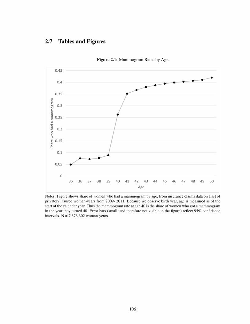
2.7 Tables and Figures
Figure 2.1: Mammogram Rates by Age
0
0.05
0.1
0.15
0.2
0.25
0.3
0.35
0.4
0.45
35 36 37 38 39 40 41 42 43 44 45 46 47 48 49 50
Share who
had
a m
ammog
ram
Age
Notes: Figure shows share of women who had a mammogram by age, from insurance claims data on a set ofprivately insured woman-years from 2009- 2011. Because we observe birth year, age is measured as of thestart of the calendar year. Thus the mammogram rate at age 40 is the share of women who got a mammogramin the year they turned 40. Error bars (small, and therefore not visible in the figure) reflect 95% confidenceintervals. N = 7,373,302 woman-years.
106
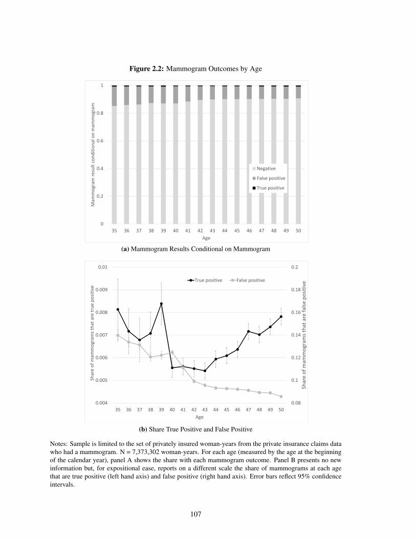
Figure 2.2: Mammogram Outcomes by Age
0
0.2
0.4
0.6
0.8
1
35 36 37 38 39 40 41 42 43 44 45 46 47 48 49 50
Mam
mog
ram re
sult cond
ition
al on mam
mog
ram
Age
Negative
False positive
True positive
(a) Mammogram Results Conditional on Mammogram
0.08
0.1
0.12
0.14
0.16
0.18
0.2
0.004
0.005
0.006
0.007
0.008
0.009
0.01
35 36 37 38 39 40 41 42 43 44 45 46 47 48 49 50
Share of m
ammog
rams tha
t are fa
lse positive
Share of m
ammog
rams that are true
positive
Age
True positive False positive
(b) Share True Positive and False Positive
Notes: Sample is limited to the set of privately insured woman-years from the private insurance claims datawho had a mammogram. N = 7,373,302 woman-years. For each age (measured by the age at the beginningof the calendar year), panel A shows the share with each mammogram outcome. Panel B presents no newinformation but, for expositional ease, reports on a different scale the share of mammograms at each agethat are true positive (left hand axis) and false positive (right hand axis). Error bars reflect 95% confidenceintervals.
107
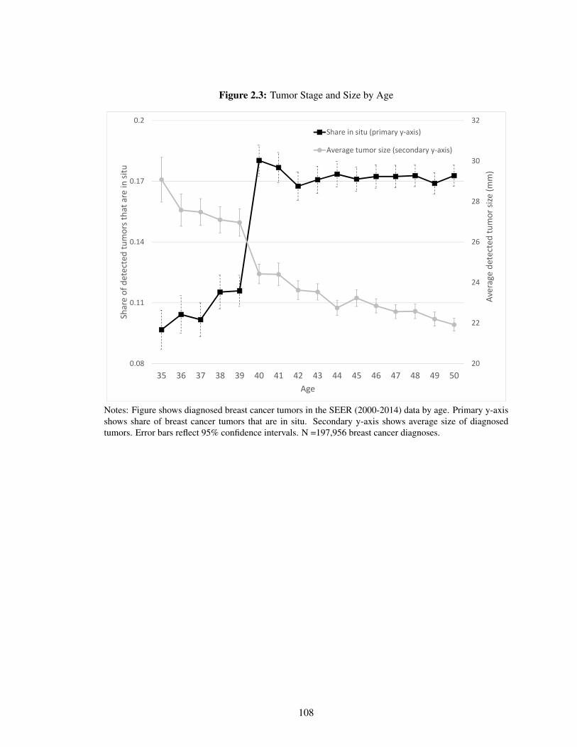
Figure 2.3: Tumor Stage and Size by Age
20
22
24
26
28
30
32
0.08
0.11
0.14
0.17
0.2
35 36 37 38 39 40 41 42 43 44 45 46 47 48 49 50
Average de
tected
tumor size (m
m)
Share of detected tumors tha
t are in
situ
Age
Share in situ (primary y‐axis)
Average tumor size (secondary y‐axis)
Notes: Figure shows diagnosed breast cancer tumors in the SEER (2000-2014) data by age. Primary y-axisshows share of breast cancer tumors that are in situ. Secondary y-axis shows average size of diagnosedtumors. Error bars reflect 95% confidence intervals. N =197,956 breast cancer diagnoses.
108
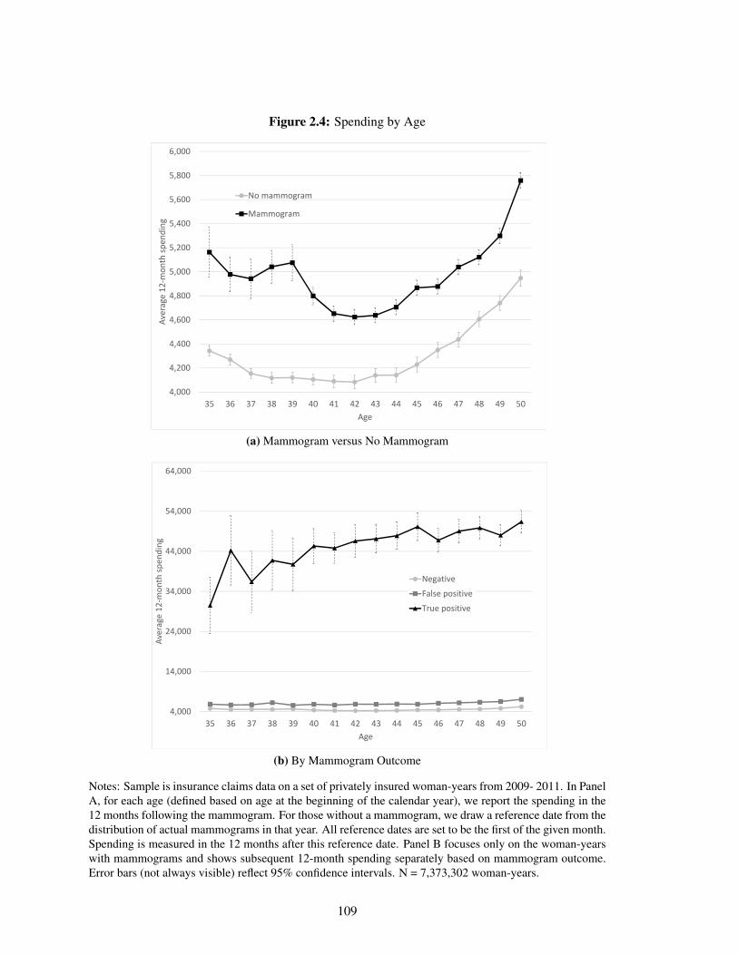
Figure 2.4: Spending by Age
4,000
4,200
4,400
4,600
4,800
5,000
5,200
5,400
5,600
5,800
6,000
35 36 37 38 39 40 41 42 43 44 45 46 47 48 49 50
Average 12
‐mon
th sp
ending
Age
No mammogram
Mammogram
(a) Mammogram versus No Mammogram
4,000
14,000
24,000
34,000
44,000
54,000
64,000
35 36 37 38 39 40 41 42 43 44 45 46 47 48 49 50
Average 12
‐mon
th sp
ending
Age
Negative
False positive
True positive
(b) By Mammogram Outcome
Notes: Sample is insurance claims data on a set of privately insured woman-years from 2009- 2011. In PanelA, for each age (defined based on age at the beginning of the calendar year), we report the spending in the12 months following the mammogram. For those without a mammogram, we draw a reference date from thedistribution of actual mammograms in that year. All reference dates are set to be the first of the given month.Spending is measured in the 12 months after this reference date. Panel B focuses only on the woman-yearswith mammograms and shows subsequent 12-month spending separately based on mammogram outcome.Error bars (not always visible) reflect 95% confidence intervals. N = 7,373,302 woman-years.
109
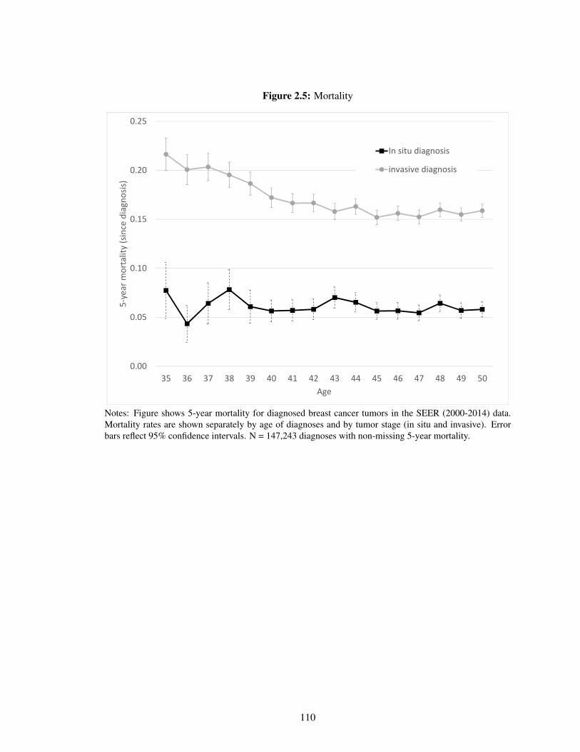
Figure 2.5: Mortality
0.00
0.05
0.10
0.15
0.20
0.25
35 36 37 38 39 40 41 42 43 44 45 46 47 48 49 50
5‐year m
ortality (since diagn
osis)
Age
In situ diagnosis
invasive diagnosis
Notes: Figure shows 5-year mortality for diagnosed breast cancer tumors in the SEER (2000-2014) data.Mortality rates are shown separately by age of diagnoses and by tumor stage (in situ and invasive). Errorbars reflect 95% confidence intervals. N = 147,243 diagnoses with non-missing 5-year mortality.
110
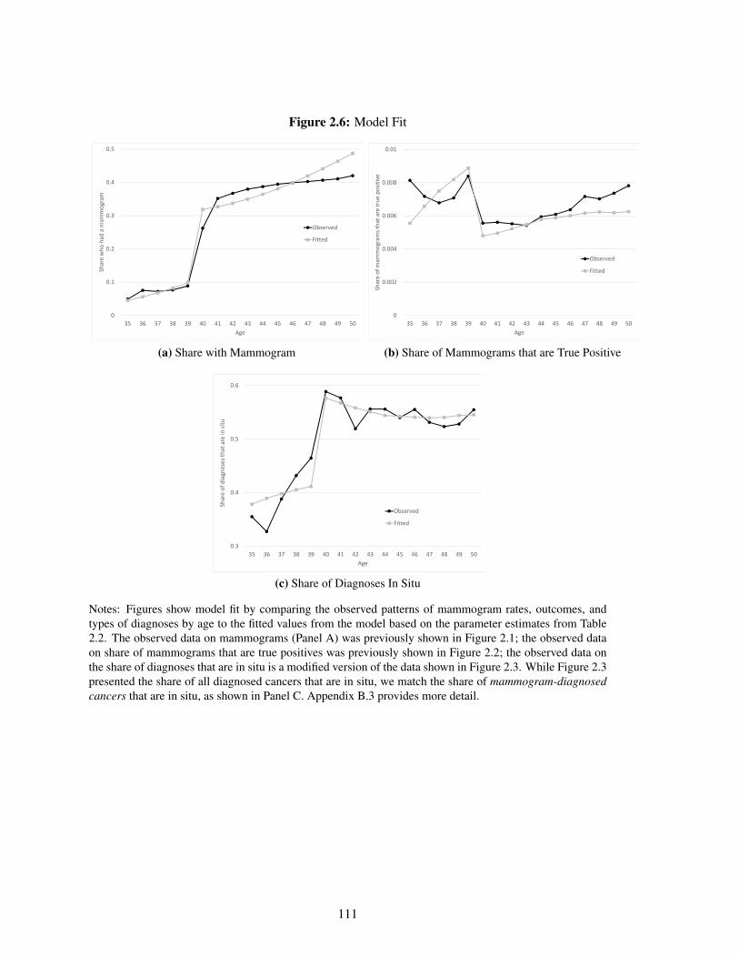
Figure 2.6: Model Fit
0
0.1
0.2
0.3
0.4
0.5
35 36 37 38 39 40 41 42 43 44 45 46 47 48 49 50
Share who
had
a m
ammog
ram
Age
Observed
Fitted
(a) Share with Mammogram
0
0.002
0.004
0.006
0.008
0.01
35 36 37 38 39 40 41 42 43 44 45 46 47 48 49 50
Share of m
ammog
rams that are true
positive
Age
Observed
Fitted
(b) Share of Mammograms that are True Positive
0.3
0.4
0.5
0.6
35 36 37 38 39 40 41 42 43 44 45 46 47 48 49 50
Share of diagn
oses th
at are in
situ
Age
Observed
Fitted
(c) Share of Diagnoses In Situ
Notes: Figures show model fit by comparing the observed patterns of mammogram rates, outcomes, andtypes of diagnoses by age to the fitted values from the model based on the parameter estimates from Table2.2. The observed data on mammograms (Panel A) was previously shown in Figure 2.1; the observed dataon share of mammograms that are true positives was previously shown in Figure 2.2; the observed data onthe share of diagnoses that are in situ is a modified version of the data shown in Figure 2.3. While Figure 2.3presented the share of all diagnosed cancers that are in situ, we match the share of mammogram-diagnosedcancers that are in situ, as shown in Panel C. Appendix B.3 provides more detail.
111
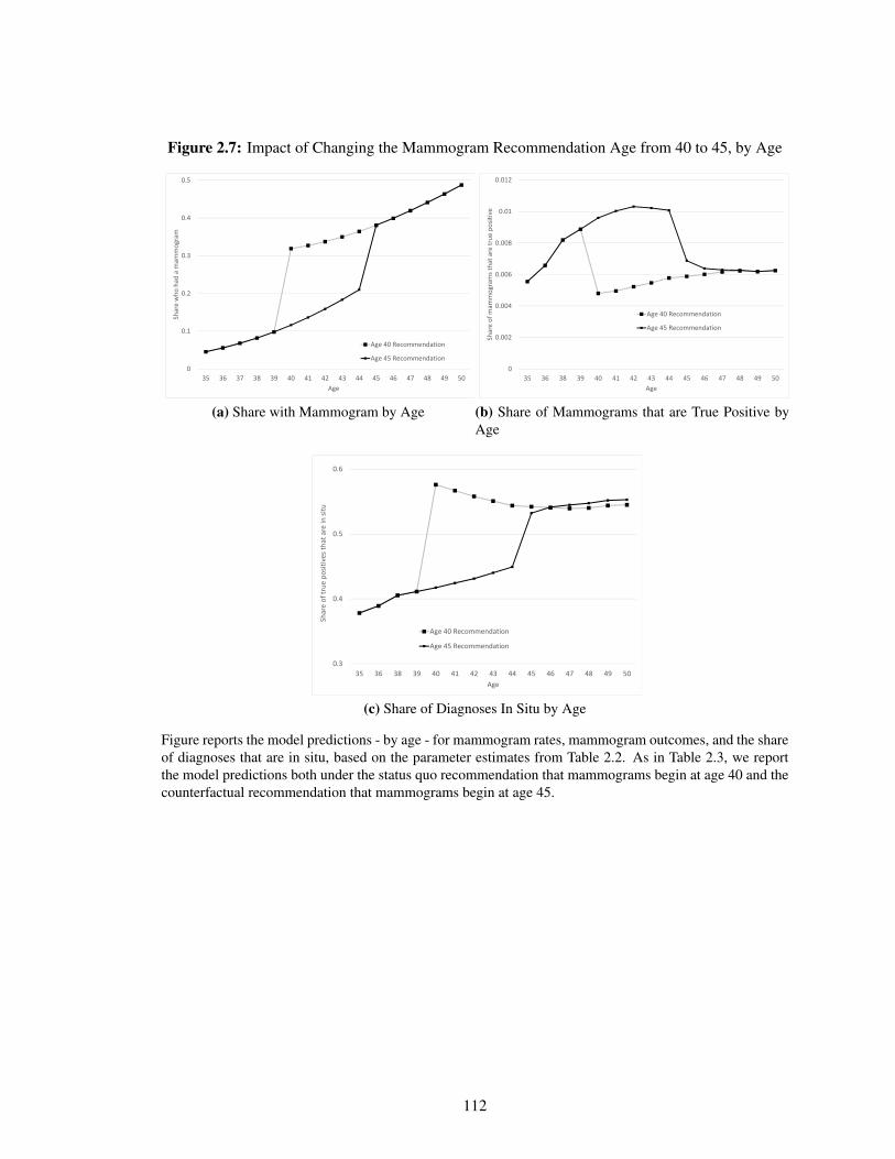
Figure 2.7: Impact of Changing the Mammogram Recommendation Age from 40 to 45, by Age
0
0.1
0.2
0.3
0.4
0.5
35 36 37 38 39 40 41 42 43 44 45 46 47 48 49 50
Share who
had
a m
ammog
ram
Age
Age 40 Recommendation
Age 45 Recommendation
(a) Share with Mammogram by Age
0
0.002
0.004
0.006
0.008
0.01
0.012
35 36 38 39 40 41 42 43 44 45 46 47 48 49 50
Share of m
ammog
rams that are true
positive
Age
Age 40 Recommendation
Age 45 Recommendation
(b) Share of Mammograms that are True Positive byAge
0.3
0.4
0.5
0.6
35 36 38 39 40 41 42 43 44 45 46 47 48 49 50
Share of true
positives tha
t are in
situ
Age
Age 40 Recommendation
Age 45 Recommendation
(c) Share of Diagnoses In Situ by Age
Figure reports the model predictions - by age - for mammogram rates, mammogram outcomes, and the shareof diagnoses that are in situ, based on the parameter estimates from Table 2.2. As in Table 2.3, we reportthe model predictions both under the status quo recommendation that mammograms begin at age 40 and thecounterfactual recommendation that mammograms begin at age 45.
112
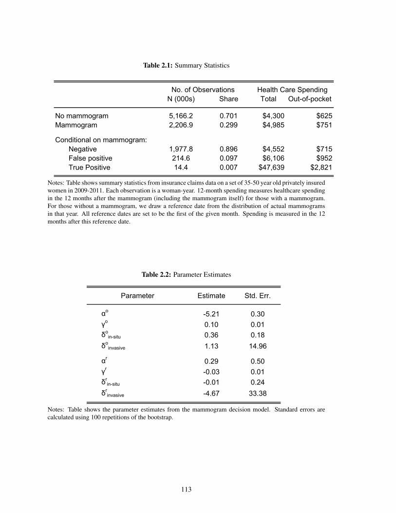
Table 2.1: Summary Statistics
N (000s) Share Total Out-of-pocket
No mammogram 5,166.2 0.701 $4,300 $625Mammogram 2,206.9 0.299 $4,985 $751
Conditional on mammogram:Negative 1,977.8 0.896 $4,552 $715False positive 214.6 0.097 $6,106 $952True Positive 14.4 0.007 $47,639 $2,821
No. of Observations Health Care Spending
Notes: Table shows summary statistics from insurance claims data on a set of 35-50 year old privately insuredwomen in 2009-2011. Each observation is a woman-year. 12-month spending measures healthcare spendingin the 12 months after the mammogram (including the mammogram itself) for those with a mammogram.For those without a mammogram, we draw a reference date from the distribution of actual mammogramsin that year. All reference dates are set to be the first of the given month. Spending is measured in the 12months after this reference date.
Table 2.2: Parameter Estimates
Estimate Std. Err.
αo-5.21 0.30
γo0.10 0.01
δoin-situ 0.36 0.18
δoinvasive 1.13 14.96
αr0.29 0.50
γr-0.03 0.01
δrin-situ -0.01 0.24
δrinvasive -4.67 33.38
Parameter
Notes: Table shows the parameter estimates from the mammogram decision model. Standard errors arecalculated using 100 repetitions of the bootstrap.
113
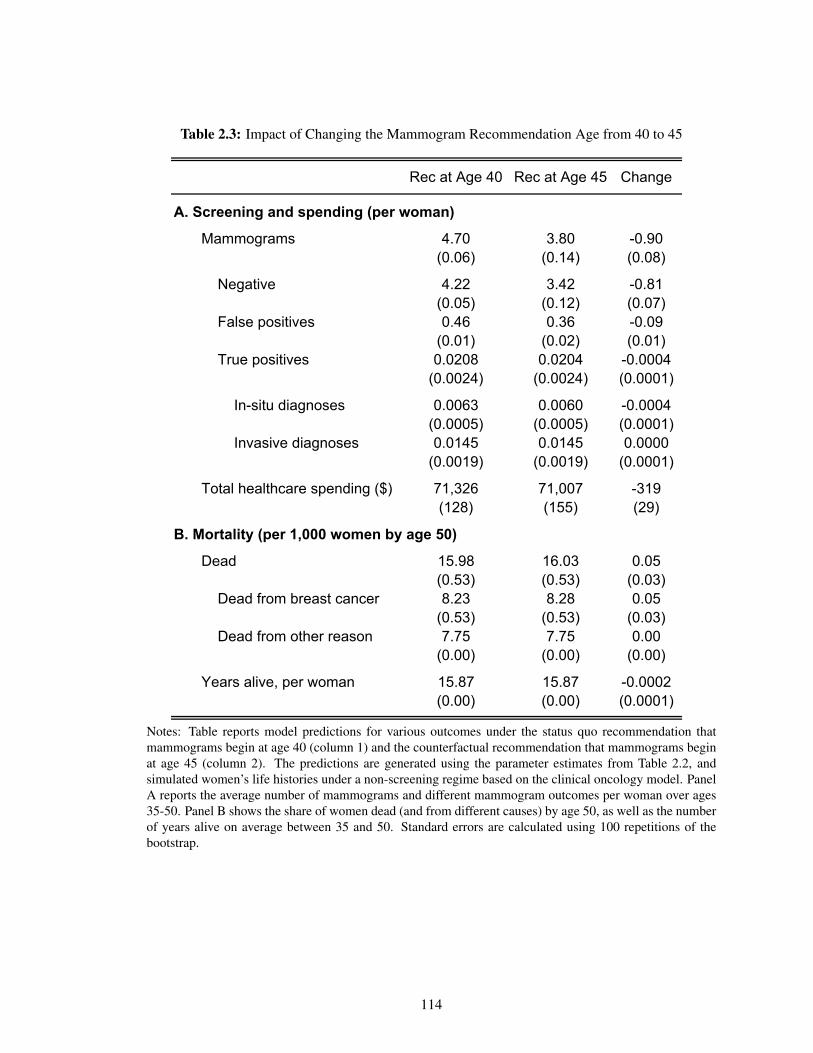
Table 2.3: Impact of Changing the Mammogram Recommendation Age from 40 to 45
Rec at Age 40 Rec at Age 45 Change
A. Screening and spending (per woman)
Mammograms 4.70 3.80 -0.90(0.06) (0.14) (0.08)
Negative 4.22 3.42 -0.81(0.05) (0.12) (0.07)
False positives 0.46 0.36 -0.09(0.01) (0.02) (0.01)
True positives 0.0208 0.0204 -0.0004(0.0024) (0.0024) (0.0001)
In-situ diagnoses 0.0063 0.0060 -0.0004(0.0005) (0.0005) (0.0001)
Invasive diagnoses 0.0145 0.0145 0.0000(0.0019) (0.0019) (0.0001)
Total healthcare spending ($) 71,326 71,007 -319(128) (155) (29)
B. Mortality (per 1,000 women by age 50)
Dead 15.98 16.03 0.05(0.53) (0.53) (0.03)
Dead from breast cancer 8.23 8.28 0.05(0.53) (0.53) (0.03)
Dead from other reason 7.75 7.75 0.00(0.00) (0.00) (0.00)
Years alive, per woman 15.87 15.87 -0.0002(0.00) (0.00) (0.0001)
Notes: Table reports model predictions for various outcomes under the status quo recommendation thatmammograms begin at age 40 (column 1) and the counterfactual recommendation that mammograms beginat age 45 (column 2). The predictions are generated using the parameter estimates from Table 2.2, andsimulated women’s life histories under a non-screening regime based on the clinical oncology model. PanelA reports the average number of mammograms and different mammogram outcomes per woman over ages35-50. Panel B shows the share of women dead (and from different causes) by age 50, as well as the numberof years alive on average between 35 and 50. Standard errors are calculated using 100 repetitions of thebootstrap.
114
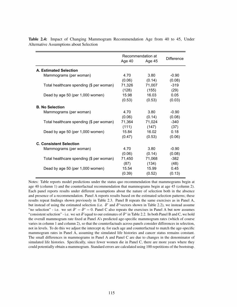
Table 2.4: Impact of Changing Mammogram Recommendation Age from 40 to 45, UnderAlternative Assumptions about Selection
Age 40 Age 45
A. Estimated SelectionMammograms (per woman) 4.70 3.80 -0.90
(0.06) (0.14) (0.08)Total healthcare spending ($ per woman) 71,326 71,007 -319
(128) (155) (29)Dead by age 50 (per 1,000 women) 15.98 16.03 0.05
(0.53) (0.53) (0.03)
B. No SelectionMammograms (per woman) 4.70 3.80 -0.90
(0.06) (0.14) (0.08)Total healthcare spending ($ per woman) 71,364 71,024 -340
(111) (147) (37)Dead by age 50 (per 1,000 women) 15.84 16.02 0.18
(0.47) (0.53) (0.06)
C. Consistent SelectionMammograms (per woman) 4.70 3.80 -0.90
(0.06) (0.14) (0.08)Total healthcare spending ($ per woman) 71,450 71,068 -382
(87) (134) (48)Dead by age 50 (per 1,000 women) 15.54 15.99 0.45
(0.39) (0.52) (0.13)
Recommendation atDifference
Notes: Table reports model predictions under the status quo recommendation that mammograms begin atage 40 (column 1) and the counterfactual recommendation that mammograms begin at age 45 (column 2).Each panel reports results under different assumptions about the nature of selection both in the absenceand presence of a recommendation. Panel A reports results based on the estimated selection patterns; theseresults repeat findings shown previously in Table 2.3. Panel B repeats the same exercises as in Panel A,but instead of using the estimated selection (i.e. δ r and δ ovectors shown in Table 2.2), we instead assume“no selection” - i.e. we set δ r = δ o = 0. Panel C also repeats the exercises in Panel A but now assumes“consistent selection” - i.e. we set δ requal to our estimates of δ o in Table 2.2. In both Panel B and C, we holdthe overall mammogram rate fixed at Panel A’s predicted age-specific mammogram rates (which of coursevaries in column 1 and column 2), so that the counterfactuals across panels consider differences in selection,not in levels. To do this we adjust the intercept αr for each age and counterfactual to match the age-specificmammogram rates in Panel A, assuming the simulated life histories and cancer status remains constant.The small differences in mammograms in Panel A and Panel C are due to changes in the denominator ofsimulated life histories. Specifically, since fewer women die in Panel C, there are more years where theycould potentially obtain a mammogram. Standard errors are calculated using 100 repetitions of the bootstrap.
115
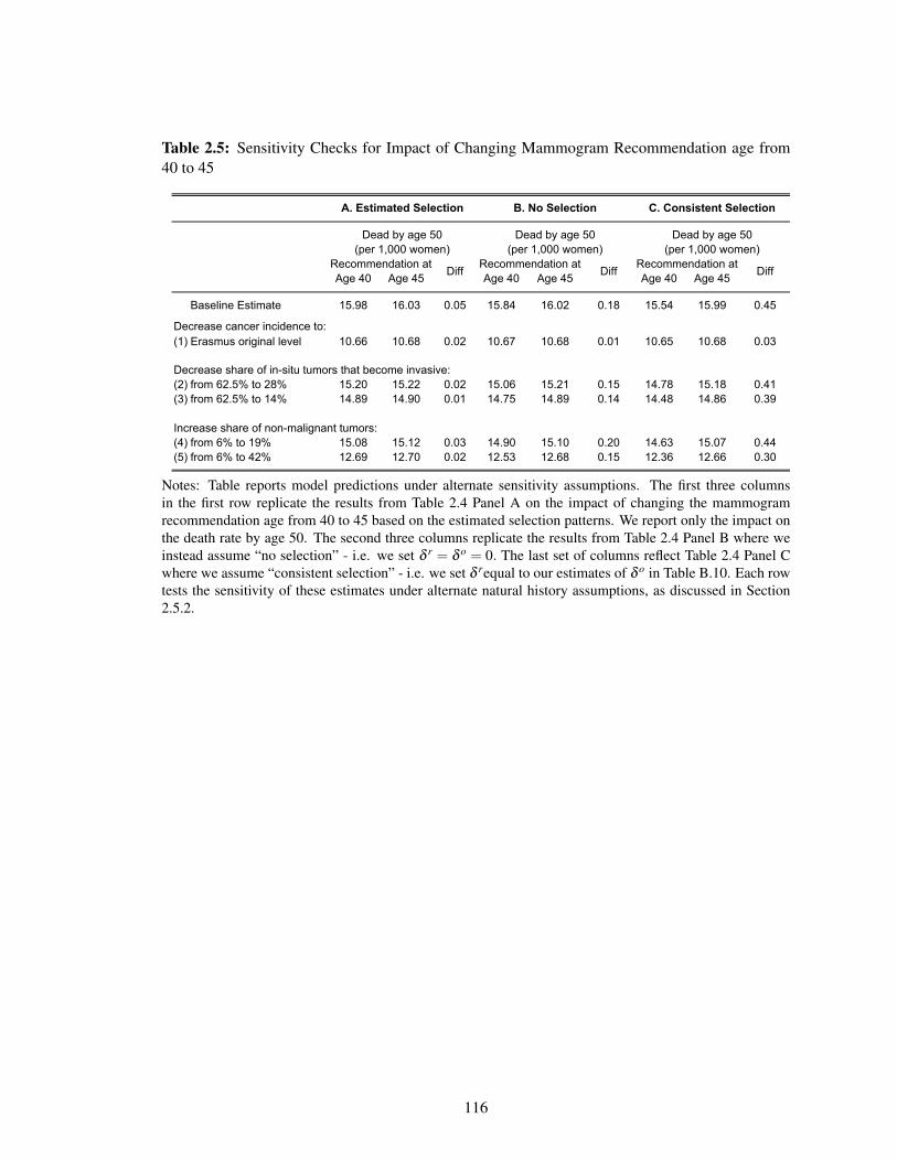
Table 2.5: Sensitivity Checks for Impact of Changing Mammogram Recommendation age from40 to 45
Age 40 Age 45 Age 40 Age 45 Age 40 Age 45
Baseline Estimate 15.98 16.03 0.05 15.84 16.02 0.18 15.54 15.99 0.45
(1) Erasmus original level 10.66 10.68 0.02 10.67 10.68 0.01 10.65 10.68 0.03
Decrease share of in-situ tumors that become invasive:(2) from 62.5% to 28% 15.20 15.22 0.02 15.06 15.21 0.15 14.78 15.18 0.41(3) from 62.5% to 14% 14.89 14.90 0.01 14.75 14.89 0.14 14.48 14.86 0.39
Increase share of non-malignant tumors:(4) from 6% to 19% 15.08 15.12 0.03 14.90 15.10 0.20 14.63 15.07 0.44(5) from 6% to 42% 12.69 12.70 0.02 12.53 12.68 0.15 12.36 12.66 0.30
Decrease cancer incidence to:
C. Consistent SelectionA. Estimated Selection B. No Selection
Dead by age 50(per 1,000 women)
Recommendation atDiff
(per 1,000 women) (per 1,000 women)Dead by age 50 Dead by age 50
Recommendation atDiff
Recommendation atDiff
Notes: Table reports model predictions under alternate sensitivity assumptions. The first three columnsin the first row replicate the results from Table 2.4 Panel A on the impact of changing the mammogramrecommendation age from 40 to 45 based on the estimated selection patterns. We report only the impact onthe death rate by age 50. The second three columns replicate the results from Table 2.4 Panel B where weinstead assume “no selection” - i.e. we set δ r = δ o = 0. The last set of columns reflect Table 2.4 Panel Cwhere we assume “consistent selection” - i.e. we set δ requal to our estimates of δ o in Table B.10. Each rowtests the sensitivity of these estimates under alternate natural history assumptions, as discussed in Section2.5.2.
116

Chapter 3
Opium for the Masses: The Effect of
Declining Religiosity on Drug
Poisonings, Suicides, and Alcohol
Abuse*
3.1 Introduction
Over the past two decades, the death rate due to drug poisonings in the United States has tripled,
largely driven by opioid overdoses (National Center for Health Statistics, 2017; Stone et al., 2018;
Case and Deaton, 2015). The suicide rate has increased by 30%, as have rates of alcoholic liver
*Contact: [email protected]. I thank Amy Finkelstein and Heidi Williams for their advice and guidance,Nicolas Bottan and Ricardo Perez-Truglia for generously sharing local scandal data, and Sarah Abraham,David Autor, Ivan Badinski, Jane Choi, Colin Gray, John Grigsby, Jon Gruber, Ryan Hill, Simon Jaeger, MattLowe, Maddie Mckelway, Frank Schilbach, Tim Simmons, and Carolyn Stein for their helpful commentsand encouragement. I am very happy that Daniel Hungerman reached out to collaborate on this work, andI look forward to working on this paper together with him and Tyler Giles in the future. Funding from theNational Institute on Aging through Grant Number T32-AG000186 and the National Science FoundationGraduate Fellowship Program under Grant Number 1122374 is gratefully acknowledged.
117

disease and other “deaths of despair” (Stone et al., 2018; Case and Deaton, 2015). A potential factor
in this crisis is declining community ties and social cohesion (Putnam, 2000; Case and Deaton,
2017). As death rates due to drug overdoses, suicides, and alcoholic liver disease have been rising,
religiosity has been in decline. The percent of the population that has no religious affiliation has
tripled from 7% in the late 1980s to over 20% in 2016. Similarly, the percent of the population that
never attends religious services has increased from 12% to 22% over the same time period (General
Social Survey, 2016).
Has reduced religiosity contributed to the increase in drug poisonings, suicides, and alcohol-
related deaths in the United States? A number of potential mechanisms could connect religiosity
and deaths of despair. Religion provides a sense of community, social cohesion, and meaning in life
that might prevent addiction or aid rehabilitation. An extensive literature in psychology has shown
that social activity is the strongest correlate of happiness (e.g. Menec (2003)), and that adults who
are more socially integrated through their religious networks are happier (Cacioppo et al., 2008).
Religious values could also directly discourage the use of drugs, excessive drinking, and suicide.
There are also direct pharmacological reasons why religion and social connections might decrease
drug overdoses. Medical literature shows that mice that are given the chemical associated with
social bonding, oxytocin, are less likely become addicted when given opiates and have less pronounced
withdrawal symptoms (Kovacs et al., 1998).There is suggestive evidence that religiosity, which
can create natural oxytocin, can be a substitute for opioids. A recent New York Magazine article
postulated: “The oxytocin we experience from love or friendship is chemically replicated by the
molecules derived from the poppy plant. It’s a shortcut — and an instant intensification — of the
happiness we might ordinarily experience in a good and fruitful communal life. It ends not just
physical pain but psychological, emotional, even existential pain” Sullivan (2018).
This paper asks whether there is a causal relationship between religiosity and physical health,
as measusured by drug abuses and deaths. I use allegations of sexual abuse against thousands of
Catholic priests as instruments for religiosity. This strategy was also used to study substitution
across religious denominations (Hungerman, 2013) and religious participation, charitable giving,
118

and pro-social beliefs (Bottan and Perez-Truglia, 2015). Consistent with that literature, I find that
sex abuse scandals cause a persistent reduction in the number of religious employees per capita
in a county. I also find reduced form evidence that scandals cause an increase in the opioid death
rate in later years. In contrast, I find no evidence that scandals, and the subsequent decline in
religiosity, increase deaths due to other drug overdoses, suicides, and alcohol poisonings. In fact,
in my instrumental variables specification, I find that an increase in religiosity would increase
mortality due to other drug overdoses, suicides, and alcohol. However, this effect is small and only
approximately a quarter of the effect of opioid overdoses; on net, there would be an increase in
total “deaths of despair.”
Using uniform crime reports, I also find reduced form evidence that the Catholic sex-abuse
scandals cause an increase in arrests for the sale of synthetic narcotics, though there was no increase
in arrests for the possession of synthetic narcotics. As a placebo check, I find that the abuse scandals
did not affect deaths due to leukemia, however there was an increase in traffic-related mortality.
In the second component of the paper, I instrument for religiosity using the Catholic sex-
abuse scandals. In my preferred instrumental variables specification, I find that an 8% decrease
in religious employment per capita - equivalent to the decrease observed since the height of the
Catholic sex abuse scandal - would increase opioid deaths by 4.4 per 100,000. This increase would
account for 35% of the current opioid mortality rate as of 2016. These effects are larger in areas
with higher Catholic populations before the scandals. Most of the decline in religiosity in recent
decades has occurred in younger adults. Accordingly, I find that the mortality effects of the abuse
scandals are concentrated in younger adults, in particular those aged 35-49.
This paper contributes to a literature on the causal effects of religiosity on social vices or
virtues. Bottan and Perez-Truglia (2015) find no effect of the Catholic abuse scandal on pro-social
beliefs, but they do find a decrease in charitable giving. Gruber and Hungerman (2008) find that the
repeal of “blue laws,” which prohibited retail activity on Sundays, led to an increase in drinking,
marijuana use, and cocaine use. There are a number of ways to reconcile Gruber and Hungerman’s
findings with my result that declines in religion have not increased other drug deaths, suicide, or
119

alcoholic liver disease mortality. It is possible that the decline of religion increases recreational
drug use but does not affect drug-related mortality. It is also possible that the set of people induced
to reduce their religiosity in response to shopping opportunities are different than the set that would
reduce their religiosity in response to the Catholic sex abuse scandal. In addition, there is evidence
that some religious affiliations might increase some types of mortality risk. Becker and Woessmann
(2018) use the concentration of Protestantism around Wittenberg to show that Protestantism had a
substantial positive impact on suicide.
This analysis also contributes to the discussion on whether the opioid epidemic is caused
by supply or demand-side factors. Case and Deaton (2017) generally argue that demand-side
factors are driving the opioid epidemic, stating that they “do not see the supply of opioids as the
fundamental factor.” However, specific economic or social conditions that are driving this crisis
have remained somewhat elusive. Ruhm (2018) estimated that “economic conditions account for
less than one-tenth of the rise in drug and opioid-involved mortality” while Finkelstein et al. (2018)
estimate that 30% of prescription patterns relating to opioid abuse are due to broad place-specific
factors. This paper provides evidence that that specific demand-side factors—religiosity and the
associated social connections—are an important factor in the opioid crisis.
This paper proceeds as follows. Section 2 describes the Catholic sex abuse scandals, lays out
the identification assumptions, and explains the empirical strategy. Section 3 discusses the religion,
mortality and crime data and provides descriptive event-study analysis. Section 4 presents the main
results and presents heterogeneity by both the Catholic rate in a county and the age of death and
Section 5 concludes.
3.2 Empirical Strategy
3.2.1 Identification and Event Study
In 2002, The Boston Globe published a series of articles detailing the sexual abuse of minors
by Catholic clergy and subsequent cover-up attempts by Catholic bishops. This explosive press
120
coverage led to the revelation of thousands of subsequent accusations of abuse, which were often
reported in local newspapers. Appendix Figure 3.1c presents the distribution of new Catholic sex-
abuse scandals over time. After early clusters of scandals in the late 1980s and early 1990s, The
Boston Globe reporting lead to a dramatic increase in reported scandals in both 2002 and the years
immediately afterward.1
The magnitude of this religious crisis is unprecedented in recent history. The John Jay Report
(2004) estimated that 4,392 priests, or 4% of all priests active between 1950 and 2000 had been
accused of sexual abuse. Since that publication, hundreds of new accusations have occurred. The
Catholic church has paid more than $2.5 billion in settlements and an additional $1.5 billion in
related costs (Ruhl and Ruhl, 2015). The scandal was particularly damaging for the credibility
of the Catholic church since there was evidence that major bishops covered up the abuse and had
reassigned accused clergy to new parishes instead pressing charges. Among all adults that are
currently religiously unaffiliated, 19% state the Catholic abuse scandal was an important reason for
their current unaffiliation. Among former Catholics this share is 33% (PRRI Survey, 2016).
My empirical strategy uses the timing and location of these scandals as instruments for religiosity.
The main identifying assumption is that the timing of scandals is exogenous to changes in local
religiosity. Since the majority of allegations occurred decades after the abuse itself, the timing of
the reporting may still be exogenous even if the underlying abuse could have been related to local
religiosity. This assumption can also be tested in an event study framework by plotting the evolution
of religiosity around the time of the scandal. I estimate the following event-study specification:
Relit = α + ∑k∈K
γksi,t−k +φi + τt +Xitβ + εit (3.1)
where the outcome variable Relit is a proxy for religiosity in county i and year t. Hungerman
(2013) show that the effect of a religious scandal is concentrated in the affected zipcode, with
lesser spillover to neighboring zipcodes. To capture the combined effect, my analysis is a the
1See Hungerman (2013) for a detailed history of the Catholic sex abuse scandal and related citations.
121

county level.2
The set of variables si,t−k reference the number of scandals in county i and year t, lagged by
k years. For example, suppose a county experiences its only scandal in the year 2005. Then si,t−k
would the value of one for both the combination of t = 2006 and k = 1 and for t = 2007 and k = 2.
This variable is defined for all k such that −kinitial < k < k f inal . For the endpoints, sk f inali,t references
all scandals that occurred in year t − k f inal and earlier, and s−kinitiali,t references all scandals that
occurred in year t + kinitial and later. The sum of si,t−k over all k ∈ K,holding any given calendar
year t fixed, is equivalent to the total number of scandals in that county i. The event study also
includes county fixed effects φi, year fixed effects τt , and controls for population, the share Black,
Hispanic, Asian, Indian, and female, and the share of the population in four age groups (0-19 years,
20-39 years, 40-64 years, 65+ years) as Xitβ . Standard errors are clustered at the county level.
In this paper, I proxy for religiosity with either the number of religious employees per capita in
county i in year t or the natural log of religious employment per capita plus one. There are other
components of religiosity and its associated social connections that may be important contributors
to mortality. The number of religious employees could be reduced due to financial concerns
while salient components of religiosity might be unaffected. Religious beliefs, independent of a
formal religious congregation may be important drivers of health and well-being. Various religious
organizations could also directly impact the health and well-being of their congregants through
social programming, direct transfers, or as a social resource.
The consideration of the most appropriate endogenous variable for religiosity is side-stepped
in the reduced form analysis. In this case, I also use an event-study framework to analyze the effect
of religious scandals on mortality rates directly. In that case, I estimate the following event-study
specification:
yit = α + ∑k∈K
γksi,t−k +φi + τt +Xitβ + εit (3.2)
where yit is the mortality rate in county i and year t. All other variable definitions are defined as in
2There are approximately 3,000 counties in the United States and 40,000 zip codes, so a county isroughly a zipcode and its surrounding neighbors.
122

equation 3.1.
3.2.2 Regression Framework
In my proposed framework, the news of a scandal is unlikely to immediately affect mortality.
Instead, a scandal might result in less frequent attendance at religious events, a gradual decrease in
the social connections maintained through religious events, a decrease in general well-being, and
eventually mortality. The event-study approach in Section 3.2.1 helps estimate the temporal delay
between a religious scandal, a change in religiosity and subsequent effects on mortality. I will use
k‡ to denote the number of years delay between a religious scandal and a change in religiosity.
Similarly, I will let k* denote the number of years delay between a change in religiosity and a
change in mortality.
The instrumental variables specification that I estimate is therefore:
Yit = α +ζ Reli,t−k* +φi + τt +Xitβ + εit (3.3)
where yit is the mortality rate in county i and year t. The coefficient of interest is on Reli,t−k* . Here,
Reli,t−k* represents the number of religious employees per capita in county i and year t, lagged
by k* years (or the natural log of religious employment per capita plus one, in county i and year
t, lagged by k* years). I also include county fixed effects φi, year fixed effects τt , and the same
demographic controls Xitβ as described in Section 3.2.1.
We instrument for Reli,t−k* with
Reli,t−k* = α +δ si,t−k*−k‡ +φi + τt +Xitβ + εit , (3.4)
where si,t−k*−k‡ represents the number of religious scandals in county i and year t,lagged by both k*
and k‡ years. The relative number of years between the religious scandal si,t−k*−k‡ and religiosity
Reli,t−k* is k‡, which represents the number of years delay between a religious scandal and a change
in religiosity.
123

3.3 Data
3.3.1 Data and Variable Definitions
The county-year level scandal dataset was collected by Bottan and Perez-Truglia (2015) based
on records published by Bishop Accountability.3 Bottan and Perez-Truglia supplemented these
records with newspaper articles, the Official Catholic Directory, and the official websites of Catholic
institutions to determine the exact location of each clergy member at the time of the scandal and
at the time of the alleged abuse. They also recorded the date of the first newspaper article that
references each accusation. I consider a scandal to have occurred in a county if either (a) a clergy
member who currently works at a Catholic institution in that county is accused of sexual abuse
for the first time or (b) a clergy member was newly accused of committing abuse at a Catholic
institution in that county, even if they did not work in that county at the time of the accusation.
Each of these situations is counted as a separate sex abuse scandal. The year of the scandal is the
year of the first newspaper article mentioning the abuse. The data include a total of 2,952 scandals
that I can match to a county and year from 1977-2010.
I proxy for religious participation with the number of employees of religious organizations in
the County Business Patterns data. These data are available for all counties in the United States
from 1986-2016. Religious organizations are identified with NAICS code 813110 or SIC code
8660. This includes churches, mosques, synagogues, and other places or worship but not schools,
hospitals or charities maintained by or affiliated with religious groups.4 These data also record
the number of religious establishments for each county and year. The number of employees of
religious organizations is converted into a per capita rate per 100,000 using population data from the
National Cancer Institute’s Surveillance Epidemiology and End Results (SEER) data. As discussed
in Section 3.2.1, religious employees are an imperfect proxy for religious strength. Future work
3See bishopaccountability.org.4The employment counts for religious organizations are censored for 4% of counties in 2016 up to 22%
of counties in 1986. If the exact employment count is not available, I observe binned sizes of employment(e.g. 1-4 employees). I approximate employment with the average number of employees in each bin,multiplied by the number of establishments of each binned size.
124
will also include self-reported religiosity measures from the General Social Survey.
The outcomes studied include mortality rates due to opioids and other “deaths of despair” due to
drug poisonings, suicide, and alcoholic liver disease. Death counts by county and year are available
from the Centers for Disease Control’s Multiple Cause of Death Files from 1999-2016. Each
cause of death is coded according to the International Classification of Diseases, Tenth Revision
(ICD-10) codes with one underlying cause of death and potentially several multiple causes of
death. Opioid deaths are defined as fatalities with underlying cause of death X40-44 (unintentional
drug poisonings), X60-64 (suicide drug poisonings), X85 (homicide drug poisonings), and Y10-14
(undetermined drug poisonings). Furthermore, opioid deaths have a multiple cause of death code of
T40.0-T40.4 (opium, heroin, other opioids, methadone, and other synthetic narcotics, respectively).
Deaths due to other drug poisonings, suicide, and alcoholic liver diseases have ICD-10 codes X40-
44, X60-64, X85, and Y10-14 (drug poisonings), X65-X84, Y87.0 and *U03 (suicides), and K70
(alcoholic liver disease). I exclude any deaths due to opioids from this latter count.
As placebo checks, I also examine deaths due to transport accidents (V01-V99) and, separately,
malignant neoplasms stated or presumed to be of haematopioetic and related tissue (C90-C96).
This category is referred to as “leukemia” for the rest of this paper. Religiosity potentially affects
many behaviors including diet, family composition, income, and smoking, complicating the
interpretation of many potential placebo checks. Leukemia is unique among cancers in having
no known extrinsic risk factors (Wu et al., 2016). For all categories, death counts are converted
into rates per 100,000 using the SEER population data.
Additional data sources include the Association of Religion Data Archives data on religious
adherence. These data are administrative reports of adherent or membership size collected from
religious organizations. They are only available every decade, e.g. in 1990, 2000, and 2010. I
compute the Catholic rate in each county as the total count of Catholic adherents for each Catholic
congregation divided by the total population in that county. This metric is used to test whether
the effects of Catholic sex abuse scandals are more concentrated in more Catholic areas. The
descriptive statistics also include data on religious affiliation from the General Social Survey.
125

Crime data were obtained from the Uniform Crime Reports, which are are published annually
by the Federal Bureau of Investigation. Law enforcement agencies around the country provide data
on local arrests, which the FBI aggregates into the Uniform Crime Rate Reports. These statistics
are available at the county level for 1988-2014. I focus on a few specific crime metrics. I include
the total number of arrests made in the county as well as violent crimes. The latter are a subset of
total crimes and include murder, rape, robberies, and aggravated assault. I also include two opioid-
related crime statistics: arrests for the sale and/or manufacture of synthetic narcotics and arrests for
the possession of synthetic narcotics. Synthetic narcotics are which are defined as manufactured
narcotics which can cause true drug addiction (demerol, methadone).
3.3.2 Summary Statistics
Table 3.1 reports summary statistics on scandals, religious participation, and mortality rates. Strikingly,
the county-level opioid death rate has increased from an average 1.1 deaths per 100,000 in 1999
to a death rate of 9.7 deaths per 100,000 in 2016. Deaths due to other drug poisonings, suicide,
and alcoholic liver disease have also risen from 18.2 deaths per 100,00 in 1999 to 30.7 in 2016.
In contrast, the traffic accident death rate has slightly decreased, while the leukemia death rate
has remained fairly constant. In 2016, county-level opioid death rates were about half as large as
deaths due to other drugs, suicide and alcohol and roughly the same order of magnitude as both
traffic-related mortality and deaths due to leukemia. 5
The average county has 442 religious employees per 100,000, or about one religious employee
per 200 residents. The average county also has 90 religious establishments (not shown). The
Catholic rate in 1990 varies from a 10th percentile of 0.4 Catholics per 100 residents to a 90th
percentile of 34.6 Catholics per 100 residents. The average county is 13.3% Catholic. This is a
county-level statistic, and is lower than the national average Catholic rate (23%) since Catholics
are often in more urban areas. The average population in a county is 89.663.
5Table 3.1 presents county-level averages. In 2016, the national mortality rate for opioids was 12.6 per100,000. The national mortality rate for other drugs, suicide, and alcohol deaths was 25.4 per 100,000; thedeath rate for traffic accidents was 13.0 per 100,000 and the death rate for leukemia was 12.5 per 100,000.
126

Twenty-one percent of all counties had at least one scandal during the time frame of 1999-2016.
Of the counties that experienced at least one scandal, 47% had only one, and an additional 15%
had only two scandals. The average number of total scandals per county during this timer period
was just under one.
3.3.3 Descriptive Analysis
Religiosity has been declining in the United States over the past few decades. This trend has
become increasingly pronounced since 2002, which was the breakthrough year for Catholic sex
abuse scandals. This decline holds both for economic measures such as religious employment
and establishments and for self-reported religiosity measures. As Figure 3.1a shows, the number
of employees at religious organizations per capita was increasing throughout the end of the 20th
century but has fallen about 8% since The Boston Globe’s main report. The number of religious
establishments per capita has fallen by about 5% over the same time frame. Concurrently, as shown
in Figure 3.1b, the share of Americans who report no religious affiliation has increased from 7% in
the mid 1980s to 14% in 2002 and has risen in recent years to approximately 22%. These graphs
both represent total changes in religiosity for the whole population; if the Catholic abuse scandal
disproportionately affected religiosity among Catholics, the effect for this subpopulation would be
even larger.
These measures of religious participation are negatively correlated with opioid deaths. Figure
3.2 presents binned scatter plots of opioid death rates against three measures of religiosity: religious
membership rates, religious employment per capita, and religious establishments per capita. In
each panel, I group the x-axis variable into fifty equally-sized bins. I plot the mean of both the
x-axis and y-axis within each of these bins. All three figures show a strong negative correlation
between religiosity and opioid death rates. The least religious counties have an average opioid
death rate that is about 10 deaths per 100,000 higher than the most religious counties. To scale these
estimates, the mean county-level opioid death rate in 2010 (the year of these figures) was 7.6 deaths
per 100,000 and the standard deviation was 9.7 deaths per 100,00. These are not causal estimates,
127

but they are potentially suggestive of a relationship between religiosity and opioid deaths.
Figure 3.3a presents the geographic distribution of the Catholic sex abuse scandals. Many
scandals occurred in isolated counties, but they were also concentrated in the Southwest and
Northeast. In comparison, the geographic variation in opioid mortality rates is shown in Figure
3.3b. Opioid deaths are concentrated in the Appalachians, the Northeast, Nevada, and Arizona.
3.4 Results
3.4.1 Event Studies
Figure 3.4a presents the event study graph of the effect of scandals on religious employees per
capita. In the years before the scandal, the coefficients are close to zero and insignificant, suggesting
that counties with and without scandals were on similar trends before the event. After the event,
the coefficients become negative and, after the first year, statistically significant.6 This suggests
that areas with an additional scandal experienced persistent reductions in the number of religious
employees per capita, compared with areas with fewer scandals. This effect seems to stabilize after
approximately eight years. At that point, an area with an additional scandal is estimated to have
3.5 fewer religious employees per capita. This is approximately a 0.8% reduction in the religious
workforce. Since Catholics are only about 23% of the population,7 if the effects of scandals are
isolated to the Catholic workforce, this would imply a 3.5% reduction in religious employees for
Catholic establishments.
There is a similar trend in Figure 3.4b, which shows the effect of scandals on the
Ln(religious employees per capita +1). The coefficients are close to zero and insignificant before
the scandal, and negative and significant afterwards. As in Figure 3.4a, the effect stabilizes after
approximately eight years, at which point an additional scandal reduces the religious employment
6After the first year, the only insignificant coefficient is the coefficient on the fifth year after the scandal.Most scandals occurred in 2002, so five years after the scandal would be 2007, the start of the GreatRecession. These economic fluctuations might have introduced noise into the estimates. The coefficienton the fifth year also has the largest standard error of any of the coefficients.
7See Section 3.3.2
128
per capita by 0.6%. This is statistically indistinguishable from the effect size in Figure 3.4a.8
The reduced form event study is presented in Figure 3.5. This plots the effect of scandals
on mortality rates. Figure 3.5a presents the effect of scandals on the opioid death rate. In the
years before the scandal, the coefficients are close to zero and statistically insignificant, suggesting
that areas with more scandals were similar to areas with fewer scandals before the event. After
the scandal, the opioid death rate remains unaffected by scandals for about ten years. After that
point, areas that had a religious scandal had a positive and statistically significant increase in opioid
mortality rates. The effect stabilizes approximately fourteen years after the scandal. After this time
period, a county with an additional scandal has approximately 0.5 additional opioid deaths per
100,000. Since the opioid death rate increases dramatically throughout the time period examined,
it would be most appropriate to benchmark this change against opioid mortality rates in latter years.
In 2016, the mean opioid death rate was 9.7 deaths per 100,000. Therefore, an additional scandal
seems to increase the opioid death rate by about 5%.
Figure 3.5b presents the effect of scandals on the mortality rate due to other drugs, suicide or
alcohol deaths. Opioid overdoses are not included in this panel. There is no statistically significant
reduced form effect of scandals on other drug, suicide or alcohol deaths. The coefficients both
before and after the scandal are insignificant, except for the very coefficient, which represents the
mortality effect fifteen or more years after a scandal. In addition, since these other drug, suicide
and alcohol deaths are twice as common as opioid deaths, a similar mortality effect would result
in coefficients that are several times larger than the coefficients for opioid deaths. Instead, the
coefficients in Figure 3.5b are smaller than the coefficients from Figure 3.5a. Appendix Figure C.1
presents the reduced form estimates separately for drug overdoses, suicides, and alcoholic liver
disease and does not find statistically significant differences between these groups.
Traffic accidents and leukemia deaths are included as placebo checks in panels (c) and (d).
Scandals do not have a significant effect reduced form effect on traffic deaths, nor do they have an
8The event studies for religious establishments per capita, andLn(religious establishments percapita+1) are also negative and statistically significant. They arenot included since they have a longer lag structure.
129
effect on leukemia mortality. The coefficients on traffic accidents are slightly elevated, indicating
that religious scandals might slightly increase the amount of traffic accidents. This is difficult to
interpret for two reasons. First, religion, and thus religious scandals, affects almost every aspect
of daily life. It is possible that religiosity affects income and employment and thus the number
of hours that are spent in traffic. Secondly, mortality must be considered in a competing risks
framework. Saving a person from an opioid overdose makes them more likely to die of other causes
later. Since traffic accidents are the most common cause of mortality in young adults (Centers for
Disease Control, Multiple Case of Death Data), a naive estimate would suggest that increasing
opioid mortality would decrease traffic accidents mechanically. Therefore, the isolated effect on
traffic accidents might be larger than estimated. Figure 3.5d examines leukemia deaths because
this type of cancer has no known external causes, such as diet or smoking behavior. This reduces
the first concern, though the competing risks framework should still be considered.
As the last component of reduced form evidence, Figure 3.6 presents the effect of religious
scandals on opioid-related crime rates. While it may take many years to see an effect of health
behaviors and well-being on mortality, crime rates present an opportunity to observe these behaviors
directly. Figure 3.6a shows that arrests for the sale of synthetic narcotics increases approximately
four years after news of a religious scandal. There is no corresponding effect on arrests for the
possession of synthetic narcotics. These outcomes of course reflect both underlying behavior
and the response of local police forces, but they are suggestive that some combination of health
behaviors and local responses are being affected by religious scandals.
3.4.2 Estimates
Using the event study results, I estimate that the lag time between scandals and a decline in
religiosity (k*in Section 3.2.2) is 8+ years.9 In addition, I find that the combined lag between
scandals and mortality rates (k* + k‡) is approximately 14+ years. Therefore, the estimated lag
9An alternate plausible lag structure is that the lag time between scandals and a decline in religiosity is4+ years. In this case, the estimated lag between religiosity and mortality would be 10+ years. As shown inAppendix Table C.2, the estimates are robust to this modification.
130
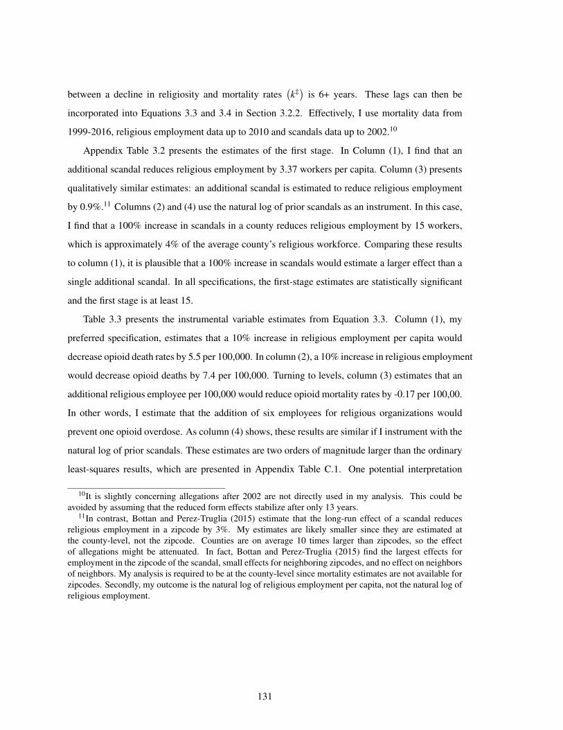
between a decline in religiosity and mortality rates(k‡)
is 6+ years. These lags can then be
incorporated into Equations 3.3 and 3.4 in Section 3.2.2. Effectively, I use mortality data from
1999-2016, religious employment data up to 2010 and scandals data up to 2002.10
Appendix Table 3.2 presents the estimates of the first stage. In Column (1), I find that an
additional scandal reduces religious employment by 3.37 workers per capita. Column (3) presents
qualitatively similar estimates: an additional scandal is estimated to reduce religious employment
by 0.9%.11 Columns (2) and (4) use the natural log of prior scandals as an instrument. In this case,
I find that a 100% increase in scandals in a county reduces religious employment by 15 workers,
which is approximately 4% of the average county’s religious workforce. Comparing these results
to column (1), it is plausible that a 100% increase in scandals would estimate a larger effect than a
single additional scandal. In all specifications, the first-stage estimates are statistically significant
and the first stage is at least 15.
Table 3.3 presents the instrumental variable estimates from Equation 3.3. Column (1), my
preferred specification, estimates that a 10% increase in religious employment per capita would
decrease opioid death rates by 5.5 per 100,000. In column (2), a 10% increase in religious employment
would decrease opioid deaths by 7.4 per 100,000. Turning to levels, column (3) estimates that an
additional religious employee per 100,000 would reduce opioid mortality rates by -0.17 per 100,00.
In other words, I estimate that the addition of six employees for religious organizations would
prevent one opioid overdose. As column (4) shows, these results are similar if I instrument with the
natural log of prior scandals. These estimates are two orders of magnitude larger than the ordinary
least-squares results, which are presented in Appendix Table C.1. One potential interpretation
10It is slightly concerning allegations after 2002 are not directly used in my analysis. This could beavoided by assuming that the reduced form effects stabilize after only 13 years.
11In contrast, Bottan and Perez-Truglia (2015) estimate that the long-run effect of a scandal reducesreligious employment in a zipcode by 3%. My estimates are likely smaller since they are estimated atthe county-level, not the zipcode. Counties are on average 10 times larger than zipcodes, so the effectof allegations might be attenuated. In fact, Bottan and Perez-Truglia (2015) find the largest effects foremployment in the zipcode of the scandal, small effects for neighboring zipcodes, and no effect on neighborsof neighbors. My analysis is required to be at the county-level since mortality estimates are not available forzipcodes. Secondly, my outcome is the natural log of religious employment per capita, not the natural log ofreligious employment.
131

is that declining religiosity is usually associated with positive changes in a community such as
increasing education or income. These contemporaneous changes would mitigate any increase in
opioid deaths associated with declining religiosity.
As shown in Figure 3.1a, the religious employment workforce has declined by about 8% since
the Catholic sex abuse scandal. This decline would be associated with an increase in opioid deaths
of about 4.4 per 100,000. To provide a sense of the magnitude, there were 40,764 opioid deaths
in the United States in 2016. If opioid deaths declined by 4.4 per 100,000, this would result in a
decrease of 14,212 deaths for the United States population. This would represent a 34% decrease
in opioid mortality.12
3.4.3 Alternate Specifications and Outcomes
The baseline estimate that a 10% increase in religious employment per capita would decrease
opioid death rates by 5.5 per 100,000 is robust to a number of alternate specifications, as shown in
Table 3.4. Column (2) presents the results without any of the demographic controls for population,
age, and race composition. This estimate is statistically significantly lower, but still large, negative,
and statistically significant. Approximately a third of all sexual abuse allegations were published
in 2002. Column (3) excludes these allegations and has very similar results as in the baseline
specification, suggesting that this watershed year is not the main driver of these results. Finally, the
baseline specification includes sex abuse allegations. Subsequent allegations might be more or less
salient than the first allegation; column (4) shows that excluding subsequent allegations makes no
substantial difference to the results.
In addition to examining the effect of religiosity on opioid deaths, Table 3.5 examines the
effect of religion on other drug, suicide and alcohol deaths. In this case, religion seems to have a
slight positive effect on these other “deaths of despair.” In other words, an increase in religiosity is
estimated to increase the mortality due to these other “deaths of despair.” One potential explanation
is opioids are pharmacologically better substitutes for oxytocin and social connections than, say,
12This calculation requires the national opioid mortality rate; the numbers in Table 3.1 are at the county-level.
132

a depressant such as alcohol. Alternately, an increase in religiosity might affect income, attitudes
toward suicide, or other intermediates. Turning towards the placebo checks in columns (3) and (4),
religion has no effect on leukemia mortality, but it does seem to cause a decrease in traffic accident
mortality. I find that a 10% increase in religion would cause a decrease of 2.4 traffic accident deaths
per 100,000 or a 10% decrease relative to a mean of 23.8 traffic deaths per 100,000. As described
in Section 3.3.1, religiosity could many aspects of daily life, including employment and thus total
hours in traffic, so finding several placebo checks is complicated.
3.4.4 Heterogeneity
Since the Catholic sex abuse scandals should disproportionately affect the religiosity of Catholic
individuals, the most Catholic counties should see the largest changes in mortality rates. Table 3.6
analyzes heterogeneity by the county’s Catholic rate in 1990, before the majority of these scandals
occurred. As expected, I find the most Catholic counties have the largest estimated effects. The
effect of religiosity on opioid death rates is twice as high in the fourth quartile Catholic counties
as in the third quartile Catholic counties. These trends are also found for other drug, suicide and
alcohol deaths and for traffic fatalities which suggests these effects are also driven by Catholic
individuals. In contrast, there are no trends by Catholic rate for leukemia mortality, as expected for
a placebo outcome.
Finally, some of these effects might be driven by direct impacts of the Catholic sex abuse
crisis. Most of the abuses occurred in the 1970s, and most victims were between the ages of 10
and 14 years of age. This suggest that they would be between 50 and 65 in the late 2010s when
most of the opioid deaths occurred. Table 3.7 analyzes heterogeneity by age, and finds that while
there is some mortality effect for those aged 50-74, the majority of the effect is driven by younger
adults. Younger adults are also the most likely age group to report becoming religiously unaffiliated
(General Social Survey, 2016) and thus might be most likely to respond to religious scandals.
133

3.5 Discussion
In 2016, there were more opioid-related fatalities than mortalities due to car crashes or of breast
cancer. Understanding this crisis and the related increases in suicide rates, alcohol disease, and
other drug overdoses is of enormous social concern. This paper provides evidence that a substantial
share of the opioid crisis can be explained by declining religiosity, precipitated by the Catholic sex
abuse scandal.
Currently, this paper is agnostic about whether the effect of religion on opioid deaths is driven
by religious values, community, or pharmacology. While some of the analysis uses religious
employment as an intermediate outcome, a substantial portion can be interpreted as effects of
shocks to religiosity, broadly defined. The differential estimates for opioid mortality compared to
other drugs, suicide, and alcohol deaths suggests that religious values regarding social vices are
not solely driving these results. However, an analysis of the effects of scandals on social ties and
community strength could help assess these mechanisms. To isolate the effect of religiosity rather
than a general decline in social ties, future analysis could contrast the effects of religious sex abuse
scandals with other sex scandals in local politics or among local teachers.
The framework in this paper could also be used to assess the impact of religiosity on various
social virtues and vices including marriage and divorce rates, tobacco use, social behavior, and a
variety of health outcomes. As religiosity undergoes an unprecedented decline in the United States,
understanding its effects on social behavior becomes increasingly relevant.
134
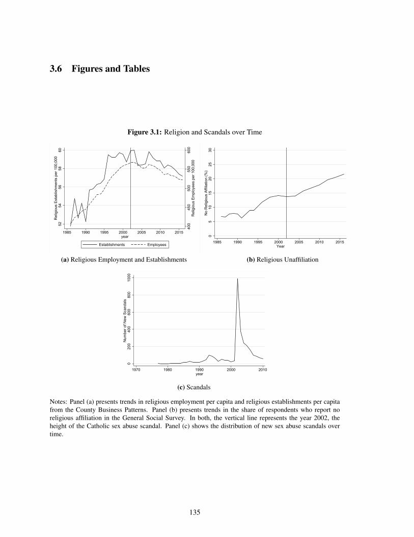
3.6 Figures and Tables
Figure 3.1: Religion and Scandals over Time
400
450
500
550
600
Rel
igio
us E
mpl
oyee
s pe
r 100
,000
5254
5658
60R
elig
ious
Est
ablis
hmen
ts p
er 1
00,0
00
1985 1990 1995 2000 2005 2010 2015year
Establishments Employees
(a) Religious Employment and Establishments
05
1015
2025
30N
o R
elig
ious
Affi
liatio
n (%
)
1985 1990 1995 2000 2005 2010 2015Year
(b) Religious Unaffiliation
020
040
060
080
010
00N
umbe
r of N
ew S
cand
als
1970 1980 1990 2000 2010year
(c) Scandals
Notes: Panel (a) presents trends in religious employment per capita and religious establishments per capitafrom the County Business Patterns. Panel (b) presents trends in the share of respondents who report noreligious affiliation in the General Social Survey. In both, the vertical line represents the year 2002, theheight of the Catholic sex abuse scandal. Panel (c) shows the distribution of new sex abuse scandals overtime.
135
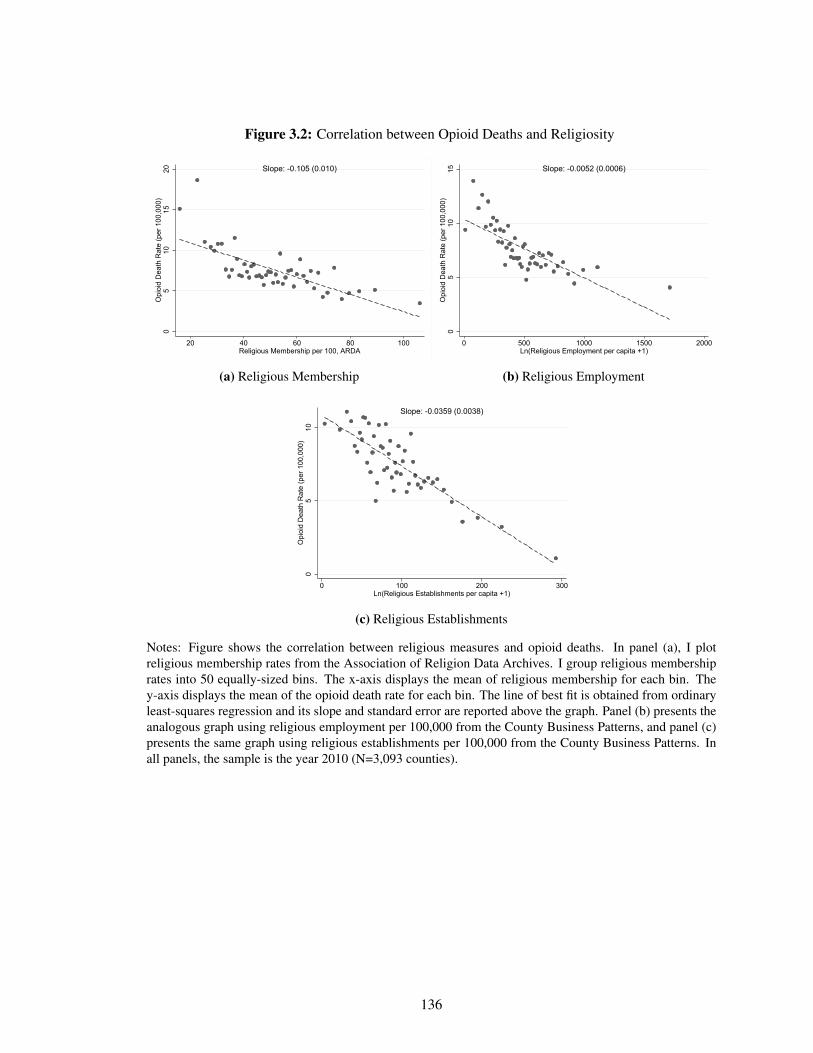
Figure 3.2: Correlation between Opioid Deaths and Religiosity
05
1015
20O
pioi
d D
eath
Rat
e (p
er 1
00,0
00)
20 40 60 80 100Religious Membership per 100, ARDA
Slope: -0.105 (0.010)
(a) Religious Membership
05
1015
Opi
oid
Dea
th R
ate
(per
100
,000
)
0 500 1000 1500 2000Ln(Religious Employment per capita +1)
Slope: -0.0052 (0.0006)
(b) Religious Employment
05
10O
pioi
d D
eath
Rat
e (p
er 1
00,0
00)
0 100 200 300Ln(Religious Establishments per capita +1)
Slope: -0.0359 (0.0038)
(c) Religious Establishments
Notes: Figure shows the correlation between religious measures and opioid deaths. In panel (a), I plotreligious membership rates from the Association of Religion Data Archives. I group religious membershiprates into 50 equally-sized bins. The x-axis displays the mean of religious membership for each bin. They-axis displays the mean of the opioid death rate for each bin. The line of best fit is obtained from ordinaryleast-squares regression and its slope and standard error are reported above the graph. Panel (b) presents theanalogous graph using religious employment per 100,000 from the County Business Patterns, and panel (c)presents the same graph using religious establishments per 100,000 from the County Business Patterns. Inall panels, the sample is the year 2010 (N=3,093 counties).
136
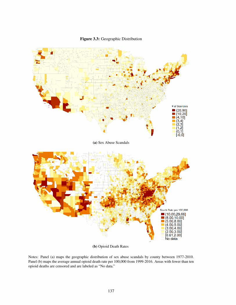
Figure 3.3: Geographic Distribution
(a) Sex Abuse Scandals
(b) Opioid Death Rates
Notes: Panel (a) maps the geographic distribution of sex abuse scandals by county between 1977-2010.Panel (b) maps the average annual opioid death rate per 100,000 from 1999-2016. Areas with fewer than tenopioid deaths are censored and are labeled as “No data.”
137
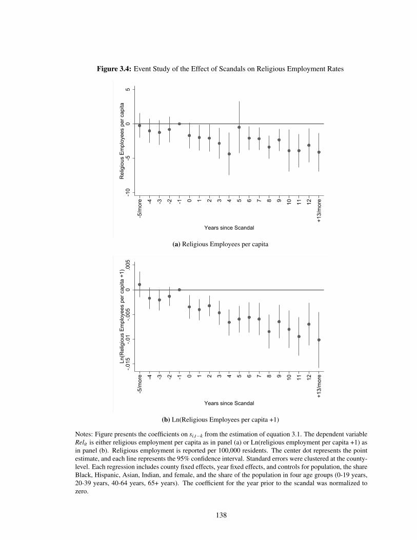
Figure 3.4: Event Study of the Effect of Scandals on Religious Employment Rates
-10
-50
5R
elig
ious
Em
ploy
ees
per c
apita
-5/m
ore -4 -3 -2 -1 0 1 2 3 4 5 6 7 8 9 10 11 12
+13/
mor
e
Years since Scandal
(a) Religious Employees per capita
-.015
-.01
-.005
0.0
05Ln
(Rel
igio
us E
mpl
oyee
s pe
r cap
ita +
1)
-5/m
ore -4 -3 -2 -1 0 1 2 3 4 5 6 7 8 9 10 11 12
+13/
mor
e
Years since Scandal
(b) Ln(Religious Employees per capita +1)
Notes: Figure presents the coefficients on si,t−k from the estimation of equation 3.1. The dependent variableRelit is either religious employment per capita as in panel (a) or Ln(religious employment per capita +1) asin panel (b). Religious employment is reported per 100,000 residents. The center dot represents the pointestimate, and each line represents the 95% confidence interval. Standard errors were clustered at the county-level. Each regression includes county fixed effects, year fixed effects, and controls for population, the shareBlack, Hispanic, Asian, Indian, and female, and the share of the population in four age groups (0-19 years,20-39 years, 40-64 years, 65+ years). The coefficient for the year prior to the scandal was normalized tozero.
138
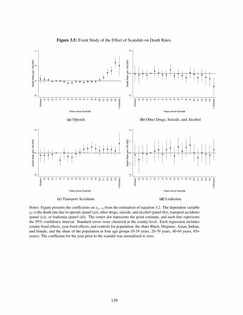
Figure 3.5: Event Study of the Effect of Scandals on Death Rates-.5
0.5
1D
eath
Rat
e (p
er 1
00,0
00)
-5/m
ore -4 -3 -2 -1 0 1 2 3 4 5 6 7 8 9 10 11 12 13 14
+15/
mor
e
Years since Scandal
(a) Opioids
-.50
.5D
eath
Rat
e (p
er 1
00,0
00)
-5/m
ore -4 -3 -2 -1 0 1 2 3 4 5 6 7 8 9 10 11 12 13 14
+15/
mor
e
Years since Scandal
(b) Other Drugs, Suicide, and Alcohol
-.50
.5D
eath
Rat
e (p
er 1
00,0
00)
-5/m
ore -4 -3 -2 -1 0 1 2 3 4 5 6 7 8 9 10 11 12 13 14
+15/
mor
e
Years since Scandal
(c) Transport Accidents
-.2-.1
0.1
.2D
eath
Rat
e (p
er 1
00,0
00)
-5/m
ore -4 -3 -2 -1 0 1 2 3 4 5 6 7 8 9 10 11 12 13 14
+15/
mor
e
Years since Scandal
(d) Leukemia
Notes: Figure presents the coefficients on si,t−k from the estimation of equation 3.2. The dependent variableyit is the death rate due to opioids (panel (a)), other drugs, suicide, and alcohol (panel (b)), transport accidents(panel (c)), or leukemia (panel (d)). The center dot represents the point estimate, and each line representsthe 95% confidence interval. Standard errors were clustered at the county-level. Each regression includescounty fixed effects, year fixed effects, and controls for population, the share Black, Hispanic, Asian, Indian,and female, and the share of the population in four age groups (0-19 years, 20-39 years, 40-64 years, 65+years). The coefficient for the year prior to the scandal was normalized to zero.
139
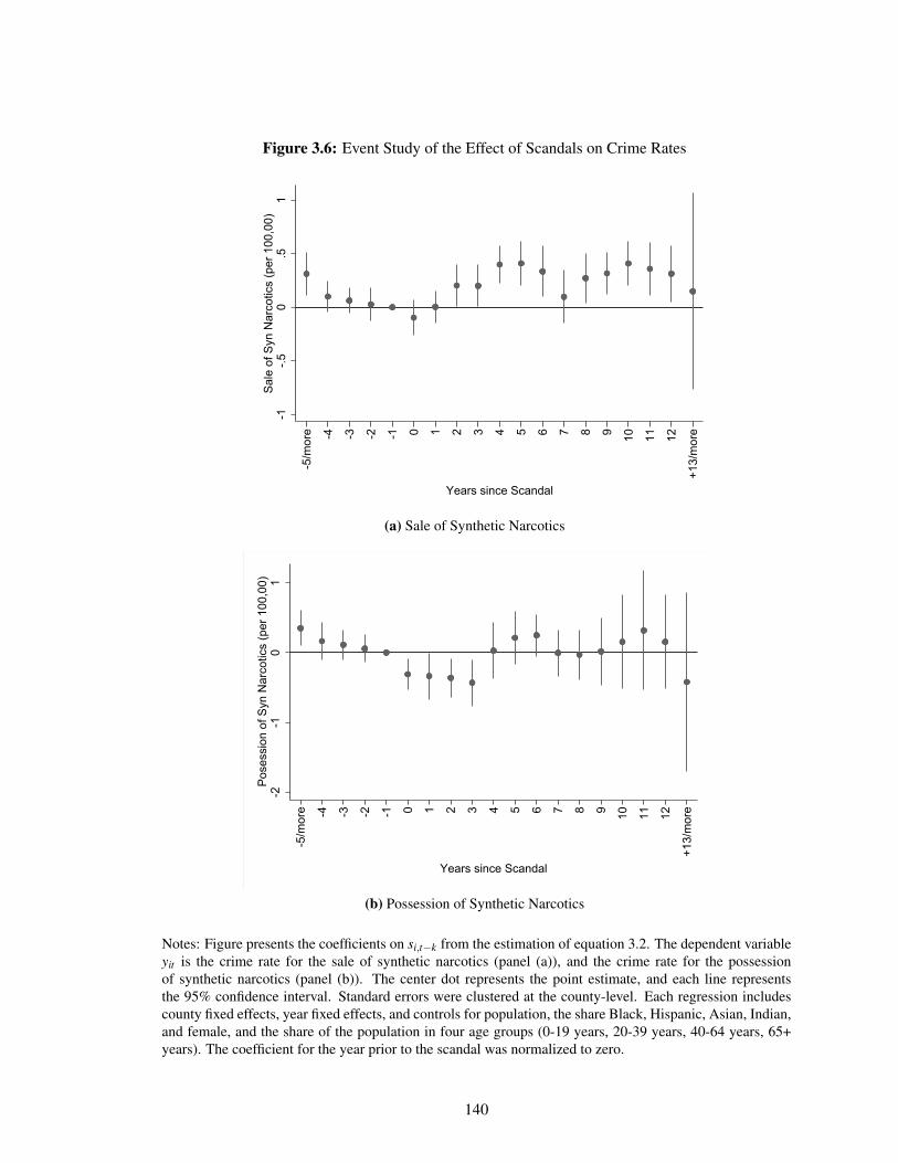
Figure 3.6: Event Study of the Effect of Scandals on Crime Rates
-1-.5
0.5
1Sa
le o
f Syn
Nar
cotic
s (p
er 1
00,0
0)
-5/m
ore -4 -3 -2 -1 0 1 2 3 4 5 6 7 8 9 10 11 12
+13/
mor
e
Years since Scandal
(a) Sale of Synthetic Narcotics
-2-1
01
Pose
ssio
n of
Syn
Nar
cotic
s (p
er 1
00,0
0)
-5/m
ore -4 -3 -2 -1 0 1 2 3 4 5 6 7 8 9 10 11 12
+13/
mor
e
Years since Scandal
(b) Possession of Synthetic Narcotics
Notes: Figure presents the coefficients on si,t−k from the estimation of equation 3.2. The dependent variableyit is the crime rate for the sale of synthetic narcotics (panel (a)), and the crime rate for the possessionof synthetic narcotics (panel (b)). The center dot represents the point estimate, and each line representsthe 95% confidence interval. Standard errors were clustered at the county-level. Each regression includescounty fixed effects, year fixed effects, and controls for population, the share Black, Hispanic, Asian, Indian,and female, and the share of the population in four age groups (0-19 years, 20-39 years, 40-64 years, 65+years). The coefficient for the year prior to the scandal was normalized to zero.
140
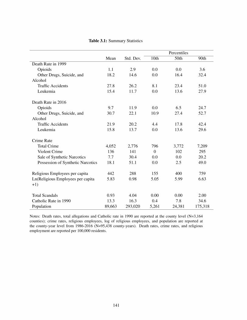
Table 3.1: Summary Statistics
PercentilesMean Std. Dev. 10th 50th 90th
Death Rate in 1999Opioids 1.1 2.9 0.0 0.0 3.6Other Drugs, Suicide, and
Alcohol18.2 14.6 0.0 16.4 32.4
Traffic Accidents 27.8 26.2 8.1 23.4 51.0Leukemia 15.4 11.7 0.0 13.6 27.9
Death Rate in 2016Opioids 9.7 11.9 0.0 6.5 24.7Other Drugs, Suicide, and
Alcohol30.7 22.1 10.9 27.4 52.7
Traffic Accidents 21.9 20.2 4.4 17.8 42.4Leukemia 15.8 13.7 0.0 13.6 29.6
Crime RateTotal Crime 4,052 2,776 796 3,772 7,209Violent Crime 136 141 0 102 295Sale of Synthetic Narcotics 7.7 30.4 0.0 0.0 20.2Possession of Synthetic Narcotics 18.1 51.1 0.0 2.5 49.0
Religious Employees per capita 442 288 155 400 759Ln(Religious Employees per capita+1)
5.83 0.98 5.05 5.99 6.63
Total Scandals 0.93 4.04 0.00 0.00 2.00Catholic Rate in 1990 13.3 16.3 0.4 7.8 34.6Population 89,663 293,020 5,261 24,381 175,318
Notes: Death rates, total allegations and Catholic rate in 1990 are reported at the county level (N=3,164counties); crime rates, religious employees, log of religious employees, and population are reported atthe county-year level from 1986-2016 (N=95,438 county-years). Death rates, crime rates, and religiousemployment are reported per 100,000 residents.
141
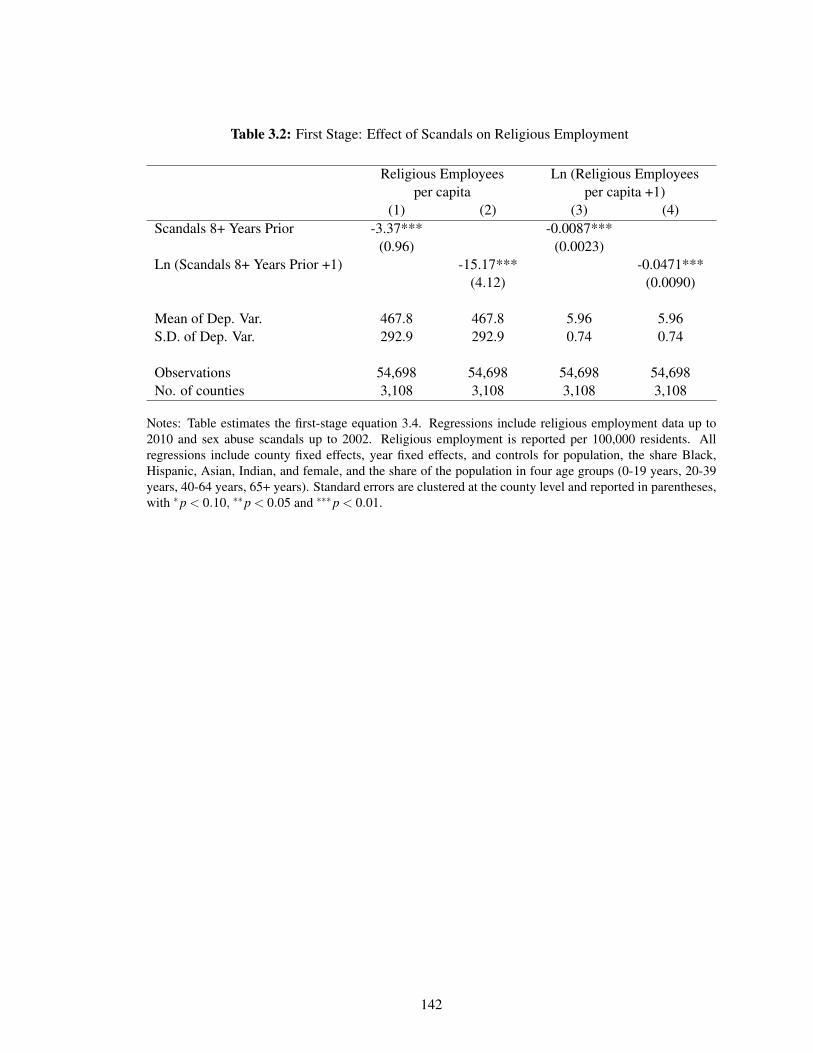
Table 3.2: First Stage: Effect of Scandals on Religious Employment
Religious Employees Ln (Religious Employeesper capita per capita +1)
(1) (2) (3) (4)Scandals 8+ Years Prior -3.37*** -0.0087***
(0.96) (0.0023)Ln (Scandals 8+ Years Prior +1) -15.17*** -0.0471***
(4.12) (0.0090)
Mean of Dep. Var. 467.8 467.8 5.96 5.96S.D. of Dep. Var. 292.9 292.9 0.74 0.74
Observations 54,698 54,698 54,698 54,698No. of counties 3,108 3,108 3,108 3,108
Notes: Table estimates the first-stage equation 3.4. Regressions include religious employment data up to2010 and sex abuse scandals up to 2002. Religious employment is reported per 100,000 residents. Allregressions include county fixed effects, year fixed effects, and controls for population, the share Black,Hispanic, Asian, Indian, and female, and the share of the population in four age groups (0-19 years, 20-39years, 40-64 years, 65+ years). Standard errors are clustered at the county level and reported in parentheses,with *p < 0.10, **p < 0.05 and ***p < 0.01.
142
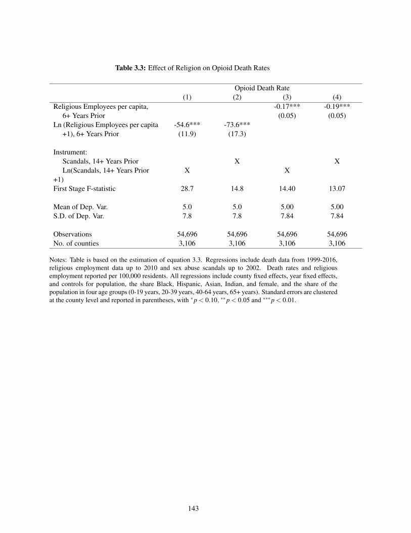
Table 3.3: Effect of Religion on Opioid Death Rates
Opioid Death Rate(1) (2) (3) (4)
Religious Employees per capita, -0.17*** -0.19***6+ Years Prior (0.05) (0.05)
Ln (Religious Employees per capita -54.6*** -73.6***+1), 6+ Years Prior (11.9) (17.3)
Instrument:Scandals, 14+ Years Prior X XLn(Scandals, 14+ Years Prior
+1)X X
First Stage F-statistic 28.7 14.8 14.40 13.07
Mean of Dep. Var. 5.0 5.0 5.00 5.00S.D. of Dep. Var. 7.8 7.8 7.84 7.84
Observations 54,696 54,696 54,696 54,696No. of counties 3,106 3,106 3,106 3,106
Notes: Table is based on the estimation of equation 3.3. Regressions include death data from 1999-2016,religious employment data up to 2010 and sex abuse scandals up to 2002. Death rates and religiousemployment reported per 100,000 residents. All regressions include county fixed effects, year fixed effects,and controls for population, the share Black, Hispanic, Asian, Indian, and female, and the share of thepopulation in four age groups (0-19 years, 20-39 years, 40-64 years, 65+ years). Standard errors are clusteredat the county level and reported in parentheses, with *p < 0.10, **p < 0.05 and ***p < 0.01.
143
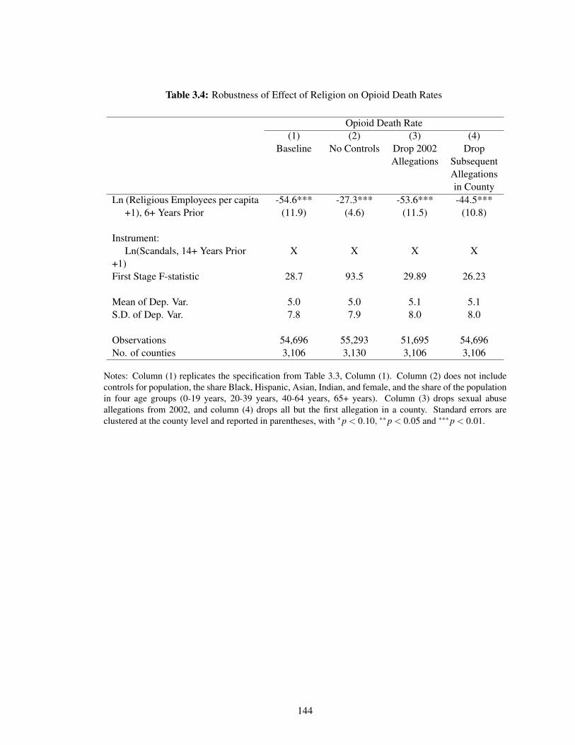
Table 3.4: Robustness of Effect of Religion on Opioid Death Rates
Opioid Death Rate(1) (2) (3) (4)
Baseline No Controls Drop 2002Allegations
DropSubsequentAllegationsin County
Ln (Religious Employees per capita -54.6*** -27.3*** -53.6*** -44.5***+1), 6+ Years Prior (11.9) (4.6) (11.5) (10.8)
Instrument:Ln(Scandals, 14+ Years Prior
+1)X X X X
First Stage F-statistic 28.7 93.5 29.89 26.23
Mean of Dep. Var. 5.0 5.0 5.1 5.1S.D. of Dep. Var. 7.8 7.9 8.0 8.0
Observations 54,696 55,293 51,695 54,696No. of counties 3,106 3,130 3,106 3,106
Notes: Column (1) replicates the specification from Table 3.3, Column (1). Column (2) does not includecontrols for population, the share Black, Hispanic, Asian, Indian, and female, and the share of the populationin four age groups (0-19 years, 20-39 years, 40-64 years, 65+ years). Column (3) drops sexual abuseallegations from 2002, and column (4) drops all but the first allegation in a county. Standard errors areclustered at the county level and reported in parentheses, with *p < 0.10, **p < 0.05 and ***p < 0.01.
144
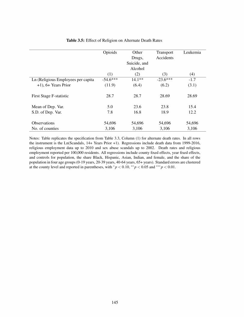
Table 3.5: Effect of Religion on Alternate Death Rates
Opioids OtherDrugs,
Suicide, andAlcohol
TransportAccidents
Leukemia
(1) (2) (3) (4)Ln (Religious Employees per capita -54.6*** 14.1** -23.6*** -1.7
+1), 6+ Years Prior (11.9) (6.4) (6.2) (3.1)
First Stage F-statistic 28.7 28.7 28.69 28.69
Mean of Dep. Var. 5.0 23.6 23.8 15.4S.D. of Dep. Var. 7.8 16.8 18.9 12.2
Observations 54,696 54,696 54,696 54,696No. of counties 3,106 3,106 3,106 3,106
Notes: Table replicates the specification from Table 3.3, Column (1) for alternate death rates. In all rowsthe instrument is the Ln(Scandals, 14+ Years Prior +1). Regressions include death data from 1999-2016,religious employment data up to 2010 and sex abuse scandals up to 2002. Death rates and religiousemployment reported per 100,000 residents. All regressions include county fixed effects, year fixed effects,and controls for population, the share Black, Hispanic, Asian, Indian, and female, and the share of thepopulation in four age groups (0-19 years, 20-39 years, 40-64 years, 65+ years). Standard errors are clusteredat the county level and reported in parentheses, with *p < 0.10, **p < 0.05 and ***p < 0.01.
145
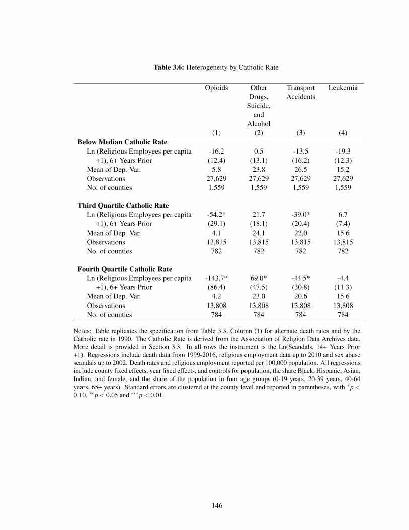
Table 3.6: Heterogeneity by Catholic Rate
Opioids OtherDrugs,
Suicide,and
Alcohol
TransportAccidents
Leukemia
(1) (2) (3) (4)Below Median Catholic Rate
Ln (Religious Employees per capita -16.2 0.5 -13.5 -19.3+1), 6+ Years Prior (12.4) (13.1) (16.2) (12.3)
Mean of Dep. Var. 5.8 23.8 26.5 15.2Observations 27,629 27,629 27,629 27,629No. of counties 1,559 1,559 1,559 1,559
Third Quartile Catholic RateLn (Religious Employees per capita -54.2* 21.7 -39.0* 6.7
+1), 6+ Years Prior (29.1) (18.1) (20.4) (7.4)Mean of Dep. Var. 4.1 24.1 22.0 15.6Observations 13,815 13,815 13,815 13,815No. of counties 782 782 782 782
Fourth Quartile Catholic RateLn (Religious Employees per capita -143.7* 69.0* -44.5* -4.4
+1), 6+ Years Prior (86.4) (47.5) (30.8) (11.3)Mean of Dep. Var. 4.2 23.0 20.6 15.6Observations 13,808 13,808 13,808 13,808No. of counties 784 784 784 784
Notes: Table replicates the specification from Table 3.3, Column (1) for alternate death rates and by theCatholic rate in 1990. The Catholic Rate is derived from the Association of Religion Data Archives data.More detail is provided in Section 3.3. In all rows the instrument is the Ln(Scandals, 14+ Years Prior+1). Regressions include death data from 1999-2016, religious employment data up to 2010 and sex abusescandals up to 2002. Death rates and religious employment reported per 100,000 population. All regressionsinclude county fixed effects, year fixed effects, and controls for population, the share Black, Hispanic, Asian,Indian, and female, and the share of the population in four age groups (0-19 years, 20-39 years, 40-64years, 65+ years). Standard errors are clustered at the county level and reported in parentheses, with *p <0.10, **p < 0.05 and ***p < 0.01.
146
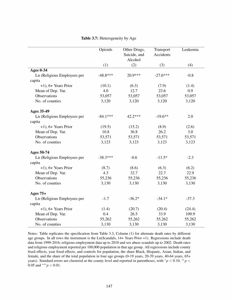
Table 3.7: Heterogeneity by Age
Opioids Other Drugs,Suicide, and
Alcohol
TransportAccidents
Leukemia
(1) (2) (3) (4)Ages 0-34
Ln (Religious Employees percapita
-48.8*** 20.9*** -27.6*** -0.8
+1), 6+ Years Prior (10.1) (6.3) (7.9) (1.4)Mean of Dep. Var. 4.0 12.7 23.6 0.9Observations 53,057 53,057 53,057 53,057No. of counties 3,120 3,120 3,120 3,120
Ages 35-49Ln (Religious Employees per
capita-84.1*** 42.2*** -19.6** 2.0
+1), 6+ Years Prior (19.5) (15.2) (8.9) (2.6)Mean of Dep. Var. 10.8 36.8 26.2 3.0Observations 53,571 53,571 53,571 53,571No. of counties 3,123 3,123 3,123 3,123
Ages 50-74Ln (Religious Employees per
capita-38.3*** -0.6 -11.5* -2.3
+1), 6+ Years Prior (8.7) (8.6) (6.3) (6.2)Mean of Dep. Var. 4.3 32.7 22.7 22.9Observations 55,236 55,236 55,236 55,236No. of counties 3,130 3,130 3,130 3,130
Ages 75+Ln (Religious Employees per
capita-1.7 -36.2* -34.1* -37.3
+1), 6+ Years Prior (1.4) (20.7) (20.4) (24.4)Mean of Dep. Var. 0.4 26.5 33.9 109.9Observations 55,262 55,262 55,262 55,262No. of counties 3,130 3,130 3,130 3,130
Notes: Table replicates the specification from Table 3.3, Column (1) for alternate death rates by differentage groups. In all rows the instrument is the Ln(Scandals, 14+ Years Prior +1). Regressions include deathdata from 1999-2016, religious employment data up to 2010 and sex abuse scandals up to 2002. Death ratesand religious employment reported per 100,000 population in that age group. All regressions include countyfixed effects, year fixed effects, and controls for population, the share Black, Hispanic, Asian, Indian, andfemale, and the share of the total population in four age groups (0-19 years, 20-39 years, 40-64 years, 65+years). Standard errors are clustered at the county level and reported in parentheses, with *p < 0.10, **p <0.05 and ***p < 0.01.
147

THIS PAGE INTENTIONALLY LEFT BLANK
148

Appendix A
Appendix for Chapter 1
A.1 Statistical Significance Calculation
In Table 1.4 columns (3), (4), (8), and (9), the outcome is an indicator for whether the drug was
statistically significantly more effective than the placebo arm or least effective arm in that paper.
The efficacy outcome—the proportion of patients that responded to treatment—was considered
statistically significant if the Z-score, computed as
Z =p1 − p2√
p(1− p)(
1n1+ 1
n2
) (A.1)
was significant at the 5% level. With an infinite sample, this Z-score cutoff was 1.64 for placebo-
controlled studies and 1.96 for head to head studies. Here p is the proportion of patients that
respond to treatment. The numeric indexing in equation A.1 refers to the first or second arm, and p
is the overall proportion for both arms. The variable n refers to the number of patients in each arm.
For schizophrenia trials, the Z-score was computed as
Z =e1 − e2√(
σ21
n1+
σ22
n2
) (A.2)
149

where e is the decline in schizophrenia score, σ is the standard deviation of this decline, and n is
the sample size in that arm.
A.2 Appendix Figures and Tables
150
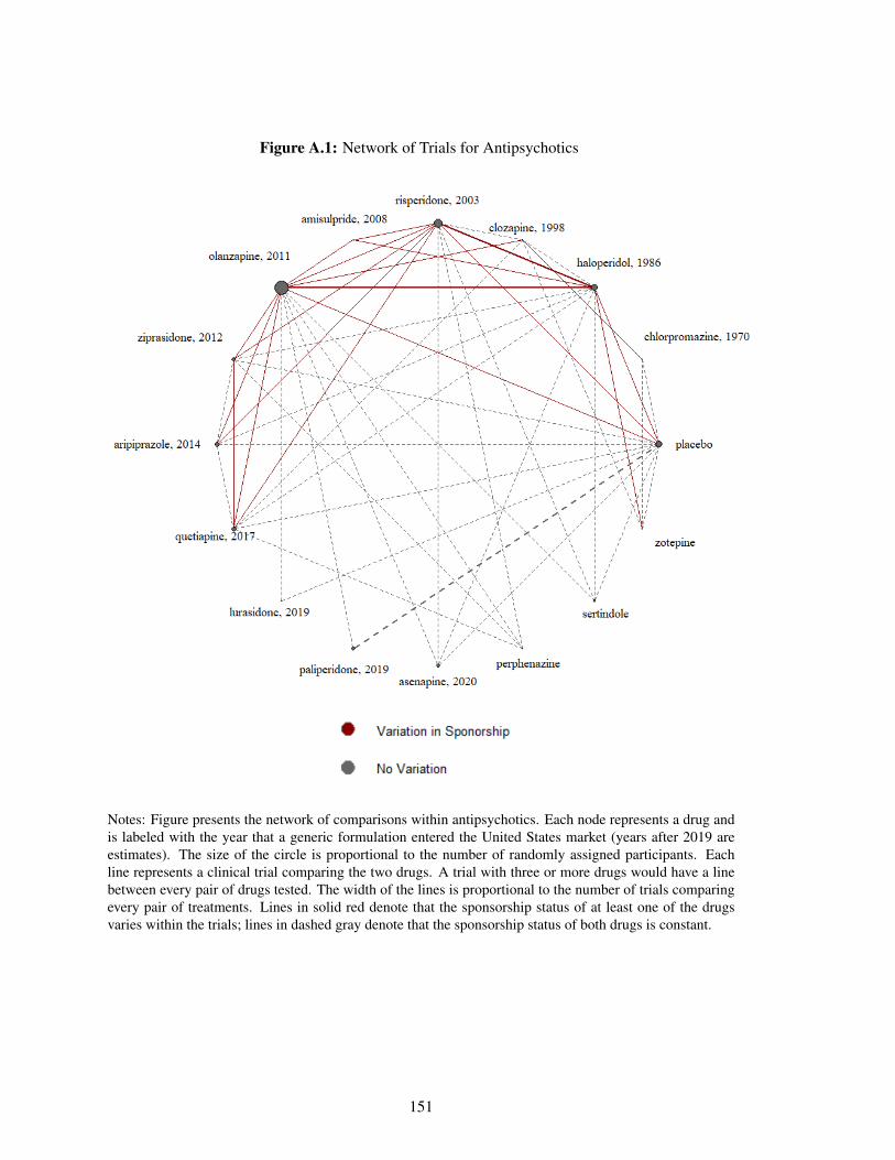
Figure A.1: Network of Trials for Antipsychotics
Notes: Figure presents the network of comparisons within antipsychotics. Each node represents a drug andis labeled with the year that a generic formulation entered the United States market (years after 2019 areestimates). The size of the circle is proportional to the number of randomly assigned participants. Eachline represents a clinical trial comparing the two drugs. A trial with three or more drugs would have a linebetween every pair of drugs tested. The width of the lines is proportional to the number of trials comparingevery pair of treatments. Lines in solid red denote that the sponsorship status of at least one of the drugsvaries within the trials; lines in dashed gray denote that the sponsorship status of both drugs is constant.
151
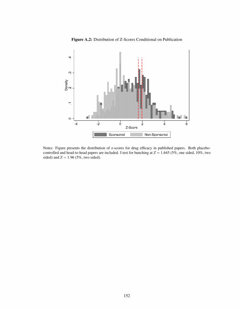
Figure A.2: Distribution of Z-Scores Conditional on Publication
Notes: Figure presents the distribution of z-scores for drug efficacy in published papers. Both placebo-controlled and head-to-head papers are included. I test for bunching at Z = 1.645 (5%, one sided, 10%, twosided) and Z = 1.96 (5%, two sided).
152
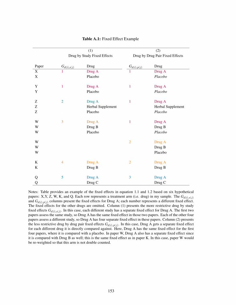
Table A.1: Fixed Effect Example
(1) (2)Drug by Study Fixed Effects Drug by Drug Pair Fixed Effects
Paper Gd(i),s( j) Drug Gd(i),p( j) DrugX 1 Drug A 1 Drug AX Placebo Placebo
Y 1 Drug A 1 Drug AY Placebo Placebo
Z 2 Drug A 1 Drug AZ Herbal Supplement Herbal SupplementZ Placebo Placebo
W 3 Drug A 1 Drug AW Drug B Drug BW Placebo Placebo
W 2 Drug AW Drug BW Placebo
K 4 Drug A 2 Drug AK Drug B Drug B
Q 5 Drug A 3 Drug AQ Drug C Drug C
Notes: Table provides an example of the fixed effects in equation 1.1 and 1.2 based on six hypotheticalpapers: X,Y, Z, W, K, and Q. Each row represents a treatment arm (i.e. drug) in my sample. The Gd(i),s( j)and Gd(i),p( j) columns present the fixed effects for Drug A; each number represents a different fixed effect.The fixed effects for the other drugs are omitted. Column (1) presents the more restrictive drug by studyfixed effects Gd(i),s( j). In this case, each different study has a separate fixed effect for Drug A. The first twopapers assess the same study, so Drug A has the same fixed effect in those two papers. Each of the other fourpapers assess a different study, so Drug A has four separate fixed effect in these papers. Column (2) presentsthe less restrictive drug by drug pair fixed effects Gd(i),p( j). In this case, Drug A gets a separate fixed effectfor each different drug it is directly compared against. Here, Drug A has the same fixed effect for the firstfour papers, where it is compared with a placebo. In paper W, Drug A also has a separate fixed effect sinceit is compared with Drug B as well; this is the same fixed effect as in paper K. In this case, paper W wouldbe re-weighted so that this arm is not double counted.
153
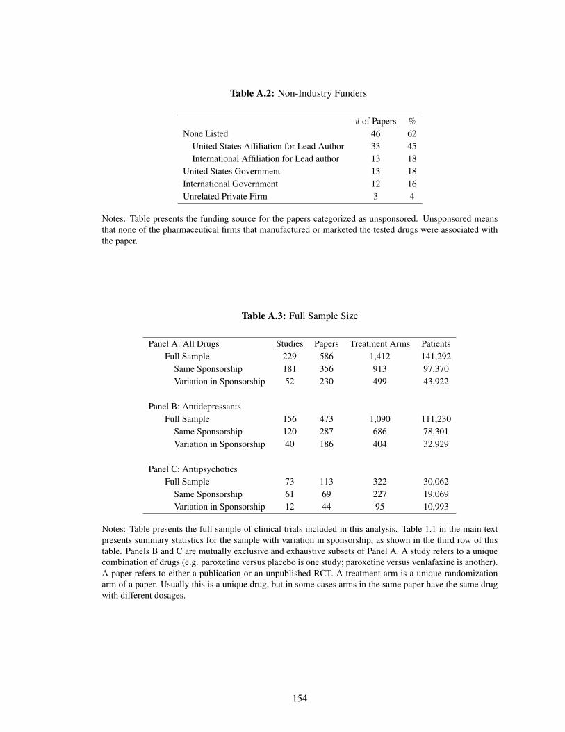
Table A.2: Non-Industry Funders
# of Papers %None Listed 46 62
United States Affiliation for Lead Author 33 45International Affiliation for Lead author 13 18
United States Government 13 18International Government 12 16Unrelated Private Firm 3 4
Notes: Table presents the funding source for the papers categorized as unsponsored. Unsponsored meansthat none of the pharmaceutical firms that manufactured or marketed the tested drugs were associated withthe paper.
Table A.3: Full Sample Size
Panel A: All Drugs Studies Papers Treatment Arms PatientsFull Sample 229 586 1,412 141,292
Same Sponsorship 181 356 913 97,370Variation in Sponsorship 52 230 499 43,922
Panel B: AntidepressantsFull Sample 156 473 1,090 111,230
Same Sponsorship 120 287 686 78,301Variation in Sponsorship 40 186 404 32,929
Panel C: AntipsychoticsFull Sample 73 113 322 30,062
Same Sponsorship 61 69 227 19,069Variation in Sponsorship 12 44 95 10,993
Notes: Table presents the full sample of clinical trials included in this analysis. Table 1.1 in the main textpresents summary statistics for the sample with variation in sponsorship, as shown in the third row of thistable. Panels B and C are mutually exclusive and exhaustive subsets of Panel A. A study refers to a uniquecombination of drugs (e.g. paroxetine versus placebo is one study; paroxetine versus venlafaxine is another).A paper refers to either a publication or an unpublished RCT. A treatment arm is a unique randomizationarm of a paper. Usually this is a unique drug, but in some cases arms in the same paper have the same drugwith different dosages.
154
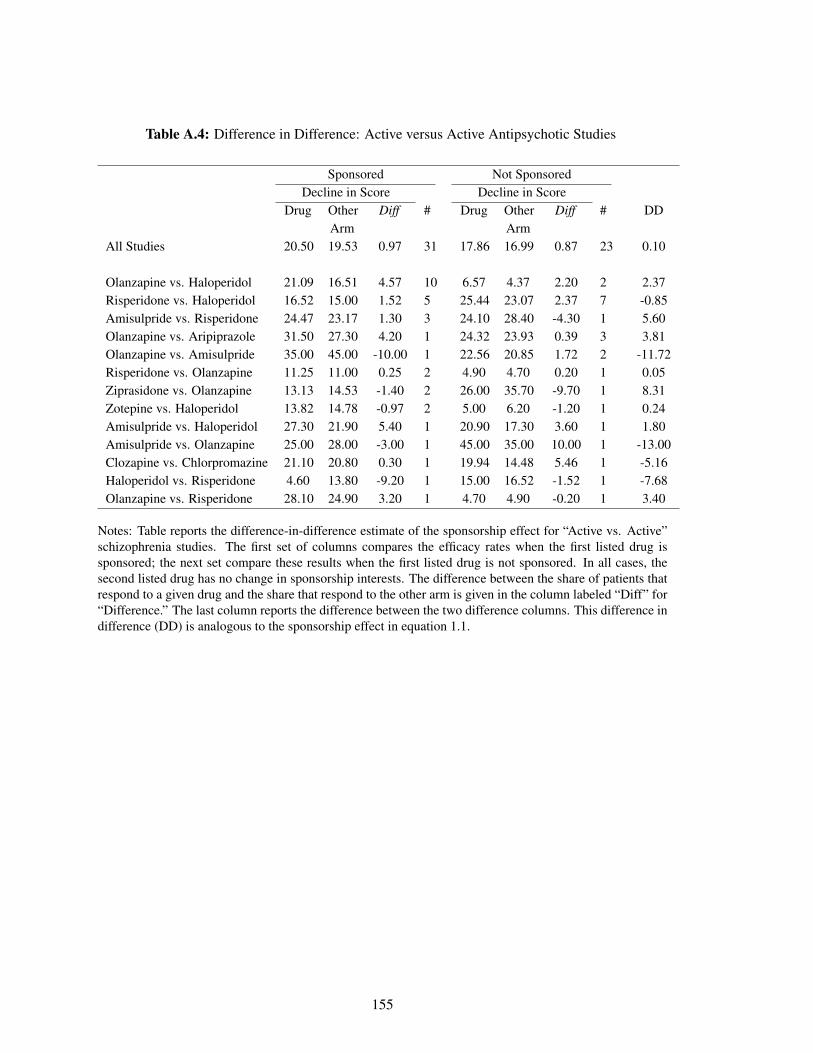
Table A.4: Difference in Difference: Active versus Active Antipsychotic Studies
Sponsored Not SponsoredDecline in Score Decline in Score
Drug OtherArm
Diff # Drug OtherArm
Diff # DD
All Studies 20.50 19.53 0.97 31 17.86 16.99 0.87 23 0.10
Olanzapine vs. Haloperidol 21.09 16.51 4.57 10 6.57 4.37 2.20 2 2.37Risperidone vs. Haloperidol 16.52 15.00 1.52 5 25.44 23.07 2.37 7 -0.85Amisulpride vs. Risperidone 24.47 23.17 1.30 3 24.10 28.40 -4.30 1 5.60Olanzapine vs. Aripiprazole 31.50 27.30 4.20 1 24.32 23.93 0.39 3 3.81Olanzapine vs. Amisulpride 35.00 45.00 -10.00 1 22.56 20.85 1.72 2 -11.72Risperidone vs. Olanzapine 11.25 11.00 0.25 2 4.90 4.70 0.20 1 0.05Ziprasidone vs. Olanzapine 13.13 14.53 -1.40 2 26.00 35.70 -9.70 1 8.31Zotepine vs. Haloperidol 13.82 14.78 -0.97 2 5.00 6.20 -1.20 1 0.24Amisulpride vs. Haloperidol 27.30 21.90 5.40 1 20.90 17.30 3.60 1 1.80Amisulpride vs. Olanzapine 25.00 28.00 -3.00 1 45.00 35.00 10.00 1 -13.00Clozapine vs. Chlorpromazine 21.10 20.80 0.30 1 19.94 14.48 5.46 1 -5.16Haloperidol vs. Risperidone 4.60 13.80 -9.20 1 15.00 16.52 -1.52 1 -7.68Olanzapine vs. Risperidone 28.10 24.90 3.20 1 4.70 4.90 -0.20 1 3.40
Notes: Table reports the difference-in-difference estimate of the sponsorship effect for “Active vs. Active”schizophrenia studies. The first set of columns compares the efficacy rates when the first listed drug issponsored; the next set compare these results when the first listed drug is not sponsored. In all cases, thesecond listed drug has no change in sponsorship interests. The difference between the share of patients thatrespond to a given drug and the share that respond to the other arm is given in the column labeled “Diff” for“Difference.” The last column reports the difference between the two difference columns. This difference indifference (DD) is analogous to the sponsorship effect in equation 1.1.
155
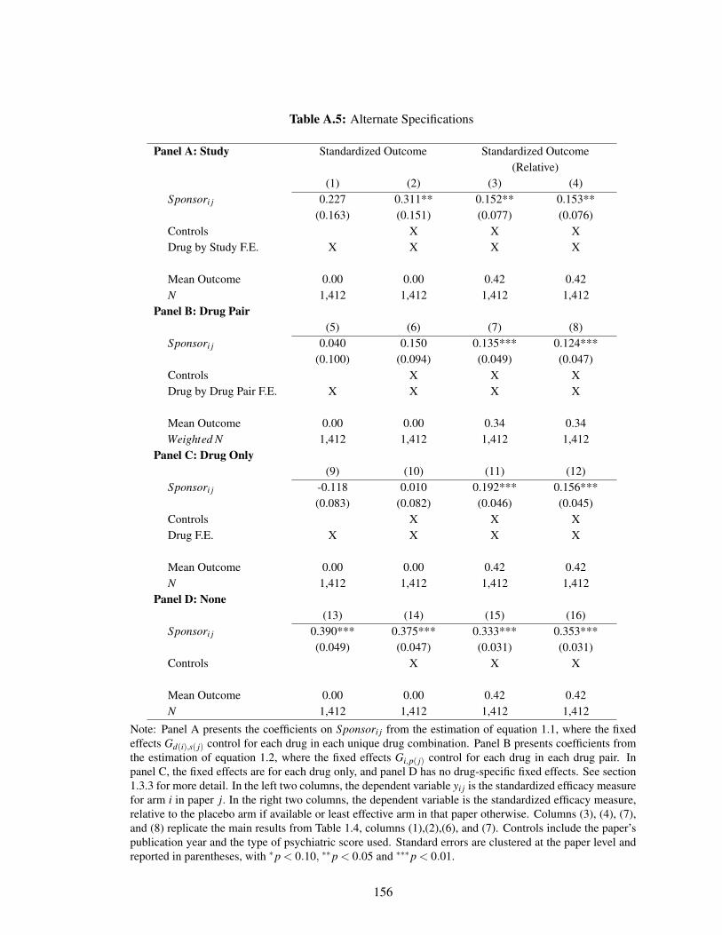
Table A.5: Alternate Specifications
Panel A: Study Standardized Outcome Standardized Outcome(Relative)
(1) (2) (3) (4)Sponsori j 0.227 0.311** 0.152** 0.153**
(0.163) (0.151) (0.077) (0.076)Controls X X XDrug by Study F.E. X X X X
Mean Outcome 0.00 0.00 0.42 0.42N 1,412 1,412 1,412 1,412
Panel B: Drug Pair(5) (6) (7) (8)
Sponsori j 0.040 0.150 0.135*** 0.124***(0.100) (0.094) (0.049) (0.047)
Controls X X XDrug by Drug Pair F.E. X X X X
Mean Outcome 0.00 0.00 0.34 0.34Weighted N 1,412 1,412 1,412 1,412
Panel C: Drug Only(9) (10) (11) (12)
Sponsori j -0.118 0.010 0.192*** 0.156***(0.083) (0.082) (0.046) (0.045)
Controls X X XDrug F.E. X X X X
Mean Outcome 0.00 0.00 0.42 0.42N 1,412 1,412 1,412 1,412
Panel D: None(13) (14) (15) (16)
Sponsori j 0.390*** 0.375*** 0.333*** 0.353***(0.049) (0.047) (0.031) (0.031)
Controls X X X
Mean Outcome 0.00 0.00 0.42 0.42N 1,412 1,412 1,412 1,412
Note: Panel A presents the coefficients on Sponsori j from the estimation of equation 1.1, where the fixedeffects Gd(i),s( j) control for each drug in each unique drug combination. Panel B presents coefficients fromthe estimation of equation 1.2, where the fixed effects Gi,p( j) control for each drug in each drug pair. Inpanel C, the fixed effects are for each drug only, and panel D has no drug-specific fixed effects. See section1.3.3 for more detail. In the left two columns, the dependent variable yi j is the standardized efficacy measurefor arm i in paper j. In the right two columns, the dependent variable is the standardized efficacy measure,relative to the placebo arm if available or least effective arm in that paper otherwise. Columns (3), (4), (7),and (8) replicate the main results from Table 1.4, columns (1),(2),(6), and (7). Controls include the paper’spublication year and the type of psychiatric score used. Standard errors are clustered at the paper level andreported in parentheses, with *p < 0.10, **p < 0.05 and ***p < 0.01.
156

Appendix B
Appendix for Chapter 2
B.1 Coding Mammograms and Outcomes in Claims Data
We follow Segel, Balkrishnan and Hirth (2017) in coding the incidence of screening mammograms
(hereafter “mammograms”) and the results of those mammograms in the HCCI claims data.
We code a woman as having a screening mammogram on a given date if she has a claim
with ICD-9 procedure code V76.12 or CPT codes 77057 or G0202 on that date, but no claims
for any other mammogram within the previous 12 months and no prior claims for breast cancer
treatment.1 Previous work has documented that claims-based measures of mammogram rates tend
to be lower than mammogram rates in self-reported survey data. For example, Freeman et al.
(2002) document this pattern in Medicare data, and Cronin et al. (2009) document similar evidence
in a study of Vermont women. Consistent with these studies, Appendix Figure B.1 documents the
age profile of the annual screening mammogram rate, as measured by both the Behavioral Risk
Factor Surveillance System (BRFSS) survey and the algorithm described above using the HCCI
claims data. Between ages 39 and 41, the mammogram rate jumps by approximately the same
1Segel, Balkrishnan and Hirth (2017) focused on data from 2003-2004, so used the CPT code 76092.In 2007 this code was replaced by 77057. In addition, Hubbard et al. (2015) identify CPT code G0202 asindicating a screening mammogram claim. Segel, Balkrishnan and Hirth (2017) provide codes for “other”(non-screening) mammograms, which we omit.
157
amount - 25 percentage points - by both measures, but the survey data describe mammogram rates
as being approximately 10 to 20 percentage points higher than the claims data rate at all ages.
Of course the samples are not perfectly comparable, as the BRFSS sample is of all women with
health insurance (public or private) from 2002-2012, while the HCCI sample is of women privately
insured by Aetna, Humana or United between 2008 and 2012.
We code the outcome of a screening mammogram as negative if there are no subsequent claims
for either follow-up testing or breast cancer treatment within the next twelve months. We code the
outcome as a false positive if there is at least one claim for follow-up testing in the following three
months (i.e. a subsequent mammogram, a breast biopsy, a breast ultrasound, or other radiologic
breast testing) in the following three months, but no claims for breast cancer treatment in the next
12 months. We code the outcome of a mammogram as true positive if, within twelve months
following the mammogram, there is at least one claim for breast cancer. We consider a women
to have a subsequent mammogram if she has a claim with ICD-9 procedure code V76.12 or CPT
codes 77057 or G0202. A women has a breast biopsy if she has a claim with ICD-9 procedure
code 85.11, 85.12, 85.20, or 85.21 or CPT codes 19100, 19101, or 19120. A breast ultrasound is
coded with ICD-9 procedure code 88.73 or CPT code 76645. Radiologic breast testing is coded
with ICD-9 procedure code 87.35, 87.36, 87.73, or 88.85 or CPT codes 76003, 77002, 76095,
77031, 76086, 76087, 76088, 77053, 77054, 76355, 76360, 76362, 77011, 77012, 77013, 76098,
76100, 76101, 76102, 76120, 76125, 76140, 76150, 76350, or 76365. Breast cancer is coded with
ICD-9 procedure code 233.0, V103.0, or 174.0 through 174.9 or CPT code 19160, 19162, 19180,
19200, 19220, 19240, 19301, 19303, 19305, 19307, 38740, or 38745.The codes used to identify
these claims are provided in Appendix Table B.1, along with their references.
The linked SEER-Medicare data allows us to cross validate this claims-based coding process
against cancer diagnoses in the cancer registry. The results are very encouraging. Appendix Tables
B.2 and B.3 describe the concordance of true positive mammograms as coded using this algorithm
with actual diagnoses as recorded in the SEER-Medicare data. For those who were diagnosed with
breast cancer and had a mammogram in the year of diagnosis, 99.8% of mammograms were coded
158
as true positive using our algorithm. Meanwhile, 93% of mammograms for patients who were never
diagnosed with breast cancer were negative, while 6.5% were false positives. Most patients with
true positive mammograms were diagnosed with breast cancer in the year of or the year following
the mammogram, while 83% of those without true positive mammograms were never diagnosed
and a further 13% were not diagnosed until more than 1 year after the mammogram (4% were
diagnosed in the year following the mammogram, but none in the year of the mammogram).
B.2 Clinical Model: The Erasmus Model
We use the Erasmus model to generate estimates of the underlying onset rate by age of cancer and
cancer type, as well as the evolution of (untreated) cancers. We adjust the model to better match
certain key moments of the SEER data. This (modified) Erasmus data, together with assumed
parameters from the mammogram decision model (specifically, equations 2.1 and 2.2) and the
observed policy recommendation (40 and above), generates an age-specific share of women who
are screened, as well as the tumor characteristics (in situ and invasive rates) conditional on getting
screened, which we then attempt to match by method of moments to the observed data on the
age-specific share of women who are screened and the tumor characteristics conditional on getting
screened.
As described in the main text, the Erasmus model is one of seven models developed for the
Cancer Intervention and Surveillance Modeling Network (CISNET) as part of a project decomposing
breast cancer mortality reductions from 1975-2000 into effects from the dissemination of mammography
versus the development of advanced treatment techniques (Clarke et al. 2006). Each of the groups
participating in the project wrote a model of breast cancer incidence and mortality in the US
over this time period and then compared the mortality rates under scenarios with and without
mammography and advanced treatment. For convenience, we focus on one of these models, the
Erasmus model (Tan et al., 2006).
In what follows we describe our implementation of the Erasmus model. This implementation
directly follows Tan et al. (2006), with all the assumptions we describe being theirs. We then
159
describe the calibration changes we make to the model based on some of our own external data and
assumptions.
B.2.1 Model Details
Tumor Incidence
The model allows us to simulate a cohort of women i, each with a year of birth bi and a year
of death from other causes di which is randomly determined and dependent on the year of birth.
Specifically, it assumes that in each year y the probability that a person born in year b (such that
y ≥ b) dies of causes other than breast cancer is Qby . A woman’s year of death is defined as the
lesser of 110 and the first year in which a random draw from a uniform distribution on [0,1] falls
below Qby . It assumes that no woman dies from other causes before age 30.
The model further assumes that there exists a probability Cb that any woman from cohort b
will get cancer before age 85. It defines age aby = y− b as the age in year y of an individual born
in year b and assumes that for every cohort b and year y such that 20 ≤ aby ≤ 85 there exists Sa,
the probability that a woman experiences tumor onset at age a conditional on eventually getting
cancer. For each woman i with any cancer, we can therefore construct the year of tumor onset ti
as the lesser of the year in which she turns 85 and the first year in which a random draw from a
uniform distribution on [0, 1] falls below Sy−bi .
Tumor Type and In Situ Characteristics
At onset, cancer type is defined to be either an invasive tumor or one of three types of non-invasive
tumors. Non-invasive tumors are also known as as ductal carcinoma in situ (DCIS), which we refer
to in the text as in situ. Invasive tumors are assigned a minimum size and other tumor characteristics
(as described in Appendix Table B.4) at onset and immediately begin growing. DCIS-regressive
tumors eventually disappear without causing any harm; DCIS-invasive tumors eventually transform
into a harmful invasive tumor but do no harm in the meantime, and DCIS-clinical tumors do no
harm but are eventually clinically detected. The model assumes that the outcome of each DCIS
160
tumor (regression, invasion, or detection) occurs wi years after onset, where wi is generated by
random draws from an exponential distribution with mean W . None of the three types of DCIS
tumors can be clinically detected during the duration of this “dwell time”, but they can be screen-
detected with a screening-year-specific probability Ey if screening occurs. The type of tumor is
defined at onset subject to age-specific probabilities Ia (invasive), Va (DCIS-invasive), Ra (DCIS-
regressive), and Ca (DCIS-clinical) such that Ia +Va +Ra +Ca = 1. Values for these and other
Erasmus parameters are given in Appendix Table B.5.
For DCIS tumors that become invasive, onset of invasive disease is defined as the moment
when the tumor size reaches the minimum value of the screening threshold diameter; this threshold
varies with the woman’s age as well as over time (to reflect improvements in screening technology).
The dwell time for DCIS tumors was calibrated in the MISCAN breast cancer model based on the
duration from onset of DCIS to the 1975 screening threshold diameter.
Invasive Tumor Characteristics
The model assumes that the fundamental characteristic of invasive tumors is their year-dependent
size syi . For all invasive tumors, it defines s0
i (the size in the year of onset) to be equal to 0.01 cm.
It assume that all invasive tumors grow exponentially. Tumor size in year y is therefore given by
s0i (1+gi)
y where gi is the individual-specific growth rate (drawn from a lognormal distribution at
tumor onset). It further assumes that diagnosis depends on tumor size and the individual’s “screen
detection diameter” rayi (drawn at the time of screening from an age- and detection-year-specific
Weibull distribution) and “clinical diagnosis diameter” ci (log normally distributed and set at tumor
onset). If the patient undergoes screening, the tumor can be detected if syi > ri. Alternatively, if
the tumor grows so large that syi > ci, the patient will certainly detect it due to the appearance of
clinical symptoms. Tumor size also determines mortality: if a patient diagnoses her tumor before
it reaches its “fatal diameter” fi (drawn at onset from a year-specific Weibull distribution), she will
receive treatment and survive, but if not, she will die regardless of treatment.
The model defines for each invasive tumor the length of time the patient will survive after the
161
tumor reaches its fatal diameter, called the “survival duration since fatal diameter” and denoted ui
(log normally distributed). It assumes that if the tumor has not been clinically detected by the time
0.9*ui years have passed since the fatal diameter was reached, it will be clinically detected due to
distant metastases at that time.
Finally, it assumes that the growth rate gi, clinical diagnosis diameter ci, and survival duration
ui are correlated with coefficients ρgc, ρgu, and ρcu. The variables described in this section (syi ,r
ayi , fi
gi,ci,ui) , combined with the woman’s age and the year of initiation, fully specify the course of the
disease for an invasive tumor, subject to potential screening regimens.
B.2.2 Parameterizing the Erasmus Model
We begin by choosing certain population-specific parameters required as inputs for the Erasmus
model: the other-cause death probability, the overall tumor incidence, and the tumor incidence by
age. As in Tan et al. (2006), the other-cause death probability follows the approach of Rosenberg
(2006). However, we adjusted the tumor incidence parameters (overall cohort incidence and
quadratic incidence by age) that are given in Tan et al. (2006) in order to match the SEER data’s
share of diagnoses that are in situ and invasive for those under 40 and over 40. After establishing
these population-specific parameters, we simulate individual life histories under a no-screening
assumption, and use the tumor sizes and types to determine the population cancer rate by age.
Other-cause Death Probability
Following Rosenberg (2006), we computed probability of death due to other causes as the difference
between the all-cause mortality and breast cancer specific mortality. We obtained all-cause mortality
for ages 0-110 and years 1933-2010 from the Human Mortality Database. Using breast cancer
death totals from the National Center for Health Statistics and female population totals from the
Human Mortality Database, we calculated breast-cancer-specific mortality for ages 0-110 and years
1959-2010. To impute values for previous years, we assumed that the age-specific breast cancer
mortality rate in any year before 1958 was equal to the rate in 1958. We combined these data to
162
calculate non-breast-cancer mortality rates for all years between 1933 and 2010.
Age Profile of Cancer Incidence
The Erasmus model provided a CDF of tumor incidence in 5-year increments, implying a step
function of yearly incidence that produces spikes in tumor onset within a cohort every 5 years (see
Appendix Table B.6, first column reproduced from Tan et al. (2006), based on estimates of US
population in 1975). We constructed a smoothed CDF of tumor incidence by fitting to the Erasmus
CDF using a constrained polynomial (quadratic) fit: y = ax2+bx+c. We fitted a,b,c, the start age
xstart (at which the CDF should be zero), and the end age xend (at which the CDF should be one).
Restrictions included:
ax2start +bxstart + c = 0
ax2end +bxend + c = 1
2axstart +b ≥ 0
The values that minimize the error ∑(y− y)2 across each of the fourteen ages in Appendix
Table B.6 are xstart = 24, xend = 85, a = 0.000268, b = −0.01282, c = 0.15327. We assume that
the incidence before age 24 is 0. The fit is shown in Appendix Figure B.5.
Adjusting Cancer Incidence Rates
Tan et al. (2006) calculate cumulative tumor incidence by birth cohort based on observed (i.e.
diagnosed) incidence in the US from 1975-1979. Implicitly, this assumes that all tumors are
diagnosed. It will therefore miss any undiagnosed tumors. Not surprisingly, therefore, when
we use the original Erasmus parameters and our calibrated screening policy described below, the
model substantially under-predicts observed diagnoses. To rectify this, we allowed the cohort
163
tumor incidence to vary with a multiplicative shift α which uniformly affects each cohort’s tumor
incidence.
We calibrate α as follows. We define the parameters θ = (α, pscrninv, pscrndcis) where pscrninv
is the probability of a mammogram conditional on having an invasive tumor and pscrninsitu is
the probability of a mammogram conditional on having an in situ tumor. We then estimate θ by
maximum likelihood. Specifically, we maximize the log likelihood of observing SEER tumor types
(1973-2013, for women 25-34). The model’s original incidence and the incidence multiplicatively
shifted by α are plotted against the SEER diagnosis rates in Appendix Figure B.6. We also plot the
model’s diagnosis rates with no screening; with the multiplicative shift this roughly matches with
the SEER diagnosis levels.
B.2.3 Visual Representation and Results from Erasmus Model: Underlying Cancer
Rate
The first panel of Appendix Figure B.7 visualizes the Erasmus model using a flow chart. The
second panel shows example sequences of progression for each of the four types of tumors, in the
absence of screening. The first two rows show the progress of DCIS-regressive and DCIS-clinical
tumors, which are harmless and differ only in their behaviors at the end of their dwell time: DCIS-
regressive tumors disappear, while DCIS-clinical tumors are detected clinically, for example at a
routine physical exam. If these tumors are screened, they will be diagnosed with a probability
equal to the “sensitivity” as described in Appendix Table B.5. Likewise, before it switches to its
invasive phase, the DCIS-invasive tumor can also be detected by a screening mammogram in the
same way. After it becomes invasive, the DCIS-invasive tumor (row 3) and the invasive tumor (row
4) can only be detected if the size exceeds the year- and age-specific screening diameter of the year
in which it is screened. If a woman’s tumor is screened (or clinically diagnosed) before it reaches
the fatal diameter, her life is saved, but if not, she will eventually die, regardless of detection or
treatment in later years. In most cases, when a woman’s tumor reaches the fatal diameter without
being diagnosed, she will be clinically diagnosed before death. The flow chart omits deaths due to
164
other causes.
Appendix Figure B.8 plots the share of women in each of five categories when the Erasmus
model is calculated with no screening. The calculation is based on birth cohorts from 1950-1975,
and focuses on women aged 30-50 in 2000-2005. At any given age, the share of women with
detectable invasive or DCIS cancer is substantially smaller than the share of women who have
already been diagnosed clinically, indicating that there is a small window of time during which a
cancer can be screened before it is clinically detected.
Using the calibrated other-cause death probabilities and incidence rates, we solve the Erasmus
model assuming that there is no screening for birth years 1950-1975. We restrict to years 2000-
2005 and ages 30-50, producing a set of individual life-histories that can be categorized in every
year as dead due to breast cancer, dead due to other causes, clinically diagnosed, currently undiagnosed
invasive cancer, currently undiagnosed DCIS, or no cancer. (We consider invasive cancer that is
too small to be detectable, and regressed DCIS tumors, to be the same as “no cancer.”)
We take the “population cancer rate” at each age, or the share of women who have a tumor
by a certain age, from the Erasmus model. The Erasmus model assumes that cancers can only
be detected by mammogram once they have reached a certain size, so we assume the screening
diameter is 1.09 cm – the average screen-detectable size in the Erasmus model – and count the
share of women with detectable invasive cancer as the share of women with tumors above that size
in the Erasmus model. We also count 80% of the women with DCIS tumors, under the assumption
in the Erasmus model that about 80% of technically “detectable” in situ tumors will be detected
in any given year. We do not count DCIS-regressive tumors after they have regressed, and after a
DCIS-invasive tumor has transitioned to an invasive tumor we determine its detectability based on
the rules for invasive cancers.2
2Note that this leads to an unintuitive model behavior in which DCIS tumors are detectable at smallersizes than invasive tumors. In the Erasmus model, invasive tumors are initialized at 0.01 mm and are notconsidered screen-detectable (by us) until they reach 1.09 cm. DCIS-invasive tumors are initialized at thescreening threshold of the year and age in which they become invasive. Since this is sometimes smaller than1.09 (1.09 is just the average of the distribution of screening thresholds in 2010), the model could simulatea DCIS-invasive tumor which is detectable for several years, then becomes undetectable, then becomesdetectable again.
165

B.3 Estimation of Mammogram Model
We estimate our model of mammogram demand by method of moments. The moments are generated
from the Erasmus model combined with our model of screening decisions. We first use the
Erasmus model to generate cancer incidence and tumor growth under a no-screening assumption,
as described above. Specifically, we simulate a panel of ten million women born between 1910 and
1974. We start at age 20 and model cancer incidence and tumor growth using the Erasmus model,
assuming no screening. We use the tumor sizes and types to determine the population cancer rate
by age.
Then, for a given set of parameters αo,γo,δ o,αr,γr,δ r, we apply the mammogram decision
model (by age and recommendation status) to the cancer rate age profile from the Erasmus model
to generate the main moments by age.
Although the model is static, it does have a dynamic element in it, as we calculate the model-
generated moments only for the women who were not diagnosed with cancer in previous years, or
those who did not die (from breast cancer or other causes) prior to the given age. To do this, we must
make an assumption about what fraction of clinically-diagnosed women under the no-screening
assumption overlap with the screen-diagnosed population when the mammogram decision model
is applied. One extreme would be to assume that there is no overlap (perfect negative correlation
between clinical and screen diagnosis), so that if 0.01 of the population were clinically-diagnosed
under the no-screening assumption, and 0.02 of the population were screen-diagnosed for a given
set of parameters, a total of 0.03 of the women would be diagnosed with cancer. We chose to
make the other assumption, that there was perfect positive correlation between clinical and screen
diagnosis. In this case, if 0.01 of the population were clinically-diagnosed and 0.02 were screen-
diagnosed, only 0.02 of the women would be diagnosed with cancer. This likely produces an
underestimate of the effects of screening, because it minimizes the number of women who are
diagnosed each year.
With this simulated population of women, an assumed value of parameters associated with
the mammogram decisions with and without recommendation (equations 2.1 and 2.2) and the
166
observed policy recommendation (40 and above), the model generates an age-specific share of
women who are screened, and the tumor characteristics (in situ and invasive rates), conditional on
getting screened.
As mentioned in the main text (footnote 13), the in situ rate moment differs from Figure 2.3 in
the main text. Figure 2.3 shows the in situ rate of all diagnosed cancers that appear in the SEER
database, but the moment we match with the model is the in situ rate of screen-detected cancers.
Cancers that are clinically diagnosed are highly unlikely to be in situ, so the SEER value likely
underestimates the true value of share in situ for screening mammogram-diagnosed cancers. We
adjust the SEER moment at each age using Bayes’ rule:
P(M)*P(insitu|M)+(1−P(M))*P(insitu| ∼ M) = P(insitu),
where M is the event that a diagnosed tumor was screen-detected. We assume that P(M), the
share of diagnoses detected by screening mammogram, is 0.2 for ages 35-39 and 0.34 for ages 40-
49 (following Roth et al. (2011)). We assume that P(insitu| ∼ M) = 0.08, following Ernster et al.
(2002). P(insitu) is given by the SEER moments in Figure 2.3, allowing us to back out P(insitu|M),
our object of interest, which is the moment we actually match. The results for P(insitu|M) for ages
40-49 range from 52% to 55%, which is in line with the 56% reported in this age group by Ernster
et al. (2002).
With our 48 moments in hand (16 moments for each of 3 types), we then search for the
parameters that minimize the (weighted) distance between these generated moments and the observed
moments. We apply a linear weight that decreases on each side of age 40, so that the weight on
moments associated with ages 39 and 41 is 10/11 of the weight on the age 40 moment, the weight
on moments associated with ages 38 and 42 is 9/11 of the weight on the age 40 moment, and so on.
To achieve a reasonable fit, we also weight the moments by the inverse of their standard deviation.
167

We chose 2,000 random starting values in the parameter space defined as follows:
αo ∈ [−10,10],γo ∈ [−0.2,0.2],δ o
insitu ∈ [−2,2], δoinvasive ∈ [−2,2]
αr ∈ [−2,2],γr ∈ [−0.2,0.2],δ r
insitu ∈ [−2,2],δ rinvasive ∈ [−2,2]
and applied the Nelder-Mead algorithm to each of these starting vectors. We then iteratively applied
the Nelder-Mead algorithm to the best starting value to further minimize the objective function.
B.4 Counterfactual Simulations of Mammogram Model
Our counterfactuals analyze the impact of changing the recommendation age as well as the selection
response. In both cases, we first model the underlying onset rate of cancer and the evolution of
cancers using the Erasmus model described in Section 2.4.2 and Appendix B.2. Since we are
interested in analyzing the impact of potential future recommendation changes, we apply the most
recent year’s value of any time-varying parameters of the Erasmus model. In practice, this means
we use the breast-cancer-specific and non-breast-cancer mortality for 2010, the scale parameter for
fatal diameter βyF from 1975 (see Appendix Table B.5), the screening sensitivity Ey from 2000, the
screening diameter scale parameters from 2000 (see Appendix Table B.7), and the tumor incidence
for the 1970 cohort (see Appendix Table B.8). We simulate this model for 10 million women’s life
histories, and in particular from ages 35-50.
We then apply the screening decision as described in Section 2.4.2 for each women and year.
The baseline model uses the parameter values given in Table 2.2, with the recommendation applied
starting at age 40. We change the age of the recommendation in Table 2.3 and the selection
parameters δ r in Table 2.4.
In all counterfactuals that retain the age-40 recommendation (i.e. the ones that aim to isolate a
counterfactual selection responses), we specify that the age-specific mammogram rates must be the
same as in the baseline specification, while the type of women who respond to the recommendation
is allowed to change. This allows the counterfactuals to consider only differences in selection, not
168
levels. After imposing the counterfactual selection coefficients, we add an age-specific constant so
that the age-specific mammogram rates are unchanged relative to the baseline. In all counterfactuals
that both use the age-45 recommendation (i.e. the ones that consider a counterfactual policy
recommendation) and impose alternative selection patterns, we make a similar adjustment so that
the age-specific mammogram rates match those produced by the age-45 counterfactual with the
baseline estimated selection parameters. The screening decisions along with underlying natural
history in the Erasmus model determine whether a given mammogram screen results in a negative
test, a false positive, or true positive based on the cancer type of the screened woman.
The Erasmus model parameters also reveal whether a mammogram detects a cancer early
enough to prevent breast-cancer-related morality. If an invasive tumor is detected before it reaches
the fatal diameter (see Appendix Table B.5 on Erasmus parameters), the person survives to die of
natural causes. If the invasive tumor is detected after the tumor is larger than the fatal diameter,
the person dies of breast cancer after some stochastic period determined by survival duration
parameters (see Appendix Table B.5 on Erasmus parameters). Breast cancer related mortality is
driven by invasive tumors; in situ tumors are only fatal if they progress to an invasive tumor.
To estimate total spending under different counterfactuals, we first calculated in the HCCI
data, the total age-specific spending in the twelve months following no mammogram, a negative
mammogram, a false positive mammogram, and a true positive mammogram. At each age, each
simulated woman falls into one of these categories. We add up the spending for a given woman
across ages 35-50 based on her relevant mammogram outcomes in each year. For example, suppose
a woman had a true positive mammogram at age 42, and no mammograms at any other age. We
would add the average spending in the HCCI data for women with no mammograms for ages 35-
41, the average spending for a woman in the twelve months following a true positive mammogram
at age 42, and the average spending for women with no mammograms at ages 43-50. Note that the
screening decision only applies to women who are alive and have never been diagnosed with breast
cancer; once a women receives a true positive diagnosis she is not longer screened.
169
B.5 Sensitivity Analysis
We explore the robustness of our estimates to changing features of our clinical model. In particular,
we focus on statistics that can be compared with other sources, such as the share of in-situ tumors
that become invasive, and the share of tumors that are non-malignant.
Two specifications test sensitivity to decreasing the share of in-situ tumors that become invasive.
The Erasmus model assumes that 62.5% of in-situ tumors will become invasive, while estimates
for the fraction of DCIS tumors that would become invasive over 10 years if left untreated ranges
from 14-60% (Burstein et al., 2004), putting the Erasmus model at the most conservative end of
the spectrum. Alternate estimates suggest that the share of DCIS-tumors that become invasive is
14% (Eusebi et al., 1994) or 28% (Page et al., 1995). In these checks, we also shift the tumor
type distribution to match these estimates at age 40. This sensitivity proportionally reduces the
share of DCIS-invasive tumors at all ages, and proportionally increases the share of tumors that are
DCIS-regressive and DCIS-clinical at all ages. The share of invasive tumors remains the same.
Similarly, two specifications test sensitivity to increasing the share of non-malignant tumors.
Non-malignant refers to tumors that have no potential to be invasive and therefore would never
result in a breast cancer mortality. Specifically, in our natural history model, recall that there are
invasive tumors as well as three types of non-invasive tumors (also known as DCIS or in situ):
DCIS-regressive, DCIS-clinical and DCIS-invasive. The invasive and DCIS-invasive tumors are
referred to as “malignant” due to their potential to cause harm, while the DCIS-regressive and
DCIS-clinical tumors will never become invasive and are therefore referred to as “non-malignant”.
The Erasmus model’s parameters (see Appendix Table B.9) imply that 3-9% of all tumors are
non-malignant.3 In contrast, estimates of over-diagnosis, or the diagnosis of a cancer that would
not harm a woman in her lifetime, vary from <5% to >30% (American Cancer Society, 2017a).
Compared to other models, the Erasmus model seems to have a low estimate of non-malignancy,
or equivalently a high estimate of the share of cancer that is invasive or could become invasive.
3The share of cancer that is in situ of any kind (DCIS-clinical, DCIS-regressive, or DCIS-invasive) withno screening is approximately 15% at age 35 and 9% at age 50 (see Appendix Figure B.4). The age gradientis because some of the DCIS invasive becomes invasive and some of the DCIS regressive regresses.
170
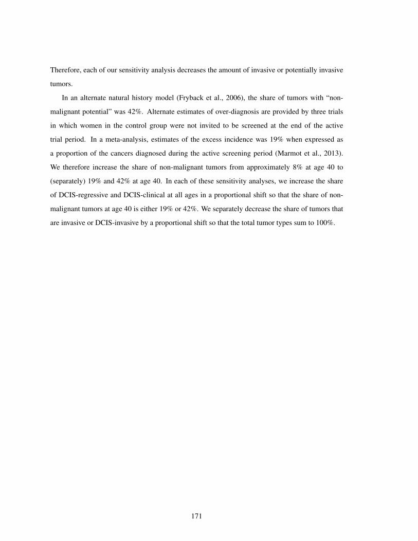
Therefore, each of our sensitivity analysis decreases the amount of invasive or potentially invasive
tumors.
In an alternate natural history model (Fryback et al., 2006), the share of tumors with “non-
malignant potential” was 42%. Alternate estimates of over-diagnosis are provided by three trials
in which women in the control group were not invited to be screened at the end of the active
trial period. In a meta-analysis, estimates of the excess incidence was 19% when expressed as
a proportion of the cancers diagnosed during the active screening period (Marmot et al., 2013).
We therefore increase the share of non-malignant tumors from approximately 8% at age 40 to
(separately) 19% and 42% at age 40. In each of these sensitivity analyses, we increase the share
of DCIS-regressive and DCIS-clinical at all ages in a proportional shift so that the share of non-
malignant tumors at age 40 is either 19% or 42%. We separately decrease the share of tumors that
are invasive or DCIS-invasive by a proportional shift so that the total tumor types sum to 100%.
171
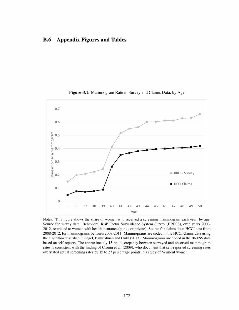
B.6 Appendix Figures and Tables
Figure B.1: Mammogram Rate in Survey and Claims Data, by Age
0
0.1
0.2
0.3
0.4
0.5
0.6
0.7
35 36 37 38 39 40 41 42 43 44 45 46 47 48 49 50
Share who
had
a m
ammog
ram
Age
BRFSS Survey
HCCI Claims
Notes: This figure shows the share of women who received a screening mammogram each year, by age.Source for survey data: Behavioral Risk Factor Surveillance System Survey (BRFSS), even years 2000-2012, restricted to women with health insurance (public or private). Source for claims data: HCCI data from2008-2012, for mammograms between 2009-2011. Mammograms are coded in the HCCI claims data usingthe algorithm described in Segel, Balkrishnan and Hirth (2017). Mammograms are coded in the BRFSS databased on self-reports. The approximately 15-ppt discrepancy between surveyed and observed mammogramrates is consistent with the finding of Cronin et al. (2009), who document that self-reported screening ratesoverstated actual screening rates by 15 to 27 percentage points in a study of Vermont women.
172
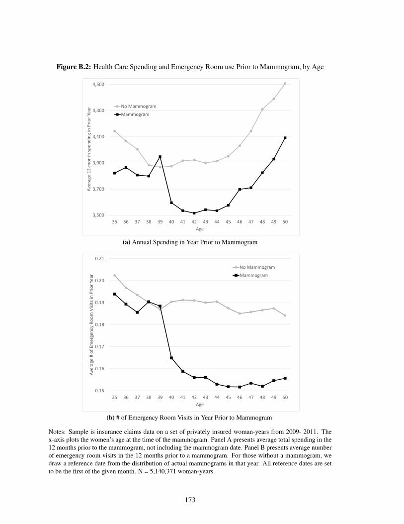
Figure B.2: Health Care Spending and Emergency Room use Prior to Mammogram, by Age
3,500
3,700
3,900
4,100
4,300
4,500
35 36 37 38 39 40 41 42 43 44 45 46 47 48 49 50
Average 12
‐mon
th sp
ending
in Prio
r Year
Age
No Mammogram
Mammogram
(a) Annual Spending in Year Prior to Mammogram
0.15
0.16
0.17
0.18
0.19
0.20
0.21
35 36 37 38 39 40 41 42 43 44 45 46 47 48 49 50
Average # of Emergency Ro
om Visits in
Prio
r Yea
r
Age
No Mammogram
Mammogram
(b) # of Emergency Room Visits in Year Prior to Mammogram
Notes: Sample is insurance claims data on a set of privately insured woman-years from 2009- 2011. Thex-axis plots the women’s age at the time of the mammogram. Panel A presents average total spending in the12 months prior to the mammogram, not including the mammogram date. Panel B presents average numberof emergency room visits in the 12 months prior to a mammogram. For those without a mammogram, wedraw a reference date from the distribution of actual mammograms in that year. All reference dates are setto be the first of the given month. N = 5,140,371 woman-years.
173
Figure B.3: Preventive Care Prior to Mammogram by Age
0.3
0.4
0.5
0.6
0.7
0.8
0.9
35 36 37 38 39 40 41 42 43 44 45 46 47 48 49 50
Any Pa
p Test in
Prio
r Year
Age
No Mammogram
Mammogram
(a) Any Pap Test in Year Prior to Mammogram
0.08
0.09
0.10
0.11
0.12
0.13
0.14
0.15
35 36 37 38 39 40 41 42 43 44 45 46 47 48 49 50
Any Flu Sh
ot in
Prio
r Year
Age
No Mammogram
Mammogram
(b) Any Flu Shot in Year Prior to Mammogram
Notes: Sample is insurance claims data on a set of privately insured woman-years from 2009- 2011. Inpanel A, for each age at the time of the mammogram, we report the average share of women who obtaineda pap test in the 12 months prior to the mammogram. We do not include tests done on the day of themammogram. Panel B presents the analogous results for any flu shot. For those without a mammogram, wedraw a reference date from the distribution of actual mammograms in that year. All reference dates are setto be the first of the given month. Spending is measured in the 12 months prior to this reference date. N =5,140,371 woman-years.
174
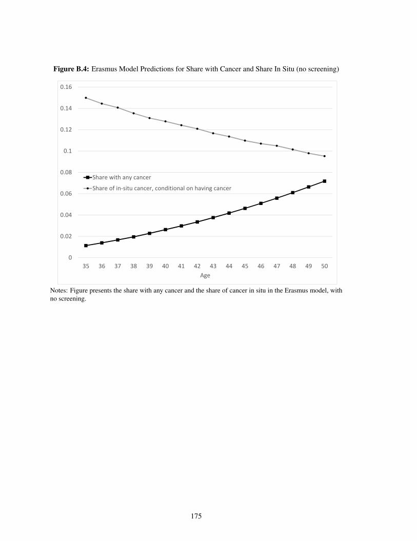
Figure B.4: Erasmus Model Predictions for Share with Cancer and Share In Situ (no screening)
0
0.02
0.04
0.06
0.08
0.1
0.12
0.14
0.16
35 36 37 38 39 40 41 42 43 44 45 46 47 48 49 50Age
Share with any cancer
Share of in‐situ cancer, conditional on having cancer
Notes: Figure presents the share with any cancer and the share of cancer in situ in the Erasmus model, withno screening.
175
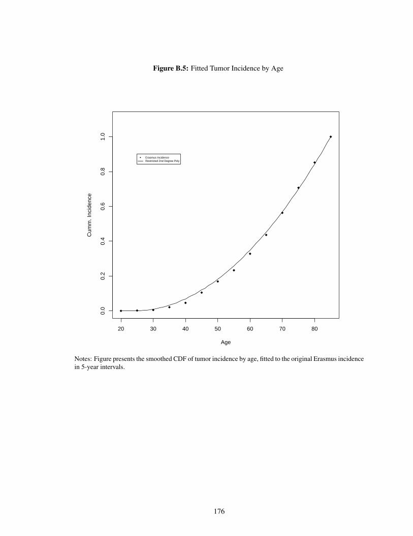
Figure B.5: Fitted Tumor Incidence by Age
20 30 40 50 60 70 80
0.0
0.2
0.4
0.6
0.8
1.0
Age
Cum
m. I
ncid
ence
Erasmus IncidenceRestricted 2nd Degree Poly
Notes: Figure presents the smoothed CDF of tumor incidence by age, fitted to the original Erasmus incidencein 5-year intervals.
176
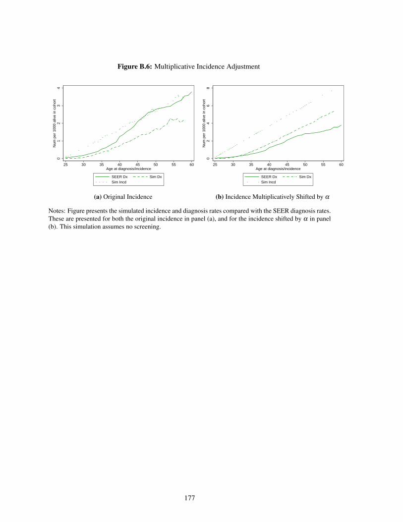
Figure B.6: Multiplicative Incidence Adjustment0
12
34
Num
per
100
0 al
ive
in c
ohor
t
25 30 35 40 45 50 55 60Age at diagnosis/incidence
SEER Dx Sim DxSim Incd
(a) Original Incidence
02
46
8N
um p
er 1
000
aliv
e in
coh
ort
25 30 35 40 45 50 55 60Age at diagnosis/incidence
SEER Dx Sim DxSim Incd
(b) Incidence Multiplicatively Shifted by α
Notes: Figure presents the simulated incidence and diagnosis rates compared with the SEER diagnosis rates.These are presented for both the original incidence in panel (a), and for the incidence shifted by α in panel(b). This simulation assumes no screening.
177
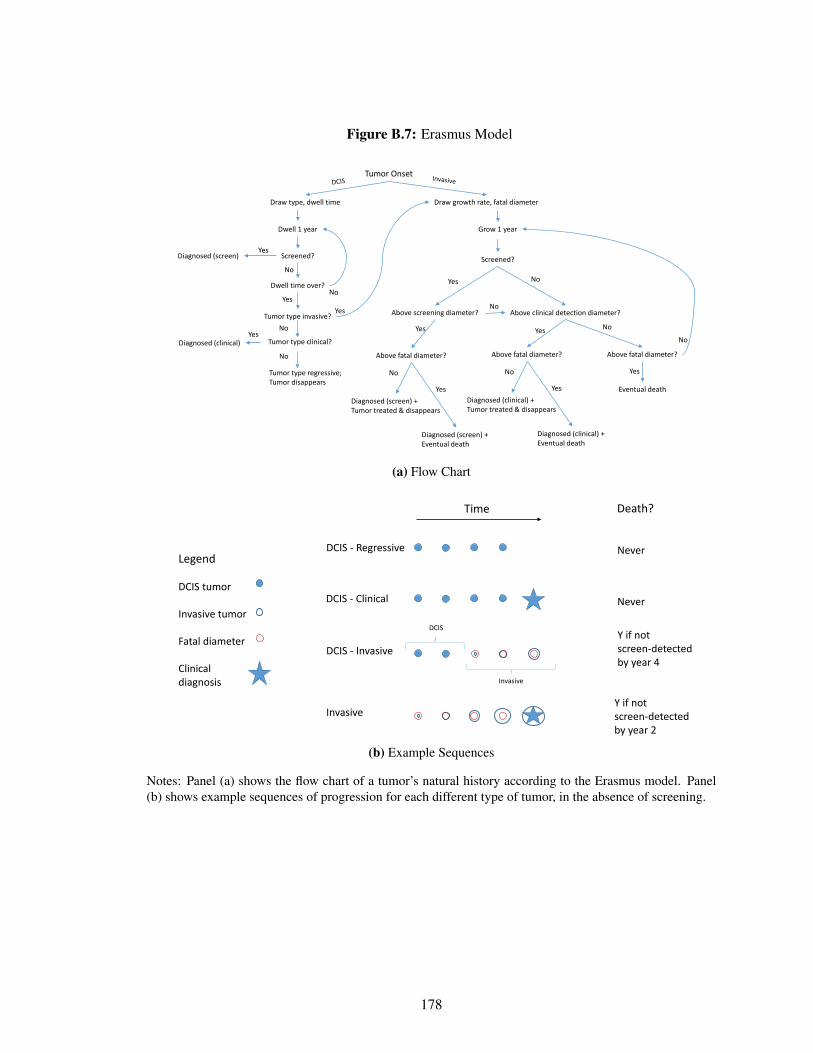
Figure B.7: Erasmus Model
Tumor Onset
Draw type, dwell time Draw growth rate, fatal diameter
Dwell 1 year
Screened?
Dwell time over?
Tumor type invasive?
Diagnosed (screen)Yes
No
Diagnosed (clinical)Yes
YesNo
Tumor type clinical?
Yes
No
No
Tumor type regressive;Tumor disappears
Grow 1 year
Screened?
Above screening diameter? Above clinical detection diameter?
Yes No
Above fatal diameter?Above fatal diameter?
Yes
No
Above fatal diameter?
No
Eventual death
Yes
No
Diagnosed (screen) + Eventual death
YesDiagnosed (screen) +Tumor treated & disappears
No
Diagnosed (clinical) + Eventual death
YesDiagnosed (clinical) +Tumor treated & disappears
No
(a) Flow Chart
DCIS - Regressive
DCIS - Clinical
DCIS - Invasive
Time
Invasive
Invasive
DCIS
Legend
DCIS tumor
Invasive tumor
Fatal diameter
Clinical diagnosis
Death?
Y if not screen-detected by year 4
Y if not screen-detected by year 2
Never
Never
(b) Example Sequences
Notes: Panel (a) shows the flow chart of a tumor’s natural history according to the Erasmus model. Panel(b) shows example sequences of progression for each different type of tumor, in the absence of screening.
178
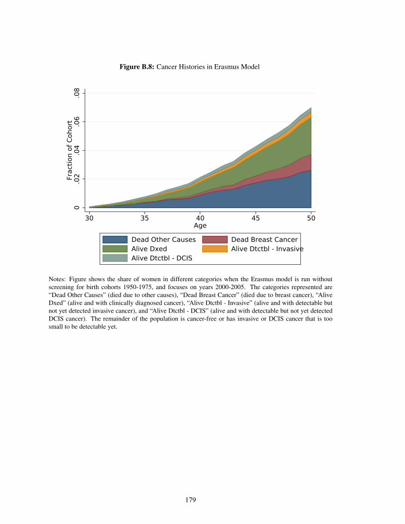
Figure B.8: Cancer Histories in Erasmus Model0
.02
.04
.06
.08
Frac
tion
of C
ohor
t
30 35 40 45 50Age
Dead Other Causes Dead Breast CancerAlive Dxed Alive Dtctbl - InvasiveAlive Dtctbl - DCIS
Notes: Figure shows the share of women in different categories when the Erasmus model is run withoutscreening for birth cohorts 1950-1975, and focuses on years 2000-2005. The categories represented are“Dead Other Causes” (died due to other causes), “Dead Breast Cancer” (died due to breast cancer), “AliveDxed” (alive and with clinically diagnosed cancer), “Alive Dtctbl - Invasive” (alive and with detectable butnot yet detected invasive cancer), and “Alive Dtctbl - DCIS” (alive and with detectable but not yet detectedDCIS cancer). The remainder of the population is cancer-free or has invasive or DCIS cancer that is toosmall to be detectable yet.
179
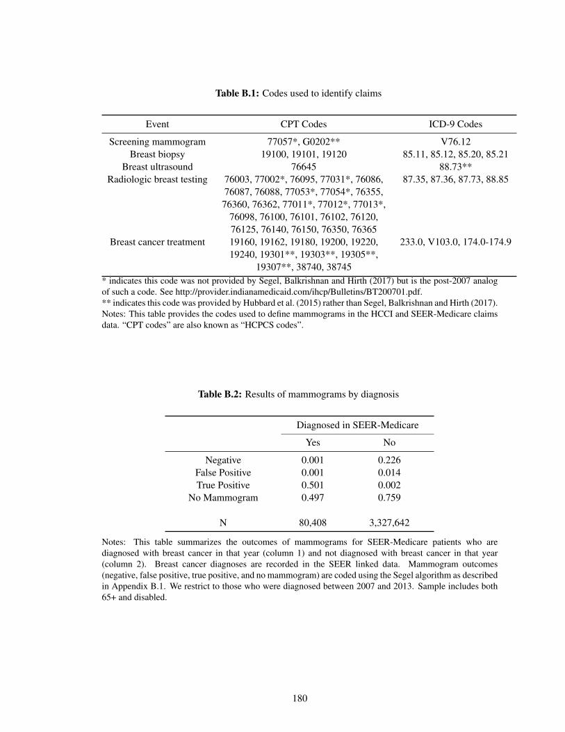
Table B.1: Codes used to identify claims
Event CPT Codes ICD-9 Codes
Screening mammogram 77057*, G0202** V76.12Breast biopsy 19100, 19101, 19120 85.11, 85.12, 85.20, 85.21
Breast ultrasound 76645 88.73**Radiologic breast testing 76003, 77002*, 76095, 77031*, 76086,
76087, 76088, 77053*, 77054*, 76355,76360, 76362, 77011*, 77012*, 77013*,
76098, 76100, 76101, 76102, 76120,76125, 76140, 76150, 76350, 76365
87.35, 87.36, 87.73, 88.85
Breast cancer treatment 19160, 19162, 19180, 19200, 19220,19240, 19301**, 19303**, 19305**,
19307**, 38740, 38745
233.0, V103.0, 174.0-174.9
* indicates this code was not provided by Segel, Balkrishnan and Hirth (2017) but is the post-2007 analogof such a code. See http://provider.indianamedicaid.com/ihcp/Bulletins/BT200701.pdf.** indicates this code was provided by Hubbard et al. (2015) rather than Segel, Balkrishnan and Hirth (2017).Notes: This table provides the codes used to define mammograms in the HCCI and SEER-Medicare claimsdata. “CPT codes” are also known as “HCPCS codes”.
Table B.2: Results of mammograms by diagnosis
Diagnosed in SEER-Medicare
Yes No
Negative 0.001 0.226False Positive 0.001 0.014True Positive 0.501 0.002
No Mammogram 0.497 0.759
N 80,408 3,327,642
Notes: This table summarizes the outcomes of mammograms for SEER-Medicare patients who arediagnosed with breast cancer in that year (column 1) and not diagnosed with breast cancer in that year(column 2). Breast cancer diagnoses are recorded in the SEER linked data. Mammogram outcomes(negative, false positive, true positive, and no mammogram) are coded using the Segel algorithm as describedin Appendix B.1. We restrict to those who were diagnosed between 2007 and 2013. Sample includes both65+ and disabled.
180
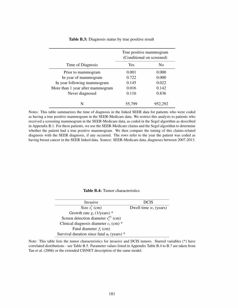
Table B.3: Diagnosis status by true positive result
True positive mammogram(Conditional on screened)
Time of Diagnosis Yes No
Prior to mammogram 0.001 0.000In year of mammogram 0.722 0.000
In year following mammogram 0.145 0.022More than 1 year after mammogram 0.016 0.142
Never diagnosed 0.116 0.836
N 55,799 952,292
Notes: This table summarizes the time of diagnosis in the linked SEER data for patients who were codedas having a true positive mammogram in the SEER-Medicare data. We restrict this analysis to patients whoreceived a screening mammogram in the SEER-Medicare data, as coded in the Segel algorithm as describedin Appendix B.1. For these patients, we use the SEER-Medicare claims and the Segel algorithm to determinewhether the patient had a true positive mammogram. We then compare the timing of this claims-relateddiagnosis with the SEER diagnosis, if any occurred. The rows refer to the year the patient was coded ashaving breast cancer in the SEER linked data. Source: SEER-Medicare data, diagnoses between 2007-2013.
Table B.4: Tumor characteristics
Invasive DCISSize sy
i (cm) Dwell time wi (years)Growth rate gi (1/years) *
Screen detection diameter rayi (cm)
Clinical diagnosis diameter ci (cm) *Fatal diameter fi (cm)
Survival duration since fatal ui (years) *
Note: This table lists the tumor characteristics for invasive and DCIS tumors. Starred variables (*) havecorrelated distributions - see Table B.5. Parameter values listed in Appendix Table B.4 to B.7 are taken fromTan et al. (2006) or the extended CISNET description of the same model.
181
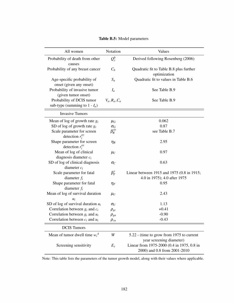
Table B.5: Model parameters
All women Notation Values
Probability of death from othercauses
Qby Derived following Rosenberg (2006)
Probability of any breast cancer Cb Quadratic fit to Table B.8 plus furtheroptimization
Age-specific probability ofonset (given any onset)
Sa Quadratic fit to values in Table B.6
Probability of invasive tumor(given tumor onset)
Ia See Table B.9
Probability of DCIS tumorsub-type (summing to 1 - Ia)
Va,Ra,Ca See Table B.9
Invasive Tumors
Mean of log of growth rate gi µG 0.062SD of log of growth rate gi σG 0.87Scale parameter for screen
detection rayi
βayR see Table B.7
Shape parameter for screendetection ray
i
ηR 2.95
Mean of log of clinicaldiagnosis diameter ci
µC 0.97
SD of log of clinical diagnosisdiameter ci
σC 0.63
Scale parameter for fataldiameter fi
βyF Linear between 1915 and 1975 (0.8 in 1915;
4.0 in 1975); 4.0 after 1975Shape parameter for fatal
diameter fi
ηF 0.95
Mean of log of survival durationui
µU 2.43
SD of log of survival duration ui σU 1.13Correlation between gi and ci ρgc +0.41Correlation between gi and ui ρgu -0.90Correlation between ci and ui ρcu -0.43
DCIS Tumors
Mean of tumor dwell time wi4 W 5.22 - (time to grow from 1975 to current
year screening diameter)Screening sensitivity Ey Linear from 1975-2000 (0.4 in 1975, 0.8 in
2000) and 0.8 from 2001-2010
Note: This table lists the parameters of the tumor growth model, along with their values where applicable.
182
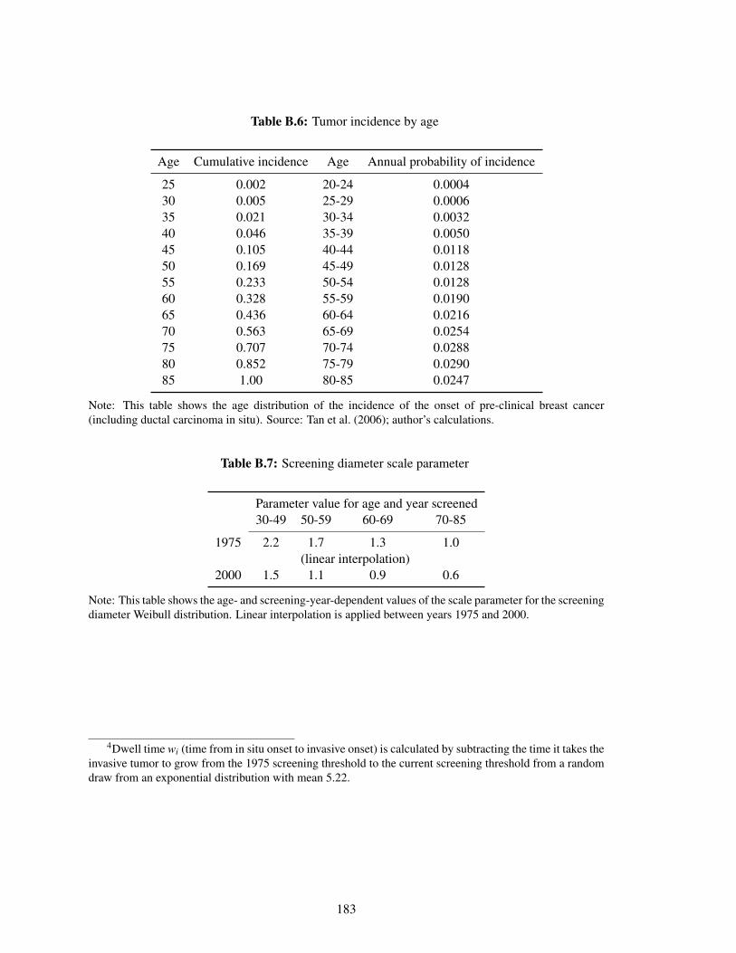
Table B.6: Tumor incidence by age
Age Cumulative incidence Age Annual probability of incidence
25 0.002 20-24 0.000430 0.005 25-29 0.000635 0.021 30-34 0.003240 0.046 35-39 0.005045 0.105 40-44 0.011850 0.169 45-49 0.012855 0.233 50-54 0.012860 0.328 55-59 0.019065 0.436 60-64 0.021670 0.563 65-69 0.025475 0.707 70-74 0.028880 0.852 75-79 0.029085 1.00 80-85 0.0247
Note: This table shows the age distribution of the incidence of the onset of pre-clinical breast cancer(including ductal carcinoma in situ). Source: Tan et al. (2006); author’s calculations.
Table B.7: Screening diameter scale parameter
Parameter value for age and year screened30-49 50-59 60-69 70-85
1975 2.2 1.7 1.3 1.0(linear interpolation)
2000 1.5 1.1 0.9 0.6
Note: This table shows the age- and screening-year-dependent values of the scale parameter for the screeningdiameter Weibull distribution. Linear interpolation is applied between years 1975 and 2000.
4Dwell time wi (time from in situ onset to invasive onset) is calculated by subtracting the time it takes theinvasive tumor to grow from the 1975 screening threshold to the current screening threshold from a randomdraw from an exponential distribution with mean 5.22.
183
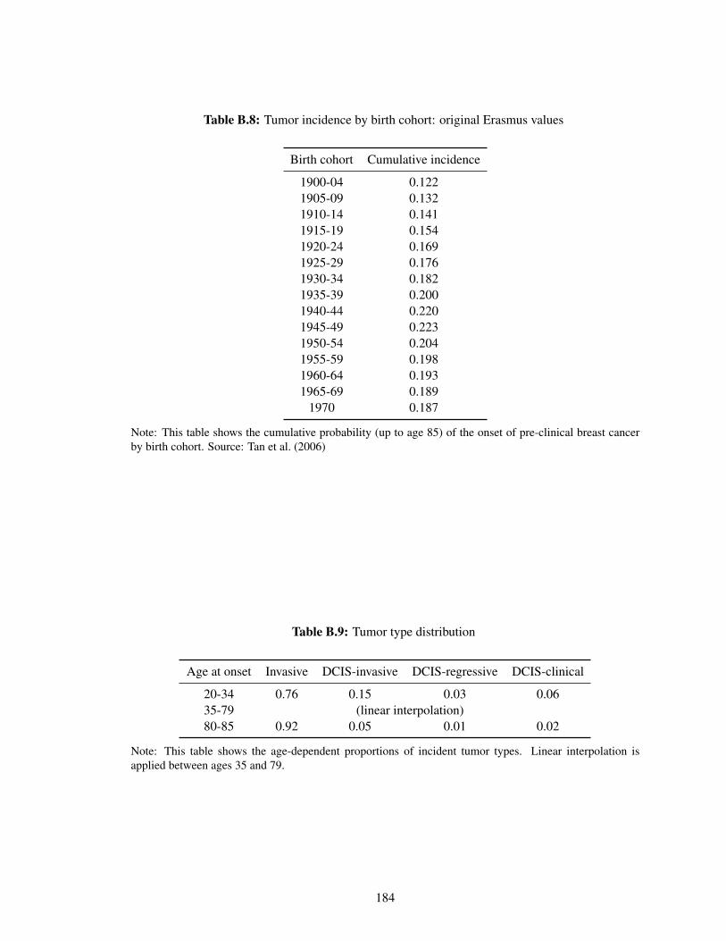
Table B.8: Tumor incidence by birth cohort: original Erasmus values
Birth cohort Cumulative incidence
1900-04 0.1221905-09 0.1321910-14 0.1411915-19 0.1541920-24 0.1691925-29 0.1761930-34 0.1821935-39 0.2001940-44 0.2201945-49 0.2231950-54 0.2041955-59 0.1981960-64 0.1931965-69 0.189
1970 0.187
Note: This table shows the cumulative probability (up to age 85) of the onset of pre-clinical breast cancerby birth cohort. Source: Tan et al. (2006)
Table B.9: Tumor type distribution
Age at onset Invasive DCIS-invasive DCIS-regressive DCIS-clinical
20-34 0.76 0.15 0.03 0.0635-79 (linear interpolation)80-85 0.92 0.05 0.01 0.02
Note: This table shows the age-dependent proportions of incident tumor types. Linear interpolation isapplied between ages 35 and 79.
184
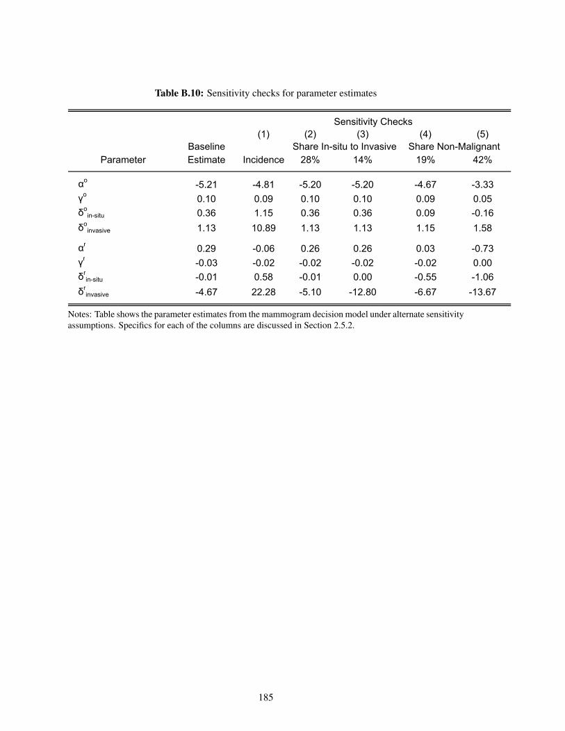
Table B.10: Sensitivity checks for parameter estimates
(1) (2) (3) (4) (5)BaselineEstimate Incidence 28% 14% 19% 42%
αo-5.21 -4.81 -5.20 -5.20 -4.67 -3.33
γo0.10 0.09 0.10 0.10 0.09 0.05
δoin-situ 0.36 1.15 0.36 0.36 0.09 -0.16
δoinvasive 1.13 10.89 1.13 1.13 1.15 1.58
αr0.29 -0.06 0.26 0.26 0.03 -0.73
γr-0.03 -0.02 -0.02 -0.02 -0.02 0.00
δrin-situ -0.01 0.58 -0.01 0.00 -0.55 -1.06
δrinvasive -4.67 22.28 -5.10 -12.80 -6.67 -13.67
Parameter
Sensitivity Checks
Share In-situ to Invasive Share Non-Malignant
Notes: Table shows the parameter estimates from the mammogram decision model under alternate sensitivityassumptions. Specifics for each of the columns are discussed in Section 2.5.2.
185

THIS PAGE INTENTIONALLY LEFT BLANK
186

Appendix C
Appendix for Chapter 3
C.1 Appendix Figures and Tables
187
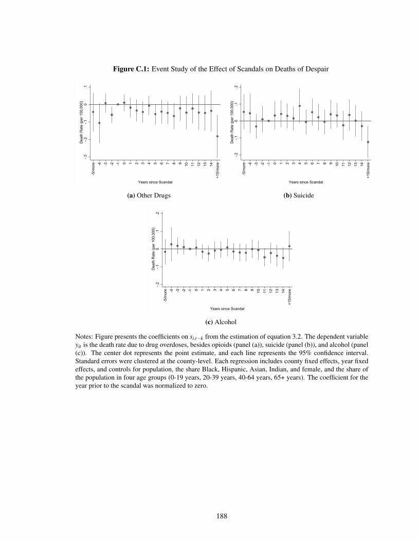
Figure C.1: Event Study of the Effect of Scandals on Deaths of Despair
-.3-.2
-.10
.1D
eath
Rat
e (p
er 1
00,0
00)
-5/m
ore -4 -3 -2 -1 0 1 2 3 4 5 6 7 8 9 10 11 12 13 14
+15/
mor
e
Years since Scandal
(a) Other Drugs
-.2-.1
0.1
.2D
eath
Rat
e (p
er 1
00,0
00)
-5/m
ore -4 -3 -2 -1 0 1 2 3 4 5 6 7 8 9 10 11 12 13 14
+15/
mor
e
Years since Scandal
(b) Suicide
-.2-.1
0.1
.2D
eath
Rat
e (p
er 1
00,0
00)
-5/m
ore -4 -3 -2 -1 0 1 2 3 4 5 6 7 8 9 10 11 12 13 14
+15/
mor
e
Years since Scandal
(c) Alcohol
Notes: Figure presents the coefficients on si,t−k from the estimation of equation 3.2. The dependent variableyit is the death rate due to drug overdoses, besides opioids (panel (a)), suicide (panel (b)), and alcohol (panel(c)). The center dot represents the point estimate, and each line represents the 95% confidence interval.Standard errors were clustered at the county-level. Each regression includes county fixed effects, year fixedeffects, and controls for population, the share Black, Hispanic, Asian, Indian, and female, and the share ofthe population in four age groups (0-19 years, 20-39 years, 40-64 years, 65+ years). The coefficient for theyear prior to the scandal was normalized to zero.
188
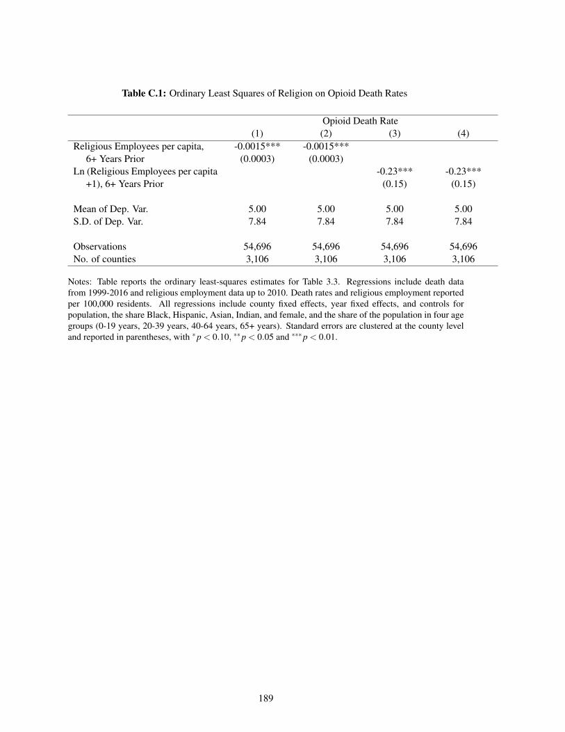
Table C.1: Ordinary Least Squares of Religion on Opioid Death Rates
Opioid Death Rate(1) (2) (3) (4)
Religious Employees per capita, -0.0015*** -0.0015***6+ Years Prior (0.0003) (0.0003)
Ln (Religious Employees per capita -0.23*** -0.23***+1), 6+ Years Prior (0.15) (0.15)
Mean of Dep. Var. 5.00 5.00 5.00 5.00S.D. of Dep. Var. 7.84 7.84 7.84 7.84
Observations 54,696 54,696 54,696 54,696No. of counties 3,106 3,106 3,106 3,106
Notes: Table reports the ordinary least-squares estimates for Table 3.3. Regressions include death datafrom 1999-2016 and religious employment data up to 2010. Death rates and religious employment reportedper 100,000 residents. All regressions include county fixed effects, year fixed effects, and controls forpopulation, the share Black, Hispanic, Asian, Indian, and female, and the share of the population in four agegroups (0-19 years, 20-39 years, 40-64 years, 65+ years). Standard errors are clustered at the county leveland reported in parentheses, with *p < 0.10, **p < 0.05 and ***p < 0.01.
189
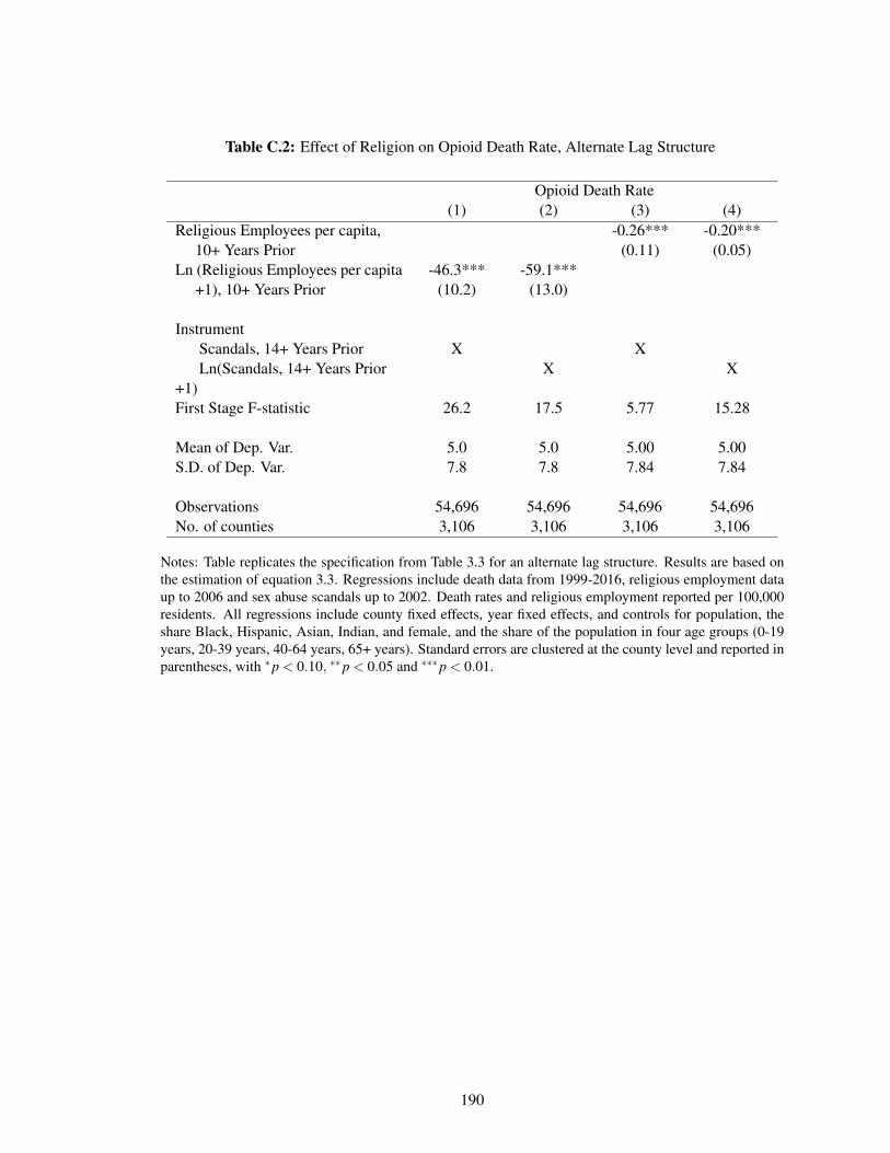
Table C.2: Effect of Religion on Opioid Death Rate, Alternate Lag Structure
Opioid Death Rate(1) (2) (3) (4)
Religious Employees per capita, -0.26*** -0.20***10+ Years Prior (0.11) (0.05)
Ln (Religious Employees per capita -46.3*** -59.1***+1), 10+ Years Prior (10.2) (13.0)
InstrumentScandals, 14+ Years Prior X XLn(Scandals, 14+ Years Prior
+1)X X
First Stage F-statistic 26.2 17.5 5.77 15.28
Mean of Dep. Var. 5.0 5.0 5.00 5.00S.D. of Dep. Var. 7.8 7.8 7.84 7.84
Observations 54,696 54,696 54,696 54,696No. of counties 3,106 3,106 3,106 3,106
Notes: Table replicates the specification from Table 3.3 for an alternate lag structure. Results are based onthe estimation of equation 3.3. Regressions include death data from 1999-2016, religious employment dataup to 2006 and sex abuse scandals up to 2002. Death rates and religious employment reported per 100,000residents. All regressions include county fixed effects, year fixed effects, and controls for population, theshare Black, Hispanic, Asian, Indian, and female, and the share of the population in four age groups (0-19years, 20-39 years, 40-64 years, 65+ years). Standard errors are clustered at the county level and reported inparentheses, with *p < 0.10, **p < 0.05 and ***p < 0.01.
190

Appendix D
Bibliography
Abaluck, Jason, Leila Agha, Chris Kabrhel, Ali Raja, and Arjun Venkatesh, “TheDeterminants of Productivity in Medical Testing: Intensity and Allocation of Care,” AmericanEconomic Review, December 2016, 106 (12), 3730–3764.
Åberg-Wistedt, Anna, Hans Ågren, Lisa Ekselius, Finn Bengtson, and Ann-CharlotteÅkerblad, “Sertraline Versus Paroxetine in Major Depression: Clinical Outcome After SixMonths of Continuous Therapy,” Journal of Clinical Psychopharmacology, 2000, 20 (6), 645–652.
Adams, Christopher and Van V. Brantner, “Estimating the Cost of New Drug Development - Isit Really $802 Million?,” Health Affairs, 2006, 25 (2), 420–428.
Alexander, FE, TJ Anderson, HK Brown, APM Forrest, W Hepburn, AE Kirkpatrick,BB Muir, RJ Prescott, and A Smith, “14 Years of Follow-Up from the Edinburgh RandomisedTrial of Breast-Cancer Screening,” The Lancet, June 1999, 353 (9168), 1903–1908.
Allcott, Hunt, “Site Selection Bias in Program Evaluation,” The Quarterly Journal of Economics,2015, 130 (3), 1117–1165.
American Cancer Society, “Breast Cancer Facts & Figures 2017-2018,” 2017.
, “Limitations of Mammograms,” October 2017.
, “History of ACS Recommendations for the Early Detection of Cancer in People WithoutSymptoms,” May 2018.
Amsterdam, JD, WG Case, E Csanalosi, M Singer, and K Rickels, “A Double-BlindComparative Trial of Zimelidine, Amitriptyline, and Placebo in Patients with Mixed Anxietyand Depression,” Pharmacopsychiatry, 1986, 19 (3), 115–119.
191

Anwar, Shamena and Hanming Fang, “An Alternative Test of Racial Prejudice in Motor VehicleSearches: Theory and Evidence,” American Economic Review, March 2006, 96 (1), 127–151.
Avorn, Jerry, “The $2.6 Billion Pill - Methodologic and Policy Considerations,” New EnglandJournal of Medicine, 2015, 372, 1877–1879.
Azoulay, Pierre, “Do Pharmaceutical Sales Respond to Scientific Evidence?,” Journal ofEconomics & Management Strategy, 2004, 11 (4), 551–594.
Becker, Sascha O. and Ludger Woessmann, “Social Cohesion, Religious Beliefs, and the Effectof Protestantism on Suicide,” The Review of Economics and Statistics, 2018, 100 (3), 377–391.
Bekelman, Justin E., Yan Li, and Cary P. Gross, “Scope and Impact of Financial Conflictsof Interest in Biomedical Research: A Systematic Review,” Journal of the American MedicalAssociation, 2003, 289 (4), 454–465.
Berry, Donald, “Breast cancer screening: Controversy of impact,” Breast (Edinburgh, Scotland),August 2013, 22 (0 2), S73–S76.
Bitler, Marianne P. and Christopher S. Carpenter, “Health Insurance Mandates,Mammography, and Breast Cancer Diagnoses,” American Economic Journal: Economic Policy,August 2016, 8 (3), 39–68.
Bjurstam, Nils, Lena Björneld, Jane Warwick, Evis Sala, Stephen W. Duffy, LennarthNyström, Neil Walker, Erling Cahlin, Olof Eriksson, Lars-Olof Hafström, HalvardLingaas, Jan Mattsson, Stellan Persson, Carl-Magnus Rudenstam, Håkan Salander, JohanSäve-Söderbergh, and Torkel Wahlin, “The Gothenburg Breast Screening Trial,” Cancer,2003, 97 (10), 2387–2396.
Bleyer, Archie and H. Gilbert Welch, “Effect of Three Decades of Screening Mammography onBreast-Cancer Incidence,” The New England Journal of Medicine, November 2012, 367 (21),1998–2005.
Block, Lauren, Marian Jarlenski, Albert Wu, and Wendy Bennett, “MammographyUse Among Women Ages 40-49 After the 2009 U.S. Preventive Services Task ForceRecommendation,” J Gen Intern Med, 2013, 28 (11), 1447–1453.
Blustein, Jan, “Medicare Coverage, Supplemental Insurance, and the Use of Mammography byOlder Women,” New England Journal of Medicine, April 1995, 332 (17), 1138–1143.
Bottan, Nicolas and Ricardo Perez-Truglia, “Losing my Religion: The Effects of ReligiousScandals on Religious Participation and Charitable Giving,” Journal of Public Economics, 2015,129, 106–119.
Bourgeois, Florence, Srinivas Murthy, and Kenneth Mandl, “Outcome Reporting Among DrugTrials Registered in ClinicalTrials.gov,” Annals of Internal Medicine, 2010, 153 (3), 158–166.
192

Brett, J, C Bankhead, B Henderson, E Watson, and J Austoker, “The Psychological Impact ofMammographic Screening. A Systematic Review,” Psycho-Oncology, November 2005, 14 (11),917–938.
Brodeur, Abel, Mathias Lé, Marc Sangnier, and Yanos Zylberberg, “Star Wars: The EmpiricsStrike Back,” American Economic Journal: Applied Economics, 2016, 8 (1), 1–32.
Brody, Debra P., Laura A. Pratt, and Jeffery P. Hughes, “Prevalence of Depression AmongAdults Aged 20 and Over: United States, 2013 to 2016, NCHS Data Brief No. 303,” 2018.
Budish, Eric, Benjamin N. Roin, and Heidi Williams, “Do Firms Underinvest in Long-TermResearch? Evidence from Cancer Clinical Trials,” American Economic Review, 2015, 105 (7),2044–2085.
Burstein, Harold J., Kornelia Polyak, Julia S. Wong, Susan C. Lester, and Carolyn M. Kaelin,“Ductal Carcinoma in Situ of the Breast,” New England Journal of Medicine, April 2004, 350(14), 1430–1441.
Cacioppo, JT, LC Hawkley, A Kalil, ME Hughes, L Waite, and RA Thisted, The science ofsubjective well-being. 2008.
Carroll, Aaron, “Do Antidepressants Work?,” The New York Times, 2018.
Case, Anne and Angus Deaton, “Rising morbidity and mortality in midlife among white non-Hispanic Americans in the 21st century,” PNAS, 2015, 112 (49), 15078–15083.
and , “Mortality and Morbidity in the 21st Century,” Brookings Papers on Economic Activity,2017.
Cipriani, Andrea, Toshi A Furukawa, Georgia Salanti, Anna Chaimani, Lauren Z. Atkinson,Yusuke Ogawa, Stefan Leucht, Henricus G Ruhe, Erick H Turner, Julian P T Higgins,Matthias Egger, Nozomi, Takeshima, Yu Hayasaka, Hissei Imai, Kiyomi Shinohara, AranTajika, John P A Ioannidis, and John R Geddes, “Comparative Efficacy and Acceptability of21 Antidepressant Drugs for the Acute Treatment of Adults with Major Depressive Disorder: ASystematic Review and Network Meta-Analysis,” The Lancet, 2018, 391, 1357–1366.
Clarke, L. D., S. K. Plevritis, R. Boer, K. A. Cronin, and E. J. Feuer, “Chapter 13: AComparative Review of CISNET Breast Models Used To Analyze U.S. Breast Cancer Incidenceand Mortality Trends,” JNCI Monographs, October 2006, 2006 (36), 96–105.
Cooper, Gregory S., Tzuyung Doug Kou, Avi Dor, Siran M. Koroukian, and Mark D.Schluchter, “Cancer Preventive Services, Socioeconomic Status, and the Affordable Care Act,”Cancer, 2017, 123 (9), 1585–1589.
193

Cronin, Kathleen A, Diana L Miglioretti, Martin Krapcho, Binbing Yu, Berta M Geller,Patricia A. Carney, Tracy Onega, Eric J Feuer, Nancy Breen, and Rachel Ballard-Barbash, “CEBP Focus on Cancer Surveillance: Bias Associated With Self-Report of PriorScreening Mammography,” Cancer epidemiology, biomarkers & prevention : a publicationof the American Association for Cancer Research, cosponsored by the American Society ofPreventive Oncology, June 2009, 18 (6), 1699–1705.
Cutler, David M., “Are We Finally Winning the War on Cancer?,” Journal of EconomicPerspectives, December 2008, 22 (4), 3–26.
Danzon, Patricia and Eric Keuffel, “Regulation of the Pharmaceutical-Biotechnology Industry,”in Nancy Rose, ed., Economic Regulation and Its Reform: What Have We Learned?, 2014,pp. 407–484.
Davidoff, Frank, Catherine D. DeAngelis, Jeffrey M. Drazen, John Hoey, Liselotte Højgaard,Richard Horton, Sheldon Kotzin, M. Gary Nicholls, Magne Nylenna, A. John P.M.Overbeke, Harold C. Sox, and Martin B. Van Der Weyden, “Sponsorship, Authorship, andAccountability,” New England Journal of Medicine, 2001, 345, 825–827.
DiMasi, Joseph, Henry Grabowski, and Ronald Hansen, “Innovation in the PharmaceuticalIndustry: New Estimates of R&D Costs,” Journal of Health Economics, 2016, 47, 20–33.
Ehrhardt, Stephan, Lawrence Appel, and Curtis Meinert, “Trends in National Institutes ofHealth Funding for Clinical Trials Registered in ClinicalTrials.gov,” Journal of the AmericanMedical Association, 2015, 314 (23), 2566–2567.
Einav, Liran, Amy Finkelstein, Stephen P. Ryan, Paul Schrimpf, and Mark R. Cullen,“Selection on Moral Hazard in Health Insurance,” American Economic Review, February 2013,103 (1), 178–219.
Elmore, Joann G., “Solving the Problem of Overdiagnosis,” New England Journal of Medicine,2016, 375 (15), 1483–1486. PMID: 27732826.
Ernster, Virginia L., Rachel Ballard-Barbash, William E. Barlow, Yingye Zheng, Donald L.Weaver, Gary Cutter, Bonnie C. Yankaskas, Robert Rosenberg, Patricia A. Carney, KarlaKerlikowske, Stephen H. Taplin, Nicole Urban, and Berta M. Geller, “Detection of DuctalCarcinoma in Situ in Women Undergoing Screening Mammography,” Journal of the NationalCancer Institute, October 2002, 94 (20), 1546–1554.
Esserman, L, Y Shieh, and I Thompson, “Rethinking Screening for Breast Cancer and ProstateCancer,” JAMA, 2009, 203 (15), 1685–1692.
Eusebi, Vincenzo, Elisa Feudale, Maria Foschini, Andrea Micheli, Alberto Conti, CristinaRiva, Silvana DiPalma, and Franco Rilke, “Long-Term Follow-Up of In Situ Carcinoma ofthe Breast,” Seminars in Diagnostic Pathology, 1994, 11 (3), 223–235.
194

Fedewa, Stacey A., Michael Goodman, W. Dana Flanders, Xuesong Han, Robert A.Smith, Elizabeth M Ward, Chyke A. Doubeni, Ann Goding Sauer, and Ahmedin Jemal,“Elimination of Cost-Sharing and Receipt of Screening for Colorectal and Breast Cancer,”Cancer, September 2015, 121 (18), 3272–3280.
Finkelstein, Amy, Matthew Gentzkow, and Heidi Williams, “What Drives Prescription OpioidAbuse? Evidence from Migration,” Working Paper, 2018.
, Sarah Taubman, Bill Wright, Mira Bernstein, Jonathan Gruber, Joseph P Newhouse,Heidi Allen, Katherine Baicker, and The Oregon Health Study Group, “The Oregon HealthInsurance Experiment: Evidence from the First Year,” The Quarterly Journal of Economics,2012, 127 (3), 1057–1106.
for Health Statistics, . National Center, “NCHS Data on Drug Poisoning Deaths,” 2017.
Freeman, Jean, Carrie Klabunde, Nicola Schussler, Joan Warren, Beth Virnig, and GregoryCooper, “Measuring Breast, Colorectal, and Prostate Cancer Screening with Medicare ClaimsData,” Medical Care, August 2002, 40 (8), (Supplement):IV–36–IV–42.
Friedberg, Mark, Bernard Saffran, Tammy J. Stinson, Wendy Nelson, and Charles L.Bennett, “Evaluation of Conflict of Interest in Economic Analysis of New Drugs Used inOncology,” Journal of the American Medical Association, 1999, 282 (15), 1453–1457.
Fryback, Dennis G., Natasha K. Stout, Marjorie A. Rosenberg, Amy Trentham-Dietz, VipatKuruchittham, and Patrick L. Remington, “The Wisconsin Breast Cancer EpidemiologySimulation Model,” Journal of the National Cancer Institute. Monographs, 2006, (36), 37–47.
Gartlehner, Gerald, Richard A. Hansen, Laura C. Morgan, Kylie Thaler, Linda Lux,Megan Van Noord, Ursula Mager, Patricia Thieda, Bradley N. Gaynes, Tania Wilkins,Michaela Strobelberger, Stacey Lloyd, Ursula Reichenpfader, and Kathleen N. Lohr,“Comparative Benefits and Harms of Second-Generation Antidepressants for Treating MajorDepressive Disorder: An Updated Meta-Analysis,” Annals of Internal Medicine, 2011, 155 (11),772–785.
Greenberg, Paul E., Andree-Anne Fournier, Tammy Sisitsky, Crystal T. Pike, and Ronald C.Kessler, “The Economic Burden of Adults with Major Depressive Disorder in the United States(2005 and 2010),” Journal of Clinical Psychiatry, 2015, 76 (2), 155–162.
Gruber, Jonathan and Daniel M. Hungerman, “The Church Versus the Mall: What Happenswhen Religion Faces Increased Secular Competition?,” Quarterly Journal of Economics, 2008,123 (2), 831–862.
Habbema, J. D. F., Gerril J. van Oortmarssen, Dick J. van Putten, Jacobus T. Lubbe, andPaul J. van der Maas, “Age-Specific Reduction in Breast Cancer Mortality by Screening: An
195

Analysis of the Results of the Health Insurance Plan of Greater New York Study,” JNCI: Journalof the National Cancer Institute, August 1986, 77 (2), 317–320.
Habermann, Elizabeth B., Beth A. Virnig, Gerald F. Riley, and Nancy N. Baxter, “The Impactof a Change in Medicare Reimbursement Policy and HEDIS Measures on Stage at DiagnosisAmong Medicare HMO and Fee-for-Service Female Breast Cancer Patients,” Medical Care,August 2007, 45 (8), 761–766.
Harding, Charles, Francesco Pompei, Dmitriy Burmistrov, H. Gilbert Welch, Rediet Abebe,and Richard Wilson, “Breast Cancer Screening, Incidence, and Mortality Across US Counties,”JAMA internal medicine, September 2015, 175 (9), 1483–1489.
HCCI, “Health Care Cost and Utilization Report: 2011,” September 2012.
Hillhouse, Todd M. and Joseph H Porter, “A Brief History of the Development of AntidepressantDrugs: From Monoamines to Glutamate,” Experimental and Clinical Psychopharmacology,2015, 23 (1), 1–21.
Hubbard, Rebecca A., Karla Kerlikowske, Chris I. Flowers, Bonnie C. Yankaskas, WeiweiZhu, and Diana L. Miglioretti, “Cumulative probability of false-positive recall or biopsyrecommendation after 10 years of screening mammography: a cohort study,” Annals of InternalMedicine, October 2011, 155 (8), 481–492.
, Weiwei Zhu, Steven Balch, Tracy Onega, and Joshua J. Fenton, “Identification of AbnormalScreening Mammogram Interpretation using Medicare Claims Data,” Health Services Research,February 2015, 50 (1), 290–304.
Humphrey, Linda L., Mark Helfand, Benjamin K. S. Chan, and Steven H. Woolf, “BreastCancer Screening: A Summary of the Evidence for the U.S. Preventive Services Task Force,”Annals of Internal Medicine, September 2002, 137 (5 Part 1), 347–360.
Hungerman, Daniel M., “Substitution and Stigma: Evidence on Religious Markets from theCatholic Sex Abuse Scandal,” American Economic Journal: Economic Policy, 2013, 5 (3), 227–253.
Ioannidis, John PA, “Effectiveness of Antidepressants: An Evidence Myth Constructed from aThousand Randomized Trials?,” Philosophy, Ethics, and Humanities in Medicine, 2008, 3 (14).
Jacobson, Mireille and Srikanth Kadiyala, “When Guidelines Conflict: A Case Study ofMammography Screening Initiation in the 1990s,” Womens Health Issues, 2017, 27 (6), 692–699.
Jørgensen, Karsten Juhl and Peter C. Gøtzsche, “Overdiagnosis in Publicly OrganisedMammography Screening Programmes: Systematic Review of Incidence Trends,” BMJ, July2009, 339, b2587.
196

, , Mette Kalager, and Per-Henrik Zahl, “Breast Cancer Screening in Denmark,” Annals ofInternal Medicine, October 2017, 167 (7), 524.
Kadiyala, Srikanth and Erin Strumpf, “Are United States and Canadian Cancer ScreeningRates Consistent with Guideline Information Regarding the Age of Screening Initiation?,”International Journal for Quality in Health Care: Journal of the International Society forQuality in Health Care, December 2011, 23 (6), 611–620.
and , “How Effective is Population-Based Cancer Screening? Regression DiscontinuityEstimates from the US Guideline Screening Initiation Ages,” Forum for Health Economics &Policy, 2016, 19 (1), 87–139.
Kelaher, M. and J. M. Stellman, “The Impact of Medicare Funding on the Use of MammographyAmong Older Women: Implications for Improving Access to Screening,” Preventive Medicine,December 2000, 31 (6), 658–664.
Kirsch, Irving, “The Emperor’s New Drugs: Exploding the Antidepressant Myth,” 2010.
Kolata, Gina, “Get a Mammogram. No Don’t. Repeat.,” New York Times, November 2009.
Kovacs, GL, Z Sarnyai, and G Szabo, “Oxytocin and Addiction: A Review,”Psychoneuroendocrinology, 1998, 23 (8), 945–962.
Kowalski, Amanda E, “Behavior within a Clinical Trial and Implications for MammographyGuidelines,” Working Paper 25049, National Bureau of Economic Research September 2018.
Krauss, Alexander, “Why All Randomised Controlled Trials Produce Biased Results,” Annals ofMedicine, 2018, 50 (4), 312–322.
Lathyris, D. N., N. A. Patsopoulos, G. Salanti, and J. P. A. Ioannidis, “Industry Sponsorshipand Selection of Comparators in Randomized Clinical Trials,” European Journal of ClinicalInvestigation, 2010, 40 (2), 172–182.
Leucht, Stefan, Andrea Cipriani, Loukia Spineli, Dimitris Mavridis, Deniz Örey, FranziskaRichter, Myto Samara, Corrado Barbui, Rolf R Engel, John R Geddes, Werner Kissling,Marko P Stapf, Bettina Lässig, Georgia Salanti, and John M Davis, “Comparative Efficacyand Tolerability of 15 Antipsychotic Drugs in Schizophrenia: A Multiple-Treatments Meta-Analysis,” The Lancet, 2013, 382 (9896), 951–962.
Lexchin, Joel, Lisa A. Bero, Benjamin Djulbegovic, and Otavio Clark, “PharmaceuticalIndustry Sponsorship and Research Outcome and Quality: Systemic Review,” BMJ, 2003, 326,1167–1170.
Linde, Klaus, Gilbert Ramirez, Cynthia D Mulrow, Andrej Pauls, Wolfgang Weidenhammer,and Dieter Melchart, “St John’s Wort for Depression: An Overview and Meta-Analysis ofRandomised Clinical Trials,” BMJ, 1996, 313, 253–258.
197
Lu, Yao and David J. G. Slusky, “The Impact of Women’s Health Clinic Closures on PreventiveCare,” American Economic Journal: Applied Economics, July 2016, 8 (3), 100–124.
Lundh, Andreas, Joel Lexchin, Barbara Mintzes, Jeppe B Schroll, and Lisa Bero, “IndustrySponsorship and Research Outcomes,” Cochrane Datatabase of Systemic Reviews, 2017,(MR000033).
Lydiard, R. Bruce, Stephan M. Stahl, Marc Hertzman, and Wilma M. Harrision, “A Double-Blind, Placebo-Controlled Study Comparing the Effects of Sertraline Versus Amitriptyline in theTreatment of Major Depression,” Journal of Clinical Psychiatry, 1997, 58 (11), 484–491.
Maciosek, Michael V., Ashley B. Coffield, Thomas J. Flottemesch, Nichol M. Edwards, andLeif I. Solberg, “Greater Use Of Preventive Services In U.S. Health Care Could Save Lives AtLittle Or No Cost,” Health Affairs, 2010, 29 (9).
Malani, Anup, “Identifying Placebo Effects with Data from Clinical Trials,” Journal of PoliticalEconomy, 2006, 114 (2), 236–256.
Marmot, M. G., D. G. Altman, D. A. Cameron, J. A. Dewar, S. G. Thompson, and M. Wilcox,“The Benefits and Harms of Breast Cancer Screening: An Independent Review,” British Journalof Cancer, June 2013, 108 (11), 2205–2240.
Mathieu, Sylvain, Isabelle Boutron, David Moher, Douglas G. Altman, and Philippe Ravaud,“Comparison of Registered and Published Primary Outcomes in Randomized Controlled Trials,”Journal of the American Medical Association, 2009, 302 (9), 977–984.
Mehta, Shivan J., Daniel Polsky, Jingsan Zhu, James D. Lewis, Jonathan T. Kolstad,George Loewenstein, and Kevin G. Volpp, “ACA-Mandated Elimination of Cost Sharing forPreventive Screening has had Limited Early iImpact,” The American Journal of Managed Care,July 2015, 21 (7), 511–517.
Mehtonen, Olli-Pekka, Jesper Sogaard, Pekka Roponen, and Kristen Behnke, “Randomized,Double-Blind Comparison of Venlafaxine and Sertraline in Outpatients with Major DepressiveDisorder,” Journal of Clinical Psychiatry, 2000, 61 (2), 95–100.
Melander, Hans, Jane Ahlqvist-Rastad, Gertie Meijer, and Björn Beermann, “EvidenceB(i)ased Medicine - Selective Reporting From Studies Sponsored By Pharmaceutical Industry:Review of Studies in New Drug Applications,” BMJ, 2003, 326, 1171.
Menec, VH, “The relation between everyday activities and successful aging: A 6-year longitudinalstudy,” Journals of Gerontology: Series B: Psychological Sciences and Social Sciences., 2003,(58), 74–82.
Miller, Anthony B., Teresa To, Cornelia J. Baines, and Claus Wall, “The Canadian NationalBreast Screening Study-2: 13-Year Results of a Randomized Trial in Women Aged 50–59Years,” JNCI: Journal of the National Cancer Institute, September 2000, 92 (18), 1490–1499.
198

, , , and , “The Canadian National Breast Screening Study-1: Breast Cancer Mortalityafter 11 to 16 Years of Follow-up: A Randomized Screening Trial of Mammography in WomenAge 40 to 49 Years,” Annals of Internal Medicine, September 2002, 137 (5_Part_1), 305.
Moore, Thomas and Donald Mattison, “Adult Utilization of Psychiatric Drugs and Differencesby Sex, Age, and Race,” JAMA Internal Medicine, 2017, 177 (2), 274–275.
Moore, Thomas J., Hanzhe Zhang, Gerard Anderson, and G. Caleb Alexander, “EstimatedCosts of Pivotal Trials for Novel Therapeutic Agents Approved by the US Food and DrugAdministration, 2015-2016,” JAMA Internal Medicine, 2018, 1787, 1451–1457.
Moss, Sue M, Howard Cuckle, Andy Evans, Louise Johns, Michael Waller, and LyndaBobrow, “Effect of Mammographic Screening from Age 40 years on Breast Cancer Mortalityat 10 years’ Follow-Up: A Randomised Controlled Trial,” The Lancet, December 2006, 368(9552), 2053–2060.
Naudet, Florian, Anne Solène Maria, and Bruno Falissard, “Antidepressant Response in MajorDepressive Disorder: A Meta-Regression Comparison of Randomized Controlled Trials andObservational Studies,” PLoS ONE, 2011, 6 (6).
Nelson, Heidi D., Kari Tyne, Arpana Naik, Christina Bougatsos, Benjamin K. Chan, andLinda Humphrey, “Screening for Breast Cancer: Systematic Evidence Review Update for theU. S. Preventive Services Task Force,” Annals of internal medicine, November 2009, 151 (10),727–W242.
Nyström, Lennarth, Ingvar Andersson, Nils Bjurstam, Jan Frisell, Bo Nordenskjöld, andLars Erik Rutqvist, “Long-term effects of mammography screening: updated overview of theSwedish randomised trials,” The Lancet, March 2002, 359 (9310), 909–919.
Oeffinger, Kevin C., Elizabeth T. H. Fontham, Ruth Etzioni, Abbe Herzig, James S.Michaelson, Ya-Chen Tina Shih, Louise C. Walter, Timothy R. Church, Christopher R.Flowers, Samuel J. LaMonte, Andrew M. D. Wolf, Carol DeSantis, Joannie Lortet-Tieulent, Kimberly Andrews, Deana Manassaram-Baptiste, Debbie Saslow, Robert A.Smith, Otis W. Brawley, and Richard Wender, “Breast Cancer Screening for Women atAverage Risk: 2015 Guideline Update From the American Cancer Society,” JAMA, October2015, 314 (15), 1599–1614.
of Criminal Justice, . John Jay College, “The Nature and Scope of Sexual Abuse of Minors ByCatholic Priests and Deacons in the United States 1950-2002.,” 2004.
Ong, Mei-Sing and Kenneth D. Mandl, “National Expenditure for False-Positive Mammogramsand Breast Cancer Overdiagnoses Estimated at $4 Billion a Year,” Health Affairs (Project Hope),April 2015, 34 (4), 576–583.
199

Oster, Emily, “Behavioral Feedback: Do Individual Choices Influence Scientific Results?,”Working Paper 25225, National Bureau of Economic Research November 2018.
Page, David, William Dupont, Lowell Rogers, Roy Jensen, and Peggy Schuyler, “ContinedLocal Recurrence of Carcinoma 15-25 Years after a Diagnosis of Low Grade Ductal CarcinomaIn Situ of the Breast Treated Only by Biopsy,” Cancer, 1995, 76 (7), 1197–1200.
Parker-Pope, Tara, “Study That Discredits SJW Draws Dubious Conclusions,” The Wall StreetJournal, 2001.
Perlis, Roy H., Clifford S. Perlis, Yelena Wu, Cindy Hwang, Megan Joseph, and AndrewNierenberg, “Industry Sponsorship and Financial Conflict of Interest in the Reporting ofClinical Trials in Psychiatry,” American Journal of Psychiatry, 2005, 162 (10), 1957–1960.
Persico, Nicola, “Racial Profiling? Detecting Bias Using Statistical Evidence,” Annual Review ofEconomics, 2009, 1 (1), 229–254.
Prasad, Vinay and Sham Mailankody, “Research and Development Spending to Bring a SingleCancer Drug to Market and Revenues After Approval,” JAMA Internal Medicine, 2017, 177 (11),1569–1575.
Pratt, Laura A., Debra J. Brody, and Qiuping Gu, “Antidepressant Use Among Persons Aged12 and Over: United States, 2011 - 14, NCHS Data Brief No. 283,” National Center for HealthStatistics, 2017.
Pritchett, Lant, “It Pays to be Ignorant: A Simple Political Economy of Rigorous ProgramEvaluation,” The Journal of Policy Reform, 2002, 5 (4), 251–269.
Psaty, Bruce M., Noel S. Weiss, and Curt D. Furberg, “Recent Trials in Hypertension:Compelling Science or Commercial Speech?,” Journal of the American Medical Association,2006, 295 (14), 1704–1706.
Putnam, Robert, Bowling Alone: The Collapse and Rivival of American Community 2000.
Rettig, Richard A., “The Industrialization of Clinical Research,” Health Affairs, 2000, 19 (2).
Rosenberg, Marjorie A., “Competing Risks to Breast Cancer Mortality,” Journal of the NationalCancer Institute. Monographs, 2006, (36), 15–19.
Roth, Mara Y., Joann G. Elmore, Joyce P. Yi-Frazier, Lisa M. Reisch, Natalia V. Oster, andDiana L. Miglioretti, “Self-detection remains a key method of breast cancer detection for U.S.women,” Journal of Women’s Health (2002), August 2011, 20 (8), 1135–1139.
Ruhl, Jack and Diane Ruhl, “NCR Reserach: Costs of Sex Abuse Crisis to US ChurchUnderestimated,” 2015.
200

Ruhm, Christopher J., “Deaths of Despair or Drug Problems?,” NBER Working Paper No. 24188,2018.
Saad, Lydia, “Women Disagree with New Mammogram Advice,” Gallup, November 2009.
Schousboe, JT, K Kerlikowske, A Loh, and SR Cummings, “Personalizing Mammography byBreast Density and Other Risk Factors for Breast Cancer: Analysis of Health Benefits and Cost-Effectiveness,” Annals of Internal Medicine, 2011, 155 (1), 10–20.
Schulz, Kenneth F., Iain Chalmers, Richard J. Hayes, and Douglas G. Altman, “EmpiricalEvidence of Bias: Dimensions of Methodological Quality Associated with Estimates ofTreatment Effects in Controlled Trials,” Journal of the American Medical Association, 1995,273 (5), 408–412.
SEER, “SEER Incidence Data, 1973-2015,” 2019.
Segel, Joel, Rajesh Balkrishnan, and Richard Hirth, “The Effect of False-positiveMammograms on Antidepressant and Anxiolytic Initiation,” Medical Care, August 2017, 55(8), 752–758.
Sertkaya, Aylin, Hui-Hsing Wong, Amber Jessup, and Trinidad Beleche, “Key Cost Drivers ofPharmaceutical Clinical Trials in the United States,” Clinical Trials, 2016, 13 (2), 117–126.
Shelton, Richard C., Martin B. Keller, Alan Gelenberg, David L. Dunner, Robert Hirschfeld,Michael E. Thase, James Russell, R. Bruce Lydiard, Paul Crits-Christoph, Robert Gallop,Linda Todd, David Hellerstein, Paul Goodnick, Gabor Keitner, Stephen M. Stahl, and UrielHalbreich, “Effectiveness of St John’s Wort in Major Depression: A Randomized ControlledTrial,” Journal of the American Medical Association, 2001, 285 (15), 1978–1986.
Sir, Aytekin, Russell D’Souza, Sukru Uguz, Tom George, Simavi Vahip, Malcolm Hopewell,Andrew Martin, William Lam, and Tal Burt, “Randomized Trial of Sertraline VersusVenlafaxine XR in Major Depression: Efficacy and Discontinuation Symptoms,” Journal ofClinical Psychiatry, 2005, 66 (10), 1312–1320.
Stone, Deborah M., Thomas R. Simon, Katherine A. Fowler, Scott R. Kegler, KemingYuan, and PhD1; Alex E. Crosby Kristin M. Holland PhD1; Asha Z. Ivey-Stephenson,“Vital Signs: Trends in State Suicide Rates - United States, 1999 - 2016 and CircumstancesContributing to Suicide - 27 States, 2015,” MMWR Morb Mortal Wkly Rep, 2018, 67, 617–624.
Sullivan, Andrew, “The Poision We Pick,” New York Magazine, 2018.
Susan G. Komen Foundation, “Accuracy of Mammograms,” November 2018.
Tan, Sita Y. G. L., Gerrit J. van Oortmarssen, Harry J. de Koning, Rob Boer, and J. Dik F.Habbema, “The MISCAN-Fadia Continuous Tumor Growth Model for Breast Cancer,” JNCIMonographs, October 2006, 2006 (36), 56–65.
201

Taubes, Gary, “The Breast-Screening Brawl,” Science, February 1997, 275 (5303), 1056–1059.
Tay-Teo, Kiu, André Ilbawi, and Suzanne R. Hill, “Comparison of Sales Income and Researchand Development Costs for FDA-Approved Cancer Drugs Sold by Originator Drug Companies,”JAMA Network Open, 2019, 2 (1).
Taylor, David, Anna Sparshatt, Seema Varma, and Olubanke Olofinjana, “AntidepressantEfficacy of Agomelatine: Meta-Analysis of Published and Unpublished Studies,” BMJ, 2014,348, 1888.
Tibshirani, Robert, “Regression Shrinkage and Selection via the Lasso,” Journal of the RoyalStatistical Society. Series B (Methodological), 1996, 58 (1), 267–288.
Turner, Erick H., Annette M. Matthews, Eftihia Linardatos, Robert A. Tell, and RobertRosenthal, “Selective Publication of Antidepressant Trials and Its Influence on ApparentEfficacy,” New England Journal of Medicine, 2008, 358, 252–260.
US Food and Drug Administration, Center for Drug Evaluation and Research, “Guidance forIndustry: Guidelines for the Clinical Evaluation of Antidepressant Drugs.,” 1977.
Welch, H. Gilbert, Less Medicine, More Health: 7 Assumptions That Drive Too Much MedicalCare, Beacon Press, 2015.
and Honor J. Passow, “Quantifying the Benefits and Harms of Screening Mammography,”JAMA Internal Medicine, March 2014, 174 (3), 448–454.
and William C. Black, “Overdiagnosis in Cancer,” JNCI: Journal of the National CancerInstitute, May 2010, 102 (9), 605–613.
, Lisa M. Schwartz, and Steven Woloshin, Overdiagnosed: Making People Sick in the Pursuitof Health, Beacon Press, 2011.
, Philip C. Prorok, A. James O’Malley, and Barnett S. Kramer, “Breast-Cancer TumorSize, Overdiagnosis, and Mammography Screening Effectiveness,” New England Journal ofMedicine, October 2016, 375 (15), 1438–1447.
Wu, Eric Q., Lizheng Shi, Howard Birnbaum, Teresa Hudson, and Ronald Kessler, “AnnualPrevalence of Diagnosed Schizophrenia in the USA: A Claims Data Analysis Approach,”Psychological Medicine, 2006, 36 (11), 1535–1540.
Wu, Song, Scott Powers, Wei Zhu, and Yusaf Hannun, “Substantial contribution of extrinsicrisk factors to cancer development,” Nature, 2016, (529).
Zackrisson, Sophia, Ingvar Andersson, Lars Janzon, Jonas Manjer, and Jens Peter Garne,“Rate of Over-Diagnosis of Breast Cancer 15 Years After End of Malmö MammographicScreening Trial: Follow-Up Study,” BMJ, March 2006, 332 (7543), 689–692.
202

Zahl, Per-Henrik, Jan Mæhlen, and H. Gilbert Welch, “The Natural History of Invasive BreastCancers Detected by Screening Mammography,” Archives of Internal Medicine, November2008, 168 (21), 2311–2316.
Zinner, Darren E., Dragana Bolcic-Jankovic, Brian Clarridge, David Blumenthal, andEric G. Campbell, “Participation of Academic Scientists in Relationships with Industry,” HealthAffairs, 2013, 28 (6), 1814–1825.
203


