Embed Size (px)
Citation preview
MSW, Sem-IV
Paper-II
Unit-III, (3.1 & 3.2)
Topic: Visual Media
Dr. Rajnesh Kr. Yadav Assistant Professor
Department of Social Work University of Lucknow, Lucknow
Email: [email protected]
3.1 Visual Media:
Visual Media can be a very powerful tool to enhance the impact of
your presentations. Words and images presented in different formats
can appeal directly to your audience's imagination, adding power to your
spoken words.
Think of using visual media for the following reasons:
• If they will save words - don't describe your results - show them;
• If their impact would be greater than the spoken word - don't
describe an image - show it.
Think about using a variety of different visual images. Try using
photographs, tables, diagrams, charts, drawings, key words, or video
sequences. Be creative and deliberate in your choice of images to
achieve the most impact.
Think of your next presentation. How can you display your material
visually? What techniques might help you present your argument or
results in a stimulating way? What might add emphasis to your spoken
words.
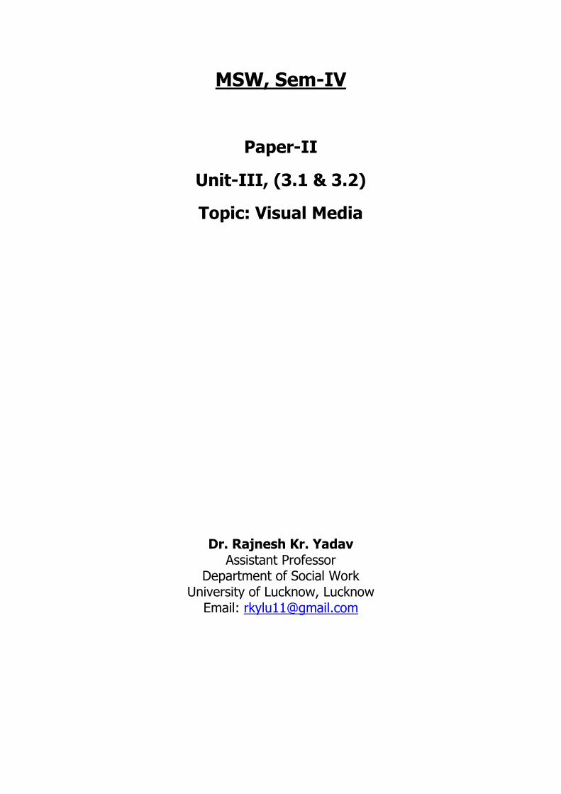
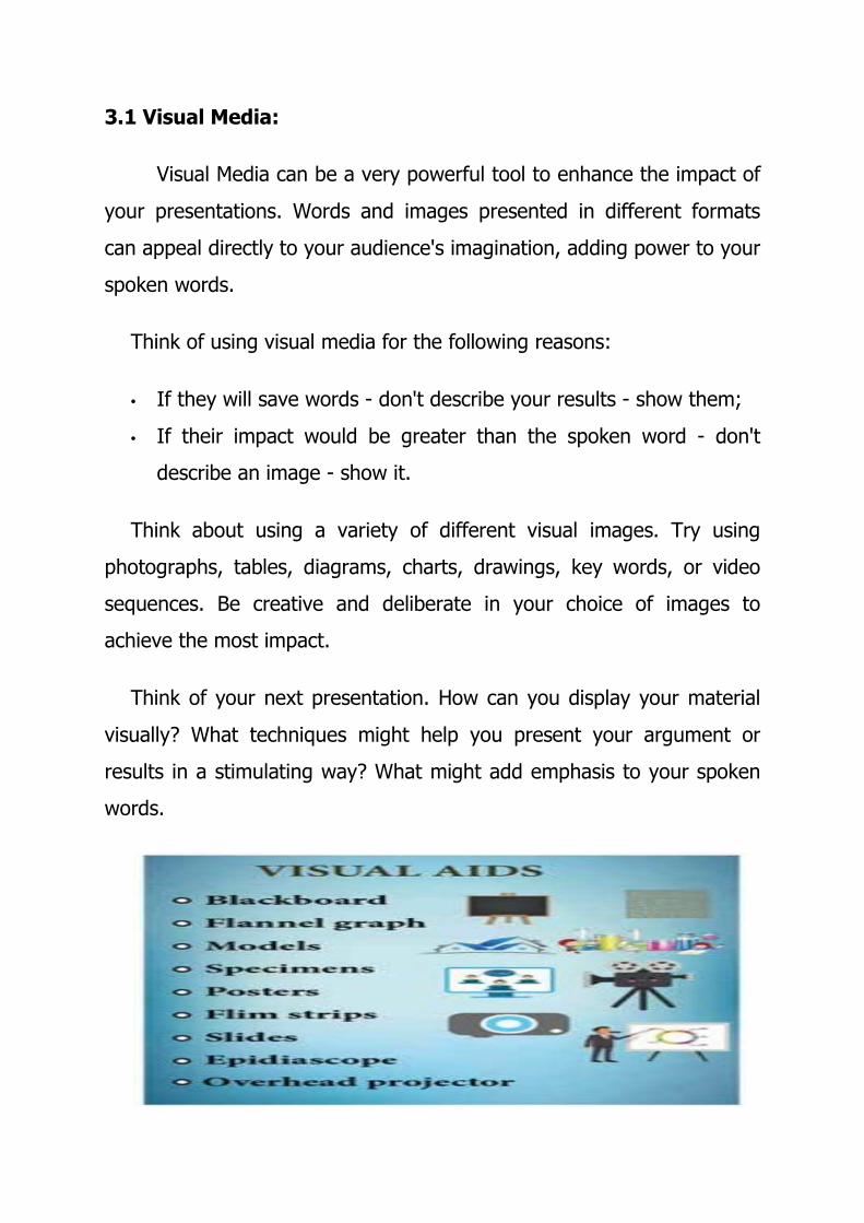
Types of Visual Media:
1. Posters:
2. Charts
3. Photos
4. Bulletin Board
5. Transparencies
6. Power Point Slides
7. Graphs
1. Posters:
This guide presents a strategy for producing poster presentations that
encourages clarity as well as creativity, helping you to make the most of
your poster design.
Types of
Visual
Media
Graphs
Posters
Charts
PhotosBulletin
Board
Tranpar
-
encies
Powerp
oint
• Poster presenters are usually offered a large area to display their
material
• Posters are usually read at a viewing distance of more than one
metre. You will need to make sure that your poster is legible and
easy to scan at this distance so that your information is
understood quickly.
• The temptation to fill the space with as much material as possible
should be avoided; poster presentations should never be as dense
as a printed page.
• Many seminar or workshops organisers supply guidelines
suggesting suitable typeface styles and sizes, along with
conventions for titles and subheadings. Use these to guide your
basic poster design.
• When making posters it is essential that you give careful
consideration to their visual appearance as well as their content.
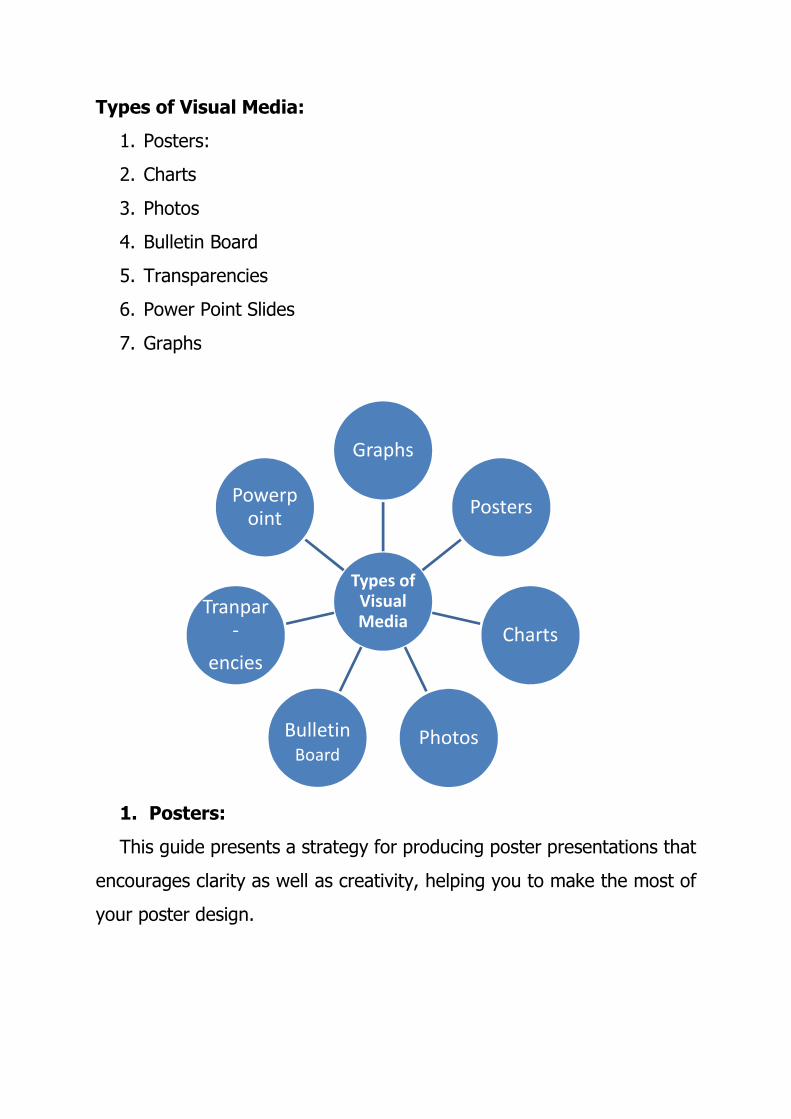
*Poster Presentation
2. Charts:
A chart is a graphical representation of data, in which "the data is
represented by symbols, such as bars in a bar chart, lines in a
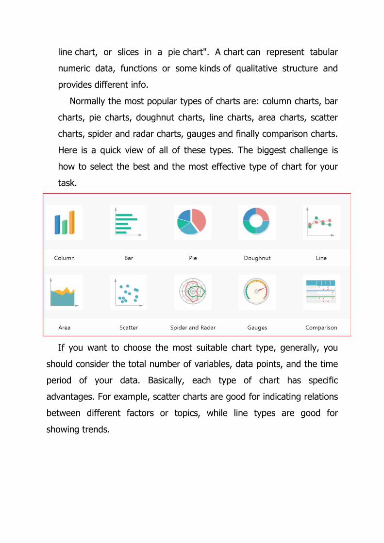
line chart, or slices in a pie chart". A chart can represent tabular
numeric data, functions or some kinds of qualitative structure and
provides different info.
Normally the most popular types of charts are: column charts, bar
charts, pie charts, doughnut charts, line charts, area charts, scatter
charts, spider and radar charts, gauges and finally comparison charts.
Here is a quick view of all of these types. The biggest challenge is
how to select the best and the most effective type of chart for your
task.
If you want to choose the most suitable chart type, generally, you
should consider the total number of variables, data points, and the time
period of your data. Basically, each type of chart has specific
advantages. For example, scatter charts are good for indicating relations
between different factors or topics, while line types are good for
showing trends.
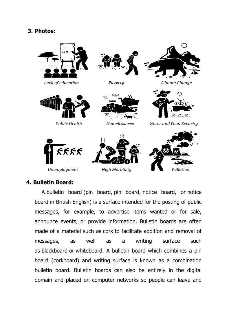
3. Photos:
4. Bulletin Board:
A bulletin board (pin board, pin board, notice board, or notice
board in British English) is a surface intended for the posting of public
messages, for example, to advertise items wanted or for sale,
announce events, or provide information. Bulletin boards are often
made of a material such as cork to facilitate addition and removal of
messages, as well as a writing surface such
as blackboard or whiteboard. A bulletin board which combines a pin
board (corkboard) and writing surface is known as a combination
bulletin board. Bulletin boards can also be entirely in the digital
domain and placed on computer networks so people can leave and
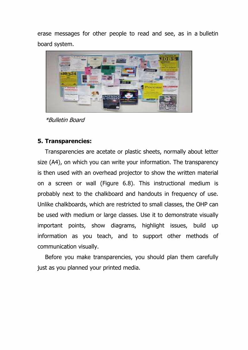
erase messages for other people to read and see, as in a bulletin
board system.
*Bulletin Board
5. Transparencies:
Transparencies are acetate or plastic sheets, normally about letter
size (A4), on which you can write your information. The transparency
is then used with an overhead projector to show the written material
on a screen or wall (Figure 6.8). This instructional medium is
probably next to the chalkboard and handouts in frequency of use.
Unlike chalkboards, which are restricted to small classes, the OHP can
be used with medium or large classes. Use it to demonstrate visually
important points, show diagrams, highlight issues, build up
information as you teach, and to support other methods of
communication visually.
Before you make transparencies, you should plan them carefully
just as you planned your printed media.
Preparing an Overhead Transparency:
Here are some useful steps in preparing overhead transparencies.
� Select the material that you will use for your transparencies. If
there is no acetate paper, then clear plastic sheets, or old but well
cleaned x-ray plates will do.
� Measure your page according to the size of the OHP screen. Leave
a margin at the sides, top and bottom. This will ensure that all
your information can be displayed at once if necessary.
� Plan your text and diagrams carefully. Try to summarize the main
points. You should not attempt to convey your entire talk on the
OHP,
� Remember that you can also add information to your original
transparency as you talk. This can be done by using special pens.
� Choose your colour pens. There are basically two kinds of pens
which you can use for writing or drawing on transparencies: (a)
spirit-based pens whose images are permanent, meaning that the
writing or drawing can only be erased using special solvents such
as methylated spirits, and (b) water based pens whose images
can be erased with plain water.
� Use large bold lettering and clear simple drawings with as few
lines and labels as possible (Laver, 1990).
6. Power Point Slides:
A PowerPoint presentation is a presentation created using
Microsoft PowerPoint software. The presentation is a collection of
individual slides that contain information on a topic. PowerPoint
presentations are commonly used in business meetings and for
training and educational purposes.
A slide is a single page of a presentation. Collectively, a group of
slides may be known as a slide deck. A slide show is an exposition of
a series of slides or images in an electronic device or in a projection
screen.
Before the advent of the personal computer, a presentation slide
could be a 35 mm slide viewed with a slide projector or
a transparency viewed with an overhead projector.
7. Graphs:
Graphs are mathematical structures that represent pairwise
relationships between objects. A graph is a flow structure that
represents the relationship between various objects. It can be visualized
by using the following two basic components:
Nodes: These are the most important components in any graph. Nodes
are entities whose relationships are expressed using edges. If a graph
comprises 2 nodes A and B and an undirected edge between them, then
it expresses a bi-directional relationship between the nodes and edge.
Edges: Edges are the components that are used to represent the
relationships between various nodes in a graph. An edge between two
nodes expresses a one-way or two-way relationship between the nodes.
Types of graphs
Bar Grap:
Bar graph is a way to visually represent qualitative data.
information is displayed either horizontally or vertically and allows
viewers to compare items. The bars are arranged in order of frequency,
so more important categories are emphasized.
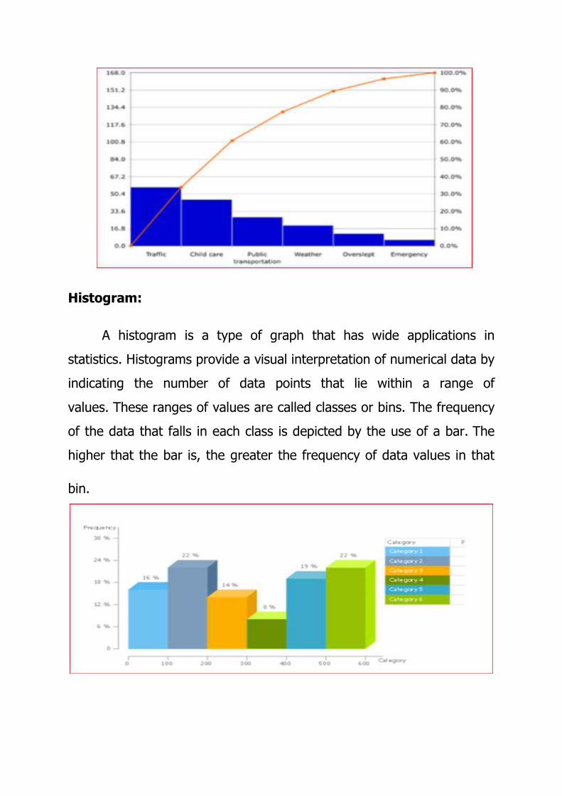
Histogram:
A histogram is a type of graph that has wide applications in
statistics. Histograms provide a visual interpretation of numerical data by
indicating the number of data points that lie within a range of
values. These ranges of values are called classes or bins. The frequency
of the data that falls in each class is depicted by the use of a bar. The
higher that the bar is, the greater the frequency of data values in that
bin.
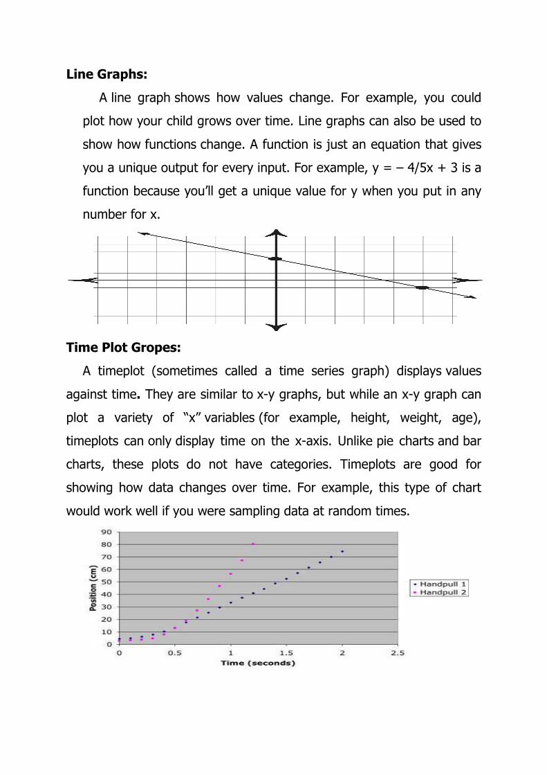
Line Graphs:
A line graph shows how values change. For example, you could
plot how your child grows over time. Line graphs can also be used to
show how functions change. A function is just an equation that gives
you a unique output for every input. For example, y = – 4/5x + 3 is a
function because you’ll get a unique value for y when you put in any
number for x.
Time Plot Gropes:
A timeplot (sometimes called a time series graph) displays values
against time. They are similar to x-y graphs, but while an x-y graph can
plot a variety of “x” variables (for example, height, weight, age),
timeplots can only display time on the x-axis. Unlike pie charts and bar
charts, these plots do not have categories. Timeplots are good for
showing how data changes over time. For example, this type of chart
would work well if you were sampling data at random times.
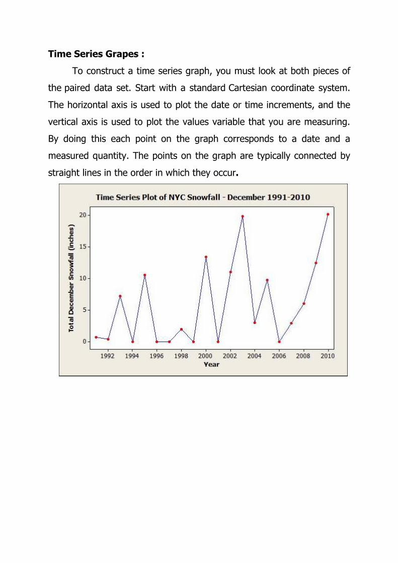
Time Series Grapes :
To construct a time series graph, you must look at both pieces of
the paired data set. Start with a standard Cartesian coordinate system.
The horizontal axis is used to plot the date or time increments, and the
vertical axis is used to plot the values variable that you are measuring.
By doing this each point on the graph corresponds to a date and a
measured quantity. The points on the graph are typically connected by
straight lines in the order in which they occur.
3.2 Steps for Making and Presenting Visual Data:
Steps & Skills in Developing Visual Media:
Well constructed visuals can make your presentation more
exciting, effective and memorable. However, in order for the visuals to
accomplish this, it is critical that they be properly planned and prepared
or they can become a liability rather than an asset. The guidelines on
these pages are designed to help you make the most of your visual
presentation.
Text Pointers:
The text (or word) portion of presentations is used to state facts or
objectives. When lines of text alone do not illustrate your point, a chart,
graph or graphic might be more appropriate.
� Avoid using more than six or seven words (30–40 characters) per
line, six or seven lines per visual. Make sure type is well spaced
and not crowded.
� Eliminate words that do not add meaning, for example: the, an,
etc.
� Avoid complete sentences. Use bulleted phrases.
� Be consistent in grammatical construction of lists; for example, use
all verbs or use all noun phrases.
� Use 36 point type for all titles, and for the text of visual aids to be
used in very large rooms.
� Use at least 18 point type for the main text in other than the
largest rooms.
� Use bullets at beginning of lines to separate ideas.
� Use functions in PowerPoint that allow you to build information,
bullet by bullet, on a slide, to keep the audience from reading
ahead.
Title Pages:
Use title pages to introduce new topics or add special emphasis to
a very important point. The best titles are a few simple lines in large
type.
Graphs, Charts and Diagrams:
Tabular Charts
Tabular charts are used to show raw data and numerical
relationships. Use only a few key examples on the visual to illustrate
your point.
Bar Graphs
Bar graphs are used to show absolute data or relationships and
comparisons. Be sure to include scales and values. Be sure the type is
legible.
Pie Charts
Pie charts are good for illustrating percentage relationships or
parts of a whole. No more than eight segments are recommended.
Line Graphs
Line graphs are ideal for illustrating trends or performance over
time. Your scale should include significant dates and milestones. Graphs
should include no more than three lines. In black and white visuals, the
lines should be distinctly different, e.g., dashed, solid, dots, etc. In color
visuals, the lines should be easily differentiated colors which contrast
well with the background.
Block or Process Diagrams
Block or process diagrams are good for illustrating structural
relationships and designs. Graphics of this type show how each piece
contributes to the whole. Avoid overcrowding. Limit your chart to no
more than 10 simple geometric shapes and titles connected by lines and
arrows.
One-Line Diagrams
Papers often contain electrical one-line diagrams which are an
integral part of a technical discussion. You should limit applying these to
needed segments of a system to make them legible to the audience.
Photographs
Good quality photographic visuals can make a major contribution
to your presentation. Be extra careful with photographs: they must be
very crisp and clear, with high contrast between light and dark areas. Do
not superimpose text over the image. If text is needed on the visual, it
should be placed in areas that have been cleared of the image. Be sure
to test your photos, projecting them to the size they will be when used
to ensure that they are clear and easily recognizable.
Presenting Visual Data:
Your visual presentation should emphasize the most important
points and ideas of your oral presentation. Use the visuals to reinforce,
clarify, illustrate or highlight individual points. Visuals are illustrating, not
repeating, your presentation. Their purpose is to add interest and
emphasis, not to compete with what you are saying.
Some key points to remember when preparing your visuals:
• Simplicity is a key to gaining your audience’s attention and
retaining their interest.
• Focus on one idea at a time. To include three or four ideas in a
single visual usually detracts from your presentation and is apt to
confuse your audience.
• Do not repeat the text of your presentation word-for-word on the
visual.
• Keep statements simple and to the point, using key words and
phrases.
• Use only essential information which supports your statements; for
example, do not project all the statistics you are using. Pick only
the key ones.
• Experiment with a variety of layouts to determine the most
effective ones. Remember that people retain information best
through a picture or a chart rather than words.
• Consider audience size. Visuals must be prepared properly so that
they are clear to even those at the back of a large room.
• Consider handing out copies of your visual presentation. Be sure to
have sufficient quantity available for your audience.
General Guidelines:
• Keep it simple. It is easier for the audience if you use three
simple visuals than a single complex one.
• Keep your audience in mind when designing your visual aids.
What terminology will they understand? What examples have
meaning for them?
• Proofread very carefully. Try to have someone else proof in
addition to yourself. It is hard to overlook errors when they are
magnified in front of an audience. Remember, even a small error
in such a focal part of your program can undermine the credibility
of your entire presentation.
• Fonts should be clear and easy to read. Use Helvetica or
similar sans serif fonts. Decorative fonts are not recommended.
Use only one typeface per visual. Add variety by using different
sizes and bolding title lines.
• Colored fonts should have a dark background (dark blue is
best) with primary titles in either yellow or white and secondary
titles in the remaining color. Details should be shown in clear
bright, light contrasting colors. Use no more than three colors per
visual.
• Avoid using shades of the background color for titles or
details.
• Avoid commercial endorsements. A photograph of apparatus
which incidentally includes a trade name is allowed, but a table
comparing attributes of identified vendor’s products will not be
allowed. There is much gray area in between these two examples;
discuss any concerns you may have with your session chair. The

display of the logo of the company with which you are associated
is restricted for use to the first and last PowerPoint slides or visuals
(usually the title slide). This restriction applies to logos of
educational institutions as well.
• Test your presentation ahead of time. Make sure it is easy to
read from an appropriate distance, and that everything is in the
proper order.


