Embed Size (px)
Citation preview
© Anselm Spoerri
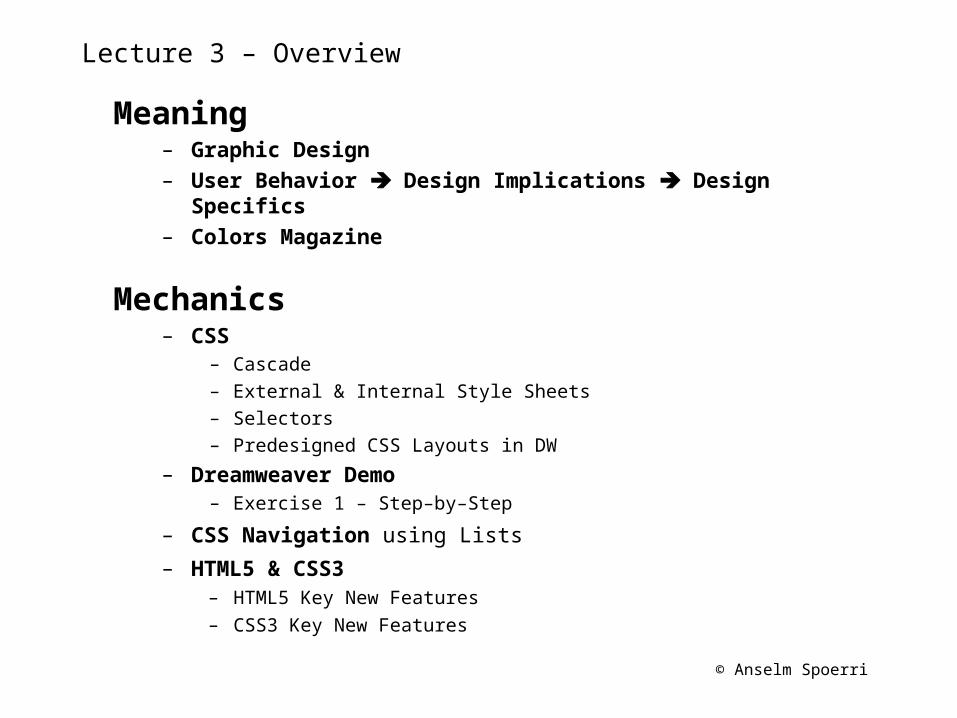
Lecture 3 – Overview
Meaning– Graphic Design – User Behavior Design Implications Design Specifics– Colors Magazine
Mechanics– CSS
– Cascade– External & Internal Style Sheets– Selectors– Predesigned CSS Layouts in DW
– Dreamweaver Demo– Exercise 1 – Step–by–Step
– CSS Navigation using Lists
– HTML5 & CSS3– HTML5 Key New Features– CSS3 Key New Features
© Anselm Spoerri
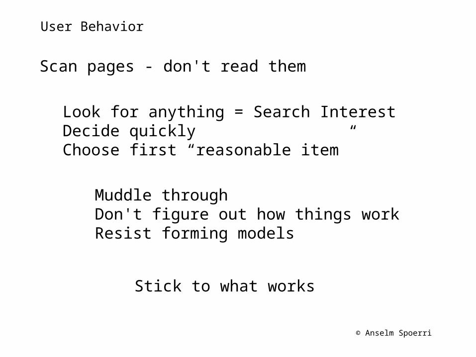
User Behavior
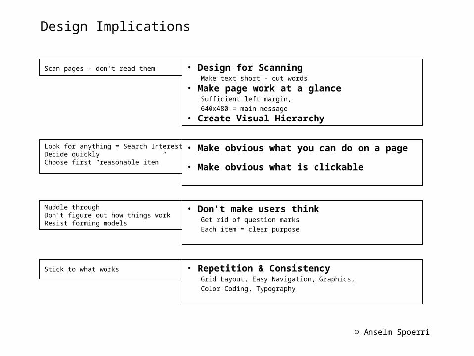
Scan pages - don't read them
Look for anything = Search Interest Decide quickly Choose first “reasonable item”
Muddle through Don't figure out how things work Resist forming models
Stick to what works
© Anselm Spoerri
Design Implications
Scan pages - don't read them • Design for Scanning Make text short - cut words • Make page work at a glance Sufficient left margin, 640x480 = main message
• Create Visual Hierarchy
Look for anything = Search Interest Decide quickly Choose first “reasonable item”
• Make obvious what you can do on a page
• Make obvious what is clickable
Muddle through Don't figure out how things work Resist forming models
• Don't make users think Get rid of question marks Each item = clear purpose
Stick to what works • Repetition & Consistency Grid Layout, Easy Navigation, Graphics, Color Coding, Typography
© Anselm Spoerri
Meaning
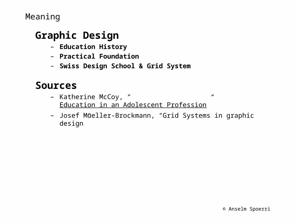
Graphic Design– Education History– Practical Foundation– Swiss Design School & Grid System
Sources– Katherine McCoy, “Education in an Adolescent Profession”– Josef Mueller-Brockmann, “Grid Systems in graphic design”
© Anselm Spoerri
Brief History of Graphic Design Education
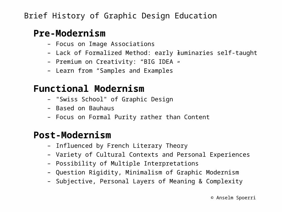
Pre-Modernism– Focus on Image Associations– Lack of Formalized Method: early luminaries self-taught– Premium on Creativity: “BIG IDEA”– Learn from “Samples and Examples”
Functional Modernism– "Swiss School" of Graphic Design– Based on Bauhaus– Focus on Formal Purity rather than Content
Post-Modernism– Influenced by French Literary Theory– Variety of Cultural Contexts and Personal Experiences– Possibility of Multiple Interpretations – Question Rigidity, Minimalism of Graphic Modernism – Subjective, Personal Layers of Meaning & Complexity
© Anselm Spoerri
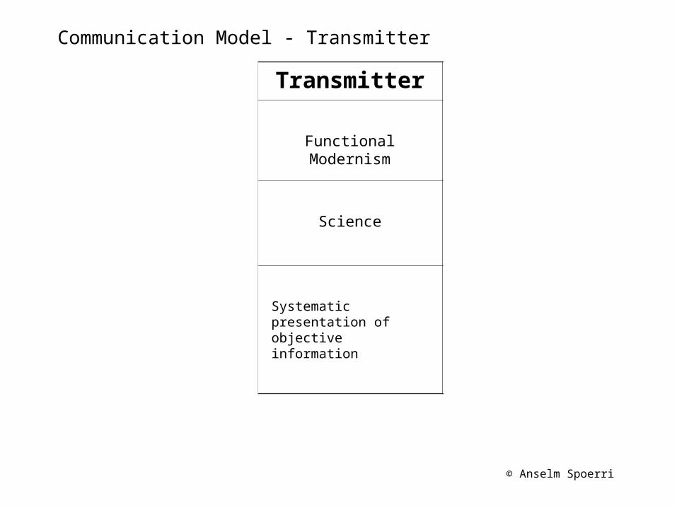
Communication Model - Sender
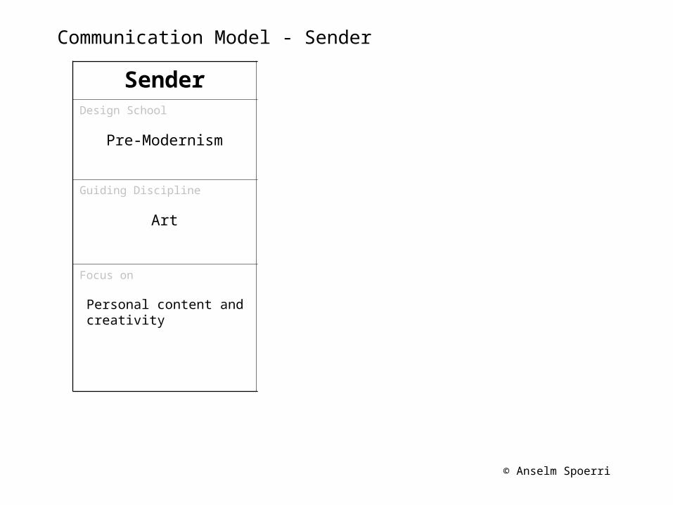
Sender Transmitter ReceiverDesign School
Pre-Modernism Functional Modernism Post-Modernism
Guiding Discipline
Art Science Language
Focus on
Personal content and creativity
Systematic presentation of objective information
Audience's response due to different cultures and subjective experiences
© Anselm Spoerri
Communication Model - Transmitter
Sender Transmitter ReceiverDesign School
Pre-Modernism Functional Modernism Post-Modernism
Guiding Discipline
Art Science Language
Focus on
Personal content and creativity
Systematic presentation of objective information
Audience's response due to different cultures and subjective experiences
© Anselm Spoerri
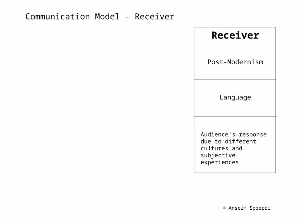
Communication Model - Receiver
Sender Transmitter ReceiverDesign School
Pre-Modernism Functional Modernism Post-Modernism
Guiding Discipline
Art Science Language
Focus on
Personal content and creativity
Systematic presentation of objective information
Audience's response due to different cultures and subjective experiences
© Anselm Spoerri
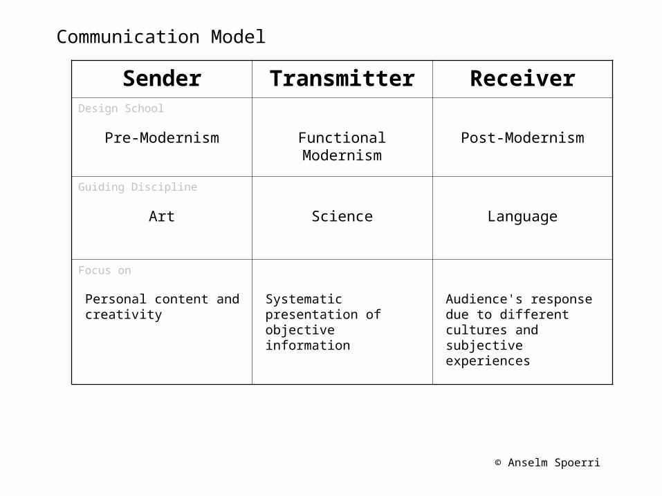
Communication Model
Sender Transmitter ReceiverDesign School
Pre-Modernism Functional Modernism Post-Modernism
Guiding Discipline
Art Science Language
Focus on
Personal content and creativity
Systematic presentation of objective information
Audience's response due to different cultures and subjective experiences
© Anselm Spoerri
Future of Graphic Design
Digital Communications Design – Different Design Strategy than Perfectionist Graphic Design– Less Control, More Conceptual, More Interaction– Users Co-Creators
Requires Deeper Understanding of the Communications Process
Combines Art, Science and Language
Needed Expertise– Multimedia Design: Visual Art, Music, Film– Communications Theory– Cognitive & Perceptual Psychology– Social Sciences & Cultural Anthropology– Computer Science
© Anselm Spoerri
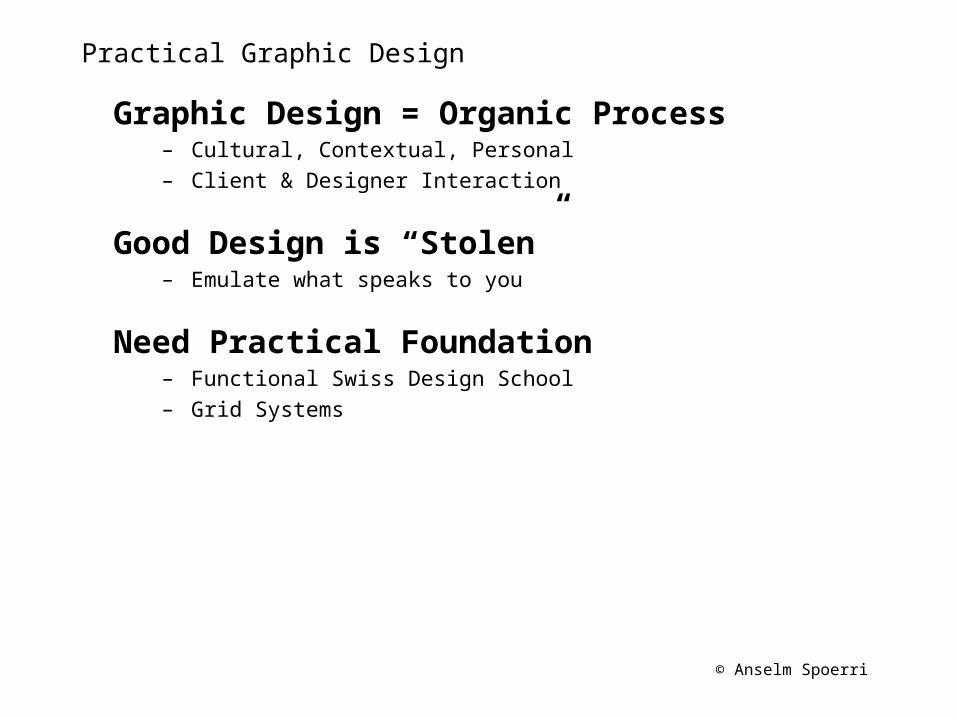
Practical Graphic Design
Graphic Design = Organic Process– Cultural, Contextual, Personal– Client & Designer Interaction
Good Design is “Stolen”– Emulate what speaks to you
Need Practical Foundation– Functional Swiss Design School– Grid Systems
© Anselm Spoerri
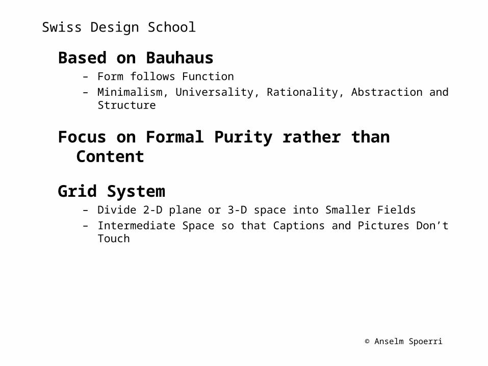
Swiss Design School
Based on Bauhaus– Form follows Function – Minimalism, Universality, Rationality, Abstraction and Structure
Focus on Formal Purity rather than Content
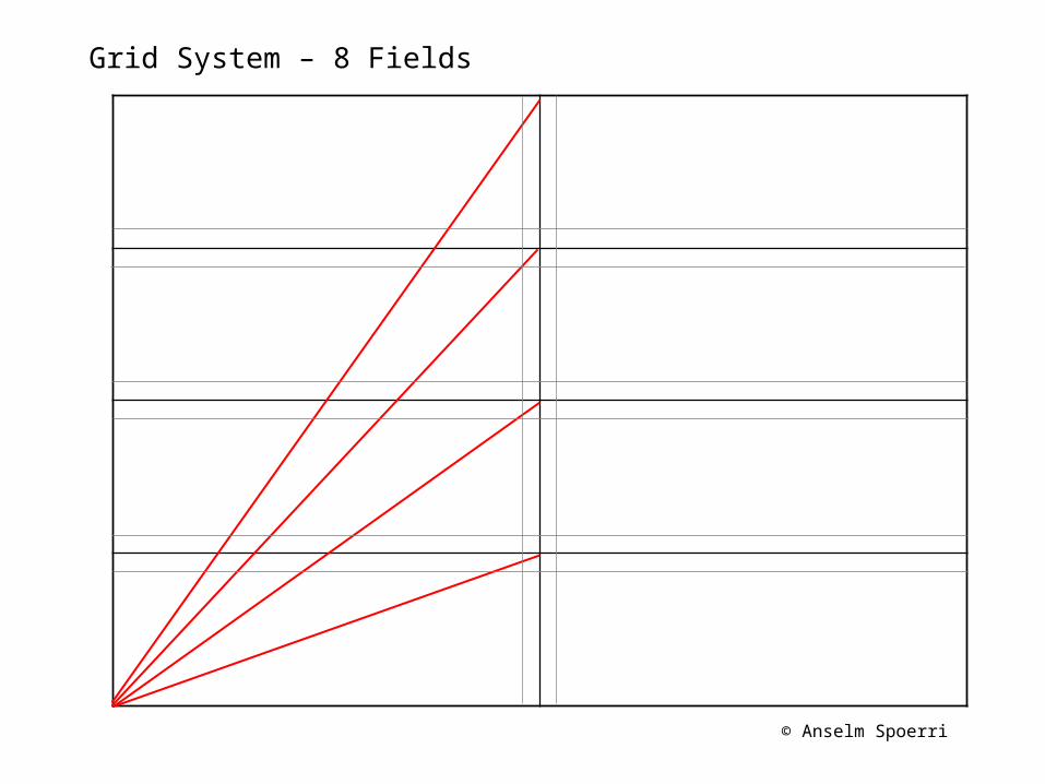
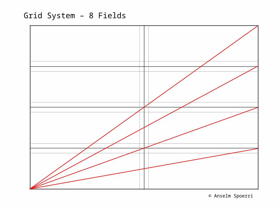
Grid System– Divide 2-D plane or 3-D space into Smaller Fields– Intermediate Space so that Captions and Pictures Don’t Touch
© Anselm Spoerri
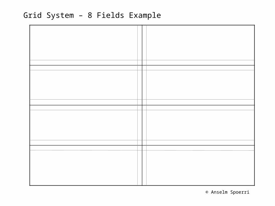
Grid System – 8 Fields Example
© Anselm Spoerri
Grid System – 8 Fields Example
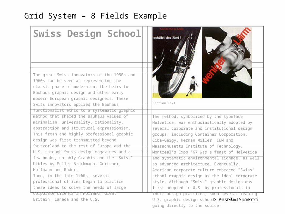
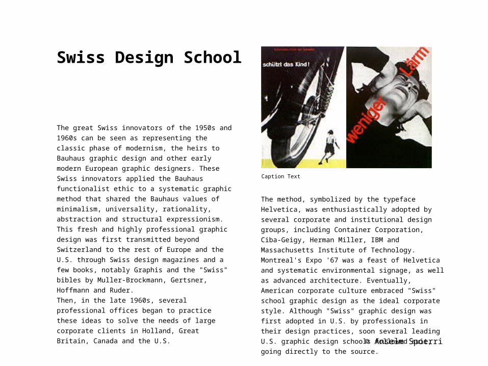
The great Swiss innovators of the 1950s and 1960s
can be seen as representing the classic phase of
modernism, the heirs to Bauhaus graphic design
and other early modern European graphic
designers. These Swiss innovators applied the
Bauhaus functionalist ethic to a systematic graphic
method that shared the Bauhaus values of
minimalism, universality, rationality, abstraction
and structural expressionism. This fresh and highly
professional graphic design was first transmitted
beyond Switzerland to the rest of Europe and the
U.S. through Swiss design magazines and a few
books, notably Graphis and the "Swiss" bibles by
Muller-Brockmann, Gertsner, Hoffmann and Ruder.
Then, in the late 1960s, several professional offices
began to practice these ideas to solve the needs of
large corporate clients in Holland, Great Britain,
Canada and the U.S.
The method, symbolized by the typeface Helvetica,
was enthusiastically adopted by several corporate
and institutional design groups, including Container
Corporation, Ciba-Geigy, Herman Miller, IBM and
Massachusetts Institute of Technology. Montreal's
Expo '67 was a feast of Helvetica and systematic
environmental signage, as well as advanced
architecture. Eventually, American corporate culture
embraced "Swiss" school graphic design as the ideal
corporate style. Although "Swiss" graphic design was
first adopted in U.S. by professionals in their design
practices, soon several leading U.S. graphic design
schools followed suit, going directly to the source.
Caption Text
Swiss Design School
© Anselm Spoerri
Grid System – 8 Fields Example
Swiss Design School
Caption Text
The method, symbolized by the typeface Helvetica,
was enthusiastically adopted by several corporate
and institutional design groups, including Container
Corporation, Ciba-Geigy, Herman Miller, IBM and
Massachusetts Institute of Technology. Montreal's
Expo '67 was a feast of Helvetica and systematic
environmental signage, as well as advanced
architecture. Eventually, American corporate culture
embraced "Swiss" school graphic design as the ideal
corporate style. Although "Swiss" graphic design was
first adopted in U.S. by professionals in their design
practices, soon several leading U.S. graphic design
schools followed suit, going directly to the source.
The great Swiss innovators of the 1950s and 1960s
can be seen as representing the classic phase of
modernism, the heirs to Bauhaus graphic design
and other early modern European graphic
designers. These Swiss innovators applied the
Bauhaus functionalist ethic to a systematic graphic
method that shared the Bauhaus values of
minimalism, universality, rationality, abstraction
and structural expressionism. This fresh and highly
professional graphic design was first transmitted
beyond Switzerland to the rest of Europe and the
U.S. through Swiss design magazines and a few
books, notably Graphis and the "Swiss" bibles by
Muller-Brockmann, Gertsner, Hoffmann and Ruder.
Then, in the late 1960s, several professional offices
began to practice these ideas to solve the needs of
large corporate clients in Holland, Great Britain,
Canada and the U.S.
© Anselm Spoerri
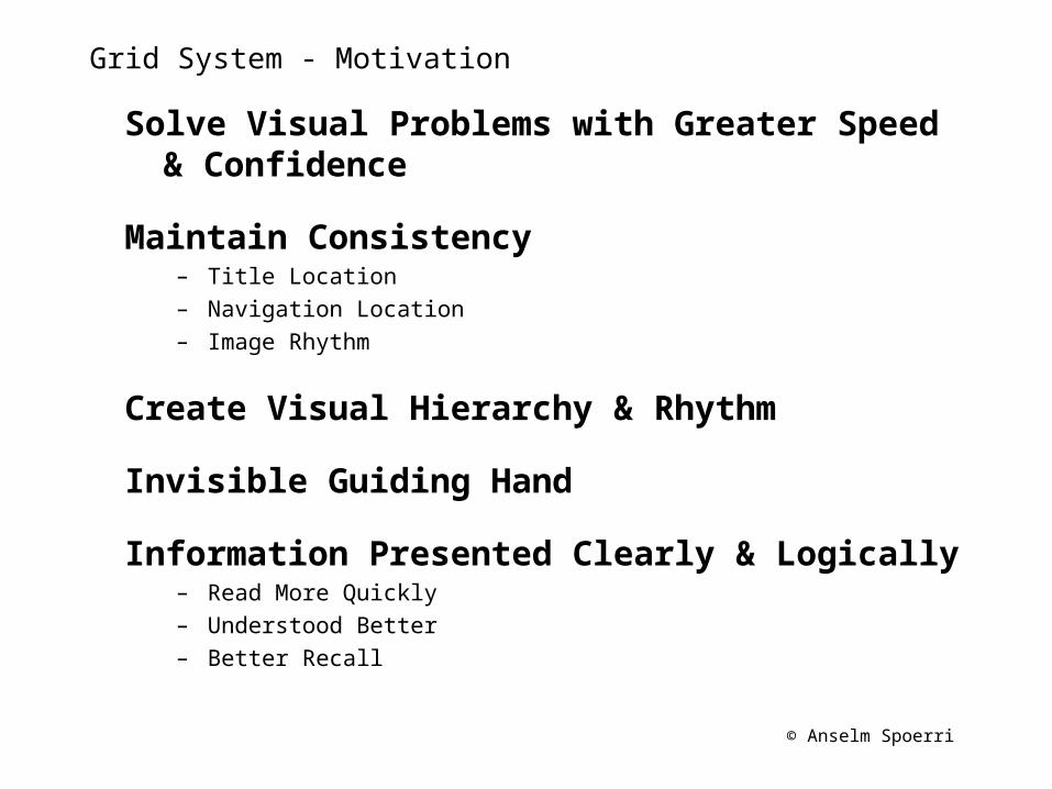
Grid System - Motivation
Solve Visual Problems with Greater Speed & Confidence
Maintain Consistency– Title Location– Navigation Location– Image Rhythm
Create Visual Hierarchy & Rhythm
Invisible Guiding Hand
Information Presented Clearly & Logically – Read More Quickly– Understood Better– Better Recall
© Anselm Spoerri
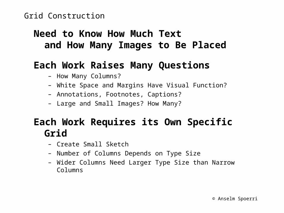
Grid Construction
Need to Know How Much Text and How Many Images to Be Placed
Each Work Raises Many Questions– How Many Columns?– White Space and Margins Have Visual Function?– Annotations, Footnotes, Captions?– Large and Small Images? How Many?
Each Work Requires its Own Specific Grid– Create Small Sketch– Number of Columns Depends on Type Size– Wider Columns Need Larger Type Size than Narrow Columns
© Anselm Spoerri
Grid System – 8 Fields
© Anselm Spoerri
Grid System – 8 Fields
© Anselm Spoerri
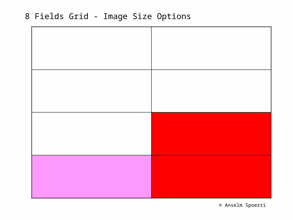
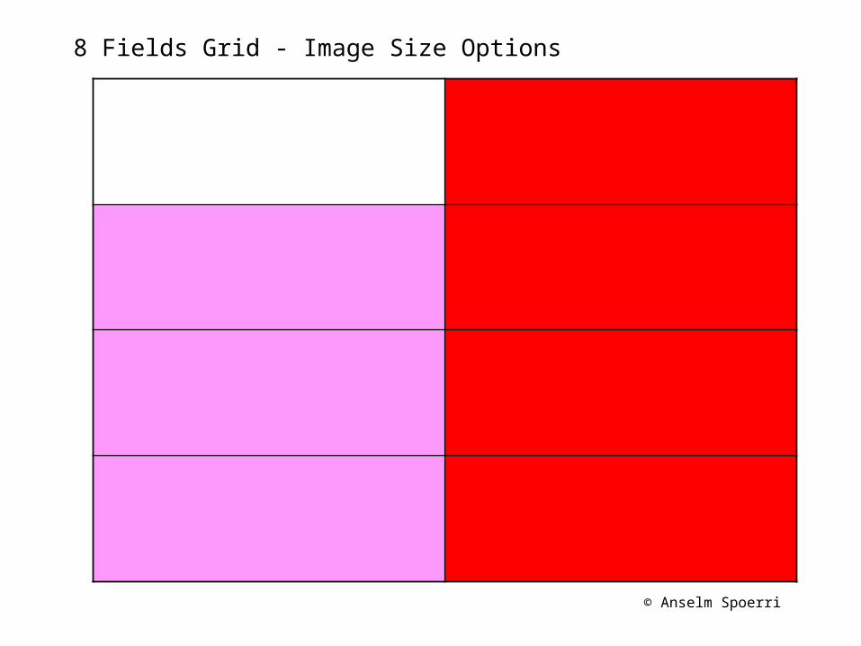
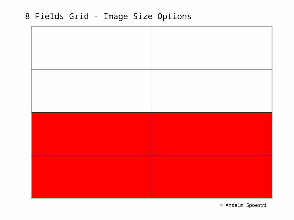
8 Fields Grid - Image Size Options
© Anselm Spoerri
8 Fields Grid - Image Size Options
© Anselm Spoerri
8 Fields Grid - Image Size Options
© Anselm Spoerri
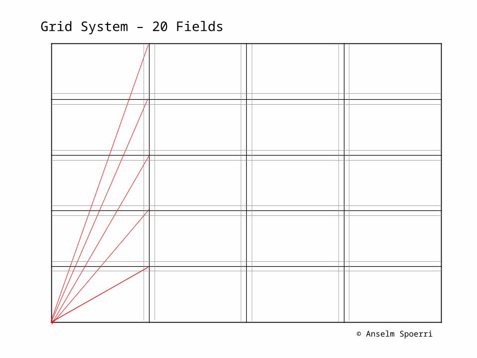
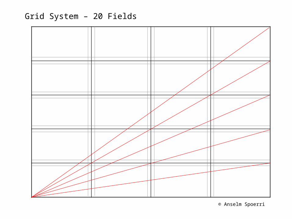
Grid System – 20 Fields
© Anselm Spoerri
Grid System – 20 Fields
© Anselm Spoerri
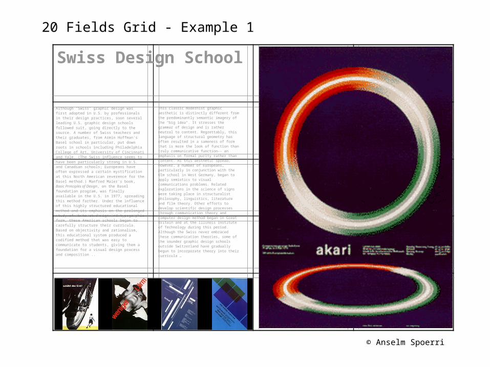
20 Fields Grid - Example 1
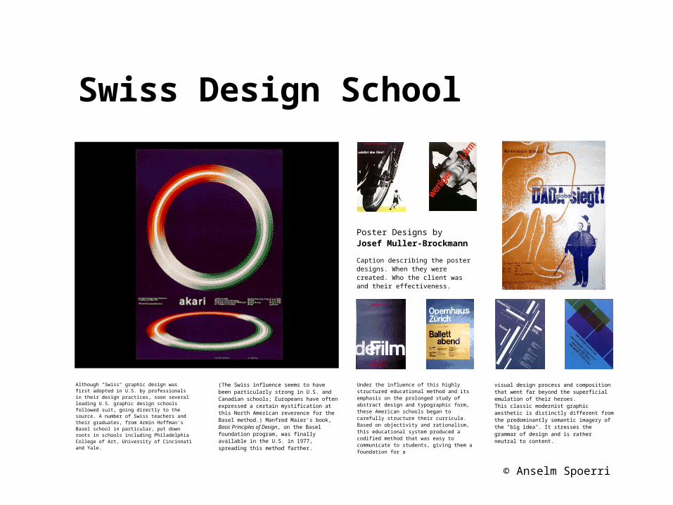
Although "Swiss" graphic design was first adopted in U.S. by professionals in their design practices, soon several leading U.S. graphic design schools followed suit, going directly to the source. A number of Swiss teachers and their graduates, from Armin Hoffman's Basel school in particular, put down roots in schools including Philadelphia College of Art, University of Cincinnati and Yale. (The Swiss influence seems to have been particularly strong in U.S. and Canadian schools; Europeans have often expressed a certain mystification at this North American reverence for the Basel method.) Manfred Maier's book, Basic Principles of Design, on the Basel foundation program, was finally available in the U.S. in 1977, spreading this method farther. Under the influence of this highly structured educational method and its emphasis on the prolonged study of abstract design and typographic form, these American schools began to carefully structure their curricula. Based on objectivity and rationalism, this educational system produced a codified method that was easy to communicate to students, giving them a foundation for a visual design process and composition ..
This classic modernist graphic aesthetic is distinctly different from the predominantly semantic imagery of the "big idea". It stresses the grammar of design and is rather neutral to content. Regrettably, this language of structural geometry has often resulted in a sameness of form that is more the look of function than truly communicative function-- an emphasis on formal purity rather than content. As this aesthetic spread, however, a number of Europeans, particularly in conjunction with the Ulm school in West Germany, began to apply semiotics to visual communications problems. Related explorations in the science of signs were taking place in structuralist philosophy, linguistics, literature and film theory. Other efforts to develop scientific design processes through communication theory and computer design method began in Great Britain and at the Illinois Institute of Technology during this period. Although the Swiss never embraced these communication theories, some of the sounder graphic design schools outside Switzerland have gradually begun to incorporate theory into their curricula …
Swiss Design School
© Anselm Spoerri
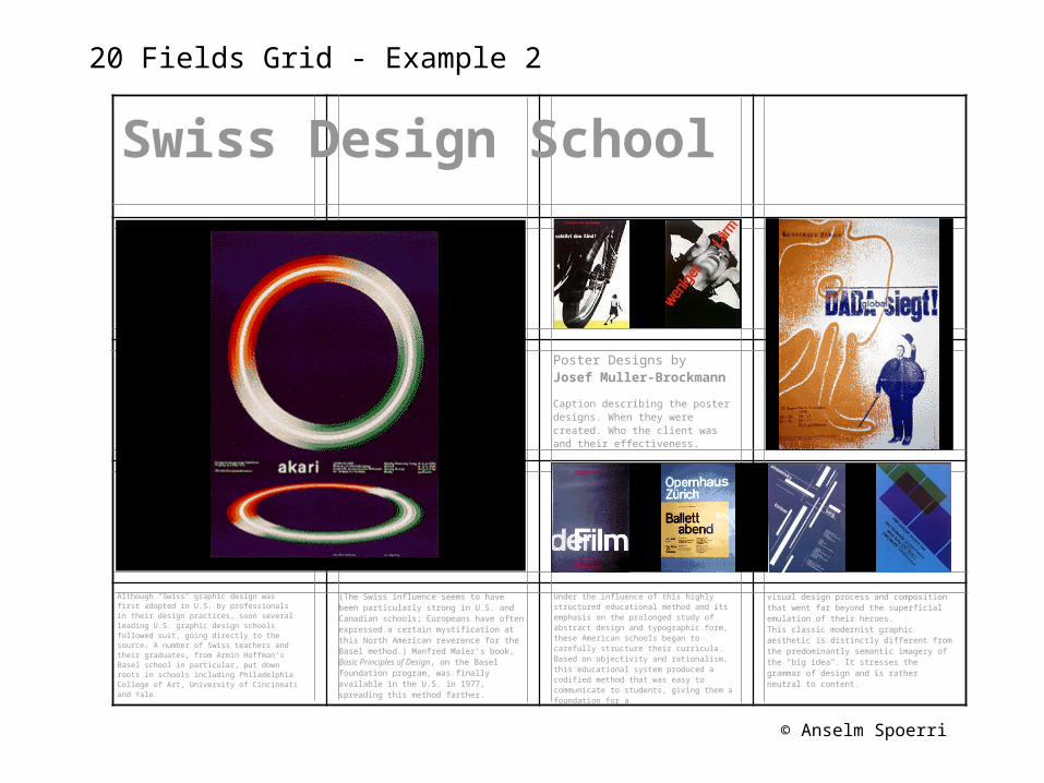
20 Fields Grid - Example 2
Although "Swiss" graphic design was first adopted in U.S. by professionals in their design practices, soon several leading U.S. graphic design schools followed suit, going directly to the source. A number of Swiss teachers and their graduates, from Armin Hoffman's Basel school in particular, put down roots in schools including Philadelphia College of Art, University of Cincinnati and Yale.
Swiss Design School
(The Swiss influence seems to have been particularly strong in U.S. and Canadian schools; Europeans have often expressed a certain mystification at this North American reverence for the Basel method.) Manfred Maier's book, Basic Principles of Design, on the Basel foundation program, was finally available in the U.S. in 1977, spreading this method farther.
Under the influence of this highly structured educational method and its emphasis on the prolonged study of abstract design and typographic form, these American schools began to carefully structure their curricula. Based on objectivity and rationalism, this educational system produced a codified method that was easy to communicate to students, giving them a foundation for a
visual design process and composition that went far beyond the superficial emulation of their heroes.This classic modernist graphic aesthetic is distinctly different from the predominantly semantic imagery of the "big idea". It stresses the grammar of design and is rather neutral to content.
Poster Designs byJosef Muller-Brockmann
Caption describing the poster designs. When they were created. Who the client was and their effectiveness.
© Anselm Spoerri
20 Fields Grid - Example 2a
Swiss Design School
Poster Designs byJosef Muller-Brockmann
Caption describing the poster designs. When they were created. Who the client was and their effectiveness.
Although "Swiss" graphic design was first adopted in U.S. by professionals in their design practices, soon several leading U.S. graphic design schools followed suit, going directly to the source. A number of Swiss teachers and their graduates, from Armin Hoffman's Basel school in particular, put down roots in schools including Philadelphia College of Art, University of Cincinnati and Yale.
(The Swiss influence seems to have been particularly strong in U.S. and Canadian schools; Europeans have often expressed a certain mystification at this North American reverence for the Basel method.) Manfred Maier's book, Basic Principles of Design, on the Basel foundation program, was finally available in the U.S. in 1977, spreading this method farther.
Under the influence of this highly structured educational method and its emphasis on the prolonged study of abstract design and typographic form, these American schools began to carefully structure their curricula. Based on objectivity and rationalism, this educational system produced a codified method that was easy to communicate to students, giving them a foundation for a
visual design process and composition that went far beyond the superficial emulation of their heroes.This classic modernist graphic aesthetic is distinctly different from the predominantly semantic imagery of the "big idea". It stresses the grammar of design and is rather neutral to content.
© Anselm Spoerri
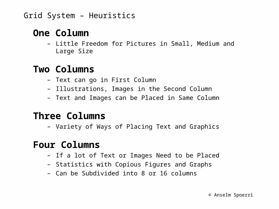
Grid System – Heuristics
One Column– Little Freedom for Pictures in Small, Medium and Large Size
Two Columns– Text can go in First Column– Illustrations, Images in the Second Column– Text and Images can be Placed in Same Column
Three Columns– Variety of Ways of Placing Text and Graphics
Four Columns– If a lot of Text or Images Need to be Placed– Statistics with Copious Figures and Graphs– Can be Subdivided into 8 or 16 columns
© Anselm Spoerri
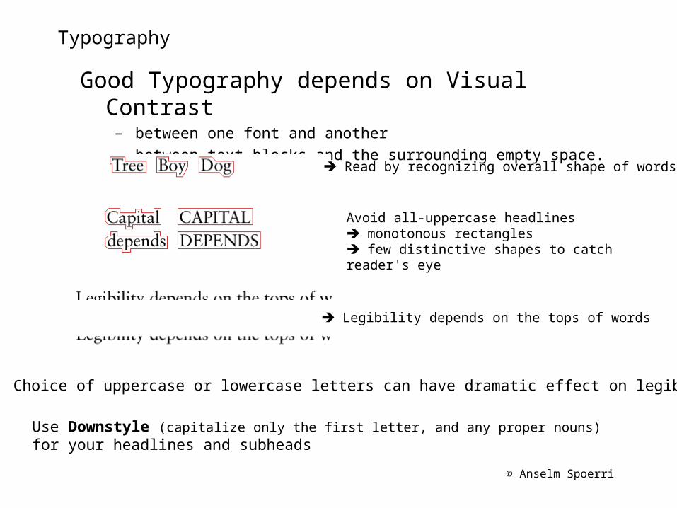
Typography
Good Typography depends on Visual Contrast – between one font and another– between text blocks and the surrounding empty space.
Read by recognizing overall shape of words
Avoid all-uppercase headlines monotonous rectangles few distinctive shapes to catch reader's eye
Legibility depends on the tops of words
Choice of uppercase or lowercase letters can have dramatic effect on legibility.
Use Downstyle (capitalize only the first letter, and any proper nouns) for your headlines and subheads
© Anselm Spoerri
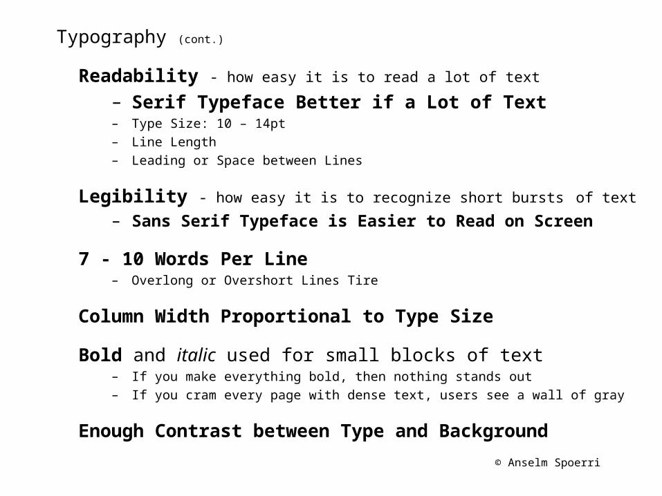
Typography (cont.)
Readability - how easy it is to read a lot of text
– Serif Typeface Better if a Lot of Text– Type Size: 10 – 14pt– Line Length– Leading or Space between Lines
Legibility - how easy it is to recognize short bursts of text – Sans Serif Typeface is Easier to Read on Screen
7 - 10 Words Per Line– Overlong or Overshort Lines Tire
Column Width Proportional to Type Size
Bold and italic used for small blocks of text– If you make everything bold, then nothing stands out– If you cram every page with dense text, users see a wall of gray
Enough Contrast between Type and Background
© Anselm Spoerri
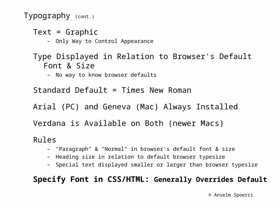
Typography (cont.)
Text = Graphic – Only Way to Control Appearance
Type Displayed in Relation to Browser's Default Font & Size– No way to know browser defaults
Standard Default = Times New Roman
Arial (PC) and Geneva (Mac) Always Installed
Verdana is Available on Both (newer Macs)
Rules– "Paragraph" & "Normal" in browser's default font & size– Heading size in relation to default browser typesize– Special text displayed smaller or larger than browser typesize
Specify Font in CSS/HTML: Generally Overrides Default
© Anselm Spoerri
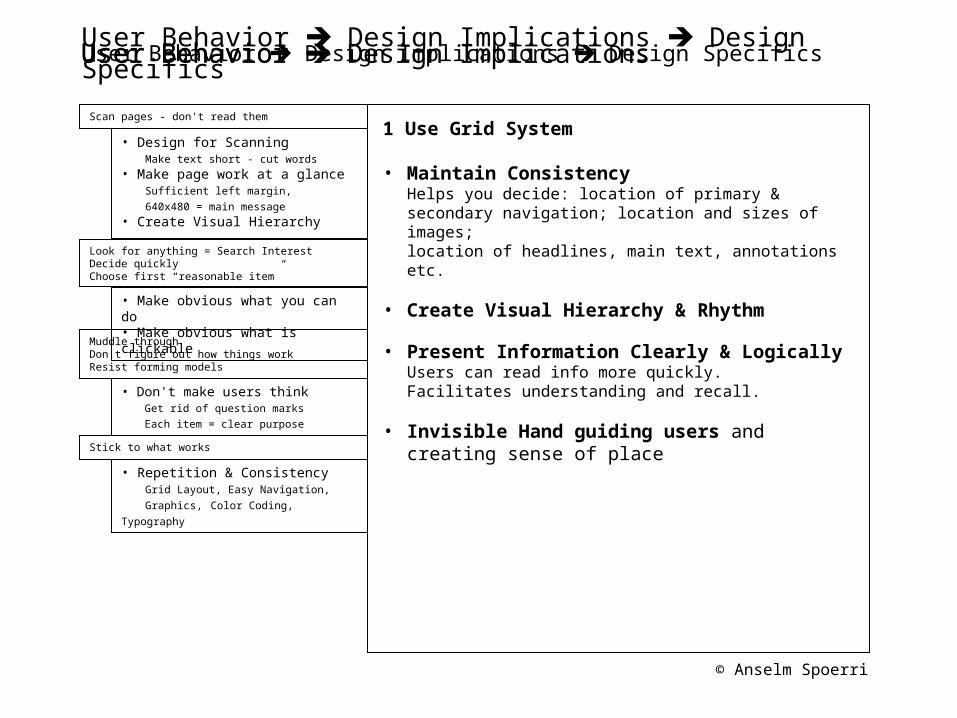
User Behavior Design Implications Design Specifics
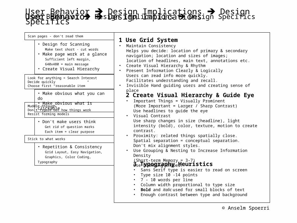
1 Use Grid System
• Maintain ConsistencyHelps you decide: location of primary & secondary navigation; location and sizes of images; location of headlines, main text, annotations etc.
• Create Visual Hierarchy & Rhythm
• Present Information Clearly & LogicallyUsers can read info more quickly.Facilitates understanding and recall.
• Invisible Hand guiding users and creating sense of place
• Design for Scanning Make text short - cut words • Make page work at a glance Sufficient left margin, 640x480 = main message• Create Visual Hierarchy
• Make obvious what you can do • Make obvious what is clickable
• Don't make users think Get rid of question marks
Each item = clear purpose
• Repetition & Consistency Grid Layout, Easy Navigation,
Graphics, Color Coding, Typography
User Behavior Design ImplicationsUser Behavior Design Implications Design Specifics
Scan pages - don't read them
Look for anything = Search Interest Decide quickly Choose first “reasonable item”
Muddle through Don't figure out how things work Resist forming models
Stick to what works
User Behavior
© Anselm Spoerri
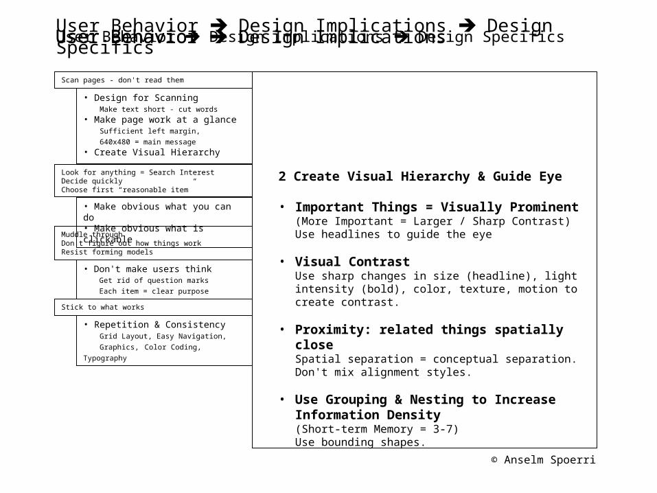
User Behavior Design Implications Design Specifics
2 Create Visual Hierarchy & Guide Eye
• Important Things = Visually Prominent(More Important = Larger / Sharp Contrast)Use headlines to guide the eye
• Visual ContrastUse sharp changes in size (headline), light intensity (bold), color, texture, motion to create contrast.
• Proximity: related things spatially closeSpatial separation = conceptual separation.Don't mix alignment styles.
• Use Grouping & Nesting to Increase Information Density (Short-term Memory = 3-7)Use bounding shapes.
• Design for Scanning Make text short - cut words • Make page work at a glance Sufficient left margin, 640x480 = main message• Create Visual Hierarchy
• Make obvious what you can do • Make obvious what is clickable
• Don't make users think Get rid of question marks
Each item = clear purpose
• Repetition & Consistency Grid Layout, Easy Navigation,
Graphics, Color Coding, Typography
User Behavior Design ImplicationsUser Behavior Design Implications Design Specifics
Scan pages - don't read them
Look for anything = Search Interest Decide quickly Choose first “reasonable item”
Muddle through Don't figure out how things work Resist forming models
Stick to what works
User Behavior
© Anselm Spoerri
User Behavior Design Implications Design Specifics
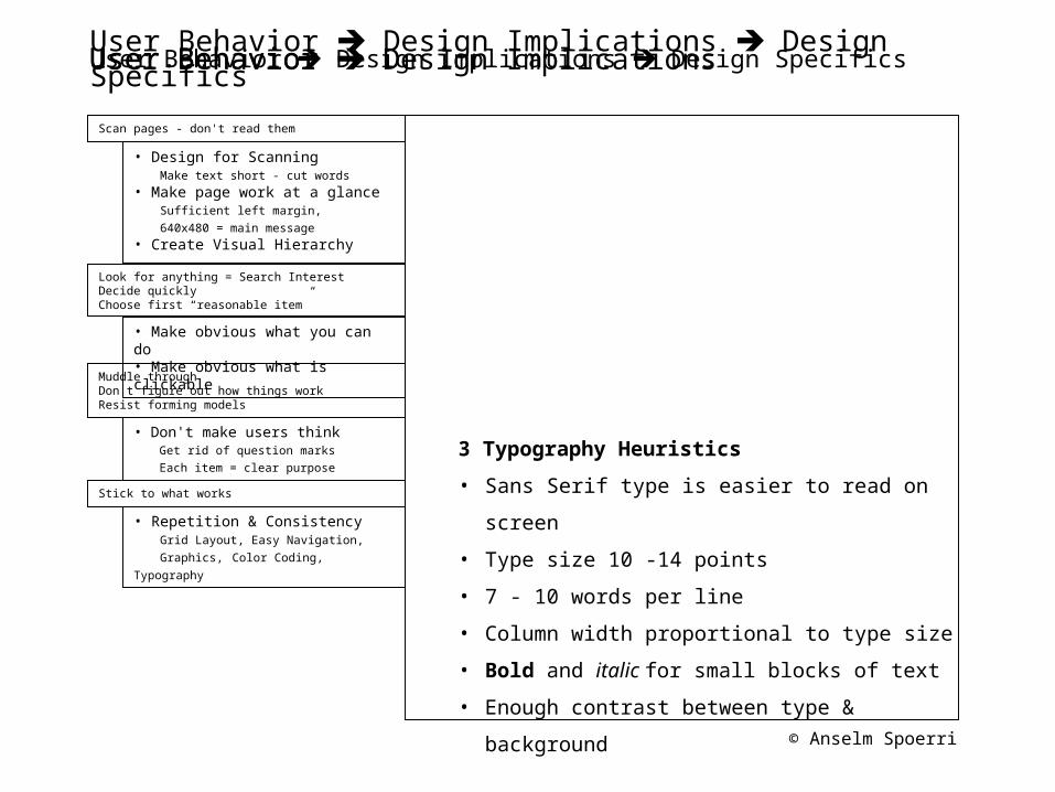
3 Typography Heuristics
• Sans Serif type is easier to read on screen
• Type size 10 -14 points
• 7 - 10 words per line
• Column width proportional to type size
• Bold and italic for small blocks of text
• Enough contrast between type & background
• Design for Scanning Make text short - cut words • Make page work at a glance Sufficient left margin, 640x480 = main message• Create Visual Hierarchy
• Make obvious what you can do • Make obvious what is clickable
• Don't make users think Get rid of question marks
Each item = clear purpose
• Repetition & Consistency Grid Layout, Easy Navigation,
Graphics, Color Coding, Typography
User Behavior Design ImplicationsUser Behavior Design Implications Design Specifics
Scan pages - don't read them
Look for anything = Search Interest Decide quickly Choose first “reasonable item”
Muddle through Don't figure out how things work Resist forming models
Stick to what works
User Behavior
© Anselm Spoerri
User Behavior Design Implications Design Specifics
1 Use Grid System• Maintain Consistency
Helps you decide: location of primary & secondary navigation; location and sizes of images; location of headlines, main text, annotations etc.
• Create Visual Hierarchy & Rhythm • Present Information Clearly & Logically
Users can read info more quickly.Facilitates understanding and recall.
• Invisible Hand guiding users and creating sense of place
2 Create Visual Hierarchy & Guide Eye • Important Things = Visually Prominent
(More Important = Larger / Sharp Contrast)Use headlines to guide the eye
• Visual ContrastUse sharp changes in size (headline), light intensity (bold), color, texture, motion to create contrast.
• Proximity: related things spatially close.Spatial separation = conceptual separation.Don't mix alignment styles.
• Use Grouping & Nesting to Increase Information Density (Short-term Memory = 3-7)Use bounding shapes.
3 Typography Heuristics • Sans Serif type is easier to read on screen • Type size 10 -14 points • 7 - 10 words per line • Column width proportional to type size • Bold and italic used for small blocks of text • Enough contrast between type and background
• Design for Scanning Make text short - cut words • Make page work at a glance Sufficient left margin, 640x480 = main message• Create Visual Hierarchy
• Make obvious what you can do • Make obvious what is clickable
• Don't make users think Get rid of question marks
Each item = clear purpose
• Repetition & Consistency Grid Layout, Easy Navigation,
Graphics, Color Coding, Typography
User Behavior Design ImplicationsUser Behavior Design Implications Design Specifics
Scan pages - don't read them
Look for anything = Search Interest Decide quickly Choose first “reasonable item”
Muddle through Don't figure out how things work Resist forming models
Stick to what works
User Behavior
© Anselm Spoerri
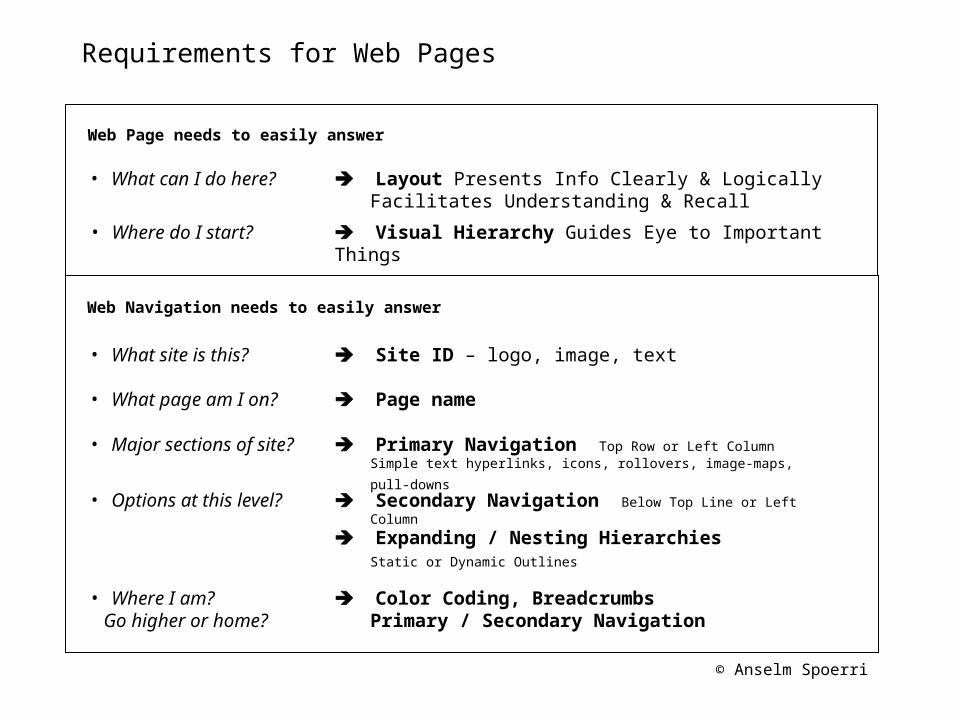
Requirements for Web Pages
Layout Presents Info Clearly & LogicallyFacilitates Understanding & Recall
Visual Hierarchy Guides Eye to Important Things• Where do I start?
• What can I do here?
• What site is this?
• What page am I on?
• Options at this level?
• Where I am? Go higher or home?
• Major sections of site?
Web Page needs to easily answer
Web Navigation needs to easily answer
Site ID – logo, image, text
Page name
Primary Navigation Top Row or Left Column
Simple text hyperlinks, icons, rollovers, image-maps, pull-downs
Secondary Navigation Below Top Line or Left Column
Expanding / Nesting Hierarchies Static or Dynamic Outlines
Color Coding, BreadcrumbsPrimary / Secondary Navigation
© Anselm Spoerri
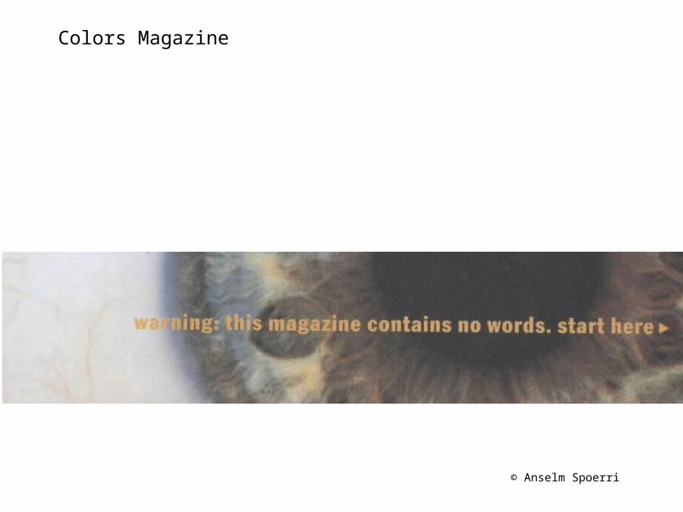
Colors Magazine
© Anselm Spoerri
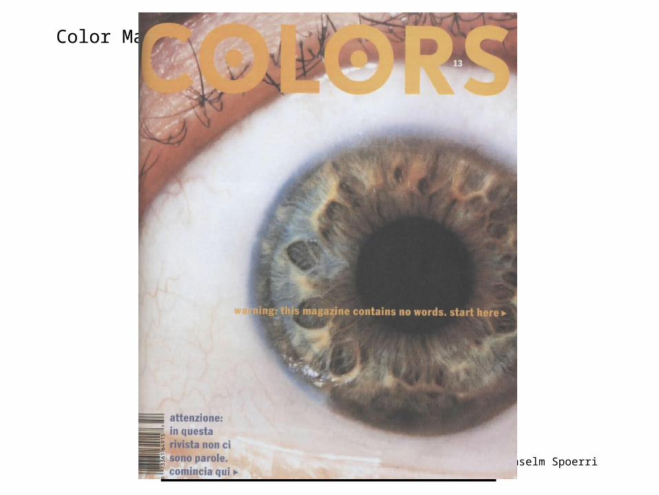
Color Magazine
© Anselm Spoerri
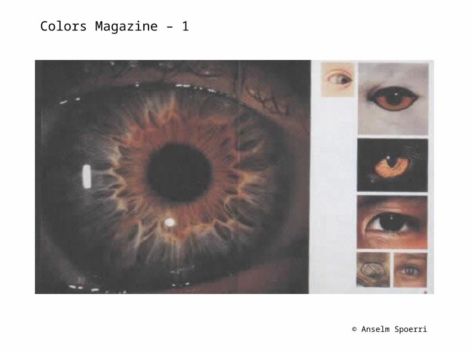
Colors Magazine – 1
© Anselm Spoerri
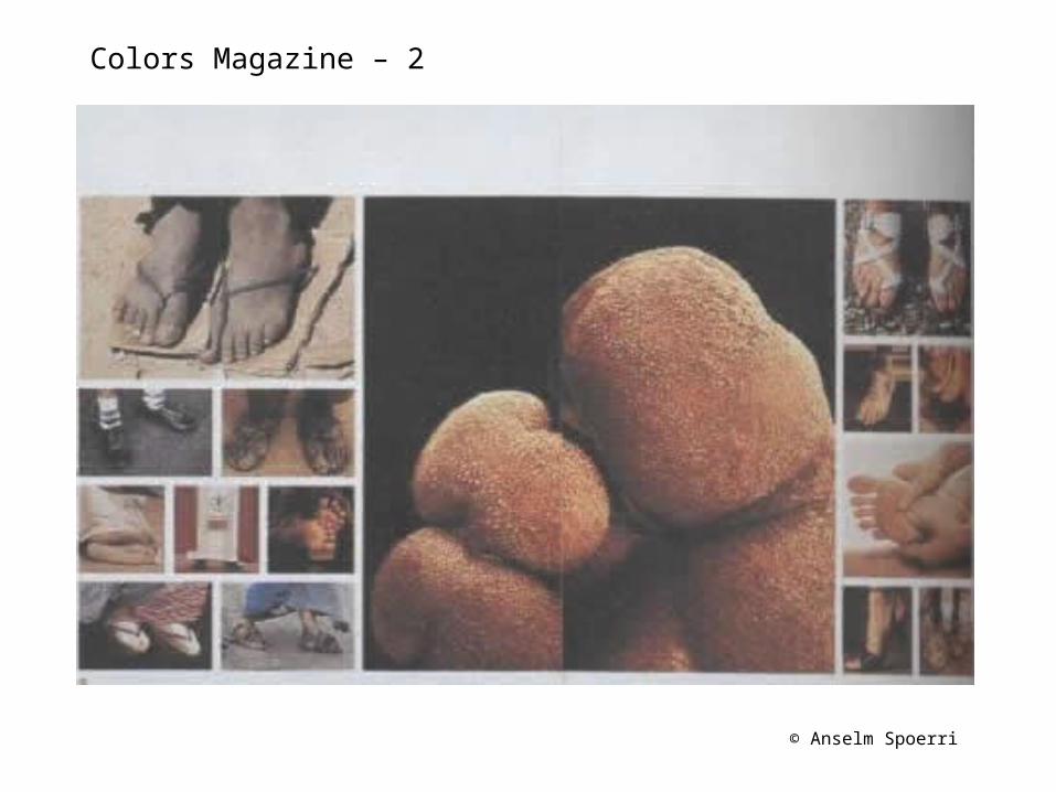
Colors Magazine – 2
© Anselm Spoerri
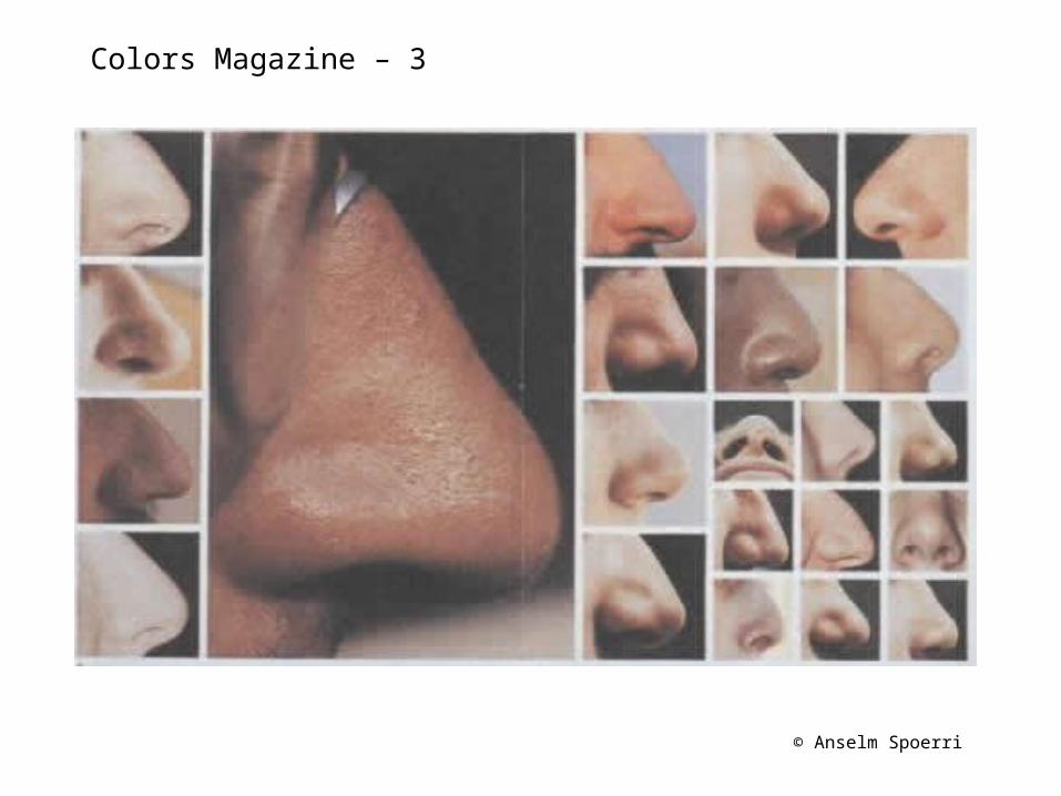
Colors Magazine – 3
© Anselm Spoerri
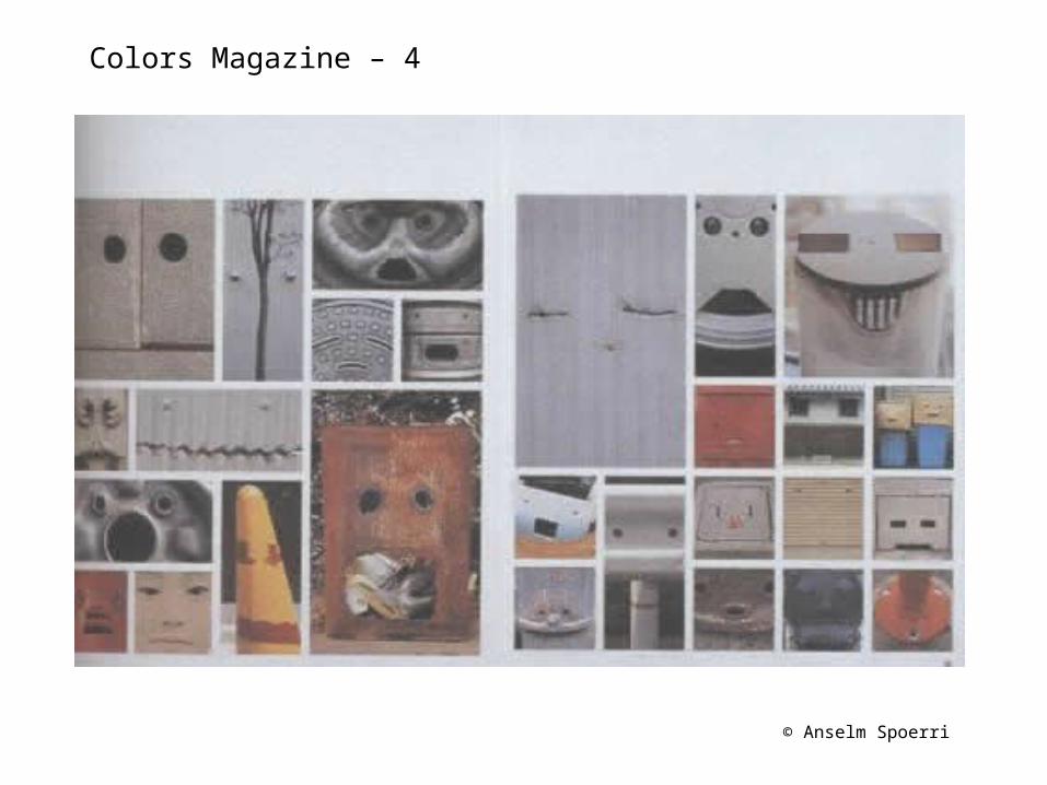
Colors Magazine – 4
© Anselm Spoerri
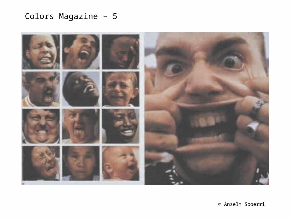
Colors Magazine – 5
© Anselm Spoerri
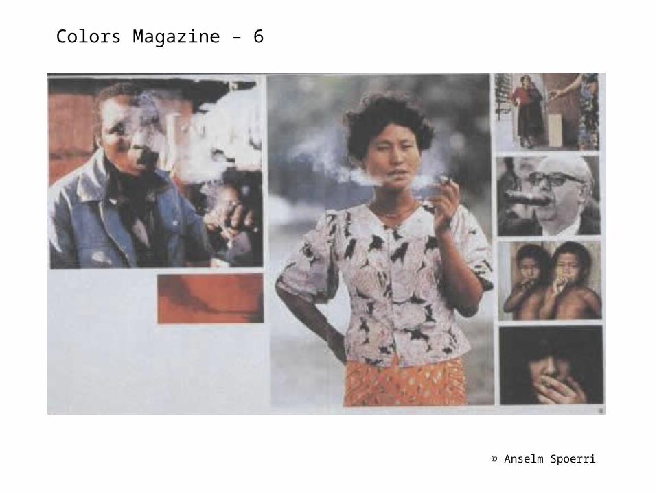
Colors Magazine – 6
© Anselm Spoerri
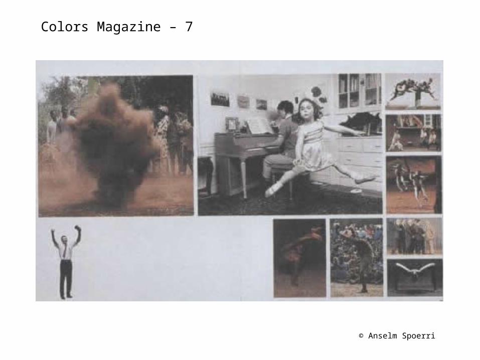
Colors Magazine – 7
© Anselm Spoerri
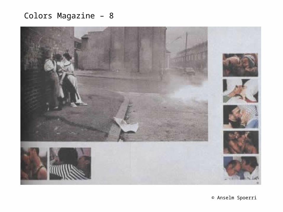
Colors Magazine – 8
© Anselm Spoerri
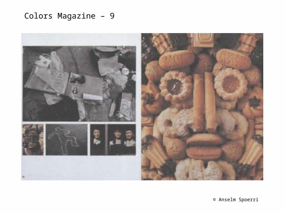
Colors Magazine – 9
© Anselm Spoerri
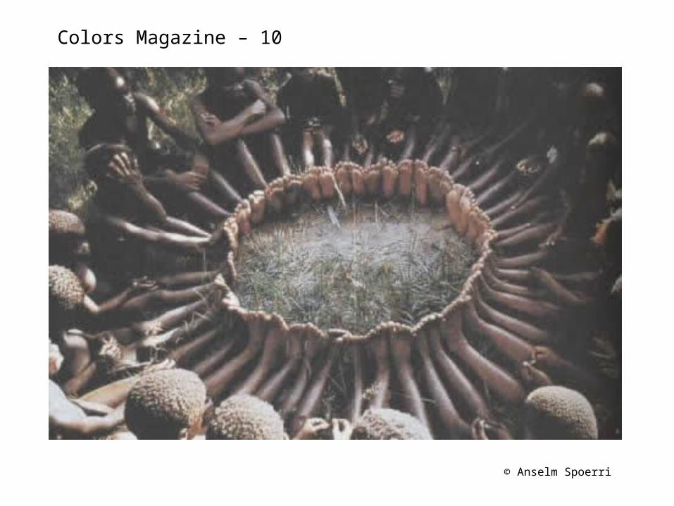
Colors Magazine – 10
© Anselm Spoerri
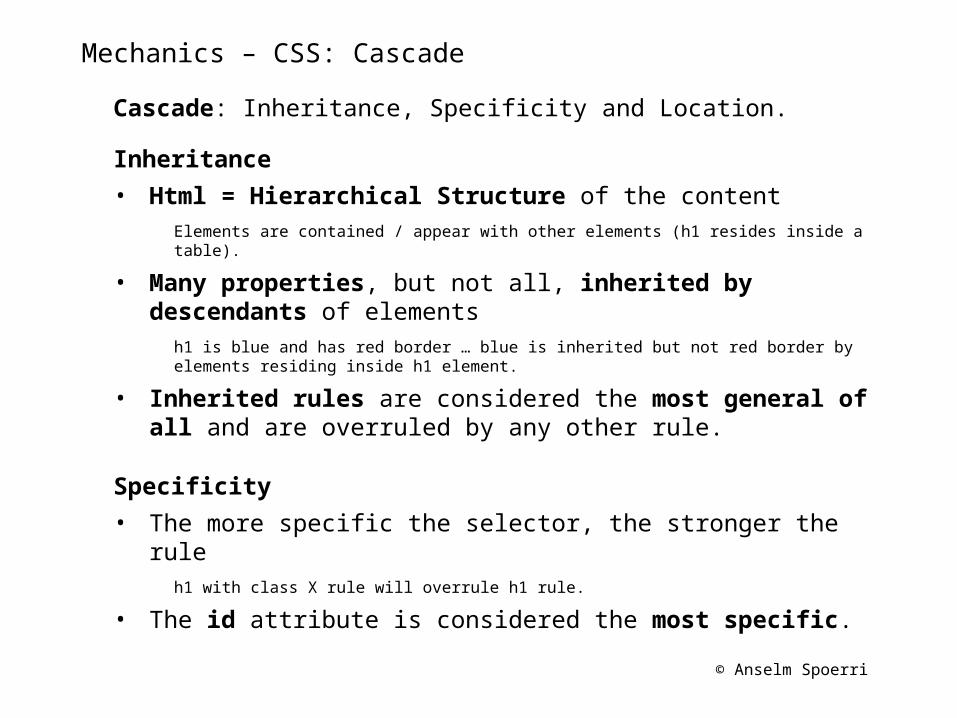
Mechanics – CSS: Cascade
Cascade: Inheritance, Specificity and Location.
Inheritance
• Html = Hierarchical Structure of the contentElements are contained / appear with other elements (h1 resides inside a table).
• Many properties, but not all, inherited by descendants of elements
h1 is blue and has red border … blue is inherited but not red border by elements residing inside h1 element.
• Inherited rules are considered the most general of all and are overruled by any other rule.
Specificity
• The more specific the selector, the stronger the rule h1 with class X rule will overrule h1 rule.
• The id attribute is considered the most specific.
© Anselm Spoerri
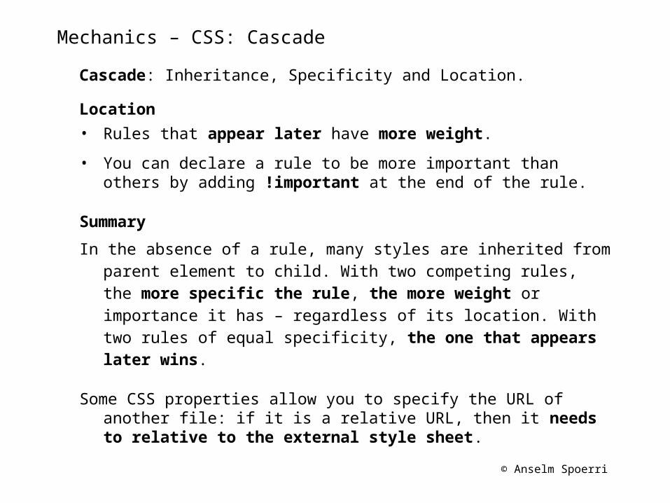
Mechanics – CSS: Cascade
Cascade: Inheritance, Specificity and Location.
Location
• Rules that appear later have more weight.
• You can declare a rule to be more important than others by adding !important at the end of the rule.
Summary
In the absence of a rule, many styles are inherited from parent element to child. With two competing rules, the more specific the rule, the more weight or importance it has – regardless of its location. With two rules of equal specificity, the one that appears later wins.
Some CSS properties allow you to specify the URL of another file: if it is a relative URL, then it needs to relative to the external style sheet.
© Anselm Spoerri
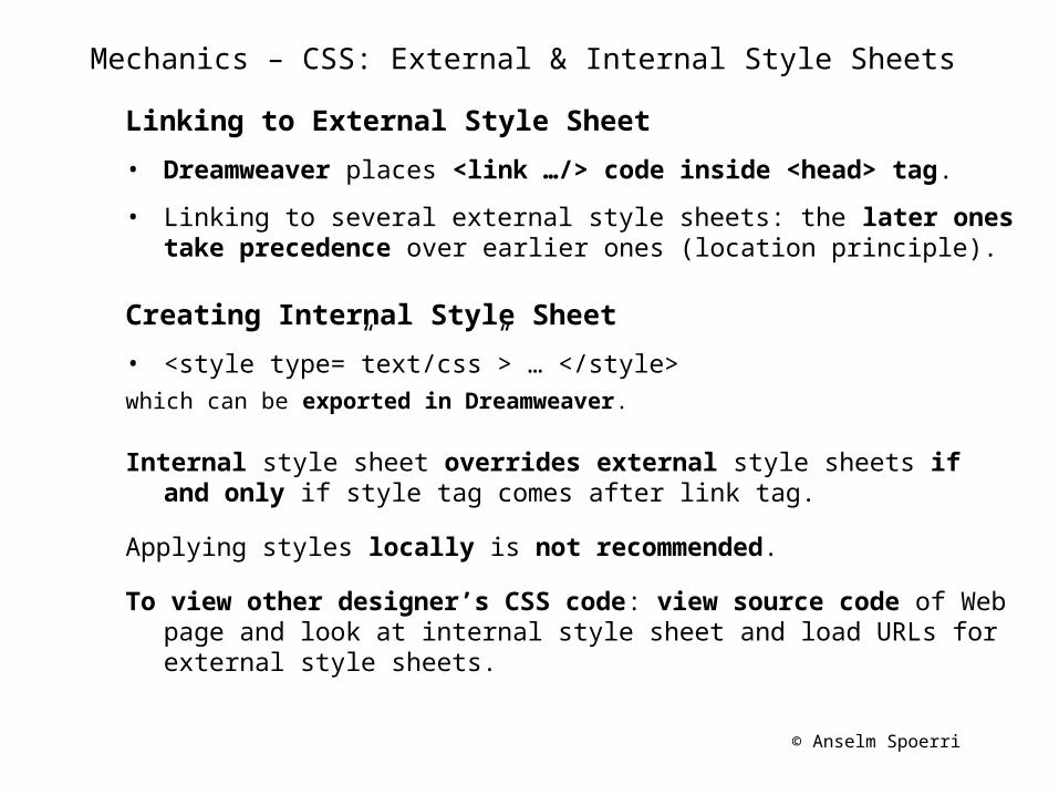
Mechanics – CSS: External & Internal Style Sheets
Linking to External Style Sheet
• Dreamweaver places <link …/> code inside <head> tag.
• Linking to several external style sheets: the later ones take precedence over earlier ones (location principle).
Creating Internal Style Sheet
• <style type=”text/css”> … </style> which can be exported in Dreamweaver.
Internal style sheet overrides external style sheets if and only if style tag comes after link tag.
Applying styles locally is not recommended.
To view other designer’s CSS code: view source code of Web page and look at internal style sheet and load URLs for external style sheets.
© Anselm Spoerri
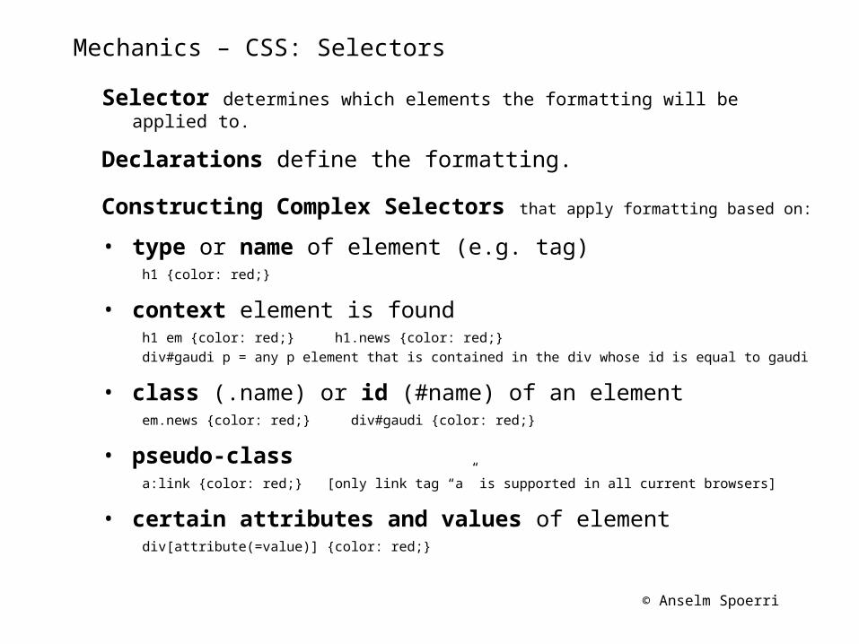
Mechanics – CSS: Selectors
Selector determines which elements the formatting will be applied to.
Declarations define the formatting.
Constructing Complex Selectors that apply formatting based on:
• type or name of element (e.g. tag) h1 {color: red;}
• context element is foundh1 em {color: red;} h1.news {color: red;} div#gaudi p = any p element that is contained in the div whose id is equal to gaudi
• class (.name) or id (#name) of an elementem.news {color: red;} div#gaudi {color: red;}
• pseudo-class a:link {color: red;} [only link tag “a” is supported in all current browsers]
• certain attributes and values of element div[attribute(=value)] {color: red;}
© Anselm Spoerri
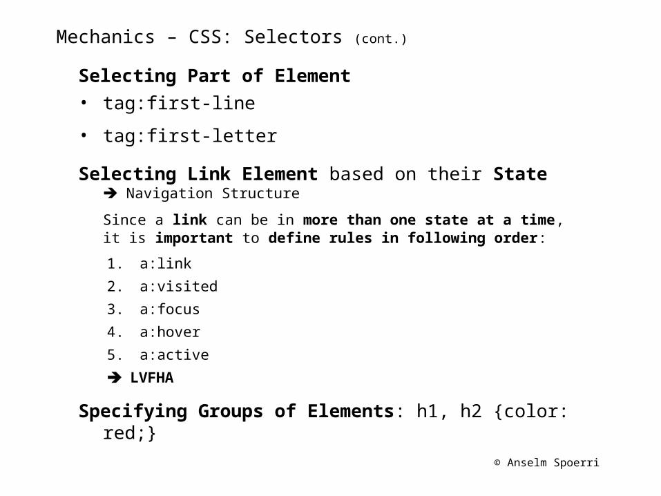
Mechanics – CSS: Selectors (cont.)
Selecting Part of Element• tag:first-line
• tag:first-letter
Selecting Link Element based on their State Navigation Structure
Since a link can be in more than one state at a time, it is important to define rules in following order:
1. a:link
2. a:visited
3. a:focus
4. a:hover
5. a:active
LVFHA
Specifying Groups of Elements: h1, h2 {color: red;}
© Anselm Spoerri
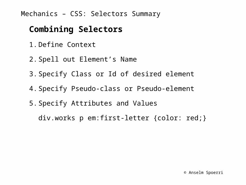
Mechanics – CSS: Selectors Summary
Combining Selectors
1. Define Context
2. Spell out Element’s Name
3. Specify Class or Id of desired element
4. Specify Pseudo-class or Pseudo-element
5. Specify Attributes and Values
div.works p em:first-letter {color: red;}
© Anselm Spoerri
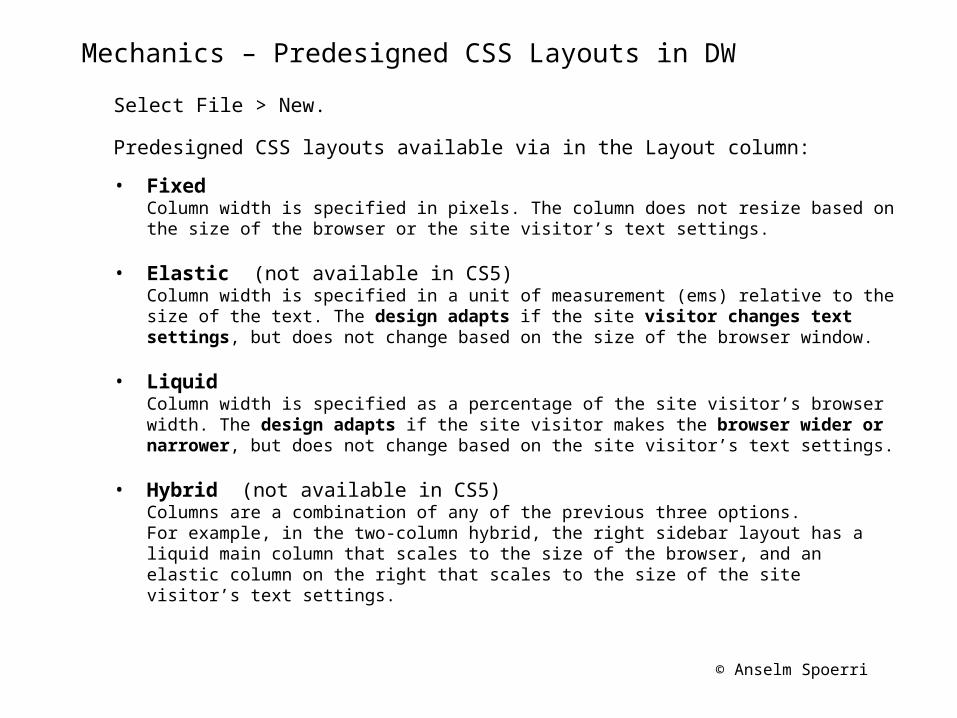
Mechanics – Predesigned CSS Layouts in DW
Select File > New.
Predesigned CSS layouts available via in the Layout column:
• Fixed Column width is specified in pixels. The column does not resize based on the size of the browser or the site visitor’s text settings.
• Elastic (not available in CS5)Column width is specified in a unit of measurement (ems) relative to the size of the text. The design adapts if the site visitor changes text settings, but does not change based on the size of the browser window.
• Liquid Column width is specified as a percentage of the site visitor’s browser width. The design adapts if the site visitor makes the browser wider or narrower, but does not change based on the site visitor’s text settings.
• Hybrid (not available in CS5) Columns are a combination of any of the previous three options. For example, in the two-column hybrid, the right sidebar layout has a liquid main column that scales to the size of the browser, and an elastic column on the right that scales to the size of the site visitor’s text settings.
© Anselm Spoerri
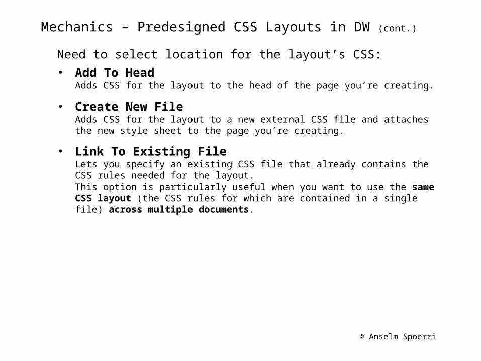
Mechanics – Predesigned CSS Layouts in DW (cont.)
Need to select location for the layout’s CSS:
• Add To Head Adds CSS for the layout to the head of the page you’re creating.
• Create New File Adds CSS for the layout to a new external CSS file and attaches the new style sheet to the page you’re creating.
• Link To Existing File Lets you specify an existing CSS file that already contains the CSS rules needed for the layout. This option is particularly useful when you want to use the same CSS layout (the CSS rules for which are contained in a single file) across multiple documents.
© Anselm Spoerri
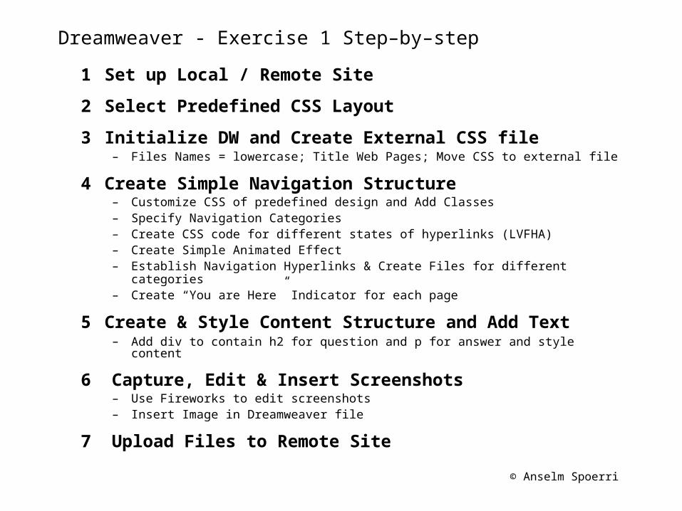
Dreamweaver - Exercise 1 Step–by–step
1 Set up Local / Remote Site
2 Select Predefined CSS Layout
3 Initialize DW and Create External CSS file– Files Names = lowercase; Title Web Pages; Move CSS to external file
4 Create Simple Navigation Structure– Customize CSS of predefined design and Add Classes– Specify Navigation Categories– Create CSS code for different states of hyperlinks (LVFHA)– Create Simple Animated Effect – Establish Navigation Hyperlinks & Create Files for different categories– Create “You are Here” Indicator for each page
5 Create & Style Content Structure and Add Text– Add div to contain h2 for question and p for answer and style content
6 Capture, Edit & Insert Screenshots– Use Fireworks to edit screenshots– Insert Image in Dreamweaver file
7 Upload Files to Remote Site
© Anselm Spoerri
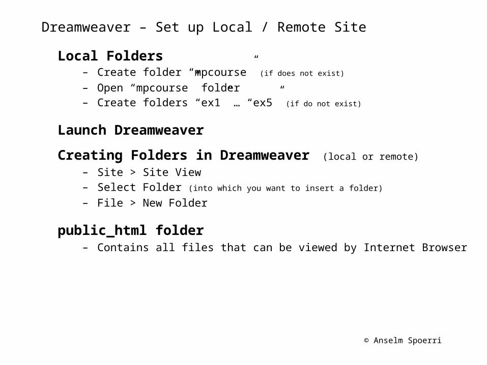
Dreamweaver – Set up Local / Remote Site
Local Folders– Create folder “mpcourse” (if does not exist)
– Open “mpcourse” folder– Create folders “ex1” … “ex5” (if do not exist)
Launch Dreamweaver
Creating Folders in Dreamweaver (local or remote)
– Site > Site View– Select Folder (into which you want to insert a folder)
– File > New Folder
public_html folder– Contains all files that can be viewed by Internet Browser
© Anselm Spoerri
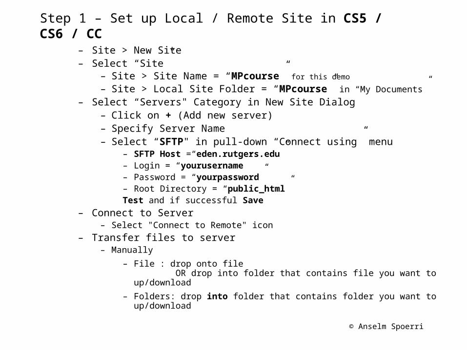
Step 1 – Set up Local / Remote Site in CS5 / CS6 / CC
– Site > New Site– Select “Site”
– Site > Site Name = “MPcourse” for this demo
– Site > Local Site Folder = “MPcourse” in “My Documents”
– Select “Servers" Category in New Site Dialog– Click on + (Add new server)– Specify Server Name– Select “SFTP" in pull-down “Connect using” menu
– SFTP Host =“eden.rutgers.edu”– Login = “yourusername”– Password = “yourpassword”– Root Directory = “public_html”Test and if successful Save
– Connect to Server– Select "Connect to Remote" icon
– Transfer files to server– Manually
– File : drop onto file OR drop into folder that contains file you want to up/download
– Folders: drop into folder that contains folder you want to up/download
© Anselm Spoerri
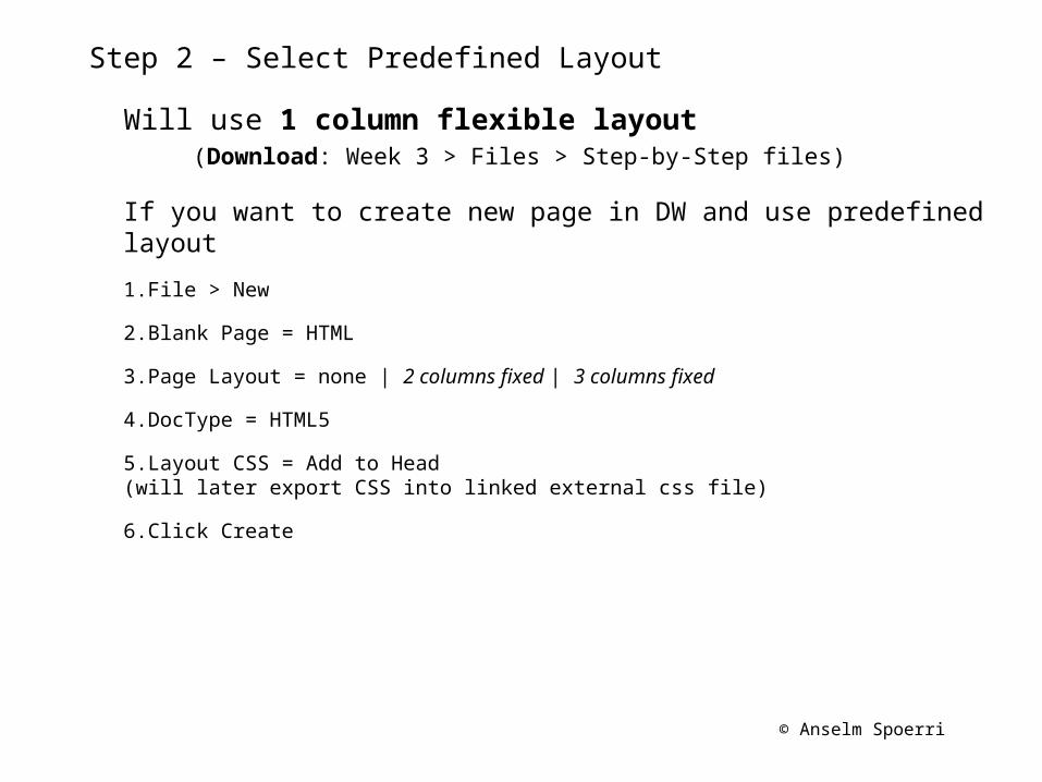
Step 2 – Select Predefined Layout
Will use 1 column flexible layout (Download: Week 3 > Files > Step-by-Step files)
If you want to create new page in DW and use predefined layout
1.File > New
2.Blank Page = HTML
3.Page Layout = none | 2 columns fixed | 3 columns fixed
4.DocType = HTML5
5.Layout CSS = Add to Head(will later export CSS into linked external css file)
6.Click Create
© Anselm Spoerri
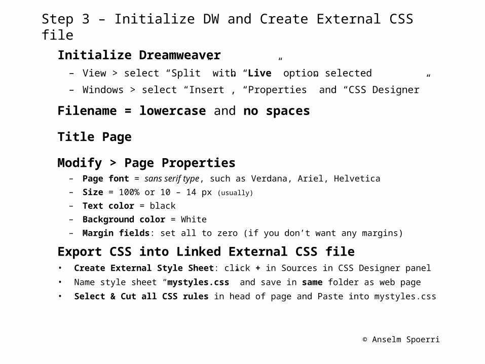
Step 3 – Initialize DW and Create External CSS file
Initialize Dreamweaver– View > select “Split” with “Live” option selected
– Windows > select “Insert”, “Properties” and “CSS Designer”
Filename = lowercase and no spaces
Title Page
Modify > Page Properties– Page font = sans serif type, such as Verdana, Ariel, Helvetica
– Size = 100% or 10 – 14 px (usually)
– Text color = black
– Background color = White
– Margin fields: set all to zero (if you don’t want any margins)
Export CSS into Linked External CSS file• Create External Style Sheet: click + in Sources in CSS Designer panel
• Name style sheet “mystyles.css” and save in same folder as web page
• Select & Cut all CSS rules in head of page and Paste into mystyles.css
© Anselm Spoerri
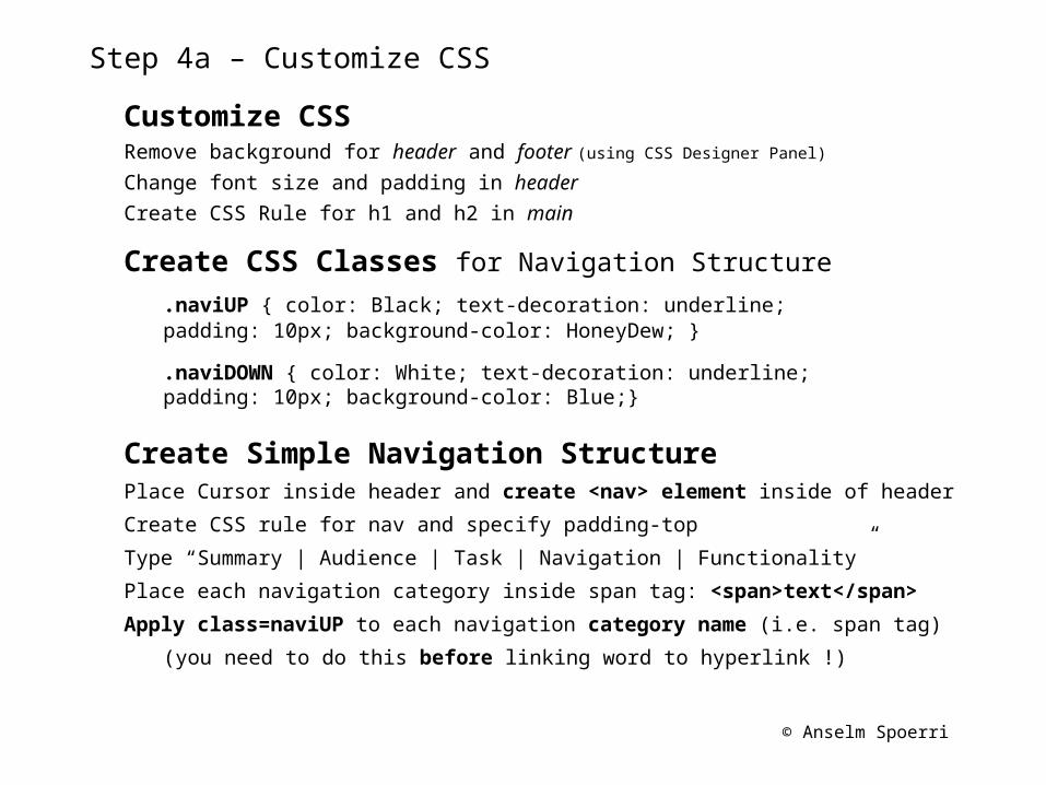
Step 4a – Customize CSS
Customize CSSRemove background for header and footer (using CSS Designer Panel)
Change font size and padding in header
Create CSS Rule for h1 and h2 in main
Create CSS Classes for Navigation Structure
.naviUP { color: Black; text-decoration: underline; padding: 10px; background-color: HoneyDew; }
.naviDOWN { color: White; text-decoration: underline; padding: 10px; background-color: Blue;}
Create Simple Navigation StructurePlace Cursor inside header and create <nav> element inside of header
Create CSS rule for nav and specify padding-top
Type “Summary | Audience | Task | Navigation | Functionality”
Place each navigation category inside span tag: <span>text</span>
Apply class=naviUP to each navigation category name (i.e. span tag)
(you need to do this before linking word to hyperlink !)
© Anselm Spoerri
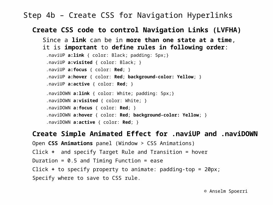
Step 4b – Create CSS for Navigation Hyperlinks
Create CSS code to control Navigation Links (LVFHA)Since a link can be in more than one state at a time, it is important to define rules in following order:
.naviUP a:link { color: Black; padding: 5px;}
.naviUP a:visited { color: Black; }
.naviUP a:focus { color: Red; }
.naviUP a:hover { color: Red; background-color: Yellow; }
.naviUP a:active { color: Red; }
.naviDOWN a:link { color: White; padding: 5px;}
.naviDOWN a:visited { color: White; }
.naviDOWN a:focus { color: Red; }
.naviDOWN a:hover { color: Red; background-color: Yellow; }
.naviDOWN a:active { color: Red; }
Create Simple Animated Effect for .naviUP and .naviDOWNOpen CSS Animations panel (Window > CSS Animations)
Click + and specify Target Rule and Transition = hover
Duration = 0.5 and Timing Function = ease
Click + to specify property to animate: padding-top = 20px;
Specify where to save to CSS rule.
© Anselm Spoerri
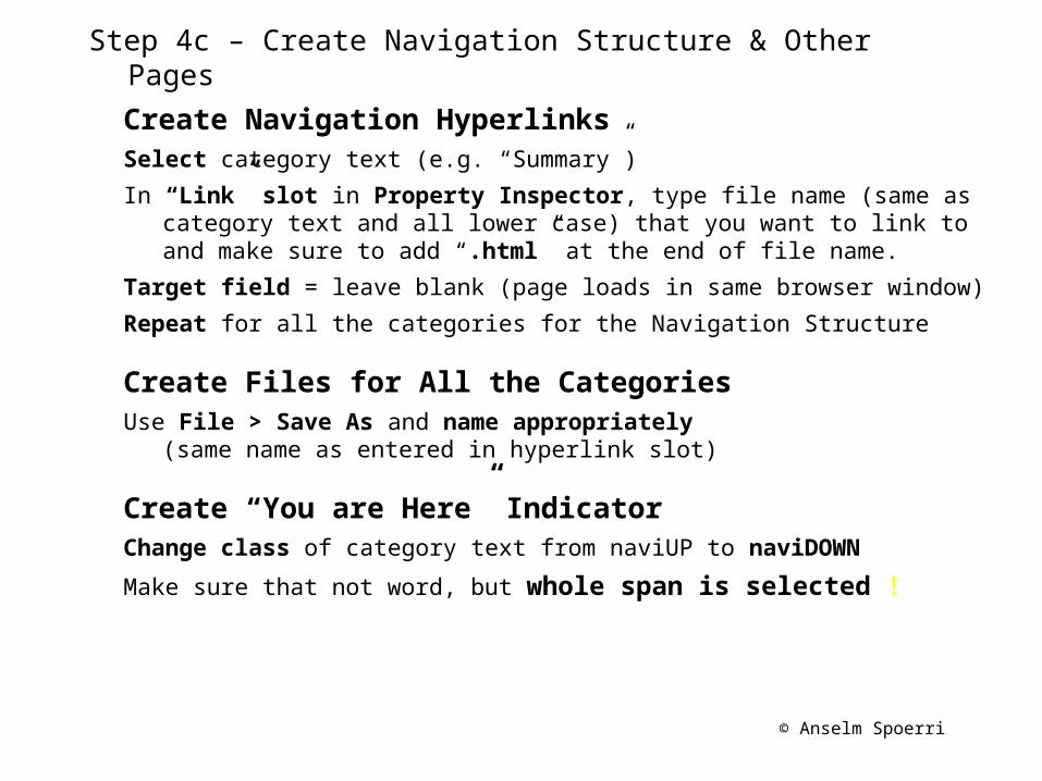
Step 4c – Create Navigation Structure & Other Pages
Create Navigation HyperlinksSelect category text (e.g. “Summary”)
In “Link” slot in Property Inspector, type file name (same as category text and all lower case) that you want to link to and make sure to add “.html” at the end of file name.
Target field = leave blank (page loads in same browser window)
Repeat for all the categories for the Navigation Structure
Create Files for All the CategoriesUse File > Save As and name appropriately
(same name as entered in hyperlink slot)
Create “You are Here” IndicatorChange class of category text from naviUP to naviDOWN
Make sure that not word, but whole span is selected !
© Anselm Spoerri
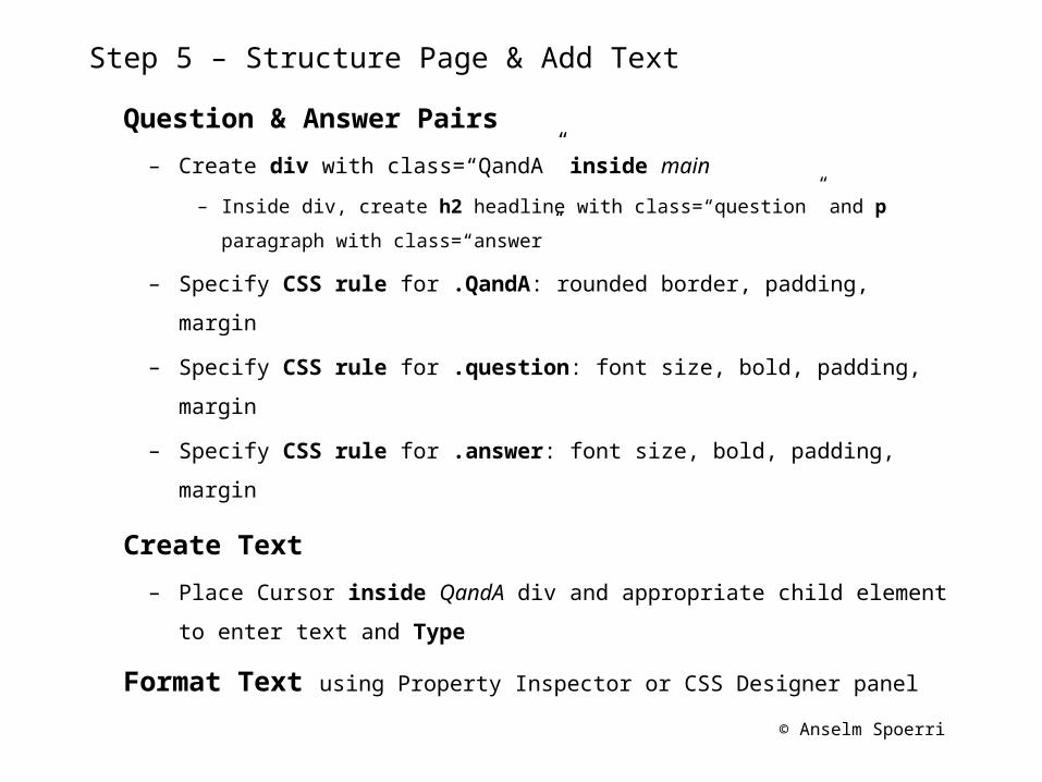
Step 5 – Structure Page & Add Text
Question & Answer Pairs
– Create div with class=“QandA” inside main
– Inside div, create h2 headline with class=“question” and p paragraph
with class=“answer”
– Specify CSS rule for .QandA: rounded border, padding, margin
– Specify CSS rule for .question: font size, bold, padding, margin
– Specify CSS rule for .answer: font size, bold, padding, margin
Create Text
– Place Cursor inside QandA div and appropriate child element to
enter text and Type
Format Text using Property Inspector or CSS Designer panel
© Anselm Spoerri
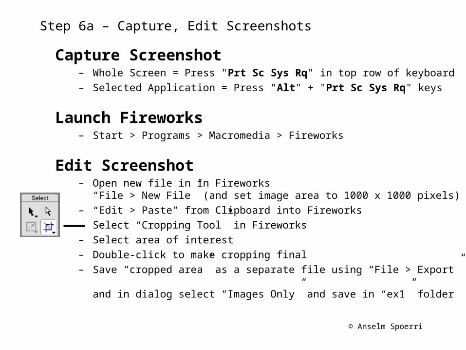
Step 6a – Capture, Edit Screenshots
Capture Screenshot– Whole Screen = Press "Prt Sc Sys Rq" in top row of keyboard– Selected Application = Press "Alt" + "Prt Sc Sys Rq" keys
Launch Fireworks– Start > Programs > Macromedia > Fireworks
Edit Screenshot– Open new file in in Fireworks
“File > New File” (and set image area to 1000 x 1000 pixels)– “Edit > Paste" from Clipboard into Fireworks– Select “Cropping Tool” in Fireworks– Select area of interest– Double-click to make cropping final– Save “cropped area” as a separate file using “File > Export”
and in dialog select “Images Only” and save in “ex1” folder
© Anselm Spoerri
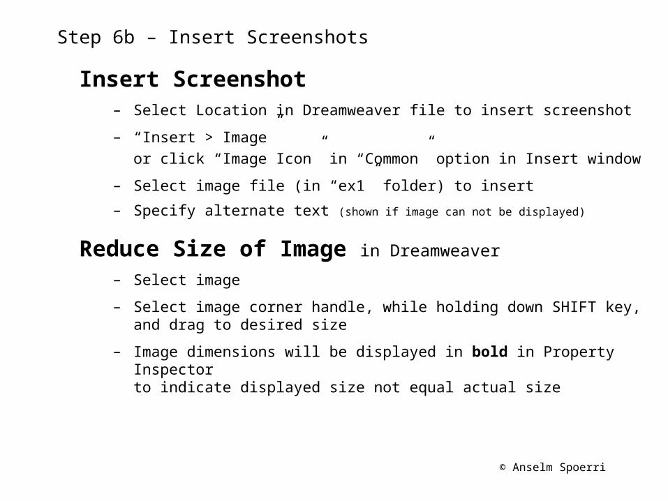
Step 6b – Insert Screenshots
Insert Screenshot– Select Location in Dreamweaver file to insert screenshot
– “Insert > Image”or click “Image Icon” in “Common” option in Insert window
– Select image file (in “ex1” folder) to insert
– Specify alternate text (shown if image can not be displayed)
Reduce Size of Image in Dreamweaver
– Select image
– Select image corner handle, while holding down SHIFT key, and drag to desired size
– Image dimensions will be displayed in bold in Property Inspectorto indicate displayed size not equal actual size
© Anselm Spoerri
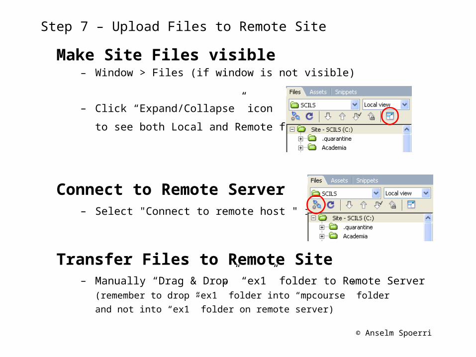
Step 7 – Upload Files to Remote Site
Make Site Files visible– Window > Files (if window is not visible)
– Click “Expand/Collapse” icon
to see both Local and Remote files
Connect to Remote Server– Select "Connect to remote host " icon
Transfer Files to Remote Site– Manually “Drag & Drop” “ex1” folder to Remote Server
(remember to drop “ex1” folder into “mpcourse” folder
and not into “ex1” folder on remote server)
© Anselm Spoerri
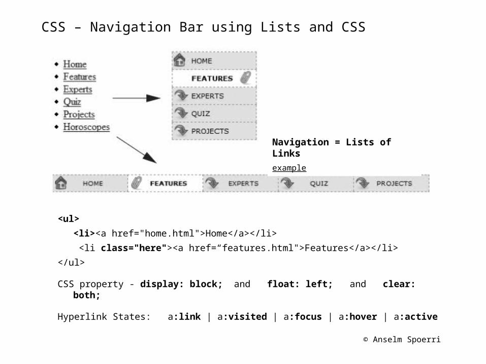
CSS – Navigation Bar using Lists and CSS
<ul>
<li><a href="home.html">Home</a></li>
<li class="here"><a href=“features.html">Features</a></li>
</ul>
CSS property - display: block; and float: left; and clear: both;
Hyperlink States: a:link | a:visited | a:focus | a:hover | a:active
Navigation = Lists of Links
example
© Anselm Spoerri
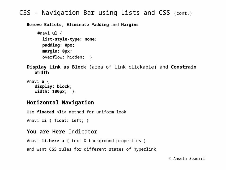
CSS – Navigation Bar using Lists and CSS (cont.)
Remove Bullets, Eliminate Padding and Margins
#navi ul { list-style-type: none; padding: 0px; margin: 0px; overflow: hidden; }
Display Link as Block (area of link clickable) and Constrain Width
#navi a {display: block;width: 100px; }
Horizontal Navigation
Use floated <li> method for uniform look
#navi li { float: left; }
You are Here Indicator
#navi li.here a { text & background properties }
and want CSS rules for different states of hyperlink
© Anselm Spoerri
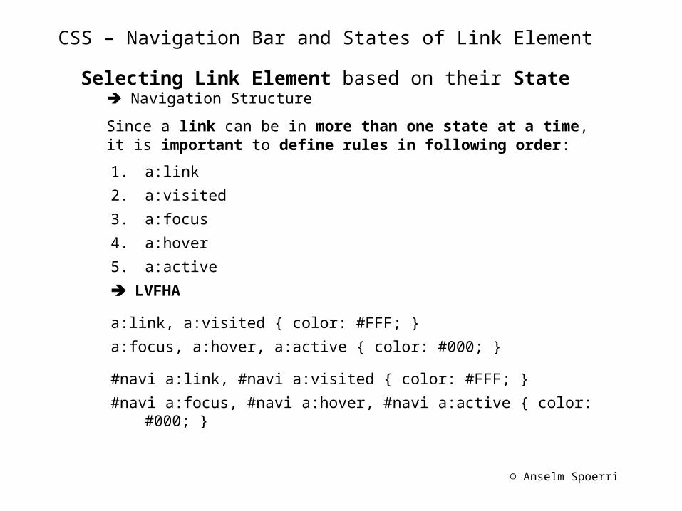
CSS – Navigation Bar and States of Link Element
Selecting Link Element based on their State Navigation Structure
Since a link can be in more than one state at a time, it is important to define rules in following order:
1. a:link
2. a:visited
3. a:focus
4. a:hover
5. a:active
LVFHA
a:link, a:visited { color: #FFF; }
a:focus, a:hover, a:active { color: #000; }
#navi a:link, #navi a:visited { color: #FFF; }
#navi a:focus, #navi a:hover, #navi a:active { color: #000; }
© Anselm Spoerri
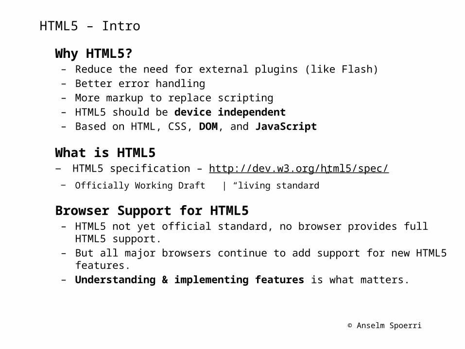
HTML5 – Intro
Why HTML5?– Reduce the need for external plugins (like Flash)– Better error handling– More markup to replace scripting– HTML5 should be device independent– Based on HTML, CSS, DOM, and JavaScript
What is HTML5‒ HTML5 specification – http://dev.w3.org/html5/spec/‒ Officially Working Draft | “living standard”
Browser Support for HTML5– HTML5 not yet official standard, no browser provides full HTML5 support.– But all major browsers continue to add support for new HTML5 features.– Understanding & implementing features is what matters.
© Anselm Spoerri
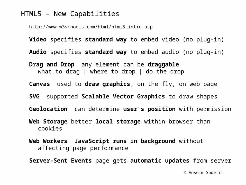
HTML5 – New Capabilities
http://www.w3schools.com/html/html5_intro.asp
Video specifies standard way to embed video (no plug-in)
Audio specifies standard way to embed audio (no plug-in)
Drag and Drop any element can be draggable what to drag | where to drop | do the drop
Canvas used to draw graphics, on the fly, on web page
SVG supported Scalable Vector Graphics to draw shapes
Geolocation can determine user's position with permission
Web Storage better local storage within browser than cookies
Web Workers JavaScript runs in background without affecting page performance
Server-Sent Events page gets automatic updates from server
© Anselm Spoerri
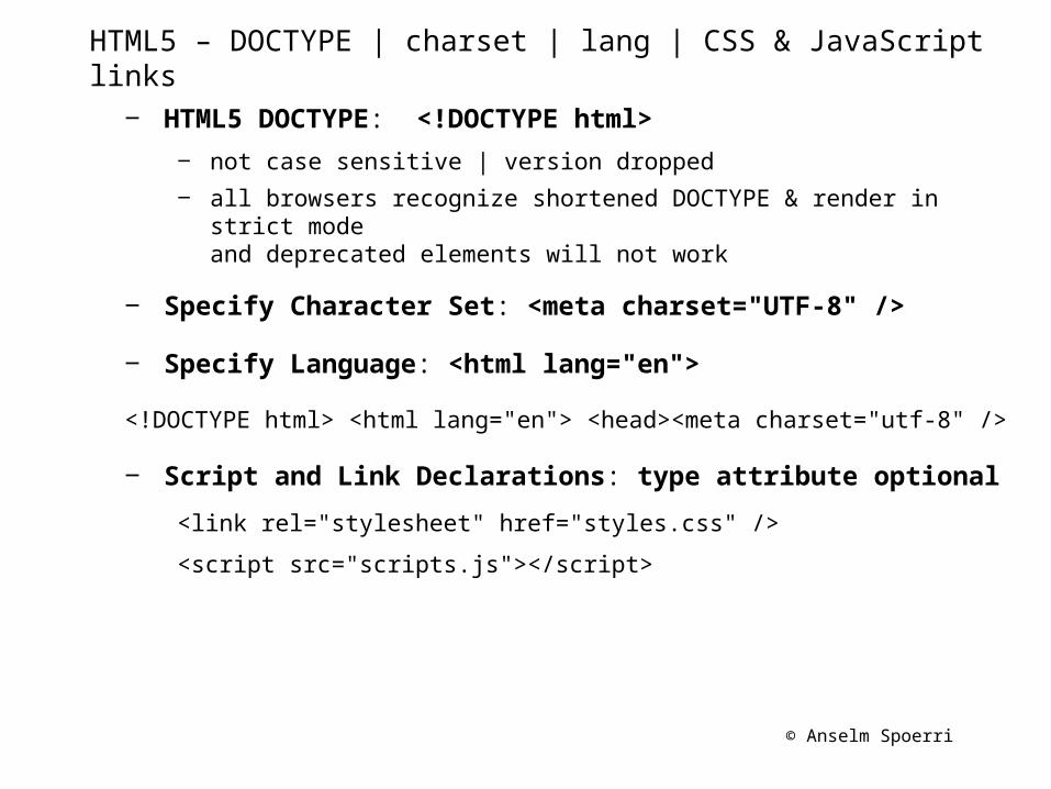
HTML5 – DOCTYPE | charset | lang | CSS & JavaScript links
‒ HTML5 DOCTYPE: <!DOCTYPE html>
‒ not case sensitive | version dropped
‒ all browsers recognize shortened DOCTYPE & render in strict modeand deprecated elements will not work
‒ Specify Character Set: <meta charset="UTF-8" />
‒ Specify Language: <html lang="en">
<!DOCTYPE html> <html lang="en"> <head><meta charset="utf-8" />
‒ Script and Link Declarations: type attribute optional
<link rel="stylesheet" href="styles.css" />
<script src="scripts.js"></script>
© Anselm Spoerri
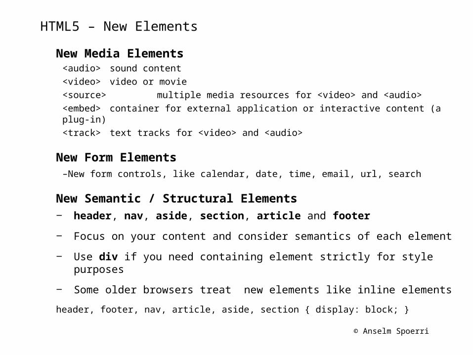
HTML5 – New Elements
New Media Elements<audio> sound content<video> video or movie<source> multiple media resources for <video> and <audio><embed> container for external application or interactive content (a plug-in)<track> text tracks for <video> and <audio>
New Form Elements–New form controls, like calendar, date, time, email, url, search
New Semantic / Structural Elements‒ header, nav, aside, section, article and footer
‒ Focus on your content and consider semantics of each element
‒ Use div if you need containing element strictly for style purposes
‒ Some older browsers treat new elements like inline elements
header, footer, nav, article, aside, section { display: block; }
© Anselm Spoerri
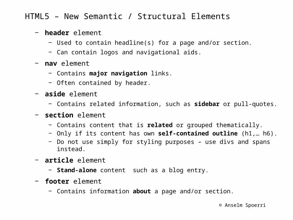
HTML5 – New Semantic / Structural Elements
‒ header element‒ Used to contain headline(s) for a page and/or section.
‒ Can contain logos and navigational aids.
‒ nav element‒ Contains major navigation links.
‒ Often contained by header.
‒ aside element‒ Contains related information, such as sidebar or pull-quotes.
‒ section element‒ Contains content that is related or grouped thematically.‒ Only if its content has own self-contained outline (h1,… h6).‒ Do not use simply for styling purposes – use divs and spans instead.
‒ article element‒ Stand-alone content such as a blog entry.
‒ footer element‒ Contains information about a page and/or section.
© Anselm Spoerri
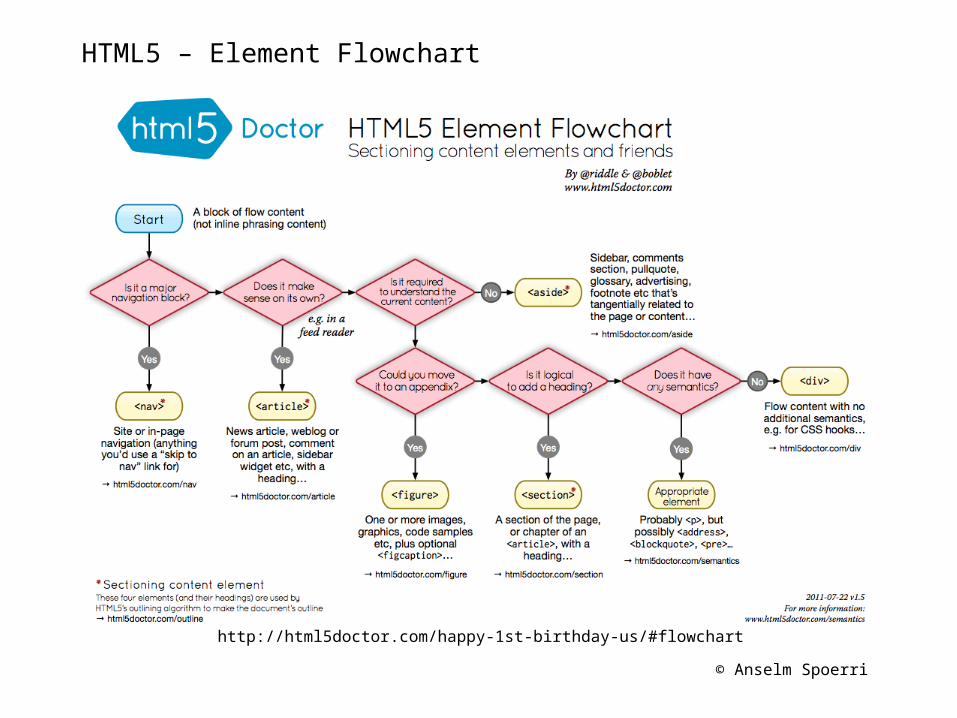
HTML5 – Element Flowchart
http://html5doctor.com/happy-1st-birthday-us/#flowchart
© Anselm Spoerri
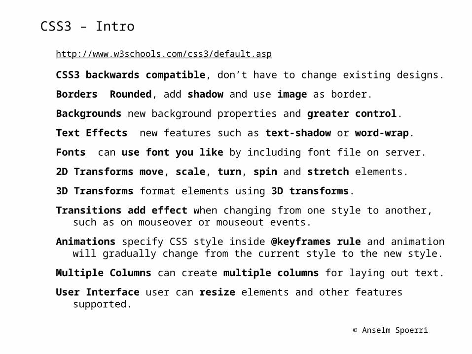
CSS3 – Intro
http://www.w3schools.com/css3/default.asp
CSS3 backwards compatible, don’t have to change existing designs.
Borders Rounded, add shadow and use image as border.
Backgrounds new background properties and greater control.
Text Effects new features such as text-shadow or word-wrap.
Fonts can use font you like by including font file on server.
2D Transforms move, scale, turn, spin and stretch elements.
3D Transforms format elements using 3D transforms.
Transitions add effect when changing from one style to another, such as on mouseover or mouseout events.
Animations specify CSS style inside @keyframes rule and animation will gradually change from the current style to the new style.
Multiple Columns can create multiple columns for laying out text.
User Interface user can resize elements and other features supported.