Embed Size (px)
Citation preview
GoalPresent FLHealthCHARTS.com’s key features for those interested in fetal and infant mortality.
AudiencePublic health professionals who want to use FLHealthCHARTS data to better understand their county’s maternal and child health status.
Key MessagesSections of CHARTS most useful for those working in maternal & child healthData related to fetal and infant mortality and ways to interpret that data.Key indicators in CHARTS that can contribute to developing service delivery plansStatistical information in CHARTS reports (quartiles, types of rates, MOV).
FLHealthCHARTS.com Fetal & Infant Mortality Webinar, May 2017
1
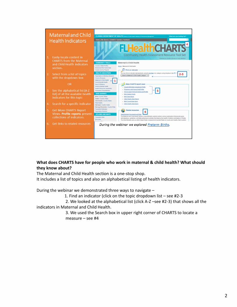
What does CHARTS have for people who work in maternal & child health? What should they know about?The Maternal and Child Health section is a one‐stop shop.It includes a list of topics and also an alphabetical listing of health indicators.
During the webinar we demonstrated three ways to navigate –1. Find an indicator (click on the topic dropdown list – see #2‐32. We looked at the alphabetical list (click A‐Z –see #2‐3) that shows all the
indicators in Maternal and Child Health. 3. We used the Search box in upper right corner of CHARTS to locate a measure – see #4
2
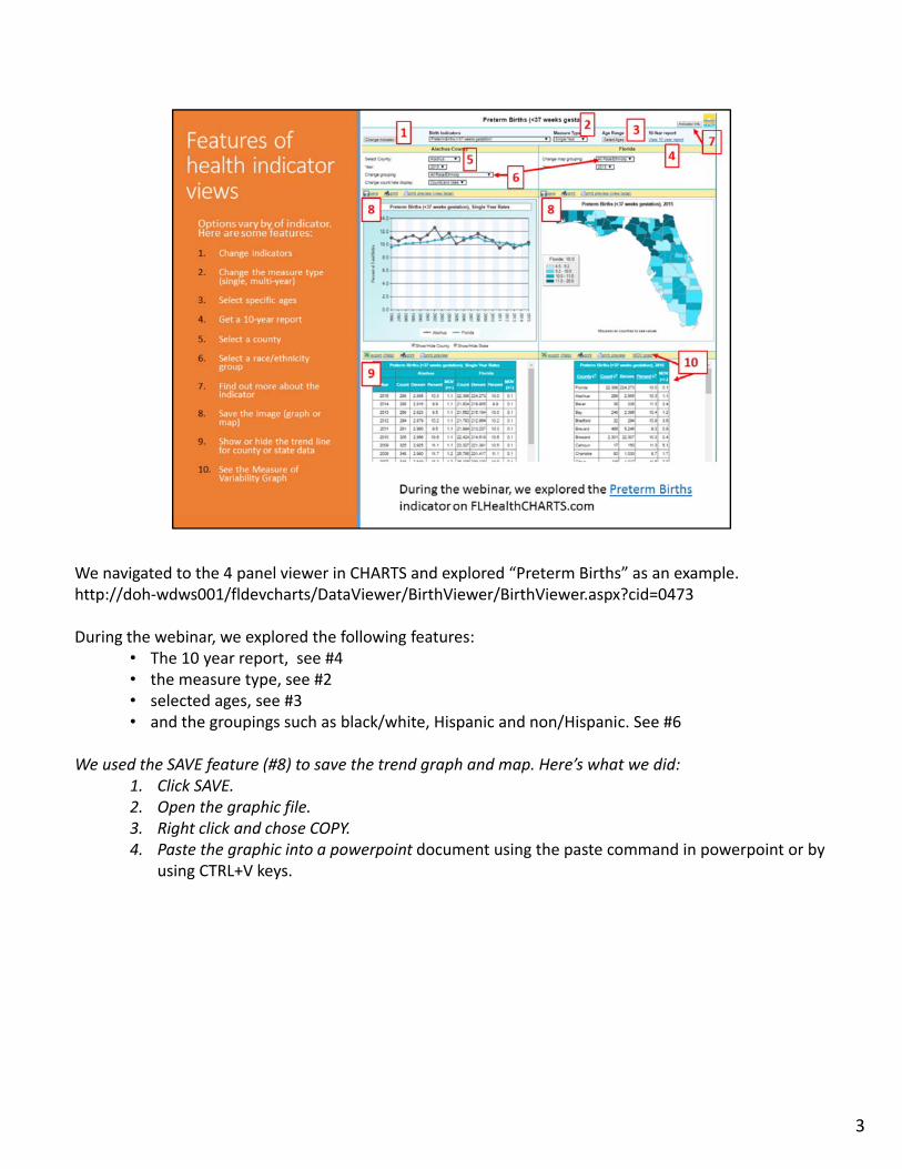
We navigated to the 4 panel viewer in CHARTS and explored “Preterm Births” as an example.http://doh‐wdws001/fldevcharts/DataViewer/BirthViewer/BirthViewer.aspx?cid=0473
During the webinar, we explored the following features:• The 10 year report, see #4• the measure type, see #2• selected ages, see #3• and the groupings such as black/white, Hispanic and non/Hispanic. See #6
We used the SAVE feature (#8) to save the trend graph and map. Here’s what we did:1. Click SAVE. 2. Open the graphic file.3. Right click and chose COPY. 4. Paste the graphic into a powerpoint document using the paste command in powerpoint or by
using CTRL+V keys.
3
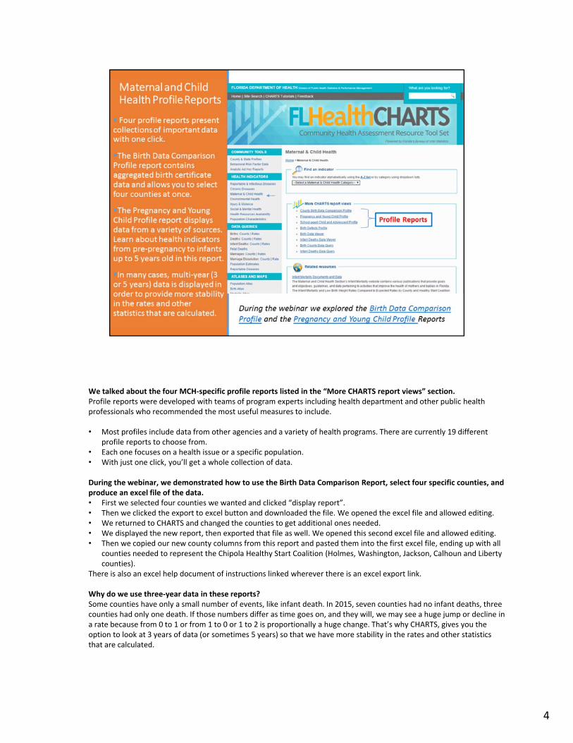
We talked about the four MCH‐specific profile reports listed in the “More CHARTS report views” section. Profile reports were developed with teams of program experts including health department and other public health professionals who recommended the most useful measures to include.
• Most profiles include data from other agencies and a variety of health programs. There are currently 19 different profile reports to choose from.
• Each one focuses on a health issue or a specific population. • With just one click, you’ll get a whole collection of data.
During the webinar, we demonstrated how to use the Birth Data Comparison Report, select four specific counties, and produce an excel file of the data. • First we selected four counties we wanted and clicked “display report”.• Then we clicked the export to excel button and downloaded the file. We opened the excel file and allowed editing.• We returned to CHARTS and changed the counties to get additional ones needed. • We displayed the new report, then exported that file as well. We opened this second excel file and allowed editing.• Then we copied our new county columns from this report and pasted them into the first excel file, ending up with all
counties needed to represent the Chipola Healthy Start Coalition (Holmes, Washington, Jackson, Calhoun and Liberty counties).
There is also an excel help document of instructions linked wherever there is an excel export link.
Why do we use three‐year data in these reports?Some counties have only a small number of events, like infant death. In 2015, seven counties had no infant deaths, three counties had only one death. If those numbers differ as time goes on, and they will, we may see a huge jump or decline in a rate because from 0 to 1 or from 1 to 0 or 1 to 2 is proportionally a huge change. That’s why CHARTS, gives you the option to look at 3 years of data (or sometimes 5 years) so that we have more stability in the rates and other statistics that are calculated.
4
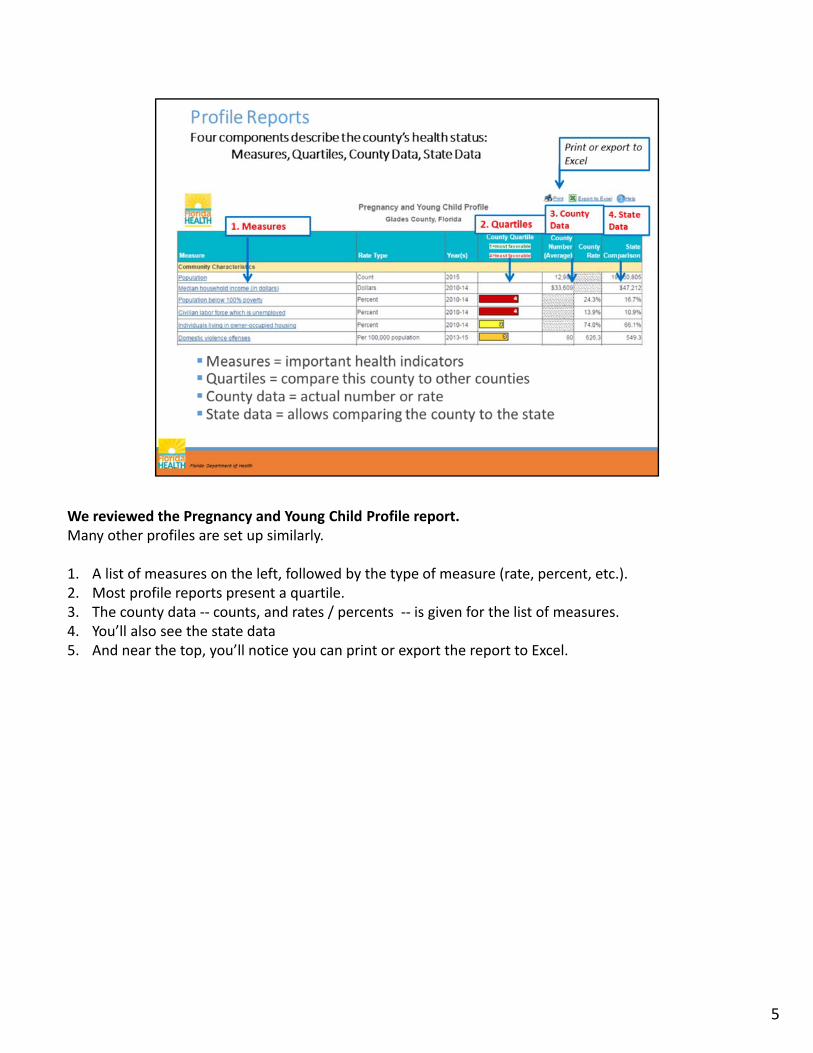
We reviewed the Pregnancy and Young Child Profile report.Many other profiles are set up similarly.
1. A list of measures on the left, followed by the type of measure (rate, percent, etc.). 2. Most profile reports present a quartile.3. The county data ‐‐ counts, and rates / percents ‐‐ is given for the list of measures.4. You’ll also see the state data5. And near the top, you’ll notice you can print or export the report to Excel.
5
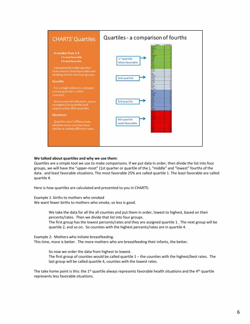
We talked about quartiles and why we use them:Quartiles are a simple tool we use to make comparisons. If we put data in order, then divide the list into four groups, we will have the “upper‐most” (1st quarter or quartile of the ), “middle” and “lowest” fourths of the data. and least favorable situations. The most favorable 25% are called quartile 1. The least favorable are called quartile 4.
Here is how quartiles are calculated and presented to you in CHARTS:
Example 1: births to mothers who smokedWe want fewer births to mothers who smoke, so less is good.
We take the data for all the all counties and put them in order, lowest to highest, based on their percents/rates. Then we divide that list into four groups. The first group has the lowest percents/rates and they are assigned quartile 1. The next group will be quartile 2, and so on. So counties with the highest percents/rates are in quartile 4.
Example 2: Mothers who initiate breastfeeding.This time, more is better. The more mothers who are breastfeeding their infants, the better.
So now we order the data from highest to lowest. The first group of counties would be called quartile 1 – the counties with the highest/best rates. The last group will be called quartile 4, counties with the lowest rates.
The take home point is this: the 1st quartile always represents favorable health situations and the 4th quartile represents less favorable situations.
6
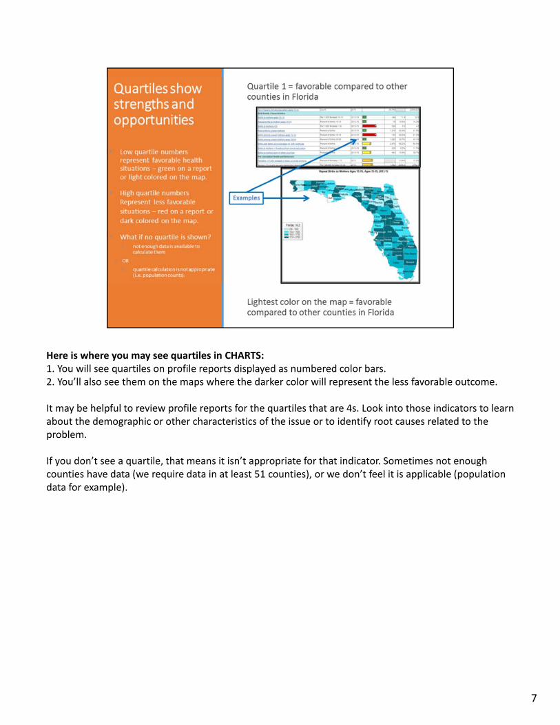
Here is where you may see quartiles in CHARTS:1. You will see quartiles on profile reports displayed as numbered color bars.2. You’ll also see them on the maps where the darker color will represent the less favorable outcome.
It may be helpful to review profile reports for the quartiles that are 4s. Look into those indicators to learn about the demographic or other characteristics of the issue or to identify root causes related to the problem.
If you don’t see a quartile, that means it isn’t appropriate for that indicator. Sometimes not enough counties have data (we require data in at least 51 counties), or we don’t feel it is applicable (population data for example).
7
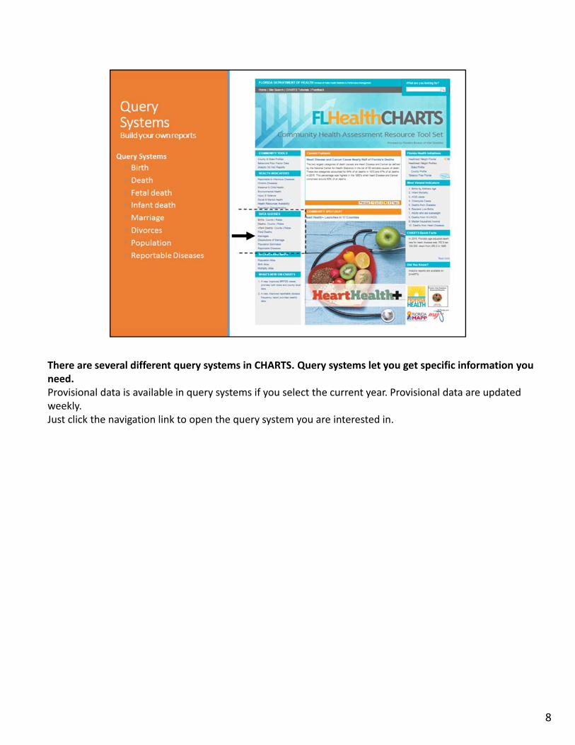
There are several different query systems in CHARTS. Query systems let you get specific information you need.Provisional data is available in query systems if you select the current year. Provisional data are updated weekly.Just click the navigation link to open the query system you are interested in.
8
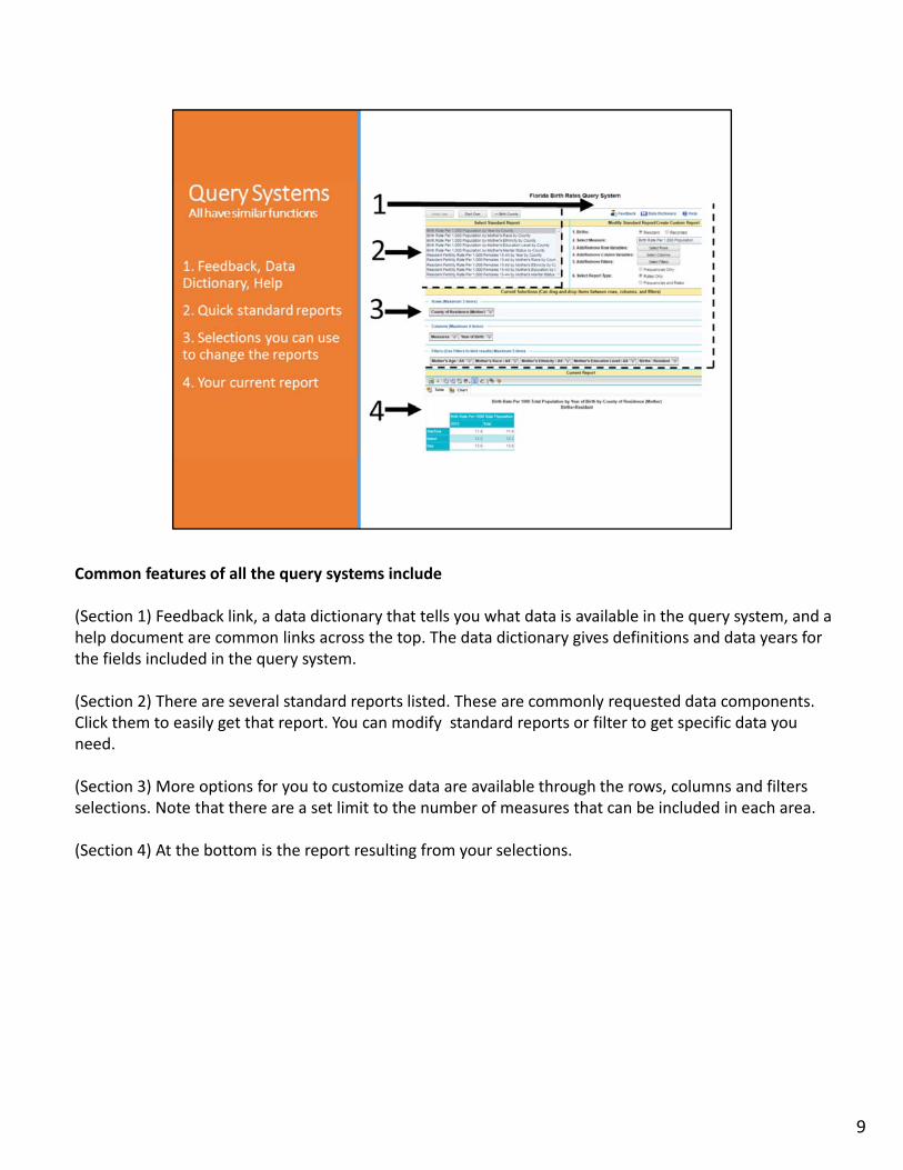
Common features of all the query systems include
(Section 1) Feedback link, a data dictionary that tells you what data is available in the query system, and a help document are common links across the top. The data dictionary gives definitions and data years for the fields included in the query system.
(Section 2) There are several standard reports listed. These are commonly requested data components. Click them to easily get that report. You can modify standard reports or filter to get specific data you need.
(Section 3) More options for you to customize data are available through the rows, columns and filters selections. Note that there are a set limit to the number of measures that can be included in each area.
(Section 4) At the bottom is the report resulting from your selections.
9
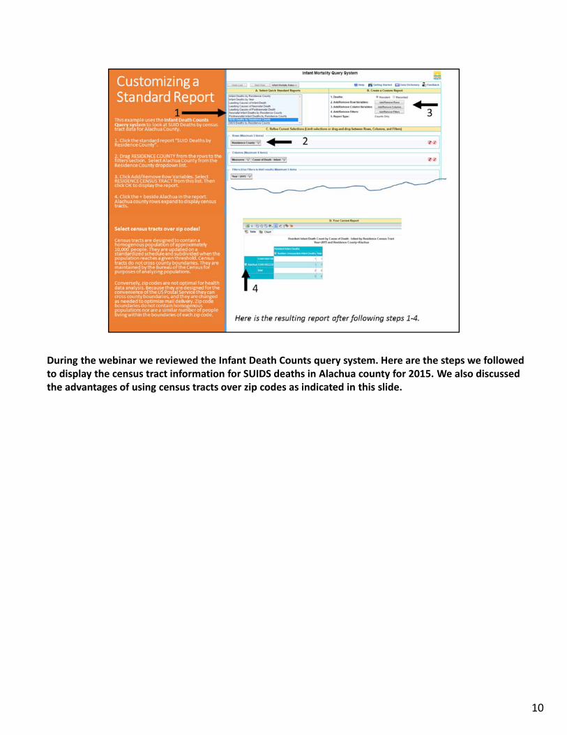
During the webinar we reviewed the Infant Death Counts query system. Here are the steps we followed to display the census tract information for SUIDS deaths in Alachua county for 2015. We also discussed the advantages of using census tracts over zip codes as indicated in this slide.
1. Click the standard report “SUID Deaths by Residence County”.2. Drag RESIDENCE COUNTY from the rows to the filters section. Select Alachua County from the Residence County dropdown list.3. Click Add/Remove Row Variables. Select RESIDENCE CENSUS TRACT from this list. Click OK to display the report.4. Click the + beside Alachua in the report. Alachua county rows expand to display census tracts.
10
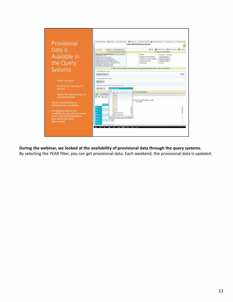
During the webinar, we looked at the availability of provisional data through the query systems. By selecting the YEAR filter, you can get provisional data. Each weekend, the provisional data is updated.
11
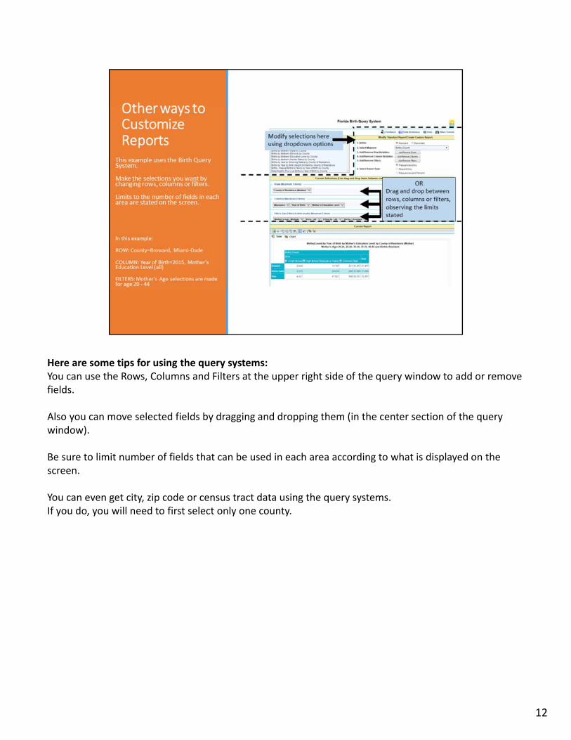
Here are some tips for using the query systems:You can use the Rows, Columns and Filters at the upper right side of the query window to add or remove fields.
Also you can move selected fields by dragging and dropping them (in the center section of the query window).
Be sure to limit number of fields that can be used in each area according to what is displayed on the screen.
You can even get city, zip code or census tract data using the query systems. If you do, you will need to first select only one county.
12
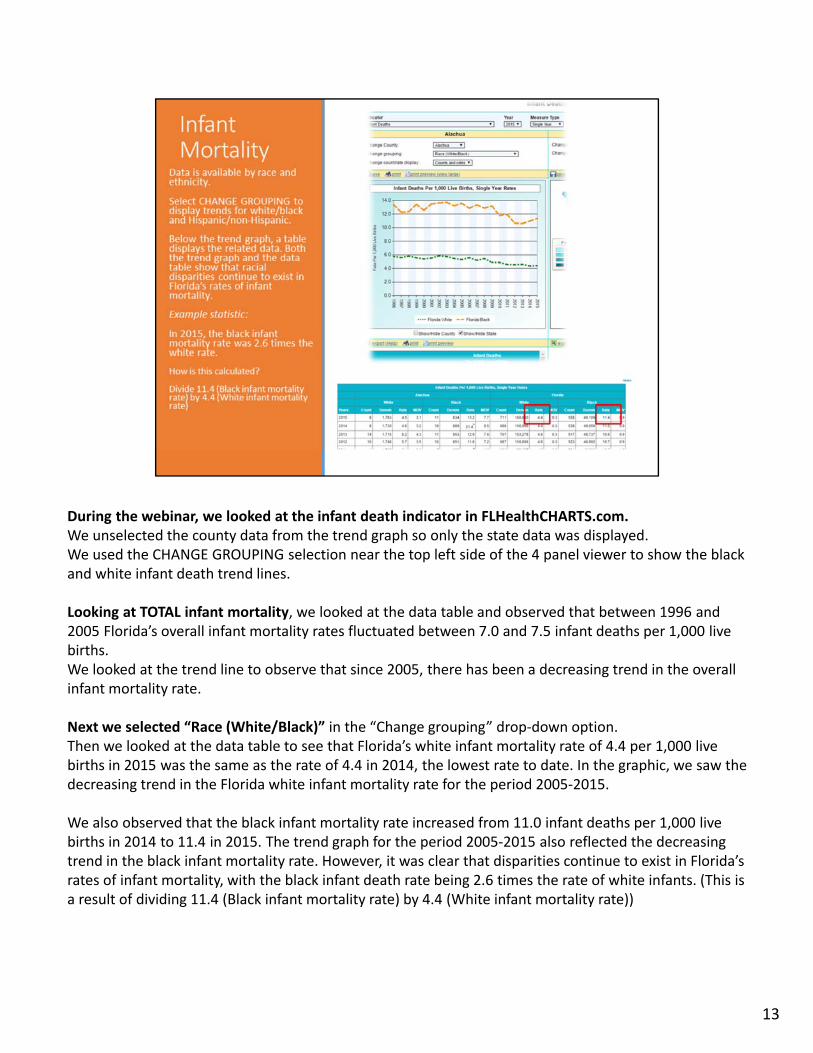
During the webinar, we looked at the infant death indicator in FLHealthCHARTS.com.We unselected the county data from the trend graph so only the state data was displayed. We used the CHANGE GROUPING selection near the top left side of the 4 panel viewer to show the black and white infant death trend lines.
Looking at TOTAL infant mortality, we looked at the data table and observed that between 1996 and 2005 Florida’s overall infant mortality rates fluctuated between 7.0 and 7.5 infant deaths per 1,000 live births. We looked at the trend line to observe that since 2005, there has been a decreasing trend in the overall infant mortality rate.
Next we selected “Race (White/Black)” in the “Change grouping” drop‐down option.Then we looked at the data table to see that Florida’s white infant mortality rate of 4.4 per 1,000 live births in 2015 was the same as the rate of 4.4 in 2014, the lowest rate to date. In the graphic, we saw the decreasing trend in the Florida white infant mortality rate for the period 2005‐2015.
We also observed that the black infant mortality rate increased from 11.0 infant deaths per 1,000 live births in 2014 to 11.4 in 2015. The trend graph for the period 2005‐2015 also reflected the decreasing trend in the black infant mortality rate. However, it was clear that disparities continue to exist in Florida’s rates of infant mortality, with the black infant death rate being 2.6 times the rate of white infants. (This is a result of dividing 11.4 (Black infant mortality rate) by 4.4 (White infant mortality rate))
13
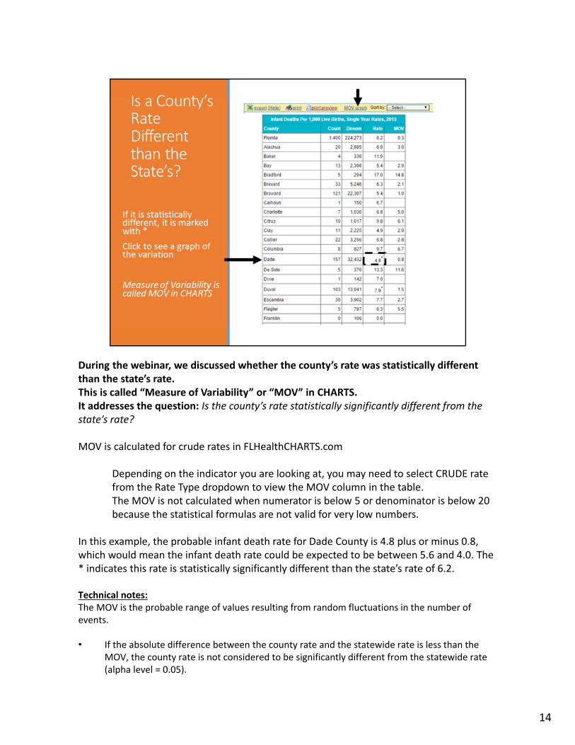
During the webinar, we discussed whether the county’s rate was statistically different than the state’s rate. This is called “Measure of Variability” or “MOV” in CHARTS.It addresses the question: Is the county’s rate statistically significantly different from the state’s rate?
MOV is calculated for crude rates in FLHealthCHARTS.com
Depending on the indicator you are looking at, you may need to select CRUDE rate from the Rate Type dropdown to view the MOV column in the table.The MOV is not calculated when numerator is below 5 or denominator is below 20 because the statistical formulas are not valid for very low numbers.
In this example, the probable infant death rate for Dade County is 4.8 plus or minus 0.8, which would mean the infant death rate could be expected to be between 5.6 and 4.0. The * indicates this rate is statistically significantly different than the state’s rate of 6.2.
Technical notes:The MOV is the probable range of values resulting from random fluctuations in the number of events.
• If the absolute difference between the county rate and the statewide rate is less than the MOV, the county rate is not considered to be significantly different from the statewide rate (alpha level = 0.05).
14

• When the absolute difference between the county rate and the statewide rate is greater than
the MOV, the county rate is significantly different from the statewide rate.
FLHealthCHARTS.com Fetal & Infant Death Webinar, May 2017 14
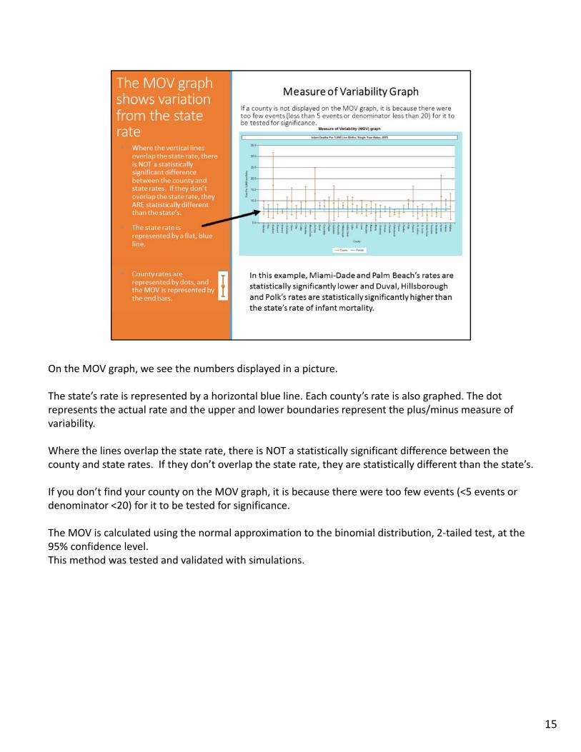
On the MOV graph, we see the numbers displayed in a picture.
The state’s rate is represented by a horizontal blue line. Each county’s rate is also graphed. The dot represents the actual rate and the upper and lower boundaries represent the plus/minus measure of variability.
Where the lines overlap the state rate, there is NOT a statistically significant difference between the county and state rates. If they don’t overlap the state rate, they are statistically different than the state’s.
If you don’t find your county on the MOV graph, it is because there were too few events (<5 events or denominator <20) for it to be tested for significance.
The MOV is calculated using the normal approximation to the binomial distribution, 2‐tailed test, at the 95% confidence level.This method was tested and validated with simulations.
15
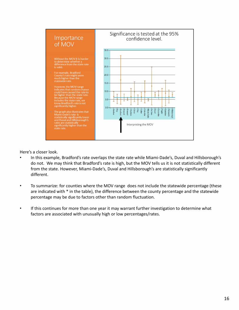
Here’s a closer look.• In this example, Bradford’s rate overlaps the state rate while Miami‐Dade’s, Duval and Hillsborough’s
do not. We may think that Bradford’s rate is high, but the MOV tells us it is not statistically different from the state. However, Miami‐Dade’s, Duval and Hillsborough’s are statistically significantly different.
• To summarize: for counties where the MOV range does not include the statewide percentage (these are indicated with * in the table), the difference between the county percentage and the statewide percentage may be due to factors other than random fluctuation.
• If this continues for more than one year it may warrant further investigation to determine what factors are associated with unusually high or low percentages/rates.
16
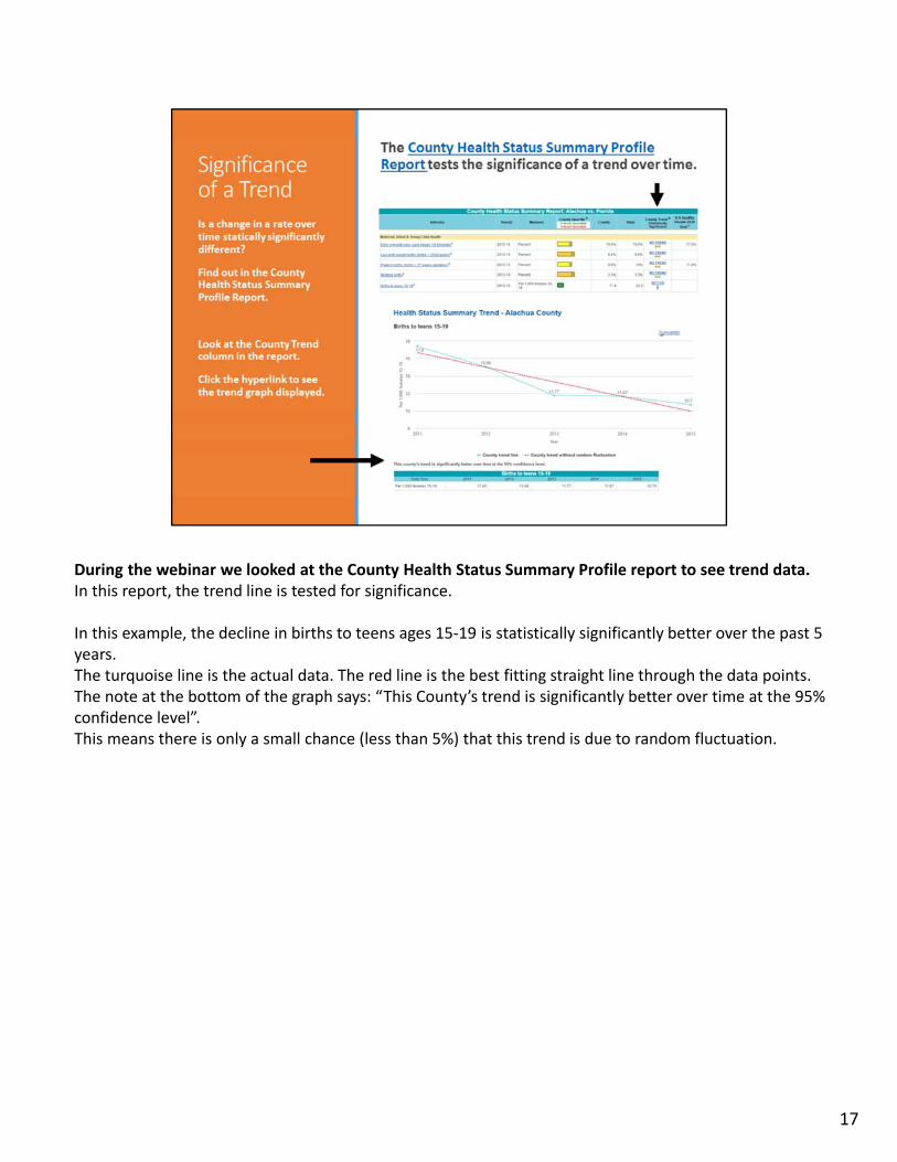
During the webinar we looked at the County Health Status Summary Profile report to see trend data.In this report, the trend line is tested for significance.
In this example, the decline in births to teens ages 15‐19 is statistically significantly better over the past 5 years.The turquoise line is the actual data. The red line is the best fitting straight line through the data points. The note at the bottom of the graph says: “This County’s trend is significantly better over time at the 95% confidence level”.This means there is only a small chance (less than 5%) that this trend is due to random fluctuation.
17
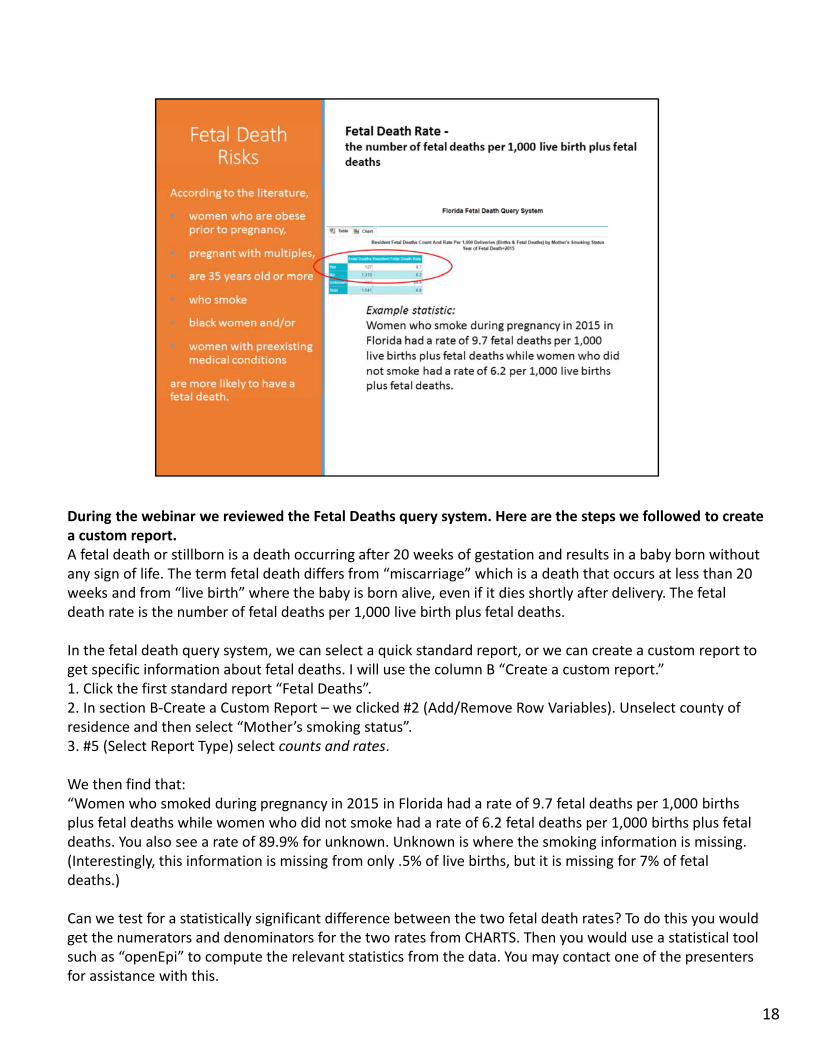
During the webinar we reviewed the Fetal Deaths query system. Here are the steps we followed to create a custom report.A fetal death or stillborn is a death occurring after 20 weeks of gestation and results in a baby born without any sign of life. The term fetal death differs from “miscarriage” which is a death that occurs at less than 20 weeks and from “live birth” where the baby is born alive, even if it dies shortly after delivery. The fetal death rate is the number of fetal deaths per 1,000 live birth plus fetal deaths.
In the fetal death query system, we can select a quick standard report, or we can create a custom report to get specific information about fetal deaths. I will use the column B “Create a custom report.”1. Click the first standard report “Fetal Deaths”.2. In section B‐Create a Custom Report – we clicked #2 (Add/Remove Row Variables). Unselect county of residence and then select “Mother’s smoking status”. 3. #5 (Select Report Type) select counts and rates.
We then find that:“Women who smoked during pregnancy in 2015 in Florida had a rate of 9.7 fetal deaths per 1,000 births plus fetal deaths while women who did not smoke had a rate of 6.2 fetal deaths per 1,000 births plus fetal deaths. You also see a rate of 89.9% for unknown. Unknown is where the smoking information is missing. (Interestingly, this information is missing from only .5% of live births, but it is missing for 7% of fetal deaths.)
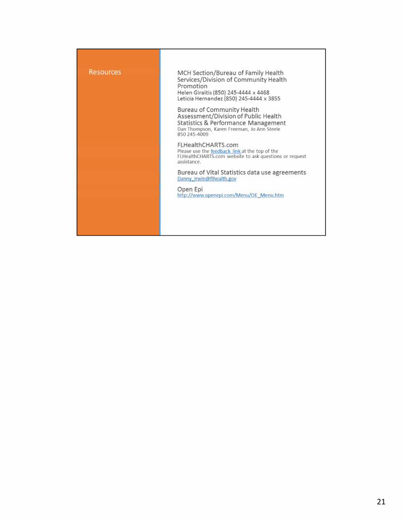
Can we test for a statistically significant difference between the two fetal death rates? To do this you would get the numerators and denominators for the two rates from CHARTS. Then you would use a statistical tool such as “openEpi” to compute the relevant statistics from the data. You may contact one of the presenters for assistance with this.
18
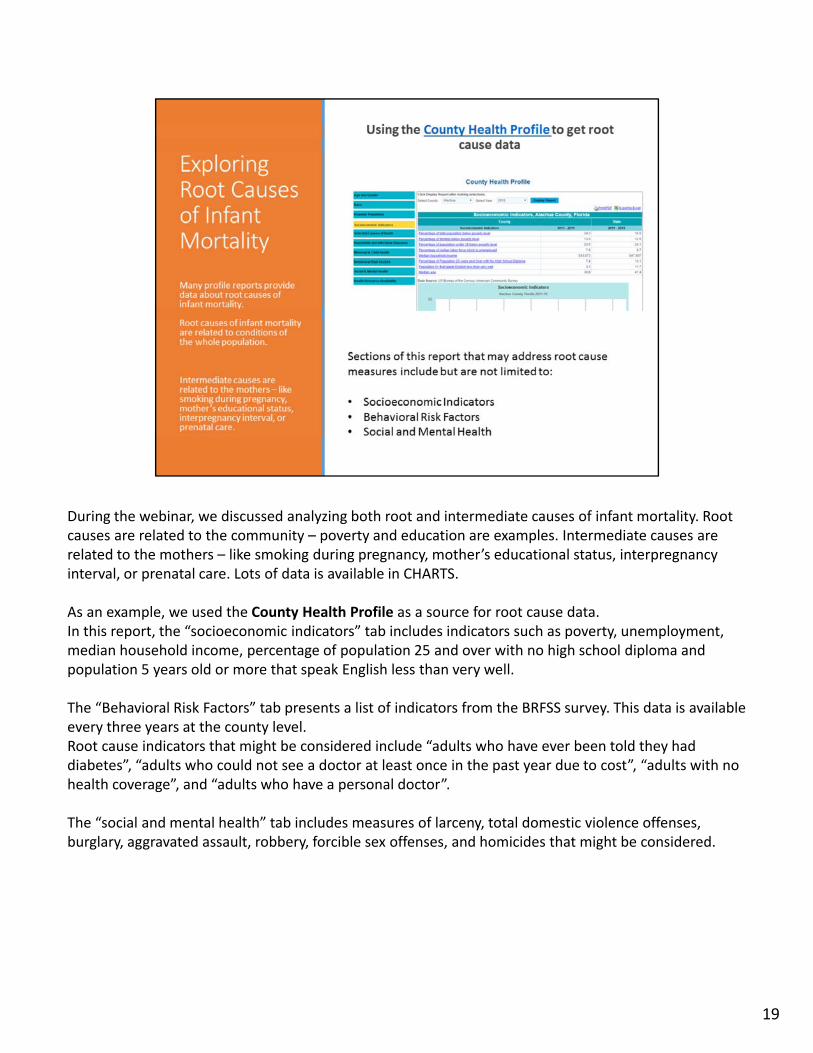
During the webinar, we discussed analyzing both root and intermediate causes of infant mortality. Root causes are related to the community – poverty and education are examples. Intermediate causes are related to the mothers – like smoking during pregnancy, mother’s educational status, interpregnancyinterval, or prenatal care. Lots of data is available in CHARTS.
As an example, we used the County Health Profile as a source for root cause data. In this report, the “socioeconomic indicators” tab includes indicators such as poverty, unemployment, median household income, percentage of population 25 and over with no high school diploma and population 5 years old or more that speak English less than very well.
The “Behavioral Risk Factors” tab presents a list of indicators from the BRFSS survey. This data is available every three years at the county level. Root cause indicators that might be considered include “adults who have ever been told they had diabetes”, “adults who could not see a doctor at least once in the past year due to cost”, “adults with no health coverage”, and “adults who have a personal doctor”.
The “social and mental health” tab includes measures of larceny, total domestic violence offenses, burglary, aggravated assault, robbery, forcible sex offenses, and homicides that might be considered.
19
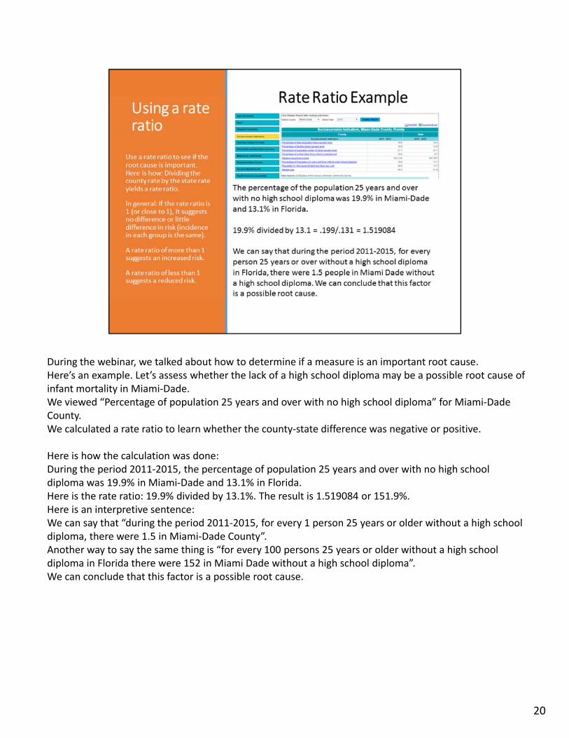
During the webinar, we talked about how to determine if a measure is an important root cause. Here’s an example. Let’s assess whether the lack of a high school diploma may be a possible root cause of infant mortality in Miami‐Dade. We viewed “Percentage of population 25 years and over with no high school diploma” for Miami‐Dade County. We calculated a rate ratio to learn whether the county‐state difference was negative or positive.
Here is how the calculation was done:During the period 2011‐2015, the percentage of population 25 years and over with no high school diploma was 19.9% in Miami‐Dade and 13.1% in Florida.Here is the rate ratio: 19.9% divided by 13.1%. The result is 1.519084 or 151.9%. Here is an interpretive sentence: We can say that “during the period 2011‐2015, for every 1 person 25 years or older without a high school diploma, there were 1.5 in Miami‐Dade County”. Another way to say the same thing is “for every 100 persons 25 years or older without a high school diploma in Florida there were 152 in Miami Dade without a high school diploma”. We can conclude that this factor is a possible root cause.
20
21