Embed Size (px)
Citation preview

DreamAgain Financials

Introduction to Candlestick Charts
Candlestick formations and patterns are a type of stock market technical analysis, and are used in stock chart displays. They are able to be used in every time frame, by long term investors to day traders and swing traders. The major benefit with candlestick charts is that they are great at providing you with turning points in the market, and when used properly, can substantially decrease your exposure to risk in the market. With candlestick charts, it’s not a guessing game. Trading blindly is no way to trade. Many are able to read patterns and single candles to determine what will soon follow.It is even believed by many traders that the news is already worked into the charts. Essentially, news reaches the average trader long after Wall Street. That press release you read this morning may have reached Wall Street a week ago. The end conclusion being that you can predict the news (positive or negative) based on chart movements and patterns.
What are Candlestick Charts?“Japanese Candlestick” charts, named for their
2

resemblance to candles, have been refined after several generations of use in Asia. Today, candlestick charts are used internationally by day traders, swing traders, investors and even Wall Street financial institutions.Candlesticks are fairly easy to understand. Anyone from a new trader that is just being introduced to technical analysis to the seasoned veteran trader can easily use the power of candlesticks. Candlesticks provide each of us with earlier indications of turning points in the market. They can display reversal signals in just a few sessions, rather than weeks previously needed for a bar chart to display clear reversal signals.Any technical tool you use can be applied to a candlestick chart. Unlike traditional bar charts and line charts, candlesticks give you trading and timing benefits not otherwise available with other charts. Candlestick charts can be used in all markets from the stock market, futures, commodities, forex and can be a powerful tool when trading options. As a result, the average technical analysis driven trader will much prefer candlestick charts when performing TA or evaluating a security.
Understanding CandlesticksThe wide part of the candlestick (or the body) of the candle, represents the range between the opening and closing prices of the session (on the daily chart). Same goes for any other time range.
3

If the closing price ends lower than the price at open, the body of the candle is red or black. The body is white or green should the closing price ends higher than the opening price.The lines above and/or below the body of the candle are referred to as shadows or wicks. The top of the upper wick shows us the high of the day, while the bottom wick shows us the low of the day.The color of the candle, and the length of the body shows whether bulls or bears are currently in charge.
Trading With CandlesticksA very powerful benefit of using candlesticks is that the color and size of the candles can display large volumes of information. A few examples:
4

Dojis
•Long green or white candle body confirms bulls are in charge
•Long red or black candle body confirms bears are in charge
•A small candle body (any color) indicates a time that the bulls and bears are in a battle of tug of war and warns you that the current market’s trend momentum may be dying
•As the candle body gets smaller, we essentially end up with a “doji,” a candlestick line that has an identical opening and closing price, and therefore has no candle body.
While the candle body is typically considered to be the most important part of the candlestick, you are also able to gain a substantial amount of information from the position and length of the wicks. For example, a tall wick above the body shows that the market tested and rejected higher prices, while a long wick under the body indicates a market that has tested and rejected lower prices. Candlestick charts will usually provide reversal signals, which traditional bar and line charting techniques
5

are unable to show.Here is an example of how using candlesticks can help to avoid a losing trades. Exhibit 1 below is a standard bar chart. In the area that is circled on the bar chart, this particular security looks strong, as it appears to be making consecutively higher closes. Based on this aspect (and this chart) alone, this looks like a potentially a winning trade.
Exhibit 2 is a candlestick chart that is analyzing the same stock and time frame used in Exhibit 1.If you look at the same circled area of the same stock on the candlestick chart, you can easily note the differences. With the candlestick chart, within the same circled area, there are a series of small candle bodies which are referred to as “spinning tops.” Small candle bodies indicate that the previous trend (in this case, the strong rally) could be losing its momentum.
6

Therefore, while the bar chart in Exhibit 1 makes it look like an attractive trade, the candlestick chart indicates there is a reason for caution when going long. The small candle bodies (spinning tops) illustrate the bulls are losing force. Therefore, by utilizing the candlestick chart, a day trader, swing trader, or even an active investor would more than likely not buy this security in the circled area. Resulting in avoiding a losing trade.
ConclusionWithout a doubt, Candlesticks are the way to go when it comes to charts. The information given by the simple displays are so much more than you get from other types of stock charts. I will follow up this post with additional posts regarding technical analysis, including some of the most common and useful chart patterns to watch for.
7

Charts 101: Bullish Harami
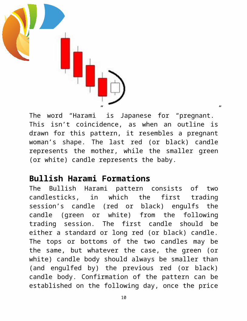
A Bullish Harami is a candlestick pattern that is formed when a large candle is immediately followed by a smaller candle, with the smaller candle’s body being found within the overall range of the larger candle’s body. When referring to candle colors, the Bullish Harami consists of a downtrend of red (or black) candles, with the final candle that engulfs a small green (or white) candle, which indicates a reversal of the downtrend.
The word “Harami” is Japanese for “pregnant.” This isn’t coincidence, as when an outline is drawn for this pattern,
8

it resembles a pregnant woman’s shape. The last red (or black) candle represents the mother, while the smaller green (or white) candle represents the baby.
Bullish Harami FormationsThe Bullish Harami pattern consists of two candlesticks, in which the first trading session’s candle (red or black) engulfs the candle (green or white) from the following trading session. The first candle should be either a standard or long red (or black) candle. The tops or bottoms of the two candles may be the same, but whatever the case, the green (or white) candle body should always be smaller than (and engulfed by) the previous red (or black) candle body. Confirmation of the pattern can be established on the following day, once the price has risen above the half-way point of the last red (or black) candle.
The Bullish Harami pattern is an indication of
9
inconsistency in the market’s health. The market is in a downtrend and an overall bearish sentiment, which leads to heavy sell pressure as indicated by the red body candles. However, the next trading session the price opens higher or at the close level of the prior session and short traders start to cover their shorts, causing the price to rise even more. Late-comers attempt to short the downtrend they may have missed out on, and profit takers from scalp trades slow the rise in price. As a result, a small green candle body is formed. This may indicate a reversal in the downtrend as it indicates that bearish sentiment and momentum may be changing.
Trading the Bullish Harami PatternA few key points to recognize the Bullish Harmani pattern are:•The market has established a prevailing downtrend•A red candle body is observed in the first trading session•The green candle body that occurs in the second trading
session is completely engulfed by the body of the first
•Next day price rises above halfway point on red engulfing candle body
10

To confirm the overall pattern, the price rises above the midpoint of the last red candle body. For confirmation, the price should cross above this level.The stop-loss level should be established at the lower of the last two lows.
Charts 101: The Bullish EngulfingLet me start by saying that if you are unfamiliar with candlestick charts and how they work, please read Introduction to Candlestick Charts before going too in depth with the individual patterns. It will make all that follows so much easier to understand.
The Bullish Engulfing
11

A Bullish Engulfing is a candle pattern that indicates a reversal, is bullish (to the upside), and usually occurs near the end of a downtrend. This pattern features two candlesticks, with the first usually being bearish, and the second bullish. The name comes from the body of the second candle engulfing the body of the first candle.
Bullish Engulfing FormationsA Bullish Engulfing is formed by two candles. The first candle forms when the market is in a downtrend. The price closes near the bottom of the time period. As a result, the black or red bearish candle is formed, which represents the first candle of the pattern. There are occasions where the first candle of the Bullish Engulfing is green, but they are a little harder to find and usually consist of a Doji or small candle. The next trading period the price opens below the low end of the body of the previous bearish candle, in a gap down.
12

Sellers are beginning new short trades, and those who may already be short in the market may be adding to their positions. Bulls creep in and start accumulating shares from sellers. As the bullish demand increases the bearish momentum decreases, and as a result the price begins to rise. As bulls continue to add to their long positions, the price increases more and by the end of the session, the closing price is higher than the body of the previous candle. As a result, this forms the bullish white or green candle, which engulfs the real body of the previous bearish candle.
Trading the Bullish EngulfingFor the Bullish Engulfing to be a reliable reversal and buy signal, there needs to be a clear downtrend established. Study the chart below, and if all 5 points are hit, buy it! If it becomes obvious that the buyers are taking control of the market, this pattern (much like the Doji and Hammer) indicates that the possible bottom of the downtrend and reversal may be unveiling.
13

If the body of the first candle is very short, while the body of the second is very tall, the importance of this pattern increases. If the second day has relatively high volume, it is likely a minor downtrend within a major uptrend. If you are short on the position, a Bullish Engulfing should signal you to take some sort of action during the next trading period. A long position can be entered above the high of the second candle. You can place a stop order below the low of the overall pattern to limit your losses, should the downtrend continue. If you have any questions, please feel free to comment. If you learned something knew, share it with others.
14