Embed Size (px)
Citation preview

1
Creating Well Designed Websites
Using HTML to Develop Websites.
“Common sense is not that common.” – Mark Twain

2
What we will look at:
9 design observations for clean working designHow to get a design that customer needs.Designing with templates.
»How to find and use templates»How to edit the image files.

3
Competency Objectives
1. Understand 9 principles for good design
2. Able to work with templates
3. Able to edit image files
Competency Alert:You need to
know this!
Common Problem Area!
People seem to forget this

4
Classic Design Criteria A Website is a little like a business card
» Must provide a needed function (address, title, contact information)
» Should have good form (look nice and appealing)
Plummers R UsH. Munster - President
1313 Mockingbird LaneTransylvania, Romania
Lots of functionality, less form
Too much form not enough function

5
9 Design Observations 5 Functionality Observations
1. Find what you need2. Make it easy to do business3. Easy flow through site4. Consistent, easy-to-find navigation5. Work with a wide variety of browsers
4 Form Observations1. Design that matches the audience expectations.2. Make a good first impression3. Break text in logical design sections4. Use consistent design with good color choice
Competency Alert:You need to
know this!

6
5 Functionality Observations
1. Find what you need
Amazon makes it easy to find stuff, even though they have lots of products.
Their search is effective.
Provide links (bottom) for other amazon needs

7
The drop-down style navigation is not obvious until you place your cursor over it
This design element took about 15 seconds to load!
A man from Mars can't figure out what your web site is about in less than 4 seconds - Vincent Flanders. The Biggest Web Design Mistakes of 2004. (http://webpagesthatsuck.com).
1. Find what you need
5 Functionality Observations
8
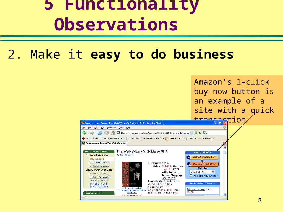
2. Make it easy to do business
Amazon’s 1-click buy-now button is an example of a site with a quick transaction
5 Functionality Observations

9
Sticky forms, do not ask user to re-enter all fields again. They ‘remember’ filled in fields.
Missing fields have asterisks for prompts
Question to ask. . . Does my web site solve the customer’s problem?
2. Make it easy to do business
5 Functionality Observations
10
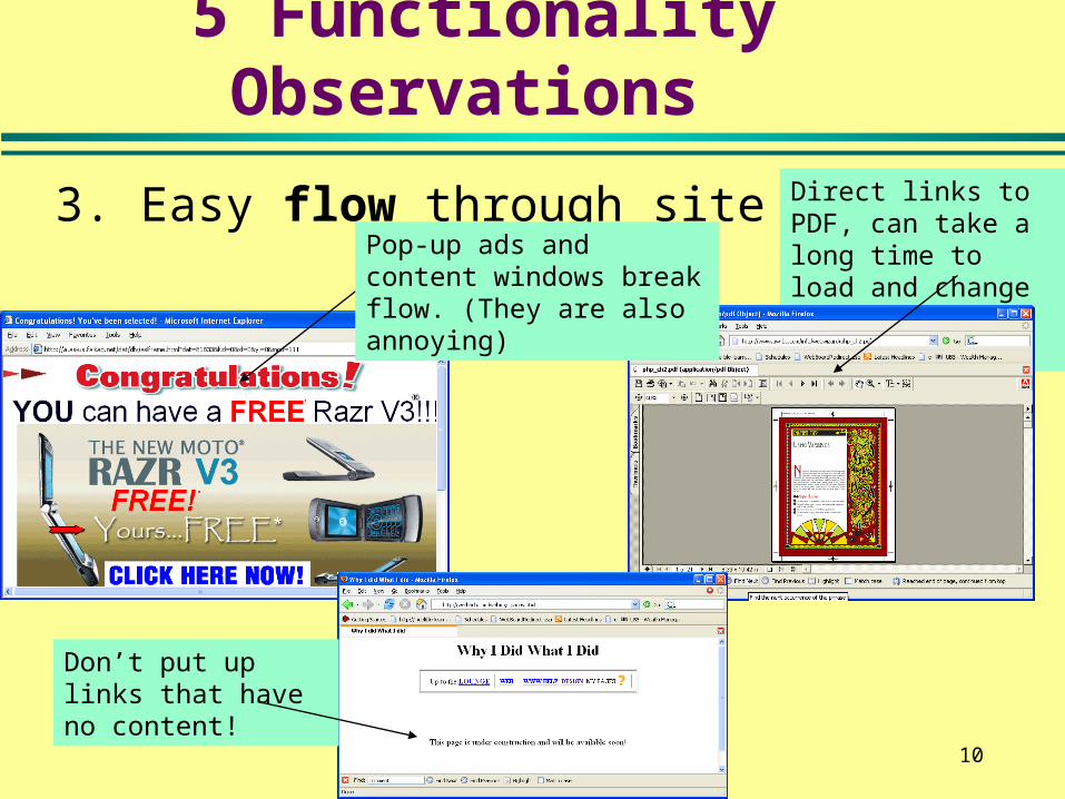
3. Easy flow through site Direct links to PDF, can take a long time to load and change navigation method.
Pop-up ads and content windows break flow. (They are also annoying)
Don’t put up links that have no content!
5 Functionality Observations

11
5 Functionality Observations
3. Don’t Break the user’s ‘flow’.This sitesays I got to have IE. What if I don’t like IE?
Is this a good thing or bad thing?

12
5 Form Observations
1. Design that matches the audience expectations.
Paul Simon’s site certainly doesn’t look like a corporate siteCNN looks like a
news site.This is probably what you’d expect here.

13
4. Consistent, easy-to-find navigation
How do I get out of here?
How do I navigate this thing?
5 Functionality Observations

14
5. Work with a wide variety of browsers
In IE I can clearly see these navigation items.
In firefox they seemed to have disappeared.
5 Functionality Observations

15
9 Design Observations 5 Functionality Observations
1. Find what you need2. Make it easy to do business3. Easy flow through site4. Consistent, easy-to-find navigation5. Work with a wide variety of browsers
4 Form Observations1. Design that matches the audience expectations.2. Make a good first impression3. Break text in logical design sections4. Use consistent design with good color choice
16
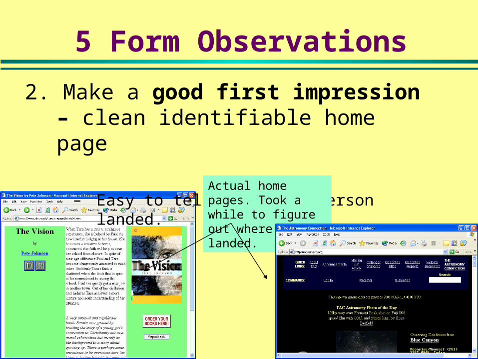
5 Form Observations
2. Make a good first impression – clean identifiable home page
– Easy to tell where the person landed. Actual home pages. Took a while to figure out where I landed.

17
5 Form Observations
3. Make a good first impression.» Make a clean, easy to identify homepage.
– Easy to tell where the person landed. – Make a good first impression
Clearly tells you who they are
Wasting all this space forces me to scroll.

18
Finally after 20-30 seconds get to this page. Suppose I only wanted their phone number?
This sight has a lengthy flash intro.
3. Make a good first impression.
5 Functionality Observations

19
5 Form Observations
4. Break text in logical design sections» That is, design content for display on the web
This site looks like the read portion of the ACT!
Notice how the fonts change, use of color, even side graphics make page more inviting

20
5. Use consistent design with good color choice
5 Form Observations
You might need a template to get coordinating colors. Still its better than looking ugly.
Consistent Design elements with:•Colors•Navigation•Tag Lines•Font Choice
Nice coordinated color, site is also good example of text broken into inviting areas

21
9 Design Observations 5 Functionality Observations
1. Find what you need2. Make it easy to do business3. Easy flow through site4. Consistent, easy-to-find navigation5. Work with a wide variety of browsers
4 Form Observations1. Design that matches the audience expectations.2. Make a good first impression3. Break text in logical design sections4. Use consistent design with good color choice

22
What we will look at:
9 design observations for clean working designHow to get a design that customer needs.Designing with templates.
»How to find and use templates»How to edit the image files.

23
Getting the right design How to determine basic functions of the site Need to ask some questions . . .
» What are major categories of information (e.g., Contact, products, support, etc.)?
» How dynamic is the content? (and who will change it?)
» Who supplies the content for each category? » How will we/you assure it’s up-to-date?» What style image are you looking for (e.g.,
corporate, earthy, homey, flashy, high tech, etc)
24
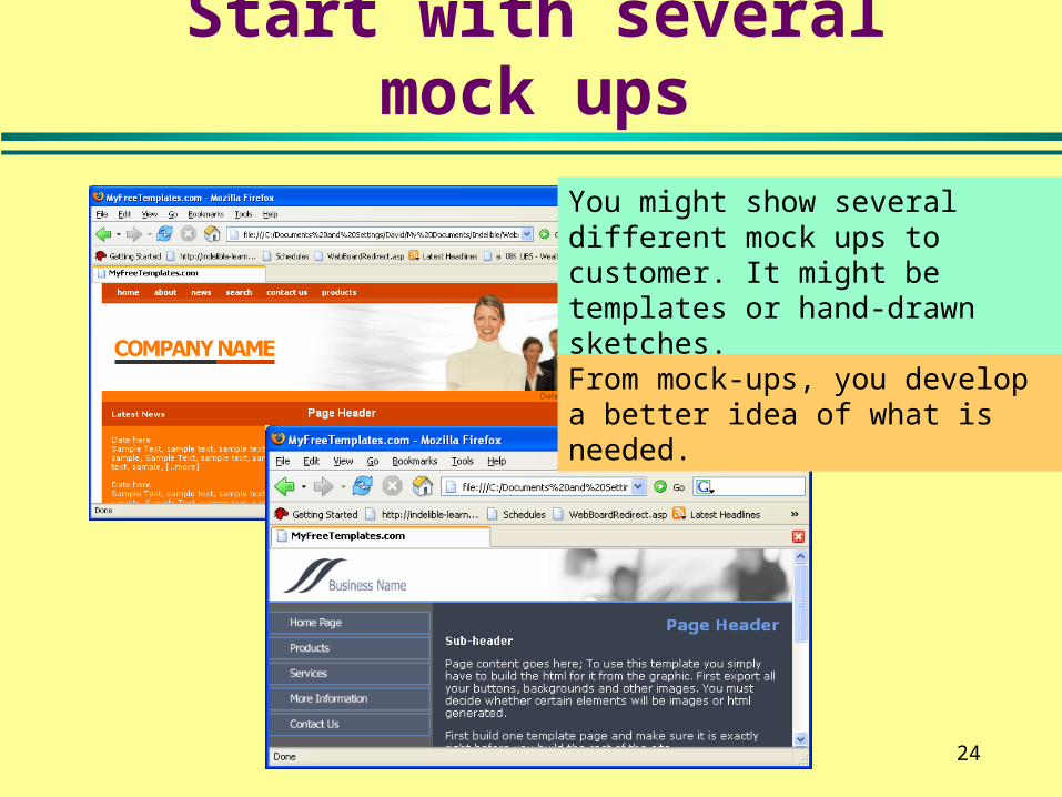
Start with several mock ups
You might show several different mock ups to customer. It might be templates or hand-drawn sketches.
From mock-ups, you develop a better idea of what is needed.

25
Consider Designing With Templates

26
The problem with HTML templates
Here is where you need to update your content. Can be difficult to work this deep in the tables.
27
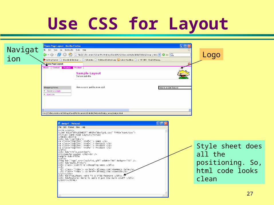
Use CSS for Layout
LogoNavigation
Style sheet does all the positioning. So, html code looks clean

28
Consider Searching for HTML Templates
Do a search on Google for Free html templates or something similar» Carefully read their license agreement
One site (myfreetemplates.com)Will download the template into a zip format. You can expand the file just by double clicking in explorer.

29
Looking at your template . . .
After expand and open the template. You will get
These are image files that need customization
Customize your text.

30
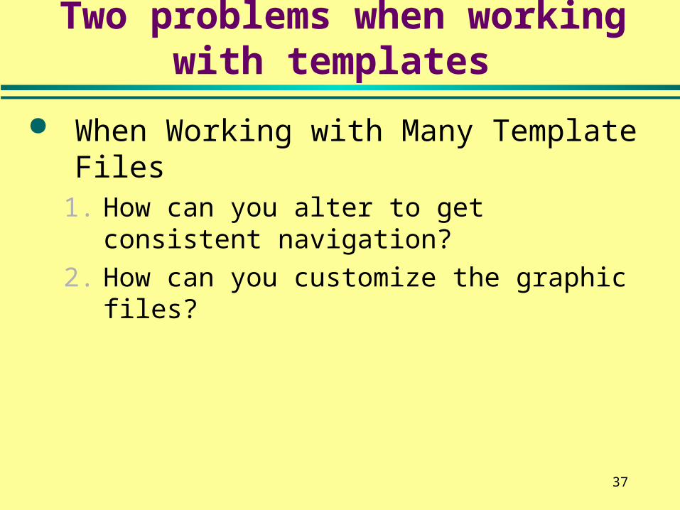
Two problems when working with templates
When Working with Many Template Files1. How can you alter to get consistent
navigation?
2. How can you customize the graphic files?
Competency Alert:You need to
know this!

31
1. How to get consistent navigation
To get consistent navigation can either» Set the site up to be frames based» Use a language on server side such as PHP
You want this information to be the ‘frame’
This information changes when click frame link.

32
It may not be obvious
The template can be quite large. This one is 140 lines
Note everything is in there as one big html file

33
1. Look for start of ‘content’ area.
Find where navigation ends and where you’d place your content. Line 74 starts a new table.
Line 81 is the page header
Line 85 shows where content goes.
So, everything before line 74 is probably frame material! Save everything line 74 on into a separate file say, home.html.

34
2. Now find the top and left hand sides
Look for where top table ends and left hand starts.
Save top table (lines 1,53) in 1 file (call it top.html) and left hand navigation (lines 53, 72) into separate files (call it left.html).

35
You now should have 3 pieces…
left.html top1.html
content.html
Note: Depending upon the template, you may have to edit each of the 3 pieces. For example, to end or start tables.

36
3. Create your own frameset. . .
Create the frameset 1 <HTML> <HEAD> <TITLE> A Nested Frames Example </TITLE> </HEAD> 2 <FRAMESET rows="15%,*" > 3 <FRAME SRC="top1.html"> 4 <!-- right frame is another frameset --> | 5 <FRAMESET cols="15%,*"> 6 <!-- top frame --> <FRAME SRC="left.htm" target=bottom"> 7 <!-- bottom frame --> | <FRAME SRC="content.html"> 8 </FRAMESET> 9 </FRAMESET> 10 </HTML>
Now it’s a ‘frames’ exercise.How do you remove scroll bars? How to you size things right? How do you get the targets to work right? How do you change css colors?
37
Two problems when working with templates
When Working with Many Template Files1. How can you alter to get consistent
navigation?
2. How can you customize the graphic files?

38
How Change Navigation Buttons
There are 2 graphic files for each navigation button. Each needs to be edited to change text.
Competency Alert:You need to
know this!

39
Use GIMP to Change Image Text
Open the file in Gimp
Use pick colors from image to find exact color of background
Use eraser tool to remove text and text tool to add text.
Eraser tool,
Text tool.
Move tool

40
A Few More Tools . . .
Rotate the image
Eraser tool,
Change image perspective.
Scale image

41
Summary:
9 design observations for clean working design» 5 Functionality Observations
1.Find what you need2.Make it easy to do business3.Easy flow through site4.Consistent, easy-to-find navigation5.Work with a wide variety of browsers
4 Form Observations1.Design that matches the audience expectations.2.Make a good first impression3.Break text in logical design sections4.Use consistent design with good color choice
How to get a design that customer needs.Designing with templates.
»How to find and use templates»How to edit the image files.

42
Module 1 Hands on Assignment
Rework the following template to support frames.
Create a file frameset.html, top.html and bottom.html
http://www.indelible-learning.com/website/templates/topblue.zip

43
One possible solution – top.html
http://www.indelible-learning.com/website/templates/Basic_blue/frameset.html
1. <HTML><HEAD><TITLE>a0001</TITLE>
2. <META HTTP-EQUIV="Content-Type" CONTENT="text/html; charset=iso-8859-1">
3. <link href="style.css" rel="stylesheet" type="text/css">
4. </HEAD>
5. <BODY BGCOLOR=#FFFFFF background="images/base_bg2.gif" text="#000000" leftmargin="0" topmargin="0" marginwidth="0" marginheight="0">
6. <div align="center">
7. <TABLE width="100%" BORDER=0 CELLPADDING=0 CELLSPACING=0>
8. <TR> <TD height="16" background="images/pixi_white.gif"><img src="images/pixi_white.gif" width="16" height="16"></TD>
9. </TR> <TR>
10. <TD height="2" background="images/top_twogreys.gif"> <IMG SRC="images/top_twogreys.gif" WIDTH=4 HEIGHT=2></TD>
11. </TR>
12. <TR>
13. <TD height="72" background="images/top_bg_blue.gif">
14. <table width="100%" border="0">
15. <tr>
16. <td width="1"><img src="images/top_bg_blue.gif" width="1" height="70"></td>
17. <td width="514" valign="top"><img src="images/pic_companylogo.gif" width="185" height="48"></td>
18. <td width="239" valign="top"><img src="images/pic_company_slogan.gif" width="103" height="48"></td>
19. </tr>
20. </table> </TD>
21. </TR>
22. <TR>
23. <TD height="24" background="images/nav1_bg1.gif"><img src="images/nav1_bg1.gif" width="1" height="24"><a href="#"><img src="images/btn_main.gif" width="80" height="24" border="0"></a><a href="#"><img src="images/btn_aboutus.gif" width="105" height="24" border="0"></a><a href="#"><img src="images/btn_products.gif" width="103" height="24" border="0"></a><a href="#"><img src="images/btn_services.gif" width="98" height="24" border="0"></a><a href="#"><img src="images/btn_support.gif" width="97" height="24" border="0"></a><a href="#"><img src="images/btn_contactus.gif" width="113" height="24" border="0"></a></TD> </TR>
24. <TR> <TD height="1" background="images/pixi_white.gif"><img src="images/pixi_white.gif" width="4" height="1"></TD> </TR>
25. <TR>
26. <TD height="21" background="images/nav2_bg.gif"> </TD>
27. </TR>
28. <TR>
29. <TD height="280" valign="top" bgcolor="#FFFFFF">
30. </table>

44
One possible solution – bottom.html
1. <html><head><link href="style.css" rel="stylesheet" type="text/css"></head><body>
2. <table width="100%" border="0" cellpadding="10">
3. <tr>
4. <td width="25"> </td>
5. <td><h1>Page Header<br>
6. <span class="date">Date dd/mm/yyyy</span></h1></td>
7. <td width="25"> </td>
8. </tr>
9. <tr>
10. <td> </td>
11. <td><p><strong>Sub-header</strong></p>
12. <p>Page content goes here; To use this template you simply have
13. to build the<br>
14. html for it from the graphic. First export all your buttons, backgrounds
15. and<br>
16. other images. You must decide whether certain elements will be
17. images<br>
18. or html generated.<br>
19. First build one template page and make sure it is exactly right
20. before you<br>
21. build the rest of the site.</p>
22. <p>[ <a href="#">Link sample</a> ] [ <a href="#">Link sample</a>
23. ] [ <a href="#">Link sample</a> ]<br>
24. </p></td>
25. <td> </td>
26. </tr> </table> </TD>
27. </TR>
28. <TR>
29. <TD height="3" background="images/base_bg1.gif"><img src="images/base_bg1.gif" width="1" height="3"></TD>
30. </TR>
31. <TR>
32. <TD height="30" background="images/base_bg2.gif"><img src="images/base_bg2.gif" width="1" height="30"></TD>
33. </TR>
34. </TABLE></div></BODY></HTML>

45
One possible solution – frameset.html
1. <HTML> <HEAD> <TITLE> A Nested Frames Example </TITLE> </HEAD>
2. <FRAMESET rows="140,*" >3. <FRAME SRC="top.html" target=bottom
scrolling='no' border=0 noresize>4. <FRAME SRC="bottom.html" target=bottom"
scrolling='no' border=0 noresize>5. <!-- bottom frame --> | <FRAME
SRC="content.html">6. </FRAMESET>7. </HTML>