Embed Size (px)
Citation preview
1
Excel Lesson 8Working with Charts
Microsoft Office 2010 Introductory
Pasewark & Pasewark
Ex
cel L
es
son
8
Pasewark & Pasewark Microsoft Office 2010 Introductory 222
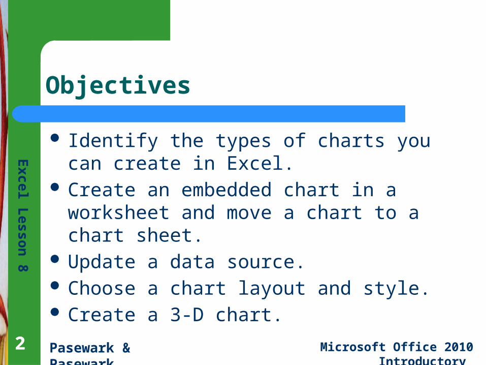
Objectives
Identify the types of charts you can create in Excel.
Create an embedded chart in a worksheet and move a chart to a chart sheet.
Update a data source. Choose a chart layout and style. Create a 3-D chart.
Ex
cel L
es
son
8
Pasewark & Pasewark Microsoft Office 2010 Introductory 333
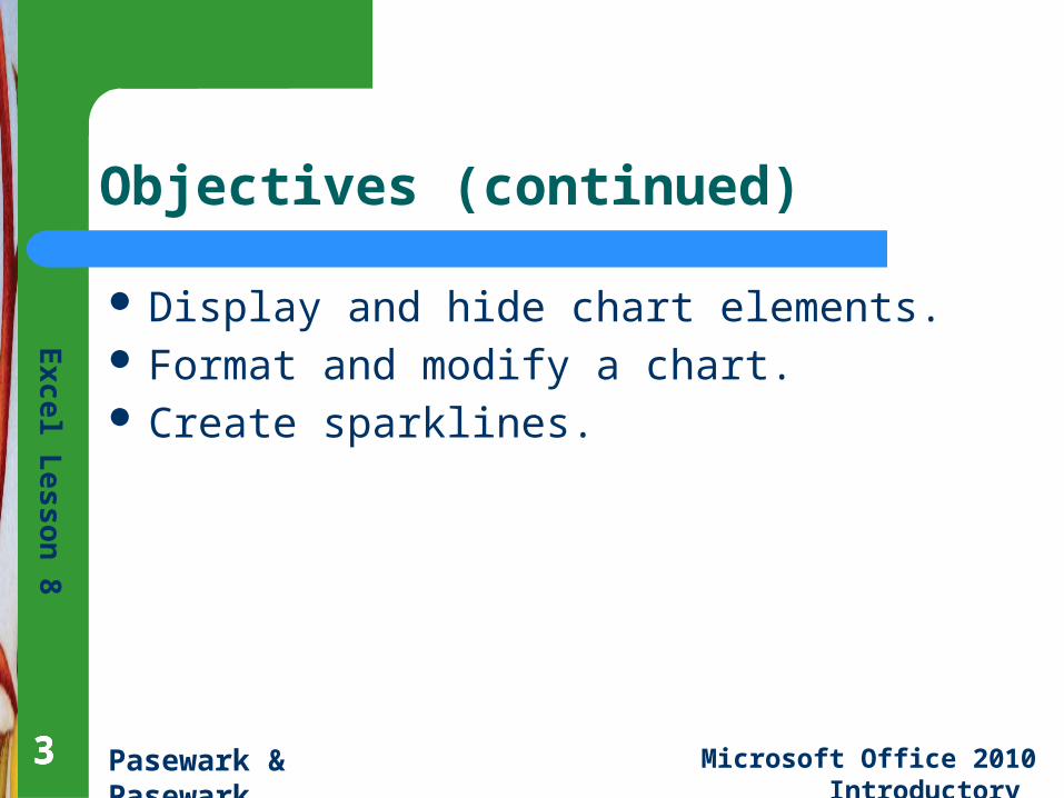
Objectives (continued)
Display and hide chart elements. Format and modify a chart. Create sparklines.
Ex
cel L
es
son
8
Pasewark & Pasewark Microsoft Office 2010 Introductory 444
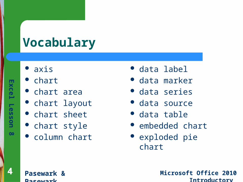
Vocabulary
axis chart chart area chart layout chart sheet chart style column chart
data label data marker data series data source data table embedded chart exploded pie chart
Ex
cel L
es
son
8
Pasewark & Pasewark Microsoft Office 2010 Introductory 555
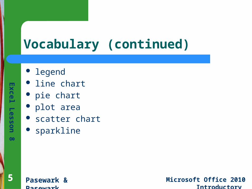
Vocabulary (continued)
legend line chart pie chart plot area scatter chart sparkline
Ex
cel L
es
son
8
Pasewark & Pasewark Microsoft Office 2010 Introductory
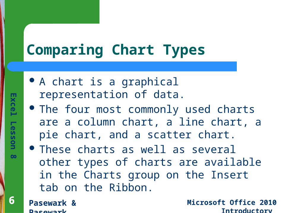
Comparing Chart Types
A chart is a graphical representation of data. The four most commonly used charts are a
column chart, a line chart, a pie chart, and a scatter chart.
These charts as well as several other types of charts are available in the Charts group on the Insert tab on the Ribbon.
666
Ex
cel L
es
son
8
Pasewark & Pasewark Microsoft Office 2010 Introductory
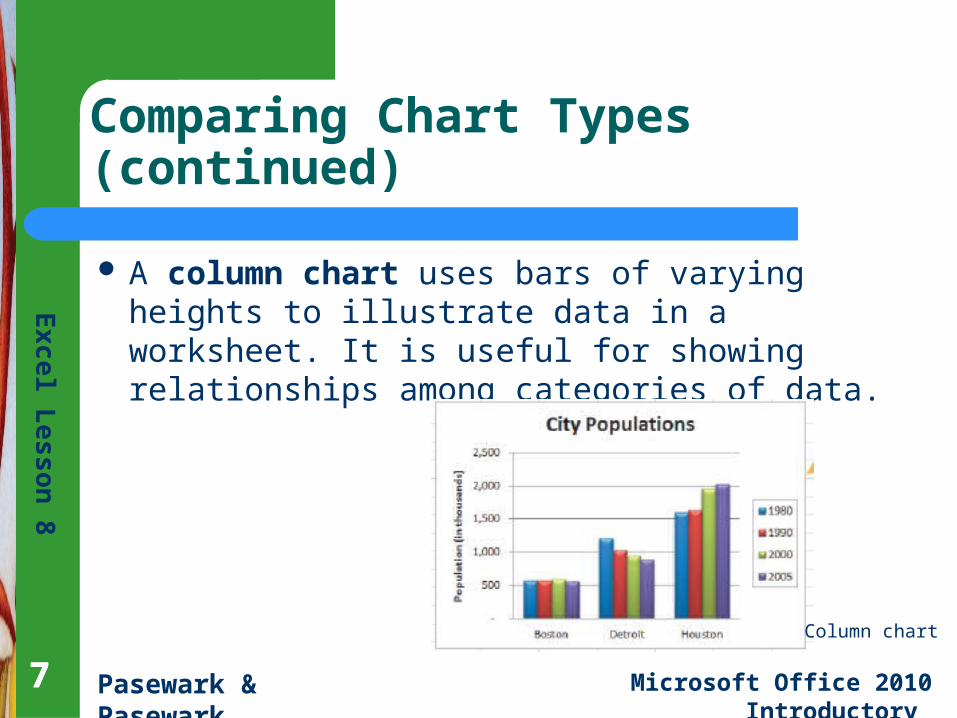
Comparing Chart Types (continued)
A column chart uses bars of varying heights to illustrate data in a worksheet. It is useful for showing relationships among categories of data.
777
Column chart
Ex
cel L
es
son
8
Pasewark & Pasewark Microsoft Office 2010 Introductory
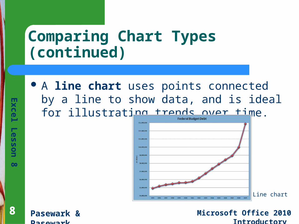
Comparing Chart Types (continued)
A line chart uses points connected by a line to show data, and is ideal for illustrating trends over time.
888
Line chart
Ex
cel L
es
son
8
Pasewark & Pasewark Microsoft Office 2010 Introductory
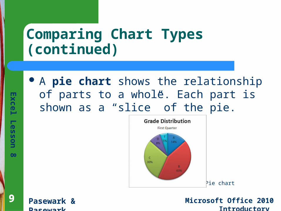
Comparing Chart Types (continued)
A pie chart shows the relationship of parts to a whole. Each part is shown as a “slice” of the pie.
999
Pie chart
Ex
cel L
es
son
8
Pasewark & Pasewark Microsoft Office 2010 Introductory
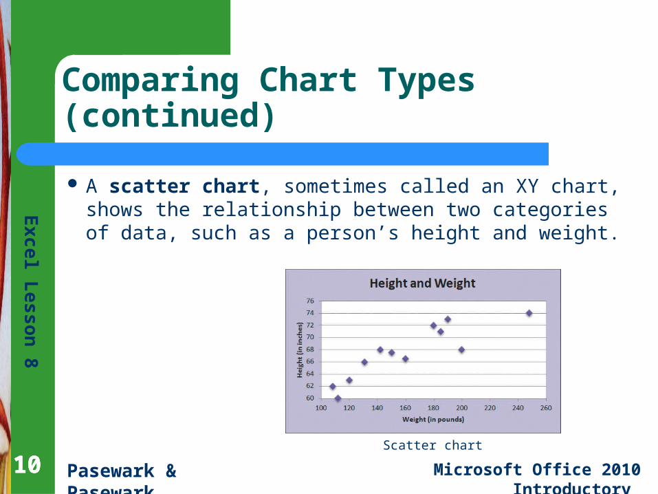
Comparing Chart Types (continued)
A scatter chart, sometimes called an XY chart, shows the relationship between two categories of data, such as a person’s height and weight.
101010Scatter chart
Ex
cel L
es
son
8
Pasewark & Pasewark Microsoft Office 2010 Introductory
Creating a Chart
The process for creating a chart is similar no matter which chart type you want to create.– First, you select the data you want to use for the
chart. – Second, you select a chart type. – Finally, you select the chart location.
111111
Ex
cel L
es
son
8
Pasewark & Pasewark Microsoft Office 2010 Introductory
Creating a Chart (continued)
Selecting the data to chart is the first step. The chart data, called the data source, is
stored in a range of cells in the worksheet. You can also choose whether to chart more
than one series of data. A data series is a group of related information
in a column or row of a worksheet that is plotted on the chart.
121212
Ex
cel L
es
son
8
Pasewark & Pasewark Microsoft Office 2010 Introductory
Creating a Chart (continued)
Selecting the chart type is the second step. The next step is to select the type of chart you
want to create, such as a column, pie, or line chart.
Each chart type has a variety of subtypes you can choose from.
The chart types are available on the Insert tab in the Charts group.
131313
Ex
cel L
es
son
8
Pasewark & Pasewark Microsoft Office 2010 Introductory
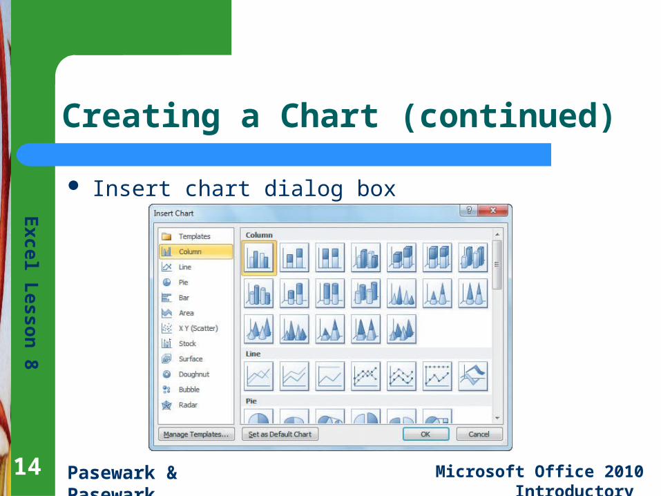
Creating a Chart (continued)
Insert chart dialog box
14
Ex
cel L
es
son
8
Pasewark & Pasewark Microsoft Office 2010 Introductory 151515
Creating a Chart (continued)
Choosing the chart location is the third step. After you select a chart type and subtype, the
chart is inserted in the center of the worksheet.
This is called an embedded chart. You can move an embedded chart to a chart sheet, which is a separate sheet in a workbook that stores a chart.
Ex
cel L
es
son
8
Pasewark & Pasewark Microsoft Office 2010 Introductory 1616
Updating a Data Source
Charts are based on the data stored in a worksheet.
If you need to change the data in the worksheet, the chart is automatically updated to reflect the new data.
You switch between a chart sheet and a worksheet by clicking the appropriate sheet tabs.
16
Ex
cel L
es
son
8
Pasewark & Pasewark Microsoft Office 2010 Introductory 1717
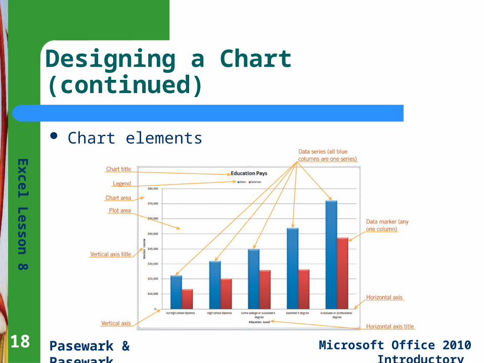
Designing a Chart
Most charts include some basic elements, such as a title and legend, which you can choose to include or hide.
Charts are made up of different parts, or elements. The chart on the next slide identifies some common chart elements.
17
Ex
cel L
es
son
8
Pasewark & Pasewark Microsoft Office 2010 Introductory
Designing a Chart (continued)
Chart elements
18
Ex
cel L
es
son
8
Pasewark & Pasewark Microsoft Office 2010 Introductory 1919
Designing a Chart (continued)
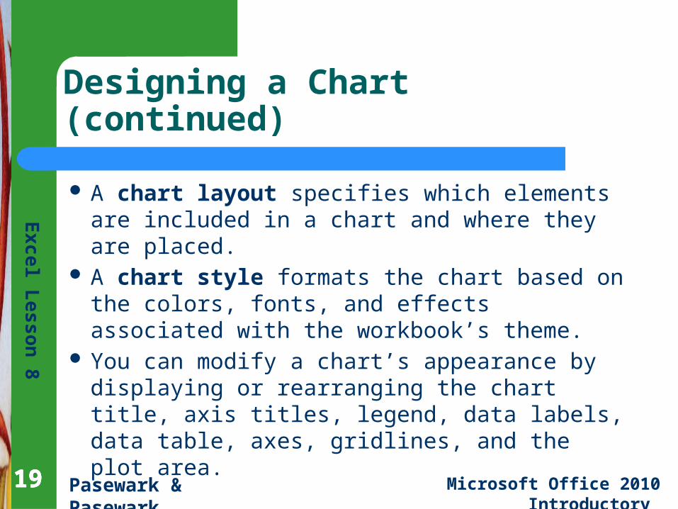
A chart layout specifies which elements are included in a chart and where they are placed.
A chart style formats the chart based on the colors, fonts, and effects associated with the workbook’s theme.
You can modify a chart’s appearance by displaying or rearranging the chart title, axis titles, legend, data labels, data table, axes, gridlines, and the plot area.
19
Ex
cel L
es
son
8
Pasewark & Pasewark Microsoft Office 2010 Introductory 2020
Creating a 3-D Chart
In a pie chart, the slices are different colors to distinguish each data marker. Pie charts can be 2-D or 3-D.
To create a 3-D chart, choose one of the 3-D chart styles, such as “Pie in 3-D.”
20
Ex
cel L
es
son
8
Pasewark & Pasewark Microsoft Office 2010 Introductory 2121
Formatting and Modifying a Chart
The Chart Tools provide a simple way to create professional-looking charts.
To make changes to an element’s fill, border color, and border style, and so forth, you need to open its Format dialog box.
Select the chart element. Then, on the Format tab, click the Format Selection button to open the Format dialog box.
21
Ex
cel L
es
son
8
Pasewark & Pasewark Microsoft Office 2010 Introductory
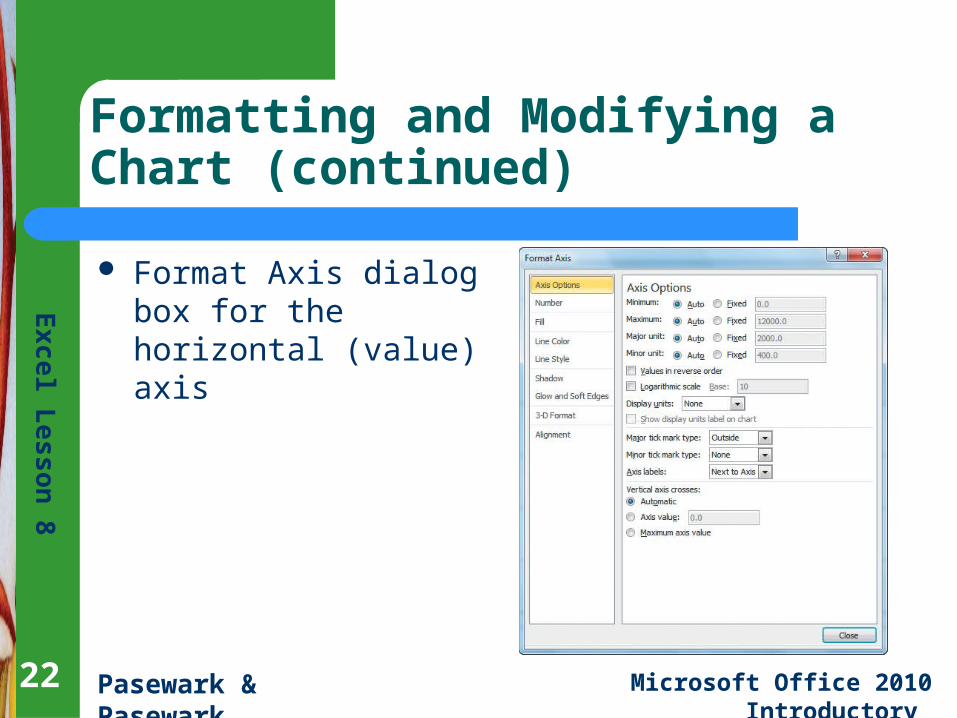
Formatting and Modifying a Chart (continued)
Format Axis dialog box for the horizontal (value) axis
22
Ex
cel L
es
son
8
Pasewark & Pasewark Microsoft Office 2010 Introductory 2323
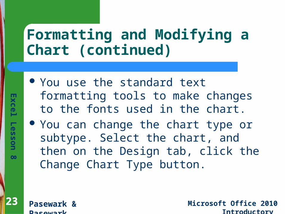
Formatting and Modifying a Chart (continued)
You use the standard text formatting tools to make changes to the fonts used in the chart.
You can change the chart type or subtype. Select the chart, and then on the Design tab, click the Change Chart Type button.
23
Ex
cel L
es
son
8
Pasewark & Pasewark Microsoft Office 2010 Introductory 2424
Inserting Sparklines
Sparklines are mini charts that you can insert into a cell. – A line sparkline is a line chart that appears within
one cell. – A column sparkline is a column chart that appears
within one cell.– A win/loss sparkline inserts a win/loss chart,
which tracks gains and losses, within one cell.
24
Ex
cel L
es
son
8
Pasewark & Pasewark Microsoft Office 2010 Introductory
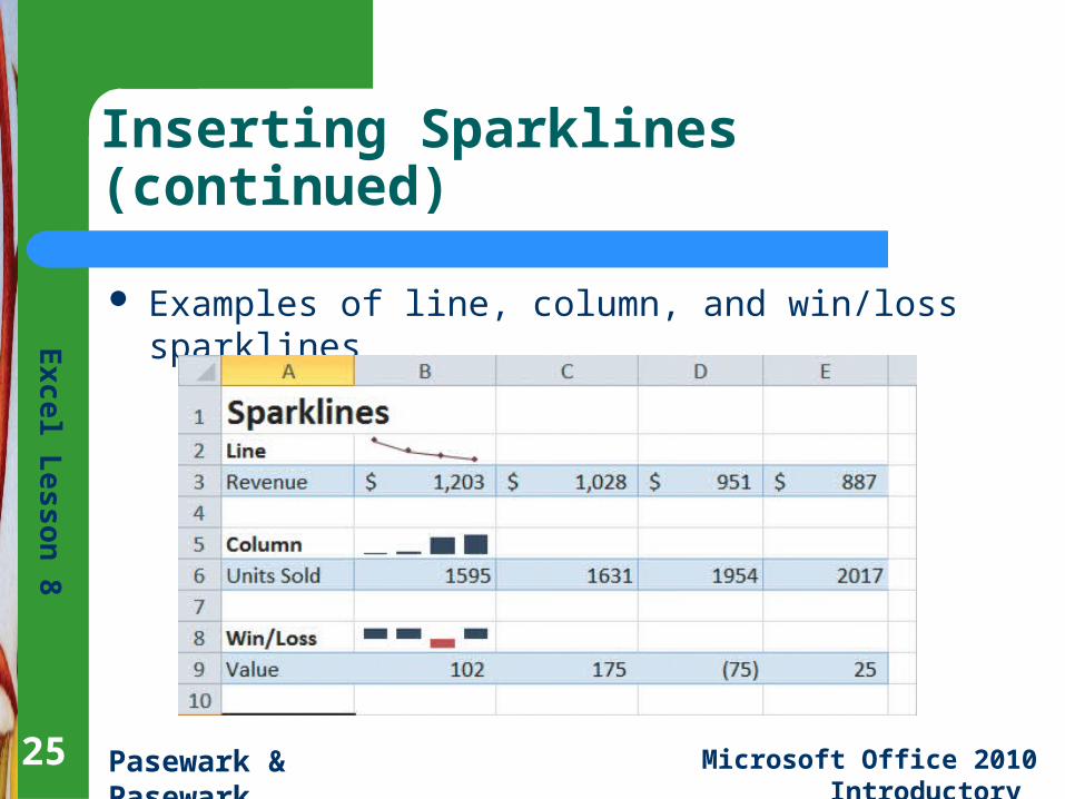
Inserting Sparklines (continued)
Examples of line, column, and win/loss sparklines
25
Ex
cel L
es
son
8
Pasewark & Pasewark Microsoft Office 2010 Introductory 2626
Inserting Sparklines (continued)
To create a sparkline, first select the range where you want to insert the sparkline.
In the Sparklines group on the Insert tab, click the button corresponding to the type of sparkline you want to create.
26
Ex
cel L
es
son
8
Pasewark & Pasewark Microsoft Office 2010 Introductory 2727
Summary
In this lesson, you learned: A chart is a graphical representation of data. You can
create several types of worksheet charts, including column, line, pie, and scatter charts.
Charts can be embedded within a worksheet or created on a chart sheet.
The process for creating a chart is the same for all chart types. Select the data for the chart. Select a chart type. Move, resize, and format the chart as needed.
27
Ex
cel L
es
son
8
Pasewark & Pasewark Microsoft Office 2010 Introductory 2828
Summary (continued)
Charts are made up of different parts, or elements. You can apply a chart layout and a chart style to determine which elements appear in the chart, where they appear, and how they look.
If the data in a chart’s data source is changed in the worksheet, the chart is automatically updated to reflect the new data.
28
Ex
cel L
es
son
8
Pasewark & Pasewark Microsoft Office 2010 Introductory 2929
Summary (continued)
You can fine-tune a chart by clicking a chart element and then opening its Format dialog box. You can also edit and format the chart text, using the standard text formatting tools.
You can change the type of chart in the Change Chart Type dialog box.
Sparklines are mini charts you can insert into a worksheet cell to show a pattern or trend. The three types of sparklines are line, column, and win/loss.
29