Embed Size (px)
Citation preview
1 Fundamentals of quantitative analysis
In this chapter, I follow the outline of topics used in the first chapter of Kachigan, Multivariate Statistical Analysis, because I think that that is a very effective presentation of these core ideas.
Increasingly, linguists handle quantitative data in their research. Phoneticians, sociolinguists, psycholinguists and computational linguists deal in numbers and have for decades. Now also, phonologists, syntacticians and historical linguists are finding linguistic research to involve quantitative methods. For example, Keller (2003) measures sentence acceptibility using a psychophysical technique called magnitude estimation. Also, Boersma & Hayes (2001) employ probablistic reasoning in a constraint reranking algorithm for optimality theory.
Consequently, mastery of quantitative methods is increasingly becoming a vital component of linguistic training. Yet, when I am asked to teach a course on quantitative methods I am not happy with the available textbooks. I hope that this book will deal adequately with the fundamental concepts that underlie common quantitative methods, and more than that will help students make the transition from the basics to real research problems with explicit examples of various common analysis techniques.
Of course, the strategies and methods of quantitative analysis are of primary importance, but in these chapters practical aspects of handling quantitative linguistic data will also be an important focus. We will be concerned with how to use a particular statistical package (R) to discover patterns in quantitative data and to test linguistic hypotheses. This theme is very practical and assumes that it is appropriate and useful to look at quantitative measures of language structure and usage.
We will question this assumption. Salsburg (2001) talks about a “statistical revolution” in science in which the distributions of measurements are the objects of study. We will, to some small extent, consider linguistics from this point of view. Has linguistics participated in the statistical revolution? What would a quantitative linguistics be like? Where is this approach taking the discipline?
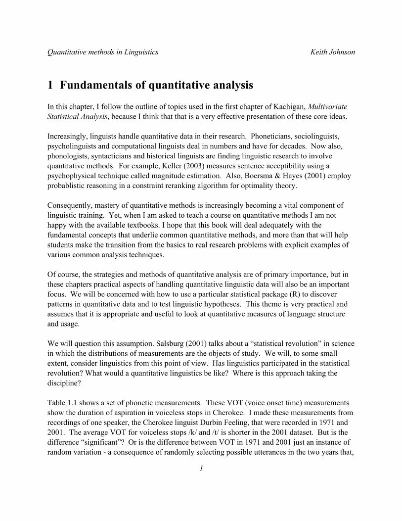
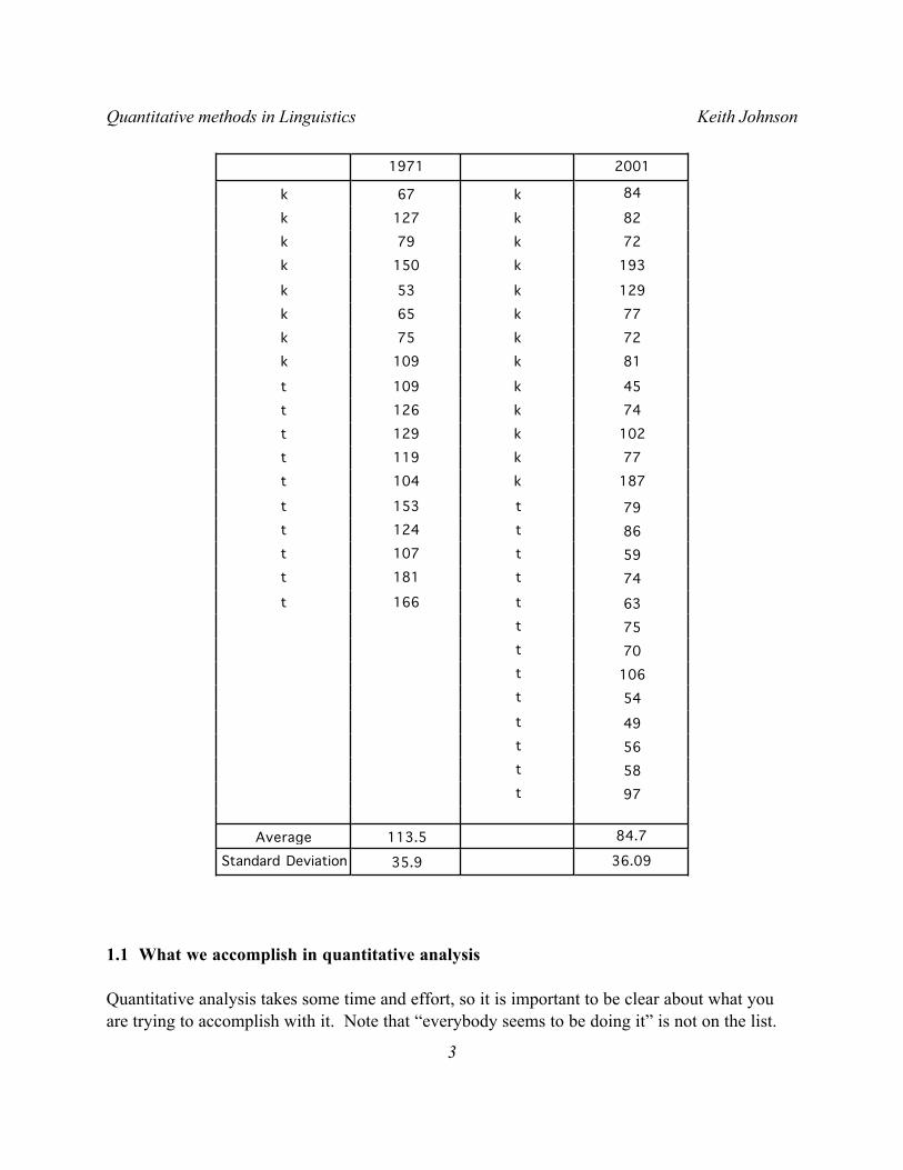
Table 1.1 shows a set of phonetic measurements. These VOT (voice onset time) measurements show the duration of aspiration in voiceless stops in Cherokee. I made these measurements from recordings of one speaker, the Cherokee linguist Durbin Feeling, that were recorded in 1971 and 2001. The average VOT for voiceless stops /k/ and /t/ is shorter in the 2001 dataset. But is the difference “significant”? Or is the difference between VOT in 1971 and 2001 just an instance of random variation - a consequence of randomly selecting possible utterances in the two years that,
Quantitative methods in Linguistics Keith Johnson
1
though not identical, come from the same underlying distribution of possible VOT values for this speaker? I think that one of the main points to keep in mind about drawing conclusions from data is that it is all guessing. Really. But what we are trying to do with statistical summaries and hypothesis testing is to quantify just how reliable our guesses are.
Table 1.1. Voice Onset Time measurements of a single Cherokee speaker with a 30 year gap between recordings.
Quantitative methods in Linguistics Keith Johnson
2
36.0935.9Standard Deviation
84.7113.5Average
97t58t56t49t54t
106t70t75t63t166t74t181t59t107t86t124t79t153t
187k104t77k119t
102k129t74k126t45k109t
81k109k72k75k77k65k
129k53k
193k150k72k79k82k127k
84k67k
20011971
1.1 What we accomplish in quantitative analysis
Quantitative analysis takes some time and effort, so it is important to be clear about what you are trying to accomplish with it. Note that “everybody seems to be doing it” is not on the list.
Quantitative methods in Linguistics Keith Johnson
3
The four main goals of quantitative analysis are:
a) data reduction - summarize trends, capture the common aspects of a set of observations such as the average, standard deviation, and correlations among variables.
b) inference - generalize from a representative set of observations to a larger universe of possible observations using hypothesis tests such as the t test or analysis of variance.
c) discover relationships - find descriptive or causal patterns in data which may be described in multiple regression models or in factor analysis.
d) explore processes that may have a basis in probability - theoretical modeling, say in information theory, or in practical contexts such as probabalistic sentence parsing.
1.2 How to describe an observation
An observation can be obtained in some elaborate way, like visiting a monastery in Egypt to look at an ancient manuscript that hasn’t been read in 1000 years, or renting an MRI machine for an hour of brain imaging. Or an observation can be obtained on the cheap - asking someone where the shoes are in the department store and noting whether the talker says the /r/’s in “fourth floor”.
Some observations can’t be quantified in any meaningful sense. For example if that ancient text has an instance of a particular form and your main question is “how old is the form?” then your result is that the form is at least as old as the manuscript. However, if you were to observe that the form was used 15 times in this manuscript, but only twice in a slightly older manuscript, then these frequency counts begin to take the shape of quantified linguistic observations that can be analyzed with the same quantitative methods used in science and engineering. I take that to be a good thing - linguistics as a member of the scientific community.
Each observation will have several descriptive properties - some will be qualitative and some will be quantitative - and descriptive properties (variables) come in one of four types:
Nominal - named properties, they have no meaningful order on a scale of any type.
Examples: What language is being observed? what dialect? Which word? What is the gender of the person being observed? Which variant was used: going or goin’?
Ordinal - orderable properties. They aren’t observed on a measurable scale, but this kind of property is transitive so that if a is less than b and b is less than c then a is also less than c.
Quantitative methods in Linguistics Keith Johnson
4
Examples: Zipf’s rank frequency of words, rating scales (e.g. excellent, good, fair, poor)?
Interval - this is a property that is measured on a scale that does not have a true zero value. In an interval scale, the magnitude of differences of adjacent observations can be determined (unlike the adjacent items on an ordinal scale), but because the zero value on the scale is arbitrary the scale cannot be interpreted in any absolute sense.
Examples: temperature (Fahrenheit or Centigrade scales), rating scales?, magnitude estimation judgements.
Ratio - this is a property that we measure on a scale that does have an absolute zero value. This is called a ratio scale because ratios of these measurements are meaningful. For instance, a vowel that is 100 msec long is twice as long as a 50 msec vowel, and 200 msec is twice 100 msec. Contrast this with temperature - 80 degrees Fahrenheit is not twice as hot as 40 degrees.
Examples: Acoustic measures - frequency, duration, frequency counts, reaction time.
1.3 Frequency distributions - a fundamental building block of quantitative analysis.
You must get this next bit, so pay attention. Suppose we want to know how grammatical a sentence is. We ask 36 people to score the sentence on a grammaticality scale so that a score of 1 means that it sounds pretty ungrammatical, and 10 sounds perfectly OK. Suppose that the ratings in Table 1.2 result from this exercise.
Interesting, but what are we supposed to learn from this? Well, we’re going to use this set of 36 numbers to construct a frequency distribution and define some of the terms used in discussing frequency distributions.
------------R note. I guess I should confess that I made up the “ratings” in Table 1.2. I used a function in the R statistics package to draw 36 random integer observations from a normal distribution that had a mean value of 4.5 and a standard deviation of 2. Here’s the command that I used to produce the made up data:
> round(rnorm(36,4.5,2))If you issue this command in R you will almost certainly get a different set of ratings (that’s the nature of random selection), but the distribution of your scores should match the one in the example.
If you want to explore R as you read this book, an impulse that I highly encourage, look at the
Quantitative methods in Linguistics Keith Johnson
5
appendix called “Getting started with R” to see how to download the R package (for free!) and to learn the basics of getting started.------------------------
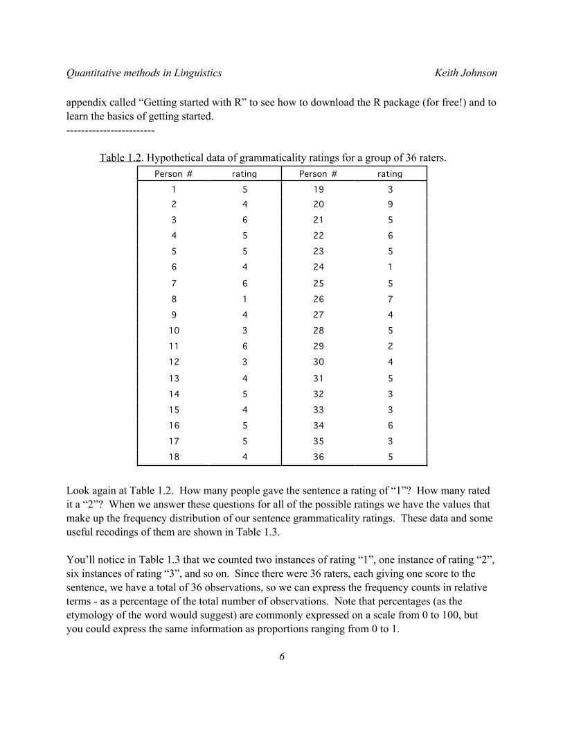
Table 1.2. Hypothetical data of grammaticality ratings for a group of 36 raters.
536418
335517
634516
333415
332514
531413
430312
229611
528310
42749
72618
52567
12446
52355
62254
52163
9204231951
ratingPerson #ratingPerson #
Look again at Table 1.2. How many people gave the sentence a rating of “1”? How many rated it a “2”? When we answer these questions for all of the possible ratings we have the values that make up the frequency distribution of our sentence grammaticality ratings. These data and some useful recodings of them are shown in Table 1.3.
You’ll notice in Table 1.3 that we counted two instances of rating “1”, one instance of rating “2”, six instances of rating “3”, and so on. Since there were 36 raters, each giving one score to the sentence, we have a total of 36 observations, so we can express the frequency counts in relative terms - as a percentage of the total number of observations. Note that percentages (as the etymology of the word would suggest) are commonly expressed on a scale from 0 to 100, but you could express the same information as proportions ranging from 0 to 1.
Quantitative methods in Linguistics Keith Johnson
6
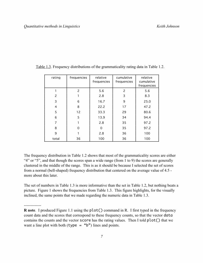
Table 1.3. Frequency distributions of the grammaticality rating data in Table 1.2.
1003610036total100362.81997.23500897.2352.81794.43413.95680.62933.312547.21722.28425.0916.763
8.332.8125.625.621
relative cumulative frequencies
cumulative frequencies
relative frequencies
frequenciesrating
The frequency distribution in Table 1.2 shows that most of the grammaticality scores are either “4” or “5”, and that though the scores span a wide range (from 1 to 9) the scores are generally clustered in the middle of the range. This is as it should be because I selected the set of scores from a normal (bell-shaped) frequency distribution that centered on the average value of 4.5 - more about this later.
The set of numbers in Table 1.3 is more informative than the set in Table 1.2, but nothing beats a picture. Figure 1 shows the frequencies from Table 1.3. This figure highlights, for the visually inclined, the same points that we made regarding the numeric data in Table 1.3.
-------------R note. I produced Figure 1.1 using the plot() command in R. I first typed in the frequency count data and the scores that correspond to these frequency counts, so that the vector data contains the counts and the vector score has the rating values. Then I told plot() that we want a line plot with both (type = “b”) lines and points.
Quantitative methods in Linguistics Keith Johnson
7
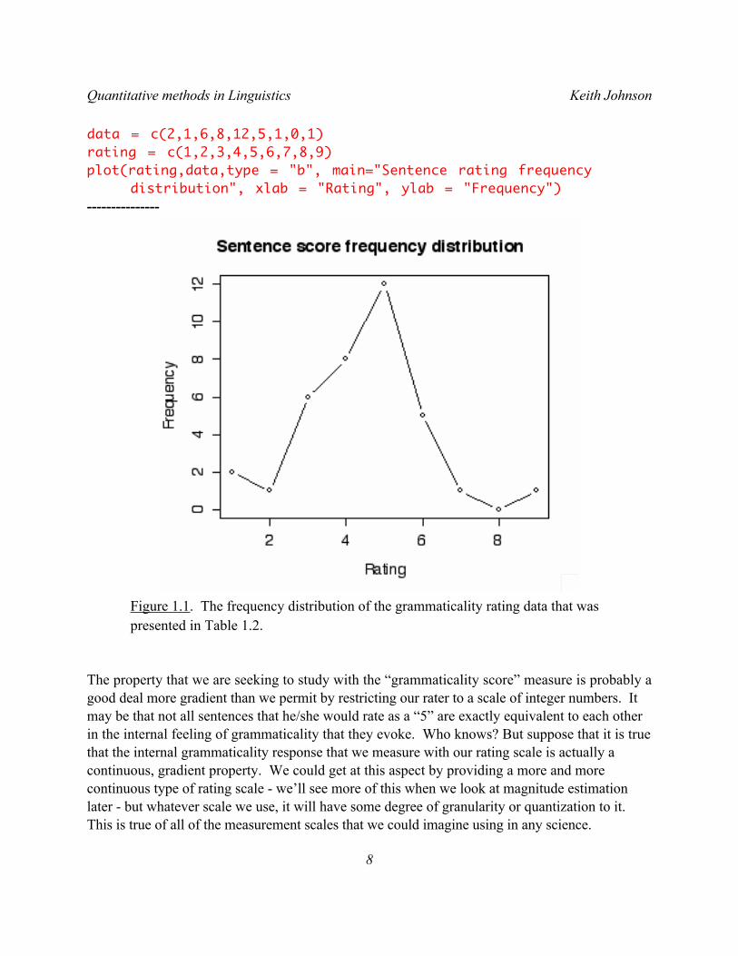
data = c(2,1,6,8,12,5,1,0,1)rating = c(1,2,3,4,5,6,7,8,9)plot(rating,data,type = "b", main="Sentence rating frequency
distribution", xlab = "Rating", ylab = "Frequency")---------------
Figure 1.1. The frequency distribution of the grammaticality rating data that was presented in Table 1.2.
The property that we are seeking to study with the “grammaticality score” measure is probably a good deal more gradient than we permit by restricting our rater to a scale of integer numbers. It may be that not all sentences that he/she would rate as a “5” are exactly equivalent to each other in the internal feeling of grammaticality that they evoke. Who knows? But suppose that it is true that the internal grammaticality response that we measure with our rating scale is actually a continuous, gradient property. We could get at this aspect by providing a more and more continuous type of rating scale - we’ll see more of this when we look at magnitude estimation later - but whatever scale we use, it will have some degree of granularity or quantization to it. This is true of all of the measurement scales that we could imagine using in any science.
Quantitative methods in Linguistics Keith Johnson
8
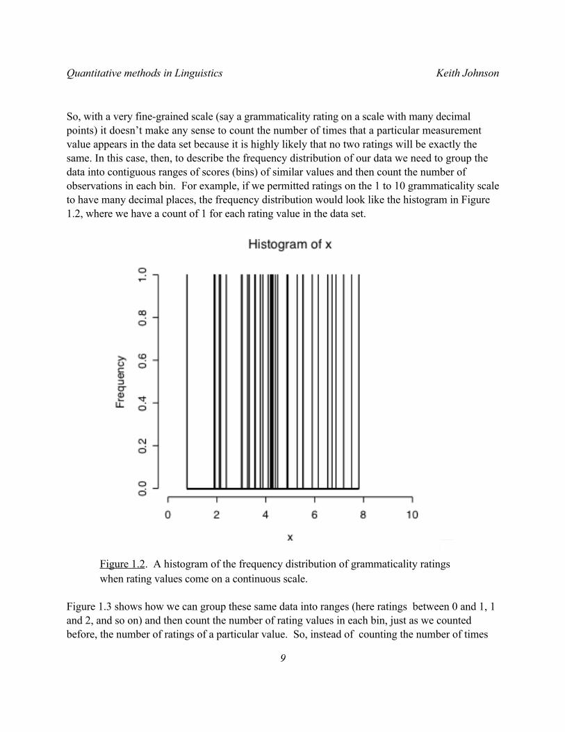
So, with a very fine-grained scale (say a grammaticality rating on a scale with many decimal points) it doesn’t make any sense to count the number of times that a particular measurement value appears in the data set because it is highly likely that no two ratings will be exactly the same. In this case, then, to describe the frequency distribution of our data we need to group the data into contiguous ranges of scores (bins) of similar values and then count the number of observations in each bin. For example, if we permitted ratings on the 1 to 10 grammaticality scale to have many decimal places, the frequency distribution would look like the histogram in Figure 1.2, where we have a count of 1 for each rating value in the data set.
Figure 1.2. A histogram of the frequency distribution of grammaticality ratings when rating values come on a continuous scale.
Figure 1.3 shows how we can group these same data into ranges (here ratings between 0 and 1, 1 and 2, and so on) and then count the number of rating values in each bin, just as we counted before, the number of ratings of a particular value. So, instead of counting the number of times
Quantitative methods in Linguistics Keith Johnson
9
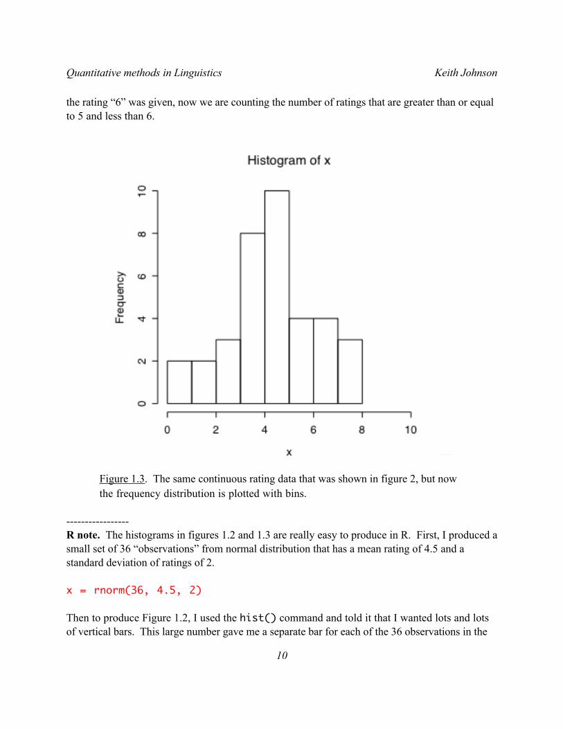
the rating “6” was given, now we are counting the number of ratings that are greater than or equal to 5 and less than 6.
Figure 1.3. The same continuous rating data that was shown in figure 2, but now the frequency distribution is plotted with bins.
-----------------R note. The histograms in figures 1.2 and 1.3 are really easy to produce in R. First, I produced a small set of 36 “observations” from normal distribution that has a mean rating of 4.5 and a standard deviation of ratings of 2.
x = rnorm(36, 4.5, 2)
Then to produce Figure 1.2, I used the hist() command and told it that I wanted lots and lots of vertical bars. This large number gave me a separate bar for each of the 36 observations in the
Quantitative methods in Linguistics Keith Johnson
10
“x” data set.
hist(x, breaks = 30000,xlim = c(0,10))
Then to produce Figure 1.3, I used the same command, this time permitting the command to choose a good bar width for my data. Nice that the simpler command gives you the more sensible output.
hist(x,xlim = c(0,10))---------------------------
OK. This process of grouping measurements on a continuous scale is a useful, practical thing to do, but it helps us now make a serious point about theoretical frequency distributions. This point is the FOUNDATION of all of the hypothesis testing statistics that we will be looking at later. So, pay attention!
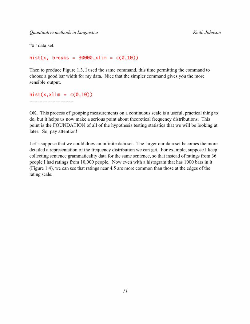
Let’s suppose that we could draw an infinite data set. The larger our data set becomes the more detailed a representation of the frequency distribution we can get. For example, suppose I keep collecting sentence grammaticality data for the same sentence, so that instead of ratings from 36 people I had ratings from 10,000 people. Now even with a histogram that has 1000 bars in it (Figure 1.4), we can see that ratings near 4.5 are more common than those at the edges of the rating scale.
Quantitative methods in Linguistics Keith Johnson
11
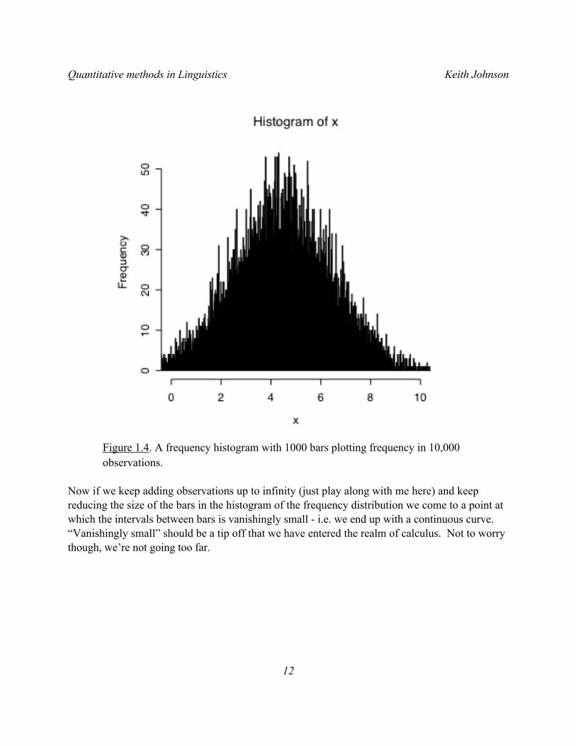
Figure 1.4. A frequency histogram with 1000 bars plotting frequency in 10,000 observations.
Now if we keep adding observations up to infinity (just play along with me here) and keep reducing the size of the bars in the histogram of the frequency distribution we come to a point at which the intervals between bars is vanishingly small - i.e. we end up with a continuous curve. “Vanishingly small” should be a tip off that we have entered the realm of calculus. Not to worry though, we’re not going too far.
Quantitative methods in Linguistics Keith Johnson
12
Figure 1.5. The probability density distribution of 10,000 observations and the theoretical probability density distribution of a normal distribution with a mean of 4.5 and a standard deviation of 2.
----------------------R note. The cool thing about figure 1.5 is that we combine a histogram of the observed frequency distribution of a set of data with a theoretical normal distribution curve (see chapter 2 regarding probability density). It is useful to be able to do this. Here are the commands I used:
x = rnorm(10000, 4.5, 2) # generate 10,000 data pointshist(x,breaks=100,freq=FALSE,xlim = c(0,10)) # plot them in a
#histogram# now plot the normal curve
plot(function(x)dnorm(x, mean=4.5, sd=2), 0,10, add=TRUE)
Quantitative methods in Linguistics Keith Johnson
13
Of course, the excellent fit between the “observed” and the theoretical distributions is helped by the fact that the data being plotted here were generated by random selection (rnorm()) of observations from the theoretical normal distribution (dnorm()).------------------------
The “normal distribution” is an especially useful theoretical function. It seems intuitively reasonable to assume that in most cases there is some underlying property that we are trying to measure - like grammaticality, or typical duration, or amount of processing time - and that there is some source of random error that keeps us from getting an exact measurement of the underlying property. If this is a good description of the source of variability in our measurements, then we can model this situation by assuming that the underlying property - the uncontaminated “true” value that we seek - is at the center of the frequency distribution that we observe in our measurements and that the spread of the distribution is caused by error - with bigger errors being less likely to occur than smaller errors.
These assumptions give us a bell-shaped frequency distribution which can be described by the normal curve, an extremely useful bell-shaped curve, which is an exponential function of the mean value (Greek letter µ “mew”) and the variance (Greek letter σ “sigma”).
€
xf = 1σ 2π
−(2x−µ) 22σe The normal distribution.
One useful aspect of this definition of a theoretical distribution of data (besides that it derives from just two numbers, the mean value and a measure of how variable the data are) is that sum of the area under the curve fx is 1. So, instead of thinking in terms of a “frequency” distribution, the normal curve gives us a way to calculate the probability of any set of observations by finding the area under any portion of the curve. We’ll come back to this.
1.4 Types of distributions.
Data come in a variety of shapes of frequency distributions (Figure 1.6).
For example, if every outcome is equally likely then the distribution is uniform. This happens for example with the six sides of a dice - each one is (supposed to be) equally likely, so if you count up the number of rolls that come up “1” it should be on average 1 out of every 6 rolls.
In the normal - bell-shaped - distribution, measurements tend to congregate around a typical value and values become less and less likely as they deviate further from this central value. As we saw in the section above, the normal curve is defined by two parameters - what the central
Quantitative methods in Linguistics Keith Johnson
14
tendency is (µ) and how quickly probability goes down as you move away from the center of the distribution (σ).
If measurements are taken on a scale (like the 1-9 grammaticality rating scale discussed above) as we approach one end of the scale the frequency distribution is bound to be skewed because there is a limit beyond which the data values cannot go. We most often run into skewed frequency distributions when dealing with percentage data and reaction time data (where negative reaction times are not meaningful).
The J-shaped distribution is a kind of skewed distribution with most observations coming from the very end of the measurement scale. For example, if you count speech errors per utterance you might find that most utterances have a speech error count of 0. So in a histogram, the number of utterances with a low error count will e very high and will decrease dramatically as the number of errors per utterance increases. A bimodal distribution is like a combination of two normal distributions - there are two peaks. If you find that your data fall in a bimodal distribution you might consider whether the data actually represent two separate populations of measurements. For example, voice fundamental frequency (the acoustic property most closely related to the pitch of a person’s voice) falls into a bimodal distribution when you pool measurements from men and women because men tend to have lower pitch than women.
If you ask a number of people how strongly they supported the US invasion of Iraq you would get a very polarized distribution of results. In this U-shaped distribution most people would be either strongly in favor or strongly opposed with not too many in the middle.
Quantitative methods in Linguistics Keith Johnson
15
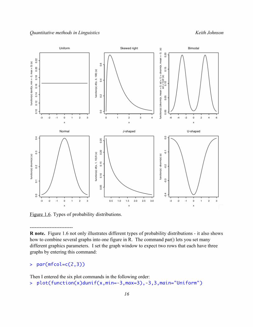
Figure 1.6. Types of probability distributions.
--------------------------R note. Figure 1.6 not only illustrates different types of probability distributions - it also shows how to combine several graphs into one figure in R. The command par() lets you set many different graphics parameters. I set the graph window to expect two rows that each have three graphs by entering this command:
> par(mfcol=c(2,3))
Then I entered the six plot commands in the following order:> plot(function(x)dunif(x,min=-3,max=3),-3,3,main="Uniform")
Quantitative methods in Linguistics Keith Johnson
16
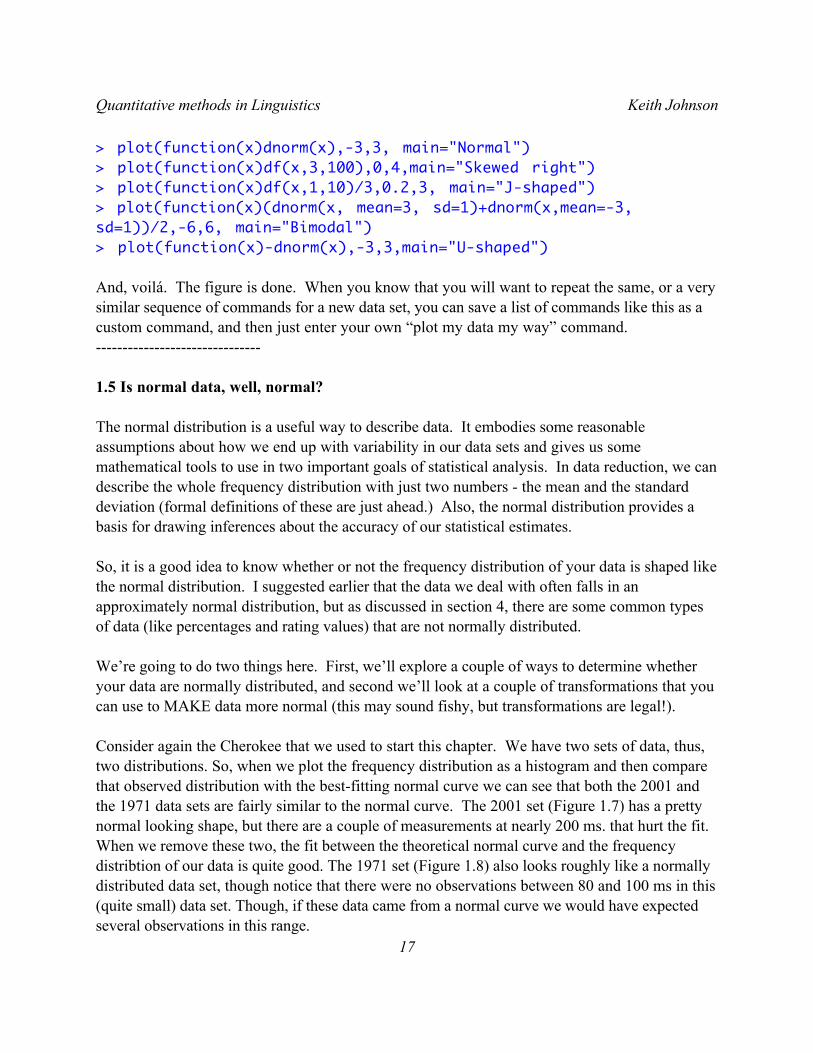
> plot(function(x)dnorm(x),-3,3, main="Normal") > plot(function(x)df(x,3,100),0,4,main="Skewed right") > plot(function(x)df(x,1,10)/3,0.2,3, main="J-shaped") > plot(function(x)(dnorm(x, mean=3, sd=1)+dnorm(x,mean=-3, sd=1))/2,-6,6, main="Bimodal") > plot(function(x)-dnorm(x),-3,3,main="U-shaped")
And, voilá. The figure is done. When you know that you will want to repeat the same, or a very similar sequence of commands for a new data set, you can save a list of commands like this as a custom command, and then just enter your own “plot my data my way” command.-------------------------------
1.5 Is normal data, well, normal?
The normal distribution is a useful way to describe data. It embodies some reasonable assumptions about how we end up with variability in our data sets and gives us some mathematical tools to use in two important goals of statistical analysis. In data reduction, we can describe the whole frequency distribution with just two numbers - the mean and the standard deviation (formal definitions of these are just ahead.) Also, the normal distribution provides a basis for drawing inferences about the accuracy of our statistical estimates.
So, it is a good idea to know whether or not the frequency distribution of your data is shaped like the normal distribution. I suggested earlier that the data we deal with often falls in an approximately normal distribution, but as discussed in section 4, there are some common types of data (like percentages and rating values) that are not normally distributed.
We’re going to do two things here. First, we’ll explore a couple of ways to determine whether your data are normally distributed, and second we’ll look at a couple of transformations that you can use to MAKE data more normal (this may sound fishy, but transformations are legal!).
Consider again the Cherokee that we used to start this chapter. We have two sets of data, thus, two distributions. So, when we plot the frequency distribution as a histogram and then compare that observed distribution with the best-fitting normal curve we can see that both the 2001 and the 1971 data sets are fairly similar to the normal curve. The 2001 set (Figure 1.7) has a pretty normal looking shape, but there are a couple of measurements at nearly 200 ms. that hurt the fit. When we remove these two, the fit between the theoretical normal curve and the frequency distribtion of our data is quite good. The 1971 set (Figure 1.8) also looks roughly like a normally distributed data set, though notice that there were no observations between 80 and 100 ms in this (quite small) data set. Though, if these data came from a normal curve we would have expected several observations in this range.
Quantitative methods in Linguistics Keith Johnson
17
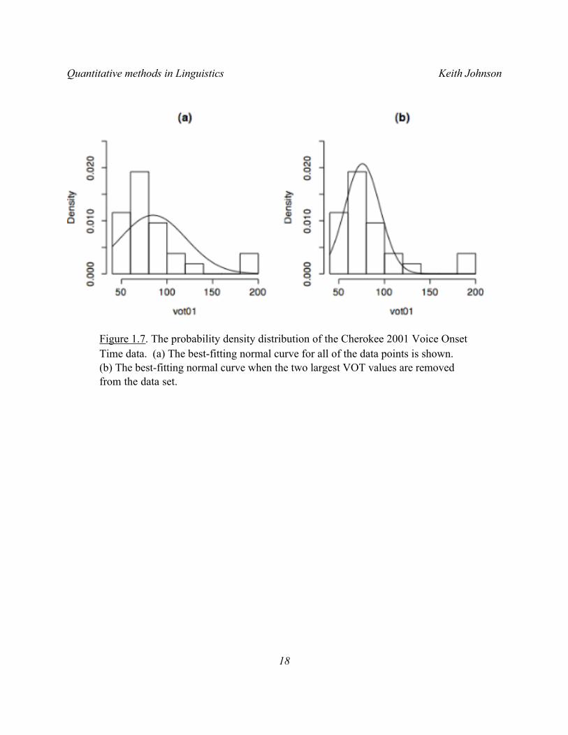
Figure 1.7. The probability density distribution of the Cherokee 2001 Voice Onset Time data. (a) The best-fitting normal curve for all of the data points is shown. (b) The best-fitting normal curve when the two largest VOT values are removed from the data set.
Quantitative methods in Linguistics Keith Johnson
18
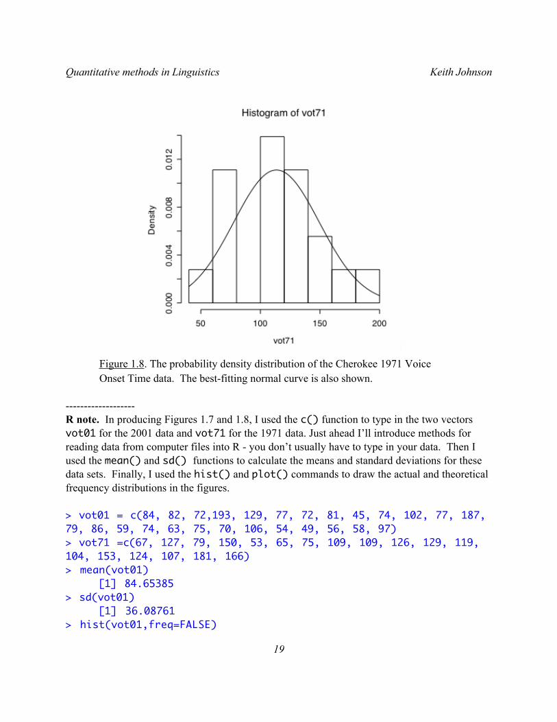
Figure 1.8. The probability density distribution of the Cherokee 1971 Voice Onset Time data. The best-fitting normal curve is also shown.
-------------------R note. In producing Figures 1.7 and 1.8, I used the c() function to type in the two vectors vot01 for the 2001 data and vot71 for the 1971 data. Just ahead I’ll introduce methods for reading data from computer files into R - you don’t usually have to type in your data. Then I used the mean() and sd() functions to calculate the means and standard deviations for these data sets. Finally, I used the hist() and plot() commands to draw the actual and theoretical frequency distributions in the figures.
> vot01 = c(84, 82, 72,193, 129, 77, 72, 81, 45, 74, 102, 77, 187, 79, 86, 59, 74, 63, 75, 70, 106, 54, 49, 56, 58, 97) > vot71 =c(67, 127, 79, 150, 53, 65, 75, 109, 109, 126, 129, 119, 104, 153, 124, 107, 181, 166) > mean(vot01) [1] 84.65385 > sd(vot01)
[1] 36.08761> hist(vot01,freq=FALSE)
Quantitative methods in Linguistics Keith Johnson
19
> plot(function(x)dnorm(x, mean=84.654, sd=36.088), 40, 200, add=TRUE)
You might also be interested to see how to take the mean and standard deviation with outliers removed. I decided that the two VOT measurements in vot01 that are greater than 180 ms are outliers and so calcuated the mean and standard deviation for only those numbers in the vector that are less than 180 using the following statements.
> mean(vot01[vot01<180])[1] 75.875> sd(vot01[vot01<180])[1] 19.218
Read vot01[vot01<180] as “the numbers in vot01 that are less than 180”. When we have data sets that are composed of several linked vectors we can extract subsets of data using similar syntax.
Note though that I have just told you how to “remove outliers” as if it is perfectly fine to remove weird data. It is not! You should use ALL of the data you collect unless you have good independent reasons for not doing so. For example, data values can be removed if you know that there has been some measurement error that results in the weird value, or if you know that the person providing the data was different from the other participants in the study in some way that bears on the aims of the study (e.g. by virtue of having fallen asleep during a perception experiment, or by not being a native speaker of the language under study), or the token is different in some crucial way (e.g. by virtue of being spoken in error or with a disfluency). Because such variation on the part of the people we study is bound to happen, it is acceptable to trim the 5% most extreme data values from a large and noisy database where manual inspection of the entire database is not practical.----------------------
These frequency distribution graphs give an indication of whether our data is distributed on a normal curve, but we are essentially waving our hands at the graphs and saying “looks pretty normal to me”. I guess you shouldn’t underestimate how important it is to look at the data, but it would be good to be able to measure just how “normally distributed” these data are.
To do this we measure the degree of fit between the data and the normal curve with a quantile/quantile plot and a correlation between the actual quantile scores and the quantile scores that are predicted by the normal curve. The NIST “Handbook of Statistical Methods” has this to say about q-q plots.
Quantitative methods in Linguistics Keith Johnson
20
The quantile-quantile (q-q) plot is a graphical technique for determining if two data sets come from populations with a common distribution.
A q-q plot is a plot of the quantiles of the first data set against the quantiles of the second data set. By a quantile, we mean the fraction (or percent) of points below the given value. That is, the 0.3 (or 30%) quantile is the point at which 30% percent of the data fall below and 70% fall above that value.
A 45-degree reference line is also plotted. If the two sets come from a population with the same distribution, the points should fall approximately along this reference line. The greater the departure from this reference line, the greater the evidence for the conclusion that the two data sets have come from populations with different distributions.
The advantages of the q-q plot are:1. The sample sizes do not need to be equal.2. Many distributional aspects can be simultaneously tested. For
example, shifts in location, shifts in scale, changes in symmetry, and the presence of outliers can all be detected from this plot. For example, if the two data sets come from populations whose distributions differ only by a shift in location, the points should lie along a straight line that is displaced either up or down from the 45-degree reference line.
The q-q plot is similar to a probability plot. For a probability plot, the quantiles for one of the data samples are replaced with the quantiles of a theoretical distribution.
Further regarding the “probabilty plot” the Handbook has this to say:
The probability plot (Chambers 1983) is a graphical technique for assessing whether or not a data set follows a given distribution such as the normal or Weibull.
The data are plotted against a theoretical distribution in such a way that the points should form approximately a straight line. Departures from this straight line indicate departures from the specified distribution.
As you can see in Figure 1.9 the Cherokee 1971 data are just as you would expect them to be if
Quantitative methods in Linguistics Keith Johnson
21
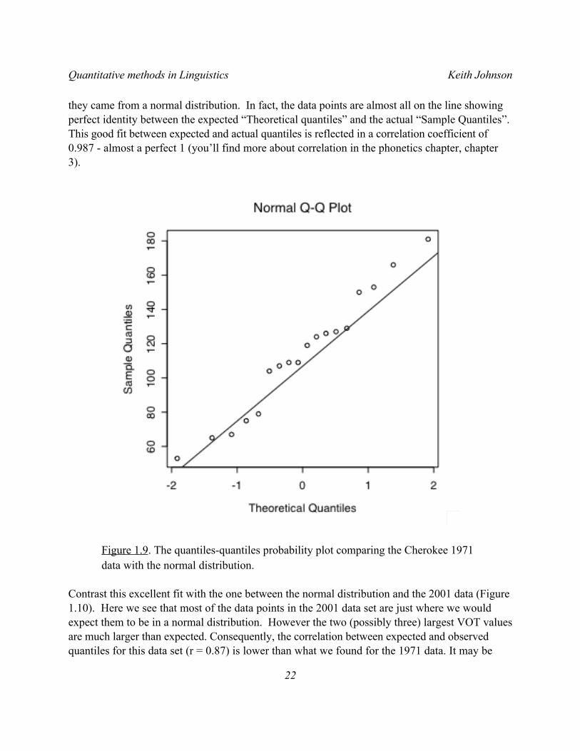
they came from a normal distribution. In fact, the data points are almost all on the line showing perfect identity between the expected “Theoretical quantiles” and the actual “Sample Quantiles”. This good fit between expected and actual quantiles is reflected in a correlation coefficient of 0.987 - almost a perfect 1 (you’ll find more about correlation in the phonetics chapter, chapter 3).
Figure 1.9. The quantiles-quantiles probability plot comparing the Cherokee 1971 data with the normal distribution.
Contrast this excellent fit with the one between the normal distribution and the 2001 data (Figure 1.10). Here we see that most of the data points in the 2001 data set are just where we would expect them to be in a normal distribution. However the two (possibly three) largest VOT values are much larger than expected. Consequently, the correlation between expected and observed quantiles for this data set (r = 0.87) is lower than what we found for the 1971 data. It may be
Quantitative methods in Linguistics Keith Johnson
22
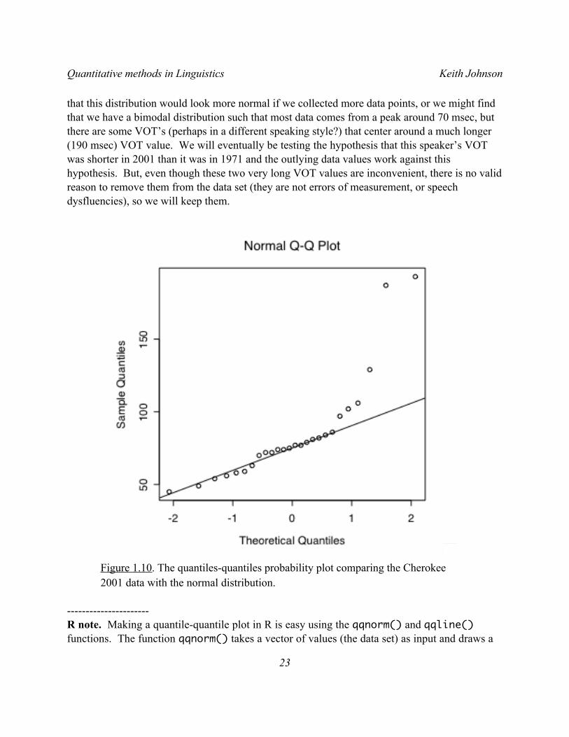
that this distribution would look more normal if we collected more data points, or we might find that we have a bimodal distribution such that most data comes from a peak around 70 msec, but there are some VOT’s (perhaps in a different speaking style?) that center around a much longer (190 msec) VOT value. We will eventually be testing the hypothesis that this speaker’s VOT was shorter in 2001 than it was in 1971 and the outlying data values work against this hypothesis. But, even though these two very long VOT values are inconvenient, there is no valid reason to remove them from the data set (they are not errors of measurement, or speech dysfluencies), so we will keep them.
Figure 1.10. The quantiles-quantiles probability plot comparing the Cherokee 2001 data with the normal distribution.
----------------------R note. Making a quantile-quantile plot in R is easy using the qqnorm() and qqline() functions. The function qqnorm() takes a vector of values (the data set) as input and draws a
Quantitative methods in Linguistics Keith Johnson
23
q-q plot of the data. I also captured the values used to plot the x-axis of the graph into the vector vot71.qq for later use in the correlation function cor(). qqline() adds the 45-degree reference line to the plot, and cor() measures how well the points fit on the line (0 for no fit at all and 1 for a perfect fit).
vot71.qq = qqnorm(vot71)$x # make the quantile/quantile plotvot01.qq = qqnorm(vot01)$x # and keep the x axis of the plot
qqline(vot71) # put the line on the plotcor(vot71,vot71.qq) # compute the correlation[1] 0.9868212> cor(vot01,vot01.qq) [1] 0.8700187-----------------------
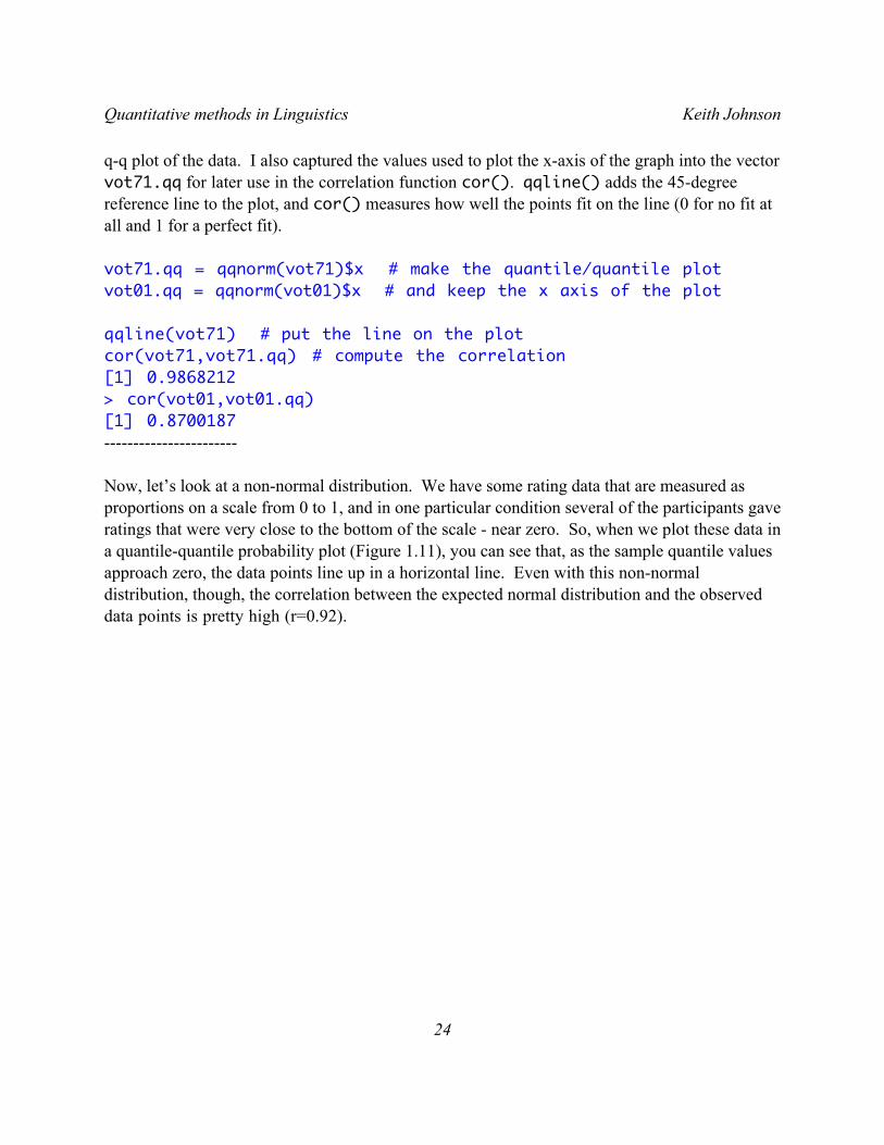
Now, let’s look at a non-normal distribution. We have some rating data that are measured as proportions on a scale from 0 to 1, and in one particular condition several of the participants gave ratings that were very close to the bottom of the scale - near zero. So, when we plot these data in a quantile-quantile probability plot (Figure 1.11), you can see that, as the sample quantile values approach zero, the data points line up in a horizontal line. Even with this non-normal distribution, though, the correlation between the expected normal distribution and the observed data points is pretty high (r=0.92).
Quantitative methods in Linguistics Keith Johnson
24
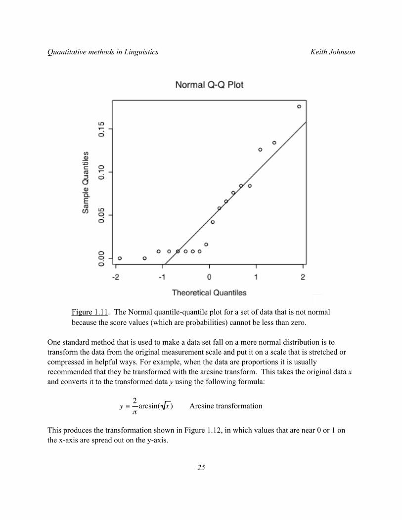
Figure 1.11. The Normal quantile-quantile plot for a set of data that is not normal because the score values (which are probabilities) cannot be less than zero.
One standard method that is used to make a data set fall on a more normal distribution is to transform the data from the original measurement scale and put it on a scale that is stretched or compressed in helpful ways. For example, when the data are proportions it is usually recommended that they be transformed with the arcsine transform. This takes the original data x and converts it to the transformed data y using the following formula:
€
y =2πarcsin( x ) Arcsine transformation
This produces the transformation shown in Figure 1.12, in which values that are near 0 or 1 on the x-axis are spread out on the y-axis.
Quantitative methods in Linguistics Keith Johnson
25
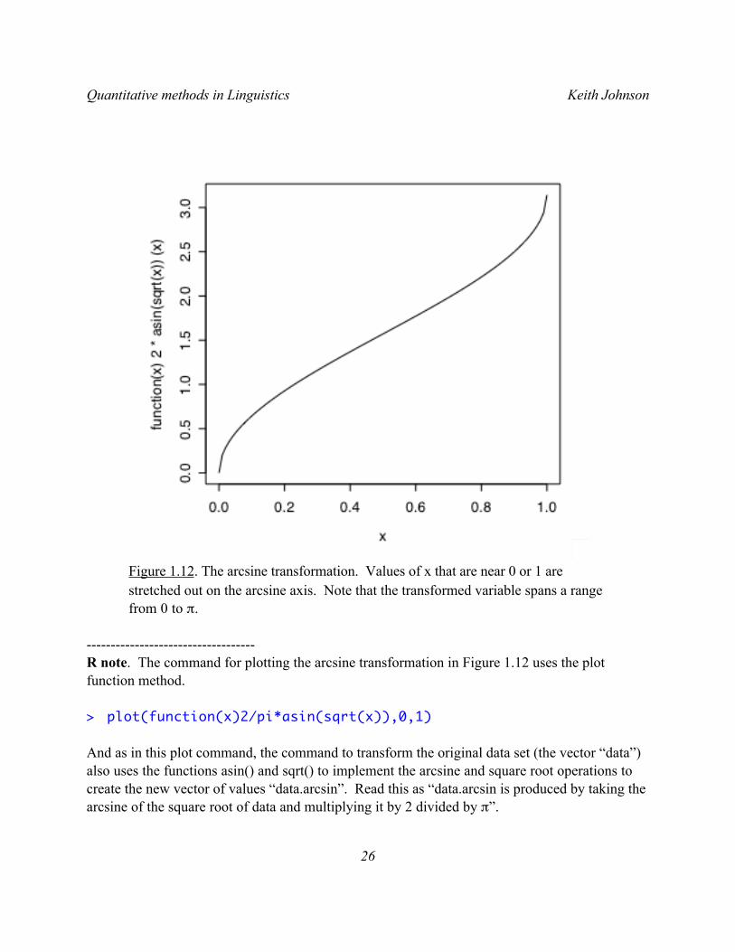
Figure 1.12. The arcsine transformation. Values of x that are near 0 or 1 are stretched out on the arcsine axis. Note that the transformed variable spans a range from 0 to π.
-----------------------------------R note. The command for plotting the arcsine transformation in Figure 1.12 uses the plot function method.
> plot(function(x)2/pi*asin(sqrt(x)),0,1)
And as in this plot command, the command to transform the original data set (the vector “data”) also uses the functions asin() and sqrt() to implement the arcsine and square root operations to create the new vector of values “data.arcsin”. Read this as “data.arcsin is produced by taking the arcsine of the square root of data and multiplying it by 2 divided by π”.
Quantitative methods in Linguistics Keith Johnson
26
> x.arcsin = 2/pi*asin(sqrt(x))----------------------------------
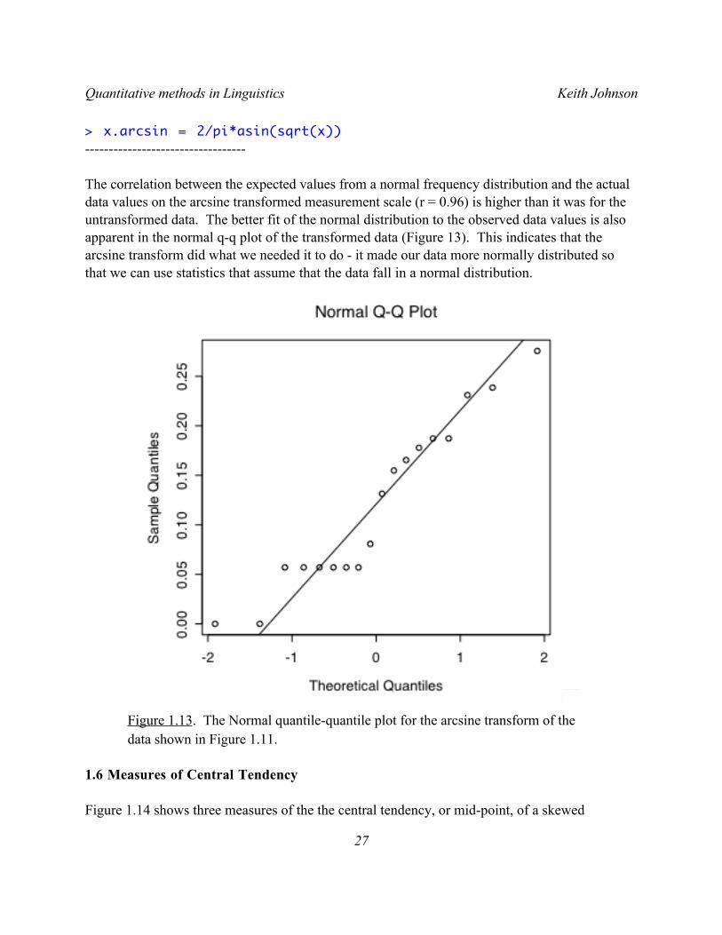
The correlation between the expected values from a normal frequency distribution and the actual data values on the arcsine transformed measurement scale (r = 0.96) is higher than it was for the untransformed data. The better fit of the normal distribution to the observed data values is also apparent in the normal q-q plot of the transformed data (Figure 13). This indicates that the arcsine transform did what we needed it to do - it made our data more normally distributed so that we can use statistics that assume that the data fall in a normal distribution.
Figure 1.13. The Normal quantile-quantile plot for the arcsine transform of the data shown in Figure 1.11.
1.6 Measures of Central Tendency
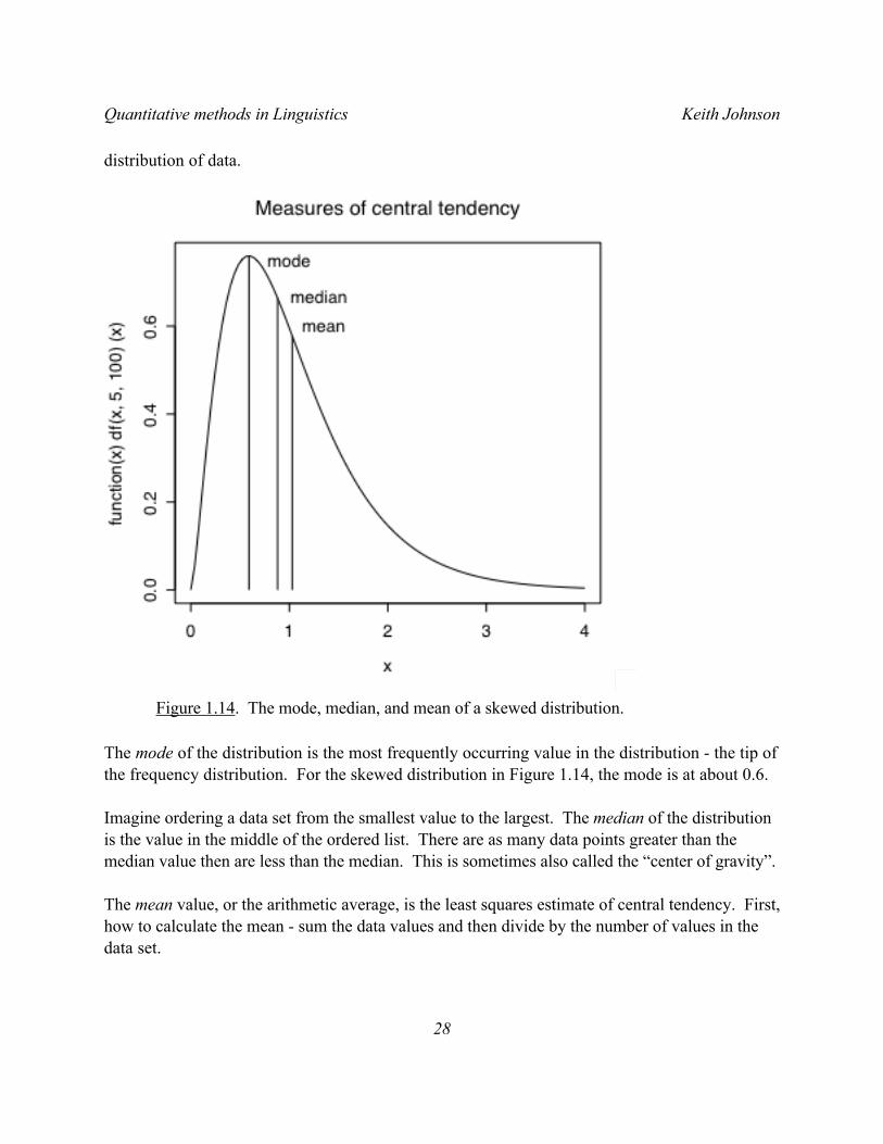
Figure 1.14 shows three measures of the the central tendency, or mid-point, of a skewed
Quantitative methods in Linguistics Keith Johnson
27
distribution of data.
Figure 1.14. The mode, median, and mean of a skewed distribution.
The mode of the distribution is the most frequently occurring value in the distribution - the tip of the frequency distribution. For the skewed distribution in Figure 1.14, the mode is at about 0.6.
Imagine ordering a data set from the smallest value to the largest. The median of the distribution is the value in the middle of the ordered list. There are as many data points greater than the median value then are less than the median. This is sometimes also called the “center of gravity”.
The mean value, or the arithmetic average, is the least squares estimate of central tendency. First, how to calculate the mean - sum the data values and then divide by the number of values in the data set.
Quantitative methods in Linguistics Keith Johnson
28
€
x =ix
i= 0
n∑
nMean.
Second, what does it mean to be the least squares estimate of central tendency? This means that if we take the difference between the mean and each value in our data set, square these differences and add them up, we will have a smaller value than if we were to do the same thing with the median or any other estimate of the “mid-point” of the data set.
€
d2 = (xii= 0
n∑ − x )2 Sum of the squared deviations (also called SS).
So, in the data set illustrated in Figure 1.14, the value of d2, the sum of the squared deviations from the mean, is 4570, but if we calculate the sum of squared deviations from the median value we get a d2 value of 4794. This property, being the least squares estimate of central tendency, is a very useful one for the derivation of statistical tests of significance.
I should also note that I used a skewed distribution to show how the mode, median, and mean differ from each other because with a normal distribution these three measures of central tendency give the same value.
----------------------------R-note. The skewed distribution in Figure 1.14 comes from the “F” family of probability density distributions and is drawn in R using the df() density of “F” function.
plot(function(x)df(x,5,100),0,4,main="Measures of central tendency")
The vertical lines were drawn with the lines() command. I used the df() function again to decide how tall to draw the lines and I used the mean() and median() commands with a data set drawn from this distribution to determine where on the x-axis to draw the mean and median lines.
lines(x = c(0.6,0.6), y = c(0,df(0.6,5,100))) skew.data <- rf(10000,5,100)lines(
x = c(mean(skew.data),mean(skew.data)), y = c(0,df(mean(skew.data),5,100)))
lines(x = c(median(skew.data),median(skew.data)), y = c(0,df(median(skew.data),5,100)))
Quantitative methods in Linguistics Keith Johnson
29
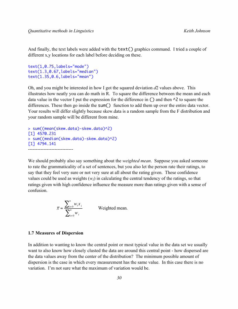
And finally, the text labels were added with the text() graphics command. I tried a couple of different x,y locations for each label before deciding on these.
text(1,0.75,labels="mode") text(1.3,0.67,labels="median") text(1.35,0.6,labels="mean")
Oh, and you might be interested in how I got the squared deviation d2 values above. This illustrates how neatly you can do math in R. To square the difference between the mean and each data value in the vector I put the expression for the difference in () and then ^2 to square the differences. These then go inside the sum() function to add them up over the entire data vector. Your results will differ slightly because skew.data is a random sample from the F distribution and your random sample will be different from mine.
> sum((mean(skew.data)-skew.data)^2) [1] 4570.231 > sum((median(skew.data)-skew.data)^2) [1] 4794.141 -----------------------------
We should probably also say something about the weighted mean. Suppose you asked someone to rate the grammaticality of a set of sentences, but you also let the person rate their ratings, to say that they feel very sure or not very sure at all about the rating given. These confidence values could be used as weights (wi) in calculating the central tendency of the ratings, so that ratings given with high confidence influence the measure more than ratings given with a sense of confusion.
€
x = iwixi= 0
n∑
wii= 0
n∑
Weighted mean.
1.7 Measures of Dispersion
In addition to wanting to know the central point or most typical value in the data set we usually want to also know how closely clusted the data are around this central point - how dispersed are the data values away from the center of the distribution? The minimum possible amount of dispersion is the case in which every measurement has the same value. In this case there is no variation. I’m not sure what the maximum of variation would be.
Quantitative methods in Linguistics Keith Johnson
30
A simple, but not very useful measure of dispersion is the range of the data values. This is the difference between the maximum and minimum values in the data set. The disadvantage of the range as a statistic are that (1) it is based only two observations, so it may be sensitive to how lucky we were with the tails of the sampling distribution, and (2) range is undefined for most theoretical distributions like the normal distribution which extend to infinity.
I don’t know of any measures of dispersion that use the median - the remaining measures discussed here refer to dispersion around the mean.
The average deviation, or the mean absolute deviation measures the absolute difference between the mean and each observation. We take the absolute difference because if we took raw differences we would be adding positive and negative values for a sum of about zero no matter how dispersed the data are. This measure of deviation is not as well defined as is the standard deviation, partly because the mean is the least squares estimator of central tendency - so a measure of deviation that uses squared deviations is more comparable to the mean.
Variance is like the mean absolute deviation except that we square the deviations before averaging them. We have definitions for variance of a population and for a sample drawn from a larger population.
€
σ 2 = (xi −µ)2 /N∑ Population variance.
€
s2 = (xi − x )2 / (n −1)∑ Sample variance.
Notice that this formula uses the Sum of Squares (SS, also called d2 above, the sum of squared deviations from the mean) and by dividing by N or n-1, we get the Mean Squares (MS, also called s2 here). We will see these names (SS, and MS) when we discuss the ANOVA later.
We take (n-1) as the denominator in the definition of s2, sample variance, because
€
x is not µ. The sample mean
€
x is only an estimate of µ, derived from the xi, so in trying to measure variance we have to keep in mind that our estimate of the central tendency
€
x is probably wrong to a certain extent. We take this into account by giving up a “degree of freedom” in the sample formula. Degrees of freedom is a measure of how much precision an estimate of variation has. Of course this is primarily related to the number of observations that serve as the basis for the estimate, but as a general rule the degrees of freedom decrease as we estimate more parameters with the same data set - here estimating both the mean and the variance with the set of observations xi.
Quantitative methods in Linguistics Keith Johnson
31
The variance is the average squared deviation - the units are squared - to get back to the original unit of measure we take the square root of the variance.
€
σ = σ 2 Population standard deviation.
€
s = s2 Sample standard deviation.
This is the same as the value known as the RMS (root mean square), a measure of deviation used in acoustic phonetics (among other disciplines).
€
s =(xi − x ∑ )2
(n −1)RMS = sample standard deviation
1.8 Standard deviation of the normal distribution
If you consider the formula for the normal distribution again, you will note that it can be defined for any mean value µ, and any standard deviation σ. However, I mentioned that this distribution is used to calculate probabilities, where the total area under the curve is equal to 1, so the area under any portion of the curve is equal to some proportion of 1. This is the case when the mean of the bell-shaped distribution is 0 and the standard deviation is 1. This is sometimes abbreviated as N(0,1) - a normal curve with mean 0 and standard deviation 1.
€
xf = 12π
e−x 2 2 The normal distribution - N(0,1)
I would like to make two points about this.
First, because the area under the normal distribution curve is 1, we can state the probability (area under the curve) of finding a value larger than any value of x, smaller than any value of x, or between any two values of x.
Second, because we can often approximate our data with a normal distribution we can state such probabilities for our data given the mean and standard deviation.
Let’s take an example of this from some rating data (Figure 1.15). Listeners were asked to rate how similar two sounds were on a scale from 1 to 5 and their average ratings for a particular condition in the experiment (how different do [d] and [] sound) will be analyzed here. Though the histogram doesn’t look like a smooth normal curve (there are only 18 data points in the set), the Q-Q plot does reveal that the individual data points do follow the normal curve pretty well
Quantitative methods in Linguistics Keith Johnson
32
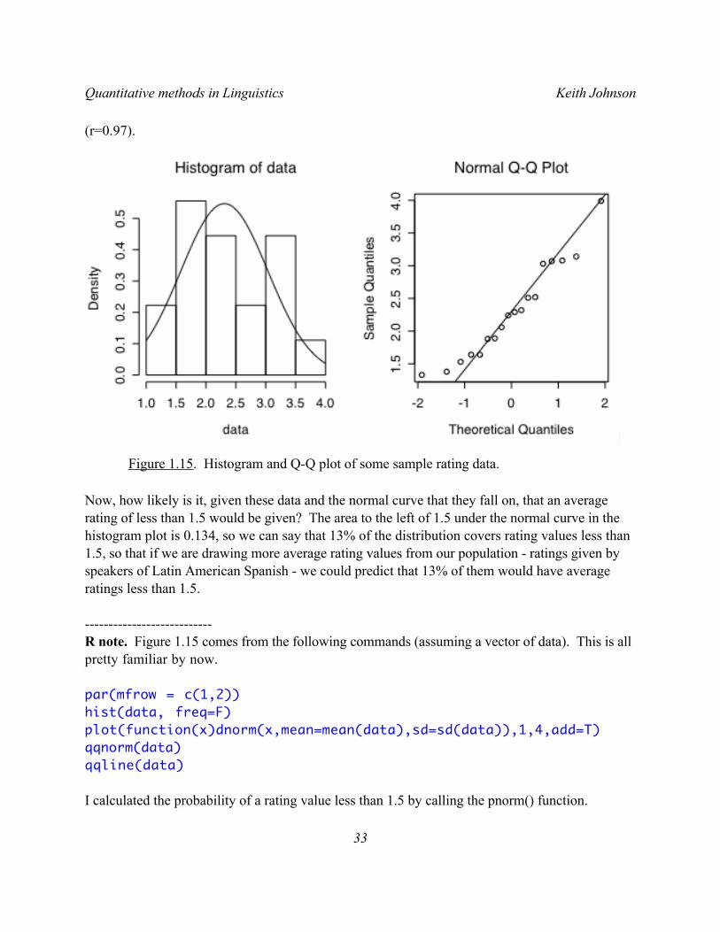
(r=0.97).
Figure 1.15. Histogram and Q-Q plot of some sample rating data.
Now, how likely is it, given these data and the normal curve that they fall on, that an average rating of less than 1.5 would be given? The area to the left of 1.5 under the normal curve in the histogram plot is 0.134, so we can say that 13% of the distribution covers rating values less than 1.5, so that if we are drawing more average rating values from our population - ratings given by speakers of Latin American Spanish - we could predict that 13% of them would have average ratings less than 1.5.
---------------------------R note. Figure 1.15 comes from the following commands (assuming a vector of data). This is all pretty familiar by now.
par(mfrow = c(1,2)) hist(data, freq=F) plot(function(x)dnorm(x,mean=mean(data),sd=sd(data)),1,4,add=T) qqnorm(data) qqline(data)
I calculated the probability of a rating value less than 1.5 by calling the pnorm() function.
Quantitative methods in Linguistics Keith Johnson
33
pnorm(1.5,mean=mean(data),sd=sd(data)) [1] 0.1340552
Pnorm() also gives the probability of a rating value greater than 3.5 but this time specifing that we want the probability of the upper tail of the distribution (values greater than 3.5).
pnorm(3.5,mean=mean(data),sd=sd(data),lower.tail=F) [1] 0.05107909------------------------------
How does this work? We can relate the frequency distribution of our data to the normal distribution because we know the mean and standard deviation of both. The key is to be able to express any value in a data set in terms of its distance in standard deviations from the mean.
For example, in these rating data the mean is 2.3 and the standard deviation is 0.7. Therefore, a rating of 3 is one standard deviation above the mean, and a rating of 1.6 is one standard deviation below the mean. This way of expressing data values, in standard deviation units, puts our data on the normal distribution - where the mean is 0 and the standard deviation is 1.
I’m talking about standardizing a data set - converting the data values into z-scores, where each data value is replaced by the distance between it and the sample mean where the distance is measured as the number of standard deviations between the data value and the mean. As a result of “standardizing” the data, z-scores always have a mean of 0 and a standard deviation of 1, just like the normal distribution. Here’s the formula for standardizing your data:
€
zi =xi − x
sZ-score standardization.
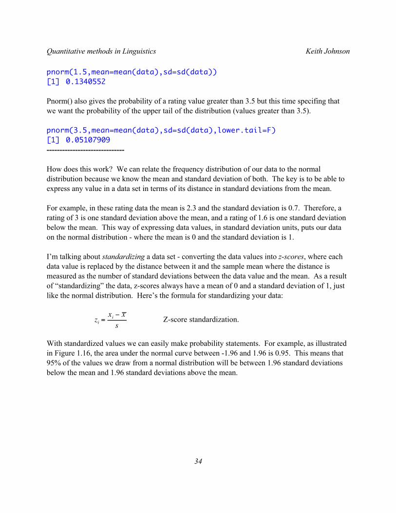
With standardized values we can easily make probability statements. For example, as illustrated in Figure 1.16, the area under the normal curve between -1.96 and 1.96 is 0.95. This means that 95% of the values we draw from a normal distribution will be between 1.96 standard deviations below the mean and 1.96 standard deviations above the mean.
Quantitative methods in Linguistics Keith Johnson
34
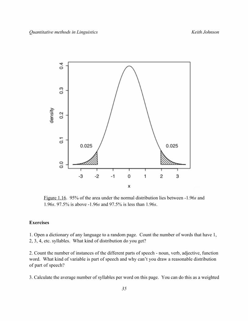
Figure 1.16. 95% of the area under the normal distribution lies between -1.96s and 1.96s. 97.5% is above -1.96s and 97.5% is less than 1.96s.
Exercises
1. Open a dictionary of any language to a random page. Count the number of words that have 1, 2, 3, 4, etc. syllables. What kind of distribution do you get?
2. Count the number of instances of the different parts of speech - noun, verb, adjective, function word. What kind of variable is part of speech and why can’t you draw a reasonable distribution of part of speech?
3. Calculate the average number of syllables per word on this page. You can do this as a weighted
Quantitative methods in Linguistics Keith Johnson
35
mean, using the count as the weight for each syllable length.
4. What is the standard deviation of the average length in syllables? How do you calculate this? Hint: the raw data have one observation per word, while the count data have several words summarized for each syllable length.
5. Are these data an accurate representation of word length in this language? How could you get a more accurate estimate?
6. Using your word length data from Question 1 above, produce a quantile-quantile plot of the data. Are these data approximately normally distributed? What is the correlation between the normal curve quantiles (the theoretical quantiles) and the observed data?
7. Make a histogram of the data. Do these data seem to follow a normal distribution? Hint: Plotting the syllable numbers on the x axis and the word counts on the y axis (like figure 1.1) may be a good way to see the frequency distribution.
8. Assuming a normal distribution, what is the probability that a word will have more than 3 syllables? How does this relate to the observed percentage of words that have more than 3 syllables in your data?
Quantitative methods in Linguistics Keith Johnson
36