Embed Size (px)
Citation preview
Typography-part 2
1.01b Investigate typefaces and fonts.
FontsIt’s easier to understand fonts if you begin with
the original definition of a font. Before desktop publishing, people called
‘typesetters’ set the type by hand using moveable type.
Each character was a separate block of metal. The letters were “set” on the layout to form the
text. Each typeface had a complete set of metal
characters for each size, weight, etc. Click here for an image on Wikipedia
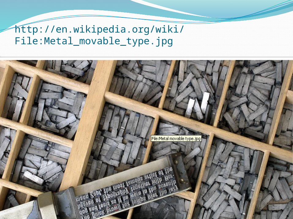
http://en.wikipedia.org/wiki/File:Metal_movable_type.jpg
Fonts ContinuedEach different size or weight required a
completely separate set of metal characters.Each metal set of characters was kept in its own
drawer and was called a type font.So a font is the specific size, weight and style
applied to a character, letter, number, or symbol.
Examples: Arial, bold, 12 pointArial, italic, 14 pointArial, 10 point
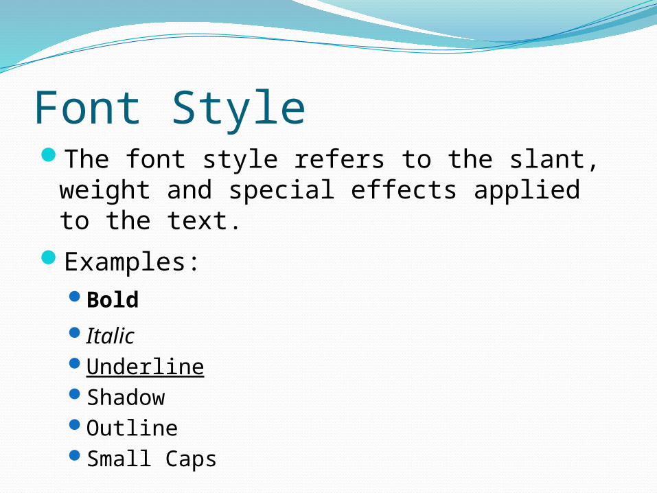
Font StyleThe font style refers to the slant, weight
and special effects applied to the text.Examples:
BoldItalicUnderlineShadowOutlineSmall Caps
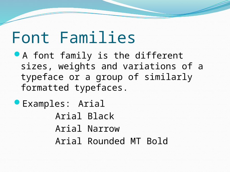
Font FamiliesA font family is the different sizes, weights
and variations of a typeface or a group of similarly formatted typefaces.
Examples: ArialArial BlackArial NarrowArial Rounded MT Bold
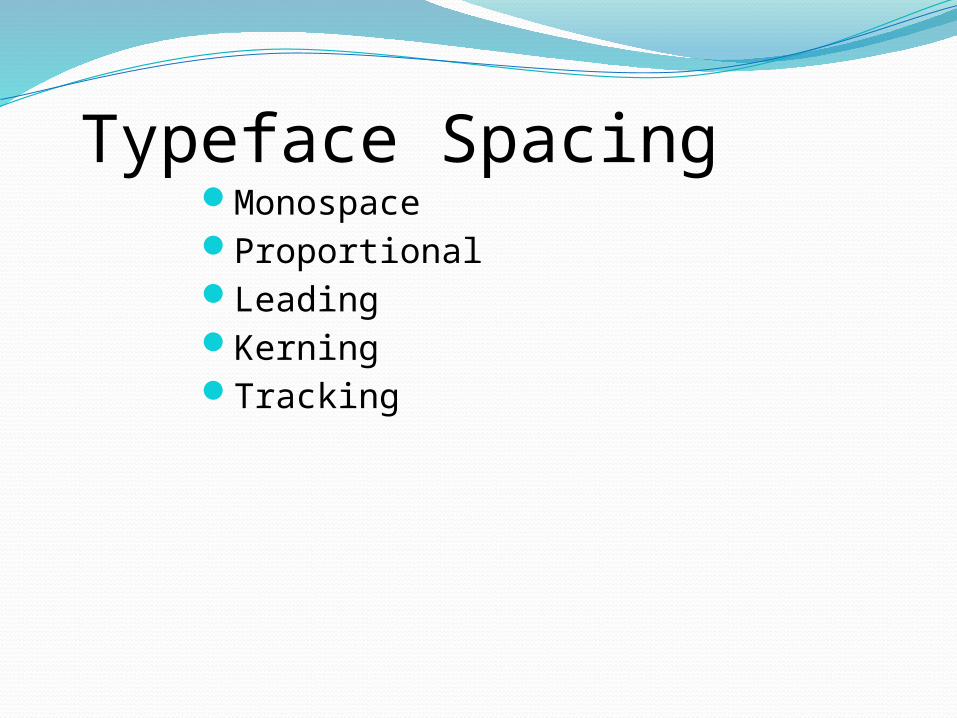
Typeface SpacingMonospaceProportionalLeadingKerningTracking
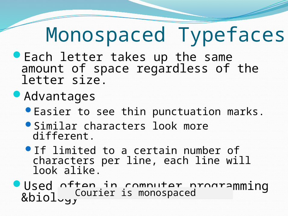
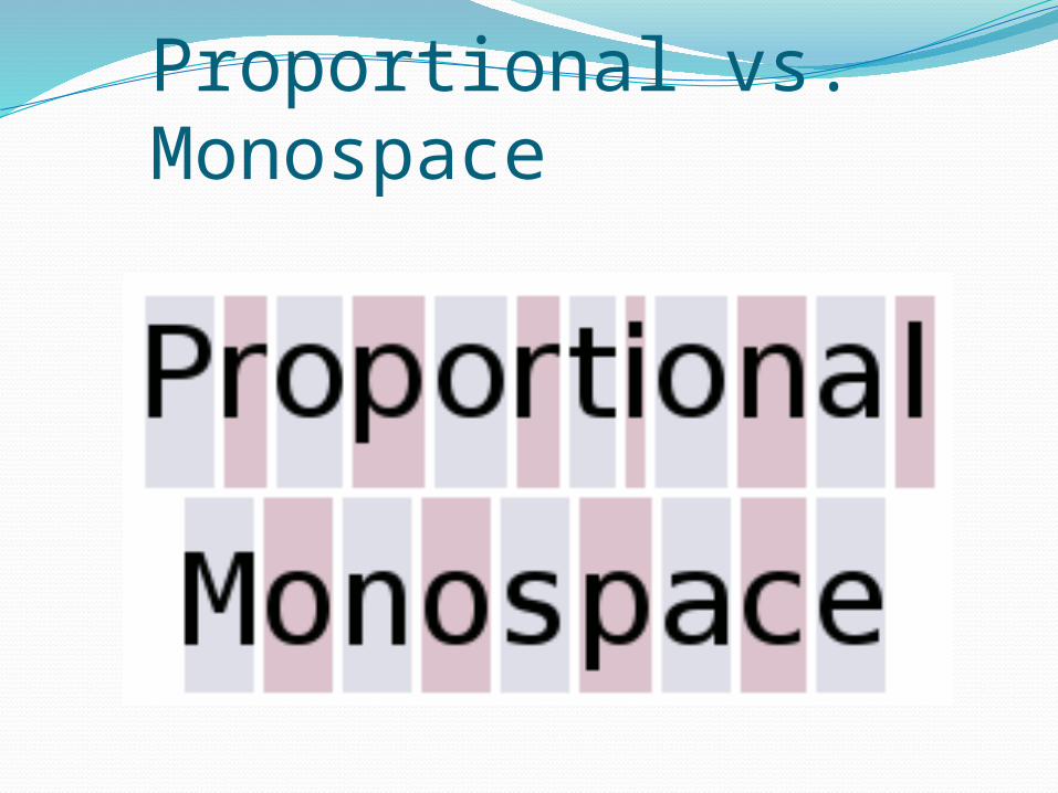
Monospaced TypefacesEach letter takes up the same amount of
space regardless of the letter size.Advantages
Easier to see thin punctuation marks.Similar characters look more different.If limited to a certain number of characters
per line, each line will look alike.Used often in computer programming
&biology
Courier is monospaced
Proportional TypefacesProportional
The amount of space each character takes up is adjusted to the width of that character.
Therefore, an i is not as wide as an m and receives less space.
AdvantagesDoes not take up as much space as monospaced
typefaces.Easier to read.
Used in most documents and publications.
Times New Roman is proportional
Proportional vs. Monospace
LeadingThe vertical spacing between lines of
text.
Pronounced “led-ding.”
In most software programs, it is referred to as line spacing.
In Desktop Publishing, it is still referred to as leading because typesetters used long pieces of lead between the moveable type to create blank lines between the text.
Leading Continued…If there were no space between the
lines of text, the letters would touch the lines above & below them and would be extremely difficult to read.
Used to:Slightly increase or decrease the length
of a column of text so that it is even with an adjacent column.
To make a block of text fit in a space that is larger or smaller than the text block.
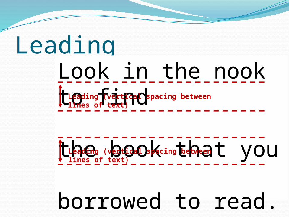
LeadingLook in the nook to find
the book that you
borrowed to read.
Leading (vertical spacing between lines of text)
Leading (vertical spacing between lines of text)
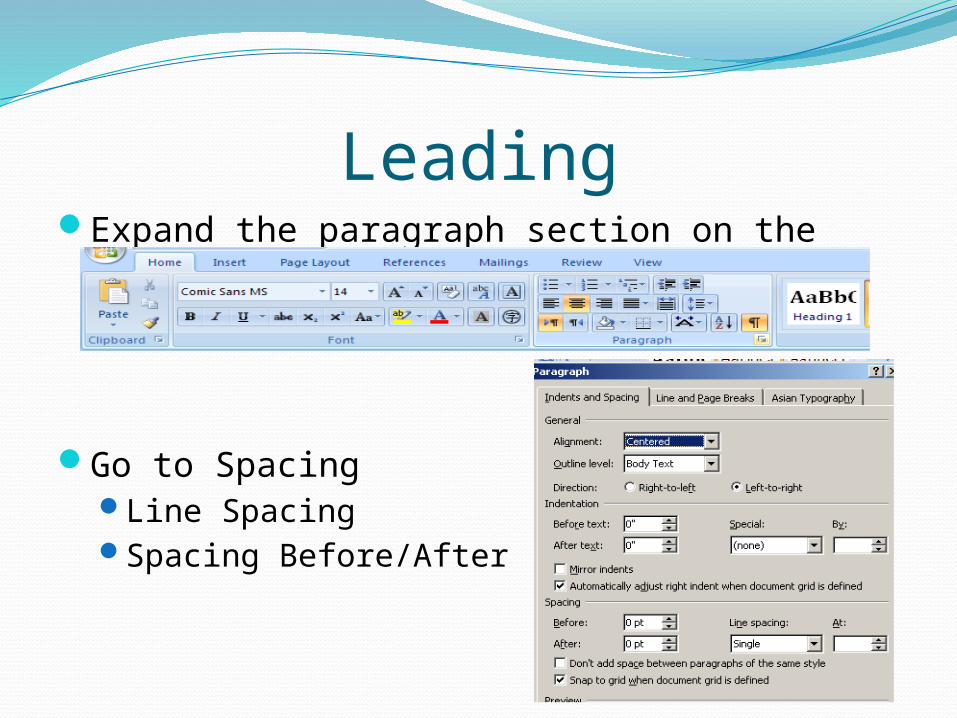
LeadingExpand the paragraph section on the Home
Ribbon
Go to Spacing Line SpacingSpacing Before/After
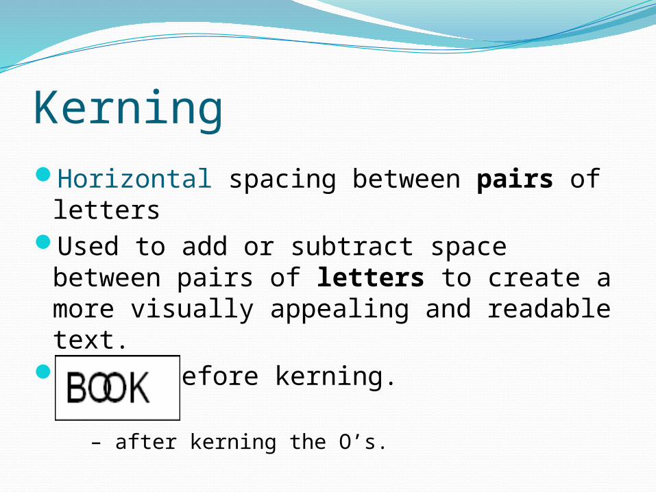
KerningHorizontal spacing between pairs of
lettersUsed to add or subtract space between
pairs of letters to create a more visually appealing and readable text.
BOOK – before kerning.
– after kerning the O’s.
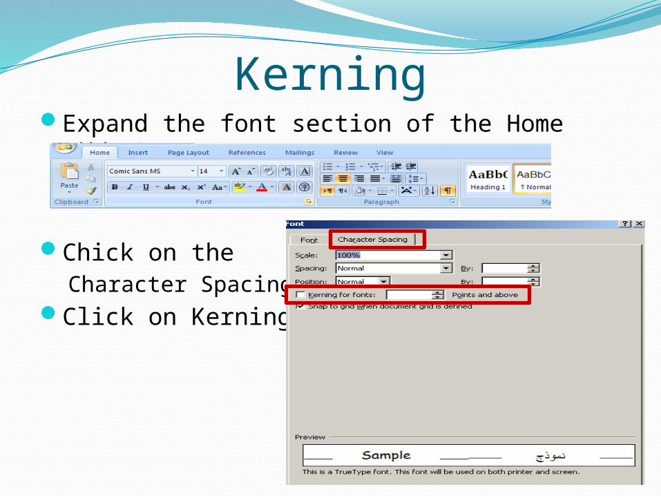
KerningExpand the font section of the Home Ribbon
Chick on the Character Spacing Tab
Click on Kerning
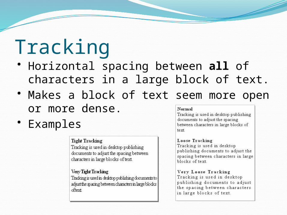
Tracking• Horizontal spacing between all of
characters in a large block of text.• Makes a block of text seem more open or
more dense.• Examples
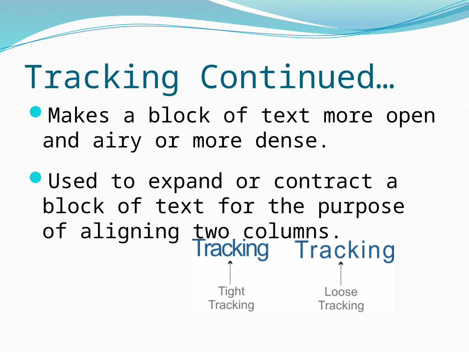
Tracking Continued…Makes a block of text more open and
airy or more dense.
Used to expand or contract a block of text for the purpose of aligning two columns.
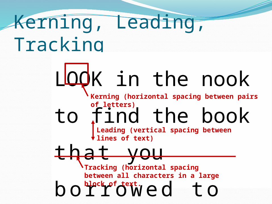
Kerning, Leading, Tracking
LOOK in the nook to find
the book tha t you
b o r r o w e d t o r e a d .
Kerning (horizontal spacing between pairs of letters)
Leading (vertical spacing between lines of text)
Tracking (horizontal spacing between all characters in a large block of text.
Glossary Siteswww.typenow.net/glossary.htmwww.adobe.com/type/topics/glossary.html www.typophile.com/wiki/Terminology
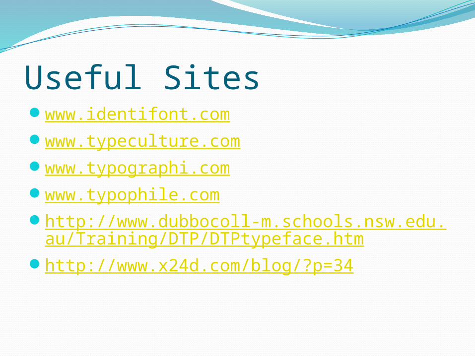
Useful Siteswww.identifont.comwww.typeculture.comwww.typographi.comwww.typophile.comhttp://www.dubbocoll-m.schools.nsw.edu.au/T
raining/DTP/DTPtypeface.htmhttp://www.x24d.com/blog/?p=34