Embed Size (px)
Citation preview

440 Chapter 10 Data Displays
Histograms10.2
How can you use intervals, tables, and graphs
to organize data?
Work with a partner.
a. Roll a number cube 20 times. Record your results in a tally chart.
b. Make a bar graph of the totals.
c. Go to the board and enter your totals in the class tally chart.
d. Make a second bar graph showing the class totals. Compare and contrast the two bar graphs.
ACTIVITY: Conducting an Experiment11
Work with a partner. You are judging a paper airplane contest. A contestant fl ies a paper airplane 20 times. You record the following distances:
20.5 ft, 24.5 ft, 18.5 ft, 19.5 ft, 21.0 ft, 14.0 ft, 12.5 ft, 20.5 ft, 17.5 ft, 24.5 ft,
19.5 ft, 17.0 ft, 18.5 ft, 12.0 ft, 21.5 ft, 23.0 ft, 13.5 ft, 19.0 ft, 22.5 ft, 19.0 ft
a. Complete the tally chart and the bar graph of the distances.
Tally Chart
Interval Tally Total
10.0−12.9
13.0−15.9
16.0−18.9
19.0−21.9
22.0−24.9
1
2
3
4
5
6
7
8
9
0
22.0
−24.9
Tota
ls
Interval
Paper Airplane Contest
19.0
−21.9
16.0
−18.9
13.0
−15.9
10.0
−12.9
b. Make a different tally chart and bar graph of the distances. Use the following intervals:
10.0–11.9, 12.0–13.9, 14.0–15.9, 16.0–17.9, 18.0–19.9, 20.0–21.9, 22.0–23.9, 24.0–25.9
c. Which graph do you think represents the distances better? Explain.
ACTIVITY: Using Intervals to Organize Data22
Tally Chart
1
2
3
4
5
6
Key: ∣̇̇ = 1 ∣̇̇̇∣̇̇∣̇̇∣̇̇∣ ̇ = 5
Data DisplaysIn this lesson, you will● make histograms.● use histograms to
analyze data.
ms_green pe_1002.indd 440ms_green pe_1002.indd 440 1/28/15 4:14:52 PM1/28/15 4:14:52 PM

Section 10.2 Histograms 441
4. IN YOUR OWN WORDS How can you use intervals, tables, and graphs to organize data?
5. What intervals could you use in a graph that displays data whose values range from 40 through 59?
Work with a partner.
a. Make the airplane shown from a single sheet of 8 1
— 2
-by-11-inch paper. Then design and make your own paper airplane.
b. PRECISION Fly each airplane 20 times. Keep track of the distance fl own each time.
c. MODELING Organize the results of the fl ights using frequency tables and graphs. Which airplane fl ies farther? Explain your reasoning.
ACTIVITY: Developing an Experiment33
Fold in half.Then unfold.
Fold corners. Fold cornersagain.
Fold in half.
Fold wings outon both sides. Fold wing edges
up.
1. 2. 3.
4.
5.6.
Use what you learned about organizing data into intervals to complete Exercises 4 and 5 on page 445.
The tally chart in Activity 2 is also called a frequency table. A frequency table groups data values into intervals. The frequency is the number of values in an interval.
Specify UnitsWhat units will you use to measure the distance fl own each time? Will the units you use affect the results in your frequency table? Explain.
Math Practice
ms_green pe_1002.indd 441ms_green pe_1002.indd 441 1/28/15 4:15:01 PM1/28/15 4:15:01 PM

442 Chapter 10 Data Displays
Lesson10.2Lesson Tutorials
EXAMPLE Making a Histogram11The frequency table shows the numbers of laps that people in a swimming class completed today. Display the data in a histogram.
Step 1: Draw and label the axes.
Step 2: Draw a bar to represent the frequency of each interval.
1. The frequency table shows the ages of people riding a roller coaster. Display the data in a histogram.
Age 10 –19 20 – 29 30 – 39 40 – 49 50 – 59
Frequency 16 11 5 2 4
Key Vocabularyfrequency table,
p. 441frequency, p. 441histogram, p. 442
Histograms
A histogram is a bar graph that shows the frequency of data values in intervals of the same size.
The height of a bar representsthe frequency of the values in the interval.
Exercises 6 – 8
1
2
3
4
0–9 10–19 20–29 30–39
5
0
Number of CDs
Freq
uen
cy
CDs Owned
2
4
6
8
10
12
01–3 4–6 7–9 10–12 13–15
Number of laps
Freq
uen
cy
Laps Completed Include any intervalwith a frequency of 0.The bar height is 0.
There is no space betweenthe bars of a histogram.
Number of Laps Frequency
1– 3 11
4 – 6 4
7– 9 0
10 –12 3
13 –15 6
ms_green pe_1002.indd 442ms_green pe_1002.indd 442 1/28/15 4:15:08 PM1/28/15 4:15:08 PM

Section 10.2 Histograms 443
EXAMPLE Using a Histogram22The histogram shows the winning speeds at the Daytona 500. (a) Which interval contains the most data values? (b) How many of the winning speeds are less than 140 miles per hour? (c) How many of the winning speeds are at least 160 miles per hour?
a. The interval with the tallest bar contains the most data values.
So, the 150 –159 miles per hour interval contains the most data values.
b. One winning speed is in the 120 –129 miles per hour interval, and four winning speeds are in the 130 –139 miles per hour interval.
So, 1 + 4 = 5 winning speeds are less than 140 miles per hour.
c. Seven winning speeds are in the 160–169 miles per hour interval, and fi ve winning speeds are in the 170–179 miles per hour interval.
So, 7 + 5 = 12 winning speeds are at least 160 miles per hour.
2. The histogram shows the numbers of hours that students in a class slept last night.
a. How many students slept at least 8 hours?
b. How many students slept less than 12 hours?
4
8
12
16
120–129 130–139 140–149 150–159 160–169 170–179
20
0
Speed (miles per hour)Fr
equ
ency
Daytona 500 Winning Speeds
2
4
6
8
10
00–3 4–7 8–11 12–15
Time (hours)
Freq
uen
cy
Amount of Sleep
Exercises 10–13
ms_green pe_1002.indd 443ms_green pe_1002.indd 443 1/28/15 4:15:12 PM1/28/15 4:15:12 PM

444 Chapter 10 Data Displays
EXAMPLE Comparing Data Displays33
The data displays show how many push-ups students in a class completed for a physical fi tness test. Which data display can you use to fi nd how many students are in the class? Explain.
You can use the histogram because it shows the number of students in each interval. The sum of these values represents the number of students in the class. You cannot use the circle graph because it does not show the number of students in each interval.
EXAMPLE Making Conclusions from Data Displays44Which statement cannot be made using the data displays in Example 3?
○A Twelve percent of the class completed less than 10 push-ups.
○B Five students completed at least 10 and at most 19 push-ups.
○C At least one student completed more than 39 push-ups.
○D Twenty-nine percent of the class completed 30 or more push-ups.
The circle graph shows that 12% completed 0 –9 push-ups. So, Statement A can be made.
In the histogram, the bar height for the 10–19 interval is 5, and the bar height for the 40– 49 interval is 1. So, Statements B and C can be made.
The circle graph shows that 24% completed 30–39 push-ups, and 4% completed 40– 49 push-ups. So, 24% + 4% = 28% completed 30 or more push-ups. Statement D cannot be made.
The correct answer is ○D .
3. In Example 3, which data display should you use to describe the portion of the entire class that completed 30–39 push-ups?
4. Make two more conclusions from the data displays in Example 3.
Exercises 14 and 15
0–90
2
4
6
8
10
12
10–19 20–29 30–39 40–49
Number of push-ups
Push-Ups
Nu
mb
er o
f st
ud
ents 40–49
4%0–9
10–19
20–29
30–39 12%
20%
40%
24%
Push-Ups
ms_green pe_1002.indd 444ms_green pe_1002.indd 444 1/28/15 4:15:14 PM1/28/15 4:15:14 PM
Section 10.2 Histograms 445
9+(-6)=3
3+(-3)=
4+(-9)=
9+(-1)=
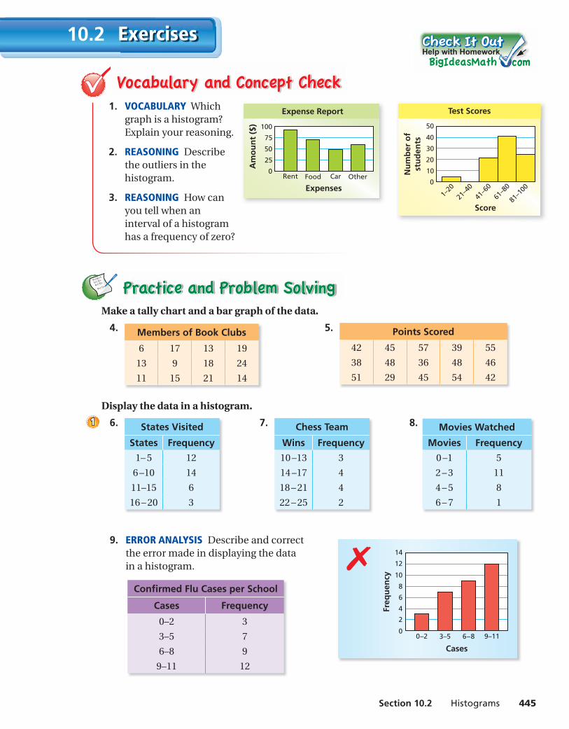
Make a tally chart and a bar graph of the data.
4. Members of Book Clubs
6 17 13 19
13 9 18 24
11 15 21 14
5. Points Scored
42 45 57 39 55
38 48 36 48 46
51 29 45 54 42
Display the data in a histogram.
6. States Visited
States Frequency
1– 5 12
6 –10 14
11–15 6
16 – 20 3
7. Chess Team
Wins Frequency
10 –13 3
14 –17 4
18 – 21 4
22 – 25 2
8. Movies Watched
Movies Frequency
0 –1 5
2 – 3 11
4 – 5 8
6 – 7 1
9. ERROR ANALYSIS Describe and correct the error made in displaying the data in a histogram.
11
Help with Homework
1. VOCABULARY Which graph is a histogram? Explain your reasoning.
2. REASONING Describe the outliers in the histogram.
3. REASONING How can you tell when an interval of a histogram has a frequency of zero?
25
50
75
100
0Rent Food Car Other
Expenses
Am
ou
nt
($)
Expense Report
10
20
30
40
0
1–20
21–4
0
41–6
0
Score
Nu
mb
er o
fst
ud
ents
Test Scores
50
61–8
0
81–1
00
Confi rmed Flu Cases per School
Cases Frequency
0–2 3
3–5 7
6–8 9
9–11 12
Exercises10.2
✗
2
4
6
8
10
12
14
00–2 3–5 6–8 9–11
Cases
Freq
uen
cy
ms_green pe_1002.indd 445ms_green pe_1002.indd 445 1/28/15 4:15:16 PM1/28/15 4:15:16 PM

446 Chapter 10 Data Displays
10. MAGAZINES The histogram shows the number of magazines read last month by the students in a class.
a. Which interval contains the fewest data values?
b. How many students are in the class?
c. What percent of the students read less than six magazines?
d. Can you fi nd the mean or the median of the data? Explain.
11. ERROR ANALYSIS Describe and correct the error made in reading the histogram.
12. VOTING The histogram shows the percent of the voting-age population that voted in a recent presidential election. Explain whether the graph supports each statement.
a. Only 40% of one state voted.
b. In most states, between 50% and 64.9% voted.
c. The mode of the data is between 55 and 59.9.
13. PROBLEM SOLVING The histograms show the areas of counties in Pennsylvania and Indiana. Which state do you think has the greater area? Explain.
5
10
15
20
25
30
35
40
00–399 400–799 800–1199 1200–1599
Area (square miles)
Nu
mb
er o
f co
un
ties
Pennsylvania
3
6
9
12
15
18
00–1 2–3 4–5 6–7
Magazines read
Freq
uen
cy
Magazines
6
12
18
24
30
36
42
48
00–199 200–399 400–599 600–799
Area (square miles)
Nu
mb
er o
f co
un
ties
Indiana
3
6
9
12
15
18
040–44.9 45–49.9 50–54.9 55–59.9 60–64.9 65–69.9 70–74.9
Percent of voting-age population
Nu
mb
er o
f st
ates
Presidential Election
2
4
6
8
10
12
14
01–4 5–8 9–12 13–16
Time (seconds)
Freq
uen
cy
Amount of Time to Download Songs
22
12% of the songs took 5 –8 seconds to download.✗
ms_green pe_1002.indd 446ms_green pe_1002.indd 446 1/28/15 4:15:18 PM1/28/15 4:15:18 PM

Section 10.2 Histograms 447
Find the percent of the number. (Section 5.6)
19. 25% of 180 20. 30% of 90 21. 16% of 140 22. 64% of 80
23. MULTIPLE CHOICE Which is the solution of the inequality represented by “Four times a number n is at least 28”? (Section 7.7)
○A n < 7 ○B n > 7 ○C n ≤ 7 ○D n ≥ 7
14. GARBAGE The data displays show how many pounds of garbage apartment residents produced in 1 week. Which data display can you use to fi nd how many residents produced more than 25 pounds of garbage? Explain.
15. REASONING Determine whether you can make each statement by using the data displays in Exercise 14. Explain your reasoning.
a. One resident produced 10 pounds of garbage.
b. Twelve residents produced between 20 and 29 pounds of garbage.
16. NUMBER SENSE Can you fi nd the range and the interquartile range of the data in Exercise 7? If so, fi nd them. If you cannot fi nd them, explain why not.
17. CRITICAL THINKING The table shows the weights of guide dogs enrolled in a training program.
a. Make a histogram of the data starting with the interval 51– 55.
b. Make another histogram of the data using different-sized intervals.
c. Compare and contrast the two histograms.
18. LogicLogic What are the possible values for the median in Exercise 10?
Weights (pounds)
81 88 57 82 70 85
71 51 82 77 79 77
83 80 54 80 81 73
59 84 75 76 68 78
83 78 55 67 85 79
Stem Leaf
0 9 1 0 5 8 8 9 2 1 2 5 5 6 7 7 7 9 9 9 3 2 3 3
Key: 1 | 5 = 15 pounds
Garbage
2
4
6
8
10
12
00–9 10–19 20–29 30–39
Pounds
Nu
mb
er o
fre
sid
ents
Garbage
33
ms_green pe_1002.indd 447ms_green pe_1002.indd 447 1/28/15 4:15:19 PM1/28/15 4:15:19 PM