Embed Size (px)
Citation preview

Copyright 2015 American Business Analytics & Research, LLC, www.shadowstats.com 1
2015 – A WORLD OUT OF BALANCE Year Past, Year Ahead and Hyperinflation
No. 692 SPECIAL COMMENTARY
February 2, 2015
__________
2014 – A Year of Market Hype, Manipulation, Intervention and Misdirection
2015 – A Year of Reckoning, Economic Turmoil, Dollar Panic and Hyperinflation
Federal Reserve and Other Central Banks Have No Way Out as
Dangers from the Panic of 2008 Persist
Global Financial, Economic and Political Instabilities Are Pushed to Limit
Economic Reality versus Illusion: No U.S. Recovery or Boom Is in Place;
No Economic Recovery Is Likely This Decade
Extreme U.S. Fiscal Imbalances Unresolved
U.S. Dollar Remains in Great Peril;
Underlying Perceptions and Fundamentals Already Are Shifting
Low Oil Prices Would Prove Fleeting with Dollar Plunge
Soaring U.S. Inflation Should Accompany Dollar Demise in 2015,
Leading to Domestic Hyperinflation
Gold and Silver Prices Will Explode in Flight from Dollar;
Holding Physical Precious Metals Remains Best Store of Wealth
___________

Shadow Government Statistics — No. 692 Special Commentary, February 2, 2015
Copyright 2015 American Business Analytics & Research, LLC, www.shadowstats.com 2
OPENING COMMENTS – U.S. HYPERINFLATION FORECAST
U.S. Dollar Demise and Hyperinflation Are Likely in Year Ahead. In 2004, I predicted that the
United States would suffer a hyperinflationary great depression before 2020. That general hyperinflation
forecast remains solid, and hyperinflation is the ultimate fate of the U.S. dollar. In 2008, the timing of the
forecast was shifted to "by 2014." Discussed below, 2014 passed without a dollar collapse, yet the key
underlying fundamentals for this financial disaster still are in place, and risk remains high of the ultimate
dollar panic breaking in the year-ahead.
In the ongoing wake of the Panic of 2008, the world remains out of balance. The current strength of the
U.S. dollar—driven by the illusion of a booming U.S. economy, and by the fantasy of the Federal Reserve
back in control of its monetary policy—is the major factor distorting the global financial system and
systemic stability.
System Never Recovered from 2008. The long-range hyperinflation prediction made in 2004 was based
on the unsustainable fiscal deficits, and long-term obligations being taken on by the United States
government. Even then, those controlling the government were unwilling to consider addressing the
nation's long-term-solvency issues.
At the time, using generally accepted accounting principles (GAAP), the actual 2004 federal deficit (one-
year's deterioration in the government's obligations, including the net-present value of unfunded
liabilities) topped an unprecedented $11 trillion. Net of one-time changes that year [the Medicare
overhaul was not fully funded], the 2004 GAAP-based deterioration was $3.4 trillion, versus a $0.4
trillion cash-based deficit. That one-year shortfall of $3.4 trillion in government funding compared with
total federal debt of $7.4 trillion, at the time, with total GAAP-based obligations of the United States at
$49.5 trillion. Ten years later, for 2014, the GAAP-based deficit was about $6 trillion, with total
obligations approaching $100 trillion, against total federal debt of $17.8 trillion, levels that still are
unsustainable and uncontainable (see the U.S. Dollar in Peril and Federal Debt and Deficit sections).
When the Federal Reserve and U.S. government addressed the Panic of 2008, the ShadowStats
hyperinflation forecast was moved closer in time, to 2014. In an effort to prevent a collapse of the
financial system, the Fed and U.S. authorities used whatever money they needed to create, spend, lend or
grant, and acted to guarantee whatever liabilities had to be covered, or to bailout whatever entities had to
be saved. Faced with limited options, the Fed and the government did little that was fundamental to
resolve or correct the issues that led to the crisis. The 2008 and ensuing interventions generally were
stopgap efforts that pushed the problems into the future. I estimated in 2008 that systemic instabilities
and a U.S. dollar collapse would resurface by 2014. Some instabilities never went away, and some have
resurfaced, but not yet to the effect, or to the extent, of collapsing the U.S. dollar. Yet, that collapse came
close in 2011.
Among circumstances to surface in the first month of 2015, the Swiss National Bank abandoned the
unsustainable cap it had put on the euro/franc exchange rate in the 2011 crisis, followed by a recession-
plagued euro area entering into a period of quantitative easing, and a Greek election that increased the
odds of some break-up or recasting of the euro. Where the imbalances from 2008 are ongoing, the

Shadow Government Statistics — No. 692 Special Commentary, February 2, 2015
Copyright 2015 American Business Analytics & Research, LLC, www.shadowstats.com 3
problems are not limited to Europe; the United States always has been at the core of the crisis.
Circumstances are far from being as happy as advertised in the U.S., specifically including options open
to the Federal Reserve (see Persistent Systemic Stresses section) and related domestic economic activity
(see the U.S. Economy section).
Orchestrated Dollar Strength, Oil Weakness and Fed Bravado. Contrary to selling off sharply, as I had
predicted for 2014, the U.S. dollar began to rally at mid-year 2014. Yet, that activity was not driven by
solid, underlying business or economic fundamentals. First, the dollar strength appeared simply to be
rigged, aimed at causing terrible financial stress for Russia, which it is doing still. Second, the dollar was
propped by false perceptions of a suddenly-booming economy, and of a Federal Reserve that purportedly
had regained control of its policies.
The U.S. Treasury has orchestrated covert financial pressures before to punish sovereign states, deemed
errant, such as Iran (see Zarate's Treasury's War: The Unleashing of a New Era of Financial Warfare).
The Treasury appears to have done the same with Russia, in response to the Ukrainian situation. While
the U.S. publicly pursued financial sanctions against Russian officials in the third week of June 2014, oil
prices peaked (Brent peaked on June 19th) and began to fall off sharply. In related form, the U.S. dollar
bottomed out against the euro on July 1st. Oil prices have continued to fall, although a bottoming may be
at hand, and the dollar has continued to strengthen.
A separate political benefit to the Administration, from plunging oil prices, at the time, would have been
the decline in gasoline prices leading into the election. Nonetheless, the election still went strongly
against the Administration (see Commentary No. 672).
Yet, oil-price movements have been contrary to a number of underlying fundamentals, including oil
industry economics. Economic damages here go well beyond Russia, and global and domestic political
and financial pressures should be mounting, at an accelerating pace, to restore economic balance to the
system. Keep in mind that strength in the U.S. dollar acts also as a depressant to dollar-based oil prices
(see Graph 39). When oil-price bashing does subside, a sharp rebound in oil prices likely will be
accompanied by some related pullback in the value of the U.S. dollar.
Low gasoline prices temporarily have provided a little extra in effective disposable income for
individuals. The extra cash appears to be going more to bill paying than to expanding personal
consumption. Whatever the beneficial effects, they likely will be limited in scope as to timing.
The Economy and the Fed. With highly-questionable recent reporting of surging GDP growth, the U.S.
dollar rally has accelerated, propped by the illusion of booming activity, the strongest U.S. economy
reported in more than a decade (see U.S. Economy section). Such has reinforced the apparent health of
the general U.S. circumstance, including more-normal Federal Reserve options, versus circumstances of
"renewed" recession and quantitative-easing actions on the part of major U.S. trading partners.
In reality, the United States economy never recovered and still is in recession. The Fed should find itself
soon enough facing-down renewed questions as to the need for another expansion of "quantitative
easing." The major difference between the Fed and its counterparts, among the traditionally stronger-
currency countries, is that the counterparts tend to provide more-honest economic reporting than generally
comes out of some of the U.S. statistical bureaus.
Shadow Government Statistics — No. 692 Special Commentary, February 2, 2015
Copyright 2015 American Business Analytics & Research, LLC, www.shadowstats.com 4
2014 Timing for Dollar Collapse and Hyperinflation was off by a Year or So. In 2013, I estimated 90%
odds of a U.S. dollar collapse as the proximal trigger for the onset of hyperinflation in the United States
by the end of 2014, and repeated those odds in the January 2014 outlook for the year ahead. Such was an
unusual forecast, by its nature, but all the factors appeared to be in place at the time, and they still appear
to be in place, as of this writing, subject to shifting market sentiments on the dollar. The 2014 timing was
wrong.
I did not expect the domestic-economic boom illusion, and related strengthened-market perceptions of the
Fed, to rally the dollar, as they did, and I did not foresee the Russian circumstance. Most external shocks
are dollar negatives, however, and the full effects of the Russian circumstance, and related market
distortions, have yet to run their course.
The general forecast for the U.S. dollar collapse and hyperinflation remains solidly in place. Only the
timing has shifted. Late in 2014, the forecast for the onset of the hyperinflation in the United States
formally was moved into 2015 (see Commentary No. 673). Such reflected the reality of significant
strengthening in the U.S. dollar, which had begun in July 2014 and has continued to date. Dollar strength
should reverse quickly and sharply, when underlying reality hits the markets hard. Market sentiment,
though, first has to shift against the dollar, and that shift is not yet in play.
In terms of negatively-shifting dollar sentiment, an "unexpected" and meaningful move to the downside in
headline economic reporting and sentiment is a likely trigger. An unanticipated downturn in the economy
adds financial stress to an already-vulnerable banking system, and should trigger increased pressure for,
and talk of enhanced Federal Reserve accommodation. It also would cause significant deterioration in the
outlook for federal fiscal conditions and U.S. Treasury borrowing needs.
Recently, the worse-than-consensus slowing of headline fourth-quarter 2014 GDP growth to 2.6% on
January 30th, the weaker-than-expected reporting of durable goods orders on January 27th, and the
weaker-than-expected retail sales on January 14th stirred some fluttering and short-lived dollar-softening
and gold-price-firming reactions. Headline, negative fundamentals are beginning to surface, again, but
they have to get much worse in order to roil the markets. That should happen within the first half of 2015.
The economic-boom mentality touted in the popular financial media is not likely to survive beyond late-
March or April 2015, with likely downside surprises in this year's benchmark revisions to key economic
series, including retail sales and industrial production. A major distorting factor in last year's reporting
was impact from the federal-government shutdown of 2013, which delayed by one year (to this year's
reporting) what would have been significant, negative information for last year's revisions. Separately,
the extreme circumstance of recent GDP overstatement should be addressed, at least partially, with the
July 30th benchmark revision to that series.
The nature of the perils facing the value of the U.S. dollar and key domestic financial markets are
summarized and then reviewed in the sections ahead, including systemic stresses, economic reality, U.S.
sovereign-solvency issues and relative market reactions to recent and prospective circumstances.
Precise timing for the U.S. dollar's ultimate demise is difficult, if not impossible to predict, much in
advance. In broad terms, however, 2015—the year ahead—remains a period of exceptional risk.
Underlying fundamentals remain in place for the currency turmoil, but, again, global sentiment first needs
to shift against the dollar. When the dollar sell-off does begin, it likely will be with little or no warning.

Shadow Government Statistics — No. 692 Special Commentary, February 2, 2015
Copyright 2015 American Business Analytics & Research, LLC, www.shadowstats.com 5
In turn, a massive global flight from the U.S. dollar would spike domestic prices sharply, with a related
domestic flight from the dollar setting the early stages of the hyperinflation. Further, economic
disruptions from the hyperinflation would exacerbate current difficulties in the broad economy, pushing a
circumstance that already is in near-depression status into a great depression.
The long-standing, primary-background material supporting the outlook for hyperinflation and the
structurally-impaired economy are detailed in 2014 Hyperinflation Report—The End Game Begins – First
Installment Revised and 2014 Hyperinflation Report—Great Economic Tumble – Second Installment.
Those outlooks are updated regularly in the Hyperinflation Outlook Summary sections of the weekly
Commentaries, and here, as to the nature of the underlying fundamentals, including near-term, proximal
triggers for massive dollar selling. Also considered a primary background document is the Public
Commentary on Inflation Measurement, which details the basic issues with distortions in headline
inflation reporting, ranging from the CPI to the GDP's implicit price deflator (IPD).
This missive contains significant new material and graphs, as well updated graphs and text from earlier
writings. It will be updated as circumstances warrant, in addition to regular updates in the weekly
Commentaries. As always, comments and questions from readers are invited and welcome. For
subscribers who would like to discuss any of these issues, please send an e-mail, with the heading
"schedule a call" or "question" along with detail as to your availability and/or specific questions to
[email protected]. I shall do my best to accommodate those requests.
Best wishes to all — John Williams
__________
Contents – Major Sections and Graphs
OPENING COMMENTS – U.S. HYPERINFLATION FORECAST ..................................................................................2
EXECUTIVE SUMMARY – U.S. DOLLAR IN PERIL .......................................................................................................7
Graph 1: U.S. DOLLAR – Financial- versus Trade-Weighted U.S. Dollar Indices (1985 - 2015) ........................................... 9
Graph 2: U.S. DOLLAR – Financial- versus Trade-Weighted U.S. Dollar Yr/Yr % Change (1985 - 2015) ............................ 9
Graph 3: U.S. DOLLAR – SYSTEMIC STRESS – Swiss Francs per U.S. Dollar and Euro (2000 - 2015) ............................. 10
PERSISTENT SYSTEMIC STRESSES, DISTORTIONS AND MANIPULATIONS .....................................................14
Graph 4: SYSTEMIC STRESS – "The Illusion" Headline Real U.S. GDP Level (2000 - 2014) .............................................. 17
Graph 5: SYSTEMIC STRESS – Real U.S. Credit Market Debt Outstanding (2000 - 2014).................................................. 17
Graph 6: SYSTEMIC STRESS – Headline Real GDP, Year-to-Year Change (2000 - 2014).................................................. 18
Graph 7: SYSTEMIC STRESS – Headline Real Credit Market Debt, Year-to-Year Change (2000 - 2014) .......................... 18
Graph 8: SYSTEMIC STRESS – FEDERAL RESERVE – Monetary Base, Level (1985 - 2015) ............................................. 19
Graph 9: SYSTEMIC STRESS – FEDERAL RESERVE – Monetary Base, Year-to-Year Change (1985 - 2015) .................... 20
Graph 10: SYSTEMIC STRESS – FEDERAL RESERVE – Money Supply (2003 - 2014) ....................................................... 20
Graph 11: SYSTEMIC STRESS – MARKETS – FEDERAL RESERVE - Fed Assets versus S&P 500 (2006 - 2015) ............. 21
Graph 12: SYSTEMIC STRESS - MARKETS – Real Price Indices of Gold versus the DJIA (2000 - 2015) ........................... 22

Shadow Government Statistics — No. 692 Special Commentary, February 2, 2015
Copyright 2015 American Business Analytics & Research, LLC, www.shadowstats.com 6
U.S. ECONOMY: NO BOOM, NO RECOVERY AND YEARS OF DIFFICULTY AHEAD .......................................23
Graph 13: ECONOMY – Real S&P 500 Sales versus Headline Real GDP (4q2007 - 3q2014) .............................................. 24
Graph 14: ECONOMY – CONSUMER/VOTER – Exit Polls versus Headline GDP Reporting (2004 - 2014) ....................... 25
Graph 15: ECONOMY – "The Illusion" Headline Real GDP (1994 - 2014) .......................................................................... 27
Graph 16: ECONOMY – Real GDP Corrected for Inflation-Understatement (1994 - 2014) ................................................. 27
Graph 17: ECONOMY – CONSUMER – Civilian Employment-Population Ratio (1994 - 2014) .......................................... 28
Graph 18: ECONOMY – CONSUMER – ShadowStats-Alternate Unemployment Measure—Inverted Scale (1994 - 2014) .. 29
Graph 19: ECONOMY – CONSUMER – Labor Force Participation Rate (1994 - 2014) ...................................................... 29
Graph 20: ECONOMY – CONSUMER – Quarterly Consumer Confidence Index (1994 - 2014) ........................................... 30
Graph 21: ECONOMY – Housing Starts (1994 - 2014) .......................................................................................................... 30
Graph 22: ECONOMY – Real Value of Construction Put in Place in U.S. (1994 - 2014) ...................................................... 31
Graph 23: ECONOMY – Corrected Real Retail Sales (2000 - 2014) ..................................................................................... 32
Graph 24: ECONOMY – Corrected Industrial Production (2000 - 2014) .............................................................................. 32
Graph 25: ECONOMY – Corrected Real New Orders for Durable Goods—Ex-Commercial Aircraft (2000 - 2014) ............ 33
STRUCTURAL CONSUMER-LIQUIDITY ISSUES .........................................................................................................34
Graph 26: ECONOMY – CONSUMER – Income Variance (1967 - 2013) ............................................................................. 36
Graph 27: ECONOMY – CONSUMER – Consumer Confidence and Sentiment (1970 - 2015) .............................................. 36
Graph 28: ECONOMY – CONSUMER – Annual Real Median Household Income (1967 - 2013) ......................................... 37
Graph 29: ECONOMY – CONSUMER – Monthly Real Median Household Income (2000 - 2014) ....................................... 38
Graph 30: ECONOMY – CONSUMER – Consumer Confidence (2000 - 2015) ..................................................................... 39
Graph 31: ECONOMY – CONSUMER – Household Sector, Real Credit Market Debt Outstanding (2000 - 2014) .............. 40
Graph 32: ECONOMY – CONSUMER – Nominal Consumer Credit Outstanding (2000 - 2014) .......................................... 40
FEDERAL DEBT AND DEFICIT: OUT OF CONTROL AND NO RESOLUTION PENDING .................................41
Graph 33: U.S. FEDERAL DEFICIT – GAAP- versus Cash-Based Annual Federal Deficit (2000 - 2014) ........................... 42
Graph 34: U.S. FEDERAL DEFICIT – Gross Federal Debt versus Nominal GDP (1940 - 2014) ......................................... 43
Graph 35: U.S. FEDERAL DEFICIT – GAAP-Based Total Federal Obligations versus Nominal GDP (2000 - 2014) ......... 43
FINANCIAL MARKETS AND INFLATION: PRESERVING ONE'S ASSETS ............................................................44
Graph 36: NOMINAL MARKETS – Gold versus Silver Prices (1970 - 2015) ........................................................................ 45
Graph 37: NOMINAL MARKETS – Gold versus Swiss Franc (1970 - 2015) ......................................................................... 45
Graph 38: NOMINAL MARKETS – Gold versus Oil Prices (1970 - 2015)............................................................................. 45
Graph 39: NOMINAL MARKETS – Oil versus Trade-Weighted Dollar (2004 - 2015) .......................................................... 46
Graph 40: INFLATION – ShadowStats Alternate (1980-Based) versus CPI-U (2000 - 2014) ............................................... 48
Graph 41: INFLATION – ShadowStats Alternate (1990-Based) versus CPI-U, C-CPI-U (2000 - 2014) ............................... 48
Graph 42: REAL MARKETS – Real S&P 500 and Dow Jones Industrial Average Indices (2000 - 2015) ............................. 49
Graph 43: REAL MARKETS – Real U.S. Treasury Yields—3-Month and 5-Year (2000 - 2015) ............................................ 50
Graph 44: REAL MARKETS – Real Home Value Index (2000 - 2014) ................................................................................... 50
Graph 45: REAL MARKETS – Real Gold and Silver Price Indices (2000 - 2015) ................................................................. 51

Shadow Government Statistics — No. 692 Special Commentary, February 2, 2015
Copyright 2015 American Business Analytics & Research, LLC, www.shadowstats.com 7
EXECUTIVE SUMMARY – U.S. DOLLAR IN PERIL
Instabilities from the Panic of 2008 Still Haunt the Global Financial System. Headline circumstances
generally were on the plus side in 2014, rarely have they been better, but underlying reality was not so
positive. After a first-quarter 2014 GDP contraction, the ensuing three quarters of GDP activity were the
strongest of any three-quarter period of GDP growth in more than a decade. Payroll employment
recovered its pre-recession high, while headline unemployment dropped to 5.6% in December, down from
a recession peak of 10.0%. The cash-based federal budget deficit purportedly hit its lowest level since
2008, while the Fed was able to taper asset purchases in its quantitative easing. The stock market hit an
all-time high, and the U.S. dollar rallied to multi-year highs, knocking down oil and gasoline prices.
In reality, the U.S. economy continued to stagnate—turning down anew—having never recovered from its
2007 plunge. Payroll jobs have surged based on soaring growth in people working part-time for
economic reasons; full-time employment still has not recovered its pre-recession high. The ShadowStats
Alternate Unemployment Measure stood at 23.0% in December, just 0.3% off its 23.3% peak one year
before. Continuing weakness in the economy was evidenced partially by midterm election results that
went strongly against the Administration. Despite Republicans gaining control of Congress, however,
chances of the government meaningfully addressing the nation's long-term solvency issues remained nil,
and the GAAP-based 2014 federal deficit likely held near an unsustainable $6 trillion level.
With 2015 already underway, U.S. economic activity should slow sharply, as seen with key economic
indicators in headline reporting, and in downside historical revisions. Downside economic shocks should
threaten the domestic stock market, intensify speculation as to renewed Fed accommodation, pummel the
U.S. dollar, spike oil and gas prices, and eventually set the early stages of a domestic hyperinflation.
Underlying U.S. dollar fundamentals and shifting sentiment already are in motion, reflecting systemic
distortions from the Panic of 2008, as they play out among major U.S. trading partners, including the
Eurozone, Japan and Switzerland.
Unsustainable U.S. Dollar Strength Remains the Primary Distorting Element in Domestic and
Global Markets. The happy news on the dollar and stocks is feeding off illusory U.S. economic
headlines, hype as to a purported significant improvement in federal budget conditions, and a newly-
virtuous Federal Reserve. Against that, major U.S. trading partners are reporting declining economic
activity—renewed recession—and recently have moved to debase their currencies, ostensibly in order to
fight those economic woes. Global markets have responded with strong flight into the U.S. dollar,
seeking safety, and in apparent anticipation of the Federal Reserve hiking interest rates.
What the markets do not recognize, yet, is that the United States has the same, ongoing economic
weaknesses and financial-system structural issues as its major trading partners. The U.S. is just better at
masking or glossing over its bad news. In particular, the United States has a massive long-range
sovereign solvency problem, which it is unwilling to address.

Shadow Government Statistics — No. 692 Special Commentary, February 2, 2015
Copyright 2015 American Business Analytics & Research, LLC, www.shadowstats.com 8
Again, within the traditional strong-currency countries, headline economic reporting and discussions on
systemic financial stresses have tended to be more honest and open than the reporting coming out of the
U.S. government. Within the traditional strong-currency countries, internal fiscal operations and trade
policies generally have been viewed in terms of supporting long-term economic and financial strength and
stability. Such excludes any current, short-lived stopgap measures and loose talk aimed at soothing
regular nervous fits in the domestic or global stock markets.
Those polices also are in general contrast to the self-destructive policies of the United States government,
which usually are driven by ever-shorter-term needs for immediate political self-gratification.
The problem remains for central governments and for central banks, including the Fed, that there is no
way out of the ongoing economic and systemic crises. The Panic of 2008 was the day of reckoning for all
the extraordinary debt and leverage excesses that had been built into the U.S. and global financial
systems, but that day of reckoning still is running its course. Where the U.S. financial-services industry
generally designed and structured what would become the basis for current systemic instabilities, with the
complicity of the U.S. government and the Federal Reserve, it is the United States and the U.S. dollar that
will take the brunt of the ensuing financial collapse and capital flight in the renewed panic ahead.
For those who are flowing their funds into the U.S. dollar, figuring that at worst the dollar will end up on
top of the rubble of other troubled Western currencies, consider the ongoing creativity and flexibility of
those holding funds outside the United States. If anything, the United States economy and financial
system remain in the worst shape of its major trading partners, living beyond its means for decades,
leading into net-debtor nation status in 1982. To the extent the global currency system ends in a pile of
rubble, look for the underlying dollar foundation and U.S. financial system to be at the bottom of it.
As to precedent, consider the U.S. pushing the global currency system from fixed to floating exchange
rates, when Nixon closed the gold window in 1971, ending the international convertibility of the U.S.
dollar into gold. Circumstances were exacerbated for the dollar, with the United States becoming an ever-
larger net-debtor nation beginning in the-early 1980s. As a result, the value of the U.S. dollar generally
has declined sharply against harder currencies such as the Swiss franc.
Indeed, from January 1971 to January 30, 2015, the U.S. dollar lost 78.7% (-78.7%) of its value against
the Swiss franc. Since January 1985 (when the United States was early on in expanding is current-
account trade deficit), the decline still was 64.8% (-64.8%).
Discussed in recent Commentaries, and as shortly will be detailed point-by-point here, the actual
underlying fundamentals for the U.S. dollar simply could not be worse, although not all of the negative
fundamentals are perceived as such, yet. With a developing confluence of extraordinarily negative
factors, the U.S. dollar should turn sharply lower, facing a massive sell-off and panicked dumping
relatively early in the year ahead. The precise timing of the major shift in dollar perceptions is not
predictable, but it could begin at any time, triggered by developments ranging from domestic or global
political shocks, to a worse-than-expected major economic statistic, for example, that could revitalize
market expectations for a more-lenient and more-accommodative Federal Reserve.
Assuming that the Fed still would do everything in its power to prevent the collapse of the domestic- or
global-financial system, then all the rhetoric about returning to monetary normalcy simply is rhetoric.
The system is not stable, and the day of reckoning that surfaced in the Panic of 2008 still has to be faced.
Shadow Government Statistics — No. 692 Special Commentary, February 2, 2015
Copyright 2015 American Business Analytics & Research, LLC, www.shadowstats.com 9
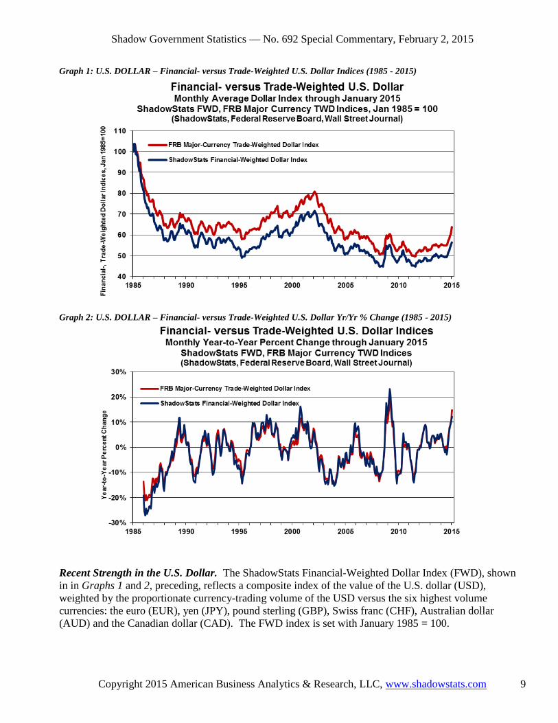
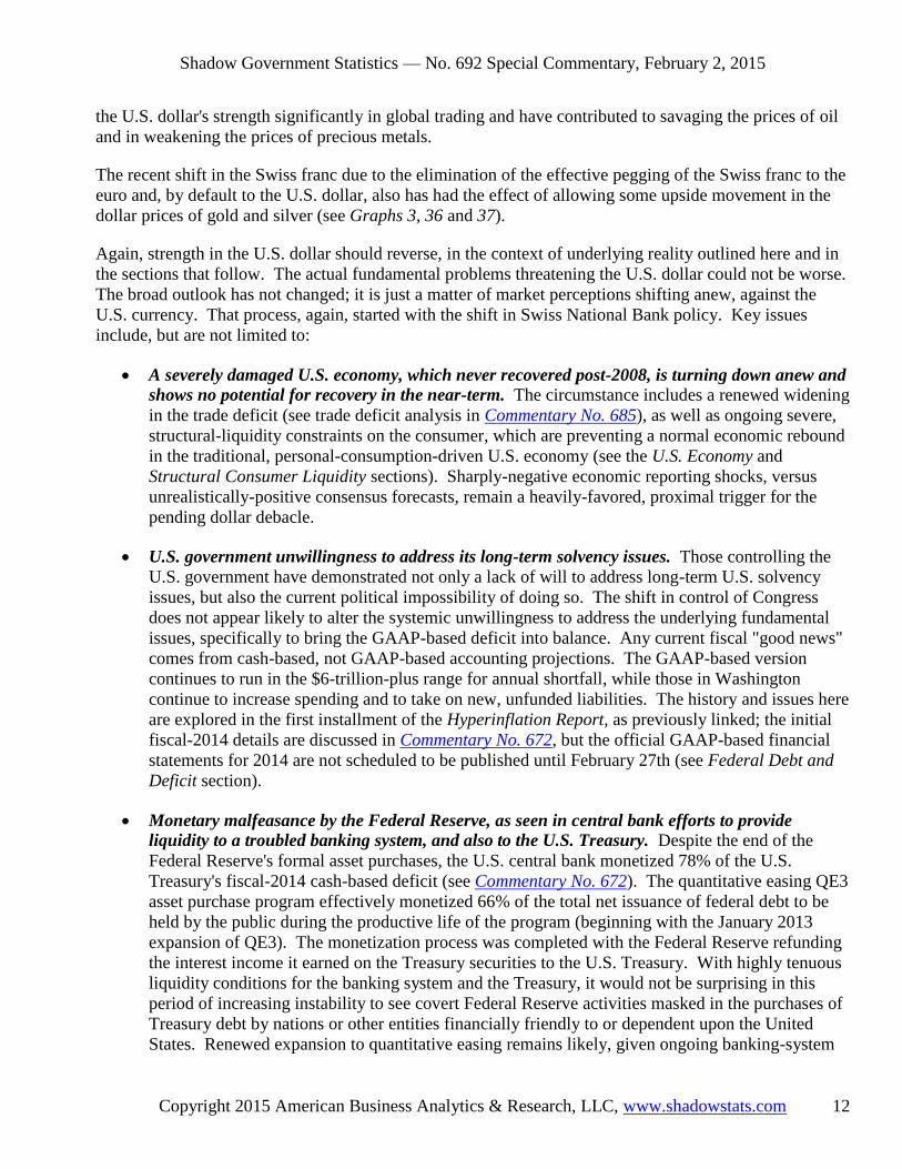
Graph 1: U.S. DOLLAR – Financial- versus Trade-Weighted U.S. Dollar Indices (1985 - 2015)
Graph 2: U.S. DOLLAR – Financial- versus Trade-Weighted U.S. Dollar Yr/Yr % Change (1985 - 2015)
Recent Strength in the U.S. Dollar. The ShadowStats Financial-Weighted Dollar Index (FWD), shown
in in Graphs 1 and 2, preceding, reflects a composite index of the value of the U.S. dollar (USD),
weighted by the proportionate currency-trading volume of the USD versus the six highest volume
currencies: the euro (EUR), yen (JPY), pound sterling (GBP), Swiss franc (CHF), Australian dollar
(AUD) and the Canadian dollar (CAD). The FWD index is set with January 1985 = 100.

Shadow Government Statistics — No. 692 Special Commentary, February 2, 2015
Copyright 2015 American Business Analytics & Research, LLC, www.shadowstats.com 10
The Federal Reserve Board's Trade-Weighted Dollar (TWD), also shown in Graphs 1 and 2, is the Major
Currency Index published by the Fed with the USD index weighted by respective U.S. merchandise trade
volume with the countries of the same currencies. For purposes of comparison with the ShadowStats
measure, the FRB index has been reweighted to January 1985 = 100, from its standard March 1973 = 100.
In contrast to the TWD, the FWD is more heavily weighted versus the Swiss franc, and less heavily
weighted versus the euro and the Canadian dollar, with the effect that the TWD has tended to show a
lower weighted-average U.S. dollar value over time.
As seen in the current period, although the dollar currently is stronger than during the Panic of 2008, the
volatility still is lower. Nonetheless, current activity still is part of the Panic playing out.
A Stopgap Euro/Dollar Prop Disappears. In the ongoing systemic turmoil of the post-Panic of 2008
period, mounting questions as to U.S. sovereign solvency arose in a deteriorating U.S. budget battle. That
triggered an S&P downgrade of the sovereign rating of the United States in August 2011, with the dollar
effectively entering free-fall. Urgent efforts to salvage the dollar redirected global markets to concentrate
on sovereign-solvency issues in the euro area, combined with heavy, dollar supportive intervention. As
the Swiss franc neared a 1.20 ratio with the euro, the Swiss National Bank capped the euro. The effect of
intervention weakening the Swiss franc versus the euro also was an intervention propping the dollar.
That 2011 Swiss franc emergency measure was withdrawn on January 15, 2015. The side effects of
maintaining intervention apparently had become too expensive, and too distorting of the system. The
currency effects of the removal of the euro cap are seen in accompanying Graph 3 [Note the inverted
scale for the CHF. Higher levels in the plots indicate relative CHF strength versus the USD or EUR]. In
response to the reversed Swiss action, gold prices also began to rally in relief. Safe havens continue in
CHF and precious metals, but that circumstance increasingly will weaken the recent, heavy "flight-to-
safety" upside pressure that had been contributing some support to the U.S. dollar rally.
Graph 3: U.S. DOLLAR – SYSTEMIC STRESS – Swiss Francs per U.S. Dollar and Euro (2000 - 2015)

Shadow Government Statistics — No. 692 Special Commentary, February 2, 2015
Copyright 2015 American Business Analytics & Research, LLC, www.shadowstats.com 11
Current Economic Issues versus Underlying U.S. Dollar Fundamentals. U.S. economic activity is
turning down anew, despite overstated growth in recent GDP reporting. Recent GDP reporting should
suffer heavy downside revisions in the next two months, as well as in the July 30, 2015 benchmark
revision. Weak, underlying economic reality also should become increasingly and painfully obvious to
the financial markets in the reporting and revisions of the weeks and months ahead for series such as retail
sales, production, the trade deficit and payroll employment, as expanded upon in the section U.S.
Economy: No Boom, No Recovery and Years of Recovery Ahead.
As financial-market expectations shift towards renewed or deepening recession, that circumstance, in
confluence with other fundamental issues, particularly deteriorating domestic political conditions, should
reverse recent buying pressures, to mounting and massive selling pressures against the U.S. dollar, as well
as potentially to resurrect elements of the Panic of 2008.
Unexpected economic weakness intensifies the known stresses on an already-impaired banking system,
increasing the perceived need for expanded, not reduced, quantitative easing. The highly touted
"tapering" by the FOMC ran its course. Future, constructive Fed behavior—purportedly moving towards
normal monetary conditions in the currently unfolding, near-perfect economic environment—is pre-
conditioned by a continued flow of "happy" economic news. Suggestions that all is right again with
world are nonsense. The Panic of 2008 never was been resolved, and the Fed soon will find that it has no
easy escape from its quantitative easing (QE3), which continues. Only overt expansion of QE3 ceased.
The economy has not recovered; the banking system is far from stable and solvent; and the Federal
Reserve and the federal government still have no way out. Significant banking-system and other systemic
(i.e. U.S. Treasury) liquidity needs will be provided, as needed, by the Fed, under the ongoing political
cover of a weakening economy—a renewed, deepening contraction in business activity. The Fed has no
choice. Systemic collapse is not an option for the Board of Governors. This circumstance simply does
not have a happy solution.
Accordingly, any speculation circulating as to an added round of Federal Reserve quantitative easing,
QE4, could become a major factor behind crashing the dollar and boosting the price of gold. The Fed has
strung out its options for propping up the system as much as it could, with continual, negative impact on
the U.S. economy. The easings to date, however, appears to have been only a prop to the increasingly
unstable equity markets (see the Persistent Systemic Stresses section).
In the event of a QE4, any resulting renewed boost to U.S. equities would be a fleeting illusion, at least in
terms of real value (purchasing power of the dollar). Such gains would tend to be losses, in real terms,
with the stocks valued in terms of Swiss francs, for example, or valued against what would become a
rapidly-increasing pace of domestic U.S. inflation.
Unexpected economic weakness also savages projections of headline, cash-based, federal-budget deficits
(particularly the 10-year versions) as well as projected funding needs for the U.S. Treasury. Current fiscal
"good news" is from cash-based, not GAAP-based and accounting projections, where comparative year-
ago, cash numbers recently were distorted against U.S. Treasury and government activity operating sub
rosa, in order to avoid the limits of a constraining debt ceiling (see Federal Debt and Deficit section).
All these crises should combine against the U.S. dollar, likely in the very-near future. That said, recent
faux market perceptions of domestic economic, financial-system and monetary tranquility have boosted
Shadow Government Statistics — No. 692 Special Commentary, February 2, 2015
Copyright 2015 American Business Analytics & Research, LLC, www.shadowstats.com 12
the U.S. dollar's strength significantly in global trading and have contributed to savaging the prices of oil
and in weakening the prices of precious metals.
The recent shift in the Swiss franc due to the elimination of the effective pegging of the Swiss franc to the
euro and, by default to the U.S. dollar, also has had the effect of allowing some upside movement in the
dollar prices of gold and silver (see Graphs 3, 36 and 37).
Again, strength in the U.S. dollar should reverse, in the context of underlying reality outlined here and in
the sections that follow. The actual fundamental problems threatening the U.S. dollar could not be worse.
The broad outlook has not changed; it is just a matter of market perceptions shifting anew, against the
U.S. currency. That process, again, started with the shift in Swiss National Bank policy. Key issues
include, but are not limited to:
A severely damaged U.S. economy, which never recovered post-2008, is turning down anew and
shows no potential for recovery in the near-term. The circumstance includes a renewed widening
in the trade deficit (see trade deficit analysis in Commentary No. 685), as well as ongoing severe,
structural-liquidity constraints on the consumer, which are preventing a normal economic rebound
in the traditional, personal-consumption-driven U.S. economy (see the U.S. Economy and
Structural Consumer Liquidity sections). Sharply-negative economic reporting shocks, versus
unrealistically-positive consensus forecasts, remain a heavily-favored, proximal trigger for the
pending dollar debacle.
U.S. government unwillingness to address its long-term solvency issues. Those controlling the
U.S. government have demonstrated not only a lack of will to address long-term U.S. solvency
issues, but also the current political impossibility of doing so. The shift in control of Congress
does not appear likely to alter the systemic unwillingness to address the underlying fundamental
issues, specifically to bring the GAAP-based deficit into balance. Any current fiscal "good news"
comes from cash-based, not GAAP-based accounting projections. The GAAP-based version
continues to run in the $6-trillion-plus range for annual shortfall, while those in Washington
continue to increase spending and to take on new, unfunded liabilities. The history and issues here
are explored in the first installment of the Hyperinflation Report, as previously linked; the initial
fiscal-2014 details are discussed in Commentary No. 672, but the official GAAP-based financial
statements for 2014 are not scheduled to be published until February 27th (see Federal Debt and
Deficit section).
Monetary malfeasance by the Federal Reserve, as seen in central bank efforts to provide
liquidity to a troubled banking system, and also to the U.S. Treasury. Despite the end of the
Federal Reserve's formal asset purchases, the U.S. central bank monetized 78% of the U.S.
Treasury's fiscal-2014 cash-based deficit (see Commentary No. 672). The quantitative easing QE3
asset purchase program effectively monetized 66% of the total net issuance of federal debt to be
held by the public during the productive life of the program (beginning with the January 2013
expansion of QE3). The monetization process was completed with the Federal Reserve refunding
the interest income it earned on the Treasury securities to the U.S. Treasury. With highly tenuous
liquidity conditions for the banking system and the Treasury, it would not be surprising in this
period of increasing instability to see covert Federal Reserve activities masked in the purchases of
Treasury debt by nations or other entities financially friendly to or dependent upon the United
States. Renewed expansion to quantitative easing remains likely, given ongoing banking-system

Shadow Government Statistics — No. 692 Special Commentary, February 2, 2015
Copyright 2015 American Business Analytics & Research, LLC, www.shadowstats.com 13
stresses and vulnerable stock markets and weakening, actual U.S. economic activity. As has been
commonplace, the Fed likely would seek political cover for new or expanded systemic
accommodation in any "renewed" economic distress (see Persistent Systemic Stresses section).
Mounting domestic and global crises of confidence in a dysfunctional U.S. government. The
positive rating by the public of the U.S. President tends to be an indicative measure of this
circumstance, usually with a meaningful correlation with the foreign-exchange-rate strength of the
U.S. dollar. The weaker the rating, the weaker tends to be the U.S. dollar. The positive rating for
the President is off its historic low, but still at levels that traditionally are traumatic for the dollar.
Chances of a meaningful shift towards constructive cooperation between the White House and the
new Congress, in addressing fundamental issues appear to be nil. Issues such as non-recovered,
faltering economic activity and the consumer liquidity crisis, and addressing the nation's long-
range solvency issues still could devolve rapidly into an extreme political crisis.
Mounting global political pressures contrary to U.S. interests. Downside pressures on the U.S.
currency generally are mounting, or sitting in place, in the context of global political and military
developments contrary to U.S. strategic, financial and economic interests. Current conditions
include the ongoing situation in Ukraine versus Russia and extremely-volatile circumstances in the
Middle East. As discussed in the Opening Comments, U.S. response to Ukrainian situation may
be behind part of the recent strength in the U.S. dollar and related weakness in oil prices, with U.S.
actions aimed at causing financial distress for Russia. The situation has yet to run its full course,
and it has the potential to reverse rapidly.
Spreading global efforts to dislodge the U.S. dollar from its primary reserve-currency status. Active efforts or comments against the U.S. dollar continue to expand. In particular, anti-dollar
rhetoric and actions have been seen with Russia, China, France, India and Iran, along with some
regular rumblings in OPEC and elsewhere. Recent dollar strength may have bought some time
versus those who have to hold dollars for various reasons. Nonetheless, any short-term instability
and a quick reversal in the dollar's strength could intensify the "dump-the-dollar" rhetoric rapidly.
When the selling pressure breaks massively against the U.S. currency, the renewed and intensifying
weakness in the dollar will place upside pressure on oil prices and other commodities, boosting domestic
inflation and inflation fears. Domestic willingness to hold U.S. dollars will tend to move in parallel with
global willingness, or lack of willingness, to do the same. These circumstances will trigger the early
stages of a hyperinflation, likely in the year ahead.
Both the renewed dollar weakness and the resulting inflation spike should boost the prices of gold and
silver, where physical holding of those key precious metals remains the ultimate hedge against the
pending inflation and financial crises. Investors need to preserve the purchasing power and liquidity of
their wealth and assets during the hyperinflation crisis ahead. Again, see Chapter 10, 2014 Hyperinflation
Report—Great Economic Tumble for detailed discussion on approaches to handing the hyperinflation
crisis.

Shadow Government Statistics — No. 692 Special Commentary, February 2, 2015
Copyright 2015 American Business Analytics & Research, LLC, www.shadowstats.com 14
PERSISTENT SYSTEMIC STRESSES, DISTORTIONS AND MANIPULATIONS
There Comes a Payback Period, When Market and Economic Cycles Are Altered by a Live-for-the-
Moment Federal Reserve or Federal Government Actions. In the 1987 stock crash, the Fed opted to
save the stock market at all costs, doing its best to avoid any recession and by sacrificing the U.S. dollar.
Again, in the Panic of 2008, the Fed opted to save the banking system and the stock market at all costs.
Doing its best to mitigate an unfolding economic collapse, the Fed moved to sacrifice the U.S. dollar, to
prop up whatever large firms were deemed too big to fail, and to prop the stock market with whatever
methods were available, ranging from extraordinary liquidity actions, to an apparent move to eliminate
safe and conservative investment options for individuals, pressuring investors into the equity markets.
The economy had begun to turn down in 2006, in the housing and construction sectors, and many other
areas slowed or were turning down in 2007. The severe-economic recession, which encompassed the
Panic of 2008, was timed from December 2007. The timing and existence of that recession, however,
were not recognized officially until after the Panic, on December 1, 2008. Unofficially, that great
economic contraction stabilized after mid-2009 into a protracted period of low-level stagnation, but it is
turning down again, still consuming the flesh and bone of the system. The economy never recovered and
certainly is not booming at the moment, despite official reporting. Formally, economic recovery followed
a mid-2009 economic trough, with renewed expansion beginning in second-quarter 2011, and the latest
three quarters of GDP growth have been the strongest in more than a decade.
The following discussion on fighting forest fires and recessions also has parallels with stock-market
manipulations. Beyond hyping economic data, there is little the U.S. government or the Federal Reserve
can do to prevent further economic damage. Nonetheless, the Fed—not learning from its past actions—
has found that it still can prop the stock market, at least temporarily, with actions that usually are
damaging to the other parts of the system, along with jawboning and rumors put into a highly nervous and
unstable market place.
Has the Fed Put on Its Smokey-the-Bear Hat Too Often? I often have compared the necessity and
natural occurrence of economic recessions to the necessity of sleep for people. Sleep helps to repair and
refresh the body, enabling you to take on fresh challenges in the day ahead. If you go without sleep—
especially using stimulants to stay awake—your efficiency drops off markedly and eventually you crash
into a deep sleep. The same applies not only to artificially-managed economic cycles, but also to
artificially-managed stock markets, which have been massaged to levels well beyond what would be
justified by underlying fundamentals, such as unadulterated earnings and revenues, beyond the accounting
games played with one-time write-offs and stock buybacks. Manipulations also can extend to killing off
the relative attractiveness of competitive asset classes, such as precious metals and interest rate vehicles.
The following text [and bracketed updated comments] was published April 29, 2008, several months
before the Panic of 2008. The analogy with economy can be applied just as easily to the U.S. stock
market, recently at an all-time high thanks largely to Federal Reserve concerns, efforts and orchestrations.

Shadow Government Statistics — No. 692 Special Commentary, February 2, 2015
Copyright 2015 American Business Analytics & Research, LLC, www.shadowstats.com 15
Looking at the year ahead, in the event of a stock selling panic or sharp sell-off, with Fed reaction
encompassing some QE variation (the weak economy still would provide political cover), stock prices
might rally, but not in real terms, not net of inflation or versus valuation in traditional stores of wealth,
such as gold, silver or the recently-unburdened Swiss franc.
Federal Reserve Addresses the Scare of the Moment versus Considering Longer-Term Risks.
Following is the April 2008 story on forest fires:
"One recent evening, I was making that point [of the necessity of regular sleep] in conversation with my
son, daughter-in-law and grandson out here in beautiful California, an area that has had more than its
share of tragic wildfires. More environmentally savvy and sensitive than I, my daughter-in-law suggested
that I might want to consider using a wildfire analogy, which upon reflection, indeed I find is a good one,
even though I may have added a word or two, here or there, to the text she gave me.
"As explained to me, wildfires or forest fires are a natural and healthy part of some wild forest
ecosystems. Naturally occurring fires usually are caused by lightning, and, as part of an undisturbed
natural ecosystem, provide a sort of 'house cleaning' for the forest. They consume brush and buildup,
clear the forest floor for new vegetation, and put nutrients back into the soil, basically fertilizing the soil.
Some plants and trees are even triggered by fire to germinate, such as pinecones that open up in the heat
and release seeds into the newly refreshed and fertilized earth. Large, established trees can easily weather
this sort of cyclic wild fire.
"As civilization has encroached on forestlands, structures, property and human life have been put at risk
from fires. Accordingly, it has become commonplace for authorities to put out most wildfires in order to
protect life and property, irrespective of risk to same. In turn, those efforts have had unintended
consequences. As a result of the disruption of the natural wildfire cycle—where the forest floor never has
its regular house cleaning—the leveraged buildup of brush and kindling makes the forest ever more
vulnerable to an unnaturally large, fast and wilder fire. Fire risk is increased by carelessness ranging from
cigarette butts to campfire ashes, by arson, by poorly structured collateralized debt obligations, etc.
"Each time that a fire is put out by the local authorities or the central bank, it is that much more important
that the next one be put out, as the fuel build up would make the next fire that much stronger and
dangerous. With this unnatural fuel buildup, it is likely that a wildfire could burn out of control, beyond
the capacity of human containment. A fire of this unnatural strength would decimate the forest, because
even old, strong, established trees cannot withstand fires of such magnitude [AIG, GM, Chrysler, Fannie
Mae, Freddie Mac and a number of large commercial and investment banking institutions come to mind
as victims of the ensuing 2008 Panic]. It has even gotten to where some park services—the forests’
regulators—have programs to utilize 'controlled burn' fires to safely reduce the fuel load on the forest
floor. Even so, fires that have been designed to be controlled have, on occasion, gotten out of hand with
disastrous consequences. Still, in most places regulatory oversight is lax. Such is obvious, given the
increasing intensity of firestorms seen in each successive fire season of recent years.
"In his protracted term as Fed Chairman, Alan Greenspan was noted for encouraging ever more creative
bubbles in efforts to forestall financial-market days of reckoning and related severe economic downturns.
Further, as top regulator of the banking system, not only did he fail to clear away unnecessary deadwood,
but also he actually encouraged the creation of new types of kindling in the form of derivative and
structured instruments. Now Ranger Ben is tackling the worst financial wildfire of the last 70 years,
Shadow Government Statistics — No. 692 Special Commentary, February 2, 2015
Copyright 2015 American Business Analytics & Research, LLC, www.shadowstats.com 16
fighting hard to save the large established banks. Fortunately for Bernanke, he has the ability to dump
whatever water or fire retardant he needs. He can save the big trees, yet lose the forest in the process."
Losing the Ongoing Battle with the Panic of 2008. All the gimmicks and interventions did not work. If
they had, common experience now would reflect strong economic growth, instead of no recovery; banks
would be lending normally into the regular flow of commerce; the Fed would not be unduly concerned
about propping the stock market; and threats of a euro break-up would be much diminished.
The Panic of 2008 continues; it never went away. To prevent systemic collapse at the time, governments
and central banks took stopgap, not corrective actions. They only pushed otherwise unresolvable issues
into the future, and that future rapidly is closing in again on the system. The U.S. economy never
recovered; it remains severely, structurally impaired and is turning down again. The U.S. banking system
remains impaired and will face an intensifying crisis with the deteriorating economy. The federal
government has no viable approach for addressing its long-term solvency issues, and the rest of the world
has lost confidence in, and patience with, U.S. actions or lack of same.
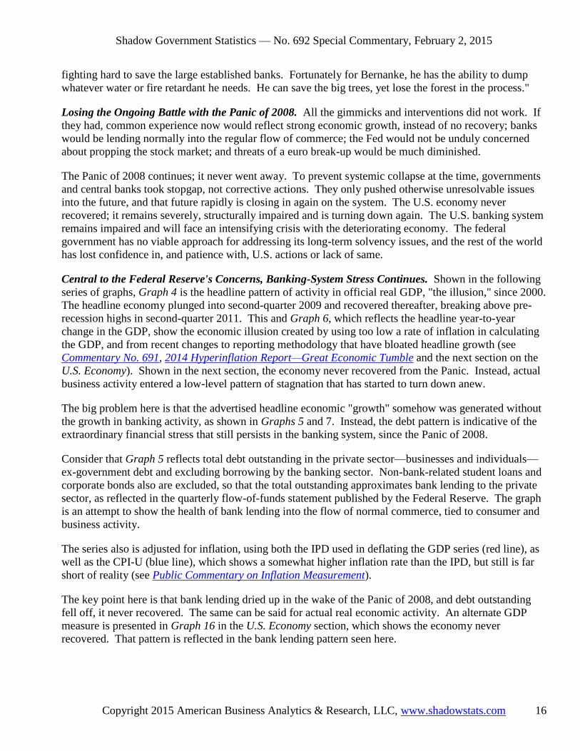
Central to the Federal Reserve's Concerns, Banking-System Stress Continues. Shown in the following
series of graphs, Graph 4 is the headline pattern of activity in official real GDP, "the illusion," since 2000.
The headline economy plunged into second-quarter 2009 and recovered thereafter, breaking above pre-
recession highs in second-quarter 2011. This and Graph 6, which reflects the headline year-to-year
change in the GDP, show the economic illusion created by using too low a rate of inflation in calculating
the GDP, and from recent changes to reporting methodology that have bloated headline growth (see
Commentary No. 691, 2014 Hyperinflation Report—Great Economic Tumble and the next section on the
U.S. Economy). Shown in the next section, the economy never recovered from the Panic. Instead, actual
business activity entered a low-level pattern of stagnation that has started to turn down anew.
The big problem here is that the advertised headline economic "growth" somehow was generated without
the growth in banking activity, as shown in Graphs 5 and 7. Instead, the debt pattern is indicative of the
extraordinary financial stress that still persists in the banking system, since the Panic of 2008.
Consider that Graph 5 reflects total debt outstanding in the private sector—businesses and individuals—
ex-government debt and excluding borrowing by the banking sector. Non-bank-related student loans and
corporate bonds also are excluded, so that the total outstanding approximates bank lending to the private
sector, as reflected in the quarterly flow-of-funds statement published by the Federal Reserve. The graph
is an attempt to show the health of bank lending into the flow of normal commerce, tied to consumer and
business activity.
The series also is adjusted for inflation, using both the IPD used in deflating the GDP series (red line), as
well as the CPI-U (blue line), which shows a somewhat higher inflation rate than the IPD, but still is far
short of reality (see Public Commentary on Inflation Measurement).
The key point here is that bank lending dried up in the wake of the Panic of 2008, and debt outstanding
fell off, it never recovered. The same can be said for actual real economic activity. An alternate GDP
measure is presented in Graph 16 in the U.S. Economy section, which shows the economy never
recovered. That pattern is reflected in the bank lending pattern seen here.

Shadow Government Statistics — No. 692 Special Commentary, February 2, 2015
Copyright 2015 American Business Analytics & Research, LLC, www.shadowstats.com 17
Graph 4: SYSTEMIC STRESS – "The Illusion" Headline Real U.S. GDP Level (2000 - 2014)
Graph 5: SYSTEMIC STRESS – Real U.S. Credit Market Debt Outstanding (2000 - 2014)

Shadow Government Statistics — No. 692 Special Commentary, February 2, 2015
Copyright 2015 American Business Analytics & Research, LLC, www.shadowstats.com 18
Graph 6: SYSTEMIC STRESS – Headline Real GDP, Year-to-Year Change (2000 - 2014)
Graph 7: SYSTEMIC STRESS – Headline Real Credit Market Debt, Year-to-Year Change (2000 - 2014)

Shadow Government Statistics — No. 692 Special Commentary, February 2, 2015
Copyright 2015 American Business Analytics & Research, LLC, www.shadowstats.com 19
A plot of real total consumer credit-market debt outstanding (all sources including federal student loans,
automobile financing, etc.) is found in Graph 31 in the Structural Consumer Liquidity section. It also
shows the same pattern as in Graph 5 and Graph 16.
Fed's Extreme "Quantitative Easing" Helped the Banking System, Funded the U.S. Treasury, Propped
the Stock Market, but It Did Not Help the Economy. The Fed's primary mission is to keep the banking
system solvent and afloat, but that was not working, coming into the Panic of 2008. Quantitative easing
was introduced in 2008 and went through a number of phases, as reflected in the size of, and growth in the
monetary base shown in Graphs 8 and 9. Normally such growth would have translated into extraordinary
growth in the money supply, but it did not, as reflected in Graph 10.
The extraordinary level of asset purchases by the Fed did not flow through to the broad economy. Banks
did not lend into the normal flow of commerce, and there was no resulting significant upside movement in
money supply, as a result. Instead, banks turned the funds back to the Fed as excess reserves, earning
interest, and providing support to the stock market, as suggested in Graph 11. As part of this process, the
Fed ended up monetizing the bulk of the U.S. Treasury's funding needs during the period of active
buying, paying back interest earned on the securities to the Treasury.
Despite the Fed having ceased purchasing new Treasury securities late in 2014 (maturing issues still are
rolled over), the monetary base currently is just shy of its all-time high of October 1, 2014, with its
Treasury asset holdings also effectively at an all-time high.
Graph 8: SYSTEMIC STRESS – FEDERAL RESERVE – Monetary Base, Level (1985 - 2015)

Shadow Government Statistics — No. 692 Special Commentary, February 2, 2015
Copyright 2015 American Business Analytics & Research, LLC, www.shadowstats.com 20
Graph 9: SYSTEMIC STRESS – FEDERAL RESERVE – Monetary Base, Year-to-Year Change (1985 - 2015)
Graph 10: SYSTEMIC STRESS – FEDERAL RESERVE – Money Supply (2003 - 2014)
The economy still is not recovering. Happy headline numbers, including the increasing nonsense and
unreliability in the unemployment and employment data should reverse in the months ahead, with other

Shadow Government Statistics — No. 692 Special Commentary, February 2, 2015
Copyright 2015 American Business Analytics & Research, LLC, www.shadowstats.com 21
series turning increasingly negative. In response, the pressures for continued or increased Federal
Reserve accommodation should mount anew. Whether in an attempt to prop a falling stock market, or
more likely to liquefy a faltering banking system, the Federal Reserve should continue to use the political
cover of declining economic activity for any such renewed or expanded liquidity actions.
The Fed's actions helped to bail out banks, providing liquidity, but banking-system solvency issues
remain. If the system were functioning normally, banks would be lending normally and the monetary
easing would have resulted in sharply rising money-supply growth. The system is far from normal, and
so is the economy (see the next major section).
Fed's Activity Has Propped Stocks; Fed Likely Will Move Again to Systemic-Liquefaction with
Renewed Economic Downturn and/or Negative Stock-Market Turmoil. Many thanks, once again, to
Tom McClellan, publisher of the McClellan Oscillator at www.mcoscillator.com, who kindly gave us
permission to use Graph 11, an updated version of one we had used back in October 2014. The plot
shows the S&P 500 versus the total Treasuries and Mortgage Back Securities (MBS) held on the Fed's
balance sheet. While the graph largely speaks for itself, Tom's thoughts—when he published an earlier
version of the graph in June 2014—still are found at this link: McClellan Financial Publications.
Although growth in the Federal Reserve's assets has tended to level off, following the completion of its
tapering in QE3, those assets held at $4.21 trillion on January 21st, the last green point on the chart, and
just a notch shy of the January 7th all-time high. The S&P 500 on January 21st, the last black point,
closed at 2,032.12. For January 28th, Fed assets were lower by 0.2% (-0.2%), the S&P 500 was down by
1.5% (-1.5%) from the January 21st levels.
Graph 11: SYSTEMIC STRESS – MARKETS – FEDERAL RESERVE - Fed Assets versus S&P 500 (2006 - 2015)

Shadow Government Statistics — No. 692 Special Commentary, February 2, 2015
Copyright 2015 American Business Analytics & Research, LLC, www.shadowstats.com 22
With No Way Out for the Fed, Private Investors Found Their Investment Options Were Limited as
Well. The longer-term relative performance of two different asset classes is shown in the following
Graph 12. The two indices shown are of comparative values, both based at January 2000 = 100, where
the gold line plots the monthly average real price (deflated by the CPI-U), through January 2015 of gold
(afternoon London fix). The lower-level brown line plots the monthly average real price (deflated by the
CPI-U), through January 2015 of the daily closing price of the Dow Jones Industrial Average (DJIA).
Graph 12: SYSTEMIC STRESS - MARKETS – Real Price Indices of Gold versus the DJIA (2000 - 2015)
With a longer-term perspective, putting all the hoopla aside of recent surges in stock indices to all-time
highs, and a recent decline in the gold price to a five-year low, consider the following from the
accompanying graph. Aside from both real and nominal levels of January 2015 average stock indices
being down from December 2014, and the precious-metals prices being higher, the plot shows that $100
invested in physical gold in January 2000, and $100 invested in the DJIA at the same time would be
valued respectively today (January 2015 average), fifteen years later—net of headline CPI-U inflation—at
$318 for the gold, and at $112 for the DJIA. See also Graphs 42 and 45 in the Financial Markets section.
Discussed there, reinvested dividends would add roughly $35 to the January 2015 stock indices.
Central bank (very specifically the Federal Reserve) and Wall Street efforts, including popular financial
media hype of the last several years clearly have been aimed at killing investment in the precious metals,
and pushing investors increasingly into an otherwise unstable stock-market that sure looks like one of the
most extraordinary, speculative bubbles of all time. While Fed Chair Janet Yellen may be trying to
follow predecessor Fed chairmen in trying to contain their respective forest fires, these shenanigans will
not save the markets or the economy, but rather, eventually, will help to fuel an extraordinary financial-

Shadow Government Statistics — No. 692 Special Commentary, February 2, 2015
Copyright 2015 American Business Analytics & Research, LLC, www.shadowstats.com 23
market and financial-system conflagration, imploding the system, the stock market (at least in real terms)
and the bond market.
The extraordinary easing by the Fed helped to keep the banks afloat, helped to fuel a domestic stock-
market bubble, but it did not stimulate the economy. Artificially-low interest rates discouraged banks
from lending as they might have into the regular flow of commerce, where higher rates allow for greater
profit margins, and for greater lending risks taken on by the banking system. The effect of the higher
rates there would have been greater loan activity and resulting higher economic activity.
Artificially-low interest rates also have hurt conservative investors, those living on a fixed income, who
might have preferred a reasonable rate of return on a relatively-safe FDIC-insured certificate of deposit,
instead of having to look at an unstable stock market foisted upon them by Fed policy.
When held for the duration, physically-owned precious metals offered, and still offer a safe-haven from
all the troubles ahead. Yet, in recent years, some entity close to the central banks and Wall Street
deliberately and irregularly intervened with massive selling in the gold and silver markets, in an obvious
and successful effort to drive lower the prices for gold and silver. The effort here was to kill the "safe-
haven" image of precious metals, to burn cautious investors and, again, to drive investors into a more-
unstable and highly-dangerous domestic stock market (see the Financial Markets and Inflation section).
U.S. ECONOMY: NO BOOM, NO RECOVERY AND YEARS OF DIFFICULTY AHEAD
Economic Crash and Boom, versus Crash and Stagnation. If one believes the headline GDP growth
rates published for the three quarters through fourth-quarter 2014, then the U.S. economy is booming,
experiencing its strongest period of growth for three consecutive quarters in the last decade. Most of
those living in the United States are not experiencing that happy circumstance. Underlying reality would
suggest sharp downside revisions to recent GDP growth estimates, but, other than for two monthly
revisions pending for the just released "advance" estimate of 2.6% annualized real growth in fourth-
quarter 2014, that will not happen until the July 30, 2015 annual benchmark revision to the series (see
Commentary No. 691). Portions of this section were reviewed in Commentary No. 689.
In recent reporting, Bureau of Economic Analysis (BEA) early estimates and revisions to initial GDP
estimates have been unusually volatile, signaling instabilities in the reporting system that likely are tied to
the impact of the Affordable Care Act (ACA). The ACA is not an economic stimulus, and it is not easily
quantifiable, given the extremely poor-quality data available. Again, as noted in No. 691, roughly 0.8%
of the headline 2.6% fourth-quarter growth likely was tied to reporting issues with the ACA. Separate
from short-range reporting instabilities, there are significant non-government indicators that suggest the
economic recovery and boom are not as advertised. Separately, a later part of this section will explore a
number of official and private indicators that show a pattern of economic activity for the last eight years
as having been one of economic crash and low-level stagnation, instead of the headline economic crash,
recovery and economic boom.

Shadow Government Statistics — No. 692 Special Commentary, February 2, 2015
Copyright 2015 American Business Analytics & Research, LLC, www.shadowstats.com 24
Corporate Activity. Shown in Graph 13, contrary to the headline GDP reporting, real sales of companies
in the S&P 500 stock index (deflated by the CPI-U) never recovered pre-recession levels, have been
stagnant in recent quarters, and turned down quarter-to-quarter in third-quarter 2014. The 500 companies
in that index represent a broad enough cross-section of U.S. economic activity to generate a solid
indication of no recovery from the 2008 economic collapse, and no sudden sharp acceleration in recent
economic activity (see Commentary No. 677). Early numbers on fourth-quarter 2014 sales tend to
confirm still no recovery, despite the continued real growth in fourth-quarter GDP. This graph will be
updated in the next month or so in a regular Commentary.
Graph 13: ECONOMY – Real S&P 500 Sales versus Headline Real GDP (4q2007 - 3q2014)
Voters. Main Street U.S.A. historically has an extraordinarily good track record in recognizing
underlying economic reality, as commonly reflected by electoral swings against the incumbent party
holding the White House, when difficult pocketbook issues dominate voter concerns (see Commentary
No. 672). Also, in recent years, exit polls, such as seen in with the 2014 midterm elections, generated a
reading of the public's view of the third-quarter 2014 economy that was consistent with quarterly
contraction, not with booming quarterly growth
Plotted in Graph 14, the red line with the diamond-points and left scale represents the latest headline
quarterly GDP growth rate prior to the election, which was 3.5% in initial third-quarter 2014 GDP
reporting (the single large diamond reflects the December 23rd revision of third-quarter activity to 5.0%).
The blue line with the circle points shows the exit poll reading of how voters viewed the economy. An
average economy would be 50% of voters viewing the economy as good or excellent, which would be
about 2.7% for the GDP (thirty-year average).

Shadow Government Statistics — No. 692 Special Commentary, February 2, 2015
Copyright 2015 American Business Analytics & Research, LLC, www.shadowstats.com 25
In more-normal economic times, such as seen in 2004 and early-2006, exit polls from the presidential or
midterm elections of those years showed about half the voters rating the national economy as "excellent
or good," with a 50% rating there being average. Not too surprisingly, that assessment of "excellent or
good" dropped to 8% in 2008, as the economy was collapsing, inching higher to 11% in the early-
recovery period of 2010. Yet, the "excellent or good" descriptor only recovered to 23% in 2012, and to
29% in 2014, despite the purported robust economic recovery and expansion in GDP activity.
Main Street U.S.A. was not looking at a fully-recovered and booming economy in the third quarter 2014,
as of the November 4, 2014 election. The exit-poll economic rating was consistent with an outright
quarter-to-quarter contraction in real third-quarter GDP activity, a quarter that had ended on September
30th, more than one month before the election. The voters certainly did not believe the headline 3.5%
third-quarter growth published the week before the election. If they did not believe that, they most likely
also did not believe the 5.0% revised growth rate published on December 23rd as the third estimate,
second revision to third-quarter GDP growth.
Graph 14: ECONOMY – CONSUMER/VOTER – Exit Polls versus Headline GDP Reporting (2004 - 2014)
Recovered Jobs Growth and Low Headline Unemployment. Happy claims of jobs creation in the payroll
employment survey have various twists and turns, well beyond the excessive upside biases that get added
into the monthly reporting. For example, much of the headline growth in payroll employment, which has
regained its pre-recession levels, has been in people taking on multiple jobs, usually at least one part-time,
in order to try to make ends meet. From the household survey side, full-time employment is significantly
shy of recovering its pre-2007 recession high, while the number of those working part-time for economic

Shadow Government Statistics — No. 692 Special Commentary, February 2, 2015
Copyright 2015 American Business Analytics & Research, LLC, www.shadowstats.com 26
reasons, unable to find a full-time job, has increased sharply during the ongoing recession, as discussed in
Commentary No. 679 and Commentary No. 686.
Unemployment issues versus the broad economy are addressed in upcoming Graphs 17 to 19. The
difference in reporting here is that although the headline U.3 unemployment rate of 5.6% in December
2014 had declined from its peak of 10.0% in October 2009, during the economic crash, that was not
necessarily due to those on the unemployment rolls finding gainful employment. Instead, the drop in
headline employment has been due largely to growth in the count of discouraged workers and their
removal from the headline labor force. Discouraged workers are those who want a job and are ready and
able to work, but they have given up looking for work because there are no jobs to be had. With all
discouraged workers accounted for, in addition to the short-term discouraged workers counted in some
measures of Bureau of Labor Statistics (BLS) unemployment, broad unemployment was about 23.0% in
December 2014, just 0.3% off its historic high of 23.3% in December 2013, based on the ShadowStats
Alternate Unemployment Measure (see Commentary No. 686).
General Economic Activity in the United States since Mid-1990s, Headline Hype versus Underlying
Reality. Discussed frequently in the regular ShadowStats Commentaries, the official GDP reporting does
not reflect properly or accurately the changes to the underlying fundamentals that drive the economy.
Underlying real-world economic activity shows that the broad economy began to turn down in 2006 and
2007, plunged into 2009, entered a protracted period of stagnation thereafter—never recovering—and
then began to turn down anew in recent quarters. Irrespective of the reporting gimmicks introduced in the
July 2013 and July 2014 GDP benchmark revisions, a consistent, fundamental pattern of faltering
historical activity is shown in Graph 16, where headline growth has been corrected for the understatement
in inflation used to deflate the headline GDP series shown in Graphs 15 and the earlier, shorter-term plot
in Graph 4.
The lack of post-2009 recovery and current flat-to-minus activity are demonstrated in the accompanying
series of graphs (Graph 17 to 22), as discussed in 2014 Hyperinflation Report—The End Game Begins
and 2014 Hyperinflation Report—Great Economic Tumble, and as covered in Commentary No. 691. A
primary, underlying fundamental reason for the lack of economic growth and recovery is covered in the
Structural Consumer Conditions Issues section, including Graphs 26 to 32.
The full economic recovery indicated by the headline real GDP numbers remains an illusion. It is a
statistical illusion created by using too-low a rate of inflation in deflating (removing inflation effects)
from the GDP series. The next two graphs tell that story, reflecting headline third-quarter 2014 GDP.
Graph 15 shows the level of headline real (inflation-adjusted) GDP activity as reported by the BEA,
where the shaded areas reflect formally-recognized periods of recession. Headline GDP activity has been
reported above pre-2007 recession levels—in full recovery—since second-quarter 2011, and headline
GDP has shown sustained growth ever since (with the exception of a growth interruption in first-quarter
2014). Adjusted for official GDP inflation (the implicit price deflator—IPD), the level of fourth-quarter
2014 GDP now stands at 8.8% above the pre-recession peak-GDP estimate of fourth-quarter 2007.

Shadow Government Statistics — No. 692 Special Commentary, February 2, 2015
Copyright 2015 American Business Analytics & Research, LLC, www.shadowstats.com 27
Graph 15: ECONOMY – "The Illusion" Headline Real GDP (1994 - 2014)
Graph 16: ECONOMY – Real GDP Corrected for Inflation-Understatement (1994 - 2014)
In contrast to the headline economic plunge-and-recovery of Graph 15, the "corrected" GDP version in
Graph 16 shows the ShadowStats contention of plunge-and-stagnation in the economy, with fourth-
quarter 2014 GDP activity down by 6.1% (-6.%) from its pre-recession peak of first-quarter 2006.

Shadow Government Statistics — No. 692 Special Commentary, February 2, 2015
Copyright 2015 American Business Analytics & Research, LLC, www.shadowstats.com 28
That graph plots the Corrected Real GDP, corrected for the understatement inherent in official inflation
estimates (see Public Commentary on Inflation Measurement), with the deflation by the implicit price
deflator (IPD) adjusted for understatement of roughly two-percentage points of annual inflation. The
inflation understatement resulted from hedonic-quality adjustments. The shaded areas in the "corrected"
graph reflect official as well as ShadowStats-defined recessions, discussed in detail in the 2014
Hyperinflation Report—Great Economic Tumble – Second Installment, which covers alternate-economic
reporting further back in U.S. history.
Graphs 17 to 22 cover various indicators that tend to support the ShadowStats version of the "corrected"
GDP, versus the headline GDP, with high visual correlations in some instances, or otherwise reflecting
major negative contributors specific to the current economic down-cycle, such as housing starts, which hit
the economy hard as early as 2006.
Graphs 17, 18 and 19 reflect indications of broad unemployment activity, as discussed most recently in
Commentary No. 686. Graph 18 is an inverted plot of the ShadowStats Alternate Unemployment
Measure, which encompasses long-term discouraged workers not counted by the Bureau of Labor
Statistics (BLS) in U.3 or U.6. The rising count of those discouraged workers is highly correlated with
both the patterns of deterioration in the employment-to-population ratio (Graph 17) and the ongoing
decline in the labor force (U.3) participation rate (Graph 19).
For comparison purposes, these graphs reflect a consistent timeframe of first-quarter 1994 through fourth-
quarter 2014. The beginning quarter here was selected for 1994, since all the labor numbers were
overhauled at that time, and prior periods of labor-related data are not comparable.
Graph 17: ECONOMY – CONSUMER – Civilian Employment-Population Ratio (1994 - 2014)

Shadow Government Statistics — No. 692 Special Commentary, February 2, 2015
Copyright 2015 American Business Analytics & Research, LLC, www.shadowstats.com 29
Graph 18: ECONOMY – CONSUMER – ShadowStats-Alternate Unemployment Measure—Inverted Scale (1994 - 2014)
Graph 19: ECONOMY – CONSUMER – Labor Force Participation Rate (1994 - 2014)

Shadow Government Statistics — No. 692 Special Commentary, February 2, 2015
Copyright 2015 American Business Analytics & Research, LLC, www.shadowstats.com 30
Graph 20: ECONOMY – CONSUMER – Quarterly Consumer Confidence Index (1994 - 2014)
Graph 21: ECONOMY – Housing Starts (1994 - 2014)
Discussed in the Structural Consumer Conditions Issues section, although current consumer confidence
levels are off bottom (Graph 20), they remain generally at recession levels, and they are not consistent
either with an economic recovery or with a current economic boom. Liquidity-starved consumers helped
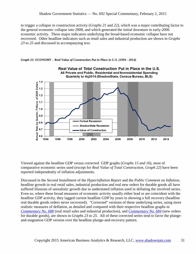
Shadow Government Statistics — No. 692 Special Commentary, February 2, 2015
Copyright 2015 American Business Analytics & Research, LLC, www.shadowstats.com 31
to trigger a collapse in construction activity (Graphs 21 and 22), which was a major contributing factor to
the general economic collapse into 2008, and which generated the initial downturn in early-2006
economic activity. These major indicators underlying the broad-based economic collapse have not
recovered. Other headline indicators such as retail sales and industrial production are shown in Graphs
23 to 25 and discussed in accompanying text.
Graph 22: ECONOMY – Real Value of Construction Put in Place in U.S. (1994 - 2014)
Viewed against the headline GDP versus corrected GDP graphs (Graphs 15 and 16), most of
comparative economic series used (except for Real Value of Total Construction, Graph 22) have been
reported independently of inflation adjustments.
Discussed in the Second Installment of the Hyperinflation Report and the Public Comment on Inflation,
headline growth in real retail sales, industrial production and real new orders for durable goods all have
suffered illusions of unrealistic growth due to understated inflation used in deflating the involved series.
Even so, where these broad measures of economic activity usually either lead or are coincident with the
headline GDP activity, they lagged current headline GDP by years in showing a full recovery (headline
real durable goods orders never recovered). "Corrected" versions of these underlying series, using more
realistic measures of deflation, as detailed and compared with their respective headline graphs in
Commentary No. 688 (real retail sales and industrial production), and Commentary No. 684 (new orders
for durable goods), are shown in Graphs 23 to 25. All of these corrected series tend to favor the plunge-
and-stagnation GDP version over the headline plunge-and-recovery pattern.

Shadow Government Statistics — No. 692 Special Commentary, February 2, 2015
Copyright 2015 American Business Analytics & Research, LLC, www.shadowstats.com 32
Graph 23: ECONOMY – Corrected Real Retail Sales (2000 - 2014)
Graph 24: ECONOMY – Corrected Industrial Production (2000 - 2014)

Shadow Government Statistics — No. 692 Special Commentary, February 2, 2015
Copyright 2015 American Business Analytics & Research, LLC, www.shadowstats.com 33
Graph 25: ECONOMY – Corrected Real New Orders for Durable Goods—Ex-Commercial Aircraft (2000 - 2014)
Headline real GDP had fully recovered from the 2007 recession and had entered a new period of new
expansion by second-quarter 2011 GDP, as real growth continued to push into uncharted territory.
Payroll employment and industrial production are traditional coincident indicators of GDP-related
economic activity, while real retail sales—adjusted for inflation—is a traditional leading indicator to GDP
activity. Accordingly, one would expect real retail sales to have led, and payrolls and industrial
production to have moved in tandem with the GDP, into its period of full recovery and new expansion as
of second-quarter 2011.
Instead, the leading, real-retail sales series hit full recovery nearly two-years later, in January 2013, the
coincident indicator industrial production hit full recovery in October 2013, and coincident payrolls hit
full recovery in March of 2014. Still, none of those series actually has recovered, yet, due to special
factors distorting their reporting. Discussed Commentary No. 688, corrected for understatement of the
inflation used in deflation the series—same concept as the GDP deflation, but different inflation measures
and weightings—the inflation impaired series have not recovered. Corrected real retail sales plunged into
2009, entered a period of protracted stagnation, and have been trending lower since 2012, as shown in
Graph 23. Corrected industrial production, in Graph 24, also plunged into 2009, and has been largely
stagnant, with an uptrend. Both these series missed major downside revisions in 2014, due to paperwork
distortions resulting from the October 2013 shutdown of the federal government. Those catch-up
revisions loom in the next several months.
Separately, shown in Graph 25, corrected new orders for durable goods (see Commentary No. 690),
which lead industrial production, are showing a pattern that is similar to corrected industrial production.
The difference is that uncorrected durable goods orders never recovered.

Shadow Government Statistics — No. 692 Special Commentary, February 2, 2015
Copyright 2015 American Business Analytics & Research, LLC, www.shadowstats.com 34
Noted earlier, payroll employment has not recovered in reality, either. Aside from excessive upside
biases built into the series, much of the headline growth in payroll employment has come from people
taking on multiple jobs, usually at least one part-time, in order to try to make ends meet. As of December
2014, full-time employment was significantly shy of recovering its pre-2007 recession high.
The basic issue with the GDP is that no other major economic series has shown a realistic, parallel pattern
of official, full-economic recovery, and meaningful expansion into new territory. Either the GDP
reporting is wrong, or all other major economic series are wrong. Where the GDP is heavily modeled,
imputed, theorized and gimmicked, it also encompasses reporting from those various major economic
series and private surveys, which still attempt to survey real-world activity. Flaws in the GDP inflation
methodologies, recent redefinitions and simplifying reporting assumptions have created the headline GDP
"recovery." The U.S. economic recovery since 2009 simply has been a statistical illusion.
STRUCTURAL CONSUMER-LIQUIDITY ISSUES
Why the Economy Has Not Recovered, and Why Recovery Is Not Pending. Consistent with evidence
that there has been no recovery, underlying consumer fundamentals, such as liquidity, have been so
severely impaired as to have driven activity into collapse and to have prevented any meaningful or
sustainable economic rebound, recovery or ongoing growth.
Discussed frequently in the regular ShadowStats Commentaries, without real (inflation-adjusted) growth
in income and without the ability or willingness to take on meaningful new debt, the consumer simply has
not had the wherewithal to fuel sustainable economic growth. Impaired consumer liquidity and its direct
restraints on consumption have dominated the last eight-plus years of U.S. economic turmoil, constraining
retail sales activity and the related dominant personal-consumption-expenditures category of the GDP,
and driving the housing-market collapse and ongoing stagnation in consumer-related real estate and
construction activity. Those economic sectors account for more than 70% of U.S. GDP activity.
Underlying economic fundamentals simply have not supported, and do not support a turnaround in broad
economic activity. There has been no economic recovery, and there remains no chance of meaningful,
broad economic growth, without a fundamental upturn in consumer- and banking-liquidity conditions.
Long-Range Structural Consumer Liquidity Issues. The level of real income and growth in real income
are at the root of consumer liquidity issues. Generally, the higher and stronger those measures are, the
healthier is consumer liquidity. The relative distribution of income among the general population—
income variance—also is a significant indicator of the health of an economy as well as the attendant
financial markets.
Since the early-1970s, when the U.S. trade deficit began to explode, surveys of inflation-adjusted
household income have showed sporadic but general deterioration, both in terms of income level and
dispersion. The major culprit here has been the ongoing loss of higher paying jobs to offshore
competition, a direct result of the explosion in the U.S. trade deficit in the last four decades (see
discussion in Chapter 7 of 2014 Hyperinflation Report—Great Economic Tumble, and Commentary No.
658, which provided some of this text concerning the annual income indicators).

Shadow Government Statistics — No. 692 Special Commentary, February 2, 2015
Copyright 2015 American Business Analytics & Research, LLC, www.shadowstats.com 35
Rising and Record Income Dispersion Levels Foreshadow Economic and Financial-Market Turmoil.
Despite—or perhaps due to—the ongoing nature of the economic and systemic-solvency crises, and the
effects of the 2008 financial panic, income dispersion has held at or hit record highs, instead of
moderating, as often has been seen otherwise during periods of financial distress.
Measures of income dispersion, or variance, indicate how income is distributed within a population. A
low level of income dispersion indicates that income tends to be concentrated in the middle, while a high
level of dispersion indicates heavier income concentrations in the extremes of low and high income, with
less in the middle. The higher the variance of income, the greater is the income dispersion.
Shown in Graph 26 are the Gini Index of Income Inequality and the Mean Logarithmic Deviation of
Income (MLD), two of the more popular income dispersion measures (see definitional details at
Commentary No. 658).
Extremes in income dispersion usually foreshadow financial-market and economic calamities. With the
current circumstance at a record extreme for 2011-to-2013, well above levels estimated to have prevailed
before the 1929 stock-market crash and the Great Depression, increasingly difficult times are likely for at
least the next several years. Generally, the more moderate the income variance is, the stronger the middle
class is, and the healthier the broad economy will be in the longer term. Conversely, the greater the
variance in income is, the more negative are the longer-term economic implications. For example, a
person earning $100,000,000 per year is not going to buy proportionately more automobiles than someone
earning say $100,000 per year, so a strong middle class generally is a better circumstance for the auto
industry than is extreme income dispersion.
Conditions surrounding extremes in income variance usually help to fuel financial-market bubbles, which
frequently are followed by financial panics and economic depressions. The sequence of those factors
tends to redistribute income in a manner that usually lowers income variance, helping economic recovery.
Other than for a brief dip following the 1987 stock-market crash, however, U.S. income variance since
1987 has been higher than has been estimated for the economy going into the 1929 stock-market crash
and the Great Depression, and its current reading remains nearly double that of any other “advanced”
economy. Instead of being tempered by the 2008 financial panic and the ongoing economic and systemic-
solvency crises, variance increased to and is holding at or near record levels. That suggests that the
greatest negative impact of the systemic turmoil, so far, has been on those in the middle-income area. It
also is suggestive of even greater financial and economic crises still ahead. The lead-time here can be as
much as five years.
Where the income dispersion in Graph 26 and real median household income in Graph 28 reflect annual
reporting for 1967 to 2013 (2013 is the latest year available), the plot of the Conference Board's
Consumer Confidence Measure and the University of Michigan's consumer sentiment index, for roughly
similar periods, is included as Graph 27, for purposes of comparison. The consumer measures have been
smoothed with a six-month moving average, against the annual income numbers. The stronger visual
correlation is between the confidence and sentiment numbers and median-household income.
As an aside here, note that despite recent near-term highs in the confidence and sentiment measures, those
series generally remain at levels seen during historic recessions, and remain below levels that would be
consistent with "booming" GDP growth.

Shadow Government Statistics — No. 692 Special Commentary, February 2, 2015
Copyright 2015 American Business Analytics & Research, LLC, www.shadowstats.com 36
Graph 26: ECONOMY – CONSUMER – Income Variance (1967 - 2013)
Graph 27: ECONOMY – CONSUMER – Consumer Confidence and Sentiment (1970 - 2015)

Shadow Government Statistics — No. 692 Special Commentary, February 2, 2015
Copyright 2015 American Business Analytics & Research, LLC, www.shadowstats.com 37
Graph 28: ECONOMY – CONSUMER – Annual Real Median Household Income (1967 - 2013)
Real Median Household Income below Levels of Late-1960s. Shown in Graph 28, inflation-adjusted, or
real, median household income, on an annual basis, declined or held stagnant at a low level of activity for
the sixth-straight year in 2013, holding at its lowest level in 19 years, or since 1994. The median
household income measure is the middle measure of the survey of household income. It likely is a better
reflection than a mean or average household income measure as to how most households are doing, when
the income dispersion measures are high. Again, as discussed earlier, those measures were at record
highs in 2011-to-2013.
Deflated by headline the CPI-U, the 2013 median household income reading actually stood below levels
reported in the late-1960s and early-1970s. Such indicates the long-term nature of the evolution of the
major structural changes squeezing consumer liquidity and impairing the current economy. The annual
reporting by the Census Bureau generally confirms the monthly reporting of real median household
income by www.SentierResearch.com, which is generated by the same monthly surveying of the Census
Bureau.
Consumer Conditions and Liquidity Issues Are Preventing a Return to Normal Economic Activity.
Indicated by the Sentier Research numbers, and confirmed broadly by the Census data, consumer income
contracted into the formal 2007 recession, with the decline in income accelerating into the period of the
purported post-June 2009 economic recovery. Since mid-2011, the Sentier numbers have been in up-
trending stagnation, still near the cycle low,
Graph 28 is the Census series of annual real median income, as deflated by the CPI-U and indexed to
2000 = 100. Graph 29, shows Sentier’s monthly data on real median household income, as deflated by

Shadow Government Statistics — No. 692 Special Commentary, February 2, 2015
Copyright 2015 American Business Analytics & Research, LLC, www.shadowstats.com 38
the CPI-U and as indexed to January 2000 = 100. Where the Census-Sentier index overlapping is not
exact, the annual patterns seen in the Census data are broadly consistent with the Sentier data for the
period 2000 to 2013. The Sentier numbers continue through December 2014 reporting, showing
continued, low-level stagnation, despite some recent up-trending in month-to-month volatility. That
volatility was exacerbated by headline month-to-month contractions of 0.3% (-0.3%) in November and
0.4% (-0.4%) in December 2014 headline CPI-U inflation used in deflating the series. The headline
declines in the CPI-U generally reflected declining gasoline prices.
Again, on a monthly basis, when headline GDP purportedly started its solid economic recovery in mid-
2009, household income plunged to new lows, and it has yet to recover its recession or pre-recession
highs, either for the 2007 recession or the 2001 recession.
Graph 29: ECONOMY – CONSUMER – Monthly Real Median Household Income (2000 - 2014)
Shown in Graph 30, the Conference Board's Consumer Confidence Index through January 2015 has been
trending higher. The confidence series tends to mimic the tone of headline economic reporting in the
press, and often is highly volatile month-to-month, as a result. Smoothed for irregular, short-term
volatility, however, it remains at levels still seen typically in recessions, as discussed earlier and shown in
Graph 27. It also has not recovered levels that preceded any of the formal recessions of the last 40 years,
and generally remains well below, or is inconsistent with, periods of historically-strong economic growth
that would rival recent booming, headline GDP gains.

Shadow Government Statistics — No. 692 Special Commentary, February 2, 2015
Copyright 2015 American Business Analytics & Research, LLC, www.shadowstats.com 39
Graph 30: ECONOMY – CONSUMER – Consumer Confidence (2000 - 2015)
The next two graphs address consumer borrowing. Debt expansion can help to make up for a shortfall in
income growth. Shown in Graph 31 of Household Sector, Real Credit Market Debt Outstanding,
household debt declined in the period following the Panic of 2008, and it has not recovered. The series
here is deflated by the headline CPI-U and includes consumer debt of all forms, including credit-card
debt, mortgages, auto loans, and government-held student loans, among other categories. The detail
comes from the Federal Reserve's quarterly flow-of-funds reporting.
The level of real debt outstanding has remained stagnant for several years, reflecting, among other issues,
the lack of normal lending by the banking system into the regular flow of commerce. Compare this graph
with Graph 5 on Real U.S. Credit Market Debt Outstanding in the Persistent Systemic Stresses section.
Again, bank lending is not normal, and it is not supporting regular economic growth and activity.
Graph 32 shows the plot of nominal consumer credit outstanding that most commonly has been used in
the regular Commentaries. Post-2008 panic, it has continued to be dominated by growth in federally-held
student loans, not in bank loans to consumers that otherwise would fuel broad consumption growth.
Before any consideration for inflation, the nominal level of consumer credit outstanding (ex-student
loans) has not rebounded or recovered since the onset of the recession. These disaggregated data are
available and plotted only on a not-seasonally-adjusted basis.

Shadow Government Statistics — No. 692 Special Commentary, February 2, 2015
Copyright 2015 American Business Analytics & Research, LLC, www.shadowstats.com 40
Graph 31: ECONOMY – CONSUMER – Household Sector, Real Credit Market Debt Outstanding (2000 - 2014)
Graph 32: ECONOMY – CONSUMER – Nominal Consumer Credit Outstanding (2000 - 2014)

Shadow Government Statistics — No. 692 Special Commentary, February 2, 2015
Copyright 2015 American Business Analytics & Research, LLC, www.shadowstats.com 41
Without real growth in income and/or potential debt expansion, and with consumer confidence still at
levels consistent with a significant portion of consumers signaling financial stress, consumers simply
cannot make ends meet. They lack the wherewithal to fuel sustainable growth or a turnaround in broad
economic activity. There has been no economic recovery, and there remains no chance of meaningful,
broad economic growth, without a fundamental upturn in consumer- and banking-liquidity conditions.
FEDERAL DEBT AND DEFICIT: OUT OF CONTROL AND NO RESOLUTION PENDING
Beyond the Gimmicked Headline, Cash-Based $0.5 Trillion 2014 Federal Deficit, the 2014 GAAP-
Based Shortfall Likely Held at About $6 Trillion. Discussed in Commentary No. 672, the U.S.
Treasury reported its annual cash-based operating deficit for fiscal year-end September 30, 2014 at
$483.350 billion ($0.48 trillion), narrowed from $680.212 billion in 2013, ostensibly at its lowest level
since 2008. The narrowing deficit included such items as higher receipts from tax increases, the end of
the payroll-tax holiday, and rising Federal Reserve interest-income kickbacks to the U.S. Treasury helping
to boost federal receipts at a faster pace than was seen in the increase of federal outlays.
Fed Monetized Much of the 2014 Deficit. The Federal Reserve, through its net purchases of U.S.
Treasuries in quantitative easing (QE3) actually ended up monetizing 77.6% of the headline, cash-based
2014 Federal Deficit. The Fed then more than refunded the related interest earned to the U.S. Treasury.
These actions are nothing more than pure money printing, with eventual horrendous implications for the
financial markets and inflation.
Not Exactly Cash-Based. There was a time, just before 2008, when the headline federal deficit really was
cash-based, cash-in less cash-out, although it still had its own reporting gimmicks. In the wake of the
Panic of 2008, however, the government opted to "capitalize" some of its bailout money, instead of
reflecting it as cash-out. Not being consolidated in the federal government's financial statements, for
example, Fannie Mae and Freddie Mac ended up paying "dividends" to the investing U.S. Treasury, based
on accounting gimmicks that would have no place in an entity owned by the Federal Government.
What would be realistic? Cash-in versus cash-out would suggest looking at the change in federal debt net
of cash balances. Headline fiscal-year-end 2013 gross federal debt was $16.74 trillion versus $17.82
trillion at year-end in 2014, an increase of $1.08 trillion, well above the happy headline number of $0.48
trillion 2014 deficit. One problem, though, was that the September 30, 2013 headline debt number
reflected an active debt ceiling in place, with a government shutting down. The Treasury had obfuscated
the effective actual debt level in keeping the headline debt level below the ceiling. A realistic level would
have been about $17.08 trillion at the end of 2013, ex-ceiling constraints. That would mean an increase in
2014 gross federal debt of about $0.74 trillion, still well above the $0.48 trillion.
As to the cash flows in 2014, were there any disruptions from the debt ceiling and government shutdown?
There likely were disruptions, but they are not likely to be publicized.
Whatever the headline 2014 cash-based deficit was, it was not fully cash-based, and it likely was more
than $0.48 trillion. It also was not based on generally accepted accounting principles, or GAAP-based

Shadow Government Statistics — No. 692 Special Commentary, February 2, 2015
Copyright 2015 American Business Analytics & Research, LLC, www.shadowstats.com 42
accounting, as discussed and shown through fiscal-year 2013 in Chapter 5 of 2014 Hyperinflation
Report—The End Game Begins – First Installment Revised.
GAAP-Based 2014 Deficit Likely Held Around $6 Trillion. Although the statutory publication of the
Financial Report of the United States Government for a given fiscal year (year-ended September 30th)
used to follow within about 75 days of the fiscal year-end, or December 15th. That publication schedule
devolved in recent years to February 27th of the next calendar year. Accordingly, formal GAAP
statements for fiscal 2014 U.S. government operations currently are scheduled for February 27, 2015.
Rough estimates suggest that the GAAP-based shortfall in the U.S. government's fiscal 2014 operations,
including the annual change in the net present value of unfunded liabilities in programs such as Social
Security and ACA distortions, and prepared using consistent actuarial assumptions and accounting
principles, was about $6.0 trillion, versus $6.2 trillion in 2013. That would mean the net present value of
all federal obligations was about $97.9 trillion for year-end 2014, versus $91.7 trillion in 2013 (the 2014
estimates are subject to revision following the government reporting of February 27th).
At these levels, the United States would need to have set aside, today, something shy of $100 trillion, in
order to meet present obligations, going forward. In perspective, that is roughly 5.5 times the total
amount of current, annual U.S. economic activity. That amount meaningfully exceeds estimates of total
global GDP in 2014. There is no possibility of the U.S. covering such obligations, going forward. The
basic choices for the United State government come down to printing the money needed, which leads to
eventual hyperinflation, or to slashing the GAAP-based budgets and unfunded liabilities, bringing the
various "social" programs into fiscal balance. The latter case was a political impossibility before the 2014
midterm election, and looks like it still is, post-election.
Graph 33: U.S. FEDERAL DEFICIT – GAAP- versus Cash-Based Annual Federal Deficit (2000 - 2014)

Shadow Government Statistics — No. 692 Special Commentary, February 2, 2015
Copyright 2015 American Business Analytics & Research, LLC, www.shadowstats.com 43
Graph 34: U.S. FEDERAL DEFICIT – Gross Federal Debt versus Nominal GDP (1940 - 2014)
Graph 35: U.S. FEDERAL DEFICIT – GAAP-Based Total Federal Obligations versus Nominal GDP (2000 - 2014)
Graphs 33 to 35 are updated versions of those in the analysis of the 2013 U.S. government financial
statements in Chapter 5 of 2014 Hyperinflation Report—The End Game Begins. The annual GAAP-
based deficit numbers in the graphs are adjusted so as to be consistent year-to-year for one-time

Shadow Government Statistics — No. 692 Special Commentary, February 2, 2015
Copyright 2015 American Business Analytics & Research, LLC, www.shadowstats.com 44
accounting changes. The gross federal debt level (and obligations) for the prior fiscal-year 2013 have
been adjusted to reflect actual year-end obligations otherwise masked by U.S. Treasury accounting
gimmicks used to keep the reported debt below the debt ceiling in effect at that fiscal year-end. The latest
headline reporting of the annual average nominal GDP level for the government's fiscal year is shown.
FINANCIAL MARKETS AND INFLATION: PRESERVING ONE'S ASSETS
Staying Ahead of Inflation and Surviving a Financial Armageddon. The ShadowStats analysis of the
pending hyperinflation crisis in the United States is the basis for suggesting that investors look to preserve
the purchasing power and liquidity of some portion, if most of their wealth and assets, during the period
of extreme financial an inflation turmoil ahead.
Circumstances are not stable. The U.S. and global financial systems literally were at the point of
collapse in 2008. Extraordinary measures bought some time, but that time is running out. Investors
need to assess their risks, at least to consider what could happen in the near future and what type of
insurance or hedging is available.
Please review Chapter 10, 2014 Hyperinflation Report—Great Economic Tumble for detailed discussion
on approaches to handling the hyperinflation crisis and the effects on various asset groups including
equities and TIPS (neither asset class would do well in the difficult times ahead). The best hedges here
remain holding physical gold and silver, as well as holding some assets outside of the U.S. dollar.
The Swiss franc has started to come back, as discussed in the U.S. Dollar in Peril section, and both the
Australian and Canadian dollars should recover meaningfully as the U.S. dollar comes under renewed
selling pressure and oil and gold prices rise anew.
The protective hedges work, however, only if they are held through the financial crisis. As seen in recent
years, gold prices can be pummeled in the open markets. Once serious inflation kicks in, though, gold's
store-of-wealth effect should become the dominant factor driving the gold price, as also would be the case
for silver.
Graphs 36 to 38 show the updated plots of nominal (not adjusted for inflation) gold prices versus silver
prices, the Swiss franc in U.S. dollar terms, and oil prices, which are published frequently in the regular
Commentaries. All areas appear to be at or just past a bottom. From the currency standpoint, that is just
for the U.S. dollar against the Swiss franc, at present, not against any other major currency. See also the
Swiss franc detail in Graph 3 in the U.S. Dollar in Peril section.
Graph 39 plots the relationship between a strengthening U.S. dollar (inverted scale for the Federal
Reserve's Major Currency Trade-Weighted U.S. Dollar measure) and weakening oil prices. Look for oil
prices to reverse sharply with a major downturn in the U.S. currency.

Shadow Government Statistics — No. 692 Special Commentary, February 2, 2015
Copyright 2015 American Business Analytics & Research, LLC, www.shadowstats.com 45
Graph 36: NOMINAL MARKETS – Gold versus Silver Prices (1970 - 2015)
Graph 37: NOMINAL MARKETS – Gold versus Swiss Franc (1970 - 2015)
Graph 38: NOMINAL MARKETS – Gold versus Oil Prices (1970 - 2015)

Shadow Government Statistics — No. 692 Special Commentary, February 2, 2015
Copyright 2015 American Business Analytics & Research, LLC, www.shadowstats.com 46
Graph 39: NOMINAL MARKETS – Oil versus Trade-Weighted Dollar (2004 - 2015)

Shadow Government Statistics — No. 692 Special Commentary, February 2, 2015
Copyright 2015 American Business Analytics & Research, LLC, www.shadowstats.com 47
Inflation versus Deflation—Inflation Should Prevail. Commonly, investors look to generate a greater
investment return than the pace of inflation. Graphs 42 to 45 show and the last fifteen years of activity in
various assets classes, adjusted for headline CPI-U inflation. Discussed here, however, the CPI
significantly understates consumer inflation versus common experience, and occasionally can generate
false readings of a minor deflation.
Questions arise regularly from subscribers, and in the press, as to the dangers of a deflationary spiral.
Defining inflation or deflation in terms of the prices of consumer goods and services (as opposed to an
asset inflation or deflation that may be seen with equities, for example), there is no real risk of major
deflation or a deflationary spiral, so long as the banking system does not collapse as it did in the 1930s.
U.S. central bank efforts at fighting deflation in 2008 generally were aimed at keeping the banking system
afloat.
Faced with renewed risks of a banking-system failure, the Federal Reserve and the federal government
likely would support the banks, again, with every dollar they could print. Resulting, inflation-stimulating
excessive systemic liquidity would be a more likely result, than the money supply collapsing from
depositors losing the cash in their banking accounts, as happened in the 1930s.
The scare of a deflationary spiral remains more of a banking-system scare than it is a deflation scare.
A short-term minor deflation was seen in mid-2009, and may be seen again briefly in the months ahead,
tied to gyrating oil and gasoline prices. Those periods of "deflation," however, would not be seen other
than for redefinitions of the CPI in recent decades that have lowered headline inflation reporting, as
addressed in the Public Commentary on Inflation Measurement.
The Public Commentary is the primary background document detailing the basic issues with distortions in
headline inflation reporting, providing the basis for the ShadowStats 1980-based and 1990-based series
(see Graphs 40 and 41). Based on that information, those looking to beat official headline inflation (CPI-
U) with their investment returns consistently will run shy of staying ahead of actual inflation, at least as
viewed from the standpoint of common experience, discussed in 2014 Hyperinflation Report—The End
Game Begins, Chapter 3.
Not reflected in Graphs 40 and 41, the CPI-U in January 2015 likely will show a headline contraction of
about 0.6% (-0.6%) month-to-month, thanks to the ongoing collapse in gasoline prices, with headline
year-to-year annual CPI-U inflation about "unchanged" or showing minor year-to-year deflation. That
would be up by about 7.5% year-to-year, for the ShadowStats 1980-Based, and up about 3.6% for the
1990-Based Alternate Inflation measures. The deflationary headline CPI-U estimates for January,
however, were used in calculating the January 2015 readings in Real Markets Graphs No. 42 to 45.

Shadow Government Statistics — No. 692 Special Commentary, February 2, 2015
Copyright 2015 American Business Analytics & Research, LLC, www.shadowstats.com 48
Graph 40: INFLATION – ShadowStats Alternate (1980-Based) versus CPI-U (2000 - 2014)
Graph 41: INFLATION – ShadowStats Alternate (1990-Based) versus CPI-U, C-CPI-U (2000 - 2014)
Real or Inflation-Adjusted Markets. In the wake of the Federal Reserve's support of the banking system
and stock market, domestic investors found their investment options severely limited in recent years, in
terms of finding safe and livable returns. The following graphs show the monthly average levels of equity

Shadow Government Statistics — No. 692 Special Commentary, February 2, 2015
Copyright 2015 American Business Analytics & Research, LLC, www.shadowstats.com 49
market values (S&P 500 and the Dow Jones Industrial Average), short-term Treasury yields, home values
and gold and silver prices, all adjusted for headline CPI-U inflation.
Not too surprisingly, despite the sharp declines in gold and silver prices of the last couple of years, the
precious metals (Graph 45)—traditional inflation hedges—showed the strongest real returns since 2000,
up well in excess of 100%.
The stock indices (Graph 42), adjusted for the CPI-U just broke above par in the last couple of years.
Such excludes consideration of dividends. An average reinvested, dividend yield of two-percent would
add about 35% to aggregate real return, still well shy of the precious metals.
Net of annual CPI-U inflation, real yields on the "risk-free" three-month Treasury bill and the five-year
Treasury note have been negative for the better part of the post-2010 period. With Treasury yields forced
to artificially-low levels by the Fed's quantitative easing, longer-term maturities will crash in price, when
yields eventually move higher, in response to inflation and/or to Federal Reserve policies.
Real home values (S&P Case-Shiller) had gained more than 70% by 2006, from 2000, but then crashed
back to, but not below, 2000 levels in 2012, and now are up by more than 20% (again, these numbers are
net of CPI-U inflation). Real estate is a hard asset and does tend to hold its value against inflation, as a
long-term store of wealth. Against the precious metals, however, it generally is not quite as liquid, and
certainly is not portable.
Graph 42: REAL MARKETS – Real S&P 500 and Dow Jones Industrial Average Indices (2000 - 2015)

Shadow Government Statistics — No. 692 Special Commentary, February 2, 2015
Copyright 2015 American Business Analytics & Research, LLC, www.shadowstats.com 50
Graph 43: REAL MARKETS – Real U.S. Treasury Yields—3-Month and 5-Year (2000 - 2015)
Graph 44: REAL MARKETS – Real Home Value Index (2000 - 2014)

Shadow Government Statistics — No. 692 Special Commentary, February 2, 2015
Copyright 2015 American Business Analytics & Research, LLC, www.shadowstats.com 51
Graph 45: REAL MARKETS – Real Gold and Silver Price Indices (2000 - 2015)
__________