Embed Size (px)
Citation preview

2015 February
User Guide V1.3.2
BadgeMaker V1.3.2


Text element 37
Image element 37
Passport Photo element 38
Signature element 38
Barcode element 38
Dynamic logo element 39
MAGstripe element 39

1. Project Data Fields 49
2. Creating project 50
1. Copy Existing Project 52
1. Data source 53
2. Project Data Fields 54
3. Data Validation 55
4. Creating Project 56
5. Biometric data 57
1. Select BadgeMaker 7 Project 58
2. Project Data Fields 59
3. Data Validation 60
4. Creating project 60
5. Importing images 61
1. Select IDPro 7 Project 62
2. Project Data Fields 63
3. Data Validation 64
4. Creating project 64
5. Importing images 65

1. Datasource 68
2. Project Data Fields 69
3. Validation 69
4. Data import 69
1. Select BadgeMaker 7 70
2. Project Data Fields 70
3. Validation 70
4. Data import 71
1. Information 79
2. Photo 80
3. Signature 81
2.1 Creating a MIFARE Classic Template using the CCI Editor 84

2.2 Information about Sector Data 86
2.3 Creating a MIFARE DESfire template using the CCI Editor 87
3.1 Supported standards 91
3.2 Supported devices 91
1.1. How to set up a BadgeMaker Connect Project 94

Welcome and thank you for using BadgeMaker.
BadgeMaker is desktop-based card production software developed to design card layouts, manage, add or
import card data, capture photo’s & signatures and printing a card with one click of a button making the
card production process quick and easy.
BadgeMaker is a combination of two specific modules that each have their own strength. BadgeMaker
Design focuses on creating perfect card layouts and BadgeMaker Identity can handle your data with the
ease of known spreadsheet software.
As a user you can design different types of ID cards or other layouts. Using a design tool that you
understand, but still has all the needed functions to make the best design possible.
BadgeMaker Design can be used for all your design setups.
BadgeMaker Design gives you the basic tools to create a front and back design, with images, photo’s,
drawing tools and dynamic data. You will be able to create a template with placeholders that help
determine the layout of dynamic data. For example: where a Passport photo should be placed, a signature
or the first and last name of person. Designing one template that can be attached to multiple data records
in BadgeMaker Identity will have a great impact on your card production.
As a user you can manage data and layouts for different types of ID cards using different types of printers.
BadgeMaker Identity gives you the basic tools to import, add and manage data like person information,
passport photo’s and signatures. This data can then be connected to a card layout and selected for
printing. With BadgeMaker uploading or printing large amounts of data and cards is possible and makes
your card production process an even better experience.
Any Windows PC with a network connection can be used to install the BadgeMaker. This PC needs to have
an internet connection to download the installation link, there is also an option to work with an offline
version.
This manual does not describe the installation of printers or other peripherals like a Camera or Signature
Pad. Please refer to the manufacturers manuals for further information on these devices.

When you or your organization has chosen BadgeMaker for your card design, data management and card
production make sure you have the correct hardware to install on. Decisions need to be made on which
Windows PC is needed for installing BadgeMaker and which card printer you would like to be connected.
Minimum Hardware specifications:
Processor Intel Pentium Dual core G640 2,8 Ghz or equal
Memory 2GB
Free Disk space 4GB
Graphics 1024 x 768
Monitor/Mouse/keyboard
3 available USB ports (printer/webcam/signature pad)
Software:
Supported Operating Systems
Windows Vista (32 bit & 64 bit)
Windows 7 (32 bit & 64 bit)
Windows 8 & 8.1 (32 bit & 64 bit)

Support for new printers is added regularly by means of our automatic software updates.
Manufacturer Type Single sided
Double sided
Batch Printing
True Black
Print job
Preferences
Contactless Encoding
MAGstripe Encoding
Remark
Datacard SD360 Yes Yes Yes Yes Yes Yes Unknown
Does not
print white text elements
on dark or black
backgrounds.
DNP CX330 Yes Yes Yes Yes Unknown No No
Evolis Primacy Yes Yes Yes Yes Yes Yes Yes
Fargo HDP5000 Yes Yes Yes Yes Yes No No
Fargo DTC4500 Yes Yes Yes Yes Yes No No
Magicard RioPRO Yes Yes Yes Yes Yes Yes Unknown
Polaroid P4500S+ Yes Yes Yes Yes Yes Yes Unknown
Default driver
installation setting for
Black panel is incorrect.
Polaroid P5500 Yes Yes Yes Yes Yes Yes Unknown
Does not
print white text elements
on dark or black
backgrounds.
Polaroid P4000E Yes Yes Yes Yes Yes No No
Does not
print white and colored
text elements or
transparent images.
ScreenCheck SC7000 Yes Yes Yes Yes Yes No No
Zebra ZXP
Series 7 Yes Yes Yes Yes Yes No No

The software installation of BadgeMaker uses a download link at: http://badgemaker.info/downloads The link will download the installer that will look like this:
Clicking on the installer above will open a popup window. This popup will ask the if you are sure you would like to run the installer. Clicking on the run button will start the BadgeMaker Setup Wizard. The Setup Wizard will guide you through the installation process.
Step 1. If you would like to run the installer and setup BadgeMaker on your desktop click the “Run” button. If you do not want to install BadgeMaker click on the “Cancel” button.

Step 2. Click on the “Next” button to continue the installation of BadgeMaker.
Step 3a. The “Features“ tab: This step in the installation process is to select how you would like to install
BadgeMaker. You can select the features you would like to install. BadgeMaker Design, Identity, Demo
projects and the CCI Editor are selected default. If you would like to choose to only install Identity or
Design just deselect the boxes of the features you do not want to install.

Step 3b. The “Installation Folder“ tab: The third step in the installation process is selecting where you
would like to install BadgeMaker. You can select where you would like to install BadgeMaker by clicking on
the browse button and browsing to the needed location. If you do not have a specific location for
BadgeMaker you can keep the default location.
Step 4. The Setup Wizard is now ready to begin the BadgeMaker installation.
Click the “Install” button to begin the installation. If you want to review or change any of your installation
settings, click on the “Back” button. Click “Cancel” to exit the wizard.

Step 5a. The installation is now in process. This can take a couple of minutes.
A popup window will appear to make sure that you want to run the installation.
Step 5b. Click on the “Run” button to continue the installation.

Step 6. The installation is complete click the “Finish” button to exit the Setup Wizard.
Step 7. After completing the installation two shortcut icons will appear on your desktop.
If you would like to start with creating a new card layout click on the “BadgeMaker Design”
icon:
If you would like to start with adding card data click on the “BadgeMaker Identity” icon:
Before you will be able to start you will need to register first.

Please be sure to install Silverlight before installing Badgemaker. Microsoft Silverlight is needed to be able
to work with BadgeMaker. Please follow the Silverlight installation instructions if you do not have
Silverlight installed on your computer.
Step 1. Download the installer from Microsoft Silverlight. Click on the “Save File” button to download the
installer into a folder(usually “Downloads”) on your computer.
Step 2. Run the Installer by clicking on the “Run” button.

Step 3. The install window pops up. Click on the “Install now” button.
Step 4. Silverlight is being installed on your computer.
Step 5. Installation Successful. Click on the “Close” button to start making designs in BadgeMaker.

At the first start-up of BadgeMaker Design or Identity a register window will pop-up so you can register
your BadgeMaker.
Fig. Example of the BadgeMaker register window.
A. The first question will be about online or offline
registration. Select the one that is applicable to the
license you bought.
Most of the licenses will be for online registration.
No access to the internet to activate your license
keys? We offer offline license keys. You can request
your local reseller for offline license keys.
Fig. Example of the BadgeMaker online registration
license key window.
B. Online Registration
You will be requested to enter a License Key. The
License key will be provided by our License
Manager. Click on the “Purchase” button to get
your License Key or visit:
http://licensemanager.badgemaker.info
The License Key must be entered (copy-paste) and
when the key is valid the software will start. Next
time the software will not require the License Key
to be entered.
Test keys can have a time restriction and may
expire on a given date. (View the License Manager
User Guide for more information on License Keys).
Check the “Use Proxy” box and enter the
information needed to connect through a Proxy
server in your network.

C. Offline Registration
You will be requested to enter a License Key. The
License key will be provided by our License
Manager. Click on the “Purchase” button to get
your License Key or visit:
http://licensemanager.badgemaker.info
An offline license key requires a hardware code.
The Badgemaker offline key registration window
provides this. You can copy and paste it in the
requested area in the License Manager. With the
use of the Hardware code the License Manager
provides an offline license key. The License Key
must be entered (copy-paste) and when the key is
valid the software will start. Next time the software
will not require the License Key to be entered.
Test keys can have a time restriction and may
expire on a given date. (View the License Manager
User Guide for more information on License Keys).
Fig. Example of a successful online registration of
BadgeMaker.
C. When you copy-paste the correct key you will
see that the registration is successful. Click the
“Ok” button to start working with BadgeMaker.

2014 October
Users Guide V1.4
BadgeMaker Design V1.3
BadgeMaker Design makes the elaborate card design process as easy, fast and intuitive as possible.
Accommodating the users in your organization that are set with the task of designing your ID-cards. Using

a user friendly overview that shows all the tools and is easy to navigate.
Window navigation
The window navigation give the option to A. minimize, B. maximize or C. close.
The main menu offers the options: “File”, “Edit”, “View” and “Help”
The main menu offers the designer 4 sub-menus:
A. File The first button offers the main functions needed to start, use, save and end BadgeMaker Design: - New Card design: Create a blank new layout for your ID-card. - Open Card design: Open an existing card design that you would like to adjust. - Import BadgeCreator design: Import your old designs created in BadgeCreator.
- Import IDPro7 design Import your old designs created in IDPro7. - Save Card design: To save a Card Design click on this link or use the short cut CTRL + S. - Save Card design as..: To save a Card Design under another name click on this link. It is also a simple way to create a duplicate of your design. - Exit: This button will let you exit BadgeMaker Design.

B. Edit Menu
The second button will offer all the edit functions that you use during the design
process:
- Undo:
This button will let you undo previous design steps. You can use the short cut
CTRL+Z.
- Redo:
This button will let you redo steps you undid.
- Cut:
To relocate an object(image, text, placeholder) on the canvas use the cut button. You can use the short
cut CTRL + X.
- Copy:
To copy an object(image, text, placeholder) on the canvas use the copy button. You can use the short cut
CTRL + C.
- Paste:
To paste a copied or cut object(image, text, placeholder) on the canvas use the cut button. You can use
the short cut CTRL + V.
C. View Menu
The third button give you control over the BadgeMaker window view, making
it able to make these windows visible or invisible:
- Card Design
- Card Layers
- Properties
D. Help Menu
The Help button offers information about BadgeMaker Design and offers an users guide.
- View Help
- About BadgeMaker Design
- License Information
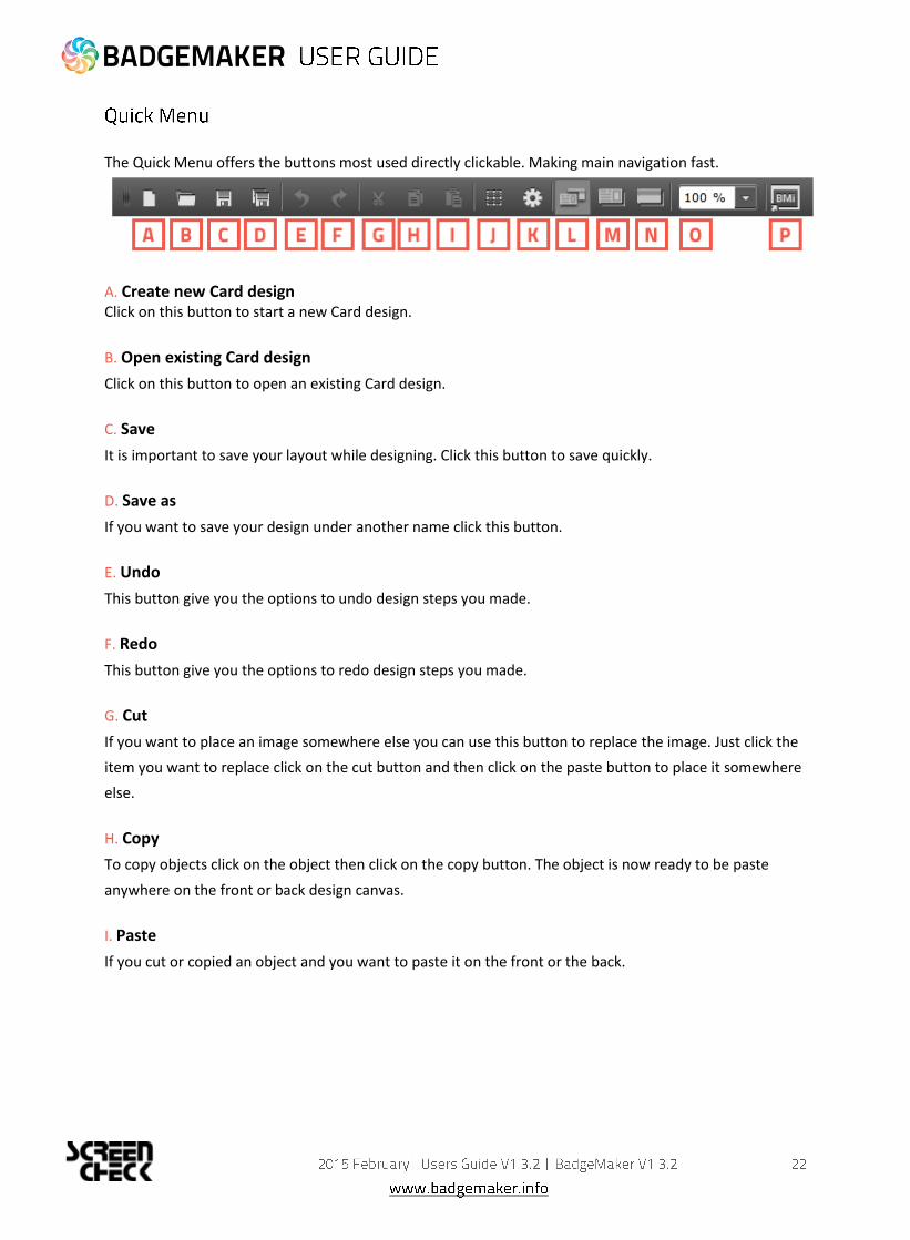
The Quick Menu offers the buttons most used directly clickable. Making main navigation fast.
A. Create new Card design Click on this button to start a new Card design.
B. Open existing Card design
Click on this button to open an existing Card design.
C. Save
It is important to save your layout while designing. Click this button to save quickly.
D. Save as
If you want to save your design under another name click this button.
E. Undo
This button give you the options to undo design steps you made.
F. Redo
This button give you the options to redo design steps you made.
G. Cut
If you want to place an image somewhere else you can use this button to replace the image. Just click the
item you want to replace click on the cut button and then click on the paste button to place it somewhere
else.
H. Copy
To copy objects click on the object then click on the copy button. The object is now ready to be paste
anywhere on the front or back design canvas.
I. Paste
If you cut or copied an object and you want to paste it on the front or the back.
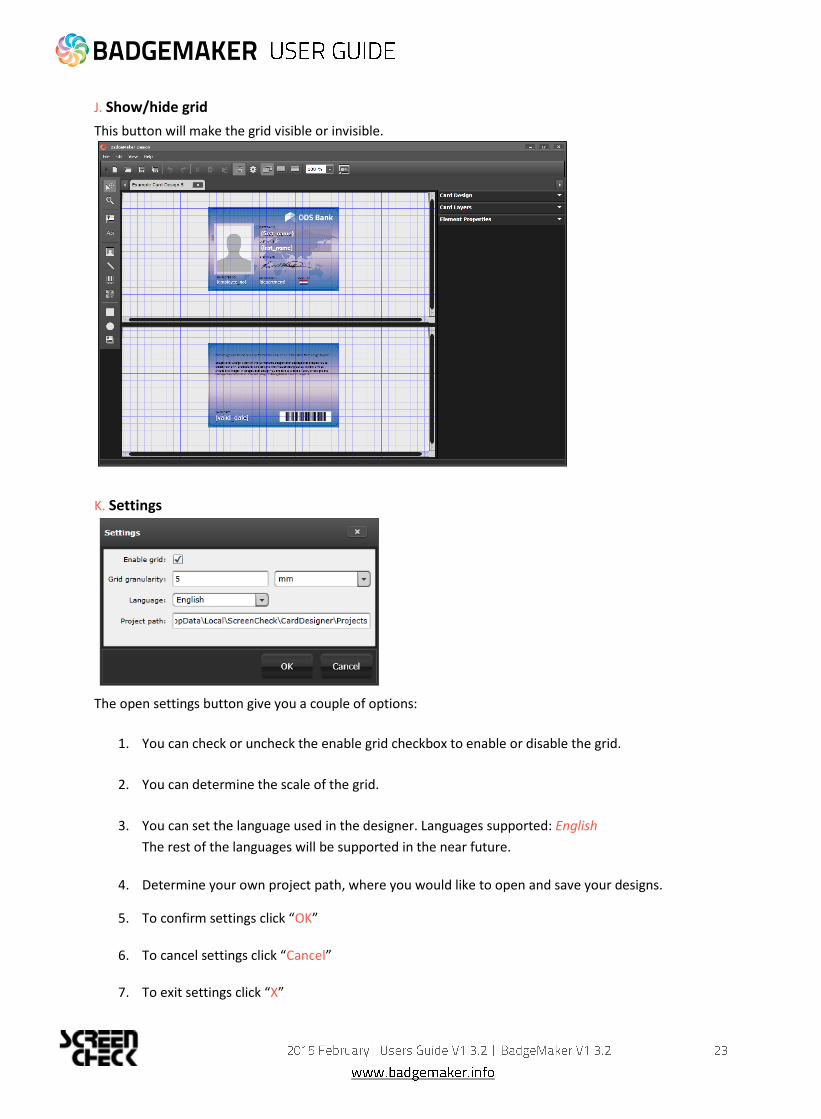
J. Show/hide grid
This button will make the grid visible or invisible.
K. Settings
The open settings button give you a couple of options:
1. You can check or uncheck the enable grid checkbox to enable or disable the grid.
2. You can determine the scale of the grid.
3. You can set the language used in the designer. Languages supported: English
The rest of the languages will be supported in the near future.
4. Determine your own project path, where you would like to open and save your designs.
5. To confirm settings click “OK”
6. To cancel settings click “Cancel”
7. To exit settings click “X”

L. Show front and back designers
Click here if you want to view the canvases for the front and back side of the layout.
M. Show front designer only
Click here if you want to only view the canvas for the front side of the layout.
N. Show back designer only
Click here if you want to only view the canvas for back side of the layout.
O. Scale slider
Use this slider to zoom the canvas view in or out.
P. BadgeMaker Identity
This Quick button let’s you open BadgeMaker Identity and continue with your card production process.

A. Main menu
B. Window menu
C. Quick menu
D. Toolbar
E. Workspace/Canvas Front
F. Workspace/Canvas Back
H. Card Design: Preview/Card Settings/Dynamic Data Fields
I. Card Layers
J. Element Properties
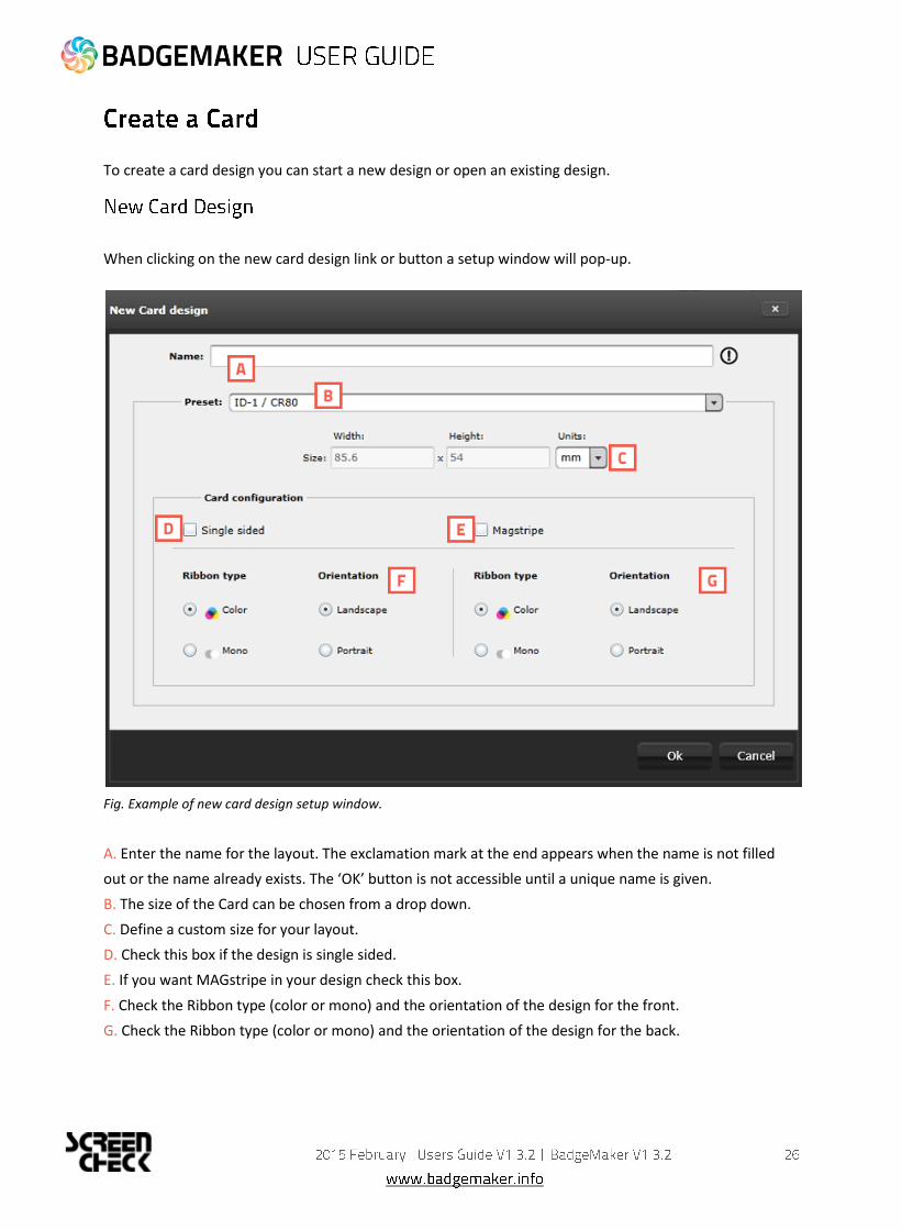
To create a card design you can start a new design or open an existing design.
When clicking on the new card design link or button a setup window will pop-up.
Fig. Example of new card design setup window.
A. Enter the name for the layout. The exclamation mark at the end appears when the name is not filled
out or the name already exists. The ‘OK’ button is not accessible until a unique name is given.
B. The size of the Card can be chosen from a drop down.
C. Define a custom size for your layout.
D. Check this box if the design is single sided.
E. If you want MAGstripe in your design check this box.
F. Check the Ribbon type (color or mono) and the orientation of the design for the front.
G. Check the Ribbon type (color or mono) and the orientation of the design for the back.

To open an existing Project select the open project function. All available existing projects are displayed
and you can select the layout for editing. You can open multiple layouts at the same time.
Fig. Example of the Open Card design popup window.
A. Select one of the existing designs
B. View the layout of the design selected
C. Check out the properties and the setup of the front and back side.
D. Open the selected design
E. Cancel opening a design.
F. Deleting a selected design.

To create and edit a design you need to work with the toolbar setup on the left side.
The tool bar offers the following functions:
A. Select/move tool This function is used to select an element. This tool also allows you to move an element in the layout. When an element is selected the move icon appears an can be used to move the element.

B. Zoom tool The zoom function is enabled and will zoom the layout. At a click of the mouse the zoom is increased one step.
C. Image tool The image element is used to place an image element in the layout.
D. Text tool The text element can be used for static and dynamic text. Use the Text Element properties to edit and add text and or dynamic text to the box. By clicking on the element and going to Element properties you get the text editor.

E. Passport Photo tool The Photo element is used to place a placeholder for the Passport Photo on the layout. You will be able to scale within proportions. When the design is used and connected to data in for example BM Identity the placeholder will replace the dummy image with the real Passport Photo of that person.
F. Signature tool The Signature element is used to place a placeholder for the signature on the layout. You will be able to scale within proportions. When the design is used and connected to data in for example BM Identity the placeholder will replace the dummy image with the real Signature of that person.

G. Barcode tool The Barcode element is used to place a placeholder for a barcode on the layout. You will be able to scale within proportions. When the design is used and connected to data in Identity the placeholder will replace the dummy image with the real Barcode. There are different types of barcodes available to select in the element properties. Barcodes that are scaled to small might not work. Test your barcode in your design with the needed data before continuing the production process.
H. 2D Barcode tool The 2D Barcode element is used to place a placeholder for a 2D barcode on the layout. You will be able to scale within proportions. When the design is used and connected to data in BadgeMaker Identity, the placeholder will replace the dummy image with the real 2D Barcode. There are different types of 2D barcodes available to select in the element properties.
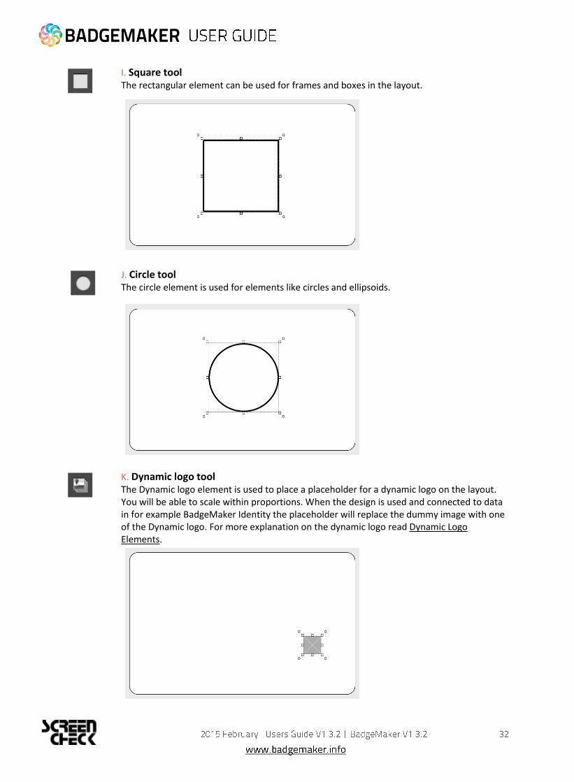
I. Square tool The rectangular element can be used for frames and boxes in the layout.
J. Circle tool The circle element is used for elements like circles and ellipsoids.
K. Dynamic logo tool The Dynamic logo element is used to place a placeholder for a dynamic logo on the layout. You will be able to scale within proportions. When the design is used and connected to data in for example BadgeMaker Identity the placeholder will replace the dummy image with one of the Dynamic logo. For more explanation on the dynamic logo read Dynamic Logo Elements.
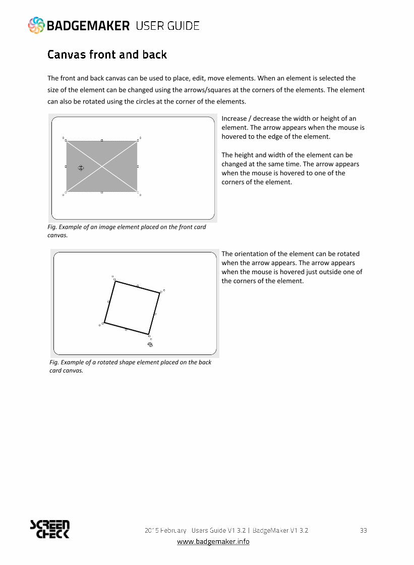
The front and back canvas can be used to place, edit, move elements. When an element is selected the
size of the element can be changed using the arrows/squares at the corners of the elements. The element
can also be rotated using the circles at the corner of the elements.
Fig. Example of an image element placed on the front card canvas.
Increase / decrease the width or height of an element. The arrow appears when the mouse is hovered to the edge of the element.
The height and width of the element can be changed at the same time. The arrow appears when the mouse is hovered to one of the corners of the element.
Fig. Example of a rotated shape element placed on the back card canvas.
The orientation of the element can be rotated when the arrow appears. The arrow appears when the mouse is hovered just outside one of the corners of the element.

The Card Design window presents three tabs: Preview, Card Settings and Dynamic Fields.
The Preview allows the user a view on the card in single view mode of the card; when clicking on the
preview it will toggle from front to back.
Fig. Example of the Preview in the Card Design Menu.
The Card Settings tab offers the user information on the Card Design properties. It is possible to change or
edit the configuration, however the elements placed are not affected.
Fig. Example of the Card Settings tab in the Card Design Menu.

The tab ‘Dynamic Fields’ will give the user a list of the dynamic fields in the layout. When a text element is
created and the text string has a name in between curly brackets, the BadgeMaker Design will detect this
as a dynamic field name and it will be added to the list of Dynamic fields automatically.
The user can delete, change and edit the field names and also enter values to be used in preview. It can be
tested for long and short names how they will show up in the preview.
A. Add a new dynamic field to the list by clicking on the “+” button.
B. List of dynamic fields names
C. Default value of the fields
D. Format name, during the setup of a new data field you will place the data field name that needs to be
connected in between the curly brackets as the format name.
E. Click on the “x” button to delete a dynamic field.

The Card Layers menu can be used to ‘order’ the sequence of the elements. The position of the elements
in the list from top to bottom defines the position on the card from the front to the back.
Fig. Example of the Card layers menu.
A. Front design layers B. Back design layers C. Every type of layer has its own icon. D. Each element has function icons for:
Making the selected layer visible or invisible.
Locking or unlocking the selected layer. When a layer is locked you will not be able to select or edit that element on the canvas.
The user can drag an A. element in the list and the new order will be B. reflected in the design:
Fig. The Rectangle element/layer in front and above the
passport photo element.
Fig. The Rectangle element/layer was dragged down in
the list showing the image moved back in the canvas
view.

The element properties window has three tabs:
Element edit, Element position tab and Element style tab.
Depending on the type of element, this tab will allow the user to view and/or edit the information of the
element. When the values are changed they are reflected immediately in the design; there is no need to
hit an enter button. The user can make changes in one window and observe the result in the other
window at the same time and vice versa. It depends on the preference of the user to create the layout in a
graphical environment or a data element environment.
Fig. Example of the Text element properties
Text element
A. Change Font B. Change Size
C. Edit style into bold, italic and underlined. D. Outline the text left, center or right E. Align the text to top, center or bottom of the box. F. Wrap text automatically or let text be cut of when being too long. G. Give the text color by clicking on the color box. H. Choose to add a dynamic field to the text box below by selecting one out of the drop down menu and clicking on the “Add” button. I. Enter all you text here.
Fig. Example of the Image element properties
Image element
A. Select an image from your computer by clicking on the “…” button.
B. Choose to bind the ratio C. Select an image that already has been uploaded into BM design.

Fig. Example of the Passport Photo element properties
Passport Photo element
A. Check box to bind the element to a certain ratio.
Fig. Example of the Signature element properties
Signature element
A. Check box to bind the element to a certain ratio.
Fig. Example of the barcode setup of a element properties.
Barcode element
A. Check box to bind the element to a certain ratio
B. Choose a barcode type by clicking on the drop down box and selecting the needed option available.
C. Select a form of error checking from this list to ensure a correct working barcode.
D. If you want the barcode to show a label with the real data check the show label check box.
E. Select the dynamic field that you want the barcode to reflect, click the “Add” button to add the dynamic field to the value. You can also type in a value for the barcode.
F. Enter a default value or combine it with a dynamic field.

Fig. Example of the dynamic logo setup element properties.
Fig. Example of the MAGstripe setup element properties.
Dynamic logo element
A. Select the dynamic field that you want the Dynamic logo to reflect.
B. Select if you want the logo to be the correct ratio or if you want it to fill the whole field.
C. Click on this button to add the dynamic logo.
D. When you want to delete a dynamic logo select the logo you want to delete first and then click on the “Remove dynamic logo” button.
E. Select an image for you dynamic logo by clicking on this button.
F. Check the default box if you want this image to show up as the default dynamic logo image.
G. If you want to add a value to your Dynamic Logo enter the data into this field.
MAGstripe element
A. Select a field from the dropdown menu that you would like to add as dynamic data to one of the three tracks of the MAGstripe.
B. The MAGstripe allows you to encode three track to the card with certain data. The fields will give you feedback when data entered is not correct. Track 1: Allows you to add 76 characters, A-Z (Capital), 0-9 and certain symbols. Track 2: Allows you to add 37 numeric characters . 0-9 Track 3: Allows you to add 104 numeric characters. 0-9 C. Click on this button to add the dynamic field selected in the dropdown menu. D. Click the LRC (longitudinal redundancy check) box to add an additional character which helps to validate your data.

Fig. Example of the position setup of a element.
A. Determine the position of the used element.
B. Scale your element giving a width or a height. Check the check-box to keep the element proportion the same as the original.
C. Rotate the element by entering an angle number from 0 to 360.
D. Give your element margins to give your the element needs margin space around.
Fig. Example of the Color popup menu
Choose a color for the line or the background using the color window. You can use:
A. the color picker
B. RGB sliders
C. HSV sliders
D. Add Transparency
E. Color library using saved colors that you can drag into the library.
F. Click on “Ok” when you selected the correct color.
Fig. Example of the style tab
A. You can change the thickness of the line, its color or style and the
B. background color of an element.

2014 October
Users Guide V1.4
BadgeMaker Design V1.3

BadgeMaker Identity makes the elaborate card design process as easy, fast and intuitive as possible.
Accommodating the users in your organization that are set with the task managing data and printing
cards. Using an user friendly overview that shows all the tools and is easy to navigate.
The window navigation give the option to A. minimize, B. maximize or C. close.
The main menu offers the options: File, Edit, Record, Options, View and Help
Which contain 6 submenus:
A. File The first button offers the main functions needed to start, use, manage and end a BadgeMaker Identity Project:
- New - Open - Close Project - Import Data - Import Photo - Export project data - Print - Print with... - Exit
B. Edit Menu The second button will offer the edit functions and project settings that you use during the data managing process: - Undo - Redo - Project Settings
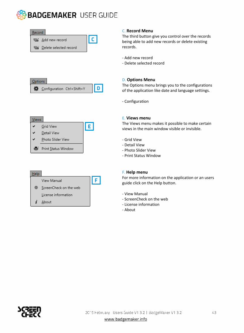
C. Record Menu The third button give you control over the records being able to add new records or delete existing records.
- Add new record - Delete selected record
D. Options Menu The Options menu brings you to the configurations of the application like date and language settings.
- Configuration
E. Views menu The Views menu makes it possible to make certain views in the main window visible or invisible.
- Grid View - Detail View - Photo Slider View - Print Status Window
F. Help menu For more information on the application or an users guide click on the Help button.
- View Manual - ScreenCheck on the web - License information - About

The Quick Menu offers the buttons most used directly clickable. Making main navigation fast.
A. New
Click on this button to start a new Project.
B. Open existing Project
Click on this button to open an existing Card design.
C. Undo
This button gives you the options to undo processing steps you made.
D. Redo
This button give you the options to redo processing steps you made.
E. Add a new record
This button give you the options to add a new record to the data grid. This means putting in new
information, adding a photo and if needed adding a signature.
F. Delete a selected record
This button give you the options to delete a record from the data grid.

G. Print all selected records Print all selected records using the most recently used printer and settings. To print one or more records, select them and click this button to print the records using the most recently used printer and print settings. On first-time use, the printer dialogue will be displayed.
1. A print window pops up so you can select the printer you installed for the card printing process.
This manual does not describe the installation of printers. Please refer to the manufacturers
manuals for further information on these devices. After you select the printer you click on the
“Print” button.
Fig. Example printer setup window.
2. A print progress window will pop-up that will show you the progress of the cards that are being
printed.
Fig. Example of the Card printing progress window.

H. Filter records
When having a lot of data in your data grid this button will be helpful giving you all kinds of different filter
options to search for specific groups or a certain person. You can add multiple filter sets. Every filter set
can have one or more filter rules. You can combine one or more filter sets to make your search more
specific.
Fig. Example of the filter options window that pop-
up after clicking the filter button in the Quick
menu.
1. To setup a filter rule start with selecting one of the fields that you want to search in. This will narrow a search and make it faster.
2. After selecting the field you need to select how specific you want to match the field with the input that you will put into field 3. If very specific choose “is”, if you do not want it to be to specific you can choose “Starts with”
3. Put in the information you are looking for depending on if a search is specific or needs to be a group. For example you could put in a complete index number to find a certain person or just the start of a number.
4. The “X” buttons are to delete a filter rule or a filter set.
5. Click on this button to add a new filter rule to this filter set to narrow your search.
6. Click on this button when you want to add a new filter set. Example: You use a filter set when searching for two different type of records and need to add a separate search.
7. Cancel filter option.
8. To start the search/filter process click on the “Ok” button.
I. BadgeMaker Design This quick menu button let’s you open BadgeMaker Design and continue with creating or adjusting your card design.
J. Refresh Data This button allows you to refresh data when working with BadgeMaker Connect projects making sure all data is up to date with the connected data bases.

The dashboard of the BadgeMaker Identity offers the following sections:
Fig. Example of the BadgeMaker IDENTITY dashboard overview
A. Main menu
B. Window menu
C. Quick menu
D. Grid View
E. Detail View
F. Photo Slider View
G. Layout gallery and layout preview
H. Photo and Signature preview
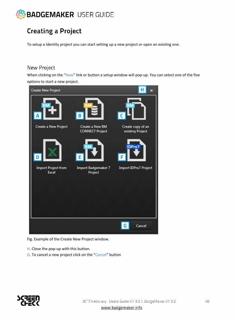
To setup a Identity project you can start setting up a new project or open an existing one.
When clicking on the “New” link or button a setup window will pop-up. You can select one of the five
options to start a new project.
Fig. Example of the Create New Project window.
H. Close the pop-up with this button.
G. To cancel a new project click on the “Cancel” button

Click on Create a New Project if you want to start with a blank data grid and setup your own field names.
Fig. Example of step 1. New project: add Project Data Fields
1. Project Data Fields
Step 1. is to add the project data fields.
A. Type in the name for your new project.
B. Put in the data field name
C. Set the data type. Select if the data are number or text for example.
D. Select if the field needs to be Required.
E. With the default input field you can add a standard value to your data field, existing empty
fields and new records will automatically get the default value you add to this data field.
F. Enable auto-increment
G. Select if the field needs to be Unique.
H. Click on the “Add New Data Field” button and add and describe the data field names you want
to use in your new project.
I. Click on the “Next” button to go to step 2. and create your new project.

2. Creating project
During step 2. the application will start creating your new project.
If there are no problems click on the A. “Finish” button. If there are problems read the feedback provided
and click on the B. “Previous” button to go back and make the needed adjustments to your data field
names and their configuration. You are now ready to start adding records to your data grid.
Fig. Example of step 2. New project: Creating project.

To create a new BadgeMaker Connect project you need the Connect Add-On.
Please read the BadgeMaker Connect Chapter (page 89.) for more information.

Fig. Example of step 2. New project: Copy existing project.
1. Copy Existing Project
A. Select an existing project from the list presented.
B. Give the project a new name.
C. Select if you want the copy with data or structure only. Select structure only if you only want the data
field setup and not the content of the previous project.
D. Click on the “Finish” button to start this new project.

1. Data source
Fig. Example of step 1. New project imported from excel file: Data source.
A. Click on this button and select the Excel/CSV file you want to import from to create a new project.
B. Select the correct date format you want to use from the drop down menu.
C. Select the first row that contains the data field names.
D. Click on the “Next” button to continue to second step.

2. Project Data Fields
A. Type in the new name for your new
project.
B. Click on the “Add New Data Field”
button and add and describe the data
field names you want to use in your
new project or adjust the existing
names.
C. Set the data type. Select if the data
are number or text for example.
The following types of database fields
are supported:
Fig. Example of step 2. New project: Project data fields.
- Text
- Number
When selecting this type you can select ‘auto-increment’ . When a new record is created the number will be
the highest number in the Project increased by 1
- Decimal
- List
When this type is selected you can add and delete the list values form the list that is presented for this
database field when a value must be entered
- Date
- Email address
- Phone number
D. Select if the field needs to be Required.
E. Select if the field needs to be Unique.
F. With the default input field you can add a standard value to your data field, existing empty fields and
new records will automatically get the default value you add to this data field.
G. Click on the “Add New Data Field” button and add and describe the data field names you want to use in
your new project.
H. Click on the “Next” button to go to step 3.

3. Data Validation
Fig. Example of step 3. New project: Data Validation.
A. This step runs a data validation to verify data against requirements specified in the previous step.
B. Click on this button to go to step 4.

4. Creating Project
A. Step 4 will create the new project imported from an excel file. As soon as the loading bar is done you
will be able to B. click on the “Next” button.
Fig. Example of step 4. New project: Creating project.

5. Biometric data
At step 5. you have the option to also import passport photo’s or signature images.
Fig. Example of step 5. New project: Biometric data.
A. Click on this button and select the passport photo folder you want to import from. The photo’s need to
have a unique name that can be connected to one of the unique fields.
B. Click on this button and select the signature folder you want to import from. The images need to have a
unique name that can be connected to one of the unique fields.
C. Select the data field that contains the unique data similar to the photo’s names.
D. Select the data field that contains the unique data similar to the signatures names.
E. Click on this button to import the Passport and/or the Signature images.
F. Click on the Finish button when you are done or do not jet want to import images.

1. Select BadgeMaker 7 Project
Fig. Example of step 1. New project: Select BadgeMaker 7 Project
A. Click on this button to select the BadgeMaker 7 project from your computer.

2. Project Data Fields
Fig. Example of step 2. New project:
Project Data Fields
A. Type in the new name for your new project.
B. Click on the “Add New Data Field” button and add and describe the data field names you want to use in
your new project or adjust the existing names.
C. Set the data type. Select if the data are number or text for example.
The following types of database fields are supported:
- Text
- Number
When selecting this type you can select ‘auto-increment’ . When a new record is created the number will
be the highest number in the Project increased by 1
- Decimal
- List
When this type is selected you can add and delete the list values form the list that is presented for this
database field when a value must be entered
- Date
- Email address
- Phone number
D. Select if the field needs to be Required.
E. Select if the field needs to be Unique.
F. With the default input field you can add a standard value to your data field, existing empty fields and
new records will automatically get the default value you add to this data field.
G. Click on the “Add New Data Field” button and add and describe the data field names you want to use in
your new project.
H. Click on the “Next” button to go to step 3.
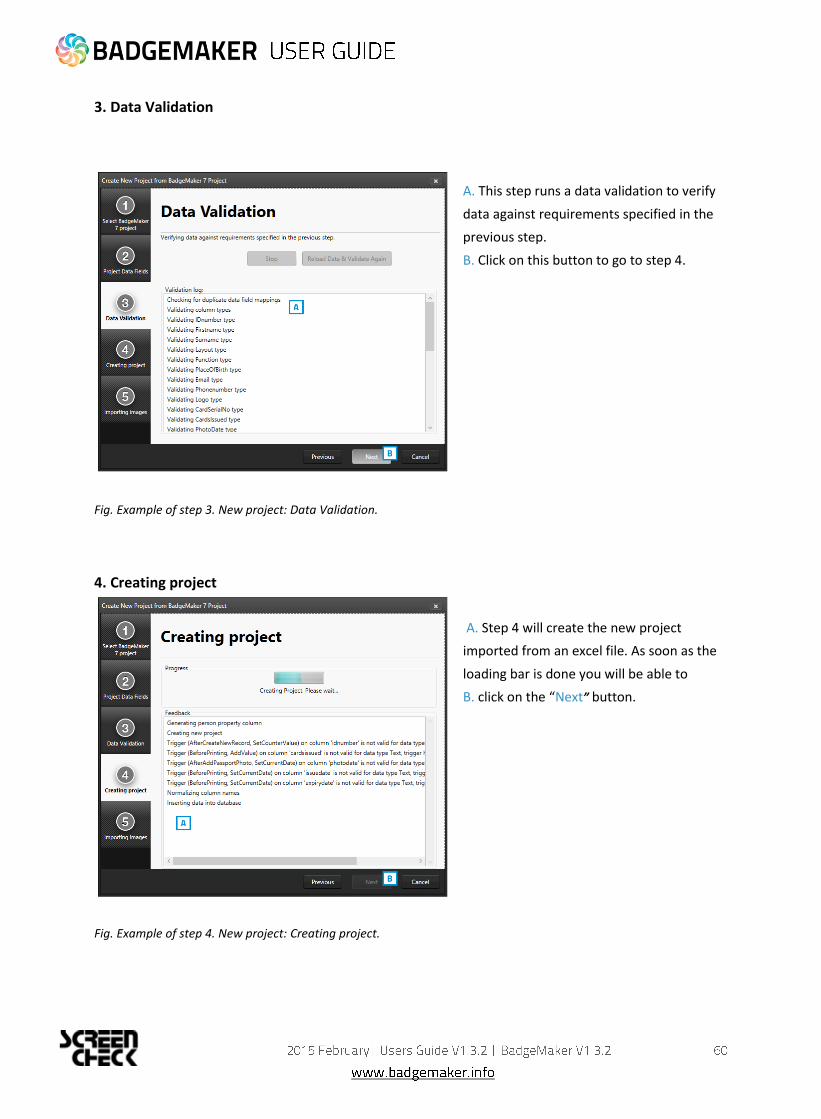
3. Data Validation
A. This step runs a data validation to verify
data against requirements specified in the
previous step.
B. Click on this button to go to step 4.
Fig. Example of step 3. New project: Data Validation.
4. Creating project
A. Step 4 will create the new project
imported from an excel file. As soon as the
loading bar is done you will be able to
B. click on the “Next” button.
Fig. Example of step 4. New project: Creating project.

5. Importing images
Fig. Example of step 5 New project: Importing images
Step 5. Processes the importing of the images. You can follow the progress by looking at the loading
bar. When the process is done you can click on the “Finish” button to start working in this new
project.
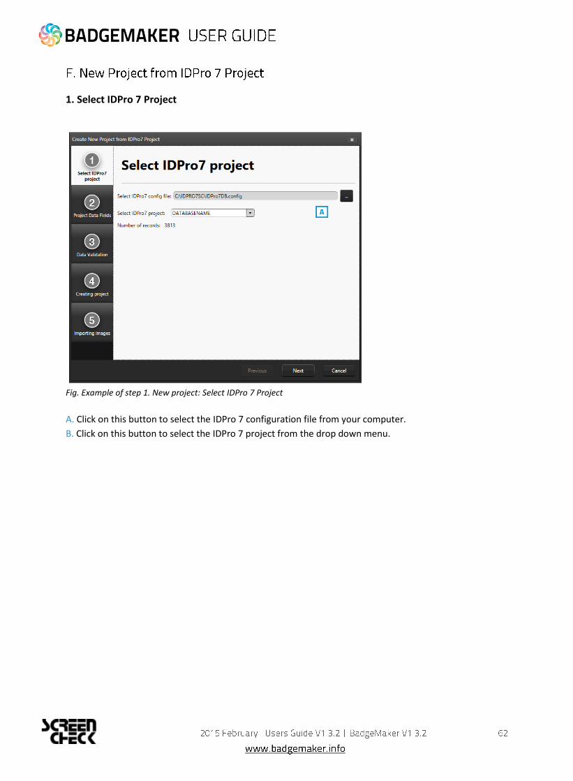
1. Select IDPro 7 Project
Fig. Example of step 1. New project: Select IDPro 7 Project
A. Click on this button to select the IDPro 7 configuration file from your computer.
B. Click on this button to select the IDPro 7 project from the drop down menu.
2. Project Data Fields
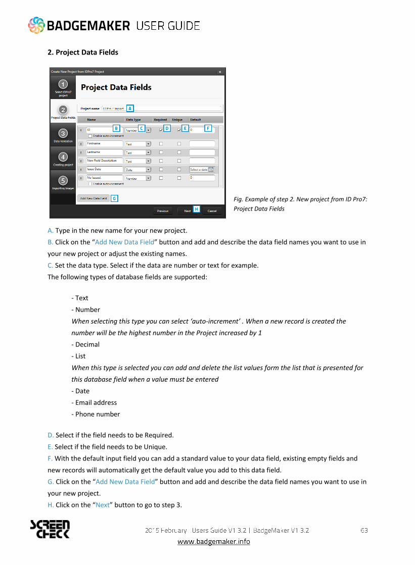
Fig. Example of step 2. New project from ID Pro7:
Project Data Fields
A. Type in the new name for your new project.
B. Click on the “Add New Data Field” button and add and describe the data field names you want to use in
your new project or adjust the existing names.
C. Set the data type. Select if the data are number or text for example.
The following types of database fields are supported:
- Text
- Number
When selecting this type you can select ‘auto-increment’ . When a new record is created the
number will be the highest number in the Project increased by 1
- Decimal
- List
When this type is selected you can add and delete the list values form the list that is presented for
this database field when a value must be entered
- Date
- Email address
- Phone number
D. Select if the field needs to be Required.
E. Select if the field needs to be Unique.
F. With the default input field you can add a standard value to your data field, existing empty fields and
new records will automatically get the default value you add to this data field.
G. Click on the “Add New Data Field” button and add and describe the data field names you want to use in
your new project.
H. Click on the “Next” button to go to step 3.

3. Data Validation
A. This step runs a data validation to verify
data against requirements specified in the
previous step.
B. Click on this button to go to step 4.
Fig. Example of step 3. New project: Data Validation.
4. Creating project
A. Step 4 will create the new project
imported from an excel file. As soon as the
loading bar is done you will be able to
B. click on the “Next” button.
Fig. Example of step 4. New project: Creating project.

5. Importing images
Fig. Example of step 5 New project: Importing images
Step 5. Processes the importing of the images. You can follow the progress by looking at the loading bar.
When the process is done you can click on the “Finish” button to start working in this new project.

To open an existing Project select the “Open” link or button. All available existing projects are displayed
and you are able to select the project that needs to be opened.
Fig. Example of the Open existing project popup window.
A. Select one of the existing projects
B. Click on the “Open” button.

You will be able to import data by using a Excel/CSV or BadgeMaker 7 file.
Fig. Example of the import data popup window.

1. Datasource
Fig. Example of the import data popup window.
A. Click on this button and select the Excel/CVS file you want to import from to create a new project.
B. Select the correct date format you want to use from the drop down menu.
C. Select the first row that contains the data field names.
D. Click on the “Next” button to continue to the second step.

2. Project Data Fields
Fig. Example of the import Excel/CVS data popup window.
A. The Target column are the fields in your project where the data from the excel fields are
imported into.
B. Connect the correct excel fields by selecting them from the drop down menu.
C. Select one of the fields of the excel data which uniquely identifies data in the data source.
3. Validation
Step 3. is validating the data fields.
4. Data import
Step 4. is processing the import of the Data. Click on the “Finish” button to start working with the
imported data from your Excel file.
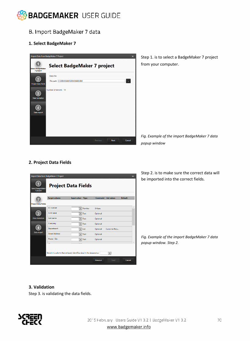
1. Select BadgeMaker 7
Step 1. is to select a BadgeMaker 7 project
from your computer.
Fig. Example of the import BadgeMaker 7 data
popup window
2. Project Data Fields
Step 2. is to make sure the correct data will
be imported into the correct fields.
Fig. Example of the import BadgeMaker 7 data
popup window. Step 2.
3. Validation
Step 3. is validating the data fields.

4. Data import
Step 4. is processing the import of the Data. Click on the “Finish” button to start working with the
imported data from the BadgeMaker 7 Project.
At step 1. Biometric data you have the option to import passport photo’s or signature images.
Fig. Example of importing biometric data.
A. Click on this button and select the passport photo folder you want to import from. The photo’s need to
have a unique name that can be connected to one of the unique fields.
B. Click on this button and select the signature folder you want to import from. The images need to have a
unique name that can be connected to one of the unique fields.
C. Select the data field that contains the unique data similar to the photo’s names.
D. Select the data field that contains the unique data similar to the signatures names.
E. Click on this button to import the Passport and/or the Signature images.
F. Click on the Finish button when you are done.

At the first tab you are able to configure the layout of the detail view. The detail view is the view shown in
the middle of the dashboard, giving you detailed information of a record.
Use the drop down menu’s to select where you want to see certain data fields. At the top are usually the
most important fields selected like the first name, last name and ID number.
Fig. Example of the Project settings: Record Layout

The gallery View is the Photo slide presentation to find the persons record very easily when people are
showing up at the front desk to change or replace a card. In the Gallery setting you can select 2 (two)
database fields that are presented with the Photo. You can select First name and Last name or chose for
the record ID or any other database field.
Fig. Example of the Preview Project settings: Gallery view

The third tab is for managing your biometric settings.
Fig. Example of the Project settings: Biometric settings
1. Check the signature check-box to enable the signature view in your project. Keep this check-box empty when you do not use signatures in your project.
2. Check the passport photos box to enable the photo view in your project. Keep this box empty when you do not use passport photos in your project.
3. You can determine the settings of the photo capture. You can select a certain ratio and select the device you would like to capture with.
4. Shows you a live preview of the ratio and capturing tool.

The third tab is for adding and managing Card Designs to your project.
Fig. Example of the Project settings: Card Designs
1. Select one of the available designs
2. Click on the “Add” button to add the design to your project.
3. If you already have a certain design you can choose to update it by clicking on this button. Any change made to the design will be updated after clicking on this button.
4. If you want to remove a design from your project select one of the designs in this list.
5. Click on the remove button if you want to delete one of the selected designs from your project.
6. Select a design and then click on the “Edit” button if you want to edit the bindings for the dynamic data of the card design.
The data binding tool is a powerful option in BadgeMaker Identity.
When you add a new layout or update a layout you will be prompted
to create the data bindings. Dynamic fields used and created in your
layout may differ from the naming or spelling of a name that exists
in your Project database. Therefore you will be allowed to create the
data bindings. The dynamic fields that are created in the layout are
presented to the left and you can bind these dynamic fields to the
database fields. The tool will create the bindings for you that are
obvious: if they are the same or as they were bonded at the previous
update; of course you will be able to modify the bindings and
confirm these settings. The new or modified layout will be available
in the dashboard of BadgeMaker Identity.
7. Preview of a selected Card Design.

The fourth tab is for managing your data field structure. You can create, edit or delete database fields in your Project.
Fig. Example of the Project settings: Structure
1. Click on the “Add New Data Field” button and add and describe the data field names you want to use in your project.
2. Set the data type. Select if the data are number or text for example. The following types of database fields are supported:
o Text
o Number: When selecting this type you can select ‘auto-increment’ . When a new record is created
the number will be the highest number in the Project increased by 1
o Decimal
o List: When this type is selected you can add and delete the list values from the list that is presented
for this database field when a value must be entered
o Date
o Email address
o Phone number
3. Select if the field needs to be Required. For each field you can select ‘required’ when this database field must be entered for a (new/edit) record.
4. Select if the field needs to be Unique. For each field you can select ‘unique’ when the entered value must be checked for its uniqueness in the Project.
5. With the default input field you can add a standard value to your data field, existing empty fields and new records will automatically get the default value you add to this data field.
6. Click this button if you want to add an extra column to your data. Click on the X to delete a column/data field.

Fig. Example of the Project settings: Triggers
Triggers can be used to automatically change data in your project on a certain condition or event.
1. All data columns of the current project are listed. Select one of the columns in order to link a trigger action to it.
2. Enable or disable a trigger in order to activate the action. Triggers are stored even though they have not been activated. Making it easy to re-activate them later on.
3. Select one of the conditions from the drop-down box. BadgeMaker Identity will automatically wait for the condition to occur before performing the action that is linked to the trigger.
4. Define the action that is performed once the condition has been met. Some actions are only available for specific columns (for example, incrementing number values can only be done on Number type columns).
All changes need to be saved before they become active. Understand that Triggers might cause your
original data to change, so make sure no vital data is lost when working with Triggers.

This tab is for managing your project. You are able to completely delete the current project you are
working on.
Fig. Example of the Project settings: Project management
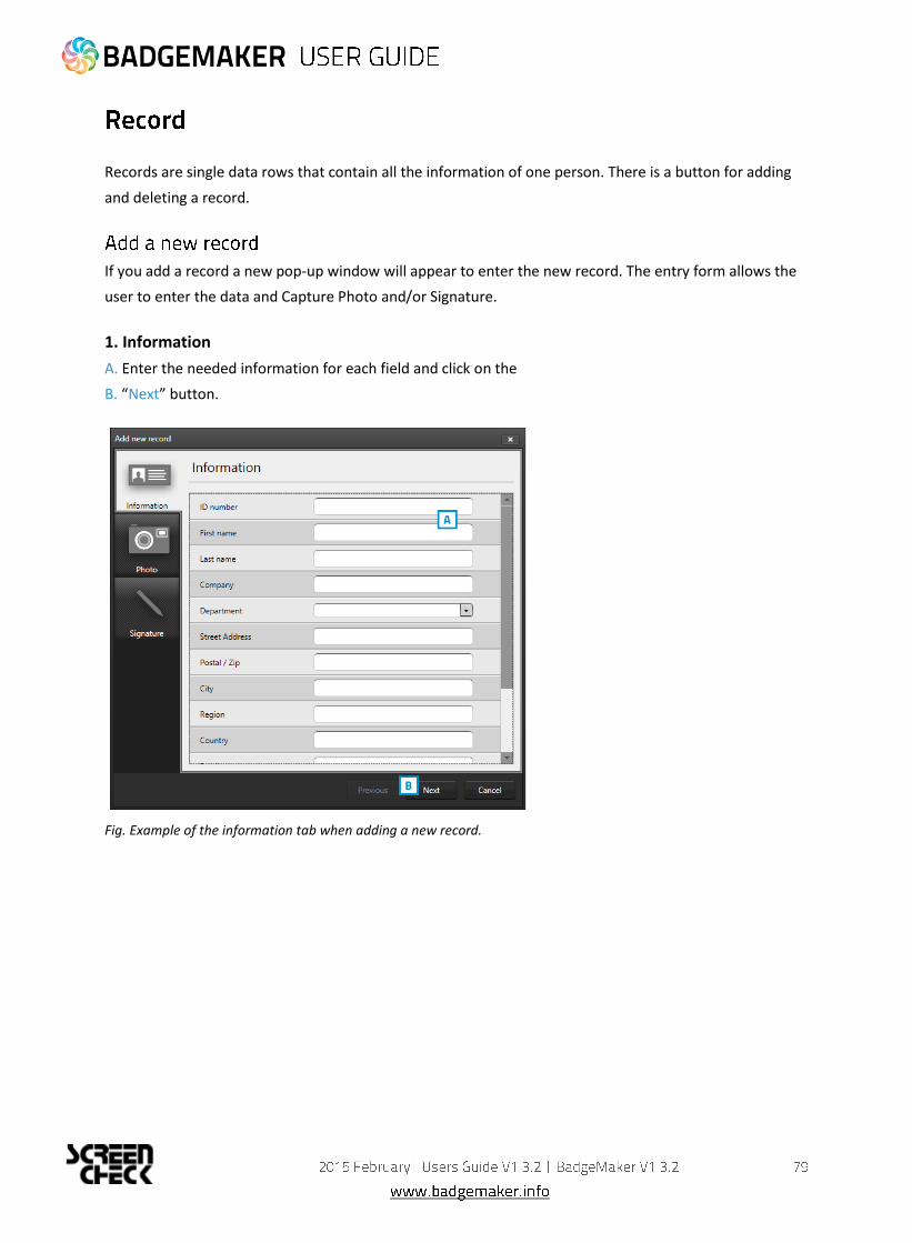
Records are single data rows that contain all the information of one person. There is a button for adding
and deleting a record.
If you add a record a new pop-up window will appear to enter the new record. The entry form allows the
user to enter the data and Capture Photo and/or Signature.
1. Information
A. Enter the needed information for each field and click on the
B. “Next” button.
Fig. Example of the information tab when adding a new record.
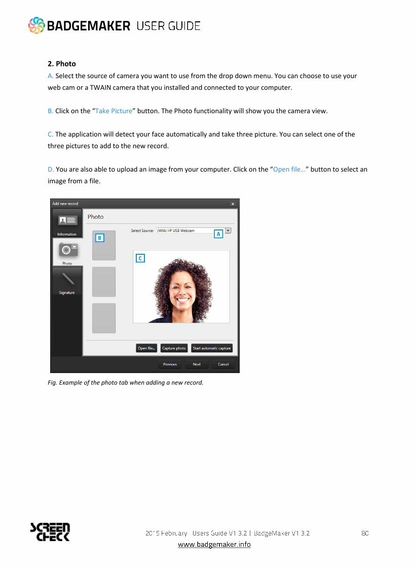
2. Photo
A. Select the source of camera you want to use from the drop down menu. You can choose to use your
web cam or a TWAIN camera that you installed and connected to your computer.
B. Click on the “Take Picture” button. The Photo functionality will show you the camera view.
C. The application will detect your face automatically and take three picture. You can select one of the
three pictures to add to the new record.
D. You are also able to upload an image from your computer. Click on the “Open file…” button to select an
image from a file.
Fig. Example of the photo tab when adding a new record.

3. Signature
A. Use a signature pad to write a signature into this field.
Fig. Example of the signature tab when adding a new record.
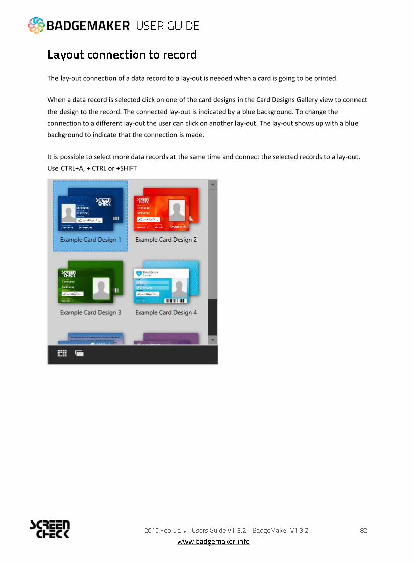
The lay-out connection of a data record to a lay-out is needed when a card is going to be printed.
When a data record is selected click on one of the card designs in the Card Designs Gallery view to connect
the design to the record. The connected lay-out is indicated by a blue background. To change the
connection to a different lay-out the user can click on another lay-out. The lay-out shows up with a blue
background to indicate that the connection is made.
It is possible to select more data records at the same time and connect the selected records to a lay-out.
Use CTRL+A, + CTRL or +SHIFT

2014 October
Users Guide V1.4
BadgeMaker Encode V1.3

The BadgeMaker Encode Add-on allows you to encode data from your BadgeMaker Identity project onto a
smart card. With BadgeMaker Encode, ScreenCheck introduces a new file format that is used to contain all
information related to the encoding of the card, which can easily and securely be shared with other
parties who collaborate on the same project.
BadgeMaker Encode currently supports the encoding of MIFARE Classic, Plus and DESfire cards. Encoding
is done using card printers that are fitted with a “reader” such as the HID Omnikey or the Springcard Crazy
Writer. For a detailed overview of supported devices and standards, please refer to the supported
hardware chapter on page 7. in this manual.
The CCI Editor is a tool that is made available to all users of the BadgeMaker software
package. This tool allows you to create an encoding template for MIFARE Classic, Plus and
DESfire cards using all the major features for each of the standards.
2.1 Creating a MIFARE Classic Template using the CCI Editor
Launch the CCI Editor, which will open to a blank window. Choose “File” → “New” → “Mifare Classic (1k)”
or “Mifare Classic (4k)” depending on your project requirements.

The Card Settings are displayed on top of the screen (A). You are able to define whether the card should
use MAD Sectors or not. Enabling this setting will have an impact on specific sectors and their contents. It
will also automatically generate Key A for sector 0 (and sector 16 for 4K cards).
On the left of the screen (F), a list of sectors is displayed, 16 for 1K cards, 40 for 4K cards. Depending on
the settings, each of the sectors can contain information that will be encoded onto the card through
BadgeMaker Identity.
The center of the screen (B,C,D and E) allows you to configure the information for the currently selected
sector. You are able to define keys, determine read and write settings for each of the four data blocks and
create data segments to fill the available space. The CCI Editor visualizes any data that will be encoded
onto the Smart Card in order to give the user a better view of the amount of used and available space in
each sector.
A
B F
C
D
E

Certain blocks (such as Block 0 on Sector 0, and the Trailer Block on all sectors) are reserved for
manufacturer information and storing keys. These are not available to the user, and are displayed as
hatched.
Each square represents one byte of information. When adding sector data, the length of the data is
visualized on the right. Each item in the list is given a slightly different color to make it easier to
understand how the data is transferred to the card.
2.2 Information about Sector Data
Dynamic Data
This is information that will be added to the card by your BadgeMaker project. Similar to adding card
designs, when you add a CCI file to your project, a pop-up will allow you to bind columns in your project to
each of these items. You must always ensure that the data in your project corresponds with the settings
you have chosen in terms of length and data type. The following data types are available.
◦ ASCII All standard ASCII characters are allowed.
◦ Numeric 0 … 9
◦ Alphabetic A … Z and a … z
◦ Alpha-numeric A … Z, a … z and 0 … 9
◦ Alphabetic and special A … Z, a … z and Punctuation marks
◦ Alpha-numeric and special A … Z, a … z, 0 … 9 and Punctuation marks
◦ Binary-coded decimal (5) 0 … 9, two digits in one byte, maximum 5 bytes
◦ Binary-coded decimal 0 … 9, two digits in one byte
◦ Binary-coded decimal date YYYYMMDD each two digits in one byte
◦ Decimal 0.00 (Fixed point)
◦ Wiegand-26 Facility and card codes with parity
◦ Hexadecimal 0123456789ABCDEF
◦ Octal 012345678
◦ Binary 01
In addition, you are able to add a description of the sector data to remind you of certain
agreements.
Constant Data
Constant or Static data is data that is manually entered in the CCI file and will never change. The format of
this piece of information can be of any of the types mentioned in the Dynamic Data section.
Empty Space This item can be used to indicate a specific part of a sector that will never be used.
Card serial number
This is a 10, 7 or 4-byte, data section which will automatically contain the card serialnumber when the
card is being encoded.
Using these options, you can create any type of CCI file. Once completed, you are able to save your work
in either an unencrypted file (XML) or an encrypted CCI file. If you choose the latter option, you will be
required to enter a password that will also be required when adding the CCI file to your BadgeMaker
Identity project.

2.3 Creating a MIFARE DESfire template using the CCI Editor
DESfire cards take an entirely different approach to encoding compared to MIFARE Classic or Plus cards.
With DESfire, you are able to define Applications and Files that contain information, each with specific
access settings. Similar to MIFARE Classic, launch the CCI Editor, which will open to a blank window.
Choose “File” → “New” → “DESFire”.
The Card settings panel will allow you to define general rules for your encoding template. A DESFire card
features a Card master key that can be used to re-encode or erase the card at any time. All keys for
DESFire cards can be encoded using 3DES, 3K3DES or AES encrypted keys. A key can be either generated
or entered manually.
The other options for the Card settings dialog are self-explanatory, but must be decided with caution as
they will impact how flexible the card can be used after being encoded. In addition to the default DESFire
features, Reset keys are implemented that allow for cards to be repurposed, by users even though the
Card master key might not be available. Distributing the Card master key might not be desirable because
of possible security liabilities. Multiple Reset keys can be created to supply to different vendors.

Once Card settings have been defined, an Application can be created by choosing “Add application” on the
bottom left of the screen. Doing so will automatically create an application titled “000001”. On the right
side of the screen, information can be entered to define the Application such as a Description, an ID
(Hexadecimal value) and the Encryption type. For each applications, settings are available that define
future use of the application such as allowing the Master key to be changed or Authentication settings for
accessing the data in the Application. Each Application can have up to 10 keys that can be distributed to
vendors for use of the Application.
Once finished, choose “Add file” to create a file named “File 0” for the currently selected Application. Each
file will contain a Description and a File number. Communication mode determines the way in which the
File is allowed to exchange data. It is highly recommended to use the Encrypted setting, as the Plain
(unencrypted) mode should only be used for data that does not contain sensitive information.
All DESFire File types are supported to accommodate integration with access control or payment systems
that support the DESFire standard. For general purposes, select the “Standard data file” from the
dropdown list.
Each file has individual settings for Read, Write and Read/Write access, as well as an access rule for
changing these settings after encoding the card.
Standard file types require you to set the total file size. Keep in mind that this has to be equal to or greater
than the total amount of bytes that are used by your File data. In our example, the total amount of data
used is 42 bytes, but the file is given 64 bytes instead.

File data is added to the File in a similar fashion to defining MIFARE Classic or Plus templates. Select a data
type from the dropdown box, and choose “Add” to create a new data block. Define the data format and
alignment, as well as the Field as this will be the identifier once the CCI file is linked to your BadgeMaker
Identity project.
Each DESFire template can contain a maximum of 32 Applications, and each Application can contain a
maximum of 32 files.
Once completed, the template can be either saved to a human-readable XML format, or a password-
encrypted CCI format. Both can be used to encode cards in your BadgeMaker Identity project.
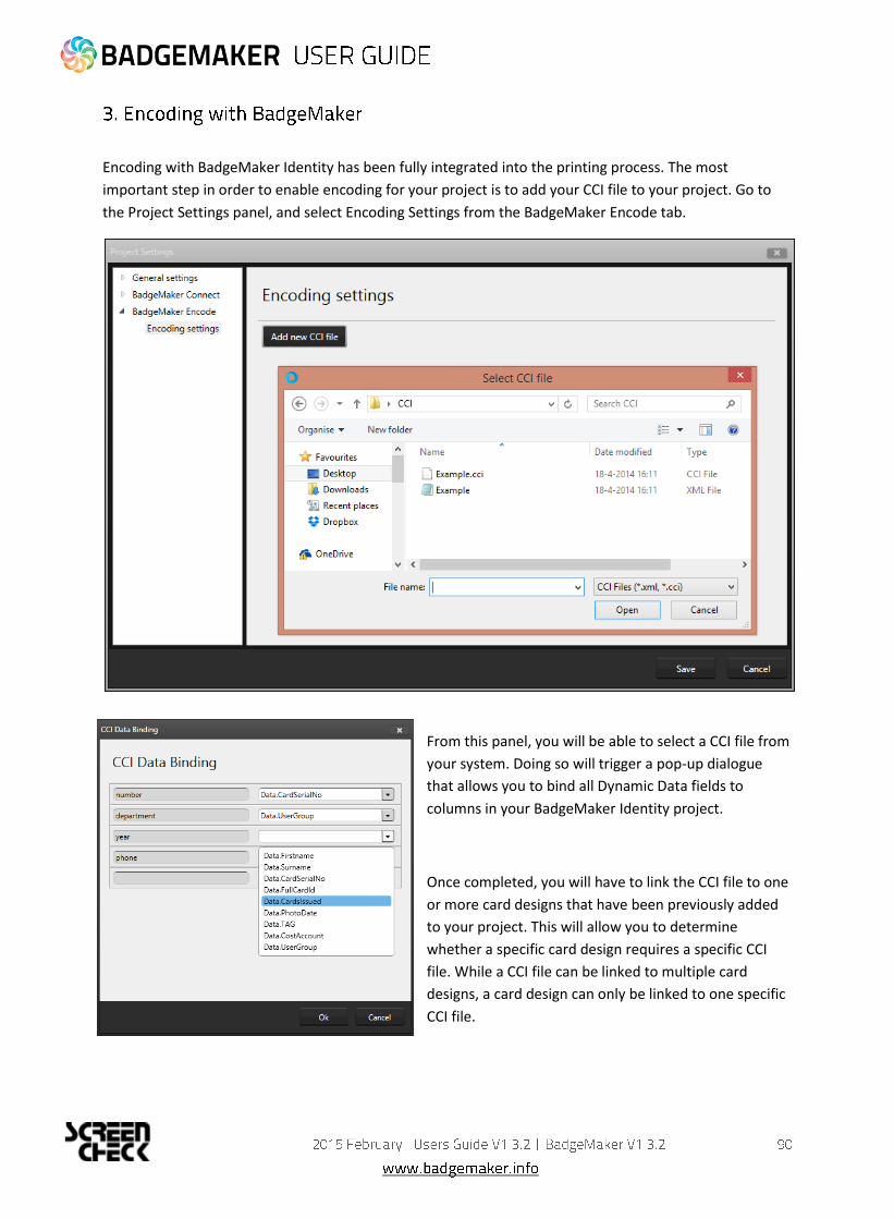
Encoding with BadgeMaker Identity has been fully integrated into the printing process. The most
important step in order to enable encoding for your project is to add your CCI file to your project. Go to
the Project Settings panel, and select Encoding Settings from the BadgeMaker Encode tab.
From this panel, you will be able to select a CCI file from
your system. Doing so will trigger a pop-up dialogue
that allows you to bind all Dynamic Data fields to
columns in your BadgeMaker Identity project.
Once completed, you will have to link the CCI file to one
or more card designs that have been previously added
to your project. This will allow you to determine
whether a specific card design requires a specific CCI
file. While a CCI file can be linked to multiple card
designs, a card design can only be linked to one specific
CCI file.

Click “Save” to store the changes. You are now ready to start encoding your cards. Encoding is simply a
matter of selecting a record and giving the print command. You might be prompted to select the reader
that is associated with your printer, this is only the case for systems that have more than one reader
connected at the same time.
Note that you might need to configure your printer to perform both Encoding and Printing tasks at the
same time, otherwise BadgeMaker Identity might list your print action as failed, even though encoding did
take place
3.1 Supported standards
BadgeMaker Encode currently supports MIFARE Classic, MIFARE Plus and MIFARE DESFire standards.
3.2 Supported devices
Previous versions of the manual contained an overview of supported printers and encoding standards,
please review the chapter on page 7. of the manual that is dedicated to supported hardware for
BadgeMaker Identity and Encode.

2014 October
Users Guide V1.4
BadgeMaker Connect V1.3

The BadgeMaker Connect Add-on allows users to connect with external databases, and use the data to
complement their local project, or even base the entire project upon. There are four types of databases
supported:
Microsoft SQL Server
Microsoft Access files
MySQL Server
Oracle Server Choosing from one of these four settings is highly recommended, however it is also possible to connect to
a database through an ODBC driver.Connecting with one of the supported databases allows you to make
full use of the database's functionality. For example: BadgeMaker will automatically lock tables when
adding or updating records, it will automatically detect user rights and allows you to work with views.
Connecting with a data source through an ODBC driver proves you with more basic functionality, but it will
suffice for most single-user environments. BadgeMaker Connect will automatically detect any available
ODBC drivers on the system, if the required ODBC driver is not listed, it can be installed using the
Microsoft update website or tool in your operating system.
This screenshot shows the Project Settings dialog, where the option for BadgeMaker Connect will be
present depending on your license key.

1.1. How to set up a BadgeMaker Connect Project
Follow these steps if you want to create a project using an external data source as your primary source of
information. If you want the local BadgeMaker Identity project to be your primary source of information,
please refer to chapter 2.
We will start by creating a new project. Click the New Project icon and select “Create a new BM CONNECT
project” from the dialog.
Enter a name for your project and click “Next”. BadgeMaker will now create the internal database
structure to base your project upon. Click “Next” once the process is complete. The third step in the
process is the definition of data sources.
Click “Add data source” to create a new data source. By default, the data source will be set to a Microsoft
SQL Server, which can be changed to an ODBC data source by selecting it from the “Type” dropdown box.

1.1.1 Configuring a Microsoft SQL Server data source
After selecting Microsoft SQL Server as the type of data source, you are able to fill in all information
required to connect to the server.
Server: Path or IP address to the server. If the server is hosted on another system in the network, it can be
either addressed as \\servername or the IP address of the server (see item “A” in the screenshot below).
Information such as the database name (or name of the view) username and password will be provided by
your database administrator. Note that in order to be able to work with a Microsoft SQL Server, an active
network connection must be available.
1.1.2 Configuring a Microsoft Access data source In order to define a Microsoft Access data source, select the option from the drop-down list, and find the path to your database by choosing the Browse (“...”) button behind the Filename field. Please not that a username and password may not be required for your Microsoft Access file, in which case these fields can be left empty.
1.1.3 Configuring an Oracle data source
Configuring a Oracle server as a data source is done in the same fashion as defining a Microsoft SQL Server data source. Please refer to chapter 1.1.1 for more information.
1.1.4 Configuring a data source through an ODBC driver
After selecting ODBC as the type of data source, you will be able to select one of the ODBC drivers
installed on your system. Please note that Windows may have more than one driver installed per file
extension. In this example, we have selected the Microsoft Access Driver (*.mdb) for our data source (see
item “B“ in the screenshot above).
After selecting the driver, you are able to provide a direct path to your database file. This can be a local
path (C:\Example\Example.mdb) or a remote path (\\Server\Example\Example.mdb). Note that in order
to be able to open your project using a remote directory, an active network connection must be available.
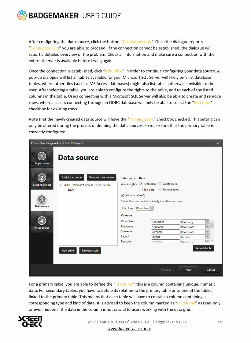
After configuring the data source, click the button “Test connection”. Once the dialogue reports
“Connection OK!” you are able to proceed. If the connection cannot be established, the dialogue will
report a detailed overview of the problem. Check all information and make sure a connection with the
external server is available before trying again.
Once the connection is established, click “Add table” in order to continue configuring your data source. A
pop-up dialogue will list all tables available for you. Microsoft SQL Server will likely only list database
tables, where other files (such as MS Access databases) might also list tables otherwise invisible to the
user. After selecting a table, you are able to configure the rights to the table, and to each of the listed
columns in the table. Users connecting with a Microsoft SQL Server will also be able to create and remove
rows, whereas users connecting through an ODBC database will only be able to select the “Edit data”
checkbox for existing rows.
Note that the newly created data source will have the “Primary table” checkbox checked. This setting can
only be altered during the process of defining the data sources, so make sure that the primary table is
correctly configured.
For a primary table, you are able to define the “Id column” this is a column containing unique, numeric
data. For secondary tables, you have to define its relation to the primary table or to one of the tables
linked to the primary table. This means that each table will have to contain a column containing a
corresponding type and kind of data. It is advised to keep the column marked as “Id column” as read-only
or even hidden if the data in the column is not crucial to users working with the data grid.

The list of columns can be used to define certain restrictions to each column such as “Read-only” or
“Hidden”. By default, columns will be marked as “Read-only”. Think carefully about what data you want to
manage through BadgeMaker, and what data should be managed by other external systems.
Once complete, you are able to define the image sources for Passport Photos and Signatures in your
project. You are able to choose from three different options:
Read image from local project Selecting this option stores captured images along with the BadgeMaker Identity project files. This option can be used to capture new image data.
Read or download image from path or URL This option allows you to read images from a remote directory either on a server or on a network drive. This can only be used to read image data. New data cannot be captured.
Read image from database (blob) This allows you to read an image from a specific column in the databased marked as BLOB (Binary Large Object) This option can be used to both read existing data and capture new image data to the database.
Images will have to be linked to a record in the database in the same way data sources are linked to each
other. It is highly recommended to choose the “ID column” of the primary data source as the source.

BadgeMaker Connect will use the filenames of the images to match between images and records. Only
exact matches will be imported in the project.
Once all the steps have been completed, click “Finish” and your project will be created.
In addition to creating project around an external data source, it is also possible to add external
information to data that is already available in an existing BadgeMaker Identity project.
If you want to configure your existing BadgeMaker Identity project to use data sources, go to the Project
Settings panel, and choose Data Sources under the BadgeMaker Connect tab. The approach for
configuring the data sources is very similar to the process of creating a project from scratch, please refer
to chapter 1. for a detailed explanation.
The main difference compared to creating a new BadgeMaker Connect project is that the local project
data will always be your primary source of information. This means that any external data source will have
to include a column that matches one of the columns in your local project data.
Attention: The software will only join tables when a corresponding record is found in both the local and
the external data, which means that if you have a local project with 10 records, and an external project
with 20 records, only the 10 records that match the local project will be displayed in the data grid. The
software will automatically complement the data in case a new record is added that has a correspondence
with one of the records in the external data source.

There are a couple of changes that may be noticeable when working with BadgeMaker Connect in
comparison to regular BadgeMaker Identity projects.
Loading times The time it takes to load your project, or to process changes to your database may increase. This is due to the time it takes to transfer data over the network, login to the database or retrieve data from the external data sources. Grayed-out columns Columns that have been marked as “read only” will have a grey background color when selected. It simply means that you will not be able to alter data for that specific column.
Data binding look different When working with multiple data sources, it can become confusing to remember what
information belongs to what data source. In order to clarify, BadgeMaker will label sources with
<table_name>.<column_name>. This means that a column “Firstname” coming from a table called
“Students” will be displayed as “Students.Firstname” when binding data.
Updating or adding pictures Depending on the read or write access restrictions and the configuration of image sources in your
project, you may or may not be able to add new images.
Project has stopped working BadgeMaker cannot prevent external data sources from changing. If a file gets removed, or a
database gets changed, it might cause your BadgeMaker Identity project to stop working. Always
consult with your database administrator to ensure that data you need in your BadgeMaker
Project is made redundantly available to you.
Default values
When creating a new project, or when altering a project structure you are able to define certain
default values for your column types. However, when using BadgeMaker Connect, these default
values will be only filled for new records or when manually entering the information into the field.
The reason for this is because the local project data does not contain the same amount of records
as the external sources, and new records are never created automatically.
Copyright ScreenCheck B.V.
The user guide is subject to change without notice.
The BadgeMaker User Guide (the “Manual”) is proprietary to ScreenCheck B.V.. (“SC”) and no ownership
rights are hereby transferred. No part of the Manual shall be used, reproduced, translated, converted,
adapted, stored in a retrieval system, communicated or transmitted by any means, for any commercial
purpose, including without limitation, sale, resale, license, rental or lease, without the prior express
written consent of SC.
SC does not make any representations, warranties or guarantees, express or implied, as to the accuracy or
completeness of the Manual. Users must be aware that updates and amendments will be made from time
to time to the Manual. It is the user’s responsibility to determine whether there have been any such
updates or amendments. Neither SC nor any of its directors, officers, employees or agents shall be liable
in contract, tort or in any other manner whatsoever to any person for any loss, damage, injury, liability,
cost or expense of any nature, including without limitation incidental, special, direct or consequential
damages arising out of or in connection with the use of the Manual.
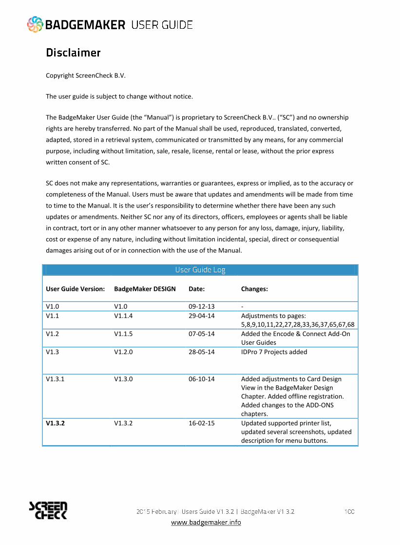
User Guide Version:
BadgeMaker DESIGN
Date:
Changes:
V1.0 V1.0 09-12-13 -
V1.1 V1.1.4 29-04-14 Adjustments to pages: 5,8,9,10,11,22,27,28,33,36,37,65,67,68
V1.2 V1.1.5 07-05-14 Added the Encode & Connect Add-On User Guides
V1.3
V1.2.0 28-05-14 IDPro 7 Projects added
V1.3.1 V1.3.0 06-10-14 Added adjustments to Card Design View in the BadgeMaker Design Chapter. Added offline registration. Added changes to the ADD-ONS chapters.
V1.3.2
V1.3.2
16-02-15 Updated supported printer list, updated several screenshots, updated description for menu buttons.